プレビュー準備中デザインリファレンスを見る
日本のWebデザインを、AIの制作リファレンスに。
DESIGN REFERENCE
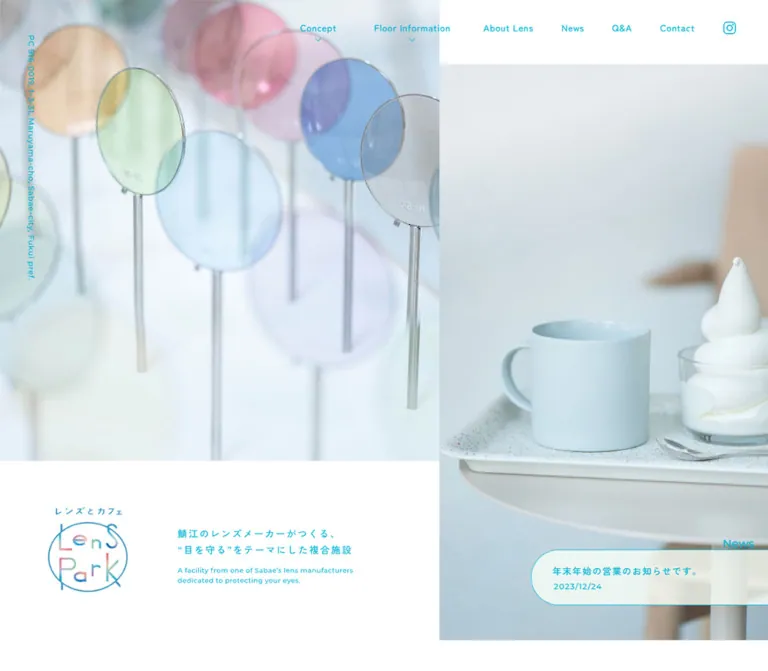
透明感のある写真とシアンの文字、淡いグリーンの背景が印象的な複合施設サイト。左右非対称のヒーローと楕円形の写真で、レンズとカフェの世界観をつなぐ。
オリジナルサイトを見るTransparent lenses, pale café photography, and cyan lettering arranged with the openness of a small park.
Website: lens-park.com
Original URL: https://lens-park.com/
Final URL: https://lens-park.com/ — HTTP 200, unchanged.
Theme: light; white surfaces, cyan typography, and a pale green floor-guide field.
Inspected: September 17, 2026, 05:40:50 JST. Supplied inspection timestamp: 2026-09-16T20:40:50.253Z.
Viewports: desktop 1440 × 1000 and mobile 390 × 844 CSS pixels.
Scope: the current facility homepage: photographic opening, introduction, concept, lens information, floor guide, activities, Instagram news, visitor information, map, and footer. Visual evidence covers the desktop opening, a middle floor-guide position, and footer, plus the mobile opening and lower footer. Rendered DOM measurements additionally cover intervening sections. Linked detail pages and external services were not inspected.
Lens Park presents a lens gallery, shop, café, and visitor activities through a spacious, image-led facility website. Its strongest visual relationship is between transparent optical products and soft daylight photography. Cyan text remains consistent across navigation, editorial copy, rules, arrows, and practical information. Pastel color lives mostly inside the photography and the distinctive logo.
The opening is asymmetric: a large lens photograph occupies the upper left, a café still life fills the right below a white top strip, and an identity panel occupies the lower left. Farther down, large oval photographs alternate with narrow bilingual descriptions on pale green. The footer returns to white and organizes useful information with thin rules. Mobile changes the composition substantially while preserving the same photographs, open spacing, and small cyan details.
Transparent lenses, pale café photography, and cyan lettering arranged with the openness of a small park.
Website: lens-park.com
Original URL: https://lens-park.com/
Final URL: https://lens-park.com/ — HTTP 200, unchanged.
Theme: light; white surfaces, cyan typography, and a pale green floor-guide field.
Inspected: September 17, 2026, 05:40:50 JST. Supplied inspection timestamp: 2026-09-16T20:40:50.253Z.
Viewports: desktop 1440 × 1000 and mobile 390 × 844 CSS pixels.
Scope: the current facility homepage: photographic opening, introduction, concept, lens information, floor guide, activities, Instagram news, visitor information, map, and footer. Visual evidence covers the desktop opening, a middle floor-guide position, and footer, plus the mobile opening and lower footer. Rendered DOM measurements additionally cover intervening sections. Linked detail pages and external services were not inspected.
Lens Park presents a lens gallery, shop, café, and visitor activities through a spacious, image-led facility website. Its strongest visual relationship is between transparent optical products and soft daylight photography. Cyan text remains consistent across navigation, editorial copy, rules, arrows, and practical information. Pastel color lives mostly inside the photography and the distinctive logo.
The opening is asymmetric: a large lens photograph occupies the upper left, a café still life fills the right below a white top strip, and an identity panel occupies the lower left. Farther down, large oval photographs alternate with narrow bilingual descriptions on pale green. The footer returns to white and organizes useful information with thin rules. Mobile changes the composition substantially while preserving the same photographs, open spacing, and small cyan details.
| Name | Value | Suggested token | Evidence and role |
|---|---|---|---|
| Lens Cyan | #00B3D3 |
--lp-cyan |
Measured: rgb(0, 179, 211) on body text, navigation, section headings, links, and selected desktop carousel dots |
| White | #FFFFFF |
--lp-white |
Measured: body background and sampled action surfaces; visible hero identity panel and footer |
| Park Green | Approximately #F1FFED |
--lp-green |
Estimated: very pale green behind the captured shop/café floor-guide rows |
| Footer Cyan | Approximately #00A3CB |
--lp-footer |
Estimated: solid copyright strip; visually darker than the main text cyan |
| Feed Charcoal | #333333 |
--lp-feed-dark |
Measured: Instagram feed's load-more button |
| Feed Blue | #408BD1 |
--lp-feed-blue |
Measured: Instagram follow button; an embedded-feed exception to the main palette |
| Readable Cyan | #007A90 |
--lp-readable |
Recommended: optional darker text color for accessible small-text implementations |
The pale green is visible even though the sampled floor section itself reports a transparent background. Its underlying paint layer was not included in the measurements. Treat the green alias as a visual approximation, not a recovered declaration.
The lens photograph introduces translucent pink, lavender, blue, green, and amber. The logo also contains several pastel hues. Keep those colors within the imagery and identity artwork instead of assigning each section a separate accent color.
Only the light presentation is evidenced. There is no verified theme selector or dark mode. The supplied WordPress gradient, shadow, and color presets do not establish visible design choices for this page.
'Zen Kaku Gothic New', sans-serif.400; most editorial paragraphs, headings, and custom links use 500.--lp-font-ja.Montserrat, sans-serif.500 for navigation and section kickers; 600 for Info. and Access headings.0.05em for navigation and the address, and 0.1em for section labels.--lp-font-en.These are computed font-family declarations. The supplied evidence does not independently verify which font files successfully loaded. The root HTML element's Times declaration is not the content typography: the body overrides it.
The hero H1 contains image content. Its measured 32px / 48px, weight 700, describes the container's inherited text styling, not a live-text version of the visible logo. Use the supplied identity artwork when authorized; do not recreate its multicolored letters by applying a generic display font.
| Role | Desktop | Mobile | Weight | Tracking |
|---|---|---|---|---|
| Body default | 16px / 24px |
Same | 400 |
Normal |
| Desktop navigation | 13px / 19.5px |
Replaced by menu control | 500 |
0.65px |
| Vertical address | 11px / 30px |
10px / 30px |
500 |
0.55px / 0.5px |
| Intro Japanese heading | 30px / 52px |
20px / 40px |
500 |
4.5px / 3px |
| Intro English line | 16px / 30px |
10px / 30px |
500 |
0.8px / 0.5px |
| Section English kicker | 15px / 15px |
Same | 500 |
1.5px |
| Main section heading | 27px / 60px |
25px / 40px |
500 |
4.05px / 2.5px |
| Concept and lens body | 14px / 30px |
Same | 500 |
0.42px |
| Floor-guide descriptions | 14px / 28px |
13px / 28px |
500 |
0.42px / 0.39px |
| Stacked activity-group heading | 30px / 50px |
25px / 45px |
500 |
6px / 5px |
| Activity-group English label | 15px / 30px |
12px / 30px |
500 |
1.5px / 1.2px |
| Pill-shaped detail link | 19px / 19px |
16px / 16px |
500 |
3.8px / 3.2px |
| LINE reservation bubble | 15px / 22px |
Same | 500 |
0.45px |
| Footer section heading | 16px / 28px |
Same | 600 |
1.6px |
| Feed buttons | 13px / 19.5px |
Same | 400 |
Normal |
| Google map link | 12px / 18px |
Same | 500 |
Normal |
The main Japanese headings are modest in size. Their prominence comes from tracking, line spacing, and surrounding space. Preserve those relationships rather than enlarging all headings into billboard typography.
Density: generous section spacing around comparatively small text. Geometry: square photographic hero panels, large oval floor images, thin rules, pill links, and elliptical action bubbles.
| Use | Value | Status |
|---|---|---|
| Desktop navigation link padding | 20px on every side |
Measured |
| Mobile editorial side inset | 40px |
Measured at 390px width |
| English kicker to main heading | 30px clear gap |
Calculated from measured boxes |
| Main heading to first paragraph | 60px clear gap in Concept and About lens |
Calculated from measured boxes |
| Concept paragraph separation | Approximately 32.19px |
Calculated from measured boxes |
| Desktop floor text inset toward image boundary | 50px |
Measured paragraph padding |
| Desktop floor-row vertical pitch | 496px between corresponding dot rows |
Calculated from measured positions |
| Mobile major section padding | Usually 80px at the top |
Measured |
| Desktop standard major section padding | 120px |
Measured |
| Desktop Concept top padding | 180px |
Measured |
| Desktop news top and bottom padding | 180px |
Measured |
These values form a hierarchy, not a strict universal spacing grid. In particular, the hero, floor guide, news feed, and footer each use different horizontal alignments.
| Element | Value | Evidence |
|---|---|---|
| Hero photograph boundaries | Square | Screenshot observation |
| Floor-guide media | Broad oval, approximately 500 × 436px |
Screenshot estimate; exact mask unavailable |
| Detail links | 100px |
Measured |
| Reservation bubbles | 50% |
Measured on non-square boxes |
| Carousel dots | 50% on 8 × 8px |
Measured |
| TOP control | 50% |
Measured |
| Embedded feed buttons | 4px |
Measured |
| Custom cards | No recurring elevated card treatment | Screenshot observation |
A 50% radius does not make a non-square element circular. The reservation controls and large photo windows have visibly oval proportions; retain that distinction.
| Element | Desktop 1440 × 1000 |
Mobile 390 × 844 |
Evidence |
|---|---|---|---|
| Opening section | 1440 × 1000px |
390 × 844px |
Measured |
| Hero lens photo | Approximately 824 × 720px |
Approximately 390 × 422px |
Screenshot geometry |
| Hero café photo | Approximately 616 × 900px, starting at y=100 |
Approximately 390 × 422px, starting at y=422 |
Screenshot geometry |
| Hero H1 container | 576 × 160px, at x=86.39, y=768 |
146 × 156px, at x=40, y=270.08 |
Measured |
| Regular content span | 1000px, commonly x=220–1220 |
310px, x=40–350 |
Measured |
| Concept body column | 430px |
310px |
Measured |
| About lens body column | 420px, starting at x=810 |
310px, starting at x=40 |
Measured |
| Desktop floor paragraph | 400px box, including 50px side padding |
310px, no side padding |
Measured |
| Order/workshop copy | Two 450px columns with 100px between them |
One 310px column |
Measured |
| News tile | 250 × 250px |
148 × 148px |
Measured |
| News tile gap | 50px |
20px |
Calculated from measured positions |
| Footer content span | Approximately 800px, x=320–1120 |
310px for text |
Mixed DOM and screenshot evidence |
| Footer map | Approximately 480 × 300px |
Approximately 390 × 245px |
Screenshot estimate |
| Copyright band | Approximately 58px high |
Approximately 58px high |
Screenshot estimate |
| Document height | 11983.11px |
12948.08px |
Measured; content-dependent |
Role: access to the facility's main sections, detail pages, social profile, and contact channel.
Desktop navigation sits across the upper right, beginning around x=777 and ending 25px from the right edge. Its anchors start at y=10, with 20px padding and 13px Montserrat labels. The sampled header itself has zero layout height, consistent with navigation that does not reserve a conventional header row.
The resting screenshot shows Concept, Floor Information, About Lens, Q&A, an Instagram icon, and Contact with a LINE mark. Japanese companion labels exist in the rendered DOM, but their reveal behavior was not exercised. Concept and floor links have small downward chevrons and point to #Concept-block and #Floor-block; the chevrons do not establish dropdown menus.
Navigation remains visible at the top in the supplied scrolled desktop captures. Its background follows the underlying content in those states. The white strip in the opening composition should not be generalized into a permanently opaque, full-width header.
On mobile, the desktop links are replaced by three thin cyan horizontal strokes. The visible strokes are approximately 50px wide at x=320, near y=25, 35, and 45. The associated measured anchor box is 70 × 80px, at x=310, y=-5. The control remains visible in the lower mobile capture. No opened-menu appearance or navigation transition is verified.
Role: immediately connect the lens collection with the café experience.
The desktop opening fills the inspected viewport. Approximately 57.2% of the width belongs to the left composition and 42.8% to the café photograph on the right. The left image reaches roughly 72% of viewport height; the remaining lower-left area is white. The café image begins below a white strip approximately 10% of the viewport height.
The photographs have different crops and purposes. The lens image shows translucent circular samples on slender stems, with overlapping colors and soft focus. The café image shows a pale mug, soft serve, tray, and small table. Neither needs a dark overlay: the page's identity comes from bright, low-contrast photography.
The lower-left identity panel contains the logo and short Japanese/English introductory copy. The measured H1 is a 576 × 160px image-containing region; it is not a 576px-wide standalone wordmark. A small vertical postal address sits near the left edge at x=30, y=50.
On mobile, the two photographs stack into approximately equal 422px halves. The logo moves onto the lower-left portion of the lens photo, using a 146 × 156px container. The desktop companion copy is not visible in this opening. The address moves to the upper photograph's right edge, changes from cyan to white, and decreases to 10px.
Role: transition from photographic identity into the facility's explanation.
A centered Japanese greeting, followed by a smaller English line, sits in open white space. Desktop uses 30px / 52px Japanese text and 16px / 30px English text. Mobile uses a two-line 20px / 40px Japanese heading and a 10px English line.
The intro section starts at document y=1100 on desktop and directly after the 844px mobile opening. Its top padding decreases from 120px to 80px. Keep this quiet pause in the page rhythm; it is a separate editorial introduction, not text that must be forced into the hero.
Role: explain the facility's purpose and guide visitors toward lens selection.
The common text anatomy is an English kicker, a widely tracked Japanese heading, then several short paragraphs. The English label is 15px; the desktop heading is 27px / 60px; body text is 14px / 30px. A 30px gap separates kicker and heading, and a 60px gap separates heading and body.
The Concept paragraph column is 430px wide at x=220. Its heading extends to 580px, so heading and paragraph widths deliberately differ. About lens places its 420px text column at x=810. This establishes an alternating editorial alignment. The accompanying image composition for these sections is not shown in the supplied screenshot slices and cannot be specified precisely.
On mobile, both sections use 310px content columns with 40px side insets. Their headings change to 25px / 40px, while the 14px / 30px paragraphs retain their size. The text gains lines instead of being uniformly scaled down.
Role: distinguish further reading from booking.
The detail link is a white pill with cyan text and a thin arrow at the left. The measured desktop example is approximately 239 × 45px, with 12px 22px 12px 55px padding, 19px text, 3.8px tracking, and a 100px radius. Mobile changes the text to 16px, producing a 213 × 42px example. The source arrow has its own asset; it should not be replaced by a heavy filled chevron.
Reservation links use white elliptical bubbles. The About lens LINE bubble is approximately 142 × 129px, with 15px / 22px text and a 50% radius. Its generous bottom padding leaves room for the LINE mark. Factory-tour booking uses a related horizontal ellipse with a different arrow placement and padding.
Contact and several booking links point to LINE. Factory-tour booking points to an external workshop page. These destinations are evidenced by href values; completion flows and new-tab behavior were not tested.
Role: show what visitors can do throughout the facility.
The section begins with Floor information, a Japanese heading, and a referenced floor-map SVG. Its measured desktop padding is 120px top and bottom; mobile uses 80px. The exact rendered appearance and responsive variant of the map are not established by the supplied screenshots.
The content groups lens gallery, shop, café, and terrace under an encounter-oriented heading, followed by lens ordering, workshops, and factory tours under an experience-oriented heading. Group headings use compact stacks of Japanese text rather than broad horizontal banners. Their measured boxes are 108 × 150px on desktop and 90 × 135px on mobile.
The floor-guide screenshot establishes the pale green background, alternating image/text layout, and oval media treatment. Those are the defining visual rules of this section.
Role: describe one part of the facility through one focused image and a short paragraph.
Each desktop row combines an approximately 500 × 436px oval photograph with a compact text block. In the café row, the media occupies approximately x=720–1220; text starts at x=320. The paragraph box is 400px wide, including 50px right padding, leaving approximately 350px of text width. The shop row reverses the relationship: image left, paragraph text starting at x=770 after its 50px left inset.
The text anatomy is a small English label, a Japanese title, a thin cyan horizontal rule, and a 14px / 28px paragraph. The screenshot's café photograph shows a staff member holding a tray inside a bright timber interior. Keep the subject readable inside the oval rather than centering the crop mechanically.
Three pagination dots sit inside the photograph near its lower edge. Each visible dot is 8px across; centers are 28px apart. The selected desktop dot is cyan and the others are white. There is no surrounding card, shadow, caption panel, or large carousel arrow in the captured state.
Mobile DOM positions place each description before its associated pagination row. Paragraphs use 13px / 28px with no side padding inside the 310px column. This supports a text-then-media stack instead of preserving desktop alternation. The exact mobile photo contour is not directly visible in the supplied mobile screenshots.
Role: explain participatory services and expose relevant booking links.
Desktop order and workshop descriptions sit in two 450px columns, starting at x=220 and x=770. Their gap is 100px. The order column has a pill-shaped detail link; the workshop uses a reservation bubble. A later factory-tour description occupies a 560px box with 60px left padding and a separate reservation ellipse.
Mobile uses a single 310px text column. Reservation bubbles are not all placed identically: the About lens bubble follows its detail link at the left, while workshop and factory-tour bubbles have right-side positions above their corresponding measured paragraphs. Preserve intentional component variation where the associated imagery supports it; do not infer unseen overlap geometry from text positions alone.
Role: present current activity and offer a route to the facility's social profile.
The measured desktop feed contains nine square links in three columns. Tiles are 250px square, with 50px gaps; the grid is 850px wide, starting at x=420. A narrow heading area sits to its left. This is a distinct asymmetric layout and extends beyond the regular 1000px content span.
Mobile changes to two 148px columns with 20px gaps, spanning x=37–353. The ninth item occupies the left position of a fifth row. Japanese and English news labels sit beside each other above the feed. The custom MORE ellipse moves below it.
Two embedded controls retain their own styles: a charcoal load-more button and a blue Instagram-follow button, both 33.5px high with 4px corners and 13px text. These are local exceptions, not the foundation for a new sitewide button system.
The extracted post markup includes placeholder image URLs. Because this region is not shown in the supplied screenshots, final post-image appearance and successful loading of every tile are unverified. The measured grid and linked content remain usable structural evidence.
Role: make opening hours and practical visit details easy to scan.
The desktop footer groups a larger logo at the left and an Info. block at the right. The information heading begins at x=650 and spans 470px. A thin cyan rule continues after the heading. The screenshot shows aligned label/value rows rather than boxed cards.
The six source labels are OPEN, HOLIDAY, CAFE, TEL, ADD., and PARKING. Captured values include 10:00–19:00, 火曜日定休, L.O. 16:30, 0778-52-7977, the Sabae address, and parking for nine vehicles. These are captured content, not independently verified future operating details.
Mobile uses a 310px information column. The address wraps into separate postal-code and street-address lines while the label column remains aligned. A definition list is a suitable recommended implementation.
Role: connect written travel directions with a usable geographic reference.
Desktop places the approximately 480 × 300px map at x=320, with a 270px directions column at x=850. An English Access heading and horizontal rule introduce Japanese subheadings for rail and car arrivals. The external Google map link sits beneath the map, aligned toward its right edge and preceded by the site's thin arrow.
Mobile reorders the section: directions first, then an approximately 390 × 245px full-width map. Text retains 40px side insets while the map reaches both viewport edges. The external map link returns to a right-aligned text inset below it.
The provider's controls, map labels, and small information panel belong to the embedded map. Their colors and shadows should not be promoted into the facility's own visual system. Map gestures and external-link results were not exercised.
Role: offer a return route and close the long page.
The desktop TOP link is a white, cyan-outlined oval with a small upward chevron above the label. It measures approximately 77.17 × 74px, at x=1312.83, y=846: 50px from the right and 80px from the bottom of the inspected viewport. Its repeated placement in scrolled screenshots supports a persistent desktop treatment; the visibility threshold is unknown.
The mobile TOP box is smaller, approximately 65.17 × 62px. Its measured position lies near the beginning of the footer in document coordinates, and it is absent from the supplied bottom capture. Do not assume the same fixed positioning on mobile.
The page ends in a full-width cyan strip approximately 58px tall, with centered white copyright text. The displayed year is 2023; it does not indicate the inspection date.
| Treatment | Supplied evidence | What can be concluded |
|---|---|---|
| Desktop navigation | color 0.1s ease-in-out, background-color 0.1s ease-in-out |
Short color transitions are defined; resulting hover colors were not captured |
| General custom links | Computed transition shorthand 0.2s |
A short transition exists; a particular transform or opacity change is not established |
| Carousel dots | background-color 0.2s ease-in-out, border-color 0.2s ease-in-out |
Selection colors can transition over 200ms |
| Feed buttons | 0.1s ease-in |
Brief feedback is defined by the embedded feed |
| Persistent navigation | Same upper-screen placement in supplied scrolled captures | Persistent presentation is visually supported; exact positioning declaration is unavailable |
| Section links | #Concept-block, #Floor-block, and #top hrefs |
In-page destinations exist; smooth scrolling is unverified |
| Carousels | Three dots and a selected state per sampled group | A carousel-like control structure exists; autoplay, swipe, interval, and transition style remain unverified |
| Mobile menu | Closed three-line control and offscreen menu content | Opening animation, focus behavior, and open-state layout remain unverified |
The sampled elements generally report animation: none. This does not exclude script-driven animation, transitions on other elements, or motion that had already completed. Slightly intermediate mobile dot colors are compatible with the supplied transitions and should not become separate palette tokens.
The inspection process waited at least five seconds initially and conservatively waited for finite motion and image decoding. Perpetual animations were temporarily paused during readiness checks and resumed. These safeguards support settled screenshots; they do not establish a complete motion specification.
Recommended adaptation: keep hover and selection feedback within approximately 100–200ms, and provide reduced-motion behavior. Any carousel autoplay or menu animation added to a new implementation is a design decision requiring separate specification.
| Surface | Appearance | Function |
|---|---|---|
| Main canvas | White | Clear background for editorial and visitor information |
| Opening identity panel | White, rectangular, flush with photo edges | Separates logo and introductory copy from the large photographs |
| Floor-guide field | Very pale green | Holds the repeating oval image/text sequence |
| Detail and reservation actions | White pills or ellipses with cyan content | Gentle, localized emphasis |
| Photo windows | Bright photographs with rectangular or oval crops | Main visual weight and material character |
| Dividers | Fine cyan rules, approximately 1px |
Separate headings and organize practical information |
| Copyright strip | Solid cyan, white text | Simple full-width ending |
| Embedded controls | Provider-specific map and feed styling | Functional exceptions with their own appearance |
There is no visible general shadow-elevation system. The site's own structure comes from whitespace, image silhouettes, aligned text, and fine rules. Shadows inside the map's interface do not change that principle.
The photography is bright, soft, and material-focused. Lens samples read as translucent discs suspended in space. The café image uses pale ceramic, clear glass, white soft serve, and a lightly speckled tray. Background detail is subdued, allowing curves and delicate color to remain prominent.
Human presence enters through the floor guide: a visitor trying glasses and a staff member serving in the café. The interiors use natural light and light timber. This creates a welcoming place to visit without replacing the lens manufacturer's identity with generic hospitality imagery.
Use separate crops for desktop and mobile. On mobile, the lens composition must still leave space for the logo near its lower left and the vertical address near its right edge. Keep the mug and soft serve legible together in the second half of the opening. Do not stretch either photograph to force a match.
Floor images use broad oval windows. A CSS ellipse is a useful implementation approximation, but the exact original clipping geometry was not supplied. Keep faces, hands, and key products inside the safe central area.
Paths below are relative to https://lens-park.com/ and were present in the rendered original-page evidence. They were not separately fetched for this analysis.
| Asset | Observed path | Evidenced use |
|---|---|---|
| Logo | /wp-content/themes/pureplus-underscores/images/logo.svg |
Hero and footer identity |
| Link arrow | /wp-content/themes/pureplus-underscores/images/icon-link-arrow.svg |
Detail, booking, MORE, and map links |
| LINE mark | /wp-content/themes/pureplus-underscores/images/line.svg |
Contact and reservation links |
| Floor-map graphic | /wp-content/themes/pureplus-underscores/images/floor-map-pc.svg |
Floor-guide content |
The hero and floor-photograph URLs were not exposed in the supplied element sample. No filenames, photographers, or alternate mobile asset paths should be inferred from their appearance. Use authorized imagery and identity assets when building a reproduction or adaptation.
The page uses several coordinated widths rather than one container everywhere. The hero is full width. Concept and floor content commonly occupy a 1000px span. The news feed has its own offset 850px grid. The footer narrows to approximately 800px.
Vertical spacing is equally deliberate. Major sections commonly use 120px padding; Concept and news use 180px in selected positions. Floor rows alternate their text and image sides, with repeated dot rows 496px apart. This creates a slow editorial rhythm across a long page.
At 390 × 844:
40px side insets and a 310px column.25px / 40px; floor descriptions use 13px / 28px.20px gaps.The footer provides a useful pattern for mixing inset text with full-width media. The map breaks out of the content column while its supporting link remains aligned to the text inset.
An inline feed rule explicitly uses min-width: 769px for an 850px news list and max-width: 768px for a 20px image gap. This confirms a feed-specific breakpoint only.
The supplied custom properties include framework breakpoint values of 640, 960, 1200, and 1600px, but they do not prove which breakpoint controls the hero or navigation. Intermediate widths, tablet layout, and landscape phones were not captured. The Quick Start uses 768px as a clearly labeled implementation choice and should be tested between the two observed endpoints.
#00B3D3 consistently for the original visual treatment's typography, rules, and small controls.These are recommendations for a new implementation, not verified original features:
2.5:1, calculated from the supplied RGB values. A darker text option such as #007A90 can retain the color family while the original cyan remains on decorative rules and marks.aria-expanded, and a relationship to its panel. Define keyboard navigation, dismissal, and focus return explicitly.8px while providing at least a 24px target; a 28px control preserves the observed center spacing.#00B3D3, measured.#FFFFFF, measured.#F1FFED, estimated.#00A3CB, estimated.#333333 and #408BD1, measured.#007A90, recommended.“Create a facility homepage inspired by Lens Park, combining an optical lens gallery, shop, café, and visitor activities. Use white, bright cyan #00B3D3, and a very pale green floor-guide field. Pair Zen Kaku Gothic New Japanese text with small tracked Montserrat English labels. Build an asymmetric desktop opening: translucent lens photography at upper left, a tall café still life at right below a white top strip, and a white logo-and-copy region at lower left. Follow with generous editorial spacing and alternating narrow descriptions beside broad oval photographs. Use delicate cyan rules, thin arrow links, and white elliptical reservation controls. On mobile, stack the two hero photographs, overlay the logo on the lens image, replace navigation with three thin lines, and place access directions before a full-width map. Keep the page calm, bright, and practical.”
This is a reusable approximation, not recovered source code. Exact measured typography and cyan are combined with explicitly estimated geometry and colors. The 768px composition breakpoint is a recommendation; only the feed's breakpoint was directly evidenced.
Load the two named fonts separately with appropriate weights. Supply authorized photographs and logo artwork. The selectors assume a hero containing two images, a brand block, and an address; floor rows containing copy and media; and separate information and access rows in the footer. Menu state, carousel behavior, feed loading, and map embedding require semantic markup and separate implementation.
:root {
  /* Measured colors */
  --lp-cyan: #00b3d3;
  --lp-white: #ffffff;
  --lp-feed-dark: #333333;
  --lp-feed-blue: #408bd1;

  /* Screenshot estimates */
  --lp-green: #f1ffed;
  --lp-footer: #00a3cb;

  /* Recommended accessible alternative */
  --lp-readable: #007a90;
  --lp-text: var(--lp-cyan);

  /* Measured font families and desktop type values */
  --lp-font-ja: 'Zen Kaku Gothic New', sans-serif;
  --lp-font-en: Montserrat, sans-serif;
  --lp-title-size: 27px;
  --lp-title-leading: 60px;
  --lp-title-tracking: 0.15em;
  --lp-body-size: 14px;
  --lp-floor-size: 14px;
  --lp-section-space: 120px;
  --lp-page-inset: 40px;
  --lp-content-width: 1000px;

  /* Estimated visible rule and media geometry */
  --lp-rule: 1px;
  --lp-oval-ratio: 500 / 436;
  --lp-footer-fill-height: 58px;

  /* Measured transition durations */
  --lp-motion-fast: 100ms ease-in-out;
  --lp-motion-link: 200ms ease;
}

* { box-sizing: border-box; }

body {
  margin: 0;
  background: var(--lp-white);
  color: var(--lp-text);
  font: 400 16px / 1.5 var(--lp-font-ja);
}

img { display: block; max-width: 100%; }
button { font: inherit; }
a { color: inherit; }

.lp-container {
  width: min(var(--lp-content-width), calc(100% - 80px));
  margin-inline: auto;
}

.lp-section { padding-block: var(--lp-section-space); }
.lp-floor { background: var(--lp-green); }

.lp-kicker {
  margin: 0 0 30px;
  font: 500 15px / 1 var(--lp-font-en);
  letter-spacing: 0.1em;
}

.lp-title {
  margin: 0 0 60px;
  font-size: var(--lp-title-size);
  line-height: var(--lp-title-leading);
  font-weight: 500;
  letter-spacing: var(--lp-title-tracking);
}

.lp-copy {
  font-size: var(--lp-body-size);
  line-height: 30px;
  font-weight: 500;
  letter-spacing: 0.03em;
}

.lp-copy p { margin: 0; }
.lp-copy p + p { margin-top: 32px; }

/* Persistent navigation: no universal opaque header surface. */
.lp-nav {
  position: fixed;
  z-index: 30;
  top: 10px;
  right: 25px;
  display: flex;
  align-items: flex-start;
}

.lp-nav a {
  display: flex;
  align-items: center;
  padding: 20px;
  text-decoration: none;
  font: 500 13px / 19.5px var(--lp-font-en);
  letter-spacing: 0.05em;
  transition: color var(--lp-motion-fast),
    background-color var(--lp-motion-fast);
}

.lp-menu {
  display: none;
  position: fixed;
  z-index: 40;
  top: -5px;
  right: 10px;
  width: 70px;
  height: 80px;
  padding: 10px;
  border: 0;
  background: transparent;
  color: var(--lp-cyan);
  cursor: pointer;
}

.lp-menu span {
  display: block;
  width: 50px;
  height: 1px;
  background: currentColor;
}

/* Hero percentages approximate the supplied desktop screenshot. */
.lp-hero {
  position: relative;
  height: 100vh;
  height: 100svh;
  background: var(--lp-white);
}

.lp-hero__lenses,
.lp-hero__cafe {
  position: absolute;
  object-fit: cover;
}

.lp-hero__lenses {
  top: 0;
  left: 0;
  width: 57.2222%;
  height: 72%;
}

.lp-hero__cafe {
  top: 10%;
  right: 0;
  width: 42.7778%;
  height: 90%;
}

.lp-brand {
  position: absolute;
  left: 6%;
  bottom: 7.2%;
  display: grid;
  grid-template-columns: 160px minmax(0, 1fr);
  align-items: center;
  gap: clamp(24px, 6.2vw, 89px);
  width: 40%;
  height: 160px;
  margin: 0;
}

.lp-brand__logo {
  width: 160px;
  height: 160px;
  object-fit: contain;
}

.lp-brand__copy {
  font-size: 16px;
  line-height: 30px;
  font-weight: 500;
  letter-spacing: 0.15em;
}

.lp-brand__copy small {
  display: block;
  margin-top: 12px;
  font: 500 12px / 18px var(--lp-font-en);
  letter-spacing: 0.03em;
}

.lp-address {
  position: absolute;
  top: 50px;
  left: 30px;
  margin: 0;
  writing-mode: vertical-rl;
  white-space: nowrap;
  font: 500 11px / 30px var(--lp-font-en);
  letter-spacing: 0.05em;
}

/* Default row: text left, media right. */
.lp-floor-row {
  display: grid;
  grid-template-columns: repeat(2, minmax(0, 1fr));
  align-items: center;
  margin-block: 60px;
}

.lp-floor-copy {
  grid-column: 1;
  grid-row: 1;
  width: calc(100% - 100px);
  margin-left: 100px;
  padding-right: 50px;
  font-size: var(--lp-floor-size);
  line-height: 28px;
  font-weight: 500;
  letter-spacing: 0.03em;
}

.lp-floor-heading {
  margin: 26px -50px 34px 0;
  padding-bottom: 22px;
  border-bottom: var(--lp-rule) solid var(--lp-cyan);
  font-size: 24px;
  font-weight: 500;
  letter-spacing: 0.15em;
}

.lp-floor-media {
  position: relative;
  grid-column: 2;
  grid-row: 1;
  aspect-ratio: var(--lp-oval-ratio);
  border-radius: 50%;
  overflow: hidden;
}

.lp-floor-media > img {
  width: 100%;
  height: 100%;
  object-fit: cover;
}

.lp-floor-row.is-reversed .lp-floor-copy {
  grid-column: 2;
  width: calc(100% - 100px);
  margin-left: 0;
  padding: 0 0 0 50px;
}

.lp-floor-row.is-reversed .lp-floor-heading {
  margin-right: 0;
  margin-left: -50px;
  padding-left: 50px;
}

.lp-floor-row.is-reversed .lp-floor-media { grid-column: 1; }

.lp-dots {
  position: absolute;
  bottom: 4px;
  left: 50%;
  display: flex;
  transform: translateX(-50%);
}

/* Recommended hit area; the visible dot retains its measured size. */
.lp-dot {
  display: grid;
  place-items: center;
  width: 28px;
  height: 28px;
  padding: 0;
  border: 0;
  background: transparent;
  cursor: pointer;
}

.lp-dot::after {
  content: '';
  width: 8px;
  height: 8px;
  border-radius: 50%;
  background: var(--lp-white);
  transition: background-color 200ms ease-in-out;
}

.lp-dot[aria-current='true']::after { background: var(--lp-cyan); }

.lp-detail {
  position: relative;
  display: inline-flex;
  align-items: center;
  min-height: 45px;
  padding: 12px 22px 12px 55px;
  border: var(--lp-rule) solid var(--lp-cyan);
  border-radius: 100px;
  background: var(--lp-white);
  text-decoration: none;
  font-size: 19px;
  line-height: 1;
  font-weight: 500;
  letter-spacing: 0.2em;
}

.lp-detail > img {
  position: absolute;
  left: 15px;
  width: 30px;
}

.lp-reserve {
  display: grid;
  place-content: center;
  width: 142px;
  min-height: 129px;
  padding: 20px;
  border: var(--lp-rule) solid var(--lp-cyan);
  border-radius: 50%;
  background: var(--lp-white);
  text-align: center;
  text-decoration: none;
  font-size: 15px;
  line-height: 22px;
  font-weight: 500;
  letter-spacing: 0.03em;
}

/* Border and inner icon arrangement above are adaptation choices. */
.lp-detail,
.lp-reserve { transition: color var(--lp-motion-link); }

.lp-news-grid {
  display: grid;
  grid-template-columns: repeat(3, minmax(0, 1fr));
  gap: 50px;
  width: min(850px, 100%);
}

.lp-news-grid > a { aspect-ratio: 1; }
.lp-news-grid img { width: 100%; height: 100%; object-fit: cover; }

.lp-feed-button {
  display: inline-block;
  padding: 7px 14px;
  border: 0;
  border-radius: 4px;
  color: white;
  background: var(--lp-feed-dark);
  font-size: 13px;
  line-height: 19.5px;
  text-decoration: none;
}

.lp-feed-button.is-follow { background: var(--lp-feed-blue); }

.lp-footer { position: relative; padding-top: 120px; }

.lp-contact {
  width: min(800px, calc(100% - 80px));
  margin-inline: auto;
}

.lp-info-row {
  display: grid;
  grid-template-columns: 280px minmax(0, 1fr);
  gap: 50px;
}

.lp-rule-title {
  display: flex;
  align-items: center;
  gap: 30px;
  margin: 0 0 24px;
  font: 600 16px / 28px var(--lp-font-en);
  letter-spacing: 0.1em;
}

.lp-rule-title::after {
  content: '';
  flex: 1;
  height: var(--lp-rule);
  background: var(--lp-cyan);
}

.lp-info-list {
  display: grid;
  grid-template-columns: 110px minmax(0, 1fr);
  gap: 10px 0;
  margin: 0;
  font-size: 14px;
}

.lp-info-list dt {
  font-family: var(--lp-font-en);
  font-weight: 600;
  letter-spacing: 0.08em;
}

.lp-info-list dd { margin: 0; overflow-wrap: anywhere; }

.lp-access-row {
  display: grid;
  grid-template-columns: 480px minmax(0, 1fr);
  grid-template-areas: 'map directions';
  gap: 50px;
  margin-block: 100px 80px;
}

.lp-map-block { grid-area: map; min-width: 0; }
.lp-directions { grid-area: directions; min-width: 0; }

.lp-map {
  display: block;
  width: 100%;
  height: 300px;
  border: 0;
}

.lp-map-link {
  display: block;
  margin-top: 18px;
  text-align: right;
  font: 500 12px / 18px var(--lp-font-en);
}

.lp-copyright {
  display: grid;
  place-items: center;
  min-height: var(--lp-footer-fill-height);
  color: white;
  background: var(--lp-footer);
  font: 500 12px / 18px var(--lp-font-en);
}

/* Desktop visibility threshold needs separate behavior. */
.lp-top {
  position: fixed;
  z-index: 20;
  right: 50px;
  bottom: 80px;
  display: grid;
  place-content: center;
  width: 77px;
  height: 74px;
  border: var(--lp-rule) solid var(--lp-cyan);
  border-radius: 50%;
  background: var(--lp-white);
  text-align: center;
  text-decoration: none;
}

/* Recommended composition breakpoint; test intermediate widths. */
@media (max-width: 768px) {
  :root {
    --lp-title-size: 25px;
    --lp-title-leading: 40px;
    --lp-title-tracking: 0.1em;
    --lp-floor-size: 13px;
    --lp-section-space: 80px;
  }

  .lp-nav { display: none; }
  .lp-menu { display: grid; align-content: center; gap: 9px; }

  .lp-hero__lenses { width: 100%; height: 50%; }
  .lp-hero__cafe { top: 50%; width: 100%; height: 50%; }

  .lp-brand {
    left: 40px;
    bottom: calc(50% - 4px);
    display: block;
    width: 146px;
    height: 156px;
  }

  .lp-brand__logo { width: 146px; height: 156px; }
  .lp-brand__copy { display: none; }

  .lp-address {
    top: 100px;
    right: 10px;
    left: auto;
    color: white;
    font-size: 10px;
  }

  .lp-floor-row { display: flex; flex-direction: column; gap: 30px; }

  .lp-floor-copy,
  .lp-floor-row.is-reversed .lp-floor-copy {
    width: 100%;
    margin: 0;
    padding: 0;
  }

  .lp-floor-heading,
  .lp-floor-row.is-reversed .lp-floor-heading {
    margin-inline: 0;
    padding-left: 0;
  }

  .lp-floor-media { width: 100%; }
  .lp-detail { min-height: 42px; font-size: 16px; }

  .lp-news-grid {
    grid-template-columns: repeat(2, minmax(0, 1fr));
    gap: 20px;
  }

  .lp-footer { padding-top: 50px; }
  .lp-info-row { grid-template-columns: minmax(0, 1fr); gap: 60px; }

  .lp-access-row {
    grid-template-columns: minmax(0, 1fr);
    grid-template-areas: 'directions' 'map';
    gap: 40px;
    margin-block: 60px;
  }

  .lp-map-block { margin-inline: -40px; }
  .lp-map { height: 245px; }
  .lp-map-link { padding-inline: 40px; }

  .lp-top {
    position: absolute;
    top: 120px;
    right: 40px;
    bottom: auto;
    width: 65px;
    height: 62px;
  }
}

/* Optional text-contrast adaptation. */
.lp-readable { --lp-text: var(--lp-readable); }

/* Recommended interaction treatments. */
:where(a, button):focus-visible {
  outline: 2px solid var(--lp-readable);
  outline-offset: 4px;
}

:where(#Concept-block, #Floor-block) { scroll-margin-top: 100px; }

@media (prefers-reduced-motion: reduce) {
  .lp-nav a,
  .lp-detail,
  .lp-reserve,
  .lp-dot::after { transition: none; }
}
The Quick Start preserves the key proportions at the supplied endpoint sizes. Floor-title styling, action borders, footer row spacing, and the mobile TOP positioning are explicit approximations. It does not reproduce unseen section imagery or establish the original menu and carousel mechanics.
Optional aliases for a project already using Tailwind v4. This is not evidence that the original website uses Tailwind. Define the custom properties above first.
@theme inline {
  --color-lens: var(--lp-cyan);
  --color-park: var(--lp-green);
  --color-paper: var(--lp-white);
  --color-footer: var(--lp-footer);
  --color-readable: var(--lp-readable);

  --font-japanese: var(--lp-font-ja);
  --font-english: var(--lp-font-en);

  --text-section: var(--lp-title-size);
  --text-section--line-height: var(--lp-title-leading);
  --text-section--letter-spacing: var(--lp-title-tracking);
  --text-editorial: 14px;
  --text-editorial--line-height: 30px;
  --text-floor: var(--lp-floor-size);
  --text-floor--line-height: 28px;
  --text-kicker: 15px;
  --text-kicker--letter-spacing: 0.1em;

  --spacing-page: 40px;
  --spacing-section: var(--lp-section-space);
  --radius-pill: 100px;
  --radius-oval: 50%;
}
2026-09-16T20:40:50.253Z, equivalent to September 17, 2026, 05:40:50.253 JST.1440 × 1000 viewport; opening, middle floor-guide, and footer captures; sampled element rectangles, computed colors, font declarations, spacing, link destinations, and transitions. Measured document height: 11983.109375px.390 × 844 viewport; opening and lower-footer captures; sampled geometry and computed styles across the page. Measured document height: 12948.078125px.This reference describes the current homepage evidenced at the stated inspection time. Measured declarations, visual estimates, and implementation recommendations are intentionally kept distinct.
# Lens Park — Style Reference

> Transparent lenses, pale café photography, and cyan lettering arranged with the openness of a small park.

**Website:** [lens-park.com](https://lens-park.com/)
**Original URL:** https://lens-park.com/
**Final URL:** https://lens-park.com/ — HTTP 200, unchanged.
**Theme:** light; white surfaces, cyan typography, and a pale green floor-guide field.
**Inspected:** September 17, 2026, 05:40:50 JST. Supplied inspection timestamp: `2026-09-16T20:40:50.253Z`.
**Viewports:** desktop `1440 × 1000` and mobile `390 × 844` CSS pixels.
**Scope:** the current facility homepage: photographic opening, introduction, concept, lens information, floor guide, activities, Instagram news, visitor information, map, and footer. Visual evidence covers the desktop opening, a middle floor-guide position, and footer, plus the mobile opening and lower footer. Rendered DOM measurements additionally cover intervening sections. Linked detail pages and external services were not inspected.

Lens Park presents a lens gallery, shop, café, and visitor activities through a spacious, image-led facility website. Its strongest visual relationship is between transparent optical products and soft daylight photography. Cyan text remains consistent across navigation, editorial copy, rules, arrows, and practical information. Pastel color lives mostly inside the photography and the distinctive logo.

The opening is asymmetric: a large lens photograph occupies the upper left, a café still life fills the right below a white top strip, and an identity panel occupies the lower left. Farther down, large oval photographs alternate with narrow bilingual descriptions on pale green. The footer returns to white and organizes useful information with thin rules. Mobile changes the composition substantially while preserving the same photographs, open spacing, and small cyan details.
# Lens Park — Style Reference

> Transparent lenses, pale café photography, and cyan lettering arranged with the openness of a small park.

**Website:** [lens-park.com](https://lens-park.com/)
**Original URL:** https://lens-park.com/
**Final URL:** https://lens-park.com/ — HTTP 200, unchanged.
**Theme:** light; white surfaces, cyan typography, and a pale green floor-guide field.
**Inspected:** September 17, 2026, 05:40:50 JST. Supplied inspection timestamp: `2026-09-16T20:40:50.253Z`.
**Viewports:** desktop `1440 × 1000` and mobile `390 × 844` CSS pixels.
**Scope:** the current facility homepage: photographic opening, introduction, concept, lens information, floor guide, activities, Instagram news, visitor information, map, and footer. Visual evidence covers the desktop opening, a middle floor-guide position, and footer, plus the mobile opening and lower footer. Rendered DOM measurements additionally cover intervening sections. Linked detail pages and external services were not inspected.

Lens Park presents a lens gallery, shop, café, and visitor activities through a spacious, image-led facility website. Its strongest visual relationship is between transparent optical products and soft daylight photography. Cyan text remains consistent across navigation, editorial copy, rules, arrows, and practical information. Pastel color lives mostly inside the photography and the distinctive logo.

The opening is asymmetric: a large lens photograph occupies the upper left, a café still life fills the right below a white top strip, and an identity panel occupies the lower left. Farther down, large oval photographs alternate with narrow bilingual descriptions on pale green. The footer returns to white and organizes useful information with thin rules. Mobile changes the composition substantially while preserving the same photographs, open spacing, and small cyan details.

## How to Read This Reference

- **Measured** values come from the supplied rendered DOM and computed styles. They are measurements at the two stated viewports, not proof of the complete source CSS.
- **Estimated** values come from visible screenshot geometry or appearance. Estimated colors have not been verified through pixel sampling or source declarations.
- **Recommended** values describe a reusable implementation. They are not claims about the original site's behavior.
- Token names in this document are implementation aliases. The supplied custom-property list does not expose a verified brand-token system.
- The screenshots are the visual authority for the captured states. Extracted text includes offscreen menu content and image alternatives that should not be treated as simultaneously visible UI.
- The supplied inspection traversed the page and waited for layout stability. It did not demonstrate menu opening, carousel operation, hover results, reservation completion, or map interaction.

## Tokens — Colors

### Default Palette

| Name | Value | Suggested token | Evidence and role |
| --- | --- | --- | --- |
| Lens Cyan | `#00B3D3` | `--lp-cyan` | **Measured:** `rgb(0, 179, 211)` on body text, navigation, section headings, links, and selected desktop carousel dots |
| White | `#FFFFFF` | `--lp-white` | **Measured:** body background and sampled action surfaces; visible hero identity panel and footer |
| Park Green | Approximately `#F1FFED` | `--lp-green` | **Estimated:** very pale green behind the captured shop/café floor-guide rows |
| Footer Cyan | Approximately `#00A3CB` | `--lp-footer` | **Estimated:** solid copyright strip; visually darker than the main text cyan |
| Feed Charcoal | `#333333` | `--lp-feed-dark` | **Measured:** Instagram feed's load-more button |
| Feed Blue | `#408BD1` | `--lp-feed-blue` | **Measured:** Instagram follow button; an embedded-feed exception to the main palette |
| Readable Cyan | `#007A90` | `--lp-readable` | **Recommended:** optional darker text color for accessible small-text implementations |

The pale green is visible even though the sampled floor section itself reports a transparent background. Its underlying paint layer was not included in the measurements. Treat the green alias as a visual approximation, not a recovered declaration.

The lens photograph introduces translucent pink, lavender, blue, green, and amber. The logo also contains several pastel hues. Keep those colors within the imagery and identity artwork instead of assigning each section a separate accent color.

### Theme Presets

Only the light presentation is evidenced. There is no verified theme selector or dark mode. The supplied WordPress gradient, shadow, and color presets do not establish visible design choices for this page.

## Tokens — Typography

### Japanese Editorial Text

- **Measured family:** `'Zen Kaku Gothic New', sans-serif`.
- **Measured weights:** body default `400`; most editorial paragraphs, headings, and custom links use `500`.
- **Character:** light, open, and deliberately spaced. Large line heights make compact text columns feel calm.
- **Role:** Japanese descriptions, main section headings, activity titles, and reservation labels.
- **Suggested alias:** `--lp-font-ja`.

### English Labels and Utilities

- **Measured family:** `Montserrat, sans-serif`.
- **Measured weights:** `500` for navigation and section kickers; `600` for `Info.` and `Access` headings.
- **Tracking:** generally `0.05em` for navigation and the address, and `0.1em` for section labels.
- **Role:** the small English layer gives orientation while Japanese carries the longer explanations.
- **Suggested alias:** `--lp-font-en`.

These are computed font-family declarations. The supplied evidence does not independently verify which font files successfully loaded. The root HTML element's Times declaration is not the content typography: the body overrides it.

### Logo and Image-Based Identity

The hero H1 contains image content. Its measured `32px / 48px`, weight `700`, describes the container's inherited text styling, not a live-text version of the visible logo. Use the supplied identity artwork when authorized; do not recreate its multicolored letters by applying a generic display font.

### Type Scale

| Role | Desktop | Mobile | Weight | Tracking |
| --- | --- | --- | --- | --- |
| Body default | `16px / 24px` | Same | `400` | Normal |
| Desktop navigation | `13px / 19.5px` | Replaced by menu control | `500` | `0.65px` |
| Vertical address | `11px / 30px` | `10px / 30px` | `500` | `0.55px` / `0.5px` |
| Intro Japanese heading | `30px / 52px` | `20px / 40px` | `500` | `4.5px` / `3px` |
| Intro English line | `16px / 30px` | `10px / 30px` | `500` | `0.8px` / `0.5px` |
| Section English kicker | `15px / 15px` | Same | `500` | `1.5px` |
| Main section heading | `27px / 60px` | `25px / 40px` | `500` | `4.05px` / `2.5px` |
| Concept and lens body | `14px / 30px` | Same | `500` | `0.42px` |
| Floor-guide descriptions | `14px / 28px` | `13px / 28px` | `500` | `0.42px` / `0.39px` |
| Stacked activity-group heading | `30px / 50px` | `25px / 45px` | `500` | `6px` / `5px` |
| Activity-group English label | `15px / 30px` | `12px / 30px` | `500` | `1.5px` / `1.2px` |
| Pill-shaped detail link | `19px / 19px` | `16px / 16px` | `500` | `3.8px` / `3.2px` |
| LINE reservation bubble | `15px / 22px` | Same | `500` | `0.45px` |
| Footer section heading | `16px / 28px` | Same | `600` | `1.6px` |
| Feed buttons | `13px / 19.5px` | Same | `400` | Normal |
| Google map link | `12px / 18px` | Same | `500` | Normal |

The main Japanese headings are modest in size. Their prominence comes from tracking, line spacing, and surrounding space. Preserve those relationships rather than enlarging all headings into billboard typography.

## Tokens — Spacing & Shapes

**Density:** generous section spacing around comparatively small text.
**Geometry:** square photographic hero panels, large oval floor images, thin rules, pill links, and elliptical action bubbles.

### Spacing Scale

| Use | Value | Status |
| --- | --- | --- |
| Desktop navigation link padding | `20px` on every side | Measured |
| Mobile editorial side inset | `40px` | Measured at `390px` width |
| English kicker to main heading | `30px` clear gap | Calculated from measured boxes |
| Main heading to first paragraph | `60px` clear gap in Concept and About lens | Calculated from measured boxes |
| Concept paragraph separation | Approximately `32.19px` | Calculated from measured boxes |
| Desktop floor text inset toward image boundary | `50px` | Measured paragraph padding |
| Desktop floor-row vertical pitch | `496px` between corresponding dot rows | Calculated from measured positions |
| Mobile major section padding | Usually `80px` at the top | Measured |
| Desktop standard major section padding | `120px` | Measured |
| Desktop Concept top padding | `180px` | Measured |
| Desktop news top and bottom padding | `180px` | Measured |

These values form a hierarchy, not a strict universal spacing grid. In particular, the hero, floor guide, news feed, and footer each use different horizontal alignments.

### Border Radius

| Element | Value | Evidence |
| --- | --- | --- |
| Hero photograph boundaries | Square | Screenshot observation |
| Floor-guide media | Broad oval, approximately `500 × 436px` | Screenshot estimate; exact mask unavailable |
| Detail links | `100px` | Measured |
| Reservation bubbles | `50%` | Measured on non-square boxes |
| Carousel dots | `50%` on `8 × 8px` | Measured |
| TOP control | `50%` | Measured |
| Embedded feed buttons | `4px` | Measured |
| Custom cards | No recurring elevated card treatment | Screenshot observation |

A `50%` radius does not make a non-square element circular. The reservation controls and large photo windows have visibly oval proportions; retain that distinction.

### Layout Measurements

| Element | Desktop `1440 × 1000` | Mobile `390 × 844` | Evidence |
| --- | --- | --- | --- |
| Opening section | `1440 × 1000px` | `390 × 844px` | Measured |
| Hero lens photo | Approximately `824 × 720px` | Approximately `390 × 422px` | Screenshot geometry |
| Hero café photo | Approximately `616 × 900px`, starting at `y=100` | Approximately `390 × 422px`, starting at `y=422` | Screenshot geometry |
| Hero H1 container | `576 × 160px`, at `x=86.39`, `y=768` | `146 × 156px`, at `x=40`, `y=270.08` | Measured |
| Regular content span | `1000px`, commonly `x=220–1220` | `310px`, `x=40–350` | Measured |
| Concept body column | `430px` | `310px` | Measured |
| About lens body column | `420px`, starting at `x=810` | `310px`, starting at `x=40` | Measured |
| Desktop floor paragraph | `400px` box, including `50px` side padding | `310px`, no side padding | Measured |
| Order/workshop copy | Two `450px` columns with `100px` between them | One `310px` column | Measured |
| News tile | `250 × 250px` | `148 × 148px` | Measured |
| News tile gap | `50px` | `20px` | Calculated from measured positions |
| Footer content span | Approximately `800px`, `x=320–1120` | `310px` for text | Mixed DOM and screenshot evidence |
| Footer map | Approximately `480 × 300px` | Approximately `390 × 245px` | Screenshot estimate |
| Copyright band | Approximately `58px` high | Approximately `58px` high | Screenshot estimate |
| Document height | `11983.11px` | `12948.08px` | Measured; content-dependent |

## Components

### Persistent Navigation

**Role:** access to the facility's main sections, detail pages, social profile, and contact channel.

Desktop navigation sits across the upper right, beginning around `x=777` and ending `25px` from the right edge. Its anchors start at `y=10`, with `20px` padding and `13px` Montserrat labels. The sampled header itself has zero layout height, consistent with navigation that does not reserve a conventional header row.

The resting screenshot shows `Concept`, `Floor Information`, `About Lens`, `Q&A`, an Instagram icon, and `Contact` with a LINE mark. Japanese companion labels exist in the rendered DOM, but their reveal behavior was not exercised. Concept and floor links have small downward chevrons and point to `#Concept-block` and `#Floor-block`; the chevrons do not establish dropdown menus.

Navigation remains visible at the top in the supplied scrolled desktop captures. Its background follows the underlying content in those states. The white strip in the opening composition should not be generalized into a permanently opaque, full-width header.

On mobile, the desktop links are replaced by three thin cyan horizontal strokes. The visible strokes are approximately `50px` wide at `x=320`, near `y=25`, `35`, and `45`. The associated measured anchor box is `70 × 80px`, at `x=310`, `y=-5`. The control remains visible in the lower mobile capture. No opened-menu appearance or navigation transition is verified.

### Photographic Opening

**Role:** immediately connect the lens collection with the café experience.

The desktop opening fills the inspected viewport. Approximately `57.2%` of the width belongs to the left composition and `42.8%` to the café photograph on the right. The left image reaches roughly `72%` of viewport height; the remaining lower-left area is white. The café image begins below a white strip approximately `10%` of the viewport height.

The photographs have different crops and purposes. The lens image shows translucent circular samples on slender stems, with overlapping colors and soft focus. The café image shows a pale mug, soft serve, tray, and small table. Neither needs a dark overlay: the page's identity comes from bright, low-contrast photography.

The lower-left identity panel contains the logo and short Japanese/English introductory copy. The measured H1 is a `576 × 160px` image-containing region; it is not a `576px`-wide standalone wordmark. A small vertical postal address sits near the left edge at `x=30`, `y=50`.

On mobile, the two photographs stack into approximately equal `422px` halves. The logo moves onto the lower-left portion of the lens photo, using a `146 × 156px` container. The desktop companion copy is not visible in this opening. The address moves to the upper photograph's right edge, changes from cyan to white, and decreases to `10px`.

### Centered Introduction

**Role:** transition from photographic identity into the facility's explanation.

A centered Japanese greeting, followed by a smaller English line, sits in open white space. Desktop uses `30px / 52px` Japanese text and `16px / 30px` English text. Mobile uses a two-line `20px / 40px` Japanese heading and a `10px` English line.

The intro section starts at document `y=1100` on desktop and directly after the `844px` mobile opening. Its top padding decreases from `120px` to `80px`. Keep this quiet pause in the page rhythm; it is a separate editorial introduction, not text that must be forced into the hero.

### Concept and Lens Information

**Role:** explain the facility's purpose and guide visitors toward lens selection.

The common text anatomy is an English kicker, a widely tracked Japanese heading, then several short paragraphs. The English label is `15px`; the desktop heading is `27px / 60px`; body text is `14px / 30px`. A `30px` gap separates kicker and heading, and a `60px` gap separates heading and body.

The Concept paragraph column is `430px` wide at `x=220`. Its heading extends to `580px`, so heading and paragraph widths deliberately differ. About lens places its `420px` text column at `x=810`. This establishes an alternating editorial alignment. The accompanying image composition for these sections is not shown in the supplied screenshot slices and cannot be specified precisely.

On mobile, both sections use `310px` content columns with `40px` side insets. Their headings change to `25px / 40px`, while the `14px / 30px` paragraphs retain their size. The text gains lines instead of being uniformly scaled down.

### Detail Link and Reservation Bubble

**Role:** distinguish further reading from booking.

The detail link is a white pill with cyan text and a thin arrow at the left. The measured desktop example is approximately `239 × 45px`, with `12px 22px 12px 55px` padding, `19px` text, `3.8px` tracking, and a `100px` radius. Mobile changes the text to `16px`, producing a `213 × 42px` example. The source arrow has its own asset; it should not be replaced by a heavy filled chevron.

Reservation links use white elliptical bubbles. The About lens LINE bubble is approximately `142 × 129px`, with `15px / 22px` text and a `50%` radius. Its generous bottom padding leaves room for the LINE mark. Factory-tour booking uses a related horizontal ellipse with a different arrow placement and padding.

Contact and several booking links point to LINE. Factory-tour booking points to an external workshop page. These destinations are evidenced by href values; completion flows and new-tab behavior were not tested.

### Floor Guide and Activity Groupings

**Role:** show what visitors can do throughout the facility.

The section begins with `Floor information`, a Japanese heading, and a referenced floor-map SVG. Its measured desktop padding is `120px` top and bottom; mobile uses `80px`. The exact rendered appearance and responsive variant of the map are not established by the supplied screenshots.

The content groups lens gallery, shop, café, and terrace under an encounter-oriented heading, followed by lens ordering, workshops, and factory tours under an experience-oriented heading. Group headings use compact stacks of Japanese text rather than broad horizontal banners. Their measured boxes are `108 × 150px` on desktop and `90 × 135px` on mobile.

The floor-guide screenshot establishes the pale green background, alternating image/text layout, and oval media treatment. Those are the defining visual rules of this section.

### Oval Floor-Guide Row

**Role:** describe one part of the facility through one focused image and a short paragraph.

Each desktop row combines an approximately `500 × 436px` oval photograph with a compact text block. In the café row, the media occupies approximately `x=720–1220`; text starts at `x=320`. The paragraph box is `400px` wide, including `50px` right padding, leaving approximately `350px` of text width. The shop row reverses the relationship: image left, paragraph text starting at `x=770` after its `50px` left inset.

The text anatomy is a small English label, a Japanese title, a thin cyan horizontal rule, and a `14px / 28px` paragraph. The screenshot's café photograph shows a staff member holding a tray inside a bright timber interior. Keep the subject readable inside the oval rather than centering the crop mechanically.

Three pagination dots sit inside the photograph near its lower edge. Each visible dot is `8px` across; centers are `28px` apart. The selected desktop dot is cyan and the others are white. There is no surrounding card, shadow, caption panel, or large carousel arrow in the captured state.

Mobile DOM positions place each description before its associated pagination row. Paragraphs use `13px / 28px` with no side padding inside the `310px` column. This supports a text-then-media stack instead of preserving desktop alternation. The exact mobile photo contour is not directly visible in the supplied mobile screenshots.

### Lens Orders, Workshops, and Factory Tours

**Role:** explain participatory services and expose relevant booking links.

Desktop order and workshop descriptions sit in two `450px` columns, starting at `x=220` and `x=770`. Their gap is `100px`. The order column has a pill-shaped detail link; the workshop uses a reservation bubble. A later factory-tour description occupies a `560px` box with `60px` left padding and a separate reservation ellipse.

Mobile uses a single `310px` text column. Reservation bubbles are not all placed identically: the About lens bubble follows its detail link at the left, while workshop and factory-tour bubbles have right-side positions above their corresponding measured paragraphs. Preserve intentional component variation where the associated imagery supports it; do not infer unseen overlap geometry from text positions alone.

### News and Instagram Feed

**Role:** present current activity and offer a route to the facility's social profile.

The measured desktop feed contains nine square links in three columns. Tiles are `250px` square, with `50px` gaps; the grid is `850px` wide, starting at `x=420`. A narrow heading area sits to its left. This is a distinct asymmetric layout and extends beyond the regular `1000px` content span.

Mobile changes to two `148px` columns with `20px` gaps, spanning `x=37–353`. The ninth item occupies the left position of a fifth row. Japanese and English news labels sit beside each other above the feed. The custom `MORE` ellipse moves below it.

Two embedded controls retain their own styles: a charcoal load-more button and a blue Instagram-follow button, both `33.5px` high with `4px` corners and `13px` text. These are local exceptions, not the foundation for a new sitewide button system.

The extracted post markup includes placeholder image URLs. Because this region is not shown in the supplied screenshots, final post-image appearance and successful loading of every tile are unverified. The measured grid and linked content remain usable structural evidence.

### Visitor Information

**Role:** make opening hours and practical visit details easy to scan.

The desktop footer groups a larger logo at the left and an `Info.` block at the right. The information heading begins at `x=650` and spans `470px`. A thin cyan rule continues after the heading. The screenshot shows aligned label/value rows rather than boxed cards.

The six source labels are `OPEN`, `HOLIDAY`, `CAFE`, `TEL`, `ADD.`, and `PARKING`. Captured values include `10:00–19:00`, `火曜日定休`, `L.O. 16:30`, `0778-52-7977`, the Sabae address, and parking for nine vehicles. These are captured content, not independently verified future operating details.

Mobile uses a `310px` information column. The address wraps into separate postal-code and street-address lines while the label column remains aligned. A definition list is a suitable recommended implementation.

### Access and Map

**Role:** connect written travel directions with a usable geographic reference.

Desktop places the approximately `480 × 300px` map at `x=320`, with a `270px` directions column at `x=850`. An English `Access` heading and horizontal rule introduce Japanese subheadings for rail and car arrivals. The external `Google map` link sits beneath the map, aligned toward its right edge and preceded by the site's thin arrow.

Mobile reorders the section: directions first, then an approximately `390 × 245px` full-width map. Text retains `40px` side insets while the map reaches both viewport edges. The external map link returns to a right-aligned text inset below it.

The provider's controls, map labels, and small information panel belong to the embedded map. Their colors and shadows should not be promoted into the facility's own visual system. Map gestures and external-link results were not exercised.

### TOP Control and Copyright Strip

**Role:** offer a return route and close the long page.

The desktop TOP link is a white, cyan-outlined oval with a small upward chevron above the label. It measures approximately `77.17 × 74px`, at `x=1312.83`, `y=846`: `50px` from the right and `80px` from the bottom of the inspected viewport. Its repeated placement in scrolled screenshots supports a persistent desktop treatment; the visibility threshold is unknown.

The mobile TOP box is smaller, approximately `65.17 × 62px`. Its measured position lies near the beginning of the footer in document coordinates, and it is absent from the supplied bottom capture. Do not assume the same fixed positioning on mobile.

The page ends in a full-width cyan strip approximately `58px` tall, with centered white copyright text. The displayed year is `2023`; it does not indicate the inspection date.

## Tokens — Motion & Interaction

| Treatment | Supplied evidence | What can be concluded |
| --- | --- | --- |
| Desktop navigation | `color 0.1s ease-in-out, background-color 0.1s ease-in-out` | Short color transitions are defined; resulting hover colors were not captured |
| General custom links | Computed transition shorthand `0.2s` | A short transition exists; a particular transform or opacity change is not established |
| Carousel dots | `background-color 0.2s ease-in-out, border-color 0.2s ease-in-out` | Selection colors can transition over `200ms` |
| Feed buttons | `0.1s ease-in` | Brief feedback is defined by the embedded feed |
| Persistent navigation | Same upper-screen placement in supplied scrolled captures | Persistent presentation is visually supported; exact positioning declaration is unavailable |
| Section links | `#Concept-block`, `#Floor-block`, and `#top` hrefs | In-page destinations exist; smooth scrolling is unverified |
| Carousels | Three dots and a selected state per sampled group | A carousel-like control structure exists; autoplay, swipe, interval, and transition style remain unverified |
| Mobile menu | Closed three-line control and offscreen menu content | Opening animation, focus behavior, and open-state layout remain unverified |

The sampled elements generally report `animation: none`. This does not exclude script-driven animation, transitions on other elements, or motion that had already completed. Slightly intermediate mobile dot colors are compatible with the supplied transitions and should not become separate palette tokens.

The inspection process waited at least five seconds initially and conservatively waited for finite motion and image decoding. Perpetual animations were temporarily paused during readiness checks and resumed. These safeguards support settled screenshots; they do not establish a complete motion specification.

**Recommended adaptation:** keep hover and selection feedback within approximately `100–200ms`, and provide reduced-motion behavior. Any carousel autoplay or menu animation added to a new implementation is a design decision requiring separate specification.

## Surfaces

| Surface | Appearance | Function |
| --- | --- | --- |
| Main canvas | White | Clear background for editorial and visitor information |
| Opening identity panel | White, rectangular, flush with photo edges | Separates logo and introductory copy from the large photographs |
| Floor-guide field | Very pale green | Holds the repeating oval image/text sequence |
| Detail and reservation actions | White pills or ellipses with cyan content | Gentle, localized emphasis |
| Photo windows | Bright photographs with rectangular or oval crops | Main visual weight and material character |
| Dividers | Fine cyan rules, approximately `1px` | Separate headings and organize practical information |
| Copyright strip | Solid cyan, white text | Simple full-width ending |
| Embedded controls | Provider-specific map and feed styling | Functional exceptions with their own appearance |

There is no visible general shadow-elevation system. The site's own structure comes from whitespace, image silhouettes, aligned text, and fine rules. Shadows inside the map's interface do not change that principle.

## Imagery

The photography is bright, soft, and material-focused. Lens samples read as translucent discs suspended in space. The café image uses pale ceramic, clear glass, white soft serve, and a lightly speckled tray. Background detail is subdued, allowing curves and delicate color to remain prominent.

Human presence enters through the floor guide: a visitor trying glasses and a staff member serving in the café. The interiors use natural light and light timber. This creates a welcoming place to visit without replacing the lens manufacturer's identity with generic hospitality imagery.

Use separate crops for desktop and mobile. On mobile, the lens composition must still leave space for the logo near its lower left and the vertical address near its right edge. Keep the mug and soft serve legible together in the second half of the opening. Do not stretch either photograph to force a match.

Floor images use broad oval windows. A CSS ellipse is a useful implementation approximation, but the exact original clipping geometry was not supplied. Keep faces, hands, and key products inside the safe central area.

### Observed Asset References

Paths below are relative to `https://lens-park.com/` and were present in the rendered original-page evidence. They were not separately fetched for this analysis.

| Asset | Observed path | Evidenced use |
| --- | --- | --- |
| Logo | `/wp-content/themes/pureplus-underscores/images/logo.svg` | Hero and footer identity |
| Link arrow | `/wp-content/themes/pureplus-underscores/images/icon-link-arrow.svg` | Detail, booking, MORE, and map links |
| LINE mark | `/wp-content/themes/pureplus-underscores/images/line.svg` | Contact and reservation links |
| Floor-map graphic | `/wp-content/themes/pureplus-underscores/images/floor-map-pc.svg` | Floor-guide content |

The hero and floor-photograph URLs were not exposed in the supplied element sample. No filenames, photographers, or alternate mobile asset paths should be inferred from their appearance. Use authorized imagery and identity assets when building a reproduction or adaptation.

## Layout & Responsive Behavior

### Desktop Composition

The page uses several coordinated widths rather than one container everywhere. The hero is full width. Concept and floor content commonly occupy a `1000px` span. The news feed has its own offset `850px` grid. The footer narrows to approximately `800px`.

Vertical spacing is equally deliberate. Major sections commonly use `120px` padding; Concept and news use `180px` in selected positions. Floor rows alternate their text and image sides, with repeated dot rows `496px` apart. This creates a slow editorial rhythm across a long page.

### Mobile Composition

At `390 × 844`:

- The hero becomes two stacked, full-width photographs within one viewport.
- The logo overlays the lens image; the vertical address moves to the right and turns white.
- Navigation becomes a persistent three-line control.
- Most editorial text uses `40px` side insets and a `310px` column.
- Main section headings use `25px / 40px`; floor descriptions use `13px / 28px`.
- Measured floor text precedes its associated image-pagination region.
- News changes from three columns to two, with smaller square tiles and `20px` gaps.
- Access text moves above a full-width map.
- TOP is not evidenced as a persistent bottom-right mobile control.

The footer provides a useful pattern for mixing inset text with full-width media. The map breaks out of the content column while its supporting link remains aligned to the text inset.

### Breakpoint Evidence

An inline feed rule explicitly uses `min-width: 769px` for an `850px` news list and `max-width: 768px` for a `20px` image gap. This confirms a feed-specific breakpoint only.

The supplied custom properties include framework breakpoint values of `640`, `960`, `1200`, and `1600px`, but they do not prove which breakpoint controls the hero or navigation. Intermediate widths, tablet layout, and landscape phones were not captured. The Quick Start uses `768px` as a clearly labeled implementation choice and should be tested between the two observed endpoints.

## Do’s and Don’ts

### Do

- Use `#00B3D3` consistently for the original visual treatment's typography, rules, and small controls.
- Give photography enough space to convey transparency, daylight, and materials.
- Preserve the asymmetric desktop hero and its separate white identity region.
- Build a distinct mobile composition with stacked photographs and an overlaid logo.
- Pair Japanese Zen Kaku Gothic New text with small Montserrat English labels.
- Keep generous line heights and wide heading tracking.
- Preserve broad oval image crops and non-square reservation bubbles.
- Alternate desktop floor rows while maintaining a clear mobile reading order.
- Use fine arrows and rules, with almost no custom shadow treatment.
- Keep visit information and map access easy to locate at the end of the page.
- Treat the feed's blue and charcoal buttons as local embedded-control styles.

### Don’t

- Don't turn the opening into a generic headline-and-large-button sales layout.
- Don't force every section into identical card grids or the same container width.
- Don't replace the original logo with ordinary styled text.
- Don't crop all oval media into perfect circles.
- Don't add dark photographic overlays, heavy borders, or glossy glass panels.
- Don't spread the logo's pastel colors across unrelated UI elements.
- Don't infer dropdowns from the navigation chevrons or autoplay from pagination dots.
- Don't assume extracted offscreen menu labels are visible in the closed state.
- Don't shrink the whole desktop layout proportionally to make the mobile version.
- Don't invent a mobile floor-map filename, unseen photograph treatment, or animation duration.

## Recommended Implementation Additions

These are recommendations for a new implementation, not verified original features:

- Improve small-text contrast where needed. The measured cyan on white is approximately `2.5:1`, calculated from the supplied RGB values. A darker text option such as `#007A90` can retain the color family while the original cyan remains on decorative rules and marks.
- Give the menu control an accessible name, `aria-expanded`, and a relationship to its panel. Define keyboard navigation, dismissal, and focus return explicitly.
- Use a semantic heading structure and meaningful alternative text for the logo and informative photography. Exclude purely decorative image descriptions from the reading order.
- Make pagination real controls with slide labels and selected states. Keep the visible dot at `8px` while providing at least a `24px` target; a `28px` control preserves the observed center spacing.
- If autoplay is added, provide pause controls and stop unnecessary motion for reduced-motion preferences.
- Provide a visible keyboard-focus style. Do not rely on a subtle cyan color change alone.
- Preserve a direct external map link and give the embedded map a descriptive title. Avoid trapping ordinary page scrolling inside the map.
- Set media dimensions to prevent layout shifts. Keep a useful news fallback if the external feed cannot load.
- Test navigation clearance and image crops at intermediate widths, with zoom, and on short landscape screens. The two supplied endpoint captures cannot establish those states.

## Agent Prompt Guide

### Quick Color Reference

- Main visual cyan: `#00B3D3`, measured.
- Canvas and action surfaces: `#FFFFFF`, measured.
- Floor-guide pale green: approximately `#F1FFED`, estimated.
- Copyright strip: approximately `#00A3CB`, estimated.
- Embedded feed controls only: `#333333` and `#408BD1`, measured.
- Optional readable text alternative: `#007A90`, recommended.

### Overall Prompt

“Create a facility homepage inspired by Lens Park, combining an optical lens gallery, shop, café, and visitor activities. Use white, bright cyan `#00B3D3`, and a very pale green floor-guide field. Pair Zen Kaku Gothic New Japanese text with small tracked Montserrat English labels. Build an asymmetric desktop opening: translucent lens photography at upper left, a tall café still life at right below a white top strip, and a white logo-and-copy region at lower left. Follow with generous editorial spacing and alternating narrow descriptions beside broad oval photographs. Use delicate cyan rules, thin arrow links, and white elliptical reservation controls. On mobile, stack the two hero photographs, overlay the logo on the lens image, replace navigation with three thin lines, and place access directions before a full-width map. Keep the page calm, bright, and practical.”

### Example Component Prompts

1. **Opening:** “At a 1440 × 1000 reference size, use approximately 824px for the left composition and 616px for the right café photo. End the lens image near y=720 and start the café image near y=100. Keep logo and concise bilingual copy in the lower-left white region. Add compact cyan navigation at the upper right.”
2. **Floor row:** “Create an approximately 1000px-wide row on pale green. Pair a broad 500 × 436px oval photograph with a compact text block containing an English kicker, a Japanese title, a thin cyan rule, and 14px body text at 28px line height. Put three 8px dots inside the image near its bottom edge. Reverse the next row.”
3. **Booking link:** “Create a white elliptical reservation control approximately 142 × 129px. Use cyan 15px Japanese text, a small arrow, and an authorized LINE mark. Keep the shape light and spacious, with a clearly visible keyboard-focus state.”
4. **Visitor footer:** “Use an approximately 800px desktop composition: logo and aligned Info label/value rows above a map-left, directions-right row. Use Montserrat 16px headings with thin cyan rules. On mobile, retain 40px text insets, move directions before the map, and let the map reach both edges.”
5. **Responsive editorial section:** “Use a 15px English kicker, a 27px Japanese heading with 60px line height, and 14px paragraphs at 30px line height. On a 390px viewport, use a 310px text column, 25px headings at 40px line height, and keep body text at 14px. Preserve space between content groups.”

## Quick Start

### CSS Custom Properties

This is a reusable approximation, not recovered source code. Exact measured typography and cyan are combined with explicitly estimated geometry and colors. The `768px` composition breakpoint is a recommendation; only the feed's breakpoint was directly evidenced.

Load the two named fonts separately with appropriate weights. Supply authorized photographs and logo artwork. The selectors assume a hero containing two images, a brand block, and an address; floor rows containing copy and media; and separate information and access rows in the footer. Menu state, carousel behavior, feed loading, and map embedding require semantic markup and separate implementation.

```css
:root {
  /* Measured colors */
  --lp-cyan: #00b3d3;
  --lp-white: #ffffff;
  --lp-feed-dark: #333333;
  --lp-feed-blue: #408bd1;

  /* Screenshot estimates */
  --lp-green: #f1ffed;
  --lp-footer: #00a3cb;

  /* Recommended accessible alternative */
  --lp-readable: #007a90;
  --lp-text: var(--lp-cyan);

  /* Measured font families and desktop type values */
  --lp-font-ja: 'Zen Kaku Gothic New', sans-serif;
  --lp-font-en: Montserrat, sans-serif;
  --lp-title-size: 27px;
  --lp-title-leading: 60px;
  --lp-title-tracking: 0.15em;
  --lp-body-size: 14px;
  --lp-floor-size: 14px;
  --lp-section-space: 120px;
  --lp-page-inset: 40px;
  --lp-content-width: 1000px;

  /* Estimated visible rule and media geometry */
  --lp-rule: 1px;
  --lp-oval-ratio: 500 / 436;
  --lp-footer-fill-height: 58px;

  /* Measured transition durations */
  --lp-motion-fast: 100ms ease-in-out;
  --lp-motion-link: 200ms ease;
}

* { box-sizing: border-box; }

body {
  margin: 0;
  background: var(--lp-white);
  color: var(--lp-text);
  font: 400 16px / 1.5 var(--lp-font-ja);
}

img { display: block; max-width: 100%; }
button { font: inherit; }
a { color: inherit; }

.lp-container {
  width: min(var(--lp-content-width), calc(100% - 80px));
  margin-inline: auto;
}

.lp-section { padding-block: var(--lp-section-space); }
.lp-floor { background: var(--lp-green); }

.lp-kicker {
  margin: 0 0 30px;
  font: 500 15px / 1 var(--lp-font-en);
  letter-spacing: 0.1em;
}

.lp-title {
  margin: 0 0 60px;
  font-size: var(--lp-title-size);
  line-height: var(--lp-title-leading);
  font-weight: 500;
  letter-spacing: var(--lp-title-tracking);
}

.lp-copy {
  font-size: var(--lp-body-size);
  line-height: 30px;
  font-weight: 500;
  letter-spacing: 0.03em;
}

.lp-copy p { margin: 0; }
.lp-copy p + p { margin-top: 32px; }

/* Persistent navigation: no universal opaque header surface. */
.lp-nav {
  position: fixed;
  z-index: 30;
  top: 10px;
  right: 25px;
  display: flex;
  align-items: flex-start;
}

.lp-nav a {
  display: flex;
  align-items: center;
  padding: 20px;
  text-decoration: none;
  font: 500 13px / 19.5px var(--lp-font-en);
  letter-spacing: 0.05em;
  transition: color var(--lp-motion-fast),
    background-color var(--lp-motion-fast);
}

.lp-menu {
  display: none;
  position: fixed;
  z-index: 40;
  top: -5px;
  right: 10px;
  width: 70px;
  height: 80px;
  padding: 10px;
  border: 0;
  background: transparent;
  color: var(--lp-cyan);
  cursor: pointer;
}

.lp-menu span {
  display: block;
  width: 50px;
  height: 1px;
  background: currentColor;
}

/* Hero percentages approximate the supplied desktop screenshot. */
.lp-hero {
  position: relative;
  height: 100vh;
  height: 100svh;
  background: var(--lp-white);
}

.lp-hero__lenses,
.lp-hero__cafe {
  position: absolute;
  object-fit: cover;
}

.lp-hero__lenses {
  top: 0;
  left: 0;
  width: 57.2222%;
  height: 72%;
}

.lp-hero__cafe {
  top: 10%;
  right: 0;
  width: 42.7778%;
  height: 90%;
}

.lp-brand {
  position: absolute;
  left: 6%;
  bottom: 7.2%;
  display: grid;
  grid-template-columns: 160px minmax(0, 1fr);
  align-items: center;
  gap: clamp(24px, 6.2vw, 89px);
  width: 40%;
  height: 160px;
  margin: 0;
}

.lp-brand__logo {
  width: 160px;
  height: 160px;
  object-fit: contain;
}

.lp-brand__copy {
  font-size: 16px;
  line-height: 30px;
  font-weight: 500;
  letter-spacing: 0.15em;
}

.lp-brand__copy small {
  display: block;
  margin-top: 12px;
  font: 500 12px / 18px var(--lp-font-en);
  letter-spacing: 0.03em;
}

.lp-address {
  position: absolute;
  top: 50px;
  left: 30px;
  margin: 0;
  writing-mode: vertical-rl;
  white-space: nowrap;
  font: 500 11px / 30px var(--lp-font-en);
  letter-spacing: 0.05em;
}

/* Default row: text left, media right. */
.lp-floor-row {
  display: grid;
  grid-template-columns: repeat(2, minmax(0, 1fr));
  align-items: center;
  margin-block: 60px;
}

.lp-floor-copy {
  grid-column: 1;
  grid-row: 1;
  width: calc(100% - 100px);
  margin-left: 100px;
  padding-right: 50px;
  font-size: var(--lp-floor-size);
  line-height: 28px;
  font-weight: 500;
  letter-spacing: 0.03em;
}

.lp-floor-heading {
  margin: 26px -50px 34px 0;
  padding-bottom: 22px;
  border-bottom: var(--lp-rule) solid var(--lp-cyan);
  font-size: 24px;
  font-weight: 500;
  letter-spacing: 0.15em;
}

.lp-floor-media {
  position: relative;
  grid-column: 2;
  grid-row: 1;
  aspect-ratio: var(--lp-oval-ratio);
  border-radius: 50%;
  overflow: hidden;
}

.lp-floor-media > img {
  width: 100%;
  height: 100%;
  object-fit: cover;
}

.lp-floor-row.is-reversed .lp-floor-copy {
  grid-column: 2;
  width: calc(100% - 100px);
  margin-left: 0;
  padding: 0 0 0 50px;
}

.lp-floor-row.is-reversed .lp-floor-heading {
  margin-right: 0;
  margin-left: -50px;
  padding-left: 50px;
}

.lp-floor-row.is-reversed .lp-floor-media { grid-column: 1; }

.lp-dots {
  position: absolute;
  bottom: 4px;
  left: 50%;
  display: flex;
  transform: translateX(-50%);
}

/* Recommended hit area; the visible dot retains its measured size. */
.lp-dot {
  display: grid;
  place-items: center;
  width: 28px;
  height: 28px;
  padding: 0;
  border: 0;
  background: transparent;
  cursor: pointer;
}

.lp-dot::after {
  content: '';
  width: 8px;
  height: 8px;
  border-radius: 50%;
  background: var(--lp-white);
  transition: background-color 200ms ease-in-out;
}

.lp-dot[aria-current='true']::after { background: var(--lp-cyan); }

.lp-detail {
  position: relative;
  display: inline-flex;
  align-items: center;
  min-height: 45px;
  padding: 12px 22px 12px 55px;
  border: var(--lp-rule) solid var(--lp-cyan);
  border-radius: 100px;
  background: var(--lp-white);
  text-decoration: none;
  font-size: 19px;
  line-height: 1;
  font-weight: 500;
  letter-spacing: 0.2em;
}

.lp-detail > img {
  position: absolute;
  left: 15px;
  width: 30px;
}

.lp-reserve {
  display: grid;
  place-content: center;
  width: 142px;
  min-height: 129px;
  padding: 20px;
  border: var(--lp-rule) solid var(--lp-cyan);
  border-radius: 50%;
  background: var(--lp-white);
  text-align: center;
  text-decoration: none;
  font-size: 15px;
  line-height: 22px;
  font-weight: 500;
  letter-spacing: 0.03em;
}

/* Border and inner icon arrangement above are adaptation choices. */
.lp-detail,
.lp-reserve { transition: color var(--lp-motion-link); }

.lp-news-grid {
  display: grid;
  grid-template-columns: repeat(3, minmax(0, 1fr));
  gap: 50px;
  width: min(850px, 100%);
}

.lp-news-grid > a { aspect-ratio: 1; }
.lp-news-grid img { width: 100%; height: 100%; object-fit: cover; }

.lp-feed-button {
  display: inline-block;
  padding: 7px 14px;
  border: 0;
  border-radius: 4px;
  color: white;
  background: var(--lp-feed-dark);
  font-size: 13px;
  line-height: 19.5px;
  text-decoration: none;
}

.lp-feed-button.is-follow { background: var(--lp-feed-blue); }

.lp-footer { position: relative; padding-top: 120px; }

.lp-contact {
  width: min(800px, calc(100% - 80px));
  margin-inline: auto;
}

.lp-info-row {
  display: grid;
  grid-template-columns: 280px minmax(0, 1fr);
  gap: 50px;
}

.lp-rule-title {
  display: flex;
  align-items: center;
  gap: 30px;
  margin: 0 0 24px;
  font: 600 16px / 28px var(--lp-font-en);
  letter-spacing: 0.1em;
}

.lp-rule-title::after {
  content: '';
  flex: 1;
  height: var(--lp-rule);
  background: var(--lp-cyan);
}

.lp-info-list {
  display: grid;
  grid-template-columns: 110px minmax(0, 1fr);
  gap: 10px 0;
  margin: 0;
  font-size: 14px;
}

.lp-info-list dt {
  font-family: var(--lp-font-en);
  font-weight: 600;
  letter-spacing: 0.08em;
}

.lp-info-list dd { margin: 0; overflow-wrap: anywhere; }

.lp-access-row {
  display: grid;
  grid-template-columns: 480px minmax(0, 1fr);
  grid-template-areas: 'map directions';
  gap: 50px;
  margin-block: 100px 80px;
}

.lp-map-block { grid-area: map; min-width: 0; }
.lp-directions { grid-area: directions; min-width: 0; }

.lp-map {
  display: block;
  width: 100%;
  height: 300px;
  border: 0;
}

.lp-map-link {
  display: block;
  margin-top: 18px;
  text-align: right;
  font: 500 12px / 18px var(--lp-font-en);
}

.lp-copyright {
  display: grid;
  place-items: center;
  min-height: var(--lp-footer-fill-height);
  color: white;
  background: var(--lp-footer);
  font: 500 12px / 18px var(--lp-font-en);
}

/* Desktop visibility threshold needs separate behavior. */
.lp-top {
  position: fixed;
  z-index: 20;
  right: 50px;
  bottom: 80px;
  display: grid;
  place-content: center;
  width: 77px;
  height: 74px;
  border: var(--lp-rule) solid var(--lp-cyan);
  border-radius: 50%;
  background: var(--lp-white);
  text-align: center;
  text-decoration: none;
}

/* Recommended composition breakpoint; test intermediate widths. */
@media (max-width: 768px) {
  :root {
    --lp-title-size: 25px;
    --lp-title-leading: 40px;
    --lp-title-tracking: 0.1em;
    --lp-floor-size: 13px;
    --lp-section-space: 80px;
  }

  .lp-nav { display: none; }
  .lp-menu { display: grid; align-content: center; gap: 9px; }

  .lp-hero__lenses { width: 100%; height: 50%; }
  .lp-hero__cafe { top: 50%; width: 100%; height: 50%; }

  .lp-brand {
    left: 40px;
    bottom: calc(50% - 4px);
    display: block;
    width: 146px;
    height: 156px;
  }

  .lp-brand__logo { width: 146px; height: 156px; }
  .lp-brand__copy { display: none; }

  .lp-address {
    top: 100px;
    right: 10px;
    left: auto;
    color: white;
    font-size: 10px;
  }

  .lp-floor-row { display: flex; flex-direction: column; gap: 30px; }

  .lp-floor-copy,
  .lp-floor-row.is-reversed .lp-floor-copy {
    width: 100%;
    margin: 0;
    padding: 0;
  }

  .lp-floor-heading,
  .lp-floor-row.is-reversed .lp-floor-heading {
    margin-inline: 0;
    padding-left: 0;
  }

  .lp-floor-media { width: 100%; }
  .lp-detail { min-height: 42px; font-size: 16px; }

  .lp-news-grid {
    grid-template-columns: repeat(2, minmax(0, 1fr));
    gap: 20px;
  }

  .lp-footer { padding-top: 50px; }
  .lp-info-row { grid-template-columns: minmax(0, 1fr); gap: 60px; }

  .lp-access-row {
    grid-template-columns: minmax(0, 1fr);
    grid-template-areas: 'directions' 'map';
    gap: 40px;
    margin-block: 60px;
  }

  .lp-map-block { margin-inline: -40px; }
  .lp-map { height: 245px; }
  .lp-map-link { padding-inline: 40px; }

  .lp-top {
    position: absolute;
    top: 120px;
    right: 40px;
    bottom: auto;
    width: 65px;
    height: 62px;
  }
}

/* Optional text-contrast adaptation. */
.lp-readable { --lp-text: var(--lp-readable); }

/* Recommended interaction treatments. */
:where(a, button):focus-visible {
  outline: 2px solid var(--lp-readable);
  outline-offset: 4px;
}

:where(#Concept-block, #Floor-block) { scroll-margin-top: 100px; }

@media (prefers-reduced-motion: reduce) {
  .lp-nav a,
  .lp-detail,
  .lp-reserve,
  .lp-dot::after { transition: none; }
}
```

The Quick Start preserves the key proportions at the supplied endpoint sizes. Floor-title styling, action borders, footer row spacing, and the mobile TOP positioning are explicit approximations. It does not reproduce unseen section imagery or establish the original menu and carousel mechanics.

### Tailwind v4 Token Mapping

Optional aliases for a project already using Tailwind v4. This is not evidence that the original website uses Tailwind. Define the custom properties above first.

```css
@theme inline {
  --color-lens: var(--lp-cyan);
  --color-park: var(--lp-green);
  --color-paper: var(--lp-white);
  --color-footer: var(--lp-footer);
  --color-readable: var(--lp-readable);

  --font-japanese: var(--lp-font-ja);
  --font-english: var(--lp-font-en);

  --text-section: var(--lp-title-size);
  --text-section--line-height: var(--lp-title-leading);
  --text-section--letter-spacing: var(--lp-title-tracking);
  --text-editorial: 14px;
  --text-editorial--line-height: 30px;
  --text-floor: var(--lp-floor-size);
  --text-floor--line-height: 28px;
  --text-kicker: 15px;
  --text-kicker--letter-spacing: 0.1em;

  --spacing-page: 40px;
  --spacing-section: var(--lp-section-space);
  --radius-pill: 100px;
  --radius-oval: 50%;
}
```

## Sources & Evidence

- [Lens Park — current homepage](https://lens-park.com/): original and final URL supplied by the inspection, HTTP 200. All site-specific design findings come from its supplied current captures and rendered evidence.
- **Inspection timestamp:** `2026-09-16T20:40:50.253Z`, equivalent to September 17, 2026, 05:40:50.253 JST.
- **Desktop evidence:** `1440 × 1000` viewport; opening, middle floor-guide, and footer captures; sampled element rectangles, computed colors, font declarations, spacing, link destinations, and transitions. Measured document height: `11983.109375px`.
- **Mobile evidence:** `390 × 844` viewport; opening and lower-footer captures; sampled geometry and computed styles across the page. Measured document height: `12948.078125px`.
- **Inspection procedure supplied with the evidence:** document readiness, an initial observation of at least five seconds, finite-motion and image-decoding waits, layout/text stability sampling, and scrolling through intermediate positions. SharedWorkers and service workers were disabled.
- **Limitations:** no additional browsing, commands, asset retrieval, or file access was performed for this reference. There is no supplied recording of menu activation, carousel navigation, hover outcomes, form or reservation completion, feed loading, or map interaction. Intermediate responsive widths and full visual treatments for sections outside the supplied screenshot slices remain unverified.

This reference describes the current homepage evidenced at the stated inspection time. Measured declarations, visual estimates, and implementation recommendations are intentionally kept distinct.スタイルやページの種類、ジャンルが近いデザインを集めました。