プレビュー準備中デザインリファレンスを見る
.DOTO / Dot Doto — Style Reference
Wide Hokkaido landscapes, condensed editorial lettering, and small flashes of electric yellow.
Original URL: https://dotdoto.com/ Final URL: https://dotdoto.com/ Theme: predominantly white editorial sections, with a charcoal contact band and a darkened photographic footer. Inspected: October 5, 2026, Japan Standard Time. The supplied retrieval timestamp is October 4, 2026, at 21:03:22.514 UTC, equivalent to October 5 at 06:03:22.514 JST. Viewports: desktop 1440 × 1000 CSS pixels; mobile 390 × 844 CSS pixels. Scope: the current homepage, using three desktop captures, two mobile captures, extracted page content, link destinations, element rectangles, and computed styles. Visual coverage includes the opening photograph, desktop recruitment cards, and the lower directory/contact/footer area. Other homepage sections have DOM evidence of varying detail. Destination pages and an opened MENU state were not inspected.
.DOTO presents a regional organization through landscape, people, publications, recruitment, and project work. It is a corporate and editorial homepage with multiple destinations. The long page moves from an expansive photographic opening into a statement, regional keywords, featured announcements, job opportunities, works, and journal content before closing with contact information.
The visual identity depends on three relationships: small people within a large landscape, narrow English display lettering beside substantial Japanese copy, and compact yellow actions within generous neutral space. The interface remains mostly flat. Photographs, typography, section backgrounds, and whitespace create the hierarchy; rounded containers and shadows do not dominate it.
閉じる
.DOTO / Dot Doto — Style Reference
Wide Hokkaido landscapes, condensed editorial lettering, and small flashes of electric yellow.
Original URL: https://dotdoto.com/ Final URL: https://dotdoto.com/ Theme: predominantly white editorial sections, with a charcoal contact band and a darkened photographic footer. Inspected: October 5, 2026, Japan Standard Time. The supplied retrieval timestamp is October 4, 2026, at 21:03:22.514 UTC, equivalent to October 5 at 06:03:22.514 JST. Viewports: desktop 1440 × 1000 CSS pixels; mobile 390 × 844 CSS pixels. Scope: the current homepage, using three desktop captures, two mobile captures, extracted page content, link destinations, element rectangles, and computed styles. Visual coverage includes the opening photograph, desktop recruitment cards, and the lower directory/contact/footer area. Other homepage sections have DOM evidence of varying detail. Destination pages and an opened MENU state were not inspected.
.DOTO presents a regional organization through landscape, people, publications, recruitment, and project work. It is a corporate and editorial homepage with multiple destinations. The long page moves from an expansive photographic opening into a statement, regional keywords, featured announcements, job opportunities, works, and journal content before closing with contact information.
The visual identity depends on three relationships: small people within a large landscape, narrow English display lettering beside substantial Japanese copy, and compact yellow actions within generous neutral space. The interface remains mostly flat. Photographs, typography, section backgrounds, and whitespace create the hierarchy; rounded containers and shadows do not dominate it.
How to Read This Reference
- Measured means supplied DOM rectangles or computed-style values. These describe the sampled element and state, not necessarily every instance of a component.
- Visual estimate means an approximate reading of the supplied current-page screenshots. These values were not obtained through programmatic pixel sampling.
- Derived means arithmetic from measured values, such as a 72px gutter being 5% of a 1440px viewport.
- Recommended means a proposed implementation decision. Breakpoints, unobserved hover endpoints, accessibility improvements, and parts of the CSS starter belong to this category.
- Token names beginning with
--doto-are implementation aliases created for this reference. They are not claimed to be original source variables. - A DOM rectangle does not establish visibility. The extracted navigation panel has measurable children although no supplied capture shows it open.
- The hero headline is present and styled in the DOM but is not visibly painted in either supplied opening capture. Its visibility mechanism, timing, and cause remain unverified.
Tokens — Colors
Default Palette
| Name | Value | Suggested token | Role and evidence |
|---|---|---|---|
| White | #ffffff |
--doto-white |
Measured main background and initial navigation/headline text color; visible editorial canvas |
| Soft Gray | #f8f8f8 |
--doto-soft |
Measured STATEMENT background; a similar pale surface appears behind the desktop VIEW MORE strip |
| Charcoal Ink | #282828 |
--doto-ink |
Measured body text and yellow-action text; visually consistent with dark utility controls |
| Electric Yellow | #e3e304 |
--doto-accent |
Measured action background, RGB 227, 227, 4 |
| Secondary Gray | #a7a7a7 |
--doto-muted |
Measured secondary navigation-panel text; that panel was not visually opened |
| Contact Charcoal | Approximately #242424 |
--doto-contact |
Visual estimate of the broad contact surface; its exact computed background was not supplied |
| Photographic Scrim | Dark translucent overlay; opacity unknown | --doto-photo-scrim |
Visible darkening of the winter footer and mobile directory photograph; implementation and opacity unmeasured |
The blue sky, green fields, dark trees, and blue-gray winter mountains supply most of the page's visible color area. They belong to the photographs rather than a large collection of UI swatches. Keep the interface palette restrained so these seasonal colors remain meaningful.
Electric Yellow appears in the paired links labeled 資料請求 and .DOTO LETTER. Their dark text distinguishes them from the reversed white navigation and footer labels. Avoid extending the yellow to every card, category, or heading.
Generic CMS and library color presets appear in the custom-property evidence. Their presence does not establish that the homepage visibly uses those gradients, shadows, or accent colors; they are excluded from the palette above.
Theme Presets
No selectable theme system is evidenced. White editorial sections, dark contact content, and photographic backgrounds are different page surfaces within one visual system.
Tokens — Typography
English Display and Navigation
- Measured family:
bebas-neue, sans-serif. - Measured weight:
400. - Character: tall, narrow uppercase lettering with compact word widths and strong vertical strokes.
- Roles: primary navigation, major English section headings,
.DOTO LETTER, and the scroll cue. - Measured tracking: usually
0.04em, expressed as 0.8px at 20px, 4px at 100px, and 1.6px at 40px.
The condensed family lets a seven-item desktop navigation remain compact and makes short section labels substantial without requiring broad horizontal blocks. Do not approximate this relationship by horizontally distorting an ordinary sans-serif.
Japanese Display Copy
- Measured family:
a-otf-midashi-go-mb31-pr6n, sans-serif. - Measured weight:
600. - Confirmed roles: hero headline, statement paragraph, and keyword links.
- Character: dense Gothic forms with enough weight to hold their own beside the condensed English headings.
Use the supplied family identifier when the font is available through an appropriate font-loading setup. The computed family list is evidence of the declaration; a separate resolved-font report was not supplied.
Body and Utility Text
The computed body stack includes Hiragino Kaku Gothic ProN, Hiragino Sans, Japanese aliases for those families, noto-sans, and sans-serif. The English-named entries are sufficient for the adaptation below; they should not be mistaken for proof that a particular fallback rendered every character.
Body defaults are 14px on desktop and 12px on mobile, both with a measured line-height equal to their font size. Individual content components override those defaults. In particular, the statement uses a spacious 2 line-height. Do not apply the body's tight inherited line-height to long paragraphs in a new implementation.
Type Scale
| Role | Desktop | Mobile | Family / weight | Evidence |
|---|---|---|---|---|
| Base body | 14px / 14px | 12px / 12px | Body stack / 400 | Measured defaults |
| Primary desktop navigation | 20px / 20px; 0.8px tracking | Not visible | bebas-neue / 400 |
Measured desktop |
| Hero headline | 50px / 75px | 35px / 52.5px | Japanese display / 600 | Measured DOM; absent from opening screenshots |
| STATEMENT and .DOTO KEYWORD headings | 100px / 100px; 4px tracking | 40px / 40px; 1.6px tracking | bebas-neue / 400 |
Measured |
| Statement paragraph | 26px / 52px | 18px / 36px | Japanese display / 600 | Measured |
| Keyword links | 40px / 60px | 26px / 39px | Japanese display / 600 | Measured; composite appearance not captured |
資料請求 action |
14px / 36px | 13px / 36px | Body stack / 700 | Measured |
.DOTO LETTER action |
16px / 36px; 0.64px tracking | Same | bebas-neue / 400 |
Measured |
| SCROLL | 14px / 14px; 0.56px tracking | 10px / 10px; 0.4px tracking | bebas-neue / 400 |
Measured |
| Navigation-panel Privacy Policy | 12px / 12px | 12px / 12px | Body stack / 400 | Measured panel content |
| Recruitment card title | Approximately 24px / 32–34px | Not captured | Bold Japanese Gothic appearance | Visual estimate; exact card family unmeasured |
| Recruitment metadata | Approximately 12–14px | Not captured | Regular sans-serif appearance | Visual estimate |
| Recruitment tags | Approximately 10px | Not captured | Small sans-serif appearance | Visual estimate |
| CONTACT heading | Approximately 48px | Approximately 40px | Condensed English appearance | Visual estimate |
The root font size is measured at 10px in both viewports. The Quick Start uses explicit pixels and conventional rem-based breakpoints so it can be integrated without changing the host application's root size.
Logo and Decorative Lettering
The .DOTO wordmark is an SVG asset, including its distinctive angled underline strokes. Its enclosing H1 has font declarations, but those declarations do not describe the rendered logo artwork.
A very large, pale WORKS word is partially visible beneath the recruitment section. Treat it as a background-scale typographic device separate from the measured 100px section heading. Its exact size and positioning were not supplied. Other repeated heading strings in the DOM may support decorative duplicates, but repetition alone does not prove that all headings use an identical visual treatment.
Tokens — Spacing & Shapes
The page combines a consistent outer inset with much larger section spacing. Small controls remain compact even when the surrounding photograph or whitespace is expansive.
Spacing Scale
| Use | Value | Evidence |
|---|---|---|
| Main horizontal gutter | 72px desktop; 19.5px mobile | Measured logo positions; both equal 5vw |
| Mobile hero-copy inset | 39px | Measured DOM; equals 10vw |
| Desktop navigation gap | 40px | Derived from consecutive measured link rectangles |
| Paired action gap | 10px | Derived from measured action rectangles |
| Desktop article-column gap | Approximately 26px | Visual estimate |
| Article image to metadata | Approximately 24px | Visual estimate |
| Metadata to article title | Approximately 20–26px | Visual estimate |
| Small social-icon gap | 16px | Derived from measured 20px panel icons at 36px intervals |
| Hero social-icon gap | 24px | Derived from measured 24px icons at 48px intervals |
| Statement vertical padding | 120px top, 130px bottom | Measured desktop |
| Statement vertical padding | 50px top, 46px bottom | Measured mobile |
| Keyword section top padding | 330px desktop; 170px mobile | Measured; section-specific spacing |
| Desktop VIEW MORE strip | Approximately 180px tall | Visual estimate |
These values do not establish a universal 8px spacing grid. Preserve the particular balance between 10px action gaps, 40px navigation spacing, 5vw page gutters, and large section pauses.
Border Radius
| Element | Shape | Evidence |
|---|---|---|
| Photographic article images | Square corners | Visible |
| Article containers | Unboxed; no visible corner treatment | Visible |
| Yellow actions | 18px radius | Measured on 40px-high links |
| MENU control | Circle | Visible; approximately 56px desktop and 50px mobile |
| VIEW MORE arrow | Thin outlined circle | Visible; approximately 40px desktop |
| JOB OFFER category label | Small capsule | Visible; approximately 18px high |
| Major section surfaces | Full-width rectangular bands | Visible |
Layout Measurements
| Element | Desktop 1440 × 1000 | Mobile 390 × 844 | Evidence |
|---|---|---|---|
| Document height | 11896.17px | 8241.03px | Measured |
| Opening viewport | Photograph fills 1440 × 1000 | Photograph fills 390 × 844 | Visible; next section begins at viewport height |
| Header logo | x 72, y 64; 95 × 43.06px | x 19.5, y 29.5; 70 × 31.73px | Measured |
| MENU circle | About x 1312, y 45; 56 × 56px | About x 320.5, y 20; 50 × 50px | Visual estimate |
| Hero headline box | x 72, y 387.5; 400 × 225px | x 39, y 343.25; 280 × 157.5px | Measured DOM, not visibly painted |
| Hero action pair | x 958 and 1128, y 905; each 160 × 40px | Not visible | Measured desktop and visible mobile omission |
| Statement section | y 1000; height 1037px | y 844; height 1043px | Measured |
| Statement copy | x 694; width 576px | x 19.5; width 351px | Measured |
| Desktop recruitment row | About 1296px wide; three columns of about 415px | No article screenshot | Visual estimate |
| Recruitment image boxes | About 415 × 286px | Unverified | Visual estimate |
| Contact band | About 434px tall | About 323px tall | Visual estimate from lower captures |
| Winter-photo footer | About 464px tall | About 302px tall | Visual estimate from lower captures |
The measured headline boxes are vertically centered: their centers are y 500 and y 422, respectively. That is a useful layout fact even though the captured headline visibility is unresolved.
Components
Persistent Header and MENU Control
Anatomy: linked SVG wordmark at left, seven English section links toward the right on desktop, and a separate dark circular MENU control at the far right.
Desktop navigation contains ABOUT, WHAT WE DO, WORKS, PEOPLE, JOURNAL, JOB OFFER, and CONTACT. The links use 20px condensed type with 0.04em tracking. Their measured rectangles include 38px of bottom padding beneath the 20px text line, providing a larger area than the visible lettering alone suggests.
The logo and menu remain at the same viewport locations in the opening and lower captures. This supports a persistent, fixed-position treatment, although the supplied style fields do not include the actual positioning declaration. The HEADER wrapper itself measures zero height; it should not be reconstructed as a conventional solid bar that pushes the hero downward.
On mobile, the horizontal link row disappears. The 70px logo and approximately 50px MENU circle preserve identity and navigation without covering much of the photograph. MENU is written inside the circle; the supplied design does not use a hamburger glyph here.
Initial desktop navigation is white. The middle capture shows a darker-looking header over white content and images, while the lower capture has low-contrast portions over a gray area. A specific blend mode or scroll-driven color algorithm cannot be established from this evidence. In an adaptation, explicitly select an appropriate header contrast state for each background.
Hero and Scroll Cue
Anatomy: edge-to-edge landscape photograph, overlaid header, DOM-defined headline, desktop social rail, desktop action pair, and a vertical scroll link at lower right.
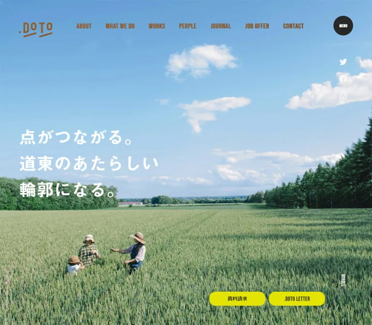
The visible photograph places three people low in a field beneath a very large sky. The horizon sits around the lower third of the image, creating a sense of place before introducing detailed content. On desktop, trees balance the right side while the people sit left of center. Mobile cropping preserves the people and distant horizon while removing much of the right-side woodland.
The source headline reads 点がつながる。 / 道東のあたらしい / 輪郭になる。. It has a measured three-line box and white Japanese display type. Both supplied current hero screenshots show the photograph without a visible headline. This discrepancy is unresolved: neither a delayed reveal nor permanent suppression was verified.
A vertical social rail has measured 24px icon boxes at y 164, 212, and 260 on desktop. It is absent from the mobile opening. The SCROLL link targets /#statement and combines small rotated-looking lettering with a long thin vertical line. Its measured overall box is approximately 56 × 155px on desktop and 30 × 145px on mobile. The destination is verified by the link; smooth scrolling is not.
Paired Yellow Actions
Anatomy: two equally sized rounded links, 10px apart, with dark centered labels.
資料請求points to the site's contact page..DOTO LETTERpoints to an external Google Forms URL.
Desktop instances measure 160 × 40px. Mobile navigation-panel instances measure 140 × 40px, matching the proportions visible in the mobile footer. Both use an 18px corner radius and #e3e304 fill. Japanese text is bold body sans-serif; the newsletter label uses the English display family.
In the desktop hero, the pair sits 55px above the bottom edge, leaving room at the right for the scroll cue. The mobile hero omits it. The actions return in the mobile footer as a centered 290px-wide group: 140px + 10px + 140px.
Keep these as compact utility destinations. Their color supplies emphasis without needing oversized typography, an enclosing panel, or a shadow.
Section Heading System
The measured STATEMENT and .DOTO KEYWORD headings are centered, uppercase, and set in the condensed display family. Their 100px desktop size becomes 40px on mobile, while tracking remains proportional at 0.04em.
Extracted content pairs several major English headings with Japanese subtitles, including 制作実績, 道東のイマ, and #道東ではたらく. Use the English title as the strong visual identifier and the Japanese line as the explanatory label.
The pale oversized WORKS lettering visible below the recruitment strip adds another scale of typography. Keep such lettering low contrast and visually subordinate to actionable content. If recreated as a duplicate label, mark the duplicate as decorative rather than exposing the same heading twice to assistive technology.
Statement
Confirmed structure: STATEMENT heading, photographic content, substantial Japanese statement copy, and a VIEW MORE link to About.
The section starts immediately after the full-height opening and uses measured #f8f8f8. On desktop, the paragraph occupies a 576px-wide right-side area at x 694. Its 26px type and 52px line-height make the statement read as a deliberate editorial declaration rather than small corporate body copy.
On mobile, the paragraph spans 351px between the 5vw gutters, using 18px type and 36px line-height. Its placement below the heading and earlier image content is consistent with a stacked presentation. Exact image dimensions were not supplied, so the desktop photo/text relationship and mobile image crop should not be assigned invented measurements.
The mobile VIEW MORE link has a measured 111.5 × 28px box and is centered. The desktop link occupies a 576 × 40px flex container aligned with the copy column; that width is the link's container, not evidence of a solid full-width button.
Keyword Field
Confirmed structure: .DOTO KEYWORD heading, explanatory copy, and numerous linked regional terms.
The page copy describes these as current social keywords and says the links open Twitter in an external window. The recorded destinations are hashtag-search URLs. This confirms the links' targets, but not a functioning live feed or the actual new-window behavior.
Keyword links use the Japanese display family at 40px desktop and 26px mobile, with a 1.5 line-height. Their computed foreground is white and their own background is transparent. No supplied screenshot shows the finished keyword composition, so the supporting background, outlines, clipping, and visible layering remain unresolved.
The extracted text repeats the keyword collection, and some link rectangles extend beyond the section's measured bounds. Do not reproduce these rectangles as ordinary page-flow geometry or infer a specific looping marquee. A moving or clipped parent could affect their appearance, but no such behavior was demonstrated.
Feature Announcements and Works Index
The DOM establishes a FEATURE area with dated announcements, titles, explanatory paragraphs, and destination links. Topics include recruitment, regional events, organizational direction, community participation, and publications. It contains six announcement entries in the supplied text.
The WORKS area contains five project entries with images, categories, dates, titles, and tags. The current subjects include training coordination, a tourism guidebook, branding, a tourism website, and a regional event.
Numbered markers occur around these sections. The works markers differ between desktop and mobile extraction: four on desktop and five on mobile. This suggests viewport-dependent grouping, but does not prove a particular carousel implementation, autoplay mode, drag interaction, or items-per-page setting. These sections' detailed visual layouts were not supplied; use their content anatomy without presenting a guessed composition as observed.
OFFER / REPORT Article Cards
Visible desktop anatomy: square-cornered image, metadata row, bold multiline Japanese title, and small hashtag-style labels.
Three cards form an even row inside approximately 72px side gutters. Their image boxes are about 415 × 286px, separated by approximately 26px. The first card uses a blue DOTO-NET illustration; the second uses a recruitment graphic with people and prominent embedded lettering; the third uses a photograph of three people outdoors.
Below each image, a small dark JOB OFFER capsule sits beside a light-gray date. The title begins after another clear gap and wraps naturally across approximately three lines. Tags form a quiet final row. There is no visible card border, background panel, drop shadow, or rounded image mask.
The three source images have different intrinsic aspect ratios, while their displayed boxes appear uniform. A common media ratio with controlled cropping is a suitable implementation approach. For images containing embedded text, review the crop separately rather than applying an arbitrary center crop to every asset.
Article targets include both internal pages and the separate recruitment website. Preserve destination semantics; a repeated visual card format does not imply every card belongs to the same URL family.
VIEW MORE Navigation Strip
The desktop recruitment group ends with a full-width pale band approximately 180px tall. A small condensed VIEW MORE label and an approximately 40px outlined circle containing a right chevron are centered as a single group.
The label and arrow are visually separate but should form one coherent link target. The circle has a fine dark outline and no fill contrast or shadow. This quiet transition leaves a substantial pause before the next section's oversized lettering.
The mobile statement example is smaller, with a 28px-high measured link box. Do not assume that every VIEW MORE instance shares a full-width pale background; the statement example sits within its own section layout.
Journal Index
The JOURNAL area includes six current entries in the supplied text, mixing PRESS RELEASE and JOURNAL categories. Each entry exposes an image, category/date metadata, a title, and tags, followed by a link to the journal index.
This is an ongoing editorial destination within the corporate homepage. The presence of press releases does not turn the page into a dedicated campaign landing page. Its exact card arrangement and typography were not captured; reusing the observed recruitment card vocabulary would be an adaptation recommendation.
Lower Site Directory
The mobile lower capture shows the bottom portion of a photographic navigation directory above CONTACT. White condensed labels and thin circular arrow outlines sit over a darkened photograph of people gathered indoors.
The mobile DOM gives this two-column reading order:
| Left | Right |
|---|---|
| ABOUT | JOURNAL |
| WHAT WE DO | JOB OFFER |
| WORKS | CONTACT |
| PEOPLE | PRESS RELEASE |
The screenshot shows only the directory's lower portion, so its complete height is unknown. Do not treat the clipped top edge of this capture as the component's actual beginning.
Desktop DOM evidence exposes bilingual category links, including image references for PEOPLE, JOURNAL, and PRESS RELEASE. The complete desktop directory composition is not visually covered.
Contact Banner
Anatomy: full-width dark linked region, centered CONTACT heading, small Japanese subtitle, and a short explanatory sentence.
The link points to /contact/. It is an invitation to a separate contact page, not an embedded form. Its source copy includes お問い合わせ and an explanation that work and interview inquiries are accepted here.
The visible band is approximately 434px tall on desktop and 323px on mobile. Desktop explanatory text stays on one line. Mobile uses two centered lines beneath a wider vertical gap. The heading appears around 48px on desktop and 40px on mobile, with much smaller supporting text.
The surface is almost black, the type is white, and generous empty space does the work. There is no additional yellow button inside this band; the paired yellow actions appear in the photographic footer below it.
Landscape Footer
A winter photograph closes the page: snow-covered ground, distant people and buildings, trees, and a broad mountain range. The image is substantially darkened so white identity, navigation, legal information, and social icons can sit on top.
On desktop, the footer includes a logo at upper left, a horizontal navigation row toward the upper right, the yellow action pair lower right, copyright and Privacy Policy at lower left, and three social icons at lower right. The visible photographic block is approximately 464px tall.
On mobile, the footer is approximately 302px tall. The action pair moves to the top center. Social icons sit near the lower left, above the copyright and privacy line. The desktop footer logo/navigation row is absent from this photographic block; the persistent header logo and MENU remain visible higher in the viewport.
Use background art direction that keeps the mountain ridge recognizable on a narrow screen. The original footer image URL and overlay opacity were not supplied.
Expanded Navigation Content — DOM Only
The extracted navigation panel contains six image-bearing category links, followed by CONTACT and PRESS RELEASE, the yellow action pair, social links, and legal information.
At 390px wide, the first six link rectangles form two columns of approximately 165px with a 21px gap inside a 351px content width. Each link rectangle is approximately 215px tall. CONTACT and PRESS RELEASE instead use full-width 351 × 50px rectangles.
These measurements document panel content layout, not an observed open-menu appearance. The panel's background, entry direction, scroll behavior, close state, keyboard behavior, and transition timing remain unverified. Keep this component distinct from the visible lower-page photographic directory.
Tokens — Motion & Interaction
Only viewport changes and page scrolling are evidenced by the supplied capture set. No hover, menu activation, carousel manipulation, keyboard sequence, or form interaction was supplied.
| Element or behavior | Evidence | What can be reused confidently |
|---|---|---|
| Yellow actions | background-color 0.4s cubic-bezier(0.165, 0.84, 0.44, 1) |
The property, duration, and easing are measured; the hover endpoint is unknown |
| Keyword links | transform 0.4s cubic-bezier(0.165, 0.84, 0.44, 1) |
A transform transition is declared; trigger and transform amount are unknown |
| Desktop navigation | Transition field lists transform, color, padding |
Property names only; no nonzero duration is supplied |
| SCROLL cue | Link destination is /#statement |
Anchor navigation; no verified smooth-scroll duration |
| Persistent header | Controls recur at consistent viewport positions in separated captures | Persistent placement is visually supported; exact scroll-state logic is unknown |
| Hero imagery | More than one image reference appears in the DOM | Multiple images exist; rotation, interval, and transition type are unverified |
| Hero text | Styled DOM heading, absent from opening screenshots | Preserve the visibility discrepancy; do not invent a reveal sequence |
| Feature/works markers | Numbered strings occur in extracted text | Numbered navigation content exists; paging behavior is unverified |
| MENU | Visible circular control and separate navigation content | The affordance and content exist; opening behavior is unverified |
Many sampled nodes report animation: none. This does not rule out JavaScript motion, parent transforms, pseudo-elements, or animations elsewhere in the page.
For an adaptation, the measured 400ms easing can guide restrained color changes. Any added image zoom, menu slide, carousel transition, or scroll reveal must be identified as new behavior. Essential content should remain available without animation.
Surfaces
| Layer | Appearance | Function |
|---|---|---|
| Opening | Full-bleed summer photograph | Establishes regional scale and human presence |
| Editorial canvas | White with dark text | Holds recruitment, project, and news content |
| Quiet section | Measured #f8f8f8 |
Gives statement content a distinct but subtle field |
| Navigation pause | Pale full-width band | Separates a content group from the next section |
| Contact | Near-black solid field | Gives a simple destination a strong closing presence |
| Directory and footer | Darkened photographs with white labels | Connects navigation to real people and place |
| Utility emphasis | Electric-yellow rounded links | Keeps request and newsletter destinations easy to locate |
No general elevation system is visible. Separate content using scale, space, imagery, and surface changes rather than adding shadows around every unit.
Imagery
The photographic direction is documentary and regional. The opening scene emphasizes sky and farmland, with people occupying a small portion of the frame. The footer answers it with a winter landscape. Together, they make geography and seasonality part of the identity rather than using photography as interchangeable decoration.
Content images are more varied: illustrations, recruitment graphics, group portraits, project documentation, and publication-related imagery. Preserve that variety inside a consistent editorial frame. Text embedded in an image belongs to the asset and should not be restyled as interface typography.
The source logo and social marks are SVG assets. The visible social set uses the Twitter bird, Facebook mark, and Instagram outline. Replacing a supplied mark with a different contemporary brand glyph would alter the observed appearance.
Observed Asset References
These are references exposed by the inspected homepage. They were not separately opened or downloaded during this analysis.
Theme image base: https://dotdoto.com/wp240711re/wp-content/themes/dotdoto/assets/img/
Upload base: https://dotdoto.com/wp240711re/wp-content/uploads/
| Asset | Base and relative path | Evidence / use |
|---|---|---|
| Wordmark | Theme: common/logo.svg |
Header and desktop footer identity |
| First hero image | Theme: fv/top--01.jpg |
Hero image reference in DOM; corresponds to the opening landscape context |
| Statement image | Theme: state__slide--01.jpg |
Statement media reference; complete presentation not captured |
| Menu thumbnails | Theme: header/thumb__about--sp.png, header/thumb__whatwedo--sp.png, header/thumb__works--sp.png |
First three image-bearing navigation entries |
| Menu thumbnails | Theme: header/thumb__people--sp.png, header/thumb__journal--sp.png, header/thumb__joboffer--sp.png |
Remaining image-bearing navigation entries |
| Lower directory images | Theme: menu__people.jpg, menu__journal.jpg, menu__pressrelease.jpg |
Referenced by lower navigation links |
| Social marks | Theme: common/icon__twitter.svg, common/icon__facebook.svg, common/icon__instagram.svg |
Hero, menu, and footer social destinations |
| DOTO-NET recruitment illustration | Upload: 2026/03/supprtstaff_recruit.png |
First visible recruitment card; intrinsic 1300 × 853 |
| Recruitment composite | Upload: 2026/03/shakewo_2603.jpg |
Second visible recruitment card; intrinsic 1280 × 670 |
| Outdoor group photograph | Upload: 2025/08/DSC09413-1536x1024-1.jpg |
Third visible recruitment card; intrinsic 1536 × 1024 |
The spelling supprtstaff_recruit.png follows the supplied path. No footer photograph path is invented here. A second hero image reference is truncated in the evidence and is therefore not expanded into a guessed URL.
Layout & Responsive Behavior
Desktop Composition
At 1440px wide, the page uses approximately 5vw side gutters while letting major photographs and section backgrounds reach the viewport edges. The recruitment grid occupies the resulting 1296px content width. Its three equal columns balance imagery and long Japanese titles without enclosing them in raised cards.
The header leaves a substantial gap between the small logo and right-aligned navigation. The opening action group sits lower right, and the social rail sits near the right edge below MENU. These controls frame the landscape instead of forming a central stack.
Large section headings and generous vertical gaps establish an editorial rhythm across the long page. The statement's 120px top padding and the keyword section's 330px top padding are measured local choices; they should not become indiscriminate padding on every section.
Mobile Composition
| Element | Observed change at 390px |
|---|---|
| Header | Full navigation row removed; logo shrinks from 95px to 70px; circular MENU remains |
| Hero | Still fills the viewport; photograph is cropped to retain people and horizon |
| Hero actions and social rail | Not visible |
| Scroll cue | Retained, with smaller text and a narrower overall box |
| DOM hero heading | 50px becomes 35px; left inset changes from 5vw to 10vw |
| Measured section headings | 100px becomes 40px |
| Statement copy | Right-side 576px desktop column becomes a 351px mobile text width |
| Statement type | 26px / 52px becomes 18px / 36px |
| Lower directory | Two columns of English links over a photograph |
| Contact copy | Supporting sentence wraps into two centered lines |
| Footer | Action pair centered above social and legal content; desktop logo/navigation row absent |
The page does not shrink uniformly. Different components change size at different rates, and some desktop utilities disappear while reappearing lower in the page.
No tablet viewport or actual media-query threshold was supplied. The Quick Start proposes a 64rem navigation breakpoint and a 48rem compact-layout breakpoint. Its two-column intermediate article grid and one-column mobile article grid are recommendations, because the mobile article arrangement is not visually covered.
Use focal-point adjustments or an appropriate mobile image source for the hero. A mobile focal point near the left quarter is a reasonable starting recommendation for this composition, but the exact object-position cannot be recovered without the source image dimensions and source crop rules.
Do’s and Don’ts
Do
- Let the regional photographs occupy large uninterrupted areas.
- Preserve the relationship between small human figures and expansive landscape.
- Use the measured electric yellow
#e3e304for the paired utility actions. - Pair narrow English display lettering with substantial Japanese Gothic copy.
- Preserve square image edges and the flat article-card treatment.
- Keep 5vw outer gutters as a useful rule supported by both inspected widths.
- Use generous line-height for the statement: the measured value is twice the font size.
- Retain the written MENU label inside a dark circle.
- Keep the mobile footer's centered action pair and left-aligned social/legal information.
- Distinguish screenshot visibility from DOM presence, especially for hero text and menu content.
Don’t
- Don’t compress the homepage into a single-purpose campaign funnel.
- Don’t replace the quiet editorial grid with rounded, shadowed panels.
- Don’t turn every category, tag, and section title yellow.
- Don’t substitute a generic office photograph for the landscape-driven opening.
- Don’t use the logo container's font declarations to redraw the SVG wordmark.
- Don’t force the desktop navigation or hero action pair into the mobile opening.
- Don’t treat repeated keyword strings as proof of a particular marquee animation.
- Don’t invent autoplay, parallax, menu timing, or hover transforms.
- Don’t infer visible brand colors from unused CMS presets.
- Don’t describe unseen mobile article or feature layouts as measured behavior.
Recommended Implementation Additions
These are proposed improvements, not verified features of the original site:
- Give the linked logo an accessible name. The supplied image references show empty alt attributes, but surrounding accessible labels were not provided.
- Implement MENU as a button with an expanded state and a relationship to its navigation region. If the expanded presentation is modal, add appropriate focus management and Escape behavior.
- Keep meaningful hero text available when fonts or scripts fail. Do not require an unverified animation to reveal essential introductory copy.
- Increase small tag text from the visually estimated 10px where readability requires it. Preserve the hierarchy with spacing and color rather than extreme reduction.
- Use a darker utility gray for small dates and secondary text when needed for contrast. The measured
#a7a7a7should not automatically become the color of every small label. - Provide comfortable pointer targets around small social icons and arrow circles without enlarging the visible artwork unnecessarily.
- If duplicated labels or keyword groups are used decoratively, prevent duplicate keyboard stops and repeated screen-reader announcements.
- If image rotation or a carousel is added, provide manual controls, a pause mechanism when appropriate, and a reduced-motion mode.
- Reserve media dimensions, prioritize the opening photograph, and defer lower-page images to reduce layout shifts and unnecessary initial loading.
- Verify navigation and text contrast over each photographic crop, including the mobile crop.
Agent Prompt Guide
Quick Color Reference
- Editorial canvas:
#ffffff. - Quiet statement surface:
#f8f8f8. - Main text and yellow-action labels:
#282828. - Request and newsletter links:
#e3e304. - Contact surface: approximately
#242424, a visual estimate. - Photography: natural sky blue, field green, and winter blue-gray; these are image colors.
- Footer treatment: darkened photography with white content; exact scrim opacity unknown.
Overall Prompt
“Create a corporate and editorial homepage inspired by the current .DOTO reference. Open with a full-viewport documentary landscape showing a few people within a wide sky and field. Use a small SVG identity at upper left, condensed English navigation on desktop, and a dark circular MENU control that remains on mobile. Build the content with white and very pale gray surfaces, dark text, large condensed English section headings, substantial Japanese Gothic copy, square photographs, and flat article grids. Reserve electric yellow #e3e304 for a compact pair of request and newsletter links. Finish with a spacious charcoal contact band and a darkened winter-landscape footer. Preserve the distinction between visually confirmed components and DOM-only sections. Do not invent a hero reveal, autoplay, or a menu transition.”
Example Component Prompts
- Opening photograph: “Create an edge-to-edge, viewport-height landscape opening. At 1440px wide, place a 95px wordmark 72px from the left and 64px from the top. Add a 56px dark MENU circle near the upper-right corner, a slim social rail, and two 160 × 40px yellow links at lower right. On a 390px phone, use a 70px logo, a 50px MENU circle, and a crop that keeps the people visible; omit the hero action pair and social rail. The current captured hero has no visible headline; document the separately measured DOM headline instead of inventing its animation.”
- Recruitment cards: “Build three unboxed editorial cards within a 90%-wide desktop container. Use approximately 26px gaps and 415 × 286px square-cornered image windows at a 1440px viewport. Under each image, place a small dark JOB OFFER capsule, a quiet date, a bold multiline Japanese title, and small plain tags. No card shadow or enclosing border. Treat the mobile arrangement as a new responsive choice.”
- Statement typography: “Use a #f8f8f8 section with a centered Bebas Neue heading at 100px on desktop and 40px on mobile. Set Japanese statement copy in the supplied display family at 26px/52px desktop and 18px/36px mobile. Preserve broad whitespace and a quiet VIEW MORE link. Do not invent exact photo dimensions absent from the evidence.”
- Contact and footer: “Create a centered white CONTACT heading and short Japanese supporting copy in a near-black band. Follow it with a darkened winter landscape. On desktop, distribute logo, navigation, yellow actions, legal text, and social icons across the footer. On mobile, center two 140 × 40px yellow actions at the top and place social icons above the legal row at lower left.”
- Section exit link: “Center a small condensed VIEW MORE label beside a thin 40px outlined circle with a right chevron. Place the group in a pale, spacious desktop band, with no elevation effect. Make the label and circle one accessible link target.”
Quick Start
CSS Custom Properties
This is an adaptation starter for the confirmed visual vocabulary, not a recovered source stylesheet. Exact measured colors, font declarations, type sizes, and action dimensions are combined with clearly marked recommendations. It covers a persistent header, full-height hero, article grid, section typography, contact band, and photographic footer.
Load the declared webfonts separately; font-family declarations alone do not fetch them. Use the original SVG or an appropriate authorized variant for the wordmark. An external SVG image does not automatically inherit the header's text color.
The starter displays the DOM-confirmed hero heading as a readable baseline if that element is included. This is a recommended implementation choice, not a claim that the heading appeared in the captured opening frame. No speculative reveal animation is included.
:root {
  /* Measured colors */
  --doto-white: #ffffff;
  --doto-soft: #f8f8f8;
  --doto-ink: #282828;
  --doto-accent: #e3e304;
  --doto-muted: #a7a7a7;

  /* Visual estimate and recommended accessibility adjustment */
  --doto-contact: #242424;
  --doto-meta-readable: #737373;
  --doto-photo-scrim: rgb(0 0 0 / 60%);

  /* Source-declared family identifiers */
  --doto-font-en: 'bebas-neue', sans-serif;
  --doto-font-display: 'a-otf-midashi-go-mb31-pr6n', sans-serif;
  --doto-font-body: 'Hiragino Kaku Gothic ProN',
    'Hiragino Sans', noto-sans, sans-serif;

  /* Measured endpoint sizes */
  --doto-body-size: 14px;
  --doto-section-size: 100px;
  --doto-hero-size: 50px;
  --doto-statement-size: 26px;
  --doto-action-width: 160px;
  --doto-action-height: 40px;
  --doto-action-radius: 18px;

  /* Geometry: gutter derived; grid gap visually estimated */
  --doto-gutter: 5vw;
  --doto-grid-gap: 26px;
  --doto-nav-gap: 40px;
  --doto-hero-focus: 50% 50%;

  /* Measured action transition */
  --doto-duration: 400ms;
  --doto-ease: cubic-bezier(0.165, 0.84, 0.44, 1);
}

* { box-sizing: border-box; }

body {
  margin: 0;
  color: var(--doto-ink);
  background: var(--doto-white);
  font-family: var(--doto-font-body);
  font-size: var(--doto-body-size);
  line-height: 1.7; /* Recommended reading baseline */
}

img { display: block; max-width: 100%; }
a { color: inherit; }
button { font: inherit; }

.doto-container {
  width: calc(100% - 2 * var(--doto-gutter));
  margin-inline: auto;
}

.doto-header {
  position: fixed;
  inset: 0 0 auto;
  z-index: 30;
  color: var(--doto-white);
  pointer-events: none;
}

.doto-header > * { pointer-events: auto; }

/* Recommended explicit contrast state; source mechanism unknown */
.doto-header[data-tone='ink'] { color: var(--doto-ink); }

.doto-brand {
  position: absolute;
  top: 64px;
  left: var(--doto-gutter);
  width: 95px;
}

.doto-brand img { width: 100%; height: auto; }

.doto-nav {
  position: absolute;
  top: 64px;
  right: calc(var(--doto-gutter) + 140px);
  display: flex;
  gap: var(--doto-nav-gap);
}

.doto-nav a {
  padding-bottom: 38px;
  font: 400 20px/1 var(--doto-font-en);
  letter-spacing: 0.04em;
  text-decoration: none;
  white-space: nowrap;
}

.doto-menu {
  position: absolute;
  top: 45px;
  right: var(--doto-gutter);
  display: grid;
  place-items: center;
  width: 56px;
  height: 56px;
  padding: 0;
  border: 0;
  border-radius: 50%;
  color: var(--doto-white);
  background: var(--doto-ink);
  font: 400 12px/1 var(--doto-font-en);
  cursor: pointer;
}

.doto-hero {
  position: relative;
  isolation: isolate;
  min-height: 100vh;
  min-height: 100svh; /* Recommended stable mobile viewport unit */
  color: var(--doto-white);
}

.doto-hero__media {
  position: absolute;
  inset: 0;
  z-index: -1;
  width: 100%;
  height: 100%;
  object-fit: cover;
  object-position: var(--doto-hero-focus);
}

.doto-hero__title {
  position: absolute;
  top: 50%;
  left: var(--doto-gutter);
  width: min(400px, 80vw);
  margin: 0;
  transform: translateY(-50%);
  font: 600 var(--doto-hero-size)/1.5 var(--doto-font-display);
}

.doto-actions { display: flex; gap: 10px; }

.doto-action {
  display: inline-flex;
  align-items: center;
  justify-content: center;
  flex: 0 0 auto;
  width: var(--doto-action-width);
  min-height: var(--doto-action-height);
  padding-inline: 10px;
  border-radius: var(--doto-action-radius);
  color: var(--doto-ink);
  background: var(--doto-accent);
  font: 700 14px/1.2 var(--doto-font-body);
  text-decoration: none;
  transition: background-color var(--doto-duration) var(--doto-ease);
}

.doto-action--en {
  font: 400 16px/1.2 var(--doto-font-en);
  letter-spacing: 0.04em;
}

.doto-hero__actions {
  position: absolute;
  right: calc(var(--doto-gutter) + 80px);
  bottom: 55px;
}

.doto-socials { display: flex; gap: 16px; }
.doto-socials img { width: 20px; height: 20px; }

.doto-hero__socials {
  position: absolute;
  top: 164px;
  right: calc(var(--doto-gutter) + 16px);
  flex-direction: column;
  gap: 24px;
}

.doto-hero__socials img { width: 24px; height: 24px; }

.doto-scroll {
  position: absolute;
  right: var(--doto-gutter);
  bottom: 0;
  display: flex;
  align-items: center;
  flex-direction: column;
  gap: 10px;
  width: 56px;
  padding-top: 10px;
  text-decoration: none;
  font: 400 14px/1 var(--doto-font-en);
  letter-spacing: 0.04em;
}

.doto-scroll span { writing-mode: vertical-rl; }
.doto-scroll::after {
  content: '';
  width: 1px;
  height: 110px;
  background: currentColor;
}

.doto-section-title {
  margin: 0;
  text-align: center;
  font: 400 var(--doto-section-size)/1 var(--doto-font-en);
  letter-spacing: 0.04em;
}

.doto-section-subtitle {
  margin: 10px 0 0;
  text-align: center;
}

.doto-statement {
  padding-block: 120px 130px;
  background: var(--doto-soft);
}

.doto-statement__copy {
  max-width: 576px;
  font: 600 var(--doto-statement-size)/2 var(--doto-font-display);
}

/* Card dimensions and typography approximate the desktop capture. */
.doto-article-grid {
  display: grid;
  grid-template-columns: repeat(3, minmax(0, 1fr));
  gap: 48px var(--doto-grid-gap);
}

.doto-article { min-width: 0; }
.doto-article__link { text-decoration: none; }

.doto-article__image {
  width: 100%;
  aspect-ratio: 415 / 286;
  object-fit: cover;
  border-radius: 0;
}

.doto-article__meta {
  display: flex;
  align-items: center;
  flex-wrap: wrap;
  gap: 14px;
  margin-top: 24px;
  color: var(--doto-meta-readable);
  font-size: 14px;
  line-height: 18px;
}

.doto-category {
  padding-inline: 14px;
  border-radius: 9px;
  color: var(--doto-white);
  background: var(--doto-ink);
  font-size: 12px;
  line-height: 18px;
}

.doto-article__title {
  margin: 20px 0;
  font: 600 24px/1.4 var(--doto-font-display);
  overflow-wrap: anywhere;
}

.doto-article__tags {
  display: flex;
  flex-wrap: wrap;
  gap: 6px 16px;
  font-size: 12px; /* Recommended increase from the visual estimate */
}

.doto-more-band {
  display: grid;
  place-items: center;
  min-height: 180px;
  background: var(--doto-soft);
}

.doto-more {
  display: inline-flex;
  align-items: center;
  gap: 24px;
  min-height: 44px;
  font: 400 16px/1 var(--doto-font-en);
  text-decoration: none;
}

.doto-more__circle {
  display: grid;
  place-items: center;
  width: 40px;
  height: 40px;
  border: 1px solid currentColor;
  border-radius: 50%;
}

.doto-more__circle::after {
  content: '';
  width: 6px;
  height: 6px;
  border-top: 1px solid currentColor;
  border-right: 1px solid currentColor;
  transform: rotate(45deg);
}

.doto-contact {
  display: flex;
  align-items: center;
  justify-content: center;
  min-height: 434px;
  padding: 80px var(--doto-gutter);
  color: var(--doto-white);
  background: var(--doto-contact);
  text-align: center;
  text-decoration: none;
}

.doto-contact__title {
  margin: 0;
  font: 400 48px/1 var(--doto-font-en);
}

.doto-contact__subtitle { margin: 8px 0 0; }
.doto-contact__copy { margin: 34px 0 0; line-height: 1.9; }

/* Supply a footer image; scrim strength is a recommendation. */
.doto-footer { position: relative; isolation: isolate; color: white; }
.doto-footer__media {
  position: absolute;
  inset: 0;
  z-index: -2;
  width: 100%;
  height: 100%;
  object-fit: cover;
}

.doto-footer::before {
  content: '';
  position: absolute;
  inset: 0;
  z-index: -1;
  background: var(--doto-photo-scrim);
}

.doto-footer__inner {
  display: flex;
  flex-direction: column;
  min-height: 464px;
  padding: 72px var(--doto-gutter) 50px;
}

.doto-footer__top,
.doto-footer__bottom {
  display: flex;
  align-items: center;
  justify-content: space-between;
  gap: 24px;
}

.doto-footer__brand { width: 95px; }
.doto-footer__nav { display: flex; gap: 32px; }
.doto-footer__nav a {
  font: 400 18px/1 var(--doto-font-en);
  text-decoration: none;
}

.doto-footer__actions {
  align-self: flex-end;
  margin-top: auto;
  margin-bottom: 50px;
}

.doto-footer__legal { display: flex; flex-wrap: wrap; gap: 12px 40px; }
.doto-footer__legal a { text-decoration: none; }

/* Recommended feedback; original hover endpoint was not captured. */
@media (hover: hover) {
  .doto-action:hover { background: var(--doto-white); }
  .doto-nav a:hover { text-decoration: underline; text-underline-offset: 5px; }
}

:where(a, button):focus-visible {
  outline: 2px solid currentColor;
  outline-offset: 4px;
}

#statement { scroll-margin-top: 100px; }

/* Proposed breakpoint, not recovered from source CSS. */
@media (max-width: 64rem) {
  .doto-nav,
  .doto-footer__nav { display: none; }
  .doto-article-grid { grid-template-columns: repeat(2, minmax(0, 1fr)); }
}

/* Proposed compact layout; endpoint values match supplied evidence. */
@media (max-width: 48rem) {
  :root {
    --doto-body-size: 12px;
    --doto-section-size: 40px;
    --doto-hero-size: 35px;
    --doto-statement-size: 18px;
    --doto-action-width: 140px;
    --doto-hero-focus: 25% 50%; /* Starting crop; verify per asset */
  }

  .doto-brand { top: 29.5px; width: 70px; }
  .doto-menu { top: 20px; width: 50px; height: 50px; }
  .doto-hero__title { left: 10vw; width: min(280px, 80vw); }
  .doto-hero__actions,
  .doto-hero__socials { display: none; }
  .doto-scroll { width: 30px; font-size: 10px; }
  .doto-action:not(.doto-action--en) { font-size: 13px; }
  .doto-statement { padding-block: 50px 46px; }
  .doto-statement__copy { max-width: none; }

  /* Recommended article reflow; mobile cards were not captured. */
  .doto-article-grid { grid-template-columns: minmax(0, 1fr); }
  .doto-article__title { font-size: 20px; }
  .doto-more__circle { width: 28px; height: 28px; }
  .doto-contact { min-height: 323px; padding-block: 70px; }
  .doto-contact__title { font-size: 40px; }
  .doto-contact__copy { max-width: 25em; margin-inline: auto; }
  .doto-footer__inner { min-height: 302px; padding-block: 40px 28px; }
  .doto-footer__top { display: none; }
  .doto-footer__actions { align-self: center; margin: 0; }
  .doto-footer__bottom {
    flex-direction: column-reverse;
    align-items: flex-start;
    gap: 20px;
    margin-top: auto;
  }
  .doto-footer__legal { gap: 12px 20px; }
}

/* Recommended support for the transitions defined in this starter. */
@media (prefers-reduced-motion: reduce) {
  .doto-action { transition: none; }
}
Use a semantic heading inside .doto-hero__title if the headline variant is included, with explicit line breaks matching the source copy. Put the article image, metadata, and title within a coherent article link; do not nest additional links inside that anchor. The footer bottom-row rules expect legal content first and the social group second in the markup.
The stylesheet does not implement MENU activation, feature paging, a keyword animation, or image rotation. Those behaviors require separate decisions and testing because the supplied evidence does not establish their details.
Tailwind v4 Token Mapping
Optional mapping for a project already using Tailwind v4. This is an implementation convenience, not evidence that the original website uses Tailwind. Define the custom properties above first.
@theme inline {
  --color-doto-ink: var(--doto-ink);
  --color-doto-accent: var(--doto-accent);
  --color-doto-soft: var(--doto-soft);
  --color-doto-contact: var(--doto-contact);
  --color-doto-muted: var(--doto-muted);

  --font-doto-en: var(--doto-font-en);
  --font-doto-display: var(--doto-font-display);
  --font-doto-body: var(--doto-font-body);

  --text-doto-section: var(--doto-section-size);
  --text-doto-hero: var(--doto-hero-size);
  --text-doto-statement: var(--doto-statement-size);

  --spacing-doto-gutter: var(--doto-gutter);
  --spacing-doto-grid: var(--doto-grid-gap);
  --radius-doto-action: var(--doto-action-radius);
}
Sources & Evidence
- Inspected original and final website: https://dotdoto.com/. The supplied response status is HTTP 200, with no change between original and final URL. The document title identifies
.DOTOand一般社団法人ドット道東. - Capture record: supplied retrieval timestamp
2026-10-04T21:03:22.514Z; desktop viewport 1440 × 1000 and mobile viewport 390 × 844. Recorded document heights are approximately 11896.17px and 8241.03px. - Visual evidence: three desktop captures show the opening, recruitment cards, and contact/footer area. Two mobile captures show the opening and lower directory/contact/footer area. Approximate screenshot dimensions in this document are explicitly labeled as visual estimates.
- Rendered evidence: supplied text, link destinations, image references, element rectangles, and computed styles establish the typography, action colors and dimensions, statement spacing, keyword styles, and responsive endpoint measurements. The element sample is extensive near the header and early sections but does not provide detailed computed styles for every later component.
- Observed navigation scope: page scrolling and desktop/mobile rendering are documented. Link destinations were read from the supplied evidence; their destination pages were not separately visited. No additional browsing, commands, or file inspection were performed for this reference.
- Readiness limitations: the supplied capture procedure waited for load, visible image decoding, finite animations, and sampled layout/text stability within bounded time limits. Perpetual animations were paused during readiness checks and resumed. These checks do not establish semantic completeness or reveal every interaction. SharedWorkers and service workers were disabled during inspection.
- Unresolved states: the DOM-defined hero headline is absent from the opening screenshots; the expanded menu was not visually opened; hover endpoints, carousel controls, animation sequencing, exact breakpoints, and footer overlay values were not verified.
This reference describes the current homepage evidence. The CSS and agent prompts provide a reusable adaptation while keeping measured facts, visual estimates, and proposed implementation choices distinct.
# .DOTO / Dot Doto — Style Reference

> Wide Hokkaido landscapes, condensed editorial lettering, and small flashes of electric yellow.

**Original URL:** [https://dotdoto.com/](https://dotdoto.com/)
**Final URL:** [https://dotdoto.com/](https://dotdoto.com/)
**Theme:** predominantly white editorial sections, with a charcoal contact band and a darkened photographic footer.
**Inspected:** October 5, 2026, Japan Standard Time. The supplied retrieval timestamp is October 4, 2026, at 21:03:22.514 UTC, equivalent to October 5 at 06:03:22.514 JST.
**Viewports:** desktop 1440 × 1000 CSS pixels; mobile 390 × 844 CSS pixels.
**Scope:** the current homepage, using three desktop captures, two mobile captures, extracted page content, link destinations, element rectangles, and computed styles. Visual coverage includes the opening photograph, desktop recruitment cards, and the lower directory/contact/footer area. Other homepage sections have DOM evidence of varying detail. Destination pages and an opened MENU state were not inspected.

.DOTO presents a regional organization through landscape, people, publications, recruitment, and project work. It is a corporate and editorial homepage with multiple destinations. The long page moves from an expansive photographic opening into a statement, regional keywords, featured announcements, job opportunities, works, and journal content before closing with contact information.

The visual identity depends on three relationships: small people within a large landscape, narrow English display lettering beside substantial Japanese copy, and compact yellow actions within generous neutral space. The interface remains mostly flat. Photographs, typography, section backgrounds, and whitespace create the hierarchy; rounded containers and shadows do not dominate it.
閉じる
# .DOTO / Dot Doto — Style Reference

> Wide Hokkaido landscapes, condensed editorial lettering, and small flashes of electric yellow.

**Original URL:** [https://dotdoto.com/](https://dotdoto.com/)
**Final URL:** [https://dotdoto.com/](https://dotdoto.com/)
**Theme:** predominantly white editorial sections, with a charcoal contact band and a darkened photographic footer.
**Inspected:** October 5, 2026, Japan Standard Time. The supplied retrieval timestamp is October 4, 2026, at 21:03:22.514 UTC, equivalent to October 5 at 06:03:22.514 JST.
**Viewports:** desktop 1440 × 1000 CSS pixels; mobile 390 × 844 CSS pixels.
**Scope:** the current homepage, using three desktop captures, two mobile captures, extracted page content, link destinations, element rectangles, and computed styles. Visual coverage includes the opening photograph, desktop recruitment cards, and the lower directory/contact/footer area. Other homepage sections have DOM evidence of varying detail. Destination pages and an opened MENU state were not inspected.

.DOTO presents a regional organization through landscape, people, publications, recruitment, and project work. It is a corporate and editorial homepage with multiple destinations. The long page moves from an expansive photographic opening into a statement, regional keywords, featured announcements, job opportunities, works, and journal content before closing with contact information.

The visual identity depends on three relationships: small people within a large landscape, narrow English display lettering beside substantial Japanese copy, and compact yellow actions within generous neutral space. The interface remains mostly flat. Photographs, typography, section backgrounds, and whitespace create the hierarchy; rounded containers and shadows do not dominate it.

## How to Read This Reference

- **Measured** means supplied DOM rectangles or computed-style values. These describe the sampled element and state, not necessarily every instance of a component.
- **Visual estimate** means an approximate reading of the supplied current-page screenshots. These values were not obtained through programmatic pixel sampling.
- **Derived** means arithmetic from measured values, such as a 72px gutter being 5% of a 1440px viewport.
- **Recommended** means a proposed implementation decision. Breakpoints, unobserved hover endpoints, accessibility improvements, and parts of the CSS starter belong to this category.
- Token names beginning with `--doto-` are implementation aliases created for this reference. They are not claimed to be original source variables.
- A DOM rectangle does not establish visibility. The extracted navigation panel has measurable children although no supplied capture shows it open.
- The hero headline is present and styled in the DOM but is not visibly painted in either supplied opening capture. Its visibility mechanism, timing, and cause remain unverified.

## Tokens — Colors

### Default Palette

| Name | Value | Suggested token | Role and evidence |
| --- | --- | --- | --- |
| White | `#ffffff` | `--doto-white` | Measured main background and initial navigation/headline text color; visible editorial canvas |
| Soft Gray | `#f8f8f8` | `--doto-soft` | Measured STATEMENT background; a similar pale surface appears behind the desktop VIEW MORE strip |
| Charcoal Ink | `#282828` | `--doto-ink` | Measured body text and yellow-action text; visually consistent with dark utility controls |
| Electric Yellow | `#e3e304` | `--doto-accent` | Measured action background, RGB 227, 227, 4 |
| Secondary Gray | `#a7a7a7` | `--doto-muted` | Measured secondary navigation-panel text; that panel was not visually opened |
| Contact Charcoal | Approximately `#242424` | `--doto-contact` | Visual estimate of the broad contact surface; its exact computed background was not supplied |
| Photographic Scrim | Dark translucent overlay; opacity unknown | `--doto-photo-scrim` | Visible darkening of the winter footer and mobile directory photograph; implementation and opacity unmeasured |

The blue sky, green fields, dark trees, and blue-gray winter mountains supply most of the page's visible color area. They belong to the photographs rather than a large collection of UI swatches. Keep the interface palette restrained so these seasonal colors remain meaningful.

Electric Yellow appears in the paired links labeled `資料請求` and `.DOTO LETTER`. Their dark text distinguishes them from the reversed white navigation and footer labels. Avoid extending the yellow to every card, category, or heading.

Generic CMS and library color presets appear in the custom-property evidence. Their presence does not establish that the homepage visibly uses those gradients, shadows, or accent colors; they are excluded from the palette above.

### Theme Presets

No selectable theme system is evidenced. White editorial sections, dark contact content, and photographic backgrounds are different page surfaces within one visual system.

## Tokens — Typography

### English Display and Navigation

- **Measured family:** `bebas-neue, sans-serif`.
- **Measured weight:** `400`.
- **Character:** tall, narrow uppercase lettering with compact word widths and strong vertical strokes.
- **Roles:** primary navigation, major English section headings, `.DOTO LETTER`, and the scroll cue.
- **Measured tracking:** usually `0.04em`, expressed as 0.8px at 20px, 4px at 100px, and 1.6px at 40px.

The condensed family lets a seven-item desktop navigation remain compact and makes short section labels substantial without requiring broad horizontal blocks. Do not approximate this relationship by horizontally distorting an ordinary sans-serif.

### Japanese Display Copy

- **Measured family:** `a-otf-midashi-go-mb31-pr6n, sans-serif`.
- **Measured weight:** `600`.
- **Confirmed roles:** hero headline, statement paragraph, and keyword links.
- **Character:** dense Gothic forms with enough weight to hold their own beside the condensed English headings.

Use the supplied family identifier when the font is available through an appropriate font-loading setup. The computed family list is evidence of the declaration; a separate resolved-font report was not supplied.

### Body and Utility Text

The computed body stack includes `Hiragino Kaku Gothic ProN`, `Hiragino Sans`, Japanese aliases for those families, `noto-sans`, and `sans-serif`. The English-named entries are sufficient for the adaptation below; they should not be mistaken for proof that a particular fallback rendered every character.

Body defaults are 14px on desktop and 12px on mobile, both with a measured line-height equal to their font size. Individual content components override those defaults. In particular, the statement uses a spacious `2` line-height. Do not apply the body's tight inherited line-height to long paragraphs in a new implementation.

### Type Scale

| Role | Desktop | Mobile | Family / weight | Evidence |
| --- | --- | --- | --- | --- |
| Base body | 14px / 14px | 12px / 12px | Body stack / 400 | Measured defaults |
| Primary desktop navigation | 20px / 20px; 0.8px tracking | Not visible | `bebas-neue` / 400 | Measured desktop |
| Hero headline | 50px / 75px | 35px / 52.5px | Japanese display / 600 | Measured DOM; absent from opening screenshots |
| STATEMENT and .DOTO KEYWORD headings | 100px / 100px; 4px tracking | 40px / 40px; 1.6px tracking | `bebas-neue` / 400 | Measured |
| Statement paragraph | 26px / 52px | 18px / 36px | Japanese display / 600 | Measured |
| Keyword links | 40px / 60px | 26px / 39px | Japanese display / 600 | Measured; composite appearance not captured |
| `資料請求` action | 14px / 36px | 13px / 36px | Body stack / 700 | Measured |
| `.DOTO LETTER` action | 16px / 36px; 0.64px tracking | Same | `bebas-neue` / 400 | Measured |
| SCROLL | 14px / 14px; 0.56px tracking | 10px / 10px; 0.4px tracking | `bebas-neue` / 400 | Measured |
| Navigation-panel Privacy Policy | 12px / 12px | 12px / 12px | Body stack / 400 | Measured panel content |
| Recruitment card title | Approximately 24px / 32–34px | Not captured | Bold Japanese Gothic appearance | Visual estimate; exact card family unmeasured |
| Recruitment metadata | Approximately 12–14px | Not captured | Regular sans-serif appearance | Visual estimate |
| Recruitment tags | Approximately 10px | Not captured | Small sans-serif appearance | Visual estimate |
| CONTACT heading | Approximately 48px | Approximately 40px | Condensed English appearance | Visual estimate |

The root font size is measured at 10px in both viewports. The Quick Start uses explicit pixels and conventional rem-based breakpoints so it can be integrated without changing the host application's root size.

### Logo and Decorative Lettering

The `.DOTO` wordmark is an SVG asset, including its distinctive angled underline strokes. Its enclosing H1 has font declarations, but those declarations do not describe the rendered logo artwork.

A very large, pale `WORKS` word is partially visible beneath the recruitment section. Treat it as a background-scale typographic device separate from the measured 100px section heading. Its exact size and positioning were not supplied. Other repeated heading strings in the DOM may support decorative duplicates, but repetition alone does not prove that all headings use an identical visual treatment.

## Tokens — Spacing & Shapes

The page combines a consistent outer inset with much larger section spacing. Small controls remain compact even when the surrounding photograph or whitespace is expansive.

### Spacing Scale

| Use | Value | Evidence |
| --- | --- | --- |
| Main horizontal gutter | 72px desktop; 19.5px mobile | Measured logo positions; both equal 5vw |
| Mobile hero-copy inset | 39px | Measured DOM; equals 10vw |
| Desktop navigation gap | 40px | Derived from consecutive measured link rectangles |
| Paired action gap | 10px | Derived from measured action rectangles |
| Desktop article-column gap | Approximately 26px | Visual estimate |
| Article image to metadata | Approximately 24px | Visual estimate |
| Metadata to article title | Approximately 20–26px | Visual estimate |
| Small social-icon gap | 16px | Derived from measured 20px panel icons at 36px intervals |
| Hero social-icon gap | 24px | Derived from measured 24px icons at 48px intervals |
| Statement vertical padding | 120px top, 130px bottom | Measured desktop |
| Statement vertical padding | 50px top, 46px bottom | Measured mobile |
| Keyword section top padding | 330px desktop; 170px mobile | Measured; section-specific spacing |
| Desktop VIEW MORE strip | Approximately 180px tall | Visual estimate |

These values do not establish a universal 8px spacing grid. Preserve the particular balance between 10px action gaps, 40px navigation spacing, 5vw page gutters, and large section pauses.

### Border Radius

| Element | Shape | Evidence |
| --- | --- | --- |
| Photographic article images | Square corners | Visible |
| Article containers | Unboxed; no visible corner treatment | Visible |
| Yellow actions | 18px radius | Measured on 40px-high links |
| MENU control | Circle | Visible; approximately 56px desktop and 50px mobile |
| VIEW MORE arrow | Thin outlined circle | Visible; approximately 40px desktop |
| JOB OFFER category label | Small capsule | Visible; approximately 18px high |
| Major section surfaces | Full-width rectangular bands | Visible |

### Layout Measurements

| Element | Desktop 1440 × 1000 | Mobile 390 × 844 | Evidence |
| --- | --- | --- | --- |
| Document height | 11896.17px | 8241.03px | Measured |
| Opening viewport | Photograph fills 1440 × 1000 | Photograph fills 390 × 844 | Visible; next section begins at viewport height |
| Header logo | x 72, y 64; 95 × 43.06px | x 19.5, y 29.5; 70 × 31.73px | Measured |
| MENU circle | About x 1312, y 45; 56 × 56px | About x 320.5, y 20; 50 × 50px | Visual estimate |
| Hero headline box | x 72, y 387.5; 400 × 225px | x 39, y 343.25; 280 × 157.5px | Measured DOM, not visibly painted |
| Hero action pair | x 958 and 1128, y 905; each 160 × 40px | Not visible | Measured desktop and visible mobile omission |
| Statement section | y 1000; height 1037px | y 844; height 1043px | Measured |
| Statement copy | x 694; width 576px | x 19.5; width 351px | Measured |
| Desktop recruitment row | About 1296px wide; three columns of about 415px | No article screenshot | Visual estimate |
| Recruitment image boxes | About 415 × 286px | Unverified | Visual estimate |
| Contact band | About 434px tall | About 323px tall | Visual estimate from lower captures |
| Winter-photo footer | About 464px tall | About 302px tall | Visual estimate from lower captures |

The measured headline boxes are vertically centered: their centers are y 500 and y 422, respectively. That is a useful layout fact even though the captured headline visibility is unresolved.

## Components

### Persistent Header and MENU Control

**Anatomy:** linked SVG wordmark at left, seven English section links toward the right on desktop, and a separate dark circular MENU control at the far right.

Desktop navigation contains `ABOUT`, `WHAT WE DO`, `WORKS`, `PEOPLE`, `JOURNAL`, `JOB OFFER`, and `CONTACT`. The links use 20px condensed type with 0.04em tracking. Their measured rectangles include 38px of bottom padding beneath the 20px text line, providing a larger area than the visible lettering alone suggests.

The logo and menu remain at the same viewport locations in the opening and lower captures. This supports a persistent, fixed-position treatment, although the supplied style fields do not include the actual positioning declaration. The HEADER wrapper itself measures zero height; it should not be reconstructed as a conventional solid bar that pushes the hero downward.

On mobile, the horizontal link row disappears. The 70px logo and approximately 50px MENU circle preserve identity and navigation without covering much of the photograph. MENU is written inside the circle; the supplied design does not use a hamburger glyph here.

Initial desktop navigation is white. The middle capture shows a darker-looking header over white content and images, while the lower capture has low-contrast portions over a gray area. A specific blend mode or scroll-driven color algorithm cannot be established from this evidence. In an adaptation, explicitly select an appropriate header contrast state for each background.

### Hero and Scroll Cue

**Anatomy:** edge-to-edge landscape photograph, overlaid header, DOM-defined headline, desktop social rail, desktop action pair, and a vertical scroll link at lower right.

The visible photograph places three people low in a field beneath a very large sky. The horizon sits around the lower third of the image, creating a sense of place before introducing detailed content. On desktop, trees balance the right side while the people sit left of center. Mobile cropping preserves the people and distant horizon while removing much of the right-side woodland.

The source headline reads `点がつながる。 / 道東のあたらしい / 輪郭になる。`. It has a measured three-line box and white Japanese display type. Both supplied current hero screenshots show the photograph without a visible headline. This discrepancy is unresolved: neither a delayed reveal nor permanent suppression was verified.

A vertical social rail has measured 24px icon boxes at y 164, 212, and 260 on desktop. It is absent from the mobile opening. The `SCROLL` link targets `/#statement` and combines small rotated-looking lettering with a long thin vertical line. Its measured overall box is approximately 56 × 155px on desktop and 30 × 145px on mobile. The destination is verified by the link; smooth scrolling is not.

### Paired Yellow Actions

**Anatomy:** two equally sized rounded links, 10px apart, with dark centered labels.

- `資料請求` points to the site's contact page.
- `.DOTO LETTER` points to an external Google Forms URL.

Desktop instances measure 160 × 40px. Mobile navigation-panel instances measure 140 × 40px, matching the proportions visible in the mobile footer. Both use an 18px corner radius and `#e3e304` fill. Japanese text is bold body sans-serif; the newsletter label uses the English display family.

In the desktop hero, the pair sits 55px above the bottom edge, leaving room at the right for the scroll cue. The mobile hero omits it. The actions return in the mobile footer as a centered 290px-wide group: 140px + 10px + 140px.

Keep these as compact utility destinations. Their color supplies emphasis without needing oversized typography, an enclosing panel, or a shadow.

### Section Heading System

The measured STATEMENT and .DOTO KEYWORD headings are centered, uppercase, and set in the condensed display family. Their 100px desktop size becomes 40px on mobile, while tracking remains proportional at 0.04em.

Extracted content pairs several major English headings with Japanese subtitles, including `制作実績`, `道東のイマ`, and `#道東ではたらく`. Use the English title as the strong visual identifier and the Japanese line as the explanatory label.

The pale oversized WORKS lettering visible below the recruitment strip adds another scale of typography. Keep such lettering low contrast and visually subordinate to actionable content. If recreated as a duplicate label, mark the duplicate as decorative rather than exposing the same heading twice to assistive technology.

### Statement

**Confirmed structure:** STATEMENT heading, photographic content, substantial Japanese statement copy, and a VIEW MORE link to About.

The section starts immediately after the full-height opening and uses measured `#f8f8f8`. On desktop, the paragraph occupies a 576px-wide right-side area at x 694. Its 26px type and 52px line-height make the statement read as a deliberate editorial declaration rather than small corporate body copy.

On mobile, the paragraph spans 351px between the 5vw gutters, using 18px type and 36px line-height. Its placement below the heading and earlier image content is consistent with a stacked presentation. Exact image dimensions were not supplied, so the desktop photo/text relationship and mobile image crop should not be assigned invented measurements.

The mobile VIEW MORE link has a measured 111.5 × 28px box and is centered. The desktop link occupies a 576 × 40px flex container aligned with the copy column; that width is the link's container, not evidence of a solid full-width button.

### Keyword Field

**Confirmed structure:** .DOTO KEYWORD heading, explanatory copy, and numerous linked regional terms.

The page copy describes these as current social keywords and says the links open Twitter in an external window. The recorded destinations are hashtag-search URLs. This confirms the links' targets, but not a functioning live feed or the actual new-window behavior.

Keyword links use the Japanese display family at 40px desktop and 26px mobile, with a 1.5 line-height. Their computed foreground is white and their own background is transparent. No supplied screenshot shows the finished keyword composition, so the supporting background, outlines, clipping, and visible layering remain unresolved.

The extracted text repeats the keyword collection, and some link rectangles extend beyond the section's measured bounds. Do not reproduce these rectangles as ordinary page-flow geometry or infer a specific looping marquee. A moving or clipped parent could affect their appearance, but no such behavior was demonstrated.

### Feature Announcements and Works Index

The DOM establishes a FEATURE area with dated announcements, titles, explanatory paragraphs, and destination links. Topics include recruitment, regional events, organizational direction, community participation, and publications. It contains six announcement entries in the supplied text.

The WORKS area contains five project entries with images, categories, dates, titles, and tags. The current subjects include training coordination, a tourism guidebook, branding, a tourism website, and a regional event.

Numbered markers occur around these sections. The works markers differ between desktop and mobile extraction: four on desktop and five on mobile. This suggests viewport-dependent grouping, but does not prove a particular carousel implementation, autoplay mode, drag interaction, or items-per-page setting. These sections' detailed visual layouts were not supplied; use their content anatomy without presenting a guessed composition as observed.

### OFFER / REPORT Article Cards

**Visible desktop anatomy:** square-cornered image, metadata row, bold multiline Japanese title, and small hashtag-style labels.

Three cards form an even row inside approximately 72px side gutters. Their image boxes are about 415 × 286px, separated by approximately 26px. The first card uses a blue DOTO-NET illustration; the second uses a recruitment graphic with people and prominent embedded lettering; the third uses a photograph of three people outdoors.

Below each image, a small dark `JOB OFFER` capsule sits beside a light-gray date. The title begins after another clear gap and wraps naturally across approximately three lines. Tags form a quiet final row. There is no visible card border, background panel, drop shadow, or rounded image mask.

The three source images have different intrinsic aspect ratios, while their displayed boxes appear uniform. A common media ratio with controlled cropping is a suitable implementation approach. For images containing embedded text, review the crop separately rather than applying an arbitrary center crop to every asset.

Article targets include both internal pages and the separate recruitment website. Preserve destination semantics; a repeated visual card format does not imply every card belongs to the same URL family.

### VIEW MORE Navigation Strip

The desktop recruitment group ends with a full-width pale band approximately 180px tall. A small condensed `VIEW MORE` label and an approximately 40px outlined circle containing a right chevron are centered as a single group.

The label and arrow are visually separate but should form one coherent link target. The circle has a fine dark outline and no fill contrast or shadow. This quiet transition leaves a substantial pause before the next section's oversized lettering.

The mobile statement example is smaller, with a 28px-high measured link box. Do not assume that every VIEW MORE instance shares a full-width pale background; the statement example sits within its own section layout.

### Journal Index

The JOURNAL area includes six current entries in the supplied text, mixing `PRESS RELEASE` and `JOURNAL` categories. Each entry exposes an image, category/date metadata, a title, and tags, followed by a link to the journal index.

This is an ongoing editorial destination within the corporate homepage. The presence of press releases does not turn the page into a dedicated campaign landing page. Its exact card arrangement and typography were not captured; reusing the observed recruitment card vocabulary would be an adaptation recommendation.

### Lower Site Directory

The mobile lower capture shows the bottom portion of a photographic navigation directory above CONTACT. White condensed labels and thin circular arrow outlines sit over a darkened photograph of people gathered indoors.

The mobile DOM gives this two-column reading order:

| Left | Right |
| --- | --- |
| ABOUT | JOURNAL |
| WHAT WE DO | JOB OFFER |
| WORKS | CONTACT |
| PEOPLE | PRESS RELEASE |

The screenshot shows only the directory's lower portion, so its complete height is unknown. Do not treat the clipped top edge of this capture as the component's actual beginning.

Desktop DOM evidence exposes bilingual category links, including image references for PEOPLE, JOURNAL, and PRESS RELEASE. The complete desktop directory composition is not visually covered.

### Contact Banner

**Anatomy:** full-width dark linked region, centered CONTACT heading, small Japanese subtitle, and a short explanatory sentence.

The link points to `/contact/`. It is an invitation to a separate contact page, not an embedded form. Its source copy includes `お問い合わせ` and an explanation that work and interview inquiries are accepted here.

The visible band is approximately 434px tall on desktop and 323px on mobile. Desktop explanatory text stays on one line. Mobile uses two centered lines beneath a wider vertical gap. The heading appears around 48px on desktop and 40px on mobile, with much smaller supporting text.

The surface is almost black, the type is white, and generous empty space does the work. There is no additional yellow button inside this band; the paired yellow actions appear in the photographic footer below it.

### Landscape Footer

A winter photograph closes the page: snow-covered ground, distant people and buildings, trees, and a broad mountain range. The image is substantially darkened so white identity, navigation, legal information, and social icons can sit on top.

On desktop, the footer includes a logo at upper left, a horizontal navigation row toward the upper right, the yellow action pair lower right, copyright and Privacy Policy at lower left, and three social icons at lower right. The visible photographic block is approximately 464px tall.

On mobile, the footer is approximately 302px tall. The action pair moves to the top center. Social icons sit near the lower left, above the copyright and privacy line. The desktop footer logo/navigation row is absent from this photographic block; the persistent header logo and MENU remain visible higher in the viewport.

Use background art direction that keeps the mountain ridge recognizable on a narrow screen. The original footer image URL and overlay opacity were not supplied.

### Expanded Navigation Content — DOM Only

The extracted navigation panel contains six image-bearing category links, followed by CONTACT and PRESS RELEASE, the yellow action pair, social links, and legal information.

At 390px wide, the first six link rectangles form two columns of approximately 165px with a 21px gap inside a 351px content width. Each link rectangle is approximately 215px tall. CONTACT and PRESS RELEASE instead use full-width 351 × 50px rectangles.

These measurements document panel content layout, not an observed open-menu appearance. The panel's background, entry direction, scroll behavior, close state, keyboard behavior, and transition timing remain unverified. Keep this component distinct from the visible lower-page photographic directory.

## Tokens — Motion & Interaction

Only viewport changes and page scrolling are evidenced by the supplied capture set. No hover, menu activation, carousel manipulation, keyboard sequence, or form interaction was supplied.

| Element or behavior | Evidence | What can be reused confidently |
| --- | --- | --- |
| Yellow actions | `background-color 0.4s cubic-bezier(0.165, 0.84, 0.44, 1)` | The property, duration, and easing are measured; the hover endpoint is unknown |
| Keyword links | `transform 0.4s cubic-bezier(0.165, 0.84, 0.44, 1)` | A transform transition is declared; trigger and transform amount are unknown |
| Desktop navigation | Transition field lists `transform, color, padding` | Property names only; no nonzero duration is supplied |
| SCROLL cue | Link destination is `/#statement` | Anchor navigation; no verified smooth-scroll duration |
| Persistent header | Controls recur at consistent viewport positions in separated captures | Persistent placement is visually supported; exact scroll-state logic is unknown |
| Hero imagery | More than one image reference appears in the DOM | Multiple images exist; rotation, interval, and transition type are unverified |
| Hero text | Styled DOM heading, absent from opening screenshots | Preserve the visibility discrepancy; do not invent a reveal sequence |
| Feature/works markers | Numbered strings occur in extracted text | Numbered navigation content exists; paging behavior is unverified |
| MENU | Visible circular control and separate navigation content | The affordance and content exist; opening behavior is unverified |

Many sampled nodes report `animation: none`. This does not rule out JavaScript motion, parent transforms, pseudo-elements, or animations elsewhere in the page.

For an adaptation, the measured 400ms easing can guide restrained color changes. Any added image zoom, menu slide, carousel transition, or scroll reveal must be identified as new behavior. Essential content should remain available without animation.

## Surfaces

| Layer | Appearance | Function |
| --- | --- | --- |
| Opening | Full-bleed summer photograph | Establishes regional scale and human presence |
| Editorial canvas | White with dark text | Holds recruitment, project, and news content |
| Quiet section | Measured `#f8f8f8` | Gives statement content a distinct but subtle field |
| Navigation pause | Pale full-width band | Separates a content group from the next section |
| Contact | Near-black solid field | Gives a simple destination a strong closing presence |
| Directory and footer | Darkened photographs with white labels | Connects navigation to real people and place |
| Utility emphasis | Electric-yellow rounded links | Keeps request and newsletter destinations easy to locate |

No general elevation system is visible. Separate content using scale, space, imagery, and surface changes rather than adding shadows around every unit.

## Imagery

The photographic direction is documentary and regional. The opening scene emphasizes sky and farmland, with people occupying a small portion of the frame. The footer answers it with a winter landscape. Together, they make geography and seasonality part of the identity rather than using photography as interchangeable decoration.

Content images are more varied: illustrations, recruitment graphics, group portraits, project documentation, and publication-related imagery. Preserve that variety inside a consistent editorial frame. Text embedded in an image belongs to the asset and should not be restyled as interface typography.

The source logo and social marks are SVG assets. The visible social set uses the Twitter bird, Facebook mark, and Instagram outline. Replacing a supplied mark with a different contemporary brand glyph would alter the observed appearance.

### Observed Asset References

These are references exposed by the inspected homepage. They were not separately opened or downloaded during this analysis.

**Theme image base:** `https://dotdoto.com/wp240711re/wp-content/themes/dotdoto/assets/img/`

**Upload base:** `https://dotdoto.com/wp240711re/wp-content/uploads/`

| Asset | Base and relative path | Evidence / use |
| --- | --- | --- |
| Wordmark | Theme: `common/logo.svg` | Header and desktop footer identity |
| First hero image | Theme: `fv/top--01.jpg` | Hero image reference in DOM; corresponds to the opening landscape context |
| Statement image | Theme: `state__slide--01.jpg` | Statement media reference; complete presentation not captured |
| Menu thumbnails | Theme: `header/thumb__about--sp.png`, `header/thumb__whatwedo--sp.png`, `header/thumb__works--sp.png` | First three image-bearing navigation entries |
| Menu thumbnails | Theme: `header/thumb__people--sp.png`, `header/thumb__journal--sp.png`, `header/thumb__joboffer--sp.png` | Remaining image-bearing navigation entries |
| Lower directory images | Theme: `menu__people.jpg`, `menu__journal.jpg`, `menu__pressrelease.jpg` | Referenced by lower navigation links |
| Social marks | Theme: `common/icon__twitter.svg`, `common/icon__facebook.svg`, `common/icon__instagram.svg` | Hero, menu, and footer social destinations |
| DOTO-NET recruitment illustration | Upload: `2026/03/supprtstaff_recruit.png` | First visible recruitment card; intrinsic 1300 × 853 |
| Recruitment composite | Upload: `2026/03/shakewo_2603.jpg` | Second visible recruitment card; intrinsic 1280 × 670 |
| Outdoor group photograph | Upload: `2025/08/DSC09413-1536x1024-1.jpg` | Third visible recruitment card; intrinsic 1536 × 1024 |

The spelling `supprtstaff_recruit.png` follows the supplied path. No footer photograph path is invented here. A second hero image reference is truncated in the evidence and is therefore not expanded into a guessed URL.

## Layout & Responsive Behavior

### Desktop Composition

At 1440px wide, the page uses approximately 5vw side gutters while letting major photographs and section backgrounds reach the viewport edges. The recruitment grid occupies the resulting 1296px content width. Its three equal columns balance imagery and long Japanese titles without enclosing them in raised cards.

The header leaves a substantial gap between the small logo and right-aligned navigation. The opening action group sits lower right, and the social rail sits near the right edge below MENU. These controls frame the landscape instead of forming a central stack.

Large section headings and generous vertical gaps establish an editorial rhythm across the long page. The statement's 120px top padding and the keyword section's 330px top padding are measured local choices; they should not become indiscriminate padding on every section.

### Mobile Composition

| Element | Observed change at 390px |
| --- | --- |
| Header | Full navigation row removed; logo shrinks from 95px to 70px; circular MENU remains |
| Hero | Still fills the viewport; photograph is cropped to retain people and horizon |
| Hero actions and social rail | Not visible |
| Scroll cue | Retained, with smaller text and a narrower overall box |
| DOM hero heading | 50px becomes 35px; left inset changes from 5vw to 10vw |
| Measured section headings | 100px becomes 40px |
| Statement copy | Right-side 576px desktop column becomes a 351px mobile text width |
| Statement type | 26px / 52px becomes 18px / 36px |
| Lower directory | Two columns of English links over a photograph |
| Contact copy | Supporting sentence wraps into two centered lines |
| Footer | Action pair centered above social and legal content; desktop logo/navigation row absent |

The page does not shrink uniformly. Different components change size at different rates, and some desktop utilities disappear while reappearing lower in the page.

No tablet viewport or actual media-query threshold was supplied. The Quick Start proposes a 64rem navigation breakpoint and a 48rem compact-layout breakpoint. Its two-column intermediate article grid and one-column mobile article grid are recommendations, because the mobile article arrangement is not visually covered.

Use focal-point adjustments or an appropriate mobile image source for the hero. A mobile focal point near the left quarter is a reasonable starting recommendation for this composition, but the exact `object-position` cannot be recovered without the source image dimensions and source crop rules.

## Do’s and Don’ts

### Do

- Let the regional photographs occupy large uninterrupted areas.
- Preserve the relationship between small human figures and expansive landscape.
- Use the measured electric yellow `#e3e304` for the paired utility actions.
- Pair narrow English display lettering with substantial Japanese Gothic copy.
- Preserve square image edges and the flat article-card treatment.
- Keep 5vw outer gutters as a useful rule supported by both inspected widths.
- Use generous line-height for the statement: the measured value is twice the font size.
- Retain the written MENU label inside a dark circle.
- Keep the mobile footer's centered action pair and left-aligned social/legal information.
- Distinguish screenshot visibility from DOM presence, especially for hero text and menu content.

### Don’t

- Don’t compress the homepage into a single-purpose campaign funnel.
- Don’t replace the quiet editorial grid with rounded, shadowed panels.
- Don’t turn every category, tag, and section title yellow.
- Don’t substitute a generic office photograph for the landscape-driven opening.
- Don’t use the logo container's font declarations to redraw the SVG wordmark.
- Don’t force the desktop navigation or hero action pair into the mobile opening.
- Don’t treat repeated keyword strings as proof of a particular marquee animation.
- Don’t invent autoplay, parallax, menu timing, or hover transforms.
- Don’t infer visible brand colors from unused CMS presets.
- Don’t describe unseen mobile article or feature layouts as measured behavior.

## Recommended Implementation Additions

These are proposed improvements, not verified features of the original site:

- Give the linked logo an accessible name. The supplied image references show empty alt attributes, but surrounding accessible labels were not provided.
- Implement MENU as a button with an expanded state and a relationship to its navigation region. If the expanded presentation is modal, add appropriate focus management and Escape behavior.
- Keep meaningful hero text available when fonts or scripts fail. Do not require an unverified animation to reveal essential introductory copy.
- Increase small tag text from the visually estimated 10px where readability requires it. Preserve the hierarchy with spacing and color rather than extreme reduction.
- Use a darker utility gray for small dates and secondary text when needed for contrast. The measured `#a7a7a7` should not automatically become the color of every small label.
- Provide comfortable pointer targets around small social icons and arrow circles without enlarging the visible artwork unnecessarily.
- If duplicated labels or keyword groups are used decoratively, prevent duplicate keyboard stops and repeated screen-reader announcements.
- If image rotation or a carousel is added, provide manual controls, a pause mechanism when appropriate, and a reduced-motion mode.
- Reserve media dimensions, prioritize the opening photograph, and defer lower-page images to reduce layout shifts and unnecessary initial loading.
- Verify navigation and text contrast over each photographic crop, including the mobile crop.

## Agent Prompt Guide

### Quick Color Reference

- Editorial canvas: `#ffffff`.
- Quiet statement surface: `#f8f8f8`.
- Main text and yellow-action labels: `#282828`.
- Request and newsletter links: `#e3e304`.
- Contact surface: approximately `#242424`, a visual estimate.
- Photography: natural sky blue, field green, and winter blue-gray; these are image colors.
- Footer treatment: darkened photography with white content; exact scrim opacity unknown.

### Overall Prompt

“Create a corporate and editorial homepage inspired by the current .DOTO reference. Open with a full-viewport documentary landscape showing a few people within a wide sky and field. Use a small SVG identity at upper left, condensed English navigation on desktop, and a dark circular MENU control that remains on mobile. Build the content with white and very pale gray surfaces, dark text, large condensed English section headings, substantial Japanese Gothic copy, square photographs, and flat article grids. Reserve electric yellow #e3e304 for a compact pair of request and newsletter links. Finish with a spacious charcoal contact band and a darkened winter-landscape footer. Preserve the distinction between visually confirmed components and DOM-only sections. Do not invent a hero reveal, autoplay, or a menu transition.”

### Example Component Prompts

1. **Opening photograph:** “Create an edge-to-edge, viewport-height landscape opening. At 1440px wide, place a 95px wordmark 72px from the left and 64px from the top. Add a 56px dark MENU circle near the upper-right corner, a slim social rail, and two 160 × 40px yellow links at lower right. On a 390px phone, use a 70px logo, a 50px MENU circle, and a crop that keeps the people visible; omit the hero action pair and social rail. The current captured hero has no visible headline; document the separately measured DOM headline instead of inventing its animation.”
2. **Recruitment cards:** “Build three unboxed editorial cards within a 90%-wide desktop container. Use approximately 26px gaps and 415 × 286px square-cornered image windows at a 1440px viewport. Under each image, place a small dark JOB OFFER capsule, a quiet date, a bold multiline Japanese title, and small plain tags. No card shadow or enclosing border. Treat the mobile arrangement as a new responsive choice.”
3. **Statement typography:** “Use a #f8f8f8 section with a centered Bebas Neue heading at 100px on desktop and 40px on mobile. Set Japanese statement copy in the supplied display family at 26px/52px desktop and 18px/36px mobile. Preserve broad whitespace and a quiet VIEW MORE link. Do not invent exact photo dimensions absent from the evidence.”
4. **Contact and footer:** “Create a centered white CONTACT heading and short Japanese supporting copy in a near-black band. Follow it with a darkened winter landscape. On desktop, distribute logo, navigation, yellow actions, legal text, and social icons across the footer. On mobile, center two 140 × 40px yellow actions at the top and place social icons above the legal row at lower left.”
5. **Section exit link:** “Center a small condensed VIEW MORE label beside a thin 40px outlined circle with a right chevron. Place the group in a pale, spacious desktop band, with no elevation effect. Make the label and circle one accessible link target.”

## Quick Start

### CSS Custom Properties

This is an adaptation starter for the confirmed visual vocabulary, not a recovered source stylesheet. Exact measured colors, font declarations, type sizes, and action dimensions are combined with clearly marked recommendations. It covers a persistent header, full-height hero, article grid, section typography, contact band, and photographic footer.

Load the declared webfonts separately; font-family declarations alone do not fetch them. Use the original SVG or an appropriate authorized variant for the wordmark. An external SVG image does not automatically inherit the header's text color.

The starter displays the DOM-confirmed hero heading as a readable baseline if that element is included. This is a recommended implementation choice, not a claim that the heading appeared in the captured opening frame. No speculative reveal animation is included.

```css
:root {
  /* Measured colors */
  --doto-white: #ffffff;
  --doto-soft: #f8f8f8;
  --doto-ink: #282828;
  --doto-accent: #e3e304;
  --doto-muted: #a7a7a7;

  /* Visual estimate and recommended accessibility adjustment */
  --doto-contact: #242424;
  --doto-meta-readable: #737373;
  --doto-photo-scrim: rgb(0 0 0 / 60%);

  /* Source-declared family identifiers */
  --doto-font-en: 'bebas-neue', sans-serif;
  --doto-font-display: 'a-otf-midashi-go-mb31-pr6n', sans-serif;
  --doto-font-body: 'Hiragino Kaku Gothic ProN',
    'Hiragino Sans', noto-sans, sans-serif;

  /* Measured endpoint sizes */
  --doto-body-size: 14px;
  --doto-section-size: 100px;
  --doto-hero-size: 50px;
  --doto-statement-size: 26px;
  --doto-action-width: 160px;
  --doto-action-height: 40px;
  --doto-action-radius: 18px;

  /* Geometry: gutter derived; grid gap visually estimated */
  --doto-gutter: 5vw;
  --doto-grid-gap: 26px;
  --doto-nav-gap: 40px;
  --doto-hero-focus: 50% 50%;

  /* Measured action transition */
  --doto-duration: 400ms;
  --doto-ease: cubic-bezier(0.165, 0.84, 0.44, 1);
}

* { box-sizing: border-box; }

body {
  margin: 0;
  color: var(--doto-ink);
  background: var(--doto-white);
  font-family: var(--doto-font-body);
  font-size: var(--doto-body-size);
  line-height: 1.7; /* Recommended reading baseline */
}

img { display: block; max-width: 100%; }
a { color: inherit; }
button { font: inherit; }

.doto-container {
  width: calc(100% - 2 * var(--doto-gutter));
  margin-inline: auto;
}

.doto-header {
  position: fixed;
  inset: 0 0 auto;
  z-index: 30;
  color: var(--doto-white);
  pointer-events: none;
}

.doto-header > * { pointer-events: auto; }

/* Recommended explicit contrast state; source mechanism unknown */
.doto-header[data-tone='ink'] { color: var(--doto-ink); }

.doto-brand {
  position: absolute;
  top: 64px;
  left: var(--doto-gutter);
  width: 95px;
}

.doto-brand img { width: 100%; height: auto; }

.doto-nav {
  position: absolute;
  top: 64px;
  right: calc(var(--doto-gutter) + 140px);
  display: flex;
  gap: var(--doto-nav-gap);
}

.doto-nav a {
  padding-bottom: 38px;
  font: 400 20px/1 var(--doto-font-en);
  letter-spacing: 0.04em;
  text-decoration: none;
  white-space: nowrap;
}

.doto-menu {
  position: absolute;
  top: 45px;
  right: var(--doto-gutter);
  display: grid;
  place-items: center;
  width: 56px;
  height: 56px;
  padding: 0;
  border: 0;
  border-radius: 50%;
  color: var(--doto-white);
  background: var(--doto-ink);
  font: 400 12px/1 var(--doto-font-en);
  cursor: pointer;
}

.doto-hero {
  position: relative;
  isolation: isolate;
  min-height: 100vh;
  min-height: 100svh; /* Recommended stable mobile viewport unit */
  color: var(--doto-white);
}

.doto-hero__media {
  position: absolute;
  inset: 0;
  z-index: -1;
  width: 100%;
  height: 100%;
  object-fit: cover;
  object-position: var(--doto-hero-focus);
}

.doto-hero__title {
  position: absolute;
  top: 50%;
  left: var(--doto-gutter);
  width: min(400px, 80vw);
  margin: 0;
  transform: translateY(-50%);
  font: 600 var(--doto-hero-size)/1.5 var(--doto-font-display);
}

.doto-actions { display: flex; gap: 10px; }

.doto-action {
  display: inline-flex;
  align-items: center;
  justify-content: center;
  flex: 0 0 auto;
  width: var(--doto-action-width);
  min-height: var(--doto-action-height);
  padding-inline: 10px;
  border-radius: var(--doto-action-radius);
  color: var(--doto-ink);
  background: var(--doto-accent);
  font: 700 14px/1.2 var(--doto-font-body);
  text-decoration: none;
  transition: background-color var(--doto-duration) var(--doto-ease);
}

.doto-action--en {
  font: 400 16px/1.2 var(--doto-font-en);
  letter-spacing: 0.04em;
}

.doto-hero__actions {
  position: absolute;
  right: calc(var(--doto-gutter) + 80px);
  bottom: 55px;
}

.doto-socials { display: flex; gap: 16px; }
.doto-socials img { width: 20px; height: 20px; }

.doto-hero__socials {
  position: absolute;
  top: 164px;
  right: calc(var(--doto-gutter) + 16px);
  flex-direction: column;
  gap: 24px;
}

.doto-hero__socials img { width: 24px; height: 24px; }

.doto-scroll {
  position: absolute;
  right: var(--doto-gutter);
  bottom: 0;
  display: flex;
  align-items: center;
  flex-direction: column;
  gap: 10px;
  width: 56px;
  padding-top: 10px;
  text-decoration: none;
  font: 400 14px/1 var(--doto-font-en);
  letter-spacing: 0.04em;
}

.doto-scroll span { writing-mode: vertical-rl; }
.doto-scroll::after {
  content: '';
  width: 1px;
  height: 110px;
  background: currentColor;
}

.doto-section-title {
  margin: 0;
  text-align: center;
  font: 400 var(--doto-section-size)/1 var(--doto-font-en);
  letter-spacing: 0.04em;
}

.doto-section-subtitle {
  margin: 10px 0 0;
  text-align: center;
}

.doto-statement {
  padding-block: 120px 130px;
  background: var(--doto-soft);
}

.doto-statement__copy {
  max-width: 576px;
  font: 600 var(--doto-statement-size)/2 var(--doto-font-display);
}

/* Card dimensions and typography approximate the desktop capture. */
.doto-article-grid {
  display: grid;
  grid-template-columns: repeat(3, minmax(0, 1fr));
  gap: 48px var(--doto-grid-gap);
}

.doto-article { min-width: 0; }
.doto-article__link { text-decoration: none; }

.doto-article__image {
  width: 100%;
  aspect-ratio: 415 / 286;
  object-fit: cover;
  border-radius: 0;
}

.doto-article__meta {
  display: flex;
  align-items: center;
  flex-wrap: wrap;
  gap: 14px;
  margin-top: 24px;
  color: var(--doto-meta-readable);
  font-size: 14px;
  line-height: 18px;
}

.doto-category {
  padding-inline: 14px;
  border-radius: 9px;
  color: var(--doto-white);
  background: var(--doto-ink);
  font-size: 12px;
  line-height: 18px;
}

.doto-article__title {
  margin: 20px 0;
  font: 600 24px/1.4 var(--doto-font-display);
  overflow-wrap: anywhere;
}

.doto-article__tags {
  display: flex;
  flex-wrap: wrap;
  gap: 6px 16px;
  font-size: 12px; /* Recommended increase from the visual estimate */
}

.doto-more-band {
  display: grid;
  place-items: center;
  min-height: 180px;
  background: var(--doto-soft);
}

.doto-more {
  display: inline-flex;
  align-items: center;
  gap: 24px;
  min-height: 44px;
  font: 400 16px/1 var(--doto-font-en);
  text-decoration: none;
}

.doto-more__circle {
  display: grid;
  place-items: center;
  width: 40px;
  height: 40px;
  border: 1px solid currentColor;
  border-radius: 50%;
}

.doto-more__circle::after {
  content: '';
  width: 6px;
  height: 6px;
  border-top: 1px solid currentColor;
  border-right: 1px solid currentColor;
  transform: rotate(45deg);
}

.doto-contact {
  display: flex;
  align-items: center;
  justify-content: center;
  min-height: 434px;
  padding: 80px var(--doto-gutter);
  color: var(--doto-white);
  background: var(--doto-contact);
  text-align: center;
  text-decoration: none;
}

.doto-contact__title {
  margin: 0;
  font: 400 48px/1 var(--doto-font-en);
}

.doto-contact__subtitle { margin: 8px 0 0; }
.doto-contact__copy { margin: 34px 0 0; line-height: 1.9; }

/* Supply a footer image; scrim strength is a recommendation. */
.doto-footer { position: relative; isolation: isolate; color: white; }
.doto-footer__media {
  position: absolute;
  inset: 0;
  z-index: -2;
  width: 100%;
  height: 100%;
  object-fit: cover;
}

.doto-footer::before {
  content: '';
  position: absolute;
  inset: 0;
  z-index: -1;
  background: var(--doto-photo-scrim);
}

.doto-footer__inner {
  display: flex;
  flex-direction: column;
  min-height: 464px;
  padding: 72px var(--doto-gutter) 50px;
}

.doto-footer__top,
.doto-footer__bottom {
  display: flex;
  align-items: center;
  justify-content: space-between;
  gap: 24px;
}

.doto-footer__brand { width: 95px; }
.doto-footer__nav { display: flex; gap: 32px; }
.doto-footer__nav a {
  font: 400 18px/1 var(--doto-font-en);
  text-decoration: none;
}

.doto-footer__actions {
  align-self: flex-end;
  margin-top: auto;
  margin-bottom: 50px;
}

.doto-footer__legal { display: flex; flex-wrap: wrap; gap: 12px 40px; }
.doto-footer__legal a { text-decoration: none; }

/* Recommended feedback; original hover endpoint was not captured. */
@media (hover: hover) {
  .doto-action:hover { background: var(--doto-white); }
  .doto-nav a:hover { text-decoration: underline; text-underline-offset: 5px; }
}

:where(a, button):focus-visible {
  outline: 2px solid currentColor;
  outline-offset: 4px;
}

#statement { scroll-margin-top: 100px; }

/* Proposed breakpoint, not recovered from source CSS. */
@media (max-width: 64rem) {
  .doto-nav,
  .doto-footer__nav { display: none; }
  .doto-article-grid { grid-template-columns: repeat(2, minmax(0, 1fr)); }
}

/* Proposed compact layout; endpoint values match supplied evidence. */
@media (max-width: 48rem) {
  :root {
    --doto-body-size: 12px;
    --doto-section-size: 40px;
    --doto-hero-size: 35px;
    --doto-statement-size: 18px;
    --doto-action-width: 140px;
    --doto-hero-focus: 25% 50%; /* Starting crop; verify per asset */
  }

  .doto-brand { top: 29.5px; width: 70px; }
  .doto-menu { top: 20px; width: 50px; height: 50px; }
  .doto-hero__title { left: 10vw; width: min(280px, 80vw); }
  .doto-hero__actions,
  .doto-hero__socials { display: none; }
  .doto-scroll { width: 30px; font-size: 10px; }
  .doto-action:not(.doto-action--en) { font-size: 13px; }
  .doto-statement { padding-block: 50px 46px; }
  .doto-statement__copy { max-width: none; }

  /* Recommended article reflow; mobile cards were not captured. */
  .doto-article-grid { grid-template-columns: minmax(0, 1fr); }
  .doto-article__title { font-size: 20px; }
  .doto-more__circle { width: 28px; height: 28px; }
  .doto-contact { min-height: 323px; padding-block: 70px; }
  .doto-contact__title { font-size: 40px; }
  .doto-contact__copy { max-width: 25em; margin-inline: auto; }
  .doto-footer__inner { min-height: 302px; padding-block: 40px 28px; }
  .doto-footer__top { display: none; }
  .doto-footer__actions { align-self: center; margin: 0; }
  .doto-footer__bottom {
    flex-direction: column-reverse;
    align-items: flex-start;
    gap: 20px;
    margin-top: auto;
  }
  .doto-footer__legal { gap: 12px 20px; }
}

/* Recommended support for the transitions defined in this starter. */
@media (prefers-reduced-motion: reduce) {
  .doto-action { transition: none; }
}
```

Use a semantic heading inside `.doto-hero__title` if the headline variant is included, with explicit line breaks matching the source copy. Put the article image, metadata, and title within a coherent article link; do not nest additional links inside that anchor. The footer bottom-row rules expect legal content first and the social group second in the markup.

The stylesheet does not implement MENU activation, feature paging, a keyword animation, or image rotation. Those behaviors require separate decisions and testing because the supplied evidence does not establish their details.

### Tailwind v4 Token Mapping

Optional mapping for a project already using Tailwind v4. This is an implementation convenience, not evidence that the original website uses Tailwind. Define the custom properties above first.

```css
@theme inline {
  --color-doto-ink: var(--doto-ink);
  --color-doto-accent: var(--doto-accent);
  --color-doto-soft: var(--doto-soft);
  --color-doto-contact: var(--doto-contact);
  --color-doto-muted: var(--doto-muted);

  --font-doto-en: var(--doto-font-en);
  --font-doto-display: var(--doto-font-display);
  --font-doto-body: var(--doto-font-body);

  --text-doto-section: var(--doto-section-size);
  --text-doto-hero: var(--doto-hero-size);
  --text-doto-statement: var(--doto-statement-size);

  --spacing-doto-gutter: var(--doto-gutter);
  --spacing-doto-grid: var(--doto-grid-gap);
  --radius-doto-action: var(--doto-action-radius);
}
```

## Sources & Evidence

- **Inspected original and final website:** [https://dotdoto.com/](https://dotdoto.com/). The supplied response status is HTTP 200, with no change between original and final URL. The document title identifies `.DOTO` and `一般社団法人ドット道東`.
- **Capture record:** supplied retrieval timestamp `2026-10-04T21:03:22.514Z`; desktop viewport 1440 × 1000 and mobile viewport 390 × 844. Recorded document heights are approximately 11896.17px and 8241.03px.
- **Visual evidence:** three desktop captures show the opening, recruitment cards, and contact/footer area. Two mobile captures show the opening and lower directory/contact/footer area. Approximate screenshot dimensions in this document are explicitly labeled as visual estimates.
- **Rendered evidence:** supplied text, link destinations, image references, element rectangles, and computed styles establish the typography, action colors and dimensions, statement spacing, keyword styles, and responsive endpoint measurements. The element sample is extensive near the header and early sections but does not provide detailed computed styles for every later component.
- **Observed navigation scope:** page scrolling and desktop/mobile rendering are documented. Link destinations were read from the supplied evidence; their destination pages were not separately visited. No additional browsing, commands, or file inspection were performed for this reference.
- **Readiness limitations:** the supplied capture procedure waited for load, visible image decoding, finite animations, and sampled layout/text stability within bounded time limits. Perpetual animations were paused during readiness checks and resumed. These checks do not establish semantic completeness or reveal every interaction. SharedWorkers and service workers were disabled during inspection.
- **Unresolved states:** the DOM-defined hero headline is absent from the opening screenshots; the expanded menu was not visually opened; hover endpoints, carousel controls, animation sequencing, exact breakpoints, and footer overlay values were not verified.

This reference describes the current homepage evidence. The CSS and agent prompts provide a reusable adaptation while keeping measured facts, visual estimates, and proposed implementation choices distinct.関連するデザイン
スタイルやページの種類、ジャンルが近いデザインを集めました。