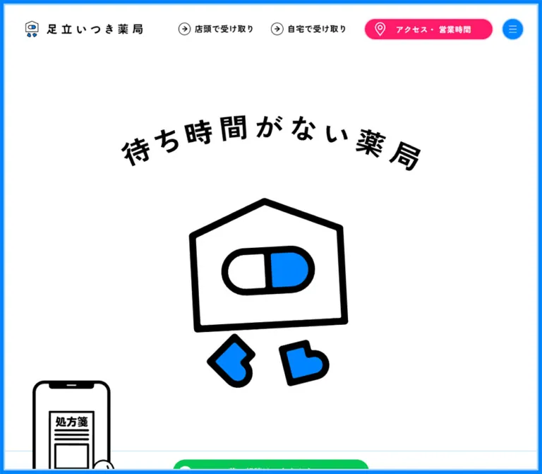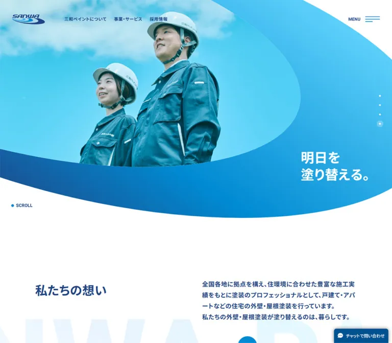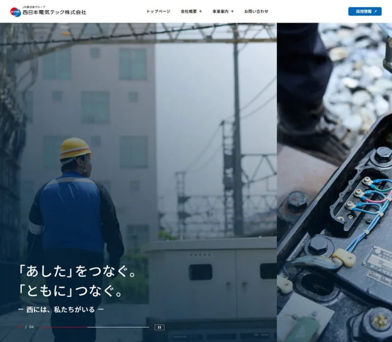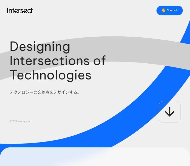
プレビュー準備中デザインリファレンスを見る
日本のWebデザインを、AIの制作リファレンスに。
DESIGN REFERENCE
鮮やかな青とコーラル、大きな活動写真、曲線のセクション境界が特徴。縦書きのセクション名と豊かな余白で、事業・実績・企業情報を案内するサイト。
オリジナルサイトを見るA regional corporate story told through expansive blue fields, candid workshop photography, and warm coral invitations.
Website: dreamstz.com
Original URL: https://www.dreamstz.com/
Final URL: https://www.dreamstz.com/
Theme: light gray canvas alternating with saturated blue sections; white surfaces and coral actions.
Inspected: September 17, 2026, Japan time. The supplied capture record is timestamped 2026-09-16T20:00:11.947Z, equivalent to September 17 at 05:00:11.947 JST.
Viewports: desktop 1440 × 1000; mobile 390 × 844, in CSS pixels.
Scope: the current corporate homepage, from its opening statement through services, achievements, case studies, news, coordinator and company information, contact, franchise businesses, and footer. Visual captures cover the opening, the achievement/Works transition, and the lower page. Rendered DOM measurements provide additional evidence for intervening sections. Linked pages and the opened mobile menu were not inspected.
Dream3.0 uses a restrained set of shapes at an unusually generous scale. A large Japanese statement and a workshop photograph introduce the organization. Blue sections then carry its message and case studies, while pale sections accommodate service explanations, news, and company information. The coral contact pill remains visible in the persistent header.
The desktop composition relies on several nested widths rather than one universal container. Broad photographs sit within 60px page margins; ordinary content occupies a 1092px frame; editorial text sits farther inward beside a narrow vertical section label. Oversized figures, rounded image panels, speech-like underlines, and broad curved boundaries give this corporate structure a friendly character. On mobile, labels become horizontal, editorial columns stack, and the photograph overlaps the beginning of the blue Message section.
A regional corporate story told through expansive blue fields, candid workshop photography, and warm coral invitations.
Website: dreamstz.com
Original URL: https://www.dreamstz.com/
Final URL: https://www.dreamstz.com/
Theme: light gray canvas alternating with saturated blue sections; white surfaces and coral actions.
Inspected: September 17, 2026, Japan time. The supplied capture record is timestamped 2026-09-16T20:00:11.947Z, equivalent to September 17 at 05:00:11.947 JST.
Viewports: desktop 1440 × 1000; mobile 390 × 844, in CSS pixels.
Scope: the current corporate homepage, from its opening statement through services, achievements, case studies, news, coordinator and company information, contact, franchise businesses, and footer. Visual captures cover the opening, the achievement/Works transition, and the lower page. Rendered DOM measurements provide additional evidence for intervening sections. Linked pages and the opened mobile menu were not inspected.
Dream3.0 uses a restrained set of shapes at an unusually generous scale. A large Japanese statement and a workshop photograph introduce the organization. Blue sections then carry its message and case studies, while pale sections accommodate service explanations, news, and company information. The coral contact pill remains visible in the persistent header.
The desktop composition relies on several nested widths rather than one universal container. Broad photographs sit within 60px page margins; ordinary content occupies a 1092px frame; editorial text sits farther inward beside a narrow vertical section label. Oversized figures, rounded image panels, speech-like underlines, and broad curved boundaries give this corporate structure a friendly character. On mobile, labels become horizontal, editorial columns stack, and the photograph overlaps the beginning of the blue Message section.
| Name | Value | Suggested token | Role and evidence |
|---|---|---|---|
| Regional Blue | #147bd8 |
--color-blue |
Measured rgb(20, 123, 216) on Message, Works, the footer, feature circles, and large achievement numbers |
| Soft Canvas | #f6f6f6 |
--color-page |
Measured body background; the opening and lower information sections appear against this neutral field |
| Invitation Coral | #eb6f5f |
--color-coral |
Measured contact-button and mobile-menu backgrounds; also the computed color of section labels on pale areas |
| Charcoal | #393939 |
--color-ink |
Measured primary text, including navigation and most headings |
| Secondary Gray | #737373 |
--color-muted |
Measured descriptive paragraphs, business descriptors, and supporting information |
| White | #ffffff |
--color-white |
Measured reversed text and the large contact panel; visually present on achievement and image surfaces |
| Pale Blue Wash | Approximately #ecf4ff |
--color-wash |
Screenshot-based approximation for the achievement inset; its actual computed background was not supplied |
Blue is a structural color: it covers whole sections and forms the final footer landscape. Coral is a smaller invitation color, used for contact actions, the mobile menu button, and case-study tags. Do not give every content block its own accent.
The blue logo has its own tonal variation. Franchise logos introduce navy, cyan, and other brand colors inside their artwork. These are asset colors, not evidence of additional global UI themes. Yellow hand symbols belong to the contact treatment, rather than a separate yellow action system.
The exposed WordPress presets include gradients and shadows. Their presence does not demonstrate visible use. The supplied screenshots show flat backgrounds and almost no conventional elevation treatment.
No user-selectable themes were observed. White text on blue is a section-level color inversion within the same page, not evidence of a dark-mode setting.
Measured stack: "Noto Sans JP", sans-serif.
Japanese body text, case-study headings, section labels, and many supporting labels use this stack. Most descriptive text uses weight 400 or 500; the narrow English section labels use 700 despite inheriting the Japanese font stack.
Long prose generally uses 1.8 line height. The desktop Message section is more spacious: its main statement is 36px / 72px, and subsequent paragraphs are 27px / 54px. This creates a public statement rather than dense corporate small print.
Measured stack: Lato, sans-serif.
Lato appears in the desktop navigation, achievement numerals, feature badges, and footer utilities. Navigation is 15px, weight 700, with a 15px line height. Achievement figures use 108px on desktop and approximately 74.43px on mobile.
Do not apply Lato to every English word automatically. The sampled case-study labels Project, Organisational, and Role use Noto Sans JP.
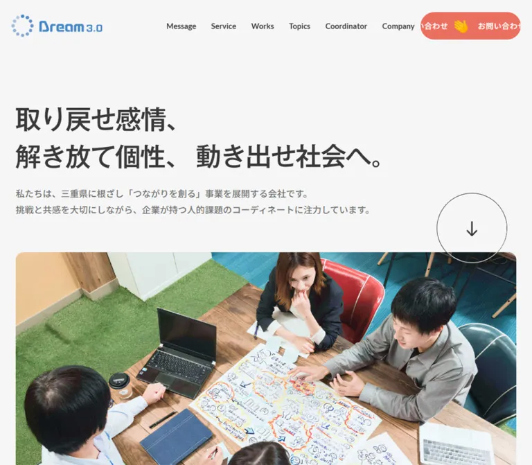
The visible headline is:
取り戻せ感情、解き放て個性、動き出せ社会へ。
On desktop, its first phrase occupies the first line; the other two share the second line. Mobile separates the three phrases into three lines.
The sampled H1 has no extracted text and reports 32px / 32px, while the visible lettering is substantially larger. Its rendered treatment therefore cannot be reconstructed from the H1's inherited font declaration alone. It may be supplied through artwork or styled descendants; the exact mechanism was not exposed.
Visual estimates: approximately 60–66px apparent type size on desktop and 36–40px on mobile, with a bold appearance. The quick start uses live text as an explicitly approximate substitute. Exact reproduction requires the authorized headline asset or its actual descendant styling.
| Role | Desktop measurement | Mobile measurement | Weight / notes |
|---|---|---|---|
| Body element default | 16px / 16px |
16px / 16px |
400; individual content rules override this unusually tight default |
| Visible desktop navigation | 15px / 15px |
Hidden in the captured header | Lato 700 |
| Header contact label | 15px / 15px |
11.9084px / 11.9084px |
400; tracking 0.05em |
| Hero introduction | 18px / 32.4px |
11.9084px / 21.4351px |
500, secondary gray |
| Section label | 21px / 21px |
10.916px / 10.916px |
700; desktop tracking 1.05px, mobile normal |
| Message opening statement | 36px / 72px |
23.8168px sampled font size |
500; mobile wrapping also depends on descendants and breaks |
| Message paragraphs | 27px / 54px |
17.8626px / 30.3664px |
500, white |
| Service and case-study prose | 15px / 27px |
11.9084px / 21.4351px |
Usually 400 or 500 |
| Feature heading | 27px / 27px |
17.8626px / 17.8626px |
500 |
| Feature supporting statement | 18px / 18px |
14.8855px / 14.8855px |
500 |
| Achievement numerals | 108px / 108px |
74.4275px / 74.4275px |
Lato 700 |
| Case-study organization name | 36px / 36px |
14.8855px / 14.8855px |
500; decorative space below is separate |
| Case-study quotation | 27px / 48.6px |
17.8626px / 32.1527px |
500, white |
| News title | 15px / 27px |
14.8855px / 26.7939px |
500; almost unchanged in size |
| Coordinator name | 27px / 27px |
20.8397px / 20.8397px |
500 |
| Coordinator biography | 15px / 27px |
14.8855px / 26.7939px |
500; mobile preserves a larger reading size than service prose |
| Franchise name | 15px / 27px |
13.8931px / 18.0611px |
500; tracking approximately -0.02em |
| Footer credit and copyright | 12px |
11.9084px |
Lato; credit 400, copyright 700 |
The mobile treatment is selective. News and biography text remain close to 15px, while service descriptions shrink to about 12px. Replacing the entire scale with one proportional multiplier would lose this hierarchy.
Density: generous between sections, compact within utility controls and metadata.
Base unit: no site-specific spacing formula was supplied. Many mobile values are consistent with nominal dimensions multiplied by 390 / 393: for example, 12 × 390 / 393 ≈ 11.9084. This is a calculated pattern, not proof of the original CSS formula or breakpoint system.
| Use | Value | Status |
|---|---|---|
| Desktop header side inset | 30px |
Measured logo-wrapper origin and contact right edge |
| Desktop wide-page inset | 60px |
Measured H1 and large contact-panel origins |
| Desktop navigation gap | 30px |
Calculated from adjacent link rectangles |
| Desktop feature-column gap | 18px |
Calculated from 352px columns at x = 174, 544, and 914 |
| Desktop franchise-card gap | 36px |
Calculated from 246px cards at x = 174, 456, and 738 |
| Desktop editorial offset from inner frame | 118px |
Calculated: content x = 292, frame x = 174 |
| Achievement panel side inset | Approximately 42px |
Screenshot outer frame and measured inner content support this value |
| Desktop news-row vertical padding | 24px |
Measured |
| Mobile news-row vertical padding | 11.9084px |
Measured |
| Mobile wide-page inset | 14.8906px |
Measured |
| Mobile service-text inset | 24.8125px |
Measured |
| Mobile Message, Works, and Topics inset | 34.7344px |
Measured |
| Desktop contact-panel padding | 102px 112px |
Measured |
| Mobile contact-panel padding | 62.5191px 14.8855px |
Measured |
The three mobile insets are intentional distinctions: broad media, service introduction, and long editorial content do not all share the same left edge.
| Element | Value | Evidence |
|---|---|---|
| Header and consultation contact pills | 50px desktop; 49.6183px mobile |
Measured |
| Mobile menu button | 50% |
Measured |
| Back-to-top control | 50% |
Measured |
| Feature badge | 50% |
Measured |
| Large contact panel | 18px desktop; 17.8626px mobile |
Measured |
| Hero photograph | About 18px desktop; 12px mobile |
Visual estimate |
| White case-study image panel | About 18px |
Visual estimate |
| Franchise logo panels | About 12–14px |
Visual estimate |
| Broad blue section boundary | Shallow elliptical arch | Visible shape; source construction not supplied |
| Element | Desktop: 1440 × 1000 | Mobile: 390 × 844 |
|---|---|---|
| Document height | 11651px |
Approximately 11001.47px |
| Wide content frame | x = 60, width = 1320px |
x = 14.89, width = 360.22px |
| Standard desktop inner frame | x = 174, width = 1092px |
Replaced by section-specific insets |
| Main editorial column | x = 292, width = 872px |
Usually x = 34.73, width = 320.53px |
| Hero H1 wrapper | x = 60, y = 213, height = 158px |
x = 14.89, y = 141.89, height = 157.44px |
| Hero introduction | y = 401, height = 64.78px |
y = 314.20, height = 64.27px |
| Hero photograph | Top near y = 536; about 1320px wide |
Approximately 360 × 360px, starting near y = 441 |
| Header contact pill | 200 × 55px, x = 1210, y = 32 |
119.08 × 39.69px, x = 216.83, y = 27.78 |
| Mobile menu button | Not visible | 39.69 × 39.69px, x = 338.41 |
| Feature badge | 99 × 99px |
69.45 × 69.45px |
| Feature text column | 352px |
268.92px, centered |
| Large contact panel | 1320 × 442px |
360.22 × 504.28px |
| Franchise link box | 246px wide |
180.11px wide; two columns |
| Back-to-top control | 141 × 141px |
80.375 × 80.375px |
| Footer element height | 403.03px |
450.53px |
Footer element height excludes the decorative arch projecting above its rectangular box. The mobile hero photo measurement is visual; its image element was not included in the DOM sample.
Role: continuous identity, section navigation, and contact access.
The visible desktop arrangement is a blue logo at the left, six small English links toward the right, and a coral contact pill at the far right. The links are Message, Service, Works, Topics, Coordinator, and Company. Their destinations are same-page fragments.
The header remains in the same screen position in opening and lower-page captures. Its background is visually transparent: scrolled content can pass behind the logo and controls. There is no visible opaque toolbar, bottom divider, blur, or shadow.
At 390px, the navigation links disappear from the visible header. The logo is visually about 148px wide, followed by a compact contact pill and a coral circle containing three white dots. The circle is a measured button. Its opened state, focus behavior, and dismissal controls were not exercised.
Role: the primary email invitation.
The header pill combines white Japanese text, yellow hand symbols, a fully rounded coral container, and clipped repeated content. The DOM contains repeated copies of お問い合わせ; captures show different fragments at the pill edges. This supports a moving-track interpretation, but no continuous recording establishes its exact direction or speed.
The anchor destination is mailto:info@dreamstz.com. It is not evidence of an on-site contact form.
Desktop anatomy is 200 × 55px, 12px 0 padding, 15px type, and 0.75px tracking. Mobile reduces the box to about 119 × 40px and the label to about 12px.
A larger consultation variant appears after the case studies. Its measured desktop box is 536 × 90px, with 18px text. The mobile source compresses it to about 198 × 45px while retaining repeated text. A static adaptation should allow enough width or wrapping for one complete accessible label.
Role: communicate the organization's purpose before introducing services.
The opening is left aligned and has no enclosing card. A bold Japanese headline sits above two desktop lines of gray introductory copy. Broad whitespace separates the header from the statement and the statement from the photograph.
The photograph shows people around a wooden table with a laptop, notebooks, and a large sheet of illustrated workshop notes. Its overhead viewpoint makes collaboration tangible. The image has rounded corners and occupies almost the full content width.
A thin outlined circle with a downward arrow overlaps the photograph's upper-right boundary. It is about 141px in diameter on desktop and 80px on mobile by visual comparison. Its activation target and scroll behavior were not supplied.
On mobile, the photograph is a square composition with approximately 15px side margins. Its lower part sits over the blue Message background. Preserve this overlap; a plain sequence of unrelated rectangles would lose an important part of the page's spatial rhythm.
Role: establish a quiet, repeatable section hierarchy.
Desktop Message, Service, and Works labels occupy a narrow rail near x = 174. Their 21px width and the visible Works label support a vertical treatment. Main content begins at x = 292, leaving a generous gap after the rail.
The labels reverse to white on blue sections and coral on pale sections. In the Works capture, the label appears softer than the main white copy; opacity or ancestor compositing may contribute, but no exact opacity was supplied.
At 390px, section labels become small horizontal headings above the content. Their measured size is approximately 10.92px. The desktop rail should not survive as a narrow mobile column.
Role: explain the company's regional mission.
The section is a full-width blue field with white text. Its desktop opening statement uses 36px / 72px; following paragraphs use 27px / 54px. These are substantially larger than ordinary service descriptions.
The DOM includes repeated captioned activity items for civic lectures, fieldwork, primary-industry training, and assistance for seniors. Their horizontal positions extend beyond both viewport edges, and the four-item sequence repeats. This is consistent with a looping strip.
The captions have different vertical positions and widths. Desktop sampled widths include 373px, 311px, and 244px; mobile examples range from about 139px to 198px. Preserve a varied sequence if recreating that treatment. The supplied screenshots do not establish the individual image crops or a precise playback rate.
Role: explain the SharePro program and its benefits.
The Service introduction uses the same offset editorial column as Message, but returns to gray body text on the light canvas. A program heading, explanatory paragraph, and right-aligned 詳細はこちら link introduce the offering.
Below it, three feature groups use equal desktop columns. Each contains a blue circular Feature badge with an ordinal, a Japanese heading, an intervening content region, a short benefit statement, and supporting copy. The supplied element sample does not establish the imagery or illustration treatment inside that intervening region.
Desktop columns are 352px wide with calculated 18px gaps. The circles are 99px across. Mobile stacks all three groups, centers a roughly 269px text area, and reduces circles to about 69px.
Role: make experience and scale immediately legible.
A rounded white container holds the Achievement heading, explanatory copy, a pale blue statistics area, and a compact client list. The current displayed figures are 23 organizations, 69 people, and 3.5 months of average project accompaniment. These are observed page content, not newly verified business statistics.
The figures use blue Lato at 108px on desktop. Small dark units sit beside the numbers. A dotted vertical divider separates the main matching totals from the average-duration group in the visible desktop crop.
The dense organization list below uses 12px / 21.6px text within a measured 1008px inner width. It remains plain text rather than a wall of separate logo cards.
Mobile places the 23 and 69 group above the 3.5 group and reduces the numerals to about 74px. The client list wraps within a 320.53px region. Its line height becomes approximately 17.86px.
Role: combine a client voice, recognizable evidence, and detailed outcomes.
The section is blue with white typography. Each case begins with the organization name, a thin underline containing a downward speech-like notch, and a larger testimonial quotation.
The visible first example names 株式会社マスヤグループさま. Its media panel is white, broadly rounded, and about 872px wide. Coral tags sit near the panel's upper-left corner: 電子化, 在庫管理, and SFA. The image shows a grouping of branded snack packages against white; it is a product composition, not another workshop photograph.
Below the media, the DOM divides outcomes into labeled sections. The first example has Project and Organisational areas side by side on desktop, followed by a wider Role explanation. On mobile, these areas stack. Body text is white, 15px / 27px on desktop and about 12px / 21.44px on mobile.
The second case uses the same organization-name and quotation hierarchy, then Result and Organisational sections. Its detailed image appearance is not visible in the supplied screenshots.
Do not turn these cases into small teaser cards. The current homepage gives them substantial reading space and external detail links.
Role: provide a secondary route without competing with the coral contact action.
Repeated labels include 詳細はこちら and 一覧はこちら. Sampled desktop link boxes are 148.5 × 39px, with 15px, weight 500, and 0.05em tracking. Mobile boxes remain nearly the same size at 147.31 × 38.69px.
They align to the right of their content regions. Their text color follows the section: charcoal on pale areas and white on blue. The supplied screenshots do not establish every icon or hover endpoint for these links, so the starter uses a restrained text-link treatment.
Role: expose recent announcements without introducing a separate card language.
Desktop rows align date, category, and title horizontally. A sampled list begins at x = 399 and is 760px wide. Date-to-category and category-to-title origins imply approximately 108px and 86px leading columns. Titles occupy the remaining 566px.
Rows use 24px vertical padding. Their height grows with title length: measured examples are 75px, 129px, and 102px. Adjacent positions leave approximately 1px between rows, consistent with a fine separator; its exact color was not supplied.
On mobile, date and category remain together above the full-width title. Titles retain approximately 15px type, while row padding falls to about 12px. Let long announcements wrap instead of imposing a uniform card height.
Role: connect the service narrative to an identifiable person and organization.
The desktop sections share a row. Their sampled heading regions are each 562.5px wide, beginning at x = 102 and x = 775.5. The coordinator area includes a small role label, a larger name, and a gray biography. The company area contains factual label/value information.
The company text identifies the operator as 株式会社Dream3.0. This is direct original-page evidence, not an inference from the domain.
Mobile places Coordinator before Company in one column. The biography remains about 15px / 26.79px, making it more readable than the smaller service prose. The supplied captures do not show the coordinator media closely enough to describe its photographic treatment.
Role: provide a substantial final invitation before the franchise-business section.
The entire white rounded panel is an email link. Its text includes お問い合わせ, Contact Us, and a short explanation. The desktop panel is 1320 × 442px, with 102px 112px padding and an 18px radius.
Mobile makes it narrower and taller: about 360 × 504px, with roughly 63px top and bottom padding. The supporting text wraps to two lines. The sampled H2 style belongs to a mixed-content heading wrapper, so it does not establish the size of every visible child label.
The measured transition affects border color and text color over 0.8 seconds. No hovered screenshot establishes the destination colors.
Role: show the organization's additional operating businesses.
The desktop section starts with FC事業 at the left and explanatory text at the right. Below it are three links. Each has a rounded logo tile, a small gray business descriptor, and a darker business name with an external-link mark.
The logo tiles visibly represent 癒し〜ぷ, まごころサポート, and 飛高専. Their native branding remains intact. The first tile is navy; the other two are predominantly white.
Desktop link boxes are 246px wide and separated by 36px. They occupy the left portion of the 1092px frame rather than stretching evenly across it. Mobile uses two approximately 180px link columns; the third item wraps to the next row. Visible logo artwork is narrower than the link box, leaving a small internal right gutter.
Role: close the page with a strong brand field and practical links.
A shallow upward blue arch connects the light franchise section to the footer. A large outlined upward-arrow circle straddles this boundary near the right edge. Its anchor points to #top; smooth scrolling and its hover scale endpoint were not tested.
Desktop footer content places the white logo and address at the left, navigation and four social icons at the right, and a small legal/credit row near the bottom. The social icons represent Facebook, X, Instagram, and YouTube. Sampled icon widths are approximately 29–30px.
Mobile keeps the logo and address left aligned, centers the social row, and places the website credit opposite the copyright. The ordinary footer navigation and privacy link are absent from the visible mobile footer; corresponding links exist in the separate navigation subtree, whose opened state remains unverified.
The current footer visibly reads Website by ARUTEGA, with an original-page link to https://arutega.jp/. This supports a general website-production credit; separate design, development, photography, or individual roles are not specified.
| Treatment | Supplied evidence | What can be concluded |
|---|---|---|
| Desktop navigation color | 0.6s cubic-bezier(0.165, 0.84, 0.44, 1) |
A color transition is defined; destination color and trigger were not exercised |
| Contact-pill background | 0.3s cubic-bezier(0.16, 1, 0.3, 1) |
Short background-color feedback is defined |
| Mobile menu-button background | 0.4s cubic-bezier(0.165, 0.84, 0.44, 1) |
Button color transition exists; menu opening sequence is unknown |
| Social-link opacity | 0.6s cubic-bezier(0.165, 0.84, 0.44, 1) |
Opacity feedback is defined; endpoint unknown |
| Back-to-top scale | 0.6s cubic-bezier(0.165, 0.84, 0.44, 1) |
Scale transition exists; scale factor and scrolling behavior are unknown |
| Large contact-panel border and text | 0.8s cubic-bezier(0.165, 0.84, 0.44, 1) |
Coordinated border/text feedback is defined |
| Mobile Message paragraphs | Transform 1.4s, opacity 1.6s, with 1.1s and 1.7s delays |
Staggered reveal styling exists; travel distance and trigger are not supplied |
| Decorative brand lines near the final contact area | Transform 1.4s; second-line delay 0.5s desktop and 0.3s mobile |
Sequential transform styling is present; exact artwork motion is unverified |
| Repeated contact text | Duplicate DOM labels and different clipped screenshot positions | Consistent with a marquee; no measured duration, direction, or pause behavior |
| Activity strip | Repeated caption groups and offscreen horizontal positions | Consistent with a looping track; continuous behavior is unverified |
| SharePro and Contact Us repetitions | Repeated text in the rendered content | Repetition is established, but visual scale and animation timing are not |
The dominant measured easing is a smooth, quickly settling curve. This is distinct from a spring or stepped animation system. Preserve that character when adding new feedback, but do not invent exact original keyframes.
The inspection waited for visible finite motion and layout stability, temporarily pausing perpetual animations during readiness checks before resuming them. This improves screenshot reliability but is not a recording of every interaction. A sampled animation: none on a text element also does not rule out animation on its parent, descendants, pseudo-elements, or JavaScript-driven track.
No menu click, contact activation, hover endpoint, keyboard path, or reduced-motion mode was verified. Repeated content alone does not prove that a component is draggable, pausable, or an interactive carousel.
| Layer | Appearance | Purpose |
|---|---|---|
| Main canvas | Flat #f6f6f6 |
Establishes a quiet background for introductory and factual content |
| Narrative field | Flat #147bd8, white text |
Carries Message and Works with a strong change of pace |
| Achievement container | White, rounded | Groups evidence and separates it from surrounding sections |
| Statistics inset | Pale blue, rounded | Supports large blue numbers without adding another strong color |
| Case-study media | White, rounded | Preserves product and client imagery against the blue field |
| Final contact panel | White, measured 18px radius | A large clickable invitation with generous internal space |
| Contact and tag accents | Coral, pill-shaped | Indicates invitation and compact categories |
| Footer | Blue with a shallow curved top | Creates a broad visual ending rather than a narrow utility strip |
No general drop-shadow hierarchy is visible. Separation comes from color fields, whitespace, corner treatment, and occasional fine rules. Do not translate every section into an elevated white card.
The opening photograph is a working scene rather than a posed corporate portrait. Its central subjects are people, a shared table, a laptop, and colorful notes. Natural wood, clothing, green flooring, blue flooring, and a red chair provide photographic variety inside an otherwise limited UI palette.
Preserve a useful view of the shared work surface and participants when choosing responsive crops. The mobile square is not simply a narrow vertical slice through one person's face. It retains the relationship among the people and the table.
Case-study imagery changes with the client. The visible snack-package composition uses a clean white background and recognizable branded products. Franchise links use complete supplied logos. These assets should not be recolored into the site's blue/coral pair.
Use crisp vector or high-resolution versions of the logo and simple arrow icons where available. The visible interface does not call for pixelated image rendering, textured overlays, monochrome photo filters, or synthetic 3D decoration.
No image src values, SVG paths, or downloadable font URLs were included in the supplied evidence. The references below identify assets visually; they are not invented file paths.
| Asset | Evidence | Implementation guidance |
|---|---|---|
| Blue Dream3.0 logo with dotted ring | Desktop and mobile header captures | Use the authorized brand asset; preserve its custom lettering and dot pattern |
| White Dream3.0 logo | Desktop and mobile footer captures | Use the reversed asset, retaining any intrinsic artwork padding |
| Workshop photograph | Opening captures | Use a broad desktop presentation and a deliberate mobile square crop |
| Snack-package composition | Desktop Works capture | Preserve the white background and complete product grouping |
| Franchise logos | Lower desktop and mobile captures | Keep each business's own colors and proportions |
| Hand symbols | Contact-pill captures | Preserve their friendly decorative role without relying on them for the accessible label |
| Down/up arrows | Opening and footer captures | Thin dark linework centered in a transparent outlined circle |
| Community activity images | Captioned, repeated DOM items | Subject categories are known; exact crops and assets remain unverified |
CSS can reproduce the framing, curves, and spacing. It cannot substitute for the identity carried by the original logo, headline treatment, and photography.
| Area | Desktop behavior | Mobile behavior |
|---|---|---|
| Header | Logo, six links, 200px contact pill | Logo, 119px contact pill, approximately 40px ellipsis button |
| Hero headline | Two visual lines | Three visual lines |
| Introductory paragraph | Two lines at 18px | Three lines at approximately 12px |
| Hero media | Wide image; lower boundary outside the opening capture | Approximately 360px square, fully visible in the opening capture |
| Section labels | Narrow vertical rail | Small horizontal label above content |
| Editorial content | Offset 872px column | Approximately 321px column |
| Feature groups | Three equal columns | Three centered stacked groups |
| Achievement groups | Totals and duration beside one another | Totals above duration |
| Case-study outcomes | Some paired columns | Sequential full-width blocks |
| News | Date, category, and title on one row | Metadata above the title |
| Coordinator / Company | Side by side | Coordinator followed by Company |
| Franchise links | Three 246px items in a left-aligned row | Two columns, then a third item on the next row |
| Footer | Address left, navigation and socials right | Address above centered socials; compact bottom credit row |
The mobile page is not a uniformly scaled desktop layout. Some content becomes smaller, some remains nearly unchanged, and several sections gain or lose large amounts of whitespace. Its measured document height is slightly shorter than desktop despite multiple stacked components.
At 1440px, the wide frame is 1440 - 2 × 60 = 1320px. The inner frame is 1092px, centered with 174px margins. Main editorial text starts 118px inside that inner frame and is 872px wide, leaving a further 102px to the frame's right edge.
At 390px, the wide frame is about 360.22px. Main editorial text is about 320.53px; the Service introduction is about 340.38px. Keep these differences when matching the inspected composition.
The mobile Message section's rectangular background begins at y = 628.55, while the photograph visibly continues to approximately y = 801. The section's first label starts at y = 880.59. These measurements establish an overlap and a substantial clearance before the text, rather than a simple image-then-section boundary.
Only two viewport sizes were supplied. Exact media-query breakpoints, intermediate tablet layouts, landscape behavior, browser zoom, safe-area handling, and minimum supported widths are unknown. The quick start selects a practical 1000px breakpoint and uses rounded dimensions; these are recommendations.
The mobile navigation subtree contains Lato links measured at approximately 36.72px, but no opened-menu screenshot was supplied. Do not infer its complete background, scrolling, or entrance treatment from those measurements alone.
#147bd8 for substantial sections and the footer, with #f6f6f6 as the quiet canvas.32px value as the apparent headline size.These are improvements for a new implementation, not verified features of the inspected site:
aria-expanded, and aria-controls. Implement keyboard operation, focus management, and Escape handling if it opens an overlay.scroll-margin-top values for sections under the persistent header.#f6f6f6.#147bd8.#393939.#737373.#eb6f5f.#ffffff.#ecf4ff; confirm against the actual asset or stylesheet when available.“Create a Japanese corporate homepage for a regional talent-development and coordination company, using the Dream3.0 composition as a reference. Use a light gray canvas, saturated blue narrative sections, white rounded media panels, and restrained coral contact actions. Pair Noto Sans JP content with Lato navigation and oversized statistics. Build a persistent transparent header, a large left-aligned Japanese statement, and a candid overhead workshop photograph. On desktop, use broad media, a centered inner frame, and a narrower editorial column beside vertical English section labels. Include substantial case studies, news rows, coordinator and company information, a large contact panel, franchise links, and a blue footer with a shallow arched top. On mobile, stack editorial content, change labels to horizontal, keep franchise links in two columns, and let the square hero photograph overlap the blue Message section. Use supplied brand assets and clearly separate verified behavior from recommended enhancements.”
This starter uses measured palette values and desktop dimensions, rounded mobile measurements, and an approximate live-text hero. The pale statistics color, breakpoint, decorative arch construction, and focus treatment are implementation recommendations. Font files, brand assets, menu JavaScript, and moving tracks must be supplied separately.
The classes assume a .wide hero, .section-grid.content editorial sections with .section-label and .section-body children, and independently structured feature, metrics, news, contact, franchise, and footer components. Use real anchors for the observed fragment and email destinations.
:root {
  /* Measured colors; the wash is a visual approximation. */
  --color-page: #f6f6f6;
  --color-blue: #147bd8;
  --color-coral: #eb6f5f;
  --color-ink: #393939;
  --color-muted: #737373;
  --color-white: #ffffff;
  --color-wash: #ecf4ff;

  --font-body: 'Noto Sans JP', sans-serif;
  --font-latin: Lato, sans-serif;
  --text-body: 15px;
  --text-small: 12px;
  --text-section: 21px;
  --text-stat: 108px;
  --leading-body: 1.8;

  --page-inset: 60px;
  --wide-width: 1320px;
  --content-width: 1092px;
  --editorial-width: 872px;
  --rail-width: 118px;
  --radius-panel: 18px;
  --radius-media-small: 12px;
  --radius-pill: 50px;
  --arrow-size: 141px;
  --arch-rise: 80px;

  --ease-site: cubic-bezier(0.165, 0.84, 0.44, 1);
  --ease-contact: cubic-bezier(0.16, 1, 0.3, 1);
  --motion-link: 600ms;
  --motion-contact: 300ms;
}

* { box-sizing: border-box; }

body {
  margin: 0;
  color: var(--color-ink);
  background: var(--color-page);
  font-family: var(--font-body);
  font-size: var(--text-body);
  line-height: var(--leading-body);
}

img { max-width: 100%; }
button, input, textarea { font: inherit; }
a { color: inherit; }

.wide {
  width: min(var(--wide-width), calc(100% - 2 * var(--page-inset)));
  margin-inline: auto;
}

.content {
  width: min(var(--content-width), calc(100% - 2 * var(--page-inset)));
  margin-inline: auto;
}

[id] { scroll-margin-top: 120px; }

.site-header {
  position: fixed;
  z-index: 30;
  inset: 0 0 auto;
  display: flex;
  align-items: center;
  gap: 36px;
  padding: 32px 30px;
  background: transparent;
}

.brand { flex: 0 0 auto; }
.brand img { display: block; width: 184px; height: auto; }

.main-nav {
  display: flex;
  align-items: center;
  gap: 30px;
  margin-inline-start: auto;
}

.main-nav a {
  font-family: var(--font-latin);
  font-size: 15px;
  font-weight: 700;
  line-height: 1;
  text-decoration: none;
  transition: color var(--motion-link) var(--ease-site);
}

.header-actions { display: flex; align-items: center; gap: 2.5px; }

.contact-pill {
  display: inline-flex;
  align-items: center;
  justify-content: center;
  gap: 10px;
  width: 200px;
  min-height: 55px;
  overflow: hidden;
  border: 0;
  border-radius: var(--radius-pill);
  color: var(--color-white);
  background: var(--color-coral);
  font-size: 15px;
  line-height: 1.4;
  letter-spacing: 0.05em;
  text-decoration: none;
  transition: background-color var(--motion-contact) var(--ease-contact);
}

.menu-toggle {
  display: none;
  place-items: center;
  width: 40px;
  height: 40px;
  padding: 0;
  border: 0;
  border-radius: 50%;
  color: var(--color-white);
  background: var(--color-coral);
  cursor: pointer;
}

.hero { padding-top: 213px; }

/* Live-text approximation of the observed graphic headline. */
.hero-title {
  margin: 0;
  font-size: 64px;
  font-weight: 700;
  line-height: 1.24;
}

.hero-title > span:first-child { display: block; }

.hero-lead {
  margin: 30px 0 0;
  color: var(--color-muted);
  font-size: 18px;
  font-weight: 500;
  line-height: 1.8;
}

.hero-visual {
  position: relative;
  z-index: 2;
  margin-top: 70px;
}

.hero-photo {
  display: block;
  width: 100%;
  height: auto;
  border-radius: var(--radius-panel);
}

.circle-arrow {
  display: grid;
  place-items: center;
  width: var(--arrow-size);
  aspect-ratio: 1;
  border: 1px solid var(--color-ink);
  border-radius: 50%;
  color: var(--color-ink);
  background: transparent;
  text-decoration: none;
  transition: scale var(--motion-link) var(--ease-site);
}

.circle-arrow svg { width: 32px; height: 32px; }
.hero-visual .circle-arrow { position: absolute; top: -118px; right: 18px; }

.blue-section {
  position: relative;
  color: var(--color-white);
  background: var(--color-blue);
}

/* Recommended CSS construction for the visible shallow arch. */
.arch-top::before {
  content: '';
  position: absolute;
  inset-inline: 0;
  bottom: 100%;
  height: var(--arch-rise);
  border-radius: 50% 50% 0 0 / 100% 100% 0 0;
  background: inherit;
  pointer-events: none;
}

.section-grid {
  display: grid;
  grid-template-columns: var(--rail-width) minmax(0, var(--editorial-width)) 1fr;
}

.section-label {
  grid-column: 1;
  margin: 0;
  color: var(--color-coral);
  font-size: var(--text-section);
  font-weight: 700;
  line-height: 1;
  letter-spacing: 0.05em;
  writing-mode: vertical-rl;
}

.section-body { grid-column: 2; min-width: 0; }
.blue-section .section-label { color: var(--color-white); }
.message { padding-block: 104px 69px; }
.message-statement { margin: 0; font-size: 36px; font-weight: 500; line-height: 2; }
.message-copy { font-size: 27px; font-weight: 500; line-height: 2; }
.service { padding-top: 193px; }
.body-copy { color: var(--color-muted); font-size: var(--text-body); line-height: 1.8; }
.blue-section .body-copy { color: var(--color-white); }

.detail-link {
  display: flex;
  align-items: center;
  justify-content: flex-end;
  width: fit-content;
  min-height: 39px;
  margin-inline-start: auto;
  font-size: 15px;
  font-weight: 500;
  letter-spacing: 0.05em;
  text-underline-offset: 4px;
}

.feature-grid { display: grid; grid-template-columns: repeat(3, minmax(0, 1fr)); gap: 18px; }
.feature { text-align: center; }
.feature-badge {
  display: flex;
  flex-direction: column;
  align-items: center;
  justify-content: center;
  width: 99px;
  aspect-ratio: 1;
  margin-inline: auto;
  border-radius: 50%;
  color: var(--color-white);
  background: var(--color-blue);
  font-family: var(--font-latin);
  font-size: 12px;
  font-weight: 700;
}
.feature-title { font-size: 27px; font-weight: 500; }

.achievement { padding: 42px; border-radius: var(--radius-panel); background: var(--color-white); }
.metrics {
  display: grid;
  grid-template-columns: 1.5fr 1fr;
  gap: 30px;
  padding: 40px;
  border-radius: var(--radius-panel);
  background: var(--color-wash);
}
.metric-group { display: flex; align-items: baseline; justify-content: center; gap: 28px; }
.metric-group + .metric-group { border-left: 1px dotted var(--color-ink); }
.metric-number { color: var(--color-blue); font: 700 var(--text-stat)/1 var(--font-latin); }
.metric-unit { color: var(--color-ink); font-size: 18px; }
.client-list { margin-bottom: 0; font-size: 12px; line-height: 1.8; }

.works { padding-top: 180px; }
.case-title { margin: 0; font-size: 36px; font-weight: 500; line-height: 1.3; }
.quote-rule { display: block; width: min(466px, 100%); height: 24px; margin-top: 24px; }
.case-quote { margin: 12px 0 30px; font-size: 27px; font-weight: 500; line-height: 1.8; }
.case-media { position: relative; overflow: hidden; border-radius: 18px; background: var(--color-white); }
.case-media img { display: block; width: 100%; height: auto; }
.case-tags { position: absolute; inset: 18px 18px auto; display: flex; flex-wrap: wrap; gap: 6px; }
.case-tag { padding: 7px 15px; border-radius: 999px; color: white; background: var(--color-coral); font-size: 15px; }
.case-outcomes { display: grid; grid-template-columns: repeat(2, minmax(0, 1fr)); }
.case-outcome { min-width: 0; padding: 25px; }
.case-outcome--wide { grid-column: 1 / -1; }

.news-list { max-width: 760px; margin-inline-start: auto; }
.news-row {
  display: grid;
  grid-template-columns: 108px 86px minmax(0, 1fr);
  padding-block: 24px;
  border-bottom: 1px solid #d9d9d9;
  text-decoration: none;
}
.news-category { color: var(--color-muted); font-size: 12px; }
.news-title { margin: 0; font-size: 15px; font-weight: 500; line-height: 1.8; }

.company-layout { display: grid; grid-template-columns: repeat(2, minmax(0, 1fr)); gap: 111px; max-width: 1236px; margin-inline: auto; }
.contact-panel {
  display: block;
  min-height: 442px;
  padding: 102px 112px;
  border: 1px solid transparent;
  border-radius: var(--radius-panel);
  background: var(--color-white);
  text-decoration: none;
  transition: border-color 800ms var(--ease-site), color 800ms var(--ease-site);
}

.franchise-grid { display: grid; grid-template-columns: repeat(3, minmax(0, 1fr)); gap: 36px; max-width: 810px; }
.franchise-card { min-width: 0; text-decoration: none; }
.franchise-image { display: block; width: 100%; aspect-ratio: 246 / 141; object-fit: contain; border-radius: 12px; background: white; }
.franchise-description { margin: 12px 0 0; color: var(--color-muted); font-size: 12px; line-height: 1.8; }
.franchise-name { margin: 0; font-size: 15px; font-weight: 500; line-height: 1.8; letter-spacing: -0.02em; }

.site-footer { position: relative; margin-top: 80px; padding-block: 40px 80px; color: white; background: var(--color-blue); }
.footer-main { display: grid; grid-template-columns: 1fr auto; gap: 40px; }
.footer-logo { display: block; width: 247px; height: auto; }
.footer-address { font-size: 12px; line-height: 1.4; }
.footer-nav { display: flex; flex-wrap: wrap; gap: 30px; font: 700 15px/1 var(--font-latin); }
.social-links { display: flex; justify-content: flex-end; gap: 30px; margin-top: 30px; }
.social-links svg { display: block; width: 30px; height: 30px; }
.footer-bottom { display: flex; justify-content: space-between; gap: 20px; margin-top: 76px; font: 400 12px/1.5 var(--font-latin); }
.back-to-top { position: absolute; right: 82px; top: -148px; }

/* Recommended focus treatment; this is not a measured source state. */
:where(a, button):focus-visible { outline: 3px solid var(--color-ink); outline-offset: 4px; }
.blue-section :where(a, button):focus-visible,
.site-footer :where(a, button):focus-visible { outline-color: white; }

/* Recommended breakpoint; only the endpoint layouts were inspected. */
@media (max-width: 1000px) {
  :root {
    --page-inset: 14.89px;
    --text-body: 11.91px;
    --text-section: 10.92px;
    --text-stat: 74.43px;
    --arrow-size: 80.38px;
    --arch-rise: 25px;
  }

  .site-header { gap: 0; padding: 27.78px 11.91px; }
  .brand img { width: 148px; }
  .main-nav { display: none; }
  .header-actions { margin-inline-start: auto; }
  .contact-pill { width: 119.08px; min-height: 39.69px; gap: 5px; font-size: 11.91px; }
  .menu-toggle { display: grid; width: 39.69px; height: 39.69px; }

  .hero { padding-top: 141.89px; }
  .hero-title { font-size: 36px; line-height: 1.46; }
  .hero-title > span { display: block; }
  .hero-lead { margin-top: 14.89px; font-size: 11.91px; }
  .desktop-break { display: none; }
  .hero-visual { margin-top: 62.52px; }
  .hero-photo { aspect-ratio: 1; object-fit: cover; border-radius: 12px; }
  .hero-visual .circle-arrow { top: -67px; right: 0; }
  .circle-arrow svg { width: 24px; height: 24px; }

  .section-grid { display: block; width: calc(100% - 69.47px); }
  .section-label { margin-bottom: 16px; writing-mode: horizontal-tb; letter-spacing: normal; }
  .message { margin-top: -172px; padding-block: 252px 68px; }
  .message-statement { font-size: 23.82px; line-height: 1.65; }
  .message-copy { font-size: 17.86px; line-height: 1.7; }
  .service { padding-top: 88px; }
  .service .section-grid { width: calc(100% - 49.63px); }

  .feature-grid { grid-template-columns: 1fr; gap: 45px; }
  .feature { width: min(269px, 100%); margin-inline: auto; }
  .feature-badge { width: 69.45px; font-size: 8.93px; }
  .feature-title { font-size: 17.86px; }

  .achievement { padding: 20px; }
  .metrics { grid-template-columns: 1fr; padding: 30px 12px; }
  .metric-group { gap: 25px; }
  .metric-group + .metric-group { border-left: 0; }
  .metric-unit { font-size: 12px; }
  .client-list { font-size: 11.91px; line-height: 1.5; }

  .works { padding-top: 111px; }
  .case-title { font-size: 14.89px; }
  .quote-rule { width: min(193px, 100%); height: 16px; margin-top: 12px; }
  .case-quote { font-size: 17.86px; }
  .case-tags { inset: 10px 10px auto; gap: 4px; }
  .case-tag { padding: 5px 8px; font-size: 11px; }
  .case-outcomes { grid-template-columns: 1fr; }
  .case-outcome { padding: 19px; }

  .news-row { grid-template-columns: 104px minmax(0, 1fr); padding-block: 12px; }
  .news-title { grid-column: 1 / -1; margin-top: 12px; font-size: 14.89px; }
  .company-layout { grid-template-columns: 1fr; gap: 100px; width: calc(100% - 71.44px); }
  .company-layout .body-copy { font-size: 14.89px; }
  .contact-panel { min-height: 504px; padding: 62.52px 14.89px; }

  .franchise-grid { grid-template-columns: repeat(2, minmax(0, 1fr)); gap: 24px 0; }
  .franchise-image { width: calc(100% - 12px); }
  .franchise-name { font-size: 13.89px; line-height: 1.3; }
  .franchise-description { font-size: 11.91px; line-height: 1.4; }

  .site-footer { margin-top: 45px; padding-block: 81px; }
  .footer-main { grid-template-columns: 1fr; gap: 0; }
  .footer-logo { width: 245px; }
  .footer-nav { display: none; }
  .social-links { justify-content: center; margin-top: 50px; }
  .footer-bottom { margin-top: 58px; font-size: 11.91px; }
  .back-to-top { right: 11.91px; top: -75px; }
}

@media (prefers-reduced-motion: reduce) {
  .main-nav a, .contact-pill, .circle-arrow, .contact-panel { transition: none; }
  .marquee-track { animation: none; transform: none; }
  .reveal { opacity: 1; transform: none; transition: none; }
}
For the case-study speech underline, place an SVG with the .quote-rule class below the organization name. This path approximates the visible notch; it is not an extracted original asset:
<svg class='quote-rule' viewBox='0 0 466 24'
     preserveAspectRatio='none' aria-hidden='true'>
  <path d='M0 1H155V22L184 1H466'
        fill='none' stroke='currentColor' stroke-width='1.5'
        vector-effect='non-scaling-stroke' />
</svg>
The CSS does not implement an opened menu, loading sequence, marquee timing, or reveal triggers. Keep all essential content visible by default. Add those behaviors only with explicit state handling and reduced-motion support.
Optional aliases for a project already using Tailwind v4. These mappings do not imply that the inspected website uses Tailwind. Define the root custom properties above first.
@theme inline {
  --color-page: #f6f6f6;
  --color-brand-blue: #147bd8;
  --color-contact-coral: #eb6f5f;
  --color-ink: #393939;
  --color-muted: #737373;
  --color-stat-wash: #ecf4ff;

  --font-sans: 'Noto Sans JP', sans-serif;
  --font-latin: Lato, sans-serif;

  --text-body: var(--text-body);
  --text-section: var(--text-section);
  --text-stat: var(--text-stat);

  --radius-panel: 18px;
  --radius-media: 12px;
  --radius-pill: 50px;
}
When mapping responsive text variables, use distinct project variable names if your build tool would otherwise resolve a token to itself. For example, rename the root size variables to --site-text-body, --site-text-section, and --site-text-stat, then reference those names in the corresponding Tailwind declarations.
200 and the same original/final URL.2026-09-16T20:00:11.947Z, or September 17, 2026 at 05:00:11.947 JST. This reference analyzes the supplied inspection; it does not claim a separate live visit.1440 × 1000 captures covering the opening, achievement/Works transition, and franchise/footer area; rendered text, links, element rectangles, and computed styles throughout the homepage.390 × 844 captures covering the opening and lower page, plus mobile rendered DOM measurements throughout the homepage.株式会社Dream3.0. The current footer visibly credits ARUTEGA, and its recorded link points to https://arutega.jp/. No additional production roles were established.This document describes the current homepage represented by that evidence. Approximate colors, live-text headline styling, responsive breakpoints, accessibility improvements, and reusable CSS are clearly identified as adaptations rather than recovered source implementation.
# Dream3.0 — Style Reference

> A regional corporate story told through expansive blue fields, candid workshop photography, and warm coral invitations.

**Website:** [dreamstz.com](https://www.dreamstz.com/)
**Original URL:** https://www.dreamstz.com/
**Final URL:** https://www.dreamstz.com/
**Theme:** light gray canvas alternating with saturated blue sections; white surfaces and coral actions.
**Inspected:** September 17, 2026, Japan time. The supplied capture record is timestamped `2026-09-16T20:00:11.947Z`, equivalent to September 17 at 05:00:11.947 JST.
**Viewports:** desktop `1440 × 1000`; mobile `390 × 844`, in CSS pixels.
**Scope:** the current corporate homepage, from its opening statement through services, achievements, case studies, news, coordinator and company information, contact, franchise businesses, and footer. Visual captures cover the opening, the achievement/Works transition, and the lower page. Rendered DOM measurements provide additional evidence for intervening sections. Linked pages and the opened mobile menu were not inspected.

Dream3.0 uses a restrained set of shapes at an unusually generous scale. A large Japanese statement and a workshop photograph introduce the organization. Blue sections then carry its message and case studies, while pale sections accommodate service explanations, news, and company information. The coral contact pill remains visible in the persistent header.

The desktop composition relies on several nested widths rather than one universal container. Broad photographs sit within 60px page margins; ordinary content occupies a 1092px frame; editorial text sits farther inward beside a narrow vertical section label. Oversized figures, rounded image panels, speech-like underlines, and broad curved boundaries give this corporate structure a friendly character. On mobile, labels become horizontal, editorial columns stack, and the photograph overlaps the beginning of the blue Message section.
# Dream3.0 — Style Reference

> A regional corporate story told through expansive blue fields, candid workshop photography, and warm coral invitations.

**Website:** [dreamstz.com](https://www.dreamstz.com/)
**Original URL:** https://www.dreamstz.com/
**Final URL:** https://www.dreamstz.com/
**Theme:** light gray canvas alternating with saturated blue sections; white surfaces and coral actions.
**Inspected:** September 17, 2026, Japan time. The supplied capture record is timestamped `2026-09-16T20:00:11.947Z`, equivalent to September 17 at 05:00:11.947 JST.
**Viewports:** desktop `1440 × 1000`; mobile `390 × 844`, in CSS pixels.
**Scope:** the current corporate homepage, from its opening statement through services, achievements, case studies, news, coordinator and company information, contact, franchise businesses, and footer. Visual captures cover the opening, the achievement/Works transition, and the lower page. Rendered DOM measurements provide additional evidence for intervening sections. Linked pages and the opened mobile menu were not inspected.

Dream3.0 uses a restrained set of shapes at an unusually generous scale. A large Japanese statement and a workshop photograph introduce the organization. Blue sections then carry its message and case studies, while pale sections accommodate service explanations, news, and company information. The coral contact pill remains visible in the persistent header.

The desktop composition relies on several nested widths rather than one universal container. Broad photographs sit within 60px page margins; ordinary content occupies a 1092px frame; editorial text sits farther inward beside a narrow vertical section label. Oversized figures, rounded image panels, speech-like underlines, and broad curved boundaries give this corporate structure a friendly character. On mobile, labels become horizontal, editorial columns stack, and the photograph overlaps the beginning of the blue Message section.

## How to Read This Reference

- **Measured** means a value appears in the supplied rendered DOM or computed-style evidence. Measurements belong to the two inspected viewports, not every possible screen size.
- **Estimated** means a visible dimension or appearance was judged from a screenshot. Estimates are explicitly identified, particularly for image corners, decorative curves, and the graphic headline.
- **Calculated** means a relationship was derived from supplied measurements, such as column gaps or inset differences.
- **Recommended** means an implementation choice for a new build. The CSS starter is an adaptation, not recovered source code.
- Token names in this document are descriptive aliases. The supplied custom-property list contains WordPress presets, but it does not establish a site-specific token naming system.
- A measured element box is not necessarily the boundary of its visible artwork. Several sampled wrappers contain images or other descendants whose own styles were not included.
- The screenshots determine which elements were visibly present. A second navigation subtree has measurable DOM boxes despite being absent from the captured page; its large type must not be mistaken for the visible desktop navigation.

## Tokens — Colors

### Default Palette

| Name | Value | Suggested token | Role and evidence |
| --- | --- | --- | --- |
| Regional Blue | `#147bd8` | `--color-blue` | Measured `rgb(20, 123, 216)` on Message, Works, the footer, feature circles, and large achievement numbers |
| Soft Canvas | `#f6f6f6` | `--color-page` | Measured body background; the opening and lower information sections appear against this neutral field |
| Invitation Coral | `#eb6f5f` | `--color-coral` | Measured contact-button and mobile-menu backgrounds; also the computed color of section labels on pale areas |
| Charcoal | `#393939` | `--color-ink` | Measured primary text, including navigation and most headings |
| Secondary Gray | `#737373` | `--color-muted` | Measured descriptive paragraphs, business descriptors, and supporting information |
| White | `#ffffff` | `--color-white` | Measured reversed text and the large contact panel; visually present on achievement and image surfaces |
| Pale Blue Wash | Approximately `#ecf4ff` | `--color-wash` | Screenshot-based approximation for the achievement inset; its actual computed background was not supplied |

Blue is a structural color: it covers whole sections and forms the final footer landscape. Coral is a smaller invitation color, used for contact actions, the mobile menu button, and case-study tags. Do not give every content block its own accent.

The blue logo has its own tonal variation. Franchise logos introduce navy, cyan, and other brand colors inside their artwork. These are asset colors, not evidence of additional global UI themes. Yellow hand symbols belong to the contact treatment, rather than a separate yellow action system.

The exposed WordPress presets include gradients and shadows. Their presence does not demonstrate visible use. The supplied screenshots show flat backgrounds and almost no conventional elevation treatment.

### Theme Presets

No user-selectable themes were observed. White text on blue is a section-level color inversion within the same page, not evidence of a dark-mode setting.

## Tokens — Typography

### Noto Sans JP — Japanese Content

**Measured stack:** `"Noto Sans JP", sans-serif`.

Japanese body text, case-study headings, section labels, and many supporting labels use this stack. Most descriptive text uses weight `400` or `500`; the narrow English section labels use `700` despite inheriting the Japanese font stack.

Long prose generally uses `1.8` line height. The desktop Message section is more spacious: its main statement is `36px / 72px`, and subsequent paragraphs are `27px / 54px`. This creates a public statement rather than dense corporate small print.

### Lato — Navigation and Metrics

**Measured stack:** `Lato, sans-serif`.

Lato appears in the desktop navigation, achievement numerals, feature badges, and footer utilities. Navigation is `15px`, weight `700`, with a `15px` line height. Achievement figures use `108px` on desktop and approximately `74.43px` on mobile.

Do not apply Lato to every English word automatically. The sampled case-study labels `Project`, `Organisational`, and `Role` use Noto Sans JP.

### Hero Headline

The visible headline is:

> 取り戻せ感情、解き放て個性、動き出せ社会へ。

On desktop, its first phrase occupies the first line; the other two share the second line. Mobile separates the three phrases into three lines.

The sampled H1 has no extracted text and reports `32px / 32px`, while the visible lettering is substantially larger. Its rendered treatment therefore cannot be reconstructed from the H1's inherited font declaration alone. It may be supplied through artwork or styled descendants; the exact mechanism was not exposed.

**Visual estimates:** approximately `60–66px` apparent type size on desktop and `36–40px` on mobile, with a bold appearance. The quick start uses live text as an explicitly approximate substitute. Exact reproduction requires the authorized headline asset or its actual descendant styling.

### Type Scale

| Role | Desktop measurement | Mobile measurement | Weight / notes |
| --- | --- | --- | --- |
| Body element default | `16px / 16px` | `16px / 16px` | `400`; individual content rules override this unusually tight default |
| Visible desktop navigation | `15px / 15px` | Hidden in the captured header | Lato `700` |
| Header contact label | `15px / 15px` | `11.9084px / 11.9084px` | `400`; tracking `0.05em` |
| Hero introduction | `18px / 32.4px` | `11.9084px / 21.4351px` | `500`, secondary gray |
| Section label | `21px / 21px` | `10.916px / 10.916px` | `700`; desktop tracking `1.05px`, mobile normal |
| Message opening statement | `36px / 72px` | `23.8168px` sampled font size | `500`; mobile wrapping also depends on descendants and breaks |
| Message paragraphs | `27px / 54px` | `17.8626px / 30.3664px` | `500`, white |
| Service and case-study prose | `15px / 27px` | `11.9084px / 21.4351px` | Usually `400` or `500` |
| Feature heading | `27px / 27px` | `17.8626px / 17.8626px` | `500` |
| Feature supporting statement | `18px / 18px` | `14.8855px / 14.8855px` | `500` |
| Achievement numerals | `108px / 108px` | `74.4275px / 74.4275px` | Lato `700` |
| Case-study organization name | `36px / 36px` | `14.8855px / 14.8855px` | `500`; decorative space below is separate |
| Case-study quotation | `27px / 48.6px` | `17.8626px / 32.1527px` | `500`, white |
| News title | `15px / 27px` | `14.8855px / 26.7939px` | `500`; almost unchanged in size |
| Coordinator name | `27px / 27px` | `20.8397px / 20.8397px` | `500` |
| Coordinator biography | `15px / 27px` | `14.8855px / 26.7939px` | `500`; mobile preserves a larger reading size than service prose |
| Franchise name | `15px / 27px` | `13.8931px / 18.0611px` | `500`; tracking approximately `-0.02em` |
| Footer credit and copyright | `12px` | `11.9084px` | Lato; credit `400`, copyright `700` |

The mobile treatment is selective. News and biography text remain close to 15px, while service descriptions shrink to about 12px. Replacing the entire scale with one proportional multiplier would lose this hierarchy.

## Tokens — Spacing & Shapes

**Density:** generous between sections, compact within utility controls and metadata.

**Base unit:** no site-specific spacing formula was supplied. Many mobile values are consistent with nominal dimensions multiplied by `390 / 393`: for example, `12 × 390 / 393 ≈ 11.9084`. This is a calculated pattern, not proof of the original CSS formula or breakpoint system.

### Spacing Scale

| Use | Value | Status |
| --- | --- | --- |
| Desktop header side inset | `30px` | Measured logo-wrapper origin and contact right edge |
| Desktop wide-page inset | `60px` | Measured H1 and large contact-panel origins |
| Desktop navigation gap | `30px` | Calculated from adjacent link rectangles |
| Desktop feature-column gap | `18px` | Calculated from `352px` columns at x = 174, 544, and 914 |
| Desktop franchise-card gap | `36px` | Calculated from `246px` cards at x = 174, 456, and 738 |
| Desktop editorial offset from inner frame | `118px` | Calculated: content x = 292, frame x = 174 |
| Achievement panel side inset | Approximately `42px` | Screenshot outer frame and measured inner content support this value |
| Desktop news-row vertical padding | `24px` | Measured |
| Mobile news-row vertical padding | `11.9084px` | Measured |
| Mobile wide-page inset | `14.8906px` | Measured |
| Mobile service-text inset | `24.8125px` | Measured |
| Mobile Message, Works, and Topics inset | `34.7344px` | Measured |
| Desktop contact-panel padding | `102px 112px` | Measured |
| Mobile contact-panel padding | `62.5191px 14.8855px` | Measured |

The three mobile insets are intentional distinctions: broad media, service introduction, and long editorial content do not all share the same left edge.

### Border Radius

| Element | Value | Evidence |
| --- | --- | --- |
| Header and consultation contact pills | `50px` desktop; `49.6183px` mobile | Measured |
| Mobile menu button | `50%` | Measured |
| Back-to-top control | `50%` | Measured |
| Feature badge | `50%` | Measured |
| Large contact panel | `18px` desktop; `17.8626px` mobile | Measured |
| Hero photograph | About `18px` desktop; `12px` mobile | Visual estimate |
| White case-study image panel | About `18px` | Visual estimate |
| Franchise logo panels | About `12–14px` | Visual estimate |
| Broad blue section boundary | Shallow elliptical arch | Visible shape; source construction not supplied |

### Layout Measurements

| Element | Desktop: 1440 × 1000 | Mobile: 390 × 844 |
| --- | --- | --- |
| Document height | `11651px` | Approximately `11001.47px` |
| Wide content frame | x = `60`, width = `1320px` | x = `14.89`, width = `360.22px` |
| Standard desktop inner frame | x = `174`, width = `1092px` | Replaced by section-specific insets |
| Main editorial column | x = `292`, width = `872px` | Usually x = `34.73`, width = `320.53px` |
| Hero H1 wrapper | x = `60`, y = `213`, height = `158px` | x = `14.89`, y = `141.89`, height = `157.44px` |
| Hero introduction | y = `401`, height = `64.78px` | y = `314.20`, height = `64.27px` |
| Hero photograph | Top near y = `536`; about `1320px` wide | Approximately `360 × 360px`, starting near y = `441` |
| Header contact pill | `200 × 55px`, x = `1210`, y = `32` | `119.08 × 39.69px`, x = `216.83`, y = `27.78` |
| Mobile menu button | Not visible | `39.69 × 39.69px`, x = `338.41` |
| Feature badge | `99 × 99px` | `69.45 × 69.45px` |
| Feature text column | `352px` | `268.92px`, centered |
| Large contact panel | `1320 × 442px` | `360.22 × 504.28px` |
| Franchise link box | `246px` wide | `180.11px` wide; two columns |
| Back-to-top control | `141 × 141px` | `80.375 × 80.375px` |
| Footer element height | `403.03px` | `450.53px` |

Footer element height excludes the decorative arch projecting above its rectangular box. The mobile hero photo measurement is visual; its image element was not included in the DOM sample.

## Components

### Persistent Header

**Role:** continuous identity, section navigation, and contact access.

The visible desktop arrangement is a blue logo at the left, six small English links toward the right, and a coral contact pill at the far right. The links are `Message`, `Service`, `Works`, `Topics`, `Coordinator`, and `Company`. Their destinations are same-page fragments.

The header remains in the same screen position in opening and lower-page captures. Its background is visually transparent: scrolled content can pass behind the logo and controls. There is no visible opaque toolbar, bottom divider, blur, or shadow.

At 390px, the navigation links disappear from the visible header. The logo is visually about 148px wide, followed by a compact contact pill and a coral circle containing three white dots. The circle is a measured button. Its opened state, focus behavior, and dismissal controls were not exercised.

### Contact Pill

**Role:** the primary email invitation.

The header pill combines white Japanese text, yellow hand symbols, a fully rounded coral container, and clipped repeated content. The DOM contains repeated copies of `お問い合わせ`; captures show different fragments at the pill edges. This supports a moving-track interpretation, but no continuous recording establishes its exact direction or speed.

The anchor destination is `mailto:info@dreamstz.com`. It is not evidence of an on-site contact form.

Desktop anatomy is `200 × 55px`, `12px 0` padding, `15px` type, and `0.75px` tracking. Mobile reduces the box to about `119 × 40px` and the label to about `12px`.

A larger consultation variant appears after the case studies. Its measured desktop box is `536 × 90px`, with `18px` text. The mobile source compresses it to about `198 × 45px` while retaining repeated text. A static adaptation should allow enough width or wrapping for one complete accessible label.

### Hero Statement and Workshop Photograph

**Role:** communicate the organization's purpose before introducing services.

The opening is left aligned and has no enclosing card. A bold Japanese headline sits above two desktop lines of gray introductory copy. Broad whitespace separates the header from the statement and the statement from the photograph.

The photograph shows people around a wooden table with a laptop, notebooks, and a large sheet of illustrated workshop notes. Its overhead viewpoint makes collaboration tangible. The image has rounded corners and occupies almost the full content width.

A thin outlined circle with a downward arrow overlaps the photograph's upper-right boundary. It is about 141px in diameter on desktop and 80px on mobile by visual comparison. Its activation target and scroll behavior were not supplied.

On mobile, the photograph is a square composition with approximately 15px side margins. Its lower part sits over the blue Message background. Preserve this overlap; a plain sequence of unrelated rectangles would lose an important part of the page's spatial rhythm.

### Section Label and Editorial Column

**Role:** establish a quiet, repeatable section hierarchy.

Desktop Message, Service, and Works labels occupy a narrow rail near x = 174. Their 21px width and the visible Works label support a vertical treatment. Main content begins at x = 292, leaving a generous gap after the rail.

The labels reverse to white on blue sections and coral on pale sections. In the Works capture, the label appears softer than the main white copy; opacity or ancestor compositing may contribute, but no exact opacity was supplied.

At 390px, section labels become small horizontal headings above the content. Their measured size is approximately 10.92px. The desktop rail should not survive as a narrow mobile column.

### Message Section and Activity Strip

**Role:** explain the company's regional mission.

The section is a full-width blue field with white text. Its desktop opening statement uses `36px / 72px`; following paragraphs use `27px / 54px`. These are substantially larger than ordinary service descriptions.

The DOM includes repeated captioned activity items for civic lectures, fieldwork, primary-industry training, and assistance for seniors. Their horizontal positions extend beyond both viewport edges, and the four-item sequence repeats. This is consistent with a looping strip.

The captions have different vertical positions and widths. Desktop sampled widths include `373px`, `311px`, and `244px`; mobile examples range from about `139px` to `198px`. Preserve a varied sequence if recreating that treatment. The supplied screenshots do not establish the individual image crops or a precise playback rate.

### Service Introduction and Feature Trio

**Role:** explain the SharePro program and its benefits.

The Service introduction uses the same offset editorial column as Message, but returns to gray body text on the light canvas. A program heading, explanatory paragraph, and right-aligned `詳細はこちら` link introduce the offering.

Below it, three feature groups use equal desktop columns. Each contains a blue circular `Feature` badge with an ordinal, a Japanese heading, an intervening content region, a short benefit statement, and supporting copy. The supplied element sample does not establish the imagery or illustration treatment inside that intervening region.

Desktop columns are `352px` wide with calculated `18px` gaps. The circles are `99px` across. Mobile stacks all three groups, centers a roughly `269px` text area, and reduces circles to about `69px`.

### Achievement Panel

**Role:** make experience and scale immediately legible.

A rounded white container holds the Achievement heading, explanatory copy, a pale blue statistics area, and a compact client list. The current displayed figures are `23` organizations, `69` people, and `3.5` months of average project accompaniment. These are observed page content, not newly verified business statistics.

The figures use blue Lato at `108px` on desktop. Small dark units sit beside the numbers. A dotted vertical divider separates the main matching totals from the average-duration group in the visible desktop crop.

The dense organization list below uses `12px / 21.6px` text within a measured 1008px inner width. It remains plain text rather than a wall of separate logo cards.

Mobile places the `23` and `69` group above the `3.5` group and reduces the numerals to about `74px`. The client list wraps within a 320.53px region. Its line height becomes approximately `17.86px`.

### Works Case Study

**Role:** combine a client voice, recognizable evidence, and detailed outcomes.

The section is blue with white typography. Each case begins with the organization name, a thin underline containing a downward speech-like notch, and a larger testimonial quotation.

The visible first example names `株式会社マスヤグループさま`. Its media panel is white, broadly rounded, and about 872px wide. Coral tags sit near the panel's upper-left corner: `電子化`, `在庫管理`, and `SFA`. The image shows a grouping of branded snack packages against white; it is a product composition, not another workshop photograph.

Below the media, the DOM divides outcomes into labeled sections. The first example has `Project` and `Organisational` areas side by side on desktop, followed by a wider `Role` explanation. On mobile, these areas stack. Body text is white, `15px / 27px` on desktop and about `12px / 21.44px` on mobile.

The second case uses the same organization-name and quotation hierarchy, then `Result` and `Organisational` sections. Its detailed image appearance is not visible in the supplied screenshots.

Do not turn these cases into small teaser cards. The current homepage gives them substantial reading space and external detail links.

### Detail Link

**Role:** provide a secondary route without competing with the coral contact action.

Repeated labels include `詳細はこちら` and `一覧はこちら`. Sampled desktop link boxes are `148.5 × 39px`, with `15px`, weight `500`, and `0.05em` tracking. Mobile boxes remain nearly the same size at `147.31 × 38.69px`.

They align to the right of their content regions. Their text color follows the section: charcoal on pale areas and white on blue. The supplied screenshots do not establish every icon or hover endpoint for these links, so the starter uses a restrained text-link treatment.

### Topics List

**Role:** expose recent announcements without introducing a separate card language.

Desktop rows align date, category, and title horizontally. A sampled list begins at x = 399 and is 760px wide. Date-to-category and category-to-title origins imply approximately `108px` and `86px` leading columns. Titles occupy the remaining `566px`.

Rows use `24px` vertical padding. Their height grows with title length: measured examples are 75px, 129px, and 102px. Adjacent positions leave approximately 1px between rows, consistent with a fine separator; its exact color was not supplied.

On mobile, date and category remain together above the full-width title. Titles retain approximately 15px type, while row padding falls to about 12px. Let long announcements wrap instead of imposing a uniform card height.

### Coordinator and Company Information

**Role:** connect the service narrative to an identifiable person and organization.

The desktop sections share a row. Their sampled heading regions are each `562.5px` wide, beginning at x = 102 and x = 775.5. The coordinator area includes a small role label, a larger name, and a gray biography. The company area contains factual label/value information.

The company text identifies the operator as `株式会社Dream3.0`. This is direct original-page evidence, not an inference from the domain.

Mobile places Coordinator before Company in one column. The biography remains about `15px / 26.79px`, making it more readable than the smaller service prose. The supplied captures do not show the coordinator media closely enough to describe its photographic treatment.

### Large Contact Panel

**Role:** provide a substantial final invitation before the franchise-business section.

The entire white rounded panel is an email link. Its text includes `お問い合わせ`, `Contact Us`, and a short explanation. The desktop panel is `1320 × 442px`, with `102px 112px` padding and an `18px` radius.

Mobile makes it narrower and taller: about `360 × 504px`, with roughly `63px` top and bottom padding. The supporting text wraps to two lines. The sampled H2 style belongs to a mixed-content heading wrapper, so it does not establish the size of every visible child label.

The measured transition affects border color and text color over 0.8 seconds. No hovered screenshot establishes the destination colors.

### Franchise Business Links

**Role:** show the organization's additional operating businesses.

The desktop section starts with `FC事業` at the left and explanatory text at the right. Below it are three links. Each has a rounded logo tile, a small gray business descriptor, and a darker business name with an external-link mark.

The logo tiles visibly represent `癒し〜ぷ`, `まごころサポート`, and `飛高専`. Their native branding remains intact. The first tile is navy; the other two are predominantly white.

Desktop link boxes are 246px wide and separated by 36px. They occupy the left portion of the 1092px frame rather than stretching evenly across it. Mobile uses two approximately 180px link columns; the third item wraps to the next row. Visible logo artwork is narrower than the link box, leaving a small internal right gutter.

### Curved Footer and Back-to-Top Control

**Role:** close the page with a strong brand field and practical links.

A shallow upward blue arch connects the light franchise section to the footer. A large outlined upward-arrow circle straddles this boundary near the right edge. Its anchor points to `#top`; smooth scrolling and its hover scale endpoint were not tested.

Desktop footer content places the white logo and address at the left, navigation and four social icons at the right, and a small legal/credit row near the bottom. The social icons represent Facebook, X, Instagram, and YouTube. Sampled icon widths are approximately 29–30px.

Mobile keeps the logo and address left aligned, centers the social row, and places the website credit opposite the copyright. The ordinary footer navigation and privacy link are absent from the visible mobile footer; corresponding links exist in the separate navigation subtree, whose opened state remains unverified.

The current footer visibly reads `Website by ARUTEGA`, with an original-page link to `https://arutega.jp/`. This supports a general website-production credit; separate design, development, photography, or individual roles are not specified.

## Tokens — Motion & Interaction

| Treatment | Supplied evidence | What can be concluded |
| --- | --- | --- |
| Desktop navigation color | `0.6s cubic-bezier(0.165, 0.84, 0.44, 1)` | A color transition is defined; destination color and trigger were not exercised |
| Contact-pill background | `0.3s cubic-bezier(0.16, 1, 0.3, 1)` | Short background-color feedback is defined |
| Mobile menu-button background | `0.4s cubic-bezier(0.165, 0.84, 0.44, 1)` | Button color transition exists; menu opening sequence is unknown |
| Social-link opacity | `0.6s cubic-bezier(0.165, 0.84, 0.44, 1)` | Opacity feedback is defined; endpoint unknown |
| Back-to-top scale | `0.6s cubic-bezier(0.165, 0.84, 0.44, 1)` | Scale transition exists; scale factor and scrolling behavior are unknown |
| Large contact-panel border and text | `0.8s cubic-bezier(0.165, 0.84, 0.44, 1)` | Coordinated border/text feedback is defined |
| Mobile Message paragraphs | Transform `1.4s`, opacity `1.6s`, with `1.1s` and `1.7s` delays | Staggered reveal styling exists; travel distance and trigger are not supplied |
| Decorative brand lines near the final contact area | Transform `1.4s`; second-line delay `0.5s` desktop and `0.3s` mobile | Sequential transform styling is present; exact artwork motion is unverified |
| Repeated contact text | Duplicate DOM labels and different clipped screenshot positions | Consistent with a marquee; no measured duration, direction, or pause behavior |
| Activity strip | Repeated caption groups and offscreen horizontal positions | Consistent with a looping track; continuous behavior is unverified |
| SharePro and Contact Us repetitions | Repeated text in the rendered content | Repetition is established, but visual scale and animation timing are not |

The dominant measured easing is a smooth, quickly settling curve. This is distinct from a spring or stepped animation system. Preserve that character when adding new feedback, but do not invent exact original keyframes.

The inspection waited for visible finite motion and layout stability, temporarily pausing perpetual animations during readiness checks before resuming them. This improves screenshot reliability but is not a recording of every interaction. A sampled `animation: none` on a text element also does not rule out animation on its parent, descendants, pseudo-elements, or JavaScript-driven track.

No menu click, contact activation, hover endpoint, keyboard path, or reduced-motion mode was verified. Repeated content alone does not prove that a component is draggable, pausable, or an interactive carousel.

## Surfaces

| Layer | Appearance | Purpose |
| --- | --- | --- |
| Main canvas | Flat `#f6f6f6` | Establishes a quiet background for introductory and factual content |
| Narrative field | Flat `#147bd8`, white text | Carries Message and Works with a strong change of pace |
| Achievement container | White, rounded | Groups evidence and separates it from surrounding sections |
| Statistics inset | Pale blue, rounded | Supports large blue numbers without adding another strong color |
| Case-study media | White, rounded | Preserves product and client imagery against the blue field |
| Final contact panel | White, measured 18px radius | A large clickable invitation with generous internal space |
| Contact and tag accents | Coral, pill-shaped | Indicates invitation and compact categories |
| Footer | Blue with a shallow curved top | Creates a broad visual ending rather than a narrow utility strip |

No general drop-shadow hierarchy is visible. Separation comes from color fields, whitespace, corner treatment, and occasional fine rules. Do not translate every section into an elevated white card.

## Imagery

The opening photograph is a working scene rather than a posed corporate portrait. Its central subjects are people, a shared table, a laptop, and colorful notes. Natural wood, clothing, green flooring, blue flooring, and a red chair provide photographic variety inside an otherwise limited UI palette.

Preserve a useful view of the shared work surface and participants when choosing responsive crops. The mobile square is not simply a narrow vertical slice through one person's face. It retains the relationship among the people and the table.

Case-study imagery changes with the client. The visible snack-package composition uses a clean white background and recognizable branded products. Franchise links use complete supplied logos. These assets should not be recolored into the site's blue/coral pair.

Use crisp vector or high-resolution versions of the logo and simple arrow icons where available. The visible interface does not call for pixelated image rendering, textured overlays, monochrome photo filters, or synthetic 3D decoration.

### Observed Asset References

No image `src` values, SVG paths, or downloadable font URLs were included in the supplied evidence. The references below identify assets visually; they are not invented file paths.

| Asset | Evidence | Implementation guidance |
| --- | --- | --- |
| Blue Dream3.0 logo with dotted ring | Desktop and mobile header captures | Use the authorized brand asset; preserve its custom lettering and dot pattern |
| White Dream3.0 logo | Desktop and mobile footer captures | Use the reversed asset, retaining any intrinsic artwork padding |
| Workshop photograph | Opening captures | Use a broad desktop presentation and a deliberate mobile square crop |
| Snack-package composition | Desktop Works capture | Preserve the white background and complete product grouping |
| Franchise logos | Lower desktop and mobile captures | Keep each business's own colors and proportions |
| Hand symbols | Contact-pill captures | Preserve their friendly decorative role without relying on them for the accessible label |
| Down/up arrows | Opening and footer captures | Thin dark linework centered in a transparent outlined circle |
| Community activity images | Captioned, repeated DOM items | Subject categories are known; exact crops and assets remain unverified |

CSS can reproduce the framing, curves, and spacing. It cannot substitute for the identity carried by the original logo, headline treatment, and photography.

## Layout & Responsive Behavior

### Observed Changes

| Area | Desktop behavior | Mobile behavior |
| --- | --- | --- |
| Header | Logo, six links, 200px contact pill | Logo, 119px contact pill, approximately 40px ellipsis button |
| Hero headline | Two visual lines | Three visual lines |
| Introductory paragraph | Two lines at 18px | Three lines at approximately 12px |
| Hero media | Wide image; lower boundary outside the opening capture | Approximately 360px square, fully visible in the opening capture |
| Section labels | Narrow vertical rail | Small horizontal label above content |
| Editorial content | Offset 872px column | Approximately 321px column |
| Feature groups | Three equal columns | Three centered stacked groups |
| Achievement groups | Totals and duration beside one another | Totals above duration |
| Case-study outcomes | Some paired columns | Sequential full-width blocks |
| News | Date, category, and title on one row | Metadata above the title |
| Coordinator / Company | Side by side | Coordinator followed by Company |
| Franchise links | Three 246px items in a left-aligned row | Two columns, then a third item on the next row |
| Footer | Address left, navigation and socials right | Address above centered socials; compact bottom credit row |

The mobile page is not a uniformly scaled desktop layout. Some content becomes smaller, some remains nearly unchanged, and several sections gain or lose large amounts of whitespace. Its measured document height is slightly shorter than desktop despite multiple stacked components.

### Container Relationships

At 1440px, the wide frame is `1440 - 2 × 60 = 1320px`. The inner frame is `1092px`, centered with `174px` margins. Main editorial text starts 118px inside that inner frame and is 872px wide, leaving a further 102px to the frame's right edge.

At 390px, the wide frame is about 360.22px. Main editorial text is about 320.53px; the Service introduction is about 340.38px. Keep these differences when matching the inspected composition.

The mobile Message section's rectangular background begins at y = 628.55, while the photograph visibly continues to approximately y = 801. The section's first label starts at y = 880.59. These measurements establish an overlap and a substantial clearance before the text, rather than a simple image-then-section boundary.

### Unverified Responsive Details

Only two viewport sizes were supplied. Exact media-query breakpoints, intermediate tablet layouts, landscape behavior, browser zoom, safe-area handling, and minimum supported widths are unknown. The quick start selects a practical 1000px breakpoint and uses rounded dimensions; these are recommendations.

The mobile navigation subtree contains Lato links measured at approximately 36.72px, but no opened-menu screenshot was supplied. Do not infer its complete background, scrolling, or entrance treatment from those measurements alone.

## Do’s and Don’ts

### Do

- Use `#147bd8` for substantial sections and the footer, with `#f6f6f6` as the quiet canvas.
- Reserve coral for invitations, small labels, and the menu control.
- Keep Japanese content in Noto Sans JP and navigation/large numerals in Lato where measured.
- Preserve broad media margins, a narrower inner frame, and the offset desktop editorial column.
- Give the workshop photograph enough space to show shared activity and the work surface.
- Retain the mobile photograph's overlap with the blue section.
- Use vertical desktop section labels and horizontal mobile labels.
- Keep case studies as substantial narratives with quotations, imagery, and outcomes.
- Use rounded media panels, circular controls, and shallow section arches as distinct shapes.
- Preserve the two-column mobile franchise arrangement.
- Treat contact actions as email links unless deliberately implementing a different destination.
- Distinguish source measurements from approximate headline typography and unverified motion.

### Don’t

- Don’t compress the homepage into a short conversion-only page; its corporate information and business links are part of the experience.
- Don’t replace the composition with a uniform grid of shadowed cards.
- Don’t treat unused WordPress gradients and shadow presets as visible design tokens.
- Don’t use the H1 wrapper's `32px` value as the apparent headline size.
- Don’t apply one mobile scaling ratio to every font and container.
- Don’t crop the hero so tightly that the relationship between people and their shared work disappears.
- Don’t recolor client products or franchise logos into the site's palette.
- Don’t interpret repeated text as proof of carousel controls or a particular animation speed.
- Don’t introduce a fully specified menu animation and describe it as observed.
- Don’t duplicate moving CTA text in the accessibility tree.
- Don’t infer image filenames, font download URLs, or specialized production roles.
- Don’t make every circular arrow a filled coral button; the large directional controls are outlined and visually light.

## Recommended Implementation Additions

These are improvements for a new implementation, not verified features of the inspected site:

- Give the hero headline one meaningful accessible H1, even if its visible treatment uses SVG or an image.
- Give the ellipsis button an accessible name, `aria-expanded`, and `aria-controls`. Implement keyboard operation, focus management, and Escape handling if it opens an overlay.
- Keep one accessible contact label. Mark decorative repeated tracks and hand symbols as hidden from assistive technology.
- Add a reduced-motion mode that stops repeated tracks and removes reveal delays without hiding content.
- Check small white text against the blue and coral fills. Adjust action colors or text treatment where required rather than assuming the source palette passes every contrast requirement.
- Consider a minimum 14px size for long mobile prose. The original approximately 12px service text is a measured reference, not a readability target that must be copied.
- Expand small icon and menu hit areas to at least 44px without necessarily enlarging the painted icon.
- Add visible focus indicators and suitable `scroll-margin-top` values for sections under the persistent header.
- Keep the privacy link reachable on mobile even if the footer navigation is suppressed.
- Supply meaningful image alternatives and explicit intrinsic image dimensions. Do not require a decorative animation or delayed reveal before essential content becomes available.

## Agent Prompt Guide

### Quick Color Reference

- Main canvas: `#f6f6f6`.
- Large narrative sections and footer: `#147bd8`.
- Main text: `#393939`.
- Supporting text: `#737373`.
- Contact pills and small action accents: `#eb6f5f`.
- Reversed text and major panels: `#ffffff`.
- Achievement wash: approximately `#ecf4ff`; confirm against the actual asset or stylesheet when available.

### Overall Prompt

“Create a Japanese corporate homepage for a regional talent-development and coordination company, using the Dream3.0 composition as a reference. Use a light gray canvas, saturated blue narrative sections, white rounded media panels, and restrained coral contact actions. Pair Noto Sans JP content with Lato navigation and oversized statistics. Build a persistent transparent header, a large left-aligned Japanese statement, and a candid overhead workshop photograph. On desktop, use broad media, a centered inner frame, and a narrower editorial column beside vertical English section labels. Include substantial case studies, news rows, coordinator and company information, a large contact panel, franchise links, and a blue footer with a shallow arched top. On mobile, stack editorial content, change labels to horizontal, keep franchise links in two columns, and let the square hero photograph overlap the blue Message section. Use supplied brand assets and clearly separate verified behavior from recommended enhancements.”

### Example Component Prompts

1. **Header:** “Build a transparent persistent header with a blue brand asset, six compact Lato section links, and a coral pill labeled お問い合わせ. At phone width, replace the visible link row with a coral circular ellipsis button. Use one accessible contact label; decorative repeated text must not be announced.”
2. **Hero:** “Create a spacious light-gray opening with the Japanese headline 取り戻せ感情、解き放て個性、動き出せ社会へ。 Use two visual lines on desktop and three on mobile. Place restrained gray supporting copy above a rounded overhead workshop photograph. Add a thin outlined downward-arrow circle across the photo's upper-right edge.”
3. **Achievement panel:** “Place blue Lato figures 23, 69, and 3.5 inside a pale blue inset within a white rounded panel. Keep units much smaller, separate desktop metric groups with a fine dotted rule, and place a compact plain-text client list below. Stack the metric groups on mobile.”
4. **Case study:** “Use a full blue field with a vertical Works label at desktop left. Set a white organization heading above a thin speech-notch underline and a larger quotation. Add a white rounded product-image panel with small coral category pills, then substantial outcome sections. Stack outcome columns on mobile.”
5. **Topics:** “Build compact announcement rows with date, category, and a flexible Japanese title. Use charcoal titles, gray metadata, fine separators, and no card shadow. On phones, move the title below the metadata while preserving approximately 15px title text.”
6. **Footer:** “Create a saturated blue footer with a shallow upward arch, a large outlined back-to-top circle at the upper right, a white logo, address, social icons, and compact credits. Center the social row on mobile and retain a two-sided bottom utility row.”

## Quick Start

### CSS Custom Properties

This starter uses measured palette values and desktop dimensions, rounded mobile measurements, and an approximate live-text hero. The pale statistics color, breakpoint, decorative arch construction, and focus treatment are implementation recommendations. Font files, brand assets, menu JavaScript, and moving tracks must be supplied separately.

The classes assume a `.wide` hero, `.section-grid.content` editorial sections with `.section-label` and `.section-body` children, and independently structured feature, metrics, news, contact, franchise, and footer components. Use real anchors for the observed fragment and email destinations.

```css
:root {
  /* Measured colors; the wash is a visual approximation. */
  --color-page: #f6f6f6;
  --color-blue: #147bd8;
  --color-coral: #eb6f5f;
  --color-ink: #393939;
  --color-muted: #737373;
  --color-white: #ffffff;
  --color-wash: #ecf4ff;

  --font-body: 'Noto Sans JP', sans-serif;
  --font-latin: Lato, sans-serif;
  --text-body: 15px;
  --text-small: 12px;
  --text-section: 21px;
  --text-stat: 108px;
  --leading-body: 1.8;

  --page-inset: 60px;
  --wide-width: 1320px;
  --content-width: 1092px;
  --editorial-width: 872px;
  --rail-width: 118px;
  --radius-panel: 18px;
  --radius-media-small: 12px;
  --radius-pill: 50px;
  --arrow-size: 141px;
  --arch-rise: 80px;

  --ease-site: cubic-bezier(0.165, 0.84, 0.44, 1);
  --ease-contact: cubic-bezier(0.16, 1, 0.3, 1);
  --motion-link: 600ms;
  --motion-contact: 300ms;
}

* { box-sizing: border-box; }

body {
  margin: 0;
  color: var(--color-ink);
  background: var(--color-page);
  font-family: var(--font-body);
  font-size: var(--text-body);
  line-height: var(--leading-body);
}

img { max-width: 100%; }
button, input, textarea { font: inherit; }
a { color: inherit; }

.wide {
  width: min(var(--wide-width), calc(100% - 2 * var(--page-inset)));
  margin-inline: auto;
}

.content {
  width: min(var(--content-width), calc(100% - 2 * var(--page-inset)));
  margin-inline: auto;
}

[id] { scroll-margin-top: 120px; }

.site-header {
  position: fixed;
  z-index: 30;
  inset: 0 0 auto;
  display: flex;
  align-items: center;
  gap: 36px;
  padding: 32px 30px;
  background: transparent;
}

.brand { flex: 0 0 auto; }
.brand img { display: block; width: 184px; height: auto; }

.main-nav {
  display: flex;
  align-items: center;
  gap: 30px;
  margin-inline-start: auto;
}

.main-nav a {
  font-family: var(--font-latin);
  font-size: 15px;
  font-weight: 700;
  line-height: 1;
  text-decoration: none;
  transition: color var(--motion-link) var(--ease-site);
}

.header-actions { display: flex; align-items: center; gap: 2.5px; }

.contact-pill {
  display: inline-flex;
  align-items: center;
  justify-content: center;
  gap: 10px;
  width: 200px;
  min-height: 55px;
  overflow: hidden;
  border: 0;
  border-radius: var(--radius-pill);
  color: var(--color-white);
  background: var(--color-coral);
  font-size: 15px;
  line-height: 1.4;
  letter-spacing: 0.05em;
  text-decoration: none;
  transition: background-color var(--motion-contact) var(--ease-contact);
}

.menu-toggle {
  display: none;
  place-items: center;
  width: 40px;
  height: 40px;
  padding: 0;
  border: 0;
  border-radius: 50%;
  color: var(--color-white);
  background: var(--color-coral);
  cursor: pointer;
}

.hero { padding-top: 213px; }

/* Live-text approximation of the observed graphic headline. */
.hero-title {
  margin: 0;
  font-size: 64px;
  font-weight: 700;
  line-height: 1.24;
}

.hero-title > span:first-child { display: block; }

.hero-lead {
  margin: 30px 0 0;
  color: var(--color-muted);
  font-size: 18px;
  font-weight: 500;
  line-height: 1.8;
}

.hero-visual {
  position: relative;
  z-index: 2;
  margin-top: 70px;
}

.hero-photo {
  display: block;
  width: 100%;
  height: auto;
  border-radius: var(--radius-panel);
}

.circle-arrow {
  display: grid;
  place-items: center;
  width: var(--arrow-size);
  aspect-ratio: 1;
  border: 1px solid var(--color-ink);
  border-radius: 50%;
  color: var(--color-ink);
  background: transparent;
  text-decoration: none;
  transition: scale var(--motion-link) var(--ease-site);
}

.circle-arrow svg { width: 32px; height: 32px; }
.hero-visual .circle-arrow { position: absolute; top: -118px; right: 18px; }

.blue-section {
  position: relative;
  color: var(--color-white);
  background: var(--color-blue);
}

/* Recommended CSS construction for the visible shallow arch. */
.arch-top::before {
  content: '';
  position: absolute;
  inset-inline: 0;
  bottom: 100%;
  height: var(--arch-rise);
  border-radius: 50% 50% 0 0 / 100% 100% 0 0;
  background: inherit;
  pointer-events: none;
}

.section-grid {
  display: grid;
  grid-template-columns: var(--rail-width) minmax(0, var(--editorial-width)) 1fr;
}

.section-label {
  grid-column: 1;
  margin: 0;
  color: var(--color-coral);
  font-size: var(--text-section);
  font-weight: 700;
  line-height: 1;
  letter-spacing: 0.05em;
  writing-mode: vertical-rl;
}

.section-body { grid-column: 2; min-width: 0; }
.blue-section .section-label { color: var(--color-white); }
.message { padding-block: 104px 69px; }
.message-statement { margin: 0; font-size: 36px; font-weight: 500; line-height: 2; }
.message-copy { font-size: 27px; font-weight: 500; line-height: 2; }
.service { padding-top: 193px; }
.body-copy { color: var(--color-muted); font-size: var(--text-body); line-height: 1.8; }
.blue-section .body-copy { color: var(--color-white); }

.detail-link {
  display: flex;
  align-items: center;
  justify-content: flex-end;
  width: fit-content;
  min-height: 39px;
  margin-inline-start: auto;
  font-size: 15px;
  font-weight: 500;
  letter-spacing: 0.05em;
  text-underline-offset: 4px;
}

.feature-grid { display: grid; grid-template-columns: repeat(3, minmax(0, 1fr)); gap: 18px; }
.feature { text-align: center; }
.feature-badge {
  display: flex;
  flex-direction: column;
  align-items: center;
  justify-content: center;
  width: 99px;
  aspect-ratio: 1;
  margin-inline: auto;
  border-radius: 50%;
  color: var(--color-white);
  background: var(--color-blue);
  font-family: var(--font-latin);
  font-size: 12px;
  font-weight: 700;
}
.feature-title { font-size: 27px; font-weight: 500; }

.achievement { padding: 42px; border-radius: var(--radius-panel); background: var(--color-white); }
.metrics {
  display: grid;
  grid-template-columns: 1.5fr 1fr;
  gap: 30px;
  padding: 40px;
  border-radius: var(--radius-panel);
  background: var(--color-wash);
}
.metric-group { display: flex; align-items: baseline; justify-content: center; gap: 28px; }
.metric-group + .metric-group { border-left: 1px dotted var(--color-ink); }
.metric-number { color: var(--color-blue); font: 700 var(--text-stat)/1 var(--font-latin); }
.metric-unit { color: var(--color-ink); font-size: 18px; }
.client-list { margin-bottom: 0; font-size: 12px; line-height: 1.8; }

.works { padding-top: 180px; }
.case-title { margin: 0; font-size: 36px; font-weight: 500; line-height: 1.3; }
.quote-rule { display: block; width: min(466px, 100%); height: 24px; margin-top: 24px; }
.case-quote { margin: 12px 0 30px; font-size: 27px; font-weight: 500; line-height: 1.8; }
.case-media { position: relative; overflow: hidden; border-radius: 18px; background: var(--color-white); }
.case-media img { display: block; width: 100%; height: auto; }
.case-tags { position: absolute; inset: 18px 18px auto; display: flex; flex-wrap: wrap; gap: 6px; }
.case-tag { padding: 7px 15px; border-radius: 999px; color: white; background: var(--color-coral); font-size: 15px; }
.case-outcomes { display: grid; grid-template-columns: repeat(2, minmax(0, 1fr)); }
.case-outcome { min-width: 0; padding: 25px; }
.case-outcome--wide { grid-column: 1 / -1; }

.news-list { max-width: 760px; margin-inline-start: auto; }
.news-row {
  display: grid;
  grid-template-columns: 108px 86px minmax(0, 1fr);
  padding-block: 24px;
  border-bottom: 1px solid #d9d9d9;
  text-decoration: none;
}
.news-category { color: var(--color-muted); font-size: 12px; }
.news-title { margin: 0; font-size: 15px; font-weight: 500; line-height: 1.8; }

.company-layout { display: grid; grid-template-columns: repeat(2, minmax(0, 1fr)); gap: 111px; max-width: 1236px; margin-inline: auto; }
.contact-panel {
  display: block;
  min-height: 442px;
  padding: 102px 112px;
  border: 1px solid transparent;
  border-radius: var(--radius-panel);
  background: var(--color-white);
  text-decoration: none;
  transition: border-color 800ms var(--ease-site), color 800ms var(--ease-site);
}

.franchise-grid { display: grid; grid-template-columns: repeat(3, minmax(0, 1fr)); gap: 36px; max-width: 810px; }
.franchise-card { min-width: 0; text-decoration: none; }
.franchise-image { display: block; width: 100%; aspect-ratio: 246 / 141; object-fit: contain; border-radius: 12px; background: white; }
.franchise-description { margin: 12px 0 0; color: var(--color-muted); font-size: 12px; line-height: 1.8; }
.franchise-name { margin: 0; font-size: 15px; font-weight: 500; line-height: 1.8; letter-spacing: -0.02em; }

.site-footer { position: relative; margin-top: 80px; padding-block: 40px 80px; color: white; background: var(--color-blue); }
.footer-main { display: grid; grid-template-columns: 1fr auto; gap: 40px; }
.footer-logo { display: block; width: 247px; height: auto; }
.footer-address { font-size: 12px; line-height: 1.4; }
.footer-nav { display: flex; flex-wrap: wrap; gap: 30px; font: 700 15px/1 var(--font-latin); }
.social-links { display: flex; justify-content: flex-end; gap: 30px; margin-top: 30px; }
.social-links svg { display: block; width: 30px; height: 30px; }
.footer-bottom { display: flex; justify-content: space-between; gap: 20px; margin-top: 76px; font: 400 12px/1.5 var(--font-latin); }
.back-to-top { position: absolute; right: 82px; top: -148px; }

/* Recommended focus treatment; this is not a measured source state. */
:where(a, button):focus-visible { outline: 3px solid var(--color-ink); outline-offset: 4px; }
.blue-section :where(a, button):focus-visible,
.site-footer :where(a, button):focus-visible { outline-color: white; }

/* Recommended breakpoint; only the endpoint layouts were inspected. */
@media (max-width: 1000px) {
  :root {
    --page-inset: 14.89px;
    --text-body: 11.91px;
    --text-section: 10.92px;
    --text-stat: 74.43px;
    --arrow-size: 80.38px;
    --arch-rise: 25px;
  }

  .site-header { gap: 0; padding: 27.78px 11.91px; }
  .brand img { width: 148px; }
  .main-nav { display: none; }
  .header-actions { margin-inline-start: auto; }
  .contact-pill { width: 119.08px; min-height: 39.69px; gap: 5px; font-size: 11.91px; }
  .menu-toggle { display: grid; width: 39.69px; height: 39.69px; }

  .hero { padding-top: 141.89px; }
  .hero-title { font-size: 36px; line-height: 1.46; }
  .hero-title > span { display: block; }
  .hero-lead { margin-top: 14.89px; font-size: 11.91px; }
  .desktop-break { display: none; }
  .hero-visual { margin-top: 62.52px; }
  .hero-photo { aspect-ratio: 1; object-fit: cover; border-radius: 12px; }
  .hero-visual .circle-arrow { top: -67px; right: 0; }
  .circle-arrow svg { width: 24px; height: 24px; }

  .section-grid { display: block; width: calc(100% - 69.47px); }
  .section-label { margin-bottom: 16px; writing-mode: horizontal-tb; letter-spacing: normal; }
  .message { margin-top: -172px; padding-block: 252px 68px; }
  .message-statement { font-size: 23.82px; line-height: 1.65; }
  .message-copy { font-size: 17.86px; line-height: 1.7; }
  .service { padding-top: 88px; }
  .service .section-grid { width: calc(100% - 49.63px); }

  .feature-grid { grid-template-columns: 1fr; gap: 45px; }
  .feature { width: min(269px, 100%); margin-inline: auto; }
  .feature-badge { width: 69.45px; font-size: 8.93px; }
  .feature-title { font-size: 17.86px; }

  .achievement { padding: 20px; }
  .metrics { grid-template-columns: 1fr; padding: 30px 12px; }
  .metric-group { gap: 25px; }
  .metric-group + .metric-group { border-left: 0; }
  .metric-unit { font-size: 12px; }
  .client-list { font-size: 11.91px; line-height: 1.5; }

  .works { padding-top: 111px; }
  .case-title { font-size: 14.89px; }
  .quote-rule { width: min(193px, 100%); height: 16px; margin-top: 12px; }
  .case-quote { font-size: 17.86px; }
  .case-tags { inset: 10px 10px auto; gap: 4px; }
  .case-tag { padding: 5px 8px; font-size: 11px; }
  .case-outcomes { grid-template-columns: 1fr; }
  .case-outcome { padding: 19px; }

  .news-row { grid-template-columns: 104px minmax(0, 1fr); padding-block: 12px; }
  .news-title { grid-column: 1 / -1; margin-top: 12px; font-size: 14.89px; }
  .company-layout { grid-template-columns: 1fr; gap: 100px; width: calc(100% - 71.44px); }
  .company-layout .body-copy { font-size: 14.89px; }
  .contact-panel { min-height: 504px; padding: 62.52px 14.89px; }

  .franchise-grid { grid-template-columns: repeat(2, minmax(0, 1fr)); gap: 24px 0; }
  .franchise-image { width: calc(100% - 12px); }
  .franchise-name { font-size: 13.89px; line-height: 1.3; }
  .franchise-description { font-size: 11.91px; line-height: 1.4; }

  .site-footer { margin-top: 45px; padding-block: 81px; }
  .footer-main { grid-template-columns: 1fr; gap: 0; }
  .footer-logo { width: 245px; }
  .footer-nav { display: none; }
  .social-links { justify-content: center; margin-top: 50px; }
  .footer-bottom { margin-top: 58px; font-size: 11.91px; }
  .back-to-top { right: 11.91px; top: -75px; }
}

@media (prefers-reduced-motion: reduce) {
  .main-nav a, .contact-pill, .circle-arrow, .contact-panel { transition: none; }
  .marquee-track { animation: none; transform: none; }
  .reveal { opacity: 1; transform: none; transition: none; }
}
```

For the case-study speech underline, place an SVG with the `.quote-rule` class below the organization name. This path approximates the visible notch; it is not an extracted original asset:

```html
<svg class='quote-rule' viewBox='0 0 466 24'
     preserveAspectRatio='none' aria-hidden='true'>
  <path d='M0 1H155V22L184 1H466'
        fill='none' stroke='currentColor' stroke-width='1.5'
        vector-effect='non-scaling-stroke' />
</svg>
```

The CSS does not implement an opened menu, loading sequence, marquee timing, or reveal triggers. Keep all essential content visible by default. Add those behaviors only with explicit state handling and reduced-motion support.

### Tailwind v4 Token Mapping

Optional aliases for a project already using Tailwind v4. These mappings do not imply that the inspected website uses Tailwind. Define the root custom properties above first.

```css
@theme inline {
  --color-page: #f6f6f6;
  --color-brand-blue: #147bd8;
  --color-contact-coral: #eb6f5f;
  --color-ink: #393939;
  --color-muted: #737373;
  --color-stat-wash: #ecf4ff;

  --font-sans: 'Noto Sans JP', sans-serif;
  --font-latin: Lato, sans-serif;

  --text-body: var(--text-body);
  --text-section: var(--text-section);
  --text-stat: var(--text-stat);

  --radius-panel: 18px;
  --radius-media: 12px;
  --radius-pill: 50px;
}
```

When mapping responsive text variables, use distinct project variable names if your build tool would otherwise resolve a token to itself. For example, rename the root size variables to `--site-text-body`, `--site-text-section`, and `--site-text-stat`, then reference those names in the corresponding Tailwind declarations.

## Sources & Evidence

- **Original and final page:** [Dream3.0](https://www.dreamstz.com/). The supplied browser record reports HTTP `200` and the same original/final URL.
- **Capture record:** `2026-09-16T20:00:11.947Z`, or September 17, 2026 at 05:00:11.947 JST. This reference analyzes the supplied inspection; it does not claim a separate live visit.
- **Desktop evidence:** three supplied `1440 × 1000` captures covering the opening, achievement/Works transition, and franchise/footer area; rendered text, links, element rectangles, and computed styles throughout the homepage.
- **Mobile evidence:** two supplied `390 × 844` captures covering the opening and lower page, plus mobile rendered DOM measurements throughout the homepage.
- **Identity evidence:** the original Company section names `株式会社Dream3.0`. The current footer visibly credits `ARUTEGA`, and its recorded link points to `https://arutega.jp/`. No additional production roles were established.
- **Interaction evidence:** captures at multiple scroll positions, persistent header placement, anchor destinations, repeated content, and computed transition declarations. Menu opening, hover endpoints, mail-client behavior, linked destinations, and continuous motion were not tested.
- **Inspection limitations:** finite-motion and stability checks do not prove semantic completeness. Delayed content, unexercised controls, exact image URLs, child-level headline styling, responsive breakpoints, and accessibility behavior remain unverified. SharedWorkers and service workers were disabled during the supplied browser inspection.

This document describes the current homepage represented by that evidence. Approximate colors, live-text headline styling, responsive breakpoints, accessibility improvements, and reusable CSS are clearly identified as adaptations rather than recovered source implementation.スタイルやページの種類、ジャンルが近いデザインを集めました。