プレビュー準備中デザインリファレンスを見る
DESIGN REFERENCE
下原自動車株式会社
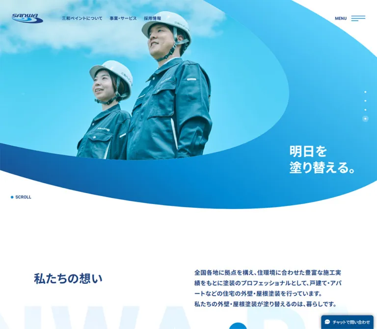
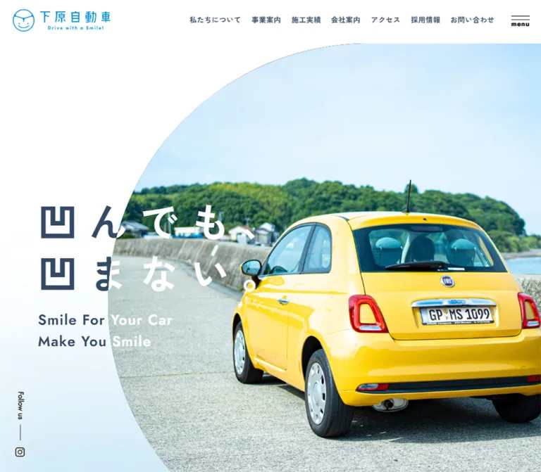
白とブルーを基調に、大きな曲線で切り取った写真と広い字間の見出しを組み合わせた自動車整備会社のサイト。縦組みの紹介文、横並びの記事一覧、写真付きのお問い合わせエリアが特徴。
Shimohara Automotive — Style Reference
Clear white space, reassuring blue typography, and automotive photography framed by generous curves.
Website: shimohara-auto.co.jp Original URL: https://shimohara-auto.co.jp/ Final URL: https://shimohara-auto.co.jp/ Theme: light page with blue accents and a dark blue footer; no theme-switching behavior was verified. Inspected: October 2, 2026, JST. Supplied evidence timestamp: October 1, 2026, 18:15:25.606 UTC, equivalent to October 2 at 03:15:25.606 JST. Viewports: 1440 × 1000 desktop and 390 × 844 mobile, in CSS pixels. Scope: the current corporate homepage: identity header, navigation, hero, introductory story, services, news, work examples, company links, recruitment, blog, contact area, and footer. Linked pages were not inspected.
The homepage presents 下原自動車株式会社, an automotive repair, maintenance, and sales business in Shingu, Wakayama. Its visual character is approachable and spacious: a fine blue identity mark, dark blue-gray text, extensive white space, strongly tracked Japanese headlines, and large photographic surfaces. In the clearly rendered desktop hero, a mechanic and an open bonnet sit inside a sweeping curved image boundary. The headline overlaps the transition between white space and photography.
This is a substantial corporate homepage with several browsing routes. Service categories, repair examples, company information, recruitment, maintenance articles, and contact details each have their own place. Its reusable character comes from the relationship between quiet typography, expansive images, curved boundaries, and restrained circular controls.
閉じる
Shimohara Automotive — Style Reference
Clear white space, reassuring blue typography, and automotive photography framed by generous curves.
Website: shimohara-auto.co.jp Original URL: https://shimohara-auto.co.jp/ Final URL: https://shimohara-auto.co.jp/ Theme: light page with blue accents and a dark blue footer; no theme-switching behavior was verified. Inspected: October 2, 2026, JST. Supplied evidence timestamp: October 1, 2026, 18:15:25.606 UTC, equivalent to October 2 at 03:15:25.606 JST. Viewports: 1440 × 1000 desktop and 390 × 844 mobile, in CSS pixels. Scope: the current corporate homepage: identity header, navigation, hero, introductory story, services, news, work examples, company links, recruitment, blog, contact area, and footer. Linked pages were not inspected.
The homepage presents 下原自動車株式会社, an automotive repair, maintenance, and sales business in Shingu, Wakayama. Its visual character is approachable and spacious: a fine blue identity mark, dark blue-gray text, extensive white space, strongly tracked Japanese headlines, and large photographic surfaces. In the clearly rendered desktop hero, a mechanic and an open bonnet sit inside a sweeping curved image boundary. The headline overlaps the transition between white space and photography.
This is a substantial corporate homepage with several browsing routes. Service categories, repair examples, company information, recruitment, maintenance articles, and contact details each have their own place. Its reusable character comes from the relationship between quiet typography, expansive images, curved boundaries, and restrained circular controls.
How to Read This Reference
- Measured means supplied rendered DOM geometry or computed style. Measurements describe the two inspected states, not necessarily every intermediate width.
- Calculated means arithmetic based on those measurements, such as card gaps, aspect ratios, or proportional insets.
- Visual estimate means an approximate reading of an original-page screenshot. Estimated colors and curves are not extracted source declarations.
- Recommended means implementation guidance for a new project. The CSS and prompts below include recommendations where original behavior or styling was not recorded.
- Token names are descriptive aliases unless explicitly identified as source custom properties.
Evidence Coverage
| Area | Available evidence | Practical confidence |
|---|---|---|
| Desktop header and hero | Clearly rendered original screenshot plus DOM and computed styles | Strong evidence for composition, typography, identity placement, and the large image curve |
| Additional desktop captures | Logo, menu control, and social rail remain visible; the main content area is white | These captures do not establish the intended appearance of the middle sections |
| Mobile opening viewport | Header is visible; the content area is white | Header appearance is confirmed; hero typography and geometry are documented by DOM only |
| Mobile contact and footer | Clearly rendered photograph, contact controls, curved boundary, blue texture, logo, and address | Strong visual evidence for this portion of the page |
| Middle sections | Extensive text, links, element bounds, and computed styles at both widths | Strong structural evidence; imagery, some decorative layers, and final visibility are not fully verified |
| Menu, carousels, and hover states | Controls, destinations, and transition declarations | Functional outcomes were not exercised in the supplied record |
The white content captures are an inspection limitation. Their cause is unknown. They should not be treated as intentional empty sections, proof of a discontinued website, or evidence of a specific loading animation. Conversely, DOM text alone does not prove that every measured component was visibly painted at capture time.
Tokens — Colors
Default Palette
| Name | Value | Evidence | Role |
|---|---|---|---|
| Page White | #ffffff |
Measured body background; also visible | Main canvas and header surroundings |
| Automotive Blue | #008acd |
Source --primary and --swiper-theme-color; measured link color |
Links, category text, and the blue action family |
| Blue-gray Ink | #344a63 |
Measured rgb(52, 74, 99) |
Body text, desktop headline, navigation, and article titles |
| Reversed White | #ffffff |
Measured on contact, recruitment, footer links, and mobile hero text | Text over darker or photographic surfaces |
| Pale Sky | Approximately #d6eff8 |
Visual estimate | The pale blue wash near the lower left of the desktop hero |
| Footer Blue | Approximately #315d86 |
Visual estimate | Base approximation for the textured mobile footer |
| Utility Black | Approximately #000000 |
Visual observation, not a sampled declaration | Thin menu marks and the desktop social utility graphics |
The logo appears brighter than the main blue-gray text. Its artwork color was not separately extracted; use the actual approved logo asset instead of assuming that every logo pixel equals --primary.
The footer has visible fine grain and tonal variation. A flat fill of the estimated Footer Blue is a fallback, not an exact reproduction. Likewise, the pale hero wash is visibly graduated, but its precise stops and opacity were not supplied.
Color Scope
The page exposes numerous framework and editor variables, including generic red, yellow, purple, shadows, and preset gradients. Their presence does not make them part of the visible brand palette. Build the reference around white, blue-gray ink, automotive blue, and the observed blue surfaces.
Yellow is visible in the car photograph within the current mobile contact capture. Treat that yellow as photographic content rather than a measured interface accent.
Several component wrappers have a computed transparent background even where screenshots show a photograph or blue surface. Those fills can come from children, images, or decorative layers. Do not substitute transparent white-page styling for a visually confirmed composite surface.
Tokens — Typography
Declared Font Stack
The body and sampled controls share this computed stack:
font-family:
  Jost,
  'Zen Kaku Gothic New',
  'Helvetica Neue',
  'Hiragino Sans',
  'ヒラギノ角ゴ  ProN W3',
  'Hiragino Kaku Gothic ProN',
  'Yu Gothic',
  YuGothic,
  Verdana,
  Meiryo,
  'M+ 1p',
  sans-serif;
Jost and Zen Kaku Gothic New are explicitly named in the computed declaration. The evidence does not independently confirm which downloaded font file rendered each glyph. Preserve the declared pairing and provide suitable fallbacks rather than claiming verified font loading.
The typography combines geometric Latin forms with clean Japanese Gothic text. Large Japanese statements carry unusually generous tracking. Small navigation and article labels are denser and more practical.
Type Scale
All values below are measured unless explicitly qualified.
| Role | Desktop | Mobile | Weight | Tracking / notes |
|---|---|---|---|---|
| Body | 16px / 26.4px |
Same | 400 |
Normal tracking; line-height ratio 1.65 |
| Hero Japanese headline | 77px / 100.1px |
50px / 65px |
700 |
22.33px desktop, 7.5px mobile |
| Hero English subheading | 28px / 42px |
18px / 27px |
700 |
1.4px desktop, 0.9px mobile |
| Introductory statement | 40px / 60px |
30px / 45px |
600 |
12px desktop, 9px mobile |
| Introductory prose | 16px / 40px |
16px / 32px |
400 |
0.8px; narrow, tall text regions |
| Recruitment statement | 33px / 56.1px |
26px / 44.2px |
600 |
Normal tracking |
| Section-heading parent | 20.8px / 24.96px |
Same | 600 |
Compound Japanese/English heading; child styles not supplied |
| Service introduction | 15px / 22.5px |
Same | 400 |
Normal tracking |
| Desktop navigation | 14px / 19.6px |
Not exposed as a horizontal row | 700 |
0.42px, equivalent to 0.03em |
| Text-and-arrow action | 16px / 24px |
Same | 700 |
Normal tracking |
| Work and blog title | 16px / 19.2px |
Same | 600 |
Wraps with card width |
| News article link | 14px / 19.6px |
Same | 700 |
Distinct from its larger inherited heading style |
| Work/blog category | 13px / 26.4px |
Same | 400 |
Automotive Blue |
| News category pill | 12px / 12px |
Same | 400 |
Compact category label |
| Contact telephone | 30px |
Same | 700 |
Computed line-height 26.4px; inline box height is about 43px |
| Footer copyright | 14px / 20px |
Same | 400 |
1px tracking |
Calculated tracking ratios: the hero uses 0.29em on desktop and 0.15em on mobile. Its English subheading uses 0.05em at both widths. The introductory statement uses 0.3em at both widths.
Do not apply the parent section-heading size to every visible Japanese and English line. The supplied element sampling does not include the nested text styles that produce the full compound heading. The implementation below explicitly labels its child-heading sizes as recommendations.
Identity and Utility Lettering
The logo includes the Japanese business name, a circular smiling mark, and the English line “Drive with a Smile!” Its visual lettering belongs to the logo artwork. The computed font on the surrounding h1 is not evidence that the logo was typeset as ordinary HTML text.
The visible menu caption is much smaller than its button's inherited 16px font. Its appearance is approximately an 11px bold utility label; this is a visual estimate. The same distinction applies to the small vertical “Follow us” treatment.
Line Breaks
The hero deliberately separates the Japanese copy into “凹んでも、” and “凹まない。” The English copy is also two lines: “Smile For Your Car” and “Make You Smile”. Preserve these intentional lines rather than allowing a generic responsive heading to reflow arbitrarily.
Tokens — Spacing & Shapes
The source uses a conventional 16px root. There is no evidence of an unusual rem scaling system.
Spacing Scale
| Use | Desktop | Mobile | Evidence |
|---|---|---|---|
| Logo left inset | 25px |
20px |
Measured |
| Common section-header inset | 56px |
16px |
Measured; not universal |
| News content inset | Main header at 56px |
31px |
Measured |
| Company and footer inset | 56px |
36px |
Measured |
| Article rail starting inset | 60px |
20px |
Measured |
| Hero copy left inset | 100.8px |
27.3px |
Measured; approximately 7vw at both widths |
| Desktop navigation gap | 30px |
— | Calculated from adjacent link bounds |
| Hero headline-to-English gap | 16px |
16px |
Calculated |
| Article-card gap | 40px |
20px |
Calculated |
| Service-link horizontal gap | About 79.33px |
32px |
Calculated |
| Service-link row gap | 60px |
20px |
Calculated |
| Company-link gap | 32px horizontally |
20px vertically |
Calculated |
| Common section opening space | Often 80px |
Often 60px |
Measured positions; some mobile sections retain 80px |
| Introductory section padding | 140px top, 120px bottom |
60px top and bottom |
Measured |
The mobile layout uses several inset families. Applying one global 16px gutter everywhere would lose the more inset news, company, and footer compositions.
Border Radius and Curves
| Element | Value / appearance | Evidence |
|---|---|---|
| Work/blog media link | 20px radius |
Measured at both widths |
| News category | 10px radius |
Measured |
| Standard action anchor | 4px radius on the anchor box |
Measured; this is not the circular arrow's radius |
| Desktop rail-control button | 60 × 60px, 30px radius |
Measured |
| Contact arrow disc | Approximately 50px diameter |
Visual estimate from the mobile contact capture |
| Service-link wrapper | 0px radius |
Measured; does not establish the shape of unrecorded inner artwork |
| Company-link wrapper | 0px radius |
Measured |
| Hero image boundary | Very large rounded left edge, cropped by the viewport | Visually confirmed; exact mask CSS unavailable |
| Contact-to-footer boundary | Broad lower curve that rises toward the right | Visually confirmed on mobile; exact geometry unavailable |
The design uses curves at different scales: architectural image boundaries, rounded article images, and small circular arrow controls. These are distinct component treatments rather than a universal pill-shaped card system.
Layout Measurements
| Element | Desktop: 1440 × 1000 | Mobile: 390 × 844 |
|---|---|---|
| Document height | 7492.27px |
6574.78px |
| Identity/header height | 80px |
60px |
| Main content starts | y = 85px |
y = 60px |
| Logo link width | 220px |
170px |
| Logo heading/artwork region height | 50px |
About 38.63px |
| Menu button | 80 × 80px |
60 × 60px |
| Hero section height | 1100px |
About 759.59px |
| Hero headline origin | x = 100.8px, y = 426.9px |
x = 27.3px, y = 434.8px |
| Common section-header width | 1328px |
358px |
| Service-link box | 318 × 318px |
153 × 153px |
| Work/blog media box | 350 × 315px |
250 × 225px |
| Company link | About 421.33 × 115.81px |
318 × 92.81px |
| Footer element height | About 855.14px |
About 625.22px |
The media boxes retain a calculated 10:9 aspect ratio at both widths. The hero heights happen to equal approximately 110vh and 90vh in the inspected states, but no original height formula was supplied. Those relationships are useful adaptation choices, not verified responsive source rules.
Components
Identity Header
Role: establish the business identity and provide navigation without competing with the hero.
The desktop composition places the blue logo at the upper left, a seven-link navigation row toward the right, and the menu control at the far right. The logo starts at x = 25px. The navigation begins around x = 689px, uses 14px bold text, and separates links by a calculated 30px.
The visible destinations are “私たちについて”, “事業案内”, “施工実績”, “会社案内”, “アクセス”, “採用情報”, and “お問い合わせ”. These are ordinary site links, with Access pointing to the company page's access anchor.
At mobile width, the logo becomes 170px wide and the menu occupies the rightmost 60px. The horizontal navigation is not exposed in the mobile text/link extraction. The white header remains visible in both the opening and footer mobile captures, supporting persistent-header behavior; the exact source positioning property was not recorded.
There is a real skip link, “本文までスキップする”, targeting #content. Its unfocused box is reduced to approximately one pixel outside the normal visible area. Focus behavior was not exercised.
Menu Trigger
Role: expose the broader site navigation.
The visible control combines two thin horizontal rules with the small lowercase label “menu”. Its measured hit area is substantially larger than its approximately 35px-wide graphic. The button text supplied to the DOM is “メニューを開閉する”.
The body text includes a broader Japanese/English navigation structure with company and recruitment sublinks. An opened menu was not captured. Its panel geometry, background, transition, focus management, and closing behavior remain unverified.
For reuse, preserve the compact visual mark while retaining the full measured hit area. Implement the open state separately with an accessible name, expanded state, and keyboard behavior.
Desktop Social Rail
Role: provide a quiet secondary route to Instagram.
A vertical “Follow us” label, a short rule, and an Instagram icon sit near the lower left of the desktop viewport. The icon link is recorded around x = 30px, with an 18px width. The rail remains visible in the additional desktop captures even when the main content is white.
The linked destination is the business's Instagram account. Neither the rail nor that link appears in the mobile visible-link extraction. Do not allocate a permanent mobile side gutter for it.
Photographic Hero
Role: communicate human care and automotive expertise before presenting detailed services.
The clearly rendered desktop image shows a mechanic wearing turquoise work clothes, an open bonnet, a partial foreground figure, and a bright blue sky. The photographic region extends to the right edge and is bounded on the left by an oversized rounded curve. White space and a pale blue lower wash remain outside that curve.
The Japanese heading begins near 7vw from the left and uses 77px type with 22.33px tracking. Its two lines occupy a measured 200.19px line box. The English pair begins 16px below, using 28px / 42px type. In this desktop capture the text is blue-gray.
At 390px, the DOM records 50px / 65px Japanese text and 18px / 27px English text, both white. The left alignment remains approximately 7vw. Because the mobile opening screenshot is white below the header, the mobile photograph, mask, and final text visibility cannot be visually confirmed.
The desktop text extraction contains duplicate hero copy. This may serve a visual layering or media function, but the supplied evidence does not establish its purpose. A new implementation should use one semantic headline and hide any purely decorative duplicate from assistive technology.
Introductory Story
Role: give the business's service promise an editorial pause after the large hero.
The statement “車を笑顔に。あなたを笑顔に。” sits beside a separate prose block and an About link. Desktop bounds place the heading in a narrow 120px-wide, approximately 419px-tall region toward the right, with prose in a 200px-wide region immediately to its left.
On mobile, the corresponding widths become 90px and 160px. The heading lies to the right of the prose. These tall, narrow bounds and their text layout strongly support vertical composition, although the source writing-mode property was not included in the supplied sampling.
The heading reduces from 40px to 30px; body text stays at 16px, with column spacing represented by line-height reducing from 40px to 32px. Retain this deliberate editorial treatment when adapting the section. Do not infer the appearance or placement of any accompanying image from the text geometry alone.
Bilingual Section Heading
Role: give each corporate content area a consistent identity.
Section headings pair Japanese labels with English names such as Service, News, Works, Company, Recruit, Blog, and Contact us. They often sit beside introductory copy or a text-and-arrow action.
The measured parent heading is 20.8px, weight 600; nested styles are absent from the evidence. Composite heading boxes generally become shorter on mobile, around 53.44px for several sections compared with 82.28px on desktop. That confirms a responsive compound treatment without establishing each child's exact type size.
For an adaptation, keep Japanese and English associated within one heading and use distinct but restrained scales. Any chosen child sizes should be documented as implementation decisions.
Text-and-Arrow Action
Role: provide a consistent route to details, archives, and contact.
Labels include “詳しくみる”, “私たちについて”, “View All”, and “メールでお問い合わせ”. Sampled anchors use 16px / 24px bold text, approximately 48.38px total height, and padding of 11.2px 65px 11.2px 0.
The 65px right-side reservation accommodates the action graphic. In the mobile contact capture, that graphic is a blue circular disc with a white right arrow, approximately 50px across. The contact label also has a visible underline.
Use the label and disc as one link. Avoid turning every instance into a full-width filled button. The underlying anchor's measured 4px radius does not describe the circular graphic.
Service Links
Role: present five service destinations as large, easily scanned choices.
The destinations are bodywork and painting, inspection, new/used vehicle sales, roadside service, and glass coating. Each links to a corresponding anchor on the service page.
Desktop geometry places three 318px square link boxes in the first row and two centered in the second. The calculated horizontal gap is about 79.33px; the row gap is 60px.
Mobile geometry changes to two columns of 153px square boxes. The first column begins at x = 26px, the second at x = 211px, yielding a 32px gap. Rows are separated by 20px, and the fifth item stays in the left column.
The service introduction changes from a horizontal desktop arrangement to a stacked mobile sequence: bilingual title, paragraph, then a right-aligned detail action. Service imagery and internal decorative masks were not visibly resolved in the supplied screenshots. The square link bounds do not prove circular or square artwork.
News List
Role: communicate recent business updates through compact editorial rows.
Three entries are present. Each groups a date, the category “お知らせ”, and a linked title. The category is a measured 100 × 20px region with 12px type, 3px 10px padding, and a 10px radius.
On desktop, the section heading and archive link occupy a left column. The entries occupy the larger area to the right, with date/category/title arranged horizontally. The title link itself is 14px / 19.6px and bold, even though its enclosing heading has a larger inherited size.
On mobile, the heading and archive action share the top row within a 328px-wide region. Each entry places its date and category above its title. Long titles wrap naturally into two lines. Row separators and their exact colors were not established by the supplied visual evidence.
Work and Blog Rails
Role: present browsable examples and useful articles without converting every item into a tall mobile stack.
Both sections use a repeated media/title/date/category structure. Six work examples and six blog entries are represented in the DOM.
Desktop media links measure 350 × 315px, have a 20px radius, and start at x = 60px, 450px, 840px, and beyond. This gives 40px gaps and an arrangement extending past the right viewport edge. Two 60px circular control buttons sit near the right side of each section header, separated by 15px.
Mobile media links become 250 × 225px with the same radius. Their x positions progress from 20px to 290px to 560px, giving 20px gaps. The geometry accommodates one complete item and part of the next within the viewport. Desktop control buttons are absent from the sampled mobile elements.
Titles remain 16px and weight 600. The first work title wraps to two lines on mobile. Dates sit below titles, followed by smaller blue category links. Keep these categories as independent destinations rather than nesting interactive links inside a single all-encompassing card link.
The layout and controls support a carousel interpretation, and Swiper variables are present. Autoplay, swipe response, looping, snapping, and button outcomes were not verified. A native horizontal overflow rail is a reasonable accessible adaptation, not a claim about the original implementation.
Company Links
Role: offer direct routes to the greeting, company profile, and access information.
Desktop links form three equal columns, each approximately 421.33px wide, with 32px gaps. Their measured padding is 30px 20px. Japanese labels are paired with Message, Profile, and Access.
Mobile links stack within a 318px-wide region inset 36px from the screen edges. Padding reduces to 20px 15px, and the vertical gap is 20px. The links retain square wrapper corners. Decorative borders, arrows, or inner typography beyond the sampled parent styles were not fully captured.
Recruitment Feature
Role: introduce employment opportunities as a distinct editorial feature.
The DOM records a bilingual heading, a prominent recruitment statement, and a detail link. All sampled text is white. On desktop the text group sits around x = 169px in a 308px-wide column; mobile uses x = 16px and 358px width.
The main statement scales from 33px / 56.1px to 26px / 44.2px. The overall section remains tall: approximately 668px on desktop and 683px on mobile.
The background artwork was not visually confirmed. White text suggests an intended contrasting surface, but does not prove a particular photograph, gradient, or overlay. Supply a readable backing surface in an adaptation without presenting that choice as an observed original asset.
Contact Area
Role: make hours, telephone contact, and the contact-page route easy to find near the end of the homepage.
The current mobile capture shows the rear of a yellow compact car behind white contact information. A darkened photographic appearance helps separate the text, although the exact overlay implementation and opacity are unknown.
The content includes opening hours 8:30 - 17:30, closure information, a telephone label, a bold 30px phone number, and the text-and-circle email inquiry action. The phone number is an actual tel: link. The email inquiry label leads to /contact/; it is not a recorded mailto: link.
Desktop DOM positions distribute the contact heading, telephone, and contact-page action across the width. Mobile positions stack the telephone and contact action centrally: the phone begins near x = 97.56px, while the 227px-wide inquiry link begins at x = 81.5px.
The photo's broad lower curve merges into the blue footer. Preserve this large-scale connection rather than using an unrelated rectangular CTA card.
Footer
Role: close with business identity, location, and a secondary navigation layer.
The mobile screenshot clearly shows a blue grain-textured surface, a white version of the logo, a postal address, a telephone link, and a small centered copyright line. Content begins around a 36px left inset. There is generous space between the address block and copyright.
The displayed address is “〒647-0061” and “和歌山県新宮市三輪崎1973-4”. It splits across lines on mobile. The footer logo link measures 200px wide at both inspected widths.
Desktop DOM evidence includes grouped navigation to the main sections and company/recruitment subpages. Those navigation links are not exposed in the mobile visible-link extraction, and the mobile footer capture presents the simpler identity/address composition.
The copyright reads “©2022 - 2026 Shimohara Automotive.” Its measured style is 14px / 20px, white, with 1px tracking. The footer's blue and texture are visual observations; the sampled footer wrapper itself has a transparent computed background.
Tokens — Motion & Interaction
| Target | Recorded declaration or structure | What it establishes | What remains unverified |
|---|---|---|---|
| Desktop navigation | color 0.4s cubic-bezier(0.165, 0.84, 0.44, 1) |
A 400ms color transition is defined | Trigger and destination color |
| Introductory and selected section content | opacity 0.8s and transform 0.8s with the same cubic-bezier |
An 800ms reveal-compatible transition is defined | Trigger threshold, initial transform, delay, and successful reveal |
| Service links and article categories | color 0.3s cubic-bezier(0.165, 0.84, 0.44, 1) |
A 300ms color transition is defined | Final hover/focus appearance |
| News category pills | color 0.4s and background 0.4s with the same easing |
Text and background can transition together | Actual alternate colors |
| Standard detail/archive actions | Color, background, border, and shadow transitions at 0.15s ease-in-out |
A short generic transition declaration | A visible shadow or filled hover state is not proven |
| Footer links | color 0.2s cubic-bezier(0.165, 0.84, 0.44, 1) |
A 200ms color transition is defined | Alternate color |
| Work/blog navigation | Two desktop buttons and offscreen horizontal item positions | A browsable rail structure exists | Click response, swipe behavior, speed, loop, and autoplay |
| Menu | A menu toggle button and navigation text | A menu entry point exists | Open/close motion and panel appearance |
| Hero | Large media region and duplicate desktop copy | A composed hero structure exists | Image sequence, crossfade, autoplay, and timing |
The repeated cubic-bezier can be retained as a reusable easing token. Do not convert the transition declarations into claims that a particular animation was witnessed. Sampled animation: none on elements also does not rule out JavaScript, ancestor, pseudo-element, or media animation.
The capture process waited for document load, sampled layout and text stability, visible image decoding, and finite animations within documented limits. Perpetual animations were temporarily paused during readiness checks and then resumed. This process did not guarantee semantic completeness, and several resulting captures remained white in the content area.
For a new implementation, keep content visible by default and make reveals a progressive enhancement. A reveal observer or media failure should never leave the homepage permanently blank.
Surfaces
| Surface | Appearance | Evidence and use |
|---|---|---|
| Main page | White, spacious | Measured body background and clear desktop capture |
| Header | White visual field with compact identity and controls | Confirmed in desktop and mobile screenshots |
| Hero surround | White fading into pale blue near the lower left | Visually confirmed; gradient values estimated |
| Hero photograph | Full-color, curved clipping | Confirmed desktop photograph; mask implementation unknown |
| Article media | Rounded 20px image-link regions |
Geometry measured; individual image appearance not confirmed |
| Contact photograph | Full-color car photograph with white text | Confirmed mobile; darkening technique unknown |
| Footer | Blue with fine visible grain and white content | Confirmed mobile; exact fill and texture asset unavailable |
There is no confirmed general shadow-elevation system. The available evidence supports hierarchy through spacing, type scale, image boundaries, and contrast. Generic editor shadow presets should not be promoted into design tokens merely because they exist in the document.
Imagery
The clearest original images are grounded automotive photographs. The desktop hero focuses on a human interaction around an open bonnet; the mobile contact area focuses on a yellow compact car. Bright daylight, blue sky, turquoise workwear, and natural photographic detail soften the industrial subject matter.
Keep photographs large enough to establish setting and human presence. Avoid replacing them with tiny thumbnail collages or isolated vector car icons. The large curve should frame the subject without cutting through a face or making overlaid copy unreadable.
The logo supplies a different kind of friendliness: thin circular linework and a smiling face-like mark. Use the approved artwork, including its blue and white variants. Do not redraw its wordmark using the body's font stack.
Observed Asset References
No image src, background-image URL, font-file URL, or texture path was included in the supplied original-page evidence. The following are observed roles, not fabricated asset filenames.
| Asset role | Confirmed content | Reuse guidance |
|---|---|---|
| Header identity | Blue circular mark, Japanese name, English tagline | Use the approved logo at 220px desktop and 170px mobile width |
| Desktop hero | Mechanic, open bonnet, foreground figure, blue sky | Preserve the generous crop and dominant curved left edge |
| Contact photograph | Rear view of a yellow compact car | Maintain sufficient backing contrast for white labels |
| Footer identity | White logo variant | Use on the blue footer rather than recoloring ordinary text |
| Footer texture | Fine grain across a blue field | Obtain an approved texture or use a clearly approximate substitute |
| Work/blog media regions | Links with measured 10:9 boxes and 20px radius |
Actual image subjects and asset URLs remain unverified |
| Service artwork | Five large link regions exist | Internal imagery and masking remain unverified |
CSS can reproduce geometry and hierarchy; it cannot reproduce the supplied photography, logo, or texture without appropriate assets.
Layout & Responsive Behavior
Page Sequence
The content order is stable across the two DOM observations: hero, introductory story, services, news, works, company links, recruitment, blog, contact, and footer. The measured page is approximately 7.49k pixels tall on desktop and 6.57k pixels tall on mobile.
The shorter mobile document does not imply that every article disappears. Work and blog entries remain laid out horizontally, and the hero, media boxes, and several gaps become smaller.
Observed Adaptations
| Area | Desktop | Mobile |
|---|---|---|
| Header | Logo, seven-link navigation, menu | Smaller logo and menu; horizontal navigation absent |
| Social link | Left-side vertical rail | Not exposed |
| Hero | 77px blue-gray headline; desktop photo visible |
50px white headline in DOM; photograph not visually confirmed |
| Introductory text | Narrow tall blocks toward the right | Narrow tall blocks retained with smaller statement type |
| Services | Three items, then two centered | Two columns, then a final left-aligned item |
| Service introduction | Title, paragraph, and action across a row | Stacked with the action aligned right |
| News | Heading beside entries; row metadata and title aligned horizontally | Heading above entries; titles wrap beneath metadata |
| Work/blog rails | 350px items, 40px gaps, desktop controls |
250px items, 20px gaps, partial next item |
| Company links | Three columns | Three stacked rows |
| Recruitment | Narrow text column; 33px statement |
Wider relative text region; 26px statement |
| Contact | Distributed horizontally | Phone and inquiry action stacked centrally |
| Footer | Address plus grouped navigation | Identity, address, telephone, and copyright |
Breakpoint Evidence
Source custom properties list 0, 375px, 576px, 768px, 992px, 1200px, and 1400px. These expose a breakpoint vocabulary, but do not reveal which media query controls each component. Only the 390px and 1440px states were inspected.
The CSS below chooses 768px and 1200px as practical adaptation boundaries. Those choices are recommendations. Intermediate widths, landscape phones, zoom behavior, and safe-area handling were not tested in the supplied record.
Reproduction Priorities
Preserve the 7% hero-copy inset, distinct mobile gutter families, large image curvature, service-grid reflow, and horizontal article rails. These relationships explain more of the page's character than copying every document y-coordinate.
Treat recorded offscreen positions cautiously. Some elements also have transform transitions, so bounds can reflect a sampled transition state. Do not reproduce isolated 20px offsets on offscreen cards as an intentional stagger without further evidence.
Do’s and Don’ts
Do
- Start with white,
#344a63text, and#008acdaccents. - Preserve the oversized curved photographic boundary in the desktop hero.
- Keep the Japanese hero copy in its two deliberate lines.
- Retain the measured difference between desktop and mobile tracking.
- Use actual logo artwork and its white footer variant.
- Maintain generous section spacing and several intentional gutter widths.
- Preserve the service layout's three-plus-two desktop arrangement and two-column mobile arrangement.
- Keep work and blog items in horizontal browsing sequences with partial-next-item visibility.
- Use
20pxarticle-image corners and compact circular action graphics. - Let contact photography flow into the textured blue footer.
- Distinguish measured DOM structure from screenshot-confirmed appearance.
Don’t
- Don't reproduce the unexplained white captures as intentional content states.
- Don't infer a hero slideshow, parallax effect, or autoplay schedule from static captures.
- Don't claim that the mobile hero image or opened menu was visually verified.
- Don't turn framework preset colors and shadows into the brand palette.
- Don't substitute generic rounded cards for every service, company, news, and article component.
- Don't assume square service-link bounds reveal the shape of their inner artwork.
- Don't apply the desktop headline's
0.29emtracking unchanged on mobile. - Don't reduce the corporate homepage to a single conversion panel.
- Don't turn the contact-page link into a mailto action without a real email destination.
- Don't hide essential content until an animation or image-loading script succeeds.
- Don't invent asset paths, production credits, or unobserved interaction outcomes.
Recommended Implementation Additions
These are recommendations for a new implementation, not verified features of the original website:
- Implement the menu with
aria-expanded, a controlled panel, Escape handling, appropriate focus management, and focus restoration. - Preserve the existing skip-link concept and make it clearly visible on focus.
- Give rail controls explicit accessible names. Provide keyboard and touch access to every item, including content initially outside the viewport.
- Keep image links and article titles coherently named while leaving category links independent.
- Render meaningful content without requiring reveal scripts. Avoid an initial global opacity of zero.
- Give the mobile hero and recruitment text a readable solid fallback if their intended media fails to load.
- Offer reduced-motion behavior and avoid forced carousel autoplay.
- Use actual image dimensions or aspect ratios to reserve space before decoding. Load the initial hero promptly and defer noncritical offscreen media.
- Mark purely decorative duplicate hero layers as hidden from assistive technology.
- Use semantic heading levels based on the page outline. The original sampled heading tags need not be copied mechanically.
- Check small blue text, white photographic text, and focus indicators against their actual rendered backgrounds.
- Retain at least a 44px interaction target around compact-looking controls and category links without enlarging every visible label.
Agent Prompt Guide
Quick Color Reference
- Canvas:
#ffffff, measured. - Primary text:
#344a63, measured. - Link/action blue:
#008acd, measured. - Reversed text:
#ffffff, measured. - Pale hero wash: approximately
#d6eff8, visual estimate. - Textured footer base: approximately
#315d86, visual estimate. - Photographic yellow and turquoise belong to image content, not mandatory UI tokens.
Overall Prompt
“Create a Japanese automotive company's corporate homepage inspired by the current Shimohara Automotive page. Use a white canvas, blue-gray text #344a63, and automotive-blue links #008acd. Use the declared Jost and Zen Kaku Gothic New font pairing with sensible fallbacks. Place a fine blue logo at the upper left, compact bold desktop navigation toward the right, and a two-rule menu mark at the far right. Give the desktop hero a large daylight photograph of a mechanic beside an open bonnet, a sweeping curved left boundary, and two lines of widely tracked Japanese copy aligned about 7% from the left. Follow with an editorial introduction, five service links, compact news rows, horizontal work and blog rails, company links, recruitment, and a photographic contact area flowing into a textured blue footer. Use restrained circular arrows and 20px article-image corners. Preserve corporate browsing depth and make all content visible without animation scripts.”
Example Component Prompts
- Hero: “Build a spacious white desktop hero with an automotive photograph filling the right side through an oversized rounded left edge. Set ‘凹んでも、’ and ‘凹まない。’ in 77px bold type, 1.3 line-height, and 0.29em tracking. Align at 7vw. Add the two-line English subheading at 28px with a 16px gap. On mobile use 50px Japanese text, 0.15em tracking, and 18px English text. Choose a readable mobile photo treatment explicitly as an adaptation because the original mobile crop was not visually verified.”
- Service group: “Arrange five service destinations in 318px square link regions: three across, then two centered. Use about 79px horizontal gaps and 60px row spacing at the inspected desktop width. At 390px, use two 153px columns with 32px gaps and 20px row spacing. Leave the final item on the left. Do not invent an original artwork mask.”
- Article rail: “Create an unboxed horizontal article rail with 350 × 315px media, 20px corners, 40px gaps, 16px semibold titles, dates, and 13px blue categories. At mobile width use 250 × 225px media and 20px gaps so the next item remains partially visible. Add accessible controls and do not enable autoplay by default.”
- News list: “Use a bilingual section heading and a small archive action. Group each entry's date, 100 × 20px category pill, and bold 14px title. On mobile place the title below the metadata and allow natural wrapping within a 328px region.”
- Contact: “Place business hours, a 30px bold telephone link, and an underlined inquiry label over an automotive photograph. Pair the inquiry label with a roughly 50px blue circle containing a white arrow. Stack the phone and action centrally on mobile. End the photograph with a broad lower curve rising on the right.”
- Footer: “Use a grain-textured blue surface with a white logo, readable postal address, telephone link, and tracked copyright. On mobile inset the identity block 36px and leave generous breathing room before the copyright. Keep the blue value and texture explicitly approximate until approved assets are available.”
Quick Start
CSS Custom Properties
This is an adaptation scaffold, not recovered source CSS. Exact colors, sampled type sizes, card dimensions, gaps, and control sizes are carried across where supported. Hero height formulas, image clipping, child-heading sizes, hover endpoints, breakpoint assignments, and contact/footer background construction are recommendations.
Use approved image and logo assets in the HTML. No asset URLs are invented here. The menu panel and enhanced rail controls need separate accessible behavior; this CSS does not pretend to implement their original interactions.
Suggested anatomy: .site-header contains a .brand link, .primary-nav, and .menu-toggle; .hero contains .hero-media and .hero-copy; .text-link contains a label and an aria-hidden .text-link__icon; each .entry contains a media link, title link, date, and independent category links.
:root {
  /* Measured colors */
  --color-page: #ffffff;
  --color-ink: #344a63;
  --color-brand: #008acd;
  --color-reverse: #ffffff;

  /* Visual approximations */
  --color-sky: #d6eff8;
  --color-footer: #315d86;

  /* Leading families from the recorded stack */
  --font-site: Jost, 'Zen Kaku Gothic New', 'Helvetica Neue',
    'Hiragino Sans', 'Hiragino Kaku Gothic ProN', 'Yu Gothic',
    YuGothic, Verdana, Meiryo, 'M+ 1p', sans-serif;
  --text-body: 16px;
  --leading-body: 1.65;
  --text-hero: 77px;
  --tracking-hero: 0.29em;
  --text-hero-en: 28px;
  --text-entry: 16px;
  --text-category: 13px;

  /* Measured desktop geometry */
  --header-height: 80px;
  --page-start: 85px;
  --logo-width: 220px;
  --gutter: 56px;
  --rail-inset: 60px;
  --entry-width: 350px;
  --entry-gap: 40px;
  --media-radius: 20px;
  --section-space: 80px;

  /* Estimated visible disc size */
  --action-disc: 50px;

  /* Recorded transition vocabulary */
  --ease-site: cubic-bezier(0.165, 0.84, 0.44, 1);
  --motion-link: 400ms var(--ease-site);
  --motion-category: 300ms var(--ease-site);
  --motion-reveal: 800ms var(--ease-site);
}

* { box-sizing: border-box; }

html {
  scroll-padding-top: calc(var(--header-height) + 20px);
}

body {
  margin: 0;
  padding-top: var(--page-start);
  color: var(--color-ink);
  background: var(--color-page);
  font-family: var(--font-site);
  font-size: var(--text-body);
  line-height: var(--leading-body);
}

img { display: block; max-width: 100%; }
a { color: var(--color-brand); }
button { font: inherit; }

.site-header {
  position: fixed;
  inset: 0 0 auto;
  z-index: 50;
  display: flex;
  align-items: center;
  height: var(--header-height);
  padding-left: 25px;
  background: var(--color-page);
}

.brand { flex: 0 0 auto; }
.brand img { width: var(--logo-width); height: auto; }

.primary-nav {
  display: flex;
  align-items: center;
  gap: 30px;
  margin-left: auto;
}

.primary-nav a {
  color: var(--color-ink);
  font-size: 14px;
  font-weight: 700;
  line-height: 1.4;
  letter-spacing: 0.03em;
  text-decoration: none;
  transition: color var(--motion-link);
}

.menu-toggle {
  display: flex;
  flex: 0 0 var(--header-height);
  flex-direction: column;
  align-items: center;
  justify-content: center;
  gap: 4px;
  width: var(--header-height);
  height: var(--header-height);
  margin-left: 15px;
  padding: 0;
  border: 0;
  color: #000;
  background: transparent;
  cursor: pointer;
}

.menu-toggle__bars {
  width: 35px;
  height: 9px;
  border-block: 1px solid currentColor;
}

.menu-toggle__label {
  font-size: 11px; /* Visual approximation */
  font-weight: 700;
  line-height: 1;
  letter-spacing: 0.05em;
}

.skip-link {
  position: fixed;
  top: 8px;
  left: 8px;
  z-index: 100;
  padding: 10px 16px;
  color: var(--color-reverse);
  background: var(--color-ink);
  transform: translateY(-160%);
}

.skip-link:focus { transform: none; }

.hero {
  position: relative;
  min-height: clamp(760px, 110vh, 1100px);
  overflow: hidden;
  background: linear-gradient(#fff 45%, var(--color-sky));
}

.hero-media {
  position: absolute;
  inset: 0 0 0 20%;
  overflow: hidden;
  border-radius: 550px 0 0 550px; /* Curve approximation */
}

.hero-media img {
  width: 100%;
  height: 100%;
  object-fit: cover;
}

.hero-copy {
  position: absolute;
  top: 31.08%; /* Adapted from the inspected desktop bounds */
  left: 7%;
  z-index: 1;
  max-width: 93%;
}

.hero-title {
  margin: 0;
  font-size: var(--text-hero);
  font-weight: 700;
  line-height: 1.3;
  letter-spacing: var(--tracking-hero);
}

.hero-title span,
.hero-tagline span { display: block; }

.hero-tagline {
  margin: 16px 0 0;
  font-size: var(--text-hero-en);
  font-weight: 700;
  line-height: 1.5;
  letter-spacing: 0.05em;
}

.section { padding-block: var(--section-space); }
.container { margin-inline: var(--gutter); }

.section-heading {
  display: flex;
  align-items: center;
  justify-content: space-between;
  gap: 32px;
}

.section-title {
  margin: 0;
  font-size: 20.8px;
  font-weight: 600;
  line-height: 1.2;
}

/* Recommended child sizes; not sampled original values. */
.section-title__label {
  display: block;
  font-size: 14px;
  line-height: 1.4;
}

.section-title__english {
  display: block;
  margin-top: 8px;
  font-size: 52px;
  line-height: 1.05;
}

.text-link {
  display: inline-flex;
  align-items: center;
  gap: 15px;
  min-height: var(--action-disc);
  color: inherit;
  font-size: 16px;
  font-weight: 700;
  line-height: 1.5;
  text-decoration: none;
}

.text-link__icon {
  display: grid;
  flex: 0 0 var(--action-disc);
  place-items: center;
  width: var(--action-disc);
  height: var(--action-disc);
  border-radius: 50%;
  color: var(--color-reverse);
  background: var(--color-brand);
}

.service-links {
  display: flex;
  flex-wrap: wrap;
  justify-content: center;
  gap: 60px 79.33px;
  width: min(1112.66px, calc(100% - 112px));
  margin: 60px auto 0;
}

.service-link {
  display: grid;
  flex: 0 0 318px;
  place-items: center;
  width: 318px;
  aspect-ratio: 1;
  color: var(--color-ink);
  border-radius: 0;
  text-decoration: none;
  transition: color var(--motion-category);
}

/* Add approved service artwork inside these measured link regions. */
.content-rail {
  display: grid;
  grid-auto-flow: column;
  grid-auto-columns: var(--entry-width);
  gap: var(--entry-gap);
  overflow-x: auto;
  padding: 40px var(--rail-inset) 20px;
  scroll-padding-inline: var(--rail-inset);
  scroll-snap-type: x proximity; /* Recommended native fallback */
}

.entry { min-width: 0; scroll-snap-align: start; }

.entry-media {
  display: block;
  overflow: hidden;
  aspect-ratio: 10 / 9;
  border-radius: var(--media-radius);
}

.entry-media img {
  width: 100%;
  height: 100%;
  object-fit: cover;
}

.entry-title {
  margin: 16px 0 0;
  font-size: var(--text-entry);
  font-weight: 600;
  line-height: 1.2;
}

.entry-title a { color: inherit; text-decoration: none; }
.entry time { display: block; margin-top: 8px; }

.entry-categories {
  display: flex;
  flex-wrap: wrap;
  gap: 6px;
}

.entry-categories a {
  font-size: var(--text-category);
  line-height: 26.4px;
  text-decoration: none;
  transition: color var(--motion-category);
}

.rail-controls { display: flex; gap: 15px; }

.rail-controls button {
  width: 60px;
  height: 60px;
  border: 1px solid currentColor; /* Recommended visible boundary */
  border-radius: 30px;
  color: var(--color-ink);
  background: transparent;
  cursor: pointer;
}

.company-links {
  display: grid;
  grid-template-columns: repeat(3, minmax(0, 1fr));
  gap: 32px;
  margin-top: 60px;
}

.company-links > a {
  display: flex;
  align-items: center;
  min-height: 115.81px;
  padding: 30px 20px;
  color: var(--color-brand);
  text-decoration: none;
}

/* Recommended backing and curve; original layer CSS was not supplied. */
.contact-panel {
  position: relative;
  isolation: isolate;
  overflow: hidden;
  border-bottom-right-radius: min(50vw, 220px);
  color: var(--color-reverse);
  background: var(--color-ink);
}

.contact-photo,
.contact-panel::after {
  position: absolute;
  inset: 0;
  width: 100%;
  height: 100%;
}

.contact-photo { z-index: -2; object-fit: cover; }

.contact-panel::after {
  content: '';
  z-index: -1;
  background: rgb(0 0 0 / 28%);
}

.contact-content {
  display: grid;
  grid-template-columns: repeat(3, minmax(0, 1fr));
  align-items: center;
  gap: 48px;
  padding: 100px max(30px, 7vw);
}

.contact-phone {
  color: inherit;
  font-size: 30px;
  font-weight: 700;
  text-decoration: none;
  white-space: nowrap;
}

.contact-panel .text-link__label {
  text-decoration: underline;
  text-underline-offset: 6px;
}

.site-footer {
  padding: 80px var(--gutter) 90px;
  color: var(--color-reverse);
  background-color: var(--color-footer);
  background-image: var(--footer-texture, none);
}

.site-footer__logo { width: 200px; }
.site-footer a { color: inherit; }
.site-footer address { margin-top: 24px; font-style: normal; }

.site-footer__copyright {
  margin: 140px 0 0;
  font-size: 14px;
  line-height: 20px;
  letter-spacing: 1px;
  text-align: center;
}

/* Recommended hover endpoint and keyboard focus. */
@media (hover: hover) {
  .primary-nav a:hover,
  .service-link:hover { color: var(--color-brand); }
}

:where(a, button):focus-visible {
  outline: 3px solid currentColor;
  outline-offset: 4px;
}

/* Chosen adaptation breakpoint, not a verified source query. */
@media (max-width: 1199px) {
  .primary-nav { display: none; }
  .menu-toggle { margin-left: auto; }
  .service-links { gap: 32px; }
  .service-link { flex-basis: calc((100% - 32px) / 2); }
}

@media (max-width: 767px) {
  :root {
    --header-height: 60px;
    --page-start: 60px;
    --logo-width: 170px;
    --gutter: 16px;
    --rail-inset: 20px;
    --entry-width: 250px;
    --entry-gap: 20px;
    --section-space: 60px;
    --text-hero: 50px;
    --tracking-hero: 0.15em;
    --text-hero-en: 18px;
  }

  .site-header { padding-left: 20px; }

  .hero {
    min-height: 90vh;
    min-height: 90svh;
    color: var(--color-reverse);
    background: var(--color-ink);
  }

  /* Recommended mobile crop and backing, not visually verified. */
  .hero-media { inset: 0; border-radius: 0; }
  .hero-media::after {
    content: '';
    position: absolute;
    inset: 0;
    background: linear-gradient(transparent, rgb(0 0 0 / 35%));
  }
  .hero-copy { top: 49.34%; }

  .section-heading { gap: 16px; }
  .section-title__english { margin-top: 0; font-size: 32px; }

  .service-links {
    justify-content: flex-start;
    width: calc(100% - 52px);
    margin-top: 30px;
    gap: 20px 32px;
  }

  .service-link {
    flex-basis: calc((100% - 32px) / 2);
    width: auto;
  }

  .rail-controls { display: none; }

  .company-section .container { margin-inline: 36px; }
  .company-links {
    grid-template-columns: 1fr;
    gap: 20px;
    margin-top: 30px;
  }
  .company-links > a {
    min-height: 92.81px;
    padding: 20px 15px;
  }

  .contact-content {
    grid-template-columns: 1fr;
    gap: 32px;
    padding: 60px 30px 90px;
  }
  .contact-content__phone,
  .contact-content__action { text-align: center; }

  .site-footer { padding-inline: 36px; }
}

/* Content stays visible without motion or JavaScript. */
@media (prefers-reduced-motion: reduce) {
  .primary-nav a,
  .service-link,
  .entry-categories a { transition: none; }
  .content-rail { scroll-behavior: auto; }
}
The mobile full-bleed hero and overlay above are deliberately recommended fallbacks. They are not a reconstruction of an unseen mobile image mask. Supply the missing original assets and review the resulting crop before treating the scaffold as a faithful implementation.
The footer texture variable is optional. Set it to an approved image value when available; the snippet otherwise uses a flat approximate blue. No reveal rule starts content at zero opacity.
Tailwind v4 Token Mapping
Optional mapping for a project already using Tailwind v4. These aliases do not imply that the original site uses Tailwind. Define the custom properties above first.
@theme inline {
  --color-page: #ffffff;
  --color-ink: #344a63;
  --color-brand: #008acd;
  --color-reverse: #ffffff;

  /* Approximate supporting surfaces */
  --color-sky: #d6eff8;
  --color-footer: #315d86;

  --font-site: Jost, 'Zen Kaku Gothic New', 'Hiragino Sans',
    'Yu Gothic', Meiryo, sans-serif;

  --text-body: 16px;
  --text-entry: 16px;
  --text-category: 13px;

  --spacing-page-gutter: var(--gutter);
  --spacing-rail-inset: var(--rail-inset);
  --spacing-entry-width: var(--entry-width);
  --spacing-entry-gap: var(--entry-gap);

  --radius-media: 20px;
  --radius-category: 10px;
  --ease-site: cubic-bezier(0.165, 0.84, 0.44, 1);
}
Sources & Evidence
- Current original homepage: supplied original and final URL, both identical, with HTTP status
200. The rendered title identifies the automotive business and its location in Shingu, Wakayama. - Evidence timestamp:
2026-10-01T18:15:25.606Z, corresponding to October 2, 2026, 03:15:25.606 JST. Individual image timestamps were not supplied. - Desktop evidence: 1440 × 1000 CSS-pixel viewport; one clearly rendered header/hero capture, two additional captures with white content areas, and extensive rendered text, links, bounds, and computed styles. Document height: approximately
7492.27px. - Mobile evidence: 390 × 844 CSS-pixel viewport; a header-only opening capture, a clearly rendered contact/footer capture, and extensive rendered text, links, bounds, and computed styles. Document height: approximately
6574.78px. - Collection conditions: initial observation lasted at least five seconds. Readiness checks included loading, finite motion, sampled text/layout stability, and visible image decoding, subject to the supplied time limits. Scrolling traversed intermediate positions. SharedWorkers and service workers were disabled. Exact scroll offsets for individual screenshots were not supplied.
- Interaction limits: no recorded menu opening, rail-control activation, touch swipe, hover endpoint, form submission, telephone activation, or hero-image sequence. Link destinations and transition declarations establish affordances, not tested outcomes.
- Asset and style limits: no complete stylesheet, image URL inventory, font loading report, pseudo-element style inventory, or per-glyph font identification was supplied. Approximate colors, masks, breakpoint assignments, and recommended accessibility behavior are labeled accordingly.
This reference describes the current homepage evidence at the original URL. It separates screenshot-confirmed appearance, measured DOM structure, calculated relationships, and proposed implementation choices.
# Shimohara Automotive — Style Reference

> Clear white space, reassuring blue typography, and automotive photography framed by generous curves.

**Website:** [shimohara-auto.co.jp](https://shimohara-auto.co.jp/)
**Original URL:** https://shimohara-auto.co.jp/
**Final URL:** https://shimohara-auto.co.jp/
**Theme:** light page with blue accents and a dark blue footer; no theme-switching behavior was verified.
**Inspected:** October 2, 2026, JST. Supplied evidence timestamp: October 1, 2026, 18:15:25.606 UTC, equivalent to October 2 at 03:15:25.606 JST.
**Viewports:** 1440 × 1000 desktop and 390 × 844 mobile, in CSS pixels.
**Scope:** the current corporate homepage: identity header, navigation, hero, introductory story, services, news, work examples, company links, recruitment, blog, contact area, and footer. Linked pages were not inspected.

The homepage presents 下原自動車株式会社, an automotive repair, maintenance, and sales business in Shingu, Wakayama. Its visual character is approachable and spacious: a fine blue identity mark, dark blue-gray text, extensive white space, strongly tracked Japanese headlines, and large photographic surfaces. In the clearly rendered desktop hero, a mechanic and an open bonnet sit inside a sweeping curved image boundary. The headline overlaps the transition between white space and photography.

This is a substantial corporate homepage with several browsing routes. Service categories, repair examples, company information, recruitment, maintenance articles, and contact details each have their own place. Its reusable character comes from the relationship between quiet typography, expansive images, curved boundaries, and restrained circular controls.
閉じる
# Shimohara Automotive — Style Reference

> Clear white space, reassuring blue typography, and automotive photography framed by generous curves.

**Website:** [shimohara-auto.co.jp](https://shimohara-auto.co.jp/)
**Original URL:** https://shimohara-auto.co.jp/
**Final URL:** https://shimohara-auto.co.jp/
**Theme:** light page with blue accents and a dark blue footer; no theme-switching behavior was verified.
**Inspected:** October 2, 2026, JST. Supplied evidence timestamp: October 1, 2026, 18:15:25.606 UTC, equivalent to October 2 at 03:15:25.606 JST.
**Viewports:** 1440 × 1000 desktop and 390 × 844 mobile, in CSS pixels.
**Scope:** the current corporate homepage: identity header, navigation, hero, introductory story, services, news, work examples, company links, recruitment, blog, contact area, and footer. Linked pages were not inspected.

The homepage presents 下原自動車株式会社, an automotive repair, maintenance, and sales business in Shingu, Wakayama. Its visual character is approachable and spacious: a fine blue identity mark, dark blue-gray text, extensive white space, strongly tracked Japanese headlines, and large photographic surfaces. In the clearly rendered desktop hero, a mechanic and an open bonnet sit inside a sweeping curved image boundary. The headline overlaps the transition between white space and photography.

This is a substantial corporate homepage with several browsing routes. Service categories, repair examples, company information, recruitment, maintenance articles, and contact details each have their own place. Its reusable character comes from the relationship between quiet typography, expansive images, curved boundaries, and restrained circular controls.

## How to Read This Reference

- **Measured** means supplied rendered DOM geometry or computed style. Measurements describe the two inspected states, not necessarily every intermediate width.
- **Calculated** means arithmetic based on those measurements, such as card gaps, aspect ratios, or proportional insets.
- **Visual estimate** means an approximate reading of an original-page screenshot. Estimated colors and curves are not extracted source declarations.
- **Recommended** means implementation guidance for a new project. The CSS and prompts below include recommendations where original behavior or styling was not recorded.
- **Token names** are descriptive aliases unless explicitly identified as source custom properties.

### Evidence Coverage

| Area | Available evidence | Practical confidence |
| --- | --- | --- |
| Desktop header and hero | Clearly rendered original screenshot plus DOM and computed styles | Strong evidence for composition, typography, identity placement, and the large image curve |
| Additional desktop captures | Logo, menu control, and social rail remain visible; the main content area is white | These captures do not establish the intended appearance of the middle sections |
| Mobile opening viewport | Header is visible; the content area is white | Header appearance is confirmed; hero typography and geometry are documented by DOM only |
| Mobile contact and footer | Clearly rendered photograph, contact controls, curved boundary, blue texture, logo, and address | Strong visual evidence for this portion of the page |
| Middle sections | Extensive text, links, element bounds, and computed styles at both widths | Strong structural evidence; imagery, some decorative layers, and final visibility are not fully verified |
| Menu, carousels, and hover states | Controls, destinations, and transition declarations | Functional outcomes were not exercised in the supplied record |

The white content captures are an inspection limitation. Their cause is unknown. They should not be treated as intentional empty sections, proof of a discontinued website, or evidence of a specific loading animation. Conversely, DOM text alone does not prove that every measured component was visibly painted at capture time.

## Tokens — Colors

### Default Palette

| Name | Value | Evidence | Role |
| --- | --- | --- | --- |
| Page White | `#ffffff` | Measured body background; also visible | Main canvas and header surroundings |
| Automotive Blue | `#008acd` | Source `--primary` and `--swiper-theme-color`; measured link color | Links, category text, and the blue action family |
| Blue-gray Ink | `#344a63` | Measured `rgb(52, 74, 99)` | Body text, desktop headline, navigation, and article titles |
| Reversed White | `#ffffff` | Measured on contact, recruitment, footer links, and mobile hero text | Text over darker or photographic surfaces |
| Pale Sky | Approximately `#d6eff8` | Visual estimate | The pale blue wash near the lower left of the desktop hero |
| Footer Blue | Approximately `#315d86` | Visual estimate | Base approximation for the textured mobile footer |
| Utility Black | Approximately `#000000` | Visual observation, not a sampled declaration | Thin menu marks and the desktop social utility graphics |

The logo appears brighter than the main blue-gray text. Its artwork color was not separately extracted; use the actual approved logo asset instead of assuming that every logo pixel equals `--primary`.

The footer has visible fine grain and tonal variation. A flat fill of the estimated Footer Blue is a fallback, not an exact reproduction. Likewise, the pale hero wash is visibly graduated, but its precise stops and opacity were not supplied.

### Color Scope

The page exposes numerous framework and editor variables, including generic red, yellow, purple, shadows, and preset gradients. Their presence does not make them part of the visible brand palette. Build the reference around white, blue-gray ink, automotive blue, and the observed blue surfaces.

Yellow is visible in the car photograph within the current mobile contact capture. Treat that yellow as photographic content rather than a measured interface accent.

Several component wrappers have a computed transparent background even where screenshots show a photograph or blue surface. Those fills can come from children, images, or decorative layers. Do not substitute transparent white-page styling for a visually confirmed composite surface.

## Tokens — Typography

### Declared Font Stack

The body and sampled controls share this computed stack:

```css
font-family:
  Jost,
  'Zen Kaku Gothic New',
  'Helvetica Neue',
  'Hiragino Sans',
  'ヒラギノ角ゴ  ProN W3',
  'Hiragino Kaku Gothic ProN',
  'Yu Gothic',
  YuGothic,
  Verdana,
  Meiryo,
  'M+ 1p',
  sans-serif;
```

Jost and Zen Kaku Gothic New are explicitly named in the computed declaration. The evidence does not independently confirm which downloaded font file rendered each glyph. Preserve the declared pairing and provide suitable fallbacks rather than claiming verified font loading.

The typography combines geometric Latin forms with clean Japanese Gothic text. Large Japanese statements carry unusually generous tracking. Small navigation and article labels are denser and more practical.

### Type Scale

All values below are measured unless explicitly qualified.

| Role | Desktop | Mobile | Weight | Tracking / notes |
| --- | --- | --- | --- | --- |
| Body | `16px / 26.4px` | Same | `400` | Normal tracking; line-height ratio `1.65` |
| Hero Japanese headline | `77px / 100.1px` | `50px / 65px` | `700` | `22.33px` desktop, `7.5px` mobile |
| Hero English subheading | `28px / 42px` | `18px / 27px` | `700` | `1.4px` desktop, `0.9px` mobile |
| Introductory statement | `40px / 60px` | `30px / 45px` | `600` | `12px` desktop, `9px` mobile |
| Introductory prose | `16px / 40px` | `16px / 32px` | `400` | `0.8px`; narrow, tall text regions |
| Recruitment statement | `33px / 56.1px` | `26px / 44.2px` | `600` | Normal tracking |
| Section-heading parent | `20.8px / 24.96px` | Same | `600` | Compound Japanese/English heading; child styles not supplied |
| Service introduction | `15px / 22.5px` | Same | `400` | Normal tracking |
| Desktop navigation | `14px / 19.6px` | Not exposed as a horizontal row | `700` | `0.42px`, equivalent to `0.03em` |
| Text-and-arrow action | `16px / 24px` | Same | `700` | Normal tracking |
| Work and blog title | `16px / 19.2px` | Same | `600` | Wraps with card width |
| News article link | `14px / 19.6px` | Same | `700` | Distinct from its larger inherited heading style |
| Work/blog category | `13px / 26.4px` | Same | `400` | Automotive Blue |
| News category pill | `12px / 12px` | Same | `400` | Compact category label |
| Contact telephone | `30px` | Same | `700` | Computed line-height `26.4px`; inline box height is about `43px` |
| Footer copyright | `14px / 20px` | Same | `400` | `1px` tracking |

**Calculated tracking ratios:** the hero uses `0.29em` on desktop and `0.15em` on mobile. Its English subheading uses `0.05em` at both widths. The introductory statement uses `0.3em` at both widths.

Do not apply the parent section-heading size to every visible Japanese and English line. The supplied element sampling does not include the nested text styles that produce the full compound heading. The implementation below explicitly labels its child-heading sizes as recommendations.

### Identity and Utility Lettering

The logo includes the Japanese business name, a circular smiling mark, and the English line “Drive with a Smile!” Its visual lettering belongs to the logo artwork. The computed font on the surrounding `h1` is not evidence that the logo was typeset as ordinary HTML text.

The visible menu caption is much smaller than its button's inherited `16px` font. Its appearance is approximately an 11px bold utility label; this is a visual estimate. The same distinction applies to the small vertical “Follow us” treatment.

### Line Breaks

The hero deliberately separates the Japanese copy into “凹んでも、” and “凹まない。” The English copy is also two lines: “Smile For Your Car” and “Make You Smile”. Preserve these intentional lines rather than allowing a generic responsive heading to reflow arbitrarily.

## Tokens — Spacing & Shapes

The source uses a conventional `16px` root. There is no evidence of an unusual rem scaling system.

### Spacing Scale

| Use | Desktop | Mobile | Evidence |
| --- | --- | --- | --- |
| Logo left inset | `25px` | `20px` | Measured |
| Common section-header inset | `56px` | `16px` | Measured; not universal |
| News content inset | Main header at `56px` | `31px` | Measured |
| Company and footer inset | `56px` | `36px` | Measured |
| Article rail starting inset | `60px` | `20px` | Measured |
| Hero copy left inset | `100.8px` | `27.3px` | Measured; approximately `7vw` at both widths |
| Desktop navigation gap | `30px` | — | Calculated from adjacent link bounds |
| Hero headline-to-English gap | `16px` | `16px` | Calculated |
| Article-card gap | `40px` | `20px` | Calculated |
| Service-link horizontal gap | About `79.33px` | `32px` | Calculated |
| Service-link row gap | `60px` | `20px` | Calculated |
| Company-link gap | `32px` horizontally | `20px` vertically | Calculated |
| Common section opening space | Often `80px` | Often `60px` | Measured positions; some mobile sections retain `80px` |
| Introductory section padding | `140px` top, `120px` bottom | `60px` top and bottom | Measured |

The mobile layout uses several inset families. Applying one global 16px gutter everywhere would lose the more inset news, company, and footer compositions.

### Border Radius and Curves

| Element | Value / appearance | Evidence |
| --- | --- | --- |
| Work/blog media link | `20px` radius | Measured at both widths |
| News category | `10px` radius | Measured |
| Standard action anchor | `4px` radius on the anchor box | Measured; this is not the circular arrow's radius |
| Desktop rail-control button | `60 × 60px`, `30px` radius | Measured |
| Contact arrow disc | Approximately `50px` diameter | Visual estimate from the mobile contact capture |
| Service-link wrapper | `0px` radius | Measured; does not establish the shape of unrecorded inner artwork |
| Company-link wrapper | `0px` radius | Measured |
| Hero image boundary | Very large rounded left edge, cropped by the viewport | Visually confirmed; exact mask CSS unavailable |
| Contact-to-footer boundary | Broad lower curve that rises toward the right | Visually confirmed on mobile; exact geometry unavailable |

The design uses curves at different scales: architectural image boundaries, rounded article images, and small circular arrow controls. These are distinct component treatments rather than a universal pill-shaped card system.

### Layout Measurements

| Element | Desktop: 1440 × 1000 | Mobile: 390 × 844 |
| --- | --- | --- |
| Document height | `7492.27px` | `6574.78px` |
| Identity/header height | `80px` | `60px` |
| Main content starts | `y = 85px` | `y = 60px` |
| Logo link width | `220px` | `170px` |
| Logo heading/artwork region height | `50px` | About `38.63px` |
| Menu button | `80 × 80px` | `60 × 60px` |
| Hero section height | `1100px` | About `759.59px` |
| Hero headline origin | `x = 100.8px`, `y = 426.9px` | `x = 27.3px`, `y = 434.8px` |
| Common section-header width | `1328px` | `358px` |
| Service-link box | `318 × 318px` | `153 × 153px` |
| Work/blog media box | `350 × 315px` | `250 × 225px` |
| Company link | About `421.33 × 115.81px` | `318 × 92.81px` |
| Footer element height | About `855.14px` | About `625.22px` |

The media boxes retain a calculated `10:9` aspect ratio at both widths. The hero heights happen to equal approximately `110vh` and `90vh` in the inspected states, but no original height formula was supplied. Those relationships are useful adaptation choices, not verified responsive source rules.

## Components

### Identity Header

**Role:** establish the business identity and provide navigation without competing with the hero.

The desktop composition places the blue logo at the upper left, a seven-link navigation row toward the right, and the menu control at the far right. The logo starts at `x = 25px`. The navigation begins around `x = 689px`, uses `14px` bold text, and separates links by a calculated `30px`.

The visible destinations are “私たちについて”, “事業案内”, “施工実績”, “会社案内”, “アクセス”, “採用情報”, and “お問い合わせ”. These are ordinary site links, with Access pointing to the company page's access anchor.

At mobile width, the logo becomes `170px` wide and the menu occupies the rightmost `60px`. The horizontal navigation is not exposed in the mobile text/link extraction. The white header remains visible in both the opening and footer mobile captures, supporting persistent-header behavior; the exact source positioning property was not recorded.

There is a real skip link, “本文までスキップする”, targeting `#content`. Its unfocused box is reduced to approximately one pixel outside the normal visible area. Focus behavior was not exercised.

### Menu Trigger

**Role:** expose the broader site navigation.

The visible control combines two thin horizontal rules with the small lowercase label “menu”. Its measured hit area is substantially larger than its approximately 35px-wide graphic. The button text supplied to the DOM is “メニューを開閉する”.

The body text includes a broader Japanese/English navigation structure with company and recruitment sublinks. An opened menu was not captured. Its panel geometry, background, transition, focus management, and closing behavior remain unverified.

For reuse, preserve the compact visual mark while retaining the full measured hit area. Implement the open state separately with an accessible name, expanded state, and keyboard behavior.

### Desktop Social Rail

**Role:** provide a quiet secondary route to Instagram.

A vertical “Follow us” label, a short rule, and an Instagram icon sit near the lower left of the desktop viewport. The icon link is recorded around `x = 30px`, with an `18px` width. The rail remains visible in the additional desktop captures even when the main content is white.

The linked destination is the business's Instagram account. Neither the rail nor that link appears in the mobile visible-link extraction. Do not allocate a permanent mobile side gutter for it.

### Photographic Hero

**Role:** communicate human care and automotive expertise before presenting detailed services.

The clearly rendered desktop image shows a mechanic wearing turquoise work clothes, an open bonnet, a partial foreground figure, and a bright blue sky. The photographic region extends to the right edge and is bounded on the left by an oversized rounded curve. White space and a pale blue lower wash remain outside that curve.

The Japanese heading begins near `7vw` from the left and uses `77px` type with `22.33px` tracking. Its two lines occupy a measured `200.19px` line box. The English pair begins `16px` below, using `28px / 42px` type. In this desktop capture the text is blue-gray.

At 390px, the DOM records `50px / 65px` Japanese text and `18px / 27px` English text, both white. The left alignment remains approximately `7vw`. Because the mobile opening screenshot is white below the header, the mobile photograph, mask, and final text visibility cannot be visually confirmed.

The desktop text extraction contains duplicate hero copy. This may serve a visual layering or media function, but the supplied evidence does not establish its purpose. A new implementation should use one semantic headline and hide any purely decorative duplicate from assistive technology.

### Introductory Story

**Role:** give the business's service promise an editorial pause after the large hero.

The statement “車を笑顔に。あなたを笑顔に。” sits beside a separate prose block and an About link. Desktop bounds place the heading in a narrow `120px`-wide, approximately `419px`-tall region toward the right, with prose in a `200px`-wide region immediately to its left.

On mobile, the corresponding widths become `90px` and `160px`. The heading lies to the right of the prose. These tall, narrow bounds and their text layout strongly support vertical composition, although the source `writing-mode` property was not included in the supplied sampling.

The heading reduces from `40px` to `30px`; body text stays at `16px`, with column spacing represented by line-height reducing from `40px` to `32px`. Retain this deliberate editorial treatment when adapting the section. Do not infer the appearance or placement of any accompanying image from the text geometry alone.

### Bilingual Section Heading

**Role:** give each corporate content area a consistent identity.

Section headings pair Japanese labels with English names such as Service, News, Works, Company, Recruit, Blog, and Contact us. They often sit beside introductory copy or a text-and-arrow action.

The measured parent heading is `20.8px`, weight `600`; nested styles are absent from the evidence. Composite heading boxes generally become shorter on mobile, around `53.44px` for several sections compared with `82.28px` on desktop. That confirms a responsive compound treatment without establishing each child's exact type size.

For an adaptation, keep Japanese and English associated within one heading and use distinct but restrained scales. Any chosen child sizes should be documented as implementation decisions.

### Text-and-Arrow Action

**Role:** provide a consistent route to details, archives, and contact.

Labels include “詳しくみる”, “私たちについて”, “View All”, and “メールでお問い合わせ”. Sampled anchors use `16px / 24px` bold text, approximately `48.38px` total height, and padding of `11.2px 65px 11.2px 0`.

The `65px` right-side reservation accommodates the action graphic. In the mobile contact capture, that graphic is a blue circular disc with a white right arrow, approximately `50px` across. The contact label also has a visible underline.

Use the label and disc as one link. Avoid turning every instance into a full-width filled button. The underlying anchor's measured `4px` radius does not describe the circular graphic.

### Service Links

**Role:** present five service destinations as large, easily scanned choices.

The destinations are bodywork and painting, inspection, new/used vehicle sales, roadside service, and glass coating. Each links to a corresponding anchor on the service page.

Desktop geometry places three `318px` square link boxes in the first row and two centered in the second. The calculated horizontal gap is about `79.33px`; the row gap is `60px`.

Mobile geometry changes to two columns of `153px` square boxes. The first column begins at `x = 26px`, the second at `x = 211px`, yielding a `32px` gap. Rows are separated by `20px`, and the fifth item stays in the left column.

The service introduction changes from a horizontal desktop arrangement to a stacked mobile sequence: bilingual title, paragraph, then a right-aligned detail action. Service imagery and internal decorative masks were not visibly resolved in the supplied screenshots. The square link bounds do not prove circular or square artwork.

### News List

**Role:** communicate recent business updates through compact editorial rows.

Three entries are present. Each groups a date, the category “お知らせ”, and a linked title. The category is a measured `100 × 20px` region with `12px` type, `3px 10px` padding, and a `10px` radius.

On desktop, the section heading and archive link occupy a left column. The entries occupy the larger area to the right, with date/category/title arranged horizontally. The title link itself is `14px / 19.6px` and bold, even though its enclosing heading has a larger inherited size.

On mobile, the heading and archive action share the top row within a `328px`-wide region. Each entry places its date and category above its title. Long titles wrap naturally into two lines. Row separators and their exact colors were not established by the supplied visual evidence.

### Work and Blog Rails

**Role:** present browsable examples and useful articles without converting every item into a tall mobile stack.

Both sections use a repeated media/title/date/category structure. Six work examples and six blog entries are represented in the DOM.

Desktop media links measure `350 × 315px`, have a `20px` radius, and start at `x = 60px`, `450px`, `840px`, and beyond. This gives `40px` gaps and an arrangement extending past the right viewport edge. Two `60px` circular control buttons sit near the right side of each section header, separated by `15px`.

Mobile media links become `250 × 225px` with the same radius. Their x positions progress from `20px` to `290px` to `560px`, giving `20px` gaps. The geometry accommodates one complete item and part of the next within the viewport. Desktop control buttons are absent from the sampled mobile elements.

Titles remain `16px` and weight `600`. The first work title wraps to two lines on mobile. Dates sit below titles, followed by smaller blue category links. Keep these categories as independent destinations rather than nesting interactive links inside a single all-encompassing card link.

The layout and controls support a carousel interpretation, and Swiper variables are present. Autoplay, swipe response, looping, snapping, and button outcomes were not verified. A native horizontal overflow rail is a reasonable accessible adaptation, not a claim about the original implementation.

### Company Links

**Role:** offer direct routes to the greeting, company profile, and access information.

Desktop links form three equal columns, each approximately `421.33px` wide, with `32px` gaps. Their measured padding is `30px 20px`. Japanese labels are paired with Message, Profile, and Access.

Mobile links stack within a `318px`-wide region inset `36px` from the screen edges. Padding reduces to `20px 15px`, and the vertical gap is `20px`. The links retain square wrapper corners. Decorative borders, arrows, or inner typography beyond the sampled parent styles were not fully captured.

### Recruitment Feature

**Role:** introduce employment opportunities as a distinct editorial feature.

The DOM records a bilingual heading, a prominent recruitment statement, and a detail link. All sampled text is white. On desktop the text group sits around `x = 169px` in a `308px`-wide column; mobile uses `x = 16px` and `358px` width.

The main statement scales from `33px / 56.1px` to `26px / 44.2px`. The overall section remains tall: approximately `668px` on desktop and `683px` on mobile.

The background artwork was not visually confirmed. White text suggests an intended contrasting surface, but does not prove a particular photograph, gradient, or overlay. Supply a readable backing surface in an adaptation without presenting that choice as an observed original asset.

### Contact Area

**Role:** make hours, telephone contact, and the contact-page route easy to find near the end of the homepage.

The current mobile capture shows the rear of a yellow compact car behind white contact information. A darkened photographic appearance helps separate the text, although the exact overlay implementation and opacity are unknown.

The content includes opening hours `8:30 - 17:30`, closure information, a telephone label, a bold `30px` phone number, and the text-and-circle email inquiry action. The phone number is an actual `tel:` link. The email inquiry label leads to `/contact/`; it is not a recorded `mailto:` link.

Desktop DOM positions distribute the contact heading, telephone, and contact-page action across the width. Mobile positions stack the telephone and contact action centrally: the phone begins near `x = 97.56px`, while the `227px`-wide inquiry link begins at `x = 81.5px`.

The photo's broad lower curve merges into the blue footer. Preserve this large-scale connection rather than using an unrelated rectangular CTA card.

### Footer

**Role:** close with business identity, location, and a secondary navigation layer.

The mobile screenshot clearly shows a blue grain-textured surface, a white version of the logo, a postal address, a telephone link, and a small centered copyright line. Content begins around a `36px` left inset. There is generous space between the address block and copyright.

The displayed address is “〒647-0061” and “和歌山県新宮市三輪崎1973-4”. It splits across lines on mobile. The footer logo link measures `200px` wide at both inspected widths.

Desktop DOM evidence includes grouped navigation to the main sections and company/recruitment subpages. Those navigation links are not exposed in the mobile visible-link extraction, and the mobile footer capture presents the simpler identity/address composition.

The copyright reads “©2022 - 2026 Shimohara Automotive.” Its measured style is `14px / 20px`, white, with `1px` tracking. The footer's blue and texture are visual observations; the sampled footer wrapper itself has a transparent computed background.

## Tokens — Motion & Interaction

| Target | Recorded declaration or structure | What it establishes | What remains unverified |
| --- | --- | --- | --- |
| Desktop navigation | `color 0.4s cubic-bezier(0.165, 0.84, 0.44, 1)` | A 400ms color transition is defined | Trigger and destination color |
| Introductory and selected section content | `opacity 0.8s` and `transform 0.8s` with the same cubic-bezier | An 800ms reveal-compatible transition is defined | Trigger threshold, initial transform, delay, and successful reveal |
| Service links and article categories | `color 0.3s cubic-bezier(0.165, 0.84, 0.44, 1)` | A 300ms color transition is defined | Final hover/focus appearance |
| News category pills | `color 0.4s` and `background 0.4s` with the same easing | Text and background can transition together | Actual alternate colors |
| Standard detail/archive actions | Color, background, border, and shadow transitions at `0.15s ease-in-out` | A short generic transition declaration | A visible shadow or filled hover state is not proven |
| Footer links | `color 0.2s cubic-bezier(0.165, 0.84, 0.44, 1)` | A 200ms color transition is defined | Alternate color |
| Work/blog navigation | Two desktop buttons and offscreen horizontal item positions | A browsable rail structure exists | Click response, swipe behavior, speed, loop, and autoplay |
| Menu | A menu toggle button and navigation text | A menu entry point exists | Open/close motion and panel appearance |
| Hero | Large media region and duplicate desktop copy | A composed hero structure exists | Image sequence, crossfade, autoplay, and timing |

The repeated cubic-bezier can be retained as a reusable easing token. Do not convert the transition declarations into claims that a particular animation was witnessed. Sampled `animation: none` on elements also does not rule out JavaScript, ancestor, pseudo-element, or media animation.

The capture process waited for document load, sampled layout and text stability, visible image decoding, and finite animations within documented limits. Perpetual animations were temporarily paused during readiness checks and then resumed. This process did not guarantee semantic completeness, and several resulting captures remained white in the content area.

For a new implementation, keep content visible by default and make reveals a progressive enhancement. A reveal observer or media failure should never leave the homepage permanently blank.

## Surfaces

| Surface | Appearance | Evidence and use |
| --- | --- | --- |
| Main page | White, spacious | Measured body background and clear desktop capture |
| Header | White visual field with compact identity and controls | Confirmed in desktop and mobile screenshots |
| Hero surround | White fading into pale blue near the lower left | Visually confirmed; gradient values estimated |
| Hero photograph | Full-color, curved clipping | Confirmed desktop photograph; mask implementation unknown |
| Article media | Rounded `20px` image-link regions | Geometry measured; individual image appearance not confirmed |
| Contact photograph | Full-color car photograph with white text | Confirmed mobile; darkening technique unknown |
| Footer | Blue with fine visible grain and white content | Confirmed mobile; exact fill and texture asset unavailable |

There is no confirmed general shadow-elevation system. The available evidence supports hierarchy through spacing, type scale, image boundaries, and contrast. Generic editor shadow presets should not be promoted into design tokens merely because they exist in the document.

## Imagery

The clearest original images are grounded automotive photographs. The desktop hero focuses on a human interaction around an open bonnet; the mobile contact area focuses on a yellow compact car. Bright daylight, blue sky, turquoise workwear, and natural photographic detail soften the industrial subject matter.

Keep photographs large enough to establish setting and human presence. Avoid replacing them with tiny thumbnail collages or isolated vector car icons. The large curve should frame the subject without cutting through a face or making overlaid copy unreadable.

The logo supplies a different kind of friendliness: thin circular linework and a smiling face-like mark. Use the approved artwork, including its blue and white variants. Do not redraw its wordmark using the body's font stack.

### Observed Asset References

No image `src`, background-image URL, font-file URL, or texture path was included in the supplied original-page evidence. The following are observed roles, not fabricated asset filenames.

| Asset role | Confirmed content | Reuse guidance |
| --- | --- | --- |
| Header identity | Blue circular mark, Japanese name, English tagline | Use the approved logo at `220px` desktop and `170px` mobile width |
| Desktop hero | Mechanic, open bonnet, foreground figure, blue sky | Preserve the generous crop and dominant curved left edge |
| Contact photograph | Rear view of a yellow compact car | Maintain sufficient backing contrast for white labels |
| Footer identity | White logo variant | Use on the blue footer rather than recoloring ordinary text |
| Footer texture | Fine grain across a blue field | Obtain an approved texture or use a clearly approximate substitute |
| Work/blog media regions | Links with measured `10:9` boxes and `20px` radius | Actual image subjects and asset URLs remain unverified |
| Service artwork | Five large link regions exist | Internal imagery and masking remain unverified |

CSS can reproduce geometry and hierarchy; it cannot reproduce the supplied photography, logo, or texture without appropriate assets.

## Layout & Responsive Behavior

### Page Sequence

The content order is stable across the two DOM observations: hero, introductory story, services, news, works, company links, recruitment, blog, contact, and footer. The measured page is approximately 7.49k pixels tall on desktop and 6.57k pixels tall on mobile.

The shorter mobile document does not imply that every article disappears. Work and blog entries remain laid out horizontally, and the hero, media boxes, and several gaps become smaller.

### Observed Adaptations

| Area | Desktop | Mobile |
| --- | --- | --- |
| Header | Logo, seven-link navigation, menu | Smaller logo and menu; horizontal navigation absent |
| Social link | Left-side vertical rail | Not exposed |
| Hero | `77px` blue-gray headline; desktop photo visible | `50px` white headline in DOM; photograph not visually confirmed |
| Introductory text | Narrow tall blocks toward the right | Narrow tall blocks retained with smaller statement type |
| Services | Three items, then two centered | Two columns, then a final left-aligned item |
| Service introduction | Title, paragraph, and action across a row | Stacked with the action aligned right |
| News | Heading beside entries; row metadata and title aligned horizontally | Heading above entries; titles wrap beneath metadata |
| Work/blog rails | `350px` items, `40px` gaps, desktop controls | `250px` items, `20px` gaps, partial next item |
| Company links | Three columns | Three stacked rows |
| Recruitment | Narrow text column; `33px` statement | Wider relative text region; `26px` statement |
| Contact | Distributed horizontally | Phone and inquiry action stacked centrally |
| Footer | Address plus grouped navigation | Identity, address, telephone, and copyright |

### Breakpoint Evidence

Source custom properties list `0`, `375px`, `576px`, `768px`, `992px`, `1200px`, and `1400px`. These expose a breakpoint vocabulary, but do not reveal which media query controls each component. Only the 390px and 1440px states were inspected.

The CSS below chooses 768px and 1200px as practical adaptation boundaries. Those choices are recommendations. Intermediate widths, landscape phones, zoom behavior, and safe-area handling were not tested in the supplied record.

### Reproduction Priorities

Preserve the 7% hero-copy inset, distinct mobile gutter families, large image curvature, service-grid reflow, and horizontal article rails. These relationships explain more of the page's character than copying every document y-coordinate.

Treat recorded offscreen positions cautiously. Some elements also have transform transitions, so bounds can reflect a sampled transition state. Do not reproduce isolated 20px offsets on offscreen cards as an intentional stagger without further evidence.

## Do’s and Don’ts

### Do

- Start with white, `#344a63` text, and `#008acd` accents.
- Preserve the oversized curved photographic boundary in the desktop hero.
- Keep the Japanese hero copy in its two deliberate lines.
- Retain the measured difference between desktop and mobile tracking.
- Use actual logo artwork and its white footer variant.
- Maintain generous section spacing and several intentional gutter widths.
- Preserve the service layout's three-plus-two desktop arrangement and two-column mobile arrangement.
- Keep work and blog items in horizontal browsing sequences with partial-next-item visibility.
- Use `20px` article-image corners and compact circular action graphics.
- Let contact photography flow into the textured blue footer.
- Distinguish measured DOM structure from screenshot-confirmed appearance.

### Don’t

- Don't reproduce the unexplained white captures as intentional content states.
- Don't infer a hero slideshow, parallax effect, or autoplay schedule from static captures.
- Don't claim that the mobile hero image or opened menu was visually verified.
- Don't turn framework preset colors and shadows into the brand palette.
- Don't substitute generic rounded cards for every service, company, news, and article component.
- Don't assume square service-link bounds reveal the shape of their inner artwork.
- Don't apply the desktop headline's `0.29em` tracking unchanged on mobile.
- Don't reduce the corporate homepage to a single conversion panel.
- Don't turn the contact-page link into a mailto action without a real email destination.
- Don't hide essential content until an animation or image-loading script succeeds.
- Don't invent asset paths, production credits, or unobserved interaction outcomes.

## Recommended Implementation Additions

These are recommendations for a new implementation, not verified features of the original website:

- Implement the menu with `aria-expanded`, a controlled panel, Escape handling, appropriate focus management, and focus restoration.
- Preserve the existing skip-link concept and make it clearly visible on focus.
- Give rail controls explicit accessible names. Provide keyboard and touch access to every item, including content initially outside the viewport.
- Keep image links and article titles coherently named while leaving category links independent.
- Render meaningful content without requiring reveal scripts. Avoid an initial global opacity of zero.
- Give the mobile hero and recruitment text a readable solid fallback if their intended media fails to load.
- Offer reduced-motion behavior and avoid forced carousel autoplay.
- Use actual image dimensions or aspect ratios to reserve space before decoding. Load the initial hero promptly and defer noncritical offscreen media.
- Mark purely decorative duplicate hero layers as hidden from assistive technology.
- Use semantic heading levels based on the page outline. The original sampled heading tags need not be copied mechanically.
- Check small blue text, white photographic text, and focus indicators against their actual rendered backgrounds.
- Retain at least a 44px interaction target around compact-looking controls and category links without enlarging every visible label.

## Agent Prompt Guide

### Quick Color Reference

- Canvas: `#ffffff`, measured.
- Primary text: `#344a63`, measured.
- Link/action blue: `#008acd`, measured.
- Reversed text: `#ffffff`, measured.
- Pale hero wash: approximately `#d6eff8`, visual estimate.
- Textured footer base: approximately `#315d86`, visual estimate.
- Photographic yellow and turquoise belong to image content, not mandatory UI tokens.

### Overall Prompt

“Create a Japanese automotive company's corporate homepage inspired by the current Shimohara Automotive page. Use a white canvas, blue-gray text `#344a63`, and automotive-blue links `#008acd`. Use the declared Jost and Zen Kaku Gothic New font pairing with sensible fallbacks. Place a fine blue logo at the upper left, compact bold desktop navigation toward the right, and a two-rule menu mark at the far right. Give the desktop hero a large daylight photograph of a mechanic beside an open bonnet, a sweeping curved left boundary, and two lines of widely tracked Japanese copy aligned about 7% from the left. Follow with an editorial introduction, five service links, compact news rows, horizontal work and blog rails, company links, recruitment, and a photographic contact area flowing into a textured blue footer. Use restrained circular arrows and 20px article-image corners. Preserve corporate browsing depth and make all content visible without animation scripts.”

### Example Component Prompts

1. **Hero:** “Build a spacious white desktop hero with an automotive photograph filling the right side through an oversized rounded left edge. Set ‘凹んでも、’ and ‘凹まない。’ in 77px bold type, 1.3 line-height, and 0.29em tracking. Align at 7vw. Add the two-line English subheading at 28px with a 16px gap. On mobile use 50px Japanese text, 0.15em tracking, and 18px English text. Choose a readable mobile photo treatment explicitly as an adaptation because the original mobile crop was not visually verified.”
2. **Service group:** “Arrange five service destinations in 318px square link regions: three across, then two centered. Use about 79px horizontal gaps and 60px row spacing at the inspected desktop width. At 390px, use two 153px columns with 32px gaps and 20px row spacing. Leave the final item on the left. Do not invent an original artwork mask.”
3. **Article rail:** “Create an unboxed horizontal article rail with 350 × 315px media, 20px corners, 40px gaps, 16px semibold titles, dates, and 13px blue categories. At mobile width use 250 × 225px media and 20px gaps so the next item remains partially visible. Add accessible controls and do not enable autoplay by default.”
4. **News list:** “Use a bilingual section heading and a small archive action. Group each entry's date, 100 × 20px category pill, and bold 14px title. On mobile place the title below the metadata and allow natural wrapping within a 328px region.”
5. **Contact:** “Place business hours, a 30px bold telephone link, and an underlined inquiry label over an automotive photograph. Pair the inquiry label with a roughly 50px blue circle containing a white arrow. Stack the phone and action centrally on mobile. End the photograph with a broad lower curve rising on the right.”
6. **Footer:** “Use a grain-textured blue surface with a white logo, readable postal address, telephone link, and tracked copyright. On mobile inset the identity block 36px and leave generous breathing room before the copyright. Keep the blue value and texture explicitly approximate until approved assets are available.”

## Quick Start

### CSS Custom Properties

This is an adaptation scaffold, not recovered source CSS. Exact colors, sampled type sizes, card dimensions, gaps, and control sizes are carried across where supported. Hero height formulas, image clipping, child-heading sizes, hover endpoints, breakpoint assignments, and contact/footer background construction are recommendations.

Use approved image and logo assets in the HTML. No asset URLs are invented here. The menu panel and enhanced rail controls need separate accessible behavior; this CSS does not pretend to implement their original interactions.

Suggested anatomy: `.site-header` contains a `.brand` link, `.primary-nav`, and `.menu-toggle`; `.hero` contains `.hero-media` and `.hero-copy`; `.text-link` contains a label and an `aria-hidden` `.text-link__icon`; each `.entry` contains a media link, title link, date, and independent category links.

```css
:root {
  /* Measured colors */
  --color-page: #ffffff;
  --color-ink: #344a63;
  --color-brand: #008acd;
  --color-reverse: #ffffff;

  /* Visual approximations */
  --color-sky: #d6eff8;
  --color-footer: #315d86;

  /* Leading families from the recorded stack */
  --font-site: Jost, 'Zen Kaku Gothic New', 'Helvetica Neue',
    'Hiragino Sans', 'Hiragino Kaku Gothic ProN', 'Yu Gothic',
    YuGothic, Verdana, Meiryo, 'M+ 1p', sans-serif;
  --text-body: 16px;
  --leading-body: 1.65;
  --text-hero: 77px;
  --tracking-hero: 0.29em;
  --text-hero-en: 28px;
  --text-entry: 16px;
  --text-category: 13px;

  /* Measured desktop geometry */
  --header-height: 80px;
  --page-start: 85px;
  --logo-width: 220px;
  --gutter: 56px;
  --rail-inset: 60px;
  --entry-width: 350px;
  --entry-gap: 40px;
  --media-radius: 20px;
  --section-space: 80px;

  /* Estimated visible disc size */
  --action-disc: 50px;

  /* Recorded transition vocabulary */
  --ease-site: cubic-bezier(0.165, 0.84, 0.44, 1);
  --motion-link: 400ms var(--ease-site);
  --motion-category: 300ms var(--ease-site);
  --motion-reveal: 800ms var(--ease-site);
}

* { box-sizing: border-box; }

html {
  scroll-padding-top: calc(var(--header-height) + 20px);
}

body {
  margin: 0;
  padding-top: var(--page-start);
  color: var(--color-ink);
  background: var(--color-page);
  font-family: var(--font-site);
  font-size: var(--text-body);
  line-height: var(--leading-body);
}

img { display: block; max-width: 100%; }
a { color: var(--color-brand); }
button { font: inherit; }

.site-header {
  position: fixed;
  inset: 0 0 auto;
  z-index: 50;
  display: flex;
  align-items: center;
  height: var(--header-height);
  padding-left: 25px;
  background: var(--color-page);
}

.brand { flex: 0 0 auto; }
.brand img { width: var(--logo-width); height: auto; }

.primary-nav {
  display: flex;
  align-items: center;
  gap: 30px;
  margin-left: auto;
}

.primary-nav a {
  color: var(--color-ink);
  font-size: 14px;
  font-weight: 700;
  line-height: 1.4;
  letter-spacing: 0.03em;
  text-decoration: none;
  transition: color var(--motion-link);
}

.menu-toggle {
  display: flex;
  flex: 0 0 var(--header-height);
  flex-direction: column;
  align-items: center;
  justify-content: center;
  gap: 4px;
  width: var(--header-height);
  height: var(--header-height);
  margin-left: 15px;
  padding: 0;
  border: 0;
  color: #000;
  background: transparent;
  cursor: pointer;
}

.menu-toggle__bars {
  width: 35px;
  height: 9px;
  border-block: 1px solid currentColor;
}

.menu-toggle__label {
  font-size: 11px; /* Visual approximation */
  font-weight: 700;
  line-height: 1;
  letter-spacing: 0.05em;
}

.skip-link {
  position: fixed;
  top: 8px;
  left: 8px;
  z-index: 100;
  padding: 10px 16px;
  color: var(--color-reverse);
  background: var(--color-ink);
  transform: translateY(-160%);
}

.skip-link:focus { transform: none; }

.hero {
  position: relative;
  min-height: clamp(760px, 110vh, 1100px);
  overflow: hidden;
  background: linear-gradient(#fff 45%, var(--color-sky));
}

.hero-media {
  position: absolute;
  inset: 0 0 0 20%;
  overflow: hidden;
  border-radius: 550px 0 0 550px; /* Curve approximation */
}

.hero-media img {
  width: 100%;
  height: 100%;
  object-fit: cover;
}

.hero-copy {
  position: absolute;
  top: 31.08%; /* Adapted from the inspected desktop bounds */
  left: 7%;
  z-index: 1;
  max-width: 93%;
}

.hero-title {
  margin: 0;
  font-size: var(--text-hero);
  font-weight: 700;
  line-height: 1.3;
  letter-spacing: var(--tracking-hero);
}

.hero-title span,
.hero-tagline span { display: block; }

.hero-tagline {
  margin: 16px 0 0;
  font-size: var(--text-hero-en);
  font-weight: 700;
  line-height: 1.5;
  letter-spacing: 0.05em;
}

.section { padding-block: var(--section-space); }
.container { margin-inline: var(--gutter); }

.section-heading {
  display: flex;
  align-items: center;
  justify-content: space-between;
  gap: 32px;
}

.section-title {
  margin: 0;
  font-size: 20.8px;
  font-weight: 600;
  line-height: 1.2;
}

/* Recommended child sizes; not sampled original values. */
.section-title__label {
  display: block;
  font-size: 14px;
  line-height: 1.4;
}

.section-title__english {
  display: block;
  margin-top: 8px;
  font-size: 52px;
  line-height: 1.05;
}

.text-link {
  display: inline-flex;
  align-items: center;
  gap: 15px;
  min-height: var(--action-disc);
  color: inherit;
  font-size: 16px;
  font-weight: 700;
  line-height: 1.5;
  text-decoration: none;
}

.text-link__icon {
  display: grid;
  flex: 0 0 var(--action-disc);
  place-items: center;
  width: var(--action-disc);
  height: var(--action-disc);
  border-radius: 50%;
  color: var(--color-reverse);
  background: var(--color-brand);
}

.service-links {
  display: flex;
  flex-wrap: wrap;
  justify-content: center;
  gap: 60px 79.33px;
  width: min(1112.66px, calc(100% - 112px));
  margin: 60px auto 0;
}

.service-link {
  display: grid;
  flex: 0 0 318px;
  place-items: center;
  width: 318px;
  aspect-ratio: 1;
  color: var(--color-ink);
  border-radius: 0;
  text-decoration: none;
  transition: color var(--motion-category);
}

/* Add approved service artwork inside these measured link regions. */
.content-rail {
  display: grid;
  grid-auto-flow: column;
  grid-auto-columns: var(--entry-width);
  gap: var(--entry-gap);
  overflow-x: auto;
  padding: 40px var(--rail-inset) 20px;
  scroll-padding-inline: var(--rail-inset);
  scroll-snap-type: x proximity; /* Recommended native fallback */
}

.entry { min-width: 0; scroll-snap-align: start; }

.entry-media {
  display: block;
  overflow: hidden;
  aspect-ratio: 10 / 9;
  border-radius: var(--media-radius);
}

.entry-media img {
  width: 100%;
  height: 100%;
  object-fit: cover;
}

.entry-title {
  margin: 16px 0 0;
  font-size: var(--text-entry);
  font-weight: 600;
  line-height: 1.2;
}

.entry-title a { color: inherit; text-decoration: none; }
.entry time { display: block; margin-top: 8px; }

.entry-categories {
  display: flex;
  flex-wrap: wrap;
  gap: 6px;
}

.entry-categories a {
  font-size: var(--text-category);
  line-height: 26.4px;
  text-decoration: none;
  transition: color var(--motion-category);
}

.rail-controls { display: flex; gap: 15px; }

.rail-controls button {
  width: 60px;
  height: 60px;
  border: 1px solid currentColor; /* Recommended visible boundary */
  border-radius: 30px;
  color: var(--color-ink);
  background: transparent;
  cursor: pointer;
}

.company-links {
  display: grid;
  grid-template-columns: repeat(3, minmax(0, 1fr));
  gap: 32px;
  margin-top: 60px;
}

.company-links > a {
  display: flex;
  align-items: center;
  min-height: 115.81px;
  padding: 30px 20px;
  color: var(--color-brand);
  text-decoration: none;
}

/* Recommended backing and curve; original layer CSS was not supplied. */
.contact-panel {
  position: relative;
  isolation: isolate;
  overflow: hidden;
  border-bottom-right-radius: min(50vw, 220px);
  color: var(--color-reverse);
  background: var(--color-ink);
}

.contact-photo,
.contact-panel::after {
  position: absolute;
  inset: 0;
  width: 100%;
  height: 100%;
}

.contact-photo { z-index: -2; object-fit: cover; }

.contact-panel::after {
  content: '';
  z-index: -1;
  background: rgb(0 0 0 / 28%);
}

.contact-content {
  display: grid;
  grid-template-columns: repeat(3, minmax(0, 1fr));
  align-items: center;
  gap: 48px;
  padding: 100px max(30px, 7vw);
}

.contact-phone {
  color: inherit;
  font-size: 30px;
  font-weight: 700;
  text-decoration: none;
  white-space: nowrap;
}

.contact-panel .text-link__label {
  text-decoration: underline;
  text-underline-offset: 6px;
}

.site-footer {
  padding: 80px var(--gutter) 90px;
  color: var(--color-reverse);
  background-color: var(--color-footer);
  background-image: var(--footer-texture, none);
}

.site-footer__logo { width: 200px; }
.site-footer a { color: inherit; }
.site-footer address { margin-top: 24px; font-style: normal; }

.site-footer__copyright {
  margin: 140px 0 0;
  font-size: 14px;
  line-height: 20px;
  letter-spacing: 1px;
  text-align: center;
}

/* Recommended hover endpoint and keyboard focus. */
@media (hover: hover) {
  .primary-nav a:hover,
  .service-link:hover { color: var(--color-brand); }
}

:where(a, button):focus-visible {
  outline: 3px solid currentColor;
  outline-offset: 4px;
}

/* Chosen adaptation breakpoint, not a verified source query. */
@media (max-width: 1199px) {
  .primary-nav { display: none; }
  .menu-toggle { margin-left: auto; }
  .service-links { gap: 32px; }
  .service-link { flex-basis: calc((100% - 32px) / 2); }
}

@media (max-width: 767px) {
  :root {
    --header-height: 60px;
    --page-start: 60px;
    --logo-width: 170px;
    --gutter: 16px;
    --rail-inset: 20px;
    --entry-width: 250px;
    --entry-gap: 20px;
    --section-space: 60px;
    --text-hero: 50px;
    --tracking-hero: 0.15em;
    --text-hero-en: 18px;
  }

  .site-header { padding-left: 20px; }

  .hero {
    min-height: 90vh;
    min-height: 90svh;
    color: var(--color-reverse);
    background: var(--color-ink);
  }

  /* Recommended mobile crop and backing, not visually verified. */
  .hero-media { inset: 0; border-radius: 0; }
  .hero-media::after {
    content: '';
    position: absolute;
    inset: 0;
    background: linear-gradient(transparent, rgb(0 0 0 / 35%));
  }
  .hero-copy { top: 49.34%; }

  .section-heading { gap: 16px; }
  .section-title__english { margin-top: 0; font-size: 32px; }

  .service-links {
    justify-content: flex-start;
    width: calc(100% - 52px);
    margin-top: 30px;
    gap: 20px 32px;
  }

  .service-link {
    flex-basis: calc((100% - 32px) / 2);
    width: auto;
  }

  .rail-controls { display: none; }

  .company-section .container { margin-inline: 36px; }
  .company-links {
    grid-template-columns: 1fr;
    gap: 20px;
    margin-top: 30px;
  }
  .company-links > a {
    min-height: 92.81px;
    padding: 20px 15px;
  }

  .contact-content {
    grid-template-columns: 1fr;
    gap: 32px;
    padding: 60px 30px 90px;
  }
  .contact-content__phone,
  .contact-content__action { text-align: center; }

  .site-footer { padding-inline: 36px; }
}

/* Content stays visible without motion or JavaScript. */
@media (prefers-reduced-motion: reduce) {
  .primary-nav a,
  .service-link,
  .entry-categories a { transition: none; }
  .content-rail { scroll-behavior: auto; }
}
```

The mobile full-bleed hero and overlay above are deliberately recommended fallbacks. They are not a reconstruction of an unseen mobile image mask. Supply the missing original assets and review the resulting crop before treating the scaffold as a faithful implementation.

The footer texture variable is optional. Set it to an approved image value when available; the snippet otherwise uses a flat approximate blue. No reveal rule starts content at zero opacity.

### Tailwind v4 Token Mapping

Optional mapping for a project already using Tailwind v4. These aliases do not imply that the original site uses Tailwind. Define the custom properties above first.

```css
@theme inline {
  --color-page: #ffffff;
  --color-ink: #344a63;
  --color-brand: #008acd;
  --color-reverse: #ffffff;

  /* Approximate supporting surfaces */
  --color-sky: #d6eff8;
  --color-footer: #315d86;

  --font-site: Jost, 'Zen Kaku Gothic New', 'Hiragino Sans',
    'Yu Gothic', Meiryo, sans-serif;

  --text-body: 16px;
  --text-entry: 16px;
  --text-category: 13px;

  --spacing-page-gutter: var(--gutter);
  --spacing-rail-inset: var(--rail-inset);
  --spacing-entry-width: var(--entry-width);
  --spacing-entry-gap: var(--entry-gap);

  --radius-media: 20px;
  --radius-category: 10px;
  --ease-site: cubic-bezier(0.165, 0.84, 0.44, 1);
}
```

## Sources & Evidence

- [Current original homepage](https://shimohara-auto.co.jp/): supplied original and final URL, both identical, with HTTP status `200`. The rendered title identifies the automotive business and its location in Shingu, Wakayama.
- **Evidence timestamp:** `2026-10-01T18:15:25.606Z`, corresponding to October 2, 2026, 03:15:25.606 JST. Individual image timestamps were not supplied.
- **Desktop evidence:** 1440 × 1000 CSS-pixel viewport; one clearly rendered header/hero capture, two additional captures with white content areas, and extensive rendered text, links, bounds, and computed styles. Document height: approximately `7492.27px`.
- **Mobile evidence:** 390 × 844 CSS-pixel viewport; a header-only opening capture, a clearly rendered contact/footer capture, and extensive rendered text, links, bounds, and computed styles. Document height: approximately `6574.78px`.
- **Collection conditions:** initial observation lasted at least five seconds. Readiness checks included loading, finite motion, sampled text/layout stability, and visible image decoding, subject to the supplied time limits. Scrolling traversed intermediate positions. SharedWorkers and service workers were disabled. Exact scroll offsets for individual screenshots were not supplied.
- **Interaction limits:** no recorded menu opening, rail-control activation, touch swipe, hover endpoint, form submission, telephone activation, or hero-image sequence. Link destinations and transition declarations establish affordances, not tested outcomes.
- **Asset and style limits:** no complete stylesheet, image URL inventory, font loading report, pseudo-element style inventory, or per-glyph font identification was supplied. Approximate colors, masks, breakpoint assignments, and recommended accessibility behavior are labeled accordingly.

This reference describes the current homepage evidence at the original URL. It separates screenshot-confirmed appearance, measured DOM structure, calculated relationships, and proposed implementation choices.関連するデザイン
スタイルやページの種類、ジャンルが近いデザインを集めました。