プレビュー準備中デザインリファレンスを見る
DESIGN REFERENCE
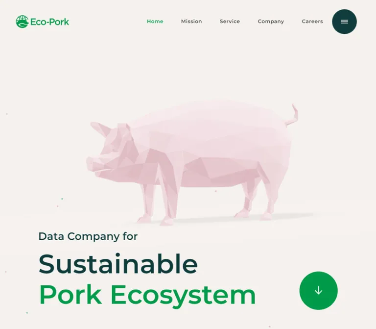
株式会社Eco-Pork|淡いピンクの豚と深緑が印象的な企業サイト
ローポリゴンの豚、大きな欧文タイポグラフィ、鮮やかな緑の円形ボタンが特徴。広い余白と深緑のセクションで、養豚のデータ活用と持続可能性を伝えるコーポレートサイト。
Eco-Pork — Style Reference
A pale polygonal pig on warm paper, grounded by forest-dark sections and vivid green circles.
Website: Eco-Pork
Original URL: https://www.eco-pork.com/
Final URL: https://www.eco-pork.com/
Theme: warm light surfaces alternating with deep teal sections; no theme selector evidenced.
Inspected: supplied capture record dated October 2, 2026, 03:01 JST — 2026-10-01T18:01:12.793Z.
Viewports: desktop 1440 × 1000 and mobile 390 × 844 CSS pixels.
Scope: the current corporate homepage, including the opening hero, Mission, Service, News, Careers, navigation, and footer. Visual captures cover the desktop hero, Service, and footer, plus the mobile hero and footer. The remaining sections are documented through rendered text, element geometry, and computed styles.
Eco-Pork presents agricultural technology through an unusually gentle visual contrast: an almost translucent pink pig sits above enormous, confident English lettering, while restrained Japanese copy explains the business. Warm off-white backgrounds keep the opening quiet. Bright green marks identity and actions; deep teal supplies the weight for the service explanation and footer.
This is a long corporate homepage with multiple destinations and editorial sections. Its defining relationships are the large animal illustration against open space, the change from light to dark section fields, the nested page gutters, and repeated circular controls. Preserve those relationships when adapting the design.
閉じる
Eco-Pork — Style Reference
A pale polygonal pig on warm paper, grounded by forest-dark sections and vivid green circles.
Website: Eco-Pork
Original URL: https://www.eco-pork.com/
Final URL: https://www.eco-pork.com/
Theme: warm light surfaces alternating with deep teal sections; no theme selector evidenced.
Inspected: supplied capture record dated October 2, 2026, 03:01 JST — 2026-10-01T18:01:12.793Z.
Viewports: desktop 1440 × 1000 and mobile 390 × 844 CSS pixels.
Scope: the current corporate homepage, including the opening hero, Mission, Service, News, Careers, navigation, and footer. Visual captures cover the desktop hero, Service, and footer, plus the mobile hero and footer. The remaining sections are documented through rendered text, element geometry, and computed styles.
Eco-Pork presents agricultural technology through an unusually gentle visual contrast: an almost translucent pink pig sits above enormous, confident English lettering, while restrained Japanese copy explains the business. Warm off-white backgrounds keep the opening quiet. Bright green marks identity and actions; deep teal supplies the weight for the service explanation and footer.
This is a long corporate homepage with multiple destinations and editorial sections. Its defining relationships are the large animal illustration against open space, the change from light to dark section fields, the nested page gutters, and repeated circular controls. Preserve those relationships when adapting the design.
How to Read This Reference
- Measured means a value appears in the supplied rendered DOM or computed-style evidence. Measurements are CSS pixels unless stated otherwise.
- Visual estimate means a proportion, color approximation, or size inferred from the supplied original-page screenshots. Estimated hex values were not obtained by programmatic pixel sampling.
- Recommended means a proposed implementation choice. The CSS and prompts below are adaptations, not recovered source code.
- Token names beginning with
--ep-are descriptive aliases created for this reference. - Computed styles describe the sampled element, which may be a wrapper. The hero
H2and sectionH3wrappers report10px; their visible lettering is much larger. Do not use those inherited wrapper values as the display type scale. - DOM presence does not establish visibility. The Service headline and paragraph exist in the rendered evidence but are invisible in the supplied Service screenshot. Their visibility or reveal state remains unresolved.
- No additional browsing, command execution, or file inspection was performed for this reference.
Tokens — Colors
Default Palette
| Name | Value | Suggested token | Evidence and role |
|---|---|---|---|
| Ecosystem Green | #009B4A |
--ep-green |
Measured on the active Home link, menu Home link, and news categories. A suitable normalized accent for the visually similar green controls. |
| Deep Teal | #0F3C3C |
--ep-ink |
Measured on the footer background, navigation-panel links, and heading wrappers. Visually matches the dark Service field and hero lettering. |
| Hero Paper | #F4F1EE |
--ep-paper |
Measured hero section background at both viewports. |
| Body Paper | #F4F1EF |
--ep-body-paper |
Measured body background; subtly different from the hero. |
| Main Surface | #FAF9F7 |
--ep-surface |
Measured main-element background. Its presence does not mean every visible light section uses this color. |
| News Paper | #F4F2EE |
--ep-news-paper |
Measured News section background. |
| Reversed White | #FAFAFA |
--ep-white |
Measured Service copy and footer text. |
| Body Charcoal | #333333 |
--ep-body-text |
Measured narrative copy, news text, and inactive desktop navigation. |
| Pig Pink | approximately #E7CAD3 |
--ep-pig-pink |
Visual approximation of a middle shade in the faceted pig. The illustration contains many lighter and darker faces. |
| Muted Footer Text | approximately #94AFAF |
--ep-muted |
Visual approximation for Sitemap, Address, and copyright labels. |
| Dark-Surface Rule | white at roughly 15–20% opacity |
--ep-rule-dark |
Recommended approximation of the fine rules and circular outlines visible against teal. |
Keep the slight distinctions between the measured light backgrounds when fidelity matters. They are close enough to feel continuous, but they are not one identical source declaration.
The prominent green circles look close to the measured brand accent; their fill values were not included in the sampled elements. The Quick Start deliberately normalizes them to #009B4A rather than claiming an exact sampled button color.
Color Behavior
The strongest color change happens at section scale. The Service area and footer become broad dark fields with pale content. This is not an individual-card inversion system.
Pink belongs mainly to the pig and sparse background particles. The small pink Translate widget is also visible, but its utility styling should not become the model for primary actions.
The supplied custom-property inventory includes many --wp--preset--* gradients, colors, and shadows. Their availability is not evidence that those presets shape the captured interface. The visible design is dominated by flat backgrounds, fine rules, restrained typography, and illustration shading.
Tokens — Typography
Montserrat and Japanese Sans-Serif Fallbacks
Measured family stack:
Montserrat, '游ゴシック Medium', 'Yu Gothic Medium',
游ゴシック体, YuGothic, 'Yu Gothic', sans-serif
The sampled content uses weight 500 for body text and 600 for navigation, narrative headlines, categories, and footer links. Montserrat's broad geometric English forms are an important part of the composition. Japanese text uses the declared fallback stack where applicable; actual glyph-level font selection and font-file delivery were not independently verified.
The HTML element reports a 10px root size. This is a source sizing convention, not the intended reading size. The Quick Start uses explicit pixel values and does not require changing the host project's root size.
Type Scale
| Role | Desktop | Mobile | Weight / tracking | Status |
|---|---|---|---|---|
| Hero lead: Data Company for | approximately 40px |
approximately 24px |
Visually semibold | Visual estimate |
| Hero statement | approximately 100px, two large lines |
approximately 41px, two large lines |
Visually semibold; compact leading | Visual estimate |
| English section label | approximately 40px in the Service capture |
Visible text size not sampled | Visually semibold | Desktop visual estimate |
| Mission and Service narrative headline | 43px / 60.2px |
27px / 37.8px |
600; 0.03em |
Measured |
| Careers narrative headline | 37px / 55.5px |
24px / 36px |
600; -0.008em |
Measured |
| Main narrative paragraph | 17px / 30.6px |
16px / 28.8px |
500; 0.05em desktop, 0.03em mobile |
Measured |
| Secondary Mission copy | 14px / 23.8px |
Same | 500; 0.05em |
Measured |
| Desktop navigation | 14px / 23.8px |
Hidden in the phone hero | 600; 0.05em |
Measured |
| Navigation-panel primary links | 50px / 57.5px |
30px / 34.5px |
600; normal tracking |
Measured DOM; open state not captured |
| Navigation-panel News and Contact | 22px / 25.3px |
Same | 600 |
Measured DOM; open state not captured |
| News date | 14px / 16.1px |
Same | 500; normal tracking |
Measured |
| News category | 12px / 13.8px |
Same | 600; normal tracking |
Measured |
| News title and Read | 14px / 23.8px |
Same | 500; 0.05em |
Measured |
| Footer sitemap links | 17px / 30.6px |
16px / 28.8px |
600; 0.05em desktop, 0.03em mobile |
Measured |
| Address and policy links | 14px / 23.8px |
Same | Address 500, policies 600; 0.05em |
Measured |
Use semibold hierarchy rather than adding several unrelated weights. Large English statements create impact; Japanese paragraphs retain generous leading and moderate line lengths.
Text Treatment
The hero deliberately separates three lines:
- Data Company for
- Sustainable
- Pork Ecosystem
The lead and Sustainable are dark teal; Pork Ecosystem is green. At 390px, the final phrase remains on one line in the supplied screenshot. This is an important fit target for the chosen font and headline width.
Navigation and action labels appear duplicated in the DOM, such as Home Home and View details View details, while only one label is visible in the captures. This may support layered presentation, but the supplied evidence does not establish its animation. Render one accessible label in an adaptation; hide decorative duplicates from assistive technology if they are needed.
Tokens — Spacing & Shapes
Density: spacious sections with compact utility text. Organizing principle: nested outer and inner gutters, repeated circular controls, and fine horizontal rules.
No single source spacing unit was established. At desktop, repeated 36px, 72px, and 144px dimensions are consistent with 2.5vw, 5vw, and 10vw at the inspected width. That relationship is a useful interpretation, not a recovered universal formula.
Spacing Scale
| Use | Desktop observation | Mobile observation | Interpretation |
|---|---|---|---|
| Header logo left inset | 72px |
19.5px |
Consistent with 5vw |
| Section-heading outer inset | 72px |
20px |
Approximately a 90%-width outer shell |
| Main copy inset | 144px |
Usually 40px |
Nested content shell |
| News content inset | 144px |
39px |
Exactly consistent with an 80%-width shell in these samples |
| Desktop navigation gap | 50px |
Not applicable | Calculated from adjacent link rectangles |
| News column gap | 36px |
One column | Calculated from 360px columns starting at 144, 540, and 936 |
| Service headline-to-body gap | 36px |
30px |
Calculated from sampled rectangles |
| Mission headline-to-body gap | 72px |
50px |
Calculated from sampled rectangles |
| Social-icon gap | 20px |
20px |
Measured from 40px links spaced 60px apart |
| Section start to heading, Service and News | 144px |
90px |
Calculated from section and heading positions |
| Section start to heading, Mission | 216px |
90px |
More generous desktop opening |
| Section start to heading, Careers | 144px |
110px |
Distinct mobile spacing |
Border Radius and Control Sizes
| Element | Desktop | Mobile | Evidence |
|---|---|---|---|
| Header logo box | 150 × 35.98px |
Same | Measured |
| Menu button element | 68 × 68px |
58 × 58px |
Measured inner button rectangle |
| Visible menu circle | approximately 70px diameter |
approximately 60px |
Visual estimate; includes surrounding treatment |
| Hero downward control | approximately 144px diameter |
approximately 80px |
Visual estimate |
| Detail-action link | 206.09 × 70px |
185.42 × 60px |
Measured whole label-and-circle link |
| Detail-action circle | approximately 70px diameter |
approximately 60px |
Desktop visual evidence; mobile size consistent with link height |
| Service diagram nodes | approximately 184px diameter |
Not visually captured | Desktop visual estimate |
| Social links | 40 × 40px, 100% radius |
Same | Measured |
| News categories | 100px radius; 2px 6px padding |
Same | Measured |
| General content surfaces | Square, unboxed regions | Same | Visual evidence; no general rounded-card system |
The menu button's sampled border-radius: 0 does not describe its visible circular surround. The circle is evident in the screenshots, but the responsible wrapper or pseudo-element was not included in the sample.
Components
Corporate Header
Role: establishes identity and provides primary destinations without competing with the illustration.
The desktop header places the green Eco-Pork wordmark at x = 72px, with a measured 150px width. Five links sit toward the right: Home, Mission, Service, Company, and Careers. Their measured gaps are 50px; Home uses the green active color. A separate dark circular menu control occupies the far right.
The measured header box is approximately 151.17px high on desktop and 98.36px on mobile. The phone retains the same logo width, removes the horizontal navigation from view, and reduces the menu circle to approximately 60px.
Only the circular menu remains visible in the supplied scrolled Service and footer views. Its repeated upper-right placement supports a persistent control treatment; the precise source positioning rule was not supplied.
Navigation Panel — DOM Evidence Only
Role: a larger secondary navigation structure associated with the menu control.
A viewport-sized section contains primary links, smaller News and Contact links, and policy links. Primary links are measured at 50px desktop and 30px mobile. Their desktop left position is approximately 859px; on mobile it is 35px. Utility links use slightly different insets, approximately 864px and 40px.
This structure exists in the DOM while the captures show the closed menu. Opening behavior, backdrop appearance, focus handling, transitions, and dismissal controls were not exercised. Do not present an imagined open-menu design as an observed state.
Opening Hero
Role: expresses the company's subject and ambition through one animal illustration and one typographic statement.
A full-width warm field contains four layers:
- The header and logo.
- A pale pink, faceted pig facing left, with a subtle ground shadow.
- Sparse small green and pink particles.
- The lower-left statement and lower-right circular down arrow.
On desktop, the pig's visible bounds are approximately 850 × 480px, beginning around x = 305px, y = 255px. The headline wrapper is measured at x = 144px, y = 628.97px, with a size of 825.14 × 299.03px. The illustration and headline overlap vertically, while contrast keeps the lettering legible.
On mobile, the pig is approximately 230 × 130px, centered around the upper-middle of the screen. Its width remains close to 59% of the viewport, but the vertical arrangement creates much more separation from the text. The headline wrapper moves to x = 20px, y = 590.91px, with a measured size of 337.89 × 133.09px.
The mobile down arrow sits below and to the right of the text. Its approximate bounds are x = 290px, y = 744px, 80 × 80px. On desktop, the larger circle aligns approximately with the bottom of the headline block.
The hero section measures 1095px high on desktop and 899px on mobile, extending beyond the first viewport by 95px and 55px. Do not assume the entire section is exactly 100vh.
Section Heading and Rule
Role: introduces a corporate chapter with a consistent graphic marker.
The visible Service header consists of a small green dot, a semibold English label, and a thin horizontal rule spanning the outer shell. The label begins around x = 144px, while the rule spans approximately x = 72–1368px.
The sampled desktop heading wrappers are generally 1296px wide and 87px high. Phone wrappers are approximately 351px wide and 62px high. These boxes establish section geometry; they do not establish the visible inner text size.
Use a circular marker and one restrained divider. The section title should remain part of the full-width composition rather than becoming a badge inside a card.
Mission Narrative
Role: explains the company's purpose and broader ecosystem.
The measured Japanese headline is 43px / 60.2px on desktop and 27px / 37.8px on mobile. The source label is “データを用いた循環型豚肉経済圏の共創”.
Desktop text uses an asymmetric arrangement. The first paragraph begins at x = 144px in a 432px-wide box. A later paragraph occupies a 576px box beginning at x = 720px, with 72px left and 36px right padding. The detail link aligns to the right edge of that later region.
On mobile, both passages become 310px-wide blocks at x = 40px. The first paragraph uses 16px / 28.8px; the secondary paragraph remains 14px / 23.8px.
The intervening artwork and its exact composition were not visually captured. Preserve the documented text hierarchy and asymmetry without inventing photographs or illustration assets for this section.
Service Section and Porker Diagram
Role: connects agricultural data collection, management, and optimization.
The supplied desktop capture shows a deep teal field, a white Service label, a fine rule, a right-aligned circular system diagram, and a View details action in the left half.
The diagram has three large pale circles:
- AI at the top.
- ICT at the lower left.
Iot, using the captured capitalization, at the lower right.
A muted dotted ring and small white directional arrows connect the nodes. Green pill labels identify “豚データ”, “最適化”, and “センサーデータ”. The center combines the small label “養豚経営支援システム” with a much larger Porker wordmark. The circles are approximately 184px in diameter; the ring is approximately 410px across.
The source also contains the headline “生産の全てを可視化し、 畜産を持続型産業へ” and a paragraph explaining the connected services. Their desktop boxes begin at x = 144px, with the paragraph measuring 504px wide. They use reversed text and the same measured narrative type scale as Mission.
Visibility limitation: those text blocks are absent from the supplied Service screenshot despite their DOM presence. The empty left region must not be documented as intentional final content. A reveal state, delayed presentation, or another visibility condition may be involved; the cause was not established.
On mobile, the headline begins approximately 480px after the bottom of the section-heading wrapper. This establishes a large intervening region, but the graphic's phone layout was not captured. Placing a scaled diagram above the copy is a reasonable adaptation, not a verified original arrangement.
Label-and-Circle Detail Link
Role: offers a clear route into a deeper corporate page.
The visible anatomy is an unboxed semibold label followed by a green disk containing a thin white right arrow. Desktop links are approximately 206px wide and 70px high; mobile links are approximately 185px wide and 60px high.
The label remains outside the colored circle. Keep the entire pair one link, with one accessible name. The circle is a recurring directional device rather than a container for a long text CTA.
Mission, Service, and Careers all use this pattern. Careers links to the separate recruitment domain present in the original-page evidence; the destination itself was not inspected.
News Entry
Role: surfaces recent company activity without introducing a dense media grid.
Each entry has a date and small green category label, followed by a Japanese article title and a Read label. Three entries are present in the supplied evidence, with dates 2026.09.30, 2026.09.28, and 2026.08.03 and categories News, Media, and Press.
Desktop entries use three 360px-wide columns with 36px gaps. Mobile entries stack at x = 39px with a width of 312px.
The category uses 12px semibold type, 2px 6px padding, and a pill radius. The measured background is transparent, so do not assume these are filled green badges. Titles and Read use 14px / 23.8px with 0.05em tracking.
Desktop Read labels sit approximately 30px below the title block. Mobile reduces this gap to approximately 10px and adds 30px bottom padding to the article link. Category links are separate from the article links; avoid nested anchors when implementing the anatomy.
A View all link sits near the right end of the News heading. No supplied visual evidence establishes article thumbnails, raised cards, or a carousel.
Careers Narrative
Role: links the company's mission to recruitment.
The desktop headline occupies the right side at x = 792px, with a 504px width. Its supporting paragraph is 468px wide. The headline uses a slightly smaller scale than Mission and Service: 37px / 55.5px, weight 600, with subtly negative tracking.
Mobile brings both blocks to x = 40px, 310px wide, with a 24px / 36px headline and 16px / 28.8px body. The detail action remains aligned to the content's right edge.
The left-side imagery was not visually captured. Empty-text elements appear in a repeated horizontal structure after Careers, but their contents and motion are not established by this evidence.
Corporate Footer
Role: closes the page with a broad navigation and contact surface.
The footer is a solid #0F3C3C field with #FAFAFA links. On desktop, a white Eco-Pork logo sits at the left. Sitemap occupies the center, and Address sits to the right. Muted labels and thin rules organize the groups.
Sitemap contains two link columns. Their measured desktop starts are x = 432px and 576px; on mobile they become 40px and 195px. Address links to a map and is followed by Twitter, YouTube, and Facebook icons in 40px outlined circles with 20px gaps.
A lower divider separates policies from the main groups. Desktop policy links distribute horizontally; mobile policies stack vertically and allow the longer Japanese label to wrap. Copyright sits toward the left of the lower area, while Back to top pairs a text label with a small green circle at the right.
The phone footer uses approximately 40px insets for its main content and policy text, but the bottom copyright and return control reach approximately 20px from the viewport edges. The social row aligns right beneath the address.
The footer logo is not visible in the supplied phone crop. That absence does not establish whether the logo is hidden or above the captured region.
Translate Utility
A small pale pink Translate » tab remains at the lower-left edge in all supplied screenshots. It is approximately 124px wide and has a visible soft shadow. Its opening behavior and translation interface were not exercised.
Treat it as a separate utility layer. Its shadow and pink fill are exceptions to the otherwise restrained action styling.
Tokens — Motion & Interaction
| Treatment | Evidence | What can be concluded |
|---|---|---|
| Narrative text transitions | transform 0.55s cubic-bezier(0.165, 0.84, 0.44, 1), opacity 0.55s cubic-bezier(0.165, 0.84, 0.44, 1) |
Measured on Mission, Service, and Careers text. Initial transforms, trigger conditions, and reveal distances were not supplied. |
| Header backdrop transition | backdrop-filter 0.3s and prefixed equivalent |
A backdrop-filter transition is declared. Its active filter value and visible trigger are unverified. |
| News-category color | color 0.35s |
Color changes can transition; the destination color and hover result were not exercised. |
| Social-link opacity | opacity 0.5s |
Opacity transitions are declared; the changed opacity value is unknown. |
| Menu, detail links, and return control | Controls and destinations are present | Click results, menu choreography, scroll duration, and focus behavior were not tested. |
| Pig and background particles | Still captures only | Movement, pointer response, rotation, rendering engine, and timing cannot be established. |
| Repeated post-Careers elements | Offscreen and repeated DOM rectangles | Insufficient evidence to identify content or claim a moving marquee. |
The collection procedure waited for initial observation, visible finite animations, layout stability, and image decoding within stated time limits. Perpetual animations were paused for readiness checks and resumed afterward. This improves capture reliability but does not prove that every content reveal completed or that every interaction works.
Many sampled elements report animation: none or a transition value of all. These values do not establish the behavior of unsampled children, pseudo-elements, or script-driven graphics.
Recommended motion character: preserve the measured short opacity/transform transitions for optional text entrances. Keep content visible when initialization fails, support reduced motion, and avoid inventing constant pig rotation or a spinning diagram without further evidence.
Surfaces
| Surface | Appearance | Purpose |
|---|---|---|
| Opening field | Warm #F4F1EE, sparse particles |
Gives the pig and large statement room |
| Light narrative regions | Closely related warm neutrals | Supports long Japanese copy and asymmetric composition |
| Service field | Deep teal with pale graphics and green markers | Makes the connected data system legible |
| News region | #F4F2EE, compact text groups |
Provides an editorial pause |
| Footer | Deep teal, pale links, muted labels, fine rules | Creates a substantial corporate ending |
| Action disk | Flat green circle, thin pale arrow | Repeats a directional interaction motif |
| Translation tab | Pale pink, slight shadow | Separate persistent utility |
There is no evidenced general-purpose elevation system. The hero's ground shadow belongs to the illustration; the Translate tab has its own utility shadow. Neither justifies adding shadows to all content blocks.
Imagery
The hero pig carries the most distinctive identity. It is represented through large polygonal faces, pale pink tonal shifts, a broad body, small legs, a projecting snout, and a raised thin tail. The shading is soft and low contrast. A faint ground shadow anchors the animal without introducing a scene or photographic background.
Keep the complete silhouette visible. The pig occupies roughly 59% of the viewport width in both supplied hero captures. Desktop scale makes it monumental; mobile scale makes it a small focal object surrounded by space.
Sparse particles use tiny green and pink marks, generally only a few pixels across. They should remain subordinate to the animal and text. Their movement is not established.
The Service graphic uses a different but compatible geometry: pale circles, a dotted orbit, small directional arrows, and green pills. It is an explanatory diagram, not a product-interface screenshot.
Observed Asset References
| Asset | Observed form | Availability |
|---|---|---|
| Header brand | Green Eco-Pork symbol and wordmark | Visible; file URL not supplied |
| Footer brand | White version of the same identity | Visible on desktop; file URL not supplied |
| Hero pig | Pale faceted animal with a soft shadow | Visible at both viewports; asset type and URL unknown |
| Hero particles | Tiny green and pink marks | Visible; implementation unknown |
| Porker diagram | Three nodes, dotted loop, arrowheads, labels, central wordmark | Visible on desktop; source assets unknown |
| Social symbols | Twitter bird, YouTube, Facebook | Visible with measured link targets; icon source unknown |
Use authorized original assets when available. A rendered image or a 3D scene could reproduce the pig's appearance, but the evidence does not identify WebGL, a particular library, a model format, or animation assets. Do not invent source file paths.
Layout & Responsive Behavior
Measured Page Geometry
These are snapshot measurements, not recommended fixed section heights. Different scroll captures should not be assumed to share precisely the same geometry or visibility state.
| Region | Desktop start / height | Mobile start / height |
|---|---|---|
| Hero | 0 / 1095px |
0 / 899px |
| Mission | 1095 / 1637.5px |
899 / 1292.39px |
| Service | 2732.5 / 1059px |
2191.39 / 1168.02px |
| News | 3791.5 / 677.19px |
3359.41 / 828.81px |
| Careers | 4468.69 / 953.5px |
4188.22 / 946.83px |
| Footer | 5803.19 / 811.56px |
5398.95 / 920.84px |
| Complete document | 6615px |
6320px |
A region of repeated elements and spacing sits between Careers and the footer. Its visual content is outside the supplied captures.
Observed Responsive Changes
| Pattern | Desktop | Mobile |
|---|---|---|
| Brand | 150px wide |
Remains 150px wide |
| Header navigation | Five inline links plus menu | Menu control only |
| Hero composition | Large pig; text overlaps its lower vertical region | Smaller pig separated from text by broad space |
| Hero copy | 144px left inset; roughly 100px statement |
20px left inset; roughly 41px statement |
| Hero arrow | Large circle beside the statement | Smaller circle below the statement, right aligned |
| Narrative copy | Asymmetric columns and offsets | Approximately 310px text blocks at 40px inset |
| News | Three columns | Single stacked list |
| Footer main groups | Brand, Sitemap, and Address across the page | Sitemap and Address stacked |
| Footer sitemap | Two link columns | Still two columns |
| Footer policies | Distributed horizontally | Stacked vertically |
| Social links | Left aligned within Address | Right aligned within Address |
The supplied evidence contains two viewport sizes, not breakpoint rules. The 800px breakpoint used below is a recommendation. Intermediate widths, landscape phones, enlarged text, and very wide screens remain unverified.
Keep the page as a normal scrolling document. The main element's viewport-sized sampled rectangle does not make this a fixed-screen application; the measured document is more than six thousand pixels tall at both sizes.
Do’s and Don’ts
Do
- Preserve the combination of warm paper, deep teal, vivid green, and pale pink illustration.
- Keep the pig's faceted silhouette complete and surrounded by substantial space.
- Maintain the hero's three-line verbal hierarchy and green final line.
- Use the measured Montserrat/Japanese sans-serif stack and the
500–600weight range. - Distinguish outer section gutters from inner narrative gutters.
- Repeat circles for menu, directional actions, diagram nodes, and social links.
- Keep action labels outside their green arrow circles.
- Retain broad section-level changes from light to dark.
- Stack News entries on mobile while preserving their date/category/title/Read anatomy.
- Preserve the footer's two-column sitemap even when the major groups stack.
- Keep essential copy visible regardless of whether a reveal animation initializes.
Don’t
- Don't turn every section into a rounded card with a shadow.
- Don't replace the pale polygonal pig with a saturated cartoon or a generic farm photograph.
- Don't crop the pig into a banner that removes its feet, snout, or tail.
- Don't treat the Service screenshot's missing copy as a deliberate empty layout.
- Don't copy the
10pxheading-wrapper font size into visible titles. - Don't infer a spinning diagram, interactive 3D model, parallax, or hover rollover from still images.
- Don't apply the unused preset gradients and shadows simply because their variables exist.
- Don't shrink the mobile logo in proportion to the viewport; it retains its desktop width.
- Don't make the whole footer one centered column; the observed alignment and nested gutters matter.
- Don't assume the mobile footer crop proves that the brand mark is removed.
Recommended Implementation Additions
These are recommendations for a new implementation, not verified features of the original page:
- Give the menu, directional controls, and social links explicit accessible names. Connect the menu button to its panel with
aria-controlsandaria-expanded. - If the navigation is implemented as a modal panel, manage focus, support Escape, and return focus to the trigger when it closes.
- Keep narrative text visible by default. Add entrance states only after successful initialization, and clear them for reduced-motion users.
- Preserve one accessible copy of duplicated navigation and action labels.
- Enlarge the interactive area around small social and return controls without necessarily enlarging their visible circles.
- Use deep teal for small reading text and verify contrast for small green labels and white text on green fills.
- Provide a textual equivalent for the Porker diagram's relationships; its labels alone do not explain the complete flow.
- Reserve illustration dimensions before loading and provide a static fallback if an animated renderer is used.
- Allow hero text to wrap and the stage to grow at narrow widths or large text sizes. Validate the intended one-line Pork Ecosystem fit at the captured phone width.
- Ensure the persistent Translate utility does not obscure footer links or keyboard focus.
Agent Prompt Guide
Quick Color Reference
- Hero background: measured
#F4F1EE. - Main dark text and footer field: measured
#0F3C3C. - Normal paragraph text: measured
#333333. - Active links and normalized implementation accent:
#009B4A. - Reversed copy: measured
#FAFAFA. - News background: measured
#F4F2EE. - Pig: multiple very pale pink polygon shades; approximate midpoint
#E7CAD3. - Dividers on dark fields: thin, muted pale strokes, without elevation.
Overall Prompt
“Create a responsive corporate homepage for an agricultural data company using Eco-Pork's observed visual relationships. Use warm off-white #F4F1EE, deep teal #0F3C3C, and green #009B4A. Center a pale pink faceted pig in a spacious opening field, with oversized geometric sans-serif text at the lower left and a green circular down arrow at the lower right. Use Montserrat with Japanese sans-serif fallbacks, semibold English labels, generous Japanese paragraph leading, nested page gutters, and fine section rules. Continue through Mission, a dark Service section with a circular AI/ICT/IoT diagram, a compact News grid, Careers, and a substantial dark footer. On phones, preserve the 150px logo, hide inline navigation, separate the pig from the headline, stack narrative sections and news, and retain a two-column footer sitemap. Keep all essential content visible without animation.”
Example Component Prompts
- Hero: “Build a warm, nearly full-screen opening with a complete pale pink polygonal pig, tiny sparse particles, and three text lines: Data Company for, Sustainable, Pork Ecosystem. Use dark teal for the first two and green for the last. At 1440px, target roughly 100px statement type and a 144px green arrow disk. At 390px, target roughly 41px type, a 150px brand mark, and an 80px arrow disk below the copy. Treat these headline and disk sizes as screenshot estimates.”
- Service diagram: “On a deep teal field, arrange three pale circular nodes in a triangle: AI above, ICT below-left, and Iot below-right. Connect them with a subdued dotted orbit and small white directional arrows. Put the Porker name in the center and three small green data labels around the orbit. Keep the diagram static unless animation is separately specified.”
- News entry: “Create an unboxed editorial item with a 14px date, a 12px green category label, a 14px Japanese title with 1.7 line height, and a Read link. Use three 360px columns with 36px gaps in the 1440px reference layout, then stack items in a roughly 312px-wide phone column. Keep category and article links separate.”
- Footer: “Create a deep teal corporate footer with a white brand mark, muted Sitemap and Address labels, fine rules, two columns of sitemap links, and three small outlined social circles. Stack the major groups on mobile while retaining the two-column sitemap. Put stacked policies below a divider, with copyright left and Back to top right in the bottom row.”
Quick Start
CSS Custom Properties
This is a practical adaptation of the observed proportions. Measured colors and narrative typography are retained; hero lettering, illustration placement, divider opacity, and breakpoint rules are approximations or recommendations. The code assumes a conventional root size, an available Montserrat font, and authorized brand/illustration assets.
The expected structure uses a .hero-stage containing .hero-art, .hero-copy, and .hero-scroll; a .service-layout containing .service-copy and .service-diagram; and footer groups inside .footer-main and .footer-lower. Diagram arrows and pill labels need markup or SVG in addition to these layout rules.
:root {
  /* Measured palette */
  --ep-paper: #f4f1ee;
  --ep-body-paper: #f4f1ef;
  --ep-surface: #faf9f7;
  --ep-news-paper: #f4f2ee;
  --ep-ink: #0f3c3c;
  --ep-green: #009b4a;
  --ep-white: #fafafa;
  --ep-body-text: #333333;

  /* Visual approximations */
  --ep-pig-pink: #e7cad3;
  --ep-muted: #94afaf;
  --ep-rule-dark: rgb(250 250 250 / 18%);
  --ep-rule-light: rgb(15 60 60 / 18%);

  /* Measured family stack and weights */
  --ep-font: Montserrat, '游ゴシック Medium', 'Yu Gothic Medium',
    游ゴシック体, YuGothic, 'Yu Gothic', sans-serif;
  --ep-weight-body: 500;
  --ep-weight-title: 600;

  /* Adapted gutter rules */
  --ep-outer-gutter: max(20px, 5vw);
  --ep-content-gutter: max(40px, 10vw);
  --ep-section-space: 144px;
  --ep-body-size: 17px;
  --ep-body-tracking: 0.05em;
  --ep-detail-size: 70px;

  /* Measured transition values */
  --ep-reveal: 550ms cubic-bezier(0.165, 0.84, 0.44, 1);
  --ep-category-transition: 350ms;
  --ep-social-transition: 500ms;
}

.eco-page,
.eco-page * {
  box-sizing: border-box;
}

.eco-page {
  margin: 0;
  color: var(--ep-body-text);
  background: var(--ep-body-paper);
  font-family: var(--ep-font);
  font-size: var(--ep-body-size);
  font-weight: var(--ep-weight-body);
  line-height: 1.8;
}

.eco-page a {
  color: inherit;
  text-decoration: none;
}

.eco-page button {
  font: inherit;
  cursor: pointer;
}

.content-shell {
  margin-inline: var(--ep-content-gutter);
}

.site-header {
  position: absolute;
  inset: 0 0 auto;
  z-index: 10;
  display: flex;
  align-items: center;
  min-height: 151px;
  padding-inline: var(--ep-outer-gutter);
}

.brand {
  margin: 0;
  line-height: 1;
}

.brand img {
  display: block;
  width: 150px;
  height: auto;
}

.primary-nav {
  display: flex;
  gap: 50px;
  margin-inline-start: auto;
  margin-inline-end: 122px;
  font-size: 14px;
  font-weight: 600;
  line-height: 1.7;
  letter-spacing: 0.05em;
}

.primary-nav [aria-current='page'] {
  color: var(--ep-green);
}

/* Persistent positioning is an adaptation of the captured placement. */
.menu-toggle {
  position: fixed;
  z-index: 30;
  top: 40px;
  right: var(--ep-outer-gutter);
  display: grid;
  place-items: center;
  width: 70px;
  height: 70px;
  padding: 0;
  border: 1px solid var(--ep-rule-dark);
  border-radius: 50%;
  color: var(--ep-white);
  background: var(--ep-ink);
}

.menu-glyph {
  position: relative;
  width: 20px;
  height: 10px;
  border-block: 1px solid currentColor;
}

.menu-glyph::after {
  position: absolute;
  top: 50%;
  left: 0;
  width: 100%;
  border-top: 1px solid currentColor;
  content: '';
}

.hero {
  padding-bottom: 95px;
  background: var(--ep-paper);
}

.hero-stage {
  position: relative;
  isolation: isolate;
  display: grid;
  grid-template-columns: minmax(0, 1fr) auto;
  align-items: end;
  gap: 24px;
  min-height: max(100svh, 720px);
  padding: 160px var(--ep-content-gutter) 72px;
}

/* Assumes an image cropped closely around the complete animal. */
.hero-art {
  position: absolute;
  z-index: 0;
  top: 25.4svh;
  left: 21.2%;
  width: 59%;
  height: auto;
  object-fit: contain;
  pointer-events: none;
}

.hero-copy,
.hero-scroll {
  position: relative;
  z-index: 1;
}

.hero-copy {
  min-width: 0;
  color: var(--ep-ink);
}

.hero-kicker {
  display: block;
  margin-bottom: 23px;
  font-size: clamp(24px, 2.78vw, 40px);
  font-weight: 600;
  line-height: 1.15;
}

.hero-title {
  margin: 0;
  font-size: clamp(50px, 6.944vw, 100px);
  font-weight: 600;
  line-height: 1.15;
}

.hero-title > span {
  display: block;
}

.hero-title .accent {
  color: var(--ep-green);
}

.circle-control {
  display: inline-grid;
  flex: none;
  place-items: center;
  width: var(--ep-detail-size);
  aspect-ratio: 1;
  padding: 0;
  border: 0;
  border-radius: 50%;
  color: var(--ep-white);
  background: var(--ep-green);
}

.circle-control svg {
  width: 24px;
  height: 24px;
  fill: none;
  stroke: currentColor;
  stroke-width: 1.6;
}

.hero-scroll {
  width: 144px;
}

.corporate-section {
  padding-block: var(--ep-section-space);
}

.mission-section {
  padding-top: 216px;
}

.section-heading {
  position: relative;
  margin: 0 var(--ep-outer-gutter);
  padding: 0 0 40px var(--ep-outer-gutter);
  border-bottom: 1px solid var(--ep-rule-light);
  color: var(--ep-ink);
  font-size: 40px;
  font-weight: 600;
  line-height: 1.15;
}

.section-heading::before {
  position: absolute;
  top: 19px;
  left: calc(var(--ep-outer-gutter) / 2);
  width: 8px;
  height: 8px;
  border-radius: 50%;
  background: var(--ep-green);
  content: '';
}

.section-content {
  margin-top: 72px;
}

.narrative-title {
  margin: 0 0 36px;
  font-size: 43px;
  font-weight: 600;
  line-height: 1.4;
  letter-spacing: 0.03em;
}

.narrative-copy {
  margin: 0;
  font-size: var(--ep-body-size);
  line-height: 1.8;
  letter-spacing: var(--ep-body-tracking);
}

.careers-title {
  font-size: 37px;
  line-height: 1.5;
  letter-spacing: -0.008em;
}

.detail-link {
  display: flex;
  align-items: center;
  gap: 20px;
  width: max-content;
  max-width: 100%;
  margin-inline-start: auto;
  margin-top: 30px;
  font-size: 17px;
  font-weight: 600;
  letter-spacing: 0.05em;
}

.service-section {
  color: var(--ep-white);
  background: var(--ep-ink);
}

.service-section .section-heading {
  color: var(--ep-white);
  border-color: var(--ep-rule-dark);
}

.service-layout {
  display: grid;
  grid-template-columns: repeat(2, minmax(0, 1fr));
  align-items: center;
  gap: 10vw;
}

/* Approximate diagram geometry; no rotation is implied. */
.service-diagram {
  position: relative;
  width: 110%;
  aspect-ratio: 1;
  color: var(--ep-white);
}

.diagram-orbit {
  position: absolute;
  top: 14%;
  left: 12.5%;
  width: 75%;
  aspect-ratio: 1;
  border: 2px dotted rgb(250 250 250 / 40%);
  border-radius: 50%;
}

.diagram-node {
  position: absolute;
  z-index: 1;
  display: grid;
  place-items: center;
  width: 33.333%;
  aspect-ratio: 1;
  border-radius: 50%;
  color: var(--ep-ink);
  background: var(--ep-white);
  font-size: 24px;
  font-weight: 600;
}

.diagram-node--ai {
  top: 0;
  left: 33.333%;
}

.diagram-node--ict {
  top: 55%;
  left: 4%;
}

.diagram-node--iot {
  top: 55%;
  right: 4%;
}

.diagram-center {
  position: absolute;
  top: 40%;
  left: 20%;
  width: 60%;
  text-align: center;
}

.diagram-center small {
  display: block;
  font-size: 12px;
}

.diagram-center strong {
  font-size: clamp(30px, 3.6vw, 52px);
  font-weight: 600;
  line-height: 1.2;
}

.news-section {
  background: var(--ep-news-paper);
}

.news-grid {
  display: grid;
  grid-template-columns: repeat(3, minmax(0, 1fr));
  gap: 36px;
}

.news-meta {
  display: flex;
  align-items: center;
  gap: 20px;
  font-size: 14px;
  line-height: 1.15;
}

.news-category {
  padding: 2px 6px;
  border-radius: 100px;
  color: var(--ep-green) !important;
  font-size: 12px;
  font-weight: 600;
  transition: color var(--ep-category-transition);
}

.news-story {
  display: block;
  margin-top: 36px;
  font-size: 14px;
  line-height: 1.7;
  letter-spacing: 0.05em;
}

.news-story p {
  margin: 0;
}

.news-story .read-label {
  display: block;
  margin-top: 30px;
  color: var(--ep-ink);
}

.site-footer {
  padding: 144px var(--ep-content-gutter) 180px;
  color: var(--ep-white);
  background: var(--ep-ink);
}

.footer-main {
  display: grid;
  grid-template-columns: 15vw 25vw minmax(0, 1fr);
  gap: 5vw;
}

.footer-label {
  margin: 0 0 26px;
  padding-bottom: 26px;
  border-bottom: 1px solid var(--ep-rule-dark);
  color: var(--ep-muted);
  font-size: 14px;
  font-weight: 600;
  letter-spacing: 0.05em;
}

.sitemap-links {
  display: grid;
  grid-template-columns: repeat(2, minmax(0, 1fr));
  font-size: 17px;
  font-weight: 600;
  line-height: 1.8;
  letter-spacing: 0.05em;
}

.sitemap-links a {
  display: block;
}

.footer-address {
  max-width: 360px;
  font-size: 14px;
  line-height: 1.7;
  letter-spacing: 0.05em;
}

.social-links {
  display: flex;
  gap: 20px;
  margin-top: 36px;
}

.social-links a {
  display: grid;
  place-items: center;
  width: 40px;
  height: 40px;
  border: 1px solid var(--ep-rule-dark);
  border-radius: 50%;
  transition: opacity var(--ep-social-transition);
}

.footer-lower {
  margin-top: 72px;
  margin-left: 20vw;
  padding-top: 72px;
  border-top: 1px solid var(--ep-rule-dark);
  font-size: 14px;
  line-height: 1.7;
  letter-spacing: 0.05em;
}

.footer-policies {
  display: flex;
  justify-content: space-between;
  gap: 36px;
  font-weight: 600;
}

.footer-bottom {
  display: flex;
  justify-content: space-between;
  align-items: center;
  gap: 20px;
  margin-top: 72px;
}

.footer-copyright {
  color: var(--ep-muted);
}

/* Content remains visible until enhancement explicitly changes it. */
.reveal-content {
  opacity: 1;
  transform: none;
  transition: opacity var(--ep-reveal), transform var(--ep-reveal);
}

/* Recommended breakpoint; the original breakpoint was not supplied. */
@media (max-width: 800px) {
  .eco-page {
    --ep-section-space: 90px;
    --ep-body-size: 16px;
    --ep-body-tracking: 0.03em;
    --ep-detail-size: 60px;
  }

  .site-header {
    min-height: 98px;
  }

  .primary-nav {
    display: none;
  }

  .menu-toggle {
    top: 19px;
    width: 60px;
    height: 60px;
  }

  .hero {
    padding-bottom: 55px;
  }

  .hero-stage {
    display: flex;
    flex-direction: column;
    justify-content: flex-end;
    align-items: stretch;
    gap: 0;
    min-height: max(100svh, 700px);
    padding: 120px 20px 20px;
  }

  .hero-art {
    top: 38.6svh;
  }

  .hero-kicker {
    margin-bottom: 12px;
    font-size: 24px;
  }

  .hero-title {
    font-size: clamp(30px, 10.5vw, 41px);
  }

  .hero-scroll {
    align-self: flex-end;
    width: 80px;
    margin-top: 20px;
  }

  .mission-section {
    padding-top: 90px;
  }

  .section-heading {
    padding-left: 20px;
    padding-bottom: 24px;
    font-size: 32px;
  }

  .section-heading::before {
    top: 15px;
    left: 0;
    width: 6px;
    height: 6px;
  }

  .section-content {
    margin-top: 50px;
  }

  .narrative-title {
    margin-bottom: 30px;
    font-size: 27px;
  }

  .careers-title {
    font-size: 24px;
  }

  .detail-link {
    font-size: 16px;
  }

  .service-layout {
    grid-template-columns: minmax(0, 1fr);
    gap: 60px;
  }

  /* Recommended phone ordering; the diagram was not captured there. */
  .service-diagram {
    grid-row: 1;
    width: 100%;
  }

  .diagram-node {
    font-size: 18px;
  }

  .diagram-center small {
    font-size: 10px;
  }

  .news-grid {
    grid-template-columns: minmax(0, 1fr);
    gap: 30px;
  }

  .news-story {
    margin-top: 18px;
    padding-bottom: 30px;
  }

  .news-story .read-label {
    margin-top: 10px;
  }

  .site-footer {
    padding: 90px 20px;
  }

  .footer-main {
    grid-template-columns: minmax(0, 1fr);
    gap: 54px;
    padding-inline: 20px;
  }

  .sitemap-links {
    font-size: 16px;
    letter-spacing: 0.03em;
  }

  .social-links {
    justify-content: flex-end;
  }

  .footer-lower {
    margin: 50px 0 0;
    padding-top: 50px;
  }

  .footer-policies {
    display: grid;
    gap: 0;
    padding-inline: 20px;
  }

  .footer-bottom {
    margin-top: 90px;
  }
}

/* Recommended keyboard and reduced-motion support. */
.eco-page :focus-visible {
  outline: 2px solid currentColor;
  outline-offset: 5px;
}

@media (prefers-reduced-motion: reduce) {
  .eco-page *,
  .eco-page *::before,
  .eco-page *::after {
    animation: none !important;
    transition: none !important;
    scroll-behavior: auto !important;
  }

  .reveal-content {
    opacity: 1 !important;
    transform: none !important;
  }
}
This starter establishes the main visual relationships. It does not implement the menu state machine, translation interface, scrolling behavior, or an animated illustration. It also retains a footer brand slot on mobile because the supplied crop does not establish its original visibility rule.
Tailwind v4 Token Mapping
Optional aliases for a project already using Tailwind v4. This is not evidence that the original site uses Tailwind. Define the custom properties above first.
@theme inline {
  --color-paper: var(--ep-paper);
  --color-news-paper: var(--ep-news-paper);
  --color-ink: var(--ep-ink);
  --color-brand-green: var(--ep-green);
  --color-reversed: var(--ep-white);
  --color-body-text: var(--ep-body-text);
  --font-brand: var(--ep-font);
  --spacing-outer-gutter: var(--ep-outer-gutter);
  --spacing-content-gutter: var(--ep-content-gutter);
  --radius-circle: 9999px;
}
Sources & Evidence
- Eco-Pork original and final homepage: supplied successful HTTP
200capture record, rendered page title, text, link destinations, element rectangles, and computed styles. Original and final URLs are identical. - Capture timestamp:
2026-10-01T18:01:12.793Z, equivalent to October 2, 2026, 03:01 JST. This is the supplied collection timestamp, not a claim of an additional live visit. - Desktop evidence:
1440 × 1000viewport; hero, Service, and footer screenshots; DOM snapshot with a6615pxdocument height. - Mobile evidence:
390 × 844viewport; hero and footer screenshots; DOM snapshot with a6320pxdocument height. - Computed-style scope: sampled rendered elements and custom properties, not a complete stylesheet, asset manifest, font-loading report, or accessibility tree.
- Interaction scope: initial rendering and scroll-position captures. No supplied click, hover, keyboard, menu-opening, translation, or return-to-top result was available. Shared workers and service workers were disabled during collection.
- Material limitations: unresolved Service-copy visibility; no visual captures of Mission, News, or Careers; no mobile Service-diagram capture; no verified animation sequence, image asset URL, 3D technology, or intermediate breakpoint behavior.
This reference describes the current homepage represented by the supplied evidence. Measured values, visual estimates, and recommended implementation choices are identified separately throughout.
# Eco-Pork — Style Reference

> A pale polygonal pig on warm paper, grounded by forest-dark sections and vivid green circles.

**Website:** [Eco-Pork](https://www.eco-pork.com/)
**Original URL:** https://www.eco-pork.com/
**Final URL:** https://www.eco-pork.com/
**Theme:** warm light surfaces alternating with deep teal sections; no theme selector evidenced.
**Inspected:** supplied capture record dated October 2, 2026, 03:01 JST — `2026-10-01T18:01:12.793Z`.
**Viewports:** desktop `1440 × 1000` and mobile `390 × 844` CSS pixels.
**Scope:** the current corporate homepage, including the opening hero, Mission, Service, News, Careers, navigation, and footer. Visual captures cover the desktop hero, Service, and footer, plus the mobile hero and footer. The remaining sections are documented through rendered text, element geometry, and computed styles.

Eco-Pork presents agricultural technology through an unusually gentle visual contrast: an almost translucent pink pig sits above enormous, confident English lettering, while restrained Japanese copy explains the business. Warm off-white backgrounds keep the opening quiet. Bright green marks identity and actions; deep teal supplies the weight for the service explanation and footer.

This is a long corporate homepage with multiple destinations and editorial sections. Its defining relationships are the large animal illustration against open space, the change from light to dark section fields, the nested page gutters, and repeated circular controls. Preserve those relationships when adapting the design.
閉じる
# Eco-Pork — Style Reference

> A pale polygonal pig on warm paper, grounded by forest-dark sections and vivid green circles.

**Website:** [Eco-Pork](https://www.eco-pork.com/)
**Original URL:** https://www.eco-pork.com/
**Final URL:** https://www.eco-pork.com/
**Theme:** warm light surfaces alternating with deep teal sections; no theme selector evidenced.
**Inspected:** supplied capture record dated October 2, 2026, 03:01 JST — `2026-10-01T18:01:12.793Z`.
**Viewports:** desktop `1440 × 1000` and mobile `390 × 844` CSS pixels.
**Scope:** the current corporate homepage, including the opening hero, Mission, Service, News, Careers, navigation, and footer. Visual captures cover the desktop hero, Service, and footer, plus the mobile hero and footer. The remaining sections are documented through rendered text, element geometry, and computed styles.

Eco-Pork presents agricultural technology through an unusually gentle visual contrast: an almost translucent pink pig sits above enormous, confident English lettering, while restrained Japanese copy explains the business. Warm off-white backgrounds keep the opening quiet. Bright green marks identity and actions; deep teal supplies the weight for the service explanation and footer.

This is a long corporate homepage with multiple destinations and editorial sections. Its defining relationships are the large animal illustration against open space, the change from light to dark section fields, the nested page gutters, and repeated circular controls. Preserve those relationships when adapting the design.

## How to Read This Reference

- **Measured** means a value appears in the supplied rendered DOM or computed-style evidence. Measurements are CSS pixels unless stated otherwise.
- **Visual estimate** means a proportion, color approximation, or size inferred from the supplied original-page screenshots. Estimated hex values were not obtained by programmatic pixel sampling.
- **Recommended** means a proposed implementation choice. The CSS and prompts below are adaptations, not recovered source code.
- Token names beginning with `--ep-` are descriptive aliases created for this reference.
- Computed styles describe the sampled element, which may be a wrapper. The hero `H2` and section `H3` wrappers report `10px`; their visible lettering is much larger. Do not use those inherited wrapper values as the display type scale.
- DOM presence does not establish visibility. The Service headline and paragraph exist in the rendered evidence but are invisible in the supplied Service screenshot. Their visibility or reveal state remains unresolved.
- No additional browsing, command execution, or file inspection was performed for this reference.

## Tokens — Colors

### Default Palette

| Name | Value | Suggested token | Evidence and role |
| --- | --- | --- | --- |
| Ecosystem Green | `#009B4A` | `--ep-green` | Measured on the active Home link, menu Home link, and news categories. A suitable normalized accent for the visually similar green controls. |
| Deep Teal | `#0F3C3C` | `--ep-ink` | Measured on the footer background, navigation-panel links, and heading wrappers. Visually matches the dark Service field and hero lettering. |
| Hero Paper | `#F4F1EE` | `--ep-paper` | Measured hero section background at both viewports. |
| Body Paper | `#F4F1EF` | `--ep-body-paper` | Measured body background; subtly different from the hero. |
| Main Surface | `#FAF9F7` | `--ep-surface` | Measured main-element background. Its presence does not mean every visible light section uses this color. |
| News Paper | `#F4F2EE` | `--ep-news-paper` | Measured News section background. |
| Reversed White | `#FAFAFA` | `--ep-white` | Measured Service copy and footer text. |
| Body Charcoal | `#333333` | `--ep-body-text` | Measured narrative copy, news text, and inactive desktop navigation. |
| Pig Pink | approximately `#E7CAD3` | `--ep-pig-pink` | Visual approximation of a middle shade in the faceted pig. The illustration contains many lighter and darker faces. |
| Muted Footer Text | approximately `#94AFAF` | `--ep-muted` | Visual approximation for Sitemap, Address, and copyright labels. |
| Dark-Surface Rule | white at roughly `15–20%` opacity | `--ep-rule-dark` | Recommended approximation of the fine rules and circular outlines visible against teal. |

Keep the slight distinctions between the measured light backgrounds when fidelity matters. They are close enough to feel continuous, but they are not one identical source declaration.

The prominent green circles look close to the measured brand accent; their fill values were not included in the sampled elements. The Quick Start deliberately normalizes them to `#009B4A` rather than claiming an exact sampled button color.

### Color Behavior

The strongest color change happens at section scale. The Service area and footer become broad dark fields with pale content. This is not an individual-card inversion system.

Pink belongs mainly to the pig and sparse background particles. The small pink Translate widget is also visible, but its utility styling should not become the model for primary actions.

The supplied custom-property inventory includes many `--wp--preset--*` gradients, colors, and shadows. Their availability is not evidence that those presets shape the captured interface. The visible design is dominated by flat backgrounds, fine rules, restrained typography, and illustration shading.

## Tokens — Typography

### Montserrat and Japanese Sans-Serif Fallbacks

**Measured family stack:**

```css
Montserrat, '游ゴシック Medium', 'Yu Gothic Medium',
游ゴシック体, YuGothic, 'Yu Gothic', sans-serif
```

The sampled content uses weight `500` for body text and `600` for navigation, narrative headlines, categories, and footer links. Montserrat's broad geometric English forms are an important part of the composition. Japanese text uses the declared fallback stack where applicable; actual glyph-level font selection and font-file delivery were not independently verified.

The `HTML` element reports a `10px` root size. This is a source sizing convention, not the intended reading size. The Quick Start uses explicit pixel values and does not require changing the host project's root size.

### Type Scale

| Role | Desktop | Mobile | Weight / tracking | Status |
| --- | --- | --- | --- | --- |
| Hero lead: Data Company for | approximately `40px` | approximately `24px` | Visually semibold | Visual estimate |
| Hero statement | approximately `100px`, two large lines | approximately `41px`, two large lines | Visually semibold; compact leading | Visual estimate |
| English section label | approximately `40px` in the Service capture | Visible text size not sampled | Visually semibold | Desktop visual estimate |
| Mission and Service narrative headline | `43px / 60.2px` | `27px / 37.8px` | `600`; `0.03em` | Measured |
| Careers narrative headline | `37px / 55.5px` | `24px / 36px` | `600`; `-0.008em` | Measured |
| Main narrative paragraph | `17px / 30.6px` | `16px / 28.8px` | `500`; `0.05em` desktop, `0.03em` mobile | Measured |
| Secondary Mission copy | `14px / 23.8px` | Same | `500`; `0.05em` | Measured |
| Desktop navigation | `14px / 23.8px` | Hidden in the phone hero | `600`; `0.05em` | Measured |
| Navigation-panel primary links | `50px / 57.5px` | `30px / 34.5px` | `600`; normal tracking | Measured DOM; open state not captured |
| Navigation-panel News and Contact | `22px / 25.3px` | Same | `600` | Measured DOM; open state not captured |
| News date | `14px / 16.1px` | Same | `500`; normal tracking | Measured |
| News category | `12px / 13.8px` | Same | `600`; normal tracking | Measured |
| News title and Read | `14px / 23.8px` | Same | `500`; `0.05em` | Measured |
| Footer sitemap links | `17px / 30.6px` | `16px / 28.8px` | `600`; `0.05em` desktop, `0.03em` mobile | Measured |
| Address and policy links | `14px / 23.8px` | Same | Address `500`, policies `600`; `0.05em` | Measured |

Use semibold hierarchy rather than adding several unrelated weights. Large English statements create impact; Japanese paragraphs retain generous leading and moderate line lengths.

### Text Treatment

The hero deliberately separates three lines:

1. Data Company for
2. Sustainable
3. Pork Ecosystem

The lead and Sustainable are dark teal; Pork Ecosystem is green. At `390px`, the final phrase remains on one line in the supplied screenshot. This is an important fit target for the chosen font and headline width.

Navigation and action labels appear duplicated in the DOM, such as `Home Home` and `View details View details`, while only one label is visible in the captures. This may support layered presentation, but the supplied evidence does not establish its animation. Render one accessible label in an adaptation; hide decorative duplicates from assistive technology if they are needed.

## Tokens — Spacing & Shapes

**Density:** spacious sections with compact utility text.
**Organizing principle:** nested outer and inner gutters, repeated circular controls, and fine horizontal rules.

No single source spacing unit was established. At desktop, repeated `36px`, `72px`, and `144px` dimensions are consistent with `2.5vw`, `5vw`, and `10vw` at the inspected width. That relationship is a useful interpretation, not a recovered universal formula.

### Spacing Scale

| Use | Desktop observation | Mobile observation | Interpretation |
| --- | --- | --- | --- |
| Header logo left inset | `72px` | `19.5px` | Consistent with `5vw` |
| Section-heading outer inset | `72px` | `20px` | Approximately a 90%-width outer shell |
| Main copy inset | `144px` | Usually `40px` | Nested content shell |
| News content inset | `144px` | `39px` | Exactly consistent with an 80%-width shell in these samples |
| Desktop navigation gap | `50px` | Not applicable | Calculated from adjacent link rectangles |
| News column gap | `36px` | One column | Calculated from `360px` columns starting at 144, 540, and 936 |
| Service headline-to-body gap | `36px` | `30px` | Calculated from sampled rectangles |
| Mission headline-to-body gap | `72px` | `50px` | Calculated from sampled rectangles |
| Social-icon gap | `20px` | `20px` | Measured from `40px` links spaced `60px` apart |
| Section start to heading, Service and News | `144px` | `90px` | Calculated from section and heading positions |
| Section start to heading, Mission | `216px` | `90px` | More generous desktop opening |
| Section start to heading, Careers | `144px` | `110px` | Distinct mobile spacing |

### Border Radius and Control Sizes

| Element | Desktop | Mobile | Evidence |
| --- | --- | --- | --- |
| Header logo box | `150 × 35.98px` | Same | Measured |
| Menu button element | `68 × 68px` | `58 × 58px` | Measured inner button rectangle |
| Visible menu circle | approximately `70px` diameter | approximately `60px` | Visual estimate; includes surrounding treatment |
| Hero downward control | approximately `144px` diameter | approximately `80px` | Visual estimate |
| Detail-action link | `206.09 × 70px` | `185.42 × 60px` | Measured whole label-and-circle link |
| Detail-action circle | approximately `70px` diameter | approximately `60px` | Desktop visual evidence; mobile size consistent with link height |
| Service diagram nodes | approximately `184px` diameter | Not visually captured | Desktop visual estimate |
| Social links | `40 × 40px`, `100%` radius | Same | Measured |
| News categories | `100px` radius; `2px 6px` padding | Same | Measured |
| General content surfaces | Square, unboxed regions | Same | Visual evidence; no general rounded-card system |

The menu button's sampled `border-radius: 0` does not describe its visible circular surround. The circle is evident in the screenshots, but the responsible wrapper or pseudo-element was not included in the sample.

## Components

### Corporate Header

**Role:** establishes identity and provides primary destinations without competing with the illustration.

The desktop header places the green Eco-Pork wordmark at `x = 72px`, with a measured `150px` width. Five links sit toward the right: Home, Mission, Service, Company, and Careers. Their measured gaps are `50px`; Home uses the green active color. A separate dark circular menu control occupies the far right.

The measured header box is approximately `151.17px` high on desktop and `98.36px` on mobile. The phone retains the same logo width, removes the horizontal navigation from view, and reduces the menu circle to approximately `60px`.

Only the circular menu remains visible in the supplied scrolled Service and footer views. Its repeated upper-right placement supports a persistent control treatment; the precise source positioning rule was not supplied.

### Navigation Panel — DOM Evidence Only

**Role:** a larger secondary navigation structure associated with the menu control.

A viewport-sized section contains primary links, smaller News and Contact links, and policy links. Primary links are measured at `50px` desktop and `30px` mobile. Their desktop left position is approximately `859px`; on mobile it is `35px`. Utility links use slightly different insets, approximately `864px` and `40px`.

This structure exists in the DOM while the captures show the closed menu. Opening behavior, backdrop appearance, focus handling, transitions, and dismissal controls were not exercised. Do not present an imagined open-menu design as an observed state.

### Opening Hero

**Role:** expresses the company's subject and ambition through one animal illustration and one typographic statement.

A full-width warm field contains four layers:

1. The header and logo.
2. A pale pink, faceted pig facing left, with a subtle ground shadow.
3. Sparse small green and pink particles.
4. The lower-left statement and lower-right circular down arrow.

On desktop, the pig's visible bounds are approximately `850 × 480px`, beginning around `x = 305px`, `y = 255px`. The headline wrapper is measured at `x = 144px`, `y = 628.97px`, with a size of `825.14 × 299.03px`. The illustration and headline overlap vertically, while contrast keeps the lettering legible.

On mobile, the pig is approximately `230 × 130px`, centered around the upper-middle of the screen. Its width remains close to 59% of the viewport, but the vertical arrangement creates much more separation from the text. The headline wrapper moves to `x = 20px`, `y = 590.91px`, with a measured size of `337.89 × 133.09px`.

The mobile down arrow sits below and to the right of the text. Its approximate bounds are `x = 290px`, `y = 744px`, `80 × 80px`. On desktop, the larger circle aligns approximately with the bottom of the headline block.

The hero section measures `1095px` high on desktop and `899px` on mobile, extending beyond the first viewport by `95px` and `55px`. Do not assume the entire section is exactly `100vh`.

### Section Heading and Rule

**Role:** introduces a corporate chapter with a consistent graphic marker.

The visible Service header consists of a small green dot, a semibold English label, and a thin horizontal rule spanning the outer shell. The label begins around `x = 144px`, while the rule spans approximately `x = 72–1368px`.

The sampled desktop heading wrappers are generally `1296px` wide and `87px` high. Phone wrappers are approximately `351px` wide and `62px` high. These boxes establish section geometry; they do not establish the visible inner text size.

Use a circular marker and one restrained divider. The section title should remain part of the full-width composition rather than becoming a badge inside a card.

### Mission Narrative

**Role:** explains the company's purpose and broader ecosystem.

The measured Japanese headline is `43px / 60.2px` on desktop and `27px / 37.8px` on mobile. The source label is “データを用いた循環型豚肉経済圏の共創”.

Desktop text uses an asymmetric arrangement. The first paragraph begins at `x = 144px` in a `432px`-wide box. A later paragraph occupies a `576px` box beginning at `x = 720px`, with `72px` left and `36px` right padding. The detail link aligns to the right edge of that later region.

On mobile, both passages become `310px`-wide blocks at `x = 40px`. The first paragraph uses `16px / 28.8px`; the secondary paragraph remains `14px / 23.8px`.

The intervening artwork and its exact composition were not visually captured. Preserve the documented text hierarchy and asymmetry without inventing photographs or illustration assets for this section.

### Service Section and Porker Diagram

**Role:** connects agricultural data collection, management, and optimization.

The supplied desktop capture shows a deep teal field, a white Service label, a fine rule, a right-aligned circular system diagram, and a View details action in the left half.

The diagram has three large pale circles:

- AI at the top.
- ICT at the lower left.
- `Iot`, using the captured capitalization, at the lower right.

A muted dotted ring and small white directional arrows connect the nodes. Green pill labels identify “豚データ”, “最適化”, and “センサーデータ”. The center combines the small label “養豚経営支援システム” with a much larger Porker wordmark. The circles are approximately `184px` in diameter; the ring is approximately `410px` across.

The source also contains the headline “生産の全てを可視化し、 畜産を持続型産業へ” and a paragraph explaining the connected services. Their desktop boxes begin at `x = 144px`, with the paragraph measuring `504px` wide. They use reversed text and the same measured narrative type scale as Mission.

**Visibility limitation:** those text blocks are absent from the supplied Service screenshot despite their DOM presence. The empty left region must not be documented as intentional final content. A reveal state, delayed presentation, or another visibility condition may be involved; the cause was not established.

On mobile, the headline begins approximately `480px` after the bottom of the section-heading wrapper. This establishes a large intervening region, but the graphic's phone layout was not captured. Placing a scaled diagram above the copy is a reasonable adaptation, not a verified original arrangement.

### Label-and-Circle Detail Link

**Role:** offers a clear route into a deeper corporate page.

The visible anatomy is an unboxed semibold label followed by a green disk containing a thin white right arrow. Desktop links are approximately `206px` wide and `70px` high; mobile links are approximately `185px` wide and `60px` high.

The label remains outside the colored circle. Keep the entire pair one link, with one accessible name. The circle is a recurring directional device rather than a container for a long text CTA.

Mission, Service, and Careers all use this pattern. Careers links to the separate recruitment domain present in the original-page evidence; the destination itself was not inspected.

### News Entry

**Role:** surfaces recent company activity without introducing a dense media grid.

Each entry has a date and small green category label, followed by a Japanese article title and a Read label. Three entries are present in the supplied evidence, with dates `2026.09.30`, `2026.09.28`, and `2026.08.03` and categories News, Media, and Press.

Desktop entries use three `360px`-wide columns with `36px` gaps. Mobile entries stack at `x = 39px` with a width of `312px`.

The category uses `12px` semibold type, `2px 6px` padding, and a pill radius. The measured background is transparent, so do not assume these are filled green badges. Titles and Read use `14px / 23.8px` with `0.05em` tracking.

Desktop Read labels sit approximately `30px` below the title block. Mobile reduces this gap to approximately `10px` and adds `30px` bottom padding to the article link. Category links are separate from the article links; avoid nested anchors when implementing the anatomy.

A View all link sits near the right end of the News heading. No supplied visual evidence establishes article thumbnails, raised cards, or a carousel.

### Careers Narrative

**Role:** links the company's mission to recruitment.

The desktop headline occupies the right side at `x = 792px`, with a `504px` width. Its supporting paragraph is `468px` wide. The headline uses a slightly smaller scale than Mission and Service: `37px / 55.5px`, weight `600`, with subtly negative tracking.

Mobile brings both blocks to `x = 40px`, `310px` wide, with a `24px / 36px` headline and `16px / 28.8px` body. The detail action remains aligned to the content's right edge.

The left-side imagery was not visually captured. Empty-text elements appear in a repeated horizontal structure after Careers, but their contents and motion are not established by this evidence.

### Corporate Footer

**Role:** closes the page with a broad navigation and contact surface.

The footer is a solid `#0F3C3C` field with `#FAFAFA` links. On desktop, a white Eco-Pork logo sits at the left. Sitemap occupies the center, and Address sits to the right. Muted labels and thin rules organize the groups.

Sitemap contains two link columns. Their measured desktop starts are `x = 432px` and `576px`; on mobile they become `40px` and `195px`. Address links to a map and is followed by Twitter, YouTube, and Facebook icons in `40px` outlined circles with `20px` gaps.

A lower divider separates policies from the main groups. Desktop policy links distribute horizontally; mobile policies stack vertically and allow the longer Japanese label to wrap. Copyright sits toward the left of the lower area, while Back to top pairs a text label with a small green circle at the right.

The phone footer uses approximately `40px` insets for its main content and policy text, but the bottom copyright and return control reach approximately `20px` from the viewport edges. The social row aligns right beneath the address.

The footer logo is not visible in the supplied phone crop. That absence does not establish whether the logo is hidden or above the captured region.

### Translate Utility

A small pale pink Translate » tab remains at the lower-left edge in all supplied screenshots. It is approximately `124px` wide and has a visible soft shadow. Its opening behavior and translation interface were not exercised.

Treat it as a separate utility layer. Its shadow and pink fill are exceptions to the otherwise restrained action styling.

## Tokens — Motion & Interaction

| Treatment | Evidence | What can be concluded |
| --- | --- | --- |
| Narrative text transitions | `transform 0.55s cubic-bezier(0.165, 0.84, 0.44, 1), opacity 0.55s cubic-bezier(0.165, 0.84, 0.44, 1)` | Measured on Mission, Service, and Careers text. Initial transforms, trigger conditions, and reveal distances were not supplied. |
| Header backdrop transition | `backdrop-filter 0.3s` and prefixed equivalent | A backdrop-filter transition is declared. Its active filter value and visible trigger are unverified. |
| News-category color | `color 0.35s` | Color changes can transition; the destination color and hover result were not exercised. |
| Social-link opacity | `opacity 0.5s` | Opacity transitions are declared; the changed opacity value is unknown. |
| Menu, detail links, and return control | Controls and destinations are present | Click results, menu choreography, scroll duration, and focus behavior were not tested. |
| Pig and background particles | Still captures only | Movement, pointer response, rotation, rendering engine, and timing cannot be established. |
| Repeated post-Careers elements | Offscreen and repeated DOM rectangles | Insufficient evidence to identify content or claim a moving marquee. |

The collection procedure waited for initial observation, visible finite animations, layout stability, and image decoding within stated time limits. Perpetual animations were paused for readiness checks and resumed afterward. This improves capture reliability but does not prove that every content reveal completed or that every interaction works.

Many sampled elements report `animation: none` or a transition value of `all`. These values do not establish the behavior of unsampled children, pseudo-elements, or script-driven graphics.

**Recommended motion character:** preserve the measured short opacity/transform transitions for optional text entrances. Keep content visible when initialization fails, support reduced motion, and avoid inventing constant pig rotation or a spinning diagram without further evidence.

## Surfaces

| Surface | Appearance | Purpose |
| --- | --- | --- |
| Opening field | Warm `#F4F1EE`, sparse particles | Gives the pig and large statement room |
| Light narrative regions | Closely related warm neutrals | Supports long Japanese copy and asymmetric composition |
| Service field | Deep teal with pale graphics and green markers | Makes the connected data system legible |
| News region | `#F4F2EE`, compact text groups | Provides an editorial pause |
| Footer | Deep teal, pale links, muted labels, fine rules | Creates a substantial corporate ending |
| Action disk | Flat green circle, thin pale arrow | Repeats a directional interaction motif |
| Translation tab | Pale pink, slight shadow | Separate persistent utility |

There is no evidenced general-purpose elevation system. The hero's ground shadow belongs to the illustration; the Translate tab has its own utility shadow. Neither justifies adding shadows to all content blocks.

## Imagery

The hero pig carries the most distinctive identity. It is represented through large polygonal faces, pale pink tonal shifts, a broad body, small legs, a projecting snout, and a raised thin tail. The shading is soft and low contrast. A faint ground shadow anchors the animal without introducing a scene or photographic background.

Keep the complete silhouette visible. The pig occupies roughly 59% of the viewport width in both supplied hero captures. Desktop scale makes it monumental; mobile scale makes it a small focal object surrounded by space.

Sparse particles use tiny green and pink marks, generally only a few pixels across. They should remain subordinate to the animal and text. Their movement is not established.

The Service graphic uses a different but compatible geometry: pale circles, a dotted orbit, small directional arrows, and green pills. It is an explanatory diagram, not a product-interface screenshot.

### Observed Asset References

| Asset | Observed form | Availability |
| --- | --- | --- |
| Header brand | Green Eco-Pork symbol and wordmark | Visible; file URL not supplied |
| Footer brand | White version of the same identity | Visible on desktop; file URL not supplied |
| Hero pig | Pale faceted animal with a soft shadow | Visible at both viewports; asset type and URL unknown |
| Hero particles | Tiny green and pink marks | Visible; implementation unknown |
| Porker diagram | Three nodes, dotted loop, arrowheads, labels, central wordmark | Visible on desktop; source assets unknown |
| Social symbols | Twitter bird, YouTube, Facebook | Visible with measured link targets; icon source unknown |

Use authorized original assets when available. A rendered image or a 3D scene could reproduce the pig's appearance, but the evidence does not identify WebGL, a particular library, a model format, or animation assets. Do not invent source file paths.

## Layout & Responsive Behavior

### Measured Page Geometry

These are snapshot measurements, not recommended fixed section heights. Different scroll captures should not be assumed to share precisely the same geometry or visibility state.

| Region | Desktop start / height | Mobile start / height |
| --- | --- | --- |
| Hero | `0 / 1095px` | `0 / 899px` |
| Mission | `1095 / 1637.5px` | `899 / 1292.39px` |
| Service | `2732.5 / 1059px` | `2191.39 / 1168.02px` |
| News | `3791.5 / 677.19px` | `3359.41 / 828.81px` |
| Careers | `4468.69 / 953.5px` | `4188.22 / 946.83px` |
| Footer | `5803.19 / 811.56px` | `5398.95 / 920.84px` |
| Complete document | `6615px` | `6320px` |

A region of repeated elements and spacing sits between Careers and the footer. Its visual content is outside the supplied captures.

### Observed Responsive Changes

| Pattern | Desktop | Mobile |
| --- | --- | --- |
| Brand | `150px` wide | Remains `150px` wide |
| Header navigation | Five inline links plus menu | Menu control only |
| Hero composition | Large pig; text overlaps its lower vertical region | Smaller pig separated from text by broad space |
| Hero copy | `144px` left inset; roughly `100px` statement | `20px` left inset; roughly `41px` statement |
| Hero arrow | Large circle beside the statement | Smaller circle below the statement, right aligned |
| Narrative copy | Asymmetric columns and offsets | Approximately `310px` text blocks at `40px` inset |
| News | Three columns | Single stacked list |
| Footer main groups | Brand, Sitemap, and Address across the page | Sitemap and Address stacked |
| Footer sitemap | Two link columns | Still two columns |
| Footer policies | Distributed horizontally | Stacked vertically |
| Social links | Left aligned within Address | Right aligned within Address |

The supplied evidence contains two viewport sizes, not breakpoint rules. The `800px` breakpoint used below is a recommendation. Intermediate widths, landscape phones, enlarged text, and very wide screens remain unverified.

Keep the page as a normal scrolling document. The main element's viewport-sized sampled rectangle does not make this a fixed-screen application; the measured document is more than six thousand pixels tall at both sizes.

## Do’s and Don’ts

### Do

- Preserve the combination of warm paper, deep teal, vivid green, and pale pink illustration.
- Keep the pig's faceted silhouette complete and surrounded by substantial space.
- Maintain the hero's three-line verbal hierarchy and green final line.
- Use the measured Montserrat/Japanese sans-serif stack and the `500–600` weight range.
- Distinguish outer section gutters from inner narrative gutters.
- Repeat circles for menu, directional actions, diagram nodes, and social links.
- Keep action labels outside their green arrow circles.
- Retain broad section-level changes from light to dark.
- Stack News entries on mobile while preserving their date/category/title/Read anatomy.
- Preserve the footer's two-column sitemap even when the major groups stack.
- Keep essential copy visible regardless of whether a reveal animation initializes.

### Don’t

- Don't turn every section into a rounded card with a shadow.
- Don't replace the pale polygonal pig with a saturated cartoon or a generic farm photograph.
- Don't crop the pig into a banner that removes its feet, snout, or tail.
- Don't treat the Service screenshot's missing copy as a deliberate empty layout.
- Don't copy the `10px` heading-wrapper font size into visible titles.
- Don't infer a spinning diagram, interactive 3D model, parallax, or hover rollover from still images.
- Don't apply the unused preset gradients and shadows simply because their variables exist.
- Don't shrink the mobile logo in proportion to the viewport; it retains its desktop width.
- Don't make the whole footer one centered column; the observed alignment and nested gutters matter.
- Don't assume the mobile footer crop proves that the brand mark is removed.

## Recommended Implementation Additions

These are recommendations for a new implementation, not verified features of the original page:

- Give the menu, directional controls, and social links explicit accessible names. Connect the menu button to its panel with `aria-controls` and `aria-expanded`.
- If the navigation is implemented as a modal panel, manage focus, support Escape, and return focus to the trigger when it closes.
- Keep narrative text visible by default. Add entrance states only after successful initialization, and clear them for reduced-motion users.
- Preserve one accessible copy of duplicated navigation and action labels.
- Enlarge the interactive area around small social and return controls without necessarily enlarging their visible circles.
- Use deep teal for small reading text and verify contrast for small green labels and white text on green fills.
- Provide a textual equivalent for the Porker diagram's relationships; its labels alone do not explain the complete flow.
- Reserve illustration dimensions before loading and provide a static fallback if an animated renderer is used.
- Allow hero text to wrap and the stage to grow at narrow widths or large text sizes. Validate the intended one-line Pork Ecosystem fit at the captured phone width.
- Ensure the persistent Translate utility does not obscure footer links or keyboard focus.

## Agent Prompt Guide

### Quick Color Reference

- Hero background: measured `#F4F1EE`.
- Main dark text and footer field: measured `#0F3C3C`.
- Normal paragraph text: measured `#333333`.
- Active links and normalized implementation accent: `#009B4A`.
- Reversed copy: measured `#FAFAFA`.
- News background: measured `#F4F2EE`.
- Pig: multiple very pale pink polygon shades; approximate midpoint `#E7CAD3`.
- Dividers on dark fields: thin, muted pale strokes, without elevation.

### Overall Prompt

“Create a responsive corporate homepage for an agricultural data company using Eco-Pork's observed visual relationships. Use warm off-white `#F4F1EE`, deep teal `#0F3C3C`, and green `#009B4A`. Center a pale pink faceted pig in a spacious opening field, with oversized geometric sans-serif text at the lower left and a green circular down arrow at the lower right. Use Montserrat with Japanese sans-serif fallbacks, semibold English labels, generous Japanese paragraph leading, nested page gutters, and fine section rules. Continue through Mission, a dark Service section with a circular AI/ICT/IoT diagram, a compact News grid, Careers, and a substantial dark footer. On phones, preserve the 150px logo, hide inline navigation, separate the pig from the headline, stack narrative sections and news, and retain a two-column footer sitemap. Keep all essential content visible without animation.”

### Example Component Prompts

1. **Hero:** “Build a warm, nearly full-screen opening with a complete pale pink polygonal pig, tiny sparse particles, and three text lines: Data Company for, Sustainable, Pork Ecosystem. Use dark teal for the first two and green for the last. At 1440px, target roughly 100px statement type and a 144px green arrow disk. At 390px, target roughly 41px type, a 150px brand mark, and an 80px arrow disk below the copy. Treat these headline and disk sizes as screenshot estimates.”
2. **Service diagram:** “On a deep teal field, arrange three pale circular nodes in a triangle: AI above, ICT below-left, and Iot below-right. Connect them with a subdued dotted orbit and small white directional arrows. Put the Porker name in the center and three small green data labels around the orbit. Keep the diagram static unless animation is separately specified.”
3. **News entry:** “Create an unboxed editorial item with a 14px date, a 12px green category label, a 14px Japanese title with 1.7 line height, and a Read link. Use three 360px columns with 36px gaps in the 1440px reference layout, then stack items in a roughly 312px-wide phone column. Keep category and article links separate.”
4. **Footer:** “Create a deep teal corporate footer with a white brand mark, muted Sitemap and Address labels, fine rules, two columns of sitemap links, and three small outlined social circles. Stack the major groups on mobile while retaining the two-column sitemap. Put stacked policies below a divider, with copyright left and Back to top right in the bottom row.”

## Quick Start

### CSS Custom Properties

This is a practical adaptation of the observed proportions. Measured colors and narrative typography are retained; hero lettering, illustration placement, divider opacity, and breakpoint rules are approximations or recommendations. The code assumes a conventional root size, an available Montserrat font, and authorized brand/illustration assets.

The expected structure uses a `.hero-stage` containing `.hero-art`, `.hero-copy`, and `.hero-scroll`; a `.service-layout` containing `.service-copy` and `.service-diagram`; and footer groups inside `.footer-main` and `.footer-lower`. Diagram arrows and pill labels need markup or SVG in addition to these layout rules.

```css
:root {
  /* Measured palette */
  --ep-paper: #f4f1ee;
  --ep-body-paper: #f4f1ef;
  --ep-surface: #faf9f7;
  --ep-news-paper: #f4f2ee;
  --ep-ink: #0f3c3c;
  --ep-green: #009b4a;
  --ep-white: #fafafa;
  --ep-body-text: #333333;

  /* Visual approximations */
  --ep-pig-pink: #e7cad3;
  --ep-muted: #94afaf;
  --ep-rule-dark: rgb(250 250 250 / 18%);
  --ep-rule-light: rgb(15 60 60 / 18%);

  /* Measured family stack and weights */
  --ep-font: Montserrat, '游ゴシック Medium', 'Yu Gothic Medium',
    游ゴシック体, YuGothic, 'Yu Gothic', sans-serif;
  --ep-weight-body: 500;
  --ep-weight-title: 600;

  /* Adapted gutter rules */
  --ep-outer-gutter: max(20px, 5vw);
  --ep-content-gutter: max(40px, 10vw);
  --ep-section-space: 144px;
  --ep-body-size: 17px;
  --ep-body-tracking: 0.05em;
  --ep-detail-size: 70px;

  /* Measured transition values */
  --ep-reveal: 550ms cubic-bezier(0.165, 0.84, 0.44, 1);
  --ep-category-transition: 350ms;
  --ep-social-transition: 500ms;
}

.eco-page,
.eco-page * {
  box-sizing: border-box;
}

.eco-page {
  margin: 0;
  color: var(--ep-body-text);
  background: var(--ep-body-paper);
  font-family: var(--ep-font);
  font-size: var(--ep-body-size);
  font-weight: var(--ep-weight-body);
  line-height: 1.8;
}

.eco-page a {
  color: inherit;
  text-decoration: none;
}

.eco-page button {
  font: inherit;
  cursor: pointer;
}

.content-shell {
  margin-inline: var(--ep-content-gutter);
}

.site-header {
  position: absolute;
  inset: 0 0 auto;
  z-index: 10;
  display: flex;
  align-items: center;
  min-height: 151px;
  padding-inline: var(--ep-outer-gutter);
}

.brand {
  margin: 0;
  line-height: 1;
}

.brand img {
  display: block;
  width: 150px;
  height: auto;
}

.primary-nav {
  display: flex;
  gap: 50px;
  margin-inline-start: auto;
  margin-inline-end: 122px;
  font-size: 14px;
  font-weight: 600;
  line-height: 1.7;
  letter-spacing: 0.05em;
}

.primary-nav [aria-current='page'] {
  color: var(--ep-green);
}

/* Persistent positioning is an adaptation of the captured placement. */
.menu-toggle {
  position: fixed;
  z-index: 30;
  top: 40px;
  right: var(--ep-outer-gutter);
  display: grid;
  place-items: center;
  width: 70px;
  height: 70px;
  padding: 0;
  border: 1px solid var(--ep-rule-dark);
  border-radius: 50%;
  color: var(--ep-white);
  background: var(--ep-ink);
}

.menu-glyph {
  position: relative;
  width: 20px;
  height: 10px;
  border-block: 1px solid currentColor;
}

.menu-glyph::after {
  position: absolute;
  top: 50%;
  left: 0;
  width: 100%;
  border-top: 1px solid currentColor;
  content: '';
}

.hero {
  padding-bottom: 95px;
  background: var(--ep-paper);
}

.hero-stage {
  position: relative;
  isolation: isolate;
  display: grid;
  grid-template-columns: minmax(0, 1fr) auto;
  align-items: end;
  gap: 24px;
  min-height: max(100svh, 720px);
  padding: 160px var(--ep-content-gutter) 72px;
}

/* Assumes an image cropped closely around the complete animal. */
.hero-art {
  position: absolute;
  z-index: 0;
  top: 25.4svh;
  left: 21.2%;
  width: 59%;
  height: auto;
  object-fit: contain;
  pointer-events: none;
}

.hero-copy,
.hero-scroll {
  position: relative;
  z-index: 1;
}

.hero-copy {
  min-width: 0;
  color: var(--ep-ink);
}

.hero-kicker {
  display: block;
  margin-bottom: 23px;
  font-size: clamp(24px, 2.78vw, 40px);
  font-weight: 600;
  line-height: 1.15;
}

.hero-title {
  margin: 0;
  font-size: clamp(50px, 6.944vw, 100px);
  font-weight: 600;
  line-height: 1.15;
}

.hero-title > span {
  display: block;
}

.hero-title .accent {
  color: var(--ep-green);
}

.circle-control {
  display: inline-grid;
  flex: none;
  place-items: center;
  width: var(--ep-detail-size);
  aspect-ratio: 1;
  padding: 0;
  border: 0;
  border-radius: 50%;
  color: var(--ep-white);
  background: var(--ep-green);
}

.circle-control svg {
  width: 24px;
  height: 24px;
  fill: none;
  stroke: currentColor;
  stroke-width: 1.6;
}

.hero-scroll {
  width: 144px;
}

.corporate-section {
  padding-block: var(--ep-section-space);
}

.mission-section {
  padding-top: 216px;
}

.section-heading {
  position: relative;
  margin: 0 var(--ep-outer-gutter);
  padding: 0 0 40px var(--ep-outer-gutter);
  border-bottom: 1px solid var(--ep-rule-light);
  color: var(--ep-ink);
  font-size: 40px;
  font-weight: 600;
  line-height: 1.15;
}

.section-heading::before {
  position: absolute;
  top: 19px;
  left: calc(var(--ep-outer-gutter) / 2);
  width: 8px;
  height: 8px;
  border-radius: 50%;
  background: var(--ep-green);
  content: '';
}

.section-content {
  margin-top: 72px;
}

.narrative-title {
  margin: 0 0 36px;
  font-size: 43px;
  font-weight: 600;
  line-height: 1.4;
  letter-spacing: 0.03em;
}

.narrative-copy {
  margin: 0;
  font-size: var(--ep-body-size);
  line-height: 1.8;
  letter-spacing: var(--ep-body-tracking);
}

.careers-title {
  font-size: 37px;
  line-height: 1.5;
  letter-spacing: -0.008em;
}

.detail-link {
  display: flex;
  align-items: center;
  gap: 20px;
  width: max-content;
  max-width: 100%;
  margin-inline-start: auto;
  margin-top: 30px;
  font-size: 17px;
  font-weight: 600;
  letter-spacing: 0.05em;
}

.service-section {
  color: var(--ep-white);
  background: var(--ep-ink);
}

.service-section .section-heading {
  color: var(--ep-white);
  border-color: var(--ep-rule-dark);
}

.service-layout {
  display: grid;
  grid-template-columns: repeat(2, minmax(0, 1fr));
  align-items: center;
  gap: 10vw;
}

/* Approximate diagram geometry; no rotation is implied. */
.service-diagram {
  position: relative;
  width: 110%;
  aspect-ratio: 1;
  color: var(--ep-white);
}

.diagram-orbit {
  position: absolute;
  top: 14%;
  left: 12.5%;
  width: 75%;
  aspect-ratio: 1;
  border: 2px dotted rgb(250 250 250 / 40%);
  border-radius: 50%;
}

.diagram-node {
  position: absolute;
  z-index: 1;
  display: grid;
  place-items: center;
  width: 33.333%;
  aspect-ratio: 1;
  border-radius: 50%;
  color: var(--ep-ink);
  background: var(--ep-white);
  font-size: 24px;
  font-weight: 600;
}

.diagram-node--ai {
  top: 0;
  left: 33.333%;
}

.diagram-node--ict {
  top: 55%;
  left: 4%;
}

.diagram-node--iot {
  top: 55%;
  right: 4%;
}

.diagram-center {
  position: absolute;
  top: 40%;
  left: 20%;
  width: 60%;
  text-align: center;
}

.diagram-center small {
  display: block;
  font-size: 12px;
}

.diagram-center strong {
  font-size: clamp(30px, 3.6vw, 52px);
  font-weight: 600;
  line-height: 1.2;
}

.news-section {
  background: var(--ep-news-paper);
}

.news-grid {
  display: grid;
  grid-template-columns: repeat(3, minmax(0, 1fr));
  gap: 36px;
}

.news-meta {
  display: flex;
  align-items: center;
  gap: 20px;
  font-size: 14px;
  line-height: 1.15;
}

.news-category {
  padding: 2px 6px;
  border-radius: 100px;
  color: var(--ep-green) !important;
  font-size: 12px;
  font-weight: 600;
  transition: color var(--ep-category-transition);
}

.news-story {
  display: block;
  margin-top: 36px;
  font-size: 14px;
  line-height: 1.7;
  letter-spacing: 0.05em;
}

.news-story p {
  margin: 0;
}

.news-story .read-label {
  display: block;
  margin-top: 30px;
  color: var(--ep-ink);
}

.site-footer {
  padding: 144px var(--ep-content-gutter) 180px;
  color: var(--ep-white);
  background: var(--ep-ink);
}

.footer-main {
  display: grid;
  grid-template-columns: 15vw 25vw minmax(0, 1fr);
  gap: 5vw;
}

.footer-label {
  margin: 0 0 26px;
  padding-bottom: 26px;
  border-bottom: 1px solid var(--ep-rule-dark);
  color: var(--ep-muted);
  font-size: 14px;
  font-weight: 600;
  letter-spacing: 0.05em;
}

.sitemap-links {
  display: grid;
  grid-template-columns: repeat(2, minmax(0, 1fr));
  font-size: 17px;
  font-weight: 600;
  line-height: 1.8;
  letter-spacing: 0.05em;
}

.sitemap-links a {
  display: block;
}

.footer-address {
  max-width: 360px;
  font-size: 14px;
  line-height: 1.7;
  letter-spacing: 0.05em;
}

.social-links {
  display: flex;
  gap: 20px;
  margin-top: 36px;
}

.social-links a {
  display: grid;
  place-items: center;
  width: 40px;
  height: 40px;
  border: 1px solid var(--ep-rule-dark);
  border-radius: 50%;
  transition: opacity var(--ep-social-transition);
}

.footer-lower {
  margin-top: 72px;
  margin-left: 20vw;
  padding-top: 72px;
  border-top: 1px solid var(--ep-rule-dark);
  font-size: 14px;
  line-height: 1.7;
  letter-spacing: 0.05em;
}

.footer-policies {
  display: flex;
  justify-content: space-between;
  gap: 36px;
  font-weight: 600;
}

.footer-bottom {
  display: flex;
  justify-content: space-between;
  align-items: center;
  gap: 20px;
  margin-top: 72px;
}

.footer-copyright {
  color: var(--ep-muted);
}

/* Content remains visible until enhancement explicitly changes it. */
.reveal-content {
  opacity: 1;
  transform: none;
  transition: opacity var(--ep-reveal), transform var(--ep-reveal);
}

/* Recommended breakpoint; the original breakpoint was not supplied. */
@media (max-width: 800px) {
  .eco-page {
    --ep-section-space: 90px;
    --ep-body-size: 16px;
    --ep-body-tracking: 0.03em;
    --ep-detail-size: 60px;
  }

  .site-header {
    min-height: 98px;
  }

  .primary-nav {
    display: none;
  }

  .menu-toggle {
    top: 19px;
    width: 60px;
    height: 60px;
  }

  .hero {
    padding-bottom: 55px;
  }

  .hero-stage {
    display: flex;
    flex-direction: column;
    justify-content: flex-end;
    align-items: stretch;
    gap: 0;
    min-height: max(100svh, 700px);
    padding: 120px 20px 20px;
  }

  .hero-art {
    top: 38.6svh;
  }

  .hero-kicker {
    margin-bottom: 12px;
    font-size: 24px;
  }

  .hero-title {
    font-size: clamp(30px, 10.5vw, 41px);
  }

  .hero-scroll {
    align-self: flex-end;
    width: 80px;
    margin-top: 20px;
  }

  .mission-section {
    padding-top: 90px;
  }

  .section-heading {
    padding-left: 20px;
    padding-bottom: 24px;
    font-size: 32px;
  }

  .section-heading::before {
    top: 15px;
    left: 0;
    width: 6px;
    height: 6px;
  }

  .section-content {
    margin-top: 50px;
  }

  .narrative-title {
    margin-bottom: 30px;
    font-size: 27px;
  }

  .careers-title {
    font-size: 24px;
  }

  .detail-link {
    font-size: 16px;
  }

  .service-layout {
    grid-template-columns: minmax(0, 1fr);
    gap: 60px;
  }

  /* Recommended phone ordering; the diagram was not captured there. */
  .service-diagram {
    grid-row: 1;
    width: 100%;
  }

  .diagram-node {
    font-size: 18px;
  }

  .diagram-center small {
    font-size: 10px;
  }

  .news-grid {
    grid-template-columns: minmax(0, 1fr);
    gap: 30px;
  }

  .news-story {
    margin-top: 18px;
    padding-bottom: 30px;
  }

  .news-story .read-label {
    margin-top: 10px;
  }

  .site-footer {
    padding: 90px 20px;
  }

  .footer-main {
    grid-template-columns: minmax(0, 1fr);
    gap: 54px;
    padding-inline: 20px;
  }

  .sitemap-links {
    font-size: 16px;
    letter-spacing: 0.03em;
  }

  .social-links {
    justify-content: flex-end;
  }

  .footer-lower {
    margin: 50px 0 0;
    padding-top: 50px;
  }

  .footer-policies {
    display: grid;
    gap: 0;
    padding-inline: 20px;
  }

  .footer-bottom {
    margin-top: 90px;
  }
}

/* Recommended keyboard and reduced-motion support. */
.eco-page :focus-visible {
  outline: 2px solid currentColor;
  outline-offset: 5px;
}

@media (prefers-reduced-motion: reduce) {
  .eco-page *,
  .eco-page *::before,
  .eco-page *::after {
    animation: none !important;
    transition: none !important;
    scroll-behavior: auto !important;
  }

  .reveal-content {
    opacity: 1 !important;
    transform: none !important;
  }
}
```

This starter establishes the main visual relationships. It does not implement the menu state machine, translation interface, scrolling behavior, or an animated illustration. It also retains a footer brand slot on mobile because the supplied crop does not establish its original visibility rule.

### Tailwind v4 Token Mapping

Optional aliases for a project already using Tailwind v4. This is not evidence that the original site uses Tailwind. Define the custom properties above first.

```css
@theme inline {
  --color-paper: var(--ep-paper);
  --color-news-paper: var(--ep-news-paper);
  --color-ink: var(--ep-ink);
  --color-brand-green: var(--ep-green);
  --color-reversed: var(--ep-white);
  --color-body-text: var(--ep-body-text);
  --font-brand: var(--ep-font);
  --spacing-outer-gutter: var(--ep-outer-gutter);
  --spacing-content-gutter: var(--ep-content-gutter);
  --radius-circle: 9999px;
}
```

## Sources & Evidence

- [Eco-Pork original and final homepage](https://www.eco-pork.com/): supplied successful HTTP `200` capture record, rendered page title, text, link destinations, element rectangles, and computed styles. Original and final URLs are identical.
- **Capture timestamp:** `2026-10-01T18:01:12.793Z`, equivalent to October 2, 2026, 03:01 JST. This is the supplied collection timestamp, not a claim of an additional live visit.
- **Desktop evidence:** `1440 × 1000` viewport; hero, Service, and footer screenshots; DOM snapshot with a `6615px` document height.
- **Mobile evidence:** `390 × 844` viewport; hero and footer screenshots; DOM snapshot with a `6320px` document height.
- **Computed-style scope:** sampled rendered elements and custom properties, not a complete stylesheet, asset manifest, font-loading report, or accessibility tree.
- **Interaction scope:** initial rendering and scroll-position captures. No supplied click, hover, keyboard, menu-opening, translation, or return-to-top result was available. Shared workers and service workers were disabled during collection.
- **Material limitations:** unresolved Service-copy visibility; no visual captures of Mission, News, or Careers; no mobile Service-diagram capture; no verified animation sequence, image asset URL, 3D technology, or intermediate breakpoint behavior.

This reference describes the current homepage represented by the supplied evidence. Measured values, visual estimates, and recommended implementation choices are identified separately throughout.関連するデザイン
スタイルやページの種類、ジャンルが近いデザインを集めました。