プレビュー準備中デザインリファレンスを見る
日本のWebデザインを、AIの制作リファレンスに。
DESIGN REFERENCE
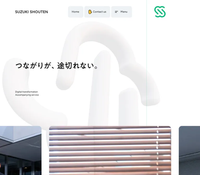
白い余白、淡い立体的なブランドマーク、グリーンの案内リンクが特徴のコーポレートサイト。大きな日本語の文章と顧客写真を軸に構成し、固定ナビゲーションはスマートフォンで画面下部へ移動します。
オリジナルサイトを見るA spacious corporate story carried by large Japanese text, client photographs, and a pale sculptural brand mark.
Website: www.suzukishouten.co.jp Original URL: https://www.suzukishouten.co.jp/ Final URL: https://www.suzukishouten.co.jp/ Theme: white canvas, black typography, bright green accents, and translucent cool-gray utility surfaces. Inspected: September 23, 2026, 03:01 JST; the supplied browser record is timestamped September 22, 2026, 18:01:08.190 UTC. Viewports: 1440 × 1000 desktop and 390 × 844 mobile, in CSS pixels. Scope: the current corporate homepage, including its opening composition, horizontal photography strip, service narrative, three linked case studies, company and recruitment narrative, contact invitation, and footer. Evidence consists of three desktop screenshots, two mobile screenshots, and rendered DOM/computed-style samples at both widths. Linked destinations and opened menu states were not inspected.
SUZUKI SHOUTEN presents DX consulting as an ongoing relationship. Its homepage develops that idea through a continuous, conversational Japanese narrative: services lead into customer relationships, case studies, the team, recruitment, and an invitation to make contact. Large text gives the story its pace. Small emojis make the voice approachable, while photographs of people and workplaces supply evidence of real collaboration.
The desktop composition is deliberately asymmetric. The narrative occupies a broad column beginning well inside the left edge, while compact green links sit in a narrow right rail. A fine green divider separates the rail from the main canvas. Above this structure, a modest wordmark and three floating utility controls leave considerable white space around the opening headline. An enormous, softly shaded interpretation of the brand symbol sits behind the content and remains visible through translucent footer tiles.
On mobile, the narrative becomes a single inset column and the utility controls move to the bottom of the viewport. The footer rearranges into two narrow link columns followed by full-width certification, sign-off, and upward-arrow panels. Preserve these changes in hierarchy and placement when adapting the design.
A spacious corporate story carried by large Japanese text, client photographs, and a pale sculptural brand mark.
Website: www.suzukishouten.co.jp Original URL: https://www.suzukishouten.co.jp/ Final URL: https://www.suzukishouten.co.jp/ Theme: white canvas, black typography, bright green accents, and translucent cool-gray utility surfaces. Inspected: September 23, 2026, 03:01 JST; the supplied browser record is timestamped September 22, 2026, 18:01:08.190 UTC. Viewports: 1440 × 1000 desktop and 390 × 844 mobile, in CSS pixels. Scope: the current corporate homepage, including its opening composition, horizontal photography strip, service narrative, three linked case studies, company and recruitment narrative, contact invitation, and footer. Evidence consists of three desktop screenshots, two mobile screenshots, and rendered DOM/computed-style samples at both widths. Linked destinations and opened menu states were not inspected.
SUZUKI SHOUTEN presents DX consulting as an ongoing relationship. Its homepage develops that idea through a continuous, conversational Japanese narrative: services lead into customer relationships, case studies, the team, recruitment, and an invitation to make contact. Large text gives the story its pace. Small emojis make the voice approachable, while photographs of people and workplaces supply evidence of real collaboration.
The desktop composition is deliberately asymmetric. The narrative occupies a broad column beginning well inside the left edge, while compact green links sit in a narrow right rail. A fine green divider separates the rail from the main canvas. Above this structure, a modest wordmark and three floating utility controls leave considerable white space around the opening headline. An enormous, softly shaded interpretation of the brand symbol sits behind the content and remains visible through translucent footer tiles.
On mobile, the narrative becomes a single inset column and the utility controls move to the bottom of the viewport. The footer rearranges into two narrow link columns followed by full-width certification, sign-off, and upward-arrow panels. Preserve these changes in hierarchy and placement when adapting the design.
16px; there is no evidence of a special viewport-derived root unit.Two measurement limitations need particular care. Several desktop section-link rectangles report a width of only 35px, although their complete labels are visible in screenshots. Those widths are unsuitable as settled component dimensions. Also, the extracted desktop narrative includes kana readings alongside kanji. Their markup and presentation behavior were not supplied, so the extraction must not be copied as duplicated visible prose.
| Name | Value | Suggested token | Evidence and role |
|---|---|---|---|
| Canvas White | #ffffff |
--color-canvas |
Measured body background; dominant page canvas |
| Text Black | #000000 |
--color-ink |
Measured narrative and navigation text |
| Brand Green | #00b976 |
--color-brand |
Measured section-link fill; visually consistent with the green identity and emphasized text |
| Utility Surface | rgba(231, 236, 240, 0.7) |
--surface-utility |
Measured Home, Contact us, and Menu backgrounds |
| Utility Base | #e7ecf0 |
--color-utility-base |
Opaque RGB component of the utility fill; not its final appearance on white |
| Strong Utility Surface | rgba(210, 219, 225, 0.7) |
--surface-strong |
Measured upward-arrow button background |
| Strong Utility Base | #d2dbe1 |
--color-utility-strong-base |
Opaque RGB component of the stronger utility fill |
| Muted Gray | #979797 |
--color-muted |
Measured SNS heading color |
| Pale Motif | Approximately #faf9f9 to #e9e7e7 |
Asset colors, not a flat fill | Estimated highlight and shadow range in the large background symbol |
| Fine Green Divider | Approximately rgb(0 185 118 / 0.35) |
--color-divider |
Recommended approximation of the pale vertical rule; its own computed color was not supplied |
The utility controls use transparency. Over plain white, their measured fill calculates to approximately #eef2f5; the stronger upward-arrow surface calculates to approximately #e0e6ea. These are composited approximations, not additional source colors. Over photography or the large pale symbol, the same translucent surfaces can appear different.
The footer tiles look closely related to the utility surfaces, but their individual background declarations were not sampled. Reusing --surface-utility for those panels is a visual approximation. Do not label that reuse as a measured footer rule.
The green is concentrated in the brand symbol, small section links, selected passages of narrative, and tiny footer bullets. Large background fields remain white or pale gray. The footer certification artwork retains its own blue, red, and black colors; those asset colors do not establish additional interface accents.
Only the light presentation is evidenced. No theme selector or alternate palette was observed. A dark theme would be a new design decision requiring separate treatment of photographs, translucent surfaces, and the pale brand artwork.
MFW-PA1GothicStd-Medium, sans-serif.400, despite the substantial visual stroke weight of the face.32px / 51.2px, with 0.5px letter spacing.24px / 38.4px, with the same 0.5px letter spacing.--font-japanese.Use the exact measured family identifier when describing the source. Its commercial name, loading URL, and font files are not established by the evidence. Avoid replacing the recorded 400 weight with an assumed 700 merely because the text looks bold.
Figtree, "Figtree Fallback", sans-serif.14px / 20px, weight 500, normal tracking.14px / 18.2px, weight 500, tracking 0.56px.12px, weight 600, tracking 0.48px.The generated fallback identifier is recorded evidence, not a downloadable font specification. The Quick Start uses a generic system fallback if Figtree is unavailable.
The body has a measured system sans-serif stack at 16px / 24px, weight 400. This is an inherited baseline; many visible components override it.
The home identity link contains no extracted text, while the screenshots show the SUZUKI SHOUTEN wordmark. Its measured link box does not establish a font family or live-text font size. Treat the wordmark as identity artwork whose implementation format remains unknown.
The hero headline and footer slogan visibly relate to the Japanese narrative style, but their own font declarations were not included in the element sample. Using the narrative family for them is a recommendation, not a separate measured finding.
| Role | Desktop | Mobile | Weight / tracking | Evidence |
|---|---|---|---|---|
| Main narrative and case-study bridges | 32px / 51.2px |
24px / 38.4px |
400; 0.5px |
Measured |
| Section-link label | 16px / 16px |
12px / 12px |
400; normal |
Measured, although mobile links are not visibly established in the supplied captures |
| Home / Contact us / Menu | 14px / 20px |
Same | 500; normal |
Measured |
| Footer site links | 14px / 33.6px |
14px / 37.8px |
500; 0.7px |
Measured |
| SNS heading | 14px / 18.2px |
Same | 500; 0.56px |
Measured |
| Social links | 12px / 33.72px |
12px / 38.4px |
600; 0.48px |
Measured |
| Certification caption | 8.3px / 14.94px |
Same | 500; normal |
Measured |
| Opening headline | Approximately 40px |
Approximately 28px |
Visually substantial; declaration unavailable | Estimated |
| English hero descriptor | Approximately 12px / 16px |
Approximately the same | Small, regular-looking Latin text | Estimated |
| Case-study headline | Approximately 20px |
Use 16–18px as an adaptation starting point |
Child styles unavailable | Desktop estimate; mobile recommendation |
| Case-study tags | Approximately 12px |
Unverified visually | Muted text inside fine outlined capsules | Desktop estimate |
| Footer slogan | Approximately 24px |
Approximately 24px |
Visually substantial | Estimated |
The hierarchy comes from the difference between expansive narrative and compact utilities. Keep ordinary navigation small enough to leave the Japanese story dominant.
The desktop text extraction includes kana readings before many kanji phrases; the mobile extraction contains the normal prose without those readings. The available screenshots do not establish a persistent furigana treatment, and no hover or annotation interaction was exercised. Preserve the normal text content without inventing an annotation trigger.
Emoji are visible content, not merely icon substitutes. The page uses gestures, people, objects, and thought bubbles inside sentences. The Contact us control includes ✋, while case-study transitions use 👇. Their system-rendered appearance may vary across platforms. Retain their role as occasional conversational punctuation rather than making every sentence an emoji cluster.
Base system: conventional CSS pixels with recurring 4, 5, 10, 20, 32, 40, 50, 80, and 200px intervals. These repetitions do not prove a single global spacing scale.
Density: airy overall composition, dense and expressive narrative paragraphs, compact utility controls, and closely joined footer panels.
| Use | Desktop | Mobile | Evidence |
|---|---|---|---|
| Utility-control gap | 5px |
5px |
Calculated from measured control positions |
| Footer panel gap | 4px |
4px |
Measured |
| Utility-control padding | 16px 20px |
Same | Measured |
| Contact icon-to-label gap | 6px |
Same | Measured |
| Menu icon-to-label gap | 15px |
Same | Measured |
| Narrative left inset | 200px |
20px |
Measured |
| Narrative-to-rail grid gap | 40px |
Single column | Measured |
| Case-card internal grid gap | 20px |
10px |
Measured on the outer link |
| Case-to-bridge / bridge-to-next-case spacing | 32px |
32px |
Calculated from adjacent element bounds |
| First case after introductory paragraph | 50px |
32px |
Calculated |
| Residual space after most narrative paragraphs | 50px |
32px |
Calculated from section height minus paragraph height; not declared padding |
| Footer distance after main content | 200px |
200px |
Calculated |
| Footer outside horizontal margin | 40px |
20px |
Measured |
| Document clearance after footer | 80px |
120px |
Calculated |
| Photography-strip gap | Approximately 40px |
Approximately 20px |
Estimated from screenshots |
| Element | Value | Evidence |
|---|---|---|
| Utility controls | 10px |
Measured |
| Upward-arrow panel | 10px |
Measured |
| Green section links | 9999px |
Measured |
| Footer panels | Approximately 10px |
Estimated |
| Large photographic frames | Approximately 16–20px |
Estimated |
| Case-study tag capsules | Fully rounded, small height | Estimated |
Rounded corners are concentrated on functional surfaces and image crops. Narrative text has no surrounding card, border, or panel.
| Element | At 1440 × 1000 | At 390 × 844 |
|---|---|---|
| Home identity link | x:80, y:45, 170 × 34px |
x:20, y:22, approximately 122 × 30.05px |
| Utility group | x:552.5, y:32, total 335 × 60px |
x:27.5, y:752, total 335 × 60px |
| Individual utility widths | Home 80px; Contact us 136px; Menu 109px |
Same |
| Narrative column | x:200, width 920px |
x:20, width 350px |
| Section grid | 920px 280px, with 40px gap |
350px, one column |
| Right rail origin | Track begins at x:1160; heading content begins at x:1200 |
No visible equivalent established |
| First service paragraph | Begins at document y:1680 |
Begins at document y:978 |
| Case-study outer links | Each sampled link is 920 × 613px |
Each is approximately 350 × 283.31px |
| Footer | x:40, width 1360px, height approximately 382.34px |
x:20, width 350px, height approximately 875.77px |
| Footer columns | Approximately 294.31 / 294.33 / 588.64 / 170.72px |
173 / 173px |
| Upward-arrow button | Approximately 170.72 × 382.34px |
350 × 80px |
| Certification link block | Approximately 181 × 87.92px |
Approximately 181 × 87.80px |
| Document height | Approximately 6485.28px |
Approximately 5570.36px |
The 613px case-study link height includes its internal content and spacing. It is not a measurement of the photograph alone. Do not derive an image aspect ratio by dividing 920 by 613.
Role: keep the homepage, contact destination, and menu affordance accessible throughout the long narrative.
The desktop identity sits at the upper left while three independent rounded controls are centered across the viewport. There is no solid full-width header bar in the supplied screenshots. The control group remains visually detached from the wordmark and from the green symbol in the right rail.
The anatomy is:
80 × 60px.136 × 60px, with the hand emoji followed by a 6px gap.109 × 60px, with a small two-line icon and 15px icon-to-label gap.All three use the measured translucent utility fill, black 14px Figtree text, and 10px corners. The group has two 5px gaps, making its total width 335px.
Home points to /; Contact us points to /contact. Menu is a button, but its opened state and behavior were not provided. Its visual reference therefore covers the closed control only.
The wordmark and utility group remain in their respective viewport positions in the supplied scrolled captures, supporting persistent placement. On mobile, the wordmark remains near the top-left corner while the entire control group moves to y:752, leaving 32px below it in the 844px viewport. Control dimensions remain unchanged at this width.
Role: establish the relationship-focused message before the longer story begins.
The opening copy is つながりが、途切れない。. It appears as one line on desktop and two lines on mobile, breaking after the comma. On desktop, its left edge is approximately 80px, with the visible lettering beginning around y:330. On mobile, it begins around x:20, y:214.
A two-line English descriptor sits below it:
Digital transformation
Accompanying service
The descriptor is much smaller than the headline and separated by substantial vertical space. There is no large filled hero CTA in the supplied opening. Contact remains available through the floating utility group.
The photography strip begins around y:660 on desktop and y:508 on mobile. These are screenshot estimates. The complete layout between that strip and the first narrative paragraph is not represented in the element sample, so the measured narrative start positions should not be interpreted as proof of a particular spacer, sticky sequence, or number of image rows.
Role: provide a continuous visual identity behind otherwise simple text and photography.
Two treatments are visible: a small bright-green interlocking symbol near the upper-right corner and an enormous pale version behind the page. The pale version resembles thick, softly rounded bands with subtle dimensional shading. Its quiet warm-gray shadows distinguish it from a flat watermark.
The desktop small symbol is approximately 60px square; the mobile version is approximately 40px square. These are visual estimates. The large motif exceeds the dimensions of an ordinary content illustration and is intentionally cropped by the viewport.
Its position and orientation differ between captures, but the evidence does not establish whether the cause is time-based animation, scroll-linked transformation, responsive layout, or a combination. Do not assert a rendering technology such as SVG animation, canvas, or WebGL.
For an adaptation, use an appropriately prepared pale asset as a non-interactive decorative layer. Keep it behind text and translucent panels, and ensure it cannot intercept pointer events. A fixed decorative layer in the Quick Start is an approximation of the recurring visual effect.
Role: introduce people and working environments before the extended service narrative.
The strip crosses the page width and exposes partial neighboring images at both edges. The desktop screenshot shows a fully visible central panel approximately 640px wide with roughly 40px between frames. The phone view retains large photographs and crops neighboring frames rather than shrinking all images into a small grid.
Visible subjects include people outside office buildings, a group in front of a glazed facade, and hands working at a laptop near window blinds. Corners are rounded, and the photographs preserve natural office and daylight colors.
The crops and visible images differ between captures. This supports a horizontally arranged image treatment, but it does not prove autoplay, dragging, snapping, direction, or speed. A static clipped strip is sufficient for the CSS reference. Any interactive carousel would require separately specified controls and behavior.
Role: organize a continuous story while providing short paths into the wider corporate website.
Each sampled desktop section uses a grid with a 920px narrative track and a 280px rail track, separated by 40px. The entire grid has 200px left padding. The narrative remains open on the white canvas; it is not enclosed in a card.
The rail begins near the fine vertical line at x:1160. Its visible labels begin at x:1200, leaving another 40px inset inside the rail. Green pill links combine Japanese section text and a right arrow. Their measured fill is #00b976, their radius is 9999px, and their nominal height is 32px on desktop.
The observed section destinations are:
| Source label | Destination | Narrative role |
|---|---|---|
サービス |
/service |
Explains continuous DX support |
DX事例 |
/works |
Introduces client relationships and examples |
私たちについて |
/about |
Describes the team and its approach |
採用情報 |
https://www.wantedly.com/companies/suzukishouten |
Introduces recruitment and organizational values |
お問い合わせ |
/contact |
Invites a first conversation |
Scrolled desktop images show rail links near the top-right while their section content continues beneath. This is consistent with sticky section markers, but the exact sticking threshold and release rules are unverified.
On mobile, the measured layout is one 350px column. Section-link elements still exist in the DOM, but their rectangles start at x:370, with most of their width outside the 390px viewport. Their appearance or activation during mobile scrolling was not demonstrated. Do not copy these off-canvas coordinates into a new implementation as if they were the intended usable state.
Role: connect the narrative to specific customer outcomes.
Each case is one linked composition containing a photograph, client identification, a testimonial-style headline, and small category tags. The outer link is a single-column grid with a measured 20px gap on desktop and 10px on mobile. It has no measured enclosing fill or rounded outer shell; the rounded treatment belongs to the visible media frame.
In the supplied middle desktop screenshot, a client name appears in small white text near the upper-left of a photograph. Below the image, the first case presents the source line 鈴木商店は、僕らが目指す方向に会社を推進してくれるファシリテーターです。, followed by a small outlined #IT戦略立案 tag.
The observed entries are:
| Client | Destination | Subject established by page text |
|---|---|---|
株式会社イタミアート |
/works/dx/itami-art/1 |
IT strategy and facilitation |
株式会社イタミアート |
/works/dx/itami-art/2 |
Automated ordering and improved outsourced-product sales |
Arboreta合同会社 |
/works/dx/arboreta/1 |
App development supporting a forestry-related business |
The second case photograph shows people in conversation in a bright office with blinds. The third entry is established by DOM text and its link; its photograph is not available in the supplied original-page screenshots.
Conversational bridge paragraphs separate the cards, including こんな事例👇や、 and さらにはこんな事例👇など、. These use the same large type as the main narrative. Preserve the sequence of story, example, bridge, and next example rather than treating the cases as an unrelated portfolio grid.
Role: turn the narrative into an approachable invitation to speak.
The final paragraph remains in the same large Japanese type and content column. Its opening lines about wanting to pursue DX without knowing where to start appear green in the desktop screenshot; the invitation that follows is black. Thought-bubble and raised-hand emojis continue the conversational tone.
The green emphasis is visible evidence, but the supplied paragraph-level computed style reports black and does not include the relevant descendant styles. The exact span boundaries and declaration are therefore not measured.
The associated お問い合わせ link remains a small green rail pill on desktop. The page does not switch to a full-width colored conversion banner before the footer.
Role: consolidate website navigation, social destinations, certification, identity, and an upward-navigation affordance.
The desktop footer is a 1360px grid positioned 40px from either side, with only 4px between panels. Its measured columns are approximately 294.31px, 294.33px, 588.64px, and 170.72px.
The first column contains nine site links. The second contains an SNS heading and Facebook/Wantedly links. The broad third column is split into an upper certification panel and lower slogan/copyright panel. The narrow fourth column is a tall upward-arrow button spanning the footer height.
The panels are pale and translucent-looking, allowing the large background motif to remain visible. The footer uses fine green bullets and generous link line heights instead of separators between every item. Desktop link text begins approximately 40px inside the first two panels.
At mobile width, the first two panels become 173px columns. Certification, slogan/copyright, and the arrow panel each span the full 350px. Long navigation labels wrap naturally; 情報セキュリティ基本方針 occupies multiple lines in the supplied phone image.
The slogan repeats つながりが、途切れない。. The original-page footer also displays © 株式会社鈴木商店, directly supporting the operator identity.
Role: present the company’s displayed information-security credential within the footer.
The measured link block is 181px wide, with a 5px grid gap between the image and caption. Subtracting the measured caption height and gap gives an image height of approximately 68px. The same compact block remains centered within a full-width mobile panel.
The displayed caption is IS 574133 / ISO(JIS Q)27001 大阪本社にて取得. Its source size is only 8.3px, which should be treated as an observed limitation rather than an ideal reading size for new work.
The linked destination is https://isms.jp/lst/ind/CR_IS_x0020_574133.html. Its destination content was not inspected. Preserve the original scope wording if reproducing this credential; do not generalize the claim to additional offices or services.
Role: add a small playful detail and a large end-of-page navigation affordance.
A small green character peeks above the first footer panel in the desktop screenshot. The corresponding empty-text link points to /game-room, and its measured rectangle is 100 × 50px, positioned 50px above the footer. No game interaction was inspected.
The upward-arrow control is a button with a darker translucent gray surface and 10px corners. On desktop it is a tall 170.72 × 382.34px panel. On mobile it becomes a horizontal 350 × 80px panel. The icon occupies a measured 29px grid column and is visually centered.
The arrow suggests back-to-top behavior, but its handler, scroll duration, and accessible name were not supplied. Describe the visible affordance separately from any recommended implementation of its action.
| Treatment | Evidence | What can be reused |
|---|---|---|
| Utility-control color transitions | Measured 0.3s cubic-bezier(0.4, 0, 0.2, 1) for color, background, border, text-decoration, fill, and stroke |
Use the recorded timing for subtle state changes; target hover colors were not provided |
| Footer link transitions | Measured 0.3s cubic-bezier(0.4, 0, 0.2, 1) |
Timing is established; the final hovered appearance is not |
| Upward-arrow surface transitions | Same measured color-transition timing as utility controls | Reuse timing independently of the unverified scroll action |
| Persistent utility placement | Matching viewport placement across top and scrolled captures | Desktop top-center and mobile bottom-center persistence are supported |
| Section-marker placement | Different desktop scroll captures show rail links near the viewport top | Sticky behavior is a reasonable interpretation; thresholds remain unknown |
| Horizontal photo composition | Different visible frames and crops across supplied views | Preserve the strip and edge cropping; autoplay and drag behavior are unverified |
| Large brand motif | Position and orientation differ across captures | Preserve the large decorative role; rotation, speed, easing, and scroll binding are unverified |
| Menu | Closed button only | Do not specify an observed overlay or opening animation |
| Case-study navigation | Destination URLs are present | Link targets are established; hover transformations and destination transitions are not |
Many sampled elements report animation: none. That does not prove that the whole page is static: image nodes, ancestor effects, pseudo-elements, and JavaScript-driven transformations are not comprehensively represented. Similarly, a bare transition: all entry without duration does not establish a visible animation.
The supplied capture process waited for load, visible-image decoding, and sampled layout/text stability; it also waited for relevant finite animations within time limits. Perpetual animations were paused during readiness checks and resumed afterward. Those procedures improve screenshot reliability but do not identify motion choreography or prove that every delayed element appeared.
For an adaptation, the measured 300ms color easing is a useful default. Any decorative movement should remain secondary to reading and receive a reduced-motion alternative. Do not assign invented source durations to the photography or brand mark.
| Layer | Appearance | Structural purpose |
|---|---|---|
| Canvas | Solid white | Keeps the long narrative open and calm |
| Decorative identity | Very pale, softly shaded interlocking form | Carries visual identity across sections |
| Narrative and cases | Transparent surrounding surface | Lets type and photography define their own boundaries |
| Utility controls | Translucent cool gray, 10px radius |
Provides compact persistent navigation |
| Section links | Bright green capsules with white text | Marks destinations in the right rail |
| Footer panels | Pale translucent-looking tiles with 4px seams |
Groups navigation and credentials without a dark footer band |
| Upward-arrow panel | Slightly darker translucent gray | Distinguishes the large final control |
| Photographs | Natural color, rounded crop | Supplies people, context, and credibility |
There is no visible general card-shadow system. Separation comes from white space, slight surface differences, rounded image boundaries, and the fine right-hand divider. Translucency is measured for the main controls; backdrop blur was not established and should not be inferred from it.
Photography emphasizes relationships and work: people standing together outside buildings, seated discussions, office blinds, and laptop use. The human subjects are larger and more specific than generic technology imagery. Building lines and window blinds provide visual structure without adding decorative graphics over the photographs.
Keep photographs naturally colored and use intentional crops. Wide case-study frames should retain readable faces and enough environmental context to feel like a real conversation. The hero strip can expose partial neighboring frames to communicate continuity across the viewport.
The large pale symbol and the small green symbol perform different jobs. The small symbol is a crisp identity marker. The large form is a soft, dimensional backdrop. Simply enlarging a flat green logo and reducing opacity will not reproduce all of the latter’s shading.
Original image src, srcset, and font-file URLs were not included in the supplied evidence. The following identifies visible assets rather than inventing retrievable paths.
| Asset | Evidence | Implementation guidance |
|---|---|---|
SUZUKI SHOUTEN wordmark |
Desktop and mobile upper-left identity | Use the supplied identity artwork when available; its font is not established |
| Small green interlocking symbol | Opening desktop and mobile captures | Preserve its outline and proportions |
| Large pale sculptural symbol | Opening, middle, and footer captures | Use a prepared decorative asset with restrained shading |
| Opening photo strip | Desktop and mobile opening captures | Preserve large crops, rounded corners, and partial neighboring images |
| First case photograph | Partially visible in the middle desktop capture | Keep the image associated with its verified case link |
| Second case photograph | Middle desktop capture, people seated against blinds | Preserve the documentary subject and bright office setting |
| Footer mascot | Desktop footer and measured /game-room link |
Keep its small peeking placement; do not invent game behavior |
| Certification artwork | Desktop and mobile footer captures | Keep its original proportions and full credential caption |
No conclusion about video, image file format, lazy-loading strategy, or source resolution can be drawn from these references alone.
At 1440px, the opening wordmark and headline begin around 80px from the left, while the later narrative starts at 200px. This offset is intentional: the opening is broad and atmospheric, and the story settles into a more inset reading position.
The main reading track is 920px wide. The right-hand grid track is 280px, and the intervening gap is 40px. A fine divider around x:1160 separates the narrative region from the section-link rail. The first service paragraph begins at document y:1680, well below the opening screenshot’s headline and photo-strip start.
Case studies remain a vertical sequence at this width. They do not become multiple desktop columns. Their bridge sentences and captions continue the conversational reading order.
The footer expands beyond the narrative column, returning to 40px outside margins. Its near-contiguous panel grid gives the end of the page a different density without introducing a different palette.
At 390px, primary narrative content has 20px side padding and a measured width of 350px. Narrative type reduces from 32px to 24px while preserving the 1.6 line-height ratio and 0.5px tracking.
The headline breaks into two lines. The top-left identity link reduces from 170px to approximately 122px wide. The small green symbol moves into the upper-right corner without a visible desktop-style rail.
The three utility controls retain their desktop dimensions and become a bottom dock. Their 335px total width leaves 27.5px on each side. The dock appears over photography in the opening capture and remains visible near the footer.
Case-study outer-link width reduces from 920px to 350px, and the measured internal gap halves to 10px. The DOM establishes this mobile geometry, but a mobile middle-page screenshot was not supplied, so exact mobile photograph crops and caption styling remain unverified.
The footer starts with two equal columns and then stacks its broader panels. The measured upward-arrow button changes from a vertical desktop panel to an 80px-high mobile row. The document retains 120px after the footer, helping keep its end clear of the dock.
Only two widths were sampled. The original media-query breakpoint, tablet composition, orientation handling, and behavior below 390px are unknown. The Quick Start uses 1024px as a recommended layout switch, not a discovered source breakpoint.
For screens narrower than the observed phone, let the utility controls contract or reflow without losing their labels. Preserve bottom safe-area clearance and enough document padding to reach content behind the dock. Both are recommended robustness measures; source safe-area declarations were not provided.
32px / 51.2px desktop and 24px / 38.4px mobile narrative relationship.10px corners.4px panel seams and its desktop-to-mobile rearrangement.35px desktop pill widths.These are recommendations for a new implementation, not verified features of the original:
#00b976 against white calculates to approximately 2.56:1; this is insufficient for normal-size white pill labels and even for large green text under standard WCAG contrast thresholds. An optional text/action green such as #00784c calculates to approximately 5.5:1 against white while retaining the bright brand green for artwork.8.3px where readability is more important than exact reproduction. Preserve the scope of the credential text.44px interaction targets for small section links through sizing or appropriate hit-area treatment. Their observed visual height is only 32px on desktop.#ffffff.#000000.#00b976.rgba(231, 236, 240, 0.7).rgba(210, 219, 225, 0.7).#979797.#00784c, explicitly an adaptation.“Create a Japanese DX consulting corporate homepage with a white canvas, black expressive Japanese typography, and restrained bright-green identity accents. Use a large pale sculptural brand symbol behind the page. Place a small wordmark at the upper left and three separate translucent gray controls—Home, a hand emoji with Contact us, and Menu—at the desktop top center. Begin with the source headline ‘つながりが、途切れない。’, a tiny two-line English service descriptor, and a horizontally cropped strip of real client and workplace photographs. Below, use a broad inset narrative column with 32px Japanese text, 1.6 line height, and a narrow right rail of green capsule links. Interleave three single-column customer cases with conversational bridge sentences. Finish with a tightly spaced pale footer panel grid. On a 390px phone, use 20px content gutters, 24px narrative text, a two-line headline, and a fixed bottom utility dock. Keep motion unspecified unless separately designed and tested.”
This is a component scaffold, not the original stylesheet or a complete reconstruction. It uses measured control, narrative, and footer relationships. Hero sizes, image ratios, the decorative-layer placement, footer fills, responsive interpolation, and the 1024px breakpoint are approximations or recommendations.
Use the recorded font families only when their font assets are available in the project; no font files or image URLs are bundled here. The .brand-watermark element expects an already pale decorative asset. The photo strip below is static and clipped. Menu behavior, upward navigation, and any carousel controls require separate implementation.
Recommended markup relationships: place .section-content and .section-rail inside each .story-section; place the five named footer panels inside .site-footer; put the mascot inside .footer-links. The code does not reconstruct the unsampled interval between the opening strip and the measured first narrative position. Tune that region with additional evidence if exact page-length correspondence is required.
:root {
  /* Measured colors */
  --color-canvas: #ffffff;
  --color-ink: #000000;
  --color-brand: #00b976;
  --color-muted: #979797;
  --surface-utility: rgb(231 236 240 / 0.7);
  --surface-strong: rgb(210 219 225 / 0.7);

  /* Recommended semantic aliases and divider approximation */
  --color-action: var(--color-brand);
  --color-emphasis: var(--color-brand);
  --color-divider: rgb(0 185 118 / 0.35);

  /* Recorded families, with available generic fallbacks */
  --font-japanese: 'MFW-PA1GothicStd-Medium', sans-serif;
  --font-latin: Figtree, system-ui, sans-serif;
  --font-base: ui-sans-serif, system-ui, sans-serif;
  --text-story: 32px;
  --leading-story: 1.6;
  --tracking-story: 0.5px;
  --text-control: 14px;
  --text-footer: 14px;

  /* Measured geometry */
  --control-height: 60px;
  --control-gap: 5px;
  --radius-control: 10px;
  --radius-pill: 9999px;
  --footer-gap: 4px;
  --case-gap: 20px;

  /* Responsive interpolation and visual approximations */
  --story-inset: clamp(80px, 13.8889vw, 200px);
  --rail-width: clamp(220px, 19.4444vw, 280px);
  --radius-media: 20px;
  --footer-inset: 40px;
  --safe-bottom: env(safe-area-inset-bottom, 0px);

  /* Measured transition timing */
  --motion-color: 300ms cubic-bezier(0.4, 0, 0.2, 1);
}

* {
  box-sizing: border-box;
}

body {
  margin: 0;
  color: var(--color-ink);
  background: var(--color-canvas);
  font: 400 16px / 1.5 var(--font-base);
}

button,
a {
  -webkit-tap-highlight-color: transparent;
}

button {
  color: inherit;
  font: inherit;
}

.site-page {
  position: relative;
  isolation: isolate;
  overflow-x: clip;
  padding-bottom: 80px;
}

/* Recommended optional contrast variant */
.site-page[data-contrast='enhanced'] {
  --color-action: #00784c;
  --color-emphasis: #00784c;
}

/* Approximation: use artwork that already has pale shading. */
.brand-watermark {
  position: fixed;
  z-index: 0;
  top: 60px;
  left: 20%;
  width: 1000px;
  max-width: none;
  height: auto;
  pointer-events: none;
  user-select: none;
}

.site-header {
  position: relative;
  z-index: 20;
}

.site-main,
.site-footer {
  position: relative;
  z-index: 1;
}

/* Approximation of the continuous desktop rail divider */
.site-main::before {
  content: '';
  position: absolute;
  z-index: -1;
  inset-block: 0;
  right: var(--rail-width);
  border-left: 1px solid var(--color-divider);
  pointer-events: none;
}

.wordmark {
  position: fixed;
  top: 45px;
  left: 80px;
  display: block;
  width: 170px;
  padding-block: 10px;
}

.wordmark img {
  display: block;
  width: 100%;
  height: auto;
}

/* The small opening symbol is not made persistent here. */
.brand-symbol {
  position: absolute;
  top: 32px;
  left: calc(100% - var(--rail-width) + 40px);
  width: 60px;
  height: 60px;
  object-fit: contain;
}

.utility-nav {
  position: fixed;
  top: 32px;
  left: 50%;
  display: grid;
  grid-template-columns: 80px 136px 109px;
  gap: var(--control-gap);
  width: 335px;
  transform: translateX(-50%);
}

.utility-control {
  display: flex;
  align-items: center;
  justify-content: center;
  gap: 6px;
  min-width: 0;
  height: var(--control-height);
  padding: 16px 20px;
  border: 0;
  border-radius: var(--radius-control);
  color: var(--color-ink);
  background: var(--surface-utility);
  font: 500 var(--text-control) / 20px var(--font-latin);
  text-decoration: none;
  white-space: nowrap;
  cursor: pointer;
  transition:
    color var(--motion-color),
    background-color var(--motion-color);
}

.utility-control--menu {
  gap: 15px;
}

/* Visual approximation of the two-line menu icon */
.menu-icon {
  display: grid;
  flex: none;
  gap: 4px;
  width: 16px;
}

.menu-icon::before,
.menu-icon::after {
  content: '';
  height: 2px;
  background: currentColor;
}

.menu-icon::after {
  width: 10px;
}

/* Hero typography and positioning are screenshot estimates. */
.hero {
  min-height: 660px;
  padding: 320px 80px 80px;
}

.hero-title {
  margin: 0;
  font: 400 40px / 1.3 var(--font-japanese);
  letter-spacing: 0.5px;
}

.hero-subtitle {
  margin: 100px 0 0;
  font: 400 12px / 16px var(--font-latin);
}

.photo-strip {
  position: relative;
  overflow: hidden;
}

.photo-track {
  display: flex;
  gap: 40px;
  width: max-content;
}

.photo-panel {
  flex: 0 0 640px;
  width: 640px;
  aspect-ratio: 3 / 2; /* Recommended, not measured */
  overflow: hidden;
  border-radius: var(--radius-media);
}

.photo-panel img,
.case-media img {
  display: block;
  width: 100%;
  height: 100%;
  object-fit: cover;
}

.story-section {
  display: grid;
  grid-template-columns: minmax(0, 1fr) var(--rail-width);
  column-gap: 40px;
  padding-left: var(--story-inset);
  padding-bottom: 50px;
  scroll-margin-top: 120px;
}

.story-section:last-child {
  padding-bottom: 0;
}

.section-content {
  grid-column: 1;
  grid-row: 1;
  min-width: 0;
}

.story-copy,
.story-bridge {
  margin: 0;
  font: 400 var(--text-story) / var(--leading-story)
    var(--font-japanese);
  letter-spacing: var(--tracking-story);
}

.story-emphasis {
  color: var(--color-emphasis);
}

.section-rail {
  grid-column: 2;
  grid-row: 1;
  min-width: 0;
  padding-left: 40px;
}

.section-link {
  position: sticky; /* Recommended interpretation */
  top: 46px;
  display: inline-flex;
  align-items: center;
  gap: 10px;
  width: fit-content;
  min-height: 32px;
  padding: 6px 15px;
  border-radius: var(--radius-pill);
  color: #ffffff;
  background: var(--color-action);
  font: 400 16px / 16px var(--font-japanese);
  text-decoration: none;
  white-space: nowrap;
}

.case-sequence {
  display: grid;
  gap: 32px;
  margin-top: 50px;
}

.case-card {
  display: grid;
  gap: var(--case-gap);
  min-width: 0;
  color: inherit;
  text-decoration: none;
}

.case-media {
  position: relative;
  aspect-ratio: 16 / 9; /* Recommended, not measured */
  overflow: hidden;
  border-radius: var(--radius-media);
}

.case-client {
  position: absolute;
  top: 24px;
  left: 30px;
  margin: 0;
  color: #ffffff;
  font: 400 14px / 1.5 var(--font-japanese);
}

.case-title {
  margin: 0;
  font: 400 20px / 1.6 var(--font-japanese);
}

.case-tags {
  display: flex;
  flex-wrap: wrap;
  gap: 6px;
  margin: 0;
  padding: 0;
  list-style: none;
}

.case-tag {
  padding: 2px 8px;
  border: 1px solid #e4e4e4; /* Visual approximation */
  border-radius: var(--radius-pill);
  color: var(--color-muted);
  font: 400 12px / 1.3 var(--font-base);
}

.site-footer {
  display: grid;
  grid-template-columns: 1fr 1fr 2fr 0.58fr;
  grid-template-areas:
    'links social cert top'
    'links social signoff top';
  gap: var(--footer-gap);
  margin: 200px var(--footer-inset) 0;
}

.footer-panel {
  min-width: 0;
  padding: 40px;
  border-radius: var(--radius-control);
  background: var(--surface-utility); /* Approximation */
}

.footer-links {
  position: relative;
  grid-area: links;
}

.footer-social {
  grid-area: social;
}

.footer-links ul,
.footer-social ul {
  margin: 0;
  padding: 0;
  list-style: none;
}

.footer-links a {
  display: block;
  color: inherit;
  font: 500 14px / 33.6px var(--font-japanese);
  letter-spacing: 0.7px;
  text-decoration: none;
}

/* Supply labels without an additional literal leading bullet. */
.footer-links a::before {
  content: '·';
  margin-right: 0.5em;
  color: var(--color-brand);
}

.footer-social-title {
  margin: 0 0 16px;
  color: var(--color-muted);
  font: 500 14px / 18.2px var(--font-latin);
  letter-spacing: 0.56px;
}

.footer-social a {
  display: block;
  color: inherit;
  font: 600 12px / 33.72px var(--font-latin);
  letter-spacing: 0.48px;
  text-decoration: none;
}

.footer-cert {
  grid-area: cert;
  display: grid;
  place-items: center;
}

.certification {
  display: grid;
  gap: 5px;
  width: 181px;
  max-width: 100%;
  color: inherit;
  text-decoration: none;
}

.certification img {
  display: block;
  width: 100%;
  height: auto;
}

.certification-caption {
  margin: 0;
  font: 500 8.3px / 14.94px var(--font-japanese);
}

.footer-signoff {
  grid-area: signoff;
  display: flex;
  flex-direction: column;
  justify-content: space-between;
  gap: 32px;
  padding: 32px;
}

.footer-slogan {
  margin: 0;
  font: 400 24px / 1.4 var(--font-japanese);
}

.footer-copyright {
  align-self: flex-end;
  margin: 0;
  color: var(--color-muted);
  font: 400 12px / 1.5 var(--font-base);
}

.footer-top {
  grid-area: top;
  display: grid;
  place-items: center;
  min-height: 80px;
  padding: 24px 20px;
  border: 0;
  border-radius: var(--radius-control);
  background: var(--surface-strong);
  cursor: pointer;
  transition: background-color var(--motion-color);
}

.footer-top svg {
  width: 29px;
  height: 32px;
}

.footer-mascot {
  position: absolute;
  top: -50px;
  left: calc(50% - 50px);
  width: 100px;
  height: 50px;
}

/* Recommended focus treatment; source state was not sampled. */
.site-page :focus-visible {
  outline: 2px solid var(--color-ink);
  outline-offset: 4px;
}

/* Recommended hover target; source transition timing is retained. */
@media (hover: hover) {
  .utility-control:hover {
    background: var(--surface-strong);
  }

  .case-card:hover .case-title,
  .footer-links a:hover,
  .footer-social a:hover {
    text-decoration: underline;
    text-underline-offset: 0.2em;
  }
}

/* Recommended breakpoint, not a discovered source value. */
@media (max-width: 1023px) {
  :root {
    --text-story: 24px;
    --case-gap: 10px;
    --footer-inset: 20px;
  }

  .site-page {
    padding-bottom: calc(120px + var(--safe-bottom));
  }

  .site-main::before {
    display: none;
  }

  .brand-watermark {
    top: 90px;
    left: -150px;
    width: 700px;
  }

  .wordmark {
    top: 22px;
    left: 20px;
    width: 122px;
  }

  .brand-symbol {
    top: 32px;
    right: 20px;
    left: auto;
    width: 40px;
    height: 40px;
  }

  .utility-nav {
    top: auto;
    bottom: calc(32px + var(--safe-bottom));
  }

  .hero {
    min-height: 508px;
    padding: 206px 20px 60px;
  }

  .hero-title {
    font-size: 28px;
    line-height: 1.4;
  }

  /* Wrap the source headline into two spans at its comma. */
  .hero-title span {
    display: block;
  }

  .hero-subtitle {
    margin-top: 48px;
  }

  .photo-track {
    gap: 20px;
  }

  .photo-panel {
    flex-basis: 300px;
    width: 300px;
  }

  .story-section {
    grid-template-columns: minmax(0, 1fr);
    row-gap: 20px;
    padding: 0 20px 32px;
  }

  /* Recommended accessible mobile alternative to off-canvas links. */
  .section-rail {
    grid-column: 1;
    grid-row: 1;
    padding: 0;
  }

  .section-content {
    grid-column: 1;
    grid-row: 2;
  }

  .section-link {
    position: static;
    min-height: 44px;
    font-size: 12px;
    line-height: 12px;
  }

  .case-sequence {
    margin-top: 32px;
  }

  .case-client {
    top: 16px;
    left: 16px;
    font-size: 12px;
  }

  .case-title {
    font-size: 16px;
  }

  .site-footer {
    grid-template-columns: repeat(2, minmax(0, 1fr));
    grid-template-areas:
      'links social'
      'cert cert'
      'signoff signoff'
      'top top';
  }

  .footer-panel {
    padding: 40px 20px;
  }

  .footer-links a {
    line-height: 37.8px;
  }

  .footer-social a {
    line-height: 38.4px;
  }

  .footer-signoff {
    align-items: center;
    text-align: center;
  }

  .footer-copyright {
    align-self: center;
  }

  .footer-top {
    height: 80px;
  }
}

/* Recommended robustness below the observed 390px width. */
@media (max-width: 374px) {
  .utility-nav {
    width: calc(100% - 24px);
    grid-template-columns: 0.8fr 1.36fr 1.09fr;
  }

  .utility-control {
    padding-inline: 10px;
  }

  .utility-control--menu {
    gap: 10px;
  }
}

@media (prefers-reduced-motion: reduce) {
  .site-page *,
  .site-page *::before,
  .site-page *::after {
    animation: none !important;
    transition: none !important;
  }
}
Optional aliases for a project already using Tailwind v4. The supplied DOM includes --tw-* custom properties, but that does not establish the original Tailwind version or complete build setup. Define the custom properties above first.
@theme inline {
  --color-canvas: #ffffff;
  --color-ink: #000000;
  --color-brand: #00b976;
  --color-muted: #979797;
  --color-utility: rgb(231 236 240 / 0.7);
  --color-utility-strong: rgb(210 219 225 / 0.7);

  --font-japanese: 'MFW-PA1GothicStd-Medium', sans-serif;
  --font-latin: Figtree, system-ui, sans-serif;

  --text-narrative: var(--text-story);
  --text-narrative--line-height: 1.6;
  --text-narrative--letter-spacing: 0.5px;
  --text-utility: 14px;
  --text-utility--line-height: 20px;

  --spacing-control: 60px;
  --spacing-control-gap: 5px;
  --spacing-panel-gap: 4px;
  --spacing-mobile-inset: 20px;
  --spacing-story-inset: var(--story-inset);
  --spacing-rail: var(--rail-width);

  --radius-control: 10px;
  --radius-media: 20px;
  --radius-pill: 9999px;
}
200. The rendered title is 鈴木商店 | DXコンサルティング.2026-09-22T18:01:08.190Z, equivalent to September 23, 2026, 03:01:08.190 JST. This is the supplied observation timestamp, not the time this reference was written.1440 × 1000 CSS-pixel viewport; opening, middle case-study, and footer screenshots; rendered text, links, element rectangles, computed typography, backgrounds, radii, grids, and transition declarations. Reported document height is approximately 6485.28px.390 × 844 CSS-pixel viewport; opening and footer screenshots; corresponding rendered DOM and computed-style samples. Reported document height is approximately 5570.36px. Middle-page mobile geometry is supported by DOM measurements, not a supplied mobile middle screenshot.All source-specific claims above are grounded in the supplied current homepage evidence. Visual estimates, calculated values, and new implementation recommendations are distinguished explicitly. The CSS is a reusable starting point and was not browser-tested in this task.
# SUZUKI SHOUTEN — Style Reference

> A spacious corporate story carried by large Japanese text, client photographs, and a pale sculptural brand mark.

**Website:** [www.suzukishouten.co.jp](https://www.suzukishouten.co.jp/)
**Original URL:** https://www.suzukishouten.co.jp/
**Final URL:** https://www.suzukishouten.co.jp/
**Theme:** white canvas, black typography, bright green accents, and translucent cool-gray utility surfaces.
**Inspected:** September 23, 2026, 03:01 JST; the supplied browser record is timestamped September 22, 2026, 18:01:08.190 UTC.
**Viewports:** 1440 × 1000 desktop and 390 × 844 mobile, in CSS pixels.
**Scope:** the current corporate homepage, including its opening composition, horizontal photography strip, service narrative, three linked case studies, company and recruitment narrative, contact invitation, and footer. Evidence consists of three desktop screenshots, two mobile screenshots, and rendered DOM/computed-style samples at both widths. Linked destinations and opened menu states were not inspected.

SUZUKI SHOUTEN presents DX consulting as an ongoing relationship. Its homepage develops that idea through a continuous, conversational Japanese narrative: services lead into customer relationships, case studies, the team, recruitment, and an invitation to make contact. Large text gives the story its pace. Small emojis make the voice approachable, while photographs of people and workplaces supply evidence of real collaboration.

The desktop composition is deliberately asymmetric. The narrative occupies a broad column beginning well inside the left edge, while compact green links sit in a narrow right rail. A fine green divider separates the rail from the main canvas. Above this structure, a modest wordmark and three floating utility controls leave considerable white space around the opening headline. An enormous, softly shaded interpretation of the brand symbol sits behind the content and remains visible through translucent footer tiles.

On mobile, the narrative becomes a single inset column and the utility controls move to the bottom of the viewport. The footer rearranges into two narrow link columns followed by full-width certification, sign-off, and upward-arrow panels. Preserve these changes in hierarchy and placement when adapting the design.
# SUZUKI SHOUTEN — Style Reference

> A spacious corporate story carried by large Japanese text, client photographs, and a pale sculptural brand mark.

**Website:** [www.suzukishouten.co.jp](https://www.suzukishouten.co.jp/)
**Original URL:** https://www.suzukishouten.co.jp/
**Final URL:** https://www.suzukishouten.co.jp/
**Theme:** white canvas, black typography, bright green accents, and translucent cool-gray utility surfaces.
**Inspected:** September 23, 2026, 03:01 JST; the supplied browser record is timestamped September 22, 2026, 18:01:08.190 UTC.
**Viewports:** 1440 × 1000 desktop and 390 × 844 mobile, in CSS pixels.
**Scope:** the current corporate homepage, including its opening composition, horizontal photography strip, service narrative, three linked case studies, company and recruitment narrative, contact invitation, and footer. Evidence consists of three desktop screenshots, two mobile screenshots, and rendered DOM/computed-style samples at both widths. Linked destinations and opened menu states were not inspected.

SUZUKI SHOUTEN presents DX consulting as an ongoing relationship. Its homepage develops that idea through a continuous, conversational Japanese narrative: services lead into customer relationships, case studies, the team, recruitment, and an invitation to make contact. Large text gives the story its pace. Small emojis make the voice approachable, while photographs of people and workplaces supply evidence of real collaboration.

The desktop composition is deliberately asymmetric. The narrative occupies a broad column beginning well inside the left edge, while compact green links sit in a narrow right rail. A fine green divider separates the rail from the main canvas. Above this structure, a modest wordmark and three floating utility controls leave considerable white space around the opening headline. An enormous, softly shaded interpretation of the brand symbol sits behind the content and remains visible through translucent footer tiles.

On mobile, the narrative becomes a single inset column and the utility controls move to the bottom of the viewport. The footer rearranges into two narrow link columns followed by full-width certification, sign-off, and upward-arrow panels. Preserve these changes in hierarchy and placement when adapting the design.

## How to Read This Reference

- **Measured** means a value appears in the supplied rendered DOM or computed-style record. Measurements describe the sampled state, not every possible state.
- **Calculated** means a value is derived from measured coordinates, dimensions, or colors. The calculation is identified where relevant.
- **Estimated** means a visual approximation from the original-page screenshots. Image dimensions, hero typography, and the decorative mark are not fully represented in the element samples.
- **Recommended** means implementation guidance for a new build. The CSS uses descriptive aliases and includes explicitly identified approximations and accessibility additions.
- All dimensions are CSS pixels unless stated otherwise. The measured root is a conventional `16px`; there is no evidence of a special viewport-derived root unit.
- The browser supplied current rendered evidence. This reference does not claim an independent browsing session, a complete stylesheet audit, or inspection of every interaction.

Two measurement limitations need particular care. Several desktop section-link rectangles report a width of only `35px`, although their complete labels are visible in screenshots. Those widths are unsuitable as settled component dimensions. Also, the extracted desktop narrative includes kana readings alongside kanji. Their markup and presentation behavior were not supplied, so the extraction must not be copied as duplicated visible prose.

## Tokens — Colors

### Default Palette

| Name | Value | Suggested token | Evidence and role |
| --- | --- | --- | --- |
| Canvas White | `#ffffff` | `--color-canvas` | Measured body background; dominant page canvas |
| Text Black | `#000000` | `--color-ink` | Measured narrative and navigation text |
| Brand Green | `#00b976` | `--color-brand` | Measured section-link fill; visually consistent with the green identity and emphasized text |
| Utility Surface | `rgba(231, 236, 240, 0.7)` | `--surface-utility` | Measured Home, Contact us, and Menu backgrounds |
| Utility Base | `#e7ecf0` | `--color-utility-base` | Opaque RGB component of the utility fill; not its final appearance on white |
| Strong Utility Surface | `rgba(210, 219, 225, 0.7)` | `--surface-strong` | Measured upward-arrow button background |
| Strong Utility Base | `#d2dbe1` | `--color-utility-strong-base` | Opaque RGB component of the stronger utility fill |
| Muted Gray | `#979797` | `--color-muted` | Measured SNS heading color |
| Pale Motif | Approximately `#faf9f9` to `#e9e7e7` | Asset colors, not a flat fill | Estimated highlight and shadow range in the large background symbol |
| Fine Green Divider | Approximately `rgb(0 185 118 / 0.35)` | `--color-divider` | Recommended approximation of the pale vertical rule; its own computed color was not supplied |

The utility controls use transparency. Over plain white, their measured fill calculates to approximately `#eef2f5`; the stronger upward-arrow surface calculates to approximately `#e0e6ea`. These are composited approximations, not additional source colors. Over photography or the large pale symbol, the same translucent surfaces can appear different.

The footer tiles look closely related to the utility surfaces, but their individual background declarations were not sampled. Reusing `--surface-utility` for those panels is a visual approximation. Do not label that reuse as a measured footer rule.

The green is concentrated in the brand symbol, small section links, selected passages of narrative, and tiny footer bullets. Large background fields remain white or pale gray. The footer certification artwork retains its own blue, red, and black colors; those asset colors do not establish additional interface accents.

### Theme Presets

Only the light presentation is evidenced. No theme selector or alternate palette was observed. A dark theme would be a new design decision requiring separate treatment of photographs, translucent surfaces, and the pale brand artwork.

## Tokens — Typography

### Japanese Narrative Typeface

- **Measured family:** `MFW-PA1GothicStd-Medium, sans-serif`.
- **Measured narrative weight:** `400`, despite the substantial visual stroke weight of the face.
- **Desktop:** `32px / 51.2px`, with `0.5px` letter spacing.
- **Mobile:** `24px / 38.4px`, with the same `0.5px` letter spacing.
- **Character:** broad, friendly Japanese letterforms with enough weight to sustain long statements as a visual feature.
- **Suggested alias:** `--font-japanese`.

Use the exact measured family identifier when describing the source. Its commercial name, loading URL, and font files are not established by the evidence. Avoid replacing the recorded `400` weight with an assumed `700` merely because the text looks bold.

### English Utility Typeface

- **Measured family:** `Figtree, "Figtree Fallback", sans-serif`.
- **Primary controls:** `14px / 20px`, weight `500`, normal tracking.
- **SNS heading:** `14px / 18.2px`, weight `500`, tracking `0.56px`.
- **Social links:** `12px`, weight `600`, tracking `0.48px`.
- **Character:** compact, clear Latin lettering that lets navigation stay quieter than the Japanese narrative.

The generated fallback identifier is recorded evidence, not a downloadable font specification. The Quick Start uses a generic system fallback if Figtree is unavailable.

### Base Text and Identity Artwork

The body has a measured system sans-serif stack at `16px / 24px`, weight `400`. This is an inherited baseline; many visible components override it.

The home identity link contains no extracted text, while the screenshots show the `SUZUKI SHOUTEN` wordmark. Its measured link box does not establish a font family or live-text font size. Treat the wordmark as identity artwork whose implementation format remains unknown.

The hero headline and footer slogan visibly relate to the Japanese narrative style, but their own font declarations were not included in the element sample. Using the narrative family for them is a recommendation, not a separate measured finding.

### Type Scale

| Role | Desktop | Mobile | Weight / tracking | Evidence |
| --- | --- | --- | --- | --- |
| Main narrative and case-study bridges | `32px / 51.2px` | `24px / 38.4px` | `400`; `0.5px` | Measured |
| Section-link label | `16px / 16px` | `12px / 12px` | `400`; normal | Measured, although mobile links are not visibly established in the supplied captures |
| Home / Contact us / Menu | `14px / 20px` | Same | `500`; normal | Measured |
| Footer site links | `14px / 33.6px` | `14px / 37.8px` | `500`; `0.7px` | Measured |
| SNS heading | `14px / 18.2px` | Same | `500`; `0.56px` | Measured |
| Social links | `12px / 33.72px` | `12px / 38.4px` | `600`; `0.48px` | Measured |
| Certification caption | `8.3px / 14.94px` | Same | `500`; normal | Measured |
| Opening headline | Approximately `40px` | Approximately `28px` | Visually substantial; declaration unavailable | Estimated |
| English hero descriptor | Approximately `12px / 16px` | Approximately the same | Small, regular-looking Latin text | Estimated |
| Case-study headline | Approximately `20px` | Use `16–18px` as an adaptation starting point | Child styles unavailable | Desktop estimate; mobile recommendation |
| Case-study tags | Approximately `12px` | Unverified visually | Muted text inside fine outlined capsules | Desktop estimate |
| Footer slogan | Approximately `24px` | Approximately `24px` | Visually substantial | Estimated |

The hierarchy comes from the difference between expansive narrative and compact utilities. Keep ordinary navigation small enough to leave the Japanese story dominant.

### Reading Annotations and Emoji

The desktop text extraction includes kana readings before many kanji phrases; the mobile extraction contains the normal prose without those readings. The available screenshots do not establish a persistent furigana treatment, and no hover or annotation interaction was exercised. Preserve the normal text content without inventing an annotation trigger.

Emoji are visible content, not merely icon substitutes. The page uses gestures, people, objects, and thought bubbles inside sentences. The Contact us control includes `✋`, while case-study transitions use `👇`. Their system-rendered appearance may vary across platforms. Retain their role as occasional conversational punctuation rather than making every sentence an emoji cluster.

## Tokens — Spacing & Shapes

**Base system:** conventional CSS pixels with recurring `4`, `5`, `10`, `20`, `32`, `40`, `50`, `80`, and `200px` intervals. These repetitions do not prove a single global spacing scale.

**Density:** airy overall composition, dense and expressive narrative paragraphs, compact utility controls, and closely joined footer panels.

### Spacing Scale

| Use | Desktop | Mobile | Evidence |
| --- | --- | --- | --- |
| Utility-control gap | `5px` | `5px` | Calculated from measured control positions |
| Footer panel gap | `4px` | `4px` | Measured |
| Utility-control padding | `16px 20px` | Same | Measured |
| Contact icon-to-label gap | `6px` | Same | Measured |
| Menu icon-to-label gap | `15px` | Same | Measured |
| Narrative left inset | `200px` | `20px` | Measured |
| Narrative-to-rail grid gap | `40px` | Single column | Measured |
| Case-card internal grid gap | `20px` | `10px` | Measured on the outer link |
| Case-to-bridge / bridge-to-next-case spacing | `32px` | `32px` | Calculated from adjacent element bounds |
| First case after introductory paragraph | `50px` | `32px` | Calculated |
| Residual space after most narrative paragraphs | `50px` | `32px` | Calculated from section height minus paragraph height; not declared padding |
| Footer distance after main content | `200px` | `200px` | Calculated |
| Footer outside horizontal margin | `40px` | `20px` | Measured |
| Document clearance after footer | `80px` | `120px` | Calculated |
| Photography-strip gap | Approximately `40px` | Approximately `20px` | Estimated from screenshots |

### Border Radius

| Element | Value | Evidence |
| --- | --- | --- |
| Utility controls | `10px` | Measured |
| Upward-arrow panel | `10px` | Measured |
| Green section links | `9999px` | Measured |
| Footer panels | Approximately `10px` | Estimated |
| Large photographic frames | Approximately `16–20px` | Estimated |
| Case-study tag capsules | Fully rounded, small height | Estimated |

Rounded corners are concentrated on functional surfaces and image crops. Narrative text has no surrounding card, border, or panel.

### Layout Measurements

| Element | At 1440 × 1000 | At 390 × 844 |
| --- | --- | --- |
| Home identity link | `x:80`, `y:45`, `170 × 34px` | `x:20`, `y:22`, approximately `122 × 30.05px` |
| Utility group | `x:552.5`, `y:32`, total `335 × 60px` | `x:27.5`, `y:752`, total `335 × 60px` |
| Individual utility widths | Home `80px`; Contact us `136px`; Menu `109px` | Same |
| Narrative column | `x:200`, width `920px` | `x:20`, width `350px` |
| Section grid | `920px 280px`, with `40px` gap | `350px`, one column |
| Right rail origin | Track begins at `x:1160`; heading content begins at `x:1200` | No visible equivalent established |
| First service paragraph | Begins at document `y:1680` | Begins at document `y:978` |
| Case-study outer links | Each sampled link is `920 × 613px` | Each is approximately `350 × 283.31px` |
| Footer | `x:40`, width `1360px`, height approximately `382.34px` | `x:20`, width `350px`, height approximately `875.77px` |
| Footer columns | Approximately `294.31 / 294.33 / 588.64 / 170.72px` | `173 / 173px` |
| Upward-arrow button | Approximately `170.72 × 382.34px` | `350 × 80px` |
| Certification link block | Approximately `181 × 87.92px` | Approximately `181 × 87.80px` |
| Document height | Approximately `6485.28px` | Approximately `5570.36px` |

The `613px` case-study link height includes its internal content and spacing. It is not a measurement of the photograph alone. Do not derive an image aspect ratio by dividing `920` by `613`.

## Components

### Persistent Identity and Utility Navigation

**Role:** keep the homepage, contact destination, and menu affordance accessible throughout the long narrative.

The desktop identity sits at the upper left while three independent rounded controls are centered across the viewport. There is no solid full-width header bar in the supplied screenshots. The control group remains visually detached from the wordmark and from the green symbol in the right rail.

The anatomy is:

1. A Home link, `80 × 60px`.
2. A Contact us link, `136 × 60px`, with the hand emoji followed by a `6px` gap.
3. A Menu button, `109 × 60px`, with a small two-line icon and `15px` icon-to-label gap.

All three use the measured translucent utility fill, black `14px` Figtree text, and `10px` corners. The group has two `5px` gaps, making its total width `335px`.

Home points to `/`; Contact us points to `/contact`. Menu is a button, but its opened state and behavior were not provided. Its visual reference therefore covers the closed control only.

The wordmark and utility group remain in their respective viewport positions in the supplied scrolled captures, supporting persistent placement. On mobile, the wordmark remains near the top-left corner while the entire control group moves to `y:752`, leaving `32px` below it in the `844px` viewport. Control dimensions remain unchanged at this width.

### Opening Hero

**Role:** establish the relationship-focused message before the longer story begins.

The opening copy is `つながりが、途切れない。`. It appears as one line on desktop and two lines on mobile, breaking after the comma. On desktop, its left edge is approximately `80px`, with the visible lettering beginning around `y:330`. On mobile, it begins around `x:20`, `y:214`.

A two-line English descriptor sits below it:

`Digital transformation`
`Accompanying service`

The descriptor is much smaller than the headline and separated by substantial vertical space. There is no large filled hero CTA in the supplied opening. Contact remains available through the floating utility group.

The photography strip begins around `y:660` on desktop and `y:508` on mobile. These are screenshot estimates. The complete layout between that strip and the first narrative paragraph is not represented in the element sample, so the measured narrative start positions should not be interpreted as proof of a particular spacer, sticky sequence, or number of image rows.

### Sculptural Brand Mark

**Role:** provide a continuous visual identity behind otherwise simple text and photography.

Two treatments are visible: a small bright-green interlocking symbol near the upper-right corner and an enormous pale version behind the page. The pale version resembles thick, softly rounded bands with subtle dimensional shading. Its quiet warm-gray shadows distinguish it from a flat watermark.

The desktop small symbol is approximately `60px` square; the mobile version is approximately `40px` square. These are visual estimates. The large motif exceeds the dimensions of an ordinary content illustration and is intentionally cropped by the viewport.

Its position and orientation differ between captures, but the evidence does not establish whether the cause is time-based animation, scroll-linked transformation, responsive layout, or a combination. Do not assert a rendering technology such as SVG animation, canvas, or WebGL.

For an adaptation, use an appropriately prepared pale asset as a non-interactive decorative layer. Keep it behind text and translucent panels, and ensure it cannot intercept pointer events. A fixed decorative layer in the Quick Start is an approximation of the recurring visual effect.

### Horizontal Photography Strip

**Role:** introduce people and working environments before the extended service narrative.

The strip crosses the page width and exposes partial neighboring images at both edges. The desktop screenshot shows a fully visible central panel approximately `640px` wide with roughly `40px` between frames. The phone view retains large photographs and crops neighboring frames rather than shrinking all images into a small grid.

Visible subjects include people outside office buildings, a group in front of a glazed facade, and hands working at a laptop near window blinds. Corners are rounded, and the photographs preserve natural office and daylight colors.

The crops and visible images differ between captures. This supports a horizontally arranged image treatment, but it does not prove autoplay, dragging, snapping, direction, or speed. A static clipped strip is sufficient for the CSS reference. Any interactive carousel would require separately specified controls and behavior.

### Narrative Section and Right Rail

**Role:** organize a continuous story while providing short paths into the wider corporate website.

Each sampled desktop section uses a grid with a `920px` narrative track and a `280px` rail track, separated by `40px`. The entire grid has `200px` left padding. The narrative remains open on the white canvas; it is not enclosed in a card.

The rail begins near the fine vertical line at `x:1160`. Its visible labels begin at `x:1200`, leaving another `40px` inset inside the rail. Green pill links combine Japanese section text and a right arrow. Their measured fill is `#00b976`, their radius is `9999px`, and their nominal height is `32px` on desktop.

The observed section destinations are:

| Source label | Destination | Narrative role |
| --- | --- | --- |
| `サービス` | `/service` | Explains continuous DX support |
| `DX事例` | `/works` | Introduces client relationships and examples |
| `私たちについて` | `/about` | Describes the team and its approach |
| `採用情報` | `https://www.wantedly.com/companies/suzukishouten` | Introduces recruitment and organizational values |
| `お問い合わせ` | `/contact` | Invites a first conversation |

Scrolled desktop images show rail links near the top-right while their section content continues beneath. This is consistent with sticky section markers, but the exact sticking threshold and release rules are unverified.

On mobile, the measured layout is one `350px` column. Section-link elements still exist in the DOM, but their rectangles start at `x:370`, with most of their width outside the `390px` viewport. Their appearance or activation during mobile scrolling was not demonstrated. Do not copy these off-canvas coordinates into a new implementation as if they were the intended usable state.

### Case-Study Link

**Role:** connect the narrative to specific customer outcomes.

Each case is one linked composition containing a photograph, client identification, a testimonial-style headline, and small category tags. The outer link is a single-column grid with a measured `20px` gap on desktop and `10px` on mobile. It has no measured enclosing fill or rounded outer shell; the rounded treatment belongs to the visible media frame.

In the supplied middle desktop screenshot, a client name appears in small white text near the upper-left of a photograph. Below the image, the first case presents the source line `鈴木商店は、僕らが目指す方向に会社を推進してくれるファシリテーターです。`, followed by a small outlined `#IT戦略立案` tag.

The observed entries are:

| Client | Destination | Subject established by page text |
| --- | --- | --- |
| `株式会社イタミアート` | `/works/dx/itami-art/1` | IT strategy and facilitation |
| `株式会社イタミアート` | `/works/dx/itami-art/2` | Automated ordering and improved outsourced-product sales |
| `Arboreta合同会社` | `/works/dx/arboreta/1` | App development supporting a forestry-related business |

The second case photograph shows people in conversation in a bright office with blinds. The third entry is established by DOM text and its link; its photograph is not available in the supplied original-page screenshots.

Conversational bridge paragraphs separate the cards, including `こんな事例👇や、` and `さらにはこんな事例👇など、`. These use the same large type as the main narrative. Preserve the sequence of story, example, bridge, and next example rather than treating the cases as an unrelated portfolio grid.

### Contact Invitation

**Role:** turn the narrative into an approachable invitation to speak.

The final paragraph remains in the same large Japanese type and content column. Its opening lines about wanting to pursue DX without knowing where to start appear green in the desktop screenshot; the invitation that follows is black. Thought-bubble and raised-hand emojis continue the conversational tone.

The green emphasis is visible evidence, but the supplied paragraph-level computed style reports black and does not include the relevant descendant styles. The exact span boundaries and declaration are therefore not measured.

The associated `お問い合わせ` link remains a small green rail pill on desktop. The page does not switch to a full-width colored conversion banner before the footer.

### Footer Panel Grid

**Role:** consolidate website navigation, social destinations, certification, identity, and an upward-navigation affordance.

The desktop footer is a `1360px` grid positioned `40px` from either side, with only `4px` between panels. Its measured columns are approximately `294.31px`, `294.33px`, `588.64px`, and `170.72px`.

The first column contains nine site links. The second contains an SNS heading and Facebook/Wantedly links. The broad third column is split into an upper certification panel and lower slogan/copyright panel. The narrow fourth column is a tall upward-arrow button spanning the footer height.

The panels are pale and translucent-looking, allowing the large background motif to remain visible. The footer uses fine green bullets and generous link line heights instead of separators between every item. Desktop link text begins approximately `40px` inside the first two panels.

At mobile width, the first two panels become `173px` columns. Certification, slogan/copyright, and the arrow panel each span the full `350px`. Long navigation labels wrap naturally; `情報セキュリティ基本方針` occupies multiple lines in the supplied phone image.

The slogan repeats `つながりが、途切れない。`. The original-page footer also displays `© 株式会社鈴木商店`, directly supporting the operator identity.

### Certification Block

**Role:** present the company’s displayed information-security credential within the footer.

The measured link block is `181px` wide, with a `5px` grid gap between the image and caption. Subtracting the measured caption height and gap gives an image height of approximately `68px`. The same compact block remains centered within a full-width mobile panel.

The displayed caption is `IS 574133 / ISO(JIS Q)27001 大阪本社にて取得`. Its source size is only `8.3px`, which should be treated as an observed limitation rather than an ideal reading size for new work.

The linked destination is `https://isms.jp/lst/ind/CR_IS_x0020_574133.html`. Its destination content was not inspected. Preserve the original scope wording if reproducing this credential; do not generalize the claim to additional offices or services.

### Mascot and Upward-Arrow Control

**Role:** add a small playful detail and a large end-of-page navigation affordance.

A small green character peeks above the first footer panel in the desktop screenshot. The corresponding empty-text link points to `/game-room`, and its measured rectangle is `100 × 50px`, positioned `50px` above the footer. No game interaction was inspected.

The upward-arrow control is a button with a darker translucent gray surface and `10px` corners. On desktop it is a tall `170.72 × 382.34px` panel. On mobile it becomes a horizontal `350 × 80px` panel. The icon occupies a measured `29px` grid column and is visually centered.

The arrow suggests back-to-top behavior, but its handler, scroll duration, and accessible name were not supplied. Describe the visible affordance separately from any recommended implementation of its action.

## Tokens — Motion & Interaction

| Treatment | Evidence | What can be reused |
| --- | --- | --- |
| Utility-control color transitions | Measured `0.3s cubic-bezier(0.4, 0, 0.2, 1)` for color, background, border, text-decoration, fill, and stroke | Use the recorded timing for subtle state changes; target hover colors were not provided |
| Footer link transitions | Measured `0.3s cubic-bezier(0.4, 0, 0.2, 1)` | Timing is established; the final hovered appearance is not |
| Upward-arrow surface transitions | Same measured color-transition timing as utility controls | Reuse timing independently of the unverified scroll action |
| Persistent utility placement | Matching viewport placement across top and scrolled captures | Desktop top-center and mobile bottom-center persistence are supported |
| Section-marker placement | Different desktop scroll captures show rail links near the viewport top | Sticky behavior is a reasonable interpretation; thresholds remain unknown |
| Horizontal photo composition | Different visible frames and crops across supplied views | Preserve the strip and edge cropping; autoplay and drag behavior are unverified |
| Large brand motif | Position and orientation differ across captures | Preserve the large decorative role; rotation, speed, easing, and scroll binding are unverified |
| Menu | Closed button only | Do not specify an observed overlay or opening animation |
| Case-study navigation | Destination URLs are present | Link targets are established; hover transformations and destination transitions are not |

Many sampled elements report `animation: none`. That does not prove that the whole page is static: image nodes, ancestor effects, pseudo-elements, and JavaScript-driven transformations are not comprehensively represented. Similarly, a bare `transition: all` entry without duration does not establish a visible animation.

The supplied capture process waited for load, visible-image decoding, and sampled layout/text stability; it also waited for relevant finite animations within time limits. Perpetual animations were paused during readiness checks and resumed afterward. Those procedures improve screenshot reliability but do not identify motion choreography or prove that every delayed element appeared.

For an adaptation, the measured `300ms` color easing is a useful default. Any decorative movement should remain secondary to reading and receive a reduced-motion alternative. Do not assign invented source durations to the photography or brand mark.

## Surfaces

| Layer | Appearance | Structural purpose |
| --- | --- | --- |
| Canvas | Solid white | Keeps the long narrative open and calm |
| Decorative identity | Very pale, softly shaded interlocking form | Carries visual identity across sections |
| Narrative and cases | Transparent surrounding surface | Lets type and photography define their own boundaries |
| Utility controls | Translucent cool gray, `10px` radius | Provides compact persistent navigation |
| Section links | Bright green capsules with white text | Marks destinations in the right rail |
| Footer panels | Pale translucent-looking tiles with `4px` seams | Groups navigation and credentials without a dark footer band |
| Upward-arrow panel | Slightly darker translucent gray | Distinguishes the large final control |
| Photographs | Natural color, rounded crop | Supplies people, context, and credibility |

There is no visible general card-shadow system. Separation comes from white space, slight surface differences, rounded image boundaries, and the fine right-hand divider. Translucency is measured for the main controls; backdrop blur was not established and should not be inferred from it.

## Imagery

Photography emphasizes relationships and work: people standing together outside buildings, seated discussions, office blinds, and laptop use. The human subjects are larger and more specific than generic technology imagery. Building lines and window blinds provide visual structure without adding decorative graphics over the photographs.

Keep photographs naturally colored and use intentional crops. Wide case-study frames should retain readable faces and enough environmental context to feel like a real conversation. The hero strip can expose partial neighboring frames to communicate continuity across the viewport.

The large pale symbol and the small green symbol perform different jobs. The small symbol is a crisp identity marker. The large form is a soft, dimensional backdrop. Simply enlarging a flat green logo and reducing opacity will not reproduce all of the latter’s shading.

### Observed Asset References

Original image `src`, `srcset`, and font-file URLs were not included in the supplied evidence. The following identifies visible assets rather than inventing retrievable paths.

| Asset | Evidence | Implementation guidance |
| --- | --- | --- |
| `SUZUKI SHOUTEN` wordmark | Desktop and mobile upper-left identity | Use the supplied identity artwork when available; its font is not established |
| Small green interlocking symbol | Opening desktop and mobile captures | Preserve its outline and proportions |
| Large pale sculptural symbol | Opening, middle, and footer captures | Use a prepared decorative asset with restrained shading |
| Opening photo strip | Desktop and mobile opening captures | Preserve large crops, rounded corners, and partial neighboring images |
| First case photograph | Partially visible in the middle desktop capture | Keep the image associated with its verified case link |
| Second case photograph | Middle desktop capture, people seated against blinds | Preserve the documentary subject and bright office setting |
| Footer mascot | Desktop footer and measured `/game-room` link | Keep its small peeking placement; do not invent game behavior |
| Certification artwork | Desktop and mobile footer captures | Keep its original proportions and full credential caption |

No conclusion about video, image file format, lazy-loading strategy, or source resolution can be drawn from these references alone.

## Layout & Responsive Behavior

### Desktop Composition

At `1440px`, the opening wordmark and headline begin around `80px` from the left, while the later narrative starts at `200px`. This offset is intentional: the opening is broad and atmospheric, and the story settles into a more inset reading position.

The main reading track is `920px` wide. The right-hand grid track is `280px`, and the intervening gap is `40px`. A fine divider around `x:1160` separates the narrative region from the section-link rail. The first service paragraph begins at document `y:1680`, well below the opening screenshot’s headline and photo-strip start.

Case studies remain a vertical sequence at this width. They do not become multiple desktop columns. Their bridge sentences and captions continue the conversational reading order.

The footer expands beyond the narrative column, returning to `40px` outside margins. Its near-contiguous panel grid gives the end of the page a different density without introducing a different palette.

### Mobile Composition

At `390px`, primary narrative content has `20px` side padding and a measured width of `350px`. Narrative type reduces from `32px` to `24px` while preserving the `1.6` line-height ratio and `0.5px` tracking.

The headline breaks into two lines. The top-left identity link reduces from `170px` to approximately `122px` wide. The small green symbol moves into the upper-right corner without a visible desktop-style rail.

The three utility controls retain their desktop dimensions and become a bottom dock. Their `335px` total width leaves `27.5px` on each side. The dock appears over photography in the opening capture and remains visible near the footer.

Case-study outer-link width reduces from `920px` to `350px`, and the measured internal gap halves to `10px`. The DOM establishes this mobile geometry, but a mobile middle-page screenshot was not supplied, so exact mobile photograph crops and caption styling remain unverified.

The footer starts with two equal columns and then stacks its broader panels. The measured upward-arrow button changes from a vertical desktop panel to an `80px`-high mobile row. The document retains `120px` after the footer, helping keep its end clear of the dock.

### Boundaries and Unknowns

Only two widths were sampled. The original media-query breakpoint, tablet composition, orientation handling, and behavior below `390px` are unknown. The Quick Start uses `1024px` as a recommended layout switch, not a discovered source breakpoint.

For screens narrower than the observed phone, let the utility controls contract or reflow without losing their labels. Preserve bottom safe-area clearance and enough document padding to reach content behind the dock. Both are recommended robustness measures; source safe-area declarations were not provided.

## Do’s and Don’ts

### Do

- Keep the white canvas, black Japanese narrative, and concentrated green accents.
- Preserve the measured `32px / 51.2px` desktop and `24px / 38.4px` mobile narrative relationship.
- Keep the opening copy modest relative to the enormous decorative symbol.
- Use the pale mark as a backdrop that remains readable through translucent surfaces.
- Retain three separate utility controls with small gaps and `10px` corners.
- Move the utility group to the bottom of the phone viewport.
- Keep customer examples in a vertical narrative sequence, including their conversational bridge lines.
- Use natural photographs of people and work rather than relying on abstract technology imagery.
- Preserve the footer’s `4px` panel seams and its desktop-to-mobile rearrangement.
- Distinguish whole-link bounds from image bounds when translating measurements.
- Keep Japanese source labels and quotations accurate while writing explanatory documentation in English.

### Don’t

- Don’t reduce the large narrative to ordinary small body text inside feature cards.
- Don’t fill the opening with a large colored CTA that displaces its quiet hierarchy.
- Don’t spread green across every surface or introduce unrelated interface accent colors.
- Don’t add general elevation shadows to all panels and photographs.
- Don’t equate translucency with verified backdrop blur.
- Don’t infer the wordmark’s font from its screenshot or its empty-text link.
- Don’t hardcode the anomalous `35px` desktop pill widths.
- Don’t reproduce mobile off-canvas section-link coordinates as usable navigation.
- Don’t turn extracted kana/kanji pairs into duplicated visible sentences.
- Don’t claim an autoplay carousel, rotating logo, menu overlay, or smooth back-to-top action without additional interaction evidence.
- Don’t invent asset paths, font downloads, or visual details for the third case photograph.

## Recommended Implementation Additions

These are recommendations for a new implementation, not verified features of the original:

- Give the wordmark, mascot link, and upward-arrow button accessible names. Empty extracted text does not establish whether an accessible name already exists.
- Use an actual link for each case-study composition and an actual button for Menu. If a menu panel is added, implement its expanded state, focus behavior, Escape handling, and return focus together.
- Provide a visible keyboard focus indicator that remains clear over white, pale artwork, translucent surfaces, and photography.
- Improve contrast for text-bearing green treatments. The measured `#00b976` against white calculates to approximately `2.56:1`; this is insufficient for normal-size white pill labels and even for large green text under standard WCAG contrast thresholds. An optional text/action green such as `#00784c` calculates to approximately `5.5:1` against white while retaining the bright brand green for artwork.
- Increase the certification caption from its observed `8.3px` where readability is more important than exact reproduction. Preserve the scope of the credential text.
- Provide approximately `44px` interaction targets for small section links through sizing or appropriate hit-area treatment. Their observed visual height is only `32px` on desktop.
- Reserve space beneath the mobile dock and account for the bottom safe area. Test keyboard focus and the last footer action without obstruction.
- If the photo strip becomes interactive, provide keyboard-operable navigation and a way to pause any automatic movement. Do not require dragging alone.
- Supply reduced-motion behavior for any added decorative movement, keeping all text and links visible in the static state.
- Use descriptive image alternatives for informative client photographs and empty alternatives for purely decorative background artwork.
- Offer visible, in-flow mobile section links rather than copying the sampled off-canvas state. The CSS below adopts this recommendation.

## Agent Prompt Guide

### Quick Color Reference

- Main canvas: `#ffffff`.
- Main text: `#000000`.
- Recorded brand/action green: `#00b976`.
- Utility fill: `rgba(231, 236, 240, 0.7)`.
- Stronger upward-arrow fill: `rgba(210, 219, 225, 0.7)`.
- Muted SNS label: `#979797`.
- Decorative symbol: almost-white artwork with faint warm-gray dimensional shading.
- Optional accessible text/action green: `#00784c`, explicitly an adaptation.

### Overall Prompt

“Create a Japanese DX consulting corporate homepage with a white canvas, black expressive Japanese typography, and restrained bright-green identity accents. Use a large pale sculptural brand symbol behind the page. Place a small wordmark at the upper left and three separate translucent gray controls—Home, a hand emoji with Contact us, and Menu—at the desktop top center. Begin with the source headline ‘つながりが、途切れない。’, a tiny two-line English service descriptor, and a horizontally cropped strip of real client and workplace photographs. Below, use a broad inset narrative column with 32px Japanese text, 1.6 line height, and a narrow right rail of green capsule links. Interleave three single-column customer cases with conversational bridge sentences. Finish with a tightly spaced pale footer panel grid. On a 390px phone, use 20px content gutters, 24px narrative text, a two-line headline, and a fixed bottom utility dock. Keep motion unspecified unless separately designed and tested.”

### Example Component Prompts

1. **Utility navigation:** “Build three separate 60px-high translucent gray controls with 10px corners and 5px gaps. Use 14px Figtree labels. Home is 80px wide, Contact us with a hand emoji is 136px, and Menu with a two-line icon is 109px. Center the group at 32px from the desktop top; place it 32px above the bottom on a 390px phone.”
2. **Narrative section:** “Create an unboxed Japanese narrative column at 32px/51.2px with 0.5px tracking. At 1440px, start the text at x=200 and give it 920px width. Add a narrow right rail beyond a fine pale-green divider, with a compact bright-green capsule link and right arrow.”
3. **Customer case:** “Create one linked vertical customer example with a large rounded office photograph, a small client name over the image, an outcome-focused Japanese headline beneath, and restrained outlined topic tags. Keep the surroundings white and use a large conversational sentence before the next case.”
4. **Footer:** “Build pale translucent footer tiles separated by only 4px. Desktop columns contain site links, SNS links, a broad certification/sign-off stack, and a tall upward-arrow control. On mobile, retain two link columns and stack certification, slogan, and an 80px-high arrow panel beneath. Let a faint oversized brand symbol remain visible through the tiles.”
5. **Decorative identity:** “Use a prepared image of a pale, thick interlocking brand form with softly shaded edges, oversized and cropped behind the page. Keep text black and fully readable. Do not prescribe rotation, parallax, or a rendering technology without additional requirements.”

## Quick Start

### CSS Custom Properties

This is a component scaffold, not the original stylesheet or a complete reconstruction. It uses measured control, narrative, and footer relationships. Hero sizes, image ratios, the decorative-layer placement, footer fills, responsive interpolation, and the `1024px` breakpoint are approximations or recommendations.

Use the recorded font families only when their font assets are available in the project; no font files or image URLs are bundled here. The `.brand-watermark` element expects an already pale decorative asset. The photo strip below is static and clipped. Menu behavior, upward navigation, and any carousel controls require separate implementation.

Recommended markup relationships: place `.section-content` and `.section-rail` inside each `.story-section`; place the five named footer panels inside `.site-footer`; put the mascot inside `.footer-links`. The code does not reconstruct the unsampled interval between the opening strip and the measured first narrative position. Tune that region with additional evidence if exact page-length correspondence is required.

```css
:root {
  /* Measured colors */
  --color-canvas: #ffffff;
  --color-ink: #000000;
  --color-brand: #00b976;
  --color-muted: #979797;
  --surface-utility: rgb(231 236 240 / 0.7);
  --surface-strong: rgb(210 219 225 / 0.7);

  /* Recommended semantic aliases and divider approximation */
  --color-action: var(--color-brand);
  --color-emphasis: var(--color-brand);
  --color-divider: rgb(0 185 118 / 0.35);

  /* Recorded families, with available generic fallbacks */
  --font-japanese: 'MFW-PA1GothicStd-Medium', sans-serif;
  --font-latin: Figtree, system-ui, sans-serif;
  --font-base: ui-sans-serif, system-ui, sans-serif;
  --text-story: 32px;
  --leading-story: 1.6;
  --tracking-story: 0.5px;
  --text-control: 14px;
  --text-footer: 14px;

  /* Measured geometry */
  --control-height: 60px;
  --control-gap: 5px;
  --radius-control: 10px;
  --radius-pill: 9999px;
  --footer-gap: 4px;
  --case-gap: 20px;

  /* Responsive interpolation and visual approximations */
  --story-inset: clamp(80px, 13.8889vw, 200px);
  --rail-width: clamp(220px, 19.4444vw, 280px);
  --radius-media: 20px;
  --footer-inset: 40px;
  --safe-bottom: env(safe-area-inset-bottom, 0px);

  /* Measured transition timing */
  --motion-color: 300ms cubic-bezier(0.4, 0, 0.2, 1);
}

* {
  box-sizing: border-box;
}

body {
  margin: 0;
  color: var(--color-ink);
  background: var(--color-canvas);
  font: 400 16px / 1.5 var(--font-base);
}

button,
a {
  -webkit-tap-highlight-color: transparent;
}

button {
  color: inherit;
  font: inherit;
}

.site-page {
  position: relative;
  isolation: isolate;
  overflow-x: clip;
  padding-bottom: 80px;
}

/* Recommended optional contrast variant */
.site-page[data-contrast='enhanced'] {
  --color-action: #00784c;
  --color-emphasis: #00784c;
}

/* Approximation: use artwork that already has pale shading. */
.brand-watermark {
  position: fixed;
  z-index: 0;
  top: 60px;
  left: 20%;
  width: 1000px;
  max-width: none;
  height: auto;
  pointer-events: none;
  user-select: none;
}

.site-header {
  position: relative;
  z-index: 20;
}

.site-main,
.site-footer {
  position: relative;
  z-index: 1;
}

/* Approximation of the continuous desktop rail divider */
.site-main::before {
  content: '';
  position: absolute;
  z-index: -1;
  inset-block: 0;
  right: var(--rail-width);
  border-left: 1px solid var(--color-divider);
  pointer-events: none;
}

.wordmark {
  position: fixed;
  top: 45px;
  left: 80px;
  display: block;
  width: 170px;
  padding-block: 10px;
}

.wordmark img {
  display: block;
  width: 100%;
  height: auto;
}

/* The small opening symbol is not made persistent here. */
.brand-symbol {
  position: absolute;
  top: 32px;
  left: calc(100% - var(--rail-width) + 40px);
  width: 60px;
  height: 60px;
  object-fit: contain;
}

.utility-nav {
  position: fixed;
  top: 32px;
  left: 50%;
  display: grid;
  grid-template-columns: 80px 136px 109px;
  gap: var(--control-gap);
  width: 335px;
  transform: translateX(-50%);
}

.utility-control {
  display: flex;
  align-items: center;
  justify-content: center;
  gap: 6px;
  min-width: 0;
  height: var(--control-height);
  padding: 16px 20px;
  border: 0;
  border-radius: var(--radius-control);
  color: var(--color-ink);
  background: var(--surface-utility);
  font: 500 var(--text-control) / 20px var(--font-latin);
  text-decoration: none;
  white-space: nowrap;
  cursor: pointer;
  transition:
    color var(--motion-color),
    background-color var(--motion-color);
}

.utility-control--menu {
  gap: 15px;
}

/* Visual approximation of the two-line menu icon */
.menu-icon {
  display: grid;
  flex: none;
  gap: 4px;
  width: 16px;
}

.menu-icon::before,
.menu-icon::after {
  content: '';
  height: 2px;
  background: currentColor;
}

.menu-icon::after {
  width: 10px;
}

/* Hero typography and positioning are screenshot estimates. */
.hero {
  min-height: 660px;
  padding: 320px 80px 80px;
}

.hero-title {
  margin: 0;
  font: 400 40px / 1.3 var(--font-japanese);
  letter-spacing: 0.5px;
}

.hero-subtitle {
  margin: 100px 0 0;
  font: 400 12px / 16px var(--font-latin);
}

.photo-strip {
  position: relative;
  overflow: hidden;
}

.photo-track {
  display: flex;
  gap: 40px;
  width: max-content;
}

.photo-panel {
  flex: 0 0 640px;
  width: 640px;
  aspect-ratio: 3 / 2; /* Recommended, not measured */
  overflow: hidden;
  border-radius: var(--radius-media);
}

.photo-panel img,
.case-media img {
  display: block;
  width: 100%;
  height: 100%;
  object-fit: cover;
}

.story-section {
  display: grid;
  grid-template-columns: minmax(0, 1fr) var(--rail-width);
  column-gap: 40px;
  padding-left: var(--story-inset);
  padding-bottom: 50px;
  scroll-margin-top: 120px;
}

.story-section:last-child {
  padding-bottom: 0;
}

.section-content {
  grid-column: 1;
  grid-row: 1;
  min-width: 0;
}

.story-copy,
.story-bridge {
  margin: 0;
  font: 400 var(--text-story) / var(--leading-story)
    var(--font-japanese);
  letter-spacing: var(--tracking-story);
}

.story-emphasis {
  color: var(--color-emphasis);
}

.section-rail {
  grid-column: 2;
  grid-row: 1;
  min-width: 0;
  padding-left: 40px;
}

.section-link {
  position: sticky; /* Recommended interpretation */
  top: 46px;
  display: inline-flex;
  align-items: center;
  gap: 10px;
  width: fit-content;
  min-height: 32px;
  padding: 6px 15px;
  border-radius: var(--radius-pill);
  color: #ffffff;
  background: var(--color-action);
  font: 400 16px / 16px var(--font-japanese);
  text-decoration: none;
  white-space: nowrap;
}

.case-sequence {
  display: grid;
  gap: 32px;
  margin-top: 50px;
}

.case-card {
  display: grid;
  gap: var(--case-gap);
  min-width: 0;
  color: inherit;
  text-decoration: none;
}

.case-media {
  position: relative;
  aspect-ratio: 16 / 9; /* Recommended, not measured */
  overflow: hidden;
  border-radius: var(--radius-media);
}

.case-client {
  position: absolute;
  top: 24px;
  left: 30px;
  margin: 0;
  color: #ffffff;
  font: 400 14px / 1.5 var(--font-japanese);
}

.case-title {
  margin: 0;
  font: 400 20px / 1.6 var(--font-japanese);
}

.case-tags {
  display: flex;
  flex-wrap: wrap;
  gap: 6px;
  margin: 0;
  padding: 0;
  list-style: none;
}

.case-tag {
  padding: 2px 8px;
  border: 1px solid #e4e4e4; /* Visual approximation */
  border-radius: var(--radius-pill);
  color: var(--color-muted);
  font: 400 12px / 1.3 var(--font-base);
}

.site-footer {
  display: grid;
  grid-template-columns: 1fr 1fr 2fr 0.58fr;
  grid-template-areas:
    'links social cert top'
    'links social signoff top';
  gap: var(--footer-gap);
  margin: 200px var(--footer-inset) 0;
}

.footer-panel {
  min-width: 0;
  padding: 40px;
  border-radius: var(--radius-control);
  background: var(--surface-utility); /* Approximation */
}

.footer-links {
  position: relative;
  grid-area: links;
}

.footer-social {
  grid-area: social;
}

.footer-links ul,
.footer-social ul {
  margin: 0;
  padding: 0;
  list-style: none;
}

.footer-links a {
  display: block;
  color: inherit;
  font: 500 14px / 33.6px var(--font-japanese);
  letter-spacing: 0.7px;
  text-decoration: none;
}

/* Supply labels without an additional literal leading bullet. */
.footer-links a::before {
  content: '·';
  margin-right: 0.5em;
  color: var(--color-brand);
}

.footer-social-title {
  margin: 0 0 16px;
  color: var(--color-muted);
  font: 500 14px / 18.2px var(--font-latin);
  letter-spacing: 0.56px;
}

.footer-social a {
  display: block;
  color: inherit;
  font: 600 12px / 33.72px var(--font-latin);
  letter-spacing: 0.48px;
  text-decoration: none;
}

.footer-cert {
  grid-area: cert;
  display: grid;
  place-items: center;
}

.certification {
  display: grid;
  gap: 5px;
  width: 181px;
  max-width: 100%;
  color: inherit;
  text-decoration: none;
}

.certification img {
  display: block;
  width: 100%;
  height: auto;
}

.certification-caption {
  margin: 0;
  font: 500 8.3px / 14.94px var(--font-japanese);
}

.footer-signoff {
  grid-area: signoff;
  display: flex;
  flex-direction: column;
  justify-content: space-between;
  gap: 32px;
  padding: 32px;
}

.footer-slogan {
  margin: 0;
  font: 400 24px / 1.4 var(--font-japanese);
}

.footer-copyright {
  align-self: flex-end;
  margin: 0;
  color: var(--color-muted);
  font: 400 12px / 1.5 var(--font-base);
}

.footer-top {
  grid-area: top;
  display: grid;
  place-items: center;
  min-height: 80px;
  padding: 24px 20px;
  border: 0;
  border-radius: var(--radius-control);
  background: var(--surface-strong);
  cursor: pointer;
  transition: background-color var(--motion-color);
}

.footer-top svg {
  width: 29px;
  height: 32px;
}

.footer-mascot {
  position: absolute;
  top: -50px;
  left: calc(50% - 50px);
  width: 100px;
  height: 50px;
}

/* Recommended focus treatment; source state was not sampled. */
.site-page :focus-visible {
  outline: 2px solid var(--color-ink);
  outline-offset: 4px;
}

/* Recommended hover target; source transition timing is retained. */
@media (hover: hover) {
  .utility-control:hover {
    background: var(--surface-strong);
  }

  .case-card:hover .case-title,
  .footer-links a:hover,
  .footer-social a:hover {
    text-decoration: underline;
    text-underline-offset: 0.2em;
  }
}

/* Recommended breakpoint, not a discovered source value. */
@media (max-width: 1023px) {
  :root {
    --text-story: 24px;
    --case-gap: 10px;
    --footer-inset: 20px;
  }

  .site-page {
    padding-bottom: calc(120px + var(--safe-bottom));
  }

  .site-main::before {
    display: none;
  }

  .brand-watermark {
    top: 90px;
    left: -150px;
    width: 700px;
  }

  .wordmark {
    top: 22px;
    left: 20px;
    width: 122px;
  }

  .brand-symbol {
    top: 32px;
    right: 20px;
    left: auto;
    width: 40px;
    height: 40px;
  }

  .utility-nav {
    top: auto;
    bottom: calc(32px + var(--safe-bottom));
  }

  .hero {
    min-height: 508px;
    padding: 206px 20px 60px;
  }

  .hero-title {
    font-size: 28px;
    line-height: 1.4;
  }

  /* Wrap the source headline into two spans at its comma. */
  .hero-title span {
    display: block;
  }

  .hero-subtitle {
    margin-top: 48px;
  }

  .photo-track {
    gap: 20px;
  }

  .photo-panel {
    flex-basis: 300px;
    width: 300px;
  }

  .story-section {
    grid-template-columns: minmax(0, 1fr);
    row-gap: 20px;
    padding: 0 20px 32px;
  }

  /* Recommended accessible mobile alternative to off-canvas links. */
  .section-rail {
    grid-column: 1;
    grid-row: 1;
    padding: 0;
  }

  .section-content {
    grid-column: 1;
    grid-row: 2;
  }

  .section-link {
    position: static;
    min-height: 44px;
    font-size: 12px;
    line-height: 12px;
  }

  .case-sequence {
    margin-top: 32px;
  }

  .case-client {
    top: 16px;
    left: 16px;
    font-size: 12px;
  }

  .case-title {
    font-size: 16px;
  }

  .site-footer {
    grid-template-columns: repeat(2, minmax(0, 1fr));
    grid-template-areas:
      'links social'
      'cert cert'
      'signoff signoff'
      'top top';
  }

  .footer-panel {
    padding: 40px 20px;
  }

  .footer-links a {
    line-height: 37.8px;
  }

  .footer-social a {
    line-height: 38.4px;
  }

  .footer-signoff {
    align-items: center;
    text-align: center;
  }

  .footer-copyright {
    align-self: center;
  }

  .footer-top {
    height: 80px;
  }
}

/* Recommended robustness below the observed 390px width. */
@media (max-width: 374px) {
  .utility-nav {
    width: calc(100% - 24px);
    grid-template-columns: 0.8fr 1.36fr 1.09fr;
  }

  .utility-control {
    padding-inline: 10px;
  }

  .utility-control--menu {
    gap: 10px;
  }
}

@media (prefers-reduced-motion: reduce) {
  .site-page *,
  .site-page *::before,
  .site-page *::after {
    animation: none !important;
    transition: none !important;
  }
}
```

### Tailwind v4 Token Mapping

Optional aliases for a project already using Tailwind v4. The supplied DOM includes `--tw-*` custom properties, but that does not establish the original Tailwind version or complete build setup. Define the custom properties above first.

```css
@theme inline {
  --color-canvas: #ffffff;
  --color-ink: #000000;
  --color-brand: #00b976;
  --color-muted: #979797;
  --color-utility: rgb(231 236 240 / 0.7);
  --color-utility-strong: rgb(210 219 225 / 0.7);

  --font-japanese: 'MFW-PA1GothicStd-Medium', sans-serif;
  --font-latin: Figtree, system-ui, sans-serif;

  --text-narrative: var(--text-story);
  --text-narrative--line-height: 1.6;
  --text-narrative--letter-spacing: 0.5px;
  --text-utility: 14px;
  --text-utility--line-height: 20px;

  --spacing-control: 60px;
  --spacing-control-gap: 5px;
  --spacing-panel-gap: 4px;
  --spacing-mobile-inset: 20px;
  --spacing-story-inset: var(--story-inset);
  --spacing-rail: var(--rail-width);

  --radius-control: 10px;
  --radius-media: 20px;
  --radius-pill: 9999px;
}
```

## Sources & Evidence

- [SUZUKI SHOUTEN homepage](https://www.suzukishouten.co.jp/): original and final inspected URL, with a reported HTTP status of `200`. The rendered title is `鈴木商店 | DXコンサルティング`.
- **Capture record:** `2026-09-22T18:01:08.190Z`, equivalent to September 23, 2026, 03:01:08.190 JST. This is the supplied observation timestamp, not the time this reference was written.
- **Desktop evidence:** `1440 × 1000` CSS-pixel viewport; opening, middle case-study, and footer screenshots; rendered text, links, element rectangles, computed typography, backgrounds, radii, grids, and transition declarations. Reported document height is approximately `6485.28px`.
- **Mobile evidence:** `390 × 844` CSS-pixel viewport; opening and footer screenshots; corresponding rendered DOM and computed-style samples. Reported document height is approximately `5570.36px`. Middle-page mobile geometry is supported by DOM measurements, not a supplied mobile middle screenshot.
- **Observed navigation targets:** home, service, works, three case-study pages, about, contact, recruitment, blog, health, security policy, game room, social profiles, and the certification registry link appear in the original-page DOM. Their destination pages were not opened for this analysis.
- **Observed interaction scope:** the capture process included initial waiting and scrolling through intermediate positions. No menu opening, explicit hover test, case-link activation, carousel manipulation, or upward-arrow activation was supplied.
- **Inspection limitations:** readiness checks used finite time limits and cannot guarantee delayed-content completeness. SharedWorkers and service workers were disabled. Image asset URLs, font-file URLs, full stylesheet rules, accessible-name computation, original breakpoints, and detailed animation behavior were not provided.

All source-specific claims above are grounded in the supplied current homepage evidence. Visual estimates, calculated values, and new implementation recommendations are distinguished explicitly. The CSS is a reusable starting point and was not browser-tested in this task.スタイルやページの種類、ジャンルが近いデザインを集めました。