プレビュー準備中デザインリファレンスを見る
DESIGN REFERENCE
広島はくしま病院|大きな文字と余白が印象的な病院サイト
「晴れやかに。」の大きな文字を病院写真に重ね、白・黄緑・グレーと細い罫線で構成。診療案内、お知らせ、採用情報をゆったり整理した病院サイト。
Hiroshima Hakushima Hospital — Style Reference
A spacious hospital homepage where expressive Japanese lettering meets clear skies, fine rules, and fresh green accents.
Website: Hiroshima Hakushima Hospital Original URL: https://www.hiroshima-hakushima-hp.jp/ Final URL: https://www.hiroshima-hakushima-hp.jp/ Theme: white canvas, slate text, and yellow-green accents; one observed appearance Inspected: September 24, 2026, at 05:47:09 JST; supplied retrieval timestamp: September 23, 2026, at 20:47:09.206 UTC Viewports: desktop 1440 × 1000 CSS pixels; mobile 390 × 844 CSS pixels Scope: the current institutional homepage, including its opening composition, service links, hospital and recruitment panels, news, social feed, regional group directory, About link, footer, and persistent announcement banner. Linked destination pages and expanded interaction states were not inspected.
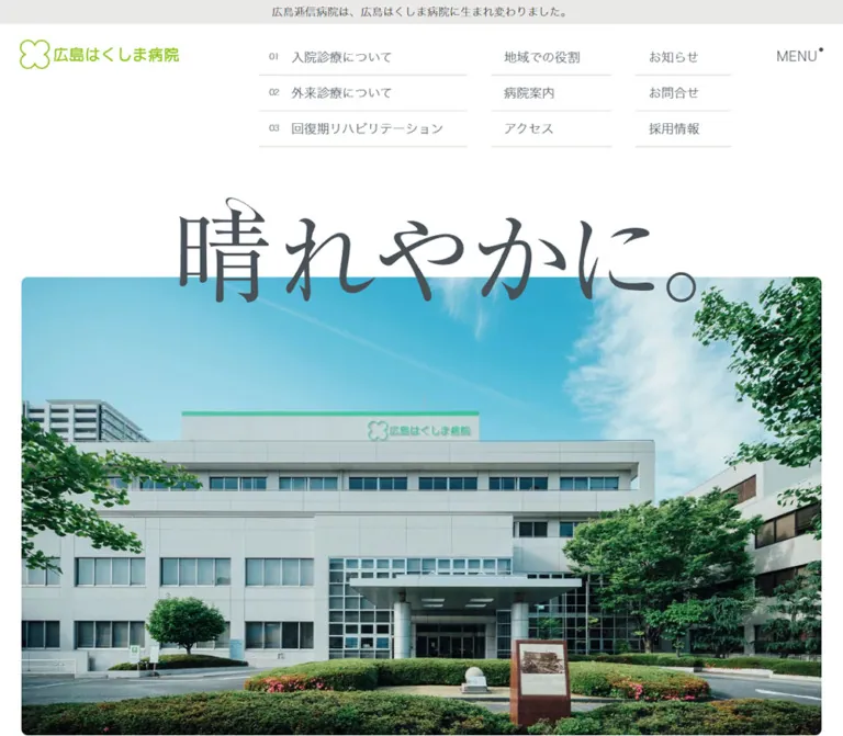
The homepage establishes its identity with the large phrase 「晴れやかに。」 overlapping the upper edge of a hospital photograph. Blue sky, mature trees, and the recognizable entrance provide most of the opening screen's color and detail. A small green hospital logo sits at the upper left, while fine, light interface text and a compact navigation matrix occupy the upper right.
The rest of the page maintains this balance between expressive scale and practical information. Numbered service rows, darkened photographic panels, dated announcements, a social grid, and a substantial network directory support different visitor needs. Broad white intervals separate these functions. Green is concentrated in the identity, recruitment link, group link, and current announcement artwork.
The defining relationship is between large imagery, delicate typography, and generous spacing. Preserve that relationship when adapting the design, while keeping clinical information, contact details, and navigation easy to read.
閉じる
Hiroshima Hakushima Hospital — Style Reference
A spacious hospital homepage where expressive Japanese lettering meets clear skies, fine rules, and fresh green accents.
Website: Hiroshima Hakushima Hospital Original URL: https://www.hiroshima-hakushima-hp.jp/ Final URL: https://www.hiroshima-hakushima-hp.jp/ Theme: white canvas, slate text, and yellow-green accents; one observed appearance Inspected: September 24, 2026, at 05:47:09 JST; supplied retrieval timestamp: September 23, 2026, at 20:47:09.206 UTC Viewports: desktop 1440 × 1000 CSS pixels; mobile 390 × 844 CSS pixels Scope: the current institutional homepage, including its opening composition, service links, hospital and recruitment panels, news, social feed, regional group directory, About link, footer, and persistent announcement banner. Linked destination pages and expanded interaction states were not inspected.
The homepage establishes its identity with the large phrase 「晴れやかに。」 overlapping the upper edge of a hospital photograph. Blue sky, mature trees, and the recognizable entrance provide most of the opening screen's color and detail. A small green hospital logo sits at the upper left, while fine, light interface text and a compact navigation matrix occupy the upper right.
The rest of the page maintains this balance between expressive scale and practical information. Numbered service rows, darkened photographic panels, dated announcements, a social grid, and a substantial network directory support different visitor needs. Broad white intervals separate these functions. Green is concentrated in the identity, recruitment link, group link, and current announcement artwork.
The defining relationship is between large imagery, delicate typography, and generous spacing. Preserve that relationship when adapting the design, while keeping clinical information, contact details, and navigation easy to read.
How to Read This Reference
- Measured means a value appears in the supplied computed styles or element rectangles. Measurements describe the captured state, not every possible state.
- Derived means arithmetic from those measurements, such as a column gap or width percentage.
- Estimated means a visual approximation from the current desktop and mobile screenshots. These values were not obtained through pixel sampling or additional browser inspection.
- Recommended means implementation guidance for a new build. It does not establish an existing feature of the original website.
- Token names are reusable descriptive aliases unless a source custom property is explicitly identified.
- Evidence coverage differs by section. The opening, desktop news area, and footer have direct visual coverage. Other sections have detailed DOM evidence but incomplete screenshot coverage.
Some extracted text belongs to alternate or concealed content. An element rectangle alone does not establish that its content was visible. This matters particularly for the photographic panels and mobile regional directory. The large opening lettering has no corresponding font measurement in the supplied element sample.
Tokens — Colors
Core Palette
| Name | Value | Suggested token | Evidence and role |
|---|---|---|---|
| Canvas White | #ffffff |
--color-canvas |
Measured body background and source --s-color-__COLOR_STYLE_BACKGROUND; the dominant page surface |
| Slate Text | #485157 |
--color-ink |
Measured rgb(72, 81, 87) on navigation labels, headings, service links, news, and contact details |
| Fresh Green | #88ba28 |
--color-brand |
Measured recruitment fill, group accents, and source --s-color-489d2b3a |
| Reversed White | #ffffff |
--color-on-image |
Measured photographic-panel text and recruitment label; also source text-accent color |
| Utility Charcoal | #333333 |
--color-utility |
Measured service eyebrow and some supporting copy; several link wrappers also carry this value |
| Warm Rule | Approximately #d8d5d2 |
--color-rule |
Estimated from navigation, news, and footer separators; exact border colors were not supplied |
| Service Wash | Approximately #f0f0f0 |
--color-service |
Estimated from the visible mobile service background; sampled section wrapper itself is transparent |
| Regional Control Gray | #eae9e8 |
--color-region-control |
Measured mobile region-button background |
| Directory Note Surface | #eff0f0 |
--color-note |
Measured desktop facility-navigation note background |
| Directory Note Text | #a1a2a5 |
--color-note-text |
Measured desktop facility-navigation note text |
The bright green of the logo artwork is visually related to Fresh Green, but its exact asset color was not measured. Likewise, the cyan sky and deep foliage belong to photography; they are not established interface tokens.
Use resolved element colors as the primary guide. The source also declares generic values such as primary #000000, text #222222, secondary text #666666, and background variants #e6e6e6 and #f5f5f5. These declarations do not override the directly observed slate text and white canvas in this reference. Transparent gradient variables in the extraction are not evidence of a visible gradient treatment.
Regional Directory Accents
The desktop group directory introduces a localized category palette. Keep these colors within the regional information system.
| Region | Measured header fill | Measured related text | Role |
|---|---|---|---|
| Tokyo / Kanagawa | #69bbea |
#69bbea |
Blue regional header and organization/category labels |
| Osaka / Nara | #6fb486 |
#6fb485 |
Muted green regional header and labels |
| Kyoto / Hyogo | #5cb8b3 |
#5cb8b3 |
Teal regional header and labels |
| Hiroshima | #eda639 |
#eda639 |
Orange regional header and labels |
| Yamaguchi | #87ba43 |
#87ba44 |
Leaf-green regional header and labels |
The one-channel differences above are present in the computed values. A new implementation may consolidate each pair, but that would be a deliberate simplification.
On mobile, region-button surfaces resolve to gray. Most sampled organization labels use the main green instead of their desktop regional color; the sampled Yamaguchi organization label retains #87ba44.
Tokens — Typography
Main Interface Family
Computed family: 'ヒラギノ角ゴ W1 JIS2004'
Source variable: --s-font-89ae8207
This family string appears on navigation, service copy, panel headings, news, English section labels, and footer text. The screenshots show narrow, delicate strokes and a restrained institutional tone. Spacious line height and modest tracking do much of the visual work.
Measured weights vary by role: 400 for ordinary navigation and service copy, 500 for news dates and titles, and 700 for MENU and several section headings. A weight of 700 paired with this specific W1 family should not be interpreted as evidence for a heavy generic sans-serif appearance. Match the actual rendered result when selecting a fallback.
The supplied data identifies computed family strings, not the exact font files or glyph fallback used by the browser.
Directory Family
Computed family: 'ヒラギノ角ゴ W3 JIS2004'
Source variable: --s-font-e8b300c1
The regional directory uses this family for denser organization and facility lists. Desktop list text measures 14px / 23.8px; mobile list text measures 16px / 27.2px. The stronger family and larger mobile text help distinguish this information-heavy section from the lighter surrounding interface.
Hero Lettering and Logo
The phrase 「晴れやかに。」 has expressive, high-contrast Japanese strokes, with a Mincho-like structure and calligraphic flourishes. Its exact font, asset format, and implementation are unverified. It does not appear as a measured text heading in the supplied sample.
Treat this lettering as a distinct visual asset when reproducing the composition. A generic serif can provide a layout placeholder, but cannot reproduce the letterforms exactly.
The green hospital wordmark and four-lobed outline symbol are also artwork. The sampled H1 belongs to the logo region; its inherited 32px font size is not a measurement of either the visible logo lettering or the large hero phrase.
Type Scale
Values below are measured unless explicitly labeled as estimates.
| Role | Desktop size / line height | Mobile size / line height | Weight | Tracking |
|---|---|---|---|---|
| MENU label | 16px / 22.4px |
Same | 700 |
0.8px, or 0.05em |
| Header navigation label | 16px / 28px |
Header link matrix absent | 400 |
Normal |
| Header service number | 10px / 17.5px |
Header link matrix absent | 400 |
Normal |
| SERVICE eyebrow | 12px / 16.8px |
Same | 400 |
0.6px, or 0.05em |
| Service statement | 34px / 59.5px |
24px / 42px |
400 |
0.1em |
| Service-row title | 18px / 31.5px |
16px / 28px |
400 |
Normal |
| Service-row number | 12px / 21px |
Same | 400 |
Normal |
| Photo-panel title | 28px / 39.2px |
Same | 700 |
1.4px, or 0.05em |
| OVERVIEW / RECRUIT caption | 11px / 19.25px |
Same | 400 |
0.55px, or 0.05em |
| Photo-panel paragraph | 18px / 28.8px |
16px / 25.6px |
400 |
0.03em |
| Photo-panel links | 18px / 31.5px |
16px / 28px |
400 |
0.05em |
| INFORMATION / Instagram | 28px / 39.2px |
Same | 700 |
0.05em |
| News date | 16px / 24px |
16px / 28.8px |
500 |
0.05em |
| News title | 18px / 27px |
16px / 24px |
500 |
0.05em |
| Group-directory heading | 36px / 36px |
24px / 24px |
400 |
Normal |
| Facility link | 14px / 23.8px |
16px / 27.2px |
400 |
Normal |
| Mobile region-button label | Not applicable | 16px / 22.4px |
700 |
Normal |
| About-band Japanese label | Approximately 40px, estimated |
24px / 36px |
Mobile 400 |
Mobile 0.05em |
| Footer contact text | Approximately 16px, estimated |
15px / 26.25px |
Mobile 400 |
Usually 0.05em |
The opening lettering occupies approximately an 800 × 160px visual area on desktop and a 310 × 65px area on mobile. These are estimated artwork bounds, not CSS font sizes.
Icons and Small Marks
The rendered evidence declares Material Icons and includes arrow_forward, arrow_upward, and keyboard_arrow_right ligatures. These correspond to directional controls. Render them as icons; do not expose the ligature strings as ordinary text.
A small raised dot appears beside MENU and several section headings. It is approximately 4–5px across in the screenshots. This is a recurring decorative detail, not a verified notification or status indicator.
Tokens — Spacing & Shapes
The site uses compact rows within very spacious sections. There is no evidence of a single mathematical spacing system; the values below provide a practical vocabulary extracted from the page.
Spacing Scale
| Value | Observed use | Evidence |
|---|---|---|
5px |
Padding around small header service numbers | Measured |
8px |
Navigation vertical padding; small directory insets | Measured |
10px |
Label inset after a number; spacing between mobile region controls | Measured / derived |
12px |
Mobile news text inset; service-row left padding | Measured |
13px |
Service-row vertical padding | Measured |
16px |
News-row spacing, service-row right padding, mobile region vertical padding | Measured |
20px |
Standard small navigation horizontal padding; desktop news text inset | Measured / derived |
24px |
Some panel sublink gaps; mobile footer navigation-group separation | Derived |
30px |
Desktop header navigation-column gap | Derived |
32px |
Photo-panel gap; desktop news/social inner insets | Derived / measured |
40px |
News heading-to-list gap; desktop service heading inset relative to eyebrow | Derived |
48px |
Mobile gap between hero section and service section | Derived |
60px |
Mobile gap from the news section end to Instagram section start | Derived |
64px |
Photo-panel vertical padding; mobile service eyebrow offset from section start | Measured / derived |
80px / 90px |
Mobile / desktop news-and-social section top padding | Measured |
220px |
Desktop gap between the hero section end and service section start | Derived |
Layout Measurements
| Element | Desktop: 1440 × 1000 | Mobile: 390 × 844 | Evidence |
|---|---|---|---|
| Document height | 5434.70px |
6989.94px |
Measured; dynamic content may alter later height |
| Header logo | 200 × 37.23px, at (32, 24) |
160 × 29.80px, at (13, 20) |
Measured |
| MENU button | 82.86 × 31.39px, at (1335.14, 19) |
Same size, at (294.14, 23) |
Measured |
| Header service column | 262.14px wide, three 45px rows |
Not displayed in initial mobile view | Measured / visual |
| Header utility columns | Two 104px columns |
Not displayed in initial mobile view | Measured / visual |
| Recruitment fill | 104 × 32px |
Initial header equivalent absent | Measured |
| Hero photograph | Approximately 1152 × 660px, at (144, 330) |
Approximately 351 × 422px, at (20, 139) |
Screenshot estimates |
| Hero section | Starts at document y=155; height 854.14px |
Starts at y=0; height 600.61px |
Measured |
| Service section start | Document y=1229.14 |
Document y=648.61 |
Measured |
| Service-row width / height | 387.06 × 58.5px |
295 × 55px |
Measured |
| Photo panels | Each 632 × 440px; x positions 72 and 736 |
Each 331.5 × 480px; x position 29.25 |
Measured |
| Photo-panel separation | 32px horizontally |
32px vertically |
Derived |
| News-list width | 616px |
351px |
Measured |
| News text width | 576px |
327px |
Measured |
| Social content width | 608px after wrapper padding |
351px |
Derived / measured |
| Mobile regional button | Not applicable | 351 × 54.39px |
Measured |
| Fixed announcement | Approximately 300 × 196px |
Approximately 200 × 130px |
Screenshot estimates |
| Announcement edge offsets | Approximately 16px right and bottom |
Approximately 16px right and bottom |
Screenshot estimates |
The 72px desktop content margin is exactly 5% of the viewport. The 19.5px mobile news margin is also 5%. The photo panels use a narrower mobile container: 331.5px, or 85% of the viewport. Do not force every section onto a single identical content width.
Border Radius and Linework
| Element | Treatment | Evidence |
|---|---|---|
| Header links, service rows, news rows | Square corners | Measured 0px radius |
| Recruitment button | Square corners | Measured 0px radius |
| Hospital / recruitment photo panels | 8px corners |
Measured |
| Hero photo | Approximately 8px corners |
Estimated |
| Announcement artwork container | Approximately 6–8px corners |
Estimated |
| Desktop regional headers | 50px radius, producing pill ends |
Measured |
| About arrow enclosure | Thin outlined oval, approximately 160 × 136px on desktop |
Estimated |
| Navigation and news separators | Approximately 1px solid rules |
Estimated |
| Eyebrow decoration | Fine diagonal line rising to the right | Visible; approximately 150px long in the desktop About band |
The page's rounded geometry is selective. Image corners are gently softened, while text navigation remains square and line-based.
Components
Persistent Identity and MENU
Role: maintain orientation while the visitor moves through a long homepage.
The green four-lobed hospital symbol and wordmark form a single horizontal lockup. It measures 200px wide on desktop and 160px on mobile. MENU sits separately at the opposite corner, with a small raised slate dot.
The same logo and MENU positions remain visible in the supplied scrolled captures. This is consistent with fixed positioning. The complete desktop link matrix scrolls out of view; it does not remain alongside them in the lower screenshots.
MENU is a native button with a white background, square corners, and measured padding of 5px 10px 4px 14px. Its inner text uses the main Japanese interface family, even though the button wrapper reports Arial. Use the label's computed typography when matching the visible result.
The logo has no visible full-width backing bar. In the mobile footer capture, content passes behind the persistent logo area. A new implementation should preserve the corner identity while improving separation where overlapping text becomes difficult to read.
Unverified: opening direction, overlay appearance, menu contents, close control, focus behavior, and scroll locking.
Desktop Navigation Matrix
Role: offer immediate routes to care information and institutional utilities.
Three compact columns sit near the top right, before the separate MENU control:
- A wide column contains
01,02, and03, followed by inpatient care, outpatient care, and recovery-phase rehabilitation labels. - A narrow column contains 「病院案内」 and 「アクセス」.
- A narrow column contains 「お知らせ」, 「お問合せ」, and a green 「採用情報」 link.
The numbered rows are 45px high, with 10px number text and 16px / 28px labels. Fine horizontal separators define the rows. The two utility columns are 104px wide and separated from adjacent columns by 30px.
Recruitment is the only filled link in this matrix. Its green rectangle measures 104 × 32px and uses white text. Keep its emphasis compact; the navigation's hierarchy comes primarily from placement and grouping.
Opening Photograph and Lettering
Role: communicate the hospital's physical identity and welcoming tone.
The first screen is a layered composition: white space, dark expressive lettering, then a large rounded photograph. The lettering crosses the image boundary, with most strokes above the sky and the lower strokes overlapping it.
At desktop size, the image begins near y=330px, spans about 80% of the viewport, and retains a landscape proportion close to the referenced asset's 2000:1145 filename ratio. The building entrance sits below the center, with foliage framing both sides.
At mobile size, the frame begins near y=139px, spans about 90% of the viewport, and becomes a tall crop. The entrance and foreground remain legible, while substantial portions of the building's sides are removed. The photo ends near y=561px, followed by a generous white interval before the service background starts around y=649px.
Use a separate lettering layer and a separately cropped image. Preserve the relationship between the phrase and the photo edge. The supplied evidence does not establish a slideshow, video, or parallax effect.
Service Introduction and Numbered Links
Role: summarize the hospital's care proposition and route visitors to three clinical sections.
A small SERVICE eyebrow precedes the statement:
「あなたの明日を支える」 地域に根ざした医療、 リハビリを提供します。
The text uses 34px / 59.5px on desktop and 24px / 42px on mobile, with 0.1em tracking. The airy three-line structure is central to the section's tone.
The eyebrow and heading are deliberately offset: the heading begins 40px to the right of the desktop eyebrow and 16px to the right on mobile. A thin diagonal rule reinforces this asymmetry in the visible mobile section.
Three full-width link rows follow. Each combines a small number, a Japanese title, and a forward arrow aligned toward the right edge. Padding is 13px 16px 13px 12px. The rows measure 58.5px high on desktop and 55px on mobile.
The visible and linked service set contains three entries. Additional text inside a raw section excerpt is insufficient evidence for a fourth visible service. The supplied views also do not establish the full service-image composition.
Hospital Overview and Recruitment Panels
Role: provide two parallel institutional entry points.
On desktop, two photographic panels occupy a 90%-wide container with a 32px gap. Each measures 632 × 440px and has 8px corners. The left image shows a hospital reception/interior; the right shows a rehabilitation activity involving a staff member and tabletop equipment.
Both images appear darkened beneath white labels. The exact overlay color and opacity were not supplied. A starting overlay around 40–50% black is a recommendation to tune against the actual chosen photographs, not a measured source value.
The visible resting presentation emphasizes a centered Japanese title, a small raised dot, and an English caption: OVERVIEW or RECRUIT. Title typography is 28px / 39.2px; captions are 11px / 19.25px.
The DOM also contains supporting paragraphs, related links, and a wide destination link. The overview panel includes hospital details, access, a patient-message service, and contact. Recruitment includes application requirements and education information.
State limitation: the desktop screenshot does not show all of this detail, and some sampled child bounds overlap. A hover or reveal arrangement is possible, but its trigger and sequence were not tested. Do not present a guessed interaction as observed behavior.
On mobile, measured panels stack at 331.5 × 480px, with a 32px gap. Their paragraph and link typography reduces to 16px, while the Japanese titles remain 28px. The measured mobile text blocks occupy a sequential layout. Their complete visual appearance is outside the supplied mobile screenshots.
News List
Role: present current operational and recruitment announcements.
The INFORMATION heading is centered over a plain list. It uses the recurring small dot and measures 28px / 39.2px, with 0.05em tracking. A 40px gap separates its line box from the first list row.
Each linked item stacks a date above its title. Thin full-width rules divide the entries. There are no thumbnail images, category pills, or elevated cards in the observed list.
Desktop content width is 616px, with text inset 20px on both sides. Dates use 16px / 24px; titles use 18px / 27px. The first item is 89px high. Longer titles create taller entries, so preserve content-driven row height.
On mobile, the list becomes 351px wide, with 12px internal text insets. Dates remain 16px but receive 28.8px line height. Titles become 16px / 24px and wrap naturally. The first measured mobile entry is approximately 110.8px high.
The captured list contains four announcements dated from June through August 2026. Those dates describe content at inspection time, not reusable design constants.
Instagram Grid
Role: show everyday staff activity and the hospital community.
The Instagram heading aligns with INFORMATION on desktop and uses the same size, tracking, and raised-dot treatment. Below it, the screenshot shows six square post previews in a three-column, two-row grid, with narrow white gutters of approximately 4–5px.
The post artwork contains photography, Japanese captions, institutional branding, and small video indicators. Keep this visual density inside the feed; the surrounding page remains quiet.
The DOM identifies an embedded social widget and a separate heading link to the hospital's Instagram profile. The desktop content area is approximately 608px wide. Mobile places Instagram below the news section, in a 351px-wide block, after a measured 60px gap.
The mobile grid's exact column count is not visually established. Widget playback, post navigation, and loading behavior were not exercised. The recorded desktop wrapper height also does not describe the full six-tile screenshot reliably; avoid using that wrapper height as a fixed implementation target.
Regional Group Directory
Role: explain the wider healthcare network and link to affiliated facilities.
This is a substantial information section, with a measured desktop height of approximately 1206px. Its heading uses 36px text on desktop and 24px on mobile.
Desktop DOM coordinates show regional blocks distributed across the section. Each starts with a rounded colored region header, followed by organization names, facility-type labels, and indented facility links. The underlying illustration or map, if any, is not established by the supplied screenshots; do not invent its artwork or geography.
Regional headers use 14px / 23.8px text, 3px vertical padding, and 50px radius. Facility links use the stronger W3 family and slate text. The section introduces blue, muted green, teal, orange, and leaf green for regional classification.
Mobile provides five native region buttons with right-chevron icons. Each measures 351 × 54.39px, uses a gray background, and has 16px 32px padding. Their top positions are approximately 64.39px apart, establishing a 10px gap. Organization and facility text increases to 16px / 27.2px.
These controls suggest disclosure behavior, but no activation was recorded. The extracted facility text and overlapping bounds do not establish which panels were visibly expanded. Implement accessible disclosures if adopting this pattern, and specify their state independently.
A centered green group-site link concludes the section. Its measured mobile size is 160 × 38.75px, with white 13px label text and a forward arrow.
About Link Band
Role: provide a calm, prominent route into the hospital introduction before the footer.
A full-width white band is framed by fine top and bottom rules. Inside it, ABOUT US sits above a diagonal hairline, followed by 「病院案内」 and a large outlined arrow enclosure.
In the desktop screenshot, the band is approximately 315px high. The Japanese label and outlined arrow sit alongside each other, with ample white space around the group. The arrow enclosure appears slightly oval, approximately 160 × 136px.
The mobile DOM measures the link band at 390 × 352.80px, with 64px top and 72px bottom padding. The eyebrow remains 12px; the Japanese label becomes 24px / 36px. The exact mobile arrow geometry is unverified.
The entire observed band links to /about. A large visual arrow is part of this link's presentation, rather than evidence of a separate action.
Footer and Patient-Message Utility
Role: provide contact information, repeated navigation, institutional policies, and patient-support links.
Desktop uses a broad white footer with three principal groups: hospital identity and address on the left, navigation near the middle, and a patient-message utility on the right. Small copyright and design-link details sit low on the left, with policy and group links across the lower middle.
The patient-message utility includes a short explanation and two thin outlined rows: 「メールを書く」 and 「ご利用実績」. The first points to an external patient-message service; the second points to an internal page. Their appearance is restrained and rectangular.
On mobile, content is vertically reorganized. The visible secondary navigation precedes the contact block. The contact logo measures 200 × 37.23px, larger than the persistent mobile header logo. Its left inset is 23.41px, or about 6% of the viewport. Address and telephone text use 15px / 26.25px.
Numbered footer care links span approximately 343.19px. The smaller utility groups form two columns of approximately 161.59px, with a 20px gap. Policy links then form a relaxed vertical list, followed by group links and small copyright text.
The DOM includes telephone links and an upward-arrow anchor targeting /#. Activation and scrolling behavior were not tested.
Persistent Opening Announcement
Role: promote the announced spring 2027 opening of 「広島城北リハビリテーション病院」.
A rectangular promotional image remains at the lower right across the current desktop and mobile captures. Its anatomy is supplied artwork: an architectural rendering, cherry blossoms, a green circular opening-date badge, a white identity strip, and a green bottom action strip.
Its displayed size is approximately 300 × 196px on desktop and 200 × 130px on mobile, with roughly 16px edge offsets. A light shadow and small corner radius distinguish it from the mostly flat page.
The image links to /information/SN5xFyvg. It is a current announcement link, not a chat launcher. No dismiss control is visible in the captures.
The mobile banner covers part of the service copy and, farther down, footer space. Preserve the observed dimensions when documenting this version; for a new implementation, make obstruction management an explicit design decision.
Tokens — Motion & Interaction
Measured Transition Definitions
| Target | Computed value | What the evidence establishes |
|---|---|---|
| Many links, labels, and wrappers | 0.3s cubic-bezier(0.4, 0.4, 0, 1) |
A common transition definition exists; actual changing properties and hover results were not tested |
| Body background | background 0.5s cubic-bezier(0.4, 0.4, 0, 1) |
A background transition is defined; no theme change was observed |
| Desktop overview / recruitment panels | 1.2s cubic-bezier(0.4, 0.4, 0, 1) 0.6s |
Longer transition with delay is present; trigger and initial/final states are unverified |
| Desktop news / social wrappers | Same 1.2s duration and 0.6s delay |
Defined section transition; not proof of a specific scroll-reveal effect |
| Mobile overview panel | 1.2s with 0.6s delay |
This longer definition remains in the sampled mobile panel |
| Mobile recruitment, news, and social wrappers | 0.3s cubic-bezier(0.4, 0.4, 0, 1) |
Transition definitions differ from their desktop counterparts |
| Sampled animation properties | none |
No CSS keyframe animation reported for these sampled elements at extraction time |
The source repeats transitions for several custom gradient properties. Reproducing that generated declaration list is unnecessary for a new implementation. Explicitly transition only the properties that a designed interaction changes.
Interaction Evidence and Limits
| Interaction | Supported observation | Unverified detail |
|---|---|---|
| Page scrolling | Top, middle, and footer views were supplied; corner identity and announcement remain visible | Exact fixed/sticky implementation and visibility thresholds |
| Navigation links | Destination URLs are present in rendered evidence | Destination-page design and successful activation |
| MENU | Native button exists on both viewports | Open/close presentation and keyboard behavior |
| Photo panels | Titles visible; supporting content exists in DOM | Hover reveal, click reveal, or other state trigger |
| Mobile region controls | Native buttons with chevrons exist | Expansion, collapse, exclusivity, and animation |
| Social feed | Six desktop previews are visible | Playback and post-opening behavior |
| Back to top | Upward-arrow link targets the page fragment | Smooth scrolling, duration, and focus destination |
The capture process waited for finite motion, layout stability, and visible image decoding. It temporarily paused perpetual animations during readiness checks. These precautions support analysis of settled layouts; they do not establish a complete motion inventory.
Recommended adaptation: use short 300ms color and border transitions with the observed easing. Keep content visible by default. Any reveal animation should be progressive enhancement, with a reduced-motion alternative. Do not invent parallax or a rotating hero to fill gaps in the evidence.
Surfaces
| Layer | Appearance | Purpose |
|---|---|---|
| Main canvas | Solid white | Holds the long institutional page together |
| Service area | Very light gray in the visible mobile capture | Separates the first practical information section from the opening |
| Navigation and news | White or transparent, fine rules, square geometry | Organizes dense information without card elevation |
| Photographic panels | Rounded image crops with darkening and white text | Introduces hospital and recruitment destinations |
| Regional headers | Local colored pills on desktop | Distinguishes geographic groups |
| Mobile regional controls | Flat warm-gray rectangles | Provides compact regional navigation controls |
| About band | White field between horizontal rules | Creates a spacious final institutional link |
| Announcement | Branded raster artwork with a subtle shadow | Keeps a current announcement above page content |
There is no general shadow hierarchy across the homepage. The announcement is a notable exception. Avoid spreading its promotional styling into the clinical navigation and news list.
Imagery
The opening photograph is specific and documentary: the hospital's front elevation, entrance canopy, shrubs, trees, and a broad cyan sky. Its welcoming quality comes from daylight, greenery, and the uncluttered composition.
The other confirmed photographic subjects are the reception/interior and a rehabilitation activity. These support the hospital's functions directly. Social previews show staff, training, and everyday activity, with text embedded in the post artwork.
The announcement uses a different visual mode: a planned-building rendering combined with seasonal blossom graphics and bold opening information. Keep it identifiable as announcement artwork, rather than a photograph of the existing hospital.
Cropping Guidance
- Preserve the broad building-and-sky relationship in the desktop opening image.
- Use a dedicated tall crop on mobile that keeps the entrance and foreground visible.
- Keep headline lettering independent of the photograph so the overlap can change with the viewport.
- Clip the photograph, not the overlapping lettering, to the rounded image frame.
- Keep panel text readable over each actual photograph; tune overlays individually.
- Preserve text within announcement artwork by displaying the complete image rather than cropping it to a generic ratio.
- Render social artwork naturally. The page does not use pixelated image scaling.
Observed Asset References
These references come from the inspected original-page evidence. They are not bundled files.
| Asset or resource | Observed reference | Evidence limit |
|---|---|---|
| Hospital hero photograph | https://storage.googleapis.com/studio-design-asset-files/projects/65qmXLwvOV/s-2000x1145_v-frms_webp_d44d84ac-2138-42a3-9e21-7259c5c6724a_small.webp |
Complete URL appears in DOM excerpts; intrinsic dimensions were not independently decoded |
| Announcement image | Asset reference begins with the same project path and s-800x522_v-fs_webp |
Remaining filename is truncated; no complete URL can be reconstructed reliably |
| Announcement destination | https://www.hiroshima-hakushima-hp.jp/information/SN5xFyvg |
Link target observed; destination not inspected |
| Social embed | https://snapwidget.com/embed/1032253 |
Referenced in the rendered section; internal widget styles were not supplied |
| Social profile | https://www.instagram.com/hiroshima_hakushima_hospital/ |
Heading-link destination observed |
| Logo, hero lettering, and panel photographs | Visible in current captures | Complete asset URLs not supplied |
Use authorized original assets when available. Similar stock photography cannot reproduce the same hospital identity, and CSS typography alone cannot reproduce the opening lettering exactly.
Layout & Responsive Behavior
Desktop Composition
The initial header spreads identity and navigation across the full width. The opening image is more narrowly centered at approximately 80% width. Below it, photographic panels and the news/social region expand to a 90%-wide content area.
The news and social region divides into two 648px wrappers. The news wrapper has 32px right padding; the social wrapper has 32px left and 8px right padding. This produces a generous 64px interval between the visible list and feed content.
The group directory occupies a substantial later portion of the page, followed by its green destination link, the About band, and the multi-column footer. Do not collapse the homepage into only its opening image and a few feature cards.
Mobile Composition
| Area | Observed adaptation |
|---|---|
| Header | Logo reduces from 200px to 160px; MENU stays 16px; desktop navigation matrix is absent |
| Hero | Image becomes a tall crop about 351 × 422px; lettering scales down while retaining overlap |
| Hero-to-service spacing | Measured section gap reduces from 220px to 48px |
| Service statement | Reduces from 34px to 24px; retains 1.75 line height and 0.1em tracking |
| Clinical links | Rows reduce from 18px to 16px text while keeping comfortable row height |
| Photo panels | Change from two columns to one; become 331.5px wide and 480px high |
| News and social | Change from side-by-side sections to a vertical sequence |
| News | Text insets reduce from 20px to 12px; titles wrap at 16px |
| Network directory | Provides five gray region buttons and larger facility-list typography |
| Footer | Navigation, contact, policy, and group content are vertically reorganized |
| Announcement | Width reduces from about 300px to 200px; bottom-right placement persists |
The mobile layout is not a uniformly scaled desktop layout. Different modules use different width percentages, and some typography remains unchanged while other text becomes smaller or larger.
Breakpoint limitation: only the two supplied viewport sizes were inspected. The original media-query thresholds and tablet behavior are unknown. A breakpoint around 60–64rem can be a starting recommendation for the main column changes, followed by content-driven testing. It is not a recovered source breakpoint.
Height limitation: the mobile hero image happens to be close to half the captured viewport height. A 50vh frame is a useful approximation for a new build, but the source sizing formula was not supplied.
Do’s and Don’ts
Do
- Make the hospital photograph and overlapping Japanese lettering the opening's principal visual event.
- Keep white dominant, with slate
#485157text and selective#88ba28accents. - Preserve the fine-stroke interface appearance and generous Japanese line spacing.
- Use numbered care links with horizontal rules and right-aligned arrows.
- Retain the desktop navigation matrix as a distinct pattern from the persistent MENU control.
- Keep the photo panels paired on desktop and stacked on mobile.
- Present news as dated text rows with natural wrapping.
- Keep regional colors scoped to the network directory.
- Preserve the mobile image's entrance-focused crop.
- Treat the announcement as a separate current-content component.
Don't
- Don't replace the hospital homepage's information architecture with a single conversion sequence.
- Don't substitute the logo's inherited H1 font size for the opening-lettering scale.
- Don't claim a named hero font without additional evidence.
- Don't turn every row into a rounded, shadowed card.
- Don't use bright green for all text or every navigation element.
- Don't spread the regional directory's five colors across the whole interface.
- Don't assume concealed DOM content was visible in the captured resting state.
- Don't invent menu transitions, hover reveals, or accordion behavior.
- Don't shrink the desktop landscape image proportionally on mobile; preserve the observed tall framing.
- Don't allow a persistent promotion to make essential text or controls unreachable in a new implementation.
Recommended Implementation Additions
These are recommendations for a new implementation, not verified features of the inspected page.
- Increase the MENU button's effective touch area from its measured 31.39px height to at least 44px while retaining the compact visible label.
- Provide a visible slate focus outline and keyboard access to every navigation link, image destination, and disclosure.
- Give an implemented menu an accessible name, expanded state, Escape handling, appropriate focus management, and focus restoration.
- Use semantic buttons with
aria-expandedandaria-controls, or native disclosure elements, for regional expansion. Keep hidden panels out of keyboard navigation. - Make photo-panel detail available to touch and keyboard users. Essential information should remain accessible without hover.
- Check green/white small-text contrast. Keep the observed green as a brand token and introduce a separately labeled darker action variant where required.
- Provide a text alternative for the opening lettering and meaningful alternatives for hospital photographs and announcement artwork.
- Offer a dismissible or in-flow mobile announcement variant, with safe-area offsets if it remains fixed.
- Give the persistent logo enough backing or clearance to avoid collisions with scrolled text.
- Reserve social-feed space and provide a profile link if the external widget is unavailable.
- Use content-driven panel heights at larger text settings. The measured 440px and 480px heights should become minimums when necessary.
- Test font fallback, 200% zoom, longer Japanese labels, and reduced motion at intermediate widths.
Agent Prompt Guide
Quick Color Reference
- Main page:
#ffffff. - Main visible interface text:
#485157. - Brand and selected filled links:
#88ba28. - Text over darkened photography:
#ffffff. - Fine rules: approximately
#d8d5d2, estimated. - Service wash: approximately
#f0f0f0, estimated. - Mobile regional controls: measured
#eae9e8. - Regional accents: blue
#69bbea, muted green#6fb486, teal#5cb8b3, orange#eda639, and leaf green#87ba43.
Overall Prompt
“Create a Japanese institutional hospital homepage inspired by the current Hiroshima Hakushima Hospital composition. Use a white canvas, slate text #485157, fresh green #88ba28, light Japanese sans-serif interface typography, fine horizontal rules, and broad vertical spacing. Place a small green identity at the upper left, a three-column navigation matrix at the upper right, and a separate persistent MENU label with a tiny raised dot. Overlap large expressive lettering such as 「晴れやかに。」 with the top edge of a rounded hospital photograph. Follow with a spacious service statement, three numbered care links, paired darkened photographic panels, a dated news list beside a six-image social grid, a regional facility directory, an outlined About band, and a practical footer. At 390px width, hide the desktop navigation matrix, use a tall entrance-focused hero crop, stack panels and information sections, and retain readable text. Treat unspecified menu and disclosure behavior as new implementation decisions.”
Example Component Prompts
- Opening: “Compose a white hospital homepage opening with a large slate Japanese lettering layer crossing the upper edge of a hospital exterior photo. At desktop, place the image near 80% viewport width in its landscape proportion. At mobile, use a 90%-wide tall crop that keeps the entrance visible. Use approximately 8px image corners and generous white space.”
- Navigation: “Build three fine-rule navigation columns: a wider numbered care list, a narrow hospital/access list, and a narrow news/contact/recruitment list. Use 16px light Japanese text, 10px numbers, 45px rows, 30px column gaps, and one compact square green recruitment link.”
- Service block: “Use a 12px SERVICE eyebrow, a delicate diagonal line, and a three-line Japanese statement at 34px with 1.75 line height and 0.1em tracking. Place three numbered, ruled care links below. Reduce the statement to 24px and row labels to 16px on mobile.”
- Photo panels: “Create two 8px-rounded photographic destination panels for hospital information and recruitment. Use reception and rehabilitation imagery, dark overlays, centered white 28px titles, tiny raised dots, and 11px English captions. Stack on mobile. Expose supporting links through a keyboard- and touch-accessible design rather than assuming an undocumented hover state.”
- News and social: “Place a centered INFORMATION heading above a plain dated list, beside a centered Instagram heading and a three-by-two square photo grid. Use slate type, 1px warm-gray rules, 16px dates, and 18px desktop news titles. Stack the sections and use 16px titles on mobile.”
- Footer: “Create a white hospital footer with identity and address, repeated fine-rule navigation, a patient-message utility with two outlined links, and small policy links. Precede it with a spacious ruled About band, diagonal eyebrow decoration, and a large outlined arrow. Reorganize the footer vertically on mobile.”
- Network directory: “Keep affiliated facilities organized by region and organization. Use localized colored pill headers and 14px directory text on desktop. On mobile, use flat gray region controls, right chevrons, and 16px facility text. Any disclosure behavior must include explicit keyboard and expanded-state handling.”
Quick Start
CSS Custom Properties
The following is an implementation scaffold, not recovered site CSS. Measured colors and type values are retained. Estimated rules, the service wash, hero placement, fixed-position behavior, and breakpoint choices are labeled or described as adaptations.
Use .hospital-page as the outer class. The desktop .top-nav expects three child navigation groups. Each .service-row expects a number, label, and arrow. Each .news-row expects a date followed by a title. Photo-panel images use .feature-image, with content in .feature-content.
The text-based .hero-slogan is a serif placeholder. Replace it with authorized lettering artwork for closer fidelity. Image files, menu logic, disclosure behavior, and the social widget must be supplied separately.
:root {
  /* Measured core colors */
  --color-canvas: #ffffff;
  --color-ink: #485157;
  --color-brand: #88ba28;
  --color-utility: #333333;
  --color-on-image: #ffffff;
  --color-region-control: #eae9e8;

  /* Screenshot estimates */
  --color-rule: #d8d5d2;
  --color-service: #f0f0f0;

  /* Measured regional header fills */
  --region-tokyo: #69bbea;
  --region-osaka: #6fb486;
  --region-kyoto: #5cb8b3;
  --region-hiroshima: #eda639;
  --region-yamaguchi: #87ba43;

  /* Source family strings with recommended generic fallbacks */
  --font-ui: 'ヒラギノ角ゴ W1 JIS2004', sans-serif;
  --font-directory: 'ヒラギノ角ゴ W3 JIS2004', sans-serif;
  --font-slogan-placeholder: serif;

  --text-eyebrow: 12px;
  --text-body: 18px;
  --text-section: 28px;
  --text-statement: 34px;
  --leading-copy: 1.6;
  --leading-navigation: 1.75;
  --tracking-label: 0.05em;
  --tracking-statement: 0.1em;

  --space-xs: 8px;
  --space-sm: 16px;
  --space-md: 24px;
  --space-lg: 32px;
  --space-xl: 40px;
  --space-section: 88px;
  --radius-image: 8px;
  --rule-width: 1px;

  /* Measured shared transition timing */
  --ease-site: cubic-bezier(0.4, 0.4, 0, 1);
  --duration-ui: 300ms;
}

.hospital-page,
.hospital-page *,
.hospital-page *::before,
.hospital-page *::after {
  box-sizing: border-box;
}

.hospital-page {
  margin: 0;
  color: var(--color-ink);
  background: var(--color-canvas);
  font-family: var(--font-ui);
  font-size: 16px;
  line-height: var(--leading-navigation);
}

.hospital-page img { display: block; max-width: 100%; }
.hospital-page a { color: inherit; text-decoration: none; }
.hospital-page button { font: inherit; }
.hospital-page h1,
.hospital-page h2,
.hospital-page h3,
.hospital-page p { margin: 0; }

.page-container { width: 90%; margin-inline: auto; }

/* Fixed positioning approximates persistence across captures. */
.site-brand {
  position: fixed;
  top: 24px;
  left: 32px;
  z-index: 30;
  width: 200px;
}
.site-brand img { width: 100%; height: auto; }

.menu-trigger {
  position: fixed;
  top: 19px;
  right: 22px;
  z-index: 40;
  display: inline-flex;
  align-items: flex-start;
  padding: 5px 10px 4px 14px;
  border: 0;
  border-radius: 0;
  background: var(--color-canvas);
  color: var(--color-ink);
  font-family: var(--font-ui);
  font-size: 16px;
  font-weight: 700;
  line-height: 1.4;
  letter-spacing: var(--tracking-label);
  cursor: pointer;
}

.menu-trigger::after,
.heading-dot::after {
  content: '';
  display: inline-block;
  flex: none;
  width: 5px;
  height: 5px;
  margin-left: 4px;
  border-radius: 50%;
  background: currentColor;
  vertical-align: top;
}

.top-nav {
  position: absolute;
  top: 20px;
  right: 160px;
  display: grid;
  grid-template-columns: 262.14px 104px 104px;
  gap: 30px;
}

.nav-row {
  display: flex;
  align-items: center;
  min-height: 45px;
  padding: 8px 20px;
  border-bottom: var(--rule-width) solid var(--color-rule);
  font-size: 16px;
  line-height: 28px;
}
.nav-row--numbered { padding: 8px 30px 8px 8px; }
.nav-number { padding: 5px; font-size: 10px; line-height: 17.5px; }
.nav-row--numbered .nav-label { padding-left: 10px; }

.hospital-page .nav-row--recruit {
  min-height: 32px;
  margin-top: 5px;
  padding: 2px 20px;
  border: 0;
  background: var(--color-brand);
  color: var(--color-on-image);
}

/* Recommended approximation of the opening geometry. */
.hero { padding: 198px 0 20px; }
.hero-slogan {
  position: relative;
  z-index: 1;
  width: 90%;
  margin: 0 auto -28px !important;
  text-align: center;
  font-family: var(--font-slogan-placeholder);
  font-size: clamp(56px, 11.11vw, 160px);
  font-weight: 400;
  line-height: 1;
}
.hero-photo {
  width: 80%;
  margin-inline: auto;
  aspect-ratio: 2000 / 1145;
  overflow: hidden;
  border-radius: var(--radius-image);
}
.hero-photo img {
  width: 100%;
  height: 100%;
  object-fit: cover;
  object-position: center;
}

/* The full desktop service composition was not visually supplied. */
.service-section {
  margin-top: 220px;
  padding: 64px 0;
  background: var(--color-service);
}
.service-copy { width: min(100%, 427px); }
.eyebrow {
  position: relative;
  width: fit-content;
  margin-bottom: 69px !important;
  color: var(--color-utility);
  font-size: var(--text-eyebrow);
  line-height: 1.4;
  letter-spacing: var(--tracking-label);
}
.eyebrow::after {
  content: '';
  position: absolute;
  top: 72px;
  left: 0;
  width: 150px;
  border-top: 1px solid var(--color-rule);
  transform: rotate(-30deg);
  transform-origin: left center;
}
.service-body { margin-left: 40px; }
.service-statement {
  font-size: var(--text-statement);
  font-weight: 400;
  line-height: 1.75;
  letter-spacing: var(--tracking-statement);
}
.service-links { margin-top: 40px; }
.service-row {
  display: grid;
  grid-template-columns: auto minmax(0, 1fr) auto;
  align-items: center;
  gap: 10px;
  min-height: 58.5px;
  padding: 13px 16px 13px 12px;
  border-bottom: 1px solid var(--color-rule);
  font-size: 18px;
  line-height: 1.75;
}
.service-number { font-size: 12px; }

.feature-grid {
  display: grid;
  grid-template-columns: repeat(2, minmax(0, 1fr));
  gap: 32px;
  margin-block: 120px 42px;
}
.feature-panel {
  position: relative;
  isolation: isolate;
  display: grid;
  place-items: center;
  min-height: 440px;
  padding: 64px 0;
  overflow: hidden;
  border-radius: var(--radius-image);
  color: var(--color-on-image);
}
.feature-image {
  position: absolute;
  inset: 0;
  z-index: -2;
  width: 100%;
  height: 100%;
  object-fit: cover;
}
.feature-panel::before {
  content: '';
  position: absolute;
  inset: 0;
  z-index: -1;
  background: rgb(0 0 0 / 45%); /* Recommended starting overlay */
}
.feature-content { width: 70%; text-align: center; }
.feature-title { font-size: 28px; font-weight: 700; line-height: 1.4; letter-spacing: 0.05em; }
.feature-caption { margin-top: 5px !important; font-size: 11px; line-height: 1.75; letter-spacing: 0.05em; }

/* An accessible detail variant; no unverified hover reveal is assumed. */
.feature-detail { margin-top: 18px !important; text-align: left; font-size: 18px; line-height: 1.6; letter-spacing: 0.03em; }
.feature-sublinks { display: flex; flex-wrap: wrap; justify-content: center; gap: 10px 24px; margin-top: 24px; }
.feature-sublinks a { text-decoration: underline; text-underline-offset: 5px; }

.news-social {
  display: grid;
  grid-template-columns: repeat(2, minmax(0, 1fr));
  padding-top: 90px;
}
.news-column { min-width: 0; padding-right: 32px; }
.social-column { min-width: 0; padding-inline: 32px 8px; }
.section-heading {
  margin-bottom: 40px !important;
  text-align: center;
  font-size: 28px;
  font-weight: 700;
  line-height: 1.4;
  letter-spacing: 0.05em;
}
.news-list { margin: 0; padding: 0; list-style: none; border-top: 1px solid var(--color-rule); }
.news-row { display: block; padding: 16px 20px; border-bottom: 1px solid var(--color-rule); }
.news-date { display: block; font-size: 16px; font-weight: 500; line-height: 1.5; letter-spacing: 0.05em; }
.news-title { margin-top: 4px !important; font-size: 18px; font-weight: 500; line-height: 1.5; letter-spacing: 0.05em; }
.social-grid { display: grid; grid-template-columns: repeat(3, minmax(0, 1fr)); gap: 4px; }
.social-grid img { width: 100%; aspect-ratio: 1; object-fit: cover; }

.directory { margin-block: var(--space-section); font-family: var(--font-directory); }
.directory-title { margin-bottom: 32px !important; text-align: center; font-family: var(--font-ui); font-size: 36px; font-weight: 400; line-height: 1.2; }
.region-header { padding: 3px 24px; border-radius: 50px; background: var(--region-color, var(--color-brand)); color: white; font-size: 14px; line-height: 1.7; }
.facility-list { font-size: 14px; line-height: 1.7; }
.region-control { display: flex; justify-content: space-between; align-items: center; width: 100%; padding: 16px 32px; border: 0; border-radius: 0; background: var(--color-region-control); color: var(--color-ink); font-family: var(--font-directory); cursor: pointer; }

.about-band { display: flex; justify-content: center; align-items: center; gap: 56px; min-height: 315px; margin-top: 88px; padding: 64px 5%; border-block: 1px solid var(--color-rule); }
.about-title { font-size: 40px; font-weight: 400; letter-spacing: 0.05em; }
.about-arrow { display: grid; place-items: center; flex: none; width: 160px; height: 136px; border: 1px solid var(--color-rule); border-radius: 50%; font-size: 32px; }
.footer-main { display: grid; grid-template-columns: 280px minmax(0, 1fr) 331px; gap: 40px; padding-block: 64px 80px; }
.footer-logo { width: 200px; margin-bottom: 16px; }
.footer-contact { font-size: 16px; line-height: 1.75; letter-spacing: 0.05em; }
.outline-link { display: flex; justify-content: space-between; align-items: center; min-height: 42px; margin-top: 8px; padding: 8px 16px; border: 1px solid var(--color-rule); }
.footer-policies { display: flex; flex-wrap: wrap; gap: 12px 20px; padding-bottom: 48px; font-size: 13px; }

/* Optional current-announcement treatment; dimensions are estimates. */
.announcement { position: fixed; right: max(16px, env(safe-area-inset-right)); bottom: max(16px, env(safe-area-inset-bottom)); z-index: 20; width: 300px; max-width: calc(100vw - 32px); overflow: hidden; border-radius: 6px; background: white; box-shadow: 0 2px 6px rgb(0 0 0 / 16%); }
.announcement img { width: 100%; height: auto; }

/* Recommended interaction feedback. */
.nav-row,
.service-row,
.news-row,
.outline-link { transition: background-color var(--duration-ui) var(--ease-site); }
@media (hover: hover) {
  .nav-row:not(.nav-row--recruit):hover,
  .service-row:hover,
  .news-row:hover,
  .outline-link:hover { background-color: var(--color-service); }
}
.hospital-page :focus-visible { outline: 2px solid var(--color-ink); outline-offset: 4px; }

/* Recommended breakpoint; the original threshold is unknown. */
@media (max-width: 64rem) {
  .top-nav { display: none; }
  .site-brand { top: 20px; left: 13px; width: 160px; }
  .menu-trigger { top: 23px; right: 13px; }
  .hero { padding: 87px 0 39px; }
  .hero-slogan { margin-bottom: -12px !important; font-size: clamp(44px, 14.36vw, 56px); line-height: 1.15; }
  .hero-photo { width: 90%; height: 50vh; aspect-ratio: auto; }
  .hero-photo img { object-position: center; }
  .service-section { margin-top: 48px; }
  .service-copy { width: 100%; padding-inline: 16px; }
  .service-body { margin-left: 16px; }
  .eyebrow { margin-bottom: 61px !important; }
  .service-statement { font-size: 24px; }
  .service-links { margin-top: 26px; }
  .service-row { min-height: 55px; font-size: 16px; }
  .feature-grid { width: 85%; grid-template-columns: 1fr; }
  .feature-panel { min-height: 480px; }
  .feature-content { width: 85%; }
  .feature-detail { font-size: 16px; }
  .news-social { grid-template-columns: 1fr; gap: 60px; padding-top: 80px; }
  .news-column,
  .social-column { padding: 0; }
  .news-row { padding-inline: 12px; }
  .news-date { line-height: 1.8; }
  .news-title { margin-top: 0 !important; font-size: 16px; }
  .directory-title { font-size: 24px; }
  .facility-list { font-size: 16px; }
  .about-band { flex-direction: column; gap: 24px; min-height: 352.8px; padding-block: 64px 72px; }
  .about-title { font-size: 24px; line-height: 1.5; }
  .about-arrow { width: 80px; height: 80px; } /* Recommended mobile geometry */
  .footer-main { display: flex; flex-direction: column; gap: 56px; }
  .footer-navigation { order: 1; }
  .footer-contact { order: 2; font-size: 15px; }
  .footer-patient-mail { order: 0; } /* Recommended placement */
  .footer-policies { flex-direction: column; gap: 16px; }
  .announcement { width: 200px; }
}

@media (prefers-reduced-motion: reduce) {
  .hospital-page *,
  .hospital-page *::before,
  .hospital-page *::after { transition: none !important; animation: none !important; }
}
The scaffold intentionally leaves intermediate-width refinement to the implementation. Verify the long rehabilitation label, the serif placeholder, and footer columns with the fonts actually available. For production, enlarge the menu hit area and resolve announcement obstruction as described above.
Tailwind v4 Token Mapping
Optional aliases for a project that already uses Tailwind v4. This does not identify the original site's framework. Define the custom properties above first.
@theme inline {
  --color-hospital-canvas: var(--color-canvas);
  --color-hospital-ink: var(--color-ink);
  --color-hospital-brand: var(--color-brand);
  --color-hospital-rule: var(--color-rule);
  --color-hospital-service: var(--color-service);
  --color-hospital-region-control: var(--color-region-control);

  --font-hospital-ui: var(--font-ui);
  --font-hospital-directory: var(--font-directory);

  --text-hospital-eyebrow: 12px;
  --text-hospital-body: 18px;
  --text-hospital-section: 28px;
  --text-hospital-statement: 34px;

  --spacing-hospital-row: 16px;
  --spacing-hospital-gap: 32px;
  --spacing-hospital-section: 88px;
  --radius-hospital-image: 8px;
  --ease-hospital: cubic-bezier(0.4, 0.4, 0, 1);
}
Sources & Evidence
- Inspected original and final page: https://www.hiroshima-hakushima-hp.jp/. Both supplied URLs are identical; the recorded response status is HTTP 200 and the page title is 「広島はくしま病院」.
- Capture record: September 23, 2026, at
20:47:09.206Z, equivalent to September 24, 2026, at05:47:09.206 JST. - Desktop visual evidence: three supplied 1440 × 1000 captures showing the opening, the photographic-panel/news/social area, and the lower About/footer area.
- Mobile visual evidence: two supplied 390 × 844 captures showing the opening and footer.
- Rendered evidence: supplied text, destination links, custom properties, element rectangles, computed typography, fills, padding, radii, transition strings, and sampled animation values for both viewports.
- Observed traversal: the supplied process waited for settled content and traversed intermediate scroll positions. No menu activation, panel hover, regional-button activation, social playback, or destination-page inspection was documented.
- Limitations: no additional browsing, file access, command execution, or interaction testing was performed for this reference. Font-file resolution, complete asset inventories, exact border colors, overlay opacity, original breakpoints, and concealed-state behavior remain unverified.
This reference describes the current homepage represented by those captures. Estimated values and implementation recommendations are explicitly distinguished from measured original-page evidence.
# Hiroshima Hakushima Hospital — Style Reference

> A spacious hospital homepage where expressive Japanese lettering meets clear skies, fine rules, and fresh green accents.

**Website:** [Hiroshima Hakushima Hospital](https://www.hiroshima-hakushima-hp.jp/)
**Original URL:** https://www.hiroshima-hakushima-hp.jp/
**Final URL:** https://www.hiroshima-hakushima-hp.jp/
**Theme:** white canvas, slate text, and yellow-green accents; one observed appearance
**Inspected:** September 24, 2026, at 05:47:09 JST; supplied retrieval timestamp: September 23, 2026, at 20:47:09.206 UTC
**Viewports:** desktop 1440 × 1000 CSS pixels; mobile 390 × 844 CSS pixels
**Scope:** the current institutional homepage, including its opening composition, service links, hospital and recruitment panels, news, social feed, regional group directory, About link, footer, and persistent announcement banner. Linked destination pages and expanded interaction states were not inspected.

The homepage establishes its identity with the large phrase 「晴れやかに。」 overlapping the upper edge of a hospital photograph. Blue sky, mature trees, and the recognizable entrance provide most of the opening screen's color and detail. A small green hospital logo sits at the upper left, while fine, light interface text and a compact navigation matrix occupy the upper right.

The rest of the page maintains this balance between expressive scale and practical information. Numbered service rows, darkened photographic panels, dated announcements, a social grid, and a substantial network directory support different visitor needs. Broad white intervals separate these functions. Green is concentrated in the identity, recruitment link, group link, and current announcement artwork.

The defining relationship is between large imagery, delicate typography, and generous spacing. Preserve that relationship when adapting the design, while keeping clinical information, contact details, and navigation easy to read.
閉じる
# Hiroshima Hakushima Hospital — Style Reference

> A spacious hospital homepage where expressive Japanese lettering meets clear skies, fine rules, and fresh green accents.

**Website:** [Hiroshima Hakushima Hospital](https://www.hiroshima-hakushima-hp.jp/)
**Original URL:** https://www.hiroshima-hakushima-hp.jp/
**Final URL:** https://www.hiroshima-hakushima-hp.jp/
**Theme:** white canvas, slate text, and yellow-green accents; one observed appearance
**Inspected:** September 24, 2026, at 05:47:09 JST; supplied retrieval timestamp: September 23, 2026, at 20:47:09.206 UTC
**Viewports:** desktop 1440 × 1000 CSS pixels; mobile 390 × 844 CSS pixels
**Scope:** the current institutional homepage, including its opening composition, service links, hospital and recruitment panels, news, social feed, regional group directory, About link, footer, and persistent announcement banner. Linked destination pages and expanded interaction states were not inspected.

The homepage establishes its identity with the large phrase 「晴れやかに。」 overlapping the upper edge of a hospital photograph. Blue sky, mature trees, and the recognizable entrance provide most of the opening screen's color and detail. A small green hospital logo sits at the upper left, while fine, light interface text and a compact navigation matrix occupy the upper right.

The rest of the page maintains this balance between expressive scale and practical information. Numbered service rows, darkened photographic panels, dated announcements, a social grid, and a substantial network directory support different visitor needs. Broad white intervals separate these functions. Green is concentrated in the identity, recruitment link, group link, and current announcement artwork.

The defining relationship is between large imagery, delicate typography, and generous spacing. Preserve that relationship when adapting the design, while keeping clinical information, contact details, and navigation easy to read.

## How to Read This Reference

- **Measured** means a value appears in the supplied computed styles or element rectangles. Measurements describe the captured state, not every possible state.
- **Derived** means arithmetic from those measurements, such as a column gap or width percentage.
- **Estimated** means a visual approximation from the current desktop and mobile screenshots. These values were not obtained through pixel sampling or additional browser inspection.
- **Recommended** means implementation guidance for a new build. It does not establish an existing feature of the original website.
- **Token names** are reusable descriptive aliases unless a source custom property is explicitly identified.
- **Evidence coverage differs by section.** The opening, desktop news area, and footer have direct visual coverage. Other sections have detailed DOM evidence but incomplete screenshot coverage.

Some extracted text belongs to alternate or concealed content. An element rectangle alone does not establish that its content was visible. This matters particularly for the photographic panels and mobile regional directory. The large opening lettering has no corresponding font measurement in the supplied element sample.

## Tokens — Colors

### Core Palette

| Name | Value | Suggested token | Evidence and role |
| --- | --- | --- | --- |
| Canvas White | `#ffffff` | `--color-canvas` | Measured body background and source `--s-color-__COLOR_STYLE_BACKGROUND`; the dominant page surface |
| Slate Text | `#485157` | `--color-ink` | Measured `rgb(72, 81, 87)` on navigation labels, headings, service links, news, and contact details |
| Fresh Green | `#88ba28` | `--color-brand` | Measured recruitment fill, group accents, and source `--s-color-489d2b3a` |
| Reversed White | `#ffffff` | `--color-on-image` | Measured photographic-panel text and recruitment label; also source text-accent color |
| Utility Charcoal | `#333333` | `--color-utility` | Measured service eyebrow and some supporting copy; several link wrappers also carry this value |
| Warm Rule | Approximately `#d8d5d2` | `--color-rule` | Estimated from navigation, news, and footer separators; exact border colors were not supplied |
| Service Wash | Approximately `#f0f0f0` | `--color-service` | Estimated from the visible mobile service background; sampled section wrapper itself is transparent |
| Regional Control Gray | `#eae9e8` | `--color-region-control` | Measured mobile region-button background |
| Directory Note Surface | `#eff0f0` | `--color-note` | Measured desktop facility-navigation note background |
| Directory Note Text | `#a1a2a5` | `--color-note-text` | Measured desktop facility-navigation note text |

The bright green of the logo artwork is visually related to Fresh Green, but its exact asset color was not measured. Likewise, the cyan sky and deep foliage belong to photography; they are not established interface tokens.

**Use resolved element colors as the primary guide.** The source also declares generic values such as primary `#000000`, text `#222222`, secondary text `#666666`, and background variants `#e6e6e6` and `#f5f5f5`. These declarations do not override the directly observed slate text and white canvas in this reference. Transparent gradient variables in the extraction are not evidence of a visible gradient treatment.

### Regional Directory Accents

The desktop group directory introduces a localized category palette. Keep these colors within the regional information system.

| Region | Measured header fill | Measured related text | Role |
| --- | --- | --- | --- |
| Tokyo / Kanagawa | `#69bbea` | `#69bbea` | Blue regional header and organization/category labels |
| Osaka / Nara | `#6fb486` | `#6fb485` | Muted green regional header and labels |
| Kyoto / Hyogo | `#5cb8b3` | `#5cb8b3` | Teal regional header and labels |
| Hiroshima | `#eda639` | `#eda639` | Orange regional header and labels |
| Yamaguchi | `#87ba43` | `#87ba44` | Leaf-green regional header and labels |

The one-channel differences above are present in the computed values. A new implementation may consolidate each pair, but that would be a deliberate simplification.

On mobile, region-button surfaces resolve to gray. Most sampled organization labels use the main green instead of their desktop regional color; the sampled Yamaguchi organization label retains `#87ba44`.

## Tokens — Typography

### Main Interface Family

**Computed family:** `'ヒラギノ角ゴ W1 JIS2004'`

**Source variable:** `--s-font-89ae8207`

This family string appears on navigation, service copy, panel headings, news, English section labels, and footer text. The screenshots show narrow, delicate strokes and a restrained institutional tone. Spacious line height and modest tracking do much of the visual work.

Measured weights vary by role: `400` for ordinary navigation and service copy, `500` for news dates and titles, and `700` for MENU and several section headings. A weight of `700` paired with this specific W1 family should not be interpreted as evidence for a heavy generic sans-serif appearance. Match the actual rendered result when selecting a fallback.

The supplied data identifies computed family strings, not the exact font files or glyph fallback used by the browser.

### Directory Family

**Computed family:** `'ヒラギノ角ゴ W3 JIS2004'`

**Source variable:** `--s-font-e8b300c1`

The regional directory uses this family for denser organization and facility lists. Desktop list text measures `14px / 23.8px`; mobile list text measures `16px / 27.2px`. The stronger family and larger mobile text help distinguish this information-heavy section from the lighter surrounding interface.

### Hero Lettering and Logo

The phrase 「晴れやかに。」 has expressive, high-contrast Japanese strokes, with a Mincho-like structure and calligraphic flourishes. Its exact font, asset format, and implementation are unverified. It does not appear as a measured text heading in the supplied sample.

Treat this lettering as a distinct visual asset when reproducing the composition. A generic serif can provide a layout placeholder, but cannot reproduce the letterforms exactly.

The green hospital wordmark and four-lobed outline symbol are also artwork. The sampled H1 belongs to the logo region; its inherited `32px` font size is not a measurement of either the visible logo lettering or the large hero phrase.

### Type Scale

Values below are measured unless explicitly labeled as estimates.

| Role | Desktop size / line height | Mobile size / line height | Weight | Tracking |
| --- | --- | --- | --- | --- |
| MENU label | `16px / 22.4px` | Same | `700` | `0.8px`, or `0.05em` |
| Header navigation label | `16px / 28px` | Header link matrix absent | `400` | Normal |
| Header service number | `10px / 17.5px` | Header link matrix absent | `400` | Normal |
| SERVICE eyebrow | `12px / 16.8px` | Same | `400` | `0.6px`, or `0.05em` |
| Service statement | `34px / 59.5px` | `24px / 42px` | `400` | `0.1em` |
| Service-row title | `18px / 31.5px` | `16px / 28px` | `400` | Normal |
| Service-row number | `12px / 21px` | Same | `400` | Normal |
| Photo-panel title | `28px / 39.2px` | Same | `700` | `1.4px`, or `0.05em` |
| OVERVIEW / RECRUIT caption | `11px / 19.25px` | Same | `400` | `0.55px`, or `0.05em` |
| Photo-panel paragraph | `18px / 28.8px` | `16px / 25.6px` | `400` | `0.03em` |
| Photo-panel links | `18px / 31.5px` | `16px / 28px` | `400` | `0.05em` |
| INFORMATION / Instagram | `28px / 39.2px` | Same | `700` | `0.05em` |
| News date | `16px / 24px` | `16px / 28.8px` | `500` | `0.05em` |
| News title | `18px / 27px` | `16px / 24px` | `500` | `0.05em` |
| Group-directory heading | `36px / 36px` | `24px / 24px` | `400` | Normal |
| Facility link | `14px / 23.8px` | `16px / 27.2px` | `400` | Normal |
| Mobile region-button label | Not applicable | `16px / 22.4px` | `700` | Normal |
| About-band Japanese label | Approximately `40px`, estimated | `24px / 36px` | Mobile `400` | Mobile `0.05em` |
| Footer contact text | Approximately `16px`, estimated | `15px / 26.25px` | Mobile `400` | Usually `0.05em` |

The opening lettering occupies approximately an `800 × 160px` visual area on desktop and a `310 × 65px` area on mobile. These are estimated artwork bounds, not CSS font sizes.

### Icons and Small Marks

The rendered evidence declares Material Icons and includes `arrow_forward`, `arrow_upward`, and `keyboard_arrow_right` ligatures. These correspond to directional controls. Render them as icons; do not expose the ligature strings as ordinary text.

A small raised dot appears beside MENU and several section headings. It is approximately `4–5px` across in the screenshots. This is a recurring decorative detail, not a verified notification or status indicator.

## Tokens — Spacing & Shapes

The site uses compact rows within very spacious sections. There is no evidence of a single mathematical spacing system; the values below provide a practical vocabulary extracted from the page.

### Spacing Scale

| Value | Observed use | Evidence |
| --- | --- | --- |
| `5px` | Padding around small header service numbers | Measured |
| `8px` | Navigation vertical padding; small directory insets | Measured |
| `10px` | Label inset after a number; spacing between mobile region controls | Measured / derived |
| `12px` | Mobile news text inset; service-row left padding | Measured |
| `13px` | Service-row vertical padding | Measured |
| `16px` | News-row spacing, service-row right padding, mobile region vertical padding | Measured |
| `20px` | Standard small navigation horizontal padding; desktop news text inset | Measured / derived |
| `24px` | Some panel sublink gaps; mobile footer navigation-group separation | Derived |
| `30px` | Desktop header navigation-column gap | Derived |
| `32px` | Photo-panel gap; desktop news/social inner insets | Derived / measured |
| `40px` | News heading-to-list gap; desktop service heading inset relative to eyebrow | Derived |
| `48px` | Mobile gap between hero section and service section | Derived |
| `60px` | Mobile gap from the news section end to Instagram section start | Derived |
| `64px` | Photo-panel vertical padding; mobile service eyebrow offset from section start | Measured / derived |
| `80px / 90px` | Mobile / desktop news-and-social section top padding | Measured |
| `220px` | Desktop gap between the hero section end and service section start | Derived |

### Layout Measurements

| Element | Desktop: 1440 × 1000 | Mobile: 390 × 844 | Evidence |
| --- | --- | --- | --- |
| Document height | `5434.70px` | `6989.94px` | Measured; dynamic content may alter later height |
| Header logo | `200 × 37.23px`, at `(32, 24)` | `160 × 29.80px`, at `(13, 20)` | Measured |
| MENU button | `82.86 × 31.39px`, at `(1335.14, 19)` | Same size, at `(294.14, 23)` | Measured |
| Header service column | `262.14px` wide, three `45px` rows | Not displayed in initial mobile view | Measured / visual |
| Header utility columns | Two `104px` columns | Not displayed in initial mobile view | Measured / visual |
| Recruitment fill | `104 × 32px` | Initial header equivalent absent | Measured |
| Hero photograph | Approximately `1152 × 660px`, at `(144, 330)` | Approximately `351 × 422px`, at `(20, 139)` | Screenshot estimates |
| Hero section | Starts at document `y=155`; height `854.14px` | Starts at `y=0`; height `600.61px` | Measured |
| Service section start | Document `y=1229.14` | Document `y=648.61` | Measured |
| Service-row width / height | `387.06 × 58.5px` | `295 × 55px` | Measured |
| Photo panels | Each `632 × 440px`; x positions `72` and `736` | Each `331.5 × 480px`; x position `29.25` | Measured |
| Photo-panel separation | `32px` horizontally | `32px` vertically | Derived |
| News-list width | `616px` | `351px` | Measured |
| News text width | `576px` | `327px` | Measured |
| Social content width | `608px` after wrapper padding | `351px` | Derived / measured |
| Mobile regional button | Not applicable | `351 × 54.39px` | Measured |
| Fixed announcement | Approximately `300 × 196px` | Approximately `200 × 130px` | Screenshot estimates |
| Announcement edge offsets | Approximately `16px` right and bottom | Approximately `16px` right and bottom | Screenshot estimates |

The `72px` desktop content margin is exactly 5% of the viewport. The `19.5px` mobile news margin is also 5%. The photo panels use a narrower mobile container: `331.5px`, or 85% of the viewport. Do not force every section onto a single identical content width.

### Border Radius and Linework

| Element | Treatment | Evidence |
| --- | --- | --- |
| Header links, service rows, news rows | Square corners | Measured `0px` radius |
| Recruitment button | Square corners | Measured `0px` radius |
| Hospital / recruitment photo panels | `8px` corners | Measured |
| Hero photo | Approximately `8px` corners | Estimated |
| Announcement artwork container | Approximately `6–8px` corners | Estimated |
| Desktop regional headers | `50px` radius, producing pill ends | Measured |
| About arrow enclosure | Thin outlined oval, approximately `160 × 136px` on desktop | Estimated |
| Navigation and news separators | Approximately `1px` solid rules | Estimated |
| Eyebrow decoration | Fine diagonal line rising to the right | Visible; approximately 150px long in the desktop About band |

The page's rounded geometry is selective. Image corners are gently softened, while text navigation remains square and line-based.

## Components

### Persistent Identity and MENU

**Role:** maintain orientation while the visitor moves through a long homepage.

The green four-lobed hospital symbol and wordmark form a single horizontal lockup. It measures `200px` wide on desktop and `160px` on mobile. MENU sits separately at the opposite corner, with a small raised slate dot.

The same logo and MENU positions remain visible in the supplied scrolled captures. This is consistent with fixed positioning. The complete desktop link matrix scrolls out of view; it does not remain alongside them in the lower screenshots.

MENU is a native button with a white background, square corners, and measured padding of `5px 10px 4px 14px`. Its inner text uses the main Japanese interface family, even though the button wrapper reports Arial. Use the label's computed typography when matching the visible result.

The logo has no visible full-width backing bar. In the mobile footer capture, content passes behind the persistent logo area. A new implementation should preserve the corner identity while improving separation where overlapping text becomes difficult to read.

**Unverified:** opening direction, overlay appearance, menu contents, close control, focus behavior, and scroll locking.

### Desktop Navigation Matrix

**Role:** offer immediate routes to care information and institutional utilities.

Three compact columns sit near the top right, before the separate MENU control:

1. A wide column contains `01`, `02`, and `03`, followed by inpatient care, outpatient care, and recovery-phase rehabilitation labels.
2. A narrow column contains 「病院案内」 and 「アクセス」.
3. A narrow column contains 「お知らせ」, 「お問合せ」, and a green 「採用情報」 link.

The numbered rows are `45px` high, with `10px` number text and `16px / 28px` labels. Fine horizontal separators define the rows. The two utility columns are `104px` wide and separated from adjacent columns by `30px`.

Recruitment is the only filled link in this matrix. Its green rectangle measures `104 × 32px` and uses white text. Keep its emphasis compact; the navigation's hierarchy comes primarily from placement and grouping.

### Opening Photograph and Lettering

**Role:** communicate the hospital's physical identity and welcoming tone.

The first screen is a layered composition: white space, dark expressive lettering, then a large rounded photograph. The lettering crosses the image boundary, with most strokes above the sky and the lower strokes overlapping it.

At desktop size, the image begins near `y=330px`, spans about 80% of the viewport, and retains a landscape proportion close to the referenced asset's `2000:1145` filename ratio. The building entrance sits below the center, with foliage framing both sides.

At mobile size, the frame begins near `y=139px`, spans about 90% of the viewport, and becomes a tall crop. The entrance and foreground remain legible, while substantial portions of the building's sides are removed. The photo ends near `y=561px`, followed by a generous white interval before the service background starts around `y=649px`.

Use a separate lettering layer and a separately cropped image. Preserve the relationship between the phrase and the photo edge. The supplied evidence does not establish a slideshow, video, or parallax effect.

### Service Introduction and Numbered Links

**Role:** summarize the hospital's care proposition and route visitors to three clinical sections.

A small SERVICE eyebrow precedes the statement:

「あなたの明日を支える」
地域に根ざした医療、
リハビリを提供します。

The text uses `34px / 59.5px` on desktop and `24px / 42px` on mobile, with `0.1em` tracking. The airy three-line structure is central to the section's tone.

The eyebrow and heading are deliberately offset: the heading begins `40px` to the right of the desktop eyebrow and `16px` to the right on mobile. A thin diagonal rule reinforces this asymmetry in the visible mobile section.

Three full-width link rows follow. Each combines a small number, a Japanese title, and a forward arrow aligned toward the right edge. Padding is `13px 16px 13px 12px`. The rows measure `58.5px` high on desktop and `55px` on mobile.

The visible and linked service set contains three entries. Additional text inside a raw section excerpt is insufficient evidence for a fourth visible service. The supplied views also do not establish the full service-image composition.

### Hospital Overview and Recruitment Panels

**Role:** provide two parallel institutional entry points.

On desktop, two photographic panels occupy a 90%-wide container with a `32px` gap. Each measures `632 × 440px` and has `8px` corners. The left image shows a hospital reception/interior; the right shows a rehabilitation activity involving a staff member and tabletop equipment.

Both images appear darkened beneath white labels. The exact overlay color and opacity were not supplied. A starting overlay around 40–50% black is a recommendation to tune against the actual chosen photographs, not a measured source value.

The visible resting presentation emphasizes a centered Japanese title, a small raised dot, and an English caption: OVERVIEW or RECRUIT. Title typography is `28px / 39.2px`; captions are `11px / 19.25px`.

The DOM also contains supporting paragraphs, related links, and a wide destination link. The overview panel includes hospital details, access, a patient-message service, and contact. Recruitment includes application requirements and education information.

**State limitation:** the desktop screenshot does not show all of this detail, and some sampled child bounds overlap. A hover or reveal arrangement is possible, but its trigger and sequence were not tested. Do not present a guessed interaction as observed behavior.

On mobile, measured panels stack at `331.5 × 480px`, with a `32px` gap. Their paragraph and link typography reduces to `16px`, while the Japanese titles remain `28px`. The measured mobile text blocks occupy a sequential layout. Their complete visual appearance is outside the supplied mobile screenshots.

### News List

**Role:** present current operational and recruitment announcements.

The INFORMATION heading is centered over a plain list. It uses the recurring small dot and measures `28px / 39.2px`, with `0.05em` tracking. A `40px` gap separates its line box from the first list row.

Each linked item stacks a date above its title. Thin full-width rules divide the entries. There are no thumbnail images, category pills, or elevated cards in the observed list.

Desktop content width is `616px`, with text inset `20px` on both sides. Dates use `16px / 24px`; titles use `18px / 27px`. The first item is `89px` high. Longer titles create taller entries, so preserve content-driven row height.

On mobile, the list becomes `351px` wide, with `12px` internal text insets. Dates remain `16px` but receive `28.8px` line height. Titles become `16px / 24px` and wrap naturally. The first measured mobile entry is approximately `110.8px` high.

The captured list contains four announcements dated from June through August 2026. Those dates describe content at inspection time, not reusable design constants.

### Instagram Grid

**Role:** show everyday staff activity and the hospital community.

The Instagram heading aligns with INFORMATION on desktop and uses the same size, tracking, and raised-dot treatment. Below it, the screenshot shows six square post previews in a three-column, two-row grid, with narrow white gutters of approximately `4–5px`.

The post artwork contains photography, Japanese captions, institutional branding, and small video indicators. Keep this visual density inside the feed; the surrounding page remains quiet.

The DOM identifies an embedded social widget and a separate heading link to the hospital's Instagram profile. The desktop content area is approximately `608px` wide. Mobile places Instagram below the news section, in a `351px`-wide block, after a measured `60px` gap.

The mobile grid's exact column count is not visually established. Widget playback, post navigation, and loading behavior were not exercised. The recorded desktop wrapper height also does not describe the full six-tile screenshot reliably; avoid using that wrapper height as a fixed implementation target.

### Regional Group Directory

**Role:** explain the wider healthcare network and link to affiliated facilities.

This is a substantial information section, with a measured desktop height of approximately `1206px`. Its heading uses `36px` text on desktop and `24px` on mobile.

Desktop DOM coordinates show regional blocks distributed across the section. Each starts with a rounded colored region header, followed by organization names, facility-type labels, and indented facility links. The underlying illustration or map, if any, is not established by the supplied screenshots; do not invent its artwork or geography.

Regional headers use `14px / 23.8px` text, `3px` vertical padding, and `50px` radius. Facility links use the stronger W3 family and slate text. The section introduces blue, muted green, teal, orange, and leaf green for regional classification.

Mobile provides five native region buttons with right-chevron icons. Each measures `351 × 54.39px`, uses a gray background, and has `16px 32px` padding. Their top positions are approximately `64.39px` apart, establishing a `10px` gap. Organization and facility text increases to `16px / 27.2px`.

These controls suggest disclosure behavior, but no activation was recorded. The extracted facility text and overlapping bounds do not establish which panels were visibly expanded. Implement accessible disclosures if adopting this pattern, and specify their state independently.

A centered green group-site link concludes the section. Its measured mobile size is `160 × 38.75px`, with white `13px` label text and a forward arrow.

### About Link Band

**Role:** provide a calm, prominent route into the hospital introduction before the footer.

A full-width white band is framed by fine top and bottom rules. Inside it, ABOUT US sits above a diagonal hairline, followed by 「病院案内」 and a large outlined arrow enclosure.

In the desktop screenshot, the band is approximately `315px` high. The Japanese label and outlined arrow sit alongside each other, with ample white space around the group. The arrow enclosure appears slightly oval, approximately `160 × 136px`.

The mobile DOM measures the link band at `390 × 352.80px`, with `64px` top and `72px` bottom padding. The eyebrow remains `12px`; the Japanese label becomes `24px / 36px`. The exact mobile arrow geometry is unverified.

The entire observed band links to `/about`. A large visual arrow is part of this link's presentation, rather than evidence of a separate action.

### Footer and Patient-Message Utility

**Role:** provide contact information, repeated navigation, institutional policies, and patient-support links.

Desktop uses a broad white footer with three principal groups: hospital identity and address on the left, navigation near the middle, and a patient-message utility on the right. Small copyright and design-link details sit low on the left, with policy and group links across the lower middle.

The patient-message utility includes a short explanation and two thin outlined rows: 「メールを書く」 and 「ご利用実績」. The first points to an external patient-message service; the second points to an internal page. Their appearance is restrained and rectangular.

On mobile, content is vertically reorganized. The visible secondary navigation precedes the contact block. The contact logo measures `200 × 37.23px`, larger than the persistent mobile header logo. Its left inset is `23.41px`, or about 6% of the viewport. Address and telephone text use `15px / 26.25px`.

Numbered footer care links span approximately `343.19px`. The smaller utility groups form two columns of approximately `161.59px`, with a `20px` gap. Policy links then form a relaxed vertical list, followed by group links and small copyright text.

The DOM includes telephone links and an upward-arrow anchor targeting `/#`. Activation and scrolling behavior were not tested.

### Persistent Opening Announcement

**Role:** promote the announced spring 2027 opening of 「広島城北リハビリテーション病院」.

A rectangular promotional image remains at the lower right across the current desktop and mobile captures. Its anatomy is supplied artwork: an architectural rendering, cherry blossoms, a green circular opening-date badge, a white identity strip, and a green bottom action strip.

Its displayed size is approximately `300 × 196px` on desktop and `200 × 130px` on mobile, with roughly `16px` edge offsets. A light shadow and small corner radius distinguish it from the mostly flat page.

The image links to `/information/SN5xFyvg`. It is a current announcement link, not a chat launcher. No dismiss control is visible in the captures.

The mobile banner covers part of the service copy and, farther down, footer space. Preserve the observed dimensions when documenting this version; for a new implementation, make obstruction management an explicit design decision.

## Tokens — Motion & Interaction

### Measured Transition Definitions

| Target | Computed value | What the evidence establishes |
| --- | --- | --- |
| Many links, labels, and wrappers | `0.3s cubic-bezier(0.4, 0.4, 0, 1)` | A common transition definition exists; actual changing properties and hover results were not tested |
| Body background | `background 0.5s cubic-bezier(0.4, 0.4, 0, 1)` | A background transition is defined; no theme change was observed |
| Desktop overview / recruitment panels | `1.2s cubic-bezier(0.4, 0.4, 0, 1) 0.6s` | Longer transition with delay is present; trigger and initial/final states are unverified |
| Desktop news / social wrappers | Same `1.2s` duration and `0.6s` delay | Defined section transition; not proof of a specific scroll-reveal effect |
| Mobile overview panel | `1.2s` with `0.6s` delay | This longer definition remains in the sampled mobile panel |
| Mobile recruitment, news, and social wrappers | `0.3s cubic-bezier(0.4, 0.4, 0, 1)` | Transition definitions differ from their desktop counterparts |
| Sampled animation properties | `none` | No CSS keyframe animation reported for these sampled elements at extraction time |

The source repeats transitions for several custom gradient properties. Reproducing that generated declaration list is unnecessary for a new implementation. Explicitly transition only the properties that a designed interaction changes.

### Interaction Evidence and Limits

| Interaction | Supported observation | Unverified detail |
| --- | --- | --- |
| Page scrolling | Top, middle, and footer views were supplied; corner identity and announcement remain visible | Exact fixed/sticky implementation and visibility thresholds |
| Navigation links | Destination URLs are present in rendered evidence | Destination-page design and successful activation |
| MENU | Native button exists on both viewports | Open/close presentation and keyboard behavior |
| Photo panels | Titles visible; supporting content exists in DOM | Hover reveal, click reveal, or other state trigger |
| Mobile region controls | Native buttons with chevrons exist | Expansion, collapse, exclusivity, and animation |
| Social feed | Six desktop previews are visible | Playback and post-opening behavior |
| Back to top | Upward-arrow link targets the page fragment | Smooth scrolling, duration, and focus destination |

The capture process waited for finite motion, layout stability, and visible image decoding. It temporarily paused perpetual animations during readiness checks. These precautions support analysis of settled layouts; they do not establish a complete motion inventory.

**Recommended adaptation:** use short `300ms` color and border transitions with the observed easing. Keep content visible by default. Any reveal animation should be progressive enhancement, with a reduced-motion alternative. Do not invent parallax or a rotating hero to fill gaps in the evidence.

## Surfaces

| Layer | Appearance | Purpose |
| --- | --- | --- |
| Main canvas | Solid white | Holds the long institutional page together |
| Service area | Very light gray in the visible mobile capture | Separates the first practical information section from the opening |
| Navigation and news | White or transparent, fine rules, square geometry | Organizes dense information without card elevation |
| Photographic panels | Rounded image crops with darkening and white text | Introduces hospital and recruitment destinations |
| Regional headers | Local colored pills on desktop | Distinguishes geographic groups |
| Mobile regional controls | Flat warm-gray rectangles | Provides compact regional navigation controls |
| About band | White field between horizontal rules | Creates a spacious final institutional link |
| Announcement | Branded raster artwork with a subtle shadow | Keeps a current announcement above page content |

There is no general shadow hierarchy across the homepage. The announcement is a notable exception. Avoid spreading its promotional styling into the clinical navigation and news list.

## Imagery

The opening photograph is specific and documentary: the hospital's front elevation, entrance canopy, shrubs, trees, and a broad cyan sky. Its welcoming quality comes from daylight, greenery, and the uncluttered composition.

The other confirmed photographic subjects are the reception/interior and a rehabilitation activity. These support the hospital's functions directly. Social previews show staff, training, and everyday activity, with text embedded in the post artwork.

The announcement uses a different visual mode: a planned-building rendering combined with seasonal blossom graphics and bold opening information. Keep it identifiable as announcement artwork, rather than a photograph of the existing hospital.

### Cropping Guidance

- Preserve the broad building-and-sky relationship in the desktop opening image.
- Use a dedicated tall crop on mobile that keeps the entrance and foreground visible.
- Keep headline lettering independent of the photograph so the overlap can change with the viewport.
- Clip the photograph, not the overlapping lettering, to the rounded image frame.
- Keep panel text readable over each actual photograph; tune overlays individually.
- Preserve text within announcement artwork by displaying the complete image rather than cropping it to a generic ratio.
- Render social artwork naturally. The page does not use pixelated image scaling.

### Observed Asset References

These references come from the inspected original-page evidence. They are not bundled files.

| Asset or resource | Observed reference | Evidence limit |
| --- | --- | --- |
| Hospital hero photograph | `https://storage.googleapis.com/studio-design-asset-files/projects/65qmXLwvOV/s-2000x1145_v-frms_webp_d44d84ac-2138-42a3-9e21-7259c5c6724a_small.webp` | Complete URL appears in DOM excerpts; intrinsic dimensions were not independently decoded |
| Announcement image | Asset reference begins with the same project path and `s-800x522_v-fs_webp` | Remaining filename is truncated; no complete URL can be reconstructed reliably |
| Announcement destination | `https://www.hiroshima-hakushima-hp.jp/information/SN5xFyvg` | Link target observed; destination not inspected |
| Social embed | `https://snapwidget.com/embed/1032253` | Referenced in the rendered section; internal widget styles were not supplied |
| Social profile | `https://www.instagram.com/hiroshima_hakushima_hospital/` | Heading-link destination observed |
| Logo, hero lettering, and panel photographs | Visible in current captures | Complete asset URLs not supplied |

Use authorized original assets when available. Similar stock photography cannot reproduce the same hospital identity, and CSS typography alone cannot reproduce the opening lettering exactly.

## Layout & Responsive Behavior

### Desktop Composition

The initial header spreads identity and navigation across the full width. The opening image is more narrowly centered at approximately 80% width. Below it, photographic panels and the news/social region expand to a 90%-wide content area.

The news and social region divides into two `648px` wrappers. The news wrapper has `32px` right padding; the social wrapper has `32px` left and `8px` right padding. This produces a generous `64px` interval between the visible list and feed content.

The group directory occupies a substantial later portion of the page, followed by its green destination link, the About band, and the multi-column footer. Do not collapse the homepage into only its opening image and a few feature cards.

### Mobile Composition

| Area | Observed adaptation |
| --- | --- |
| Header | Logo reduces from 200px to 160px; MENU stays 16px; desktop navigation matrix is absent |
| Hero | Image becomes a tall crop about 351 × 422px; lettering scales down while retaining overlap |
| Hero-to-service spacing | Measured section gap reduces from 220px to 48px |
| Service statement | Reduces from 34px to 24px; retains 1.75 line height and 0.1em tracking |
| Clinical links | Rows reduce from 18px to 16px text while keeping comfortable row height |
| Photo panels | Change from two columns to one; become 331.5px wide and 480px high |
| News and social | Change from side-by-side sections to a vertical sequence |
| News | Text insets reduce from 20px to 12px; titles wrap at 16px |
| Network directory | Provides five gray region buttons and larger facility-list typography |
| Footer | Navigation, contact, policy, and group content are vertically reorganized |
| Announcement | Width reduces from about 300px to 200px; bottom-right placement persists |

The mobile layout is not a uniformly scaled desktop layout. Different modules use different width percentages, and some typography remains unchanged while other text becomes smaller or larger.

**Breakpoint limitation:** only the two supplied viewport sizes were inspected. The original media-query thresholds and tablet behavior are unknown. A breakpoint around `60–64rem` can be a starting recommendation for the main column changes, followed by content-driven testing. It is not a recovered source breakpoint.

**Height limitation:** the mobile hero image happens to be close to half the captured viewport height. A `50vh` frame is a useful approximation for a new build, but the source sizing formula was not supplied.

## Do’s and Don’ts

### Do

- Make the hospital photograph and overlapping Japanese lettering the opening's principal visual event.
- Keep white dominant, with slate `#485157` text and selective `#88ba28` accents.
- Preserve the fine-stroke interface appearance and generous Japanese line spacing.
- Use numbered care links with horizontal rules and right-aligned arrows.
- Retain the desktop navigation matrix as a distinct pattern from the persistent MENU control.
- Keep the photo panels paired on desktop and stacked on mobile.
- Present news as dated text rows with natural wrapping.
- Keep regional colors scoped to the network directory.
- Preserve the mobile image's entrance-focused crop.
- Treat the announcement as a separate current-content component.

### Don't

- Don't replace the hospital homepage's information architecture with a single conversion sequence.
- Don't substitute the logo's inherited H1 font size for the opening-lettering scale.
- Don't claim a named hero font without additional evidence.
- Don't turn every row into a rounded, shadowed card.
- Don't use bright green for all text or every navigation element.
- Don't spread the regional directory's five colors across the whole interface.
- Don't assume concealed DOM content was visible in the captured resting state.
- Don't invent menu transitions, hover reveals, or accordion behavior.
- Don't shrink the desktop landscape image proportionally on mobile; preserve the observed tall framing.
- Don't allow a persistent promotion to make essential text or controls unreachable in a new implementation.

## Recommended Implementation Additions

These are recommendations for a new implementation, not verified features of the inspected page.

- Increase the MENU button's effective touch area from its measured 31.39px height to at least 44px while retaining the compact visible label.
- Provide a visible slate focus outline and keyboard access to every navigation link, image destination, and disclosure.
- Give an implemented menu an accessible name, expanded state, Escape handling, appropriate focus management, and focus restoration.
- Use semantic buttons with `aria-expanded` and `aria-controls`, or native disclosure elements, for regional expansion. Keep hidden panels out of keyboard navigation.
- Make photo-panel detail available to touch and keyboard users. Essential information should remain accessible without hover.
- Check green/white small-text contrast. Keep the observed green as a brand token and introduce a separately labeled darker action variant where required.
- Provide a text alternative for the opening lettering and meaningful alternatives for hospital photographs and announcement artwork.
- Offer a dismissible or in-flow mobile announcement variant, with safe-area offsets if it remains fixed.
- Give the persistent logo enough backing or clearance to avoid collisions with scrolled text.
- Reserve social-feed space and provide a profile link if the external widget is unavailable.
- Use content-driven panel heights at larger text settings. The measured 440px and 480px heights should become minimums when necessary.
- Test font fallback, 200% zoom, longer Japanese labels, and reduced motion at intermediate widths.

## Agent Prompt Guide

### Quick Color Reference

- Main page: `#ffffff`.
- Main visible interface text: `#485157`.
- Brand and selected filled links: `#88ba28`.
- Text over darkened photography: `#ffffff`.
- Fine rules: approximately `#d8d5d2`, estimated.
- Service wash: approximately `#f0f0f0`, estimated.
- Mobile regional controls: measured `#eae9e8`.
- Regional accents: blue `#69bbea`, muted green `#6fb486`, teal `#5cb8b3`, orange `#eda639`, and leaf green `#87ba43`.

### Overall Prompt

“Create a Japanese institutional hospital homepage inspired by the current Hiroshima Hakushima Hospital composition. Use a white canvas, slate text `#485157`, fresh green `#88ba28`, light Japanese sans-serif interface typography, fine horizontal rules, and broad vertical spacing. Place a small green identity at the upper left, a three-column navigation matrix at the upper right, and a separate persistent MENU label with a tiny raised dot. Overlap large expressive lettering such as 「晴れやかに。」 with the top edge of a rounded hospital photograph. Follow with a spacious service statement, three numbered care links, paired darkened photographic panels, a dated news list beside a six-image social grid, a regional facility directory, an outlined About band, and a practical footer. At 390px width, hide the desktop navigation matrix, use a tall entrance-focused hero crop, stack panels and information sections, and retain readable text. Treat unspecified menu and disclosure behavior as new implementation decisions.”

### Example Component Prompts

1. **Opening:** “Compose a white hospital homepage opening with a large slate Japanese lettering layer crossing the upper edge of a hospital exterior photo. At desktop, place the image near 80% viewport width in its landscape proportion. At mobile, use a 90%-wide tall crop that keeps the entrance visible. Use approximately 8px image corners and generous white space.”
2. **Navigation:** “Build three fine-rule navigation columns: a wider numbered care list, a narrow hospital/access list, and a narrow news/contact/recruitment list. Use 16px light Japanese text, 10px numbers, 45px rows, 30px column gaps, and one compact square green recruitment link.”
3. **Service block:** “Use a 12px SERVICE eyebrow, a delicate diagonal line, and a three-line Japanese statement at 34px with 1.75 line height and 0.1em tracking. Place three numbered, ruled care links below. Reduce the statement to 24px and row labels to 16px on mobile.”
4. **Photo panels:** “Create two 8px-rounded photographic destination panels for hospital information and recruitment. Use reception and rehabilitation imagery, dark overlays, centered white 28px titles, tiny raised dots, and 11px English captions. Stack on mobile. Expose supporting links through a keyboard- and touch-accessible design rather than assuming an undocumented hover state.”
5. **News and social:** “Place a centered INFORMATION heading above a plain dated list, beside a centered Instagram heading and a three-by-two square photo grid. Use slate type, 1px warm-gray rules, 16px dates, and 18px desktop news titles. Stack the sections and use 16px titles on mobile.”
6. **Footer:** “Create a white hospital footer with identity and address, repeated fine-rule navigation, a patient-message utility with two outlined links, and small policy links. Precede it with a spacious ruled About band, diagonal eyebrow decoration, and a large outlined arrow. Reorganize the footer vertically on mobile.”
7. **Network directory:** “Keep affiliated facilities organized by region and organization. Use localized colored pill headers and 14px directory text on desktop. On mobile, use flat gray region controls, right chevrons, and 16px facility text. Any disclosure behavior must include explicit keyboard and expanded-state handling.”

## Quick Start

### CSS Custom Properties

The following is an implementation scaffold, not recovered site CSS. Measured colors and type values are retained. Estimated rules, the service wash, hero placement, fixed-position behavior, and breakpoint choices are labeled or described as adaptations.

Use `.hospital-page` as the outer class. The desktop `.top-nav` expects three child navigation groups. Each `.service-row` expects a number, label, and arrow. Each `.news-row` expects a date followed by a title. Photo-panel images use `.feature-image`, with content in `.feature-content`.

The text-based `.hero-slogan` is a serif placeholder. Replace it with authorized lettering artwork for closer fidelity. Image files, menu logic, disclosure behavior, and the social widget must be supplied separately.

```css
:root {
  /* Measured core colors */
  --color-canvas: #ffffff;
  --color-ink: #485157;
  --color-brand: #88ba28;
  --color-utility: #333333;
  --color-on-image: #ffffff;
  --color-region-control: #eae9e8;

  /* Screenshot estimates */
  --color-rule: #d8d5d2;
  --color-service: #f0f0f0;

  /* Measured regional header fills */
  --region-tokyo: #69bbea;
  --region-osaka: #6fb486;
  --region-kyoto: #5cb8b3;
  --region-hiroshima: #eda639;
  --region-yamaguchi: #87ba43;

  /* Source family strings with recommended generic fallbacks */
  --font-ui: 'ヒラギノ角ゴ W1 JIS2004', sans-serif;
  --font-directory: 'ヒラギノ角ゴ W3 JIS2004', sans-serif;
  --font-slogan-placeholder: serif;

  --text-eyebrow: 12px;
  --text-body: 18px;
  --text-section: 28px;
  --text-statement: 34px;
  --leading-copy: 1.6;
  --leading-navigation: 1.75;
  --tracking-label: 0.05em;
  --tracking-statement: 0.1em;

  --space-xs: 8px;
  --space-sm: 16px;
  --space-md: 24px;
  --space-lg: 32px;
  --space-xl: 40px;
  --space-section: 88px;
  --radius-image: 8px;
  --rule-width: 1px;

  /* Measured shared transition timing */
  --ease-site: cubic-bezier(0.4, 0.4, 0, 1);
  --duration-ui: 300ms;
}

.hospital-page,
.hospital-page *,
.hospital-page *::before,
.hospital-page *::after {
  box-sizing: border-box;
}

.hospital-page {
  margin: 0;
  color: var(--color-ink);
  background: var(--color-canvas);
  font-family: var(--font-ui);
  font-size: 16px;
  line-height: var(--leading-navigation);
}

.hospital-page img { display: block; max-width: 100%; }
.hospital-page a { color: inherit; text-decoration: none; }
.hospital-page button { font: inherit; }
.hospital-page h1,
.hospital-page h2,
.hospital-page h3,
.hospital-page p { margin: 0; }

.page-container { width: 90%; margin-inline: auto; }

/* Fixed positioning approximates persistence across captures. */
.site-brand {
  position: fixed;
  top: 24px;
  left: 32px;
  z-index: 30;
  width: 200px;
}
.site-brand img { width: 100%; height: auto; }

.menu-trigger {
  position: fixed;
  top: 19px;
  right: 22px;
  z-index: 40;
  display: inline-flex;
  align-items: flex-start;
  padding: 5px 10px 4px 14px;
  border: 0;
  border-radius: 0;
  background: var(--color-canvas);
  color: var(--color-ink);
  font-family: var(--font-ui);
  font-size: 16px;
  font-weight: 700;
  line-height: 1.4;
  letter-spacing: var(--tracking-label);
  cursor: pointer;
}

.menu-trigger::after,
.heading-dot::after {
  content: '';
  display: inline-block;
  flex: none;
  width: 5px;
  height: 5px;
  margin-left: 4px;
  border-radius: 50%;
  background: currentColor;
  vertical-align: top;
}

.top-nav {
  position: absolute;
  top: 20px;
  right: 160px;
  display: grid;
  grid-template-columns: 262.14px 104px 104px;
  gap: 30px;
}

.nav-row {
  display: flex;
  align-items: center;
  min-height: 45px;
  padding: 8px 20px;
  border-bottom: var(--rule-width) solid var(--color-rule);
  font-size: 16px;
  line-height: 28px;
}
.nav-row--numbered { padding: 8px 30px 8px 8px; }
.nav-number { padding: 5px; font-size: 10px; line-height: 17.5px; }
.nav-row--numbered .nav-label { padding-left: 10px; }

.hospital-page .nav-row--recruit {
  min-height: 32px;
  margin-top: 5px;
  padding: 2px 20px;
  border: 0;
  background: var(--color-brand);
  color: var(--color-on-image);
}

/* Recommended approximation of the opening geometry. */
.hero { padding: 198px 0 20px; }
.hero-slogan {
  position: relative;
  z-index: 1;
  width: 90%;
  margin: 0 auto -28px !important;
  text-align: center;
  font-family: var(--font-slogan-placeholder);
  font-size: clamp(56px, 11.11vw, 160px);
  font-weight: 400;
  line-height: 1;
}
.hero-photo {
  width: 80%;
  margin-inline: auto;
  aspect-ratio: 2000 / 1145;
  overflow: hidden;
  border-radius: var(--radius-image);
}
.hero-photo img {
  width: 100%;
  height: 100%;
  object-fit: cover;
  object-position: center;
}

/* The full desktop service composition was not visually supplied. */
.service-section {
  margin-top: 220px;
  padding: 64px 0;
  background: var(--color-service);
}
.service-copy { width: min(100%, 427px); }
.eyebrow {
  position: relative;
  width: fit-content;
  margin-bottom: 69px !important;
  color: var(--color-utility);
  font-size: var(--text-eyebrow);
  line-height: 1.4;
  letter-spacing: var(--tracking-label);
}
.eyebrow::after {
  content: '';
  position: absolute;
  top: 72px;
  left: 0;
  width: 150px;
  border-top: 1px solid var(--color-rule);
  transform: rotate(-30deg);
  transform-origin: left center;
}
.service-body { margin-left: 40px; }
.service-statement {
  font-size: var(--text-statement);
  font-weight: 400;
  line-height: 1.75;
  letter-spacing: var(--tracking-statement);
}
.service-links { margin-top: 40px; }
.service-row {
  display: grid;
  grid-template-columns: auto minmax(0, 1fr) auto;
  align-items: center;
  gap: 10px;
  min-height: 58.5px;
  padding: 13px 16px 13px 12px;
  border-bottom: 1px solid var(--color-rule);
  font-size: 18px;
  line-height: 1.75;
}
.service-number { font-size: 12px; }

.feature-grid {
  display: grid;
  grid-template-columns: repeat(2, minmax(0, 1fr));
  gap: 32px;
  margin-block: 120px 42px;
}
.feature-panel {
  position: relative;
  isolation: isolate;
  display: grid;
  place-items: center;
  min-height: 440px;
  padding: 64px 0;
  overflow: hidden;
  border-radius: var(--radius-image);
  color: var(--color-on-image);
}
.feature-image {
  position: absolute;
  inset: 0;
  z-index: -2;
  width: 100%;
  height: 100%;
  object-fit: cover;
}
.feature-panel::before {
  content: '';
  position: absolute;
  inset: 0;
  z-index: -1;
  background: rgb(0 0 0 / 45%); /* Recommended starting overlay */
}
.feature-content { width: 70%; text-align: center; }
.feature-title { font-size: 28px; font-weight: 700; line-height: 1.4; letter-spacing: 0.05em; }
.feature-caption { margin-top: 5px !important; font-size: 11px; line-height: 1.75; letter-spacing: 0.05em; }

/* An accessible detail variant; no unverified hover reveal is assumed. */
.feature-detail { margin-top: 18px !important; text-align: left; font-size: 18px; line-height: 1.6; letter-spacing: 0.03em; }
.feature-sublinks { display: flex; flex-wrap: wrap; justify-content: center; gap: 10px 24px; margin-top: 24px; }
.feature-sublinks a { text-decoration: underline; text-underline-offset: 5px; }

.news-social {
  display: grid;
  grid-template-columns: repeat(2, minmax(0, 1fr));
  padding-top: 90px;
}
.news-column { min-width: 0; padding-right: 32px; }
.social-column { min-width: 0; padding-inline: 32px 8px; }
.section-heading {
  margin-bottom: 40px !important;
  text-align: center;
  font-size: 28px;
  font-weight: 700;
  line-height: 1.4;
  letter-spacing: 0.05em;
}
.news-list { margin: 0; padding: 0; list-style: none; border-top: 1px solid var(--color-rule); }
.news-row { display: block; padding: 16px 20px; border-bottom: 1px solid var(--color-rule); }
.news-date { display: block; font-size: 16px; font-weight: 500; line-height: 1.5; letter-spacing: 0.05em; }
.news-title { margin-top: 4px !important; font-size: 18px; font-weight: 500; line-height: 1.5; letter-spacing: 0.05em; }
.social-grid { display: grid; grid-template-columns: repeat(3, minmax(0, 1fr)); gap: 4px; }
.social-grid img { width: 100%; aspect-ratio: 1; object-fit: cover; }

.directory { margin-block: var(--space-section); font-family: var(--font-directory); }
.directory-title { margin-bottom: 32px !important; text-align: center; font-family: var(--font-ui); font-size: 36px; font-weight: 400; line-height: 1.2; }
.region-header { padding: 3px 24px; border-radius: 50px; background: var(--region-color, var(--color-brand)); color: white; font-size: 14px; line-height: 1.7; }
.facility-list { font-size: 14px; line-height: 1.7; }
.region-control { display: flex; justify-content: space-between; align-items: center; width: 100%; padding: 16px 32px; border: 0; border-radius: 0; background: var(--color-region-control); color: var(--color-ink); font-family: var(--font-directory); cursor: pointer; }

.about-band { display: flex; justify-content: center; align-items: center; gap: 56px; min-height: 315px; margin-top: 88px; padding: 64px 5%; border-block: 1px solid var(--color-rule); }
.about-title { font-size: 40px; font-weight: 400; letter-spacing: 0.05em; }
.about-arrow { display: grid; place-items: center; flex: none; width: 160px; height: 136px; border: 1px solid var(--color-rule); border-radius: 50%; font-size: 32px; }
.footer-main { display: grid; grid-template-columns: 280px minmax(0, 1fr) 331px; gap: 40px; padding-block: 64px 80px; }
.footer-logo { width: 200px; margin-bottom: 16px; }
.footer-contact { font-size: 16px; line-height: 1.75; letter-spacing: 0.05em; }
.outline-link { display: flex; justify-content: space-between; align-items: center; min-height: 42px; margin-top: 8px; padding: 8px 16px; border: 1px solid var(--color-rule); }
.footer-policies { display: flex; flex-wrap: wrap; gap: 12px 20px; padding-bottom: 48px; font-size: 13px; }

/* Optional current-announcement treatment; dimensions are estimates. */
.announcement { position: fixed; right: max(16px, env(safe-area-inset-right)); bottom: max(16px, env(safe-area-inset-bottom)); z-index: 20; width: 300px; max-width: calc(100vw - 32px); overflow: hidden; border-radius: 6px; background: white; box-shadow: 0 2px 6px rgb(0 0 0 / 16%); }
.announcement img { width: 100%; height: auto; }

/* Recommended interaction feedback. */
.nav-row,
.service-row,
.news-row,
.outline-link { transition: background-color var(--duration-ui) var(--ease-site); }
@media (hover: hover) {
  .nav-row:not(.nav-row--recruit):hover,
  .service-row:hover,
  .news-row:hover,
  .outline-link:hover { background-color: var(--color-service); }
}
.hospital-page :focus-visible { outline: 2px solid var(--color-ink); outline-offset: 4px; }

/* Recommended breakpoint; the original threshold is unknown. */
@media (max-width: 64rem) {
  .top-nav { display: none; }
  .site-brand { top: 20px; left: 13px; width: 160px; }
  .menu-trigger { top: 23px; right: 13px; }
  .hero { padding: 87px 0 39px; }
  .hero-slogan { margin-bottom: -12px !important; font-size: clamp(44px, 14.36vw, 56px); line-height: 1.15; }
  .hero-photo { width: 90%; height: 50vh; aspect-ratio: auto; }
  .hero-photo img { object-position: center; }
  .service-section { margin-top: 48px; }
  .service-copy { width: 100%; padding-inline: 16px; }
  .service-body { margin-left: 16px; }
  .eyebrow { margin-bottom: 61px !important; }
  .service-statement { font-size: 24px; }
  .service-links { margin-top: 26px; }
  .service-row { min-height: 55px; font-size: 16px; }
  .feature-grid { width: 85%; grid-template-columns: 1fr; }
  .feature-panel { min-height: 480px; }
  .feature-content { width: 85%; }
  .feature-detail { font-size: 16px; }
  .news-social { grid-template-columns: 1fr; gap: 60px; padding-top: 80px; }
  .news-column,
  .social-column { padding: 0; }
  .news-row { padding-inline: 12px; }
  .news-date { line-height: 1.8; }
  .news-title { margin-top: 0 !important; font-size: 16px; }
  .directory-title { font-size: 24px; }
  .facility-list { font-size: 16px; }
  .about-band { flex-direction: column; gap: 24px; min-height: 352.8px; padding-block: 64px 72px; }
  .about-title { font-size: 24px; line-height: 1.5; }
  .about-arrow { width: 80px; height: 80px; } /* Recommended mobile geometry */
  .footer-main { display: flex; flex-direction: column; gap: 56px; }
  .footer-navigation { order: 1; }
  .footer-contact { order: 2; font-size: 15px; }
  .footer-patient-mail { order: 0; } /* Recommended placement */
  .footer-policies { flex-direction: column; gap: 16px; }
  .announcement { width: 200px; }
}

@media (prefers-reduced-motion: reduce) {
  .hospital-page *,
  .hospital-page *::before,
  .hospital-page *::after { transition: none !important; animation: none !important; }
}
```

The scaffold intentionally leaves intermediate-width refinement to the implementation. Verify the long rehabilitation label, the serif placeholder, and footer columns with the fonts actually available. For production, enlarge the menu hit area and resolve announcement obstruction as described above.

### Tailwind v4 Token Mapping

Optional aliases for a project that already uses Tailwind v4. This does not identify the original site's framework. Define the custom properties above first.

```css
@theme inline {
  --color-hospital-canvas: var(--color-canvas);
  --color-hospital-ink: var(--color-ink);
  --color-hospital-brand: var(--color-brand);
  --color-hospital-rule: var(--color-rule);
  --color-hospital-service: var(--color-service);
  --color-hospital-region-control: var(--color-region-control);

  --font-hospital-ui: var(--font-ui);
  --font-hospital-directory: var(--font-directory);

  --text-hospital-eyebrow: 12px;
  --text-hospital-body: 18px;
  --text-hospital-section: 28px;
  --text-hospital-statement: 34px;

  --spacing-hospital-row: 16px;
  --spacing-hospital-gap: 32px;
  --spacing-hospital-section: 88px;
  --radius-hospital-image: 8px;
  --ease-hospital: cubic-bezier(0.4, 0.4, 0, 1);
}
```

## Sources & Evidence

- **Inspected original and final page:** [https://www.hiroshima-hakushima-hp.jp/](https://www.hiroshima-hakushima-hp.jp/). Both supplied URLs are identical; the recorded response status is HTTP 200 and the page title is 「広島はくしま病院」.
- **Capture record:** September 23, 2026, at `20:47:09.206Z`, equivalent to September 24, 2026, at `05:47:09.206 JST`.
- **Desktop visual evidence:** three supplied 1440 × 1000 captures showing the opening, the photographic-panel/news/social area, and the lower About/footer area.
- **Mobile visual evidence:** two supplied 390 × 844 captures showing the opening and footer.
- **Rendered evidence:** supplied text, destination links, custom properties, element rectangles, computed typography, fills, padding, radii, transition strings, and sampled animation values for both viewports.
- **Observed traversal:** the supplied process waited for settled content and traversed intermediate scroll positions. No menu activation, panel hover, regional-button activation, social playback, or destination-page inspection was documented.
- **Limitations:** no additional browsing, file access, command execution, or interaction testing was performed for this reference. Font-file resolution, complete asset inventories, exact border colors, overlay opacity, original breakpoints, and concealed-state behavior remain unverified.

This reference describes the current homepage represented by those captures. Estimated values and implementation recommendations are explicitly distinguished from measured original-page evidence.関連するデザイン
スタイルやページの種類、ジャンルが近いデザインを集めました。