プレビュー準備中デザインリファレンスを見る
RISE / 税理士法人ライズ — Style Reference
A calm accounting practice expressed through an ascending illustrated city, spacious typography, and clear orange contact points.
Website: RISE Tax Accountant Office Original URL: https://rise-tax.com/accountant/ Final URL: https://rise-tax.com/accountant/ Theme: light gray canvas, muted blue sections, and a dark slate footer; no theme selector was evidenced. Inspected: supplied browser collection dated September 23, 2026, 06:00:10 JST / September 22, 2026, 21:00:10.765 UTC. Viewports: 1440 × 1000 desktop and 390 × 844 mobile, in CSS pixels. Scope: the current accounting division homepage. Visual captures cover the desktop opening, the Download/News boundary, the desktop footer, the mobile opening, and the mobile footer. Rendered DOM and computed-style evidence additionally cover Feature, Service, Download, News, Recruit, Area, and Contact. Linked pages and opened navigation states were not inspected.
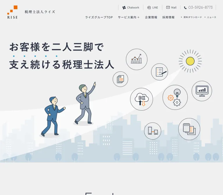
This is a substantial corporate homepage with service navigation, resources, news, recruitment, coverage information, and several contact routes. Its identity comes from the relationship between restrained business information and approachable illustration. A pale gray opening gives the dark Japanese slogan ample space, while two suited figures ascend a broad white curve above a simplified city. Business and technology symbols sit inside thin outlined circles.
Below the opening, large regular-weight English section names establish the rhythm. Smaller Japanese labels explain each section. Muted blue supports the service information, orange identifies contact actions, and the dark footer consolidates the organization’s details. Wide margins, generous leading, isolated rounded corners, and an asymmetric news arrangement keep the long page from feeling like a uniform stack of cards.
閉じる
RISE / 税理士法人ライズ — Style Reference
A calm accounting practice expressed through an ascending illustrated city, spacious typography, and clear orange contact points.
Website: RISE Tax Accountant Office Original URL: https://rise-tax.com/accountant/ Final URL: https://rise-tax.com/accountant/ Theme: light gray canvas, muted blue sections, and a dark slate footer; no theme selector was evidenced. Inspected: supplied browser collection dated September 23, 2026, 06:00:10 JST / September 22, 2026, 21:00:10.765 UTC. Viewports: 1440 × 1000 desktop and 390 × 844 mobile, in CSS pixels. Scope: the current accounting division homepage. Visual captures cover the desktop opening, the Download/News boundary, the desktop footer, the mobile opening, and the mobile footer. Rendered DOM and computed-style evidence additionally cover Feature, Service, Download, News, Recruit, Area, and Contact. Linked pages and opened navigation states were not inspected.
This is a substantial corporate homepage with service navigation, resources, news, recruitment, coverage information, and several contact routes. Its identity comes from the relationship between restrained business information and approachable illustration. A pale gray opening gives the dark Japanese slogan ample space, while two suited figures ascend a broad white curve above a simplified city. Business and technology symbols sit inside thin outlined circles.
Below the opening, large regular-weight English section names establish the rhythm. Smaller Japanese labels explain each section. Muted blue supports the service information, orange identifies contact actions, and the dark footer consolidates the organization’s details. Wide margins, generous leading, isolated rounded corners, and an asymmetric news arrangement keep the long page from feeling like a uniform stack of cards.
How to Read This Reference
- Measured means supplied computed styles or rendered element bounds. Hex colors converted from supplied RGB values are exact conversions.
- Visual estimate means a proportion or appearance read from an original-page screenshot. These are not pixel-sampled colors or recovered CSS declarations.
- Recommendation means an implementation choice proposed here. Breakpoints, asset delivery, accessibility additions, and the Quick Start are adaptations unless explicitly identified as measured.
- Named tokens are descriptive aliases. The source variable is shown separately where available.
- The source HTML root is measured at
10px. Tables use CSS pixels directly; the Quick Start retains a conventional browser root instead of copying sourceremnumbers. - The element snapshots and scrolled captures are not a single synchronized frame. Some image-dependent card heights differ between them. Use measured typography and widths with the visible composition; do not hardcode all reported section heights or absolute document coordinates.
- Only supplied evidence was analyzed. No additional pages, files, or resources were accessed.
Tokens — Colors
Default Palette
| Name | Value | Source evidence | Role |
|---|---|---|---|
| Light Gray Canvas | #f0f0f0 |
--bg01: 240,240,240 |
Visible opening and neutral content canvas |
| Slate Ink | #2d3243 |
--black: 45,50,67; computed body and footer colors |
Body text, navigation, main linework, recruitment button, footer background |
| Service Blue | #4b89ab |
--bg03: 75,137,171; computed Service background |
Large service field and the blue contact surroundings visible above the footer |
| Contact Orange | #fc7216 |
--accent01: 252,114,22; computed contact button fill |
Primary contact pills; visually consistent with the floating contact circle |
| Information Cyan | #239ccf |
--accent02: 35,156,207 |
Small information accents; visually corresponds to news badges and headline emphasis |
| Muted Slate | #7b7e89 |
--sub02: 123,126,137; computed footer button and copyright |
Download pill, subdued footer details |
| Fine Rule | #bdbec4 |
--border: 189,190,196 |
Neutral divider color; visible thin section and utility separators |
| White | #ffffff |
Computed service/footer foreground; visible panels | Reversed text, white brand version, contact panel, media surfaces, illustrated path |
| Secondary Gray | #d9dadc |
--bg02: 217,218,220 |
Available source neutral; exact component assignment was not established |
| Pale Blue | #9dd3ea |
--bg04: 157,211,234 |
Available source blue; do not assume every pale skyline shape uses this exact value |
The cloud support banner has a measured rgba(255,255,255,0.1) background over Service Blue. Preserve that relationship as a translucent white wash rather than replacing it with an unrelated gray card.
Additional declared values include --sub01: #394650, --base: #262626, --cobalt: #1b2b3a, --blue: #1c4388, --gray01: #e6e6e6, and --orange: #ff6600. Their presence does not establish a major visible role on this page. In particular, the measured contact action is #fc7216, not the separately declared #ff6600.
Color Hierarchy
Use gray and slate for the majority of the interface. Blue should occupy substantial sections, while orange remains concentrated around inquiry actions. Cyan works at the scale of a small badge or emphasis mark. The yellow sun, blue clothing, and pale city layers belong to the illustration palette; their exact fills were not supplied.
There is no evidenced alternate theme system. The blue service region and dark footer are sections within one light page.
Tokens — Typography
Japanese Body and Labels
Measured stack: Noto Sans JP, ヒラギノ角ゴ ProN W3, Meiryo, sans-serif.
Body text uses weight 400, generous 2 line height, and 0.1em tracking. Most sampled content headings use weight 500. The result is clear and deliberate without making every section bold. A computed font stack identifies the declaration; it does not independently prove which fallback rendered every glyph.
English Display and Numerals
Measured stack: Outfit, sans-serif.
The English section names use regular weight 400, line height 1, and 0.05em tracking. Outfit also appears on news dates, the header phone number, the main Contact phone number, and desktop footer social labels. Its rounded geometry gives the corporate content a softer character.
Brand and Hero Lettering
The RISE brand lockup includes serif-looking lettering. The supplied computed styles describe the containing link, not the typeface inside that artwork. Do not recreate the wordmark by assigning an invented serif family.
The opening slogan is visible in the screenshots but absent from the supplied text-element samples. Its rendering method and precise font declaration are unverified. Its visible size is approximately 54–56px on desktop and 26px on mobile. Treat these as reconstruction estimates, not measured text tokens.
Type Scale
| Role | Desktop | Mobile | Weight and tracking | Evidence |
|---|---|---|---|---|
| Body copy | 16px / 32px |
14px / 28px |
400; 0.1em |
Measured |
| English section name | 82px / 82px |
52px / 52px |
400; 0.05em |
Measured |
| Japanese section label | 17px / 34px |
13px / 26px |
500; inherited 1.6px / 1.4px tracking |
Measured |
| Feature heading | 27px / 43.2px |
24px / 38.4px |
500; 0.1em |
Measured |
| Standard service heading | 28px / 44.8px |
24px / 38.4px |
500; 0.1em |
Measured |
| Accreditation statement | 46px / 82.8px |
27px / 43.2px |
500; 0.1em |
Measured |
| Cloud support heading | 39px / 62.4px |
24px / 38.4px |
500; 0.1em |
Measured |
| Recruitment statement | 50px / 80px |
28px / 44.8px |
500; 0.1em |
Measured |
| News date | 18px / 18px |
16px / 16px |
Outfit 400; 0.05em |
Measured |
| News/resource title | 16px / 24px |
14px / 21px |
400; inherited tracking |
Measured |
| Main Contact phone | 54px / 54px |
30px / 30px |
Outfit 400; normal tracking |
Measured |
| Desktop primary navigation | 16px / 32px |
Replaced by menu control | 500; 1.6px tracking |
Measured |
| Desktop minor navigation | 12px / 24px |
Inside mobile navigation | 500; 1.2px tracking |
Measured |
| Footer action label | 18px / 36px |
16px / 32px |
400 |
Measured |
| Visible footer phone numerals | Approximately 36–40px |
Approximately 36–38px |
Light geometric appearance | Visual estimate; numeral child styles were not sampled |
Do not use the computed 14px or 16px of a footer phone’s parent as the visible numeral size. The screenshots clearly show larger numeral content inside those wrappers.
Tokens — Spacing & Shapes
Density: spacious page sections, readable paragraphs, compact navigation, and large contact targets.
A universal eight-pixel spacing system cannot be recovered from the evidence. The source combines values such as 12, 25, 37, 44, 54, 68, and 90px. Preserve component relationships rather than rounding everything to a new grid.
Spacing Scale
| Relationship | Desktop | Mobile | Status |
|---|---|---|---|
| Main wide content inset | 90px |
25px |
Measured |
| Header brand left inset | 40px |
20px |
Measured |
| English title to Japanese label | 12px |
4px |
Calculated from measured bounds |
| Feature section start to title | 187px |
64px |
Measured bounds |
| Service section start to title | 198px |
65px |
Measured bounds |
| Standard service column gap | Approximately 37px |
One column | Calculated from measured link bounds |
| Small news card gap | 40px |
Approximately 40px between successive cards |
Measured bounds |
| Contact panel text inset | 60px from visible panel edge |
25px |
Bounds plus visible panel geometry |
| Footer action gap | 20px |
15px |
Measured bounds |
| Floating contact edge clearance | 30px right/bottom |
14px right/bottom |
Measured bounds and visible circles |
Border Radius
| Element | Desktop | Mobile | Status |
|---|---|---|---|
| Service section | Top-right 80px; other corners square |
Top-right 40px |
Measured |
| Cloud support banner | Top-right 80px; other corners square |
Top-right 40px |
Measured |
| Footer | Top-left 80px; other corners square |
Top-left 40px |
Measured |
| Outline list button | 200px declared radius |
150px |
Measured; both render as pills |
| Filled footer button | 150px |
150px |
Measured |
| Resource/news image corners | Approximately 10–12px |
Not visually verified in a mobile content capture | Visual estimate |
| Floating contact icon | Circle, 80px diameter |
Circle, 60px diameter |
Visual geometry supported by wrapper widths |
Layout Measurements
| Element | Desktop at 1440 × 1000 | Mobile at 390 × 844 |
|---|---|---|
| Opening composition | Main content starts at document y=1000px |
Main content starts at y=844px |
| Initial header | 1440 × 140px |
390 × 80px |
| Header brand link | 272 × 77.86px; columns 61px 172px, gap 39px |
168 × 60px; columns 47px 109px, gap 12px |
| Mobile menu button | Not shown | 50 × 50px, at x=330, y=15 |
| Wide section content | 1260px wide, starting at x=90 |
340px wide, starting at x=25 |
| Area section content | 1100px wide, starting at x=170 |
340px wide |
| Standard service links | Approximately 383px wide, three columns |
340px wide, one column |
| Cloud support banner | 1260px wide; two measured 557.5px tracks with 25px gap and 120px left padding |
340px wide; 290px inner track and 25px side padding |
| Featured news link | 580px wide |
340px wide |
| Secondary news links | 281px each |
340px each |
| News list button | 196 × 68px |
275 × 64px |
| Download list button | 264 × 68px |
275 × 64px |
| Footer action | 400 × 80px |
275 × 60px |
| Floating contact wrapper | 80 × 108px, including caption |
60 × 80px, including caption |
| Document height in snapshot | 8758.75px |
11862.44px |
The root declares --contents_width: 1100px and --contents_width_with_padding: 1240px, but several rendered sections are 1260px wide. These variables are not a universal explanation of every wrapper. The Quick Start’s 1260px wide-container cap is an adaptation to the measured desktop layout, not a recovered global source rule.
Components
Corporate Header
Role: persistent identity, service discovery, and contact access.
On desktop, the left side is the orange stepped RISE symbol beside the Japanese organization name. On the right, a utility row contains Chatwork, LINE, Mail, and the phone number. Fine vertical rules separate these controls. Below is the primary navigation, with larger corporate links and smaller resource/news links.
The top-state header is transparent over the gray opening. In the middle desktop capture, it appears as an opaque white band approximately 120px high, compared with the measured 140px opening state. It is absent from the supplied desktop footer capture. The mobile footer capture still shows the 80px header. This demonstrates different persistent-header states, but does not establish the exact scroll thresholds or positioning implementation.
A plus sign follows サービス案内, and service sublinks exist in the DOM. Their opening trigger and expanded presentation were not exercised.
On mobile, retain the compact brand and a three-line menu glyph at the right. Its measured button is 50 × 50px; the visible strokes are approximately 30px wide. Navigation entries exist outside the viewport at x≈493px, so their presence in extracted text does not mean the menu was open. Menu animation, backdrop, focus management, and scroll locking remain unverified.
Illustrated Opening
Role: introduce the practice through a visual metaphor of shared progress.
The opening occupies the initial viewport. The visible slogan is:
お客様を二人三脚で 支え続ける税理士法人
On desktop, the text begins around x=113px, with its first line near the upper quarter of the screen. A short row of cyan square dots sits between the lines. The illustration grows across the lower and right portions: a pale city, a broad ascending white curve, two suited figures, circular business symbols, and a small yellow sun.
The desktop scene gives the right side to icons such as growth charts, documents, cloud DX, gears, and accounting tools. The mobile capture places the headline near x=25px, keeps substantial empty gray space below it, and stacks the visual story vertically. The figures occupy the lower left and center. The captured mobile symbols include a phone, folder, chart, building, megaphone, AI lettering, and a handshake.
The evidence does not establish whether every icon difference comes from responsive asset selection or an animation phase. What is clear is that the mobile composition cannot be reproduced by uniformly shrinking the desktop frame.
Recommendation: use art-directed desktop and portrait compositions. Keep the skyline at the bottom, preserve the figures’ relationship to the rising path, and avoid cropping the slogan or central figures. Do not add a large hero button that competes with the existing floating contact action.
Bilingual Section Heading
Role: create a repeatable chapter marker throughout the long page.
The measured anatomy is an English paragraph such as Feature, Service, or News, followed by a Japanese h2. English names are 82px on desktop and 52px on mobile. Japanese labels are 17px and 13px, respectively.
The emphasis is intentionally inverted from a conventional heading pair: the English word is visually dominant, while the smaller Japanese line carries the specific section meaning. Preserve regular-weight English letters, tight English leading, and the generous surrounding whitespace.
The desktop Contact heading is an exception: its English name and Japanese label sit alongside one another in a grid with a measured 46px gap. They stack on mobile.
Feature Group
Role: explain the practice’s business support approach.
The first three numbered features align in three desktop columns. Their descriptions have measured widths of about 370px. Each combines a two-line 27px heading with 16px / 32px copy. A fourth accreditation statement receives larger typography and a separate, broader treatment below.
On mobile, the first three entries become a vertical sequence with 24px headings and 14px / 28px paragraphs inside the 340px content column. Their headings begin approximately 454px apart in the sampled layout. This spacing includes content or media regions not fully represented by the sampled text elements; it is not a recommended fixed card height.
The DOM establishes the numbered hierarchy and text layout. The supplied screenshots do not show this section’s artwork, so illustration subjects and exact image dimensions should remain unspecified.
Service Grid
Role: provide direct routes to six core services.
A full-width Service Blue field carries white text and a single rounded top-right corner. The six services form a three-column, two-row desktop arrangement. Each complete entry is an anchor containing a heading, short description, and More affordance. The sampled links have transparent backgrounds rather than independent white card fills.
Headings are centered within their columns. The source measures 28px / 44.8px headings, 16px / 32px descriptions, and 54px bottom padding on the desktop links. The six topics cover incorporation, advisory contracts, succession, medical business support, payroll, and M&A.
On mobile, entries stack at 340px wide with 24px headings and 72px bottom padding. Each sampled link is approximately 406px tall, with its heading starting about 227px below the link’s top. The unseen portion should not be replaced with invented artwork or treated as arbitrary blank padding; actual media must determine that space in a reconstruction.
Cloud Support Banner
Role: distinguish cloud accounting and IT support from the six standard services.
The desktop banner spans the full 1260px section width. Its background is a ten-percent white wash over the blue field. It repeats the top-right 80px corner, uses two columns, and indents content 120px from the left.
The heading is larger than the standard service headings at 39px. On mobile it becomes a 340px wide single-column banner with 25px inner side padding, a 40px top-right corner, and a 24px heading. The captured text breaks クラウドDX・ and IT導入支援 onto separate lines.
Download Resource
Role: make a practical document resource discoverable.
The observed content contains one resource, leaving substantial open space to its right on desktop. Its visible media surface is white with softly rounded corners and an orange/yellow ring graphic. Beneath it sit a small blue category label, the resource title, and a right-aligned underlined ダウンロード affordance with a downward arrow.
The resource link measures approximately 382px wide on desktop and 340px on mobile. The separate list action is an outlined pill: 264 × 68px on desktop and 275 × 64px below the content on mobile.
The observed resource href points to an internal detail page. A direct file download was not verified. Preserve that distinction when wiring the control.
Asymmetric News Layout
Role: give one story prominence while retaining two compact updates.
The desktop section has a large left group and two smaller cards to the right. The left group combines the News heading, Japanese label, outline list button, and a 580px featured article. The right cards are 281px wide, separated by 40px. Their visible media begins near the section heading’s top, while the featured image begins lower beneath the heading group.
Each article is one anchor containing an image, a date/category row, and a short title. Dates use Outfit. Category labels are compact cyan-blue rectangles with white Japanese text. The cards themselves remain on the gray canvas; rounded corners belong to the image surfaces rather than a raised outer panel.
The current screenshot shows a bright blue announcement graphic in the featured position, an interview photograph in one secondary card, and a RISE logo on white in the other. The secondary image windows appear approximately 3:2; this is a screenshot estimate, not a recovered universal image rule.
On mobile, all three article links are 340px wide in one vertical sequence. The list button moves below them. Keep the DOM order meaningful rather than relying on desktop positioning to explain the content.
Recruitment Block
Role: connect the corporate site to recruitment information.
The desktop text group begins well to the right at x≈856.5px. It includes a 50px statement, a 19px / 38px supporting paragraph, and a dark slate pill measuring 356 × 84px.
On mobile, the statement is 28px, the description returns to 14px / 28px, and the action is 275 × 64px. The supplied DOM suggests space for media, but its actual subject and treatment are not visible in the provided captures. Do not assume a team photograph or a specific illustration.
Coverage Area
Role: explain regional and online availability.
This section uses the narrower 1100px desktop wrapper. The content lists four regional areas and online support, followed by longer location text. The online support statement measures 28px / 44.8px on desktop and 20px / 32px on mobile.
The mobile inner detail column is 290px wide at x=50px, nested inside the 340px section wrapper. Preserve the hierarchy between area labels, the online statement, and dense supporting copy.
Repeated regional labels alone do not prove tabs or accordions. Their selection behavior was not tested.
Contact Panel
Role: offer multiple ways to begin a consultation.
A blue surround leads into a white panel. Source content presents three consultation benefits, explanatory text, Chatwork, LINE, a contact-page link, and a prominent phone number with operating hours.
On desktop, the explanatory text occupies a measured 440px column. The three channel links sit side by side in roughly 217px tracks, each combining an icon with a label. The main phone number is 54px in Outfit.
On mobile, the channels stack into 290px wide rows around 81px high. Their measured typography grows to 19px even though general body copy reduces to 14px. The phone number reduces to 30px, with hours beneath it. This is a useful responsive distinction: mobile contact choices remain large while supporting prose becomes smaller.
The phone is an actual tel: link in the supplied DOM. The contact action links to /accountant/contact/; no inline form or submission state was inspected.
Corporate Footer
Role: consolidate identity, practical details, navigation, and inquiry routes.
The desktop footer is Slate Ink with white content and a single 80px top-left corner. Its main geometry is three columns of approximately 316px, 400px, and 400px, separated by 72px gaps.
The first column holds the white RISE lockup, address, large telephone and fax numerals, and operating information. The middle column contains the accounting section’s navigation. The right column contains group links, social channels, and two full-width pills: muted slate for downloads and orange for inquiries. Service sublinks use measured white at 70% opacity. Fine rules divide major links. Copyright runs vertically near the lower left.
On mobile, the footer becomes a centered sequence: stacked white brand, address, phone, hours, fax, availability note, download pill, contact pill, and horizontal copyright. The desktop sitemap and social rows are absent from the visible mobile footer. The top-left radius halves to 40px, and the buttons become 275 × 60px with a 15px gap.
The address and organization name are supported by the original page. No production-credit claim is established by this footer.
Floating Contact Control
Role: keep a consultation route available during the long scroll.
A circular orange button containing a white envelope sits at the bottom right. In the opening and content captures, a short 初回無料 caption sits immediately above it. The composite control is 80 × 108px on desktop and 60 × 80px on mobile.
The circle stays visible in the footer captures while the caption is absent. The exact condition that changes the caption was not supplied. Match the observed states only when implementing the corresponding behavior deliberately.
This control links to the contact page. It is not evidence of a chat widget or an expanding inline form.
Tokens — Motion & Interaction
| Treatment | Supplied evidence | What can be concluded |
|---|---|---|
| Main header | transition: 0.3s at both viewports |
A short transition is defined; exact changing properties and scroll trigger are unverified |
| Desktop navigation and common pills | Frequently transition: 0.3s |
Short UI transitions are part of the source styling; hover endpoint appearance was not captured |
| Section headings | Frequently transition: 0.75s |
A longer transition exists; reveal distance, opacity endpoints, and triggering logic are unknown |
| News section | transition: 0.75s |
Section-level transition evidence, without a recorded timeline |
| Sampled element animations | animation: none |
No keyframe animation was reported on those sampled elements |
Entries reporting only transition: all |
No useful duration included | Do not interpret this as a verified animated effect |
| Hero figures and symbols | Static captures only | Orbiting, walking, parallax, and looping movement are not established |
| Mobile menu and desktop service submenu | Controls and links exist | Opening, closing, keyboard behavior, and expanded appearance were not tested |
| Contact and service links | Destination hrefs supplied | Navigation intent is verified; destination-page behavior is outside scope |
The capture process waited at least five seconds initially, checked layout/text stability, and handled finite and perpetual animations during readiness checks. This improves the reliability of settled screenshots but is not a recording of the original motion sequence. It also does not prove that every delayed or offscreen effect was observed.
Recommended adaptation: retain restrained 300ms feedback for color or opacity changes. Use the observed 750ms duration only for optional section reveals, with content visible by default. Avoid inventing a continuous hero animation. Provide reduced-motion behavior and keyboard-visible states independently of hover.
Surfaces
| Layer | Appearance | Purpose |
|---|---|---|
| Main canvas | Flat light gray | Connects the opening, resources, news, and other neutral sections |
| Service field | Solid muted blue with white text | Groups the service catalog into one large visual chapter |
| Cloud banner | Ten-percent white wash over blue | Adds hierarchy without introducing a separate card material |
| Media surface | White or image-filled, modest corner rounding | Frames resource graphics, photographs, and logo artwork |
| Contact panel | White inset into a blue region | Separates practical contact information from the surrounding section |
| Footer | Dark slate with one large rounded corner | Creates a decisive end to the page and supports reversed content |
| Primary action | Flat orange circle or pill | Makes inquiry routes easy to find |
| Secondary action | Fine outline or muted slate fill | Distinguishes lists and downloads from inquiries |
No general drop-shadow or glass surface system is visible. Thin rules, colored fields, spacing, and selective corner rounding provide structure. Soft oval shapes below the illustrated figures belong to the artwork rather than a UI elevation system.
Imagery
The principal visual language is clean, flat business illustration with fine dark outlines. People have simplified faces and restrained clothing colors. The city is built from low-contrast blue-gray silhouettes, white window marks, and simplified trees. The broad white rising path connects the people to the sun and business symbols.
The outlined symbol circles vary in size rather than forming a rigid icon grid. Desktop diameters appear roughly 85–145px; mobile circles are around 45–70px. These are visual estimates. Stroke weights appear fine and consistent, approximately 1–2px at the captured scale.
Keep the hero’s generous empty gray area. Filling every available space with symbols would remove its calmness. The visible desktop and mobile compositions should be treated as separate art-direction targets.
Photography appears within a news thumbnail, where an interview subject is shown in an office setting. Other news/resource images retain their own artwork and colors. The bright blue announcement image is content imagery, not a new global theme color.
Observed Asset References
No original src, srcset, asset URLs, or file formats were supplied. The references below identify visible instances only.
| Asset instance | Evidence | Reuse guidance |
|---|---|---|
| Desktop ascending-city hero | Original-page capture 1 | Preserve the people, curved path, skyline, sun, and distributed circular motifs |
| Portrait hero composition | Original-page capture 4 | Use dedicated portrait art direction instead of shrinking the desktop frame |
| Orange/dark RISE header lockup | Captures 1, 2, 4, and 5 | Use an authorized brand asset; do not substitute an arbitrary font |
| White RISE footer lockup | Captures 3 and 5 | Retain the stacked-square motif and reversed lettering |
| Invoice resource graphic | Capture 2 | White media surface with orange/yellow ring artwork and source title |
| Interview news image | Capture 2 | Preserve its editorial context; the subject’s identity was not established |
| RISE logo news image | Capture 2 | Keep ample white space around the logo |
| Feature, service, and recruitment media | Not visually covered by the supplied screenshots | Obtain actual assets before claiming their subjects or styling |
Do not assume the original illustrations are SVGs merely because their lines look vector-like. Their delivery format and any layered animation structure remain unknown.
Layout & Responsive Behavior
The desktop page alternates expansive sections with compact navigation and contact details. Its measured document height is approximately 8759px. The mobile page reaches approximately 11862px, mainly because multi-column content becomes sequential.
| Relationship | Desktop observation | Mobile observation |
|---|---|---|
| Opening | Viewport-height landscape composition | Viewport-height portrait composition |
| Header | Brand plus two navigation rows | Brand plus menu button |
| Wide content wrapper | 1260px with 90px side margins |
340px with 25px side margins |
| English titles | 82px |
52px |
| Feature group | Three entries across, then larger fourth item | Vertical sequence |
| Standard services | Three columns and two rows | One column |
| Cloud support | Two-column banner | Single-column banner |
| News | Large featured column plus two smaller cards | Three full-width entries |
| Contact channels | Three links across | Three large rows |
| Footer | Three columns with navigation | Centered identity and contact stack |
| Large section corner | 80px |
40px |
| Floating contact circle | 80px, inset 30px |
60px, inset 14px |
The exact source breakpoints were not included. Two sampled widths cannot establish tablet behavior or the precise point where the menu replaces desktop navigation. The Quick Start uses 1000px as a recommended adaptation breakpoint; it is not a source finding.
Use normal document flow for content sections. The measured opening aligns with viewport height, but the entire site is not a fixed-height application. Avoid fixing service, news, or footer heights to snapshot numbers. Allow font loading, translated copy, image aspect ratios, and user zoom to expand them.
Maintain the narrower Area content column on large screens. On mobile, preserve the distinction between the 340px outer content width and 290px inset detail/contact regions.
Do’s and Don’ts
Do
- Preserve the light gray, slate, muted blue, and orange hierarchy.
- Use large regular-weight Outfit section names paired with smaller Japanese labels.
- Keep body copy airy: measured leading is twice the font size.
- Art-direct the mobile hero around a tall composition with intentional empty space.
- Retain the ascending white path as the central illustration motif.
- Use a top-right rounded corner for service regions and a top-left rounded corner for the footer.
- Preserve the featured-versus-secondary news hierarchy on desktop.
- Let individual resource and article images retain their own visual identity.
- Keep orange contact actions distinct from outline list buttons and gray download pills.
- Simplify the mobile footer while retaining address, telephone, fax, and primary actions.
- Keep whole service and news entries navigable through their supplied anchor structure.
Don’t
- Don’t reduce this corporate homepage to a single campaign section with one conversion route.
- Don’t replace the illustrated opening with generic office photography.
- Don’t compress the desktop hero into a tiny landscape image on a phone.
- Don’t make every English heading bold or use the brand’s serif appearance for body text.
- Don’t put every service into a white, shadowed, fully rounded card.
- Don’t distribute orange equally across decorative elements and every navigation link.
- Don’t treat all pale blue artwork fills as exact matches to a source variable.
- Don’t assume a service submenu, area selector, or menu interaction was tested because its text appears in the DOM.
- Don’t infer font sizes from parent wrappers when the visible content is artwork or an unsampled child.
- Don’t invent asset URLs, production roles, hover endpoints, or looping hero effects.
- Don’t freeze section heights from an image-dependent snapshot.
Recommended Implementation Additions
These are recommendations for a new implementation, not verified features of the original:
- Provide a semantic text equivalent for the hero slogan if it is delivered as artwork. Keep decorative city elements and repeated symbols out of the accessibility tree.
- Give the mobile menu button an accessible name,
aria-expanded, andaria-controls. Ensure closed navigation cannot receive keyboard focus. - Give the floating envelope link a meaningful accessible name even when its visible caption disappears.
- Preserve clear focus indicators across gray, blue, orange, and dark surfaces.
- Check small white text against blue, orange, and muted gray fills. Adjust text treatment or the relevant functional surface when required for contrast.
- Keep region content accessible without assuming an unverified tab or accordion pattern. If one is implemented, use the corresponding keyboard and semantic model.
- Reserve image space using actual intrinsic dimensions or known aspect ratios. Avoid layout shifts as article and service imagery loads.
- Ensure the floating control does not cover final lines, footer links, or mobile safe areas.
- Use reduced-motion preferences for any added transitions or reveals, and never leave content hidden if enhancement scripts fail.
- Preserve native telephone links; keep the fax label distinct from telephone actions.
Agent Prompt Guide
Quick Color Reference
- Main canvas:
#f0f0f0. - Text and footer:
#2d3243. - Service and contact surroundings:
#4b89ab. - Primary contact actions:
#fc7216. - Small information accents:
#239ccf. - Secondary footer action:
#7b7e89. - Fine neutral rules:
#bdbec4. - Reversed text and inset panels:
#ffffff.
Overall Prompt
“Create a Japanese accounting firm’s corporate homepage with a calm light gray canvas, dark slate text, muted blue service sections, and orange contact actions. Use Noto Sans JP for Japanese text and regular-weight Outfit for oversized English section names and selected numerals. Build a viewport-height illustrated opening with two suited figures ascending a broad white curve above a pale city, surrounded by fine outlined business symbols and a small yellow sun. Follow with features, a blue service catalog, downloadable resources, asymmetric news, recruitment, coverage, and contact information. Use generous whitespace, 80px single-corner section rounding on desktop, modest image rounding, thin rules, and flat pill buttons. On mobile, use dedicated portrait hero art, 25px content margins, stacked services/news, 40px section corners, and a centered simplified footer. Treat menu behavior and animation as implementation decisions requiring specification.”
Example Component Prompts
- Hero: “Create a gray 1440 × 1000 opening composition with a large two-line Japanese slogan in the upper left, small cyan square emphasis marks, a pale city along the bottom, two outlined suited figures ascending a broad white path, and circular business motifs toward the right. Prepare a separate 390 × 844 composition with the headline near the top and the illustration arranged vertically. Keep orange confined to branding and contact UI.”
- Service section: “Build a muted blue service chapter with white text and only the top-right corner rounded. Use an 82px regular Outfit section name and a 17px Japanese label. Arrange six transparent linked entries in three columns, with centered 28px headings and spacious descriptions. Add a wide cloud-support banner with a ten-percent white wash. Stack the content on mobile.”
- News: “Place a large News heading and outline list pill above a 580px featured article on the left. Place two 281px article cards with a 40px gap on the right. Use rounded image windows, Outfit dates, compact cyan category labels, and unboxed Japanese titles on a gray background. On mobile, stack all articles at the same width.”
- Footer: “Create a dark slate corporate footer with one large top-left rounded corner. Use a white brand lockup, address, large phone and fax numerals, subdued service links, social controls, and gray/orange action pills. At phone width, center the identity and contact information, omit the desktop sitemap, and use 275 × 60px buttons.”
- Floating contact: “Build an orange envelope link at the lower right, 80px in diameter on desktop and 60px on mobile. Place a short consultation caption above it in normal content states. Use 30px desktop and 14px mobile edge clearances, with safe-area support and an accessible link name.”
Quick Start
CSS Custom Properties
This is a reusable adaptation of the measured palette, typography, and layout relationships. It is not the original stylesheet. Font files and authorized illustration assets must be supplied separately; no asset paths were established by the evidence.
The CSS assumes a .rise-site wrapper, a .site-header, .hero, section containers, linked service/news entries, a .site-footer, and a .floating-contact link. The hero illustration should be delivered through an art-directed picture element. Header state classes require application logic; no original scroll thresholds are implied.
:root {
  /* Exact conversions of observed source colors */
  --rise-canvas: #f0f0f0;
  --rise-ink: #2d3243;
  --rise-blue: #4b89ab;
  --rise-orange: #fc7216;
  --rise-cyan: #239ccf;
  --rise-muted: #7b7e89;
  --rise-rule: #bdbec4;
  --rise-white: #ffffff;

  /* Observed font declarations; load authorized font files separately */
  --rise-font-ja: 'Noto Sans JP', 'ヒラギノ角ゴ ProN W3', Meiryo, sans-serif;
  --rise-font-en: 'Outfit', sans-serif;
  --rise-body-size: 16px;
  --rise-section-size: 82px;
  --rise-label-size: 17px;
  --rise-card-title: 28px;
  --rise-body-leading: 2;
  --rise-heading-leading: 1.6;
  --rise-tracking-ja: 0.1em;
  --rise-tracking-en: 0.05em;

  /* Recommended containers matching the inspected desktop geometry */
  --rise-gutter: clamp(25px, 6.25vw, 90px);
  --rise-wide: 1260px;
  --rise-narrow: 1100px;
  --rise-section-space: 190px;
  --rise-corner: 80px;
  --rise-media-radius: 12px; /* Visual estimate */
  --rise-header-height: 140px;
  --rise-float-size: 80px;
  --rise-float-inset: 30px;

  /* Durations observed; easing below is an adaptation */
  --rise-motion-ui: 300ms;
  --rise-motion-reveal: 750ms;
}

*,
*::before,
*::after {
  box-sizing: border-box;
}

body {
  margin: 0;
}

.rise-site {
  color: var(--rise-ink);
  background: var(--rise-canvas);
  font-family: var(--rise-font-ja);
  font-size: var(--rise-body-size);
  font-weight: 400;
  line-height: var(--rise-body-leading);
  letter-spacing: var(--rise-tracking-ja);
}

.rise-site a {
  color: inherit;
}

.rise-site img {
  display: block;
  max-width: 100%;
}

.container {
  width: min(var(--rise-wide), calc(100% - 2 * var(--rise-gutter)));
  margin-inline: auto;
}

.container--narrow {
  max-width: var(--rise-narrow);
}

/* Recommended persistent-header shell; source thresholds are unknown. */
.site-header {
  position: fixed;
  inset: 0 0 auto;
  z-index: 50;
  display: flex;
  align-items: center;
  justify-content: space-between;
  gap: 32px;
  height: var(--rise-header-height);
  padding-inline: 40px;
  background: transparent;
  transition: background-color var(--rise-motion-ui) ease;
}

.site-header.is-scrolled {
  height: 120px; /* Visual estimate of the supplied scrolled state */
  background: var(--rise-white);
}

.brand {
  display: grid;
  grid-template-columns: 61px 172px;
  align-items: center;
  gap: 39px;
  text-decoration: none;
}

.header-navigation {
  display: grid;
  justify-items: end;
  gap: 22px;
}

.header-utilities,
.header-primary {
  display: flex;
  align-items: center;
}

.header-utilities a {
  padding-inline: 23px;
  border-inline-start: 1px solid var(--rise-rule);
  font-size: 15px;
  letter-spacing: normal;
  text-decoration: none;
}

.header-primary {
  gap: 28px;
  font-weight: 500;
}

.menu-toggle {
  display: none;
  width: 50px;
  height: 50px;
  border: 0;
  color: inherit;
  background: transparent;
}

.hero {
  position: relative;
  min-height: 100vh;
  min-height: 100svh;
  overflow: clip;
  isolation: isolate;
}

.hero-art {
  position: absolute;
  inset: 0;
  z-index: -1;
}

.hero-art img {
  width: 100%;
  height: 100%;
  object-fit: cover;
  object-position: center bottom;
}

/* Use only when the supplied hero art does not already contain the slogan. */
.hero-copy {
  position: absolute;
  top: 25%;
  left: 8%;
  margin: 0;
  font-size: clamp(40px, 3.9vw, 56px);
  font-weight: 700;
  line-height: 1.8;
  letter-spacing: 0.1em;
}

.hero-copy > span {
  display: block;
}

.chapter {
  padding-block: var(--rise-section-space) 90px;
}

.section-title {
  margin: 0;
  font-family: var(--rise-font-en);
  font-size: var(--rise-section-size);
  font-weight: 400;
  line-height: 1;
  letter-spacing: var(--rise-tracking-en);
}

.section-label {
  margin: 12px 0 0;
  font-size: var(--rise-label-size);
  font-weight: 500;
  line-height: 2;
}

.section--blue {
  color: var(--rise-white);
  background: var(--rise-blue);
  border-radius: 0 var(--rise-corner) 0 0;
}

.feature-grid,
.service-grid {
  display: grid;
  grid-template-columns: repeat(3, minmax(0, 1fr));
  gap: 50px 37px;
  margin-top: 44px;
}

.service-link {
  position: relative;
  display: grid;
  align-content: start;
  justify-items: center;
  gap: 17px;
  padding: 44px 0 54px;
  text-align: center;
  text-decoration: none;
}

.service-link h3 {
  margin: 0;
  font-size: var(--rise-card-title);
  font-weight: 500;
  line-height: var(--rise-heading-leading);
}

.service-link p {
  margin: 0;
}

/* Any service media should retain its actual aspect ratio. */
.service-link img {
  height: auto;
}

.cloud-banner {
  display: grid;
  grid-template-columns: repeat(2, minmax(0, 1fr));
  align-items: center;
  gap: 25px;
  margin-top: 90px;
  padding-left: 120px;
  min-height: 172px;
  border-radius: 0 var(--rise-corner) 0 0;
  background: rgb(255 255 255 / 10%);
}

.button {
  position: relative;
  display: inline-flex;
  align-items: center;
  justify-content: center;
  min-height: 68px;
  padding: 8px 64px 8px 30px;
  border: 1px solid var(--rise-muted);
  border-radius: 200px;
  font-size: 16px;
  font-weight: 500;
  line-height: 2;
  letter-spacing: 0.05em;
  text-decoration: none;
  transition: opacity var(--rise-motion-ui) ease;
}

.button--contact,
.button--download,
.button--recruit {
  color: var(--rise-white) !important;
  border-color: transparent;
}

.button--contact { background: var(--rise-orange); }
.button--download { background: var(--rise-muted); }
.button--recruit { background: var(--rise-ink); }

.news-layout {
  display: grid;
  grid-template-columns: minmax(0, 1fr) minmax(0, 1.038fr);
  gap: 78px;
}

.news-secondary {
  display: grid;
  grid-template-columns: repeat(2, minmax(0, 1fr));
  align-content: start;
  gap: 40px;
}

.news-card {
  display: grid;
  align-content: start;
  gap: 8px;
  text-decoration: none;
}

.news-feature > .news-card {
  margin-top: 40px;
}

.media-frame {
  overflow: hidden;
  border-radius: var(--rise-media-radius);
  background: var(--rise-white);
}

.media-frame img {
  width: 100%;
  height: auto;
}

.news-meta {
  display: flex;
  flex-wrap: wrap;
  align-items: center;
  gap: 14px;
  margin-top: 12px;
}

.news-date {
  font-family: var(--rise-font-en);
  font-size: 18px;
  line-height: 1;
  letter-spacing: 0.05em;
}

.news-tag {
  padding: 3px 9px;
  border-radius: 3px;
  color: var(--rise-white);
  background: var(--rise-cyan);
  font-size: 13px;
  line-height: 1.6;
}

.news-card-title {
  margin: 0;
  font-size: var(--rise-body-size);
  font-weight: 400;
  line-height: 1.5;
}

.contact-panel {
  padding: 60px;
  color: var(--rise-ink);
  background: var(--rise-white);
}

.contact-channels {
  display: grid;
  grid-template-columns: repeat(3, minmax(0, 1fr));
}

.contact-channel {
  display: grid;
  grid-template-columns: 40px minmax(0, 1fr);
  align-items: center;
  gap: 14px;
  padding: 10px 14px;
  text-decoration: none;
}

.contact-phone {
  font-family: var(--rise-font-en);
  font-size: 54px;
  line-height: 1;
  letter-spacing: normal;
  white-space: nowrap;
}

.site-footer {
  position: relative;
  padding-block: 132px 150px;
  border-radius: var(--rise-corner) 0 0 0;
  color: var(--rise-white);
  background: var(--rise-ink);
}

.footer-grid {
  display: grid;
  grid-template-columns: minmax(0, 0.79fr) repeat(2, minmax(0, 1fr));
  gap: 72px;
}

.footer-actions {
  display: grid;
  gap: 20px;
}

.footer-actions .button {
  width: 100%;
  min-height: 80px;
  font-size: 18px;
}

.footer-service-link {
  color: rgb(255 255 255 / 70%) !important;
  font-size: 15px;
}

.footer-copyright {
  position: absolute;
  left: 30px;
  bottom: 40px;
  margin: 0;
  color: var(--rise-muted);
  font-size: 12px;
  writing-mode: vertical-rl;
}

.floating-contact {
  position: fixed;
  right: var(--rise-float-inset);
  bottom: calc(var(--rise-float-inset) + env(safe-area-inset-bottom, 0px));
  z-index: 60;
  display: grid;
  justify-items: center;
  width: var(--rise-float-size);
  text-decoration: none;
}

.floating-contact-label {
  font-size: 16px;
  line-height: 28px;
  white-space: nowrap;
}

.floating-contact-circle {
  display: grid;
  place-items: center;
  width: 100%;
  aspect-ratio: 1;
  border-radius: 50%;
  color: var(--rise-white);
  background: var(--rise-orange);
}

.floating-contact-circle svg {
  width: 30px;
  height: 30px;
}

/* Optional state hook matching the supplied footer captures. */
.floating-contact.is-over-footer .floating-contact-label {
  visibility: hidden;
}

/* Recommended focus treatment, not recovered source behavior. */
.rise-site :focus-visible {
  outline: 2px solid var(--rise-ink);
  outline-offset: 4px;
  box-shadow: 0 0 0 4px var(--rise-white);
}

/* Recommended breakpoint; the original breakpoint was not supplied. */
@media (max-width: 1000px) {
  :root {
    --rise-gutter: 25px;
    --rise-body-size: 14px;
    --rise-section-size: 52px;
    --rise-label-size: 13px;
    --rise-card-title: 24px;
    --rise-section-space: 64px;
    --rise-corner: 40px;
    --rise-header-height: 80px;
    --rise-float-size: 60px;
    --rise-float-inset: 14px;
  }

  .site-header,
  .site-header.is-scrolled {
    height: 80px;
    padding-inline: 20px 10px;
  }

  .brand {
    grid-template-columns: 47px 109px;
    gap: 12px;
  }

  .header-navigation { display: none; }
  .menu-toggle { display: grid; place-items: center; }

  .hero-copy {
    top: 12.4%;
    left: 25px;
    font-size: clamp(21px, 6.67vw, 26px);
  }

  .chapter { padding-bottom: 60px; }
  .section-label { margin-top: 4px; }

  .feature-grid,
  .service-grid,
  .news-layout,
  .news-secondary,
  .footer-grid,
  .contact-channels {
    grid-template-columns: minmax(0, 1fr);
  }

  .service-link { padding-bottom: 72px; }

  .cloud-banner {
    grid-template-columns: minmax(0, 1fr);
    margin-top: 60px;
    padding: 32px 25px;
  }

  .news-layout,
  .news-secondary { gap: 40px; }
  .news-date { font-size: 16px; }

  .button {
    width: min(275px, 100%);
    min-height: 64px;
    padding: 8px 48px 8px 25px;
    letter-spacing: 0.0875em;
  }

  .contact-panel { padding: 25px; }

  .contact-channel {
    gap: 20px;
    min-height: 81px;
    padding: 20px 10px;
    font-size: 19px;
    line-height: 1.5;
  }

  .contact-phone { font-size: 30px; }

  .site-footer { padding-block: 50px; }
  .footer-grid { gap: 40px; text-align: center; }

  .footer-sitemap,
  .footer-group-links,
  .footer-social { display: none; }

  .footer-actions { justify-items: center; gap: 15px; }

  .footer-actions .button {
    width: min(275px, 100%);
    min-height: 60px;
    font-size: 16px;
  }

  .footer-copyright {
    position: static;
    margin-top: 40px;
    text-align: center;
    writing-mode: horizontal-tb;
  }

  .floating-contact-label {
    font-size: 14px;
    line-height: 20px;
  }
}

@media (prefers-reduced-motion: reduce) {
  .rise-site *,
  .rise-site *::before,
  .rise-site *::after {
    animation: none !important;
    transition: none !important;
    scroll-behavior: auto !important;
  }
}
The desktop navigation is intentionally removed from this mobile shell until a functioning menu is supplied. Implement the mobile menu as a separate accessible component before shipping. The CSS does not recreate unverified menu panels, area controls, source reveal animations, or missing illustrations.
Tailwind v4 Token Mapping
Optional mapping for a project already using Tailwind v4. Define the custom properties above first. This does not imply that the original website uses Tailwind.
@theme inline {
  --color-rise-canvas: var(--rise-canvas);
  --color-rise-ink: var(--rise-ink);
  --color-rise-blue: var(--rise-blue);
  --color-rise-orange: var(--rise-orange);
  --color-rise-cyan: var(--rise-cyan);
  --color-rise-muted: var(--rise-muted);
  --color-rise-rule: var(--rise-rule);

  --font-japanese: var(--rise-font-ja);
  --font-display: var(--rise-font-en);

  --text-body: var(--rise-body-size);
  --text-section: var(--rise-section-size);
  --text-section-label: var(--rise-label-size);
  --text-service-title: var(--rise-card-title);

  --spacing-page-gutter: var(--rise-gutter);
  --spacing-section: var(--rise-section-space);
  --radius-section: var(--rise-corner);
  --radius-media: var(--rise-media-radius);
}
Sources & Evidence
- Original and final page: https://rise-tax.com/accountant/. The supplied browser observation reports HTTP
200, with no URL change. - Collection timestamp:
2026-09-22T21:00:10.765Z, equivalent to September 23, 2026, 06:00:10.765 JST. - Desktop visual evidence: three original-page captures at
1440 × 1000, showing the opening, the Download/News boundary, and the footer. - Mobile visual evidence: two original-page captures at
390 × 844, showing the opening and footer. - Rendered evidence: supplied text, link destinations, custom properties, computed font/color/transition values, and element rectangles for both viewports. These support the token values and responsive component measurements in this reference.
- Observed behavior: page loading and scroll capture were performed by the supplied collection process. Persistent header/contact states are visible across captures. No menu opening, hover sequence, region selection, form submission, or destination-page interaction was supplied.
- Limitations: image URLs and font-file declarations are unavailable; many middle sections have DOM evidence without a corresponding visual capture. Some image-dependent bounds differ between the element snapshot and scrolled screenshots. Exact breakpoints, animation timelines, expanded navigation states, and late-loading content remain unverified.
This reference describes the current page represented by the supplied inspection. Measurements, visual estimates, and recommended implementation choices are kept distinct throughout.
# RISE / 税理士法人ライズ — Style Reference

> A calm accounting practice expressed through an ascending illustrated city, spacious typography, and clear orange contact points.

**Website:** [RISE Tax Accountant Office](https://rise-tax.com/accountant/)
**Original URL:** https://rise-tax.com/accountant/
**Final URL:** https://rise-tax.com/accountant/
**Theme:** light gray canvas, muted blue sections, and a dark slate footer; no theme selector was evidenced.
**Inspected:** supplied browser collection dated September 23, 2026, 06:00:10 JST / September 22, 2026, 21:00:10.765 UTC.
**Viewports:** 1440 × 1000 desktop and 390 × 844 mobile, in CSS pixels.
**Scope:** the current accounting division homepage. Visual captures cover the desktop opening, the Download/News boundary, the desktop footer, the mobile opening, and the mobile footer. Rendered DOM and computed-style evidence additionally cover Feature, Service, Download, News, Recruit, Area, and Contact. Linked pages and opened navigation states were not inspected.

This is a substantial corporate homepage with service navigation, resources, news, recruitment, coverage information, and several contact routes. Its identity comes from the relationship between restrained business information and approachable illustration. A pale gray opening gives the dark Japanese slogan ample space, while two suited figures ascend a broad white curve above a simplified city. Business and technology symbols sit inside thin outlined circles.

Below the opening, large regular-weight English section names establish the rhythm. Smaller Japanese labels explain each section. Muted blue supports the service information, orange identifies contact actions, and the dark footer consolidates the organization’s details. Wide margins, generous leading, isolated rounded corners, and an asymmetric news arrangement keep the long page from feeling like a uniform stack of cards.
閉じる
# RISE / 税理士法人ライズ — Style Reference

> A calm accounting practice expressed through an ascending illustrated city, spacious typography, and clear orange contact points.

**Website:** [RISE Tax Accountant Office](https://rise-tax.com/accountant/)
**Original URL:** https://rise-tax.com/accountant/
**Final URL:** https://rise-tax.com/accountant/
**Theme:** light gray canvas, muted blue sections, and a dark slate footer; no theme selector was evidenced.
**Inspected:** supplied browser collection dated September 23, 2026, 06:00:10 JST / September 22, 2026, 21:00:10.765 UTC.
**Viewports:** 1440 × 1000 desktop and 390 × 844 mobile, in CSS pixels.
**Scope:** the current accounting division homepage. Visual captures cover the desktop opening, the Download/News boundary, the desktop footer, the mobile opening, and the mobile footer. Rendered DOM and computed-style evidence additionally cover Feature, Service, Download, News, Recruit, Area, and Contact. Linked pages and opened navigation states were not inspected.

This is a substantial corporate homepage with service navigation, resources, news, recruitment, coverage information, and several contact routes. Its identity comes from the relationship between restrained business information and approachable illustration. A pale gray opening gives the dark Japanese slogan ample space, while two suited figures ascend a broad white curve above a simplified city. Business and technology symbols sit inside thin outlined circles.

Below the opening, large regular-weight English section names establish the rhythm. Smaller Japanese labels explain each section. Muted blue supports the service information, orange identifies contact actions, and the dark footer consolidates the organization’s details. Wide margins, generous leading, isolated rounded corners, and an asymmetric news arrangement keep the long page from feeling like a uniform stack of cards.

## How to Read This Reference

- **Measured** means supplied computed styles or rendered element bounds. Hex colors converted from supplied RGB values are exact conversions.
- **Visual estimate** means a proportion or appearance read from an original-page screenshot. These are not pixel-sampled colors or recovered CSS declarations.
- **Recommendation** means an implementation choice proposed here. Breakpoints, asset delivery, accessibility additions, and the Quick Start are adaptations unless explicitly identified as measured.
- **Named tokens** are descriptive aliases. The source variable is shown separately where available.
- The source HTML root is measured at `10px`. Tables use CSS pixels directly; the Quick Start retains a conventional browser root instead of copying source `rem` numbers.
- The element snapshots and scrolled captures are not a single synchronized frame. Some image-dependent card heights differ between them. Use measured typography and widths with the visible composition; do not hardcode all reported section heights or absolute document coordinates.
- Only supplied evidence was analyzed. No additional pages, files, or resources were accessed.

## Tokens — Colors

### Default Palette

| Name | Value | Source evidence | Role |
| --- | --- | --- | --- |
| Light Gray Canvas | `#f0f0f0` | `--bg01: 240,240,240` | Visible opening and neutral content canvas |
| Slate Ink | `#2d3243` | `--black: 45,50,67`; computed body and footer colors | Body text, navigation, main linework, recruitment button, footer background |
| Service Blue | `#4b89ab` | `--bg03: 75,137,171`; computed Service background | Large service field and the blue contact surroundings visible above the footer |
| Contact Orange | `#fc7216` | `--accent01: 252,114,22`; computed contact button fill | Primary contact pills; visually consistent with the floating contact circle |
| Information Cyan | `#239ccf` | `--accent02: 35,156,207` | Small information accents; visually corresponds to news badges and headline emphasis |
| Muted Slate | `#7b7e89` | `--sub02: 123,126,137`; computed footer button and copyright | Download pill, subdued footer details |
| Fine Rule | `#bdbec4` | `--border: 189,190,196` | Neutral divider color; visible thin section and utility separators |
| White | `#ffffff` | Computed service/footer foreground; visible panels | Reversed text, white brand version, contact panel, media surfaces, illustrated path |
| Secondary Gray | `#d9dadc` | `--bg02: 217,218,220` | Available source neutral; exact component assignment was not established |
| Pale Blue | `#9dd3ea` | `--bg04: 157,211,234` | Available source blue; do not assume every pale skyline shape uses this exact value |

The cloud support banner has a measured `rgba(255,255,255,0.1)` background over Service Blue. Preserve that relationship as a translucent white wash rather than replacing it with an unrelated gray card.

Additional declared values include `--sub01: #394650`, `--base: #262626`, `--cobalt: #1b2b3a`, `--blue: #1c4388`, `--gray01: #e6e6e6`, and `--orange: #ff6600`. Their presence does not establish a major visible role on this page. In particular, the measured contact action is `#fc7216`, not the separately declared `#ff6600`.

### Color Hierarchy

Use gray and slate for the majority of the interface. Blue should occupy substantial sections, while orange remains concentrated around inquiry actions. Cyan works at the scale of a small badge or emphasis mark. The yellow sun, blue clothing, and pale city layers belong to the illustration palette; their exact fills were not supplied.

There is no evidenced alternate theme system. The blue service region and dark footer are sections within one light page.

## Tokens — Typography

### Japanese Body and Labels

**Measured stack:** `Noto Sans JP`, `ヒラギノ角ゴ ProN W3`, `Meiryo`, `sans-serif`.

Body text uses weight `400`, generous `2` line height, and `0.1em` tracking. Most sampled content headings use weight `500`. The result is clear and deliberate without making every section bold. A computed font stack identifies the declaration; it does not independently prove which fallback rendered every glyph.

### English Display and Numerals

**Measured stack:** `Outfit, sans-serif`.

The English section names use regular weight `400`, line height `1`, and `0.05em` tracking. Outfit also appears on news dates, the header phone number, the main Contact phone number, and desktop footer social labels. Its rounded geometry gives the corporate content a softer character.

### Brand and Hero Lettering

The RISE brand lockup includes serif-looking lettering. The supplied computed styles describe the containing link, not the typeface inside that artwork. Do not recreate the wordmark by assigning an invented serif family.

The opening slogan is visible in the screenshots but absent from the supplied text-element samples. Its rendering method and precise font declaration are unverified. Its visible size is approximately `54–56px` on desktop and `26px` on mobile. Treat these as reconstruction estimates, not measured text tokens.

### Type Scale

| Role | Desktop | Mobile | Weight and tracking | Evidence |
| --- | --- | --- | --- | --- |
| Body copy | `16px / 32px` | `14px / 28px` | `400`; `0.1em` | Measured |
| English section name | `82px / 82px` | `52px / 52px` | `400`; `0.05em` | Measured |
| Japanese section label | `17px / 34px` | `13px / 26px` | `500`; inherited `1.6px / 1.4px` tracking | Measured |
| Feature heading | `27px / 43.2px` | `24px / 38.4px` | `500`; `0.1em` | Measured |
| Standard service heading | `28px / 44.8px` | `24px / 38.4px` | `500`; `0.1em` | Measured |
| Accreditation statement | `46px / 82.8px` | `27px / 43.2px` | `500`; `0.1em` | Measured |
| Cloud support heading | `39px / 62.4px` | `24px / 38.4px` | `500`; `0.1em` | Measured |
| Recruitment statement | `50px / 80px` | `28px / 44.8px` | `500`; `0.1em` | Measured |
| News date | `18px / 18px` | `16px / 16px` | Outfit `400`; `0.05em` | Measured |
| News/resource title | `16px / 24px` | `14px / 21px` | `400`; inherited tracking | Measured |
| Main Contact phone | `54px / 54px` | `30px / 30px` | Outfit `400`; normal tracking | Measured |
| Desktop primary navigation | `16px / 32px` | Replaced by menu control | `500`; `1.6px` tracking | Measured |
| Desktop minor navigation | `12px / 24px` | Inside mobile navigation | `500`; `1.2px` tracking | Measured |
| Footer action label | `18px / 36px` | `16px / 32px` | `400` | Measured |
| Visible footer phone numerals | Approximately `36–40px` | Approximately `36–38px` | Light geometric appearance | Visual estimate; numeral child styles were not sampled |

Do not use the computed `14px` or `16px` of a footer phone’s parent as the visible numeral size. The screenshots clearly show larger numeral content inside those wrappers.

## Tokens — Spacing & Shapes

**Density:** spacious page sections, readable paragraphs, compact navigation, and large contact targets.

A universal eight-pixel spacing system cannot be recovered from the evidence. The source combines values such as `12`, `25`, `37`, `44`, `54`, `68`, and `90px`. Preserve component relationships rather than rounding everything to a new grid.

### Spacing Scale

| Relationship | Desktop | Mobile | Status |
| --- | --- | --- | --- |
| Main wide content inset | `90px` | `25px` | Measured |
| Header brand left inset | `40px` | `20px` | Measured |
| English title to Japanese label | `12px` | `4px` | Calculated from measured bounds |
| Feature section start to title | `187px` | `64px` | Measured bounds |
| Service section start to title | `198px` | `65px` | Measured bounds |
| Standard service column gap | Approximately `37px` | One column | Calculated from measured link bounds |
| Small news card gap | `40px` | Approximately `40px` between successive cards | Measured bounds |
| Contact panel text inset | `60px` from visible panel edge | `25px` | Bounds plus visible panel geometry |
| Footer action gap | `20px` | `15px` | Measured bounds |
| Floating contact edge clearance | `30px` right/bottom | `14px` right/bottom | Measured bounds and visible circles |

### Border Radius

| Element | Desktop | Mobile | Status |
| --- | --- | --- | --- |
| Service section | Top-right `80px`; other corners square | Top-right `40px` | Measured |
| Cloud support banner | Top-right `80px`; other corners square | Top-right `40px` | Measured |
| Footer | Top-left `80px`; other corners square | Top-left `40px` | Measured |
| Outline list button | `200px` declared radius | `150px` | Measured; both render as pills |
| Filled footer button | `150px` | `150px` | Measured |
| Resource/news image corners | Approximately `10–12px` | Not visually verified in a mobile content capture | Visual estimate |
| Floating contact icon | Circle, `80px` diameter | Circle, `60px` diameter | Visual geometry supported by wrapper widths |

### Layout Measurements

| Element | Desktop at 1440 × 1000 | Mobile at 390 × 844 |
| --- | --- | --- |
| Opening composition | Main content starts at document `y=1000px` | Main content starts at `y=844px` |
| Initial header | `1440 × 140px` | `390 × 80px` |
| Header brand link | `272 × 77.86px`; columns `61px 172px`, gap `39px` | `168 × 60px`; columns `47px 109px`, gap `12px` |
| Mobile menu button | Not shown | `50 × 50px`, at `x=330, y=15` |
| Wide section content | `1260px` wide, starting at `x=90` | `340px` wide, starting at `x=25` |
| Area section content | `1100px` wide, starting at `x=170` | `340px` wide |
| Standard service links | Approximately `383px` wide, three columns | `340px` wide, one column |
| Cloud support banner | `1260px` wide; two measured `557.5px` tracks with `25px` gap and `120px` left padding | `340px` wide; `290px` inner track and `25px` side padding |
| Featured news link | `580px` wide | `340px` wide |
| Secondary news links | `281px` each | `340px` each |
| News list button | `196 × 68px` | `275 × 64px` |
| Download list button | `264 × 68px` | `275 × 64px` |
| Footer action | `400 × 80px` | `275 × 60px` |
| Floating contact wrapper | `80 × 108px`, including caption | `60 × 80px`, including caption |
| Document height in snapshot | `8758.75px` | `11862.44px` |

The root declares `--contents_width: 1100px` and `--contents_width_with_padding: 1240px`, but several rendered sections are `1260px` wide. These variables are not a universal explanation of every wrapper. The Quick Start’s `1260px` wide-container cap is an adaptation to the measured desktop layout, not a recovered global source rule.

## Components

### Corporate Header

**Role:** persistent identity, service discovery, and contact access.

On desktop, the left side is the orange stepped RISE symbol beside the Japanese organization name. On the right, a utility row contains Chatwork, LINE, Mail, and the phone number. Fine vertical rules separate these controls. Below is the primary navigation, with larger corporate links and smaller resource/news links.

The top-state header is transparent over the gray opening. In the middle desktop capture, it appears as an opaque white band approximately `120px` high, compared with the measured `140px` opening state. It is absent from the supplied desktop footer capture. The mobile footer capture still shows the `80px` header. This demonstrates different persistent-header states, but does not establish the exact scroll thresholds or positioning implementation.

A plus sign follows `サービス案内`, and service sublinks exist in the DOM. Their opening trigger and expanded presentation were not exercised.

On mobile, retain the compact brand and a three-line menu glyph at the right. Its measured button is `50 × 50px`; the visible strokes are approximately `30px` wide. Navigation entries exist outside the viewport at `x≈493px`, so their presence in extracted text does not mean the menu was open. Menu animation, backdrop, focus management, and scroll locking remain unverified.

### Illustrated Opening

**Role:** introduce the practice through a visual metaphor of shared progress.

The opening occupies the initial viewport. The visible slogan is:

> お客様を二人三脚で
> 支え続ける税理士法人

On desktop, the text begins around `x=113px`, with its first line near the upper quarter of the screen. A short row of cyan square dots sits between the lines. The illustration grows across the lower and right portions: a pale city, a broad ascending white curve, two suited figures, circular business symbols, and a small yellow sun.

The desktop scene gives the right side to icons such as growth charts, documents, cloud DX, gears, and accounting tools. The mobile capture places the headline near `x=25px`, keeps substantial empty gray space below it, and stacks the visual story vertically. The figures occupy the lower left and center. The captured mobile symbols include a phone, folder, chart, building, megaphone, AI lettering, and a handshake.

The evidence does not establish whether every icon difference comes from responsive asset selection or an animation phase. What is clear is that the mobile composition cannot be reproduced by uniformly shrinking the desktop frame.

**Recommendation:** use art-directed desktop and portrait compositions. Keep the skyline at the bottom, preserve the figures’ relationship to the rising path, and avoid cropping the slogan or central figures. Do not add a large hero button that competes with the existing floating contact action.

### Bilingual Section Heading

**Role:** create a repeatable chapter marker throughout the long page.

The measured anatomy is an English paragraph such as `Feature`, `Service`, or `News`, followed by a Japanese `h2`. English names are `82px` on desktop and `52px` on mobile. Japanese labels are `17px` and `13px`, respectively.

The emphasis is intentionally inverted from a conventional heading pair: the English word is visually dominant, while the smaller Japanese line carries the specific section meaning. Preserve regular-weight English letters, tight English leading, and the generous surrounding whitespace.

The desktop Contact heading is an exception: its English name and Japanese label sit alongside one another in a grid with a measured `46px` gap. They stack on mobile.

### Feature Group

**Role:** explain the practice’s business support approach.

The first three numbered features align in three desktop columns. Their descriptions have measured widths of about `370px`. Each combines a two-line `27px` heading with `16px / 32px` copy. A fourth accreditation statement receives larger typography and a separate, broader treatment below.

On mobile, the first three entries become a vertical sequence with `24px` headings and `14px / 28px` paragraphs inside the `340px` content column. Their headings begin approximately `454px` apart in the sampled layout. This spacing includes content or media regions not fully represented by the sampled text elements; it is not a recommended fixed card height.

The DOM establishes the numbered hierarchy and text layout. The supplied screenshots do not show this section’s artwork, so illustration subjects and exact image dimensions should remain unspecified.

### Service Grid

**Role:** provide direct routes to six core services.

A full-width Service Blue field carries white text and a single rounded top-right corner. The six services form a three-column, two-row desktop arrangement. Each complete entry is an anchor containing a heading, short description, and `More` affordance. The sampled links have transparent backgrounds rather than independent white card fills.

Headings are centered within their columns. The source measures `28px / 44.8px` headings, `16px / 32px` descriptions, and `54px` bottom padding on the desktop links. The six topics cover incorporation, advisory contracts, succession, medical business support, payroll, and M&A.

On mobile, entries stack at `340px` wide with `24px` headings and `72px` bottom padding. Each sampled link is approximately `406px` tall, with its heading starting about `227px` below the link’s top. The unseen portion should not be replaced with invented artwork or treated as arbitrary blank padding; actual media must determine that space in a reconstruction.

### Cloud Support Banner

**Role:** distinguish cloud accounting and IT support from the six standard services.

The desktop banner spans the full `1260px` section width. Its background is a ten-percent white wash over the blue field. It repeats the top-right `80px` corner, uses two columns, and indents content `120px` from the left.

The heading is larger than the standard service headings at `39px`. On mobile it becomes a `340px` wide single-column banner with `25px` inner side padding, a `40px` top-right corner, and a `24px` heading. The captured text breaks `クラウドDX・` and `IT導入支援` onto separate lines.

### Download Resource

**Role:** make a practical document resource discoverable.

The observed content contains one resource, leaving substantial open space to its right on desktop. Its visible media surface is white with softly rounded corners and an orange/yellow ring graphic. Beneath it sit a small blue category label, the resource title, and a right-aligned underlined `ダウンロード` affordance with a downward arrow.

The resource link measures approximately `382px` wide on desktop and `340px` on mobile. The separate list action is an outlined pill: `264 × 68px` on desktop and `275 × 64px` below the content on mobile.

The observed resource href points to an internal detail page. A direct file download was not verified. Preserve that distinction when wiring the control.

### Asymmetric News Layout

**Role:** give one story prominence while retaining two compact updates.

The desktop section has a large left group and two smaller cards to the right. The left group combines the `News` heading, Japanese label, outline list button, and a `580px` featured article. The right cards are `281px` wide, separated by `40px`. Their visible media begins near the section heading’s top, while the featured image begins lower beneath the heading group.

Each article is one anchor containing an image, a date/category row, and a short title. Dates use Outfit. Category labels are compact cyan-blue rectangles with white Japanese text. The cards themselves remain on the gray canvas; rounded corners belong to the image surfaces rather than a raised outer panel.

The current screenshot shows a bright blue announcement graphic in the featured position, an interview photograph in one secondary card, and a RISE logo on white in the other. The secondary image windows appear approximately `3:2`; this is a screenshot estimate, not a recovered universal image rule.

On mobile, all three article links are `340px` wide in one vertical sequence. The list button moves below them. Keep the DOM order meaningful rather than relying on desktop positioning to explain the content.

### Recruitment Block

**Role:** connect the corporate site to recruitment information.

The desktop text group begins well to the right at `x≈856.5px`. It includes a `50px` statement, a `19px / 38px` supporting paragraph, and a dark slate pill measuring `356 × 84px`.

On mobile, the statement is `28px`, the description returns to `14px / 28px`, and the action is `275 × 64px`. The supplied DOM suggests space for media, but its actual subject and treatment are not visible in the provided captures. Do not assume a team photograph or a specific illustration.

### Coverage Area

**Role:** explain regional and online availability.

This section uses the narrower `1100px` desktop wrapper. The content lists four regional areas and online support, followed by longer location text. The online support statement measures `28px / 44.8px` on desktop and `20px / 32px` on mobile.

The mobile inner detail column is `290px` wide at `x=50px`, nested inside the `340px` section wrapper. Preserve the hierarchy between area labels, the online statement, and dense supporting copy.

Repeated regional labels alone do not prove tabs or accordions. Their selection behavior was not tested.

### Contact Panel

**Role:** offer multiple ways to begin a consultation.

A blue surround leads into a white panel. Source content presents three consultation benefits, explanatory text, Chatwork, LINE, a contact-page link, and a prominent phone number with operating hours.

On desktop, the explanatory text occupies a measured `440px` column. The three channel links sit side by side in roughly `217px` tracks, each combining an icon with a label. The main phone number is `54px` in Outfit.

On mobile, the channels stack into `290px` wide rows around `81px` high. Their measured typography grows to `19px` even though general body copy reduces to `14px`. The phone number reduces to `30px`, with hours beneath it. This is a useful responsive distinction: mobile contact choices remain large while supporting prose becomes smaller.

The phone is an actual `tel:` link in the supplied DOM. The contact action links to `/accountant/contact/`; no inline form or submission state was inspected.

### Corporate Footer

**Role:** consolidate identity, practical details, navigation, and inquiry routes.

The desktop footer is Slate Ink with white content and a single `80px` top-left corner. Its main geometry is three columns of approximately `316px`, `400px`, and `400px`, separated by `72px` gaps.

The first column holds the white RISE lockup, address, large telephone and fax numerals, and operating information. The middle column contains the accounting section’s navigation. The right column contains group links, social channels, and two full-width pills: muted slate for downloads and orange for inquiries. Service sublinks use measured white at `70%` opacity. Fine rules divide major links. Copyright runs vertically near the lower left.

On mobile, the footer becomes a centered sequence: stacked white brand, address, phone, hours, fax, availability note, download pill, contact pill, and horizontal copyright. The desktop sitemap and social rows are absent from the visible mobile footer. The top-left radius halves to `40px`, and the buttons become `275 × 60px` with a `15px` gap.

The address and organization name are supported by the original page. No production-credit claim is established by this footer.

### Floating Contact Control

**Role:** keep a consultation route available during the long scroll.

A circular orange button containing a white envelope sits at the bottom right. In the opening and content captures, a short `初回無料` caption sits immediately above it. The composite control is `80 × 108px` on desktop and `60 × 80px` on mobile.

The circle stays visible in the footer captures while the caption is absent. The exact condition that changes the caption was not supplied. Match the observed states only when implementing the corresponding behavior deliberately.

This control links to the contact page. It is not evidence of a chat widget or an expanding inline form.

## Tokens — Motion & Interaction

| Treatment | Supplied evidence | What can be concluded |
| --- | --- | --- |
| Main header | `transition: 0.3s` at both viewports | A short transition is defined; exact changing properties and scroll trigger are unverified |
| Desktop navigation and common pills | Frequently `transition: 0.3s` | Short UI transitions are part of the source styling; hover endpoint appearance was not captured |
| Section headings | Frequently `transition: 0.75s` | A longer transition exists; reveal distance, opacity endpoints, and triggering logic are unknown |
| News section | `transition: 0.75s` | Section-level transition evidence, without a recorded timeline |
| Sampled element animations | `animation: none` | No keyframe animation was reported on those sampled elements |
| Entries reporting only `transition: all` | No useful duration included | Do not interpret this as a verified animated effect |
| Hero figures and symbols | Static captures only | Orbiting, walking, parallax, and looping movement are not established |
| Mobile menu and desktop service submenu | Controls and links exist | Opening, closing, keyboard behavior, and expanded appearance were not tested |
| Contact and service links | Destination hrefs supplied | Navigation intent is verified; destination-page behavior is outside scope |

The capture process waited at least five seconds initially, checked layout/text stability, and handled finite and perpetual animations during readiness checks. This improves the reliability of settled screenshots but is not a recording of the original motion sequence. It also does not prove that every delayed or offscreen effect was observed.

**Recommended adaptation:** retain restrained `300ms` feedback for color or opacity changes. Use the observed `750ms` duration only for optional section reveals, with content visible by default. Avoid inventing a continuous hero animation. Provide reduced-motion behavior and keyboard-visible states independently of hover.

## Surfaces

| Layer | Appearance | Purpose |
| --- | --- | --- |
| Main canvas | Flat light gray | Connects the opening, resources, news, and other neutral sections |
| Service field | Solid muted blue with white text | Groups the service catalog into one large visual chapter |
| Cloud banner | Ten-percent white wash over blue | Adds hierarchy without introducing a separate card material |
| Media surface | White or image-filled, modest corner rounding | Frames resource graphics, photographs, and logo artwork |
| Contact panel | White inset into a blue region | Separates practical contact information from the surrounding section |
| Footer | Dark slate with one large rounded corner | Creates a decisive end to the page and supports reversed content |
| Primary action | Flat orange circle or pill | Makes inquiry routes easy to find |
| Secondary action | Fine outline or muted slate fill | Distinguishes lists and downloads from inquiries |

No general drop-shadow or glass surface system is visible. Thin rules, colored fields, spacing, and selective corner rounding provide structure. Soft oval shapes below the illustrated figures belong to the artwork rather than a UI elevation system.

## Imagery

The principal visual language is clean, flat business illustration with fine dark outlines. People have simplified faces and restrained clothing colors. The city is built from low-contrast blue-gray silhouettes, white window marks, and simplified trees. The broad white rising path connects the people to the sun and business symbols.

The outlined symbol circles vary in size rather than forming a rigid icon grid. Desktop diameters appear roughly `85–145px`; mobile circles are around `45–70px`. These are visual estimates. Stroke weights appear fine and consistent, approximately `1–2px` at the captured scale.

Keep the hero’s generous empty gray area. Filling every available space with symbols would remove its calmness. The visible desktop and mobile compositions should be treated as separate art-direction targets.

Photography appears within a news thumbnail, where an interview subject is shown in an office setting. Other news/resource images retain their own artwork and colors. The bright blue announcement image is content imagery, not a new global theme color.

### Observed Asset References

No original `src`, `srcset`, asset URLs, or file formats were supplied. The references below identify visible instances only.

| Asset instance | Evidence | Reuse guidance |
| --- | --- | --- |
| Desktop ascending-city hero | Original-page capture 1 | Preserve the people, curved path, skyline, sun, and distributed circular motifs |
| Portrait hero composition | Original-page capture 4 | Use dedicated portrait art direction instead of shrinking the desktop frame |
| Orange/dark RISE header lockup | Captures 1, 2, 4, and 5 | Use an authorized brand asset; do not substitute an arbitrary font |
| White RISE footer lockup | Captures 3 and 5 | Retain the stacked-square motif and reversed lettering |
| Invoice resource graphic | Capture 2 | White media surface with orange/yellow ring artwork and source title |
| Interview news image | Capture 2 | Preserve its editorial context; the subject’s identity was not established |
| RISE logo news image | Capture 2 | Keep ample white space around the logo |
| Feature, service, and recruitment media | Not visually covered by the supplied screenshots | Obtain actual assets before claiming their subjects or styling |

Do not assume the original illustrations are SVGs merely because their lines look vector-like. Their delivery format and any layered animation structure remain unknown.

## Layout & Responsive Behavior

The desktop page alternates expansive sections with compact navigation and contact details. Its measured document height is approximately `8759px`. The mobile page reaches approximately `11862px`, mainly because multi-column content becomes sequential.

| Relationship | Desktop observation | Mobile observation |
| --- | --- | --- |
| Opening | Viewport-height landscape composition | Viewport-height portrait composition |
| Header | Brand plus two navigation rows | Brand plus menu button |
| Wide content wrapper | `1260px` with `90px` side margins | `340px` with `25px` side margins |
| English titles | `82px` | `52px` |
| Feature group | Three entries across, then larger fourth item | Vertical sequence |
| Standard services | Three columns and two rows | One column |
| Cloud support | Two-column banner | Single-column banner |
| News | Large featured column plus two smaller cards | Three full-width entries |
| Contact channels | Three links across | Three large rows |
| Footer | Three columns with navigation | Centered identity and contact stack |
| Large section corner | `80px` | `40px` |
| Floating contact circle | `80px`, inset `30px` | `60px`, inset `14px` |

The exact source breakpoints were not included. Two sampled widths cannot establish tablet behavior or the precise point where the menu replaces desktop navigation. The Quick Start uses `1000px` as a recommended adaptation breakpoint; it is not a source finding.

Use normal document flow for content sections. The measured opening aligns with viewport height, but the entire site is not a fixed-height application. Avoid fixing service, news, or footer heights to snapshot numbers. Allow font loading, translated copy, image aspect ratios, and user zoom to expand them.

Maintain the narrower Area content column on large screens. On mobile, preserve the distinction between the `340px` outer content width and `290px` inset detail/contact regions.

## Do’s and Don’ts

### Do

- Preserve the light gray, slate, muted blue, and orange hierarchy.
- Use large regular-weight Outfit section names paired with smaller Japanese labels.
- Keep body copy airy: measured leading is twice the font size.
- Art-direct the mobile hero around a tall composition with intentional empty space.
- Retain the ascending white path as the central illustration motif.
- Use a top-right rounded corner for service regions and a top-left rounded corner for the footer.
- Preserve the featured-versus-secondary news hierarchy on desktop.
- Let individual resource and article images retain their own visual identity.
- Keep orange contact actions distinct from outline list buttons and gray download pills.
- Simplify the mobile footer while retaining address, telephone, fax, and primary actions.
- Keep whole service and news entries navigable through their supplied anchor structure.

### Don’t

- Don’t reduce this corporate homepage to a single campaign section with one conversion route.
- Don’t replace the illustrated opening with generic office photography.
- Don’t compress the desktop hero into a tiny landscape image on a phone.
- Don’t make every English heading bold or use the brand’s serif appearance for body text.
- Don’t put every service into a white, shadowed, fully rounded card.
- Don’t distribute orange equally across decorative elements and every navigation link.
- Don’t treat all pale blue artwork fills as exact matches to a source variable.
- Don’t assume a service submenu, area selector, or menu interaction was tested because its text appears in the DOM.
- Don’t infer font sizes from parent wrappers when the visible content is artwork or an unsampled child.
- Don’t invent asset URLs, production roles, hover endpoints, or looping hero effects.
- Don’t freeze section heights from an image-dependent snapshot.

## Recommended Implementation Additions

These are recommendations for a new implementation, not verified features of the original:

- Provide a semantic text equivalent for the hero slogan if it is delivered as artwork. Keep decorative city elements and repeated symbols out of the accessibility tree.
- Give the mobile menu button an accessible name, `aria-expanded`, and `aria-controls`. Ensure closed navigation cannot receive keyboard focus.
- Give the floating envelope link a meaningful accessible name even when its visible caption disappears.
- Preserve clear focus indicators across gray, blue, orange, and dark surfaces.
- Check small white text against blue, orange, and muted gray fills. Adjust text treatment or the relevant functional surface when required for contrast.
- Keep region content accessible without assuming an unverified tab or accordion pattern. If one is implemented, use the corresponding keyboard and semantic model.
- Reserve image space using actual intrinsic dimensions or known aspect ratios. Avoid layout shifts as article and service imagery loads.
- Ensure the floating control does not cover final lines, footer links, or mobile safe areas.
- Use reduced-motion preferences for any added transitions or reveals, and never leave content hidden if enhancement scripts fail.
- Preserve native telephone links; keep the fax label distinct from telephone actions.

## Agent Prompt Guide

### Quick Color Reference

- Main canvas: `#f0f0f0`.
- Text and footer: `#2d3243`.
- Service and contact surroundings: `#4b89ab`.
- Primary contact actions: `#fc7216`.
- Small information accents: `#239ccf`.
- Secondary footer action: `#7b7e89`.
- Fine neutral rules: `#bdbec4`.
- Reversed text and inset panels: `#ffffff`.

### Overall Prompt

“Create a Japanese accounting firm’s corporate homepage with a calm light gray canvas, dark slate text, muted blue service sections, and orange contact actions. Use Noto Sans JP for Japanese text and regular-weight Outfit for oversized English section names and selected numerals. Build a viewport-height illustrated opening with two suited figures ascending a broad white curve above a pale city, surrounded by fine outlined business symbols and a small yellow sun. Follow with features, a blue service catalog, downloadable resources, asymmetric news, recruitment, coverage, and contact information. Use generous whitespace, 80px single-corner section rounding on desktop, modest image rounding, thin rules, and flat pill buttons. On mobile, use dedicated portrait hero art, 25px content margins, stacked services/news, 40px section corners, and a centered simplified footer. Treat menu behavior and animation as implementation decisions requiring specification.”

### Example Component Prompts

1. **Hero:** “Create a gray 1440 × 1000 opening composition with a large two-line Japanese slogan in the upper left, small cyan square emphasis marks, a pale city along the bottom, two outlined suited figures ascending a broad white path, and circular business motifs toward the right. Prepare a separate 390 × 844 composition with the headline near the top and the illustration arranged vertically. Keep orange confined to branding and contact UI.”
2. **Service section:** “Build a muted blue service chapter with white text and only the top-right corner rounded. Use an 82px regular Outfit section name and a 17px Japanese label. Arrange six transparent linked entries in three columns, with centered 28px headings and spacious descriptions. Add a wide cloud-support banner with a ten-percent white wash. Stack the content on mobile.”
3. **News:** “Place a large News heading and outline list pill above a 580px featured article on the left. Place two 281px article cards with a 40px gap on the right. Use rounded image windows, Outfit dates, compact cyan category labels, and unboxed Japanese titles on a gray background. On mobile, stack all articles at the same width.”
4. **Footer:** “Create a dark slate corporate footer with one large top-left rounded corner. Use a white brand lockup, address, large phone and fax numerals, subdued service links, social controls, and gray/orange action pills. At phone width, center the identity and contact information, omit the desktop sitemap, and use 275 × 60px buttons.”
5. **Floating contact:** “Build an orange envelope link at the lower right, 80px in diameter on desktop and 60px on mobile. Place a short consultation caption above it in normal content states. Use 30px desktop and 14px mobile edge clearances, with safe-area support and an accessible link name.”

## Quick Start

### CSS Custom Properties

This is a reusable adaptation of the measured palette, typography, and layout relationships. It is not the original stylesheet. Font files and authorized illustration assets must be supplied separately; no asset paths were established by the evidence.

The CSS assumes a `.rise-site` wrapper, a `.site-header`, `.hero`, section containers, linked service/news entries, a `.site-footer`, and a `.floating-contact` link. The hero illustration should be delivered through an art-directed `picture` element. Header state classes require application logic; no original scroll thresholds are implied.

```css
:root {
  /* Exact conversions of observed source colors */
  --rise-canvas: #f0f0f0;
  --rise-ink: #2d3243;
  --rise-blue: #4b89ab;
  --rise-orange: #fc7216;
  --rise-cyan: #239ccf;
  --rise-muted: #7b7e89;
  --rise-rule: #bdbec4;
  --rise-white: #ffffff;

  /* Observed font declarations; load authorized font files separately */
  --rise-font-ja: 'Noto Sans JP', 'ヒラギノ角ゴ ProN W3', Meiryo, sans-serif;
  --rise-font-en: 'Outfit', sans-serif;
  --rise-body-size: 16px;
  --rise-section-size: 82px;
  --rise-label-size: 17px;
  --rise-card-title: 28px;
  --rise-body-leading: 2;
  --rise-heading-leading: 1.6;
  --rise-tracking-ja: 0.1em;
  --rise-tracking-en: 0.05em;

  /* Recommended containers matching the inspected desktop geometry */
  --rise-gutter: clamp(25px, 6.25vw, 90px);
  --rise-wide: 1260px;
  --rise-narrow: 1100px;
  --rise-section-space: 190px;
  --rise-corner: 80px;
  --rise-media-radius: 12px; /* Visual estimate */
  --rise-header-height: 140px;
  --rise-float-size: 80px;
  --rise-float-inset: 30px;

  /* Durations observed; easing below is an adaptation */
  --rise-motion-ui: 300ms;
  --rise-motion-reveal: 750ms;
}

*,
*::before,
*::after {
  box-sizing: border-box;
}

body {
  margin: 0;
}

.rise-site {
  color: var(--rise-ink);
  background: var(--rise-canvas);
  font-family: var(--rise-font-ja);
  font-size: var(--rise-body-size);
  font-weight: 400;
  line-height: var(--rise-body-leading);
  letter-spacing: var(--rise-tracking-ja);
}

.rise-site a {
  color: inherit;
}

.rise-site img {
  display: block;
  max-width: 100%;
}

.container {
  width: min(var(--rise-wide), calc(100% - 2 * var(--rise-gutter)));
  margin-inline: auto;
}

.container--narrow {
  max-width: var(--rise-narrow);
}

/* Recommended persistent-header shell; source thresholds are unknown. */
.site-header {
  position: fixed;
  inset: 0 0 auto;
  z-index: 50;
  display: flex;
  align-items: center;
  justify-content: space-between;
  gap: 32px;
  height: var(--rise-header-height);
  padding-inline: 40px;
  background: transparent;
  transition: background-color var(--rise-motion-ui) ease;
}

.site-header.is-scrolled {
  height: 120px; /* Visual estimate of the supplied scrolled state */
  background: var(--rise-white);
}

.brand {
  display: grid;
  grid-template-columns: 61px 172px;
  align-items: center;
  gap: 39px;
  text-decoration: none;
}

.header-navigation {
  display: grid;
  justify-items: end;
  gap: 22px;
}

.header-utilities,
.header-primary {
  display: flex;
  align-items: center;
}

.header-utilities a {
  padding-inline: 23px;
  border-inline-start: 1px solid var(--rise-rule);
  font-size: 15px;
  letter-spacing: normal;
  text-decoration: none;
}

.header-primary {
  gap: 28px;
  font-weight: 500;
}

.menu-toggle {
  display: none;
  width: 50px;
  height: 50px;
  border: 0;
  color: inherit;
  background: transparent;
}

.hero {
  position: relative;
  min-height: 100vh;
  min-height: 100svh;
  overflow: clip;
  isolation: isolate;
}

.hero-art {
  position: absolute;
  inset: 0;
  z-index: -1;
}

.hero-art img {
  width: 100%;
  height: 100%;
  object-fit: cover;
  object-position: center bottom;
}

/* Use only when the supplied hero art does not already contain the slogan. */
.hero-copy {
  position: absolute;
  top: 25%;
  left: 8%;
  margin: 0;
  font-size: clamp(40px, 3.9vw, 56px);
  font-weight: 700;
  line-height: 1.8;
  letter-spacing: 0.1em;
}

.hero-copy > span {
  display: block;
}

.chapter {
  padding-block: var(--rise-section-space) 90px;
}

.section-title {
  margin: 0;
  font-family: var(--rise-font-en);
  font-size: var(--rise-section-size);
  font-weight: 400;
  line-height: 1;
  letter-spacing: var(--rise-tracking-en);
}

.section-label {
  margin: 12px 0 0;
  font-size: var(--rise-label-size);
  font-weight: 500;
  line-height: 2;
}

.section--blue {
  color: var(--rise-white);
  background: var(--rise-blue);
  border-radius: 0 var(--rise-corner) 0 0;
}

.feature-grid,
.service-grid {
  display: grid;
  grid-template-columns: repeat(3, minmax(0, 1fr));
  gap: 50px 37px;
  margin-top: 44px;
}

.service-link {
  position: relative;
  display: grid;
  align-content: start;
  justify-items: center;
  gap: 17px;
  padding: 44px 0 54px;
  text-align: center;
  text-decoration: none;
}

.service-link h3 {
  margin: 0;
  font-size: var(--rise-card-title);
  font-weight: 500;
  line-height: var(--rise-heading-leading);
}

.service-link p {
  margin: 0;
}

/* Any service media should retain its actual aspect ratio. */
.service-link img {
  height: auto;
}

.cloud-banner {
  display: grid;
  grid-template-columns: repeat(2, minmax(0, 1fr));
  align-items: center;
  gap: 25px;
  margin-top: 90px;
  padding-left: 120px;
  min-height: 172px;
  border-radius: 0 var(--rise-corner) 0 0;
  background: rgb(255 255 255 / 10%);
}

.button {
  position: relative;
  display: inline-flex;
  align-items: center;
  justify-content: center;
  min-height: 68px;
  padding: 8px 64px 8px 30px;
  border: 1px solid var(--rise-muted);
  border-radius: 200px;
  font-size: 16px;
  font-weight: 500;
  line-height: 2;
  letter-spacing: 0.05em;
  text-decoration: none;
  transition: opacity var(--rise-motion-ui) ease;
}

.button--contact,
.button--download,
.button--recruit {
  color: var(--rise-white) !important;
  border-color: transparent;
}

.button--contact { background: var(--rise-orange); }
.button--download { background: var(--rise-muted); }
.button--recruit { background: var(--rise-ink); }

.news-layout {
  display: grid;
  grid-template-columns: minmax(0, 1fr) minmax(0, 1.038fr);
  gap: 78px;
}

.news-secondary {
  display: grid;
  grid-template-columns: repeat(2, minmax(0, 1fr));
  align-content: start;
  gap: 40px;
}

.news-card {
  display: grid;
  align-content: start;
  gap: 8px;
  text-decoration: none;
}

.news-feature > .news-card {
  margin-top: 40px;
}

.media-frame {
  overflow: hidden;
  border-radius: var(--rise-media-radius);
  background: var(--rise-white);
}

.media-frame img {
  width: 100%;
  height: auto;
}

.news-meta {
  display: flex;
  flex-wrap: wrap;
  align-items: center;
  gap: 14px;
  margin-top: 12px;
}

.news-date {
  font-family: var(--rise-font-en);
  font-size: 18px;
  line-height: 1;
  letter-spacing: 0.05em;
}

.news-tag {
  padding: 3px 9px;
  border-radius: 3px;
  color: var(--rise-white);
  background: var(--rise-cyan);
  font-size: 13px;
  line-height: 1.6;
}

.news-card-title {
  margin: 0;
  font-size: var(--rise-body-size);
  font-weight: 400;
  line-height: 1.5;
}

.contact-panel {
  padding: 60px;
  color: var(--rise-ink);
  background: var(--rise-white);
}

.contact-channels {
  display: grid;
  grid-template-columns: repeat(3, minmax(0, 1fr));
}

.contact-channel {
  display: grid;
  grid-template-columns: 40px minmax(0, 1fr);
  align-items: center;
  gap: 14px;
  padding: 10px 14px;
  text-decoration: none;
}

.contact-phone {
  font-family: var(--rise-font-en);
  font-size: 54px;
  line-height: 1;
  letter-spacing: normal;
  white-space: nowrap;
}

.site-footer {
  position: relative;
  padding-block: 132px 150px;
  border-radius: var(--rise-corner) 0 0 0;
  color: var(--rise-white);
  background: var(--rise-ink);
}

.footer-grid {
  display: grid;
  grid-template-columns: minmax(0, 0.79fr) repeat(2, minmax(0, 1fr));
  gap: 72px;
}

.footer-actions {
  display: grid;
  gap: 20px;
}

.footer-actions .button {
  width: 100%;
  min-height: 80px;
  font-size: 18px;
}

.footer-service-link {
  color: rgb(255 255 255 / 70%) !important;
  font-size: 15px;
}

.footer-copyright {
  position: absolute;
  left: 30px;
  bottom: 40px;
  margin: 0;
  color: var(--rise-muted);
  font-size: 12px;
  writing-mode: vertical-rl;
}

.floating-contact {
  position: fixed;
  right: var(--rise-float-inset);
  bottom: calc(var(--rise-float-inset) + env(safe-area-inset-bottom, 0px));
  z-index: 60;
  display: grid;
  justify-items: center;
  width: var(--rise-float-size);
  text-decoration: none;
}

.floating-contact-label {
  font-size: 16px;
  line-height: 28px;
  white-space: nowrap;
}

.floating-contact-circle {
  display: grid;
  place-items: center;
  width: 100%;
  aspect-ratio: 1;
  border-radius: 50%;
  color: var(--rise-white);
  background: var(--rise-orange);
}

.floating-contact-circle svg {
  width: 30px;
  height: 30px;
}

/* Optional state hook matching the supplied footer captures. */
.floating-contact.is-over-footer .floating-contact-label {
  visibility: hidden;
}

/* Recommended focus treatment, not recovered source behavior. */
.rise-site :focus-visible {
  outline: 2px solid var(--rise-ink);
  outline-offset: 4px;
  box-shadow: 0 0 0 4px var(--rise-white);
}

/* Recommended breakpoint; the original breakpoint was not supplied. */
@media (max-width: 1000px) {
  :root {
    --rise-gutter: 25px;
    --rise-body-size: 14px;
    --rise-section-size: 52px;
    --rise-label-size: 13px;
    --rise-card-title: 24px;
    --rise-section-space: 64px;
    --rise-corner: 40px;
    --rise-header-height: 80px;
    --rise-float-size: 60px;
    --rise-float-inset: 14px;
  }

  .site-header,
  .site-header.is-scrolled {
    height: 80px;
    padding-inline: 20px 10px;
  }

  .brand {
    grid-template-columns: 47px 109px;
    gap: 12px;
  }

  .header-navigation { display: none; }
  .menu-toggle { display: grid; place-items: center; }

  .hero-copy {
    top: 12.4%;
    left: 25px;
    font-size: clamp(21px, 6.67vw, 26px);
  }

  .chapter { padding-bottom: 60px; }
  .section-label { margin-top: 4px; }

  .feature-grid,
  .service-grid,
  .news-layout,
  .news-secondary,
  .footer-grid,
  .contact-channels {
    grid-template-columns: minmax(0, 1fr);
  }

  .service-link { padding-bottom: 72px; }

  .cloud-banner {
    grid-template-columns: minmax(0, 1fr);
    margin-top: 60px;
    padding: 32px 25px;
  }

  .news-layout,
  .news-secondary { gap: 40px; }
  .news-date { font-size: 16px; }

  .button {
    width: min(275px, 100%);
    min-height: 64px;
    padding: 8px 48px 8px 25px;
    letter-spacing: 0.0875em;
  }

  .contact-panel { padding: 25px; }

  .contact-channel {
    gap: 20px;
    min-height: 81px;
    padding: 20px 10px;
    font-size: 19px;
    line-height: 1.5;
  }

  .contact-phone { font-size: 30px; }

  .site-footer { padding-block: 50px; }
  .footer-grid { gap: 40px; text-align: center; }

  .footer-sitemap,
  .footer-group-links,
  .footer-social { display: none; }

  .footer-actions { justify-items: center; gap: 15px; }

  .footer-actions .button {
    width: min(275px, 100%);
    min-height: 60px;
    font-size: 16px;
  }

  .footer-copyright {
    position: static;
    margin-top: 40px;
    text-align: center;
    writing-mode: horizontal-tb;
  }

  .floating-contact-label {
    font-size: 14px;
    line-height: 20px;
  }
}

@media (prefers-reduced-motion: reduce) {
  .rise-site *,
  .rise-site *::before,
  .rise-site *::after {
    animation: none !important;
    transition: none !important;
    scroll-behavior: auto !important;
  }
}
```

The desktop navigation is intentionally removed from this mobile shell until a functioning menu is supplied. Implement the mobile menu as a separate accessible component before shipping. The CSS does not recreate unverified menu panels, area controls, source reveal animations, or missing illustrations.

### Tailwind v4 Token Mapping

Optional mapping for a project already using Tailwind v4. Define the custom properties above first. This does not imply that the original website uses Tailwind.

```css
@theme inline {
  --color-rise-canvas: var(--rise-canvas);
  --color-rise-ink: var(--rise-ink);
  --color-rise-blue: var(--rise-blue);
  --color-rise-orange: var(--rise-orange);
  --color-rise-cyan: var(--rise-cyan);
  --color-rise-muted: var(--rise-muted);
  --color-rise-rule: var(--rise-rule);

  --font-japanese: var(--rise-font-ja);
  --font-display: var(--rise-font-en);

  --text-body: var(--rise-body-size);
  --text-section: var(--rise-section-size);
  --text-section-label: var(--rise-label-size);
  --text-service-title: var(--rise-card-title);

  --spacing-page-gutter: var(--rise-gutter);
  --spacing-section: var(--rise-section-space);
  --radius-section: var(--rise-corner);
  --radius-media: var(--rise-media-radius);
}
```

## Sources & Evidence

- **Original and final page:** [https://rise-tax.com/accountant/](https://rise-tax.com/accountant/). The supplied browser observation reports HTTP `200`, with no URL change.
- **Collection timestamp:** `2026-09-22T21:00:10.765Z`, equivalent to September 23, 2026, 06:00:10.765 JST.
- **Desktop visual evidence:** three original-page captures at `1440 × 1000`, showing the opening, the Download/News boundary, and the footer.
- **Mobile visual evidence:** two original-page captures at `390 × 844`, showing the opening and footer.
- **Rendered evidence:** supplied text, link destinations, custom properties, computed font/color/transition values, and element rectangles for both viewports. These support the token values and responsive component measurements in this reference.
- **Observed behavior:** page loading and scroll capture were performed by the supplied collection process. Persistent header/contact states are visible across captures. No menu opening, hover sequence, region selection, form submission, or destination-page interaction was supplied.
- **Limitations:** image URLs and font-file declarations are unavailable; many middle sections have DOM evidence without a corresponding visual capture. Some image-dependent bounds differ between the element snapshot and scrolled screenshots. Exact breakpoints, animation timelines, expanded navigation states, and late-loading content remain unverified.

This reference describes the current page represented by the supplied inspection. Measurements, visual estimates, and recommended implementation choices are kept distinct throughout.関連するデザイン
スタイルやページの種類、ジャンルが近いデザインを集めました。