プレビュー準備中デザインリファレンスを見る
日本のWebデザインを、AIの制作リファレンスに。
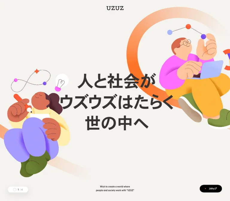
DESIGN REFERENCE
温かなオフホワイトとオレンジを基調に、人物イラストと大きな曲線で前向きな世界観を表現。写真を用いた事業カルーセルと、イラストを配した濃色の大型フッターが特徴のコーポレートサイト。
オリジナルサイトを見るAn optimistic corporate world built from warm paper, oversized people, and orange paths that keep moving forward.
Website / original URL: uzuz-holdings.jp
Final URL: https://uzuz-holdings.jp/
Theme: light content surfaces with a charcoal footer and saturated illustration accents
Inspected: September 13, 2026; supplied retrieval timestamp 2026-09-13T08:36:13.162Z, equivalent to 17:36:13.162 JST
Viewports: desktop 1440 × 1000 and mobile 390 × 844 CSS pixels
Scope: the current corporate homepage. Visual evidence covers the desktop hero, one desktop service slide, the desktop footer, the mobile hero, and the mobile footer. Rendered text, links, element bounds, and computed styles additionally cover the message, blog, services, news, recruitment, and footer sections. Destination pages and opened navigation states were not inspected.
UZUZ combines a restrained corporate interface with unusually expressive illustration. Warm off-white supports dark Japanese copy, while orange appears in contact controls, small activity marks, and broad illustrated paths. Characters have oversized hands and shoes, rounded bodies, saturated clothing, and soft dimensional shading. Their movement and the looping paths give the brand a sense of individual careers connecting into a larger social system.
The homepage is a substantial corporate gateway: identity and purpose lead into editorial content, service discovery, news, recruitment, and a detailed directory. Its visual rhythm alternates open illustrated space, compact information, expansive photographic panels, and a dark closing scene. The design depends on this range of scales: small navigation, large narrative copy, enormous cropped lettering, and full-width artwork.
An optimistic corporate world built from warm paper, oversized people, and orange paths that keep moving forward.
Website / original URL: uzuz-holdings.jp
Final URL: https://uzuz-holdings.jp/
Theme: light content surfaces with a charcoal footer and saturated illustration accents
Inspected: September 13, 2026; supplied retrieval timestamp 2026-09-13T08:36:13.162Z, equivalent to 17:36:13.162 JST
Viewports: desktop 1440 × 1000 and mobile 390 × 844 CSS pixels
Scope: the current corporate homepage. Visual evidence covers the desktop hero, one desktop service slide, the desktop footer, the mobile hero, and the mobile footer. Rendered text, links, element bounds, and computed styles additionally cover the message, blog, services, news, recruitment, and footer sections. Destination pages and opened navigation states were not inspected.
UZUZ combines a restrained corporate interface with unusually expressive illustration. Warm off-white supports dark Japanese copy, while orange appears in contact controls, small activity marks, and broad illustrated paths. Characters have oversized hands and shoes, rounded bodies, saturated clothing, and soft dimensional shading. Their movement and the looping paths give the brand a sense of individual careers connecting into a larger social system.
The homepage is a substantial corporate gateway: identity and purpose lead into editorial content, service discovery, news, recruitment, and a detailed directory. Its visual rhythm alternates open illustrated space, compact information, expansive photographic panels, and a dark closing scene. The design depends on this range of scales: small navigation, large narrative copy, enormous cropped lettering, and full-width artwork.
font-family identifies the declared stack, not the font file used for every glyph. Several sampled anchors inherit 10px while their visible child labels appear larger.| Name | Value | Suggested token | Role and evidence |
|---|---|---|---|
| Warm Canvas | #F4F3EF |
--color-canvas |
Measured HTML/body background and service-section background; the principal warm neutral |
| Body Ink | #363331 |
--color-ink |
Measured body, narrative copy, and paragraph color |
| Deep Charcoal | #252322 |
--color-charcoal |
Measured footer background and section-heading color |
| White | #FFFFFF |
--color-white |
Measured blog/news section backgrounds and service-copy color; visually used by the navigation surface |
| Action Orange | #FF7326 |
--color-orange |
Measured header contact fill and footer contact-panel fill |
| Recruitment Red | #FF4642 |
--color-recruit |
Measured recruitment panel at the top of the footer |
| Footer Gray | #AFAFAF |
--color-footer-muted |
Measured footer directory-link color |
| Black | #000000 |
--color-black |
Measured navigation-anchor color; visually present in the wordmark and huge cropped lettering |
The warm canvas is slightly darker and warmer than the white content surfaces. Preserve that difference: it creates section rhythm without heavy borders.
Read the rendered layer, not just the parent declaration. The photographed service slide appears on an amber graphic field even though the sampled link reports a white background. The graphic-producing layer was not included in the element sample. Similarly, the contact link reports black inherited text, while the screenshot shows a white visible label. Child styles and media can determine the final appearance.
These are visual estimates for art direction, not measured brand colors.
| Accent | Approximation | Observed use |
|---|---|---|
| Service Amber | Around #FFA900 |
Large ESES service panel with subtle texture and broad circular bands |
| Peach | Around #FFCEB5 |
Pale portions of the hero and footer paths |
| Lavender | Around #A08CFF |
Clothing in the mobile hero and footer character |
| Bright Pink | Around #F267F5 |
Desktop hero trousers and small communication graphics |
| Forest Green | Around #32634D |
Clothing and character accessories |
| Golden Yellow | Around #FFBC37 |
Clothing, hair, and warm illustration details |
These colors belong primarily to artwork. Orange remains the consistent interface accent. The page does not need separate lavender, green, and pink button systems.
The supplied custom-property list includes numerous WordPress presets and a default blue Swiper color. Their presence does not establish visible brand usage. In particular, the captured active carousel indicators appear orange, not the default Swiper blue.
Measured stack: ac-medium, heisei-kaku-gothic-std, 'Yu Gothic', YuGothic, sans-serif.
Use this spelling when reproducing the declared stack. ac-medium is an observed family identifier; its underlying font identity and files were not supplied. Do not expand it into an assumed commercial font name.
Japanese copy is compact and substantial, with generous line spacing in paragraphs. Secondary hero statements compute to weight 400, despite appearing visually firm. The primary brand statement and section headings compute to 700. Avoid making all text bold simply because the captured Japanese glyphs have a strong presence.
The source root is 10px at both viewports, with a 17.5px line height. The Quick Start keeps a conventional application root and expresses component sizes directly, so its rem values should not be confused with the source root.
The UZUZ wordmark is visibly serif and sits inside a linked identity box. No wordmark font declaration was provided. Use an authorized logo asset rather than recreating the mark with the body family.
The desktop service capture also contains enormous black serif letterforms, cropped by the viewport and partly covered by the service panel. Only a fragment is visible. This is an observed graphic treatment; its exact wording, font, font size, and delivery format are unverified. Keep ordinary section headings readable and separate from any decorative oversized lettering.
| Role | Desktop measurement | Mobile measurement | Weight | Notes |
|---|---|---|---|---|
| Primary hero statement | 100.8px / 131.04px |
31.2px / 40.56px |
700 |
Three-line brand statement exists in both DOM samples |
| Supporting hero statements | 46.08px / 73.728px |
19.5px / 31.2px |
400 |
Matches the statement types visible in the supplied hero captures |
| English hero subtitle | 14.4px / 23.04px |
No corresponding visible-text measurement | 700 |
Included in desktop evidence; absent from mobile visible-text extraction |
| Main section labels | 28px / 33.6px |
24px / 36px |
700 |
Blog, services, news, and recruitment labels |
| Message paragraph | 17px / 37.4px |
16px / 33.6px |
400 |
Especially relaxed leading: 2.2 desktop, 2.1 mobile |
| Service, blog, recruitment paragraphs | 14px / 26.6px |
14px / 26.6px |
500 |
Stable body size with 1.9 leading |
| Footer directory links | 14px / 26.6px |
14px / 26.6px |
400 |
Gray on charcoal |
| Topic-tag anchor | 10px / 10px |
10px / 10px |
400 |
Small label; measured outer dimensions include more than the text line |
| Navigation label | Approximately 14px visually |
Contact label approximately 11px visually |
Not directly sampled at child level | Parent-anchor 10px is not a reliable visible-label measurement |
| ESES slide title | Approximately 32px visually |
Not visually inspected | Visually bold | Estimate from the desktop service capture |
Calculated size relationships: desktop secondary statements equal 3.2vw, and the primary statement equals 7vw, at 1440px. At 390px, the corresponding values equal 5vw and 8vw. These relationships fit the observations; the original media-query declarations and breakpoint were not supplied.
Most sampled text has normal letter spacing. Avoid introducing wide tracking into Japanese paragraphs or navigation.
The evidence supports several useful component-specific spacings, rather than one proven universal grid.
| Use | Desktop | Mobile | Status |
|---|---|---|---|
| Navigation top offset | About 20px |
About 20px |
Visual bar position, supported by anchor bounds |
| Navigation-link padding | 20px 15px |
Desktop links replaced by compact controls | Measured |
| Header contact padding | 10px 40px |
4px 22px |
Measured |
| Standard pill-link padding | 13.5px 40px |
11px 36px |
Measured |
| Section-label left position | 72px |
About 22px |
Measured |
| Service-link padding | 20px 41.77px |
11px 20px |
Measured |
| Topic-tag padding | 8px 10px |
5px 10px |
Measured |
| Footer padding | 36px 46.08px 424.80px |
40px 22.61px 273px |
Measured; bottom reserve accommodates artwork |
| Footer CTA gap | 26px horizontally |
10px vertically |
Calculated from measured bounds |
The desktop hero statement occupies the center of a large empty field. Do not fill that space with secondary badges or a stack of conversion controls. At the opposite end of the page, the footer deliberately reserves substantial space for an illustrated closing scene.
| Element | Value | Evidence |
|---|---|---|
| Contact and detail pills | 100px |
Measured |
| Topic tags | 2px |
Measured |
| Footer CTA panels | 10px |
Measured at both viewports |
| Footer container | 20px desktop; 10px mobile |
Measured |
| Navigation surface | Approximately 10–12px |
Visual estimate |
| Service outer frame | Approximately 20px at visible upper corners |
Visual estimate; sampled inner anchor has 0px radius |
| Service photograph | Visibly square corners | Desktop capture |
Use rounded enclosing surfaces selectively. The photograph remains a clean rectangle inside the rounded service frame.
| Element | Desktop 1440 × 1000 |
Mobile 390 × 844 |
Interpretation |
|---|---|---|---|
| Document height | 8502.41px |
10279.45px |
Measured; a long scrolling corporate homepage |
| Visible navigation surface | About 1066 × 67px |
About 346 × 57px |
Visual estimate; header wrapper itself measures a full viewport |
| Logo-link box | 114 × 32px |
73 × 20px |
Measured |
| Header contact link | 162.47 × 46.59px |
108.80 × 28.89px |
Measured |
| Hero paragraph/stage box | 1440 × 960.19px |
390 × 693.67px |
Measured; includes the stage, not the ink bounds of the letters |
| Stage end to Message section start | 42px |
42px |
Calculated difference; not a directly measured control-strip height |
| Message paragraph box | 1165.27px wide |
346.34px wide |
Measured |
| Service link/frame | 1392 × 540.75px |
346 × 558.78px |
Measured |
| Unscaled service-copy width | About 476.28px in sampled desktop content |
306px |
Measured; some other layers have smaller bounds |
| Service photograph | About 745 × 496px |
Not visually inspected | Desktop visual estimate, approximately 3:2 |
| Footer container | 1391.03 × 1856.08px |
370.50 × 2430.56px |
Measured |
| Footer CTA panel | 636.44 × 181px |
325.28 × 116px |
Measured |
The hero stage dimensions are consistent with approximately 3:2 landscape artwork and 9:16 portrait artwork. This is a calculated design clue, not a recovered aspect-ratio declaration.
Role: present the corporate identity, principal destinations, and contact action without dominating the illustrated opening.
A white rounded bar floats near the top of the hero. At desktop size it starts around x=187px and y=20px, with a broad, soft shadow. The logo sits approximately 40px inside its left edge. The navigation occupies the middle, followed by the orange お問い合わせ pill at the right.
The visible desktop destinations are UZUZとは, 事業紹介, ニュース, ブログ, and 採用情報. Small plus marks accompany the first two. Their presence establishes an expandable-navigation affordance, but the opening trigger and expanded contents were not exercised.
At 390px, the horizontal destination list gives way to a compact menu icon. The logo, contact pill, and menu control remain visible in a roughly 346px-wide bar. The white surface is about 57px high, while the contact pill itself is only about 29px high.
The sampled HEADER rectangle spans the viewport. It is not evidence that the visible white navigation is 1000px or 844px tall. Its fixed-versus-absolute scroll behavior is also unverified.
Role: express the group's purpose through four short narrative states.
The desktop capture shows 誰もがウズウズはたらくことで、世の中がウズウズ機能する in two centered lines, framed by a running figure at lower left and a much larger walking figure at right. Orange and yellow paths enter from the lower edges. Most of the upper field remains empty beneath the navigation.
The mobile capture shows そんな社会をより良くする エコシステムの形成を、私たちUZUZは目指します in three centered lines. A figure occupies the upper-right region, another sits toward the lower left, and broad peach/orange loops frame the neutral copy area.
Four distinct statements are present in the DOM. The primary statement, 人と社会が ウズウズはたらく 世の中へ, has a much larger measured type scale than the supporting statements. Preserve this hierarchy when implementing different slides.
The desktop and mobile captures show different slides. Their different characters do not, by themselves, prove a breakpoint-specific asset replacement. What is clear is that the portrait composition needs its own protected text area and deliberate placement of artwork.
Role: expose position and directional navigation with very little visual weight.
Both hero captures show a white band beneath the artwork, small gray indicators, one orange active indicator, and simple black arrows near the side edges. Four indicators are visible for the hero. The desktop service capture shows eight.
The indicator marks are approximately 6px in diameter. Their center-to-center spacing is visually about 50px on desktop and 30px in the mobile hero. These are visual estimates, not measured hit areas.
Keep the arrow drawing small even if its interactive target is larger. Autoplay timing, swipe support, indicator-click behavior, focus handling, and wrapping behavior were not tested.
Role: turn the short hero statements into a fuller explanation of purpose.
The DOM contains an English Message label, a multiline Japanese heading, a generous paragraph, and a link to the About area. The paragraph uses 17px / 37.4px on desktop and 16px / 33.6px on mobile.
The desktop paragraph box is centered within the page, and the About pill is horizontally centered. On mobile, the paragraph uses approximately 22px side margins, while the About pill aligns toward the right edge of that content area.
Only the beginning of this section is visible in the mobile capture. Its full visual composition and heading size were not supplied, so avoid inventing an illustration or text alignment beyond the measured boxes.
Role: give the corporate identity an ongoing editorial and human dimension.
The section has a measured white background, a Japanese section heading, and the English phrase How we do in the extracted content. The material includes management perspectives, dates, topic tags, and four employee-interview entries.
Paragraphs use 14px / 26.6px. Topic-tag anchors have a 2px radius and smaller vertical padding on mobile. A representative unscaled tag measures 28px high on desktop and 22px on mobile.
Desktop employee-tag positions align in a right-hand content region. Mobile tags move to approximately x=42.6px and are spaced much farther apart vertically, indicating a substantially taller arrangement of entries. The section grows from approximately 1716px to 2538px in height.
No dedicated blog screenshot was supplied. Card borders, thumbnail crops, title sizes, and hover appearance are therefore unverified. The DOM also includes a video fallback string; that does not establish the video's appearance or playback behavior.
Role: present a service as a substantial editorial feature with one clear destination.
The desktop capture shows the ESES service in a nearly full-width amber panel. Its anatomy is:
Services label.SES事業(ESES) title, followed by two separated blocks of Japanese copy.詳しくみる pill near the lower right of the text column, with a small orange dot before the label.The photograph shows three people in conversation around monitors in a naturally lit office. The image is approximately 745px wide; the text column is approximately 476px before any layer scaling. The unusually large gap between them contributes to the editorial feeling.
The whole service unit appears as a link in the DOM, with a distinct destination for each of eight services. The visible detail pill should therefore be an internal visual cue rather than a nested interactive link.
On mobile, the service link changes from display: flex to display: block, measures 346px wide, and uses 20px horizontal padding. The measured ESES paragraph begins about 332px below the link's top. This supports a vertically reorganized composition, but the exact image order and crop are not visually confirmed. The mobile service text extraction omits the desktop detail label while retaining the full service link.
Role: create a dramatic transition in scale around the services presentation.
In the desktop service capture, enormous black serif letterforms fill the background above the panel and extend beyond the viewport. The amber panel overlaps their lower region. This is deliberately more graphic than the ordinary 28px section label.
Use a separately clipped decorative layer when adapting this idea. The semantic heading should remain readable and available to assistive technology. Do not infer a precise animation or reconstruct an unseen full word from the partial capture.
Role: provide dated corporate updates with category and group attribution.
The DOM establishes a white section containing four news entries, dates, group tags, and a ニュース一覧 link. On desktop the label sits at x=72px and the tags are in a right-hand content region. On mobile the section label spans the content width, tags move below their entry content, and the archive pill aligns right.
The section height increases from approximately 999px to 1920px. Mobile extracted text retains dates and group tags but omits category words that appear in the desktop extraction. The exact visibility rules and the visual treatment of article thumbnails were not supplied.
Role: connect the group's mission to a career invitation.
The section combines the Japanese recruitment heading, the English word career, a short statement, a paragraph, and a 詳しくみる link to the recruitment page.
Desktop paragraph bounds are approximately 422.5px wide at x=888.5px, establishing a right-hand copy column. On mobile, the copy expands to approximately 346px at x=22px, and the detail pill moves to the right edge. The paragraph retains 14px / 26.6px typography.
The unseen media portion should not be filled with an assumed photo or illustration when documenting the source. For a new implementation, choose media deliberately and label it as new content.
Role: offer contact and recruitment before the detailed site directory.
The dark footer begins with two large linked panels: orange for お問い合わせ and red for 採用情報. Both have a measured 10px radius.
At desktop size, the panels sit side by side, each approximately 636 × 181px, separated by 26px. On mobile they stack, each approximately 325 × 116px, with a 10px gap. These are substantial destination blocks, distinct from the small pill links used elsewhere.
Their colors and geometry are measured, but their complete visible label and icon styling were not captured in the supplied footer images.
Role: combine corporate navigation, group relationships, social destinations, and a memorable ending.
The footer is a charcoal container with warm outer margins. Desktop information uses a broad left region and multiple right-hand columns. The lower desktop capture places social links on the left and service/company pairs to the right. White category labels contrast with muted gray linked names.
On mobile, primary directory links form two columns of roughly 162.6px each. Group-company and related-service entries become full-width label/value stacks. Social links follow as a single vertical list. Their visible row rhythm is approximately 32px on mobile and 40px on desktop, calculated from sampled positions.
Near the bottom, the white UZUZ mark sits beside the copyright line. The mobile copyright wraps onto a second line; preserve wrapping rather than forcing a single line.
A leaping figure in lavender trousers, a small rust-colored dog, cream clouds, and an orange-to-peach looping path fill the closing scene. The path crosses itself and continues beyond the frame. The mobile scene retains these motifs with a tighter composition and cropped clouds at the side edges.
Reserve space for this artwork: measured bottom padding is approximately 425px on desktop and 273px on mobile. The artwork is part of the footer's composition, not a small icon after the legal text.
| Treatment | Evidence | Supported conclusion |
|---|---|---|
| Header background | Computed background 0.3s transition |
A 300ms background transition is declared; trigger and end colors are unverified |
| Desktop contact link | Computed 0.3s transition |
A 300ms transition is declared; changed properties were not independently observed |
| Topic tags | Computed 0.2s transition |
200ms transition duration is supported |
| Desktop footer directory links | Computed 0.2s transition |
Short transition duration is supported; hover appearance is unverified |
| Social links | Computed opacity 0.3s |
A 300ms opacity transition is declared |
| Mobile group-company links | Computed opacity 0.3s |
The mobile link treatment includes opacity transitions |
| Hero carousel | Four statements and four visible indicators | Multiple narrative states exist; timing and interaction results are unverified |
| Service carousel | Eight distinct service destinations and eight visible desktop indicators | Eight service choices exist; duplicated extracted entries should not be counted as extra services |
| Scaled content layers | Bounds of 452.47 / 476.28 and 290.70 / 306 are approximately 0.95 |
Calculated evidence consistent with scaled layers; the transform declaration and its cause were not supplied |
| Section media | Video fallback text in blog and service DOM | Video elements are indicated; playback, looping, and exact content remain unverified |
Many sampled elements report animation: none and a transition string of only all. Neither proves that the whole page is static, nor provides a usable duration for every element. Script-driven motion, descendant transforms, and media playback are outside those individual declarations.
The capture process waited for stability and visible finite animations, with bounded time limits. It temporarily paused perpetual animations during readiness checks and resumed them afterward. These captures therefore document settled visual states, not a complete animation timeline.
Recommended motion approach: retain compact 200–300ms control feedback, keep text stable while artwork or slides change, and implement an explicit reduced-motion mode. Choose carousel duration and easing through testing; do not present invented values as source measurements.
| Layer | Appearance | Purpose |
|---|---|---|
| Page canvas | Warm off-white | Unifies illustration backgrounds and outside margins |
| Navigation | White, rounded, softly shadowed | Separates navigation from the hero artwork |
| Blog and news | Measured white section backgrounds | Creates a quieter editorial reading surface |
| Service frame | Amber graphic field with broad bands and subtle texture | Makes the active service a large visual feature |
| Service photograph | Natural-color rectangular image | Grounds the abstract brand story in workplace activity |
| Small actions | Orange or white pills | Makes destinations recognizable without adding large chrome |
| Footer | Solid charcoal with modest outer radius | Holds dense navigation and supports the bright closing artwork |
| Footer action panels | Flat orange and red rounded rectangles | Differentiates contact and recruitment destinations |
The navigation has a visible soft shadow; a universal card-elevation system is not evidenced. Most hierarchy comes from size, background changes, spacing, and artwork.
The character style combines exaggerated proportions with soft volume. Hands and shoes are large; limbs and clothing form broad rounded shapes. Shading is gentle, with small tonal transitions and occasional texture. This is neither flat outline illustration nor photorealistic 3D rendering.
The people are shown working, communicating, and moving. Their devices, bags, message tiles, and energetic poses link the imagery to career support without making the hero resemble a software dashboard. Clothing provides the loudest color contrasts.
Paths are equally important. They work as broad ribbons in the hero and as a narrower crossing loop in the footer. Their color often shifts from saturated orange into pale peach or near-white. They should extend beyond their containers so the scene feels larger than its frame.
Photography plays a different role: the visible office image has natural window light, conversational body language, monitors, and a shared table. Preserve its ordinary workplace credibility. It does not need the illustration palette applied as a heavy color overlay.
No original media-file URLs were included in the supplied evidence. The following references identify visible assets by role; they are not invented filenames.
| Asset role | Evidence | Reuse guidance |
|---|---|---|
| Black UZUZ wordmark | Desktop and mobile hero captures | Preserve its proportions; use an authorized logo file |
| Desktop narrative artwork | Desktop hero capture | Keep the large right figure, lower-left movement, and central copy clearance for that slide |
| Portrait narrative artwork | Mobile hero capture | Preserve the upper/lower placement and neutral center of that captured state |
| ESES office photograph | Desktop service capture | Approximately 3:2; retain people and conversational context when cropping |
| Oversized black letterforms | Desktop service capture | Treat as a separate graphic layer; full wording and media format are unverified |
| Footer character, dog, clouds, and loop | Desktop and mobile footer captures | Prepare a composition that works at both aspect ratios without covering links |
| Social-platform symbols | Footer captures | Small recognizable symbols with consistent optical sizing; asset format is unverified |
CSS can reproduce the surfaces and layout. The distinctive people, clothing, expressions, and path compositions require appropriate artwork.
The page remains a scrolling corporate document at both inspected widths. Its section sequence is hero, Message, blog, services, news, recruitment, and footer. The phone document is longer despite a smaller hero because editorial and directory content reorganize vertically.
| Region | Desktop section height | Mobile section height | Evidence limit |
|---|---|---|---|
| Message | About 984px |
About 765px |
DOM measurements; full composition not captured |
| Blog | About 1716px |
About 2538px |
DOM measurements; card appearance unverified |
| Services | About 965px |
About 1028px |
Desktop visual and both DOM samples |
| News | About 999px |
About 1920px |
DOM measurements |
| Recruitment | About 910px |
About 823px |
DOM measurements |
| Footer | About 1856px |
About 2431px |
Both visual captures and DOM measurements |
These heights are diagnostic measurements of the sampled content, not recommended fixed heights. Some recorded section bounds overlap by approximately 20px, so the rows should not be summed into a rigid page-height formula.
The main responsive changes are:
The mobile DOM includes extensive navigation content that is not visible in the closed-menu screenshot. Its presence and bounds are not evidence that the menu was opened or that all groups were expanded. Likewise, the exact responsive breakpoint is unknown. The Quick Start uses 48rem as a recommended starting point, to be adjusted against content fit.
#F4F3EF, orange #FF7326, and charcoal #252322 as the structural palette.10px value for every visible label.These are recommendations for a new implementation, not verified features of the original page:
#F4F3EF.#363331.#252322.#FF7326.#FF4642.#FFFFFF.#AFAFAF.#FFA900; a visual approximation of a graphic surface.“Create a Japanese corporate homepage for a group working across career support, education, and employment services. Use warm off-white #F4F3EF, dark text #363331, action orange #FF7326, white editorial sections, and a charcoal #252322 footer. Place a compact white rounded navigation bar over a spacious illustrated hero. Use expressive people with oversized hands and shoes, vivid clothing, and orange-to-peach paths around a clear central Japanese statement. Continue through a purpose section, management and employee stories, a large photographic service carousel, news, recruitment, and a detailed footer directory. Include occasional oversized cropped serif graphics, small dot accents, white detail pills, and a large illustrated footer ending. Preserve desktop and portrait compositions, using real text and accessible controls. Treat unverified timings and breakpoints as implementation decisions.”
お問い合わせ pill. At phone width, retain the logo and contact action alongside a small menu icon. Use a subtle soft shadow and a 20px top offset.”Services eyebrow, a bold Japanese service title, two short paragraphs, and a white detail pill on the left. Put a large square-cornered office photograph on the right. Use one link for the whole feature and a separate navigation strip below it.”The following CSS provides a reusable visual foundation for the navigation, hero, service feature, and footer. It uses measured colors and type endpoints, with recommended layout rules between them. It keeps the application root at its normal size.
The navigation shadow, service gradient, 48rem breakpoint, intermediate scaling, and focus treatment are adaptations. Actual logo, character, path, and photographic assets must be supplied. This CSS was not executed in the inspected environment.
Use .service-frame around a single .service-card anchor. Inside the anchor, use .service-copy, .service-photo, and a noninteractive .service-detail span. A hero contains one visible .hero-slide; give other slides hidden until a functional controller selects them. The indicator styles below describe passive visual marks; add properly sized buttons if making them clickable.
:root {
  /* Measured interface colors */
  --color-canvas: #f4f3ef;
  --color-ink: #363331;
  --color-charcoal: #252322;
  --color-white: #ffffff;
  --color-orange: #ff7326;
  --color-recruit: #ff4642;
  --color-footer-muted: #afafaf;

  /* Visual approximations for a replacement graphic surface */
  --color-service-amber: #ffa900;
  --color-path-peach: #ffceb5;

  /* Observed family identifiers; font files are not included */
  --font-body: ac-medium, heisei-kaku-gothic-std,
    'Yu Gothic', YuGothic, sans-serif;
  --text-body: 14px;
  --text-section: 28px;
  --text-message: 17px;
  --leading-body: 1.9;
  --leading-message: 2.2;
  --leading-section: 1.2;

  /* Recommended rules matching the inspected endpoints */
  --page-gutter: clamp(22px, 5vw, 72px);
  --frame-gutter: 24px;
  --section-space: clamp(96px, 11vw, 160px);
  --radius-small: 2px;
  --radius-panel: 10px;
  --radius-frame: 20px;
  --radius-pill: 100px;
  --footer-art-reserve: 425px;

  /* Observed durations; easing is an adaptation */
  --motion-fast: 200ms ease;
  --motion-base: 300ms ease;
  --shadow-nav: 0 14px 32px rgb(37 35 34 / 8%);
}

* {
  box-sizing: border-box;
}

body {
  margin: 0;
  background: var(--color-canvas);
  color: var(--color-ink);
  font-family: var(--font-body);
  font-size: var(--text-body);
  font-weight: 500;
  line-height: var(--leading-body);
}

img,
picture {
  display: block;
  max-width: 100%;
}

button,
a {
  -webkit-tap-highlight-color: transparent;
}

button {
  font: inherit;
}

[hidden] {
  display: none !important;
}

.section-shell {
  width: calc(100% - 2 * var(--page-gutter));
  max-width: 1296px;
  margin-inline: auto;
  padding-block: var(--section-space);
}

.section--white {
  background: var(--color-white);
}

.section-title {
  margin: 0 0 32px;
  color: var(--color-charcoal);
  font-size: var(--text-section);
  font-weight: 700;
  line-height: var(--leading-section);
}

.message-copy {
  font-size: var(--text-message);
  font-weight: 400;
  line-height: var(--leading-message);
}

/* Absolute placement is an adaptation; source scroll behavior is unknown. */
.page-header {
  position: absolute;
  z-index: 20;
  top: 20px;
  left: 50%;
  width: min(1066px, calc(100% - 44px));
  transform: translateX(-50%);
}

.nav-bar {
  display: flex;
  align-items: center;
  justify-content: space-between;
  min-height: 66.6px;
  padding-inline: 40px 20px;
  border-radius: var(--radius-panel);
  background: var(--color-white);
  box-shadow: var(--shadow-nav);
}

.brand img {
  width: 114px;
  height: 32px;
  object-fit: contain;
}

.desktop-nav {
  display: flex;
  align-items: center;
}

.nav-link {
  display: inline-flex;
  align-items: center;
  gap: 10px;
  padding: 20px 15px;
  color: #000;
  font-size: 14px;
  text-decoration: none;
}

.contact-pill,
.detail-pill {
  display: inline-flex;
  align-items: center;
  justify-content: center;
  gap: 20px;
  width: fit-content;
  border-radius: var(--radius-pill);
  font-size: 14px;
  line-height: 1.9;
  text-decoration: none;
}

.contact-pill {
  padding: 10px 40px;
  background: var(--color-orange);
  color: var(--color-white);
  transition: opacity var(--motion-base);
}

.detail-pill {
  padding: 13.5px 40px;
  background: var(--color-white);
  color: var(--color-ink);
}

.detail-pill::before,
.service-eyebrow::before {
  content: '';
  flex: 0 0 5px;
  width: 5px;
  height: 5px;
  border-radius: 50%;
  background: var(--color-orange);
}

.menu-toggle {
  display: none;
  position: relative;
  width: 20px;
  height: 44px;
  padding: 0;
  border: 0;
  background: transparent;
  color: var(--color-ink);
}

/* Enlarge the target around the compact visible menu symbol. */
.menu-toggle::before {
  content: '';
  position: absolute;
  inset: 0 -12px;
}

.hero-stage {
  position: relative;
  isolation: isolate;
  aspect-ratio: 3 / 2;
  overflow: hidden;
  background: var(--color-canvas);
}

.hero-slide {
  position: absolute;
  inset: 0;
  display: grid;
  place-items: center;
}

.hero-art {
  position: absolute;
  z-index: -1;
  inset: 0;
  width: 100%;
  height: 100%;
  pointer-events: none;
}

.hero-art img {
  width: 100%;
  height: 100%;
  object-fit: contain;
}

.hero-message {
  margin: 0;
  padding-inline: 24px;
  font-size: clamp(32px, 3.2vw, 46.08px);
  font-weight: 400;
  line-height: 1.6;
  text-align: center;
}

.hero-message--primary {
  font-size: clamp(50px, 7vw, 100.8px);
  font-weight: 700;
  line-height: 1.3;
}

.hero-message .line {
  display: block;
}

.hero-caption {
  position: absolute;
  bottom: 5%;
  margin: 0;
  font-size: 14.4px;
  font-weight: 700;
  line-height: 1.6;
  text-align: center;
}

/* A 64px strip is a recommended accessible adaptation. */
.slider-controls {
  display: grid;
  grid-template-columns: 44px minmax(0, 1fr) 44px;
  align-items: center;
  min-height: 64px;
  padding-inline: 10px;
  background: var(--color-white);
}

.slider-arrow {
  display: grid;
  place-items: center;
  width: 44px;
  height: 44px;
  border: 0;
  background: transparent;
  color: #000;
  cursor: pointer;
}

.slider-dots {
  display: flex;
  justify-content: center;
  align-items: center;
  gap: 44px;
}

.slider-dot {
  width: 6px;
  height: 6px;
  border-radius: 50%;
  background: #d4d4d4;
}

.slider-dot[data-active='true'] {
  background: var(--color-orange);
}

.service-frame {
  margin-inline: var(--frame-gutter);
  overflow: hidden;
  border-radius: var(--radius-frame);
  background-color: var(--color-service-amber);
  background-image:
    radial-gradient(
      ellipse at 30% 95%,
      transparent 48%,
      rgb(255 255 255 / 10%) 48% 65%,
      transparent 65%
    ),
    linear-gradient(120deg, #ffb20a, #ffa008);
}

.service-card {
  display: grid;
  grid-template-columns: minmax(0, 0.64fr) minmax(0, 1fr);
  gap: clamp(24px, 6vw, 88px);
  padding: 20px 3%;
  color: var(--color-white);
  text-decoration: none;
}

.service-copy {
  display: flex;
  flex-direction: column;
  align-items: flex-start;
  padding-block: 16px 28px;
}

.service-eyebrow {
  display: inline-flex;
  align-items: center;
  gap: 12px;
  margin: 0;
  font-size: 14px;
}

.service-title {
  margin: clamp(32px, 5vw, 72px) 0 20px;
  font-size: 32px;
  font-weight: 700;
  line-height: 1.4;
}

.service-copy p {
  margin-block: 0 26.6px;
}

.service-detail {
  align-self: flex-end;
  margin-top: auto;
}

.service-photo {
  align-self: center;
  width: 100%;
  aspect-ratio: 3 / 2;
  object-fit: cover;
  border-radius: 0;
}

/* Optional contrast-oriented treatment for a new implementation. */
.service-frame--dark-copy .service-card {
  color: var(--color-charcoal);
}

.topic-tag {
  display: inline-flex;
  padding: 8px 10px;
  border: 1px solid transparent;
  border-radius: var(--radius-small);
  color: var(--color-ink);
  font-size: 10px;
  font-weight: 400;
  line-height: 1;
  text-decoration: none;
}

.site-footer {
  position: relative;
  isolation: isolate;
  overflow: hidden;
  margin: 26px var(--frame-gutter) 30px;
  padding: 36px 3.2vw var(--footer-art-reserve);
  border-radius: var(--radius-frame);
  background: var(--color-charcoal);
  color: var(--color-white);
}

.footer-actions,
.footer-body,
.footer-secondary,
.footer-bottom {
  position: relative;
  z-index: 1;
}

.footer-actions {
  display: grid;
  grid-template-columns: repeat(2, minmax(0, 1fr));
  gap: 26px;
}

.footer-action {
  display: flex;
  align-items: center;
  justify-content: space-between;
  min-height: 181px;
  padding: 40px 50px;
  border-radius: var(--radius-panel);
  background: var(--color-orange);
  color: var(--color-white);
  font-size: 28px;
  font-weight: 700;
  text-decoration: none;
}

.footer-action--recruit {
  background: var(--color-recruit);
}

.footer-body,
.footer-secondary {
  display: grid;
  grid-template-columns: minmax(0, 0.85fr) minmax(0, 1fr);
  gap: 48px;
  margin-top: 100px;
}

.footer-directory {
  display: grid;
  grid-template-columns: repeat(3, minmax(0, 1fr));
  gap: 32px 0;
}

.footer-link-list,
.social-list {
  margin: 0;
  padding: 0;
  list-style: none;
}

.footer-link-list a,
.group-directory a,
.social-list a {
  color: var(--color-footer-muted);
  font-size: 14px;
  font-weight: 400;
  line-height: 1.9;
  text-decoration: none;
}

.social-list {
  display: grid;
  gap: 13px;
}

.social-list a {
  display: flex;
  align-items: center;
  gap: 14px;
  transition: opacity var(--motion-base);
}

.group-directory {
  margin: 0;
}

.group-directory > div {
  display: grid;
  grid-template-columns: repeat(2, minmax(0, 1fr));
  gap: 12px;
  margin-bottom: 12px;
}

.group-directory dd {
  margin: 0;
}

.footer-bottom {
  display: grid;
  grid-template-columns: minmax(0, 0.85fr) minmax(0, 1fr);
  gap: 48px;
  align-items: center;
  margin-top: 150px;
}

.footer-bottom p {
  margin: 0;
  overflow-wrap: anywhere;
}

.footer-scene {
  position: absolute;
  z-index: 0;
  inset: auto 0 0;
  width: 100%;
  height: 490px;
  object-fit: cover;
  pointer-events: none;
}

/* Recommended interaction and focus styling. */
@media (hover: hover) {
  .contact-pill:hover,
  .social-list a:hover {
    opacity: 0.78;
  }
}

a:focus-visible,
button:focus-visible {
  outline: 2px solid var(--color-charcoal);
  outline-offset: 4px;
}

.site-footer a:focus-visible {
  outline-color: var(--color-white);
}

/* Recommended breakpoint; only the endpoint layouts were inspected. */
@media (max-width: 48rem) {
  :root {
    --page-gutter: 22px;
    --frame-gutter: 10px;
    --text-section: 24px;
    --text-message: 16px;
    --leading-section: 1.5;
    --leading-message: 2.1;
    --radius-frame: 10px;
    --footer-art-reserve: 273px;
  }

  .nav-bar {
    display: grid;
    grid-template-columns: minmax(0, 1fr) auto 20px;
    gap: 20px;
    min-height: 57px;
    padding-inline: 20px;
  }

  .brand img {
    width: 73px;
    height: 20px;
  }

  .desktop-nav {
    display: none;
  }

  .menu-toggle {
    display: block;
  }

  .contact-pill {
    position: relative;
    padding: 4px 22px;
    font-size: 11px;
    white-space: nowrap;
  }

  .contact-pill::before {
    content: '';
    position: absolute;
    inset: -8px 0;
  }

  .hero-stage {
    aspect-ratio: 9 / 16;
  }

  .hero-message {
    padding-inline: 18px;
    font-size: clamp(16px, 5vw, 24px);
  }

  .hero-message--primary {
    font-size: clamp(26px, 8vw, 42px);
  }

  .hero-caption {
    display: none;
  }

  .slider-dots {
    gap: 24px;
  }

  .detail-pill {
    padding: 11px 36px;
  }

  /* Photo-first stacking is a recommendation, not a verified crop. */
  .service-frame {
    margin-inline: var(--page-gutter);
  }

  .service-card {
    display: flex;
    flex-direction: column;
    gap: 24px;
    padding: 11px 20px 30px;
  }

  .service-photo {
    order: -1;
  }

  .service-copy {
    padding: 0;
  }

  .service-title {
    margin-block: 24px 16px;
    font-size: 26px;
  }

  .service-detail {
    display: none;
  }

  .topic-tag {
    padding-block: 5px;
  }

  .site-footer {
    margin-top: 50px;
    margin-bottom: 10px;
    padding: 40px 22.6px var(--footer-art-reserve);
  }

  .footer-actions {
    grid-template-columns: 1fr;
    gap: 10px;
  }

  .footer-action {
    min-height: 116px;
    padding: 40px 20px;
    font-size: 24px;
  }

  .footer-body,
  .footer-secondary {
    display: flex;
    flex-direction: column;
    gap: 60px;
    margin-top: 70px;
  }

  .footer-directory {
    grid-template-columns: 1fr;
    gap: 44px;
  }

  .footer-link-list {
    display: grid;
    grid-template-columns: repeat(2, minmax(0, 1fr));
  }

  .footer-link-list a {
    display: block;
    padding-right: 10px;
    overflow-wrap: anywhere;
  }

  .group-directory {
    order: -1;
  }

  .group-directory > div {
    display: block;
    margin-bottom: 26px;
  }

  .group-directory dd {
    margin-top: 8px;
  }

  .social-list {
    gap: 5px;
  }

  .footer-bottom {
    grid-template-columns: 73px minmax(0, 1fr);
    gap: 40px;
    margin-top: 68px;
  }

  .footer-scene {
    height: 273px;
  }
}

@media (prefers-reduced-motion: reduce) {
  .contact-pill,
  .social-list a,
  .hero-slide,
  .service-card {
    animation: none;
    transition: none;
  }
}
The CSS intentionally does not implement menu expansion, slide navigation, autoplay, video playback, or dynamic announcements. Add those behaviors with real event handlers and test them independently. Script-driven autoplay must honor reduced-motion preferences explicitly; a CSS media query alone does not stop a timer.
Optional mapping for a project already using Tailwind v4. These aliases do not imply that the original website uses Tailwind. Define the custom properties above first.
@theme inline {
  --color-canvas: #f4f3ef;
  --color-ink: #363331;
  --color-charcoal: #252322;
  --color-action: #ff7326;
  --color-recruitment: #ff4642;
  --color-footer-muted: #afafaf;

  --font-corporate: ac-medium, heisei-kaku-gothic-std,
    'Yu Gothic', YuGothic, sans-serif;

  --text-copy: 14px;
  --text-copy--line-height: 1.9;
  --text-section-label: var(--text-section);
  --text-section-label--line-height: var(--leading-section);
  --text-purpose: var(--text-message);
  --text-purpose--line-height: var(--leading-message);

  --spacing-page: var(--page-gutter);
  --spacing-frame: var(--frame-gutter);
  --spacing-section: var(--section-space);

  --radius-tag: 2px;
  --radius-panel: 10px;
  --radius-feature: var(--radius-frame);
  --radius-pill: 100px;
  --shadow-floating-nav: var(--shadow-nav);
}
200, with identical original and final URLs.2026-09-13T08:36:13.162Z; individual screenshot timestamps were not separately provided.1440 × 1000, covering the hero, ESES service feature, and lower footer; two mobile captures at 390 × 844, covering the hero and lower footer.株式会社UZUZホールディングス, and the footer contains © COPYRIGHT uzuz-holdings inc..Measured values describe the current captured homepage. Approximate palette extensions, responsive interpolation, accessible enhancements, and CSS/Tailwind mappings are explicitly provided as implementation guidance.
# UZUZ Holdings — Style Reference

> An optimistic corporate world built from warm paper, oversized people, and orange paths that keep moving forward.

**Website / original URL:** [uzuz-holdings.jp](https://uzuz-holdings.jp/)
**Final URL:** [https://uzuz-holdings.jp/](https://uzuz-holdings.jp/)
**Theme:** light content surfaces with a charcoal footer and saturated illustration accents
**Inspected:** September 13, 2026; supplied retrieval timestamp `2026-09-13T08:36:13.162Z`, equivalent to 17:36:13.162 JST
**Viewports:** desktop `1440 × 1000` and mobile `390 × 844` CSS pixels
**Scope:** the current corporate homepage. Visual evidence covers the desktop hero, one desktop service slide, the desktop footer, the mobile hero, and the mobile footer. Rendered text, links, element bounds, and computed styles additionally cover the message, blog, services, news, recruitment, and footer sections. Destination pages and opened navigation states were not inspected.

UZUZ combines a restrained corporate interface with unusually expressive illustration. Warm off-white supports dark Japanese copy, while orange appears in contact controls, small activity marks, and broad illustrated paths. Characters have oversized hands and shoes, rounded bodies, saturated clothing, and soft dimensional shading. Their movement and the looping paths give the brand a sense of individual careers connecting into a larger social system.

The homepage is a substantial corporate gateway: identity and purpose lead into editorial content, service discovery, news, recruitment, and a detailed directory. Its visual rhythm alternates open illustrated space, compact information, expansive photographic panels, and a dark closing scene. The design depends on this range of scales: small navigation, large narrative copy, enormous cropped lettering, and full-width artwork.
# UZUZ Holdings — Style Reference

> An optimistic corporate world built from warm paper, oversized people, and orange paths that keep moving forward.

**Website / original URL:** [uzuz-holdings.jp](https://uzuz-holdings.jp/)
**Final URL:** [https://uzuz-holdings.jp/](https://uzuz-holdings.jp/)
**Theme:** light content surfaces with a charcoal footer and saturated illustration accents
**Inspected:** September 13, 2026; supplied retrieval timestamp `2026-09-13T08:36:13.162Z`, equivalent to 17:36:13.162 JST
**Viewports:** desktop `1440 × 1000` and mobile `390 × 844` CSS pixels
**Scope:** the current corporate homepage. Visual evidence covers the desktop hero, one desktop service slide, the desktop footer, the mobile hero, and the mobile footer. Rendered text, links, element bounds, and computed styles additionally cover the message, blog, services, news, recruitment, and footer sections. Destination pages and opened navigation states were not inspected.

UZUZ combines a restrained corporate interface with unusually expressive illustration. Warm off-white supports dark Japanese copy, while orange appears in contact controls, small activity marks, and broad illustrated paths. Characters have oversized hands and shoes, rounded bodies, saturated clothing, and soft dimensional shading. Their movement and the looping paths give the brand a sense of individual careers connecting into a larger social system.

The homepage is a substantial corporate gateway: identity and purpose lead into editorial content, service discovery, news, recruitment, and a detailed directory. Its visual rhythm alternates open illustrated space, compact information, expansive photographic panels, and a dark closing scene. The design depends on this range of scales: small navigation, large narrative copy, enormous cropped lettering, and full-width artwork.

## How to Read This Reference

- **Measured** means a value appears in the supplied rendered DOM or computed-style evidence. Measurements are CSS pixels unless stated otherwise.
- **Visual estimate** means an approximate reading of the supplied original-page captures. Estimated colors were not obtained through a pixel-sampling tool.
- **Calculated** means arithmetic applied to measured values, such as converting a font size into its viewport-width equivalent.
- **Recommended** means a reusable implementation choice. The Quick Start is an adaptation, not recovered source CSS.
- Token names are descriptive aliases. The evidence does not expose a complete brand-token system.
- Computed `font-family` identifies the declared stack, not the font file used for every glyph. Several sampled anchors inherit `10px` while their visible child labels appear larger.
- Repeated slide content and repeated link labels exist in the extraction. The captures show one visible label per control and one dominant slide per carousel; duplicates should not become duplicate interface content.
- Some slide bounds overlap or appear scaled. The screenshot and style snapshot can represent different carousel moments. Use stable dimensions and visible hierarchy without assuming every recorded element was simultaneously visible.

## Tokens — Colors

### Default Palette

| Name | Value | Suggested token | Role and evidence |
| --- | --- | --- | --- |
| Warm Canvas | `#F4F3EF` | `--color-canvas` | Measured HTML/body background and service-section background; the principal warm neutral |
| Body Ink | `#363331` | `--color-ink` | Measured body, narrative copy, and paragraph color |
| Deep Charcoal | `#252322` | `--color-charcoal` | Measured footer background and section-heading color |
| White | `#FFFFFF` | `--color-white` | Measured blog/news section backgrounds and service-copy color; visually used by the navigation surface |
| Action Orange | `#FF7326` | `--color-orange` | Measured header contact fill and footer contact-panel fill |
| Recruitment Red | `#FF4642` | `--color-recruit` | Measured recruitment panel at the top of the footer |
| Footer Gray | `#AFAFAF` | `--color-footer-muted` | Measured footer directory-link color |
| Black | `#000000` | `--color-black` | Measured navigation-anchor color; visually present in the wordmark and huge cropped lettering |

The warm canvas is slightly darker and warmer than the white content surfaces. Preserve that difference: it creates section rhythm without heavy borders.

**Read the rendered layer, not just the parent declaration.** The photographed service slide appears on an amber graphic field even though the sampled link reports a white background. The graphic-producing layer was not included in the element sample. Similarly, the contact link reports black inherited text, while the screenshot shows a white visible label. Child styles and media can determine the final appearance.

### Illustration and Graphic Accents

These are **visual estimates for art direction**, not measured brand colors.

| Accent | Approximation | Observed use |
| --- | --- | --- |
| Service Amber | Around `#FFA900` | Large ESES service panel with subtle texture and broad circular bands |
| Peach | Around `#FFCEB5` | Pale portions of the hero and footer paths |
| Lavender | Around `#A08CFF` | Clothing in the mobile hero and footer character |
| Bright Pink | Around `#F267F5` | Desktop hero trousers and small communication graphics |
| Forest Green | Around `#32634D` | Clothing and character accessories |
| Golden Yellow | Around `#FFBC37` | Clothing, hair, and warm illustration details |

These colors belong primarily to artwork. Orange remains the consistent interface accent. The page does not need separate lavender, green, and pink button systems.

The supplied custom-property list includes numerous WordPress presets and a default blue Swiper color. Their presence does not establish visible brand usage. In particular, the captured active carousel indicators appear orange, not the default Swiper blue.

## Tokens — Typography

### Source Sans-Serif Stack

**Measured stack:** `ac-medium, heisei-kaku-gothic-std, 'Yu Gothic', YuGothic, sans-serif`.

Use this spelling when reproducing the declared stack. `ac-medium` is an observed family identifier; its underlying font identity and files were not supplied. Do not expand it into an assumed commercial font name.

Japanese copy is compact and substantial, with generous line spacing in paragraphs. Secondary hero statements compute to weight `400`, despite appearing visually firm. The primary brand statement and section headings compute to `700`. Avoid making all text bold simply because the captured Japanese glyphs have a strong presence.

The source root is `10px` at both viewports, with a `17.5px` line height. The Quick Start keeps a conventional application root and expresses component sizes directly, so its rem values should not be confused with the source root.

### Wordmark and Oversized Lettering

The UZUZ wordmark is visibly serif and sits inside a linked identity box. No wordmark font declaration was provided. Use an authorized logo asset rather than recreating the mark with the body family.

The desktop service capture also contains enormous black serif letterforms, cropped by the viewport and partly covered by the service panel. Only a fragment is visible. This is an observed graphic treatment; its exact wording, font, font size, and delivery format are unverified. Keep ordinary section headings readable and separate from any decorative oversized lettering.

### Type Scale

| Role | Desktop measurement | Mobile measurement | Weight | Notes |
| --- | --- | --- | --- | --- |
| Primary hero statement | `100.8px / 131.04px` | `31.2px / 40.56px` | `700` | Three-line brand statement exists in both DOM samples |
| Supporting hero statements | `46.08px / 73.728px` | `19.5px / 31.2px` | `400` | Matches the statement types visible in the supplied hero captures |
| English hero subtitle | `14.4px / 23.04px` | No corresponding visible-text measurement | `700` | Included in desktop evidence; absent from mobile visible-text extraction |
| Main section labels | `28px / 33.6px` | `24px / 36px` | `700` | Blog, services, news, and recruitment labels |
| Message paragraph | `17px / 37.4px` | `16px / 33.6px` | `400` | Especially relaxed leading: `2.2` desktop, `2.1` mobile |
| Service, blog, recruitment paragraphs | `14px / 26.6px` | `14px / 26.6px` | `500` | Stable body size with `1.9` leading |
| Footer directory links | `14px / 26.6px` | `14px / 26.6px` | `400` | Gray on charcoal |
| Topic-tag anchor | `10px / 10px` | `10px / 10px` | `400` | Small label; measured outer dimensions include more than the text line |
| Navigation label | Approximately `14px` visually | Contact label approximately `11px` visually | Not directly sampled at child level | Parent-anchor `10px` is not a reliable visible-label measurement |
| ESES slide title | Approximately `32px` visually | Not visually inspected | Visually bold | Estimate from the desktop service capture |

**Calculated size relationships:** desktop secondary statements equal `3.2vw`, and the primary statement equals `7vw`, at 1440px. At 390px, the corresponding values equal `5vw` and `8vw`. These relationships fit the observations; the original media-query declarations and breakpoint were not supplied.

Most sampled text has normal letter spacing. Avoid introducing wide tracking into Japanese paragraphs or navigation.

## Tokens — Spacing & Shapes

### Spacing Scale

The evidence supports several useful component-specific spacings, rather than one proven universal grid.

| Use | Desktop | Mobile | Status |
| --- | --- | --- | --- |
| Navigation top offset | About `20px` | About `20px` | Visual bar position, supported by anchor bounds |
| Navigation-link padding | `20px 15px` | Desktop links replaced by compact controls | Measured |
| Header contact padding | `10px 40px` | `4px 22px` | Measured |
| Standard pill-link padding | `13.5px 40px` | `11px 36px` | Measured |
| Section-label left position | `72px` | About `22px` | Measured |
| Service-link padding | `20px 41.77px` | `11px 20px` | Measured |
| Topic-tag padding | `8px 10px` | `5px 10px` | Measured |
| Footer padding | `36px 46.08px 424.80px` | `40px 22.61px 273px` | Measured; bottom reserve accommodates artwork |
| Footer CTA gap | `26px` horizontally | `10px` vertically | Calculated from measured bounds |

The desktop hero statement occupies the center of a large empty field. Do not fill that space with secondary badges or a stack of conversion controls. At the opposite end of the page, the footer deliberately reserves substantial space for an illustrated closing scene.

### Border Radius

| Element | Value | Evidence |
| --- | --- | --- |
| Contact and detail pills | `100px` | Measured |
| Topic tags | `2px` | Measured |
| Footer CTA panels | `10px` | Measured at both viewports |
| Footer container | `20px` desktop; `10px` mobile | Measured |
| Navigation surface | Approximately `10–12px` | Visual estimate |
| Service outer frame | Approximately `20px` at visible upper corners | Visual estimate; sampled inner anchor has `0px` radius |
| Service photograph | Visibly square corners | Desktop capture |

Use rounded enclosing surfaces selectively. The photograph remains a clean rectangle inside the rounded service frame.

### Layout Measurements

| Element | Desktop `1440 × 1000` | Mobile `390 × 844` | Interpretation |
| --- | --- | --- | --- |
| Document height | `8502.41px` | `10279.45px` | Measured; a long scrolling corporate homepage |
| Visible navigation surface | About `1066 × 67px` | About `346 × 57px` | Visual estimate; header wrapper itself measures a full viewport |
| Logo-link box | `114 × 32px` | `73 × 20px` | Measured |
| Header contact link | `162.47 × 46.59px` | `108.80 × 28.89px` | Measured |
| Hero paragraph/stage box | `1440 × 960.19px` | `390 × 693.67px` | Measured; includes the stage, not the ink bounds of the letters |
| Stage end to Message section start | `42px` | `42px` | Calculated difference; not a directly measured control-strip height |
| Message paragraph box | `1165.27px` wide | `346.34px` wide | Measured |
| Service link/frame | `1392 × 540.75px` | `346 × 558.78px` | Measured |
| Unscaled service-copy width | About `476.28px` in sampled desktop content | `306px` | Measured; some other layers have smaller bounds |
| Service photograph | About `745 × 496px` | Not visually inspected | Desktop visual estimate, approximately `3:2` |
| Footer container | `1391.03 × 1856.08px` | `370.50 × 2430.56px` | Measured |
| Footer CTA panel | `636.44 × 181px` | `325.28 × 116px` | Measured |

The hero stage dimensions are consistent with approximately `3:2` landscape artwork and `9:16` portrait artwork. This is a calculated design clue, not a recovered `aspect-ratio` declaration.

## Components

### Floating Navigation Bar

**Role:** present the corporate identity, principal destinations, and contact action without dominating the illustrated opening.

A white rounded bar floats near the top of the hero. At desktop size it starts around x=187px and y=20px, with a broad, soft shadow. The logo sits approximately 40px inside its left edge. The navigation occupies the middle, followed by the orange `お問い合わせ` pill at the right.

The visible desktop destinations are `UZUZとは`, `事業紹介`, `ニュース`, `ブログ`, and `採用情報`. Small plus marks accompany the first two. Their presence establishes an expandable-navigation affordance, but the opening trigger and expanded contents were not exercised.

At 390px, the horizontal destination list gives way to a compact menu icon. The logo, contact pill, and menu control remain visible in a roughly 346px-wide bar. The white surface is about 57px high, while the contact pill itself is only about 29px high.

The sampled `HEADER` rectangle spans the viewport. It is not evidence that the visible white navigation is 1000px or 844px tall. Its fixed-versus-absolute scroll behavior is also unverified.

### Illustrated Narrative Hero

**Role:** express the group's purpose through four short narrative states.

The desktop capture shows `誰もがウズウズはたらくことで、世の中がウズウズ機能する` in two centered lines, framed by a running figure at lower left and a much larger walking figure at right. Orange and yellow paths enter from the lower edges. Most of the upper field remains empty beneath the navigation.

The mobile capture shows `そんな社会をより良くする エコシステムの形成を、私たちUZUZは目指します` in three centered lines. A figure occupies the upper-right region, another sits toward the lower left, and broad peach/orange loops frame the neutral copy area.

Four distinct statements are present in the DOM. The primary statement, `人と社会が ウズウズはたらく 世の中へ`, has a much larger measured type scale than the supporting statements. Preserve this hierarchy when implementing different slides.

The desktop and mobile captures show different slides. Their different characters do not, by themselves, prove a breakpoint-specific asset replacement. What is clear is that the portrait composition needs its own protected text area and deliberate placement of artwork.

### Carousel Navigation

**Role:** expose position and directional navigation with very little visual weight.

Both hero captures show a white band beneath the artwork, small gray indicators, one orange active indicator, and simple black arrows near the side edges. Four indicators are visible for the hero. The desktop service capture shows eight.

The indicator marks are approximately 6px in diameter. Their center-to-center spacing is visually about 50px on desktop and 30px in the mobile hero. These are visual estimates, not measured hit areas.

Keep the arrow drawing small even if its interactive target is larger. Autoplay timing, swipe support, indicator-click behavior, focus handling, and wrapping behavior were not tested.

### Message Section

**Role:** turn the short hero statements into a fuller explanation of purpose.

The DOM contains an English `Message` label, a multiline Japanese heading, a generous paragraph, and a link to the About area. The paragraph uses `17px / 37.4px` on desktop and `16px / 33.6px` on mobile.

The desktop paragraph box is centered within the page, and the About pill is horizontally centered. On mobile, the paragraph uses approximately 22px side margins, while the About pill aligns toward the right edge of that content area.

Only the beginning of this section is visible in the mobile capture. Its full visual composition and heading size were not supplied, so avoid inventing an illustration or text alignment beyond the measured boxes.

### Blog and Employee Content

**Role:** give the corporate identity an ongoing editorial and human dimension.

The section has a measured white background, a Japanese section heading, and the English phrase `How we do` in the extracted content. The material includes management perspectives, dates, topic tags, and four employee-interview entries.

Paragraphs use `14px / 26.6px`. Topic-tag anchors have a `2px` radius and smaller vertical padding on mobile. A representative unscaled tag measures 28px high on desktop and 22px on mobile.

Desktop employee-tag positions align in a right-hand content region. Mobile tags move to approximately x=42.6px and are spaced much farther apart vertically, indicating a substantially taller arrangement of entries. The section grows from approximately 1716px to 2538px in height.

No dedicated blog screenshot was supplied. Card borders, thumbnail crops, title sizes, and hover appearance are therefore unverified. The DOM also includes a video fallback string; that does not establish the video's appearance or playback behavior.

### Photographic Service Slide

**Role:** present a service as a substantial editorial feature with one clear destination.

The desktop capture shows the ESES service in a nearly full-width amber panel. Its anatomy is:

1. A rounded outer graphic frame, inset roughly 24px from the viewport edges.
2. A left text column containing a small orange-dot eyebrow and `Services` label.
3. A bold `SES事業(ESES)` title, followed by two separated blocks of Japanese copy.
4. A white `詳しくみる` pill near the lower right of the text column, with a small orange dot before the label.
5. A large rectangular office photograph on the right, inset about 20px from the top of the panel.
6. A separate white navigation strip below the panel.

The photograph shows three people in conversation around monitors in a naturally lit office. The image is approximately 745px wide; the text column is approximately 476px before any layer scaling. The unusually large gap between them contributes to the editorial feeling.

The whole service unit appears as a link in the DOM, with a distinct destination for each of eight services. The visible detail pill should therefore be an internal visual cue rather than a nested interactive link.

On mobile, the service link changes from `display: flex` to `display: block`, measures 346px wide, and uses 20px horizontal padding. The measured ESES paragraph begins about 332px below the link's top. This supports a vertically reorganized composition, but the exact image order and crop are not visually confirmed. The mobile service text extraction omits the desktop detail label while retaining the full service link.

### Oversized Section Graphic

**Role:** create a dramatic transition in scale around the services presentation.

In the desktop service capture, enormous black serif letterforms fill the background above the panel and extend beyond the viewport. The amber panel overlaps their lower region. This is deliberately more graphic than the ordinary 28px section label.

Use a separately clipped decorative layer when adapting this idea. The semantic heading should remain readable and available to assistive technology. Do not infer a precise animation or reconstruct an unseen full word from the partial capture.

### News Section

**Role:** provide dated corporate updates with category and group attribution.

The DOM establishes a white section containing four news entries, dates, group tags, and a `ニュース一覧` link. On desktop the label sits at x=72px and the tags are in a right-hand content region. On mobile the section label spans the content width, tags move below their entry content, and the archive pill aligns right.

The section height increases from approximately 999px to 1920px. Mobile extracted text retains dates and group tags but omits category words that appear in the desktop extraction. The exact visibility rules and the visual treatment of article thumbnails were not supplied.

### Recruitment Section

**Role:** connect the group's mission to a career invitation.

The section combines the Japanese recruitment heading, the English word `career`, a short statement, a paragraph, and a `詳しくみる` link to the recruitment page.

Desktop paragraph bounds are approximately 422.5px wide at x=888.5px, establishing a right-hand copy column. On mobile, the copy expands to approximately 346px at x=22px, and the detail pill moves to the right edge. The paragraph retains `14px / 26.6px` typography.

The unseen media portion should not be filled with an assumed photo or illustration when documenting the source. For a new implementation, choose media deliberately and label it as new content.

### Footer Action Panels

**Role:** offer contact and recruitment before the detailed site directory.

The dark footer begins with two large linked panels: orange for `お問い合わせ` and red for `採用情報`. Both have a measured `10px` radius.

At desktop size, the panels sit side by side, each approximately `636 × 181px`, separated by 26px. On mobile they stack, each approximately `325 × 116px`, with a 10px gap. These are substantial destination blocks, distinct from the small pill links used elsewhere.

Their colors and geometry are measured, but their complete visible label and icon styling were not captured in the supplied footer images.

### Footer Directory and Closing Scene

**Role:** combine corporate navigation, group relationships, social destinations, and a memorable ending.

The footer is a charcoal container with warm outer margins. Desktop information uses a broad left region and multiple right-hand columns. The lower desktop capture places social links on the left and service/company pairs to the right. White category labels contrast with muted gray linked names.

On mobile, primary directory links form two columns of roughly 162.6px each. Group-company and related-service entries become full-width label/value stacks. Social links follow as a single vertical list. Their visible row rhythm is approximately 32px on mobile and 40px on desktop, calculated from sampled positions.

Near the bottom, the white UZUZ mark sits beside the copyright line. The mobile copyright wraps onto a second line; preserve wrapping rather than forcing a single line.

A leaping figure in lavender trousers, a small rust-colored dog, cream clouds, and an orange-to-peach looping path fill the closing scene. The path crosses itself and continues beyond the frame. The mobile scene retains these motifs with a tighter composition and cropped clouds at the side edges.

Reserve space for this artwork: measured bottom padding is approximately 425px on desktop and 273px on mobile. The artwork is part of the footer's composition, not a small icon after the legal text.

## Tokens — Motion & Interaction

| Treatment | Evidence | Supported conclusion |
| --- | --- | --- |
| Header background | Computed `background 0.3s` transition | A 300ms background transition is declared; trigger and end colors are unverified |
| Desktop contact link | Computed `0.3s` transition | A 300ms transition is declared; changed properties were not independently observed |
| Topic tags | Computed `0.2s` transition | 200ms transition duration is supported |
| Desktop footer directory links | Computed `0.2s` transition | Short transition duration is supported; hover appearance is unverified |
| Social links | Computed `opacity 0.3s` | A 300ms opacity transition is declared |
| Mobile group-company links | Computed `opacity 0.3s` | The mobile link treatment includes opacity transitions |
| Hero carousel | Four statements and four visible indicators | Multiple narrative states exist; timing and interaction results are unverified |
| Service carousel | Eight distinct service destinations and eight visible desktop indicators | Eight service choices exist; duplicated extracted entries should not be counted as extra services |
| Scaled content layers | Bounds of `452.47 / 476.28` and `290.70 / 306` are approximately `0.95` | Calculated evidence consistent with scaled layers; the transform declaration and its cause were not supplied |
| Section media | Video fallback text in blog and service DOM | Video elements are indicated; playback, looping, and exact content remain unverified |

Many sampled elements report `animation: none` and a transition string of only `all`. Neither proves that the whole page is static, nor provides a usable duration for every element. Script-driven motion, descendant transforms, and media playback are outside those individual declarations.

The capture process waited for stability and visible finite animations, with bounded time limits. It temporarily paused perpetual animations during readiness checks and resumed them afterward. These captures therefore document settled visual states, not a complete animation timeline.

**Recommended motion approach:** retain compact 200–300ms control feedback, keep text stable while artwork or slides change, and implement an explicit reduced-motion mode. Choose carousel duration and easing through testing; do not present invented values as source measurements.

## Surfaces

| Layer | Appearance | Purpose |
| --- | --- | --- |
| Page canvas | Warm off-white | Unifies illustration backgrounds and outside margins |
| Navigation | White, rounded, softly shadowed | Separates navigation from the hero artwork |
| Blog and news | Measured white section backgrounds | Creates a quieter editorial reading surface |
| Service frame | Amber graphic field with broad bands and subtle texture | Makes the active service a large visual feature |
| Service photograph | Natural-color rectangular image | Grounds the abstract brand story in workplace activity |
| Small actions | Orange or white pills | Makes destinations recognizable without adding large chrome |
| Footer | Solid charcoal with modest outer radius | Holds dense navigation and supports the bright closing artwork |
| Footer action panels | Flat orange and red rounded rectangles | Differentiates contact and recruitment destinations |

The navigation has a visible soft shadow; a universal card-elevation system is not evidenced. Most hierarchy comes from size, background changes, spacing, and artwork.

## Imagery

The character style combines exaggerated proportions with soft volume. Hands and shoes are large; limbs and clothing form broad rounded shapes. Shading is gentle, with small tonal transitions and occasional texture. This is neither flat outline illustration nor photorealistic 3D rendering.

The people are shown working, communicating, and moving. Their devices, bags, message tiles, and energetic poses link the imagery to career support without making the hero resemble a software dashboard. Clothing provides the loudest color contrasts.

Paths are equally important. They work as broad ribbons in the hero and as a narrower crossing loop in the footer. Their color often shifts from saturated orange into pale peach or near-white. They should extend beyond their containers so the scene feels larger than its frame.

Photography plays a different role: the visible office image has natural window light, conversational body language, monitors, and a shared table. Preserve its ordinary workplace credibility. It does not need the illustration palette applied as a heavy color overlay.

### Observed Asset References

No original media-file URLs were included in the supplied evidence. The following references identify visible assets by role; they are not invented filenames.

| Asset role | Evidence | Reuse guidance |
| --- | --- | --- |
| Black UZUZ wordmark | Desktop and mobile hero captures | Preserve its proportions; use an authorized logo file |
| Desktop narrative artwork | Desktop hero capture | Keep the large right figure, lower-left movement, and central copy clearance for that slide |
| Portrait narrative artwork | Mobile hero capture | Preserve the upper/lower placement and neutral center of that captured state |
| ESES office photograph | Desktop service capture | Approximately `3:2`; retain people and conversational context when cropping |
| Oversized black letterforms | Desktop service capture | Treat as a separate graphic layer; full wording and media format are unverified |
| Footer character, dog, clouds, and loop | Desktop and mobile footer captures | Prepare a composition that works at both aspect ratios without covering links |
| Social-platform symbols | Footer captures | Small recognizable symbols with consistent optical sizing; asset format is unverified |

CSS can reproduce the surfaces and layout. The distinctive people, clothing, expressions, and path compositions require appropriate artwork.

## Layout & Responsive Behavior

The page remains a scrolling corporate document at both inspected widths. Its section sequence is hero, Message, blog, services, news, recruitment, and footer. The phone document is longer despite a smaller hero because editorial and directory content reorganize vertically.

| Region | Desktop section height | Mobile section height | Evidence limit |
| --- | --- | --- | --- |
| Message | About `984px` | About `765px` | DOM measurements; full composition not captured |
| Blog | About `1716px` | About `2538px` | DOM measurements; card appearance unverified |
| Services | About `965px` | About `1028px` | Desktop visual and both DOM samples |
| News | About `999px` | About `1920px` | DOM measurements |
| Recruitment | About `910px` | About `823px` | DOM measurements |
| Footer | About `1856px` | About `2431px` | Both visual captures and DOM measurements |

These heights are diagnostic measurements of the sampled content, not recommended fixed heights. Some recorded section bounds overlap by approximately 20px, so the rows should not be summed into a rigid page-height formula.

The main responsive changes are:

- **Navigation:** the five desktop destination links collapse into a compact menu affordance while the contact action remains visible.
- **Hero:** the stage shifts from a landscape to a portrait proportion. Supporting copy reduces from 46.08px to 19.5px, with intentional line breaks and surrounding illustration space.
- **Content margins:** section labels move from 72px to approximately 22px from the left edge.
- **Service presentation:** the link changes from a desktop flex arrangement to a mobile block arrangement; the exact phone photo crop is unverified.
- **Archive and detail links:** several links that sit at the left or center on desktop align to the right on mobile.
- **Footer CTAs:** two columns become a vertical stack.
- **Footer navigation:** desktop category columns become two-column link groups, followed by full-width company/service entries and a single social list.
- **Closing artwork:** mobile retains meaningful character scale, with side cropping and a 273px bottom reserve.

The mobile DOM includes extensive navigation content that is not visible in the closed-menu screenshot. Its presence and bounds are not evidence that the menu was opened or that all groups were expanded. Likewise, the exact responsive breakpoint is unknown. The Quick Start uses 48rem as a recommended starting point, to be adjusted against content fit.

## Do’s and Don’ts

### Do

- Preserve the warm canvas `#F4F3EF`, orange `#FF7326`, and charcoal `#252322` as the structural palette.
- Keep the corporate information architecture, including editorial content, service discovery, recruitment, and the directory.
- Give the hero a large protected area for real Japanese text.
- Maintain a meaningful size difference between the primary brand statement and supporting slides.
- Art-direct characters and paths for portrait layouts instead of shrinking a desktop composition indiscriminately.
- Keep natural photography distinct from expressive character illustration.
- Use small orange marks to connect pills, section details, and carousel position.
- Preserve white versus warm off-white section changes.
- Use square photographic crops inside selected rounded containers.
- Reserve generous footer space for the character, dog, clouds, and crossing path.
- Allow legal text and long navigation labels to wrap.

### Don’t

- Don’t reduce the homepage to a hero and a single conversion form.
- Don’t replace the large service feature with a generic grid of identical small cards.
- Don’t use the default blue framework tokens as brand colors.
- Don’t flatten all surfaces to pure white or make the footer pure black.
- Don’t use lavender, pink, and green as competing primary-action colors.
- Don’t substitute a guessed text font for the UZUZ wordmark.
- Don’t use the root or parent-anchor `10px` value for every visible label.
- Don’t turn every measured section height into a fixed CSS height.
- Don’t reproduce duplicated DOM labels as visible duplicate text.
- Don’t claim autoplay timing, hover effects, menu mechanics, or media paths that were not inspected.
- Don’t let decorative loops or oversized letters compromise reading or pointer access.

## Recommended Implementation Additions

These are recommendations for a new implementation, not verified features of the original page:

- Give the menu and arrow controls explicit accessible names and sufficiently large hit areas. The visible mobile contact pill and tiny pagination marks need particular attention.
- If pagination is interactive, place each small visible dot inside a larger button. Otherwise expose the current position as text and use named previous/next buttons.
- Keep inactive slides out of keyboard navigation and the accessibility tree. Announce manual changes without repeatedly announcing autoplay content.
- If autoplay is introduced, provide pause/resume control and stop automatic movement for reduced-motion preferences.
- Give each service one coherent link target. Style the internal detail cue as a span rather than nesting another link or button.
- Check text contrast against the actual amber artwork and orange/red action surfaces. For small white copy, adjust its backing or use a darker text treatment where necessary.
- Provide meaningful alternative text for the workplace photograph. Mark purely decorative people, paths, and clouds as decorative when the adjacent text already conveys the message.
- Reserve image dimensions and provide suitable desktop/mobile sources to prevent layout movement as artwork loads.
- Use semantic section headings independently of decorative oversized lettering.
- Verify focus visibility, mobile-menu scrolling, and long-label wrapping when the functional implementation is available.

## Agent Prompt Guide

### Quick Color Reference

- Canvas: `#F4F3EF`.
- Main text: `#363331`.
- Section-heading ink and footer: `#252322`.
- Contact action: `#FF7326`.
- Footer recruitment action: `#FF4642`.
- White content surfaces: `#FFFFFF`.
- Footer secondary links: `#AFAFAF`.
- Service amber: approximately `#FFA900`; a visual approximation of a graphic surface.
- Lavender, pink, green, yellow, and peach belong mainly to illustration.

### Overall Prompt

“Create a Japanese corporate homepage for a group working across career support, education, and employment services. Use warm off-white `#F4F3EF`, dark text `#363331`, action orange `#FF7326`, white editorial sections, and a charcoal `#252322` footer. Place a compact white rounded navigation bar over a spacious illustrated hero. Use expressive people with oversized hands and shoes, vivid clothing, and orange-to-peach paths around a clear central Japanese statement. Continue through a purpose section, management and employee stories, a large photographic service carousel, news, recruitment, and a detailed footer directory. Include occasional oversized cropped serif graphics, small dot accents, white detail pills, and a large illustrated footer ending. Preserve desktop and portrait compositions, using real text and accessible controls. Treat unverified timings and breakpoints as implementation decisions.”

### Example Component Prompts

1. **Navigation:** “Design a white rounded corporate navigation bar with a black UZUZ logo, five compact Japanese destination links, plus marks beside the first two, and an orange `お問い合わせ` pill. At phone width, retain the logo and contact action alongside a small menu icon. Use a subtle soft shadow and a 20px top offset.”
2. **Supporting hero slide:** “Create a warm off-white illustration stage with a two-line Japanese statement at its center. Frame it with a running person at lower left and a larger walking person at right. Use saturated clothing and orange/yellow paths entering from the lower edges. Keep the central text area and the large upper field calm.”
3. **Service feature:** “Build a nearly full-width amber service panel with rounded outer corners, a compact `Services` eyebrow, a bold Japanese service title, two short paragraphs, and a white detail pill on the left. Put a large square-cornered office photograph on the right. Use one link for the whole feature and a separate navigation strip below it.”
4. **Footer:** “Create a charcoal footer inside warm page margins. Start with orange contact and red recruitment panels, then a corporate sitemap, service/company pairs, and social links. Finish with a white wordmark and wrapping copyright above a leaping lavender-clothed figure, a small dog, clouds, and an orange-to-peach crossing path. Reserve substantial artwork space on both desktop and phone.”
5. **Responsive adaptation:** “At 390px, use roughly 22px content margins, 19.5px supporting hero copy with 1.6 leading, and 14px body copy with 1.9 leading. Reorganize long content vertically, use two columns for compact footer links, stack group-company entries, and keep the character artwork large enough to retain expression. Treat these as measured endpoint targets, not proof of a particular breakpoint.”

## Quick Start

### CSS Custom Properties

The following CSS provides a reusable visual foundation for the navigation, hero, service feature, and footer. It uses measured colors and type endpoints, with recommended layout rules between them. It keeps the application root at its normal size.

The navigation shadow, service gradient, 48rem breakpoint, intermediate scaling, and focus treatment are adaptations. Actual logo, character, path, and photographic assets must be supplied. This CSS was not executed in the inspected environment.

Use `.service-frame` around a single `.service-card` anchor. Inside the anchor, use `.service-copy`, `.service-photo`, and a noninteractive `.service-detail` span. A hero contains one visible `.hero-slide`; give other slides `hidden` until a functional controller selects them. The indicator styles below describe passive visual marks; add properly sized buttons if making them clickable.

```css
:root {
  /* Measured interface colors */
  --color-canvas: #f4f3ef;
  --color-ink: #363331;
  --color-charcoal: #252322;
  --color-white: #ffffff;
  --color-orange: #ff7326;
  --color-recruit: #ff4642;
  --color-footer-muted: #afafaf;

  /* Visual approximations for a replacement graphic surface */
  --color-service-amber: #ffa900;
  --color-path-peach: #ffceb5;

  /* Observed family identifiers; font files are not included */
  --font-body: ac-medium, heisei-kaku-gothic-std,
    'Yu Gothic', YuGothic, sans-serif;
  --text-body: 14px;
  --text-section: 28px;
  --text-message: 17px;
  --leading-body: 1.9;
  --leading-message: 2.2;
  --leading-section: 1.2;

  /* Recommended rules matching the inspected endpoints */
  --page-gutter: clamp(22px, 5vw, 72px);
  --frame-gutter: 24px;
  --section-space: clamp(96px, 11vw, 160px);
  --radius-small: 2px;
  --radius-panel: 10px;
  --radius-frame: 20px;
  --radius-pill: 100px;
  --footer-art-reserve: 425px;

  /* Observed durations; easing is an adaptation */
  --motion-fast: 200ms ease;
  --motion-base: 300ms ease;
  --shadow-nav: 0 14px 32px rgb(37 35 34 / 8%);
}

* {
  box-sizing: border-box;
}

body {
  margin: 0;
  background: var(--color-canvas);
  color: var(--color-ink);
  font-family: var(--font-body);
  font-size: var(--text-body);
  font-weight: 500;
  line-height: var(--leading-body);
}

img,
picture {
  display: block;
  max-width: 100%;
}

button,
a {
  -webkit-tap-highlight-color: transparent;
}

button {
  font: inherit;
}

[hidden] {
  display: none !important;
}

.section-shell {
  width: calc(100% - 2 * var(--page-gutter));
  max-width: 1296px;
  margin-inline: auto;
  padding-block: var(--section-space);
}

.section--white {
  background: var(--color-white);
}

.section-title {
  margin: 0 0 32px;
  color: var(--color-charcoal);
  font-size: var(--text-section);
  font-weight: 700;
  line-height: var(--leading-section);
}

.message-copy {
  font-size: var(--text-message);
  font-weight: 400;
  line-height: var(--leading-message);
}

/* Absolute placement is an adaptation; source scroll behavior is unknown. */
.page-header {
  position: absolute;
  z-index: 20;
  top: 20px;
  left: 50%;
  width: min(1066px, calc(100% - 44px));
  transform: translateX(-50%);
}

.nav-bar {
  display: flex;
  align-items: center;
  justify-content: space-between;
  min-height: 66.6px;
  padding-inline: 40px 20px;
  border-radius: var(--radius-panel);
  background: var(--color-white);
  box-shadow: var(--shadow-nav);
}

.brand img {
  width: 114px;
  height: 32px;
  object-fit: contain;
}

.desktop-nav {
  display: flex;
  align-items: center;
}

.nav-link {
  display: inline-flex;
  align-items: center;
  gap: 10px;
  padding: 20px 15px;
  color: #000;
  font-size: 14px;
  text-decoration: none;
}

.contact-pill,
.detail-pill {
  display: inline-flex;
  align-items: center;
  justify-content: center;
  gap: 20px;
  width: fit-content;
  border-radius: var(--radius-pill);
  font-size: 14px;
  line-height: 1.9;
  text-decoration: none;
}

.contact-pill {
  padding: 10px 40px;
  background: var(--color-orange);
  color: var(--color-white);
  transition: opacity var(--motion-base);
}

.detail-pill {
  padding: 13.5px 40px;
  background: var(--color-white);
  color: var(--color-ink);
}

.detail-pill::before,
.service-eyebrow::before {
  content: '';
  flex: 0 0 5px;
  width: 5px;
  height: 5px;
  border-radius: 50%;
  background: var(--color-orange);
}

.menu-toggle {
  display: none;
  position: relative;
  width: 20px;
  height: 44px;
  padding: 0;
  border: 0;
  background: transparent;
  color: var(--color-ink);
}

/* Enlarge the target around the compact visible menu symbol. */
.menu-toggle::before {
  content: '';
  position: absolute;
  inset: 0 -12px;
}

.hero-stage {
  position: relative;
  isolation: isolate;
  aspect-ratio: 3 / 2;
  overflow: hidden;
  background: var(--color-canvas);
}

.hero-slide {
  position: absolute;
  inset: 0;
  display: grid;
  place-items: center;
}

.hero-art {
  position: absolute;
  z-index: -1;
  inset: 0;
  width: 100%;
  height: 100%;
  pointer-events: none;
}

.hero-art img {
  width: 100%;
  height: 100%;
  object-fit: contain;
}

.hero-message {
  margin: 0;
  padding-inline: 24px;
  font-size: clamp(32px, 3.2vw, 46.08px);
  font-weight: 400;
  line-height: 1.6;
  text-align: center;
}

.hero-message--primary {
  font-size: clamp(50px, 7vw, 100.8px);
  font-weight: 700;
  line-height: 1.3;
}

.hero-message .line {
  display: block;
}

.hero-caption {
  position: absolute;
  bottom: 5%;
  margin: 0;
  font-size: 14.4px;
  font-weight: 700;
  line-height: 1.6;
  text-align: center;
}

/* A 64px strip is a recommended accessible adaptation. */
.slider-controls {
  display: grid;
  grid-template-columns: 44px minmax(0, 1fr) 44px;
  align-items: center;
  min-height: 64px;
  padding-inline: 10px;
  background: var(--color-white);
}

.slider-arrow {
  display: grid;
  place-items: center;
  width: 44px;
  height: 44px;
  border: 0;
  background: transparent;
  color: #000;
  cursor: pointer;
}

.slider-dots {
  display: flex;
  justify-content: center;
  align-items: center;
  gap: 44px;
}

.slider-dot {
  width: 6px;
  height: 6px;
  border-radius: 50%;
  background: #d4d4d4;
}

.slider-dot[data-active='true'] {
  background: var(--color-orange);
}

.service-frame {
  margin-inline: var(--frame-gutter);
  overflow: hidden;
  border-radius: var(--radius-frame);
  background-color: var(--color-service-amber);
  background-image:
    radial-gradient(
      ellipse at 30% 95%,
      transparent 48%,
      rgb(255 255 255 / 10%) 48% 65%,
      transparent 65%
    ),
    linear-gradient(120deg, #ffb20a, #ffa008);
}

.service-card {
  display: grid;
  grid-template-columns: minmax(0, 0.64fr) minmax(0, 1fr);
  gap: clamp(24px, 6vw, 88px);
  padding: 20px 3%;
  color: var(--color-white);
  text-decoration: none;
}

.service-copy {
  display: flex;
  flex-direction: column;
  align-items: flex-start;
  padding-block: 16px 28px;
}

.service-eyebrow {
  display: inline-flex;
  align-items: center;
  gap: 12px;
  margin: 0;
  font-size: 14px;
}

.service-title {
  margin: clamp(32px, 5vw, 72px) 0 20px;
  font-size: 32px;
  font-weight: 700;
  line-height: 1.4;
}

.service-copy p {
  margin-block: 0 26.6px;
}

.service-detail {
  align-self: flex-end;
  margin-top: auto;
}

.service-photo {
  align-self: center;
  width: 100%;
  aspect-ratio: 3 / 2;
  object-fit: cover;
  border-radius: 0;
}

/* Optional contrast-oriented treatment for a new implementation. */
.service-frame--dark-copy .service-card {
  color: var(--color-charcoal);
}

.topic-tag {
  display: inline-flex;
  padding: 8px 10px;
  border: 1px solid transparent;
  border-radius: var(--radius-small);
  color: var(--color-ink);
  font-size: 10px;
  font-weight: 400;
  line-height: 1;
  text-decoration: none;
}

.site-footer {
  position: relative;
  isolation: isolate;
  overflow: hidden;
  margin: 26px var(--frame-gutter) 30px;
  padding: 36px 3.2vw var(--footer-art-reserve);
  border-radius: var(--radius-frame);
  background: var(--color-charcoal);
  color: var(--color-white);
}

.footer-actions,
.footer-body,
.footer-secondary,
.footer-bottom {
  position: relative;
  z-index: 1;
}

.footer-actions {
  display: grid;
  grid-template-columns: repeat(2, minmax(0, 1fr));
  gap: 26px;
}

.footer-action {
  display: flex;
  align-items: center;
  justify-content: space-between;
  min-height: 181px;
  padding: 40px 50px;
  border-radius: var(--radius-panel);
  background: var(--color-orange);
  color: var(--color-white);
  font-size: 28px;
  font-weight: 700;
  text-decoration: none;
}

.footer-action--recruit {
  background: var(--color-recruit);
}

.footer-body,
.footer-secondary {
  display: grid;
  grid-template-columns: minmax(0, 0.85fr) minmax(0, 1fr);
  gap: 48px;
  margin-top: 100px;
}

.footer-directory {
  display: grid;
  grid-template-columns: repeat(3, minmax(0, 1fr));
  gap: 32px 0;
}

.footer-link-list,
.social-list {
  margin: 0;
  padding: 0;
  list-style: none;
}

.footer-link-list a,
.group-directory a,
.social-list a {
  color: var(--color-footer-muted);
  font-size: 14px;
  font-weight: 400;
  line-height: 1.9;
  text-decoration: none;
}

.social-list {
  display: grid;
  gap: 13px;
}

.social-list a {
  display: flex;
  align-items: center;
  gap: 14px;
  transition: opacity var(--motion-base);
}

.group-directory {
  margin: 0;
}

.group-directory > div {
  display: grid;
  grid-template-columns: repeat(2, minmax(0, 1fr));
  gap: 12px;
  margin-bottom: 12px;
}

.group-directory dd {
  margin: 0;
}

.footer-bottom {
  display: grid;
  grid-template-columns: minmax(0, 0.85fr) minmax(0, 1fr);
  gap: 48px;
  align-items: center;
  margin-top: 150px;
}

.footer-bottom p {
  margin: 0;
  overflow-wrap: anywhere;
}

.footer-scene {
  position: absolute;
  z-index: 0;
  inset: auto 0 0;
  width: 100%;
  height: 490px;
  object-fit: cover;
  pointer-events: none;
}

/* Recommended interaction and focus styling. */
@media (hover: hover) {
  .contact-pill:hover,
  .social-list a:hover {
    opacity: 0.78;
  }
}

a:focus-visible,
button:focus-visible {
  outline: 2px solid var(--color-charcoal);
  outline-offset: 4px;
}

.site-footer a:focus-visible {
  outline-color: var(--color-white);
}

/* Recommended breakpoint; only the endpoint layouts were inspected. */
@media (max-width: 48rem) {
  :root {
    --page-gutter: 22px;
    --frame-gutter: 10px;
    --text-section: 24px;
    --text-message: 16px;
    --leading-section: 1.5;
    --leading-message: 2.1;
    --radius-frame: 10px;
    --footer-art-reserve: 273px;
  }

  .nav-bar {
    display: grid;
    grid-template-columns: minmax(0, 1fr) auto 20px;
    gap: 20px;
    min-height: 57px;
    padding-inline: 20px;
  }

  .brand img {
    width: 73px;
    height: 20px;
  }

  .desktop-nav {
    display: none;
  }

  .menu-toggle {
    display: block;
  }

  .contact-pill {
    position: relative;
    padding: 4px 22px;
    font-size: 11px;
    white-space: nowrap;
  }

  .contact-pill::before {
    content: '';
    position: absolute;
    inset: -8px 0;
  }

  .hero-stage {
    aspect-ratio: 9 / 16;
  }

  .hero-message {
    padding-inline: 18px;
    font-size: clamp(16px, 5vw, 24px);
  }

  .hero-message--primary {
    font-size: clamp(26px, 8vw, 42px);
  }

  .hero-caption {
    display: none;
  }

  .slider-dots {
    gap: 24px;
  }

  .detail-pill {
    padding: 11px 36px;
  }

  /* Photo-first stacking is a recommendation, not a verified crop. */
  .service-frame {
    margin-inline: var(--page-gutter);
  }

  .service-card {
    display: flex;
    flex-direction: column;
    gap: 24px;
    padding: 11px 20px 30px;
  }

  .service-photo {
    order: -1;
  }

  .service-copy {
    padding: 0;
  }

  .service-title {
    margin-block: 24px 16px;
    font-size: 26px;
  }

  .service-detail {
    display: none;
  }

  .topic-tag {
    padding-block: 5px;
  }

  .site-footer {
    margin-top: 50px;
    margin-bottom: 10px;
    padding: 40px 22.6px var(--footer-art-reserve);
  }

  .footer-actions {
    grid-template-columns: 1fr;
    gap: 10px;
  }

  .footer-action {
    min-height: 116px;
    padding: 40px 20px;
    font-size: 24px;
  }

  .footer-body,
  .footer-secondary {
    display: flex;
    flex-direction: column;
    gap: 60px;
    margin-top: 70px;
  }

  .footer-directory {
    grid-template-columns: 1fr;
    gap: 44px;
  }

  .footer-link-list {
    display: grid;
    grid-template-columns: repeat(2, minmax(0, 1fr));
  }

  .footer-link-list a {
    display: block;
    padding-right: 10px;
    overflow-wrap: anywhere;
  }

  .group-directory {
    order: -1;
  }

  .group-directory > div {
    display: block;
    margin-bottom: 26px;
  }

  .group-directory dd {
    margin-top: 8px;
  }

  .social-list {
    gap: 5px;
  }

  .footer-bottom {
    grid-template-columns: 73px minmax(0, 1fr);
    gap: 40px;
    margin-top: 68px;
  }

  .footer-scene {
    height: 273px;
  }
}

@media (prefers-reduced-motion: reduce) {
  .contact-pill,
  .social-list a,
  .hero-slide,
  .service-card {
    animation: none;
    transition: none;
  }
}
```

The CSS intentionally does not implement menu expansion, slide navigation, autoplay, video playback, or dynamic announcements. Add those behaviors with real event handlers and test them independently. Script-driven autoplay must honor reduced-motion preferences explicitly; a CSS media query alone does not stop a timer.

### Tailwind v4 Token Mapping

Optional mapping for a project already using Tailwind v4. These aliases do not imply that the original website uses Tailwind. Define the custom properties above first.

```css
@theme inline {
  --color-canvas: #f4f3ef;
  --color-ink: #363331;
  --color-charcoal: #252322;
  --color-action: #ff7326;
  --color-recruitment: #ff4642;
  --color-footer-muted: #afafaf;

  --font-corporate: ac-medium, heisei-kaku-gothic-std,
    'Yu Gothic', YuGothic, sans-serif;

  --text-copy: 14px;
  --text-copy--line-height: 1.9;
  --text-section-label: var(--text-section);
  --text-section-label--line-height: var(--leading-section);
  --text-purpose: var(--text-message);
  --text-purpose--line-height: var(--leading-message);

  --spacing-page: var(--page-gutter);
  --spacing-frame: var(--frame-gutter);
  --spacing-section: var(--section-space);

  --radius-tag: 2px;
  --radius-panel: 10px;
  --radius-feature: var(--radius-frame);
  --radius-pill: 100px;
  --shadow-floating-nav: var(--shadow-nav);
}
```

## Sources & Evidence

- **Inspected original and final website:** [https://uzuz-holdings.jp/](https://uzuz-holdings.jp/). The supplied browser record reports HTTP `200`, with identical original and final URLs.
- **Inspection date:** September 13, 2026. The supplied session retrieval timestamp is `2026-09-13T08:36:13.162Z`; individual screenshot timestamps were not separately provided.
- **Original-page visual evidence:** three desktop captures at `1440 × 1000`, covering the hero, ESES service feature, and lower footer; two mobile captures at `390 × 844`, covering the hero and lower footer.
- **Rendered evidence:** complete extracted homepage text and links, sampled element rectangles, computed colors, typography, padding, radii, display modes, transitions, and custom properties for both viewports.
- **Identity evidence:** the original-page title names `株式会社UZUZホールディングス`, and the footer contains `© COPYRIGHT uzuz-holdings inc.`.
- **Observed inspection scope:** page loading and scrolling to captured regions. No control-click, hover-result, keyboard-navigation, open-menu, form-submission, or destination-page evidence was supplied.
- **Capture limitations:** readiness checks used finite time limits and temporarily paused perpetual animations. Delayed content, unsampled child styles, media timelines, exact image URLs, font-file identities, and unexercised behavior remain unverified.
- **Analysis method:** this reference was derived from the supplied original-page captures and rendered evidence. No additional browsing, commands, or file inspection was performed.

Measured values describe the current captured homepage. Approximate palette extensions, responsive interpolation, accessible enhancements, and CSS/Tailwind mappings are explicitly provided as implementation guidance.スタイルやページの種類、ジャンルが近いデザインを集めました。