プレビュー準備中デザインリファレンスを見る
DESIGN REFERENCE
FINDERS|青い街並みイラストと3カラムの不動産サイト
紺色の文字と手描きの街並み、広い余白が特徴。PCでは中央のブランド表現を物件情報と問い合わせパネルで挟み、スマートフォンでは縦に展開する不動産サイト。
FINDERS — Style Reference
A blue-ink city portrait framed by a quiet rental index and an office directory.
Website: FINDERS Original URL: https://www.finders-tokyo.co.jp/ Final URL: https://www.finders-tokyo.co.jp/ Response: HTTP 200; original and final URLs are identical. Theme: white and cool pale gray, with navy typography and blue illustration. Inspected: October 2, 2026, at 00:52:49 JST; supplied retrieval timestamp: October 1, 2026, at 15:52:49.120 UTC. Viewports: 1440 × 1000 desktop and 390 × 844 mobile, in CSS pixels. Scope: the current corporate and rental-discovery homepage. Visual evidence covers the opening desktop and mobile compositions. Supplied rendered DOM and computed styles additionally describe recommendations, About, five strengths, office contacts, news, footer navigation, and menu links. Open-menu states, property-page transitions, and later illustrated scenes were not visually verified.
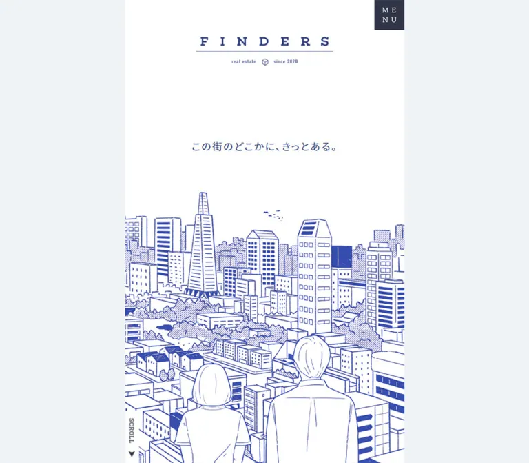
FINDERS places a narrow illustrated brand experience between two practical information panels. On desktop, the center is a 560px white strip, while recommendations and office contacts occupy matching 440px pale-gray wings. The panels are information-rich but visually restrained: compact property specifications, thin separators, widely tracked headings, and small utility icons. The central illustration supplies the personality through hand-drawn buildings, trees, birds, and two people looking across the city.
The opening is unusually spacious. A modest wordmark sits high above a single Japanese sentence, with the skyline rising from the bottom edge. Red appears only as a small price emphasis in the visible property list. On mobile, the opening scene occupies the screen width and the information panels move into the subsequent vertical sequence. Preserve this balance between human illustration, generous white space, and precise real-estate information.
閉じる
FINDERS — Style Reference
A blue-ink city portrait framed by a quiet rental index and an office directory.
Website: FINDERS Original URL: https://www.finders-tokyo.co.jp/ Final URL: https://www.finders-tokyo.co.jp/ Response: HTTP 200; original and final URLs are identical. Theme: white and cool pale gray, with navy typography and blue illustration. Inspected: October 2, 2026, at 00:52:49 JST; supplied retrieval timestamp: October 1, 2026, at 15:52:49.120 UTC. Viewports: 1440 × 1000 desktop and 390 × 844 mobile, in CSS pixels. Scope: the current corporate and rental-discovery homepage. Visual evidence covers the opening desktop and mobile compositions. Supplied rendered DOM and computed styles additionally describe recommendations, About, five strengths, office contacts, news, footer navigation, and menu links. Open-menu states, property-page transitions, and later illustrated scenes were not visually verified.
FINDERS places a narrow illustrated brand experience between two practical information panels. On desktop, the center is a 560px white strip, while recommendations and office contacts occupy matching 440px pale-gray wings. The panels are information-rich but visually restrained: compact property specifications, thin separators, widely tracked headings, and small utility icons. The central illustration supplies the personality through hand-drawn buildings, trees, birds, and two people looking across the city.
The opening is unusually spacious. A modest wordmark sits high above a single Japanese sentence, with the skyline rising from the bottom edge. Red appears only as a small price emphasis in the visible property list. On mobile, the opening scene occupies the screen width and the information panels move into the subsequent vertical sequence. Preserve this balance between human illustration, generous white space, and precise real-estate information.
How to Read This Reference
- Measured means a value appears in the supplied rendered element rectangles or computed styles. Measurements can describe offscreen nodes and do not establish that those nodes were visible.
- Visual estimate means an approximate observation from the original-page captures, including artwork bounds, unsampled borders, and text inside unsampled child elements.
- Derived means arithmetic based on supplied measurements, such as column proportions or repeated row spacing.
- Recommended means an implementation choice for a new site. Recommended breakpoints, accessibility behavior, and CSS architecture are not claims about the original implementation.
- Token names are reusable aliases created for this reference unless explicitly identified as source variables.
- The three desktop captures show the same opening composition; the two mobile captures also show the same opening composition. They do not demonstrate a sequence of interactions.
- The reported document heights equal the viewport heights, even though supplied node coordinates extend much farther down. This suggests a constrained viewport with scrolling or clipping elsewhere, but the exact scroll container and its behavior are unverified.
Tokens — Colors
Default Palette
| Name | Value | Suggested token | Evidence and role |
|---|---|---|---|
| Brand Navy | #2b3c7b |
--color-ink |
Measured rgb(43, 60, 123) on the opening sentence, section-heading wrappers, property titles, contact links, and other content |
| Cool Panel | #eff3f5 |
--color-panel |
Measured rgb(239, 243, 245) on recommendation and contact sections at both viewports |
| White Canvas | #ffffff |
--color-paper |
Measured body background; visually forms the central opening field and reversed labels |
| Slate Navy | #303547 |
--color-dark |
Measured menu-button and footer backgrounds; also the scroll-label text color |
| Deep Detail Ink | #0a184b |
--color-detail |
Measured property-link text color; child titles override it with Brand Navy |
| Inherited Body Gray | #333333 |
--color-body-base |
Measured body/main inheritance; many visible descendants override it |
| Price Red | Approximately #ee3154 |
--color-price |
Visual estimate for highlighted rent amounts; the price span was not sampled |
| Hairline Gray | Approximately #cccccc |
--color-rule |
Visual estimate for property separators and office-grid borders |
| Illustration Blue | Approximately #3547a8 |
--color-art-reference |
Visual estimate for the brighter blue drawing; retain supplied artwork colors when available |
Navy is the functional foreground. Slate Navy is reserved for dark blocks and selected utility elements. The illustration reads slightly brighter than the interface, but its exact stroke color cannot be established from the supplied styles.
Price Red is a small editorial emphasis within otherwise navy property information. It is not evidence for a red primary-button system.
Palette Boundaries
The supplied custom properties include many WordPress preset colors, gradients, and shadows. Their presence does not establish visible use. None should be added to the design palette without component-level evidence.
No alternate theme or theme selector was observed. Transparent element backgrounds inherit their surrounding white or pale-gray surface; they are not additional palette colors.
Tokens — Typography
Noto Sans JP — Japanese Content
Measured family: 'Noto Sans JP', sans-serif.
This family appears on body text, the opening Japanese sentence, property titles, About copy, strength headings and paragraphs, map links, and news titles. Regular weight carries most content. Property names are bold, and strength headings become bold at the mobile viewport.
The measured source root is 10px. The starter below uses explicit pixel values and does not require changing a project's root font size.
Roboto Slab — Office Labels and Utilities
Measured family: 'Roboto Slab', serif.
Directly sampled uses include office names, telephone links, MAIL, the SCROLL label, and copyright text. Broad tracking gives the office headings their directory-like rhythm.
The visible English section headings also have a slab-serif appearance, but their inner text elements were not sampled. Using Roboto Slab for those headings is a supported visual adaptation, not a direct measurement of their child styles.
Wordmark and Section-Heading Caveats
The FINDERS wordmark should be treated as a graphic. Its H1 wrapper contains no extracted text. The wrapper's computed font sizes, 26.6667px on desktop and 30px on mobile, do not measure the visible logo lettering.
Likewise, a section H2 wrapper is measured at 15px, while its prominent English title is visibly larger. Do not apply the wrapper's font size to every line inside a bilingual heading.
Type Scale
| Role | Desktop | Mobile | Tracking | Evidence |
|---|---|---|---|---|
| Body inheritance | 16px / 16px, 400 |
14px / 14px, 400 |
0.8px / 0.7px |
Measured; descendants often override it |
| Opening sentence | 20px / 32px, 400 |
Same | 2.4px |
Measured |
| Section H2 wrapper | 15px / 15px, 400 |
Same | 0.8px / 0.7px |
Measured wrapper, not all child text |
| Large English section title | About 22px, bold |
Not visually verified below the fold | About 0.4–0.45em |
Desktop visual estimate |
| Property name | 15px / 15px, 700 |
Same | 2.25px |
Measured |
| Property detail lines | About 13px |
Not visually verified below the fold | Compact | Desktop visual estimate; child styles unavailable |
| About statement | 18px / 36px, 400 |
18px / 39.6px, 400 |
1.8px / 2.52px |
Measured |
| Strength heading | 20px / 36px, 400 |
16px / 28.8px, 700 |
2px / 1.6px |
Measured |
| Strength paragraph | 14px / 28px, 400 |
Same | 2.8px |
Measured |
| Office heading | 15px / 15px, 400 |
13px / 13px, 400 |
4.5px / 3.9px |
Measured Roboto Slab |
| Telephone and MAIL | 14px / 14px, 400 |
12px / 12px, 400 |
0.8px / 0.7px |
Measured Roboto Slab |
| Map link | 14px / 14px, 400 |
12px / 12px, 400 |
0.8px / 0.7px |
Measured Noto Sans JP |
| News title | 15px / 24px, 400 |
Same | 2.25px |
Measured H3 child |
| Scroll label | 12px / 12px, 700 |
Same | 0.8px / 0.7px |
Measured Roboto Slab |
| Copyright | 9px / 18px, 400 |
9px / 9px, 400 |
0.9px |
Measured |
The sampled news anchors inherit 8.75px, but their H3 children render at 15px. The child measurement is the meaningful news-title token.
Keep the opening copy modest. Its impact comes from placement and empty space, rather than a large headline scale.
Tokens — Spacing & Shapes
Geometry: square panels, thin rules, compact rectangular buttons, and small circular page markers. Density: sparse central storytelling with dense supporting information. Spacing system: a mixture of fixed desktop dimensions and width-relative mobile insets. A universal source spacing scale was not established.
Layout Measurements
| Element | Desktop at 1440 × 1000 | Mobile at 390 × 844 | Basis |
|---|---|---|---|
| Opening central field | x = 440, width 560px, height 1000px |
Full 390px width, first section ends at y = 844 |
Measured geometry and capture |
| Recommendation panel | 440 × 1000px at left |
390 × 785.34px, beginning at y = 844 |
Measured |
| Contact panel | 440 × 1000px at right |
390 × 919.03px, beginning at y = 4184.81 |
Measured |
| Side-panel content width | 324px |
304.22px |
Measured |
| Side-panel content inset | 58px from each desktop edge |
42.89px |
Measured; mobile is approximately 11% of width |
| Central lower-section inset | 61.59px |
42.89px |
Measured; both approximately 11% of their section width |
| Opening H1 wrapper top | 79px |
66.67px |
Measured; both consistent with about 7.9% of viewport height |
| Visible logo graphic | About 276 × 59px |
About 230 × 49px |
Visual estimate, supported by wrapper height |
| Opening sentence box | 312.70 × 38px, top 340px |
Same size, top 369.61px |
Measured |
| Menu button | 60 × 60px, at x = 940 |
50 × 50px, at x = 340 |
Measured |
| Scroll-label rectangle | About 28 × 105.64px |
About 28 × 105.03px |
Measured transformed rectangle |
At desktop, the columns occupy approximately 30.56% / 38.89% / 30.56% of the screenshot width. These percentages describe that capture; they are not verified source CSS formulas.
Repeated Spacing
| Use | Value | Evidence |
|---|---|---|
| Desktop side-heading top | 70px |
Measured |
| Heading group to first property/office | 50px |
Derived from heading bottom 136px to content top 186px |
| Desktop property row pitch | 164.78px |
Difference between successive link positions |
| Mobile property row pitch | 162.78px |
Difference between successive link positions |
| Gap between property-link rectangles | 37px |
Derived at both viewports; includes separator space |
| Desktop office-title pitch | 242px |
Measured positions 186, 428, 670 |
| Desktop office title to action grid | About 30px after the title |
Capture and measured link positions |
| Mobile section vertical padding | 78px |
Measured on recommendation, strengths, contact, and news; equals 20% of viewport width |
| Arrow-button gap | 20px |
Measured from 54px buttons starting at 58px and 132px |
| Page-dot gap | 12px between 9px dots |
Derived from 21px start-to-start spacing |
| Desktop control clearance from bottom | 50px |
Controls end at y = 950 |
Border Radius and Rules
| Element | Shape | Evidence |
|---|---|---|
| Main sections and office action grids | Square | Capture; sampled sections have 0px radius |
| Menu button | Square | Measured 0px radius |
| Property category badge | Square, thin outline | Capture |
| Carousel arrows | Square, thin outline | Capture and measured 0px radius |
| Carousel dots | Circular, 9 × 9px |
Measured 50% radius |
| Social artwork | Small rounded-square brand marks | Capture; this is artwork, not a general card-radius system |
| Dividers | Approximately 1px |
Visual estimate supported by contact-grid coordinate gaps |
There is no visible general-purpose shadow or elevation system. Background changes, linework, and alignment establish hierarchy.
Components
Desktop Three-Column Frame
Role: present brand, available rentals, and office access together.
The left panel contains recommendations, the center contains the illustrated introduction and subsequent editorial content, and the right panel contains contacts. Both side panels use Cool Panel. The center remains white.
The opening capture gives each wing a 324px inner content column. Their headings share a 70px top alignment. The center's logo begins at 79px, creating a related but slightly lower identity line.
The page looks like a framed reading experience. However, the supplied evidence does not expose the CSS position or overflow ownership of these regions. Persistent rails during scrolling are a reasonable implementation model, but were not demonstrated by a before/after scroll capture.
Opening Brand Scene
Role: establish the emotional setting for finding a home.
The visible anatomy is:
- A centered FINDERS wordmark with a fine horizontal line and miniature
real estate, cube symbol, andsince 2020details. - A large uninterrupted white interval.
- The sentence
この街のどこかに、きっとある。in20pxregular Noto Sans JP,32pxline height, and2.4pxtracking. - A detailed blue city illustration anchored to the bottom.
- A narrow vertical
SCROLLtab at the lower-left edge of the central field. - A dark menu square at the upper-right edge of that field.
The drawing shows the backs of two people overlooking a mixture of houses, apartment buildings, towers, and trees. Their cropped foreground figures create a viewpoint inside the scene. The skyline remains secondary to the white field above it.
Other short narrative sentences exist in the DOM, including ただ美しくて and 最高に心地よくて. Only the opening sentence is visible in the supplied captures. Do not render all extracted sentences simultaneously or invent their transition sequence.
Bilingual Section Heading
Role: provide a repeatable editorial label for both utility and narrative sections.
The visible desktop pattern is a centered uppercase English heading, a thin horizontal rule spanning the inner content width, and a smaller Japanese subtitle below. RECOMMEND and CONTACT use this pattern at the top of the side panels.
Their measured heading-group height is 66px on desktop. Equivalent mobile heading wrappers measure 60px. The lower sections have corresponding English/Japanese labels in the DOM, but their complete visual rendering was not captured.
For a reusable adaptation, use a slab-serif English line with broad tracking and a compact sans-serif subtitle. Keep the rule attached to the heading group rather than framing the whole section as a card.
Property Recommendation Row
Role: provide a compact, directly linked rental summary.
Each measured item is an anchor to a distinct /rent/ URL. The visible first page contains three items. The first is ケーエスハイム.
Anatomy:
- Small outlined
マンションcategory badge, approximately59 × 17pxin the desktop capture. - Bold navy property name:
15px, weight700, with2.25pxtracking. - Price row with a circular yen icon, red rent amount, slash, and darker management fee.
- Floor/layout/area row with a house icon.
- Railway/station/walking-time row with a train icon.
- A light separator between entries.
The visible rows have no property photograph, enclosing card fill, or shadow. The entire content block links to the rental detail, rather than relying on a separate large CTA.
The first desktop anchor is 324 × 127.78px; mobile anchors are 304.22 × 125.78px. This preserves information density across viewports. Long station names and variable property titles should remain real text and wrap safely in an adaptation.
Recommendation Pagination
Role: move among groups of property summaries.
The desktop capture shows two outlined arrow buttons at the lower-left of the panel and three small page dots at the lower-right. The first dot is filled navy. The previous arrow appears faded, but its disabled semantics were not supplied.
Arrow buttons measure 54 × 27px. Dots measure 9 × 9px, with 12px gaps. All controls align to the same bottom edge, 50px above the viewport bottom.
The DOM contains nine distinct rental links arranged as three horizontal groups of three. Group offsets advance by the measured page width: 324px desktop and 304.22px mobile. Together with the dots, this supports a three-page arrangement. Actual button response, looping, autoplay, and swipe behavior remain unverified.
Several entries share a building name but have different rental URLs. Treat these as distinct listings rather than automatically deduplicating them by title.
Office Contact Block
Role: expose phone, inquiry, and map access for each office.
Three blocks appear in the desktop right panel: FINDERS TOKYO, FINDERS KICHIJOJI, and FINDERS ROPPONGI.
Each contains a widely tracked Roboto Slab title followed by a square two-row action grid. The upper row splits telephone and MAIL into equal columns. The lower map link spans the full width. Telephone, envelope, and location icons align to the left; mail and map rows also show small right arrows.
The desktop grid is approximately 324 × 96px, including its borders. Measured inner link heights are 46px for the upper links and 47px for the map link. Mobile inner links measure 42px high, with the two-column upper row retained.
The contact section therefore remains a directory of equivalent offices. No single office is presented as a large dominant conversion card.
Destination evidence: MAIL links to the site's /contact/ page, not a mailto: address. Map links point to Google Maps. Telephone links use tel: destinations.
Content-integrity issue: the Tokyo label displays 03-6871-8516, while its supplied href is tel:0345676046. Verify the intended number before reusing the contact data.
Contact Footer and Social Links
Role: close the desktop utility panel without competing with office information.
A fine navy rule precedes LINE, TikTok, and YouTube marks at the lower left and a small two-line copyright at the lower right. The visual icons are about 30px square. Their sampled inline anchor rectangles are shorter, so the anchor height should not be mistaken for the artwork height.
On mobile, the DOM places the three social links in a centered row near the end of Contact. Copyright appears later inside the dark page footer. This relocation is measured from DOM layout rather than a lower-page screenshot.
About Statement
Role: explain the company's approach with a short, spacious statement.
The desktop section begins immediately after the opening field at y = 1000. It uses approximately 61.59px horizontal insets and 60px top padding. Its heading is followed by an 18px / 36px paragraph arranged as four source lines.
On mobile, About follows recommendations. The paragraph retains 18px type but expands to 39.6px line height and 2.52px tracking.
A substantial lower region is reserved by padding: approximately 460.8px on desktop and 390px on mobile. The supplied captures do not show what appears in that region. Preserve the measured space when studying proportions, but do not invent a second illustration or photo to explain it.
Numbered Strengths
Role: explain five service advantages in a narrow editorial column.
The DOM contains items numbered 01 through 05, covering exclusive designer properties, a broad search area, online procedures, living-support services, and investment purchase options.
Each item contains a number, a two-line heading, and a paragraph. Desktop headings use regular 20px / 36px; mobile headings change to bold 16px / 28.8px. Paragraphs stay at 14px / 28px with unusually generous 2.8px tracking.
The source remains a vertical sequence at both inspected widths. There is no evidence for a desktop feature-card grid. Number styling was not separately sampled, so its exact size should remain unspecified.
News List
Role: present operating notices through a restrained text list.
Five linked notices exist in the supplied DOM. Their H3 titles use 15px / 24px Noto Sans JP with 2.25px tracking. Desktop title positions advance by 75px.
On mobile, each anchor becomes a full-width block of approximately 304.22 × 66.89px, with measured top/bottom padding of 23.4px and 19.5px. This creates a more substantial link target even though the title size remains unchanged.
No news thumbnails were established. Do not add image cards solely because the section contains articles.
Menu Trigger and Page Footer
Role: expose the wider property-browsing and corporate navigation.
The opening trigger is a Slate Navy square with white letters arranged as ME over NU. It sits at the central field's right edge, not the desktop viewport's right edge. Its measured size changes from 60px to 50px on mobile.
The extracted menu and footer links include TOP, RECOMMEND, LIBRARY, HISTORY, FAVORITE, and COMPANY, with Japanese companion labels and three policy links. White navigation text and a Slate Navy footer background are measured. Footer padding is 70px 61.59px on desktop and approximately 50.7px 42.89px on mobile.
The menu was not shown open in the captures. Its extracted links and close control establish available content, but do not prove the overlay dimensions, opening direction, focus behavior, or interaction timing.
Tokens — Motion & Interaction
| Element or treatment | Supplied declaration | What it establishes |
|---|---|---|
| Desktop logo wrapper, scroll label, side panels | opacity 1.2s cubic-bezier(0.08, 0.64, 0.56, 1) |
A defined opacity transition; trigger and progression unverified |
| Mobile logo wrapper | opacity 0.3s ease-out 0.3s |
A 300ms opacity transition with 300ms delay |
| Property and office links | 0.3s transition shorthand |
A transition duration exists; changed properties and endpoint styles were not supplied |
| Desktop social/footer links | opacity 0.2s |
Short opacity feedback is defined |
| Corresponding sampled mobile links | none |
These sampled transitions are absent at the mobile viewport |
| Menu trigger | background-color 0.2s, opacity 1.2s with the custom curve, transform 0.3s ease-out |
Multiple transition channels are defined; open/closed transforms are unknown |
| Back-to-top link | background-color 0.2s, transform 0.3s ease-out |
Styling transitions, not proof of smooth page scrolling |
| Close button | background-color 0.2s |
Defined background feedback |
Sampled elements report animation: none. This does not exclude animation on unsampled descendants, pseudo-elements, artwork, or JavaScript-controlled properties.
The source exposes five --mv-mask-height-* custom properties and multiple opening copy fragments. Their numeric values vary by viewport, but their names and offsets do not establish a reveal technique, sprite count, duration, or scroll-scrubbing behavior. Do not reconstruct an animation from those values alone.
The collection process waited for loading, image decoding, and sampled layout stability, with bounded waits, and temporarily paused perpetual animations during readiness checks. That improves confidence in the captured opening state but does not prove that every delayed state was reached.
Recommended motion language: keep feedback quiet and brief. Use the measured opacity timings only for elements whose visibility is deliberately controlled. Avoid introducing mandatory parallax, autoplay, spring scaling, or elaborate scene transitions without further evidence.
Surfaces
| Surface | Appearance | Purpose |
|---|---|---|
| Opening and narrative canvas | White | Gives the city drawing and Japanese copy room to breathe |
| Recommendation and contact panels | Cool Panel #eff3f5 |
Separates transactional information from the central story |
| Property rows | Transparent on Cool Panel, thin separators | Maintains a compact index rather than a card collection |
| Office action grid | Panel-colored cells with light rules | Groups related contact methods without elevation |
| Menu square | Slate Navy with white letters | A small, concentrated navigation anchor |
| Lower page footer | Slate Navy with white links | Closes the editorial column and repeats navigation |
| Scroll tab | White strip with dark text | Keeps the cue legible over the illustration |
The visible page uses flat fills. Its richness comes from the hand-drawn scene and typography, not gradients, surface textures, shadows, or rounded containers.
Imagery
The main image is a blue line drawing of an inhabited city. Its distinguishing details are irregular architectural outlines, repeated windows, diagonal hatching, dense treetops, a few distant birds, and two foreground people seen from behind. The mixture of small homes and taller buildings makes the city feel varied and lived in.
White remains the dominant field. Blue fills are used selectively for roofs, shaded faces, windows, and trees. The drawing should retain its uneven hand and fine anti-aliased edges. There is no evidence for deliberate pixelation, photographic filtering, or a uniform technical blueprint treatment.
At the desktop opening, the highest visible building line is around y = 458; on mobile it is around y = 467. The drawing reaches the bottom edge in both captures. Its visible height is therefore approximately 542px desktop and 377px mobile. Those heights scale almost exactly with the field widths of 560px and 390px. This supports a width-scaled, bottom-aligned composition, although the original image box, transparent margins, and asset dimensions were not supplied.
Observed Asset References
| Visual reference | Verified appearance | Asset limitation |
|---|---|---|
| FINDERS wordmark | Spaced serif lettering, fine rule, miniature real-estate descriptor and cube | Original asset URL and format unavailable |
| Opening city illustration | Blue urban linework with two foreground figures | Original asset URL, native dimensions, and animation format unavailable |
| Property icons | Yen circle, house, and train | Icon library or source format unverified |
| Contact icons | Telephone, envelope, pin, and arrows | Icon library or source format unverified |
| Social marks | LINE, TikTok, and YouTube in navy | Original file URLs unavailable; destination links are present in the DOM |
Use authorized original artwork where available. For a new commission, brief the subject, viewpoint, line density, and blue/white relationship rather than asking for generic skyline stock art. CSS can reproduce the layout and information system; it cannot replace the specific illustrated identity.
Layout & Responsive Behavior
Desktop Composition
The measured first view is exactly 440px + 560px + 440px. The center is narrow enough to retain the proportions of a portrait editorial page. Side content is aligned to matching 324px columns, leaving 58px of internal whitespace at either edge.
Recommendation controls and the contact footer sit near the bottom of the first view, while their content begins near the top. This creates large flexible gaps in the utility panels without enlarging individual entries.
Below the opening, About, Strengths, News, and the dark footer retain the central 560px width. Recommendation and Contact remain positioned at the sides in the supplied desktop layout coordinates.
Mobile Sequence
The mobile evidence shows a structural rearrangement:
| Region | Desktop position | Mobile position and height |
|---|---|---|
| Opening | Center, first 1000px |
Starts at 0; first 844px |
| Recommendations | Left wing | Starts at 844; height 785.34px |
| About | Center at 1000 |
Starts at 1629.34; height 737.06px |
| Strengths | Center at 1810.80 |
Starts at 2366.41; height 1818.41px |
| Contact | Right wing | Starts at 4184.81; height 919.03px |
| News | Center at 3526.80 |
Starts at 5103.84; height 581.75px |
| Footer | Center at 4166.80 |
Starts at 5685.59; height 650.75px |
These are layout coordinates from the initial DOM sample, not independently verified scroll destinations or document-height measurements.
The mobile opening keeps the sentence at 20px, rather than scaling all text proportionally with the artwork. The logo becomes smaller, the menu changes to 50px, and the city drawing scales with the available width. The sentence moves from a desktop box top at 34% of viewport height to about 43.79% on mobile.
Below the opening, the repeated horizontal inset is approximately 11% of width. Property names remain 15px. Contact labels become smaller, while About gains line height and strength headings gain weight. Responsiveness therefore changes hierarchy and spacing selectively.
Breakpoint and Scroll Limitations
Only the two stated viewports were inspected. The exact transition width between the three-column frame and the single-column sequence is unknown. A 579px media-query fragment appears in extracted inline text, but its contents are incomplete and do not establish the main layout breakpoint.
The starter uses a recommended 1280px breakpoint, a 560px desktop center, and sticky utility rails inside a single scroll container. This is an implementation strategy for the measured appearance. Intermediate widths, short landscape windows, zoom, and safe-area behavior require additional testing.
Do’s and Don’ts
Do
- Keep the white center and pale-gray utility panels visually distinct.
- Preserve the
560pxdesktop center at the inspected scale. - Use navy for most text, icons, and rules; confine red to small price emphasis.
- Retain the actual division between Noto Sans JP content and Roboto Slab utility typography.
- Keep the opening sentence small enough for the empty field to remain meaningful.
- Anchor the city illustration at the bottom and scale it without distortion.
- Preserve property anatomy: category, name, rent/fee, floor/layout/area, and transit.
- Keep office contact methods in a compact two-row grid.
- Move recommendation and contact content into the mobile reading sequence.
- Preserve the measured mobile changes in heading weight and line height.
- Distinguish visible opening content from additional text merely present in the DOM.
Don’t
- Do not replace the framed homepage with a full-width photograph and oversized sales headline.
- Do not add property photos to the observed text-only recommendation rows by default.
- Do not turn office entries or strengths into large rounded cards.
- Do not use red as a general action fill based only on the rent highlights.
- Do not treat WordPress preset gradients and shadows as active design tokens.
- Do not use the H1 wrapper font to recreate the FINDERS wordmark.
- Do not display every extracted opening sentence at once.
- Do not claim autoplay, parallax, swipe, or menu animation from static captures.
- Do not interpret
documentHeight = viewportHeightas proof that the site has no further content. - Do not replace separate rentals with one entry merely because their building names match.
- Do not copy the mismatched Tokyo phone destination without verification.
Recommended Implementation Additions
These are recommendations for a new implementation, not verified features of the original:
- Give the menu trigger an accessible name and
aria-expanded; if it opens a modal navigation panel, implement focus containment, Escape dismissal, and focus return. - Give carousel arrows explicit previous/next labels and expose the current page. Keep inactive pages out of sequential keyboard focus where appropriate.
- Enlarge the effective hit areas of the
54 × 27pxarrow controls and9pxdots while preserving their small visible geometry. Aim for at least44 × 44pxinteractive areas. - Retain a visible keyboard focus outline in navy. A skip link exists in the supplied DOM, but its focused appearance and target behavior were not tested.
- Ensure all mobile sections remain reachable through the chosen scrolling model. Avoid a full-height clipped container without an operable inner scroller.
- Provide a static readable fallback if scene animation or JavaScript fails. Essential copy should not depend on opacity transitions completing.
- Honor reduced-motion preferences and avoid introducing autoplay as a requirement.
- Preserve semantic labels for rent, fees, layout, floor area, and transit even when icons carry the visible label.
- Verify the Tokyo telephone label and destination against approved business data.
- Consider increasing the measured
9pxcopyright size and testing the compact mobile contact text at browser zoom. - Supply meaningful logo text alternatives. Treat the city illustration as decorative if equivalent brand meaning is already conveyed by adjacent content; otherwise provide a concise description.
- Use authorized font files and artwork. The supplied evidence names font families but does not provide font-loading URLs or image files.
Agent Prompt Guide
Quick Color Reference
- Main foreground:
#2b3c7b. - Secondary property detail ink:
#0a184b. - Center and narrative surfaces:
#ffffff. - Recommendation and contact surfaces:
#eff3f5. - Menu and footer:
#303547, with white foreground. - Rent emphasis: approximately
#ee3154, a screenshot-based approximation. - Fine neutral rules: approximately
#cccccc. - Illustration: preserve the authorized artwork's blue; do not recolor it based on an estimated token alone.
Overall Prompt
“Create a Japanese real-estate corporate homepage with a narrow illustrated center and two practical information panels. At a 1440px desktop width, use a 560px white central column between two 440px pale-gray panels. Place a small spaced wordmark near the top, a single 20px Japanese sentence in a large white field, and detailed blue urban line art with two people seen from behind at the bottom. The left panel contains three compact text-only rental summaries, small outlined arrow controls, and three page dots. The right panel contains three office headings and ruled phone/mail/map grids. Use navy #2b3c7b, pale gray #eff3f5, Noto Sans JP, and Roboto Slab for office and utility labels. On mobile, show the opening full width and place recommendations, About, strengths, contacts, news, and footer in sequence. Treat unverified scene and menu behavior as separate implementation work.”
Example Component Prompts
- Rental summary: “Design a compact navy rental link on pale gray. Stack an outlined category badge, a bold 15px property title with 2.25px tracking, then three icon-led specification lines. Highlight only the rent amount in restrained red. Separate rows with fine rules; use no photograph or enclosing card.”
- Office directory: “Create three equally weighted office blocks. Use widely tracked Roboto Slab headings above a thin-bordered grid with phone and MAIL side by side and a full-width map link below. Keep the cells flat, square, and approximately 46–47px tall on desktop.”
- Opening scene: “Compose a narrow white field with a small graphic wordmark near 8% of its height, one centered Japanese sentence, and bottom-aligned blue hand-drawn city artwork. Leave extensive white space above the skyline and keep the foreground figures partially cropped by the bottom edge.”
- Mobile adaptation: “At 390 × 844, make the illustrated opening full width, retain 20px copy, reduce the menu to 50px square, and place utility sections below the opening. Use approximately 11% horizontal section insets and 78px vertical padding at this viewport.”
- Strength item: “Build a single-column numbered service explanation with a two-line navy heading and airy Japanese paragraph. Use 20px regular headings on desktop, 16px bold headings on mobile, and 14px body text with 28px line height. Keep the surface white and avoid feature-card styling.”
Quick Start
CSS Custom Properties
This is an adaptation of the measured appearance, not recovered source CSS. It uses a conventional root size, a recommended desktop breakpoint, and one scroll container with sticky side panels. The estimated colors, section-title styling, and artwork slot are explicitly approximations.
Use .site-scroll > .finders-page, with these direct children in mobile reading order: .hero, .recommend, .about, .strengths, .contact, .news, and .site-footer. Add .rail to Recommend and Contact, and .content-section to About, Strengths, and News. Place .menu-toggle outside the scroll container.
Supply authorized image elements for .brand and .hero-art. The artwork rule assumes an image prepared to approximately the visible drawing bounds; adjust it if the actual asset includes whitespace. No original asset path is available in the supplied evidence.
For recommendations, place .property-page groups inside .property-pages; each group contains three .property-item entries. The native horizontal scrolling below is a recommended fallback. Arrow controls and page indicators require event handlers if included. Menu behavior and scene transitions also require separate implementation.
:root {
  /* Measured colors */
  --color-paper: #ffffff;
  --color-panel: #eff3f5;
  --color-ink: #2b3c7b;
  --color-detail: #0a184b;
  --color-dark: #303547;
  --color-body-base: #333333;

  /* Visual approximations */
  --color-price: #ee3154;
  --color-rule: #cccccc;

  /* Measured family names; font loading is separate */
  --font-body: 'Noto Sans JP', sans-serif;
  --font-latin: 'Roboto Slab', serif;

  --center-width: 560px;
  --rail-content-width: 324px;
  --section-inset: 11%;
  --rule-width: 1px;
  --menu-size: 50px;

  /* Measured transition vocabulary */
  --fade-duration: 1.2s;
  --fade-ease: cubic-bezier(0.08, 0.64, 0.56, 1);
  --feedback-duration: 0.2s;
}

* { box-sizing: border-box; }
body { margin: 0; }
button, a { -webkit-tap-highlight-color: transparent; }
button { font: inherit; }
a { color: inherit; }

.site-scroll {
  height: 100vh;
  height: 100svh;
  overflow-y: auto;
  color: var(--color-ink);
  background: var(--color-paper);
  font-family: var(--font-body);
  font-size: 14px;
  letter-spacing: 0.7px;
}

.finders-page { width: 100%; }
.finders-page > * { min-width: 0; }

.hero {
  position: relative;
  height: 100vh;
  height: 100svh;
  overflow: hidden;
  background: var(--color-paper);
}

.brand {
  position: absolute;
  top: 7.9%;
  left: 50%;
  display: block;
  width: 230px;
  max-width: calc(100% - 100px);
  height: auto;
  transform: translateX(-50%);
}

.hero-copy {
  position: absolute;
  z-index: 1;
  top: 43.793%;
  left: 50%;
  width: max-content;
  max-width: calc(100% - 32px);
  margin: 0;
  padding: 3px 10px;
  transform: translateX(-50%);
  font-size: 20px;
  font-weight: 400;
  line-height: 32px;
  letter-spacing: 2.4px;
  text-align: center;
}

.hero-art {
  position: absolute;
  bottom: 0;
  left: 0;
  display: block;
  width: 100%;
  height: auto;
  /* Estimated visible-art ratio, not the original file ratio */
  aspect-ratio: 560 / 542;
  object-fit: cover;
  object-position: center bottom;
}

.scroll-cue {
  position: absolute;
  z-index: 2;
  bottom: 0;
  left: 0;
  width: 28px;
  min-height: 105px;
  margin: 0;
  padding: 15px 8px;
  color: var(--color-dark);
  background: var(--color-paper);
  writing-mode: vertical-rl;
  font: 700 12px/12px var(--font-latin);
  letter-spacing: 0.7px;
}

.menu-toggle {
  position: fixed;
  z-index: 20;
  top: 0;
  right: 0;
  display: grid;
  place-content: center;
  width: var(--menu-size);
  height: var(--menu-size);
  padding: 0;
  border: 0;
  border-radius: 0;
  color: var(--color-paper);
  background: var(--color-dark);
  font: 400 14px/20px var(--font-latin);
  letter-spacing: 0.3em;
  cursor: pointer;
  transition: background-color var(--feedback-duration);
}

.rail,
.content-section {
  padding: 20vw var(--section-inset);
}

.rail { background: var(--color-panel); }

.section-title {
  margin: 0 0 13vw;
  color: var(--color-ink);
  text-align: center;
}

/* Inner heading styles are visual adaptations */
.section-title__en {
  display: block;
  padding-bottom: 12px;
  border-bottom: 1px solid var(--color-dark);
  font: 700 18px/22px var(--font-latin);
  letter-spacing: 0.45em;
  text-indent: 0.45em;
  text-transform: uppercase;
}

.section-title__ja {
  display: block;
  margin-top: 10px;
  font: 400 12px/15px var(--font-body);
  letter-spacing: 2px;
}

.property-pages {
  display: flex;
  overflow-x: auto;
  scroll-snap-type: x mandatory;
}

.property-page {
  flex: 0 0 100%;
  min-width: 0;
  scroll-snap-align: start;
}

.property-item:not(:last-child) {
  margin-bottom: 18px;
  padding-bottom: 18px;
  border-bottom: 1px solid var(--color-rule);
}

.property-link {
  display: block;
  min-height: 126px;
  padding-top: 3px;
  color: var(--color-detail);
  text-decoration: none;
}

.property-type {
  display: inline-block;
  margin-bottom: 14px;
  padding: 0 5px;
  border: 1px solid var(--color-ink);
  color: var(--color-ink);
  background: var(--color-paper);
  font-size: 10px;
  line-height: 15px;
  letter-spacing: 0;
}

.property-name {
  margin: 0 0 10px;
  color: var(--color-ink);
  font-size: 15px;
  font-weight: 700;
  line-height: 1.3;
  letter-spacing: 2.25px;
}

.property-meta {
  margin: 0;
  padding: 0;
  list-style: none;
  font-size: 13px;
  line-height: 22px;
}

.property-meta li {
  display: grid;
  grid-template-columns: 15px minmax(0, 1fr);
  gap: 10px;
}

.property-icon { width: 15px; height: 15px; }
.property-price { color: var(--color-price); font-weight: 700; }

.recommend-controls {
  display: flex;
  align-items: flex-end;
  justify-content: space-between;
  margin-top: 41px;
}

.carousel-arrows { display: flex; gap: 20px; }
.carousel-dots { display: flex; gap: 12px; }

.carousel-arrow {
  width: 54px;
  height: 27px;
  padding: 0;
  border: 1px solid var(--color-ink);
  border-radius: 0;
  color: var(--color-ink);
  background: var(--color-paper);
  cursor: pointer;
}

.carousel-arrow:disabled { opacity: 0.4; cursor: default; }

.carousel-dot {
  width: 9px;
  height: 9px;
  padding: 0;
  border: 2px solid var(--color-ink);
  border-radius: 50%;
  background: transparent;
}

.carousel-dot[aria-current='true'] {
  background: var(--color-ink);
}

.office:not(:last-child) {
  margin-bottom: 11vw;
  padding-bottom: 11vw;
  border-bottom: 1px solid var(--color-rule);
}

.office-title {
  margin: 0 0 7vw;
  font: 400 13px/13px var(--font-latin);
  letter-spacing: 3.9px;
  text-transform: uppercase;
}

.office-actions {
  display: grid;
  grid-template-columns: repeat(2, minmax(0, 1fr));
  grid-template-rows: 42px 42px;
  gap: 1px;
  border: 1px solid var(--color-rule);
  background: var(--color-rule);
}

.office-actions a {
  position: relative;
  display: flex;
  align-items: center;
  justify-content: center;
  min-width: 0;
  padding: 0 30px;
  background: var(--color-panel);
  font: 400 12px/1 var(--font-latin);
  text-decoration: none;
}

.office-actions .office-phone { padding-right: 5px; }

.office-actions .office-map {
  grid-column: 1 / -1;
  font-family: var(--font-body);
}

.office-icon {
  position: absolute;
  left: 12px;
  width: 16px;
  height: 16px;
}

.office-arrow { position: absolute; right: 12px; }

.contact-tail { margin-top: 17vw; }
.social-links { display: flex; justify-content: center; gap: 20px; }
.social-links img { display: block; width: 28px; height: 28px; }
.contact-copy { display: none; }

.copyright {
  margin: 0;
  font: 400 9px/18px var(--font-latin);
  letter-spacing: 0.9px;
}

.about { padding-bottom: 100vw; }

.about-copy {
  margin: 0;
  font-size: 18px;
  line-height: 39.6px;
  letter-spacing: 2.52px;
}

.strength-item + .strength-item { margin-top: 72px; }

.strength-title {
  margin: 0 0 15px;
  font-size: 16px;
  font-weight: 700;
  line-height: 28.8px;
  letter-spacing: 1.6px;
}

.strength-copy {
  margin: 0;
  font-size: 14px;
  line-height: 28px;
  letter-spacing: 2.8px;
}

.news-link {
  display: block;
  padding: 23.4px 0 19.5px;
  border-bottom: 1px solid var(--color-rule);
  font-size: 15px;
  line-height: 24px;
  letter-spacing: 2.25px;
  text-decoration: none;
}

.site-footer {
  padding: 13vw var(--section-inset);
  color: var(--color-paper);
  background: var(--color-dark);
}

.footer-nav {
  display: grid;
  justify-items: center;
  gap: 39px;
}

.footer-nav a { text-align: center; text-decoration: none; }

.footer-policies {
  display: flex;
  flex-wrap: wrap;
  justify-content: center;
  gap: 16px;
  margin-top: 50px;
  font-size: 11px;
  line-height: 1.6;
}

.mobile-copy { margin-top: 40px; text-align: center; }

/* Recommended breakpoint and scroll architecture */
@media (min-width: 1280px) {
  :root { --menu-size: 60px; }

  .site-scroll { font-size: 16px; letter-spacing: 0.8px; }

  .finders-page {
    display: grid;
    grid-template-columns: minmax(0, 1fr) var(--center-width) minmax(0, 1fr);
    grid-template-rows: 100svh auto auto auto auto;
    align-items: start;
  }

  .hero { grid-column: 2; grid-row: 1; }
  .about { grid-column: 2; grid-row: 2; }
  .strengths { grid-column: 2; grid-row: 3; }
  .news { grid-column: 2; grid-row: 4; }
  .site-footer { grid-column: 2; grid-row: 5; }

  .rail {
    position: sticky;
    top: 0;
    display: flex;
    flex-direction: column;
    height: 100svh;
    padding: 70px 24px 50px;
    overflow-y: auto;
  }

  .rail > * {
    width: 100%;
    max-width: var(--rail-content-width);
    margin-inline: auto;
    flex-shrink: 0;
  }

  .recommend { grid-column: 1; grid-row: 1 / -1; }
  .contact { grid-column: 3; grid-row: 1 / -1; }

  .brand { width: 276px; }
  .hero-copy { top: 34%; }
  .menu-toggle { right: calc((100vw - var(--center-width)) / 2); }

  .section-title { margin-bottom: 50px; }
  .section-title__en { font-size: 22px; line-height: 26px; }
  .section-title__ja { margin-top: 12px; }

  .property-link { min-height: 128px; }
  .recommend-controls { margin-top: auto; padding-top: 40px; }

  .office:not(:last-child) {
    margin-bottom: 50px;
    padding-bottom: 50px;
  }

  .office-title {
    margin-bottom: 30px;
    font-size: 15px;
    line-height: 15px;
    letter-spacing: 4.5px;
  }

  .office-actions { grid-template-rows: 46px 47px; }
  .office-actions a { padding-inline: 40px; font-size: 14px; }
  .office-actions .office-phone { padding-right: 10px; }

  .contact-tail {
    display: flex;
    align-items: center;
    justify-content: space-between;
    gap: 16px;
    margin-top: auto;
    padding-top: 15px;
    border-top: 1px solid var(--color-ink);
  }

  .social-links { gap: 10px; }
  .social-links img { width: 30px; height: 30px; }
  .contact-copy { display: block; text-align: right; }

  .content-section { padding: 60px var(--section-inset); }
  .about { padding-bottom: 460.8px; }
  .about-copy { line-height: 36px; letter-spacing: 1.8px; }
  .strengths { padding-top: 120px; }

  .strength-title {
    margin-bottom: 10px;
    font-size: 20px;
    font-weight: 400;
    line-height: 36px;
    letter-spacing: 2px;
  }

  .news { padding-bottom: 120px; }
  .news-link { padding-block: 25px; }
  .site-footer { padding: 70px var(--section-inset); }
  .mobile-copy { display: none; }
}

/* Recommended focus and restrained hover feedback */
.site-scroll :focus-visible,
.menu-toggle:focus-visible {
  outline: 2px solid currentColor;
  outline-offset: 4px;
}

@media (hover: hover) {
  .property-link,
  .office-actions a,
  .social-links a {
    transition: opacity var(--feedback-duration);
  }

  .property-link:hover,
  .office-actions a:hover,
  .social-links a:hover {
    opacity: 0.72;
  }
}

@media (prefers-reduced-motion: reduce) {
  .site-scroll *,
  .site-scroll *::before,
  .site-scroll *::after,
  .menu-toggle {
    animation: none !important;
    transition: none !important;
    scroll-behavior: auto !important;
  }
}
The hover opacity endpoint is recommended, not measured. The starter also relaxes property-title line height to accommodate wrapping. Its controls reproduce visible dimensions; enlarge their effective targets before production use.
Tailwind v4 Token Mapping
Optional aliases for a project already using Tailwind v4. These do not indicate that the original website uses Tailwind. Keep the structural CSS above or implement its equivalent separately.
@theme inline {
  --color-finders-paper: var(--color-paper);
  --color-finders-panel: var(--color-panel);
  --color-finders-ink: var(--color-ink);
  --color-finders-detail: var(--color-detail);
  --color-finders-dark: var(--color-dark);
  --color-finders-price: var(--color-price);
  --color-finders-rule: var(--color-rule);

  --font-finders-body: var(--font-body);
  --font-finders-latin: var(--font-latin);

  --text-finders-copy: 20px;
  --text-finders-property: 15px;
  --text-finders-body: 14px;
  --text-finders-about: 18px;

  --spacing-finders-center: 560px;
  --spacing-finders-rail-content: 324px;
  --spacing-finders-arrow-width: 54px;
  --spacing-finders-arrow-height: 27px;
  --radius-finders-square: 0px;
}
Sources & Evidence
- FINDERS homepage: original and final inspected URL; supplied response status
200and page title株式会社FINDERS. - Supplied current-page captures: three desktop images at
1440 × 1000and two mobile images at390 × 844, showing the opening state. - Supplied retrieval timestamp:
2026-10-01T15:52:49.120Z, equivalent to October 2, 2026, at 00:52:49.120 JST. - Supplied rendered DOM: section text, link destinations, element rectangles, computed colors, fonts, spacing, transitions, and selected custom properties at both viewports.
- Original-page identity evidence includes the page title and the visible
FINDERS Co.,Ltd.copyright. The displayed copyright year is page content, not the inspection date. - Lower-page descriptions rely on DOM and computed styles where no corresponding screenshot was provided. Offscreen geometry does not establish visibility or successful navigation to that position.
- No click, hover, focus, open-menu, rental-navigation, or before/after scroll result was supplied. Exact breakpoints, scroll ownership, source asset URLs, loaded font files, and scene animation behavior remain unverified.
This reference documents the current supplied homepage evidence. Measured tokens, visual estimates, derived proportions, and recommended implementation behavior are identified separately throughout.
# FINDERS — Style Reference

> A blue-ink city portrait framed by a quiet rental index and an office directory.

**Website:** [FINDERS](https://www.finders-tokyo.co.jp/)
**Original URL:** https://www.finders-tokyo.co.jp/
**Final URL:** https://www.finders-tokyo.co.jp/
**Response:** HTTP 200; original and final URLs are identical.
**Theme:** white and cool pale gray, with navy typography and blue illustration.
**Inspected:** October 2, 2026, at 00:52:49 JST; supplied retrieval timestamp: October 1, 2026, at 15:52:49.120 UTC.
**Viewports:** 1440 × 1000 desktop and 390 × 844 mobile, in CSS pixels.
**Scope:** the current corporate and rental-discovery homepage. Visual evidence covers the opening desktop and mobile compositions. Supplied rendered DOM and computed styles additionally describe recommendations, About, five strengths, office contacts, news, footer navigation, and menu links. Open-menu states, property-page transitions, and later illustrated scenes were not visually verified.

FINDERS places a narrow illustrated brand experience between two practical information panels. On desktop, the center is a 560px white strip, while recommendations and office contacts occupy matching 440px pale-gray wings. The panels are information-rich but visually restrained: compact property specifications, thin separators, widely tracked headings, and small utility icons. The central illustration supplies the personality through hand-drawn buildings, trees, birds, and two people looking across the city.

The opening is unusually spacious. A modest wordmark sits high above a single Japanese sentence, with the skyline rising from the bottom edge. Red appears only as a small price emphasis in the visible property list. On mobile, the opening scene occupies the screen width and the information panels move into the subsequent vertical sequence. Preserve this balance between human illustration, generous white space, and precise real-estate information.
閉じる
# FINDERS — Style Reference

> A blue-ink city portrait framed by a quiet rental index and an office directory.

**Website:** [FINDERS](https://www.finders-tokyo.co.jp/)
**Original URL:** https://www.finders-tokyo.co.jp/
**Final URL:** https://www.finders-tokyo.co.jp/
**Response:** HTTP 200; original and final URLs are identical.
**Theme:** white and cool pale gray, with navy typography and blue illustration.
**Inspected:** October 2, 2026, at 00:52:49 JST; supplied retrieval timestamp: October 1, 2026, at 15:52:49.120 UTC.
**Viewports:** 1440 × 1000 desktop and 390 × 844 mobile, in CSS pixels.
**Scope:** the current corporate and rental-discovery homepage. Visual evidence covers the opening desktop and mobile compositions. Supplied rendered DOM and computed styles additionally describe recommendations, About, five strengths, office contacts, news, footer navigation, and menu links. Open-menu states, property-page transitions, and later illustrated scenes were not visually verified.

FINDERS places a narrow illustrated brand experience between two practical information panels. On desktop, the center is a 560px white strip, while recommendations and office contacts occupy matching 440px pale-gray wings. The panels are information-rich but visually restrained: compact property specifications, thin separators, widely tracked headings, and small utility icons. The central illustration supplies the personality through hand-drawn buildings, trees, birds, and two people looking across the city.

The opening is unusually spacious. A modest wordmark sits high above a single Japanese sentence, with the skyline rising from the bottom edge. Red appears only as a small price emphasis in the visible property list. On mobile, the opening scene occupies the screen width and the information panels move into the subsequent vertical sequence. Preserve this balance between human illustration, generous white space, and precise real-estate information.

## How to Read This Reference

- **Measured** means a value appears in the supplied rendered element rectangles or computed styles. Measurements can describe offscreen nodes and do not establish that those nodes were visible.
- **Visual estimate** means an approximate observation from the original-page captures, including artwork bounds, unsampled borders, and text inside unsampled child elements.
- **Derived** means arithmetic based on supplied measurements, such as column proportions or repeated row spacing.
- **Recommended** means an implementation choice for a new site. Recommended breakpoints, accessibility behavior, and CSS architecture are not claims about the original implementation.
- **Token names** are reusable aliases created for this reference unless explicitly identified as source variables.
- The three desktop captures show the same opening composition; the two mobile captures also show the same opening composition. They do not demonstrate a sequence of interactions.
- The reported document heights equal the viewport heights, even though supplied node coordinates extend much farther down. This suggests a constrained viewport with scrolling or clipping elsewhere, but the exact scroll container and its behavior are unverified.

## Tokens — Colors

### Default Palette

| Name | Value | Suggested token | Evidence and role |
| --- | --- | --- | --- |
| Brand Navy | `#2b3c7b` | `--color-ink` | Measured `rgb(43, 60, 123)` on the opening sentence, section-heading wrappers, property titles, contact links, and other content |
| Cool Panel | `#eff3f5` | `--color-panel` | Measured `rgb(239, 243, 245)` on recommendation and contact sections at both viewports |
| White Canvas | `#ffffff` | `--color-paper` | Measured body background; visually forms the central opening field and reversed labels |
| Slate Navy | `#303547` | `--color-dark` | Measured menu-button and footer backgrounds; also the scroll-label text color |
| Deep Detail Ink | `#0a184b` | `--color-detail` | Measured property-link text color; child titles override it with Brand Navy |
| Inherited Body Gray | `#333333` | `--color-body-base` | Measured body/main inheritance; many visible descendants override it |
| Price Red | Approximately `#ee3154` | `--color-price` | Visual estimate for highlighted rent amounts; the price span was not sampled |
| Hairline Gray | Approximately `#cccccc` | `--color-rule` | Visual estimate for property separators and office-grid borders |
| Illustration Blue | Approximately `#3547a8` | `--color-art-reference` | Visual estimate for the brighter blue drawing; retain supplied artwork colors when available |

Navy is the functional foreground. Slate Navy is reserved for dark blocks and selected utility elements. The illustration reads slightly brighter than the interface, but its exact stroke color cannot be established from the supplied styles.

Price Red is a small editorial emphasis within otherwise navy property information. It is not evidence for a red primary-button system.

### Palette Boundaries

The supplied custom properties include many WordPress preset colors, gradients, and shadows. Their presence does not establish visible use. None should be added to the design palette without component-level evidence.

No alternate theme or theme selector was observed. Transparent element backgrounds inherit their surrounding white or pale-gray surface; they are not additional palette colors.

## Tokens — Typography

### Noto Sans JP — Japanese Content

**Measured family:** `'Noto Sans JP', sans-serif`.

This family appears on body text, the opening Japanese sentence, property titles, About copy, strength headings and paragraphs, map links, and news titles. Regular weight carries most content. Property names are bold, and strength headings become bold at the mobile viewport.

The measured source root is `10px`. The starter below uses explicit pixel values and does not require changing a project's root font size.

### Roboto Slab — Office Labels and Utilities

**Measured family:** `'Roboto Slab', serif`.

Directly sampled uses include office names, telephone links, `MAIL`, the `SCROLL` label, and copyright text. Broad tracking gives the office headings their directory-like rhythm.

The visible English section headings also have a slab-serif appearance, but their inner text elements were not sampled. Using Roboto Slab for those headings is a supported visual adaptation, not a direct measurement of their child styles.

### Wordmark and Section-Heading Caveats

The FINDERS wordmark should be treated as a graphic. Its H1 wrapper contains no extracted text. The wrapper's computed font sizes, `26.6667px` on desktop and `30px` on mobile, do not measure the visible logo lettering.

Likewise, a section H2 wrapper is measured at `15px`, while its prominent English title is visibly larger. Do not apply the wrapper's font size to every line inside a bilingual heading.

### Type Scale

| Role | Desktop | Mobile | Tracking | Evidence |
| --- | --- | --- | --- | --- |
| Body inheritance | `16px / 16px`, 400 | `14px / 14px`, 400 | `0.8px` / `0.7px` | Measured; descendants often override it |
| Opening sentence | `20px / 32px`, 400 | Same | `2.4px` | Measured |
| Section H2 wrapper | `15px / 15px`, 400 | Same | `0.8px` / `0.7px` | Measured wrapper, not all child text |
| Large English section title | About `22px`, bold | Not visually verified below the fold | About `0.4–0.45em` | Desktop visual estimate |
| Property name | `15px / 15px`, 700 | Same | `2.25px` | Measured |
| Property detail lines | About `13px` | Not visually verified below the fold | Compact | Desktop visual estimate; child styles unavailable |
| About statement | `18px / 36px`, 400 | `18px / 39.6px`, 400 | `1.8px` / `2.52px` | Measured |
| Strength heading | `20px / 36px`, 400 | `16px / 28.8px`, 700 | `2px` / `1.6px` | Measured |
| Strength paragraph | `14px / 28px`, 400 | Same | `2.8px` | Measured |
| Office heading | `15px / 15px`, 400 | `13px / 13px`, 400 | `4.5px` / `3.9px` | Measured Roboto Slab |
| Telephone and MAIL | `14px / 14px`, 400 | `12px / 12px`, 400 | `0.8px` / `0.7px` | Measured Roboto Slab |
| Map link | `14px / 14px`, 400 | `12px / 12px`, 400 | `0.8px` / `0.7px` | Measured Noto Sans JP |
| News title | `15px / 24px`, 400 | Same | `2.25px` | Measured H3 child |
| Scroll label | `12px / 12px`, 700 | Same | `0.8px` / `0.7px` | Measured Roboto Slab |
| Copyright | `9px / 18px`, 400 | `9px / 9px`, 400 | `0.9px` | Measured |

The sampled news anchors inherit `8.75px`, but their H3 children render at `15px`. The child measurement is the meaningful news-title token.

Keep the opening copy modest. Its impact comes from placement and empty space, rather than a large headline scale.

## Tokens — Spacing & Shapes

**Geometry:** square panels, thin rules, compact rectangular buttons, and small circular page markers.
**Density:** sparse central storytelling with dense supporting information.
**Spacing system:** a mixture of fixed desktop dimensions and width-relative mobile insets. A universal source spacing scale was not established.

### Layout Measurements

| Element | Desktop at 1440 × 1000 | Mobile at 390 × 844 | Basis |
| --- | --- | --- | --- |
| Opening central field | `x = 440`, width `560px`, height `1000px` | Full `390px` width, first section ends at `y = 844` | Measured geometry and capture |
| Recommendation panel | `440 × 1000px` at left | `390 × 785.34px`, beginning at `y = 844` | Measured |
| Contact panel | `440 × 1000px` at right | `390 × 919.03px`, beginning at `y = 4184.81` | Measured |
| Side-panel content width | `324px` | `304.22px` | Measured |
| Side-panel content inset | `58px` from each desktop edge | `42.89px` | Measured; mobile is approximately 11% of width |
| Central lower-section inset | `61.59px` | `42.89px` | Measured; both approximately 11% of their section width |
| Opening H1 wrapper top | `79px` | `66.67px` | Measured; both consistent with about 7.9% of viewport height |
| Visible logo graphic | About `276 × 59px` | About `230 × 49px` | Visual estimate, supported by wrapper height |
| Opening sentence box | `312.70 × 38px`, top `340px` | Same size, top `369.61px` | Measured |
| Menu button | `60 × 60px`, at `x = 940` | `50 × 50px`, at `x = 340` | Measured |
| Scroll-label rectangle | About `28 × 105.64px` | About `28 × 105.03px` | Measured transformed rectangle |

At desktop, the columns occupy approximately `30.56% / 38.89% / 30.56%` of the screenshot width. These percentages describe that capture; they are not verified source CSS formulas.

### Repeated Spacing

| Use | Value | Evidence |
| --- | --- | --- |
| Desktop side-heading top | `70px` | Measured |
| Heading group to first property/office | `50px` | Derived from heading bottom `136px` to content top `186px` |
| Desktop property row pitch | `164.78px` | Difference between successive link positions |
| Mobile property row pitch | `162.78px` | Difference between successive link positions |
| Gap between property-link rectangles | `37px` | Derived at both viewports; includes separator space |
| Desktop office-title pitch | `242px` | Measured positions `186`, `428`, `670` |
| Desktop office title to action grid | About `30px` after the title | Capture and measured link positions |
| Mobile section vertical padding | `78px` | Measured on recommendation, strengths, contact, and news; equals 20% of viewport width |
| Arrow-button gap | `20px` | Measured from `54px` buttons starting at `58px` and `132px` |
| Page-dot gap | `12px` between `9px` dots | Derived from 21px start-to-start spacing |
| Desktop control clearance from bottom | `50px` | Controls end at `y = 950` |

### Border Radius and Rules

| Element | Shape | Evidence |
| --- | --- | --- |
| Main sections and office action grids | Square | Capture; sampled sections have `0px` radius |
| Menu button | Square | Measured `0px` radius |
| Property category badge | Square, thin outline | Capture |
| Carousel arrows | Square, thin outline | Capture and measured `0px` radius |
| Carousel dots | Circular, `9 × 9px` | Measured `50%` radius |
| Social artwork | Small rounded-square brand marks | Capture; this is artwork, not a general card-radius system |
| Dividers | Approximately `1px` | Visual estimate supported by contact-grid coordinate gaps |

There is no visible general-purpose shadow or elevation system. Background changes, linework, and alignment establish hierarchy.

## Components

### Desktop Three-Column Frame

**Role:** present brand, available rentals, and office access together.

The left panel contains recommendations, the center contains the illustrated introduction and subsequent editorial content, and the right panel contains contacts. Both side panels use Cool Panel. The center remains white.

The opening capture gives each wing a `324px` inner content column. Their headings share a `70px` top alignment. The center's logo begins at `79px`, creating a related but slightly lower identity line.

The page looks like a framed reading experience. However, the supplied evidence does not expose the CSS `position` or overflow ownership of these regions. Persistent rails during scrolling are a reasonable implementation model, but were not demonstrated by a before/after scroll capture.

### Opening Brand Scene

**Role:** establish the emotional setting for finding a home.

The visible anatomy is:

1. A centered FINDERS wordmark with a fine horizontal line and miniature `real estate`, cube symbol, and `since 2020` details.
2. A large uninterrupted white interval.
3. The sentence `この街のどこかに、きっとある。` in `20px` regular Noto Sans JP, `32px` line height, and `2.4px` tracking.
4. A detailed blue city illustration anchored to the bottom.
5. A narrow vertical `SCROLL` tab at the lower-left edge of the central field.
6. A dark menu square at the upper-right edge of that field.

The drawing shows the backs of two people overlooking a mixture of houses, apartment buildings, towers, and trees. Their cropped foreground figures create a viewpoint inside the scene. The skyline remains secondary to the white field above it.

Other short narrative sentences exist in the DOM, including `ただ美しくて` and `最高に心地よくて`. Only the opening sentence is visible in the supplied captures. Do not render all extracted sentences simultaneously or invent their transition sequence.

### Bilingual Section Heading

**Role:** provide a repeatable editorial label for both utility and narrative sections.

The visible desktop pattern is a centered uppercase English heading, a thin horizontal rule spanning the inner content width, and a smaller Japanese subtitle below. `RECOMMEND` and `CONTACT` use this pattern at the top of the side panels.

Their measured heading-group height is `66px` on desktop. Equivalent mobile heading wrappers measure `60px`. The lower sections have corresponding English/Japanese labels in the DOM, but their complete visual rendering was not captured.

For a reusable adaptation, use a slab-serif English line with broad tracking and a compact sans-serif subtitle. Keep the rule attached to the heading group rather than framing the whole section as a card.

### Property Recommendation Row

**Role:** provide a compact, directly linked rental summary.

Each measured item is an anchor to a distinct `/rent/` URL. The visible first page contains three items. The first is `ケーエスハイム`.

Anatomy:

- Small outlined `マンション` category badge, approximately `59 × 17px` in the desktop capture.
- Bold navy property name: `15px`, weight `700`, with `2.25px` tracking.
- Price row with a circular yen icon, red rent amount, slash, and darker management fee.
- Floor/layout/area row with a house icon.
- Railway/station/walking-time row with a train icon.
- A light separator between entries.

The visible rows have no property photograph, enclosing card fill, or shadow. The entire content block links to the rental detail, rather than relying on a separate large CTA.

The first desktop anchor is `324 × 127.78px`; mobile anchors are `304.22 × 125.78px`. This preserves information density across viewports. Long station names and variable property titles should remain real text and wrap safely in an adaptation.

### Recommendation Pagination

**Role:** move among groups of property summaries.

The desktop capture shows two outlined arrow buttons at the lower-left of the panel and three small page dots at the lower-right. The first dot is filled navy. The previous arrow appears faded, but its disabled semantics were not supplied.

Arrow buttons measure `54 × 27px`. Dots measure `9 × 9px`, with `12px` gaps. All controls align to the same bottom edge, `50px` above the viewport bottom.

The DOM contains nine distinct rental links arranged as three horizontal groups of three. Group offsets advance by the measured page width: `324px` desktop and `304.22px` mobile. Together with the dots, this supports a three-page arrangement. Actual button response, looping, autoplay, and swipe behavior remain unverified.

Several entries share a building name but have different rental URLs. Treat these as distinct listings rather than automatically deduplicating them by title.

### Office Contact Block

**Role:** expose phone, inquiry, and map access for each office.

Three blocks appear in the desktop right panel: `FINDERS TOKYO`, `FINDERS KICHIJOJI`, and `FINDERS ROPPONGI`.

Each contains a widely tracked Roboto Slab title followed by a square two-row action grid. The upper row splits telephone and `MAIL` into equal columns. The lower map link spans the full width. Telephone, envelope, and location icons align to the left; mail and map rows also show small right arrows.

The desktop grid is approximately `324 × 96px`, including its borders. Measured inner link heights are `46px` for the upper links and `47px` for the map link. Mobile inner links measure `42px` high, with the two-column upper row retained.

The contact section therefore remains a directory of equivalent offices. No single office is presented as a large dominant conversion card.

**Destination evidence:** `MAIL` links to the site's `/contact/` page, not a `mailto:` address. Map links point to Google Maps. Telephone links use `tel:` destinations.

**Content-integrity issue:** the Tokyo label displays `03-6871-8516`, while its supplied href is `tel:0345676046`. Verify the intended number before reusing the contact data.

### Contact Footer and Social Links

**Role:** close the desktop utility panel without competing with office information.

A fine navy rule precedes LINE, TikTok, and YouTube marks at the lower left and a small two-line copyright at the lower right. The visual icons are about `30px` square. Their sampled inline anchor rectangles are shorter, so the anchor height should not be mistaken for the artwork height.

On mobile, the DOM places the three social links in a centered row near the end of Contact. Copyright appears later inside the dark page footer. This relocation is measured from DOM layout rather than a lower-page screenshot.

### About Statement

**Role:** explain the company's approach with a short, spacious statement.

The desktop section begins immediately after the opening field at `y = 1000`. It uses approximately `61.59px` horizontal insets and `60px` top padding. Its heading is followed by an `18px / 36px` paragraph arranged as four source lines.

On mobile, About follows recommendations. The paragraph retains `18px` type but expands to `39.6px` line height and `2.52px` tracking.

A substantial lower region is reserved by padding: approximately `460.8px` on desktop and `390px` on mobile. The supplied captures do not show what appears in that region. Preserve the measured space when studying proportions, but do not invent a second illustration or photo to explain it.

### Numbered Strengths

**Role:** explain five service advantages in a narrow editorial column.

The DOM contains items numbered `01` through `05`, covering exclusive designer properties, a broad search area, online procedures, living-support services, and investment purchase options.

Each item contains a number, a two-line heading, and a paragraph. Desktop headings use regular `20px / 36px`; mobile headings change to bold `16px / 28.8px`. Paragraphs stay at `14px / 28px` with unusually generous `2.8px` tracking.

The source remains a vertical sequence at both inspected widths. There is no evidence for a desktop feature-card grid. Number styling was not separately sampled, so its exact size should remain unspecified.

### News List

**Role:** present operating notices through a restrained text list.

Five linked notices exist in the supplied DOM. Their H3 titles use `15px / 24px` Noto Sans JP with `2.25px` tracking. Desktop title positions advance by `75px`.

On mobile, each anchor becomes a full-width block of approximately `304.22 × 66.89px`, with measured top/bottom padding of `23.4px` and `19.5px`. This creates a more substantial link target even though the title size remains unchanged.

No news thumbnails were established. Do not add image cards solely because the section contains articles.

### Menu Trigger and Page Footer

**Role:** expose the wider property-browsing and corporate navigation.

The opening trigger is a Slate Navy square with white letters arranged as `ME` over `NU`. It sits at the central field's right edge, not the desktop viewport's right edge. Its measured size changes from `60px` to `50px` on mobile.

The extracted menu and footer links include `TOP`, `RECOMMEND`, `LIBRARY`, `HISTORY`, `FAVORITE`, and `COMPANY`, with Japanese companion labels and three policy links. White navigation text and a Slate Navy footer background are measured. Footer padding is `70px 61.59px` on desktop and approximately `50.7px 42.89px` on mobile.

The menu was not shown open in the captures. Its extracted links and close control establish available content, but do not prove the overlay dimensions, opening direction, focus behavior, or interaction timing.

## Tokens — Motion & Interaction

| Element or treatment | Supplied declaration | What it establishes |
| --- | --- | --- |
| Desktop logo wrapper, scroll label, side panels | `opacity 1.2s cubic-bezier(0.08, 0.64, 0.56, 1)` | A defined opacity transition; trigger and progression unverified |
| Mobile logo wrapper | `opacity 0.3s ease-out 0.3s` | A 300ms opacity transition with 300ms delay |
| Property and office links | `0.3s` transition shorthand | A transition duration exists; changed properties and endpoint styles were not supplied |
| Desktop social/footer links | `opacity 0.2s` | Short opacity feedback is defined |
| Corresponding sampled mobile links | `none` | These sampled transitions are absent at the mobile viewport |
| Menu trigger | `background-color 0.2s`, `opacity 1.2s` with the custom curve, `transform 0.3s ease-out` | Multiple transition channels are defined; open/closed transforms are unknown |
| Back-to-top link | `background-color 0.2s, transform 0.3s ease-out` | Styling transitions, not proof of smooth page scrolling |
| Close button | `background-color 0.2s` | Defined background feedback |

Sampled elements report `animation: none`. This does not exclude animation on unsampled descendants, pseudo-elements, artwork, or JavaScript-controlled properties.

The source exposes five `--mv-mask-height-*` custom properties and multiple opening copy fragments. Their numeric values vary by viewport, but their names and offsets do not establish a reveal technique, sprite count, duration, or scroll-scrubbing behavior. Do not reconstruct an animation from those values alone.

The collection process waited for loading, image decoding, and sampled layout stability, with bounded waits, and temporarily paused perpetual animations during readiness checks. That improves confidence in the captured opening state but does not prove that every delayed state was reached.

**Recommended motion language:** keep feedback quiet and brief. Use the measured opacity timings only for elements whose visibility is deliberately controlled. Avoid introducing mandatory parallax, autoplay, spring scaling, or elaborate scene transitions without further evidence.

## Surfaces

| Surface | Appearance | Purpose |
| --- | --- | --- |
| Opening and narrative canvas | White | Gives the city drawing and Japanese copy room to breathe |
| Recommendation and contact panels | Cool Panel `#eff3f5` | Separates transactional information from the central story |
| Property rows | Transparent on Cool Panel, thin separators | Maintains a compact index rather than a card collection |
| Office action grid | Panel-colored cells with light rules | Groups related contact methods without elevation |
| Menu square | Slate Navy with white letters | A small, concentrated navigation anchor |
| Lower page footer | Slate Navy with white links | Closes the editorial column and repeats navigation |
| Scroll tab | White strip with dark text | Keeps the cue legible over the illustration |

The visible page uses flat fills. Its richness comes from the hand-drawn scene and typography, not gradients, surface textures, shadows, or rounded containers.

## Imagery

The main image is a blue line drawing of an inhabited city. Its distinguishing details are irregular architectural outlines, repeated windows, diagonal hatching, dense treetops, a few distant birds, and two foreground people seen from behind. The mixture of small homes and taller buildings makes the city feel varied and lived in.

White remains the dominant field. Blue fills are used selectively for roofs, shaded faces, windows, and trees. The drawing should retain its uneven hand and fine anti-aliased edges. There is no evidence for deliberate pixelation, photographic filtering, or a uniform technical blueprint treatment.

At the desktop opening, the highest visible building line is around `y = 458`; on mobile it is around `y = 467`. The drawing reaches the bottom edge in both captures. Its visible height is therefore approximately `542px` desktop and `377px` mobile. Those heights scale almost exactly with the field widths of `560px` and `390px`. This supports a width-scaled, bottom-aligned composition, although the original image box, transparent margins, and asset dimensions were not supplied.

### Observed Asset References

| Visual reference | Verified appearance | Asset limitation |
| --- | --- | --- |
| FINDERS wordmark | Spaced serif lettering, fine rule, miniature real-estate descriptor and cube | Original asset URL and format unavailable |
| Opening city illustration | Blue urban linework with two foreground figures | Original asset URL, native dimensions, and animation format unavailable |
| Property icons | Yen circle, house, and train | Icon library or source format unverified |
| Contact icons | Telephone, envelope, pin, and arrows | Icon library or source format unverified |
| Social marks | LINE, TikTok, and YouTube in navy | Original file URLs unavailable; destination links are present in the DOM |

Use authorized original artwork where available. For a new commission, brief the subject, viewpoint, line density, and blue/white relationship rather than asking for generic skyline stock art. CSS can reproduce the layout and information system; it cannot replace the specific illustrated identity.

## Layout & Responsive Behavior

### Desktop Composition

The measured first view is exactly `440px + 560px + 440px`. The center is narrow enough to retain the proportions of a portrait editorial page. Side content is aligned to matching `324px` columns, leaving `58px` of internal whitespace at either edge.

Recommendation controls and the contact footer sit near the bottom of the first view, while their content begins near the top. This creates large flexible gaps in the utility panels without enlarging individual entries.

Below the opening, About, Strengths, News, and the dark footer retain the central `560px` width. Recommendation and Contact remain positioned at the sides in the supplied desktop layout coordinates.

### Mobile Sequence

The mobile evidence shows a structural rearrangement:

| Region | Desktop position | Mobile position and height |
| --- | --- | --- |
| Opening | Center, first `1000px` | Starts at `0`; first `844px` |
| Recommendations | Left wing | Starts at `844`; height `785.34px` |
| About | Center at `1000` | Starts at `1629.34`; height `737.06px` |
| Strengths | Center at `1810.80` | Starts at `2366.41`; height `1818.41px` |
| Contact | Right wing | Starts at `4184.81`; height `919.03px` |
| News | Center at `3526.80` | Starts at `5103.84`; height `581.75px` |
| Footer | Center at `4166.80` | Starts at `5685.59`; height `650.75px` |

These are layout coordinates from the initial DOM sample, not independently verified scroll destinations or document-height measurements.

The mobile opening keeps the sentence at `20px`, rather than scaling all text proportionally with the artwork. The logo becomes smaller, the menu changes to `50px`, and the city drawing scales with the available width. The sentence moves from a desktop box top at 34% of viewport height to about 43.79% on mobile.

Below the opening, the repeated horizontal inset is approximately 11% of width. Property names remain `15px`. Contact labels become smaller, while About gains line height and strength headings gain weight. Responsiveness therefore changes hierarchy and spacing selectively.

### Breakpoint and Scroll Limitations

Only the two stated viewports were inspected. The exact transition width between the three-column frame and the single-column sequence is unknown. A `579px` media-query fragment appears in extracted inline text, but its contents are incomplete and do not establish the main layout breakpoint.

The starter uses a **recommended 1280px breakpoint**, a `560px` desktop center, and sticky utility rails inside a single scroll container. This is an implementation strategy for the measured appearance. Intermediate widths, short landscape windows, zoom, and safe-area behavior require additional testing.

## Do’s and Don’ts

### Do

- Keep the white center and pale-gray utility panels visually distinct.
- Preserve the `560px` desktop center at the inspected scale.
- Use navy for most text, icons, and rules; confine red to small price emphasis.
- Retain the actual division between Noto Sans JP content and Roboto Slab utility typography.
- Keep the opening sentence small enough for the empty field to remain meaningful.
- Anchor the city illustration at the bottom and scale it without distortion.
- Preserve property anatomy: category, name, rent/fee, floor/layout/area, and transit.
- Keep office contact methods in a compact two-row grid.
- Move recommendation and contact content into the mobile reading sequence.
- Preserve the measured mobile changes in heading weight and line height.
- Distinguish visible opening content from additional text merely present in the DOM.

### Don’t

- Do not replace the framed homepage with a full-width photograph and oversized sales headline.
- Do not add property photos to the observed text-only recommendation rows by default.
- Do not turn office entries or strengths into large rounded cards.
- Do not use red as a general action fill based only on the rent highlights.
- Do not treat WordPress preset gradients and shadows as active design tokens.
- Do not use the H1 wrapper font to recreate the FINDERS wordmark.
- Do not display every extracted opening sentence at once.
- Do not claim autoplay, parallax, swipe, or menu animation from static captures.
- Do not interpret `documentHeight = viewportHeight` as proof that the site has no further content.
- Do not replace separate rentals with one entry merely because their building names match.
- Do not copy the mismatched Tokyo phone destination without verification.

## Recommended Implementation Additions

These are recommendations for a new implementation, not verified features of the original:

- Give the menu trigger an accessible name and `aria-expanded`; if it opens a modal navigation panel, implement focus containment, Escape dismissal, and focus return.
- Give carousel arrows explicit previous/next labels and expose the current page. Keep inactive pages out of sequential keyboard focus where appropriate.
- Enlarge the effective hit areas of the `54 × 27px` arrow controls and `9px` dots while preserving their small visible geometry. Aim for at least `44 × 44px` interactive areas.
- Retain a visible keyboard focus outline in navy. A skip link exists in the supplied DOM, but its focused appearance and target behavior were not tested.
- Ensure all mobile sections remain reachable through the chosen scrolling model. Avoid a full-height clipped container without an operable inner scroller.
- Provide a static readable fallback if scene animation or JavaScript fails. Essential copy should not depend on opacity transitions completing.
- Honor reduced-motion preferences and avoid introducing autoplay as a requirement.
- Preserve semantic labels for rent, fees, layout, floor area, and transit even when icons carry the visible label.
- Verify the Tokyo telephone label and destination against approved business data.
- Consider increasing the measured `9px` copyright size and testing the compact mobile contact text at browser zoom.
- Supply meaningful logo text alternatives. Treat the city illustration as decorative if equivalent brand meaning is already conveyed by adjacent content; otherwise provide a concise description.
- Use authorized font files and artwork. The supplied evidence names font families but does not provide font-loading URLs or image files.

## Agent Prompt Guide

### Quick Color Reference

- Main foreground: `#2b3c7b`.
- Secondary property detail ink: `#0a184b`.
- Center and narrative surfaces: `#ffffff`.
- Recommendation and contact surfaces: `#eff3f5`.
- Menu and footer: `#303547`, with white foreground.
- Rent emphasis: approximately `#ee3154`, a screenshot-based approximation.
- Fine neutral rules: approximately `#cccccc`.
- Illustration: preserve the authorized artwork's blue; do not recolor it based on an estimated token alone.

### Overall Prompt

“Create a Japanese real-estate corporate homepage with a narrow illustrated center and two practical information panels. At a 1440px desktop width, use a 560px white central column between two 440px pale-gray panels. Place a small spaced wordmark near the top, a single 20px Japanese sentence in a large white field, and detailed blue urban line art with two people seen from behind at the bottom. The left panel contains three compact text-only rental summaries, small outlined arrow controls, and three page dots. The right panel contains three office headings and ruled phone/mail/map grids. Use navy #2b3c7b, pale gray #eff3f5, Noto Sans JP, and Roboto Slab for office and utility labels. On mobile, show the opening full width and place recommendations, About, strengths, contacts, news, and footer in sequence. Treat unverified scene and menu behavior as separate implementation work.”

### Example Component Prompts

1. **Rental summary:** “Design a compact navy rental link on pale gray. Stack an outlined category badge, a bold 15px property title with 2.25px tracking, then three icon-led specification lines. Highlight only the rent amount in restrained red. Separate rows with fine rules; use no photograph or enclosing card.”
2. **Office directory:** “Create three equally weighted office blocks. Use widely tracked Roboto Slab headings above a thin-bordered grid with phone and MAIL side by side and a full-width map link below. Keep the cells flat, square, and approximately 46–47px tall on desktop.”
3. **Opening scene:** “Compose a narrow white field with a small graphic wordmark near 8% of its height, one centered Japanese sentence, and bottom-aligned blue hand-drawn city artwork. Leave extensive white space above the skyline and keep the foreground figures partially cropped by the bottom edge.”
4. **Mobile adaptation:** “At 390 × 844, make the illustrated opening full width, retain 20px copy, reduce the menu to 50px square, and place utility sections below the opening. Use approximately 11% horizontal section insets and 78px vertical padding at this viewport.”
5. **Strength item:** “Build a single-column numbered service explanation with a two-line navy heading and airy Japanese paragraph. Use 20px regular headings on desktop, 16px bold headings on mobile, and 14px body text with 28px line height. Keep the surface white and avoid feature-card styling.”

## Quick Start

### CSS Custom Properties

This is an adaptation of the measured appearance, not recovered source CSS. It uses a conventional root size, a recommended desktop breakpoint, and one scroll container with sticky side panels. The estimated colors, section-title styling, and artwork slot are explicitly approximations.

Use `.site-scroll > .finders-page`, with these direct children in mobile reading order: `.hero`, `.recommend`, `.about`, `.strengths`, `.contact`, `.news`, and `.site-footer`. Add `.rail` to Recommend and Contact, and `.content-section` to About, Strengths, and News. Place `.menu-toggle` outside the scroll container.

Supply authorized image elements for `.brand` and `.hero-art`. The artwork rule assumes an image prepared to approximately the visible drawing bounds; adjust it if the actual asset includes whitespace. No original asset path is available in the supplied evidence.

For recommendations, place `.property-page` groups inside `.property-pages`; each group contains three `.property-item` entries. The native horizontal scrolling below is a recommended fallback. Arrow controls and page indicators require event handlers if included. Menu behavior and scene transitions also require separate implementation.

```css
:root {
  /* Measured colors */
  --color-paper: #ffffff;
  --color-panel: #eff3f5;
  --color-ink: #2b3c7b;
  --color-detail: #0a184b;
  --color-dark: #303547;
  --color-body-base: #333333;

  /* Visual approximations */
  --color-price: #ee3154;
  --color-rule: #cccccc;

  /* Measured family names; font loading is separate */
  --font-body: 'Noto Sans JP', sans-serif;
  --font-latin: 'Roboto Slab', serif;

  --center-width: 560px;
  --rail-content-width: 324px;
  --section-inset: 11%;
  --rule-width: 1px;
  --menu-size: 50px;

  /* Measured transition vocabulary */
  --fade-duration: 1.2s;
  --fade-ease: cubic-bezier(0.08, 0.64, 0.56, 1);
  --feedback-duration: 0.2s;
}

* { box-sizing: border-box; }
body { margin: 0; }
button, a { -webkit-tap-highlight-color: transparent; }
button { font: inherit; }
a { color: inherit; }

.site-scroll {
  height: 100vh;
  height: 100svh;
  overflow-y: auto;
  color: var(--color-ink);
  background: var(--color-paper);
  font-family: var(--font-body);
  font-size: 14px;
  letter-spacing: 0.7px;
}

.finders-page { width: 100%; }
.finders-page > * { min-width: 0; }

.hero {
  position: relative;
  height: 100vh;
  height: 100svh;
  overflow: hidden;
  background: var(--color-paper);
}

.brand {
  position: absolute;
  top: 7.9%;
  left: 50%;
  display: block;
  width: 230px;
  max-width: calc(100% - 100px);
  height: auto;
  transform: translateX(-50%);
}

.hero-copy {
  position: absolute;
  z-index: 1;
  top: 43.793%;
  left: 50%;
  width: max-content;
  max-width: calc(100% - 32px);
  margin: 0;
  padding: 3px 10px;
  transform: translateX(-50%);
  font-size: 20px;
  font-weight: 400;
  line-height: 32px;
  letter-spacing: 2.4px;
  text-align: center;
}

.hero-art {
  position: absolute;
  bottom: 0;
  left: 0;
  display: block;
  width: 100%;
  height: auto;
  /* Estimated visible-art ratio, not the original file ratio */
  aspect-ratio: 560 / 542;
  object-fit: cover;
  object-position: center bottom;
}

.scroll-cue {
  position: absolute;
  z-index: 2;
  bottom: 0;
  left: 0;
  width: 28px;
  min-height: 105px;
  margin: 0;
  padding: 15px 8px;
  color: var(--color-dark);
  background: var(--color-paper);
  writing-mode: vertical-rl;
  font: 700 12px/12px var(--font-latin);
  letter-spacing: 0.7px;
}

.menu-toggle {
  position: fixed;
  z-index: 20;
  top: 0;
  right: 0;
  display: grid;
  place-content: center;
  width: var(--menu-size);
  height: var(--menu-size);
  padding: 0;
  border: 0;
  border-radius: 0;
  color: var(--color-paper);
  background: var(--color-dark);
  font: 400 14px/20px var(--font-latin);
  letter-spacing: 0.3em;
  cursor: pointer;
  transition: background-color var(--feedback-duration);
}

.rail,
.content-section {
  padding: 20vw var(--section-inset);
}

.rail { background: var(--color-panel); }

.section-title {
  margin: 0 0 13vw;
  color: var(--color-ink);
  text-align: center;
}

/* Inner heading styles are visual adaptations */
.section-title__en {
  display: block;
  padding-bottom: 12px;
  border-bottom: 1px solid var(--color-dark);
  font: 700 18px/22px var(--font-latin);
  letter-spacing: 0.45em;
  text-indent: 0.45em;
  text-transform: uppercase;
}

.section-title__ja {
  display: block;
  margin-top: 10px;
  font: 400 12px/15px var(--font-body);
  letter-spacing: 2px;
}

.property-pages {
  display: flex;
  overflow-x: auto;
  scroll-snap-type: x mandatory;
}

.property-page {
  flex: 0 0 100%;
  min-width: 0;
  scroll-snap-align: start;
}

.property-item:not(:last-child) {
  margin-bottom: 18px;
  padding-bottom: 18px;
  border-bottom: 1px solid var(--color-rule);
}

.property-link {
  display: block;
  min-height: 126px;
  padding-top: 3px;
  color: var(--color-detail);
  text-decoration: none;
}

.property-type {
  display: inline-block;
  margin-bottom: 14px;
  padding: 0 5px;
  border: 1px solid var(--color-ink);
  color: var(--color-ink);
  background: var(--color-paper);
  font-size: 10px;
  line-height: 15px;
  letter-spacing: 0;
}

.property-name {
  margin: 0 0 10px;
  color: var(--color-ink);
  font-size: 15px;
  font-weight: 700;
  line-height: 1.3;
  letter-spacing: 2.25px;
}

.property-meta {
  margin: 0;
  padding: 0;
  list-style: none;
  font-size: 13px;
  line-height: 22px;
}

.property-meta li {
  display: grid;
  grid-template-columns: 15px minmax(0, 1fr);
  gap: 10px;
}

.property-icon { width: 15px; height: 15px; }
.property-price { color: var(--color-price); font-weight: 700; }

.recommend-controls {
  display: flex;
  align-items: flex-end;
  justify-content: space-between;
  margin-top: 41px;
}

.carousel-arrows { display: flex; gap: 20px; }
.carousel-dots { display: flex; gap: 12px; }

.carousel-arrow {
  width: 54px;
  height: 27px;
  padding: 0;
  border: 1px solid var(--color-ink);
  border-radius: 0;
  color: var(--color-ink);
  background: var(--color-paper);
  cursor: pointer;
}

.carousel-arrow:disabled { opacity: 0.4; cursor: default; }

.carousel-dot {
  width: 9px;
  height: 9px;
  padding: 0;
  border: 2px solid var(--color-ink);
  border-radius: 50%;
  background: transparent;
}

.carousel-dot[aria-current='true'] {
  background: var(--color-ink);
}

.office:not(:last-child) {
  margin-bottom: 11vw;
  padding-bottom: 11vw;
  border-bottom: 1px solid var(--color-rule);
}

.office-title {
  margin: 0 0 7vw;
  font: 400 13px/13px var(--font-latin);
  letter-spacing: 3.9px;
  text-transform: uppercase;
}

.office-actions {
  display: grid;
  grid-template-columns: repeat(2, minmax(0, 1fr));
  grid-template-rows: 42px 42px;
  gap: 1px;
  border: 1px solid var(--color-rule);
  background: var(--color-rule);
}

.office-actions a {
  position: relative;
  display: flex;
  align-items: center;
  justify-content: center;
  min-width: 0;
  padding: 0 30px;
  background: var(--color-panel);
  font: 400 12px/1 var(--font-latin);
  text-decoration: none;
}

.office-actions .office-phone { padding-right: 5px; }

.office-actions .office-map {
  grid-column: 1 / -1;
  font-family: var(--font-body);
}

.office-icon {
  position: absolute;
  left: 12px;
  width: 16px;
  height: 16px;
}

.office-arrow { position: absolute; right: 12px; }

.contact-tail { margin-top: 17vw; }
.social-links { display: flex; justify-content: center; gap: 20px; }
.social-links img { display: block; width: 28px; height: 28px; }
.contact-copy { display: none; }

.copyright {
  margin: 0;
  font: 400 9px/18px var(--font-latin);
  letter-spacing: 0.9px;
}

.about { padding-bottom: 100vw; }

.about-copy {
  margin: 0;
  font-size: 18px;
  line-height: 39.6px;
  letter-spacing: 2.52px;
}

.strength-item + .strength-item { margin-top: 72px; }

.strength-title {
  margin: 0 0 15px;
  font-size: 16px;
  font-weight: 700;
  line-height: 28.8px;
  letter-spacing: 1.6px;
}

.strength-copy {
  margin: 0;
  font-size: 14px;
  line-height: 28px;
  letter-spacing: 2.8px;
}

.news-link {
  display: block;
  padding: 23.4px 0 19.5px;
  border-bottom: 1px solid var(--color-rule);
  font-size: 15px;
  line-height: 24px;
  letter-spacing: 2.25px;
  text-decoration: none;
}

.site-footer {
  padding: 13vw var(--section-inset);
  color: var(--color-paper);
  background: var(--color-dark);
}

.footer-nav {
  display: grid;
  justify-items: center;
  gap: 39px;
}

.footer-nav a { text-align: center; text-decoration: none; }

.footer-policies {
  display: flex;
  flex-wrap: wrap;
  justify-content: center;
  gap: 16px;
  margin-top: 50px;
  font-size: 11px;
  line-height: 1.6;
}

.mobile-copy { margin-top: 40px; text-align: center; }

/* Recommended breakpoint and scroll architecture */
@media (min-width: 1280px) {
  :root { --menu-size: 60px; }

  .site-scroll { font-size: 16px; letter-spacing: 0.8px; }

  .finders-page {
    display: grid;
    grid-template-columns: minmax(0, 1fr) var(--center-width) minmax(0, 1fr);
    grid-template-rows: 100svh auto auto auto auto;
    align-items: start;
  }

  .hero { grid-column: 2; grid-row: 1; }
  .about { grid-column: 2; grid-row: 2; }
  .strengths { grid-column: 2; grid-row: 3; }
  .news { grid-column: 2; grid-row: 4; }
  .site-footer { grid-column: 2; grid-row: 5; }

  .rail {
    position: sticky;
    top: 0;
    display: flex;
    flex-direction: column;
    height: 100svh;
    padding: 70px 24px 50px;
    overflow-y: auto;
  }

  .rail > * {
    width: 100%;
    max-width: var(--rail-content-width);
    margin-inline: auto;
    flex-shrink: 0;
  }

  .recommend { grid-column: 1; grid-row: 1 / -1; }
  .contact { grid-column: 3; grid-row: 1 / -1; }

  .brand { width: 276px; }
  .hero-copy { top: 34%; }
  .menu-toggle { right: calc((100vw - var(--center-width)) / 2); }

  .section-title { margin-bottom: 50px; }
  .section-title__en { font-size: 22px; line-height: 26px; }
  .section-title__ja { margin-top: 12px; }

  .property-link { min-height: 128px; }
  .recommend-controls { margin-top: auto; padding-top: 40px; }

  .office:not(:last-child) {
    margin-bottom: 50px;
    padding-bottom: 50px;
  }

  .office-title {
    margin-bottom: 30px;
    font-size: 15px;
    line-height: 15px;
    letter-spacing: 4.5px;
  }

  .office-actions { grid-template-rows: 46px 47px; }
  .office-actions a { padding-inline: 40px; font-size: 14px; }
  .office-actions .office-phone { padding-right: 10px; }

  .contact-tail {
    display: flex;
    align-items: center;
    justify-content: space-between;
    gap: 16px;
    margin-top: auto;
    padding-top: 15px;
    border-top: 1px solid var(--color-ink);
  }

  .social-links { gap: 10px; }
  .social-links img { width: 30px; height: 30px; }
  .contact-copy { display: block; text-align: right; }

  .content-section { padding: 60px var(--section-inset); }
  .about { padding-bottom: 460.8px; }
  .about-copy { line-height: 36px; letter-spacing: 1.8px; }
  .strengths { padding-top: 120px; }

  .strength-title {
    margin-bottom: 10px;
    font-size: 20px;
    font-weight: 400;
    line-height: 36px;
    letter-spacing: 2px;
  }

  .news { padding-bottom: 120px; }
  .news-link { padding-block: 25px; }
  .site-footer { padding: 70px var(--section-inset); }
  .mobile-copy { display: none; }
}

/* Recommended focus and restrained hover feedback */
.site-scroll :focus-visible,
.menu-toggle:focus-visible {
  outline: 2px solid currentColor;
  outline-offset: 4px;
}

@media (hover: hover) {
  .property-link,
  .office-actions a,
  .social-links a {
    transition: opacity var(--feedback-duration);
  }

  .property-link:hover,
  .office-actions a:hover,
  .social-links a:hover {
    opacity: 0.72;
  }
}

@media (prefers-reduced-motion: reduce) {
  .site-scroll *,
  .site-scroll *::before,
  .site-scroll *::after,
  .menu-toggle {
    animation: none !important;
    transition: none !important;
    scroll-behavior: auto !important;
  }
}
```

The hover opacity endpoint is recommended, not measured. The starter also relaxes property-title line height to accommodate wrapping. Its controls reproduce visible dimensions; enlarge their effective targets before production use.

### Tailwind v4 Token Mapping

Optional aliases for a project already using Tailwind v4. These do not indicate that the original website uses Tailwind. Keep the structural CSS above or implement its equivalent separately.

```css
@theme inline {
  --color-finders-paper: var(--color-paper);
  --color-finders-panel: var(--color-panel);
  --color-finders-ink: var(--color-ink);
  --color-finders-detail: var(--color-detail);
  --color-finders-dark: var(--color-dark);
  --color-finders-price: var(--color-price);
  --color-finders-rule: var(--color-rule);

  --font-finders-body: var(--font-body);
  --font-finders-latin: var(--font-latin);

  --text-finders-copy: 20px;
  --text-finders-property: 15px;
  --text-finders-body: 14px;
  --text-finders-about: 18px;

  --spacing-finders-center: 560px;
  --spacing-finders-rail-content: 324px;
  --spacing-finders-arrow-width: 54px;
  --spacing-finders-arrow-height: 27px;
  --radius-finders-square: 0px;
}
```

## Sources & Evidence

- [FINDERS homepage](https://www.finders-tokyo.co.jp/): original and final inspected URL; supplied response status `200` and page title `株式会社FINDERS`.
- Supplied current-page captures: three desktop images at `1440 × 1000` and two mobile images at `390 × 844`, showing the opening state.
- Supplied retrieval timestamp: `2026-10-01T15:52:49.120Z`, equivalent to October 2, 2026, at 00:52:49.120 JST.
- Supplied rendered DOM: section text, link destinations, element rectangles, computed colors, fonts, spacing, transitions, and selected custom properties at both viewports.
- Original-page identity evidence includes the page title and the visible `FINDERS Co.,Ltd.` copyright. The displayed copyright year is page content, not the inspection date.
- Lower-page descriptions rely on DOM and computed styles where no corresponding screenshot was provided. Offscreen geometry does not establish visibility or successful navigation to that position.
- No click, hover, focus, open-menu, rental-navigation, or before/after scroll result was supplied. Exact breakpoints, scroll ownership, source asset URLs, loaded font files, and scene animation behavior remain unverified.

This reference documents the current supplied homepage evidence. Measured tokens, visual estimates, derived proportions, and recommended implementation behavior are identified separately throughout.関連するデザイン
スタイルやページの種類、ジャンルが近いデザインを集めました。