プレビュー準備中デザインリファレンスを見る
DESIGN REFERENCE
レタースペーシング|タイポグラフィにおける文字間調整の考え方
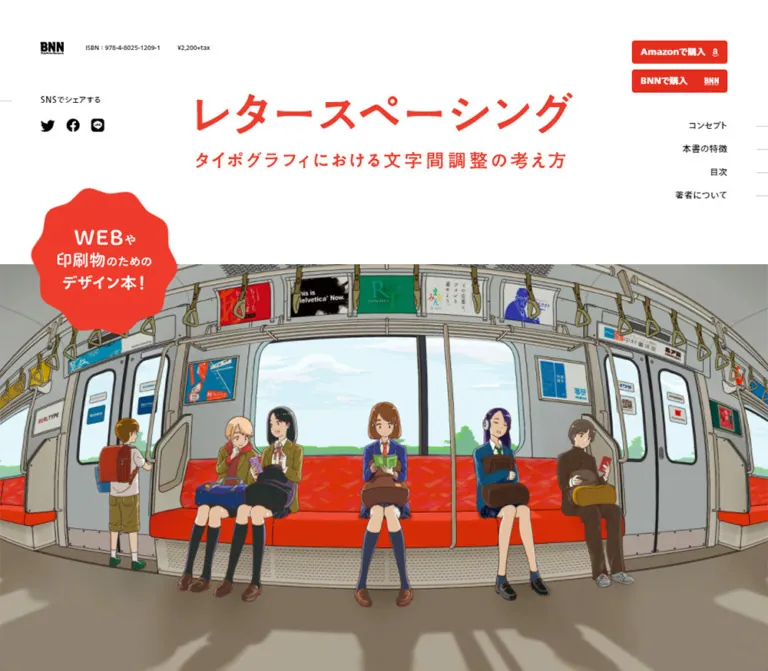
電車内のイラストと赤いタイトルが印象的な書籍紹介サイト。大きな余白、誌面見本、固定購入ボタンを組み合わせ、文字間調整の学びを視覚的に伝えています。
Letter Spacing / レタースペーシング — Style Reference
A typography textbook presented through generous white space, red lettering, and an illustrated train full of carefully spaced passengers.
Original URL: letter-spacing.mimiguri.co.jp Final URL: letter-spacing.mimiguri.co.jp — unchanged; supplied inspection reports HTTP 200. Theme: a light editorial presentation with white, black, red, and limited chapter colors. Inspected: October 5, 2026, 06:40 JST / October 4, 2026, 21:40 UTC. Viewports: desktop 1440 × 1000 CSS px; mobile 390 × 844 CSS px. Scope: supplied desktop captures of the opening, third feature section and spread gallery, and final purchase/footer area; mobile captures of the opening and final purchase/footer area; rendered text and selected computed styles across the longer page. Menu opening, image enlargement, link activation, and the Before/After treatment were not exercised in the supplied evidence.
This is a focused book presentation with substantial editorial content: a concept explanation, three learning stages, printed-page examples, an eight-chapter contents list, an author profile, and repeated retailer links. Its character comes from the relationship between careful typography and expressive illustration. The interface stays quiet enough for the train scene and book spreads to remain the main visual material.
The page uses several distinct scales. Small publisher details and purchase controls sit around a large illustrated opening. Feature sections combine expansive page previews with compact, generously led copy. Near the end, a saturated red band brings the cover, publication details, and black purchase buttons together. On desktop, the title is centered in the viewport while much of the reading content is shifted left to leave room for the fixed right navigation.
閉じる
Letter Spacing / レタースペーシング — Style Reference
A typography textbook presented through generous white space, red lettering, and an illustrated train full of carefully spaced passengers.
Original URL: letter-spacing.mimiguri.co.jp Final URL: letter-spacing.mimiguri.co.jp — unchanged; supplied inspection reports HTTP 200. Theme: a light editorial presentation with white, black, red, and limited chapter colors. Inspected: October 5, 2026, 06:40 JST / October 4, 2026, 21:40 UTC. Viewports: desktop 1440 × 1000 CSS px; mobile 390 × 844 CSS px. Scope: supplied desktop captures of the opening, third feature section and spread gallery, and final purchase/footer area; mobile captures of the opening and final purchase/footer area; rendered text and selected computed styles across the longer page. Menu opening, image enlargement, link activation, and the Before/After treatment were not exercised in the supplied evidence.
This is a focused book presentation with substantial editorial content: a concept explanation, three learning stages, printed-page examples, an eight-chapter contents list, an author profile, and repeated retailer links. Its character comes from the relationship between careful typography and expressive illustration. The interface stays quiet enough for the train scene and book spreads to remain the main visual material.
The page uses several distinct scales. Small publisher details and purchase controls sit around a large illustrated opening. Feature sections combine expansive page previews with compact, generously led copy. Near the end, a saturated red band brings the cover, publication details, and black purchase buttons together. On desktop, the title is centered in the viewport while much of the reading content is shifted left to leave room for the fixed right navigation.
How to Read This Reference
- Measured means a value is present in the supplied rendered DOM rectangles or computed styles. Positions refer to the captured viewport or document coordinates as appropriate.
- Estimated means a visual approximation from the supplied original-page screenshots. Estimated hexadecimal colors are working matches, not pixel samples or recovered CSS declarations.
- Calculated means arithmetic applied to measured values, such as a column gap or an available content width.
- Recommended means implementation guidance for a new build. It does not describe a verified feature of the original.
- Token names and CSS classes below are reusable aliases. The supplied custom-property extraction was empty; these names are not claimed as original source variables.
- Empty text in an
H1orH2does not establish the absence of an accessible name. It does mean that the visible graphical lettering cannot be assigned the element's inherited font size.
Tokens — Colors
Primary Palette
| Name | Value | Suggested token | Evidence and role |
|---|---|---|---|
| Paper | #ffffff |
--color-paper |
White is measured in reversed button labels and observed visually across the opening, printed pages, author panel, and footer. The sampled body background itself is transparent. |
| Ink | #000000 |
--color-ink |
Measured body text and large purchase-button fills; also the visible social symbols and footer line illustration. |
| Interface Red | #e42e1e |
--color-red |
Measured compact purchase-button fill, small English section labels, author/publisher links, and first-part label. |
| Display Red | approximately #f4382c |
--color-display-red |
Estimated from the large title, scalloped badge, and final purchase band. Their precise source colors were not supplied. |
| Pale Ground | approximately #f7f7f7 |
--color-ground |
Estimated near-white background behind the concept and feature material. |
| Fine Rule | approximately #d9d9d9 |
--color-rule |
Estimated thin author-panel boundary and inactive navigation ticks. |
The measured interface red and the estimated red of the large artwork should remain separate tokens until the original assets or styles can establish their exact relationship. Do not automatically recolor embedded title or cover artwork to match a button declaration.
Chapter and Printed-Page Colors
| Name | Value | Evidence | Use |
|---|---|---|---|
| Part One Red | #e42e1e |
Measured | First learning-stage label. |
| Part Two Green | #00ab3a |
Measured | Second learning-stage label. |
| Part Three Blue | #007dd8 |
Measured | Third learning-stage label; a closely matching blue appears in its diagram and magnifier control. |
| Printed Blue | approximately #afd3e5 |
Estimated | Blue field within the visible book spread. |
| Printed Pink | approximately #f4bcbc |
Estimated | Pink fields inside the lower spread previews. |
Green and blue organize the educational material. They are not alternate global purchase colors. The pale blue and pink belong principally to reproduced book pages, rather than to a general interface-card system.
No alternate color theme is shown in the supplied evidence.
Tokens — Typography
Observed Families
The computed body family is TazuganeGothicStdN-Regular, sans-serif. Bold labels, feature headings, and purchase controls use TazuganeGothicStdN-Bold, sans-serif.
Most bold elements also compute to weight 700. The contents and author headings instead compute to weight 400 while using the explicitly named Bold family. Preserve that distinction when interpreting the evidence; a numeric weight alone does not describe the selected face.
The root HTML element reports Times, but the body overrides it. This is not evidence for a visible serif-based interface.
For a new implementation, load these faces only when available and licensed. The CSS below names the observed families and retains a generic sans-serif fallback; it does not supply or assume access to font files.
Graphical Display Lettering
The opening title and subtitle form a graphical lockup. Its H1 contains no extracted text, and its inherited 14px font size does not explain the visible lettering.
- Desktop measured box:
520 × 104.59px, positioned atx: 460px,y: 128px. - Mobile measured wrapper:
390 × 55.92px, with56pxhorizontal padding. - Mobile calculated content width:
278px. - Visual treatment: large red Japanese title above a smaller, widely spaced red subtitle.
The main concept headline is also represented by an empty-text heading in the extraction. Its bold black appearance is visible in the mobile capture, but its font family and true display size cannot be recovered from the inherited heading style.
Use authorized graphical assets for these lockups when available. If rebuilding them as live text, identify that work as a typographic approximation and retain a meaningful accessible heading.
Measured Type Scale
Sizes and line heights below are desktop → mobile.
| Role | Font size / line height | Tracking | Family and notes |
|---|---|---|---|
| Body element default | 14 / 14px → 14 / 14px |
Normal | Regular; content paragraphs override this tight default. |
| Feature paragraph | 14 / 28px → 12 / 24px |
Normal | Regular; consistent 2 line-height ratio. |
| Concept paragraph | 14 / 35px → 12 / 24px |
Normal | Especially airy on desktop. |
| Concept supporting heading | 21 / 31.5px → 18 / 27px |
1.05px → 0.9px |
Bold, weight 700. |
| Feature heading | 27 / 40.5px → 20 / 30px |
1.35px → 1px |
Bold, weight 700; visible two-line phrasing. |
| Learning-stage label | 16 / 16px → 14 / 14px |
0.4px → 0.35px |
Bold; surrounding label box is taller than its text line. |
| Contents heading | 24 / 24px → 20 / 20px |
1.2px → 1px |
Bold family, computed weight 400. |
| Author heading | 24 / 24px → 16 / 16px |
1.2px → 0.8px |
Bold family, computed weight 400. |
| English section caption | 10 / 10px → 10 / 10px |
0.5px |
Bold red; examples include Concept and Index. |
| Compact purchase label | 12 / 33px → 10 / 34px |
0.3px → 0.25px |
Bold; actual button height is 32px. |
| Desktop navigation / offscreen mobile navigation | 12 / 12px → 16 / 16px |
0.6px → 0.8px |
Regular black on desktop; Bold white in the offscreen mobile link boxes. |
| Mid-page purchase label | 20 / 120px → 14 / 80px |
1px → 0.7px |
Bold, vertically aligned within large buttons. |
| Final-band purchase label | 14 / 72px → 14 / 80px |
0.7px |
Bold. |
| Publication details | 12 / 24px → 12 / 24px |
Normal | White regular text on the red band. |
| Footer contact URL | 12 / 12px → 10 / 10px |
Normal | Black regular text. |
Many headings use approximately 0.05em tracking, while compact purchase labels use 0.025em. Body paragraphs retain normal tracking. Avoid applying the heading tracking to all Japanese prose.
The opening ISBN and price both compute to 10px, but their reported rectangle heights are only 8px on desktop and 5px on mobile. The visual fine print is correspondingly tiny. Scaling or another ancestor-level effect may be involved; the supplied styles do not establish its mechanism.
Tokens — Spacing & Shapes
The composition repeatedly uses multiples of eight, but no source spacing scale was supplied. Treat an 8px working rhythm as an adaptation, not a recovered design-system declaration.
Measured and Calculated Spacing
| Relationship | Desktop | Mobile | Evidence |
|---|---|---|---|
| Compact purchase controls from top | 56px |
20px |
Measured. |
| Compact purchase controls from side | 56px from right |
20px from left |
Measured. |
| Gap between compact purchase controls | 8px, vertical |
8px, horizontal |
Calculated from rectangles. |
| Main reading region | x: 120–1200px, width 1080px |
x: 32–358px, width 326px |
Measured across major content and purchase rows. |
| Concept columns | 540px + 96px gap + 444px |
One 326px copy column |
Calculated from measured rectangles. |
| Feature copy | x: 784px, width 396px |
x: 32px, width 326px |
Measured. |
| Mid-page purchase pair | 528px + 24px gap + 528px |
Two 326px buttons, 8px vertical gap |
Measured/calculated. |
| Final purchase pair | About 270.19px wide; 16px vertical gap |
326px wide; 8px vertical gap |
Measured/calculated. |
| Feature-label start-to-start rhythm | About 583.52px |
About 519.05px |
Calculated between the three repeated labels; not a recovered fixed row height. |
| Mid-page purchase row to contents heading | 240px |
96px |
Calculated from button bottom to heading top. |
The desktop reading region is centered at x: 660px, whereas the viewport and hero title are centered at x: 720px. This 60px difference is a meaningful part of the composition. A universal centered container would lose the space reserved for the right rail.
Shapes and Dimensions
| Element | Dimensions or radius | Status |
|---|---|---|
| Desktop compact purchase button | 132 × 32px, 4px radius |
Measured. |
| Mobile compact purchase buttons | About 115.58 × 32px and 104.91 × 32px, 4px radius |
Measured; widths differ with label and logo space. |
| Desktop mid-page purchase button | 528 × 120px, 8px radius |
Measured. |
| Final desktop purchase button | About 270.19 × 72px, 6px radius |
Measured. |
| Large mobile purchase button | 326 × 80px, 6px radius |
Measured. |
| Hero seal | 200 × 200px desktop; 96 × 96px mobile |
Measured wrapper; scalloped silhouette is visible. |
| Magnifier square | Approximately 56 × 56px |
Screenshot estimate. |
| Final book cover | Approximately 320px wide desktop; 244px mobile |
Screenshot estimate. |
| Author information panel | Square corners, fine gray boundary | Screenshot observation; border width approximately 1px. |
Use mostly square artwork and flat surfaces. Rounded corners identify purchase controls; the irregular seal is a separate graphic gesture. There is no visible general-purpose shadow or elevated-card system.
Components
Persistent Purchase Controls and Section Navigation
Role: keep purchasing and section access available during the long read.
On desktop, the right rail starts at x: 1252px, y: 56px. Its two red retailer links are 132 × 32px, with white labels and small retailer marks. The second button starts at y: 96px.
Four right-aligned section links follow: コンセプト, 本書の特徴, 目次, and 著者について. Their measured rows are 32px high, beginning at y: 158px. Short horizontal ticks reach toward the viewport edge. In the feature capture, 本書の特徴 and its longer tick are red, visibly identifying the current section. The exact tracking mechanism was not supplied.
The same rail position remains visible in the scrolled desktop captures. On mobile, the two purchase controls remain near the upper-left corner and a two-stroke menu symbol sits at the upper right. The scrolled mobile purchase/footer capture retains these controls over the content, supporting persistent placement.
Observed destinations are:
Amazonで購入→https://amzn.to/3gwTUFNBNNで購入andBNNオンラインストアで購入→https://bnn.thebase.in/items/46823717- Section links → the original page's
#concept,#feature,#index, and#authoranchors.
The offscreen mobile navigation links measure 195 × 48px and begin at x: 390px. Their white, bold 16px text is measured, but the open menu's background, arrangement, entrance motion, and dismissal behavior are not visually verified.
Publisher Information and Sharing
Role: supply compact publication context without competing with the title.
The opening desktop publisher mark sits near x: 56px, y: 59px. ISBN and price form a fine-print row beside it. A separate SNSでシェアする label and three black social symbols sit below.
Mobile reorganizes this material into a compact second header row near y: 80px: publisher information at left and sharing at right. The publisher mark becomes 24px wide instead of 32px.
The supplied links identify Twitter sharing, Facebook sharing, and LINE sharing. The visible Twitter symbol is the bird used by the page; replacing it with a different platform mark would change the captured design. Desktop social-link boxes are about 34–36px wide with 8px padding; mobile boxes are 28px wide with 6px padding.
Opening Title, Train Illustration, and Seal
Role: establish the book's identity and turn spacing into a memorable visual subject.
The title lockup is centered in a large white field. It is visually independent of the small publisher material and right-side controls. A full-width train illustration begins below it, at approximately y: 361px on desktop and y: 264px on mobile.
The train is richly drawn: curved interior perspective, hanging straps, advertisements, orange-red upholstery, passengers, and a quiet landscape outside the windows. Different gaps between passengers create a strong visual connection to the subject of letter spacing, although this interpretation is not a verified statement of authorial intent.
A red scalloped seal overlaps the illustration's upper-left edge. It contains the white message WEBや印刷物のためのデザイン本!. The seal is not a conventional circular UI badge.
On mobile, the title's available graphic width becomes 278px. The train remains edge-to-edge and is cropped around its central passengers. The visible image region is approximately 350px high, ending near y: 613px. Do not squeeze the entire wide scene into a short thumbnail or distort the illustration to fit.
Concept Section
Role: explain the value of learning optical spacing.
A tiny red Concept caption introduces a much larger black graphical statement. The visible copy includes 文字間ひとつで、ここまで変わる。. Pale, oversized outline forms sit behind the section.
Desktop measurements establish a 540px left region and 444px right copy region, separated by 96px. The supporting heading uses 21px bold type, while the paragraph uses 14px text with an unusually open 35px line height.
Mobile moves the content into the 326px reading column and reduces the supporting heading to 18px; paragraphs become 12 / 24px. The text follows the graphical concept material instead of sharing a row with it.
The DOM contains Before and After labels. The supplied captures do not establish whether these belong to a slider, a toggle, a timed animation, or a static comparison. Preserve the comparison concept without inventing a verified interaction.
Three Learning-Stage Features
Role: explain the book's progression from fundamentals to observation and practice.
The three groups introduce basic concepts, differences between writing systems, and practical logo analysis/exercises. All three desktop copy regions share x: 784px and a width of 396px; the supplied measurements do not support an alternating left/right copy layout.
Each group contains a colored learning-stage label, a two-line black heading, and a short paragraph. Headings use 27 / 40.5px; paragraphs use 14 / 28px. Label colors progress through red, green, and blue.
The visible third group pairs a large printed spread on the left with copy and a blue line illustration on the right. The left preview occupies roughly 704px in the screenshot, leaving approximately 80px before the text region. Its blue magnifier square is attached to the lower-right corner.
In this third group, the part number appears in a filled blue chip, followed by blue descriptive text. The accompanying drawing combines a standing figure, outlined LOGO lettering, and a seated figure at an abc monitor. It is thin, diagrammatic, and playful.
Mobile measurements place each copy group in the same 326px column. Headings reduce to 20 / 30px, labels to 14px, and paragraphs to 12 / 24px. The mobile feature imagery itself is not included in the supplied screenshots, so its exact width, crop, and diagram placement remain unverified.
Spread Gallery and Editorial Statement
Role: show the book's visual teaching method and self-contained spread format.
A centered red statement reads 知りたいところだけサクッと読める見開き完結. Four small red dots sit over the emphasized phrase. Their placement reads as typographic emphasis; no pagination behavior is established.
Below, enlarged book-page samples form a broad horizontal composition that is clipped by the screenshot edges. White printed pages alternate with pale pink illustration fields and black/red typography. Their printed text belongs to the image content and should not be mistaken for the site's interface font scale.
The mobile text extraction includes a line break after 知りたいところだけサクッと. The supplied evidence does not establish swipe navigation, autoplay, or a carousel implementation.
Mid-Page Purchase Pair
Role: offer retailer choices after the explanatory material.
Two equal black links occupy the 1080px desktop reading region: 528px each, separated by 24px. They are unusually substantial at 120px high, with 20px bold white labels, small retailer marks, and 8px corners.
On mobile they stack, becoming 326 × 80px, with 8px between them, 14px labels, and 6px corners. These large black controls are intentionally different from the small red persistent controls.
Contents Section
Role: make the book's scope inspectable before purchase.
The section begins with 目次 and the small red caption Index. Desktop heading size is 24px; mobile is 20px. The English caption stays 10px.
The rendered text contains eight chapter groups, numbered subsections, and eight Column entries. Topics progress from the meaning of letter space through Latin, Japanese, mixed-script composition, real examples, and exercises.
No supplied screenshot shows this section's complete visual arrangement, and no item-level interaction evidence is present. Its column count, dividers, and any expand/collapse behavior are therefore unverified. For an adaptation, semantic chapter lists are a sound starting point; do not describe an accordion as an observed component.
Author and Publisher Panel
Role: provide authorship and publication context.
The desktop bottom capture shows the lower part of a white information panel with a fine gray border. The DOM places the author heading at x: 169px, inset from the main x: 120px alignment.
The content identifies 今市達也 as the book's author, includes a biography and the linked handle @ima_collection, and labels a publisher-information row with a link to http://www.bnn.co.jp/. These are book-related roles; the supplied original-page evidence does not turn the author's employment history into a website production credit.
Use the same quiet type hierarchy as the rest of the editorial content. The author heading drops to 16px on mobile, while its English caption remains 10px. The linked author and publisher text computes to 14 / 28px on desktop and 12 / 21px on mobile.
Final Purchase Band
Role: consolidate the physical book, publication facts, and purchase actions.
A wide saturated red field contains three desktop groups: the cover at left, a white title and specifications in the middle, and two stacked black purchase buttons at right. The cover is a flat front view, not a floating 3D product mockup.
The desktop screenshot suggests a band about 406px high and a cover about 320 × 454px, protruding roughly 24px above and below it. These are screenshot estimates. The measured specification text begins at x: 504px; the buttons begin at approximately x: 877.81px.
The specifications include the author, publisher, A5 format, 192 pages, ISBN, and the displayed price of 2,200 yen before tax. Use 12 / 24px white text. The current page's price is observed content, not a separately verified retailer price.
Mobile stacks the cover, white title lockup, details, and buttons. The cover is approximately 244px wide and centered. Details and buttons use the 32px side gutters. The final buttons are 326 × 80px, separated by 8px; the red field continues about 32px below the last button.
Footer
Role: close with publisher identity, sharing, contact, and a small illustration.
The desktop footer is white, spacious, and organized into publisher/copyright, sharing, and contact groups. A small black line drawing of a person beside a computer anchors the far-right edge. The drawing includes a speech bubble and continues the teaching theme without competing with the book cover above.
On mobile, the publisher mark and copyright share a row. Sharing follows beneath, then the contact label and URL. The illustration occupies the lower-right corner. The footer contact URL is visibly small at 10px on mobile; preserving its location does not require preserving that size in an accessible adaptation.
The visible copyright is © 2021 Tatsuya Imaichi. It is page content, not the date of this inspection.
Tokens — Motion & Interaction
| Treatment | Evidence | What can be stated |
|---|---|---|
| Compact desktop purchase buttons | background-color 0.25s cubic-bezier(0.215, 0.61, 0.355, 1) |
A short background-color transition is declared. Its destination color was not captured. |
| Large desktop purchase buttons | Color and background-color, each 0.25s with the same curve |
A coordinated color transition is declared. Hover end states remain unverified. |
| Desktop section links | color 0.375s cubic-bezier(0.215, 0.61, 0.355, 1) |
Navigation color changes have a slightly longer declared transition. |
| Author and publisher links | Color transition of 0.25s with the same curve on desktop |
Link color transition is measured; trigger and end state were not tested. |
| Persistent controls | Same viewport placement across scrolled captures | Visually persistent desktop rail and mobile purchase/menu controls. Exact positioning rules were not supplied. |
| Active feature navigation | Red feature label and extended red edge tick in the middle desktop capture | An active-section treatment is visible. Scroll-spy implementation is unknown. |
| Mobile menu | Menu symbol visible; navigation link boxes positioned beyond the right edge | A closed/offscreen state is evidenced. Opening motion, overlay, focus behavior, and dismissal are unverified. |
| Magnifier | White magnifier in a blue square on the spread preview | An enlargement affordance is visible. No modal or zoom result was captured. |
| Before/After | Labels present in rendered text | Comparison content exists; interaction mechanics are unknown. |
| Loading | Loading occurs in extracted text but not in the settled screenshots |
Do not invent a visible loader, duration, or entrance choreography. |
The sampled elements report animation: none, but this does not establish that the entire site has no animation. Mobile transition entries are often serialized only as all; without a duration, they do not support a numerical motion token.
The supplied capture process waited for layout, text, and visible-image stability, with bounded waits for finite animations. Perpetual animations were paused during readiness checks and then resumed. These procedures support the settled compositions shown here, not claims about every transient state or delayed interaction.
For an adaptation, restrained color feedback is consistent with the measured styles. Smooth scrolling, menu motion, image transitions, and reduced-motion behavior should be treated as explicit implementation choices.
Surfaces
| Surface | Appearance | Function |
|---|---|---|
| Opening field | Plain white | Gives the red title, tiny publication details, and purchase rail clear separation. |
| Editorial ground | Near-white with oversized pale outline forms | Connects concept and book-preview sections without becoming a strong texture. |
| Printed spreads | White pages with pink or blue printed fields | Demonstrate the actual book's teaching and layout. |
| Author panel | White, thin gray boundary, square corners | Groups biography and publisher information. |
| Final purchase band | Saturated red with white text | Reasserts the book identity and supports black purchase controls. |
| Footer | Plain white with black text and line drawing | Provides a quiet ending after the red band. |
| Purchase controls | Red when compact; black when large | Creates a clear distinction between persistent utility and dedicated purchase moments. |
Depth comes from overlap, scale, and color boundaries. The seal overlaps the train, the cover crosses the red band, and the fixed controls sit over the scrolling document. Soft card shadows are not needed to explain these layers.
Imagery
The illustration system has two complementary modes. The train scene is detailed, colorful, and spatially immersive. The supporting teaching graphics are sparse line drawings with a limited accent color. Book spreads bridge them by showing real typography, diagrams, and annotations.
Observed Visual References
No original image filenames or asset URLs were included in the supplied evidence. The references below identify visual roles rather than invented source paths.
| Visual | Observed characteristics | Reuse guidance |
|---|---|---|
| Opening title lockup | Red Japanese title over a smaller red subtitle | Preserve its proportions; supply an accessible text equivalent. |
| Train interior | Wide illustrated perspective, detailed ads and straps, orange-red seat, several passengers | Keep the full-width desktop impact and centered mobile crop. |
| Scalloped seal | Irregular red perimeter, compact white lettering | Use an authorized asset or deliberate equivalent; a plain circle loses the original silhouette. |
| Pale background forms | Oversized, very low-contrast outline contours resembling enlarged letter strokes | Keep behind content and nearly invisible at normal reading distance. |
| Third-part diagram | Thin blue people, outlined LOGO, and an abc monitor |
Match its spare stroke language rather than introducing unrelated stock icons. |
| Book spreads | Fine printed typography, annotations, diagrams, blue and pink fields | Preserve page proportions and embedded print detail. |
| Physical cover | White upper region with train image; red lower region with black text bands | Present as a flat cover with an intact aspect ratio. |
| Footer vignette | Small black line drawing with speech bubble and computer | Anchor it at the edge without obstructing contact information. |
The supplied captures show illustration and printed-page imagery rather than photography. Do not apply pixelated rendering to these assets: the desired appearance is clear print reproduction and drawn linework, not a bitmap effect.
Layout & Responsive Behavior
Desktop: 1440 × 1000
The opening title is centered across the full viewport. Publisher information occupies the upper-left corner and purchase/navigation controls occupy the upper-right corner. The train illustration spans the page width and continues below the first captured viewport.
Below the opening, the main reading region often extends from x: 120px to x: 1200px. This leaves more space on the right for the persistent rail. The concept uses two measured columns, while the visible feature section gives its printed spread an even wider, edge-reaching left region.
The final band uses a horizontal cover/details/actions arrangement. The footer spreads its utility groups across the same broad reading area, with its illustration farther right.
Mobile: 390 × 844
The upper purchase controls form a horizontal pair at y: 20px. The menu symbol occupies the opposite corner. Publisher information and social sharing move to a second row, and the centered title begins at y: 144px.
The train starts near y: 264px and ends near y: 613px. The concept caption starts at y: 677.38px, leaving approximately 64px after the image. Body copy uses 32px side gutters, while the title uses larger 56px insets.
Large purchase controls stack to fill the 326px reading width. The final book section becomes a vertical sequence, and the footer reorganizes into compact rows with the illustration at the lower right.
Verified Changes and Limits
| Element | Desktop | Mobile |
|---|---|---|
| Purchase utility | Two vertically stacked buttons at upper right | Two horizontal buttons at upper left |
| Section navigation | Visible right rail | Links positioned offscreen; menu symbol visible |
| Title content width | 520px |
278px calculated |
| Hero seal | 200px |
96px |
| Main prose | 14px |
12px |
| Feature heading | 27px |
20px |
| Mid-page purchase links | Two columns, 120px high |
One column, 80px high |
| Final purchase links | About 270px wide, 72px high |
326px wide, 80px high |
| Recorded document height | 7479.11px |
6409.48px |
The shorter mobile document is a measurement, not evidence that content was removed. Both text extractions include the same eight chapters and author/publication material.
Only these two viewport sizes were supplied. The actual breakpoint, tablet arrangements, landscape behavior, safe-area rules, and image-selection logic remain unknown. The Quick Start uses a recommended 960px breakpoint as an implementation starting point, not an original-source value.
Do’s and Don’ts
Do
- Preserve the contrast between tiny publication utilities, large graphical titles, and expansive illustrations.
- Keep the hero title centered in the viewport while allowing desktop reading content to sit farther left.
- Use the measured red for compact purchase controls and section accents.
- Reserve green and blue for the learning-stage material.
- Keep body copy calmly spaced:
14 / 28pxon desktop and12 / 24pxin the observed mobile layout. - Preserve the train's central passengers when cropping on mobile.
- Distinguish red persistent purchase links from black dedicated purchase buttons.
- Retain the cover's overlap across the final red band's edges.
- Use the actual book's spreads and graphical lettering when authorized and available.
- Keep the pale background forms subordinate to the text and images.
Don’t
- Don't assign the title a
14pxdisplay size because that value is inherited by its empty-text heading wrapper. - Don't center every desktop section in the same container and eliminate the right-rail clearance.
- Don't turn the three learning stages into generic rounded feature cards.
- Don't make green or blue the primary purchase color.
- Don't shrink the wide train illustration until all of it fits on a phone.
- Don't replace the scalloped seal with an ordinary pill badge.
- Don't describe the spread gallery as a carousel or the comparison as a draggable slider without further evidence.
- Don't infer an open-menu design from white text in offscreen link boxes.
- Don't promote the author's biography into a website production-credit claim.
- Don't treat the screenshot-estimated surface colors or the recommended breakpoint as recovered source CSS.
Recommended Implementation Additions
These are recommendations for a new implementation, not verified features of the original:
- Keep graphical titles inside properly named heading structures. Check accessible names instead of assuming that empty extracted text means the original is unnamed.
- Increase invisible hit areas around the compact purchase links, social symbols, and menu icon toward
44pxwithout enlarging every visible graphic. - Use accessible names for icon-only sharing and magnifier controls.
- If a mobile panel is implemented, keep closed content out of keyboard navigation and manage focus, Escape dismissal, and
aria-expandedconsistently. - Add a strong keyboard focus treatment that remains visible on white, black, and red surfaces.
- Provide text descriptions or accessible alternatives for instructional spread images; important teaching content should not depend solely on tiny raster text.
- Consider larger mobile reading and utility text while preserving the original hierarchy. The captured ISBN and footer URL are especially small.
- Ensure persistent controls do not cover anchor targets, enlarged text, or important content at intermediate widths.
- Use
prefers-reduced-motionfor any added scrolling or menu effects. Do not invent continuous motion merely because the page contains illustrations.
Agent Prompt Guide
Quick Color Reference
- Canvas and panels: white
#ffffff. - Body text and large purchase controls: black
#000000. - Measured interface red:
#e42e1e. - Approximate large display/band red:
#f4382c; validate against available artwork. - Second-stage label: green
#00ab3a. - Third-stage label: blue
#007dd8. - Editorial background: approximately
#f7f7f7, with extremely pale outline forms. - Printed pink and blue remain part of the book imagery rather than becoming general card fills.
Overall Prompt
“Create a Japanese typography-book presentation inspired by the observed レタースペーシング page. Use white space, black Japanese sans-serif body text, red graphical title lettering, and a detailed full-width commuter-train illustration. Place small publisher details at the upper left and persistent compact red retailer links above a right-side section rail on desktop. Shift the main editorial reading region slightly left of the viewport center. Present three learning stages with red, green, and blue labels, large printed spreads, black two-line headings, and restrained line illustrations. Finish with a broad red band containing a flat book cover, white specifications, and black purchase buttons. On mobile, retain the purchase links beside a menu symbol, crop the train around its center, use 32px content gutters, and stack the final purchase content. Treat unobserved interactions as new implementation decisions.”
Example Component Prompts
- Opening: “A white book-title field with a centered red Japanese title/subtitle graphic. Tiny black publisher information sits at left; two compact red purchase links sit at right. Below, a wide illustrated train interior reaches both edges. A large irregular red seal overlaps the image at its upper-left edge.”
- Feature section: “A large uncropped printed spread on the left and a 396px text column on the right. Begin with a blue part label, then a black two-line 27px heading and 14px body text with 28px leading. Add a sparse blue instructional drawing and a square magnifier cue attached to the spread.”
- Purchase band: “A saturated red horizontal band with a flat portrait book cover protruding slightly above and below it. Place white title artwork and compact publication facts in the middle, and two stacked black retailer buttons at right. Use modest six-pixel corners and no product shadow.”
- Mobile adaptation: “At 390px wide, place two 32px-high red purchase links near the top-left and a two-line menu symbol at the top-right. Center a 278px title graphic below a compact publisher/share row. Show a 350px-high centered crop of the train. Use 32px gutters for prose and full-width stacked 80px purchase buttons.”
- Footer: “A quiet white footer with a black publisher mark, a small copyright line, three black sharing symbols, and a contact URL. Put a small hand-drawn person and computer at the lower-right edge. Avoid a heavy divider or a dark footer block.”
Quick Start
CSS Custom Properties
This is an adaptation using measured values where available. The display red, background gray, chapter-image geometry, intermediate-width formulas, and 960px breakpoint are recommendations or estimates. Supply authorized title, seal, train, cover, spread, and background artwork separately; no asset paths are invented here.
The snippets style the closed mobile-menu state. Menu behavior, current-section tracking, and any image enlargement require separate implementation and verification.
:root {
  /* Measured interface colors */
  --color-paper: #ffffff;
  --color-ink: #000000;
  --color-red: #e42e1e;
  --color-green: #00ab3a;
  --color-blue: #007dd8;

  /* Screenshot estimates: validate against available artwork */
  --color-display-red: #f4382c;
  --color-ground: #f7f7f7;
  --color-rule: #d9d9d9;

  /* Observed families; font files are not provided here */
  --font-body: 'TazuganeGothicStdN-Regular', sans-serif;
  --font-bold: 'TazuganeGothicStdN-Bold', sans-serif;
  --text-body: 14px;
  --text-feature: 27px;
  --text-caption: 10px;
  --leading-body: 2;
  --leading-heading: 1.5;
  --tracking-heading: 0.05em;

  --space-1: 8px;
  --space-2: 16px;
  --space-3: 24px;
  --space-4: 32px;
  --space-6: 48px;
  --space-8: 64px;
  --content-width: 1080px;
  --radius-compact: 4px;
  --radius-button: 6px;
  --radius-large: 8px;

  --ease-interface: cubic-bezier(0.215, 0.61, 0.355, 1);
  --motion-color: 250ms var(--ease-interface);
  --motion-nav: 375ms var(--ease-interface);
}

* { box-sizing: border-box; }
body { margin: 0; }
img { display: block; max-width: 100%; }
button, a { -webkit-tap-highlight-color: transparent; }

.book-page {
  color: var(--color-ink);
  background: var(--color-paper);
  font-family: var(--font-body);
  font-size: var(--text-body);
  line-height: var(--leading-body);
}

/* Recommended formula: reproduces x=120 and width=1080 at 1440px. */
.content-rail {
  width: min(var(--content-width), calc(100% - 240px));
  margin-inline-start: max(32px, calc((100% - 1200px) / 2));
}

.purchase-rail {
  position: fixed;
  z-index: 30;
  top: 56px;
  right: 56px;
  width: 132px;
}

.rail-actions { display: grid; gap: 8px; }

.buy {
  display: flex;
  align-items: center;
  justify-content: center;
  gap: 16px;
  width: 100%;
  min-height: 72px;
  padding: 12px 16px;
  border-radius: var(--radius-button);
  color: var(--color-paper);
  background: var(--color-ink);
  font-family: var(--font-bold);
  font-size: 14px;
  font-weight: 700;
  line-height: 1.5;
  letter-spacing: 0.05em;
  text-decoration: none;
  transition: color var(--motion-color),
    background-color var(--motion-color);
}

.buy--compact {
  justify-content: space-between;
  gap: 8px;
  min-height: 32px;
  padding: 0 12px;
  border-radius: var(--radius-compact);
  background: var(--color-red);
  font-size: 12px;
  letter-spacing: 0.025em;
}

.buy__mark { flex: none; width: auto; height: 14px; }
.section-nav { margin-top: 30px; }

.section-nav a {
  position: relative;
  display: block;
  padding-block: 10px;
  color: var(--color-ink);
  font-size: 12px;
  line-height: 12px;
  letter-spacing: 0.05em;
  text-align: right;
  text-decoration: none;
  transition: color var(--motion-nav);
}

.section-nav a::after {
  content: '';
  position: absolute;
  top: 50%;
  right: -56px;
  width: 16px;
  height: 1px;
  background: var(--color-rule);
}

.section-nav a[aria-current='location'] { color: var(--color-red); }
.section-nav a[aria-current='location']::after {
  width: 36px;
  background: currentColor;
}

.menu-trigger { display: none; }

.hero { position: relative; padding-top: 128px; }
.hero-title { width: 520px; margin: 0 auto; }
.hero-title img { width: 100%; height: auto; }
.hero-meta { position: absolute; top: 56px; left: 56px; }
.hero-share { position: absolute; top: 132px; left: 56px; }
.hero-art { position: relative; margin-top: 128px; }
.hero-art > img { width: 100%; height: auto; }
.hero-seal { position: absolute; top: -100px; left: 44px; width: 200px; }

/* Add the pale outline artwork as a separate decorative layer. */
.editorial-ground { background: var(--color-ground); }
.section-caption {
  color: var(--color-red);
  font-family: var(--font-bold);
  font-size: 10px;
  font-weight: 700;
  line-height: 1;
  letter-spacing: 0.05em;
}

.concept {
  display: grid;
  grid-template-columns: minmax(0, 540fr) minmax(0, 444fr);
  gap: 96px;
  padding-block: 120px;
}

.concept-copy h3 {
  font-family: var(--font-bold);
  font-size: 21px;
  line-height: 1.5;
  letter-spacing: 0.05em;
}
.concept-copy p { line-height: 2.5; }

/* Recommended geometry matching the visible desktop feature row. */
.feature-row {
  display: grid;
  grid-template-columns: minmax(0, 1fr) minmax(0, 396px);
  gap: 80px;
  width: calc(100% - 260px);
  max-width: 1180px;
}
.feature-row + .feature-row { margin-top: 80px; }
.feature-visual { position: relative; margin: 0; }
.feature-visual > img { width: 100%; height: auto; }
.feature-copy { --part-color: var(--color-red); }
.feature-copy--green { --part-color: var(--color-green); }
.feature-copy--blue { --part-color: var(--color-blue); }

.part-label {
  color: var(--part-color);
  font-family: var(--font-bold);
  font-size: 16px;
  font-weight: 700;
  line-height: 1;
  letter-spacing: 0.025em;
}
.feature-copy h2 {
  margin: 25px 0 26px;
  font-family: var(--font-bold);
  font-size: var(--text-feature);
  font-weight: 700;
  line-height: var(--leading-heading);
  letter-spacing: var(--tracking-heading);
}
.feature-copy p { margin-block: 0; }

.preview-zoom {
  position: absolute;
  right: 0;
  bottom: 0;
  display: grid;
  place-items: center;
  width: 56px;
  height: 56px;
  border: 0;
  color: white;
  background: var(--color-blue);
}

.spread-statement {
  color: var(--color-red);
  font-family: var(--font-bold);
  text-align: center;
}
.spread-statement em {
  font-style: normal;
  text-emphasis: filled dot;
  text-emphasis-position: over;
}

.purchase-pair { display: grid; grid-template-columns: 1fr 1fr; gap: 24px; }
.purchase-pair .buy {
  min-height: 120px;
  border-radius: var(--radius-large);
  font-size: 20px;
}

.section-title { display: flex; align-items: baseline; gap: 12px; }
.section-title h2 {
  margin: 0;
  font-family: var(--font-bold);
  font-size: 24px;
  font-weight: 400;
  line-height: 1;
  letter-spacing: 0.05em;
}
.author-panel {
  padding: 48px;
  border: 1px solid var(--color-rule);
  background: var(--color-paper);
}
.author-panel a { color: var(--color-red); }

.sale-band { color: white; background: var(--color-display-red); }
.sale-inner {
  display: grid;
  grid-template-columns: minmax(0, 320fr) minmax(0, 310fr) minmax(0, 270fr);
  gap: 64px;
  align-items: center;
  max-width: 1028px;
  min-height: 406px;
}
.sale-cover { width: 100%; height: auto; margin-block: -24px; }
.sale-details { font-size: 12px; line-height: 24px; }
.sale-actions { display: grid; gap: 16px; }

.page-footer { position: relative; padding-block: 80px; background: white; }
.footer-inner { display: grid; grid-template-columns: repeat(3, minmax(0, 1fr)); }
.footer-contact { overflow-wrap: anywhere; }
.footer-drawing { position: absolute; right: 56px; bottom: 0; width: 150px; }

/* Suggested hover endpoints; original endpoints were not captured. */
@media (hover: hover) {
  .buy:hover { background: var(--color-red); }
  .buy--compact:hover { background: var(--color-ink); }
}

/* Recommended accessible focus treatment. */
.book-page :focus-visible {
  outline: 2px solid var(--color-ink);
  outline-offset: 4px;
  box-shadow: 0 0 0 4px var(--color-paper);
}

/* Recommended breakpoint; the original breakpoint is unknown. */
@media (max-width: 960px) {
  .book-page { --text-body: 12px; --text-feature: 20px; }
  .content-rail { width: calc(100% - 64px); margin-inline: 32px; }
  .purchase-rail { top: 20px; left: 20px; right: auto; width: auto; }
  .rail-actions { grid-auto-flow: column; gap: 8px; }
  .buy--compact { width: auto; font-size: 10px; }
  .section-nav { display: none; }

  /* Larger hit area around a small two-stroke visual. */
  .menu-trigger {
    display: block;
    position: fixed;
    top: 14px;
    right: 10px;
    width: 44px;
    height: 44px;
    padding: 0;
    border: 0;
    background: transparent;
  }
  .menu-trigger::before, .menu-trigger::after {
    content: '';
    position: absolute;
    left: 10px;
    top: 18px;
    width: 24px;
    height: 2px;
    background: var(--color-ink);
  }
  .menu-trigger::after { top: 24px; }

  .hero { padding-top: 144px; }
  .hero-title { width: calc(100% - 112px); }
  .hero-meta { top: 80px; left: 20px; }
  .hero-share { top: 80px; left: auto; right: 20px; }
  .hero-art { margin-top: 64px; }
  .hero-art > img { height: 350px; object-fit: cover; object-position: center; }
  .hero-seal { top: -32px; left: 16px; width: 96px; }

  .concept { grid-template-columns: 1fr; gap: 48px; padding-block: 64px; }
  .concept-copy h3 { font-size: 18px; }
  .concept-copy p { line-height: 2; }
  .feature-row { width: 100%; grid-template-columns: 1fr; gap: 24px; }
  .feature-copy { margin-inline: 32px; }
  .part-label { font-size: 14px; }
  .feature-copy h2 { margin-block: 19px 17px; }

  .purchase-pair { grid-template-columns: 1fr; gap: 8px; }
  .purchase-pair .buy, .sale-actions .buy {
    min-height: 80px;
    border-radius: 6px;
    font-size: 14px;
  }
  .section-title h2 { font-size: 20px; }
  .author-panel { padding: 24px; }
  .author-panel .section-title h2 { font-size: 16px; }

  .sale-band { padding-block: 32px; }
  .sale-inner { grid-template-columns: 1fr; gap: 32px; min-height: 0; }
  .sale-cover { width: min(244px, 100%); justify-self: center; margin: -56px 0 8px; }
  .sale-actions { gap: 8px; }
  .page-footer { padding-block: 48px; }
  .footer-inner { grid-template-columns: 1fr; gap: 24px; }
  .footer-drawing { right: 20px; width: 90px; pointer-events: none; }
  .footer-contact { padding-right: 100px; }
}

/* Recommended for any optional motion added to this adaptation. */
@media (prefers-reduced-motion: reduce) {
  .buy, .section-nav a { transition: none; }
}
The cover overlap and mobile feature stacking in this CSS are adaptation choices informed by the visible layout; their complete original rules were not supplied. Avoid setting whole-page fixed heights from the recorded document measurements. Let actual content and asset proportions determine the document length.
Tailwind v4 Token Mapping
Optional aliases for a project already using Tailwind v4. This does not imply that the original website uses Tailwind. Define the properties above first.
@theme inline {
  --color-paper: var(--color-paper);
  --color-interface-red: var(--color-red);
  --color-display-red: var(--color-display-red);
  --color-chapter-green: var(--color-green);
  --color-chapter-blue: var(--color-blue);

  --font-editorial: var(--font-body);
  --font-emphasis: var(--font-bold);
  --text-editorial: var(--text-body);
  --text-feature-heading: var(--text-feature);
  --text-section-caption: 10px;

  --spacing-page-gutter: 32px;
  --spacing-rail-offset: 56px;
  --radius-purchase-small: 4px;
  --radius-purchase: 6px;
  --radius-purchase-large: 8px;
}
Sources & Evidence
- Inspected original and final page: https://letter-spacing.mimiguri.co.jp/. The supplied record reports HTTP 200 and no URL change.
- Capture timestamp:
2026-10-04T21:40:16.417Z, equivalent to October 5, 2026, 06:40:16 JST. - Desktop evidence: three supplied original-page captures at
1440 × 1000, plus rendered text, link destinations, selected element rectangles, computed typography, colors, radii, and transition declarations. Recorded document height: approximately7479.11px. - Mobile evidence: two supplied original-page captures at
390 × 844, with corresponding rendered DOM measurements. Recorded document height: approximately6409.48px. - Visual coverage: opening composition, third feature/spread area, final purchase band, and footer; mobile opening and final purchase/footer. Contents, most concept details, and portions of the author section are supported primarily by DOM evidence rather than complete screenshots.
- Interaction coverage: scrolled compositions, persistent controls, a visible active navigation state, and declared desktop color transitions. No supplied click results establish menu opening, retailer navigation, image zoom, sharing completion, or Before/After mechanics.
- Inspection limitations: selected computed styles rather than a complete stylesheet; no asset inventory or confirmed source breakpoints; settled captures rather than continuous motion recordings. The supplied inspection disabled SharedWorkers and service workers.
This reference analyzes the supplied current-page evidence. It does not claim an additional live visit or a reconstruction of a historical version. Screenshot estimates and implementation recommendations are identified separately from measured values.
# Letter Spacing / レタースペーシング — Style Reference

> A typography textbook presented through generous white space, red lettering, and an illustrated train full of carefully spaced passengers.

**Original URL:** [letter-spacing.mimiguri.co.jp](https://letter-spacing.mimiguri.co.jp/)
**Final URL:** [letter-spacing.mimiguri.co.jp](https://letter-spacing.mimiguri.co.jp/) — unchanged; supplied inspection reports HTTP 200.
**Theme:** a light editorial presentation with white, black, red, and limited chapter colors.
**Inspected:** October 5, 2026, 06:40 JST / October 4, 2026, 21:40 UTC.
**Viewports:** desktop **1440 × 1000 CSS px**; mobile **390 × 844 CSS px**.
**Scope:** supplied desktop captures of the opening, third feature section and spread gallery, and final purchase/footer area; mobile captures of the opening and final purchase/footer area; rendered text and selected computed styles across the longer page. Menu opening, image enlargement, link activation, and the Before/After treatment were not exercised in the supplied evidence.

This is a focused book presentation with substantial editorial content: a concept explanation, three learning stages, printed-page examples, an eight-chapter contents list, an author profile, and repeated retailer links. Its character comes from the relationship between careful typography and expressive illustration. The interface stays quiet enough for the train scene and book spreads to remain the main visual material.

The page uses several distinct scales. Small publisher details and purchase controls sit around a large illustrated opening. Feature sections combine expansive page previews with compact, generously led copy. Near the end, a saturated red band brings the cover, publication details, and black purchase buttons together. On desktop, the title is centered in the viewport while much of the reading content is shifted left to leave room for the fixed right navigation.
閉じる
# Letter Spacing / レタースペーシング — Style Reference

> A typography textbook presented through generous white space, red lettering, and an illustrated train full of carefully spaced passengers.

**Original URL:** [letter-spacing.mimiguri.co.jp](https://letter-spacing.mimiguri.co.jp/)
**Final URL:** [letter-spacing.mimiguri.co.jp](https://letter-spacing.mimiguri.co.jp/) — unchanged; supplied inspection reports HTTP 200.
**Theme:** a light editorial presentation with white, black, red, and limited chapter colors.
**Inspected:** October 5, 2026, 06:40 JST / October 4, 2026, 21:40 UTC.
**Viewports:** desktop **1440 × 1000 CSS px**; mobile **390 × 844 CSS px**.
**Scope:** supplied desktop captures of the opening, third feature section and spread gallery, and final purchase/footer area; mobile captures of the opening and final purchase/footer area; rendered text and selected computed styles across the longer page. Menu opening, image enlargement, link activation, and the Before/After treatment were not exercised in the supplied evidence.

This is a focused book presentation with substantial editorial content: a concept explanation, three learning stages, printed-page examples, an eight-chapter contents list, an author profile, and repeated retailer links. Its character comes from the relationship between careful typography and expressive illustration. The interface stays quiet enough for the train scene and book spreads to remain the main visual material.

The page uses several distinct scales. Small publisher details and purchase controls sit around a large illustrated opening. Feature sections combine expansive page previews with compact, generously led copy. Near the end, a saturated red band brings the cover, publication details, and black purchase buttons together. On desktop, the title is centered in the viewport while much of the reading content is shifted left to leave room for the fixed right navigation.

## How to Read This Reference

- **Measured** means a value is present in the supplied rendered DOM rectangles or computed styles. Positions refer to the captured viewport or document coordinates as appropriate.
- **Estimated** means a visual approximation from the supplied original-page screenshots. Estimated hexadecimal colors are working matches, not pixel samples or recovered CSS declarations.
- **Calculated** means arithmetic applied to measured values, such as a column gap or an available content width.
- **Recommended** means implementation guidance for a new build. It does not describe a verified feature of the original.
- Token names and CSS classes below are reusable aliases. The supplied custom-property extraction was empty; these names are not claimed as original source variables.
- Empty text in an `H1` or `H2` does not establish the absence of an accessible name. It does mean that the visible graphical lettering cannot be assigned the element's inherited font size.

## Tokens — Colors

### Primary Palette

| Name | Value | Suggested token | Evidence and role |
| --- | --- | --- | --- |
| Paper | `#ffffff` | `--color-paper` | White is measured in reversed button labels and observed visually across the opening, printed pages, author panel, and footer. The sampled body background itself is transparent. |
| Ink | `#000000` | `--color-ink` | Measured body text and large purchase-button fills; also the visible social symbols and footer line illustration. |
| Interface Red | `#e42e1e` | `--color-red` | Measured compact purchase-button fill, small English section labels, author/publisher links, and first-part label. |
| Display Red | approximately `#f4382c` | `--color-display-red` | Estimated from the large title, scalloped badge, and final purchase band. Their precise source colors were not supplied. |
| Pale Ground | approximately `#f7f7f7` | `--color-ground` | Estimated near-white background behind the concept and feature material. |
| Fine Rule | approximately `#d9d9d9` | `--color-rule` | Estimated thin author-panel boundary and inactive navigation ticks. |

The measured interface red and the estimated red of the large artwork should remain separate tokens until the original assets or styles can establish their exact relationship. Do not automatically recolor embedded title or cover artwork to match a button declaration.

### Chapter and Printed-Page Colors

| Name | Value | Evidence | Use |
| --- | --- | --- | --- |
| Part One Red | `#e42e1e` | Measured | First learning-stage label. |
| Part Two Green | `#00ab3a` | Measured | Second learning-stage label. |
| Part Three Blue | `#007dd8` | Measured | Third learning-stage label; a closely matching blue appears in its diagram and magnifier control. |
| Printed Blue | approximately `#afd3e5` | Estimated | Blue field within the visible book spread. |
| Printed Pink | approximately `#f4bcbc` | Estimated | Pink fields inside the lower spread previews. |

Green and blue organize the educational material. They are not alternate global purchase colors. The pale blue and pink belong principally to reproduced book pages, rather than to a general interface-card system.

No alternate color theme is shown in the supplied evidence.

## Tokens — Typography

### Observed Families

The computed body family is **`TazuganeGothicStdN-Regular, sans-serif`**. Bold labels, feature headings, and purchase controls use **`TazuganeGothicStdN-Bold, sans-serif`**.

Most bold elements also compute to weight `700`. The contents and author headings instead compute to weight `400` while using the explicitly named Bold family. Preserve that distinction when interpreting the evidence; a numeric weight alone does not describe the selected face.

The root HTML element reports `Times`, but the body overrides it. This is not evidence for a visible serif-based interface.

For a new implementation, load these faces only when available and licensed. The CSS below names the observed families and retains a generic sans-serif fallback; it does not supply or assume access to font files.

### Graphical Display Lettering

The opening title and subtitle form a graphical lockup. Its `H1` contains no extracted text, and its inherited `14px` font size does not explain the visible lettering.

- **Desktop measured box:** `520 × 104.59px`, positioned at `x: 460px`, `y: 128px`.
- **Mobile measured wrapper:** `390 × 55.92px`, with `56px` horizontal padding.
- **Mobile calculated content width:** `278px`.
- **Visual treatment:** large red Japanese title above a smaller, widely spaced red subtitle.

The main concept headline is also represented by an empty-text heading in the extraction. Its bold black appearance is visible in the mobile capture, but its font family and true display size cannot be recovered from the inherited heading style.

Use authorized graphical assets for these lockups when available. If rebuilding them as live text, identify that work as a typographic approximation and retain a meaningful accessible heading.

### Measured Type Scale

Sizes and line heights below are desktop → mobile.

| Role | Font size / line height | Tracking | Family and notes |
| --- | --- | --- | --- |
| Body element default | `14 / 14px` → `14 / 14px` | Normal | Regular; content paragraphs override this tight default. |
| Feature paragraph | `14 / 28px` → `12 / 24px` | Normal | Regular; consistent `2` line-height ratio. |
| Concept paragraph | `14 / 35px` → `12 / 24px` | Normal | Especially airy on desktop. |
| Concept supporting heading | `21 / 31.5px` → `18 / 27px` | `1.05px` → `0.9px` | Bold, weight `700`. |
| Feature heading | `27 / 40.5px` → `20 / 30px` | `1.35px` → `1px` | Bold, weight `700`; visible two-line phrasing. |
| Learning-stage label | `16 / 16px` → `14 / 14px` | `0.4px` → `0.35px` | Bold; surrounding label box is taller than its text line. |
| Contents heading | `24 / 24px` → `20 / 20px` | `1.2px` → `1px` | Bold family, computed weight `400`. |
| Author heading | `24 / 24px` → `16 / 16px` | `1.2px` → `0.8px` | Bold family, computed weight `400`. |
| English section caption | `10 / 10px` → `10 / 10px` | `0.5px` | Bold red; examples include `Concept` and `Index`. |
| Compact purchase label | `12 / 33px` → `10 / 34px` | `0.3px` → `0.25px` | Bold; actual button height is `32px`. |
| Desktop navigation / offscreen mobile navigation | `12 / 12px` → `16 / 16px` | `0.6px` → `0.8px` | Regular black on desktop; Bold white in the offscreen mobile link boxes. |
| Mid-page purchase label | `20 / 120px` → `14 / 80px` | `1px` → `0.7px` | Bold, vertically aligned within large buttons. |
| Final-band purchase label | `14 / 72px` → `14 / 80px` | `0.7px` | Bold. |
| Publication details | `12 / 24px` → `12 / 24px` | Normal | White regular text on the red band. |
| Footer contact URL | `12 / 12px` → `10 / 10px` | Normal | Black regular text. |

Many headings use approximately `0.05em` tracking, while compact purchase labels use `0.025em`. Body paragraphs retain normal tracking. Avoid applying the heading tracking to all Japanese prose.

The opening ISBN and price both compute to `10px`, but their reported rectangle heights are only `8px` on desktop and `5px` on mobile. The visual fine print is correspondingly tiny. Scaling or another ancestor-level effect may be involved; the supplied styles do not establish its mechanism.

## Tokens — Spacing & Shapes

The composition repeatedly uses multiples of eight, but no source spacing scale was supplied. Treat an **8px working rhythm** as an adaptation, not a recovered design-system declaration.

### Measured and Calculated Spacing

| Relationship | Desktop | Mobile | Evidence |
| --- | --- | --- | --- |
| Compact purchase controls from top | `56px` | `20px` | Measured. |
| Compact purchase controls from side | `56px` from right | `20px` from left | Measured. |
| Gap between compact purchase controls | `8px`, vertical | `8px`, horizontal | Calculated from rectangles. |
| Main reading region | `x: 120–1200px`, width `1080px` | `x: 32–358px`, width `326px` | Measured across major content and purchase rows. |
| Concept columns | `540px + 96px gap + 444px` | One `326px` copy column | Calculated from measured rectangles. |
| Feature copy | `x: 784px`, width `396px` | `x: 32px`, width `326px` | Measured. |
| Mid-page purchase pair | `528px + 24px gap + 528px` | Two `326px` buttons, `8px` vertical gap | Measured/calculated. |
| Final purchase pair | About `270.19px` wide; `16px` vertical gap | `326px` wide; `8px` vertical gap | Measured/calculated. |
| Feature-label start-to-start rhythm | About `583.52px` | About `519.05px` | Calculated between the three repeated labels; not a recovered fixed row height. |
| Mid-page purchase row to contents heading | `240px` | `96px` | Calculated from button bottom to heading top. |

The desktop reading region is centered at `x: 660px`, whereas the viewport and hero title are centered at `x: 720px`. This 60px difference is a meaningful part of the composition. A universal centered container would lose the space reserved for the right rail.

### Shapes and Dimensions

| Element | Dimensions or radius | Status |
| --- | --- | --- |
| Desktop compact purchase button | `132 × 32px`, `4px` radius | Measured. |
| Mobile compact purchase buttons | About `115.58 × 32px` and `104.91 × 32px`, `4px` radius | Measured; widths differ with label and logo space. |
| Desktop mid-page purchase button | `528 × 120px`, `8px` radius | Measured. |
| Final desktop purchase button | About `270.19 × 72px`, `6px` radius | Measured. |
| Large mobile purchase button | `326 × 80px`, `6px` radius | Measured. |
| Hero seal | `200 × 200px` desktop; `96 × 96px` mobile | Measured wrapper; scalloped silhouette is visible. |
| Magnifier square | Approximately `56 × 56px` | Screenshot estimate. |
| Final book cover | Approximately `320px` wide desktop; `244px` mobile | Screenshot estimate. |
| Author information panel | Square corners, fine gray boundary | Screenshot observation; border width approximately `1px`. |

Use mostly square artwork and flat surfaces. Rounded corners identify purchase controls; the irregular seal is a separate graphic gesture. There is no visible general-purpose shadow or elevated-card system.

## Components

### Persistent Purchase Controls and Section Navigation

**Role:** keep purchasing and section access available during the long read.

On desktop, the right rail starts at `x: 1252px`, `y: 56px`. Its two red retailer links are `132 × 32px`, with white labels and small retailer marks. The second button starts at `y: 96px`.

Four right-aligned section links follow: `コンセプト`, `本書の特徴`, `目次`, and `著者について`. Their measured rows are `32px` high, beginning at `y: 158px`. Short horizontal ticks reach toward the viewport edge. In the feature capture, `本書の特徴` and its longer tick are red, visibly identifying the current section. The exact tracking mechanism was not supplied.

The same rail position remains visible in the scrolled desktop captures. On mobile, the two purchase controls remain near the upper-left corner and a two-stroke menu symbol sits at the upper right. The scrolled mobile purchase/footer capture retains these controls over the content, supporting persistent placement.

Observed destinations are:

- `Amazonで購入` → `https://amzn.to/3gwTUFN`
- `BNNで購入` and `BNNオンラインストアで購入` → `https://bnn.thebase.in/items/46823717`
- Section links → the original page's `#concept`, `#feature`, `#index`, and `#author` anchors.

The offscreen mobile navigation links measure `195 × 48px` and begin at `x: 390px`. Their white, bold `16px` text is measured, but the open menu's background, arrangement, entrance motion, and dismissal behavior are not visually verified.

### Publisher Information and Sharing

**Role:** supply compact publication context without competing with the title.

The opening desktop publisher mark sits near `x: 56px`, `y: 59px`. ISBN and price form a fine-print row beside it. A separate `SNSでシェアする` label and three black social symbols sit below.

Mobile reorganizes this material into a compact second header row near `y: 80px`: publisher information at left and sharing at right. The publisher mark becomes `24px` wide instead of `32px`.

The supplied links identify Twitter sharing, Facebook sharing, and LINE sharing. The visible Twitter symbol is the bird used by the page; replacing it with a different platform mark would change the captured design. Desktop social-link boxes are about `34–36px` wide with `8px` padding; mobile boxes are `28px` wide with `6px` padding.

### Opening Title, Train Illustration, and Seal

**Role:** establish the book's identity and turn spacing into a memorable visual subject.

The title lockup is centered in a large white field. It is visually independent of the small publisher material and right-side controls. A full-width train illustration begins below it, at approximately `y: 361px` on desktop and `y: 264px` on mobile.

The train is richly drawn: curved interior perspective, hanging straps, advertisements, orange-red upholstery, passengers, and a quiet landscape outside the windows. Different gaps between passengers create a strong visual connection to the subject of letter spacing, although this interpretation is not a verified statement of authorial intent.

A red scalloped seal overlaps the illustration's upper-left edge. It contains the white message `WEBや印刷物のためのデザイン本!`. The seal is not a conventional circular UI badge.

On mobile, the title's available graphic width becomes `278px`. The train remains edge-to-edge and is cropped around its central passengers. The visible image region is approximately `350px` high, ending near `y: 613px`. Do not squeeze the entire wide scene into a short thumbnail or distort the illustration to fit.

### Concept Section

**Role:** explain the value of learning optical spacing.

A tiny red `Concept` caption introduces a much larger black graphical statement. The visible copy includes `文字間ひとつで、ここまで変わる。`. Pale, oversized outline forms sit behind the section.

Desktop measurements establish a `540px` left region and `444px` right copy region, separated by `96px`. The supporting heading uses `21px` bold type, while the paragraph uses `14px` text with an unusually open `35px` line height.

Mobile moves the content into the `326px` reading column and reduces the supporting heading to `18px`; paragraphs become `12 / 24px`. The text follows the graphical concept material instead of sharing a row with it.

The DOM contains `Before` and `After` labels. The supplied captures do not establish whether these belong to a slider, a toggle, a timed animation, or a static comparison. Preserve the comparison concept without inventing a verified interaction.

### Three Learning-Stage Features

**Role:** explain the book's progression from fundamentals to observation and practice.

The three groups introduce basic concepts, differences between writing systems, and practical logo analysis/exercises. All three desktop copy regions share `x: 784px` and a width of `396px`; the supplied measurements do not support an alternating left/right copy layout.

Each group contains a colored learning-stage label, a two-line black heading, and a short paragraph. Headings use `27 / 40.5px`; paragraphs use `14 / 28px`. Label colors progress through red, green, and blue.

The visible third group pairs a large printed spread on the left with copy and a blue line illustration on the right. The left preview occupies roughly `704px` in the screenshot, leaving approximately `80px` before the text region. Its blue magnifier square is attached to the lower-right corner.

In this third group, the part number appears in a filled blue chip, followed by blue descriptive text. The accompanying drawing combines a standing figure, outlined `LOGO` lettering, and a seated figure at an `abc` monitor. It is thin, diagrammatic, and playful.

Mobile measurements place each copy group in the same `326px` column. Headings reduce to `20 / 30px`, labels to `14px`, and paragraphs to `12 / 24px`. The mobile feature imagery itself is not included in the supplied screenshots, so its exact width, crop, and diagram placement remain unverified.

### Spread Gallery and Editorial Statement

**Role:** show the book's visual teaching method and self-contained spread format.

A centered red statement reads `知りたいところだけサクッと読める見開き完結`. Four small red dots sit over the emphasized phrase. Their placement reads as typographic emphasis; no pagination behavior is established.

Below, enlarged book-page samples form a broad horizontal composition that is clipped by the screenshot edges. White printed pages alternate with pale pink illustration fields and black/red typography. Their printed text belongs to the image content and should not be mistaken for the site's interface font scale.

The mobile text extraction includes a line break after `知りたいところだけサクッと`. The supplied evidence does not establish swipe navigation, autoplay, or a carousel implementation.

### Mid-Page Purchase Pair

**Role:** offer retailer choices after the explanatory material.

Two equal black links occupy the `1080px` desktop reading region: `528px` each, separated by `24px`. They are unusually substantial at `120px` high, with `20px` bold white labels, small retailer marks, and `8px` corners.

On mobile they stack, becoming `326 × 80px`, with `8px` between them, `14px` labels, and `6px` corners. These large black controls are intentionally different from the small red persistent controls.

### Contents Section

**Role:** make the book's scope inspectable before purchase.

The section begins with `目次` and the small red caption `Index`. Desktop heading size is `24px`; mobile is `20px`. The English caption stays `10px`.

The rendered text contains eight chapter groups, numbered subsections, and eight `Column` entries. Topics progress from the meaning of letter space through Latin, Japanese, mixed-script composition, real examples, and exercises.

No supplied screenshot shows this section's complete visual arrangement, and no item-level interaction evidence is present. Its column count, dividers, and any expand/collapse behavior are therefore unverified. For an adaptation, semantic chapter lists are a sound starting point; do not describe an accordion as an observed component.

### Author and Publisher Panel

**Role:** provide authorship and publication context.

The desktop bottom capture shows the lower part of a white information panel with a fine gray border. The DOM places the author heading at `x: 169px`, inset from the main `x: 120px` alignment.

The content identifies **今市達也** as the book's author, includes a biography and the linked handle `@ima_collection`, and labels a publisher-information row with a link to `http://www.bnn.co.jp/`. These are book-related roles; the supplied original-page evidence does not turn the author's employment history into a website production credit.

Use the same quiet type hierarchy as the rest of the editorial content. The author heading drops to `16px` on mobile, while its English caption remains `10px`. The linked author and publisher text computes to `14 / 28px` on desktop and `12 / 21px` on mobile.

### Final Purchase Band

**Role:** consolidate the physical book, publication facts, and purchase actions.

A wide saturated red field contains three desktop groups: the cover at left, a white title and specifications in the middle, and two stacked black purchase buttons at right. The cover is a flat front view, not a floating 3D product mockup.

The desktop screenshot suggests a band about `406px` high and a cover about `320 × 454px`, protruding roughly `24px` above and below it. These are screenshot estimates. The measured specification text begins at `x: 504px`; the buttons begin at approximately `x: 877.81px`.

The specifications include the author, publisher, A5 format, 192 pages, ISBN, and the displayed price of `2,200` yen before tax. Use `12 / 24px` white text. The current page's price is observed content, not a separately verified retailer price.

Mobile stacks the cover, white title lockup, details, and buttons. The cover is approximately `244px` wide and centered. Details and buttons use the `32px` side gutters. The final buttons are `326 × 80px`, separated by `8px`; the red field continues about `32px` below the last button.

### Footer

**Role:** close with publisher identity, sharing, contact, and a small illustration.

The desktop footer is white, spacious, and organized into publisher/copyright, sharing, and contact groups. A small black line drawing of a person beside a computer anchors the far-right edge. The drawing includes a speech bubble and continues the teaching theme without competing with the book cover above.

On mobile, the publisher mark and copyright share a row. Sharing follows beneath, then the contact label and URL. The illustration occupies the lower-right corner. The footer contact URL is visibly small at `10px` on mobile; preserving its location does not require preserving that size in an accessible adaptation.

The visible copyright is `© 2021 Tatsuya Imaichi`. It is page content, not the date of this inspection.

## Tokens — Motion & Interaction

| Treatment | Evidence | What can be stated |
| --- | --- | --- |
| Compact desktop purchase buttons | `background-color 0.25s cubic-bezier(0.215, 0.61, 0.355, 1)` | A short background-color transition is declared. Its destination color was not captured. |
| Large desktop purchase buttons | Color and background-color, each `0.25s` with the same curve | A coordinated color transition is declared. Hover end states remain unverified. |
| Desktop section links | `color 0.375s cubic-bezier(0.215, 0.61, 0.355, 1)` | Navigation color changes have a slightly longer declared transition. |
| Author and publisher links | Color transition of `0.25s` with the same curve on desktop | Link color transition is measured; trigger and end state were not tested. |
| Persistent controls | Same viewport placement across scrolled captures | Visually persistent desktop rail and mobile purchase/menu controls. Exact positioning rules were not supplied. |
| Active feature navigation | Red feature label and extended red edge tick in the middle desktop capture | An active-section treatment is visible. Scroll-spy implementation is unknown. |
| Mobile menu | Menu symbol visible; navigation link boxes positioned beyond the right edge | A closed/offscreen state is evidenced. Opening motion, overlay, focus behavior, and dismissal are unverified. |
| Magnifier | White magnifier in a blue square on the spread preview | An enlargement affordance is visible. No modal or zoom result was captured. |
| Before/After | Labels present in rendered text | Comparison content exists; interaction mechanics are unknown. |
| Loading | `Loading` occurs in extracted text but not in the settled screenshots | Do not invent a visible loader, duration, or entrance choreography. |

The sampled elements report `animation: none`, but this does not establish that the entire site has no animation. Mobile transition entries are often serialized only as `all`; without a duration, they do not support a numerical motion token.

The supplied capture process waited for layout, text, and visible-image stability, with bounded waits for finite animations. Perpetual animations were paused during readiness checks and then resumed. These procedures support the settled compositions shown here, not claims about every transient state or delayed interaction.

For an adaptation, restrained color feedback is consistent with the measured styles. Smooth scrolling, menu motion, image transitions, and reduced-motion behavior should be treated as explicit implementation choices.

## Surfaces

| Surface | Appearance | Function |
| --- | --- | --- |
| Opening field | Plain white | Gives the red title, tiny publication details, and purchase rail clear separation. |
| Editorial ground | Near-white with oversized pale outline forms | Connects concept and book-preview sections without becoming a strong texture. |
| Printed spreads | White pages with pink or blue printed fields | Demonstrate the actual book's teaching and layout. |
| Author panel | White, thin gray boundary, square corners | Groups biography and publisher information. |
| Final purchase band | Saturated red with white text | Reasserts the book identity and supports black purchase controls. |
| Footer | Plain white with black text and line drawing | Provides a quiet ending after the red band. |
| Purchase controls | Red when compact; black when large | Creates a clear distinction between persistent utility and dedicated purchase moments. |

Depth comes from overlap, scale, and color boundaries. The seal overlaps the train, the cover crosses the red band, and the fixed controls sit over the scrolling document. Soft card shadows are not needed to explain these layers.

## Imagery

The illustration system has two complementary modes. The train scene is detailed, colorful, and spatially immersive. The supporting teaching graphics are sparse line drawings with a limited accent color. Book spreads bridge them by showing real typography, diagrams, and annotations.

### Observed Visual References

No original image filenames or asset URLs were included in the supplied evidence. The references below identify visual roles rather than invented source paths.

| Visual | Observed characteristics | Reuse guidance |
| --- | --- | --- |
| Opening title lockup | Red Japanese title over a smaller red subtitle | Preserve its proportions; supply an accessible text equivalent. |
| Train interior | Wide illustrated perspective, detailed ads and straps, orange-red seat, several passengers | Keep the full-width desktop impact and centered mobile crop. |
| Scalloped seal | Irregular red perimeter, compact white lettering | Use an authorized asset or deliberate equivalent; a plain circle loses the original silhouette. |
| Pale background forms | Oversized, very low-contrast outline contours resembling enlarged letter strokes | Keep behind content and nearly invisible at normal reading distance. |
| Third-part diagram | Thin blue people, outlined `LOGO`, and an `abc` monitor | Match its spare stroke language rather than introducing unrelated stock icons. |
| Book spreads | Fine printed typography, annotations, diagrams, blue and pink fields | Preserve page proportions and embedded print detail. |
| Physical cover | White upper region with train image; red lower region with black text bands | Present as a flat cover with an intact aspect ratio. |
| Footer vignette | Small black line drawing with speech bubble and computer | Anchor it at the edge without obstructing contact information. |

The supplied captures show illustration and printed-page imagery rather than photography. Do not apply pixelated rendering to these assets: the desired appearance is clear print reproduction and drawn linework, not a bitmap effect.

## Layout & Responsive Behavior

### Desktop: 1440 × 1000

The opening title is centered across the full viewport. Publisher information occupies the upper-left corner and purchase/navigation controls occupy the upper-right corner. The train illustration spans the page width and continues below the first captured viewport.

Below the opening, the main reading region often extends from `x: 120px` to `x: 1200px`. This leaves more space on the right for the persistent rail. The concept uses two measured columns, while the visible feature section gives its printed spread an even wider, edge-reaching left region.

The final band uses a horizontal cover/details/actions arrangement. The footer spreads its utility groups across the same broad reading area, with its illustration farther right.

### Mobile: 390 × 844

The upper purchase controls form a horizontal pair at `y: 20px`. The menu symbol occupies the opposite corner. Publisher information and social sharing move to a second row, and the centered title begins at `y: 144px`.

The train starts near `y: 264px` and ends near `y: 613px`. The concept caption starts at `y: 677.38px`, leaving approximately `64px` after the image. Body copy uses `32px` side gutters, while the title uses larger `56px` insets.

Large purchase controls stack to fill the `326px` reading width. The final book section becomes a vertical sequence, and the footer reorganizes into compact rows with the illustration at the lower right.

### Verified Changes and Limits

| Element | Desktop | Mobile |
| --- | --- | --- |
| Purchase utility | Two vertically stacked buttons at upper right | Two horizontal buttons at upper left |
| Section navigation | Visible right rail | Links positioned offscreen; menu symbol visible |
| Title content width | `520px` | `278px` calculated |
| Hero seal | `200px` | `96px` |
| Main prose | `14px` | `12px` |
| Feature heading | `27px` | `20px` |
| Mid-page purchase links | Two columns, `120px` high | One column, `80px` high |
| Final purchase links | About `270px` wide, `72px` high | `326px` wide, `80px` high |
| Recorded document height | `7479.11px` | `6409.48px` |

The shorter mobile document is a measurement, not evidence that content was removed. Both text extractions include the same eight chapters and author/publication material.

Only these two viewport sizes were supplied. The actual breakpoint, tablet arrangements, landscape behavior, safe-area rules, and image-selection logic remain unknown. The Quick Start uses a recommended `960px` breakpoint as an implementation starting point, not an original-source value.

## Do’s and Don’ts

### Do

- Preserve the contrast between tiny publication utilities, large graphical titles, and expansive illustrations.
- Keep the hero title centered in the viewport while allowing desktop reading content to sit farther left.
- Use the measured red for compact purchase controls and section accents.
- Reserve green and blue for the learning-stage material.
- Keep body copy calmly spaced: `14 / 28px` on desktop and `12 / 24px` in the observed mobile layout.
- Preserve the train's central passengers when cropping on mobile.
- Distinguish red persistent purchase links from black dedicated purchase buttons.
- Retain the cover's overlap across the final red band's edges.
- Use the actual book's spreads and graphical lettering when authorized and available.
- Keep the pale background forms subordinate to the text and images.

### Don’t

- Don't assign the title a `14px` display size because that value is inherited by its empty-text heading wrapper.
- Don't center every desktop section in the same container and eliminate the right-rail clearance.
- Don't turn the three learning stages into generic rounded feature cards.
- Don't make green or blue the primary purchase color.
- Don't shrink the wide train illustration until all of it fits on a phone.
- Don't replace the scalloped seal with an ordinary pill badge.
- Don't describe the spread gallery as a carousel or the comparison as a draggable slider without further evidence.
- Don't infer an open-menu design from white text in offscreen link boxes.
- Don't promote the author's biography into a website production-credit claim.
- Don't treat the screenshot-estimated surface colors or the recommended breakpoint as recovered source CSS.

## Recommended Implementation Additions

These are recommendations for a new implementation, not verified features of the original:

- Keep graphical titles inside properly named heading structures. Check accessible names instead of assuming that empty extracted text means the original is unnamed.
- Increase invisible hit areas around the compact purchase links, social symbols, and menu icon toward `44px` without enlarging every visible graphic.
- Use accessible names for icon-only sharing and magnifier controls.
- If a mobile panel is implemented, keep closed content out of keyboard navigation and manage focus, Escape dismissal, and `aria-expanded` consistently.
- Add a strong keyboard focus treatment that remains visible on white, black, and red surfaces.
- Provide text descriptions or accessible alternatives for instructional spread images; important teaching content should not depend solely on tiny raster text.
- Consider larger mobile reading and utility text while preserving the original hierarchy. The captured ISBN and footer URL are especially small.
- Ensure persistent controls do not cover anchor targets, enlarged text, or important content at intermediate widths.
- Use `prefers-reduced-motion` for any added scrolling or menu effects. Do not invent continuous motion merely because the page contains illustrations.

## Agent Prompt Guide

### Quick Color Reference

- Canvas and panels: white `#ffffff`.
- Body text and large purchase controls: black `#000000`.
- Measured interface red: `#e42e1e`.
- Approximate large display/band red: `#f4382c`; validate against available artwork.
- Second-stage label: green `#00ab3a`.
- Third-stage label: blue `#007dd8`.
- Editorial background: approximately `#f7f7f7`, with extremely pale outline forms.
- Printed pink and blue remain part of the book imagery rather than becoming general card fills.

### Overall Prompt

“Create a Japanese typography-book presentation inspired by the observed レタースペーシング page. Use white space, black Japanese sans-serif body text, red graphical title lettering, and a detailed full-width commuter-train illustration. Place small publisher details at the upper left and persistent compact red retailer links above a right-side section rail on desktop. Shift the main editorial reading region slightly left of the viewport center. Present three learning stages with red, green, and blue labels, large printed spreads, black two-line headings, and restrained line illustrations. Finish with a broad red band containing a flat book cover, white specifications, and black purchase buttons. On mobile, retain the purchase links beside a menu symbol, crop the train around its center, use 32px content gutters, and stack the final purchase content. Treat unobserved interactions as new implementation decisions.”

### Example Component Prompts

1. **Opening:** “A white book-title field with a centered red Japanese title/subtitle graphic. Tiny black publisher information sits at left; two compact red purchase links sit at right. Below, a wide illustrated train interior reaches both edges. A large irregular red seal overlaps the image at its upper-left edge.”
2. **Feature section:** “A large uncropped printed spread on the left and a 396px text column on the right. Begin with a blue part label, then a black two-line 27px heading and 14px body text with 28px leading. Add a sparse blue instructional drawing and a square magnifier cue attached to the spread.”
3. **Purchase band:** “A saturated red horizontal band with a flat portrait book cover protruding slightly above and below it. Place white title artwork and compact publication facts in the middle, and two stacked black retailer buttons at right. Use modest six-pixel corners and no product shadow.”
4. **Mobile adaptation:** “At 390px wide, place two 32px-high red purchase links near the top-left and a two-line menu symbol at the top-right. Center a 278px title graphic below a compact publisher/share row. Show a 350px-high centered crop of the train. Use 32px gutters for prose and full-width stacked 80px purchase buttons.”
5. **Footer:** “A quiet white footer with a black publisher mark, a small copyright line, three black sharing symbols, and a contact URL. Put a small hand-drawn person and computer at the lower-right edge. Avoid a heavy divider or a dark footer block.”

## Quick Start

### CSS Custom Properties

This is an adaptation using measured values where available. The display red, background gray, chapter-image geometry, intermediate-width formulas, and `960px` breakpoint are recommendations or estimates. Supply authorized title, seal, train, cover, spread, and background artwork separately; no asset paths are invented here.

The snippets style the closed mobile-menu state. Menu behavior, current-section tracking, and any image enlargement require separate implementation and verification.

```css
:root {
  /* Measured interface colors */
  --color-paper: #ffffff;
  --color-ink: #000000;
  --color-red: #e42e1e;
  --color-green: #00ab3a;
  --color-blue: #007dd8;

  /* Screenshot estimates: validate against available artwork */
  --color-display-red: #f4382c;
  --color-ground: #f7f7f7;
  --color-rule: #d9d9d9;

  /* Observed families; font files are not provided here */
  --font-body: 'TazuganeGothicStdN-Regular', sans-serif;
  --font-bold: 'TazuganeGothicStdN-Bold', sans-serif;
  --text-body: 14px;
  --text-feature: 27px;
  --text-caption: 10px;
  --leading-body: 2;
  --leading-heading: 1.5;
  --tracking-heading: 0.05em;

  --space-1: 8px;
  --space-2: 16px;
  --space-3: 24px;
  --space-4: 32px;
  --space-6: 48px;
  --space-8: 64px;
  --content-width: 1080px;
  --radius-compact: 4px;
  --radius-button: 6px;
  --radius-large: 8px;

  --ease-interface: cubic-bezier(0.215, 0.61, 0.355, 1);
  --motion-color: 250ms var(--ease-interface);
  --motion-nav: 375ms var(--ease-interface);
}

* { box-sizing: border-box; }
body { margin: 0; }
img { display: block; max-width: 100%; }
button, a { -webkit-tap-highlight-color: transparent; }

.book-page {
  color: var(--color-ink);
  background: var(--color-paper);
  font-family: var(--font-body);
  font-size: var(--text-body);
  line-height: var(--leading-body);
}

/* Recommended formula: reproduces x=120 and width=1080 at 1440px. */
.content-rail {
  width: min(var(--content-width), calc(100% - 240px));
  margin-inline-start: max(32px, calc((100% - 1200px) / 2));
}

.purchase-rail {
  position: fixed;
  z-index: 30;
  top: 56px;
  right: 56px;
  width: 132px;
}

.rail-actions { display: grid; gap: 8px; }

.buy {
  display: flex;
  align-items: center;
  justify-content: center;
  gap: 16px;
  width: 100%;
  min-height: 72px;
  padding: 12px 16px;
  border-radius: var(--radius-button);
  color: var(--color-paper);
  background: var(--color-ink);
  font-family: var(--font-bold);
  font-size: 14px;
  font-weight: 700;
  line-height: 1.5;
  letter-spacing: 0.05em;
  text-decoration: none;
  transition: color var(--motion-color),
    background-color var(--motion-color);
}

.buy--compact {
  justify-content: space-between;
  gap: 8px;
  min-height: 32px;
  padding: 0 12px;
  border-radius: var(--radius-compact);
  background: var(--color-red);
  font-size: 12px;
  letter-spacing: 0.025em;
}

.buy__mark { flex: none; width: auto; height: 14px; }
.section-nav { margin-top: 30px; }

.section-nav a {
  position: relative;
  display: block;
  padding-block: 10px;
  color: var(--color-ink);
  font-size: 12px;
  line-height: 12px;
  letter-spacing: 0.05em;
  text-align: right;
  text-decoration: none;
  transition: color var(--motion-nav);
}

.section-nav a::after {
  content: '';
  position: absolute;
  top: 50%;
  right: -56px;
  width: 16px;
  height: 1px;
  background: var(--color-rule);
}

.section-nav a[aria-current='location'] { color: var(--color-red); }
.section-nav a[aria-current='location']::after {
  width: 36px;
  background: currentColor;
}

.menu-trigger { display: none; }

.hero { position: relative; padding-top: 128px; }
.hero-title { width: 520px; margin: 0 auto; }
.hero-title img { width: 100%; height: auto; }
.hero-meta { position: absolute; top: 56px; left: 56px; }
.hero-share { position: absolute; top: 132px; left: 56px; }
.hero-art { position: relative; margin-top: 128px; }
.hero-art > img { width: 100%; height: auto; }
.hero-seal { position: absolute; top: -100px; left: 44px; width: 200px; }

/* Add the pale outline artwork as a separate decorative layer. */
.editorial-ground { background: var(--color-ground); }
.section-caption {
  color: var(--color-red);
  font-family: var(--font-bold);
  font-size: 10px;
  font-weight: 700;
  line-height: 1;
  letter-spacing: 0.05em;
}

.concept {
  display: grid;
  grid-template-columns: minmax(0, 540fr) minmax(0, 444fr);
  gap: 96px;
  padding-block: 120px;
}

.concept-copy h3 {
  font-family: var(--font-bold);
  font-size: 21px;
  line-height: 1.5;
  letter-spacing: 0.05em;
}
.concept-copy p { line-height: 2.5; }

/* Recommended geometry matching the visible desktop feature row. */
.feature-row {
  display: grid;
  grid-template-columns: minmax(0, 1fr) minmax(0, 396px);
  gap: 80px;
  width: calc(100% - 260px);
  max-width: 1180px;
}
.feature-row + .feature-row { margin-top: 80px; }
.feature-visual { position: relative; margin: 0; }
.feature-visual > img { width: 100%; height: auto; }
.feature-copy { --part-color: var(--color-red); }
.feature-copy--green { --part-color: var(--color-green); }
.feature-copy--blue { --part-color: var(--color-blue); }

.part-label {
  color: var(--part-color);
  font-family: var(--font-bold);
  font-size: 16px;
  font-weight: 700;
  line-height: 1;
  letter-spacing: 0.025em;
}
.feature-copy h2 {
  margin: 25px 0 26px;
  font-family: var(--font-bold);
  font-size: var(--text-feature);
  font-weight: 700;
  line-height: var(--leading-heading);
  letter-spacing: var(--tracking-heading);
}
.feature-copy p { margin-block: 0; }

.preview-zoom {
  position: absolute;
  right: 0;
  bottom: 0;
  display: grid;
  place-items: center;
  width: 56px;
  height: 56px;
  border: 0;
  color: white;
  background: var(--color-blue);
}

.spread-statement {
  color: var(--color-red);
  font-family: var(--font-bold);
  text-align: center;
}
.spread-statement em {
  font-style: normal;
  text-emphasis: filled dot;
  text-emphasis-position: over;
}

.purchase-pair { display: grid; grid-template-columns: 1fr 1fr; gap: 24px; }
.purchase-pair .buy {
  min-height: 120px;
  border-radius: var(--radius-large);
  font-size: 20px;
}

.section-title { display: flex; align-items: baseline; gap: 12px; }
.section-title h2 {
  margin: 0;
  font-family: var(--font-bold);
  font-size: 24px;
  font-weight: 400;
  line-height: 1;
  letter-spacing: 0.05em;
}
.author-panel {
  padding: 48px;
  border: 1px solid var(--color-rule);
  background: var(--color-paper);
}
.author-panel a { color: var(--color-red); }

.sale-band { color: white; background: var(--color-display-red); }
.sale-inner {
  display: grid;
  grid-template-columns: minmax(0, 320fr) minmax(0, 310fr) minmax(0, 270fr);
  gap: 64px;
  align-items: center;
  max-width: 1028px;
  min-height: 406px;
}
.sale-cover { width: 100%; height: auto; margin-block: -24px; }
.sale-details { font-size: 12px; line-height: 24px; }
.sale-actions { display: grid; gap: 16px; }

.page-footer { position: relative; padding-block: 80px; background: white; }
.footer-inner { display: grid; grid-template-columns: repeat(3, minmax(0, 1fr)); }
.footer-contact { overflow-wrap: anywhere; }
.footer-drawing { position: absolute; right: 56px; bottom: 0; width: 150px; }

/* Suggested hover endpoints; original endpoints were not captured. */
@media (hover: hover) {
  .buy:hover { background: var(--color-red); }
  .buy--compact:hover { background: var(--color-ink); }
}

/* Recommended accessible focus treatment. */
.book-page :focus-visible {
  outline: 2px solid var(--color-ink);
  outline-offset: 4px;
  box-shadow: 0 0 0 4px var(--color-paper);
}

/* Recommended breakpoint; the original breakpoint is unknown. */
@media (max-width: 960px) {
  .book-page { --text-body: 12px; --text-feature: 20px; }
  .content-rail { width: calc(100% - 64px); margin-inline: 32px; }
  .purchase-rail { top: 20px; left: 20px; right: auto; width: auto; }
  .rail-actions { grid-auto-flow: column; gap: 8px; }
  .buy--compact { width: auto; font-size: 10px; }
  .section-nav { display: none; }

  /* Larger hit area around a small two-stroke visual. */
  .menu-trigger {
    display: block;
    position: fixed;
    top: 14px;
    right: 10px;
    width: 44px;
    height: 44px;
    padding: 0;
    border: 0;
    background: transparent;
  }
  .menu-trigger::before, .menu-trigger::after {
    content: '';
    position: absolute;
    left: 10px;
    top: 18px;
    width: 24px;
    height: 2px;
    background: var(--color-ink);
  }
  .menu-trigger::after { top: 24px; }

  .hero { padding-top: 144px; }
  .hero-title { width: calc(100% - 112px); }
  .hero-meta { top: 80px; left: 20px; }
  .hero-share { top: 80px; left: auto; right: 20px; }
  .hero-art { margin-top: 64px; }
  .hero-art > img { height: 350px; object-fit: cover; object-position: center; }
  .hero-seal { top: -32px; left: 16px; width: 96px; }

  .concept { grid-template-columns: 1fr; gap: 48px; padding-block: 64px; }
  .concept-copy h3 { font-size: 18px; }
  .concept-copy p { line-height: 2; }
  .feature-row { width: 100%; grid-template-columns: 1fr; gap: 24px; }
  .feature-copy { margin-inline: 32px; }
  .part-label { font-size: 14px; }
  .feature-copy h2 { margin-block: 19px 17px; }

  .purchase-pair { grid-template-columns: 1fr; gap: 8px; }
  .purchase-pair .buy, .sale-actions .buy {
    min-height: 80px;
    border-radius: 6px;
    font-size: 14px;
  }
  .section-title h2 { font-size: 20px; }
  .author-panel { padding: 24px; }
  .author-panel .section-title h2 { font-size: 16px; }

  .sale-band { padding-block: 32px; }
  .sale-inner { grid-template-columns: 1fr; gap: 32px; min-height: 0; }
  .sale-cover { width: min(244px, 100%); justify-self: center; margin: -56px 0 8px; }
  .sale-actions { gap: 8px; }
  .page-footer { padding-block: 48px; }
  .footer-inner { grid-template-columns: 1fr; gap: 24px; }
  .footer-drawing { right: 20px; width: 90px; pointer-events: none; }
  .footer-contact { padding-right: 100px; }
}

/* Recommended for any optional motion added to this adaptation. */
@media (prefers-reduced-motion: reduce) {
  .buy, .section-nav a { transition: none; }
}
```

The cover overlap and mobile feature stacking in this CSS are adaptation choices informed by the visible layout; their complete original rules were not supplied. Avoid setting whole-page fixed heights from the recorded document measurements. Let actual content and asset proportions determine the document length.

### Tailwind v4 Token Mapping

Optional aliases for a project already using Tailwind v4. This does not imply that the original website uses Tailwind. Define the properties above first.

```css
@theme inline {
  --color-paper: var(--color-paper);
  --color-interface-red: var(--color-red);
  --color-display-red: var(--color-display-red);
  --color-chapter-green: var(--color-green);
  --color-chapter-blue: var(--color-blue);

  --font-editorial: var(--font-body);
  --font-emphasis: var(--font-bold);
  --text-editorial: var(--text-body);
  --text-feature-heading: var(--text-feature);
  --text-section-caption: 10px;

  --spacing-page-gutter: 32px;
  --spacing-rail-offset: 56px;
  --radius-purchase-small: 4px;
  --radius-purchase: 6px;
  --radius-purchase-large: 8px;
}
```

## Sources & Evidence

- **Inspected original and final page:** [https://letter-spacing.mimiguri.co.jp/](https://letter-spacing.mimiguri.co.jp/). The supplied record reports HTTP 200 and no URL change.
- **Capture timestamp:** `2026-10-04T21:40:16.417Z`, equivalent to October 5, 2026, 06:40:16 JST.
- **Desktop evidence:** three supplied original-page captures at `1440 × 1000`, plus rendered text, link destinations, selected element rectangles, computed typography, colors, radii, and transition declarations. Recorded document height: approximately `7479.11px`.
- **Mobile evidence:** two supplied original-page captures at `390 × 844`, with corresponding rendered DOM measurements. Recorded document height: approximately `6409.48px`.
- **Visual coverage:** opening composition, third feature/spread area, final purchase band, and footer; mobile opening and final purchase/footer. Contents, most concept details, and portions of the author section are supported primarily by DOM evidence rather than complete screenshots.
- **Interaction coverage:** scrolled compositions, persistent controls, a visible active navigation state, and declared desktop color transitions. No supplied click results establish menu opening, retailer navigation, image zoom, sharing completion, or Before/After mechanics.
- **Inspection limitations:** selected computed styles rather than a complete stylesheet; no asset inventory or confirmed source breakpoints; settled captures rather than continuous motion recordings. The supplied inspection disabled SharedWorkers and service workers.

This reference analyzes the supplied current-page evidence. It does not claim an additional live visit or a reconstruction of a historical version. Screenshot estimates and implementation recommendations are identified separately from measured values.関連するデザイン
スタイルやページの種類、ジャンルが近いデザインを集めました。