プレビュー準備中デザインリファレンスを見る
DESIGN REFERENCE
株式会社x garden|余白と繊細な曲線が印象的なコーポレートサイト
白い余白、黒いワードマーク、植物を思わせるロゴ、多色の細線アニメーションを組み合わせたXR企業サイト。ニュース、事業、実績、サービスの構成とモバイルでの再配置を詳しく解説。
x garden — Style Reference
A nearly empty white canvas, anchored by black identity and a living bundle of colored threads.
Original URL: https://x-garden.co.jp/
Final URL: https://x-garden.co.jp/
Theme: light; white and black with restrained gray surfaces and fine colored decoration.
Inspected: October 5, 2026, 06:26:50 JST. Supplied retrieval timestamp: October 4, 2026, 21:26:50.288Z.
Viewports: desktop 1440 × 1000 and mobile 390 × 844 CSS pixels.
Scope: the current corporate homepage. Visual evidence covers three desktop and two mobile opening-screen captures. Rendered DOM and computed styles additionally cover the introduction, News, Topics, business descriptions, client works, services, member link, footer, and closed navigation structure. Open-menu appearance, lower-page image content, hover outcomes, and linked pages were not visually inspected.
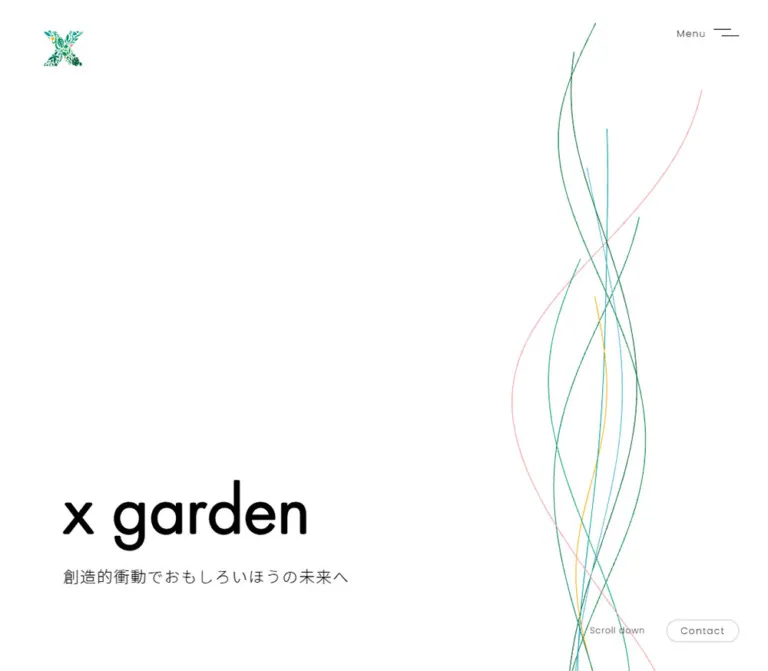
x garden introduces its XR practice through restraint. A botanical X emblem occupies the upper-left corner, a small Menu control sits opposite it, and a large black lowercase wordmark rests near the bottom left. A single Japanese statement follows the wordmark. Most of the opening screen remains white. Thin green, teal, blue, gold, and pink curves occupy a narrow vertical region on the right, changing shape between captures.
The page continues as a substantial corporate presentation: philosophy, updates, business capabilities, project work, services, people, and company navigation. Its hierarchy combines light Latin typography, generously spaced Japanese prose, oversized pale section labels, and media-led content groups. The mobile layout deliberately rearranges these groups instead of shrinking the desktop composition uniformly.
閉じる
x garden — Style Reference
A nearly empty white canvas, anchored by black identity and a living bundle of colored threads.
Original URL: https://x-garden.co.jp/
Final URL: https://x-garden.co.jp/
Theme: light; white and black with restrained gray surfaces and fine colored decoration.
Inspected: October 5, 2026, 06:26:50 JST. Supplied retrieval timestamp: October 4, 2026, 21:26:50.288Z.
Viewports: desktop 1440 × 1000 and mobile 390 × 844 CSS pixels.
Scope: the current corporate homepage. Visual evidence covers three desktop and two mobile opening-screen captures. Rendered DOM and computed styles additionally cover the introduction, News, Topics, business descriptions, client works, services, member link, footer, and closed navigation structure. Open-menu appearance, lower-page image content, hover outcomes, and linked pages were not visually inspected.
x garden introduces its XR practice through restraint. A botanical X emblem occupies the upper-left corner, a small Menu control sits opposite it, and a large black lowercase wordmark rests near the bottom left. A single Japanese statement follows the wordmark. Most of the opening screen remains white. Thin green, teal, blue, gold, and pink curves occupy a narrow vertical region on the right, changing shape between captures.
The page continues as a substantial corporate presentation: philosophy, updates, business capabilities, project work, services, people, and company navigation. Its hierarchy combines light Latin typography, generously spaced Japanese prose, oversized pale section labels, and media-led content groups. The mobile layout deliberately rearranges these groups instead of shrinking the desktop composition uniformly.
How to Read This Reference
- Measured means a value explicitly present in the supplied computed styles or element rectangles. Measurements are CSS pixels unless stated otherwise.
- Derived means arithmetic based on those measurements, such as the gap between cards or the space between the wordmark and tagline.
- Visual estimate means an observation from the current-page screenshots. Decorative color values and stroke widths below are estimates, not sampled source declarations.
- Recommended means an implementation choice for a new project. Breakpoints, accessible hit areas, fallback fonts, SVG geometry, and unverified hover treatments belong to this category.
- Token names are descriptive aliases. The supplied custom-property export is empty; these names are not recovered source variables.
- Below-the-fold descriptions are based on DOM geometry and computed styling. An offscreen rectangle does not establish the final painted appearance, image crop, or animation state.
Tokens — Colors
Default Palette
| Name | Value | Suggested token | Evidence and role |
|---|---|---|---|
| White canvas | #ffffff |
--color-paper |
Measured on News, business, and service sections; visually matches the hero canvas |
| Black ink | #000000 |
--color-ink |
Measured text color; visible wordmark and utility linework |
| Works surface | #f5f5f5 |
--color-surface |
Measured background of Client partner works at both viewports |
| Pale display gray | #d9d9d9 |
--color-display-muted |
Measured color of the large News and Topics labels |
| Secondary gray | #707070 |
--color-muted |
Measured service hashtag text |
| Contact outline | Approximately #cccccc |
--color-rule |
Visual estimate of the fine rounded outline in the desktop hero |
| White overlay text | #ffffff |
--color-on-media |
Measured on desktop service descriptions and the repeated Member text; underlying media appearance is unverified |
The HTML and BODY backgrounds were reported as transparent. White is nevertheless the visible opening canvas and an explicit background on several subsequent sections. A direct white page background is an appropriate implementation token.
Some parent anchors report browser blue, rgb(0, 0, 238), while their visible child text is black or their content is graphical. Do not introduce blue navigation text on that basis.
Decorative Accents
These are suggested approximations from the current screenshots, not exact brand specifications.
| Name | Approximate value | Suggested token | Use |
|---|---|---|---|
| Botanical green | #008653 |
--thread-green |
Emblem impression and darker strands |
| Teal | #009d9f |
--thread-teal |
Prominent curved strands |
| Sky blue | #29a8c7 |
--thread-blue |
A lighter, wider-sweeping strand |
| Gold | #e6ad00 |
--thread-gold |
One restrained warm filament |
| Rose | #ef8292 |
--thread-rose |
A fine pink filament |
Color occupies very little area. Keep these accents in the emblem and linework rather than distributing them across buttons, cards, headings, and badges. The emblem contains more detail and tonal variation than five flat CSS swatches can reproduce.
Theme Behavior
Only the light appearance is evidenced. No theme switcher or alternate palette was observed.
Tokens — Typography
Japanese Text
The computed styles explicitly name three families:
NotoSansCJKjp-Light: desktop body copy, the desktop hero tagline, and several supporting roles.NotoSansCJKjp-Regular: news titles, work descriptions, mobile introduction copy, and the mobile hero tagline.NotoSansCJKjp-Medium: mobile Japanese section headings.
These are the reported family names, not verified font-file paths. Their names and CSS weights are separate facts: for example, the desktop introduction heading reports the Light family with weight 700, while the mobile hero tagline reports the Regular family with weight 300. Reproduce the measured combination only when the corresponding authorized fonts are available; do not silently equate a family suffix with its computed weight.
The base HTML text is 16px / 28.8px, weight 400, with 1.28px tracking. Introduction paragraphs expand to a 32px line height on desktop. This gives Japanese prose a calm, open rhythm.
Latin Headings and Utilities
Poppins, sans-serif is measured on navigation links, section headings, dates, service titles, and Scroll down.
- Weight
100: large pale News and Topics labels. - Weight
300: most Latin headings and navigation. - Weight
400: client-label text. - Weight
500: mobile service titles.
The visible Menu and Contact lettering is approximately 12–13px by screenshot inspection. Their parent-anchor styles do not establish the exact typeface and size of every child. Poppins at 13px is a reasonable implementation recommendation, not an additional measured value.
Graphic Wordmark
The black x garden wordmark should be treated as identity artwork. The H1 has no extracted text, while its measured box is 360 × 106.55px on desktop and 188.91 × 57.91px on mobile.
Its inherited 32px H1 font size does not describe the visible lettering. The supplied evidence does not identify the internal image or vector element, its source path, or the font used to construct the mark. Preserve an authorized asset rather than approximating it with a guessed display font.
Type Scale
Values below are measured unless marked otherwise.
| Role | Desktop size / line height | Mobile size / line height | Family and weight |
|---|---|---|---|
| Base text | 16 / 28.8px |
16 / 28.8px on root |
Light, 400; many mobile descendants override it |
| Hero tagline | 23.616 / 23.616px |
16.263 / 16.263px |
Light 400 → Regular 300 |
| Scroll down | 12 / 21.6px |
12 / 21.6px |
Poppins 300, tracking 0.72px |
| Introduction heading | 28 / 50.4px |
26.442 / 47.596px |
Light 700 → Medium 500 |
| Introduction body | 16 / 32px |
14.235 / 28.47px |
Light 400 → Regular 400 |
| News / Topics display label | 150 / 150px |
81.276 / 81.276px |
Poppins 100, #d9d9d9 |
| News date | 12 / 21.6px |
12.207 / 21.973px |
Poppins 300 |
| News title | 14 / 25.2px |
14.235 / 25.623px |
Regular 400, approximately 0.01em tracking |
| Main Latin section heading | 42 / 75.6px |
26.442 / 47.596px |
Poppins 300 |
| Business heading | 28 / 50.4px |
18.291 / 32.924px |
Poppins 300 |
| Business description | 16 / 28.8px |
13.221 / 23.798px |
Light 400 |
| Work description | 18 / 32.4px |
14.235 / 25.623px |
Regular 400 |
| Service title | 20 / 36px |
16.263 / 26.021px |
Poppins 300 → 500 |
| Service hashtags | 12 / 21.6px |
10.179 / 18.322px |
Light 400, gray |
| Service description | 14 / 25.2px |
11.193 / 20.147px |
Light 400; white on desktop, black on mobile |
| Section link | 16 / 28.8px |
16.263 / 29.273px |
Poppins 300 |
| Navigation entries, closed-state DOM | 42.48 / 76.464px |
20.319 / 36.574px |
Poppins 300; open-state rendering unverified |
| Repeated Member lettering | 130 / 234px |
36.582 / 65.848px |
Poppins 300, white |
| Footer statement | 28 / 56px |
16.263 / 32.526px |
Light 400 on sampled parent |
Most roles inherit 1.28px tracking. This is an absolute value, not one universal em ratio. News titles use much tighter tracking; Scroll down has its own setting.
Tokens — Spacing & Shapes
The layout uses multiple alignment tracks. The header, hero copy, news grid, business rows, and wider service grid do not all share one container edge.
Spacing Scale
| Use | Desktop evidence | Mobile evidence |
|---|---|---|
| Header outer inset | 40px at logo-link origin and right edge |
Approximately 32.52px |
| Hero copy left inset | 117.91px |
32.52px |
| Wordmark-to-tagline gap | 24px, derived |
17.27px, derived |
| Hero tagline bottom clearance | 120px, derived |
126.97px, derived |
| Common prose paragraph separation | Approximately 34px, derived |
Approximately 34.55px, derived |
| News card horizontal gap | 32px, derived |
Approximately 10.17px between the two small cards |
| Service grid horizontal gap | 32px, derived |
A single list of full-width rows |
| Service grid row gap | 92px, derived |
Rows meet consecutively in sampled geometry |
| Business-row vertical padding | 50px top and bottom |
40.638px top, 55.887px bottom |
| Section-link padding | 18px 32px |
16.263px 26.442px |
| Works section padding | 115px top, 124px bottom |
81.276px top and bottom |
| Service section padding | 156px top, 120px bottom |
101.595px top, 60.957px bottom |
These values do not establish a universal eight-pixel grid. Use a small set of practical aliases while retaining the conspicuously large section spacing.
Border Radius and Rules
| Element | Evidence | Implementation implication |
|---|---|---|
| Desktop Contact | Measured 50px radius; 100 × 31px rectangle |
A small pill with a delicate outline |
| Our Vision / View all | Measured 0px radius |
Preserve square layout boxes; border and arrow details were not supplied |
| Content-link boxes | Measured 0px radius |
Avoid a general rounded-card system |
| Menu icon | Two fine, horizontally offset strokes in screenshots | Approximately 1px visual stroke; not a three-line icon |
| Colored strands | Approximately 0.5–1px apparent thickness |
Use delicate linework; exact source width is unknown |
Layout Measurements
| Element | Desktop 1440 × 1000 |
Mobile 390 × 844 |
|---|---|---|
| Hero boundary | Introduction starts at y=1000 |
Introduction starts at y=844 |
| Header logo link | (40, 40), 96 × 54px |
(32.52, 32.52), 38 × 36px |
| Menu anchor | (1314, 40), 86 × 10px |
(272.48, 43.67), 85 × 10px |
| Wordmark H1 | (117.91, 725.84), 360 × 106.55px |
(32.52, 625.59), 188.91 × 57.91px |
| Hero tagline | Starts at (117.91, 856.39) |
Starts at (32.52, 700.77) |
| Scroll down | (1193.84, 932.20), 76.16 × 21.60px |
(32.52, 789.59), 76.16 × 21.59px |
| Contact pill | (1300, 929), 100 × 31px |
Not visible; absent from the mobile extracted standalone link list |
| News card widths | Three cards of 275.19px |
First 324.97px; next two approximately 157.40px each |
| Business-row width | 997.91px |
324.97px |
| Work-item width | 864px |
294.69px |
| Service-item width | 378.88px |
324.97px |
| Standard section link | 260 × 64.80px |
Usually 229.58 × 61.77px; works retains 260px width |
The larger desktop logo-link box includes more horizontal space than the visible botanical emblem. Do not stretch the emblem to fill a 96px width.
Components
Corner Header
Role: quiet identity and access to the site navigation.
The header has no visible filled bar, bottom divider, or shadow in the opening screenshots. Place the botanical emblem at the upper left and the Menu label plus two-line icon at the upper right. The desktop emblem itself appears about 54px wide within its larger link box; mobile uses a much smaller mark inside a 38 × 36px link.
The menu icon consists of two thin strokes, offset horizontally. Its modest scale is part of the design. The entire header should remain subordinate to the wordmark and empty canvas. Persistence during scrolling is not established by the supplied captures.
Opening Hero
Role: establish identity and creative character before introducing the business.
The hero occupies the first viewport at both tested sizes. Its content stack is a graphic wordmark followed by the source line “創造的衝動でおもしろいほうの未来へ”. On desktop, the wordmark begins at approximately 72.6% of viewport height; on mobile, at approximately 74.1%.
Keep the text left aligned. The composition depends on leaving the upper and central portions largely vacant. There is no visible hero photograph, feature list, central button, or enclosing text panel.
On mobile, the wordmark width falls to approximately 189px, while the Japanese line remains on one line in the supplied capture. Its measured paragraph box extends beyond the viewport because the box starts at x=32.52 and is 390px wide. The visible text fits; this is not a recommendation to reproduce an overflowing text container.
Colored Filament Field
Role: provide the opening screen's main decorative movement.
Several fine curves rise through the right side of the screen. They cross, separate, and bend with different amplitudes. Most are green or teal, with restrained blue, gold, and pink accents. The strokes remain unfilled and have no glow or enclosing shape.
Across the desktop captures, the visible field occupies roughly x=940–1185; the main bundle is near x=1100. Across the mobile captures, strands occupy roughly x=188–366. These are visual envelopes across changing frames, not fixed element bounds.
Mobile retains the decoration at a large relative scale. Some strands pass through the horizontal region occupied by the tagline. A recreation can preserve that overlap while keeping text above decorative elements. SVG paths are a practical recommendation; the original rendering technology is not identified.
Hero Utilities
Role: provide a low-emphasis next step and contact route.
Desktop places Scroll down near the lower right and the outlined Contact pill beside it. The Contact pill ends 40px from the right and bottom edges. Scroll down links to #block-intro; its final scroll behavior was not exercised.
Mobile moves Scroll down to the lower-left content alignment, approximately 32.8px above the bottom by its text box. The standalone Contact pill is absent from the mobile evidence. Contact remains present in navigation and footer link data.
The hero action hierarchy is deliberately quiet: small black text, almost no fill, and a single fine outline.
Navigation Structure
Role: expose the corporate site's main destinations.
The DOM contains Home, Member, Philosophy, Company, Service, News, Works, and Contact, followed by CEO Blog and Creator Blog. Both Menu and Close are extracted, while only Menu is visible in the supplied screenshots.
Measured entries form two columns in the closed-state DOM. Desktop entries use 42.48px Poppins; mobile entries use 20.319px. These measurements support a large navigation treatment but do not establish the open panel's background, entrance animation, clipping, or final positions. In particular, mobile left-column rectangles begin close to x=2.52, unlike the visible page gutter. Do not copy those coordinates as a verified open-menu layout.
Introduction / Our Vision
Role: explain the company's creative motivation.
A Japanese heading repeats the hero statement, followed by short paragraphs and a standalone “Our Vision” link. Desktop section padding is 178px 0 240px 216px. Body text uses 16px / 32px; successive paragraphs have approximately 34px of additional separation.
Mobile changes the heading to two lines and uses 14.235px / 28.47px paragraphs. Internal horizontal padding is approximately 32.53px. The section begins immediately after the hero but occupies about 1344px in the mobile DOM, compared with about 1095px on desktop. The supplied evidence does not account visually for every part of that height.
The link is a generous square-cornered target rather than a small inline text link: approximately 260 × 64.8px on desktop and 229.6 × 61.8px on mobile. Its border and decorative details are unverified.
News and Topics Groups
Role: present recent updates and selected announcements with an editorial rhythm.
Each group contains three linked items. Desktop uses three equal 275.19px columns with 32px gaps. The grid starts near x=217.59, placing it further inward than the hero and service grid.
Each item has a media region before the date, then a Japanese title. The pre-date region measures about 199.5px high on desktop. Date padding is 15px above and 12px below the text. Titles use 14px / 25.2px and tight tracking.
News and Topics use very large, pale, thin Poppins labels. Desktop rectangles extend beyond opposite viewport edges: News starts at approximately x=-75.47, and Topics extends beyond the right edge. This is a measured placement, not a supplied lower-page screenshot.
Mobile changes each group to a full-width lead item above two half-width items. The lead card is 324.97px wide; the smaller cards are approximately 157.40px with a 10.17px gap. The large labels reduce to 81.276px. Preserve this featured-item hierarchy rather than stacking all three items identically.
Business Statement and Business Rows
Role: connect the creative philosophy to practical XR work.
The business section introduces a Japanese statement about sustainable XR, explanatory paragraphs, and two linked offerings: “XR Client partner事業” and “Incubation事業”. Desktop offering rows are approximately 998px wide with 50px vertical padding. Their descriptions reserve roughly 299px on the right, leaving about 699px for text.
Mobile rows remain approximately 325px wide, but their text occupies a narrower 219.34px column. The first row's text begins at the left gutter; the second begins at approximately x=138.13, aligning the text column to the right. This alternating alignment is a distinctive responsive detail.
The remaining row area may accommodate visual or decorative content, but its appearance is not supplied. Do not invent icons or diagrams and describe them as observed.
Client Partner Works
Role: showcase client projects at a larger scale than news items.
This is the explicitly measured light-gray section, #f5f5f5. It has a 42px Latin heading on desktop and 26.442px on mobile.
The DOM contains horizontally arranged, repeated project links. Desktop item widths are 864px, exactly 60% of the inspected viewport width. Mobile items are approximately 294.69px wide, with a 312px step between item origins and therefore about 17.31px between boxes.
The repeated links and offscreen positions are consistent with a looping carousel or track, but do not prove autoplay, dragging, controls, or timing. There are three unique project destinations; duplicates should not become separate editorial projects.
Desktop captions split into a client-label region of approximately 259px and a description region of approximately 605px, a 30/70 division. Mobile places the client label above the description, both spanning the item width. Preserve this caption reflow.
Our Service
Role: provide routes into the company's service portfolio.
The desktop DOM lays out five services in a three-column grid. Each item is approximately 378.88px wide, with 32px column gaps and 92px between row boxes. A 20px light Poppins title precedes gray hashtags. Description text is white near the lower part of each item, suggesting a media-associated treatment; the actual imagery, overlay background, and reveal mechanism are unverified.
Mobile changes the presentation into five consecutive horizontal flex rows, each approximately 325 × 257px with 32.526px vertical padding. The measured text column is approximately 151.91px wide. Titles become smaller but heavier: 16.263px, weight 500. Descriptions become black, 11.193px, and are present within the text column rather than in the desktop white-text position.
This is a structural adaptation, not simply a one-column version of the desktop cards. A reconstruction should explicitly model the text and media areas separately. The media-side dimensions and crops remain recommendations until visual evidence is available.
Member Link and Footer
Role: transition from the service portfolio to people and company navigation.
A full-width link contains six repetitions of Member. The text is white Poppins, 130px on desktop and 36.582px on mobile. Repetition suggests a band or moving-text treatment, but no motion cycle is confirmed. Its underlying image or background is not visible in the supplied screenshots.
The footer contains “XR for Empathy.” with a Japanese supporting statement, eight main links, two blog links, a graphical home link, and the copyright line. Navigation remains in two columns on mobile. Desktop link-column origins are approximately x=118.08 and 308.08; mobile uses x=32.52 and 195.
The footer's graphical link is positioned on the right in desktop geometry and below the navigation at the left gutter on mobile. Do not infer its artwork from the empty link text alone.
Tokens — Motion & Interaction
Motion Evidence
| Treatment | Supplied evidence | What can be concluded |
|---|---|---|
| Hero filaments | Different shapes across three desktop and two mobile captures; text remains stable | The decoration changes over time; duration, easing, loop, and rendering method are unknown |
| Hero tagline | 1.5s cubic-bezier(0.25, 0.1, 0.25, 1) 0.4s at both viewports |
A transition with a 400ms delay is declared; changed properties and initial state are not supplied |
| Desktop menu-entry text | 0.8s cubic-bezier(0.19, 1, 0.22, 1) |
A long decelerating transition is declared; actual opening sequence is untested |
| Scroll down | 0.4s cubic-bezier(0.25, 0.1, 0.25, 1) |
A transition is declared; this does not specify scroll duration |
| Desktop news text | 0.4s cubic-bezier(0.25, 0.1, 0.25, 1) |
Dates and titles have transitions; hover endpoint is unknown |
| Works caption text | 0.3s cubic-bezier(0.25, 0.1, 0.25, 1) at both sizes |
Short caption transitions are declared |
| Desktop service description | 0.5s cubic-bezier(0.25, 0.1, 0.25, 1) |
A description transition exists; no verified hover/reveal behavior |
| Desktop Contact | 0.6s cubic-bezier(0.165, 0.84, 0.44, 1) |
A decelerating transition is declared on the pill link |
| Desktop footer links | 0.4s cubic-bezier(0.25, 0.46, 0.45, 0.94) |
A separate easing is used for these links |
Many mobile counterparts report only transition: all, without a nonzero duration. That is not evidence of an active animated transition. Likewise, animation: none on sampled text elements does not rule out script-driven decoration or animation elsewhere.
Interaction Limits
Only the closed hero state is visually documented. Menu activation, keyboard focus, pointer hover, carousel dragging, autoplay, contact navigation, and the Scroll down result were not supplied as exercised interactions. Link destinations establish available routes, not successful destination behavior.
For a new implementation, use quiet, smoothly decelerating transitions where appropriate. A slow SVG deformation can approximate the filament character, but any chosen cycle length or path interpolation is a new design decision. Avoid attributing a particular animation library, canvas engine, or scroll framework to the original.
Surfaces
| Layer | Evidence | Design role |
|---|---|---|
| Hero canvas | Visually white | Maximum negative space around identity and linework |
| Header | Visually transparent over the hero | Corner navigation without a separate chrome band |
| News / business / services | Measured white backgrounds | Continuous editorial field |
| Works | Measured #f5f5f5 |
Gentle separation of project content |
| Contact pill | Visually white or transparent, fine gray outline | A small, contained utility action |
| Pale section lettering | Measured #d9d9d9 |
Large-scale hierarchy with low visual weight |
| Service media descriptions | Measured white text on desktop | Foreground styling confirmed; underlying surface unverified |
| Member band | Measured white text | Background and media treatment unverified |
There is no visible hero shadow or glass treatment. The sampled content boxes use square corners. A general system of elevated rounded cards would change the character of the evidenced layout.
Imagery
The opening screen has two distinct identity assets: the compact botanical X emblem and the large black wordmark. The emblem combines organic detail with a clear letter silhouette. Its dense miniature linework contrasts with the exceptionally sparse, long curves elsewhere on the screen.
The hero contains no visible photography. Lower-page DOM geometry reserves substantial areas before news dates and inside work and service items, but the supplied captures do not reveal their subjects, grading, crop, or resolution. Do not infer a stock-photo style from the company's industry or from project descriptions.
Observed Asset References
No original image URLs, SVG source paths, canvas details, or font-file URLs are included in the supplied evidence.
| Asset or region | Established evidence | Reuse guidance |
|---|---|---|
| Botanical X emblem | Visible in desktop and mobile heroes | Use an authorized identity asset; preserve its internal detail |
| Black wordmark | Visible lettering and measured H1 boxes | Treat as artwork; provide an accessible name |
| Colored filaments | Visible changing curve geometry | SVG is a recommended approximation, not a verified source format |
| News media region | Space before dates at consistent proportions | Use actual editorial images when available; crop is unverified |
| Work media region | Large horizontal item geometry | Preserve room for project media without inventing its visual treatment |
| Service media region | Tall desktop items and horizontal mobile rows | Separate media from text so the responsive change can be implemented |
| Member background | Not supplied visually | Leave its treatment unresolved rather than inventing a photograph |
Do not fabricate asset paths or replace the botanical identity with a generic leaf icon.
Layout & Responsive Behavior
Observed Reflow
| Area | Desktop behavior | Mobile behavior |
|---|---|---|
| Header | 40px corner offsets; larger logo-link box |
Approximately 32.5px side inset; smaller emblem |
| Hero copy | Lower left, 360px wordmark box |
Lower left, approximately 189px wordmark box |
| Filaments | Narrow field near the right third | Relatively broad field in the right half, intersecting the tagline region |
| Hero utilities | Scroll down and Contact at lower right | Scroll down moves left; standalone Contact disappears |
| Introduction heading | One line in measured text layout | Two lines |
| News / Topics | Three equal columns per group | One full-width item, then two smaller items |
| Business rows | Wide text blocks with reserved right-side space | Narrow text columns alternate left and right |
| Works captions | Client and description side by side | Client above description |
| Services | Three-column desktop grid | Horizontal rows with a narrow text column |
| Footer | Two link columns and a right-side graphical link | Two link columns, followed by the graphical link on the left |
The common content inset is approximately 8.2–8.34% of viewport width, but news and business content use additional desktop indentation. This is a relationship derived from two endpoints, not the recovered source formula.
The exact breakpoint is unknown. A 767px breakpoint in the Quick Start is a recommendation for demonstrating the observed reflow. Tablet widths, landscape phones, browser zoom, and intermediate line wrapping were not tested.
Scroll Geometry Caveat
The export reports document heights equal to the viewport heights, yet MAIN measures approximately 10118.78px on desktop and 8790.53px on mobile. Footer rectangles extend those nominal bounds to approximately 10884.55px and 9503.50px. The desktop Member rectangle is also displaced relative to neighboring section bounds.
These inconsistencies may involve transformed or managed content, but the mechanism is unverified. They do not establish a one-screen document, a particular scroll library, or a reliable total scroll length. Use the local component dimensions and section sequence; do not hardcode the captured Y coordinates into a new page.
Do’s and Don’ts
Do
- Preserve the very large white opening field and the low placement of the wordmark.
- Keep the botanical emblem visually small and detailed.
- Use the real wordmark asset rather than treating the H1's inherited font size as its appearance.
- Pair light Poppins headings with the measured Japanese font roles and open line spacing.
- Confine strong color to fine decoration and identity assets.
- Preserve the desktop separation between header, hero, news, and service alignment tracks.
- Give mobile news one large lead item above two smaller items.
- Model mobile services as horizontal rows and works captions as stacked text.
- Keep the works background close to the measured
#f5f5f5. - Treat animation as a restrained accent around stable, readable content.
Don’t
- Don’t replace the corporate homepage with a generic product landing-page sequence.
- Don’t center the hero wordmark or fill the empty upper half with promotional content.
- Don’t turn the filaments into thick ribbons, glowing trails, or a full-screen gradient.
- Don’t distribute the filament colors across every UI control.
- Don’t apply rounded containers and shadows to all news, works, and service links.
- Don’t flatten the mobile news layout into three identical stacked cards.
- Don’t treat repeated work links as additional unique projects.
- Don’t present closed-menu DOM coordinates as a verified open-menu screenshot.
- Don’t invent lower-page photography, asset URLs, hover transformations, or animation timings.
- Don’t copy the mobile paragraph overflow or the sampled document-height inconsistency as layout requirements.
Recommended Implementation Additions
These are recommendations for a new implementation, not verified original features.
- Implement Menu as a button with an accessible name,
aria-expanded, and a relationship to its navigation region. Manage focus and Escape behavior when the panel opens. - Increase the effective hit area of small utilities to at least
44 × 44pxwhile retaining their compact visible lettering and linework. - Give the graphical H1 an accessible
x gardenname. Mark decorative filament SVGs as hidden from assistive technology and disable pointer events on them. - Provide a static filament composition for reduced-motion preferences. Keep content available if decorative scripts fail.
- Use normal document flow or an accessible scrolling container that supports anchors, keyboard navigation, focus visibility, and restored positions.
- If works becomes a looping carousel, hide duplicate slides from assistive technology and keep all unique projects reachable without dragging.
- Consider raising mobile service descriptions from the observed
11.193pxto at least14px, with corresponding row-height adjustments. This intentionally departs from the captured density. - Ensure desktop white service descriptions have sufficient contrast against their actual media and remain available to keyboard and touch users.
- Keep the hero flexible at short heights and high zoom; preserving the composition should not clip the tagline or navigation.
Agent Prompt Guide
Quick Color Reference
- Canvas and most sections: measured
#ffffff. - Primary text: measured
#000000. - Works surface: measured
#f5f5f5. - Large News / Topics labels: measured
#d9d9d9. - Service hashtags: measured
#707070. - Decorative approximations: green
#008653, teal#009d9f, blue#29a8c7, gold#e6ad00, rose#ef8292. - Contact outline: approximately
#cccccc; do not turn it into a filled accent button.
Overall Prompt
“Create an XR corporate homepage inspired by the evidenced x garden composition. Use a white canvas, black identity artwork, light Poppins Latin headings, and spacious Japanese sans-serif text. Place a small botanical emblem at the upper left and a compact Menu label with two offset hairlines at the upper right. Keep most of the first viewport empty. Anchor a black lowercase wordmark near the lower left with one short Japanese statement below. Place several extremely thin, individually curving green, teal, blue, gold, and pink strands on the right. Continue into philosophy, News and Topics, business rows, a pale-gray works section, service entries, and company navigation. On mobile, retain the low hero copy, move Scroll down to the left, use a featured news item above two smaller items, and turn service cards into horizontal rows. Treat unverified imagery and interactions as implementation choices.”
Example Component Prompts
- Desktop hero: “At a 1440 × 1000 reference size, position the wordmark box near x=118, y=726 at 360px wide. Place the Japanese tagline 24px below it. Use 40px corner offsets for header utilities and a small outlined Contact pill at the lower right. Leave the center and upper left almost entirely white.”
- Mobile hero: “At 390 × 844, use a roughly 32.5px content inset and a 189px wordmark near y=626. Keep the tagline around 16.3px and move Scroll down to the bottom left. Retain a narrow bundle of colored curves through the right half, behind the text. Do not add the desktop floating Contact pill.”
- News group: “Create three square-cornered editorial links with media, a small Poppins date, and a tightly tracked Japanese title. Desktop uses three equal columns with 32px gaps. Mobile promotes the first item to full width and places the next two side by side. Add a large, very thin, pale-gray section label.”
- Business rows: “Use two spacious linked business descriptions. On desktop, reserve substantial room to the right of the text. On mobile, use a narrow text column aligned left in the first row and right in the second. Keep titles light, body copy open, and any new decorative content explicitly optional.”
- Works track: “Place large project items on a #f5f5f5 section. Use a small client label beside a larger Japanese description on desktop, then stack the caption on mobile. Show adjacent-item context without inventing an autoplay timing. Keep duplicate slides out of the accessible reading order.”
- Service reflow: “Use three columns on desktop with 20px light Latin titles and small gray hashtags. At the mobile breakpoint, create horizontal rows with a text column and a media column; increase title weight and show descriptions in black. Supply actual project media rather than generic XR stock imagery.”
Quick Start
CSS Custom Properties
This is a usable adaptation, not the original stylesheet. It keeps a conventional root font size and approximates the two inspected layouts. The breakpoint, fallback fonts, SVG paths, container interpolation, focus treatment, and hover opacity are recommendations. Font loading and authorized brand assets must be supplied separately.
Class contract: .hero contains .site-header, .hero-filaments, .hero-copy, and .hero-utilities. Put the emblem inside .brand and the graphical H1 asset inside .hero-wordmark. A .news-grid contains three .news-card links; each has .news-media, .news-date, and .news-title. A .service-card contains .service-copy and .service-media. Work captions contain .work-client and .work-description.
:root {
  /* Measured neutral colors */
  --color-paper: #ffffff;
  --color-ink: #000000;
  --color-surface: #f5f5f5;
  --color-display-muted: #d9d9d9;
  --color-muted: #707070;
  --color-on-media: #ffffff;

  /* Visual approximations, not recovered brand specifications */
  --color-rule: #cccccc;
  --thread-green: #008653;
  --thread-teal: #009d9f;
  --thread-blue: #29a8c7;
  --thread-gold: #e6ad00;
  --thread-rose: #ef8292;

  /* Measured family names; system fallbacks are recommendations */
  --font-latin: 'Poppins', sans-serif;
  --font-jp-light: 'NotoSansCJKjp-Light', system-ui, sans-serif;
  --font-jp-regular: 'NotoSansCJKjp-Regular', system-ui, sans-serif;
  --font-jp-medium: 'NotoSansCJKjp-Medium', system-ui, sans-serif;
  --tracking-base: 1.28px;
  --tracking-tight: 0.01em;

  /* Adapted layout tokens */
  --page-gutter: 8.3vw;
  --header-inset: 40px;
  --grid-gap: 32px;
  --text-section: 42px;
  --text-body: 16px;
  --text-news: 14px;
  --radius-contact: 50px;
  --thread-width: 0.65px;

  /* Measured timing values; state endpoints are not recovered */
  --ease-standard: cubic-bezier(0.25, 0.1, 0.25, 1);
  --ease-menu: cubic-bezier(0.19, 1, 0.22, 1);
  --ease-contact: cubic-bezier(0.165, 0.84, 0.44, 1);
  --duration-link: 400ms;
  --duration-caption: 300ms;
  --duration-contact: 600ms;
}

* { box-sizing: border-box; }

body {
  margin: 0;
  color: var(--color-ink);
  background: var(--color-paper);
  font-family: var(--font-jp-light);
  font-size: var(--text-body);
  font-weight: 400;
  line-height: 1.8;
  letter-spacing: var(--tracking-base);
}

a { color: inherit; }
img { display: block; max-width: 100%; }
button { font: inherit; color: inherit; }

.hero {
  position: relative;
  isolation: isolate;
  min-height: 100vh;
  min-height: 100svh;
  overflow: hidden;
  background: var(--color-paper);
}

.site-header {
  position: absolute;
  z-index: 3;
  inset: var(--header-inset) var(--header-inset) auto;
  display: flex;
  justify-content: space-between;
  align-items: flex-start;
}

.brand {
  display: grid;
  place-items: center;
  width: 96px;
  height: 54px;
}

.brand > :is(img, svg) {
  display: block;
  width: 54px;
  max-height: 54px;
  object-fit: contain;
}

.menu-trigger {
  position: relative;
  display: inline-flex;
  align-items: center;
  gap: 12px;
  border: 0;
  padding: 0;
  background: transparent;
  font: 300 13px / 1 var(--font-latin);
  letter-spacing: 1px;
  cursor: pointer;
}

/* Recommended enlargement of the compact visible target. */
.menu-trigger::before {
  content: '';
  position: absolute;
  inset: -16px -4px;
}

.menu-lines {
  position: relative;
  display: block;
  width: 35px;
  height: 11px;
}

.menu-lines::before,
.menu-lines::after {
  content: '';
  position: absolute;
  width: 24px;
  height: 1px;
  background: currentColor;
}

.menu-lines::before { top: 0; left: 0; }
.menu-lines::after { bottom: 0; right: 0; }

.hero-copy {
  position: absolute;
  z-index: 1;
  left: 8.1879%;
  right: 8.1879%;
  bottom: 12%;
}

.hero-wordmark {
  width: 360px;
  max-width: 100%;
  height: 106.55px;
  margin: 0 0 24px;
  line-height: 0;
}

.hero-wordmark > :is(img, svg) {
  width: 100%;
  height: 100%;
  object-fit: contain;
  object-position: left center;
}

.hero-tagline {
  margin: 0;
  font-size: 23.616px;
  font-weight: 400;
  line-height: 1;
}

.hero-filaments {
  position: absolute;
  z-index: 0;
  top: 0;
  left: 65%;
  width: 18%;
  height: 100%;
  overflow: visible;
  pointer-events: none;
}

.hero-filaments path {
  fill: none;
  stroke: var(--thread-teal);
  stroke-width: var(--thread-width);
  vector-effect: non-scaling-stroke;
}

.hero-filaments path:nth-child(2),
.hero-filaments path:nth-child(6) { stroke: var(--thread-green); }
.hero-filaments path:nth-child(3) { stroke: var(--thread-blue); }
.hero-filaments path:nth-child(4) { stroke: var(--thread-gold); }
.hero-filaments path:nth-child(5) { stroke: var(--thread-rose); }

.hero-utilities {
  position: absolute;
  z-index: 2;
  right: 40px;
  bottom: 40px;
  display: flex;
  align-items: center;
  gap: 30px;
  font-family: var(--font-latin);
  font-weight: 300;
}

.scroll-cue {
  font-size: 12px;
  line-height: 1.8;
  letter-spacing: 0.72px;
  text-decoration: none;
}

.contact-pill {
  display: grid;
  place-items: center;
  width: 100px;
  min-height: 31px;
  border: 1px solid var(--color-rule);
  border-radius: var(--radius-contact);
  font-size: 13px;
  line-height: 1;
  text-decoration: none;
}

.content-wide {
  width: calc(100% - 2 * var(--page-gutter));
  margin-inline: auto;
}

.section-heading {
  margin: 0 0 85px;
  font: 300 var(--text-section) / 1.8 var(--font-latin);
}

.intro {
  padding: 178px var(--page-gutter) 240px 15%;
}

.intro h2 {
  margin: 0 0 34px;
  font-size: 28px;
  line-height: 1.8;
}

.intro p {
  margin: 0 0 34px;
  line-height: 2;
}

.section-link {
  display: flex;
  align-items: center;
  width: 260px;
  max-width: 100%;
  min-height: 64.8px;
  padding: 18px 32px;
  border-radius: 0;
  font: 300 16px / 1.8 var(--font-latin);
  text-decoration: none;
}

/* Geometry adapted from the desktop News group. */
.news-group {
  position: relative;
  width: 61.775%;
  margin-left: 15.111%;
  margin-block: 120px;
}

.display-label {
  margin: 0 0 54px;
  color: var(--color-display-muted);
  font: 100 150px / 1 var(--font-latin);
}

.news-grid {
  display: grid;
  grid-template-columns: repeat(3, minmax(0, 1fr));
  gap: var(--grid-gap);
}

.news-card { min-width: 0; text-decoration: none; }

/* Ratio inferred from the space preceding each date. */
.news-media {
  aspect-ratio: 1.379 / 1;
  overflow: hidden;
}

.news-media img {
  width: 100%;
  height: 100%;
  object-fit: cover;
}

.news-date {
  margin: 0;
  padding: 15px 0 12px;
  font: 300 12px / 1.8 var(--font-latin);
}

.news-title {
  margin: 0;
  font-family: var(--font-jp-regular);
  font-size: var(--text-news);
  font-weight: 400;
  line-height: 1.8;
  letter-spacing: var(--tracking-tight);
}

.works-section {
  padding-block: 115px 124px;
  background: var(--color-surface);
}

/* Native horizontal scrolling is a recommended fallback. */
.works-track {
  display: flex;
  overflow-x: auto;
  scroll-snap-type: x proximity;
}

.work-card {
  flex: 0 0 60vw;
  min-width: 0;
  scroll-snap-align: center;
  text-decoration: none;
}

.work-caption {
  display: grid;
  grid-template-columns: 30% 70%;
}

.work-client {
  margin: 0;
  font: 400 12px / 1.8 var(--font-latin);
}

.work-description {
  margin: 0;
  font: 400 18px / 1.8 var(--font-jp-regular);
}

.service-section { padding-block: 156px 120px; }

.service-grid {
  display: grid;
  grid-template-columns: repeat(3, minmax(0, 1fr));
  gap: 92px 32px;
}

.service-card { min-width: 0; text-decoration: none; }

.service-title {
  margin: 0 0 8px;
  font: 300 20px / 1.8 var(--font-latin);
}

.service-tags {
  margin: 0;
  padding-bottom: 34px;
  color: var(--color-muted);
  font-size: 12px;
  line-height: 1.8;
}

/* Keep descriptions readable until actual media treatment is supplied. */
.service-description {
  margin: 0 0 20px;
  font-size: 14px;
  line-height: 1.8;
}

.footer-nav {
  display: grid;
  grid-template-columns: repeat(2, minmax(0, 190px));
  gap: 18px 0;
  font: 300 16px / 1.8 var(--font-latin);
}

/* Recommended feedback; original visual endpoints are unknown. */
.scroll-cue,
.contact-pill,
.section-link {
  transition: opacity var(--duration-link) var(--ease-standard);
}

@media (hover: hover) {
  :is(.scroll-cue, .contact-pill, .section-link):hover {
    opacity: 0.6;
  }
}

:focus-visible {
  outline: 2px solid var(--color-ink);
  outline-offset: 5px;
}

/* Recommended breakpoint, calibrated to the supplied phone viewport. */
@media (max-width: 767px) {
  :root {
    --page-gutter: 8.337vw;
    --header-inset: 8.337vw;
    --text-section: 26.442px;
    --text-body: 14.235px;
    --text-news: 14.235px;
  }

  .brand { width: 38px; height: 36px; }
  .brand > :is(img, svg) { width: 38px; max-height: 36px; }
  .menu-trigger { margin-top: 11px; }

  .hero-copy {
    left: var(--page-gutter);
    right: var(--page-gutter);
    bottom: 15.045%;
  }

  .hero-wordmark {
    width: 48.438vw;
    height: 57.91px;
    margin-bottom: 17.27px;
  }

  .hero-tagline {
    font-family: var(--font-jp-regular);
    font-size: 16.263px;
    font-weight: 300;
    line-height: 1.4;
  }

  /* The extra leading above is a recommended wrapping safeguard. */
  .hero-filaments { left: 48%; width: 46%; }

  .hero-utilities {
    left: var(--page-gutter);
    right: auto;
    bottom: 32.8px;
  }

  .contact-pill { display: none; }
  .intro { padding: 101.595px var(--page-gutter) 121.875px; }

  .intro h2 {
    font-family: var(--font-jp-medium);
    font-size: 26.442px;
    font-weight: 500;
  }

  .intro p { font-family: var(--font-jp-regular); }
  .section-heading { margin-bottom: 48px; }

  .section-link {
    width: 229.58px;
    min-height: 61.77px;
    padding: 16.263px 26.442px;
    font-size: 16.263px;
  }

  .news-group {
    width: calc(100% - 2 * var(--page-gutter));
    margin: 80px auto;
  }

  .display-label { font-size: 81.276px; }

  .news-grid {
    grid-template-columns: repeat(2, minmax(0, 1fr));
    gap: 60.98px 10.17px;
  }

  .news-card:first-child { grid-column: 1 / -1; }
  .news-date { padding: 20.319px 0 7.644px; font-size: 12.207px; }

  .works-section { padding-block: 81.276px; }
  .works-track { gap: 17.31px; padding-inline: 12.22vw; }
  .work-card { flex-basis: 75.56vw; }
  .work-caption { display: block; }
  .work-client { margin-bottom: 9.16px; font-size: 12.207px; }
  .work-description { font-size: 14.235px; }

  .service-section { padding-block: 101.595px 60.957px; }
  .service-grid { display: block; }

  .service-card {
    display: grid;
    grid-template-columns: 46.75% minmax(0, 1fr);
    align-items: center;
    gap: 20px;
    min-height: 257px;
    padding-block: 32.526px;
  }

  .service-title {
    margin-bottom: 0;
    font-size: 16.263px;
    font-weight: 500;
    line-height: 1.6;
  }

  .service-tags {
    padding: 5.109px 0 10.179px;
    font-size: 10.179px;
  }

  .service-description {
    margin: 0;
    padding-bottom: 15.249px;
    font-size: 11.193px;
    letter-spacing: 0.01em;
  }

  .footer-nav {
    grid-template-columns: repeat(2, minmax(0, 1fr));
    font-size: 16.263px;
  }
}

/* Recommended short-screen fallback instead of clipping hero copy. */
@media (max-height: 600px) {
  .hero { min-height: 680px; }
}

@media (prefers-reduced-motion: reduce) {
  .hero-filaments,
  .hero-filaments * {
    animation: none !important;
    transition: none !important;
  }

  .scroll-cue,
  .contact-pill,
  .section-link { transition: none; }
}
Static Filament Scaffold
The following SVG is new approximate geometry, supplied to make the CSS usable without a bitmap background. It is not extracted artwork. It stays static by default; a future motion implementation should honor reduced-motion preferences and retain independent curve shapes.
<svg
  class='hero-filaments'
  viewBox='0 0 260 1000'
  preserveAspectRatio='none'
  aria-hidden='true'
  focusable='false'
>
  <path d='M185 110 C310 405 -30 570 25 1010' />
  <path d='M148 65 C178 410 120 670 72 1010' />
  <path d='M225 375 C265 610 40 790 28 1010' />
  <path d='M148 193 C153 585 110 820 38 1010' />
  <path d='M148 5 C131 420 90 650 5 1010' />
  <path d='M115 255 C130 550 222 630 90 1010' />
  <path d='M133 440 C194 670 102 850 100 1010' />
</svg>
Tailwind v4 Token Mapping
Optional aliases for projects already using Tailwind v4. This is not evidence that the original site uses Tailwind. Define the CSS properties above first.
@theme inline {
  --color-canvas: var(--color-paper);
  --color-ink: #000000;
  --color-works: var(--color-surface);
  --color-display-gray: var(--color-display-muted);
  --color-secondary: var(--color-muted);

  --font-interface: var(--font-latin);
  --font-japanese: var(--font-jp-light);
  --font-japanese-regular: var(--font-jp-regular);

  --text-section: 42px;
  --text-utility: 12px;
  --spacing-page: var(--page-gutter);
  --spacing-card-gap: 32px;
  --radius-contact: 50px;
}
Sources & Evidence
- Inspected original and final page: https://x-garden.co.jp/. The supplied response reports HTTP
200and no URL change. - Capture date: October 4, 2026,
21:26:50.288Z, equivalent to October 5, 2026,06:26:50.288JST. - Visual evidence: three current desktop opening-screen captures at
1440 × 1000and two current mobile opening-screen captures at390 × 844. These establish the visible identity, hero composition, utility placement, and changing filament shapes. - Rendered evidence: supplied text, link destinations, element rectangles, font families, sizes, weights, line heights, letter spacing, backgrounds, padding, radii, and transition strings at both viewports. Lower-page component measurements come from this evidence, not from full-page screenshots.
- Capture procedure: the provider observed the initial page for at least five seconds and checked document loading, finite animations, layout/text stability, and visible image decoding. Perpetual animations were paused during readiness checks and resumed afterward. These checks do not guarantee that every delayed visual or interaction was exercised.
- Interaction limits: no verified open-menu state, hover outcome, carousel manipulation, completed anchor scroll, or linked-page rendering was supplied. Header persistence, scroll implementation, decorative rendering technology, and reduced-motion support remain unverified.
- Analysis limits: no additional browsing, command execution, filesystem inspection, font-file inspection, or asset retrieval was performed. Source CSS formulas and breakpoints were not provided. Estimated colors and recommended code are explicitly distinguished from measured values.
This reference describes the current homepage represented by the supplied evidence. It does not reconstruct a previous design or claim visual verification of unseen lower-page imagery.
# x garden — Style Reference

> A nearly empty white canvas, anchored by black identity and a living bundle of colored threads.

**Original URL:** [https://x-garden.co.jp/](https://x-garden.co.jp/)
**Final URL:** [https://x-garden.co.jp/](https://x-garden.co.jp/)
**Theme:** light; white and black with restrained gray surfaces and fine colored decoration.
**Inspected:** October 5, 2026, 06:26:50 JST. Supplied retrieval timestamp: October 4, 2026, `21:26:50.288Z`.
**Viewports:** desktop `1440 × 1000` and mobile `390 × 844` CSS pixels.
**Scope:** the current corporate homepage. Visual evidence covers three desktop and two mobile opening-screen captures. Rendered DOM and computed styles additionally cover the introduction, News, Topics, business descriptions, client works, services, member link, footer, and closed navigation structure. Open-menu appearance, lower-page image content, hover outcomes, and linked pages were not visually inspected.

x garden introduces its XR practice through restraint. A botanical X emblem occupies the upper-left corner, a small Menu control sits opposite it, and a large black lowercase wordmark rests near the bottom left. A single Japanese statement follows the wordmark. Most of the opening screen remains white. Thin green, teal, blue, gold, and pink curves occupy a narrow vertical region on the right, changing shape between captures.

The page continues as a substantial corporate presentation: philosophy, updates, business capabilities, project work, services, people, and company navigation. Its hierarchy combines light Latin typography, generously spaced Japanese prose, oversized pale section labels, and media-led content groups. The mobile layout deliberately rearranges these groups instead of shrinking the desktop composition uniformly.
閉じる
# x garden — Style Reference

> A nearly empty white canvas, anchored by black identity and a living bundle of colored threads.

**Original URL:** [https://x-garden.co.jp/](https://x-garden.co.jp/)
**Final URL:** [https://x-garden.co.jp/](https://x-garden.co.jp/)
**Theme:** light; white and black with restrained gray surfaces and fine colored decoration.
**Inspected:** October 5, 2026, 06:26:50 JST. Supplied retrieval timestamp: October 4, 2026, `21:26:50.288Z`.
**Viewports:** desktop `1440 × 1000` and mobile `390 × 844` CSS pixels.
**Scope:** the current corporate homepage. Visual evidence covers three desktop and two mobile opening-screen captures. Rendered DOM and computed styles additionally cover the introduction, News, Topics, business descriptions, client works, services, member link, footer, and closed navigation structure. Open-menu appearance, lower-page image content, hover outcomes, and linked pages were not visually inspected.

x garden introduces its XR practice through restraint. A botanical X emblem occupies the upper-left corner, a small Menu control sits opposite it, and a large black lowercase wordmark rests near the bottom left. A single Japanese statement follows the wordmark. Most of the opening screen remains white. Thin green, teal, blue, gold, and pink curves occupy a narrow vertical region on the right, changing shape between captures.

The page continues as a substantial corporate presentation: philosophy, updates, business capabilities, project work, services, people, and company navigation. Its hierarchy combines light Latin typography, generously spaced Japanese prose, oversized pale section labels, and media-led content groups. The mobile layout deliberately rearranges these groups instead of shrinking the desktop composition uniformly.

## How to Read This Reference

- **Measured** means a value explicitly present in the supplied computed styles or element rectangles. Measurements are CSS pixels unless stated otherwise.
- **Derived** means arithmetic based on those measurements, such as the gap between cards or the space between the wordmark and tagline.
- **Visual estimate** means an observation from the current-page screenshots. Decorative color values and stroke widths below are estimates, not sampled source declarations.
- **Recommended** means an implementation choice for a new project. Breakpoints, accessible hit areas, fallback fonts, SVG geometry, and unverified hover treatments belong to this category.
- Token names are descriptive aliases. The supplied custom-property export is empty; these names are not recovered source variables.
- Below-the-fold descriptions are based on DOM geometry and computed styling. An offscreen rectangle does not establish the final painted appearance, image crop, or animation state.

## Tokens — Colors

### Default Palette

| Name | Value | Suggested token | Evidence and role |
| --- | --- | --- | --- |
| White canvas | `#ffffff` | `--color-paper` | Measured on News, business, and service sections; visually matches the hero canvas |
| Black ink | `#000000` | `--color-ink` | Measured text color; visible wordmark and utility linework |
| Works surface | `#f5f5f5` | `--color-surface` | Measured background of Client partner works at both viewports |
| Pale display gray | `#d9d9d9` | `--color-display-muted` | Measured color of the large News and Topics labels |
| Secondary gray | `#707070` | `--color-muted` | Measured service hashtag text |
| Contact outline | Approximately `#cccccc` | `--color-rule` | Visual estimate of the fine rounded outline in the desktop hero |
| White overlay text | `#ffffff` | `--color-on-media` | Measured on desktop service descriptions and the repeated Member text; underlying media appearance is unverified |

The HTML and BODY backgrounds were reported as transparent. White is nevertheless the visible opening canvas and an explicit background on several subsequent sections. A direct white page background is an appropriate implementation token.

Some parent anchors report browser blue, `rgb(0, 0, 238)`, while their visible child text is black or their content is graphical. Do not introduce blue navigation text on that basis.

### Decorative Accents

These are **suggested approximations from the current screenshots**, not exact brand specifications.

| Name | Approximate value | Suggested token | Use |
| --- | --- | --- | --- |
| Botanical green | `#008653` | `--thread-green` | Emblem impression and darker strands |
| Teal | `#009d9f` | `--thread-teal` | Prominent curved strands |
| Sky blue | `#29a8c7` | `--thread-blue` | A lighter, wider-sweeping strand |
| Gold | `#e6ad00` | `--thread-gold` | One restrained warm filament |
| Rose | `#ef8292` | `--thread-rose` | A fine pink filament |

Color occupies very little area. Keep these accents in the emblem and linework rather than distributing them across buttons, cards, headings, and badges. The emblem contains more detail and tonal variation than five flat CSS swatches can reproduce.

### Theme Behavior

Only the light appearance is evidenced. No theme switcher or alternate palette was observed.

## Tokens — Typography

### Japanese Text

The computed styles explicitly name three families:

- `NotoSansCJKjp-Light`: desktop body copy, the desktop hero tagline, and several supporting roles.
- `NotoSansCJKjp-Regular`: news titles, work descriptions, mobile introduction copy, and the mobile hero tagline.
- `NotoSansCJKjp-Medium`: mobile Japanese section headings.

These are the reported family names, not verified font-file paths. Their names and CSS weights are separate facts: for example, the desktop introduction heading reports the Light family with weight `700`, while the mobile hero tagline reports the Regular family with weight `300`. Reproduce the measured combination only when the corresponding authorized fonts are available; do not silently equate a family suffix with its computed weight.

The base HTML text is `16px / 28.8px`, weight `400`, with `1.28px` tracking. Introduction paragraphs expand to a `32px` line height on desktop. This gives Japanese prose a calm, open rhythm.

### Latin Headings and Utilities

`Poppins, sans-serif` is measured on navigation links, section headings, dates, service titles, and Scroll down.

- Weight `100`: large pale News and Topics labels.
- Weight `300`: most Latin headings and navigation.
- Weight `400`: client-label text.
- Weight `500`: mobile service titles.

The visible Menu and Contact lettering is approximately `12–13px` by screenshot inspection. Their parent-anchor styles do not establish the exact typeface and size of every child. Poppins at `13px` is a reasonable implementation recommendation, not an additional measured value.

### Graphic Wordmark

The black `x garden` wordmark should be treated as identity artwork. The H1 has no extracted text, while its measured box is `360 × 106.55px` on desktop and `188.91 × 57.91px` on mobile.

Its inherited `32px` H1 font size does **not** describe the visible lettering. The supplied evidence does not identify the internal image or vector element, its source path, or the font used to construct the mark. Preserve an authorized asset rather than approximating it with a guessed display font.

### Type Scale

Values below are measured unless marked otherwise.

| Role | Desktop size / line height | Mobile size / line height | Family and weight |
| --- | --- | --- | --- |
| Base text | `16 / 28.8px` | `16 / 28.8px` on root | Light, `400`; many mobile descendants override it |
| Hero tagline | `23.616 / 23.616px` | `16.263 / 16.263px` | Light `400` → Regular `300` |
| Scroll down | `12 / 21.6px` | `12 / 21.6px` | Poppins `300`, tracking `0.72px` |
| Introduction heading | `28 / 50.4px` | `26.442 / 47.596px` | Light `700` → Medium `500` |
| Introduction body | `16 / 32px` | `14.235 / 28.47px` | Light `400` → Regular `400` |
| News / Topics display label | `150 / 150px` | `81.276 / 81.276px` | Poppins `100`, `#d9d9d9` |
| News date | `12 / 21.6px` | `12.207 / 21.973px` | Poppins `300` |
| News title | `14 / 25.2px` | `14.235 / 25.623px` | Regular `400`, approximately `0.01em` tracking |
| Main Latin section heading | `42 / 75.6px` | `26.442 / 47.596px` | Poppins `300` |
| Business heading | `28 / 50.4px` | `18.291 / 32.924px` | Poppins `300` |
| Business description | `16 / 28.8px` | `13.221 / 23.798px` | Light `400` |
| Work description | `18 / 32.4px` | `14.235 / 25.623px` | Regular `400` |
| Service title | `20 / 36px` | `16.263 / 26.021px` | Poppins `300` → `500` |
| Service hashtags | `12 / 21.6px` | `10.179 / 18.322px` | Light `400`, gray |
| Service description | `14 / 25.2px` | `11.193 / 20.147px` | Light `400`; white on desktop, black on mobile |
| Section link | `16 / 28.8px` | `16.263 / 29.273px` | Poppins `300` |
| Navigation entries, closed-state DOM | `42.48 / 76.464px` | `20.319 / 36.574px` | Poppins `300`; open-state rendering unverified |
| Repeated Member lettering | `130 / 234px` | `36.582 / 65.848px` | Poppins `300`, white |
| Footer statement | `28 / 56px` | `16.263 / 32.526px` | Light `400` on sampled parent |

Most roles inherit `1.28px` tracking. This is an absolute value, not one universal `em` ratio. News titles use much tighter tracking; Scroll down has its own setting.

## Tokens — Spacing & Shapes

The layout uses multiple alignment tracks. The header, hero copy, news grid, business rows, and wider service grid do not all share one container edge.

### Spacing Scale

| Use | Desktop evidence | Mobile evidence |
| --- | --- | --- |
| Header outer inset | `40px` at logo-link origin and right edge | Approximately `32.52px` |
| Hero copy left inset | `117.91px` | `32.52px` |
| Wordmark-to-tagline gap | `24px`, derived | `17.27px`, derived |
| Hero tagline bottom clearance | `120px`, derived | `126.97px`, derived |
| Common prose paragraph separation | Approximately `34px`, derived | Approximately `34.55px`, derived |
| News card horizontal gap | `32px`, derived | Approximately `10.17px` between the two small cards |
| Service grid horizontal gap | `32px`, derived | A single list of full-width rows |
| Service grid row gap | `92px`, derived | Rows meet consecutively in sampled geometry |
| Business-row vertical padding | `50px` top and bottom | `40.638px` top, `55.887px` bottom |
| Section-link padding | `18px 32px` | `16.263px 26.442px` |
| Works section padding | `115px` top, `124px` bottom | `81.276px` top and bottom |
| Service section padding | `156px` top, `120px` bottom | `101.595px` top, `60.957px` bottom |

These values do not establish a universal eight-pixel grid. Use a small set of practical aliases while retaining the conspicuously large section spacing.

### Border Radius and Rules

| Element | Evidence | Implementation implication |
| --- | --- | --- |
| Desktop Contact | Measured `50px` radius; `100 × 31px` rectangle | A small pill with a delicate outline |
| Our Vision / View all | Measured `0px` radius | Preserve square layout boxes; border and arrow details were not supplied |
| Content-link boxes | Measured `0px` radius | Avoid a general rounded-card system |
| Menu icon | Two fine, horizontally offset strokes in screenshots | Approximately `1px` visual stroke; not a three-line icon |
| Colored strands | Approximately `0.5–1px` apparent thickness | Use delicate linework; exact source width is unknown |

### Layout Measurements

| Element | Desktop `1440 × 1000` | Mobile `390 × 844` |
| --- | --- | --- |
| Hero boundary | Introduction starts at `y=1000` | Introduction starts at `y=844` |
| Header logo link | `(40, 40)`, `96 × 54px` | `(32.52, 32.52)`, `38 × 36px` |
| Menu anchor | `(1314, 40)`, `86 × 10px` | `(272.48, 43.67)`, `85 × 10px` |
| Wordmark H1 | `(117.91, 725.84)`, `360 × 106.55px` | `(32.52, 625.59)`, `188.91 × 57.91px` |
| Hero tagline | Starts at `(117.91, 856.39)` | Starts at `(32.52, 700.77)` |
| Scroll down | `(1193.84, 932.20)`, `76.16 × 21.60px` | `(32.52, 789.59)`, `76.16 × 21.59px` |
| Contact pill | `(1300, 929)`, `100 × 31px` | Not visible; absent from the mobile extracted standalone link list |
| News card widths | Three cards of `275.19px` | First `324.97px`; next two approximately `157.40px` each |
| Business-row width | `997.91px` | `324.97px` |
| Work-item width | `864px` | `294.69px` |
| Service-item width | `378.88px` | `324.97px` |
| Standard section link | `260 × 64.80px` | Usually `229.58 × 61.77px`; works retains `260px` width |

The larger desktop logo-link box includes more horizontal space than the visible botanical emblem. Do not stretch the emblem to fill a `96px` width.

## Components

### Corner Header

**Role:** quiet identity and access to the site navigation.

The header has no visible filled bar, bottom divider, or shadow in the opening screenshots. Place the botanical emblem at the upper left and the Menu label plus two-line icon at the upper right. The desktop emblem itself appears about `54px` wide within its larger link box; mobile uses a much smaller mark inside a `38 × 36px` link.

The menu icon consists of two thin strokes, offset horizontally. Its modest scale is part of the design. The entire header should remain subordinate to the wordmark and empty canvas. Persistence during scrolling is not established by the supplied captures.

### Opening Hero

**Role:** establish identity and creative character before introducing the business.

The hero occupies the first viewport at both tested sizes. Its content stack is a graphic wordmark followed by the source line “創造的衝動でおもしろいほうの未来へ”. On desktop, the wordmark begins at approximately `72.6%` of viewport height; on mobile, at approximately `74.1%`.

Keep the text left aligned. The composition depends on leaving the upper and central portions largely vacant. There is no visible hero photograph, feature list, central button, or enclosing text panel.

On mobile, the wordmark width falls to approximately `189px`, while the Japanese line remains on one line in the supplied capture. Its measured paragraph box extends beyond the viewport because the box starts at `x=32.52` and is `390px` wide. The visible text fits; this is not a recommendation to reproduce an overflowing text container.

### Colored Filament Field

**Role:** provide the opening screen's main decorative movement.

Several fine curves rise through the right side of the screen. They cross, separate, and bend with different amplitudes. Most are green or teal, with restrained blue, gold, and pink accents. The strokes remain unfilled and have no glow or enclosing shape.

Across the desktop captures, the visible field occupies roughly `x=940–1185`; the main bundle is near `x=1100`. Across the mobile captures, strands occupy roughly `x=188–366`. These are visual envelopes across changing frames, not fixed element bounds.

Mobile retains the decoration at a large relative scale. Some strands pass through the horizontal region occupied by the tagline. A recreation can preserve that overlap while keeping text above decorative elements. SVG paths are a practical recommendation; the original rendering technology is not identified.

### Hero Utilities

**Role:** provide a low-emphasis next step and contact route.

Desktop places Scroll down near the lower right and the outlined Contact pill beside it. The Contact pill ends `40px` from the right and bottom edges. Scroll down links to `#block-intro`; its final scroll behavior was not exercised.

Mobile moves Scroll down to the lower-left content alignment, approximately `32.8px` above the bottom by its text box. The standalone Contact pill is absent from the mobile evidence. Contact remains present in navigation and footer link data.

The hero action hierarchy is deliberately quiet: small black text, almost no fill, and a single fine outline.

### Navigation Structure

**Role:** expose the corporate site's main destinations.

The DOM contains Home, Member, Philosophy, Company, Service, News, Works, and Contact, followed by CEO Blog and Creator Blog. Both Menu and Close are extracted, while only Menu is visible in the supplied screenshots.

Measured entries form two columns in the closed-state DOM. Desktop entries use `42.48px` Poppins; mobile entries use `20.319px`. These measurements support a large navigation treatment but do not establish the open panel's background, entrance animation, clipping, or final positions. In particular, mobile left-column rectangles begin close to `x=2.52`, unlike the visible page gutter. Do not copy those coordinates as a verified open-menu layout.

### Introduction / Our Vision

**Role:** explain the company's creative motivation.

A Japanese heading repeats the hero statement, followed by short paragraphs and a standalone “Our Vision” link. Desktop section padding is `178px 0 240px 216px`. Body text uses `16px / 32px`; successive paragraphs have approximately `34px` of additional separation.

Mobile changes the heading to two lines and uses `14.235px / 28.47px` paragraphs. Internal horizontal padding is approximately `32.53px`. The section begins immediately after the hero but occupies about `1344px` in the mobile DOM, compared with about `1095px` on desktop. The supplied evidence does not account visually for every part of that height.

The link is a generous square-cornered target rather than a small inline text link: approximately `260 × 64.8px` on desktop and `229.6 × 61.8px` on mobile. Its border and decorative details are unverified.

### News and Topics Groups

**Role:** present recent updates and selected announcements with an editorial rhythm.

Each group contains three linked items. Desktop uses three equal `275.19px` columns with `32px` gaps. The grid starts near `x=217.59`, placing it further inward than the hero and service grid.

Each item has a media region before the date, then a Japanese title. The pre-date region measures about `199.5px` high on desktop. Date padding is `15px` above and `12px` below the text. Titles use `14px / 25.2px` and tight tracking.

News and Topics use very large, pale, thin Poppins labels. Desktop rectangles extend beyond opposite viewport edges: News starts at approximately `x=-75.47`, and Topics extends beyond the right edge. This is a measured placement, not a supplied lower-page screenshot.

Mobile changes each group to a full-width lead item above two half-width items. The lead card is `324.97px` wide; the smaller cards are approximately `157.40px` with a `10.17px` gap. The large labels reduce to `81.276px`. Preserve this featured-item hierarchy rather than stacking all three items identically.

### Business Statement and Business Rows

**Role:** connect the creative philosophy to practical XR work.

The business section introduces a Japanese statement about sustainable XR, explanatory paragraphs, and two linked offerings: “XR Client partner事業” and “Incubation事業”. Desktop offering rows are approximately `998px` wide with `50px` vertical padding. Their descriptions reserve roughly `299px` on the right, leaving about `699px` for text.

Mobile rows remain approximately `325px` wide, but their text occupies a narrower `219.34px` column. The first row's text begins at the left gutter; the second begins at approximately `x=138.13`, aligning the text column to the right. This alternating alignment is a distinctive responsive detail.

The remaining row area may accommodate visual or decorative content, but its appearance is not supplied. Do not invent icons or diagrams and describe them as observed.

### Client Partner Works

**Role:** showcase client projects at a larger scale than news items.

This is the explicitly measured light-gray section, `#f5f5f5`. It has a `42px` Latin heading on desktop and `26.442px` on mobile.

The DOM contains horizontally arranged, repeated project links. Desktop item widths are `864px`, exactly `60%` of the inspected viewport width. Mobile items are approximately `294.69px` wide, with a `312px` step between item origins and therefore about `17.31px` between boxes.

The repeated links and offscreen positions are consistent with a looping carousel or track, but do not prove autoplay, dragging, controls, or timing. There are three unique project destinations; duplicates should not become separate editorial projects.

Desktop captions split into a client-label region of approximately `259px` and a description region of approximately `605px`, a `30/70` division. Mobile places the client label above the description, both spanning the item width. Preserve this caption reflow.

### Our Service

**Role:** provide routes into the company's service portfolio.

The desktop DOM lays out five services in a three-column grid. Each item is approximately `378.88px` wide, with `32px` column gaps and `92px` between row boxes. A `20px` light Poppins title precedes gray hashtags. Description text is white near the lower part of each item, suggesting a media-associated treatment; the actual imagery, overlay background, and reveal mechanism are unverified.

Mobile changes the presentation into five consecutive horizontal flex rows, each approximately `325 × 257px` with `32.526px` vertical padding. The measured text column is approximately `151.91px` wide. Titles become smaller but heavier: `16.263px`, weight `500`. Descriptions become black, `11.193px`, and are present within the text column rather than in the desktop white-text position.

This is a structural adaptation, not simply a one-column version of the desktop cards. A reconstruction should explicitly model the text and media areas separately. The media-side dimensions and crops remain recommendations until visual evidence is available.

### Member Link and Footer

**Role:** transition from the service portfolio to people and company navigation.

A full-width link contains six repetitions of Member. The text is white Poppins, `130px` on desktop and `36.582px` on mobile. Repetition suggests a band or moving-text treatment, but no motion cycle is confirmed. Its underlying image or background is not visible in the supplied screenshots.

The footer contains “XR for Empathy.” with a Japanese supporting statement, eight main links, two blog links, a graphical home link, and the copyright line. Navigation remains in two columns on mobile. Desktop link-column origins are approximately `x=118.08` and `308.08`; mobile uses `x=32.52` and `195`.

The footer's graphical link is positioned on the right in desktop geometry and below the navigation at the left gutter on mobile. Do not infer its artwork from the empty link text alone.

## Tokens — Motion & Interaction

### Motion Evidence

| Treatment | Supplied evidence | What can be concluded |
| --- | --- | --- |
| Hero filaments | Different shapes across three desktop and two mobile captures; text remains stable | The decoration changes over time; duration, easing, loop, and rendering method are unknown |
| Hero tagline | `1.5s cubic-bezier(0.25, 0.1, 0.25, 1) 0.4s` at both viewports | A transition with a `400ms` delay is declared; changed properties and initial state are not supplied |
| Desktop menu-entry text | `0.8s cubic-bezier(0.19, 1, 0.22, 1)` | A long decelerating transition is declared; actual opening sequence is untested |
| Scroll down | `0.4s cubic-bezier(0.25, 0.1, 0.25, 1)` | A transition is declared; this does not specify scroll duration |
| Desktop news text | `0.4s cubic-bezier(0.25, 0.1, 0.25, 1)` | Dates and titles have transitions; hover endpoint is unknown |
| Works caption text | `0.3s cubic-bezier(0.25, 0.1, 0.25, 1)` at both sizes | Short caption transitions are declared |
| Desktop service description | `0.5s cubic-bezier(0.25, 0.1, 0.25, 1)` | A description transition exists; no verified hover/reveal behavior |
| Desktop Contact | `0.6s cubic-bezier(0.165, 0.84, 0.44, 1)` | A decelerating transition is declared on the pill link |
| Desktop footer links | `0.4s cubic-bezier(0.25, 0.46, 0.45, 0.94)` | A separate easing is used for these links |

Many mobile counterparts report only `transition: all`, without a nonzero duration. That is not evidence of an active animated transition. Likewise, `animation: none` on sampled text elements does not rule out script-driven decoration or animation elsewhere.

### Interaction Limits

Only the closed hero state is visually documented. Menu activation, keyboard focus, pointer hover, carousel dragging, autoplay, contact navigation, and the Scroll down result were not supplied as exercised interactions. Link destinations establish available routes, not successful destination behavior.

For a new implementation, use quiet, smoothly decelerating transitions where appropriate. A slow SVG deformation can approximate the filament character, but any chosen cycle length or path interpolation is a new design decision. Avoid attributing a particular animation library, canvas engine, or scroll framework to the original.

## Surfaces

| Layer | Evidence | Design role |
| --- | --- | --- |
| Hero canvas | Visually white | Maximum negative space around identity and linework |
| Header | Visually transparent over the hero | Corner navigation without a separate chrome band |
| News / business / services | Measured white backgrounds | Continuous editorial field |
| Works | Measured `#f5f5f5` | Gentle separation of project content |
| Contact pill | Visually white or transparent, fine gray outline | A small, contained utility action |
| Pale section lettering | Measured `#d9d9d9` | Large-scale hierarchy with low visual weight |
| Service media descriptions | Measured white text on desktop | Foreground styling confirmed; underlying surface unverified |
| Member band | Measured white text | Background and media treatment unverified |

There is no visible hero shadow or glass treatment. The sampled content boxes use square corners. A general system of elevated rounded cards would change the character of the evidenced layout.

## Imagery

The opening screen has two distinct identity assets: the compact botanical X emblem and the large black wordmark. The emblem combines organic detail with a clear letter silhouette. Its dense miniature linework contrasts with the exceptionally sparse, long curves elsewhere on the screen.

The hero contains no visible photography. Lower-page DOM geometry reserves substantial areas before news dates and inside work and service items, but the supplied captures do not reveal their subjects, grading, crop, or resolution. Do not infer a stock-photo style from the company's industry or from project descriptions.

### Observed Asset References

No original image URLs, SVG source paths, canvas details, or font-file URLs are included in the supplied evidence.

| Asset or region | Established evidence | Reuse guidance |
| --- | --- | --- |
| Botanical X emblem | Visible in desktop and mobile heroes | Use an authorized identity asset; preserve its internal detail |
| Black wordmark | Visible lettering and measured H1 boxes | Treat as artwork; provide an accessible name |
| Colored filaments | Visible changing curve geometry | SVG is a recommended approximation, not a verified source format |
| News media region | Space before dates at consistent proportions | Use actual editorial images when available; crop is unverified |
| Work media region | Large horizontal item geometry | Preserve room for project media without inventing its visual treatment |
| Service media region | Tall desktop items and horizontal mobile rows | Separate media from text so the responsive change can be implemented |
| Member background | Not supplied visually | Leave its treatment unresolved rather than inventing a photograph |

Do not fabricate asset paths or replace the botanical identity with a generic leaf icon.

## Layout & Responsive Behavior

### Observed Reflow

| Area | Desktop behavior | Mobile behavior |
| --- | --- | --- |
| Header | `40px` corner offsets; larger logo-link box | Approximately `32.5px` side inset; smaller emblem |
| Hero copy | Lower left, `360px` wordmark box | Lower left, approximately `189px` wordmark box |
| Filaments | Narrow field near the right third | Relatively broad field in the right half, intersecting the tagline region |
| Hero utilities | Scroll down and Contact at lower right | Scroll down moves left; standalone Contact disappears |
| Introduction heading | One line in measured text layout | Two lines |
| News / Topics | Three equal columns per group | One full-width item, then two smaller items |
| Business rows | Wide text blocks with reserved right-side space | Narrow text columns alternate left and right |
| Works captions | Client and description side by side | Client above description |
| Services | Three-column desktop grid | Horizontal rows with a narrow text column |
| Footer | Two link columns and a right-side graphical link | Two link columns, followed by the graphical link on the left |

The common content inset is approximately `8.2–8.34%` of viewport width, but news and business content use additional desktop indentation. This is a relationship derived from two endpoints, not the recovered source formula.

The exact breakpoint is unknown. A `767px` breakpoint in the Quick Start is a recommendation for demonstrating the observed reflow. Tablet widths, landscape phones, browser zoom, and intermediate line wrapping were not tested.

### Scroll Geometry Caveat

The export reports document heights equal to the viewport heights, yet MAIN measures approximately `10118.78px` on desktop and `8790.53px` on mobile. Footer rectangles extend those nominal bounds to approximately `10884.55px` and `9503.50px`. The desktop Member rectangle is also displaced relative to neighboring section bounds.

These inconsistencies may involve transformed or managed content, but the mechanism is unverified. They do not establish a one-screen document, a particular scroll library, or a reliable total scroll length. Use the local component dimensions and section sequence; do not hardcode the captured Y coordinates into a new page.

## Do’s and Don’ts

### Do

- Preserve the very large white opening field and the low placement of the wordmark.
- Keep the botanical emblem visually small and detailed.
- Use the real wordmark asset rather than treating the H1's inherited font size as its appearance.
- Pair light Poppins headings with the measured Japanese font roles and open line spacing.
- Confine strong color to fine decoration and identity assets.
- Preserve the desktop separation between header, hero, news, and service alignment tracks.
- Give mobile news one large lead item above two smaller items.
- Model mobile services as horizontal rows and works captions as stacked text.
- Keep the works background close to the measured `#f5f5f5`.
- Treat animation as a restrained accent around stable, readable content.

### Don’t

- Don’t replace the corporate homepage with a generic product landing-page sequence.
- Don’t center the hero wordmark or fill the empty upper half with promotional content.
- Don’t turn the filaments into thick ribbons, glowing trails, or a full-screen gradient.
- Don’t distribute the filament colors across every UI control.
- Don’t apply rounded containers and shadows to all news, works, and service links.
- Don’t flatten the mobile news layout into three identical stacked cards.
- Don’t treat repeated work links as additional unique projects.
- Don’t present closed-menu DOM coordinates as a verified open-menu screenshot.
- Don’t invent lower-page photography, asset URLs, hover transformations, or animation timings.
- Don’t copy the mobile paragraph overflow or the sampled document-height inconsistency as layout requirements.

## Recommended Implementation Additions

These are recommendations for a new implementation, not verified original features.

- Implement Menu as a button with an accessible name, `aria-expanded`, and a relationship to its navigation region. Manage focus and Escape behavior when the panel opens.
- Increase the effective hit area of small utilities to at least `44 × 44px` while retaining their compact visible lettering and linework.
- Give the graphical H1 an accessible `x garden` name. Mark decorative filament SVGs as hidden from assistive technology and disable pointer events on them.
- Provide a static filament composition for reduced-motion preferences. Keep content available if decorative scripts fail.
- Use normal document flow or an accessible scrolling container that supports anchors, keyboard navigation, focus visibility, and restored positions.
- If works becomes a looping carousel, hide duplicate slides from assistive technology and keep all unique projects reachable without dragging.
- Consider raising mobile service descriptions from the observed `11.193px` to at least `14px`, with corresponding row-height adjustments. This intentionally departs from the captured density.
- Ensure desktop white service descriptions have sufficient contrast against their actual media and remain available to keyboard and touch users.
- Keep the hero flexible at short heights and high zoom; preserving the composition should not clip the tagline or navigation.

## Agent Prompt Guide

### Quick Color Reference

- Canvas and most sections: measured `#ffffff`.
- Primary text: measured `#000000`.
- Works surface: measured `#f5f5f5`.
- Large News / Topics labels: measured `#d9d9d9`.
- Service hashtags: measured `#707070`.
- Decorative approximations: green `#008653`, teal `#009d9f`, blue `#29a8c7`, gold `#e6ad00`, rose `#ef8292`.
- Contact outline: approximately `#cccccc`; do not turn it into a filled accent button.

### Overall Prompt

“Create an XR corporate homepage inspired by the evidenced x garden composition. Use a white canvas, black identity artwork, light Poppins Latin headings, and spacious Japanese sans-serif text. Place a small botanical emblem at the upper left and a compact Menu label with two offset hairlines at the upper right. Keep most of the first viewport empty. Anchor a black lowercase wordmark near the lower left with one short Japanese statement below. Place several extremely thin, individually curving green, teal, blue, gold, and pink strands on the right. Continue into philosophy, News and Topics, business rows, a pale-gray works section, service entries, and company navigation. On mobile, retain the low hero copy, move Scroll down to the left, use a featured news item above two smaller items, and turn service cards into horizontal rows. Treat unverified imagery and interactions as implementation choices.”

### Example Component Prompts

1. **Desktop hero:** “At a 1440 × 1000 reference size, position the wordmark box near x=118, y=726 at 360px wide. Place the Japanese tagline 24px below it. Use 40px corner offsets for header utilities and a small outlined Contact pill at the lower right. Leave the center and upper left almost entirely white.”
2. **Mobile hero:** “At 390 × 844, use a roughly 32.5px content inset and a 189px wordmark near y=626. Keep the tagline around 16.3px and move Scroll down to the bottom left. Retain a narrow bundle of colored curves through the right half, behind the text. Do not add the desktop floating Contact pill.”
3. **News group:** “Create three square-cornered editorial links with media, a small Poppins date, and a tightly tracked Japanese title. Desktop uses three equal columns with 32px gaps. Mobile promotes the first item to full width and places the next two side by side. Add a large, very thin, pale-gray section label.”
4. **Business rows:** “Use two spacious linked business descriptions. On desktop, reserve substantial room to the right of the text. On mobile, use a narrow text column aligned left in the first row and right in the second. Keep titles light, body copy open, and any new decorative content explicitly optional.”
5. **Works track:** “Place large project items on a #f5f5f5 section. Use a small client label beside a larger Japanese description on desktop, then stack the caption on mobile. Show adjacent-item context without inventing an autoplay timing. Keep duplicate slides out of the accessible reading order.”
6. **Service reflow:** “Use three columns on desktop with 20px light Latin titles and small gray hashtags. At the mobile breakpoint, create horizontal rows with a text column and a media column; increase title weight and show descriptions in black. Supply actual project media rather than generic XR stock imagery.”

## Quick Start

### CSS Custom Properties

This is a usable adaptation, not the original stylesheet. It keeps a conventional root font size and approximates the two inspected layouts. The breakpoint, fallback fonts, SVG paths, container interpolation, focus treatment, and hover opacity are recommendations. Font loading and authorized brand assets must be supplied separately.

**Class contract:** `.hero` contains `.site-header`, `.hero-filaments`, `.hero-copy`, and `.hero-utilities`. Put the emblem inside `.brand` and the graphical H1 asset inside `.hero-wordmark`. A `.news-grid` contains three `.news-card` links; each has `.news-media`, `.news-date`, and `.news-title`. A `.service-card` contains `.service-copy` and `.service-media`. Work captions contain `.work-client` and `.work-description`.

```css
:root {
  /* Measured neutral colors */
  --color-paper: #ffffff;
  --color-ink: #000000;
  --color-surface: #f5f5f5;
  --color-display-muted: #d9d9d9;
  --color-muted: #707070;
  --color-on-media: #ffffff;

  /* Visual approximations, not recovered brand specifications */
  --color-rule: #cccccc;
  --thread-green: #008653;
  --thread-teal: #009d9f;
  --thread-blue: #29a8c7;
  --thread-gold: #e6ad00;
  --thread-rose: #ef8292;

  /* Measured family names; system fallbacks are recommendations */
  --font-latin: 'Poppins', sans-serif;
  --font-jp-light: 'NotoSansCJKjp-Light', system-ui, sans-serif;
  --font-jp-regular: 'NotoSansCJKjp-Regular', system-ui, sans-serif;
  --font-jp-medium: 'NotoSansCJKjp-Medium', system-ui, sans-serif;
  --tracking-base: 1.28px;
  --tracking-tight: 0.01em;

  /* Adapted layout tokens */
  --page-gutter: 8.3vw;
  --header-inset: 40px;
  --grid-gap: 32px;
  --text-section: 42px;
  --text-body: 16px;
  --text-news: 14px;
  --radius-contact: 50px;
  --thread-width: 0.65px;

  /* Measured timing values; state endpoints are not recovered */
  --ease-standard: cubic-bezier(0.25, 0.1, 0.25, 1);
  --ease-menu: cubic-bezier(0.19, 1, 0.22, 1);
  --ease-contact: cubic-bezier(0.165, 0.84, 0.44, 1);
  --duration-link: 400ms;
  --duration-caption: 300ms;
  --duration-contact: 600ms;
}

* { box-sizing: border-box; }

body {
  margin: 0;
  color: var(--color-ink);
  background: var(--color-paper);
  font-family: var(--font-jp-light);
  font-size: var(--text-body);
  font-weight: 400;
  line-height: 1.8;
  letter-spacing: var(--tracking-base);
}

a { color: inherit; }
img { display: block; max-width: 100%; }
button { font: inherit; color: inherit; }

.hero {
  position: relative;
  isolation: isolate;
  min-height: 100vh;
  min-height: 100svh;
  overflow: hidden;
  background: var(--color-paper);
}

.site-header {
  position: absolute;
  z-index: 3;
  inset: var(--header-inset) var(--header-inset) auto;
  display: flex;
  justify-content: space-between;
  align-items: flex-start;
}

.brand {
  display: grid;
  place-items: center;
  width: 96px;
  height: 54px;
}

.brand > :is(img, svg) {
  display: block;
  width: 54px;
  max-height: 54px;
  object-fit: contain;
}

.menu-trigger {
  position: relative;
  display: inline-flex;
  align-items: center;
  gap: 12px;
  border: 0;
  padding: 0;
  background: transparent;
  font: 300 13px / 1 var(--font-latin);
  letter-spacing: 1px;
  cursor: pointer;
}

/* Recommended enlargement of the compact visible target. */
.menu-trigger::before {
  content: '';
  position: absolute;
  inset: -16px -4px;
}

.menu-lines {
  position: relative;
  display: block;
  width: 35px;
  height: 11px;
}

.menu-lines::before,
.menu-lines::after {
  content: '';
  position: absolute;
  width: 24px;
  height: 1px;
  background: currentColor;
}

.menu-lines::before { top: 0; left: 0; }
.menu-lines::after { bottom: 0; right: 0; }

.hero-copy {
  position: absolute;
  z-index: 1;
  left: 8.1879%;
  right: 8.1879%;
  bottom: 12%;
}

.hero-wordmark {
  width: 360px;
  max-width: 100%;
  height: 106.55px;
  margin: 0 0 24px;
  line-height: 0;
}

.hero-wordmark > :is(img, svg) {
  width: 100%;
  height: 100%;
  object-fit: contain;
  object-position: left center;
}

.hero-tagline {
  margin: 0;
  font-size: 23.616px;
  font-weight: 400;
  line-height: 1;
}

.hero-filaments {
  position: absolute;
  z-index: 0;
  top: 0;
  left: 65%;
  width: 18%;
  height: 100%;
  overflow: visible;
  pointer-events: none;
}

.hero-filaments path {
  fill: none;
  stroke: var(--thread-teal);
  stroke-width: var(--thread-width);
  vector-effect: non-scaling-stroke;
}

.hero-filaments path:nth-child(2),
.hero-filaments path:nth-child(6) { stroke: var(--thread-green); }
.hero-filaments path:nth-child(3) { stroke: var(--thread-blue); }
.hero-filaments path:nth-child(4) { stroke: var(--thread-gold); }
.hero-filaments path:nth-child(5) { stroke: var(--thread-rose); }

.hero-utilities {
  position: absolute;
  z-index: 2;
  right: 40px;
  bottom: 40px;
  display: flex;
  align-items: center;
  gap: 30px;
  font-family: var(--font-latin);
  font-weight: 300;
}

.scroll-cue {
  font-size: 12px;
  line-height: 1.8;
  letter-spacing: 0.72px;
  text-decoration: none;
}

.contact-pill {
  display: grid;
  place-items: center;
  width: 100px;
  min-height: 31px;
  border: 1px solid var(--color-rule);
  border-radius: var(--radius-contact);
  font-size: 13px;
  line-height: 1;
  text-decoration: none;
}

.content-wide {
  width: calc(100% - 2 * var(--page-gutter));
  margin-inline: auto;
}

.section-heading {
  margin: 0 0 85px;
  font: 300 var(--text-section) / 1.8 var(--font-latin);
}

.intro {
  padding: 178px var(--page-gutter) 240px 15%;
}

.intro h2 {
  margin: 0 0 34px;
  font-size: 28px;
  line-height: 1.8;
}

.intro p {
  margin: 0 0 34px;
  line-height: 2;
}

.section-link {
  display: flex;
  align-items: center;
  width: 260px;
  max-width: 100%;
  min-height: 64.8px;
  padding: 18px 32px;
  border-radius: 0;
  font: 300 16px / 1.8 var(--font-latin);
  text-decoration: none;
}

/* Geometry adapted from the desktop News group. */
.news-group {
  position: relative;
  width: 61.775%;
  margin-left: 15.111%;
  margin-block: 120px;
}

.display-label {
  margin: 0 0 54px;
  color: var(--color-display-muted);
  font: 100 150px / 1 var(--font-latin);
}

.news-grid {
  display: grid;
  grid-template-columns: repeat(3, minmax(0, 1fr));
  gap: var(--grid-gap);
}

.news-card { min-width: 0; text-decoration: none; }

/* Ratio inferred from the space preceding each date. */
.news-media {
  aspect-ratio: 1.379 / 1;
  overflow: hidden;
}

.news-media img {
  width: 100%;
  height: 100%;
  object-fit: cover;
}

.news-date {
  margin: 0;
  padding: 15px 0 12px;
  font: 300 12px / 1.8 var(--font-latin);
}

.news-title {
  margin: 0;
  font-family: var(--font-jp-regular);
  font-size: var(--text-news);
  font-weight: 400;
  line-height: 1.8;
  letter-spacing: var(--tracking-tight);
}

.works-section {
  padding-block: 115px 124px;
  background: var(--color-surface);
}

/* Native horizontal scrolling is a recommended fallback. */
.works-track {
  display: flex;
  overflow-x: auto;
  scroll-snap-type: x proximity;
}

.work-card {
  flex: 0 0 60vw;
  min-width: 0;
  scroll-snap-align: center;
  text-decoration: none;
}

.work-caption {
  display: grid;
  grid-template-columns: 30% 70%;
}

.work-client {
  margin: 0;
  font: 400 12px / 1.8 var(--font-latin);
}

.work-description {
  margin: 0;
  font: 400 18px / 1.8 var(--font-jp-regular);
}

.service-section { padding-block: 156px 120px; }

.service-grid {
  display: grid;
  grid-template-columns: repeat(3, minmax(0, 1fr));
  gap: 92px 32px;
}

.service-card { min-width: 0; text-decoration: none; }

.service-title {
  margin: 0 0 8px;
  font: 300 20px / 1.8 var(--font-latin);
}

.service-tags {
  margin: 0;
  padding-bottom: 34px;
  color: var(--color-muted);
  font-size: 12px;
  line-height: 1.8;
}

/* Keep descriptions readable until actual media treatment is supplied. */
.service-description {
  margin: 0 0 20px;
  font-size: 14px;
  line-height: 1.8;
}

.footer-nav {
  display: grid;
  grid-template-columns: repeat(2, minmax(0, 190px));
  gap: 18px 0;
  font: 300 16px / 1.8 var(--font-latin);
}

/* Recommended feedback; original visual endpoints are unknown. */
.scroll-cue,
.contact-pill,
.section-link {
  transition: opacity var(--duration-link) var(--ease-standard);
}

@media (hover: hover) {
  :is(.scroll-cue, .contact-pill, .section-link):hover {
    opacity: 0.6;
  }
}

:focus-visible {
  outline: 2px solid var(--color-ink);
  outline-offset: 5px;
}

/* Recommended breakpoint, calibrated to the supplied phone viewport. */
@media (max-width: 767px) {
  :root {
    --page-gutter: 8.337vw;
    --header-inset: 8.337vw;
    --text-section: 26.442px;
    --text-body: 14.235px;
    --text-news: 14.235px;
  }

  .brand { width: 38px; height: 36px; }
  .brand > :is(img, svg) { width: 38px; max-height: 36px; }
  .menu-trigger { margin-top: 11px; }

  .hero-copy {
    left: var(--page-gutter);
    right: var(--page-gutter);
    bottom: 15.045%;
  }

  .hero-wordmark {
    width: 48.438vw;
    height: 57.91px;
    margin-bottom: 17.27px;
  }

  .hero-tagline {
    font-family: var(--font-jp-regular);
    font-size: 16.263px;
    font-weight: 300;
    line-height: 1.4;
  }

  /* The extra leading above is a recommended wrapping safeguard. */
  .hero-filaments { left: 48%; width: 46%; }

  .hero-utilities {
    left: var(--page-gutter);
    right: auto;
    bottom: 32.8px;
  }

  .contact-pill { display: none; }
  .intro { padding: 101.595px var(--page-gutter) 121.875px; }

  .intro h2 {
    font-family: var(--font-jp-medium);
    font-size: 26.442px;
    font-weight: 500;
  }

  .intro p { font-family: var(--font-jp-regular); }
  .section-heading { margin-bottom: 48px; }

  .section-link {
    width: 229.58px;
    min-height: 61.77px;
    padding: 16.263px 26.442px;
    font-size: 16.263px;
  }

  .news-group {
    width: calc(100% - 2 * var(--page-gutter));
    margin: 80px auto;
  }

  .display-label { font-size: 81.276px; }

  .news-grid {
    grid-template-columns: repeat(2, minmax(0, 1fr));
    gap: 60.98px 10.17px;
  }

  .news-card:first-child { grid-column: 1 / -1; }
  .news-date { padding: 20.319px 0 7.644px; font-size: 12.207px; }

  .works-section { padding-block: 81.276px; }
  .works-track { gap: 17.31px; padding-inline: 12.22vw; }
  .work-card { flex-basis: 75.56vw; }
  .work-caption { display: block; }
  .work-client { margin-bottom: 9.16px; font-size: 12.207px; }
  .work-description { font-size: 14.235px; }

  .service-section { padding-block: 101.595px 60.957px; }
  .service-grid { display: block; }

  .service-card {
    display: grid;
    grid-template-columns: 46.75% minmax(0, 1fr);
    align-items: center;
    gap: 20px;
    min-height: 257px;
    padding-block: 32.526px;
  }

  .service-title {
    margin-bottom: 0;
    font-size: 16.263px;
    font-weight: 500;
    line-height: 1.6;
  }

  .service-tags {
    padding: 5.109px 0 10.179px;
    font-size: 10.179px;
  }

  .service-description {
    margin: 0;
    padding-bottom: 15.249px;
    font-size: 11.193px;
    letter-spacing: 0.01em;
  }

  .footer-nav {
    grid-template-columns: repeat(2, minmax(0, 1fr));
    font-size: 16.263px;
  }
}

/* Recommended short-screen fallback instead of clipping hero copy. */
@media (max-height: 600px) {
  .hero { min-height: 680px; }
}

@media (prefers-reduced-motion: reduce) {
  .hero-filaments,
  .hero-filaments * {
    animation: none !important;
    transition: none !important;
  }

  .scroll-cue,
  .contact-pill,
  .section-link { transition: none; }
}
```

### Static Filament Scaffold

The following SVG is **new approximate geometry**, supplied to make the CSS usable without a bitmap background. It is not extracted artwork. It stays static by default; a future motion implementation should honor reduced-motion preferences and retain independent curve shapes.

```html
<svg
  class='hero-filaments'
  viewBox='0 0 260 1000'
  preserveAspectRatio='none'
  aria-hidden='true'
  focusable='false'
>
  <path d='M185 110 C310 405 -30 570 25 1010' />
  <path d='M148 65 C178 410 120 670 72 1010' />
  <path d='M225 375 C265 610 40 790 28 1010' />
  <path d='M148 193 C153 585 110 820 38 1010' />
  <path d='M148 5 C131 420 90 650 5 1010' />
  <path d='M115 255 C130 550 222 630 90 1010' />
  <path d='M133 440 C194 670 102 850 100 1010' />
</svg>
```

### Tailwind v4 Token Mapping

Optional aliases for projects already using Tailwind v4. This is not evidence that the original site uses Tailwind. Define the CSS properties above first.

```css
@theme inline {
  --color-canvas: var(--color-paper);
  --color-ink: #000000;
  --color-works: var(--color-surface);
  --color-display-gray: var(--color-display-muted);
  --color-secondary: var(--color-muted);

  --font-interface: var(--font-latin);
  --font-japanese: var(--font-jp-light);
  --font-japanese-regular: var(--font-jp-regular);

  --text-section: 42px;
  --text-utility: 12px;
  --spacing-page: var(--page-gutter);
  --spacing-card-gap: 32px;
  --radius-contact: 50px;
}
```

## Sources & Evidence

- **Inspected original and final page:** [https://x-garden.co.jp/](https://x-garden.co.jp/). The supplied response reports HTTP `200` and no URL change.
- **Capture date:** October 4, 2026, `21:26:50.288Z`, equivalent to October 5, 2026, `06:26:50.288` JST.
- **Visual evidence:** three current desktop opening-screen captures at `1440 × 1000` and two current mobile opening-screen captures at `390 × 844`. These establish the visible identity, hero composition, utility placement, and changing filament shapes.
- **Rendered evidence:** supplied text, link destinations, element rectangles, font families, sizes, weights, line heights, letter spacing, backgrounds, padding, radii, and transition strings at both viewports. Lower-page component measurements come from this evidence, not from full-page screenshots.
- **Capture procedure:** the provider observed the initial page for at least five seconds and checked document loading, finite animations, layout/text stability, and visible image decoding. Perpetual animations were paused during readiness checks and resumed afterward. These checks do not guarantee that every delayed visual or interaction was exercised.
- **Interaction limits:** no verified open-menu state, hover outcome, carousel manipulation, completed anchor scroll, or linked-page rendering was supplied. Header persistence, scroll implementation, decorative rendering technology, and reduced-motion support remain unverified.
- **Analysis limits:** no additional browsing, command execution, filesystem inspection, font-file inspection, or asset retrieval was performed. Source CSS formulas and breakpoints were not provided. Estimated colors and recommended code are explicitly distinguished from measured values.

This reference describes the current homepage represented by the supplied evidence. It does not reconstruct a previous design or claim visual verification of unseen lower-page imagery.関連するデザイン
スタイルやページの種類、ジャンルが近いデザインを集めました。