プレビュー準備中デザインリファレンスを見る
DESIGN REFERENCE
TerraDrone|2023 資金調達特設サイト
青みのある白地、鮮やかな青、大きな実績数値と工業施設の空撮が特徴。広い余白と非対称の文章配置で、資金調達の背景から事業紹介へつなぐ特設サイト。
TerraDrone / 2023 Funding Website — Style Reference
An expansive corporate funding story in cool white, electric blue, and industrial aerial imagery.
Website: fundingwebsite2023.terra-drone.net Original URL: https://fundingwebsite2023.terra-drone.net/ Final URL: https://fundingwebsite2023.terra-drone.net/ Theme: light; no alternative theme was demonstrated. Inspected: September 29, 2026, at 13:35:47 UTC / 22:35:47 JST, using the supplied browser inspection. Viewports: desktop 1440 × 1000 and mobile 390 × 844 CSS pixels. Scope: the current Japanese funding microsite, including desktop opening, a metrics presentation state, closing presentation controls, Contact/Recruit panels, and footer; mobile opening and Recruit/footer captures; rendered DOM and computed styles covering the intervening funding story, CEO message, results, services, UTM explanation, case studies, and company presentation section.
TerraDrone presents its funding announcement through the visual language of a spacious corporate report. The page combines a nearly white blue-tinted canvas, light Japanese sans-serif text, narrow reading columns, fine structural lines, and large areas of empty space. Blue supplies the emphasis: section labels, oversized performance figures, and a thin stripe at the page edge. Black branding and charcoal circular arrows give the pale composition a few firm anchors.
The opening has a distinctive order. A two-line statement appears first, followed much lower by the company identity and utilities, followed lower again by industrial aerial imagery. Later sections alternate the position of their text, expand performance information into a presentation-like scene, and return to compact service and project information. The closing Contact and Recruit links become two large architectural panels instead of isolated buttons.
This is a dedicated funding and corporate-information microsite. Its visible 2023 identity and dated business claims remain part of the page currently served in September 2026; they should not be rewritten as newly verified 2026 financial results.
閉じる
TerraDrone / 2023 Funding Website — Style Reference
An expansive corporate funding story in cool white, electric blue, and industrial aerial imagery.
Website: fundingwebsite2023.terra-drone.net Original URL: https://fundingwebsite2023.terra-drone.net/ Final URL: https://fundingwebsite2023.terra-drone.net/ Theme: light; no alternative theme was demonstrated. Inspected: September 29, 2026, at 13:35:47 UTC / 22:35:47 JST, using the supplied browser inspection. Viewports: desktop 1440 × 1000 and mobile 390 × 844 CSS pixels. Scope: the current Japanese funding microsite, including desktop opening, a metrics presentation state, closing presentation controls, Contact/Recruit panels, and footer; mobile opening and Recruit/footer captures; rendered DOM and computed styles covering the intervening funding story, CEO message, results, services, UTM explanation, case studies, and company presentation section.
TerraDrone presents its funding announcement through the visual language of a spacious corporate report. The page combines a nearly white blue-tinted canvas, light Japanese sans-serif text, narrow reading columns, fine structural lines, and large areas of empty space. Blue supplies the emphasis: section labels, oversized performance figures, and a thin stripe at the page edge. Black branding and charcoal circular arrows give the pale composition a few firm anchors.
The opening has a distinctive order. A two-line statement appears first, followed much lower by the company identity and utilities, followed lower again by industrial aerial imagery. Later sections alternate the position of their text, expand performance information into a presentation-like scene, and return to compact service and project information. The closing Contact and Recruit links become two large architectural panels instead of isolated buttons.
This is a dedicated funding and corporate-information microsite. Its visible 2023 identity and dated business claims remain part of the page currently served in September 2026; they should not be rewritten as newly verified 2026 financial results.
How to Read This Reference
- Measured values come from the supplied rendered DOM, computed styles, and element rectangles. Measurements are CSS pixels unless otherwise noted.
- Visual estimates come only from the original-page screenshots. They are identified explicitly, especially for rules, large numerals, decorative curves, and icon sizes.
- Derived values are simple calculations from measured rectangles, such as column gaps and content widths.
- Recommended values are implementation choices for a reusable adaptation. They are not recovered source CSS.
- Named tokens are descriptive aliases. The only supplied source custom property was
--vh, reported as10pxat both viewports. - The supplied screenshots establish appearance at selected positions. DOM coverage is broader, but does not establish the appearance of every image, hidden menu, or intermediate presentation state.
- No additional browsing, file inspection, asset retrieval, or interaction testing was performed for this reference.
Tokens — Colors
Default Palette
| Name | Value | Suggested token | Evidence and role |
|---|---|---|---|
| Cool Canvas | #f7fafd |
--canvas |
Measured body background at both viewports; the continuous opening, content, closing-panel, and footer surface |
| Charcoal | #2e3033 |
--ink |
Measured body and heading color; visually also the filled closing-arrow circles |
| Secondary Copy | #45484d |
--copy |
Measured service introductions, UTM explanation, and selected mobile paragraphs |
| Muted Copy | #5c6166 |
--muted |
Measured explanatory notes, metric descriptions, and footer contact details |
| Electric Blue | #006ae4 |
--accent |
Measured section labels and numeric units; large metric figures visually use the same blue family |
| Slate Label | #738395 |
--slate |
Measured results labels above the figures |
| Presentation Blue | #adbccc |
--presentation |
Measured company-presentation section background |
| Inactive Utility | #a6acb2 |
--inactive |
Measured JA link color in the captured Japanese state |
| Quiet Link | #8d9299 |
--quiet-link |
Measured Corporate Site link color |
| Reversed Text | #f7fafc |
--reversed |
Measured mobile company-presentation link text |
Estimated Supporting Colors
| Name | Approximation | Suggested token | Use |
|---|---|---|---|
| Metrics Surface | #edf0f2 |
--metrics-surface |
Slightly darker cool gray visible in the desktop metrics scene; its actual background declaration was not supplied |
| Structural Rule | #d7dde4 |
--rule |
Fine panel and column separators |
| Control Outline | #bcc4cc |
--control-rule |
Outlined pills and back-to-top circle |
| Growth Curve | #e3e8ee |
--curve |
Very low-contrast rising curve behind the performance figures |
| Pale Edge Blue | #7eb5df |
--edge-end |
Approximate lighter end of the narrow blue edge stripe |
Use the measured colors as the reliable foundation. Treat supporting hex values as matching starting points, not sampled or recovered source tokens.
Accent and Border Behavior
The visible top stripe shifts from stronger blue at the left toward lighter blue at the right. Its thickness is approximately 4px on desktop and 2px in the mobile opening capture. A similar blue edge appears at the bottom of the footer. The stripe's function was not established; do not automatically label it a scroll-progress indicator.
Blue is concentrated in labels and figures. The large Contact/Recruit arrow circles remain charcoal. This separation helps the blue communicate information without making every interactive element equally prominent.
Some sampled anchor containers report browser-default blue, while their visible descendants have explicit charcoal, gray, or blue styling. Those raw parent values are not additional palette colors. Likewise, the root element's default black is not the principal visible text color.
Tokens — Typography
Japanese Text
- Desktop computed stack:
'Hiragino Sans', 'Noto sans JP', sans-serif. - Mobile computed stack:
'Noto sans JP', sans-serif. - Body weight:
300. - Opening headline weight:
400. - Most section headings and labels:
500. - Character: restrained, light, and highly spaced vertically. Large size and surrounding whitespace establish hierarchy more often than heavy weight.
These are computed family declarations. Font files and @font-face definitions were not supplied, so the actual selected face and font-file provenance are not independently established. The Times value on the root element is a browser default, not evidence of visible serif typography.
Latin Utilities
The computed family for JA, EN, Contact, Recruit, and English service labels is Roboto2, sans-serif. Preserve Roboto2 as the observed family alias when describing the source. Do not silently rename it to a particular Roboto release or assume its font file is available in a new project.
Most navigation utilities use 14px, weight 500, and a 14px line height. Smaller English service labels use 11.7px on desktop and 11.44px on mobile.
Branding and Large Figures
The wordmark and adjacent 2023 site descriptor are visibly rendered, but their sampled heading/paragraph nodes contain no ordinary text. Their appearance should be preserved through the appropriate brand assets when available, rather than reconstructed from a guessed font.
The metrics screenshot visibly contains 3,000, 87.8, and 20. Their numeral nodes and font declarations are absent from the supplied element sample. The figures have thin, tall strokes and approximately 70px of visible glyph height; a nominal font size around 90–100px is a visual estimate. Neither their exact typeface nor their rendering method is verified.
Type Scale
Sizes and line heights below are measured, except for the explicitly estimated numeral row.
| Role | Desktop size / line height | Mobile size / line height | Weight |
|---|---|---|---|
| Opening headline | 54 / 75.6px |
36.4 / 50.96px |
400 |
| Narrative heading | 28.8 / 46.08px |
24.96 / 39.936px |
500 |
| Standalone section heading | 32.4 / 32.4px |
24.96 / 24.96px |
500 |
| Multiline UTM heading | 32.4 / 51.84px |
24.96 / 39.936px |
500 |
| Standard body | 14.4 / 28.8px |
15.6 / 29.38px |
300 |
| Section eyebrow | 12.6 / 12.6px |
12.48 / 12.48px |
500 |
| Service heading | 21.6 / 21.6px |
17.68 / 17.68px |
500 |
| Service description | 12.6 / 25.2px |
12.48 / 23.504px |
300 |
| Case-study heading | 21.6 / 43.2px |
15.6 / 29.64px |
500 |
| Case category/client line | 12.6 / 25.2px |
11.44 / 21.5453px |
500 |
| Three-column metric label | 14 / 14px |
14.56 / 14.56px |
500 |
| Three-column metric description | 13 / 26px |
13.52 / 25.4627px |
300 |
| Large metric numerals | Approximately 90–100px; line height unknown |
Not visually measured | Visually light; exact weight unknown |
| Closing-panel heading | 28.8 / 28.8px |
24.96 / 24.96px |
500 |
| Closing-panel description | 13.5 / 27px |
13.52 / 25.4627px |
300 |
| Footer contact text | 11 / 11px |
11.44 / 25.168px |
300 |
Tracking
The body reports 0.72px letter spacing on desktop and 0.78px on mobile. These correspond to 0.05em at the respective body sizes, but many headings inherit the same absolute spacing rather than receiving 0.05em of their own larger size.
Tracking also varies by content:
- Funding-background paragraphs:
1.008pxdesktop and1.092pxmobile, equivalent to0.07emof body size. - CEO paragraphs:
0.1008pxdesktop and0.1092pxmobile, equivalent to0.007em. - Desktop metric descriptions:
0.091pxat13px. - Footer details:
0.77pxdesktop and0.8008pxmobile.
Do not apply a universal wide letter-spacing value to all paragraphs. The denser CEO and metric text is a meaningful part of the hierarchy.
Tokens — Spacing & Shapes
Observed spacing character: expansive section spacing, narrow text measures, fine divisions, and relatively small controls.
Source scaling: many values are fractional and consistent with responsive sizing, but two viewport samples do not establish the original formulas or breakpoints. No universal source spacing unit can be recovered confidently.
Spacing Scale
| Use | Desktop | Mobile | Status |
|---|---|---|---|
| Main horizontal inset | 72px |
19.75px |
Measured at heading/content rectangles |
| Main content width | 1296px |
350.5px |
Measured |
| Opening top padding | 124.2px |
146.64px |
Measured |
| Funding section top padding | 180px |
104px |
Measured |
| Services section top padding | 144px |
104px |
Measured |
| UTM section top padding | 154.8px |
104px |
Measured |
| Case-study section top padding | 181.8px |
104px |
Measured |
| Narrative eyebrow-to-heading gap | Approximately 36px |
Approximately 24.96px |
Derived from rectangles |
| Narrative heading-to-body gap in desktop intro | Approximately 32.4px |
Intervening layout region; not a direct equivalent | Derived |
| Service-column gap | Approximately 22.97px |
Single column | Derived |
| Closing-panel top padding | 180px |
65.52px |
Measured |
| Footer top padding | 127.8px |
104px |
Measured |
Border Radius
| Element | Treatment | Evidence |
|---|---|---|
| Contact pill | 30px radius |
Computed style |
| Language capsule | Fully rounded ends | Screenshot observation; wrapper radius not supplied |
| Closing-panel arrow | Circle | Screenshot observation |
| Back-to-top control | Circle | Screenshot observation; anchor rectangle is 46 × 46px |
| Presentation utility controls | Circular outlines and a combined rounded navigation capsule | Screenshot observation |
| Sections and hero imagery | Square boundaries | Visible screenshots; sampled section radii are 0px |
There is no visible general-purpose card-radius or shadow-elevation system. Rounded geometry is reserved for controls.
Layout Measurements
| Element | Desktop 1440 × 1000 | Mobile 390 × 844 |
|---|---|---|
| Headline origin | x 72, y 124.19 |
x 19.75, y 146.63 |
| Headline box height | 151.19px |
101.94px |
| Opening logo box | 162 × 29.69px at y 336.56 |
124.80 × 22.88px at y 275.59 |
| Main/hero section start | y 483.25 |
y 402.47 |
| First media section height | 846px |
229.59px |
| First funding-copy width | 441px |
350.5px |
| CEO-copy width | 423px |
350.5px |
| Results section height | 10200px |
15279.22px |
| Service text-column width | 416.69px |
350.5px |
| Case-study text width | 527.39px |
248.03px |
| Company-presentation section height | 941.34px |
481.58px |
| Individual closing-link box | 719.5 × 508.88px |
390 × 368.56px |
| Footer height | 323.72px |
427.25px |
| Total document height | 20098.61px |
25299.97px |
The desktop media section's height is a section measurement, not a verified image bounding box or image aspect ratio. Likewise, the long results section may include presentation spacing; it should not be reproduced as a giant empty block without the corresponding behavior.
Components
Opening Statement and Identity Band
Role: establish the corporate ambition before presenting the company and utilities.
The opening statement is the two-line source copy 空から、 / 世界を進化させる. It sits at the main left inset and uses a regular-weight sans-serif rather than a heavy display face. Its desktop text box starts approximately 124px from the top; mobile starts approximately 147px down, retaining substantial empty space above the message.
The identity band is lower and visually separate. On desktop, the TerraDrone logo begins around y 337px; the small 2023 funding-site descriptor follows a thin vertical divider. Language and Contact capsules sit at the far right, aligned around the same horizontal band.
The source's measured HEADER element contains the statement. Do not assume that every visible item in the identity band belongs to that same semantic header element.
On mobile, the logo becomes about 125px wide, the descriptor remains beside it, and the desktop utility capsules are absent from the closed-menu screenshot. The identity row ends around y 299px, well before the media starts around y 402px.
Desktop Utilities and Mobile Menu Trigger
Role: provide language selection and persistent access to contact/navigation.
The desktop Contact link measures approximately 130.16 × 42px, with 13px 51px 13px 23px padding and a 30px radius. The additional right padding accommodates a small right arrow. Its outline is fine and its fill visually matches the canvas.
The neighboring language capsule groups JA and EN with a short vertical separator. JA is muted in this Japanese-page state, but it remains an anchor to the Japanese root; the evidence does not establish a disabled control.
Contact also remains visible near the upper-right corner in the desktop metrics and closing screenshots. That persistence is observed; the exact fixed/sticky mechanism and transition threshold are not supplied.
Mobile shows a small two-line menu glyph near the upper-right corner in both opening and footer captures. Its visible strokes are approximately 28px wide. The expanded menu was not captured. Although the mobile DOM includes navigation text and rectangles, that does not prove those items were visible over the opening screenshot.
The supplied mobile navigation destinations are:
| Source label | Destination |
|---|---|
トップ |
/# |
資金調達について |
/#intro |
代表メッセージ |
/#message |
実績 |
/#content |
事業領域 |
/#service |
運航管理事業について |
/#about |
事例紹介 |
/#business |
These are navigation targets, not evidence of a tested menu-opening animation or smooth-scroll implementation.
Aerial Hero
Role: connect the corporate statement to physical infrastructure and industrial scale.
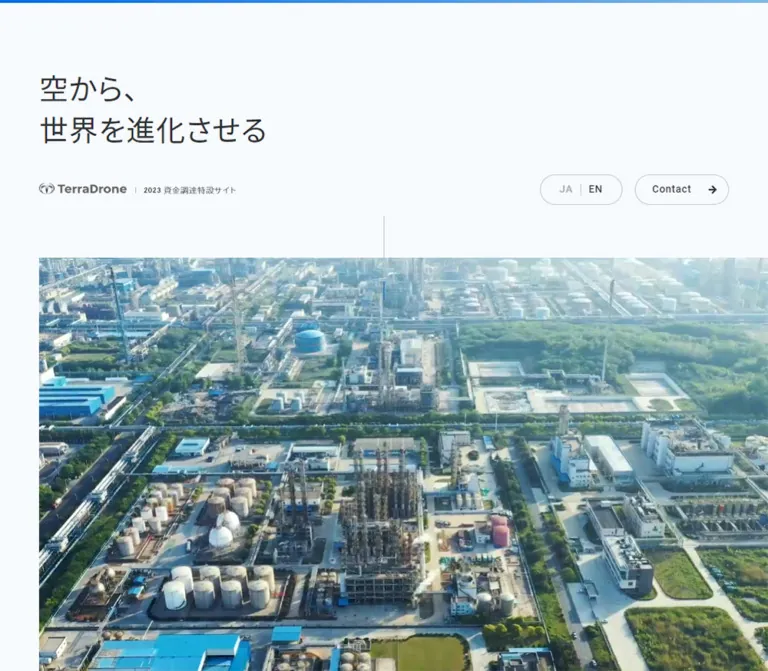
The desktop capture shows a broad, cool-toned aerial view of an industrial facility: storage tanks, pipes, buildings, roads, and vegetation. It begins at the left content inset and continues to the right viewport edge, creating an asymmetric bleed. The photograph is not enclosed in a rounded card and has no visible text overlay.
A fine vertical line crosses the media's upper boundary at the viewport center. In the desktop screenshot it runs approximately from y 406px to y 560px; on mobile, approximately y 361px to y 443px. Treat it as a delicate alignment marker, not a large scroll-arrow widget.
The mobile capture shows a more top-down industrial view with clear horizontal bands of roads and trees. Its visible media region runs from approximately y 402px to 632px, starting near x 20px and reaching the right edge.
The difference between the desktop and mobile images could arise from different media frames or responsive image selection. A looping hero video, autoplay policy, crop formula, and media source URL are not established by the supplied evidence.
Funding Narrative Blocks
Role: explain the investment announcement and its business context.
Each main text block starts with a small blue eyebrow, followed by a charcoal heading at 28.8px / 1.6 on desktop and light body text at 14.4px / 2. The first block occupies a 441px measure beginning at x 840.61px; the next funding-background block moves to the left inset at x 72px with the same width. This alternating placement creates the editorial rhythm.
The explanatory note about Wa'ed forms a smaller subordinate text block: approximately 298.8px wide at x 982.81px on desktop. Its heading is 13px / 20.8px, and its body is muted 12px / 21.6px.
Mobile main copy uses the full 350.5px inner width. The Wa'ed note remains narrower, approximately 199.69px wide and aligned toward the right at x 170.56px. This is a useful detail to preserve: the mobile page does not eliminate every secondary indentation.
Large intervals separate some mobile headings from their following paragraphs. The sampled text geometry establishes these intervals, but the intervening visual assets are not described sufficiently to reconstruct them.
CEO Message
Role: add a leadership statement to the funding narrative.
The desktop text sits toward the right at x 827.08px, with a 423px measure. It follows the blue-eyebrow, medium-heading, light-body hierarchy and ends with a role/name line. The body tracking is much tighter than in the preceding funding-background paragraphs.
On mobile, the copy becomes 350.5px wide. Paragraph text is 15.6px / 29.64px in secondary charcoal, and the signature line is 14.56px / 23.296px.
The available screenshots do not show this section's accompanying imagery. Do not invent a portrait, image treatment, or portrait filename from the section's subject alone.
Performance Presentation
Role: turn company performance into a large, visually paced part of the story.
The captured desktop state is a full-width triptych with vertical rules at approximately x 480px and 960px. Each third contains a centered slate label, a very large blue value, and a narrower left-aligned explanation.
| Column | Visible label | Visible value | Description measure |
|---|---|---|---|
| Left | 案件数累計 |
3,000 件 |
252px, starting at x 114px |
| Center | 成長率(CAGR) |
87.8 % |
252px, starting at x 594px |
| Right | 営業利益率 |
20 % |
252px, starting at x 1074px |
The labels appear near y 380px in the screenshot, the numeral glyphs occupy roughly y 438–510px, and the descriptions begin around y 570px. These screenshot positions describe the captured state, not fixed document coordinates.
A faint curve rises behind the figures from the lower left toward the upper right. Four narrow progress-like rails sit near the bottom with approximately 21px gaps. The first two are blue, the third is partly blue, and the fourth is gray in the supplied state. Their clickability and relationship to time or scroll position were not tested.
The broader DOM contains additional results topics, including industry ranking, countries of operation, and cumulative funding. Do not invent unseen numerical values. The performance section spans 10200px of desktop document space and approximately 15279px on mobile. Together with the staged screenshot and rail system, this suggests a presentation sequence, but does not establish its JavaScript implementation, pinning rules, or transition timeline.
Mobile metric descriptions occupy approximately 280.8px at x 54.59px, and the three labels appear at separate document positions. A 1 / 4 indicator is also present in extracted mobile text. Its exact association and visual treatment are unverified.
Business Areas
Role: translate the funding story into three concrete service categories.
The desktop section title starts at the left inset, while its introductory paragraph starts at x 936px and occupies 432px. Below, three equal text columns begin at x 72px, 511.66px, and 951.31px, each approximately 416.69px wide.
Each item has an English blue label—UTM, Inspection, or Survey—followed by a Japanese service heading and a compact description. There is no evidence in the supplied captures for rounded, elevated service cards.
Mobile places these items sequentially at the main left inset. Service headings reduce to 17.68px, while descriptions remain approximately 12.48px. The section grows from approximately 610px on desktop to 1373px on mobile. Any associated imagery should be verified separately; its appearance is not available in the supplied screenshots.
UTM Explanation and Project Link
Role: explain the flight-management business and connect it to examples.
A blue eyebrow introduces a broad multiline heading. The desktop supporting paragraph is again a 432px column at x 936px. Rendered text includes an eight-country service list explicitly dated December 2022. The existence of that list does not establish the design of a map or geographic illustration.
The project link プロジェクト事例を見る sits toward the right and includes substantial arrow clearance: 69px of right padding on desktop and 59px on mobile. Its destination is the page's #business section.
Mobile DOM also exposes a direct introduction-video link at /movie/Unifly_Japan.mp4. The actual video, playback controls, and any desktop modal behavior were not exercised.
Case-Study List
Role: provide concrete evidence through client and project descriptions.
Six cases are represented in the DOM. Each text group begins with a category/client line, followed by a sentence-length heading. Desktop headings use 21.6px / 43.2px; these are substantial editorial statements rather than short card titles.
The desktop copy starts at x 730.80px and is approximately 527.39px wide. On mobile it still has an intentional left offset: x 122.22px, with only 248.03px of text width. Preserve this offset relationship when matching the current composition; do not assume every mobile element becomes full-width.
The left-hand visual region is not sufficiently represented in the supplied element sample or screenshots to establish image subjects, thumbnail dimensions, or cropping. Case descriptions also do not establish that the rows themselves are clickable.
Company Presentation Section
Role: provide company materials within a distinct visual surface.
This section uses the measured blue-gray #adbccc background. Its measured desktop padding is 168.3px 182.7px; the mobile padding is approximately 108.16px 18.72px 70.47px.
The desktop closing screenshot shows a centered white-outlined previous/next capsule and separate circular expansion-style and download-style icons. Only the trailing part of this section is visible; the actual presentation pages are outside the supplied screenshot area.
The DOM provides links to /pdf/pitchdeck.pdf?230124, including the source label 会社案内資料を見る. The mobile link is pale text at 14.56px / 27.4213px.
These affordances do not prove working pagination, browser fullscreen behavior, or forced downloading. The document was not opened, and its visual contents are not part of this reference.
Contact and Recruit Panels
Role: close the story with two large, clear destinations.
The desktop pair fills the viewport width. Each link is approximately 719.5px wide and 508.88px tall, separated by a fine vertical rule. Each entire panel is an anchor, containing:
- A blue English label at
13px. - A charcoal Japanese heading at
28.8px. - A small two-line description at
13.5px / 27px. - A charcoal circular right-arrow control, visually about
52pxin diameter.
The text starts 72px from the panel's left edge and 180px from its top. The arrow sits toward the right and approximately at the panel's vertical center. No separate filled rectangular CTA is needed inside this already clickable region.
Mobile stacks Contact above Recruit. Each panel is approximately 368.56px tall, with 65.52px of top padding. The arrow moves below the copy toward the lower-right corner and appears approximately 48px across. A horizontal rule separates the panels.
Observed destinations are https://terra-drone.net/contact/ and https://www.terra-drone.net/recruit_top/. These destinations were recorded but not opened.
Footer
Role: provide a quiet corporate identity and practical contact details.
The footer shares the main canvas and is separated from the closing panels by a fine rule. Desktop places the black wordmark at the left inset, followed by small gray address, phone, and email lines. The Corporate Site link sits at the lower right with a tiny external-link indicator. An outlined upward-arrow circle sits higher on the right.
The back-to-top anchor measures 46 × 46px at both viewports. Its target is #; the scroll animation and focus behavior are unverified.
The mobile footer is taller, approximately 427.25px. Its logo link is measured at 182px wide, compared with 157.5px on desktop, although inline anchor height is not a reliable measurement of the painted logo. A large vertical gap separates the logo from the address. The address wraps into two lines, the phone and email follow, and Corporate Site remains at the lower right.
Phone and email are actual tel: and mailto: links. Their subdued styling should not obscure their interactivity in an accessible implementation.
Tokens — Motion & Interaction
| Item | Evidence | What can be claimed |
|---|---|---|
| Body opacity | Computed opacity 0.3s linear |
A 300ms linear opacity transition is declared; its trigger and visible sequence are unknown |
| Contact transition | Computed 0.15s linear |
A 150ms linear transition is reported; changed properties and end states were not supplied |
| Sampled elements | Mostly animation: none; many report transition: all without useful timing |
These samples do not establish active animation and do not rule out scripts or unsampled animation layers |
| Desktop Contact persistence | Present near the top right in later screenshots | Persistent utility placement is visible; its exact implementation is unverified |
| Performance presentation | Staged scene, long section geometry, four rails | A presentation structure is supported; count-up behavior, scrubbing, easing, and pinning are unverified |
| Hero imagery | Different industrial views at the two viewport captures | Different visible media states are supported; autoplay or looping is not proven |
| Mobile menu | Trigger visible; navigation targets present in DOM | A menu affordance and link inventory exist; opening/closing behavior is untested |
| Presentation controls | Navigation and utility glyphs visible; document links supplied | Control appearance and link targets are known; results of activation are unknown |
| Back to top | Upward arrow and # destination |
A top-link affordance exists; smooth scrolling is unverified |
The capture process waited for document loading, finite motion, sampled layout stability, and visible image decoding within bounded time limits. Perpetual animations were paused for readiness checks and resumed afterward. These checks improve capture reliability but do not reveal a complete animation sequence or guarantee that every delayed state was inspected.
For a new implementation, restrained 150–300ms transitions are a reasonable recommendation for utility feedback. Keep all performance data readable in a static mode. Any elaborate scroll presentation should be implemented only with an explicit behavior specification, keyboard access, and a reduced-motion alternative.
Surfaces
| Surface | Appearance | Role |
|---|---|---|
| Main canvas | Measured #f7fafd, flat |
Continuous background for the narrative and closing content |
| Performance scene | Visually slightly darker cool gray | Differentiates the data presentation without a strong color break |
| Media | Unframed industrial aerial imagery with square edges | Supplies visual density and real-world context |
| Company presentation | Measured #adbccc |
A distinct document/media zone |
| Utility capsule | Transparent-looking fill, fine gray outline | Language and contact controls |
| Closing arrow | Charcoal circle with pale arrow | Strong action cue within large clickable panels |
| Structural divisions | Fine low-contrast rules | Establish columns and panel boundaries |
Depth comes primarily from imagery, whitespace, and changes in background tone. No general shadow or glass-blur treatment is visible in the supplied original-page screenshots.
Imagery
The verified image language is industrial aerial observation. The desktop opening uses an oblique overview, with a bright atmospheric area toward the upper right and a dense network of infrastructure below. The mobile opening emphasizes a top-down composition with roads, trees, rooftops, and tanks forming clear bands.
The images contain cyan, gray, white, and natural green. They do not need to be recolored into a monochrome brand illustration. Their detail contrasts with the almost empty interface around them.
Use broad square-edged media regions and preserve the off-center, right-bleeding placement. Keep the headline outside the image. When adapting the composition, select responsive crops that retain recognizable infrastructure at phone size rather than allowing the most useful detail to disappear at the edges.
Observed Asset References
Paths below are observed references relative to the inspected website. They were not retrieved for this document.
| Item | Reference | Evidence limit |
|---|---|---|
| Opening aerial media | Source path not supplied | Appearance visible in original-page desktop and mobile captures; media type unknown |
| TerraDrone logo and site descriptor | Source paths not supplied | Visible branding with measured layout boxes; no basis for inventing asset filenames |
| UTM introduction video | /movie/Unifly_Japan.mp4 |
Direct mobile anchor destination; video contents and playback uninspected |
| Company presentation | /pdf/pitchdeck.pdf?230124 |
Desktop and mobile link destination; document contents uninspected |
| Performance numerals and curve | Source paths/markup not supplied | Visible in the desktop metrics screenshot; font and rendering method unknown |
The supplied evidence does not justify describing unseen CEO, service, geographic, or case-study artwork. Use verified assets when available, and keep placeholders explicit during implementation.
Layout & Responsive Behavior
Observed Changes
| Relationship | Desktop | Mobile |
|---|---|---|
| Main content inset | 72px, exactly 5% of viewport width |
Approximately 19.75px, close to 5% |
| Opening whitespace | Headline begins around 124px |
Headline begins around 147px; the top breathing room is retained |
| Opening headline | 54px, two lines |
36.4px, two lines |
| Main body | 14.4px |
Increases to 15.6px |
| Opening controls | Language and Contact capsules beside identity | Closed view shows a two-line menu trigger |
| Hero placement | Left inset, right bleed | Left inset, right bleed, different visible crop/frame |
| Narrative copy | Alternating narrow desktop measures | Main copy uses the inner width; subordinate notes can remain indented |
| Services | Three columns | Sequential single-column items |
| Case-study copy | Broad right-side measure | Narrow right-side measure remains offset |
| Contact and Recruit | Two equal side-by-side panels | Full-width stacked panels |
| Closing arrows | Right side, vertically centered | Below text at lower right |
| Footer | Compact horizontal composition | Taller composition with a larger identity-to-address gap |
The mobile design is not a uniform scale-down. Body text grows, section headings shrink, services stack, and closing controls move. At the same time, the opening retains generous whitespace and some editorial indents remain.
No tablet, landscape-phone, zoomed, or intermediate-width capture was supplied. The exact media-query breakpoint is unknown. A breakpoint near 768px in the Quick Start is a recommendation for switching these relationships, not an observed source value.
The reported --vh: 10px is identical in both snapshots even though the viewport heights differ. Do not infer a reliable 1vh formula from this sample or copy it into a new mobile implementation. Prefer native viewport units for a new stage and verify its behavior independently.
The document's very large total height is dominated by the results presentation. A static adaptation should keep the content in normal flow instead of copying the source's measured scroll distance without its associated presentation behavior.
Do’s and Don’ts
Do
- Preserve the cool canvas
#f7fafd, charcoal text#2e3033, and measured blue#006ae4. - Keep the opening statement above a separate identity-and-utility band.
- Retain the substantial top spacing on mobile.
- Use light Japanese body text, medium headings, and generous line height.
- Distinguish utility typography from the Japanese body stack without inventing font provenance.
- Keep aerial imagery square-edged, uncaptioned in the hero, and bleeding toward the right edge.
- Use narrow, alternating narrative measures on desktop.
- Preserve the performance scene's large figures, fine vertical divisions, and quiet explanatory text.
- Reserve circles and pills primarily for controls.
- Make the entire Contact and Recruit panels links.
- Retain the mobile case-copy offset and the narrow subordinate note where matching the observed page.
- Treat dated rankings and financial figures as source-page content with their original context.
Don’t
- Don't replace the opening with a conventional centered headline and large blue rectangular CTA.
- Don't apply heavy weights to every heading or wide tracking to every paragraph.
- Don't turn all content into rounded cards with shadows.
- Don't flatten the industrial imagery into generic gradient decoration.
- Don't place dense text over the hero image.
- Don't assume a hero video, animated counters, parallax, or scroll-scrubbed transitions from still captures alone.
- Don't describe the mobile menu's open state as inspected.
- Don't infer missing metric values or unseen presentation slides.
- Don't copy the long results-section height without implementing and testing an appropriate reading experience.
- Don't use the source's unverified
--vhsample as a mobile viewport formula. - Don't rebuild the logo or metric typeface from a guessed font name.
Recommended Implementation Additions
These are recommendations for a new implementation, not verified features of the original page:
- Give the mobile menu button an accessible name,
aria-expanded, and a relationship to its navigation region. If it opens an overlay, specify focus placement, Escape behavior, and focus return. - Keep icon-only presentation and top-link controls explicitly named. Do not rely on arrow direction alone.
- Use a visible blue focus outline on all links and buttons, including the complete closing panels.
- Provide touch targets of at least 44px for compact utilities, while preserving their small visible glyphs.
- Render all performance values as accessible text. Decorative curves and rails should be hidden from assistive technology unless they communicate a meaningful, labeled state.
- Ensure long Japanese headings can wrap rather than clipping at enlarged text sizes.
- Test the small footer text and muted links for readability and contrast; increase their size or darkness where required.
- Offer a normal-flow results layout under reduced motion or when a presentation script is unavailable. Avoid trapping readers in a pinned region.
- If motion media is introduced, provide appropriate controls and a still fallback. The supplied evidence does not establish the original site's media accessibility behavior.
- Preserve useful direct links to the company material and video instead of making a custom viewer the only route to the content.
Agent Prompt Guide
Quick Color Reference
- Main canvas: measured
#f7fafd. - Main headings and strong controls: measured
#2e3033. - Informational emphasis: measured
#006ae4. - Secondary paragraphs: measured
#45484dor#5c6166according to hierarchy. - Performance labels: measured
#738395. - Company-presentation band: measured
#adbccc. - Fine rules and metrics background: approximate matching values; validate against the original-page captures.
- Strong action treatment: a charcoal circular arrow inside a large linked panel.
Overall Prompt
“Create a Japanese corporate funding microsite with the spacious editorial character of the inspected TerraDrone page. Use a cool white canvas #f7fafd, charcoal text #2e3033, and electric blue #006ae4 for small section labels and large performance figures. Begin with a left-aligned two-line Japanese statement, then a lower identity row containing a black wordmark, a small dated site descriptor, and outlined language/contact capsules. Place square-edged industrial aerial media below with a left inset, right bleed, and a fine central vertical marker. Alternate narrow narrative text columns on desktop, include a restrained three-column performance scene, and close with two large Contact/Recruit link panels. On mobile, retain the opening whitespace, use approximately 20px side insets, stack services and closing panels, and move circular action arrows below the copy. Use measured typography where available; keep unverified motion and media behavior explicit.”
Example Component Prompts
- Opening: “At 1440px wide, place a regular-weight 54px Japanese heading at a 72px left inset with 75.6px line height and about 124px top spacing. Put the logo and utilities on a separate lower band. Start right-bleeding aerial industrial media around y=483px. Use no heading overlay on the image.”
- Narrative block: “Use a blue 12.6px eyebrow, a 28.8px medium-weight heading with 1.6 line height, and light 14.4px body copy with double leading. Keep the desktop reading measure near 441px and alternate its position between sections. On a 390px phone, use a 350px measure and 15.6px body copy.”
- Performance scene: “Create three equal desktop columns separated by fine cool-gray rules. Center slate labels above thin, oversized blue values, then place left-aligned 252px explanatory paragraphs beneath them. Add an extremely faint rising curve behind the figures and four narrow rails near the bottom. Treat the result as a static state unless animation behavior is separately specified.”
- Closing panels: “Build two full-width half-page link panels on desktop, each about 509px tall. Use 72px left padding, a small blue English label, a 28.8px Japanese heading, and a charcoal circular arrow at the right. On mobile, stack the panels at about 369px each and move the arrow to the lower-right area below the paragraph.”
- Footer: “Use the same cool canvas with a fine top rule. Place a black company wordmark above small gray contact details, a quiet external corporate-site link at the lower right, and a thin outlined back-to-top circle. On mobile, retain a large gap between the logo and address instead of compressing all information into a tight list.”
Quick Start
CSS Custom Properties
This is an adaptation scaffold, not recovered production CSS. It uses measured desktop/mobile typography and colors, rounded layout approximations, an estimated desktop media ratio, and a recommended 767px breakpoint. The results scene is intentionally static; it does not reproduce an unverified scroll timeline. No font files or image assets are bundled or invented.
:root {
  /* Measured colors */
  --canvas: #f7fafd;
  --ink: #2e3033;
  --copy: #45484d;
  --muted: #5c6166;
  --accent: #006ae4;
  --slate: #738395;
  --presentation: #adbccc;
  --inactive: #a6acb2;
  --quiet-link: #8d9299;
  --reversed: #f7fafc;

  /* Visual approximations, not recovered declarations */
  --metrics-surface: #edf0f2;
  --rule: #d7dde4;
  --control-rule: #bcc4cc;
  --curve: #e3e8ee;
  --edge-end: #7eb5df;

  /* Observed family declarations; supply fonts separately */
  --font-ja: 'Hiragino Sans', 'Noto sans JP', sans-serif;
  --font-latin: Roboto2, sans-serif;
  --body-size: 14.4px;
  --body-leading: 28.8px;
  --hero-size: 54px;
  --narrative-size: 28.8px;
  --section-size: 32.4px;
  --eyebrow-size: 12.6px;
  --tracking: 0.72px;

  /* Measured relationships with reusable aliases */
  --gutter: 5vw;
  --copy-width: 441px;
  --section-space: 144px;
  --pill-radius: 30px;
  --arrow-size: 52px;
  --utility-motion: 150ms linear;
  --edge-gradient: linear-gradient(
    90deg, var(--accent), var(--edge-end)
  );
}

* {
  box-sizing: border-box;
}

body {
  margin: 0;
  color: var(--ink);
  background: var(--canvas);
  font-family: var(--font-ja);
  font-size: var(--body-size);
  font-weight: 300;
  line-height: var(--body-leading);
  letter-spacing: var(--tracking);
}

/* Recommended placement for the observed narrow edge stripe */
body::before {
  content: '';
  position: fixed;
  inset: 0 0 auto;
  height: 4px;
  background: var(--edge-gradient);
  pointer-events: none;
  z-index: 100;
}

a {
  color: inherit;
}

button {
  font: inherit;
}

img,
video {
  display: block;
  max-width: 100%;
}

.shell {
  width: calc(100% - 2 * var(--gutter));
  margin-inline: auto;
}

.opening {
  padding-top: 124.2px;
}

.opening-title {
  margin: 0;
  font-size: var(--hero-size);
  font-weight: 400;
  line-height: 1.4;
}

.identity-row {
  display: flex;
  align-items: center;
  gap: 24px;
  min-height: 42px;
  margin-top: 54.85px;
}

.identity-brand {
  display: flex;
  align-items: baseline;
  gap: 16px;
  min-width: 0;
}

.brand-logo {
  width: 162px;
  height: auto;
  flex: none;
}

.site-description {
  padding-left: 16px;
  border-left: 1px solid var(--control-rule);
  font-size: 12px; /* Recommended text fallback for the descriptor */
  line-height: 1.2;
}

.utilities {
  display: flex;
  align-items: center;
  gap: 17px;
  margin-left: auto;
}

.pill {
  display: inline-flex;
  align-items: center;
  justify-content: center;
  min-height: 42px;
  padding: 13px 23px;
  border: 1px solid var(--control-rule);
  border-radius: var(--pill-radius);
  background: transparent;
  color: var(--ink);
  font-family: var(--font-latin);
  font-size: 14px;
  font-weight: 500;
  line-height: 14px;
  text-decoration: none;
  transition: border-color var(--utility-motion);
}

.language-pill {
  gap: 11px;
  padding-inline: 26px;
}

.language-pill a {
  text-decoration: none;
}

.language-pill a + a {
  padding-left: 11px;
  border-left: 1px solid var(--control-rule);
}

.language-pill [aria-current='page'] {
  color: var(--inactive);
}

.contact-pill {
  position: relative;
  padding-right: 51px;
}

.contact-pill .arrow {
  position: absolute;
  right: 17px;
}

.menu-toggle {
  display: none;
}

.hero-media {
  position: relative;
  margin: 111px 0 0 var(--gutter);
  aspect-ratio: 16 / 9; /* Recommended desktop crop, not measured */
}

.hero-media > img,
.hero-media > video {
  width: 100%;
  height: 100%;
  object-fit: cover;
}

.hero-media::before {
  content: '';
  position: absolute;
  top: -77px;
  left: calc((100% - var(--gutter)) / 2);
  width: 1px;
  height: 154px;
  background: var(--control-rule);
  pointer-events: none;
  z-index: 1;
}

.editorial-section {
  padding-block: var(--section-space) 126px;
}

.funding-section {
  padding-top: 180px;
}

.editorial-copy {
  max-width: var(--copy-width);
}

/* Placement approximation for the first desktop narrative block */
.editorial-copy--right {
  margin-left: auto;
  margin-right: 6vw;
}

.eyebrow {
  margin: 0 0 36px;
  color: var(--accent);
  font-size: var(--eyebrow-size);
  font-weight: 500;
  line-height: 1;
}

.narrative-title {
  margin: 0 0 32.4px;
  font-size: var(--narrative-size);
  font-weight: 500;
  line-height: 1.6;
  overflow-wrap: anywhere;
}

.editorial-copy p:not(.eyebrow) {
  margin-block: 0 1em;
}

.section-heading-row {
  display: grid;
  grid-template-columns: minmax(0, 1fr) 432px;
  gap: 40px;
  align-items: start;
}

.section-title {
  margin: 0;
  font-size: var(--section-size);
  font-weight: 500;
  line-height: 1;
}

.section-introduction {
  margin: 0;
  color: var(--copy);
  font-size: 13.5px;
  line-height: 27px;
}

.service-grid {
  display: grid;
  grid-template-columns: repeat(3, minmax(0, 1fr));
  gap: 23px;
  margin-top: 80px; /* Adaptation spacing */
}

.service-label {
  color: var(--accent);
  font-family: var(--font-latin);
  font-size: 11.7px;
  font-weight: 500;
  line-height: 1;
}

.service-title {
  margin: 14.4px 0 18px;
  font-size: 21.6px;
  font-weight: 500;
  line-height: 1;
}

.service-description {
  margin: 0;
  font-size: 12.6px;
  line-height: 25.2px;
  letter-spacing: 0.007em;
}

/* Static performance scene; no scroll pinning is implied */
.metrics-stage {
  position: relative;
  background: var(--metrics-surface);
  overflow: hidden;
}

.growth-line {
  position: absolute;
  inset: 0;
  width: 100%;
  height: 100%;
  fill: none;
  stroke: var(--curve);
  stroke-width: 3;
  pointer-events: none;
}

.metrics-grid {
  position: relative;
  display: grid;
  grid-template-columns: repeat(3, minmax(0, 1fr));
  min-height: 100svh;
}

.metric {
  display: flex;
  flex-direction: column;
  align-items: center;
  justify-content: center;
  min-width: 0;
  padding: 100px 24px;
}

.metric + .metric {
  border-left: 1px solid var(--rule);
}

.metric-label {
  margin: 0;
  color: var(--slate);
  font-size: 14px;
  font-weight: 500;
  line-height: 1;
  text-align: center;
}

.metric-number {
  margin: 32px 0 38px;
  color: var(--accent);
  font-family: var(--font-latin);
  font-size: 96px; /* Visual approximation; source face unknown */
  font-weight: 300;
  line-height: 1;
  letter-spacing: -0.04em;
  font-variant-numeric: lining-nums;
  white-space: nowrap;
}

.metric-unit {
  margin-left: 8px;
  font-family: var(--font-ja);
  font-size: 28.8px;
  font-weight: 600;
  letter-spacing: normal;
}

.metric-description {
  width: 252px;
  max-width: 100%;
  margin: 0;
  color: var(--muted);
  font-size: 13px;
  line-height: 26px;
  letter-spacing: 0.007em;
}

.progress-rails {
  position: absolute;
  right: var(--gutter);
  bottom: 36px;
  left: var(--gutter);
  display: grid;
  grid-template-columns: repeat(4, minmax(0, 1fr));
  gap: 21px;
}

.progress-rails span {
  height: 2px;
  background: var(--control-rule);
}

.progress-rails span::before {
  content: '';
  display: block;
  width: var(--completion, 0%);
  height: 100%;
  background: var(--accent);
}

.presentation-section {
  padding: 168.3px 12.6875vw;
  background: var(--presentation);
  color: var(--reversed);
}

.closing-grid {
  display: grid;
  grid-template-columns: repeat(2, minmax(0, 1fr));
  gap: 1px;
  border-block: 1px solid var(--rule);
  background: var(--rule);
}

.closing-link {
  position: relative;
  min-width: 0;
  min-height: 508.88px;
  padding: 180px 180px 179.1px 72px;
  background: var(--canvas);
  color: var(--ink);
  text-decoration: none;
}

.closing-label {
  margin: 0;
  color: var(--accent);
  font-family: var(--font-latin);
  font-size: 13px;
  font-weight: 500;
  line-height: 1;
}

.closing-title {
  margin: 28.8px 0 25.2px;
  font-size: 28.8px;
  font-weight: 500;
  line-height: 1.2;
  overflow-wrap: anywhere;
}

.closing-description {
  margin: 0;
  font-size: 13.5px;
  line-height: 27px;
}

.closing-arrow {
  position: absolute;
  top: 50%;
  right: 72px;
  display: grid;
  place-items: center;
  width: var(--arrow-size);
  height: var(--arrow-size);
  border-radius: 50%;
  background: var(--ink);
  color: var(--canvas);
  transform: translateY(-50%);
}

.page-footer {
  position: relative;
  min-height: 323.72px;
  padding: 127.8px var(--gutter) 65.7px;
}

.footer-logo {
  width: 157.5px;
  height: auto;
}

.footer-contacts {
  margin-top: 24px;
  color: var(--muted);
  font-size: 11px;
  line-height: 11px;
  letter-spacing: 0.07em;
}

.footer-contacts p {
  margin: 0 0 14.4px;
}

.footer-contacts a,
.footer-company-link {
  text-decoration: none;
}

.footer-company-link {
  position: absolute;
  right: var(--gutter);
  bottom: 80px;
  color: var(--quiet-link);
  font-size: 11px;
  line-height: 22px;
}

.back-to-top {
  position: absolute;
  top: 51.4px;
  right: var(--gutter);
  display: grid;
  place-items: center;
  width: 46px;
  height: 46px;
  border: 1px solid var(--control-rule);
  border-radius: 50%;
  text-decoration: none;
}

.page-footer::after {
  content: '';
  position: absolute;
  inset: auto 0 0;
  height: 4px;
  background: var(--edge-gradient);
}

/* Recommended keyboard and hover feedback */
:where(a, button):focus-visible {
  outline: 3px solid var(--accent);
  outline-offset: 4px;
}

@media (hover: hover) {
  .pill:hover {
    border-color: var(--ink);
  }
}

/* Recommended intermediate-width accommodation */
@media (min-width: 768px) and (max-width: 1199px) {
  .closing-link {
    padding: 120px 96px 120px 5vw;
  }

  .closing-arrow {
    right: 24px;
  }

  .section-heading-row {
    grid-template-columns: 1fr 1fr;
  }
}

/* Recommended breakpoint; endpoint values follow mobile evidence */
@media (max-width: 767px) {
  :root {
    --font-ja: 'Noto sans JP', sans-serif;
    --gutter: 20px;
    --body-size: 15.6px;
    --body-leading: 29.38px;
    --hero-size: 36.4px;
    --narrative-size: 24.96px;
    --section-size: 24.96px;
    --eyebrow-size: 12.48px;
    --tracking: 0.78px;
    --section-space: 104px;
    --arrow-size: 48px;
  }

  body::before {
    height: 2px;
  }

  .opening {
    padding-top: 146.64px;
  }

  .identity-row {
    min-height: 22.88px;
    margin-top: 27.04px;
  }

  .identity-brand {
    gap: 10px;
  }

  .brand-logo {
    width: 124.8px;
  }

  .site-description {
    padding-left: 10px;
    font-size: 11px;
  }

  .utilities {
    display: none;
  }

  .menu-toggle {
    position: fixed;
    top: 14px;
    right: 12px;
    z-index: 90;
    display: flex;
    flex-direction: column;
    align-items: center;
    justify-content: center;
    gap: 4px;
    width: 44px;
    height: 44px;
    padding: 0;
    border: 0;
    background: transparent;
    color: var(--muted);
  }

  .menu-toggle span {
    width: 28px;
    height: 2px;
    background: currentColor;
  }

  .hero-media {
    margin-top: 104px;
    aspect-ratio: 1.613;
  }

  .hero-media::before {
    top: -41px;
    height: 82px;
  }

  .editorial-section {
    padding-block: 104px;
  }

  .editorial-copy,
  .editorial-copy--right {
    max-width: none;
    margin-inline: 0;
  }

  .eyebrow {
    margin-bottom: 24.96px;
  }

  .narrative-title {
    margin-bottom: 24.96px;
  }

  .section-heading-row,
  .service-grid {
    grid-template-columns: minmax(0, 1fr);
  }

  .section-heading-row {
    gap: 20.8px;
  }

  .section-introduction {
    font-size: 13.52px;
    line-height: 25.4627px;
  }

  .service-grid {
    gap: 56px;
  }

  .service-label {
    font-size: 11.44px;
  }

  .service-title {
    font-size: 17.68px;
  }

  .service-description {
    font-size: 12.48px;
    line-height: 23.504px;
  }

  /* Recommended static mobile alternative to the long results sequence */
  .metrics-grid {
    grid-template-columns: minmax(0, 1fr);
    min-height: 0;
  }

  .metric {
    min-height: 480px;
    padding: 80px 14%;
  }

  .metric + .metric {
    border-left: 0;
    border-top: 1px solid var(--rule);
  }

  .metric-label {
    font-size: 14.56px;
  }

  .metric-number {
    font-size: clamp(64px, 22vw, 96px);
  }

  .metric-description {
    width: 280.8px;
    font-size: 13.52px;
    line-height: 25.4627px;
  }

  .growth-line,
  .progress-rails {
    display: none;
  }

  .presentation-section {
    padding: 108.16px 18.72px 70.47px;
  }

  .closing-grid {
    grid-template-columns: minmax(0, 1fr);
  }

  .closing-link {
    min-height: 368.56px;
    padding: 65.52px 20px 134.16px;
  }

  .closing-label {
    font-size: 13.52px;
  }

  .closing-title {
    margin: 29.12px 0 24.96px;
    font-size: 24.96px;
  }

  .closing-description {
    color: var(--copy);
    font-size: 13.52px;
    line-height: 25.4627px;
  }

  .closing-arrow {
    top: auto;
    right: 20px;
    bottom: 54px;
    transform: none;
  }

  .page-footer {
    min-height: 427.25px;
    padding: 104px var(--gutter) 44.72px;
  }

  .footer-logo {
    width: 182px;
  }

  .footer-contacts {
    margin-top: 146px;
    font-size: 11.44px;
    line-height: 25.168px;
  }

  .footer-contacts p {
    margin: 0;
  }

  .footer-company-link {
    bottom: 44.72px;
    font-size: 11.44px;
    line-height: 21.5453px;
  }

  .back-to-top {
    top: 106.9px;
  }
}

@media (prefers-reduced-motion: reduce) {
  html {
    scroll-behavior: auto;
  }

  .pill {
    transition: none;
  }
}
The CSS deliberately uses 1.2 leading for closing headings to tolerate wrapping in an adaptation; the source's single-line closing headings measured 1. Add real navigation behavior separately. A hidden desktop utility group does not by itself implement the mobile menu.
Minimal Component Markup
This example uses the observed metrics and labels as source copy. The curve is an illustrative approximation, not recovered SVG artwork. The rails reproduce one captured visual state and are decorative here.
<section class='metrics-stage' aria-label='Company performance'>
  <svg class='growth-line' viewBox='0 0 1440 1000'
       preserveAspectRatio='none' aria-hidden='true'>
    <path d='M0 862 C740 862 1330 680 1440 135' />
  </svg>

  <div class='metrics-grid'>
    <article class='metric'>
      <h3 class='metric-label'>案件数累計</h3>
      <p class='metric-number'>3,000<span class='metric-unit'>件</span></p>
      <p class='metric-description'>
        運航管理、測量、点検の各事業累計の案件数が3,000件を突破しました。
      </p>
    </article>

    <article class='metric'>
      <h3 class='metric-label'>成長率(CAGR)</h3>
      <p class='metric-number'>87.8<span class='metric-unit'>%</span></p>
      <p class='metric-description'>
        2016年の創業から売上、事業規模、従業員数ともに順調に成長を続けています。
      </p>
    </article>

    <article class='metric'>
      <h3 class='metric-label'>営業利益率</h3>
      <p class='metric-number'>20<span class='metric-unit'>%</span></p>
      <p class='metric-description'>
        2016年の創業から4期目で黒字化、毎年増収増益しています。
      </p>
    </article>
  </div>

  <div class='progress-rails' aria-hidden='true'>
    <span style='--completion: 100%'></span>
    <span style='--completion: 100%'></span>
    <span style='--completion: 65%'></span>
    <span style='--completion: 0%'></span>
  </div>
</section>
Tailwind v4 Token Mapping
Optional mapping for a project already using Tailwind v4. Define the custom properties above first. This is not evidence that the inspected website uses Tailwind.
@theme inline {
  --color-canvas: var(--canvas);
  --color-ink: var(--ink);
  --color-copy: var(--copy);
  --color-muted: var(--muted);
  --color-accent: var(--accent);
  --color-slate: var(--slate);
  --color-presentation: var(--presentation);
  --color-rule: var(--rule);

  --font-body: var(--font-ja);
  --font-utility: var(--font-latin);

  --text-body: var(--body-size);
  --text-hero: var(--hero-size);
  --text-narrative: var(--narrative-size);
  --text-section: var(--section-size);
  --text-eyebrow: var(--eyebrow-size);

  --spacing-page: var(--gutter);
  --spacing-section: var(--section-space);
  --radius-pill: 30px;
}
Sources & Evidence
- Inspected original page: TerraDrone funding website. Original and final URLs were identical; the supplied response status was HTTP 200.
- Capture timestamp: September 29, 2026,
2026-09-29T13:35:47.413Z, equivalent to 22:35:47.413 JST. - Desktop evidence: 1440 × 1000 viewport; original-page opening, three-column metrics state, and lower presentation/Contact/Recruit/footer captures; rendered document height approximately 20098.61px.
- Mobile evidence: 390 × 844 viewport; original-page opening and Recruit/footer captures; rendered document height approximately 25299.97px.
- Rendered DOM and computed styles: supplied text, anchor destinations, element rectangles, colors, font-family declarations, sizes, weights, line heights, tracking, padding, radii, transitions, animation samples, and the
--vhcustom-property sample. - Observed interaction scope: the supplied browser process traversed the page for scroll captures. No supplied evidence demonstrates activation of the mobile menu, language switch, video, presentation navigation, expansion/download controls, Contact/Recruit destinations, or back-to-top link.
- Recorded original-page resources: UTM introduction video and company presentation. These are observed link targets only; their contents were not inspected.
- Inspection limits: only two viewport sizes and selected screenshots were supplied. Complete stylesheets, font files, hero asset URLs, unsampled image bounds, time-resolved motion, expanded navigation, and intermediate responsive states were unavailable. SharedWorkers and service workers were disabled during the supplied browser inspection.
This reference describes the page currently served at the inspected URL using the available original-page evidence. Measured facts, screenshot estimates, and adaptation choices are kept separate throughout.
# TerraDrone / 2023 Funding Website — Style Reference

> An expansive corporate funding story in cool white, electric blue, and industrial aerial imagery.

**Website:** [fundingwebsite2023.terra-drone.net](https://fundingwebsite2023.terra-drone.net/)
**Original URL:** https://fundingwebsite2023.terra-drone.net/
**Final URL:** https://fundingwebsite2023.terra-drone.net/
**Theme:** light; no alternative theme was demonstrated.
**Inspected:** September 29, 2026, at 13:35:47 UTC / 22:35:47 JST, using the supplied browser inspection.
**Viewports:** desktop 1440 × 1000 and mobile 390 × 844 CSS pixels.
**Scope:** the current Japanese funding microsite, including desktop opening, a metrics presentation state, closing presentation controls, Contact/Recruit panels, and footer; mobile opening and Recruit/footer captures; rendered DOM and computed styles covering the intervening funding story, CEO message, results, services, UTM explanation, case studies, and company presentation section.

TerraDrone presents its funding announcement through the visual language of a spacious corporate report. The page combines a nearly white blue-tinted canvas, light Japanese sans-serif text, narrow reading columns, fine structural lines, and large areas of empty space. Blue supplies the emphasis: section labels, oversized performance figures, and a thin stripe at the page edge. Black branding and charcoal circular arrows give the pale composition a few firm anchors.

The opening has a distinctive order. A two-line statement appears first, followed much lower by the company identity and utilities, followed lower again by industrial aerial imagery. Later sections alternate the position of their text, expand performance information into a presentation-like scene, and return to compact service and project information. The closing Contact and Recruit links become two large architectural panels instead of isolated buttons.

This is a dedicated funding and corporate-information microsite. Its visible 2023 identity and dated business claims remain part of the page currently served in September 2026; they should not be rewritten as newly verified 2026 financial results.
閉じる
# TerraDrone / 2023 Funding Website — Style Reference

> An expansive corporate funding story in cool white, electric blue, and industrial aerial imagery.

**Website:** [fundingwebsite2023.terra-drone.net](https://fundingwebsite2023.terra-drone.net/)
**Original URL:** https://fundingwebsite2023.terra-drone.net/
**Final URL:** https://fundingwebsite2023.terra-drone.net/
**Theme:** light; no alternative theme was demonstrated.
**Inspected:** September 29, 2026, at 13:35:47 UTC / 22:35:47 JST, using the supplied browser inspection.
**Viewports:** desktop 1440 × 1000 and mobile 390 × 844 CSS pixels.
**Scope:** the current Japanese funding microsite, including desktop opening, a metrics presentation state, closing presentation controls, Contact/Recruit panels, and footer; mobile opening and Recruit/footer captures; rendered DOM and computed styles covering the intervening funding story, CEO message, results, services, UTM explanation, case studies, and company presentation section.

TerraDrone presents its funding announcement through the visual language of a spacious corporate report. The page combines a nearly white blue-tinted canvas, light Japanese sans-serif text, narrow reading columns, fine structural lines, and large areas of empty space. Blue supplies the emphasis: section labels, oversized performance figures, and a thin stripe at the page edge. Black branding and charcoal circular arrows give the pale composition a few firm anchors.

The opening has a distinctive order. A two-line statement appears first, followed much lower by the company identity and utilities, followed lower again by industrial aerial imagery. Later sections alternate the position of their text, expand performance information into a presentation-like scene, and return to compact service and project information. The closing Contact and Recruit links become two large architectural panels instead of isolated buttons.

This is a dedicated funding and corporate-information microsite. Its visible 2023 identity and dated business claims remain part of the page currently served in September 2026; they should not be rewritten as newly verified 2026 financial results.

## How to Read This Reference

- **Measured** values come from the supplied rendered DOM, computed styles, and element rectangles. Measurements are CSS pixels unless otherwise noted.
- **Visual estimates** come only from the original-page screenshots. They are identified explicitly, especially for rules, large numerals, decorative curves, and icon sizes.
- **Derived** values are simple calculations from measured rectangles, such as column gaps and content widths.
- **Recommended** values are implementation choices for a reusable adaptation. They are not recovered source CSS.
- **Named tokens** are descriptive aliases. The only supplied source custom property was `--vh`, reported as `10px` at both viewports.
- The supplied screenshots establish appearance at selected positions. DOM coverage is broader, but does not establish the appearance of every image, hidden menu, or intermediate presentation state.
- No additional browsing, file inspection, asset retrieval, or interaction testing was performed for this reference.

## Tokens — Colors

### Default Palette

| Name | Value | Suggested token | Evidence and role |
| --- | --- | --- | --- |
| Cool Canvas | `#f7fafd` | `--canvas` | Measured body background at both viewports; the continuous opening, content, closing-panel, and footer surface |
| Charcoal | `#2e3033` | `--ink` | Measured body and heading color; visually also the filled closing-arrow circles |
| Secondary Copy | `#45484d` | `--copy` | Measured service introductions, UTM explanation, and selected mobile paragraphs |
| Muted Copy | `#5c6166` | `--muted` | Measured explanatory notes, metric descriptions, and footer contact details |
| Electric Blue | `#006ae4` | `--accent` | Measured section labels and numeric units; large metric figures visually use the same blue family |
| Slate Label | `#738395` | `--slate` | Measured results labels above the figures |
| Presentation Blue | `#adbccc` | `--presentation` | Measured company-presentation section background |
| Inactive Utility | `#a6acb2` | `--inactive` | Measured `JA` link color in the captured Japanese state |
| Quiet Link | `#8d9299` | `--quiet-link` | Measured `Corporate Site` link color |
| Reversed Text | `#f7fafc` | `--reversed` | Measured mobile company-presentation link text |

### Estimated Supporting Colors

| Name | Approximation | Suggested token | Use |
| --- | --- | --- | --- |
| Metrics Surface | `#edf0f2` | `--metrics-surface` | Slightly darker cool gray visible in the desktop metrics scene; its actual background declaration was not supplied |
| Structural Rule | `#d7dde4` | `--rule` | Fine panel and column separators |
| Control Outline | `#bcc4cc` | `--control-rule` | Outlined pills and back-to-top circle |
| Growth Curve | `#e3e8ee` | `--curve` | Very low-contrast rising curve behind the performance figures |
| Pale Edge Blue | `#7eb5df` | `--edge-end` | Approximate lighter end of the narrow blue edge stripe |

Use the measured colors as the reliable foundation. Treat supporting hex values as matching starting points, not sampled or recovered source tokens.

### Accent and Border Behavior

The visible top stripe shifts from stronger blue at the left toward lighter blue at the right. Its thickness is approximately 4px on desktop and 2px in the mobile opening capture. A similar blue edge appears at the bottom of the footer. The stripe's function was not established; do not automatically label it a scroll-progress indicator.

Blue is concentrated in labels and figures. The large Contact/Recruit arrow circles remain charcoal. This separation helps the blue communicate information without making every interactive element equally prominent.

Some sampled anchor containers report browser-default blue, while their visible descendants have explicit charcoal, gray, or blue styling. Those raw parent values are not additional palette colors. Likewise, the root element's default black is not the principal visible text color.

## Tokens — Typography

### Japanese Text

- **Desktop computed stack:** `'Hiragino Sans', 'Noto sans JP', sans-serif`.
- **Mobile computed stack:** `'Noto sans JP', sans-serif`.
- **Body weight:** `300`.
- **Opening headline weight:** `400`.
- **Most section headings and labels:** `500`.
- **Character:** restrained, light, and highly spaced vertically. Large size and surrounding whitespace establish hierarchy more often than heavy weight.

These are computed family declarations. Font files and `@font-face` definitions were not supplied, so the actual selected face and font-file provenance are not independently established. The `Times` value on the root element is a browser default, not evidence of visible serif typography.

### Latin Utilities

The computed family for `JA`, `EN`, `Contact`, `Recruit`, and English service labels is `Roboto2, sans-serif`. Preserve `Roboto2` as the observed family alias when describing the source. Do not silently rename it to a particular Roboto release or assume its font file is available in a new project.

Most navigation utilities use `14px`, weight `500`, and a `14px` line height. Smaller English service labels use `11.7px` on desktop and `11.44px` on mobile.

### Branding and Large Figures

The wordmark and adjacent 2023 site descriptor are visibly rendered, but their sampled heading/paragraph nodes contain no ordinary text. Their appearance should be preserved through the appropriate brand assets when available, rather than reconstructed from a guessed font.

The metrics screenshot visibly contains `3,000`, `87.8`, and `20`. Their numeral nodes and font declarations are absent from the supplied element sample. The figures have thin, tall strokes and approximately 70px of visible glyph height; a nominal font size around 90–100px is a visual estimate. Neither their exact typeface nor their rendering method is verified.

### Type Scale

Sizes and line heights below are measured, except for the explicitly estimated numeral row.

| Role | Desktop size / line height | Mobile size / line height | Weight |
| --- | --- | --- | --- |
| Opening headline | `54 / 75.6px` | `36.4 / 50.96px` | `400` |
| Narrative heading | `28.8 / 46.08px` | `24.96 / 39.936px` | `500` |
| Standalone section heading | `32.4 / 32.4px` | `24.96 / 24.96px` | `500` |
| Multiline UTM heading | `32.4 / 51.84px` | `24.96 / 39.936px` | `500` |
| Standard body | `14.4 / 28.8px` | `15.6 / 29.38px` | `300` |
| Section eyebrow | `12.6 / 12.6px` | `12.48 / 12.48px` | `500` |
| Service heading | `21.6 / 21.6px` | `17.68 / 17.68px` | `500` |
| Service description | `12.6 / 25.2px` | `12.48 / 23.504px` | `300` |
| Case-study heading | `21.6 / 43.2px` | `15.6 / 29.64px` | `500` |
| Case category/client line | `12.6 / 25.2px` | `11.44 / 21.5453px` | `500` |
| Three-column metric label | `14 / 14px` | `14.56 / 14.56px` | `500` |
| Three-column metric description | `13 / 26px` | `13.52 / 25.4627px` | `300` |
| Large metric numerals | Approximately `90–100px`; line height unknown | Not visually measured | Visually light; exact weight unknown |
| Closing-panel heading | `28.8 / 28.8px` | `24.96 / 24.96px` | `500` |
| Closing-panel description | `13.5 / 27px` | `13.52 / 25.4627px` | `300` |
| Footer contact text | `11 / 11px` | `11.44 / 25.168px` | `300` |

### Tracking

The body reports `0.72px` letter spacing on desktop and `0.78px` on mobile. These correspond to `0.05em` at the respective body sizes, but many headings inherit the same absolute spacing rather than receiving `0.05em` of their own larger size.

Tracking also varies by content:

- Funding-background paragraphs: `1.008px` desktop and `1.092px` mobile, equivalent to `0.07em` of body size.
- CEO paragraphs: `0.1008px` desktop and `0.1092px` mobile, equivalent to `0.007em`.
- Desktop metric descriptions: `0.091px` at `13px`.
- Footer details: `0.77px` desktop and `0.8008px` mobile.

Do not apply a universal wide letter-spacing value to all paragraphs. The denser CEO and metric text is a meaningful part of the hierarchy.

## Tokens — Spacing & Shapes

**Observed spacing character:** expansive section spacing, narrow text measures, fine divisions, and relatively small controls.

**Source scaling:** many values are fractional and consistent with responsive sizing, but two viewport samples do not establish the original formulas or breakpoints. No universal source spacing unit can be recovered confidently.

### Spacing Scale

| Use | Desktop | Mobile | Status |
| --- | --- | --- | --- |
| Main horizontal inset | `72px` | `19.75px` | Measured at heading/content rectangles |
| Main content width | `1296px` | `350.5px` | Measured |
| Opening top padding | `124.2px` | `146.64px` | Measured |
| Funding section top padding | `180px` | `104px` | Measured |
| Services section top padding | `144px` | `104px` | Measured |
| UTM section top padding | `154.8px` | `104px` | Measured |
| Case-study section top padding | `181.8px` | `104px` | Measured |
| Narrative eyebrow-to-heading gap | Approximately `36px` | Approximately `24.96px` | Derived from rectangles |
| Narrative heading-to-body gap in desktop intro | Approximately `32.4px` | Intervening layout region; not a direct equivalent | Derived |
| Service-column gap | Approximately `22.97px` | Single column | Derived |
| Closing-panel top padding | `180px` | `65.52px` | Measured |
| Footer top padding | `127.8px` | `104px` | Measured |

### Border Radius

| Element | Treatment | Evidence |
| --- | --- | --- |
| Contact pill | `30px` radius | Computed style |
| Language capsule | Fully rounded ends | Screenshot observation; wrapper radius not supplied |
| Closing-panel arrow | Circle | Screenshot observation |
| Back-to-top control | Circle | Screenshot observation; anchor rectangle is `46 × 46px` |
| Presentation utility controls | Circular outlines and a combined rounded navigation capsule | Screenshot observation |
| Sections and hero imagery | Square boundaries | Visible screenshots; sampled section radii are `0px` |

There is no visible general-purpose card-radius or shadow-elevation system. Rounded geometry is reserved for controls.

### Layout Measurements

| Element | Desktop 1440 × 1000 | Mobile 390 × 844 |
| --- | --- | --- |
| Headline origin | `x 72, y 124.19` | `x 19.75, y 146.63` |
| Headline box height | `151.19px` | `101.94px` |
| Opening logo box | `162 × 29.69px` at `y 336.56` | `124.80 × 22.88px` at `y 275.59` |
| Main/hero section start | `y 483.25` | `y 402.47` |
| First media section height | `846px` | `229.59px` |
| First funding-copy width | `441px` | `350.5px` |
| CEO-copy width | `423px` | `350.5px` |
| Results section height | `10200px` | `15279.22px` |
| Service text-column width | `416.69px` | `350.5px` |
| Case-study text width | `527.39px` | `248.03px` |
| Company-presentation section height | `941.34px` | `481.58px` |
| Individual closing-link box | `719.5 × 508.88px` | `390 × 368.56px` |
| Footer height | `323.72px` | `427.25px` |
| Total document height | `20098.61px` | `25299.97px` |

The desktop media section's height is a section measurement, not a verified image bounding box or image aspect ratio. Likewise, the long results section may include presentation spacing; it should not be reproduced as a giant empty block without the corresponding behavior.

## Components

### Opening Statement and Identity Band

**Role:** establish the corporate ambition before presenting the company and utilities.

The opening statement is the two-line source copy `空から、` / `世界を進化させる`. It sits at the main left inset and uses a regular-weight sans-serif rather than a heavy display face. Its desktop text box starts approximately 124px from the top; mobile starts approximately 147px down, retaining substantial empty space above the message.

The identity band is lower and visually separate. On desktop, the TerraDrone logo begins around `y 337px`; the small 2023 funding-site descriptor follows a thin vertical divider. Language and Contact capsules sit at the far right, aligned around the same horizontal band.

The source's measured `HEADER` element contains the statement. Do not assume that every visible item in the identity band belongs to that same semantic header element.

On mobile, the logo becomes about 125px wide, the descriptor remains beside it, and the desktop utility capsules are absent from the closed-menu screenshot. The identity row ends around `y 299px`, well before the media starts around `y 402px`.

### Desktop Utilities and Mobile Menu Trigger

**Role:** provide language selection and persistent access to contact/navigation.

The desktop Contact link measures approximately `130.16 × 42px`, with `13px 51px 13px 23px` padding and a `30px` radius. The additional right padding accommodates a small right arrow. Its outline is fine and its fill visually matches the canvas.

The neighboring language capsule groups `JA` and `EN` with a short vertical separator. `JA` is muted in this Japanese-page state, but it remains an anchor to the Japanese root; the evidence does not establish a disabled control.

Contact also remains visible near the upper-right corner in the desktop metrics and closing screenshots. That persistence is observed; the exact fixed/sticky mechanism and transition threshold are not supplied.

Mobile shows a small two-line menu glyph near the upper-right corner in both opening and footer captures. Its visible strokes are approximately 28px wide. The expanded menu was not captured. Although the mobile DOM includes navigation text and rectangles, that does not prove those items were visible over the opening screenshot.

The supplied mobile navigation destinations are:

| Source label | Destination |
| --- | --- |
| `トップ` | `/#` |
| `資金調達について` | `/#intro` |
| `代表メッセージ` | `/#message` |
| `実績` | `/#content` |
| `事業領域` | `/#service` |
| `運航管理事業について` | `/#about` |
| `事例紹介` | `/#business` |

These are navigation targets, not evidence of a tested menu-opening animation or smooth-scroll implementation.

### Aerial Hero

**Role:** connect the corporate statement to physical infrastructure and industrial scale.

The desktop capture shows a broad, cool-toned aerial view of an industrial facility: storage tanks, pipes, buildings, roads, and vegetation. It begins at the left content inset and continues to the right viewport edge, creating an asymmetric bleed. The photograph is not enclosed in a rounded card and has no visible text overlay.

A fine vertical line crosses the media's upper boundary at the viewport center. In the desktop screenshot it runs approximately from `y 406px` to `y 560px`; on mobile, approximately `y 361px` to `y 443px`. Treat it as a delicate alignment marker, not a large scroll-arrow widget.

The mobile capture shows a more top-down industrial view with clear horizontal bands of roads and trees. Its visible media region runs from approximately `y 402px` to `632px`, starting near `x 20px` and reaching the right edge.

The difference between the desktop and mobile images could arise from different media frames or responsive image selection. A looping hero video, autoplay policy, crop formula, and media source URL are not established by the supplied evidence.

### Funding Narrative Blocks

**Role:** explain the investment announcement and its business context.

Each main text block starts with a small blue eyebrow, followed by a charcoal heading at `28.8px / 1.6` on desktop and light body text at `14.4px / 2`. The first block occupies a `441px` measure beginning at `x 840.61px`; the next funding-background block moves to the left inset at `x 72px` with the same width. This alternating placement creates the editorial rhythm.

The explanatory note about Wa'ed forms a smaller subordinate text block: approximately `298.8px` wide at `x 982.81px` on desktop. Its heading is `13px / 20.8px`, and its body is muted `12px / 21.6px`.

Mobile main copy uses the full `350.5px` inner width. The Wa'ed note remains narrower, approximately `199.69px` wide and aligned toward the right at `x 170.56px`. This is a useful detail to preserve: the mobile page does not eliminate every secondary indentation.

Large intervals separate some mobile headings from their following paragraphs. The sampled text geometry establishes these intervals, but the intervening visual assets are not described sufficiently to reconstruct them.

### CEO Message

**Role:** add a leadership statement to the funding narrative.

The desktop text sits toward the right at `x 827.08px`, with a `423px` measure. It follows the blue-eyebrow, medium-heading, light-body hierarchy and ends with a role/name line. The body tracking is much tighter than in the preceding funding-background paragraphs.

On mobile, the copy becomes `350.5px` wide. Paragraph text is `15.6px / 29.64px` in secondary charcoal, and the signature line is `14.56px / 23.296px`.

The available screenshots do not show this section's accompanying imagery. Do not invent a portrait, image treatment, or portrait filename from the section's subject alone.

### Performance Presentation

**Role:** turn company performance into a large, visually paced part of the story.

The captured desktop state is a full-width triptych with vertical rules at approximately `x 480px` and `960px`. Each third contains a centered slate label, a very large blue value, and a narrower left-aligned explanation.

| Column | Visible label | Visible value | Description measure |
| --- | --- | --- | --- |
| Left | `案件数累計` | `3,000 件` | `252px`, starting at `x 114px` |
| Center | `成長率(CAGR)` | `87.8 %` | `252px`, starting at `x 594px` |
| Right | `営業利益率` | `20 %` | `252px`, starting at `x 1074px` |

The labels appear near `y 380px` in the screenshot, the numeral glyphs occupy roughly `y 438–510px`, and the descriptions begin around `y 570px`. These screenshot positions describe the captured state, not fixed document coordinates.

A faint curve rises behind the figures from the lower left toward the upper right. Four narrow progress-like rails sit near the bottom with approximately 21px gaps. The first two are blue, the third is partly blue, and the fourth is gray in the supplied state. Their clickability and relationship to time or scroll position were not tested.

The broader DOM contains additional results topics, including industry ranking, countries of operation, and cumulative funding. Do not invent unseen numerical values. The performance section spans 10200px of desktop document space and approximately 15279px on mobile. Together with the staged screenshot and rail system, this suggests a presentation sequence, but does not establish its JavaScript implementation, pinning rules, or transition timeline.

Mobile metric descriptions occupy approximately `280.8px` at `x 54.59px`, and the three labels appear at separate document positions. A `1 / 4` indicator is also present in extracted mobile text. Its exact association and visual treatment are unverified.

### Business Areas

**Role:** translate the funding story into three concrete service categories.

The desktop section title starts at the left inset, while its introductory paragraph starts at `x 936px` and occupies `432px`. Below, three equal text columns begin at `x 72px`, `511.66px`, and `951.31px`, each approximately `416.69px` wide.

Each item has an English blue label—`UTM`, `Inspection`, or `Survey`—followed by a Japanese service heading and a compact description. There is no evidence in the supplied captures for rounded, elevated service cards.

Mobile places these items sequentially at the main left inset. Service headings reduce to `17.68px`, while descriptions remain approximately `12.48px`. The section grows from approximately 610px on desktop to 1373px on mobile. Any associated imagery should be verified separately; its appearance is not available in the supplied screenshots.

### UTM Explanation and Project Link

**Role:** explain the flight-management business and connect it to examples.

A blue eyebrow introduces a broad multiline heading. The desktop supporting paragraph is again a `432px` column at `x 936px`. Rendered text includes an eight-country service list explicitly dated December 2022. The existence of that list does not establish the design of a map or geographic illustration.

The project link `プロジェクト事例を見る` sits toward the right and includes substantial arrow clearance: `69px` of right padding on desktop and `59px` on mobile. Its destination is the page's `#business` section.

Mobile DOM also exposes a direct introduction-video link at `/movie/Unifly_Japan.mp4`. The actual video, playback controls, and any desktop modal behavior were not exercised.

### Case-Study List

**Role:** provide concrete evidence through client and project descriptions.

Six cases are represented in the DOM. Each text group begins with a category/client line, followed by a sentence-length heading. Desktop headings use `21.6px / 43.2px`; these are substantial editorial statements rather than short card titles.

The desktop copy starts at `x 730.80px` and is approximately `527.39px` wide. On mobile it still has an intentional left offset: `x 122.22px`, with only `248.03px` of text width. Preserve this offset relationship when matching the current composition; do not assume every mobile element becomes full-width.

The left-hand visual region is not sufficiently represented in the supplied element sample or screenshots to establish image subjects, thumbnail dimensions, or cropping. Case descriptions also do not establish that the rows themselves are clickable.

### Company Presentation Section

**Role:** provide company materials within a distinct visual surface.

This section uses the measured blue-gray `#adbccc` background. Its measured desktop padding is `168.3px 182.7px`; the mobile padding is approximately `108.16px 18.72px 70.47px`.

The desktop closing screenshot shows a centered white-outlined previous/next capsule and separate circular expansion-style and download-style icons. Only the trailing part of this section is visible; the actual presentation pages are outside the supplied screenshot area.

The DOM provides links to `/pdf/pitchdeck.pdf?230124`, including the source label `会社案内資料を見る`. The mobile link is pale text at `14.56px / 27.4213px`.

These affordances do not prove working pagination, browser fullscreen behavior, or forced downloading. The document was not opened, and its visual contents are not part of this reference.

### Contact and Recruit Panels

**Role:** close the story with two large, clear destinations.

The desktop pair fills the viewport width. Each link is approximately `719.5px` wide and `508.88px` tall, separated by a fine vertical rule. Each entire panel is an anchor, containing:

1. A blue English label at `13px`.
2. A charcoal Japanese heading at `28.8px`.
3. A small two-line description at `13.5px / 27px`.
4. A charcoal circular right-arrow control, visually about `52px` in diameter.

The text starts `72px` from the panel's left edge and `180px` from its top. The arrow sits toward the right and approximately at the panel's vertical center. No separate filled rectangular CTA is needed inside this already clickable region.

Mobile stacks Contact above Recruit. Each panel is approximately `368.56px` tall, with `65.52px` of top padding. The arrow moves below the copy toward the lower-right corner and appears approximately `48px` across. A horizontal rule separates the panels.

Observed destinations are `https://terra-drone.net/contact/` and `https://www.terra-drone.net/recruit_top/`. These destinations were recorded but not opened.

### Footer

**Role:** provide a quiet corporate identity and practical contact details.

The footer shares the main canvas and is separated from the closing panels by a fine rule. Desktop places the black wordmark at the left inset, followed by small gray address, phone, and email lines. The `Corporate Site` link sits at the lower right with a tiny external-link indicator. An outlined upward-arrow circle sits higher on the right.

The back-to-top anchor measures `46 × 46px` at both viewports. Its target is `#`; the scroll animation and focus behavior are unverified.

The mobile footer is taller, approximately `427.25px`. Its logo link is measured at 182px wide, compared with 157.5px on desktop, although inline anchor height is not a reliable measurement of the painted logo. A large vertical gap separates the logo from the address. The address wraps into two lines, the phone and email follow, and `Corporate Site` remains at the lower right.

Phone and email are actual `tel:` and `mailto:` links. Their subdued styling should not obscure their interactivity in an accessible implementation.

## Tokens — Motion & Interaction

| Item | Evidence | What can be claimed |
| --- | --- | --- |
| Body opacity | Computed `opacity 0.3s linear` | A 300ms linear opacity transition is declared; its trigger and visible sequence are unknown |
| Contact transition | Computed `0.15s linear` | A 150ms linear transition is reported; changed properties and end states were not supplied |
| Sampled elements | Mostly `animation: none`; many report `transition: all` without useful timing | These samples do not establish active animation and do not rule out scripts or unsampled animation layers |
| Desktop Contact persistence | Present near the top right in later screenshots | Persistent utility placement is visible; its exact implementation is unverified |
| Performance presentation | Staged scene, long section geometry, four rails | A presentation structure is supported; count-up behavior, scrubbing, easing, and pinning are unverified |
| Hero imagery | Different industrial views at the two viewport captures | Different visible media states are supported; autoplay or looping is not proven |
| Mobile menu | Trigger visible; navigation targets present in DOM | A menu affordance and link inventory exist; opening/closing behavior is untested |
| Presentation controls | Navigation and utility glyphs visible; document links supplied | Control appearance and link targets are known; results of activation are unknown |
| Back to top | Upward arrow and `#` destination | A top-link affordance exists; smooth scrolling is unverified |

The capture process waited for document loading, finite motion, sampled layout stability, and visible image decoding within bounded time limits. Perpetual animations were paused for readiness checks and resumed afterward. These checks improve capture reliability but do not reveal a complete animation sequence or guarantee that every delayed state was inspected.

For a new implementation, restrained 150–300ms transitions are a reasonable recommendation for utility feedback. Keep all performance data readable in a static mode. Any elaborate scroll presentation should be implemented only with an explicit behavior specification, keyboard access, and a reduced-motion alternative.

## Surfaces

| Surface | Appearance | Role |
| --- | --- | --- |
| Main canvas | Measured `#f7fafd`, flat | Continuous background for the narrative and closing content |
| Performance scene | Visually slightly darker cool gray | Differentiates the data presentation without a strong color break |
| Media | Unframed industrial aerial imagery with square edges | Supplies visual density and real-world context |
| Company presentation | Measured `#adbccc` | A distinct document/media zone |
| Utility capsule | Transparent-looking fill, fine gray outline | Language and contact controls |
| Closing arrow | Charcoal circle with pale arrow | Strong action cue within large clickable panels |
| Structural divisions | Fine low-contrast rules | Establish columns and panel boundaries |

Depth comes primarily from imagery, whitespace, and changes in background tone. No general shadow or glass-blur treatment is visible in the supplied original-page screenshots.

## Imagery

The verified image language is industrial aerial observation. The desktop opening uses an oblique overview, with a bright atmospheric area toward the upper right and a dense network of infrastructure below. The mobile opening emphasizes a top-down composition with roads, trees, rooftops, and tanks forming clear bands.

The images contain cyan, gray, white, and natural green. They do not need to be recolored into a monochrome brand illustration. Their detail contrasts with the almost empty interface around them.

Use broad square-edged media regions and preserve the off-center, right-bleeding placement. Keep the headline outside the image. When adapting the composition, select responsive crops that retain recognizable infrastructure at phone size rather than allowing the most useful detail to disappear at the edges.

### Observed Asset References

Paths below are observed references relative to the inspected website. They were not retrieved for this document.

| Item | Reference | Evidence limit |
| --- | --- | --- |
| Opening aerial media | Source path not supplied | Appearance visible in original-page desktop and mobile captures; media type unknown |
| TerraDrone logo and site descriptor | Source paths not supplied | Visible branding with measured layout boxes; no basis for inventing asset filenames |
| UTM introduction video | `/movie/Unifly_Japan.mp4` | Direct mobile anchor destination; video contents and playback uninspected |
| Company presentation | `/pdf/pitchdeck.pdf?230124` | Desktop and mobile link destination; document contents uninspected |
| Performance numerals and curve | Source paths/markup not supplied | Visible in the desktop metrics screenshot; font and rendering method unknown |

The supplied evidence does not justify describing unseen CEO, service, geographic, or case-study artwork. Use verified assets when available, and keep placeholders explicit during implementation.

## Layout & Responsive Behavior

### Observed Changes

| Relationship | Desktop | Mobile |
| --- | --- | --- |
| Main content inset | `72px`, exactly 5% of viewport width | Approximately `19.75px`, close to 5% |
| Opening whitespace | Headline begins around `124px` | Headline begins around `147px`; the top breathing room is retained |
| Opening headline | `54px`, two lines | `36.4px`, two lines |
| Main body | `14.4px` | Increases to `15.6px` |
| Opening controls | Language and Contact capsules beside identity | Closed view shows a two-line menu trigger |
| Hero placement | Left inset, right bleed | Left inset, right bleed, different visible crop/frame |
| Narrative copy | Alternating narrow desktop measures | Main copy uses the inner width; subordinate notes can remain indented |
| Services | Three columns | Sequential single-column items |
| Case-study copy | Broad right-side measure | Narrow right-side measure remains offset |
| Contact and Recruit | Two equal side-by-side panels | Full-width stacked panels |
| Closing arrows | Right side, vertically centered | Below text at lower right |
| Footer | Compact horizontal composition | Taller composition with a larger identity-to-address gap |

The mobile design is not a uniform scale-down. Body text grows, section headings shrink, services stack, and closing controls move. At the same time, the opening retains generous whitespace and some editorial indents remain.

No tablet, landscape-phone, zoomed, or intermediate-width capture was supplied. The exact media-query breakpoint is unknown. A breakpoint near 768px in the Quick Start is a recommendation for switching these relationships, not an observed source value.

The reported `--vh: 10px` is identical in both snapshots even though the viewport heights differ. Do not infer a reliable `1vh` formula from this sample or copy it into a new mobile implementation. Prefer native viewport units for a new stage and verify its behavior independently.

The document's very large total height is dominated by the results presentation. A static adaptation should keep the content in normal flow instead of copying the source's measured scroll distance without its associated presentation behavior.

## Do’s and Don’ts

### Do

- Preserve the cool canvas `#f7fafd`, charcoal text `#2e3033`, and measured blue `#006ae4`.
- Keep the opening statement above a separate identity-and-utility band.
- Retain the substantial top spacing on mobile.
- Use light Japanese body text, medium headings, and generous line height.
- Distinguish utility typography from the Japanese body stack without inventing font provenance.
- Keep aerial imagery square-edged, uncaptioned in the hero, and bleeding toward the right edge.
- Use narrow, alternating narrative measures on desktop.
- Preserve the performance scene's large figures, fine vertical divisions, and quiet explanatory text.
- Reserve circles and pills primarily for controls.
- Make the entire Contact and Recruit panels links.
- Retain the mobile case-copy offset and the narrow subordinate note where matching the observed page.
- Treat dated rankings and financial figures as source-page content with their original context.

### Don’t

- Don't replace the opening with a conventional centered headline and large blue rectangular CTA.
- Don't apply heavy weights to every heading or wide tracking to every paragraph.
- Don't turn all content into rounded cards with shadows.
- Don't flatten the industrial imagery into generic gradient decoration.
- Don't place dense text over the hero image.
- Don't assume a hero video, animated counters, parallax, or scroll-scrubbed transitions from still captures alone.
- Don't describe the mobile menu's open state as inspected.
- Don't infer missing metric values or unseen presentation slides.
- Don't copy the long results-section height without implementing and testing an appropriate reading experience.
- Don't use the source's unverified `--vh` sample as a mobile viewport formula.
- Don't rebuild the logo or metric typeface from a guessed font name.

## Recommended Implementation Additions

These are recommendations for a new implementation, not verified features of the original page:

- Give the mobile menu button an accessible name, `aria-expanded`, and a relationship to its navigation region. If it opens an overlay, specify focus placement, Escape behavior, and focus return.
- Keep icon-only presentation and top-link controls explicitly named. Do not rely on arrow direction alone.
- Use a visible blue focus outline on all links and buttons, including the complete closing panels.
- Provide touch targets of at least 44px for compact utilities, while preserving their small visible glyphs.
- Render all performance values as accessible text. Decorative curves and rails should be hidden from assistive technology unless they communicate a meaningful, labeled state.
- Ensure long Japanese headings can wrap rather than clipping at enlarged text sizes.
- Test the small footer text and muted links for readability and contrast; increase their size or darkness where required.
- Offer a normal-flow results layout under reduced motion or when a presentation script is unavailable. Avoid trapping readers in a pinned region.
- If motion media is introduced, provide appropriate controls and a still fallback. The supplied evidence does not establish the original site's media accessibility behavior.
- Preserve useful direct links to the company material and video instead of making a custom viewer the only route to the content.

## Agent Prompt Guide

### Quick Color Reference

- Main canvas: measured `#f7fafd`.
- Main headings and strong controls: measured `#2e3033`.
- Informational emphasis: measured `#006ae4`.
- Secondary paragraphs: measured `#45484d` or `#5c6166` according to hierarchy.
- Performance labels: measured `#738395`.
- Company-presentation band: measured `#adbccc`.
- Fine rules and metrics background: approximate matching values; validate against the original-page captures.
- Strong action treatment: a charcoal circular arrow inside a large linked panel.

### Overall Prompt

“Create a Japanese corporate funding microsite with the spacious editorial character of the inspected TerraDrone page. Use a cool white canvas `#f7fafd`, charcoal text `#2e3033`, and electric blue `#006ae4` for small section labels and large performance figures. Begin with a left-aligned two-line Japanese statement, then a lower identity row containing a black wordmark, a small dated site descriptor, and outlined language/contact capsules. Place square-edged industrial aerial media below with a left inset, right bleed, and a fine central vertical marker. Alternate narrow narrative text columns on desktop, include a restrained three-column performance scene, and close with two large Contact/Recruit link panels. On mobile, retain the opening whitespace, use approximately 20px side insets, stack services and closing panels, and move circular action arrows below the copy. Use measured typography where available; keep unverified motion and media behavior explicit.”

### Example Component Prompts

1. **Opening:** “At 1440px wide, place a regular-weight 54px Japanese heading at a 72px left inset with 75.6px line height and about 124px top spacing. Put the logo and utilities on a separate lower band. Start right-bleeding aerial industrial media around y=483px. Use no heading overlay on the image.”
2. **Narrative block:** “Use a blue 12.6px eyebrow, a 28.8px medium-weight heading with 1.6 line height, and light 14.4px body copy with double leading. Keep the desktop reading measure near 441px and alternate its position between sections. On a 390px phone, use a 350px measure and 15.6px body copy.”
3. **Performance scene:** “Create three equal desktop columns separated by fine cool-gray rules. Center slate labels above thin, oversized blue values, then place left-aligned 252px explanatory paragraphs beneath them. Add an extremely faint rising curve behind the figures and four narrow rails near the bottom. Treat the result as a static state unless animation behavior is separately specified.”
4. **Closing panels:** “Build two full-width half-page link panels on desktop, each about 509px tall. Use 72px left padding, a small blue English label, a 28.8px Japanese heading, and a charcoal circular arrow at the right. On mobile, stack the panels at about 369px each and move the arrow to the lower-right area below the paragraph.”
5. **Footer:** “Use the same cool canvas with a fine top rule. Place a black company wordmark above small gray contact details, a quiet external corporate-site link at the lower right, and a thin outlined back-to-top circle. On mobile, retain a large gap between the logo and address instead of compressing all information into a tight list.”

## Quick Start

### CSS Custom Properties

This is an adaptation scaffold, not recovered production CSS. It uses measured desktop/mobile typography and colors, rounded layout approximations, an estimated desktop media ratio, and a recommended 767px breakpoint. The results scene is intentionally static; it does not reproduce an unverified scroll timeline. No font files or image assets are bundled or invented.

```css
:root {
  /* Measured colors */
  --canvas: #f7fafd;
  --ink: #2e3033;
  --copy: #45484d;
  --muted: #5c6166;
  --accent: #006ae4;
  --slate: #738395;
  --presentation: #adbccc;
  --inactive: #a6acb2;
  --quiet-link: #8d9299;
  --reversed: #f7fafc;

  /* Visual approximations, not recovered declarations */
  --metrics-surface: #edf0f2;
  --rule: #d7dde4;
  --control-rule: #bcc4cc;
  --curve: #e3e8ee;
  --edge-end: #7eb5df;

  /* Observed family declarations; supply fonts separately */
  --font-ja: 'Hiragino Sans', 'Noto sans JP', sans-serif;
  --font-latin: Roboto2, sans-serif;
  --body-size: 14.4px;
  --body-leading: 28.8px;
  --hero-size: 54px;
  --narrative-size: 28.8px;
  --section-size: 32.4px;
  --eyebrow-size: 12.6px;
  --tracking: 0.72px;

  /* Measured relationships with reusable aliases */
  --gutter: 5vw;
  --copy-width: 441px;
  --section-space: 144px;
  --pill-radius: 30px;
  --arrow-size: 52px;
  --utility-motion: 150ms linear;
  --edge-gradient: linear-gradient(
    90deg, var(--accent), var(--edge-end)
  );
}

* {
  box-sizing: border-box;
}

body {
  margin: 0;
  color: var(--ink);
  background: var(--canvas);
  font-family: var(--font-ja);
  font-size: var(--body-size);
  font-weight: 300;
  line-height: var(--body-leading);
  letter-spacing: var(--tracking);
}

/* Recommended placement for the observed narrow edge stripe */
body::before {
  content: '';
  position: fixed;
  inset: 0 0 auto;
  height: 4px;
  background: var(--edge-gradient);
  pointer-events: none;
  z-index: 100;
}

a {
  color: inherit;
}

button {
  font: inherit;
}

img,
video {
  display: block;
  max-width: 100%;
}

.shell {
  width: calc(100% - 2 * var(--gutter));
  margin-inline: auto;
}

.opening {
  padding-top: 124.2px;
}

.opening-title {
  margin: 0;
  font-size: var(--hero-size);
  font-weight: 400;
  line-height: 1.4;
}

.identity-row {
  display: flex;
  align-items: center;
  gap: 24px;
  min-height: 42px;
  margin-top: 54.85px;
}

.identity-brand {
  display: flex;
  align-items: baseline;
  gap: 16px;
  min-width: 0;
}

.brand-logo {
  width: 162px;
  height: auto;
  flex: none;
}

.site-description {
  padding-left: 16px;
  border-left: 1px solid var(--control-rule);
  font-size: 12px; /* Recommended text fallback for the descriptor */
  line-height: 1.2;
}

.utilities {
  display: flex;
  align-items: center;
  gap: 17px;
  margin-left: auto;
}

.pill {
  display: inline-flex;
  align-items: center;
  justify-content: center;
  min-height: 42px;
  padding: 13px 23px;
  border: 1px solid var(--control-rule);
  border-radius: var(--pill-radius);
  background: transparent;
  color: var(--ink);
  font-family: var(--font-latin);
  font-size: 14px;
  font-weight: 500;
  line-height: 14px;
  text-decoration: none;
  transition: border-color var(--utility-motion);
}

.language-pill {
  gap: 11px;
  padding-inline: 26px;
}

.language-pill a {
  text-decoration: none;
}

.language-pill a + a {
  padding-left: 11px;
  border-left: 1px solid var(--control-rule);
}

.language-pill [aria-current='page'] {
  color: var(--inactive);
}

.contact-pill {
  position: relative;
  padding-right: 51px;
}

.contact-pill .arrow {
  position: absolute;
  right: 17px;
}

.menu-toggle {
  display: none;
}

.hero-media {
  position: relative;
  margin: 111px 0 0 var(--gutter);
  aspect-ratio: 16 / 9; /* Recommended desktop crop, not measured */
}

.hero-media > img,
.hero-media > video {
  width: 100%;
  height: 100%;
  object-fit: cover;
}

.hero-media::before {
  content: '';
  position: absolute;
  top: -77px;
  left: calc((100% - var(--gutter)) / 2);
  width: 1px;
  height: 154px;
  background: var(--control-rule);
  pointer-events: none;
  z-index: 1;
}

.editorial-section {
  padding-block: var(--section-space) 126px;
}

.funding-section {
  padding-top: 180px;
}

.editorial-copy {
  max-width: var(--copy-width);
}

/* Placement approximation for the first desktop narrative block */
.editorial-copy--right {
  margin-left: auto;
  margin-right: 6vw;
}

.eyebrow {
  margin: 0 0 36px;
  color: var(--accent);
  font-size: var(--eyebrow-size);
  font-weight: 500;
  line-height: 1;
}

.narrative-title {
  margin: 0 0 32.4px;
  font-size: var(--narrative-size);
  font-weight: 500;
  line-height: 1.6;
  overflow-wrap: anywhere;
}

.editorial-copy p:not(.eyebrow) {
  margin-block: 0 1em;
}

.section-heading-row {
  display: grid;
  grid-template-columns: minmax(0, 1fr) 432px;
  gap: 40px;
  align-items: start;
}

.section-title {
  margin: 0;
  font-size: var(--section-size);
  font-weight: 500;
  line-height: 1;
}

.section-introduction {
  margin: 0;
  color: var(--copy);
  font-size: 13.5px;
  line-height: 27px;
}

.service-grid {
  display: grid;
  grid-template-columns: repeat(3, minmax(0, 1fr));
  gap: 23px;
  margin-top: 80px; /* Adaptation spacing */
}

.service-label {
  color: var(--accent);
  font-family: var(--font-latin);
  font-size: 11.7px;
  font-weight: 500;
  line-height: 1;
}

.service-title {
  margin: 14.4px 0 18px;
  font-size: 21.6px;
  font-weight: 500;
  line-height: 1;
}

.service-description {
  margin: 0;
  font-size: 12.6px;
  line-height: 25.2px;
  letter-spacing: 0.007em;
}

/* Static performance scene; no scroll pinning is implied */
.metrics-stage {
  position: relative;
  background: var(--metrics-surface);
  overflow: hidden;
}

.growth-line {
  position: absolute;
  inset: 0;
  width: 100%;
  height: 100%;
  fill: none;
  stroke: var(--curve);
  stroke-width: 3;
  pointer-events: none;
}

.metrics-grid {
  position: relative;
  display: grid;
  grid-template-columns: repeat(3, minmax(0, 1fr));
  min-height: 100svh;
}

.metric {
  display: flex;
  flex-direction: column;
  align-items: center;
  justify-content: center;
  min-width: 0;
  padding: 100px 24px;
}

.metric + .metric {
  border-left: 1px solid var(--rule);
}

.metric-label {
  margin: 0;
  color: var(--slate);
  font-size: 14px;
  font-weight: 500;
  line-height: 1;
  text-align: center;
}

.metric-number {
  margin: 32px 0 38px;
  color: var(--accent);
  font-family: var(--font-latin);
  font-size: 96px; /* Visual approximation; source face unknown */
  font-weight: 300;
  line-height: 1;
  letter-spacing: -0.04em;
  font-variant-numeric: lining-nums;
  white-space: nowrap;
}

.metric-unit {
  margin-left: 8px;
  font-family: var(--font-ja);
  font-size: 28.8px;
  font-weight: 600;
  letter-spacing: normal;
}

.metric-description {
  width: 252px;
  max-width: 100%;
  margin: 0;
  color: var(--muted);
  font-size: 13px;
  line-height: 26px;
  letter-spacing: 0.007em;
}

.progress-rails {
  position: absolute;
  right: var(--gutter);
  bottom: 36px;
  left: var(--gutter);
  display: grid;
  grid-template-columns: repeat(4, minmax(0, 1fr));
  gap: 21px;
}

.progress-rails span {
  height: 2px;
  background: var(--control-rule);
}

.progress-rails span::before {
  content: '';
  display: block;
  width: var(--completion, 0%);
  height: 100%;
  background: var(--accent);
}

.presentation-section {
  padding: 168.3px 12.6875vw;
  background: var(--presentation);
  color: var(--reversed);
}

.closing-grid {
  display: grid;
  grid-template-columns: repeat(2, minmax(0, 1fr));
  gap: 1px;
  border-block: 1px solid var(--rule);
  background: var(--rule);
}

.closing-link {
  position: relative;
  min-width: 0;
  min-height: 508.88px;
  padding: 180px 180px 179.1px 72px;
  background: var(--canvas);
  color: var(--ink);
  text-decoration: none;
}

.closing-label {
  margin: 0;
  color: var(--accent);
  font-family: var(--font-latin);
  font-size: 13px;
  font-weight: 500;
  line-height: 1;
}

.closing-title {
  margin: 28.8px 0 25.2px;
  font-size: 28.8px;
  font-weight: 500;
  line-height: 1.2;
  overflow-wrap: anywhere;
}

.closing-description {
  margin: 0;
  font-size: 13.5px;
  line-height: 27px;
}

.closing-arrow {
  position: absolute;
  top: 50%;
  right: 72px;
  display: grid;
  place-items: center;
  width: var(--arrow-size);
  height: var(--arrow-size);
  border-radius: 50%;
  background: var(--ink);
  color: var(--canvas);
  transform: translateY(-50%);
}

.page-footer {
  position: relative;
  min-height: 323.72px;
  padding: 127.8px var(--gutter) 65.7px;
}

.footer-logo {
  width: 157.5px;
  height: auto;
}

.footer-contacts {
  margin-top: 24px;
  color: var(--muted);
  font-size: 11px;
  line-height: 11px;
  letter-spacing: 0.07em;
}

.footer-contacts p {
  margin: 0 0 14.4px;
}

.footer-contacts a,
.footer-company-link {
  text-decoration: none;
}

.footer-company-link {
  position: absolute;
  right: var(--gutter);
  bottom: 80px;
  color: var(--quiet-link);
  font-size: 11px;
  line-height: 22px;
}

.back-to-top {
  position: absolute;
  top: 51.4px;
  right: var(--gutter);
  display: grid;
  place-items: center;
  width: 46px;
  height: 46px;
  border: 1px solid var(--control-rule);
  border-radius: 50%;
  text-decoration: none;
}

.page-footer::after {
  content: '';
  position: absolute;
  inset: auto 0 0;
  height: 4px;
  background: var(--edge-gradient);
}

/* Recommended keyboard and hover feedback */
:where(a, button):focus-visible {
  outline: 3px solid var(--accent);
  outline-offset: 4px;
}

@media (hover: hover) {
  .pill:hover {
    border-color: var(--ink);
  }
}

/* Recommended intermediate-width accommodation */
@media (min-width: 768px) and (max-width: 1199px) {
  .closing-link {
    padding: 120px 96px 120px 5vw;
  }

  .closing-arrow {
    right: 24px;
  }

  .section-heading-row {
    grid-template-columns: 1fr 1fr;
  }
}

/* Recommended breakpoint; endpoint values follow mobile evidence */
@media (max-width: 767px) {
  :root {
    --font-ja: 'Noto sans JP', sans-serif;
    --gutter: 20px;
    --body-size: 15.6px;
    --body-leading: 29.38px;
    --hero-size: 36.4px;
    --narrative-size: 24.96px;
    --section-size: 24.96px;
    --eyebrow-size: 12.48px;
    --tracking: 0.78px;
    --section-space: 104px;
    --arrow-size: 48px;
  }

  body::before {
    height: 2px;
  }

  .opening {
    padding-top: 146.64px;
  }

  .identity-row {
    min-height: 22.88px;
    margin-top: 27.04px;
  }

  .identity-brand {
    gap: 10px;
  }

  .brand-logo {
    width: 124.8px;
  }

  .site-description {
    padding-left: 10px;
    font-size: 11px;
  }

  .utilities {
    display: none;
  }

  .menu-toggle {
    position: fixed;
    top: 14px;
    right: 12px;
    z-index: 90;
    display: flex;
    flex-direction: column;
    align-items: center;
    justify-content: center;
    gap: 4px;
    width: 44px;
    height: 44px;
    padding: 0;
    border: 0;
    background: transparent;
    color: var(--muted);
  }

  .menu-toggle span {
    width: 28px;
    height: 2px;
    background: currentColor;
  }

  .hero-media {
    margin-top: 104px;
    aspect-ratio: 1.613;
  }

  .hero-media::before {
    top: -41px;
    height: 82px;
  }

  .editorial-section {
    padding-block: 104px;
  }

  .editorial-copy,
  .editorial-copy--right {
    max-width: none;
    margin-inline: 0;
  }

  .eyebrow {
    margin-bottom: 24.96px;
  }

  .narrative-title {
    margin-bottom: 24.96px;
  }

  .section-heading-row,
  .service-grid {
    grid-template-columns: minmax(0, 1fr);
  }

  .section-heading-row {
    gap: 20.8px;
  }

  .section-introduction {
    font-size: 13.52px;
    line-height: 25.4627px;
  }

  .service-grid {
    gap: 56px;
  }

  .service-label {
    font-size: 11.44px;
  }

  .service-title {
    font-size: 17.68px;
  }

  .service-description {
    font-size: 12.48px;
    line-height: 23.504px;
  }

  /* Recommended static mobile alternative to the long results sequence */
  .metrics-grid {
    grid-template-columns: minmax(0, 1fr);
    min-height: 0;
  }

  .metric {
    min-height: 480px;
    padding: 80px 14%;
  }

  .metric + .metric {
    border-left: 0;
    border-top: 1px solid var(--rule);
  }

  .metric-label {
    font-size: 14.56px;
  }

  .metric-number {
    font-size: clamp(64px, 22vw, 96px);
  }

  .metric-description {
    width: 280.8px;
    font-size: 13.52px;
    line-height: 25.4627px;
  }

  .growth-line,
  .progress-rails {
    display: none;
  }

  .presentation-section {
    padding: 108.16px 18.72px 70.47px;
  }

  .closing-grid {
    grid-template-columns: minmax(0, 1fr);
  }

  .closing-link {
    min-height: 368.56px;
    padding: 65.52px 20px 134.16px;
  }

  .closing-label {
    font-size: 13.52px;
  }

  .closing-title {
    margin: 29.12px 0 24.96px;
    font-size: 24.96px;
  }

  .closing-description {
    color: var(--copy);
    font-size: 13.52px;
    line-height: 25.4627px;
  }

  .closing-arrow {
    top: auto;
    right: 20px;
    bottom: 54px;
    transform: none;
  }

  .page-footer {
    min-height: 427.25px;
    padding: 104px var(--gutter) 44.72px;
  }

  .footer-logo {
    width: 182px;
  }

  .footer-contacts {
    margin-top: 146px;
    font-size: 11.44px;
    line-height: 25.168px;
  }

  .footer-contacts p {
    margin: 0;
  }

  .footer-company-link {
    bottom: 44.72px;
    font-size: 11.44px;
    line-height: 21.5453px;
  }

  .back-to-top {
    top: 106.9px;
  }
}

@media (prefers-reduced-motion: reduce) {
  html {
    scroll-behavior: auto;
  }

  .pill {
    transition: none;
  }
}
```

The CSS deliberately uses `1.2` leading for closing headings to tolerate wrapping in an adaptation; the source's single-line closing headings measured `1`. Add real navigation behavior separately. A hidden desktop utility group does not by itself implement the mobile menu.

### Minimal Component Markup

This example uses the observed metrics and labels as source copy. The curve is an illustrative approximation, not recovered SVG artwork. The rails reproduce one captured visual state and are decorative here.

```html
<section class='metrics-stage' aria-label='Company performance'>
  <svg class='growth-line' viewBox='0 0 1440 1000'
       preserveAspectRatio='none' aria-hidden='true'>
    <path d='M0 862 C740 862 1330 680 1440 135' />
  </svg>

  <div class='metrics-grid'>
    <article class='metric'>
      <h3 class='metric-label'>案件数累計</h3>
      <p class='metric-number'>3,000<span class='metric-unit'>件</span></p>
      <p class='metric-description'>
        運航管理、測量、点検の各事業累計の案件数が3,000件を突破しました。
      </p>
    </article>

    <article class='metric'>
      <h3 class='metric-label'>成長率(CAGR)</h3>
      <p class='metric-number'>87.8<span class='metric-unit'>%</span></p>
      <p class='metric-description'>
        2016年の創業から売上、事業規模、従業員数ともに順調に成長を続けています。
      </p>
    </article>

    <article class='metric'>
      <h3 class='metric-label'>営業利益率</h3>
      <p class='metric-number'>20<span class='metric-unit'>%</span></p>
      <p class='metric-description'>
        2016年の創業から4期目で黒字化、毎年増収増益しています。
      </p>
    </article>
  </div>

  <div class='progress-rails' aria-hidden='true'>
    <span style='--completion: 100%'></span>
    <span style='--completion: 100%'></span>
    <span style='--completion: 65%'></span>
    <span style='--completion: 0%'></span>
  </div>
</section>
```

### Tailwind v4 Token Mapping

Optional mapping for a project already using Tailwind v4. Define the custom properties above first. This is not evidence that the inspected website uses Tailwind.

```css
@theme inline {
  --color-canvas: var(--canvas);
  --color-ink: var(--ink);
  --color-copy: var(--copy);
  --color-muted: var(--muted);
  --color-accent: var(--accent);
  --color-slate: var(--slate);
  --color-presentation: var(--presentation);
  --color-rule: var(--rule);

  --font-body: var(--font-ja);
  --font-utility: var(--font-latin);

  --text-body: var(--body-size);
  --text-hero: var(--hero-size);
  --text-narrative: var(--narrative-size);
  --text-section: var(--section-size);
  --text-eyebrow: var(--eyebrow-size);

  --spacing-page: var(--gutter);
  --spacing-section: var(--section-space);
  --radius-pill: 30px;
}
```

## Sources & Evidence

- **Inspected original page:** [TerraDrone funding website](https://fundingwebsite2023.terra-drone.net/). Original and final URLs were identical; the supplied response status was HTTP 200.
- **Capture timestamp:** September 29, 2026, `2026-09-29T13:35:47.413Z`, equivalent to 22:35:47.413 JST.
- **Desktop evidence:** 1440 × 1000 viewport; original-page opening, three-column metrics state, and lower presentation/Contact/Recruit/footer captures; rendered document height approximately 20098.61px.
- **Mobile evidence:** 390 × 844 viewport; original-page opening and Recruit/footer captures; rendered document height approximately 25299.97px.
- **Rendered DOM and computed styles:** supplied text, anchor destinations, element rectangles, colors, font-family declarations, sizes, weights, line heights, tracking, padding, radii, transitions, animation samples, and the `--vh` custom-property sample.
- **Observed interaction scope:** the supplied browser process traversed the page for scroll captures. No supplied evidence demonstrates activation of the mobile menu, language switch, video, presentation navigation, expansion/download controls, Contact/Recruit destinations, or back-to-top link.
- **Recorded original-page resources:** [UTM introduction video](https://fundingwebsite2023.terra-drone.net/movie/Unifly_Japan.mp4) and [company presentation](https://fundingwebsite2023.terra-drone.net/pdf/pitchdeck.pdf?230124). These are observed link targets only; their contents were not inspected.
- **Inspection limits:** only two viewport sizes and selected screenshots were supplied. Complete stylesheets, font files, hero asset URLs, unsampled image bounds, time-resolved motion, expanded navigation, and intermediate responsive states were unavailable. SharedWorkers and service workers were disabled during the supplied browser inspection.

This reference describes the page currently served at the inspected URL using the available original-page evidence. Measured facts, screenshot estimates, and adaptation choices are kept separate throughout.関連するデザイン
スタイルやページの種類、ジャンルが近いデザインを集めました。