プレビュー準備中デザインリファレンスを見る
日本のWebデザインを、AIの制作リファレンスに。
DESIGN REFERENCE
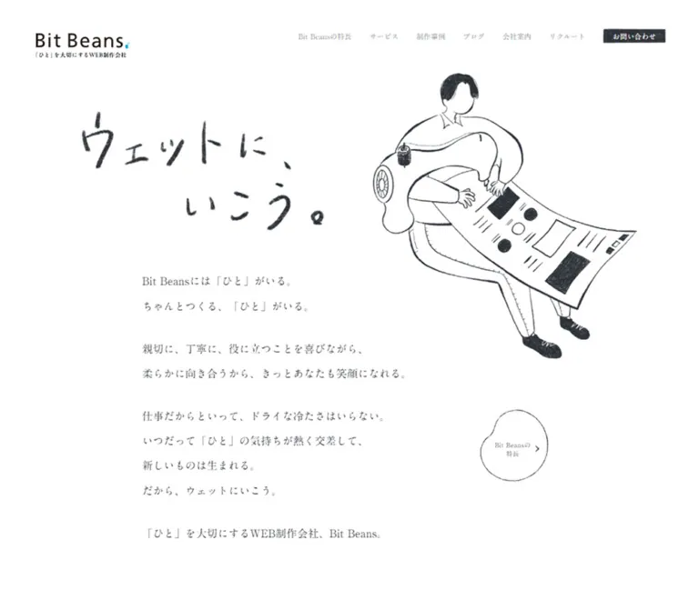
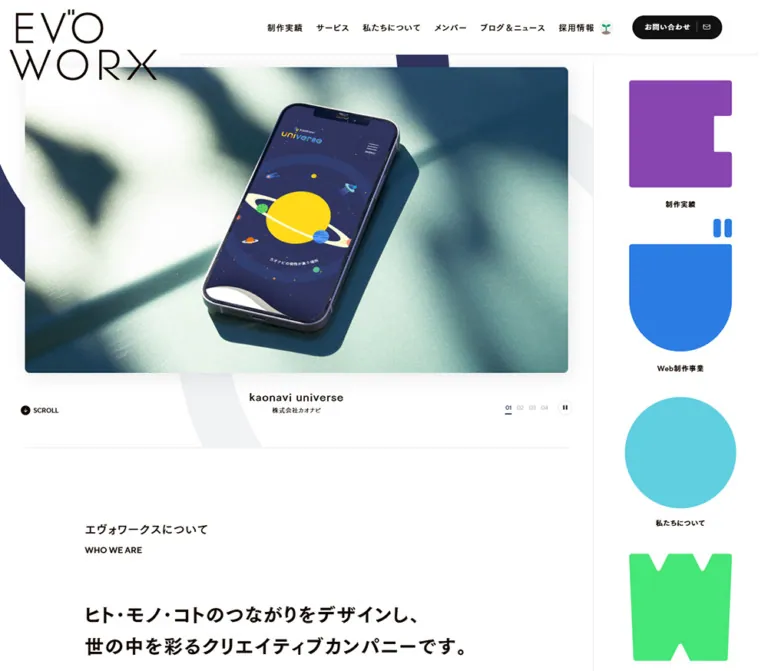
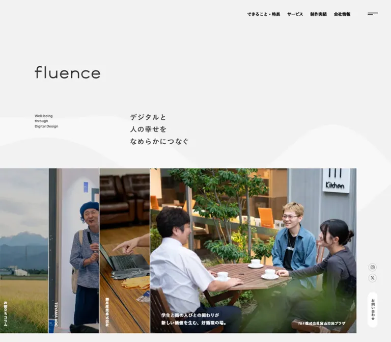
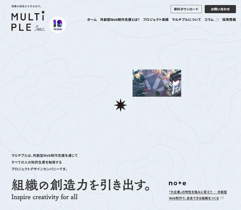
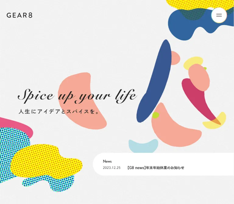
紙のような背景に、有機的な図形とハーフトーンを重ねたコーポレートサイト。流麗な英文レタリング、横並びの制作実績、大きな余白、都市の線画アイコンが特徴。
オリジナルサイトを見るA web direction company presented as a colorful paper collage, with generous space and a carefully organized corporate backbone.
Website / original URL: gggggggg.jp Final URL: https://gggggggg.jp/ Theme: a light, textured canvas with white content surfaces and multicolored decorative artwork; no theme switch was verified. Inspected: supplied browser session retrieved September 23, 2026, at 03:11:54 JST — September 22, 2026, at 18:11:54 UTC. Viewports: desktop 1440 × 1000 CSS pixels; mobile 390 × 844 CSS pixels. Scope: the current corporate homepage: opening hero, company introduction, Project Story, Works, G8 Journal, series links, recruitment links, contact invitation, and footer. Screenshots directly document the desktop hero, Works, and footer, plus the mobile hero and footer. Other sections are documented through supplied rendered DOM measurements. Linked destination pages and an opened navigation menu were not inspected.
GEAR8 pairs a restrained information system with exuberant artwork. The opening view places black, flowing English lettering over a near-white paper texture. Lime, blue, salmon, yellow, cyan, and pink organic shapes drift visually through the composition, with dense colored halftones concentrated in the corners. The Japanese statement underneath is a widely tracked, substantial sans-serif. A small wordmark and a circular menu control leave almost the entire viewport available to the composition.
The rest of the homepage serves several purposes: explaining the company, presenting client work, publishing articles, recruiting colleagues, and connecting regional sites and travel media. Large white surfaces, bilingual headings, broad image previews, and compact metadata organize this material. The desktop layout deliberately varies its horizontal alignment. On mobile, the design preserves its generous opening space while simplifying navigation, stacking content, and removing secondary footer detail.
A web direction company presented as a colorful paper collage, with generous space and a carefully organized corporate backbone.
Website / original URL: gggggggg.jp Final URL: https://gggggggg.jp/ Theme: a light, textured canvas with white content surfaces and multicolored decorative artwork; no theme switch was verified. Inspected: supplied browser session retrieved September 23, 2026, at 03:11:54 JST — September 22, 2026, at 18:11:54 UTC. Viewports: desktop 1440 × 1000 CSS pixels; mobile 390 × 844 CSS pixels. Scope: the current corporate homepage: opening hero, company introduction, Project Story, Works, G8 Journal, series links, recruitment links, contact invitation, and footer. Screenshots directly document the desktop hero, Works, and footer, plus the mobile hero and footer. Other sections are documented through supplied rendered DOM measurements. Linked destination pages and an opened navigation menu were not inspected.
GEAR8 pairs a restrained information system with exuberant artwork. The opening view places black, flowing English lettering over a near-white paper texture. Lime, blue, salmon, yellow, cyan, and pink organic shapes drift visually through the composition, with dense colored halftones concentrated in the corners. The Japanese statement underneath is a widely tracked, substantial sans-serif. A small wordmark and a circular menu control leave almost the entire viewport available to the composition.
The rest of the homepage serves several purposes: explaining the company, presenting client work, publishing articles, recruiting colleagues, and connecting regional sites and travel media. Large white surfaces, bilingual headings, broad image previews, and compact metadata organize this material. The desktop layout deliberately varies its horizontal alignment. On mobile, the design preserves its generous opening space while simplifying navigation, stacking content, and removing secondary footer detail.
--swiper-theme-color: #007aff; its presence does not establish blue as a visible brand or action color.| Name | Value | Suggested token | Evidence and role |
|---|---|---|---|
| Text Ink | #222222 |
--color-ink |
Measured body, headings, and link text |
| White Surface | #ffffff |
--color-surface |
Measured news background; visually consistent with the large white content areas |
| Tag Gray | #f5f5f5 |
--color-chip |
Measured category-link and carousel-button backgrounds |
| Contact Gray | #f8f8f8 |
--color-contact |
Measured contact-panel background |
| Paper Base | approximately #f4f4f3 |
--color-paper |
Estimated neutral base beneath visible grain; the body itself computes as transparent |
| Fine Rule | approximately #eaeaea |
--color-rule |
Estimated footer tile and publication-frame borders |
| Lime | approximately #c5dc30 |
--color-lime |
Estimated large edge shapes, small islands, and decorative strokes |
| Deep Blue | approximately #385a91 |
--color-blue-deep |
Estimated long organic forms and lower-page edge artwork |
| Medium Blue | approximately #30679d |
--color-blue |
Estimated upper-right organic cluster |
| Salmon | approximately #f6a691 |
--color-salmon |
Estimated curved central forms |
| Pale Cyan | approximately #afe0e5 |
--color-cyan |
Estimated translucent shapes and lower-left mobile artwork |
| Soft Yellow | approximately #ffeb79 |
--color-yellow |
Estimated translucent yellow forms |
| Pink | approximately #ee5387 |
--color-pink |
Estimated lower-left accent shapes |
The artwork also contains intense yellow grounds, red dots, and cyan/blue/green halftone mixtures. These are illustration colors rather than separate interface states. Preserve their relationships inside the artwork instead of assigning each one to a button variant.
The menu button's measured native background is #efefef, but its visible face is nearly white with a thin multicolored rim. The supplied evidence does not identify the layers responsible for that appearance. Match the rendered control rather than treating its native background as the complete design.
Keep functional content predominantly ink on white. The palette's saturation belongs mainly to the illustration layer. Category links are pale gray; project metadata remains black; the news strip is white. The visible page does not establish a universal filled brand-color CTA.
Some artwork overlaps produce darker or muted areas. Transparency or compositing is visually plausible, but the precise opacity values and blend modes are unknown. Do not claim a particular blend-mode implementation.
dnp-shuei-gothic-gin-std, sans-serif.600.700 in the sampled Japanese headings.300.--font-ja.brandon-grotesque, sans-serif on the sampled company heading, its English subtitle, contact heading, and copyright.500 on those elements.--font-en.Do not infer that every English label uses this face: some sampled English navigation links inherit the Japanese interface stack.
“Spice up your life” is visible as flowing, high-contrast italic lettering. The corresponding H2 has empty extracted text and a measured graphic-sized box. Its computed sans-serif declaration does not identify the lettering's typeface.
Treat the hero phrase as lettering artwork unless an authorized source asset establishes otherwise. Its rendering method and asset format are unreported. Use an accessible image or graphic with an equivalent text alternative in a new implementation. Do not substitute a guessed script font and label it the original.
The GEAR8 wordmark is likewise represented by an empty-text home link. Its measured dimensions describe the link box, not a live-text font size.
| Role | Desktop measurement | Mobile measurement | Weight / tracking |
|---|---|---|---|
| Body | 16px / 28px |
14px / 24.5px |
600, normal tracking |
| Hero Japanese statement | 30px / 52.5px |
14px / 24.5px |
600, 0.16em tracking |
| WHO We Are | 60px / 90px |
40px / 60px |
English face, 500, 0.05em |
| Company English subtitle | 19.2px / 33.6px |
14px / 24.5px |
English face, 500, 0.02em |
| Company statement paragraph | 18px / 30px |
14px / 23.333px |
600; tracking 2.61px / 0.7px |
| Japanese section labels | 24px / 42px |
16px / 28px |
700; tracking 4.8px / 2.4px |
| Work title | 24px / 42px |
18px / 31.5px |
700, 0.07em |
| News title | 16px / 24px |
14px / 21px |
700, -0.01em |
| Category links | 12px / 21px |
12px / 21px |
600, normal tracking |
| Sampled project URL | 14px / 24.5px |
12px / 21px |
300 |
| Archive link | 16px / 28px |
14px / 24.5px |
600, 0.09em |
| Series-list heading | 24px / 42px |
18px / 31.5px |
700 |
| Keep in Touch | 48px / 84px |
26px / 45.5px |
English face, 500 |
| Contact supporting copy | 22.4px / 39.2px |
13px / 22.75px |
600, 0.05em |
| Footer utility links | 14px / 24.5px |
12px / 21px |
300 |
| Copyright | 12px / 21px |
10px / 17.5px |
English face, 500 |
The source root changes from 16px to 14px between the inspected widths, but individual components also change explicitly. Uniformly scaling the desktop page by 87.5% would not reproduce the phone layout.
Spacing character: broad section intervals around comparatively dense metadata. No single source spacing unit was established.
| Use | Desktop | Mobile | Evidence |
|---|---|---|---|
| Hero left inset | 80px |
20px |
Measured; lettering extends 5px left of the desktop copy alignment |
| Menu right inset | 80px |
20px |
Measured |
| Company section top padding | 160px |
72px |
Measured |
| Team section top padding | 165px |
72px |
Measured |
| Main bottom padding | 160px |
68px |
Measured |
| Work-card horizontal gap | 40px |
20px |
Derived from neighboring card rectangles |
| Category-link gap | 10px horizontally |
8px |
Derived |
| Category-link padding | 10px 12px |
8px 12px |
Measured |
| Journal-card gap | 60px horizontally |
24px vertically |
Derived |
| Series-grid gap | 20px horizontal, 30px vertical |
15px horizontal, 20px vertical |
Derived |
| Location-tile gap | 30px horizontally |
7px horizontal, 16px vertical |
Derived |
| Publication-card gap | 40px horizontally |
18px vertically |
Derived |
| Footer bottom padding | 50px |
32px |
Measured |
| Element | Desktop | Mobile | Status |
|---|---|---|---|
| Menu | 50% |
50% |
Measured |
| News strip | 9999px 0 0 9999px |
Same | Measured; rounded left end, square right edge |
| Company statement link | 36px |
20px |
Measured |
| Category links | 6px |
4px |
Measured |
| Contact panel | 30px |
18px |
Measured |
| Work preview | Approximately 36–40px |
Unverified visually | Estimated from desktop screenshot |
| Large white sheet edge | Approximately 60px at the visible desktop corner |
Not fully measurable | Estimated |
| Location and publication frames | Square | Square where retained | Visible in screenshots |
| Element | Desktop | Mobile |
|---|---|---|
| Document height | 8027.625px, reported rounded as 8028 |
7350.922px, reported rounded as 7351 |
| Hero | 1440 × 1000px |
390 × 844px |
| Wordmark link | 116 × 28px, at (80, 58) |
84 × 24.5px, at (20, 37.75) |
| Menu control | 80 × 80px, at (1280, 32) |
54 × 54px, at (316, 23) |
| Hero lettering box | 716 × 90px, at (75, 420) |
315 × 39.594px, at (20, 422) |
| News strip | 632 × 102px, at (808, 838) |
370 × 71.5px, at (20, 682.5) |
| Company statement link | 730 × 550px |
350 × 289.484px |
| Three-way route links | 376 × 226px each |
350 × 129.75px each, stacked |
| Featured project link | Approximately 1022 × 789.641px |
315 × 362.125px |
| Work-card width | 584px |
310px |
| Journal-card width | Approximately 362.667px |
330px |
| Series-link box | 287 × 129.5px |
157.5 × 157.5px |
| Contact panel | 1208 × 320px |
330 × 153.75px |
| Location tile | Approximately 217.6 × 236.5px |
Approximately 105.33 × 93.5px |
| Publication link | 376 × 166.5px |
330 × 143.5px |
Image-and-text card measurements include the entire linked component, not just its image. Document heights are capture-specific and should not become fixed implementation heights.
The opening header exposes only the GEAR8 wordmark at left and a circular menu button at right. There is no visible desktop horizontal navigation bar in the supplied hero screenshot.
The menu consists of a pale circular face, a very thin multicolored perimeter, and two dark horizontal strokes. Its face measures 80px on desktop and 54px on mobile. The perimeter is approximately 1–2px thick visually; the exact paint method is unknown.
The menu remains at the same upper-right viewport location in the supplied scrolled captures. This supports a persistent control, although the source positioning declaration is not supplied. The wordmark is not visible in those scrolled captures, so do not automatically make both elements fixed.
The DOM exposes six main destinations: WHO We Are, Works, G8 Journal, Member, Recruit, and G8 Summit, accompanied by Japanese labels. Social and utility links also exist. An opened-menu composition, animation, close state, focus behavior, and scroll locking were not verified.
The hero occupies exactly the inspected viewport height at both widths. The phrase “Spice up your life” supplies the main typographic gesture, with “人生にアイデアとスパイスを。” beneath it.
On desktop, the lettering starts at approximately 42% of the viewport height. On mobile it starts at 50%. The mobile layout preserves substantial empty space above the statement rather than compressing the composition around a large conversion button.
The desktop Japanese line has 15px top padding and a 5px left adjustment. On mobile, the paragraph starts 10px below the lettering box and has no internal padding. The lettering scales proportionally: the two measured boxes have approximately the same 7.96:1 ratio.
The artwork combines large cropped perimeter forms with smaller interior shapes. Dark blue, lime, and salmon silhouettes create irregular vertical and diagonal movement. Tiny repeating dots and translucent overlaps add detail without changing the simple headline hierarchy.
A single linked white strip attaches to the right edge of the viewport. Only its left end is rounded. Its observed destination is the homepage's current news article, not a form or a general navigation drawer.
Desktop anatomy:
23px 65px padding, 102px total height, and 60px clearance below the strip.Mobile anatomy:
12px 28px padding, 71.5px total height, and 90px clearance below the strip.The source anchor computes as flex. A CSS grid is a convenient recommended implementation of the observed text arrangement, not a claim about the source markup.
English section names establish a strong visual label, while Japanese text explains the section. The sampled WHO We Are heading uses Brandon Grotesque at 60px desktop and 40px mobile. Japanese labels such as “制作実績” and “探究したこと” use 24px desktop and 16px mobile with generous tracking.
The desktop Works capture places the heading toward the left and category links toward the right. Mobile measurements place the Works category links below the heading. Do not force a single horizontal header row at narrow widths.
The desktop company introduction pairs an English heading region with a substantially larger statement link. That link measures 730 × 550px and has a 36px radius. The phone version becomes a 350px-wide block with a 20px radius and 68px 24px 48px padding.
The statement includes “未来から考える。” and “Thinking from the future.” followed by a short Japanese paragraph. Its content links to the future-thinking page.
Three links follow: Philosophy, Mission, and How to work. They occupy a three-column desktop arrangement with 376px-wide boxes and 40px gaps. On mobile they stack with 10px gaps and 36px 14px padding. Their detailed illustrations or background treatments are not documented by the supplied screenshots; only their content, geometry, and computed styles should be treated as established.
Project Story presents one featured case study with a date, a substantial linked content block, a project title, industry text, a displayed client URL, and textual hashtags.
The feature is intentionally offset: its desktop link starts around x = 302px, while the mobile link starts at x = 55px and is 315px wide. This retains a modest indentation on mobile instead of making every component share the same left edge.
The desktop archive link is measured above the feature near the section heading. On mobile it is measured near the end of the section. The feature's image asset and exact visual composition are not supplied, so do not invent a client mockup or image treatment for this section.
The visible Works area sits on a broad white surface with a rounded outer corner. Work previews are large, while client metadata remains compact and unboxed beneath them.
Five category links appear in pale-gray rectangles. They lead to category archive URLs. They are not verified interactive filters, and no selected state is established.
At 1440px, the links measure 41px high with a 6px radius. At 390px, they remain 12px text, become 37px high with a 4px radius, and wrap into three rows. This maintains comfortable label sizes rather than shrinking the whole row to fit.
The card's anatomy is:
The outer card is not a rounded, shadowed container. The image receives the prominent radius; the text continues directly on the white section surface.
Cards measure 584px wide on desktop and 310px on mobile. Their spacing produces a 624px desktop pitch and a 330px mobile pitch. The desktop screenshot shows two complete previews and partial neighbors. The phone DOM supports one main card with neighboring items extending beyond the viewport.
The pictured desktop previews include a food-company website with photography and a collage of idol-group websites. Their colors belong to the client work, not to GEAR8's interface palette. The preview proportion is visually about 1.7–1.8:1; its exact source aspect ratio was not supplied.
Long titles remain multiline. The TSUIMA title occupies three measured desktop lines and four mobile lines. Do not impose single-line truncation or equal text heights merely to make the rail look uniform.
The card's main observed link goes to an internal case-study page. A displayed client URL does not by itself establish a separate external click target. Avoid nested anchors when adapting this anatomy.
Archive links combine a short text label with a separate pale circular arrow area. The visible Works archive action is right aligned and uses an approximately 80px circle.
Measured desktop archive anchors are 80px high and reserve 100px of right padding. Mobile equivalents are 40px high and reserve 60px. A smaller 40px mobile arrow circle is a reasonable implementation interpretation, but its exact pseudo-element dimensions were not supplied.
This is a recurring navigational treatment. Keep its emphasis lighter than a large solid-color CTA.
The desktop journal has three measured article links, each about 362.67px wide, separated by 60px. The mobile version stacks 330px-wide article links with 24px vertical gaps. Dates and article titles are present in the rendered content; the supplied screenshots do not document the article imagery itself.
The series directory contains eight entries, including Branding, Design, Direction, Gear8 Next, Good & New, Mix Culture, Tech, and Trippino. Desktop measurements form four columns and two rows. Mobile measurements form two columns and four rows, with 157.5px-square link boxes.
The article archive link appears by the desktop heading and after the article stack on mobile. Preserve that reading-order change when adapting the layout.
Member, Recruit, and Culture reuse the three-way route-link geometry from the company introduction. They measure 376 × 226px on desktop, and stack as 350 × 129.75px links on mobile.
This repetition gives the long page a consistent navigation rhythm. Reuse a component for these route groups, while leaving their actual artwork configurable because it is not visible in the supplied section captures.
The entire “Keep in Touch” panel links to the contact page. Its tone is conversational: the Japanese copy invites inquiries about everyday topics as well as work.
The measured desktop panel is 1208 × 320px with a #f8f8f8 fill, a 30px radius, and 30px 60px padding. Its English heading is 48px; supporting Japanese text is 22.4px.
On mobile the panel measures 330 × 153.75px, with 20px padding and an 18px radius. The English heading becomes 26px, while the supporting copy becomes 13px and wraps over three lines. The result remains a compact, whole-panel link rather than an embedded contact form.
The desktop footer contains a logo/social row, a detailed directory, utility links, location tiles, publication links, and copyright.
The directory uses five measured columns of approximately 225.6px with 20px gaps. Six main groups fit into that structure by placing Recruit below Member in the same column. Subcategory links use compact 14px text and approximately 29px row spacing.
Mobile retains six main destination links in a two-column arrangement, each column 155px wide with a 20px gap. The detailed child-link lists are absent from the mobile rendered text. The evidence does not establish accordion controls; do not invent an accordion interaction as an existing feature.
Utility links reduce to 12px and wrap. The white footer surface begins approximately 20px from the phone's left edge, while its content starts at x = 40px. Decorative shapes remain visible in the exposed page margin.
Five locations are displayed: Sapporo, Taipei, Bangkok, Chiang Mai, and Phnom Penh. Each has a delicate black line illustration of a local landmark above an English city name.
Desktop tiles form one row of five faintly outlined rectangles. The first four show domains below their names. On mobile, they form three columns followed by two items on the next row; visible borders and domain captions disappear, leaving icons and names.
The DOM supplies links for Sapporo, Taipei, Bangkok, and Chiang Mai. No Phnom Penh destination appears in the supplied link evidence. Do not assign it a fabricated regional URL.
Three publication links complete the footer: Trippino Hokkaido, Trippino Chiangmai, and Into the Local. Each consists of a thin rectangular logo frame, a Japanese description, and a domain line.
Desktop links form three columns, each 376px wide. The logo frames are approximately 100px high in the screenshot. On mobile, the links stack at 330px wide, and their logo frames are approximately 90px high.
Keep the supplied logos centered and uncropped. The descriptions sit outside the frames. These components use square borders and quiet typography, creating a clear contrast with the organic background artwork.
| Element or behavior | Evidence | Safe interpretation |
|---|---|---|
| Most sampled links | Computed transition reports 0.2s |
A 200ms transition exists; the changing property and visual endpoint are not established |
| Carousel buttons | Computed transition reports 0.3s |
A 300ms control transition exists; hover and pressed appearances were not captured |
| Carousel position | Desktop screenshot and DOM show different neighboring cards in the same measured slots | More than one rail state was recorded; autoplay, timing, looping, and input method remain unverified |
| Menu persistence | Same upper-right placement across supplied scrolled screenshots | Persistent viewport access is visible; exact positioning and open behavior are not documented |
| Decorative artwork | Different compositions appear at the two widths | Cropping and placement differ; motion paths and responsive positioning rules cannot be separated from still images |
| Sampled element animations | Many entries report animation: none |
This applies to sampled elements, not necessarily every graphic, pseudo-element, or script-driven animation |
| Opening readiness | Collector waited for load, finite motion, stable layout, and image decoding within limits | This improves capture reliability but does not verify every delayed state or interaction |
The evidence supports a horizontal work rail and short link transitions. It does not support a specific floating-blob animation, animated gradient rim, parallax rate, or entrance choreography.
Recommended adaptation: start with a static art composition, native horizontal scrolling, and restrained 200ms link feedback. Add animation only with an explicit design specification. Provide a reduced-motion alternative and a pause mechanism if automatic rail movement is introduced.
| Layer | Appearance | Function |
|---|---|---|
| Page canvas | Fine neutral paper grain | Unifies the long page and carries decorative shapes |
| Hero illustration | Saturated irregular forms and halftone clusters | Establishes personality around the main statement |
| Content sheet | White, broad, selectively rounded | Provides reading space for portfolio and footer content |
| Category links | #f5f5f5, small radius |
Compact archive navigation |
| Contact panel | #f8f8f8, larger radius |
Distinct but quiet contact invitation |
| Location/publication frames | Thin pale rule, square corners | Organizes regional and media links |
| Menu | Pale circle with multicolored rim | Persistent navigation affordance |
No general elevation system is visible in the supplied captures. Separation comes from white space, pale fills, borders, image crops, and the contrast between geometric content frames and organic artwork.
The defining artwork resembles cut paper, translucent ink, and colorful printed halftones. Shapes are irregular and asymmetrical: bent capsules, elongated leaves, soft islands, and branching forms. They overlap and extend beyond the viewport edges rather than assembling into a centered illustration card.
The upper-right cluster combines a blue form with a yellow dotted layer. The lower-left cluster uses cyan and multicolored dot patterns with pink and yellow pieces. Smaller salmon, lime, blue, and yellow forms occupy the open field around the lettering. The phone capture preserves the corner clusters while showing a much sparser central arrangement.
Paper grain is fine and low contrast. It should remain visible in empty areas without becoming a noisy overlay on Japanese text. Halftones belong inside selected artwork shapes; they are not a global screen filter.
Client previews remain in full color. Footer landmarks and publication identities switch to fine monochrome drawing. This produces three distinct image roles: expressive brand decoration, informative client work, and restrained directory symbols.
No downloadable asset paths or image-source URLs were supplied. These are visual asset identifications, not invented file references.
| Asset | Current-page evidence | Implementation guidance |
|---|---|---|
| GEAR8 wordmark | Desktop/mobile header; footer DOM | Use an authorized identity asset; preserve its proportions |
| Hero phrase | Graphic-sized H2 and visible lettering | Supply lettering artwork with an accessible text equivalent |
| Paper texture | Hero and exposed page margins | Use a subtle repeatable texture; exact tile and opacity are unknown |
| Organic collage | Current hero screenshots and page-edge fragments | Art-direct shapes for each layout instead of stretching one flattened desktop image |
| Work previews | Desktop Works capture | Use actual project previews; do not recolor them to match the brand decoration |
| Landmark drawings | Desktop/mobile footer captures | Preserve thin, detailed black linework |
| Publication logos | Desktop/mobile footer captures | Center within pale rectangular frames with object-fit: contain |
A recurring desktop content width is 1208px, but its position changes. Company route groups start at x = 116px, Works and footer content at x = 141px, and journal content at x = 91px. These offsets create a deliberate left/right rhythm. Replacing every section with one identical centered container would flatten that composition.
The desktop Works surface visibly starts around x = 80px. Its content begins farther inside, while neighboring rail items extend toward the viewport edges. The mobile footer similarly leaves a 20px exposed margin and starts its content at x = 40px.
| Area | 1440px viewport | 390px viewport |
|---|---|---|
| Hero | Full viewport; 716px lettering box | Full viewport; 315px lettering box; large upper empty area retained |
| Main header control | 80px circle | 54px circle |
| News | 632px wide, date beside title | 370px wide, title below label/date |
| Company introduction | Asymmetrical paired regions | Stacked 350px-wide content |
| Route-link groups | Three columns | One column |
| Work rail | Two complete 584px cards plus partial neighbors | One main 310px card with neighboring content outside the viewport |
| Work categories | One horizontal sequence | Three wrapped rows |
| Journal | Three columns | One column |
| Series directory | Four columns | Two columns |
| Footer navigation | Five columns with child lists | Two columns of primary destinations |
| Locations | Five outlined tiles with domain captions where supplied | Three columns; outlines and domains removed |
| Publications | Three columns | One column |
Only these two widths were inspected. Exact media-query boundaries, tablet behavior, landscape behavior, zoom handling, and safe-area rules are unknown. The Quick Start uses 767px as an explicit recommendation, not a recovered breakpoint.
The source's work rail uses offscreen item positions. A large negative card coordinate is therefore not evidence that the entire page should scroll horizontally. Constrain overflow to the rail or its viewport.
These are recommendations for a new implementation, not verified features of the original:
aria-expanded, and a relationship to its controlled navigation. Manage focus and Escape dismissal if it opens a modal drawer.#222222.#ffffff.#f5f5f5.#f8f8f8.#f4f4f3 with fine neutral grain.#c5dc30, deep blue #385a91, medium blue #30679d, salmon #f6a691, cyan #afe0e5, soft yellow #ffeb79, and pink #ee5387.“Create a Japanese web direction company's corporate homepage inspired by the current GEAR8 page. Use a near-white paper texture, black typography, generous space, and irregular cut-paper forms in lime, blue, salmon, cyan, yellow, and pink. Concentrate dense halftone detail in cropped corner clusters. Place a small wordmark at the upper left and a circular white menu with a thin multicolored rim at the upper right. The full-height opening uses supplied flowing English lettering above a tracked Japanese statement and a white news strip attached to the right edge. Continue with company information, an offset featured case study, a horizontal work rail, a journal, recruitment links, and a comprehensive footer. Use large white content surfaces, rounded image previews, compact project metadata, and fine monochrome landmark drawings. On mobile, retain the opening's empty space, stack editorial content, reduce directory detail, and use three columns for five location symbols. Treat artwork motion and menu behavior as separate specifications.”
This is a reusable visual shell. Exact typography and measured component sizes are separated from estimated artwork tokens. The proposed grid layouts, hover endpoint, scroll snapping, and 767px breakpoint are recommendations.
Supply authorized logo, lettering, preview, landmark, and publication assets separately. Set --paper-texture to a local texture image when available; its default deliberately contains no invented asset URL. The CSS does not implement an opened menu or automatic carousel movement.
:root {
  /* Measured interface colors */
  --color-ink: #222222;
  --color-surface: #ffffff;
  --color-chip: #f5f5f5;
  --color-contact: #f8f8f8;

  /* Visual estimates for adaptation */
  --color-paper: #f4f4f3;
  --color-rule: #eaeaea;
  --color-lime: #c5dc30;
  --color-blue-deep: #385a91;
  --color-blue: #30679d;
  --color-salmon: #f6a691;
  --color-cyan: #afe0e5;
  --color-yellow: #ffeb79;
  --color-pink: #ee5387;
  --paper-texture: none;

  /* Observed family declarations; load licensed fonts separately */
  --font-ja: 'dnp-shuei-gothic-gin-std', sans-serif;
  --font-en: 'brandon-grotesque', sans-serif;

  --content-width: 1208px;
  --page-edge: 80px;
  --section-space: 160px;
  --radius-contact: 30px;
  --radius-preview: 36px;
  --motion-link: 200ms;
}

.gear8 {
  color: var(--color-ink);
  background-color: var(--color-paper);
  background-image: var(--paper-texture);
  font: 600 16px / 1.75 var(--font-ja);
}

.gear8 *,
.gear8 *::before,
.gear8 *::after {
  box-sizing: border-box;
}

.gear8 a {
  color: inherit;
  text-decoration: none;
  transition: opacity var(--motion-link);
}

.gear8 img {
  display: block;
  max-inline-size: 100%;
}

.content {
  inline-size: min(
    var(--content-width),
    calc(100% - 2 * var(--page-edge))
  );
  margin-inline: auto;
}

.section-space {
  padding-block-start: var(--section-space);
}

/* White sheet behind an independently aligned content region */
.panel-right {
  position: relative;
  isolation: isolate;
}

.panel-right::before {
  content: '';
  position: absolute;
  inset: 0 0 0 var(--page-edge);
  z-index: -1;
  border-radius: 60px 0 0 60px;
  background: var(--color-surface);
}

.panel-right > .content {
  position: relative;
  inset-inline-start: 25px;
}

.journal-content {
  position: relative;
  inset-inline-start: -25px;
}

.site-brand {
  position: absolute;
  inset-block-start: 58px;
  inset-inline-start: var(--page-edge);
  z-index: 10;
  inline-size: 116px;
  block-size: 28px;
}

.site-brand img {
  inline-size: 100%;
  block-size: 100%;
  object-fit: contain;
}

/* Recommended layered approximation of the visible menu rim */
.menu-toggle {
  position: fixed;
  inset-block-start: 32px;
  inset-inline-end: var(--page-edge);
  z-index: 30;
  inline-size: 80px;
  block-size: 80px;
  padding: 0;
  border: 2px solid transparent;
  border-radius: 50%;
  background:
    linear-gradient(#fff, #fff) padding-box,
    conic-gradient(
      var(--color-lime),
      #ffd348,
      #ff8d76,
      #60c9d2,
      var(--color-lime)
    ) border-box;
  cursor: pointer;
}

.menu-toggle::before,
.menu-toggle::after {
  content: '';
  position: absolute;
  inset-block-start: 50%;
  inset-inline-start: 50%;
  inline-size: 24px;
  block-size: 2px;
  background: var(--color-ink);
}

.menu-toggle::before {
  transform: translate(-50%, -50%) translateY(-4px);
}

.menu-toggle::after {
  transform: translate(-50%, -50%) translateY(4px);
}

.hero {
  position: relative;
  isolation: isolate;
  min-block-size: 100vh;
  min-block-size: 100svh;
}

.hero-art {
  position: absolute;
  inset: 0;
  z-index: -1;
  overflow: hidden;
  pointer-events: none;
}

.hero-copy {
  position: absolute;
  inset-block-start: 42%;
  inset-inline-start: var(--page-edge);
  max-inline-size: calc(100% - 2 * var(--page-edge));
}

/* Apply to supplied lettering artwork, not an invented script font */
.hero-lettering {
  display: block;
  inline-size: 716px;
  max-inline-size: 100%;
  block-size: auto;
  aspect-ratio: 716 / 90;
  margin-inline-start: -5px;
  object-fit: contain;
}

.hero-subtitle {
  margin: 0;
  padding: 15px 0 0 5px;
  font-size: 30px;
  line-height: 1.75;
  letter-spacing: 0.16em;
}

.news-strip {
  position: absolute;
  inset-inline-end: 0;
  inset-block-end: 60px;
  display: grid;
  grid-template-areas: 'label label' 'date title';
  grid-template-columns: 82px minmax(0, 1fr);
  grid-template-rows: 28px 28px;
  column-gap: 20px;
  inline-size: min(632px, calc(100% - 20px));
  min-block-size: 102px;
  padding: 23px 65px;
  border-radius: 9999px 0 0 9999px;
  background: var(--color-surface);
}

.news-label { grid-area: label; }
.news-date { grid-area: date; font-size: 12px; font-weight: 300; }

.news-title {
  grid-area: title;
  align-self: center;
  margin: 0;
  font-size: 16px;
  font-weight: 700;
  line-height: 24px;
  letter-spacing: -0.01em;
}

.section-title-en {
  margin: 0;
  font: 500 60px / 1.5 var(--font-en);
  letter-spacing: 0.05em;
}

.section-title-ja {
  margin: 0;
  font-size: 24px;
  line-height: 1.75;
  letter-spacing: 0.2em;
}

.category-links {
  display: flex;
  flex-wrap: wrap;
  gap: 10px;
}

.category-link {
  display: block;
  padding: 10px 12px;
  border-radius: 6px;
  background: var(--color-chip);
  font-size: 12px;
  line-height: 21px;
}

/* Recommended native-scroll alternative to an unverified slider setup */
.works-rail {
  --rail-inset: max(40px, calc((100vw - 1208px) / 2 + 25px));
  display: grid;
  grid-auto-flow: column;
  grid-auto-columns: min(584px, calc(100vw - 80px));
  gap: 40px;
  overflow-x: auto;
  padding-inline: var(--rail-inset);
  padding-block-end: 12px;
  scroll-padding-inline: var(--rail-inset);
  scroll-snap-type: x proximity;
}

.work-card {
  min-inline-size: 0;
  scroll-snap-align: start;
}

.work-preview {
  inline-size: 100%;
  aspect-ratio: 584 / 337;
  object-fit: cover;
  border-radius: var(--radius-preview);
}

.work-title {
  margin: 20px 0 12px;
  font-size: 24px;
  font-weight: 700;
  line-height: 1.75;
  letter-spacing: 0.07em;
}

.work-meta {
  margin: 0;
  font-size: 14px;
  line-height: 1.75;
}

.work-url {
  font-weight: 300;
  overflow-wrap: anywhere;
}

.archive-link {
  display: inline-flex;
  align-items: center;
  gap: 20px;
  min-block-size: 80px;
  letter-spacing: 0.09em;
}

.arrow-circle {
  display: grid;
  place-items: center;
  flex: 0 0 80px;
  inline-size: 80px;
  block-size: 80px;
  border-radius: 50%;
  background: var(--color-chip);
}

.route-grid,
.journal-grid,
.publication-grid {
  display: grid;
  grid-template-columns: repeat(3, minmax(0, 1fr));
  gap: 40px;
}

.route-card {
  display: flex;
  align-items: center;
  min-block-size: 226px;
}

.journal-grid { gap: 60px; }

.series-grid {
  display: grid;
  grid-template-columns: repeat(4, minmax(0, 1fr));
  gap: 30px 20px;
}

.series-card { min-block-size: 129.5px; }

.contact-panel {
  display: flex;
  align-items: center;
  min-block-size: 320px;
  padding: 30px 60px;
  border-radius: var(--radius-contact);
  background: var(--color-contact);
}

.contact-copy { max-inline-size: 630.25px; }

.contact-heading {
  margin: 0;
  font: 500 48px / 1.75 var(--font-en);
}

.contact-description {
  margin: 0;
  font-size: 22.4px;
  line-height: 1.75;
  letter-spacing: 0.05em;
}

.footer-nav {
  display: grid;
  grid-template-columns: repeat(5, minmax(0, 1fr));
  gap: 20px;
}

.location-grid {
  display: grid;
  grid-template-columns: repeat(5, minmax(0, 1fr));
  gap: 30px;
}

.location-tile {
  display: flex;
  flex-direction: column;
  align-items: center;
  min-block-size: 236.5px;
  padding: 45px 15px 35px;
  border: 1px solid var(--color-rule);
  text-align: center;
}

.location-icon {
  inline-size: 70px;
  block-size: 65px;
  object-fit: contain;
}

.location-name {
  margin-block: 20px 0;
  font: 500 24px / 1.4 var(--font-en);
}

.location-domain {
  display: block;
  margin-block-start: 8px;
  font-size: 14px;
}

.publication-logo {
  display: grid;
  place-items: center;
  block-size: 100px;
  border: 1px solid var(--color-rule);
}

.publication-logo img {
  max-inline-size: 55%;
  max-block-size: 60px;
  object-fit: contain;
}

.publication-description { margin: 14px 0 0; }
.publication-domain { margin: 0; font-weight: 300; }

.copyright {
  margin-block: 50px 0;
  text-align: end;
  font: 500 12px / 1.75 var(--font-en);
}

/* Recommended focus and hover behavior */
.gear8 :is(a, button):focus-visible {
  outline: 2px solid var(--color-ink);
  outline-offset: 4px;
}

@media (hover: hover) {
  .gear8 a:hover { opacity: 0.78; }
}

/* Recommended breakpoint; the source breakpoint is unknown */
@media (max-width: 767px) {
  :root {
    --page-edge: 20px;
    --section-space: 72px;
    --radius-contact: 18px;
  }

  .gear8 { font-size: 14px; }

  .panel-right > .content {
    inset-inline-start: 0;
    inline-size: calc(100% - 60px);
    margin-inline: 40px 20px;
  }

  .journal-content {
    inset-inline-start: 0;
    inline-size: calc(100% - 60px);
    margin-inline: 20px 40px;
  }

  .site-brand {
    inset-block-start: 37.75px;
    inline-size: 84px;
    block-size: 24.5px;
  }

  .menu-toggle {
    inset-block-start: 23px;
    inline-size: 54px;
    block-size: 54px;
  }

  .menu-toggle::before,
  .menu-toggle::after { inline-size: 18px; }

  .hero-copy { inset-block-start: 50%; }

  .hero-lettering {
    inline-size: 315px;
    margin-inline-start: 0;
  }

  .hero-subtitle {
    margin-block-start: 10px;
    padding: 0;
    font-size: 14px;
  }

  .news-strip {
    inset-block-end: 90px;
    grid-template-areas: 'label date' 'title title';
    grid-template-columns: auto minmax(0, 1fr);
    grid-template-rows: 24.5px 21px;
    gap: 2px 8px;
    inline-size: calc(100% - 20px);
    min-block-size: 71.5px;
    padding: 12px 28px;
  }

  .news-label { font-size: 12px; }
  .news-title { font-size: 14px; line-height: 21px; }
  .section-title-en { font-size: 40px; }
  .section-title-ja { font-size: 16px; letter-spacing: 0.15em; }

  .category-links { gap: 8px; }
  .category-link { padding: 8px 12px; border-radius: 4px; }
  .works-rail { gap: 20px; }
  .work-title { margin-block-start: 12px; font-size: 18px; }
  .work-meta { font-size: 12px; }

  .archive-link { min-block-size: 40px; }
  .arrow-circle { flex-basis: 40px; inline-size: 40px; block-size: 40px; }

  .route-grid,
  .journal-grid,
  .publication-grid { grid-template-columns: minmax(0, 1fr); }

  .route-grid { gap: 10px; }
  .route-card { min-block-size: 129.75px; padding: 36px 14px; }
  .journal-grid { gap: 24px; }

  .series-grid {
    grid-template-columns: repeat(2, minmax(0, 1fr));
    gap: 20px 15px;
  }

  .series-card { min-block-size: 0; aspect-ratio: 1; }

  .contact-panel { min-block-size: 153.75px; padding: 20px; }
  .contact-copy { max-inline-size: 193px; }
  .contact-heading { font-size: 26px; }
  .contact-description { font-size: 13px; }

  .footer-nav { grid-template-columns: repeat(2, minmax(0, 1fr)); }
  .footer-subnav { display: none; }

  .location-grid {
    grid-template-columns: repeat(3, minmax(0, 1fr));
    gap: 16px 7px;
  }

  .location-tile { min-block-size: 93.5px; padding: 0; border: 0; }
  .location-icon { inline-size: 54px; block-size: 50px; }
  .location-name { margin-block-start: 10px; font-size: 18px; }
  .location-domain { display: none; }

  .publication-grid { gap: 18px; }
  .publication-logo { block-size: 90px; }
  .publication-description { margin-block-start: 8px; }
  .copyright { margin-block-start: 24px; font-size: 10px; }
}

@media (prefers-reduced-motion: reduce) {
  .gear8 a { transition: none; }
  .hero-art * { animation: none !important; }
  .works-rail { scroll-snap-type: none; }
}
The artwork, white-sheet silhouette, and client previews still require visual assets and tuning. The location-label sizes, icon sizes, preview ratio, and preview radius in this starter are practical estimates. The measured text sizes and card widths should be the first anchors used during comparison.
Optional aliases for projects already using Tailwind v4. They do not imply that the original website uses Tailwind. Load the properties above first and keep responsive structural changes explicit.
@theme inline {
  --color-ink: #222222;
  --color-surface: #ffffff;
  --color-paper: #f4f4f3;
  --color-chip: #f5f5f5;
  --color-contact: #f8f8f8;
  --color-lime: #c5dc30;
  --color-blue-deep: #385a91;
  --color-salmon: #f6a691;

  --font-interface: var(--font-ja);
  --font-display: var(--font-en);

  --text-caption: 12px;
  --text-body: 16px;
  --text-work-title: 24px;
  --text-section: 60px;

  --spacing-page-edge: var(--page-edge);
  --spacing-section: var(--section-space);
  --radius-preview: 36px;
  --radius-contact: var(--radius-contact);
}
2026-09-22T18:11:54.482Z, equivalent to September 23, 2026, 03:11:54.482 JST. Separate timestamps for each screenshot were not supplied.This reference describes the current homepage documented by that inspection. Measured values, screenshot estimates, and recommended adaptations are distinguished throughout.
# GEAR8 — Style Reference

> A web direction company presented as a colorful paper collage, with generous space and a carefully organized corporate backbone.

**Website / original URL:** [gggggggg.jp](https://gggggggg.jp/)
**Final URL:** [https://gggggggg.jp/](https://gggggggg.jp/)
**Theme:** a light, textured canvas with white content surfaces and multicolored decorative artwork; no theme switch was verified.
**Inspected:** supplied browser session retrieved September 23, 2026, at 03:11:54 JST — September 22, 2026, at 18:11:54 UTC.
**Viewports:** desktop 1440 × 1000 CSS pixels; mobile 390 × 844 CSS pixels.
**Scope:** the current corporate homepage: opening hero, company introduction, Project Story, Works, G8 Journal, series links, recruitment links, contact invitation, and footer. Screenshots directly document the desktop hero, Works, and footer, plus the mobile hero and footer. Other sections are documented through supplied rendered DOM measurements. Linked destination pages and an opened navigation menu were not inspected.

GEAR8 pairs a restrained information system with exuberant artwork. The opening view places black, flowing English lettering over a near-white paper texture. Lime, blue, salmon, yellow, cyan, and pink organic shapes drift visually through the composition, with dense colored halftones concentrated in the corners. The Japanese statement underneath is a widely tracked, substantial sans-serif. A small wordmark and a circular menu control leave almost the entire viewport available to the composition.

The rest of the homepage serves several purposes: explaining the company, presenting client work, publishing articles, recruiting colleagues, and connecting regional sites and travel media. Large white surfaces, bilingual headings, broad image previews, and compact metadata organize this material. The desktop layout deliberately varies its horizontal alignment. On mobile, the design preserves its generous opening space while simplifying navigation, stacking content, and removing secondary footer detail.
# GEAR8 — Style Reference

> A web direction company presented as a colorful paper collage, with generous space and a carefully organized corporate backbone.

**Website / original URL:** [gggggggg.jp](https://gggggggg.jp/)
**Final URL:** [https://gggggggg.jp/](https://gggggggg.jp/)
**Theme:** a light, textured canvas with white content surfaces and multicolored decorative artwork; no theme switch was verified.
**Inspected:** supplied browser session retrieved September 23, 2026, at 03:11:54 JST — September 22, 2026, at 18:11:54 UTC.
**Viewports:** desktop 1440 × 1000 CSS pixels; mobile 390 × 844 CSS pixels.
**Scope:** the current corporate homepage: opening hero, company introduction, Project Story, Works, G8 Journal, series links, recruitment links, contact invitation, and footer. Screenshots directly document the desktop hero, Works, and footer, plus the mobile hero and footer. Other sections are documented through supplied rendered DOM measurements. Linked destination pages and an opened navigation menu were not inspected.

GEAR8 pairs a restrained information system with exuberant artwork. The opening view places black, flowing English lettering over a near-white paper texture. Lime, blue, salmon, yellow, cyan, and pink organic shapes drift visually through the composition, with dense colored halftones concentrated in the corners. The Japanese statement underneath is a widely tracked, substantial sans-serif. A small wordmark and a circular menu control leave almost the entire viewport available to the composition.

The rest of the homepage serves several purposes: explaining the company, presenting client work, publishing articles, recruiting colleagues, and connecting regional sites and travel media. Large white surfaces, bilingual headings, broad image previews, and compact metadata organize this material. The desktop layout deliberately varies its horizontal alignment. On mobile, the design preserves its generous opening space while simplifying navigation, stacking content, and removing secondary footer detail.

## How to Read This Reference

- **Measured** means a value appears in the supplied computed styles or element rectangles. Values are CSS pixels unless stated otherwise.
- **Derived** means calculated from those measurements, such as a gap between neighboring cards. This does not establish whether the source uses flexbox, grid, or another layout method.
- **Estimated** means visually judged from the current screenshots. Decorative color hex values, texture parameters, and unreported image radii are estimates, not sampled source tokens.
- **Recommended** means implementation guidance for a new site. The CSS below is an adaptation, not recovered source code.
- Token names in this document are descriptive aliases. The only supplied source custom property is `--swiper-theme-color: #007aff`; its presence does not establish blue as a visible brand or action color.
- Computed font-family names are available. Font files, licensing, and successful loading of each individual face were not separately reported.
- DOM text and nonzero rectangles do not prove visibility. The menu links appear in the evidence even though the supplied screenshots show the closed menu state.

## Tokens — Colors

### Default Palette

| Name | Value | Suggested token | Evidence and role |
| --- | --- | --- | --- |
| Text Ink | `#222222` | `--color-ink` | Measured body, headings, and link text |
| White Surface | `#ffffff` | `--color-surface` | Measured news background; visually consistent with the large white content areas |
| Tag Gray | `#f5f5f5` | `--color-chip` | Measured category-link and carousel-button backgrounds |
| Contact Gray | `#f8f8f8` | `--color-contact` | Measured contact-panel background |
| Paper Base | approximately `#f4f4f3` | `--color-paper` | Estimated neutral base beneath visible grain; the body itself computes as transparent |
| Fine Rule | approximately `#eaeaea` | `--color-rule` | Estimated footer tile and publication-frame borders |
| Lime | approximately `#c5dc30` | `--color-lime` | Estimated large edge shapes, small islands, and decorative strokes |
| Deep Blue | approximately `#385a91` | `--color-blue-deep` | Estimated long organic forms and lower-page edge artwork |
| Medium Blue | approximately `#30679d` | `--color-blue` | Estimated upper-right organic cluster |
| Salmon | approximately `#f6a691` | `--color-salmon` | Estimated curved central forms |
| Pale Cyan | approximately `#afe0e5` | `--color-cyan` | Estimated translucent shapes and lower-left mobile artwork |
| Soft Yellow | approximately `#ffeb79` | `--color-yellow` | Estimated translucent yellow forms |
| Pink | approximately `#ee5387` | `--color-pink` | Estimated lower-left accent shapes |

The artwork also contains intense yellow grounds, red dots, and cyan/blue/green halftone mixtures. These are illustration colors rather than separate interface states. Preserve their relationships inside the artwork instead of assigning each one to a button variant.

The menu button's measured native background is `#efefef`, but its visible face is nearly white with a thin multicolored rim. The supplied evidence does not identify the layers responsible for that appearance. Match the rendered control rather than treating its native background as the complete design.

### Color Application

Keep functional content predominantly ink on white. The palette's saturation belongs mainly to the illustration layer. Category links are pale gray; project metadata remains black; the news strip is white. The visible page does not establish a universal filled brand-color CTA.

Some artwork overlaps produce darker or muted areas. Transparency or compositing is visually plausible, but the precise opacity values and blend modes are unknown. Do not claim a particular blend-mode implementation.

## Tokens — Typography

### Japanese Interface and Body Text

- **Measured family:** `dnp-shuei-gothic-gin-std, sans-serif`.
- **Body weight:** `600`.
- **Heading weight:** commonly `700` in the sampled Japanese headings.
- **Light supporting text:** some URLs and footer utility links use `300`.
- **Character:** firm, compact Japanese sans-serif text, softened by generous line spacing and selective tracking.
- **Implementation alias:** `--font-ja`.

### English Display and Supporting Labels

- **Measured family:** `brandon-grotesque, sans-serif` on the sampled company heading, its English subtitle, contact heading, and copyright.
- **Measured weight:** `500` on those elements.
- **Role:** approachable English display typography that contrasts with the more substantial Japanese text.
- **Implementation alias:** `--font-en`.

Do not infer that every English label uses this face: some sampled English navigation links inherit the Japanese interface stack.

### Hero Lettering and Wordmark

“Spice up your life” is visible as flowing, high-contrast italic lettering. The corresponding H2 has empty extracted text and a measured graphic-sized box. Its computed sans-serif declaration does not identify the lettering's typeface.

Treat the hero phrase as lettering artwork unless an authorized source asset establishes otherwise. Its rendering method and asset format are unreported. Use an accessible image or graphic with an equivalent text alternative in a new implementation. Do not substitute a guessed script font and label it the original.

The GEAR8 wordmark is likewise represented by an empty-text home link. Its measured dimensions describe the link box, not a live-text font size.

### Type Scale

| Role | Desktop measurement | Mobile measurement | Weight / tracking |
| --- | --- | --- | --- |
| Body | `16px / 28px` | `14px / 24.5px` | `600`, normal tracking |
| Hero Japanese statement | `30px / 52.5px` | `14px / 24.5px` | `600`, `0.16em` tracking |
| WHO We Are | `60px / 90px` | `40px / 60px` | English face, `500`, `0.05em` |
| Company English subtitle | `19.2px / 33.6px` | `14px / 24.5px` | English face, `500`, `0.02em` |
| Company statement paragraph | `18px / 30px` | `14px / 23.333px` | `600`; tracking `2.61px` / `0.7px` |
| Japanese section labels | `24px / 42px` | `16px / 28px` | `700`; tracking `4.8px` / `2.4px` |
| Work title | `24px / 42px` | `18px / 31.5px` | `700`, `0.07em` |
| News title | `16px / 24px` | `14px / 21px` | `700`, `-0.01em` |
| Category links | `12px / 21px` | `12px / 21px` | `600`, normal tracking |
| Sampled project URL | `14px / 24.5px` | `12px / 21px` | `300` |
| Archive link | `16px / 28px` | `14px / 24.5px` | `600`, `0.09em` |
| Series-list heading | `24px / 42px` | `18px / 31.5px` | `700` |
| Keep in Touch | `48px / 84px` | `26px / 45.5px` | English face, `500` |
| Contact supporting copy | `22.4px / 39.2px` | `13px / 22.75px` | `600`, `0.05em` |
| Footer utility links | `14px / 24.5px` | `12px / 21px` | `300` |
| Copyright | `12px / 21px` | `10px / 17.5px` | English face, `500` |

The source root changes from 16px to 14px between the inspected widths, but individual components also change explicitly. Uniformly scaling the desktop page by 87.5% would not reproduce the phone layout.

## Tokens — Spacing & Shapes

**Spacing character:** broad section intervals around comparatively dense metadata. No single source spacing unit was established.

### Spacing Scale

| Use | Desktop | Mobile | Evidence |
| --- | --- | --- | --- |
| Hero left inset | `80px` | `20px` | Measured; lettering extends 5px left of the desktop copy alignment |
| Menu right inset | `80px` | `20px` | Measured |
| Company section top padding | `160px` | `72px` | Measured |
| Team section top padding | `165px` | `72px` | Measured |
| Main bottom padding | `160px` | `68px` | Measured |
| Work-card horizontal gap | `40px` | `20px` | Derived from neighboring card rectangles |
| Category-link gap | `10px` horizontally | `8px` | Derived |
| Category-link padding | `10px 12px` | `8px 12px` | Measured |
| Journal-card gap | `60px` horizontally | `24px` vertically | Derived |
| Series-grid gap | `20px` horizontal, `30px` vertical | `15px` horizontal, `20px` vertical | Derived |
| Location-tile gap | `30px` horizontally | `7px` horizontal, `16px` vertical | Derived |
| Publication-card gap | `40px` horizontally | `18px` vertically | Derived |
| Footer bottom padding | `50px` | `32px` | Measured |

### Border Radius

| Element | Desktop | Mobile | Status |
| --- | --- | --- | --- |
| Menu | `50%` | `50%` | Measured |
| News strip | `9999px 0 0 9999px` | Same | Measured; rounded left end, square right edge |
| Company statement link | `36px` | `20px` | Measured |
| Category links | `6px` | `4px` | Measured |
| Contact panel | `30px` | `18px` | Measured |
| Work preview | Approximately `36–40px` | Unverified visually | Estimated from desktop screenshot |
| Large white sheet edge | Approximately `60px` at the visible desktop corner | Not fully measurable | Estimated |
| Location and publication frames | Square | Square where retained | Visible in screenshots |

### Layout Measurements

| Element | Desktop | Mobile |
| --- | --- | --- |
| Document height | `8027.625px`, reported rounded as 8028 | `7350.922px`, reported rounded as 7351 |
| Hero | `1440 × 1000px` | `390 × 844px` |
| Wordmark link | `116 × 28px`, at `(80, 58)` | `84 × 24.5px`, at `(20, 37.75)` |
| Menu control | `80 × 80px`, at `(1280, 32)` | `54 × 54px`, at `(316, 23)` |
| Hero lettering box | `716 × 90px`, at `(75, 420)` | `315 × 39.594px`, at `(20, 422)` |
| News strip | `632 × 102px`, at `(808, 838)` | `370 × 71.5px`, at `(20, 682.5)` |
| Company statement link | `730 × 550px` | `350 × 289.484px` |
| Three-way route links | `376 × 226px` each | `350 × 129.75px` each, stacked |
| Featured project link | Approximately `1022 × 789.641px` | `315 × 362.125px` |
| Work-card width | `584px` | `310px` |
| Journal-card width | Approximately `362.667px` | `330px` |
| Series-link box | `287 × 129.5px` | `157.5 × 157.5px` |
| Contact panel | `1208 × 320px` | `330 × 153.75px` |
| Location tile | Approximately `217.6 × 236.5px` | Approximately `105.33 × 93.5px` |
| Publication link | `376 × 166.5px` | `330 × 143.5px` |

Image-and-text card measurements include the entire linked component, not just its image. Document heights are capture-specific and should not become fixed implementation heights.

## Components

### Header Identity and Menu Control

The opening header exposes only the GEAR8 wordmark at left and a circular menu button at right. There is no visible desktop horizontal navigation bar in the supplied hero screenshot.

The menu consists of a pale circular face, a very thin multicolored perimeter, and two dark horizontal strokes. Its face measures 80px on desktop and 54px on mobile. The perimeter is approximately 1–2px thick visually; the exact paint method is unknown.

The menu remains at the same upper-right viewport location in the supplied scrolled captures. This supports a persistent control, although the source positioning declaration is not supplied. The wordmark is not visible in those scrolled captures, so do not automatically make both elements fixed.

The DOM exposes six main destinations: WHO We Are, Works, G8 Journal, Member, Recruit, and G8 Summit, accompanied by Japanese labels. Social and utility links also exist. An opened-menu composition, animation, close state, focus behavior, and scroll locking were not verified.

### Full-Viewport Hero

The hero occupies exactly the inspected viewport height at both widths. The phrase “Spice up your life” supplies the main typographic gesture, with “人生にアイデアとスパイスを。” beneath it.

On desktop, the lettering starts at approximately 42% of the viewport height. On mobile it starts at 50%. The mobile layout preserves substantial empty space above the statement rather than compressing the composition around a large conversion button.

The desktop Japanese line has 15px top padding and a 5px left adjustment. On mobile, the paragraph starts 10px below the lettering box and has no internal padding. The lettering scales proportionally: the two measured boxes have approximately the same 7.96:1 ratio.

The artwork combines large cropped perimeter forms with smaller interior shapes. Dark blue, lime, and salmon silhouettes create irregular vertical and diagonal movement. Tiny repeating dots and translucent overlaps add detail without changing the simple headline hierarchy.

### News Strip

A single linked white strip attaches to the right edge of the viewport. Only its left end is rounded. Its observed destination is the homepage's current news article, not a form or a general navigation drawer.

Desktop anatomy:

1. A News label above the metadata line.
2. A date at the left of the lower line.
3. A bold article title alongside the date.
4. `23px 65px` padding, 102px total height, and 60px clearance below the strip.

Mobile anatomy:

1. News and the date share the first row.
2. The article title occupies a second row.
3. `12px 28px` padding, 71.5px total height, and 90px clearance below the strip.

The source anchor computes as flex. A CSS grid is a convenient recommended implementation of the observed text arrangement, not a claim about the source markup.

### Bilingual Section Headings

English section names establish a strong visual label, while Japanese text explains the section. The sampled WHO We Are heading uses Brandon Grotesque at 60px desktop and 40px mobile. Japanese labels such as “制作実績” and “探究したこと” use 24px desktop and 16px mobile with generous tracking.

The desktop Works capture places the heading toward the left and category links toward the right. Mobile measurements place the Works category links below the heading. Do not force a single horizontal header row at narrow widths.

### Company Introduction and Route Links

The desktop company introduction pairs an English heading region with a substantially larger statement link. That link measures 730 × 550px and has a 36px radius. The phone version becomes a 350px-wide block with a 20px radius and `68px 24px 48px` padding.

The statement includes “未来から考える。” and “Thinking from the future.” followed by a short Japanese paragraph. Its content links to the future-thinking page.

Three links follow: Philosophy, Mission, and How to work. They occupy a three-column desktop arrangement with 376px-wide boxes and 40px gaps. On mobile they stack with 10px gaps and `36px 14px` padding. Their detailed illustrations or background treatments are not documented by the supplied screenshots; only their content, geometry, and computed styles should be treated as established.

### Project Story Feature

Project Story presents one featured case study with a date, a substantial linked content block, a project title, industry text, a displayed client URL, and textual hashtags.

The feature is intentionally offset: its desktop link starts around x = 302px, while the mobile link starts at x = 55px and is 315px wide. This retains a modest indentation on mobile instead of making every component share the same left edge.

The desktop archive link is measured above the feature near the section heading. On mobile it is measured near the end of the section. The feature's image asset and exact visual composition are not supplied, so do not invent a client mockup or image treatment for this section.

### Works Section and Category Links

The visible Works area sits on a broad white surface with a rounded outer corner. Work previews are large, while client metadata remains compact and unboxed beneath them.

Five category links appear in pale-gray rectangles. They lead to category archive URLs. They are not verified interactive filters, and no selected state is established.

At 1440px, the links measure 41px high with a 6px radius. At 390px, they remain 12px text, become 37px high with a 4px radius, and wrap into three rows. This maintains comfortable label sizes rather than shrinking the whole row to fit.

### Work Card and Horizontal Rail

The card's anatomy is:

1. A wide website preview with pronounced rounded corners.
2. A multiline bold project title.
3. A smaller client name.
4. A displayed client URL.
5. Plain textual hashtags.

The outer card is not a rounded, shadowed container. The image receives the prominent radius; the text continues directly on the white section surface.

Cards measure 584px wide on desktop and 310px on mobile. Their spacing produces a 624px desktop pitch and a 330px mobile pitch. The desktop screenshot shows two complete previews and partial neighbors. The phone DOM supports one main card with neighboring items extending beyond the viewport.

The pictured desktop previews include a food-company website with photography and a collage of idol-group websites. Their colors belong to the client work, not to GEAR8's interface palette. The preview proportion is visually about 1.7–1.8:1; its exact source aspect ratio was not supplied.

Long titles remain multiline. The TSUIMA title occupies three measured desktop lines and four mobile lines. Do not impose single-line truncation or equal text heights merely to make the rail look uniform.

The card's main observed link goes to an internal case-study page. A displayed client URL does not by itself establish a separate external click target. Avoid nested anchors when adapting this anatomy.

### Archive Link with Circular Arrow

Archive links combine a short text label with a separate pale circular arrow area. The visible Works archive action is right aligned and uses an approximately 80px circle.

Measured desktop archive anchors are 80px high and reserve 100px of right padding. Mobile equivalents are 40px high and reserve 60px. A smaller 40px mobile arrow circle is a reasonable implementation interpretation, but its exact pseudo-element dimensions were not supplied.

This is a recurring navigational treatment. Keep its emphasis lighter than a large solid-color CTA.

### G8 Journal and Series Directory

The desktop journal has three measured article links, each about 362.67px wide, separated by 60px. The mobile version stacks 330px-wide article links with 24px vertical gaps. Dates and article titles are present in the rendered content; the supplied screenshots do not document the article imagery itself.

The series directory contains eight entries, including Branding, Design, Direction, Gear8 Next, Good & New, Mix Culture, Tech, and Trippino. Desktop measurements form four columns and two rows. Mobile measurements form two columns and four rows, with 157.5px-square link boxes.

The article archive link appears by the desktop heading and after the article stack on mobile. Preserve that reading-order change when adapting the layout.

### Join Our Team

Member, Recruit, and Culture reuse the three-way route-link geometry from the company introduction. They measure 376 × 226px on desktop, and stack as 350 × 129.75px links on mobile.

This repetition gives the long page a consistent navigation rhythm. Reuse a component for these route groups, while leaving their actual artwork configurable because it is not visible in the supplied section captures.

### Contact Invitation

The entire “Keep in Touch” panel links to the contact page. Its tone is conversational: the Japanese copy invites inquiries about everyday topics as well as work.

The measured desktop panel is 1208 × 320px with a `#f8f8f8` fill, a 30px radius, and `30px 60px` padding. Its English heading is 48px; supporting Japanese text is 22.4px.

On mobile the panel measures 330 × 153.75px, with 20px padding and an 18px radius. The English heading becomes 26px, while the supporting copy becomes 13px and wraps over three lines. The result remains a compact, whole-panel link rather than an embedded contact form.

### Footer Navigation

The desktop footer contains a logo/social row, a detailed directory, utility links, location tiles, publication links, and copyright.

The directory uses five measured columns of approximately 225.6px with 20px gaps. Six main groups fit into that structure by placing Recruit below Member in the same column. Subcategory links use compact 14px text and approximately 29px row spacing.

Mobile retains six main destination links in a two-column arrangement, each column 155px wide with a 20px gap. The detailed child-link lists are absent from the mobile rendered text. The evidence does not establish accordion controls; do not invent an accordion interaction as an existing feature.

Utility links reduce to 12px and wrap. The white footer surface begins approximately 20px from the phone's left edge, while its content starts at x = 40px. Decorative shapes remain visible in the exposed page margin.

### Location Tiles

Five locations are displayed: Sapporo, Taipei, Bangkok, Chiang Mai, and Phnom Penh. Each has a delicate black line illustration of a local landmark above an English city name.

Desktop tiles form one row of five faintly outlined rectangles. The first four show domains below their names. On mobile, they form three columns followed by two items on the next row; visible borders and domain captions disappear, leaving icons and names.

The DOM supplies links for Sapporo, Taipei, Bangkok, and Chiang Mai. No Phnom Penh destination appears in the supplied link evidence. Do not assign it a fabricated regional URL.

### Publication Links

Three publication links complete the footer: Trippino Hokkaido, Trippino Chiangmai, and Into the Local. Each consists of a thin rectangular logo frame, a Japanese description, and a domain line.

Desktop links form three columns, each 376px wide. The logo frames are approximately 100px high in the screenshot. On mobile, the links stack at 330px wide, and their logo frames are approximately 90px high.

Keep the supplied logos centered and uncropped. The descriptions sit outside the frames. These components use square borders and quiet typography, creating a clear contrast with the organic background artwork.

## Tokens — Motion & Interaction

| Element or behavior | Evidence | Safe interpretation |
| --- | --- | --- |
| Most sampled links | Computed transition reports `0.2s` | A 200ms transition exists; the changing property and visual endpoint are not established |
| Carousel buttons | Computed transition reports `0.3s` | A 300ms control transition exists; hover and pressed appearances were not captured |
| Carousel position | Desktop screenshot and DOM show different neighboring cards in the same measured slots | More than one rail state was recorded; autoplay, timing, looping, and input method remain unverified |
| Menu persistence | Same upper-right placement across supplied scrolled screenshots | Persistent viewport access is visible; exact positioning and open behavior are not documented |
| Decorative artwork | Different compositions appear at the two widths | Cropping and placement differ; motion paths and responsive positioning rules cannot be separated from still images |
| Sampled element animations | Many entries report `animation: none` | This applies to sampled elements, not necessarily every graphic, pseudo-element, or script-driven animation |
| Opening readiness | Collector waited for load, finite motion, stable layout, and image decoding within limits | This improves capture reliability but does not verify every delayed state or interaction |

The evidence supports a horizontal work rail and short link transitions. It does not support a specific floating-blob animation, animated gradient rim, parallax rate, or entrance choreography.

**Recommended adaptation:** start with a static art composition, native horizontal scrolling, and restrained 200ms link feedback. Add animation only with an explicit design specification. Provide a reduced-motion alternative and a pause mechanism if automatic rail movement is introduced.

## Surfaces

| Layer | Appearance | Function |
| --- | --- | --- |
| Page canvas | Fine neutral paper grain | Unifies the long page and carries decorative shapes |
| Hero illustration | Saturated irregular forms and halftone clusters | Establishes personality around the main statement |
| Content sheet | White, broad, selectively rounded | Provides reading space for portfolio and footer content |
| Category links | `#f5f5f5`, small radius | Compact archive navigation |
| Contact panel | `#f8f8f8`, larger radius | Distinct but quiet contact invitation |
| Location/publication frames | Thin pale rule, square corners | Organizes regional and media links |
| Menu | Pale circle with multicolored rim | Persistent navigation affordance |

No general elevation system is visible in the supplied captures. Separation comes from white space, pale fills, borders, image crops, and the contrast between geometric content frames and organic artwork.

## Imagery

The defining artwork resembles cut paper, translucent ink, and colorful printed halftones. Shapes are irregular and asymmetrical: bent capsules, elongated leaves, soft islands, and branching forms. They overlap and extend beyond the viewport edges rather than assembling into a centered illustration card.

The upper-right cluster combines a blue form with a yellow dotted layer. The lower-left cluster uses cyan and multicolored dot patterns with pink and yellow pieces. Smaller salmon, lime, blue, and yellow forms occupy the open field around the lettering. The phone capture preserves the corner clusters while showing a much sparser central arrangement.

Paper grain is fine and low contrast. It should remain visible in empty areas without becoming a noisy overlay on Japanese text. Halftones belong inside selected artwork shapes; they are not a global screen filter.

Client previews remain in full color. Footer landmarks and publication identities switch to fine monochrome drawing. This produces three distinct image roles: expressive brand decoration, informative client work, and restrained directory symbols.

### Observed Asset References

No downloadable asset paths or image-source URLs were supplied. These are visual asset identifications, not invented file references.

| Asset | Current-page evidence | Implementation guidance |
| --- | --- | --- |
| GEAR8 wordmark | Desktop/mobile header; footer DOM | Use an authorized identity asset; preserve its proportions |
| Hero phrase | Graphic-sized H2 and visible lettering | Supply lettering artwork with an accessible text equivalent |
| Paper texture | Hero and exposed page margins | Use a subtle repeatable texture; exact tile and opacity are unknown |
| Organic collage | Current hero screenshots and page-edge fragments | Art-direct shapes for each layout instead of stretching one flattened desktop image |
| Work previews | Desktop Works capture | Use actual project previews; do not recolor them to match the brand decoration |
| Landmark drawings | Desktop/mobile footer captures | Preserve thin, detailed black linework |
| Publication logos | Desktop/mobile footer captures | Center within pale rectangular frames with `object-fit: contain` |

## Layout & Responsive Behavior

A recurring desktop content width is 1208px, but its position changes. Company route groups start at x = 116px, Works and footer content at x = 141px, and journal content at x = 91px. These offsets create a deliberate left/right rhythm. Replacing every section with one identical centered container would flatten that composition.

The desktop Works surface visibly starts around x = 80px. Its content begins farther inside, while neighboring rail items extend toward the viewport edges. The mobile footer similarly leaves a 20px exposed margin and starts its content at x = 40px.

### Observed Responsive Changes

| Area | 1440px viewport | 390px viewport |
| --- | --- | --- |
| Hero | Full viewport; 716px lettering box | Full viewport; 315px lettering box; large upper empty area retained |
| Main header control | 80px circle | 54px circle |
| News | 632px wide, date beside title | 370px wide, title below label/date |
| Company introduction | Asymmetrical paired regions | Stacked 350px-wide content |
| Route-link groups | Three columns | One column |
| Work rail | Two complete 584px cards plus partial neighbors | One main 310px card with neighboring content outside the viewport |
| Work categories | One horizontal sequence | Three wrapped rows |
| Journal | Three columns | One column |
| Series directory | Four columns | Two columns |
| Footer navigation | Five columns with child lists | Two columns of primary destinations |
| Locations | Five outlined tiles with domain captions where supplied | Three columns; outlines and domains removed |
| Publications | Three columns | One column |

Only these two widths were inspected. Exact media-query boundaries, tablet behavior, landscape behavior, zoom handling, and safe-area rules are unknown. The Quick Start uses 767px as an explicit recommendation, not a recovered breakpoint.

The source's work rail uses offscreen item positions. A large negative card coordinate is therefore not evidence that the entire page should scroll horizontally. Constrain overflow to the rail or its viewport.

## Do’s and Don’ts

### Do

- Keep the distinction between saturated decorative artwork and mostly monochrome functional content.
- Preserve the paper texture, irregular silhouettes, and localized halftone patterns.
- Use the measured Japanese and English font stacks when properly available.
- Treat the hero phrase as lettering artwork until its actual source is known.
- Retain the full-height mobile opening and its deliberate empty space.
- Build the news component as a right-edge strip with only the left end rounded.
- Keep work previews broad and let project titles wrap naturally.
- Preserve the varying section alignments and the visible page margin beside white surfaces.
- Simplify footer details on mobile while retaining primary destinations.
- Keep location illustrations and publication logos fine, monochrome, and uncropped.

### Don't

- Don't turn every saturated artwork color into a competing action color.
- Don't replace the corporate information architecture with an unrelated sequence of generic marketing features.
- Don't give every work card a border, filled container, and elevation shadow.
- Don't describe category archive links as tested client-side filters.
- Don't infer an opened menu design from hidden DOM text.
- Don't infer autoplay settings or blob animation timing from still captures.
- Don't use the Swiper custom-property value as proof of the site's brand palette.
- Don't shrink all desktop content proportionally to obtain the mobile layout.
- Don't put footer descriptions inside the publication-logo frames.
- Don't fabricate asset URLs, a script-font name, a Phnom Penh destination, or production credits.

## Recommended Implementation Additions

These are recommendations for a new implementation, not verified features of the original:

- Give the menu a clear accessible name, `aria-expanded`, and a relationship to its controlled navigation. Manage focus and Escape dismissal if it opens a modal drawer.
- Provide meaningful alternative text for identity and project previews. Mark decorative collage artwork as hidden from assistive technology.
- Preserve the hero phrase as accessible text even when its visible treatment is a graphic.
- Add a visible ink-colored keyboard focus outline across links and controls.
- Ensure carousel controls have at least a 44 × 44px interactive area. The sampled mobile button rectangles are only 14 × 10.5px; surrounding hit behavior was not supplied.
- Keep portfolio items keyboard reachable and avoid relying on automatic movement to expose them.
- If motion is added, respect reduced-motion preferences and provide a pause mechanism for automatic movement.
- Keep primary footer destinations available when secondary lists disappear. Do not silently remove information that has no reachable parent page.
- Reserve image dimensions to prevent layout shifts. Use responsive assets for project previews and keep decorative texture files small.
- Test long Japanese titles, unavailable webfonts, increased text size, and short landscape screens before shipping.

## Agent Prompt Guide

### Quick Color Reference

- Main text: measured `#222222`.
- News and white content areas: `#ffffff`.
- Category links: measured `#f5f5f5`.
- Contact surface: measured `#f8f8f8`.
- Paper approximation: `#f4f4f3` with fine neutral grain.
- Decorative approximations: lime `#c5dc30`, deep blue `#385a91`, medium blue `#30679d`, salmon `#f6a691`, cyan `#afe0e5`, soft yellow `#ffeb79`, and pink `#ee5387`.
- Use the vivid colors inside artwork; retain quiet functional controls.

### Overall Prompt

“Create a Japanese web direction company's corporate homepage inspired by the current GEAR8 page. Use a near-white paper texture, black typography, generous space, and irregular cut-paper forms in lime, blue, salmon, cyan, yellow, and pink. Concentrate dense halftone detail in cropped corner clusters. Place a small wordmark at the upper left and a circular white menu with a thin multicolored rim at the upper right. The full-height opening uses supplied flowing English lettering above a tracked Japanese statement and a white news strip attached to the right edge. Continue with company information, an offset featured case study, a horizontal work rail, a journal, recruitment links, and a comprehensive footer. Use large white content surfaces, rounded image previews, compact project metadata, and fine monochrome landmark drawings. On mobile, retain the opening's empty space, stack editorial content, reduce directory detail, and use three columns for five location symbols. Treat artwork motion and menu behavior as separate specifications.”

### Example Component Prompts

1. **Hero:** “A full-height paper-textured composition with supplied italic lettering, a bold Japanese subtitle, and cropped organic halftone artwork. At 390px wide, keep the lettering around 315px wide and near the vertical midpoint. Preserve ample empty space above it.”
2. **News:** “A white news link connected to the right viewport edge, with a fully rounded left end. Use a News label, date, and bold title. Desktop title shares the lower row with the date; mobile title moves below the label/date row. No shadow.”
3. **Work rail:** “Large website-preview cards on an open white surface. Desktop cards are 584px wide with 40px gaps; phone cards are 310px wide with 20px gaps. Round the preview image, then place a multiline 24px desktop or 18px mobile Japanese title, client name, URL text, and plain hashtags underneath.”
4. **Location directory:** “Five fine black landmark illustrations with English city names. Use outlined 217.6px-wide tiles in a desktop row; at phone width remove outlines and domain captions, arranging the cities in three columns followed by two.”
5. **Publication footer:** “Three monochrome publication logos centered in thin rectangular frames. Put each Japanese description and domain below its frame. Use three desktop columns and one mobile column with square corners and no elevation.”

## Quick Start

### CSS Custom Properties

This is a reusable visual shell. Exact typography and measured component sizes are separated from estimated artwork tokens. The proposed grid layouts, hover endpoint, scroll snapping, and 767px breakpoint are recommendations.

Supply authorized logo, lettering, preview, landmark, and publication assets separately. Set `--paper-texture` to a local texture image when available; its default deliberately contains no invented asset URL. The CSS does not implement an opened menu or automatic carousel movement.

```css
:root {
  /* Measured interface colors */
  --color-ink: #222222;
  --color-surface: #ffffff;
  --color-chip: #f5f5f5;
  --color-contact: #f8f8f8;

  /* Visual estimates for adaptation */
  --color-paper: #f4f4f3;
  --color-rule: #eaeaea;
  --color-lime: #c5dc30;
  --color-blue-deep: #385a91;
  --color-blue: #30679d;
  --color-salmon: #f6a691;
  --color-cyan: #afe0e5;
  --color-yellow: #ffeb79;
  --color-pink: #ee5387;
  --paper-texture: none;

  /* Observed family declarations; load licensed fonts separately */
  --font-ja: 'dnp-shuei-gothic-gin-std', sans-serif;
  --font-en: 'brandon-grotesque', sans-serif;

  --content-width: 1208px;
  --page-edge: 80px;
  --section-space: 160px;
  --radius-contact: 30px;
  --radius-preview: 36px;
  --motion-link: 200ms;
}

.gear8 {
  color: var(--color-ink);
  background-color: var(--color-paper);
  background-image: var(--paper-texture);
  font: 600 16px / 1.75 var(--font-ja);
}

.gear8 *,
.gear8 *::before,
.gear8 *::after {
  box-sizing: border-box;
}

.gear8 a {
  color: inherit;
  text-decoration: none;
  transition: opacity var(--motion-link);
}

.gear8 img {
  display: block;
  max-inline-size: 100%;
}

.content {
  inline-size: min(
    var(--content-width),
    calc(100% - 2 * var(--page-edge))
  );
  margin-inline: auto;
}

.section-space {
  padding-block-start: var(--section-space);
}

/* White sheet behind an independently aligned content region */
.panel-right {
  position: relative;
  isolation: isolate;
}

.panel-right::before {
  content: '';
  position: absolute;
  inset: 0 0 0 var(--page-edge);
  z-index: -1;
  border-radius: 60px 0 0 60px;
  background: var(--color-surface);
}

.panel-right > .content {
  position: relative;
  inset-inline-start: 25px;
}

.journal-content {
  position: relative;
  inset-inline-start: -25px;
}

.site-brand {
  position: absolute;
  inset-block-start: 58px;
  inset-inline-start: var(--page-edge);
  z-index: 10;
  inline-size: 116px;
  block-size: 28px;
}

.site-brand img {
  inline-size: 100%;
  block-size: 100%;
  object-fit: contain;
}

/* Recommended layered approximation of the visible menu rim */
.menu-toggle {
  position: fixed;
  inset-block-start: 32px;
  inset-inline-end: var(--page-edge);
  z-index: 30;
  inline-size: 80px;
  block-size: 80px;
  padding: 0;
  border: 2px solid transparent;
  border-radius: 50%;
  background:
    linear-gradient(#fff, #fff) padding-box,
    conic-gradient(
      var(--color-lime),
      #ffd348,
      #ff8d76,
      #60c9d2,
      var(--color-lime)
    ) border-box;
  cursor: pointer;
}

.menu-toggle::before,
.menu-toggle::after {
  content: '';
  position: absolute;
  inset-block-start: 50%;
  inset-inline-start: 50%;
  inline-size: 24px;
  block-size: 2px;
  background: var(--color-ink);
}

.menu-toggle::before {
  transform: translate(-50%, -50%) translateY(-4px);
}

.menu-toggle::after {
  transform: translate(-50%, -50%) translateY(4px);
}

.hero {
  position: relative;
  isolation: isolate;
  min-block-size: 100vh;
  min-block-size: 100svh;
}

.hero-art {
  position: absolute;
  inset: 0;
  z-index: -1;
  overflow: hidden;
  pointer-events: none;
}

.hero-copy {
  position: absolute;
  inset-block-start: 42%;
  inset-inline-start: var(--page-edge);
  max-inline-size: calc(100% - 2 * var(--page-edge));
}

/* Apply to supplied lettering artwork, not an invented script font */
.hero-lettering {
  display: block;
  inline-size: 716px;
  max-inline-size: 100%;
  block-size: auto;
  aspect-ratio: 716 / 90;
  margin-inline-start: -5px;
  object-fit: contain;
}

.hero-subtitle {
  margin: 0;
  padding: 15px 0 0 5px;
  font-size: 30px;
  line-height: 1.75;
  letter-spacing: 0.16em;
}

.news-strip {
  position: absolute;
  inset-inline-end: 0;
  inset-block-end: 60px;
  display: grid;
  grid-template-areas: 'label label' 'date title';
  grid-template-columns: 82px minmax(0, 1fr);
  grid-template-rows: 28px 28px;
  column-gap: 20px;
  inline-size: min(632px, calc(100% - 20px));
  min-block-size: 102px;
  padding: 23px 65px;
  border-radius: 9999px 0 0 9999px;
  background: var(--color-surface);
}

.news-label { grid-area: label; }
.news-date { grid-area: date; font-size: 12px; font-weight: 300; }

.news-title {
  grid-area: title;
  align-self: center;
  margin: 0;
  font-size: 16px;
  font-weight: 700;
  line-height: 24px;
  letter-spacing: -0.01em;
}

.section-title-en {
  margin: 0;
  font: 500 60px / 1.5 var(--font-en);
  letter-spacing: 0.05em;
}

.section-title-ja {
  margin: 0;
  font-size: 24px;
  line-height: 1.75;
  letter-spacing: 0.2em;
}

.category-links {
  display: flex;
  flex-wrap: wrap;
  gap: 10px;
}

.category-link {
  display: block;
  padding: 10px 12px;
  border-radius: 6px;
  background: var(--color-chip);
  font-size: 12px;
  line-height: 21px;
}

/* Recommended native-scroll alternative to an unverified slider setup */
.works-rail {
  --rail-inset: max(40px, calc((100vw - 1208px) / 2 + 25px));
  display: grid;
  grid-auto-flow: column;
  grid-auto-columns: min(584px, calc(100vw - 80px));
  gap: 40px;
  overflow-x: auto;
  padding-inline: var(--rail-inset);
  padding-block-end: 12px;
  scroll-padding-inline: var(--rail-inset);
  scroll-snap-type: x proximity;
}

.work-card {
  min-inline-size: 0;
  scroll-snap-align: start;
}

.work-preview {
  inline-size: 100%;
  aspect-ratio: 584 / 337;
  object-fit: cover;
  border-radius: var(--radius-preview);
}

.work-title {
  margin: 20px 0 12px;
  font-size: 24px;
  font-weight: 700;
  line-height: 1.75;
  letter-spacing: 0.07em;
}

.work-meta {
  margin: 0;
  font-size: 14px;
  line-height: 1.75;
}

.work-url {
  font-weight: 300;
  overflow-wrap: anywhere;
}

.archive-link {
  display: inline-flex;
  align-items: center;
  gap: 20px;
  min-block-size: 80px;
  letter-spacing: 0.09em;
}

.arrow-circle {
  display: grid;
  place-items: center;
  flex: 0 0 80px;
  inline-size: 80px;
  block-size: 80px;
  border-radius: 50%;
  background: var(--color-chip);
}

.route-grid,
.journal-grid,
.publication-grid {
  display: grid;
  grid-template-columns: repeat(3, minmax(0, 1fr));
  gap: 40px;
}

.route-card {
  display: flex;
  align-items: center;
  min-block-size: 226px;
}

.journal-grid { gap: 60px; }

.series-grid {
  display: grid;
  grid-template-columns: repeat(4, minmax(0, 1fr));
  gap: 30px 20px;
}

.series-card { min-block-size: 129.5px; }

.contact-panel {
  display: flex;
  align-items: center;
  min-block-size: 320px;
  padding: 30px 60px;
  border-radius: var(--radius-contact);
  background: var(--color-contact);
}

.contact-copy { max-inline-size: 630.25px; }

.contact-heading {
  margin: 0;
  font: 500 48px / 1.75 var(--font-en);
}

.contact-description {
  margin: 0;
  font-size: 22.4px;
  line-height: 1.75;
  letter-spacing: 0.05em;
}

.footer-nav {
  display: grid;
  grid-template-columns: repeat(5, minmax(0, 1fr));
  gap: 20px;
}

.location-grid {
  display: grid;
  grid-template-columns: repeat(5, minmax(0, 1fr));
  gap: 30px;
}

.location-tile {
  display: flex;
  flex-direction: column;
  align-items: center;
  min-block-size: 236.5px;
  padding: 45px 15px 35px;
  border: 1px solid var(--color-rule);
  text-align: center;
}

.location-icon {
  inline-size: 70px;
  block-size: 65px;
  object-fit: contain;
}

.location-name {
  margin-block: 20px 0;
  font: 500 24px / 1.4 var(--font-en);
}

.location-domain {
  display: block;
  margin-block-start: 8px;
  font-size: 14px;
}

.publication-logo {
  display: grid;
  place-items: center;
  block-size: 100px;
  border: 1px solid var(--color-rule);
}

.publication-logo img {
  max-inline-size: 55%;
  max-block-size: 60px;
  object-fit: contain;
}

.publication-description { margin: 14px 0 0; }
.publication-domain { margin: 0; font-weight: 300; }

.copyright {
  margin-block: 50px 0;
  text-align: end;
  font: 500 12px / 1.75 var(--font-en);
}

/* Recommended focus and hover behavior */
.gear8 :is(a, button):focus-visible {
  outline: 2px solid var(--color-ink);
  outline-offset: 4px;
}

@media (hover: hover) {
  .gear8 a:hover { opacity: 0.78; }
}

/* Recommended breakpoint; the source breakpoint is unknown */
@media (max-width: 767px) {
  :root {
    --page-edge: 20px;
    --section-space: 72px;
    --radius-contact: 18px;
  }

  .gear8 { font-size: 14px; }

  .panel-right > .content {
    inset-inline-start: 0;
    inline-size: calc(100% - 60px);
    margin-inline: 40px 20px;
  }

  .journal-content {
    inset-inline-start: 0;
    inline-size: calc(100% - 60px);
    margin-inline: 20px 40px;
  }

  .site-brand {
    inset-block-start: 37.75px;
    inline-size: 84px;
    block-size: 24.5px;
  }

  .menu-toggle {
    inset-block-start: 23px;
    inline-size: 54px;
    block-size: 54px;
  }

  .menu-toggle::before,
  .menu-toggle::after { inline-size: 18px; }

  .hero-copy { inset-block-start: 50%; }

  .hero-lettering {
    inline-size: 315px;
    margin-inline-start: 0;
  }

  .hero-subtitle {
    margin-block-start: 10px;
    padding: 0;
    font-size: 14px;
  }

  .news-strip {
    inset-block-end: 90px;
    grid-template-areas: 'label date' 'title title';
    grid-template-columns: auto minmax(0, 1fr);
    grid-template-rows: 24.5px 21px;
    gap: 2px 8px;
    inline-size: calc(100% - 20px);
    min-block-size: 71.5px;
    padding: 12px 28px;
  }

  .news-label { font-size: 12px; }
  .news-title { font-size: 14px; line-height: 21px; }
  .section-title-en { font-size: 40px; }
  .section-title-ja { font-size: 16px; letter-spacing: 0.15em; }

  .category-links { gap: 8px; }
  .category-link { padding: 8px 12px; border-radius: 4px; }
  .works-rail { gap: 20px; }
  .work-title { margin-block-start: 12px; font-size: 18px; }
  .work-meta { font-size: 12px; }

  .archive-link { min-block-size: 40px; }
  .arrow-circle { flex-basis: 40px; inline-size: 40px; block-size: 40px; }

  .route-grid,
  .journal-grid,
  .publication-grid { grid-template-columns: minmax(0, 1fr); }

  .route-grid { gap: 10px; }
  .route-card { min-block-size: 129.75px; padding: 36px 14px; }
  .journal-grid { gap: 24px; }

  .series-grid {
    grid-template-columns: repeat(2, minmax(0, 1fr));
    gap: 20px 15px;
  }

  .series-card { min-block-size: 0; aspect-ratio: 1; }

  .contact-panel { min-block-size: 153.75px; padding: 20px; }
  .contact-copy { max-inline-size: 193px; }
  .contact-heading { font-size: 26px; }
  .contact-description { font-size: 13px; }

  .footer-nav { grid-template-columns: repeat(2, minmax(0, 1fr)); }
  .footer-subnav { display: none; }

  .location-grid {
    grid-template-columns: repeat(3, minmax(0, 1fr));
    gap: 16px 7px;
  }

  .location-tile { min-block-size: 93.5px; padding: 0; border: 0; }
  .location-icon { inline-size: 54px; block-size: 50px; }
  .location-name { margin-block-start: 10px; font-size: 18px; }
  .location-domain { display: none; }

  .publication-grid { gap: 18px; }
  .publication-logo { block-size: 90px; }
  .publication-description { margin-block-start: 8px; }
  .copyright { margin-block-start: 24px; font-size: 10px; }
}

@media (prefers-reduced-motion: reduce) {
  .gear8 a { transition: none; }
  .hero-art * { animation: none !important; }
  .works-rail { scroll-snap-type: none; }
}
```

The artwork, white-sheet silhouette, and client previews still require visual assets and tuning. The location-label sizes, icon sizes, preview ratio, and preview radius in this starter are practical estimates. The measured text sizes and card widths should be the first anchors used during comparison.

### Tailwind v4 Token Mapping

Optional aliases for projects already using Tailwind v4. They do not imply that the original website uses Tailwind. Load the properties above first and keep responsive structural changes explicit.

```css
@theme inline {
  --color-ink: #222222;
  --color-surface: #ffffff;
  --color-paper: #f4f4f3;
  --color-chip: #f5f5f5;
  --color-contact: #f8f8f8;
  --color-lime: #c5dc30;
  --color-blue-deep: #385a91;
  --color-salmon: #f6a691;

  --font-interface: var(--font-ja);
  --font-display: var(--font-en);

  --text-caption: 12px;
  --text-body: 16px;
  --text-work-title: 24px;
  --text-section: 60px;

  --spacing-page-edge: var(--page-edge);
  --spacing-section: var(--section-space);
  --radius-preview: 36px;
  --radius-contact: var(--radius-contact);
}
```

## Sources & Evidence

- **Inspected original and final page:** [GEAR8 homepage](https://gggggggg.jp/), returned HTTP 200 with the same original and final URL.
- **Capture-session timestamp:** `2026-09-22T18:11:54.482Z`, equivalent to September 23, 2026, 03:11:54.482 JST. Separate timestamps for each screenshot were not supplied.
- **Desktop evidence:** 1440 × 1000 CSS-pixel viewport; approximately 8028px document height; supplied hero, Works, and footer screenshots, plus rendered text, links, computed styles, and element bounds.
- **Mobile evidence:** 390 × 844 CSS-pixel viewport; approximately 7351px document height; supplied hero and footer screenshots, plus rendered text, links, computed styles, and element bounds.
- **Current-page identity:** the page title names 株式会社GEAR8, the page presents GEAR8 as a web direction team, and the footer displays © GEAR8 Inc. This supports the site's identity; it does not establish production credits.
- **Capture behavior:** the collector observed the initial page for at least five seconds, performed readiness checks, and traversed intermediate scroll positions. Perpetual animations were paused during readiness checks and resumed afterward. Readiness had finite time limits and does not guarantee every delayed state was captured.
- **Interaction limits:** no explicit menu-opening, hover, focus, swipe, carousel-button, or destination-page test was supplied. Differing rail positions establish captured states, not the mechanism that produced them.
- **Asset and implementation limits:** no asset URLs, full stylesheets, animation keyframes, font binaries, or exact responsive breakpoints were supplied. SharedWorkers and service workers were disabled during inspection.

This reference describes the current homepage documented by that inspection. Measured values, screenshot estimates, and recommended adaptations are distinguished throughout.スタイルやページの種類、ジャンルが近いデザインを集めました。