プレビュー準備中デザインリファレンスを見る
Vitamin i Factory — Style Reference
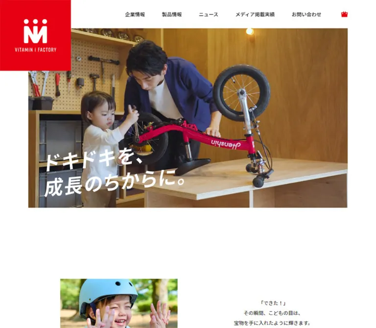
A spacious white corporate website where a red identity mark frames the energy of children, bicycles, and shared discoveries.
Website: vitamin-i.jp Original URL: https://www.vitamin-i.jp/ Final URL: https://www.vitamin-i.jp/ Theme: light content canvas with red accents and a charcoal footer; no theme selector was evidenced. Inspected: October 5, 2026, at 05:47 JST; supplied retrieval timestamp: October 4, 2026, at 20:47:44.452 UTC. Viewports: 1440 × 1000 desktop and 390 × 844 mobile, in CSS pixels. Scope: the current corporate homepage, including its opening hero, introductory statement, story rail, product and lesson sections, news, media and recruitment panels, and footer. Five supplied original-page screenshots cover desktop opening/product/footer states and mobile opening/footer states. Rendered DOM and computed-style excerpts provide additional measurements for intervening sections. Linked pages and interactive open states were not independently inspected.
Vitamin i Factory gives its corporate homepage the visual warmth of a family activity brand. Large photographs supply movement, human expression, and product color. The interface around them stays restrained: white backgrounds, near-black Japanese text, narrow English section headings, and small, purposeful red accents. The most assertive brand element is a square red logo block that overlaps the opening header and hero.
This is a substantial corporate and product gateway. Its sequence moves from an emotional introduction to editorial stories, product discovery, company news, and institutional links. Broad whitespace separates these different reading modes. The design works through scale changes: a large opening image, small editorial cards, expansive product photography, quiet news rows, and a dense dark footer.
閉じる
Vitamin i Factory — Style Reference
A spacious white corporate website where a red identity mark frames the energy of children, bicycles, and shared discoveries.
Website: vitamin-i.jp Original URL: https://www.vitamin-i.jp/ Final URL: https://www.vitamin-i.jp/ Theme: light content canvas with red accents and a charcoal footer; no theme selector was evidenced. Inspected: October 5, 2026, at 05:47 JST; supplied retrieval timestamp: October 4, 2026, at 20:47:44.452 UTC. Viewports: 1440 × 1000 desktop and 390 × 844 mobile, in CSS pixels. Scope: the current corporate homepage, including its opening hero, introductory statement, story rail, product and lesson sections, news, media and recruitment panels, and footer. Five supplied original-page screenshots cover desktop opening/product/footer states and mobile opening/footer states. Rendered DOM and computed-style excerpts provide additional measurements for intervening sections. Linked pages and interactive open states were not independently inspected.
Vitamin i Factory gives its corporate homepage the visual warmth of a family activity brand. Large photographs supply movement, human expression, and product color. The interface around them stays restrained: white backgrounds, near-black Japanese text, narrow English section headings, and small, purposeful red accents. The most assertive brand element is a square red logo block that overlaps the opening header and hero.
This is a substantial corporate and product gateway. Its sequence moves from an emotional introduction to editorial stories, product discovery, company news, and institutional links. Broad whitespace separates these different reading modes. The design works through scale changes: a large opening image, small editorial cards, expansive product photography, quiet news rows, and a dense dark footer.
How to Read This Reference
- Measured values come from the supplied rendered DOM and computed styles. They describe the captured state, not an independently recovered stylesheet.
- Visual estimates come from the five original-page screenshots. Image boundaries, pictogram dimensions, and the compact desktop header height are labeled accordingly.
- Derived values are arithmetic relationships between recorded measurements, such as card gaps and centered margins.
- Recommendations describe implementation choices where the evidence does not establish a rule. The CSS starter is an adaptation, not recovered source code.
- Token names are descriptive implementation aliases. The supplied custom-property inventory mostly contains WordPress presets; their presence does not establish that those presets control the visible design.
- Coordinates have different scroll contexts. Some element records describe the opening page, others the footer capture. Do not combine every recorded
yvalue into a single viewport layout. - Only two viewport widths were supplied. Exact breakpoints, intermediate scaling formulas, hover endpoints, menu opening behavior, and hero playback behavior remain unverified.
Tokens — Colors
Default Palette
| Name | Value | Suggested token | Role and evidence |
|---|---|---|---|
| Brand Red | #e60012 |
--color-brand |
Measured logo-block background, product numbering, and product-menu subtitle; visually repeated in navigation arrows and pictograms |
| White | #ffffff |
--color-page |
Measured page and header background; reversed footer links |
| Text Ink | #191919 |
--color-ink |
Measured body text, navigation, section headings, product titles, and article titles |
| Desktop Soft Surface | #f9f9f7 |
--color-surface-desktop |
Measured desktop media/recruitment panels and Braveboard promotion |
| Mobile Soft Surface | #f3f3f0 |
--color-surface-mobile |
Measured mobile versions of those same surfaces |
| Footer Charcoal | #373737 |
--color-footer |
Measured footer background at both viewports |
| Footer Control | #3d3d3d |
--color-footer-control |
Measured contact and social-control backgrounds |
| Muted Footer Text | #919191 |
--color-muted |
Measured legal-link text |
The red is a structural accent. It identifies the brand, marks product sequence numbers, introduces selected English headings, and creates compact directional controls. Large content regions remain white or very pale warm gray.
The greens, blues, yellow, pink, and beige in product photographs belong to the imagery. They should not become additional interface accent tokens. Likewise, the unrelated gradients, shadows, and vivid colors in the WordPress preset inventory are not evidence of a visible multicolor UI system.
Responsive Surface Variation
The lower promotional panels use #f9f9f7 on desktop and #f3f3f0 on mobile. This is a measured difference, not a screenshot color guess. Preserve it when matching the captured endpoints. A new implementation may deliberately consolidate these into one surface color, but that would be an adaptation.
Subtle outlines around footer controls and a soft shadow under the compact desktop header are visible in the screenshots. Their exact color, blur, and opacity were not included in the computed-style excerpt.
Tokens — Typography
Japanese Text and Navigation
- Observed stack:
"Noto Sans JP", Meiryo, sans-serif. - Observed weights: primarily
400, with500for navigation, footer links, the story introduction heading, and promotional-panel headings. - Character: calm, readable Japanese sans serif. The ordinary body text is not heavily emboldened.
- Role: carries the company narrative, product explanation, article titles, and navigation.
- Implementation alias:
--font-body.
The root font size is 16px at both inspected widths. Individual component sizes change between viewports. The evidence does not establish a single responsive root-unit formula.
English Section Headings and Dates
- Observed stack:
rift-soft, "Noto Sans JP", sans-serif. - Observed heading weight:
400. - Observed product-number weight:
600. - Character: tall, narrow letterforms with a compact horizontal footprint.
- Role: section labels such as
STORY,PRODUCT,NEWS,MEDIA, andRECRUIT; article dates; product numbering. - Implementation alias:
--font-display.
The visible MEDIA and RECRUIT headings color the first English letter red while keeping the remainder dark. Small red Japanese labels sit alongside them. The full computed styles of those small label spans were not supplied.
These are observed font-family declarations. Font-file URLs, loading behavior, and licensing information were not provided. Load the appropriate fonts separately when authorized; do not invent asset URLs.
Hero Lettering and Identity Artwork
The hero reads “ドキドキを、成長のちからに。” in two large white lines with an energetic slant. Its h1 has an empty extracted text value and a measured visual container. Consequently, the wrapper's computed 16px font size is not a measurement of the visible headline.
Treat the lettering as a distinct graphic treatment. Its exact asset type and font are unverified. Use authorized headline artwork when available, or explicitly treat an editable-text version as an approximation. The logo is also bespoke artwork rather than ordinary text set in the body font.
The footer's CONTACT US and vertical PAGE TOP labels look condensed. Their child-level font measurements were not included; the parent anchor's body-font declaration does not identify the visible lettering conclusively.
Type Scale
Values below are computed measurements, rounded where useful. Sizes and line heights are in CSS pixels.
| Role | Desktop size / line height | Mobile size / line height | Weight and notes |
|---|---|---|---|
| Main English section heading | 45 / 45 |
28.6 / 28.6 |
Display family, 400 |
| Story introduction heading | 32 / 50 |
20.8 / 32.5 |
Body family, 500 |
| Product title | 32 / 38.4 |
20.8 / 24.96 |
Body family, 400 |
| Media/recruitment heading | 25 / 37.5 |
15.6 / 23.4 |
Body family, 500 |
| Introductory statement | 18.72 / 37.44 |
17.16 / 34.32 |
Body family, 400; generous double leading |
| Product/story explanatory copy | 16 / 35 |
14.56 / 31.85 |
Body family, 400 |
| Story title | 14 / 25 |
11.44 / 20.43 |
Body family, 400 |
| News title | 14 / 30.62 |
11.44 / 22.47 |
Body family, 400 |
| Promotional-panel description | 14 / 25 |
11.44 / 20.43 |
Body family, 400 |
| Story date | 16 / 16 |
10.4 / 10.4 |
Display family; 0.05em tracking |
| News date | 16 / 16 |
13.52 / 13.52 |
Display family; 0.05em tracking |
| Product number | 30 / 44.12 |
15.6 / 22.94 |
Display family, 600, red |
| Desktop navigation | 14 / 16.8 |
Hidden in the closed mobile screenshot | Body family, 500 |
| Mobile navigation links in DOM | Not applicable | 13.52 / 13.52 |
Menu appearance was not visually inspected open |
| Footer navigation | 16 / 16 |
13.52 / 13.52 |
Body family, 500 |
| Legal links | 12 / 12 |
10.4 / 10.4 |
Body family, 500, muted gray |
The offscreen desktop product-menu heading is approximately 55px, larger than the homepage's 45px section headings. Keep menu measurements separate from the main content scale.
Recommended adaptation: increase the smallest mobile article titles and descriptive text for comfortable reading. The observed 11.44px text and 10.4px story dates are useful matching references, not mandatory accessibility targets.
Tokens — Spacing & Shapes
Overall density: generous section spacing and image areas, with compact navigation and editorial metadata. Geometry: square image crops and rectangular panels, contrasted with circular arrows and social controls.
Spacing Scale
These are repeated or particularly useful measured relationships, not a recovered source spacing scale.
| Use | Desktop | Mobile | Evidence |
|---|---|---|---|
| Opening hero horizontal inset | About 80px |
About 29px |
Screenshot boundaries |
| Main content horizontal inset | Usually 160px |
29.625px |
DOM; story introduction is slightly offset at 168px on desktop |
| Navigation gaps | About 48px |
Not applicable | Derived from recorded desktop link positions |
| Story-card gap | 63.98px |
24.95px |
Derived from neighboring anchor boxes |
| Product heading to description | 36px |
24.95px |
Derived from text rectangles |
| Product description to detail link | 36px |
About 38.47px |
Derived from first product text rectangles |
| Product-image to copy gap | About 64px |
Vertically stacked | Desktop screenshot and text position |
| Product gallery gutters | About 64px |
Unverified | Desktop screenshot estimate |
| Media/recruitment panel gap | 40px |
8.31px |
Derived from panel rectangles |
| Lower panels to footer | 40px |
29.11px |
Derived from panel and main bounds |
| Footer navigation row interval | About 44px |
About 44.7px |
Derived from consecutive link positions |
Several desktop transitions between major blocks use 200px: for example, the story controls to the product heading and the Braveboard promotion to the news heading. Do not apply 200px mechanically to every boundary; the mobile layout and image-led sections use different relationships.
Border Radius
| Element | Desktop | Mobile | Status |
|---|---|---|---|
| Logo block, content panels, image tiles | 0 |
0 |
Measured panels and visible image geometry |
| Story navigation buttons | 50%, 40 × 40px |
Small arrow boxes without the desktop circular box | Measured button styles; behavior untested |
| Detail-arrow disc | Approximately 40px diameter |
Link container approximately 33.27px high |
Desktop visual estimate; mobile disc itself not measured |
| Footer contact control | 20px |
10.4px |
Measured |
| Footer social controls | 50%, 56 × 56px |
50%, approximately 54.08 × 54.08px |
Measured |
| Promotional pictogram field | Circular, roughly 126px diameter |
Unverified | Desktop screenshot estimate |
Layout Measurements
| Element | Desktop: 1440 × 1000 | Mobile: 390 × 844 |
|---|---|---|
| Opening header | 80px high |
49.91px high |
| Compact header | Approximately 65px high in scrolled screenshots |
Approximately 50px high |
| Opening red logo block | 200 × 200px |
104 × 104px |
| Hero image area | Approximately 1280 × 720px, beginning at (80, 80) |
Approximately 332 × 569px, beginning near (29, 50) |
| Hero headline container | 526 × 188px, at (140, 573) |
242.31 × 86.83px, at approximately (53.02, 510.22) |
| Standard main content width | 1120px |
330.75px |
| First product text column | 331.75px, beginning at x = 948.25 |
330.75px, beginning at x = 29.625 |
| Story card width | 200px |
166.39px |
| Media/recruitment panel | 660 × 399.44px each |
330.75 × 267.38px each |
| Footer contact control | Approximately 190 × 56px |
156 × 49.91px |
| Footer height | Approximately 544.89px |
Approximately 939.47px |
| Reported document height | 9206px |
8484px |
The opening logo deliberately exceeds the header height. It overlaps the hero's upper-left territory instead of fitting inside a conventional navigation bar.
Components
Application Header
Role: persistent identity and access to company information, products, news, media coverage, contact, and the shop.
At the opening desktop state, the white header is 80px high. A 200px red square sits at the top-left corner and contains the white emblem and small wordmark. Navigation aligns to the right, ending in a small red shopping-bag symbol. Links use 14px, weight 500, with substantial horizontal separation.
Scrolled desktop captures show a smaller red emblem near x = 80 inside a roughly 65px white strip. A subtle shadow separates this compact header from the content below. Both expanded and compact logo anchors occur in the DOM. The compact desktop anchor has a wider layout box than its visible emblem, so its recorded 224px width should not be used as the glyph width.
On mobile, the header is about 50px high. The opening square becomes 104px; the scrolled state uses a small red emblem near the 29px content inset. A two-line menu symbol appears at the right. Its measured button box is only about 19.75 × 8.28px; a larger effective hit area was not established by the excerpt.
Product Navigation and Mobile Menu Structure
Role: grouped access to the product ecosystem.
The desktop DOM contains an offscreen product-navigation region with a large PRODUCT heading, a red Japanese subtitle, and links to the bicycle, lessons, and Braveboard. Its negative coordinates are not evidence that this panel was visibly open.
The mobile DOM contains company links, a product grouping with indented links, a full-width red shop link, and social links. Recorded menu rows are approximately 65.52px high inside a 330.75px column. Product links have 23.4px left padding. The shop link is approximately 330.75 × 66.55px with a red fill and white text.
The closed screenshots establish the menu trigger, while the DOM establishes the content structure. Opening animation, focus management, background treatment, and scrolling behavior remain unverified.
Opening Hero
Role: introduces the emotional promise before the detailed company or product content.
The desktop hero is an inset, square-cornered landscape rectangle. Its visible frame shows a close view of a rider and a red bicycle outdoors. The red logo block overlaps its upper-left area. White lettering sits near the lower-left corner, inset approximately 60px from the image's left edge.
The mobile hero changes to a tall portrait composition. Its captured frame shows an adult working at a table with another person in the foreground. The slogan remains near the lower-left, with an approximately 23px image-relative left inset and a roughly 22px bottom clearance.
There is no visible primary button in this opening composition. The image and slogan establish the brand, while the header carries navigation. Preserve the strong overlap, clean frame edges, and deliberate whitespace below the image.
The different desktop and mobile scenes are compatible with moving media or alternate imagery, but the evidence does not identify the mechanism. Do not claim a verified autoplay video, slideshow interval, or breakpoint-specific media source.
Introductory Statement
Role: explains the connection between play, achievement, confidence, and growth.
The statement opens with “「できた!」” and uses short, deliberately broken lines. Desktop text is 18.72px with 37.44px leading in a 500px block at x = 810. Mobile text is nearly as large at 17.16px, with 34.32px leading, inside a wider-than-standard 373.38px text box.
The mobile opening screenshot also shows a smiling child wearing a blue helmet and exchanging a high-five. This next image starts around y = 699, approximately 80px after the hero ends. The complete desktop image arrangement and mobile statement alignment were not visually shown, so reproduce the documented text rhythm without inventing an exact collage composition.
Bilingual Section Heading
Role: provides a repeatable editorial landmark.
Use a tall, narrow English heading above or beside a smaller Japanese label. The main English scale is 45px on desktop and 28.6px on mobile. The visible media and recruitment panels add a red initial letter and a red Japanese label.
Keep these headings visually distinct from Japanese content headings. Their narrow type allows a large vertical presence without consuming the width of a conventional bold sans-serif title.
Story Introduction and Horizontal Rail
Role: connects the product brand to family experiences and current editorial content.
Desktop places a 400px introduction at approximately x = 168, with the first 200px article card starting near x = 688. Subsequent cards advance about 264px, producing a 64px gap. Five article links are present; later cards extend beyond the viewport.
Each card contains an image region, a display-font date, a Japanese article title, and category text. The metadata begins approximately 216px below the card top on desktop, consistent with a square 200px image plus spacing, but the actual image rectangle was not supplied. Treat the square thumbnail as an informed layout inference.
Two 40px circular button boxes appear beneath the desktop rail. Their presence supports a carousel-like structure; next/previous behavior, dragging, autoplay, and looping were not exercised.
On mobile, the introduction precedes the rail. Cards are 166.39px wide, separated by about 24.95px. The first begins at the main 29.625px inset, while the second extends almost to the viewport's right edge. Preserve this horizontal sequence instead of assuming the cards become a vertical list.
Product Feature
Role: introduces a product or learning service with a large image and concise explanation.
The first desktop feature uses an asymmetric split. The photograph extends to the left viewport edge and ends around x = 884; the copy begins at x = 948.25 and ends at x = 1280. The approximately 64px separation is generous enough to keep the photograph and text visually independent.
The copy anatomy is:
- A red display-font sequence number, such as
01, with a short underline visible in the screenshot. - A regular-weight Japanese title, such as “へんしんバイク”.
- A short explanatory paragraph with
35pxdesktop leading. - A red circular directional icon beside “詳しくみる”.
The lesson section is numbered 02. Its desktop text starts at x = 160, reversing the first feature's text placement. The supplied excerpt does not establish every associated image dimension.
On mobile, both numbered copy blocks occupy the main 330.75px column. The title reduces to 20.8px, the paragraph to 14.56px, and the number to 15.6px. Preserve the sequence and hierarchy while stacking the media and copy.
Product Image Gallery
Role: alternates product detail with the experience of using the product.
The desktop screenshot shows three square image columns within the approximately 1120px content width. Tile widths are about 331px, with approximately 64px gutters. The next row begins after a similarly generous vertical gap.
The images alternate between children in colorful studio sets and isolated bicycles on pale gray backgrounds. All use square corners. There are no visible text overlays or conventional card shells around the captured tiles.
The total image count, click behavior, and mobile column count are not established. A two-column mobile gallery is a reasonable implementation recommendation, not an observed source rule.
Detail Link
Role: provides a lightweight directional action inside an otherwise open content composition.
The desktop product link combines a red circle of approximately 40px with a small white right-pointing triangle and a dark Japanese label. The label is separated from the circle by roughly 24px in the screenshot. The link itself can span the text column; the visible icon and wording occupy only its leading portion.
Although the triangle resembles a play symbol, the recorded product link navigates to a product page. Implement it as a link, not a media-playback button. A larger invisible interaction area can improve accessibility without enlarging the visible disc.
Braveboard Promotion
Role: connects the homepage to the related board brand.
The desktop link is a pale rectangular panel approximately 879 × 124px, centered within the larger page. It combines identity/content areas in a horizontal layout, with recorded padding of 34px 176px 40px 27px.
On mobile, it becomes a 330.75 × 172.13px block with a slightly darker pale surface. Its descriptive text is 11.44px / 20.43px, and substantial right padding reserves space within the panel. The visual content occupying that reserved region was not supplied; do not invent a specific illustration.
News List
Role: presents corporate and product announcements without competing with the photography.
Desktop uses a compact heading column and an approximately 800px list region. Each linked row contains a date, the category label PRESS, and a Japanese title. Recorded title boxes have about 30.62px line height, and rows begin roughly 62.61px apart.
On mobile, each row becomes a block: date/category metadata precedes the title. The title spans the 330.75px content width and may wrap to two lines. The list-end “一覧をみる” link aligns toward the right.
The text excerpt establishes the category wording, but not a measured badge fill or border. Avoid inventing colorful category chips.
Media and Recruitment Panels
Role: closes the main content with two company-oriented destinations.
Desktop uses two pale, square-cornered anchors, each 660 × 399.44px, with 40px outer margins and a 40px center gutter. Text begins 96px inside the left edge. The English heading begins about 100px below the panel top.
Each panel contains a bilingual heading, a medium-weight Japanese statement, and a short paragraph. A white circular field near the upper-right contains a red pictogram: a bicycle for media and a document-like recruitment symbol. The pictograms have a small darker corner detail visible in the capture.
Mobile stacks the panels at 330.75 × 267.38px, with approximately 8.31px between them. Horizontal internal padding is approximately 29.64px. The mobile text includes “詳しくみる”, while the desktop excerpt does not expose that additional wording. Keep the entire panel as a single link; an internal directional label should not become a nested anchor.
Footer
Role: gives the long page a clear endpoint and consolidates corporate, product, contact, social, and legal navigation.
The desktop footer is a full-width #373737 field, approximately 545px high, with 120px top padding and 38px bottom padding. A white brand mark occupies the left side. Two navigation columns begin around x = 870 and x = 1099, with white 16px, weight-500 links.
Below those columns, a rounded CONTACT US control sits beside three circular social controls. The contact control is approximately 190 × 56px; social circles are 56px. Their #3d3d3d fill is only slightly lighter than the footer. Legal links and copyright sit low on the left in muted gray. A narrow vertical PAGE TOP link is placed near the lower-right edge.
Mobile reorganizes this into a tall footer of about 939px. The logo is centered in its own upper region; corporate and product links become one left-aligned sequence. The contact control appears below the links, followed by a separate social row. Legal links and copyright form the final lines. PAGE TOP remains near the right edge beside the lower controls.
The mobile footer screenshot is taken near the document bottom, so the logo is partly above the visible area. That crop does not imply an intentionally clipped logo component.
Tokens — Motion & Interaction
| Treatment | Evidence | What can be concluded |
|---|---|---|
| Header transition | Computed transition: 0.6s |
A nonzero header transition is defined; exact animated properties and scroll threshold were not supplied |
| Large logo transition | transform 0.6s, opacity 0.2s 0.6s |
Transform lasts 600ms; opacity lasts 200ms after a 600ms delay |
| Desktop navigation links | color 0.4s |
Color changes can transition over 400ms; the hover color endpoint was not recorded |
| Story titles | color 0.4s |
A 400ms color transition is defined |
| Desktop story controls | 0.4s |
A transition is defined; click result and easing were not observed |
| News and promotional headings | 0.4s on sampled elements |
A short visual transition is defined; its endpoint is unverified |
| Desktop contact/social links | 0.4s |
Control styling can transition; the resulting hover appearance was not captured |
| Hero media | Different scenes in supplied opening captures | Scene variation exists; video, slideshow, playback settings, and timing are unverified |
| Header compact state | Large opening identity and small scrolled identity are both visible | State change is supported by screenshots; its triggering logic is unknown |
| Story rail | Offscreen card positions and two control buttons | Horizontal presentation is supported; gesture, looping, and autoplay behavior are unknown |
| Page-top link | Recorded destination /#top |
An anchor destination is present; smooth-scrolling behavior was not verified |
Many elements report only transition: all. Without a nonzero duration, this is not evidence of a visible animation. Likewise, animation: none on sampled text and containers does not rule out media playback or animation in descendants.
The supplied capture process waited for initial readiness and traversed scroll positions. It did not supply a frame-by-frame transition recording or a tested interaction sequence for the menu and rail. No parallax, scroll pinning, cinematic entrance effect, or spring animation should be presented as an observed feature.
Recommended motion direction: keep structural changes restrained and use the measured 400–600ms durations as references. Provide reduced-motion behavior and a static alternative if animated hero media is introduced.
Surfaces
| Layer | Appearance | Purpose |
|---|---|---|
| Main canvas | Pure white | Gives images and typography room to breathe |
| Header | White; subtle separation in scrolled desktop state | Keeps navigation legible over changing page content |
| Opening identity | Solid red square with white artwork | Establishes a strong, recognizable page anchor |
| Product and story content | Images and text placed directly on white | Avoids excessive card framing |
| Lower promotional panels | Very pale warm gray, square corners | Groups secondary destinations without heavy borders |
| Footer | Solid charcoal | Signals the end of the main narrative and consolidates navigation |
| Footer controls | Slightly lighter charcoal with restrained outlines | Creates usable control shapes without introducing a new accent color |
| Circular detail controls | Brand red with white directional glyph | Adds a small, recognizable action cue |
There is no evidenced general-purpose elevation system. Most separation comes from whitespace, scale, image boundaries, and the change to a dark footer.
Imagery
The photography has two complementary modes.
Everyday experience: outdoor cycling, children reacting with delight, and adults working or interacting in real environments. Tight crops emphasize hands, faces, gestures, and the bicycle itself. The mobile hero's portrait framing makes people occupy most of the available image area.
Playful product presentation: children and bicycles appear in studio scenes made from colorful flat shapes, clouds, bunting, simple buildings, and other craft-like props. These sets are cheerful without changing the interface palette. Isolated bicycles on light gray backgrounds provide quieter comparison images between lifestyle photographs.
Maintain natural photographic texture. Do not apply pixelation, strong duotone filters, artificial glass effects, or decorative UI gradients over these images. The desktop gallery uses consistent square crops, while the hero requires separate attention to landscape and portrait composition.
Observed Asset References
No original image filenames, media URLs, SVG sources, or poster paths were included in the supplied evidence. The following is an asset inventory by visible role, not a list of downloadable files.
| Asset role | Original-page evidence | Implementation guidance |
|---|---|---|
| Expanded identity | White emblem and wordmark inside a red square | Use authorized logo artwork; retain its internal proportions |
| Compact identity | Small red emblem on white | Use a dedicated compact asset or a verified crop of the identity artwork |
| Footer identity | White emblem and wordmark on charcoal | Preserve its white treatment and clear surrounding space |
| Hero scene | Outdoor bicycle close-up on desktop; indoor working scene on mobile | Art-direct crops for each aspect ratio; source mechanism is unverified |
| Hero lettering | White, slanted two-line Japanese slogan | Preserve graphic character; supply an accessible text equivalent |
| Introductory image | Smiling child in a blue helmet, exchanging a high-five | Favor an expressive, human moment over a generic product cutout |
| Product feature image | Red bicycle and a child against a vivid green studio set | Let photography carry the strong secondary colors |
| Product gallery | Children with bicycles, pale product-only images, colorful studio scenery | Alternate activity and object detail in square tiles |
| Media/recruitment symbols | Red bicycle and document-like pictograms in white circles | Retain the simple silhouette and small corner detail |
| Utility symbols | Shopping bag, directional triangles, envelope, social marks, external-link marker | Match the compact visual weight; do not assume an icon library |
Layout & Responsive Behavior
The page uses several widths rather than one universal container. At 1440px, the hero has approximately 80px side margins, many text/gallery sections use 160px, and the final promotional pair uses 40px. Product photography can reach a viewport edge while its text aligns with the inner content grid.
That alternation produces the editorial rhythm. Preserve the difference between wide image sections, narrower reading regions, and broad footer navigation. A single boxed container applied everywhere would erase a defining relationship.
| Region | Desktop observation | Mobile observation |
|---|---|---|
| Header | Full navigation, large opening identity, compact scrolled identity | Two-line menu trigger, smaller opening block, compact emblem |
| Hero | Inset 16:9 landscape image | Tall portrait image with similar side margins proportionally |
| Introductory statement | 500px text block on the right side |
Nearly full-width text box; body size remains relatively large |
| Story section | Introduction beside a horizontal rail | Introduction above a narrower horizontal rail |
| Product copy | First copy block right; lesson copy left | Both use the same main left-aligned content column |
| Product gallery | Three square columns | Column count unverified |
| News | Date/category/title arranged horizontally | Metadata precedes title within stacked rows |
| Media/recruitment | Two large panels side by side | Two smaller panels stacked with a narrow gap |
| Footer | Brand left, two navigation columns and controls right | Centered brand region, one navigation sequence, separate contact/social rows |
The mobile content inset is usually 29.625px, or about 7.6% of the viewport. The hero uses a very similar inset. The introductory statement is an exception, with an approximately 8.31px horizontal inset.
Mobile is not a uniform shrink of desktop. The hero becomes proportionally taller, explanatory copy retains generous leading, the news hierarchy changes, and the footer becomes considerably taller. The story rail remains horizontal.
Unverified: tablet composition, exact breakpoint widths, the mobile gallery, menu overlay appearance, image-source swapping, and behavior with long translated labels. The 900px breakpoint in the starter below is a recommended integration choice, not a recovered source breakpoint.
Do’s and Don’ts
Do
- Preserve the red square's overlap with the opening hero.
- Keep the UI palette centered on
#e60012, white, and#191919. - Pair Japanese sans-serif text with narrow English display headings.
- Maintain broad whitespace between editorial, product, and institutional content.
- Use distinct widths for the hero, reading content, product imagery, and lower panels.
- Keep image crops and panel corners square.
- Alternate expressive family imagery with clear product photography.
- Preserve the horizontal story sequence at mobile widths.
- Use red circular directional cues as compact links within open layouts.
- Reorganize the footer for mobile while retaining generous link spacing.
- Keep the observed soft-surface color difference explicit when matching both captures.
Don’t
- Do not reduce this corporate homepage to a single-purpose sales landing page.
- Do not add a dominant hero purchase button that is absent from the evidence.
- Do not turn every photograph or text block into a rounded, shadowed card.
- Do not use the colorful photographic backdrops as a rainbow of UI accent colors.
- Do not substitute heavy, wide English headings for the observed condensed display type.
- Do not interpret the empty
h1wrapper's16pxvalue as the hero lettering size. - Do not treat offscreen navigation DOM as a visually inspected open menu.
- Do not assert autoplay, parallax, carousel looping, or hover endpoints without testing them.
- Do not infer the mobile gallery layout from the desktop grid.
- Do not scale every desktop measurement by one constant factor for mobile.
- Do not copy unrelated WordPress preset gradients or shadows into the visible design system.
Recommended Implementation Additions
These are recommendations for a new implementation, not verified features of the original page:
- Give the menu, shop, social, and rail controls accessible names. Ensure at least a
44pxinteraction area even when the visible symbol is much smaller. - Manage expanded and compact logo links so hidden duplicates are not exposed as redundant keyboard stops.
- Give the mobile menu an explicit expanded state, keyboard handling, focus return, and a scrollable layout when its content exceeds the viewport.
- Supply meaningful alternate text for identity and product images. Give the graphic hero heading a real accessible heading equivalent.
- Raise very small mobile reading text where needed. A
14pxarticle title and at least12pxmetadata are reasonable starting points for this composition. - Preserve a visible keyboard-focus indicator on white, pale, and charcoal surfaces.
- Keep rail items reachable without requiring dragging, and ensure their focus outlines are not clipped by overflow containers.
- If the hero uses motion, provide a stable poster, reduced-motion handling, and appropriate playback controls. Audio and autoplay behavior are not established by the evidence.
- Preserve footer contrast when adjusting the muted legal text or control borders.
- Reserve image dimensions and choose responsive image sources to keep the long page stable during loading.
Agent Prompt Guide
Quick Color Reference
- Page/header:
#ffffff. - Main text:
#191919. - Brand block, numbers, directional discs:
#e60012. - Desktop promotional panels:
#f9f9f7. - Mobile promotional panels:
#f3f3f0. - Footer:
#373737. - Footer controls:
#3d3d3d. - Muted legal text:
#919191. - Image colors remain photographic rather than becoming general UI tokens.
Overall Prompt
“Create a Japanese corporate homepage for a children's cycling and active-play brand, using Vitamin i Factory's observed visual relationships. Use a spacious white canvas, near-black Noto Sans JP text, narrow rift-soft English section headings, and precise red #e60012 accents. Begin with a red square identity block overlapping a white header and an inset photographic hero. Place a large white two-line Japanese slogan low on the hero. Continue with a generous brand statement, a horizontal story rail, asymmetric product features, square product photography, quiet news rows, pale media/recruitment panels, and a charcoal footer. On mobile, use roughly 30px side insets, a tall hero, stacked product copy and panels, and a single footer navigation sequence. Treat unverified menu and media behavior as implementation decisions.”
Example Component Prompts
- Opening header and hero: “At a 1440px viewport, create an 80px white navigation bar and a 200px red logo square anchored at the upper-left. Overlap the square with a hero beginning 80px from the top and sides. Use a 1280 × 720px landscape photograph and white Japanese headline artwork near the lower-left. Provide a separate compact header state with a small red emblem.”
- Story rail: “Place a 400px editorial introduction beside a horizontal sequence of 200px article cards with 64px gaps. Each card contains photography, a narrow display-font date, a modest Japanese title, and category text. On mobile, move the introduction above the rail and use approximately 166px cards with 25px gaps. Do not assume autoplay.”
- Product feature: “Use a large photograph reaching the left viewport edge and a 332px text column to the right with a 64px gap. Stack a small underlined red number, a 32px regular Japanese title, generous body copy, and a red circular right-arrow link. Stack image and copy on mobile.”
- Product gallery: “Create three square photographic columns within an approximately 1120px desktop region, separated by 64px gutters. Alternate children in playful studio sets with isolated bicycles on pale backgrounds. Keep corners square and avoid card shadows. Choose the mobile grid deliberately because it was not observed.”
- Media/recruitment pair: “Create two 660px pale panels with a 40px gap. Use narrow uppercase English headings with a red first letter, small red Japanese labels, a Japanese statement, and short body copy. Place a red pictogram inside a white circular field near the upper-right. Stack the panels on mobile.”
- Footer: “Build a full-width charcoal footer with a white brand mark on the left and two white-text navigation columns on the right. Add a subtly rounded contact control and three circular social controls in slightly lighter charcoal. Keep legal text muted and place a narrow vertical page-top link near the lower-right. Reflow into a tall mobile footer with one navigation sequence.”
Quick Start
CSS Custom Properties
This CSS expresses the measured palette, typography, and principal dimensions with conventional CSS units. The intermediate layout rules, 900px breakpoint, mobile gallery, hover endpoints, focus styling, and enlarged interaction targets are recommended adaptations. It is not the original stylesheet.
Provide authorized logo, headline, and photographic assets separately. The header's data-compact state needs application logic; no original scroll threshold is known. Menu behavior and rail-control logic also require implementation. Font-family declarations below do not load font files.
:root {
  /* Measured colors */
  --color-brand: #e60012;
  --color-page: #ffffff;
  --color-ink: #191919;
  --color-surface-desktop: #f9f9f7;
  --color-surface-mobile: #f3f3f0;
  --color-surface: var(--color-surface-desktop);
  --color-footer: #373737;
  --color-footer-control: #3d3d3d;
  --color-muted: #919191;

  /* Observed font stacks; load fonts separately */
  --font-body: 'Noto Sans JP', Meiryo, sans-serif;
  --font-display: rift-soft, 'Noto Sans JP', sans-serif;
  --text-section: 45px;
  --text-product: 32px;
  --text-body: 16px;
  --leading-body: 35px;
  --text-small: 14px;
  --leading-small: 25px;
  --text-date: 16px;
  --text-number: 30px;

  /* Captured desktop dimensions */
  --page-gutter: 80px;
  --hero-gutter: 80px;
  --content-max: 1120px;
  --hero-max: 1280px;
  --header-height: 80px;
  --header-compact-height: 65px;
  --logo-block: 200px;
  --story-width: 200px;
  --story-gap: 64px;
  --detail-disc: 40px;
  --section-space: 200px;

  /* Measured durations; endpoints below are adaptations */
  --motion-color: 400ms;
  --motion-header: 600ms;
}

* { box-sizing: border-box; }
html { scroll-padding-top: var(--header-height); }
body {
  margin: 0;
  color: var(--color-ink);
  background: var(--color-page);
  font-family: var(--font-body);
  font-size: 16px;
  line-height: 1.75;
}
img, video { display: block; max-width: 100%; }
a { color: inherit; }
button { font: inherit; }
h1, h2, h3, p { margin: 0; }

.content {
  width: min(var(--content-max), calc(100% - 2 * var(--page-gutter)));
  margin-inline: auto;
}
.section { margin-block: var(--section-space); }
.section-title {
  font-family: var(--font-display);
  font-size: var(--text-section);
  font-weight: 400;
  line-height: 1;
}
.section-title--accent::first-letter { color: var(--color-brand); }
.section-label {
  color: var(--color-brand);
  font-size: 12px; /* Recommended subtitle size */
}
.body-copy {
  font-size: var(--text-body);
  line-height: var(--leading-body);
}

.site-header {
  position: fixed;
  inset: 0 0 auto;
  z-index: 100;
  display: flex;
  align-items: center;
  height: var(--header-height);
  padding-inline: var(--page-gutter);
  background: var(--color-page);
  transition: height var(--motion-header);
}
.brand-large {
  position: absolute;
  inset: 0 auto auto 0;
  display: grid;
  place-items: center;
  width: var(--logo-block);
  aspect-ratio: 1;
  background: var(--color-brand);
  transition: transform 600ms, opacity 200ms 600ms;
}
.brand-large img { width: 60%; }
.brand-small {
  display: flex;
  align-items: center;
  width: 31px;
  opacity: 0;
  pointer-events: none;
}
.site-header[data-compact='true'] {
  height: var(--header-compact-height);
  box-shadow: 0 5px 16px rgb(0 0 0 / 0.045); /* Visual approximation */
}
.site-header[data-compact='true'] .brand-large {
  transform: translateY(-100%); /* Recommended state treatment */
  opacity: 0;
  pointer-events: none;
}
.site-header[data-compact='true'] .brand-small {
  opacity: 1;
  pointer-events: auto;
}
.desktop-nav {
  display: flex;
  align-items: center;
  gap: 48px;
  height: 100%;
  margin-inline-start: auto;
}
.desktop-nav a {
  display: flex;
  align-items: center;
  min-height: 44px;
  font-size: 14px;
  font-weight: 500;
  line-height: 1.2;
  text-decoration: none;
  transition: color var(--motion-color);
}
.menu-toggle { display: none; }

main { padding-top: var(--header-height); }
.hero {
  position: relative;
  width: min(var(--hero-max), calc(100% - 2 * var(--hero-gutter)));
  aspect-ratio: 16 / 9;
  margin-inline: auto;
}
.hero-media {
  width: 100%;
  height: 100%;
  object-fit: cover;
}
.hero-heading {
  position: absolute;
  left: 60px;
  bottom: 39px;
  width: min(526px, calc(100% - 80px));
}
.hero-heading img { width: 100%; height: auto; }

/* Recommended introductory arrangement; full source image layout is unknown */
.manifesto {
  display: grid;
  grid-template-columns: minmax(0, 1fr) minmax(0, 500px);
  align-items: center;
  gap: 80px;
  margin-block: var(--section-space);
}
.manifesto p { font-size: 18.72px; line-height: 2; }

.story-layout {
  display: grid;
  grid-template-columns: 400px minmax(0, 1fr);
  gap: 120px;
}
.story-intro h3 {
  margin-top: 80px;
  font-size: 32px;
  font-weight: 500;
  line-height: 50px;
}
.story-intro p { margin-top: 36px; }
.story-rail {
  display: flex;
  gap: var(--story-gap);
  min-width: 0;
  overflow-x: auto;
  padding-block: 4px 16px;
  padding-inline: 4px;
  scroll-snap-type: x proximity; /* Recommended enhancement */
}
.story-card {
  flex: 0 0 var(--story-width);
  scroll-snap-align: start;
  text-decoration: none;
}
.story-card img {
  width: 100%;
  aspect-ratio: 1; /* Inferred thumbnail proportion */
  object-fit: cover;
}
.date {
  font-family: var(--font-display);
  font-size: var(--text-date);
  line-height: 1;
  letter-spacing: 0.05em;
}
.story-card .date { margin-top: 16px; }
.story-card h3 {
  margin-top: 16px;
  font-size: var(--text-small);
  font-weight: 400;
  line-height: var(--leading-small);
  transition: color var(--motion-color);
}

.product-feature {
  display: grid;
  grid-template-columns: minmax(0, 1fr) 331.75px;
  align-items: center;
  gap: 64px;
  padding-inline-end: max(var(--page-gutter), calc((100vw - var(--content-max)) / 2));
}
.product-feature--reverse {
  grid-template-columns: 331.75px minmax(0, 1fr);
  padding-inline-start: max(var(--page-gutter), calc((100vw - var(--content-max)) / 2));
  padding-inline-end: 0;
}
.product-feature--reverse .product-copy { order: -1; }
.product-media img { width: 100%; height: auto; }
.product-number {
  display: inline-block;
  padding-inline: 3px;
  border-bottom: 1px solid currentColor;
  color: var(--color-brand);
  font-family: var(--font-display);
  font-size: var(--text-number);
  font-weight: 600;
  line-height: 1.4706;
}
.product-copy h3 {
  margin-top: 50px;
  font-size: var(--text-product);
  font-weight: 400;
  line-height: 1.2;
}
.product-copy .body-copy { margin-top: 36px; }
.detail-link {
  display: inline-flex;
  align-items: center;
  gap: 24px;
  min-height: 44px; /* Recommended accessible target */
  margin-top: 36px;
  font-size: 16px;
  text-decoration: none;
}
.detail-icon {
  display: grid;
  place-items: center;
  flex: 0 0 var(--detail-disc);
  width: var(--detail-disc);
  height: var(--detail-disc);
  border-radius: 50%;
  background: var(--color-brand);
}
.detail-icon::before {
  content: '';
  margin-left: 3px;
  border-block: 5px solid transparent;
  border-left: 8px solid white;
}
.product-gallery {
  display: grid;
  grid-template-columns: repeat(3, minmax(0, 1fr));
  gap: 64px;
  margin-block: 64px;
}
.product-gallery img { width: 100%; aspect-ratio: 1; object-fit: cover; }

.news-layout { display: grid; grid-template-columns: 160px minmax(0, 1fr); }
.news-list { max-width: 800px; }
.news-item {
  display: grid;
  grid-template-columns: 72px 120px minmax(0, 1fr);
  align-items: baseline;
  gap: 20px;
  margin-bottom: 32px;
  text-decoration: none;
}
.news-title { font-size: var(--text-small); line-height: 30.625px; }

.portal-grid {
  display: grid;
  grid-template-columns: repeat(2, minmax(0, 1fr));
  gap: 40px;
  margin: 160px 40px 40px;
}
.portal {
  position: relative;
  padding: 100px 72px 75px 96px;
  background: var(--color-surface);
  text-decoration: none;
}
.portal-icon {
  position: absolute;
  top: 40px;
  right: 72px;
  display: grid;
  place-items: center;
  width: 126px;
  aspect-ratio: 1;
  border-radius: 50%;
  background: white;
}
.portal h3 { margin-top: 65px; font-size: 25px; font-weight: 500; line-height: 1.5; }
.portal p { margin-top: 27px; font-size: var(--text-small); line-height: var(--leading-small); }
.portal-more { display: none; }

.site-footer {
  position: relative;
  padding: 120px var(--page-gutter) 38px;
  color: white;
  background: var(--color-footer);
}
.footer-main {
  display: grid;
  grid-template-columns: minmax(0, 1fr) 410px;
  gap: 80px;
  max-width: 1200px;
  margin-inline: auto;
}
.footer-brand { align-self: center; width: 150px; }
.footer-nav { display: grid; grid-template-columns: 144px 1fr; gap: 85px; }
.footer-nav ul { display: grid; align-content: start; gap: 28px; margin: 0; padding: 0; list-style: none; }
.footer-nav a { font-size: 16px; font-weight: 500; line-height: 1; text-decoration: none; }
.footer-controls { display: flex; align-items: center; gap: 24px; margin-top: 48px; }
.contact-link {
  display: flex;
  align-items: center;
  justify-content: center;
  gap: 16px;
  width: 190px;
  height: 56px;
  border: 1px solid rgb(255 255 255 / 0.07); /* Estimated outline */
  border-radius: 20px;
  background: var(--color-footer-control);
  text-decoration: none;
}
.social-links { display: flex; gap: 8px; }
.social-link {
  display: grid;
  place-items: center;
  width: 56px;
  height: 56px;
  border: 1px solid rgb(255 255 255 / 0.07);
  border-radius: 50%;
  background: var(--color-footer-control);
}
.footer-legal { display: flex; flex-wrap: wrap; gap: 22px; margin-top: 64px; color: var(--color-muted); font-size: 12px; }
.page-top { position: absolute; right: 38px; bottom: 38px; writing-mode: vertical-rl; text-decoration: none; }

/* Recommended focus and hover treatments; original endpoints were not captured */
:where(a, button):focus-visible { outline: 2px solid currentColor; outline-offset: 4px; }
@media (hover: hover) {
  .desktop-nav a:hover,
  .story-card:hover h3,
  .news-item:hover .news-title { color: var(--color-brand); }
}

/* Recommended breakpoint; values reproduce the supplied mobile scale */
@media (max-width: 900px) {
  :root {
    --color-surface: var(--color-surface-mobile);
    --page-gutter: 29.625px;
    --hero-gutter: 29.11px;
    --header-height: 49.906px;
    --header-compact-height: 49.906px;
    --logo-block: 104px;
    --text-section: 28.6px;
    --text-product: 20.8px;
    --text-body: 14.56px;
    --leading-body: 31.85px;
    --text-small: 11.44px;
    --leading-small: 20.4285px;
    --text-date: 10.4px;
    --text-number: 15.6px;
    --story-width: 166.39px;
    --story-gap: 24.95px;
    --detail-disc: 33.27px;
    --section-space: 80px;
  }
  .desktop-nav { display: none; }
  .brand-small { width: 25.47px; }
  .menu-toggle {
    display: grid;
    place-items: center;
    width: 44px;
    height: 44px;
    margin-inline-start: auto;
    margin-inline-end: -12px;
    padding: 0;
    border: 0;
    background: transparent;
  }
  .hero { aspect-ratio: 332 / 569; }
  .hero-heading { left: 23.4px; bottom: 22px; width: min(242.31px, calc(100% - 46.8px)); }
  .manifesto { grid-template-columns: 1fr; gap: 48px; }
  .manifesto p { font-size: 17.16px; line-height: 2; }
  .story-layout { grid-template-columns: 1fr; gap: 50px; }
  .story-intro h3 { margin-top: 60px; font-size: 20.8px; line-height: 32.5px; }
  .story-intro p { margin-top: 26px; }
  .story-card .date { margin-top: 12.5px; }
  .story-card h3 { margin-top: 8.3px; }
  .product-feature,
  .product-feature--reverse { grid-template-columns: 1fr; gap: 40px; padding-inline: var(--page-gutter); }
  .product-feature--reverse .product-copy { order: initial; }
  .product-copy h3 { margin-top: 40.55px; }
  .product-copy .body-copy { margin-top: 24.95px; }
  .detail-link { margin-top: 38.47px; gap: 20px; }
  .product-gallery { grid-template-columns: repeat(2, minmax(0, 1fr)); gap: 16px; } /* Recommended, not observed */
  .news-layout { grid-template-columns: 1fr; gap: 64px; }
  .news-item { grid-template-columns: auto 1fr; gap: 12px 20px; }
  .news-item .date { font-size: 13.52px; }
  .news-title { grid-column: 1 / -1; line-height: 22.4715px; }
  .portal-grid { grid-template-columns: 1fr; gap: 8.31px; margin: 83px var(--page-gutter) 29.11px; }
  .portal { min-height: 267.38px; padding: 44.72px 29.625px 29.12px; }
  .portal-icon { top: 20px; right: 29px; width: 76px; } /* Recommended mobile icon scale */
  .portal h3 { margin-top: 42.62px; font-size: 15.6px; }
  .portal p { margin-top: 14.55px; }
  .portal-more { display: block; margin-top: 16px; font-size: 11.44px; }
  .site-footer { padding: 104px var(--page-gutter) 23.92px; }
  .footer-main { grid-template-columns: 1fr; gap: 100px; }
  .footer-brand { width: 98px; justify-self: center; }
  .footer-nav { grid-template-columns: 1fr; gap: 31px; }
  .footer-nav ul { gap: 31px; }
  .footer-nav a { font-size: 13.52px; }
  .footer-controls { flex-direction: column; align-items: flex-start; gap: 43.67px; margin-top: 88px; }
  .contact-link { width: 156px; height: 49.91px; border-radius: 10.4px; }
  .social-links { gap: 8.31px; }
  .social-link { width: 54.08px; height: 54.08px; }
  .footer-legal { margin-top: 24px; gap: 16px; font-size: 10.4px; }
  .page-top { right: var(--page-gutter); bottom: 64px; }
}

@media (prefers-reduced-motion: reduce) {
  html { scroll-behavior: auto; }
  .site-header, .brand-large, .desktop-nav a, .story-card h3 { transition: none; }
}
Use a real anchor for the circular detail treatment. The triangle is decorative because the label already communicates the destination action:
<a class="detail-link" href="/henshinbike/">
  <span class="detail-icon" aria-hidden="true"></span>
  <span>詳しくみる</span>
</a>
The starter deliberately does not provide guessed media URLs, logo paths, or a font-loading service. It also does not claim pixel-perfect reproduction of sections whose complete imagery was not captured. Validate the adaptation at both supplied viewports, intermediate widths, keyboard focus states, and longer content lengths.
Tailwind v4 Token Mapping
Optional mapping for an implementation already using Tailwind v4. This is not evidence that the original site uses Tailwind. Define the custom properties above first.
@theme inline {
  --color-brand: #e60012;
  --color-page: #ffffff;
  --color-ink: #191919;
  --color-soft-panel: var(--color-surface);
  --color-footer: #373737;
  --color-footer-control: #3d3d3d;
  --color-muted: #919191;

  --font-body: 'Noto Sans JP', Meiryo, sans-serif;
  --font-display: rift-soft, 'Noto Sans JP', sans-serif;

  --text-section-heading: var(--text-section);
  --text-product-heading: var(--text-product);
  --text-editorial: var(--text-body);
  --text-supporting: var(--text-small);

  --spacing-page-inset: var(--page-gutter);
  --spacing-section-gap: var(--section-space);
  --spacing-story-card: var(--story-width);
  --spacing-story-gap: var(--story-gap);
  --spacing-detail-disc: var(--detail-disc);

  --radius-panel: 0px;
  --radius-contact-desktop: 20px;
  --radius-contact-mobile: 10.4px;
}
Sources & Evidence
- Inspected original and final homepage: https://www.vitamin-i.jp/. The supplied browser evidence reports HTTP
200, an unchanged final URL, and the page title “株式会社ビタミンiファクトリー”. - Capture time:
2026-10-04T20:47:44.452Z, equivalent to October 5, 2026, at 05:47 JST. - Desktop evidence: three supplied original-page screenshots at
1440 × 1000, covering the opening hero, a product/gallery region, and the final panels/footer. The rendered DOM reports a9206pxdocument height. - Mobile evidence: two supplied original-page screenshots at
390 × 844, covering the opening hero and the lower footer. The rendered DOM reports an8484pxdocument height. - Computed-style evidence: element rectangles, colors, font-family declarations, sizes, weights, line heights, padding, radii, and transition declarations for the header, introductory text, story links, product copy, news, promotional panels, and footer.
- Navigation evidence: homepage anchors identify company, story, bicycle, lesson, news, media, recruitment, contact, shop, legal, and social destinations. These establish link targets only; destination-page appearance and behavior were not inspected.
- Capture limitations: the supplied process waited for initial readiness and sampled settled scroll positions, but delayed content and unexercised interactions may remain. No raw media inventory, complete stylesheet, hover-state capture, open-menu screenshot, keyboard test, or verified hero-playback sequence was provided. SharedWorkers and service workers were disabled during the supplied inspection.
This reference describes the current homepage supported by those captures and measurements. Estimated geometry and recommended implementation behavior are explicitly distinguished from observed values.
# Vitamin i Factory — Style Reference

> A spacious white corporate website where a red identity mark frames the energy of children, bicycles, and shared discoveries.

**Website:** [vitamin-i.jp](https://www.vitamin-i.jp/)
**Original URL:** https://www.vitamin-i.jp/
**Final URL:** https://www.vitamin-i.jp/
**Theme:** light content canvas with red accents and a charcoal footer; no theme selector was evidenced.
**Inspected:** October 5, 2026, at 05:47 JST; supplied retrieval timestamp: October 4, 2026, at 20:47:44.452 UTC.
**Viewports:** 1440 × 1000 desktop and 390 × 844 mobile, in CSS pixels.
**Scope:** the current corporate homepage, including its opening hero, introductory statement, story rail, product and lesson sections, news, media and recruitment panels, and footer. Five supplied original-page screenshots cover desktop opening/product/footer states and mobile opening/footer states. Rendered DOM and computed-style excerpts provide additional measurements for intervening sections. Linked pages and interactive open states were not independently inspected.

Vitamin i Factory gives its corporate homepage the visual warmth of a family activity brand. Large photographs supply movement, human expression, and product color. The interface around them stays restrained: white backgrounds, near-black Japanese text, narrow English section headings, and small, purposeful red accents. The most assertive brand element is a square red logo block that overlaps the opening header and hero.

This is a substantial corporate and product gateway. Its sequence moves from an emotional introduction to editorial stories, product discovery, company news, and institutional links. Broad whitespace separates these different reading modes. The design works through scale changes: a large opening image, small editorial cards, expansive product photography, quiet news rows, and a dense dark footer.
閉じる
# Vitamin i Factory — Style Reference

> A spacious white corporate website where a red identity mark frames the energy of children, bicycles, and shared discoveries.

**Website:** [vitamin-i.jp](https://www.vitamin-i.jp/)
**Original URL:** https://www.vitamin-i.jp/
**Final URL:** https://www.vitamin-i.jp/
**Theme:** light content canvas with red accents and a charcoal footer; no theme selector was evidenced.
**Inspected:** October 5, 2026, at 05:47 JST; supplied retrieval timestamp: October 4, 2026, at 20:47:44.452 UTC.
**Viewports:** 1440 × 1000 desktop and 390 × 844 mobile, in CSS pixels.
**Scope:** the current corporate homepage, including its opening hero, introductory statement, story rail, product and lesson sections, news, media and recruitment panels, and footer. Five supplied original-page screenshots cover desktop opening/product/footer states and mobile opening/footer states. Rendered DOM and computed-style excerpts provide additional measurements for intervening sections. Linked pages and interactive open states were not independently inspected.

Vitamin i Factory gives its corporate homepage the visual warmth of a family activity brand. Large photographs supply movement, human expression, and product color. The interface around them stays restrained: white backgrounds, near-black Japanese text, narrow English section headings, and small, purposeful red accents. The most assertive brand element is a square red logo block that overlaps the opening header and hero.

This is a substantial corporate and product gateway. Its sequence moves from an emotional introduction to editorial stories, product discovery, company news, and institutional links. Broad whitespace separates these different reading modes. The design works through scale changes: a large opening image, small editorial cards, expansive product photography, quiet news rows, and a dense dark footer.

## How to Read This Reference

- **Measured values** come from the supplied rendered DOM and computed styles. They describe the captured state, not an independently recovered stylesheet.
- **Visual estimates** come from the five original-page screenshots. Image boundaries, pictogram dimensions, and the compact desktop header height are labeled accordingly.
- **Derived values** are arithmetic relationships between recorded measurements, such as card gaps and centered margins.
- **Recommendations** describe implementation choices where the evidence does not establish a rule. The CSS starter is an adaptation, not recovered source code.
- **Token names** are descriptive implementation aliases. The supplied custom-property inventory mostly contains WordPress presets; their presence does not establish that those presets control the visible design.
- **Coordinates have different scroll contexts.** Some element records describe the opening page, others the footer capture. Do not combine every recorded `y` value into a single viewport layout.
- **Only two viewport widths were supplied.** Exact breakpoints, intermediate scaling formulas, hover endpoints, menu opening behavior, and hero playback behavior remain unverified.

## Tokens — Colors

### Default Palette

| Name | Value | Suggested token | Role and evidence |
| --- | --- | --- | --- |
| Brand Red | `#e60012` | `--color-brand` | Measured logo-block background, product numbering, and product-menu subtitle; visually repeated in navigation arrows and pictograms |
| White | `#ffffff` | `--color-page` | Measured page and header background; reversed footer links |
| Text Ink | `#191919` | `--color-ink` | Measured body text, navigation, section headings, product titles, and article titles |
| Desktop Soft Surface | `#f9f9f7` | `--color-surface-desktop` | Measured desktop media/recruitment panels and Braveboard promotion |
| Mobile Soft Surface | `#f3f3f0` | `--color-surface-mobile` | Measured mobile versions of those same surfaces |
| Footer Charcoal | `#373737` | `--color-footer` | Measured footer background at both viewports |
| Footer Control | `#3d3d3d` | `--color-footer-control` | Measured contact and social-control backgrounds |
| Muted Footer Text | `#919191` | `--color-muted` | Measured legal-link text |

The red is a structural accent. It identifies the brand, marks product sequence numbers, introduces selected English headings, and creates compact directional controls. Large content regions remain white or very pale warm gray.

The greens, blues, yellow, pink, and beige in product photographs belong to the imagery. They should not become additional interface accent tokens. Likewise, the unrelated gradients, shadows, and vivid colors in the WordPress preset inventory are not evidence of a visible multicolor UI system.

### Responsive Surface Variation

The lower promotional panels use `#f9f9f7` on desktop and `#f3f3f0` on mobile. This is a measured difference, not a screenshot color guess. Preserve it when matching the captured endpoints. A new implementation may deliberately consolidate these into one surface color, but that would be an adaptation.

Subtle outlines around footer controls and a soft shadow under the compact desktop header are visible in the screenshots. Their exact color, blur, and opacity were not included in the computed-style excerpt.

## Tokens — Typography

### Japanese Text and Navigation

- **Observed stack:** `"Noto Sans JP", Meiryo, sans-serif`.
- **Observed weights:** primarily `400`, with `500` for navigation, footer links, the story introduction heading, and promotional-panel headings.
- **Character:** calm, readable Japanese sans serif. The ordinary body text is not heavily emboldened.
- **Role:** carries the company narrative, product explanation, article titles, and navigation.
- **Implementation alias:** `--font-body`.

The root font size is `16px` at both inspected widths. Individual component sizes change between viewports. The evidence does not establish a single responsive root-unit formula.

### English Section Headings and Dates

- **Observed stack:** `rift-soft, "Noto Sans JP", sans-serif`.
- **Observed heading weight:** `400`.
- **Observed product-number weight:** `600`.
- **Character:** tall, narrow letterforms with a compact horizontal footprint.
- **Role:** section labels such as `STORY`, `PRODUCT`, `NEWS`, `MEDIA`, and `RECRUIT`; article dates; product numbering.
- **Implementation alias:** `--font-display`.

The visible `MEDIA` and `RECRUIT` headings color the first English letter red while keeping the remainder dark. Small red Japanese labels sit alongside them. The full computed styles of those small label spans were not supplied.

These are observed font-family declarations. Font-file URLs, loading behavior, and licensing information were not provided. Load the appropriate fonts separately when authorized; do not invent asset URLs.

### Hero Lettering and Identity Artwork

The hero reads “ドキドキを、成長のちからに。” in two large white lines with an energetic slant. Its `h1` has an empty extracted text value and a measured visual container. Consequently, the wrapper's computed `16px` font size is not a measurement of the visible headline.

Treat the lettering as a distinct graphic treatment. Its exact asset type and font are unverified. Use authorized headline artwork when available, or explicitly treat an editable-text version as an approximation. The logo is also bespoke artwork rather than ordinary text set in the body font.

The footer's `CONTACT US` and vertical `PAGE TOP` labels look condensed. Their child-level font measurements were not included; the parent anchor's body-font declaration does not identify the visible lettering conclusively.

### Type Scale

Values below are computed measurements, rounded where useful. Sizes and line heights are in CSS pixels.

| Role | Desktop size / line height | Mobile size / line height | Weight and notes |
| --- | --- | --- | --- |
| Main English section heading | `45 / 45` | `28.6 / 28.6` | Display family, `400` |
| Story introduction heading | `32 / 50` | `20.8 / 32.5` | Body family, `500` |
| Product title | `32 / 38.4` | `20.8 / 24.96` | Body family, `400` |
| Media/recruitment heading | `25 / 37.5` | `15.6 / 23.4` | Body family, `500` |
| Introductory statement | `18.72 / 37.44` | `17.16 / 34.32` | Body family, `400`; generous double leading |
| Product/story explanatory copy | `16 / 35` | `14.56 / 31.85` | Body family, `400` |
| Story title | `14 / 25` | `11.44 / 20.43` | Body family, `400` |
| News title | `14 / 30.62` | `11.44 / 22.47` | Body family, `400` |
| Promotional-panel description | `14 / 25` | `11.44 / 20.43` | Body family, `400` |
| Story date | `16 / 16` | `10.4 / 10.4` | Display family; `0.05em` tracking |
| News date | `16 / 16` | `13.52 / 13.52` | Display family; `0.05em` tracking |
| Product number | `30 / 44.12` | `15.6 / 22.94` | Display family, `600`, red |
| Desktop navigation | `14 / 16.8` | Hidden in the closed mobile screenshot | Body family, `500` |
| Mobile navigation links in DOM | Not applicable | `13.52 / 13.52` | Menu appearance was not visually inspected open |
| Footer navigation | `16 / 16` | `13.52 / 13.52` | Body family, `500` |
| Legal links | `12 / 12` | `10.4 / 10.4` | Body family, `500`, muted gray |

The offscreen desktop product-menu heading is approximately `55px`, larger than the homepage's `45px` section headings. Keep menu measurements separate from the main content scale.

**Recommended adaptation:** increase the smallest mobile article titles and descriptive text for comfortable reading. The observed `11.44px` text and `10.4px` story dates are useful matching references, not mandatory accessibility targets.

## Tokens — Spacing & Shapes

**Overall density:** generous section spacing and image areas, with compact navigation and editorial metadata.
**Geometry:** square image crops and rectangular panels, contrasted with circular arrows and social controls.

### Spacing Scale

These are repeated or particularly useful measured relationships, not a recovered source spacing scale.

| Use | Desktop | Mobile | Evidence |
| --- | --- | --- | --- |
| Opening hero horizontal inset | About `80px` | About `29px` | Screenshot boundaries |
| Main content horizontal inset | Usually `160px` | `29.625px` | DOM; story introduction is slightly offset at `168px` on desktop |
| Navigation gaps | About `48px` | Not applicable | Derived from recorded desktop link positions |
| Story-card gap | `63.98px` | `24.95px` | Derived from neighboring anchor boxes |
| Product heading to description | `36px` | `24.95px` | Derived from text rectangles |
| Product description to detail link | `36px` | About `38.47px` | Derived from first product text rectangles |
| Product-image to copy gap | About `64px` | Vertically stacked | Desktop screenshot and text position |
| Product gallery gutters | About `64px` | Unverified | Desktop screenshot estimate |
| Media/recruitment panel gap | `40px` | `8.31px` | Derived from panel rectangles |
| Lower panels to footer | `40px` | `29.11px` | Derived from panel and main bounds |
| Footer navigation row interval | About `44px` | About `44.7px` | Derived from consecutive link positions |

Several desktop transitions between major blocks use `200px`: for example, the story controls to the product heading and the Braveboard promotion to the news heading. Do not apply `200px` mechanically to every boundary; the mobile layout and image-led sections use different relationships.

### Border Radius

| Element | Desktop | Mobile | Status |
| --- | --- | --- | --- |
| Logo block, content panels, image tiles | `0` | `0` | Measured panels and visible image geometry |
| Story navigation buttons | `50%`, `40 × 40px` | Small arrow boxes without the desktop circular box | Measured button styles; behavior untested |
| Detail-arrow disc | Approximately `40px` diameter | Link container approximately `33.27px` high | Desktop visual estimate; mobile disc itself not measured |
| Footer contact control | `20px` | `10.4px` | Measured |
| Footer social controls | `50%`, `56 × 56px` | `50%`, approximately `54.08 × 54.08px` | Measured |
| Promotional pictogram field | Circular, roughly `126px` diameter | Unverified | Desktop screenshot estimate |

### Layout Measurements

| Element | Desktop: 1440 × 1000 | Mobile: 390 × 844 |
| --- | --- | --- |
| Opening header | `80px` high | `49.91px` high |
| Compact header | Approximately `65px` high in scrolled screenshots | Approximately `50px` high |
| Opening red logo block | `200 × 200px` | `104 × 104px` |
| Hero image area | Approximately `1280 × 720px`, beginning at `(80, 80)` | Approximately `332 × 569px`, beginning near `(29, 50)` |
| Hero headline container | `526 × 188px`, at `(140, 573)` | `242.31 × 86.83px`, at approximately `(53.02, 510.22)` |
| Standard main content width | `1120px` | `330.75px` |
| First product text column | `331.75px`, beginning at `x = 948.25` | `330.75px`, beginning at `x = 29.625` |
| Story card width | `200px` | `166.39px` |
| Media/recruitment panel | `660 × 399.44px` each | `330.75 × 267.38px` each |
| Footer contact control | Approximately `190 × 56px` | `156 × 49.91px` |
| Footer height | Approximately `544.89px` | Approximately `939.47px` |
| Reported document height | `9206px` | `8484px` |

The opening logo deliberately exceeds the header height. It overlaps the hero's upper-left territory instead of fitting inside a conventional navigation bar.

## Components

### Application Header

**Role:** persistent identity and access to company information, products, news, media coverage, contact, and the shop.

At the opening desktop state, the white header is `80px` high. A `200px` red square sits at the top-left corner and contains the white emblem and small wordmark. Navigation aligns to the right, ending in a small red shopping-bag symbol. Links use `14px`, weight `500`, with substantial horizontal separation.

Scrolled desktop captures show a smaller red emblem near `x = 80` inside a roughly `65px` white strip. A subtle shadow separates this compact header from the content below. Both expanded and compact logo anchors occur in the DOM. The compact desktop anchor has a wider layout box than its visible emblem, so its recorded `224px` width should not be used as the glyph width.

On mobile, the header is about `50px` high. The opening square becomes `104px`; the scrolled state uses a small red emblem near the `29px` content inset. A two-line menu symbol appears at the right. Its measured button box is only about `19.75 × 8.28px`; a larger effective hit area was not established by the excerpt.

### Product Navigation and Mobile Menu Structure

**Role:** grouped access to the product ecosystem.

The desktop DOM contains an offscreen product-navigation region with a large `PRODUCT` heading, a red Japanese subtitle, and links to the bicycle, lessons, and Braveboard. Its negative coordinates are not evidence that this panel was visibly open.

The mobile DOM contains company links, a product grouping with indented links, a full-width red shop link, and social links. Recorded menu rows are approximately `65.52px` high inside a `330.75px` column. Product links have `23.4px` left padding. The shop link is approximately `330.75 × 66.55px` with a red fill and white text.

The closed screenshots establish the menu trigger, while the DOM establishes the content structure. Opening animation, focus management, background treatment, and scrolling behavior remain unverified.

### Opening Hero

**Role:** introduces the emotional promise before the detailed company or product content.

The desktop hero is an inset, square-cornered landscape rectangle. Its visible frame shows a close view of a rider and a red bicycle outdoors. The red logo block overlaps its upper-left area. White lettering sits near the lower-left corner, inset approximately `60px` from the image's left edge.

The mobile hero changes to a tall portrait composition. Its captured frame shows an adult working at a table with another person in the foreground. The slogan remains near the lower-left, with an approximately `23px` image-relative left inset and a roughly `22px` bottom clearance.

There is no visible primary button in this opening composition. The image and slogan establish the brand, while the header carries navigation. Preserve the strong overlap, clean frame edges, and deliberate whitespace below the image.

The different desktop and mobile scenes are compatible with moving media or alternate imagery, but the evidence does not identify the mechanism. Do not claim a verified autoplay video, slideshow interval, or breakpoint-specific media source.

### Introductory Statement

**Role:** explains the connection between play, achievement, confidence, and growth.

The statement opens with “「できた!」” and uses short, deliberately broken lines. Desktop text is `18.72px` with `37.44px` leading in a `500px` block at `x = 810`. Mobile text is nearly as large at `17.16px`, with `34.32px` leading, inside a wider-than-standard `373.38px` text box.

The mobile opening screenshot also shows a smiling child wearing a blue helmet and exchanging a high-five. This next image starts around `y = 699`, approximately `80px` after the hero ends. The complete desktop image arrangement and mobile statement alignment were not visually shown, so reproduce the documented text rhythm without inventing an exact collage composition.

### Bilingual Section Heading

**Role:** provides a repeatable editorial landmark.

Use a tall, narrow English heading above or beside a smaller Japanese label. The main English scale is `45px` on desktop and `28.6px` on mobile. The visible media and recruitment panels add a red initial letter and a red Japanese label.

Keep these headings visually distinct from Japanese content headings. Their narrow type allows a large vertical presence without consuming the width of a conventional bold sans-serif title.

### Story Introduction and Horizontal Rail

**Role:** connects the product brand to family experiences and current editorial content.

Desktop places a `400px` introduction at approximately `x = 168`, with the first `200px` article card starting near `x = 688`. Subsequent cards advance about `264px`, producing a `64px` gap. Five article links are present; later cards extend beyond the viewport.

Each card contains an image region, a display-font date, a Japanese article title, and category text. The metadata begins approximately `216px` below the card top on desktop, consistent with a square `200px` image plus spacing, but the actual image rectangle was not supplied. Treat the square thumbnail as an informed layout inference.

Two `40px` circular button boxes appear beneath the desktop rail. Their presence supports a carousel-like structure; next/previous behavior, dragging, autoplay, and looping were not exercised.

On mobile, the introduction precedes the rail. Cards are `166.39px` wide, separated by about `24.95px`. The first begins at the main `29.625px` inset, while the second extends almost to the viewport's right edge. Preserve this horizontal sequence instead of assuming the cards become a vertical list.

### Product Feature

**Role:** introduces a product or learning service with a large image and concise explanation.

The first desktop feature uses an asymmetric split. The photograph extends to the left viewport edge and ends around `x = 884`; the copy begins at `x = 948.25` and ends at `x = 1280`. The approximately `64px` separation is generous enough to keep the photograph and text visually independent.

The copy anatomy is:

1. A red display-font sequence number, such as `01`, with a short underline visible in the screenshot.
2. A regular-weight Japanese title, such as “へんしんバイク”.
3. A short explanatory paragraph with `35px` desktop leading.
4. A red circular directional icon beside “詳しくみる”.

The lesson section is numbered `02`. Its desktop text starts at `x = 160`, reversing the first feature's text placement. The supplied excerpt does not establish every associated image dimension.

On mobile, both numbered copy blocks occupy the main `330.75px` column. The title reduces to `20.8px`, the paragraph to `14.56px`, and the number to `15.6px`. Preserve the sequence and hierarchy while stacking the media and copy.

### Product Image Gallery

**Role:** alternates product detail with the experience of using the product.

The desktop screenshot shows three square image columns within the approximately `1120px` content width. Tile widths are about `331px`, with approximately `64px` gutters. The next row begins after a similarly generous vertical gap.

The images alternate between children in colorful studio sets and isolated bicycles on pale gray backgrounds. All use square corners. There are no visible text overlays or conventional card shells around the captured tiles.

The total image count, click behavior, and mobile column count are not established. A two-column mobile gallery is a reasonable implementation recommendation, not an observed source rule.

### Detail Link

**Role:** provides a lightweight directional action inside an otherwise open content composition.

The desktop product link combines a red circle of approximately `40px` with a small white right-pointing triangle and a dark Japanese label. The label is separated from the circle by roughly `24px` in the screenshot. The link itself can span the text column; the visible icon and wording occupy only its leading portion.

Although the triangle resembles a play symbol, the recorded product link navigates to a product page. Implement it as a link, not a media-playback button. A larger invisible interaction area can improve accessibility without enlarging the visible disc.

### Braveboard Promotion

**Role:** connects the homepage to the related board brand.

The desktop link is a pale rectangular panel approximately `879 × 124px`, centered within the larger page. It combines identity/content areas in a horizontal layout, with recorded padding of `34px 176px 40px 27px`.

On mobile, it becomes a `330.75 × 172.13px` block with a slightly darker pale surface. Its descriptive text is `11.44px / 20.43px`, and substantial right padding reserves space within the panel. The visual content occupying that reserved region was not supplied; do not invent a specific illustration.

### News List

**Role:** presents corporate and product announcements without competing with the photography.

Desktop uses a compact heading column and an approximately `800px` list region. Each linked row contains a date, the category label `PRESS`, and a Japanese title. Recorded title boxes have about `30.62px` line height, and rows begin roughly `62.61px` apart.

On mobile, each row becomes a block: date/category metadata precedes the title. The title spans the `330.75px` content width and may wrap to two lines. The list-end “一覧をみる” link aligns toward the right.

The text excerpt establishes the category wording, but not a measured badge fill or border. Avoid inventing colorful category chips.

### Media and Recruitment Panels

**Role:** closes the main content with two company-oriented destinations.

Desktop uses two pale, square-cornered anchors, each `660 × 399.44px`, with `40px` outer margins and a `40px` center gutter. Text begins `96px` inside the left edge. The English heading begins about `100px` below the panel top.

Each panel contains a bilingual heading, a medium-weight Japanese statement, and a short paragraph. A white circular field near the upper-right contains a red pictogram: a bicycle for media and a document-like recruitment symbol. The pictograms have a small darker corner detail visible in the capture.

Mobile stacks the panels at `330.75 × 267.38px`, with approximately `8.31px` between them. Horizontal internal padding is approximately `29.64px`. The mobile text includes “詳しくみる”, while the desktop excerpt does not expose that additional wording. Keep the entire panel as a single link; an internal directional label should not become a nested anchor.

### Footer

**Role:** gives the long page a clear endpoint and consolidates corporate, product, contact, social, and legal navigation.

The desktop footer is a full-width `#373737` field, approximately `545px` high, with `120px` top padding and `38px` bottom padding. A white brand mark occupies the left side. Two navigation columns begin around `x = 870` and `x = 1099`, with white `16px`, weight-`500` links.

Below those columns, a rounded `CONTACT US` control sits beside three circular social controls. The contact control is approximately `190 × 56px`; social circles are `56px`. Their `#3d3d3d` fill is only slightly lighter than the footer. Legal links and copyright sit low on the left in muted gray. A narrow vertical `PAGE TOP` link is placed near the lower-right edge.

Mobile reorganizes this into a tall footer of about `939px`. The logo is centered in its own upper region; corporate and product links become one left-aligned sequence. The contact control appears below the links, followed by a separate social row. Legal links and copyright form the final lines. `PAGE TOP` remains near the right edge beside the lower controls.

The mobile footer screenshot is taken near the document bottom, so the logo is partly above the visible area. That crop does not imply an intentionally clipped logo component.

## Tokens — Motion & Interaction

| Treatment | Evidence | What can be concluded |
| --- | --- | --- |
| Header transition | Computed `transition: 0.6s` | A nonzero header transition is defined; exact animated properties and scroll threshold were not supplied |
| Large logo transition | `transform 0.6s, opacity 0.2s 0.6s` | Transform lasts 600ms; opacity lasts 200ms after a 600ms delay |
| Desktop navigation links | `color 0.4s` | Color changes can transition over 400ms; the hover color endpoint was not recorded |
| Story titles | `color 0.4s` | A 400ms color transition is defined |
| Desktop story controls | `0.4s` | A transition is defined; click result and easing were not observed |
| News and promotional headings | `0.4s` on sampled elements | A short visual transition is defined; its endpoint is unverified |
| Desktop contact/social links | `0.4s` | Control styling can transition; the resulting hover appearance was not captured |
| Hero media | Different scenes in supplied opening captures | Scene variation exists; video, slideshow, playback settings, and timing are unverified |
| Header compact state | Large opening identity and small scrolled identity are both visible | State change is supported by screenshots; its triggering logic is unknown |
| Story rail | Offscreen card positions and two control buttons | Horizontal presentation is supported; gesture, looping, and autoplay behavior are unknown |
| Page-top link | Recorded destination `/#top` | An anchor destination is present; smooth-scrolling behavior was not verified |

Many elements report only `transition: all`. Without a nonzero duration, this is not evidence of a visible animation. Likewise, `animation: none` on sampled text and containers does not rule out media playback or animation in descendants.

The supplied capture process waited for initial readiness and traversed scroll positions. It did not supply a frame-by-frame transition recording or a tested interaction sequence for the menu and rail. No parallax, scroll pinning, cinematic entrance effect, or spring animation should be presented as an observed feature.

**Recommended motion direction:** keep structural changes restrained and use the measured 400–600ms durations as references. Provide reduced-motion behavior and a static alternative if animated hero media is introduced.

## Surfaces

| Layer | Appearance | Purpose |
| --- | --- | --- |
| Main canvas | Pure white | Gives images and typography room to breathe |
| Header | White; subtle separation in scrolled desktop state | Keeps navigation legible over changing page content |
| Opening identity | Solid red square with white artwork | Establishes a strong, recognizable page anchor |
| Product and story content | Images and text placed directly on white | Avoids excessive card framing |
| Lower promotional panels | Very pale warm gray, square corners | Groups secondary destinations without heavy borders |
| Footer | Solid charcoal | Signals the end of the main narrative and consolidates navigation |
| Footer controls | Slightly lighter charcoal with restrained outlines | Creates usable control shapes without introducing a new accent color |
| Circular detail controls | Brand red with white directional glyph | Adds a small, recognizable action cue |

There is no evidenced general-purpose elevation system. Most separation comes from whitespace, scale, image boundaries, and the change to a dark footer.

## Imagery

The photography has two complementary modes.

**Everyday experience:** outdoor cycling, children reacting with delight, and adults working or interacting in real environments. Tight crops emphasize hands, faces, gestures, and the bicycle itself. The mobile hero's portrait framing makes people occupy most of the available image area.

**Playful product presentation:** children and bicycles appear in studio scenes made from colorful flat shapes, clouds, bunting, simple buildings, and other craft-like props. These sets are cheerful without changing the interface palette. Isolated bicycles on light gray backgrounds provide quieter comparison images between lifestyle photographs.

Maintain natural photographic texture. Do not apply pixelation, strong duotone filters, artificial glass effects, or decorative UI gradients over these images. The desktop gallery uses consistent square crops, while the hero requires separate attention to landscape and portrait composition.

### Observed Asset References

No original image filenames, media URLs, SVG sources, or poster paths were included in the supplied evidence. The following is an asset inventory by visible role, not a list of downloadable files.

| Asset role | Original-page evidence | Implementation guidance |
| --- | --- | --- |
| Expanded identity | White emblem and wordmark inside a red square | Use authorized logo artwork; retain its internal proportions |
| Compact identity | Small red emblem on white | Use a dedicated compact asset or a verified crop of the identity artwork |
| Footer identity | White emblem and wordmark on charcoal | Preserve its white treatment and clear surrounding space |
| Hero scene | Outdoor bicycle close-up on desktop; indoor working scene on mobile | Art-direct crops for each aspect ratio; source mechanism is unverified |
| Hero lettering | White, slanted two-line Japanese slogan | Preserve graphic character; supply an accessible text equivalent |
| Introductory image | Smiling child in a blue helmet, exchanging a high-five | Favor an expressive, human moment over a generic product cutout |
| Product feature image | Red bicycle and a child against a vivid green studio set | Let photography carry the strong secondary colors |
| Product gallery | Children with bicycles, pale product-only images, colorful studio scenery | Alternate activity and object detail in square tiles |
| Media/recruitment symbols | Red bicycle and document-like pictograms in white circles | Retain the simple silhouette and small corner detail |
| Utility symbols | Shopping bag, directional triangles, envelope, social marks, external-link marker | Match the compact visual weight; do not assume an icon library |

## Layout & Responsive Behavior

The page uses several widths rather than one universal container. At 1440px, the hero has approximately `80px` side margins, many text/gallery sections use `160px`, and the final promotional pair uses `40px`. Product photography can reach a viewport edge while its text aligns with the inner content grid.

That alternation produces the editorial rhythm. Preserve the difference between wide image sections, narrower reading regions, and broad footer navigation. A single boxed container applied everywhere would erase a defining relationship.

| Region | Desktop observation | Mobile observation |
| --- | --- | --- |
| Header | Full navigation, large opening identity, compact scrolled identity | Two-line menu trigger, smaller opening block, compact emblem |
| Hero | Inset 16:9 landscape image | Tall portrait image with similar side margins proportionally |
| Introductory statement | `500px` text block on the right side | Nearly full-width text box; body size remains relatively large |
| Story section | Introduction beside a horizontal rail | Introduction above a narrower horizontal rail |
| Product copy | First copy block right; lesson copy left | Both use the same main left-aligned content column |
| Product gallery | Three square columns | Column count unverified |
| News | Date/category/title arranged horizontally | Metadata precedes title within stacked rows |
| Media/recruitment | Two large panels side by side | Two smaller panels stacked with a narrow gap |
| Footer | Brand left, two navigation columns and controls right | Centered brand region, one navigation sequence, separate contact/social rows |

The mobile content inset is usually `29.625px`, or about `7.6%` of the viewport. The hero uses a very similar inset. The introductory statement is an exception, with an approximately `8.31px` horizontal inset.

Mobile is not a uniform shrink of desktop. The hero becomes proportionally taller, explanatory copy retains generous leading, the news hierarchy changes, and the footer becomes considerably taller. The story rail remains horizontal.

**Unverified:** tablet composition, exact breakpoint widths, the mobile gallery, menu overlay appearance, image-source swapping, and behavior with long translated labels. The `900px` breakpoint in the starter below is a recommended integration choice, not a recovered source breakpoint.

## Do’s and Don’ts

### Do

- Preserve the red square's overlap with the opening hero.
- Keep the UI palette centered on `#e60012`, white, and `#191919`.
- Pair Japanese sans-serif text with narrow English display headings.
- Maintain broad whitespace between editorial, product, and institutional content.
- Use distinct widths for the hero, reading content, product imagery, and lower panels.
- Keep image crops and panel corners square.
- Alternate expressive family imagery with clear product photography.
- Preserve the horizontal story sequence at mobile widths.
- Use red circular directional cues as compact links within open layouts.
- Reorganize the footer for mobile while retaining generous link spacing.
- Keep the observed soft-surface color difference explicit when matching both captures.

### Don’t

- Do not reduce this corporate homepage to a single-purpose sales landing page.
- Do not add a dominant hero purchase button that is absent from the evidence.
- Do not turn every photograph or text block into a rounded, shadowed card.
- Do not use the colorful photographic backdrops as a rainbow of UI accent colors.
- Do not substitute heavy, wide English headings for the observed condensed display type.
- Do not interpret the empty `h1` wrapper's `16px` value as the hero lettering size.
- Do not treat offscreen navigation DOM as a visually inspected open menu.
- Do not assert autoplay, parallax, carousel looping, or hover endpoints without testing them.
- Do not infer the mobile gallery layout from the desktop grid.
- Do not scale every desktop measurement by one constant factor for mobile.
- Do not copy unrelated WordPress preset gradients or shadows into the visible design system.

## Recommended Implementation Additions

These are recommendations for a new implementation, not verified features of the original page:

- Give the menu, shop, social, and rail controls accessible names. Ensure at least a `44px` interaction area even when the visible symbol is much smaller.
- Manage expanded and compact logo links so hidden duplicates are not exposed as redundant keyboard stops.
- Give the mobile menu an explicit expanded state, keyboard handling, focus return, and a scrollable layout when its content exceeds the viewport.
- Supply meaningful alternate text for identity and product images. Give the graphic hero heading a real accessible heading equivalent.
- Raise very small mobile reading text where needed. A `14px` article title and at least `12px` metadata are reasonable starting points for this composition.
- Preserve a visible keyboard-focus indicator on white, pale, and charcoal surfaces.
- Keep rail items reachable without requiring dragging, and ensure their focus outlines are not clipped by overflow containers.
- If the hero uses motion, provide a stable poster, reduced-motion handling, and appropriate playback controls. Audio and autoplay behavior are not established by the evidence.
- Preserve footer contrast when adjusting the muted legal text or control borders.
- Reserve image dimensions and choose responsive image sources to keep the long page stable during loading.

## Agent Prompt Guide

### Quick Color Reference

- Page/header: `#ffffff`.
- Main text: `#191919`.
- Brand block, numbers, directional discs: `#e60012`.
- Desktop promotional panels: `#f9f9f7`.
- Mobile promotional panels: `#f3f3f0`.
- Footer: `#373737`.
- Footer controls: `#3d3d3d`.
- Muted legal text: `#919191`.
- Image colors remain photographic rather than becoming general UI tokens.

### Overall Prompt

“Create a Japanese corporate homepage for a children's cycling and active-play brand, using Vitamin i Factory's observed visual relationships. Use a spacious white canvas, near-black Noto Sans JP text, narrow rift-soft English section headings, and precise red `#e60012` accents. Begin with a red square identity block overlapping a white header and an inset photographic hero. Place a large white two-line Japanese slogan low on the hero. Continue with a generous brand statement, a horizontal story rail, asymmetric product features, square product photography, quiet news rows, pale media/recruitment panels, and a charcoal footer. On mobile, use roughly 30px side insets, a tall hero, stacked product copy and panels, and a single footer navigation sequence. Treat unverified menu and media behavior as implementation decisions.”

### Example Component Prompts

1. **Opening header and hero:** “At a 1440px viewport, create an 80px white navigation bar and a 200px red logo square anchored at the upper-left. Overlap the square with a hero beginning 80px from the top and sides. Use a 1280 × 720px landscape photograph and white Japanese headline artwork near the lower-left. Provide a separate compact header state with a small red emblem.”
2. **Story rail:** “Place a 400px editorial introduction beside a horizontal sequence of 200px article cards with 64px gaps. Each card contains photography, a narrow display-font date, a modest Japanese title, and category text. On mobile, move the introduction above the rail and use approximately 166px cards with 25px gaps. Do not assume autoplay.”
3. **Product feature:** “Use a large photograph reaching the left viewport edge and a 332px text column to the right with a 64px gap. Stack a small underlined red number, a 32px regular Japanese title, generous body copy, and a red circular right-arrow link. Stack image and copy on mobile.”
4. **Product gallery:** “Create three square photographic columns within an approximately 1120px desktop region, separated by 64px gutters. Alternate children in playful studio sets with isolated bicycles on pale backgrounds. Keep corners square and avoid card shadows. Choose the mobile grid deliberately because it was not observed.”
5. **Media/recruitment pair:** “Create two 660px pale panels with a 40px gap. Use narrow uppercase English headings with a red first letter, small red Japanese labels, a Japanese statement, and short body copy. Place a red pictogram inside a white circular field near the upper-right. Stack the panels on mobile.”
6. **Footer:** “Build a full-width charcoal footer with a white brand mark on the left and two white-text navigation columns on the right. Add a subtly rounded contact control and three circular social controls in slightly lighter charcoal. Keep legal text muted and place a narrow vertical page-top link near the lower-right. Reflow into a tall mobile footer with one navigation sequence.”

## Quick Start

### CSS Custom Properties

This CSS expresses the measured palette, typography, and principal dimensions with conventional CSS units. The intermediate layout rules, `900px` breakpoint, mobile gallery, hover endpoints, focus styling, and enlarged interaction targets are recommended adaptations. It is not the original stylesheet.

Provide authorized logo, headline, and photographic assets separately. The header's `data-compact` state needs application logic; no original scroll threshold is known. Menu behavior and rail-control logic also require implementation. Font-family declarations below do not load font files.

```css
:root {
  /* Measured colors */
  --color-brand: #e60012;
  --color-page: #ffffff;
  --color-ink: #191919;
  --color-surface-desktop: #f9f9f7;
  --color-surface-mobile: #f3f3f0;
  --color-surface: var(--color-surface-desktop);
  --color-footer: #373737;
  --color-footer-control: #3d3d3d;
  --color-muted: #919191;

  /* Observed font stacks; load fonts separately */
  --font-body: 'Noto Sans JP', Meiryo, sans-serif;
  --font-display: rift-soft, 'Noto Sans JP', sans-serif;
  --text-section: 45px;
  --text-product: 32px;
  --text-body: 16px;
  --leading-body: 35px;
  --text-small: 14px;
  --leading-small: 25px;
  --text-date: 16px;
  --text-number: 30px;

  /* Captured desktop dimensions */
  --page-gutter: 80px;
  --hero-gutter: 80px;
  --content-max: 1120px;
  --hero-max: 1280px;
  --header-height: 80px;
  --header-compact-height: 65px;
  --logo-block: 200px;
  --story-width: 200px;
  --story-gap: 64px;
  --detail-disc: 40px;
  --section-space: 200px;

  /* Measured durations; endpoints below are adaptations */
  --motion-color: 400ms;
  --motion-header: 600ms;
}

* { box-sizing: border-box; }
html { scroll-padding-top: var(--header-height); }
body {
  margin: 0;
  color: var(--color-ink);
  background: var(--color-page);
  font-family: var(--font-body);
  font-size: 16px;
  line-height: 1.75;
}
img, video { display: block; max-width: 100%; }
a { color: inherit; }
button { font: inherit; }
h1, h2, h3, p { margin: 0; }

.content {
  width: min(var(--content-max), calc(100% - 2 * var(--page-gutter)));
  margin-inline: auto;
}
.section { margin-block: var(--section-space); }
.section-title {
  font-family: var(--font-display);
  font-size: var(--text-section);
  font-weight: 400;
  line-height: 1;
}
.section-title--accent::first-letter { color: var(--color-brand); }
.section-label {
  color: var(--color-brand);
  font-size: 12px; /* Recommended subtitle size */
}
.body-copy {
  font-size: var(--text-body);
  line-height: var(--leading-body);
}

.site-header {
  position: fixed;
  inset: 0 0 auto;
  z-index: 100;
  display: flex;
  align-items: center;
  height: var(--header-height);
  padding-inline: var(--page-gutter);
  background: var(--color-page);
  transition: height var(--motion-header);
}
.brand-large {
  position: absolute;
  inset: 0 auto auto 0;
  display: grid;
  place-items: center;
  width: var(--logo-block);
  aspect-ratio: 1;
  background: var(--color-brand);
  transition: transform 600ms, opacity 200ms 600ms;
}
.brand-large img { width: 60%; }
.brand-small {
  display: flex;
  align-items: center;
  width: 31px;
  opacity: 0;
  pointer-events: none;
}
.site-header[data-compact='true'] {
  height: var(--header-compact-height);
  box-shadow: 0 5px 16px rgb(0 0 0 / 0.045); /* Visual approximation */
}
.site-header[data-compact='true'] .brand-large {
  transform: translateY(-100%); /* Recommended state treatment */
  opacity: 0;
  pointer-events: none;
}
.site-header[data-compact='true'] .brand-small {
  opacity: 1;
  pointer-events: auto;
}
.desktop-nav {
  display: flex;
  align-items: center;
  gap: 48px;
  height: 100%;
  margin-inline-start: auto;
}
.desktop-nav a {
  display: flex;
  align-items: center;
  min-height: 44px;
  font-size: 14px;
  font-weight: 500;
  line-height: 1.2;
  text-decoration: none;
  transition: color var(--motion-color);
}
.menu-toggle { display: none; }

main { padding-top: var(--header-height); }
.hero {
  position: relative;
  width: min(var(--hero-max), calc(100% - 2 * var(--hero-gutter)));
  aspect-ratio: 16 / 9;
  margin-inline: auto;
}
.hero-media {
  width: 100%;
  height: 100%;
  object-fit: cover;
}
.hero-heading {
  position: absolute;
  left: 60px;
  bottom: 39px;
  width: min(526px, calc(100% - 80px));
}
.hero-heading img { width: 100%; height: auto; }

/* Recommended introductory arrangement; full source image layout is unknown */
.manifesto {
  display: grid;
  grid-template-columns: minmax(0, 1fr) minmax(0, 500px);
  align-items: center;
  gap: 80px;
  margin-block: var(--section-space);
}
.manifesto p { font-size: 18.72px; line-height: 2; }

.story-layout {
  display: grid;
  grid-template-columns: 400px minmax(0, 1fr);
  gap: 120px;
}
.story-intro h3 {
  margin-top: 80px;
  font-size: 32px;
  font-weight: 500;
  line-height: 50px;
}
.story-intro p { margin-top: 36px; }
.story-rail {
  display: flex;
  gap: var(--story-gap);
  min-width: 0;
  overflow-x: auto;
  padding-block: 4px 16px;
  padding-inline: 4px;
  scroll-snap-type: x proximity; /* Recommended enhancement */
}
.story-card {
  flex: 0 0 var(--story-width);
  scroll-snap-align: start;
  text-decoration: none;
}
.story-card img {
  width: 100%;
  aspect-ratio: 1; /* Inferred thumbnail proportion */
  object-fit: cover;
}
.date {
  font-family: var(--font-display);
  font-size: var(--text-date);
  line-height: 1;
  letter-spacing: 0.05em;
}
.story-card .date { margin-top: 16px; }
.story-card h3 {
  margin-top: 16px;
  font-size: var(--text-small);
  font-weight: 400;
  line-height: var(--leading-small);
  transition: color var(--motion-color);
}

.product-feature {
  display: grid;
  grid-template-columns: minmax(0, 1fr) 331.75px;
  align-items: center;
  gap: 64px;
  padding-inline-end: max(var(--page-gutter), calc((100vw - var(--content-max)) / 2));
}
.product-feature--reverse {
  grid-template-columns: 331.75px minmax(0, 1fr);
  padding-inline-start: max(var(--page-gutter), calc((100vw - var(--content-max)) / 2));
  padding-inline-end: 0;
}
.product-feature--reverse .product-copy { order: -1; }
.product-media img { width: 100%; height: auto; }
.product-number {
  display: inline-block;
  padding-inline: 3px;
  border-bottom: 1px solid currentColor;
  color: var(--color-brand);
  font-family: var(--font-display);
  font-size: var(--text-number);
  font-weight: 600;
  line-height: 1.4706;
}
.product-copy h3 {
  margin-top: 50px;
  font-size: var(--text-product);
  font-weight: 400;
  line-height: 1.2;
}
.product-copy .body-copy { margin-top: 36px; }
.detail-link {
  display: inline-flex;
  align-items: center;
  gap: 24px;
  min-height: 44px; /* Recommended accessible target */
  margin-top: 36px;
  font-size: 16px;
  text-decoration: none;
}
.detail-icon {
  display: grid;
  place-items: center;
  flex: 0 0 var(--detail-disc);
  width: var(--detail-disc);
  height: var(--detail-disc);
  border-radius: 50%;
  background: var(--color-brand);
}
.detail-icon::before {
  content: '';
  margin-left: 3px;
  border-block: 5px solid transparent;
  border-left: 8px solid white;
}
.product-gallery {
  display: grid;
  grid-template-columns: repeat(3, minmax(0, 1fr));
  gap: 64px;
  margin-block: 64px;
}
.product-gallery img { width: 100%; aspect-ratio: 1; object-fit: cover; }

.news-layout { display: grid; grid-template-columns: 160px minmax(0, 1fr); }
.news-list { max-width: 800px; }
.news-item {
  display: grid;
  grid-template-columns: 72px 120px minmax(0, 1fr);
  align-items: baseline;
  gap: 20px;
  margin-bottom: 32px;
  text-decoration: none;
}
.news-title { font-size: var(--text-small); line-height: 30.625px; }

.portal-grid {
  display: grid;
  grid-template-columns: repeat(2, minmax(0, 1fr));
  gap: 40px;
  margin: 160px 40px 40px;
}
.portal {
  position: relative;
  padding: 100px 72px 75px 96px;
  background: var(--color-surface);
  text-decoration: none;
}
.portal-icon {
  position: absolute;
  top: 40px;
  right: 72px;
  display: grid;
  place-items: center;
  width: 126px;
  aspect-ratio: 1;
  border-radius: 50%;
  background: white;
}
.portal h3 { margin-top: 65px; font-size: 25px; font-weight: 500; line-height: 1.5; }
.portal p { margin-top: 27px; font-size: var(--text-small); line-height: var(--leading-small); }
.portal-more { display: none; }

.site-footer {
  position: relative;
  padding: 120px var(--page-gutter) 38px;
  color: white;
  background: var(--color-footer);
}
.footer-main {
  display: grid;
  grid-template-columns: minmax(0, 1fr) 410px;
  gap: 80px;
  max-width: 1200px;
  margin-inline: auto;
}
.footer-brand { align-self: center; width: 150px; }
.footer-nav { display: grid; grid-template-columns: 144px 1fr; gap: 85px; }
.footer-nav ul { display: grid; align-content: start; gap: 28px; margin: 0; padding: 0; list-style: none; }
.footer-nav a { font-size: 16px; font-weight: 500; line-height: 1; text-decoration: none; }
.footer-controls { display: flex; align-items: center; gap: 24px; margin-top: 48px; }
.contact-link {
  display: flex;
  align-items: center;
  justify-content: center;
  gap: 16px;
  width: 190px;
  height: 56px;
  border: 1px solid rgb(255 255 255 / 0.07); /* Estimated outline */
  border-radius: 20px;
  background: var(--color-footer-control);
  text-decoration: none;
}
.social-links { display: flex; gap: 8px; }
.social-link {
  display: grid;
  place-items: center;
  width: 56px;
  height: 56px;
  border: 1px solid rgb(255 255 255 / 0.07);
  border-radius: 50%;
  background: var(--color-footer-control);
}
.footer-legal { display: flex; flex-wrap: wrap; gap: 22px; margin-top: 64px; color: var(--color-muted); font-size: 12px; }
.page-top { position: absolute; right: 38px; bottom: 38px; writing-mode: vertical-rl; text-decoration: none; }

/* Recommended focus and hover treatments; original endpoints were not captured */
:where(a, button):focus-visible { outline: 2px solid currentColor; outline-offset: 4px; }
@media (hover: hover) {
  .desktop-nav a:hover,
  .story-card:hover h3,
  .news-item:hover .news-title { color: var(--color-brand); }
}

/* Recommended breakpoint; values reproduce the supplied mobile scale */
@media (max-width: 900px) {
  :root {
    --color-surface: var(--color-surface-mobile);
    --page-gutter: 29.625px;
    --hero-gutter: 29.11px;
    --header-height: 49.906px;
    --header-compact-height: 49.906px;
    --logo-block: 104px;
    --text-section: 28.6px;
    --text-product: 20.8px;
    --text-body: 14.56px;
    --leading-body: 31.85px;
    --text-small: 11.44px;
    --leading-small: 20.4285px;
    --text-date: 10.4px;
    --text-number: 15.6px;
    --story-width: 166.39px;
    --story-gap: 24.95px;
    --detail-disc: 33.27px;
    --section-space: 80px;
  }
  .desktop-nav { display: none; }
  .brand-small { width: 25.47px; }
  .menu-toggle {
    display: grid;
    place-items: center;
    width: 44px;
    height: 44px;
    margin-inline-start: auto;
    margin-inline-end: -12px;
    padding: 0;
    border: 0;
    background: transparent;
  }
  .hero { aspect-ratio: 332 / 569; }
  .hero-heading { left: 23.4px; bottom: 22px; width: min(242.31px, calc(100% - 46.8px)); }
  .manifesto { grid-template-columns: 1fr; gap: 48px; }
  .manifesto p { font-size: 17.16px; line-height: 2; }
  .story-layout { grid-template-columns: 1fr; gap: 50px; }
  .story-intro h3 { margin-top: 60px; font-size: 20.8px; line-height: 32.5px; }
  .story-intro p { margin-top: 26px; }
  .story-card .date { margin-top: 12.5px; }
  .story-card h3 { margin-top: 8.3px; }
  .product-feature,
  .product-feature--reverse { grid-template-columns: 1fr; gap: 40px; padding-inline: var(--page-gutter); }
  .product-feature--reverse .product-copy { order: initial; }
  .product-copy h3 { margin-top: 40.55px; }
  .product-copy .body-copy { margin-top: 24.95px; }
  .detail-link { margin-top: 38.47px; gap: 20px; }
  .product-gallery { grid-template-columns: repeat(2, minmax(0, 1fr)); gap: 16px; } /* Recommended, not observed */
  .news-layout { grid-template-columns: 1fr; gap: 64px; }
  .news-item { grid-template-columns: auto 1fr; gap: 12px 20px; }
  .news-item .date { font-size: 13.52px; }
  .news-title { grid-column: 1 / -1; line-height: 22.4715px; }
  .portal-grid { grid-template-columns: 1fr; gap: 8.31px; margin: 83px var(--page-gutter) 29.11px; }
  .portal { min-height: 267.38px; padding: 44.72px 29.625px 29.12px; }
  .portal-icon { top: 20px; right: 29px; width: 76px; } /* Recommended mobile icon scale */
  .portal h3 { margin-top: 42.62px; font-size: 15.6px; }
  .portal p { margin-top: 14.55px; }
  .portal-more { display: block; margin-top: 16px; font-size: 11.44px; }
  .site-footer { padding: 104px var(--page-gutter) 23.92px; }
  .footer-main { grid-template-columns: 1fr; gap: 100px; }
  .footer-brand { width: 98px; justify-self: center; }
  .footer-nav { grid-template-columns: 1fr; gap: 31px; }
  .footer-nav ul { gap: 31px; }
  .footer-nav a { font-size: 13.52px; }
  .footer-controls { flex-direction: column; align-items: flex-start; gap: 43.67px; margin-top: 88px; }
  .contact-link { width: 156px; height: 49.91px; border-radius: 10.4px; }
  .social-links { gap: 8.31px; }
  .social-link { width: 54.08px; height: 54.08px; }
  .footer-legal { margin-top: 24px; gap: 16px; font-size: 10.4px; }
  .page-top { right: var(--page-gutter); bottom: 64px; }
}

@media (prefers-reduced-motion: reduce) {
  html { scroll-behavior: auto; }
  .site-header, .brand-large, .desktop-nav a, .story-card h3 { transition: none; }
}
```

Use a real anchor for the circular detail treatment. The triangle is decorative because the label already communicates the destination action:

```html
<a class="detail-link" href="/henshinbike/">
  <span class="detail-icon" aria-hidden="true"></span>
  <span>詳しくみる</span>
</a>
```

The starter deliberately does not provide guessed media URLs, logo paths, or a font-loading service. It also does not claim pixel-perfect reproduction of sections whose complete imagery was not captured. Validate the adaptation at both supplied viewports, intermediate widths, keyboard focus states, and longer content lengths.

### Tailwind v4 Token Mapping

Optional mapping for an implementation already using Tailwind v4. This is not evidence that the original site uses Tailwind. Define the custom properties above first.

```css
@theme inline {
  --color-brand: #e60012;
  --color-page: #ffffff;
  --color-ink: #191919;
  --color-soft-panel: var(--color-surface);
  --color-footer: #373737;
  --color-footer-control: #3d3d3d;
  --color-muted: #919191;

  --font-body: 'Noto Sans JP', Meiryo, sans-serif;
  --font-display: rift-soft, 'Noto Sans JP', sans-serif;

  --text-section-heading: var(--text-section);
  --text-product-heading: var(--text-product);
  --text-editorial: var(--text-body);
  --text-supporting: var(--text-small);

  --spacing-page-inset: var(--page-gutter);
  --spacing-section-gap: var(--section-space);
  --spacing-story-card: var(--story-width);
  --spacing-story-gap: var(--story-gap);
  --spacing-detail-disc: var(--detail-disc);

  --radius-panel: 0px;
  --radius-contact-desktop: 20px;
  --radius-contact-mobile: 10.4px;
}
```

## Sources & Evidence

- **Inspected original and final homepage:** [https://www.vitamin-i.jp/](https://www.vitamin-i.jp/). The supplied browser evidence reports HTTP `200`, an unchanged final URL, and the page title “株式会社ビタミンiファクトリー”.
- **Capture time:** `2026-10-04T20:47:44.452Z`, equivalent to October 5, 2026, at 05:47 JST.
- **Desktop evidence:** three supplied original-page screenshots at `1440 × 1000`, covering the opening hero, a product/gallery region, and the final panels/footer. The rendered DOM reports a `9206px` document height.
- **Mobile evidence:** two supplied original-page screenshots at `390 × 844`, covering the opening hero and the lower footer. The rendered DOM reports an `8484px` document height.
- **Computed-style evidence:** element rectangles, colors, font-family declarations, sizes, weights, line heights, padding, radii, and transition declarations for the header, introductory text, story links, product copy, news, promotional panels, and footer.
- **Navigation evidence:** homepage anchors identify company, story, bicycle, lesson, news, media, recruitment, contact, shop, legal, and social destinations. These establish link targets only; destination-page appearance and behavior were not inspected.
- **Capture limitations:** the supplied process waited for initial readiness and sampled settled scroll positions, but delayed content and unexercised interactions may remain. No raw media inventory, complete stylesheet, hover-state capture, open-menu screenshot, keyboard test, or verified hero-playback sequence was provided. SharedWorkers and service workers were disabled during the supplied inspection.

This reference describes the current homepage supported by those captures and measurements. Estimated geometry and recommended implementation behavior are explicitly distinguished from observed values.関連するデザイン
スタイルやページの種類、ジャンルが近いデザインを集めました。