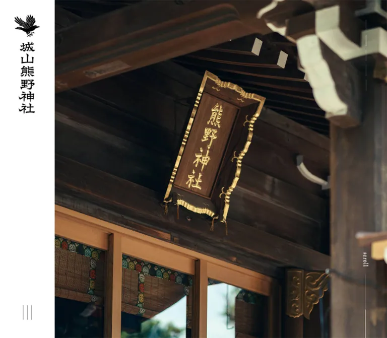
プレビュー準備中デザインリファレンスを見る
DESIGN REFERENCE
城山熊野神社オフィシャルサイト
縦書きの明朝体と大きな境内写真、豊かな白余白が印象的な神社の公式サイト。デスクトップの固定サイドナビゲーションを、モバイルでは写真上のロゴとメニューに切り替える構成。
Shiroyama Kumano Shrine — Style Reference
A quiet photographic journey framed by vertical Mincho text, white space, and a persistent shrine emblem.
Website: shiroyamakumano-jinja.jp Original URL: https://shiroyamakumano-jinja.jp/ Final URL: https://shiroyamakumano-jinja.jp/ — unchanged, HTTP 200. Theme: white editorial canvas with charcoal reservation controls and footer; natural color comes primarily from photographs. Inspected: supplied capture dated October 2, 2026, 03:01 JST; retrieval timestamp October 1, 2026, 18:01:40.254 UTC. Viewports: desktop 1440 × 1000 CSS pixels; mobile 390 × 844 CSS pixels. Scope: the current homepage, including its photographic opening, introductory narrative, news, numbered shrine and forest sections, grounds link, prayer and annual-event links, access information, and footer. Visual captures show desktop opening, an editorial section, and access/footer, plus mobile opening and footer. Rendered DOM measurements cover additional homepage sections. Linked interior pages and reservation flows were not inspected.
This is an institutional shrine website with several content destinations. Its identity comes from the relationship between photographic scale and typographic restraint: an expansive view of the shrine or surrounding landscape sits beside a narrow identity rail, while small, light Mincho text occupies deliberately spacious white fields. The bird emblem and drawn vertical wordmark carry more visual weight than the interface headings.
The desktop composition reads like a sequence of Japanese editorial spreads. Vertical headings, narrow text columns, and alternating text positions create a measured pace through the page. Mobile preserves selected vertical passages but changes longer introductory prose, access details, and footer navigation to horizontal reading. The result is an adaptation of the composition, rather than a uniformly reduced desktop layout.
閉じる
Shiroyama Kumano Shrine — Style Reference
A quiet photographic journey framed by vertical Mincho text, white space, and a persistent shrine emblem.
Website: shiroyamakumano-jinja.jp Original URL: https://shiroyamakumano-jinja.jp/ Final URL: https://shiroyamakumano-jinja.jp/ — unchanged, HTTP 200. Theme: white editorial canvas with charcoal reservation controls and footer; natural color comes primarily from photographs. Inspected: supplied capture dated October 2, 2026, 03:01 JST; retrieval timestamp October 1, 2026, 18:01:40.254 UTC. Viewports: desktop 1440 × 1000 CSS pixels; mobile 390 × 844 CSS pixels. Scope: the current homepage, including its photographic opening, introductory narrative, news, numbered shrine and forest sections, grounds link, prayer and annual-event links, access information, and footer. Visual captures show desktop opening, an editorial section, and access/footer, plus mobile opening and footer. Rendered DOM measurements cover additional homepage sections. Linked interior pages and reservation flows were not inspected.
This is an institutional shrine website with several content destinations. Its identity comes from the relationship between photographic scale and typographic restraint: an expansive view of the shrine or surrounding landscape sits beside a narrow identity rail, while small, light Mincho text occupies deliberately spacious white fields. The bird emblem and drawn vertical wordmark carry more visual weight than the interface headings.
The desktop composition reads like a sequence of Japanese editorial spreads. Vertical headings, narrow text columns, and alternating text positions create a measured pace through the page. Mobile preserves selected vertical passages but changes longer introductory prose, access details, and footer navigation to horizontal reading. The result is an adaptation of the composition, rather than a uniformly reduced desktop layout.
How to Read This Reference
- Measured means a value supplied by the rendered DOM or computed styles. All dimensions are CSS pixels unless stated otherwise.
- Calculated means arithmetic based on those measurements, such as the remaining width after subtracting the desktop rail.
- Visual estimate means an approximate dimension or appearance read from the supplied current-page screenshots. These values were not independently sampled from image pixels.
- Recommended means a reusable implementation choice, not a verified feature of the original website.
- Token names below are descriptive aliases. The supplied custom-property inventory mostly contains generic publishing-system presets; it does not establish a custom shrine design-token system.
- Element bounds can include padding, stretching, or inactive navigation structures. A tall heading box is not evidence of unusually large type, and nonzero menu geometry does not prove that the menu was open.
- The source root computes to 10px, but this reference uses explicit pixel measurements. The Quick Start keeps a conventional root size.
Tokens — Colors
Default Palette
| Name | Value | Suggested token | Evidence and role |
|---|---|---|---|
| White canvas | #ffffff |
--color-paper |
Visually observed main canvas and rail; also measured on the mobile grounds container |
| Editorial gray | #737373 |
--color-text |
Measured rgb(115, 115, 115) on narrative text, headings, news titles, access details, and many links |
| Charcoal | #222222 |
--color-charcoal |
Measured reservation-button and footer background |
| Identity black | #000000 |
--color-identity |
Measured desktop rail-link color and default body color; visually matches the dark emblem |
| Reversed white | #ffffff |
--color-on-dark |
Measured reservation labels, footer links, scroll label, and promotional-section text |
| Fine divider | Approximately #dedede |
--color-rule |
Visual estimate for the subtle rail/page boundary; a recommended approximation |
| Map loading field | Approximately #e3e3e3 |
No global token | Visual estimate of the gray area around the visible desktop map tiles; not established as an intentional brand surface |
The dominant reading color is gray, although the body’s inherited computed color is black. Use the actual component colors rather than applying the body default to every paragraph.
Footer links compute to white but look subdued in the screenshot. Ancestor opacity and compositing were not supplied, so an exact separate footer-gray token cannot be established. The Quick Start uses the measured white value.
Forest greens, weathered timber browns, stone grays, and the mobile opening’s cyan sky belong to the photography. They are not evidence of green or cyan interface accents. The vivid colors, gradients, and shadows present in generic root presets are not visibly used as this page’s design system.
Theme Presets
No selectable theme was evidenced. White content, dark footer, and white controls over photographs are contextual treatments within one visual system.
Tokens — Typography
Primary Mincho Family
- Measured family declaration:
fot-tsukuaoldmin-pr6n, sans-serif. - Measured body weight:
300. - Measured editorial-heading weight: generally
400. - Character: delicate Japanese Mincho forms, narrow strokes, and a restrained editorial presence.
- Fallback: the supplied declaration explicitly uses
sans-serif. The evidence does not establish a particular fallback font or font-file URL. - Implementation alias:
--font-editorial: 'fot-tsukuaoldmin-pr6n', sans-serif.
The emblem and vertical shrine wordmark are graphic identity elements. The empty H1’s computed 28px bold style does not describe the visible lettering; do not recreate that lettering by applying the H1 styles to ordinary text.
Writing Direction
Vertical composition is a defining visual feature. The desktop rail uses individual vertical labels stacked down the rail. Editorial sections use Japanese columns progressing from right to left. Vertical headings remain on mobile, while the introductory body and practical navigation become horizontal.
writing-mode: vertical-rl is the recommended implementation of the observed composition. The supplied property subset did not include the original writing-mode declarations. For vertical text, line height governs spacing between columns rather than spacing between horizontal rows.
Type Scale
| Role | Desktop size / line height | Mobile size / line height | Weight | Tracking |
|---|---|---|---|---|
| Default body | 14 / 21px |
14 / 21px |
300 | Normal |
| Desktop rail links | 15 / 22.5px |
Rail absent | 300 | Normal |
| Opening narrative heading | 27 / 45.9px |
23 / 39.1px |
400 | 1px |
| Introductory narrative | 18 / 36px |
15 / 30px |
300 | Desktop 1px; mobile normal |
| News section heading | 22 / 33px |
18 / 27px |
400 | 1px |
| News article title | 16 / 24px |
14 / 21px |
400 | Normal |
| Numbered editorial heading | 22 / 30.8px |
18 / 25.2px |
400 | 1px |
| Editorial subsection H3 | 16 / 24px |
15 / 15px |
400 | 1px |
| Shrine/forest description | 16 / 41.12px |
14 / 28px |
300 | 1px |
| Grounds description | 16 / 41.6px |
14 / 29.4px |
300 | 1px |
| Prayer/event title | 22 / 33px |
18 / 27px |
400 | 2px |
| Reservation label | 15 / 54px |
14 / 50px |
300 | Normal |
| Scroll label | 16 / 24px |
15 / 22.5px |
300 | 1px |
| Access heading | 20 / 30px |
16 / 24px |
400 | 1px |
| Access address/directions | 18 / 27px |
14 / 21px |
300 | Normal |
| Footer primary links | 16 / 24px |
14 / 21px |
300 | Desktop 1px; mobile 0.2px |
| Footer secondary links | 15 / 22.5px |
13 / 19.5px |
300 | Desktop 1px; mobile 0.5px |
| Footer legal line | 12 / 18px |
10 / 15px |
300 | Desktop 0.5px; mobile 0.2px |
The mobile subsection anchors report 13px while their child H3 elements report 15px. Use the child heading measurement when describing the visible label.
No large marketing-display scale is required. The largest measured editorial headline is 27px on desktop; photography and whitespace provide the scale.
Tokens — Spacing & Shapes
Density: sparse at section level, fine and compact at control level. Geometry: square photographs, rectangular reservation control, thin rules, and a small circular return-to-top symbol. Spacing model: component-specific pixel spacing. A universal 4px or 8px source grid was not established.
Spacing Scale
| Use | Desktop | Mobile | Evidence |
|---|---|---|---|
| Identity rail width | 150px |
Removed | Measured layout offset and screenshot |
| Standard inset for news/access | 120px inside the content area |
35px |
Calculated from element coordinates |
| Introductory paragraph side inset | Approximately 141px |
40px |
Desktop paragraph at x=291 within content starting x=150; mobile x=40 |
| Intro heading clearance below opening | 200px |
105px |
Calculated from main and heading coordinates |
| Intro heading bottom padding | 120px |
95px |
Measured |
| Desktop rail-label gap | 25px between label boxes |
Not applicable | Calculated from consecutive bounds |
| News column gap | Approximately 46.22px |
30px vertical gap |
Calculated |
| Reservation distance from content left | 50px |
0px |
Calculated; desktop x=200 minus rail width |
| Reservation bottom offset | 45px |
0px |
Calculated at the captured viewport |
| Footer top/bottom padding | 80 / 50px |
75 / 30px |
Measured |
| Footer legal-line left inset | 70px inside content |
35px |
Measured |
Border Radius
| Element | Observed treatment |
|---|---|
| Reservation button | Measured 0px radius |
| News links and numbered sections | Measured 0px radius on supplied containers |
| Photographs | Visually square corners |
| Footer and rail | Flat rectangular surfaces |
| Return-to-top symbol | Thin outlined circle, visually about 35px desktop and 27px mobile |
The return-to-top circle is a utility symbol, not the start of a rounded-card system.
Layout Measurements
| Element | Desktop 1440 × 1000 | Mobile 390 × 844 |
|---|---|---|
| Opening header bounds | 1440 × 1000px |
390 × 844px |
| Content after rail | 1290px wide, x=150px |
390px wide, x=0px |
| Main starts | y=1000px |
y=844px |
| Intro paragraph | 1008 × 380px |
310 × 720px |
| News link | Approximately 319.19 × 281.45px |
320 × 270.5px |
| Grounds link container | 1290 × 500px |
390 × 812px |
| Each prayer/event link | 645 × 430px |
390 × 260px |
| Footer | 1290 × 476px |
390 × 702px |
| Document height | Approximately 7769.69px |
Approximately 8320.06px |
These are captured results, not fixed heights to apply to arbitrary replacement copy. In particular, several desktop heading boxes stretch to 867px in their layout; the heading text itself remains 22px.
Components
Desktop Identity Rail
Role: persistent identity and primary navigation.
A 150px white strip occupies the entire left edge. The opening shows a black bird emblem above the large vertical shrine wordmark. The emblem is visually about 70px wide; its home-link container measures 150 × 62px at y=40. A very thin divider appears along the rail’s right edge in the scrolled captures.
The scrolled state retains the bird emblem and shows six compact vertical links: 城山熊野神社のこと, 鎮守の森, 境内, 御祈願, 年間行事, and アクセス. Their measured x-position is 67px and their text width is 15px, centering the labels within the rail. The first begins at y=248 and the last at y=703. The opening screenshot does not visibly show this full navigation stack.
A menu symbol sits near the bottom: three thin vertical strokes, visually about 24 × 40px as a group. The expanded menu was not captured. Keep the distinction between the compact rail and the larger navigation structure present in the DOM.
Mobile Identity and Menu
Role: preserve identity without consuming a permanent content column.
The opening uses a white emblem and vertical wordmark over the photograph. Its measured link sits at x=25, y=20 and is 52 × 201.92px. Three fine horizontal menu strokes appear in the upper-right corner.
In the lower-page mobile capture, the identity is reduced to a black bird emblem over the white page area, with a dark menu symbol at right. This supports a scroll-dependent change of identity treatment. The exact threshold, background-switching logic, and menu-opening transition were not exercised.
The mobile layout has no 150px reserved rail. Content begins at x=0.
Photographic Opening
Role: establish the shrine’s physical setting before introducing text.
On desktop, the photograph starts directly after the rail and fills the remaining 1290px width through the 1000px opening viewport. The supplied frame shows the shrine facade, broad roof, surrounding trees, lanterns, and visitors. There is no large advertising headline over the photograph.
The mobile frame fills the screen width with a tall view across the shrine woodland toward the city. Sky occupies the upper portion, dense vegetation fills the middle, and the shrine roof anchors the lower portion. The reservation strip covers the bottom 54px, leaving 790px of the opening photograph visible above it.
Five button elements accompany the opening. Their visible marks are extremely thin vertical lines:
- Desktop: each measured box is
1 × 31px, at x=1382, with 10px between boxes. - Mobile: each is
1 × 25px, at x=351, again separated by 10px. - Their numeric text is hidden through a measured 0px font size and transparent text color.
The screenshots and buttons support a multi-image presentation. They do not establish an autoplay interval, slide order, transition type, or whether the different desktop/mobile photographs result from timing or device-specific assets.
Scroll Cue
Role: quietly indicate that content continues below the opening.
A small white scroll label sits vertically near the right edge above a long fine line. Its font is the same editorial family, at 16px desktop and 15px mobile, with 1px tracking. The desktop label begins around y=764; the mobile label around y=665.
No motion of the line was verified. Preserve the thin visual cue without assuming that it is a progress meter or clickable control.
Reservation Control
Role: persistent access to prayer reservations.
The visible label is 御祈願ご予約はこちら, linked to /prayer/#reservation.
On desktop, it is a square-cornered charcoal rectangle measuring 227 × 54px, positioned at x=200, y=901 in the opening capture. The white text is 15px, weight 300, with a 54px line box and a small 7px left-padding adjustment. It remains in the same screen position in the supplied editorial capture.
On mobile, it becomes a bottom strip at y=790 with a 54px height and 14px type. The DOM reports a 392px width in a 390px viewport. Treat this as a source box-model detail, not a target overflow to reproduce.
The control is absent from the supplied footer captures. Its exact hiding condition is unknown. The DOM also contains duplicate reservation links, so do not interpret every measured copy as simultaneously visible.
Introductory Narrative
Role: explain the shrine’s history and relationship with its woodland.
The heading 鎮守の森に抱かれる 千年の物語。 appears below the opening, centered within the available content area. It is vertical, light, and modest in scale: 27px desktop and 23px mobile.
Desktop prose occupies a broad field of narrow vertical columns, measured as 1008 × 380px. At 18px with 36px line height, the columns have substantial breathing room. Two small related links lead to the shrine introduction and forest pages.
Mobile changes the long narrative to horizontal text in a 310px-wide block with 40px side margins. It uses 15px type and a generous 30px line height. The heading remains vertical, creating continuity without forcing a long sideways reading surface onto a phone. The two related links become horizontal and align toward the right edge below the prose.
News Teasers
Role: expose current notices without overpowering the historical narrative.
The vertical おしらせ heading is centered above three dated article links. Desktop places the links in three columns within a 1050px-wide region, with approximately 319.19px per column and 46.22px gutters.
The measured titles use 16px regular Mincho; dates and titles are part of the same linked teaser. The supplied entries concern a Setsubun festival, a purification ceremony, and New Year prayer reservations. A small centered もっと読む link leads to /news.
On mobile, the three links form one 320px-wide column, with 30px between their bounds and 14px titles. The measured link blocks allocate considerable space above the titles, but their media elements and artwork were not included in the supplied visual captures. Their exact thumbnail ratio and photographic subjects remain unverified.
Numbered Shrine and Forest Sections
Role: introduce deeper content through an editorial image/text composition.
The first section pairs 01 and 城山熊野神社のこと with five narrow subsection links and a vertical descriptive paragraph. The supplied screenshot shows a large photograph of a lantern, roof structure, timber, and surrounding foliage on the left. Its visible width is approximately 645px, from x=150 to x=795. The screenshot begins partway through the section, so the visible photograph slice is not a measurement of its complete height.
The first section’s measured desktop text sits on the right: subsection links begin between x=943 and x=1107, and the description is 198 × 298px. The second section, 02 and 鎮守の森, shifts its measured text toward the left. This establishes alternating emphasis; the second photograph’s bounds and subject are not visually documented here.
Both sections use 22px headings, 16px description text, 1px tracking, and unusually open 41.12px column spacing on desktop. Links remain unboxed and close to the narrative.
On mobile, the headings retain vertical form but move into separate positions above the later text groups. Shrine subsection labels occupy a cluster toward the right, while the vertical description occupies a 112px-wide block toward the left. Description type becomes 14px with 28px column spacing. This is a composed arrangement of small vertical groups, not simply a desktop two-column grid squeezed to fit.
Grounds Feature
Role: link to the shrine grounds with a more immersive content band.
The desktop anchor spans the entire 1290px content width and measures 500px high. Its computed background is black, with white vertical heading and descriptive text. The heading is 22px; the description is 16px with 41.6px column spacing. The underlying media was not shown in the supplied screenshot set, so its subject and overlay treatment cannot be specified.
Mobile changes the component to a 390 × 812px white container with 35px horizontal padding. A white title occupies its upper region, while the descriptive paragraph below computes to editorial gray and measures approximately 293.91 × 255px. The narrow-column proportions support a retained vertical text composition. The mobile rendered text also exposes 境内を見る.
Do not transfer the desktop white paragraph directly onto the mobile white background. The source explicitly changes the paragraph color and component structure.
Prayer and Annual-Event Links
Role: provide large, direct entry points into practical shrine information.
Desktop places two equal 645 × 430px links side by side: 05 年間行事 on the left and 04 御祈願 on the right. Both have black computed backgrounds and white 22px titles with 2px tracking. Their exact media content was not supplied.
Mobile places 04 御祈願 first and 05 年間行事 second. Each measures 390 × 260px, preserving the same 3:2 container ratio. A 5px gap separates their bounds. The title size drops to 18px.
The source DOM lists the annual-event link first, but measured mobile positions put the prayer link above it. A new implementation should keep logical reading and keyboard order consistent with the intended visible order.
Access Section
Role: connect the editorial experience to a physical visit.
Desktop groups the map area on the left and vertical shrine name, address, and walking directions on the right. The visible map field is approximately 773px wide. Only a smaller central tile region is rendered in the supplied capture; the surrounding area is gray. This is an observed rendering state, not proof of an intentionally sparse or fully loaded map design.
The text identifies the shrine at 東京都板橋区志村2丁目16-2 and describes an approximately six-minute walk from 志村三丁目駅. The shrine heading is 20px; practical text is 18px.
On mobile, these details become horizontal within 35px side insets. The heading uses 16px and the address/directions 14px. A 320 × 45px Google Mapで見る link appears below the map region, with 13px text and a fine horizontal rule visible in the capture. Its destination is present in the DOM, but the external page was not visited.
Footer
Role: provide a complete site directory and a clear tonal ending.
The footer uses measured charcoal #222222. On desktop it begins after the access section, remains offset by the 150px rail, and measures 476px high. Most navigation is concentrated on the right, with vertical primary and secondary labels. Secondary links are preceded by small separator strokes. Broad empty space remains toward the left.
The hierarchy covers shrine history and beliefs, forest information, grounds, prayers, events, news, access, questions, and contact. The legal line sits near the lower-left of the content region at x=220, using 12px text, an underlined PRIVACY POLICY link, a small divider, and the shrine copyright.
Mobile turns the same hierarchy into a horizontal, single-column directory. It begins at x=35 with 75px top padding, uses 14px primary links and 13px subordinate links, and extends to a measured 702px height. Secondary labels have a 17px indentation. The legal line reduces to 10px.
A thin circular upward-chevron symbol appears near the lower-right. Its click behavior and scrolling duration were not tested.
Expanded Navigation Structure
The DOM contains a larger directory with subsection links, shrine contact information, legal text, and another reservation link. Its desktop links use 18–20px type; mobile links use 14–16px. This structure is consistent with an expanded menu, but no open-menu screenshot or activation trace was supplied.
Use the established typography and hierarchy when designing that state. Do not present its backdrop, entrance direction, focus behavior, or exact visibility as verified original behavior.
Tokens — Motion & Interaction
| Treatment | Supplied computed value or evidence | What can be concluded |
|---|---|---|
| Header transition | 0.2s linear |
A short transition is declared; changed properties were not established |
| Most ordinary links | 0.3s ease-in-out |
Shared link-transition timing; exact hover destination styles are unknown |
| Editorial headings and intro | opacity 1s ease-in-out |
Opacity transitions are declared |
| News teaser anchors | opacity 1s ease-in-out |
Same reveal-oriented timing is available on the teaser containers |
| Mobile identity links | visibility 0.3s, opacity 0.3s linear |
Visibility and opacity changes are supported by the declared styles |
| Opening image presentation | Five narrow button elements and differing captured photographs | Multiple image states are supported; autoplay and transition mechanics are unverified |
| Persistent identity and CTA | Similar screen positions across captures | Supports persistent placement; exact position rules and activation thresholds were not supplied |
| Return-to-top symbol | Visible upward-chevron circle | Affordance is visible; action and motion were not exercised |
The supplied sampling reports animation: none on the listed elements. This does not rule out JavaScript animation, transitions, pseudo-elements, or animation on unsampled image layers. Likewise, a reported transition: all without a positive duration is not evidence of visible animation.
Capture preparation waited for finite motion and layout stability, temporarily paused perpetual animation during readiness checks, and traversed intermediate scroll positions. These procedures provide settled views, not a complete interaction recording.
Recommended motion direction: retain slow opacity changes for editorial reveals and short transitions for utility controls. Keep the photographic composition still unless additional motion evidence or a new product requirement justifies movement. Reduced-motion handling and keyboard interaction are recommendations, not verified original features.
Surfaces
| Layer | Appearance | Structural purpose |
|---|---|---|
| Page canvas | White, visually untextured | Holds large intervals of negative space |
| Desktop rail | White with black identity and a faint edge | Persistent frame independent of photographic content |
| Opening image | Full-color environmental photograph | Establishes place and atmosphere |
| Editorial sections | White with light gray Mincho text | Provides a quiet reading rhythm |
| Reservation control | Charcoal rectangle with white text | Strong, compact practical action |
| Promotional links | Black computed backing and white labels | Separates destination links from the white narrative |
| Footer | Charcoal with light directory text | Closes the page with a dense information area |
| Access map region | Pale gray with partially visible map tiles | Captured third-party content state; loading completeness uncertain |
No general shadow, glass, gradient, or raised-card system is visible. Boundaries come from image edges, color-field changes, thin rules, and whitespace.
Imagery
The supplied current-page photographs are grounded in a specific place: shrine architecture, layered woodland, stone lanterns, timber, roof eaves, visitors, and the surrounding city. The desktop opening has a broad, almost frontal architectural composition. The editorial lantern photograph uses foreground softness and layered depth. The mobile opening places a large expanse of sky above dense trees and a distant urban horizon.
The treatment feels subdued and natural, but no color-grading values, filters, or image-processing pipeline were supplied. Do not invent a universal green tint or apply a blanket dark overlay to every image.
Useful characteristics to preserve:
- Large architectural and environmental frames with meaningful detail at several depths.
- Asymmetric cropping where the composition benefits from it.
- Natural light and restrained saturation rather than bright promotional color.
- People as evidence of everyday shrine life, without turning the page into a portrait-led composition.
- Sharp rectangular image boundaries, with no decorative frames or rounded corners.
- Sufficient clear space for the emblem and fine white controls in the opening.
Observed Asset References
| Visual asset | Current-page evidence | Asset-path availability |
|---|---|---|
| Bird emblem and vertical shrine wordmark | Desktop and mobile opening captures | No original file URL supplied |
| Compact dark bird emblem | Scrolled desktop and mobile captures | No original file URL supplied |
| Shrine facade photograph | Desktop opening capture | No original file URL supplied |
| Woodland, roof, and city photograph | Mobile opening capture | No original file URL supplied |
| Lantern and roof-eave photograph | Desktop editorial capture | No original file URL supplied |
| Access map | Desktop lower-page capture | Tile sources and complete loading state not supplied |
| News and later promotional media | Layout containers present in DOM | Images, exact crops, and media URLs not supplied |
Use authorized brand and photographic assets where available. The CSS scaffold can reproduce the framing, but invented generic shrine stock imagery will not reproduce the observed composition. Image formats, intrinsic dimensions, responsive source sets, and loading priorities remain unverified.
Layout & Responsive Behavior
The measured desktop structure is a 150px rail plus a 1290px page region. The content is not constrained to a centered desktop card. Wide image sections touch the page-region boundaries, while news and practical information use interior margins.
Mobile removes the rail and lets the opening span all 390px. Standard content insets become 35px, with a slightly larger 40px inset for introductory prose. Reflow happens component by component:
| Component | Desktop | Mobile |
|---|---|---|
| Identity | Full wordmark in left rail at opening | White identity over photo; compact dark emblem farther down |
| Primary navigation | Vertical labels in persistent rail | Menu control; open state unverified |
| Reservation | Floating 227px-wide rectangle | Full-width bottom strip |
| Introductory body | Broad field of vertical columns | Horizontal paragraph block |
| News | Three columns | Three stacked links |
| Numbered editorial copy | Alternating desktop text positions | Smaller arranged vertical groups |
| Grounds | Wide dark-backed feature | Taller white component with separate text region |
| Prayer/events | Events left, prayer right | Prayer above events |
| Access | Map left, vertical details right | Horizontal details and a map link |
| Footer | Vertical directory across the right side | Horizontal stacked directory |
The opening occupies one measured viewport at both sizes. The remaining page is approximately 550px taller on mobile despite much narrower content, reflecting selective reflow rather than a simple scale factor.
Only two viewport widths were inspected. The actual media-query breakpoint, tablet behavior, landscape-phone layout, browser-chrome resizing, safe-area rules, and intermediate fluid formulas were not provided. The Quick Start’s 900px breakpoint is a recommendation.
Do’s and Don’ts
Do
- Build the desktop page around the measured 150px identity rail.
- Let real environmental photography establish scale and atmosphere.
- Keep the reading palette white, editorial gray, black, and charcoal.
- Use the measured light font weights and modest heading sizes.
- Preserve vertical Japanese composition where it is central to the visual hierarchy.
- Change lengthy mobile introduction text and practical information to horizontal reading.
- Give text and imagery large, deliberate intervals of white space.
- Keep the reservation action rectangular and visually quiet despite its persistent placement.
- Preserve the mobile prayer-before-events ordering.
- Use a dense, hierarchical footer as the page’s final dark surface.
- Distinguish visible screenshots from inactive or duplicated DOM structures.
Don’t
- Don’t replace the shrine identity artwork with generic bold Japanese text.
- Don’t introduce oversized hero slogans over the opening photograph.
- Don’t use bright green UI accents simply because the photographs contain trees.
- Don’t convert every section into a rounded card with shadows.
- Don’t force all mobile paragraphs or navigation into vertical writing.
- Don’t shrink the entire desktop composition proportionally to fit a phone.
- Don’t reproduce the measured 392px mobile CTA width as intentional horizontal overflow.
- Don’t copy the partial desktop map rendering as a finished map design.
- Don’t assume a slide interval, parallax effect, hover zoom, or menu animation from static views.
- Don’t mistake generic root presets for colors and effects visibly used on this page.
- Don’t treat tall stretched heading bounds as mandatory text heights.
Recommended Implementation Additions
These are improvements for a new implementation, not verified original features:
- Give the image-based home link an accessible shrine name and the menu button an explicit label and expanded state.
- Enlarge the very narrow slide-control hit areas while preserving the fine visible strokes. Include clear selected-state semantics.
- Keep DOM reading order aligned with the visible mobile prayer/event order.
- Provide visible keyboard focus and ensure vertical links remain understandable to assistive technology.
- Keep content visible if reveal scripts fail; apply hidden reveal states only after successful initialization.
- Respect reduced-motion preferences for opacity reveals and any implemented slideshow behavior.
- Ensure the reservation strip does not cover focused controls or final-page content. Account for safe-area insets on applicable devices.
- Provide a reliable map fallback and a usable text directions link when map tiles fail to load.
- Review the smallest legal text and low-contrast details at device scale. Increasing mobile legal text above the observed 10px is a reasonable accessibility adaptation.
- Load the licensed primary font explicitly if available; declaring its family name alone does not make the font available.
Agent Prompt Guide
Quick Color Reference
- Main page and desktop rail:
#ffffff. - Narrative text and editorial headings:
#737373. - Identity and rail labels:
#000000. - Reservation and footer:
#222222. - Text on photographs and charcoal:
#ffffff. - Fine dividers: approximately
#dedede, a recommended visual approximation. - Greens and cyan remain in photography, not in general button styling.
Overall Prompt
“Create a Japanese shrine homepage with a quiet editorial composition. At desktop width, reserve a 150px white left rail for a black bird emblem, vertical shrine identity, small vertical navigation labels, and a fine menu symbol. Fill the remaining opening viewport with a large environmental photograph. Use the declared font family fot-tsukuaoldmin-pr6n when available, light 300-weight body text, regular 400-weight headings, white backgrounds, #737373 text, and #222222 reservation and footer surfaces. Follow the opening with a centered vertical headline, spacious narrative, three dated news teasers, numbered shrine and forest sections, large practical destination links, access information, and a dark directory footer. On mobile, remove the rail, place a white identity over the opening image, retain selected vertical headings, change long introduction text to horizontal reading, stack news, and make the reservation control a 54px bottom strip. Keep corners square and avoid shadows. Treat animation and image selection as separate implementation decisions.”
Example Component Prompts
- Identity rail: “A fixed 150px white desktop rail with a centered black bird emblem near the top, a graphic vertical shrine wordmark for the opening, and 15px light vertical Japanese navigation labels in the scrolled state. Use a fine right divider and three thin vertical menu strokes near the bottom.”
- Editorial section: “A large rectangular shrine-detail photograph beside a sparse white text field. Place a small numbered vertical heading at the outside edge, narrow vertical subsection links nearby, and a short 16px Mincho paragraph with roughly 41px between columns. Use gray text and ample empty space.”
- Reservation action: “A square charcoal button labeled
御祈願ご予約はこちら, with fine white Mincho text. Desktop size 227 × 54px, 50px inside the content edge and 45px above the viewport bottom. Mobile becomes a 54px full-width strip.” - Responsive narrative: “Keep a modest vertical Japanese heading on both devices. Present desktop prose as widely spaced vertical columns, but use 15px horizontal prose with 30px line height and 40px side margins on a 390px phone.”
- Footer: “A flat
#222222directory footer with delicate light text. Desktop uses right-aligned groups of vertical links and an understated legal line at lower left. Mobile uses a single horizontal-reading column with 35px margins, indented subordinate links, and a fine circular upward-chevron control.”
Quick Start
CSS Custom Properties
This is a reusable scaffold, not recovered source code. It reproduces the measured palette, principal dimensions, type hierarchy, and responsive direction. The 900px breakpoint, media ratios for unmeasured editorial/news images, focus styles, safe-area handling, and enlarged pager targets are recommendations.
Expected structure: a .site-rail beside .site-page; the latter contains .hero, narrative sections, and .site-footer. Supply authorized images as ordinary image elements. Apply data-past-hero to the body when the compact identity should appear, and optionally data-footer-visible when the reservation strip should leave the footer unobstructed. Those state changes, menu behavior, and slideshow logic require separate JavaScript; they are not implemented by this CSS.
:root {
  /* Measured colors and declared font family */
  --color-paper: #fff;
  --color-text: #737373;
  --color-identity: #000;
  --color-charcoal: #222;
  --color-on-dark: #fff;
  --font-editorial: 'fot-tsukuaoldmin-pr6n', sans-serif;
  --weight-body: 300;
  --weight-heading: 400;

  /* Divider is a visual approximation */
  --color-rule: #dedede;
  --rail-width: 150px;
  --content-inset: 120px;
  --mobile-inset: 35px;
  --reservation-height: 54px;
  --tracking-editorial: 1px;
  --motion-link: 300ms ease-in-out;
  --motion-reveal: 1000ms ease-in-out;
  --safe-bottom: env(safe-area-inset-bottom, 0px);
}

* { box-sizing: border-box; }
html { scroll-padding-block-end: 70px; }
body {
  margin: 0;
  color: var(--color-text);
  background: var(--color-paper);
  font-family: var(--font-editorial);
  font-size: 14px;
  font-weight: var(--weight-body);
  line-height: 1.5;
}
a { color: inherit; text-decoration: none; }
button { font: inherit; }
img { display: block; max-width: 100%; }
h1, h2, h3, p { margin: 0; }
h2, h3 { font-weight: var(--weight-heading); }

.site-page { margin-left: var(--rail-width); }
.site-rail {
  position: fixed;
  inset: 0 auto 0 0;
  z-index: 40;
  width: var(--rail-width);
  background: var(--color-paper);
  border-right: 1px solid var(--color-rule);
  color: var(--color-identity);
}
.rail-brand {
  display: grid;
  justify-items: center;
  gap: 12px;
  margin-top: 40px;
}
.rail-brand__crest { width: 70px; height: auto; }
.rail-brand__wordmark { width: 45px; height: auto; }
.rail-nav {
  position: absolute;
  top: 248px;
  left: 0;
  display: flex;
  width: 100%;
  flex-direction: column;
  align-items: center;
  gap: 25px;
  visibility: hidden;
  opacity: 0;
}
.rail-nav a {
  writing-mode: vertical-rl;
  font-size: 15px;
  line-height: 1.5;
}
body[data-past-hero] .rail-brand__wordmark { display: none; }
body[data-past-hero] .rail-nav { visibility: visible; opacity: 1; }

.menu-button {
  display: grid;
  place-items: center;
  width: 44px;
  height: 44px;
  padding: 0;
  border: 0;
  color: inherit;
  background: transparent;
  cursor: pointer;
}
.menu-strokes { display: grid; gap: 6px; width: 30px; }
.menu-strokes span { height: 1px; background: currentColor; }
.rail-menu {
  position: absolute;
  bottom: 45px;
  left: 50%;
  transform: translateX(-50%);
}
.rail-menu .menu-strokes { width: 40px; gap: 10px; transform: rotate(90deg); }
.mobile-brand, .mobile-menu { display: none; }

.hero { position: relative; height: 100vh; height: 100svh; }
.hero__image {
  position: absolute;
  inset: 0;
  width: 100%;
  height: 100%;
  object-fit: cover;
  object-position: var(--hero-position, 50% 50%);
}
.hero-index {
  position: absolute;
  top: 48px;
  right: 35px;
  display: grid;
}
/* Enlarged targets intentionally change the measured pager pitch. */
.hero-index button {
  display: grid;
  place-items: center;
  width: 44px;
  height: 44px;
  padding: 0;
  border: 0;
  background: transparent;
  color: #fff;
  cursor: pointer;
}
.hero-index button::before {
  content: '';
  width: 1px;
  height: 31px;
  background: currentColor;
  opacity: 0.35;
}
.hero-index button[aria-current='true']::before { opacity: 1; }
.hero-scroll {
  position: absolute;
  right: 46px;
  bottom: 0;
  display: flex;
  flex-direction: column;
  align-items: center;
  gap: 12px;
  color: #fff;
  font-size: 16px;
  letter-spacing: 1px;
}
.hero-scroll span { writing-mode: vertical-rl; }
.hero-scroll::after { content: ''; width: 1px; height: 184px; background: currentColor; }
.reservation {
  position: fixed;
  z-index: 50;
  left: calc(var(--rail-width) + 50px);
  bottom: 45px;
  display: grid;
  place-items: center;
  width: 227px;
  min-height: var(--reservation-height);
  padding-left: 7px;
  background: var(--color-charcoal);
  color: var(--color-on-dark);
  font-size: 15px;
  border-radius: 0;
}
body[data-footer-visible] .reservation { visibility: hidden; }

.story { padding: 200px var(--content-inset) 0; }
.story-title {
  width: max-content;
  margin-inline: auto;
  padding-bottom: 120px;
  writing-mode: vertical-rl;
  font-size: 27px;
  line-height: 1.7;
  letter-spacing: 1px;
}
.story-copy {
  max-width: 100%;
  height: 380px;
  margin-inline: auto;
  writing-mode: vertical-rl;
  font-size: 18px;
  line-height: 2;
  letter-spacing: 1px;
}
.section-heading {
  width: max-content;
  margin-inline: auto;
  writing-mode: vertical-rl;
  font-size: 22px;
  line-height: 1.5;
  letter-spacing: 1px;
}
.news { margin: 320px var(--content-inset) 0; }
.news-grid {
  display: grid;
  grid-template-columns: repeat(3, minmax(0, 1fr));
  gap: 46.22px;
  margin-top: 80px;
}
/* Suggested ratio; original news media bounds were not supplied. */
.news-card__media { width: 100%; aspect-ratio: 3 / 2; object-fit: cover; }
.news-card__date { display: block; margin-top: 16px; }
.news-card__title { margin-top: 6px; font-size: 16px; line-height: 1.5; }
.news-more { display: block; width: max-content; margin: 96px auto 0; font-size: 16px; }

.editorial {
  display: grid;
  grid-template-columns: repeat(2, minmax(0, 1fr));
  margin-top: 320px;
}
/* Suggested ratio; replace after checking the supplied project assets. */
.editorial__media { aspect-ratio: 3 / 4; }
.editorial__media img { width: 100%; height: 100%; object-fit: cover; }
.editorial__text {
  display: flex;
  flex-direction: row-reverse;
  align-items: flex-start;
  justify-content: center;
  gap: 60px;
  padding: 60px 35px;
}
.editorial__title { writing-mode: vertical-rl; font-size: 22px; line-height: 1.4; letter-spacing: 1px; }
.editorial__links { display: flex; flex-direction: row-reverse; gap: 16px; }
.editorial__links a { writing-mode: vertical-rl; font-size: 16px; letter-spacing: 1px; }
.editorial__copy {
  margin-top: 80px;
  height: 300px;
  writing-mode: vertical-rl;
  font-size: 16px;
  line-height: 2.57;
  letter-spacing: 1px;
}

/* Put prayer before events in the HTML for logical mobile order. */
.service-links { display: flex; flex-direction: row-reverse; }
.service-link {
  position: relative;
  display: grid;
  place-items: center;
  flex: 1;
  aspect-ratio: 3 / 2;
  color: #fff;
  background: #000;
}
.service-link img { position: absolute; inset: 0; width: 100%; height: 100%; object-fit: cover; }
.service-link h2 { position: relative; writing-mode: vertical-rl; font-size: 22px; line-height: 1.5; letter-spacing: 2px; }
.access { margin: 200px var(--content-inset) 120px; }
.access-layout { display: grid; grid-template-columns: minmax(0, 1fr) auto; gap: 100px; }
.access-details { writing-mode: vertical-rl; font-size: 18px; line-height: 1.5; }
.access-details h3 { font-size: 20px; letter-spacing: 1px; }
.access-details p { margin-block-start: 30px; }
.map-link { display: none; }

.site-footer { padding: 80px 70px 50px; color: #fff; background: var(--color-charcoal); }
.footer-directory { display: flex; flex-direction: row-reverse; gap: 24px; }
.footer-group { display: flex; flex-direction: row-reverse; gap: 0; }
.footer-heading { writing-mode: vertical-rl; font-size: 16px; letter-spacing: 1px; }
.footer-group ul { display: flex; flex-direction: row-reverse; list-style: none; margin: 0; padding: 0; }
.footer-group li { width: 35px; padding-top: 31px; }
.footer-group a { writing-mode: vertical-rl; font-size: 15px; letter-spacing: 1px; }
.footer-legal { margin-top: 170px; font-size: 12px; line-height: 1.5; letter-spacing: 0.5px; }
.footer-legal a { text-decoration: underline; text-underline-offset: 3px; }

/* Recommended interaction enhancements */
a, button { transition: opacity var(--motion-link); }
:focus-visible { outline: 2px solid currentColor; outline-offset: 5px; }
[data-reveal] { opacity: 1; transition: opacity var(--motion-reveal); }
.js-reveals [data-reveal]:not(.is-visible) { opacity: 0; }

/* Recommended breakpoint; the original breakpoint was not supplied. */
@media (max-width: 900px) {
  .site-rail { display: none; }
  .site-page { margin-left: 0; }
  .mobile-brand { display: block; position: absolute; z-index: 40; top: 20px; left: 25px; width: 52px; }
  .mobile-brand__crest { display: none; }
  .mobile-menu { display: grid; position: fixed; z-index: 60; top: 16px; right: 17px; color: #fff; }
  body[data-past-hero] .mobile-brand { position: fixed; }
  body[data-past-hero] .mobile-brand__full { display: none; }
  body[data-past-hero] .mobile-brand__crest { display: block; }
  body[data-past-hero] .mobile-menu { color: #000; }
  .hero-index { top: 75px; right: 16px; }
  .hero-index button::before { height: 25px; }
  .hero-scroll { right: 26px; bottom: 54px; font-size: 15px; }
  .hero-scroll::after { height: 75px; }
  .reservation {
    left: 0;
    right: 0;
    bottom: 0;
    width: auto;
    min-height: calc(54px + var(--safe-bottom));
    padding: 0 16px var(--safe-bottom);
    font-size: 14px;
  }
  .story { padding: 105px 40px 0; }
  .story-title { padding-bottom: 95px; font-size: 23px; }
  .story-copy { height: auto; writing-mode: horizontal-tb; font-size: 15px; line-height: 2; letter-spacing: normal; }
  .section-heading { font-size: 18px; }
  .news { margin: 180px 35px 0; }
  .news-grid { grid-template-columns: 1fr; gap: 30px; margin-top: 45px; }
  .news-card__title, .news-more { font-size: 14px; }
  .news-more { margin-top: 60px; }
  .editorial { grid-template-columns: 1fr; margin-top: 200px; }
  .editorial__text { padding: 45px 35px; gap: 28px; }
  .editorial__title { font-size: 18px; }
  .editorial__links { gap: 10px; }
  .editorial__links a { font-size: 15px; }
  .editorial__copy { margin-top: 43px; height: 280px; font-size: 14px; line-height: 2; }
  .service-links { flex-direction: column; gap: 5px; }
  .service-link { flex: none; width: 100%; }
  .service-link h2 { font-size: 18px; }
  .access { margin: 100px 35px; }
  .access-layout { display: flex; flex-direction: column; gap: 35px; }
  .access-details { order: -1; writing-mode: horizontal-tb; font-size: 14px; }
  .access-details h3 { font-size: 16px; }
  .access-details p { margin-block-start: 12px; }
  .map-link { display: block; min-height: 45px; margin-top: 24px; border-bottom: 1px solid var(--color-rule); text-align: center; font-size: 13px; line-height: 43px; }
  .site-footer { padding: 75px 35px 30px; }
  .footer-directory, .footer-group, .footer-group ul { display: block; }
  .footer-group + .footer-group { margin-top: 30px; }
  .footer-heading { writing-mode: horizontal-tb; font-size: 14px; letter-spacing: 0.2px; }
  .footer-group ul { margin-top: 10px; }
  .footer-group li { width: auto; padding: 0 0 3px 17px; }
  .footer-group a { writing-mode: horizontal-tb; font-size: 13px; line-height: 1.5; letter-spacing: 0.5px; }
  .footer-legal { margin-top: 76px; font-size: 10px; letter-spacing: 0.2px; }
}

@media (prefers-reduced-motion: reduce) {
  a, button, [data-reveal] { transition: none; }
  .js-reveals [data-reveal]:not(.is-visible) { opacity: 1; }
}
The original numbered-section positioning is more specialized than the generic editorial grid above. Use the measured coordinates and screenshot composition to refine those sections after real text and image assets are available. The scaffold deliberately leaves unverified grounds media, map embedding, menu overlays, and slideshow transitions to explicit implementation decisions.
Tailwind v4 Token Mapping
Optional aliases for a project already using Tailwind v4. This does not imply that the original site uses Tailwind. Retain the component CSS for vertical writing and state-dependent layout.
@theme {
  --color-paper: #ffffff;
  --color-editorial: #737373;
  --color-charcoal: #222222;
  --color-identity: #000000;
  --color-rule: #dedede;

  --font-editorial: 'fot-tsukuaoldmin-pr6n', sans-serif;

  --text-caption: 12px;
  --text-mobile-body: 15px;
  --text-editorial-body: 16px;
  --text-section: 22px;
  --text-intro: 27px;

  --spacing-rail: 150px;
  --spacing-page-inset: 120px;
  --spacing-mobile-inset: 35px;
  --spacing-reservation: 54px;

  --radius-flat: 0px;
}
Sources & Evidence
- Inspected original and final website: Shiroyama Kumano Shrine. Both supplied URLs are identical; the response status is 200 and the rendered title is
城山熊野神社オフィシャルサイト. - Capture timestamp: October 1, 2026, 18:01:40.254 UTC, corresponding to October 2, 2026, 03:01:40.254 JST.
- Desktop evidence: supplied 1440 × 1000 captures of the opening, an editorial section, and access/footer, plus rendered element bounds, computed typography, colors, transitions, links, and document height.
- Mobile evidence: supplied 390 × 844 captures of the opening and lower access/footer region, plus corresponding rendered DOM and computed-style measurements.
- Observed navigation evidence: homepage scrolling and links in the supplied DOM. Interior pages, external map destinations, menu activation, reservation completion, hover states, keyboard behavior, and return-to-top activation were not tested.
- Capture limitations: readiness checks waited for finite animation, stable layout/text, and visible-image decoding within bounded limits. Perpetual animation was temporarily paused during checks and then resumed. SharedWorkers and service workers were disabled. These conditions do not prove complete map loading, delayed-content completion, or slideshow timing.
- Analysis boundary: this document was produced from the supplied current-page evidence without additional browsing or file inspection. All estimates and recommended implementation choices are identified separately from measured values.
# Shiroyama Kumano Shrine — Style Reference

> A quiet photographic journey framed by vertical Mincho text, white space, and a persistent shrine emblem.

**Website:** [shiroyamakumano-jinja.jp](https://shiroyamakumano-jinja.jp/)
**Original URL:** https://shiroyamakumano-jinja.jp/
**Final URL:** https://shiroyamakumano-jinja.jp/ — unchanged, HTTP 200.
**Theme:** white editorial canvas with charcoal reservation controls and footer; natural color comes primarily from photographs.
**Inspected:** supplied capture dated October 2, 2026, 03:01 JST; retrieval timestamp October 1, 2026, 18:01:40.254 UTC.
**Viewports:** desktop 1440 × 1000 CSS pixels; mobile 390 × 844 CSS pixels.
**Scope:** the current homepage, including its photographic opening, introductory narrative, news, numbered shrine and forest sections, grounds link, prayer and annual-event links, access information, and footer. Visual captures show desktop opening, an editorial section, and access/footer, plus mobile opening and footer. Rendered DOM measurements cover additional homepage sections. Linked interior pages and reservation flows were not inspected.

This is an institutional shrine website with several content destinations. Its identity comes from the relationship between photographic scale and typographic restraint: an expansive view of the shrine or surrounding landscape sits beside a narrow identity rail, while small, light Mincho text occupies deliberately spacious white fields. The bird emblem and drawn vertical wordmark carry more visual weight than the interface headings.

The desktop composition reads like a sequence of Japanese editorial spreads. Vertical headings, narrow text columns, and alternating text positions create a measured pace through the page. Mobile preserves selected vertical passages but changes longer introductory prose, access details, and footer navigation to horizontal reading. The result is an adaptation of the composition, rather than a uniformly reduced desktop layout.
閉じる
# Shiroyama Kumano Shrine — Style Reference

> A quiet photographic journey framed by vertical Mincho text, white space, and a persistent shrine emblem.

**Website:** [shiroyamakumano-jinja.jp](https://shiroyamakumano-jinja.jp/)
**Original URL:** https://shiroyamakumano-jinja.jp/
**Final URL:** https://shiroyamakumano-jinja.jp/ — unchanged, HTTP 200.
**Theme:** white editorial canvas with charcoal reservation controls and footer; natural color comes primarily from photographs.
**Inspected:** supplied capture dated October 2, 2026, 03:01 JST; retrieval timestamp October 1, 2026, 18:01:40.254 UTC.
**Viewports:** desktop 1440 × 1000 CSS pixels; mobile 390 × 844 CSS pixels.
**Scope:** the current homepage, including its photographic opening, introductory narrative, news, numbered shrine and forest sections, grounds link, prayer and annual-event links, access information, and footer. Visual captures show desktop opening, an editorial section, and access/footer, plus mobile opening and footer. Rendered DOM measurements cover additional homepage sections. Linked interior pages and reservation flows were not inspected.

This is an institutional shrine website with several content destinations. Its identity comes from the relationship between photographic scale and typographic restraint: an expansive view of the shrine or surrounding landscape sits beside a narrow identity rail, while small, light Mincho text occupies deliberately spacious white fields. The bird emblem and drawn vertical wordmark carry more visual weight than the interface headings.

The desktop composition reads like a sequence of Japanese editorial spreads. Vertical headings, narrow text columns, and alternating text positions create a measured pace through the page. Mobile preserves selected vertical passages but changes longer introductory prose, access details, and footer navigation to horizontal reading. The result is an adaptation of the composition, rather than a uniformly reduced desktop layout.

## How to Read This Reference

- **Measured** means a value supplied by the rendered DOM or computed styles. All dimensions are CSS pixels unless stated otherwise.
- **Calculated** means arithmetic based on those measurements, such as the remaining width after subtracting the desktop rail.
- **Visual estimate** means an approximate dimension or appearance read from the supplied current-page screenshots. These values were not independently sampled from image pixels.
- **Recommended** means a reusable implementation choice, not a verified feature of the original website.
- Token names below are descriptive aliases. The supplied custom-property inventory mostly contains generic publishing-system presets; it does not establish a custom shrine design-token system.
- Element bounds can include padding, stretching, or inactive navigation structures. A tall heading box is not evidence of unusually large type, and nonzero menu geometry does not prove that the menu was open.
- The source root computes to 10px, but this reference uses explicit pixel measurements. The Quick Start keeps a conventional root size.

## Tokens — Colors

### Default Palette

| Name | Value | Suggested token | Evidence and role |
| --- | --- | --- | --- |
| White canvas | `#ffffff` | `--color-paper` | Visually observed main canvas and rail; also measured on the mobile grounds container |
| Editorial gray | `#737373` | `--color-text` | Measured `rgb(115, 115, 115)` on narrative text, headings, news titles, access details, and many links |
| Charcoal | `#222222` | `--color-charcoal` | Measured reservation-button and footer background |
| Identity black | `#000000` | `--color-identity` | Measured desktop rail-link color and default body color; visually matches the dark emblem |
| Reversed white | `#ffffff` | `--color-on-dark` | Measured reservation labels, footer links, scroll label, and promotional-section text |
| Fine divider | Approximately `#dedede` | `--color-rule` | Visual estimate for the subtle rail/page boundary; a recommended approximation |
| Map loading field | Approximately `#e3e3e3` | No global token | Visual estimate of the gray area around the visible desktop map tiles; not established as an intentional brand surface |

The dominant reading color is gray, although the body’s inherited computed color is black. Use the actual component colors rather than applying the body default to every paragraph.

Footer links compute to white but look subdued in the screenshot. Ancestor opacity and compositing were not supplied, so an exact separate footer-gray token cannot be established. The Quick Start uses the measured white value.

Forest greens, weathered timber browns, stone grays, and the mobile opening’s cyan sky belong to the photography. They are not evidence of green or cyan interface accents. The vivid colors, gradients, and shadows present in generic root presets are not visibly used as this page’s design system.

### Theme Presets

No selectable theme was evidenced. White content, dark footer, and white controls over photographs are contextual treatments within one visual system.

## Tokens — Typography

### Primary Mincho Family

- **Measured family declaration:** `fot-tsukuaoldmin-pr6n, sans-serif`.
- **Measured body weight:** `300`.
- **Measured editorial-heading weight:** generally `400`.
- **Character:** delicate Japanese Mincho forms, narrow strokes, and a restrained editorial presence.
- **Fallback:** the supplied declaration explicitly uses `sans-serif`. The evidence does not establish a particular fallback font or font-file URL.
- **Implementation alias:** `--font-editorial: 'fot-tsukuaoldmin-pr6n', sans-serif`.

The emblem and vertical shrine wordmark are graphic identity elements. The empty H1’s computed 28px bold style does not describe the visible lettering; do not recreate that lettering by applying the H1 styles to ordinary text.

### Writing Direction

Vertical composition is a defining visual feature. The desktop rail uses individual vertical labels stacked down the rail. Editorial sections use Japanese columns progressing from right to left. Vertical headings remain on mobile, while the introductory body and practical navigation become horizontal.

`writing-mode: vertical-rl` is the recommended implementation of the observed composition. The supplied property subset did not include the original `writing-mode` declarations. For vertical text, line height governs spacing between columns rather than spacing between horizontal rows.

### Type Scale

| Role | Desktop size / line height | Mobile size / line height | Weight | Tracking |
| --- | --- | --- | --- | --- |
| Default body | `14 / 21px` | `14 / 21px` | 300 | Normal |
| Desktop rail links | `15 / 22.5px` | Rail absent | 300 | Normal |
| Opening narrative heading | `27 / 45.9px` | `23 / 39.1px` | 400 | `1px` |
| Introductory narrative | `18 / 36px` | `15 / 30px` | 300 | Desktop `1px`; mobile normal |
| News section heading | `22 / 33px` | `18 / 27px` | 400 | `1px` |
| News article title | `16 / 24px` | `14 / 21px` | 400 | Normal |
| Numbered editorial heading | `22 / 30.8px` | `18 / 25.2px` | 400 | `1px` |
| Editorial subsection H3 | `16 / 24px` | `15 / 15px` | 400 | `1px` |
| Shrine/forest description | `16 / 41.12px` | `14 / 28px` | 300 | `1px` |
| Grounds description | `16 / 41.6px` | `14 / 29.4px` | 300 | `1px` |
| Prayer/event title | `22 / 33px` | `18 / 27px` | 400 | `2px` |
| Reservation label | `15 / 54px` | `14 / 50px` | 300 | Normal |
| Scroll label | `16 / 24px` | `15 / 22.5px` | 300 | `1px` |
| Access heading | `20 / 30px` | `16 / 24px` | 400 | `1px` |
| Access address/directions | `18 / 27px` | `14 / 21px` | 300 | Normal |
| Footer primary links | `16 / 24px` | `14 / 21px` | 300 | Desktop `1px`; mobile `0.2px` |
| Footer secondary links | `15 / 22.5px` | `13 / 19.5px` | 300 | Desktop `1px`; mobile `0.5px` |
| Footer legal line | `12 / 18px` | `10 / 15px` | 300 | Desktop `0.5px`; mobile `0.2px` |

The mobile subsection anchors report 13px while their child H3 elements report 15px. Use the child heading measurement when describing the visible label.

No large marketing-display scale is required. The largest measured editorial headline is 27px on desktop; photography and whitespace provide the scale.

## Tokens — Spacing & Shapes

**Density:** sparse at section level, fine and compact at control level.
**Geometry:** square photographs, rectangular reservation control, thin rules, and a small circular return-to-top symbol.
**Spacing model:** component-specific pixel spacing. A universal 4px or 8px source grid was not established.

### Spacing Scale

| Use | Desktop | Mobile | Evidence |
| --- | --- | --- | --- |
| Identity rail width | `150px` | Removed | Measured layout offset and screenshot |
| Standard inset for news/access | `120px` inside the content area | `35px` | Calculated from element coordinates |
| Introductory paragraph side inset | Approximately `141px` | `40px` | Desktop paragraph at x=291 within content starting x=150; mobile x=40 |
| Intro heading clearance below opening | `200px` | `105px` | Calculated from main and heading coordinates |
| Intro heading bottom padding | `120px` | `95px` | Measured |
| Desktop rail-label gap | `25px` between label boxes | Not applicable | Calculated from consecutive bounds |
| News column gap | Approximately `46.22px` | `30px` vertical gap | Calculated |
| Reservation distance from content left | `50px` | `0px` | Calculated; desktop x=200 minus rail width |
| Reservation bottom offset | `45px` | `0px` | Calculated at the captured viewport |
| Footer top/bottom padding | `80 / 50px` | `75 / 30px` | Measured |
| Footer legal-line left inset | `70px` inside content | `35px` | Measured |

### Border Radius

| Element | Observed treatment |
| --- | --- |
| Reservation button | Measured `0px` radius |
| News links and numbered sections | Measured `0px` radius on supplied containers |
| Photographs | Visually square corners |
| Footer and rail | Flat rectangular surfaces |
| Return-to-top symbol | Thin outlined circle, visually about 35px desktop and 27px mobile |

The return-to-top circle is a utility symbol, not the start of a rounded-card system.

### Layout Measurements

| Element | Desktop 1440 × 1000 | Mobile 390 × 844 |
| --- | --- | --- |
| Opening header bounds | `1440 × 1000px` | `390 × 844px` |
| Content after rail | `1290px` wide, x=`150px` | `390px` wide, x=`0px` |
| Main starts | y=`1000px` | y=`844px` |
| Intro paragraph | `1008 × 380px` | `310 × 720px` |
| News link | Approximately `319.19 × 281.45px` | `320 × 270.5px` |
| Grounds link container | `1290 × 500px` | `390 × 812px` |
| Each prayer/event link | `645 × 430px` | `390 × 260px` |
| Footer | `1290 × 476px` | `390 × 702px` |
| Document height | Approximately `7769.69px` | Approximately `8320.06px` |

These are captured results, not fixed heights to apply to arbitrary replacement copy. In particular, several desktop heading boxes stretch to 867px in their layout; the heading text itself remains 22px.

## Components

### Desktop Identity Rail

**Role:** persistent identity and primary navigation.

A 150px white strip occupies the entire left edge. The opening shows a black bird emblem above the large vertical shrine wordmark. The emblem is visually about 70px wide; its home-link container measures 150 × 62px at y=40. A very thin divider appears along the rail’s right edge in the scrolled captures.

The scrolled state retains the bird emblem and shows six compact vertical links: `城山熊野神社のこと`, `鎮守の森`, `境内`, `御祈願`, `年間行事`, and `アクセス`. Their measured x-position is 67px and their text width is 15px, centering the labels within the rail. The first begins at y=248 and the last at y=703. The opening screenshot does not visibly show this full navigation stack.

A menu symbol sits near the bottom: three thin vertical strokes, visually about 24 × 40px as a group. The expanded menu was not captured. Keep the distinction between the compact rail and the larger navigation structure present in the DOM.

### Mobile Identity and Menu

**Role:** preserve identity without consuming a permanent content column.

The opening uses a white emblem and vertical wordmark over the photograph. Its measured link sits at x=25, y=20 and is 52 × 201.92px. Three fine horizontal menu strokes appear in the upper-right corner.

In the lower-page mobile capture, the identity is reduced to a black bird emblem over the white page area, with a dark menu symbol at right. This supports a scroll-dependent change of identity treatment. The exact threshold, background-switching logic, and menu-opening transition were not exercised.

The mobile layout has no 150px reserved rail. Content begins at x=0.

### Photographic Opening

**Role:** establish the shrine’s physical setting before introducing text.

On desktop, the photograph starts directly after the rail and fills the remaining 1290px width through the 1000px opening viewport. The supplied frame shows the shrine facade, broad roof, surrounding trees, lanterns, and visitors. There is no large advertising headline over the photograph.

The mobile frame fills the screen width with a tall view across the shrine woodland toward the city. Sky occupies the upper portion, dense vegetation fills the middle, and the shrine roof anchors the lower portion. The reservation strip covers the bottom 54px, leaving 790px of the opening photograph visible above it.

Five button elements accompany the opening. Their visible marks are extremely thin vertical lines:

- Desktop: each measured box is `1 × 31px`, at x=1382, with 10px between boxes.
- Mobile: each is `1 × 25px`, at x=351, again separated by 10px.
- Their numeric text is hidden through a measured 0px font size and transparent text color.

The screenshots and buttons support a multi-image presentation. They do not establish an autoplay interval, slide order, transition type, or whether the different desktop/mobile photographs result from timing or device-specific assets.

### Scroll Cue

**Role:** quietly indicate that content continues below the opening.

A small white `scroll` label sits vertically near the right edge above a long fine line. Its font is the same editorial family, at 16px desktop and 15px mobile, with 1px tracking. The desktop label begins around y=764; the mobile label around y=665.

No motion of the line was verified. Preserve the thin visual cue without assuming that it is a progress meter or clickable control.

### Reservation Control

**Role:** persistent access to prayer reservations.

The visible label is `御祈願ご予約はこちら`, linked to `/prayer/#reservation`.

On desktop, it is a square-cornered charcoal rectangle measuring 227 × 54px, positioned at x=200, y=901 in the opening capture. The white text is 15px, weight 300, with a 54px line box and a small 7px left-padding adjustment. It remains in the same screen position in the supplied editorial capture.

On mobile, it becomes a bottom strip at y=790 with a 54px height and 14px type. The DOM reports a 392px width in a 390px viewport. Treat this as a source box-model detail, not a target overflow to reproduce.

The control is absent from the supplied footer captures. Its exact hiding condition is unknown. The DOM also contains duplicate reservation links, so do not interpret every measured copy as simultaneously visible.

### Introductory Narrative

**Role:** explain the shrine’s history and relationship with its woodland.

The heading `鎮守の森に抱かれる 千年の物語。` appears below the opening, centered within the available content area. It is vertical, light, and modest in scale: 27px desktop and 23px mobile.

Desktop prose occupies a broad field of narrow vertical columns, measured as 1008 × 380px. At 18px with 36px line height, the columns have substantial breathing room. Two small related links lead to the shrine introduction and forest pages.

Mobile changes the long narrative to horizontal text in a 310px-wide block with 40px side margins. It uses 15px type and a generous 30px line height. The heading remains vertical, creating continuity without forcing a long sideways reading surface onto a phone. The two related links become horizontal and align toward the right edge below the prose.

### News Teasers

**Role:** expose current notices without overpowering the historical narrative.

The vertical `おしらせ` heading is centered above three dated article links. Desktop places the links in three columns within a 1050px-wide region, with approximately 319.19px per column and 46.22px gutters.

The measured titles use 16px regular Mincho; dates and titles are part of the same linked teaser. The supplied entries concern a Setsubun festival, a purification ceremony, and New Year prayer reservations. A small centered `もっと読む` link leads to `/news`.

On mobile, the three links form one 320px-wide column, with 30px between their bounds and 14px titles. The measured link blocks allocate considerable space above the titles, but their media elements and artwork were not included in the supplied visual captures. Their exact thumbnail ratio and photographic subjects remain unverified.

### Numbered Shrine and Forest Sections

**Role:** introduce deeper content through an editorial image/text composition.

The first section pairs `01` and `城山熊野神社のこと` with five narrow subsection links and a vertical descriptive paragraph. The supplied screenshot shows a large photograph of a lantern, roof structure, timber, and surrounding foliage on the left. Its visible width is approximately 645px, from x=150 to x=795. The screenshot begins partway through the section, so the visible photograph slice is not a measurement of its complete height.

The first section’s measured desktop text sits on the right: subsection links begin between x=943 and x=1107, and the description is 198 × 298px. The second section, `02` and `鎮守の森`, shifts its measured text toward the left. This establishes alternating emphasis; the second photograph’s bounds and subject are not visually documented here.

Both sections use 22px headings, 16px description text, 1px tracking, and unusually open 41.12px column spacing on desktop. Links remain unboxed and close to the narrative.

On mobile, the headings retain vertical form but move into separate positions above the later text groups. Shrine subsection labels occupy a cluster toward the right, while the vertical description occupies a 112px-wide block toward the left. Description type becomes 14px with 28px column spacing. This is a composed arrangement of small vertical groups, not simply a desktop two-column grid squeezed to fit.

### Grounds Feature

**Role:** link to the shrine grounds with a more immersive content band.

The desktop anchor spans the entire 1290px content width and measures 500px high. Its computed background is black, with white vertical heading and descriptive text. The heading is 22px; the description is 16px with 41.6px column spacing. The underlying media was not shown in the supplied screenshot set, so its subject and overlay treatment cannot be specified.

Mobile changes the component to a 390 × 812px white container with 35px horizontal padding. A white title occupies its upper region, while the descriptive paragraph below computes to editorial gray and measures approximately 293.91 × 255px. The narrow-column proportions support a retained vertical text composition. The mobile rendered text also exposes `境内を見る`.

Do not transfer the desktop white paragraph directly onto the mobile white background. The source explicitly changes the paragraph color and component structure.

### Prayer and Annual-Event Links

**Role:** provide large, direct entry points into practical shrine information.

Desktop places two equal 645 × 430px links side by side: `05 年間行事` on the left and `04 御祈願` on the right. Both have black computed backgrounds and white 22px titles with 2px tracking. Their exact media content was not supplied.

Mobile places `04 御祈願` first and `05 年間行事` second. Each measures 390 × 260px, preserving the same 3:2 container ratio. A 5px gap separates their bounds. The title size drops to 18px.

The source DOM lists the annual-event link first, but measured mobile positions put the prayer link above it. A new implementation should keep logical reading and keyboard order consistent with the intended visible order.

### Access Section

**Role:** connect the editorial experience to a physical visit.

Desktop groups the map area on the left and vertical shrine name, address, and walking directions on the right. The visible map field is approximately 773px wide. Only a smaller central tile region is rendered in the supplied capture; the surrounding area is gray. This is an observed rendering state, not proof of an intentionally sparse or fully loaded map design.

The text identifies the shrine at `東京都板橋区志村2丁目16-2` and describes an approximately six-minute walk from `志村三丁目駅`. The shrine heading is 20px; practical text is 18px.

On mobile, these details become horizontal within 35px side insets. The heading uses 16px and the address/directions 14px. A 320 × 45px `Google Mapで見る` link appears below the map region, with 13px text and a fine horizontal rule visible in the capture. Its destination is present in the DOM, but the external page was not visited.

### Footer

**Role:** provide a complete site directory and a clear tonal ending.

The footer uses measured charcoal `#222222`. On desktop it begins after the access section, remains offset by the 150px rail, and measures 476px high. Most navigation is concentrated on the right, with vertical primary and secondary labels. Secondary links are preceded by small separator strokes. Broad empty space remains toward the left.

The hierarchy covers shrine history and beliefs, forest information, grounds, prayers, events, news, access, questions, and contact. The legal line sits near the lower-left of the content region at x=220, using 12px text, an underlined `PRIVACY POLICY` link, a small divider, and the shrine copyright.

Mobile turns the same hierarchy into a horizontal, single-column directory. It begins at x=35 with 75px top padding, uses 14px primary links and 13px subordinate links, and extends to a measured 702px height. Secondary labels have a 17px indentation. The legal line reduces to 10px.

A thin circular upward-chevron symbol appears near the lower-right. Its click behavior and scrolling duration were not tested.

### Expanded Navigation Structure

The DOM contains a larger directory with subsection links, shrine contact information, legal text, and another reservation link. Its desktop links use 18–20px type; mobile links use 14–16px. This structure is consistent with an expanded menu, but no open-menu screenshot or activation trace was supplied.

Use the established typography and hierarchy when designing that state. Do not present its backdrop, entrance direction, focus behavior, or exact visibility as verified original behavior.

## Tokens — Motion & Interaction

| Treatment | Supplied computed value or evidence | What can be concluded |
| --- | --- | --- |
| Header transition | `0.2s linear` | A short transition is declared; changed properties were not established |
| Most ordinary links | `0.3s ease-in-out` | Shared link-transition timing; exact hover destination styles are unknown |
| Editorial headings and intro | `opacity 1s ease-in-out` | Opacity transitions are declared |
| News teaser anchors | `opacity 1s ease-in-out` | Same reveal-oriented timing is available on the teaser containers |
| Mobile identity links | `visibility 0.3s, opacity 0.3s linear` | Visibility and opacity changes are supported by the declared styles |
| Opening image presentation | Five narrow button elements and differing captured photographs | Multiple image states are supported; autoplay and transition mechanics are unverified |
| Persistent identity and CTA | Similar screen positions across captures | Supports persistent placement; exact position rules and activation thresholds were not supplied |
| Return-to-top symbol | Visible upward-chevron circle | Affordance is visible; action and motion were not exercised |

The supplied sampling reports `animation: none` on the listed elements. This does not rule out JavaScript animation, transitions, pseudo-elements, or animation on unsampled image layers. Likewise, a reported `transition: all` without a positive duration is not evidence of visible animation.

Capture preparation waited for finite motion and layout stability, temporarily paused perpetual animation during readiness checks, and traversed intermediate scroll positions. These procedures provide settled views, not a complete interaction recording.

**Recommended motion direction:** retain slow opacity changes for editorial reveals and short transitions for utility controls. Keep the photographic composition still unless additional motion evidence or a new product requirement justifies movement. Reduced-motion handling and keyboard interaction are recommendations, not verified original features.

## Surfaces

| Layer | Appearance | Structural purpose |
| --- | --- | --- |
| Page canvas | White, visually untextured | Holds large intervals of negative space |
| Desktop rail | White with black identity and a faint edge | Persistent frame independent of photographic content |
| Opening image | Full-color environmental photograph | Establishes place and atmosphere |
| Editorial sections | White with light gray Mincho text | Provides a quiet reading rhythm |
| Reservation control | Charcoal rectangle with white text | Strong, compact practical action |
| Promotional links | Black computed backing and white labels | Separates destination links from the white narrative |
| Footer | Charcoal with light directory text | Closes the page with a dense information area |
| Access map region | Pale gray with partially visible map tiles | Captured third-party content state; loading completeness uncertain |

No general shadow, glass, gradient, or raised-card system is visible. Boundaries come from image edges, color-field changes, thin rules, and whitespace.

## Imagery

The supplied current-page photographs are grounded in a specific place: shrine architecture, layered woodland, stone lanterns, timber, roof eaves, visitors, and the surrounding city. The desktop opening has a broad, almost frontal architectural composition. The editorial lantern photograph uses foreground softness and layered depth. The mobile opening places a large expanse of sky above dense trees and a distant urban horizon.

The treatment feels subdued and natural, but no color-grading values, filters, or image-processing pipeline were supplied. Do not invent a universal green tint or apply a blanket dark overlay to every image.

Useful characteristics to preserve:

- Large architectural and environmental frames with meaningful detail at several depths.
- Asymmetric cropping where the composition benefits from it.
- Natural light and restrained saturation rather than bright promotional color.
- People as evidence of everyday shrine life, without turning the page into a portrait-led composition.
- Sharp rectangular image boundaries, with no decorative frames or rounded corners.
- Sufficient clear space for the emblem and fine white controls in the opening.

### Observed Asset References

| Visual asset | Current-page evidence | Asset-path availability |
| --- | --- | --- |
| Bird emblem and vertical shrine wordmark | Desktop and mobile opening captures | No original file URL supplied |
| Compact dark bird emblem | Scrolled desktop and mobile captures | No original file URL supplied |
| Shrine facade photograph | Desktop opening capture | No original file URL supplied |
| Woodland, roof, and city photograph | Mobile opening capture | No original file URL supplied |
| Lantern and roof-eave photograph | Desktop editorial capture | No original file URL supplied |
| Access map | Desktop lower-page capture | Tile sources and complete loading state not supplied |
| News and later promotional media | Layout containers present in DOM | Images, exact crops, and media URLs not supplied |

Use authorized brand and photographic assets where available. The CSS scaffold can reproduce the framing, but invented generic shrine stock imagery will not reproduce the observed composition. Image formats, intrinsic dimensions, responsive source sets, and loading priorities remain unverified.

## Layout & Responsive Behavior

The measured desktop structure is a 150px rail plus a 1290px page region. The content is not constrained to a centered desktop card. Wide image sections touch the page-region boundaries, while news and practical information use interior margins.

Mobile removes the rail and lets the opening span all 390px. Standard content insets become 35px, with a slightly larger 40px inset for introductory prose. Reflow happens component by component:

| Component | Desktop | Mobile |
| --- | --- | --- |
| Identity | Full wordmark in left rail at opening | White identity over photo; compact dark emblem farther down |
| Primary navigation | Vertical labels in persistent rail | Menu control; open state unverified |
| Reservation | Floating 227px-wide rectangle | Full-width bottom strip |
| Introductory body | Broad field of vertical columns | Horizontal paragraph block |
| News | Three columns | Three stacked links |
| Numbered editorial copy | Alternating desktop text positions | Smaller arranged vertical groups |
| Grounds | Wide dark-backed feature | Taller white component with separate text region |
| Prayer/events | Events left, prayer right | Prayer above events |
| Access | Map left, vertical details right | Horizontal details and a map link |
| Footer | Vertical directory across the right side | Horizontal stacked directory |

The opening occupies one measured viewport at both sizes. The remaining page is approximately 550px taller on mobile despite much narrower content, reflecting selective reflow rather than a simple scale factor.

Only two viewport widths were inspected. The actual media-query breakpoint, tablet behavior, landscape-phone layout, browser-chrome resizing, safe-area rules, and intermediate fluid formulas were not provided. The Quick Start’s 900px breakpoint is a recommendation.

## Do’s and Don’ts

### Do

- Build the desktop page around the measured 150px identity rail.
- Let real environmental photography establish scale and atmosphere.
- Keep the reading palette white, editorial gray, black, and charcoal.
- Use the measured light font weights and modest heading sizes.
- Preserve vertical Japanese composition where it is central to the visual hierarchy.
- Change lengthy mobile introduction text and practical information to horizontal reading.
- Give text and imagery large, deliberate intervals of white space.
- Keep the reservation action rectangular and visually quiet despite its persistent placement.
- Preserve the mobile prayer-before-events ordering.
- Use a dense, hierarchical footer as the page’s final dark surface.
- Distinguish visible screenshots from inactive or duplicated DOM structures.

### Don’t

- Don’t replace the shrine identity artwork with generic bold Japanese text.
- Don’t introduce oversized hero slogans over the opening photograph.
- Don’t use bright green UI accents simply because the photographs contain trees.
- Don’t convert every section into a rounded card with shadows.
- Don’t force all mobile paragraphs or navigation into vertical writing.
- Don’t shrink the entire desktop composition proportionally to fit a phone.
- Don’t reproduce the measured 392px mobile CTA width as intentional horizontal overflow.
- Don’t copy the partial desktop map rendering as a finished map design.
- Don’t assume a slide interval, parallax effect, hover zoom, or menu animation from static views.
- Don’t mistake generic root presets for colors and effects visibly used on this page.
- Don’t treat tall stretched heading bounds as mandatory text heights.

## Recommended Implementation Additions

These are improvements for a new implementation, not verified original features:

- Give the image-based home link an accessible shrine name and the menu button an explicit label and expanded state.
- Enlarge the very narrow slide-control hit areas while preserving the fine visible strokes. Include clear selected-state semantics.
- Keep DOM reading order aligned with the visible mobile prayer/event order.
- Provide visible keyboard focus and ensure vertical links remain understandable to assistive technology.
- Keep content visible if reveal scripts fail; apply hidden reveal states only after successful initialization.
- Respect reduced-motion preferences for opacity reveals and any implemented slideshow behavior.
- Ensure the reservation strip does not cover focused controls or final-page content. Account for safe-area insets on applicable devices.
- Provide a reliable map fallback and a usable text directions link when map tiles fail to load.
- Review the smallest legal text and low-contrast details at device scale. Increasing mobile legal text above the observed 10px is a reasonable accessibility adaptation.
- Load the licensed primary font explicitly if available; declaring its family name alone does not make the font available.

## Agent Prompt Guide

### Quick Color Reference

- Main page and desktop rail: `#ffffff`.
- Narrative text and editorial headings: `#737373`.
- Identity and rail labels: `#000000`.
- Reservation and footer: `#222222`.
- Text on photographs and charcoal: `#ffffff`.
- Fine dividers: approximately `#dedede`, a recommended visual approximation.
- Greens and cyan remain in photography, not in general button styling.

### Overall Prompt

“Create a Japanese shrine homepage with a quiet editorial composition. At desktop width, reserve a 150px white left rail for a black bird emblem, vertical shrine identity, small vertical navigation labels, and a fine menu symbol. Fill the remaining opening viewport with a large environmental photograph. Use the declared font family `fot-tsukuaoldmin-pr6n` when available, light 300-weight body text, regular 400-weight headings, white backgrounds, `#737373` text, and `#222222` reservation and footer surfaces. Follow the opening with a centered vertical headline, spacious narrative, three dated news teasers, numbered shrine and forest sections, large practical destination links, access information, and a dark directory footer. On mobile, remove the rail, place a white identity over the opening image, retain selected vertical headings, change long introduction text to horizontal reading, stack news, and make the reservation control a 54px bottom strip. Keep corners square and avoid shadows. Treat animation and image selection as separate implementation decisions.”

### Example Component Prompts

1. **Identity rail:** “A fixed 150px white desktop rail with a centered black bird emblem near the top, a graphic vertical shrine wordmark for the opening, and 15px light vertical Japanese navigation labels in the scrolled state. Use a fine right divider and three thin vertical menu strokes near the bottom.”
2. **Editorial section:** “A large rectangular shrine-detail photograph beside a sparse white text field. Place a small numbered vertical heading at the outside edge, narrow vertical subsection links nearby, and a short 16px Mincho paragraph with roughly 41px between columns. Use gray text and ample empty space.”
3. **Reservation action:** “A square charcoal button labeled `御祈願ご予約はこちら`, with fine white Mincho text. Desktop size 227 × 54px, 50px inside the content edge and 45px above the viewport bottom. Mobile becomes a 54px full-width strip.”
4. **Responsive narrative:** “Keep a modest vertical Japanese heading on both devices. Present desktop prose as widely spaced vertical columns, but use 15px horizontal prose with 30px line height and 40px side margins on a 390px phone.”
5. **Footer:** “A flat `#222222` directory footer with delicate light text. Desktop uses right-aligned groups of vertical links and an understated legal line at lower left. Mobile uses a single horizontal-reading column with 35px margins, indented subordinate links, and a fine circular upward-chevron control.”

## Quick Start

### CSS Custom Properties

This is a reusable scaffold, not recovered source code. It reproduces the measured palette, principal dimensions, type hierarchy, and responsive direction. The 900px breakpoint, media ratios for unmeasured editorial/news images, focus styles, safe-area handling, and enlarged pager targets are recommendations.

Expected structure: a `.site-rail` beside `.site-page`; the latter contains `.hero`, narrative sections, and `.site-footer`. Supply authorized images as ordinary image elements. Apply `data-past-hero` to the body when the compact identity should appear, and optionally `data-footer-visible` when the reservation strip should leave the footer unobstructed. Those state changes, menu behavior, and slideshow logic require separate JavaScript; they are not implemented by this CSS.

```css
:root {
  /* Measured colors and declared font family */
  --color-paper: #fff;
  --color-text: #737373;
  --color-identity: #000;
  --color-charcoal: #222;
  --color-on-dark: #fff;
  --font-editorial: 'fot-tsukuaoldmin-pr6n', sans-serif;
  --weight-body: 300;
  --weight-heading: 400;

  /* Divider is a visual approximation */
  --color-rule: #dedede;
  --rail-width: 150px;
  --content-inset: 120px;
  --mobile-inset: 35px;
  --reservation-height: 54px;
  --tracking-editorial: 1px;
  --motion-link: 300ms ease-in-out;
  --motion-reveal: 1000ms ease-in-out;
  --safe-bottom: env(safe-area-inset-bottom, 0px);
}

* { box-sizing: border-box; }
html { scroll-padding-block-end: 70px; }
body {
  margin: 0;
  color: var(--color-text);
  background: var(--color-paper);
  font-family: var(--font-editorial);
  font-size: 14px;
  font-weight: var(--weight-body);
  line-height: 1.5;
}
a { color: inherit; text-decoration: none; }
button { font: inherit; }
img { display: block; max-width: 100%; }
h1, h2, h3, p { margin: 0; }
h2, h3 { font-weight: var(--weight-heading); }

.site-page { margin-left: var(--rail-width); }
.site-rail {
  position: fixed;
  inset: 0 auto 0 0;
  z-index: 40;
  width: var(--rail-width);
  background: var(--color-paper);
  border-right: 1px solid var(--color-rule);
  color: var(--color-identity);
}
.rail-brand {
  display: grid;
  justify-items: center;
  gap: 12px;
  margin-top: 40px;
}
.rail-brand__crest { width: 70px; height: auto; }
.rail-brand__wordmark { width: 45px; height: auto; }
.rail-nav {
  position: absolute;
  top: 248px;
  left: 0;
  display: flex;
  width: 100%;
  flex-direction: column;
  align-items: center;
  gap: 25px;
  visibility: hidden;
  opacity: 0;
}
.rail-nav a {
  writing-mode: vertical-rl;
  font-size: 15px;
  line-height: 1.5;
}
body[data-past-hero] .rail-brand__wordmark { display: none; }
body[data-past-hero] .rail-nav { visibility: visible; opacity: 1; }

.menu-button {
  display: grid;
  place-items: center;
  width: 44px;
  height: 44px;
  padding: 0;
  border: 0;
  color: inherit;
  background: transparent;
  cursor: pointer;
}
.menu-strokes { display: grid; gap: 6px; width: 30px; }
.menu-strokes span { height: 1px; background: currentColor; }
.rail-menu {
  position: absolute;
  bottom: 45px;
  left: 50%;
  transform: translateX(-50%);
}
.rail-menu .menu-strokes { width: 40px; gap: 10px; transform: rotate(90deg); }
.mobile-brand, .mobile-menu { display: none; }

.hero { position: relative; height: 100vh; height: 100svh; }
.hero__image {
  position: absolute;
  inset: 0;
  width: 100%;
  height: 100%;
  object-fit: cover;
  object-position: var(--hero-position, 50% 50%);
}
.hero-index {
  position: absolute;
  top: 48px;
  right: 35px;
  display: grid;
}
/* Enlarged targets intentionally change the measured pager pitch. */
.hero-index button {
  display: grid;
  place-items: center;
  width: 44px;
  height: 44px;
  padding: 0;
  border: 0;
  background: transparent;
  color: #fff;
  cursor: pointer;
}
.hero-index button::before {
  content: '';
  width: 1px;
  height: 31px;
  background: currentColor;
  opacity: 0.35;
}
.hero-index button[aria-current='true']::before { opacity: 1; }
.hero-scroll {
  position: absolute;
  right: 46px;
  bottom: 0;
  display: flex;
  flex-direction: column;
  align-items: center;
  gap: 12px;
  color: #fff;
  font-size: 16px;
  letter-spacing: 1px;
}
.hero-scroll span { writing-mode: vertical-rl; }
.hero-scroll::after { content: ''; width: 1px; height: 184px; background: currentColor; }
.reservation {
  position: fixed;
  z-index: 50;
  left: calc(var(--rail-width) + 50px);
  bottom: 45px;
  display: grid;
  place-items: center;
  width: 227px;
  min-height: var(--reservation-height);
  padding-left: 7px;
  background: var(--color-charcoal);
  color: var(--color-on-dark);
  font-size: 15px;
  border-radius: 0;
}
body[data-footer-visible] .reservation { visibility: hidden; }

.story { padding: 200px var(--content-inset) 0; }
.story-title {
  width: max-content;
  margin-inline: auto;
  padding-bottom: 120px;
  writing-mode: vertical-rl;
  font-size: 27px;
  line-height: 1.7;
  letter-spacing: 1px;
}
.story-copy {
  max-width: 100%;
  height: 380px;
  margin-inline: auto;
  writing-mode: vertical-rl;
  font-size: 18px;
  line-height: 2;
  letter-spacing: 1px;
}
.section-heading {
  width: max-content;
  margin-inline: auto;
  writing-mode: vertical-rl;
  font-size: 22px;
  line-height: 1.5;
  letter-spacing: 1px;
}
.news { margin: 320px var(--content-inset) 0; }
.news-grid {
  display: grid;
  grid-template-columns: repeat(3, minmax(0, 1fr));
  gap: 46.22px;
  margin-top: 80px;
}
/* Suggested ratio; original news media bounds were not supplied. */
.news-card__media { width: 100%; aspect-ratio: 3 / 2; object-fit: cover; }
.news-card__date { display: block; margin-top: 16px; }
.news-card__title { margin-top: 6px; font-size: 16px; line-height: 1.5; }
.news-more { display: block; width: max-content; margin: 96px auto 0; font-size: 16px; }

.editorial {
  display: grid;
  grid-template-columns: repeat(2, minmax(0, 1fr));
  margin-top: 320px;
}
/* Suggested ratio; replace after checking the supplied project assets. */
.editorial__media { aspect-ratio: 3 / 4; }
.editorial__media img { width: 100%; height: 100%; object-fit: cover; }
.editorial__text {
  display: flex;
  flex-direction: row-reverse;
  align-items: flex-start;
  justify-content: center;
  gap: 60px;
  padding: 60px 35px;
}
.editorial__title { writing-mode: vertical-rl; font-size: 22px; line-height: 1.4; letter-spacing: 1px; }
.editorial__links { display: flex; flex-direction: row-reverse; gap: 16px; }
.editorial__links a { writing-mode: vertical-rl; font-size: 16px; letter-spacing: 1px; }
.editorial__copy {
  margin-top: 80px;
  height: 300px;
  writing-mode: vertical-rl;
  font-size: 16px;
  line-height: 2.57;
  letter-spacing: 1px;
}

/* Put prayer before events in the HTML for logical mobile order. */
.service-links { display: flex; flex-direction: row-reverse; }
.service-link {
  position: relative;
  display: grid;
  place-items: center;
  flex: 1;
  aspect-ratio: 3 / 2;
  color: #fff;
  background: #000;
}
.service-link img { position: absolute; inset: 0; width: 100%; height: 100%; object-fit: cover; }
.service-link h2 { position: relative; writing-mode: vertical-rl; font-size: 22px; line-height: 1.5; letter-spacing: 2px; }
.access { margin: 200px var(--content-inset) 120px; }
.access-layout { display: grid; grid-template-columns: minmax(0, 1fr) auto; gap: 100px; }
.access-details { writing-mode: vertical-rl; font-size: 18px; line-height: 1.5; }
.access-details h3 { font-size: 20px; letter-spacing: 1px; }
.access-details p { margin-block-start: 30px; }
.map-link { display: none; }

.site-footer { padding: 80px 70px 50px; color: #fff; background: var(--color-charcoal); }
.footer-directory { display: flex; flex-direction: row-reverse; gap: 24px; }
.footer-group { display: flex; flex-direction: row-reverse; gap: 0; }
.footer-heading { writing-mode: vertical-rl; font-size: 16px; letter-spacing: 1px; }
.footer-group ul { display: flex; flex-direction: row-reverse; list-style: none; margin: 0; padding: 0; }
.footer-group li { width: 35px; padding-top: 31px; }
.footer-group a { writing-mode: vertical-rl; font-size: 15px; letter-spacing: 1px; }
.footer-legal { margin-top: 170px; font-size: 12px; line-height: 1.5; letter-spacing: 0.5px; }
.footer-legal a { text-decoration: underline; text-underline-offset: 3px; }

/* Recommended interaction enhancements */
a, button { transition: opacity var(--motion-link); }
:focus-visible { outline: 2px solid currentColor; outline-offset: 5px; }
[data-reveal] { opacity: 1; transition: opacity var(--motion-reveal); }
.js-reveals [data-reveal]:not(.is-visible) { opacity: 0; }

/* Recommended breakpoint; the original breakpoint was not supplied. */
@media (max-width: 900px) {
  .site-rail { display: none; }
  .site-page { margin-left: 0; }
  .mobile-brand { display: block; position: absolute; z-index: 40; top: 20px; left: 25px; width: 52px; }
  .mobile-brand__crest { display: none; }
  .mobile-menu { display: grid; position: fixed; z-index: 60; top: 16px; right: 17px; color: #fff; }
  body[data-past-hero] .mobile-brand { position: fixed; }
  body[data-past-hero] .mobile-brand__full { display: none; }
  body[data-past-hero] .mobile-brand__crest { display: block; }
  body[data-past-hero] .mobile-menu { color: #000; }
  .hero-index { top: 75px; right: 16px; }
  .hero-index button::before { height: 25px; }
  .hero-scroll { right: 26px; bottom: 54px; font-size: 15px; }
  .hero-scroll::after { height: 75px; }
  .reservation {
    left: 0;
    right: 0;
    bottom: 0;
    width: auto;
    min-height: calc(54px + var(--safe-bottom));
    padding: 0 16px var(--safe-bottom);
    font-size: 14px;
  }
  .story { padding: 105px 40px 0; }
  .story-title { padding-bottom: 95px; font-size: 23px; }
  .story-copy { height: auto; writing-mode: horizontal-tb; font-size: 15px; line-height: 2; letter-spacing: normal; }
  .section-heading { font-size: 18px; }
  .news { margin: 180px 35px 0; }
  .news-grid { grid-template-columns: 1fr; gap: 30px; margin-top: 45px; }
  .news-card__title, .news-more { font-size: 14px; }
  .news-more { margin-top: 60px; }
  .editorial { grid-template-columns: 1fr; margin-top: 200px; }
  .editorial__text { padding: 45px 35px; gap: 28px; }
  .editorial__title { font-size: 18px; }
  .editorial__links { gap: 10px; }
  .editorial__links a { font-size: 15px; }
  .editorial__copy { margin-top: 43px; height: 280px; font-size: 14px; line-height: 2; }
  .service-links { flex-direction: column; gap: 5px; }
  .service-link { flex: none; width: 100%; }
  .service-link h2 { font-size: 18px; }
  .access { margin: 100px 35px; }
  .access-layout { display: flex; flex-direction: column; gap: 35px; }
  .access-details { order: -1; writing-mode: horizontal-tb; font-size: 14px; }
  .access-details h3 { font-size: 16px; }
  .access-details p { margin-block-start: 12px; }
  .map-link { display: block; min-height: 45px; margin-top: 24px; border-bottom: 1px solid var(--color-rule); text-align: center; font-size: 13px; line-height: 43px; }
  .site-footer { padding: 75px 35px 30px; }
  .footer-directory, .footer-group, .footer-group ul { display: block; }
  .footer-group + .footer-group { margin-top: 30px; }
  .footer-heading { writing-mode: horizontal-tb; font-size: 14px; letter-spacing: 0.2px; }
  .footer-group ul { margin-top: 10px; }
  .footer-group li { width: auto; padding: 0 0 3px 17px; }
  .footer-group a { writing-mode: horizontal-tb; font-size: 13px; line-height: 1.5; letter-spacing: 0.5px; }
  .footer-legal { margin-top: 76px; font-size: 10px; letter-spacing: 0.2px; }
}

@media (prefers-reduced-motion: reduce) {
  a, button, [data-reveal] { transition: none; }
  .js-reveals [data-reveal]:not(.is-visible) { opacity: 1; }
}
```

The original numbered-section positioning is more specialized than the generic editorial grid above. Use the measured coordinates and screenshot composition to refine those sections after real text and image assets are available. The scaffold deliberately leaves unverified grounds media, map embedding, menu overlays, and slideshow transitions to explicit implementation decisions.

### Tailwind v4 Token Mapping

Optional aliases for a project already using Tailwind v4. This does not imply that the original site uses Tailwind. Retain the component CSS for vertical writing and state-dependent layout.

```css
@theme {
  --color-paper: #ffffff;
  --color-editorial: #737373;
  --color-charcoal: #222222;
  --color-identity: #000000;
  --color-rule: #dedede;

  --font-editorial: 'fot-tsukuaoldmin-pr6n', sans-serif;

  --text-caption: 12px;
  --text-mobile-body: 15px;
  --text-editorial-body: 16px;
  --text-section: 22px;
  --text-intro: 27px;

  --spacing-rail: 150px;
  --spacing-page-inset: 120px;
  --spacing-mobile-inset: 35px;
  --spacing-reservation: 54px;

  --radius-flat: 0px;
}
```

## Sources & Evidence

- **Inspected original and final website:** [Shiroyama Kumano Shrine](https://shiroyamakumano-jinja.jp/). Both supplied URLs are identical; the response status is 200 and the rendered title is `城山熊野神社オフィシャルサイト`.
- **Capture timestamp:** October 1, 2026, 18:01:40.254 UTC, corresponding to October 2, 2026, 03:01:40.254 JST.
- **Desktop evidence:** supplied 1440 × 1000 captures of the opening, an editorial section, and access/footer, plus rendered element bounds, computed typography, colors, transitions, links, and document height.
- **Mobile evidence:** supplied 390 × 844 captures of the opening and lower access/footer region, plus corresponding rendered DOM and computed-style measurements.
- **Observed navigation evidence:** homepage scrolling and links in the supplied DOM. Interior pages, external map destinations, menu activation, reservation completion, hover states, keyboard behavior, and return-to-top activation were not tested.
- **Capture limitations:** readiness checks waited for finite animation, stable layout/text, and visible-image decoding within bounded limits. Perpetual animation was temporarily paused during checks and then resumed. SharedWorkers and service workers were disabled. These conditions do not prove complete map loading, delayed-content completion, or slideshow timing.
- **Analysis boundary:** this document was produced from the supplied current-page evidence without additional browsing or file inspection. All estimates and recommended implementation choices are identified separately from measured values.
関連するデザイン
スタイルやページの種類、ジャンルが近いデザインを集めました。