プレビュー準備中デザインリファレンスを見る
日本のWebデザインを、AIの制作リファレンスに。
DESIGN REFERENCE
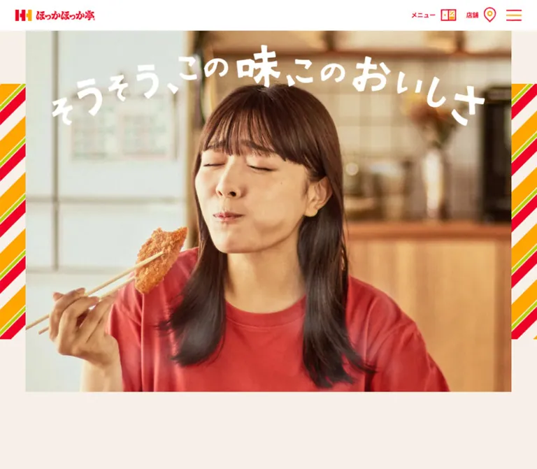
クリーム色の背景に赤とオレンジの斜めストライプを配し、大きな料理写真、切り角のボタン、常設の注文導線を組み合わせた公式ブランドサイト。
オリジナルサイトを見るA neighborhood bento shop translated into warm paper, colorful wrapper stripes, generous food photography, and unmistakable ordering buttons.
Website: ほっかほっか亭 Original URL: https://www.hokkahokka-tei.jp/ Final URL: https://www.hokkahokka-tei.jp/ Theme: light appearance in both supplied viewport inspections Inspected: September 17, 2026, 03:49 JST; supplied retrieval timestamp September 16, 2026, 18:49:37.436 UTC Viewports: desktop 1440 × 1000 CSS pixels; mobile 390 × 844 CSS pixels Scope: the current homepage, including its promotional hero, feature and benefit carousels, menu highlights, linked promotional directory, food-quality story, brand narrative, app and social links, news, persistent ordering controls, and footer. Open navigation, ordering dialogs, and destination pages were not inspected.
The homepage combines a quiet cream foundation with the visual energy of takeaway packaging. Red identifies navigation and actions; orange outlines buttons and marks separators; a narrow green stripe completes the recurring diagonal pattern. Large campaign graphics supply their own colors, while the surrounding interface stays consistent. The desktop opening capture features a bright pixel-art campaign, and the mobile opening capture features a portrait food promotion.
This is a broad brand and service homepage. Visitors can explore products, discover campaigns, find stores, begin an order, read company news, or reach recruitment information. The long page alternates image-heavy sections with generous empty space and small, readable text. A persistent white header and prominent ordering controls keep practical tasks available throughout that journey.
A neighborhood bento shop translated into warm paper, colorful wrapper stripes, generous food photography, and unmistakable ordering buttons.
Website: ほっかほっか亭 Original URL: https://www.hokkahokka-tei.jp/ Final URL: https://www.hokkahokka-tei.jp/ Theme: light appearance in both supplied viewport inspections Inspected: September 17, 2026, 03:49 JST; supplied retrieval timestamp September 16, 2026, 18:49:37.436 UTC Viewports: desktop 1440 × 1000 CSS pixels; mobile 390 × 844 CSS pixels Scope: the current homepage, including its promotional hero, feature and benefit carousels, menu highlights, linked promotional directory, food-quality story, brand narrative, app and social links, news, persistent ordering controls, and footer. Open navigation, ordering dialogs, and destination pages were not inspected.
The homepage combines a quiet cream foundation with the visual energy of takeaway packaging. Red identifies navigation and actions; orange outlines buttons and marks separators; a narrow green stripe completes the recurring diagonal pattern. Large campaign graphics supply their own colors, while the surrounding interface stays consistent. The desktop opening capture features a bright pixel-art campaign, and the mobile opening capture features a portrait food promotion.
This is a broad brand and service homepage. Visitors can explore products, discover campaigns, find stores, begin an order, read company news, or reach recruitment information. The long page alternates image-heavy sections with generous empty space and small, readable text. A persistent white header and prominent ordering controls keep practical tasks available throughout that journey.
--hh- are reusable aliases introduced here. Original custom-property identifiers are shown only where relevant.| Name | Value | Evidence | Suggested token | Role |
|---|---|---|---|---|
| Warm Cream | #f7f0e8 |
Measured body background; source --s-color-6d968846 |
--hh-paper |
Main page canvas, section breathing room, and the light intervals in the wrapper motif |
| Brand Red | #ee0026 |
Measured navigation text and food-story label backgrounds | --hh-red |
Navigation labels, prominent actions, callout labels, and recurring red accents |
| Brand Orange | #ffa600 |
Declared source --s-color-d0b22bf4: #ffa600ff; visually consistent with orange framing |
--hh-orange |
Recommended exact token for button frames, stripes, and news dividers; individual graphic pixels were not sampled |
| White | #ffffff |
Measured header/footer backgrounds and reversed text | --hh-white |
Persistent header, footer, story plaque, and text on red |
| Near Black | #000300 |
Measured product titles and much of the main copy; source --s-color-5fab5e1b |
--hh-ink |
Product names, campaign titles, dates, and main editorial text |
| Charcoal | #323232 |
Measured story descriptions, footer text, and mobile dock labels | --hh-charcoal |
Secondary body copy and utility information |
| Wrapper Green | Approximately #a6c900 |
Screenshot estimate only | --hh-stripe-green |
Narrow green accent between broader orange and red diagonal bands |
| Gold Edge | Approximately #d98e00 |
Screenshot estimate only | --hh-gold-edge |
Hard offset edge visible around desktop ordering badges and action artwork |
| Deep Red Edge | Approximately #c60028 |
Screenshot estimate only | --hh-red-edge |
Hard lower edge of the mobile ordering dock |
The computed #333333 on many structural wrappers is close to, but distinct from, the #323232 used by their visible text descendants. Use the actual text element when identifying a typography color.
The stable interface palette is cream, white, red, orange, and dark text. The green stripe is a small decorative accent. Cyan skies, lime fields, yellow campaign strips, and orange food-poster backgrounds belong to individual promotional graphics.
Keep that distinction when extending the site: a new campaign can have a different visual world without changing the header, footer, news list, or ordering controls. The supplied custom-property inventory contains other colors and gradients, but their presence alone does not establish their use in the inspected homepage.
No alternate theme or theme-switching interaction was supplied.
Measured family: Noto Sans JP.
This family appears on navigation labels, menu names, campaign descriptions, story copy, news, footer links, and mobile dock captions. The working hierarchy comes from weight and size rather than elaborate tracking. Sampled text uses normal letter spacing.
Use regular 400 for descriptions and dates, 500 for the introductory brand statement and app copy, 600 for selected utility labels, 700 for navigation and campaign headings, and 900 for product names.
The visible headings 特集 and 街の台所 have broad, irregular strokes and a lively, sign-painted character. The vertical lettering beside the large bento photograph continues this expressive tone.
Their exact rendering method and applied font are not established by the supplied element sample. A source variable declares Hokkahokkatei Regular, but no sampled heading connects that declaration to the visible lettering. Preserve approved heading artwork or verify the actual font before implementing it. Do not identify a typeface from the screenshot alone.
Some button wrappers report Montserrat at 15px, but their visible Japanese label descendants report Noto Sans JP at 16px. Likewise, the Times value on the HTML and body elements is not evidence that the visible homepage uses a serif body face.
All numeric values below are measured unless explicitly marked as estimates. Size and line height are in CSS pixels.
| Role | Desktop size / line height | Mobile size / line height | Weight | Notes |
|---|---|---|---|---|
| Header menu label | 12 / 16.8 |
11 / 15.4 |
700 |
Red text beside a menu illustration |
| Header store label | 13 / 18.2 |
11 / 15.4 |
700 |
Red text beside a location pin |
| Header bulk-order label | 13 / 18.2 |
Not visible in mobile header | 700 |
Bulk ordering moves to the mobile dock |
| Menu product name | 36 / 50.4 |
24 / 33.6 |
900 |
Examples: 月見天丼, のり弁当 |
| Benefit-card title | 24 / 33.6 |
18 / 25.2 |
700 |
Allows multiple lines |
| Benefit-card description | 16 / 28.8 |
14 / 25.2 |
400 |
Loose 1.8 leading |
| Benefit-card date | 14 / 19.6 |
12 / 16.8 |
400 |
Optional small metadata above the title |
| Brand introduction | 16 / 40 |
14 / 35 |
500 |
Exceptionally open 2.5 leading |
| Red food-story label | 24 / 33.6 |
20 / 28 |
700 |
White text, compact red background |
| Food-story description | 14 / 28 |
14 / 28 |
400 |
Preserved size and leading across both viewports |
| Brand narrative paragraph | 14 / 29.4 |
14 / 29.4 |
400 |
Column width changes substantially |
| App-support copy | 16 / 25.6 |
14 / 29.4 |
500 |
Mobile copy has more open leading |
| Social-support sentence | 16 / 22.4 |
16 / 22.4 |
700 |
Centered above social links |
| Standard CTA label | 16 / 16 or 16 / 22.4 |
Same sampled values | 700 |
Individual CTA label line boxes differ |
| News date | 16 / 22.4 |
14 / 19.6 |
400 |
Date remains visually separate from the headline |
| News headline | 14 / 29.4 |
14 / 29.4 |
400 |
Mobile uses shortened versions of long titles |
| News category | 12 / 16.8 |
12 / 16.8 |
400 |
White text within small colored rectangles |
| Footer recruitment link | 16 / 22.4 |
16 / 22.4 |
400 |
Open-innovation text uses 600 |
| Footer legal link | 14 / 19.6 |
14 / 19.6 |
400 |
Horizontal desktop arrangement; vertical mobile arrangement |
| Copyright | 12 / 16.8 |
12 / 16.8 |
400 |
Wraps on mobile |
| Mobile dock caption | Not applicable | 11 / 15.4 |
600 |
One or two lines beneath icons |
| Expressive section lettering | Approximately 56–72px visual height |
Approximately 36–40px for the visible feature heading |
Unverified | Screenshot estimate; not a measured CSS font size |
The page has two contrasting densities: compact navigation and controls, surrounded by expansive editorial spacing. There is no evidence of a single global spacing unit.
| Use | Desktop | Mobile | Evidence |
|---|---|---|---|
| Header horizontal inset | 30px |
20px |
Measured padding |
| Main opening space after hero | 150px |
100px |
Measured main top padding |
| Menu-section top padding | 100px |
60px |
Measured |
| Benefit-section top padding | 100px |
80px |
Measured |
| Directory-section top padding | 150px |
60px |
Measured |
| Food story, narrative, social, and news section top padding | Commonly 150px |
Commonly 80px |
Measured on these sections |
| App-section top padding | 200px |
80px |
Measured |
| Main bottom padding | 200px |
200px |
Measured; visible child overflow can affect the apparent gap |
| Common section internal gap | 30px |
10–30px, depending on section |
Measured |
| Directory column gap | 30px |
10px |
Calculated from item rectangles |
| Directory row gap | Approximately 30px |
Approximately 15px |
Calculated |
| Mobile product-card gap | Not applicable | 30px |
Calculated |
| Benefit text-stack gap | 10px |
7px |
Calculated from date, title, and description boxes |
| Final news row to archive CTA | 50px |
50px |
Calculated |
| Desktop ordering-badge gap | 20px |
Not applicable | Calculated |
| Footer horizontal inset | 40px |
20px |
Recorded content positions |
| Element | Treatment | Evidence |
|---|---|---|
| Header and footer surfaces | Square outer boundaries | Screenshots and measured 0px radius |
| Red story labels | 2px radius |
Measured |
| Promotional directory artwork | Rounded image corners, approximately 20–25px in the desktop capture |
Visual estimate; anchor wrappers themselves report 0px |
| Standard CTA | Clipped corners with a red center and orange rim | Visual observation; sampled button wrapper reports 0px |
| Story introduction plaque | Large clipped corners, approximately 45px cuts on desktop |
Screenshot estimate |
| Mobile dock group | Long clipped-corner white panel with a red outline | Visual observation |
| Bulk-order mobile tile | Separate red clipped-corner panel | Visual observation |
A wrapper's border-radius: 0 does not describe the complete visual component. Several shapes appear to be carried by image or pseudo-element decoration. Reproduce their silhouettes rather than converting them into generic rounded pills.
| Element | Desktop 1440 × 1000 | Mobile 390 × 844 | Status |
|---|---|---|---|
| Document height | 8666.89px |
8527.47px |
Measured snapshot values |
| Header | 1440 × 60px |
390 × 60px |
Measured |
| Header brand link | 156 × 27.14px |
45.5 × 60px |
Measured link boxes; mobile contains only the compact emblem |
| Hero slide link | 1440 × 650.22px |
390 × 567.56px |
Measured active slide boxes |
| Hero's inner artwork | Approximately 1300px wide with 70px side bands |
Approximately 350px wide with 20px side bands |
Screenshot estimates |
| Feature-carousel slot | 530 × 330px |
305 × 188px |
Measured anchors, not necessarily the inner artwork bounds |
| Benefit-carousel slot | 530 × 520px |
295 × 375px |
Measured anchors |
| Benefit description width | 450px |
235px |
Measured |
| Menu highlight card | 520 × 429.84px |
390 × 325.67px |
Measured |
| Standard CTA | 213 × 68px |
213 × 68px |
Measured |
| Directory item | Usually 281.5 × 187.7px |
Usually 150.5 × 100.3px |
Measured; one artwork is taller |
| Directory total row width | 1216px across four columns |
311px across two columns |
Calculated |
| Story introduction text | 637.13 × 120px |
313 × 140px |
Measured |
| News list | 1170px wide, starting at x=135 |
350px wide, starting at x=20 |
Measured |
| News row height | Usually 74.39px; long row 100.78px |
91.39px or 120.78px |
Measured; content dependent |
| Desktop ordering badges | 151 × 136.05px and 151 × 134.55px |
Replaced by dock | Measured |
| Footer | 330.69px high |
632.83px high |
Measured |
| Footer brand link | 249 × 43.31px |
249 × 43.31px |
Measured |
| Footer stripe band | Approximately 50px high |
Approximately 25px high |
Screenshot estimates consistent with logo offsets |
Role: persistent identity and immediate access to practical tasks.
A flat white bar remains visible at the top in both opening and scrolled screenshots. It is 60px high at both inspected widths. Desktop uses a small full brand lockup with a 50th-anniversary mark on the left. The right side groups メニュー, 店舗, the bulk-order link, and a three-line menu button.
Labels are red and sit beside red/orange illustrations: an open menu, location pin, and stacked bento packages. The desktop links have approximately 55–57px-high target boxes. The menu button's measured box is 30 × 60px.
On mobile, the brand becomes an emblem within a 45.5px-wide link. The menu and store links remain visible, while the long bulk-order header link is absent. Their labels shrink to 11px. Horizontal padding changes from 30px to 20px; header height remains unchanged.
The menu button is present, but its expanded panel, focus behavior, and dismissal interaction were not supplied. A new implementation should keep those behaviors separate from the verified closed-header appearance.
Role: display the current campaign as a large, self-contained poster.
The hero begins directly below the header at y=60px. Its outer slide spans the viewport, while the main artwork is centered between diagonal wrapper stripes. The desktop screenshot shows approximately 70px of striped framing on each side; mobile shows approximately 20px.
The desktop campaign uses pixel-art food characters, Japanese landmarks, a blue sky, green ground, oversized outlined lettering, and a yellow message strip. The mobile campaign uses a tall orange composition with a large tempura bowl, small ingredient labels, prominent white product lettering, and a secondary bowl below.
These are different active campaigns. Their difference does not prove that a specific campaign is exclusively assigned to a particular breakpoint. What is established is the wide desktop presentation and portrait mobile presentation.
Recommended anatomy: a viewport-width carousel region, individual linked slides, a centered artwork element, and decorative stripes behind or beside it. Use appropriately composed desktop and mobile artwork when available. Preserve embedded text and product details; indiscriminate object-fit: cover cropping would remove essential information.
The DOM records neighboring slide anchors at whole-viewport horizontal offsets. This supports a carousel structure, but autoplay interval, swipe handling, and hero navigation controls were not verified.
Role: expose several current promotions below the opening campaign.
The 特集 heading is centered with expressive dark lettering. A large cream gap separates this section from the hero. Below it, linked landscape promotions occupy 530 × 330px desktop slots. Neighboring cards extend beyond the viewport edges, making the section read as a horizontal sequence rather than a contained grid.
The sampled desktop control pair consists of two 68 × 68px buttons. Their horizontal positions imply a 64px gap between the buttons. The section text includes pause, but the pause control's appearance and operation were not independently inspected.
Mobile slots measure 305 × 188px. The centered recorded slot starts at x=42.5px, leaving visible room for neighboring content. The desktop control pair does not appear in the supplied mobile element sample; its mobile behavior should remain unverified.
Role: provide a short route from visual product discovery to the wider menu.
Two linked product entries are recorded: 月見天丼 and のり弁当. Desktop cards sit at x=155px and x=765px, each 520px wide, producing a calculated 90px gap. Titles use near-black Noto Sans JP at 36px and weight 900, with a 10px inset from each card's left edge.
Mobile places the two entries vertically, each spanning the 390px viewport. Their title size becomes 24px and their card-to-card gap is 30px. The centered メニューをもっと見る action remains 213 × 68px.
The DOM establishes the card structure and dimensions, but the supplied screenshots do not show both full product-card compositions. Do not infer additional prices, badges, or card backgrounds.
Role: promote points, coupons, the app, payment offers, and related services.
Each linked card combines promotional artwork with an optional date, bold title, and readable description. Desktop slots measure 530 × 520px with 15px horizontal anchor padding. The description area is 450px wide and uses 16px text with 28.8px leading.
Mobile slots measure 295 × 375px with 10px horizontal anchor padding. The copy area narrows to 235px; titles become 18px, descriptions 14px, and dates 12px. The date/title/body sequence uses roughly 7px gaps on mobile and 10px on desktop.
The captured card sets differ between desktop and mobile, including delivery and cashless-service entries in the mobile sample. Carousel position or rendering strategy can affect the sampled set; do not treat every content difference as a responsive visibility rule.
For reuse, let card height accommodate longer text instead of mechanically enforcing the captured height. Preserve the wide image-first structure and compact metadata hierarchy.
Role: collect longer-lived brand projects, recruitment, initiatives, and related content.
Twelve linked artwork tiles are recorded. Desktop uses four columns across a 1216px-wide group, with 281.5px-wide tiles and 30px column gaps. Mobile uses two columns across approximately 311px, with 150.5px-wide tiles, a 10px column gap, and approximately 15px row gaps.
Most tiles have an approximately 3:2 aspect ratio. One recorded signage tile is taller, so the evidence does not support forcing every asset into the same cropped frame. The visible desktop tiles have rounded artwork corners and no general elevation shadow.
This directory is visually distinct from the larger promotional carousels. Maintain its smaller scale and denser arrangement rather than giving every item a large text card.
Role: explain the brand through an oversized meal and concrete preparation details.
The visible 街の台所 heading overlaps the upper edge of a centered white plaque with large clipped corners. The plaque is approximately 706px wide in the desktop screenshot. Three centered lines of introductory copy use measured 16px type with 40px leading. A broad diagonal stripe band passes behind the lower part of the plaque and the upper portion of the food composition.
Below it, a large bento photograph dominates the composition. The white tray, dark nori, crisp fried fish, long tempura, and small side dishes retain detailed natural textures. The food appears isolated against the cream background. A loose red looping arrow connects the left annotation to the meal, while expressive vertical lettering sits to the right.
Three annotation groups are established by the DOM:
まずは、お米: rice and its preparation.そして、店内仕込み: cooking within the store.たった、7200秒: the brand's freshness message.Each annotation has a white-on-red label with a 2px radius and 2px 10px 4px padding, followed by 14px copy at 28px leading. Desktop label text is 24px; mobile is 20px.
Desktop annotations occupy different positions around the central photograph. Mobile repositions them into a longer sequence: left-aligned rice copy, a right-shifted preparation group, then another left-aligned group. The first and third begin at x=20px; the second label begins around x=135.6px. This is an editorial arrangement with deliberate offsets, not three identical centered cards.
The mobile introduction is 313px wide and uses 14px text with 35px leading. Its complete visual composition is not included in the mobile screenshots, so retain the DOM-confirmed typography and placement without inventing its image crop.
Role: provide supporting stories about everyday meals, familiarity, and product development.
Desktop records three 340px-wide paragraph columns at x=100, 540, and 980px, sharing the same vertical position. Copy uses 14px text with 29.4px leading.
Mobile records 206px-wide paragraphs at x=51, 349, and 647px, again at the same vertical position. This establishes a horizontal arrangement with offscreen panels. It does not support converting these into a verified vertical stack or claiming that swiping was tested.
The associated imagery is not shown in the supplied current-page screenshots. Preserve this section's narrative role and paragraph proportions while treating its precise artwork and navigation mechanism as unverified.
Role: connect ongoing customer relationships to the app and external channels.
The app section contains a short three-line message about mobile ordering and coupons, followed by App Store and Google Play links. Desktop badge boxes are approximately 160 × 59.6px and 200 × 59.4px, arranged side by side. Mobile stacks approximately 163 × 60.6px and 200 × 59.3px badges with a calculated 10px gap.
The social section presents a centered 16px bold supporting sentence and links to Instagram, X, LINE, and YouTube. Desktop icon boxes are approximately 64px high, with 50px gaps. Mobile uses approximately 50px-high icons and 33px gaps. The YouTube link is wider than the other three in both layouts.
Exact decorative artwork in these sections is not available in the screenshots. Do not invent phone mockups, animation, or additional promotional imagery from the presence of app links alone.
Role: present recent announcements in a calm, scannable format.
Desktop uses a centered 1170px-wide list. Each linked row contains a date, small category rectangle, headline, and a thin right-facing chevron. Orange dashed rules separate entries. Product-information badges are red in the supplied screenshot, and the CP badge is orange. The release badge's fill is not visible in that screenshot.
Dates use 16px text, category labels 12px, and headlines 14px with 29.4px leading. Typical desktop rows measure 74.39px high; the long final headline increases its row to 100.78px.
On mobile, the list becomes 350px wide with 20px side margins. The date and category occupy the first line, with the headline below. Rows measure approximately 91.39px for shorter titles and 120.78px for two-line titles. Long titles are shortened with ellipses in the rendered mobile text. The evidence does not establish whether this is CSS clamping or separately generated text.
The 記事一覧 CTA sits 50px below the final recorded row. Preserve row-wide linking and comfortable leading; the visual hierarchy does not require thumbnail images for each announcement.
Role: create a consistent endpoint for menu, story, and news sections.
The recurring button measures 213 × 68px on both desktop and mobile. It uses a saturated red center, orange rim, clipped corners, and a small hard edge that gives it a printed, dimensional appearance. The visible label is white Noto Sans JP at 16px and weight 700.
Examples include メニューをもっと見る, もっと見る, and 記事一覧. The shape carries more personality than the type. Keep the label centered and preserve generous room around the button.
Some supplied DOM entries show both anchor and button wrappers. For a new implementation, use one semantic interactive element per action rather than reproducing nested interactive controls.
Role: keep purchase-related tasks within immediate reach.
Desktop has two illustrated badges near the lower-right corner: mobile ordering and orders of ten or more. Each is approximately 151px wide and 135–136px high. Their group has a 20px gap, sits 20px from the right edge, and ends approximately 50px above the viewport bottom.
The badges combine an illustration protruding above a red label block, a thick orange perimeter, and a hard gold edge. The mobile-order control is recorded as a button; its resulting state was not inspected. The bulk-order control links to https://hokkahokka.com/.
Mobile replaces the desktop pair with a bottom dock. A white clipped-corner group contains three icon-over-caption controls: メニュー, 店舗, and モバイルオーダー. Thin red vertical rules divide the group. A separate red tile to its right contains the bulk-order action, using a stacked-package icon and a two-line white caption.
The group spans roughly x=16–269px; the separate tile spans roughly x=274–374px. The full visual assembly is approximately 84px high and sits about 10px above the viewport bottom. Its inner menu/store/order link boxes are approximately 74–75px wide and 70px high.
The dock remains visible in the mobile footer capture and overlaps part of the copyright area. This observed overlap should inform additional bottom clearance in an adaptation.
Role: close the brand story with recruitment, company information, and legal navigation.
A diagonal stripe band introduces a flat white footer. The full brand and anniversary lockup is larger than the desktop header logo: 249 × 43.31px at both inspected widths.
Desktop starts the content 40px from the left. The first three recruitment links share a row, followed by a longer open-innovation link. A fine dark rule separates them from legal and company links. Copyright occupies the lower-right area.
Mobile uses 20px side margins and stacks recruitment and legal links vertically. Recruitment text remains 16px, legal links remain 14px, and the copyright wraps at 12px. The long open-innovation label wraps into two lines. Small outlined chevrons lead the recruitment links.
Keep the footer white, spacious, and plainly typographic. Its identity comes from the stripe band and brand lockup rather than decorative cards.
The evidence establishes carousel structures, persistent controls across scroll positions, and several computed transition declarations. It does not provide a complete interaction recording.
| Element or behavior | Supplied evidence | What can be concluded |
|---|---|---|
| Common interface transitions | 0.3s cubic-bezier(0.4, 0.4, 0, 1) on many elements |
A shared transition treatment is declared; actual changed properties and hover endpoints are not established |
| Button wrappers | 0.4s cubic-bezier(0.4, 0.4, 0, 1) |
Buttons have a slightly longer declared transition; do not infer bounce, lift, or color inversion |
| Body background | background 0.5s cubic-bezier(0.4, 0.4, 0, 1) |
A background transition exists; no theme change was observed |
| Mobile feature and benefit slides | transform 1s cubic-bezier(0.58, 0.21, 0.41, 0.96) |
These sampled mobile slide transforms have a one-second duration |
| Hero and desktop slide samples | Transform transitions with the same carousel easing, but no nonzero duration shown | Do not assign the mobile one-second value to every carousel |
| Desktop social-support text | 1s cubic-bezier(0.4, 0.3, 0.3, 0.9) 0.6s |
A delayed transition is declared; trigger and visual endpoints remain unverified |
| Carousel pause indication | The text pause appears in feature and benefit sections |
Pause-related UI exists in the rendered evidence; successful operation was not tested |
| Persistent header and order controls | Remain in corresponding viewport positions across supplied scroll captures | Persistent placement is visually supported; source position values were not included |
| Link destinations | Menu, stores, news, app stores, social channels, and ordering URLs recorded | Navigation targets are known; resulting pages were not inspected |
| Sampled CSS animation fields | none |
No keyframe animation is reported for those sampled elements; this does not exclude JavaScript-driven motion |
The supplied capture process waited for loading, visible finite motion, sampled layout stability, and image decoding, with bounded timeouts. Perpetual animations were temporarily paused during readiness checks and resumed. These checks do not reveal autoplay cadence, guarantee every delayed asset, or verify menu and ordering interactions.
For an adaptation, use restrained transitions for utility controls and provide explicit carousel controls. Any additional hover treatment, reduced-motion behavior, or scroll-triggered reveal should be documented as new behavior.
| Layer | Appearance | Function |
|---|---|---|
| Page canvas | Solid warm cream | Unifies the long page and creates restful space between dense promotions |
| Header | Flat white | Keeps identity and practical navigation clear |
| Campaign artwork | Full-color, self-contained graphics | Supplies seasonal visual variation |
| Wrapper bands | Repeating diagonal cream, orange, green, and red stripes | Frames the hero and marks major editorial/footer transitions |
| Story plaque | White clipped-corner shape | Separates the centered introductory statement from the patterned background |
| Story label | Red rectangle with a tiny radius | Creates concise, readable annotations around the food |
| News list | Cream surface with orange dashed rules | Provides structure without cards or elevation |
| Standard CTA | Red face, orange rim, clipped corners | Makes section exits consistent and prominent |
| Mobile dock | White/red faceted panels with a hard lower edge | Groups recurring tasks and distinguishes bulk ordering |
| Footer | Flat white with a fine dark divider | Organizes institutional information |
There is no broad soft-shadow elevation system in the inspected captures. The dimensional effect belongs mainly to illustrated buttons and badges. Avoid spreading that treatment to every content block.
The current page uses several distinct image roles within one stable interface.
Campaign posters are dense and expressive. They combine product photography or illustration with large Japanese lettering, small annotations, dates, and campaign-specific colors. Their compositions carry information that cannot safely be cropped away.
Food photography emphasizes abundance and texture: crisp coating, uneven tempura edges, glossy side dishes, dark nori, and the familiar white bento tray. The oversized story photograph gives the product more visual weight than the adjacent explanatory copy.
Brand decorations include the diagonal wrapper pattern, loose red arrows, expressive dark headings, and small red/orange utility illustrations. The icon system is recognizable and illustrative, while news and footer chevrons are much simpler.
Pixel art belongs to the captured desktop campaign. Preserve its intentional raster character within that artwork, but do not apply pixelated rendering to food photography or the entire interface.
The supplied evidence does not include complete usable image-source URLs. Several background-image strings are truncated. The table identifies verified visual assets by their location rather than inventing filenames.
| Asset | Original-page location | Evidence and handling |
|---|---|---|
| Full brand and anniversary lockup | Desktop header and both footers | Visible in current captures; preserve the complete approved artwork |
| Compact emblem | Mobile header | Visible; use a dedicated emblem rather than squeezing the full wordmark |
| Pixel-art campaign poster | Active desktop hero | Visible; retain embedded lettering and the landscape composition |
| Tempura-bowl campaign poster | Active mobile hero | Visible; retain the portrait composition and ingredient labels |
| Promotional directory thumbnails | Four-column desktop directory | Partly visible in the story capture; DOM confirms linked tile sizes |
| Large nori-bento photograph | Neighborhood kitchen story | Visible; preserve texture and the tray silhouette |
| Red looping annotation arrow | Beside the rice explanation | Visible; treat as decorative artwork |
| Ordering badge illustrations | Desktop floating controls and mobile dock | Visible; these shapes carry brand identity |
| App-store and social-link artwork | App and social sections | Link dimensions and destinations recorded; full visual compositions not supplied |
Use authorized brand assets where available. CSS can reproduce spacing, stripes, labels, and approximate faceted shapes, but it cannot replace the specific food photography, logo, campaign lettering, and illustration work.
The recorded sequence is: header → campaign hero → feature carousel → menu highlights → benefit carousel → promotional directory → neighborhood kitchen story → brand narrative → app promotion → social links → news → footer. Persistent ordering controls sit above this document flow.
Both versions remain long pages: approximately 8667px on desktop and 8527px on mobile in the supplied snapshots. The similar heights do not imply identical layout. Mobile reduces gaps and image sizes while stacking some sections and retaining horizontal sequences elsewhere.
| Area | Desktop behavior | Mobile behavior |
|---|---|---|
| Header | Full wordmark, anniversary mark, three task links, menu button | Compact emblem, menu/store links, menu button |
| Hero | Wide campaign with approximately 70px striped side bands | Portrait campaign with approximately 20px striped side bands |
| Feature promotions | 530px slots with neighboring content extending beyond the viewport | 305px slots with neighboring content still present |
| Menu highlights | Two 520px cards in a row | Two full-width cards stacked vertically |
| Benefits | 530px slots and 450px copy width | 295px slots and 235px copy width |
| Promotional directory | Four columns | Two columns |
| Story introduction | Wide centered copy with 40px leading | 313px-wide copy with 35px leading |
| Food annotations | Distributed around a large central photograph | Repositioned into a longer, alternately offset sequence |
| Brand narrative | Three text columns visible across the page | Horizontally positioned panels, including offscreen content |
| App badges | Side by side | Vertically stacked |
| Social links | Approximately 64px-high icons | Approximately 50px-high icons |
| News | Date, category, headline, and arrow in a wide row | Metadata above headline; long headlines shortened |
| Order access | Two large floating badges at lower right | Three-part white dock plus separate red bulk-order tile |
| Footer | Mainly horizontal link groups | Vertical link groups with wrapped copy |
A max-width: 1140px rule is visible in a supplied line-break helper fragment. It does not establish the breakpoint for the header, directory, or ordering dock. Only the two inspected widths are confirmed.
The Quick Start uses a recommended 767px breakpoint to demonstrate the observed desktop/mobile arrangements. Validate intermediate widths separately before production use.
Treat recorded document coordinates as evidence of proportions and relationships, not a prescription for absolute positioning. Carousel transforms, content length, image loading, and responsive variants can shift those coordinates. Keep the overall page in normal flow, with fixed positioning reserved for persistent utilities.
#f7f0e8 as the continuous main canvas and use white for the persistent header and footer.These are improvements for a new implementation, not verified features of the original page:
#f7f0e8.#ffffff.#ee0026.#ffa600.#000300; supporting text: charcoal #323232.#a6c900, an estimated adaptation value.“Create a Japanese takeaway-food brand homepage inspired by the current Hokka-Hokka Tei interface. Use a warm cream #f7f0e8 page, a compact 60px white persistent header, red #ee0026 utility labels, orange #ffa600 button rims, and repeating diagonal wrapper stripes with a narrow green accent. Begin with a large campaign poster framed by striped side bands. Follow it with a feature carousel, two product highlights, a benefit carousel, a smaller promotional directory, an oversized bento photograph with red annotation labels, brand stories, app links, social links, news, and a white footer. Use Noto Sans JP for interface text and approved expressive artwork for major section headings. Keep standard CTAs approximately 213 × 68px with clipped corners. On mobile, show a compact emblem, portrait campaign artwork, stacked product highlights, two directory columns, and a fixed bottom task dock with a separate red bulk-order tile. Keep unknown interactions explicitly separate from the verified visual reference.”
This is an adaptation scaffold, not the original stylesheet or a tested replica. Exact palette, type, and major dimensions come from the evidence. Stripe proportions, clipped-corner geometry, heading fallback, focus behavior, the 767px breakpoint, and native horizontal scrolling are implementation recommendations.
Load Noto Sans JP through an approved font source if available; otherwise the declared system fallback will be used. Supply authorized logo, icon, campaign, and food assets separately. The display-heading fallback below does not reproduce the unverified expressive lettering.
:root {
  /* Measured or declared original-page colors */
  --hh-paper: #f7f0e8;
  --hh-red: #ee0026;
  --hh-orange: #ffa600;
  --hh-white: #ffffff;
  --hh-ink: #000300;
  --hh-charcoal: #323232;

  /* Estimated decorative colors */
  --hh-stripe-green: #a6c900;
  --hh-gold-edge: #d98e00;
  --hh-red-edge: #c60028;

  /* Verified primary family; fallback is a recommendation */
  --hh-font: 'Noto Sans JP', system-ui, sans-serif;
  --hh-text-body: 16px;
  --hh-text-small: 14px;
  --hh-text-caption: 12px;
  --hh-text-card: 24px;
  --hh-text-product: 36px;
  --hh-leading-body: 1.8;
  --hh-leading-story: 2;

  --hh-header-height: 60px;
  --hh-header-inset: 30px;
  --hh-section-space: 150px;
  --hh-opening-space: 150px;
  --hh-news-width: 1170px;
  --hh-directory-width: 1216px;
  --hh-cta-width: 213px;
  --hh-cta-height: 68px;
  --hh-label-radius: 2px;
  --hh-art-radius: 24px;
  --hh-safe-bottom: env(safe-area-inset-bottom, 0px);

  /* Observed transition timings; application is selective */
  --hh-ui-ease: cubic-bezier(0.4, 0.4, 0, 1);
  --hh-slide-ease: cubic-bezier(0.58, 0.21, 0.41, 0.96);
  --hh-ui-duration: 300ms;
  --hh-button-duration: 400ms;
  --hh-mobile-slide-duration: 1000ms;
}

*,
*::before,
*::after {
  box-sizing: border-box;
}

html {
  scroll-padding-top: calc(var(--hh-header-height) + 16px);
}

body {
  margin: 0;
  padding-top: var(--hh-header-height);
  color: var(--hh-ink);
  background: var(--hh-paper);
  font-family: var(--hh-font);
  font-size: var(--hh-text-body);
  line-height: var(--hh-leading-body);
}

img {
  max-width: 100%;
  height: auto;
}

button,
a {
  -webkit-tap-highlight-color: transparent;
}

button {
  font: inherit;
  cursor: pointer;
}

:where(a, button):focus-visible {
  outline: 3px solid var(--hh-charcoal);
  outline-offset: 5px;
}

.hh-header {
  position: fixed;
  inset: 0 0 auto;
  z-index: 50;
  display: flex;
  align-items: center;
  justify-content: space-between;
  height: var(--hh-header-height);
  padding-inline: var(--hh-header-inset);
  background: var(--hh-white);
}

.hh-brand-full img {
  display: block;
  width: 156px;
}

.hh-brand-symbol {
  display: none;
}

.hh-header-nav {
  display: flex;
  align-items: center;
  gap: 20px;
}

.hh-header-link {
  display: flex;
  align-items: center;
  gap: 10px;
  min-height: 55px;
  color: var(--hh-red);
  font-size: 13px;
  font-weight: 700;
  line-height: 1.4;
  text-decoration: none;
}

.hh-header-link--menu {
  font-size: 12px;
}

.hh-header-link img {
  display: block;
  width: 30px;
}

.hh-menu-toggle {
  display: grid;
  place-items: center;
  width: 44px; /* Recommended larger target; source width was 30px */
  height: 60px;
  padding: 0;
  border: 0;
  color: var(--hh-red);
  background: transparent;
}

/* Approximate wrapper pattern; do not treat stops as source values. */
.hh-striped {
  --stripe-unit: 1px;
  background: repeating-linear-gradient(
    135deg,
    var(--hh-paper) 0 calc(24 * var(--stripe-unit)),
    var(--hh-orange) calc(24 * var(--stripe-unit)) calc(51 * var(--stripe-unit)),
    var(--hh-paper) calc(51 * var(--stripe-unit)) calc(53 * var(--stripe-unit)),
    var(--hh-stripe-green) calc(53 * var(--stripe-unit)) calc(59 * var(--stripe-unit)),
    var(--hh-paper) calc(59 * var(--stripe-unit)) calc(61 * var(--stripe-unit)),
    var(--hh-red) calc(61 * var(--stripe-unit)) calc(78 * var(--stripe-unit))
  );
}

.hh-hero-art {
  display: block;
  width: min(calc(100% - 140px), 1300px);
  margin-inline: auto;
}

.hh-hero-art img {
  display: block;
  width: 100%;
  height: auto; /* Preserve the complete campaign composition */
}

.hh-main {
  padding-block: var(--hh-opening-space) 200px;
}

.hh-section + .hh-section {
  margin-top: var(--hh-section-space);
}

.hh-section-title {
  margin: 0 0 30px;
  color: var(--hh-charcoal);
  font-size: clamp(36px, 4.5vw, 64px);
  font-weight: 900; /* Approximation when approved title artwork is unavailable */
  line-height: 1.2;
  text-align: center;
}

/* Recommended native-scroll fallback, not the original carousel engine. */
.hh-promo-track {
  display: flex;
  overflow-x: auto;
  overscroll-behavior-inline: contain;
  scroll-snap-type: x proximity;
  padding: 8px 20px 16px;
}

.hh-promo-slot {
  flex: 0 0 530px;
  min-width: 0;
  padding-inline: 15px;
  color: inherit;
  text-decoration: none;
  scroll-snap-align: center;
}

.hh-promo-slot img {
  display: block;
  width: 100%;
  border-radius: var(--hh-art-radius);
}

.hh-promo-copy {
  padding: 20px 25px;
}

.hh-promo-copy > * {
  margin: 0;
}

.hh-promo-copy > * + * {
  margin-top: 10px;
}

.hh-promo-date {
  font-size: 14px;
  line-height: 1.4;
}

.hh-promo-title {
  font-size: var(--hh-text-card);
  font-weight: 700;
  line-height: 1.4;
}

.hh-product-grid {
  display: grid;
  grid-template-columns: repeat(2, minmax(0, 1fr));
  gap: 90px;
  width: min(calc(100% - 40px), 1130px);
  margin-inline: auto;
}

.hh-product {
  color: inherit;
  text-decoration: none;
}

.hh-product-name {
  margin: 0 10px;
  font-size: var(--hh-text-product);
  font-weight: 900;
  line-height: 1.4;
}

.hh-directory {
  display: grid;
  grid-template-columns: repeat(4, minmax(0, 1fr));
  gap: 30px;
  width: min(calc(100% - 80px), var(--hh-directory-width));
  margin-inline: auto;
}

.hh-directory img {
  display: block;
  width: 100%;
  height: auto;
  border-radius: var(--hh-art-radius);
}

/* Clip decoration, leaving the interactive element's focus outline intact. */
.hh-facet {
  --facet-fill: var(--hh-red);
  --facet-edge: var(--hh-orange);
  --facet-cut: 12px;
  --facet-shape: polygon(
    var(--facet-cut) 0,
    calc(100% - var(--facet-cut)) 0,
    100% var(--facet-cut),
    100% calc(100% - var(--facet-cut)),
    calc(100% - var(--facet-cut)) 100%,
    var(--facet-cut) 100%,
    0 calc(100% - var(--facet-cut)),
    0 var(--facet-cut)
  );
  position: relative;
  isolation: isolate;
  border: 0;
  background: transparent;
}

.hh-facet::before,
.hh-facet::after {
  content: '';
  position: absolute;
  pointer-events: none;
  clip-path: var(--facet-shape);
}

.hh-facet::before {
  inset: 0;
  z-index: -2;
  background: var(--facet-edge);
}

.hh-facet::after {
  inset: 3px;
  z-index: -1;
  background: var(--facet-fill);
}

.hh-cta {
  display: grid;
  place-items: center;
  width: var(--hh-cta-width);
  min-height: var(--hh-cta-height);
  padding: 12px 18px;
  color: var(--hh-white);
  font-size: 16px;
  font-weight: 700;
  line-height: 1.4;
  text-align: center;
  text-decoration: none;
  filter: drop-shadow(3px 3px 0 var(--hh-gold-edge));
  transition: opacity var(--hh-button-duration) var(--hh-ui-ease);
}

.hh-section-action {
  display: flex;
  justify-content: center;
  margin-top: 50px;
}

.hh-story-plaque {
  --facet-fill: var(--hh-white);
  --facet-edge: var(--hh-white);
  --facet-cut: 45px;
  width: min(calc(100% - 40px), 706px);
  margin-inline: auto;
  padding: 72px 34px 36px;
  text-align: center;
}

.hh-story-intro {
  margin: 0;
  font-size: 16px;
  font-weight: 500;
  line-height: 2.5;
}

.hh-story-label {
  display: inline-block;
  margin: 0 0 15px;
  padding: 2px 10px 4px;
  border-radius: var(--hh-label-radius);
  color: var(--hh-white);
  background: var(--hh-red);
  font-size: 24px;
  font-weight: 700;
  line-height: 1.4;
}

.hh-story-copy {
  margin: 0;
  color: var(--hh-charcoal);
  font-size: 14px;
  line-height: 2;
}

.hh-news {
  width: min(calc(100% - 40px), var(--hh-news-width));
  margin-inline: auto;
}

.hh-news-row {
  display: grid;
  grid-template-columns: 173px minmax(0, 1fr) 10px;
  align-items: center;
  column-gap: 25px;
  min-height: 74.4px;
  padding: 20px 10px 20px 25px;
  border-bottom: 2px dashed var(--hh-orange);
  color: inherit;
  text-decoration: none;
}

.hh-news-meta {
  display: grid;
  grid-template-columns: 85px 58px;
  align-items: center;
  gap: 30px;
  font-size: 16px;
  line-height: 1.4;
}

.hh-news-badge {
  padding: 2px 5px;
  color: var(--hh-white);
  background: var(--hh-red);
  font-size: 12px;
  line-height: 1.4;
  text-align: center;
}

.hh-news-badge--campaign {
  color: var(--hh-ink); /* Recommended contrast improvement */
  background: var(--hh-orange);
}

.hh-news-title {
  margin: 0;
  font-size: 14px;
  font-weight: 400;
  line-height: 2.1;
}

.hh-chevron {
  width: 10px;
  height: 10px;
  border-top: 1px solid currentColor;
  border-right: 1px solid currentColor;
  transform: rotate(45deg);
}

.hh-order-desktop {
  position: fixed;
  right: 20px;
  bottom: 50px;
  z-index: 40;
  display: flex;
  align-items: end;
  gap: 20px;
}

.hh-order-desktop > :is(a, button) {
  display: block;
  width: 151px;
  min-height: 135px;
  margin: 0;
  padding: 0;
  border: 0;
  background: transparent;
}

.hh-order-desktop img {
  display: block;
  width: 100%;
}

.hh-order-mobile {
  display: none;
}

.hh-footer {
  color: var(--hh-charcoal);
  background: var(--hh-white);
}

.hh-footer-stripe {
  height: 50px;
}

.hh-footer-inner {
  padding: 40px 40px 15px;
}

.hh-footer-logo {
  display: block;
  width: 249px;
  margin-bottom: 27px;
}

.hh-footer-links {
  display: flex;
  flex-wrap: wrap;
  gap: 0 40px;
}

.hh-footer-links a,
.hh-footer-legal a {
  padding-block: 10px;
  color: inherit;
  line-height: 1.4;
  text-decoration: none;
}

.hh-footer-legal {
  display: flex;
  flex-wrap: wrap;
  gap: 0 30px;
  margin-top: 20px;
  padding-top: 15px;
  border-top: 1px solid currentColor;
  font-size: 14px;
}

.hh-copyright {
  margin: 20px 0 0;
  font-size: 12px;
  line-height: 1.4;
}

/* Recommended interaction, not an observed hover endpoint. */
@media (hover: hover) {
  .hh-cta:hover {
    opacity: 0.88;
  }
}

/* Recommended breakpoint; only 1440px and 390px were inspected. */
@media (max-width: 767px) {
  :root {
    --hh-header-inset: 20px;
    --hh-opening-space: 100px;
    --hh-section-space: 80px;
    --hh-text-body: 14px;
    --hh-text-card: 18px;
    --hh-text-product: 24px;
  }

  html {
    scroll-padding-bottom: calc(110px + var(--hh-safe-bottom));
  }

  .hh-brand-full,
  .hh-header-link--bulk,
  .hh-order-desktop {
    display: none;
  }

  .hh-brand-symbol {
    display: grid;
    place-items: center;
    width: 45.5px;
    height: 60px;
  }

  .hh-brand-symbol img {
    width: 36px; /* Visual estimate of the emblem, not its link box */
  }

  .hh-header-link {
    min-height: 60px;
    gap: 8px;
    font-size: 11px;
  }

  .hh-hero-art {
    width: calc(100% - 40px);
  }

  .hh-promo-slot {
    flex-basis: 305px;
    padding-inline: 10px;
  }

  .hh-promo-slot--benefit {
    flex-basis: 295px;
  }

  .hh-promo-copy {
    padding: 20px;
  }

  .hh-promo-copy > * + * {
    margin-top: 7px;
  }

  .hh-promo-date {
    font-size: 12px;
  }

  .hh-product-grid {
    grid-template-columns: minmax(0, 1fr);
    width: 100%;
    gap: 30px;
  }

  .hh-directory {
    grid-template-columns: repeat(2, minmax(0, 1fr));
    width: calc(100% - 80px);
    gap: 15px 10px;
  }

  .hh-story-plaque {
    --facet-cut: 22px;
    padding: 45px 18px 30px;
  }

  .hh-story-intro {
    font-size: 14px;
  }

  .hh-story-label {
    margin-bottom: 10px;
    font-size: 20px;
  }

  .hh-news-row {
    grid-template-columns: minmax(0, 1fr) 12px;
    gap: 7px 20px;
    padding: 15px 0 17px;
  }

  .hh-news-meta {
    grid-column: 1;
    font-size: 14px;
  }

  .hh-news-title {
    grid-column: 1;
  }

  .hh-news-row > .hh-chevron {
    grid-column: 2;
    grid-row: 1 / span 2;
  }

  .hh-order-mobile {
    position: fixed;
    right: 16px;
    bottom: calc(10px + var(--hh-safe-bottom));
    left: 16px;
    z-index: 40;
    display: grid;
    grid-template-columns: minmax(0, 1fr) 100px;
    gap: 5px;
  }

  .hh-dock-group {
    --facet-fill: var(--hh-white);
    --facet-edge: var(--hh-red);
    --facet-cut: 18px;
    display: grid;
    grid-template-columns: repeat(3, minmax(0, 1fr));
    padding: 5px 14px 9px;
    filter: drop-shadow(0 4px 0 var(--hh-red-edge));
  }

  .hh-dock-link {
    display: flex;
    flex-direction: column;
    align-items: center;
    justify-content: center;
    gap: 3px;
    min-width: 0;
    min-height: 70px;
    color: var(--hh-charcoal);
    font-size: 11px;
    font-weight: 600;
    line-height: 1.4;
    text-align: center;
    text-decoration: none;
  }

  .hh-dock-link + .hh-dock-link {
    border-left: 1px solid var(--hh-red);
  }

  .hh-dock-link img {
    display: block;
    width: 34px;
    height: 34px;
    object-fit: contain;
  }

  .hh-dock-bulk {
    --facet-fill: var(--hh-red);
    --facet-edge: var(--hh-red);
    --facet-cut: 18px;
    min-height: 84px;
    color: var(--hh-white);
    filter: drop-shadow(0 4px 0 var(--hh-red-edge));
  }

  .hh-footer-stripe {
    --stripe-unit: 0.26px;
    height: 25px;
  }

  .hh-footer-inner {
    padding: 40px 20px calc(120px + var(--hh-safe-bottom));
  }

  .hh-footer-logo {
    margin-bottom: 20px;
  }

  .hh-footer-links,
  .hh-footer-legal {
    flex-direction: column;
    align-items: flex-start;
    gap: 0;
  }

  .hh-footer-links a,
  .hh-footer-legal a {
    padding-block: 10px 5px;
  }

  .hh-copyright {
    margin-top: 30px;
  }
}

/* Pair this with reduced-motion handling in any carousel JavaScript. */
@media (prefers-reduced-motion: reduce) {
  .hh-cta,
  .hh-promo-slot {
    transition: none;
  }

  .hh-promo-track {
    scroll-behavior: auto;
    scroll-snap-type: none;
  }
}
Use .hh-facet.hh-cta on a single link or button. Use .hh-facet.hh-dock-group around the three mobile task links, and .hh-facet.hh-dock-link.hh-dock-bulk on the separate bulk-order link. The desktop ordering selectors expect supplied badge artwork containing the illustrated silhouette.
For the hero, place an appropriately sourced <picture> inside .hh-hero-art and use .hh-striped on its outer region. Select responsive artwork through <source> elements; do not stretch one poster to both measured shapes.
Optional aliases for a project already using Tailwind v4. This is not evidence that the original site uses Tailwind. Define the custom properties above first.
@theme inline {
  --color-hokka-paper: var(--hh-paper);
  --color-hokka-red: var(--hh-red);
  --color-hokka-orange: var(--hh-orange);
  --color-hokka-ink: var(--hh-ink);
  --color-hokka-charcoal: var(--hh-charcoal);
  --color-hokka-stripe-green: var(--hh-stripe-green);

  --font-hokka: var(--hh-font);

  --text-hokka-body: var(--hh-text-body);
  --text-hokka-small: var(--hh-text-small);
  --text-hokka-card: var(--hh-text-card);
  --text-hokka-product: var(--hh-text-product);

  --spacing-hokka-header: var(--hh-header-height);
  --spacing-hokka-section: var(--hh-section-space);
  --spacing-hokka-cta: var(--hh-cta-height);

  --radius-hokka-label: var(--hh-label-radius);
  --radius-hokka-art: var(--hh-art-radius);
}
This reference describes the current homepage in the supplied inspection. Screenshot estimates, measured values, and recommended implementation choices remain explicitly distinguished.
# Hokka-Hokka Tei — Style Reference

> A neighborhood bento shop translated into warm paper, colorful wrapper stripes, generous food photography, and unmistakable ordering buttons.

**Website:** [ほっかほっか亭](https://www.hokkahokka-tei.jp/)
**Original URL:** https://www.hokkahokka-tei.jp/
**Final URL:** https://www.hokkahokka-tei.jp/
**Theme:** light appearance in both supplied viewport inspections
**Inspected:** September 17, 2026, 03:49 JST; supplied retrieval timestamp September 16, 2026, 18:49:37.436 UTC
**Viewports:** desktop 1440 × 1000 CSS pixels; mobile 390 × 844 CSS pixels
**Scope:** the current homepage, including its promotional hero, feature and benefit carousels, menu highlights, linked promotional directory, food-quality story, brand narrative, app and social links, news, persistent ordering controls, and footer. Open navigation, ordering dialogs, and destination pages were not inspected.

The homepage combines a quiet cream foundation with the visual energy of takeaway packaging. Red identifies navigation and actions; orange outlines buttons and marks separators; a narrow green stripe completes the recurring diagonal pattern. Large campaign graphics supply their own colors, while the surrounding interface stays consistent. The desktop opening capture features a bright pixel-art campaign, and the mobile opening capture features a portrait food promotion.

This is a broad brand and service homepage. Visitors can explore products, discover campaigns, find stores, begin an order, read company news, or reach recruitment information. The long page alternates image-heavy sections with generous empty space and small, readable text. A persistent white header and prominent ordering controls keep practical tasks available throughout that journey.
# Hokka-Hokka Tei — Style Reference

> A neighborhood bento shop translated into warm paper, colorful wrapper stripes, generous food photography, and unmistakable ordering buttons.

**Website:** [ほっかほっか亭](https://www.hokkahokka-tei.jp/)
**Original URL:** https://www.hokkahokka-tei.jp/
**Final URL:** https://www.hokkahokka-tei.jp/
**Theme:** light appearance in both supplied viewport inspections
**Inspected:** September 17, 2026, 03:49 JST; supplied retrieval timestamp September 16, 2026, 18:49:37.436 UTC
**Viewports:** desktop 1440 × 1000 CSS pixels; mobile 390 × 844 CSS pixels
**Scope:** the current homepage, including its promotional hero, feature and benefit carousels, menu highlights, linked promotional directory, food-quality story, brand narrative, app and social links, news, persistent ordering controls, and footer. Open navigation, ordering dialogs, and destination pages were not inspected.

The homepage combines a quiet cream foundation with the visual energy of takeaway packaging. Red identifies navigation and actions; orange outlines buttons and marks separators; a narrow green stripe completes the recurring diagonal pattern. Large campaign graphics supply their own colors, while the surrounding interface stays consistent. The desktop opening capture features a bright pixel-art campaign, and the mobile opening capture features a portrait food promotion.

This is a broad brand and service homepage. Visitors can explore products, discover campaigns, find stores, begin an order, read company news, or reach recruitment information. The long page alternates image-heavy sections with generous empty space and small, readable text. A persistent white header and prominent ordering controls keep practical tasks available throughout that journey.

## How to Read This Reference

- **Measured** means a value recorded in the supplied rendered DOM, computed styles, or bounding rectangles. Measurements describe the captured state, not a universal layout formula.
- **Calculated** means arithmetic based on those measurements, such as the gap between two recorded elements.
- **Estimated** means a visual approximation from the current-page screenshots. These values were not sampled with a pixel tool.
- **Recommended** means an implementation choice for a new adaptation. It is not a claim about the original website.
- Token names beginning with `--hh-` are reusable aliases introduced here. Original custom-property identifiers are shown only where relevant.
- Desktop screenshots cover the opening, the food-quality story, and the news/footer area. Mobile screenshots cover the opening and footer. Other sections have rendered DOM evidence but less direct visual coverage.
- Repeated text, offscreen slide anchors, transparent wrappers, and zero-height inactive slides must be interpreted in context. They do not establish repeated visible content, empty visual buttons, or broken images.

## Tokens — Colors

### Default Palette

| Name | Value | Evidence | Suggested token | Role |
| --- | --- | --- | --- | --- |
| Warm Cream | `#f7f0e8` | Measured body background; source `--s-color-6d968846` | `--hh-paper` | Main page canvas, section breathing room, and the light intervals in the wrapper motif |
| Brand Red | `#ee0026` | Measured navigation text and food-story label backgrounds | `--hh-red` | Navigation labels, prominent actions, callout labels, and recurring red accents |
| Brand Orange | `#ffa600` | Declared source `--s-color-d0b22bf4: #ffa600ff`; visually consistent with orange framing | `--hh-orange` | Recommended exact token for button frames, stripes, and news dividers; individual graphic pixels were not sampled |
| White | `#ffffff` | Measured header/footer backgrounds and reversed text | `--hh-white` | Persistent header, footer, story plaque, and text on red |
| Near Black | `#000300` | Measured product titles and much of the main copy; source `--s-color-5fab5e1b` | `--hh-ink` | Product names, campaign titles, dates, and main editorial text |
| Charcoal | `#323232` | Measured story descriptions, footer text, and mobile dock labels | `--hh-charcoal` | Secondary body copy and utility information |
| Wrapper Green | Approximately `#a6c900` | Screenshot estimate only | `--hh-stripe-green` | Narrow green accent between broader orange and red diagonal bands |
| Gold Edge | Approximately `#d98e00` | Screenshot estimate only | `--hh-gold-edge` | Hard offset edge visible around desktop ordering badges and action artwork |
| Deep Red Edge | Approximately `#c60028` | Screenshot estimate only | `--hh-red-edge` | Hard lower edge of the mobile ordering dock |

The computed `#333333` on many structural wrappers is close to, but distinct from, the `#323232` used by their visible text descendants. Use the actual text element when identifying a typography color.

### Color Boundaries

The stable interface palette is cream, white, red, orange, and dark text. The green stripe is a small decorative accent. Cyan skies, lime fields, yellow campaign strips, and orange food-poster backgrounds belong to individual promotional graphics.

Keep that distinction when extending the site: a new campaign can have a different visual world without changing the header, footer, news list, or ordering controls. The supplied custom-property inventory contains other colors and gradients, but their presence alone does not establish their use in the inspected homepage.

No alternate theme or theme-switching interaction was supplied.

## Tokens — Typography

### Primary UI Typeface

**Measured family:** `Noto Sans JP`.

This family appears on navigation labels, menu names, campaign descriptions, story copy, news, footer links, and mobile dock captions. The working hierarchy comes from weight and size rather than elaborate tracking. Sampled text uses normal letter spacing.

Use regular `400` for descriptions and dates, `500` for the introductory brand statement and app copy, `600` for selected utility labels, `700` for navigation and campaign headings, and `900` for product names.

### Display Lettering and Font Evidence

The visible headings `特集` and `街の台所` have broad, irregular strokes and a lively, sign-painted character. The vertical lettering beside the large bento photograph continues this expressive tone.

Their exact rendering method and applied font are not established by the supplied element sample. A source variable declares `Hokkahokkatei Regular`, but no sampled heading connects that declaration to the visible lettering. Preserve approved heading artwork or verify the actual font before implementing it. Do not identify a typeface from the screenshot alone.

Some button wrappers report `Montserrat` at 15px, but their visible Japanese label descendants report `Noto Sans JP` at 16px. Likewise, the `Times` value on the HTML and body elements is not evidence that the visible homepage uses a serif body face.

### Type Scale

All numeric values below are measured unless explicitly marked as estimates. Size and line height are in CSS pixels.

| Role | Desktop size / line height | Mobile size / line height | Weight | Notes |
| --- | --- | --- | --- | --- |
| Header menu label | `12 / 16.8` | `11 / 15.4` | `700` | Red text beside a menu illustration |
| Header store label | `13 / 18.2` | `11 / 15.4` | `700` | Red text beside a location pin |
| Header bulk-order label | `13 / 18.2` | Not visible in mobile header | `700` | Bulk ordering moves to the mobile dock |
| Menu product name | `36 / 50.4` | `24 / 33.6` | `900` | Examples: `月見天丼`, `のり弁当` |
| Benefit-card title | `24 / 33.6` | `18 / 25.2` | `700` | Allows multiple lines |
| Benefit-card description | `16 / 28.8` | `14 / 25.2` | `400` | Loose `1.8` leading |
| Benefit-card date | `14 / 19.6` | `12 / 16.8` | `400` | Optional small metadata above the title |
| Brand introduction | `16 / 40` | `14 / 35` | `500` | Exceptionally open `2.5` leading |
| Red food-story label | `24 / 33.6` | `20 / 28` | `700` | White text, compact red background |
| Food-story description | `14 / 28` | `14 / 28` | `400` | Preserved size and leading across both viewports |
| Brand narrative paragraph | `14 / 29.4` | `14 / 29.4` | `400` | Column width changes substantially |
| App-support copy | `16 / 25.6` | `14 / 29.4` | `500` | Mobile copy has more open leading |
| Social-support sentence | `16 / 22.4` | `16 / 22.4` | `700` | Centered above social links |
| Standard CTA label | `16 / 16` or `16 / 22.4` | Same sampled values | `700` | Individual CTA label line boxes differ |
| News date | `16 / 22.4` | `14 / 19.6` | `400` | Date remains visually separate from the headline |
| News headline | `14 / 29.4` | `14 / 29.4` | `400` | Mobile uses shortened versions of long titles |
| News category | `12 / 16.8` | `12 / 16.8` | `400` | White text within small colored rectangles |
| Footer recruitment link | `16 / 22.4` | `16 / 22.4` | `400` | Open-innovation text uses `600` |
| Footer legal link | `14 / 19.6` | `14 / 19.6` | `400` | Horizontal desktop arrangement; vertical mobile arrangement |
| Copyright | `12 / 16.8` | `12 / 16.8` | `400` | Wraps on mobile |
| Mobile dock caption | Not applicable | `11 / 15.4` | `600` | One or two lines beneath icons |
| Expressive section lettering | Approximately `56–72px` visual height | Approximately `36–40px` for the visible feature heading | Unverified | Screenshot estimate; not a measured CSS font size |

## Tokens — Spacing & Shapes

The page has two contrasting densities: compact navigation and controls, surrounded by expansive editorial spacing. There is no evidence of a single global spacing unit.

### Spacing Scale

| Use | Desktop | Mobile | Evidence |
| --- | --- | --- | --- |
| Header horizontal inset | `30px` | `20px` | Measured padding |
| Main opening space after hero | `150px` | `100px` | Measured main top padding |
| Menu-section top padding | `100px` | `60px` | Measured |
| Benefit-section top padding | `100px` | `80px` | Measured |
| Directory-section top padding | `150px` | `60px` | Measured |
| Food story, narrative, social, and news section top padding | Commonly `150px` | Commonly `80px` | Measured on these sections |
| App-section top padding | `200px` | `80px` | Measured |
| Main bottom padding | `200px` | `200px` | Measured; visible child overflow can affect the apparent gap |
| Common section internal gap | `30px` | `10–30px`, depending on section | Measured |
| Directory column gap | `30px` | `10px` | Calculated from item rectangles |
| Directory row gap | Approximately `30px` | Approximately `15px` | Calculated |
| Mobile product-card gap | Not applicable | `30px` | Calculated |
| Benefit text-stack gap | `10px` | `7px` | Calculated from date, title, and description boxes |
| Final news row to archive CTA | `50px` | `50px` | Calculated |
| Desktop ordering-badge gap | `20px` | Not applicable | Calculated |
| Footer horizontal inset | `40px` | `20px` | Recorded content positions |

### Border Radius

| Element | Treatment | Evidence |
| --- | --- | --- |
| Header and footer surfaces | Square outer boundaries | Screenshots and measured `0px` radius |
| Red story labels | `2px` radius | Measured |
| Promotional directory artwork | Rounded image corners, approximately `20–25px` in the desktop capture | Visual estimate; anchor wrappers themselves report `0px` |
| Standard CTA | Clipped corners with a red center and orange rim | Visual observation; sampled button wrapper reports `0px` |
| Story introduction plaque | Large clipped corners, approximately `45px` cuts on desktop | Screenshot estimate |
| Mobile dock group | Long clipped-corner white panel with a red outline | Visual observation |
| Bulk-order mobile tile | Separate red clipped-corner panel | Visual observation |

A wrapper's `border-radius: 0` does not describe the complete visual component. Several shapes appear to be carried by image or pseudo-element decoration. Reproduce their silhouettes rather than converting them into generic rounded pills.

### Layout Measurements

| Element | Desktop 1440 × 1000 | Mobile 390 × 844 | Status |
| --- | --- | --- | --- |
| Document height | `8666.89px` | `8527.47px` | Measured snapshot values |
| Header | `1440 × 60px` | `390 × 60px` | Measured |
| Header brand link | `156 × 27.14px` | `45.5 × 60px` | Measured link boxes; mobile contains only the compact emblem |
| Hero slide link | `1440 × 650.22px` | `390 × 567.56px` | Measured active slide boxes |
| Hero's inner artwork | Approximately `1300px` wide with `70px` side bands | Approximately `350px` wide with `20px` side bands | Screenshot estimates |
| Feature-carousel slot | `530 × 330px` | `305 × 188px` | Measured anchors, not necessarily the inner artwork bounds |
| Benefit-carousel slot | `530 × 520px` | `295 × 375px` | Measured anchors |
| Benefit description width | `450px` | `235px` | Measured |
| Menu highlight card | `520 × 429.84px` | `390 × 325.67px` | Measured |
| Standard CTA | `213 × 68px` | `213 × 68px` | Measured |
| Directory item | Usually `281.5 × 187.7px` | Usually `150.5 × 100.3px` | Measured; one artwork is taller |
| Directory total row width | `1216px` across four columns | `311px` across two columns | Calculated |
| Story introduction text | `637.13 × 120px` | `313 × 140px` | Measured |
| News list | `1170px` wide, starting at `x=135` | `350px` wide, starting at `x=20` | Measured |
| News row height | Usually `74.39px`; long row `100.78px` | `91.39px` or `120.78px` | Measured; content dependent |
| Desktop ordering badges | `151 × 136.05px` and `151 × 134.55px` | Replaced by dock | Measured |
| Footer | `330.69px` high | `632.83px` high | Measured |
| Footer brand link | `249 × 43.31px` | `249 × 43.31px` | Measured |
| Footer stripe band | Approximately `50px` high | Approximately `25px` high | Screenshot estimates consistent with logo offsets |

## Components

### Site Header

**Role:** persistent identity and immediate access to practical tasks.

A flat white bar remains visible at the top in both opening and scrolled screenshots. It is 60px high at both inspected widths. Desktop uses a small full brand lockup with a 50th-anniversary mark on the left. The right side groups `メニュー`, `店舗`, the bulk-order link, and a three-line menu button.

Labels are red and sit beside red/orange illustrations: an open menu, location pin, and stacked bento packages. The desktop links have approximately 55–57px-high target boxes. The menu button's measured box is 30 × 60px.

On mobile, the brand becomes an emblem within a 45.5px-wide link. The menu and store links remain visible, while the long bulk-order header link is absent. Their labels shrink to 11px. Horizontal padding changes from 30px to 20px; header height remains unchanged.

The menu button is present, but its expanded panel, focus behavior, and dismissal interaction were not supplied. A new implementation should keep those behaviors separate from the verified closed-header appearance.

### Promotional Hero

**Role:** display the current campaign as a large, self-contained poster.

The hero begins directly below the header at `y=60px`. Its outer slide spans the viewport, while the main artwork is centered between diagonal wrapper stripes. The desktop screenshot shows approximately 70px of striped framing on each side; mobile shows approximately 20px.

The desktop campaign uses pixel-art food characters, Japanese landmarks, a blue sky, green ground, oversized outlined lettering, and a yellow message strip. The mobile campaign uses a tall orange composition with a large tempura bowl, small ingredient labels, prominent white product lettering, and a secondary bowl below.

These are different active campaigns. Their difference does not prove that a specific campaign is exclusively assigned to a particular breakpoint. What is established is the wide desktop presentation and portrait mobile presentation.

**Recommended anatomy:** a viewport-width carousel region, individual linked slides, a centered artwork element, and decorative stripes behind or beside it. Use appropriately composed desktop and mobile artwork when available. Preserve embedded text and product details; indiscriminate `object-fit: cover` cropping would remove essential information.

The DOM records neighboring slide anchors at whole-viewport horizontal offsets. This supports a carousel structure, but autoplay interval, swipe handling, and hero navigation controls were not verified.

### Feature Carousel

**Role:** expose several current promotions below the opening campaign.

The `特集` heading is centered with expressive dark lettering. A large cream gap separates this section from the hero. Below it, linked landscape promotions occupy 530 × 330px desktop slots. Neighboring cards extend beyond the viewport edges, making the section read as a horizontal sequence rather than a contained grid.

The sampled desktop control pair consists of two 68 × 68px buttons. Their horizontal positions imply a 64px gap between the buttons. The section text includes `pause`, but the pause control's appearance and operation were not independently inspected.

Mobile slots measure 305 × 188px. The centered recorded slot starts at `x=42.5px`, leaving visible room for neighboring content. The desktop control pair does not appear in the supplied mobile element sample; its mobile behavior should remain unverified.

### Menu Highlights

**Role:** provide a short route from visual product discovery to the wider menu.

Two linked product entries are recorded: `月見天丼` and `のり弁当`. Desktop cards sit at `x=155px` and `x=765px`, each 520px wide, producing a calculated 90px gap. Titles use near-black Noto Sans JP at 36px and weight 900, with a 10px inset from each card's left edge.

Mobile places the two entries vertically, each spanning the 390px viewport. Their title size becomes 24px and their card-to-card gap is 30px. The centered `メニューをもっと見る` action remains 213 × 68px.

The DOM establishes the card structure and dimensions, but the supplied screenshots do not show both full product-card compositions. Do not infer additional prices, badges, or card backgrounds.

### Benefit and Service Carousel

**Role:** promote points, coupons, the app, payment offers, and related services.

Each linked card combines promotional artwork with an optional date, bold title, and readable description. Desktop slots measure 530 × 520px with 15px horizontal anchor padding. The description area is 450px wide and uses 16px text with 28.8px leading.

Mobile slots measure 295 × 375px with 10px horizontal anchor padding. The copy area narrows to 235px; titles become 18px, descriptions 14px, and dates 12px. The date/title/body sequence uses roughly 7px gaps on mobile and 10px on desktop.

The captured card sets differ between desktop and mobile, including delivery and cashless-service entries in the mobile sample. Carousel position or rendering strategy can affect the sampled set; do not treat every content difference as a responsive visibility rule.

For reuse, let card height accommodate longer text instead of mechanically enforcing the captured height. Preserve the wide image-first structure and compact metadata hierarchy.

### Promotional Directory

**Role:** collect longer-lived brand projects, recruitment, initiatives, and related content.

Twelve linked artwork tiles are recorded. Desktop uses four columns across a 1216px-wide group, with 281.5px-wide tiles and 30px column gaps. Mobile uses two columns across approximately 311px, with 150.5px-wide tiles, a 10px column gap, and approximately 15px row gaps.

Most tiles have an approximately 3:2 aspect ratio. One recorded signage tile is taller, so the evidence does not support forcing every asset into the same cropped frame. The visible desktop tiles have rounded artwork corners and no general elevation shadow.

This directory is visually distinct from the larger promotional carousels. Maintain its smaller scale and denser arrangement rather than giving every item a large text card.

### Neighborhood Kitchen Story

**Role:** explain the brand through an oversized meal and concrete preparation details.

The visible `街の台所` heading overlaps the upper edge of a centered white plaque with large clipped corners. The plaque is approximately 706px wide in the desktop screenshot. Three centered lines of introductory copy use measured 16px type with 40px leading. A broad diagonal stripe band passes behind the lower part of the plaque and the upper portion of the food composition.

Below it, a large bento photograph dominates the composition. The white tray, dark nori, crisp fried fish, long tempura, and small side dishes retain detailed natural textures. The food appears isolated against the cream background. A loose red looping arrow connects the left annotation to the meal, while expressive vertical lettering sits to the right.

Three annotation groups are established by the DOM:

- `まずは、お米`: rice and its preparation.
- `そして、店内仕込み`: cooking within the store.
- `たった、7200秒`: the brand's freshness message.

Each annotation has a white-on-red label with a 2px radius and `2px 10px 4px` padding, followed by 14px copy at 28px leading. Desktop label text is 24px; mobile is 20px.

Desktop annotations occupy different positions around the central photograph. Mobile repositions them into a longer sequence: left-aligned rice copy, a right-shifted preparation group, then another left-aligned group. The first and third begin at `x=20px`; the second label begins around `x=135.6px`. This is an editorial arrangement with deliberate offsets, not three identical centered cards.

The mobile introduction is 313px wide and uses 14px text with 35px leading. Its complete visual composition is not included in the mobile screenshots, so retain the DOM-confirmed typography and placement without inventing its image crop.

### Brand Narrative Panels

**Role:** provide supporting stories about everyday meals, familiarity, and product development.

Desktop records three 340px-wide paragraph columns at `x=100`, `540`, and `980px`, sharing the same vertical position. Copy uses 14px text with 29.4px leading.

Mobile records 206px-wide paragraphs at `x=51`, `349`, and `647px`, again at the same vertical position. This establishes a horizontal arrangement with offscreen panels. It does not support converting these into a verified vertical stack or claiming that swiping was tested.

The associated imagery is not shown in the supplied current-page screenshots. Preserve this section's narrative role and paragraph proportions while treating its precise artwork and navigation mechanism as unverified.

### App and Social Sections

**Role:** connect ongoing customer relationships to the app and external channels.

The app section contains a short three-line message about mobile ordering and coupons, followed by App Store and Google Play links. Desktop badge boxes are approximately 160 × 59.6px and 200 × 59.4px, arranged side by side. Mobile stacks approximately 163 × 60.6px and 200 × 59.3px badges with a calculated 10px gap.

The social section presents a centered 16px bold supporting sentence and links to Instagram, X, LINE, and YouTube. Desktop icon boxes are approximately 64px high, with 50px gaps. Mobile uses approximately 50px-high icons and 33px gaps. The YouTube link is wider than the other three in both layouts.

Exact decorative artwork in these sections is not available in the screenshots. Do not invent phone mockups, animation, or additional promotional imagery from the presence of app links alone.

### News List

**Role:** present recent announcements in a calm, scannable format.

Desktop uses a centered 1170px-wide list. Each linked row contains a date, small category rectangle, headline, and a thin right-facing chevron. Orange dashed rules separate entries. Product-information badges are red in the supplied screenshot, and the `CP` badge is orange. The release badge's fill is not visible in that screenshot.

Dates use 16px text, category labels 12px, and headlines 14px with 29.4px leading. Typical desktop rows measure 74.39px high; the long final headline increases its row to 100.78px.

On mobile, the list becomes 350px wide with 20px side margins. The date and category occupy the first line, with the headline below. Rows measure approximately 91.39px for shorter titles and 120.78px for two-line titles. Long titles are shortened with ellipses in the rendered mobile text. The evidence does not establish whether this is CSS clamping or separately generated text.

The `記事一覧` CTA sits 50px below the final recorded row. Preserve row-wide linking and comfortable leading; the visual hierarchy does not require thumbnail images for each announcement.

### Standard Action Button

**Role:** create a consistent endpoint for menu, story, and news sections.

The recurring button measures 213 × 68px on both desktop and mobile. It uses a saturated red center, orange rim, clipped corners, and a small hard edge that gives it a printed, dimensional appearance. The visible label is white Noto Sans JP at 16px and weight 700.

Examples include `メニューをもっと見る`, `もっと見る`, and `記事一覧`. The shape carries more personality than the type. Keep the label centered and preserve generous room around the button.

Some supplied DOM entries show both anchor and button wrappers. For a new implementation, use one semantic interactive element per action rather than reproducing nested interactive controls.

### Persistent Ordering Controls

**Role:** keep purchase-related tasks within immediate reach.

Desktop has two illustrated badges near the lower-right corner: mobile ordering and orders of ten or more. Each is approximately 151px wide and 135–136px high. Their group has a 20px gap, sits 20px from the right edge, and ends approximately 50px above the viewport bottom.

The badges combine an illustration protruding above a red label block, a thick orange perimeter, and a hard gold edge. The mobile-order control is recorded as a button; its resulting state was not inspected. The bulk-order control links to `https://hokkahokka.com/`.

Mobile replaces the desktop pair with a bottom dock. A white clipped-corner group contains three icon-over-caption controls: `メニュー`, `店舗`, and `モバイルオーダー`. Thin red vertical rules divide the group. A separate red tile to its right contains the bulk-order action, using a stacked-package icon and a two-line white caption.

The group spans roughly `x=16–269px`; the separate tile spans roughly `x=274–374px`. The full visual assembly is approximately 84px high and sits about 10px above the viewport bottom. Its inner menu/store/order link boxes are approximately 74–75px wide and 70px high.

The dock remains visible in the mobile footer capture and overlaps part of the copyright area. This observed overlap should inform additional bottom clearance in an adaptation.

### Footer

**Role:** close the brand story with recruitment, company information, and legal navigation.

A diagonal stripe band introduces a flat white footer. The full brand and anniversary lockup is larger than the desktop header logo: 249 × 43.31px at both inspected widths.

Desktop starts the content 40px from the left. The first three recruitment links share a row, followed by a longer open-innovation link. A fine dark rule separates them from legal and company links. Copyright occupies the lower-right area.

Mobile uses 20px side margins and stacks recruitment and legal links vertically. Recruitment text remains 16px, legal links remain 14px, and the copyright wraps at 12px. The long open-innovation label wraps into two lines. Small outlined chevrons lead the recruitment links.

Keep the footer white, spacious, and plainly typographic. Its identity comes from the stripe band and brand lockup rather than decorative cards.

## Tokens — Motion & Interaction

The evidence establishes carousel structures, persistent controls across scroll positions, and several computed transition declarations. It does not provide a complete interaction recording.

| Element or behavior | Supplied evidence | What can be concluded |
| --- | --- | --- |
| Common interface transitions | `0.3s cubic-bezier(0.4, 0.4, 0, 1)` on many elements | A shared transition treatment is declared; actual changed properties and hover endpoints are not established |
| Button wrappers | `0.4s cubic-bezier(0.4, 0.4, 0, 1)` | Buttons have a slightly longer declared transition; do not infer bounce, lift, or color inversion |
| Body background | `background 0.5s cubic-bezier(0.4, 0.4, 0, 1)` | A background transition exists; no theme change was observed |
| Mobile feature and benefit slides | `transform 1s cubic-bezier(0.58, 0.21, 0.41, 0.96)` | These sampled mobile slide transforms have a one-second duration |
| Hero and desktop slide samples | Transform transitions with the same carousel easing, but no nonzero duration shown | Do not assign the mobile one-second value to every carousel |
| Desktop social-support text | `1s cubic-bezier(0.4, 0.3, 0.3, 0.9) 0.6s` | A delayed transition is declared; trigger and visual endpoints remain unverified |
| Carousel pause indication | The text `pause` appears in feature and benefit sections | Pause-related UI exists in the rendered evidence; successful operation was not tested |
| Persistent header and order controls | Remain in corresponding viewport positions across supplied scroll captures | Persistent placement is visually supported; source `position` values were not included |
| Link destinations | Menu, stores, news, app stores, social channels, and ordering URLs recorded | Navigation targets are known; resulting pages were not inspected |
| Sampled CSS animation fields | `none` | No keyframe animation is reported for those sampled elements; this does not exclude JavaScript-driven motion |

The supplied capture process waited for loading, visible finite motion, sampled layout stability, and image decoding, with bounded timeouts. Perpetual animations were temporarily paused during readiness checks and resumed. These checks do not reveal autoplay cadence, guarantee every delayed asset, or verify menu and ordering interactions.

For an adaptation, use restrained transitions for utility controls and provide explicit carousel controls. Any additional hover treatment, reduced-motion behavior, or scroll-triggered reveal should be documented as new behavior.

## Surfaces

| Layer | Appearance | Function |
| --- | --- | --- |
| Page canvas | Solid warm cream | Unifies the long page and creates restful space between dense promotions |
| Header | Flat white | Keeps identity and practical navigation clear |
| Campaign artwork | Full-color, self-contained graphics | Supplies seasonal visual variation |
| Wrapper bands | Repeating diagonal cream, orange, green, and red stripes | Frames the hero and marks major editorial/footer transitions |
| Story plaque | White clipped-corner shape | Separates the centered introductory statement from the patterned background |
| Story label | Red rectangle with a tiny radius | Creates concise, readable annotations around the food |
| News list | Cream surface with orange dashed rules | Provides structure without cards or elevation |
| Standard CTA | Red face, orange rim, clipped corners | Makes section exits consistent and prominent |
| Mobile dock | White/red faceted panels with a hard lower edge | Groups recurring tasks and distinguishes bulk ordering |
| Footer | Flat white with a fine dark divider | Organizes institutional information |

There is no broad soft-shadow elevation system in the inspected captures. The dimensional effect belongs mainly to illustrated buttons and badges. Avoid spreading that treatment to every content block.

## Imagery

The current page uses several distinct image roles within one stable interface.

**Campaign posters** are dense and expressive. They combine product photography or illustration with large Japanese lettering, small annotations, dates, and campaign-specific colors. Their compositions carry information that cannot safely be cropped away.

**Food photography** emphasizes abundance and texture: crisp coating, uneven tempura edges, glossy side dishes, dark nori, and the familiar white bento tray. The oversized story photograph gives the product more visual weight than the adjacent explanatory copy.

**Brand decorations** include the diagonal wrapper pattern, loose red arrows, expressive dark headings, and small red/orange utility illustrations. The icon system is recognizable and illustrative, while news and footer chevrons are much simpler.

**Pixel art** belongs to the captured desktop campaign. Preserve its intentional raster character within that artwork, but do not apply pixelated rendering to food photography or the entire interface.

### Observed Asset References

The supplied evidence does not include complete usable image-source URLs. Several background-image strings are truncated. The table identifies verified visual assets by their location rather than inventing filenames.

| Asset | Original-page location | Evidence and handling |
| --- | --- | --- |
| Full brand and anniversary lockup | Desktop header and both footers | Visible in current captures; preserve the complete approved artwork |
| Compact emblem | Mobile header | Visible; use a dedicated emblem rather than squeezing the full wordmark |
| Pixel-art campaign poster | Active desktop hero | Visible; retain embedded lettering and the landscape composition |
| Tempura-bowl campaign poster | Active mobile hero | Visible; retain the portrait composition and ingredient labels |
| Promotional directory thumbnails | Four-column desktop directory | Partly visible in the story capture; DOM confirms linked tile sizes |
| Large nori-bento photograph | Neighborhood kitchen story | Visible; preserve texture and the tray silhouette |
| Red looping annotation arrow | Beside the rice explanation | Visible; treat as decorative artwork |
| Ordering badge illustrations | Desktop floating controls and mobile dock | Visible; these shapes carry brand identity |
| App-store and social-link artwork | App and social sections | Link dimensions and destinations recorded; full visual compositions not supplied |

Use authorized brand assets where available. CSS can reproduce spacing, stripes, labels, and approximate faceted shapes, but it cannot replace the specific food photography, logo, campaign lettering, and illustration work.

## Layout & Responsive Behavior

### Page Sequence

The recorded sequence is: header → campaign hero → feature carousel → menu highlights → benefit carousel → promotional directory → neighborhood kitchen story → brand narrative → app promotion → social links → news → footer. Persistent ordering controls sit above this document flow.

Both versions remain long pages: approximately 8667px on desktop and 8527px on mobile in the supplied snapshots. The similar heights do not imply identical layout. Mobile reduces gaps and image sizes while stacking some sections and retaining horizontal sequences elsewhere.

### Observed Adaptations

| Area | Desktop behavior | Mobile behavior |
| --- | --- | --- |
| Header | Full wordmark, anniversary mark, three task links, menu button | Compact emblem, menu/store links, menu button |
| Hero | Wide campaign with approximately 70px striped side bands | Portrait campaign with approximately 20px striped side bands |
| Feature promotions | 530px slots with neighboring content extending beyond the viewport | 305px slots with neighboring content still present |
| Menu highlights | Two 520px cards in a row | Two full-width cards stacked vertically |
| Benefits | 530px slots and 450px copy width | 295px slots and 235px copy width |
| Promotional directory | Four columns | Two columns |
| Story introduction | Wide centered copy with 40px leading | 313px-wide copy with 35px leading |
| Food annotations | Distributed around a large central photograph | Repositioned into a longer, alternately offset sequence |
| Brand narrative | Three text columns visible across the page | Horizontally positioned panels, including offscreen content |
| App badges | Side by side | Vertically stacked |
| Social links | Approximately 64px-high icons | Approximately 50px-high icons |
| News | Date, category, headline, and arrow in a wide row | Metadata above headline; long headlines shortened |
| Order access | Two large floating badges at lower right | Three-part white dock plus separate red bulk-order tile |
| Footer | Mainly horizontal link groups | Vertical link groups with wrapped copy |

### Breakpoint and Positioning Limits

A `max-width: 1140px` rule is visible in a supplied line-break helper fragment. It does not establish the breakpoint for the header, directory, or ordering dock. Only the two inspected widths are confirmed.

The Quick Start uses a recommended 767px breakpoint to demonstrate the observed desktop/mobile arrangements. Validate intermediate widths separately before production use.

Treat recorded document coordinates as evidence of proportions and relationships, not a prescription for absolute positioning. Carousel transforms, content length, image loading, and responsive variants can shift those coordinates. Keep the overall page in normal flow, with fixed positioning reserved for persistent utilities.

## Do’s and Don’ts

### Do

- Keep `#f7f0e8` as the continuous main canvas and use white for the persistent header and footer.
- Preserve the red/orange action hierarchy and the thin green accent within the wrapper stripes.
- Let campaign artwork introduce its own colors while keeping the surrounding interface stable.
- Use Noto Sans JP for the verified UI roles, including heavy product names and loosely led descriptions.
- Preserve expressive heading artwork when available; identify its actual font before substituting one.
- Use clipped-corner red buttons with orange framing for recurring section actions.
- Maintain broad spacing between sections and detailed food imagery at a generous scale.
- Keep promotional carousels, the small directory grid, and the news list visually distinct.
- Recompose mobile layouts selectively: stack products, use two directory columns, and retain horizontal narrative relationships where appropriate.
- Keep ordering access persistent and provide sufficient clearance for the final footer content.

### Don't

- Do not reduce the homepage to a single campaign landing page or a single conversion path.
- Do not derive the global interface palette from the blue/green hero campaign.
- Do not infer that different captured slides prove a breakpoint-exclusive campaign policy.
- Do not crop campaign posters as if their embedded titles and dates were expendable decoration.
- Do not replace the faceted buttons with generic pills or uniformly rounded cards.
- Do not add soft shadows, translucent glass, or gradient panels across the page.
- Do not assign every font declared in the custom-property inventory to the visible design.
- Do not apply pixelated image rendering to food photography.
- Do not assume every desktop column becomes a vertical mobile stack.
- Do not claim tested autoplay, swipe, menu, hover, or ordering behavior from static captures and transition declarations alone.

## Recommended Implementation Additions

These are improvements for a new implementation, not verified features of the original page:

- Give icon-only buttons and image links accessible names. Mark decorative stripes, arrows, and duplicated artwork as decorative.
- Preserve one interactive element per action. Use links for navigation and buttons for state changes.
- Expand the 30px-wide menu-button target to at least 44px without enlarging its visible icon.
- Add a visible keyboard focus ring outside faceted decoration. Clip decorative layers rather than the interactive element itself.
- Reserve at least the mobile dock's full height, its bottom offset, and safe-area inset after the last footer content. The supplied mobile footer capture demonstrates why this matters.
- Provide previous/next and pause controls for automatically advancing promotions. Stop automatic changes while a user is interacting with the carousel.
- Respect reduced-motion preferences in both CSS and carousel JavaScript; retain a complete static reading state.
- Keep complete campaign names, dates, and linked news titles accessible even when the visual presentation uses images or shortened text.
- Check contrast for small white text on orange badges. A dark-text orange variant is a practical alternative where needed.
- Use semantic headings for section structure, independently of decorative title artwork. The source's sampled heading tags do not always match visual hierarchy.
- Give image assets explicit dimensions or aspect ratios to stabilize layout, and load below-the-fold artwork progressively.

## Agent Prompt Guide

### Quick Color Reference

- Main canvas: warm cream `#f7f0e8`.
- Header, footer, and introductory plaque: white `#ffffff`.
- Navigation, primary action faces, and story labels: red `#ee0026`.
- Button rims, separators, and broad stripe accents: orange `#ffa600`.
- Main text: near black `#000300`; supporting text: charcoal `#323232`.
- Thin wrapper stripe: approximately `#a6c900`, an estimated adaptation value.
- Campaign palettes: variable and confined to campaign artwork.

### Overall Prompt

“Create a Japanese takeaway-food brand homepage inspired by the current Hokka-Hokka Tei interface. Use a warm cream `#f7f0e8` page, a compact 60px white persistent header, red `#ee0026` utility labels, orange `#ffa600` button rims, and repeating diagonal wrapper stripes with a narrow green accent. Begin with a large campaign poster framed by striped side bands. Follow it with a feature carousel, two product highlights, a benefit carousel, a smaller promotional directory, an oversized bento photograph with red annotation labels, brand stories, app links, social links, news, and a white footer. Use Noto Sans JP for interface text and approved expressive artwork for major section headings. Keep standard CTAs approximately 213 × 68px with clipped corners. On mobile, show a compact emblem, portrait campaign artwork, stacked product highlights, two directory columns, and a fixed bottom task dock with a separate red bulk-order tile. Keep unknown interactions explicitly separate from the verified visual reference.”

### Example Component Prompts

1. **Header:** “Build a flat white 60px header with the full brand lockup at left and red text-plus-illustration menu, store, and bulk-order links at right. Use 30px desktop padding and 20px mobile padding. Switch to the emblem on mobile and keep menu/store access visible. The expanded menu design is outside this reference.”
2. **Food story:** “Compose a cream section with a centered white plaque with clipped corners, expressive dark heading artwork, and widely led introductory text. Run a diagonal red/orange/green wrapper band behind it. Place a large detailed bento photograph below, with red rectangular annotation labels, 14px body copy at 28px leading, and a loose red decorative arrow.”
3. **Standard action:** “Create a 213 × 68px link with a red face, orange rim, clipped corners, and centered white 16px bold Japanese text. Preserve the silhouette without soft elevation. Put the keyboard focus ring on an unclipped outer element.”
4. **News list:** “Create a cream news list with orange dashed dividers, dates, small category rectangles, restrained 14px headlines, and right-facing chevrons. Use a 1170px desktop container. On a 390px viewport, use 20px side margins and place date/category above the headline.”
5. **Mobile order dock:** “Create a bottom-fixed task dock with three icon-over-caption links in a white faceted panel outlined in red, divided by thin red rules. Place a separate red faceted bulk-order tile beside it. Use 11px semibold captions, approximately 70px inner target heights, safe-area-aware placement, and enough footer clearance.”
6. **Promotional directory:** “Lay out image-led promotional links in four desktop columns with 30px gaps and two mobile columns with 10px horizontal gaps. Preserve each artwork's aspect ratio and rounded image corners. Keep the directory visually smaller and denser than the campaign carousels.”

## Quick Start

### CSS Custom Properties

This is an adaptation scaffold, not the original stylesheet or a tested replica. Exact palette, type, and major dimensions come from the evidence. Stripe proportions, clipped-corner geometry, heading fallback, focus behavior, the 767px breakpoint, and native horizontal scrolling are implementation recommendations.

Load Noto Sans JP through an approved font source if available; otherwise the declared system fallback will be used. Supply authorized logo, icon, campaign, and food assets separately. The display-heading fallback below does not reproduce the unverified expressive lettering.

```css
:root {
  /* Measured or declared original-page colors */
  --hh-paper: #f7f0e8;
  --hh-red: #ee0026;
  --hh-orange: #ffa600;
  --hh-white: #ffffff;
  --hh-ink: #000300;
  --hh-charcoal: #323232;

  /* Estimated decorative colors */
  --hh-stripe-green: #a6c900;
  --hh-gold-edge: #d98e00;
  --hh-red-edge: #c60028;

  /* Verified primary family; fallback is a recommendation */
  --hh-font: 'Noto Sans JP', system-ui, sans-serif;
  --hh-text-body: 16px;
  --hh-text-small: 14px;
  --hh-text-caption: 12px;
  --hh-text-card: 24px;
  --hh-text-product: 36px;
  --hh-leading-body: 1.8;
  --hh-leading-story: 2;

  --hh-header-height: 60px;
  --hh-header-inset: 30px;
  --hh-section-space: 150px;
  --hh-opening-space: 150px;
  --hh-news-width: 1170px;
  --hh-directory-width: 1216px;
  --hh-cta-width: 213px;
  --hh-cta-height: 68px;
  --hh-label-radius: 2px;
  --hh-art-radius: 24px;
  --hh-safe-bottom: env(safe-area-inset-bottom, 0px);

  /* Observed transition timings; application is selective */
  --hh-ui-ease: cubic-bezier(0.4, 0.4, 0, 1);
  --hh-slide-ease: cubic-bezier(0.58, 0.21, 0.41, 0.96);
  --hh-ui-duration: 300ms;
  --hh-button-duration: 400ms;
  --hh-mobile-slide-duration: 1000ms;
}

*,
*::before,
*::after {
  box-sizing: border-box;
}

html {
  scroll-padding-top: calc(var(--hh-header-height) + 16px);
}

body {
  margin: 0;
  padding-top: var(--hh-header-height);
  color: var(--hh-ink);
  background: var(--hh-paper);
  font-family: var(--hh-font);
  font-size: var(--hh-text-body);
  line-height: var(--hh-leading-body);
}

img {
  max-width: 100%;
  height: auto;
}

button,
a {
  -webkit-tap-highlight-color: transparent;
}

button {
  font: inherit;
  cursor: pointer;
}

:where(a, button):focus-visible {
  outline: 3px solid var(--hh-charcoal);
  outline-offset: 5px;
}

.hh-header {
  position: fixed;
  inset: 0 0 auto;
  z-index: 50;
  display: flex;
  align-items: center;
  justify-content: space-between;
  height: var(--hh-header-height);
  padding-inline: var(--hh-header-inset);
  background: var(--hh-white);
}

.hh-brand-full img {
  display: block;
  width: 156px;
}

.hh-brand-symbol {
  display: none;
}

.hh-header-nav {
  display: flex;
  align-items: center;
  gap: 20px;
}

.hh-header-link {
  display: flex;
  align-items: center;
  gap: 10px;
  min-height: 55px;
  color: var(--hh-red);
  font-size: 13px;
  font-weight: 700;
  line-height: 1.4;
  text-decoration: none;
}

.hh-header-link--menu {
  font-size: 12px;
}

.hh-header-link img {
  display: block;
  width: 30px;
}

.hh-menu-toggle {
  display: grid;
  place-items: center;
  width: 44px; /* Recommended larger target; source width was 30px */
  height: 60px;
  padding: 0;
  border: 0;
  color: var(--hh-red);
  background: transparent;
}

/* Approximate wrapper pattern; do not treat stops as source values. */
.hh-striped {
  --stripe-unit: 1px;
  background: repeating-linear-gradient(
    135deg,
    var(--hh-paper) 0 calc(24 * var(--stripe-unit)),
    var(--hh-orange) calc(24 * var(--stripe-unit)) calc(51 * var(--stripe-unit)),
    var(--hh-paper) calc(51 * var(--stripe-unit)) calc(53 * var(--stripe-unit)),
    var(--hh-stripe-green) calc(53 * var(--stripe-unit)) calc(59 * var(--stripe-unit)),
    var(--hh-paper) calc(59 * var(--stripe-unit)) calc(61 * var(--stripe-unit)),
    var(--hh-red) calc(61 * var(--stripe-unit)) calc(78 * var(--stripe-unit))
  );
}

.hh-hero-art {
  display: block;
  width: min(calc(100% - 140px), 1300px);
  margin-inline: auto;
}

.hh-hero-art img {
  display: block;
  width: 100%;
  height: auto; /* Preserve the complete campaign composition */
}

.hh-main {
  padding-block: var(--hh-opening-space) 200px;
}

.hh-section + .hh-section {
  margin-top: var(--hh-section-space);
}

.hh-section-title {
  margin: 0 0 30px;
  color: var(--hh-charcoal);
  font-size: clamp(36px, 4.5vw, 64px);
  font-weight: 900; /* Approximation when approved title artwork is unavailable */
  line-height: 1.2;
  text-align: center;
}

/* Recommended native-scroll fallback, not the original carousel engine. */
.hh-promo-track {
  display: flex;
  overflow-x: auto;
  overscroll-behavior-inline: contain;
  scroll-snap-type: x proximity;
  padding: 8px 20px 16px;
}

.hh-promo-slot {
  flex: 0 0 530px;
  min-width: 0;
  padding-inline: 15px;
  color: inherit;
  text-decoration: none;
  scroll-snap-align: center;
}

.hh-promo-slot img {
  display: block;
  width: 100%;
  border-radius: var(--hh-art-radius);
}

.hh-promo-copy {
  padding: 20px 25px;
}

.hh-promo-copy > * {
  margin: 0;
}

.hh-promo-copy > * + * {
  margin-top: 10px;
}

.hh-promo-date {
  font-size: 14px;
  line-height: 1.4;
}

.hh-promo-title {
  font-size: var(--hh-text-card);
  font-weight: 700;
  line-height: 1.4;
}

.hh-product-grid {
  display: grid;
  grid-template-columns: repeat(2, minmax(0, 1fr));
  gap: 90px;
  width: min(calc(100% - 40px), 1130px);
  margin-inline: auto;
}

.hh-product {
  color: inherit;
  text-decoration: none;
}

.hh-product-name {
  margin: 0 10px;
  font-size: var(--hh-text-product);
  font-weight: 900;
  line-height: 1.4;
}

.hh-directory {
  display: grid;
  grid-template-columns: repeat(4, minmax(0, 1fr));
  gap: 30px;
  width: min(calc(100% - 80px), var(--hh-directory-width));
  margin-inline: auto;
}

.hh-directory img {
  display: block;
  width: 100%;
  height: auto;
  border-radius: var(--hh-art-radius);
}

/* Clip decoration, leaving the interactive element's focus outline intact. */
.hh-facet {
  --facet-fill: var(--hh-red);
  --facet-edge: var(--hh-orange);
  --facet-cut: 12px;
  --facet-shape: polygon(
    var(--facet-cut) 0,
    calc(100% - var(--facet-cut)) 0,
    100% var(--facet-cut),
    100% calc(100% - var(--facet-cut)),
    calc(100% - var(--facet-cut)) 100%,
    var(--facet-cut) 100%,
    0 calc(100% - var(--facet-cut)),
    0 var(--facet-cut)
  );
  position: relative;
  isolation: isolate;
  border: 0;
  background: transparent;
}

.hh-facet::before,
.hh-facet::after {
  content: '';
  position: absolute;
  pointer-events: none;
  clip-path: var(--facet-shape);
}

.hh-facet::before {
  inset: 0;
  z-index: -2;
  background: var(--facet-edge);
}

.hh-facet::after {
  inset: 3px;
  z-index: -1;
  background: var(--facet-fill);
}

.hh-cta {
  display: grid;
  place-items: center;
  width: var(--hh-cta-width);
  min-height: var(--hh-cta-height);
  padding: 12px 18px;
  color: var(--hh-white);
  font-size: 16px;
  font-weight: 700;
  line-height: 1.4;
  text-align: center;
  text-decoration: none;
  filter: drop-shadow(3px 3px 0 var(--hh-gold-edge));
  transition: opacity var(--hh-button-duration) var(--hh-ui-ease);
}

.hh-section-action {
  display: flex;
  justify-content: center;
  margin-top: 50px;
}

.hh-story-plaque {
  --facet-fill: var(--hh-white);
  --facet-edge: var(--hh-white);
  --facet-cut: 45px;
  width: min(calc(100% - 40px), 706px);
  margin-inline: auto;
  padding: 72px 34px 36px;
  text-align: center;
}

.hh-story-intro {
  margin: 0;
  font-size: 16px;
  font-weight: 500;
  line-height: 2.5;
}

.hh-story-label {
  display: inline-block;
  margin: 0 0 15px;
  padding: 2px 10px 4px;
  border-radius: var(--hh-label-radius);
  color: var(--hh-white);
  background: var(--hh-red);
  font-size: 24px;
  font-weight: 700;
  line-height: 1.4;
}

.hh-story-copy {
  margin: 0;
  color: var(--hh-charcoal);
  font-size: 14px;
  line-height: 2;
}

.hh-news {
  width: min(calc(100% - 40px), var(--hh-news-width));
  margin-inline: auto;
}

.hh-news-row {
  display: grid;
  grid-template-columns: 173px minmax(0, 1fr) 10px;
  align-items: center;
  column-gap: 25px;
  min-height: 74.4px;
  padding: 20px 10px 20px 25px;
  border-bottom: 2px dashed var(--hh-orange);
  color: inherit;
  text-decoration: none;
}

.hh-news-meta {
  display: grid;
  grid-template-columns: 85px 58px;
  align-items: center;
  gap: 30px;
  font-size: 16px;
  line-height: 1.4;
}

.hh-news-badge {
  padding: 2px 5px;
  color: var(--hh-white);
  background: var(--hh-red);
  font-size: 12px;
  line-height: 1.4;
  text-align: center;
}

.hh-news-badge--campaign {
  color: var(--hh-ink); /* Recommended contrast improvement */
  background: var(--hh-orange);
}

.hh-news-title {
  margin: 0;
  font-size: 14px;
  font-weight: 400;
  line-height: 2.1;
}

.hh-chevron {
  width: 10px;
  height: 10px;
  border-top: 1px solid currentColor;
  border-right: 1px solid currentColor;
  transform: rotate(45deg);
}

.hh-order-desktop {
  position: fixed;
  right: 20px;
  bottom: 50px;
  z-index: 40;
  display: flex;
  align-items: end;
  gap: 20px;
}

.hh-order-desktop > :is(a, button) {
  display: block;
  width: 151px;
  min-height: 135px;
  margin: 0;
  padding: 0;
  border: 0;
  background: transparent;
}

.hh-order-desktop img {
  display: block;
  width: 100%;
}

.hh-order-mobile {
  display: none;
}

.hh-footer {
  color: var(--hh-charcoal);
  background: var(--hh-white);
}

.hh-footer-stripe {
  height: 50px;
}

.hh-footer-inner {
  padding: 40px 40px 15px;
}

.hh-footer-logo {
  display: block;
  width: 249px;
  margin-bottom: 27px;
}

.hh-footer-links {
  display: flex;
  flex-wrap: wrap;
  gap: 0 40px;
}

.hh-footer-links a,
.hh-footer-legal a {
  padding-block: 10px;
  color: inherit;
  line-height: 1.4;
  text-decoration: none;
}

.hh-footer-legal {
  display: flex;
  flex-wrap: wrap;
  gap: 0 30px;
  margin-top: 20px;
  padding-top: 15px;
  border-top: 1px solid currentColor;
  font-size: 14px;
}

.hh-copyright {
  margin: 20px 0 0;
  font-size: 12px;
  line-height: 1.4;
}

/* Recommended interaction, not an observed hover endpoint. */
@media (hover: hover) {
  .hh-cta:hover {
    opacity: 0.88;
  }
}

/* Recommended breakpoint; only 1440px and 390px were inspected. */
@media (max-width: 767px) {
  :root {
    --hh-header-inset: 20px;
    --hh-opening-space: 100px;
    --hh-section-space: 80px;
    --hh-text-body: 14px;
    --hh-text-card: 18px;
    --hh-text-product: 24px;
  }

  html {
    scroll-padding-bottom: calc(110px + var(--hh-safe-bottom));
  }

  .hh-brand-full,
  .hh-header-link--bulk,
  .hh-order-desktop {
    display: none;
  }

  .hh-brand-symbol {
    display: grid;
    place-items: center;
    width: 45.5px;
    height: 60px;
  }

  .hh-brand-symbol img {
    width: 36px; /* Visual estimate of the emblem, not its link box */
  }

  .hh-header-link {
    min-height: 60px;
    gap: 8px;
    font-size: 11px;
  }

  .hh-hero-art {
    width: calc(100% - 40px);
  }

  .hh-promo-slot {
    flex-basis: 305px;
    padding-inline: 10px;
  }

  .hh-promo-slot--benefit {
    flex-basis: 295px;
  }

  .hh-promo-copy {
    padding: 20px;
  }

  .hh-promo-copy > * + * {
    margin-top: 7px;
  }

  .hh-promo-date {
    font-size: 12px;
  }

  .hh-product-grid {
    grid-template-columns: minmax(0, 1fr);
    width: 100%;
    gap: 30px;
  }

  .hh-directory {
    grid-template-columns: repeat(2, minmax(0, 1fr));
    width: calc(100% - 80px);
    gap: 15px 10px;
  }

  .hh-story-plaque {
    --facet-cut: 22px;
    padding: 45px 18px 30px;
  }

  .hh-story-intro {
    font-size: 14px;
  }

  .hh-story-label {
    margin-bottom: 10px;
    font-size: 20px;
  }

  .hh-news-row {
    grid-template-columns: minmax(0, 1fr) 12px;
    gap: 7px 20px;
    padding: 15px 0 17px;
  }

  .hh-news-meta {
    grid-column: 1;
    font-size: 14px;
  }

  .hh-news-title {
    grid-column: 1;
  }

  .hh-news-row > .hh-chevron {
    grid-column: 2;
    grid-row: 1 / span 2;
  }

  .hh-order-mobile {
    position: fixed;
    right: 16px;
    bottom: calc(10px + var(--hh-safe-bottom));
    left: 16px;
    z-index: 40;
    display: grid;
    grid-template-columns: minmax(0, 1fr) 100px;
    gap: 5px;
  }

  .hh-dock-group {
    --facet-fill: var(--hh-white);
    --facet-edge: var(--hh-red);
    --facet-cut: 18px;
    display: grid;
    grid-template-columns: repeat(3, minmax(0, 1fr));
    padding: 5px 14px 9px;
    filter: drop-shadow(0 4px 0 var(--hh-red-edge));
  }

  .hh-dock-link {
    display: flex;
    flex-direction: column;
    align-items: center;
    justify-content: center;
    gap: 3px;
    min-width: 0;
    min-height: 70px;
    color: var(--hh-charcoal);
    font-size: 11px;
    font-weight: 600;
    line-height: 1.4;
    text-align: center;
    text-decoration: none;
  }

  .hh-dock-link + .hh-dock-link {
    border-left: 1px solid var(--hh-red);
  }

  .hh-dock-link img {
    display: block;
    width: 34px;
    height: 34px;
    object-fit: contain;
  }

  .hh-dock-bulk {
    --facet-fill: var(--hh-red);
    --facet-edge: var(--hh-red);
    --facet-cut: 18px;
    min-height: 84px;
    color: var(--hh-white);
    filter: drop-shadow(0 4px 0 var(--hh-red-edge));
  }

  .hh-footer-stripe {
    --stripe-unit: 0.26px;
    height: 25px;
  }

  .hh-footer-inner {
    padding: 40px 20px calc(120px + var(--hh-safe-bottom));
  }

  .hh-footer-logo {
    margin-bottom: 20px;
  }

  .hh-footer-links,
  .hh-footer-legal {
    flex-direction: column;
    align-items: flex-start;
    gap: 0;
  }

  .hh-footer-links a,
  .hh-footer-legal a {
    padding-block: 10px 5px;
  }

  .hh-copyright {
    margin-top: 30px;
  }
}

/* Pair this with reduced-motion handling in any carousel JavaScript. */
@media (prefers-reduced-motion: reduce) {
  .hh-cta,
  .hh-promo-slot {
    transition: none;
  }

  .hh-promo-track {
    scroll-behavior: auto;
    scroll-snap-type: none;
  }
}
```

Use `.hh-facet.hh-cta` on a single link or button. Use `.hh-facet.hh-dock-group` around the three mobile task links, and `.hh-facet.hh-dock-link.hh-dock-bulk` on the separate bulk-order link. The desktop ordering selectors expect supplied badge artwork containing the illustrated silhouette.

For the hero, place an appropriately sourced `<picture>` inside `.hh-hero-art` and use `.hh-striped` on its outer region. Select responsive artwork through `<source>` elements; do not stretch one poster to both measured shapes.

### Tailwind v4 Token Mapping

Optional aliases for a project already using Tailwind v4. This is not evidence that the original site uses Tailwind. Define the custom properties above first.

```css
@theme inline {
  --color-hokka-paper: var(--hh-paper);
  --color-hokka-red: var(--hh-red);
  --color-hokka-orange: var(--hh-orange);
  --color-hokka-ink: var(--hh-ink);
  --color-hokka-charcoal: var(--hh-charcoal);
  --color-hokka-stripe-green: var(--hh-stripe-green);

  --font-hokka: var(--hh-font);

  --text-hokka-body: var(--hh-text-body);
  --text-hokka-small: var(--hh-text-small);
  --text-hokka-card: var(--hh-text-card);
  --text-hokka-product: var(--hh-text-product);

  --spacing-hokka-header: var(--hh-header-height);
  --spacing-hokka-section: var(--hh-section-space);
  --spacing-hokka-cta: var(--hh-cta-height);

  --radius-hokka-label: var(--hh-label-radius);
  --radius-hokka-art: var(--hh-art-radius);
}
```

## Sources & Evidence

- **Inspected original and final page:** [https://www.hokkahokka-tei.jp/](https://www.hokkahokka-tei.jp/). The supplied observation reports HTTP 200 and an unchanged final URL.
- **Capture timestamp:** September 16, 2026, 18:49:37.436 UTC, corresponding to September 17, 2026, 03:49:37.436 JST. This reference analyzes that supplied inspection; no additional live browsing was performed.
- **Desktop evidence:** 1440 × 1000 CSS-pixel viewport, three current-page captures covering the opening, neighborhood kitchen story, and news/footer region; rendered DOM and computed styles covering the broader homepage. Recorded document height: 8666.89px.
- **Mobile evidence:** 390 × 844 CSS-pixel viewport, two current-page captures covering the opening and footer; rendered DOM and computed styles covering the broader homepage. Recorded document height: 8527.47px.
- **Measured evidence:** element rectangles, visible text descendants, computed font families/sizes/weights/leading, padding, gaps, colors, selected radii, transition declarations, custom properties, and recorded link destinations.
- **Interaction evidence:** supplied scrolling captures establish persistent header and ordering-control placement. Horizontal slide positions establish carousel structure. No supplied click results verify expanded navigation, ordering dialogs, carousel controls, or destination-page behavior.
- **Inspection limits:** only two viewport sizes were supplied; intermediate breakpoints, hover endpoints, keyboard operation, autoplay intervals, and most active motion remain unverified. The source asset strings are incomplete, and some image-heavy sections are represented primarily by DOM evidence. SharedWorkers and service workers were disabled during collection.

This reference describes the current homepage in the supplied inspection. Screenshot estimates, measured values, and recommended implementation choices remain explicitly distinguished.スタイルやページの種類、ジャンルが近いデザインを集めました。