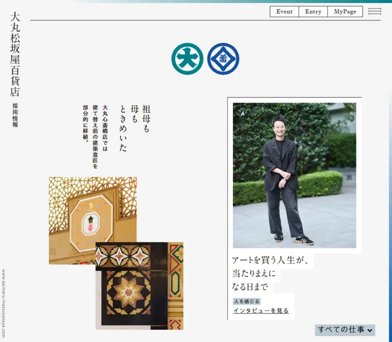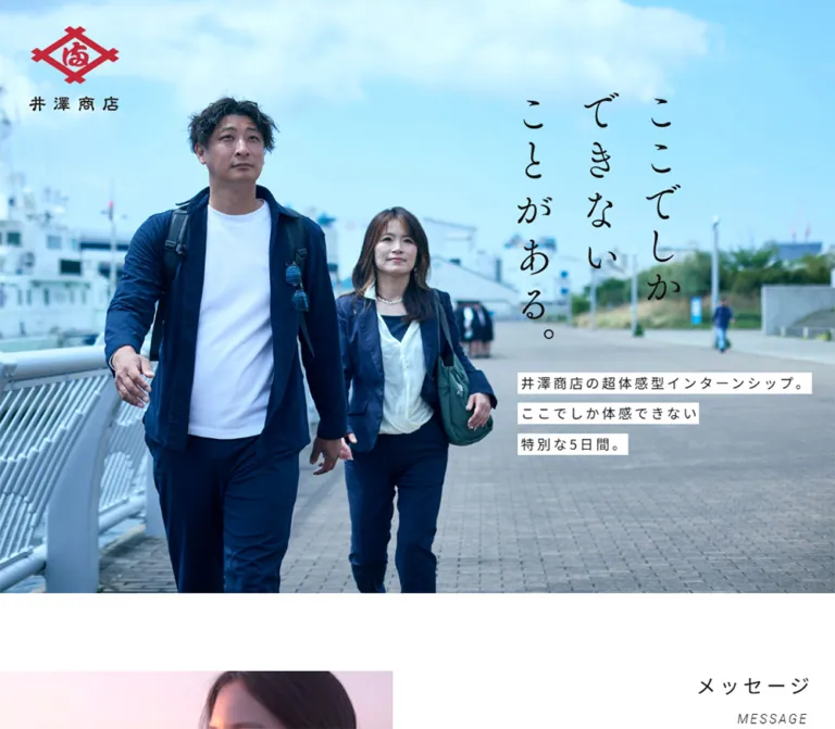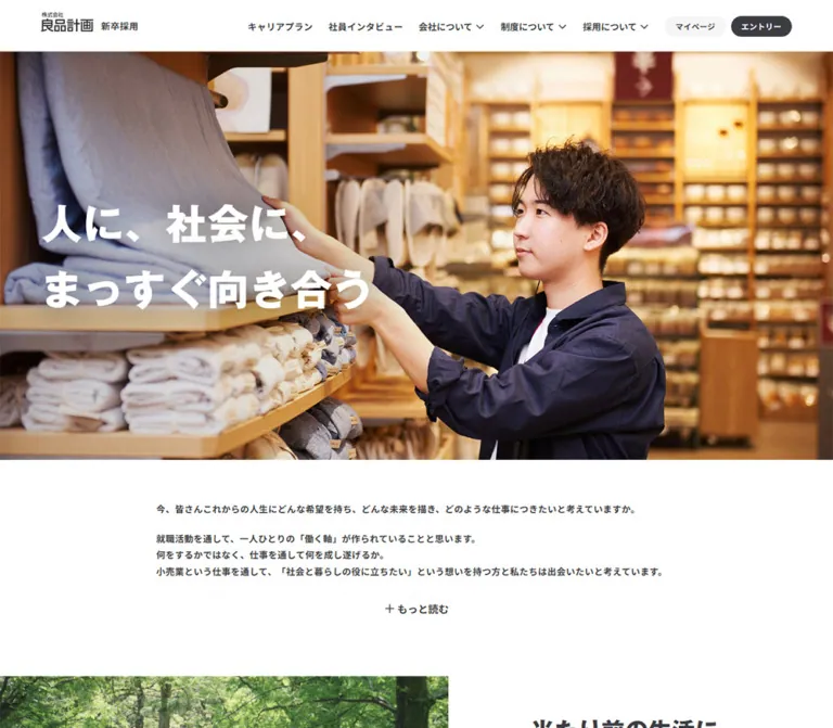
プレビュー準備中デザインリファレンスを見る
日本のWebデザインを、AIの制作リファレンスに。
DESIGN REFERENCE
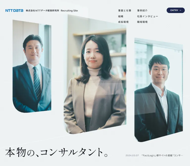
淡いブルーグレーの余白に、明朝体の見出しと斜めに切り取った社員写真を組み合わせた採用サイト。非対称な構成、紺色のピル型ボタン、都市風景のフッターが特徴。
オリジナルサイトを見るPale blue-gray space, precise Mincho typography, and human portraits framed by sloping edges.
Website: NTT DATA Institute of Management Consulting — Recruiting site Original URL: https://www.nttdata-strategy.com/recruit/ Final URL: https://www.nttdata-strategy.com/recruit/ Theme: a light editorial canvas, interrupted by a dark organization section and a photographic footer. Inspected: September 22, 2026, at 14:59:53.753 UTC / 23:59:53.753 JST, according to the supplied retrieval record. Viewports: 1440 × 1000 desktop and 390 × 844 mobile, in CSS pixels. Scope: the current recruitment homepage: navigation, mobile opening composition, introductory statement, Business, Project, Team, Interview, News, and footer. Destination pages and opened menus were not inspected.
This is a recruitment website with a long editorial homepage and links to separate business, project, organization, interview, development, and workplace pages. Its identity comes from the contrast between generous empty space and tightly composed information. Japanese Mincho headings provide a thoughtful, literary tone; sans-serif body copy and small English labels keep navigation practical. Navy capsules mark actions without dominating the page.
Photography supplies the human and institutional context. The visible mobile opening arranges three employees in staggered, angled windows. The desktop Project section pairs compact case-study rows with a large office photograph extending toward the viewport edge. At the bottom, a muted city panorama creates a spacious setting for white navigation, branding, and the vertical statement “ゆえに、本物。”
The first supplied desktop capture is completely blank. It does not establish the appearance of the desktop opening or prove a particular loading sequence. The current mobile opening, desktop Project view, footer captures, and extensive DOM measurements provide sufficient evidence for the rest of this reference.
Pale blue-gray space, precise Mincho typography, and human portraits framed by sloping edges.
Website: NTT DATA Institute of Management Consulting — Recruiting site Original URL: https://www.nttdata-strategy.com/recruit/ Final URL: https://www.nttdata-strategy.com/recruit/ Theme: a light editorial canvas, interrupted by a dark organization section and a photographic footer. Inspected: September 22, 2026, at 14:59:53.753 UTC / 23:59:53.753 JST, according to the supplied retrieval record. Viewports: 1440 × 1000 desktop and 390 × 844 mobile, in CSS pixels. Scope: the current recruitment homepage: navigation, mobile opening composition, introductory statement, Business, Project, Team, Interview, News, and footer. Destination pages and opened menus were not inspected.
This is a recruitment website with a long editorial homepage and links to separate business, project, organization, interview, development, and workplace pages. Its identity comes from the contrast between generous empty space and tightly composed information. Japanese Mincho headings provide a thoughtful, literary tone; sans-serif body copy and small English labels keep navigation practical. Navy capsules mark actions without dominating the page.
Photography supplies the human and institutional context. The visible mobile opening arranges three employees in staggered, angled windows. The desktop Project section pairs compact case-study rows with a large office photograph extending toward the viewport edge. At the bottom, a muted city panorama creates a spacious setting for white navigation, branding, and the vertical statement “ゆえに、本物。”
The first supplied desktop capture is completely blank. It does not establish the appearance of the desktop opening or prove a particular loading sequence. The current mobile opening, desktop Project view, footer captures, and extensive DOM measurements provide sufficient evidence for the rest of this reference.
| Name | Value | Suggested token | Evidence and role |
|---|---|---|---|
| Pale Canvas | #EDF1F2 |
--color-canvas |
Measured BODY background at both viewports; the main page field |
| Text Black | #000000 |
--color-ink |
Measured primary body, heading, and navigation color |
| Action Navy | #1D264D |
--color-action |
Measured ENTRY and section-link fills; reversed text on the Team action |
| Organization Slate | #2D3341 |
--color-slate |
Measured Team section background |
| Surface White | #FFFFFF |
--color-surface |
Measured interview-card fill and mobile menu-button fill; reversed text and controls |
| Supporting Blue | rgb(0 91 150 / 60%) |
--color-support |
Measured section labels, project context, and interview departments |
| Quiet Blue Wash | rgb(0 91 150 / 5%) |
--color-wash |
Measured LOAD MORE fill |
| Social Disc | rgb(255 255 255 / 15%) |
--color-social |
Measured circular social-link background over the footer photograph |
Supporting Blue is translucent. Calculated over the pale canvas, it is approximately #5F97BB; over white, approximately #669DC0. Preserve the alpha value when reproducing the source relationship rather than assigning one opaque blue everywhere.
Quiet Blue Wash over white produces approximately #F2F7FA. The logo uses a stronger corporate blue, but its exact color was not supplied as a computed value. Use approved logo artwork instead of treating Supporting Blue as the logo color.
| Treatment | Observation | Reuse guidance |
|---|---|---|
| Fine dividers | Pale dashed or dotted rules in project and news areas | A 1px dashed rule is a reasonable approximation; exact source color and dash pattern were not measured |
| Footer atmosphere | City photograph appears muted by a blue-gray veil | Tune a photographic overlay against the selected image; its source opacity is unknown |
| Hero background | Very light grain, diagonal hairlines, and broad translucent bands are visible on mobile | Keep these subordinate to portraits and typography; implementation method is unverified |
| Project arrow capsules | Light blue-gray oval surfaces with small navy arrows | Match their quiet contrast; exact fill was not measured |
There is no observed theme selector. The dark Team section is part of the page sequence, not evidence of a separate dark mode.
Measured stack: YakuHanMP, 'Shippori Mincho B1', serif.
This stack appears on the introductory statement, section headings, and News heading. The measured weight is 400. Its fine stroke contrast and generous leading give the page its editorial character. Preserve the distinction between these headings and the more utilitarian body copy.
The hero statement visible on mobile reads “本物の、コンサルタント。” Its extracted H1 contains no text, and the reported 16px inherited font size does not describe the visible lettering. The exact headline asset type and font are unverified. The footer statement similarly has no supplied text-style measurement.
Measured stack: 'Noto Sans JP', sans-serif.
Body copy generally uses weight 400; navigation and project titles use 500. Main explanatory paragraphs have conspicuous 0.12em tracking and 1.75 line height. Project titles use slightly tighter 0.09em tracking and 1.5 leading.
Measured stack: Raleway, sans-serif.
Raleway appears in section labels, ENTRY, English introductory text, Romanized employee names, and copyright. Small labels use medium-to-bold weights and usually 0.06em tracking. The English statement is much larger and lighter.
Values below are measured unless explicitly marked otherwise. Size and line height are shown as size / line-height.
| Role | Family and weight | Desktop | Mobile | Tracking |
|---|---|---|---|---|
| Root/default text | Noto Sans JP, 400 | 16 / 24px |
16 / 24px |
Normal |
| Introductory Japanese statement | Editorial stack, 400 | 22 / 44px |
14 / 28px |
0.06em |
| English introductory statement | Raleway, 400 | 64 / 64px |
30 / 30px |
Normal |
| Business and Project headings | Editorial stack, 400 | 40 / 56px |
30 / 42px |
0.06em |
| Team heading | Editorial stack, 400 | 40 / 56px |
30 / 42px |
Normal |
| Interview section heading | Editorial stack, 400 | 80 / 112px |
30 / 42px |
Desktop -0.06px; mobile 0.06em |
| Main explanatory paragraphs | Noto Sans JP, 400 | 16 / 28px |
14 / 24.5px |
0.12em |
| English section labels | Raleway, 600 | 12 / 18px |
10 / 15px |
0.06em |
| Desktop navigation | Noto Sans JP, 500 | 13 / 19.5px |
Hidden in the closed mobile header | 0.12em |
| ENTRY | Raleway, 700 desktop / 600 mobile | 12 / 18px |
10 / 15px |
0.06em |
| Project title | Noto Sans JP, 500 | 16 / 24px |
12 / 18px |
0.09em |
| Project context | Noto Sans JP, 500 | 12 / 18px |
11 / 16.5px |
0.12em |
| Employee name | Raleway, 600 | 14 / 21px |
12 / 18px |
0.06em |
| Employee department | Noto Sans JP, 400 | 11 / 16.5px |
10 / 15px |
0.12em |
| News heading | Editorial stack, 400 | 36 / 54px |
20 / 30px |
0.06em |
| Footer navigation | Noto Sans JP, 400 | 16 / 28px |
14 / 24.5px |
0.12em |
| Copyright | Raleway, 500 | 10 / 10px |
8 / 8px |
Normal |
The desktop Interview heading's measured tracking is minus 0.06 pixels, not minus 0.06em.
The interview quote containers report 16px / 24px at both sizes, but their bounding heights suggest additional child layout or styling. Those parent values should not be treated as a complete specification for the visible quote treatment.
No single source spacing unit was established. Small paddings recur at 6, 8, 10, 12, 16, 20, and 24px; editorial gaps and section spacing frequently use 40, 60, 80, 120, 160, and 200px.
| Use | Desktop | Mobile | Evidence |
|---|---|---|---|
| Header identity left edge | 40px |
20px |
Measured |
| Business/Project section frame | Starts at 160px; 1120px wide |
40px nominal side padding |
Measured |
| Project body/list side inset | 160px from viewport |
20px from viewport |
Measured; mobile content extends beyond the heading frame |
| Interview section side padding | 120px |
30px |
Measured |
| News outer padding | 20px |
10px |
Measured |
| Footer navigation left inset | 60px |
30px |
Measured |
| Desktop navigation padding | 6px 16px |
Not applicable | Measured |
| Main section-link padding | 10px 24px |
8px 16px |
Measured |
| Main section-link internal gap | 12px |
8px |
Measured |
| Manifesto paragraph separation | 44px |
28px |
Calculated from supplied bounds |
| Interview card outer padding | 10px |
10px |
Measured |
| Interview card-to-card gap | 60px horizontally |
60px vertically |
Calculated from supplied bounds |
| Team section padding | 200px 160px 112px |
120px 43.333px 40px |
Measured |
| Element | Value | Status |
|---|---|---|
| ENTRY, section links, LOAD MORE, menu control | 9999px |
Measured capsule geometry |
| Social controls | 9999px on 30 × 30px boxes |
Measured circles |
| Team upper corners | 80px 80px 0 0 desktop; 30px 30px 0 0 mobile |
Measured |
| Interview cards | 6px 6px 60px 6px |
Expanded from measured three-value shorthand 6px 6px 60px |
| Desktop Project photograph | Approximately 80px at lower left; small upper-left rounding |
Screenshot estimate |
| Project thumbnails | Approximately 6px |
Screenshot estimate |
| News white panel | Approximately 12px |
Screenshot estimate |
| Central mobile hero portrait | Large lower-left curve, approximately 45–55px, combined with angled edges |
Screenshot estimate; not a standard rounded rectangle |
The interview card's large corner is bottom right. It should not become a card with both lower corners equally rounded.
| Element | Desktop | Mobile |
|---|---|---|
| Recorded document height | Approximately 9226px |
Approximately 9126px |
| Header bounds | 1440 × 136.5px |
390 × 60px |
| ENTRY control | 103.844 × 30px, at (1296.156, 42) |
60 × 24px, at (258, 18) |
| Mobile menu control | Not shown | 44 × 24px, at (326, 18) |
| Introductory text column | 645.453px wide, centered |
334.188px wide, centered |
| Project grid | 520px 440px, with 160px gap |
155px 155px, with no reported column gap |
| Project link rows | 520px wide |
350px wide |
| Interview cards | Three cards, each 360 × 613.969px |
330px wide; heights 445, 473, and 473px |
| News section | 1440 × 400px in sampled DOM state |
390 × 689px |
| Footer | 1440 × 680px |
390 × 686.391px |
Document heights and absolute positions are capture-state measurements, not recommended fixed CSS heights. The desktop News DOM and later screenshot expose different amounts of row content, so that section's sampled height is particularly unsuitable as a hardcoded requirement.
Role: maintain corporate identity and access to the recruitment site's main destinations.
On desktop, the identity group begins 40px from the left. Six Japanese navigation links form two columns and three rows at the upper right. The rows begin at y=42, 73.5, and 105px. ENTRY sits farther right as a navy capsule with white uppercase text and a small downward chevron.
The navigation labels are “事業と仕事”, “事例紹介”, “組織”, “社員インタビュー”, “成長環境”, and “職場環境”. The header has a transparent computed background and remains visible at the top of the supplied scrolled desktop captures. Its exact fixed-versus-sticky implementation was not included.
On mobile, a compact logo sits at approximately x=20, with a small company/recruiting caption below. ENTRY and an outlined white menu capsule occupy the right side. The menu button's extracted label is “メニューを開く”. The desktop navigation is absent from the closed mobile view.
The mobile footer capture retains the two top-right controls while the identity group is no longer visible. This supports a distinct scrolled presentation but does not establish its trigger or animation logic.
The DOM contains graduate and mid-career recruitment destinations associated with ENTRY. Neither its expanded state nor the mobile menu was exercised. Do not infer dropdown dimensions, open-state placement, focus behavior, or dismissal rules from the closed controls.
Role: introduce the employer through people and a short statement before the longer narrative.
The current mobile screenshot shows three staggered portrait windows:
These are screenshot estimates. Angled upper and lower edges, selective large corner curves, and uneven vertical placement distinguish the composition from a row of ordinary portrait cards. The people themselves remain upright; the framing provides most of the diagonal movement.
The pale background contains faint diagonal lines and translucent bands. The statement “本物の、コンサルタント。” occupies two lines near the bottom of the first viewport. Its measured H1 container is 350 × 100.063px, begins at (20, 683.438), and includes 30px right padding. The visible lettering is approximately in the mid-40px range, but its actual font size and rendering mechanism are not established.
A dated recruitment announcement follows at about y=808. Its linked text is 11px / 16.5px, with 0.12em tracking, and visibly truncates to one line. The full announcement remains present in the supplied DOM.
For desktop, the H1 container was measured at (40, 878.109), 760 × 71.891px, but the opening screenshot is blank. This reference therefore does not specify a desktop portrait arrangement or opening animation.
Role: explain the organization's social purpose before presenting individual content areas.
Three paragraphs sit in a centered, relatively narrow column. Desktop uses 22px Mincho type with 44px leading and a width of about 645px. Mobile reduces the column to about 334px and the type to 14px / 28px. Paragraph separation equals one line of leading at each measured size.
The English statement “Lighting the way to a brighter society” follows in Raleway, 64px desktop and 30px mobile. It provides a change in typographic texture without becoming a button or badge.
Preserve the reading pauses and short, deliberate line lengths. The supplied content includes viewport-dependent line breaks. Avoid forcing the desktop line-break pattern onto the phone layout.
Role: introduce the firm's work and link to the detailed business page.
The sequence is a small blue English label, a three-line Mincho heading, explanatory copy, and a compact SEE MORE action. Desktop measurements place the heading at x=160 with a 460px box, followed by a narrower 400px body column. The action is approximately 142.172 × 38px.
On mobile, the heading starts at x=40 and occupies a 310px-wide box. The body later spans 330px from x=30, and the 109.813 × 31px action is centered. There is a substantial measured interval between the mobile heading and body; the supplied screenshots do not reveal that interval's complete media composition. Preserve room for the source composition without inventing a specific photograph or animation.
Role: demonstrate the range of consulting work through concrete examples.
The desktop section uses a measured 520px / 160px gap / 440px grid. In the screenshot, the right-side office image begins around x=840 and occupies a visible region approximately 600px wide and 800px high, reaching the viewport edge. Its visible footprint extends beyond the nominal 440px grid column. The photograph shows two employees working together in a bright office, with a pronounced lower-left curve.
The left side contains a Mincho heading, a paragraph, two project rows, and SEE ALL PROJECTS. The body uses 16px / 28px, with 0.12em tracking. The two visible cases concern battery regulation and information management, and methane reduction using seaweed.
Each desktop row contains:
90 × 120px photographic thumbnail.16px / 24px, weight-500 title.The first row is 144px high and the second 126px, with 30px between them. Fine rules begin over the text region rather than passing through the image. The visible arrow surfaces are approximately 50 × 36px; this is an image estimate.
On mobile, the section retains a two-column masthead measurement of 155px 155px. The heading occupies the right column in a tall 155 × 345px box. The paragraph and case-study list then span 350px with 20px viewport insets. This is a composed rearrangement, not evidence that every element simply becomes a full-width stack.
Mobile project titles shrink to 12px / 18px; contextual text uses 11px / 16.5px. Text begins at x≈112.8 inside a row beginning at x=20. The remaining 92.8px accommodates the image and its gap; a roughly 73px image plus 20px gap is a reasonable derived approximation, not an explicitly measured image width.
Observed navigation discrepancy: SEE ALL PROJECTS points to /recruit/business/ in the supplied DOM, while the primary “事例紹介” link points to /recruit/project/. Verify the intended destination in a new implementation.
Role: create a strong visual pause and introduce the organization behind the work.
This full-width section changes to #2D3341 with white text. Its upper corners are 80px on desktop and 30px on mobile. Desktop padding is 200px 160px 112px; mobile padding is 120px 43.333px 40px.
The desktop heading has a tall 168 × 636px box at the right, while explanatory text sits in a 320px column toward the left. Mobile places the heading in a 126 × 520.453px box toward the left and the English label toward the right. The paragraph then spans approximately 303px.
Those dimensions strongly suggest vertical editorial title composition, but the supplied computed-style subset omits writing-mode, and the section is not shown in a current screenshot. Treat the exact text axis as an inference requiring confirmation. The footer's vertical statement, by contrast, is directly visible.
The section action reverses the standard treatment: white capsule, navy text. “We are Professionals” appears four times in the extracted content. Repetition alone does not establish a moving marquee, scrolling speed, or animation direction.
Role: lead candidates into individual consultant stories.
The section begins with a centered English label and a large Mincho heading, “だから私は、ここにいる。” Desktop uses an unusually large 80px / 112px heading; mobile uses two lines at 30px / 42px.
The measured desktop cards form three columns at x=120, 540, and 960, each 360px wide. The middle card begins 80px above the outer cards. This stagger repeats the broader page's preference for uneven alignment.
Each card is a white linked surface with:
6px 6px 60px 6px outer radius, emphasizing the lower-right corner.The supplied DOM supports these text and container measurements. It does not expose all internal image bounds, so precise portrait placement within the cards remains unverified.
On mobile, the cards become a single vertical sequence at x=30, 330px wide, with 60px gaps. Their heights vary with content rather than remaining equal. Keep the full-card link and allow quote and department text to wrap naturally.
Role: present current recruitment announcements near the end of the page.
The visible surface is white with modest rounded corners, separated from the viewport by 20px desktop or 10px mobile outer padding. Rows use fine pale rules, dates, announcement text, and an arrow where a linked destination is visible. LOAD MORE is a small light-blue capsule with a downward arrow.
Desktop measurements show a narrow, tall News heading box consistent with vertical composition; mobile uses a horizontal English label over a 20px / 30px Japanese heading. Writing direction itself was not supplied in computed styles.
The mobile DOM contains four dated announcements. Their rows are 310px wide with 20px vertical padding and measured heights of 94 or 112px. The LOAD MORE button measures approximately 120.516 × 27px mobile and 135.016 × 30px desktop.
LOAD MORE was not activated. Do not assume page size, an infinite-scroll mechanism, a loading spinner, or a completed state. Two mobile announcement anchors have empty href values; preserve the announcement content but verify whether these should be non-link rows.
Role: close the page with a wider social context and repeat the site's primary routes.
The footer uses a full-width urban panorama under a muted blue-gray treatment. The buildings occupy the lower portion while open sky creates room for navigation and a vertical statement. All visible footer branding and navigation is white.
Desktop has two columns of navigation near the lower left, each 180px wide. Link boxes are 44px high. The corporate-site link and three circular social links sit below. The logo/recruiting identity and copyright occupy the lower right.
Mobile changes to a single column of seven links, each 40.5px high, beginning about 220px below the footer's top. The vertical statement sits in the upper-right area. The corporate-site link and social controls share a row near the bottom, followed by white branding and copyright.
The footer measures about 680px high at both tested sizes. On the phone, it remains a substantial photographic section rather than collapsing to a short utility strip. Preserve open sky above the skyline and avoid cropping the image so tightly that buildings become the entire background.
The evidence includes computed transition declarations but no recorded click, hover, menu-opening, or pagination results.
| Target | Measured declaration | What is established |
|---|---|---|
| Main header | opacity 0.7s linear |
Opacity changes have a defined transition; the trigger and endpoint are unknown |
| Hero announcement link | Color-related properties, 0.15s cubic-bezier(0.4, 0, 0.2, 1) |
Short color transitions are available; hover colors were not captured |
| Project titles | Color-related properties, 0.5s cubic-bezier(0.54, 0.01, 0.04, 0.98) |
A slower custom-eased color treatment is defined |
| Interview cards | transform 1s cubic-bezier(0.16, 1, 0.3, 1) and matching box-shadow transition |
Transform and shadow changes are supported; displacement and shadow values are unknown |
| Interview quote containers | Color-related properties using the same 1s curve | Color treatment is coordinated with the card |
| Social links | Color-related properties, 0.15s cubic-bezier(0.4, 0, 0.2, 1) |
Short feedback transitions are defined |
Many other elements report only transition: all; this is insufficient to infer a meaningful duration or visible effect. Sampled elements report animation: none, which does not exclude JavaScript motion, pseudo-element animation, or effects outside the sampled state.
The collection process waited for document load, visible image decoding, and sampled layout stability, with finite time limits. Perpetual animation was paused during readiness checks and resumed afterward. These precautions do not verify complete hero sequencing, scrolling choreography, or delayed content.
For reuse, retain the quiet rhythm of short utility feedback and slower editorial transitions. Any added reveal, portrait cycling, parallax, marquee, or hover lift must be described as a new implementation choice.
| Layer | Appearance | Function |
|---|---|---|
| Main canvas | Solid #EDF1F2 |
Unifies the long page and makes whitespace part of the composition |
| Opening atmosphere | Very faint diagonal lines, grain, and translucent bands | Adds depth without becoming a foreground pattern |
| Project rows | Canvas background, image, fine rule, small arrow surface | Supports dense information without enclosing every item in a card |
| Interview cards | White with one exaggerated lower-right corner | Separates individual voices from the page background |
| Team section | Dark slate, white text, large upper corners | Creates a major narrative transition |
| News panel | White with modest corner rounding | Gives dates and updates a practical, readable surface |
| Footer | Muted urban photography with white text | Closes the page through atmosphere and navigation |
There is no measured general-purpose elevation scale. Interview cards declare shadow transitions, but no resting or active shadow values were supplied. Do not build the entire system around speculative shadows.
The visible current imagery is photographic: employees in bright offices, a collaborative working scene, a battery-related project thumbnail, sheep in a green landscape, and a dense urban panorama.
Employee photographs feel approachable and professional. Daylit or brightly illuminated interiors, white architectural surfaces, dark suits, and cool environmental tones work naturally with the page palette. Preserve skin tones and facial detail; the pale canvas should not become a heavy blue filter over every image.
Framing is a major identity device. The mobile opening uses staggered masks with angled edges and selective curves. The Project photograph uses a broad, stable crop with a large lower-left curve. Small case-study thumbnails remain straightforward and legible.
Use image-specific focal positions. The central mobile employee's face and book are both meaningful, while the right portrait is intentionally cropped by the screen edge. A universal centered crop would lose these relationships.
The supplied evidence exposes one full image URL in the rendered main-data excerpt:
| Asset | Observed URL | Evidence limit |
|---|---|---|
| Employee interview photograph reference | https://images.microcms-assets.io/assets/8ba880c1ada24b3286662c41b2822851/17a7c60bdf804f83a3ef926bf1177667/img-interview-saito-06.jpg |
Present in the page's rendered data excerpt; correspondence to a particular visible portrait was not established |
The exact URLs for the visible project photograph, project thumbnails, hero masks, logo artwork, and footer panorama were not supplied. Do not invent original asset paths. The CSS starter accepts an implementation-provided footer image and leaves authorized image selection to the project.
The page uses several alignment systems rather than one universal container. Header content starts at 40px on desktop; major editorial sections often start at 160px; interview cards start at 120px; footer navigation starts at 60px. Mobile likewise uses 20, 30, 40, and approximately 43px insets for different compositions.
| Area | Desktop observation | Mobile observation |
|---|---|---|
| Navigation | Two columns of three links plus ENTRY | ENTRY and menu control; expanded navigation unverified |
| Opening | H1 and announcement bounds available; screenshot blank | Three staggered portraits, two-line statement, one-line announcement |
| Introductory statement | Centered 645px column, 22px Mincho text | Centered 334px column, 14px Mincho text |
| Business | Heading and body toward the left of a broad section | Narrow heading frame; body and centered CTA appear later |
| Project | 520px content column, 160px gap, right-side photographic bleed | Two-column masthead, then 350px-wide body and project rows |
| Team | Large upper corners, tall right-side heading box | Smaller upper corners, tall left-side heading box, body below |
| Interview | Three 360px cards; center card raised by 80px | One 330px column with 60px vertical gaps |
| News | Compact section in the sampled DOM; tall heading box | Horizontal heading and four visible DOM rows |
| Footer | Two-column links, brand at lower right | Single-column links, utility row, brand below |
Only 1440px and 390px widths were inspected. No source breakpoint values were provided. Intermediate layouts, landscape phones, browser zoom, and tablet behavior remain unverified. The 64rem breakpoint in the Quick Start is a recommendation for an adaptation.
The header visibly overlays scrolled content in the supplied screenshots. In the Project capture, this causes the brand to cross the area occupied by the section heading. That is a captured scroll position, not evidence that the heading should be permanently placed under the logo in normal flow.
These are recommendations for a new implementation, not verified original features.
#EDF1F2.#000000.#1D264D with white text.#2D3341 with white text.#FFFFFF.rgb(0 91 150 / 60%).rgb(0 91 150 / 5%).“Create a Japanese consulting recruitment homepage with a pale blue-gray canvas, generous editorial whitespace, and distinct section compositions. Use Shippori Mincho B1 with YakuHanMP for Japanese editorial headings, Noto Sans JP for body and navigation, and Raleway for English labels. Combine staggered employee portraits in angled windows, compact navy pill links, a desktop project feature with a photograph bleeding to the right, a dark slate organization section with rounded upper corners, three white interview cards with a raised center card, a restrained news panel, and a tall muted cityscape footer. On phones, preserve the composed portrait opening, stack interview cards, and convert footer navigation to one column. Treat unknown animation and menu behavior as separate design decisions.”
This is a reusable adaptation, not recovered source code. It preserves measured colors, typography roles, major spacing, card geometry, and transition curves. The breakpoint, focus treatment, divider color, footer overlay, and unspecified inner CTA typography are recommendations. Font files and image assets must be supplied separately.
The project-row styles expect an image, a .project-row__body containing a title and context, and an optional .project-arrow. The footer expects a navigation group, utility group, social links, and brand group. Mobile hero masks and the inferred vertical Team/Project title compositions need bespoke markup and visual verification beyond this starter.
:root {
  /* Measured colors */
  --color-canvas: #edf1f2;
  --color-ink: #000000;
  --color-action: #1d264d;
  --color-slate: #2d3341;
  --color-surface: #ffffff;
  --color-support: rgb(0 91 150 / 60%);
  --color-wash: rgb(0 91 150 / 5%);
  --color-social: rgb(255 255 255 / 15%);

  /* Recommended approximation for unsampled dividers */
  --color-rule: #d5dde2;

  /* Computed source stacks; load authorized font files separately */
  --font-body: 'Noto Sans JP', sans-serif;
  --font-editorial: YakuHanMP, 'Shippori Mincho B1', serif;
  --font-latin: Raleway, sans-serif;

  --text-body: 14px;
  --text-heading: 30px;
  --text-label: 10px;
  --text-manifesto: 14px;
  --leading-body: 1.75;
  --leading-heading: 1.4;
  --tracking-body: 0.12em;
  --tracking-heading: 0.06em;

  --radius-pill: 9999px;
  --radius-card: 6px 6px 60px 6px;
  --radius-team: 30px 30px 0 0;
  --radius-panel: 12px;

  --motion-utility: 150ms cubic-bezier(0.4, 0, 0.2, 1);
  --motion-project: 500ms cubic-bezier(0.54, 0.01, 0.04, 0.98);
  --motion-card: 1000ms cubic-bezier(0.16, 1, 0.3, 1);
  --motion-header: 700ms linear;

  /* Supply a real image URL in the consuming project */
  --footer-image: none;
}

* {
  box-sizing: border-box;
}

html {
  font-size: 16px;
}

body {
  margin: 0;
  color: var(--color-ink);
  background: var(--color-canvas);
  font: 400 16px / 1.5 var(--font-body);
}

img {
  display: block;
  max-width: 100%;
}

button,
input {
  font: inherit;
}

a {
  color: inherit;
}

.content-shell {
  width: min(1120px, calc(100% - 80px));
  margin-inline: auto;
}

.section-label {
  margin: 0 0 24px;
  color: var(--color-support);
  font: 600 var(--text-label) / 1.5 var(--font-latin);
  letter-spacing: 0.06em;
}

.section-heading {
  margin: 0;
  font: 400 var(--text-heading) / var(--leading-heading)
    var(--font-editorial);
  letter-spacing: var(--tracking-heading);
}

.section-copy {
  font-size: var(--text-body);
  line-height: var(--leading-body);
  letter-spacing: var(--tracking-body);
}

/* Recommended fixed implementation of the observed persistent header */
.site-header {
  position: fixed;
  inset: 0 0 auto;
  z-index: 30;
  display: flex;
  align-items: flex-start;
  justify-content: space-between;
  gap: 20px;
  padding: 18px 20px;
  transition: opacity var(--motion-header);
}

.site-brand {
  width: 90px;
  flex: none;
}

.desktop-nav {
  display: none;
}

.header-actions {
  display: flex;
  align-items: center;
  gap: 8px;
}

.entry-button,
.menu-button,
.pill-link,
.load-more {
  display: inline-flex;
  align-items: center;
  justify-content: center;
  border: 0;
  border-radius: var(--radius-pill);
  text-decoration: none;
  cursor: pointer;
}

.entry-button {
  width: 60px;
  height: 24px;
  padding: 0;
  color: white;
  background: var(--color-action);
  font: 600 10px / 15px var(--font-latin);
  letter-spacing: 0.06em;
  text-transform: uppercase;
}

.menu-button {
  width: 44px;
  height: 24px;
  padding: 0;
  border: 1px solid var(--color-action);
  color: var(--color-action);
  background: white;
}

/* Inner label typography is an adaptation; capsule padding is measured */
.pill-link {
  gap: 8px;
  padding: 8px 16px;
  color: white;
  background: var(--color-action);
  font: 700 10px / 15px var(--font-latin);
  letter-spacing: 0.06em;
  text-transform: uppercase;
}

.pill-link--inverse {
  color: var(--color-action);
  background: white;
}

.manifesto {
  width: min(645.453px, calc(100% - 56px));
  margin-inline: auto;
}

.manifesto p {
  margin: 0 0 2em;
  font: 400 var(--text-manifesto) / 2 var(--font-editorial);
  letter-spacing: 0.06em;
}

.manifesto .manifesto-english {
  margin-top: 50px;
  font: 400 30px / 1 var(--font-latin);
  letter-spacing: normal;
}

.announcement {
  display: grid;
  grid-template-columns: auto minmax(0, 1fr);
  align-items: baseline;
  gap: 16px;
  font-size: 11px;
  line-height: 1.5;
  letter-spacing: 0.12em;
}

.announcement a {
  min-width: 0;
  overflow: hidden;
  white-space: nowrap;
  text-overflow: ellipsis;
  text-decoration: none;
  transition: color var(--motion-utility);
}

.project-list {
  display: grid;
  gap: 0;
}

.project-row {
  position: relative;
  display: grid;
  grid-template-columns: 73px minmax(0, 1fr);
  gap: 20px;
  padding: 16px 0;
  border-top: 1px dashed var(--color-rule);
  text-decoration: none;
}

.project-row > img {
  width: 100%;
  aspect-ratio: 3 / 4;
  object-fit: cover;
  border-radius: 6px;
}

.project-row__title {
  margin: 0;
  font: 500 12px / 1.5 var(--font-body);
  letter-spacing: 0.09em;
  transition: color var(--motion-project);
}

.project-row__context {
  margin: 12px 0 0;
  color: var(--color-support);
  font: 500 11px / 1.5 var(--font-body);
  letter-spacing: 0.12em;
}

/* Desktop arrow appearance is visually estimated */
.project-arrow {
  display: none;
  align-items: center;
  justify-content: center;
  width: 50px;
  height: 36px;
  border-radius: var(--radius-pill);
  color: var(--color-action);
  background: rgb(29 38 77 / 5%);
}

.team-section {
  padding: 120px 11.1111% 40px;
  border-radius: var(--radius-team);
  color: white;
  background: var(--color-slate);
}

.team-section .section-label {
  color: white;
}

.interview-section {
  width: min(1200px, calc(100% - 60px));
  margin-inline: auto;
  padding-bottom: 120px;
}

.interview-heading {
  text-align: center;
}

.interview-grid {
  display: grid;
  gap: 60px;
  margin-top: 60px;
}

.interview-card {
  display: block;
  min-width: 0;
  overflow: hidden;
  padding: 10px;
  border-radius: var(--radius-card);
  color: var(--color-ink);
  background: white;
  text-decoration: none;
  transition:
    transform var(--motion-card),
    box-shadow var(--motion-card);
}

.interview-card__text {
  padding: 10px;
}

.interview-card__name {
  margin: 0;
  font: 600 12px / 1.5 var(--font-latin);
  letter-spacing: 0.06em;
}

.interview-card__department {
  margin: 0;
  color: var(--color-support);
  font: 400 10px / 1.5 var(--font-body);
  letter-spacing: 0.12em;
}

.news-panel {
  margin: 0 10px 10px;
  padding: 60px 30px;
  border-radius: var(--radius-panel);
  background: white;
}

.news-row {
  display: block;
  padding: 20px 0;
  border-bottom: 1px dashed var(--color-rule);
  text-decoration: none;
}

.load-more {
  gap: 8px;
  padding: 6px 16px;
  color: var(--color-ink);
  background: var(--color-wash);
  font: 600 10px / 15px var(--font-latin);
  letter-spacing: 0.06em;
  text-transform: uppercase;
}

.city-footer {
  position: relative;
  min-height: 686px;
  padding: 0 30px 40px;
  color: white;
  background-color: var(--color-slate);
  /* Recommended overlay; adjust to the chosen photograph */
  background-image:
    linear-gradient(rgb(21 52 62 / 48%), rgb(21 52 62 / 48%)),
    var(--footer-image);
  background-size: cover;
  background-position: center bottom;
}

.footer-slogan {
  position: absolute;
  top: 60px;
  right: 30px;
  margin: 0;
  writing-mode: vertical-rl;
  font: 400 32px / 1.4 var(--font-editorial);
}

.footer-nav {
  display: grid;
  padding-top: 220px;
}

.footer-nav a {
  padding: 8px 0;
  font-size: 14px;
  line-height: 24.5px;
  letter-spacing: 0.12em;
  text-decoration: none;
}

.footer-utilities {
  display: flex;
  align-items: center;
  justify-content: space-between;
  gap: 20px;
  margin-top: 44px;
}

.footer-socials {
  display: flex;
  gap: 10px;
}

.footer-socials a {
  display: grid;
  width: 30px;
  height: 30px;
  place-items: center;
  border-radius: 50%;
  background: var(--color-social);
  transition: background-color var(--motion-utility);
}

.footer-brand {
  margin-top: 36px;
}

.footer-copyright {
  font: 500 8px / 1 var(--font-latin);
}

/* Recommended breakpoint, not a recovered source media query */
@media (min-width: 64rem) {
  :root {
    --text-body: 16px;
    --text-heading: 40px;
    --text-label: 12px;
    --text-manifesto: 22px;
    --radius-team: 80px 80px 0 0;
  }

  .site-header {
    gap: 26px;
    padding: 36px 40px 0;
  }

  .site-brand {
    width: 400px;
    max-width: 35vw;
    margin-right: auto;
  }

  .desktop-nav {
    display: grid;
    grid-template-columns: max-content max-content;
    padding-top: 6px;
  }

  .desktop-nav a {
    padding: 6px 16px;
    font: 500 13px / 19.5px var(--font-body);
    letter-spacing: 0.12em;
    text-decoration: none;
  }

  .header-actions {
    padding-top: 6px;
  }

  .entry-button {
    width: 103.844px;
    height: 30px;
    font-size: 12px;
    line-height: 18px;
    font-weight: 700;
  }

  .menu-button {
    display: none;
  }

  .pill-link {
    gap: 12px;
    padding: 10px 24px;
    font-size: 12px;
    line-height: 18px;
  }

  .manifesto .manifesto-english {
    margin-top: 100px;
    font-size: 64px;
  }

  .project-list {
    gap: 30px;
  }

  .project-row {
    grid-template-columns: 90px minmax(0, 1fr) 50px;
    gap: 30px;
    padding: 0;
    border-top: 0;
  }

  .project-row::before {
    position: absolute;
    top: 0;
    right: 0;
    left: 120px;
    border-top: 1px dashed var(--color-rule);
    content: '';
  }

  .project-row__body {
    padding: 24px 10px 0 0;
  }

  .project-row__title {
    font-size: 16px;
  }

  .project-row__context {
    font-size: 12px;
  }

  .project-arrow {
    display: flex;
    margin-top: 18px;
  }

  .team-section {
    padding: 200px 11.1111% 112px;
  }

  .interview-heading {
    font-size: 80px;
    line-height: 112px;
    letter-spacing: -0.06px;
  }

  .interview-grid {
    grid-template-columns: repeat(3, minmax(0, 1fr));
    align-items: start;
    margin-top: 200px;
  }

  .interview-card:nth-child(2) {
    transform: translateY(-80px);
  }

  .interview-card__text {
    padding: 20px;
  }

  .interview-card__name {
    font-size: 14px;
  }

  .interview-card__department {
    font-size: 11px;
  }

  .news-panel {
    margin: 0 20px 20px;
    padding: 120px clamp(30px, 10vw, 144px);
  }

  .load-more {
    font-size: 12px;
    line-height: 18px;
  }

  .city-footer {
    min-height: 680px;
    padding: 0 60px 56px;
  }

  .footer-slogan {
    top: 100px;
    right: 100px;
    font-size: 44px;
  }

  .footer-nav {
    grid-template-columns: 180px 180px;
    padding-top: 317px;
  }

  .footer-nav a {
    font-size: 16px;
    line-height: 28px;
  }

  .footer-utilities {
    display: block;
    margin-top: 45px;
  }

  .footer-socials {
    margin-top: 20px;
  }

  .footer-brand {
    position: absolute;
    right: 80px;
    bottom: 56px;
    width: 400px;
    margin: 0;
  }

  .footer-copyright {
    font-size: 10px;
  }
}

/* Recommended accessibility additions */
:where(a, button):focus-visible {
  outline: 2px solid currentColor;
  outline-offset: 4px;
}

@media (prefers-reduced-motion: reduce) {
  .site-header,
  .announcement a,
  .project-row__title,
  .interview-card,
  .footer-socials a {
    transition: none;
  }
}
This starter intentionally defines no opening reveal, hover displacement, portrait cycling, or dropdown choreography. Add those only after their requirements are established. The static raised interview card remains in reduced-motion mode because it is a compositional offset, not an animation.
Optional aliases for a project that already uses Tailwind v4. This does not establish the original site's framework version. Define the custom properties above first.
@theme inline {
  --color-canvas: #edf1f2;
  --color-ink: #000000;
  --color-action: #1d264d;
  --color-slate: #2d3341;
  --color-surface: #ffffff;
  --color-support: rgb(0 91 150 / 60%);
  --color-wash: rgb(0 91 150 / 5%);

  --font-body: 'Noto Sans JP', sans-serif;
  --font-editorial: YakuHanMP, 'Shippori Mincho B1', serif;
  --font-latin: Raleway, sans-serif;

  --text-copy: var(--text-body);
  --text-section: var(--text-heading);
  --text-overline: var(--text-label);

  --radius-pill: 9999px;
  --radius-panel: 12px;
  --radius-feature: 80px;
}

/* Asymmetric shapes remain explicit component rules */
.interview-shape {
  border-radius: 6px 6px 60px 6px;
}
This reference was prepared from the supplied current-page evidence without additional browsing, command execution, or file inspection. Estimates and implementation additions are labeled separately from measurements.
# NTT DATA Institute of Management Consulting — Recruitment Style Reference

> Pale blue-gray space, precise Mincho typography, and human portraits framed by sloping edges.

**Website:** [NTT DATA Institute of Management Consulting — Recruiting site](https://www.nttdata-strategy.com/recruit/)
**Original URL:** https://www.nttdata-strategy.com/recruit/
**Final URL:** https://www.nttdata-strategy.com/recruit/
**Theme:** a light editorial canvas, interrupted by a dark organization section and a photographic footer.
**Inspected:** September 22, 2026, at 14:59:53.753 UTC / 23:59:53.753 JST, according to the supplied retrieval record.
**Viewports:** 1440 × 1000 desktop and 390 × 844 mobile, in CSS pixels.
**Scope:** the current recruitment homepage: navigation, mobile opening composition, introductory statement, Business, Project, Team, Interview, News, and footer. Destination pages and opened menus were not inspected.

This is a recruitment website with a long editorial homepage and links to separate business, project, organization, interview, development, and workplace pages. Its identity comes from the contrast between generous empty space and tightly composed information. Japanese Mincho headings provide a thoughtful, literary tone; sans-serif body copy and small English labels keep navigation practical. Navy capsules mark actions without dominating the page.

Photography supplies the human and institutional context. The visible mobile opening arranges three employees in staggered, angled windows. The desktop Project section pairs compact case-study rows with a large office photograph extending toward the viewport edge. At the bottom, a muted city panorama creates a spacious setting for white navigation, branding, and the vertical statement “ゆえに、本物。”

The first supplied desktop capture is completely blank. It does not establish the appearance of the desktop opening or prove a particular loading sequence. The current mobile opening, desktop Project view, footer captures, and extensive DOM measurements provide sufficient evidence for the rest of this reference.
# NTT DATA Institute of Management Consulting — Recruitment Style Reference

> Pale blue-gray space, precise Mincho typography, and human portraits framed by sloping edges.

**Website:** [NTT DATA Institute of Management Consulting — Recruiting site](https://www.nttdata-strategy.com/recruit/)
**Original URL:** https://www.nttdata-strategy.com/recruit/
**Final URL:** https://www.nttdata-strategy.com/recruit/
**Theme:** a light editorial canvas, interrupted by a dark organization section and a photographic footer.
**Inspected:** September 22, 2026, at 14:59:53.753 UTC / 23:59:53.753 JST, according to the supplied retrieval record.
**Viewports:** 1440 × 1000 desktop and 390 × 844 mobile, in CSS pixels.
**Scope:** the current recruitment homepage: navigation, mobile opening composition, introductory statement, Business, Project, Team, Interview, News, and footer. Destination pages and opened menus were not inspected.

This is a recruitment website with a long editorial homepage and links to separate business, project, organization, interview, development, and workplace pages. Its identity comes from the contrast between generous empty space and tightly composed information. Japanese Mincho headings provide a thoughtful, literary tone; sans-serif body copy and small English labels keep navigation practical. Navy capsules mark actions without dominating the page.

Photography supplies the human and institutional context. The visible mobile opening arranges three employees in staggered, angled windows. The desktop Project section pairs compact case-study rows with a large office photograph extending toward the viewport edge. At the bottom, a muted city panorama creates a spacious setting for white navigation, branding, and the vertical statement “ゆえに、本物。”

The first supplied desktop capture is completely blank. It does not establish the appearance of the desktop opening or prove a particular loading sequence. The current mobile opening, desktop Project view, footer captures, and extensive DOM measurements provide sufficient evidence for the rest of this reference.

## How to Read This Reference

- **Measured** means a value supplied by the rendered DOM or computed-style evidence. Measurements apply to the recorded viewport and capture state.
- **Visually observed** means visible in a supplied current-page screenshot. Approximate image dimensions, corner sizes, and photographic treatments are identified as estimates.
- **Calculated** means derived from supplied values, such as alpha compositing or differences between element positions.
- **Recommended** means an implementation choice for reuse, not a verified feature of the original website.
- Token names in this document are descriptive aliases. The supplied custom-property list contains utility defaults but does not expose an original semantic design-token system.
- Computed font stacks establish declarations, not independent verification of every downloaded font or rendered glyph.
- Offscreen DOM measurements support layout descriptions, but they do not provide a complete visual inspection of every section. Writing direction, image masks, menu states, and motion require particular care.

## Tokens — Colors

### Default Palette

| Name | Value | Suggested token | Evidence and role |
| --- | --- | --- | --- |
| Pale Canvas | `#EDF1F2` | `--color-canvas` | Measured BODY background at both viewports; the main page field |
| Text Black | `#000000` | `--color-ink` | Measured primary body, heading, and navigation color |
| Action Navy | `#1D264D` | `--color-action` | Measured ENTRY and section-link fills; reversed text on the Team action |
| Organization Slate | `#2D3341` | `--color-slate` | Measured Team section background |
| Surface White | `#FFFFFF` | `--color-surface` | Measured interview-card fill and mobile menu-button fill; reversed text and controls |
| Supporting Blue | `rgb(0 91 150 / 60%)` | `--color-support` | Measured section labels, project context, and interview departments |
| Quiet Blue Wash | `rgb(0 91 150 / 5%)` | `--color-wash` | Measured LOAD MORE fill |
| Social Disc | `rgb(255 255 255 / 15%)` | `--color-social` | Measured circular social-link background over the footer photograph |

Supporting Blue is translucent. **Calculated** over the pale canvas, it is approximately `#5F97BB`; over white, approximately `#669DC0`. Preserve the alpha value when reproducing the source relationship rather than assigning one opaque blue everywhere.

Quiet Blue Wash over white produces approximately `#F2F7FA`. The logo uses a stronger corporate blue, but its exact color was not supplied as a computed value. Use approved logo artwork instead of treating Supporting Blue as the logo color.

### Additional Visual Treatments

| Treatment | Observation | Reuse guidance |
| --- | --- | --- |
| Fine dividers | Pale dashed or dotted rules in project and news areas | A 1px dashed rule is a reasonable approximation; exact source color and dash pattern were not measured |
| Footer atmosphere | City photograph appears muted by a blue-gray veil | Tune a photographic overlay against the selected image; its source opacity is unknown |
| Hero background | Very light grain, diagonal hairlines, and broad translucent bands are visible on mobile | Keep these subordinate to portraits and typography; implementation method is unverified |
| Project arrow capsules | Light blue-gray oval surfaces with small navy arrows | Match their quiet contrast; exact fill was not measured |

There is no observed theme selector. The dark Team section is part of the page sequence, not evidence of a separate dark mode.

## Tokens — Typography

### Japanese Editorial Text

**Measured stack:** `YakuHanMP, 'Shippori Mincho B1', serif`.

This stack appears on the introductory statement, section headings, and News heading. The measured weight is `400`. Its fine stroke contrast and generous leading give the page its editorial character. Preserve the distinction between these headings and the more utilitarian body copy.

The hero statement visible on mobile reads “本物の、コンサルタント。” Its extracted H1 contains no text, and the reported `16px` inherited font size does not describe the visible lettering. The exact headline asset type and font are unverified. The footer statement similarly has no supplied text-style measurement.

### Japanese Body and Navigation

**Measured stack:** `'Noto Sans JP', sans-serif`.

Body copy generally uses weight `400`; navigation and project titles use `500`. Main explanatory paragraphs have conspicuous `0.12em` tracking and `1.75` line height. Project titles use slightly tighter `0.09em` tracking and `1.5` leading.

### English Labels and Names

**Measured stack:** `Raleway, sans-serif`.

Raleway appears in section labels, ENTRY, English introductory text, Romanized employee names, and copyright. Small labels use medium-to-bold weights and usually `0.06em` tracking. The English statement is much larger and lighter.

### Type Scale

Values below are measured unless explicitly marked otherwise. Size and line height are shown as `size / line-height`.

| Role | Family and weight | Desktop | Mobile | Tracking |
| --- | --- | --- | --- | --- |
| Root/default text | Noto Sans JP, 400 | `16 / 24px` | `16 / 24px` | Normal |
| Introductory Japanese statement | Editorial stack, 400 | `22 / 44px` | `14 / 28px` | `0.06em` |
| English introductory statement | Raleway, 400 | `64 / 64px` | `30 / 30px` | Normal |
| Business and Project headings | Editorial stack, 400 | `40 / 56px` | `30 / 42px` | `0.06em` |
| Team heading | Editorial stack, 400 | `40 / 56px` | `30 / 42px` | Normal |
| Interview section heading | Editorial stack, 400 | `80 / 112px` | `30 / 42px` | Desktop `-0.06px`; mobile `0.06em` |
| Main explanatory paragraphs | Noto Sans JP, 400 | `16 / 28px` | `14 / 24.5px` | `0.12em` |
| English section labels | Raleway, 600 | `12 / 18px` | `10 / 15px` | `0.06em` |
| Desktop navigation | Noto Sans JP, 500 | `13 / 19.5px` | Hidden in the closed mobile header | `0.12em` |
| ENTRY | Raleway, 700 desktop / 600 mobile | `12 / 18px` | `10 / 15px` | `0.06em` |
| Project title | Noto Sans JP, 500 | `16 / 24px` | `12 / 18px` | `0.09em` |
| Project context | Noto Sans JP, 500 | `12 / 18px` | `11 / 16.5px` | `0.12em` |
| Employee name | Raleway, 600 | `14 / 21px` | `12 / 18px` | `0.06em` |
| Employee department | Noto Sans JP, 400 | `11 / 16.5px` | `10 / 15px` | `0.12em` |
| News heading | Editorial stack, 400 | `36 / 54px` | `20 / 30px` | `0.06em` |
| Footer navigation | Noto Sans JP, 400 | `16 / 28px` | `14 / 24.5px` | `0.12em` |
| Copyright | Raleway, 500 | `10 / 10px` | `8 / 8px` | Normal |

The desktop Interview heading's measured tracking is **minus 0.06 pixels**, not minus 0.06em.

The interview quote containers report `16px / 24px` at both sizes, but their bounding heights suggest additional child layout or styling. Those parent values should not be treated as a complete specification for the visible quote treatment.

## Tokens — Spacing & Shapes

No single source spacing unit was established. Small paddings recur at 6, 8, 10, 12, 16, 20, and 24px; editorial gaps and section spacing frequently use 40, 60, 80, 120, 160, and 200px.

### Spacing Scale

| Use | Desktop | Mobile | Evidence |
| --- | --- | --- | --- |
| Header identity left edge | `40px` | `20px` | Measured |
| Business/Project section frame | Starts at `160px`; `1120px` wide | `40px` nominal side padding | Measured |
| Project body/list side inset | `160px` from viewport | `20px` from viewport | Measured; mobile content extends beyond the heading frame |
| Interview section side padding | `120px` | `30px` | Measured |
| News outer padding | `20px` | `10px` | Measured |
| Footer navigation left inset | `60px` | `30px` | Measured |
| Desktop navigation padding | `6px 16px` | Not applicable | Measured |
| Main section-link padding | `10px 24px` | `8px 16px` | Measured |
| Main section-link internal gap | `12px` | `8px` | Measured |
| Manifesto paragraph separation | `44px` | `28px` | Calculated from supplied bounds |
| Interview card outer padding | `10px` | `10px` | Measured |
| Interview card-to-card gap | `60px` horizontally | `60px` vertically | Calculated from supplied bounds |
| Team section padding | `200px 160px 112px` | `120px 43.333px 40px` | Measured |

### Border Radius

| Element | Value | Status |
| --- | --- | --- |
| ENTRY, section links, LOAD MORE, menu control | `9999px` | Measured capsule geometry |
| Social controls | `9999px` on `30 × 30px` boxes | Measured circles |
| Team upper corners | `80px 80px 0 0` desktop; `30px 30px 0 0` mobile | Measured |
| Interview cards | `6px 6px 60px 6px` | Expanded from measured three-value shorthand `6px 6px 60px` |
| Desktop Project photograph | Approximately `80px` at lower left; small upper-left rounding | Screenshot estimate |
| Project thumbnails | Approximately `6px` | Screenshot estimate |
| News white panel | Approximately `12px` | Screenshot estimate |
| Central mobile hero portrait | Large lower-left curve, approximately `45–55px`, combined with angled edges | Screenshot estimate; not a standard rounded rectangle |

The interview card's large corner is **bottom right**. It should not become a card with both lower corners equally rounded.

### Layout Measurements

| Element | Desktop | Mobile |
| --- | --- | --- |
| Recorded document height | Approximately `9226px` | Approximately `9126px` |
| Header bounds | `1440 × 136.5px` | `390 × 60px` |
| ENTRY control | `103.844 × 30px`, at `(1296.156, 42)` | `60 × 24px`, at `(258, 18)` |
| Mobile menu control | Not shown | `44 × 24px`, at `(326, 18)` |
| Introductory text column | `645.453px` wide, centered | `334.188px` wide, centered |
| Project grid | `520px 440px`, with `160px` gap | `155px 155px`, with no reported column gap |
| Project link rows | `520px` wide | `350px` wide |
| Interview cards | Three cards, each `360 × 613.969px` | `330px` wide; heights `445`, `473`, and `473px` |
| News section | `1440 × 400px` in sampled DOM state | `390 × 689px` |
| Footer | `1440 × 680px` | `390 × 686.391px` |

Document heights and absolute positions are capture-state measurements, not recommended fixed CSS heights. The desktop News DOM and later screenshot expose different amounts of row content, so that section's sampled height is particularly unsuitable as a hardcoded requirement.

## Components

### Persistent Header and Entry Control

**Role:** maintain corporate identity and access to the recruitment site's main destinations.

On desktop, the identity group begins 40px from the left. Six Japanese navigation links form two columns and three rows at the upper right. The rows begin at y=42, 73.5, and 105px. ENTRY sits farther right as a navy capsule with white uppercase text and a small downward chevron.

The navigation labels are “事業と仕事”, “事例紹介”, “組織”, “社員インタビュー”, “成長環境”, and “職場環境”. The header has a transparent computed background and remains visible at the top of the supplied scrolled desktop captures. Its exact fixed-versus-sticky implementation was not included.

On mobile, a compact logo sits at approximately x=20, with a small company/recruiting caption below. ENTRY and an outlined white menu capsule occupy the right side. The menu button's extracted label is “メニューを開く”. The desktop navigation is absent from the closed mobile view.

The mobile footer capture retains the two top-right controls while the identity group is no longer visible. This supports a distinct scrolled presentation but does not establish its trigger or animation logic.

The DOM contains graduate and mid-career recruitment destinations associated with ENTRY. Neither its expanded state nor the mobile menu was exercised. Do not infer dropdown dimensions, open-state placement, focus behavior, or dismissal rules from the closed controls.

### Mobile Opening Composition and News Ticker

**Role:** introduce the employer through people and a short statement before the longer narrative.

The current mobile screenshot shows three staggered portrait windows:

- A woman at the upper left, partly cropped by the viewport, spanning roughly x=0–128 and y=94–312.
- A larger central portrait of a smiling employee holding a book, roughly x=107–282 and y=182–500.
- A smaller portrait at the lower right, partly cropped by the viewport, roughly x=265–390 and y=369–589.

These are screenshot estimates. Angled upper and lower edges, selective large corner curves, and uneven vertical placement distinguish the composition from a row of ordinary portrait cards. The people themselves remain upright; the framing provides most of the diagonal movement.

The pale background contains faint diagonal lines and translucent bands. The statement “本物の、コンサルタント。” occupies two lines near the bottom of the first viewport. Its measured H1 container is `350 × 100.063px`, begins at `(20, 683.438)`, and includes 30px right padding. The visible lettering is approximately in the mid-40px range, but its actual font size and rendering mechanism are not established.

A dated recruitment announcement follows at about y=808. Its linked text is `11px / 16.5px`, with `0.12em` tracking, and visibly truncates to one line. The full announcement remains present in the supplied DOM.

For desktop, the H1 container was measured at `(40, 878.109)`, `760 × 71.891px`, but the opening screenshot is blank. This reference therefore does not specify a desktop portrait arrangement or opening animation.

### Introductory Statement

**Role:** explain the organization's social purpose before presenting individual content areas.

Three paragraphs sit in a centered, relatively narrow column. Desktop uses `22px` Mincho type with `44px` leading and a width of about 645px. Mobile reduces the column to about 334px and the type to `14px / 28px`. Paragraph separation equals one line of leading at each measured size.

The English statement “Lighting the way to a brighter society” follows in Raleway, `64px` desktop and `30px` mobile. It provides a change in typographic texture without becoming a button or badge.

Preserve the reading pauses and short, deliberate line lengths. The supplied content includes viewport-dependent line breaks. Avoid forcing the desktop line-break pattern onto the phone layout.

### Business Section

**Role:** introduce the firm's work and link to the detailed business page.

The sequence is a small blue English label, a three-line Mincho heading, explanatory copy, and a compact SEE MORE action. Desktop measurements place the heading at x=160 with a 460px box, followed by a narrower 400px body column. The action is approximately `142.172 × 38px`.

On mobile, the heading starts at x=40 and occupies a 310px-wide box. The body later spans 330px from x=30, and the `109.813 × 31px` action is centered. There is a substantial measured interval between the mobile heading and body; the supplied screenshots do not reveal that interval's complete media composition. Preserve room for the source composition without inventing a specific photograph or animation.

### Project Feature and Case-Study Rows

**Role:** demonstrate the range of consulting work through concrete examples.

The desktop section uses a measured `520px / 160px gap / 440px` grid. In the screenshot, the right-side office image begins around x=840 and occupies a visible region approximately 600px wide and 800px high, reaching the viewport edge. Its visible footprint extends beyond the nominal 440px grid column. The photograph shows two employees working together in a bright office, with a pronounced lower-left curve.

The left side contains a Mincho heading, a paragraph, two project rows, and SEE ALL PROJECTS. The body uses `16px / 28px`, with `0.12em` tracking. The two visible cases concern battery regulation and information management, and methane reduction using seaweed.

Each desktop row contains:

1. A roughly `90 × 120px` photographic thumbnail.
2. A title column beginning 120px after the row's left edge.
3. A `16px / 24px`, weight-500 title.
4. Blue contextual text below, separated by about 12px.
5. A small right arrow inside a quiet oval at the far right.

The first row is 144px high and the second 126px, with 30px between them. Fine rules begin over the text region rather than passing through the image. The visible arrow surfaces are approximately `50 × 36px`; this is an image estimate.

On mobile, the section retains a two-column masthead measurement of `155px 155px`. The heading occupies the right column in a tall `155 × 345px` box. The paragraph and case-study list then span 350px with 20px viewport insets. This is a composed rearrangement, not evidence that every element simply becomes a full-width stack.

Mobile project titles shrink to `12px / 18px`; contextual text uses `11px / 16.5px`. Text begins at x≈112.8 inside a row beginning at x=20. The remaining 92.8px accommodates the image and its gap; a roughly 73px image plus 20px gap is a reasonable derived approximation, not an explicitly measured image width.

**Observed navigation discrepancy:** SEE ALL PROJECTS points to `/recruit/business/` in the supplied DOM, while the primary “事例紹介” link points to `/recruit/project/`. Verify the intended destination in a new implementation.

### Team Section

**Role:** create a strong visual pause and introduce the organization behind the work.

This full-width section changes to `#2D3341` with white text. Its upper corners are 80px on desktop and 30px on mobile. Desktop padding is `200px 160px 112px`; mobile padding is `120px 43.333px 40px`.

The desktop heading has a tall `168 × 636px` box at the right, while explanatory text sits in a 320px column toward the left. Mobile places the heading in a `126 × 520.453px` box toward the left and the English label toward the right. The paragraph then spans approximately 303px.

Those dimensions strongly suggest vertical editorial title composition, but the supplied computed-style subset omits `writing-mode`, and the section is not shown in a current screenshot. Treat the exact text axis as an inference requiring confirmation. The footer's vertical statement, by contrast, is directly visible.

The section action reverses the standard treatment: white capsule, navy text. “We are Professionals” appears four times in the extracted content. Repetition alone does not establish a moving marquee, scrolling speed, or animation direction.

### Interview Cards

**Role:** lead candidates into individual consultant stories.

The section begins with a centered English label and a large Mincho heading, “だから私は、ここにいる。” Desktop uses an unusually large `80px / 112px` heading; mobile uses two lines at `30px / 42px`.

The measured desktop cards form three columns at x=120, 540, and 960, each 360px wide. The middle card begins 80px above the outer cards. This stagger repeats the broader page's preference for uneven alignment.

Each card is a white linked surface with:

- 10px outer padding.
- An interview statement near the top.
- A Romanized name in Raleway.
- A smaller blue department label.
- A `6px 6px 60px 6px` outer radius, emphasizing the lower-right corner.

The supplied DOM supports these text and container measurements. It does not expose all internal image bounds, so precise portrait placement within the cards remains unverified.

On mobile, the cards become a single vertical sequence at x=30, 330px wide, with 60px gaps. Their heights vary with content rather than remaining equal. Keep the full-card link and allow quote and department text to wrap naturally.

### News Panel

**Role:** present current recruitment announcements near the end of the page.

The visible surface is white with modest rounded corners, separated from the viewport by 20px desktop or 10px mobile outer padding. Rows use fine pale rules, dates, announcement text, and an arrow where a linked destination is visible. LOAD MORE is a small light-blue capsule with a downward arrow.

Desktop measurements show a narrow, tall News heading box consistent with vertical composition; mobile uses a horizontal English label over a `20px / 30px` Japanese heading. Writing direction itself was not supplied in computed styles.

The mobile DOM contains four dated announcements. Their rows are 310px wide with 20px vertical padding and measured heights of 94 or 112px. The LOAD MORE button measures approximately `120.516 × 27px` mobile and `135.016 × 30px` desktop.

LOAD MORE was not activated. Do not assume page size, an infinite-scroll mechanism, a loading spinner, or a completed state. Two mobile announcement anchors have empty href values; preserve the announcement content but verify whether these should be non-link rows.

### Cityscape Footer

**Role:** close the page with a wider social context and repeat the site's primary routes.

The footer uses a full-width urban panorama under a muted blue-gray treatment. The buildings occupy the lower portion while open sky creates room for navigation and a vertical statement. All visible footer branding and navigation is white.

Desktop has two columns of navigation near the lower left, each 180px wide. Link boxes are 44px high. The corporate-site link and three circular social links sit below. The logo/recruiting identity and copyright occupy the lower right.

Mobile changes to a single column of seven links, each `40.5px` high, beginning about 220px below the footer's top. The vertical statement sits in the upper-right area. The corporate-site link and social controls share a row near the bottom, followed by white branding and copyright.

The footer measures about 680px high at both tested sizes. On the phone, it remains a substantial photographic section rather than collapsing to a short utility strip. Preserve open sky above the skyline and avoid cropping the image so tightly that buildings become the entire background.

## Tokens — Motion & Interaction

The evidence includes computed transition declarations but no recorded click, hover, menu-opening, or pagination results.

| Target | Measured declaration | What is established |
| --- | --- | --- |
| Main header | `opacity 0.7s linear` | Opacity changes have a defined transition; the trigger and endpoint are unknown |
| Hero announcement link | Color-related properties, `0.15s cubic-bezier(0.4, 0, 0.2, 1)` | Short color transitions are available; hover colors were not captured |
| Project titles | Color-related properties, `0.5s cubic-bezier(0.54, 0.01, 0.04, 0.98)` | A slower custom-eased color treatment is defined |
| Interview cards | `transform 1s cubic-bezier(0.16, 1, 0.3, 1)` and matching box-shadow transition | Transform and shadow changes are supported; displacement and shadow values are unknown |
| Interview quote containers | Color-related properties using the same 1s curve | Color treatment is coordinated with the card |
| Social links | Color-related properties, `0.15s cubic-bezier(0.4, 0, 0.2, 1)` | Short feedback transitions are defined |

Many other elements report only `transition: all`; this is insufficient to infer a meaningful duration or visible effect. Sampled elements report `animation: none`, which does not exclude JavaScript motion, pseudo-element animation, or effects outside the sampled state.

The collection process waited for document load, visible image decoding, and sampled layout stability, with finite time limits. Perpetual animation was paused during readiness checks and resumed afterward. These precautions do not verify complete hero sequencing, scrolling choreography, or delayed content.

For reuse, retain the quiet rhythm of short utility feedback and slower editorial transitions. Any added reveal, portrait cycling, parallax, marquee, or hover lift must be described as a new implementation choice.

## Surfaces

| Layer | Appearance | Function |
| --- | --- | --- |
| Main canvas | Solid `#EDF1F2` | Unifies the long page and makes whitespace part of the composition |
| Opening atmosphere | Very faint diagonal lines, grain, and translucent bands | Adds depth without becoming a foreground pattern |
| Project rows | Canvas background, image, fine rule, small arrow surface | Supports dense information without enclosing every item in a card |
| Interview cards | White with one exaggerated lower-right corner | Separates individual voices from the page background |
| Team section | Dark slate, white text, large upper corners | Creates a major narrative transition |
| News panel | White with modest corner rounding | Gives dates and updates a practical, readable surface |
| Footer | Muted urban photography with white text | Closes the page through atmosphere and navigation |

There is no measured general-purpose elevation scale. Interview cards declare shadow transitions, but no resting or active shadow values were supplied. Do not build the entire system around speculative shadows.

## Imagery

The visible current imagery is photographic: employees in bright offices, a collaborative working scene, a battery-related project thumbnail, sheep in a green landscape, and a dense urban panorama.

Employee photographs feel approachable and professional. Daylit or brightly illuminated interiors, white architectural surfaces, dark suits, and cool environmental tones work naturally with the page palette. Preserve skin tones and facial detail; the pale canvas should not become a heavy blue filter over every image.

Framing is a major identity device. The mobile opening uses staggered masks with angled edges and selective curves. The Project photograph uses a broad, stable crop with a large lower-left curve. Small case-study thumbnails remain straightforward and legible.

Use image-specific focal positions. The central mobile employee's face and book are both meaningful, while the right portrait is intentionally cropped by the screen edge. A universal centered crop would lose these relationships.

### Observed Asset References

The supplied evidence exposes one full image URL in the rendered main-data excerpt:

| Asset | Observed URL | Evidence limit |
| --- | --- | --- |
| Employee interview photograph reference | `https://images.microcms-assets.io/assets/8ba880c1ada24b3286662c41b2822851/17a7c60bdf804f83a3ef926bf1177667/img-interview-saito-06.jpg` | Present in the page's rendered data excerpt; correspondence to a particular visible portrait was not established |

The exact URLs for the visible project photograph, project thumbnails, hero masks, logo artwork, and footer panorama were not supplied. Do not invent original asset paths. The CSS starter accepts an implementation-provided footer image and leaves authorized image selection to the project.

## Layout & Responsive Behavior

The page uses several alignment systems rather than one universal container. Header content starts at 40px on desktop; major editorial sections often start at 160px; interview cards start at 120px; footer navigation starts at 60px. Mobile likewise uses 20, 30, 40, and approximately 43px insets for different compositions.

| Area | Desktop observation | Mobile observation |
| --- | --- | --- |
| Navigation | Two columns of three links plus ENTRY | ENTRY and menu control; expanded navigation unverified |
| Opening | H1 and announcement bounds available; screenshot blank | Three staggered portraits, two-line statement, one-line announcement |
| Introductory statement | Centered 645px column, 22px Mincho text | Centered 334px column, 14px Mincho text |
| Business | Heading and body toward the left of a broad section | Narrow heading frame; body and centered CTA appear later |
| Project | 520px content column, 160px gap, right-side photographic bleed | Two-column masthead, then 350px-wide body and project rows |
| Team | Large upper corners, tall right-side heading box | Smaller upper corners, tall left-side heading box, body below |
| Interview | Three 360px cards; center card raised by 80px | One 330px column with 60px vertical gaps |
| News | Compact section in the sampled DOM; tall heading box | Horizontal heading and four visible DOM rows |
| Footer | Two-column links, brand at lower right | Single-column links, utility row, brand below |

Only 1440px and 390px widths were inspected. No source breakpoint values were provided. Intermediate layouts, landscape phones, browser zoom, and tablet behavior remain unverified. The 64rem breakpoint in the Quick Start is a recommendation for an adaptation.

The header visibly overlays scrolled content in the supplied screenshots. In the Project capture, this causes the brand to cross the area occupied by the section heading. That is a captured scroll position, not evidence that the heading should be permanently placed under the logo in normal flow.

## Do’s and Don’ts

### Do

- Keep the measured pale canvas, navy actions, white surfaces, and slate Team section distinct.
- Preserve the three typography roles: Japanese editorial serif, Japanese utility sans-serif, and Raleway English labels.
- Use generous leading and restrained action sizes.
- Maintain varied section insets and deliberate asymmetry.
- Preserve angled portrait windows and selective large corner curves.
- Let the desktop Project photograph extend beyond its nominal content column.
- Keep project rows compact, with images, contextual text, rules, and understated arrow controls.
- Retain the raised middle interview card on desktop and content-dependent card heights on mobile.
- Give the cityscape footer enough height and sky for its vertical statement and white navigation.
- Distinguish source measurements from inferred composition and added interactions.

### Don’t

- Don’t treat the recruitment homepage as a single conversion panel with interchangeable feature cards.
- Don’t replace the Mincho hierarchy with one sans-serif family throughout.
- Don’t make every corner equally rounded; corner placement carries identity.
- Don’t convert Supporting Blue to one opaque color without considering its background.
- Don’t infer desktop opening imagery from the blank current capture.
- Don’t assume the portraits rotate, the repeated English text scrolls, or ENTRY opens a particular menu.
- Don’t hardcode the recorded 9,000px document height or sampled News height.
- Don’t use the H1 container's inherited 16px font size as the visible hero-lettering size.
- Don’t reproduce empty links or the project CTA destination discrepancy without checking intent.
- Don’t add strong shadows, saturated decorative colors, or dense borders to every section.

## Recommended Implementation Additions

These are recommendations for a new implementation, not verified original features.

- Provide keyboard-visible focus treatments that remain legible on pale, dark, and photographic backgrounds.
- Increase the interactive hit area of the 24px-high mobile controls and 30px social circles to at least 44px without necessarily enlarging their visible capsules.
- Give menu and ENTRY triggers accessible names, expanded state, and relationships to their panels. Implement focus management after the actual interaction model is chosen.
- Ensure the hero statement has an accessible text equivalent. Its empty extracted H1 does not establish whether the original image or graphic already has suitable alternative text.
- Use a coherent heading hierarchy. The sampled project rows use H1 elements; a new homepage would normally use lower-level headings beneath its main H1 and section H2s.
- Check the translucent blue labels and small footer copyright for contrast and readability. Use a stronger blue or larger text where needed.
- Allow users to read the full recruitment announcement beyond its compact visual truncation.
- Use non-interactive news rows when no destination exists, and verify the SEE ALL PROJECTS target.
- Make added animation respect reduced-motion preferences. Essential content should remain visible if animation or JavaScript fails.
- Keep a static portrait composition available during image loading instead of allowing the opening to remain blank.
- Test the inferred vertical title arrangements with real Japanese content and at intermediate widths before committing them to a reusable component.

## Agent Prompt Guide

### Quick Color Reference

- Main canvas: `#EDF1F2`.
- Primary text: `#000000`.
- Action capsules: `#1D264D` with white text.
- Organization section: `#2D3341` with white text.
- Interview and news surfaces: `#FFFFFF`.
- Supporting labels: `rgb(0 91 150 / 60%)`.
- Quiet action wash: `rgb(0 91 150 / 5%)`.
- Footer: muted city photography, white type, and translucent white social discs.

### Overall Prompt

“Create a Japanese consulting recruitment homepage with a pale blue-gray canvas, generous editorial whitespace, and distinct section compositions. Use Shippori Mincho B1 with YakuHanMP for Japanese editorial headings, Noto Sans JP for body and navigation, and Raleway for English labels. Combine staggered employee portraits in angled windows, compact navy pill links, a desktop project feature with a photograph bleeding to the right, a dark slate organization section with rounded upper corners, three white interview cards with a raised center card, a restrained news panel, and a tall muted cityscape footer. On phones, preserve the composed portrait opening, stack interview cards, and convert footer navigation to one column. Treat unknown animation and menu behavior as separate design decisions.”

### Example Component Prompts

1. **Mobile opening:** “At 390px wide, place a small corporate logo at upper left and compact ENTRY/menu capsules at upper right. Arrange three upright employee photographs in staggered, diagonally edged windows, with the central portrait larger. Keep a pale textured background, a two-line Mincho-style statement near the lower edge, and a compact dated announcement beneath it. Do not add an automatic slideshow without a separate requirement.”
2. **Project feature:** “Create a 1120px desktop editorial section with a 520px content column, a 160px gap, and a right-side photograph extending toward the viewport edge. Use a regular-weight 40px Mincho heading, 16px body copy with 28px leading, and two compact project rows with 90 × 120px thumbnails, pale rules, blue contextual text, and quiet arrow capsules.”
3. **Interview group:** “Create three white linked interview cards, each 360px wide, with 60px gaps. Raise the center card by 80px. Use 6px corners except for a 60px lower-right corner, compact name and department metadata, and content-aware heights. At phone width, use one 330px column with 60px vertical gaps.”
4. **Footer:** “Create an approximately 680px-tall footer using a muted urban panorama with generous sky. Place a short Japanese statement vertically near the right, white navigation at the left, small social circles, and white employer branding. On mobile, use one navigation column and place the corporate link and social controls on the same row above the brand.”

## Quick Start

### CSS Custom Properties

This is a reusable adaptation, not recovered source code. It preserves measured colors, typography roles, major spacing, card geometry, and transition curves. The breakpoint, focus treatment, divider color, footer overlay, and unspecified inner CTA typography are recommendations. Font files and image assets must be supplied separately.

The project-row styles expect an image, a `.project-row__body` containing a title and context, and an optional `.project-arrow`. The footer expects a navigation group, utility group, social links, and brand group. Mobile hero masks and the inferred vertical Team/Project title compositions need bespoke markup and visual verification beyond this starter.

```css
:root {
  /* Measured colors */
  --color-canvas: #edf1f2;
  --color-ink: #000000;
  --color-action: #1d264d;
  --color-slate: #2d3341;
  --color-surface: #ffffff;
  --color-support: rgb(0 91 150 / 60%);
  --color-wash: rgb(0 91 150 / 5%);
  --color-social: rgb(255 255 255 / 15%);

  /* Recommended approximation for unsampled dividers */
  --color-rule: #d5dde2;

  /* Computed source stacks; load authorized font files separately */
  --font-body: 'Noto Sans JP', sans-serif;
  --font-editorial: YakuHanMP, 'Shippori Mincho B1', serif;
  --font-latin: Raleway, sans-serif;

  --text-body: 14px;
  --text-heading: 30px;
  --text-label: 10px;
  --text-manifesto: 14px;
  --leading-body: 1.75;
  --leading-heading: 1.4;
  --tracking-body: 0.12em;
  --tracking-heading: 0.06em;

  --radius-pill: 9999px;
  --radius-card: 6px 6px 60px 6px;
  --radius-team: 30px 30px 0 0;
  --radius-panel: 12px;

  --motion-utility: 150ms cubic-bezier(0.4, 0, 0.2, 1);
  --motion-project: 500ms cubic-bezier(0.54, 0.01, 0.04, 0.98);
  --motion-card: 1000ms cubic-bezier(0.16, 1, 0.3, 1);
  --motion-header: 700ms linear;

  /* Supply a real image URL in the consuming project */
  --footer-image: none;
}

* {
  box-sizing: border-box;
}

html {
  font-size: 16px;
}

body {
  margin: 0;
  color: var(--color-ink);
  background: var(--color-canvas);
  font: 400 16px / 1.5 var(--font-body);
}

img {
  display: block;
  max-width: 100%;
}

button,
input {
  font: inherit;
}

a {
  color: inherit;
}

.content-shell {
  width: min(1120px, calc(100% - 80px));
  margin-inline: auto;
}

.section-label {
  margin: 0 0 24px;
  color: var(--color-support);
  font: 600 var(--text-label) / 1.5 var(--font-latin);
  letter-spacing: 0.06em;
}

.section-heading {
  margin: 0;
  font: 400 var(--text-heading) / var(--leading-heading)
    var(--font-editorial);
  letter-spacing: var(--tracking-heading);
}

.section-copy {
  font-size: var(--text-body);
  line-height: var(--leading-body);
  letter-spacing: var(--tracking-body);
}

/* Recommended fixed implementation of the observed persistent header */
.site-header {
  position: fixed;
  inset: 0 0 auto;
  z-index: 30;
  display: flex;
  align-items: flex-start;
  justify-content: space-between;
  gap: 20px;
  padding: 18px 20px;
  transition: opacity var(--motion-header);
}

.site-brand {
  width: 90px;
  flex: none;
}

.desktop-nav {
  display: none;
}

.header-actions {
  display: flex;
  align-items: center;
  gap: 8px;
}

.entry-button,
.menu-button,
.pill-link,
.load-more {
  display: inline-flex;
  align-items: center;
  justify-content: center;
  border: 0;
  border-radius: var(--radius-pill);
  text-decoration: none;
  cursor: pointer;
}

.entry-button {
  width: 60px;
  height: 24px;
  padding: 0;
  color: white;
  background: var(--color-action);
  font: 600 10px / 15px var(--font-latin);
  letter-spacing: 0.06em;
  text-transform: uppercase;
}

.menu-button {
  width: 44px;
  height: 24px;
  padding: 0;
  border: 1px solid var(--color-action);
  color: var(--color-action);
  background: white;
}

/* Inner label typography is an adaptation; capsule padding is measured */
.pill-link {
  gap: 8px;
  padding: 8px 16px;
  color: white;
  background: var(--color-action);
  font: 700 10px / 15px var(--font-latin);
  letter-spacing: 0.06em;
  text-transform: uppercase;
}

.pill-link--inverse {
  color: var(--color-action);
  background: white;
}

.manifesto {
  width: min(645.453px, calc(100% - 56px));
  margin-inline: auto;
}

.manifesto p {
  margin: 0 0 2em;
  font: 400 var(--text-manifesto) / 2 var(--font-editorial);
  letter-spacing: 0.06em;
}

.manifesto .manifesto-english {
  margin-top: 50px;
  font: 400 30px / 1 var(--font-latin);
  letter-spacing: normal;
}

.announcement {
  display: grid;
  grid-template-columns: auto minmax(0, 1fr);
  align-items: baseline;
  gap: 16px;
  font-size: 11px;
  line-height: 1.5;
  letter-spacing: 0.12em;
}

.announcement a {
  min-width: 0;
  overflow: hidden;
  white-space: nowrap;
  text-overflow: ellipsis;
  text-decoration: none;
  transition: color var(--motion-utility);
}

.project-list {
  display: grid;
  gap: 0;
}

.project-row {
  position: relative;
  display: grid;
  grid-template-columns: 73px minmax(0, 1fr);
  gap: 20px;
  padding: 16px 0;
  border-top: 1px dashed var(--color-rule);
  text-decoration: none;
}

.project-row > img {
  width: 100%;
  aspect-ratio: 3 / 4;
  object-fit: cover;
  border-radius: 6px;
}

.project-row__title {
  margin: 0;
  font: 500 12px / 1.5 var(--font-body);
  letter-spacing: 0.09em;
  transition: color var(--motion-project);
}

.project-row__context {
  margin: 12px 0 0;
  color: var(--color-support);
  font: 500 11px / 1.5 var(--font-body);
  letter-spacing: 0.12em;
}

/* Desktop arrow appearance is visually estimated */
.project-arrow {
  display: none;
  align-items: center;
  justify-content: center;
  width: 50px;
  height: 36px;
  border-radius: var(--radius-pill);
  color: var(--color-action);
  background: rgb(29 38 77 / 5%);
}

.team-section {
  padding: 120px 11.1111% 40px;
  border-radius: var(--radius-team);
  color: white;
  background: var(--color-slate);
}

.team-section .section-label {
  color: white;
}

.interview-section {
  width: min(1200px, calc(100% - 60px));
  margin-inline: auto;
  padding-bottom: 120px;
}

.interview-heading {
  text-align: center;
}

.interview-grid {
  display: grid;
  gap: 60px;
  margin-top: 60px;
}

.interview-card {
  display: block;
  min-width: 0;
  overflow: hidden;
  padding: 10px;
  border-radius: var(--radius-card);
  color: var(--color-ink);
  background: white;
  text-decoration: none;
  transition:
    transform var(--motion-card),
    box-shadow var(--motion-card);
}

.interview-card__text {
  padding: 10px;
}

.interview-card__name {
  margin: 0;
  font: 600 12px / 1.5 var(--font-latin);
  letter-spacing: 0.06em;
}

.interview-card__department {
  margin: 0;
  color: var(--color-support);
  font: 400 10px / 1.5 var(--font-body);
  letter-spacing: 0.12em;
}

.news-panel {
  margin: 0 10px 10px;
  padding: 60px 30px;
  border-radius: var(--radius-panel);
  background: white;
}

.news-row {
  display: block;
  padding: 20px 0;
  border-bottom: 1px dashed var(--color-rule);
  text-decoration: none;
}

.load-more {
  gap: 8px;
  padding: 6px 16px;
  color: var(--color-ink);
  background: var(--color-wash);
  font: 600 10px / 15px var(--font-latin);
  letter-spacing: 0.06em;
  text-transform: uppercase;
}

.city-footer {
  position: relative;
  min-height: 686px;
  padding: 0 30px 40px;
  color: white;
  background-color: var(--color-slate);
  /* Recommended overlay; adjust to the chosen photograph */
  background-image:
    linear-gradient(rgb(21 52 62 / 48%), rgb(21 52 62 / 48%)),
    var(--footer-image);
  background-size: cover;
  background-position: center bottom;
}

.footer-slogan {
  position: absolute;
  top: 60px;
  right: 30px;
  margin: 0;
  writing-mode: vertical-rl;
  font: 400 32px / 1.4 var(--font-editorial);
}

.footer-nav {
  display: grid;
  padding-top: 220px;
}

.footer-nav a {
  padding: 8px 0;
  font-size: 14px;
  line-height: 24.5px;
  letter-spacing: 0.12em;
  text-decoration: none;
}

.footer-utilities {
  display: flex;
  align-items: center;
  justify-content: space-between;
  gap: 20px;
  margin-top: 44px;
}

.footer-socials {
  display: flex;
  gap: 10px;
}

.footer-socials a {
  display: grid;
  width: 30px;
  height: 30px;
  place-items: center;
  border-radius: 50%;
  background: var(--color-social);
  transition: background-color var(--motion-utility);
}

.footer-brand {
  margin-top: 36px;
}

.footer-copyright {
  font: 500 8px / 1 var(--font-latin);
}

/* Recommended breakpoint, not a recovered source media query */
@media (min-width: 64rem) {
  :root {
    --text-body: 16px;
    --text-heading: 40px;
    --text-label: 12px;
    --text-manifesto: 22px;
    --radius-team: 80px 80px 0 0;
  }

  .site-header {
    gap: 26px;
    padding: 36px 40px 0;
  }

  .site-brand {
    width: 400px;
    max-width: 35vw;
    margin-right: auto;
  }

  .desktop-nav {
    display: grid;
    grid-template-columns: max-content max-content;
    padding-top: 6px;
  }

  .desktop-nav a {
    padding: 6px 16px;
    font: 500 13px / 19.5px var(--font-body);
    letter-spacing: 0.12em;
    text-decoration: none;
  }

  .header-actions {
    padding-top: 6px;
  }

  .entry-button {
    width: 103.844px;
    height: 30px;
    font-size: 12px;
    line-height: 18px;
    font-weight: 700;
  }

  .menu-button {
    display: none;
  }

  .pill-link {
    gap: 12px;
    padding: 10px 24px;
    font-size: 12px;
    line-height: 18px;
  }

  .manifesto .manifesto-english {
    margin-top: 100px;
    font-size: 64px;
  }

  .project-list {
    gap: 30px;
  }

  .project-row {
    grid-template-columns: 90px minmax(0, 1fr) 50px;
    gap: 30px;
    padding: 0;
    border-top: 0;
  }

  .project-row::before {
    position: absolute;
    top: 0;
    right: 0;
    left: 120px;
    border-top: 1px dashed var(--color-rule);
    content: '';
  }

  .project-row__body {
    padding: 24px 10px 0 0;
  }

  .project-row__title {
    font-size: 16px;
  }

  .project-row__context {
    font-size: 12px;
  }

  .project-arrow {
    display: flex;
    margin-top: 18px;
  }

  .team-section {
    padding: 200px 11.1111% 112px;
  }

  .interview-heading {
    font-size: 80px;
    line-height: 112px;
    letter-spacing: -0.06px;
  }

  .interview-grid {
    grid-template-columns: repeat(3, minmax(0, 1fr));
    align-items: start;
    margin-top: 200px;
  }

  .interview-card:nth-child(2) {
    transform: translateY(-80px);
  }

  .interview-card__text {
    padding: 20px;
  }

  .interview-card__name {
    font-size: 14px;
  }

  .interview-card__department {
    font-size: 11px;
  }

  .news-panel {
    margin: 0 20px 20px;
    padding: 120px clamp(30px, 10vw, 144px);
  }

  .load-more {
    font-size: 12px;
    line-height: 18px;
  }

  .city-footer {
    min-height: 680px;
    padding: 0 60px 56px;
  }

  .footer-slogan {
    top: 100px;
    right: 100px;
    font-size: 44px;
  }

  .footer-nav {
    grid-template-columns: 180px 180px;
    padding-top: 317px;
  }

  .footer-nav a {
    font-size: 16px;
    line-height: 28px;
  }

  .footer-utilities {
    display: block;
    margin-top: 45px;
  }

  .footer-socials {
    margin-top: 20px;
  }

  .footer-brand {
    position: absolute;
    right: 80px;
    bottom: 56px;
    width: 400px;
    margin: 0;
  }

  .footer-copyright {
    font-size: 10px;
  }
}

/* Recommended accessibility additions */
:where(a, button):focus-visible {
  outline: 2px solid currentColor;
  outline-offset: 4px;
}

@media (prefers-reduced-motion: reduce) {
  .site-header,
  .announcement a,
  .project-row__title,
  .interview-card,
  .footer-socials a {
    transition: none;
  }
}
```

This starter intentionally defines no opening reveal, hover displacement, portrait cycling, or dropdown choreography. Add those only after their requirements are established. The static raised interview card remains in reduced-motion mode because it is a compositional offset, not an animation.

### Tailwind v4 Token Mapping

Optional aliases for a project that already uses Tailwind v4. This does not establish the original site's framework version. Define the custom properties above first.

```css
@theme inline {
  --color-canvas: #edf1f2;
  --color-ink: #000000;
  --color-action: #1d264d;
  --color-slate: #2d3341;
  --color-surface: #ffffff;
  --color-support: rgb(0 91 150 / 60%);
  --color-wash: rgb(0 91 150 / 5%);

  --font-body: 'Noto Sans JP', sans-serif;
  --font-editorial: YakuHanMP, 'Shippori Mincho B1', serif;
  --font-latin: Raleway, sans-serif;

  --text-copy: var(--text-body);
  --text-section: var(--text-heading);
  --text-overline: var(--text-label);

  --radius-pill: 9999px;
  --radius-panel: 12px;
  --radius-feature: 80px;
}

/* Asymmetric shapes remain explicit component rules */
.interview-shape {
  border-radius: 6px 6px 60px 6px;
}
```

## Sources & Evidence

- **Inspected original and final page:** [NTT DATA Institute of Management Consulting — Recruiting site](https://www.nttdata-strategy.com/recruit/). The supplied response status is HTTP 200, and the original and final URLs are identical.
- **Capture record:** September 22, 2026, 14:59:53.753 UTC / 23:59:53.753 JST. Desktop viewport: 1440 × 1000. Mobile viewport: 390 × 844. Recorded document heights: approximately 9226px and 9126px respectively.
- **Current visual evidence:** a blank desktop opening capture; a desktop Project-section capture; desktop and mobile footer captures; and a mobile opening capture. These support the visible imagery, framing, palette relationships, and responsive descriptions identified above.
- **Rendered DOM and computed styles:** supplied element bounds, font stacks, sizes, weights, line heights, tracking, colors, padding, gaps, border radii, grid columns, link destinations, and transition declarations. These are the authority for measured values.
- **Original-page identity evidence:** the page title, header branding, footer copyright, and the rendered corporate link to [nttdata-strategy.com](https://www.nttdata-strategy.com/) identify the organization.
- **Interaction scope:** scrolling was part of the supplied collection process. No menu expansion, ENTRY expansion, LOAD MORE activation, hover result, or destination-page interaction was provided.
- **Inspection limitations:** the desktop opening remained visually blank in its supplied capture; several middle sections are supported primarily by DOM measurements; image masks and most asset URLs are unavailable; exact breakpoints and some writing directions are unreported. Readiness checks used finite time limits and do not prove semantic completeness. SharedWorkers and service workers were disabled during inspection.

This reference was prepared from the supplied current-page evidence without additional browsing, command execution, or file inspection. Estimates and implementation additions are labeled separately from measurements.スタイルやページの種類、ジャンルが近いデザインを集めました。