プレビュー準備中デザインリファレンスを見る
DESIGN REFERENCE
イシノマキ・ファーム|農と福祉をつなぐ団体サイト
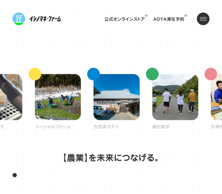
白いドット柄の背景に、丸みのある和文書体、地域の写真、色付きの円を組み合わせた団体サイト。大きな余白と横並びのニュース、モバイルの段違いカード配置が特徴。
Ishinomaki Farm — Style Reference
A spacious community journal with rounded Japanese lettering, documentary photographs, and colored circles on dotted white paper.
Website: ishinomaki-farm.com Original URL: https://ishinomaki-farm.com/ Final URL: https://ishinomaki-farm.com/ Theme: the inspected homepage has a light, patterned canvas. Inspected: October 2, 2026, 05:21 JST; supplied retrieval timestamp: October 1, 2026, 20:21:25.562 UTC. Viewports: 1440 × 1000 and 390 × 844 CSS pixels. Scope: the current organizational homepage: featured news rail, introduction, projects, activity reports, news summaries, contact invitation, and footer navigation. Visual evidence includes desktop opening, middle, and footer captures, plus mobile opening and footer captures. Other homepage regions are supported by the supplied DOM. Linked pages and menu expansion were not inspected.
Ishinomaki Farm presents agricultural work, social support, and local participation through an editorial homepage. The operator is identified in the original page as 一般社団法人イシノマキ・ファーム. Navigation gives comparable prominence to organizational information, projects, reports, news, and contact.
The strongest visual relationship is between enormous amounts of white space and small, confident shapes. A faint dot grid continues behind photographs, copy, and the footer. Rounded Japanese lettering supplies warmth; charcoal supplies structure. Green, purple, brown, and yellow circles overlap selected image corners without becoming large colored panels.
The opening composition places a horizontal news rail well below the header. Further down, three desktop content columns become two staggered columns on mobile. Preserve these changes in composition: the phone layout is more distinctive than a simple stack of desktop cards.
閉じる
Ishinomaki Farm — Style Reference
A spacious community journal with rounded Japanese lettering, documentary photographs, and colored circles on dotted white paper.
Website: ishinomaki-farm.com Original URL: https://ishinomaki-farm.com/ Final URL: https://ishinomaki-farm.com/ Theme: the inspected homepage has a light, patterned canvas. Inspected: October 2, 2026, 05:21 JST; supplied retrieval timestamp: October 1, 2026, 20:21:25.562 UTC. Viewports: 1440 × 1000 and 390 × 844 CSS pixels. Scope: the current organizational homepage: featured news rail, introduction, projects, activity reports, news summaries, contact invitation, and footer navigation. Visual evidence includes desktop opening, middle, and footer captures, plus mobile opening and footer captures. Other homepage regions are supported by the supplied DOM. Linked pages and menu expansion were not inspected.
Ishinomaki Farm presents agricultural work, social support, and local participation through an editorial homepage. The operator is identified in the original page as 一般社団法人イシノマキ・ファーム. Navigation gives comparable prominence to organizational information, projects, reports, news, and contact.
The strongest visual relationship is between enormous amounts of white space and small, confident shapes. A faint dot grid continues behind photographs, copy, and the footer. Rounded Japanese lettering supplies warmth; charcoal supplies structure. Green, purple, brown, and yellow circles overlap selected image corners without becoming large colored panels.
The opening composition places a horizontal news rail well below the header. Further down, three desktop content columns become two staggered columns on mobile. Preserve these changes in composition: the phone layout is more distinctive than a simple stack of desktop cards.
How to Read This Reference
- Measured means explicitly present in the supplied element rectangles or computed styles. Decimal values are rounded where appropriate.
- Calculated means arithmetic based on those measurements, such as column gaps or the distance between a card’s top and its title.
- Visual estimate means an approximation from the original-page captures. Accent hex values, background dots, and image corner radii were not independently sampled.
- Recommended means an implementation choice for a new site. The CSS below is an adaptation, not recovered source code.
- Token names are descriptive aliases. The supplied custom-property extraction was empty; this does not establish that the entire website contains no CSS variables.
- DOM presence does not establish visibility. The extraction includes repeated navigation, member biographies, and white-text content that is not visible in the supplied light-page screenshots.
- Coordinates describe individual capture states. Moving content and separate screenshot timing can produce different horizontal positions.
Tokens — Colors
Visible Homepage Palette
| Name | Value | Suggested token | Evidence and role |
|---|---|---|---|
| White canvas | approximately #ffffff |
--color-paper |
Visually observed page surface. Sampled HTML/body backgrounds are transparent, so this is not a recovered body declaration. |
| Charcoal | #323232 |
--color-ink |
Measured navigation, headings, body text, and circular menu fill. |
| Pale caption gray | #cdcdcd |
--color-muted |
Measured featured-news captions and project taxonomy text. |
| Secondary anchor gray | #3c3c3c |
--color-anchor-source |
Measured on some navigation anchors; nested text often declares its own color. |
| Dot gray | approximately #efefef |
--color-dot |
Visual estimate for the very faint repeating background points. |
| Fresh green | approximately #2eaf64 |
--color-fresh |
Visual estimate for one featured-news circle. |
| Deep green | approximately #007d40 |
--color-deep-green |
Visual estimate for circles accompanying selected news/report images. |
| Muted purple | approximately #8c63a6 |
--color-purple |
Visual estimate for the housing-support news marker. |
| Earth brown | approximately #88463b |
--color-earth |
Visual estimate for selected agricultural/report markers. |
| Bright yellow | approximately #ffe34a |
--color-yellow |
Visual estimate for the consultation-poster report marker. |
| Logo sky blue | approximately #66ccff |
--color-logo-sky |
Visual estimate inside the supplied brand artwork. Preserve the original artwork rather than repainting it from this estimate. |
The interface is primarily white and charcoal. Accent colors occupy small circular areas, while photographs introduce most of the page’s color variation. The circles have no visible text labels; their full category mapping is unverified.
Computed Colors Outside the Confirmed Visible State
Some extracted navigation/panel text computes to white, and related-link text computes to #95ceff. These samples do not match the visible light footer. They may belong to another interface state, but the evidence does not establish its background or activation behavior. Do not derive a dark theme or blue navigation overlay from these declarations alone.
Recommended accessibility adjustment: #cdcdcd against white has approximately 1.59:1 contrast, calculated from the color values. Preserve it as an observed token, but use a darker value such as #707070 for essential captions and taxonomy links in an accessible adaptation.
Tokens — Typography
Rounded Display and Navigation Face
- Measured family:
'Jun 501', sans-serif. - Measured weight: commonly
400, including navigation, card titles, and the opening statement; sampled section headings use700. - Character: rounded Japanese forms with a substantial, friendly appearance. A visually bold result does not mean every element has CSS weight
700. - Roles: navigation, section headings, card titles, taxonomy labels, action labels, and organization names.
- Suggested alias:
--font-display.
Body Face
- Measured family:
'Jun 201', sans-serif. - Measured weight:
400. - Roles: introduction paragraphs, project excerpts, address details, and member biography text in the DOM.
- Character: lighter than the display face, with unusually generous line spacing.
- Suggested alias:
--font-body.
Font files, licensing, and delivery URLs were not supplied. The Quick Start names the observed families but does not load them. A generic sans-serif fallback will preserve functionality, not the exact Japanese letterforms.
Type Scale
Sizes and line heights below are measured unless otherwise stated. Desktop tracking is generally 1px; the corresponding mobile samples use 0.5px.
| Role | Desktop size / line height | Mobile size / line height | Family and weight |
|---|---|---|---|
| Primary navigation/group label | 20px; source line height 0px with vertical padding |
Same size and source line-height arrangement | Jun 501, 400 |
| Opening statement | 40px / 40px |
24px / 24px |
Jun 501, 400 |
| Main section heading | 40px / 40px |
20px / 20px |
Jun 501, 700 |
| Introduction label | 20px / 20px |
14px / 14px |
Jun 501, 700 |
| Introduction statement | 40px / 80px |
24px / 48px |
Jun 501, 400 |
| Introduction paragraph | 16px / 36px |
14px / 34px |
Jun 201, 400 |
| Featured-news caption | 20px / 20px |
14px / 14px |
Jun 501, 400 |
| Project card title | 20px / 40px |
14px / 28px |
Jun 501, 400 |
| Project excerpt | 12px / 32px |
10px / 20px |
Jun 201, 400 |
| Project taxonomy | 12px / 32px |
10px / 20px |
Jun 501, 400 |
| Outlined action label | 20px / 56px |
14px / 46px |
Jun 501, 400 |
| Organization label in sampled navigation content | 16px / 16px |
16px / 16px |
Jun 501, 400 |
| Address in sampled navigation content | 12px / 32px |
12px / 32px |
Jun 201, 400 |
The source’s zero-size anchor wrappers and zero line-height navigation paragraphs are implementation details. Their children provide the visible lettering. Use normal line boxes and flex alignment in a new implementation rather than copying those resets.
The wordmark is distinct artwork. Do not reproduce it by italicizing the general UI font.
Tokens — Spacing & Shapes
Spacing Scale
This is a recurring set of observed dimensions, not a confirmed source spacing system.
| Dimension | Desktop | Mobile | Evidence |
|---|---|---|---|
| Header outer inset | 60px |
30px |
Measured brand/menu coordinates. |
| Intro section padding | 60px |
30px |
Measured section padding. |
| Featured image-to-caption gap | 20px |
20px |
Calculated from square media and caption positions. |
| Featured rail item gap | 60px |
40px |
Calculated from adjacent link rectangles. |
| Project card column gap | 80px |
30px |
Calculated from card x positions and widths. |
| Project section top padding | 160px |
90px |
Measured. |
| Project section bottom padding | 80px |
45px |
Measured. |
| Project heading-to-first-card top | 110px |
75px |
Calculated from heading and link rectangles. |
| Mobile navigation row pitch | — | 60px |
Measured in sampled navigation; also consistent with the visible footer rhythm. |
Border Radius and Small Shapes
| Element | Desktop | Mobile | Status |
|---|---|---|---|
| Menu control | 60 × 60px, 50% radius |
50 × 50px, 50% radius |
Measured. |
| Outlined action | 30px radius |
25px radius |
Measured. |
| Featured-image corners | approximately 28–30px |
approximately 14–16px |
Visual estimates. |
| Featured color marker | approximately 60px diameter |
approximately 50px diameter |
Visual estimates. |
| Background dots | approximately 3–4px diameter on a 30px grid |
Similar apparent scale | Visual estimates. |
| Isolated lower-left charcoal dot | approximately 20px diameter |
approximately 20px diameter |
Visible; purpose unverified. |
| Outlined action stroke | approximately 2px |
approximately 2px |
Visible and consistent with the measured inner/outer box difference. |
Color markers overlap the upper-left corner of an image, with their centers approximately aligned to the image corner. Clip the image itself, not the entire marker-and-image wrapper.
Layout Measurements
| Element | At 1440 × 1000 | At 390 × 844 |
|---|---|---|
| Document height | approximately 6606.06px |
approximately 5249.13px |
| Brand home link | (60, 60), 230 × 60px |
(30, 30), 190 × 50px |
| Menu control | (1320, 60), 60 × 60px |
(310, 30), 50 × 50px |
| Opening section rectangle | y 228, height 1000px |
y 40, height 844px |
| Featured link width | 293.31px |
342px |
| Featured link height, including caption | 333.31px |
376px |
| Featured image top | y 581.34 |
y 291 |
| Opening statement top | y 1031.33 |
y 746.5 |
| Main project heading frame | x 160, width 1120px |
x 15, width 360px |
| Project card width | 293.33px |
150px |
| Project card columns | x 200, 573.33, 946.66 |
x 30, 210 |
| Intro paragraph width | 500px |
330px |
| Intro action | 293.33 × 60px |
150 × 50px |
The desktop project row occupies approximately 1040px: three 293.33px cards plus two 80px gaps. This is a measurement at the supplied viewport, not proof of a 1040px source maximum width.
Components
Persistent Brand and Menu
Role: maintain identity and access to navigation through the long page.
The left home link combines a blue-and-green circular emblem with the black Japanese wordmark. At desktop size, the full link is 230 × 60px; at mobile size it is 190 × 50px.
A charcoal circle on the right contains three thin white horizontal strokes. Its diameter changes from 60px to 50px. Stroke widths are visually about 32px and 26–28px, respectively; these are estimates.
The opening desktop capture also shows five primary navigation labels between the logo and menu: 私たちについて, イシノマキ•ファームの事業, 活動レポート, お知らせ, and お問い合わせ. The later desktop captures retain the logo and menu without that full row. Their persistent screen placement supports fixed positioning; the exact navigation-collapse trigger is unverified.
The header has no visible enclosing bar, border, or shadow. In the scrolled captures, page imagery or text can pass behind the logo area. A new implementation should preserve the light visual treatment while preventing important controls from becoming unreadable over content.
Featured News Rail
Role: surface current stories through a broad photographic strip.
Each item contains a square image, an optional colored circular marker overlapping its upper-left corner, and a single pale-gray caption below. Captions truncate rather than form tall text blocks.
Desktop media are approximately 293.31px square, followed by 20px of space and a 20px caption line. Mobile media are 342px square, followed by the same gap and a 14px caption line. The rail therefore grows its images on the phone while shrinking its text.
The rail extends past both viewport edges. Visible partial neighbors are part of the composition. The desktop item pitch is approximately 353.31px; the mobile pitch is 382px.
Five unique news destinations repeat three times in the DOM. This supports a looping-rail interpretation, but does not establish autoplay speed, direction, drag behavior, or pause controls. Do not treat all fifteen extracted entries as separate stories.
The image centers align with the opening section’s vertical midpoint in both measured states. The substantial empty space above them is supported by the captures, not a reason to invent an additional headline or background photograph.
Opening Statement
Role: summarize the organization’s connecting mission.
The phrase follows the form 【農業】を未来につなげる。, using a bracketed topic and a rounded display face. The desktop DOM contains ホップ in the topic slot, while the mobile capture contains 農業.
Those different values support a variable topic slot. They do not prove a particular rotation schedule or animation. Reserve enough space for different word lengths without shifting adjacent content.
The statement is 40px on desktop and 24px on mobile. In the desktop snapshot its top is below the first viewport, at approximately y 1031; on mobile it is visible near y 746.5. Its absence from the first desktop image should not be interpreted as missing content.
A separate small charcoal dot appears near the lower left in multiple captures. Its function was not established; do not label it as a carousel indicator, cursor, or scroll control.
Introduction
Role: explain the organization and lead to its About page.
The DOM establishes four parts: the small label 本サイトについて, a two-line statement, a descriptive paragraph, and the outlined 私たちについて link.
The desktop statement uses 40px / 80px, and the paragraph uses 16px / 36px within a 500px width. Mobile changes those to 24px / 48px and 14px / 34px, with a 330px paragraph width.
The mobile label appears well into the introduction section rather than directly at its top. The supplied evidence does not reveal all intervening visual content. Preserve the measured text treatment, but do not fabricate an accompanying illustration or photograph.
Project Card
Role: introduce a program and expose its detail page and taxonomy.
The visible anatomy is rounded media, a substantial title, an optional short excerpt, and bracketed category/keyword links. Current examples include Soil ISHINOMAKI, the housing-support home Soilいしのまき, and the social-farm employment-support program.
Desktop titles occupy two 40px lines in the sampled cards. Excerpts occupy 64px, consistent with two 32px lines. Mobile titles occupy two 28px lines, and excerpts occupy two 20px lines. Long DOM text is therefore not evidence that complete articles appear inside the cards.
Taxonomy is plain pale-gray text inside Japanese brackets, such as 【自立援助ホーム】. It is not rendered as a filled badge or bordered chip. Category and keyword links should remain separate from the main detail link.
The cards have no visible outer container fill, frame, or elevation shadow. Their structure comes from media edges, typography, and spacing.
Media measurement limitation: the title begins approximately 439.03px below the desktop card-link top and 224.28px below the mobile card-link top. Image-element rectangles were not supplied, so these distances must not be reported as image heights. The Quick Start reserves a similarly proportioned visual region, with square imagery inside it as an explicit reconstruction choice.
Activity Report Card
Role: connect project activity to individual reporting.
The middle desktop capture shows report imagery with overlapping green, brown, and yellow circles. The DOM adds a title, bracketed category/keyword links, and a writer link.
On mobile, the writer link has a measured 30px height; its text starts 40px to the right of the link’s left edge. That leaves a compact leading visual slot, but its image shape is not established by the supplied element sample.
Use a separate author row beneath taxonomy. Do not convert the organizational members named in this content into website-production credits.
News Summary
Role: provide dated organizational updates after the report section.
The homepage DOM contains three news entries, each with a story title and bracketed date/category information, followed by お知らせ一覧. Examples include dates 【2026.08.13】 and 【2026.06.09】.
These entries share destinations with the opening rail. Their exact lower-page media arrangement is not visible in the supplied screenshots, so do not infer a new table, timeline, or large promotional panel.
Outlined Index Link
Role: lead from a preview section to its complete archive.
The control is a long, transparent capsule with a charcoal outline and centered rounded lettering. The measured introduction example is 293.33 × 60px on desktop and 150 × 50px on mobile, with radii of 30px and 25px.
The desktop project capture shows 事業一覧 aligned with the left content column. On mobile, its measured position places it in the right column beneath the second project card, while the third card continues in the left column. This is an intentional compositional relationship to preserve in a close adaptation.
Computed styles declare background-color 0.5s ease-in-out on these links and color 0.5s ease-in-out on their labels. The actual hover endpoint was not captured.
Contact Invitation
Role: invite questions about the organization’s activities and programs.
The DOM supplies a linked heading and explanatory copy leading to /contact/. The desktop footer capture includes the centered two-line invitation above the navigation area.
Keep this region spacious and typographic. It does not require a contrasting banner, form fields, or a filled conversion button. A contact form itself was not inspected.
Footer and Mobile Navigation Groups
Role: expose the site hierarchy, social accounts, accommodation reservation, and organizational details.
Desktop navigation groups sit across the left and middle area, with related links and organization information aligned toward the right. Group headings are dark and prominent; subordinate bracketed links are much smaller and pale gray. AOYA滞在予約 has a dotted underline and a small external-link mark.
On mobile, the footer becomes a vertical sequence of major labels with thin plus signs at the right. Related links, the reservation link, organization details, and copyright follow underneath. The content begins about 45px from the left in the supplied footer view.
The plus signs communicate an expansion affordance, and the DOM includes associated script-style links. No expansion was exercised. The mobile footer screenshot is not evidence that the main hamburger menu was opened.
The visible mobile footer’s first group overlaps the persistent logo at the captured scroll position. Treat this as an observed collision to address in a new implementation, not a required decorative effect.
Tokens — Motion & Interaction
| Treatment | Evidence | What can be concluded |
|---|---|---|
| Text-color transitions | color 0.5s ease-in-out on captions, taxonomy, and several labels |
The source defines half-second color transitions; target colors are not established. |
| Circular control and capsule fill transitions | background-color 0.5s ease-in-out |
Background changes are supported by CSS; specific hover/active states are unverified. |
| Opening section animation | 0.5s ease-in-out forwards load_off0 |
A finite named animation is declared. Its keyframes were not supplied. |
| Other sampled section animations | 0.5s ease-in-out forwards load_off1 |
Same limitation; do not describe a specific slide, scale, or fade trajectory. |
| Featured rail | Repeated story groups and small positional differences between DOM and screenshots | Consistent with a moving or looping rail; duration, direction, input methods, and stopping behavior are unknown. |
| Bracketed statement topic | Different topic text in desktop and mobile evidence | A variable slot is supported; the change mechanism and timing are unknown. |
| Header persistence | Brand/menu remain at the same screen corners across scroll captures | Fixed behavior is strongly supported visually; collapse thresholds are unknown. |
| Mobile group expansion | Plus icons and control-like links | An affordance exists; expanded layout, animation, and keyboard handling were not tested. |
The capture process waited for finite animations and image readiness within stated limits, and temporarily paused perpetual animations during readiness checks before resuming them. Still images cannot establish the full motion sequence. A sampled child with animation: none does not rule out movement applied by a parent or script.
Recommended implementation: begin with a manually scrollable rail and normal links. If automatic movement is added, include pause behavior, stop it for reduced-motion preferences, and keep repeated visual clones out of the keyboard and accessibility reading order.
Surfaces
| Layer | Appearance | Purpose |
|---|---|---|
| Page canvas | White with a faint regular dot pattern | Provides continuity through every visible section. |
| Header area | Visually transparent | Keeps the brand and menu floating within the page rather than inside a toolbar. |
| Story card | Unboxed text beneath rounded media | Groups content without a separate surface. |
| Color marker | Flat solid circle | Adds a small, playful emphasis at an image corner. |
| Archive action | Transparent capsule with dark outline | Gives navigation a clear shape without a large color block. |
| Footer | Same dotted canvas as the main page | Keeps the site map integrated with the editorial content. |
No general shadow-elevation system is visible. The light edge around the Soil graphic may belong to that image or its local treatment; it is not sufficient evidence for applying shadows to all cards.
Imagery
Photography is documentary and local: people meeting, children and adults at a soccer activity, agricultural work, cultivated plots, and program-related scenes. Event posters and program graphics appear alongside photographs rather than being normalized into one photographic style.
The featured rail uses square crops. Content photographs have rounded boundaries, while text stays outside the image. Colored circles sit above the image plane. Avoid putting all titles over photographs or applying a uniform dark overlay.
Preserve useful subject placement when cropping groups of people. Program logos and event posters need separate crop decisions: filling a square may remove lettering. An adaptation can use object-fit: contain for information graphics while retaining the same surrounding geometry; this is a recommendation, not a confirmed source rule.
Observed Asset References
No direct image-file URLs or font-file URLs were included in the supplied evidence. The following are content references present in the homepage, not asset download paths. Their destination pages were not inspected.
| Visible material | Homepage-linked reference | Observed use |
|---|---|---|
| Circular emblem and Japanese wordmark | Homepage | Persistent home link. |
| Two-person photograph | Photo-report news | Featured rail image. |
| Soccer group photograph | Soccer news and project entry | Rail and project imagery. |
| Soil program graphic | Housing-support news and project entry | Program identity and housing-support content. |
| Cultivation scene | Cultivation report | Report preview visible in the desktop middle capture. |
| Produce-based consultation poster | Consultation report | Report preview with a yellow circular marker. |
Use authorized original brand and photographic assets when reproducing this site. CSS can reproduce the framing but cannot replace the identity carried by the actual participants and activities.
Layout & Responsive Behavior
Desktop Composition
At 1440px wide, the header uses 60px outside clearance. The opening rail is full-width and clipped by the screen edges. Its media begin around y 581px, leaving approximately 461px between the header artwork’s bottom and the image tops.
The project row is centered between x 200 and approximately x 1240. The section heading uses a wider 1120px frame. Main headings are centered; card content is left-aligned. Long section gaps allow the dotted background to remain a major part of the composition.
The footer uses a different internal grouping from the cards. Do not force every footer column to share the three-card grid.
Mobile Composition
The 390px layout retains 30px outside clearance for the logo and menu, and removes the visible horizontal primary-navigation row. The featured rail remains a large horizontal strip: its 342px image width is about 87.7% of the viewport, calculated from this single observation. That percentage is not a recovered CSS formula.
Project content uses two 150px columns with a 30px gap. It does not become a single-column list.
| Project item | Measured x | Measured top y |
|---|---|---|
| First | 30px |
1995px |
| Second | 210px |
2187.64px |
| Third | 30px |
2380.28px |
| Archive link | 210px |
2588px |
The second project begins approximately 192.64px lower than the first. The report section repeats the left-right-left arrangement with an approximately 187.64px step between starts. This is a staggered composition, not an aligned two-column row or an arbitrary masonry claim.
Typography changes by role. Card titles shrink from 20px to 14px, but primary navigation labels remain 20px. The introduction’s body copy reduces only from 16px to 14px. Tracking halves from 1px to 0.5px in the sampled equivalents.
Responsive Limits
Only the two stated viewport sizes were inspected. Tablet behavior, landscape phones, exact media-query breakpoints, zoom behavior, and safe-area handling are unknown. The shorter mobile document does not prove content removal; the two-column composition and smaller typography also affect its height.
The Quick Start uses recommended breakpoints and preserves the evidenced endpoint layouts. Validate intermediate widths and long Japanese titles separately.
Do’s and Don’ts
Do
- Keep the pale dot pattern continuous through the opening, content, and footer.
- Preserve the rounded Jun display/body distinction when the fonts are available.
- Use
#323232for the principal text and circular menu. - Keep color accents small, flat, and circular.
- Place markers outside the image clip so they overlap cleanly.
- Distinguish the large horizontal featured rail from the smaller editorial card grid.
- Preserve three desktop columns and the observed two-column mobile stagger.
- Keep taxonomy as bracketed text with independent links.
- Use transparent outlined capsules for archive navigation.
- Keep project, report, news, and contact content as parts of a complete organizational site.
Don’t
- Don’t turn the opening into a full-bleed photographic banner with an oversized sales headline.
- Don’t place every card inside a white panel with a shadow.
- Don’t treat accent-circle colors as verified category semantics.
- Don’t convert all mobile content into one centered column.
- Don’t interpret the project card’s entire pre-title region as a measured image height.
- Don’t infer a dark theme from white text in unconfirmed DOM states.
- Don’t describe plus-icon expansion, autoplay timing, or hover endpoints as tested behavior.
- Don’t copy zero-size text wrappers into a semantic component system.
- Don’t hide essential information behind the observed pale-gray contrast or
10pxmobile text. - Don’t reproduce the mobile footer’s header overlap as an intentional feature.
Recommended Implementation Additions
These recommendations are not verified features of the original site:
- Use real buttons for the menu and expansion controls, with accessible names,
aria-expanded, andaria-controls. - Give the approximately
20pxplus icon a hit area of at least44 × 44px, while preserving its thin visual strokes. - Keep the group’s destination link distinct from its expansion button.
- Use visible keyboard focus, including on photographic story links and taxonomy.
- Darken essential gray text and consider a minimum
12pxmobile metadata size. - Keep full story names available to assistive technology when visible labels are clamped.
- Give linked images meaningful accessible names; empty text in an extraction alone does not establish their actual accessible names.
- Provide pause and reduced-motion behavior for any automatically moving rail or changing topic.
- Preserve reading order when staggering mobile cards. Avoid CSS placement that contradicts the content sequence.
- Prevent the fixed brand and menu from obscuring focused controls, anchor targets, or footer headings.
- Reserve image dimensions before loading, and use content-aware crops for people, posters, and program marks.
Agent Prompt Guide
Quick Color Reference
- Canvas: visually white, approximately
#ffffff. - Main text and menu: measured
#323232. - Source muted text: measured
#cdcdcd; recommended accessible alternative#707070. - Background dots: approximately
#efefef. - Decorative circle approximations: green
#2eaf64, deep green#007d40, purple#8c63a6, brown#88463b, yellow#ffe34a. - Surfaces: transparent content groups and outlined actions; no general card elevation.
Overall Prompt
“Create an organizational and editorial homepage for a Japanese social farm. Use a white canvas with a faint 30px dot grid, charcoal text, rounded Japanese display lettering, lighter body copy, and generous open space. Place an authorized brand mark at the upper left and a dark circular three-line menu at the upper right. Build a wide featured-news rail with square documentary photographs, clipped neighboring items, small colored circles overlapping image corners, and single-line captions underneath. Continue with an introduction, project previews, activity reports, dated news, a contact invitation, and a detailed footer. Use three content columns on desktop and two staggered columns on mobile. Keep archive actions as transparent outlined capsules. Treat motion timing and expanded-menu appearance as unspecified.”
Example Component Prompts
- Header: “At 1440px wide, position a 230 × 60px brand link 60px from the top and left, and a 60px charcoal circular menu 60px from the top and right. Fit five rounded Japanese navigation labels between them. At 390px, use 30px insets, a 190 × 50px brand link, a 50px menu, and no horizontal navigation row.”
- Featured rail: “Create unboxed news links with approximately 293px square desktop media, 60px gaps, rounded image corners, and optional 60px colored circles centered on the upper-left image corner. Place a pale single-line 20px caption 20px below each image. For the inspected phone proportions, use 342px images, 40px gaps, 50px circles, and 14px captions.”
- Project section: “Center a 40px section heading above three approximately 293px content columns with 80px gaps. Use rounded media, 20px titles with 40px line height, small spacious excerpts, and bracketed taxonomy links. On mobile, use two 150px columns, a 30px gap, 14px titles, and a left-right-left stagger of about 190px between item starts.”
- Archive action: “Build a transparent charcoal-outlined capsule labeled
事業一覧, approximately 293 × 60px on desktop and 150 × 50px on mobile. Center rounded Japanese lettering. Keep it aligned with a content column rather than stretching it across the section.” - Footer: “Continue the dotted page background behind grouped navigation. Use dark rounded group headings, small bracketed sublinks, separate related links, a dotted-underlined reservation link, and compact organization details. On mobile, stack the groups with thin plus icons and sufficient touch targets, leaving clear space beneath the persistent header.”
Quick Start
CSS Custom Properties
This CSS reproduces the principal visual relationships with semantic classes. It is not the original stylesheet. Accent colors, dot texture, image radii, breakpoints, and hover endpoints are adaptations. It does not implement menu state, topic rotation, or automatic rail movement.
Use .story-grid with three .story-card siblings followed by an .index-link. Inside each card, place a .story-visual containing .media and an image, then the title and optional excerpt; keep taxonomy links outside the main story link. The reserved visual region approximates the measured card-top-to-title ratio. Positioning a square image at its bottom is a reconstruction choice because source image rectangles were unavailable.
:root {
  /* Measured text colors; visual approximations for paper and accents */
  --color-paper: #ffffff;
  --color-ink: #323232;
  --color-muted: #cdcdcd;
  --color-dot: #efefef;
  --color-fresh: #2eaf64;
  --color-deep-green: #007d40;
  --color-purple: #8c63a6;
  --color-earth: #88463b;
  --color-yellow: #ffe34a;

  /* Observed family names; load authorized font files separately */
  --font-display: 'Jun 501', sans-serif;
  --font-body: 'Jun 201', sans-serif;
  --tracking: 1px;
  --text-body: 16px;
  --leading-body: 36px;
  --text-section: 40px;
  --text-card: 20px;
  --leading-card: 40px;
  --text-detail: 12px;
  --leading-detail: 32px;
  --text-caption: 20px;
  --text-statement: 40px;

  /* Dimensions calibrated to the supplied desktop capture */
  --header-inset: 60px;
  --brand-width: 230px;
  --brand-height: 60px;
  --menu-size: 60px;
  --rail-width: 293.333px;
  --rail-gap: 60px;
  --pin-size: 60px;
  --image-radius: 30px;
  --media-gap: 30px;
  --hero-offset: 228px;
  --statement-gap: 156px;
  --section-top: 160px;
  --section-bottom: 80px;
  --heading-gap: 110px;
  --motion-color: 500ms ease-in-out;
}

* { box-sizing: border-box; }

.farm-site {
  margin: 0;
  color: var(--color-ink);
  background-color: var(--color-paper);
  background-image: radial-gradient(
    circle at 2px 2px,
    var(--color-dot) 1.7px,
    transparent 2px
  );
  background-size: 30px 30px;
  font: 400 var(--text-body) / var(--leading-body) var(--font-body);
  letter-spacing: var(--tracking);
}

/* Recommended optional contrast improvement */
.farm-site[data-readable='true'] { --color-muted: #707070; }

.farm-site a { color: inherit; }
.farm-site button { font: inherit; }
.farm-site :focus-visible {
  outline: 3px solid var(--color-ink);
  outline-offset: 5px;
}

.site-header {
  position: fixed;
  z-index: 20;
  inset: var(--header-inset) var(--header-inset) auto;
  display: flex;
  align-items: center;
  gap: 30px;
  pointer-events: none;
}
.site-header > * { pointer-events: auto; }
.brand {
  display: block;
  flex: 0 0 var(--brand-width);
  width: var(--brand-width);
  height: var(--brand-height);
}
.brand img {
  display: block;
  width: 100%;
  height: 100%;
  object-fit: contain;
}
.desktop-nav {
  display: flex;
  flex: 1;
  justify-content: space-between;
  align-items: center;
  gap: 24px;
}
.desktop-nav a {
  font: 400 20px / 1.4 var(--font-display);
  text-decoration: none;
  white-space: nowrap;
}
.menu-button {
  flex: 0 0 var(--menu-size);
  width: var(--menu-size);
  height: var(--menu-size);
  display: grid;
  place-content: center;
  gap: 5px;
  padding: 0;
  border: 0;
  border-radius: 50%;
  color: white;
  background: var(--color-ink);
  cursor: pointer;
}
.menu-button span {
  display: block;
  width: 32px;
  height: 2px;
  background: currentColor;
}

/* State must be supplied by an application controller */
.site-header[data-compact='true'] .desktop-nav {
  visibility: hidden;
  pointer-events: none;
}

.featured {
  position: relative;
  height: 100svh;
  min-height: 760px;
  margin-top: var(--hero-offset);
}
.feature-rail {
  position: absolute;
  inset-inline: 0;
  top: calc(50% - var(--rail-width) / 2 - var(--pin-size) / 2);
  display: flex;
  gap: var(--rail-gap);
  margin: 0;
  padding: calc(var(--pin-size) / 2) calc(var(--pin-size) / 2) 20px;
  overflow-x: auto;
  list-style: none;
  scroll-snap-type: x proximity;
}
.feature-card {
  flex: 0 0 var(--rail-width);
  min-width: 0;
  scroll-snap-align: start;
}
.feature-card > a {
  display: block;
  text-decoration: none;
}
.media {
  position: relative;
  display: block;
  aspect-ratio: 1;
}
.media img {
  display: block;
  width: 100%;
  height: 100%;
  object-fit: cover;
  border-radius: var(--image-radius);
}
.media--graphic img { object-fit: contain; }
.media--pin::before {
  content: '';
  position: absolute;
  z-index: 1;
  top: 0;
  left: 0;
  width: var(--pin-size);
  height: var(--pin-size);
  border-radius: 50%;
  background: var(--pin-color, var(--color-fresh));
  transform: translate(-50%, -50%);
  pointer-events: none;
}
.feature-caption {
  margin: 20px 0 0;
  overflow: hidden;
  color: var(--color-muted);
  font: 400 var(--text-caption) / 1 var(--font-display);
  white-space: nowrap;
  text-overflow: ellipsis;
  transition: color var(--motion-color);
}
.feature-statement {
  position: absolute;
  inset-inline: 30px;
  top: calc(50% + var(--rail-width) / 2 + var(--statement-gap));
  margin: 0;
  text-align: center;
  font: 400 var(--text-statement) / 1.25 var(--font-display);
}

.content-section {
  padding-block: var(--section-top) var(--section-bottom);
}
.section-title {
  width: min(1120px, calc(100% - 30px));
  margin: 0 auto var(--heading-gap);
  text-align: center;
  font: 700 var(--text-section) / 1 var(--font-display);
}
.story-grid {
  display: grid;
  grid-template-columns: repeat(3, minmax(0, 1fr));
  gap: 80px;
  width: min(1040px, calc(100% - 120px));
  margin-inline: auto;
  align-items: start;
}
.story-card { min-width: 0; }
.story-link {
  display: block;
  text-decoration: none;
}
.story-visual {
  position: relative;
  display: block;
  aspect-ratio: 1 / 1.497;
}
.story-visual .media {
  position: absolute;
  inset-inline: 0;
  bottom: var(--media-gap);
}
.story-title {
  margin: 0;
  font: 400 var(--text-card) / var(--leading-card) var(--font-display);
}
.story-excerpt {
  margin: 0;
  font: 400 var(--text-detail) / var(--leading-detail) var(--font-body);
}
.clamp-two {
  display: -webkit-box;
  -webkit-box-orient: vertical;
  -webkit-line-clamp: 2;
  overflow: hidden;
}
.story-tags {
  display: flex;
  flex-wrap: wrap;
  gap: 0 5px;
  margin: 0;
  padding: 0;
  list-style: none;
  color: var(--color-muted);
  font: 400 var(--text-detail) / var(--leading-detail) var(--font-display);
}
.story-tags a {
  text-decoration: none;
  transition: color var(--motion-color);
}
.index-link {
  display: inline-flex;
  align-items: center;
  justify-content: center;
  width: 293.333px;
  max-width: 100%;
  min-height: 60px;
  padding: 8px 16px;
  border: 2px solid var(--color-ink);
  border-radius: 30px;
  background: transparent;
  font: 400 20px / 1.4 var(--font-display);
  text-decoration: none;
  transition: color var(--motion-color), background-color var(--motion-color);
}
.story-grid > .index-link { grid-column: 1; }

/* Recommended hover endpoints; original endpoints were not captured */
@media (hover: hover) {
  .feature-card a:hover .feature-caption,
  .story-tags a:hover { color: var(--color-ink); }
  .index-link:hover {
    color: var(--color-paper);
    background: var(--color-ink);
  }
}

.intro-copy {
  max-width: 500px;
  font: 400 var(--text-body) / var(--leading-body) var(--font-body);
}
.intro-statement {
  font: 400 40px / 80px var(--font-display);
}
.footer-layout {
  display: grid;
  grid-template-columns: minmax(0, 670px) minmax(0, 300px);
  gap: 30px;
  width: min(1000px, calc(100% - 120px));
  margin-inline: auto;
}
.footer-groups {
  display: grid;
  grid-template-columns: 1fr 1.6fr 1fr;
  gap: 60px 45px;
}
.footer-row {
  display: flex;
  align-items: center;
  justify-content: space-between;
  gap: 16px;
  font: 400 20px / 1.5 var(--font-display);
}
.footer-plus { display: none; }
.footer-sublinks {
  padding: 0;
  margin: 8px 0 0;
  list-style: none;
  color: var(--color-muted);
  font: 400 12px / 32px var(--font-display);
}
.reservation-link {
  text-decoration: none;
  border-bottom: 2px dotted currentColor;
}

/* Recommended breakpoint: the original threshold is unknown */
@media (max-width: 1279px) {
  .desktop-nav { display: none; }
  .menu-button { margin-left: auto; }
}

@media (max-width: 767px) {
  :root {
    --tracking: 0.5px;
    --text-body: 14px;
    --leading-body: 34px;
    --text-section: 20px;
    --text-card: 14px;
    --leading-card: 28px;
    --text-detail: 10px;
    --leading-detail: 20px;
    --text-caption: 14px;
    --text-statement: 24px;
    --header-inset: 30px;
    --brand-width: 190px;
    --brand-height: 50px;
    --menu-size: 50px;
    --rail-width: min(342px, calc(100vw - 48px));
    --rail-gap: 40px;
    --pin-size: 50px;
    --image-radius: 15px;
    --media-gap: 15px;
    --hero-offset: 40px;
    --statement-gap: 113.5px;
    --section-top: 90px;
    --section-bottom: 45px;
    --heading-gap: 75px;
  }
  .site-header { gap: 15px; }
  .menu-button span { width: 26px; }
  .featured { min-height: 780px; }
  .story-grid {
    width: calc(100% - 60px);
    grid-template-columns: repeat(2, minmax(0, 1fr));
    grid-auto-rows: minmax(193px, auto);
    gap: 0 30px;
  }
  .story-grid > .story-card:nth-child(1) {
    grid-column: 1;
    grid-row: 1 / span 2;
  }
  .story-grid > .story-card:nth-child(2) {
    grid-column: 2;
    grid-row: 2 / span 2;
  }
  .story-grid > .story-card:nth-child(3) {
    grid-column: 1;
    grid-row: 3 / span 2;
  }
  .story-grid > .index-link {
    grid-column: 2;
    grid-row: 4;
    margin-top: 14px;
    align-self: start;
  }
  /* Smaller editorial pins are an adaptation, not a measured value */
  .story-grid .media { --pin-size: 30px; }
  .story-excerpt { margin-top: 5px; }
  .story-tags { margin-top: 10px; }
  .index-link {
    width: 150px;
    min-height: 50px;
    border-radius: 25px;
    font-size: 14px;
  }
  .intro-copy { max-width: 330px; }
  .intro-statement { font-size: 24px; line-height: 48px; }
  .footer-layout {
    display: block;
    width: calc(100% - 90px);
    padding-top: 100px;
  }
  .footer-groups { display: block; }
  .footer-row { min-height: 60px; }
  .footer-plus {
    display: grid;
    place-items: center;
    flex: 0 0 44px;
    width: 44px;
    height: 44px;
    padding: 0;
    border: 0;
    color: inherit;
    background: transparent;
  }
}

/* Recommended narrow-screen fallback; not an inspected layout */
@media (max-width: 359px) {
  .site-header { inset-inline: 20px; }
  .brand { flex-basis: 170px; width: 170px; }
  .story-grid { display: block; }
  .story-card { margin-bottom: 50px; }
  .story-grid > .index-link { margin-top: 0; }
}

@media (prefers-reduced-motion: reduce) {
  .farm-site *,
  .farm-site *::before,
  .farm-site *::after {
    animation: none !important;
    transition: none !important;
    scroll-behavior: auto !important;
  }
}
The CSS intentionally keeps the rail manually scrollable and does not duplicate stories. Its hero offsets are calibrated to the supplied captures, not universal source formulas. The staggered grid is intended for a three-item preview; test longer content before extending it to a complete archive. JavaScript-driven motion also needs an explicit reduced-motion check.
Tailwind v4 Token Mapping
Optional mapping for a project already using Tailwind v4. This does not imply that the original site uses Tailwind. Define the custom properties above first.
@theme inline {
  --color-farm-paper: var(--color-paper);
  --color-farm-ink: var(--color-ink);
  --color-farm-muted: var(--color-muted);
  --color-farm-dot: var(--color-dot);
  --color-farm-green: var(--color-deep-green);
  --color-farm-purple: var(--color-purple);
  --color-farm-earth: var(--color-earth);
  --color-farm-yellow: var(--color-yellow);

  --font-farm-display: var(--font-display);
  --font-farm-body: var(--font-body);
  --text-farm-section: var(--text-section);
  --text-farm-card: var(--text-card);
  --text-farm-detail: var(--text-detail);
  --radius-farm-image: var(--image-radius);
  --spacing-farm-header: var(--header-inset);
}
Sources & Evidence
- Inspected original and final website: https://ishinomaki-farm.com/. The supplied browser evidence reports HTTP
200with no URL change. - Capture time:
2026-10-01T20:21:25.562Z, equivalent to October 2, 2026, 05:21:25.562 JST. - Desktop evidence: 1440 × 1000 CSS-pixel viewport; opening rail/header, project-to-report transition, and footer screenshots; rendered document height approximately
6606.06px. - Mobile evidence: 390 × 844 CSS-pixel viewport; opening rail/statement and footer screenshots; rendered document height approximately
5249.13px. - DOM and computed styles: supplied text, links, element rectangles, families, sizes, weights, line heights, tracking, colors, padding, radii, transitions, and animation names. These establish the measured values in this document.
- Observed navigation evidence: the capture process traversed scroll positions. Header persistence and responsive composition are supported by the resulting states. No menu click, accordion expansion, hover comparison, keyboard test, or rail gesture trace was supplied.
- Capture limitations: readiness checks used bounded waits for layout stability, finite animations, and image decoding. Perpetual animations were temporarily paused and resumed. These checks do not establish that every delayed feature or interface state was revealed.
- Analysis limitations: no additional browsing or file access was performed. Linked destinations, full stylesheets, animation keyframes, direct asset URLs, font delivery, and intermediate viewport behavior were not inspected. Hidden or duplicate DOM content was not treated as a visible design state.
This reference describes the current homepage evidenced by the supplied captures. Measured source values, visual approximations, and recommended implementation choices are identified separately throughout.
# Ishinomaki Farm — Style Reference

> A spacious community journal with rounded Japanese lettering, documentary photographs, and colored circles on dotted white paper.

**Website:** [ishinomaki-farm.com](https://ishinomaki-farm.com/)
**Original URL:** https://ishinomaki-farm.com/
**Final URL:** https://ishinomaki-farm.com/
**Theme:** the inspected homepage has a light, patterned canvas.
**Inspected:** October 2, 2026, 05:21 JST; supplied retrieval timestamp: October 1, 2026, 20:21:25.562 UTC.
**Viewports:** 1440 × 1000 and 390 × 844 CSS pixels.
**Scope:** the current organizational homepage: featured news rail, introduction, projects, activity reports, news summaries, contact invitation, and footer navigation. Visual evidence includes desktop opening, middle, and footer captures, plus mobile opening and footer captures. Other homepage regions are supported by the supplied DOM. Linked pages and menu expansion were not inspected.

Ishinomaki Farm presents agricultural work, social support, and local participation through an editorial homepage. The operator is identified in the original page as 一般社団法人イシノマキ・ファーム. Navigation gives comparable prominence to organizational information, projects, reports, news, and contact.

The strongest visual relationship is between enormous amounts of white space and small, confident shapes. A faint dot grid continues behind photographs, copy, and the footer. Rounded Japanese lettering supplies warmth; charcoal supplies structure. Green, purple, brown, and yellow circles overlap selected image corners without becoming large colored panels.

The opening composition places a horizontal news rail well below the header. Further down, three desktop content columns become two staggered columns on mobile. Preserve these changes in composition: the phone layout is more distinctive than a simple stack of desktop cards.
閉じる
# Ishinomaki Farm — Style Reference

> A spacious community journal with rounded Japanese lettering, documentary photographs, and colored circles on dotted white paper.

**Website:** [ishinomaki-farm.com](https://ishinomaki-farm.com/)
**Original URL:** https://ishinomaki-farm.com/
**Final URL:** https://ishinomaki-farm.com/
**Theme:** the inspected homepage has a light, patterned canvas.
**Inspected:** October 2, 2026, 05:21 JST; supplied retrieval timestamp: October 1, 2026, 20:21:25.562 UTC.
**Viewports:** 1440 × 1000 and 390 × 844 CSS pixels.
**Scope:** the current organizational homepage: featured news rail, introduction, projects, activity reports, news summaries, contact invitation, and footer navigation. Visual evidence includes desktop opening, middle, and footer captures, plus mobile opening and footer captures. Other homepage regions are supported by the supplied DOM. Linked pages and menu expansion were not inspected.

Ishinomaki Farm presents agricultural work, social support, and local participation through an editorial homepage. The operator is identified in the original page as 一般社団法人イシノマキ・ファーム. Navigation gives comparable prominence to organizational information, projects, reports, news, and contact.

The strongest visual relationship is between enormous amounts of white space and small, confident shapes. A faint dot grid continues behind photographs, copy, and the footer. Rounded Japanese lettering supplies warmth; charcoal supplies structure. Green, purple, brown, and yellow circles overlap selected image corners without becoming large colored panels.

The opening composition places a horizontal news rail well below the header. Further down, three desktop content columns become two staggered columns on mobile. Preserve these changes in composition: the phone layout is more distinctive than a simple stack of desktop cards.

## How to Read This Reference

- **Measured** means explicitly present in the supplied element rectangles or computed styles. Decimal values are rounded where appropriate.
- **Calculated** means arithmetic based on those measurements, such as column gaps or the distance between a card’s top and its title.
- **Visual estimate** means an approximation from the original-page captures. Accent hex values, background dots, and image corner radii were not independently sampled.
- **Recommended** means an implementation choice for a new site. The CSS below is an adaptation, not recovered source code.
- Token names are descriptive aliases. The supplied custom-property extraction was empty; this does not establish that the entire website contains no CSS variables.
- DOM presence does not establish visibility. The extraction includes repeated navigation, member biographies, and white-text content that is not visible in the supplied light-page screenshots.
- Coordinates describe individual capture states. Moving content and separate screenshot timing can produce different horizontal positions.

## Tokens — Colors

### Visible Homepage Palette

| Name | Value | Suggested token | Evidence and role |
| --- | --- | --- | --- |
| White canvas | approximately `#ffffff` | `--color-paper` | Visually observed page surface. Sampled HTML/body backgrounds are transparent, so this is not a recovered body declaration. |
| Charcoal | `#323232` | `--color-ink` | Measured navigation, headings, body text, and circular menu fill. |
| Pale caption gray | `#cdcdcd` | `--color-muted` | Measured featured-news captions and project taxonomy text. |
| Secondary anchor gray | `#3c3c3c` | `--color-anchor-source` | Measured on some navigation anchors; nested text often declares its own color. |
| Dot gray | approximately `#efefef` | `--color-dot` | Visual estimate for the very faint repeating background points. |
| Fresh green | approximately `#2eaf64` | `--color-fresh` | Visual estimate for one featured-news circle. |
| Deep green | approximately `#007d40` | `--color-deep-green` | Visual estimate for circles accompanying selected news/report images. |
| Muted purple | approximately `#8c63a6` | `--color-purple` | Visual estimate for the housing-support news marker. |
| Earth brown | approximately `#88463b` | `--color-earth` | Visual estimate for selected agricultural/report markers. |
| Bright yellow | approximately `#ffe34a` | `--color-yellow` | Visual estimate for the consultation-poster report marker. |
| Logo sky blue | approximately `#66ccff` | `--color-logo-sky` | Visual estimate inside the supplied brand artwork. Preserve the original artwork rather than repainting it from this estimate. |

The interface is primarily white and charcoal. Accent colors occupy small circular areas, while photographs introduce most of the page’s color variation. The circles have no visible text labels; their full category mapping is unverified.

### Computed Colors Outside the Confirmed Visible State

Some extracted navigation/panel text computes to white, and related-link text computes to `#95ceff`. These samples do not match the visible light footer. They may belong to another interface state, but the evidence does not establish its background or activation behavior. Do not derive a dark theme or blue navigation overlay from these declarations alone.

**Recommended accessibility adjustment:** `#cdcdcd` against white has approximately 1.59:1 contrast, calculated from the color values. Preserve it as an observed token, but use a darker value such as `#707070` for essential captions and taxonomy links in an accessible adaptation.

## Tokens — Typography

### Rounded Display and Navigation Face

- **Measured family:** `'Jun 501', sans-serif`.
- **Measured weight:** commonly `400`, including navigation, card titles, and the opening statement; sampled section headings use `700`.
- **Character:** rounded Japanese forms with a substantial, friendly appearance. A visually bold result does not mean every element has CSS weight `700`.
- **Roles:** navigation, section headings, card titles, taxonomy labels, action labels, and organization names.
- **Suggested alias:** `--font-display`.

### Body Face

- **Measured family:** `'Jun 201', sans-serif`.
- **Measured weight:** `400`.
- **Roles:** introduction paragraphs, project excerpts, address details, and member biography text in the DOM.
- **Character:** lighter than the display face, with unusually generous line spacing.
- **Suggested alias:** `--font-body`.

Font files, licensing, and delivery URLs were not supplied. The Quick Start names the observed families but does not load them. A generic sans-serif fallback will preserve functionality, not the exact Japanese letterforms.

### Type Scale

Sizes and line heights below are measured unless otherwise stated. Desktop tracking is generally `1px`; the corresponding mobile samples use `0.5px`.

| Role | Desktop size / line height | Mobile size / line height | Family and weight |
| --- | --- | --- | --- |
| Primary navigation/group label | `20px`; source line height `0px` with vertical padding | Same size and source line-height arrangement | Jun 501, `400` |
| Opening statement | `40px / 40px` | `24px / 24px` | Jun 501, `400` |
| Main section heading | `40px / 40px` | `20px / 20px` | Jun 501, `700` |
| Introduction label | `20px / 20px` | `14px / 14px` | Jun 501, `700` |
| Introduction statement | `40px / 80px` | `24px / 48px` | Jun 501, `400` |
| Introduction paragraph | `16px / 36px` | `14px / 34px` | Jun 201, `400` |
| Featured-news caption | `20px / 20px` | `14px / 14px` | Jun 501, `400` |
| Project card title | `20px / 40px` | `14px / 28px` | Jun 501, `400` |
| Project excerpt | `12px / 32px` | `10px / 20px` | Jun 201, `400` |
| Project taxonomy | `12px / 32px` | `10px / 20px` | Jun 501, `400` |
| Outlined action label | `20px / 56px` | `14px / 46px` | Jun 501, `400` |
| Organization label in sampled navigation content | `16px / 16px` | `16px / 16px` | Jun 501, `400` |
| Address in sampled navigation content | `12px / 32px` | `12px / 32px` | Jun 201, `400` |

The source’s zero-size anchor wrappers and zero line-height navigation paragraphs are implementation details. Their children provide the visible lettering. Use normal line boxes and flex alignment in a new implementation rather than copying those resets.

The wordmark is distinct artwork. Do not reproduce it by italicizing the general UI font.

## Tokens — Spacing & Shapes

### Spacing Scale

This is a recurring set of observed dimensions, not a confirmed source spacing system.

| Dimension | Desktop | Mobile | Evidence |
| --- | --- | --- | --- |
| Header outer inset | `60px` | `30px` | Measured brand/menu coordinates. |
| Intro section padding | `60px` | `30px` | Measured section padding. |
| Featured image-to-caption gap | `20px` | `20px` | Calculated from square media and caption positions. |
| Featured rail item gap | `60px` | `40px` | Calculated from adjacent link rectangles. |
| Project card column gap | `80px` | `30px` | Calculated from card x positions and widths. |
| Project section top padding | `160px` | `90px` | Measured. |
| Project section bottom padding | `80px` | `45px` | Measured. |
| Project heading-to-first-card top | `110px` | `75px` | Calculated from heading and link rectangles. |
| Mobile navigation row pitch | — | `60px` | Measured in sampled navigation; also consistent with the visible footer rhythm. |

### Border Radius and Small Shapes

| Element | Desktop | Mobile | Status |
| --- | --- | --- | --- |
| Menu control | `60 × 60px`, `50%` radius | `50 × 50px`, `50%` radius | Measured. |
| Outlined action | `30px` radius | `25px` radius | Measured. |
| Featured-image corners | approximately `28–30px` | approximately `14–16px` | Visual estimates. |
| Featured color marker | approximately `60px` diameter | approximately `50px` diameter | Visual estimates. |
| Background dots | approximately `3–4px` diameter on a `30px` grid | Similar apparent scale | Visual estimates. |
| Isolated lower-left charcoal dot | approximately `20px` diameter | approximately `20px` diameter | Visible; purpose unverified. |
| Outlined action stroke | approximately `2px` | approximately `2px` | Visible and consistent with the measured inner/outer box difference. |

Color markers overlap the upper-left corner of an image, with their centers approximately aligned to the image corner. Clip the image itself, not the entire marker-and-image wrapper.

### Layout Measurements

| Element | At 1440 × 1000 | At 390 × 844 |
| --- | --- | --- |
| Document height | approximately `6606.06px` | approximately `5249.13px` |
| Brand home link | `(60, 60)`, `230 × 60px` | `(30, 30)`, `190 × 50px` |
| Menu control | `(1320, 60)`, `60 × 60px` | `(310, 30)`, `50 × 50px` |
| Opening section rectangle | y `228`, height `1000px` | y `40`, height `844px` |
| Featured link width | `293.31px` | `342px` |
| Featured link height, including caption | `333.31px` | `376px` |
| Featured image top | y `581.34` | y `291` |
| Opening statement top | y `1031.33` | y `746.5` |
| Main project heading frame | x `160`, width `1120px` | x `15`, width `360px` |
| Project card width | `293.33px` | `150px` |
| Project card columns | x `200`, `573.33`, `946.66` | x `30`, `210` |
| Intro paragraph width | `500px` | `330px` |
| Intro action | `293.33 × 60px` | `150 × 50px` |

The desktop project row occupies approximately `1040px`: three `293.33px` cards plus two `80px` gaps. This is a measurement at the supplied viewport, not proof of a `1040px` source maximum width.

## Components

### Persistent Brand and Menu

**Role:** maintain identity and access to navigation through the long page.

The left home link combines a blue-and-green circular emblem with the black Japanese wordmark. At desktop size, the full link is `230 × 60px`; at mobile size it is `190 × 50px`.

A charcoal circle on the right contains three thin white horizontal strokes. Its diameter changes from `60px` to `50px`. Stroke widths are visually about `32px` and `26–28px`, respectively; these are estimates.

The opening desktop capture also shows five primary navigation labels between the logo and menu: `私たちについて`, `イシノマキ•ファームの事業`, `活動レポート`, `お知らせ`, and `お問い合わせ`. The later desktop captures retain the logo and menu without that full row. Their persistent screen placement supports fixed positioning; the exact navigation-collapse trigger is unverified.

The header has no visible enclosing bar, border, or shadow. In the scrolled captures, page imagery or text can pass behind the logo area. A new implementation should preserve the light visual treatment while preventing important controls from becoming unreadable over content.

### Featured News Rail

**Role:** surface current stories through a broad photographic strip.

Each item contains a square image, an optional colored circular marker overlapping its upper-left corner, and a single pale-gray caption below. Captions truncate rather than form tall text blocks.

Desktop media are approximately `293.31px` square, followed by `20px` of space and a `20px` caption line. Mobile media are `342px` square, followed by the same gap and a `14px` caption line. The rail therefore grows its images on the phone while shrinking its text.

The rail extends past both viewport edges. Visible partial neighbors are part of the composition. The desktop item pitch is approximately `353.31px`; the mobile pitch is `382px`.

Five unique news destinations repeat three times in the DOM. This supports a looping-rail interpretation, but does not establish autoplay speed, direction, drag behavior, or pause controls. Do not treat all fifteen extracted entries as separate stories.

The image centers align with the opening section’s vertical midpoint in both measured states. The substantial empty space above them is supported by the captures, not a reason to invent an additional headline or background photograph.

### Opening Statement

**Role:** summarize the organization’s connecting mission.

The phrase follows the form `【農業】を未来につなげる。`, using a bracketed topic and a rounded display face. The desktop DOM contains `ホップ` in the topic slot, while the mobile capture contains `農業`.

Those different values support a variable topic slot. They do not prove a particular rotation schedule or animation. Reserve enough space for different word lengths without shifting adjacent content.

The statement is `40px` on desktop and `24px` on mobile. In the desktop snapshot its top is below the first viewport, at approximately y `1031`; on mobile it is visible near y `746.5`. Its absence from the first desktop image should not be interpreted as missing content.

A separate small charcoal dot appears near the lower left in multiple captures. Its function was not established; do not label it as a carousel indicator, cursor, or scroll control.

### Introduction

**Role:** explain the organization and lead to its About page.

The DOM establishes four parts: the small label `本サイトについて`, a two-line statement, a descriptive paragraph, and the outlined `私たちについて` link.

The desktop statement uses `40px / 80px`, and the paragraph uses `16px / 36px` within a `500px` width. Mobile changes those to `24px / 48px` and `14px / 34px`, with a `330px` paragraph width.

The mobile label appears well into the introduction section rather than directly at its top. The supplied evidence does not reveal all intervening visual content. Preserve the measured text treatment, but do not fabricate an accompanying illustration or photograph.

### Project Card

**Role:** introduce a program and expose its detail page and taxonomy.

The visible anatomy is rounded media, a substantial title, an optional short excerpt, and bracketed category/keyword links. Current examples include Soil ISHINOMAKI, the housing-support home `Soilいしのまき`, and the social-farm employment-support program.

Desktop titles occupy two `40px` lines in the sampled cards. Excerpts occupy `64px`, consistent with two `32px` lines. Mobile titles occupy two `28px` lines, and excerpts occupy two `20px` lines. Long DOM text is therefore not evidence that complete articles appear inside the cards.

Taxonomy is plain pale-gray text inside Japanese brackets, such as `【自立援助ホーム】`. It is not rendered as a filled badge or bordered chip. Category and keyword links should remain separate from the main detail link.

The cards have no visible outer container fill, frame, or elevation shadow. Their structure comes from media edges, typography, and spacing.

**Media measurement limitation:** the title begins approximately `439.03px` below the desktop card-link top and `224.28px` below the mobile card-link top. Image-element rectangles were not supplied, so these distances must not be reported as image heights. The Quick Start reserves a similarly proportioned visual region, with square imagery inside it as an explicit reconstruction choice.

### Activity Report Card

**Role:** connect project activity to individual reporting.

The middle desktop capture shows report imagery with overlapping green, brown, and yellow circles. The DOM adds a title, bracketed category/keyword links, and a writer link.

On mobile, the writer link has a measured `30px` height; its text starts `40px` to the right of the link’s left edge. That leaves a compact leading visual slot, but its image shape is not established by the supplied element sample.

Use a separate author row beneath taxonomy. Do not convert the organizational members named in this content into website-production credits.

### News Summary

**Role:** provide dated organizational updates after the report section.

The homepage DOM contains three news entries, each with a story title and bracketed date/category information, followed by `お知らせ一覧`. Examples include dates `【2026.08.13】` and `【2026.06.09】`.

These entries share destinations with the opening rail. Their exact lower-page media arrangement is not visible in the supplied screenshots, so do not infer a new table, timeline, or large promotional panel.

### Outlined Index Link

**Role:** lead from a preview section to its complete archive.

The control is a long, transparent capsule with a charcoal outline and centered rounded lettering. The measured introduction example is `293.33 × 60px` on desktop and `150 × 50px` on mobile, with radii of `30px` and `25px`.

The desktop project capture shows `事業一覧` aligned with the left content column. On mobile, its measured position places it in the right column beneath the second project card, while the third card continues in the left column. This is an intentional compositional relationship to preserve in a close adaptation.

Computed styles declare `background-color 0.5s ease-in-out` on these links and `color 0.5s ease-in-out` on their labels. The actual hover endpoint was not captured.

### Contact Invitation

**Role:** invite questions about the organization’s activities and programs.

The DOM supplies a linked heading and explanatory copy leading to `/contact/`. The desktop footer capture includes the centered two-line invitation above the navigation area.

Keep this region spacious and typographic. It does not require a contrasting banner, form fields, or a filled conversion button. A contact form itself was not inspected.

### Footer and Mobile Navigation Groups

**Role:** expose the site hierarchy, social accounts, accommodation reservation, and organizational details.

Desktop navigation groups sit across the left and middle area, with related links and organization information aligned toward the right. Group headings are dark and prominent; subordinate bracketed links are much smaller and pale gray. `AOYA滞在予約` has a dotted underline and a small external-link mark.

On mobile, the footer becomes a vertical sequence of major labels with thin plus signs at the right. Related links, the reservation link, organization details, and copyright follow underneath. The content begins about `45px` from the left in the supplied footer view.

The plus signs communicate an expansion affordance, and the DOM includes associated script-style links. No expansion was exercised. The mobile footer screenshot is not evidence that the main hamburger menu was opened.

The visible mobile footer’s first group overlaps the persistent logo at the captured scroll position. Treat this as an observed collision to address in a new implementation, not a required decorative effect.

## Tokens — Motion & Interaction

| Treatment | Evidence | What can be concluded |
| --- | --- | --- |
| Text-color transitions | `color 0.5s ease-in-out` on captions, taxonomy, and several labels | The source defines half-second color transitions; target colors are not established. |
| Circular control and capsule fill transitions | `background-color 0.5s ease-in-out` | Background changes are supported by CSS; specific hover/active states are unverified. |
| Opening section animation | `0.5s ease-in-out forwards load_off0` | A finite named animation is declared. Its keyframes were not supplied. |
| Other sampled section animations | `0.5s ease-in-out forwards load_off1` | Same limitation; do not describe a specific slide, scale, or fade trajectory. |
| Featured rail | Repeated story groups and small positional differences between DOM and screenshots | Consistent with a moving or looping rail; duration, direction, input methods, and stopping behavior are unknown. |
| Bracketed statement topic | Different topic text in desktop and mobile evidence | A variable slot is supported; the change mechanism and timing are unknown. |
| Header persistence | Brand/menu remain at the same screen corners across scroll captures | Fixed behavior is strongly supported visually; collapse thresholds are unknown. |
| Mobile group expansion | Plus icons and control-like links | An affordance exists; expanded layout, animation, and keyboard handling were not tested. |

The capture process waited for finite animations and image readiness within stated limits, and temporarily paused perpetual animations during readiness checks before resuming them. Still images cannot establish the full motion sequence. A sampled child with `animation: none` does not rule out movement applied by a parent or script.

**Recommended implementation:** begin with a manually scrollable rail and normal links. If automatic movement is added, include pause behavior, stop it for reduced-motion preferences, and keep repeated visual clones out of the keyboard and accessibility reading order.

## Surfaces

| Layer | Appearance | Purpose |
| --- | --- | --- |
| Page canvas | White with a faint regular dot pattern | Provides continuity through every visible section. |
| Header area | Visually transparent | Keeps the brand and menu floating within the page rather than inside a toolbar. |
| Story card | Unboxed text beneath rounded media | Groups content without a separate surface. |
| Color marker | Flat solid circle | Adds a small, playful emphasis at an image corner. |
| Archive action | Transparent capsule with dark outline | Gives navigation a clear shape without a large color block. |
| Footer | Same dotted canvas as the main page | Keeps the site map integrated with the editorial content. |

No general shadow-elevation system is visible. The light edge around the Soil graphic may belong to that image or its local treatment; it is not sufficient evidence for applying shadows to all cards.

## Imagery

Photography is documentary and local: people meeting, children and adults at a soccer activity, agricultural work, cultivated plots, and program-related scenes. Event posters and program graphics appear alongside photographs rather than being normalized into one photographic style.

The featured rail uses square crops. Content photographs have rounded boundaries, while text stays outside the image. Colored circles sit above the image plane. Avoid putting all titles over photographs or applying a uniform dark overlay.

Preserve useful subject placement when cropping groups of people. Program logos and event posters need separate crop decisions: filling a square may remove lettering. An adaptation can use `object-fit: contain` for information graphics while retaining the same surrounding geometry; this is a recommendation, not a confirmed source rule.

### Observed Asset References

No direct image-file URLs or font-file URLs were included in the supplied evidence. The following are content references present in the homepage, not asset download paths. Their destination pages were not inspected.

| Visible material | Homepage-linked reference | Observed use |
| --- | --- | --- |
| Circular emblem and Japanese wordmark | [Homepage](https://ishinomaki-farm.com/) | Persistent home link. |
| Two-person photograph | [Photo-report news](https://ishinomaki-farm.com/news/detail/4974/) | Featured rail image. |
| Soccer group photograph | [Soccer news](https://ishinomaki-farm.com/news/detail/4973/) and [project entry](https://ishinomaki-farm.com/project/detail/4972/) | Rail and project imagery. |
| Soil program graphic | [Housing-support news](https://ishinomaki-farm.com/news/detail/4962/) and [project entry](https://ishinomaki-farm.com/project/detail/4935/) | Program identity and housing-support content. |
| Cultivation scene | [Cultivation report](https://ishinomaki-farm.com/ninaite/detail/4987/) | Report preview visible in the desktop middle capture. |
| Produce-based consultation poster | [Consultation report](https://ishinomaki-farm.com/ninaite/detail/4956/) | Report preview with a yellow circular marker. |

Use authorized original brand and photographic assets when reproducing this site. CSS can reproduce the framing but cannot replace the identity carried by the actual participants and activities.

## Layout & Responsive Behavior

### Desktop Composition

At 1440px wide, the header uses `60px` outside clearance. The opening rail is full-width and clipped by the screen edges. Its media begin around y `581px`, leaving approximately `461px` between the header artwork’s bottom and the image tops.

The project row is centered between x `200` and approximately x `1240`. The section heading uses a wider `1120px` frame. Main headings are centered; card content is left-aligned. Long section gaps allow the dotted background to remain a major part of the composition.

The footer uses a different internal grouping from the cards. Do not force every footer column to share the three-card grid.

### Mobile Composition

The 390px layout retains `30px` outside clearance for the logo and menu, and removes the visible horizontal primary-navigation row. The featured rail remains a large horizontal strip: its `342px` image width is about 87.7% of the viewport, calculated from this single observation. That percentage is not a recovered CSS formula.

Project content uses two `150px` columns with a `30px` gap. It does not become a single-column list.

| Project item | Measured x | Measured top y |
| --- | --- | --- |
| First | `30px` | `1995px` |
| Second | `210px` | `2187.64px` |
| Third | `30px` | `2380.28px` |
| Archive link | `210px` | `2588px` |

The second project begins approximately `192.64px` lower than the first. The report section repeats the left-right-left arrangement with an approximately `187.64px` step between starts. This is a staggered composition, not an aligned two-column row or an arbitrary masonry claim.

Typography changes by role. Card titles shrink from `20px` to `14px`, but primary navigation labels remain `20px`. The introduction’s body copy reduces only from `16px` to `14px`. Tracking halves from `1px` to `0.5px` in the sampled equivalents.

### Responsive Limits

Only the two stated viewport sizes were inspected. Tablet behavior, landscape phones, exact media-query breakpoints, zoom behavior, and safe-area handling are unknown. The shorter mobile document does not prove content removal; the two-column composition and smaller typography also affect its height.

The Quick Start uses recommended breakpoints and preserves the evidenced endpoint layouts. Validate intermediate widths and long Japanese titles separately.

## Do’s and Don’ts

### Do

- Keep the pale dot pattern continuous through the opening, content, and footer.
- Preserve the rounded Jun display/body distinction when the fonts are available.
- Use `#323232` for the principal text and circular menu.
- Keep color accents small, flat, and circular.
- Place markers outside the image clip so they overlap cleanly.
- Distinguish the large horizontal featured rail from the smaller editorial card grid.
- Preserve three desktop columns and the observed two-column mobile stagger.
- Keep taxonomy as bracketed text with independent links.
- Use transparent outlined capsules for archive navigation.
- Keep project, report, news, and contact content as parts of a complete organizational site.

### Don’t

- Don’t turn the opening into a full-bleed photographic banner with an oversized sales headline.
- Don’t place every card inside a white panel with a shadow.
- Don’t treat accent-circle colors as verified category semantics.
- Don’t convert all mobile content into one centered column.
- Don’t interpret the project card’s entire pre-title region as a measured image height.
- Don’t infer a dark theme from white text in unconfirmed DOM states.
- Don’t describe plus-icon expansion, autoplay timing, or hover endpoints as tested behavior.
- Don’t copy zero-size text wrappers into a semantic component system.
- Don’t hide essential information behind the observed pale-gray contrast or `10px` mobile text.
- Don’t reproduce the mobile footer’s header overlap as an intentional feature.

## Recommended Implementation Additions

These recommendations are not verified features of the original site:

- Use real buttons for the menu and expansion controls, with accessible names, `aria-expanded`, and `aria-controls`.
- Give the approximately `20px` plus icon a hit area of at least `44 × 44px`, while preserving its thin visual strokes.
- Keep the group’s destination link distinct from its expansion button.
- Use visible keyboard focus, including on photographic story links and taxonomy.
- Darken essential gray text and consider a minimum `12px` mobile metadata size.
- Keep full story names available to assistive technology when visible labels are clamped.
- Give linked images meaningful accessible names; empty text in an extraction alone does not establish their actual accessible names.
- Provide pause and reduced-motion behavior for any automatically moving rail or changing topic.
- Preserve reading order when staggering mobile cards. Avoid CSS placement that contradicts the content sequence.
- Prevent the fixed brand and menu from obscuring focused controls, anchor targets, or footer headings.
- Reserve image dimensions before loading, and use content-aware crops for people, posters, and program marks.

## Agent Prompt Guide

### Quick Color Reference

- Canvas: visually white, approximately `#ffffff`.
- Main text and menu: measured `#323232`.
- Source muted text: measured `#cdcdcd`; recommended accessible alternative `#707070`.
- Background dots: approximately `#efefef`.
- Decorative circle approximations: green `#2eaf64`, deep green `#007d40`, purple `#8c63a6`, brown `#88463b`, yellow `#ffe34a`.
- Surfaces: transparent content groups and outlined actions; no general card elevation.

### Overall Prompt

“Create an organizational and editorial homepage for a Japanese social farm. Use a white canvas with a faint 30px dot grid, charcoal text, rounded Japanese display lettering, lighter body copy, and generous open space. Place an authorized brand mark at the upper left and a dark circular three-line menu at the upper right. Build a wide featured-news rail with square documentary photographs, clipped neighboring items, small colored circles overlapping image corners, and single-line captions underneath. Continue with an introduction, project previews, activity reports, dated news, a contact invitation, and a detailed footer. Use three content columns on desktop and two staggered columns on mobile. Keep archive actions as transparent outlined capsules. Treat motion timing and expanded-menu appearance as unspecified.”

### Example Component Prompts

1. **Header:** “At 1440px wide, position a 230 × 60px brand link 60px from the top and left, and a 60px charcoal circular menu 60px from the top and right. Fit five rounded Japanese navigation labels between them. At 390px, use 30px insets, a 190 × 50px brand link, a 50px menu, and no horizontal navigation row.”
2. **Featured rail:** “Create unboxed news links with approximately 293px square desktop media, 60px gaps, rounded image corners, and optional 60px colored circles centered on the upper-left image corner. Place a pale single-line 20px caption 20px below each image. For the inspected phone proportions, use 342px images, 40px gaps, 50px circles, and 14px captions.”
3. **Project section:** “Center a 40px section heading above three approximately 293px content columns with 80px gaps. Use rounded media, 20px titles with 40px line height, small spacious excerpts, and bracketed taxonomy links. On mobile, use two 150px columns, a 30px gap, 14px titles, and a left-right-left stagger of about 190px between item starts.”
4. **Archive action:** “Build a transparent charcoal-outlined capsule labeled `事業一覧`, approximately 293 × 60px on desktop and 150 × 50px on mobile. Center rounded Japanese lettering. Keep it aligned with a content column rather than stretching it across the section.”
5. **Footer:** “Continue the dotted page background behind grouped navigation. Use dark rounded group headings, small bracketed sublinks, separate related links, a dotted-underlined reservation link, and compact organization details. On mobile, stack the groups with thin plus icons and sufficient touch targets, leaving clear space beneath the persistent header.”

## Quick Start

### CSS Custom Properties

This CSS reproduces the principal visual relationships with semantic classes. It is not the original stylesheet. Accent colors, dot texture, image radii, breakpoints, and hover endpoints are adaptations. It does not implement menu state, topic rotation, or automatic rail movement.

Use `.story-grid` with three `.story-card` siblings followed by an `.index-link`. Inside each card, place a `.story-visual` containing `.media` and an image, then the title and optional excerpt; keep taxonomy links outside the main story link. The reserved visual region approximates the measured card-top-to-title ratio. Positioning a square image at its bottom is a reconstruction choice because source image rectangles were unavailable.

```css
:root {
  /* Measured text colors; visual approximations for paper and accents */
  --color-paper: #ffffff;
  --color-ink: #323232;
  --color-muted: #cdcdcd;
  --color-dot: #efefef;
  --color-fresh: #2eaf64;
  --color-deep-green: #007d40;
  --color-purple: #8c63a6;
  --color-earth: #88463b;
  --color-yellow: #ffe34a;

  /* Observed family names; load authorized font files separately */
  --font-display: 'Jun 501', sans-serif;
  --font-body: 'Jun 201', sans-serif;
  --tracking: 1px;
  --text-body: 16px;
  --leading-body: 36px;
  --text-section: 40px;
  --text-card: 20px;
  --leading-card: 40px;
  --text-detail: 12px;
  --leading-detail: 32px;
  --text-caption: 20px;
  --text-statement: 40px;

  /* Dimensions calibrated to the supplied desktop capture */
  --header-inset: 60px;
  --brand-width: 230px;
  --brand-height: 60px;
  --menu-size: 60px;
  --rail-width: 293.333px;
  --rail-gap: 60px;
  --pin-size: 60px;
  --image-radius: 30px;
  --media-gap: 30px;
  --hero-offset: 228px;
  --statement-gap: 156px;
  --section-top: 160px;
  --section-bottom: 80px;
  --heading-gap: 110px;
  --motion-color: 500ms ease-in-out;
}

* { box-sizing: border-box; }

.farm-site {
  margin: 0;
  color: var(--color-ink);
  background-color: var(--color-paper);
  background-image: radial-gradient(
    circle at 2px 2px,
    var(--color-dot) 1.7px,
    transparent 2px
  );
  background-size: 30px 30px;
  font: 400 var(--text-body) / var(--leading-body) var(--font-body);
  letter-spacing: var(--tracking);
}

/* Recommended optional contrast improvement */
.farm-site[data-readable='true'] { --color-muted: #707070; }

.farm-site a { color: inherit; }
.farm-site button { font: inherit; }
.farm-site :focus-visible {
  outline: 3px solid var(--color-ink);
  outline-offset: 5px;
}

.site-header {
  position: fixed;
  z-index: 20;
  inset: var(--header-inset) var(--header-inset) auto;
  display: flex;
  align-items: center;
  gap: 30px;
  pointer-events: none;
}
.site-header > * { pointer-events: auto; }
.brand {
  display: block;
  flex: 0 0 var(--brand-width);
  width: var(--brand-width);
  height: var(--brand-height);
}
.brand img {
  display: block;
  width: 100%;
  height: 100%;
  object-fit: contain;
}
.desktop-nav {
  display: flex;
  flex: 1;
  justify-content: space-between;
  align-items: center;
  gap: 24px;
}
.desktop-nav a {
  font: 400 20px / 1.4 var(--font-display);
  text-decoration: none;
  white-space: nowrap;
}
.menu-button {
  flex: 0 0 var(--menu-size);
  width: var(--menu-size);
  height: var(--menu-size);
  display: grid;
  place-content: center;
  gap: 5px;
  padding: 0;
  border: 0;
  border-radius: 50%;
  color: white;
  background: var(--color-ink);
  cursor: pointer;
}
.menu-button span {
  display: block;
  width: 32px;
  height: 2px;
  background: currentColor;
}

/* State must be supplied by an application controller */
.site-header[data-compact='true'] .desktop-nav {
  visibility: hidden;
  pointer-events: none;
}

.featured {
  position: relative;
  height: 100svh;
  min-height: 760px;
  margin-top: var(--hero-offset);
}
.feature-rail {
  position: absolute;
  inset-inline: 0;
  top: calc(50% - var(--rail-width) / 2 - var(--pin-size) / 2);
  display: flex;
  gap: var(--rail-gap);
  margin: 0;
  padding: calc(var(--pin-size) / 2) calc(var(--pin-size) / 2) 20px;
  overflow-x: auto;
  list-style: none;
  scroll-snap-type: x proximity;
}
.feature-card {
  flex: 0 0 var(--rail-width);
  min-width: 0;
  scroll-snap-align: start;
}
.feature-card > a {
  display: block;
  text-decoration: none;
}
.media {
  position: relative;
  display: block;
  aspect-ratio: 1;
}
.media img {
  display: block;
  width: 100%;
  height: 100%;
  object-fit: cover;
  border-radius: var(--image-radius);
}
.media--graphic img { object-fit: contain; }
.media--pin::before {
  content: '';
  position: absolute;
  z-index: 1;
  top: 0;
  left: 0;
  width: var(--pin-size);
  height: var(--pin-size);
  border-radius: 50%;
  background: var(--pin-color, var(--color-fresh));
  transform: translate(-50%, -50%);
  pointer-events: none;
}
.feature-caption {
  margin: 20px 0 0;
  overflow: hidden;
  color: var(--color-muted);
  font: 400 var(--text-caption) / 1 var(--font-display);
  white-space: nowrap;
  text-overflow: ellipsis;
  transition: color var(--motion-color);
}
.feature-statement {
  position: absolute;
  inset-inline: 30px;
  top: calc(50% + var(--rail-width) / 2 + var(--statement-gap));
  margin: 0;
  text-align: center;
  font: 400 var(--text-statement) / 1.25 var(--font-display);
}

.content-section {
  padding-block: var(--section-top) var(--section-bottom);
}
.section-title {
  width: min(1120px, calc(100% - 30px));
  margin: 0 auto var(--heading-gap);
  text-align: center;
  font: 700 var(--text-section) / 1 var(--font-display);
}
.story-grid {
  display: grid;
  grid-template-columns: repeat(3, minmax(0, 1fr));
  gap: 80px;
  width: min(1040px, calc(100% - 120px));
  margin-inline: auto;
  align-items: start;
}
.story-card { min-width: 0; }
.story-link {
  display: block;
  text-decoration: none;
}
.story-visual {
  position: relative;
  display: block;
  aspect-ratio: 1 / 1.497;
}
.story-visual .media {
  position: absolute;
  inset-inline: 0;
  bottom: var(--media-gap);
}
.story-title {
  margin: 0;
  font: 400 var(--text-card) / var(--leading-card) var(--font-display);
}
.story-excerpt {
  margin: 0;
  font: 400 var(--text-detail) / var(--leading-detail) var(--font-body);
}
.clamp-two {
  display: -webkit-box;
  -webkit-box-orient: vertical;
  -webkit-line-clamp: 2;
  overflow: hidden;
}
.story-tags {
  display: flex;
  flex-wrap: wrap;
  gap: 0 5px;
  margin: 0;
  padding: 0;
  list-style: none;
  color: var(--color-muted);
  font: 400 var(--text-detail) / var(--leading-detail) var(--font-display);
}
.story-tags a {
  text-decoration: none;
  transition: color var(--motion-color);
}
.index-link {
  display: inline-flex;
  align-items: center;
  justify-content: center;
  width: 293.333px;
  max-width: 100%;
  min-height: 60px;
  padding: 8px 16px;
  border: 2px solid var(--color-ink);
  border-radius: 30px;
  background: transparent;
  font: 400 20px / 1.4 var(--font-display);
  text-decoration: none;
  transition: color var(--motion-color), background-color var(--motion-color);
}
.story-grid > .index-link { grid-column: 1; }

/* Recommended hover endpoints; original endpoints were not captured */
@media (hover: hover) {
  .feature-card a:hover .feature-caption,
  .story-tags a:hover { color: var(--color-ink); }
  .index-link:hover {
    color: var(--color-paper);
    background: var(--color-ink);
  }
}

.intro-copy {
  max-width: 500px;
  font: 400 var(--text-body) / var(--leading-body) var(--font-body);
}
.intro-statement {
  font: 400 40px / 80px var(--font-display);
}
.footer-layout {
  display: grid;
  grid-template-columns: minmax(0, 670px) minmax(0, 300px);
  gap: 30px;
  width: min(1000px, calc(100% - 120px));
  margin-inline: auto;
}
.footer-groups {
  display: grid;
  grid-template-columns: 1fr 1.6fr 1fr;
  gap: 60px 45px;
}
.footer-row {
  display: flex;
  align-items: center;
  justify-content: space-between;
  gap: 16px;
  font: 400 20px / 1.5 var(--font-display);
}
.footer-plus { display: none; }
.footer-sublinks {
  padding: 0;
  margin: 8px 0 0;
  list-style: none;
  color: var(--color-muted);
  font: 400 12px / 32px var(--font-display);
}
.reservation-link {
  text-decoration: none;
  border-bottom: 2px dotted currentColor;
}

/* Recommended breakpoint: the original threshold is unknown */
@media (max-width: 1279px) {
  .desktop-nav { display: none; }
  .menu-button { margin-left: auto; }
}

@media (max-width: 767px) {
  :root {
    --tracking: 0.5px;
    --text-body: 14px;
    --leading-body: 34px;
    --text-section: 20px;
    --text-card: 14px;
    --leading-card: 28px;
    --text-detail: 10px;
    --leading-detail: 20px;
    --text-caption: 14px;
    --text-statement: 24px;
    --header-inset: 30px;
    --brand-width: 190px;
    --brand-height: 50px;
    --menu-size: 50px;
    --rail-width: min(342px, calc(100vw - 48px));
    --rail-gap: 40px;
    --pin-size: 50px;
    --image-radius: 15px;
    --media-gap: 15px;
    --hero-offset: 40px;
    --statement-gap: 113.5px;
    --section-top: 90px;
    --section-bottom: 45px;
    --heading-gap: 75px;
  }
  .site-header { gap: 15px; }
  .menu-button span { width: 26px; }
  .featured { min-height: 780px; }
  .story-grid {
    width: calc(100% - 60px);
    grid-template-columns: repeat(2, minmax(0, 1fr));
    grid-auto-rows: minmax(193px, auto);
    gap: 0 30px;
  }
  .story-grid > .story-card:nth-child(1) {
    grid-column: 1;
    grid-row: 1 / span 2;
  }
  .story-grid > .story-card:nth-child(2) {
    grid-column: 2;
    grid-row: 2 / span 2;
  }
  .story-grid > .story-card:nth-child(3) {
    grid-column: 1;
    grid-row: 3 / span 2;
  }
  .story-grid > .index-link {
    grid-column: 2;
    grid-row: 4;
    margin-top: 14px;
    align-self: start;
  }
  /* Smaller editorial pins are an adaptation, not a measured value */
  .story-grid .media { --pin-size: 30px; }
  .story-excerpt { margin-top: 5px; }
  .story-tags { margin-top: 10px; }
  .index-link {
    width: 150px;
    min-height: 50px;
    border-radius: 25px;
    font-size: 14px;
  }
  .intro-copy { max-width: 330px; }
  .intro-statement { font-size: 24px; line-height: 48px; }
  .footer-layout {
    display: block;
    width: calc(100% - 90px);
    padding-top: 100px;
  }
  .footer-groups { display: block; }
  .footer-row { min-height: 60px; }
  .footer-plus {
    display: grid;
    place-items: center;
    flex: 0 0 44px;
    width: 44px;
    height: 44px;
    padding: 0;
    border: 0;
    color: inherit;
    background: transparent;
  }
}

/* Recommended narrow-screen fallback; not an inspected layout */
@media (max-width: 359px) {
  .site-header { inset-inline: 20px; }
  .brand { flex-basis: 170px; width: 170px; }
  .story-grid { display: block; }
  .story-card { margin-bottom: 50px; }
  .story-grid > .index-link { margin-top: 0; }
}

@media (prefers-reduced-motion: reduce) {
  .farm-site *,
  .farm-site *::before,
  .farm-site *::after {
    animation: none !important;
    transition: none !important;
    scroll-behavior: auto !important;
  }
}
```

The CSS intentionally keeps the rail manually scrollable and does not duplicate stories. Its hero offsets are calibrated to the supplied captures, not universal source formulas. The staggered grid is intended for a three-item preview; test longer content before extending it to a complete archive. JavaScript-driven motion also needs an explicit reduced-motion check.

### Tailwind v4 Token Mapping

Optional mapping for a project already using Tailwind v4. This does not imply that the original site uses Tailwind. Define the custom properties above first.

```css
@theme inline {
  --color-farm-paper: var(--color-paper);
  --color-farm-ink: var(--color-ink);
  --color-farm-muted: var(--color-muted);
  --color-farm-dot: var(--color-dot);
  --color-farm-green: var(--color-deep-green);
  --color-farm-purple: var(--color-purple);
  --color-farm-earth: var(--color-earth);
  --color-farm-yellow: var(--color-yellow);

  --font-farm-display: var(--font-display);
  --font-farm-body: var(--font-body);
  --text-farm-section: var(--text-section);
  --text-farm-card: var(--text-card);
  --text-farm-detail: var(--text-detail);
  --radius-farm-image: var(--image-radius);
  --spacing-farm-header: var(--header-inset);
}
```

## Sources & Evidence

- **Inspected original and final website:** [https://ishinomaki-farm.com/](https://ishinomaki-farm.com/). The supplied browser evidence reports HTTP `200` with no URL change.
- **Capture time:** `2026-10-01T20:21:25.562Z`, equivalent to October 2, 2026, 05:21:25.562 JST.
- **Desktop evidence:** 1440 × 1000 CSS-pixel viewport; opening rail/header, project-to-report transition, and footer screenshots; rendered document height approximately `6606.06px`.
- **Mobile evidence:** 390 × 844 CSS-pixel viewport; opening rail/statement and footer screenshots; rendered document height approximately `5249.13px`.
- **DOM and computed styles:** supplied text, links, element rectangles, families, sizes, weights, line heights, tracking, colors, padding, radii, transitions, and animation names. These establish the measured values in this document.
- **Observed navigation evidence:** the capture process traversed scroll positions. Header persistence and responsive composition are supported by the resulting states. No menu click, accordion expansion, hover comparison, keyboard test, or rail gesture trace was supplied.
- **Capture limitations:** readiness checks used bounded waits for layout stability, finite animations, and image decoding. Perpetual animations were temporarily paused and resumed. These checks do not establish that every delayed feature or interface state was revealed.
- **Analysis limitations:** no additional browsing or file access was performed. Linked destinations, full stylesheets, animation keyframes, direct asset URLs, font delivery, and intermediate viewport behavior were not inspected. Hidden or duplicate DOM content was not treated as a visible design state.

This reference describes the current homepage evidenced by the supplied captures. Measured source values, visual approximations, and recommended implementation choices are identified separately throughout.関連するデザイン
スタイルやページの種類、ジャンルが近いデザインを集めました。