プレビュー準備中デザインリファレンスを見る
石川隆規税理士事務所 — Style Reference
A reassuring inheritance-tax practice expressed through hanging signs, rounded lettering, and generous illustrated circles.
Original URL: https://i-taxoffice.jp/ Final URL: https://i-taxoffice.jp/ — unchanged; supplied HTTP status: 200. Theme: light, with white and warm cream surfaces. No alternate theme is evidenced. Inspected: October 2, 2026, at 05:46:57.977 JST / October 1, 2026, at 20:46:57.977 UTC, according to the supplied inspection record. Viewports: 1440 × 1000 desktop and 390 × 844 mobile, in CSS pixels. Scope: the current homepage, represented by three desktop captures, two mobile captures, and rendered DOM/computed-style evidence. Coverage includes the opening identity and introduction, three linked practice principles, service summaries, the referral policy, and the footer. Destination pages and an opened mobile menu were not inspected.
This is a professional-practice homepage organized around explanation and reassurance. Its central message, “関わる皆様が 納得できる相続を,” introduces an approach to inheritance that prioritizes agreement among the people involved. Three principles follow, then service categories and an explicit referral-only consultation policy. The page supports orientation and understanding; its visible primary links lead to office and service information.
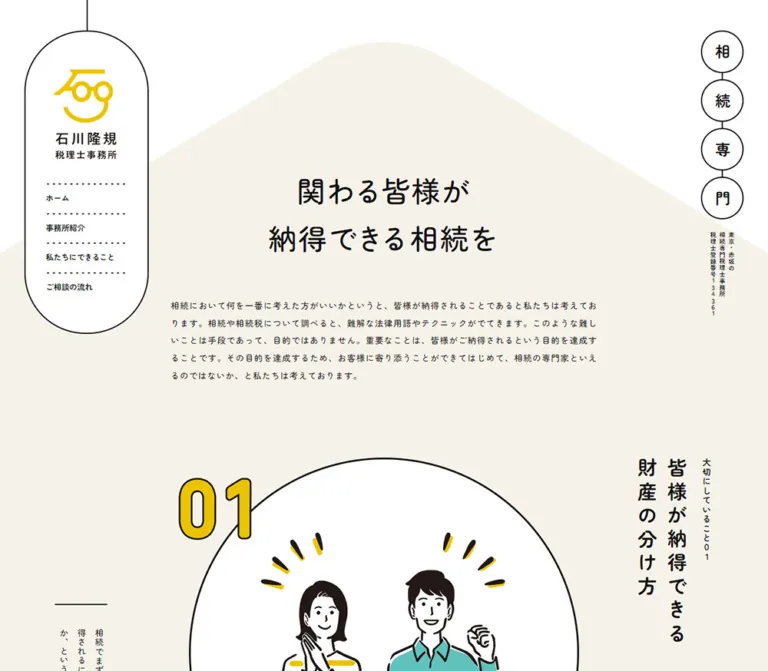
The visual identity comes from the relationship between soft shapes and precise dark outlines. A hanging capsule contains the desktop logo and navigation. Four connected circles spell “相続専門” on the opposite edge. A broad, gently peaked cream background supports the central introduction. Large white illustration circles, yellow outlined numbers, vertical Japanese titles, and dotted connectors turn the long page into a sequence of editorial compositions. Rounded Japanese lettering keeps the legal and financial subject approachable without making the layout visually busy.
閉じる
石川隆規税理士事務所 — Style Reference
A reassuring inheritance-tax practice expressed through hanging signs, rounded lettering, and generous illustrated circles.
Original URL: https://i-taxoffice.jp/ Final URL: https://i-taxoffice.jp/ — unchanged; supplied HTTP status: 200. Theme: light, with white and warm cream surfaces. No alternate theme is evidenced. Inspected: October 2, 2026, at 05:46:57.977 JST / October 1, 2026, at 20:46:57.977 UTC, according to the supplied inspection record. Viewports: 1440 × 1000 desktop and 390 × 844 mobile, in CSS pixels. Scope: the current homepage, represented by three desktop captures, two mobile captures, and rendered DOM/computed-style evidence. Coverage includes the opening identity and introduction, three linked practice principles, service summaries, the referral policy, and the footer. Destination pages and an opened mobile menu were not inspected.
This is a professional-practice homepage organized around explanation and reassurance. Its central message, “関わる皆様が 納得できる相続を,” introduces an approach to inheritance that prioritizes agreement among the people involved. Three principles follow, then service categories and an explicit referral-only consultation policy. The page supports orientation and understanding; its visible primary links lead to office and service information.
The visual identity comes from the relationship between soft shapes and precise dark outlines. A hanging capsule contains the desktop logo and navigation. Four connected circles spell “相続専門” on the opposite edge. A broad, gently peaked cream background supports the central introduction. Large white illustration circles, yellow outlined numbers, vertical Japanese titles, and dotted connectors turn the long page into a sequence of editorial compositions. Rounded Japanese lettering keeps the legal and financial subject approachable without making the layout visually busy.
How to Read This Reference
- Measured values come from the supplied computed styles or element rectangles. They are not independently remeasured here.
- Derived values are calculations from those measurements, such as the mobile content width being approximately 88% of the viewport.
- Visual estimates describe the supplied current-page screenshots. Estimated hexadecimal colors are implementation starting points, not sampled or recovered source declarations.
- Recommendations describe a new implementation. The CSS, proposed breakpoint, focus states, and hover effects below are explicitly adaptations.
- Named tokens are descriptive aliases. The supplied custom-property maps are empty; these names are not claimed to exist in the original stylesheet.
- Parent styles are not child styles. Several heading wrappers contain visibly larger lettering than their own recorded font size. The record does not expose every nested span, pseudo-element, border, transform, or illustration asset.
- Still images do not verify interactions. Link destinations and transition declarations are available, but menu opening, hover endpoints, entrance sequences, and scrolling effects were not exercised in the supplied evidence.
Tokens — Colors
Default Palette
| Name | Value | Suggested token | Evidence and role |
|---|---|---|---|
| Ink | #111111 |
--color-ink |
Measured: body and most text compute to rgb(17, 17, 17). Outlines visually use a similar dark tone. |
| White | #ffffff |
--color-white |
Measured: body, footer, and large information links. Visually also fills the identity capsule and illustration circles. |
| Warm Cream | approximately #f7f3eb |
--color-paper |
Visual estimate: the main editorial background and broad peaked opening shape. |
| Identity Yellow | approximately #efc500 |
--color-yellow |
Visual estimate: logo symbol, outlined section numerals, illustration accents, and the return-to-top shape. |
| Referral Sand | approximately #eae0cc |
--color-sand |
Visual estimate: the full-width referral-policy band. Slightly deeper than the main cream. |
| Service Blue | approximately #74a6e8 |
--color-blue |
Visual estimate: the visible rounded lower edge of the final service panel in the mobile capture. Other service-panel fills are not established. |
| Illustration Brown | approximately #261c18 |
--color-drawing |
Visual estimate: hair and hand-drawn contours in the third principle illustration. |
White service text is confirmed by the DOM. Only part of its blue background is visible in the current mobile screenshot, so the exact contrast cannot be audited from a recovered source color. The estimated blue paired with white produces approximately 2.5:1 contrast; treat that calculation as a reason to verify the actual palette before reusing it for small text.
Yellow is an identity accent rather than a universal button fill. The two prominent information links remain white with dark outlines. Preserve that distribution: cream creates continuity, white separates illustrated and informational surfaces, and yellow marks personality and sequence.
No theme selector or alternate palette is evidenced.
Tokens — Typography
Zen Maru Gothic — Main Interface
- Recorded family:
"Zen Maru Gothic", sans-serifon the body, navigation, headings, paragraphs, and footer. - Recorded weights:
500for body copy, the introductory headline, and the referral heading;700for navigation, many sectional headings, and large links. - Character: rounded Japanese forms with a calm, open rhythm. The softer terminals connect the typography to the friendly line illustrations.
- Font-loading limitation: the computed family is recorded; font-file URLs, subsets, and download status are not supplied.
The root element computes to 10px, while the body explicitly computes to 16px on desktop and 14px on mobile. The root's Times-family declaration is not the visible page's editorial font. A new implementation can retain a conventional root size and use the measured pixel equivalents below.
Type Scale
Values are measured unless marked otherwise. Size and line height describe the sampled element, not necessarily every descendant.
| Role | Desktop size / line height | Mobile size / line height | Weight | Tracking |
|---|---|---|---|---|
| Body default | 16 / 24px |
14 / 21px |
500 | 0.04em |
| Introductory paragraph | 16 / 32px |
14 / 28px |
500 | 0.04em |
| Introductory headline | 52 / 62.4px |
30 / 36px |
500 | 0.08em |
| Navigation links | 14 / 14px |
14 / 14px, offscreen in closed state |
700 | 0.02em |
| Specialty caption | 11 / 16.5px |
11 / 16.5px |
700 | 0.08em |
| Principle heading wrapper | 16 / 24px |
14 / 21px |
700 | 0.08em |
| Service section heading | 44 / 66px |
24 / 36px |
700 | 0.08em |
| Service heading wrapper | 16 / 24px |
14 / 21px |
700 | 0.08em |
| Large outlined links | 20 / 20px |
12 / 12px |
700 | 0.64px desktop; 0.56px mobile |
| Referral heading | 28 / 42px |
18 / 27px |
500 | 0.06em |
| Referral paragraph | 20 / 40px |
14 / 28px |
500 | 0.04em |
| Footer address and hours | 16 / 32px |
12 / 24px |
500 | 0.04em |
| Copyright | 11 / 22px |
11 / 22px |
500 | 0.04em |
Display Lettering and Vertical Text
The large principle titles appear approximately 36px on desktop and 24px on mobile. These are visual estimates for nested display lettering, not the measured font sizes of their H2 wrappers. The yellow section numerals are substantially larger; approximately 120–140px desktop and 80–100px mobile are useful starting ranges. Their actual font declaration was not captured.
The desktop principle titles and side descriptions read vertically. Mobile retains the vertical titles but changes the descriptions to horizontal paragraphs. Use actual Japanese vertical typesetting for these elements, such as writing-mode: vertical-rl; rotating an entire horizontal sentence would produce the wrong reading direction and punctuation behavior.
The introductory headline is horizontal in both captures. Its character-separated DOM text does not establish a character animation. Its measured desktop box is about 174.78px high, despite a parent line height of 62.4px; nested layout contributes to the visible line rhythm. Do not assume that two ordinary line boxes alone reproduce it.
Tokens — Spacing & Shapes
Density: generous at the section level, compact within navigation and identity details. Recurring geometry: capsules, circles, thin connecting stems, short dotted rules, and a broad rounded peak.
Spacing Scale
The record does not establish a universal spacing system. These recurring measurements are useful implementation anchors.
| Use | Desktop | Mobile | Evidence |
|---|---|---|---|
| Identity capsule top offset | approximately 50px |
approximately 20px |
Screenshot bounds; header top padding matches these values |
| Desktop identity left offset | 40px |
Centered | Measured header position / screenshot |
| Standard mobile content gutter | — | 23.39px per side |
Measured; approximately 6vw |
| Headline-to-intro-copy gap | 60px |
20px |
Derived from adjacent rectangles |
| Intro-copy-to-first-principle gap | 120px |
40px |
Derived from adjacent rectangles |
| Navigation item height | 50px |
50px in offscreen menu links |
Measured |
| Navigation vertical padding | 18px |
18px |
Measured |
| Large-link padding | 30px |
20px |
Measured |
| Principle description padding | 40px 0 |
0 80px 0 0 |
Measured; mobile reserves space at the right |
| Gap between mobile principle link boxes | — | 50px |
Derived |
| Referral paragraph left inset | 60px |
0 |
Measured |
| Footer vertical padding | 200px top, 120px bottom |
46.8px top and bottom |
Measured; mobile equals 12vw at 390px |
Border Radius and Linework
| Element | Treatment | Evidence |
|---|---|---|
| Large information links | 100px border radius |
Measured |
| Desktop identity enclosure | Tall capsule, approximately 204 × 503px |
Visual bounds; approximately 102px end radii |
| Mobile identity enclosure | Capsule, approximately 140 × 195px |
Visual estimate |
| Specialty badges | Circles; approximately 70px desktop and 53px mobile |
Group dimensions plus screenshot geometry |
| Illustration frames | Large white circles with dark outlines | Visually approximately 640px diameter in desktop captures |
| Detail cue | Outlined circle, approximately 120px desktop |
Visual estimate |
| Return-to-top surface | Soft, slightly irregular rounded shape | Screenshot; not a perfect circle |
| General outlines | Approximately 2px |
Visual estimate |
| Large circle and pill outlines | Approximately 3px desktop |
Visual estimate; pill box arithmetic is also consistent with 3px borders |
Dotted lines are structural accents. They divide navigation rows, separate the mobile identity from the introduction, and connect detail cues to their surrounding composition. The referral band instead uses large white dashed curves.
Layout Measurements
| Element | 1440 × 1000 | 390 × 844 |
|---|---|---|
| Document height | 5648px |
4713px |
| Intro content box | 699.83px wide at x 370.08 |
343.22px wide at x 23.39 |
| Headline box top | y 270px |
y 353.09px, including 30px top padding |
| Intro paragraph box | y 504.78, height 160px |
y 503.09, height 252px |
| First principle link | 1080 × 640px, x 180, y 784.78 |
343.22 × 582.39px, x 23.39, y 795.09 |
| Specialty badge group | 70 × 310px |
242 × 53px |
| Office-information link | 440 × 86px |
343.22 × 56px |
| Service-information link | 440 × 86px |
343.22 × 56px |
| Footer | 1440 × 578px |
390 × 298.59px |
| Footer text container | 1280px wide, x 80 |
343.22px wide, x 23.39 |
| Return-to-top link box | 67 × 73px |
34 × 37px |
The later desktop principle link boxes are recorded as 576px high, while the visible illustration circle in the middle capture appears about 640px across. These measurements come from different observation contexts. Do not derive a universal circle size, transform, or animation endpoint from those offscreen rectangles alone.
Components
Hanging Identity and Desktop Navigation
Role: establishes the practice and gives access to its main informational pages.
The desktop identity sits near the upper-left edge, inside a white capsule outlined in dark ink. A thin vertical stem continues from its top to the viewport edge. The enclosure begins around x 40, y 50 and is approximately 204px wide.
Inside, the yellow symbol and Japanese office wordmark form one visual identity block. Below it, four left-aligned navigation rows are separated by dotted rules:
- “ホーム” →
/ - “事務所紹介” →
/about/ - “私たちにできること” →
/service/ - “ご相談の流れ” →
/flow/
The navigation text is 14px, weight 700, with 18px vertical padding. Its measured width is 134px. Preserve the capsule's generous top and bottom breathing room; it should resemble a suspended sign rather than a conventional rectangular sidebar.
The desktop sign is absent from the supplied lower-page captures. Its exact scroll-position or visibility mechanism is not established, so it should not be described as an always-visible fixed rail.
Mobile Identity and Menu Affordance
The mobile logo capsule is centered at the top, approximately 140 × 195px, with its upper edge at y 20. The measured logo H1 box is 80 × 111.09px at x 155, y 62.
A three-line menu icon appears near the upper-right corner. It is visible at the same screen location in both supplied mobile captures, consistent with a persistent control. The actual positioning rule is not included in the DOM extract.
The navigation links remain in the mobile DOM but their recorded x-coordinate is 429px, beyond the 390px viewport. They compute to white text in that state. This supports an offscreen closed-menu arrangement, but does not establish its opened background, dimensions, animation direction, or interaction model.
Connected Specialty Badges
Role: communicates the practice's specialization before the main introduction.
Four individually outlined white circles contain the characters “相”, “続”, “専”, and “門”. Short dark connectors join the circles.
On desktop, the group is a vertical strip at x 1330, y 50, measuring 70 × 310px. A small vertically arranged caption beneath it gives the location, specialization, and registration information. Its recorded type is 11px / 16.5px, weight 700.
On mobile, the same four circles form a centered horizontal group at x 74, y 227.09, measuring 242 × 53px. The caption switches to two horizontal lines beneath the group. Preserve the reading order when changing the layout direction.
Peaked Introduction
Role: explains the office's priorities and establishes the page's tone.
A broad cream shape rises behind the content like a gently rounded roof. In the desktop opening capture its apex is near y 70, while its sloping sides meet the viewport edges near y 470. These are visual estimates; the original path is not available.
The headline is centered in a roughly 700px column, while the paragraph below is left aligned. The wording occupies two deliberate headline lines. Wide tracking and restrained weight matter as much as size: desktop uses 52px, weight 500, and 0.08em tracking.
The paragraph uses 16px / 32px on desktop and 14px / 28px on mobile. It is a substantial statement rather than a short promotional caption. Preserve its comfortable two-times line height and avoid reducing the column to a narrow central slogan.
Mobile places a short centered dotted rule above the headline, after the identity and specialty group. The outer content gutter is approximately 6vw.
Linked Principle Composition
Role: presents one of three priorities and links to its corresponding explanation.
Each principle is one large anchor containing several coordinated visual parts:
- An oversized yellow numeral with a dark outline, positioned near the upper-left edge of the illustration.
- A large white circular illustration field with a dark perimeter.
- A vertical title on the right, accompanied by the smaller label “大切にしていること” and its number.
- A vertical explanatory paragraph toward the lower left on desktop.
- A small outlined circular “詳細へ” cue near the lower right, preceded by a dotted stem.
The three destinations are /about/#num01, /about/#num02, and /about/#num03. Their topics are agreement on the division of property, preparation for paying inheritance tax, and the pursuit of an appropriate tax amount.
The third illustration is fully visible in the supplied middle desktop capture: a seated person writes on a document, wearing a yellow dotted top. Dark, slightly irregular contours, a white face, and a small music-note bubble make a complex financial task appear manageable.
Do not turn the whole composition into a small bordered card. The outline belongs primarily to the illustration circle and the detail cue; the title and paragraph sit directly on the cream background.
Mobile reflow: the title remains vertical at the right, while the description becomes a horizontal paragraph below the illustration region. Its measured right padding is 80px. The second title changes from two textual lines on desktop to three on mobile. Exact mobile illustration bounds and detail-circle dimensions are not visible in the supplied crops.
Implementation anatomy: use a single anchor with semantic heading and paragraph descendants. The visual “詳細へ” circle can be a span inside that anchor; it should not become a nested interactive link.
Office and Service Information Links
Role: provide clear transitions from the editorial sections to deeper information.
“事務所紹介へ” and “私たちにできること” share a wide white pill treatment with a dark outline. Desktop dimensions are 440 × 86px; mobile dimensions are 343.22 × 56px. Their recorded radius is 100px.
Desktop labels use 20px / 20px, weight 700, with 30px padding. Mobile labels use 12px / 12px, weight 700, with 20px padding. The smaller mobile type is an observed choice, not a general accessibility recommendation.
In the middle desktop capture, a straight dark stem connects the bottom of the final illustration circle to the office-information pill. Its visible length is approximately 120px. Treat this as an intentional continuation of the hanging-sign motif.
Service Summaries
Role: separates assistance before inheritance, after inheritance, and other consultation work.
The rendered content contains three summaries beneath “私たちにできること”. Desktop paragraph boxes sit in three columns, each approximately 239.67px wide, starting at x 220, 600.17, and 980.33. Their aligned positions support a three-column layout with substantial internal padding.
Mobile stacks the summaries vertically. Paragraphs are approximately 280.84px wide at x 54.58, inside the wider 343.22px content region. The resulting inset is about 31.2px per side.
The recorded headings and paragraphs are white. The lower edge of the final mobile panel is blue and broadly rounded. The full service-section appearance is not shown in the supplied current-page screenshots: do not infer a complete palette, icon set, illustration arrangement, or identical radii for all three items.
Referral-Policy Band
Role: sets expectations about who can request consultation.
A full-width sand-colored band contains the heading “ご紹介の方のみ、相談をお受けしています” and a longer explanation. Large white dashed curves cross the background without competing with the text.
Desktop uses two columns within the 1080px content width. The heading occupies approximately 380px; the paragraph occupies the remaining 700px box, including a 60px left inset. A thin vertical dark rule divides the columns. The visible band is approximately 400px tall.
Mobile stacks the heading and paragraph, removes the visible vertical divider, and uses the same approximately 6vw page gutters. The heading is 18px / 27px, and the paragraph is 14px / 28px. The dashed curves remain oversized and cropped by the band.
Preserve the actual referral restriction in any content adaptation that represents this practice. The observed band is explanatory; it does not contain an open consultation form or a booking button.
Office Footer and Return to Top
The footer returns to a plain white field. It identifies the office, supplies a phonetic reading, lists its address and weekday opening hours, and ends with copyright text. The visible identity and copyright independently support the office name as the page operator.
Desktop uses a wide 1280px inner area, beginning at x 80, and 200px of top padding. Mobile uses the standard 343.22px content width and 46.8px vertical padding. The layout remains left aligned rather than becoming centered.
A small yellow shape containing an upward chevron sits near the lower-right corner. Its anchor targets /#pagetop. The measured link box is 67 × 73px on desktop and 34 × 37px on mobile. The target is verified; smooth scrolling and fixed positioning are not.
Tokens — Motion & Interaction
The following are recorded computed transition values, not demonstrated animation sequences.
| Element | Recorded transition | What the evidence establishes |
|---|---|---|
| Header | 1s cubic-bezier(0.68, -0.6, 0.32, 1.4) |
An overshooting timing function is declared; trigger and changed properties are unknown. |
| Ordinary links, principle links, return-to-top link | 0.4s ease-in-out |
Shared transition timing; no specific hover endpoint was captured. |
| Intro paragraph | 0.6s ease-in-out |
A transition is declared; reveal or scroll behavior is unverified. |
| Mobile introductory headline | 0.4s ease-in-out |
Recorded on mobile; no demonstrated character-by-character sequence. |
| Large pill links | 0.6s cubic-bezier(0.68, -0.6, 0.32, 2) |
A pronounced overshoot curve is declared; the affected visual property is not established. |
| Sampled elements | animation: none |
No keyframe animation is recorded on these sampled nodes. This does not cover all descendants or pseudo-elements. |
A bare computed transition value of all is not proof that an element visibly animates. The capture process waited for a settled presentation, so entrance behavior cannot be reconstructed from the final screenshots.
For an adaptation, keep feedback restrained: a small positional or color change can use the recorded timings. Do not invent perpetual swinging signs, bouncing illustrations, parallax, or moving dashed paths and present them as original behavior. Reduced-motion support should be added explicitly.
Surfaces
| Surface | Appearance | Function |
|---|---|---|
| Opening and principles | Warm cream with dark text | Continuous editorial reading area |
| Identity sign | White, dark capsule outline | Distinct practice identity and navigation |
| Illustration field | White circle, dark outline | Frames the handmade artwork without cropping it |
| Information link | White pill, dark outline | Prominent but calm navigation |
| Service panel, visible portion | Blue with white copy and a rounded lower edge | Differentiates service information; full palette unverified |
| Referral band | Deeper sand with white dashed curves | Separates consultation eligibility from service descriptions |
| Footer | White with left-aligned dark text | Plain institutional information |
| Return-to-top shape | Yellow with dark chevron | Small utility accent |
No general shadow-elevation system is visible in the supplied captures. Separation comes from outlines, background changes, whitespace, and the contrast between vertical and horizontal composition.
Imagery
The strongest fully visible illustration uses slightly irregular dark strokes, broad flat fills, simple facial features, and a familiar desk activity. Yellow connects the person's clothing to the logo and numbered sequence. A tiny blue note adds secondary color without creating a broad multicolor interface.
Keep illustrations uncropped inside their white circles. Leave enough white space around hands, heads, and accompanying symbols for the outline to read clearly. The artwork should not touch the circular perimeter everywhere or become a full-bleed photographic crop.
The logo combines a yellow symbol with the Japanese office name and profession. Preserve authorized original artwork when available; reproducing the symbol with an unrelated icon would remove a central identity cue. No photography is visible in the supplied current-page crops, but imagery elsewhere in unshown regions is not established.
Observed Asset References
No asset URLs, filenames, or intrinsic image dimensions are supplied. The following are visual references, not downloadable asset paths.
| Asset or decoration | Current-page evidence | Reuse guidance |
|---|---|---|
| Yellow identity symbol and wordmark | Desktop opening and mobile opening | Use the authorized original logo; preserve its compact vertical proportions. |
| Third principle illustration | Middle desktop capture | Preserve the seated writing pose, open white field, dark contours, and limited accent fills. |
| First principle artwork | Only its upper portion appears in the desktop opening | Do not infer the complete scene from this crop. |
| Large numbered sequence | Opening and middle desktop captures; mobile opening | Yellow fill with a dark outline; oversized relative to body text. |
| Referral dashed curves | Desktop footer-area and mobile lower-page captures | Decorative oversized paths, clipped to the band; exact paths are unknown. |
| Menu and upward chevron | Mobile opening/lower-page and footer captures | Simple dark strokes; implementation format is unknown. |
For newly commissioned artwork, use friendly everyday situations, variable-width contours, minimal shading, and restrained flat accents. SVG is a suitable implementation format for new line illustrations and decorations, but the original asset formats are not established here.
Layout & Responsive Behavior
The desktop opening has three independent visual zones: the left identity capsule, the central introduction, and the right specialty strip. The central content remains centered on the viewport; it is not simply a main column offset by the entire sidebar width.
The principle sequence expands to a centered 1080px region. Its illustration, title, description, and detail cue occupy different parts of a broad composition. Large gaps establish a slow reading rhythm. Later, the services use three aligned columns and the referral notice uses a two-column layout.
The supplied mobile viewport demonstrates deliberate recomposition:
| Element | Desktop | Mobile |
|---|---|---|
| Identity | Left capsule containing logo and navigation | Smaller centered logo capsule; separate menu affordance |
| Specialty badges | Vertical right-side chain | Horizontal chain below the logo |
| Specialty caption | Vertical arrangement | Two centered horizontal lines |
| Intro headline | 52px, two lines |
30px, two lines, with a dotted rule above |
| Intro paragraph | About 700px wide |
About 343px, or 88% of the viewport |
| Principle title | Vertical | Remains vertical; second title wraps into more columns |
| Principle description | Vertical side text | Horizontal text beneath the illustration region |
| Services | Three columns | Stacked summaries |
| Main information links | Centered 440px pills |
Full content-width pills |
| Referral policy | Heading and text separated by a vertical rule | Stacked, without the visible divider |
| Footer | Large top padding and 80px side inset |
Compact padding and standard mobile gutters |
Only these two viewport widths were inspected. The original breakpoint, tablet layout, landscape behavior, and font interpolation rules are unknown. The CSS below uses a recommended 1200px composition switch to keep the desktop sign clear of the approximately 700px reading column; this is not a recovered source breakpoint.
The mobile document is shorter than the desktop document despite its stacked services. Smaller illustration compositions, reduced gaps, and tighter footer spacing make that possible. Do not preserve every desktop section height on mobile.
Do’s and Don’ts
Do
- Use the recorded Zen Maru Gothic stack, with weight
500for the calm introductory voice and700for compact navigation. - Preserve the two-times paragraph line height and deliberate tracking.
- Keep white and cream distinct; the illustration circles should remain visible against the page.
- Reserve yellow for identity, sequence numbers, artwork accents, and the small top-return control.
- Treat circles, capsules, and connecting stems as a coherent visual vocabulary.
- Keep desktop principle titles and descriptions vertically typeset.
- Reflow descriptions horizontally on mobile while retaining the distinctive vertical titles.
- Preserve the broad desktop compositions and approximately 6vw mobile gutters.
- Make each principle a coherent link, including its visible detail cue.
- Keep the referral policy prominent and accurately worded.
- Verify estimated colors and original artwork before aiming for exact visual reproduction.
Don’t
- Don't replace the page with a generic hero followed by a uniform card grid.
- Don't add a dominant booking button that conflicts with the observed referral-only policy.
- Don't fill every prominent link with yellow; the large observed links are white outlined pills.
- Don't replace Japanese vertical text with rotated horizontal strings.
- Don't infer large display-letter sizes from their smaller parent H2 styles.
- Don't introduce heavy shadows, glass effects, or glossy gradients into the outlined surfaces.
- Don't crop the illustrations to fill the entire circular field.
- Don't make the desktop identity rail permanently fixed based solely on the opening capture.
- Don't invent the mobile menu's opened design or treat transition declarations as tested interactions.
- Don't reuse the mobile return-to-top dimensions without considering a larger touch target.
Recommended Implementation Additions
These are recommendations for a new implementation, not verified original features:
- Give the menu button an accessible name,
aria-expanded, andaria-controls. Keep closed-menu links out of keyboard navigation; restore focus appropriately when closing the menu. - Give the linked logo a meaningful accessible name and the return-to-top link a clear label. Empty link text in the supplied extraction does not establish whether the original has an accessible name.
- Maintain one logical heading and reading order even when CSS distributes text around a circle. Use vertical writing only as presentation.
- Implement principle detail cues as part of their surrounding anchor, without nested links or duplicate tab stops.
- Provide a visible dark focus outline with sufficient offset from component borders.
- Enlarge small icon-control hit areas to at least
44 × 44pxwhile retaining the smaller visible mark where appropriate. - Verify the service colors against their white text. Use dark text or a darker fill if the actual combination lacks sufficient contrast.
- Respect reduced-motion preferences and ensure all explanatory content is available without entrance effects.
- Mark connecting stems, background peaks, and dashed paths as decorative. Provide useful alternatives for illustrations when they convey information beyond adjacent text.
- Load the chosen font intentionally and check fallback wrapping, especially in vertical headings and long mobile paragraphs.
Agent Prompt Guide
Quick Color Reference
- Main text: measured
#111111. - White surfaces: measured
#ffffff. - Main cream: estimated
#f7f3eb. - Identity yellow: estimated
#efc500. - Referral sand: estimated
#eae0cc. - Visible service blue: estimated
#74a6e8; verify before pairing with white text. - Primary information-link treatment: white fill, dark outline, fully rounded ends.
- Decorative separation: thin stems, dots, and broad dashed curves; no shadow system.
Overall Prompt
“Create an informational homepage for a Japanese inheritance-tax practice, using the visual principles of 石川隆規税理士事務所. Use warm cream, white, dark ink, and a restrained yellow accent. Set Japanese text in Zen Maru Gothic with generous line height. On desktop, place a hanging white capsule containing the logo and dotted navigation at the upper left, and four connected specialty circles at the upper right. Center a two-line introduction over a broad softly peaked cream background. Follow with large circular illustrations, yellow outlined numbers, vertical Japanese titles, vertical side descriptions, and small circular detail cues. Recompose the identity and badges horizontally on mobile, keep titles vertical, and move descriptions below the artwork. Finish with a sand referral-policy band and a spacious white office footer. Use the supplied measurements where verified and identify all approximations.”
Example Component Prompts
- Identity sign: “Build a white hanging capsule approximately 204px wide on desktop, with a thin dark stem, an authorized yellow logo, and four 50px navigation rows divided by dotted rules. On mobile, reduce it to a centered 140px logo capsule and provide a separate accessible menu button. Do not invent the original menu's opened appearance.”
- Principle composition: “Arrange a large white outlined illustration circle on cream, an oversized yellow outlined numeral near its upper-left edge, a vertical Japanese title at right, and a vertical explanatory paragraph at lower left. Add a circular ‘詳細へ’ cue, but make the entire composition a single semantic link. On mobile, move the paragraph below the art and preserve space at its right.”
- Information pill: “Create a white outlined link measuring 440 × 86px on desktop, with a 100px radius and centered 20px bold lettering. At the mobile reference width, use the 343px content width, 56px height, and 12px lettering. Treat any proposed hover transform as an adaptation.”
- Referral notice: “Use a muted sand full-width band with large white dashed curves. On desktop, place a 28px heading beside a 20px paragraph with a dark vertical divider and a 60px text inset. Stack them on mobile using 18px and 14px text. Preserve the referral-only policy and avoid adding an unsupported booking action.”
- New illustration: “Draw a friendly person reviewing paperwork with slightly irregular dark contours, white negative space, a small yellow clothing accent, and minimal shading. Fit the complete scene comfortably inside a large white circle. Create original artwork rather than tracing the practice's logo or existing illustrations.”
Quick Start
CSS Custom Properties
This is a reusable adaptation, not the original stylesheet. Measured type sizes, content widths, and pill dimensions are retained. Colors other than ink and white, display-number sizing, repeated-section spacing, the background paths, and the breakpoint are approximations or recommendations.
Load Zen Maru Gothic separately using an appropriate font source; no font or image asset URLs were supplied. Use a conventional root size. For the introduction, put each of its two lines in a span. For a principle, use one .principle anchor containing .principle-number, .principle-art, .principle-heading, .principle-copy, and a non-interactive .detail-cue.
The service-card example intentionally uses dark text on the estimated blue for contrast. The inspected service text is white. Menu opening requires a separately designed and accessible interaction; the CSS only represents its closed state.
:root {
  /* Measured colors */
  --color-ink: #111111;
  --color-white: #ffffff;

  /* Visual estimates; verify against authorized source assets */
  --color-paper: #f7f3eb;
  --color-yellow: #efc500;
  --color-sand: #eae0cc;
  --color-blue: #74a6e8;
  --color-drawing: #261c18;

  --font-body: 'Zen Maru Gothic', sans-serif;
  --weight-body: 500;
  --weight-strong: 700;
  --tracking-body: 0.04em;
  --tracking-heading: 0.08em;
  --content-width: 1080px;
  --intro-width: 699.83px;
  --rule: 2px;
  --rule-strong: 3px;
  --radius-pill: 100px;

  /* Recorded timings; interaction endpoints are recommendations */
  --motion-link: 400ms ease-in-out;
  --motion-pill: 600ms cubic-bezier(0.68, -0.6, 0.32, 2);
  --motion-header: 1s cubic-bezier(0.68, -0.6, 0.32, 1.4);
}

* { box-sizing: border-box; }

body {
  margin: 0;
  color: var(--color-ink);
  background: var(--color-white);
  font: var(--weight-body) 16px / 1.5 var(--font-body);
  letter-spacing: var(--tracking-body);
}

img { display: block; max-width: 100%; height: auto; }
button, a { -webkit-tap-highlight-color: transparent; }
button { font: inherit; }

.paper-zone {
  position: relative;
  isolation: isolate;
  background: var(--color-paper);
}

.paper-roof {
  position: absolute;
  inset: 0 0 auto;
  z-index: -1;
  width: 100%;
  height: 470px;
  fill: var(--color-white);
  pointer-events: none;
}

.paper-roof--mobile { display: none; }

.site-header {
  position: absolute;
  z-index: 2;
  top: 50px;
  left: 40px;
  width: 204px;
}

.brand-panel {
  position: relative;
  padding: 50px 33px;
  border: var(--rule) solid var(--color-ink);
  border-radius: 110px;
  background: var(--color-white);
}

.brand-panel::before {
  content: '';
  position: absolute;
  bottom: 100%;
  left: calc(50% - 1px);
  width: 2px;
  height: 50px;
  background: var(--color-ink);
}

.brand-logo { display: block; padding: 12px 16px 20px 12px; }
.brand-logo img { width: 100%; }
.primary-nav { margin-top: 20px; }

.primary-nav a {
  position: relative;
  display: block;
  padding: 18px 0;
  color: inherit;
  font-size: 14px;
  font-weight: 700;
  line-height: 14px;
  letter-spacing: 0.02em;
  text-decoration: none;
}

.primary-nav a::before {
  content: '';
  position: absolute;
  inset: 0 0 auto;
  border-top: 2px dotted currentColor;
}

.menu-toggle { display: none; }

.specialty {
  position: absolute;
  z-index: 2;
  top: 50px;
  right: 40px;
  width: 70px;
}

.specialty-chars {
  display: flex;
  flex-direction: column;
  gap: 10px;
  margin: 0;
  padding: 0;
  list-style: none;
}

.specialty-chars > li {
  position: relative;
  display: grid;
  place-items: center;
  flex: 0 0 auto;
  width: 70px;
  height: 70px;
  border: 2px solid var(--color-ink);
  border-radius: 50%;
  background: var(--color-white);
  font-size: 28px; /* Visual approximation of the inner glyph */
  font-weight: 700;
}

.specialty-chars > li + li::before {
  content: '';
  position: absolute;
  top: -12px;
  left: calc(50% - 1px);
  width: 2px;
  height: 10px;
  background: var(--color-ink);
}

.specialty-caption {
  width: max-content;
  margin: 20px auto 0;
  writing-mode: vertical-rl;
  font-size: 11px;
  font-weight: 700;
  line-height: 1.5;
  letter-spacing: 0.08em;
}

.site-intro {
  width: min(var(--intro-width), 88%);
  margin-inline: auto;
  padding-top: 270px;
}

.hero-title {
  position: relative;
  margin: 0;
  font-size: 52px;
  font-weight: 500;
  line-height: 1.2;
  letter-spacing: 0.08em;
  text-align: center;
}

/* Span padding approximates the captured two-line box rhythm. */
.hero-title > span { display: block; padding-block: 12.5px; }
.intro-copy { margin: 60px 0 0; line-height: 2; }

.principles {
  width: min(var(--content-width), 88%);
  margin: 120px auto 0;
}

.principle {
  --copy-height: 400px;
  position: relative;
  display: block;
  min-height: 640px;
  color: inherit;
  text-decoration: none;
}

.principle + .principle {
  --copy-height: 360px;
  margin-top: 160px; /* Recommended rhythm, not a source constant */
}

.principle-art {
  display: grid;
  place-items: center;
  width: 640px;
  max-width: 100%;
  aspect-ratio: 1;
  margin: 0 auto;
  border: 3px solid var(--color-ink);
  border-radius: 50%;
  background: var(--color-white);
}

.principle-art img {
  max-width: 72%;
  max-height: 72%;
  object-fit: contain;
}

.principle-number {
  position: absolute;
  top: 0;
  left: calc(50% - 345px);
  color: var(--color-yellow);
  font: 700 140px / 1 sans-serif;
  -webkit-text-stroke: 3px var(--color-ink);
}

.principle-heading {
  position: absolute;
  top: 0;
  right: 0;
  display: flex;
  flex-direction: row-reverse;
  gap: 14px;
  margin: 0;
}

.principle-eyebrow,
.principle-title { writing-mode: vertical-rl; }

.principle-eyebrow { font-size: 16px; line-height: 24px; }
.principle-title {
  font-size: 36px; /* Estimated nested display size */
  line-height: 1.5;
  letter-spacing: 0.08em;
}

.principle-copy {
  position: absolute;
  bottom: 0;
  left: 0;
  width: max-content;
  max-width: 160px;
  height: var(--copy-height);
  margin: 0;
  padding: 40px 0;
  border-top: 2px solid currentColor;
  border-bottom: 2px solid currentColor;
  writing-mode: vertical-rl;
  line-height: 2;
}

.detail-cue {
  position: absolute;
  right: 0;
  bottom: 0;
  display: grid;
  place-items: center;
  width: 120px;
  aspect-ratio: 1;
  border: 3px solid currentColor;
  border-radius: 50%;
  font-weight: 700;
}

.detail-cue::before {
  content: '';
  position: absolute;
  bottom: calc(100% + 28px);
  left: 50%;
  height: 48px;
  border-left: 3px dotted currentColor;
}

.section-link {
  position: relative;
  display: block;
  width: min(440px, 100%);
  margin-inline: auto;
  padding: 30px;
  border: 3px solid var(--color-ink);
  border-radius: var(--radius-pill);
  color: var(--color-ink);
  background: var(--color-white);
  font-size: 20px;
  font-weight: 700;
  line-height: 20px;
  letter-spacing: 0.64px;
  text-align: center;
  text-decoration: none;
  transition: transform var(--motion-pill);
}

.office-link { margin-top: 120px; }
.office-link::before {
  content: '';
  position: absolute;
  bottom: 100%;
  left: calc(50% - 1.5px);
  height: 123px;
  border-left: 3px solid var(--color-ink);
}

.services { padding-block: 120px; background: var(--color-white); }
.services-inner { width: min(1080px, 88%); margin-inline: auto; }
.services-title { font-size: 44px; line-height: 1.5; letter-spacing: 0.08em; }
.service-grid { display: grid; grid-template-columns: repeat(3, minmax(0, 1fr)); gap: 60px; }

.service-card {
  padding: 40px;
  border-radius: 64px; /* Approximation; full original cards were not shown */
  background: var(--service-surface, var(--color-blue));
  color: var(--color-ink); /* Recommended contrast adjustment */
}

.service-card p { line-height: 2; }

.referral {
  position: relative;
  overflow: hidden;
  padding-block: 120px;
  background: var(--color-sand);
}

.referral-inner {
  position: relative;
  width: min(1080px, 88%);
  margin-inline: auto;
  display: grid;
  grid-template-columns: 380px minmax(0, 1fr);
}

.referral h2 {
  margin: 0;
  font-size: 28px;
  font-weight: 500;
  line-height: 1.5;
  letter-spacing: 0.06em;
}

.referral p {
  margin: 0;
  padding-left: 60px;
  border-left: 2px solid var(--color-ink);
  font-size: 20px;
  line-height: 2;
}

.site-footer {
  position: relative;
  padding: 200px 80px 120px;
  background: var(--color-white);
}

.footer-address { margin: 30px 0 0; line-height: 2; }
.copyright { margin: 30px 0 0; font-size: 11px; line-height: 22px; }

.back-to-top {
  position: absolute;
  right: 30px;
  bottom: 30px;
  display: grid;
  place-items: center;
  width: 67px;
  height: 73px;
  color: var(--color-ink);
  background: var(--color-yellow);
  border-radius: 46% 48% 43% 47%;
  text-decoration: none;
}

/* Recommended feedback; original hover endpoints were not tested. */
@media (hover: hover) {
  .section-link:hover { transform: translateY(-2px); }
  .primary-nav a:hover { text-decoration: underline; text-underline-offset: 5px; }
}

:where(a, button):focus-visible {
  outline: 3px solid var(--color-ink);
  outline-offset: 5px;
}

/* Recommended composition switch; original breakpoint is unknown. */
@media (max-width: 1199px) {
  body { font-size: 14px; }
  .paper-roof--desktop { display: none; }
  .paper-roof--mobile { display: block; height: 237px; }

  .site-header { top: 20px; left: 50%; width: 140px; transform: translateX(-50%); }
  .brand-panel { padding: 40px 28px; }
  .brand-panel::before { height: 20px; }
  .brand-logo { padding: 0; }
  .primary-nav { display: none; }

  .menu-toggle {
    position: fixed;
    z-index: 10;
    top: 9px;
    right: 13px;
    display: grid;
    place-items: center;
    width: 44px;
    height: 44px;
    padding: 0;
    border: 0;
    color: var(--color-ink);
    background: transparent;
  }

  .specialty { top: 227.09px; right: auto; left: 50%; width: 242px; transform: translateX(-50%); }
  .specialty-chars { flex-direction: row; }
  .specialty-chars > li { width: 53px; height: 53px; font-size: 22px; }
  .specialty-chars > li + li::before { top: calc(50% - 1px); left: -12px; width: 10px; height: 2px; }
  .specialty-caption { margin-top: 10px; writing-mode: horizontal-tb; text-align: center; }

  .site-intro { padding-top: 353.09px; }
  .hero-title { padding-top: 30px; font-size: 30px; }
  .hero-title > span { padding-block: 7px; }
  .hero-title::before {
    content: '';
    position: absolute;
    top: 0;
    left: 50%;
    width: 130px;
    border-top: 2px dotted var(--color-ink);
    transform: translateX(-50%);
  }
  .intro-copy { margin-top: 20px; }

  .principles { width: min(700px, 88%); margin-top: 40px; }
  .principle { min-height: 0; padding-top: 108px; }
  .principle + .principle { margin-top: 50px; }
  .principle-art { width: min(640px, 100%); }
  .principle-number { left: 0; font-size: 96px; }
  .principle-heading { gap: 5px; }
  .principle-eyebrow { font-size: 12px; line-height: 18px; }
  .principle-title { font-size: 24px; }
  .principle-copy {
    position: static;
    width: auto;
    max-width: none;
    height: auto;
    margin-top: 20px;
    padding: 0 80px 0 0;
    border: 0;
    writing-mode: horizontal-tb;
  }
  .detail-cue { width: 68px; border-width: 2px; font-size: 12px; }
  .detail-cue::before { display: none; }

  .section-link { padding: 20px; border-width: 2px; font-size: 12px; line-height: 12px; letter-spacing: 0.56px; }
  .office-link { margin-top: 50px; }
  .office-link::before { display: none; }

  .services { padding-block: 92px; }
  .services-title { font-size: 24px; }
  .service-grid { grid-template-columns: minmax(0, 1fr); gap: 24px; }
  .service-card { padding: 8vw; }

  .referral { padding-block: 8vw; }
  .referral-inner { grid-template-columns: minmax(0, 1fr); gap: 4vw; }
  .referral h2 { font-size: 18px; }
  .referral p { padding: 0; border: 0; font-size: 14px; }

  .site-footer { padding: 12vw 6vw; }
  .footer-address { margin-top: 20px; font-size: 12px; }
  .back-to-top { right: 4vw; bottom: 4vw; width: 44px; height: 44px; }
}

@media (prefers-reduced-motion: reduce) {
  .section-link,
  .primary-nav a,
  .site-header { transition: none; }
  .section-link:hover { transform: none; }
}
Decorative Background Shape
These SVG paths approximate the visible background boundary. They are newly specified geometry, not recovered original assets. Place them at the start of .paper-zone; their white fill masks the area above the cream peak.
<svg class="paper-roof paper-roof--desktop"
     viewBox="0 0 1440 470" preserveAspectRatio="none"
     aria-hidden="true" focusable="false">
  <path d="M0 0H1440V470L822 99Q720 40 618 99L0 470Z" />
</svg>

<svg class="paper-roof paper-roof--mobile"
     viewBox="0 0 390 237" preserveAspectRatio="none"
     aria-hidden="true" focusable="false">
  <path d="M0 0H390V237L245 151Q195 122 145 151L0 237Z" />
</svg>
Add referral-band dashed curves as a separate decorative SVG layer with white strokes, no fill, and clipping at the band boundaries. Keep the text above that layer. Their precise path geometry is not available and is intentionally not presented as measured.
Tailwind v4 Token Mapping
Optional aliases for a project already using Tailwind v4. This does not imply that the original website uses Tailwind. Estimated colors retain their status as estimates.
@theme {
  --color-office-ink: #111111;
  --color-office-white: #ffffff;
  --color-office-paper: #f7f3eb;
  --color-office-yellow: #efc500;
  --color-office-sand: #eae0cc;
  --color-office-blue: #74a6e8;

  --font-office: 'Zen Maru Gothic', sans-serif;
  --text-office-body: 16px;
  --text-office-body-mobile: 14px;
  --text-office-hero: 52px;
  --text-office-hero-mobile: 30px;
  --text-office-section: 44px;
  --text-office-section-mobile: 24px;

  --radius-office-pill: 100px;
  --spacing-office-content: 1080px;
  --spacing-office-intro: 699.83px;
  --spacing-office-pill: 440px;
}
Sources & Evidence
- Inspected original and final page: https://i-taxoffice.jp/. The supplied record reports an unchanged URL and HTTP 200. Its title, visible office identity, referral policy, and footer identify the current practice homepage.
- Capture time:
2026-10-01T20:46:57.977Z, equivalent to October 2, 2026, 05:46:57.977 JST. This reference analyzes the supplied inspection; it does not claim an additional live visit. - Desktop evidence: 1440 × 1000 CSS pixels; document height 5648px. Three current-page screenshots cover the opening, a middle principle composition, and the referral/footer region.
- Mobile evidence: 390 × 844 CSS pixels; document height 4713px. Two current-page screenshots cover the opening and the lower service/referral/footer region.
- Rendered DOM and computed styles: supplied text, link destinations, element rectangles, font stacks, sizes, weights, line heights, tracking, selected padding, pill radius, and transition declarations. No source custom properties or asset paths are included.
- Interaction evidence: anchors to the homepage, office page and its three principle fragments, service page, consultation-flow page, and page-top fragment. Those destination pages, hover states, menu opening, keyboard behavior, and scroll effects were not tested in this record.
- Capture limitations: the supplied process waited at least five seconds initially and attempted to settle layout, text, images, and finite motion before screenshots. This improves confidence in the visible resting states but does not prove completeness or document the motion sequence. SharedWorkers and service workers were disabled; offline behavior was not assessed.
- Visual limitations: the middle mobile principle compositions and most of the service-panel artwork are outside the provided screenshot crops. Exact cream, yellow, sand, and blue values, nested display-font metrics, illustration formats, breakpoint rules, and hidden interaction states remain unverified.
This reference describes the current homepage represented by the supplied evidence. Measured values, visual approximations, and recommended implementation choices are intentionally distinguished throughout.
# 石川隆規税理士事務所 — Style Reference

> A reassuring inheritance-tax practice expressed through hanging signs, rounded lettering, and generous illustrated circles.

**Original URL:** [https://i-taxoffice.jp/](https://i-taxoffice.jp/)
**Final URL:** [https://i-taxoffice.jp/](https://i-taxoffice.jp/) — unchanged; supplied HTTP status: 200.
**Theme:** light, with white and warm cream surfaces. No alternate theme is evidenced.
**Inspected:** October 2, 2026, at 05:46:57.977 JST / October 1, 2026, at 20:46:57.977 UTC, according to the supplied inspection record.
**Viewports:** 1440 × 1000 desktop and 390 × 844 mobile, in CSS pixels.
**Scope:** the current homepage, represented by three desktop captures, two mobile captures, and rendered DOM/computed-style evidence. Coverage includes the opening identity and introduction, three linked practice principles, service summaries, the referral policy, and the footer. Destination pages and an opened mobile menu were not inspected.

This is a professional-practice homepage organized around explanation and reassurance. Its central message, “関わる皆様が 納得できる相続を,” introduces an approach to inheritance that prioritizes agreement among the people involved. Three principles follow, then service categories and an explicit referral-only consultation policy. The page supports orientation and understanding; its visible primary links lead to office and service information.

The visual identity comes from the relationship between soft shapes and precise dark outlines. A hanging capsule contains the desktop logo and navigation. Four connected circles spell “相続専門” on the opposite edge. A broad, gently peaked cream background supports the central introduction. Large white illustration circles, yellow outlined numbers, vertical Japanese titles, and dotted connectors turn the long page into a sequence of editorial compositions. Rounded Japanese lettering keeps the legal and financial subject approachable without making the layout visually busy.
閉じる
# 石川隆規税理士事務所 — Style Reference

> A reassuring inheritance-tax practice expressed through hanging signs, rounded lettering, and generous illustrated circles.

**Original URL:** [https://i-taxoffice.jp/](https://i-taxoffice.jp/)
**Final URL:** [https://i-taxoffice.jp/](https://i-taxoffice.jp/) — unchanged; supplied HTTP status: 200.
**Theme:** light, with white and warm cream surfaces. No alternate theme is evidenced.
**Inspected:** October 2, 2026, at 05:46:57.977 JST / October 1, 2026, at 20:46:57.977 UTC, according to the supplied inspection record.
**Viewports:** 1440 × 1000 desktop and 390 × 844 mobile, in CSS pixels.
**Scope:** the current homepage, represented by three desktop captures, two mobile captures, and rendered DOM/computed-style evidence. Coverage includes the opening identity and introduction, three linked practice principles, service summaries, the referral policy, and the footer. Destination pages and an opened mobile menu were not inspected.

This is a professional-practice homepage organized around explanation and reassurance. Its central message, “関わる皆様が 納得できる相続を,” introduces an approach to inheritance that prioritizes agreement among the people involved. Three principles follow, then service categories and an explicit referral-only consultation policy. The page supports orientation and understanding; its visible primary links lead to office and service information.

The visual identity comes from the relationship between soft shapes and precise dark outlines. A hanging capsule contains the desktop logo and navigation. Four connected circles spell “相続専門” on the opposite edge. A broad, gently peaked cream background supports the central introduction. Large white illustration circles, yellow outlined numbers, vertical Japanese titles, and dotted connectors turn the long page into a sequence of editorial compositions. Rounded Japanese lettering keeps the legal and financial subject approachable without making the layout visually busy.

## How to Read This Reference

- **Measured** values come from the supplied computed styles or element rectangles. They are not independently remeasured here.
- **Derived** values are calculations from those measurements, such as the mobile content width being approximately 88% of the viewport.
- **Visual estimates** describe the supplied current-page screenshots. Estimated hexadecimal colors are implementation starting points, not sampled or recovered source declarations.
- **Recommendations** describe a new implementation. The CSS, proposed breakpoint, focus states, and hover effects below are explicitly adaptations.
- **Named tokens** are descriptive aliases. The supplied custom-property maps are empty; these names are not claimed to exist in the original stylesheet.
- **Parent styles are not child styles.** Several heading wrappers contain visibly larger lettering than their own recorded font size. The record does not expose every nested span, pseudo-element, border, transform, or illustration asset.
- **Still images do not verify interactions.** Link destinations and transition declarations are available, but menu opening, hover endpoints, entrance sequences, and scrolling effects were not exercised in the supplied evidence.

## Tokens — Colors

### Default Palette

| Name | Value | Suggested token | Evidence and role |
| --- | --- | --- | --- |
| Ink | `#111111` | `--color-ink` | **Measured:** body and most text compute to `rgb(17, 17, 17)`. Outlines visually use a similar dark tone. |
| White | `#ffffff` | `--color-white` | **Measured:** body, footer, and large information links. Visually also fills the identity capsule and illustration circles. |
| Warm Cream | approximately `#f7f3eb` | `--color-paper` | **Visual estimate:** the main editorial background and broad peaked opening shape. |
| Identity Yellow | approximately `#efc500` | `--color-yellow` | **Visual estimate:** logo symbol, outlined section numerals, illustration accents, and the return-to-top shape. |
| Referral Sand | approximately `#eae0cc` | `--color-sand` | **Visual estimate:** the full-width referral-policy band. Slightly deeper than the main cream. |
| Service Blue | approximately `#74a6e8` | `--color-blue` | **Visual estimate:** the visible rounded lower edge of the final service panel in the mobile capture. Other service-panel fills are not established. |
| Illustration Brown | approximately `#261c18` | `--color-drawing` | **Visual estimate:** hair and hand-drawn contours in the third principle illustration. |

White service text is confirmed by the DOM. Only part of its blue background is visible in the current mobile screenshot, so the exact contrast cannot be audited from a recovered source color. The estimated blue paired with white produces approximately 2.5:1 contrast; treat that calculation as a reason to verify the actual palette before reusing it for small text.

Yellow is an identity accent rather than a universal button fill. The two prominent information links remain white with dark outlines. Preserve that distribution: cream creates continuity, white separates illustrated and informational surfaces, and yellow marks personality and sequence.

No theme selector or alternate palette is evidenced.

## Tokens — Typography

### Zen Maru Gothic — Main Interface

- **Recorded family:** `"Zen Maru Gothic", sans-serif` on the body, navigation, headings, paragraphs, and footer.
- **Recorded weights:** `500` for body copy, the introductory headline, and the referral heading; `700` for navigation, many sectional headings, and large links.
- **Character:** rounded Japanese forms with a calm, open rhythm. The softer terminals connect the typography to the friendly line illustrations.
- **Font-loading limitation:** the computed family is recorded; font-file URLs, subsets, and download status are not supplied.

The root element computes to `10px`, while the body explicitly computes to `16px` on desktop and `14px` on mobile. The root's Times-family declaration is not the visible page's editorial font. A new implementation can retain a conventional root size and use the measured pixel equivalents below.

### Type Scale

Values are measured unless marked otherwise. Size and line height describe the sampled element, not necessarily every descendant.

| Role | Desktop size / line height | Mobile size / line height | Weight | Tracking |
| --- | --- | --- | --- | --- |
| Body default | `16 / 24px` | `14 / 21px` | 500 | `0.04em` |
| Introductory paragraph | `16 / 32px` | `14 / 28px` | 500 | `0.04em` |
| Introductory headline | `52 / 62.4px` | `30 / 36px` | 500 | `0.08em` |
| Navigation links | `14 / 14px` | `14 / 14px`, offscreen in closed state | 700 | `0.02em` |
| Specialty caption | `11 / 16.5px` | `11 / 16.5px` | 700 | `0.08em` |
| Principle heading wrapper | `16 / 24px` | `14 / 21px` | 700 | `0.08em` |
| Service section heading | `44 / 66px` | `24 / 36px` | 700 | `0.08em` |
| Service heading wrapper | `16 / 24px` | `14 / 21px` | 700 | `0.08em` |
| Large outlined links | `20 / 20px` | `12 / 12px` | 700 | `0.64px` desktop; `0.56px` mobile |
| Referral heading | `28 / 42px` | `18 / 27px` | 500 | `0.06em` |
| Referral paragraph | `20 / 40px` | `14 / 28px` | 500 | `0.04em` |
| Footer address and hours | `16 / 32px` | `12 / 24px` | 500 | `0.04em` |
| Copyright | `11 / 22px` | `11 / 22px` | 500 | `0.04em` |

### Display Lettering and Vertical Text

The large principle titles appear approximately `36px` on desktop and `24px` on mobile. These are **visual estimates for nested display lettering**, not the measured font sizes of their H2 wrappers. The yellow section numerals are substantially larger; approximately `120–140px` desktop and `80–100px` mobile are useful starting ranges. Their actual font declaration was not captured.

The desktop principle titles and side descriptions read vertically. Mobile retains the vertical titles but changes the descriptions to horizontal paragraphs. Use actual Japanese vertical typesetting for these elements, such as `writing-mode: vertical-rl`; rotating an entire horizontal sentence would produce the wrong reading direction and punctuation behavior.

The introductory headline is horizontal in both captures. Its character-separated DOM text does not establish a character animation. Its measured desktop box is about `174.78px` high, despite a parent line height of `62.4px`; nested layout contributes to the visible line rhythm. Do not assume that two ordinary line boxes alone reproduce it.

## Tokens — Spacing & Shapes

**Density:** generous at the section level, compact within navigation and identity details.
**Recurring geometry:** capsules, circles, thin connecting stems, short dotted rules, and a broad rounded peak.

### Spacing Scale

The record does not establish a universal spacing system. These recurring measurements are useful implementation anchors.

| Use | Desktop | Mobile | Evidence |
| --- | --- | --- | --- |
| Identity capsule top offset | approximately `50px` | approximately `20px` | Screenshot bounds; header top padding matches these values |
| Desktop identity left offset | `40px` | Centered | Measured header position / screenshot |
| Standard mobile content gutter | — | `23.39px` per side | Measured; approximately `6vw` |
| Headline-to-intro-copy gap | `60px` | `20px` | Derived from adjacent rectangles |
| Intro-copy-to-first-principle gap | `120px` | `40px` | Derived from adjacent rectangles |
| Navigation item height | `50px` | `50px` in offscreen menu links | Measured |
| Navigation vertical padding | `18px` | `18px` | Measured |
| Large-link padding | `30px` | `20px` | Measured |
| Principle description padding | `40px 0` | `0 80px 0 0` | Measured; mobile reserves space at the right |
| Gap between mobile principle link boxes | — | `50px` | Derived |
| Referral paragraph left inset | `60px` | `0` | Measured |
| Footer vertical padding | `200px` top, `120px` bottom | `46.8px` top and bottom | Measured; mobile equals `12vw` at 390px |

### Border Radius and Linework

| Element | Treatment | Evidence |
| --- | --- | --- |
| Large information links | `100px` border radius | Measured |
| Desktop identity enclosure | Tall capsule, approximately `204 × 503px` | Visual bounds; approximately `102px` end radii |
| Mobile identity enclosure | Capsule, approximately `140 × 195px` | Visual estimate |
| Specialty badges | Circles; approximately `70px` desktop and `53px` mobile | Group dimensions plus screenshot geometry |
| Illustration frames | Large white circles with dark outlines | Visually approximately `640px` diameter in desktop captures |
| Detail cue | Outlined circle, approximately `120px` desktop | Visual estimate |
| Return-to-top surface | Soft, slightly irregular rounded shape | Screenshot; not a perfect circle |
| General outlines | Approximately `2px` | Visual estimate |
| Large circle and pill outlines | Approximately `3px` desktop | Visual estimate; pill box arithmetic is also consistent with 3px borders |

Dotted lines are structural accents. They divide navigation rows, separate the mobile identity from the introduction, and connect detail cues to their surrounding composition. The referral band instead uses large white dashed curves.

### Layout Measurements

| Element | 1440 × 1000 | 390 × 844 |
| --- | --- | --- |
| Document height | `5648px` | `4713px` |
| Intro content box | `699.83px` wide at x `370.08` | `343.22px` wide at x `23.39` |
| Headline box top | y `270px` | y `353.09px`, including `30px` top padding |
| Intro paragraph box | y `504.78`, height `160px` | y `503.09`, height `252px` |
| First principle link | `1080 × 640px`, x `180`, y `784.78` | `343.22 × 582.39px`, x `23.39`, y `795.09` |
| Specialty badge group | `70 × 310px` | `242 × 53px` |
| Office-information link | `440 × 86px` | `343.22 × 56px` |
| Service-information link | `440 × 86px` | `343.22 × 56px` |
| Footer | `1440 × 578px` | `390 × 298.59px` |
| Footer text container | `1280px` wide, x `80` | `343.22px` wide, x `23.39` |
| Return-to-top link box | `67 × 73px` | `34 × 37px` |

The later desktop principle link boxes are recorded as `576px` high, while the visible illustration circle in the middle capture appears about `640px` across. These measurements come from different observation contexts. Do not derive a universal circle size, transform, or animation endpoint from those offscreen rectangles alone.

## Components

### Hanging Identity and Desktop Navigation

**Role:** establishes the practice and gives access to its main informational pages.

The desktop identity sits near the upper-left edge, inside a white capsule outlined in dark ink. A thin vertical stem continues from its top to the viewport edge. The enclosure begins around x `40`, y `50` and is approximately `204px` wide.

Inside, the yellow symbol and Japanese office wordmark form one visual identity block. Below it, four left-aligned navigation rows are separated by dotted rules:

- “ホーム” → `/`
- “事務所紹介” → `/about/`
- “私たちにできること” → `/service/`
- “ご相談の流れ” → `/flow/`

The navigation text is `14px`, weight `700`, with `18px` vertical padding. Its measured width is `134px`. Preserve the capsule's generous top and bottom breathing room; it should resemble a suspended sign rather than a conventional rectangular sidebar.

The desktop sign is absent from the supplied lower-page captures. Its exact scroll-position or visibility mechanism is not established, so it should not be described as an always-visible fixed rail.

### Mobile Identity and Menu Affordance

The mobile logo capsule is centered at the top, approximately `140 × 195px`, with its upper edge at y `20`. The measured logo H1 box is `80 × 111.09px` at x `155`, y `62`.

A three-line menu icon appears near the upper-right corner. It is visible at the same screen location in both supplied mobile captures, consistent with a persistent control. The actual positioning rule is not included in the DOM extract.

The navigation links remain in the mobile DOM but their recorded x-coordinate is `429px`, beyond the `390px` viewport. They compute to white text in that state. This supports an offscreen closed-menu arrangement, but does not establish its opened background, dimensions, animation direction, or interaction model.

### Connected Specialty Badges

**Role:** communicates the practice's specialization before the main introduction.

Four individually outlined white circles contain the characters “相”, “続”, “専”, and “門”. Short dark connectors join the circles.

On desktop, the group is a vertical strip at x `1330`, y `50`, measuring `70 × 310px`. A small vertically arranged caption beneath it gives the location, specialization, and registration information. Its recorded type is `11px / 16.5px`, weight `700`.

On mobile, the same four circles form a centered horizontal group at x `74`, y `227.09`, measuring `242 × 53px`. The caption switches to two horizontal lines beneath the group. Preserve the reading order when changing the layout direction.

### Peaked Introduction

**Role:** explains the office's priorities and establishes the page's tone.

A broad cream shape rises behind the content like a gently rounded roof. In the desktop opening capture its apex is near y `70`, while its sloping sides meet the viewport edges near y `470`. These are visual estimates; the original path is not available.

The headline is centered in a roughly `700px` column, while the paragraph below is left aligned. The wording occupies two deliberate headline lines. Wide tracking and restrained weight matter as much as size: desktop uses `52px`, weight `500`, and `0.08em` tracking.

The paragraph uses `16px / 32px` on desktop and `14px / 28px` on mobile. It is a substantial statement rather than a short promotional caption. Preserve its comfortable two-times line height and avoid reducing the column to a narrow central slogan.

Mobile places a short centered dotted rule above the headline, after the identity and specialty group. The outer content gutter is approximately `6vw`.

### Linked Principle Composition

**Role:** presents one of three priorities and links to its corresponding explanation.

Each principle is one large anchor containing several coordinated visual parts:

1. An oversized yellow numeral with a dark outline, positioned near the upper-left edge of the illustration.
2. A large white circular illustration field with a dark perimeter.
3. A vertical title on the right, accompanied by the smaller label “大切にしていること” and its number.
4. A vertical explanatory paragraph toward the lower left on desktop.
5. A small outlined circular “詳細へ” cue near the lower right, preceded by a dotted stem.

The three destinations are `/about/#num01`, `/about/#num02`, and `/about/#num03`. Their topics are agreement on the division of property, preparation for paying inheritance tax, and the pursuit of an appropriate tax amount.

The third illustration is fully visible in the supplied middle desktop capture: a seated person writes on a document, wearing a yellow dotted top. Dark, slightly irregular contours, a white face, and a small music-note bubble make a complex financial task appear manageable.

Do not turn the whole composition into a small bordered card. The outline belongs primarily to the illustration circle and the detail cue; the title and paragraph sit directly on the cream background.

**Mobile reflow:** the title remains vertical at the right, while the description becomes a horizontal paragraph below the illustration region. Its measured right padding is `80px`. The second title changes from two textual lines on desktop to three on mobile. Exact mobile illustration bounds and detail-circle dimensions are not visible in the supplied crops.

**Implementation anatomy:** use a single anchor with semantic heading and paragraph descendants. The visual “詳細へ” circle can be a span inside that anchor; it should not become a nested interactive link.

### Office and Service Information Links

**Role:** provide clear transitions from the editorial sections to deeper information.

“事務所紹介へ” and “私たちにできること” share a wide white pill treatment with a dark outline. Desktop dimensions are `440 × 86px`; mobile dimensions are `343.22 × 56px`. Their recorded radius is `100px`.

Desktop labels use `20px / 20px`, weight `700`, with `30px` padding. Mobile labels use `12px / 12px`, weight `700`, with `20px` padding. The smaller mobile type is an observed choice, not a general accessibility recommendation.

In the middle desktop capture, a straight dark stem connects the bottom of the final illustration circle to the office-information pill. Its visible length is approximately `120px`. Treat this as an intentional continuation of the hanging-sign motif.

### Service Summaries

**Role:** separates assistance before inheritance, after inheritance, and other consultation work.

The rendered content contains three summaries beneath “私たちにできること”. Desktop paragraph boxes sit in three columns, each approximately `239.67px` wide, starting at x `220`, `600.17`, and `980.33`. Their aligned positions support a three-column layout with substantial internal padding.

Mobile stacks the summaries vertically. Paragraphs are approximately `280.84px` wide at x `54.58`, inside the wider `343.22px` content region. The resulting inset is about `31.2px` per side.

The recorded headings and paragraphs are white. The lower edge of the final mobile panel is blue and broadly rounded. The full service-section appearance is not shown in the supplied current-page screenshots: do not infer a complete palette, icon set, illustration arrangement, or identical radii for all three items.

### Referral-Policy Band

**Role:** sets expectations about who can request consultation.

A full-width sand-colored band contains the heading “ご紹介の方のみ、相談をお受けしています” and a longer explanation. Large white dashed curves cross the background without competing with the text.

Desktop uses two columns within the `1080px` content width. The heading occupies approximately `380px`; the paragraph occupies the remaining `700px` box, including a `60px` left inset. A thin vertical dark rule divides the columns. The visible band is approximately `400px` tall.

Mobile stacks the heading and paragraph, removes the visible vertical divider, and uses the same approximately `6vw` page gutters. The heading is `18px / 27px`, and the paragraph is `14px / 28px`. The dashed curves remain oversized and cropped by the band.

Preserve the actual referral restriction in any content adaptation that represents this practice. The observed band is explanatory; it does not contain an open consultation form or a booking button.

### Office Footer and Return to Top

The footer returns to a plain white field. It identifies the office, supplies a phonetic reading, lists its address and weekday opening hours, and ends with copyright text. The visible identity and copyright independently support the office name as the page operator.

Desktop uses a wide `1280px` inner area, beginning at x `80`, and `200px` of top padding. Mobile uses the standard `343.22px` content width and `46.8px` vertical padding. The layout remains left aligned rather than becoming centered.

A small yellow shape containing an upward chevron sits near the lower-right corner. Its anchor targets `/#pagetop`. The measured link box is `67 × 73px` on desktop and `34 × 37px` on mobile. The target is verified; smooth scrolling and fixed positioning are not.

## Tokens — Motion & Interaction

The following are recorded computed transition values, not demonstrated animation sequences.

| Element | Recorded transition | What the evidence establishes |
| --- | --- | --- |
| Header | `1s cubic-bezier(0.68, -0.6, 0.32, 1.4)` | An overshooting timing function is declared; trigger and changed properties are unknown. |
| Ordinary links, principle links, return-to-top link | `0.4s ease-in-out` | Shared transition timing; no specific hover endpoint was captured. |
| Intro paragraph | `0.6s ease-in-out` | A transition is declared; reveal or scroll behavior is unverified. |
| Mobile introductory headline | `0.4s ease-in-out` | Recorded on mobile; no demonstrated character-by-character sequence. |
| Large pill links | `0.6s cubic-bezier(0.68, -0.6, 0.32, 2)` | A pronounced overshoot curve is declared; the affected visual property is not established. |
| Sampled elements | `animation: none` | No keyframe animation is recorded on these sampled nodes. This does not cover all descendants or pseudo-elements. |

A bare computed transition value of `all` is not proof that an element visibly animates. The capture process waited for a settled presentation, so entrance behavior cannot be reconstructed from the final screenshots.

For an adaptation, keep feedback restrained: a small positional or color change can use the recorded timings. Do not invent perpetual swinging signs, bouncing illustrations, parallax, or moving dashed paths and present them as original behavior. Reduced-motion support should be added explicitly.

## Surfaces

| Surface | Appearance | Function |
| --- | --- | --- |
| Opening and principles | Warm cream with dark text | Continuous editorial reading area |
| Identity sign | White, dark capsule outline | Distinct practice identity and navigation |
| Illustration field | White circle, dark outline | Frames the handmade artwork without cropping it |
| Information link | White pill, dark outline | Prominent but calm navigation |
| Service panel, visible portion | Blue with white copy and a rounded lower edge | Differentiates service information; full palette unverified |
| Referral band | Deeper sand with white dashed curves | Separates consultation eligibility from service descriptions |
| Footer | White with left-aligned dark text | Plain institutional information |
| Return-to-top shape | Yellow with dark chevron | Small utility accent |

No general shadow-elevation system is visible in the supplied captures. Separation comes from outlines, background changes, whitespace, and the contrast between vertical and horizontal composition.

## Imagery

The strongest fully visible illustration uses slightly irregular dark strokes, broad flat fills, simple facial features, and a familiar desk activity. Yellow connects the person's clothing to the logo and numbered sequence. A tiny blue note adds secondary color without creating a broad multicolor interface.

Keep illustrations uncropped inside their white circles. Leave enough white space around hands, heads, and accompanying symbols for the outline to read clearly. The artwork should not touch the circular perimeter everywhere or become a full-bleed photographic crop.

The logo combines a yellow symbol with the Japanese office name and profession. Preserve authorized original artwork when available; reproducing the symbol with an unrelated icon would remove a central identity cue. No photography is visible in the supplied current-page crops, but imagery elsewhere in unshown regions is not established.

### Observed Asset References

No asset URLs, filenames, or intrinsic image dimensions are supplied. The following are visual references, not downloadable asset paths.

| Asset or decoration | Current-page evidence | Reuse guidance |
| --- | --- | --- |
| Yellow identity symbol and wordmark | Desktop opening and mobile opening | Use the authorized original logo; preserve its compact vertical proportions. |
| Third principle illustration | Middle desktop capture | Preserve the seated writing pose, open white field, dark contours, and limited accent fills. |
| First principle artwork | Only its upper portion appears in the desktop opening | Do not infer the complete scene from this crop. |
| Large numbered sequence | Opening and middle desktop captures; mobile opening | Yellow fill with a dark outline; oversized relative to body text. |
| Referral dashed curves | Desktop footer-area and mobile lower-page captures | Decorative oversized paths, clipped to the band; exact paths are unknown. |
| Menu and upward chevron | Mobile opening/lower-page and footer captures | Simple dark strokes; implementation format is unknown. |

For newly commissioned artwork, use friendly everyday situations, variable-width contours, minimal shading, and restrained flat accents. SVG is a suitable implementation format for new line illustrations and decorations, but the original asset formats are not established here.

## Layout & Responsive Behavior

The desktop opening has three independent visual zones: the left identity capsule, the central introduction, and the right specialty strip. The central content remains centered on the viewport; it is not simply a main column offset by the entire sidebar width.

The principle sequence expands to a centered `1080px` region. Its illustration, title, description, and detail cue occupy different parts of a broad composition. Large gaps establish a slow reading rhythm. Later, the services use three aligned columns and the referral notice uses a two-column layout.

The supplied mobile viewport demonstrates deliberate recomposition:

| Element | Desktop | Mobile |
| --- | --- | --- |
| Identity | Left capsule containing logo and navigation | Smaller centered logo capsule; separate menu affordance |
| Specialty badges | Vertical right-side chain | Horizontal chain below the logo |
| Specialty caption | Vertical arrangement | Two centered horizontal lines |
| Intro headline | `52px`, two lines | `30px`, two lines, with a dotted rule above |
| Intro paragraph | About `700px` wide | About `343px`, or 88% of the viewport |
| Principle title | Vertical | Remains vertical; second title wraps into more columns |
| Principle description | Vertical side text | Horizontal text beneath the illustration region |
| Services | Three columns | Stacked summaries |
| Main information links | Centered `440px` pills | Full content-width pills |
| Referral policy | Heading and text separated by a vertical rule | Stacked, without the visible divider |
| Footer | Large top padding and `80px` side inset | Compact padding and standard mobile gutters |

Only these two viewport widths were inspected. The original breakpoint, tablet layout, landscape behavior, and font interpolation rules are unknown. The CSS below uses a recommended `1200px` composition switch to keep the desktop sign clear of the approximately `700px` reading column; this is not a recovered source breakpoint.

The mobile document is shorter than the desktop document despite its stacked services. Smaller illustration compositions, reduced gaps, and tighter footer spacing make that possible. Do not preserve every desktop section height on mobile.

## Do’s and Don’ts

### Do

- Use the recorded Zen Maru Gothic stack, with weight `500` for the calm introductory voice and `700` for compact navigation.
- Preserve the two-times paragraph line height and deliberate tracking.
- Keep white and cream distinct; the illustration circles should remain visible against the page.
- Reserve yellow for identity, sequence numbers, artwork accents, and the small top-return control.
- Treat circles, capsules, and connecting stems as a coherent visual vocabulary.
- Keep desktop principle titles and descriptions vertically typeset.
- Reflow descriptions horizontally on mobile while retaining the distinctive vertical titles.
- Preserve the broad desktop compositions and approximately 6vw mobile gutters.
- Make each principle a coherent link, including its visible detail cue.
- Keep the referral policy prominent and accurately worded.
- Verify estimated colors and original artwork before aiming for exact visual reproduction.

### Don’t

- Don't replace the page with a generic hero followed by a uniform card grid.
- Don't add a dominant booking button that conflicts with the observed referral-only policy.
- Don't fill every prominent link with yellow; the large observed links are white outlined pills.
- Don't replace Japanese vertical text with rotated horizontal strings.
- Don't infer large display-letter sizes from their smaller parent H2 styles.
- Don't introduce heavy shadows, glass effects, or glossy gradients into the outlined surfaces.
- Don't crop the illustrations to fill the entire circular field.
- Don't make the desktop identity rail permanently fixed based solely on the opening capture.
- Don't invent the mobile menu's opened design or treat transition declarations as tested interactions.
- Don't reuse the mobile return-to-top dimensions without considering a larger touch target.

## Recommended Implementation Additions

These are recommendations for a new implementation, not verified original features:

- Give the menu button an accessible name, `aria-expanded`, and `aria-controls`. Keep closed-menu links out of keyboard navigation; restore focus appropriately when closing the menu.
- Give the linked logo a meaningful accessible name and the return-to-top link a clear label. Empty link text in the supplied extraction does not establish whether the original has an accessible name.
- Maintain one logical heading and reading order even when CSS distributes text around a circle. Use vertical writing only as presentation.
- Implement principle detail cues as part of their surrounding anchor, without nested links or duplicate tab stops.
- Provide a visible dark focus outline with sufficient offset from component borders.
- Enlarge small icon-control hit areas to at least `44 × 44px` while retaining the smaller visible mark where appropriate.
- Verify the service colors against their white text. Use dark text or a darker fill if the actual combination lacks sufficient contrast.
- Respect reduced-motion preferences and ensure all explanatory content is available without entrance effects.
- Mark connecting stems, background peaks, and dashed paths as decorative. Provide useful alternatives for illustrations when they convey information beyond adjacent text.
- Load the chosen font intentionally and check fallback wrapping, especially in vertical headings and long mobile paragraphs.

## Agent Prompt Guide

### Quick Color Reference

- Main text: measured `#111111`.
- White surfaces: measured `#ffffff`.
- Main cream: estimated `#f7f3eb`.
- Identity yellow: estimated `#efc500`.
- Referral sand: estimated `#eae0cc`.
- Visible service blue: estimated `#74a6e8`; verify before pairing with white text.
- Primary information-link treatment: white fill, dark outline, fully rounded ends.
- Decorative separation: thin stems, dots, and broad dashed curves; no shadow system.

### Overall Prompt

“Create an informational homepage for a Japanese inheritance-tax practice, using the visual principles of 石川隆規税理士事務所. Use warm cream, white, dark ink, and a restrained yellow accent. Set Japanese text in Zen Maru Gothic with generous line height. On desktop, place a hanging white capsule containing the logo and dotted navigation at the upper left, and four connected specialty circles at the upper right. Center a two-line introduction over a broad softly peaked cream background. Follow with large circular illustrations, yellow outlined numbers, vertical Japanese titles, vertical side descriptions, and small circular detail cues. Recompose the identity and badges horizontally on mobile, keep titles vertical, and move descriptions below the artwork. Finish with a sand referral-policy band and a spacious white office footer. Use the supplied measurements where verified and identify all approximations.”

### Example Component Prompts

1. **Identity sign:** “Build a white hanging capsule approximately 204px wide on desktop, with a thin dark stem, an authorized yellow logo, and four 50px navigation rows divided by dotted rules. On mobile, reduce it to a centered 140px logo capsule and provide a separate accessible menu button. Do not invent the original menu's opened appearance.”
2. **Principle composition:** “Arrange a large white outlined illustration circle on cream, an oversized yellow outlined numeral near its upper-left edge, a vertical Japanese title at right, and a vertical explanatory paragraph at lower left. Add a circular ‘詳細へ’ cue, but make the entire composition a single semantic link. On mobile, move the paragraph below the art and preserve space at its right.”
3. **Information pill:** “Create a white outlined link measuring 440 × 86px on desktop, with a 100px radius and centered 20px bold lettering. At the mobile reference width, use the 343px content width, 56px height, and 12px lettering. Treat any proposed hover transform as an adaptation.”
4. **Referral notice:** “Use a muted sand full-width band with large white dashed curves. On desktop, place a 28px heading beside a 20px paragraph with a dark vertical divider and a 60px text inset. Stack them on mobile using 18px and 14px text. Preserve the referral-only policy and avoid adding an unsupported booking action.”
5. **New illustration:** “Draw a friendly person reviewing paperwork with slightly irregular dark contours, white negative space, a small yellow clothing accent, and minimal shading. Fit the complete scene comfortably inside a large white circle. Create original artwork rather than tracing the practice's logo or existing illustrations.”

## Quick Start

### CSS Custom Properties

This is a reusable adaptation, not the original stylesheet. Measured type sizes, content widths, and pill dimensions are retained. Colors other than ink and white, display-number sizing, repeated-section spacing, the background paths, and the breakpoint are approximations or recommendations.

Load Zen Maru Gothic separately using an appropriate font source; no font or image asset URLs were supplied. Use a conventional root size. For the introduction, put each of its two lines in a span. For a principle, use one `.principle` anchor containing `.principle-number`, `.principle-art`, `.principle-heading`, `.principle-copy`, and a non-interactive `.detail-cue`.

The service-card example intentionally uses dark text on the estimated blue for contrast. The inspected service text is white. Menu opening requires a separately designed and accessible interaction; the CSS only represents its closed state.

```css
:root {
  /* Measured colors */
  --color-ink: #111111;
  --color-white: #ffffff;

  /* Visual estimates; verify against authorized source assets */
  --color-paper: #f7f3eb;
  --color-yellow: #efc500;
  --color-sand: #eae0cc;
  --color-blue: #74a6e8;
  --color-drawing: #261c18;

  --font-body: 'Zen Maru Gothic', sans-serif;
  --weight-body: 500;
  --weight-strong: 700;
  --tracking-body: 0.04em;
  --tracking-heading: 0.08em;
  --content-width: 1080px;
  --intro-width: 699.83px;
  --rule: 2px;
  --rule-strong: 3px;
  --radius-pill: 100px;

  /* Recorded timings; interaction endpoints are recommendations */
  --motion-link: 400ms ease-in-out;
  --motion-pill: 600ms cubic-bezier(0.68, -0.6, 0.32, 2);
  --motion-header: 1s cubic-bezier(0.68, -0.6, 0.32, 1.4);
}

* { box-sizing: border-box; }

body {
  margin: 0;
  color: var(--color-ink);
  background: var(--color-white);
  font: var(--weight-body) 16px / 1.5 var(--font-body);
  letter-spacing: var(--tracking-body);
}

img { display: block; max-width: 100%; height: auto; }
button, a { -webkit-tap-highlight-color: transparent; }
button { font: inherit; }

.paper-zone {
  position: relative;
  isolation: isolate;
  background: var(--color-paper);
}

.paper-roof {
  position: absolute;
  inset: 0 0 auto;
  z-index: -1;
  width: 100%;
  height: 470px;
  fill: var(--color-white);
  pointer-events: none;
}

.paper-roof--mobile { display: none; }

.site-header {
  position: absolute;
  z-index: 2;
  top: 50px;
  left: 40px;
  width: 204px;
}

.brand-panel {
  position: relative;
  padding: 50px 33px;
  border: var(--rule) solid var(--color-ink);
  border-radius: 110px;
  background: var(--color-white);
}

.brand-panel::before {
  content: '';
  position: absolute;
  bottom: 100%;
  left: calc(50% - 1px);
  width: 2px;
  height: 50px;
  background: var(--color-ink);
}

.brand-logo { display: block; padding: 12px 16px 20px 12px; }
.brand-logo img { width: 100%; }
.primary-nav { margin-top: 20px; }

.primary-nav a {
  position: relative;
  display: block;
  padding: 18px 0;
  color: inherit;
  font-size: 14px;
  font-weight: 700;
  line-height: 14px;
  letter-spacing: 0.02em;
  text-decoration: none;
}

.primary-nav a::before {
  content: '';
  position: absolute;
  inset: 0 0 auto;
  border-top: 2px dotted currentColor;
}

.menu-toggle { display: none; }

.specialty {
  position: absolute;
  z-index: 2;
  top: 50px;
  right: 40px;
  width: 70px;
}

.specialty-chars {
  display: flex;
  flex-direction: column;
  gap: 10px;
  margin: 0;
  padding: 0;
  list-style: none;
}

.specialty-chars > li {
  position: relative;
  display: grid;
  place-items: center;
  flex: 0 0 auto;
  width: 70px;
  height: 70px;
  border: 2px solid var(--color-ink);
  border-radius: 50%;
  background: var(--color-white);
  font-size: 28px; /* Visual approximation of the inner glyph */
  font-weight: 700;
}

.specialty-chars > li + li::before {
  content: '';
  position: absolute;
  top: -12px;
  left: calc(50% - 1px);
  width: 2px;
  height: 10px;
  background: var(--color-ink);
}

.specialty-caption {
  width: max-content;
  margin: 20px auto 0;
  writing-mode: vertical-rl;
  font-size: 11px;
  font-weight: 700;
  line-height: 1.5;
  letter-spacing: 0.08em;
}

.site-intro {
  width: min(var(--intro-width), 88%);
  margin-inline: auto;
  padding-top: 270px;
}

.hero-title {
  position: relative;
  margin: 0;
  font-size: 52px;
  font-weight: 500;
  line-height: 1.2;
  letter-spacing: 0.08em;
  text-align: center;
}

/* Span padding approximates the captured two-line box rhythm. */
.hero-title > span { display: block; padding-block: 12.5px; }
.intro-copy { margin: 60px 0 0; line-height: 2; }

.principles {
  width: min(var(--content-width), 88%);
  margin: 120px auto 0;
}

.principle {
  --copy-height: 400px;
  position: relative;
  display: block;
  min-height: 640px;
  color: inherit;
  text-decoration: none;
}

.principle + .principle {
  --copy-height: 360px;
  margin-top: 160px; /* Recommended rhythm, not a source constant */
}

.principle-art {
  display: grid;
  place-items: center;
  width: 640px;
  max-width: 100%;
  aspect-ratio: 1;
  margin: 0 auto;
  border: 3px solid var(--color-ink);
  border-radius: 50%;
  background: var(--color-white);
}

.principle-art img {
  max-width: 72%;
  max-height: 72%;
  object-fit: contain;
}

.principle-number {
  position: absolute;
  top: 0;
  left: calc(50% - 345px);
  color: var(--color-yellow);
  font: 700 140px / 1 sans-serif;
  -webkit-text-stroke: 3px var(--color-ink);
}

.principle-heading {
  position: absolute;
  top: 0;
  right: 0;
  display: flex;
  flex-direction: row-reverse;
  gap: 14px;
  margin: 0;
}

.principle-eyebrow,
.principle-title { writing-mode: vertical-rl; }

.principle-eyebrow { font-size: 16px; line-height: 24px; }
.principle-title {
  font-size: 36px; /* Estimated nested display size */
  line-height: 1.5;
  letter-spacing: 0.08em;
}

.principle-copy {
  position: absolute;
  bottom: 0;
  left: 0;
  width: max-content;
  max-width: 160px;
  height: var(--copy-height);
  margin: 0;
  padding: 40px 0;
  border-top: 2px solid currentColor;
  border-bottom: 2px solid currentColor;
  writing-mode: vertical-rl;
  line-height: 2;
}

.detail-cue {
  position: absolute;
  right: 0;
  bottom: 0;
  display: grid;
  place-items: center;
  width: 120px;
  aspect-ratio: 1;
  border: 3px solid currentColor;
  border-radius: 50%;
  font-weight: 700;
}

.detail-cue::before {
  content: '';
  position: absolute;
  bottom: calc(100% + 28px);
  left: 50%;
  height: 48px;
  border-left: 3px dotted currentColor;
}

.section-link {
  position: relative;
  display: block;
  width: min(440px, 100%);
  margin-inline: auto;
  padding: 30px;
  border: 3px solid var(--color-ink);
  border-radius: var(--radius-pill);
  color: var(--color-ink);
  background: var(--color-white);
  font-size: 20px;
  font-weight: 700;
  line-height: 20px;
  letter-spacing: 0.64px;
  text-align: center;
  text-decoration: none;
  transition: transform var(--motion-pill);
}

.office-link { margin-top: 120px; }
.office-link::before {
  content: '';
  position: absolute;
  bottom: 100%;
  left: calc(50% - 1.5px);
  height: 123px;
  border-left: 3px solid var(--color-ink);
}

.services { padding-block: 120px; background: var(--color-white); }
.services-inner { width: min(1080px, 88%); margin-inline: auto; }
.services-title { font-size: 44px; line-height: 1.5; letter-spacing: 0.08em; }
.service-grid { display: grid; grid-template-columns: repeat(3, minmax(0, 1fr)); gap: 60px; }

.service-card {
  padding: 40px;
  border-radius: 64px; /* Approximation; full original cards were not shown */
  background: var(--service-surface, var(--color-blue));
  color: var(--color-ink); /* Recommended contrast adjustment */
}

.service-card p { line-height: 2; }

.referral {
  position: relative;
  overflow: hidden;
  padding-block: 120px;
  background: var(--color-sand);
}

.referral-inner {
  position: relative;
  width: min(1080px, 88%);
  margin-inline: auto;
  display: grid;
  grid-template-columns: 380px minmax(0, 1fr);
}

.referral h2 {
  margin: 0;
  font-size: 28px;
  font-weight: 500;
  line-height: 1.5;
  letter-spacing: 0.06em;
}

.referral p {
  margin: 0;
  padding-left: 60px;
  border-left: 2px solid var(--color-ink);
  font-size: 20px;
  line-height: 2;
}

.site-footer {
  position: relative;
  padding: 200px 80px 120px;
  background: var(--color-white);
}

.footer-address { margin: 30px 0 0; line-height: 2; }
.copyright { margin: 30px 0 0; font-size: 11px; line-height: 22px; }

.back-to-top {
  position: absolute;
  right: 30px;
  bottom: 30px;
  display: grid;
  place-items: center;
  width: 67px;
  height: 73px;
  color: var(--color-ink);
  background: var(--color-yellow);
  border-radius: 46% 48% 43% 47%;
  text-decoration: none;
}

/* Recommended feedback; original hover endpoints were not tested. */
@media (hover: hover) {
  .section-link:hover { transform: translateY(-2px); }
  .primary-nav a:hover { text-decoration: underline; text-underline-offset: 5px; }
}

:where(a, button):focus-visible {
  outline: 3px solid var(--color-ink);
  outline-offset: 5px;
}

/* Recommended composition switch; original breakpoint is unknown. */
@media (max-width: 1199px) {
  body { font-size: 14px; }
  .paper-roof--desktop { display: none; }
  .paper-roof--mobile { display: block; height: 237px; }

  .site-header { top: 20px; left: 50%; width: 140px; transform: translateX(-50%); }
  .brand-panel { padding: 40px 28px; }
  .brand-panel::before { height: 20px; }
  .brand-logo { padding: 0; }
  .primary-nav { display: none; }

  .menu-toggle {
    position: fixed;
    z-index: 10;
    top: 9px;
    right: 13px;
    display: grid;
    place-items: center;
    width: 44px;
    height: 44px;
    padding: 0;
    border: 0;
    color: var(--color-ink);
    background: transparent;
  }

  .specialty { top: 227.09px; right: auto; left: 50%; width: 242px; transform: translateX(-50%); }
  .specialty-chars { flex-direction: row; }
  .specialty-chars > li { width: 53px; height: 53px; font-size: 22px; }
  .specialty-chars > li + li::before { top: calc(50% - 1px); left: -12px; width: 10px; height: 2px; }
  .specialty-caption { margin-top: 10px; writing-mode: horizontal-tb; text-align: center; }

  .site-intro { padding-top: 353.09px; }
  .hero-title { padding-top: 30px; font-size: 30px; }
  .hero-title > span { padding-block: 7px; }
  .hero-title::before {
    content: '';
    position: absolute;
    top: 0;
    left: 50%;
    width: 130px;
    border-top: 2px dotted var(--color-ink);
    transform: translateX(-50%);
  }
  .intro-copy { margin-top: 20px; }

  .principles { width: min(700px, 88%); margin-top: 40px; }
  .principle { min-height: 0; padding-top: 108px; }
  .principle + .principle { margin-top: 50px; }
  .principle-art { width: min(640px, 100%); }
  .principle-number { left: 0; font-size: 96px; }
  .principle-heading { gap: 5px; }
  .principle-eyebrow { font-size: 12px; line-height: 18px; }
  .principle-title { font-size: 24px; }
  .principle-copy {
    position: static;
    width: auto;
    max-width: none;
    height: auto;
    margin-top: 20px;
    padding: 0 80px 0 0;
    border: 0;
    writing-mode: horizontal-tb;
  }
  .detail-cue { width: 68px; border-width: 2px; font-size: 12px; }
  .detail-cue::before { display: none; }

  .section-link { padding: 20px; border-width: 2px; font-size: 12px; line-height: 12px; letter-spacing: 0.56px; }
  .office-link { margin-top: 50px; }
  .office-link::before { display: none; }

  .services { padding-block: 92px; }
  .services-title { font-size: 24px; }
  .service-grid { grid-template-columns: minmax(0, 1fr); gap: 24px; }
  .service-card { padding: 8vw; }

  .referral { padding-block: 8vw; }
  .referral-inner { grid-template-columns: minmax(0, 1fr); gap: 4vw; }
  .referral h2 { font-size: 18px; }
  .referral p { padding: 0; border: 0; font-size: 14px; }

  .site-footer { padding: 12vw 6vw; }
  .footer-address { margin-top: 20px; font-size: 12px; }
  .back-to-top { right: 4vw; bottom: 4vw; width: 44px; height: 44px; }
}

@media (prefers-reduced-motion: reduce) {
  .section-link,
  .primary-nav a,
  .site-header { transition: none; }
  .section-link:hover { transform: none; }
}
```

### Decorative Background Shape

These SVG paths approximate the visible background boundary. They are newly specified geometry, not recovered original assets. Place them at the start of `.paper-zone`; their white fill masks the area above the cream peak.

```html
<svg class="paper-roof paper-roof--desktop"
     viewBox="0 0 1440 470" preserveAspectRatio="none"
     aria-hidden="true" focusable="false">
  <path d="M0 0H1440V470L822 99Q720 40 618 99L0 470Z" />
</svg>

<svg class="paper-roof paper-roof--mobile"
     viewBox="0 0 390 237" preserveAspectRatio="none"
     aria-hidden="true" focusable="false">
  <path d="M0 0H390V237L245 151Q195 122 145 151L0 237Z" />
</svg>
```

Add referral-band dashed curves as a separate decorative SVG layer with white strokes, no fill, and clipping at the band boundaries. Keep the text above that layer. Their precise path geometry is not available and is intentionally not presented as measured.

### Tailwind v4 Token Mapping

Optional aliases for a project already using Tailwind v4. This does not imply that the original website uses Tailwind. Estimated colors retain their status as estimates.

```css
@theme {
  --color-office-ink: #111111;
  --color-office-white: #ffffff;
  --color-office-paper: #f7f3eb;
  --color-office-yellow: #efc500;
  --color-office-sand: #eae0cc;
  --color-office-blue: #74a6e8;

  --font-office: 'Zen Maru Gothic', sans-serif;
  --text-office-body: 16px;
  --text-office-body-mobile: 14px;
  --text-office-hero: 52px;
  --text-office-hero-mobile: 30px;
  --text-office-section: 44px;
  --text-office-section-mobile: 24px;

  --radius-office-pill: 100px;
  --spacing-office-content: 1080px;
  --spacing-office-intro: 699.83px;
  --spacing-office-pill: 440px;
}
```

## Sources & Evidence

- **Inspected original and final page:** [https://i-taxoffice.jp/](https://i-taxoffice.jp/). The supplied record reports an unchanged URL and HTTP 200. Its title, visible office identity, referral policy, and footer identify the current practice homepage.
- **Capture time:** `2026-10-01T20:46:57.977Z`, equivalent to October 2, 2026, 05:46:57.977 JST. This reference analyzes the supplied inspection; it does not claim an additional live visit.
- **Desktop evidence:** 1440 × 1000 CSS pixels; document height 5648px. Three current-page screenshots cover the opening, a middle principle composition, and the referral/footer region.
- **Mobile evidence:** 390 × 844 CSS pixels; document height 4713px. Two current-page screenshots cover the opening and the lower service/referral/footer region.
- **Rendered DOM and computed styles:** supplied text, link destinations, element rectangles, font stacks, sizes, weights, line heights, tracking, selected padding, pill radius, and transition declarations. No source custom properties or asset paths are included.
- **Interaction evidence:** anchors to the homepage, office page and its three principle fragments, service page, consultation-flow page, and page-top fragment. Those destination pages, hover states, menu opening, keyboard behavior, and scroll effects were not tested in this record.
- **Capture limitations:** the supplied process waited at least five seconds initially and attempted to settle layout, text, images, and finite motion before screenshots. This improves confidence in the visible resting states but does not prove completeness or document the motion sequence. SharedWorkers and service workers were disabled; offline behavior was not assessed.
- **Visual limitations:** the middle mobile principle compositions and most of the service-panel artwork are outside the provided screenshot crops. Exact cream, yellow, sand, and blue values, nested display-font metrics, illustration formats, breakpoint rules, and hidden interaction states remain unverified.

This reference describes the current homepage represented by the supplied evidence. Measured values, visual approximations, and recommended implementation choices are intentionally distinguished throughout.関連するデザイン
スタイルやページの種類、ジャンルが近いデザインを集めました。