プレビュー準備中デザインリファレンスを見る
DESIGN REFERENCE
はたけワーク|農業と福祉をつなぐ公式サイト
生成りの背景と濃紺の文字に、農作業の写真や手描きイラストを組み合わせた公式サイト。大きな片側の角丸、白い短冊状の見出し、ゆったりした余白が特徴。
HATAKE WORK — Style Reference
An open, welcoming portrait of agricultural work, framed by warm paper, navy lettering, and gently drawn greenery.
Website: hatakework.com Original URL: https://hatakework.com/ Final URL: https://hatakework.com/ Theme: light, with a warm off-white canvas and deep navy text Inspected: September 29, 2026; supplied evidence retrieved at 13:23:38.422 UTC / 22:23:38.422 JST Viewports: 1440 × 1000 desktop and 390 × 844 mobile, in CSS pixels Scope: the current organization homepage: opening composition, mission, three activities, community illustration, staff, Q&A, news, access, company information, and footer. Visual captures cover the opening, a desktop community/photo transition, and the lower information sections. Other sections are documented through the supplied rendered DOM and computed styles. Linked pages and expanded navigation states were not inspected.
HATAKE WORK presents an organization connecting agriculture, a bakery, community activities, and supported employment. Its homepage combines a substantial organizational introduction with practical visitor information. Large photographs establish the working environment; the small navigation, quiet contact button, staff biographies, and detailed access information support several different visitor needs.
The visual identity rests on a few specific relationships: very large photographs beside unoccupied paper-colored space, a single exaggerated rounded corner, three separate white headline strips, sturdy Japanese display lettering, and widely tracked condensed English headings. A textured illustration makes the community activities tangible. The lower page becomes more restrained, using compact label/value groups and fine rules without abandoning the generous spacing.
閉じる
HATAKE WORK — Style Reference
An open, welcoming portrait of agricultural work, framed by warm paper, navy lettering, and gently drawn greenery.
Website: hatakework.com Original URL: https://hatakework.com/ Final URL: https://hatakework.com/ Theme: light, with a warm off-white canvas and deep navy text Inspected: September 29, 2026; supplied evidence retrieved at 13:23:38.422 UTC / 22:23:38.422 JST Viewports: 1440 × 1000 desktop and 390 × 844 mobile, in CSS pixels Scope: the current organization homepage: opening composition, mission, three activities, community illustration, staff, Q&A, news, access, company information, and footer. Visual captures cover the opening, a desktop community/photo transition, and the lower information sections. Other sections are documented through the supplied rendered DOM and computed styles. Linked pages and expanded navigation states were not inspected.
HATAKE WORK presents an organization connecting agriculture, a bakery, community activities, and supported employment. Its homepage combines a substantial organizational introduction with practical visitor information. Large photographs establish the working environment; the small navigation, quiet contact button, staff biographies, and detailed access information support several different visitor needs.
The visual identity rests on a few specific relationships: very large photographs beside unoccupied paper-colored space, a single exaggerated rounded corner, three separate white headline strips, sturdy Japanese display lettering, and widely tracked condensed English headings. A textured illustration makes the community activities tangible. The lower page becomes more restrained, using compact label/value groups and fine rules without abandoning the generous spacing.
How to Read This Reference
- Measured values come from the supplied original-page DOM rectangles and computed styles. Decimal measurements are sometimes rounded for readability.
- Visual estimates describe geometry or artwork visible in the screenshots when its element measurements were not supplied. They are not recovered CSS declarations.
- Derived values are arithmetic relationships between recorded rectangles, such as column gaps and distances between text blocks.
- Recommended values and the Quick Start are implementation guidance. Their selectors, token names, breakpoint choices, and layout techniques are adaptation choices unless explicitly identified as source values.
- Font names below are recorded computed family declarations. Individual font files, licensing, and the actual font used for every rendered glyph were not independently verified.
- Static captures and transition declarations do not establish hover outcomes, entrance choreography, autoplay, or menu behavior.
Tokens — Colors
Default Palette
| Name | Value | Suggested token | Evidence and role |
|---|---|---|---|
| Warm Paper | #f3f3ef |
--color-paper |
Measured body and footer background; also the mobile menu button and staff role-label surface |
| Navy Ink | #002b3d |
--color-ink |
Measured headings, navigation text, hero lettering, and contact-button fill |
| Muted Blue | #365663 |
--color-muted |
Measured service descriptions, biographies, dates, addresses, and company values |
| Community Green | #006a4e |
--color-community |
Measured text within the desktop community illustration links |
| White | #ffffff |
--color-white |
Measured hero-strip backgrounds, Q&A section background, community label surfaces, and reversed button captions |
| Copyright Gray | #60605f |
--color-copyright |
Measured copyright text color |
| Navigation Paper | rgba(243,243,239,0.9) |
--color-nav-surface |
Measured individual desktop navigation-link backgrounds |
The off-white canvas is subtly different from the pure white headline strips. Preserve this distinction: the strips remain visible when they extend beyond the photograph.
Green has two roles. The exact dark green above belongs to community-link text; the lighter green doodle, illustration foliage, and photographic vegetation have their own asset colors. Do not recolor all of them to a single sampled UI token. Orange crates, brown bread, and the red strawberry are photographic accents rather than a general interface palette.
The DOM contains generic black, gray, and transparent wrapper styles. Prefer the visible child element's computed color when documenting the final appearance. The numerous transparent gradient-related custom properties do not establish a visible gradient system or selectable themes.
Recommended rule color: rgba(0,43,61,0.16) is a useful approximation for quiet separators. The exact access-divider color was not supplied.
Tokens — Typography
Japanese Display Lettering
- Recorded family:
見出ゴMB1. - Source variable:
--s-font-3989675a. - Observed roles: hero strips, mission heading, activity headings, navigation, and compact access/company headings.
- Observed weight: usually
400, despite the visibly substantial letterforms. The contact caption uses700. - Character: compact, sturdy Japanese gothic lettering with a friendly editorial presence.
Do not apply a global bold weight just because the display face looks heavy. Its native shapes and the recorded CSS weight are separate properties.
Japanese Reading and Detail Faces
| Recorded family | Source variable | Observed use |
|---|---|---|
秀英角ゴシック銀 M JIS2004 |
--s-font-feb7e4c5 |
Mission and activity introductions, Q&A answers, service kickers, news titles |
秀英角ゴシック銀 L JIS2004 |
--s-font-dcbb80e3 |
Service descriptions, staff biographies, access details, company values |
秀英角ゴシック銀 B JIS2004 |
--s-font-648c2fb9 |
Staff roles and names, Q&A questions, action captions, company field labels |
Most of these elements declare font-weight: 400; different named faces provide much of the hierarchy. Staff names and Q&A questions additionally declare 700. News titles declare 900 on the M family. These are recorded declarations, not proof that a corresponding separate font file was loaded.
English Headings and Utility Text
Roboto Condensed, through --s-font-91aa103b, supplies STAFF, Q&A, NEWS, COMMUNITY AREA, ACCESS, COMPANY, Q/A letters, and follow us. Its narrow forms allow generous tracking without making the headings excessively wide.
DM Sans, through --s-font-0ebe27be, supplies dates, the scroll captions, Coming Soon..., and copyright text. Scroll captions and the availability message use weight 500; dates and copyright use 400.
The root and body report Times at 16px, but the inspected content overrides that default. Times is not the visible editorial font system.
Type Scale
All values below are measured. Sizes are written as font size / line height in pixels.
| Role | Family | Desktop | Mobile | Tracking and weight |
|---|---|---|---|---|
| Hero strip | Display | 26 / 31.2 |
22 / 26.4 |
Normal; 400 |
| Mission heading | Display | 32 / 57.6 |
24 / 43.2 |
Normal desktop; -0.05em mobile |
| Mission body | M | 15 / 36 |
14 / 30.8 |
Normal; 400 |
| Activity introduction kicker | Display | 18 / 30.6 |
16 / 27.2 |
Normal |
| Main activity heading | Display | 40 / 68 |
28 / 47.6 |
Normal |
| Activity introduction body | M | 15 / 33 |
13 / 28.6 |
-0.04em |
| Service kicker | M | 12 / 20.4 |
Same | Normal |
| Service title | Display | 24 / 33.6 |
22 / 30.8 |
-0.02em |
| Service description | L | 13 / 23.53 |
Same | -0.06em |
| Service action caption | B | 13 / 18.2 |
Same | -0.15em |
| Community heading | Roboto Condensed | 32 / 44.8 |
13 / 18.2 |
0.2em; 400 |
| Staff heading | Roboto Condensed | 48 / 67.2 |
40 / 48 |
0.15em; 400 |
| Q&A and news headings | Roboto Condensed | 48 / 67.2 |
40 / 48 |
0.2em; 400 |
| Japanese section subtitle | M or B, by section | 15 / 33 |
13 / 28.6 |
Normal |
| Staff role | B | 11 / 13.2 |
Same | 0.02em; 400 |
| Staff name | B | 22 / 22 |
20 / 20 |
Normal; 700 |
| Staff biography | L | 13 / 23.4 |
Same | Normal |
| Q&A question | B | 22 / 26.4 |
18 / 30.6 |
Normal; 700 |
| Q&A answer | M | 14 / 28 |
13 / 26 |
-0.01em |
| News date | DM Sans | 13 / 19.5 |
12 / 18 |
0.14em; 400 |
| News title | M | 13 / 20.8 |
Same | Normal; 900 |
| Access heading | Display | 20 / 32 |
22 / 35.2 |
-0.05em |
| Company heading | Display | 20 / 32 |
18 / 28.8 |
-0.05em |
| Access/company English label | Roboto Condensed | 13 / 20.8 |
Same | 0.2em access; 0.11em company |
| Company field label | B | 13 / 15.6 |
Same | 0.05em |
| Company value | L | 12 / 14.4 |
Same | Normal; opening-day value uses 16.8px leading |
| Follow caption | Roboto Condensed | 15 / 21 |
Same | 0.2em |
| Copyright | DM Sans | 11 / 15.4 |
Same | Normal |
Typography does not shrink uniformly on mobile. Access becomes slightly larger, service descriptions retain their size, and the community heading becomes much smaller. Preserve role-specific changes rather than scaling the whole page.
Tokens — Spacing & Shapes
No single source spacing-unit variable was established. Recurring values include 4, 8, 16, 24, 32, 40, 80, 100, and 160px, alongside a distinct 25px mobile content inset.
Spacing Scale
| Relationship | Desktop | Mobile | Evidence |
|---|---|---|---|
| Gap between hero strips | 14px |
12px |
Derived from strip rectangles |
| Hero-strip horizontal padding | 10px |
10px |
Computed |
| Desktop navigation-link padding | 3px 6px |
Not visible in closed mobile header | Computed |
| Gap between desktop navigation links | 14px |
Not applicable | Derived |
| Last navigation link to contact button | 30px |
Not applicable | Derived |
| Mission heading to body | 32px |
24px |
Derived |
| Service kicker to title | 4px |
4px |
Derived |
| Service title to description | 8px |
8px |
Derived |
| Service description to action | 24px |
24px |
Derived |
| Service text-column separation | 80px |
Stacked | Derived from 280px columns |
| Staff profile separation | 56px |
32px |
Derived from repeated profile positions |
| Staff section padding | 160px top and bottom |
100px top and bottom |
Computed |
| Q&A top padding | 160px |
80px |
Computed |
| Access top padding | 140px |
80px |
Computed |
| Activity-section padding | 100px top, 200px bottom |
80px top, 100px bottom |
Computed |
| Footer padding | 32px top and bottom |
0px top, 80px bottom |
Computed |
The hero strips report 6px 10px padding at both sizes, but their measured heights are 46px desktop and 32px mobile. Those heights cannot be reconstructed by simply adding the reported line height and vertical padding. Preserve the distinction between a recorded rectangle and a calculated intrinsic text box. The Quick Start uses an explicitly adjusted mobile padding to approximate the captured strip height without clipping text.
Border Radius
| Element | Value | Status |
|---|---|---|
| Desktop hero strip | 4px |
Measured |
| Mobile hero strip | 2px |
Measured |
| Contact button | 8px |
Measured |
| Mobile menu button | 8px |
Measured |
| Desktop navigation label | 2px 8px |
Measured; alternating small corners |
| Community white label | 12px |
Measured on sampled label surfaces |
| Staff role label | 0 20px 0 0 |
Measured |
| Main photograph upper-right corner | Approximately 140px desktop, 100px mobile |
Visual estimate |
| Corner produce photograph | Large lower-left rounding | Visually observed; exact radius unavailable |
| Mobile overlapping bakery photograph | Small rounding, approximately 4px |
Visual estimate |
The large photographic curves and the small interface radii serve different purposes. Avoid applying the hero radius to ordinary controls or making every photograph a uniformly rounded rectangle.
Layout Measurements
| Element | Desktop at 1440 × 1000 | Mobile at 390 × 844 | Status |
|---|---|---|---|
| Document height | 9463.78px |
9567.48px |
Measured |
| Header rectangle | 1440 × 164px |
390 × 80px |
Measured |
| Logo link rectangle | 218 × 68px, at (0,48) |
126 × 44px, at (0,18) |
Measured; includes space beyond painted logo |
| Contact control | 150 × 48px, at (1230,58) |
Not visible in closed header | Measured |
| Menu control | Not visible | 48 × 48px, at (326,16) |
Measured |
| Main opening photograph | Approximately 1066 × 780px, at (0,156) |
Approximately 328 × 528px, at (0,181) |
Visual estimate |
| First hero strip | 280 × 46px, at (1020,746) |
240 × 32px, at (18,150) |
Measured |
| Second hero strip | 176 × 46px, at (1020,806) |
152 × 32px, at (18,194) |
Measured |
| Third hero strip | 228 × 46px, at (1020,866) |
196 × 32px, at (18,238) |
Measured |
| Mission section width | 1024px, starting at x=208 |
390px, with 25px side padding |
Measured |
| Mission reading column | 460px |
340px |
Measured |
| Activity introduction paragraph | 600px |
340px |
Measured |
| Service text column | 280px |
280px, starting at x=55 |
Measured |
| Staff biography box | 300px, including 8px left padding |
260px, including 8px left padding |
Measured |
| News item | 460 × 120px |
340px wide; approximately 252px and 231px high |
Measured |
| Lower information span | 960px, from x=240 to x=1200 |
340px, from x=25 to x=365 |
Derived from aligned content |
| Access text column | 420px, starting at x=780 |
340px, starting at x=25 |
Measured |
| Desktop map | Approximately 480 × 300px |
Only its lower portion is captured | Visual estimate |
| Mobile company columns | Not applicable | Approximately 163.19px each, separated by 13.63px |
Measured/derived |
| Instagram link box | 32 × 32px |
32 × 32px |
Measured |
Components
Persistent Header
Role: identity, section navigation, and contact access throughout the long homepage.
The header remains at the same screen location in the supplied opening and scrolled captures. Its measured background is transparent. Individual navigation links carry 90%-opaque paper backgrounds, which become visible as small protective patches over the community illustration. The exact fixed/sticky positioning declaration was not supplied; a fixed overlay is a suitable implementation model.
On desktop, the painted logo begins around 57px from the left, while its link rectangle begins at zero. Do not confuse the asset's visible bounds with the full clickable wrapper. Seven compact links sit toward the right, followed by a navy contact control. The first two navigation links use 14px display type; the remaining five use 13px. Tracking is -0.05em and line height is 1.
The contact control combines a white paper-plane symbol with the label お問い合わせ, an 8px radius, and a 150 × 48px rectangle. The recorded outer link and inner button share that rectangle. For a new implementation, use one semantic link styled as a button.
The mobile header reduces to the logo and a paper-colored 48px menu button containing three thin navy strokes. The logo remains visible over lower-page content. An expanded menu was not captured, so its layout, animation, and focus behavior remain unverified.
Opening Photo Composition
Role: introduce the people and physical work behind the organization.
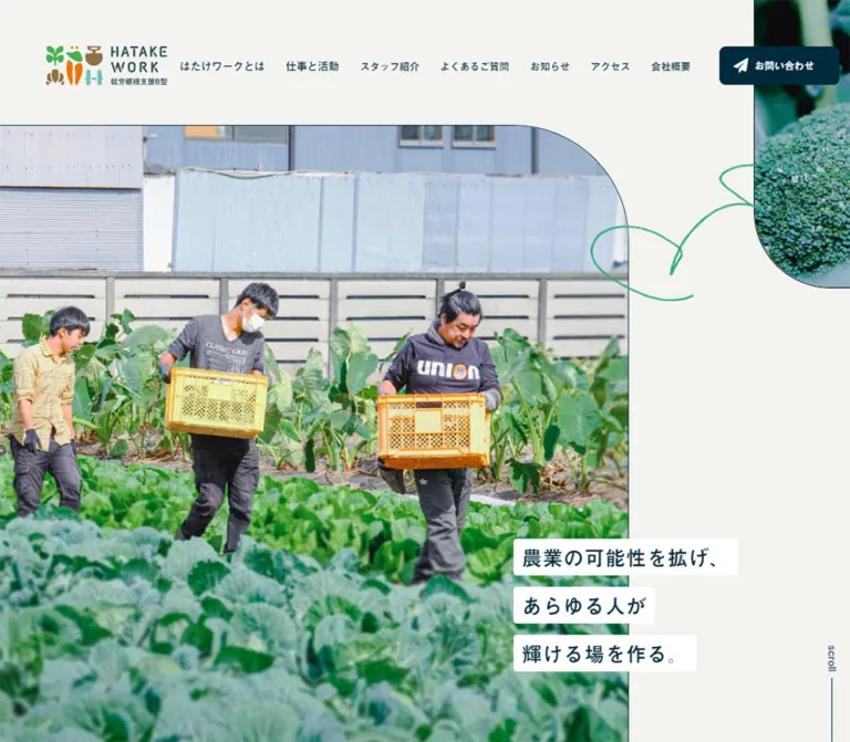
The desktop field photograph begins flush with the left edge and occupies approximately 74% of the viewport width. Its upper-right corner is strongly rounded, with a fine dark edge visible against the paper canvas. People carrying harvest crates are surrounded by a substantial foreground of leafy crops; the farm buildings remain part of the scene.
A separate broccoli photograph enters from the upper-right edge and ends in a large lower-left curve. A loose green line drawing occupies the adjacent paper space. These are separate layers with separate crops, not a single background collage containing the headline.
The mobile composition is deliberately rearranged. The main photograph becomes a tall crop about 328px wide, leaving a narrow paper channel on the right. One crate-carrying worker becomes the main focal subject. A smaller bakery-process photograph begins around (185,654), overlaps the field photograph, and continues below the initial viewport. Its visible content shows gloved hands working with bread.
Implementation guidance: use separately positioned image frames, editable focal points, and a distinct decorative line asset. Keep cropping responsive without changing the image aspect ratio through stretching. The exact source image URLs and crop-position declarations were not supplied.
Three-Line Hero Statement
Role: state the mission with clear contrast while retaining the photographic composition.
The statement is split into three independently sized white strips:
農業の可能性を拡げ、あらゆる人が輝ける場を作る。
On desktop, all three begin at x=1020. They overlap the photograph's right edge by roughly 46px and extend into the paper margin. Their left edges align, while the right edges follow the phrase lengths. The arrangement sits near the photograph's bottom.
On mobile, the strips move to x=18, beginning at y=150. The first lies immediately above the photograph's top, while the next two overlap it. Type decreases from 26px to 22px and strip spacing from 14px to 12px.
Preserve the individual white surfaces and intentional phrase breaks. A single large text panel would remove the stepped silhouette. For semantic markup, use one heading containing three block-level spans; the inspected source uses separate paragraph elements.
Scroll Cue
Role: suggest continuation beyond the opening composition.
A small vertical scroll caption sits in the right margin with a thin downward rule. The text uses DM Sans at 13px desktop and 12px mobile, weight 500. Its link targets #image.
The mobile link's recorded rectangle is 14 × 504px, while the visible line occupies only part of that region. Do not use the full anchor height as a measured line length. Anchor activation and smooth-scrolling behavior were not tested.
Mission Editorial Block
Role: explain the relationship between agricultural work, individual abilities, and community participation.
The desktop section has a 1024px outer width, with a 460px reading column aligned to its left. A two-line display heading uses 32px type with 57.6px leading. The body starts 32px below it and uses 15px type with unusually open 36px leading. Deliberate short lines give the prose a reflective cadence.
At 390px, the reading column becomes 340px wide within 25px side insets. The heading becomes 24px and the body 14px, while the gap contracts to 24px. Keep the readable column and intentional line rhythm; expanding this text across the full desktop container would change the pacing.
The supplied screenshots do not show this entire section, so additional image placement within it is not specified here.
Three Activity Modules
Role: distinguish the farm, bakery, and community workshop activities.
The introduction pairs an 18px kicker with a 40px heading and a 600px paragraph. Below it, three 280px text blocks begin at desktop x positions 208, 568, and 928. The second module's kicker begins 40px lower than those of its neighbors, producing a measured stagger.
Each text module follows the same hierarchy: small muted kicker, display title, lighter muted description, then もっとみる. The title follows the kicker by 4px; the description follows by 8px; the action begins 24px after the description. The workshop title occupies two lines and has a Coming Soon... message in its associated region.
Farm and bakery actions have observed destinations /agriculture and /bakery. The workshop's action-like caption appears in the text evidence, but no corresponding service-action link was supplied. Do not invent an active workshop destination.
On mobile, the modules stack and retain their 280px text width. Their action-link rectangles expand from approximately 131 × 48px to 280 × 48px. White captions are measured; the supplied element sample does not independently establish the service-button fill or radius. Reusing the measured navy contact fill is a reasonable adaptation choice.
Community Illustration and Labels
Role: show the activities as parts of a shared place.
The desktop capture shows a textured, hand-drawn community scene: greenhouses, planted beds, people, crops, and a cutaway building containing bakery and workshop activity. Muted yellow, pale mint, and layered greens make the drawing feel printed and approachable. It floats on the paper background without a rectangular card.
Small white labels are placed near the relevant locations. Sampled labels use 13px display text in #006a4e, 18.2px leading, and -0.05em tracking. Measured white label surfaces use 2px 12px padding and a 12px radius. Some labels visibly include a small directional triangle; do not assume every label has one.
The recorded links connect the illustration to agriculture and bakery pages and to agriculture fragments such as #yamato and #working-area. These are destination records, not tested navigation outcomes.
The mobile rendered text and link list omit the six desktop location labels. Their mobile replacement, if any, is not established. Preserve a readable mobile alternative when adapting the illustration instead of shrinking desktop hotspots to unusable sizes.
Full-Width Produce Photograph
Role: provide a sensory pause between illustrated and informational content.
The desktop middle capture transitions from the community drawing, through a broad band of paper-colored space, into an edge-to-edge photograph of a hand holding a strawberry. The fruit is sharply emphasized against a bright, softly blurred growing environment.
This image uses the full viewport width, unlike the opening photograph and centered text sections. Its complete height is outside the supplied capture. No parallax or animated crop was demonstrated.
Staff Profile Strip
Role: introduce the people responsible for the organization and bakery.
The recorded layout places six profiles horizontally, including profiles beyond the viewport. Desktop biography boxes are 300px wide at a 356px pitch; mobile boxes are 260px wide at a 292px pitch. This establishes a horizontal arrangement and a partial-next-profile opportunity on mobile. A scroll caption supports that affordance, but actual dragging, swiping, snapping, and autoplay were not exercised.
Each profile includes an image region, a small role label, a name with pronunciation text, and a biography. The role label uses the paper background and only its upper-right corner is rounded, at 20px. Padding is 14px 18px 8px 8px, and its text is 11px. Names use 22px desktop or 20px mobile; pronunciation text is 12px. Biographies remain 13px with 23.4px leading.
The role-label geometry repeats the page's preference for a single rounded corner. Exact portrait crops and image-frame dimensions were not supplied. Native horizontal overflow with keyboard access is a recommended implementation, not a verified description of the original scrolling mechanism.
Q&A Reading Section
Role: explain eligibility, participation, and the relationship between the bakery and employment support.
The Q&A section has a measured white background, separating it from the paper canvas. A centered 48px condensed English heading sits above a smaller Japanese subtitle. Three question-and-answer pairs have nonzero text rectangles in both viewport records. No collapsed state or toggle interaction was demonstrated.
Questions and answers share a left text alignment, with Q/A letters in a separate narrow column. Desktop answer text is approximately 621px wide at 14px / 28px. Mobile text starts at x=73, leaving room for the marker column inside the 25px page inset, and occupies 292px at 13px / 26px.
Questions decrease from 22px to 18px but gain more relative leading on mobile, accommodating wrapping. Q letters are recorded as white. A letters are muted blue on desktop and white on mobile; their enclosing marker surfaces were not included in the sample, so an exact badge shape or fill cannot be specified.
News Teasers
Role: surface recent organizational announcements and events.
Two desktop links occupy 460 × 120px rectangles on one row, separated by 20px. Within each, the date and title sit to the right of an image region. The title column is 198px wide. Dates use lightly tracked DM Sans; titles are small, dense Japanese text at 13px / 20.8px.
Mobile changes both the outer arrangement and the internal order. Each link is 340px wide, with its date and title below the image region; the two items stack with a measured 64px gap. The first and second link heights are approximately 252px and 231px, reflecting different title lengths.
A centered もっとみる link follows the teasers and targets /news. Its measured rectangle is 90 × 28px at both sizes. Use a lightweight continuation link here rather than duplicating the large contact treatment.
Access Information
Role: help visitors find the workplace and bakery and understand opening arrangements.
The desktop section uses a 960px information span. Its heading combines a 20px Japanese label with a 13px tracked English caption, separated by 16px. Below it, an approximately 480 × 300px map sits left, followed by a 60px gap and a measured 420px information column.
The information column contains an 18px facility name, a three-line contact block, two compact opening-hours rows, and three transport instructions. The contact block uses muted blue 13px text, 23.4px leading, and 0.05em tracking. Fine horizontal rules separate the hours group; its labels have small outlined rectangular frames in the screenshot.
On mobile, the text occupies the 340px content width and precedes the map. The supplied lower mobile capture shows map tiles, while the desktop capture shows a largely blank map surface with a マップで開く control. Treat that difference as an observed rendering state, not a deliberate empty-map design. The map destination and interaction were not inspected.
Company Information and Footer
Role: establish organizational identity and provide a quiet end to the page.
The inspected company section identifies the legal entity as 株式会社WALA and the office as はたけワーク. This is directly supported by the original page's company section.
On desktop, the section heading occupies the left area, followed by four compact groups. Their content pairs are legal entity/office name, email/representative, address/telephone, and establishment/opening days. Labels use 13px B-face text with 0.05em tracking; values use 12px L-face text. The groups have no enclosing card backgrounds or prominent borders.
Mobile places the heading above a two-column arrangement. Each column is about 163px wide, with a 13.6px horizontal gap. Address and telephone values wrap naturally; the text size remains compact instead of being scaled down further.
The footer centers follow us, an outlined Instagram symbol, and a small gray copyright line. The Instagram link has a measured 32px box and an observed destination on the organization's Instagram account. The mobile footer leaves 80px of bottom padding. No production credit is visible in the supplied original-page evidence.
Tokens — Motion & Interaction
Recorded Transition Declarations
| Element or group | Recorded value | What it establishes |
|---|---|---|
| Many text elements, links, wrappers, and the header | 0.3s cubic-bezier(0.4,0.4,0,1) |
A shared transition timing; the triggering property changes are not established |
| Contact button | 0.4s cubic-bezier(0.4,0.4,0,1) |
A distinct control transition duration |
| Body background | background 0.5s cubic-bezier(0.4,0.4,0,1) |
Background changes would interpolate with this timing; no color-change sequence was demonstrated |
| Desktop Q&A section | 1s cubic-bezier(0.445,0.05,0.55,0.95) |
A slower section transition declaration |
| Mobile Q&A section | 0.3s cubic-bezier(0.4,0.4,0,1) |
Different recorded timing at the mobile viewport |
| Sampled elements | animation: none |
No active named CSS animation on those sampled elements at extraction time |
Many declarations also enumerate gradient-related custom properties. Their presence does not demonstrate a visible gradient animation.
Interaction Evidence and Limits
| Feature | Supported observation | Unverified behavior |
|---|---|---|
| Persistent header | Visible at the top of opening and scrolled screenshots | Exact fixed/sticky declaration and any hide-on-scroll behavior |
| Section navigation | Desktop anchor destinations are recorded | Scroll easing, active-section indication, focus transfer |
| Mobile menu | Closed 48px button is visible | Expanded layout, animation, dismissal, focus management |
| Staff strip | Horizontal profile geometry and scroll caption | Touch/drag handling, snapping, buttons, autoplay |
| Q&A | Questions and answers occupy rendered space | Any interactive collapse behavior |
| Illustration labels | Desktop anchor destinations exist | Hover animation, tooltip states, mobile equivalent |
| Contact and news | Links and destinations are recorded | Destination-page design and form behavior |
| Loading | A load-complete message appears in extracted text | A visible splash or loading animation |
The supplied capture process waited for load, sampled stability, and image decoding within stated limits. Perpetual animations were temporarily paused during readiness checks and resumed afterward. That process improves capture stability but does not prove that every delayed state was seen.
Recommended adaptation: use the recorded 300–400ms easing for subtle color or opacity feedback, retain ordinary document scrolling, and avoid introducing a slideshow or elaborate entrance sequence without additional evidence. Support reduced motion for any added effects.
Surfaces
| Surface | Appearance | Role |
|---|---|---|
| Main canvas | Solid #f3f3ef |
Connects the long page and creates breathing room around imagery |
| Hero text strips | Pure white, small radius | Keeps navy Japanese copy readable across photograph and canvas |
| Navigation patches | Paper at 90% opacity | Protects small text as the transparent header overlaps content |
| Contact action | Navy with white text and symbol | Provides a clear, compact primary utility action |
| Community labels | Small white pills with dark green text | Identifies places within the illustration |
| Staff role label | Paper with one rounded corner | Connects image and biography without a full card surface |
| Q&A section | Pure white | Separates a sustained reading area from surrounding paper sections |
| Lower information | Paper with sparse fine rules | Organizes practical information without visual heaviness |
The captured site does not show a general shadow-based elevation system. The small external-map control has its own visible shadow; that embedded control should not define the site's card styling. Avoid treating the navigation's translucent patches as glass panels: no backdrop blur was established.
Imagery
Photography feels documentary and specific to the work. The field scene includes people, buildings, crops, and carrying crates. The bakery detail focuses on hands and process. The strawberry image celebrates a single piece of produce through shallow depth of field and bright natural light.
The community illustration contributes a different texture: softly irregular edges, printed grain, simplified people, and a cutaway building. Its explanatory function matters as much as its charm. Keep location labels outside the raster artwork when adapting it so they can remain real links and readable text.
The multicolor logo is an asset with its own small agricultural motifs and lettering. Do not replace it with a typed wordmark and generic vegetable icons. The green doodle is a restrained accent in the open hero margin, not a repeated background pattern.
Observed Asset References
| Asset | Supplied visual evidence | Reuse guidance |
|---|---|---|
| HATAKE WORK logo | Desktop and mobile opening and lower-page captures | Use an authorized original asset; preserve internal color and letter spacing |
| Field-work photograph | Desktop and mobile opening captures | Use separate wide and portrait crops with an explicit focal point |
| Broccoli close-up | Upper-right edge of both opening captures | Keep the frame partially outside the viewport and round its lower-left corner |
| Green line drawing | Opening captures | Separate decorative layer; exclude it from the accessibility tree |
| Bakery process detail | Lower-right of mobile opening capture | Preserve the overlap and visible hands/process |
| Community illustration | Desktop middle capture | Preserve texture, cutaway building, cultivation areas, and open surroundings |
| Strawberry photograph | Lower portion of desktop middle capture | Use a full-width photographic break; complete image height is unmeasured |
| Staff and news images | Background-image references appear in DOM excerpts | Asset paths are incomplete; exact files and crops cannot be reconstructed from those excerpts |
No complete reusable image URL or font-file URL was provided. Do not invent filenames from truncated asset references. The CSS below expects authorized image assets to be supplied separately and does not use screenshots as production backgrounds.
Layout & Responsive Behavior
The page combines several widths instead of imposing one uniform container. Mission and activity content use a 1024px outer region; access, news, and company information align within roughly 960px; descriptions remain much narrower. Full-width photography interrupts this otherwise contained structure.
| Feature | Desktop observation | Mobile observation |
|---|---|---|
| Navigation | Seven links and contact control | Logo and menu button |
| Header height | 164px |
80px |
| Opening photograph | Wide, approximately 74% of viewport | Portrait crop, approximately 84% of viewport |
| Hero statement | Lower-right, bridging image and canvas | Upper-left, bridging canvas and image |
| Bakery detail | Not visible in the desktop opening capture | Overlapping the main photograph near its bottom |
| Mission body | 460px column |
340px column with 25px outer insets |
| Activity modules | Three 280px text columns with a stagger | Three stacked 280px modules |
| Activity action | Approximately 131 × 48px |
280 × 48px |
| Community labels | Six destination labels in rendered evidence | Labels absent from supplied mobile text/link extraction |
| Staff | Horizontal profiles, 300px biography boxes | Horizontal profiles, 260px biography boxes |
| News | Two items side by side, image beside text | Stacked items, image above text |
| Access | Map left, information right | Information above map |
| Company information | Heading beside four groups | Heading above two columns |
| Footer | 32px vertical padding | 80px bottom padding |
A source excerpt contains a max-width: 840px rule for responsive line breaks. It does not establish that every layout or navigation change occurs at 840px. No tablet screenshot was supplied. The Quick Start uses 840px for content reflow and 1100px for header collapse as explicitly recommended starting points.
The recorded total page lengths are approximately 9464px desktop and 9567px mobile. Similar totals conceal substantial redistribution: the activity area grows from about 1421px to 2378px, while other spacing and image regions contract. Do not target the total document height as an implementation requirement.
Persistent navigation overlaps underlying content in the lower captures. Add sufficient anchor offset in an adaptation so section headings remain readable when reached through navigation. Test intermediate widths, enlarged text, and long contact values separately; the two supplied viewports do not establish those behaviors.
Do’s and Don’ts
Do
- Preserve the exact paper, navy, and muted-blue colors:
#f3f3ef,#002b3d, and#365663. - Keep white headline strips visibly separate from the off-white canvas.
- Maintain one strongly rounded corner on the main image and the opposing curve on the corner produce frame.
- Give photographs their own crop and focal-point settings at each layout size.
- Use the recorded Japanese display face and reading-face hierarchy when available.
- Pair compact Japanese subtitles with widely tracked condensed English headings.
- Retain narrow service descriptions, open mission leading, and substantial section spacing.
- Preserve the distinction between stacked activity modules and horizontally arranged staff profiles on mobile.
- Keep contact access visually clear but proportionate to the small navigation.
- Organize company details through label/value hierarchy and whitespace.
Don’t
- Do not flatten the opening composition into one full-width background image with centered text.
- Do not merge the three headline strips into a single white card.
- Do not scale the desktop hero down unchanged for mobile.
- Do not apply uniform large radii, drop shadows, or colored card backgrounds throughout the page.
- Do not use the green illustration-label color as the fill for every action.
- Do not stretch the field photograph to preserve all desktop subjects in the mobile crop.
- Do not treat every staff profile as a vertically stacked mobile card.
- Do not assume the Q&A is an accordion or the staff row is an autoplay carousel.
- Do not reproduce the desktop map's blank capture as an intentional design feature.
- Do not infer a visible gradient system from transparent framework custom properties.
- Do not copy generic Times wrapper styles into the visible typography system.
Recommended Implementation Additions
These are recommendations for a new implementation, not verified features of the original site:
- Use semantic headings for the hero, mission, activity sections, and informational sections, even where the recorded source uses paragraphs.
- Implement navigation destinations as links and the mobile menu trigger as a button; avoid nesting a button inside a link.
- Give the menu button an accessible name, expanded state, and controlled-region reference. Verify focus movement and keyboard dismissal in its implemented open state.
- Provide visible navy focus outlines and larger hit areas around small illustration labels and the Instagram symbol.
- Add
scroll-margin-topfor section anchors to account for the persistent header. - Keep all six staff biographies accessible through native horizontal scrolling or explicit keyboard-operable controls.
- Provide a text-based mobile alternative for illustration destinations if spatial labels are omitted.
- Keep the address and a usable map link available when embedded map tiles do not render.
- Allow labels and values to wrap at enlarged text sizes. Consider larger practical-information text where legibility is more important than matching the compact original.
- Keep decorative line art out of the accessibility tree and give meaningful work/process photographs useful alternatives.
- Load appropriately sized images, reserve their dimensions, and avoid delaying the opening photograph behind below-the-fold assets.
- Supply reduced-motion behavior for any added transitions or scrolling effects.
Agent Prompt Guide
Quick Color Reference
- Canvas and footer:
#f3f3ef. - Main headings, navigation, contact fill, and linework:
#002b3d. - Descriptions, biographies, dates, and address values:
#365663. - Hero-strip and illustration-label surfaces:
#ffffff. - Community-link text:
#006a4e. - Copyright:
#60605f. - Desktop navigation patches:
rgba(243,243,239,0.9). - Photographic greens, strawberry red, crate orange, and bread brown stay within the images.
Overall Prompt
“Create a Japanese organization homepage for an agricultural employment-support community. Use warm paper #f3f3ef, navy #002b3d, and muted blue #365663. Open with a large field-work photograph flush to the left, a dramatically rounded upper-right corner, a small broccoli photograph entering from the upper-right edge, and a restrained green line drawing in the open margin. Set the mission in three separately sized white strips, positioned near the lower-right edge on desktop and near the upper-left on mobile. Combine sturdy Japanese display lettering with light Japanese reading text and widely tracked Roboto Condensed section headings. Continue with a spacious mission, three activity modules, a textured community illustration, a horizontal staff row, readable Q&A, news, access information, and a quiet company footer. Preserve the distinct content widths and responsive rearrangements documented in this reference.”
Example Component Prompts
- Opening composition: “At 1440px, use a left-aligned field photo around 1066px wide and 780px tall, with one large upper-right curve. Place three 26px navy Japanese phrases on individual white strips starting around x=1020. On a 390px phone, use a tall 328px image crop, move the strips to x=18 near the top, and overlap a smaller bakery-process image at the lower-right.”
- Persistent header: “Create a transparent desktop header with a compact multicolor logo, small navy Japanese links on individual 90%-opaque paper patches, and a 150 × 48px navy contact link with a white paper-plane symbol. On mobile, retain the logo and use a 48px paper menu button with three thin strokes. Treat the open menu as a separately specified accessible component.”
- Activity modules: “Build three 280px description columns with 12px muted kickers, 24px Japanese display titles, 13px descriptions, and 48px-high continuation links. Offset the middle desktop module by 40px. Stack the modules on mobile, keep their 280px width, and expand continuation links across that width.”
- Staff row: “Create a horizontal staff section with 300px desktop profiles and 56px gaps, changing to 260px profiles and 32px gaps on mobile. Use a small paper role label with only its upper-right corner rounded, a strong name, smaller pronunciation text, and a muted 13px biography. Use native scrolling without assuming autoplay.”
- Company footer: “Arrange compact company label/value pairs beside a small bilingual heading on desktop and below it in two columns on mobile. Use navy labels, muted-blue values, no enclosing cards, and generous surrounding paper space. Finish with a centered tracked follow caption, an outlined Instagram symbol, and small gray copyright text.”
Quick Start
CSS Custom Properties
This is a reusable adaptation, not the original stylesheet. Palette and most type/control values are measured; photographic dimensions and radii are screenshot estimates. Breakpoints, responsive interpolation, focus styling, and layout methods are recommendations. Image sources, licensed font loading, menu behavior, and complete page content must be supplied by the implementation.
Use .story-shell for mission/activity content and .info-shell for lower information. The hero expects separate main, corner, optional detail, and decorative assets. Company information expects four definition-list groups, each containing related label/value pairs.
:root {
  /* Measured interface colors */
  --color-paper: #f3f3ef;
  --color-ink: #002b3d;
  --color-muted: #365663;
  --color-community: #006a4e;
  --color-white: #ffffff;
  --color-copyright: #60605f;
  --color-nav-surface: rgba(243, 243, 239, 0.9);

  /* Recommended separator approximation */
  --color-rule: rgba(0, 43, 61, 0.16);

  /* Recorded families with recommended fallbacks */
  --font-display: '見出ゴMB1', 'Yu Gothic', sans-serif;
  --font-body: '秀英角ゴシック銀 M JIS2004', 'Yu Gothic', sans-serif;
  --font-detail: '秀英角ゴシック銀 L JIS2004', 'Yu Gothic', sans-serif;
  --font-strong: '秀英角ゴシック銀 B JIS2004', 'Yu Gothic', sans-serif;
  --font-heading-en: 'Roboto Condensed', sans-serif;
  --font-utility: 'DM Sans', sans-serif;

  --width-story: 1024px;
  --width-info: 960px;
  --width-service: 280px;
  --gutter-mobile: 25px;
  --header-height: 164px;

  --radius-strip: 4px;
  --radius-control: 8px;
  --radius-place: 12px;
  --radius-role: 20px;

  --space-4: 4px;
  --space-8: 8px;
  --space-16: 16px;
  --space-24: 24px;
  --space-32: 32px;
  --space-40: 40px;
  --space-80: 80px;
  --space-100: 100px;
  --space-160: 160px;

  /* Recorded timing, applied only to selected properties */
  --ease-site: cubic-bezier(0.4, 0.4, 0, 1);
  --motion-ui: 300ms;
  --motion-contact: 400ms;
}

* { box-sizing: border-box; }
html { background: var(--color-paper); }
body {
  margin: 0;
  color: var(--color-ink);
  background: var(--color-paper);
  font-family: var(--font-body);
  font-size: 15px;
  line-height: 2.2;
}
img { display: block; max-width: 100%; }
button, a { -webkit-tap-highlight-color: transparent; }
a { color: inherit; }
button { font: inherit; }
[id] { scroll-margin-top: calc(var(--header-height) + 16px); }

.story-shell,
.info-shell {
  width: calc(100% - 50px);
  margin-inline: auto;
}
.story-shell { max-width: var(--width-story); }
.info-shell { max-width: var(--width-info); }

.site-header {
  position: fixed;
  inset: 0 0 auto;
  z-index: 50;
  display: flex;
  align-items: center;
  gap: 30px;
  height: var(--header-height);
  padding-inline: 60px;
  background: transparent;
}
.site-brand { flex: 0 0 auto; }
.site-brand img { width: 160px; height: auto; }
.site-nav {
  display: flex;
  align-items: center;
  gap: 14px;
  margin-left: auto;
}
.site-nav a {
  padding: 3px 6px;
  border-radius: 2px 8px;
  background: var(--color-nav-surface);
  font-family: var(--font-display);
  font-size: 13px;
  line-height: 1;
  letter-spacing: -0.05em;
  text-decoration: none;
  white-space: nowrap;
}
.site-nav a:nth-child(-n + 2) { font-size: 14px; }
.contact-link,
.more-link {
  display: inline-flex;
  align-items: center;
  justify-content: center;
  gap: 8px;
  min-height: 48px;
  padding: 10px 28px;
  border-radius: var(--radius-control);
  color: var(--color-white);
  background: var(--color-ink);
  font-family: var(--font-strong);
  font-size: 13px;
  line-height: 1.4;
  text-decoration: none;
  transition: opacity var(--motion-contact) var(--ease-site);
}
.contact-link {
  flex: 0 0 150px;
  padding-inline: 14px;
  font-family: var(--font-display);
  font-weight: 700;
  letter-spacing: -0.05em;
}
.contact-link svg { width: 20px; height: 20px; }
.menu-button {
  display: none;
  width: 48px;
  height: 48px;
  padding: 12px;
  border: 0;
  border-radius: 8px;
  color: var(--color-ink);
  background: var(--color-paper);
  cursor: pointer;
}
.menu-button span {
  display: block;
  width: 24px;
  height: 1px;
  background: currentColor;
}

/* Estimated photographic geometry with adjustable focal points */
.hero {
  --hero-top: 156px;
  --hero-image-height: clamp(540px, 54.167vw, 780px);
  position: relative;
  isolation: isolate;
  overflow: clip;
  padding-top: var(--hero-top);
  padding-bottom: 104px;
}
.hero-main {
  width: 74%;
  height: var(--hero-image-height);
  margin: 0;
  overflow: hidden;
  border: 1px solid var(--color-ink);
  border-left: 0;
  border-radius: 0 140px 4px 0;
}
.hero-main img,
.hero-corner img,
.hero-detail img {
  width: 100%;
  height: 100%;
  object-fit: cover;
}
.hero-main img { object-position: var(--hero-focal, 50% 50%); }
.hero-corner {
  position: absolute;
  top: 0;
  left: 91.667%;
  width: 240px;
  height: 360px;
  margin: 0;
  overflow: hidden;
  border: 1px solid var(--color-ink);
  border-radius: 0 0 0 100px;
}
.hero-doodle {
  position: absolute;
  top: 205px;
  right: 6%;
  width: 240px;
  pointer-events: none;
}
.hero-title {
  position: absolute;
  z-index: 2;
  top: calc(var(--hero-top) + var(--hero-image-height) - 190px);
  left: 70.833%;
  display: grid;
  justify-items: start;
  gap: 14px;
  margin: 0;
  font-family: var(--font-display);
  font-size: 26px;
  font-weight: 400;
  line-height: 1.2;
}
.hero-title span {
  display: block;
  width: fit-content;
  min-height: 46px;
  padding: 6px 10px;
  border-radius: var(--radius-strip);
  background: var(--color-white);
}
.hero-detail { display: none; }
.hero-scroll {
  position: absolute;
  right: 16px;
  top: calc(var(--hero-top) + var(--hero-image-height) - 57px);
  display: flex;
  align-items: center;
  flex-direction: column;
  gap: 8px;
  font: 500 13px/1.6 var(--font-utility);
  text-decoration: none;
}
.hero-scroll span { writing-mode: vertical-rl; }
.hero-scroll::after {
  content: '';
  width: 1px;
  height: 120px;
  background: currentColor;
}

.mission { padding-top: 160px; }
.mission-copy { max-width: 460px; }
.mission-copy h2 {
  margin: 0 0 32px;
  font: 400 32px/1.8 var(--font-display);
}
.mission-copy p { margin: 0; font-size: 15px; line-height: 2.4; }

.activities { padding-block: 100px 200px; }
.activity-intro h2 {
  margin: 0;
  font: 400 40px/1.7 var(--font-display);
}
.activity-intro p {
  max-width: 600px;
  margin: 40px 0 0;
  font-size: 15px;
  line-height: 2.2;
  letter-spacing: -0.04em;
}
.service-grid {
  display: grid;
  grid-template-columns: repeat(3, minmax(0, 280px));
  gap: 80px;
  margin-top: 80px;
}
.service:nth-child(2) { padding-top: 40px; }
.service-kicker {
  margin: 0 0 4px;
  color: var(--color-muted);
  font-size: 12px;
  line-height: 1.7;
}
.service h3 {
  margin: 0 0 8px;
  font: 400 24px/1.4 var(--font-display);
  letter-spacing: -0.02em;
}
.service-description {
  margin: 0 0 24px;
  color: var(--color-muted);
  font: 400 13px/1.81 var(--font-detail);
  letter-spacing: -0.06em;
}
.more-link { letter-spacing: -0.15em; }

.section-heading-en {
  margin: 0;
  font: 400 48px/1.4 var(--font-heading-en);
  letter-spacing: 0.2em;
}
.section-heading-en.is-staff { letter-spacing: 0.15em; }
.section-subtitle { margin: 0; font-size: 15px; line-height: 2.2; }
.place-link {
  display: inline-flex;
  align-items: center;
  gap: 6px;
  padding: 2px 12px;
  border-radius: 12px;
  color: var(--color-community);
  background: var(--color-white);
  font: 400 13px/1.4 var(--font-display);
  letter-spacing: -0.05em;
  text-decoration: none;
}

/* Recommended native scrolling for the observed horizontal arrangement */
.staff { padding-block: 160px; }
.staff-layout {
  display: grid;
  grid-template-columns: 296px minmax(0, 1fr);
  gap: 56px;
  margin-left: max(25px, calc((100% - 1024px) / 2));
}
.staff-track {
  display: flex;
  gap: 56px;
  overflow-x: auto;
  padding-right: 25px;
  padding-bottom: 16px;
}
.staff-card { flex: 0 0 300px; min-width: 0; }
.staff-role {
  width: fit-content;
  margin: 0;
  padding: 14px 18px 8px 8px;
  border-radius: 0 20px 0 0;
  color: var(--color-muted);
  background: var(--color-paper);
  font: 400 11px/1.2 var(--font-strong);
  letter-spacing: 0.02em;
}
.staff-name {
  margin: 12px 0 16px;
  padding-left: 8px;
  font: 700 22px/1 var(--font-strong);
}
.staff-biography {
  margin: 0;
  padding-left: 8px;
  color: var(--color-muted);
  font: 400 13px/1.8 var(--font-detail);
}

.faq { padding: 160px 25px 72px; background: var(--color-white); }
.faq-heading { text-align: center; }
.faq-list { max-width: 684px; margin: 56px auto 0; }
.faq-row {
  display: grid;
  grid-template-columns: 48px minmax(0, 1fr);
  gap: 12px;
}
.faq-question { font: 700 22px/1.2 var(--font-strong); }
.faq-answer { font-size: 14px; line-height: 2; letter-spacing: -0.01em; }

.access { padding-top: 140px; }
.compact-heading {
  display: flex;
  align-items: center;
  gap: 16px;
  margin: 0;
  font: 400 20px/1.6 var(--font-display);
  letter-spacing: -0.05em;
}
.compact-heading small {
  font: 400 13px/1.6 var(--font-heading-en);
  letter-spacing: 0.2em;
}
.access-grid {
  display: grid;
  grid-template-columns: minmax(0, 480px) minmax(0, 420px);
  gap: 60px;
  margin-top: 40px;
}
.access-map { min-width: 0; height: 300px; }
.access-map iframe { width: 100%; height: 100%; border: 0; }
.access-details {
  min-width: 0;
  color: var(--color-muted);
  font: 400 13px/1.8 var(--font-detail);
}
.access-details h3 {
  margin: 0 0 16px;
  color: var(--color-ink);
  font: 400 18px/1.4 var(--font-strong);
}
.access-hours {
  padding-block: 16px;
  border-block: 1px solid var(--color-rule);
}

.company {
  display: grid;
  grid-template-columns: 274px minmax(0, 1fr);
  gap: 24px;
  margin-top: 190px;
}
.company .compact-heading { align-self: start; }
.company .compact-heading small { letter-spacing: 0.11em; }
.company-groups {
  display: grid;
  grid-template-columns: 100px 140px 210px 140px;
  gap: 24px;
}
.company-groups dl { min-width: 0; margin: 0; }
.company-groups dt {
  margin: 0 0 6px;
  font: 400 13px/1.2 var(--font-strong);
  letter-spacing: 0.05em;
}
.company-groups dd {
  margin: 0 0 32px;
  color: var(--color-muted);
  font: 400 12px/1.2 var(--font-detail);
  overflow-wrap: anywhere;
}
.company-groups dd:last-child { margin-bottom: 0; }
.site-footer { padding: 32px 25px; text-align: center; }
.follow-label {
  margin: 0 0 16px;
  font: 400 15px/1.4 var(--font-heading-en);
  letter-spacing: 0.2em;
}
.social-link {
  display: inline-grid;
  place-items: center;
  width: 44px;
  height: 44px;
}
.social-link svg { width: 32px; height: 32px; }
.copyright {
  margin: 24px 0 0;
  color: var(--color-copyright);
  font: 400 11px/1.4 var(--font-utility);
}

/* Recommended feedback, not a recovered original hover state */
@media (hover: hover) {
  .contact-link:hover,
  .more-link:hover { opacity: 0.84; }
  .site-nav a:hover { text-decoration: underline; text-underline-offset: 4px; }
}
:where(a, button, [tabindex]):focus-visible {
  outline: 2px solid var(--color-ink);
  outline-offset: 4px;
}

/* Recommended header threshold; original threshold is unverified */
@media (max-width: 1100px) {
  :root { --header-height: 80px; }
  .site-header { padding-inline: 22px 16px; }
  .site-brand img { width: 100px; }
  .site-nav,
  .site-header .contact-link { display: none; }
  .menu-button {
    display: grid;
    align-content: center;
    gap: 8px;
    margin-left: auto;
  }
  .service-grid { grid-template-columns: repeat(3, minmax(0, 1fr)); gap: 32px; }
  .company { grid-template-columns: 1fr; gap: 40px; }
  .company-groups { grid-template-columns: repeat(4, minmax(0, 1fr)); }
}

/* Recommended content threshold; a source line-break rule uses 840px */
@media (max-width: 840px) {
  .hero {
    --hero-top: 181px;
    --hero-image-height: 528px;
    padding-bottom: 300px;
  }
  .hero-main { width: 84.1%; border-top-right-radius: 100px; }
  .hero-main img { object-position: var(--hero-mobile-focal, 70% 50%); }
  .hero-corner {
    left: 84.615%;
    width: 140px;
    height: 204px;
    border-bottom-left-radius: 70px;
  }
  .hero-doodle { top: 65px; right: 0; width: 180px; }
  .hero-title { top: 150px; left: 18px; gap: 12px; font-size: 22px; }
  .hero-title span {
    min-height: 32px;
    padding: 3px 10px;
    border-radius: 2px;
  }
  .hero-detail {
    position: absolute;
    z-index: 3;
    display: block;
    top: 654px;
    right: 20px;
    width: min(48%, 186px);
    aspect-ratio: 3 / 4;
    margin: 0;
    overflow: hidden;
    border: 1px solid var(--color-ink);
    border-radius: 4px;
  }
  .hero-scroll { top: 380px; font-size: 12px; }
  .hero-scroll::after { height: 104px; }

  .mission { padding-top: 0; }
  .mission-copy { max-width: none; }
  .mission-copy h2 { margin-bottom: 24px; font-size: 24px; letter-spacing: -0.05em; }
  .mission-copy p { font-size: 14px; line-height: 2.2; }
  .activities { padding-block: 80px 100px; }
  .activity-intro h2 { font-size: 28px; }
  .activity-intro p { margin-top: 0; font-size: 13px; }
  .service-grid { grid-template-columns: minmax(0, 280px); justify-content: center; gap: 80px; }
  .service:nth-child(2) { padding-top: 0; }
  .service h3 { font-size: 22px; }
  .more-link { width: 100%; }

  .section-heading-en { font-size: 40px; line-height: 1.2; }
  .section-subtitle { font-size: 13px; }
  .staff { padding-block: 100px; }
  .staff-layout { display: block; margin-left: 25px; }
  .staff-track { gap: 32px; margin-top: 24px; }
  .staff-card { flex-basis: 260px; }
  .staff-name { font-size: 20px; }
  .faq { padding-top: 80px; }
  .faq-list { margin-top: 40px; }
  .faq-row { grid-template-columns: 40px minmax(0, 1fr); gap: 8px; }
  .faq-question { font-size: 18px; line-height: 1.7; }
  .faq-answer { font-size: 13px; }

  .access { padding-top: 80px; }
  .access > .compact-heading { font-size: 22px; }
  .access-grid { grid-template-columns: 1fr; gap: 32px; }
  .access-details { grid-row: 1; }
  .access-map { height: 240px; }
  .company { margin-top: 120px; }
  .company .compact-heading { font-size: 18px; }
  .company-groups { grid-template-columns: repeat(2, minmax(0, 1fr)); gap: 20px 4%; }
  .site-footer { margin-top: 45px; padding-block: 0 80px; }
}

@media (prefers-reduced-motion: reduce) {
  .contact-link,
  .more-link { transition: none; }
  html { scroll-behavior: auto; }
}
The mobile detail-image aspect ratio, mobile map height, and intermediate-width interpolation are recommended placeholders for unmeasured geometry. Adjust them against the actual authorized assets. This starter covers the visual shell and reusable components; it does not reproduce the entire document's image sequence or total height. If the named Japanese fonts are unavailable, tune the fallback weight and line breaks explicitly rather than assuming equivalent metrics.
Tailwind v4 Token Mapping
Optional aliases for a project already using Tailwind v4. This does not imply that the original site uses Tailwind. Define the custom properties above first.
@theme inline {
  --color-paper: #f3f3ef;
  --color-ink: #002b3d;
  --color-muted: #365663;
  --color-community: #006a4e;
  --color-copyright: #60605f;

  --font-jp-display: var(--font-display);
  --font-jp-body: var(--font-body);
  --font-jp-detail: var(--font-detail);
  --font-jp-strong: var(--font-strong);
  --font-section: var(--font-heading-en);
  --font-meta: var(--font-utility);

  --text-caption: 13px;
  --text-service: 24px;
  --text-section: 48px;

  --spacing-page-inset: 25px;
  --spacing-service-column: 280px;
  --spacing-section: 160px;

  --radius-strip: 4px;
  --radius-control: 8px;
  --radius-place: 12px;
  --radius-role: 20px;
}
Sources & Evidence
- Inspected original and final page: HATAKE WORK. Both URLs are
https://hatakework.com/; the supplied response status is HTTP 200 and the rendered title isHATAKE WORK. - Capture date: September 29, 2026. Evidence batch timestamp:
2026-09-29T13:23:38.422Z, equivalent to 22:23:38.422 JST. - Desktop evidence: 1440 × 1000 CSS pixels; three supplied screenshots covering the opening, community illustration/photo transition, and access/company/footer region. Recorded document height: approximately 9463.78px.
- Mobile evidence: 390 × 844 CSS pixels; two supplied screenshots covering the opening and lower map/company/footer region. Recorded document height: approximately 9567.48px.
- Rendered DOM and computed styles: supplied element rectangles, colors, named font declarations, font sizes, line heights, tracking, padding, radii, transition declarations, section text, and destination links at both viewports. Offscreen staff coordinates support the horizontal-layout analysis.
- Original-page identity evidence: the rendered company section names
株式会社WALAandはたけワーク. - Observed state coverage: initial rendered page and scrolled page positions. Persistent header placement is visible across captures. No clicked menu, hover sequence, staff scroll gesture, Q&A toggle, contact form, or destination-page inspection was supplied.
- Inspection limitations: only two viewport sizes; incomplete image URLs; no full font-loading audit; no measured image rectangles for several lower sections; different map rendering states; and no complete temporal motion record. Readiness checks used finite waits and cannot prove that every delayed state was captured. SharedWorkers and service workers were disabled during the supplied inspection.
This reference describes the current homepage represented by the supplied original-page evidence. Screenshot estimates, derived dimensions, and implementation recommendations are identified separately from measured source values.
# HATAKE WORK — Style Reference

> An open, welcoming portrait of agricultural work, framed by warm paper, navy lettering, and gently drawn greenery.

**Website:** [hatakework.com](https://hatakework.com/)
**Original URL:** https://hatakework.com/
**Final URL:** https://hatakework.com/
**Theme:** light, with a warm off-white canvas and deep navy text
**Inspected:** September 29, 2026; supplied evidence retrieved at 13:23:38.422 UTC / 22:23:38.422 JST
**Viewports:** 1440 × 1000 desktop and 390 × 844 mobile, in CSS pixels
**Scope:** the current organization homepage: opening composition, mission, three activities, community illustration, staff, Q&A, news, access, company information, and footer. Visual captures cover the opening, a desktop community/photo transition, and the lower information sections. Other sections are documented through the supplied rendered DOM and computed styles. Linked pages and expanded navigation states were not inspected.

HATAKE WORK presents an organization connecting agriculture, a bakery, community activities, and supported employment. Its homepage combines a substantial organizational introduction with practical visitor information. Large photographs establish the working environment; the small navigation, quiet contact button, staff biographies, and detailed access information support several different visitor needs.

The visual identity rests on a few specific relationships: very large photographs beside unoccupied paper-colored space, a single exaggerated rounded corner, three separate white headline strips, sturdy Japanese display lettering, and widely tracked condensed English headings. A textured illustration makes the community activities tangible. The lower page becomes more restrained, using compact label/value groups and fine rules without abandoning the generous spacing.
閉じる
# HATAKE WORK — Style Reference

> An open, welcoming portrait of agricultural work, framed by warm paper, navy lettering, and gently drawn greenery.

**Website:** [hatakework.com](https://hatakework.com/)
**Original URL:** https://hatakework.com/
**Final URL:** https://hatakework.com/
**Theme:** light, with a warm off-white canvas and deep navy text
**Inspected:** September 29, 2026; supplied evidence retrieved at 13:23:38.422 UTC / 22:23:38.422 JST
**Viewports:** 1440 × 1000 desktop and 390 × 844 mobile, in CSS pixels
**Scope:** the current organization homepage: opening composition, mission, three activities, community illustration, staff, Q&A, news, access, company information, and footer. Visual captures cover the opening, a desktop community/photo transition, and the lower information sections. Other sections are documented through the supplied rendered DOM and computed styles. Linked pages and expanded navigation states were not inspected.

HATAKE WORK presents an organization connecting agriculture, a bakery, community activities, and supported employment. Its homepage combines a substantial organizational introduction with practical visitor information. Large photographs establish the working environment; the small navigation, quiet contact button, staff biographies, and detailed access information support several different visitor needs.

The visual identity rests on a few specific relationships: very large photographs beside unoccupied paper-colored space, a single exaggerated rounded corner, three separate white headline strips, sturdy Japanese display lettering, and widely tracked condensed English headings. A textured illustration makes the community activities tangible. The lower page becomes more restrained, using compact label/value groups and fine rules without abandoning the generous spacing.

## How to Read This Reference

- **Measured** values come from the supplied original-page DOM rectangles and computed styles. Decimal measurements are sometimes rounded for readability.
- **Visual estimates** describe geometry or artwork visible in the screenshots when its element measurements were not supplied. They are not recovered CSS declarations.
- **Derived** values are arithmetic relationships between recorded rectangles, such as column gaps and distances between text blocks.
- **Recommended** values and the Quick Start are implementation guidance. Their selectors, token names, breakpoint choices, and layout techniques are adaptation choices unless explicitly identified as source values.
- Font names below are recorded computed family declarations. Individual font files, licensing, and the actual font used for every rendered glyph were not independently verified.
- Static captures and transition declarations do not establish hover outcomes, entrance choreography, autoplay, or menu behavior.

## Tokens — Colors

### Default Palette

| Name | Value | Suggested token | Evidence and role |
| --- | --- | --- | --- |
| Warm Paper | `#f3f3ef` | `--color-paper` | Measured body and footer background; also the mobile menu button and staff role-label surface |
| Navy Ink | `#002b3d` | `--color-ink` | Measured headings, navigation text, hero lettering, and contact-button fill |
| Muted Blue | `#365663` | `--color-muted` | Measured service descriptions, biographies, dates, addresses, and company values |
| Community Green | `#006a4e` | `--color-community` | Measured text within the desktop community illustration links |
| White | `#ffffff` | `--color-white` | Measured hero-strip backgrounds, Q&A section background, community label surfaces, and reversed button captions |
| Copyright Gray | `#60605f` | `--color-copyright` | Measured copyright text color |
| Navigation Paper | `rgba(243,243,239,0.9)` | `--color-nav-surface` | Measured individual desktop navigation-link backgrounds |

The off-white canvas is subtly different from the pure white headline strips. Preserve this distinction: the strips remain visible when they extend beyond the photograph.

Green has two roles. The exact dark green above belongs to community-link text; the lighter green doodle, illustration foliage, and photographic vegetation have their own asset colors. Do not recolor all of them to a single sampled UI token. Orange crates, brown bread, and the red strawberry are photographic accents rather than a general interface palette.

The DOM contains generic black, gray, and transparent wrapper styles. Prefer the visible child element's computed color when documenting the final appearance. The numerous transparent gradient-related custom properties do not establish a visible gradient system or selectable themes.

**Recommended rule color:** `rgba(0,43,61,0.16)` is a useful approximation for quiet separators. The exact access-divider color was not supplied.

## Tokens — Typography

### Japanese Display Lettering

- **Recorded family:** `見出ゴMB1`.
- **Source variable:** `--s-font-3989675a`.
- **Observed roles:** hero strips, mission heading, activity headings, navigation, and compact access/company headings.
- **Observed weight:** usually `400`, despite the visibly substantial letterforms. The contact caption uses `700`.
- **Character:** compact, sturdy Japanese gothic lettering with a friendly editorial presence.

Do not apply a global bold weight just because the display face looks heavy. Its native shapes and the recorded CSS weight are separate properties.

### Japanese Reading and Detail Faces

| Recorded family | Source variable | Observed use |
| --- | --- | --- |
| `秀英角ゴシック銀 M JIS2004` | `--s-font-feb7e4c5` | Mission and activity introductions, Q&A answers, service kickers, news titles |
| `秀英角ゴシック銀 L JIS2004` | `--s-font-dcbb80e3` | Service descriptions, staff biographies, access details, company values |
| `秀英角ゴシック銀 B JIS2004` | `--s-font-648c2fb9` | Staff roles and names, Q&A questions, action captions, company field labels |

Most of these elements declare `font-weight: 400`; different named faces provide much of the hierarchy. Staff names and Q&A questions additionally declare `700`. News titles declare `900` on the M family. These are recorded declarations, not proof that a corresponding separate font file was loaded.

### English Headings and Utility Text

**Roboto Condensed**, through `--s-font-91aa103b`, supplies `STAFF`, `Q&A`, `NEWS`, `COMMUNITY AREA`, `ACCESS`, `COMPANY`, Q/A letters, and `follow us`. Its narrow forms allow generous tracking without making the headings excessively wide.

**DM Sans**, through `--s-font-0ebe27be`, supplies dates, the scroll captions, `Coming Soon...`, and copyright text. Scroll captions and the availability message use weight `500`; dates and copyright use `400`.

The root and body report Times at 16px, but the inspected content overrides that default. Times is not the visible editorial font system.

### Type Scale

All values below are measured. Sizes are written as font size / line height in pixels.

| Role | Family | Desktop | Mobile | Tracking and weight |
| --- | --- | --- | --- | --- |
| Hero strip | Display | `26 / 31.2` | `22 / 26.4` | Normal; `400` |
| Mission heading | Display | `32 / 57.6` | `24 / 43.2` | Normal desktop; `-0.05em` mobile |
| Mission body | M | `15 / 36` | `14 / 30.8` | Normal; `400` |
| Activity introduction kicker | Display | `18 / 30.6` | `16 / 27.2` | Normal |
| Main activity heading | Display | `40 / 68` | `28 / 47.6` | Normal |
| Activity introduction body | M | `15 / 33` | `13 / 28.6` | `-0.04em` |
| Service kicker | M | `12 / 20.4` | Same | Normal |
| Service title | Display | `24 / 33.6` | `22 / 30.8` | `-0.02em` |
| Service description | L | `13 / 23.53` | Same | `-0.06em` |
| Service action caption | B | `13 / 18.2` | Same | `-0.15em` |
| Community heading | Roboto Condensed | `32 / 44.8` | `13 / 18.2` | `0.2em`; `400` |
| Staff heading | Roboto Condensed | `48 / 67.2` | `40 / 48` | `0.15em`; `400` |
| Q&A and news headings | Roboto Condensed | `48 / 67.2` | `40 / 48` | `0.2em`; `400` |
| Japanese section subtitle | M or B, by section | `15 / 33` | `13 / 28.6` | Normal |
| Staff role | B | `11 / 13.2` | Same | `0.02em`; `400` |
| Staff name | B | `22 / 22` | `20 / 20` | Normal; `700` |
| Staff biography | L | `13 / 23.4` | Same | Normal |
| Q&A question | B | `22 / 26.4` | `18 / 30.6` | Normal; `700` |
| Q&A answer | M | `14 / 28` | `13 / 26` | `-0.01em` |
| News date | DM Sans | `13 / 19.5` | `12 / 18` | `0.14em`; `400` |
| News title | M | `13 / 20.8` | Same | Normal; `900` |
| Access heading | Display | `20 / 32` | `22 / 35.2` | `-0.05em` |
| Company heading | Display | `20 / 32` | `18 / 28.8` | `-0.05em` |
| Access/company English label | Roboto Condensed | `13 / 20.8` | Same | `0.2em` access; `0.11em` company |
| Company field label | B | `13 / 15.6` | Same | `0.05em` |
| Company value | L | `12 / 14.4` | Same | Normal; opening-day value uses `16.8px` leading |
| Follow caption | Roboto Condensed | `15 / 21` | Same | `0.2em` |
| Copyright | DM Sans | `11 / 15.4` | Same | Normal |

Typography does not shrink uniformly on mobile. Access becomes slightly larger, service descriptions retain their size, and the community heading becomes much smaller. Preserve role-specific changes rather than scaling the whole page.

## Tokens — Spacing & Shapes

No single source spacing-unit variable was established. Recurring values include 4, 8, 16, 24, 32, 40, 80, 100, and 160px, alongside a distinct 25px mobile content inset.

### Spacing Scale

| Relationship | Desktop | Mobile | Evidence |
| --- | --- | --- | --- |
| Gap between hero strips | `14px` | `12px` | Derived from strip rectangles |
| Hero-strip horizontal padding | `10px` | `10px` | Computed |
| Desktop navigation-link padding | `3px 6px` | Not visible in closed mobile header | Computed |
| Gap between desktop navigation links | `14px` | Not applicable | Derived |
| Last navigation link to contact button | `30px` | Not applicable | Derived |
| Mission heading to body | `32px` | `24px` | Derived |
| Service kicker to title | `4px` | `4px` | Derived |
| Service title to description | `8px` | `8px` | Derived |
| Service description to action | `24px` | `24px` | Derived |
| Service text-column separation | `80px` | Stacked | Derived from 280px columns |
| Staff profile separation | `56px` | `32px` | Derived from repeated profile positions |
| Staff section padding | `160px` top and bottom | `100px` top and bottom | Computed |
| Q&A top padding | `160px` | `80px` | Computed |
| Access top padding | `140px` | `80px` | Computed |
| Activity-section padding | `100px` top, `200px` bottom | `80px` top, `100px` bottom | Computed |
| Footer padding | `32px` top and bottom | `0px` top, `80px` bottom | Computed |

The hero strips report `6px 10px` padding at both sizes, but their measured heights are 46px desktop and 32px mobile. Those heights cannot be reconstructed by simply adding the reported line height and vertical padding. Preserve the distinction between a recorded rectangle and a calculated intrinsic text box. The Quick Start uses an explicitly adjusted mobile padding to approximate the captured strip height without clipping text.

### Border Radius

| Element | Value | Status |
| --- | --- | --- |
| Desktop hero strip | `4px` | Measured |
| Mobile hero strip | `2px` | Measured |
| Contact button | `8px` | Measured |
| Mobile menu button | `8px` | Measured |
| Desktop navigation label | `2px 8px` | Measured; alternating small corners |
| Community white label | `12px` | Measured on sampled label surfaces |
| Staff role label | `0 20px 0 0` | Measured |
| Main photograph upper-right corner | Approximately `140px` desktop, `100px` mobile | Visual estimate |
| Corner produce photograph | Large lower-left rounding | Visually observed; exact radius unavailable |
| Mobile overlapping bakery photograph | Small rounding, approximately `4px` | Visual estimate |

The large photographic curves and the small interface radii serve different purposes. Avoid applying the hero radius to ordinary controls or making every photograph a uniformly rounded rectangle.

### Layout Measurements

| Element | Desktop at 1440 × 1000 | Mobile at 390 × 844 | Status |
| --- | --- | --- | --- |
| Document height | `9463.78px` | `9567.48px` | Measured |
| Header rectangle | `1440 × 164px` | `390 × 80px` | Measured |
| Logo link rectangle | `218 × 68px`, at `(0,48)` | `126 × 44px`, at `(0,18)` | Measured; includes space beyond painted logo |
| Contact control | `150 × 48px`, at `(1230,58)` | Not visible in closed header | Measured |
| Menu control | Not visible | `48 × 48px`, at `(326,16)` | Measured |
| Main opening photograph | Approximately `1066 × 780px`, at `(0,156)` | Approximately `328 × 528px`, at `(0,181)` | Visual estimate |
| First hero strip | `280 × 46px`, at `(1020,746)` | `240 × 32px`, at `(18,150)` | Measured |
| Second hero strip | `176 × 46px`, at `(1020,806)` | `152 × 32px`, at `(18,194)` | Measured |
| Third hero strip | `228 × 46px`, at `(1020,866)` | `196 × 32px`, at `(18,238)` | Measured |
| Mission section width | `1024px`, starting at `x=208` | `390px`, with `25px` side padding | Measured |
| Mission reading column | `460px` | `340px` | Measured |
| Activity introduction paragraph | `600px` | `340px` | Measured |
| Service text column | `280px` | `280px`, starting at `x=55` | Measured |
| Staff biography box | `300px`, including `8px` left padding | `260px`, including `8px` left padding | Measured |
| News item | `460 × 120px` | `340px` wide; approximately `252px` and `231px` high | Measured |
| Lower information span | `960px`, from `x=240` to `x=1200` | `340px`, from `x=25` to `x=365` | Derived from aligned content |
| Access text column | `420px`, starting at `x=780` | `340px`, starting at `x=25` | Measured |
| Desktop map | Approximately `480 × 300px` | Only its lower portion is captured | Visual estimate |
| Mobile company columns | Not applicable | Approximately `163.19px` each, separated by `13.63px` | Measured/derived |
| Instagram link box | `32 × 32px` | `32 × 32px` | Measured |

## Components

### Persistent Header

**Role:** identity, section navigation, and contact access throughout the long homepage.

The header remains at the same screen location in the supplied opening and scrolled captures. Its measured background is transparent. Individual navigation links carry 90%-opaque paper backgrounds, which become visible as small protective patches over the community illustration. The exact fixed/sticky positioning declaration was not supplied; a fixed overlay is a suitable implementation model.

On desktop, the painted logo begins around 57px from the left, while its link rectangle begins at zero. Do not confuse the asset's visible bounds with the full clickable wrapper. Seven compact links sit toward the right, followed by a navy contact control. The first two navigation links use 14px display type; the remaining five use 13px. Tracking is `-0.05em` and line height is `1`.

The contact control combines a white paper-plane symbol with the label `お問い合わせ`, an 8px radius, and a 150 × 48px rectangle. The recorded outer link and inner button share that rectangle. For a new implementation, use one semantic link styled as a button.

The mobile header reduces to the logo and a paper-colored 48px menu button containing three thin navy strokes. The logo remains visible over lower-page content. An expanded menu was not captured, so its layout, animation, and focus behavior remain unverified.

### Opening Photo Composition

**Role:** introduce the people and physical work behind the organization.

The desktop field photograph begins flush with the left edge and occupies approximately 74% of the viewport width. Its upper-right corner is strongly rounded, with a fine dark edge visible against the paper canvas. People carrying harvest crates are surrounded by a substantial foreground of leafy crops; the farm buildings remain part of the scene.

A separate broccoli photograph enters from the upper-right edge and ends in a large lower-left curve. A loose green line drawing occupies the adjacent paper space. These are separate layers with separate crops, not a single background collage containing the headline.

The mobile composition is deliberately rearranged. The main photograph becomes a tall crop about 328px wide, leaving a narrow paper channel on the right. One crate-carrying worker becomes the main focal subject. A smaller bakery-process photograph begins around `(185,654)`, overlaps the field photograph, and continues below the initial viewport. Its visible content shows gloved hands working with bread.

**Implementation guidance:** use separately positioned image frames, editable focal points, and a distinct decorative line asset. Keep cropping responsive without changing the image aspect ratio through stretching. The exact source image URLs and crop-position declarations were not supplied.

### Three-Line Hero Statement

**Role:** state the mission with clear contrast while retaining the photographic composition.

The statement is split into three independently sized white strips:

- `農業の可能性を拡げ、`
- `あらゆる人が`
- `輝ける場を作る。`

On desktop, all three begin at `x=1020`. They overlap the photograph's right edge by roughly 46px and extend into the paper margin. Their left edges align, while the right edges follow the phrase lengths. The arrangement sits near the photograph's bottom.

On mobile, the strips move to `x=18`, beginning at `y=150`. The first lies immediately above the photograph's top, while the next two overlap it. Type decreases from 26px to 22px and strip spacing from 14px to 12px.

Preserve the individual white surfaces and intentional phrase breaks. A single large text panel would remove the stepped silhouette. For semantic markup, use one heading containing three block-level spans; the inspected source uses separate paragraph elements.

### Scroll Cue

**Role:** suggest continuation beyond the opening composition.

A small vertical `scroll` caption sits in the right margin with a thin downward rule. The text uses DM Sans at 13px desktop and 12px mobile, weight 500. Its link targets `#image`.

The mobile link's recorded rectangle is 14 × 504px, while the visible line occupies only part of that region. Do not use the full anchor height as a measured line length. Anchor activation and smooth-scrolling behavior were not tested.

### Mission Editorial Block

**Role:** explain the relationship between agricultural work, individual abilities, and community participation.

The desktop section has a 1024px outer width, with a 460px reading column aligned to its left. A two-line display heading uses 32px type with 57.6px leading. The body starts 32px below it and uses 15px type with unusually open 36px leading. Deliberate short lines give the prose a reflective cadence.

At 390px, the reading column becomes 340px wide within 25px side insets. The heading becomes 24px and the body 14px, while the gap contracts to 24px. Keep the readable column and intentional line rhythm; expanding this text across the full desktop container would change the pacing.

The supplied screenshots do not show this entire section, so additional image placement within it is not specified here.

### Three Activity Modules

**Role:** distinguish the farm, bakery, and community workshop activities.

The introduction pairs an 18px kicker with a 40px heading and a 600px paragraph. Below it, three 280px text blocks begin at desktop x positions 208, 568, and 928. The second module's kicker begins 40px lower than those of its neighbors, producing a measured stagger.

Each text module follows the same hierarchy: small muted kicker, display title, lighter muted description, then `もっとみる`. The title follows the kicker by 4px; the description follows by 8px; the action begins 24px after the description. The workshop title occupies two lines and has a `Coming Soon...` message in its associated region.

Farm and bakery actions have observed destinations `/agriculture` and `/bakery`. The workshop's action-like caption appears in the text evidence, but no corresponding service-action link was supplied. Do not invent an active workshop destination.

On mobile, the modules stack and retain their 280px text width. Their action-link rectangles expand from approximately 131 × 48px to 280 × 48px. White captions are measured; the supplied element sample does not independently establish the service-button fill or radius. Reusing the measured navy contact fill is a reasonable adaptation choice.

### Community Illustration and Labels

**Role:** show the activities as parts of a shared place.

The desktop capture shows a textured, hand-drawn community scene: greenhouses, planted beds, people, crops, and a cutaway building containing bakery and workshop activity. Muted yellow, pale mint, and layered greens make the drawing feel printed and approachable. It floats on the paper background without a rectangular card.

Small white labels are placed near the relevant locations. Sampled labels use 13px display text in `#006a4e`, 18.2px leading, and `-0.05em` tracking. Measured white label surfaces use `2px 12px` padding and a 12px radius. Some labels visibly include a small directional triangle; do not assume every label has one.

The recorded links connect the illustration to agriculture and bakery pages and to agriculture fragments such as `#yamato` and `#working-area`. These are destination records, not tested navigation outcomes.

The mobile rendered text and link list omit the six desktop location labels. Their mobile replacement, if any, is not established. Preserve a readable mobile alternative when adapting the illustration instead of shrinking desktop hotspots to unusable sizes.

### Full-Width Produce Photograph

**Role:** provide a sensory pause between illustrated and informational content.

The desktop middle capture transitions from the community drawing, through a broad band of paper-colored space, into an edge-to-edge photograph of a hand holding a strawberry. The fruit is sharply emphasized against a bright, softly blurred growing environment.

This image uses the full viewport width, unlike the opening photograph and centered text sections. Its complete height is outside the supplied capture. No parallax or animated crop was demonstrated.

### Staff Profile Strip

**Role:** introduce the people responsible for the organization and bakery.

The recorded layout places six profiles horizontally, including profiles beyond the viewport. Desktop biography boxes are 300px wide at a 356px pitch; mobile boxes are 260px wide at a 292px pitch. This establishes a horizontal arrangement and a partial-next-profile opportunity on mobile. A `scroll` caption supports that affordance, but actual dragging, swiping, snapping, and autoplay were not exercised.

Each profile includes an image region, a small role label, a name with pronunciation text, and a biography. The role label uses the paper background and only its upper-right corner is rounded, at 20px. Padding is `14px 18px 8px 8px`, and its text is 11px. Names use 22px desktop or 20px mobile; pronunciation text is 12px. Biographies remain 13px with 23.4px leading.

The role-label geometry repeats the page's preference for a single rounded corner. Exact portrait crops and image-frame dimensions were not supplied. Native horizontal overflow with keyboard access is a recommended implementation, not a verified description of the original scrolling mechanism.

### Q&A Reading Section

**Role:** explain eligibility, participation, and the relationship between the bakery and employment support.

The Q&A section has a measured white background, separating it from the paper canvas. A centered 48px condensed English heading sits above a smaller Japanese subtitle. Three question-and-answer pairs have nonzero text rectangles in both viewport records. No collapsed state or toggle interaction was demonstrated.

Questions and answers share a left text alignment, with Q/A letters in a separate narrow column. Desktop answer text is approximately 621px wide at 14px / 28px. Mobile text starts at `x=73`, leaving room for the marker column inside the 25px page inset, and occupies 292px at 13px / 26px.

Questions decrease from 22px to 18px but gain more relative leading on mobile, accommodating wrapping. Q letters are recorded as white. A letters are muted blue on desktop and white on mobile; their enclosing marker surfaces were not included in the sample, so an exact badge shape or fill cannot be specified.

### News Teasers

**Role:** surface recent organizational announcements and events.

Two desktop links occupy 460 × 120px rectangles on one row, separated by 20px. Within each, the date and title sit to the right of an image region. The title column is 198px wide. Dates use lightly tracked DM Sans; titles are small, dense Japanese text at 13px / 20.8px.

Mobile changes both the outer arrangement and the internal order. Each link is 340px wide, with its date and title below the image region; the two items stack with a measured 64px gap. The first and second link heights are approximately 252px and 231px, reflecting different title lengths.

A centered `もっとみる` link follows the teasers and targets `/news`. Its measured rectangle is 90 × 28px at both sizes. Use a lightweight continuation link here rather than duplicating the large contact treatment.

### Access Information

**Role:** help visitors find the workplace and bakery and understand opening arrangements.

The desktop section uses a 960px information span. Its heading combines a 20px Japanese label with a 13px tracked English caption, separated by 16px. Below it, an approximately 480 × 300px map sits left, followed by a 60px gap and a measured 420px information column.

The information column contains an 18px facility name, a three-line contact block, two compact opening-hours rows, and three transport instructions. The contact block uses muted blue 13px text, 23.4px leading, and `0.05em` tracking. Fine horizontal rules separate the hours group; its labels have small outlined rectangular frames in the screenshot.

On mobile, the text occupies the 340px content width and precedes the map. The supplied lower mobile capture shows map tiles, while the desktop capture shows a largely blank map surface with a `マップで開く` control. Treat that difference as an observed rendering state, not a deliberate empty-map design. The map destination and interaction were not inspected.

### Company Information and Footer

**Role:** establish organizational identity and provide a quiet end to the page.

The inspected company section identifies the legal entity as `株式会社WALA` and the office as `はたけワーク`. This is directly supported by the original page's [company section](https://hatakework.com/#company).

On desktop, the section heading occupies the left area, followed by four compact groups. Their content pairs are legal entity/office name, email/representative, address/telephone, and establishment/opening days. Labels use 13px B-face text with `0.05em` tracking; values use 12px L-face text. The groups have no enclosing card backgrounds or prominent borders.

Mobile places the heading above a two-column arrangement. Each column is about 163px wide, with a 13.6px horizontal gap. Address and telephone values wrap naturally; the text size remains compact instead of being scaled down further.

The footer centers `follow us`, an outlined Instagram symbol, and a small gray copyright line. The Instagram link has a measured 32px box and an observed destination on the organization's Instagram account. The mobile footer leaves 80px of bottom padding. No production credit is visible in the supplied original-page evidence.

## Tokens — Motion & Interaction

### Recorded Transition Declarations

| Element or group | Recorded value | What it establishes |
| --- | --- | --- |
| Many text elements, links, wrappers, and the header | `0.3s cubic-bezier(0.4,0.4,0,1)` | A shared transition timing; the triggering property changes are not established |
| Contact button | `0.4s cubic-bezier(0.4,0.4,0,1)` | A distinct control transition duration |
| Body background | `background 0.5s cubic-bezier(0.4,0.4,0,1)` | Background changes would interpolate with this timing; no color-change sequence was demonstrated |
| Desktop Q&A section | `1s cubic-bezier(0.445,0.05,0.55,0.95)` | A slower section transition declaration |
| Mobile Q&A section | `0.3s cubic-bezier(0.4,0.4,0,1)` | Different recorded timing at the mobile viewport |
| Sampled elements | `animation: none` | No active named CSS animation on those sampled elements at extraction time |

Many declarations also enumerate gradient-related custom properties. Their presence does not demonstrate a visible gradient animation.

### Interaction Evidence and Limits

| Feature | Supported observation | Unverified behavior |
| --- | --- | --- |
| Persistent header | Visible at the top of opening and scrolled screenshots | Exact fixed/sticky declaration and any hide-on-scroll behavior |
| Section navigation | Desktop anchor destinations are recorded | Scroll easing, active-section indication, focus transfer |
| Mobile menu | Closed 48px button is visible | Expanded layout, animation, dismissal, focus management |
| Staff strip | Horizontal profile geometry and scroll caption | Touch/drag handling, snapping, buttons, autoplay |
| Q&A | Questions and answers occupy rendered space | Any interactive collapse behavior |
| Illustration labels | Desktop anchor destinations exist | Hover animation, tooltip states, mobile equivalent |
| Contact and news | Links and destinations are recorded | Destination-page design and form behavior |
| Loading | A load-complete message appears in extracted text | A visible splash or loading animation |

The supplied capture process waited for load, sampled stability, and image decoding within stated limits. Perpetual animations were temporarily paused during readiness checks and resumed afterward. That process improves capture stability but does not prove that every delayed state was seen.

**Recommended adaptation:** use the recorded 300–400ms easing for subtle color or opacity feedback, retain ordinary document scrolling, and avoid introducing a slideshow or elaborate entrance sequence without additional evidence. Support reduced motion for any added effects.

## Surfaces

| Surface | Appearance | Role |
| --- | --- | --- |
| Main canvas | Solid `#f3f3ef` | Connects the long page and creates breathing room around imagery |
| Hero text strips | Pure white, small radius | Keeps navy Japanese copy readable across photograph and canvas |
| Navigation patches | Paper at 90% opacity | Protects small text as the transparent header overlaps content |
| Contact action | Navy with white text and symbol | Provides a clear, compact primary utility action |
| Community labels | Small white pills with dark green text | Identifies places within the illustration |
| Staff role label | Paper with one rounded corner | Connects image and biography without a full card surface |
| Q&A section | Pure white | Separates a sustained reading area from surrounding paper sections |
| Lower information | Paper with sparse fine rules | Organizes practical information without visual heaviness |

The captured site does not show a general shadow-based elevation system. The small external-map control has its own visible shadow; that embedded control should not define the site's card styling. Avoid treating the navigation's translucent patches as glass panels: no backdrop blur was established.

## Imagery

Photography feels documentary and specific to the work. The field scene includes people, buildings, crops, and carrying crates. The bakery detail focuses on hands and process. The strawberry image celebrates a single piece of produce through shallow depth of field and bright natural light.

The community illustration contributes a different texture: softly irregular edges, printed grain, simplified people, and a cutaway building. Its explanatory function matters as much as its charm. Keep location labels outside the raster artwork when adapting it so they can remain real links and readable text.

The multicolor logo is an asset with its own small agricultural motifs and lettering. Do not replace it with a typed wordmark and generic vegetable icons. The green doodle is a restrained accent in the open hero margin, not a repeated background pattern.

### Observed Asset References

| Asset | Supplied visual evidence | Reuse guidance |
| --- | --- | --- |
| HATAKE WORK logo | Desktop and mobile opening and lower-page captures | Use an authorized original asset; preserve internal color and letter spacing |
| Field-work photograph | Desktop and mobile opening captures | Use separate wide and portrait crops with an explicit focal point |
| Broccoli close-up | Upper-right edge of both opening captures | Keep the frame partially outside the viewport and round its lower-left corner |
| Green line drawing | Opening captures | Separate decorative layer; exclude it from the accessibility tree |
| Bakery process detail | Lower-right of mobile opening capture | Preserve the overlap and visible hands/process |
| Community illustration | Desktop middle capture | Preserve texture, cutaway building, cultivation areas, and open surroundings |
| Strawberry photograph | Lower portion of desktop middle capture | Use a full-width photographic break; complete image height is unmeasured |
| Staff and news images | Background-image references appear in DOM excerpts | Asset paths are incomplete; exact files and crops cannot be reconstructed from those excerpts |

No complete reusable image URL or font-file URL was provided. Do not invent filenames from truncated asset references. The CSS below expects authorized image assets to be supplied separately and does not use screenshots as production backgrounds.

## Layout & Responsive Behavior

The page combines several widths instead of imposing one uniform container. Mission and activity content use a 1024px outer region; access, news, and company information align within roughly 960px; descriptions remain much narrower. Full-width photography interrupts this otherwise contained structure.

| Feature | Desktop observation | Mobile observation |
| --- | --- | --- |
| Navigation | Seven links and contact control | Logo and menu button |
| Header height | `164px` | `80px` |
| Opening photograph | Wide, approximately 74% of viewport | Portrait crop, approximately 84% of viewport |
| Hero statement | Lower-right, bridging image and canvas | Upper-left, bridging canvas and image |
| Bakery detail | Not visible in the desktop opening capture | Overlapping the main photograph near its bottom |
| Mission body | `460px` column | `340px` column with 25px outer insets |
| Activity modules | Three 280px text columns with a stagger | Three stacked 280px modules |
| Activity action | Approximately `131 × 48px` | `280 × 48px` |
| Community labels | Six destination labels in rendered evidence | Labels absent from supplied mobile text/link extraction |
| Staff | Horizontal profiles, 300px biography boxes | Horizontal profiles, 260px biography boxes |
| News | Two items side by side, image beside text | Stacked items, image above text |
| Access | Map left, information right | Information above map |
| Company information | Heading beside four groups | Heading above two columns |
| Footer | 32px vertical padding | 80px bottom padding |

A source excerpt contains a `max-width: 840px` rule for responsive line breaks. It does not establish that every layout or navigation change occurs at 840px. No tablet screenshot was supplied. The Quick Start uses 840px for content reflow and 1100px for header collapse as explicitly recommended starting points.

The recorded total page lengths are approximately 9464px desktop and 9567px mobile. Similar totals conceal substantial redistribution: the activity area grows from about 1421px to 2378px, while other spacing and image regions contract. Do not target the total document height as an implementation requirement.

Persistent navigation overlaps underlying content in the lower captures. Add sufficient anchor offset in an adaptation so section headings remain readable when reached through navigation. Test intermediate widths, enlarged text, and long contact values separately; the two supplied viewports do not establish those behaviors.

## Do’s and Don’ts

### Do

- Preserve the exact paper, navy, and muted-blue colors: `#f3f3ef`, `#002b3d`, and `#365663`.
- Keep white headline strips visibly separate from the off-white canvas.
- Maintain one strongly rounded corner on the main image and the opposing curve on the corner produce frame.
- Give photographs their own crop and focal-point settings at each layout size.
- Use the recorded Japanese display face and reading-face hierarchy when available.
- Pair compact Japanese subtitles with widely tracked condensed English headings.
- Retain narrow service descriptions, open mission leading, and substantial section spacing.
- Preserve the distinction between stacked activity modules and horizontally arranged staff profiles on mobile.
- Keep contact access visually clear but proportionate to the small navigation.
- Organize company details through label/value hierarchy and whitespace.

### Don’t

- Do not flatten the opening composition into one full-width background image with centered text.
- Do not merge the three headline strips into a single white card.
- Do not scale the desktop hero down unchanged for mobile.
- Do not apply uniform large radii, drop shadows, or colored card backgrounds throughout the page.
- Do not use the green illustration-label color as the fill for every action.
- Do not stretch the field photograph to preserve all desktop subjects in the mobile crop.
- Do not treat every staff profile as a vertically stacked mobile card.
- Do not assume the Q&A is an accordion or the staff row is an autoplay carousel.
- Do not reproduce the desktop map's blank capture as an intentional design feature.
- Do not infer a visible gradient system from transparent framework custom properties.
- Do not copy generic Times wrapper styles into the visible typography system.

## Recommended Implementation Additions

These are recommendations for a new implementation, not verified features of the original site:

- Use semantic headings for the hero, mission, activity sections, and informational sections, even where the recorded source uses paragraphs.
- Implement navigation destinations as links and the mobile menu trigger as a button; avoid nesting a button inside a link.
- Give the menu button an accessible name, expanded state, and controlled-region reference. Verify focus movement and keyboard dismissal in its implemented open state.
- Provide visible navy focus outlines and larger hit areas around small illustration labels and the Instagram symbol.
- Add `scroll-margin-top` for section anchors to account for the persistent header.
- Keep all six staff biographies accessible through native horizontal scrolling or explicit keyboard-operable controls.
- Provide a text-based mobile alternative for illustration destinations if spatial labels are omitted.
- Keep the address and a usable map link available when embedded map tiles do not render.
- Allow labels and values to wrap at enlarged text sizes. Consider larger practical-information text where legibility is more important than matching the compact original.
- Keep decorative line art out of the accessibility tree and give meaningful work/process photographs useful alternatives.
- Load appropriately sized images, reserve their dimensions, and avoid delaying the opening photograph behind below-the-fold assets.
- Supply reduced-motion behavior for any added transitions or scrolling effects.

## Agent Prompt Guide

### Quick Color Reference

- Canvas and footer: `#f3f3ef`.
- Main headings, navigation, contact fill, and linework: `#002b3d`.
- Descriptions, biographies, dates, and address values: `#365663`.
- Hero-strip and illustration-label surfaces: `#ffffff`.
- Community-link text: `#006a4e`.
- Copyright: `#60605f`.
- Desktop navigation patches: `rgba(243,243,239,0.9)`.
- Photographic greens, strawberry red, crate orange, and bread brown stay within the images.

### Overall Prompt

“Create a Japanese organization homepage for an agricultural employment-support community. Use warm paper `#f3f3ef`, navy `#002b3d`, and muted blue `#365663`. Open with a large field-work photograph flush to the left, a dramatically rounded upper-right corner, a small broccoli photograph entering from the upper-right edge, and a restrained green line drawing in the open margin. Set the mission in three separately sized white strips, positioned near the lower-right edge on desktop and near the upper-left on mobile. Combine sturdy Japanese display lettering with light Japanese reading text and widely tracked Roboto Condensed section headings. Continue with a spacious mission, three activity modules, a textured community illustration, a horizontal staff row, readable Q&A, news, access information, and a quiet company footer. Preserve the distinct content widths and responsive rearrangements documented in this reference.”

### Example Component Prompts

1. **Opening composition:** “At 1440px, use a left-aligned field photo around 1066px wide and 780px tall, with one large upper-right curve. Place three 26px navy Japanese phrases on individual white strips starting around x=1020. On a 390px phone, use a tall 328px image crop, move the strips to x=18 near the top, and overlap a smaller bakery-process image at the lower-right.”
2. **Persistent header:** “Create a transparent desktop header with a compact multicolor logo, small navy Japanese links on individual 90%-opaque paper patches, and a 150 × 48px navy contact link with a white paper-plane symbol. On mobile, retain the logo and use a 48px paper menu button with three thin strokes. Treat the open menu as a separately specified accessible component.”
3. **Activity modules:** “Build three 280px description columns with 12px muted kickers, 24px Japanese display titles, 13px descriptions, and 48px-high continuation links. Offset the middle desktop module by 40px. Stack the modules on mobile, keep their 280px width, and expand continuation links across that width.”
4. **Staff row:** “Create a horizontal staff section with 300px desktop profiles and 56px gaps, changing to 260px profiles and 32px gaps on mobile. Use a small paper role label with only its upper-right corner rounded, a strong name, smaller pronunciation text, and a muted 13px biography. Use native scrolling without assuming autoplay.”
5. **Company footer:** “Arrange compact company label/value pairs beside a small bilingual heading on desktop and below it in two columns on mobile. Use navy labels, muted-blue values, no enclosing cards, and generous surrounding paper space. Finish with a centered tracked follow caption, an outlined Instagram symbol, and small gray copyright text.”

## Quick Start

### CSS Custom Properties

This is a reusable adaptation, not the original stylesheet. Palette and most type/control values are measured; photographic dimensions and radii are screenshot estimates. Breakpoints, responsive interpolation, focus styling, and layout methods are recommendations. Image sources, licensed font loading, menu behavior, and complete page content must be supplied by the implementation.

Use `.story-shell` for mission/activity content and `.info-shell` for lower information. The hero expects separate main, corner, optional detail, and decorative assets. Company information expects four definition-list groups, each containing related label/value pairs.

```css
:root {
  /* Measured interface colors */
  --color-paper: #f3f3ef;
  --color-ink: #002b3d;
  --color-muted: #365663;
  --color-community: #006a4e;
  --color-white: #ffffff;
  --color-copyright: #60605f;
  --color-nav-surface: rgba(243, 243, 239, 0.9);

  /* Recommended separator approximation */
  --color-rule: rgba(0, 43, 61, 0.16);

  /* Recorded families with recommended fallbacks */
  --font-display: '見出ゴMB1', 'Yu Gothic', sans-serif;
  --font-body: '秀英角ゴシック銀 M JIS2004', 'Yu Gothic', sans-serif;
  --font-detail: '秀英角ゴシック銀 L JIS2004', 'Yu Gothic', sans-serif;
  --font-strong: '秀英角ゴシック銀 B JIS2004', 'Yu Gothic', sans-serif;
  --font-heading-en: 'Roboto Condensed', sans-serif;
  --font-utility: 'DM Sans', sans-serif;

  --width-story: 1024px;
  --width-info: 960px;
  --width-service: 280px;
  --gutter-mobile: 25px;
  --header-height: 164px;

  --radius-strip: 4px;
  --radius-control: 8px;
  --radius-place: 12px;
  --radius-role: 20px;

  --space-4: 4px;
  --space-8: 8px;
  --space-16: 16px;
  --space-24: 24px;
  --space-32: 32px;
  --space-40: 40px;
  --space-80: 80px;
  --space-100: 100px;
  --space-160: 160px;

  /* Recorded timing, applied only to selected properties */
  --ease-site: cubic-bezier(0.4, 0.4, 0, 1);
  --motion-ui: 300ms;
  --motion-contact: 400ms;
}

* { box-sizing: border-box; }
html { background: var(--color-paper); }
body {
  margin: 0;
  color: var(--color-ink);
  background: var(--color-paper);
  font-family: var(--font-body);
  font-size: 15px;
  line-height: 2.2;
}
img { display: block; max-width: 100%; }
button, a { -webkit-tap-highlight-color: transparent; }
a { color: inherit; }
button { font: inherit; }
[id] { scroll-margin-top: calc(var(--header-height) + 16px); }

.story-shell,
.info-shell {
  width: calc(100% - 50px);
  margin-inline: auto;
}
.story-shell { max-width: var(--width-story); }
.info-shell { max-width: var(--width-info); }

.site-header {
  position: fixed;
  inset: 0 0 auto;
  z-index: 50;
  display: flex;
  align-items: center;
  gap: 30px;
  height: var(--header-height);
  padding-inline: 60px;
  background: transparent;
}
.site-brand { flex: 0 0 auto; }
.site-brand img { width: 160px; height: auto; }
.site-nav {
  display: flex;
  align-items: center;
  gap: 14px;
  margin-left: auto;
}
.site-nav a {
  padding: 3px 6px;
  border-radius: 2px 8px;
  background: var(--color-nav-surface);
  font-family: var(--font-display);
  font-size: 13px;
  line-height: 1;
  letter-spacing: -0.05em;
  text-decoration: none;
  white-space: nowrap;
}
.site-nav a:nth-child(-n + 2) { font-size: 14px; }
.contact-link,
.more-link {
  display: inline-flex;
  align-items: center;
  justify-content: center;
  gap: 8px;
  min-height: 48px;
  padding: 10px 28px;
  border-radius: var(--radius-control);
  color: var(--color-white);
  background: var(--color-ink);
  font-family: var(--font-strong);
  font-size: 13px;
  line-height: 1.4;
  text-decoration: none;
  transition: opacity var(--motion-contact) var(--ease-site);
}
.contact-link {
  flex: 0 0 150px;
  padding-inline: 14px;
  font-family: var(--font-display);
  font-weight: 700;
  letter-spacing: -0.05em;
}
.contact-link svg { width: 20px; height: 20px; }
.menu-button {
  display: none;
  width: 48px;
  height: 48px;
  padding: 12px;
  border: 0;
  border-radius: 8px;
  color: var(--color-ink);
  background: var(--color-paper);
  cursor: pointer;
}
.menu-button span {
  display: block;
  width: 24px;
  height: 1px;
  background: currentColor;
}

/* Estimated photographic geometry with adjustable focal points */
.hero {
  --hero-top: 156px;
  --hero-image-height: clamp(540px, 54.167vw, 780px);
  position: relative;
  isolation: isolate;
  overflow: clip;
  padding-top: var(--hero-top);
  padding-bottom: 104px;
}
.hero-main {
  width: 74%;
  height: var(--hero-image-height);
  margin: 0;
  overflow: hidden;
  border: 1px solid var(--color-ink);
  border-left: 0;
  border-radius: 0 140px 4px 0;
}
.hero-main img,
.hero-corner img,
.hero-detail img {
  width: 100%;
  height: 100%;
  object-fit: cover;
}
.hero-main img { object-position: var(--hero-focal, 50% 50%); }
.hero-corner {
  position: absolute;
  top: 0;
  left: 91.667%;
  width: 240px;
  height: 360px;
  margin: 0;
  overflow: hidden;
  border: 1px solid var(--color-ink);
  border-radius: 0 0 0 100px;
}
.hero-doodle {
  position: absolute;
  top: 205px;
  right: 6%;
  width: 240px;
  pointer-events: none;
}
.hero-title {
  position: absolute;
  z-index: 2;
  top: calc(var(--hero-top) + var(--hero-image-height) - 190px);
  left: 70.833%;
  display: grid;
  justify-items: start;
  gap: 14px;
  margin: 0;
  font-family: var(--font-display);
  font-size: 26px;
  font-weight: 400;
  line-height: 1.2;
}
.hero-title span {
  display: block;
  width: fit-content;
  min-height: 46px;
  padding: 6px 10px;
  border-radius: var(--radius-strip);
  background: var(--color-white);
}
.hero-detail { display: none; }
.hero-scroll {
  position: absolute;
  right: 16px;
  top: calc(var(--hero-top) + var(--hero-image-height) - 57px);
  display: flex;
  align-items: center;
  flex-direction: column;
  gap: 8px;
  font: 500 13px/1.6 var(--font-utility);
  text-decoration: none;
}
.hero-scroll span { writing-mode: vertical-rl; }
.hero-scroll::after {
  content: '';
  width: 1px;
  height: 120px;
  background: currentColor;
}

.mission { padding-top: 160px; }
.mission-copy { max-width: 460px; }
.mission-copy h2 {
  margin: 0 0 32px;
  font: 400 32px/1.8 var(--font-display);
}
.mission-copy p { margin: 0; font-size: 15px; line-height: 2.4; }

.activities { padding-block: 100px 200px; }
.activity-intro h2 {
  margin: 0;
  font: 400 40px/1.7 var(--font-display);
}
.activity-intro p {
  max-width: 600px;
  margin: 40px 0 0;
  font-size: 15px;
  line-height: 2.2;
  letter-spacing: -0.04em;
}
.service-grid {
  display: grid;
  grid-template-columns: repeat(3, minmax(0, 280px));
  gap: 80px;
  margin-top: 80px;
}
.service:nth-child(2) { padding-top: 40px; }
.service-kicker {
  margin: 0 0 4px;
  color: var(--color-muted);
  font-size: 12px;
  line-height: 1.7;
}
.service h3 {
  margin: 0 0 8px;
  font: 400 24px/1.4 var(--font-display);
  letter-spacing: -0.02em;
}
.service-description {
  margin: 0 0 24px;
  color: var(--color-muted);
  font: 400 13px/1.81 var(--font-detail);
  letter-spacing: -0.06em;
}
.more-link { letter-spacing: -0.15em; }

.section-heading-en {
  margin: 0;
  font: 400 48px/1.4 var(--font-heading-en);
  letter-spacing: 0.2em;
}
.section-heading-en.is-staff { letter-spacing: 0.15em; }
.section-subtitle { margin: 0; font-size: 15px; line-height: 2.2; }
.place-link {
  display: inline-flex;
  align-items: center;
  gap: 6px;
  padding: 2px 12px;
  border-radius: 12px;
  color: var(--color-community);
  background: var(--color-white);
  font: 400 13px/1.4 var(--font-display);
  letter-spacing: -0.05em;
  text-decoration: none;
}

/* Recommended native scrolling for the observed horizontal arrangement */
.staff { padding-block: 160px; }
.staff-layout {
  display: grid;
  grid-template-columns: 296px minmax(0, 1fr);
  gap: 56px;
  margin-left: max(25px, calc((100% - 1024px) / 2));
}
.staff-track {
  display: flex;
  gap: 56px;
  overflow-x: auto;
  padding-right: 25px;
  padding-bottom: 16px;
}
.staff-card { flex: 0 0 300px; min-width: 0; }
.staff-role {
  width: fit-content;
  margin: 0;
  padding: 14px 18px 8px 8px;
  border-radius: 0 20px 0 0;
  color: var(--color-muted);
  background: var(--color-paper);
  font: 400 11px/1.2 var(--font-strong);
  letter-spacing: 0.02em;
}
.staff-name {
  margin: 12px 0 16px;
  padding-left: 8px;
  font: 700 22px/1 var(--font-strong);
}
.staff-biography {
  margin: 0;
  padding-left: 8px;
  color: var(--color-muted);
  font: 400 13px/1.8 var(--font-detail);
}

.faq { padding: 160px 25px 72px; background: var(--color-white); }
.faq-heading { text-align: center; }
.faq-list { max-width: 684px; margin: 56px auto 0; }
.faq-row {
  display: grid;
  grid-template-columns: 48px minmax(0, 1fr);
  gap: 12px;
}
.faq-question { font: 700 22px/1.2 var(--font-strong); }
.faq-answer { font-size: 14px; line-height: 2; letter-spacing: -0.01em; }

.access { padding-top: 140px; }
.compact-heading {
  display: flex;
  align-items: center;
  gap: 16px;
  margin: 0;
  font: 400 20px/1.6 var(--font-display);
  letter-spacing: -0.05em;
}
.compact-heading small {
  font: 400 13px/1.6 var(--font-heading-en);
  letter-spacing: 0.2em;
}
.access-grid {
  display: grid;
  grid-template-columns: minmax(0, 480px) minmax(0, 420px);
  gap: 60px;
  margin-top: 40px;
}
.access-map { min-width: 0; height: 300px; }
.access-map iframe { width: 100%; height: 100%; border: 0; }
.access-details {
  min-width: 0;
  color: var(--color-muted);
  font: 400 13px/1.8 var(--font-detail);
}
.access-details h3 {
  margin: 0 0 16px;
  color: var(--color-ink);
  font: 400 18px/1.4 var(--font-strong);
}
.access-hours {
  padding-block: 16px;
  border-block: 1px solid var(--color-rule);
}

.company {
  display: grid;
  grid-template-columns: 274px minmax(0, 1fr);
  gap: 24px;
  margin-top: 190px;
}
.company .compact-heading { align-self: start; }
.company .compact-heading small { letter-spacing: 0.11em; }
.company-groups {
  display: grid;
  grid-template-columns: 100px 140px 210px 140px;
  gap: 24px;
}
.company-groups dl { min-width: 0; margin: 0; }
.company-groups dt {
  margin: 0 0 6px;
  font: 400 13px/1.2 var(--font-strong);
  letter-spacing: 0.05em;
}
.company-groups dd {
  margin: 0 0 32px;
  color: var(--color-muted);
  font: 400 12px/1.2 var(--font-detail);
  overflow-wrap: anywhere;
}
.company-groups dd:last-child { margin-bottom: 0; }
.site-footer { padding: 32px 25px; text-align: center; }
.follow-label {
  margin: 0 0 16px;
  font: 400 15px/1.4 var(--font-heading-en);
  letter-spacing: 0.2em;
}
.social-link {
  display: inline-grid;
  place-items: center;
  width: 44px;
  height: 44px;
}
.social-link svg { width: 32px; height: 32px; }
.copyright {
  margin: 24px 0 0;
  color: var(--color-copyright);
  font: 400 11px/1.4 var(--font-utility);
}

/* Recommended feedback, not a recovered original hover state */
@media (hover: hover) {
  .contact-link:hover,
  .more-link:hover { opacity: 0.84; }
  .site-nav a:hover { text-decoration: underline; text-underline-offset: 4px; }
}
:where(a, button, [tabindex]):focus-visible {
  outline: 2px solid var(--color-ink);
  outline-offset: 4px;
}

/* Recommended header threshold; original threshold is unverified */
@media (max-width: 1100px) {
  :root { --header-height: 80px; }
  .site-header { padding-inline: 22px 16px; }
  .site-brand img { width: 100px; }
  .site-nav,
  .site-header .contact-link { display: none; }
  .menu-button {
    display: grid;
    align-content: center;
    gap: 8px;
    margin-left: auto;
  }
  .service-grid { grid-template-columns: repeat(3, minmax(0, 1fr)); gap: 32px; }
  .company { grid-template-columns: 1fr; gap: 40px; }
  .company-groups { grid-template-columns: repeat(4, minmax(0, 1fr)); }
}

/* Recommended content threshold; a source line-break rule uses 840px */
@media (max-width: 840px) {
  .hero {
    --hero-top: 181px;
    --hero-image-height: 528px;
    padding-bottom: 300px;
  }
  .hero-main { width: 84.1%; border-top-right-radius: 100px; }
  .hero-main img { object-position: var(--hero-mobile-focal, 70% 50%); }
  .hero-corner {
    left: 84.615%;
    width: 140px;
    height: 204px;
    border-bottom-left-radius: 70px;
  }
  .hero-doodle { top: 65px; right: 0; width: 180px; }
  .hero-title { top: 150px; left: 18px; gap: 12px; font-size: 22px; }
  .hero-title span {
    min-height: 32px;
    padding: 3px 10px;
    border-radius: 2px;
  }
  .hero-detail {
    position: absolute;
    z-index: 3;
    display: block;
    top: 654px;
    right: 20px;
    width: min(48%, 186px);
    aspect-ratio: 3 / 4;
    margin: 0;
    overflow: hidden;
    border: 1px solid var(--color-ink);
    border-radius: 4px;
  }
  .hero-scroll { top: 380px; font-size: 12px; }
  .hero-scroll::after { height: 104px; }

  .mission { padding-top: 0; }
  .mission-copy { max-width: none; }
  .mission-copy h2 { margin-bottom: 24px; font-size: 24px; letter-spacing: -0.05em; }
  .mission-copy p { font-size: 14px; line-height: 2.2; }
  .activities { padding-block: 80px 100px; }
  .activity-intro h2 { font-size: 28px; }
  .activity-intro p { margin-top: 0; font-size: 13px; }
  .service-grid { grid-template-columns: minmax(0, 280px); justify-content: center; gap: 80px; }
  .service:nth-child(2) { padding-top: 0; }
  .service h3 { font-size: 22px; }
  .more-link { width: 100%; }

  .section-heading-en { font-size: 40px; line-height: 1.2; }
  .section-subtitle { font-size: 13px; }
  .staff { padding-block: 100px; }
  .staff-layout { display: block; margin-left: 25px; }
  .staff-track { gap: 32px; margin-top: 24px; }
  .staff-card { flex-basis: 260px; }
  .staff-name { font-size: 20px; }
  .faq { padding-top: 80px; }
  .faq-list { margin-top: 40px; }
  .faq-row { grid-template-columns: 40px minmax(0, 1fr); gap: 8px; }
  .faq-question { font-size: 18px; line-height: 1.7; }
  .faq-answer { font-size: 13px; }

  .access { padding-top: 80px; }
  .access > .compact-heading { font-size: 22px; }
  .access-grid { grid-template-columns: 1fr; gap: 32px; }
  .access-details { grid-row: 1; }
  .access-map { height: 240px; }
  .company { margin-top: 120px; }
  .company .compact-heading { font-size: 18px; }
  .company-groups { grid-template-columns: repeat(2, minmax(0, 1fr)); gap: 20px 4%; }
  .site-footer { margin-top: 45px; padding-block: 0 80px; }
}

@media (prefers-reduced-motion: reduce) {
  .contact-link,
  .more-link { transition: none; }
  html { scroll-behavior: auto; }
}
```

The mobile detail-image aspect ratio, mobile map height, and intermediate-width interpolation are recommended placeholders for unmeasured geometry. Adjust them against the actual authorized assets. This starter covers the visual shell and reusable components; it does not reproduce the entire document's image sequence or total height. If the named Japanese fonts are unavailable, tune the fallback weight and line breaks explicitly rather than assuming equivalent metrics.

### Tailwind v4 Token Mapping

Optional aliases for a project already using Tailwind v4. This does not imply that the original site uses Tailwind. Define the custom properties above first.

```css
@theme inline {
  --color-paper: #f3f3ef;
  --color-ink: #002b3d;
  --color-muted: #365663;
  --color-community: #006a4e;
  --color-copyright: #60605f;

  --font-jp-display: var(--font-display);
  --font-jp-body: var(--font-body);
  --font-jp-detail: var(--font-detail);
  --font-jp-strong: var(--font-strong);
  --font-section: var(--font-heading-en);
  --font-meta: var(--font-utility);

  --text-caption: 13px;
  --text-service: 24px;
  --text-section: 48px;

  --spacing-page-inset: 25px;
  --spacing-service-column: 280px;
  --spacing-section: 160px;

  --radius-strip: 4px;
  --radius-control: 8px;
  --radius-place: 12px;
  --radius-role: 20px;
}
```

## Sources & Evidence

- **Inspected original and final page:** [HATAKE WORK](https://hatakework.com/). Both URLs are `https://hatakework.com/`; the supplied response status is HTTP 200 and the rendered title is `HATAKE WORK`.
- **Capture date:** September 29, 2026. Evidence batch timestamp: `2026-09-29T13:23:38.422Z`, equivalent to 22:23:38.422 JST.
- **Desktop evidence:** 1440 × 1000 CSS pixels; three supplied screenshots covering the opening, community illustration/photo transition, and access/company/footer region. Recorded document height: approximately 9463.78px.
- **Mobile evidence:** 390 × 844 CSS pixels; two supplied screenshots covering the opening and lower map/company/footer region. Recorded document height: approximately 9567.48px.
- **Rendered DOM and computed styles:** supplied element rectangles, colors, named font declarations, font sizes, line heights, tracking, padding, radii, transition declarations, section text, and destination links at both viewports. Offscreen staff coordinates support the horizontal-layout analysis.
- **Original-page identity evidence:** the rendered [company section](https://hatakework.com/#company) names `株式会社WALA` and `はたけワーク`.
- **Observed state coverage:** initial rendered page and scrolled page positions. Persistent header placement is visible across captures. No clicked menu, hover sequence, staff scroll gesture, Q&A toggle, contact form, or destination-page inspection was supplied.
- **Inspection limitations:** only two viewport sizes; incomplete image URLs; no full font-loading audit; no measured image rectangles for several lower sections; different map rendering states; and no complete temporal motion record. Readiness checks used finite waits and cannot prove that every delayed state was captured. SharedWorkers and service workers were disabled during the supplied inspection.

This reference describes the current homepage represented by the supplied original-page evidence. Screenshot estimates, derived dimensions, and implementation recommendations are identified separately from measured source values.関連するデザイン
スタイルやページの種類、ジャンルが近いデザインを集めました。