プレビュー準備中デザインリファレンスを見る
日本のWebデザインを、AIの制作リファレンスに。
DESIGN REFERENCE
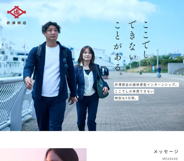
青空と人物写真を大きく使い、縦書きのコピーと白帯の説明文を重ねた採用ページ。濃紺の五感体験セクション、余白のあるインタビュー、画面外へ続く写真ギャラリーで仕事と地域の魅力を伝えています。
オリジナルサイトを見るA photographic field journal, with a red merchant’s mark, open blue skies, and five senses unfolding against deep navy.
Website: izawasyouten.jp/recruit/internship
Original URL: https://izawasyouten.jp/recruit/internship/
Final URL: https://izawasyouten.jp/recruit/internship/
Theme: white editorial sections, a deep navy sensory sequence, and full-color photography.
Inspected: September 22, 2026. Supplied retrieval timestamp: 2026-09-22T13:49:21.618Z, equivalent to 22:49:21.618 JST.
Viewports: 1440 × 1000 desktop and 390 × 844 mobile, in CSS pixels.
Scope: the current internship recruitment page for 株式会社井澤商店. Visual captures cover the desktop hero, desktop taste chapter, desktop gallery/footer, mobile hero, and mobile gallery/footer. Rendered text and computed element measurements additionally cover the message, concept movie section, company profile, recruitment information, five sensory chapters, guidelines, two interviews, participant voices, FAQ, and application links.
The page presents a five-day internship through people, agricultural work, travel, food, and landscape. Its opening composition combines a large waterfront photograph with a small red company emblem, a three-column vertical Japanese headline, and three narrow white strips of supporting copy. The photography supplies most of the color and emotional detail.
The long document alternates spacious editorial content with an immersive navy sequence organized around seeing, listening, touching, smelling, and tasting. Desktop content repeatedly occupies a lane on the right, while mobile changes placement, heading orientation, and text widths. A staggered gallery of portrait photographs closes the page above a restrained copyright line.
A photographic field journal, with a red merchant’s mark, open blue skies, and five senses unfolding against deep navy.
Website: izawasyouten.jp/recruit/internship
Original URL: https://izawasyouten.jp/recruit/internship/
Final URL: https://izawasyouten.jp/recruit/internship/
Theme: white editorial sections, a deep navy sensory sequence, and full-color photography.
Inspected: September 22, 2026. Supplied retrieval timestamp: 2026-09-22T13:49:21.618Z, equivalent to 22:49:21.618 JST.
Viewports: 1440 × 1000 desktop and 390 × 844 mobile, in CSS pixels.
Scope: the current internship recruitment page for 株式会社井澤商店. Visual captures cover the desktop hero, desktop taste chapter, desktop gallery/footer, mobile hero, and mobile gallery/footer. Rendered text and computed element measurements additionally cover the message, concept movie section, company profile, recruitment information, five sensory chapters, guidelines, two interviews, participant voices, FAQ, and application links.
The page presents a five-day internship through people, agricultural work, travel, food, and landscape. Its opening composition combines a large waterfront photograph with a small red company emblem, a three-column vertical Japanese headline, and three narrow white strips of supporting copy. The photography supplies most of the color and emotional detail.
The long document alternates spacious editorial content with an immersive navy sequence organized around seeing, listening, touching, smelling, and tasting. Desktop content repeatedly occupies a lane on the right, while mobile changes placement, heading orientation, and text widths. A staggered gallery of portrait photographs closes the page above a restrained copyright line.
| Name | Value | Suggested token | Evidence and role |
|---|---|---|---|
| Editorial White | #FFFFFF |
--color-paper |
Exact computed application-link background and sensory text color; also visually matches the editorial canvas, gallery gutters, and hero text strips. |
| Warm Black | #151313 |
--color-ink |
Exact conversion of measured rgb(21, 19, 19). Used throughout ordinary text and application labels. |
| Sensory Navy | Approximately #17153E |
--color-sensory |
Visual estimate of the large uniform background in the desktop taste capture. The sampled section backgrounds are transparent, so the actual ancestor fill was not supplied. |
| Emblem Red | Approximately #CF2036 |
--color-brand-reference |
Visual estimate from the company emblem. Preserve the supplied logo artwork rather than recoloring it to this estimate. |
| Photographic Sky | Approximately #A9E7F6 |
Reference only | A representative visual estimate of the hero’s pale cyan sky. This is photographic color, not a verified interface fill. |
White and warm black form the ordinary reading system. The sensory sequence reverses the text to white over navy. Red is concentrated in the brand artwork; the measured application links use white backgrounds and dark text.
The photographs add blue clothing, greenhouse greens, orange sunsets, and warm food colors. Keep those colors inside the imagery rather than assigning a separate UI accent to every content category.
The supplied --swiper-theme-color: #007aff and ring-related custom properties are library defaults in the evidence. They are not sufficient evidence of visible blue controls or a blue focus treatment.
'Noto Sans JP', sans-serif.400.300 for sensory descriptions, 600 for interview questions, and 700 for application links.--font-body: 'Noto Sans JP', sans-serif.These are computed family declarations. Font-file URLs and successful loading of each individual face were not independently established by the supplied evidence.
Roboto, sans-serif.300 for labels such as MESSAGE, GUIDELINE, and INTERVIEW; 100 for the sensory labels.0.17em; vertically arranged English section labels use 0.24em.taste label is slanted and flanked by short horizontal rules. Font-style was not included in the computed sample.The hero reads “ここでしかできないことがある。” in three vertical columns. Its visible strokes are expressive and uneven, with more character than the page’s regular sans-serif text. The evidence does not identify its font or asset format.
The five sensory headings likewise use large Japanese characters with expressive strokes. Their H3 wrappers contain no extracted text, while separate English labels remain live text. Preserve the original artwork when available and provide an accessible text equivalent. Do not infer a font name from their appearance.
Values below are measured computed values, rounded where useful. Sizes are ordinary CSS pixels; the root remains 16px at both inspected widths.
| Role | Desktop size / line height | Mobile size / line height | Weight | Tracking |
|---|---|---|---|---|
| Root and default body | 16 / 24px |
16 / 24px |
400 | Normal |
| Hero supporting paragraph | 18.01 / 41.02px |
15.19 / 34.60px |
400 | Normal on sampled parent |
| Japanese section heading | 26 / 36.4px |
22.25 / 31.15px |
400 | 0.20em desktop; 0.15em mobile |
| English section label | 18 / 21.6px |
12.375 / 14.85px |
300 | 0.17em |
| Message body | 13.93 / 30.64px |
15.04 / 30.08px |
400 | 0.10em desktop; 0.14em mobile |
| Company description | 13.93 / 30.64px |
15.16 / 30.31px |
400 | 0.14em |
| Sensory English label | 22 / 26.4px |
16 / 19.2px |
100 | 0.17em |
| Sensory description | 17 / 36.89px |
15 / 30px |
300 | 0.13em |
| Guideline explanatory text | 14 / 19.6px |
14 / 19.6px |
400 | 0.10em |
| Interview biography | 12.7 / 22.86px |
12.04 / 21.68px |
400 | 0.10em |
| Interview question | 19.8 / 31.68px |
17.175 / 27.48px |
600 | 0.20em desktop; 0.15em mobile |
| Interview answer | 14.7 / 30.87px |
14.04 / 24.58px |
400 | 0.10em |
| Application link | 16 / 24px |
16 / 24px |
700 | 0.17em |
The mobile message body becomes slightly larger than its desktop counterpart, while English labels become much smaller. This is a selective hierarchy adjustment, not uniform scaling.
The copyright paragraph wrapper reports 16px/24px, but the visible inner lettering appears smaller and tracked. Approximately 14px desktop and 12px mobile are visual estimates suitable for an adaptation; they are not measured inner-text styles.
Base: a conventional 16px root with many component-specific dimensions. Density: broad photographic regions, narrow reading columns, and large vertical intervals between chapters. Source formulas: not supplied. Do not extrapolate a single viewport unit from the decimal measurements.
| Relationship | Desktop | Mobile | Status |
|---|---|---|---|
| Japanese heading to English label | 16px |
16px |
Calculated from sampled boxes |
| Hero headline box to supporting paragraph | 36px |
Repositioned independently | Calculated desktop gap |
| Sensory character to English label | About 12.8px |
About 12.8px |
Calculated from sampled boxes |
| Sensory label to description | 24px |
24px |
Calculated from sampled boxes |
| Sensory description inner horizontal padding | 49.9px |
19.06px |
Measured; mobile also has an outer inset |
| Interview question to answer | About 18.19px |
About 14.25px |
Calculated |
| Interview Q&A block separation | About 56.39px |
About 48.52px |
Calculated between sampled blocks |
| Voice item separation | 24px |
16px |
Calculated |
| Guideline section vertical padding | 178px top, 197px bottom |
120px top, 140px bottom |
Measured |
| Gallery horizontal gutter | About 39–40px |
About 21–22px |
Visual estimate |
| Gallery row gap | About 48px |
About 20px |
Visual estimate |
| Footer padding | 80px 72px |
48px 19.5px |
Measured |
| Element | Treatment | Evidence |
|---|---|---|
| Photographs and gallery tiles | Square corners | Visible captures |
| Hero text strips | Square, closely fitted white backing | Visible captures |
| Sampled sections and text wrappers | 0px radius |
Computed styles |
| Application links | 8px radius |
Computed styles |
| General card elevation | No verified shared system | Captures and sampled wrappers |
Reserve the modest rounded shape for the application control. The photographed chapters and gallery derive structure from cropping, spacing, and background changes.
Positions in the hero rows below are viewport coordinates at the initial capture. Other rows describe the element’s horizontal lane in the document.
| Element | Desktop: 1440 × 1000 | Mobile: 390 × 844 |
|---|---|---|
| Document height | Approximately 21,311px |
Approximately 19,306px |
| Main content start | y = 0 |
y = 66px |
| Brand artwork wrapper | x 50, y 39.42, 133.59 × 125px |
x 36.44, y 25.56, 75.84 × 71.81px |
| Hero headline wrapper | x 892.81, y 160, 247.34 × 374.13px |
x 214.25, y 46, 143.75 × 217.42px |
| Hero supporting paragraph | x 892.81, y 570.13, 547.19 × 123.09px |
x 14.58, y 692.22, 317.91 × 103.78px |
| Message section lane | x 761.98, width 633.02px |
Full 390px section |
| Message paragraph lane | x 829.97, width 358px |
x 29.25, width 331.5px |
| Sensory chapter content wrapper | x 762, width 603px |
Full 390px section |
| Interview reading lane | x 872, width 461px |
x 29.25, width 331.5px |
| Voice and FAQ lane | x 875, width 474px |
x 29.25, width 331.5px |
| Guideline application link | 498 × 83.64px |
352.09 × 110.52px |
| Closing application link | 808 × 100.55px |
331.5 × 122.63px |
| Footer | Height 184px |
Height 147.59px |
A recurring mobile reading width is 331.5 / 390 = 85%, leaving 7.5% per side. This applies to the message paragraphs, company description, interview copy, voices, and FAQ at the inspected width. It is not the width of every mobile component.
Role: carries company identity through the photographic opening.
The mark combines a red emblem with black Japanese lettering beneath it. Its link points to the same internship route without the trailing slash. The sampled H1 contains the linked visual mark rather than extracted heading text.
On desktop, the artwork sits about 50px from the left and 39px from the top. On mobile, it becomes approximately 76px wide and moves to about 36px from the left and 26px from the top. Its mobile box crosses the boundary between the white top strip and the photograph, which begins at y = 66px.
The logo also appears in the desktop taste capture at the upper-left viewport corner. It is absent from the supplied footer views. This supports a recurring positioned overlay, but does not establish whether the original uses fixed positioning, sticky positioning, conditional visibility, or repeated elements. A complete persistence rule cannot be recovered from these frames.
Role: establishes the human and environmental character of the internship before practical information begins.
The desktop photograph fills the supplied 1440 × 1000 frame. Two people walk beside a waterfront, with cyan sky providing open space above and to the right. Their navy clothing connects visually with the later navy sensory section.
The vertical headline begins at approximately 62% of the desktop viewport width. Its three columns read from right to left. Below it, three independently backed lines present the supporting text:
The white backing follows each line’s length. It does not form a single large rectangular text panel. The sampled paragraph’s line height creates substantial separation between the narrow strips.
On mobile, the composition changes in three ways: the portrait crop brings both people closer; the headline moves to the upper-right and partly overlaps the white area above the image; the supporting strips move to the lower-left. The headline remains artwork at approximately 144 × 217px, rather than becoming a small horizontal heading.
The native photo dimensions and source crop rules are unavailable. Match the people’s positions using an appropriate mobile crop, then tune object-position against the reference.
Role: provides a consistent editorial signpost across a long page.
The common construction is a Japanese H2 followed by a smaller English paragraph, separated by 16px. Japanese text is regular weight with pronounced tracking; English is lighter, more compact, and generally uppercase.
Orientation is component-specific. The company-profile heading occupies a narrow vertical column on desktop and remains vertically arranged near the center on mobile. The internship-information heading changes from a horizontal white heading on desktop to a vertical dark heading near the mobile right edge. The supplied measurements therefore support changes in orientation, location, and color—not just font size.
Use an explicit vertical-heading variant when extending the system. Preserve the semantic heading in the document regardless of its visual writing direction.
Role: connects the experience to the company’s agricultural work and purpose.
The message contains three paragraph groups. On desktop, they occupy a 358px-wide lane nested inside the broader right-hand section. Each group uses roughly 13.93px type with 30.64px leading, making the prose feel deliberate and spacious.
On mobile, the same paragraphs use a 331.5px lane and approximately 15.04px type with 30.08px leading. The width changes little in absolute terms, but the reading lane moves into a centered, nearly full-width composition.
The company-profile section combines its vertical bilingual heading, explanatory copy, and company facts. The rendered page directly identifies 株式会社 井澤商店 and its agricultural-materials business. The facts include company name, location, contact information, representative, business activities, and business hours.
The supplied evidence does not include screenshots of these complete sections. Their accompanying image crops, fact-row rules, and small decorative elements should not be reconstructed from assumptions. A semantic definition list is a suitable implementation recommendation for the company facts.
Role: introduces a film associated with the internship concept.
The heading pair “コンセプト動画” and CONCEPT MOVIE is confirmed. The measured enclosing section is about 986px tall on desktop and 525px on mobile, including its surrounding spacing.
No player image, player DOM, playback event, or media URL was supplied. Autoplay, sound, poster styling, modal behavior, and playback controls remain unverified. Reserve a responsive media area in a new implementation, then specify its behavior separately once the actual media requirements are known.
Role: turns the internship’s experiential promise into a sequence of concrete situations.
The five entries are see, listen, feel, smell, and taste. Each has a Japanese display character, a lowercase English label, and a descriptive paragraph.
The desktop taste capture reveals the main visual construction:
taste label sits beneath the character, between two short white rules.The left photo shows food at close range, while the right photo shows people sharing a meal. Their difference in scale connects physical sensation with social experience.
The measured taste character wrapper is 122 × 116.05px on desktop and 85 × 80.84px on mobile. Other characters vary in width; they are not identical square icon containers. The English label is 22px desktop and 16px mobile.
Desktop sensory sections measure approximately 1043–1113px tall. All five sampled mobile sections measure approximately 1054.98px, or about 1.25 times the inspected 844px viewport height. The character begins about 592.67px into each mobile section.
A mobile sensory screenshot was not supplied. The DOM confirms full-width chapters, centered character wrappers, and inset white descriptions, but does not establish the ordering or cropping of the photographs. The stacked mobile treatment in the Quick Start is a recommended fallback.
Role: presents the practical details needed before application.
The section includes dates, location, duration, eligibility, capacity, travel support, accommodation, insurance, an application deadline, and seminar attendance requirements. Nine seminar dates are present in the rendered text.
The heading is a single desktop line and becomes two lines on mobile. The enclosing section uses substantial measured padding: 178px above and 197px below on desktop, reducing to 120px and 140px on mobile.
The application-qualification paragraphs retain 14px type and 19.6px leading at both viewports. Their text starts about 84.4px inside the guideline content lane, suggesting an aligned label/value relationship in that portion. The full row markup and border treatments were not supplied.
The page contains a 2026 event schedule. Those dates are content observed at inspection time, not evidence that applications remained open on September 22.
Role: directs visitors to an external seminar registration page.
The visible label is “説明会はマイナビから申し込み”. The page contains two such links: one after the guidelines and one near the end of the content.
Both point to the same observed destination:
https://job.mynavi.jp/28/pc/corpinfo/displaySeminar/index?optNo=PzT3-C&corpId=235570
Measured anatomy includes a white background, warm-black text, 8px corner radius, 16px bold type, 0.17em tracking, flex layout, and an 8px internal gap. The guideline version is 498px wide on desktop; the closing version expands to 808px. Mobile widths follow their local content lanes.
Desktop padding is 19.2px vertically, with 12px or 24px horizontally depending on placement. Mobile padding becomes 15px top, 16px sides, and 29px bottom. The sampled heights exceed a single text line plus these insets; unsampled child content may contribute. Do not invent a specific icon or logo arrangement to explain the difference.
A 400ms box-shadow transition is declared. Actual shadow values and a hovered screenshot were not supplied. The destination was not opened, and new-tab behavior was not established.
Role: gives the recruitment story a personal and practical perspective.
Two numbered interviews are present, for 宮田 一弥 and 塚原 ひろ子. Each includes a bilingual heading, name and role, a biography, and three question-and-answer sections.
Desktop interview copy occupies a 461px-wide lane beginning at x = 872px. Mobile copy uses the recurring centered 85% reading width. Biography text is deliberately smaller than the main answers. Questions use weight 600, increased size, and wider tracking to establish a clear scan path without enclosing every answer in a card.
The first sampled vertical artwork wrapper is 122 × 559px on desktop and approximately 71 × 326px on mobile. Its extracted text is empty; the exact lettering and asset format are unavailable. Treat this as an artwork reservation rather than guessing the content or typeface.
No complete interview screenshot was supplied, so portrait crops and the broader image composition remain outside the verified visual scope.
Role: adds three short accounts of the internship experience.
A Japanese heading and VOICE label introduce three paragraph groups. Their sampled wrappers use flex layout with a 24px horizontal gap. Desktop groups occupy a 474px lane; mobile uses 331.5px. The gaps between groups decrease from 24px to 16px on mobile.
The evidence does not identify the flex children visually. Avatars, quotation icons, speech bubbles, and colored cards should not be assumed. Preserve the three-part content rhythm while using only verified or newly specified supporting elements.
Role: addresses questions about transfers, benefits, and remote work.
The visible page-text extraction lists three questions. The section’s fuller element text also includes their answers. This is consistent with an initially collapsed answer presentation, but the exact control semantics and open/close behavior were not tested.
The section shares the voice section’s reading lane. Native details and summary elements would be a reasonable accessible implementation choice, but are a recommendation rather than a finding about the source.
Role: leaves the visitor with a broad visual account of people, work, food, and place.
The desktop capture shows two rows of square-cornered portrait photographs, approximately 281 × 374px each. Horizontal gaps are about 40px and the row gap about 48px. The second row starts at a different horizontal offset, so its first image is clipped by the left viewport edge. Partial tiles also continue beyond the right edge.
The mobile capture shows three rows. Tiles are approximately 177 × 235px, with roughly 22px horizontal and 20px vertical gaps. Rows retain independent offsets and extend beyond the viewport. The images become smaller without turning into a conventional two-column grid.
The photographs include greenhouse work, crop handling, agricultural conversations, coastlines, travel, office work, and shared meals. No visible captions, frames, or rounded image corners interrupt the sequence.
These frames establish composition, not motion. Row offsets and differing visible images do not prove autoplay, opposing movement directions, infinite looping, dragging, or a particular carousel speed.
Role: provides a quiet endpoint after the dense photographic gallery.
A centered copyright line sits on white. Desktop keeps it on one line within an approximately 184px-high footer. Mobile separates the company line from All rights reserved. and uses an approximately 148px-high footer.
The visible wording retains © 2024 IZAWASHOTEN Co.,Ltd. That year is part of the page content; it is not the inspection date. No additional footer navigation is present in the supplied captures or link inventory.
The evidence provides transition declarations and settled captures. It does not provide a complete recording of the motion sequence.
| Element | Measured declaration | What it establishes | Limitation |
|---|---|---|---|
| Brand H1 wrapper | opacity 2s cubic-bezier(0.4, 0, 0.2, 1) |
A long opacity transition is available. | Trigger and initial opacity were not supplied. |
| Hero supporting paragraph | opacity 0.6s cubic-bezier(0.4, 0, 0.2, 1) 4s |
A 600ms opacity transition with a 4-second delay is declared. | It does not prove the full opening timeline or headline sequence. |
| Message and company content | opacity 1.2s ease-out, filter 1.2s ease-out |
Opacity and filter transitions are configured. | Filter values, reveal thresholds, and replay behavior are unknown. |
| Interview artwork wrappers | opacity 0.7s ease-out, filter 0.7s ease-out |
A shorter reveal treatment is configured for these elements. | No blur radius or trigger was supplied. |
| Interview Q&A and closing content | opacity 1.2s ease-out, filter 1.2s ease-out |
Shared reveal timing across multiple content blocks. | Scroll binding was not independently exercised. |
| Application links | box-shadow 0.4s cubic-bezier(0.4, 0, 0.2, 1) |
Shadow changes can transition over 400ms. | Hover and focus appearances remain unverified. |
| Sampled CSS animations | animation: none on listed elements |
No keyframe animation on those particular sampled nodes. | Descendants, pseudo-elements, JavaScript, and media may behave differently. |
The supplied collection process waited at least five seconds initially and attempted to settle finite animations, layouts, text, and visible image decoding. Perpetual animations were temporarily paused during readiness checks and then resumed. These procedures improve capture stability but do not identify the page’s motion choreography.
Implementation recommendation: keep content visible by default and add reveals progressively. Respect reduced-motion preferences, avoid reproducing the four-second text delay unless it serves a specific requirement, and provide a pause mechanism if a new implementation adds continuous gallery movement.
| Surface | Appearance | Function |
|---|---|---|
| Hero | Full-color waterfront photograph | Establishes people, atmosphere, and place. |
| Hero copy backing | Small white rectangles fitted to individual lines | Keeps text readable while retaining most of the photograph. |
| Editorial canvas | White with warm-black text | Supports the company narrative and practical information. |
| Sensory field | Deep navy with white text and artwork | Gives the five-senses sequence a distinct chapter identity. |
| Supporting photographs | Unframed rectangular crops | Connects an immersive scene with a smaller contextual view. |
| Application control | White, 8px rounded rectangle | Creates a consistent registration target. |
| Gallery | White gutters around portrait photographs | Gives dense imagery an orderly, open rhythm. |
| Footer | White, centered dark text | Ends the page with minimal visual weight. |
The visual hierarchy comes primarily from image scale, alignment, negative space, and the large white-to-navy change. A universal elevated-card system is not supported by the supplied evidence.
The photographic language is observational and people-focused. Agricultural work appears through conversations, handling crops, greenhouse visits, and food rather than through isolated product packshots. Travel and coastlines give the page a sense of movement through real places.
The hero has a cool, bright cyan cast. Navy clothing anchors the people against that sky. The taste chapter moves closer to food texture and shared dining, while the final gallery broadens the palette with green crops and warm sunsets.
Preserve the difference between image roles: a large immersive scene, a smaller contextual photograph, and repeating portrait gallery crops. Avoid forcing every image into the same aspect ratio.
No original image URLs, SVG sources, font-file URLs, or video URLs were included in the evidence. The following are asset requirements identified from the page, not downloadable path claims.
| Asset | Evidence | Implementation requirement |
|---|---|---|
| Red emblem with Japanese wordmark | Desktop and mobile hero; desktop taste capture | Use the supplied brand asset with its original proportions. |
| Vertical hero headline | Visible captures and matching empty-text wrapper measurements | Preserve the artwork; provide a text equivalent. |
| Waterfront hero photograph | Both hero captures | Supply desktop and mobile crops that retain the two people and space for the headline. |
| Large food photograph | Desktop taste capture | Use a tall crop with visible food texture and depth. |
| Shared-meal photograph | Desktop taste capture | Use a landscape supporting crop above the sensory character. |
| Five sensory character graphics | Sampled H3 boxes; taste character visible | Preserve individually varying artwork dimensions. |
| Gallery photographs | Desktop and mobile gallery captures | Prepare portrait crops of approximately 3:4 while protecting faces and hands. |
| Interview and message artwork | Empty-text wrappers with measured geometry | Resolve from authorized assets before reproducing lettering or imagery. |
The supplied capture filenames identify inspection evidence, not original website asset paths. The Quick Start’s example filenames are integration placeholders.
The hero fills the visible opening frame. Below it, many editorial sections use a lane beginning around 53% of the viewport width, with narrower paragraph lanes nested inside. Later interview and practical content often begin around 61% of the viewport width.
The taste capture establishes a large left photograph and a slightly wider right navy region. Within the right region, the supporting image and text have their own margins. Preserve these nested alignments rather than centering every section inside one identical container.
The page remains a long scrolling document. The measured desktop height is about 21.3 inspected viewport heights; these large chapter intervals are part of its pacing. Exact document height will change with content, font metrics, and viewport dimensions.
At 390 × 844:
The mobile document is approximately 19,306px tall. Its smaller height does not mean content was simply removed: several desktop compositions and their large spatial arrangements have been reorganized.
Only the two listed viewports were supplied. The original breakpoint, tablet behavior, landscape-phone behavior, intermediate fluid formulas, and safe-area handling are unknown. The Quick Start uses a recommended 900px breakpoint for a new implementation, not a recovered source breakpoint.
These are recommendations for a new implementation, not verified features of the original page:
#FFFFFF.#151313.#17153E; verify against the supplied original asset or stylesheet when available.#CF2036; retain the original logo colors.#A9E7F6, not a required solid-color surface.“Create a Japanese internship recruitment page inspired by the current IZAWASHOTEN page. Lead with a full-width waterfront photograph of people, a compact red emblem at the upper-left, three columns of expressive vertical Japanese headline artwork on the right, and three separately backed white text strips below. Continue into spacious white editorial sections with tracked Noto Sans JP headings and light Roboto English labels. Build a deep navy five-senses sequence with large documentary photographs, smaller contextual photos, overlapping white character artwork, and lightly tracked descriptions. Use narrow reading lanes within asymmetric desktop compositions. On mobile, move the hero copy to the lower-left, preserve vertical artwork, center ordinary prose in an 85% width, and deliberately recompose headings. Finish with staggered rows of square-cornered portrait photographs and a quiet copyright footer. Keep all unverified interaction behavior explicit as new design decisions.”
This is an implementation scaffold, not recovered source CSS. It uses measured typography and several measured anchor positions. Navy, photo proportions, gallery offsets, and the inner copyright styling are visual approximations. The 900px breakpoint and stacked mobile sensory layout are recommendations.
Supply the actual brand, headline, character, and photographic assets. The starter intentionally uses ordinary document scrolling and does not attempt to recreate unverified pinning or gallery animation.
:root {
  /* Exact measured interface colors */
  --color-paper: #fff;
  --color-ink: #151313;

  /* Visual approximation; verify against the original fill */
  --color-sensory: #17153e;

  /* Computed family declarations */
  --font-body: 'Noto Sans JP', sans-serif;
  --font-label: Roboto, sans-serif;

  --size-section: 26px;
  --size-label: 18px;
  --tracking-section: 0.2em;
  --tracking-label: 0.17em;
  --radius-action: 8px;

  /* Adapted from the measured desktop headline width */
  --hero-art-width: clamp(180px, 17.1767vw, 247.34375px);

  /* Estimated gallery geometry */
  --gallery-tile-width: clamp(220px, 19.5vw, 320px);
  --gallery-column-gap: 40px;
  --gallery-row-gap: 48px;

  --ease-standard: cubic-bezier(0.4, 0, 0.2, 1);
  --motion-reveal: 1.2s ease-out;
  --motion-action: 0.4s var(--ease-standard);
}

* {
  box-sizing: border-box;
}

html {
  font-size: 16px;
}

body {
  margin: 0;
  color: var(--color-ink);
  background: var(--color-paper);
  font-family: var(--font-body);
  font-weight: 400;
}

img {
  display: block;
  max-width: 100%;
}

/* Opening placement only; persistence requires separate verification. */
.brand-header {
  position: absolute;
  z-index: 10;
  top: 39.4286px;
  left: 50px;
  width: 133.59px;
}

.brand-header img {
  width: 100%;
  height: auto;
}

.hero {
  position: relative;
  min-height: 100vh;
  min-height: 100svh;
}

.hero-picture {
  position: absolute;
  inset: 0;
}

.hero-picture img {
  width: 100%;
  height: 100%;
  object-fit: cover;
  object-position: center;
}

.hero-composition {
  position: absolute;
  top: 16vh;
  top: 16svh;
  left: 62%;
  right: 0;
}

.hero-headline {
  width: var(--hero-art-width);
  margin: 0;
}

.hero-headline img {
  width: 100%;
  height: auto;
}

.hero-lede {
  margin: 36px 0 0;
  font-size: 18.01px;
  font-weight: 400;
  line-height: 2.27778;
}

.hero-lede span {
  padding-inline: 3px;
  color: var(--color-ink);
  background: var(--color-paper);
  -webkit-box-decoration-break: clone;
  box-decoration-break: clone;
}

.section-title {
  margin: 0;
  font-size: var(--size-section);
  font-weight: 400;
  line-height: 1.4;
  letter-spacing: var(--tracking-section);
}

.section-label {
  margin: 16px 0 0;
  font-family: var(--font-label);
  font-size: var(--size-label);
  font-weight: 300;
  line-height: 1.2;
  letter-spacing: var(--tracking-label);
  text-transform: uppercase;
}

/* Select this modifier per section, rather than globally. */
.section-heading--vertical {
  display: flex;
  flex-direction: row-reverse;
  align-items: flex-start;
  justify-content: flex-start;
  gap: 8px;
}

.section-heading--vertical > * {
  margin: 0;
  writing-mode: vertical-rl;
}

.section-heading--vertical .section-label {
  letter-spacing: 0.24em;
}

.editorial-lane {
  width: 43.9594%;
  margin-left: 52.9156%;
}

.message-copy {
  width: 358px;
  max-width: 100%;
  margin-left: 67.98px;
  font-size: 13.9286px;
  line-height: 2.2;
  letter-spacing: 0.1em;
}

.message-copy p {
  margin: 0 0 1em;
}

.sense-chapter {
  display: grid;
  grid-template-columns: 47.0833% 52.9167%;
  min-height: 1075px;
  color: var(--color-paper);
  background: var(--color-sensory);
}

.sense-main-image {
  width: 100%;
  height: 100%;
  min-height: 0;
  object-fit: cover;
}

/* Photo position and overlap approximate the desktop taste chapter. */
.sense-panel {
  min-width: 0;
  padding: 90px 75px 160px 84px;
}

.sense-photo {
  width: 100%;
  aspect-ratio: 603 / 348.86;
  object-fit: cover;
}

.sense-symbol {
  position: relative;
  width: 122px;
  margin: -48px auto 0;
}

.sense-symbol img {
  width: 100%;
  height: auto;
}

.sense-label {
  display: flex;
  align-items: center;
  justify-content: center;
  gap: 11px;
  margin: 12.8px 0 0;
  font-family: var(--font-label);
  font-size: 22px;
  font-weight: 100;
  font-style: italic;
  line-height: 1.2;
  letter-spacing: 0.17em;
}

.sense-label::before,
.sense-label::after {
  content: '';
  width: 24px;
  height: 1px;
  background: currentColor;
}

.sense-description {
  margin: 24px 0 0;
  padding-inline: 49.9px;
  font-size: 17px;
  font-weight: 300;
  line-height: 2.17;
  letter-spacing: 0.13em;
}

.guideline {
  padding: 178px 4.86111% 197px;
}

.guideline-content {
  width: 498px;
  max-width: 100%;
  margin-left: auto;
}

/* Recommended semantic fact-row scaffold. */
.fact-row {
  display: grid;
  grid-template-columns: 84.4px minmax(0, 1fr);
  padding-block: 12px;
  font-size: 14px;
  line-height: 1.4;
  letter-spacing: 0.1em;
}

.fact-row dt,
.fact-row dd {
  margin: 0;
}

.application-link {
  display: flex;
  align-items: center;
  justify-content: center;
  gap: 8px;
  width: 100%;
  min-height: 83.64px;
  padding: 19.2px 12px;
  border-radius: var(--radius-action);
  color: var(--color-ink);
  background: var(--color-paper);
  font-size: 16px;
  font-weight: 700;
  line-height: 1.5;
  letter-spacing: 0.17em;
  text-align: center;
  text-decoration: none;
  transition: box-shadow var(--motion-action);
}

.application-link--closing {
  width: min(808px, 85%);
  min-height: 100.55px;
  margin-inline: auto;
  padding-inline: 24px;
}

.interview-copy {
  width: 32.014%;
  margin-left: 60.556%;
}

.interview-bio {
  font-size: 12.7px;
  line-height: 1.8;
  letter-spacing: 0.1em;
}

.interview-question {
  margin: 0 0 18.19px;
  font-size: 19.8px;
  font-weight: 600;
  line-height: 1.6;
  letter-spacing: 0.2em;
}

.interview-answer {
  margin: 0;
  font-size: 14.7px;
  line-height: 2.1;
  letter-spacing: 0.1em;
}

.interview-qa + .interview-qa {
  margin-top: 56.39px;
}

/* Static gallery: no inferred autoplay or drag behavior. */
.gallery {
  display: grid;
  row-gap: var(--gallery-row-gap);
  overflow: hidden;
}

.gallery-row {
  display: flex;
  gap: var(--gallery-column-gap);
  width: max-content;
  margin: 0;
  padding: 0;
  list-style: none;
  transform: translateX(var(--row-offset, 28px));
}

.gallery-row:nth-child(2) {
  --row-offset: -29px;
}

.gallery-row:nth-child(3) {
  display: none;
}

.gallery-tile {
  flex: 0 0 var(--gallery-tile-width);
  width: var(--gallery-tile-width);
  aspect-ratio: 3 / 4;
  object-fit: cover;
  border-radius: 0;
}

.site-footer {
  padding: 80px 5%;
  text-align: center;
}

/* Inner copyright typography is an estimated adaptation. */
.copyright {
  margin: 0;
  font-size: 14px;
  line-height: 24px;
  letter-spacing: 0.15em;
}

/* Recommended focus treatment, not an observed source style. */
a:focus-visible,
button:focus-visible,
summary:focus-visible {
  outline: 2px solid currentColor;
  outline-offset: 5px;
}

/* Optional enhancement: content remains visible without this class. */
@media (prefers-reduced-motion: no-preference) {
  .is-entering {
    animation: content-enter var(--motion-reveal) both;
  }
}

@keyframes content-enter {
  from { opacity: 0; }
  to { opacity: 1; }
}

/* Recommended breakpoint; the source breakpoint was not supplied. */
@media (max-width: 900px) {
  :root {
    --size-section: 22.25px;
    --size-label: 12.375px;
    --tracking-section: 0.15em;
    --gallery-tile-width: 45.4vw;
    --gallery-column-gap: 22px;
    --gallery-row-gap: 20px;
  }

  .page-main {
    padding-top: 66px;
  }

  .brand-header {
    top: 25.574px;
    left: 36.4486px;
    width: 75.84px;
  }

  .hero {
    min-height: calc(100vh - 66px);
    min-height: calc(100svh - 66px);
  }

  .hero-picture img {
    /* Starting point only; tune using the supplied mobile crop. */
    object-position: 25% center;
  }

  .hero-composition {
    position: static;
  }

  .hero-headline {
    position: absolute;
    top: -20px;
    right: 32px;
    width: 143.75px;
  }

  .hero-lede {
    position: absolute;
    bottom: 48px;
    left: 14.58px;
    max-width: calc(100% - 29.16px);
    margin: 0;
    font-size: 15.1881px;
    line-height: 2.27778;
  }

  .editorial-lane {
    width: 100%;
    margin-left: 0;
  }

  .message-copy,
  .interview-copy {
    width: 85%;
    margin-inline: auto;
  }

  .message-copy {
    font-size: 15.0383px;
    line-height: 2;
    letter-spacing: 0.14em;
  }

  /* Recommended fallback: mobile photo order was not captured. */
  .sense-chapter {
    display: block;
    min-height: 0;
  }

  .sense-main-image {
    height: 100vw;
    max-height: 560px;
  }

  .sense-panel {
    padding: 48px 19.28px 120px;
  }

  .sense-symbol {
    width: 85px;
    margin-top: -33px;
  }

  .sense-label {
    gap: 8px;
    font-size: 16px;
  }

  .sense-description {
    padding-inline: 19.06px;
    font-size: 15px;
    line-height: 2;
  }

  .guideline {
    padding: 120px 4.86111% 140px;
  }

  .guideline-content {
    width: 100%;
  }

  .application-link {
    min-height: 110.52px;
    padding: 15px 16px 29px;
  }

  .application-link--closing {
    width: 85%;
    min-height: 122.63px;
  }

  .interview-bio {
    font-size: 12.0437px;
  }

  .interview-question {
    margin-bottom: 14.25px;
    font-size: 17.175px;
    letter-spacing: 0.15em;
  }

  .interview-answer {
    font-size: 14.0437px;
    line-height: 1.75;
  }

  .interview-qa + .interview-qa {
    margin-top: 48.52px;
  }

  .gallery-row:nth-child(1) {
    --row-offset: -42vw;
  }

  .gallery-row:nth-child(2) {
    --row-offset: -35px;
  }

  .gallery-row:nth-child(3) {
    --row-offset: -45.2vw;
    display: flex;
  }

  .site-footer {
    padding: 48px 5%;
  }

  .copyright {
    font-size: 12px;
    line-height: 25.8px;
  }

  .copyright span {
    display: block;
  }
}

@media (prefers-reduced-motion: reduce) {
  .is-entering {
    animation: none;
    opacity: 1;
    filter: none;
  }

  .application-link {
    transition: none;
  }
}
The filenames below are placeholders for authorized assets, not observed website paths. This adaptation assigns the recruitment headline the semantic H1; the inspected page’s sampled H1 instead wraps the logo.
<header class='brand-header'>
  <a href='/recruit/internship/'>
    <img src='brand-mark.svg' alt='井澤商店'>
  </a>
</header>

<main class='page-main'>
  <section class='hero' aria-labelledby='internship-title'>
    <picture class='hero-picture'>
      <source media='(max-width: 900px)' srcset='hero-mobile.jpg'>
      <img src='hero-desktop.jpg' alt='' fetchpriority='high'>
    </picture>
    <div class='hero-composition'>
      <h1 class='hero-headline' id='internship-title'>
        <img src='hero-headline.svg'
             alt='ここでしかできないことがある。'>
      </h1>
      <p class='hero-lede'>
        <span>井澤商店の超体感型インターンシップ。</span><br>
        <span>ここでしか体感できない</span><br>
        <span>特別な5日間。</span>
      </p>
    </div>
  </section>
</main>
Add the actual intrinsic image dimensions when integrating the assets. The empty photographic alternative assumes the adjacent text supplies the hero’s essential message; use a meaningful description when the photograph itself communicates additional necessary information.
Optional mapping for a new project already using Tailwind v4. This is not a claim about the original website’s framework version. Define the custom properties above first.
@theme inline {
  --color-canvas: var(--color-paper);
  --color-ink: #151313;
  --color-sensory: #17153e;

  --font-japanese: var(--font-body);
  --font-english: var(--font-label);

  --text-section: var(--size-section);
  --text-section-label: var(--size-label);
  --text-action: 16px;

  --radius-action: 8px;
  --spacing-heading-gap: 16px;
  --spacing-sensory-copy-gap: 24px;
}
2026-09-22T13:49:21.618Z. Individual screenshot timestamps were not separately provided.This reference describes the current page represented by the supplied original-site evidence. It does not reconstruct earlier versions, and its CSS scaffold does not claim pixel-identical behavior outside the inspected states.
# IZAWASHOTEN / Internship — Style Reference

> A photographic field journal, with a red merchant’s mark, open blue skies, and five senses unfolding against deep navy.

**Website:** [izawasyouten.jp/recruit/internship](https://izawasyouten.jp/recruit/internship/)
**Original URL:** https://izawasyouten.jp/recruit/internship/
**Final URL:** https://izawasyouten.jp/recruit/internship/
**Theme:** white editorial sections, a deep navy sensory sequence, and full-color photography.
**Inspected:** September 22, 2026. Supplied retrieval timestamp: `2026-09-22T13:49:21.618Z`, equivalent to 22:49:21.618 JST.
**Viewports:** 1440 × 1000 desktop and 390 × 844 mobile, in CSS pixels.
**Scope:** the current internship recruitment page for 株式会社井澤商店. Visual captures cover the desktop hero, desktop taste chapter, desktop gallery/footer, mobile hero, and mobile gallery/footer. Rendered text and computed element measurements additionally cover the message, concept movie section, company profile, recruitment information, five sensory chapters, guidelines, two interviews, participant voices, FAQ, and application links.

The page presents a five-day internship through people, agricultural work, travel, food, and landscape. Its opening composition combines a large waterfront photograph with a small red company emblem, a three-column vertical Japanese headline, and three narrow white strips of supporting copy. The photography supplies most of the color and emotional detail.

The long document alternates spacious editorial content with an immersive navy sequence organized around seeing, listening, touching, smelling, and tasting. Desktop content repeatedly occupies a lane on the right, while mobile changes placement, heading orientation, and text widths. A staggered gallery of portrait photographs closes the page above a restrained copyright line.
# IZAWASHOTEN / Internship — Style Reference

> A photographic field journal, with a red merchant’s mark, open blue skies, and five senses unfolding against deep navy.

**Website:** [izawasyouten.jp/recruit/internship](https://izawasyouten.jp/recruit/internship/)
**Original URL:** https://izawasyouten.jp/recruit/internship/
**Final URL:** https://izawasyouten.jp/recruit/internship/
**Theme:** white editorial sections, a deep navy sensory sequence, and full-color photography.
**Inspected:** September 22, 2026. Supplied retrieval timestamp: `2026-09-22T13:49:21.618Z`, equivalent to 22:49:21.618 JST.
**Viewports:** 1440 × 1000 desktop and 390 × 844 mobile, in CSS pixels.
**Scope:** the current internship recruitment page for 株式会社井澤商店. Visual captures cover the desktop hero, desktop taste chapter, desktop gallery/footer, mobile hero, and mobile gallery/footer. Rendered text and computed element measurements additionally cover the message, concept movie section, company profile, recruitment information, five sensory chapters, guidelines, two interviews, participant voices, FAQ, and application links.

The page presents a five-day internship through people, agricultural work, travel, food, and landscape. Its opening composition combines a large waterfront photograph with a small red company emblem, a three-column vertical Japanese headline, and three narrow white strips of supporting copy. The photography supplies most of the color and emotional detail.

The long document alternates spacious editorial content with an immersive navy sequence organized around seeing, listening, touching, smelling, and tasting. Desktop content repeatedly occupies a lane on the right, while mobile changes placement, heading orientation, and text widths. A staggered gallery of portrait photographs closes the page above a restrained copyright line.

## How to Read This Reference

- **Measured** values come from the supplied rendered DOM and computed-style records. Decimal values describe the inspected viewport; they do not establish the original responsive formula.
- **Visual estimates** come only from the five current-page screenshots. Approximate colors, photo dimensions, and overlaps are explicitly identified.
- **Calculated** values are arithmetic derived from those measurements, such as the 85% mobile reading width.
- **Recommendations** and the Quick Start are implementation guidance. They do not claim to reproduce undisclosed source code or untested behavior.
- **Named tokens** are descriptive aliases created for this reference. The supplied custom properties do not expose a complete semantic design-token system.
- **Artwork is distinct from typography.** The large vertical headline and sensory characters are visible where sampled text wrappers are empty. Their inherited 16px font size does not describe the visible lettering.
- **Evidence coverage varies.** The hero, taste composition, and gallery can be described visually. Other sections are documented through text, coordinates, dimensions, and computed styles; their unsampled decorations and image treatments remain uncertain.

## Tokens — Colors

### Default Palette

| Name | Value | Suggested token | Evidence and role |
| --- | --- | --- | --- |
| Editorial White | `#FFFFFF` | `--color-paper` | Exact computed application-link background and sensory text color; also visually matches the editorial canvas, gallery gutters, and hero text strips. |
| Warm Black | `#151313` | `--color-ink` | Exact conversion of measured `rgb(21, 19, 19)`. Used throughout ordinary text and application labels. |
| Sensory Navy | Approximately `#17153E` | `--color-sensory` | Visual estimate of the large uniform background in the desktop taste capture. The sampled section backgrounds are transparent, so the actual ancestor fill was not supplied. |
| Emblem Red | Approximately `#CF2036` | `--color-brand-reference` | Visual estimate from the company emblem. Preserve the supplied logo artwork rather than recoloring it to this estimate. |
| Photographic Sky | Approximately `#A9E7F6` | Reference only | A representative visual estimate of the hero’s pale cyan sky. This is photographic color, not a verified interface fill. |

White and warm black form the ordinary reading system. The sensory sequence reverses the text to white over navy. Red is concentrated in the brand artwork; the measured application links use white backgrounds and dark text.

The photographs add blue clothing, greenhouse greens, orange sunsets, and warm food colors. Keep those colors inside the imagery rather than assigning a separate UI accent to every content category.

The supplied `--swiper-theme-color: #007aff` and ring-related custom properties are library defaults in the evidence. They are not sufficient evidence of visible blue controls or a blue focus treatment.

## Tokens — Typography

### Japanese Reading Text

- **Computed stack:** `'Noto Sans JP', sans-serif`.
- **Common weight:** `400`.
- **Other measured weights:** `300` for sensory descriptions, `600` for interview questions, and `700` for application links.
- **Character:** clear Japanese sans-serif typography with substantial tracking and generous paragraph leading.
- **Implementation alias:** `--font-body: 'Noto Sans JP', sans-serif`.

These are computed family declarations. Font-file URLs and successful loading of each individual face were not independently established by the supplied evidence.

### English Section Labels

- **Computed stack:** `Roboto, sans-serif`.
- **Weight:** `300` for labels such as `MESSAGE`, `GUIDELINE`, and `INTERVIEW`; `100` for the sensory labels.
- **Tracking:** normally `0.17em`; vertically arranged English section labels use `0.24em`.
- **Case:** ordinary section labels appear uppercase in the rendered text; the five senses remain lowercase.
- **Visual detail:** the visible `taste` label is slanted and flanked by short horizontal rules. Font-style was not included in the computed sample.

### Headline and Sensory Artwork

The hero reads “ここでしかできないことがある。” in three vertical columns. Its visible strokes are expressive and uneven, with more character than the page’s regular sans-serif text. The evidence does not identify its font or asset format.

The five sensory headings likewise use large Japanese characters with expressive strokes. Their H3 wrappers contain no extracted text, while separate English labels remain live text. Preserve the original artwork when available and provide an accessible text equivalent. Do not infer a font name from their appearance.

### Type Scale

Values below are measured computed values, rounded where useful. Sizes are ordinary CSS pixels; the root remains 16px at both inspected widths.

| Role | Desktop size / line height | Mobile size / line height | Weight | Tracking |
| --- | --- | --- | --- | --- |
| Root and default body | `16 / 24px` | `16 / 24px` | 400 | Normal |
| Hero supporting paragraph | `18.01 / 41.02px` | `15.19 / 34.60px` | 400 | Normal on sampled parent |
| Japanese section heading | `26 / 36.4px` | `22.25 / 31.15px` | 400 | `0.20em` desktop; `0.15em` mobile |
| English section label | `18 / 21.6px` | `12.375 / 14.85px` | 300 | `0.17em` |
| Message body | `13.93 / 30.64px` | `15.04 / 30.08px` | 400 | `0.10em` desktop; `0.14em` mobile |
| Company description | `13.93 / 30.64px` | `15.16 / 30.31px` | 400 | `0.14em` |
| Sensory English label | `22 / 26.4px` | `16 / 19.2px` | 100 | `0.17em` |
| Sensory description | `17 / 36.89px` | `15 / 30px` | 300 | `0.13em` |
| Guideline explanatory text | `14 / 19.6px` | `14 / 19.6px` | 400 | `0.10em` |
| Interview biography | `12.7 / 22.86px` | `12.04 / 21.68px` | 400 | `0.10em` |
| Interview question | `19.8 / 31.68px` | `17.175 / 27.48px` | 600 | `0.20em` desktop; `0.15em` mobile |
| Interview answer | `14.7 / 30.87px` | `14.04 / 24.58px` | 400 | `0.10em` |
| Application link | `16 / 24px` | `16 / 24px` | 700 | `0.17em` |

The mobile message body becomes slightly larger than its desktop counterpart, while English labels become much smaller. This is a selective hierarchy adjustment, not uniform scaling.

The copyright paragraph wrapper reports 16px/24px, but the visible inner lettering appears smaller and tracked. Approximately 14px desktop and 12px mobile are visual estimates suitable for an adaptation; they are not measured inner-text styles.

## Tokens — Spacing & Shapes

**Base:** a conventional 16px root with many component-specific dimensions.
**Density:** broad photographic regions, narrow reading columns, and large vertical intervals between chapters.
**Source formulas:** not supplied. Do not extrapolate a single viewport unit from the decimal measurements.

### Spacing Scale

| Relationship | Desktop | Mobile | Status |
| --- | --- | --- | --- |
| Japanese heading to English label | `16px` | `16px` | Calculated from sampled boxes |
| Hero headline box to supporting paragraph | `36px` | Repositioned independently | Calculated desktop gap |
| Sensory character to English label | About `12.8px` | About `12.8px` | Calculated from sampled boxes |
| Sensory label to description | `24px` | `24px` | Calculated from sampled boxes |
| Sensory description inner horizontal padding | `49.9px` | `19.06px` | Measured; mobile also has an outer inset |
| Interview question to answer | About `18.19px` | About `14.25px` | Calculated |
| Interview Q&A block separation | About `56.39px` | About `48.52px` | Calculated between sampled blocks |
| Voice item separation | `24px` | `16px` | Calculated |
| Guideline section vertical padding | `178px` top, `197px` bottom | `120px` top, `140px` bottom | Measured |
| Gallery horizontal gutter | About `39–40px` | About `21–22px` | Visual estimate |
| Gallery row gap | About `48px` | About `20px` | Visual estimate |
| Footer padding | `80px 72px` | `48px 19.5px` | Measured |

### Border Radius and Edges

| Element | Treatment | Evidence |
| --- | --- | --- |
| Photographs and gallery tiles | Square corners | Visible captures |
| Hero text strips | Square, closely fitted white backing | Visible captures |
| Sampled sections and text wrappers | `0px` radius | Computed styles |
| Application links | `8px` radius | Computed styles |
| General card elevation | No verified shared system | Captures and sampled wrappers |

Reserve the modest rounded shape for the application control. The photographed chapters and gallery derive structure from cropping, spacing, and background changes.

### Layout Measurements

Positions in the hero rows below are viewport coordinates at the initial capture. Other rows describe the element’s horizontal lane in the document.

| Element | Desktop: 1440 × 1000 | Mobile: 390 × 844 |
| --- | --- | --- |
| Document height | Approximately `21,311px` | Approximately `19,306px` |
| Main content start | `y = 0` | `y = 66px` |
| Brand artwork wrapper | `x 50`, `y 39.42`, `133.59 × 125px` | `x 36.44`, `y 25.56`, `75.84 × 71.81px` |
| Hero headline wrapper | `x 892.81`, `y 160`, `247.34 × 374.13px` | `x 214.25`, `y 46`, `143.75 × 217.42px` |
| Hero supporting paragraph | `x 892.81`, `y 570.13`, `547.19 × 123.09px` | `x 14.58`, `y 692.22`, `317.91 × 103.78px` |
| Message section lane | `x 761.98`, width `633.02px` | Full `390px` section |
| Message paragraph lane | `x 829.97`, width `358px` | `x 29.25`, width `331.5px` |
| Sensory chapter content wrapper | `x 762`, width `603px` | Full `390px` section |
| Interview reading lane | `x 872`, width `461px` | `x 29.25`, width `331.5px` |
| Voice and FAQ lane | `x 875`, width `474px` | `x 29.25`, width `331.5px` |
| Guideline application link | `498 × 83.64px` | `352.09 × 110.52px` |
| Closing application link | `808 × 100.55px` | `331.5 × 122.63px` |
| Footer | Height `184px` | Height `147.59px` |

A recurring mobile reading width is **331.5 / 390 = 85%**, leaving **7.5% per side**. This applies to the message paragraphs, company description, interview copy, voices, and FAQ at the inspected width. It is not the width of every mobile component.

## Components

### Positioned Brand Mark

**Role:** carries company identity through the photographic opening.

The mark combines a red emblem with black Japanese lettering beneath it. Its link points to the same internship route without the trailing slash. The sampled H1 contains the linked visual mark rather than extracted heading text.

On desktop, the artwork sits about 50px from the left and 39px from the top. On mobile, it becomes approximately 76px wide and moves to about 36px from the left and 26px from the top. Its mobile box crosses the boundary between the white top strip and the photograph, which begins at y = 66px.

The logo also appears in the desktop taste capture at the upper-left viewport corner. It is absent from the supplied footer views. This supports a recurring positioned overlay, but does not establish whether the original uses fixed positioning, sticky positioning, conditional visibility, or repeated elements. A complete persistence rule cannot be recovered from these frames.

### Photographic Hero

**Role:** establishes the human and environmental character of the internship before practical information begins.

The desktop photograph fills the supplied 1440 × 1000 frame. Two people walk beside a waterfront, with cyan sky providing open space above and to the right. Their navy clothing connects visually with the later navy sensory section.

The vertical headline begins at approximately 62% of the desktop viewport width. Its three columns read from right to left. Below it, three independently backed lines present the supporting text:

- “井澤商店の超体感型インターンシップ。”
- “ここでしか体感できない”
- “特別な5日間。”

The white backing follows each line’s length. It does not form a single large rectangular text panel. The sampled paragraph’s line height creates substantial separation between the narrow strips.

On mobile, the composition changes in three ways: the portrait crop brings both people closer; the headline moves to the upper-right and partly overlaps the white area above the image; the supporting strips move to the lower-left. The headline remains artwork at approximately 144 × 217px, rather than becoming a small horizontal heading.

The native photo dimensions and source crop rules are unavailable. Match the people’s positions using an appropriate mobile crop, then tune `object-position` against the reference.

### Bilingual Section Heading

**Role:** provides a consistent editorial signpost across a long page.

The common construction is a Japanese H2 followed by a smaller English paragraph, separated by 16px. Japanese text is regular weight with pronounced tracking; English is lighter, more compact, and generally uppercase.

Orientation is component-specific. The company-profile heading occupies a narrow vertical column on desktop and remains vertically arranged near the center on mobile. The internship-information heading changes from a horizontal white heading on desktop to a vertical dark heading near the mobile right edge. The supplied measurements therefore support changes in orientation, location, and color—not just font size.

Use an explicit vertical-heading variant when extending the system. Preserve the semantic heading in the document regardless of its visual writing direction.

### Message and Company Profile

**Role:** connects the experience to the company’s agricultural work and purpose.

The message contains three paragraph groups. On desktop, they occupy a 358px-wide lane nested inside the broader right-hand section. Each group uses roughly 13.93px type with 30.64px leading, making the prose feel deliberate and spacious.

On mobile, the same paragraphs use a 331.5px lane and approximately 15.04px type with 30.08px leading. The width changes little in absolute terms, but the reading lane moves into a centered, nearly full-width composition.

The company-profile section combines its vertical bilingual heading, explanatory copy, and company facts. The rendered page directly identifies 株式会社 井澤商店 and its agricultural-materials business. The facts include company name, location, contact information, representative, business activities, and business hours.

The supplied evidence does not include screenshots of these complete sections. Their accompanying image crops, fact-row rules, and small decorative elements should not be reconstructed from assumptions. A semantic definition list is a suitable implementation recommendation for the company facts.

### Concept Movie Section

**Role:** introduces a film associated with the internship concept.

The heading pair “コンセプト動画” and `CONCEPT MOVIE` is confirmed. The measured enclosing section is about 986px tall on desktop and 525px on mobile, including its surrounding spacing.

No player image, player DOM, playback event, or media URL was supplied. Autoplay, sound, poster styling, modal behavior, and playback controls remain unverified. Reserve a responsive media area in a new implementation, then specify its behavior separately once the actual media requirements are known.

### Five-Senses Chapter

**Role:** turns the internship’s experiential promise into a sequence of concrete situations.

The five entries are `see`, `listen`, `feel`, `smell`, and `taste`. Each has a Japanese display character, a lowercase English label, and a descriptive paragraph.

The desktop taste capture reveals the main visual construction:

1. A large photograph fills the left region, ending around x = 678px, or 47.1% of the viewport width.
2. A navy region occupies the remaining width.
3. A supporting landscape photograph sits inside the right region at x ≈ 762px, approximately 603px wide and 348px high.
4. A large white “味” character overlaps the lower edge of that photograph by roughly 45–50px.
5. A light, slanted `taste` label sits beneath the character, between two short white rules.
6. A left-aligned paragraph follows with 24px separation and approximately 50px internal side padding.

The left photo shows food at close range, while the right photo shows people sharing a meal. Their difference in scale connects physical sensation with social experience.

The measured taste character wrapper is 122 × 116.05px on desktop and 85 × 80.84px on mobile. Other characters vary in width; they are not identical square icon containers. The English label is 22px desktop and 16px mobile.

Desktop sensory sections measure approximately 1043–1113px tall. All five sampled mobile sections measure approximately 1054.98px, or about 1.25 times the inspected 844px viewport height. The character begins about 592.67px into each mobile section.

A mobile sensory screenshot was not supplied. The DOM confirms full-width chapters, centered character wrappers, and inset white descriptions, but does not establish the ordering or cropping of the photographs. The stacked mobile treatment in the Quick Start is a recommended fallback.

### Recruitment Guidelines

**Role:** presents the practical details needed before application.

The section includes dates, location, duration, eligibility, capacity, travel support, accommodation, insurance, an application deadline, and seminar attendance requirements. Nine seminar dates are present in the rendered text.

The heading is a single desktop line and becomes two lines on mobile. The enclosing section uses substantial measured padding: 178px above and 197px below on desktop, reducing to 120px and 140px on mobile.

The application-qualification paragraphs retain 14px type and 19.6px leading at both viewports. Their text starts about 84.4px inside the guideline content lane, suggesting an aligned label/value relationship in that portion. The full row markup and border treatments were not supplied.

The page contains a 2026 event schedule. Those dates are content observed at inspection time, not evidence that applications remained open on September 22.

### Seminar Application Link

**Role:** directs visitors to an external seminar registration page.

The visible label is “説明会はマイナビから申し込み”. The page contains two such links: one after the guidelines and one near the end of the content.

Both point to the same observed destination:

`https://job.mynavi.jp/28/pc/corpinfo/displaySeminar/index?optNo=PzT3-C&corpId=235570`

Measured anatomy includes a white background, warm-black text, 8px corner radius, 16px bold type, 0.17em tracking, flex layout, and an 8px internal gap. The guideline version is 498px wide on desktop; the closing version expands to 808px. Mobile widths follow their local content lanes.

Desktop padding is 19.2px vertically, with 12px or 24px horizontally depending on placement. Mobile padding becomes 15px top, 16px sides, and 29px bottom. The sampled heights exceed a single text line plus these insets; unsampled child content may contribute. Do not invent a specific icon or logo arrangement to explain the difference.

A 400ms box-shadow transition is declared. Actual shadow values and a hovered screenshot were not supplied. The destination was not opened, and new-tab behavior was not established.

### Employee Interview

**Role:** gives the recruitment story a personal and practical perspective.

Two numbered interviews are present, for 宮田 一弥 and 塚原 ひろ子. Each includes a bilingual heading, name and role, a biography, and three question-and-answer sections.

Desktop interview copy occupies a 461px-wide lane beginning at x = 872px. Mobile copy uses the recurring centered 85% reading width. Biography text is deliberately smaller than the main answers. Questions use weight 600, increased size, and wider tracking to establish a clear scan path without enclosing every answer in a card.

The first sampled vertical artwork wrapper is 122 × 559px on desktop and approximately 71 × 326px on mobile. Its extracted text is empty; the exact lettering and asset format are unavailable. Treat this as an artwork reservation rather than guessing the content or typeface.

No complete interview screenshot was supplied, so portrait crops and the broader image composition remain outside the verified visual scope.

### Participant Voices

**Role:** adds three short accounts of the internship experience.

A Japanese heading and `VOICE` label introduce three paragraph groups. Their sampled wrappers use flex layout with a 24px horizontal gap. Desktop groups occupy a 474px lane; mobile uses 331.5px. The gaps between groups decrease from 24px to 16px on mobile.

The evidence does not identify the flex children visually. Avatars, quotation icons, speech bubbles, and colored cards should not be assumed. Preserve the three-part content rhythm while using only verified or newly specified supporting elements.

### FAQ

**Role:** addresses questions about transfers, benefits, and remote work.

The visible page-text extraction lists three questions. The section’s fuller element text also includes their answers. This is consistent with an initially collapsed answer presentation, but the exact control semantics and open/close behavior were not tested.

The section shares the voice section’s reading lane. Native `details` and `summary` elements would be a reasonable accessible implementation choice, but are a recommendation rather than a finding about the source.

### Closing Photo Gallery

**Role:** leaves the visitor with a broad visual account of people, work, food, and place.

The desktop capture shows two rows of square-cornered portrait photographs, approximately 281 × 374px each. Horizontal gaps are about 40px and the row gap about 48px. The second row starts at a different horizontal offset, so its first image is clipped by the left viewport edge. Partial tiles also continue beyond the right edge.

The mobile capture shows three rows. Tiles are approximately 177 × 235px, with roughly 22px horizontal and 20px vertical gaps. Rows retain independent offsets and extend beyond the viewport. The images become smaller without turning into a conventional two-column grid.

The photographs include greenhouse work, crop handling, agricultural conversations, coastlines, travel, office work, and shared meals. No visible captions, frames, or rounded image corners interrupt the sequence.

These frames establish composition, not motion. Row offsets and differing visible images do not prove autoplay, opposing movement directions, infinite looping, dragging, or a particular carousel speed.

### Copyright Footer

**Role:** provides a quiet endpoint after the dense photographic gallery.

A centered copyright line sits on white. Desktop keeps it on one line within an approximately 184px-high footer. Mobile separates the company line from `All rights reserved.` and uses an approximately 148px-high footer.

The visible wording retains `© 2024 IZAWASHOTEN Co.,Ltd`. That year is part of the page content; it is not the inspection date. No additional footer navigation is present in the supplied captures or link inventory.

## Tokens — Motion & Interaction

The evidence provides transition declarations and settled captures. It does not provide a complete recording of the motion sequence.

| Element | Measured declaration | What it establishes | Limitation |
| --- | --- | --- | --- |
| Brand H1 wrapper | `opacity 2s cubic-bezier(0.4, 0, 0.2, 1)` | A long opacity transition is available. | Trigger and initial opacity were not supplied. |
| Hero supporting paragraph | `opacity 0.6s cubic-bezier(0.4, 0, 0.2, 1) 4s` | A 600ms opacity transition with a 4-second delay is declared. | It does not prove the full opening timeline or headline sequence. |
| Message and company content | `opacity 1.2s ease-out, filter 1.2s ease-out` | Opacity and filter transitions are configured. | Filter values, reveal thresholds, and replay behavior are unknown. |
| Interview artwork wrappers | `opacity 0.7s ease-out, filter 0.7s ease-out` | A shorter reveal treatment is configured for these elements. | No blur radius or trigger was supplied. |
| Interview Q&A and closing content | `opacity 1.2s ease-out, filter 1.2s ease-out` | Shared reveal timing across multiple content blocks. | Scroll binding was not independently exercised. |
| Application links | `box-shadow 0.4s cubic-bezier(0.4, 0, 0.2, 1)` | Shadow changes can transition over 400ms. | Hover and focus appearances remain unverified. |
| Sampled CSS animations | `animation: none` on listed elements | No keyframe animation on those particular sampled nodes. | Descendants, pseudo-elements, JavaScript, and media may behave differently. |

The supplied collection process waited at least five seconds initially and attempted to settle finite animations, layouts, text, and visible image decoding. Perpetual animations were temporarily paused during readiness checks and then resumed. These procedures improve capture stability but do not identify the page’s motion choreography.

**Implementation recommendation:** keep content visible by default and add reveals progressively. Respect reduced-motion preferences, avoid reproducing the four-second text delay unless it serves a specific requirement, and provide a pause mechanism if a new implementation adds continuous gallery movement.

## Surfaces

| Surface | Appearance | Function |
| --- | --- | --- |
| Hero | Full-color waterfront photograph | Establishes people, atmosphere, and place. |
| Hero copy backing | Small white rectangles fitted to individual lines | Keeps text readable while retaining most of the photograph. |
| Editorial canvas | White with warm-black text | Supports the company narrative and practical information. |
| Sensory field | Deep navy with white text and artwork | Gives the five-senses sequence a distinct chapter identity. |
| Supporting photographs | Unframed rectangular crops | Connects an immersive scene with a smaller contextual view. |
| Application control | White, 8px rounded rectangle | Creates a consistent registration target. |
| Gallery | White gutters around portrait photographs | Gives dense imagery an orderly, open rhythm. |
| Footer | White, centered dark text | Ends the page with minimal visual weight. |

The visual hierarchy comes primarily from image scale, alignment, negative space, and the large white-to-navy change. A universal elevated-card system is not supported by the supplied evidence.

## Imagery

The photographic language is observational and people-focused. Agricultural work appears through conversations, handling crops, greenhouse visits, and food rather than through isolated product packshots. Travel and coastlines give the page a sense of movement through real places.

The hero has a cool, bright cyan cast. Navy clothing anchors the people against that sky. The taste chapter moves closer to food texture and shared dining, while the final gallery broadens the palette with green crops and warm sunsets.

Preserve the difference between image roles: a large immersive scene, a smaller contextual photograph, and repeating portrait gallery crops. Avoid forcing every image into the same aspect ratio.

### Observed Asset References

No original image URLs, SVG sources, font-file URLs, or video URLs were included in the evidence. The following are asset requirements identified from the page, not downloadable path claims.

| Asset | Evidence | Implementation requirement |
| --- | --- | --- |
| Red emblem with Japanese wordmark | Desktop and mobile hero; desktop taste capture | Use the supplied brand asset with its original proportions. |
| Vertical hero headline | Visible captures and matching empty-text wrapper measurements | Preserve the artwork; provide a text equivalent. |
| Waterfront hero photograph | Both hero captures | Supply desktop and mobile crops that retain the two people and space for the headline. |
| Large food photograph | Desktop taste capture | Use a tall crop with visible food texture and depth. |
| Shared-meal photograph | Desktop taste capture | Use a landscape supporting crop above the sensory character. |
| Five sensory character graphics | Sampled H3 boxes; taste character visible | Preserve individually varying artwork dimensions. |
| Gallery photographs | Desktop and mobile gallery captures | Prepare portrait crops of approximately 3:4 while protecting faces and hands. |
| Interview and message artwork | Empty-text wrappers with measured geometry | Resolve from authorized assets before reproducing lettering or imagery. |

The supplied capture filenames identify inspection evidence, not original website asset paths. The Quick Start’s example filenames are integration placeholders.

## Layout & Responsive Behavior

### Desktop Composition

The hero fills the visible opening frame. Below it, many editorial sections use a lane beginning around 53% of the viewport width, with narrower paragraph lanes nested inside. Later interview and practical content often begin around 61% of the viewport width.

The taste capture establishes a large left photograph and a slightly wider right navy region. Within the right region, the supporting image and text have their own margins. Preserve these nested alignments rather than centering every section inside one identical container.

The page remains a long scrolling document. The measured desktop height is about 21.3 inspected viewport heights; these large chapter intervals are part of its pacing. Exact document height will change with content, font metrics, and viewport dimensions.

### Mobile Recomposition

At 390 × 844:

- A 66px white area precedes the main image, while the logo and headline overlap its boundary.
- The hero’s supporting copy moves from the right side to the lower-left.
- Common Japanese headings decrease from 26px to 22.25px, while English labels decrease from 18px to 12.375px.
- Some section headings change orientation and color. The internship-information heading becomes vertical and dark.
- Most editorial reading lanes become 85% of the viewport width, centered.
- The five senses become full-width sections with centered character graphics and inset text.
- The guideline heading wraps into two lines and its application link becomes taller.
- The gallery presents three visible rows with smaller portrait tiles and narrower gutters.
- The copyright changes to two centered lines.

The mobile document is approximately 19,306px tall. Its smaller height does not mean content was simply removed: several desktop compositions and their large spatial arrangements have been reorganized.

### Unverified Responsive Details

Only the two listed viewports were supplied. The original breakpoint, tablet behavior, landscape-phone behavior, intermediate fluid formulas, and safe-area handling are unknown. The Quick Start uses a recommended 900px breakpoint for a new implementation, not a recovered source breakpoint.

## Do’s and Don’ts

### Do

- Let photography carry the main visual impact.
- Preserve the red emblem as a compact identity marker.
- Keep the hero’s vertical artwork separate from its live supporting text.
- Fit white backing to each supporting line instead of enclosing the whole hero message.
- Maintain the navy sensory field and white character artwork.
- Pair a large sensory photograph with a smaller contextual photograph.
- Keep Japanese headings regular in weight, generously tracked, and paired with lighter English labels.
- Use distinct widths for editorial containers and their inner reading lanes.
- Recompose the mobile hero around faces, headline space, and lower-left supporting copy.
- Retain square photo corners and the gallery’s staggered overflow.
- Preserve readable prose even when optional reveal effects are unavailable.
- Label approximations and newly designed interactions when handing this reference to another implementer.

### Don’t

- Don’t replace the expressive headline or sensory artwork with an invented named font.
- Don’t interpret inherited 16px styles on empty wrappers as the size of the visible lettering.
- Don’t use the estimated sky color as a large flat substitute for the hero photograph.
- Don’t turn every section into an identical centered card grid.
- Don’t make all mobile typography a fixed percentage of the desktop scale.
- Don’t convert the gallery into uniform columns with every image aligned to the viewport edge.
- Don’t invent movie autoplay, FAQ animation, gallery speed, or sticky behavior from still frames.
- Don’t treat library custom properties as proof of visible controls.
- Don’t fabricate image paths, production roles, or unobserved decorative components.
- Don’t use the copyright year as evidence of the page’s current recruitment status.

## Recommended Implementation Additions

These are recommendations for a new implementation, not verified features of the original page:

- Give the logo link an accessible name and provide an accessible page heading for the main recruitment message.
- Keep the headline and sensory graphics accessible through meaningful alternatives; avoid duplicate announcements when equivalent live text is present.
- Use responsive image sources and explicit dimensions to preserve faces, avoid layout shifts, and reduce mobile transfer sizes.
- Load the hero promptly and lazy-load lower-page photographs when appropriate. Preserve enough image quality for food texture, faces, and foliage.
- Retain visible focus indicators on the external application links. Add clear external-destination wording if the surrounding context does not make it apparent.
- Use semantic definition lists or tables for company facts and recruitment details, selected according to the actual information relationships.
- If FAQ answers are collapsible, expose state through native controls or correctly managed button semantics.
- If continuous gallery motion is added, provide pause behavior and a static reduced-motion mode.
- Ensure animation failure never leaves essential text at zero opacity.
- Review the smallest biography and English-label sizes under zoom and on narrow screens. Increasing their size is a reasonable accessibility adaptation.
- Treat recruitment dates and application availability as maintained content. Show an explicit closed or upcoming state when appropriate.

## Agent Prompt Guide

### Quick Color Reference

- Editorial canvas and application background: measured `#FFFFFF`.
- Reading text: measured `#151313`.
- Sensory background: approximately `#17153E`; verify against the supplied original asset or stylesheet when available.
- Logo red: approximately `#CF2036`; retain the original logo colors.
- Hero sky: photographic cyan, approximately `#A9E7F6`, not a required solid-color surface.
- Sensory descriptions, rules, and character graphics: white.

### Overall Prompt

“Create a Japanese internship recruitment page inspired by the current IZAWASHOTEN page. Lead with a full-width waterfront photograph of people, a compact red emblem at the upper-left, three columns of expressive vertical Japanese headline artwork on the right, and three separately backed white text strips below. Continue into spacious white editorial sections with tracked Noto Sans JP headings and light Roboto English labels. Build a deep navy five-senses sequence with large documentary photographs, smaller contextual photos, overlapping white character artwork, and lightly tracked descriptions. Use narrow reading lanes within asymmetric desktop compositions. On mobile, move the hero copy to the lower-left, preserve vertical artwork, center ordinary prose in an 85% width, and deliberately recompose headings. Finish with staggered rows of square-cornered portrait photographs and a quiet copyright footer. Keep all unverified interaction behavior explicit as new design decisions.”

### Example Component Prompts

1. **Hero:** “At 1440 × 1000, place a small red company emblem around x = 50, y = 39. Use a bright waterfront photograph across the frame. Place vertical headline artwork around x = 893, y = 160 at approximately 247 × 374px. Below it, set 18px Japanese supporting text on three separate white strips with approximately 41px line spacing. At 390 × 844, move the artwork to the upper-right and the supporting copy to the lower-left.”
2. **Sensory chapter:** “Create a desktop taste chapter with a large food photograph occupying roughly 47% of the width and a deep navy region on the right. Place a 603px-wide shared-meal photograph inside the right region. Overlap its lower edge with a white Japanese character graphic, followed by a thin lowercase English label between short rules and a spacious 17px white paragraph.”
3. **Editorial heading:** “Pair a regular-weight, widely tracked Japanese heading with a lighter uppercase Roboto label 16px below. Use 26px and 18px type on desktop, reducing to 22.25px and 12.375px at the reference mobile width. Provide a vertical variant for selected sections.”
4. **Interview:** “Use a narrow right-side desktop reading lane for a staff biography and three Q&A blocks. Keep the biography around 12.7px, questions around 19.8px at weight 600, and answers around 14.7px with generous leading. On mobile, center the content in an 85% width and reduce the question tracking.”
5. **Gallery:** “Create staggered horizontal rows of portrait photographs on white, with square corners and partial images extending beyond both screen edges. Use roughly 281 × 374px tiles with 40px horizontal gutters on desktop, and roughly 177 × 235px tiles with 22px gutters on mobile. Show two desktop rows and three mobile rows. Start with a static layout; specify any motion separately.”

## Quick Start

### CSS Custom Properties

This is an implementation scaffold, not recovered source CSS. It uses measured typography and several measured anchor positions. Navy, photo proportions, gallery offsets, and the inner copyright styling are visual approximations. The 900px breakpoint and stacked mobile sensory layout are recommendations.

Supply the actual brand, headline, character, and photographic assets. The starter intentionally uses ordinary document scrolling and does not attempt to recreate unverified pinning or gallery animation.

```css
:root {
  /* Exact measured interface colors */
  --color-paper: #fff;
  --color-ink: #151313;

  /* Visual approximation; verify against the original fill */
  --color-sensory: #17153e;

  /* Computed family declarations */
  --font-body: 'Noto Sans JP', sans-serif;
  --font-label: Roboto, sans-serif;

  --size-section: 26px;
  --size-label: 18px;
  --tracking-section: 0.2em;
  --tracking-label: 0.17em;
  --radius-action: 8px;

  /* Adapted from the measured desktop headline width */
  --hero-art-width: clamp(180px, 17.1767vw, 247.34375px);

  /* Estimated gallery geometry */
  --gallery-tile-width: clamp(220px, 19.5vw, 320px);
  --gallery-column-gap: 40px;
  --gallery-row-gap: 48px;

  --ease-standard: cubic-bezier(0.4, 0, 0.2, 1);
  --motion-reveal: 1.2s ease-out;
  --motion-action: 0.4s var(--ease-standard);
}

* {
  box-sizing: border-box;
}

html {
  font-size: 16px;
}

body {
  margin: 0;
  color: var(--color-ink);
  background: var(--color-paper);
  font-family: var(--font-body);
  font-weight: 400;
}

img {
  display: block;
  max-width: 100%;
}

/* Opening placement only; persistence requires separate verification. */
.brand-header {
  position: absolute;
  z-index: 10;
  top: 39.4286px;
  left: 50px;
  width: 133.59px;
}

.brand-header img {
  width: 100%;
  height: auto;
}

.hero {
  position: relative;
  min-height: 100vh;
  min-height: 100svh;
}

.hero-picture {
  position: absolute;
  inset: 0;
}

.hero-picture img {
  width: 100%;
  height: 100%;
  object-fit: cover;
  object-position: center;
}

.hero-composition {
  position: absolute;
  top: 16vh;
  top: 16svh;
  left: 62%;
  right: 0;
}

.hero-headline {
  width: var(--hero-art-width);
  margin: 0;
}

.hero-headline img {
  width: 100%;
  height: auto;
}

.hero-lede {
  margin: 36px 0 0;
  font-size: 18.01px;
  font-weight: 400;
  line-height: 2.27778;
}

.hero-lede span {
  padding-inline: 3px;
  color: var(--color-ink);
  background: var(--color-paper);
  -webkit-box-decoration-break: clone;
  box-decoration-break: clone;
}

.section-title {
  margin: 0;
  font-size: var(--size-section);
  font-weight: 400;
  line-height: 1.4;
  letter-spacing: var(--tracking-section);
}

.section-label {
  margin: 16px 0 0;
  font-family: var(--font-label);
  font-size: var(--size-label);
  font-weight: 300;
  line-height: 1.2;
  letter-spacing: var(--tracking-label);
  text-transform: uppercase;
}

/* Select this modifier per section, rather than globally. */
.section-heading--vertical {
  display: flex;
  flex-direction: row-reverse;
  align-items: flex-start;
  justify-content: flex-start;
  gap: 8px;
}

.section-heading--vertical > * {
  margin: 0;
  writing-mode: vertical-rl;
}

.section-heading--vertical .section-label {
  letter-spacing: 0.24em;
}

.editorial-lane {
  width: 43.9594%;
  margin-left: 52.9156%;
}

.message-copy {
  width: 358px;
  max-width: 100%;
  margin-left: 67.98px;
  font-size: 13.9286px;
  line-height: 2.2;
  letter-spacing: 0.1em;
}

.message-copy p {
  margin: 0 0 1em;
}

.sense-chapter {
  display: grid;
  grid-template-columns: 47.0833% 52.9167%;
  min-height: 1075px;
  color: var(--color-paper);
  background: var(--color-sensory);
}

.sense-main-image {
  width: 100%;
  height: 100%;
  min-height: 0;
  object-fit: cover;
}

/* Photo position and overlap approximate the desktop taste chapter. */
.sense-panel {
  min-width: 0;
  padding: 90px 75px 160px 84px;
}

.sense-photo {
  width: 100%;
  aspect-ratio: 603 / 348.86;
  object-fit: cover;
}

.sense-symbol {
  position: relative;
  width: 122px;
  margin: -48px auto 0;
}

.sense-symbol img {
  width: 100%;
  height: auto;
}

.sense-label {
  display: flex;
  align-items: center;
  justify-content: center;
  gap: 11px;
  margin: 12.8px 0 0;
  font-family: var(--font-label);
  font-size: 22px;
  font-weight: 100;
  font-style: italic;
  line-height: 1.2;
  letter-spacing: 0.17em;
}

.sense-label::before,
.sense-label::after {
  content: '';
  width: 24px;
  height: 1px;
  background: currentColor;
}

.sense-description {
  margin: 24px 0 0;
  padding-inline: 49.9px;
  font-size: 17px;
  font-weight: 300;
  line-height: 2.17;
  letter-spacing: 0.13em;
}

.guideline {
  padding: 178px 4.86111% 197px;
}

.guideline-content {
  width: 498px;
  max-width: 100%;
  margin-left: auto;
}

/* Recommended semantic fact-row scaffold. */
.fact-row {
  display: grid;
  grid-template-columns: 84.4px minmax(0, 1fr);
  padding-block: 12px;
  font-size: 14px;
  line-height: 1.4;
  letter-spacing: 0.1em;
}

.fact-row dt,
.fact-row dd {
  margin: 0;
}

.application-link {
  display: flex;
  align-items: center;
  justify-content: center;
  gap: 8px;
  width: 100%;
  min-height: 83.64px;
  padding: 19.2px 12px;
  border-radius: var(--radius-action);
  color: var(--color-ink);
  background: var(--color-paper);
  font-size: 16px;
  font-weight: 700;
  line-height: 1.5;
  letter-spacing: 0.17em;
  text-align: center;
  text-decoration: none;
  transition: box-shadow var(--motion-action);
}

.application-link--closing {
  width: min(808px, 85%);
  min-height: 100.55px;
  margin-inline: auto;
  padding-inline: 24px;
}

.interview-copy {
  width: 32.014%;
  margin-left: 60.556%;
}

.interview-bio {
  font-size: 12.7px;
  line-height: 1.8;
  letter-spacing: 0.1em;
}

.interview-question {
  margin: 0 0 18.19px;
  font-size: 19.8px;
  font-weight: 600;
  line-height: 1.6;
  letter-spacing: 0.2em;
}

.interview-answer {
  margin: 0;
  font-size: 14.7px;
  line-height: 2.1;
  letter-spacing: 0.1em;
}

.interview-qa + .interview-qa {
  margin-top: 56.39px;
}

/* Static gallery: no inferred autoplay or drag behavior. */
.gallery {
  display: grid;
  row-gap: var(--gallery-row-gap);
  overflow: hidden;
}

.gallery-row {
  display: flex;
  gap: var(--gallery-column-gap);
  width: max-content;
  margin: 0;
  padding: 0;
  list-style: none;
  transform: translateX(var(--row-offset, 28px));
}

.gallery-row:nth-child(2) {
  --row-offset: -29px;
}

.gallery-row:nth-child(3) {
  display: none;
}

.gallery-tile {
  flex: 0 0 var(--gallery-tile-width);
  width: var(--gallery-tile-width);
  aspect-ratio: 3 / 4;
  object-fit: cover;
  border-radius: 0;
}

.site-footer {
  padding: 80px 5%;
  text-align: center;
}

/* Inner copyright typography is an estimated adaptation. */
.copyright {
  margin: 0;
  font-size: 14px;
  line-height: 24px;
  letter-spacing: 0.15em;
}

/* Recommended focus treatment, not an observed source style. */
a:focus-visible,
button:focus-visible,
summary:focus-visible {
  outline: 2px solid currentColor;
  outline-offset: 5px;
}

/* Optional enhancement: content remains visible without this class. */
@media (prefers-reduced-motion: no-preference) {
  .is-entering {
    animation: content-enter var(--motion-reveal) both;
  }
}

@keyframes content-enter {
  from { opacity: 0; }
  to { opacity: 1; }
}

/* Recommended breakpoint; the source breakpoint was not supplied. */
@media (max-width: 900px) {
  :root {
    --size-section: 22.25px;
    --size-label: 12.375px;
    --tracking-section: 0.15em;
    --gallery-tile-width: 45.4vw;
    --gallery-column-gap: 22px;
    --gallery-row-gap: 20px;
  }

  .page-main {
    padding-top: 66px;
  }

  .brand-header {
    top: 25.574px;
    left: 36.4486px;
    width: 75.84px;
  }

  .hero {
    min-height: calc(100vh - 66px);
    min-height: calc(100svh - 66px);
  }

  .hero-picture img {
    /* Starting point only; tune using the supplied mobile crop. */
    object-position: 25% center;
  }

  .hero-composition {
    position: static;
  }

  .hero-headline {
    position: absolute;
    top: -20px;
    right: 32px;
    width: 143.75px;
  }

  .hero-lede {
    position: absolute;
    bottom: 48px;
    left: 14.58px;
    max-width: calc(100% - 29.16px);
    margin: 0;
    font-size: 15.1881px;
    line-height: 2.27778;
  }

  .editorial-lane {
    width: 100%;
    margin-left: 0;
  }

  .message-copy,
  .interview-copy {
    width: 85%;
    margin-inline: auto;
  }

  .message-copy {
    font-size: 15.0383px;
    line-height: 2;
    letter-spacing: 0.14em;
  }

  /* Recommended fallback: mobile photo order was not captured. */
  .sense-chapter {
    display: block;
    min-height: 0;
  }

  .sense-main-image {
    height: 100vw;
    max-height: 560px;
  }

  .sense-panel {
    padding: 48px 19.28px 120px;
  }

  .sense-symbol {
    width: 85px;
    margin-top: -33px;
  }

  .sense-label {
    gap: 8px;
    font-size: 16px;
  }

  .sense-description {
    padding-inline: 19.06px;
    font-size: 15px;
    line-height: 2;
  }

  .guideline {
    padding: 120px 4.86111% 140px;
  }

  .guideline-content {
    width: 100%;
  }

  .application-link {
    min-height: 110.52px;
    padding: 15px 16px 29px;
  }

  .application-link--closing {
    width: 85%;
    min-height: 122.63px;
  }

  .interview-bio {
    font-size: 12.0437px;
  }

  .interview-question {
    margin-bottom: 14.25px;
    font-size: 17.175px;
    letter-spacing: 0.15em;
  }

  .interview-answer {
    font-size: 14.0437px;
    line-height: 1.75;
  }

  .interview-qa + .interview-qa {
    margin-top: 48.52px;
  }

  .gallery-row:nth-child(1) {
    --row-offset: -42vw;
  }

  .gallery-row:nth-child(2) {
    --row-offset: -35px;
  }

  .gallery-row:nth-child(3) {
    --row-offset: -45.2vw;
    display: flex;
  }

  .site-footer {
    padding: 48px 5%;
  }

  .copyright {
    font-size: 12px;
    line-height: 25.8px;
  }

  .copyright span {
    display: block;
  }
}

@media (prefers-reduced-motion: reduce) {
  .is-entering {
    animation: none;
    opacity: 1;
    filter: none;
  }

  .application-link {
    transition: none;
  }
}
```

### Minimal Hero Markup

The filenames below are placeholders for authorized assets, not observed website paths. This adaptation assigns the recruitment headline the semantic H1; the inspected page’s sampled H1 instead wraps the logo.

```html
<header class='brand-header'>
  <a href='/recruit/internship/'>
    <img src='brand-mark.svg' alt='井澤商店'>
  </a>
</header>

<main class='page-main'>
  <section class='hero' aria-labelledby='internship-title'>
    <picture class='hero-picture'>
      <source media='(max-width: 900px)' srcset='hero-mobile.jpg'>
      <img src='hero-desktop.jpg' alt='' fetchpriority='high'>
    </picture>
    <div class='hero-composition'>
      <h1 class='hero-headline' id='internship-title'>
        <img src='hero-headline.svg'
             alt='ここでしかできないことがある。'>
      </h1>
      <p class='hero-lede'>
        <span>井澤商店の超体感型インターンシップ。</span><br>
        <span>ここでしか体感できない</span><br>
        <span>特別な5日間。</span>
      </p>
    </div>
  </section>
</main>
```

Add the actual intrinsic image dimensions when integrating the assets. The empty photographic alternative assumes the adjacent text supplies the hero’s essential message; use a meaningful description when the photograph itself communicates additional necessary information.

### Tailwind v4 Token Mapping

Optional mapping for a new project already using Tailwind v4. This is not a claim about the original website’s framework version. Define the custom properties above first.

```css
@theme inline {
  --color-canvas: var(--color-paper);
  --color-ink: #151313;
  --color-sensory: #17153e;

  --font-japanese: var(--font-body);
  --font-english: var(--font-label);

  --text-section: var(--size-section);
  --text-section-label: var(--size-label);
  --text-action: 16px;

  --radius-action: 8px;
  --spacing-heading-gap: 16px;
  --spacing-sensory-copy-gap: 24px;
}
```

## Sources & Evidence

- **Inspected original page:** [Internship — 株式会社井澤商店](https://izawasyouten.jp/recruit/internship/). The supplied browser evidence reports HTTP 200 and the same final URL.
- **Inspection time:** September 22, 2026, with the supplied retrieval timestamp `2026-09-22T13:49:21.618Z`. Individual screenshot timestamps were not separately provided.
- **Desktop evidence:** 1440 × 1000 CSS pixels; three current-page screenshots covering the hero, taste chapter, and gallery/footer. Reported document height: approximately 21,311px.
- **Mobile evidence:** 390 × 844 CSS pixels; two current-page screenshots covering the hero and gallery/footer. Reported document height: approximately 19,306px.
- **Rendered DOM and computed styles:** page title, full section text, link destinations, selected element rectangles, typography, padding, radii, display values, transitions, and selected custom properties at both viewports.
- **Capture procedure:** the supplied process waited for document loading, finite-motion settling, sampled layout/text stability, and visible image decoding within stated time limits. It traversed intermediate scroll positions and temporarily paused perpetual animations during readiness checks. SharedWorkers and service workers were disabled during inspection.
- **Interaction limits:** no supplied results verify movie playback, FAQ activation, application-link navigation, hover appearance, keyboard operation, gallery movement, or reduced-motion behavior. Transition declarations are distinguished from demonstrated interactions throughout this document.
- **Asset and layout limits:** original asset URLs, complete stylesheets, unsampled ancestor fills, mobile sensory imagery, exact breakpoints, and the mechanism behind recurring logo placement were not provided. Approximate values and proposed implementation choices are labeled accordingly.

This reference describes the current page represented by the supplied original-site evidence. It does not reconstruct earlier versions, and its CSS scaffold does not claim pixel-identical behavior outside the inspected states.スタイルやページの種類、ジャンルが近いデザインを集めました。