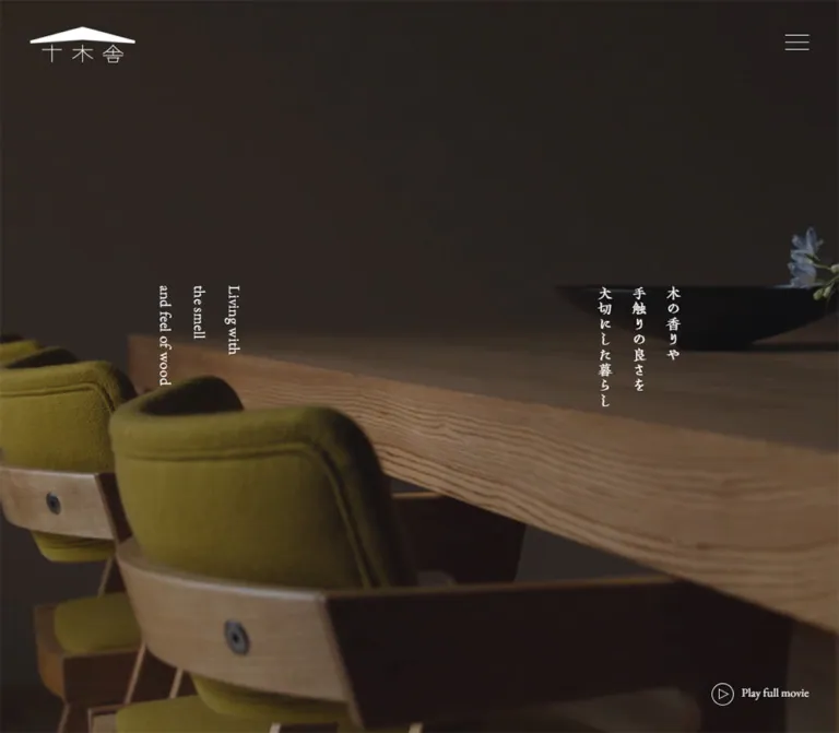
プレビュー準備中デザインリファレンスを見る
DESIGN REFERENCE
木の家工房 十木舎|縦書きと木の質感を生かした住宅サイト
無垢材の住まいを伝える京都の住宅サイト。繊細な和文書体と欧文セリフ、余白の大きい写真配置、縦書きから横書きへ切り替わるレスポンシブ構成が特徴です。
Juhmokusha / 木の家工房 十木舎 — Style Reference
Quiet timber interiors, vertical Japanese lettering, and generous white space.
Original URL: https://juhmokusha.jp/
Final URL: https://juhmokusha.jp/ — HTTP 200; unchanged destination.
Theme: white editorial content, photography across the opening viewport, and a charcoal footer.
Inspected: October 2, 2026, Japan Standard Time. The supplied browser record is timestamped 2026-10-01T18:02:06.701Z, equivalent to October 2 at 03:02:06.701 JST.
Viewports: desktop 1440 × 1000 and mobile 390 × 844 CSS pixels.
Scope: the current homepage, including its opening composition, introductory statement, three house-building stories, works collection, blog collection, persistent corner controls, and footer. Visual evidence covers desktop top/middle/bottom positions and mobile top/bottom positions; supplied DOM measurements cover additional content. Open navigation, movie playback, carousel operation, and linked pages were not inspected.
Juhmokusha presents a Kyoto timber-home business through the pace of an architectural publication. Large photographs establish material, light, and craft. Japanese display lettering has a brush-like character, ordinary paragraphs use a Mincho stack, and English labels use a delicate serif. Almost all interface color is neutral; wood, foliage, upholstery, and daylight provide the chromatic range.
The defining desktop relationship is between vertical text and asymmetric photographs. Narrow columns of Japanese copy occupy open white space alongside large, square-cornered images. The homepage then becomes more conventional when presenting projects and dated articles, while retaining small captions and unboxed links. Mobile changes the reading direction of most content, preserves the vertical opening statement, turns works into a horizontal rail, and keeps the blog in two columns.
閉じる
Juhmokusha / 木の家工房 十木舎 — Style Reference
Quiet timber interiors, vertical Japanese lettering, and generous white space.
Original URL: https://juhmokusha.jp/
Final URL: https://juhmokusha.jp/ — HTTP 200; unchanged destination.
Theme: white editorial content, photography across the opening viewport, and a charcoal footer.
Inspected: October 2, 2026, Japan Standard Time. The supplied browser record is timestamped 2026-10-01T18:02:06.701Z, equivalent to October 2 at 03:02:06.701 JST.
Viewports: desktop 1440 × 1000 and mobile 390 × 844 CSS pixels.
Scope: the current homepage, including its opening composition, introductory statement, three house-building stories, works collection, blog collection, persistent corner controls, and footer. Visual evidence covers desktop top/middle/bottom positions and mobile top/bottom positions; supplied DOM measurements cover additional content. Open navigation, movie playback, carousel operation, and linked pages were not inspected.
Juhmokusha presents a Kyoto timber-home business through the pace of an architectural publication. Large photographs establish material, light, and craft. Japanese display lettering has a brush-like character, ordinary paragraphs use a Mincho stack, and English labels use a delicate serif. Almost all interface color is neutral; wood, foliage, upholstery, and daylight provide the chromatic range.
The defining desktop relationship is between vertical text and asymmetric photographs. Narrow columns of Japanese copy occupy open white space alongside large, square-cornered images. The homepage then becomes more conventional when presenting projects and dated articles, while retaining small captions and unboxed links. Mobile changes the reading direction of most content, preserves the vertical opening statement, turns works into a horizontal rail, and keeps the blog in two columns.
How to Read This Reference
- Measured values come from the supplied rendered DOM and computed-style records. They describe the two captured viewport states, not an independently retrieved stylesheet.
- Calculated values are arithmetic derived from those measurements, such as gaps between card rectangles.
- Estimated values come from the current-page screenshots where an image or decoration was not included in the element export.
- Recommended values belong to the reusable implementation below. They are not claims about the source website.
- Token names and component class names are new descriptive aliases. The supplied custom-property export was empty.
- A computed font-family list establishes the declared stack. It does not independently establish which font file supplied every glyph.
- Several navigation elements have negative horizontal coordinates. Those are measurements of the closed navigation state, not visible content extending beyond the page.
- Static captures and recorded transition declarations cannot establish playback, hover endpoints, scroll triggers, or animation choreography.
Tokens — Colors
Default Palette
| Name | Value | Suggested token | Role and evidence |
|---|---|---|---|
| White Canvas | #ffffff |
--color-canvas |
Visually observed content background. The sampled HTML and body backgrounds are transparent, so this is the rendered canvas color rather than a verified body declaration. |
| Black Ink | #000000 |
--color-ink |
Measured body, heading, and link text on light content. Also matches the dark logo and menu lines visible over white sections. |
| Quiet Gray | #999da0 |
--color-muted |
Measured English introduction subtitle and project dates: rgb(153, 157, 160). |
| Charcoal | #252526 |
--color-footer |
Measured footer background: rgb(37, 37, 38). |
| Reversed White | #ffffff |
--color-on-dark |
Measured opening copy, movie control, and footer text. |
No separate colored CTA system is visible. Calls to action use typography, a fine rule, or a small outlined play symbol.
Warm timber, olive upholstery, green planting, and cool window reflections belong to the photography. Do not convert them into additional interface accent tokens. In particular, the blue cast in the desktop opening capture is part of the photographed scene; the evidence does not establish a blue CSS overlay.
No selectable color theme was observed. White and charcoal are different page regions within one design.
Tokens — Typography
Japanese Display Lettering
Measured family: KOさきがけ龍爪M, serif.
This family appears in the opening Japanese statement, section headings, project and article titles, navigation, and footer brand. Its irregular, calligraphic stroke character carries much of the identity. The sampled weight is consistently 400; the expressive appearance does not come from a heavy CSS weight.
Use the exact family name only with an appropriately available font. A generic serif fallback preserves the reading category but will not reproduce the distinctive lettering.
Japanese Body Copy
Measured stack: 'Yu Mincho Light', YuMincho, 'Yu Mincho', 游明朝体, serif.
The body defaults to 14px, weight 400, line height 24.5px, and letter spacing 0.35px. Introductory prose increases to 16px. On desktop that introduction reads in vertical columns; on mobile it becomes left-aligned horizontal paragraphs with a 28px line height.
English Labels and Dates
Measured family: 'EB Garamond', serif.
This appears in the English opening statement, introduction translation, movie label, project dates, and text links. Its modest size and fine serif forms support the Japanese lettering without creating a second headline system.
The footer visibly uses smaller English companions beside Japanese labels. Their individual child-span styles were not exported, so the exact footer English size is not asserted here.
Type Scale
All values below are measured unless identified otherwise. Line height in vertical writing controls the distance between columns.
| Role | Desktop size / line height | Mobile size / line height | Tracking and notes |
|---|---|---|---|
| Root | 10px / normal |
10px / normal |
Source 1rem therefore equals 10px at both inspected sizes. |
| Default body | 14px / 24.5px |
14px / 24.5px |
0.35px; regular weight. |
| Opening Japanese statement | 19px / 43.225px |
25px / 56.875px |
0.35px; three vertical lines. Mobile is larger. |
| Opening English statement | 19px / 43.225px |
Not visible | 0.35px; three vertical lines on desktop. |
| Introduction Japanese heading | 31px / 50.375px |
31px / 49.6px |
Desktop 0.35px; mobile 1.55px. |
| Introduction English subtitle | 15.4px / 30.8px |
17.6px / 29.48px |
Desktop 0.35px; mobile 0.88px; muted gray. |
| Introduction prose | 16px / 32px |
16px / 28px |
Desktop 0.35px; mobile 0.8px. |
| Feature and collection headings | 24.5px / 42.875px |
24.5px / 42.875px |
0.35px; reading direction changes. |
| Project titles | 19.2px / 25.344px |
19.2px / 25.344px |
0.96px, equivalent to 0.05em. |
| Blog titles | 19.2px / 25.344px |
18.25px / 27.375px |
0.05em; one-line desktop presentation, up to two measured mobile lines. |
| Sampled project dates | 15.4px / 15.4px |
15.4px / 15.4px |
0.35px; EB Garamond; muted gray. |
| View All | 17.6px / 30.8px |
15.4px / 26.95px |
0.025em. |
| View More | Not visible in desktop text | 15.4px / 26.95px |
0.385px; mobile feature links. |
| Play full movie | 15px / normal |
15.4px / normal |
Normal tracking. |
| Footer Japanese links | 19px / 33.25px |
15.4px / 26.95px |
0.35px. |
| Closed-menu links, offscreen | 24.5px / 42.875px |
22px / 38.5px |
Desktop -0.49px; mobile 0.88px. These are not the footer sizes. |
The hierarchy depends on writing direction, spacing, and image scale as much as font size. The largest measured text is only 31px; a very large marketing headline would change the balance.
Tokens — Spacing & Shapes
The source does not reveal a single universal spacing unit. Use the measured relationships below instead of forcing the design into an assumed eight-pixel grid.
Spacing Scale
| Use | Desktop | Mobile | Evidence |
|---|---|---|---|
| Main editorial container | 1000px wide at x=220 |
327.594px wide at x=31.203 |
Measured. Mobile is consistent with approximately 84vw and 8vw side margins. |
| Header side inset | 51.828px |
20.656px |
Measured; approximately 3.6vw and 5.3vw respectively. Source formulas are unknown. |
| Header top inset | 34px |
25px |
Measured logo and button placement. |
| Introduction padding | 110px top, 115px bottom |
55px top, 68px bottom |
Measured. |
| Gap between feature sections | 115px |
80px |
Calculated from consecutive section rectangles. |
| Works horizontal card gap | 44px |
20px along the rail |
Calculated. |
| Works desktop row gap | 53px |
Not applicable to the observed rail | Calculated. |
| Blog horizontal card gap | 45px |
19.656px |
Calculated; mobile gap is approximately 6% of the container. |
| Blog row gap | 50px |
38px |
Calculated. |
| Works-to-blog section gap | 150px |
83px |
Calculated between section bounds. |
| Main-content-to-footer gap | 150px |
70px |
Calculated. |
| Footer padding | 90px top, 100px bottom |
50px top and bottom |
Measured. |
| Mobile footer navigation gap | — | 15px between link boxes |
Calculated; row pitch is approximately 41.95px. |
Border Radius and Rules
| Element | Treatment | Evidence |
|---|---|---|
| Feature photographs | Square corners | Screenshot observation. |
| Project and blog entries | No rounded card enclosure | Screenshot observation; sampled anchors have 0px radius. |
| View All / View More links | Long, thin bottom rule | Screenshot observation; approximately 1px thick. |
| Hamburger | Three fine horizontal strokes | Screenshot observation. |
| Play symbol | Thin outlined circle and triangular mark | Screenshot observation; the circle is approximately 28px in diameter. |
| General surfaces | Flat, without visible elevation shadows | Screenshot observation. |
Layout Measurements
| Element | Desktop | Mobile |
|---|---|---|
| Document height | 6846.375px |
7284.25px |
| Opening region | First 1000px of the document |
First 844px of the document |
| Logo heading box | 133 × 45px |
103 × 34.844px |
| Menu button box | 30 × 39px |
23 × 35px |
| Opening Japanese text box | 129.656 × 154.875px at 932.844, 397.563 |
170.625 × 202.875px at 109.688, 302.844 |
| Opening English text box | 129.656 × 154.875px at 377.5, 397.563 |
Not visible |
| Movie button box | 123.125 × 28px |
87.406 × 59px |
| Introduction section height | 502.953px |
878.719px |
| Individual feature section height | 600px |
Approximately 522.984px |
| Feature image width | Approximately 520px, estimated from the middle capture |
Not independently exported |
| Works card width | 380px |
328px |
| Blog card width | 238px |
153.969px |
| Footer height | 460.797px |
667.984px |
The selected DOM export contains large intervals between some text-bearing sections. It does not enumerate every intervening media element. Do not reproduce those intervals as empty spacer blocks solely from their coordinates.
Components
Persistent Corner Header
Role: maintain identity and access to navigation while the page scrolls.
The roof-shaped wordmark sits at the upper left, with a three-line menu control at the upper right. There is no visible full-width header surface. The sampled header has zero layout height, and the controls remain in the same corner positions across the supplied scroll captures.
On desktop the wordmark box is 133 × 45px, inset approximately 52px from the left and 34px from the top. Mobile reduces it to approximately 103 × 35px, with 21px horizontal and 25px top insets.
Both marks are white over the opening imagery and black over the white content visible in later captures. The mechanism that changes their appearance is not supplied; do not assume a blend mode, filter, or particular scroll script.
The menu button is a real button in the DOM. Its measured width is only 30px on desktop and 23px on mobile. A new implementation should enlarge the hit area without enlarging the visible strokes.
Closed Navigation Structure
Role: provide access to the business, project, and contact sections.
The DOM contains nine bilingual links: house building, works, cost and flow, FAQ, about, model house, blog, recruitment, and contact. Social and privacy links follow.
In the captured closed state, these links sit outside the viewport at negative horizontal coordinates. Desktop link rectangles are tall and narrow; mobile link rectangles are wide horizontal rows. That establishes a responsive navigation structure but does not establish the opened panel's final position, background, transition, close control, or keyboard behavior.
Keep these measurements separate from the visible footer navigation, which uses smaller text.
Full-Viewport Opening Composition
Role: introduce the feeling of inhabiting a timber interior.
The opening image fills the viewport. The desktop capture shows wooden chairs and a table through reflective glazing, with soft garden light beyond. The mobile capture shows a darker, close interior composition with wood grain, seating, and a bowl. Both allow furnishings and natural light to carry the scene.
The Japanese statement is three vertical lines:
木の香りや手触りの良さを大切にした暮らし
Desktop places this group around 69.3% of viewport width, with its English companion around 30.7%. Their box centers share a vertical position of 475px, slightly above the midpoint of the 1000px viewport.
Mobile removes the English opening companion from the visible composition. The Japanese group is horizontally centered and increases from 19px to 25px. Its center sits at approximately 404px within the 844px viewport.
Use vertical Japanese writing with right-to-left column progression. English runs in the desktop composition are sideways within vertical columns. Do not rotate the complete Japanese paragraph as a single horizontal bitmap.
Movie Affordance
Role: offer an explicit route to a longer film.
Play full movie appears at the lower right. Desktop uses a horizontal arrangement: a small outlined play circle followed by the serif label. Its box ends approximately 52px from the right and 35px above the bottom.
Mobile stacks the icon above the label. The box ends approximately 21px from the right and 30px above the bottom. This increases its height from 28px to 59px without making it visually dominant.
The label and button semantics are directly observed. Activation was not tested, so a modal, external player, fullscreen transition, audio behavior, and close interaction are all unverified.
Introductory Statement
Role: explain the relationship between natural materials, craft, and everyday comfort.
The desktop introduction sits in a centered 1000px container. A large vertical Japanese heading occupies the right, its gray English translation sits to its left, and three groups of vertical body copy extend further left. The measured paragraph line height is 32px, creating calm spacing between vertical text columns.
The heading is repeated from the opening statement, but it is larger at 31px and rendered in black on white. This repetition connects the atmosphere of the opening image with the explanatory content below.
On mobile the same section becomes horizontal. The heading occupies three lines, the English translation follows in gray, and three prose paragraphs sit below. The body container is approximately 328px wide, with 16px / 28px text. The first paragraph begins 55px below the English subtitle's measured bottom edge.
Alternating House-Building Stories
Role: turn the business philosophy into three linked editorial stories.
The observed stories are 木でつくる家, 職人がつくる家, and 柔軟な設計力, accompanied by English subtitles. Each has a dedicated link destination under /build/.
Desktop pairs a large photograph with vertical text. The first and third sections place the image on the right; the middle section places it on the left. The middle screenshot shows a close view of a craftsperson holding a chisel and, below it, a timber room opening toward a courtyard.
The visible image widths are approximately 520px; each measured section is 600px tall. Text headings begin 72px below the section top. Large horizontal separation keeps the copy from looking like an image caption pressed against the photograph.
The link encloses substantial story content rather than appearing only as a small button. There is no card background, border, radius, or visible shadow around the story.
Mobile stacks the image and horizontal text in the approximately 328px content column. English subtitles appear beneath Japanese headings, and a separate View More link is present for each story. The exact image crop and paragraph clipping rules were not exported. For a new implementation, use concise editorial excerpts instead of forcing long text into the measured section height.
Works Collection
Role: give access to completed residential projects.
Desktop presents four project links in a two-column, two-row arrangement. Each card is 380px wide; the horizontal gap is 44px. The project image is followed by a calligraphic Japanese title and a small gray date. The section heading occupies a separate region at the right of the collection.
The photographs are landscape-oriented. Card heights differ slightly between projects, which is consistent with small intrinsic image-ratio differences. The export does not establish a universal crop rule; preserve supplied image proportions unless a new layout specifically requires cropping.
On mobile, seven project links are positioned in a horizontal rail. Cards are 328px wide and start every 348px, leaving a 20px gap. The first card is within the main container and later cards extend offscreen. Two small button boxes, each 25 × 21px, sit near the heading and support the reading of this as a carousel-style component.
The rail arrangement and controls are measured. Button activation, dragging, swipe support, autoplay, wrapping, and snap behavior were not tested.
Blog Collection
Role: present site visits, house-building updates, events, and everyday care.
Desktop uses six entries in a three-column, two-row grid. A 196px heading region on the left offsets the card area to x=416. Each card is 238px wide, with 45px horizontal gaps.
The screenshot shows square photographs above Japanese titles and gray dates. Topics include watering a garden, a summer closure notice, and a ground-breaking ceremony. These everyday scenes make the page feel like an active workshop rather than an image-only architecture portfolio.
Long desktop titles are visually shortened to one line, including an ellipsis in the supplied capture. The exact truncation property is not included in the style export.
Mobile shows four entries in a two-column grid. Each card is approximately 154px wide, with a 19.66px gap. Titles use 18.25px / 27.375px and can occupy two measured lines. The shorter garden-care title occupies one line, so not every card has an identical content height.
Underlined Text Link
Role: provide a restrained continuation action.
View All uses EB Garamond over a long thin bottom rule. Desktop links are 168px wide with 17.6px text. Mobile links are 150px wide with 15.4px text and 3px bottom padding.
The line extends well beyond the short label. Keep this relationship: the rule gives the small action enough visual presence without a filled button shape. The same mobile treatment is used for View More.
Charcoal Footer
Role: close the editorial sequence with a complete site directory.
The footer is a solid #252526 region with white typography. Desktop uses vertical Japanese navigation arranged across the right half, with the brand at the far right. The primary navigation progresses from house building near the right toward contact at the left. Social symbols and vertically oriented legal text sit much further left, separated by a broad empty area.
Desktop Japanese link text is 19px / 33.25px. Neighboring navigation columns begin approximately 69.84px apart. The footer is about 461px tall, including 90px top and 100px bottom padding.
Mobile turns the directory into horizontal rows. The brand appears first, followed by the nine bilingual links, then Instagram and Facebook icons side by side, and finally copyright and privacy text. Japanese links reduce to 15.4px / 26.95px, and the footer grows to approximately 668px tall.
The visible copyright reads © 2021 Juhmokusha. That is page content, not evidence of the inspection date or the date of the current design.
Tokens — Motion & Interaction
| Element or treatment | Recorded evidence | What can be concluded |
|---|---|---|
| Header appearance | transition: opacity 2s |
A two-second opacity transition is declared. Its trigger and endpoint are not supplied. |
| Introduction | transition: opacity 2s |
The section supports a slow fade. Scroll activation was not independently verified. |
| Feature stories | transition: opacity 2s, transform 2s |
Opacity and transform can change over two seconds. Travel distance and direction are unknown. |
| Collection headings and View All wrappers | transition: opacity 2s |
Section details share the slow opacity treatment. |
| Many desktop links | transition: opacity 0.3s |
A short opacity response is declared; the hovered opacity is not exported. |
| Menu and movie buttons | transition: opacity 0.3s |
The visible controls share the short response duration. |
| Many mobile content links | Serialized transition value all |
No explicit nonzero duration is evidenced by that value alone. |
| Sampled element animations | animation: none |
No keyframe animation is reported on those sampled elements. This does not rule out video, scripts, or unsampled elements. |
| Opening media | Different scenes in supplied captures and a movie button | A film-oriented presentation is evident. Background playback settings and sequencing remain unverified. |
| Mobile works rail | Offscreen cards and two buttons | Horizontal arrangement is confirmed; movement behavior is not. |
A suitable adaptation uses slow, quiet reveals and brief link feedback. The CSS below preserves the recorded transition durations but leaves content visible by default. An optional reveal controller should be progressive enhancement and should respect reduced-motion preferences.
Do not invent parallax, a specific video loop length, an opening menu animation, or carousel timing from these captures.
Surfaces
| Surface | Appearance | Purpose |
|---|---|---|
| Opening region | Full-viewport interior imagery with reversed white lettering | Establish atmosphere and material character. |
| Editorial canvas | White with black text | Give vertical typography and photographs room to breathe. |
| Project and article entries | Image, title, date directly on the canvas | Organize content without visible card containers. |
| Continuation actions | Unfilled text with a fine underline | Provide quiet but recognizable navigation. |
| Footer | Solid charcoal with white text and symbols | Create a strong final page region and house the full directory. |
The observed page does not use a general elevation system. Visual grouping comes from distance, alignment, image edges, and writing direction.
Imagery
Photographs emphasize tactile evidence: solid wood surfaces, exposed timber structure, hands and tools, garden planting, soft daylight, and rooms connected to outdoor space. The craftsperson image crops closely around an arm, hand, and chisel. The room image includes timber ceiling boards, structural posts, furniture, and a courtyard beyond the glazing.
Preserve natural variation in color and exposure. The dark opening mobile frame and the brighter reflective desktop frame should not be flattened into one uniformly tinted visual treatment. A frame-specific contrast adjustment may be useful in a new implementation, but no exact source overlay is established.
Feature photographs are large and visually uninterrupted. Blog thumbnails use tighter square crops. Project images remain landscape-oriented and show small differences in proportion. Avoid adding decorative rounded corners or a simulated paper texture.
Observed Asset References
No image, video, logo, icon, or font-file URLs were included in the supplied element export. The references below identify visible assets without inventing filenames.
| Asset role | Current-page evidence | Implementation guidance |
|---|---|---|
| Brand mark | Roof silhouette above the Japanese wordmark in desktop and mobile captures | Use authorized artwork and provide suitable light/dark rendering. |
| Opening media | Timber furnishings, reflective glazing, and a darker interior scene | Supply responsive media crops and a reliable poster image. |
| Craft photograph | Close crop of a person holding a chisel | Preserve the hand/tool relationship and warm material color. |
| Design photograph | Timber room facing a planted courtyard | Keep architectural lines and the interior/exterior relationship legible. |
| Blog images | Garden care, an interior, and a ceremony in the desktop lower capture | Use subject-aware square crops. |
| Social symbols | Instagram and Facebook marks | Use recognizable assets with accessible names. No icon library was identified. |
| Play symbol | Fine circle and triangular play mark | Keep the visible symbol small while providing a larger operable target. |
Layout & Responsive Behavior
Observed Desktop Composition
At 1440 × 1000, the homepage opens at full viewport size. The header floats over the media. Below it, the introduction uses a centered 1000px container and vertical Japanese composition.
The feature sequence expands beyond that editorial container toward the viewport edges. Alternating photographs and text create an asymmetric rhythm. Works return to a centered container with two image columns and a right-hand heading region. Blog uses three narrower image columns and a left-hand heading region. The footer returns to a full-width surface.
Observed Mobile Composition
At 390 × 844, most content uses approximately 31.2px side margins. The opening statement remains vertical and grows in size; its English companion is absent from the visible opening state. The rest of the introduction and feature content changes to horizontal reading.
Works becomes a one-card-wide horizontal rail. Blog remains a two-column grid rather than becoming a single feed. The footer becomes a vertical stack of horizontal bilingual rows. The persistent corner logo and menu control remain present.
Responsive Comparison
| Area | Desktop | Mobile |
|---|---|---|
| Opening Japanese statement | Smaller vertical group at the right | Larger vertical group centered |
| Opening English statement | Separate vertical group at the left | Not visible |
| Movie control | Icon and label in one row | Icon above label |
| Introduction | Vertical heading, translation, and prose | Horizontal heading, translation, and paragraphs |
| Feature stories | Alternating image/text compositions | Stacked images and horizontal excerpts; View More appears |
| Works | Four cards in a two-by-two grid | Seven links arranged in a horizontal rail |
| Blog | Six cards in three columns | Four cards in two columns |
| Footer | Vertical columns across a broad horizontal field | Horizontal links stacked vertically |
The item-count differences are part of the observed states. They do not establish the server-side selection mechanism or the reason for the different counts.
Breakpoint limitation: only the two supplied viewport sizes were inspected. No exact source breakpoint or intermediate tablet behavior is known. The Quick Start uses 1100px as a recommended transition point to give the vertical desktop composition enough room.
Do’s and Don’ts
Do
- Build around white, black, muted gray, and a charcoal footer.
- Let natural materials and photography supply the color.
- Preserve vertical Japanese composition on desktop and in the mobile opening statement.
- Pair the distinctive Japanese display family with Mincho body copy and EB Garamond labels.
- Keep the measured regular font weights; achieve hierarchy through spacing and placement.
- Alternate the large feature photographs across the page.
- Keep project and blog entries directly on the canvas, without decorative enclosures.
- Retain long, fine underlines beneath small continuation labels.
- Preserve the different mobile behaviors of works and blog.
- Treat the logo artwork and photographic crops as important design assets.
Don’t
- Do not introduce oversized headlines, bright CTA fills, or a dense promotional button hierarchy.
- Do not replace all serif typography with a contemporary sans-serif stack.
- Do not rotate a complete Japanese paragraph to imitate vertical typesetting.
- Do not retain vertical body paragraphs on narrow screens when the observed mobile version reads horizontally.
- Do not add rounded image cards, soft shadows, glass panels, or ornamental wood-grain backgrounds.
- Do not interpret cool reflections or olive upholstery as interface accent colors.
- Do not turn the mobile blog into the same carousel treatment as works.
- Do not reproduce offscreen closed-menu coordinates as visible layout.
- Do not fill unmeasured page intervals with arbitrary fixed-height blank sections.
- Do not claim tested movie, menu, hover, or carousel behavior from static evidence.
Recommended Implementation Additions
These are recommendations for a new implementation, not verified features of the inspected page:
- Increase menu, movie, social, and carousel hit areas to at least
44 × 44pxwhile preserving the small visible marks. - Give icon-only controls explicit accessible names. Expose expanded state and associate the menu button with its panel.
- Keep closed navigation out of keyboard navigation and restore focus appropriately when a panel closes.
- Add a visible focus indicator that works on white, photographic, and charcoal backgrounds.
- Use a darker optional metadata color such as
#686c70where small-text contrast requirements apply; the observed#999da0is intentionally pale. - Test opening text contrast across every selected media frame and crop.
- Offer a poster-based reduced-motion mode and stop background playback through media logic when that preference is active.
- Keep film sound under explicit user control. Provide captions or other alternatives when the film contains meaningful speech.
- Give a works rail keyboard-operable controls and do not rely exclusively on swiping.
- Preserve full article titles in accessible link text even when visual titles are truncated.
- Supply intrinsic image dimensions to stabilize layout. Avoid lazy-loading the primary opening visual.
- Use short mobile feature excerpts with clear continuation links instead of inaccessible fixed-height clipping.
Agent Prompt Guide
Quick Color Reference
- Content canvas:
#ffffff. - Primary text, rules, and light-section controls:
#000000. - Secondary English text and dates:
#999da0. - Footer surface:
#252526. - Text and controls over dark regions:
#ffffff. - Timber, olive, green, and reflected blue belong to images, not a general UI accent palette.
Overall Prompt
“Create an editorial homepage for a Japanese timber-home workshop. Use a white canvas, black regular-weight Japanese display lettering, Mincho body copy, EB Garamond English labels, muted gray dates, and a charcoal footer. Begin with full-viewport interior imagery, a small roof-shaped brand mark in the upper left, a fine three-line menu control in the upper right, and separate vertical Japanese and English statements across the image. Alternate large photographs of timber rooms and craftsmanship with spacious vertical Japanese text. Follow with a two-column works collection and a three-column blog collection, using unboxed images, small titles, dates, and long underlined continuation links. On mobile, center and enlarge the vertical Japanese opening statement, hide its English companion, change content prose to horizontal reading, present works in a horizontal rail, and retain a two-column blog grid. Use restrained opacity transitions and preserve readable static content.”
Example Component Prompts
- Opening composition: “At a 1440 × 1000 desktop viewport, fill the first screen with an atmospheric timber interior. Place a 133px-wide logo around 52px from the left and 34px from the top. Put three lines of vertical Japanese copy near 69% of viewport width and an English serif companion near 31%. Use white 19px type and a small outlined movie control at the lower right. At 390px wide, show only the Japanese group, centered at 25px.”
- Craft story: “Create a square-cornered photograph of hands working with a chisel beside narrow columns of Japanese text on white. Use a 24.5px regular display heading, a smaller gray English subtitle, and generous empty space between image and copy. Alternate the image side in neighboring stories. Stack image, horizontal text, and an underlined View More link on mobile.”
- Works collection: “Use a centered 1000px desktop section with two 380px project columns, a 44px gap, and a separate heading region at the right. Put a Japanese project title and small gray date beneath each landscape image. On mobile, use approximately 328px-wide cards separated by 20px in a horizontal rail. Keep carousel behavior and accessibility explicit.”
- Blog collection: “Build six desktop article entries in three 238px columns separated by 45px, with a heading region on the left. Use square photographs, regular calligraphic Japanese titles, gray dates, and no card enclosure. At 390px wide, use two approximately 154px columns and allow titles two lines.”
- Footer: “Create a flat #252526 footer with white bilingual links. Arrange Japanese navigation in vertical columns on desktop, with the brand at the far right and social/legal details far to the left. On mobile, use 31px side insets, horizontal navigation rows with roughly 15px between them, a horizontal social row, and a compact legal line.”
Quick Start
CSS Custom Properties
This is a recommended adaptation using conventional root sizing and explicit pixel values. The original measured root is 10px; the code does not depend on that root setting.
Class names describe new components. Use separate heading/copy groups inside .intro__inner, media/copy children inside .feature, and title/cards/continuation regions inside each .collection. Load authorized fonts and imagery separately. The header's media state, navigation behavior, movie action, and optional carousel buttons require application integration.
The 1100px breakpoint, hover endpoint, mobile feature crop, and native scroll snapping are recommendations. The starter covers the documented components; unsampled media regions and complete document height are not reconstructed.
:root {
  /* Colors measured from text and footer styles; canvas observed visually. */
  --color-canvas: #ffffff;
  --color-ink: #000000;
  --color-muted: #999da0;
  --color-footer: #252526;
  --color-on-dark: #ffffff;

  /* Declared source families; font files must be supplied separately. */
  --font-display: 'KOさきがけ龍爪M', serif;
  --font-body: 'Yu Mincho Light', YuMincho, 'Yu Mincho', '游明朝体', serif;
  --font-english: 'EB Garamond', serif;

  --text-body: 14px;
  --text-prose: 16px;
  --text-section: 24.5px;
  --text-statement: 31px;
  --text-card: 19.2px;
  --text-meta: 15.4px;

  --content-max: 1000px;
  --content-fluid: 84%;
  --header-inset: 3.6%;
  --header-top: 34px;
  --rule: 1px;
  --motion-link: 300ms;
  --motion-reveal: 2s;
}

* { box-sizing: border-box; }

body {
  margin: 0;
  color: var(--color-ink);
  background: var(--color-canvas);
  font: 400 var(--text-body)/1.75 var(--font-body);
  letter-spacing: 0.35px;
}

h1, h2, h3, p { margin: 0; }
a { color: inherit; text-decoration: none; }
button { font: inherit; color: inherit; cursor: pointer; }
img { display: block; max-width: 100%; }

.container,
.collection {
  width: min(var(--content-max), var(--content-fluid));
  margin-inline: auto;
}

.en { font-family: var(--font-english); }
.muted { color: var(--color-muted); }

/* Supply the matching logo artwork for each foreground state. */
.site-header {
  position: fixed;
  inset: 0 var(--header-inset) auto;
  height: 0;
  z-index: 20;
  color: var(--color-ink);
}

.site-header[data-over-media='true'] {
  color: var(--color-on-dark);
}

.brand {
  position: absolute;
  top: var(--header-top);
  left: 0;
  width: 133px;
}

.brand img,
.brand svg { width: 100%; height: auto; }

.menu-toggle {
  position: absolute;
  top: var(--header-top);
  right: 0;
  display: grid;
  align-content: space-between;
  width: 30px;
  height: 39px;
  padding: 10px 0;
  border: 0;
  background: transparent;
}

.menu-toggle span {
  display: block;
  width: 100%;
  height: 1px;
  background: currentColor;
}

/* Recommended larger hit area without larger visible strokes. */
.menu-toggle::after {
  content: '';
  position: absolute;
  inset: -6px -11px;
}

.hero {
  position: relative;
  min-height: 100vh;
  min-height: 100svh;
  overflow: hidden;
  color: var(--color-on-dark);
}

.hero__media {
  position: absolute;
  inset: 0;
  width: 100%;
  height: 100%;
  object-fit: cover;
}

.hero__ja,
.hero__en {
  position: absolute;
  top: 47.5%;
  margin: 0;
  writing-mode: vertical-rl;
  text-orientation: mixed;
  font-size: 19px;
  font-weight: 400;
  line-height: 2.275;
  letter-spacing: 0.35px;
  transform: translate(-50%, -50%);
}

.hero__ja {
  left: 69.3%;
  font-family: var(--font-display);
}

.hero__en {
  left: 30.7%;
  font-family: var(--font-english);
}

.movie-button {
  position: absolute;
  right: var(--header-inset);
  bottom: 35px;
  display: flex;
  align-items: center;
  gap: 10px;
  padding: 0;
  border: 0;
  background: transparent;
  font: 400 15px/1.4 var(--font-english);
  letter-spacing: normal;
}

.play-ring {
  display: grid;
  place-items: center;
  width: 28px;
  height: 28px;
  border: 1px solid currentColor;
  border-radius: 50%;
}

.play-ring svg { width: 14px; height: 14px; }

.intro { padding-block: 110px 115px; }

.intro__inner {
  display: flex;
  flex-direction: row-reverse;
  justify-content: space-between;
  gap: 24px;
}

.intro__heading,
.intro__copy {
  display: flex;
  flex-direction: row-reverse;
}

.intro__heading { gap: 65px; }
.intro__copy { gap: 32.5px; }

.intro__heading h2,
.intro__heading .en,
.intro__copy p {
  height: 278px;
  writing-mode: vertical-rl;
  text-orientation: mixed;
}

.intro__heading h2 {
  font: 400 31px/1.625 var(--font-display);
}

.intro__heading .en {
  color: var(--color-muted);
  font: 400 15.4px/2 var(--font-english);
}

.intro__copy p { font-size: 16px; line-height: 2; }

/* Desktop image sizing is a visual approximation of the feature capture. */
.feature {
  display: grid;
  grid-template-columns: minmax(0, 1fr) 520px;
  gap: clamp(60px, 9.72vw, 140px);
  width: calc(100% - 40px);
  margin-inline: auto;
}

.feature + .feature { margin-top: 115px; }

.feature__media {
  grid-column: 2;
  grid-row: 1;
  width: 520px;
  height: 600px;
  object-fit: cover;
}

.feature__copy {
  grid-column: 1;
  grid-row: 1;
  display: flex;
  flex-direction: row-reverse;
  align-items: flex-start;
  justify-self: end;
  gap: 60px;
  padding-top: 72px;
}

.feature__title {
  writing-mode: vertical-rl;
  font: 400 24.5px/1.75 var(--font-display);
}

.feature__title .en {
  display: inline-block;
  margin-inline-start: 24px;
  color: var(--color-muted);
  font-size: 15.4px;
}

.feature__body {
  writing-mode: vertical-rl;
  max-height: 430px;
  margin-top: 96px;
  line-height: 2;
}

.feature--reverse {
  grid-template-columns: 520px minmax(0, 1fr);
}

.feature--reverse .feature__media { grid-column: 1; }
.feature--reverse .feature__copy {
  grid-column: 2;
  justify-self: start;
}

.feature__more { display: none; }

.collection {
  display: grid;
  row-gap: 33px;
}

.collection + .collection { margin-top: 150px; }

.collection__title {
  grid-row: 1;
  writing-mode: vertical-rl;
  font: 400 24.5px/1.75 var(--font-display);
}

.collection__title .en {
  margin-inline-start: 24px;
  color: var(--color-muted);
  font-size: 15.4px;
}

.collection__cards {
  grid-row: 1;
  display: grid;
  min-width: 0;
  padding-top: 40px;
}

.collection--works {
  grid-template-columns: minmax(0, 804fr) minmax(0, 196fr);
}

.collection--works .collection__title { grid-column: 2; }
.collection--works .collection__cards {
  grid-column: 1;
  grid-template-columns: repeat(2, minmax(0, 1fr));
  gap: 53px 44px;
}
.collection--works .collection__more { grid-column: 1; }

.collection--blog {
  grid-template-columns: minmax(0, 196fr) minmax(0, 804fr);
}

.collection--blog .collection__title { grid-column: 1; }
.collection--blog .collection__cards {
  grid-column: 2;
  grid-template-columns: repeat(3, minmax(0, 1fr));
  gap: 50px 45px;
}
.collection--blog .collection__more { grid-column: 2; }

.work-card,
.blog-card { display: block; min-width: 0; }

.work-card img { width: 100%; height: auto; }
.blog-card img { width: 100%; aspect-ratio: 1; object-fit: cover; }

.card__title {
  margin-top: 10px;
  font: 400 19.2px/1.32 var(--font-display);
  letter-spacing: 0.05em;
}

/* Recommended truncation technique matching the visible line counts. */
.blog-card .card__title {
  display: -webkit-box;
  -webkit-box-orient: vertical;
  -webkit-line-clamp: 1;
  overflow: hidden;
}

.card__date {
  margin-top: 5px;
  color: var(--color-muted);
  font: 400 15.4px/1 var(--font-english);
}

.text-link {
  display: inline-block;
  width: 168px;
  border-bottom: var(--rule) solid currentColor;
  font: 400 17.6px/1.75 var(--font-english);
  letter-spacing: 0.025em;
}

.site-footer {
  margin-top: 150px;
  padding-block: 90px 100px;
  color: var(--color-on-dark);
  background: var(--color-footer);
}

.site-footer__inner {
  display: grid;
  grid-template-columns: minmax(0, 1fr) auto auto;
  gap: 136px;
  width: calc(100% - 104px);
  margin-inline: auto;
}

.footer-brand {
  grid-column: 3;
  grid-row: 1;
  writing-mode: vertical-rl;
  font: 400 19px/1.75 var(--font-display);
}

.footer-nav {
  grid-column: 2;
  grid-row: 1;
  display: flex;
  flex-direction: row-reverse;
  gap: 36.6px;
}

.footer-nav a {
  writing-mode: vertical-rl;
  font: 400 19px/1.75 var(--font-display);
}

/* English footer size is an adaptation, not an exported child-span value. */
.footer-nav .en {
  margin-inline-start: 12px;
  font: 400 13.2px/1.75 var(--font-english);
}

.footer-aux {
  grid-column: 1;
  grid-row: 1;
  display: flex;
  align-items: flex-start;
  gap: 65px;
}

.footer-social {
  order: 2;
  display: flex;
  flex-direction: column;
  gap: 15px;
}

.footer-legal {
  writing-mode: vertical-rl;
  font: 400 13.2px/1.75 var(--font-english);
}

.footer-legal a { margin-inline-start: 20px; }

/* Content stays visible without a reveal controller. */
[data-reveal] {
  transition: opacity var(--motion-reveal), transform var(--motion-reveal);
}

a,
button { transition: opacity var(--motion-link); }

/* The source duration is measured; this endpoint is recommended. */
@media (hover: hover) {
  a:hover,
  button:hover { opacity: 0.75; }
}

:focus-visible {
  outline: 2px solid currentColor;
  outline-offset: 5px;
}

/* Recommended breakpoint; only 1440px and 390px states were inspected. */
@media (max-width: 1100px) {
  :root {
    --header-inset: 5.3%;
    --header-top: 25px;
  }

  .brand { width: 103px; }
  .menu-toggle { width: 23px; height: 35px; }

  .hero__ja {
    left: 50%;
    top: 47.9%;
    font-size: 25px;
  }
  .hero__en { display: none; }

  .movie-button {
    bottom: 30px;
    flex-direction: column;
    gap: 10px;
    font-size: 15.4px;
  }

  .intro { padding-block: 55px 68px; }
  .intro__inner,
  .intro__heading,
  .intro__copy { display: block; }

  .intro__heading h2,
  .intro__heading .en,
  .intro__copy p {
    height: auto;
    writing-mode: horizontal-tb;
  }

  .intro__heading h2 {
    line-height: 1.6;
    letter-spacing: 0.05em;
  }

  .intro__heading .en {
    display: inline-block;
    margin-top: 17px;
    font-size: 17.6px;
    line-height: 1.675;
    letter-spacing: 0.05em;
  }

  .intro__copy { margin-top: 55px; }
  .intro__copy p {
    line-height: 1.75;
    letter-spacing: 0.05em;
  }
  .intro__copy p + p { margin-top: 28px; }

  .feature,
  .feature--reverse {
    display: block;
    width: var(--content-fluid);
  }
  .feature + .feature { margin-top: 80px; }

  /* Recommended mobile crop; the source image rectangle was not exported. */
  .feature__media {
    width: 100%;
    height: auto;
    aspect-ratio: 4 / 3;
    object-fit: cover;
  }

  .feature__copy { display: block; padding-top: 25px; }
  .feature__title,
  .feature__body { writing-mode: horizontal-tb; }
  .feature__title .en { display: block; margin: 0; }
  .feature__body { max-height: none; margin-top: 20px; line-height: 1.75; }
  .feature__more { display: block; margin-top: 20px; }

  .collection { display: block; }
  .collection + .collection { margin-top: 83px; }
  .collection__title { writing-mode: horizontal-tb; margin-bottom: 30px; }
  .collection__title .en { margin-inline-start: 12px; }
  .collection--works .collection__title .en { display: block; margin: 0; }

  /* Native scrolling is an adaptation; source carousel mechanics are unknown. */
  .collection--works .collection__cards {
    display: flex;
    gap: 20px;
    padding-top: 0;
    overflow-x: auto;
    scroll-snap-type: x proximity;
  }
  .work-card { flex: 0 0 100%; scroll-snap-align: start; }

  .collection--blog .collection__cards {
    grid-template-columns: repeat(2, minmax(0, 1fr));
    gap: 38px 6%;
    padding-top: 0;
  }

  .blog-card .card__title {
    margin-top: 15px;
    font-size: 18.25px;
    line-height: 1.5;
    -webkit-line-clamp: 2;
  }

  .collection__more { margin-top: 33px; }
  .text-link { width: 150px; padding-bottom: 3px; font-size: 15.4px; }

  .site-footer { margin-top: 70px; padding-block: 50px; }
  .site-footer__inner { display: block; width: var(--content-fluid); }
  .footer-brand { display: inline-block; writing-mode: horizontal-tb; font-size: 15.4px; }
  .footer-nav { flex-direction: column; gap: 15px; margin-top: 47px; }
  .footer-nav a { writing-mode: horizontal-tb; font-size: 15.4px; }
  .footer-nav .en { margin-inline-start: 10px; }
  .footer-aux { display: flex; flex-direction: column; gap: 30px; margin-top: 55px; }
  .footer-social { order: 0; flex-direction: row; gap: 14px; }
  .footer-legal { writing-mode: horizontal-tb; }
  .footer-legal a { margin-inline-start: 18px; }
}

@media (prefers-reduced-motion: reduce) {
  [data-reveal],
  a,
  button { transition: none; }

  .collection--works .collection__cards { scroll-snap-type: none; }
  /* Pause video and select a poster through media logic as well. */
}
Tailwind v4 Token Mapping
Optional aliases for projects already using Tailwind v4. This mapping does not imply that the original site uses Tailwind. Define the custom properties above first; keep the component rules for writing modes and responsive composition.
@theme inline {
  --color-canvas: #ffffff;
  --color-ink: #000000;
  --color-muted: #999da0;
  --color-footer: #252526;
  --color-on-dark: #ffffff;

  --font-display: 'KOさきがけ龍爪M', serif;
  --font-body: 'Yu Mincho Light', YuMincho, 'Yu Mincho', '游明朝体', serif;
  --font-english: 'EB Garamond', serif;

  --text-body: 14px;
  --text-prose: 16px;
  --text-meta: 15.4px;
  --text-card: 19.2px;
  --text-section: 24.5px;
  --text-statement: 31px;

  --spacing-editorial: 1000px;
  --spacing-works-gap: 44px;
  --spacing-blog-gap: 45px;
  --spacing-feature-gap: 115px;
  --radius-flat: 0px;
}
Sources & Evidence
- Juhmokusha homepage: original and final URL in the supplied record, with HTTP status
200. This is the website authority for the current-page observations. - Capture timestamp:
2026-10-01T18:02:06.701Z, or October 2, 2026 at 03:02:06.701 JST. - Desktop evidence:
1440 × 1000CSS-pixel viewport; top, middle, and bottom current-page screenshots; sampled rendered text, link destinations, rectangles, and computed styles. Measured document height:6846.375px. - Mobile evidence:
390 × 844CSS-pixel viewport; opening and lower-page screenshots, plus rendered DOM measurements for the introduction, features, works rail, blog, and footer. Measured document height:7284.25px. - Capture process: the supplied record describes document/image readiness checks, an initial observation of at least five seconds, and scrolling through intermediate positions. Perpetual animations were paused during readiness checks and resumed afterward. These checks do not establish every delayed state or interaction.
- Style coverage: sampled computed declarations establish the font stacks, text colors, footer fill, many sizes, element bounds, and transition durations reported here. The complete stylesheet, media source URLs, font files, and exact breakpoint rules were not provided.
- Interaction limits: menu opening, movie activation, carousel movement, hover endpoints, focus behavior, sound, reduced-motion handling, and linked-page content were not tested. Internal destinations are known from homepage links only.
This reference describes the current homepage evidenced by the supplied captures. Estimates and implementation recommendations are identified separately from measured observations.
# Juhmokusha / 木の家工房 十木舎 — Style Reference

> Quiet timber interiors, vertical Japanese lettering, and generous white space.

**Original URL:** [https://juhmokusha.jp/](https://juhmokusha.jp/)
**Final URL:** [https://juhmokusha.jp/](https://juhmokusha.jp/) — HTTP 200; unchanged destination.
**Theme:** white editorial content, photography across the opening viewport, and a charcoal footer.
**Inspected:** October 2, 2026, Japan Standard Time. The supplied browser record is timestamped `2026-10-01T18:02:06.701Z`, equivalent to October 2 at 03:02:06.701 JST.
**Viewports:** desktop `1440 × 1000` and mobile `390 × 844` CSS pixels.
**Scope:** the current homepage, including its opening composition, introductory statement, three house-building stories, works collection, blog collection, persistent corner controls, and footer. Visual evidence covers desktop top/middle/bottom positions and mobile top/bottom positions; supplied DOM measurements cover additional content. Open navigation, movie playback, carousel operation, and linked pages were not inspected.

Juhmokusha presents a Kyoto timber-home business through the pace of an architectural publication. Large photographs establish material, light, and craft. Japanese display lettering has a brush-like character, ordinary paragraphs use a Mincho stack, and English labels use a delicate serif. Almost all interface color is neutral; wood, foliage, upholstery, and daylight provide the chromatic range.

The defining desktop relationship is between vertical text and asymmetric photographs. Narrow columns of Japanese copy occupy open white space alongside large, square-cornered images. The homepage then becomes more conventional when presenting projects and dated articles, while retaining small captions and unboxed links. Mobile changes the reading direction of most content, preserves the vertical opening statement, turns works into a horizontal rail, and keeps the blog in two columns.
閉じる
# Juhmokusha / 木の家工房 十木舎 — Style Reference

> Quiet timber interiors, vertical Japanese lettering, and generous white space.

**Original URL:** [https://juhmokusha.jp/](https://juhmokusha.jp/)
**Final URL:** [https://juhmokusha.jp/](https://juhmokusha.jp/) — HTTP 200; unchanged destination.
**Theme:** white editorial content, photography across the opening viewport, and a charcoal footer.
**Inspected:** October 2, 2026, Japan Standard Time. The supplied browser record is timestamped `2026-10-01T18:02:06.701Z`, equivalent to October 2 at 03:02:06.701 JST.
**Viewports:** desktop `1440 × 1000` and mobile `390 × 844` CSS pixels.
**Scope:** the current homepage, including its opening composition, introductory statement, three house-building stories, works collection, blog collection, persistent corner controls, and footer. Visual evidence covers desktop top/middle/bottom positions and mobile top/bottom positions; supplied DOM measurements cover additional content. Open navigation, movie playback, carousel operation, and linked pages were not inspected.

Juhmokusha presents a Kyoto timber-home business through the pace of an architectural publication. Large photographs establish material, light, and craft. Japanese display lettering has a brush-like character, ordinary paragraphs use a Mincho stack, and English labels use a delicate serif. Almost all interface color is neutral; wood, foliage, upholstery, and daylight provide the chromatic range.

The defining desktop relationship is between vertical text and asymmetric photographs. Narrow columns of Japanese copy occupy open white space alongside large, square-cornered images. The homepage then becomes more conventional when presenting projects and dated articles, while retaining small captions and unboxed links. Mobile changes the reading direction of most content, preserves the vertical opening statement, turns works into a horizontal rail, and keeps the blog in two columns.

## How to Read This Reference

- **Measured** values come from the supplied rendered DOM and computed-style records. They describe the two captured viewport states, not an independently retrieved stylesheet.
- **Calculated** values are arithmetic derived from those measurements, such as gaps between card rectangles.
- **Estimated** values come from the current-page screenshots where an image or decoration was not included in the element export.
- **Recommended** values belong to the reusable implementation below. They are not claims about the source website.
- Token names and component class names are new descriptive aliases. The supplied custom-property export was empty.
- A computed font-family list establishes the declared stack. It does not independently establish which font file supplied every glyph.
- Several navigation elements have negative horizontal coordinates. Those are measurements of the closed navigation state, not visible content extending beyond the page.
- Static captures and recorded transition declarations cannot establish playback, hover endpoints, scroll triggers, or animation choreography.

## Tokens — Colors

### Default Palette

| Name | Value | Suggested token | Role and evidence |
| --- | --- | --- | --- |
| White Canvas | `#ffffff` | `--color-canvas` | Visually observed content background. The sampled HTML and body backgrounds are transparent, so this is the rendered canvas color rather than a verified body declaration. |
| Black Ink | `#000000` | `--color-ink` | Measured body, heading, and link text on light content. Also matches the dark logo and menu lines visible over white sections. |
| Quiet Gray | `#999da0` | `--color-muted` | Measured English introduction subtitle and project dates: `rgb(153, 157, 160)`. |
| Charcoal | `#252526` | `--color-footer` | Measured footer background: `rgb(37, 37, 38)`. |
| Reversed White | `#ffffff` | `--color-on-dark` | Measured opening copy, movie control, and footer text. |

No separate colored CTA system is visible. Calls to action use typography, a fine rule, or a small outlined play symbol.

Warm timber, olive upholstery, green planting, and cool window reflections belong to the photography. Do not convert them into additional interface accent tokens. In particular, the blue cast in the desktop opening capture is part of the photographed scene; the evidence does not establish a blue CSS overlay.

No selectable color theme was observed. White and charcoal are different page regions within one design.

## Tokens — Typography

### Japanese Display Lettering

**Measured family:** `KOさきがけ龍爪M, serif`.

This family appears in the opening Japanese statement, section headings, project and article titles, navigation, and footer brand. Its irregular, calligraphic stroke character carries much of the identity. The sampled weight is consistently `400`; the expressive appearance does not come from a heavy CSS weight.

Use the exact family name only with an appropriately available font. A generic serif fallback preserves the reading category but will not reproduce the distinctive lettering.

### Japanese Body Copy

**Measured stack:** `'Yu Mincho Light', YuMincho, 'Yu Mincho', 游明朝体, serif`.

The body defaults to `14px`, weight `400`, line height `24.5px`, and letter spacing `0.35px`. Introductory prose increases to `16px`. On desktop that introduction reads in vertical columns; on mobile it becomes left-aligned horizontal paragraphs with a `28px` line height.

### English Labels and Dates

**Measured family:** `'EB Garamond', serif`.

This appears in the English opening statement, introduction translation, movie label, project dates, and text links. Its modest size and fine serif forms support the Japanese lettering without creating a second headline system.

The footer visibly uses smaller English companions beside Japanese labels. Their individual child-span styles were not exported, so the exact footer English size is not asserted here.

### Type Scale

All values below are measured unless identified otherwise. Line height in vertical writing controls the distance between columns.

| Role | Desktop size / line height | Mobile size / line height | Tracking and notes |
| --- | --- | --- | --- |
| Root | `10px / normal` | `10px / normal` | Source `1rem` therefore equals `10px` at both inspected sizes. |
| Default body | `14px / 24.5px` | `14px / 24.5px` | `0.35px`; regular weight. |
| Opening Japanese statement | `19px / 43.225px` | `25px / 56.875px` | `0.35px`; three vertical lines. Mobile is larger. |
| Opening English statement | `19px / 43.225px` | Not visible | `0.35px`; three vertical lines on desktop. |
| Introduction Japanese heading | `31px / 50.375px` | `31px / 49.6px` | Desktop `0.35px`; mobile `1.55px`. |
| Introduction English subtitle | `15.4px / 30.8px` | `17.6px / 29.48px` | Desktop `0.35px`; mobile `0.88px`; muted gray. |
| Introduction prose | `16px / 32px` | `16px / 28px` | Desktop `0.35px`; mobile `0.8px`. |
| Feature and collection headings | `24.5px / 42.875px` | `24.5px / 42.875px` | `0.35px`; reading direction changes. |
| Project titles | `19.2px / 25.344px` | `19.2px / 25.344px` | `0.96px`, equivalent to `0.05em`. |
| Blog titles | `19.2px / 25.344px` | `18.25px / 27.375px` | `0.05em`; one-line desktop presentation, up to two measured mobile lines. |
| Sampled project dates | `15.4px / 15.4px` | `15.4px / 15.4px` | `0.35px`; EB Garamond; muted gray. |
| View All | `17.6px / 30.8px` | `15.4px / 26.95px` | `0.025em`. |
| View More | Not visible in desktop text | `15.4px / 26.95px` | `0.385px`; mobile feature links. |
| Play full movie | `15px / normal` | `15.4px / normal` | Normal tracking. |
| Footer Japanese links | `19px / 33.25px` | `15.4px / 26.95px` | `0.35px`. |
| Closed-menu links, offscreen | `24.5px / 42.875px` | `22px / 38.5px` | Desktop `-0.49px`; mobile `0.88px`. These are not the footer sizes. |

The hierarchy depends on writing direction, spacing, and image scale as much as font size. The largest measured text is only `31px`; a very large marketing headline would change the balance.

## Tokens — Spacing & Shapes

The source does not reveal a single universal spacing unit. Use the measured relationships below instead of forcing the design into an assumed eight-pixel grid.

### Spacing Scale

| Use | Desktop | Mobile | Evidence |
| --- | --- | --- | --- |
| Main editorial container | `1000px` wide at `x=220` | `327.594px` wide at `x=31.203` | Measured. Mobile is consistent with approximately `84vw` and `8vw` side margins. |
| Header side inset | `51.828px` | `20.656px` | Measured; approximately `3.6vw` and `5.3vw` respectively. Source formulas are unknown. |
| Header top inset | `34px` | `25px` | Measured logo and button placement. |
| Introduction padding | `110px` top, `115px` bottom | `55px` top, `68px` bottom | Measured. |
| Gap between feature sections | `115px` | `80px` | Calculated from consecutive section rectangles. |
| Works horizontal card gap | `44px` | `20px` along the rail | Calculated. |
| Works desktop row gap | `53px` | Not applicable to the observed rail | Calculated. |
| Blog horizontal card gap | `45px` | `19.656px` | Calculated; mobile gap is approximately `6%` of the container. |
| Blog row gap | `50px` | `38px` | Calculated. |
| Works-to-blog section gap | `150px` | `83px` | Calculated between section bounds. |
| Main-content-to-footer gap | `150px` | `70px` | Calculated. |
| Footer padding | `90px` top, `100px` bottom | `50px` top and bottom | Measured. |
| Mobile footer navigation gap | — | `15px` between link boxes | Calculated; row pitch is approximately `41.95px`. |

### Border Radius and Rules

| Element | Treatment | Evidence |
| --- | --- | --- |
| Feature photographs | Square corners | Screenshot observation. |
| Project and blog entries | No rounded card enclosure | Screenshot observation; sampled anchors have `0px` radius. |
| View All / View More links | Long, thin bottom rule | Screenshot observation; approximately `1px` thick. |
| Hamburger | Three fine horizontal strokes | Screenshot observation. |
| Play symbol | Thin outlined circle and triangular mark | Screenshot observation; the circle is approximately `28px` in diameter. |
| General surfaces | Flat, without visible elevation shadows | Screenshot observation. |

### Layout Measurements

| Element | Desktop | Mobile |
| --- | --- | --- |
| Document height | `6846.375px` | `7284.25px` |
| Opening region | First `1000px` of the document | First `844px` of the document |
| Logo heading box | `133 × 45px` | `103 × 34.844px` |
| Menu button box | `30 × 39px` | `23 × 35px` |
| Opening Japanese text box | `129.656 × 154.875px` at `932.844, 397.563` | `170.625 × 202.875px` at `109.688, 302.844` |
| Opening English text box | `129.656 × 154.875px` at `377.5, 397.563` | Not visible |
| Movie button box | `123.125 × 28px` | `87.406 × 59px` |
| Introduction section height | `502.953px` | `878.719px` |
| Individual feature section height | `600px` | Approximately `522.984px` |
| Feature image width | Approximately `520px`, estimated from the middle capture | Not independently exported |
| Works card width | `380px` | `328px` |
| Blog card width | `238px` | `153.969px` |
| Footer height | `460.797px` | `667.984px` |

The selected DOM export contains large intervals between some text-bearing sections. It does not enumerate every intervening media element. Do not reproduce those intervals as empty spacer blocks solely from their coordinates.

## Components

### Persistent Corner Header

**Role:** maintain identity and access to navigation while the page scrolls.

The roof-shaped wordmark sits at the upper left, with a three-line menu control at the upper right. There is no visible full-width header surface. The sampled header has zero layout height, and the controls remain in the same corner positions across the supplied scroll captures.

On desktop the wordmark box is `133 × 45px`, inset approximately `52px` from the left and `34px` from the top. Mobile reduces it to approximately `103 × 35px`, with `21px` horizontal and `25px` top insets.

Both marks are white over the opening imagery and black over the white content visible in later captures. The mechanism that changes their appearance is not supplied; do not assume a blend mode, filter, or particular scroll script.

The menu button is a real button in the DOM. Its measured width is only `30px` on desktop and `23px` on mobile. A new implementation should enlarge the hit area without enlarging the visible strokes.

### Closed Navigation Structure

**Role:** provide access to the business, project, and contact sections.

The DOM contains nine bilingual links: house building, works, cost and flow, FAQ, about, model house, blog, recruitment, and contact. Social and privacy links follow.

In the captured closed state, these links sit outside the viewport at negative horizontal coordinates. Desktop link rectangles are tall and narrow; mobile link rectangles are wide horizontal rows. That establishes a responsive navigation structure but does not establish the opened panel's final position, background, transition, close control, or keyboard behavior.

Keep these measurements separate from the visible footer navigation, which uses smaller text.

### Full-Viewport Opening Composition

**Role:** introduce the feeling of inhabiting a timber interior.

The opening image fills the viewport. The desktop capture shows wooden chairs and a table through reflective glazing, with soft garden light beyond. The mobile capture shows a darker, close interior composition with wood grain, seating, and a bowl. Both allow furnishings and natural light to carry the scene.

The Japanese statement is three vertical lines:

- `木の香りや`
- `手触りの良さを`
- `大切にした暮らし`

Desktop places this group around `69.3%` of viewport width, with its English companion around `30.7%`. Their box centers share a vertical position of `475px`, slightly above the midpoint of the `1000px` viewport.

Mobile removes the English opening companion from the visible composition. The Japanese group is horizontally centered and increases from `19px` to `25px`. Its center sits at approximately `404px` within the `844px` viewport.

Use vertical Japanese writing with right-to-left column progression. English runs in the desktop composition are sideways within vertical columns. Do not rotate the complete Japanese paragraph as a single horizontal bitmap.

### Movie Affordance

**Role:** offer an explicit route to a longer film.

`Play full movie` appears at the lower right. Desktop uses a horizontal arrangement: a small outlined play circle followed by the serif label. Its box ends approximately `52px` from the right and `35px` above the bottom.

Mobile stacks the icon above the label. The box ends approximately `21px` from the right and `30px` above the bottom. This increases its height from `28px` to `59px` without making it visually dominant.

The label and button semantics are directly observed. Activation was not tested, so a modal, external player, fullscreen transition, audio behavior, and close interaction are all unverified.

### Introductory Statement

**Role:** explain the relationship between natural materials, craft, and everyday comfort.

The desktop introduction sits in a centered `1000px` container. A large vertical Japanese heading occupies the right, its gray English translation sits to its left, and three groups of vertical body copy extend further left. The measured paragraph line height is `32px`, creating calm spacing between vertical text columns.

The heading is repeated from the opening statement, but it is larger at `31px` and rendered in black on white. This repetition connects the atmosphere of the opening image with the explanatory content below.

On mobile the same section becomes horizontal. The heading occupies three lines, the English translation follows in gray, and three prose paragraphs sit below. The body container is approximately `328px` wide, with `16px / 28px` text. The first paragraph begins `55px` below the English subtitle's measured bottom edge.

### Alternating House-Building Stories

**Role:** turn the business philosophy into three linked editorial stories.

The observed stories are `木でつくる家`, `職人がつくる家`, and `柔軟な設計力`, accompanied by English subtitles. Each has a dedicated link destination under `/build/`.

Desktop pairs a large photograph with vertical text. The first and third sections place the image on the right; the middle section places it on the left. The middle screenshot shows a close view of a craftsperson holding a chisel and, below it, a timber room opening toward a courtyard.

The visible image widths are approximately `520px`; each measured section is `600px` tall. Text headings begin `72px` below the section top. Large horizontal separation keeps the copy from looking like an image caption pressed against the photograph.

The link encloses substantial story content rather than appearing only as a small button. There is no card background, border, radius, or visible shadow around the story.

Mobile stacks the image and horizontal text in the approximately `328px` content column. English subtitles appear beneath Japanese headings, and a separate `View More` link is present for each story. The exact image crop and paragraph clipping rules were not exported. For a new implementation, use concise editorial excerpts instead of forcing long text into the measured section height.

### Works Collection

**Role:** give access to completed residential projects.

Desktop presents four project links in a two-column, two-row arrangement. Each card is `380px` wide; the horizontal gap is `44px`. The project image is followed by a calligraphic Japanese title and a small gray date. The section heading occupies a separate region at the right of the collection.

The photographs are landscape-oriented. Card heights differ slightly between projects, which is consistent with small intrinsic image-ratio differences. The export does not establish a universal crop rule; preserve supplied image proportions unless a new layout specifically requires cropping.

On mobile, seven project links are positioned in a horizontal rail. Cards are `328px` wide and start every `348px`, leaving a `20px` gap. The first card is within the main container and later cards extend offscreen. Two small button boxes, each `25 × 21px`, sit near the heading and support the reading of this as a carousel-style component.

The rail arrangement and controls are measured. Button activation, dragging, swipe support, autoplay, wrapping, and snap behavior were not tested.

### Blog Collection

**Role:** present site visits, house-building updates, events, and everyday care.

Desktop uses six entries in a three-column, two-row grid. A `196px` heading region on the left offsets the card area to `x=416`. Each card is `238px` wide, with `45px` horizontal gaps.

The screenshot shows square photographs above Japanese titles and gray dates. Topics include watering a garden, a summer closure notice, and a ground-breaking ceremony. These everyday scenes make the page feel like an active workshop rather than an image-only architecture portfolio.

Long desktop titles are visually shortened to one line, including an ellipsis in the supplied capture. The exact truncation property is not included in the style export.

Mobile shows four entries in a two-column grid. Each card is approximately `154px` wide, with a `19.66px` gap. Titles use `18.25px / 27.375px` and can occupy two measured lines. The shorter garden-care title occupies one line, so not every card has an identical content height.

### Underlined Text Link

**Role:** provide a restrained continuation action.

`View All` uses EB Garamond over a long thin bottom rule. Desktop links are `168px` wide with `17.6px` text. Mobile links are `150px` wide with `15.4px` text and `3px` bottom padding.

The line extends well beyond the short label. Keep this relationship: the rule gives the small action enough visual presence without a filled button shape. The same mobile treatment is used for `View More`.

### Charcoal Footer

**Role:** close the editorial sequence with a complete site directory.

The footer is a solid `#252526` region with white typography. Desktop uses vertical Japanese navigation arranged across the right half, with the brand at the far right. The primary navigation progresses from house building near the right toward contact at the left. Social symbols and vertically oriented legal text sit much further left, separated by a broad empty area.

Desktop Japanese link text is `19px / 33.25px`. Neighboring navigation columns begin approximately `69.84px` apart. The footer is about `461px` tall, including `90px` top and `100px` bottom padding.

Mobile turns the directory into horizontal rows. The brand appears first, followed by the nine bilingual links, then Instagram and Facebook icons side by side, and finally copyright and privacy text. Japanese links reduce to `15.4px / 26.95px`, and the footer grows to approximately `668px` tall.

The visible copyright reads `© 2021 Juhmokusha`. That is page content, not evidence of the inspection date or the date of the current design.

## Tokens — Motion & Interaction

| Element or treatment | Recorded evidence | What can be concluded |
| --- | --- | --- |
| Header appearance | `transition: opacity 2s` | A two-second opacity transition is declared. Its trigger and endpoint are not supplied. |
| Introduction | `transition: opacity 2s` | The section supports a slow fade. Scroll activation was not independently verified. |
| Feature stories | `transition: opacity 2s, transform 2s` | Opacity and transform can change over two seconds. Travel distance and direction are unknown. |
| Collection headings and View All wrappers | `transition: opacity 2s` | Section details share the slow opacity treatment. |
| Many desktop links | `transition: opacity 0.3s` | A short opacity response is declared; the hovered opacity is not exported. |
| Menu and movie buttons | `transition: opacity 0.3s` | The visible controls share the short response duration. |
| Many mobile content links | Serialized transition value `all` | No explicit nonzero duration is evidenced by that value alone. |
| Sampled element animations | `animation: none` | No keyframe animation is reported on those sampled elements. This does not rule out video, scripts, or unsampled elements. |
| Opening media | Different scenes in supplied captures and a movie button | A film-oriented presentation is evident. Background playback settings and sequencing remain unverified. |
| Mobile works rail | Offscreen cards and two buttons | Horizontal arrangement is confirmed; movement behavior is not. |

A suitable adaptation uses slow, quiet reveals and brief link feedback. The CSS below preserves the recorded transition durations but leaves content visible by default. An optional reveal controller should be progressive enhancement and should respect reduced-motion preferences.

Do not invent parallax, a specific video loop length, an opening menu animation, or carousel timing from these captures.

## Surfaces

| Surface | Appearance | Purpose |
| --- | --- | --- |
| Opening region | Full-viewport interior imagery with reversed white lettering | Establish atmosphere and material character. |
| Editorial canvas | White with black text | Give vertical typography and photographs room to breathe. |
| Project and article entries | Image, title, date directly on the canvas | Organize content without visible card containers. |
| Continuation actions | Unfilled text with a fine underline | Provide quiet but recognizable navigation. |
| Footer | Solid charcoal with white text and symbols | Create a strong final page region and house the full directory. |

The observed page does not use a general elevation system. Visual grouping comes from distance, alignment, image edges, and writing direction.

## Imagery

Photographs emphasize tactile evidence: solid wood surfaces, exposed timber structure, hands and tools, garden planting, soft daylight, and rooms connected to outdoor space. The craftsperson image crops closely around an arm, hand, and chisel. The room image includes timber ceiling boards, structural posts, furniture, and a courtyard beyond the glazing.

Preserve natural variation in color and exposure. The dark opening mobile frame and the brighter reflective desktop frame should not be flattened into one uniformly tinted visual treatment. A frame-specific contrast adjustment may be useful in a new implementation, but no exact source overlay is established.

Feature photographs are large and visually uninterrupted. Blog thumbnails use tighter square crops. Project images remain landscape-oriented and show small differences in proportion. Avoid adding decorative rounded corners or a simulated paper texture.

### Observed Asset References

No image, video, logo, icon, or font-file URLs were included in the supplied element export. The references below identify visible assets without inventing filenames.

| Asset role | Current-page evidence | Implementation guidance |
| --- | --- | --- |
| Brand mark | Roof silhouette above the Japanese wordmark in desktop and mobile captures | Use authorized artwork and provide suitable light/dark rendering. |
| Opening media | Timber furnishings, reflective glazing, and a darker interior scene | Supply responsive media crops and a reliable poster image. |
| Craft photograph | Close crop of a person holding a chisel | Preserve the hand/tool relationship and warm material color. |
| Design photograph | Timber room facing a planted courtyard | Keep architectural lines and the interior/exterior relationship legible. |
| Blog images | Garden care, an interior, and a ceremony in the desktop lower capture | Use subject-aware square crops. |
| Social symbols | Instagram and Facebook marks | Use recognizable assets with accessible names. No icon library was identified. |
| Play symbol | Fine circle and triangular play mark | Keep the visible symbol small while providing a larger operable target. |

## Layout & Responsive Behavior

### Observed Desktop Composition

At `1440 × 1000`, the homepage opens at full viewport size. The header floats over the media. Below it, the introduction uses a centered `1000px` container and vertical Japanese composition.

The feature sequence expands beyond that editorial container toward the viewport edges. Alternating photographs and text create an asymmetric rhythm. Works return to a centered container with two image columns and a right-hand heading region. Blog uses three narrower image columns and a left-hand heading region. The footer returns to a full-width surface.

### Observed Mobile Composition

At `390 × 844`, most content uses approximately `31.2px` side margins. The opening statement remains vertical and grows in size; its English companion is absent from the visible opening state. The rest of the introduction and feature content changes to horizontal reading.

Works becomes a one-card-wide horizontal rail. Blog remains a two-column grid rather than becoming a single feed. The footer becomes a vertical stack of horizontal bilingual rows. The persistent corner logo and menu control remain present.

### Responsive Comparison

| Area | Desktop | Mobile |
| --- | --- | --- |
| Opening Japanese statement | Smaller vertical group at the right | Larger vertical group centered |
| Opening English statement | Separate vertical group at the left | Not visible |
| Movie control | Icon and label in one row | Icon above label |
| Introduction | Vertical heading, translation, and prose | Horizontal heading, translation, and paragraphs |
| Feature stories | Alternating image/text compositions | Stacked images and horizontal excerpts; View More appears |
| Works | Four cards in a two-by-two grid | Seven links arranged in a horizontal rail |
| Blog | Six cards in three columns | Four cards in two columns |
| Footer | Vertical columns across a broad horizontal field | Horizontal links stacked vertically |

The item-count differences are part of the observed states. They do not establish the server-side selection mechanism or the reason for the different counts.

**Breakpoint limitation:** only the two supplied viewport sizes were inspected. No exact source breakpoint or intermediate tablet behavior is known. The Quick Start uses `1100px` as a recommended transition point to give the vertical desktop composition enough room.

## Do’s and Don’ts

### Do

- Build around white, black, muted gray, and a charcoal footer.
- Let natural materials and photography supply the color.
- Preserve vertical Japanese composition on desktop and in the mobile opening statement.
- Pair the distinctive Japanese display family with Mincho body copy and EB Garamond labels.
- Keep the measured regular font weights; achieve hierarchy through spacing and placement.
- Alternate the large feature photographs across the page.
- Keep project and blog entries directly on the canvas, without decorative enclosures.
- Retain long, fine underlines beneath small continuation labels.
- Preserve the different mobile behaviors of works and blog.
- Treat the logo artwork and photographic crops as important design assets.

### Don’t

- Do not introduce oversized headlines, bright CTA fills, or a dense promotional button hierarchy.
- Do not replace all serif typography with a contemporary sans-serif stack.
- Do not rotate a complete Japanese paragraph to imitate vertical typesetting.
- Do not retain vertical body paragraphs on narrow screens when the observed mobile version reads horizontally.
- Do not add rounded image cards, soft shadows, glass panels, or ornamental wood-grain backgrounds.
- Do not interpret cool reflections or olive upholstery as interface accent colors.
- Do not turn the mobile blog into the same carousel treatment as works.
- Do not reproduce offscreen closed-menu coordinates as visible layout.
- Do not fill unmeasured page intervals with arbitrary fixed-height blank sections.
- Do not claim tested movie, menu, hover, or carousel behavior from static evidence.

## Recommended Implementation Additions

These are recommendations for a new implementation, not verified features of the inspected page:

- Increase menu, movie, social, and carousel hit areas to at least `44 × 44px` while preserving the small visible marks.
- Give icon-only controls explicit accessible names. Expose expanded state and associate the menu button with its panel.
- Keep closed navigation out of keyboard navigation and restore focus appropriately when a panel closes.
- Add a visible focus indicator that works on white, photographic, and charcoal backgrounds.
- Use a darker optional metadata color such as `#686c70` where small-text contrast requirements apply; the observed `#999da0` is intentionally pale.
- Test opening text contrast across every selected media frame and crop.
- Offer a poster-based reduced-motion mode and stop background playback through media logic when that preference is active.
- Keep film sound under explicit user control. Provide captions or other alternatives when the film contains meaningful speech.
- Give a works rail keyboard-operable controls and do not rely exclusively on swiping.
- Preserve full article titles in accessible link text even when visual titles are truncated.
- Supply intrinsic image dimensions to stabilize layout. Avoid lazy-loading the primary opening visual.
- Use short mobile feature excerpts with clear continuation links instead of inaccessible fixed-height clipping.

## Agent Prompt Guide

### Quick Color Reference

- Content canvas: `#ffffff`.
- Primary text, rules, and light-section controls: `#000000`.
- Secondary English text and dates: `#999da0`.
- Footer surface: `#252526`.
- Text and controls over dark regions: `#ffffff`.
- Timber, olive, green, and reflected blue belong to images, not a general UI accent palette.

### Overall Prompt

“Create an editorial homepage for a Japanese timber-home workshop. Use a white canvas, black regular-weight Japanese display lettering, Mincho body copy, EB Garamond English labels, muted gray dates, and a charcoal footer. Begin with full-viewport interior imagery, a small roof-shaped brand mark in the upper left, a fine three-line menu control in the upper right, and separate vertical Japanese and English statements across the image. Alternate large photographs of timber rooms and craftsmanship with spacious vertical Japanese text. Follow with a two-column works collection and a three-column blog collection, using unboxed images, small titles, dates, and long underlined continuation links. On mobile, center and enlarge the vertical Japanese opening statement, hide its English companion, change content prose to horizontal reading, present works in a horizontal rail, and retain a two-column blog grid. Use restrained opacity transitions and preserve readable static content.”

### Example Component Prompts

1. **Opening composition:** “At a 1440 × 1000 desktop viewport, fill the first screen with an atmospheric timber interior. Place a 133px-wide logo around 52px from the left and 34px from the top. Put three lines of vertical Japanese copy near 69% of viewport width and an English serif companion near 31%. Use white 19px type and a small outlined movie control at the lower right. At 390px wide, show only the Japanese group, centered at 25px.”
2. **Craft story:** “Create a square-cornered photograph of hands working with a chisel beside narrow columns of Japanese text on white. Use a 24.5px regular display heading, a smaller gray English subtitle, and generous empty space between image and copy. Alternate the image side in neighboring stories. Stack image, horizontal text, and an underlined View More link on mobile.”
3. **Works collection:** “Use a centered 1000px desktop section with two 380px project columns, a 44px gap, and a separate heading region at the right. Put a Japanese project title and small gray date beneath each landscape image. On mobile, use approximately 328px-wide cards separated by 20px in a horizontal rail. Keep carousel behavior and accessibility explicit.”
4. **Blog collection:** “Build six desktop article entries in three 238px columns separated by 45px, with a heading region on the left. Use square photographs, regular calligraphic Japanese titles, gray dates, and no card enclosure. At 390px wide, use two approximately 154px columns and allow titles two lines.”
5. **Footer:** “Create a flat #252526 footer with white bilingual links. Arrange Japanese navigation in vertical columns on desktop, with the brand at the far right and social/legal details far to the left. On mobile, use 31px side insets, horizontal navigation rows with roughly 15px between them, a horizontal social row, and a compact legal line.”

## Quick Start

### CSS Custom Properties

This is a recommended adaptation using conventional root sizing and explicit pixel values. The original measured root is `10px`; the code does not depend on that root setting.

Class names describe new components. Use separate heading/copy groups inside `.intro__inner`, media/copy children inside `.feature`, and title/cards/continuation regions inside each `.collection`. Load authorized fonts and imagery separately. The header's media state, navigation behavior, movie action, and optional carousel buttons require application integration.

The `1100px` breakpoint, hover endpoint, mobile feature crop, and native scroll snapping are recommendations. The starter covers the documented components; unsampled media regions and complete document height are not reconstructed.

```css
:root {
  /* Colors measured from text and footer styles; canvas observed visually. */
  --color-canvas: #ffffff;
  --color-ink: #000000;
  --color-muted: #999da0;
  --color-footer: #252526;
  --color-on-dark: #ffffff;

  /* Declared source families; font files must be supplied separately. */
  --font-display: 'KOさきがけ龍爪M', serif;
  --font-body: 'Yu Mincho Light', YuMincho, 'Yu Mincho', '游明朝体', serif;
  --font-english: 'EB Garamond', serif;

  --text-body: 14px;
  --text-prose: 16px;
  --text-section: 24.5px;
  --text-statement: 31px;
  --text-card: 19.2px;
  --text-meta: 15.4px;

  --content-max: 1000px;
  --content-fluid: 84%;
  --header-inset: 3.6%;
  --header-top: 34px;
  --rule: 1px;
  --motion-link: 300ms;
  --motion-reveal: 2s;
}

* { box-sizing: border-box; }

body {
  margin: 0;
  color: var(--color-ink);
  background: var(--color-canvas);
  font: 400 var(--text-body)/1.75 var(--font-body);
  letter-spacing: 0.35px;
}

h1, h2, h3, p { margin: 0; }
a { color: inherit; text-decoration: none; }
button { font: inherit; color: inherit; cursor: pointer; }
img { display: block; max-width: 100%; }

.container,
.collection {
  width: min(var(--content-max), var(--content-fluid));
  margin-inline: auto;
}

.en { font-family: var(--font-english); }
.muted { color: var(--color-muted); }

/* Supply the matching logo artwork for each foreground state. */
.site-header {
  position: fixed;
  inset: 0 var(--header-inset) auto;
  height: 0;
  z-index: 20;
  color: var(--color-ink);
}

.site-header[data-over-media='true'] {
  color: var(--color-on-dark);
}

.brand {
  position: absolute;
  top: var(--header-top);
  left: 0;
  width: 133px;
}

.brand img,
.brand svg { width: 100%; height: auto; }

.menu-toggle {
  position: absolute;
  top: var(--header-top);
  right: 0;
  display: grid;
  align-content: space-between;
  width: 30px;
  height: 39px;
  padding: 10px 0;
  border: 0;
  background: transparent;
}

.menu-toggle span {
  display: block;
  width: 100%;
  height: 1px;
  background: currentColor;
}

/* Recommended larger hit area without larger visible strokes. */
.menu-toggle::after {
  content: '';
  position: absolute;
  inset: -6px -11px;
}

.hero {
  position: relative;
  min-height: 100vh;
  min-height: 100svh;
  overflow: hidden;
  color: var(--color-on-dark);
}

.hero__media {
  position: absolute;
  inset: 0;
  width: 100%;
  height: 100%;
  object-fit: cover;
}

.hero__ja,
.hero__en {
  position: absolute;
  top: 47.5%;
  margin: 0;
  writing-mode: vertical-rl;
  text-orientation: mixed;
  font-size: 19px;
  font-weight: 400;
  line-height: 2.275;
  letter-spacing: 0.35px;
  transform: translate(-50%, -50%);
}

.hero__ja {
  left: 69.3%;
  font-family: var(--font-display);
}

.hero__en {
  left: 30.7%;
  font-family: var(--font-english);
}

.movie-button {
  position: absolute;
  right: var(--header-inset);
  bottom: 35px;
  display: flex;
  align-items: center;
  gap: 10px;
  padding: 0;
  border: 0;
  background: transparent;
  font: 400 15px/1.4 var(--font-english);
  letter-spacing: normal;
}

.play-ring {
  display: grid;
  place-items: center;
  width: 28px;
  height: 28px;
  border: 1px solid currentColor;
  border-radius: 50%;
}

.play-ring svg { width: 14px; height: 14px; }

.intro { padding-block: 110px 115px; }

.intro__inner {
  display: flex;
  flex-direction: row-reverse;
  justify-content: space-between;
  gap: 24px;
}

.intro__heading,
.intro__copy {
  display: flex;
  flex-direction: row-reverse;
}

.intro__heading { gap: 65px; }
.intro__copy { gap: 32.5px; }

.intro__heading h2,
.intro__heading .en,
.intro__copy p {
  height: 278px;
  writing-mode: vertical-rl;
  text-orientation: mixed;
}

.intro__heading h2 {
  font: 400 31px/1.625 var(--font-display);
}

.intro__heading .en {
  color: var(--color-muted);
  font: 400 15.4px/2 var(--font-english);
}

.intro__copy p { font-size: 16px; line-height: 2; }

/* Desktop image sizing is a visual approximation of the feature capture. */
.feature {
  display: grid;
  grid-template-columns: minmax(0, 1fr) 520px;
  gap: clamp(60px, 9.72vw, 140px);
  width: calc(100% - 40px);
  margin-inline: auto;
}

.feature + .feature { margin-top: 115px; }

.feature__media {
  grid-column: 2;
  grid-row: 1;
  width: 520px;
  height: 600px;
  object-fit: cover;
}

.feature__copy {
  grid-column: 1;
  grid-row: 1;
  display: flex;
  flex-direction: row-reverse;
  align-items: flex-start;
  justify-self: end;
  gap: 60px;
  padding-top: 72px;
}

.feature__title {
  writing-mode: vertical-rl;
  font: 400 24.5px/1.75 var(--font-display);
}

.feature__title .en {
  display: inline-block;
  margin-inline-start: 24px;
  color: var(--color-muted);
  font-size: 15.4px;
}

.feature__body {
  writing-mode: vertical-rl;
  max-height: 430px;
  margin-top: 96px;
  line-height: 2;
}

.feature--reverse {
  grid-template-columns: 520px minmax(0, 1fr);
}

.feature--reverse .feature__media { grid-column: 1; }
.feature--reverse .feature__copy {
  grid-column: 2;
  justify-self: start;
}

.feature__more { display: none; }

.collection {
  display: grid;
  row-gap: 33px;
}

.collection + .collection { margin-top: 150px; }

.collection__title {
  grid-row: 1;
  writing-mode: vertical-rl;
  font: 400 24.5px/1.75 var(--font-display);
}

.collection__title .en {
  margin-inline-start: 24px;
  color: var(--color-muted);
  font-size: 15.4px;
}

.collection__cards {
  grid-row: 1;
  display: grid;
  min-width: 0;
  padding-top: 40px;
}

.collection--works {
  grid-template-columns: minmax(0, 804fr) minmax(0, 196fr);
}

.collection--works .collection__title { grid-column: 2; }
.collection--works .collection__cards {
  grid-column: 1;
  grid-template-columns: repeat(2, minmax(0, 1fr));
  gap: 53px 44px;
}
.collection--works .collection__more { grid-column: 1; }

.collection--blog {
  grid-template-columns: minmax(0, 196fr) minmax(0, 804fr);
}

.collection--blog .collection__title { grid-column: 1; }
.collection--blog .collection__cards {
  grid-column: 2;
  grid-template-columns: repeat(3, minmax(0, 1fr));
  gap: 50px 45px;
}
.collection--blog .collection__more { grid-column: 2; }

.work-card,
.blog-card { display: block; min-width: 0; }

.work-card img { width: 100%; height: auto; }
.blog-card img { width: 100%; aspect-ratio: 1; object-fit: cover; }

.card__title {
  margin-top: 10px;
  font: 400 19.2px/1.32 var(--font-display);
  letter-spacing: 0.05em;
}

/* Recommended truncation technique matching the visible line counts. */
.blog-card .card__title {
  display: -webkit-box;
  -webkit-box-orient: vertical;
  -webkit-line-clamp: 1;
  overflow: hidden;
}

.card__date {
  margin-top: 5px;
  color: var(--color-muted);
  font: 400 15.4px/1 var(--font-english);
}

.text-link {
  display: inline-block;
  width: 168px;
  border-bottom: var(--rule) solid currentColor;
  font: 400 17.6px/1.75 var(--font-english);
  letter-spacing: 0.025em;
}

.site-footer {
  margin-top: 150px;
  padding-block: 90px 100px;
  color: var(--color-on-dark);
  background: var(--color-footer);
}

.site-footer__inner {
  display: grid;
  grid-template-columns: minmax(0, 1fr) auto auto;
  gap: 136px;
  width: calc(100% - 104px);
  margin-inline: auto;
}

.footer-brand {
  grid-column: 3;
  grid-row: 1;
  writing-mode: vertical-rl;
  font: 400 19px/1.75 var(--font-display);
}

.footer-nav {
  grid-column: 2;
  grid-row: 1;
  display: flex;
  flex-direction: row-reverse;
  gap: 36.6px;
}

.footer-nav a {
  writing-mode: vertical-rl;
  font: 400 19px/1.75 var(--font-display);
}

/* English footer size is an adaptation, not an exported child-span value. */
.footer-nav .en {
  margin-inline-start: 12px;
  font: 400 13.2px/1.75 var(--font-english);
}

.footer-aux {
  grid-column: 1;
  grid-row: 1;
  display: flex;
  align-items: flex-start;
  gap: 65px;
}

.footer-social {
  order: 2;
  display: flex;
  flex-direction: column;
  gap: 15px;
}

.footer-legal {
  writing-mode: vertical-rl;
  font: 400 13.2px/1.75 var(--font-english);
}

.footer-legal a { margin-inline-start: 20px; }

/* Content stays visible without a reveal controller. */
[data-reveal] {
  transition: opacity var(--motion-reveal), transform var(--motion-reveal);
}

a,
button { transition: opacity var(--motion-link); }

/* The source duration is measured; this endpoint is recommended. */
@media (hover: hover) {
  a:hover,
  button:hover { opacity: 0.75; }
}

:focus-visible {
  outline: 2px solid currentColor;
  outline-offset: 5px;
}

/* Recommended breakpoint; only 1440px and 390px states were inspected. */
@media (max-width: 1100px) {
  :root {
    --header-inset: 5.3%;
    --header-top: 25px;
  }

  .brand { width: 103px; }
  .menu-toggle { width: 23px; height: 35px; }

  .hero__ja {
    left: 50%;
    top: 47.9%;
    font-size: 25px;
  }
  .hero__en { display: none; }

  .movie-button {
    bottom: 30px;
    flex-direction: column;
    gap: 10px;
    font-size: 15.4px;
  }

  .intro { padding-block: 55px 68px; }
  .intro__inner,
  .intro__heading,
  .intro__copy { display: block; }

  .intro__heading h2,
  .intro__heading .en,
  .intro__copy p {
    height: auto;
    writing-mode: horizontal-tb;
  }

  .intro__heading h2 {
    line-height: 1.6;
    letter-spacing: 0.05em;
  }

  .intro__heading .en {
    display: inline-block;
    margin-top: 17px;
    font-size: 17.6px;
    line-height: 1.675;
    letter-spacing: 0.05em;
  }

  .intro__copy { margin-top: 55px; }
  .intro__copy p {
    line-height: 1.75;
    letter-spacing: 0.05em;
  }
  .intro__copy p + p { margin-top: 28px; }

  .feature,
  .feature--reverse {
    display: block;
    width: var(--content-fluid);
  }
  .feature + .feature { margin-top: 80px; }

  /* Recommended mobile crop; the source image rectangle was not exported. */
  .feature__media {
    width: 100%;
    height: auto;
    aspect-ratio: 4 / 3;
    object-fit: cover;
  }

  .feature__copy { display: block; padding-top: 25px; }
  .feature__title,
  .feature__body { writing-mode: horizontal-tb; }
  .feature__title .en { display: block; margin: 0; }
  .feature__body { max-height: none; margin-top: 20px; line-height: 1.75; }
  .feature__more { display: block; margin-top: 20px; }

  .collection { display: block; }
  .collection + .collection { margin-top: 83px; }
  .collection__title { writing-mode: horizontal-tb; margin-bottom: 30px; }
  .collection__title .en { margin-inline-start: 12px; }
  .collection--works .collection__title .en { display: block; margin: 0; }

  /* Native scrolling is an adaptation; source carousel mechanics are unknown. */
  .collection--works .collection__cards {
    display: flex;
    gap: 20px;
    padding-top: 0;
    overflow-x: auto;
    scroll-snap-type: x proximity;
  }
  .work-card { flex: 0 0 100%; scroll-snap-align: start; }

  .collection--blog .collection__cards {
    grid-template-columns: repeat(2, minmax(0, 1fr));
    gap: 38px 6%;
    padding-top: 0;
  }

  .blog-card .card__title {
    margin-top: 15px;
    font-size: 18.25px;
    line-height: 1.5;
    -webkit-line-clamp: 2;
  }

  .collection__more { margin-top: 33px; }
  .text-link { width: 150px; padding-bottom: 3px; font-size: 15.4px; }

  .site-footer { margin-top: 70px; padding-block: 50px; }
  .site-footer__inner { display: block; width: var(--content-fluid); }
  .footer-brand { display: inline-block; writing-mode: horizontal-tb; font-size: 15.4px; }
  .footer-nav { flex-direction: column; gap: 15px; margin-top: 47px; }
  .footer-nav a { writing-mode: horizontal-tb; font-size: 15.4px; }
  .footer-nav .en { margin-inline-start: 10px; }
  .footer-aux { display: flex; flex-direction: column; gap: 30px; margin-top: 55px; }
  .footer-social { order: 0; flex-direction: row; gap: 14px; }
  .footer-legal { writing-mode: horizontal-tb; }
  .footer-legal a { margin-inline-start: 18px; }
}

@media (prefers-reduced-motion: reduce) {
  [data-reveal],
  a,
  button { transition: none; }

  .collection--works .collection__cards { scroll-snap-type: none; }
  /* Pause video and select a poster through media logic as well. */
}
```

### Tailwind v4 Token Mapping

Optional aliases for projects already using Tailwind v4. This mapping does not imply that the original site uses Tailwind. Define the custom properties above first; keep the component rules for writing modes and responsive composition.

```css
@theme inline {
  --color-canvas: #ffffff;
  --color-ink: #000000;
  --color-muted: #999da0;
  --color-footer: #252526;
  --color-on-dark: #ffffff;

  --font-display: 'KOさきがけ龍爪M', serif;
  --font-body: 'Yu Mincho Light', YuMincho, 'Yu Mincho', '游明朝体', serif;
  --font-english: 'EB Garamond', serif;

  --text-body: 14px;
  --text-prose: 16px;
  --text-meta: 15.4px;
  --text-card: 19.2px;
  --text-section: 24.5px;
  --text-statement: 31px;

  --spacing-editorial: 1000px;
  --spacing-works-gap: 44px;
  --spacing-blog-gap: 45px;
  --spacing-feature-gap: 115px;
  --radius-flat: 0px;
}
```

## Sources & Evidence

- [Juhmokusha homepage](https://juhmokusha.jp/): original and final URL in the supplied record, with HTTP status `200`. This is the website authority for the current-page observations.
- **Capture timestamp:** `2026-10-01T18:02:06.701Z`, or October 2, 2026 at 03:02:06.701 JST.
- **Desktop evidence:** `1440 × 1000` CSS-pixel viewport; top, middle, and bottom current-page screenshots; sampled rendered text, link destinations, rectangles, and computed styles. Measured document height: `6846.375px`.
- **Mobile evidence:** `390 × 844` CSS-pixel viewport; opening and lower-page screenshots, plus rendered DOM measurements for the introduction, features, works rail, blog, and footer. Measured document height: `7284.25px`.
- **Capture process:** the supplied record describes document/image readiness checks, an initial observation of at least five seconds, and scrolling through intermediate positions. Perpetual animations were paused during readiness checks and resumed afterward. These checks do not establish every delayed state or interaction.
- **Style coverage:** sampled computed declarations establish the font stacks, text colors, footer fill, many sizes, element bounds, and transition durations reported here. The complete stylesheet, media source URLs, font files, and exact breakpoint rules were not provided.
- **Interaction limits:** menu opening, movie activation, carousel movement, hover endpoints, focus behavior, sound, reduced-motion handling, and linked-page content were not tested. Internal destinations are known from homepage links only.

This reference describes the current homepage evidenced by the supplied captures. Estimates and implementation recommendations are identified separately from measured observations.関連するデザイン
スタイルやページの種類、ジャンルが近いデザインを集めました。