プレビュー準備中デザインリファレンスを見る
DESIGN REFERENCE
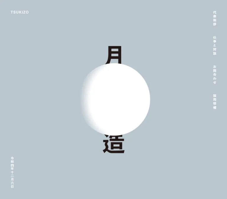
月造 — 縦書きと月の造形が印象的なリノベーション企業サイト
青みのあるグレーを基調に、明朝体の縦書き、白い月の造形、建築写真と大きな余白を組み合わせた月造の企業サイト。写真と記事情報の配置、問い合わせ導線、モバイルでの組み替えまで整理したデザインリファレンス。
TSUKIZO / 月造 — Style Reference
A renovation practice presented through vertical typography, architectural photographs, and a white lunar form suspended in blue-gray space.
Website: tsuki-zo.jp Original URL: https://tsuki-zo.jp/ Final URL: https://tsuki-zo.jp/ Theme: a single observed light palette, with a dark gray footer Inspected: October 2, 2026, Japan Standard Time. Supplied capture timestamp: October 1, 2026, at 15:58:32.604 UTC, equivalent to October 2 at 00:58:32.604 JST. Viewports: desktop 1440 × 1000 CSS pixels; mobile 390 × 844 CSS pixels. Scope: the current corporate homepage: opening identity composition, introductory statement, representative-message module, five work-and-dialogue entries, contact links, and company footer. The mobile menu was captured closed. Linked destination pages were not inspected.
TSUKIZO uses a restrained architectural language: a continuous blue-gray canvas, warm near-black editorial text, white utility labels, and square photographic windows. Its defining feature is the use of Japanese vertical writing across navigation, introductory prose, project titles, dates, and selected company information. The result feels closer to a carefully spaced printed publication than a conventional service brochure.
The homepage introduces the renovation practice, presents its thinking through conversations and projects, and provides routes to contact and recruitment. At desktop size, photographs and their titles occupy opposite sides of a 1000px content area, separated by unusually broad empty space. On mobile, each photograph moves above its vertical text composition. The writing direction remains an organizing device rather than disappearing at the smaller viewport.
閉じる
TSUKIZO / 月造 — Style Reference
A renovation practice presented through vertical typography, architectural photographs, and a white lunar form suspended in blue-gray space.
Website: tsuki-zo.jp Original URL: https://tsuki-zo.jp/ Final URL: https://tsuki-zo.jp/ Theme: a single observed light palette, with a dark gray footer Inspected: October 2, 2026, Japan Standard Time. Supplied capture timestamp: October 1, 2026, at 15:58:32.604 UTC, equivalent to October 2 at 00:58:32.604 JST. Viewports: desktop 1440 × 1000 CSS pixels; mobile 390 × 844 CSS pixels. Scope: the current corporate homepage: opening identity composition, introductory statement, representative-message module, five work-and-dialogue entries, contact links, and company footer. The mobile menu was captured closed. Linked destination pages were not inspected.
TSUKIZO uses a restrained architectural language: a continuous blue-gray canvas, warm near-black editorial text, white utility labels, and square photographic windows. Its defining feature is the use of Japanese vertical writing across navigation, introductory prose, project titles, dates, and selected company information. The result feels closer to a carefully spaced printed publication than a conventional service brochure.
The homepage introduces the renovation practice, presents its thinking through conversations and projects, and provides routes to contact and recruitment. At desktop size, photographs and their titles occupy opposite sides of a 1000px content area, separated by unusually broad empty space. On mobile, each photograph moves above its vertical text composition. The writing direction remains an organizing device rather than disappearing at the smaller viewport.
How to Read This Reference
- Measured values come from the supplied rendered DOM rectangles and computed-style records. Measurements use CSS pixels unless stated otherwise.
- Calculated values are arithmetic relationships between those measurements, such as gaps, aspect ratios, and row intervals.
- Visual estimates describe details visible in the five current-page captures but absent from the computed-style extract, including thin borders and the lunar texture.
- Recommended values belong to the reusable implementation, including its breakpoint, focus treatment, and expanded mobile menu target. They are not claims about the original stylesheet.
- Named tokens are descriptive aliases. The only supplied source custom property is
--vh, recorded as10pxon desktop and8.44pxon mobile. - The introduction and message module have detailed DOM evidence but no dedicated supplied screenshot. Their layout descriptions distinguish measured geometry from visually confirmed imagery.
- Font-family declarations are available; the actual font selected for every rendered glyph was not independently verified. The complete stylesheet, image URLs, animation keyframes, and interaction scripts were not supplied.
Tokens — Colors
Default Palette
| Name | Value | Suggested token | Role | Evidence |
|---|---|---|---|---|
| Blue-gray canvas | #bac6ce |
--color-canvas |
Continuous background through the hero, introduction, project list, and contact section | Computed body background: rgb(186, 198, 206) at both viewports |
| Warm dark ink | #231815 |
--color-ink |
Editorial prose, project titles, captions, and central brand artwork | Computed text color; artwork correspondence is visual |
| White utility | #ffffff |
--color-white |
Navigation, dates, section labels, contact text, footer text, and the lunar form | Computed text colors; lunar appearance is visual |
| Footer gray | #666666 |
--color-footer |
Full-width company-information footer | Computed footer background: rgb(102, 102, 102) |
Palette Behavior
The blue-gray background is the main surface, not a tint applied to individual cards. Content sections remain transparent over it. Photographs contribute almost all additional color: pale timber, cream interiors, green facades, grass, and human figures.
White has two distinct roles: it is the material of the large lunar shape and the color of small navigational information. Dark ink carries the longer reading content. Fine white rules divide project entries and outline the contact links. Their approximately 1px thickness is a visual estimate rather than an extracted border declaration.
No alternate theme or color selector is evidenced. Do not infer one from the palette tokens.
Tokens — Typography
Editorial Serif
- Computed family:
"Shippori Mincho", serif. - Primary uses: introduction, project titles, dialogue captions, and representative-name text.
- Default body declaration:
15px, weight400. - Character: a Japanese Mincho face with visible stroke contrast, particularly effective in the long vertical title columns.
- Suggested alias:
--font-editorial.
Vertical writing changes the meaning of spacing: line height controls the distance between adjacent text columns, while letter spacing affects progression down each column. Reproducing the font size alone will not reproduce the composition.
Utility Sans Serif
- Computed stack:
游ゴシック体, YuGothic, "Yu Gothic", "Zen Kaku Gothic New". - Primary uses: navigation, dates, section headings,
MORE, contact links, and footer information. - Typical weight:
700; mobile section headings use500. - Character: compact, bold, and deliberately tracked.
- Suggested alias:
--font-utility.
The Quick Start adds a final generic sans-serif fallback as a recommendation. It does not establish which member of the original stack rendered on the capture system.
Brand Artwork
The small TSUKIZO wordmark and central Japanese lockup occupy empty-text elements in the supplied DOM extract. Their visible lettering should be treated as artwork rather than assigned a guessed typeface.
The wordmark measures 83 × 15px at both viewports. The central lockup measures approximately 102 × 499.09px on desktop and 64 × 313.16px on mobile. These are artwork-container dimensions, not font sizes.
Type Scale
Values below are measured computed styles. Tracking is expressed in pixels to preserve the supplied evidence.
| Role | Desktop size / line height | Mobile size / line height | Weight | Tracking |
|---|---|---|---|---|
| Navigation | 15 / 15px |
15 / 15px, links outside the closed viewport |
700 |
3.3px |
| Hero date | 15 / 15px |
15 / 15px |
700 |
1.5px |
| Introduction heading | 21 / 37.8px |
28 / 50.4px |
400 |
4.62px / 6.16px |
| Introduction prose | 15 / 24px |
13 / 20.8px |
400 |
2.55px / 2.21px |
| Section headings | 25 / 25px |
25 / 25px |
700 / 500 |
4px |
| Project-title link | 27 / 40.5px |
25 / 37.5px |
400 |
Normal |
| Dialogue caption | 15 / 15px |
15 / 15px |
400 |
1.5px |
| Project number | 18 / 18px |
18 / 18px |
700 |
1.8px |
| Project publication date | 11 / 11px |
11 / 11px |
700 |
1.1px |
MORE / MESSAGE |
13px; MESSAGE line height 13px |
Same | 700 |
1.3px |
| Contact action | 19 / 90px |
19 / 67px |
700 |
1.9px |
| Representative-name line | 17 / 17px |
13 / 13px |
Computed 100 |
3.74px / 2.86px |
| Footer address text | 11 / 19.8px |
12 / 21.6px |
700 |
2.2px / 2.4px |
| Footer company name | 14 / 14px |
18 / 18px |
700 |
2.8px / 3.6px |
| Footer contact-form link | 14px, normal line height |
14 / 14px |
700 |
1.4px |
| Copyright | 12px, normal line height |
12 / 12px |
700 |
1.2px |
The project title's parent heading reports 15px, but the visible anchor inside it reports 27px on desktop and 25px on mobile. Use the anchor measurements when reproducing its appearance.
The 90px and 67px contact line heights center one-line labels within their controls. They are not general text-leading tokens.
Tokens — Spacing & Shapes
Density: sparse at the page level, precise within each text cluster.
Geometry: square photographs, rectangular outline links, thin straight dividers, and one soft circular hero motif.
Radius system: no visible general-purpose rounding. Sampled content containers report 0px border radius.
Spacing Scale
| Use | Desktop | Mobile | Evidence |
|---|---|---|---|
| Main left inset | 50px |
25px |
Measured |
| Wordmark top inset | About 50px |
30px |
Measured |
| Hero-date bottom clearance | About 50px |
30px |
Calculated from its bounds |
| Desktop navigation inter-link gap | 44px |
Closed menu; not applicable | Calculated |
| Photograph to adjacent caption | 40px horizontally |
Caption moves below the image | Calculated |
| Work-section heading to first photograph | 100px after the heading box |
40px after the heading box |
Calculated |
| Repeated project start interval | 417px |
591.5px |
Calculated |
| Mobile photograph to title block | Not applicable | 24px |
Calculated |
| Number to date | 35px |
30px |
Calculated |
| Contact-action gap | About 16px horizontally |
About 25px vertically |
Calculated with visually inferred borders |
| Contact actions to footer | About 200px |
About 74px |
Calculated with visually inferred borders |
| Footer padding | 45px 50px |
37px 30px 55px |
Computed |
| Mobile footer address-group gap | Not applicable | 45px |
Calculated |
These values form several separate spacing rhythms. The page does not provide evidence for a single universal 8px spacing system.
Layout Measurements
| Element | Desktop at 1440 × 1000 | Mobile at 390 × 844 |
|---|---|---|
| Document height | Approximately 5132.34px |
Approximately 6503.09px |
| Main editorial region | x = 50–1050, width 1000px |
Generally x = 25–365, width 340px |
| Small wordmark | 83 × 15px at approximately (50, 50) |
83 × 15px at (25, 30) |
| Central lockup | 102 × 499.09px |
64 × 313.16px |
| Lunar artwork box | 338 × 338px at approximately (553, 330.41) |
211 × 211px at (91.5, 315.5) |
| Hero date | 15 × 132px |
15 × 132px |
| Project image area | 415 × 296px |
340 × 242.5px |
| Project title container | 81 × 290px |
75 × 270px |
| Message media area | 440 × 254.28px |
340 × 196.5px |
| Contact anchor interior | 490 × 90px |
340 × 67px |
| Contact outer outline | Approximately 492 × 92px |
Approximately 342 × 69px |
| Footer | 1440 × 255px |
390 × 635.34px |
The project image areas maintain a calculated ratio of approximately 1.402:1. The message media area has a different ratio, approximately 1.730:1. Do not force both into a generic 16:9 crop.
Components
Opening Identity Composition
Role: establishes the company identity before the editorial content begins.
The opening occupies approximately one viewport height. The small white TSUKIZO wordmark sits at the upper left. A tall dark Japanese lockup is centered in the viewport and partially obscured by the white lunar artwork. A vertical Japanese-era date sits near the lower-left corner.
The lunar box is centered almost exactly over the lockup, with an approximately 2px rightward offset in both measured viewports. In the supplied current-page captures, its left contour is clean and rounded, while its right side dissolves through a fine, soft texture into the background. The measured square contains transparent or fading regions; it should not be interpreted as a completely opaque circle of that diameter.
The hero contains no evidenced sales headline, explanatory paragraph, or contact button. Its impact comes from scale, overlap, and empty space.
Anatomy: small wordmark → tall centered lockup → overlapping lunar artwork → lower-left date, with navigation positioned separately at the right edge.
Desktop Navigation and Mobile Menu Trigger
Role: provides persistent access to the main site sections.
Desktop presents four vertically written links in a narrow right-side rail: 代表挨拶, 仕事と対話, お問合わせ, and 採用情報. Their destinations are /message/, /works/, /contact/, and /recruit/ respectively. The links remain at the right edge in the supplied scrolled captures, supporting a persistent-navigation interpretation; the actual positioning declaration was not included.
The first link begins at approximately (1375, 50). Labels use white, bold 15px utility type, 3.3px tracking, and approximately 44px between link boxes. They are not rotated horizontal words: the visible Japanese characters remain upright in vertical text.
On mobile, the visible control is a 23 × 34px button at (342, 30), drawn as three thin vertical strokes. The navigation links have measured positions beyond the right edge, beginning around x = 420.5px, while the viewport is only 390px wide.
Unverified: opening direction, panel background, close-state icon, focus management, and whether the hidden links are removed from keyboard navigation. A menu transition duration is recorded, but no open-state capture is supplied.
Introductory Statement
Role: explains the practice's approach to renewing existing buildings and spaces.
The main heading is 未来をみすえ、正しくその先に残す仕事。. Its desktop box begins around y = 1180.41px, approximately 180px beyond the opening viewport. The heading occupies two narrow vertical columns at the right of the editorial region. The prose extends leftward in separate column groups.
Desktop prose uses 15px Mincho type, 24px line height, and 2.55px tracking. Its tall measured boxes are approximately 403.66px high. Several paragraph groups are separated by calculated 40px horizontal gaps; the heading is separated from the nearest paragraph group by approximately 90px.
Mobile adds a section-heading row labeled 月造とは, beginning at y = 924px, with MORE at the right. The main statement grows to 28px, while body text decreases to 13px. The prose is regrouped into two successive bands of narrow vertical columns within an approximately 325px-wide inner area. The long desktop paragraph is segmented differently in the mobile text evidence.
This is not a simple global scale reduction. The introduction changes grouping and hierarchy while retaining vertical reading. Its exact inner heading arrangement has DOM evidence but no dedicated supplied visual capture.
Representative-Message Module
Role: connects the introductory statement to the representative's message page.
Desktop pairs an approximately 440 × 254.28px media area on the left with text to its right. Measured text includes the white utility label MESSAGE, the Mincho name line 取締役 月森忍, and a right-aligned MORE link. Both the media link and MORE lead to /message/.
On mobile, the media area becomes approximately 340 × 196.5px. Text moves beneath it, inset around 16px from the media's left edge. The name line reduces from 17px to 13px. The mobile rendered text also includes 代表ご挨拶.
The media subject and detailed headline treatment are not visible in the supplied current-page screenshots. Retain the measured media/text relationship without inventing portrait styling, image content, or hover effects.
Section Heading Row
Role: names the next content region and provides access to its fuller destination.
Desktop places the white Japanese heading at the right edge of the 1000px content region and the small underlined MORE link at the far left. The project section uses 仕事と対話; contact uses お問合わせ.
Mobile reverses that horizontal arrangement: the heading sits at the left and MORE at the right. The section-heading size stays at 25px, while its computed weight changes from 700 to 500.
This reversal is important. Keeping the desktop alignment on a phone would miss a directly measured responsive decision.
Work-and-Dialogue Entry
Role: presents a project as an editorial conversation rather than a product card.
The homepage contains five entries, numbered 〇五 through 〇一. Each combines a photograph, dialogue caption, title link, number, and publication date. Titles and the media-associated READ links point to the corresponding /works/05/ through /works/01/ pages.
Desktop anatomy, measured from the first entry:
| Part | Horizontal position | Width | Treatment |
|---|---|---|---|
| Photograph | x = 50px |
415px |
Landscape rectangle, square corners |
| Dialogue caption | x = 505px |
15px |
Dark 15px vertical Mincho text |
| Open interval | Approximately x = 520–901px |
Approximately 381px |
Unfilled canvas |
| Title container | x = 901px |
81px |
Two-column vertical Mincho composition |
| Number/date rail | x = 1032px |
18px |
White utility text; date centered beneath number |
The title リノベーションで新しい環境を生み出す is rendered at 27px with a 40.5px column interval. The first caption reads つくり手の対話/海老名芸術高速. The second entry uses the same geometry with a different title and caption.
The first two photographs begin 417px apart. Subtracting the 296px image height leaves a 121px inter-image interval. The screenshot shows this distributed around a thin white divider, approximately 60px on either side.
Mobile anatomy: a full-width 340 × 242.5px photograph comes first. After a 24px gap, the title occupies a 75px-wide vertical block toward the right, the number/date rail occupies the far-right 18px, and the caption sits at the far left. Captions align near the bottom of the 270px title region; shorter captions therefore begin lower.
The title reduces only slightly, from 27px to 25px. The mobile result remains an editorial composition with substantial internal space.
Interaction boundary: title links and media-associated links are evidenced separately. The whole row is not proven to be a single clickable target. READ exists in link text but is not visibly rendered as a standalone badge in the supplied desktop resting-state capture; its overlay or hover behavior is unverified.
Contact Section
Role: offers a direct telephone route and a separate contact-form destination.
The section uses the same heading/MORE arrangement as the project list. Two large, transparent rectangular outlines follow: TEL: 045-323-6464 and CONTACT FORM.
Desktop places them side by side, with approximately 492px outer width and 92px outer height each, separated by about 16px. Mobile stacks them, with approximately 69px outer height and a 25px gap. Their 19px bold utility labels remain the same size at both viewports.
The telephone anchor points to tel:045-323-6464. The form anchor points to /contact/. No form fields or submission interaction were inspected on the homepage.
There are no evidenced filled action colors, arrows, rounded pills, or shadows. Their hierarchy comes from size, white outlines, and the space around them.
Company Footer
Role: identifies the operator, lists its locations, and repeats contact information.
A full-width #666666 surface terminates the blue-gray page. The original page explicitly names 有限会社 月造 and lists an office, satellite office, and factory, including the name Hadano Base.
Desktop uses a 255px-high footer with 45px 50px padding. Contact information sits at the left, copyright near the lower-left edge, and company/location information forms vertical columns at the right. The company name is the rightmost column.
Mobile reorganizes this into a footer approximately 635px tall. The company name remains vertical at the upper right, but address groups become horizontal text blocks stacked at the left. These use 12px text, 21.6px line height, and 2.4px tracking. The three address groups are separated by approximately 45px.
The mobile contact-form link appears below the addresses, followed by the telephone text and copyright. The supplied link list confirms the footer form link; it does not establish that the footer telephone text is also an anchor.
Tokens — Motion & Interaction
The supplied evidence contains computed animation and transition declarations, not a complete motion recording. Preserve that distinction.
| Element | Recorded declaration | Supported interpretation | Limitation |
|---|---|---|---|
| Header | 1.5s 2.5s forwards fade_in |
An entrance animation is assigned, with a 2.5s delay and 1.5s duration | Keyframes and exact easing are unavailable |
| Small wordmark | 1.5s 2.5s fadeIn |
Delayed entrance assigned to its container | Initial and final properties were not supplied |
| Central lockup | 1.5s 1.5s fadeIn |
Earlier entrance than the peripheral identity elements | No frame-by-frame sequence supplied |
| Hero date | 1.5s 2.5s fadeIn |
Shares the later entrance timing | Exact opacity behavior remains unverified |
| Introduction elements | 0.3s transition |
Timed state changes are declared | Trigger and changed properties are unknown |
| Message/project media links | 0.3s transition |
A short transition is available | Hover endpoints and image transformations are unknown |
| Contact links | 0.4s transition |
Slightly longer control transition | No hover or focus state was captured |
| Mobile menu button | 0.4s transition |
A timed button state change is declared | Open/close behavior is unverified |
| Lunar wrapper | animation: none on the sampled element |
No CSS animation is assigned to that wrapper | Nested artwork or script-driven motion could still exist |
The declared lockup timing would finish around three seconds after its animation timeline begins; the later identity elements would finish around four seconds. These are calculated timing relationships, not observed playback milestones.
Do not infer lunar rotation, a phase cycle, pointer following, scroll-linked motion, or a date-driven moon state. The supplied static appearance and wrapper declaration cannot establish those behaviors. The displayed Japanese-era date matches the capture date, but automatic daily updating was not tested.
Many elements report transition: all without an explicit duration in the extract. That alone is not evidence of a visible timed animation.
Surfaces
| Layer | Appearance | Purpose |
|---|---|---|
| Main canvas | Solid #bac6ce |
Unifies the opening and editorial content |
| Editorial content | Transparent over the canvas | Lets spacing and writing direction establish structure |
| Photograph | Natural color, square boundary | Introduces material, people, and built environments |
| Hero artwork | Dark lockup with a white, softly textured lunar form | Creates the primary visual identity |
| Contact action | Transparent fill, thin white outline | Marks a large actionable region without adding a new color |
| Footer | Solid #666666 with white information |
Gives company details a distinct closing surface |
No general card-elevation system is visible. Separation comes from rules, image edges, type orientation, and large intervals. The lunar edge is a local artwork treatment; it does not justify adding blur or gradients to ordinary interface surfaces.
Imagery
The current project capture shows natural-color architectural photography. The first visible image looks down through a light interior structure with timber elements and several people. The second shows pale-green buildings around an open grassy area. These images carry useful evidence of scale, construction, and occupation rather than functioning as abstract background decoration.
Photography remains rectangular and unframed. The observed project ratio is approximately 1.402:1, with consistent display dimensions across entries. No source-resolution, crop-setting, filter, or object-position data is supplied, so do not prescribe a universal crop that could remove important architectural details.
The lunar artwork uses a different visual language: a bright rounded mass with a fine, diffuse edge. Its subtle texture belongs to the artwork itself. A blurred white CSS circle may approximate its broad silhouette, but it will not reproduce the inspected edge or transparency.
Observed Asset References
No asset filenames or image source URLs were included in the evidence. The following are verified visual or measured asset roles, not invented file paths.
| Asset role | Observed treatment | Evidence limit |
|---|---|---|
TSUKIZO wordmark |
White, 83 × 15px at both viewports |
Typeface and file format unknown |
| Central Japanese lockup | Tall dark artwork, partly obscured | Source asset and internal construction unknown |
| Lunar artwork | 338px desktop / 211px mobile square box, with fading regions |
Rendering method and motion unknown |
| Work photographs | 415 × 296px desktop / 340 × 242.5px mobile |
Original dimensions and crop rules unavailable |
| Message media | Approximately 1.730:1 measured area | Subject not visible in the supplied captures |
| Mobile menu symbol | Three thin vertical white strokes | Exact stroke CSS and active state unavailable |
For an implementation, use authorized brand and photographic assets. Preserve image detail and smooth text rendering; no pixelated image treatment is evidenced.
Layout & Responsive Behavior
The desktop content region is deliberately left aligned. At 1440px wide, it begins at 50px and ends at 1050px, leaving a broad interval before the right-side navigation. Centering a conventional 1000px wrapper would shift its left edge to 220px and materially change the composition.
The opening artwork, however, is centered on the viewport rather than on that editorial region. Keep these two alignment systems separate.
| Behavior | Desktop observation | Mobile observation |
|---|---|---|
| Hero height | Approximately one 1000px viewport | Approximately one 844px viewport |
| Main outer inset | 50px |
25px |
| Wordmark scale | 83 × 15px |
Unchanged |
| Central artwork scale | Lockup 102px wide; moon 338px |
Lockup 64px wide; moon 211px |
| Navigation | Visible vertical rail | Three-stroke trigger; links outside the closed viewport |
| Section-heading alignment | Heading right, MORE left |
Heading left, MORE right |
| Introduction | Broad arrangement of vertical column groups | Two successive groups within a narrower inner region |
| Project layout | Image, caption, empty interval, title, metadata across one row | Full-width image above vertical text and metadata |
| Contact actions | Two columns | One column |
| Footer addresses | Vertical columns at the right | Horizontal blocks stacked at the left |
| Footer company name | Vertical | Still vertical, enlarged from 14px to 18px |
The mobile page becomes longer primarily because of content reorganization: the project image/title combination expands from a 417px desktop start interval to a 591.5px mobile interval, and the footer grows substantially.
The supplied --vh values equal one percent of the respective viewport heights. The consuming CSS was not included, so this does not prove the exact hero-height formula.
Breakpoint limitation: only 1440px and 390px widths were inspected. The original breakpoint, tablet layout, landscape behavior, and intermediate interpolation are unknown. The Quick Start's 64rem breakpoint is a recommendation for a new implementation.
Do’s and Don’ts
Do
- Keep the continuous blue-gray canvas exact:
#bac6ce. - Use warm dark Mincho text for editorial reading and tracked utility sans serif for navigation and metadata.
- Preserve upright Japanese vertical writing in the components where it is evidenced.
- Center the hero on the viewport while keeping the desktop editorial region left aligned.
- Retain the large empty interval between project captions and titles on desktop.
- Use consistent landscape photograph dimensions and square corners.
- Keep project numbers and dates in their own narrow white rail.
- Stack photographs above vertical text on mobile.
- Reverse the heading/
MOREalignment between desktop and mobile. - Change footer addresses to horizontal mobile reading while keeping the company name vertical.
- Treat the lunar edge as distinctive artwork, with its own transparency and texture.
Don’t
- Don’t replace the project entries with a rounded-card grid.
- Don’t rotate entire horizontal strings to imitate vertical Japanese writing.
- Don’t center the desktop editorial wrapper.
- Don’t scale every mobile element uniformly; several sizes stay constant or increase.
- Don’t add a bright accent color or filled primary button absent from the observed palette.
- Don’t give photographs decorative shadows, frames, or universal 16:9 crops.
- Don’t infer a full-row click target from separately evidenced links.
- Don’t invent menu overlays, hover inversions, scroll effects, or lunar animation.
- Don’t typeset the brand artwork with a guessed font and present it as an exact reproduction.
- Don’t turn the homepage into a sequence of generic promotional feature panels.
Recommended Implementation Additions
These are recommendations for a new implementation, not verified features of the original page.
- Provide a readable utility-color option. Calculated from the supplied sRGB colors, white on
#bac6cehas approximately1.74:1contrast. Dark ink on the same canvas is approximately9.94:1; white on the footer is approximately5.74:1. Using dark ink for essential small utility text would improve legibility while retaining white for artwork and decorative rules. - Enlarge the mobile menu hit area. Keep the visible 23 × 34px symbol, but place it in an approximately 44 × 44px button. Add an accessible name and an accurate expanded state.
- Keep the closed navigation out of keyboard focus. Positioning links beyond the viewport does not by itself make them inaccessible. Use appropriate hidden/inert behavior and restore focus when the menu closes.
- Preserve logical reading order. Use semantic headings, paragraphs, links, and dates. Apply vertical writing with CSS without reversing the underlying Japanese text. Mark source Japanese content with
lang='ja'. - Make repeated link labels meaningful. Give each
MORElink contextual accessible text. Ensure a project image link has an appropriate name even if its visibleREADtreatment is hidden. - Use resilient media sizing. Reserve the measured aspect ratios to reduce layout movement, provide meaningful image alternatives, and verify architectural crops at both viewports.
- Allow text to grow. Treat measured title heights as reference dimensions, not clipping limits for longer copy or enlarged text. A minimum height is safer than hidden overflow.
- Provide reduced-motion behavior. Essential identity, navigation, and content should remain visible without a multi-second entrance sequence. Any later-added lunar animation should have a static alternative.
Agent Prompt Guide
Quick Color Reference
- Main page:
#bac6ce. - Editorial text and dark brand artwork:
#231815. - Observed utility text, rules, and contact outlines:
#ffffff. - Footer surface:
#666666. - Photography: natural color, without an evidenced global tint.
- Optional accessibility adaptation: dark utility text on the blue-gray canvas.
Overall Prompt
“Create a Japanese renovation-company homepage inspired by TSUKIZO's editorial composition. Use a continuous blue-gray background #bac6ce, warm dark ink #231815, white utility labels, and a gray #666666 footer. Pair Shippori Mincho editorial typography with a Yu Gothic-based utility stack. Open with a small upper-left wordmark, a tall centered Japanese brand lockup, an overlapping white lunar artwork with a fine fading edge, and a lower-left vertical date. Use a narrow persistent desktop navigation rail at the right. Place project photographs at the left of a 1000px-wide, left-aligned editorial region, with a vertical caption beside each image and a vertical title and number/date rail near the region's right edge. Preserve broad empty intervals and thin white dividers. On mobile, place each photograph above its vertical title composition, stack contact outlines, and turn footer addresses into horizontal text blocks. Treat the menu's open state and all unsupported animation as separate implementation decisions.”
Example Component Prompts
- Hero: “A viewport-height blue-gray field with an 83 × 15px white wordmark near the upper-left corner. Center a tall dark Japanese lockup behind a white lunar artwork. Use a 338px lunar box on the desktop reference and a 211px box on the phone reference. Preserve the artwork's translucent fading region. Place a small vertical Japanese-era date near the lower-left edge.”
- Desktop project entry: “A 1000px-wide editorial row beginning 50px from the viewport's left edge. Place a 415 × 296px architectural photograph first, a 15px-wide vertical Mincho caption 40px to its right, then generous empty space. Align a two-column 27px vertical title near the right and an 18px number with an 11px date at the outer edge. Add a fine white separator with broad breathing room.”
- Mobile project entry: “Within 25px side margins on a 390px phone, place a 340 × 242.5px photograph above a 270px-tall vertical text composition. Leave 24px after the photograph. Put the 25px Mincho title toward the right, white number/date metadata at the far right, and a narrow dialogue caption at the far left, aligned near the bottom.”
- Contact section: “Use two transparent rectangular white-outline links with centered 19px bold, tracked utility text. Keep the desktop controls side by side at approximately 92px outer height. Stack them at approximately 69px outer height on mobile. Include a telephone link and a separate contact-page link.”
- Footer: “Create a full-width dark gray footer with white tracked sans-serif text. Desktop has contact details at left and vertical company/address columns at right. Mobile stacks three horizontal address blocks, keeps the company name vertical at the upper right, and places the contact link, telephone text, and copyright below.”
Quick Start
CSS Custom Properties
This is a reusable CSS adaptation, not the original stylesheet. It covers the opening, navigation resting state, section headings, project entries, contact links, and footer. It uses measured endpoint dimensions, a recommended 64rem breakpoint, and ordinary 16px-root-compatible units.
Expected structure: .hero is full width; .site-content wraps the editorial sections. A .work-row contains .work-media, .work-caption, .work-title, and .work-meta. The metadata contains .work-number and .work-date. A .section-heading contains its heading followed by a MORE link. The footer separates .footer-contact from .footer-identity, which contains the company name and location groups.
Use authorized artwork in .brand-wordmark, .hero-lockup, and .hero-moon. Asset paths are intentionally unspecified because none were supplied. The CSS does not implement an unobserved menu-open state or animate the lunar artwork. Control sizing uses border-box, so the mobile contact outline fits the 340px content region instead of reproducing the original's approximately 2px wider outer box.
:root {
  /* Measured palette */
  --color-canvas: #bac6ce;
  --color-ink: #231815;
  --color-white: #ffffff;
  --color-footer: #666666;
  --color-utility: var(--color-white);

  /* Observed families; generic sans-serif fallback is recommended */
  --font-editorial: 'Shippori Mincho', serif;
  --font-utility: '游ゴシック体', YuGothic, 'Yu Gothic',
    'Zen Kaku Gothic New', sans-serif;

  /* Measured desktop reference dimensions */
  --page-inset: 50px;
  --content-max: 1000px;
  --moon-size: 338px;
  --lockup-width: 102px;
  --text-project: 27px;
  --text-section: 25px;
  --text-utility: 13px;
  --text-action: 19px;
  --rule: 1px;
}

* { box-sizing: border-box; }

body {
  margin: 0;
  color: var(--color-ink);
  background: var(--color-canvas);
  font-family: var(--font-editorial);
  font-size: 15px;
  font-weight: 400;
}

img { display: block; max-width: 100%; }
a { color: inherit; }
button { font: inherit; }

.site-content {
  width: min(
    var(--content-max),
    calc(100% - var(--page-inset) - var(--page-inset) - 80px)
  );
  margin-left: var(--page-inset);
}

/* Recommended stable viewport unit; source height formula is unknown */
.hero {
  position: relative;
  min-height: 100vh;
  min-height: 100svh;
}

.brand-wordmark {
  position: absolute;
  top: 50px;
  left: var(--page-inset);
  width: 83px;
  height: 15px;
  object-fit: contain;
}

.hero-lockup,
.hero-moon {
  position: absolute;
  top: 50%;
  left: 50%;
  transform: translate(-50%, -50%);
  object-fit: contain;
}

.hero-lockup {
  width: var(--lockup-width);
  height: auto;
}

.hero-moon {
  left: calc(50% + 2px);
  width: var(--moon-size);
  height: var(--moon-size);
}

.hero-date {
  position: absolute;
  bottom: 50px;
  left: var(--page-inset);
  margin: 0;
  color: var(--color-utility);
  writing-mode: vertical-rl;
  text-orientation: upright;
  font-family: var(--font-utility);
  font-size: 15px;
  font-weight: 700;
  line-height: 1;
  letter-spacing: 0.1em;
}

/* Fixed placement approximates the persistent captured rail */
.site-nav {
  position: fixed;
  z-index: 20;
  top: 50px;
  right: 49px;
  display: grid;
  justify-items: center;
  gap: 44px;
}

.site-nav a {
  color: var(--color-utility);
  writing-mode: vertical-rl;
  text-orientation: upright;
  font-family: var(--font-utility);
  font-size: 15px;
  font-weight: 700;
  line-height: 1;
  letter-spacing: 0.22em;
  text-decoration: none;
}

.menu-toggle { display: none; }

.section-heading {
  display: flex;
  flex-direction: row-reverse;
  justify-content: space-between;
  align-items: center;
  margin-bottom: 100px;
  color: var(--color-utility);
  font-family: var(--font-utility);
}

.section-heading h2 {
  margin: 0;
  font-size: var(--text-section);
  font-weight: 700;
  line-height: 1;
  letter-spacing: 4px;
}

.more-link {
  font-size: var(--text-utility);
  font-weight: 700;
  line-height: 1.5;
  letter-spacing: 0.1em;
  text-underline-offset: 6px;
  text-decoration-thickness: 1px;
}

.work-row {
  display: grid;
  grid-template-columns:
    41.5% 40px 15px minmax(0, 1fr) 81px 50px 18px;
  align-items: start;
  padding-block: 60px;
  border-bottom: var(--rule) solid var(--color-white);
}

.work-row:first-child { padding-top: 0; }

.work-media {
  grid-column: 1;
  grid-row: 1;
  display: block;
  margin: 0;
}

.work-media img {
  width: 100%;
  height: auto;
  aspect-ratio: 415 / 296;
  object-fit: cover;
  /* Verify the crop for each architectural photograph. */
}

.work-caption {
  grid-column: 3;
  grid-row: 1;
  margin: 0;
  writing-mode: vertical-rl;
  font-size: 15px;
  font-weight: 400;
  line-height: 1;
  letter-spacing: 0.1em;
}

.work-title {
  grid-column: 5;
  grid-row: 1;
  width: 81px;
  min-height: 290px;
  margin: 0;
  writing-mode: vertical-rl;
  font-size: var(--text-project);
  font-weight: 400;
  line-height: 1.5;
  letter-spacing: normal;
}

.work-title a { text-decoration: none; }

.work-meta {
  grid-column: 7;
  grid-row: 1;
  display: flex;
  flex-direction: column;
  align-items: center;
  gap: 35px;
  color: var(--color-utility);
  font-family: var(--font-utility);
  font-weight: 700;
}

.work-number,
.work-date {
  margin: 0;
  writing-mode: vertical-rl;
  text-orientation: upright;
  line-height: 1;
  letter-spacing: 0.1em;
}

.work-number { font-size: 18px; }
.work-date { font-size: 11px; }

.contact-section { padding-block: 180px 200px; }
.contact-section .section-heading { margin-bottom: 80px; }

.contact-actions {
  display: grid;
  grid-template-columns: repeat(2, minmax(0, 1fr));
  gap: 16px;
}

.contact-action {
  display: flex;
  align-items: center;
  justify-content: center;
  min-height: 92px;
  padding: 12px;
  border: var(--rule) solid var(--color-white);
  color: var(--color-utility);
  font-family: var(--font-utility);
  font-size: var(--text-action);
  font-weight: 700;
  line-height: 1.4;
  letter-spacing: 0.1em;
  text-align: center;
  text-decoration: none;
}

.site-footer {
  display: grid;
  grid-template-columns: minmax(0, 1fr) auto;
  gap: 40px;
  min-height: 255px;
  padding: 45px 50px;
  color: var(--color-white);
  background: var(--color-footer);
  font-family: var(--font-utility);
  font-weight: 700;
}

.footer-contact {
  display: flex;
  flex-direction: column;
  align-items: flex-start;
}

.footer-links {
  display: flex;
  flex-direction: column;
  font-size: 14px;
  line-height: 1.5;
  letter-spacing: 0.1em;
}

.footer-links a { text-decoration: none; }

.footer-copyright {
  margin: auto 0 0;
  padding-top: 30px;
  font-size: 12px;
  line-height: 1.4;
  letter-spacing: 0.1em;
}

.footer-identity {
  display: flex;
  flex-direction: row-reverse;
  align-items: flex-start;
  gap: 60px;
}

.footer-name {
  height: 165px;
  margin: 0;
  writing-mode: vertical-rl;
  font-size: 14px;
  line-height: 1;
  letter-spacing: 0.2em;
}

.footer-offices {
  display: flex;
  flex-direction: row-reverse;
  gap: 30px;
}

.footer-office {
  height: 165px;
  margin: 0;
  writing-mode: vertical-rl;
  font-size: 11px;
  font-style: normal;
  line-height: 1.8;
  letter-spacing: 0.2em;
}

/* Recommended visible focus treatment */
:where(a, button):focus-visible {
  outline: 2px solid var(--color-ink);
  outline-offset: 5px;
}

.site-footer :where(a, button):focus-visible {
  outline-color: var(--color-white);
}

/* Optional accessibility adaptation, not an observed theme */
.contrast-enhanced {
  --color-utility: var(--color-ink);
}

/* Recommended breakpoint; original breakpoint was not supplied */
@media (max-width: 64rem) {
  :root {
    --page-inset: 25px;
    --moon-size: 211px;
    --lockup-width: 64px;
    --text-project: 25px;
  }

  .site-content {
    width: calc(100% - var(--page-inset) - var(--page-inset));
  }

  .brand-wordmark { top: 30px; }
  .hero-date { bottom: 30px; }

  /* Closed state only; implement menu state and focus separately. */
  .site-nav { display: none; }

  .menu-toggle {
    position: fixed;
    z-index: 30;
    top: 25px;
    right: 14px;
    display: grid;
    place-items: center;
    width: 44px;
    height: 44px;
    padding: 0;
    border: 0;
    color: var(--color-utility);
    background: transparent;
  }

  .menu-toggle__lines {
    position: relative;
    width: 23px;
    height: 34px;
    border-inline: 1px solid currentColor;
  }

  .menu-toggle__lines::before {
    position: absolute;
    inset-block: 0;
    left: 50%;
    border-left: 1px solid currentColor;
    content: '';
  }

  .section-heading {
    flex-direction: row;
    margin-bottom: 40px;
  }

  .section-heading h2 { font-weight: 500; }

  .work-row {
    grid-template-columns: 15px minmax(0, 1fr) 75px 25px 18px;
    row-gap: 24px;
    margin-bottom: 27px;
    padding: 0 0 27px;
  }

  .work-row:last-child { margin-bottom: 0; }

  .work-media {
    grid-column: 1 / -1;
    grid-row: 1;
  }

  .work-caption {
    grid-column: 1;
    grid-row: 2;
    align-self: end;
  }

  .work-title {
    grid-column: 3;
    grid-row: 2;
    width: 75px;
    min-height: 270px;
  }

  .work-meta {
    grid-column: 5;
    grid-row: 2;
    gap: 30px;
  }

  .contact-section { padding-block: 93px 74px; }
  .contact-section .section-heading { margin-bottom: 46px; }

  .contact-actions {
    grid-template-columns: 1fr;
    gap: 25px;
  }

  .contact-action { min-height: 69px; }

  .site-footer {
    grid-template-columns: 1fr;
    gap: 60px;
    padding: 37px 30px 55px;
  }

  .footer-identity {
    position: relative;
    grid-row: 1;
    display: block;
  }

  .footer-name {
    position: absolute;
    top: 0;
    right: 0;
    height: auto;
    font-size: 18px;
  }

  .footer-offices { display: block; }

  .footer-office {
    height: auto;
    margin-bottom: 45px;
    padding-right: 38px;
    writing-mode: horizontal-tb;
    font-size: 12px;
    line-height: 1.8;
  }

  .footer-office:last-child { margin-bottom: 0; }
  .footer-contact { grid-row: 2; }

  .footer-links {
    flex-direction: column-reverse;
    gap: 12px;
  }
}
For the introductory prose, use writing-mode: vertical-rl, line-height: 1.6, and letter-spacing: 0.17em. Start from the measured 15px desktop and 13px mobile sizes. Its paragraph segmentation and two mobile bands should be implemented deliberately with the actual copy; a universal fixed-height text box is not sufficient.
The CSS intentionally leaves entrance animation off. If the recorded stagger is reproduced, define and test its opacity states explicitly, ensure content remains visible without scripts, and disable the entrance under prefers-reduced-motion: reduce. No hover endpoint is invented here.
Tailwind v4 Token Mapping
Optional aliases for a project already using Tailwind v4. This is not evidence that the original site uses Tailwind. Define the custom properties above first.
@theme inline {
  --color-canvas: #bac6ce;
  --color-ink: #231815;
  --color-utility: var(--color-utility);
  --color-footer: #666666;

  --font-editorial: 'Shippori Mincho', serif;
  --font-utility: '游ゴシック体', YuGothic, 'Yu Gothic',
    'Zen Kaku Gothic New', sans-serif;

  --text-project: var(--text-project);
  --text-section: 25px;
  --text-action: 19px;

  --spacing-page-inset: var(--page-inset);
  --spacing-content-max: 1000px;
  --spacing-moon: var(--moon-size);
}
Sources & Evidence
- Inspected original and final page: https://tsuki-zo.jp/. The supplied inspection reports HTTP 200 and the same original/final URL. The rendered title is
月造; company identity is independently supported by the original-page footer. - Capture timestamp:
2026-10-01T15:58:32.604Z, corresponding to October 2, 2026, at 00:58:32.604 JST. The visible hero date is令和八年十月二日. - Desktop evidence: 1440 × 1000 CSS-pixel viewport, approximately 5132.34px document height; supplied captures show the opening composition, work entries, and contact/footer region.
- Mobile evidence: 390 × 844 CSS-pixel viewport, approximately 6503.09px document height; supplied captures show the opening composition and lower contact/footer region. Intermediate mobile layouts are documented from their rendered DOM rectangles and computed styles.
- Rendered DOM evidence: element positions and dimensions, text, anchor destinations, color values, font-family stacks, typography, footer padding, selected transitions/animations, and the
--vhcustom property. Full image-source records, complete stylesheets, and animation keyframes were not supplied. - Interaction scope: the supplied browser procedure traversed the page through intermediate scroll positions and captured settled views. Destination routes, menu opening, hover/focus states, telephone handling, and form submission were not exercised in the available evidence.
- Readiness limitations: the inspection waited for document loading, visible image decoding, finite animations, and sampled layout/text stability within stated time limits. Perpetual animations were paused during readiness checks and resumed afterward. SharedWorkers and service workers were disabled. These checks do not establish the absence of delayed content or fully characterize motion.
This reference describes the current supplied homepage evidence. Breakpoint choices, accessible controls, semantic markup guidance, and reusable CSS are explicitly proposed adaptations.
# TSUKIZO / 月造 — Style Reference

> A renovation practice presented through vertical typography, architectural photographs, and a white lunar form suspended in blue-gray space.

**Website:** [tsuki-zo.jp](https://tsuki-zo.jp/)
**Original URL:** https://tsuki-zo.jp/
**Final URL:** https://tsuki-zo.jp/
**Theme:** a single observed light palette, with a dark gray footer
**Inspected:** October 2, 2026, Japan Standard Time. Supplied capture timestamp: October 1, 2026, at 15:58:32.604 UTC, equivalent to October 2 at 00:58:32.604 JST.
**Viewports:** desktop 1440 × 1000 CSS pixels; mobile 390 × 844 CSS pixels.
**Scope:** the current corporate homepage: opening identity composition, introductory statement, representative-message module, five work-and-dialogue entries, contact links, and company footer. The mobile menu was captured closed. Linked destination pages were not inspected.

TSUKIZO uses a restrained architectural language: a continuous blue-gray canvas, warm near-black editorial text, white utility labels, and square photographic windows. Its defining feature is the use of Japanese vertical writing across navigation, introductory prose, project titles, dates, and selected company information. The result feels closer to a carefully spaced printed publication than a conventional service brochure.

The homepage introduces the renovation practice, presents its thinking through conversations and projects, and provides routes to contact and recruitment. At desktop size, photographs and their titles occupy opposite sides of a 1000px content area, separated by unusually broad empty space. On mobile, each photograph moves above its vertical text composition. The writing direction remains an organizing device rather than disappearing at the smaller viewport.
閉じる
# TSUKIZO / 月造 — Style Reference

> A renovation practice presented through vertical typography, architectural photographs, and a white lunar form suspended in blue-gray space.

**Website:** [tsuki-zo.jp](https://tsuki-zo.jp/)
**Original URL:** https://tsuki-zo.jp/
**Final URL:** https://tsuki-zo.jp/
**Theme:** a single observed light palette, with a dark gray footer
**Inspected:** October 2, 2026, Japan Standard Time. Supplied capture timestamp: October 1, 2026, at 15:58:32.604 UTC, equivalent to October 2 at 00:58:32.604 JST.
**Viewports:** desktop 1440 × 1000 CSS pixels; mobile 390 × 844 CSS pixels.
**Scope:** the current corporate homepage: opening identity composition, introductory statement, representative-message module, five work-and-dialogue entries, contact links, and company footer. The mobile menu was captured closed. Linked destination pages were not inspected.

TSUKIZO uses a restrained architectural language: a continuous blue-gray canvas, warm near-black editorial text, white utility labels, and square photographic windows. Its defining feature is the use of Japanese vertical writing across navigation, introductory prose, project titles, dates, and selected company information. The result feels closer to a carefully spaced printed publication than a conventional service brochure.

The homepage introduces the renovation practice, presents its thinking through conversations and projects, and provides routes to contact and recruitment. At desktop size, photographs and their titles occupy opposite sides of a 1000px content area, separated by unusually broad empty space. On mobile, each photograph moves above its vertical text composition. The writing direction remains an organizing device rather than disappearing at the smaller viewport.

## How to Read This Reference

- **Measured values** come from the supplied rendered DOM rectangles and computed-style records. Measurements use CSS pixels unless stated otherwise.
- **Calculated values** are arithmetic relationships between those measurements, such as gaps, aspect ratios, and row intervals.
- **Visual estimates** describe details visible in the five current-page captures but absent from the computed-style extract, including thin borders and the lunar texture.
- **Recommended values** belong to the reusable implementation, including its breakpoint, focus treatment, and expanded mobile menu target. They are not claims about the original stylesheet.
- **Named tokens** are descriptive aliases. The only supplied source custom property is `--vh`, recorded as `10px` on desktop and `8.44px` on mobile.
- The introduction and message module have detailed DOM evidence but no dedicated supplied screenshot. Their layout descriptions distinguish measured geometry from visually confirmed imagery.
- Font-family declarations are available; the actual font selected for every rendered glyph was not independently verified. The complete stylesheet, image URLs, animation keyframes, and interaction scripts were not supplied.

## Tokens — Colors

### Default Palette

| Name | Value | Suggested token | Role | Evidence |
| --- | --- | --- | --- | --- |
| Blue-gray canvas | `#bac6ce` | `--color-canvas` | Continuous background through the hero, introduction, project list, and contact section | Computed body background: `rgb(186, 198, 206)` at both viewports |
| Warm dark ink | `#231815` | `--color-ink` | Editorial prose, project titles, captions, and central brand artwork | Computed text color; artwork correspondence is visual |
| White utility | `#ffffff` | `--color-white` | Navigation, dates, section labels, contact text, footer text, and the lunar form | Computed text colors; lunar appearance is visual |
| Footer gray | `#666666` | `--color-footer` | Full-width company-information footer | Computed footer background: `rgb(102, 102, 102)` |

### Palette Behavior

The blue-gray background is the main surface, not a tint applied to individual cards. Content sections remain transparent over it. Photographs contribute almost all additional color: pale timber, cream interiors, green facades, grass, and human figures.

White has two distinct roles: it is the material of the large lunar shape and the color of small navigational information. Dark ink carries the longer reading content. Fine white rules divide project entries and outline the contact links. Their approximately 1px thickness is a visual estimate rather than an extracted border declaration.

No alternate theme or color selector is evidenced. Do not infer one from the palette tokens.

## Tokens — Typography

### Editorial Serif

- **Computed family:** `"Shippori Mincho", serif`.
- **Primary uses:** introduction, project titles, dialogue captions, and representative-name text.
- **Default body declaration:** `15px`, weight `400`.
- **Character:** a Japanese Mincho face with visible stroke contrast, particularly effective in the long vertical title columns.
- **Suggested alias:** `--font-editorial`.

Vertical writing changes the meaning of spacing: line height controls the distance between adjacent text columns, while letter spacing affects progression down each column. Reproducing the font size alone will not reproduce the composition.

### Utility Sans Serif

- **Computed stack:** `游ゴシック体, YuGothic, "Yu Gothic", "Zen Kaku Gothic New"`.
- **Primary uses:** navigation, dates, section headings, `MORE`, contact links, and footer information.
- **Typical weight:** `700`; mobile section headings use `500`.
- **Character:** compact, bold, and deliberately tracked.
- **Suggested alias:** `--font-utility`.

The Quick Start adds a final generic `sans-serif` fallback as a recommendation. It does not establish which member of the original stack rendered on the capture system.

### Brand Artwork

The small `TSUKIZO` wordmark and central Japanese lockup occupy empty-text elements in the supplied DOM extract. Their visible lettering should be treated as artwork rather than assigned a guessed typeface.

The wordmark measures `83 × 15px` at both viewports. The central lockup measures approximately `102 × 499.09px` on desktop and `64 × 313.16px` on mobile. These are artwork-container dimensions, not font sizes.

### Type Scale

Values below are measured computed styles. Tracking is expressed in pixels to preserve the supplied evidence.

| Role | Desktop size / line height | Mobile size / line height | Weight | Tracking |
| --- | --- | --- | --- | --- |
| Navigation | `15 / 15px` | `15 / 15px`, links outside the closed viewport | `700` | `3.3px` |
| Hero date | `15 / 15px` | `15 / 15px` | `700` | `1.5px` |
| Introduction heading | `21 / 37.8px` | `28 / 50.4px` | `400` | `4.62px` / `6.16px` |
| Introduction prose | `15 / 24px` | `13 / 20.8px` | `400` | `2.55px` / `2.21px` |
| Section headings | `25 / 25px` | `25 / 25px` | `700` / `500` | `4px` |
| Project-title link | `27 / 40.5px` | `25 / 37.5px` | `400` | Normal |
| Dialogue caption | `15 / 15px` | `15 / 15px` | `400` | `1.5px` |
| Project number | `18 / 18px` | `18 / 18px` | `700` | `1.8px` |
| Project publication date | `11 / 11px` | `11 / 11px` | `700` | `1.1px` |
| `MORE` / `MESSAGE` | `13px`; `MESSAGE` line height `13px` | Same | `700` | `1.3px` |
| Contact action | `19 / 90px` | `19 / 67px` | `700` | `1.9px` |
| Representative-name line | `17 / 17px` | `13 / 13px` | Computed `100` | `3.74px` / `2.86px` |
| Footer address text | `11 / 19.8px` | `12 / 21.6px` | `700` | `2.2px` / `2.4px` |
| Footer company name | `14 / 14px` | `18 / 18px` | `700` | `2.8px` / `3.6px` |
| Footer contact-form link | `14px`, normal line height | `14 / 14px` | `700` | `1.4px` |
| Copyright | `12px`, normal line height | `12 / 12px` | `700` | `1.2px` |

The project title's parent heading reports `15px`, but the visible anchor inside it reports `27px` on desktop and `25px` on mobile. Use the anchor measurements when reproducing its appearance.

The `90px` and `67px` contact line heights center one-line labels within their controls. They are not general text-leading tokens.

## Tokens — Spacing & Shapes

**Density:** sparse at the page level, precise within each text cluster.
**Geometry:** square photographs, rectangular outline links, thin straight dividers, and one soft circular hero motif.
**Radius system:** no visible general-purpose rounding. Sampled content containers report `0px` border radius.

### Spacing Scale

| Use | Desktop | Mobile | Evidence |
| --- | --- | --- | --- |
| Main left inset | `50px` | `25px` | Measured |
| Wordmark top inset | About `50px` | `30px` | Measured |
| Hero-date bottom clearance | About `50px` | `30px` | Calculated from its bounds |
| Desktop navigation inter-link gap | `44px` | Closed menu; not applicable | Calculated |
| Photograph to adjacent caption | `40px` horizontally | Caption moves below the image | Calculated |
| Work-section heading to first photograph | `100px` after the heading box | `40px` after the heading box | Calculated |
| Repeated project start interval | `417px` | `591.5px` | Calculated |
| Mobile photograph to title block | Not applicable | `24px` | Calculated |
| Number to date | `35px` | `30px` | Calculated |
| Contact-action gap | About `16px` horizontally | About `25px` vertically | Calculated with visually inferred borders |
| Contact actions to footer | About `200px` | About `74px` | Calculated with visually inferred borders |
| Footer padding | `45px 50px` | `37px 30px 55px` | Computed |
| Mobile footer address-group gap | Not applicable | `45px` | Calculated |

These values form several separate spacing rhythms. The page does not provide evidence for a single universal 8px spacing system.

### Layout Measurements

| Element | Desktop at 1440 × 1000 | Mobile at 390 × 844 |
| --- | --- | --- |
| Document height | Approximately `5132.34px` | Approximately `6503.09px` |
| Main editorial region | `x = 50–1050`, width `1000px` | Generally `x = 25–365`, width `340px` |
| Small wordmark | `83 × 15px` at approximately `(50, 50)` | `83 × 15px` at `(25, 30)` |
| Central lockup | `102 × 499.09px` | `64 × 313.16px` |
| Lunar artwork box | `338 × 338px` at approximately `(553, 330.41)` | `211 × 211px` at `(91.5, 315.5)` |
| Hero date | `15 × 132px` | `15 × 132px` |
| Project image area | `415 × 296px` | `340 × 242.5px` |
| Project title container | `81 × 290px` | `75 × 270px` |
| Message media area | `440 × 254.28px` | `340 × 196.5px` |
| Contact anchor interior | `490 × 90px` | `340 × 67px` |
| Contact outer outline | Approximately `492 × 92px` | Approximately `342 × 69px` |
| Footer | `1440 × 255px` | `390 × 635.34px` |

The project image areas maintain a calculated ratio of approximately `1.402:1`. The message media area has a different ratio, approximately `1.730:1`. Do not force both into a generic 16:9 crop.

## Components

### Opening Identity Composition

**Role:** establishes the company identity before the editorial content begins.

The opening occupies approximately one viewport height. The small white `TSUKIZO` wordmark sits at the upper left. A tall dark Japanese lockup is centered in the viewport and partially obscured by the white lunar artwork. A vertical Japanese-era date sits near the lower-left corner.

The lunar box is centered almost exactly over the lockup, with an approximately 2px rightward offset in both measured viewports. In the supplied current-page captures, its left contour is clean and rounded, while its right side dissolves through a fine, soft texture into the background. The measured square contains transparent or fading regions; it should not be interpreted as a completely opaque circle of that diameter.

The hero contains no evidenced sales headline, explanatory paragraph, or contact button. Its impact comes from scale, overlap, and empty space.

**Anatomy:** small wordmark → tall centered lockup → overlapping lunar artwork → lower-left date, with navigation positioned separately at the right edge.

### Desktop Navigation and Mobile Menu Trigger

**Role:** provides persistent access to the main site sections.

Desktop presents four vertically written links in a narrow right-side rail: `代表挨拶`, `仕事と対話`, `お問合わせ`, and `採用情報`. Their destinations are `/message/`, `/works/`, `/contact/`, and `/recruit/` respectively. The links remain at the right edge in the supplied scrolled captures, supporting a persistent-navigation interpretation; the actual positioning declaration was not included.

The first link begins at approximately `(1375, 50)`. Labels use white, bold 15px utility type, `3.3px` tracking, and approximately `44px` between link boxes. They are not rotated horizontal words: the visible Japanese characters remain upright in vertical text.

On mobile, the visible control is a `23 × 34px` button at `(342, 30)`, drawn as three thin vertical strokes. The navigation links have measured positions beyond the right edge, beginning around `x = 420.5px`, while the viewport is only 390px wide.

**Unverified:** opening direction, panel background, close-state icon, focus management, and whether the hidden links are removed from keyboard navigation. A menu transition duration is recorded, but no open-state capture is supplied.

### Introductory Statement

**Role:** explains the practice's approach to renewing existing buildings and spaces.

The main heading is `未来をみすえ、正しくその先に残す仕事。`. Its desktop box begins around `y = 1180.41px`, approximately 180px beyond the opening viewport. The heading occupies two narrow vertical columns at the right of the editorial region. The prose extends leftward in separate column groups.

Desktop prose uses `15px` Mincho type, `24px` line height, and `2.55px` tracking. Its tall measured boxes are approximately `403.66px` high. Several paragraph groups are separated by calculated 40px horizontal gaps; the heading is separated from the nearest paragraph group by approximately 90px.

Mobile adds a section-heading row labeled `月造とは`, beginning at `y = 924px`, with `MORE` at the right. The main statement grows to `28px`, while body text decreases to `13px`. The prose is regrouped into two successive bands of narrow vertical columns within an approximately 325px-wide inner area. The long desktop paragraph is segmented differently in the mobile text evidence.

This is not a simple global scale reduction. The introduction changes grouping and hierarchy while retaining vertical reading. Its exact inner heading arrangement has DOM evidence but no dedicated supplied visual capture.

### Representative-Message Module

**Role:** connects the introductory statement to the representative's message page.

Desktop pairs an approximately `440 × 254.28px` media area on the left with text to its right. Measured text includes the white utility label `MESSAGE`, the Mincho name line `取締役 月森忍`, and a right-aligned `MORE` link. Both the media link and `MORE` lead to `/message/`.

On mobile, the media area becomes approximately `340 × 196.5px`. Text moves beneath it, inset around 16px from the media's left edge. The name line reduces from 17px to 13px. The mobile rendered text also includes `代表ご挨拶`.

The media subject and detailed headline treatment are not visible in the supplied current-page screenshots. Retain the measured media/text relationship without inventing portrait styling, image content, or hover effects.

### Section Heading Row

**Role:** names the next content region and provides access to its fuller destination.

Desktop places the white Japanese heading at the right edge of the 1000px content region and the small underlined `MORE` link at the far left. The project section uses `仕事と対話`; contact uses `お問合わせ`.

Mobile reverses that horizontal arrangement: the heading sits at the left and `MORE` at the right. The section-heading size stays at 25px, while its computed weight changes from 700 to 500.

This reversal is important. Keeping the desktop alignment on a phone would miss a directly measured responsive decision.

### Work-and-Dialogue Entry

**Role:** presents a project as an editorial conversation rather than a product card.

The homepage contains five entries, numbered `〇五` through `〇一`. Each combines a photograph, dialogue caption, title link, number, and publication date. Titles and the media-associated `READ` links point to the corresponding `/works/05/` through `/works/01/` pages.

**Desktop anatomy, measured from the first entry:**

| Part | Horizontal position | Width | Treatment |
| --- | --- | --- | --- |
| Photograph | `x = 50px` | `415px` | Landscape rectangle, square corners |
| Dialogue caption | `x = 505px` | `15px` | Dark 15px vertical Mincho text |
| Open interval | Approximately `x = 520–901px` | Approximately `381px` | Unfilled canvas |
| Title container | `x = 901px` | `81px` | Two-column vertical Mincho composition |
| Number/date rail | `x = 1032px` | `18px` | White utility text; date centered beneath number |

The title `リノベーションで新しい環境を生み出す` is rendered at 27px with a 40.5px column interval. The first caption reads `つくり手の対話/海老名芸術高速`. The second entry uses the same geometry with a different title and caption.

The first two photographs begin 417px apart. Subtracting the 296px image height leaves a 121px inter-image interval. The screenshot shows this distributed around a thin white divider, approximately 60px on either side.

**Mobile anatomy:** a full-width `340 × 242.5px` photograph comes first. After a 24px gap, the title occupies a 75px-wide vertical block toward the right, the number/date rail occupies the far-right 18px, and the caption sits at the far left. Captions align near the bottom of the 270px title region; shorter captions therefore begin lower.

The title reduces only slightly, from 27px to 25px. The mobile result remains an editorial composition with substantial internal space.

**Interaction boundary:** title links and media-associated links are evidenced separately. The whole row is not proven to be a single clickable target. `READ` exists in link text but is not visibly rendered as a standalone badge in the supplied desktop resting-state capture; its overlay or hover behavior is unverified.

### Contact Section

**Role:** offers a direct telephone route and a separate contact-form destination.

The section uses the same heading/`MORE` arrangement as the project list. Two large, transparent rectangular outlines follow: `TEL: 045-323-6464` and `CONTACT FORM`.

Desktop places them side by side, with approximately 492px outer width and 92px outer height each, separated by about 16px. Mobile stacks them, with approximately 69px outer height and a 25px gap. Their 19px bold utility labels remain the same size at both viewports.

The telephone anchor points to `tel:045-323-6464`. The form anchor points to `/contact/`. No form fields or submission interaction were inspected on the homepage.

There are no evidenced filled action colors, arrows, rounded pills, or shadows. Their hierarchy comes from size, white outlines, and the space around them.

### Company Footer

**Role:** identifies the operator, lists its locations, and repeats contact information.

A full-width `#666666` surface terminates the blue-gray page. The original page explicitly names `有限会社 月造` and lists an office, satellite office, and factory, including the name `Hadano Base`.

Desktop uses a 255px-high footer with `45px 50px` padding. Contact information sits at the left, copyright near the lower-left edge, and company/location information forms vertical columns at the right. The company name is the rightmost column.

Mobile reorganizes this into a footer approximately 635px tall. The company name remains vertical at the upper right, but address groups become horizontal text blocks stacked at the left. These use 12px text, 21.6px line height, and 2.4px tracking. The three address groups are separated by approximately 45px.

The mobile contact-form link appears below the addresses, followed by the telephone text and copyright. The supplied link list confirms the footer form link; it does not establish that the footer telephone text is also an anchor.

## Tokens — Motion & Interaction

The supplied evidence contains computed animation and transition declarations, not a complete motion recording. Preserve that distinction.

| Element | Recorded declaration | Supported interpretation | Limitation |
| --- | --- | --- | --- |
| Header | `1.5s 2.5s forwards fade_in` | An entrance animation is assigned, with a 2.5s delay and 1.5s duration | Keyframes and exact easing are unavailable |
| Small wordmark | `1.5s 2.5s fadeIn` | Delayed entrance assigned to its container | Initial and final properties were not supplied |
| Central lockup | `1.5s 1.5s fadeIn` | Earlier entrance than the peripheral identity elements | No frame-by-frame sequence supplied |
| Hero date | `1.5s 2.5s fadeIn` | Shares the later entrance timing | Exact opacity behavior remains unverified |
| Introduction elements | `0.3s` transition | Timed state changes are declared | Trigger and changed properties are unknown |
| Message/project media links | `0.3s` transition | A short transition is available | Hover endpoints and image transformations are unknown |
| Contact links | `0.4s` transition | Slightly longer control transition | No hover or focus state was captured |
| Mobile menu button | `0.4s` transition | A timed button state change is declared | Open/close behavior is unverified |
| Lunar wrapper | `animation: none` on the sampled element | No CSS animation is assigned to that wrapper | Nested artwork or script-driven motion could still exist |

The declared lockup timing would finish around three seconds after its animation timeline begins; the later identity elements would finish around four seconds. These are calculated timing relationships, not observed playback milestones.

Do not infer lunar rotation, a phase cycle, pointer following, scroll-linked motion, or a date-driven moon state. The supplied static appearance and wrapper declaration cannot establish those behaviors. The displayed Japanese-era date matches the capture date, but automatic daily updating was not tested.

Many elements report `transition: all` without an explicit duration in the extract. That alone is not evidence of a visible timed animation.

## Surfaces

| Layer | Appearance | Purpose |
| --- | --- | --- |
| Main canvas | Solid `#bac6ce` | Unifies the opening and editorial content |
| Editorial content | Transparent over the canvas | Lets spacing and writing direction establish structure |
| Photograph | Natural color, square boundary | Introduces material, people, and built environments |
| Hero artwork | Dark lockup with a white, softly textured lunar form | Creates the primary visual identity |
| Contact action | Transparent fill, thin white outline | Marks a large actionable region without adding a new color |
| Footer | Solid `#666666` with white information | Gives company details a distinct closing surface |

No general card-elevation system is visible. Separation comes from rules, image edges, type orientation, and large intervals. The lunar edge is a local artwork treatment; it does not justify adding blur or gradients to ordinary interface surfaces.

## Imagery

The current project capture shows natural-color architectural photography. The first visible image looks down through a light interior structure with timber elements and several people. The second shows pale-green buildings around an open grassy area. These images carry useful evidence of scale, construction, and occupation rather than functioning as abstract background decoration.

Photography remains rectangular and unframed. The observed project ratio is approximately 1.402:1, with consistent display dimensions across entries. No source-resolution, crop-setting, filter, or `object-position` data is supplied, so do not prescribe a universal crop that could remove important architectural details.

The lunar artwork uses a different visual language: a bright rounded mass with a fine, diffuse edge. Its subtle texture belongs to the artwork itself. A blurred white CSS circle may approximate its broad silhouette, but it will not reproduce the inspected edge or transparency.

### Observed Asset References

No asset filenames or image source URLs were included in the evidence. The following are verified visual or measured asset roles, not invented file paths.

| Asset role | Observed treatment | Evidence limit |
| --- | --- | --- |
| `TSUKIZO` wordmark | White, `83 × 15px` at both viewports | Typeface and file format unknown |
| Central Japanese lockup | Tall dark artwork, partly obscured | Source asset and internal construction unknown |
| Lunar artwork | `338px` desktop / `211px` mobile square box, with fading regions | Rendering method and motion unknown |
| Work photographs | `415 × 296px` desktop / `340 × 242.5px` mobile | Original dimensions and crop rules unavailable |
| Message media | Approximately 1.730:1 measured area | Subject not visible in the supplied captures |
| Mobile menu symbol | Three thin vertical white strokes | Exact stroke CSS and active state unavailable |

For an implementation, use authorized brand and photographic assets. Preserve image detail and smooth text rendering; no pixelated image treatment is evidenced.

## Layout & Responsive Behavior

The desktop content region is deliberately left aligned. At 1440px wide, it begins at 50px and ends at 1050px, leaving a broad interval before the right-side navigation. Centering a conventional 1000px wrapper would shift its left edge to 220px and materially change the composition.

The opening artwork, however, is centered on the viewport rather than on that editorial region. Keep these two alignment systems separate.

| Behavior | Desktop observation | Mobile observation |
| --- | --- | --- |
| Hero height | Approximately one 1000px viewport | Approximately one 844px viewport |
| Main outer inset | `50px` | `25px` |
| Wordmark scale | `83 × 15px` | Unchanged |
| Central artwork scale | Lockup `102px` wide; moon `338px` | Lockup `64px` wide; moon `211px` |
| Navigation | Visible vertical rail | Three-stroke trigger; links outside the closed viewport |
| Section-heading alignment | Heading right, `MORE` left | Heading left, `MORE` right |
| Introduction | Broad arrangement of vertical column groups | Two successive groups within a narrower inner region |
| Project layout | Image, caption, empty interval, title, metadata across one row | Full-width image above vertical text and metadata |
| Contact actions | Two columns | One column |
| Footer addresses | Vertical columns at the right | Horizontal blocks stacked at the left |
| Footer company name | Vertical | Still vertical, enlarged from 14px to 18px |

The mobile page becomes longer primarily because of content reorganization: the project image/title combination expands from a 417px desktop start interval to a 591.5px mobile interval, and the footer grows substantially.

The supplied `--vh` values equal one percent of the respective viewport heights. The consuming CSS was not included, so this does not prove the exact hero-height formula.

**Breakpoint limitation:** only 1440px and 390px widths were inspected. The original breakpoint, tablet layout, landscape behavior, and intermediate interpolation are unknown. The Quick Start's `64rem` breakpoint is a recommendation for a new implementation.

## Do’s and Don’ts

### Do

- Keep the continuous blue-gray canvas exact: `#bac6ce`.
- Use warm dark Mincho text for editorial reading and tracked utility sans serif for navigation and metadata.
- Preserve upright Japanese vertical writing in the components where it is evidenced.
- Center the hero on the viewport while keeping the desktop editorial region left aligned.
- Retain the large empty interval between project captions and titles on desktop.
- Use consistent landscape photograph dimensions and square corners.
- Keep project numbers and dates in their own narrow white rail.
- Stack photographs above vertical text on mobile.
- Reverse the heading/`MORE` alignment between desktop and mobile.
- Change footer addresses to horizontal mobile reading while keeping the company name vertical.
- Treat the lunar edge as distinctive artwork, with its own transparency and texture.

### Don’t

- Don’t replace the project entries with a rounded-card grid.
- Don’t rotate entire horizontal strings to imitate vertical Japanese writing.
- Don’t center the desktop editorial wrapper.
- Don’t scale every mobile element uniformly; several sizes stay constant or increase.
- Don’t add a bright accent color or filled primary button absent from the observed palette.
- Don’t give photographs decorative shadows, frames, or universal 16:9 crops.
- Don’t infer a full-row click target from separately evidenced links.
- Don’t invent menu overlays, hover inversions, scroll effects, or lunar animation.
- Don’t typeset the brand artwork with a guessed font and present it as an exact reproduction.
- Don’t turn the homepage into a sequence of generic promotional feature panels.

## Recommended Implementation Additions

These are recommendations for a new implementation, not verified features of the original page.

- **Provide a readable utility-color option.** Calculated from the supplied sRGB colors, white on `#bac6ce` has approximately `1.74:1` contrast. Dark ink on the same canvas is approximately `9.94:1`; white on the footer is approximately `5.74:1`. Using dark ink for essential small utility text would improve legibility while retaining white for artwork and decorative rules.
- **Enlarge the mobile menu hit area.** Keep the visible 23 × 34px symbol, but place it in an approximately 44 × 44px button. Add an accessible name and an accurate expanded state.
- **Keep the closed navigation out of keyboard focus.** Positioning links beyond the viewport does not by itself make them inaccessible. Use appropriate hidden/inert behavior and restore focus when the menu closes.
- **Preserve logical reading order.** Use semantic headings, paragraphs, links, and dates. Apply vertical writing with CSS without reversing the underlying Japanese text. Mark source Japanese content with `lang='ja'`.
- **Make repeated link labels meaningful.** Give each `MORE` link contextual accessible text. Ensure a project image link has an appropriate name even if its visible `READ` treatment is hidden.
- **Use resilient media sizing.** Reserve the measured aspect ratios to reduce layout movement, provide meaningful image alternatives, and verify architectural crops at both viewports.
- **Allow text to grow.** Treat measured title heights as reference dimensions, not clipping limits for longer copy or enlarged text. A minimum height is safer than hidden overflow.
- **Provide reduced-motion behavior.** Essential identity, navigation, and content should remain visible without a multi-second entrance sequence. Any later-added lunar animation should have a static alternative.

## Agent Prompt Guide

### Quick Color Reference

- Main page: `#bac6ce`.
- Editorial text and dark brand artwork: `#231815`.
- Observed utility text, rules, and contact outlines: `#ffffff`.
- Footer surface: `#666666`.
- Photography: natural color, without an evidenced global tint.
- Optional accessibility adaptation: dark utility text on the blue-gray canvas.

### Overall Prompt

“Create a Japanese renovation-company homepage inspired by TSUKIZO's editorial composition. Use a continuous blue-gray background `#bac6ce`, warm dark ink `#231815`, white utility labels, and a gray `#666666` footer. Pair Shippori Mincho editorial typography with a Yu Gothic-based utility stack. Open with a small upper-left wordmark, a tall centered Japanese brand lockup, an overlapping white lunar artwork with a fine fading edge, and a lower-left vertical date. Use a narrow persistent desktop navigation rail at the right. Place project photographs at the left of a 1000px-wide, left-aligned editorial region, with a vertical caption beside each image and a vertical title and number/date rail near the region's right edge. Preserve broad empty intervals and thin white dividers. On mobile, place each photograph above its vertical title composition, stack contact outlines, and turn footer addresses into horizontal text blocks. Treat the menu's open state and all unsupported animation as separate implementation decisions.”

### Example Component Prompts

1. **Hero:** “A viewport-height blue-gray field with an 83 × 15px white wordmark near the upper-left corner. Center a tall dark Japanese lockup behind a white lunar artwork. Use a 338px lunar box on the desktop reference and a 211px box on the phone reference. Preserve the artwork's translucent fading region. Place a small vertical Japanese-era date near the lower-left edge.”
2. **Desktop project entry:** “A 1000px-wide editorial row beginning 50px from the viewport's left edge. Place a 415 × 296px architectural photograph first, a 15px-wide vertical Mincho caption 40px to its right, then generous empty space. Align a two-column 27px vertical title near the right and an 18px number with an 11px date at the outer edge. Add a fine white separator with broad breathing room.”
3. **Mobile project entry:** “Within 25px side margins on a 390px phone, place a 340 × 242.5px photograph above a 270px-tall vertical text composition. Leave 24px after the photograph. Put the 25px Mincho title toward the right, white number/date metadata at the far right, and a narrow dialogue caption at the far left, aligned near the bottom.”
4. **Contact section:** “Use two transparent rectangular white-outline links with centered 19px bold, tracked utility text. Keep the desktop controls side by side at approximately 92px outer height. Stack them at approximately 69px outer height on mobile. Include a telephone link and a separate contact-page link.”
5. **Footer:** “Create a full-width dark gray footer with white tracked sans-serif text. Desktop has contact details at left and vertical company/address columns at right. Mobile stacks three horizontal address blocks, keeps the company name vertical at the upper right, and places the contact link, telephone text, and copyright below.”

## Quick Start

### CSS Custom Properties

This is a reusable CSS adaptation, not the original stylesheet. It covers the opening, navigation resting state, section headings, project entries, contact links, and footer. It uses measured endpoint dimensions, a recommended `64rem` breakpoint, and ordinary 16px-root-compatible units.

Expected structure: `.hero` is full width; `.site-content` wraps the editorial sections. A `.work-row` contains `.work-media`, `.work-caption`, `.work-title`, and `.work-meta`. The metadata contains `.work-number` and `.work-date`. A `.section-heading` contains its heading followed by a `MORE` link. The footer separates `.footer-contact` from `.footer-identity`, which contains the company name and location groups.

Use authorized artwork in `.brand-wordmark`, `.hero-lockup`, and `.hero-moon`. Asset paths are intentionally unspecified because none were supplied. The CSS does not implement an unobserved menu-open state or animate the lunar artwork. Control sizing uses `border-box`, so the mobile contact outline fits the 340px content region instead of reproducing the original's approximately 2px wider outer box.

```css
:root {
  /* Measured palette */
  --color-canvas: #bac6ce;
  --color-ink: #231815;
  --color-white: #ffffff;
  --color-footer: #666666;
  --color-utility: var(--color-white);

  /* Observed families; generic sans-serif fallback is recommended */
  --font-editorial: 'Shippori Mincho', serif;
  --font-utility: '游ゴシック体', YuGothic, 'Yu Gothic',
    'Zen Kaku Gothic New', sans-serif;

  /* Measured desktop reference dimensions */
  --page-inset: 50px;
  --content-max: 1000px;
  --moon-size: 338px;
  --lockup-width: 102px;
  --text-project: 27px;
  --text-section: 25px;
  --text-utility: 13px;
  --text-action: 19px;
  --rule: 1px;
}

* { box-sizing: border-box; }

body {
  margin: 0;
  color: var(--color-ink);
  background: var(--color-canvas);
  font-family: var(--font-editorial);
  font-size: 15px;
  font-weight: 400;
}

img { display: block; max-width: 100%; }
a { color: inherit; }
button { font: inherit; }

.site-content {
  width: min(
    var(--content-max),
    calc(100% - var(--page-inset) - var(--page-inset) - 80px)
  );
  margin-left: var(--page-inset);
}

/* Recommended stable viewport unit; source height formula is unknown */
.hero {
  position: relative;
  min-height: 100vh;
  min-height: 100svh;
}

.brand-wordmark {
  position: absolute;
  top: 50px;
  left: var(--page-inset);
  width: 83px;
  height: 15px;
  object-fit: contain;
}

.hero-lockup,
.hero-moon {
  position: absolute;
  top: 50%;
  left: 50%;
  transform: translate(-50%, -50%);
  object-fit: contain;
}

.hero-lockup {
  width: var(--lockup-width);
  height: auto;
}

.hero-moon {
  left: calc(50% + 2px);
  width: var(--moon-size);
  height: var(--moon-size);
}

.hero-date {
  position: absolute;
  bottom: 50px;
  left: var(--page-inset);
  margin: 0;
  color: var(--color-utility);
  writing-mode: vertical-rl;
  text-orientation: upright;
  font-family: var(--font-utility);
  font-size: 15px;
  font-weight: 700;
  line-height: 1;
  letter-spacing: 0.1em;
}

/* Fixed placement approximates the persistent captured rail */
.site-nav {
  position: fixed;
  z-index: 20;
  top: 50px;
  right: 49px;
  display: grid;
  justify-items: center;
  gap: 44px;
}

.site-nav a {
  color: var(--color-utility);
  writing-mode: vertical-rl;
  text-orientation: upright;
  font-family: var(--font-utility);
  font-size: 15px;
  font-weight: 700;
  line-height: 1;
  letter-spacing: 0.22em;
  text-decoration: none;
}

.menu-toggle { display: none; }

.section-heading {
  display: flex;
  flex-direction: row-reverse;
  justify-content: space-between;
  align-items: center;
  margin-bottom: 100px;
  color: var(--color-utility);
  font-family: var(--font-utility);
}

.section-heading h2 {
  margin: 0;
  font-size: var(--text-section);
  font-weight: 700;
  line-height: 1;
  letter-spacing: 4px;
}

.more-link {
  font-size: var(--text-utility);
  font-weight: 700;
  line-height: 1.5;
  letter-spacing: 0.1em;
  text-underline-offset: 6px;
  text-decoration-thickness: 1px;
}

.work-row {
  display: grid;
  grid-template-columns:
    41.5% 40px 15px minmax(0, 1fr) 81px 50px 18px;
  align-items: start;
  padding-block: 60px;
  border-bottom: var(--rule) solid var(--color-white);
}

.work-row:first-child { padding-top: 0; }

.work-media {
  grid-column: 1;
  grid-row: 1;
  display: block;
  margin: 0;
}

.work-media img {
  width: 100%;
  height: auto;
  aspect-ratio: 415 / 296;
  object-fit: cover;
  /* Verify the crop for each architectural photograph. */
}

.work-caption {
  grid-column: 3;
  grid-row: 1;
  margin: 0;
  writing-mode: vertical-rl;
  font-size: 15px;
  font-weight: 400;
  line-height: 1;
  letter-spacing: 0.1em;
}

.work-title {
  grid-column: 5;
  grid-row: 1;
  width: 81px;
  min-height: 290px;
  margin: 0;
  writing-mode: vertical-rl;
  font-size: var(--text-project);
  font-weight: 400;
  line-height: 1.5;
  letter-spacing: normal;
}

.work-title a { text-decoration: none; }

.work-meta {
  grid-column: 7;
  grid-row: 1;
  display: flex;
  flex-direction: column;
  align-items: center;
  gap: 35px;
  color: var(--color-utility);
  font-family: var(--font-utility);
  font-weight: 700;
}

.work-number,
.work-date {
  margin: 0;
  writing-mode: vertical-rl;
  text-orientation: upright;
  line-height: 1;
  letter-spacing: 0.1em;
}

.work-number { font-size: 18px; }
.work-date { font-size: 11px; }

.contact-section { padding-block: 180px 200px; }
.contact-section .section-heading { margin-bottom: 80px; }

.contact-actions {
  display: grid;
  grid-template-columns: repeat(2, minmax(0, 1fr));
  gap: 16px;
}

.contact-action {
  display: flex;
  align-items: center;
  justify-content: center;
  min-height: 92px;
  padding: 12px;
  border: var(--rule) solid var(--color-white);
  color: var(--color-utility);
  font-family: var(--font-utility);
  font-size: var(--text-action);
  font-weight: 700;
  line-height: 1.4;
  letter-spacing: 0.1em;
  text-align: center;
  text-decoration: none;
}

.site-footer {
  display: grid;
  grid-template-columns: minmax(0, 1fr) auto;
  gap: 40px;
  min-height: 255px;
  padding: 45px 50px;
  color: var(--color-white);
  background: var(--color-footer);
  font-family: var(--font-utility);
  font-weight: 700;
}

.footer-contact {
  display: flex;
  flex-direction: column;
  align-items: flex-start;
}

.footer-links {
  display: flex;
  flex-direction: column;
  font-size: 14px;
  line-height: 1.5;
  letter-spacing: 0.1em;
}

.footer-links a { text-decoration: none; }

.footer-copyright {
  margin: auto 0 0;
  padding-top: 30px;
  font-size: 12px;
  line-height: 1.4;
  letter-spacing: 0.1em;
}

.footer-identity {
  display: flex;
  flex-direction: row-reverse;
  align-items: flex-start;
  gap: 60px;
}

.footer-name {
  height: 165px;
  margin: 0;
  writing-mode: vertical-rl;
  font-size: 14px;
  line-height: 1;
  letter-spacing: 0.2em;
}

.footer-offices {
  display: flex;
  flex-direction: row-reverse;
  gap: 30px;
}

.footer-office {
  height: 165px;
  margin: 0;
  writing-mode: vertical-rl;
  font-size: 11px;
  font-style: normal;
  line-height: 1.8;
  letter-spacing: 0.2em;
}

/* Recommended visible focus treatment */
:where(a, button):focus-visible {
  outline: 2px solid var(--color-ink);
  outline-offset: 5px;
}

.site-footer :where(a, button):focus-visible {
  outline-color: var(--color-white);
}

/* Optional accessibility adaptation, not an observed theme */
.contrast-enhanced {
  --color-utility: var(--color-ink);
}

/* Recommended breakpoint; original breakpoint was not supplied */
@media (max-width: 64rem) {
  :root {
    --page-inset: 25px;
    --moon-size: 211px;
    --lockup-width: 64px;
    --text-project: 25px;
  }

  .site-content {
    width: calc(100% - var(--page-inset) - var(--page-inset));
  }

  .brand-wordmark { top: 30px; }
  .hero-date { bottom: 30px; }

  /* Closed state only; implement menu state and focus separately. */
  .site-nav { display: none; }

  .menu-toggle {
    position: fixed;
    z-index: 30;
    top: 25px;
    right: 14px;
    display: grid;
    place-items: center;
    width: 44px;
    height: 44px;
    padding: 0;
    border: 0;
    color: var(--color-utility);
    background: transparent;
  }

  .menu-toggle__lines {
    position: relative;
    width: 23px;
    height: 34px;
    border-inline: 1px solid currentColor;
  }

  .menu-toggle__lines::before {
    position: absolute;
    inset-block: 0;
    left: 50%;
    border-left: 1px solid currentColor;
    content: '';
  }

  .section-heading {
    flex-direction: row;
    margin-bottom: 40px;
  }

  .section-heading h2 { font-weight: 500; }

  .work-row {
    grid-template-columns: 15px minmax(0, 1fr) 75px 25px 18px;
    row-gap: 24px;
    margin-bottom: 27px;
    padding: 0 0 27px;
  }

  .work-row:last-child { margin-bottom: 0; }

  .work-media {
    grid-column: 1 / -1;
    grid-row: 1;
  }

  .work-caption {
    grid-column: 1;
    grid-row: 2;
    align-self: end;
  }

  .work-title {
    grid-column: 3;
    grid-row: 2;
    width: 75px;
    min-height: 270px;
  }

  .work-meta {
    grid-column: 5;
    grid-row: 2;
    gap: 30px;
  }

  .contact-section { padding-block: 93px 74px; }
  .contact-section .section-heading { margin-bottom: 46px; }

  .contact-actions {
    grid-template-columns: 1fr;
    gap: 25px;
  }

  .contact-action { min-height: 69px; }

  .site-footer {
    grid-template-columns: 1fr;
    gap: 60px;
    padding: 37px 30px 55px;
  }

  .footer-identity {
    position: relative;
    grid-row: 1;
    display: block;
  }

  .footer-name {
    position: absolute;
    top: 0;
    right: 0;
    height: auto;
    font-size: 18px;
  }

  .footer-offices { display: block; }

  .footer-office {
    height: auto;
    margin-bottom: 45px;
    padding-right: 38px;
    writing-mode: horizontal-tb;
    font-size: 12px;
    line-height: 1.8;
  }

  .footer-office:last-child { margin-bottom: 0; }
  .footer-contact { grid-row: 2; }

  .footer-links {
    flex-direction: column-reverse;
    gap: 12px;
  }
}
```

For the introductory prose, use `writing-mode: vertical-rl`, `line-height: 1.6`, and `letter-spacing: 0.17em`. Start from the measured 15px desktop and 13px mobile sizes. Its paragraph segmentation and two mobile bands should be implemented deliberately with the actual copy; a universal fixed-height text box is not sufficient.

The CSS intentionally leaves entrance animation off. If the recorded stagger is reproduced, define and test its opacity states explicitly, ensure content remains visible without scripts, and disable the entrance under `prefers-reduced-motion: reduce`. No hover endpoint is invented here.

### Tailwind v4 Token Mapping

Optional aliases for a project already using Tailwind v4. This is not evidence that the original site uses Tailwind. Define the custom properties above first.

```css
@theme inline {
  --color-canvas: #bac6ce;
  --color-ink: #231815;
  --color-utility: var(--color-utility);
  --color-footer: #666666;

  --font-editorial: 'Shippori Mincho', serif;
  --font-utility: '游ゴシック体', YuGothic, 'Yu Gothic',
    'Zen Kaku Gothic New', sans-serif;

  --text-project: var(--text-project);
  --text-section: 25px;
  --text-action: 19px;

  --spacing-page-inset: var(--page-inset);
  --spacing-content-max: 1000px;
  --spacing-moon: var(--moon-size);
}
```

## Sources & Evidence

- **Inspected original and final page:** [https://tsuki-zo.jp/](https://tsuki-zo.jp/). The supplied inspection reports HTTP 200 and the same original/final URL. The rendered title is `月造`; company identity is independently supported by the original-page footer.
- **Capture timestamp:** `2026-10-01T15:58:32.604Z`, corresponding to October 2, 2026, at 00:58:32.604 JST. The visible hero date is `令和八年十月二日`.
- **Desktop evidence:** 1440 × 1000 CSS-pixel viewport, approximately 5132.34px document height; supplied captures show the opening composition, work entries, and contact/footer region.
- **Mobile evidence:** 390 × 844 CSS-pixel viewport, approximately 6503.09px document height; supplied captures show the opening composition and lower contact/footer region. Intermediate mobile layouts are documented from their rendered DOM rectangles and computed styles.
- **Rendered DOM evidence:** element positions and dimensions, text, anchor destinations, color values, font-family stacks, typography, footer padding, selected transitions/animations, and the `--vh` custom property. Full image-source records, complete stylesheets, and animation keyframes were not supplied.
- **Interaction scope:** the supplied browser procedure traversed the page through intermediate scroll positions and captured settled views. Destination routes, menu opening, hover/focus states, telephone handling, and form submission were not exercised in the available evidence.
- **Readiness limitations:** the inspection waited for document loading, visible image decoding, finite animations, and sampled layout/text stability within stated time limits. Perpetual animations were paused during readiness checks and resumed afterward. SharedWorkers and service workers were disabled. These checks do not establish the absence of delayed content or fully characterize motion.

This reference describes the current supplied homepage evidence. Breakpoint choices, accessible controls, semantic markup guidance, and reusable CSS are explicitly proposed adaptations.関連するデザイン
スタイルやページの種類、ジャンルが近いデザインを集めました。