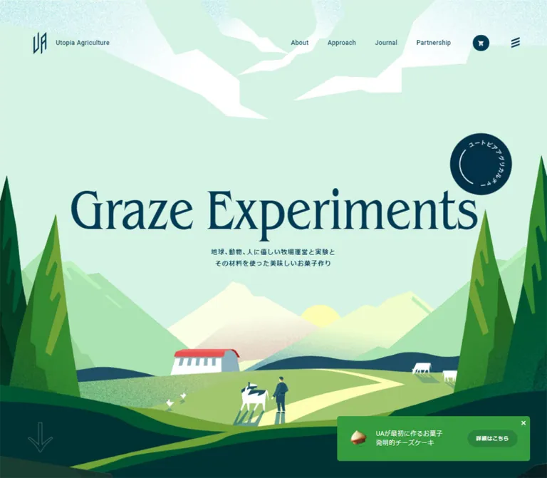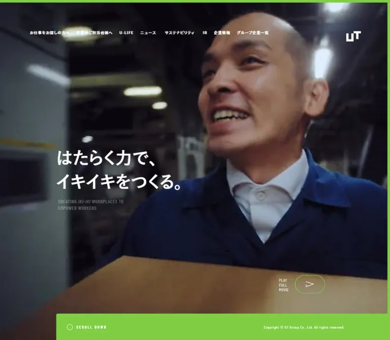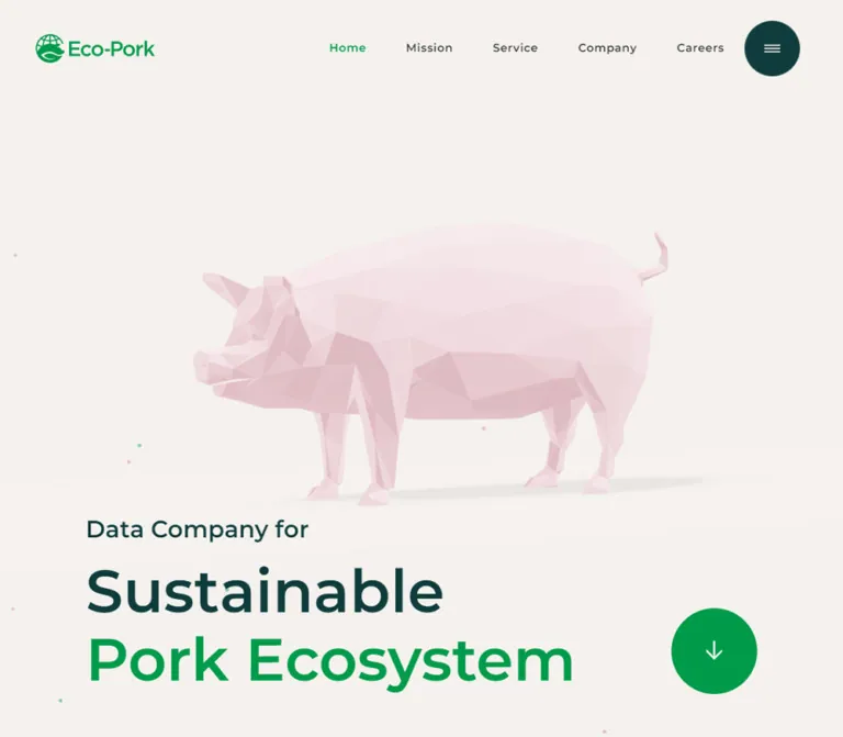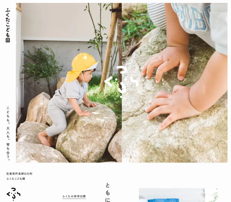
プレビュー準備中デザインリファレンスを見る
DESIGN REFERENCE
株式会社果実堂テクノロジー
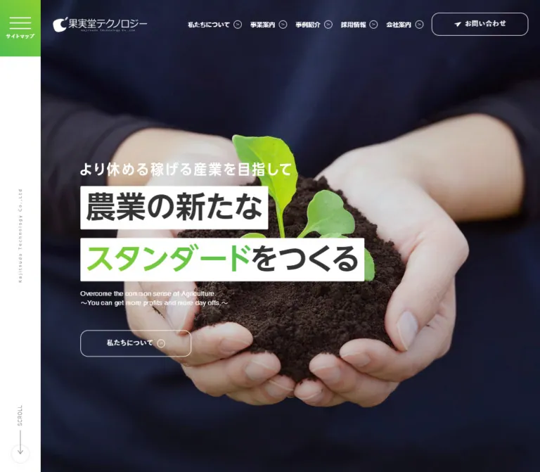
農業の現場写真と力強い日本語見出し、緑のグラデーションを組み合わせた企業サイト。デスクトップの固定サイドレールと、余白を活かした事業・事例・採用情報の構成が特徴。
Kajitsudo Technology — Style Reference
Agricultural field photography, bold white headline strips, and fresh green accents inside a spacious corporate website.
Website: kajitsudotech.co.jp
Original URL: https://www.kajitsudotech.co.jp/
Final URL: https://www.kajitsudotech.co.jp/
Theme: a white corporate canvas with green accents, orange utility labels, photographic feature sections, and a charcoal footer.
Inspected: October 2, 2026, Japan Standard Time. Supplied evidence timestamp: 2026-10-01T15:31:33.928Z, equivalent to October 2 at 00:31:33.928 JST.
Viewports: desktop 1440 × 1000 and mobile 390 × 844 CSS pixels.
Scope: the current corporate homepage, including its hero, news, company introduction, two business offerings, three case studies, recruitment feature, contact section, footer, and closed-state navigation evidence. Interior pages and the open menu were not inspected.
Kajitsudo Technology presents agricultural expertise through photographs of people, plants, soil, and work. Its strongest graphic gesture is the hero headline: two separate white strips carrying very heavy Japanese text, with one phrase highlighted in green. A narrow white rail anchors the desktop composition while the rest of the page moves through large photographs, pale green backgrounds, generous white panels, and compact information lists.
The page is a corporate homepage with several destinations and audiences. News establishes activity; the introduction explains the company; business and case-study sections lead to deeper information; recruitment and contact provide separate next steps. Preserve this breadth when adapting the design. Its identity depends on the relationship between strong photography, restrained navigation, substantial Japanese headings, and unusually spacious paragraph leading.
閉じる
Kajitsudo Technology — Style Reference
Agricultural field photography, bold white headline strips, and fresh green accents inside a spacious corporate website.
Website: kajitsudotech.co.jp
Original URL: https://www.kajitsudotech.co.jp/
Final URL: https://www.kajitsudotech.co.jp/
Theme: a white corporate canvas with green accents, orange utility labels, photographic feature sections, and a charcoal footer.
Inspected: October 2, 2026, Japan Standard Time. Supplied evidence timestamp: 2026-10-01T15:31:33.928Z, equivalent to October 2 at 00:31:33.928 JST.
Viewports: desktop 1440 × 1000 and mobile 390 × 844 CSS pixels.
Scope: the current corporate homepage, including its hero, news, company introduction, two business offerings, three case studies, recruitment feature, contact section, footer, and closed-state navigation evidence. Interior pages and the open menu were not inspected.
Kajitsudo Technology presents agricultural expertise through photographs of people, plants, soil, and work. Its strongest graphic gesture is the hero headline: two separate white strips carrying very heavy Japanese text, with one phrase highlighted in green. A narrow white rail anchors the desktop composition while the rest of the page moves through large photographs, pale green backgrounds, generous white panels, and compact information lists.
The page is a corporate homepage with several destinations and audiences. News establishes activity; the introduction explains the company; business and case-study sections lead to deeper information; recruitment and contact provide separate next steps. Preserve this breadth when adapting the design. Its identity depends on the relationship between strong photography, restrained navigation, substantial Japanese headings, and unusually spacious paragraph leading.
How to Read This Reference
- Measured values come directly from the supplied rendered DOM and computed-style records. All dimensions are CSS pixels unless stated otherwise.
- Visual estimates describe the supplied original-page captures. Estimated colors, shadows, decorative dimensions, and image crops are not recovered stylesheet declarations.
- Derived values are calculations from measured geometry, such as a container's percentage width or an image area's aspect ratio.
- Recommendations describe a new implementation. Proposed breakpoints, accessible behavior, fallback fonts, and sample CSS are not claims about the original implementation.
- Every custom property and component class below is a reusable alias. The supplied custom-property collection was empty.
- The captures establish appearance, while the DOM supplies additional content and measurements for sections not fully pictured. Neither establishes untested hover, menu, or form behavior.
A sampled element can report a transparent background while its visible appearance comes from an image, descendant, or decorative layer. Similarly, some offscreen rectangles do not map cleanly to settled scrolled captures. Use the screenshots for composition and the computed records for individual properties; do not reconstruct the page by hardcoding extracted document coordinates.
Tokens — Colors
Default Palette
| Name | Value | Suggested token | Evidence and role |
|---|---|---|---|
| Canvas White | #ffffff |
--color-canvas |
Measured body background; also visually present in headline strips and content surfaces |
| Main Charcoal | #333333 |
--color-ink |
Measured body, section-heading, and control text |
| Reading Gray | #555555 |
--color-copy |
Measured introduction, business, and contact paragraphs |
| Strong Article Ink | #111111 |
--color-article |
Measured news and case-study titles |
| Muted Gray | #777777 |
--color-muted |
Measured dates, rail captions, and mobile telephone-hours text |
| Orange Accent | #f26d3f |
--color-accent |
Measured English section labels, business numbers, and telephone number |
| Leaf Green | approximately #50bf46 |
--color-green |
Visual estimate for the deeper end of button and menu gradients |
| Lime Green | approximately #82ce2c |
--color-lime |
Visual estimate for the brighter gradient end and headline emphasis |
| Pale Green | approximately #eaf7de |
--color-wash-start |
Visual estimate for the left side of the business-area background |
| Pale Yellow Green | approximately #f7fbd4 |
--color-wash-end |
Visual estimate for the right side of that background |
| Footer Charcoal | approximately #282828 |
--color-footer |
Visual estimate from the large footer surface |
| Fine Border | approximately #d9d9d9 |
--color-line |
Visual estimate from outlined contact controls |
The supplied computed records establish orange precisely, but do not expose the green gradient stops. Keep that distinction when transferring the palette into a design system.
Color Distribution
Green is concentrated in the menu control, a selected phrase in the hero, small leaf ornaments, primary detail links, and pale section backgrounds. Orange marks small English labels and the telephone number. It is not the general primary-button fill.
The desktop hero's dark navy is part of the photograph, not evidence of a navy page theme. The mobile hero capture contains a much lighter photograph while retaining the same white navigation and headline-strip composition.
Filled detail buttons visually run from deeper green on the left toward lime on the right. The headline emphasis appears to run in the opposite direction. These directions are visual observations; exact stop positions and source gradient syntax are unavailable.
Tokens — Typography
Japanese Display Face
Computed family: MFW-UDShinGoNTPro-DeBold, sans-serif.
This family is declared on the hero headline, desktop navigation, section headings, business headings, recruitment headline, and offscreen sitemap headings. Its computed weight is 400, despite its visibly heavy appearance. The face itself supplies the weight; applying synthetic bold is not an equivalent reconstruction.
The records establish the CSS family name, not font-file URLs, licensing, or successful glyph selection for every character. A new implementation should use this face only when available and licensed. A bold Japanese system sans-serif is a recommended fallback, with line lengths checked again after substitution.
Japanese Body and Controls
The source declares a Japanese system stack beginning with 游ゴシック体, Yu Gothic, and YuGothic, followed by Hiragino, Meiryo, Osaka, MS PGothic, Helvetica, Verdana, and sans-serif alternatives.
Paragraphs use regular weight. Buttons, news titles, dates, and case-study metadata commonly use 700. Long copy has considerably more leading than the headline typography: approximately twice the text size, and sometimes more.
English Labels and Numbers
Computed stack: Helvetica, Verdana, sans-serif.
English section labels are small, bold, orange, and visually uppercase. The hero's English supporting copy is regular white text. The telephone number uses the same Latin stack at a much larger size.
Type Scale
Values below are measured. A slash separates font size from line height.
| Role | Desktop | Mobile | Weight and detail |
|---|---|---|---|
| Hero headline | 70 / 70px |
35.1 / 35.1px |
Display face, computed 400 |
| Hero English copy | 15 / 21px |
14 / 19.6px |
Regular Latin stack |
| Main navigation | 17 / 17px |
Not visible | Display face, computed 400 |
| Section heading | 34 / 51px |
26 / 39px |
Display face, computed 400 |
| English section label | 12 / 12px |
10 / 10px |
Latin stack, 700 |
| Introductory paragraph | 15 / 35.625px |
13 / 26px |
Regular; tracking 1.2px / 0.65px |
| Business title | 28 / 39.2px |
20 / 28px |
Display face, computed 400 |
| Business description | 14 / 28px |
12 / 24px |
Regular; tracking 1.12px / 0.96px |
| Business number | 13 / 13px |
12 / 12px |
Orange Latin text, 700 |
| News title | 16 / 16px |
14 / 14px |
System sans-serif, 700; child styling is not fully captured |
| News date | 13 / 13px |
11 / 11px |
Muted gray, 700 |
| News category | 12 / 12px |
10 / 10px |
White, 700 |
| Case-study title | 18 / 27.9px |
16 / 24.8px |
Strong Article Ink, 700 |
| Case location/company | 12 / 16.8px |
12 / 16.8px |
System sans-serif, 700 |
| Recruitment headline | 48 / 48px |
26 / 36.4px |
White display face |
| Recruitment paragraph | 14 / 29.96px |
12 / 25.68px |
White, regular |
| Main button label | 15 / 15px |
13 / 13px |
700; tracking 1.2px / 1.04px |
| Telephone number | 28 / 28px |
24 / 24px |
Orange Latin text, 700 |
| Telephone hours | 12 / 19.2px |
10 / 16px |
700 |
| Footer contact text | 13 / 26px |
11 / 22px |
White, regular |
The short white statement above the hero headline is visible in the captures, but its sampled paragraph has no extracted text. Its box measures 492 × 36.25px on desktop and 260 × 19.25px on mobile. Its visible lettering is approximately 32px and 18px respectively; those font sizes are estimates, not computed values.
The source HTML root is 10px, while the body reports 6.25px with a 6.25px line height. These are underlying defaults, not the size of normal reading copy. The visible elements override them. The Quick Start therefore uses explicit component sizes with a conventional root rather than copying the tiny body default.
Tokens — Spacing & Shapes
Density: broad section spacing, compact labels, long paragraph leading, and medium-size rounded controls.
There is no verified universal spacing unit. Repeated values include 10, 20, 30, 40, 60, and 80px, with percentage-based geometry suggested by the measured container widths.
Spacing Scale
| Use | Desktop | Mobile | Evidence |
|---|---|---|---|
| Header top inset | 30px |
0px |
Measured padding |
| English label top padding | 10px |
5px |
Measured |
| Arrow reservation in many links | 28px |
28px |
Measured right padding |
| Hero button padding | 22px 60px |
18px 40px |
Measured |
| Filled detail button padding | 20px 70px |
20px 40px |
Measured |
| Business text left inset | 40px |
20px |
Derived from image and text coordinates |
| Business description top padding | 30px |
20px |
Measured |
| Recruitment banner padding | 136px 0 |
30px |
Measured on the linked banner |
| Recruitment section top padding | 60px |
40px |
Measured |
| Contact copy top padding | 40px |
30px |
Measured |
| Contact-to-footer gap | approximately 80px |
approximately 40px |
Derived from section and footer bounds |
| Standard mobile content gutter | — | 19.5px per side |
Measured; exactly 5% of viewport width |
Border Radius and Lines
| Element | Desktop | Mobile | Evidence |
|---|---|---|---|
| Main action buttons | 15px |
10px |
Measured |
| Recruitment banner | 15px |
10px |
Measured |
| News category labels | 5px |
5px |
Measured |
| About panel and footer corners | approximately 15px |
approximately 15px on footer |
Visual estimate; decorative layer not directly sampled |
| Hero headline strips | approximately 2px |
approximately 2px |
Visual estimate |
| Small arrow enclosures | Circular | Circular | Visible in captures |
| Contact control outlines | approximately 1px |
approximately 1px |
Visual estimate consistent with measured box heights |
The source uses rounded rectangles, not fully rounded pills. Small circular arrow symbols supply a second, more delicate shape language. A faint dotted vertical rule divides the desktop contact section.
Layout Measurements
| Element | Desktop measurement | Mobile measurement |
|---|---|---|
| Main-page left edge | 100.81px |
0px |
| Main-page width | 1339.19px |
390px |
| Standard section width | 1215.44px |
351px |
| Standard section left edge | 162.69px |
19.5px |
| Header logo link box | 255.45 × 40px |
200 × 25px |
| Hero photograph area | approximately 1340 × 1000px |
390 × 844px |
| Hero headline group | 661.48 × 224px |
351 × 120.38px |
| Hero action | 257.03 × 61px |
202.77 × 51px |
| About section box | 1277.31px wide |
374.39px wide |
| Business image area | 607.72 × 375.56px |
351 × 216.91px |
| Case-study card width | 380.83px |
351px |
| Recruitment linked banner | 1215.44 × 556.16px |
351 × 344.72px |
| Contact form link | 569.53 × 57px |
351 × 55px |
| Telephone link | 569.53 × 94px |
351 × 84.81px |
| Footer | 1277.31 × 221px |
374.39 × 294px |
| Reported document height | 5968px |
5977px |
At the desktop viewport, the rail occupies approximately 7% of the screen. The standard section occupies approximately 90.76% of the remaining page width. These are derived proportions, not recovered source CSS formulas.
Components
Persistent Rail and Header
Role: keep orientation and company identity visible around a large photographic opening.
On desktop, a white rail approximately 101px wide occupies the left edge. Its top is a green menu block approximately 130px tall, containing three thin white lines and the label サイトマップ. A small, widely tracked company name runs vertically near the rail's center. The lower control shows SCROLL in the opening capture and BACK TO TOP in lower captures, with a fine line, arrow, and circular outline. The DOM confirms a #top link for the latter.
The header overlays the photograph to the right of the rail. The white company logo sits at approximately x: 132px, followed by five navigation links and an outlined contact action. The contact action measures 190 × 53px, with a 15px radius. Navigation combines 17px display text and small circular arrows.
On mobile, the rail disappears. A 50px-high header contains the white logo at the upper left, while a green 50 × 50px hamburger control occupies the upper right. That green control remains visible in the bottom-page mobile capture. The horizontal navigation and separate header contact action are absent.
The logo is graphical. Its DOM link dimensions should not be mistaken for the width or typography of the visible lettering inside the asset.
Hero
Role: state the company's ambition and connect it to real agricultural work.
The hero fills the inspected viewport height. On desktop, a close photograph of hands holding soil and a seedling provides a dark background. On mobile, the captured frame shows hands using a tablet. Both keep the copy at the left rather than centering it over the image.
The content stack is:
- A short white statement:
より休める稼げる産業を目指して. - A white strip containing
農業の新たな. - A second white strip containing
スタンダードをつくる, withスタンダードhighlighted in green. - Two lines of small white English copy.
- An outlined link labeled
私たちについて, with a circular arrow.
At desktop size, the stack begins around x: 207.94px; the first headline strip starts at y: 377.5px. The two strips have separate widths rather than forming one rectangular text panel. Their visual heights are about 102px each, separated by about 20px.
At mobile size, the stack begins at x: 19.5px. The headline starts at approximately y: 356.91px, with strips around 55px high. The action begins at y: 556.47px. Consider the entire stack as a vertically balanced unit slightly below the viewport center, not as text pinned to the image's bottom edge.
The desktop and mobile photographs differ at the captured moments. This does not establish a responsive image substitution: several aligned hero layers and opacity transitions are present, so different slideshow phases are also plausible.
Section Heading Group
Role: provide a consistent bilingual hierarchy throughout the homepage.
Pair a large dark Japanese heading with a small orange English label beneath it. A small green leaf ornament sits just above the heading's trailing edge in the visible About, Business, and Contact sections.
Desktop groups are generally left aligned. Mobile groups are centered while the paragraphs beneath them remain left aligned. The Japanese heading changes from 34px to 26px; the English label changes from 12px to 10px.
The leaf is an accent, not a repeating background pattern. Keep it small enough to remain subordinate to the heading. Its source asset and precise dimensions were not supplied.
News List
Role: present recent company activity in an efficient index.
The DOM contains four dated entries. Desktop rows span the standard 1215.44px content width and measure approximately 78px high. Their horizontal anatomy is date, category label, and title. Dates occupy a 96px box; category labels are 110px wide and 30px high; titles begin approximately 236px after the row's left edge.
On mobile, the date and category share an upper line, with the title beneath. Rows measure approximately 351 × 92.59px. Category labels become content-sized and approximately 21px high. The article-list link moves from the desktop heading row to below the list and is centered.
The category text is white, with a measured 5px radius, but its actual fill is not established by the supplied transparent background records. Do not invent a multicolor category system. The exact divider and title-overflow treatments are also not visually confirmed in the provided captures.
The extraction includes empty-text article anchors alongside titles. For a new implementation, use a clearly named article link and separate category link without nesting interactive elements.
About Feature
Role: connect the corporate proposition to people working in the field.
A wide photograph of two people standing in agricultural land precedes a large white panel. In the desktop capture, the panel overlaps the photograph and extends to the right edge of the content area. Its left corners are visibly rounded. The next section's pale green background continues behind it.
The panel uses two columns: the heading at the left and explanatory copy with a green detail button at the right. The text column begins at approximately x: 706.73px and is around 630px wide. The detail button measures 242.88 × 55px.
On mobile, the panel is approximately 96% of the viewport width, with about 20px of internal horizontal padding. The heading is centered, followed by a 334.39px-wide paragraph and full-width button. The paragraph uses 13px / 26px, preserving the spacious reading rhythm after the layout stacks.
The visible overlap is authoritative; the exact offset and decorative-layer implementation are not recoverable from the sampled section rectangle alone.
Business Offering Pair
Role: distinguish support for established agricultural companies from support for new entrants.
The desktop introduction uses three horizontal zones: heading, explanatory paragraph, and a right-aligned list link. A very large, pale BUSINESS watermark sits in the background. The watermark is visible in the capture, but its exact font size and opacity are not supplied.
Two linked offerings sit side by side with no horizontal gap between their measured image areas. Each image region measures approximately 607.72 × 375.56px, a derived ratio of about 1.618:1. Beneath each image, use an orange business number, a two-line display heading, and a gray paragraph.
The titles identify 農業法人向け アグリカルチャーソリューション and 新規参入向け ハウスソリューション. Their entire content regions are links to separate service pages.
On mobile, the offerings stack at 351px wide. Image regions retain the same measured ratio. Text is inset by 20px, titles use 20px / 28px, and descriptions use 12px / 24px.
The extracted heading text appears twice inside each business heading. This is not evidence that duplicate titles should be visibly rendered or announced. The purpose of the duplicate layers and any associated hover effect were not verified.
Case-Study Cards
Role: provide concrete examples of partner outcomes.
The desktop layout has three linked cards, each approximately 380.83px wide, separated by about 36.48px. Their content order is an upper media region, location, bold outcome title, and company name. The title has stronger contrast than the surrounding metadata.
On mobile, cards form a single vertical list at 351px wide with a measured 30px gap between successive card bounds. Titles reduce from 18px to 16px while location and company text remain 12px.
The supplied DOM establishes the card geometry and text hierarchy. The case-study image subjects, exact image treatments, and hover states are not visible in the provided original-page captures and should remain unspecified.
Recruitment Banner
Role: give recruitment a distinct, photographic invitation.
A large rounded photograph of a worker among leafy crops carries white centered text. The desktop banner is approximately 1215 × 556px, with a centered text block around 640px wide. It contains an English recruitment label, a large Japanese headline, a thin white underline, explanatory copy, and a green detail treatment.
The entire banner is a link to the recruitment page. The green treatment inside it is part of that linked composition; avoid implementing a nested anchor or button.
On mobile, the linked banner measures approximately 351 × 345px, uses a 10px radius and 30px padding, and wraps the heading across two lines. Its smaller height comes from reduced padding and type, not simply scaling the desktop photograph and all its contents uniformly.
Contact Section
Role: provide equally clear web and telephone contact routes.
Desktop contact uses two columns separated by a faint dotted vertical rule. The left column is approximately 419.55px wide and contains the heading group plus introductory copy. The right column is approximately 569.53px wide and contains two labeled methods.
The web method uses a full-width white outlined link, centered text, and a small circle-arrow at the right. The telephone method uses a taller outlined box containing an orange handset symbol and 096-237-7080, followed by reception hours. The DOM confirms a tel:096-237-7080 destination.
On mobile, the heading, paragraph, web method, and telephone method stack. Method labels are centered. Both controls span the 351px content width. The form link is 55px high; the telephone box is about 85px high. The desktop divider is absent in the mobile capture.
Do not turn the orange telephone number into an orange-filled button. The observed emphasis comes from typography inside a neutral outlined surface.
Footer
Role: close the page with company identity and practical contact information.
A broad charcoal panel sits inside white outer margins with rounded upper corners. Desktop places a horizontal white logo at the left and address, telephone/fax, map link, Facebook link, and copyright at the right. Its measured surface is approximately 1277 × 221px.
Mobile uses a taller 374 × 294px panel with approximately 8px outer margins. A vertically arranged logo lockup is centered above the company details. The logo region changes from 212 × 34px on desktop to 142 × 60px on mobile. Preserve this layout change rather than shrinking the horizontal footer logo indefinitely.
Map and social links are visibly underlined. Copyright is small, gray, and tracked. This is a compact identity footer; the extensive sitemap exists elsewhere in the navigation structure.
Closed Sitemap Structure
The rendered DOM contains bilingual links for Home, About, Business, Case Study, Recruit, Company, News, and Contact, plus three business sublinks. Desktop menu items have offscreen negative horizontal coordinates; mobile menu items begin beyond the right viewport edge.
This confirms a separate navigation structure in its closed state. It does not establish the appearance of the open panel, its animation direction, backdrop treatment, keyboard handling, or dismissal behavior.
Tokens — Motion & Interaction
| Treatment | Supplied evidence | What can be concluded |
|---|---|---|
| Ordinary links and linked cards | transition: 0.2s |
A short transition duration is declared; changed properties and hover appearance are not established |
| Hero image layers | opacity 1s cubic-bezier(0.645, 0.045, 0.355, 1) |
Opacity crossfades are supported by the declared styles |
| Hero detail link | opacity 0.9s cubic-bezier(0.77, 0, 0.175, 1) 1s |
A delayed opacity transition is declared for this element |
| Multiple hero frames | Several coincident viewport-sized layers; different photographs in captures | Consistent with a changing hero image, but schedule and trigger are unverified |
| Rail navigation | Opening SCROLL treatment and lower-page BACK TO TOP; #top destination |
Position-dependent presentation is visible; scroll easing and threshold are unknown |
| Sitemap | Closed offscreen link structure | Open-state behavior was not exercised |
| Navigation and contact | Real page URLs and a telephone URI in rendered links | Destinations are confirmed; destination-page behavior was not inspected |
Most sampled nodes report animation: none. That does not rule out transitions, JavaScript-driven movement, or effects on unsampled descendants. Conversely, a bare transition: all without a recorded duration is not proof of visible animation.
The collection process waited for initial load, visible finite motion, layout/text stability, and image decoding within bounded time limits. Perpetual animations were temporarily paused during readiness checks and resumed afterward. This supports settled screenshots, not a complete motion specification.
For a new implementation, retain restrained fades and short control feedback. Do not introduce parallax, text scrambling, spring-driven cards, or automatic image timing as supposedly observed behavior.
Surfaces
| Surface | Appearance | Purpose |
|---|---|---|
| Main canvas | White | Clear corporate reading space |
| Desktop rail | White with a subtle edge shadow in captures | Persistent orientation beside the page |
| Hero | Full-height photographic field | Establish agricultural subject and visual impact |
| Headline strips | Opaque white with nearly square corners | Preserve strong text contrast over photography |
| About panel | Large white rounded panel over a photograph/background transition | Separate explanatory content from imagery |
| Business background | Pale green-to-yellow-green wash with oversized faint lettering | Connect the service section to the agricultural palette |
| Detail action | Green gradient, white label, rounded rectangle | Indicate a route to deeper information |
| Contact methods | White, fine gray outline | Keep web and telephone routes clear without heavy fills |
| Footer | Charcoal with white identity and contact text | Provide a strong visual endpoint |
Soft shadows are visible around selected prominent elements, especially the green About button and large photographic/panel boundaries. There is no evidence of a comprehensive elevation scale. Any reusable shadow values should be treated as approximations and applied sparingly.
Imagery
The photographic language is natural and specific: hands holding living plants, people standing in cultivated fields, a worker surrounded by leaves, and a tablet used during work. The contrast between organic material and practical technology supports the company's subject without requiring abstract technology illustrations.
The desktop hero retains the hands and seedling as the main focal point, with dark clothing behind the text. The mobile hero uses a tight portrait crop of a different captured frame. Avoid assuming that the mobile view must show a smaller version of the seedling composition.
Use real photography with enough resolution for large crops. Preserve believable green foliage and skin tones. Darkening or crop adjustments may be needed for white text, but a specific source overlay value was not provided.
Observed Asset References
The supplied evidence contains no original image URLs, file names, or native asset dimensions. The entries below identify visible subjects rather than invented paths.
| Visual asset | Evidence | Reuse guidance |
|---|---|---|
| Hands holding soil and a seedling | Desktop hero capture | Large landscape crop with the plant and hands retained |
| Hands using a tablet | Mobile hero capture | Portrait crop with open space above the main activity |
| Two people in a cultivated field | Desktop About-area capture | Wide contextual image supporting the overlapping panel |
| Business imagery | Only the upper portions are visible: bottle-like containers at left and sky at right | Obtain the full assets before specifying exact subjects or crops |
| Worker among leafy crops | Recruitment capture | Wide background with text contrast and rounded clipping |
| Company logo | Header and footer captures | Preserve the original mark and the distinct footer lockups |
| Leaf ornament and small icons | Heading, navigation, contact, and footer captures | Preserve their scale and thin visual weight; source formats are unknown |
Case-study media content was not visually available in the supplied captures. Do not invent partner portraits, locations, or photography credits.
Layout & Responsive Behavior
The desktop design is asymmetrical at the page level and orderly inside its sections. The rail removes about 101px from the left edge. Most content then sits within a narrower centered container, while the hero and selected overlapping panels use broader widths.
| Relationship | Desktop at 1440px | Mobile at 390px |
|---|---|---|
| Global shell | Left rail plus page | Full-width page; top-right menu button |
| Hero | Full available width and viewport height | Full viewport width and height |
| Header | Logo, five links, contact action | Logo and hamburger |
| Section headings | Usually left aligned | Centered |
| News | Date, category, title on one row | Date/category above title; list link below all rows |
| About | Overlapping panel with two content columns | Broad panel with stacked content and full-width action |
| Business | Two adjoining offerings | One offering after another |
| Cases | Three columns | One vertical list |
| Recruitment | Broad banner, large centered heading | Compact banner with wrapped heading and 30px inset |
| Contact | Two columns with divider | Single column; full-width controls |
| Footer | Horizontal logo beside information | Centered stacked logo and information |
Desktop case-card spacing is approximately 36.5px; mobile card spacing is 30px. Business images keep their measured 1.618:1 ratio across the two viewports. The mobile content gutter is consistently 5%, while the About panel and footer extend closer to the edges.
Only these two viewport widths were inspected. Exact breakpoints, tablet layouts, landscape handling, and continuous sizing formulas are unknown. The measured mobile hero size of 35.1px equals 9% of 390px, but one sample does not prove a 9vw source rule.
The similar total document heights—about 6,000px at both sizes—do not imply identical vertical structure. Stacked cards make some mobile sections longer, while reduced images, type, and padding make others shorter.
Do’s and Don’ts
Do
- Preserve the desktop white rail and the mobile corner-menu transformation.
- Keep the hero headline on two separate white strips with green emphasis inside the second strip.
- Use substantial Japanese display type alongside much smaller orange English labels.
- Keep paragraphs airy, especially the introduction's measured
15px / 35.625pxdesktop treatment. - Use agricultural photographs with clear human activity and meaningful crop choices.
- Maintain the homepage sequence of news, introduction, services, cases, recruitment, and contact.
- Preserve the desktop two-service and three-case arrangements, then stack them on mobile.
- Use green for detail actions and orange for labels and the telephone number.
- Keep the contact controls broad, outlined, and easy to distinguish.
- Preserve the footer's different horizontal and stacked logo arrangements.
Don’t
- Don't reduce the corporate homepage to one conversion message and a repeated CTA.
- Don't use the dark hero photograph as justification for a dark page-wide theme.
- Don't replace the headline strips with a single translucent glass panel.
- Don't make every link a bright green button or every section a shadowed card.
- Don't replace measured display-face weight
400with synthetic bold without checking the actual font. - Don't copy the body's 6.25px default as a reading-text size.
- Don't assume different hero photographs prove a mobile-only asset swap.
- Don't infer menu animation, image autoplay timing, or hover effects from static captures.
- Don't reproduce duplicated extracted business titles as duplicate visible or accessible text.
- Don't fabricate asset paths, case-study imagery, production credits, or font files.
Recommended Implementation Additions
These are recommendations for a new implementation, not verified features of the original page:
- Give the menu button an accessible name,
aria-expanded, andaria-controls. If its panel is modal, implement keyboard dismissal, focus containment, and focus return. - Remove closed offscreen navigation from keyboard traversal and the accessibility tree until opened. Offscreen positioning alone is insufficient.
- Keep all navigation as real links and provide visible focus indicators. Preserve the actual telephone URI for the telephone control.
- Use semantic headings for the page's content hierarchy; the observed logo H1 and paragraph-based hero need not dictate a new implementation's semantics.
- Validate contrast for white text on bright green and small orange labels. An accessible variant may need darker green stops or dark action text while retaining the same geometry.
- Consider 14–16px mobile reading copy where content density permits. The original's 12–13px paragraphs are measured observations, not a required accessibility target.
- Provide reduced-motion behavior and a stable hero frame. If automatic image changes are implemented, avoid making essential information depend on their timing.
- Use meaningful image alternatives when photographs convey content, and hide decorative leaves and arrow ornaments from assistive technology.
- Reserve image dimensions and avoid hiding essential copy until a reveal script succeeds.
Agent Prompt Guide
Quick Color Reference
- Canvas and headline strips: measured
#ffffff. - Primary text: measured
#333333; long copy:#555555. - Article titles: measured
#111111; muted text:#777777. - English labels and telephone number: measured
#f26d3f. - Green gradient approximation:
#50bf46to#82ce2c. - Pale business wash approximation:
#eaf7deto#f7fbd4. - Footer approximation:
#282828. - Borders are fine and neutral; shadows are occasional, not a universal card treatment.
Overall Prompt
“Create a Japanese agricultural technology corporate homepage inspired by this reference. Use a white canvas, charcoal Japanese typography, small orange English section labels, and fresh green gradient detail actions. At desktop size, reserve a narrow white rail on the left with a green sitemap control, vertical company lettering, and a fine scroll/top indicator. Place a white logo and horizontal navigation over a full-height agricultural photograph. Build the hero statement from two separate white strips, with a heavy Japanese headline and one green phrase. Follow with a compact news list, an overlapping white About panel, two business offerings, three case studies, a photographic recruitment banner, two contact methods, and a charcoal footer. On mobile, remove the rail, retain a fixed 50px green menu square, center section headings, and stack the content. Use spacious paragraph leading and restrained fades. Treat supplied measurements as authoritative and estimated green shades as adjustable.”
Example Component Prompts
- Hero: “A viewport-height agricultural photograph with a left-aligned content stack slightly below center. Add a short white statement, two separate white headline strips, green emphasis within the second line, small white English copy, and a thin white outlined About link. Desktop headline: 70px; mobile source measurement: 35.1px. Keep each strip fitted to its text.”
- About panel: “Overlap a wide field photograph with a large white rounded panel. Use a dark Japanese heading and tiny orange ABOUT US label at left, airy gray copy and a green detail action at right. Stack and center the heading on mobile, with the paragraph left aligned and the action full width.”
- Business section: “Place two adjoining image-led service links over a pale green wash with oversized faint BUSINESS lettering. Beneath each image, use an orange business number, heavy two-line Japanese title, and gray description. Preserve the approximately 1.618:1 image ratio and stack the links on mobile.”
- Contact section: “Use a two-column white contact section with a faint dotted divider. The left contains the bilingual heading and explanation. The right contains a full-width outlined form link and a taller telephone box with an orange number and small hours text. Stack all content on mobile and keep both methods full width.”
- Footer: “A broad charcoal footer with rounded upper corners and narrow white outer margins. Place a white horizontal logo beside practical company details on desktop; use the stacked logo and centered details on mobile. Keep map and social links underlined and copyright small and muted.”
Quick Start
CSS Custom Properties
This is a reusable approximation, not extracted source code. Exact measured neutrals, orange, type sizes, and control radii are retained where practical. Green colors, shadows, and layout formulas are visual adaptations. The 64rem layout breakpoint and 84rem header-navigation threshold are recommendations because the original breakpoints were not supplied.
The default display font below is a bold system fallback. Apply data-display-font='licensed' only after loading an authorized copy of the observed display face. Supply your own approved photographs and logo assets; the CSS does not fetch assets or implement a slideshow or menu state machine.
:root {
  /* Measured colors */
  --color-canvas: #fff;
  --color-ink: #333;
  --color-copy: #555;
  --color-article: #111;
  --color-muted: #777;
  --color-accent: #f26d3f;

  /* Visual approximations */
  --color-green: #50bf46;
  --color-lime: #82ce2c;
  --color-wash-start: #eaf7de;
  --color-wash-end: #f7fbd4;
  --color-footer: #282828;
  --color-line: #d9d9d9;
  --gradient-action: linear-gradient(90deg, var(--color-green), var(--color-lime));

  /* Normalized fallback stacks */
  --font-body: 'Yu Gothic', YuGothic, 'Hiragino Kaku Gothic Pro',
    Meiryo, Osaka, 'MS PGothic', Helvetica, Verdana, sans-serif;
  --font-latin: Helvetica, Verdana, sans-serif;
  --font-display: var(--font-body);
  --weight-display: 700;

  --text-hero: 70px;
  --text-section: 34px;
  --text-business: 28px;
  --text-label: 12px;
  --text-copy: 15px;
  --text-button: 15px;
  --leading-copy: 2.375;
  --tracking-copy: 0.08em;

  /* Derived desktop geometry */
  --rail-width: 7vw;
  --content-width: 90.76%;
  --radius-control: 15px;
  --radius-panel: 15px;
  --space-section: 80px;

  /* Recommended approximation, not a measured shadow */
  --shadow-soft: 0 12px 30px rgb(0 0 0 / 12%);
  --motion-control: 200ms;
  --motion-image: 1s cubic-bezier(0.645, 0.045, 0.355, 1);
}

[data-display-font='licensed'] {
  --font-display: 'MFW-UDShinGoNTPro-DeBold', sans-serif;
  --weight-display: 400;
}

* { box-sizing: border-box; }
html { scroll-behavior: auto; }
body {
  margin: 0;
  color: var(--color-ink);
  background: var(--color-canvas);
  font: 15px/2 var(--font-body);
}
img { display: block; max-width: 100%; }
a { color: inherit; }
button { font: inherit; }
.site-page { margin-left: var(--rail-width); }
.container { width: var(--content-width); margin-inline: auto; }
.section { padding-block: var(--space-section); }

.site-rail {
  position: fixed;
  inset: 0 auto 0 0;
  z-index: 20;
  width: var(--rail-width);
  background: #fff;
  box-shadow: 2px 0 10px rgb(0 0 0 / 5%);
}
.site-rail__name {
  position: absolute;
  top: 50%;
  left: 50%;
  writing-mode: vertical-rl;
  transform: translate(-50%, -50%) rotate(180deg);
  color: var(--color-muted);
  font: 10px/1 var(--font-latin);
  letter-spacing: 0.3em;
}
.menu-toggle {
  position: fixed;
  inset: 0 auto auto 0;
  z-index: 30;
  display: grid;
  place-content: center;
  gap: 12px;
  width: var(--rail-width);
  height: 130px;
  padding: 0;
  border: 0;
  color: #fff;
  background: linear-gradient(var(--color-lime), var(--color-green));
  cursor: pointer;
}
.menu-lines { display: grid; gap: 11px; width: 50px; }
.menu-lines span { height: 2px; background: currentColor; }
.menu-label { font-size: 10px; font-weight: 700; line-height: 1; }

.hero {
  position: relative;
  isolation: isolate;
  display: grid;
  align-items: center;
  min-height: max(100svh, 740px);
  color: #fff;
  background: #24282d;
}
.hero__media {
  position: absolute;
  inset: 0;
  z-index: -1;
  width: 100%;
  height: 100%;
  object-fit: cover;
  object-position: center;
}
.site-header {
  position: absolute;
  inset: 30px 2.31% auto;
  display: flex;
  align-items: center;
  gap: 30px;
}
.brand { flex: none; }
.brand img { width: 255px; height: 40px; object-fit: contain; object-position: left; }
.primary-nav {
  display: flex;
  align-items: center;
  gap: 30px;
  margin-left: auto;
  white-space: nowrap;
}
.primary-nav a {
  font-family: var(--font-display);
  font-size: 17px;
  font-weight: var(--weight-display);
  line-height: 1;
  text-decoration: none;
}
.hero__content {
  position: relative;
  width: 84%;
  margin-left: 8%;
  transform: translateY(5svh);
}
.hero__tagline {
  margin: 0 0 20px;
  font-size: 32px;
  font-weight: 700;
  line-height: 1.13;
}
.hero__headline {
  display: grid;
  justify-items: start;
  gap: 20px;
  margin: 0;
  color: var(--color-ink);
  font-family: var(--font-display);
  font-size: var(--text-hero);
  font-weight: var(--weight-display);
  line-height: 1;
}
.hero__line {
  max-width: 100%;
  padding: 16px 12px;
  border-radius: 2px;
  background: #fff;
}
.hero__emphasis { color: var(--color-green); }
@supports (background-clip: text) {
  .hero__emphasis {
    color: transparent;
    background: linear-gradient(90deg, var(--color-lime), var(--color-green));
    background-clip: text;
  }
}
.hero__english {
  margin: 20px 0 53px;
  font: 15px/1.4 var(--font-latin);
  letter-spacing: 0.3125px;
}

.button {
  display: inline-flex;
  align-items: center;
  justify-content: center;
  gap: 12px;
  padding: 20px 70px;
  border: 1px solid var(--color-line);
  border-radius: var(--radius-control);
  color: var(--color-ink);
  background: #fff;
  font-size: var(--text-button);
  font-weight: 700;
  line-height: 1;
  letter-spacing: 0.08em;
  text-align: center;
  text-decoration: none;
  transition: opacity var(--motion-control);
}
.button--green {
  border: 0;
  color: #fff;
  background: var(--gradient-action);
}
.button--hero { padding: 22px 60px; color: #fff; border-color: #fff; background: transparent; }
.header-contact { flex: none; width: 190px; padding: 18px 0; }
.arrow-circle {
  display: inline-grid;
  flex: none;
  place-items: center;
  width: 19px;
  height: 19px;
  border: 1px solid currentColor;
  border-radius: 50%;
  font: 11px/1 var(--font-latin);
}

.section-heading {
  margin: 0;
  font-family: var(--font-display);
  font-size: var(--text-section);
  font-weight: var(--weight-display);
  line-height: 1.5;
}
.section-label {
  margin: 10px 0 0;
  color: var(--color-accent);
  font: 700 var(--text-label)/1 var(--font-latin);
  text-transform: uppercase;
}
.section-copy {
  margin: 0;
  color: var(--color-copy);
  font-size: var(--text-copy);
  line-height: var(--leading-copy);
  letter-spacing: var(--tracking-copy);
}
.section-intro {
  display: grid;
  grid-template-columns: 20% minmax(0, 1fr) auto;
  align-items: start;
  gap: 20px;
  margin-bottom: 46px;
}
.section-more { font-size: 15px; white-space: nowrap; }

.about-photo { width: 100%; object-fit: cover; }
.about-panel {
  position: relative;
  width: 95.38%;
  margin: -80px 0 0 auto;
  padding: 70px 7%;
  display: grid;
  grid-template-columns: 36% minmax(0, 1fr);
  align-items: center;
  gap: 50px;
  border-radius: var(--radius-panel) 0 0 var(--radius-panel);
  background: #fff;
}
.about-panel .button { margin-top: 30px; box-shadow: var(--shadow-soft); }
.business-surface {
  background: linear-gradient(90deg, var(--color-wash-start), var(--color-wash-end));
}
.business-grid { display: grid; grid-template-columns: repeat(2, minmax(0, 1fr)); }
.business-card { display: block; min-width: 0; color: inherit; text-decoration: none; }
.business-card__image { width: 100%; aspect-ratio: 1.618 / 1; object-fit: cover; }
.business-card__body { padding: 40px; }
.business-card__number { color: var(--color-accent); font: 700 13px/1 var(--font-latin); }
.business-card__title {
  margin: 14px 0 0;
  font-family: var(--font-display);
  font-size: var(--text-business);
  font-weight: var(--weight-display);
  line-height: 1.4;
}
.business-card__copy { margin: 24px 0 0; color: var(--color-copy); font-size: 14px; line-height: 2; letter-spacing: 0.08em; }
.case-grid { display: grid; grid-template-columns: repeat(3, minmax(0, 1fr)); gap: 3%; }
.case-card { display: block; min-width: 0; text-decoration: none; }
.case-card__meta { font-size: 12px; font-weight: 700; line-height: 1.4; }
.case-card__title { margin: 2px 0 12px; color: var(--color-article); font-size: 18px; line-height: 1.55; }

.recruit-banner {
  position: relative;
  isolation: isolate;
  display: block;
  overflow: hidden;
  padding: 136px 30px;
  border-radius: var(--radius-control);
  color: #fff;
  background: #344b2d;
  text-align: center;
  text-decoration: none;
}
.recruit-banner__media { position: absolute; inset: 0; z-index: -1; width: 100%; height: 100%; object-fit: cover; }
.recruit-banner__content { max-width: 640px; margin-inline: auto; }
.recruit-banner__title { font-family: var(--font-display); font-size: 48px; font-weight: var(--weight-display); line-height: 1.3; }

.contact-grid { width: 80%; margin-inline: auto; display: grid; grid-template-columns: 0.737fr 1fr; gap: 82px; }
.contact-methods { position: relative; }
.contact-methods::before { content: ''; position: absolute; inset: 0 auto 0 -41px; border-left: 1px dotted #bbb; }
.contact-method + .contact-method { margin-top: 30px; }
.contact-method__label { margin: 0 0 18px; font-size: 15px; font-weight: 700; line-height: 1.4; }
.contact-method .button { width: 100%; }
.phone-button { flex-direction: column; gap: 10px; }
.phone-number { color: var(--color-accent); font: 700 28px/1 var(--font-latin); }
.phone-hours { font-size: 12px; line-height: 1.6; }

.site-footer {
  width: 95.38%;
  margin: 80px auto 0;
  padding: 45px 8%;
  display: grid;
  grid-template-columns: 212px minmax(0, 1fr);
  gap: 66px;
  border-radius: 15px 15px 0 0;
  color: #fff;
  background: var(--color-footer);
  font-size: 13px;
  line-height: 2;
}
.site-footer__logo { width: 212px; height: 34px; object-fit: contain; }
.site-footer__copyright { margin-top: 30px; color: #aaa; font: 10px/1.6 var(--font-latin); letter-spacing: 0.1em; }

/* Recommended focus treatment; not an observed source state. */
:where(a, button):focus-visible { outline: 3px solid #245d23; outline-offset: 5px; }
.hero :where(a, button):focus-visible { outline-color: #fff; }

@media (max-width: 84rem) {
  .primary-nav, .header-contact { display: none; }
}

@media (max-width: 64rem) {
  :root {
    --rail-width: 0px;
    --content-width: 90%;
    --text-section: 26px;
    --text-business: 20px;
    --text-label: 10px;
    --text-copy: 13px;
    --text-button: 13px;
    --leading-copy: 2;
    --tracking-copy: 0.05em;
    --radius-control: 10px;
    --space-section: 50px;
  }
  .site-rail { display: none; }
  .menu-toggle { inset: 0 0 auto auto; width: 50px; height: 50px; }
  .menu-lines { width: 30px; gap: 7px; }
  .menu-lines span { height: 1px; }
  .menu-label { display: none; }
  .site-header { inset: 0 0 auto; height: 50px; padding-inline: 9px 60px; }
  .brand img { width: 200px; height: 25px; }
  .hero { min-height: max(100svh, 680px); }
  .hero__content { width: 90%; margin-left: 5%; }
  .hero__tagline { margin-bottom: 18px; font-size: 18px; }
  /* Fallback fitting size; source measured 35.1px at 390px. */
  .hero__headline { gap: 10px; font-size: clamp(24px, 8.2vw, 35.1px); }
  .hero__line { padding: 10px 8px; }
  .hero__english { margin: 10px 0 30px; font-size: 14px; }
  .button { padding: 20px 40px; }
  .button--hero { padding: 18px 40px; }
  .section-heading, .section-label { text-align: center; }
  .section-label { margin-top: 5px; }
  .section-intro { grid-template-columns: 1fr; gap: 26px; margin-bottom: 30px; }
  .section-more { justify-self: center; font-size: 13px; }
  .about-panel { width: 96%; margin: 0 auto; padding: 20px; grid-template-columns: 1fr; gap: 30px; border-radius: 15px; }
  .about-panel .button { width: 100%; margin-top: 24px; }
  .business-grid, .case-grid { grid-template-columns: 1fr; }
  .business-card__body { padding: 20px; }
  .business-card__number { font-size: 12px; }
  .business-card__copy { margin-top: 20px; font-size: 12px; }
  .case-grid { gap: 30px; }
  .case-card__title { font-size: 16px; }
  .recruit-banner { padding: 30px; }
  .recruit-banner__title { font-size: 26px; line-height: 1.4; }
  .contact-grid { width: 90%; grid-template-columns: 1fr; gap: 30px; }
  .contact-methods::before { display: none; }
  .contact-method__label { text-align: center; }
  .phone-number { font-size: 24px; }
  .phone-hours { color: var(--color-muted); font-size: 10px; }
  .site-footer { width: 96%; margin-top: 40px; padding: 25px 5% 45px; grid-template-columns: 1fr; gap: 20px; text-align: center; font-size: 11px; }
  .site-footer__logo { width: 142px; height: 60px; margin-inline: auto; }
}

@media (prefers-reduced-motion: reduce) {
  .button, .hero__media { transition: none; }
  /* Any image-rotation script must also respect this preference. */
}
The hero expects separate .hero__line elements inside one semantic heading, with .hero__emphasis wrapping only the green phrase. Mark arrow symbols as decorative. A recruitment banner should contain a noninteractive element styled as a button because the banner itself is already a link.
The fallback mobile headline is deliberately slightly smaller than the source measurement to accommodate broader system-font glyphs. Recheck the two-strip fit after loading the licensed display face; do not compensate for an unavailable font by cropping text. The mobile footer also needs an appropriate stacked logo asset—CSS dimensions alone do not create that lockup.
Tailwind v4 Token Mapping
Optional aliases for an existing Tailwind v4 project. This is not evidence that the original site uses Tailwind. Define the properties above before applying this mapping.
@theme inline {
  --color-canvas: var(--color-canvas);
  --color-ink: var(--color-ink);
  --color-copy: var(--color-copy);
  --color-agri-green: var(--color-green);
  --color-agri-lime: var(--color-lime);
  --color-agri-orange: var(--color-accent);
  --color-footer-panel: var(--color-footer);

  --font-japanese: var(--font-body);
  --font-heading: var(--font-display);
  --font-english: var(--font-latin);

  --text-section-heading: var(--text-section);
  --text-business-heading: var(--text-business);
  --text-section-label: var(--text-label);
  --text-reading: var(--text-copy);

  --radius-action: var(--radius-control);
  --radius-feature: var(--radius-panel);
  --spacing-section-gap: var(--space-section);
}
Sources & Evidence
- Inspected original and final page: https://www.kajitsudotech.co.jp/. The supplied record reports HTTP
200, with no change between original and final URLs. - Capture date: evidence retrieved at
2026-10-01T15:31:33.928Z, or October 2, 2026 at 00:31:33.928 JST. Separate timestamps for each individual screenshot were not supplied. - Desktop evidence:
1440 × 1000CSS-pixel viewport; original-page captures of the opening hero, About/Business transition, and Recruitment/Contact/Footer area; rendered text, link targets, element rectangles, and computed styles. - Mobile evidence:
390 × 844CSS-pixel viewport; original-page captures of the hero and Contact/Footer area; rendered text, link targets, element rectangles, and computed styles throughout the homepage. - Collection scope: initial observation lasted at least five seconds, followed by readiness checks and scrolling through intermediate positions. Image decoding and animation waits had finite limits. SharedWorkers and service workers were disabled during collection.
- Interaction limits: no supplied open-menu capture, hover recording, keyboard test, form submission, telephone activation, interior-page inspection, or complete hero timing sequence. Link destinations are evidence of targets, not completed interactions.
- Asset and style limits: no image URL inventory, font binaries, full stylesheet source, exact green gradient values, or complete pseudo-element styling was supplied. These gaps are explicitly marked as estimates or recommendations above.
This reference describes the current homepage represented by the supplied original-page evidence. Measured values apply to the two inspected viewports; the reusable CSS is an adaptation, not a claim to reproduce unobserved states or source implementation details.
# Kajitsudo Technology — Style Reference

> Agricultural field photography, bold white headline strips, and fresh green accents inside a spacious corporate website.

**Website:** [kajitsudotech.co.jp](https://www.kajitsudotech.co.jp/)
**Original URL:** https://www.kajitsudotech.co.jp/
**Final URL:** https://www.kajitsudotech.co.jp/
**Theme:** a white corporate canvas with green accents, orange utility labels, photographic feature sections, and a charcoal footer.
**Inspected:** October 2, 2026, Japan Standard Time. Supplied evidence timestamp: `2026-10-01T15:31:33.928Z`, equivalent to October 2 at 00:31:33.928 JST.
**Viewports:** desktop `1440 × 1000` and mobile `390 × 844` CSS pixels.
**Scope:** the current corporate homepage, including its hero, news, company introduction, two business offerings, three case studies, recruitment feature, contact section, footer, and closed-state navigation evidence. Interior pages and the open menu were not inspected.

Kajitsudo Technology presents agricultural expertise through photographs of people, plants, soil, and work. Its strongest graphic gesture is the hero headline: two separate white strips carrying very heavy Japanese text, with one phrase highlighted in green. A narrow white rail anchors the desktop composition while the rest of the page moves through large photographs, pale green backgrounds, generous white panels, and compact information lists.

The page is a corporate homepage with several destinations and audiences. News establishes activity; the introduction explains the company; business and case-study sections lead to deeper information; recruitment and contact provide separate next steps. Preserve this breadth when adapting the design. Its identity depends on the relationship between strong photography, restrained navigation, substantial Japanese headings, and unusually spacious paragraph leading.
閉じる
# Kajitsudo Technology — Style Reference

> Agricultural field photography, bold white headline strips, and fresh green accents inside a spacious corporate website.

**Website:** [kajitsudotech.co.jp](https://www.kajitsudotech.co.jp/)
**Original URL:** https://www.kajitsudotech.co.jp/
**Final URL:** https://www.kajitsudotech.co.jp/
**Theme:** a white corporate canvas with green accents, orange utility labels, photographic feature sections, and a charcoal footer.
**Inspected:** October 2, 2026, Japan Standard Time. Supplied evidence timestamp: `2026-10-01T15:31:33.928Z`, equivalent to October 2 at 00:31:33.928 JST.
**Viewports:** desktop `1440 × 1000` and mobile `390 × 844` CSS pixels.
**Scope:** the current corporate homepage, including its hero, news, company introduction, two business offerings, three case studies, recruitment feature, contact section, footer, and closed-state navigation evidence. Interior pages and the open menu were not inspected.

Kajitsudo Technology presents agricultural expertise through photographs of people, plants, soil, and work. Its strongest graphic gesture is the hero headline: two separate white strips carrying very heavy Japanese text, with one phrase highlighted in green. A narrow white rail anchors the desktop composition while the rest of the page moves through large photographs, pale green backgrounds, generous white panels, and compact information lists.

The page is a corporate homepage with several destinations and audiences. News establishes activity; the introduction explains the company; business and case-study sections lead to deeper information; recruitment and contact provide separate next steps. Preserve this breadth when adapting the design. Its identity depends on the relationship between strong photography, restrained navigation, substantial Japanese headings, and unusually spacious paragraph leading.

## How to Read This Reference

- **Measured** values come directly from the supplied rendered DOM and computed-style records. All dimensions are CSS pixels unless stated otherwise.
- **Visual estimates** describe the supplied original-page captures. Estimated colors, shadows, decorative dimensions, and image crops are not recovered stylesheet declarations.
- **Derived** values are calculations from measured geometry, such as a container's percentage width or an image area's aspect ratio.
- **Recommendations** describe a new implementation. Proposed breakpoints, accessible behavior, fallback fonts, and sample CSS are not claims about the original implementation.
- Every custom property and component class below is a reusable alias. The supplied custom-property collection was empty.
- The captures establish appearance, while the DOM supplies additional content and measurements for sections not fully pictured. Neither establishes untested hover, menu, or form behavior.

A sampled element can report a transparent background while its visible appearance comes from an image, descendant, or decorative layer. Similarly, some offscreen rectangles do not map cleanly to settled scrolled captures. Use the screenshots for composition and the computed records for individual properties; do not reconstruct the page by hardcoding extracted document coordinates.

## Tokens — Colors

### Default Palette

| Name | Value | Suggested token | Evidence and role |
| --- | --- | --- | --- |
| Canvas White | `#ffffff` | `--color-canvas` | Measured body background; also visually present in headline strips and content surfaces |
| Main Charcoal | `#333333` | `--color-ink` | Measured body, section-heading, and control text |
| Reading Gray | `#555555` | `--color-copy` | Measured introduction, business, and contact paragraphs |
| Strong Article Ink | `#111111` | `--color-article` | Measured news and case-study titles |
| Muted Gray | `#777777` | `--color-muted` | Measured dates, rail captions, and mobile telephone-hours text |
| Orange Accent | `#f26d3f` | `--color-accent` | Measured English section labels, business numbers, and telephone number |
| Leaf Green | approximately `#50bf46` | `--color-green` | Visual estimate for the deeper end of button and menu gradients |
| Lime Green | approximately `#82ce2c` | `--color-lime` | Visual estimate for the brighter gradient end and headline emphasis |
| Pale Green | approximately `#eaf7de` | `--color-wash-start` | Visual estimate for the left side of the business-area background |
| Pale Yellow Green | approximately `#f7fbd4` | `--color-wash-end` | Visual estimate for the right side of that background |
| Footer Charcoal | approximately `#282828` | `--color-footer` | Visual estimate from the large footer surface |
| Fine Border | approximately `#d9d9d9` | `--color-line` | Visual estimate from outlined contact controls |

The supplied computed records establish orange precisely, but do not expose the green gradient stops. Keep that distinction when transferring the palette into a design system.

### Color Distribution

Green is concentrated in the menu control, a selected phrase in the hero, small leaf ornaments, primary detail links, and pale section backgrounds. Orange marks small English labels and the telephone number. It is not the general primary-button fill.

The desktop hero's dark navy is part of the photograph, not evidence of a navy page theme. The mobile hero capture contains a much lighter photograph while retaining the same white navigation and headline-strip composition.

Filled detail buttons visually run from deeper green on the left toward lime on the right. The headline emphasis appears to run in the opposite direction. These directions are visual observations; exact stop positions and source gradient syntax are unavailable.

## Tokens — Typography

### Japanese Display Face

**Computed family:** `MFW-UDShinGoNTPro-DeBold, sans-serif`.

This family is declared on the hero headline, desktop navigation, section headings, business headings, recruitment headline, and offscreen sitemap headings. Its computed weight is `400`, despite its visibly heavy appearance. The face itself supplies the weight; applying synthetic bold is not an equivalent reconstruction.

The records establish the CSS family name, not font-file URLs, licensing, or successful glyph selection for every character. A new implementation should use this face only when available and licensed. A bold Japanese system sans-serif is a recommended fallback, with line lengths checked again after substitution.

### Japanese Body and Controls

The source declares a Japanese system stack beginning with `游ゴシック体`, `Yu Gothic`, and `YuGothic`, followed by Hiragino, Meiryo, Osaka, MS PGothic, Helvetica, Verdana, and sans-serif alternatives.

Paragraphs use regular weight. Buttons, news titles, dates, and case-study metadata commonly use `700`. Long copy has considerably more leading than the headline typography: approximately twice the text size, and sometimes more.

### English Labels and Numbers

**Computed stack:** `Helvetica, Verdana, sans-serif`.

English section labels are small, bold, orange, and visually uppercase. The hero's English supporting copy is regular white text. The telephone number uses the same Latin stack at a much larger size.

### Type Scale

Values below are measured. A slash separates font size from line height.

| Role | Desktop | Mobile | Weight and detail |
| --- | --- | --- | --- |
| Hero headline | `70 / 70px` | `35.1 / 35.1px` | Display face, computed `400` |
| Hero English copy | `15 / 21px` | `14 / 19.6px` | Regular Latin stack |
| Main navigation | `17 / 17px` | Not visible | Display face, computed `400` |
| Section heading | `34 / 51px` | `26 / 39px` | Display face, computed `400` |
| English section label | `12 / 12px` | `10 / 10px` | Latin stack, `700` |
| Introductory paragraph | `15 / 35.625px` | `13 / 26px` | Regular; tracking `1.2px` / `0.65px` |
| Business title | `28 / 39.2px` | `20 / 28px` | Display face, computed `400` |
| Business description | `14 / 28px` | `12 / 24px` | Regular; tracking `1.12px` / `0.96px` |
| Business number | `13 / 13px` | `12 / 12px` | Orange Latin text, `700` |
| News title | `16 / 16px` | `14 / 14px` | System sans-serif, `700`; child styling is not fully captured |
| News date | `13 / 13px` | `11 / 11px` | Muted gray, `700` |
| News category | `12 / 12px` | `10 / 10px` | White, `700` |
| Case-study title | `18 / 27.9px` | `16 / 24.8px` | Strong Article Ink, `700` |
| Case location/company | `12 / 16.8px` | `12 / 16.8px` | System sans-serif, `700` |
| Recruitment headline | `48 / 48px` | `26 / 36.4px` | White display face |
| Recruitment paragraph | `14 / 29.96px` | `12 / 25.68px` | White, regular |
| Main button label | `15 / 15px` | `13 / 13px` | `700`; tracking `1.2px` / `1.04px` |
| Telephone number | `28 / 28px` | `24 / 24px` | Orange Latin text, `700` |
| Telephone hours | `12 / 19.2px` | `10 / 16px` | `700` |
| Footer contact text | `13 / 26px` | `11 / 22px` | White, regular |

The short white statement above the hero headline is visible in the captures, but its sampled paragraph has no extracted text. Its box measures `492 × 36.25px` on desktop and `260 × 19.25px` on mobile. Its visible lettering is approximately 32px and 18px respectively; those font sizes are estimates, not computed values.

The source HTML root is `10px`, while the body reports `6.25px` with a `6.25px` line height. These are underlying defaults, not the size of normal reading copy. The visible elements override them. The Quick Start therefore uses explicit component sizes with a conventional root rather than copying the tiny body default.

## Tokens — Spacing & Shapes

**Density:** broad section spacing, compact labels, long paragraph leading, and medium-size rounded controls.

There is no verified universal spacing unit. Repeated values include 10, 20, 30, 40, 60, and 80px, with percentage-based geometry suggested by the measured container widths.

### Spacing Scale

| Use | Desktop | Mobile | Evidence |
| --- | --- | --- | --- |
| Header top inset | `30px` | `0px` | Measured padding |
| English label top padding | `10px` | `5px` | Measured |
| Arrow reservation in many links | `28px` | `28px` | Measured right padding |
| Hero button padding | `22px 60px` | `18px 40px` | Measured |
| Filled detail button padding | `20px 70px` | `20px 40px` | Measured |
| Business text left inset | `40px` | `20px` | Derived from image and text coordinates |
| Business description top padding | `30px` | `20px` | Measured |
| Recruitment banner padding | `136px 0` | `30px` | Measured on the linked banner |
| Recruitment section top padding | `60px` | `40px` | Measured |
| Contact copy top padding | `40px` | `30px` | Measured |
| Contact-to-footer gap | approximately `80px` | approximately `40px` | Derived from section and footer bounds |
| Standard mobile content gutter | — | `19.5px` per side | Measured; exactly 5% of viewport width |

### Border Radius and Lines

| Element | Desktop | Mobile | Evidence |
| --- | --- | --- | --- |
| Main action buttons | `15px` | `10px` | Measured |
| Recruitment banner | `15px` | `10px` | Measured |
| News category labels | `5px` | `5px` | Measured |
| About panel and footer corners | approximately `15px` | approximately `15px` on footer | Visual estimate; decorative layer not directly sampled |
| Hero headline strips | approximately `2px` | approximately `2px` | Visual estimate |
| Small arrow enclosures | Circular | Circular | Visible in captures |
| Contact control outlines | approximately `1px` | approximately `1px` | Visual estimate consistent with measured box heights |

The source uses rounded rectangles, not fully rounded pills. Small circular arrow symbols supply a second, more delicate shape language. A faint dotted vertical rule divides the desktop contact section.

### Layout Measurements

| Element | Desktop measurement | Mobile measurement |
| --- | --- | --- |
| Main-page left edge | `100.81px` | `0px` |
| Main-page width | `1339.19px` | `390px` |
| Standard section width | `1215.44px` | `351px` |
| Standard section left edge | `162.69px` | `19.5px` |
| Header logo link box | `255.45 × 40px` | `200 × 25px` |
| Hero photograph area | approximately `1340 × 1000px` | `390 × 844px` |
| Hero headline group | `661.48 × 224px` | `351 × 120.38px` |
| Hero action | `257.03 × 61px` | `202.77 × 51px` |
| About section box | `1277.31px` wide | `374.39px` wide |
| Business image area | `607.72 × 375.56px` | `351 × 216.91px` |
| Case-study card width | `380.83px` | `351px` |
| Recruitment linked banner | `1215.44 × 556.16px` | `351 × 344.72px` |
| Contact form link | `569.53 × 57px` | `351 × 55px` |
| Telephone link | `569.53 × 94px` | `351 × 84.81px` |
| Footer | `1277.31 × 221px` | `374.39 × 294px` |
| Reported document height | `5968px` | `5977px` |

At the desktop viewport, the rail occupies approximately 7% of the screen. The standard section occupies approximately 90.76% of the remaining page width. These are derived proportions, not recovered source CSS formulas.

## Components

### Persistent Rail and Header

**Role:** keep orientation and company identity visible around a large photographic opening.

On desktop, a white rail approximately 101px wide occupies the left edge. Its top is a green menu block approximately 130px tall, containing three thin white lines and the label `サイトマップ`. A small, widely tracked company name runs vertically near the rail's center. The lower control shows `SCROLL` in the opening capture and `BACK TO TOP` in lower captures, with a fine line, arrow, and circular outline. The DOM confirms a `#top` link for the latter.

The header overlays the photograph to the right of the rail. The white company logo sits at approximately `x: 132px`, followed by five navigation links and an outlined contact action. The contact action measures `190 × 53px`, with a 15px radius. Navigation combines 17px display text and small circular arrows.

On mobile, the rail disappears. A 50px-high header contains the white logo at the upper left, while a green `50 × 50px` hamburger control occupies the upper right. That green control remains visible in the bottom-page mobile capture. The horizontal navigation and separate header contact action are absent.

The logo is graphical. Its DOM link dimensions should not be mistaken for the width or typography of the visible lettering inside the asset.

### Hero

**Role:** state the company's ambition and connect it to real agricultural work.

The hero fills the inspected viewport height. On desktop, a close photograph of hands holding soil and a seedling provides a dark background. On mobile, the captured frame shows hands using a tablet. Both keep the copy at the left rather than centering it over the image.

The content stack is:

1. A short white statement: `より休める稼げる産業を目指して`.
2. A white strip containing `農業の新たな`.
3. A second white strip containing `スタンダードをつくる`, with `スタンダード` highlighted in green.
4. Two lines of small white English copy.
5. An outlined link labeled `私たちについて`, with a circular arrow.

At desktop size, the stack begins around `x: 207.94px`; the first headline strip starts at `y: 377.5px`. The two strips have separate widths rather than forming one rectangular text panel. Their visual heights are about 102px each, separated by about 20px.

At mobile size, the stack begins at `x: 19.5px`. The headline starts at approximately `y: 356.91px`, with strips around 55px high. The action begins at `y: 556.47px`. Consider the entire stack as a vertically balanced unit slightly below the viewport center, not as text pinned to the image's bottom edge.

The desktop and mobile photographs differ at the captured moments. This does not establish a responsive image substitution: several aligned hero layers and opacity transitions are present, so different slideshow phases are also plausible.

### Section Heading Group

**Role:** provide a consistent bilingual hierarchy throughout the homepage.

Pair a large dark Japanese heading with a small orange English label beneath it. A small green leaf ornament sits just above the heading's trailing edge in the visible About, Business, and Contact sections.

Desktop groups are generally left aligned. Mobile groups are centered while the paragraphs beneath them remain left aligned. The Japanese heading changes from 34px to 26px; the English label changes from 12px to 10px.

The leaf is an accent, not a repeating background pattern. Keep it small enough to remain subordinate to the heading. Its source asset and precise dimensions were not supplied.

### News List

**Role:** present recent company activity in an efficient index.

The DOM contains four dated entries. Desktop rows span the standard `1215.44px` content width and measure approximately 78px high. Their horizontal anatomy is date, category label, and title. Dates occupy a 96px box; category labels are 110px wide and 30px high; titles begin approximately 236px after the row's left edge.

On mobile, the date and category share an upper line, with the title beneath. Rows measure approximately `351 × 92.59px`. Category labels become content-sized and approximately 21px high. The article-list link moves from the desktop heading row to below the list and is centered.

The category text is white, with a measured 5px radius, but its actual fill is not established by the supplied transparent background records. Do not invent a multicolor category system. The exact divider and title-overflow treatments are also not visually confirmed in the provided captures.

The extraction includes empty-text article anchors alongside titles. For a new implementation, use a clearly named article link and separate category link without nesting interactive elements.

### About Feature

**Role:** connect the corporate proposition to people working in the field.

A wide photograph of two people standing in agricultural land precedes a large white panel. In the desktop capture, the panel overlaps the photograph and extends to the right edge of the content area. Its left corners are visibly rounded. The next section's pale green background continues behind it.

The panel uses two columns: the heading at the left and explanatory copy with a green detail button at the right. The text column begins at approximately `x: 706.73px` and is around 630px wide. The detail button measures `242.88 × 55px`.

On mobile, the panel is approximately 96% of the viewport width, with about 20px of internal horizontal padding. The heading is centered, followed by a `334.39px`-wide paragraph and full-width button. The paragraph uses `13px / 26px`, preserving the spacious reading rhythm after the layout stacks.

The visible overlap is authoritative; the exact offset and decorative-layer implementation are not recoverable from the sampled section rectangle alone.

### Business Offering Pair

**Role:** distinguish support for established agricultural companies from support for new entrants.

The desktop introduction uses three horizontal zones: heading, explanatory paragraph, and a right-aligned list link. A very large, pale `BUSINESS` watermark sits in the background. The watermark is visible in the capture, but its exact font size and opacity are not supplied.

Two linked offerings sit side by side with no horizontal gap between their measured image areas. Each image region measures approximately `607.72 × 375.56px`, a derived ratio of about `1.618:1`. Beneath each image, use an orange business number, a two-line display heading, and a gray paragraph.

The titles identify `農業法人向け アグリカルチャーソリューション` and `新規参入向け ハウスソリューション`. Their entire content regions are links to separate service pages.

On mobile, the offerings stack at `351px` wide. Image regions retain the same measured ratio. Text is inset by 20px, titles use `20px / 28px`, and descriptions use `12px / 24px`.

The extracted heading text appears twice inside each business heading. This is not evidence that duplicate titles should be visibly rendered or announced. The purpose of the duplicate layers and any associated hover effect were not verified.

### Case-Study Cards

**Role:** provide concrete examples of partner outcomes.

The desktop layout has three linked cards, each approximately `380.83px` wide, separated by about `36.48px`. Their content order is an upper media region, location, bold outcome title, and company name. The title has stronger contrast than the surrounding metadata.

On mobile, cards form a single vertical list at `351px` wide with a measured 30px gap between successive card bounds. Titles reduce from 18px to 16px while location and company text remain 12px.

The supplied DOM establishes the card geometry and text hierarchy. The case-study image subjects, exact image treatments, and hover states are not visible in the provided original-page captures and should remain unspecified.

### Recruitment Banner

**Role:** give recruitment a distinct, photographic invitation.

A large rounded photograph of a worker among leafy crops carries white centered text. The desktop banner is approximately `1215 × 556px`, with a centered text block around 640px wide. It contains an English recruitment label, a large Japanese headline, a thin white underline, explanatory copy, and a green detail treatment.

The entire banner is a link to the recruitment page. The green treatment inside it is part of that linked composition; avoid implementing a nested anchor or button.

On mobile, the linked banner measures approximately `351 × 345px`, uses a 10px radius and 30px padding, and wraps the heading across two lines. Its smaller height comes from reduced padding and type, not simply scaling the desktop photograph and all its contents uniformly.

### Contact Section

**Role:** provide equally clear web and telephone contact routes.

Desktop contact uses two columns separated by a faint dotted vertical rule. The left column is approximately `419.55px` wide and contains the heading group plus introductory copy. The right column is approximately `569.53px` wide and contains two labeled methods.

The web method uses a full-width white outlined link, centered text, and a small circle-arrow at the right. The telephone method uses a taller outlined box containing an orange handset symbol and `096-237-7080`, followed by reception hours. The DOM confirms a `tel:096-237-7080` destination.

On mobile, the heading, paragraph, web method, and telephone method stack. Method labels are centered. Both controls span the `351px` content width. The form link is 55px high; the telephone box is about 85px high. The desktop divider is absent in the mobile capture.

Do not turn the orange telephone number into an orange-filled button. The observed emphasis comes from typography inside a neutral outlined surface.

### Footer

**Role:** close the page with company identity and practical contact information.

A broad charcoal panel sits inside white outer margins with rounded upper corners. Desktop places a horizontal white logo at the left and address, telephone/fax, map link, Facebook link, and copyright at the right. Its measured surface is approximately `1277 × 221px`.

Mobile uses a taller `374 × 294px` panel with approximately 8px outer margins. A vertically arranged logo lockup is centered above the company details. The logo region changes from `212 × 34px` on desktop to `142 × 60px` on mobile. Preserve this layout change rather than shrinking the horizontal footer logo indefinitely.

Map and social links are visibly underlined. Copyright is small, gray, and tracked. This is a compact identity footer; the extensive sitemap exists elsewhere in the navigation structure.

### Closed Sitemap Structure

The rendered DOM contains bilingual links for Home, About, Business, Case Study, Recruit, Company, News, and Contact, plus three business sublinks. Desktop menu items have offscreen negative horizontal coordinates; mobile menu items begin beyond the right viewport edge.

This confirms a separate navigation structure in its closed state. It does not establish the appearance of the open panel, its animation direction, backdrop treatment, keyboard handling, or dismissal behavior.

## Tokens — Motion & Interaction

| Treatment | Supplied evidence | What can be concluded |
| --- | --- | --- |
| Ordinary links and linked cards | `transition: 0.2s` | A short transition duration is declared; changed properties and hover appearance are not established |
| Hero image layers | `opacity 1s cubic-bezier(0.645, 0.045, 0.355, 1)` | Opacity crossfades are supported by the declared styles |
| Hero detail link | `opacity 0.9s cubic-bezier(0.77, 0, 0.175, 1) 1s` | A delayed opacity transition is declared for this element |
| Multiple hero frames | Several coincident viewport-sized layers; different photographs in captures | Consistent with a changing hero image, but schedule and trigger are unverified |
| Rail navigation | Opening `SCROLL` treatment and lower-page `BACK TO TOP`; `#top` destination | Position-dependent presentation is visible; scroll easing and threshold are unknown |
| Sitemap | Closed offscreen link structure | Open-state behavior was not exercised |
| Navigation and contact | Real page URLs and a telephone URI in rendered links | Destinations are confirmed; destination-page behavior was not inspected |

Most sampled nodes report `animation: none`. That does not rule out transitions, JavaScript-driven movement, or effects on unsampled descendants. Conversely, a bare `transition: all` without a recorded duration is not proof of visible animation.

The collection process waited for initial load, visible finite motion, layout/text stability, and image decoding within bounded time limits. Perpetual animations were temporarily paused during readiness checks and resumed afterward. This supports settled screenshots, not a complete motion specification.

For a new implementation, retain restrained fades and short control feedback. Do not introduce parallax, text scrambling, spring-driven cards, or automatic image timing as supposedly observed behavior.

## Surfaces

| Surface | Appearance | Purpose |
| --- | --- | --- |
| Main canvas | White | Clear corporate reading space |
| Desktop rail | White with a subtle edge shadow in captures | Persistent orientation beside the page |
| Hero | Full-height photographic field | Establish agricultural subject and visual impact |
| Headline strips | Opaque white with nearly square corners | Preserve strong text contrast over photography |
| About panel | Large white rounded panel over a photograph/background transition | Separate explanatory content from imagery |
| Business background | Pale green-to-yellow-green wash with oversized faint lettering | Connect the service section to the agricultural palette |
| Detail action | Green gradient, white label, rounded rectangle | Indicate a route to deeper information |
| Contact methods | White, fine gray outline | Keep web and telephone routes clear without heavy fills |
| Footer | Charcoal with white identity and contact text | Provide a strong visual endpoint |

Soft shadows are visible around selected prominent elements, especially the green About button and large photographic/panel boundaries. There is no evidence of a comprehensive elevation scale. Any reusable shadow values should be treated as approximations and applied sparingly.

## Imagery

The photographic language is natural and specific: hands holding living plants, people standing in cultivated fields, a worker surrounded by leaves, and a tablet used during work. The contrast between organic material and practical technology supports the company's subject without requiring abstract technology illustrations.

The desktop hero retains the hands and seedling as the main focal point, with dark clothing behind the text. The mobile hero uses a tight portrait crop of a different captured frame. Avoid assuming that the mobile view must show a smaller version of the seedling composition.

Use real photography with enough resolution for large crops. Preserve believable green foliage and skin tones. Darkening or crop adjustments may be needed for white text, but a specific source overlay value was not provided.

### Observed Asset References

The supplied evidence contains no original image URLs, file names, or native asset dimensions. The entries below identify visible subjects rather than invented paths.

| Visual asset | Evidence | Reuse guidance |
| --- | --- | --- |
| Hands holding soil and a seedling | Desktop hero capture | Large landscape crop with the plant and hands retained |
| Hands using a tablet | Mobile hero capture | Portrait crop with open space above the main activity |
| Two people in a cultivated field | Desktop About-area capture | Wide contextual image supporting the overlapping panel |
| Business imagery | Only the upper portions are visible: bottle-like containers at left and sky at right | Obtain the full assets before specifying exact subjects or crops |
| Worker among leafy crops | Recruitment capture | Wide background with text contrast and rounded clipping |
| Company logo | Header and footer captures | Preserve the original mark and the distinct footer lockups |
| Leaf ornament and small icons | Heading, navigation, contact, and footer captures | Preserve their scale and thin visual weight; source formats are unknown |

Case-study media content was not visually available in the supplied captures. Do not invent partner portraits, locations, or photography credits.

## Layout & Responsive Behavior

The desktop design is asymmetrical at the page level and orderly inside its sections. The rail removes about 101px from the left edge. Most content then sits within a narrower centered container, while the hero and selected overlapping panels use broader widths.

| Relationship | Desktop at 1440px | Mobile at 390px |
| --- | --- | --- |
| Global shell | Left rail plus page | Full-width page; top-right menu button |
| Hero | Full available width and viewport height | Full viewport width and height |
| Header | Logo, five links, contact action | Logo and hamburger |
| Section headings | Usually left aligned | Centered |
| News | Date, category, title on one row | Date/category above title; list link below all rows |
| About | Overlapping panel with two content columns | Broad panel with stacked content and full-width action |
| Business | Two adjoining offerings | One offering after another |
| Cases | Three columns | One vertical list |
| Recruitment | Broad banner, large centered heading | Compact banner with wrapped heading and 30px inset |
| Contact | Two columns with divider | Single column; full-width controls |
| Footer | Horizontal logo beside information | Centered stacked logo and information |

Desktop case-card spacing is approximately 36.5px; mobile card spacing is 30px. Business images keep their measured `1.618:1` ratio across the two viewports. The mobile content gutter is consistently 5%, while the About panel and footer extend closer to the edges.

Only these two viewport widths were inspected. Exact breakpoints, tablet layouts, landscape handling, and continuous sizing formulas are unknown. The measured mobile hero size of 35.1px equals 9% of 390px, but one sample does not prove a `9vw` source rule.

The similar total document heights—about 6,000px at both sizes—do not imply identical vertical structure. Stacked cards make some mobile sections longer, while reduced images, type, and padding make others shorter.

## Do’s and Don’ts

### Do

- Preserve the desktop white rail and the mobile corner-menu transformation.
- Keep the hero headline on two separate white strips with green emphasis inside the second strip.
- Use substantial Japanese display type alongside much smaller orange English labels.
- Keep paragraphs airy, especially the introduction's measured `15px / 35.625px` desktop treatment.
- Use agricultural photographs with clear human activity and meaningful crop choices.
- Maintain the homepage sequence of news, introduction, services, cases, recruitment, and contact.
- Preserve the desktop two-service and three-case arrangements, then stack them on mobile.
- Use green for detail actions and orange for labels and the telephone number.
- Keep the contact controls broad, outlined, and easy to distinguish.
- Preserve the footer's different horizontal and stacked logo arrangements.

### Don’t

- Don't reduce the corporate homepage to one conversion message and a repeated CTA.
- Don't use the dark hero photograph as justification for a dark page-wide theme.
- Don't replace the headline strips with a single translucent glass panel.
- Don't make every link a bright green button or every section a shadowed card.
- Don't replace measured display-face weight `400` with synthetic bold without checking the actual font.
- Don't copy the body's 6.25px default as a reading-text size.
- Don't assume different hero photographs prove a mobile-only asset swap.
- Don't infer menu animation, image autoplay timing, or hover effects from static captures.
- Don't reproduce duplicated extracted business titles as duplicate visible or accessible text.
- Don't fabricate asset paths, case-study imagery, production credits, or font files.

## Recommended Implementation Additions

These are recommendations for a new implementation, not verified features of the original page:

- Give the menu button an accessible name, `aria-expanded`, and `aria-controls`. If its panel is modal, implement keyboard dismissal, focus containment, and focus return.
- Remove closed offscreen navigation from keyboard traversal and the accessibility tree until opened. Offscreen positioning alone is insufficient.
- Keep all navigation as real links and provide visible focus indicators. Preserve the actual telephone URI for the telephone control.
- Use semantic headings for the page's content hierarchy; the observed logo H1 and paragraph-based hero need not dictate a new implementation's semantics.
- Validate contrast for white text on bright green and small orange labels. An accessible variant may need darker green stops or dark action text while retaining the same geometry.
- Consider 14–16px mobile reading copy where content density permits. The original's 12–13px paragraphs are measured observations, not a required accessibility target.
- Provide reduced-motion behavior and a stable hero frame. If automatic image changes are implemented, avoid making essential information depend on their timing.
- Use meaningful image alternatives when photographs convey content, and hide decorative leaves and arrow ornaments from assistive technology.
- Reserve image dimensions and avoid hiding essential copy until a reveal script succeeds.

## Agent Prompt Guide

### Quick Color Reference

- Canvas and headline strips: measured `#ffffff`.
- Primary text: measured `#333333`; long copy: `#555555`.
- Article titles: measured `#111111`; muted text: `#777777`.
- English labels and telephone number: measured `#f26d3f`.
- Green gradient approximation: `#50bf46` to `#82ce2c`.
- Pale business wash approximation: `#eaf7de` to `#f7fbd4`.
- Footer approximation: `#282828`.
- Borders are fine and neutral; shadows are occasional, not a universal card treatment.

### Overall Prompt

“Create a Japanese agricultural technology corporate homepage inspired by this reference. Use a white canvas, charcoal Japanese typography, small orange English section labels, and fresh green gradient detail actions. At desktop size, reserve a narrow white rail on the left with a green sitemap control, vertical company lettering, and a fine scroll/top indicator. Place a white logo and horizontal navigation over a full-height agricultural photograph. Build the hero statement from two separate white strips, with a heavy Japanese headline and one green phrase. Follow with a compact news list, an overlapping white About panel, two business offerings, three case studies, a photographic recruitment banner, two contact methods, and a charcoal footer. On mobile, remove the rail, retain a fixed 50px green menu square, center section headings, and stack the content. Use spacious paragraph leading and restrained fades. Treat supplied measurements as authoritative and estimated green shades as adjustable.”

### Example Component Prompts

1. **Hero:** “A viewport-height agricultural photograph with a left-aligned content stack slightly below center. Add a short white statement, two separate white headline strips, green emphasis within the second line, small white English copy, and a thin white outlined About link. Desktop headline: 70px; mobile source measurement: 35.1px. Keep each strip fitted to its text.”
2. **About panel:** “Overlap a wide field photograph with a large white rounded panel. Use a dark Japanese heading and tiny orange ABOUT US label at left, airy gray copy and a green detail action at right. Stack and center the heading on mobile, with the paragraph left aligned and the action full width.”
3. **Business section:** “Place two adjoining image-led service links over a pale green wash with oversized faint BUSINESS lettering. Beneath each image, use an orange business number, heavy two-line Japanese title, and gray description. Preserve the approximately 1.618:1 image ratio and stack the links on mobile.”
4. **Contact section:** “Use a two-column white contact section with a faint dotted divider. The left contains the bilingual heading and explanation. The right contains a full-width outlined form link and a taller telephone box with an orange number and small hours text. Stack all content on mobile and keep both methods full width.”
5. **Footer:** “A broad charcoal footer with rounded upper corners and narrow white outer margins. Place a white horizontal logo beside practical company details on desktop; use the stacked logo and centered details on mobile. Keep map and social links underlined and copyright small and muted.”

## Quick Start

### CSS Custom Properties

This is a reusable approximation, not extracted source code. Exact measured neutrals, orange, type sizes, and control radii are retained where practical. Green colors, shadows, and layout formulas are visual adaptations. The `64rem` layout breakpoint and `84rem` header-navigation threshold are recommendations because the original breakpoints were not supplied.

The default display font below is a bold system fallback. Apply `data-display-font='licensed'` only after loading an authorized copy of the observed display face. Supply your own approved photographs and logo assets; the CSS does not fetch assets or implement a slideshow or menu state machine.

```css
:root {
  /* Measured colors */
  --color-canvas: #fff;
  --color-ink: #333;
  --color-copy: #555;
  --color-article: #111;
  --color-muted: #777;
  --color-accent: #f26d3f;

  /* Visual approximations */
  --color-green: #50bf46;
  --color-lime: #82ce2c;
  --color-wash-start: #eaf7de;
  --color-wash-end: #f7fbd4;
  --color-footer: #282828;
  --color-line: #d9d9d9;
  --gradient-action: linear-gradient(90deg, var(--color-green), var(--color-lime));

  /* Normalized fallback stacks */
  --font-body: 'Yu Gothic', YuGothic, 'Hiragino Kaku Gothic Pro',
    Meiryo, Osaka, 'MS PGothic', Helvetica, Verdana, sans-serif;
  --font-latin: Helvetica, Verdana, sans-serif;
  --font-display: var(--font-body);
  --weight-display: 700;

  --text-hero: 70px;
  --text-section: 34px;
  --text-business: 28px;
  --text-label: 12px;
  --text-copy: 15px;
  --text-button: 15px;
  --leading-copy: 2.375;
  --tracking-copy: 0.08em;

  /* Derived desktop geometry */
  --rail-width: 7vw;
  --content-width: 90.76%;
  --radius-control: 15px;
  --radius-panel: 15px;
  --space-section: 80px;

  /* Recommended approximation, not a measured shadow */
  --shadow-soft: 0 12px 30px rgb(0 0 0 / 12%);
  --motion-control: 200ms;
  --motion-image: 1s cubic-bezier(0.645, 0.045, 0.355, 1);
}

[data-display-font='licensed'] {
  --font-display: 'MFW-UDShinGoNTPro-DeBold', sans-serif;
  --weight-display: 400;
}

* { box-sizing: border-box; }
html { scroll-behavior: auto; }
body {
  margin: 0;
  color: var(--color-ink);
  background: var(--color-canvas);
  font: 15px/2 var(--font-body);
}
img { display: block; max-width: 100%; }
a { color: inherit; }
button { font: inherit; }
.site-page { margin-left: var(--rail-width); }
.container { width: var(--content-width); margin-inline: auto; }
.section { padding-block: var(--space-section); }

.site-rail {
  position: fixed;
  inset: 0 auto 0 0;
  z-index: 20;
  width: var(--rail-width);
  background: #fff;
  box-shadow: 2px 0 10px rgb(0 0 0 / 5%);
}
.site-rail__name {
  position: absolute;
  top: 50%;
  left: 50%;
  writing-mode: vertical-rl;
  transform: translate(-50%, -50%) rotate(180deg);
  color: var(--color-muted);
  font: 10px/1 var(--font-latin);
  letter-spacing: 0.3em;
}
.menu-toggle {
  position: fixed;
  inset: 0 auto auto 0;
  z-index: 30;
  display: grid;
  place-content: center;
  gap: 12px;
  width: var(--rail-width);
  height: 130px;
  padding: 0;
  border: 0;
  color: #fff;
  background: linear-gradient(var(--color-lime), var(--color-green));
  cursor: pointer;
}
.menu-lines { display: grid; gap: 11px; width: 50px; }
.menu-lines span { height: 2px; background: currentColor; }
.menu-label { font-size: 10px; font-weight: 700; line-height: 1; }

.hero {
  position: relative;
  isolation: isolate;
  display: grid;
  align-items: center;
  min-height: max(100svh, 740px);
  color: #fff;
  background: #24282d;
}
.hero__media {
  position: absolute;
  inset: 0;
  z-index: -1;
  width: 100%;
  height: 100%;
  object-fit: cover;
  object-position: center;
}
.site-header {
  position: absolute;
  inset: 30px 2.31% auto;
  display: flex;
  align-items: center;
  gap: 30px;
}
.brand { flex: none; }
.brand img { width: 255px; height: 40px; object-fit: contain; object-position: left; }
.primary-nav {
  display: flex;
  align-items: center;
  gap: 30px;
  margin-left: auto;
  white-space: nowrap;
}
.primary-nav a {
  font-family: var(--font-display);
  font-size: 17px;
  font-weight: var(--weight-display);
  line-height: 1;
  text-decoration: none;
}
.hero__content {
  position: relative;
  width: 84%;
  margin-left: 8%;
  transform: translateY(5svh);
}
.hero__tagline {
  margin: 0 0 20px;
  font-size: 32px;
  font-weight: 700;
  line-height: 1.13;
}
.hero__headline {
  display: grid;
  justify-items: start;
  gap: 20px;
  margin: 0;
  color: var(--color-ink);
  font-family: var(--font-display);
  font-size: var(--text-hero);
  font-weight: var(--weight-display);
  line-height: 1;
}
.hero__line {
  max-width: 100%;
  padding: 16px 12px;
  border-radius: 2px;
  background: #fff;
}
.hero__emphasis { color: var(--color-green); }
@supports (background-clip: text) {
  .hero__emphasis {
    color: transparent;
    background: linear-gradient(90deg, var(--color-lime), var(--color-green));
    background-clip: text;
  }
}
.hero__english {
  margin: 20px 0 53px;
  font: 15px/1.4 var(--font-latin);
  letter-spacing: 0.3125px;
}

.button {
  display: inline-flex;
  align-items: center;
  justify-content: center;
  gap: 12px;
  padding: 20px 70px;
  border: 1px solid var(--color-line);
  border-radius: var(--radius-control);
  color: var(--color-ink);
  background: #fff;
  font-size: var(--text-button);
  font-weight: 700;
  line-height: 1;
  letter-spacing: 0.08em;
  text-align: center;
  text-decoration: none;
  transition: opacity var(--motion-control);
}
.button--green {
  border: 0;
  color: #fff;
  background: var(--gradient-action);
}
.button--hero { padding: 22px 60px; color: #fff; border-color: #fff; background: transparent; }
.header-contact { flex: none; width: 190px; padding: 18px 0; }
.arrow-circle {
  display: inline-grid;
  flex: none;
  place-items: center;
  width: 19px;
  height: 19px;
  border: 1px solid currentColor;
  border-radius: 50%;
  font: 11px/1 var(--font-latin);
}

.section-heading {
  margin: 0;
  font-family: var(--font-display);
  font-size: var(--text-section);
  font-weight: var(--weight-display);
  line-height: 1.5;
}
.section-label {
  margin: 10px 0 0;
  color: var(--color-accent);
  font: 700 var(--text-label)/1 var(--font-latin);
  text-transform: uppercase;
}
.section-copy {
  margin: 0;
  color: var(--color-copy);
  font-size: var(--text-copy);
  line-height: var(--leading-copy);
  letter-spacing: var(--tracking-copy);
}
.section-intro {
  display: grid;
  grid-template-columns: 20% minmax(0, 1fr) auto;
  align-items: start;
  gap: 20px;
  margin-bottom: 46px;
}
.section-more { font-size: 15px; white-space: nowrap; }

.about-photo { width: 100%; object-fit: cover; }
.about-panel {
  position: relative;
  width: 95.38%;
  margin: -80px 0 0 auto;
  padding: 70px 7%;
  display: grid;
  grid-template-columns: 36% minmax(0, 1fr);
  align-items: center;
  gap: 50px;
  border-radius: var(--radius-panel) 0 0 var(--radius-panel);
  background: #fff;
}
.about-panel .button { margin-top: 30px; box-shadow: var(--shadow-soft); }
.business-surface {
  background: linear-gradient(90deg, var(--color-wash-start), var(--color-wash-end));
}
.business-grid { display: grid; grid-template-columns: repeat(2, minmax(0, 1fr)); }
.business-card { display: block; min-width: 0; color: inherit; text-decoration: none; }
.business-card__image { width: 100%; aspect-ratio: 1.618 / 1; object-fit: cover; }
.business-card__body { padding: 40px; }
.business-card__number { color: var(--color-accent); font: 700 13px/1 var(--font-latin); }
.business-card__title {
  margin: 14px 0 0;
  font-family: var(--font-display);
  font-size: var(--text-business);
  font-weight: var(--weight-display);
  line-height: 1.4;
}
.business-card__copy { margin: 24px 0 0; color: var(--color-copy); font-size: 14px; line-height: 2; letter-spacing: 0.08em; }
.case-grid { display: grid; grid-template-columns: repeat(3, minmax(0, 1fr)); gap: 3%; }
.case-card { display: block; min-width: 0; text-decoration: none; }
.case-card__meta { font-size: 12px; font-weight: 700; line-height: 1.4; }
.case-card__title { margin: 2px 0 12px; color: var(--color-article); font-size: 18px; line-height: 1.55; }

.recruit-banner {
  position: relative;
  isolation: isolate;
  display: block;
  overflow: hidden;
  padding: 136px 30px;
  border-radius: var(--radius-control);
  color: #fff;
  background: #344b2d;
  text-align: center;
  text-decoration: none;
}
.recruit-banner__media { position: absolute; inset: 0; z-index: -1; width: 100%; height: 100%; object-fit: cover; }
.recruit-banner__content { max-width: 640px; margin-inline: auto; }
.recruit-banner__title { font-family: var(--font-display); font-size: 48px; font-weight: var(--weight-display); line-height: 1.3; }

.contact-grid { width: 80%; margin-inline: auto; display: grid; grid-template-columns: 0.737fr 1fr; gap: 82px; }
.contact-methods { position: relative; }
.contact-methods::before { content: ''; position: absolute; inset: 0 auto 0 -41px; border-left: 1px dotted #bbb; }
.contact-method + .contact-method { margin-top: 30px; }
.contact-method__label { margin: 0 0 18px; font-size: 15px; font-weight: 700; line-height: 1.4; }
.contact-method .button { width: 100%; }
.phone-button { flex-direction: column; gap: 10px; }
.phone-number { color: var(--color-accent); font: 700 28px/1 var(--font-latin); }
.phone-hours { font-size: 12px; line-height: 1.6; }

.site-footer {
  width: 95.38%;
  margin: 80px auto 0;
  padding: 45px 8%;
  display: grid;
  grid-template-columns: 212px minmax(0, 1fr);
  gap: 66px;
  border-radius: 15px 15px 0 0;
  color: #fff;
  background: var(--color-footer);
  font-size: 13px;
  line-height: 2;
}
.site-footer__logo { width: 212px; height: 34px; object-fit: contain; }
.site-footer__copyright { margin-top: 30px; color: #aaa; font: 10px/1.6 var(--font-latin); letter-spacing: 0.1em; }

/* Recommended focus treatment; not an observed source state. */
:where(a, button):focus-visible { outline: 3px solid #245d23; outline-offset: 5px; }
.hero :where(a, button):focus-visible { outline-color: #fff; }

@media (max-width: 84rem) {
  .primary-nav, .header-contact { display: none; }
}

@media (max-width: 64rem) {
  :root {
    --rail-width: 0px;
    --content-width: 90%;
    --text-section: 26px;
    --text-business: 20px;
    --text-label: 10px;
    --text-copy: 13px;
    --text-button: 13px;
    --leading-copy: 2;
    --tracking-copy: 0.05em;
    --radius-control: 10px;
    --space-section: 50px;
  }
  .site-rail { display: none; }
  .menu-toggle { inset: 0 0 auto auto; width: 50px; height: 50px; }
  .menu-lines { width: 30px; gap: 7px; }
  .menu-lines span { height: 1px; }
  .menu-label { display: none; }
  .site-header { inset: 0 0 auto; height: 50px; padding-inline: 9px 60px; }
  .brand img { width: 200px; height: 25px; }
  .hero { min-height: max(100svh, 680px); }
  .hero__content { width: 90%; margin-left: 5%; }
  .hero__tagline { margin-bottom: 18px; font-size: 18px; }
  /* Fallback fitting size; source measured 35.1px at 390px. */
  .hero__headline { gap: 10px; font-size: clamp(24px, 8.2vw, 35.1px); }
  .hero__line { padding: 10px 8px; }
  .hero__english { margin: 10px 0 30px; font-size: 14px; }
  .button { padding: 20px 40px; }
  .button--hero { padding: 18px 40px; }
  .section-heading, .section-label { text-align: center; }
  .section-label { margin-top: 5px; }
  .section-intro { grid-template-columns: 1fr; gap: 26px; margin-bottom: 30px; }
  .section-more { justify-self: center; font-size: 13px; }
  .about-panel { width: 96%; margin: 0 auto; padding: 20px; grid-template-columns: 1fr; gap: 30px; border-radius: 15px; }
  .about-panel .button { width: 100%; margin-top: 24px; }
  .business-grid, .case-grid { grid-template-columns: 1fr; }
  .business-card__body { padding: 20px; }
  .business-card__number { font-size: 12px; }
  .business-card__copy { margin-top: 20px; font-size: 12px; }
  .case-grid { gap: 30px; }
  .case-card__title { font-size: 16px; }
  .recruit-banner { padding: 30px; }
  .recruit-banner__title { font-size: 26px; line-height: 1.4; }
  .contact-grid { width: 90%; grid-template-columns: 1fr; gap: 30px; }
  .contact-methods::before { display: none; }
  .contact-method__label { text-align: center; }
  .phone-number { font-size: 24px; }
  .phone-hours { color: var(--color-muted); font-size: 10px; }
  .site-footer { width: 96%; margin-top: 40px; padding: 25px 5% 45px; grid-template-columns: 1fr; gap: 20px; text-align: center; font-size: 11px; }
  .site-footer__logo { width: 142px; height: 60px; margin-inline: auto; }
}

@media (prefers-reduced-motion: reduce) {
  .button, .hero__media { transition: none; }
  /* Any image-rotation script must also respect this preference. */
}
```

The hero expects separate `.hero__line` elements inside one semantic heading, with `.hero__emphasis` wrapping only the green phrase. Mark arrow symbols as decorative. A recruitment banner should contain a noninteractive element styled as a button because the banner itself is already a link.

The fallback mobile headline is deliberately slightly smaller than the source measurement to accommodate broader system-font glyphs. Recheck the two-strip fit after loading the licensed display face; do not compensate for an unavailable font by cropping text. The mobile footer also needs an appropriate stacked logo asset—CSS dimensions alone do not create that lockup.

### Tailwind v4 Token Mapping

Optional aliases for an existing Tailwind v4 project. This is not evidence that the original site uses Tailwind. Define the properties above before applying this mapping.

```css
@theme inline {
  --color-canvas: var(--color-canvas);
  --color-ink: var(--color-ink);
  --color-copy: var(--color-copy);
  --color-agri-green: var(--color-green);
  --color-agri-lime: var(--color-lime);
  --color-agri-orange: var(--color-accent);
  --color-footer-panel: var(--color-footer);

  --font-japanese: var(--font-body);
  --font-heading: var(--font-display);
  --font-english: var(--font-latin);

  --text-section-heading: var(--text-section);
  --text-business-heading: var(--text-business);
  --text-section-label: var(--text-label);
  --text-reading: var(--text-copy);

  --radius-action: var(--radius-control);
  --radius-feature: var(--radius-panel);
  --spacing-section-gap: var(--space-section);
}
```

## Sources & Evidence

- **Inspected original and final page:** [https://www.kajitsudotech.co.jp/](https://www.kajitsudotech.co.jp/). The supplied record reports HTTP `200`, with no change between original and final URLs.
- **Capture date:** evidence retrieved at `2026-10-01T15:31:33.928Z`, or October 2, 2026 at 00:31:33.928 JST. Separate timestamps for each individual screenshot were not supplied.
- **Desktop evidence:** `1440 × 1000` CSS-pixel viewport; original-page captures of the opening hero, About/Business transition, and Recruitment/Contact/Footer area; rendered text, link targets, element rectangles, and computed styles.
- **Mobile evidence:** `390 × 844` CSS-pixel viewport; original-page captures of the hero and Contact/Footer area; rendered text, link targets, element rectangles, and computed styles throughout the homepage.
- **Collection scope:** initial observation lasted at least five seconds, followed by readiness checks and scrolling through intermediate positions. Image decoding and animation waits had finite limits. SharedWorkers and service workers were disabled during collection.
- **Interaction limits:** no supplied open-menu capture, hover recording, keyboard test, form submission, telephone activation, interior-page inspection, or complete hero timing sequence. Link destinations are evidence of targets, not completed interactions.
- **Asset and style limits:** no image URL inventory, font binaries, full stylesheet source, exact green gradient values, or complete pseudo-element styling was supplied. These gaps are explicitly marked as estimates or recommendations above.

This reference describes the current homepage represented by the supplied original-page evidence. Measured values apply to the two inspected viewports; the reusable CSS is an adaptation, not a claim to reproduce unobserved states or source implementation details.関連するデザイン
スタイルやページの種類、ジャンルが近いデザインを集めました。