プレビュー準備中デザインリファレンスを見る
日本のWebデザインを、AIの制作リファレンスに。
DESIGN REFERENCE
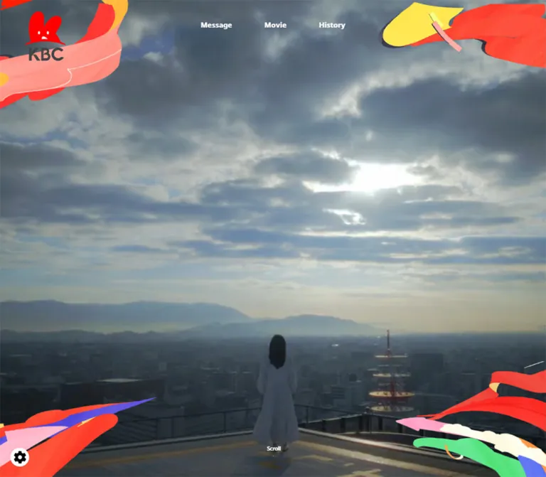
街を望む映像的なビジュアルと鮮やかなリボン、淡いピンクの年表、赤いフッターで地域と歩む70年を伝える周年サイト。
オリジナルサイトを見るA cinematic city view framed by painted ribbons, followed by a generous pink timeline and a brilliant red closing signature.
Website: KBC 70th Anniversary Original URL: https://kbc.co.jp/70th/ Final URL: https://kbc.co.jp/70th/ Theme: light editorial sections, a photographic opening, and a solid red footer; no theme selector was evidenced. Inspected: September 22, 2026, at 14:30:32.938 UTC / 23:30:32.938 JST. Viewports: 1440 × 1000 desktop and 390 × 844 mobile, in CSS pixels. Scope: supplied current-page desktop opening, desktop timeline excerpt, desktop footer, mobile opening, and mobile footer captures, plus rendered text, links, element rectangles, and computed styles spanning both documents. Message, Movie, most timeline entries, and the programme index have DOM evidence but no dedicated visual capture in this set.
This is a corporate anniversary narrative with substantial historical and programme content. Its sequence moves from an atmospheric opening into a brand message, an anniversary movie, a chronology connecting KBC milestones with regional events, programme listings, group-company links, and institutional navigation.
The visual identity depends on three relationships: subdued photographic scenery against saturated hand-painted ribbons; white historical cards against a pale pink field; and restrained charcoal interface elements against a pure red footer. English navigation labels are brief, while Japanese editorial copy carries the story. Large spaces between sections give the anniversary material a ceremonial pace.
The currently served content includes a programme snapshot explicitly dated April 2024. That content date is separate from the September 2026 inspection date.
A cinematic city view framed by painted ribbons, followed by a generous pink timeline and a brilliant red closing signature.
Website: KBC 70th Anniversary Original URL: https://kbc.co.jp/70th/ Final URL: https://kbc.co.jp/70th/ Theme: light editorial sections, a photographic opening, and a solid red footer; no theme selector was evidenced. Inspected: September 22, 2026, at 14:30:32.938 UTC / 23:30:32.938 JST. Viewports: 1440 × 1000 desktop and 390 × 844 mobile, in CSS pixels. Scope: supplied current-page desktop opening, desktop timeline excerpt, desktop footer, mobile opening, and mobile footer captures, plus rendered text, links, element rectangles, and computed styles spanning both documents. Message, Movie, most timeline entries, and the programme index have DOM evidence but no dedicated visual capture in this set.
This is a corporate anniversary narrative with substantial historical and programme content. Its sequence moves from an atmospheric opening into a brand message, an anniversary movie, a chronology connecting KBC milestones with regional events, programme listings, group-company links, and institutional navigation.
The visual identity depends on three relationships: subdued photographic scenery against saturated hand-painted ribbons; white historical cards against a pale pink field; and restrained charcoal interface elements against a pure red footer. English navigation labels are brief, while Japanese editorial copy carries the story. Large spaces between sections give the anniversary material a ceremonial pace.
The currently served content includes a programme snapshot explicitly dated April 2024. That content date is separate from the September 2026 inspection date.
| Name | Value | Suggested token | Evidence | Role |
|---|---|---|---|---|
| KBC Red | #ff0000 |
--color-brand |
Measured | Footer fill, Movie heading, programme-category headings; visually also year markers and mobile menu control |
| Charcoal | #444444 |
--color-ink |
Measured | Body text and brand-site button background; visually also page-top disc |
| White | #ffffff |
--color-white |
Measured body background and copyright text; other uses visually supported | Timeline cards, footer lettering, arrows, and timeline connectors |
| Timeline Pink | Approximately #ffdddd |
--color-history |
Visual estimate | Broad history-section field |
| Soft Neutral | Approximately #f6f6f4 |
--color-neutral |
Visual estimate | Area preceding the footer and pale image surfaces |
| Ribbon Coral | Approximately #ff493d |
--color-ribbon-coral |
Visual estimate | Painted foreground strokes; separate from exact UI red |
| Ribbon Yellow | Approximately #ffe65b |
--color-ribbon-yellow |
Visual estimate | Upper-right painted shape and small accents |
| Ribbon Pink | Approximately #ffa6cf |
--color-ribbon-pink |
Visual estimate | Lower-corner illustration accents |
| Ribbon Green | Approximately #62df88 |
--color-ribbon-green |
Visual estimate | Lower-right illustration |
| Ribbon Violet | Approximately #6953e8 |
--color-ribbon-violet |
Visual estimate | Narrow lower-corner strokes |
The photographic opening adds slate blue, gray, and muted olive tones. These belong to the image rather than a general interface palette. Keep the colorful ribbon accents inside the artwork instead of assigning each one to a different button or content category.
The desktop navigation appears white over the opening scene and charcoal over the pink history section. The sampled outer anchors report charcoal in both cases; their inherited color alone does not explain the visible lettering. Reproduce the visible contrast with an explicit header state in a new implementation.
The brand-site link has a measured charcoal background, although its outer anchor also reports charcoal text. The screenshot clearly shows white lettering and a white arrow disc. Style the actual label and icon, rather than copying the parent color mechanically.
MFW-PAotoGothicStdN-Medium, 'ヒラギノ角ゴ Pro W3'.400, despite Medium being part of the family name.MFW-PAotoGothicStdN-Bold, 'ヒラギノ角ゴ Pro W3'.700.Use the declared faces only when available and appropriately licensed. The Quick Start adds generic fallbacks for portability; it does not supply or identify a font download.
| Role | Desktop measured value | Mobile measured value | Notes |
|---|---|---|---|
| Body inheritance | 13px / 13px, weight 400 |
Same | A reset/inheritance value, not the reading size of every component |
| Message paragraphs | 24px / 68px, weight 700 |
12.48px / 27.04px, weight 700 |
Deliberately spacious lines |
| Message tracking | 0.96px, or 0.04em |
0.3744px, or 0.03em |
Measured |
| Movie heading | 120px / 120px, weight 700 |
62.4px / 62.4px, weight 700 |
Red; tracking is 0.02em at both sizes |
| Movie explanation | 18px / 36px |
11.44px / 22.88px |
Line height is twice the font size |
| History introduction | 20px / 41px |
12.48px / 25.584px |
Approximately 2.05 line-height ratio |
| Timeline explanatory copy | 18px / 32px |
12.48px / 22.36px |
Desktop rectangles also show evidence consistent with scaling; see below |
| Programme categories | 26px / 26px, weight 700 |
18.72px / 18.72px, weight 700 |
Red labels for television, radio, and projects |
| Copyright | 15px / 30px |
11.44px / 22.88px |
White, centered |
| Desktop navigation lettering | Approximately 20–22px visually | Replaced by menu control | The sampled anchor's inherited 13px is not a reliable visible-label measurement |
| Featured timeline title | Approximately 24px visually | Not visually established | Red and bold in the supplied desktop excerpt |
| Regional-event title | Approximately 22px visually | Not visually established | Charcoal and bold |
The root element reports 10px. The Quick Start retains a conventional browser root and uses explicit values, so its rem-based additions do not depend on that reset.
The Message section contains an empty-text H1 box measuring approximately 366 × 356.09px on desktop and 197.59 × 192.25px on mobile. Its contents were not included in the element sample. Treat it as an identity-sized visual slot, without assuming its inherited 26px font describes the visible graphic.
Similarly, the Japanese message H2 occupies a 176px-high desktop box while reporting inherited 19.5px type. The History H2 occupies 160px including bottom padding. Their final lettering sizes cannot be recovered from the parent records alone. The Movie H2 is the reliable measured large-type reference.
Density: a sparse opening and broad section spacing, followed by a very long chronology and a denser programme index.
Geometry: circles for utility controls and year seals; pill-shaped outbound links; softly rounded cards; broad curved image-to-copy boundaries within featured milestones.
Several mobile values correspond exactly to viewport percentages at 390px: 12.48px = 3.2vw, 62.4px = 16vw, 18.72px = 4.8vw, and 26px = 6.6667vw. These equivalences are useful for adaptation, but a single mobile measurement does not prove the original CSS formulas or breakpoint.
| Element | Desktop | Mobile | Evidence |
|---|---|---|---|
| Opening section | 1440 × 1000px |
390 × 844px |
Measured; fills the captured viewport |
| Full document height | 31,270.98px |
22,738.64px |
Measured captured state |
| Main Movie/timeline wrapper | 1120px, x = 160 |
338px, x = 26 |
Measured |
| Programme-index wrapper | 930px, x = 255 |
338px, x = 26 |
Measured |
| Header horizontal padding | 65px |
17.6042px |
Measured |
| Header top position | 30px |
8.125px |
Measured; mobile header box itself has zero height |
| Message top padding | 168px |
101.4px |
Measured |
| Space after Message before Movie section | 360px |
Approximately 145.6px |
Derived from section rectangles |
| Movie activation area | 1120 × 630px |
338 × 234px |
Measured outer link; mobile box is not 16:9 |
| Movie explanatory text width | 914px |
325.53px |
Measured |
| History top padding | 345px |
98.8px |
Measured |
| Gap between sampled decade sections | 125px |
Approximately 33.84px |
Derived from consecutive rectangles |
| Group-company link tile | 320 × 140px |
171.59 × 72.80px |
Measured |
| Group-company grid gap | 40px |
Approximately 15.6px |
Derived from tile positions |
| Brand-site pill | 890 × 150px |
338 × 78px |
Measured |
| Footer | 1440 × 636px |
390 × 563.55px |
Measured |
| Footer outbound link | 320 × 80px |
296.39 × 62.39px |
Measured |
| Gap between footer links | 20px |
Approximately 20.8px |
Derived |
| Page-top outer control | 102 × 126px |
52 × 68.63px |
Measured; includes caption |
The desktop screenshot shows a featured card approximately 480px wide at x = 160, a central white rail approximately 14px wide around x = 720, and a compact regional-event card approximately 370px wide starting near x = 799. This supports a reusable desktop arrangement of two 480px lanes separated by a 160px central gap, with the compact card occupying only part of its lane.
The settled featured card has approximately 30px horizontal copy padding. However, the DOM sample reports paragraph rectangles at x = 211 with a 378px width. A 420px text area scaled to 90% about the card center would produce those values. Paragraph heights also show 28.8px increments against a computed 32px line height. This is consistent with a transformed ancestor, but the transform declaration and trigger were not supplied. Do not confuse those rectangles with the final untransformed card width.
| Element | Value | Status |
|---|---|---|
| Brand-site pill | 75px desktop; 39px mobile |
Measured |
| Footer link | 40px desktop; 31.2px mobile |
Measured |
| Featured-card lower corners | Approximately 10px |
Visual estimate |
| Regional-event card | Approximately 8–10px |
Visual estimate |
| Regional year label | Approximately 15px, fully rounded |
Visual estimate |
| Featured year seal | Approximately 80px diameter |
Visual estimate, desktop |
| Page-top disc | Approximately 100px desktop; 52px mobile |
Visual estimate supported by outer rectangles |
| Mobile menu disc | Approximately 58px diameter |
Visual estimate |
The curved top of the featured image and the white arch above its description are larger compositional shapes. A uniform 10px corner radius does not reproduce them.
Role: maintain identity and provide access to Message, Movie, and History.
The desktop opening places the red KBC mascot and charcoal wordmark near the upper-left corner. Three short English links sit across the upper center, with approximately 84px between their measured boxes. There is no opaque navigation bar or enclosing border.
The same logo and navigation remain visible in the desktop history capture, establishing persistent-header behavior across the supplied scroll positions. The positioning mechanism was not provided, and the footer captures do not show the header.
On mobile, the horizontal link row disappears. A red circular control near the upper-right corner contains two fine white horizontal lines. Its approximate position is x = 313, y = 19. The logo remains at the upper left, visibly smaller than on desktop.
The mobile DOM contains the three navigation links outside the viewport at x ≈ 416. This supports a closed off-canvas navigation structure. It does not establish the open panel's appearance, transition, focus management, or closing behavior.
Role: establish place, atmosphere, and anticipation before the written message.
A rooftop scene fills the viewport. A person in a pale dress stands near the lower center, looking across a city toward distant mountains. A large, clouded sky occupies most of the composition. The city and foreground are comparatively dark, allowing the white navigation and Scroll cue to remain legible.
Four groups of colorful painted ribbons enter from the corners. Red and coral dominate, with yellow at the upper right and pink, green, cream, and violet in the lower corners. Their irregular edges and visible texture make the frame feel handmade.
The opening contains no large promotional headline in the supplied captures. The main Japanese message follows below it. Preserve that delay between atmospheric image and written statement.
On mobile, the scene is cropped horizontally while retaining the person and skyline. The corner illustrations are resized and repositioned; they do not behave as one uniformly scaled desktop border.
A small centered Scroll label sits near the bottom with a thin vertical white rule beneath it. In the desktop capture the rule reaches the lower edge; in the mobile capture it ends above a small bottom clearance. The evidence does not establish whether this cue is clickable or animated.
Role: introduce the anniversary identity and future-facing statement.
The measured structure is a centered identity-sized H1, followed by the two-line heading あしたを、もっとユニークに。, then widely spaced, centered Japanese paragraphs. The desktop statement uses bold 24px text with 68px line height.
Mobile copy uses additional deliberate line breaks. The sentence about walking with the local community and the final statement each split into more lines than on desktop. Preserve the editorial pacing rather than allowing arbitrary wrapping to determine every break.
The exact identity artwork and visible heading lettering were not supplied in a dedicated capture. Their bounding boxes establish hierarchy and space allocation, not a complete visual treatment.
Role: introduce and activate the anniversary film.
The strongest measured typographic component is the red Movie heading: 120px on desktop and 62.4px on mobile. Below it is an activation link labeled 70周年ムービーを再生する, followed by an explanatory paragraph.
The desktop activation box is exactly 16:9 at 1120 × 630px. The mobile link box measures 338 × 234px; that measurement may include more than the visible media thumbnail. Do not force its entire mobile control into a 16:9 rectangle based solely on the desktop size.
The body text describes a film connecting regional history with the future through animation. It identifies 陣野小和 as the performer and クレナズム as the artist who supplied an original song. Those are film-content credits explicitly present in the inspected page.
Playback was not exercised. The evidence does not establish a modal, embedded player, streaming provider, soundtrack behavior, or full-screen transition. Use a semantic button when implementing a JavaScript-controlled player instead of reproducing the sampled empty href.
Role: connect the organization's milestones with events in its surrounding region.
The section begins with History, the Japanese heading ユニークをとどけて、70年, and introductory copy. The chronology runs from 1953 through 2024 in the rendered content.
The supplied desktop excerpt establishes the key arrangement: substantial KBC milestone cards on the left, compact regional-event cards on the right, and a broad white vertical rail with horizontal connections. The layout is intentionally uneven. Regional events do not need photographs or the same height as organization milestones.
The pale pink field continues through large areas of empty space between events. Preserve those pauses and the visible chronological spine. A dense table or a uniform card grid would change the reading experience.
Mobile paragraph widths support a full-width reading lane within the 338px wrapper. The exact mobile rail and connector arrangement is not visible in the supplied captures.
Role: give a KBC programme or initiative enough room for recognition and explanation.
The 1989 example has this anatomy:
ドォーモ.ドォーモ放送開始.In the supplied excerpt the card is approximately 480px wide and 520px tall. Its title and paragraph begin about 30px inside the left edge. The roughly 80px year seal intersects the curved white transition, making it part of the card composition rather than a detached metadata chip.
Use original programme artwork where available. Do not recreate a logo using a similar font or substitute a generic stock photograph.
Role: provide concise historical context alongside organization milestones.
The 1989 example is a compact white rounded rectangle, approximately 370 × 123px. A small red pill containing the year sits above a bold charcoal title, アジア太平洋博覧会開催. The content is inset approximately 24px horizontally and 20px vertically.
There is no large illustration or explanatory paragraph in this example. A white horizontal connector meets the card from the central rail. Keep these entries lighter than the featured milestone cards so the two kinds of history remain distinguishable.
Role: document the breadth of KBC's activities after the chronology.
A narrower desktop wrapper contains a section heading, the explicit April 2024 date note, and three categories: テレビ, ラジオ, and プロジェクト. Category headings are measured red bold text at 26px desktop and 18.72px mobile.
The content is a dense sequence of programme names separated by Japanese slash characters. The supplied link inventory does not establish these names as individual links. Treat them as editorial listings unless a new implementation has actual destinations.
Mobile reflow makes this section approximately 2006.78px tall, compared with 1409px on desktop. This is a text-heavy part of the page, unlike the opening and footer; do not impose the same sparse composition on every section.
Role: connect the anniversary story to the wider organization.
Five logo-bearing links appear before the large brand-site button. The measured desktop arrangement is three columns followed by two tiles, using 320 × 140px link boxes and 40px gaps. Mobile uses two columns, approximately 171.59 × 72.80px tiles, and 15.6px gaps, leaving the fifth tile at the start of a third row.
The original destinations are /kbc-ghd/, /, /kbcunie/, /kbckaihatsu/, and /kbcmooov/ on the KBC domain. The sampled anchors have empty text. Their accessible names and image alternatives were not provided. The mobile footer capture shows the end of this area, including a white logo tile.
Role: provide a prominent continuation into the organization's brand material.
A charcoal pill labeled ブランドサイトはこちら leads to the brand site. It measures 890 × 150px on desktop and 338 × 78px on mobile. The mobile screenshot shows a centered white label and a white circular arrow container near the right edge.
The arrow is a thin charcoal right-pointing line inside a white disc. The disc is visually about 40px across on mobile. It is an icon inside the link, not a second target.
A substantial neutral gap separates this pill from the red footer: approximately 290px on desktop and 114.4px on mobile, derived from the measured element positions.
Role: close the story with a strong brand signature and practical destinations.
The footer is an uninterrupted #ff0000 field. A white anniversary mark combines the large number 70, the mascot, an anniversary ribbon, and KBC lettering. On desktop it sits left of a stacked pair of outlined links; on mobile it is centered above them.
The two links are 公式サイトはこちら and 採用情報はこちら, leading to the official homepage and recruitment page. Each uses a thin white outline, a fully rounded shape, white text, and a white arrow disc at the right. Desktop buttons measure 320 × 80px. Mobile buttons remain broad at approximately 296.4 × 62.4px, with about 46.8px outer margins.
A fine white horizontal rule separates the main footer from the centered copyright line. The displayed text is All Rights Reserved. Copyright © KBC Co.,Ltd.. This is the identity statement present in the inspected footer.
Role: provide a return point after the long document.
A charcoal circle straddles the neutral/red boundary near the right side. It contains a narrow white upward-pointing triangle, with Page top written below the circle on the red field.
The desktop outer control starts 50px above the footer and measures 102 × 126px including its caption. Mobile starts 26px above the footer and measures 52 × 68.63px. This is an intentional overlap at a section boundary, rather than a fixed floating control evidenced throughout the page.
The control's purpose is clear from its label. Its click handler, scrolling duration, and focus destination were not tested.
| Element or behavior | Supplied evidence | Supported conclusion |
|---|---|---|
| Header transition | 0.4s cubic-bezier(0.19, 1, 0.22, 1) on the header |
A 400ms eased transition is declared; affected properties and triggers are not established |
| History introductory paragraph | 0.6s cubic-bezier(0.39, 0.575, 0.565, 1) 1.3s |
A 600ms transition with a 1300ms delay is declared; its visual effect is unverified |
| Other sampled transitions | Frequently serialized as all |
This does not establish a nonzero transition duration |
| Sampled CSS animations | none on the listed elements |
No animation is declared on those sampled nodes; descendants, pseudo-elements, media, and script animation are not fully covered |
| Header navigation | Real links to #message, #movie, and #history |
In-page destinations are verified; smooth scrolling and active-link treatment are not |
| Mobile navigation | Menu control visible; link boxes outside the viewport | Closed navigation state is evidenced; open state is not |
| Opening imagery | One cinematic scene in the supplied captures | Video source, autoplay, looping, audio, and frame timing are not established |
| Movie activation | Named activation link in the DOM | Playback affordance is verified; player behavior is not |
| Timeline rectangles | Measurements consistent with a 0.9 scale on some desktop card contents | Possible reveal-state scaling; no supported duration or scroll trigger |
| Page top | Visible labeled control at footer boundary | Intended return-to-top function; execution unverified |
The collector waited for initial rendering and sampled stability, temporarily pausing perpetual animations during readiness checks before resuming them. A settled screenshot is therefore not evidence that an element never moves.
For an adaptation, the measured header easing is a useful starting point for restrained transitions. Do not invent parallax, scroll scrubbing, elastic card entrances, or continuously moving ribbons as if they were verified source behavior.
| Layer | Appearance | Structural purpose |
|---|---|---|
| Opening | Full-bleed, muted city scene | Emotional introduction and sense of place |
| Corner artwork | Saturated, textured painted shapes | Branded framing without obscuring the center |
| History field | Pale pink | Unifies the long chronology |
| Featured milestone | Pale artwork area, white curved copy surface | Gives major organizational events a recognizable visual story |
| Regional event | Compact white rounded panel | Adds parallel historical context |
| Timeline infrastructure | Broad white rail and connectors | Establishes sequence and relationship |
| Pre-footer region | Soft neutral background | Separates logo links and the large charcoal continuation button |
| Footer | Pure red with white detail | Strong closing identity and clear outbound destinations |
| Utility disc | Charcoal with white symbol | Page-top control with sufficient visual separation from red |
Shadows are secondary. A soft card shadow is visible in the timeline, but there is no evidence for a broad multi-level elevation system. Most hierarchy comes from color fields, scale, whitespace, and curved boundaries.
The opening combines photographic depth with flat, tactile illustration. The image has a broad sky, distant mountains, dense urban detail, and a small human figure. The painted ribbons are much brighter than the scenery and remain close to the perimeter. Preserve the open center and the balance between quiet background and energetic edges.
The ribbons resemble layered brush or cut-paper strokes with uneven contours, slight surface variation, and occasional fine drawn lines. Their appearance is not reproduced by smooth gradients or a few generic CSS blobs. Treat the four corners as separately art-directed groups.
The history excerpt uses programme branding as its main illustration. Its neutral image surface gives the colorful logo room to remain recognizable. The footer switches to a monochrome white anniversary mark, while the header retains the red mascot and charcoal lettering.
| Visual resource | Evidence | Implementation guidance |
|---|---|---|
| Rooftop/city opening scene | Desktop and mobile original-page captures | Use an authorized scene or poster; preserve the person when cropping |
| Four corner ribbon groups | Desktop and mobile opening captures | Supply separate transparent layers or a carefully art-directed composite |
| KBC header identity | Opening and desktop history captures | Preserve original proportions and colors |
ドォーモ programme artwork |
Desktop 1989 timeline capture | Keep as artwork; contain within the image panel |
| White anniversary mark | Both footer captures | Use the correct monochrome variant |
| Group-company marks | Logo links in DOM; partial mobile capture | Preserve aspect ratios and provide meaningful accessible names |
No asset file URLs were supplied for these resources. The CSS below intentionally contains no guessed image paths. Photography, logos, and ribbon texture require real assets in addition to the layout shell.
The page remains a long scrolling document at both widths. It is not a fixed application shell. The captured height falls from approximately 31,271px on desktop to 22,739px on mobile, but individual sections behave differently: the history compresses while the programme index grows through text wrapping.
| Region | Desktop observation | Mobile observation |
|---|---|---|
| Opening | Entire 1440 × 1000 viewport; expansive sky and city | Entire 390 × 844 viewport; central scene retained through horizontal cropping |
| Navigation | Three visible English anchor links | Circular menu control; closed links positioned offscreen |
| Message | Larger type, fewer editorial line breaks | Smaller type, additional deliberate breaks |
| Movie | 1120px-wide activation area; 120px heading | 338px-wide activation box; 62.4px heading |
| Timeline | Illustrated milestones and compact regional events on opposite sides of a center rail | 338px section width and 296.4px paragraph width support a broad reading lane; rail geometry unverified |
| Programme index | 930px-wide text region | 338px-wide region with substantially more wrapping |
| Group companies | Three-column arrangement | Two-column arrangement |
| Footer | Anniversary mark and link stack side by side | Centered mark above two wide links |
| Page top | Approximately 100px disc, half above boundary | 52px disc, half above boundary |
Do not scale the desktop screenshot as a single composition. Navigation changes structure, footer content stacks, company tiles change column count, and editorial copy receives new line breaks.
Some recorded offscreen rectangles overlap, including the desktop Movie activation area and its following paragraph. The unusually tall Movie section also exceeds the height of its listed visible contents. These facts do not by themselves establish pinning, parallax, or a particular scroll-animation system. Use normal content flow as the reusable baseline, and add only behavior supported by further inspection.
The exact responsive breakpoint is unknown. The Quick Start uses 767px as a recommended implementation boundary. Tablet, landscape-phone, browser-chrome changes, and enlarged-text layouts were not captured.
#ff0000 and #444444 for the measured primary interface colors.These are recommendations for a new implementation, not verified features of the original page:
#ff0000, measured.#444444, measured.#ffffff.#ffdddd, visual estimate.#f6f6f4, visual estimate.“Create a long-form anniversary website for a regional broadcaster. Begin with a full-viewport city scene viewed from a rooftop, keeping a person near the lower center and a broad clouded sky above. Frame the corners with textured, irregular painted ribbons in red, coral, yellow, pink, green, and violet. Place a compact brand mark at the upper left, three simple desktop anchor links across the upper center, and a small bottom Scroll cue. Follow with a centered Japanese message, an oversized red Movie heading, and a long pale-pink chronology. On desktop, place illustrated organizational milestones left of a broad white rail and compact regional events to its right. Finish with programme listings, group-company logo tiles, a large charcoal brand-site pill, and a pure-red footer with a white anniversary mark. Recompose navigation, cards, logos, and footer for mobile. Treat playback and menu behavior as explicit implementation work.”
This is a reusable adaptation, not recovered source CSS. It preserves measured colors, key sizes, and the observed component relationships. Pink, neutral gray, shadows, card curves, navigation text size, and the 767px breakpoint are approximations or recommendations.
Use .timeline-row for a logical pair of milestone and regional-event entries; keep the DOM in chronological order. A .milestone-card contains .milestone-media followed by .milestone-copy, with .year-disc, a heading, and a paragraph inside the copy area. Image elements must receive real, authorized assets.
Header contrast uses an explicit .is-over-hero state. Header visibility near the footer, menu behavior, media controls, and any reveal effects require separate implementation. The baseline below leaves content visible and does not recreate unverified scroll choreography.
:root {
  /* Measured primary colors; estimated supporting surfaces. */
  --color-brand: #ff0000;
  --color-ink: #444444;
  --color-white: #ffffff;
  --color-history: #ffdddd;
  --color-neutral: #f6f6f4;

  /* Source family names with recommended portable fallbacks. */
  --font-body: 'MFW-PAotoGothicStdN-Medium',
    'ヒラギノ角ゴ Pro W3', system-ui, sans-serif;
  --font-bold: 'MFW-PAotoGothicStdN-Bold',
    'ヒラギノ角ゴ Pro W3', system-ui, sans-serif;

  --content-wide: 1120px;
  --content-index: 930px;
  --text-story: 18px;
  --leading-story: 1.777778;
  --text-movie-copy: 18px;
  --text-message: 24px;
  --leading-message: 2.833333;
  --text-display: 120px;
  --text-category: 26px;
  --text-copyright: 15px;
  --timeline-gap: 160px;
  --timeline-rule: 14px;
  --radius-card: 10px;
  --radius-pill: 999px;

  /* Recommended approximation of the visible card shadow. */
  --shadow-card: 0 12px 28px rgb(68 68 68 / 0.06);
  --ease-header: cubic-bezier(0.19, 1, 0.22, 1);
}

* { box-sizing: border-box; }
body {
  margin: 0;
  color: var(--color-ink);
  background: var(--color-white);
  font-family: var(--font-body);
}
img { display: block; max-width: 100%; }
a { color: inherit; }
button { font: inherit; }
[hidden] { display: none !important; }
section[id] { scroll-margin-top: 120px; }
.wrap {
  width: min(var(--content-wide), calc(100% - 52px));
  margin-inline: auto;
}

/* Fixed positioning is an adaptation of observed persistence. */
.site-header {
  position: fixed;
  inset: 30px 65px auto;
  z-index: 100;
  display: grid;
  grid-template-columns: 1fr auto 1fr;
  align-items: start;
  color: var(--color-ink);
  transition: color 400ms var(--ease-header);
}
.site-header.is-over-hero { color: var(--color-white); }
.header-logo { width: 78px; }
.desktop-nav {
  display: flex;
  gap: 84px;
  padding-top: 28px;
  font-family: var(--font-bold);
  font-size: 22px;
  line-height: 1;
}
.desktop-nav a { text-decoration: none; }
.menu-button { display: none; }

.hero {
  position: relative;
  height: 100vh;
  height: 100svh;
  overflow: hidden;
  isolation: isolate;
  background: #53616a;
}
.hero-media {
  position: absolute;
  inset: 0;
  width: 100%;
  height: 100%;
  object-fit: cover;
  object-position: center;
  z-index: -1;
}
.ribbon {
  position: absolute;
  pointer-events: none;
  max-width: none;
}
.ribbon--tl { top: 0; left: 0; width: clamp(180px, 24vw, 350px); }
.ribbon--tr { top: 0; right: 0; width: clamp(145px, 30vw, 450px); }
.ribbon--bl { bottom: 0; left: 0; width: clamp(145px, 29vw, 420px); }
.ribbon--br { bottom: 0; right: 0; width: clamp(140px, 28vw, 410px); }
.scroll-cue {
  position: absolute;
  bottom: 0;
  left: 50%;
  display: grid;
  justify-items: center;
  gap: 30px;
  transform: translateX(-50%);
  color: white;
  font-size: 13px;
  line-height: 16px;
}
.scroll-cue::after {
  content: '';
  width: 1px;
  height: 32px;
  background: currentColor;
}

.message { padding-top: 168px; text-align: center; }
.message-identity { width: 366px; margin-inline: auto; }
.message-copy {
  font-family: var(--font-bold);
  font-size: var(--text-message);
  font-weight: 700;
  line-height: var(--leading-message);
  letter-spacing: 0.04em;
}
.message-copy p { margin: 0; }
.movie { padding-block: 160px; }
.movie-title {
  margin: 0 0 64px;
  color: var(--color-brand);
  font-family: var(--font-bold);
  font-size: var(--text-display);
  font-weight: 700;
  line-height: 1;
  letter-spacing: 0.02em;
}
.movie-trigger {
  display: grid;
  place-items: center;
  width: 100%;
  aspect-ratio: 16 / 9;
  padding: 0;
  border: 0;
  color: inherit;
  background: var(--color-neutral);
  cursor: pointer;
}
.movie-copy {
  max-width: 914px;
  margin: 40px auto 0;
  font-size: var(--text-movie-copy);
  line-height: 2;
}

.history {
  padding-block: 345px 160px;
  background: var(--color-history);
}
.timeline { position: relative; }
.timeline::before {
  content: '';
  position: absolute;
  inset-block: 0;
  left: 50%;
  width: var(--timeline-rule);
  transform: translateX(-50%);
  background: white;
}
.timeline-row {
  position: relative;
  display: grid;
  grid-template-columns: repeat(2, minmax(0, 1fr));
  gap: var(--timeline-gap);
  align-items: start;
  margin-bottom: 125px;
}
.milestone-card, .regional-card { position: relative; }
.milestone-card { grid-column: 1; }
.milestone-card::after, .regional-card::after {
  content: '';
  position: absolute;
  width: calc(var(--timeline-gap) / 2);
  height: var(--timeline-rule);
  background: white;
}
.milestone-card::after { right: -80px; top: 42%; }
.regional-card::after { left: -80px; top: 50%; }
.milestone-media {
  display: grid;
  place-items: center;
  aspect-ratio: 480 / 345;
  overflow: hidden;
  background: var(--color-neutral);
  border-radius: 50% 50% 0 0 / 12% 12% 0 0;
}
.milestone-media img {
  width: 72%;
  max-height: 72%;
  object-fit: contain;
}
.milestone-copy {
  position: relative;
  margin-top: -30px;
  padding: 70px 30px 26px;
  background: white;
  border-radius: 50% 50% 10px 10px / 30px 30px 10px 10px;
  box-shadow: var(--shadow-card);
}
.year-disc {
  position: absolute;
  top: -26px;
  left: 23px;
  display: grid;
  place-items: center;
  width: 80px;
  height: 80px;
  border-radius: 50%;
  color: white;
  background: var(--color-brand);
  font-size: 24px;
}
.milestone-copy h3 {
  margin: 0 0 14px;
  color: var(--color-brand);
  font-family: var(--font-bold);
  font-size: 24px;
  line-height: 1.5;
}
.milestone-copy p {
  margin: 0;
  font-size: var(--text-story);
  line-height: var(--leading-story);
}
.regional-card {
  grid-column: 2;
  width: min(370px, 100%);
  margin-top: 64px;
  padding: 20px 24px 26px;
  border-radius: var(--radius-card);
  background: white;
}
.year-pill {
  display: inline-block;
  padding: 3px 9px;
  border-radius: var(--radius-pill);
  color: white;
  background: var(--color-brand);
  font-size: 22px;
  line-height: 1.1;
}
.regional-card h3 {
  margin: 16px 0 0;
  font-family: var(--font-bold);
  font-size: 22px;
  line-height: 1.4;
}

.programme-index { max-width: var(--content-index); }
.programme-index h3 {
  color: var(--color-brand);
  font-family: var(--font-bold);
  font-size: var(--text-category);
}
.group-section {
  padding-block: 80px 290px;
  background: var(--color-neutral);
}
.company-grid {
  display: grid;
  grid-template-columns: repeat(3, minmax(0, 1fr));
  gap: 40px;
  width: min(1040px, calc(100% - 52px));
  margin-inline: auto;
}
.company-tile {
  display: grid;
  place-items: center;
  min-height: 140px;
  padding: 24px;
  background: white;
}
.company-tile img { max-height: 80px; object-fit: contain; }
.brand-link, .footer-link {
  display: flex;
  align-items: center;
  justify-content: space-between;
  gap: 20px;
  border-radius: var(--radius-pill);
  text-decoration: none;
}
.brand-link {
  position: relative;
  justify-content: center;
  width: min(890px, calc(100% - 52px));
  min-height: 150px;
  margin: 160px auto 0;
  padding: 24px 100px;
  color: white;
  background: var(--color-ink);
  font-family: var(--font-bold);
}
.arrow-disc {
  display: grid;
  place-items: center;
  flex: 0 0 40px;
  width: 40px;
  height: 40px;
  border-radius: 50%;
  color: var(--color-ink);
  background: white;
}
.brand-link .arrow-disc { position: absolute; right: 60px; }

.site-footer {
  position: relative;
  padding: 112px 0 80px;
  color: white;
  background: var(--color-brand);
}
.footer-main {
  display: grid;
  grid-template-columns: 1fr 320px;
  align-items: start;
  width: min(900px, calc(100% - 52px));
  margin-inline: auto;
}
.anniversary-mark { width: 204px; }
.footer-links { display: grid; gap: 20px; padding-top: 18px; }
.footer-link {
  min-height: 80px;
  padding: 16px 20px 16px 40px;
  border: 1px solid white;
  font-size: 16px;
}
.footer-divider {
  width: min(1120px, calc(100% - 52px));
  margin: 164px auto 50px;
  border: 0;
  border-top: 1px solid white;
}
.copyright {
  margin: 0;
  padding-inline: 20px;
  text-align: center;
  font-size: var(--text-copyright);
  line-height: 2;
}
.page-top {
  position: absolute;
  top: -50px;
  right: max(26px, calc((100% - 1120px) / 2));
  display: grid;
  justify-items: center;
  gap: 8px;
  text-decoration: none;
  font-size: 18px;
  line-height: 1;
}
.page-top-disc {
  display: grid;
  place-items: center;
  width: 100px;
  height: 100px;
  border-radius: 50%;
  background: var(--color-ink);
}
.page-top-disc::before {
  content: '';
  width: 14px;
  height: 26px;
  background: white;
  clip-path: polygon(50% 0, 100% 100%, 0 100%);
}

/* Recommended breakpoint; source breakpoint was not supplied. */
@media (max-width: 767px) {
  :root {
    --text-story: 3.2vw;
    --leading-story: 1.791667;
    --text-message: 3.2vw;
    --leading-message: 2.166667;
    --text-movie-copy: 2.933333vw;
    --text-display: 16vw;
    --text-category: 4.8vw;
    --text-copyright: 2.933333vw;
  }
  .wrap { width: 86.666667%; }
  .site-header { inset: 8.125px 4.5139vw auto; }
  .header-logo { width: 60px; }
  .desktop-nav { display: none; }
  .menu-button {
    grid-column: 3;
    justify-self: end;
    display: grid;
    place-content: center;
    gap: 9px;
    width: 58px;
    height: 58px;
    margin-top: 11px;
    padding: 0;
    border: 0;
    border-radius: 50%;
    color: white;
    background: var(--color-brand);
  }
  .menu-button span { width: 25px; height: 1px; background: currentColor; }
  .scroll-cue { bottom: 26px; gap: 4px; }
  .scroll-cue::after { height: 18px; }
  .message { padding-top: 26vw; }
  .message-identity { width: 50.666667vw; }
  .message-copy { letter-spacing: 0.03em; }
  .movie { padding-block: 100px; }
  .movie-title { margin-bottom: 31.2px; }
  .movie-trigger { aspect-ratio: 338 / 234; }
  .movie-copy { width: 96.31%; margin-top: 20.8px; }
  .history { padding-block: 25.333333vw 37.333333vw; }

  /* Recommended mobile simplification; rail appearance is unverified. */
  .timeline::before,
  .milestone-card::after,
  .regional-card::after { display: none; }
  .timeline-row { grid-template-columns: 1fr; gap: 24px; margin-bottom: 33.84px; }
  .milestone-card, .regional-card { grid-column: 1; }
  .regional-card { width: 100%; margin-top: 0; }
  .milestone-copy { padding: 52px 5.333333vw 24px; }
  .milestone-copy h3, .regional-card h3 { font-size: 18px; }
  .year-disc { width: 52px; height: 52px; left: 20.8px; font-size: 17px; }
  .year-pill { font-size: 16px; }
  .group-section { padding-bottom: 114.4px; }
  .company-grid { width: 92%; grid-template-columns: repeat(2, minmax(0, 1fr)); gap: 4vw; }
  .company-tile { min-height: 18.666667vw; padding: 12px; }
  .brand-link {
    width: 86.666667%;
    min-height: 78px;
    margin-top: 48.1px;
    padding: 20px 64px 20px 24px;
    font-size: 14px;
  }
  .brand-link .arrow-disc { right: 24px; }
  .site-footer { padding: 52px 0 62.4px; }
  .footer-main { width: 76%; grid-template-columns: 1fr; justify-items: center; gap: 62px; }
  .anniversary-mark { width: 120px; }
  .footer-links { width: 100%; gap: 20.8px; padding-top: 0; }
  .footer-link { min-height: 62.4px; padding: 13px 13px 13px 36.4px; font-size: 14px; }
  .footer-link .arrow-disc { width: 32px; height: 32px; flex-basis: 32px; }
  .footer-divider { width: 76%; margin: 76px auto 24px; }
  .page-top { top: -26px; right: 6.666667%; gap: 5.2px; font-size: 11.44px; }
  .page-top-disc { width: 52px; height: 52px; }
  .page-top-disc::before { width: 8px; height: 14px; }

  /* Optional readability variant applied to the root element. */
  .readable-type {
    --text-story: max(14px, 3.2vw);
    --text-message: max(14px, 3.2vw);
    --text-movie-copy: max(14px, 2.933333vw);
    --text-copyright: max(12px, 2.933333vw);
  }
}

/* Recommended keyboard treatment; not observed source behavior. */
:where(a, button):focus-visible {
  outline: 3px solid currentColor;
  outline-offset: 5px;
}
@media (prefers-reduced-motion: reduce) {
  html { scroll-behavior: auto; }
  .site-header { transition: none; }
}
Optional aliases for a project already using Tailwind v4. This does not imply that the inspected website uses Tailwind. Define the properties above first.
@theme inline {
  --color-brand: #ff0000;
  --color-ink: #444444;
  --color-history: #ffdddd;
  --color-neutral: #f6f6f4;
  --font-editorial: var(--font-body);
  --font-emphasis: var(--font-bold);
  --text-story: var(--text-story);
  --text-anniversary: var(--text-display);
  --text-category-label: var(--text-category);
  --radius-card: 10px;
  --radius-pill: 999px;
  --spacing-timeline-gap: 160px;
  --spacing-timeline-rule: 14px;
}
For an actual Tailwind project, avoid defining a theme variable in terms of itself: rename the underlying --text-story property to an application-specific name such as --kbc-text-story and map --text-story to that variable. The remaining aliases already use distinct source names or direct values.
The supplied collection waited at least five seconds during initial observation and checked document load, sampled layout/text stability, applicable finite motion, and image decoding within bounded waits. Scrolling traversed intermediate positions. These checks do not establish complete interaction coverage or the absence of delayed content. Shared workers and service workers were disabled during collection.
No additional browsing or file inspection was performed for this reference. Exact asset URLs, complete descendant styles, breakpoint declarations, open-menu appearance, playback behavior, hover/focus states, and mobile timeline connectors remain unverified. The document describes the page currently supplied at the inspected URL; it does not reconstruct an earlier version.
# KBC 70th Anniversary — Style Reference

> A cinematic city view framed by painted ribbons, followed by a generous pink timeline and a brilliant red closing signature.

**Website:** [KBC 70th Anniversary](https://kbc.co.jp/70th/)
**Original URL:** https://kbc.co.jp/70th/
**Final URL:** https://kbc.co.jp/70th/
**Theme:** light editorial sections, a photographic opening, and a solid red footer; no theme selector was evidenced.
**Inspected:** September 22, 2026, at 14:30:32.938 UTC / 23:30:32.938 JST.
**Viewports:** 1440 × 1000 desktop and 390 × 844 mobile, in CSS pixels.
**Scope:** supplied current-page desktop opening, desktop timeline excerpt, desktop footer, mobile opening, and mobile footer captures, plus rendered text, links, element rectangles, and computed styles spanning both documents. Message, Movie, most timeline entries, and the programme index have DOM evidence but no dedicated visual capture in this set.

This is a corporate anniversary narrative with substantial historical and programme content. Its sequence moves from an atmospheric opening into a brand message, an anniversary movie, a chronology connecting KBC milestones with regional events, programme listings, group-company links, and institutional navigation.

The visual identity depends on three relationships: subdued photographic scenery against saturated hand-painted ribbons; white historical cards against a pale pink field; and restrained charcoal interface elements against a pure red footer. English navigation labels are brief, while Japanese editorial copy carries the story. Large spaces between sections give the anniversary material a ceremonial pace.

The currently served content includes a programme snapshot explicitly dated April 2024. That content date is separate from the September 2026 inspection date.
# KBC 70th Anniversary — Style Reference

> A cinematic city view framed by painted ribbons, followed by a generous pink timeline and a brilliant red closing signature.

**Website:** [KBC 70th Anniversary](https://kbc.co.jp/70th/)
**Original URL:** https://kbc.co.jp/70th/
**Final URL:** https://kbc.co.jp/70th/
**Theme:** light editorial sections, a photographic opening, and a solid red footer; no theme selector was evidenced.
**Inspected:** September 22, 2026, at 14:30:32.938 UTC / 23:30:32.938 JST.
**Viewports:** 1440 × 1000 desktop and 390 × 844 mobile, in CSS pixels.
**Scope:** supplied current-page desktop opening, desktop timeline excerpt, desktop footer, mobile opening, and mobile footer captures, plus rendered text, links, element rectangles, and computed styles spanning both documents. Message, Movie, most timeline entries, and the programme index have DOM evidence but no dedicated visual capture in this set.

This is a corporate anniversary narrative with substantial historical and programme content. Its sequence moves from an atmospheric opening into a brand message, an anniversary movie, a chronology connecting KBC milestones with regional events, programme listings, group-company links, and institutional navigation.

The visual identity depends on three relationships: subdued photographic scenery against saturated hand-painted ribbons; white historical cards against a pale pink field; and restrained charcoal interface elements against a pure red footer. English navigation labels are brief, while Japanese editorial copy carries the story. Large spaces between sections give the anniversary material a ceremonial pace.

The currently served content includes a programme snapshot explicitly dated April 2024. That content date is separate from the September 2026 inspection date.

## How to Read This Reference

- **Measured** means a value appears in the supplied computed styles or element rectangles. Measurements describe the captured state, including any transforms affecting that state.
- **Visual estimate** means an approximate dimension, color, or treatment inferred from the original-page screenshots. These are not sampled stylesheet values.
- **Recommended** means an implementation choice for a reusable adaptation. Breakpoints, accessibility additions, and the CSS component classes below belong to this category.
- **Tokens are descriptive aliases.** The supplied custom-property collections were empty; these names are not claimed to be original source variables.
- **Visual and DOM evidence have different coverage.** The screenshots establish appearance where shown; DOM text establishes content and link destinations elsewhere.
- **Parent styles are not necessarily visible lettering styles.** Several anchors and headings report inherited 13px or 19.5px text while their rendered contents occupy much larger boxes. Descendant styling and graphic contents were not fully supplied.
- **Interaction outcomes remain unverified.** No menu-open, movie-playing, hover, keyboard-focus, or completed page-top interaction was supplied.

## Tokens — Colors

### Default Palette

| Name | Value | Suggested token | Evidence | Role |
| --- | --- | --- | --- | --- |
| KBC Red | `#ff0000` | `--color-brand` | Measured | Footer fill, Movie heading, programme-category headings; visually also year markers and mobile menu control |
| Charcoal | `#444444` | `--color-ink` | Measured | Body text and brand-site button background; visually also page-top disc |
| White | `#ffffff` | `--color-white` | Measured body background and copyright text; other uses visually supported | Timeline cards, footer lettering, arrows, and timeline connectors |
| Timeline Pink | Approximately `#ffdddd` | `--color-history` | Visual estimate | Broad history-section field |
| Soft Neutral | Approximately `#f6f6f4` | `--color-neutral` | Visual estimate | Area preceding the footer and pale image surfaces |
| Ribbon Coral | Approximately `#ff493d` | `--color-ribbon-coral` | Visual estimate | Painted foreground strokes; separate from exact UI red |
| Ribbon Yellow | Approximately `#ffe65b` | `--color-ribbon-yellow` | Visual estimate | Upper-right painted shape and small accents |
| Ribbon Pink | Approximately `#ffa6cf` | `--color-ribbon-pink` | Visual estimate | Lower-corner illustration accents |
| Ribbon Green | Approximately `#62df88` | `--color-ribbon-green` | Visual estimate | Lower-right illustration |
| Ribbon Violet | Approximately `#6953e8` | `--color-ribbon-violet` | Visual estimate | Narrow lower-corner strokes |

The photographic opening adds slate blue, gray, and muted olive tones. These belong to the image rather than a general interface palette. Keep the colorful ribbon accents inside the artwork instead of assigning each one to a different button or content category.

### Color Behavior

The desktop navigation appears white over the opening scene and charcoal over the pink history section. The sampled outer anchors report charcoal in both cases; their inherited color alone does not explain the visible lettering. Reproduce the visible contrast with an explicit header state in a new implementation.

The brand-site link has a measured charcoal background, although its outer anchor also reports charcoal text. The screenshot clearly shows white lettering and a white arrow disc. Style the actual label and icon, rather than copying the parent color mechanically.

## Tokens — Typography

### Source Medium Face

- **Computed family:** `MFW-PAotoGothicStdN-Medium, 'ヒラギノ角ゴ Pro W3'`.
- **Computed weight:** `400`, despite Medium being part of the family name.
- **Role:** body copy, explanatory paragraphs, and inherited interface text.
- **Character:** clean Japanese Gothic lettering with an approachable editorial tone.
- **Limitation:** a computed family declaration does not independently prove which font file supplied every glyph. Font files and loading status were not provided.

### Source Bold Face

- **Computed family:** `MFW-PAotoGothicStdN-Bold, 'ヒラギノ角ゴ Pro W3'`.
- **Computed weight:** `700`.
- **Role:** message paragraphs, the large Movie heading, and programme-category labels.

Use the declared faces only when available and appropriately licensed. The Quick Start adds generic fallbacks for portability; it does not supply or identify a font download.

### Type Scale

| Role | Desktop measured value | Mobile measured value | Notes |
| --- | --- | --- | --- |
| Body inheritance | `13px / 13px`, weight 400 | Same | A reset/inheritance value, not the reading size of every component |
| Message paragraphs | `24px / 68px`, weight 700 | `12.48px / 27.04px`, weight 700 | Deliberately spacious lines |
| Message tracking | `0.96px`, or `0.04em` | `0.3744px`, or `0.03em` | Measured |
| Movie heading | `120px / 120px`, weight 700 | `62.4px / 62.4px`, weight 700 | Red; tracking is `0.02em` at both sizes |
| Movie explanation | `18px / 36px` | `11.44px / 22.88px` | Line height is twice the font size |
| History introduction | `20px / 41px` | `12.48px / 25.584px` | Approximately 2.05 line-height ratio |
| Timeline explanatory copy | `18px / 32px` | `12.48px / 22.36px` | Desktop rectangles also show evidence consistent with scaling; see below |
| Programme categories | `26px / 26px`, weight 700 | `18.72px / 18.72px`, weight 700 | Red labels for television, radio, and projects |
| Copyright | `15px / 30px` | `11.44px / 22.88px` | White, centered |
| Desktop navigation lettering | Approximately 20–22px visually | Replaced by menu control | The sampled anchor's inherited 13px is not a reliable visible-label measurement |
| Featured timeline title | Approximately 24px visually | Not visually established | Red and bold in the supplied desktop excerpt |
| Regional-event title | Approximately 22px visually | Not visually established | Charcoal and bold |

The root element reports `10px`. The Quick Start retains a conventional browser root and uses explicit values, so its rem-based additions do not depend on that reset.

### Graphic and Nested Headings

The Message section contains an empty-text H1 box measuring approximately `366 × 356.09px` on desktop and `197.59 × 192.25px` on mobile. Its contents were not included in the element sample. Treat it as an identity-sized visual slot, without assuming its inherited 26px font describes the visible graphic.

Similarly, the Japanese message H2 occupies a 176px-high desktop box while reporting inherited 19.5px type. The History H2 occupies 160px including bottom padding. Their final lettering sizes cannot be recovered from the parent records alone. The Movie H2 is the reliable measured large-type reference.

## Tokens — Spacing & Shapes

**Density:** a sparse opening and broad section spacing, followed by a very long chronology and a denser programme index.

**Geometry:** circles for utility controls and year seals; pill-shaped outbound links; softly rounded cards; broad curved image-to-copy boundaries within featured milestones.

### Responsive Scaling Evidence

Several mobile values correspond exactly to viewport percentages at 390px: `12.48px = 3.2vw`, `62.4px = 16vw`, `18.72px = 4.8vw`, and `26px = 6.6667vw`. These equivalences are useful for adaptation, but a single mobile measurement does not prove the original CSS formulas or breakpoint.

### Layout Measurements

| Element | Desktop | Mobile | Evidence |
| --- | --- | --- | --- |
| Opening section | `1440 × 1000px` | `390 × 844px` | Measured; fills the captured viewport |
| Full document height | `31,270.98px` | `22,738.64px` | Measured captured state |
| Main Movie/timeline wrapper | `1120px`, x = 160 | `338px`, x = 26 | Measured |
| Programme-index wrapper | `930px`, x = 255 | `338px`, x = 26 | Measured |
| Header horizontal padding | `65px` | `17.6042px` | Measured |
| Header top position | `30px` | `8.125px` | Measured; mobile header box itself has zero height |
| Message top padding | `168px` | `101.4px` | Measured |
| Space after Message before Movie section | `360px` | Approximately `145.6px` | Derived from section rectangles |
| Movie activation area | `1120 × 630px` | `338 × 234px` | Measured outer link; mobile box is not 16:9 |
| Movie explanatory text width | `914px` | `325.53px` | Measured |
| History top padding | `345px` | `98.8px` | Measured |
| Gap between sampled decade sections | `125px` | Approximately `33.84px` | Derived from consecutive rectangles |
| Group-company link tile | `320 × 140px` | `171.59 × 72.80px` | Measured |
| Group-company grid gap | `40px` | Approximately `15.6px` | Derived from tile positions |
| Brand-site pill | `890 × 150px` | `338 × 78px` | Measured |
| Footer | `1440 × 636px` | `390 × 563.55px` | Measured |
| Footer outbound link | `320 × 80px` | `296.39 × 62.39px` | Measured |
| Gap between footer links | `20px` | Approximately `20.8px` | Derived |
| Page-top outer control | `102 × 126px` | `52 × 68.63px` | Measured; includes caption |

### Timeline Geometry

The desktop screenshot shows a featured card approximately 480px wide at x = 160, a central white rail approximately 14px wide around x = 720, and a compact regional-event card approximately 370px wide starting near x = 799. This supports a reusable desktop arrangement of two 480px lanes separated by a 160px central gap, with the compact card occupying only part of its lane.

The settled featured card has approximately 30px horizontal copy padding. However, the DOM sample reports paragraph rectangles at x = 211 with a 378px width. A 420px text area scaled to 90% about the card center would produce those values. Paragraph heights also show 28.8px increments against a computed 32px line height. This is **consistent with a transformed ancestor**, but the transform declaration and trigger were not supplied. Do not confuse those rectangles with the final untransformed card width.

### Border Radius

| Element | Value | Status |
| --- | --- | --- |
| Brand-site pill | `75px` desktop; `39px` mobile | Measured |
| Footer link | `40px` desktop; `31.2px` mobile | Measured |
| Featured-card lower corners | Approximately `10px` | Visual estimate |
| Regional-event card | Approximately `8–10px` | Visual estimate |
| Regional year label | Approximately `15px`, fully rounded | Visual estimate |
| Featured year seal | Approximately `80px` diameter | Visual estimate, desktop |
| Page-top disc | Approximately `100px` desktop; `52px` mobile | Visual estimate supported by outer rectangles |
| Mobile menu disc | Approximately `58px` diameter | Visual estimate |

The curved top of the featured image and the white arch above its description are larger compositional shapes. A uniform 10px corner radius does not reproduce them.

## Components

### Transparent Header

**Role:** maintain identity and provide access to Message, Movie, and History.

The desktop opening places the red KBC mascot and charcoal wordmark near the upper-left corner. Three short English links sit across the upper center, with approximately 84px between their measured boxes. There is no opaque navigation bar or enclosing border.

The same logo and navigation remain visible in the desktop history capture, establishing persistent-header behavior across the supplied scroll positions. The positioning mechanism was not provided, and the footer captures do not show the header.

On mobile, the horizontal link row disappears. A red circular control near the upper-right corner contains two fine white horizontal lines. Its approximate position is x = 313, y = 19. The logo remains at the upper left, visibly smaller than on desktop.

The mobile DOM contains the three navigation links outside the viewport at x ≈ 416. This supports a closed off-canvas navigation structure. It does not establish the open panel's appearance, transition, focus management, or closing behavior.

### Full-Viewport Opening Scene

**Role:** establish place, atmosphere, and anticipation before the written message.

A rooftop scene fills the viewport. A person in a pale dress stands near the lower center, looking across a city toward distant mountains. A large, clouded sky occupies most of the composition. The city and foreground are comparatively dark, allowing the white navigation and Scroll cue to remain legible.

Four groups of colorful painted ribbons enter from the corners. Red and coral dominate, with yellow at the upper right and pink, green, cream, and violet in the lower corners. Their irregular edges and visible texture make the frame feel handmade.

The opening contains no large promotional headline in the supplied captures. The main Japanese message follows below it. Preserve that delay between atmospheric image and written statement.

On mobile, the scene is cropped horizontally while retaining the person and skyline. The corner illustrations are resized and repositioned; they do not behave as one uniformly scaled desktop border.

A small centered Scroll label sits near the bottom with a thin vertical white rule beneath it. In the desktop capture the rule reaches the lower edge; in the mobile capture it ends above a small bottom clearance. The evidence does not establish whether this cue is clickable or animated.

### Message Section

**Role:** introduce the anniversary identity and future-facing statement.

The measured structure is a centered identity-sized H1, followed by the two-line heading `あしたを、もっとユニークに。`, then widely spaced, centered Japanese paragraphs. The desktop statement uses bold 24px text with 68px line height.

Mobile copy uses additional deliberate line breaks. The sentence about walking with the local community and the final statement each split into more lines than on desktop. Preserve the editorial pacing rather than allowing arbitrary wrapping to determine every break.

The exact identity artwork and visible heading lettering were not supplied in a dedicated capture. Their bounding boxes establish hierarchy and space allocation, not a complete visual treatment.

### Movie Section

**Role:** introduce and activate the anniversary film.

The strongest measured typographic component is the red Movie heading: 120px on desktop and 62.4px on mobile. Below it is an activation link labeled `70周年ムービーを再生する`, followed by an explanatory paragraph.

The desktop activation box is exactly 16:9 at 1120 × 630px. The mobile link box measures 338 × 234px; that measurement may include more than the visible media thumbnail. Do not force its entire mobile control into a 16:9 rectangle based solely on the desktop size.

The body text describes a film connecting regional history with the future through animation. It identifies 陣野小和 as the performer and クレナズム as the artist who supplied an original song. Those are film-content credits explicitly present in the inspected page.

Playback was not exercised. The evidence does not establish a modal, embedded player, streaming provider, soundtrack behavior, or full-screen transition. Use a semantic button when implementing a JavaScript-controlled player instead of reproducing the sampled empty href.

### History Introduction and Timeline

**Role:** connect the organization's milestones with events in its surrounding region.

The section begins with History, the Japanese heading `ユニークをとどけて、70年`, and introductory copy. The chronology runs from 1953 through 2024 in the rendered content.

The supplied desktop excerpt establishes the key arrangement: substantial KBC milestone cards on the left, compact regional-event cards on the right, and a broad white vertical rail with horizontal connections. The layout is intentionally uneven. Regional events do not need photographs or the same height as organization milestones.

The pale pink field continues through large areas of empty space between events. Preserve those pauses and the visible chronological spine. A dense table or a uniform card grid would change the reading experience.

Mobile paragraph widths support a full-width reading lane within the 338px wrapper. The exact mobile rail and connector arrangement is not visible in the supplied captures.

### Featured Milestone Card

**Role:** give a KBC programme or initiative enough room for recognition and explanation.

The 1989 example has this anatomy:

1. A large pale image area with a shallow domed upper edge.
2. Centered, colorful programme artwork for `ドォーモ`.
3. A white copy area whose upper edge rises in a broad curve.
4. A red circular year seal overlapping the image/copy boundary near the left side.
5. A bold red milestone title, `ドォーモ放送開始`.
6. A short charcoal explanatory paragraph with generous line spacing.
7. Small lower corner radii and a restrained, diffuse shadow against the pink background.

In the supplied excerpt the card is approximately 480px wide and 520px tall. Its title and paragraph begin about 30px inside the left edge. The roughly 80px year seal intersects the curved white transition, making it part of the card composition rather than a detached metadata chip.

Use original programme artwork where available. Do not recreate a logo using a similar font or substitute a generic stock photograph.

### Regional-Event Card

**Role:** provide concise historical context alongside organization milestones.

The 1989 example is a compact white rounded rectangle, approximately 370 × 123px. A small red pill containing the year sits above a bold charcoal title, `アジア太平洋博覧会開催`. The content is inset approximately 24px horizontally and 20px vertically.

There is no large illustration or explanatory paragraph in this example. A white horizontal connector meets the card from the central rail. Keep these entries lighter than the featured milestone cards so the two kinds of history remain distinguishable.

### Programme Content Index

**Role:** document the breadth of KBC's activities after the chronology.

A narrower desktop wrapper contains a section heading, the explicit April 2024 date note, and three categories: `テレビ`, `ラジオ`, and `プロジェクト`. Category headings are measured red bold text at 26px desktop and 18.72px mobile.

The content is a dense sequence of programme names separated by Japanese slash characters. The supplied link inventory does not establish these names as individual links. Treat them as editorial listings unless a new implementation has actual destinations.

Mobile reflow makes this section approximately 2006.78px tall, compared with 1409px on desktop. This is a text-heavy part of the page, unlike the opening and footer; do not impose the same sparse composition on every section.

### Group-Company Links

**Role:** connect the anniversary story to the wider organization.

Five logo-bearing links appear before the large brand-site button. The measured desktop arrangement is three columns followed by two tiles, using 320 × 140px link boxes and 40px gaps. Mobile uses two columns, approximately 171.59 × 72.80px tiles, and 15.6px gaps, leaving the fifth tile at the start of a third row.

The original destinations are `/kbc-ghd/`, `/`, `/kbcunie/`, `/kbckaihatsu/`, and `/kbcmooov/` on the KBC domain. The sampled anchors have empty text. Their accessible names and image alternatives were not provided. The mobile footer capture shows the end of this area, including a white logo tile.

### Brand-Site Link

**Role:** provide a prominent continuation into the organization's brand material.

A charcoal pill labeled `ブランドサイトはこちら` leads to [the brand site](https://kbc.co.jp/brand/). It measures 890 × 150px on desktop and 338 × 78px on mobile. The mobile screenshot shows a centered white label and a white circular arrow container near the right edge.

The arrow is a thin charcoal right-pointing line inside a white disc. The disc is visually about 40px across on mobile. It is an icon inside the link, not a second target.

A substantial neutral gap separates this pill from the red footer: approximately 290px on desktop and 114.4px on mobile, derived from the measured element positions.

### Anniversary Footer

**Role:** close the story with a strong brand signature and practical destinations.

The footer is an uninterrupted `#ff0000` field. A white anniversary mark combines the large number 70, the mascot, an anniversary ribbon, and KBC lettering. On desktop it sits left of a stacked pair of outlined links; on mobile it is centered above them.

The two links are `公式サイトはこちら` and `採用情報はこちら`, leading to the official homepage and recruitment page. Each uses a thin white outline, a fully rounded shape, white text, and a white arrow disc at the right. Desktop buttons measure 320 × 80px. Mobile buttons remain broad at approximately 296.4 × 62.4px, with about 46.8px outer margins.

A fine white horizontal rule separates the main footer from the centered copyright line. The displayed text is `All Rights Reserved. Copyright © KBC Co.,Ltd.`. This is the identity statement present in the inspected footer.

### Page-Top Control

**Role:** provide a return point after the long document.

A charcoal circle straddles the neutral/red boundary near the right side. It contains a narrow white upward-pointing triangle, with Page top written below the circle on the red field.

The desktop outer control starts 50px above the footer and measures 102 × 126px including its caption. Mobile starts 26px above the footer and measures 52 × 68.63px. This is an intentional overlap at a section boundary, rather than a fixed floating control evidenced throughout the page.

The control's purpose is clear from its label. Its click handler, scrolling duration, and focus destination were not tested.

## Tokens — Motion & Interaction

| Element or behavior | Supplied evidence | Supported conclusion |
| --- | --- | --- |
| Header transition | `0.4s cubic-bezier(0.19, 1, 0.22, 1)` on the header | A 400ms eased transition is declared; affected properties and triggers are not established |
| History introductory paragraph | `0.6s cubic-bezier(0.39, 0.575, 0.565, 1) 1.3s` | A 600ms transition with a 1300ms delay is declared; its visual effect is unverified |
| Other sampled transitions | Frequently serialized as `all` | This does not establish a nonzero transition duration |
| Sampled CSS animations | `none` on the listed elements | No animation is declared on those sampled nodes; descendants, pseudo-elements, media, and script animation are not fully covered |
| Header navigation | Real links to `#message`, `#movie`, and `#history` | In-page destinations are verified; smooth scrolling and active-link treatment are not |
| Mobile navigation | Menu control visible; link boxes outside the viewport | Closed navigation state is evidenced; open state is not |
| Opening imagery | One cinematic scene in the supplied captures | Video source, autoplay, looping, audio, and frame timing are not established |
| Movie activation | Named activation link in the DOM | Playback affordance is verified; player behavior is not |
| Timeline rectangles | Measurements consistent with a 0.9 scale on some desktop card contents | Possible reveal-state scaling; no supported duration or scroll trigger |
| Page top | Visible labeled control at footer boundary | Intended return-to-top function; execution unverified |

The collector waited for initial rendering and sampled stability, temporarily pausing perpetual animations during readiness checks before resuming them. A settled screenshot is therefore not evidence that an element never moves.

For an adaptation, the measured header easing is a useful starting point for restrained transitions. Do not invent parallax, scroll scrubbing, elastic card entrances, or continuously moving ribbons as if they were verified source behavior.

## Surfaces

| Layer | Appearance | Structural purpose |
| --- | --- | --- |
| Opening | Full-bleed, muted city scene | Emotional introduction and sense of place |
| Corner artwork | Saturated, textured painted shapes | Branded framing without obscuring the center |
| History field | Pale pink | Unifies the long chronology |
| Featured milestone | Pale artwork area, white curved copy surface | Gives major organizational events a recognizable visual story |
| Regional event | Compact white rounded panel | Adds parallel historical context |
| Timeline infrastructure | Broad white rail and connectors | Establishes sequence and relationship |
| Pre-footer region | Soft neutral background | Separates logo links and the large charcoal continuation button |
| Footer | Pure red with white detail | Strong closing identity and clear outbound destinations |
| Utility disc | Charcoal with white symbol | Page-top control with sufficient visual separation from red |

Shadows are secondary. A soft card shadow is visible in the timeline, but there is no evidence for a broad multi-level elevation system. Most hierarchy comes from color fields, scale, whitespace, and curved boundaries.

## Imagery

The opening combines photographic depth with flat, tactile illustration. The image has a broad sky, distant mountains, dense urban detail, and a small human figure. The painted ribbons are much brighter than the scenery and remain close to the perimeter. Preserve the open center and the balance between quiet background and energetic edges.

The ribbons resemble layered brush or cut-paper strokes with uneven contours, slight surface variation, and occasional fine drawn lines. Their appearance is not reproduced by smooth gradients or a few generic CSS blobs. Treat the four corners as separately art-directed groups.

The history excerpt uses programme branding as its main illustration. Its neutral image surface gives the colorful logo room to remain recognizable. The footer switches to a monochrome white anniversary mark, while the header retains the red mascot and charcoal lettering.

### Observed Asset References

| Visual resource | Evidence | Implementation guidance |
| --- | --- | --- |
| Rooftop/city opening scene | Desktop and mobile original-page captures | Use an authorized scene or poster; preserve the person when cropping |
| Four corner ribbon groups | Desktop and mobile opening captures | Supply separate transparent layers or a carefully art-directed composite |
| KBC header identity | Opening and desktop history captures | Preserve original proportions and colors |
| `ドォーモ` programme artwork | Desktop 1989 timeline capture | Keep as artwork; contain within the image panel |
| White anniversary mark | Both footer captures | Use the correct monochrome variant |
| Group-company marks | Logo links in DOM; partial mobile capture | Preserve aspect ratios and provide meaningful accessible names |

No asset file URLs were supplied for these resources. The CSS below intentionally contains no guessed image paths. Photography, logos, and ribbon texture require real assets in addition to the layout shell.

## Layout & Responsive Behavior

The page remains a long scrolling document at both widths. It is not a fixed application shell. The captured height falls from approximately 31,271px on desktop to 22,739px on mobile, but individual sections behave differently: the history compresses while the programme index grows through text wrapping.

| Region | Desktop observation | Mobile observation |
| --- | --- | --- |
| Opening | Entire 1440 × 1000 viewport; expansive sky and city | Entire 390 × 844 viewport; central scene retained through horizontal cropping |
| Navigation | Three visible English anchor links | Circular menu control; closed links positioned offscreen |
| Message | Larger type, fewer editorial line breaks | Smaller type, additional deliberate breaks |
| Movie | 1120px-wide activation area; 120px heading | 338px-wide activation box; 62.4px heading |
| Timeline | Illustrated milestones and compact regional events on opposite sides of a center rail | 338px section width and 296.4px paragraph width support a broad reading lane; rail geometry unverified |
| Programme index | 930px-wide text region | 338px-wide region with substantially more wrapping |
| Group companies | Three-column arrangement | Two-column arrangement |
| Footer | Anniversary mark and link stack side by side | Centered mark above two wide links |
| Page top | Approximately 100px disc, half above boundary | 52px disc, half above boundary |

Do not scale the desktop screenshot as a single composition. Navigation changes structure, footer content stacks, company tiles change column count, and editorial copy receives new line breaks.

Some recorded offscreen rectangles overlap, including the desktop Movie activation area and its following paragraph. The unusually tall Movie section also exceeds the height of its listed visible contents. These facts do not by themselves establish pinning, parallax, or a particular scroll-animation system. Use normal content flow as the reusable baseline, and add only behavior supported by further inspection.

The exact responsive breakpoint is unknown. The Quick Start uses 767px as a recommended implementation boundary. Tablet, landscape-phone, browser-chrome changes, and enlarged-text layouts were not captured.

## Do’s and Don’ts

### Do

- Preserve the opening's full-viewport scale and unobstructed central scene.
- Keep the written anniversary message below the opening image.
- Use exact `#ff0000` and `#444444` for the measured primary interface colors.
- Confine the rainbow palette primarily to supplied artwork and programme marks.
- Keep the history background broad and pale, with generous pauses between milestones.
- Distinguish illustrated KBC milestones from compact regional-event cards.
- Preserve the curved image/copy boundaries and overlapping circular year seals.
- Use the actual Medium and Bold family declarations when available, with appropriate fallbacks.
- Retain the wide pill links and circular arrow containers.
- Recompose the footer and logo grid for mobile.
- Preserve the programme index's explicit content date.
- Keep measured values, visual estimates, and new implementation choices distinguishable.

### Don’t

- Don't insert a large marketing headline over the supplied opening composition.
- Don't reduce the entire history to a uniform grid of identical cards.
- Don't apply the ribbon colors indiscriminately to navigation and buttons.
- Don't replace textured illustrations with glossy gradients or generic geometric swooshes.
- Don't mistake a sampled parent's 13px font or charcoal color for its visible child lettering.
- Don't treat transformed offscreen rectangles as settled card dimensions.
- Don't hardcode the captured 31,271px document height or the large section rectangles.
- Don't claim a particular video provider, playback modal, menu animation, or scroll effect without evidence.
- Don't reproduce small mobile copy uncritically when readability requirements call for a larger size.
- Don't fabricate asset filenames, breakpoint values, or website-production roles.

## Recommended Implementation Additions

These are recommendations for a new implementation, not verified features of the original page:

- Give the mobile menu a real button, an accessible name, and an expanded state. If it opens a panel, manage keyboard access and restore focus on close.
- Give the movie control a meaningful accessible label and a usable poster fallback. Provide appropriate captions or transcript material for the film.
- If the opening uses autoplay media, provide pause and reduced-motion behavior. Do not assume its audio should start automatically.
- Use an ordered semantic structure for the chronology and retain chronological reading order when changing columns.
- Add descriptive alternatives to meaningful programme and company logos; mark decorative ribbons as decorative.
- Provide a visible focus indicator and a suitable scroll offset for anchors beneath the persistent header.
- Offer a readable mobile type variant with approximately 14–16px body copy. Several measured source sizes are only 11.44–12.48px.
- Check text contrast without changing the documented source tokens. White against pure red is approximately 4.0:1, calculated from the measured colors, which falls below 4.5:1 for normal-sized text. An accessibility-focused variant may need a darker red or different text treatment.
- Implement Page top as a real destination or button with predictable keyboard behavior. Honor reduced-motion preferences when scrolling.
- Keep large media dimensions reserved during loading and defer nonessential offscreen assets without hiding the textual history.

## Agent Prompt Guide

### Quick Color Reference

- Primary brand and footer: `#ff0000`, measured.
- Main text and dark controls: `#444444`, measured.
- Cards and reversed details: `#ffffff`.
- Timeline field: approximately `#ffdddd`, visual estimate.
- Pre-footer neutral: approximately `#f6f6f4`, visual estimate.
- Ribbon accents: coral, yellow, pink, green, violet, and cream within artwork.
- Primary continuation: charcoal pill with white lettering and a white circular arrow.

### Overall Prompt

“Create a long-form anniversary website for a regional broadcaster. Begin with a full-viewport city scene viewed from a rooftop, keeping a person near the lower center and a broad clouded sky above. Frame the corners with textured, irregular painted ribbons in red, coral, yellow, pink, green, and violet. Place a compact brand mark at the upper left, three simple desktop anchor links across the upper center, and a small bottom Scroll cue. Follow with a centered Japanese message, an oversized red Movie heading, and a long pale-pink chronology. On desktop, place illustrated organizational milestones left of a broad white rail and compact regional events to its right. Finish with programme listings, group-company logo tiles, a large charcoal brand-site pill, and a pure-red footer with a white anniversary mark. Recompose navigation, cards, logos, and footer for mobile. Treat playback and menu behavior as explicit implementation work.”

### Example Component Prompts

1. **Featured milestone:** “Create an approximately 480px-wide anniversary timeline card with a pale programme-artwork panel, a shallow domed top, and a white description panel with a broad curved upper edge. Overlap an 80px red year circle near the left edge. Use a bold red Japanese title, charcoal body copy, small lower corner radii, and a very soft shadow on pale pink.”
2. **Regional event:** “Create a compact white history card approximately 370px wide. Place a small red year pill above a bold charcoal title, with about 24px horizontal padding. Connect its left edge to a white timeline rail. Keep this entry visually lighter than illustrated organization milestones.”
3. **Mobile opening:** “Use a 390 × 844 reference frame. Crop the rooftop scene horizontally around the central person. Keep the red mascot at upper left and a roughly 58px red menu disc at upper right with two thin white lines. Independently size the four ribbon groups so the center remains open.”
4. **Closing footer:** “Create a pure-red footer with a white anniversary logo and two white-outline pill links containing circular white arrow discs. Use a side-by-side desktop layout and a centered vertical mobile layout. Place a charcoal Page top circle halfway across the upper boundary and separate copyright with a fine white rule.”
5. **Brand continuation:** “Create a charcoal pill link labeled ブランドサイトはこちら, 890 × 150px on a large desktop and 338 × 78px at a 390px viewport. Center the white label while reserving space for a white arrow disc on the right.”

## Quick Start

### CSS Custom Properties

This is a reusable adaptation, not recovered source CSS. It preserves measured colors, key sizes, and the observed component relationships. Pink, neutral gray, shadows, card curves, navigation text size, and the 767px breakpoint are approximations or recommendations.

Use `.timeline-row` for a logical pair of milestone and regional-event entries; keep the DOM in chronological order. A `.milestone-card` contains `.milestone-media` followed by `.milestone-copy`, with `.year-disc`, a heading, and a paragraph inside the copy area. Image elements must receive real, authorized assets.

Header contrast uses an explicit `.is-over-hero` state. Header visibility near the footer, menu behavior, media controls, and any reveal effects require separate implementation. The baseline below leaves content visible and does not recreate unverified scroll choreography.

```css
:root {
  /* Measured primary colors; estimated supporting surfaces. */
  --color-brand: #ff0000;
  --color-ink: #444444;
  --color-white: #ffffff;
  --color-history: #ffdddd;
  --color-neutral: #f6f6f4;

  /* Source family names with recommended portable fallbacks. */
  --font-body: 'MFW-PAotoGothicStdN-Medium',
    'ヒラギノ角ゴ Pro W3', system-ui, sans-serif;
  --font-bold: 'MFW-PAotoGothicStdN-Bold',
    'ヒラギノ角ゴ Pro W3', system-ui, sans-serif;

  --content-wide: 1120px;
  --content-index: 930px;
  --text-story: 18px;
  --leading-story: 1.777778;
  --text-movie-copy: 18px;
  --text-message: 24px;
  --leading-message: 2.833333;
  --text-display: 120px;
  --text-category: 26px;
  --text-copyright: 15px;
  --timeline-gap: 160px;
  --timeline-rule: 14px;
  --radius-card: 10px;
  --radius-pill: 999px;

  /* Recommended approximation of the visible card shadow. */
  --shadow-card: 0 12px 28px rgb(68 68 68 / 0.06);
  --ease-header: cubic-bezier(0.19, 1, 0.22, 1);
}

* { box-sizing: border-box; }
body {
  margin: 0;
  color: var(--color-ink);
  background: var(--color-white);
  font-family: var(--font-body);
}
img { display: block; max-width: 100%; }
a { color: inherit; }
button { font: inherit; }
[hidden] { display: none !important; }
section[id] { scroll-margin-top: 120px; }
.wrap {
  width: min(var(--content-wide), calc(100% - 52px));
  margin-inline: auto;
}

/* Fixed positioning is an adaptation of observed persistence. */
.site-header {
  position: fixed;
  inset: 30px 65px auto;
  z-index: 100;
  display: grid;
  grid-template-columns: 1fr auto 1fr;
  align-items: start;
  color: var(--color-ink);
  transition: color 400ms var(--ease-header);
}
.site-header.is-over-hero { color: var(--color-white); }
.header-logo { width: 78px; }
.desktop-nav {
  display: flex;
  gap: 84px;
  padding-top: 28px;
  font-family: var(--font-bold);
  font-size: 22px;
  line-height: 1;
}
.desktop-nav a { text-decoration: none; }
.menu-button { display: none; }

.hero {
  position: relative;
  height: 100vh;
  height: 100svh;
  overflow: hidden;
  isolation: isolate;
  background: #53616a;
}
.hero-media {
  position: absolute;
  inset: 0;
  width: 100%;
  height: 100%;
  object-fit: cover;
  object-position: center;
  z-index: -1;
}
.ribbon {
  position: absolute;
  pointer-events: none;
  max-width: none;
}
.ribbon--tl { top: 0; left: 0; width: clamp(180px, 24vw, 350px); }
.ribbon--tr { top: 0; right: 0; width: clamp(145px, 30vw, 450px); }
.ribbon--bl { bottom: 0; left: 0; width: clamp(145px, 29vw, 420px); }
.ribbon--br { bottom: 0; right: 0; width: clamp(140px, 28vw, 410px); }
.scroll-cue {
  position: absolute;
  bottom: 0;
  left: 50%;
  display: grid;
  justify-items: center;
  gap: 30px;
  transform: translateX(-50%);
  color: white;
  font-size: 13px;
  line-height: 16px;
}
.scroll-cue::after {
  content: '';
  width: 1px;
  height: 32px;
  background: currentColor;
}

.message { padding-top: 168px; text-align: center; }
.message-identity { width: 366px; margin-inline: auto; }
.message-copy {
  font-family: var(--font-bold);
  font-size: var(--text-message);
  font-weight: 700;
  line-height: var(--leading-message);
  letter-spacing: 0.04em;
}
.message-copy p { margin: 0; }
.movie { padding-block: 160px; }
.movie-title {
  margin: 0 0 64px;
  color: var(--color-brand);
  font-family: var(--font-bold);
  font-size: var(--text-display);
  font-weight: 700;
  line-height: 1;
  letter-spacing: 0.02em;
}
.movie-trigger {
  display: grid;
  place-items: center;
  width: 100%;
  aspect-ratio: 16 / 9;
  padding: 0;
  border: 0;
  color: inherit;
  background: var(--color-neutral);
  cursor: pointer;
}
.movie-copy {
  max-width: 914px;
  margin: 40px auto 0;
  font-size: var(--text-movie-copy);
  line-height: 2;
}

.history {
  padding-block: 345px 160px;
  background: var(--color-history);
}
.timeline { position: relative; }
.timeline::before {
  content: '';
  position: absolute;
  inset-block: 0;
  left: 50%;
  width: var(--timeline-rule);
  transform: translateX(-50%);
  background: white;
}
.timeline-row {
  position: relative;
  display: grid;
  grid-template-columns: repeat(2, minmax(0, 1fr));
  gap: var(--timeline-gap);
  align-items: start;
  margin-bottom: 125px;
}
.milestone-card, .regional-card { position: relative; }
.milestone-card { grid-column: 1; }
.milestone-card::after, .regional-card::after {
  content: '';
  position: absolute;
  width: calc(var(--timeline-gap) / 2);
  height: var(--timeline-rule);
  background: white;
}
.milestone-card::after { right: -80px; top: 42%; }
.regional-card::after { left: -80px; top: 50%; }
.milestone-media {
  display: grid;
  place-items: center;
  aspect-ratio: 480 / 345;
  overflow: hidden;
  background: var(--color-neutral);
  border-radius: 50% 50% 0 0 / 12% 12% 0 0;
}
.milestone-media img {
  width: 72%;
  max-height: 72%;
  object-fit: contain;
}
.milestone-copy {
  position: relative;
  margin-top: -30px;
  padding: 70px 30px 26px;
  background: white;
  border-radius: 50% 50% 10px 10px / 30px 30px 10px 10px;
  box-shadow: var(--shadow-card);
}
.year-disc {
  position: absolute;
  top: -26px;
  left: 23px;
  display: grid;
  place-items: center;
  width: 80px;
  height: 80px;
  border-radius: 50%;
  color: white;
  background: var(--color-brand);
  font-size: 24px;
}
.milestone-copy h3 {
  margin: 0 0 14px;
  color: var(--color-brand);
  font-family: var(--font-bold);
  font-size: 24px;
  line-height: 1.5;
}
.milestone-copy p {
  margin: 0;
  font-size: var(--text-story);
  line-height: var(--leading-story);
}
.regional-card {
  grid-column: 2;
  width: min(370px, 100%);
  margin-top: 64px;
  padding: 20px 24px 26px;
  border-radius: var(--radius-card);
  background: white;
}
.year-pill {
  display: inline-block;
  padding: 3px 9px;
  border-radius: var(--radius-pill);
  color: white;
  background: var(--color-brand);
  font-size: 22px;
  line-height: 1.1;
}
.regional-card h3 {
  margin: 16px 0 0;
  font-family: var(--font-bold);
  font-size: 22px;
  line-height: 1.4;
}

.programme-index { max-width: var(--content-index); }
.programme-index h3 {
  color: var(--color-brand);
  font-family: var(--font-bold);
  font-size: var(--text-category);
}
.group-section {
  padding-block: 80px 290px;
  background: var(--color-neutral);
}
.company-grid {
  display: grid;
  grid-template-columns: repeat(3, minmax(0, 1fr));
  gap: 40px;
  width: min(1040px, calc(100% - 52px));
  margin-inline: auto;
}
.company-tile {
  display: grid;
  place-items: center;
  min-height: 140px;
  padding: 24px;
  background: white;
}
.company-tile img { max-height: 80px; object-fit: contain; }
.brand-link, .footer-link {
  display: flex;
  align-items: center;
  justify-content: space-between;
  gap: 20px;
  border-radius: var(--radius-pill);
  text-decoration: none;
}
.brand-link {
  position: relative;
  justify-content: center;
  width: min(890px, calc(100% - 52px));
  min-height: 150px;
  margin: 160px auto 0;
  padding: 24px 100px;
  color: white;
  background: var(--color-ink);
  font-family: var(--font-bold);
}
.arrow-disc {
  display: grid;
  place-items: center;
  flex: 0 0 40px;
  width: 40px;
  height: 40px;
  border-radius: 50%;
  color: var(--color-ink);
  background: white;
}
.brand-link .arrow-disc { position: absolute; right: 60px; }

.site-footer {
  position: relative;
  padding: 112px 0 80px;
  color: white;
  background: var(--color-brand);
}
.footer-main {
  display: grid;
  grid-template-columns: 1fr 320px;
  align-items: start;
  width: min(900px, calc(100% - 52px));
  margin-inline: auto;
}
.anniversary-mark { width: 204px; }
.footer-links { display: grid; gap: 20px; padding-top: 18px; }
.footer-link {
  min-height: 80px;
  padding: 16px 20px 16px 40px;
  border: 1px solid white;
  font-size: 16px;
}
.footer-divider {
  width: min(1120px, calc(100% - 52px));
  margin: 164px auto 50px;
  border: 0;
  border-top: 1px solid white;
}
.copyright {
  margin: 0;
  padding-inline: 20px;
  text-align: center;
  font-size: var(--text-copyright);
  line-height: 2;
}
.page-top {
  position: absolute;
  top: -50px;
  right: max(26px, calc((100% - 1120px) / 2));
  display: grid;
  justify-items: center;
  gap: 8px;
  text-decoration: none;
  font-size: 18px;
  line-height: 1;
}
.page-top-disc {
  display: grid;
  place-items: center;
  width: 100px;
  height: 100px;
  border-radius: 50%;
  background: var(--color-ink);
}
.page-top-disc::before {
  content: '';
  width: 14px;
  height: 26px;
  background: white;
  clip-path: polygon(50% 0, 100% 100%, 0 100%);
}

/* Recommended breakpoint; source breakpoint was not supplied. */
@media (max-width: 767px) {
  :root {
    --text-story: 3.2vw;
    --leading-story: 1.791667;
    --text-message: 3.2vw;
    --leading-message: 2.166667;
    --text-movie-copy: 2.933333vw;
    --text-display: 16vw;
    --text-category: 4.8vw;
    --text-copyright: 2.933333vw;
  }
  .wrap { width: 86.666667%; }
  .site-header { inset: 8.125px 4.5139vw auto; }
  .header-logo { width: 60px; }
  .desktop-nav { display: none; }
  .menu-button {
    grid-column: 3;
    justify-self: end;
    display: grid;
    place-content: center;
    gap: 9px;
    width: 58px;
    height: 58px;
    margin-top: 11px;
    padding: 0;
    border: 0;
    border-radius: 50%;
    color: white;
    background: var(--color-brand);
  }
  .menu-button span { width: 25px; height: 1px; background: currentColor; }
  .scroll-cue { bottom: 26px; gap: 4px; }
  .scroll-cue::after { height: 18px; }
  .message { padding-top: 26vw; }
  .message-identity { width: 50.666667vw; }
  .message-copy { letter-spacing: 0.03em; }
  .movie { padding-block: 100px; }
  .movie-title { margin-bottom: 31.2px; }
  .movie-trigger { aspect-ratio: 338 / 234; }
  .movie-copy { width: 96.31%; margin-top: 20.8px; }
  .history { padding-block: 25.333333vw 37.333333vw; }

  /* Recommended mobile simplification; rail appearance is unverified. */
  .timeline::before,
  .milestone-card::after,
  .regional-card::after { display: none; }
  .timeline-row { grid-template-columns: 1fr; gap: 24px; margin-bottom: 33.84px; }
  .milestone-card, .regional-card { grid-column: 1; }
  .regional-card { width: 100%; margin-top: 0; }
  .milestone-copy { padding: 52px 5.333333vw 24px; }
  .milestone-copy h3, .regional-card h3 { font-size: 18px; }
  .year-disc { width: 52px; height: 52px; left: 20.8px; font-size: 17px; }
  .year-pill { font-size: 16px; }
  .group-section { padding-bottom: 114.4px; }
  .company-grid { width: 92%; grid-template-columns: repeat(2, minmax(0, 1fr)); gap: 4vw; }
  .company-tile { min-height: 18.666667vw; padding: 12px; }
  .brand-link {
    width: 86.666667%;
    min-height: 78px;
    margin-top: 48.1px;
    padding: 20px 64px 20px 24px;
    font-size: 14px;
  }
  .brand-link .arrow-disc { right: 24px; }
  .site-footer { padding: 52px 0 62.4px; }
  .footer-main { width: 76%; grid-template-columns: 1fr; justify-items: center; gap: 62px; }
  .anniversary-mark { width: 120px; }
  .footer-links { width: 100%; gap: 20.8px; padding-top: 0; }
  .footer-link { min-height: 62.4px; padding: 13px 13px 13px 36.4px; font-size: 14px; }
  .footer-link .arrow-disc { width: 32px; height: 32px; flex-basis: 32px; }
  .footer-divider { width: 76%; margin: 76px auto 24px; }
  .page-top { top: -26px; right: 6.666667%; gap: 5.2px; font-size: 11.44px; }
  .page-top-disc { width: 52px; height: 52px; }
  .page-top-disc::before { width: 8px; height: 14px; }

  /* Optional readability variant applied to the root element. */
  .readable-type {
    --text-story: max(14px, 3.2vw);
    --text-message: max(14px, 3.2vw);
    --text-movie-copy: max(14px, 2.933333vw);
    --text-copyright: max(12px, 2.933333vw);
  }
}

/* Recommended keyboard treatment; not observed source behavior. */
:where(a, button):focus-visible {
  outline: 3px solid currentColor;
  outline-offset: 5px;
}
@media (prefers-reduced-motion: reduce) {
  html { scroll-behavior: auto; }
  .site-header { transition: none; }
}
```

### Tailwind v4 Token Mapping

Optional aliases for a project already using Tailwind v4. This does not imply that the inspected website uses Tailwind. Define the properties above first.

```css
@theme inline {
  --color-brand: #ff0000;
  --color-ink: #444444;
  --color-history: #ffdddd;
  --color-neutral: #f6f6f4;
  --font-editorial: var(--font-body);
  --font-emphasis: var(--font-bold);
  --text-story: var(--text-story);
  --text-anniversary: var(--text-display);
  --text-category-label: var(--text-category);
  --radius-card: 10px;
  --radius-pill: 999px;
  --spacing-timeline-gap: 160px;
  --spacing-timeline-rule: 14px;
}
```

For an actual Tailwind project, avoid defining a theme variable in terms of itself: rename the underlying `--text-story` property to an application-specific name such as `--kbc-text-story` and map `--text-story` to that variable. The remaining aliases already use distinct source names or direct values.

## Sources & Evidence

- [Original and final anniversary page](https://kbc.co.jp/70th/): HTTP 200, unchanged URL, retrieved September 22, 2026, at 14:30:32.938 UTC. Authority for the supplied page title, rendered text, destinations, and computed element records.
- **Desktop original-page captures, 1440 × 1000:** opening scene; history excerpt around the 1989 entries; footer and the preceding neutral area.
- **Mobile original-page captures, 390 × 844:** opening scene; group-area tail, brand-site button, and footer.
- **Rendered DOM and computed styles at both viewports:** source font-family declarations, exact red/charcoal/white values, type sizes, line heights, selected transitions, element rectangles, section lengths, and link destinations.
- **Verified anchor destinations:** [Message](https://kbc.co.jp/70th/#message), [Movie](https://kbc.co.jp/70th/#movie), and [History](https://kbc.co.jp/70th/#history). Destinations were present in the supplied DOM; click behavior was not independently exercised.
- **Verified footer destinations:** [brand site](https://kbc.co.jp/brand/), [official homepage](https://kbc.co.jp/), and [recruitment](https://kbc.co.jp/recruit/). Only the anniversary page's links were inspected; destination-page designs are outside scope.

The supplied collection waited at least five seconds during initial observation and checked document load, sampled layout/text stability, applicable finite motion, and image decoding within bounded waits. Scrolling traversed intermediate positions. These checks do not establish complete interaction coverage or the absence of delayed content. Shared workers and service workers were disabled during collection.

No additional browsing or file inspection was performed for this reference. Exact asset URLs, complete descendant styles, breakpoint declarations, open-menu appearance, playback behavior, hover/focus states, and mobile timeline connectors remain unverified. The document describes the page currently supplied at the inspected URL; it does not reconstruct an earlier version.スタイルやページの種類、ジャンルが近いデザインを集めました。