プレビュー準備中デザインリファレンスを見る
SpiderPlus & Co. — 25th Anniversary Style Reference
A company history presented as a construction celebration: yellow framing, architectural numerals, and a narrow illustrated story beside the city.
Original URL: https://spiderplus.co.jp/25th/ Final URL: https://spiderplus.co.jp/25th/ Theme: light, with bright yellow fields, white and warm off-white reading surfaces, grayscale photography, and coral accents. Inspected: October 2, 2026, at 01:58:17.857 JST; supplied retrieval timestamp: October 1, 2026, at 16:58:17.857 UTC. Viewports: desktop 1440 × 1000 CSS pixels; mobile 390 × 844 CSS pixels. Scope: desktop opening, a scrolled 2021 milestone, and footer; mobile opening and footer; rendered text, element geometry, computed typography, and selected transitions across the longer document.
This is the current corporate anniversary microsite commemorating the company's 1997–2022 history. Its 2022 anniversary copy and copyright remain part of the page served at the inspected URL in 2026. The supplied response status is 200, and the original and final URLs are identical.
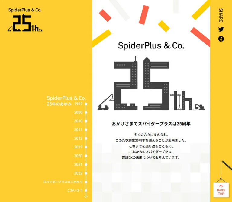
The design combines the scale of a city with the intimacy of a narrow reading column. On desktop, a broad left field holds the anniversary identity, architectural photography, and a persistent-looking year index. A 540px story strip sits near the right edge, followed by a 100px utility rail. The opening replaces photography with yellow and gives the story strip a white background, a large construction-shaped anniversary emblem, and scattered rectangular confetti.
The experience changes after the chronology. Future-facing copy and a presidential greeting use centered editorial columns, and a full-width yellow footer offers two clear destinations. On mobile, the side composition gives way to a single column. Typography remains readable at the same body size, and the crane carrying the PAGE TOP sign continues to connect utility with the construction theme.
閉じる
SpiderPlus & Co. — 25th Anniversary Style Reference
A company history presented as a construction celebration: yellow framing, architectural numerals, and a narrow illustrated story beside the city.
Original URL: https://spiderplus.co.jp/25th/ Final URL: https://spiderplus.co.jp/25th/ Theme: light, with bright yellow fields, white and warm off-white reading surfaces, grayscale photography, and coral accents. Inspected: October 2, 2026, at 01:58:17.857 JST; supplied retrieval timestamp: October 1, 2026, at 16:58:17.857 UTC. Viewports: desktop 1440 × 1000 CSS pixels; mobile 390 × 844 CSS pixels. Scope: desktop opening, a scrolled 2021 milestone, and footer; mobile opening and footer; rendered text, element geometry, computed typography, and selected transitions across the longer document.
This is the current corporate anniversary microsite commemorating the company's 1997–2022 history. Its 2022 anniversary copy and copyright remain part of the page served at the inspected URL in 2026. The supplied response status is 200, and the original and final URLs are identical.
The design combines the scale of a city with the intimacy of a narrow reading column. On desktop, a broad left field holds the anniversary identity, architectural photography, and a persistent-looking year index. A 540px story strip sits near the right edge, followed by a 100px utility rail. The opening replaces photography with yellow and gives the story strip a white background, a large construction-shaped anniversary emblem, and scattered rectangular confetti.
The experience changes after the chronology. Future-facing copy and a presidential greeting use centered editorial columns, and a full-width yellow footer offers two clear destinations. On mobile, the side composition gives way to a single column. Typography remains readable at the same body size, and the crane carrying the PAGE TOP sign continues to connect utility with the construction theme.
How to Read This Reference
- Measured means a value is present in the supplied rendered DOM/computed-style evidence. Derived gaps are identified as calculations from those rectangles.
- Visual estimate means a proportion, color, or shape was judged from the supplied current-page captures. It is not a sampled pixel value or recovered CSS declaration.
- Recommended means an implementation choice for a new project. Breakpoints, accessibility enhancements, reveal endpoints, and the Quick Start's layout rules are recommendations unless explicitly identified as measured.
- Token names are descriptive aliases. The supplied custom-property inventories were empty; these names are not claimed to be original source variables.
- Graphic lettering is distinct from text. Several logos, dates, and controls have empty extracted text or zero-size text styles while remaining clearly visible. Their appearance cannot be reconstructed from the enclosing element's font size.
- Coverage varies by section. The opening and footer were visually captured at both viewports. Mobile milestone imagery and the complete visual treatment of the long editorial sections were not supplied as screenshots.
- Coordinates require context. Long-document section positions are document coordinates. Persistent control rectangles describe their viewport placement. Offscreen elements with reveal transforms can have different coordinates from their settled appearance.
Tokens — Colors
Default Palette
| Name | Value | Suggested token | Evidence and role |
|---|---|---|---|
| Anniversary Yellow | #fecd2f |
--color-yellow |
Measured footer background: rgb(254, 205, 47). The opening's broad yellow field is visually consistent, but its exact background declaration was not included. |
| White | #ffffff |
--color-white |
Measured body background and photographic-caption text. Visually used for the opening story strip, reversed navigation details, and hanging sign. |
| Warm Off-White | #f5f5f2 |
--color-paper |
Measured greeting-section background: rgb(245, 245, 242). The captured history reading strip appears similarly warm; its exact background was not separately reported. |
| Black | #000000 |
--color-ink |
Measured primary text and SHARE label. Also the visible treatment of the small anniversary identity and social symbols. |
| Link Coral | #f9634a |
--color-link |
Measured sustainability-link color: rgb(249, 99, 74). |
| Artwork Coral | approximately #ff604a |
--color-art-coral |
Visual estimate for confetti, large date graphics, the active 2021 navigation marker, and PAGE TOP lettering. Not established as identical to Link Coral. |
| Emblem Charcoal | approximately #444444 |
--color-emblem |
Visual estimate for the large architectural anniversary artwork. |
| Button Charcoal | approximately #333333 |
--color-button |
Visual estimate for the two footer destination tiles. |
| Illustration Gold | approximately #ffcc00 |
--color-gold |
Visual estimate for the brighter yellow inside confetti and the illustrated bell mechanism. |
Keep the distinction between measured text/surface colors and colors embedded in artwork. A computed blue link color on an image-only footer anchor does not describe its visible charcoal-and-white artwork. Likewise, a computed black color on a navigation button does not establish the color of its graphical year label.
Palette Distribution
The opening places most of the saturated yellow outside the reading strip. White carries the emblem and introductory copy. In the captured history state, gray architecture becomes the dominant outer field, while coral dates and colorful illustrations animate the pale central story. The footer returns to uninterrupted yellow across the viewport.
Pale square tiles soften the transition between white, off-white, and yellow sections. Their appearance relies on several low-contrast fills rather than one strongly outlined checkerboard. Exact individual tile colors were not supplied.
There is no observed theme selector or alternate dark theme.
Tokens — Typography
Japanese Body and Headings
The measured body stack is:
YakuHanJP, 'Noto Sans JP', 'Hiragino Sans',
'ヒラギノ角ゴ ProN W3', 'Hiragino Kaku Gothic ProN',
Meiryo, メイリオ, Osaka, 'MS PGothic', arial, helvetica, sans-serif
The page uses regular Japanese sans-serif paragraphs with bold, moderately sized headings. The computed stack is direct evidence of declared family preferences; it does not prove which font supplied every glyph or identify the loaded font files.
Body copy remains 15px on both inspected viewports. Milestone headings remain 20px / 30px, weight 700. Responsive adaptation mainly changes line length, line wrapping, and layout rather than shrinking all text.
Branded Utility Text
The SHARE label has the measured stack beginning with Spiderplus-Medium, followed by the Japanese body stack. Its measured size is 20px / 24px, weight 500, on both viewports.
This is evidence for that label only. Do not assume the same font produced the wordmarks, anniversary emblem, year graphics, or footer product logo.
Artwork Lettering
The architectural 25th mark is illustration, with buildings forming the numerals and construction equipment completing the silhouette. The visible wordmarks and date graphics also require treatment as supplied artwork unless independently available as fonts.
The desktop year buttons report font-size: 0px and line-height: 0px; their visible labels remain present in the capture. This is a rendering detail of graphical controls, not a reusable text-size token.
The root HTML element reports a 10px font size and a Times family, but the body overrides the family and size. The visible site is not a serif design. The Quick Start uses explicit pixel measurements and does not require copying the original root size.
Type Scale
| Role | Desktop | Mobile | Weight / tracking | Evidence |
|---|---|---|---|---|
| Introductory anniversary statement | 20px / 30px |
20px / 30px |
700, normal tracking |
Measured; one desktop line becomes two mobile lines |
| Milestone heading | 20px / 30px |
20px / 30px |
700, normal tracking |
Measured |
| Introductory and milestone body | 15px / 26px |
15px / 26px |
400, normal tracking |
Measured |
| Future/greeting section heading | 32px / 48px |
20px / 30px |
700, normal tracking |
Measured |
| Future/greeting paragraphs | 15px / 30px |
15px / 30px |
400, normal tracking |
Measured |
| Architectural photo caption | 12px / 18px |
Not present in mobile visible-text evidence | 400 |
Measured desktop |
| SHARE | 20px / 24px |
20px / 24px |
500 |
Measured; orientation changes |
| Copyright | 11px / 20px |
11px / 20px |
400, 1.1px tracking |
Measured |
| Image disclaimer | 10px / 15px |
10px / 15px |
400, normal tracking |
Measured |
| Large milestone year | Visually around a 72–80px text scale |
Date-art containers roughly 39–40px high |
Graphic lettering | Desktop scale is estimated; mobile rectangle heights are measured, not font sizes |
| Main wordmark | Visually around a 40px text scale |
Around 30–34px, depending on placement |
Graphic lettering | Visual estimate only |
The strongest hierarchy comes from the anniversary illustration and large dates. Ordinary headings stay compact enough to support a long historical narrative.
Tokens — Spacing & Shapes
Overall rhythm: generous scene-level spacing, restrained paragraph spacing, and small utility details.
There is no evidence of a universal spacing grid. Repeated values such as 20px, 30px, and 40px are useful implementation aliases, but not proof of a formal source token system.
Spacing Scale
| Use | Value | Status |
|---|---|---|
| Year label to marker gap | 11px, occasionally 13px |
Measured button gap |
| Timeline marker pitch | approximately 39–40px |
Derived from successive desktop button positions |
| Mobile milestone text side inset | 40px |
Measured: 310px column inside 390px viewport |
| Mobile future-text side inset | 20px |
Measured: 350px column |
| Mobile greeting-text side inset | 40px |
Measured: 310px column |
| Intro statement to body | Desktop 23px; mobile approximately 15.6px |
Calculated from element rectangles |
| Milestone heading to paragraph | Desktop 25px; mobile 20px |
Calculated from successive rectangles |
| Future paragraph gaps | Desktop 40px; mobile 30px |
Calculated |
| Greeting paragraph gaps | Desktop 35px; mobile 30px |
Calculated for regular paragraph pairs |
| Footer destination gap | Desktop 40px horizontal; mobile 30px vertical |
Calculated from anchor rectangles |
| Future-section top padding | 140px on both viewports |
Measured |
| Greeting-section top padding | Desktop 140px; mobile 80px |
Measured; inner content adds further spacing |
| Footer padding | Desktop 235px 0 245px; mobile 150px 0 160px |
Measured |
Shape Vocabulary
| Element | Shape | Evidence |
|---|---|---|
| Story strip and section surfaces | Square-edged, unboxed planes | Visible captures |
| Timeline markers | Small circles, approximately 12–13px across | Visual estimate supported by 13px-high control rectangles |
| Timeline spine | Thin white vertical line, approximately 2px | Visual estimate |
| Footer destination tiles | Approximately 6px corner radius | Visual estimate of artwork; the outer anchors themselves report 0px radius |
| PAGE TOP sign | White square with a small hard offset shadow | Visible captures |
| Milestone illustration backing | Large white circle in the 2021 scene | Visible capture; not verified for every milestone |
| Confetti | Rotated rectangular strips with sharp corners | Visible captures |
| Section-transition mosaic | Axis-aligned square tiles | Visible captures |
Layout Measurements
| Element | Desktop 1440 × 1000 | Mobile 390 × 844 | Status |
|---|---|---|---|
| Document height | 16,279px |
Approximately 11,718.39px |
Measured |
| Opening left field | 800px wide |
Not retained as a separate field | Screenshot boundary, corroborated by story geometry |
| Opening story strip | 540px, from x=800 to x=1340 |
Full viewport width | Measured statement width and visual boundary |
| Right utility rail | 100px |
No separate rail | Derived desktop width |
| Large anniversary-art container | 490 × 257.5px, x=825, y=291.75 |
Approximately 348.39 × 184.95px, x=20.80, y=176.91 |
Measured |
| Intro body | 460 × 130px, x=840 |
390 × 130px, x=0 |
Measured |
| Milestone text width | 460px |
310px |
Measured |
| Future/greeting text width | 644px, x=398 |
Future 350px; greeting 310px |
Measured |
| Small desktop emblem container | 160 × 82px, x=34, y=61.5 |
Not visible in supplied phone captures | Measured; wordmark above is separate visually |
| Timeline heading container | 177 × 46px, x=594, y=513 |
Not displayed | Measured |
| Footer destination | 258 × 70px each |
258 × 70px each |
Measured |
| Crane/button wrapper | 85 × 177px, x=1355, y=808 |
Approximately 60 × 129.17px, x=330, y=704.83 |
Measured |
The initial DOM sample places some offscreen milestone text at x=820, while the settled 2021 capture visually places it near x=840. The width is consistently 460px. Do not turn the offscreen x coordinate into a permanent gutter rule or infer a specific reveal transform from it.
Components
Persistent Desktop Identity
Role: maintain the anniversary identity while the history moves beneath it.
A small SpiderPlus & Co. wordmark sits above a black construction-shaped 25th emblem in the upper-left corner. The emblem container is 160 × 82px. The complete identity occupies more height because the wordmark is visually separate above it.
It remains in the same upper-left area across the desktop opening, history, and footer captures. This supports describing its behavior as persistent in the observed states; the exact positioning declaration was not supplied.
There is no visible equivalent occupying the phone's upper-left corner. The mobile opening relies on the larger wordmark and anniversary art inside the reading flow.
Desktop Year Index
Role: orient the reader within a long company history.
The index sits just left of the story strip, with right-aligned labels connected by a thin vertical line. Its heading combines the company wordmark and a small anniversary-history caption. The first year visually aligns with the lower part of that heading.
The observed controls are:
- 1997, 2000, 2010, 2011, 2012, 2017, 2020, 2021, and 2022.
- The future section, labeled
スパイダープラスのこれから. - The greeting section, labeled
ごあいさつ.
Year labels occupy compact controls about 58–59px wide; the future label expands to 201px. Circles sit around x=772 in the inspected desktop layout. The list has roughly 40px vertical intervals and ends in a downward arrow.
The opening shows white labels and markers over yellow. In the scrolled 2021 capture, the 2021 label and marker are coral while the others remain white over gray architecture. The index is absent from the supplied footer capture and from the mobile visible-text extraction.
The DOM identifies these entries as buttons. Their exact click destinations, scrolling offsets, keyboard behavior, and active-state update mechanism were not exercised. A sticky index constrained to the history area is a useful implementation recommendation, not a recovered source rule.
Anniversary Opening
Role: introduce the anniversary before the historical sequence.
The desktop reading strip contains, in order:
- Cropped rectangular confetti near the upper edge.
- A centered SpiderPlus & Co. wordmark.
- The large charcoal anniversary illustration.
- A bold centered anniversary statement.
- Five lines of centered introductory copy.
- A low-contrast square mosaic leading into the next surface.
The large emblem turns the digits into buildings, with windows, horizontal bands, a crane, and small construction vehicles. Preserve the entire composition rather than replacing it with ordinary text reading 25th.
The measured desktop statement starts at y=589.25 and uses a 30px line box. The body starts at y=642.25 and occupies five 26px lines. On mobile, the statement starts near y=395.13 and wraps into two 30px lines; the body starts near y=470.72 and still occupies five lines.
The phone composition preserves the emblem's scale relative to the screen. Its 348.39px container leaves only about 20.8px on each side. The introductory text is centered across the viewport rather than forced into the narrower 310px milestone column.
History Milestone
Role: pair a company event with a year, a visual scene, and concise explanation.
The captured 2021 milestone has a pale reading strip with a large coral year on the left and a month graphic on the right. Below are a bold 20px heading, a 15px paragraph, and a large illustration that continues below the viewport. A white circular field frames the illustrated yellow bell mechanism.
The outer desktop scene includes a large grayscale building photograph on the left. Oversized translucent numerals are partially visible near the lower-left edge. Device illustrations extend into the narrow right-side area: a phone appears higher up, and a laptop with a video-call grid enters from the right.
A reusable component should separate:
- The photographic scene and its optional caption.
- The year/month graphic row.
- The milestone heading and body.
- The primary illustration.
- Secondary illustrations that may extend beyond the reading strip.
The rendered document contains twelve milestone entries before the future section. Several belong to 2022, while the navigation offers one 2022 entry. Preserve the distinction between navigation years and individual events.
Desktop photographic captions combine a year with a landmark name. They are small white text, measured at 12px / 18px, positioned near the lower-left of their scene. The page's disclaimer, 画像はイメージです。, means these photographs should not be presented as independently verified construction-project credits.
Future Section
Role: shift from historical milestones to the company's mission and future contribution.
The section begins at document y=13000 on desktop and approximately y=8422.5 on mobile. Its measured top padding is 140px at both viewports.
Desktop paragraphs occupy a centered 644px column with 15px text and 30px line height. The heading is 32px / 48px. On mobile, the heading becomes 20px / 30px, and paragraphs widen relative to the milestone template: 350px with 20px side margins.
Two substantial paragraphs are followed by a coral sustainability link. Its observed destination is https://spiderplus.co.jp/about-us/sustainability/. The destination itself was not inspected.
The supplied evidence supports this section's text geometry and typography. It does not establish every surrounding illustration or transition decoration.
Greeting Section
Role: provide a longer personal statement after the history and future narrative.
This section has the measured warm off-white background #f5f5f2. It uses the same desktop 644px reading width and 15px / 30px body type as the future section, but its paragraphs are separated by 35px gaps in the desktop measurements.
On mobile, the body narrows to 310px with 40px side margins, and regular paragraph gaps become 30px. The heading becomes 20px / 30px. The section ends with a two-line role-and-name signature.
The source section padding alone does not locate the heading: the greeting heading sits 240px below the desktop section start and 140px below the mobile start. Additional inner spacing therefore exists beyond the measured 140px and 80px section padding.
Footer Destination Pair
Role: close the commemorative reading experience and offer the company and product websites.
A full-width yellow field replaces the split history layout. A centered company wordmark sits above two charcoal destination tiles:
- Corporate site:
https://spiderplus.co.jp/. - SPIDERPLUS product site:
https://spider-plus.com/.
Each anchor measures 258 × 70px. On desktop, they sit side by side with a 40px gap, giving a combined width of 556px. On mobile, both keep their width and stack with a 30px gap, centered at x=66.
The corporate tile contains the white company wordmark and a right arrow. The product tile includes a small Japanese descriptor above the stronger SPIDERPLUS wordmark, also followed by an arrow. Preserve the different internal logo proportions instead of forcing both tiles into the same text treatment.
The small copyright uses 11px text, 20px line height, and 1.1px tracking. The source year is 2022. The image disclaimer is white, 10px / 15px, near the lower-left edge.
The desktop footer measures 719px tall. The mobile footer measures approximately 693.89px. Square mosaic artwork extends above the main yellow section boundary, so the first visible yellow tiles should not be mistaken for the footer element's top edge.
Share Controls
Role: provide social sharing without competing with the story.
On desktop, SHARE is rotated vertically in the right rail, near x=1378 and y=34. A black Twitter bird and circular Facebook symbol sit below it. The measured icon-anchor widths are 26px; the Twitter anchor is 22.5px high and the Facebook anchor is 26px high.
On mobile, SHARE and the two icons become a centered horizontal row inside the footer. The row follows the destination tiles by about 50px. Measured horizontal gaps are approximately 20px.
The rendered links point to Twitter and Facebook share endpoints with the anniversary URL encoded in their parameters. Link presence is verified; popup behavior, endpoint availability, and resulting share dialogs were not tested.
Crane PAGE TOP Control
Role: keep a return-to-top affordance available in the site's visual language.
A dark crane arm enters from the right edge. A thin vertical cable, hook, and short suspension lines hold a white square sign containing a coral upward arrow and stacked PAGE TOP text. A small hard offset shadow gives the sign a physical edge without introducing a general elevation system.
The complete button wrapper measures 85 × 177px on desktop and about 60 × 129.17px on mobile. It is positioned 15px above the desktop viewport bottom and 10px above the mobile bottom. The visible square sign is approximately 70px across on desktop and 50px on mobile; those sign measurements are visual estimates.
Its consistent lower-right placement is visible in all supplied original-page captures. The button's label implies a top action, but activation and scrolling behavior were not exercised. The empty extracted button text does not establish whether the original has an accessible name.
Confetti and Mosaic Transitions
Role: connect celebration with construction geometry.
Confetti consists of a small number of long rectangular strips, rotated at different angles and cropped by the opening's edges. Yellow, coral, and nearly white strips form an open frame around the identity rather than a dense particle field.
Mosaics use square blocks arranged into an irregular stepped boundary. In the desktop footer capture, tile cells appear approximately 45px wide; in the phone capture, they appear approximately 31px wide. These are visual estimates. The footer's visible tile band extends roughly 135px above its main boundary on desktop and 94px on mobile.
Keep these motifs flat and sharp. The mosaic is a transition between fields, not a decorative border around every component.
Tokens — Motion & Interaction
Measured Transition Definitions
| Element | Computed transition | What the evidence supports |
|---|---|---|
| Milestone heading opacity | opacity 0.56s ease-out 0.6s |
A delayed opacity transition is defined |
| Milestone heading transform | transform 0.8s cubic-bezier(0.5, 1, 0.89, 1) 0.6s |
A delayed transform transition is defined; direction and distance are unknown |
| Milestone paragraph opacity | opacity 0.56s ease-out 0.8s |
Paragraph opacity starts 0.2s later than heading opacity, if triggered together |
| Milestone paragraph transform | transform 0.8s cubic-bezier(0.5, 1, 0.89, 1) 0.8s |
Paragraph transform uses the same easing with a later delay |
| Crane button opacity | opacity 0.64s ease-out 0.88s |
A delayed fade is defined; its trigger was not supplied |
| Desktop social anchors | transform 0.24s ease-out |
Transform feedback is defined; the hover/active endpoint was not captured |
These are transition declarations, not a complete animation recording. The sampled elements report animation: none, but that does not establish the absence of animated descendants, pseudo-elements, image assets, or scripted motion elsewhere.
Observed State Changes and Limits
The scrolled desktop capture shows the 2021 navigation item highlighted in coral. This supports an active-section presentation, but does not identify whether it is driven by scrolling, a click, or another mechanism.
The evidence collection traversed the document and waited for visible content to settle. Its readiness procedure temporarily paused perpetual animations and then resumed them. Static captures therefore cannot establish the speed, direction, or existence of looping confetti, crane movement, parallax, or illustration animation.
The 1000px spacing of early desktop scene captions is consistent with viewport-height chapters at the inspected desktop size. It is not proof of scroll snapping or a specific 100vh source declaration. Avoid adding mandatory snapping based on that spacing alone.
Recommended adaptation: retain a restrained heading-then-paragraph reveal, preserve natural document scrolling, and make all content readable without reveal JavaScript. Use reduced-motion preferences to remove delays and transforms. Do not invent bouncing cranes or continuous confetti as observed behavior.
Surfaces
| Surface | Appearance | Purpose |
|---|---|---|
| Opening outer field | Saturated yellow | Anniversary framing and desktop navigation backdrop |
| Opening reading strip | White | Clear presentation of the wordmark, emblem, and introduction |
| History outer scene | Grayscale architecture with occasional colored illustrations | Connect the chronology to the built environment |
| History reading strip | Pale warm neutral | Stable reading surface against the larger scene |
| Illustration backing | White circular field in the captured 2021 scene | Isolate a colorful event illustration |
| Greeting section | Measured #f5f5f2 |
Calm surface for sustained reading |
| Footer | Measured #fecd2f |
Strong visual conclusion and destination area |
| Destination tiles | Charcoal with white artwork | High-contrast navigation to corporate and product sites |
| PAGE TOP sign | White with a small hard shadow | A physical construction-sign metaphor |
There is no visible general-purpose card grid, glass effect, or soft-shadow elevation system. Most structure comes from large color fields, the narrow story strip, illustration silhouettes, and whitespace.
Imagery
The imagery connects real architecture with simplified construction illustrations. Photographs are grayscale and visually subdued. Illustrations remain flat, clean, and colorful, with dark mechanical outlines and small details that reward viewing at a larger scale.
The anniversary emblem is the main identity asset: buildings form the numerals, windows repeat like a grid, and cranes and machinery complete the outline. It should remain sharp and proportional at both the 490px desktop width and the approximately 348px phone width.
The 2021 scene expands the vocabulary to construction technology. Device illustrations and a video-call screen coexist with a bell mechanism and a high-rise photograph. This gives the history a sense of changing tools without turning the page into a software dashboard.
Observed Asset References
No asset URLs or original filenames were included in the supplied rendered evidence. The following inventory identifies visible roles, not downloadable paths or verified file formats.
| Asset role | Observed appearance | Usage guidance |
|---|---|---|
| Main anniversary emblem | Charcoal architectural 25th composition | Preserve its complete silhouette and intrinsic proportions |
| Small anniversary identity | Black emblem beneath a company wordmark | Use as desktop persistent branding |
| Main company wordmark | Black on white/yellow; white inside corporate destination | Use approved artwork rather than guessing the font |
| SPIDERPLUS product lockup | White condensed product lettering with small descriptor | Preserve the descriptor-to-logo hierarchy |
| Architectural scene | Large grayscale high-rise photograph | Allow substantial cropping in the desktop backdrop |
| Milestone date graphics | Large coral year and month | Keep year and month separated across the reading width |
| Milestone illustration | Yellow bell mechanism on a white circle in 2021 | Treat as event-specific art, not a universal icon |
| Secondary device art | Cropped phone and video-call laptop | Allow controlled overflow into the desktop side area |
| Crane utility artwork | Mechanical arm, cable, hook, and suspended sign | Keep the whole assembly proportional when reducing it on mobile |
| Social symbols | Black Twitter bird and Facebook circle | Match the supplied current appearance when documenting this page |
| Transition artwork | Pale or yellow square mosaic | Use at major section boundaries |
The artwork has a crisp geometric appearance, but its actual SVG/raster formats were not provided. Do not apply image-rendering: pixelated; this is not a low-resolution bitmap aesthetic. Photography should remain photographic, and text should remain live text wherever it is ordinary editorial content.
Layout & Responsive Behavior
Desktop Composition
At 1440px wide, the opening divides into an 800px left field, a 540px reading strip, and a 100px right rail. These are measurements of one viewport, not a recovered responsive formula.
The opening's broad left field is deliberately sparse. It holds the small upper-left identity and the lower-positioned year index. The story strip carries the visual density. The right rail provides SHARE near the top and the crane control near the bottom.
The history uses a similar reading alignment while the outer field becomes photographic. The left scene is large enough to convey architectural scale; the text remains constrained to 460px. Early scene captions repeat at 1000px vertical intervals. The future section starts at y=13000, following the opening and twelve milestone entries.
The future and greeting sections leave the side-aligned chronology layout and use a 644px column centered within the viewport. The footer also spans the entire width, with its destination pair centered around x=720.
Mobile Composition
At 390px wide:
- The opening becomes a full-width white composition with cropped confetti at the top.
- The large anniversary artwork measures about 348px wide.
- The anniversary statement wraps to two lines without reducing its 20px font size.
- Introductory body copy retains its centered five-line arrangement and 15px / 26px type.
- The desktop year index and small upper-left identity are not visible.
- Milestone copy uses a 310px column with 40px side margins.
- Future copy uses 350px, while greeting copy returns to 310px.
- Editorial section headings reduce from 32px to 20px.
- The footer destinations remain 258 × 70px and stack vertically.
- SHARE moves into the footer as a horizontal row.
- The crane remains near the lower-right corner at a smaller size.
The mobile milestone heading positions advance by varying amounts: early intervals are approximately 582px, 586px, and 746px. The history therefore should not be assumed to preserve one full viewport per entry on phones.
Desktop architectural captions are absent from the mobile visible-text extraction. However, no mobile middle-of-history screenshot was supplied. The presence, ordering, or removal of architectural photographs and milestone illustrations on mobile remains unverified.
Breakpoint and Overflow Guidance
The original breakpoint is unknown. The Quick Start uses 1100px as a recommended breakpoint because a 540px story strip, a 100px utility rail, and a useful left-side area need substantial width.
Test intermediate widths rather than extrapolating the desktop composition indefinitely. Maintain natural text flow, let longer Japanese headings wrap, and prevent the crane control from covering essential links or signature text. Safe-area padding is a recommended addition; it was not measured in the source.
Do’s and Don’ts
Do
- Preserve the relationship between a broad desktop scene and a narrow story strip.
- Use the measured footer yellow
#fecd2fas the primary implementation color. - Keep white, warm off-white, and grayscale photography distinct.
- Preserve the architectural anniversary emblem as artwork.
- Maintain 15px body text and 20px milestone headings across the inspected desktop/mobile sizes.
- Give long editorial paragraphs the measured 30px line height.
- Use large coral year/month graphics to organize milestones.
- Keep the desktop index compact, with a thin line and small circular markers.
- Let the footer become a full-width yellow conclusion.
- Retain the construction metaphor in the PAGE TOP control.
- Distinguish one navigation year from multiple events within that year.
- Use the supplied measured transition timings only with clearly identified implementation endpoints.
Don’t
- Don’t turn the chronology into an unrelated grid of rounded feature cards.
- Don’t replace the illustrated anniversary emblem with a generic large numeral.
- Don’t apply the
Spiderplus-Mediumfamily to all lettering based solely on the SHARE measurement. - Don’t use the root Times declaration as the visible typography reference.
- Don’t copy
font-size: 0into newly authored text navigation. - Don’t shrink all phone typography to preserve desktop line breaks.
- Don’t assume the desktop photographic layout persists unchanged on mobile.
- Don’t add mandatory scroll snapping, parallax, or looping crane animation without labeling it as a new choice.
- Don’t treat image-only anchors' computed blue text color as a visible palette color.
- Don’t replace the square mosaic with a smooth gradient or a strong checkerboard.
- Don’t infer construction-project credits from decorative landmark photography.
- Don’t update the anniversary or copyright year merely because the current inspection occurred later.
Recommended Implementation Additions
These are recommendations for a new implementation, not verified features of the original page:
- Provide explicit accessible names for year controls, image-based destination links, social icons, and the crane button. Empty extracted text alone cannot establish the original accessibility state.
- Use real headings and readable date text alongside or behind graphical dates. Preserve a logical outline even where the visible heading is artwork.
- Prefer semantic anchor targets for section navigation when appropriate. If buttons control scrolling, ensure keyboard operation and focus behavior are intentional.
- Mark the current chapter with an accessible state, such as
aria-current, rather than relying only on coral color. - Enlarge interactive hit areas around small timeline and social graphics while preserving their visual sizes.
- Check white navigation on yellow, white disclaimer text on yellow, and coral text on light surfaces for the intended accessibility standard. Darker functional text can coexist with the original decorative palette.
- Respect reduced motion and keep reveal content visible when JavaScript is unavailable or fails.
- Give decorative confetti, mosaic tiles, and crane mechanics empty alternatives or hide them from assistive technology; retain a meaningful name for the action itself.
- Reserve artwork dimensions to prevent layout shifts, and defer loading distant photographic scenes where appropriate.
- Test footer controls with browser zoom, longer localized labels, and mobile safe areas.
Agent Prompt Guide
Quick Color Reference
- Primary yellow: measured footer
#fecd2f. - White canvas and reversed artwork:
#ffffff. - Warm editorial surface: measured
#f5f5f2. - Main text and small identity:
#000000. - Sustainability-link coral: measured
#f9634a. - Large graphic coral: approximately
#ff604a, a visual estimate. - Anniversary emblem charcoal: approximately
#444444. - Footer destination charcoal: approximately
#333333. - Separation: large color fields and square mosaic transitions, with very limited shadow.
Overall Prompt
“Create a corporate anniversary history experience inspired by the current SpiderPlus 25th anniversary page. At a 1440px desktop width, use a broad 800px scene at left, a 540px reading strip, and a 100px utility rail. Frame the opening in bright yellow #fecd2f; keep the story strip white. Use approved architectural anniversary artwork, a centered wordmark, sparse coral/yellow rectangular confetti, and a pale square mosaic transition. Present milestones with large coral year/month graphics, 20px bold Japanese headings, 15px body text with 26px line height, subdued grayscale architecture, and flat construction illustrations. Place a compact vertical year index beside the reading strip and a crane carrying PAGE TOP at the lower-right edge. Change to centered editorial sections and a full-width yellow footer. On mobile, use a single column, preserve body text size, hide the desktop side index, stack the two footer destinations, and move SHARE into the footer. Treat the breakpoint, mobile history imagery, and animation endpoints as implementation decisions rather than verified source behavior.”
Example Component Prompts
- Opening: “Build a white anniversary opening with cropped rectangular confetti above a centered company wordmark and a construction-shaped 25th emblem. Use a 490px emblem container on the inspected desktop strip and approximately 348px at a 390px phone width. Add a 20px bold centered statement, 15px / 26px introductory copy, and a pale square mosaic at the bottom. Preserve the artwork; do not substitute a font numeral.”
- Year index: “Create a compact right-aligned vertical history index with nine year labels, two editorial-section labels, small circular markers, and a thin white spine. Use approximately 40px row intervals and coral for the current entry. Keep it beside the desktop story strip and constrain it to the history region. Make interactive targets larger than the visible dots.”
- Milestone: “Create a pale 540px desktop story strip with a 460px text area. Put a large coral year at the left and a month at the right, then a 20px / 30px bold heading and 15px / 26px body copy. Add a flat event illustration below and grayscale architecture outside the strip. At phone width, use 40px text margins and preserve the type sizes.”
- Footer: “Create a full-width yellow
#fecd2ffooter with an irregular square-tile transition above it. Center the company wordmark and two charcoal 258 × 70px destination links. Use a 40px horizontal desktop gap and a 30px vertical mobile gap. On phones, place a horizontal SHARE row below the links, followed by small tracked copyright text.” - Crane utility: “Design a lower-right PAGE TOP affordance as a white sign suspended from a small construction crane. Use a dark arm, thin cable, coral arrow and text, and a small hard shadow. Fit the complete composition into an 85 × 177px desktop wrapper and approximately 60 × 129px on mobile. Keep movement optional and provide an accessible button name.”
Quick Start
CSS Custom Properties
This is a reusable adaptation, not recovered source CSS. It preserves the measured text sizes, principal widths, footer dimensions, and transition timings. The 1100px breakpoint, sticky-index implementation, and reveal distance are recommendations. The mobile story surface fills the width; any additional mobile history imagery needs a separately chosen layout because that portion was not visually captured.
Expected structure: a .history-shell containing .history-scenes and a sibling .timeline; each scene contains .story-content. Place .share inside the footer so CSS can position it in the desktop rail and return it to normal mobile flow. Supply authorized artwork for the brand, anniversary mark, dates, mosaics, and crane; no asset files or font downloads are bundled here.
:root {
  /* Measured colors */
  --color-yellow: #fecd2f;
  --color-white: #ffffff;
  --color-paper: #f5f5f2;
  --color-ink: #000000;
  --color-link: #f9634a;

  /* Visual estimates for artwork-related colors */
  --color-art-coral: #ff604a;
  --color-emblem: #444444;
  --color-button: #333333;

  /* Declared source stacks; font files must be supplied separately */
  --font-body: YakuHanJP, 'Noto Sans JP', 'Hiragino Sans',
    'ヒラギノ角ゴ ProN W3', 'Hiragino Kaku Gothic ProN',
    Meiryo, メイリオ, Osaka, 'MS PGothic', Arial, Helvetica, sans-serif;
  --font-utility: Spiderplus-Medium, var(--font-body);

  --text-body: 15px;
  --text-heading: 20px;
  --text-editorial: 32px;
  --leading-story: 26px;
  --leading-editorial: 30px;

  --story-width: 540px;
  --rail-width: 100px;
  --editorial-width: 644px;
  --destination-width: 258px;
  --destination-height: 70px;
  --radius-destination: 6px; /* Visual estimate */

  --ease-reveal: cubic-bezier(0.5, 1, 0.89, 1);
  --duration-fade: 560ms;
  --duration-move: 800ms;
  --safe-bottom: env(safe-area-inset-bottom, 0px);
}

* {
  box-sizing: border-box;
}

body {
  margin: 0;
  color: var(--color-ink);
  background: var(--color-white);
  font-family: var(--font-body);
  font-size: var(--text-body);
  font-weight: 400;
}

button,
a {
  -webkit-tap-highlight-color: transparent;
}

button {
  font: inherit;
}

img {
  max-width: 100%;
}

.history-shell {
  position: relative;
  background: var(--color-yellow);
}

.history-scenes {
  min-width: 0;
}

.story-panel {
  position: relative;
  background-position: center;
  background-size: cover;
}

/* Background photography can be supplied per desktop scene. */
.story-content {
  position: relative;
  width: 100%;
  background: var(--color-white);
}

.site-mark,
.timeline {
  display: none;
}

.hero {
  padding: 124px 0 210px;
  text-align: center;
}

.hero-brand {
  display: block;
  width: 224px; /* Approximate mobile artwork width */
  height: auto;
  margin: 0 auto;
}

.anniversary-art {
  display: block;
  width: 89.3333%;
  height: auto;
  margin: 17px auto 0;
}

.hero-statement {
  margin: 33px 0 0;
  font-size: var(--text-heading);
  font-weight: 700;
  line-height: 30px;
}

.hero-copy {
  width: 100%;
  margin: 15.6px auto 0;
  font-size: var(--text-body);
  line-height: var(--leading-story);
}

.milestone {
  padding: 40px 0 80px;
  background: var(--color-paper);
}

.milestone-inner {
  width: calc(100% - 80px);
  margin-inline: auto;
}

.date-row {
  display: flex;
  align-items: flex-end;
  justify-content: space-between;
  gap: 20px;
}

.date-art {
  display: block;
  width: auto;
  height: 40px;
}

.milestone-title {
  margin: 15px 0 0;
  font-size: var(--text-heading);
  font-weight: 700;
  line-height: 30px;
  --reveal-delay: 600ms;
}

.milestone-copy {
  margin: 20px 0 0;
  font-size: var(--text-body);
  line-height: var(--leading-story);
  --reveal-delay: 800ms;
}

.milestone-illustration {
  display: block;
  width: min(400px, 100%);
  height: auto;
  margin: 32px auto 0;
}

.editorial {
  padding: 140px 0;
}

.editorial-inner {
  width: min(var(--editorial-width), calc(100% - 40px));
  margin-inline: auto;
}

.editorial h2 {
  margin: 0;
  font-size: 20px;
  font-weight: 700;
  line-height: 30px;
}

.editorial p {
  margin: 30px 0 0;
  line-height: var(--leading-editorial);
}

.editorial a {
  color: var(--color-link);
}

.greeting {
  padding-top: 80px;
  background: var(--color-paper);
}

.greeting .editorial-inner {
  width: min(var(--editorial-width), calc(100% - 80px));
  padding-top: 60px;
}

.anniversary-footer {
  position: relative;
  padding: 150px 0 160px;
  background: var(--color-yellow);
  text-align: center;
}

/* Use supplied transition art; dimensions are visual approximations. */
.footer-mosaic {
  position: absolute;
  inset: auto 0 100%;
  width: 100%;
  height: 94px;
  object-fit: cover;
  object-position: bottom;
  pointer-events: none;
}

.footer-brand {
  display: block;
  width: 258px;
  height: auto;
  margin: 0 auto 34px;
}

.footer-links {
  display: flex;
  flex-direction: column;
  align-items: center;
  justify-content: center;
  gap: 30px;
}

.footer-link {
  display: flex;
  align-items: center;
  justify-content: center;
  gap: 16px;
  width: min(var(--destination-width), calc(100vw - 40px));
  height: var(--destination-height);
  padding: 12px 16px;
  border-radius: var(--radius-destination);
  color: var(--color-white);
  background: var(--color-button);
  text-decoration: none;
}

.footer-link img {
  display: block;
  max-width: 190px;
  max-height: 46px;
  object-fit: contain;
}

/* Omit this arrow if the supplied destination artwork includes one. */
.footer-link::after {
  content: '→';
  font-size: 24px;
  line-height: 1;
}

.share {
  display: flex;
  align-items: center;
  justify-content: center;
  gap: 20px;
  margin-top: 50px;
}

.share-label {
  margin: 0;
  font-family: var(--font-utility);
  font-size: 20px;
  font-weight: 500;
  line-height: 24px;
}

.share a {
  display: block;
  width: 26px;
  color: var(--color-ink);
}

.share img,
.share svg {
  display: block;
  width: 100%;
  height: auto;
}

.copyright {
  margin: 50px 0 0;
  font-size: 11px;
  line-height: 20px;
  letter-spacing: 1.1px;
}

.image-note {
  position: absolute;
  left: 24px;
  bottom: 46px;
  margin: 0;
  color: var(--color-white);
  font-size: 10px;
  line-height: 15px;
}

.page-top {
  position: fixed;
  z-index: 50;
  right: 0;
  bottom: calc(10px + var(--safe-bottom));
  width: 60px;
  padding: 0;
  border: 0;
  background: transparent;
  cursor: pointer;
  transition: opacity 640ms ease-out 880ms;
}

.page-top img {
  display: block;
  width: 100%;
  height: auto;
}

/* Recommended accessibility treatment. */
a:focus-visible,
button:focus-visible {
  outline: 3px solid var(--color-ink);
  outline-offset: 4px;
}

@media (min-width: 1100px) {
  /* Recommended breakpoint, not a recovered source media query. */
  .history-shell {
    display: grid;
    grid-template-columns: minmax(0, 1fr) var(--story-width) var(--rail-width);
  }

  .history-scenes {
    grid-column: 1 / -1;
    grid-row: 1;
  }

  .story-panel,
  .story-content {
    min-height: 100svh;
  }

  .story-content {
    width: var(--story-width);
    margin-left: auto;
    margin-right: var(--rail-width);
  }

  .site-mark {
    display: block;
    position: fixed;
    z-index: 40;
    top: 34px;
    left: 34px;
    width: 160px;
  }

  .timeline {
    display: block;
    position: sticky;
    z-index: 30;
    grid-column: 1;
    grid-row: 1;
    align-self: start;
    justify-self: end;
    top: max(20px, calc(100svh - 487px));
    width: 201px;
    margin-right: 22px;
    color: var(--color-white);
  }

  .timeline-heading {
    display: block;
    width: 177px;
    height: 46px;
    margin-left: auto;
    margin-right: 7px;
  }

  .timeline-list {
    position: relative;
    margin: -29px 0 0;
    padding: 0;
    list-style: none;
  }

  .timeline-list::before {
    content: '';
    position: absolute;
    top: 20px;
    bottom: 0;
    right: 5.5px;
    width: 2px;
    background: var(--color-white);
    pointer-events: none;
  }

  .timeline button {
    position: relative;
    display: flex;
    align-items: center;
    justify-content: flex-end;
    gap: 11px;
    width: 100%;
    height: 40px;
    padding: 0;
    border: 0;
    color: inherit;
    background: transparent;
    font-size: 16px; /* Live-text adaptation of graphic labels */
    line-height: 1.2;
    cursor: pointer;
  }

  .timeline button::after {
    content: '';
    flex: 0 0 13px;
    width: 13px;
    height: 13px;
    border-radius: 50%;
    background: currentColor;
  }

  .timeline button[aria-current='step'] {
    color: var(--color-art-coral);
  }

  .hero {
    padding-top: 220px;
    padding-bottom: 220px;
  }

  .hero-brand {
    width: 304px;
  }

  .anniversary-art {
    width: 490px;
    margin-top: 24px;
  }

  .hero-statement {
    margin-top: 40px;
  }

  .hero-copy {
    width: 460px;
    margin-top: 23px;
  }

  .milestone {
    padding-top: 180px;
  }

  .date-art {
    height: 72px; /* Approximation; preserve each asset's own ratio */
  }

  .milestone-copy {
    margin-top: 25px;
  }

  .editorial h2 {
    font-size: var(--text-editorial);
    line-height: 48px;
  }

  .editorial p {
    margin-top: 40px;
  }

  .greeting {
    padding-top: 140px;
  }

  .greeting .editorial-inner {
    padding-top: 100px;
  }

  .greeting p {
    margin-top: 35px;
  }

  .anniversary-footer {
    padding: 235px 0 245px;
  }

  .footer-mosaic {
    height: 135px;
  }

  .footer-brand {
    width: 304px;
    margin-bottom: 40px;
  }

  .footer-links {
    flex-direction: row;
    gap: 40px;
  }

  .share {
    position: fixed;
    z-index: 40;
    top: 34px;
    right: 37px;
    flex-direction: column;
    margin: 0;
  }

  .share-label {
    writing-mode: vertical-rl;
  }

  .share a {
    transition: transform 240ms ease-out;
  }

  .copyright {
    margin-top: 70px;
  }

  .image-note {
    left: 30px;
    bottom: 20px;
  }

  .page-top {
    bottom: calc(15px + var(--safe-bottom));
    width: 85px;
  }
}

/* Optional reveals: content is visible unless explicitly marked pending. */
[data-reveal] {
  opacity: 1;
  transform: none;
}

@media (prefers-reduced-motion: no-preference) {
  [data-reveal] {
    transition:
      opacity var(--duration-fade) ease-out var(--reveal-delay, 600ms),
      transform var(--duration-move) var(--ease-reveal) var(--reveal-delay, 600ms);
  }

  /* Recommended endpoint; original transform distance is unknown. */
  [data-reveal][data-pending='true'] {
    opacity: 0;
    transform: translateY(16px);
  }
}

@media (prefers-reduced-motion: reduce) {
  [data-reveal],
  .page-top,
  .share a {
    transition: none;
  }
}
Apply pending reveal states only after the reveal controller is ready, then remove them when content should appear. The CSS does not implement navigation, active-section detection, sharing, or the PAGE TOP action. It also does not recreate the illustrations or establish the original site's unobserved animation endpoints.
Tailwind v4 Token Mapping
Optional aliases for a project already using Tailwind v4. Define the custom properties above first. This is not evidence that the original website uses Tailwind.
@theme inline {
  --color-anniversary: var(--color-yellow);
  --color-reading-paper: var(--color-paper);
  --color-site-ink: var(--color-ink);
  --color-site-link: var(--color-link);
  --color-art-coral: #ff604a;
  --color-destination: var(--color-button);

  --font-sans: var(--font-body);
  --font-utility-label: var(--font-utility);

  --text-story: 15px;
  --text-story--line-height: 26px;
  --text-milestone: 20px;
  --text-milestone--line-height: 30px;
  --text-editorial-title: 32px;
  --text-editorial-title--line-height: 48px;

  --spacing-story: 540px;
  --spacing-utility-rail: 100px;
  --spacing-editorial: 644px;
  --spacing-destination: 258px;
  --radius-destination-tile: 6px;
}
Sources & Evidence
- Inspected original and final page: SpiderPlus 25th Anniversary. Both URLs are identical; supplied HTTP status is 200.
- Capture time: October 1, 2026, 16:58:17.857 UTC, equivalent to October 2, 2026, 01:58:17.857 JST.
- Desktop evidence: three current-page captures at 1440 × 1000 showing the opening, a scrolled 2021 milestone, and the footer; rendered document height 16,279px.
- Mobile evidence: two current-page captures at 390 × 844 showing the opening and footer; rendered document height approximately 11,718.39px.
- Rendered DOM/computed styles: supplied visible text, element rectangles, declared font stacks, sizes, line heights, colors, section padding, anchor destinations, and selected transition definitions. These support the measurements identified throughout this document.
- Original-page identity: the rendered page title names スパイダープラス株式会社; the page displays SpiderPlus branding and links to its corporate website. No production-credit identity is established by the inspected original-page evidence.
- Collection conditions: initial observation lasted at least five seconds. The browser waited for document loading, relevant finite animation, sampled layout/text stability, and image decoding within bounded timeouts. Scrolling traversed intermediate positions. SharedWorkers and service workers were disabled during collection.
- Limits: no additional browsing or command execution was performed for this reference. No clicks, hover endpoints, keyboard interactions, external destination pages, or complete animation sequences were independently tested. The original media queries, asset URLs, font binaries, and mobile middle-of-history imagery were not supplied.
This reference describes the current page evidenced by those captures and measurements. Visual estimates and recommended implementation choices are explicitly separated from measured source behavior.
# SpiderPlus & Co. — 25th Anniversary Style Reference

> A company history presented as a construction celebration: yellow framing, architectural numerals, and a narrow illustrated story beside the city.

**Original URL:** [https://spiderplus.co.jp/25th/](https://spiderplus.co.jp/25th/)
**Final URL:** [https://spiderplus.co.jp/25th/](https://spiderplus.co.jp/25th/)
**Theme:** light, with bright yellow fields, white and warm off-white reading surfaces, grayscale photography, and coral accents.
**Inspected:** October 2, 2026, at 01:58:17.857 JST; supplied retrieval timestamp: October 1, 2026, at 16:58:17.857 UTC.
**Viewports:** desktop 1440 × 1000 CSS pixels; mobile 390 × 844 CSS pixels.
**Scope:** desktop opening, a scrolled 2021 milestone, and footer; mobile opening and footer; rendered text, element geometry, computed typography, and selected transitions across the longer document.

This is the current corporate anniversary microsite commemorating the company's 1997–2022 history. Its 2022 anniversary copy and copyright remain part of the page served at the inspected URL in 2026. The supplied response status is 200, and the original and final URLs are identical.

The design combines the scale of a city with the intimacy of a narrow reading column. On desktop, a broad left field holds the anniversary identity, architectural photography, and a persistent-looking year index. A 540px story strip sits near the right edge, followed by a 100px utility rail. The opening replaces photography with yellow and gives the story strip a white background, a large construction-shaped anniversary emblem, and scattered rectangular confetti.

The experience changes after the chronology. Future-facing copy and a presidential greeting use centered editorial columns, and a full-width yellow footer offers two clear destinations. On mobile, the side composition gives way to a single column. Typography remains readable at the same body size, and the crane carrying the PAGE TOP sign continues to connect utility with the construction theme.
閉じる
# SpiderPlus & Co. — 25th Anniversary Style Reference

> A company history presented as a construction celebration: yellow framing, architectural numerals, and a narrow illustrated story beside the city.

**Original URL:** [https://spiderplus.co.jp/25th/](https://spiderplus.co.jp/25th/)
**Final URL:** [https://spiderplus.co.jp/25th/](https://spiderplus.co.jp/25th/)
**Theme:** light, with bright yellow fields, white and warm off-white reading surfaces, grayscale photography, and coral accents.
**Inspected:** October 2, 2026, at 01:58:17.857 JST; supplied retrieval timestamp: October 1, 2026, at 16:58:17.857 UTC.
**Viewports:** desktop 1440 × 1000 CSS pixels; mobile 390 × 844 CSS pixels.
**Scope:** desktop opening, a scrolled 2021 milestone, and footer; mobile opening and footer; rendered text, element geometry, computed typography, and selected transitions across the longer document.

This is the current corporate anniversary microsite commemorating the company's 1997–2022 history. Its 2022 anniversary copy and copyright remain part of the page served at the inspected URL in 2026. The supplied response status is 200, and the original and final URLs are identical.

The design combines the scale of a city with the intimacy of a narrow reading column. On desktop, a broad left field holds the anniversary identity, architectural photography, and a persistent-looking year index. A 540px story strip sits near the right edge, followed by a 100px utility rail. The opening replaces photography with yellow and gives the story strip a white background, a large construction-shaped anniversary emblem, and scattered rectangular confetti.

The experience changes after the chronology. Future-facing copy and a presidential greeting use centered editorial columns, and a full-width yellow footer offers two clear destinations. On mobile, the side composition gives way to a single column. Typography remains readable at the same body size, and the crane carrying the PAGE TOP sign continues to connect utility with the construction theme.

## How to Read This Reference

- **Measured** means a value is present in the supplied rendered DOM/computed-style evidence. Derived gaps are identified as calculations from those rectangles.
- **Visual estimate** means a proportion, color, or shape was judged from the supplied current-page captures. It is not a sampled pixel value or recovered CSS declaration.
- **Recommended** means an implementation choice for a new project. Breakpoints, accessibility enhancements, reveal endpoints, and the Quick Start's layout rules are recommendations unless explicitly identified as measured.
- **Token names** are descriptive aliases. The supplied custom-property inventories were empty; these names are not claimed to be original source variables.
- **Graphic lettering is distinct from text.** Several logos, dates, and controls have empty extracted text or zero-size text styles while remaining clearly visible. Their appearance cannot be reconstructed from the enclosing element's font size.
- **Coverage varies by section.** The opening and footer were visually captured at both viewports. Mobile milestone imagery and the complete visual treatment of the long editorial sections were not supplied as screenshots.
- **Coordinates require context.** Long-document section positions are document coordinates. Persistent control rectangles describe their viewport placement. Offscreen elements with reveal transforms can have different coordinates from their settled appearance.

## Tokens — Colors

### Default Palette

| Name | Value | Suggested token | Evidence and role |
| --- | --- | --- | --- |
| Anniversary Yellow | `#fecd2f` | `--color-yellow` | Measured footer background: `rgb(254, 205, 47)`. The opening's broad yellow field is visually consistent, but its exact background declaration was not included. |
| White | `#ffffff` | `--color-white` | Measured body background and photographic-caption text. Visually used for the opening story strip, reversed navigation details, and hanging sign. |
| Warm Off-White | `#f5f5f2` | `--color-paper` | Measured greeting-section background: `rgb(245, 245, 242)`. The captured history reading strip appears similarly warm; its exact background was not separately reported. |
| Black | `#000000` | `--color-ink` | Measured primary text and SHARE label. Also the visible treatment of the small anniversary identity and social symbols. |
| Link Coral | `#f9634a` | `--color-link` | Measured sustainability-link color: `rgb(249, 99, 74)`. |
| Artwork Coral | approximately `#ff604a` | `--color-art-coral` | Visual estimate for confetti, large date graphics, the active 2021 navigation marker, and PAGE TOP lettering. Not established as identical to Link Coral. |
| Emblem Charcoal | approximately `#444444` | `--color-emblem` | Visual estimate for the large architectural anniversary artwork. |
| Button Charcoal | approximately `#333333` | `--color-button` | Visual estimate for the two footer destination tiles. |
| Illustration Gold | approximately `#ffcc00` | `--color-gold` | Visual estimate for the brighter yellow inside confetti and the illustrated bell mechanism. |

Keep the distinction between measured text/surface colors and colors embedded in artwork. A computed blue link color on an image-only footer anchor does not describe its visible charcoal-and-white artwork. Likewise, a computed black color on a navigation button does not establish the color of its graphical year label.

### Palette Distribution

The opening places most of the saturated yellow outside the reading strip. White carries the emblem and introductory copy. In the captured history state, gray architecture becomes the dominant outer field, while coral dates and colorful illustrations animate the pale central story. The footer returns to uninterrupted yellow across the viewport.

Pale square tiles soften the transition between white, off-white, and yellow sections. Their appearance relies on several low-contrast fills rather than one strongly outlined checkerboard. Exact individual tile colors were not supplied.

There is no observed theme selector or alternate dark theme.

## Tokens — Typography

### Japanese Body and Headings

The measured body stack is:

```css
YakuHanJP, 'Noto Sans JP', 'Hiragino Sans',
'ヒラギノ角ゴ ProN W3', 'Hiragino Kaku Gothic ProN',
Meiryo, メイリオ, Osaka, 'MS PGothic', arial, helvetica, sans-serif
```

The page uses regular Japanese sans-serif paragraphs with bold, moderately sized headings. The computed stack is direct evidence of declared family preferences; it does not prove which font supplied every glyph or identify the loaded font files.

Body copy remains **15px** on both inspected viewports. Milestone headings remain **20px / 30px**, weight **700**. Responsive adaptation mainly changes line length, line wrapping, and layout rather than shrinking all text.

### Branded Utility Text

The SHARE label has the measured stack beginning with **`Spiderplus-Medium`**, followed by the Japanese body stack. Its measured size is **20px / 24px**, weight **500**, on both viewports.

This is evidence for that label only. Do not assume the same font produced the wordmarks, anniversary emblem, year graphics, or footer product logo.

### Artwork Lettering

The architectural 25th mark is illustration, with buildings forming the numerals and construction equipment completing the silhouette. The visible wordmarks and date graphics also require treatment as supplied artwork unless independently available as fonts.

The desktop year buttons report `font-size: 0px` and `line-height: 0px`; their visible labels remain present in the capture. This is a rendering detail of graphical controls, not a reusable text-size token.

The root HTML element reports a 10px font size and a Times family, but the body overrides the family and size. The visible site is not a serif design. The Quick Start uses explicit pixel measurements and does not require copying the original root size.

### Type Scale

| Role | Desktop | Mobile | Weight / tracking | Evidence |
| --- | --- | --- | --- | --- |
| Introductory anniversary statement | `20px / 30px` | `20px / 30px` | `700`, normal tracking | Measured; one desktop line becomes two mobile lines |
| Milestone heading | `20px / 30px` | `20px / 30px` | `700`, normal tracking | Measured |
| Introductory and milestone body | `15px / 26px` | `15px / 26px` | `400`, normal tracking | Measured |
| Future/greeting section heading | `32px / 48px` | `20px / 30px` | `700`, normal tracking | Measured |
| Future/greeting paragraphs | `15px / 30px` | `15px / 30px` | `400`, normal tracking | Measured |
| Architectural photo caption | `12px / 18px` | Not present in mobile visible-text evidence | `400` | Measured desktop |
| SHARE | `20px / 24px` | `20px / 24px` | `500` | Measured; orientation changes |
| Copyright | `11px / 20px` | `11px / 20px` | `400`, `1.1px` tracking | Measured |
| Image disclaimer | `10px / 15px` | `10px / 15px` | `400`, normal tracking | Measured |
| Large milestone year | Visually around a `72–80px` text scale | Date-art containers roughly `39–40px` high | Graphic lettering | Desktop scale is estimated; mobile rectangle heights are measured, not font sizes |
| Main wordmark | Visually around a `40px` text scale | Around `30–34px`, depending on placement | Graphic lettering | Visual estimate only |

The strongest hierarchy comes from the anniversary illustration and large dates. Ordinary headings stay compact enough to support a long historical narrative.

## Tokens — Spacing & Shapes

**Overall rhythm:** generous scene-level spacing, restrained paragraph spacing, and small utility details.

There is no evidence of a universal spacing grid. Repeated values such as 20px, 30px, and 40px are useful implementation aliases, but not proof of a formal source token system.

### Spacing Scale

| Use | Value | Status |
| --- | --- | --- |
| Year label to marker gap | `11px`, occasionally `13px` | Measured button gap |
| Timeline marker pitch | approximately `39–40px` | Derived from successive desktop button positions |
| Mobile milestone text side inset | `40px` | Measured: 310px column inside 390px viewport |
| Mobile future-text side inset | `20px` | Measured: 350px column |
| Mobile greeting-text side inset | `40px` | Measured: 310px column |
| Intro statement to body | Desktop `23px`; mobile approximately `15.6px` | Calculated from element rectangles |
| Milestone heading to paragraph | Desktop `25px`; mobile `20px` | Calculated from successive rectangles |
| Future paragraph gaps | Desktop `40px`; mobile `30px` | Calculated |
| Greeting paragraph gaps | Desktop `35px`; mobile `30px` | Calculated for regular paragraph pairs |
| Footer destination gap | Desktop `40px` horizontal; mobile `30px` vertical | Calculated from anchor rectangles |
| Future-section top padding | `140px` on both viewports | Measured |
| Greeting-section top padding | Desktop `140px`; mobile `80px` | Measured; inner content adds further spacing |
| Footer padding | Desktop `235px 0 245px`; mobile `150px 0 160px` | Measured |

### Shape Vocabulary

| Element | Shape | Evidence |
| --- | --- | --- |
| Story strip and section surfaces | Square-edged, unboxed planes | Visible captures |
| Timeline markers | Small circles, approximately 12–13px across | Visual estimate supported by 13px-high control rectangles |
| Timeline spine | Thin white vertical line, approximately 2px | Visual estimate |
| Footer destination tiles | Approximately 6px corner radius | Visual estimate of artwork; the outer anchors themselves report 0px radius |
| PAGE TOP sign | White square with a small hard offset shadow | Visible captures |
| Milestone illustration backing | Large white circle in the 2021 scene | Visible capture; not verified for every milestone |
| Confetti | Rotated rectangular strips with sharp corners | Visible captures |
| Section-transition mosaic | Axis-aligned square tiles | Visible captures |

### Layout Measurements

| Element | Desktop 1440 × 1000 | Mobile 390 × 844 | Status |
| --- | --- | --- | --- |
| Document height | `16,279px` | Approximately `11,718.39px` | Measured |
| Opening left field | `800px` wide | Not retained as a separate field | Screenshot boundary, corroborated by story geometry |
| Opening story strip | `540px`, from x=800 to x=1340 | Full viewport width | Measured statement width and visual boundary |
| Right utility rail | `100px` | No separate rail | Derived desktop width |
| Large anniversary-art container | `490 × 257.5px`, x=825, y=291.75 | Approximately `348.39 × 184.95px`, x=20.80, y=176.91 | Measured |
| Intro body | `460 × 130px`, x=840 | `390 × 130px`, x=0 | Measured |
| Milestone text width | `460px` | `310px` | Measured |
| Future/greeting text width | `644px`, x=398 | Future `350px`; greeting `310px` | Measured |
| Small desktop emblem container | `160 × 82px`, x=34, y=61.5 | Not visible in supplied phone captures | Measured; wordmark above is separate visually |
| Timeline heading container | `177 × 46px`, x=594, y=513 | Not displayed | Measured |
| Footer destination | `258 × 70px` each | `258 × 70px` each | Measured |
| Crane/button wrapper | `85 × 177px`, x=1355, y=808 | Approximately `60 × 129.17px`, x=330, y=704.83 | Measured |

The initial DOM sample places some offscreen milestone text at x=820, while the settled 2021 capture visually places it near x=840. The width is consistently 460px. Do not turn the offscreen x coordinate into a permanent gutter rule or infer a specific reveal transform from it.

## Components

### Persistent Desktop Identity

**Role:** maintain the anniversary identity while the history moves beneath it.

A small SpiderPlus & Co. wordmark sits above a black construction-shaped 25th emblem in the upper-left corner. The emblem container is 160 × 82px. The complete identity occupies more height because the wordmark is visually separate above it.

It remains in the same upper-left area across the desktop opening, history, and footer captures. This supports describing its behavior as persistent in the observed states; the exact positioning declaration was not supplied.

There is no visible equivalent occupying the phone's upper-left corner. The mobile opening relies on the larger wordmark and anniversary art inside the reading flow.

### Desktop Year Index

**Role:** orient the reader within a long company history.

The index sits just left of the story strip, with right-aligned labels connected by a thin vertical line. Its heading combines the company wordmark and a small anniversary-history caption. The first year visually aligns with the lower part of that heading.

The observed controls are:

- 1997, 2000, 2010, 2011, 2012, 2017, 2020, 2021, and 2022.
- The future section, labeled `スパイダープラスのこれから`.
- The greeting section, labeled `ごあいさつ`.

Year labels occupy compact controls about 58–59px wide; the future label expands to 201px. Circles sit around x=772 in the inspected desktop layout. The list has roughly 40px vertical intervals and ends in a downward arrow.

The opening shows white labels and markers over yellow. In the scrolled 2021 capture, the 2021 label and marker are coral while the others remain white over gray architecture. The index is absent from the supplied footer capture and from the mobile visible-text extraction.

The DOM identifies these entries as buttons. Their exact click destinations, scrolling offsets, keyboard behavior, and active-state update mechanism were not exercised. A sticky index constrained to the history area is a useful implementation recommendation, not a recovered source rule.

### Anniversary Opening

**Role:** introduce the anniversary before the historical sequence.

The desktop reading strip contains, in order:

1. Cropped rectangular confetti near the upper edge.
2. A centered SpiderPlus & Co. wordmark.
3. The large charcoal anniversary illustration.
4. A bold centered anniversary statement.
5. Five lines of centered introductory copy.
6. A low-contrast square mosaic leading into the next surface.

The large emblem turns the digits into buildings, with windows, horizontal bands, a crane, and small construction vehicles. Preserve the entire composition rather than replacing it with ordinary text reading 25th.

The measured desktop statement starts at y=589.25 and uses a 30px line box. The body starts at y=642.25 and occupies five 26px lines. On mobile, the statement starts near y=395.13 and wraps into two 30px lines; the body starts near y=470.72 and still occupies five lines.

The phone composition preserves the emblem's scale relative to the screen. Its 348.39px container leaves only about 20.8px on each side. The introductory text is centered across the viewport rather than forced into the narrower 310px milestone column.

### History Milestone

**Role:** pair a company event with a year, a visual scene, and concise explanation.

The captured 2021 milestone has a pale reading strip with a large coral year on the left and a month graphic on the right. Below are a bold 20px heading, a 15px paragraph, and a large illustration that continues below the viewport. A white circular field frames the illustrated yellow bell mechanism.

The outer desktop scene includes a large grayscale building photograph on the left. Oversized translucent numerals are partially visible near the lower-left edge. Device illustrations extend into the narrow right-side area: a phone appears higher up, and a laptop with a video-call grid enters from the right.

A reusable component should separate:

- The photographic scene and its optional caption.
- The year/month graphic row.
- The milestone heading and body.
- The primary illustration.
- Secondary illustrations that may extend beyond the reading strip.

The rendered document contains twelve milestone entries before the future section. Several belong to 2022, while the navigation offers one 2022 entry. Preserve the distinction between navigation years and individual events.

Desktop photographic captions combine a year with a landmark name. They are small white text, measured at 12px / 18px, positioned near the lower-left of their scene. The page's disclaimer, `画像はイメージです。`, means these photographs should not be presented as independently verified construction-project credits.

### Future Section

**Role:** shift from historical milestones to the company's mission and future contribution.

The section begins at document y=13000 on desktop and approximately y=8422.5 on mobile. Its measured top padding is 140px at both viewports.

Desktop paragraphs occupy a centered 644px column with 15px text and 30px line height. The heading is 32px / 48px. On mobile, the heading becomes 20px / 30px, and paragraphs widen relative to the milestone template: 350px with 20px side margins.

Two substantial paragraphs are followed by a coral sustainability link. Its observed destination is `https://spiderplus.co.jp/about-us/sustainability/`. The destination itself was not inspected.

The supplied evidence supports this section's text geometry and typography. It does not establish every surrounding illustration or transition decoration.

### Greeting Section

**Role:** provide a longer personal statement after the history and future narrative.

This section has the measured warm off-white background `#f5f5f2`. It uses the same desktop 644px reading width and 15px / 30px body type as the future section, but its paragraphs are separated by 35px gaps in the desktop measurements.

On mobile, the body narrows to 310px with 40px side margins, and regular paragraph gaps become 30px. The heading becomes 20px / 30px. The section ends with a two-line role-and-name signature.

The source section padding alone does not locate the heading: the greeting heading sits 240px below the desktop section start and 140px below the mobile start. Additional inner spacing therefore exists beyond the measured 140px and 80px section padding.

### Footer Destination Pair

**Role:** close the commemorative reading experience and offer the company and product websites.

A full-width yellow field replaces the split history layout. A centered company wordmark sits above two charcoal destination tiles:

- Corporate site: `https://spiderplus.co.jp/`.
- SPIDERPLUS product site: `https://spider-plus.com/`.

Each anchor measures 258 × 70px. On desktop, they sit side by side with a 40px gap, giving a combined width of 556px. On mobile, both keep their width and stack with a 30px gap, centered at x=66.

The corporate tile contains the white company wordmark and a right arrow. The product tile includes a small Japanese descriptor above the stronger SPIDERPLUS wordmark, also followed by an arrow. Preserve the different internal logo proportions instead of forcing both tiles into the same text treatment.

The small copyright uses 11px text, 20px line height, and 1.1px tracking. The source year is 2022. The image disclaimer is white, 10px / 15px, near the lower-left edge.

The desktop footer measures 719px tall. The mobile footer measures approximately 693.89px. Square mosaic artwork extends above the main yellow section boundary, so the first visible yellow tiles should not be mistaken for the footer element's top edge.

### Share Controls

**Role:** provide social sharing without competing with the story.

On desktop, SHARE is rotated vertically in the right rail, near x=1378 and y=34. A black Twitter bird and circular Facebook symbol sit below it. The measured icon-anchor widths are 26px; the Twitter anchor is 22.5px high and the Facebook anchor is 26px high.

On mobile, SHARE and the two icons become a centered horizontal row inside the footer. The row follows the destination tiles by about 50px. Measured horizontal gaps are approximately 20px.

The rendered links point to Twitter and Facebook share endpoints with the anniversary URL encoded in their parameters. Link presence is verified; popup behavior, endpoint availability, and resulting share dialogs were not tested.

### Crane PAGE TOP Control

**Role:** keep a return-to-top affordance available in the site's visual language.

A dark crane arm enters from the right edge. A thin vertical cable, hook, and short suspension lines hold a white square sign containing a coral upward arrow and stacked PAGE TOP text. A small hard offset shadow gives the sign a physical edge without introducing a general elevation system.

The complete button wrapper measures 85 × 177px on desktop and about 60 × 129.17px on mobile. It is positioned 15px above the desktop viewport bottom and 10px above the mobile bottom. The visible square sign is approximately 70px across on desktop and 50px on mobile; those sign measurements are visual estimates.

Its consistent lower-right placement is visible in all supplied original-page captures. The button's label implies a top action, but activation and scrolling behavior were not exercised. The empty extracted button text does not establish whether the original has an accessible name.

### Confetti and Mosaic Transitions

**Role:** connect celebration with construction geometry.

Confetti consists of a small number of long rectangular strips, rotated at different angles and cropped by the opening's edges. Yellow, coral, and nearly white strips form an open frame around the identity rather than a dense particle field.

Mosaics use square blocks arranged into an irregular stepped boundary. In the desktop footer capture, tile cells appear approximately 45px wide; in the phone capture, they appear approximately 31px wide. These are visual estimates. The footer's visible tile band extends roughly 135px above its main boundary on desktop and 94px on mobile.

Keep these motifs flat and sharp. The mosaic is a transition between fields, not a decorative border around every component.

## Tokens — Motion & Interaction

### Measured Transition Definitions

| Element | Computed transition | What the evidence supports |
| --- | --- | --- |
| Milestone heading opacity | `opacity 0.56s ease-out 0.6s` | A delayed opacity transition is defined |
| Milestone heading transform | `transform 0.8s cubic-bezier(0.5, 1, 0.89, 1) 0.6s` | A delayed transform transition is defined; direction and distance are unknown |
| Milestone paragraph opacity | `opacity 0.56s ease-out 0.8s` | Paragraph opacity starts 0.2s later than heading opacity, if triggered together |
| Milestone paragraph transform | `transform 0.8s cubic-bezier(0.5, 1, 0.89, 1) 0.8s` | Paragraph transform uses the same easing with a later delay |
| Crane button opacity | `opacity 0.64s ease-out 0.88s` | A delayed fade is defined; its trigger was not supplied |
| Desktop social anchors | `transform 0.24s ease-out` | Transform feedback is defined; the hover/active endpoint was not captured |

These are transition declarations, not a complete animation recording. The sampled elements report `animation: none`, but that does not establish the absence of animated descendants, pseudo-elements, image assets, or scripted motion elsewhere.

### Observed State Changes and Limits

The scrolled desktop capture shows the 2021 navigation item highlighted in coral. This supports an active-section presentation, but does not identify whether it is driven by scrolling, a click, or another mechanism.

The evidence collection traversed the document and waited for visible content to settle. Its readiness procedure temporarily paused perpetual animations and then resumed them. Static captures therefore cannot establish the speed, direction, or existence of looping confetti, crane movement, parallax, or illustration animation.

The 1000px spacing of early desktop scene captions is consistent with viewport-height chapters at the inspected desktop size. It is not proof of scroll snapping or a specific `100vh` source declaration. Avoid adding mandatory snapping based on that spacing alone.

**Recommended adaptation:** retain a restrained heading-then-paragraph reveal, preserve natural document scrolling, and make all content readable without reveal JavaScript. Use reduced-motion preferences to remove delays and transforms. Do not invent bouncing cranes or continuous confetti as observed behavior.

## Surfaces

| Surface | Appearance | Purpose |
| --- | --- | --- |
| Opening outer field | Saturated yellow | Anniversary framing and desktop navigation backdrop |
| Opening reading strip | White | Clear presentation of the wordmark, emblem, and introduction |
| History outer scene | Grayscale architecture with occasional colored illustrations | Connect the chronology to the built environment |
| History reading strip | Pale warm neutral | Stable reading surface against the larger scene |
| Illustration backing | White circular field in the captured 2021 scene | Isolate a colorful event illustration |
| Greeting section | Measured `#f5f5f2` | Calm surface for sustained reading |
| Footer | Measured `#fecd2f` | Strong visual conclusion and destination area |
| Destination tiles | Charcoal with white artwork | High-contrast navigation to corporate and product sites |
| PAGE TOP sign | White with a small hard shadow | A physical construction-sign metaphor |

There is no visible general-purpose card grid, glass effect, or soft-shadow elevation system. Most structure comes from large color fields, the narrow story strip, illustration silhouettes, and whitespace.

## Imagery

The imagery connects real architecture with simplified construction illustrations. Photographs are grayscale and visually subdued. Illustrations remain flat, clean, and colorful, with dark mechanical outlines and small details that reward viewing at a larger scale.

The anniversary emblem is the main identity asset: buildings form the numerals, windows repeat like a grid, and cranes and machinery complete the outline. It should remain sharp and proportional at both the 490px desktop width and the approximately 348px phone width.

The 2021 scene expands the vocabulary to construction technology. Device illustrations and a video-call screen coexist with a bell mechanism and a high-rise photograph. This gives the history a sense of changing tools without turning the page into a software dashboard.

### Observed Asset References

No asset URLs or original filenames were included in the supplied rendered evidence. The following inventory identifies visible roles, not downloadable paths or verified file formats.

| Asset role | Observed appearance | Usage guidance |
| --- | --- | --- |
| Main anniversary emblem | Charcoal architectural 25th composition | Preserve its complete silhouette and intrinsic proportions |
| Small anniversary identity | Black emblem beneath a company wordmark | Use as desktop persistent branding |
| Main company wordmark | Black on white/yellow; white inside corporate destination | Use approved artwork rather than guessing the font |
| SPIDERPLUS product lockup | White condensed product lettering with small descriptor | Preserve the descriptor-to-logo hierarchy |
| Architectural scene | Large grayscale high-rise photograph | Allow substantial cropping in the desktop backdrop |
| Milestone date graphics | Large coral year and month | Keep year and month separated across the reading width |
| Milestone illustration | Yellow bell mechanism on a white circle in 2021 | Treat as event-specific art, not a universal icon |
| Secondary device art | Cropped phone and video-call laptop | Allow controlled overflow into the desktop side area |
| Crane utility artwork | Mechanical arm, cable, hook, and suspended sign | Keep the whole assembly proportional when reducing it on mobile |
| Social symbols | Black Twitter bird and Facebook circle | Match the supplied current appearance when documenting this page |
| Transition artwork | Pale or yellow square mosaic | Use at major section boundaries |

The artwork has a crisp geometric appearance, but its actual SVG/raster formats were not provided. Do not apply `image-rendering: pixelated`; this is not a low-resolution bitmap aesthetic. Photography should remain photographic, and text should remain live text wherever it is ordinary editorial content.

## Layout & Responsive Behavior

### Desktop Composition

At 1440px wide, the opening divides into an 800px left field, a 540px reading strip, and a 100px right rail. These are measurements of one viewport, not a recovered responsive formula.

The opening's broad left field is deliberately sparse. It holds the small upper-left identity and the lower-positioned year index. The story strip carries the visual density. The right rail provides SHARE near the top and the crane control near the bottom.

The history uses a similar reading alignment while the outer field becomes photographic. The left scene is large enough to convey architectural scale; the text remains constrained to 460px. Early scene captions repeat at 1000px vertical intervals. The future section starts at y=13000, following the opening and twelve milestone entries.

The future and greeting sections leave the side-aligned chronology layout and use a 644px column centered within the viewport. The footer also spans the entire width, with its destination pair centered around x=720.

### Mobile Composition

At 390px wide:

- The opening becomes a full-width white composition with cropped confetti at the top.
- The large anniversary artwork measures about 348px wide.
- The anniversary statement wraps to two lines without reducing its 20px font size.
- Introductory body copy retains its centered five-line arrangement and 15px / 26px type.
- The desktop year index and small upper-left identity are not visible.
- Milestone copy uses a 310px column with 40px side margins.
- Future copy uses 350px, while greeting copy returns to 310px.
- Editorial section headings reduce from 32px to 20px.
- The footer destinations remain 258 × 70px and stack vertically.
- SHARE moves into the footer as a horizontal row.
- The crane remains near the lower-right corner at a smaller size.

The mobile milestone heading positions advance by varying amounts: early intervals are approximately 582px, 586px, and 746px. The history therefore should not be assumed to preserve one full viewport per entry on phones.

Desktop architectural captions are absent from the mobile visible-text extraction. However, no mobile middle-of-history screenshot was supplied. The presence, ordering, or removal of architectural photographs and milestone illustrations on mobile remains unverified.

### Breakpoint and Overflow Guidance

The original breakpoint is unknown. The Quick Start uses **1100px as a recommended breakpoint** because a 540px story strip, a 100px utility rail, and a useful left-side area need substantial width.

Test intermediate widths rather than extrapolating the desktop composition indefinitely. Maintain natural text flow, let longer Japanese headings wrap, and prevent the crane control from covering essential links or signature text. Safe-area padding is a recommended addition; it was not measured in the source.

## Do’s and Don’ts

### Do

- Preserve the relationship between a broad desktop scene and a narrow story strip.
- Use the measured footer yellow `#fecd2f` as the primary implementation color.
- Keep white, warm off-white, and grayscale photography distinct.
- Preserve the architectural anniversary emblem as artwork.
- Maintain 15px body text and 20px milestone headings across the inspected desktop/mobile sizes.
- Give long editorial paragraphs the measured 30px line height.
- Use large coral year/month graphics to organize milestones.
- Keep the desktop index compact, with a thin line and small circular markers.
- Let the footer become a full-width yellow conclusion.
- Retain the construction metaphor in the PAGE TOP control.
- Distinguish one navigation year from multiple events within that year.
- Use the supplied measured transition timings only with clearly identified implementation endpoints.

### Don’t

- Don’t turn the chronology into an unrelated grid of rounded feature cards.
- Don’t replace the illustrated anniversary emblem with a generic large numeral.
- Don’t apply the `Spiderplus-Medium` family to all lettering based solely on the SHARE measurement.
- Don’t use the root Times declaration as the visible typography reference.
- Don’t copy `font-size: 0` into newly authored text navigation.
- Don’t shrink all phone typography to preserve desktop line breaks.
- Don’t assume the desktop photographic layout persists unchanged on mobile.
- Don’t add mandatory scroll snapping, parallax, or looping crane animation without labeling it as a new choice.
- Don’t treat image-only anchors' computed blue text color as a visible palette color.
- Don’t replace the square mosaic with a smooth gradient or a strong checkerboard.
- Don’t infer construction-project credits from decorative landmark photography.
- Don’t update the anniversary or copyright year merely because the current inspection occurred later.

## Recommended Implementation Additions

These are recommendations for a new implementation, not verified features of the original page:

- Provide explicit accessible names for year controls, image-based destination links, social icons, and the crane button. Empty extracted text alone cannot establish the original accessibility state.
- Use real headings and readable date text alongside or behind graphical dates. Preserve a logical outline even where the visible heading is artwork.
- Prefer semantic anchor targets for section navigation when appropriate. If buttons control scrolling, ensure keyboard operation and focus behavior are intentional.
- Mark the current chapter with an accessible state, such as `aria-current`, rather than relying only on coral color.
- Enlarge interactive hit areas around small timeline and social graphics while preserving their visual sizes.
- Check white navigation on yellow, white disclaimer text on yellow, and coral text on light surfaces for the intended accessibility standard. Darker functional text can coexist with the original decorative palette.
- Respect reduced motion and keep reveal content visible when JavaScript is unavailable or fails.
- Give decorative confetti, mosaic tiles, and crane mechanics empty alternatives or hide them from assistive technology; retain a meaningful name for the action itself.
- Reserve artwork dimensions to prevent layout shifts, and defer loading distant photographic scenes where appropriate.
- Test footer controls with browser zoom, longer localized labels, and mobile safe areas.

## Agent Prompt Guide

### Quick Color Reference

- Primary yellow: measured footer `#fecd2f`.
- White canvas and reversed artwork: `#ffffff`.
- Warm editorial surface: measured `#f5f5f2`.
- Main text and small identity: `#000000`.
- Sustainability-link coral: measured `#f9634a`.
- Large graphic coral: approximately `#ff604a`, a visual estimate.
- Anniversary emblem charcoal: approximately `#444444`.
- Footer destination charcoal: approximately `#333333`.
- Separation: large color fields and square mosaic transitions, with very limited shadow.

### Overall Prompt

“Create a corporate anniversary history experience inspired by the current SpiderPlus 25th anniversary page. At a 1440px desktop width, use a broad 800px scene at left, a 540px reading strip, and a 100px utility rail. Frame the opening in bright yellow `#fecd2f`; keep the story strip white. Use approved architectural anniversary artwork, a centered wordmark, sparse coral/yellow rectangular confetti, and a pale square mosaic transition. Present milestones with large coral year/month graphics, 20px bold Japanese headings, 15px body text with 26px line height, subdued grayscale architecture, and flat construction illustrations. Place a compact vertical year index beside the reading strip and a crane carrying PAGE TOP at the lower-right edge. Change to centered editorial sections and a full-width yellow footer. On mobile, use a single column, preserve body text size, hide the desktop side index, stack the two footer destinations, and move SHARE into the footer. Treat the breakpoint, mobile history imagery, and animation endpoints as implementation decisions rather than verified source behavior.”

### Example Component Prompts

1. **Opening:** “Build a white anniversary opening with cropped rectangular confetti above a centered company wordmark and a construction-shaped 25th emblem. Use a 490px emblem container on the inspected desktop strip and approximately 348px at a 390px phone width. Add a 20px bold centered statement, 15px / 26px introductory copy, and a pale square mosaic at the bottom. Preserve the artwork; do not substitute a font numeral.”
2. **Year index:** “Create a compact right-aligned vertical history index with nine year labels, two editorial-section labels, small circular markers, and a thin white spine. Use approximately 40px row intervals and coral for the current entry. Keep it beside the desktop story strip and constrain it to the history region. Make interactive targets larger than the visible dots.”
3. **Milestone:** “Create a pale 540px desktop story strip with a 460px text area. Put a large coral year at the left and a month at the right, then a 20px / 30px bold heading and 15px / 26px body copy. Add a flat event illustration below and grayscale architecture outside the strip. At phone width, use 40px text margins and preserve the type sizes.”
4. **Footer:** “Create a full-width yellow `#fecd2f` footer with an irregular square-tile transition above it. Center the company wordmark and two charcoal 258 × 70px destination links. Use a 40px horizontal desktop gap and a 30px vertical mobile gap. On phones, place a horizontal SHARE row below the links, followed by small tracked copyright text.”
5. **Crane utility:** “Design a lower-right PAGE TOP affordance as a white sign suspended from a small construction crane. Use a dark arm, thin cable, coral arrow and text, and a small hard shadow. Fit the complete composition into an 85 × 177px desktop wrapper and approximately 60 × 129px on mobile. Keep movement optional and provide an accessible button name.”

## Quick Start

### CSS Custom Properties

This is a reusable adaptation, not recovered source CSS. It preserves the measured text sizes, principal widths, footer dimensions, and transition timings. The 1100px breakpoint, sticky-index implementation, and reveal distance are recommendations. The mobile story surface fills the width; any additional mobile history imagery needs a separately chosen layout because that portion was not visually captured.

Expected structure: a `.history-shell` containing `.history-scenes` and a sibling `.timeline`; each scene contains `.story-content`. Place `.share` inside the footer so CSS can position it in the desktop rail and return it to normal mobile flow. Supply authorized artwork for the brand, anniversary mark, dates, mosaics, and crane; no asset files or font downloads are bundled here.

```css
:root {
  /* Measured colors */
  --color-yellow: #fecd2f;
  --color-white: #ffffff;
  --color-paper: #f5f5f2;
  --color-ink: #000000;
  --color-link: #f9634a;

  /* Visual estimates for artwork-related colors */
  --color-art-coral: #ff604a;
  --color-emblem: #444444;
  --color-button: #333333;

  /* Declared source stacks; font files must be supplied separately */
  --font-body: YakuHanJP, 'Noto Sans JP', 'Hiragino Sans',
    'ヒラギノ角ゴ ProN W3', 'Hiragino Kaku Gothic ProN',
    Meiryo, メイリオ, Osaka, 'MS PGothic', Arial, Helvetica, sans-serif;
  --font-utility: Spiderplus-Medium, var(--font-body);

  --text-body: 15px;
  --text-heading: 20px;
  --text-editorial: 32px;
  --leading-story: 26px;
  --leading-editorial: 30px;

  --story-width: 540px;
  --rail-width: 100px;
  --editorial-width: 644px;
  --destination-width: 258px;
  --destination-height: 70px;
  --radius-destination: 6px; /* Visual estimate */

  --ease-reveal: cubic-bezier(0.5, 1, 0.89, 1);
  --duration-fade: 560ms;
  --duration-move: 800ms;
  --safe-bottom: env(safe-area-inset-bottom, 0px);
}

* {
  box-sizing: border-box;
}

body {
  margin: 0;
  color: var(--color-ink);
  background: var(--color-white);
  font-family: var(--font-body);
  font-size: var(--text-body);
  font-weight: 400;
}

button,
a {
  -webkit-tap-highlight-color: transparent;
}

button {
  font: inherit;
}

img {
  max-width: 100%;
}

.history-shell {
  position: relative;
  background: var(--color-yellow);
}

.history-scenes {
  min-width: 0;
}

.story-panel {
  position: relative;
  background-position: center;
  background-size: cover;
}

/* Background photography can be supplied per desktop scene. */
.story-content {
  position: relative;
  width: 100%;
  background: var(--color-white);
}

.site-mark,
.timeline {
  display: none;
}

.hero {
  padding: 124px 0 210px;
  text-align: center;
}

.hero-brand {
  display: block;
  width: 224px; /* Approximate mobile artwork width */
  height: auto;
  margin: 0 auto;
}

.anniversary-art {
  display: block;
  width: 89.3333%;
  height: auto;
  margin: 17px auto 0;
}

.hero-statement {
  margin: 33px 0 0;
  font-size: var(--text-heading);
  font-weight: 700;
  line-height: 30px;
}

.hero-copy {
  width: 100%;
  margin: 15.6px auto 0;
  font-size: var(--text-body);
  line-height: var(--leading-story);
}

.milestone {
  padding: 40px 0 80px;
  background: var(--color-paper);
}

.milestone-inner {
  width: calc(100% - 80px);
  margin-inline: auto;
}

.date-row {
  display: flex;
  align-items: flex-end;
  justify-content: space-between;
  gap: 20px;
}

.date-art {
  display: block;
  width: auto;
  height: 40px;
}

.milestone-title {
  margin: 15px 0 0;
  font-size: var(--text-heading);
  font-weight: 700;
  line-height: 30px;
  --reveal-delay: 600ms;
}

.milestone-copy {
  margin: 20px 0 0;
  font-size: var(--text-body);
  line-height: var(--leading-story);
  --reveal-delay: 800ms;
}

.milestone-illustration {
  display: block;
  width: min(400px, 100%);
  height: auto;
  margin: 32px auto 0;
}

.editorial {
  padding: 140px 0;
}

.editorial-inner {
  width: min(var(--editorial-width), calc(100% - 40px));
  margin-inline: auto;
}

.editorial h2 {
  margin: 0;
  font-size: 20px;
  font-weight: 700;
  line-height: 30px;
}

.editorial p {
  margin: 30px 0 0;
  line-height: var(--leading-editorial);
}

.editorial a {
  color: var(--color-link);
}

.greeting {
  padding-top: 80px;
  background: var(--color-paper);
}

.greeting .editorial-inner {
  width: min(var(--editorial-width), calc(100% - 80px));
  padding-top: 60px;
}

.anniversary-footer {
  position: relative;
  padding: 150px 0 160px;
  background: var(--color-yellow);
  text-align: center;
}

/* Use supplied transition art; dimensions are visual approximations. */
.footer-mosaic {
  position: absolute;
  inset: auto 0 100%;
  width: 100%;
  height: 94px;
  object-fit: cover;
  object-position: bottom;
  pointer-events: none;
}

.footer-brand {
  display: block;
  width: 258px;
  height: auto;
  margin: 0 auto 34px;
}

.footer-links {
  display: flex;
  flex-direction: column;
  align-items: center;
  justify-content: center;
  gap: 30px;
}

.footer-link {
  display: flex;
  align-items: center;
  justify-content: center;
  gap: 16px;
  width: min(var(--destination-width), calc(100vw - 40px));
  height: var(--destination-height);
  padding: 12px 16px;
  border-radius: var(--radius-destination);
  color: var(--color-white);
  background: var(--color-button);
  text-decoration: none;
}

.footer-link img {
  display: block;
  max-width: 190px;
  max-height: 46px;
  object-fit: contain;
}

/* Omit this arrow if the supplied destination artwork includes one. */
.footer-link::after {
  content: '→';
  font-size: 24px;
  line-height: 1;
}

.share {
  display: flex;
  align-items: center;
  justify-content: center;
  gap: 20px;
  margin-top: 50px;
}

.share-label {
  margin: 0;
  font-family: var(--font-utility);
  font-size: 20px;
  font-weight: 500;
  line-height: 24px;
}

.share a {
  display: block;
  width: 26px;
  color: var(--color-ink);
}

.share img,
.share svg {
  display: block;
  width: 100%;
  height: auto;
}

.copyright {
  margin: 50px 0 0;
  font-size: 11px;
  line-height: 20px;
  letter-spacing: 1.1px;
}

.image-note {
  position: absolute;
  left: 24px;
  bottom: 46px;
  margin: 0;
  color: var(--color-white);
  font-size: 10px;
  line-height: 15px;
}

.page-top {
  position: fixed;
  z-index: 50;
  right: 0;
  bottom: calc(10px + var(--safe-bottom));
  width: 60px;
  padding: 0;
  border: 0;
  background: transparent;
  cursor: pointer;
  transition: opacity 640ms ease-out 880ms;
}

.page-top img {
  display: block;
  width: 100%;
  height: auto;
}

/* Recommended accessibility treatment. */
a:focus-visible,
button:focus-visible {
  outline: 3px solid var(--color-ink);
  outline-offset: 4px;
}

@media (min-width: 1100px) {
  /* Recommended breakpoint, not a recovered source media query. */
  .history-shell {
    display: grid;
    grid-template-columns: minmax(0, 1fr) var(--story-width) var(--rail-width);
  }

  .history-scenes {
    grid-column: 1 / -1;
    grid-row: 1;
  }

  .story-panel,
  .story-content {
    min-height: 100svh;
  }

  .story-content {
    width: var(--story-width);
    margin-left: auto;
    margin-right: var(--rail-width);
  }

  .site-mark {
    display: block;
    position: fixed;
    z-index: 40;
    top: 34px;
    left: 34px;
    width: 160px;
  }

  .timeline {
    display: block;
    position: sticky;
    z-index: 30;
    grid-column: 1;
    grid-row: 1;
    align-self: start;
    justify-self: end;
    top: max(20px, calc(100svh - 487px));
    width: 201px;
    margin-right: 22px;
    color: var(--color-white);
  }

  .timeline-heading {
    display: block;
    width: 177px;
    height: 46px;
    margin-left: auto;
    margin-right: 7px;
  }

  .timeline-list {
    position: relative;
    margin: -29px 0 0;
    padding: 0;
    list-style: none;
  }

  .timeline-list::before {
    content: '';
    position: absolute;
    top: 20px;
    bottom: 0;
    right: 5.5px;
    width: 2px;
    background: var(--color-white);
    pointer-events: none;
  }

  .timeline button {
    position: relative;
    display: flex;
    align-items: center;
    justify-content: flex-end;
    gap: 11px;
    width: 100%;
    height: 40px;
    padding: 0;
    border: 0;
    color: inherit;
    background: transparent;
    font-size: 16px; /* Live-text adaptation of graphic labels */
    line-height: 1.2;
    cursor: pointer;
  }

  .timeline button::after {
    content: '';
    flex: 0 0 13px;
    width: 13px;
    height: 13px;
    border-radius: 50%;
    background: currentColor;
  }

  .timeline button[aria-current='step'] {
    color: var(--color-art-coral);
  }

  .hero {
    padding-top: 220px;
    padding-bottom: 220px;
  }

  .hero-brand {
    width: 304px;
  }

  .anniversary-art {
    width: 490px;
    margin-top: 24px;
  }

  .hero-statement {
    margin-top: 40px;
  }

  .hero-copy {
    width: 460px;
    margin-top: 23px;
  }

  .milestone {
    padding-top: 180px;
  }

  .date-art {
    height: 72px; /* Approximation; preserve each asset's own ratio */
  }

  .milestone-copy {
    margin-top: 25px;
  }

  .editorial h2 {
    font-size: var(--text-editorial);
    line-height: 48px;
  }

  .editorial p {
    margin-top: 40px;
  }

  .greeting {
    padding-top: 140px;
  }

  .greeting .editorial-inner {
    padding-top: 100px;
  }

  .greeting p {
    margin-top: 35px;
  }

  .anniversary-footer {
    padding: 235px 0 245px;
  }

  .footer-mosaic {
    height: 135px;
  }

  .footer-brand {
    width: 304px;
    margin-bottom: 40px;
  }

  .footer-links {
    flex-direction: row;
    gap: 40px;
  }

  .share {
    position: fixed;
    z-index: 40;
    top: 34px;
    right: 37px;
    flex-direction: column;
    margin: 0;
  }

  .share-label {
    writing-mode: vertical-rl;
  }

  .share a {
    transition: transform 240ms ease-out;
  }

  .copyright {
    margin-top: 70px;
  }

  .image-note {
    left: 30px;
    bottom: 20px;
  }

  .page-top {
    bottom: calc(15px + var(--safe-bottom));
    width: 85px;
  }
}

/* Optional reveals: content is visible unless explicitly marked pending. */
[data-reveal] {
  opacity: 1;
  transform: none;
}

@media (prefers-reduced-motion: no-preference) {
  [data-reveal] {
    transition:
      opacity var(--duration-fade) ease-out var(--reveal-delay, 600ms),
      transform var(--duration-move) var(--ease-reveal) var(--reveal-delay, 600ms);
  }

  /* Recommended endpoint; original transform distance is unknown. */
  [data-reveal][data-pending='true'] {
    opacity: 0;
    transform: translateY(16px);
  }
}

@media (prefers-reduced-motion: reduce) {
  [data-reveal],
  .page-top,
  .share a {
    transition: none;
  }
}
```

Apply pending reveal states only after the reveal controller is ready, then remove them when content should appear. The CSS does not implement navigation, active-section detection, sharing, or the PAGE TOP action. It also does not recreate the illustrations or establish the original site's unobserved animation endpoints.

### Tailwind v4 Token Mapping

Optional aliases for a project already using Tailwind v4. Define the custom properties above first. This is not evidence that the original website uses Tailwind.

```css
@theme inline {
  --color-anniversary: var(--color-yellow);
  --color-reading-paper: var(--color-paper);
  --color-site-ink: var(--color-ink);
  --color-site-link: var(--color-link);
  --color-art-coral: #ff604a;
  --color-destination: var(--color-button);

  --font-sans: var(--font-body);
  --font-utility-label: var(--font-utility);

  --text-story: 15px;
  --text-story--line-height: 26px;
  --text-milestone: 20px;
  --text-milestone--line-height: 30px;
  --text-editorial-title: 32px;
  --text-editorial-title--line-height: 48px;

  --spacing-story: 540px;
  --spacing-utility-rail: 100px;
  --spacing-editorial: 644px;
  --spacing-destination: 258px;
  --radius-destination-tile: 6px;
}
```

## Sources & Evidence

- **Inspected original and final page:** [SpiderPlus 25th Anniversary](https://spiderplus.co.jp/25th/). Both URLs are identical; supplied HTTP status is 200.
- **Capture time:** October 1, 2026, 16:58:17.857 UTC, equivalent to October 2, 2026, 01:58:17.857 JST.
- **Desktop evidence:** three current-page captures at 1440 × 1000 showing the opening, a scrolled 2021 milestone, and the footer; rendered document height 16,279px.
- **Mobile evidence:** two current-page captures at 390 × 844 showing the opening and footer; rendered document height approximately 11,718.39px.
- **Rendered DOM/computed styles:** supplied visible text, element rectangles, declared font stacks, sizes, line heights, colors, section padding, anchor destinations, and selected transition definitions. These support the measurements identified throughout this document.
- **Original-page identity:** the rendered page title names スパイダープラス株式会社; the page displays SpiderPlus branding and links to its corporate website. No production-credit identity is established by the inspected original-page evidence.
- **Collection conditions:** initial observation lasted at least five seconds. The browser waited for document loading, relevant finite animation, sampled layout/text stability, and image decoding within bounded timeouts. Scrolling traversed intermediate positions. SharedWorkers and service workers were disabled during collection.
- **Limits:** no additional browsing or command execution was performed for this reference. No clicks, hover endpoints, keyboard interactions, external destination pages, or complete animation sequences were independently tested. The original media queries, asset URLs, font binaries, and mobile middle-of-history imagery were not supplied.

This reference describes the current page evidenced by those captures and measurements. Visual estimates and recommended implementation choices are explicitly separated from measured source behavior.関連するデザイン
スタイルやページの種類、ジャンルが近いデザインを集めました。