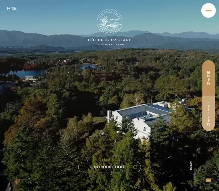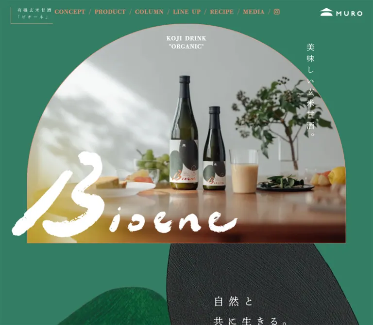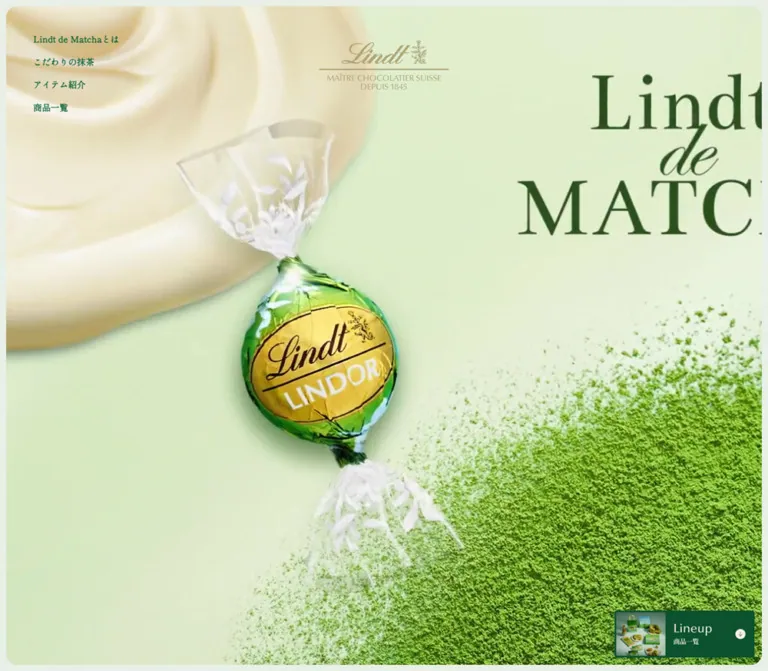
プレビュー準備中デザインリファレンスを見る
日本のWebデザインを、AIの制作リファレンスに。
DESIGN REFERENCE
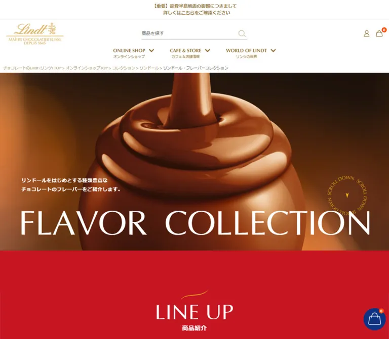
艶やかなチョコレートの大きな写真、赤とゴールドのブランド表現、白地の商品一覧を組み合わせたフレーバー紹介ページ。大きな欧文見出しと季節別の商品構成が特徴です。
オリジナルサイトを見るGlossy chocolate at monumental scale, followed by a precise white catalog framed in red and gold.
Website: Lindt — Flavor Collection Original URL: https://www.lindt.jp/contents/pickandmix/ Final URL: https://www.lindt.jp/contents/pickandmix/ Theme: light shopping interface, with a dark photographic hero and a saturated red editorial section. Inspected: September 23, 2026, at 03:13 JST; supplied retrieval timestamp: September 22, 2026, at 18:13:21.249 UTC. Viewports: desktop 1440 × 1000 CSS pixels; mobile 390 × 844 CSS pixels. Scope: the current flavor collection page within the Japanese shopping website. Evidence covers the desktop opening, seasonal product grid, and footer; mobile opening and footer; and rendered text, links, and selected computed styles throughout the document. Product destination pages, opened menus, and checkout flows were not inspected.
This page combines brand storytelling with an extensive flavor catalog. The opening image magnifies the glossy folds of pouring chocolate until the product becomes the entire visual field. A very large, regular-weight Optima title sits across its lower edge. Gold branding and fine utility icons frame the image inside the existing store navigation.
Below the hero, a red field introduces LINDOR, NUXOR, and European Specialties through large English family names and Japanese descriptions. The page then changes to white for comparison and browsing: narrow English product names, Japanese subtitles, isolated product composites, generous paragraph leading, small availability stamps, and gold purchase pills. Seasonal group headings organize the long catalog without enclosing every product in a separate box.
The mobile layout changes composition as well as size. The title breaks into two lines, introductory copy sits below the photograph on red, category shortcuts stack, and product rows become two columns. The shared footer changes from expanded columns to compact disclosure rows.
Glossy chocolate at monumental scale, followed by a precise white catalog framed in red and gold.
Website: Lindt — Flavor Collection Original URL: https://www.lindt.jp/contents/pickandmix/ Final URL: https://www.lindt.jp/contents/pickandmix/ Theme: light shopping interface, with a dark photographic hero and a saturated red editorial section. Inspected: September 23, 2026, at 03:13 JST; supplied retrieval timestamp: September 22, 2026, at 18:13:21.249 UTC. Viewports: desktop 1440 × 1000 CSS pixels; mobile 390 × 844 CSS pixels. Scope: the current flavor collection page within the Japanese shopping website. Evidence covers the desktop opening, seasonal product grid, and footer; mobile opening and footer; and rendered text, links, and selected computed styles throughout the document. Product destination pages, opened menus, and checkout flows were not inspected.
This page combines brand storytelling with an extensive flavor catalog. The opening image magnifies the glossy folds of pouring chocolate until the product becomes the entire visual field. A very large, regular-weight Optima title sits across its lower edge. Gold branding and fine utility icons frame the image inside the existing store navigation.
Below the hero, a red field introduces LINDOR, NUXOR, and European Specialties through large English family names and Japanese descriptions. The page then changes to white for comparison and browsing: narrow English product names, Japanese subtitles, isolated product composites, generous paragraph leading, small availability stamps, and gold purchase pills. Seasonal group headings organize the long catalog without enclosing every product in a separate box.
The mobile layout changes composition as well as size. The title breaks into two lines, introductory copy sits below the photograph on red, category shortcuts stack, and product rows become two columns. The shared footer changes from expanded columns to compact disclosure rows.
| Name | Value | Suggested token | Role | Evidence |
|---|---|---|---|---|
| White | #ffffff |
--color-white |
Page, header, catalog, footer, and reversed text | Measured body/header backgrounds and hero/editorial text |
| Lindt Editorial Red | #c61624 |
--color-red |
Full-width LINE UP section | Measured rgb(198, 22, 36) section background |
| Display Gold | #eda91b |
--color-display-gold |
Oversized product-family lettering | Measured rgb(237, 169, 27) on LINDOR and secondary family labels |
| Utility Gold | #917236 |
--color-utility-gold |
Shipping message and primary navigation | Measured rgb(145, 114, 54) |
| Breadcrumb Gold | #ac9568 |
--color-breadcrumb |
Ancestor links in the breadcrumb | Measured rgb(172, 149, 104) |
| Catalog Ink | #262626 |
--color-ink |
Flavor catalog headings, product names, and descriptions | Measured rgb(38, 38, 38) |
| Shell Gray | #555555 |
--color-muted |
Inherited body and shopping-shell text | Measured rgb(85, 85, 85) |
These golds have separate jobs. Large decorative lettering uses a brighter yellow gold; small navigation uses a darker brown gold. Preserve that distinction instead of assigning one gold to every element.
| Treatment | Approximation | Role and limitation |
|---|---|---|
| Purchase gradient | #f4ad0e → #b36f16, left to right |
Visible in the desktop seasonal capture; exact endpoints and stops were not supplied |
| Availability stamp | Approximately #bb1429 |
Dark red behind 販売中; its exact source color is unverified |
| Product dividers | Approximately #dddddd |
Fine vertical separation between desktop products |
| Footer/header rules | Approximately #e6e6e6 |
Quiet horizontal boundaries |
| Logo gold | Approximately #c6a452 |
Appearance of the supplied brand artwork, not a replacement logo specification |
| Cocoa fallback | Approximately #3b1d0e |
Suggested temporary background behind the hero image; the visible browns belong to the image |
The hero contains deep brown shadows, orange-brown midtones, and creamy highlights. These are image colors, not evidence of additional interface themes. Payment and app-store marks retain their own recognizable colors inside the otherwise restrained footer.
The supplied custom properties include administrative and editor presets. Their blue and purple values do not describe the visible storefront palette and should not be reused as brand colors.
Optima, sans-serif.400 on the hero title, LINE UP, FLAVOR, and large family names.--font-display.Optima availability varies by environment. No font-file URL or loading declaration was supplied. Validate the chosen fallback before relying on identical title wrapping.
The measured body stack starts with Optima, followed by Hiragino Kaku Gothic ProN, localized aliases, Meiryo, Osaka, MS PGothic, Arial, Helvetica, and a generic sans-serif fallback. The header stack starts directly with the Japanese sans-serif families.
Japanese descriptions use regular weight and unusually open leading. Short introductory statements, shipping information, and Japanese section labels use bold weight. This contrast supplies hierarchy without adding many font families.
Roboto Condensed, sans-serif.400.22px / 26.4px.18px / 21.6px.0.48px on desktop and 0.39px on mobile.The narrow letterforms accommodate names such as LINDOR Golden Caramel & Hazelnut within compact product columns. Long names still wrap on mobile. Do not force every title onto one line.
The Lindt wordmark is artwork. Its script and accompanying lettering should not be reconstructed with a guessed font. The mobile header shows a compact wordmark; desktop and footer versions include the extended brand lockup.
Values below are measured unless explicitly marked otherwise. Sizes are shown as font size / line height.
| Role | Desktop | Mobile | Weight and tracking |
|---|---|---|---|
| HTML root | 16px |
10px |
Source root sizes; not a universal body scale |
| Body | 16px / 25.6px |
14px / 22.4px |
400 |
| Shipping notice | 14px / 21px |
12px / 18px |
700 |
| Primary navigation anchor | 14px / 14px |
Offscreen menu anchor: 11px / 11px |
700; these are different layouts |
| Breadcrumb links | 12px / 12px |
10px / 10px |
400 |
| Hero title | 126px / 129.78px |
56.16px / 57.8448px |
400; desktop -1.26px tracking, mobile normal |
| Hero introduction | 18px / 32.4px |
14px / 25.2px |
700; tracking 0.54px / 0.42px |
| LINE UP / FLAVOR | 76px / 80.56px |
41.964px / 44.4818px |
400; desktop 1.52px tracking, mobile normal |
| Main Japanese section label | 22px / 30.8px |
17.979px / 25.1706px |
700; approximately 0.04em tracking |
| Editorial LINDOR word | 200px / 220px |
79.989px / 87.9879px |
400, display gold |
| Catalog LINDOR word | 150px / 156px |
63.999px / 66.559px |
400, display gold |
| Editorial LINDOR Japanese heading | 28px / 39.2px |
24px / 33.6px |
700 |
| Secondary family Japanese heading | 22px / 30.8px |
18px / 25.2px |
700 |
| Editorial description | 18px / 36px |
14px / 28px |
400 |
| English product name | 22px / 26.4px |
18px / 21.6px |
Roboto Condensed, 400 |
| Product description | 16px / 32px |
13px / 26px |
400; tracking 0.48px / 0.39px |
| Seasonal English heading | Approximately 30px, visual estimate |
SEASONAL sample: 23.985px / 25.4241px |
Regular display typography |
| Footer links/copyright | Approximately 12px, visual estimate |
Approximately 12px, visual estimate |
Exact computed footer typography unavailable |
The repeated 2.0 line-height ratio in descriptions is important. It gives dense Japanese copy room to breathe beneath visually rich product imagery.
Some English section-label rectangles are taller than one text line. Their measured box heights include layout beyond the glyph line; do not treat those rectangle heights as font sizes or line heights.
Density: a compact shopping header, expansive brand introduction, and a structured catalog with generous vertical rhythm.
Geometry: mostly rectangular surfaces and unboxed content. Strong rounding is concentrated in action pills and the circular scroll cue.
The evidence shows a 16px desktop root and a 10px mobile root, but it does not include the stylesheet formulas that connect viewport width to all dimensions.
At 390px, the hero title's 56.16px size equals 14.4vw arithmetically. That is a useful implementation reference, not proof that the source declares 14.4vw. The Quick Start uses a conventional root size and explicit responsive aliases instead of copying an unknown rem system.
| Use | Desktop | Mobile | Evidence |
|---|---|---|---|
| Shipping text outer inset | 9px |
5px |
Measured text rectangles |
| Primary navigation label gap | 6px |
Unverified | Measured desktop anchor gap |
| Editorial content side inset | 80px |
23.984px |
Measured content positions |
| Product-card horizontal padding | 20px each side |
15px each side |
Measured anchor padding |
| Main catalog vertical padding | 120px top and bottom |
78px top, 81.12px bottom |
Measured section padding |
| LINE UP top padding | 121px |
133px |
Measured; mobile also accommodates the relocated introduction |
| Mobile category-shortcut gap | — | 16px |
Calculated from successive link rectangles |
| Gap after first product row | Approximately 59px |
36px |
Calculated from sampled card bounds and next-row positions |
| Seasonal group separation | Approximately 70px after the previous CTA row |
Unverified visually | Desktop screenshot estimate |
These values do not establish a single global spacing grid. The shopping shell, editorial section, and product catalog use related but distinct layouts.
| Element | Value | Evidence |
|---|---|---|
| Hero, catalog surface, sampled product anchors | 0 |
Measured |
| Category shortcuts | 55px desktop; 39.975px mobile |
Measured |
| Purchase CTA | Approximately half of its roughly 59px height |
Screenshot estimate; fully rounded ends |
| Availability stamp | Square left edge, rounded right end | Visual observation; numeric radius unverified |
| Scroll cue | Circular artwork in a square box | Measured box: 144px desktop, approximately 96px mobile |
| Element | Desktop 1440 × 1000 | Mobile 390 × 844 |
|---|---|---|
| Document height | 20,564.516px, rounded report 20,565px |
25,972.328px, rounded report 25,972px |
| Header | 1440 × 200px |
390 × 105px |
| Hero | Starts at y=229.188; 1440 × 660px |
Starts at y=125; 390 × 400px |
| Hero title rectangle | x=69.109, y=720.219, width 1289.141px |
x=22.609, y=389.406, width 343.375px |
| Scroll cue | x=1215.375, y=615.313, 144 × 144px |
x=268.688, y=367.031, approximately 95.969 × 95.969px |
| Red LINE UP section | y=889.188, height 2908.953px |
y=525, height 2394.656px |
| Main editorial content width | 1280px |
342.031px |
| LINDOR introduction copy | 620px wide, centered at x=410 |
342.031px wide at x=23.984 |
| White FLAVOR section | y=3798.141, height 12,253.797px |
y=2919.656, height 19,025.531px |
| Category shortcut | 400.625 × 110px, three across |
342.031 × 79.984px, stacked |
| Product anchor width | 330px |
196.016px |
| Product text width | 290px |
166.016px |
The desktop product grid extends beyond the 1280px heading alignment: sampled anchors run from x=60 to x=1380, with their inner content starting at x=80. On mobile, the sampled grid extends roughly 1px beyond each viewport edge while text starts about 14px inward. Preserve the visual alignment, but do not intentionally reproduce horizontal overflow in a new implementation.
Role: a persistent shopping benefit above brand navigation.
A centered bold gold line on white, with a thin lower rule. The captured message is 5,980円以上のご購入で送料無料. The visible strip is approximately 40px high on desktop and 28px on mobile, consistent with the measured text sizes and insets.
Keep this separate from the editorial hero. Its language is small, practical, and tied to the store.
Role: brand identity, product search, shopping utilities, and navigation across the full website.
The header is 200px tall. Its main row places the extended gold logo at the left, an understated search field near the center, and store, wishlist, account, and bag icons at the right. The logo artwork is approximately 159px wide. The visible search field is approximately 360px wide, with a bottom rule rather than a filled rounded container. Its source label is 商品を探す.
The lower navigation row contains eight groups: CATEGORY, GIFT, RECOMMEND, SUBSCRIPTION, PRICE, CAFE&STORE, WORLD OF LINDT, and INFORMATION. Each pairs an English label with a smaller Japanese explanation and a downward chevron. Sampled navigation anchors are 55px high, with 8px 25px 16px 0 padding and a 6px label gap.
The bag count is a small orange-red circular badge. The visible zero is current page state, not a permanent visual requirement.
Rendered evidence contains nested menu content, but the desktop opening capture shows the compact navigation state. Trigger behavior, open-panel appearance, keyboard support, and dismissal were not tested.
Role: retain the shopping shell without consuming desktop navigation width.
The 105px white header keeps the shipping strip, then shows menu and search icons on the left, a centered compact Lindt wordmark, and store, wishlist, and bag icons on the right. The measured compact logo link is approximately 77.5px wide. The full desktop search field and horizontal navigation are absent from the visible mobile state.
The header is also present at the top of the mobile footer capture, supporting persistent positioning while scrolling. Exact fixed-versus-sticky implementation was not included in the sampled style fields.
The mobile DOM places navigation content to the left of the viewport at x=-390. This supports a closed offscreen menu structure. It does not demonstrate the opening animation or the appearance of an opened drawer.
Observed caveat: mobile body top padding is 83px, while the header rectangle is 105px tall. Earlier breadcrumb links sit around y=90, beneath the visible header region; the opening screenshot exposes only the lower breadcrumb line. A new implementation should derive its content offset from the actual header height.
Role: establish the page's position within the store collection hierarchy.
Small gold ancestor links and a gray current-page label sit on white immediately before the hero. Desktop links start at x=120, creating a narrower alignment than the main 80px content gutter. The measured type is 12px on desktop and 10px on mobile.
Keep the breadcrumb visually subordinate. On small screens, provide a deliberate compact or scrollable treatment with the current page still available to assistive technology.
Role: establish the sensory character of the page before presenting the assortment.
The hero fills the viewport width and uses a tightly cropped chocolate image. A thick stream enters from the top, forming glossy folds over a rounded chocolate form. The composition contains enough deep shadow behind the lower text to keep white lettering legible.
Desktop anatomy:
x=78, y=608.126px, on one line.Mobile anatomy:
56.16px.The mobile paragraph begins at y=565.625, approximately 40.6px below the hero's bottom. Although its DOM association remains with the hero, its visible composition belongs to the red transition area.
The headline is rendered text, supported by an H1 sample. Preserve it as text. The image medium is unverified: a static capture of pouring chocolate does not establish video playback or animation.
Role: link from the hero to the introduction.
Gold SCROLL DOWN lettering follows a circular path around a small downward pointer. Its observed target is #lineup. It is visually light despite its large interaction box.
The anchor has a recorded 0.3s transition. No rotation keyframes, hover result, or smooth-scroll duration were supplied. A circular arrangement of text should not be treated as evidence that it rotates.
Role: explain the three chocolate families before the detailed catalog.
A continuous #c61624 field supports white copy and bright gold family names. The opening section heading combines a small gold flourish, regular English LINE UP, and bold Japanese 商品紹介.
LINDOR receives the largest typographic treatment: a 200px gold word on desktop, followed by a centered 620px description area. Its Japanese heading is 28px bold and its description is 18px with 36px leading.
The measured secondary descriptions use two 512px-wide desktop regions, starting near x=80 and x=740.5. Their vertical positions are staggered by about 80px. English NUXOR and European Specialties labels occupy tall, narrow rectangles beside these regions. Those bounds suggest sideways decorative lettering, but the transform or writing-mode declaration was not supplied.
On mobile, LINDOR copy fills a roughly 342px column. Secondary copy narrows to about 277px and alternates its inset: NUXOR starts near x=89, European Specialties near x=24. This is an editorial arrangement with deliberate asymmetry. Exact image geometry in these lower introductory areas cannot be reconstructed from the supplied screenshots.
Role: mark the transition from introduction to direct browsing.
The white section begins with the same English/Japanese heading system: FLAVOR and フレーバー紹介. Below it, three rounded links target LINDOR, NUXOR, and European Specialties within the same document.
Desktop links are approximately 400.6 × 110px, separated by about 39px. Mobile links are approximately 342 × 80px, stacked with 16px gaps. Text is white and the measured radii are 55px and about 40px respectively.
The supplied background-color field is transparent and no background-image field was provided for these controls. Their exact fill or imagery is therefore unverified. A gold fill in an adaptation is a recommendation, not a measured source value.
These are anchor shortcuts, not demonstrated filtering tabs. Keep all flavor families reachable in the document.
Role: organize a long assortment without introducing a separate page for each group.
Catalog family labels use oversized gold English lettering with smaller Japanese labels. LINDOR is measured at 150px on desktop and approximately 64px on mobile.
The LINDOR catalog separates standard flavors from seasonal flavors, then includes SEASONAL, HALLOWEEN, CHRISTMAS, and VALENTINE’S DAY groups. The seasonal desktop capture shows a fine gold rule across the content width, followed by a regular English heading and smaller Japanese text on the same line.
Use headings and rules as the primary group boundaries. Avoid enclosing an entire seasonal assortment in an additional rounded panel.
Role: present a flavor and, when a purchase destination is present, provide a direct route to it.
The product module sits directly on the white catalog surface. Desktop rows contain four products; mobile samples confirm two.
Anatomy, in reading order:
販売中 stamp over the upper-left portion of the image area.2.0 line-height.ご購入はこちら, with a white cart symbol.The seasonal image composition repeats a useful visual grammar: wrapper on the left, chocolate on the right, and a thin gold flourish above. Ingredient cues distinguish variants, such as shortbread pieces or a small pumpkin.
Desktop card anchors are 330px wide with 20px horizontal padding, leaving 290px for content. Fine gray vertical rules divide adjacent cards; no full enclosing border or shadow is visible. The Halloween capture shows purchase pills approximately 290px wide and 59px high, aligned at the bottom of the row.
The first measured standard row has card bounds about 458px high. Mobile samples vary substantially, from roughly 341px to 728px. These values are observations of the supplied layout, not a reusable fixed card-height scale. Long titles, descriptions, media spacing, and row sizing require testing with real content.
Role: distinguish products with a current purchase route while retaining the larger flavor reference.
Purchasable products are represented by block anchors in the DOM. The visible pill belongs within that product link; it should not become a nested button inside an anchor.
In the desktop Halloween row, Halloween, Ghost, and Pumpkin Spice show 販売中 and purchase pills. Shortbread remains visible without those elements. Missing purchase controls do not independently establish that an item is sold out or discontinued.
Preserve descriptions and images for entries without a purchase route. Keep availability as explicit data rather than a style inferred from the season name. No per-card price, quantity selector, or tested add-to-cart action appears in the supplied catalog evidence.
Role: connect flavor discovery to the in-store selection experience and online shopping.
Rendered text after the catalog explains selecting chocolates by weight, trying different flavors, and creating a personal gift. Three supporting topics cover the pleasure of choosing, assortment variety, and individual gifting.
The recorded destination links are STORE, pointing to the store-information page, and ONLINE SHOP, pointing to the online-shop entry page. Their presence and labels are supported by the DOM. The supplied screenshots do not establish the detailed layout, photography, or button dimensions of this lower content region.
Role: return from the collection content to comprehensive store navigation and purchasing support.
The footer is white, spacious, and organized through gold links and pale rules. The visible lower navigation row contains five columns: CAFE & STORE, WORLD OF LINDT, INFORMATION, OUR COMPANY, and GLOBAL SITE. Column headings are gray and slightly larger than their links. Additional shopping-category columns continue above the captured region.
Below the navigation, social icons and app-store badges occupy the left. Payment information and recognizable payment marks follow. An extended gold Lindt lockup sits on the right, approximately 220px wide by visual estimate. A long horizontal rule separates the final centered copyright line.
The footer displays a 2025 copyright year. This is source content, not the inspection date.
Role: retain a large store information architecture in a narrow viewport.
The mobile footer presents full-width disclosure rows with small gold headings, right-aligned chevrons, and pale horizontal rules. The DOM lists six main groups: ONLINE SHOP, CAFE & STORE, WORLD OF LINDT, INFORMATION, OUR COMPANY, and GLOBAL SITE. The supplied bottom capture shows the final four rows closed.
Social icons and the two app-store badges are centered below the navigation. Payment descriptions and marks use nearly the full width. The extended Lindt logo then moves below the payment area and centers above the copyright divider.
Open disclosure states and toggle behavior were not tested. Payment text is close to the viewport edge in the capture; a new implementation should reserve a modest inset and allow text enlargement without horizontal overflow.
| Element | Recorded value or evidence | What it establishes | Limit |
|---|---|---|---|
| Hero introduction | 2s cubic-bezier(0.2, 0.4, 0.1, 1) |
A long eased transition is attached to the paragraph | Animated properties, trigger, and start/end values were not supplied |
| LINE UP / FLAVOR labels | Same 2s curve |
Shared transition timing across major labels | Does not prove a specific reveal direction or stagger |
| Several Japanese section headings | Same 2s curve |
Consistent timing on sampled headings | Exact activation conditions unverified |
| Circular scroll anchor | 0.3s |
Short transition duration | No verified rotation or click animation |
| Family shortcut links | 0.6s |
Slower control transition duration | Hover appearance and changing properties unverified |
| Mobile offscreen navigation anchors | 0.3s |
Transition declarations exist in the closed menu structure | Drawer opening and dismissal were not exercised |
| Product anchors | Generic all; sampled animation none |
No specific nonzero product animation established | Do not infer lift, zoom, or fade on hover |
| Section links | #lineup, #lindor, #nuxor, #european |
In-page destinations exist | Smooth scrolling and focus transfer unverified |
| Mobile header | Present in opening and footer captures | Header remains visible at both scroll positions | Exact positioning mechanism unverified |
The supplied capture process waited for finite motion and image decoding, and temporarily paused perpetual animations during readiness checks. This describes the inspection method; it does not establish that a particular component has a perpetual animation.
Recommended adaptation: keep essential content visible by default. If reveals are added, reuse the measured 2s curve sparingly for major editorial elements. Use shorter feedback for controls, and provide a reduced-motion state. Do not introduce parallax, chocolate simulation, or a rotating ring as if those behaviors were verified.
| Layer | Appearance | Purpose |
|---|---|---|
| Shopping shell | White, small gold controls, fine neutral rules | Store identity and utilities |
| Hero | Full-width chocolate image with white lettering | Sensory introduction |
| Editorial introduction | Solid red, white copy, bright gold display words | Product-family storytelling |
| Flavor catalog | White with dark text and thin separators | Product comparison and browsing |
| Purchase indicator | Gold gradient pill with white label and cart symbol | Visible route to a product destination |
| Availability indicator | Small dark-red stamp | Compact sale-status information |
| Footer | White, gold links, gray headings, recognizable external marks | Site navigation and purchasing support |
There is no general elevation system in the supplied captures. Structure comes from color-field changes, typography, aligned content, and rules. Shadows inside the chocolate artwork are image lighting, not card elevation.
The hero treats chocolate as a sculptural material. Broad specular highlights describe its folds, while dark background regions provide contrast for the title. The crop is intentionally close: it communicates smoothness and richness before showing a conventional packaged product.
Catalog imagery has a different job. Isolated composites show wrapper identity, chocolate form, and filling or ingredient cues on white. Consistent relative scale makes flavors comparable even when their wrappers use different colors. The artwork itself carries much of the assortment's color variety.
Use object-fit: cover for the hero and object-fit: contain for complete product composites. Product wrappers and ingredient details should remain intact. Keep normal image interpolation; there is no pixel-art treatment.
Gold outline utilities are visually thin and simple. Social, payment, and app-store marks are recognizable supplied graphics. No exact icon library is established by the evidence.
| Asset | Observed use | Evidence | File-path status |
|---|---|---|---|
| Pouring-chocolate hero | Desktop wide crop and mobile close crop | Original desktop and mobile opening captures | Source URL not supplied |
| Extended Lindt lockup | Desktop header and both footers | Original header/footer captures | Source URL not supplied |
| Compact Lindt wordmark | Mobile header | Original mobile captures | Source URL not supplied |
| Circular SCROLL DOWN artwork | Hero anchor | Both opening captures and measured anchor bounds | Source URL not supplied |
| Gold flourish | Section heading and product compositions | Mobile opening and desktop seasonal capture | Independent asset versus embedded artwork unverified |
| Flavor composites | Wrapped piece, exposed chocolate, optional ingredients | Desktop Halloween/Christmas capture | Source URLs not supplied |
| Social, app-store, and payment marks | Footer support area | Desktop and mobile footer captures | Link destinations exist; inline asset URLs were not supplied |
No hero, product-image, or font-file manifest was included. Use supplied project assets when implementing the reference; do not invent original asset paths. CSS can reproduce the layout and hierarchy, but the chocolate imagery and brand lockups carry much of the visual identity.
The page follows a long document flow: shopping header, breadcrumb, hero, red family introduction, white flavor catalog, PICK & MIX information, destination links, and shared footer.
| Concern | Desktop observation | Mobile observation |
|---|---|---|
| Header | Expanded search, utilities, and eight navigation groups | Compact icon row and centered wordmark; remains visible in the footer capture |
| Hero | 660px high; title on one line |
400px high; title on two lines |
| Introductory copy | Over the chocolate image | Below the image on red |
| Main text gutter | 80px |
Approximately 24px |
| Editorial families | Large centered LINDOR introduction, then staggered secondary regions | Stacked regions with alternating copy insets |
| Category shortcuts | Three across | Three stacked |
| Product catalog | Four columns, 290px text regions | Two columns, approximately 166px text regions |
| Product descriptions | 16px / 32px |
13px / 26px |
| Footer navigation | Expanded columns | Closed disclosure rows in the captured state |
| Footer brand lockup | Right of the support area | Centered below payment information |
The two-column mobile catalog is a defining observation. A single-column card stack would materially change the page's rhythm at 390px.
The measured mobile document is about 26,000px tall. Category shortcuts therefore serve a practical browsing purpose. Preserve the family and seasonal hierarchy, and ensure anchor targets remain visible beneath persistent navigation.
Source breakpoints were not supplied. A 767px mobile boundary in the Quick Start is a recommendation. Test tablet widths, Japanese line breaking, font fallback, enlarged text, and long product names independently.
The mobile card samples do not establish globally equal heights or aligned CTAs in every row. Use content-driven sizing in a new implementation, then align actions within each row where practical. Avoid copying the largest sampled height onto every product.
#c61624 and distinguish bright display gold from darker utility gold.These are recommendations for a new implementation, not verified features of the inspected page:
aria-expanded, and matching content visibility.scroll-margin-top to anchor targets.#ffffff.#c61624.#eda91b.#917236.#ac9568.#262626; inherited shell text: #555555.#f4ad0e to #b36f16.#bb1429.“Create a Japanese chocolate flavor reference integrated into a full shopping website. Use a white and gold commerce header, a full-width close-up of glossy pouring chocolate, and a very large regular Optima title reading FLAVOR COLLECTION. Follow with a saturated red #c61624 editorial introduction, white Japanese copy, and oversized gold #eda91b family names. Transition to a long white catalog with family anchors and seasonal group headings. Use Roboto Condensed for English flavor names, Japanese subtitles, complete product composites, thin vertical separators, generous description leading, optional red availability stamps, and gold purchase pills. At 390px, use a compact persistent header, a two-line hero title, introductory copy below the image on red, stacked category links, a two-column product grid, and footer disclosure rows. Use the supplied artwork and explicit product availability data. Treat unverified motion as an optional implementation choice.”
商品紹介. Give LINDOR monumental gold lettering and a centered description with double-spaced leading. Arrange secondary family descriptions with deliberate staggered alignment and alternate their insets on mobile.”This is an implementation adaptation, not recovered source CSS. Measured colors and type sizes are retained. Supporting colors, breakpoints, flexible card sizing, hover feedback, and footer disclosure mechanics are recommendations.
The CSS expects a .flavor-reference wrapper; a .hero containing .hero-media, .hero-title, .hero-intro, and .scroll-cue; and a following .lineup section. Use two spans inside .hero-title for the mobile line break. Product children should follow the anatomy described above, with .purchase-pill as a noninteractive element inside a product link.
Bind real image sources in the markup. Supply the logo, flourish, and scroll-ring artwork as assets. The CSS does not load or fabricate font files. The body stack below omits duplicate localized family aliases for readability.
:root {
  /* Measured palette */
  --color-white: #ffffff;
  --color-red: #c61624;
  --color-display-gold: #eda91b;
  --color-utility-gold: #917236;
  --color-breadcrumb: #ac9568;
  --color-ink: #262626;
  --color-muted: #555555;

  /* Visual estimates and adaptation choices */
  --color-rule: #dddddd;
  --color-rule-soft: #e6e6e6;
  --color-sale: #bb1429;
  --color-action-start: #f4ad0e;
  --color-action-end: #b36f16;
  --color-cocoa-fallback: #3b1d0e;
  --purchase-fill: linear-gradient(
    90deg,
    var(--color-action-start),
    var(--color-action-end)
  );

  /* Observed family names; font files must be supplied separately */
  --font-display: Optima, sans-serif;
  --font-product: 'Roboto Condensed', sans-serif;
  --font-ui: 'Hiragino Kaku Gothic ProN', Meiryo, Osaka,
    'MS PGothic', Arial, Helvetica, sans-serif;
  --font-body: Optima, var(--font-ui);

  --text-body: 16px;
  --text-editorial: 18px;
  --text-product: 16px;
  --text-product-name: 22px;
  --text-section: 76px;
  --text-section-ja: 22px;
  --tracking-product: 0.48px;

  /* Desktop measurements with flexible outer margins */
  --content-max: 1280px;
  --page-gutter: clamp(24px, 5.5556vw, 80px);
  --product-inset: 20px;
  --hero-height: 660px;
  --shortcut-height: 110px;
  --header-height: 200px;
  --anchor-offset: 24px;

  /* Recorded durations; animated properties below are recommendations */
  --motion-editorial: 2s cubic-bezier(0.2, 0.4, 0.1, 1);
  --motion-control: 300ms;
  --motion-shortcut: 600ms;
}

* {
  box-sizing: border-box;
}

body {
  margin: 0;
}

.flavor-reference {
  color: var(--color-ink);
  background: var(--color-white);
  font: 400 var(--text-body)/1.6 var(--font-body);
}

.flavor-reference img {
  max-width: 100%;
}

.content-width {
  width: min(
    var(--content-max),
    calc(100% - 2 * var(--page-gutter))
  );
  margin-inline: auto;
}

.commerce-header {
  color: var(--color-utility-gold);
  background: var(--color-white);
  font-family: var(--font-ui);
}

.shipping-notice {
  display: grid;
  min-height: 40px;
  place-items: center;
  margin: 0;
  padding: 9px;
  border-bottom: 1px solid var(--color-rule-soft);
  font-size: 14px;
  font-weight: 700;
  line-height: 21px;
  text-align: center;
}

.brand-row {
  display: grid;
  grid-template-columns: 1fr minmax(240px, 360px) 1.2fr;
  align-items: center;
  gap: 40px;
  min-height: 105px;
}

.brand-logo img {
  display: block;
  width: 159px;
  height: auto;
}

.search-field {
  width: 100%;
  border: 0;
  border-bottom: 1px solid var(--color-breadcrumb);
  border-radius: 0;
  padding: 10px 32px 10px 0;
  background: transparent;
  color: var(--color-muted);
  font: inherit;
  font-size: 14px;
}

.header-tools {
  display: flex;
  justify-content: flex-end;
  align-items: center;
  gap: 18px;
}

.mobile-tools {
  display: none;
}

.primary-navigation {
  display: flex;
  align-items: stretch;
  justify-content: space-between;
  min-height: 55px;
}

.nav-entry {
  display: flex;
  flex-direction: column;
  gap: 6px;
  padding: 8px 25px 16px 0;
  color: inherit;
  font-size: 14px;
  font-weight: 700;
  line-height: 14px;
  text-decoration: none;
}

.nav-entry small {
  font-size: 11px;
  font-weight: 400;
}

.breadcrumb {
  min-height: 29.188px;
  padding-block: 8px;
  color: var(--color-muted);
  font-size: 12px;
  line-height: 12px;
}

.breadcrumb a {
  color: var(--color-breadcrumb);
}

.hero {
  position: relative;
  height: var(--hero-height);
  color: var(--color-white);
  background: var(--color-cocoa-fallback);
}

/* Clip media separately so the mobile introduction can extend below. */
.hero-media {
  position: absolute;
  inset: 0;
  overflow: hidden;
}

.hero-media img {
  display: block;
  width: 100%;
  height: 100%;
  object-fit: cover;
  object-position: var(--hero-focus, 50% 50%);
}

.hero-title {
  position: absolute;
  z-index: 1;
  right: 5.6%;
  bottom: 39.2px;
  left: 4.8%;
  margin: 0;
  font-family: var(--font-display);
  font-size: clamp(48px, 8.75vw, 126px);
  font-weight: 400;
  line-height: 1.03;
  letter-spacing: -0.01em;
  text-transform: uppercase;
}

.hero-intro {
  position: absolute;
  z-index: 2;
  bottom: 216.5px;
  left: 5.4%;
  width: min(370px, 40%);
  margin: 0;
  font-size: 18px;
  font-weight: 700;
  line-height: 1.8;
  letter-spacing: 0.03em;
}

.scroll-cue {
  position: absolute;
  z-index: 2;
  top: 386.125px;
  right: 5.6%;
  width: 144px;
  aspect-ratio: 1;
  color: var(--color-display-gold);
  transition: opacity var(--motion-control);
}

.lineup {
  padding: 121px 0 120px;
  color: var(--color-white);
  background: var(--color-red);
}

.section-heading {
  text-align: center;
}

.section-mark {
  display: block;
  width: 60px;
  height: auto;
  margin: 0 auto 16px;
}

.section-en {
  margin: 0;
  font-family: var(--font-display);
  font-size: var(--text-section);
  font-weight: 400;
  line-height: 1.06;
  letter-spacing: 0.02em;
  text-transform: uppercase;
}

.section-ja {
  margin: 8px 0 0;
  font-size: var(--text-section-ja);
  font-weight: 700;
  line-height: 1.4;
  letter-spacing: 0.04em;
}

.editorial-family-word {
  margin: 0;
  color: var(--color-display-gold);
  font: 400 clamp(80px, 13.889vw, 200px)/1.1
    var(--font-display);
}

.editorial-copy {
  max-width: 620px;
  margin-inline: auto;
  font-size: var(--text-editorial);
  line-height: 2;
}

.flavor-catalog {
  padding-block: 120px;
  background: var(--color-white);
}

.flavor-jumps {
  display: grid;
  grid-template-columns: repeat(3, minmax(0, 1fr));
  gap: 39px;
  margin-block: 70px 130px;
}

.flavor-jump {
  display: flex;
  align-items: center;
  min-height: var(--shortcut-height);
  padding: 5px 56px 5px 28px;
  border-radius: calc(var(--shortcut-height) / 2);
  color: var(--color-white);
  /* Suggested fill; the original shortcut background was not supplied. */
  background: var(--purchase-fill);
  text-decoration: none;
  transition: filter var(--motion-shortcut);
}

.catalog-family-word {
  margin: 0;
  color: var(--color-display-gold);
  font: 400 clamp(64px, 10.417vw, 150px)/1.04
    var(--font-display);
}

.season-heading {
  display: flex;
  flex-wrap: wrap;
  align-items: baseline;
  gap: 16px;
  margin: 70px 0 60px;
  padding-top: 14px;
  border-top: 1px solid var(--color-display-gold);
  font: 400 30px/1.2 var(--font-display);
}

.season-heading small {
  font: 400 16px/1.5 var(--font-ui);
}

.product-grid {
  display: grid;
  grid-template-columns: repeat(4, minmax(0, 1fr));
  row-gap: 60px;
  margin-inline: calc(-1 * var(--product-inset));
}

.product-card {
  display: flex;
  min-width: 0;
  flex-direction: column;
  padding-inline: var(--product-inset);
  color: var(--color-ink);
  text-decoration: none;
  letter-spacing: var(--tracking-product);
}

.product-card:not(:nth-child(4n + 1)) {
  border-left: 1px solid var(--color-rule);
}

.product-name {
  margin: 0;
  font: 400 var(--text-product-name)/1.2 var(--font-product);
  letter-spacing: inherit;
  overflow-wrap: anywhere;
}

.product-name-ja {
  margin: 4px 0 0;
  font-size: 14px;
  line-height: 1.5;
}

.product-media {
  position: relative;
  margin-block: 20px;
}

.product-media img {
  display: block;
  width: 100%;
  height: auto;
  object-fit: contain;
}

.sale-stamp {
  position: absolute;
  top: 0;
  left: 0;
  padding: 5px 12px;
  border-radius: 0 999px 999px 0;
  color: var(--color-white);
  background: var(--color-sale);
  font: 700 13px/1.4 var(--font-ui);
  letter-spacing: normal;
}

.product-description {
  margin: 0 0 28px;
  font-size: var(--text-product);
  line-height: 2;
}

.purchase-pill {
  display: flex;
  align-items: center;
  justify-content: center;
  gap: 10px;
  min-height: 59px;
  margin-top: auto;
  padding: 12px 16px;
  border-radius: 999px;
  color: var(--color-white);
  background: var(--purchase-fill);
  font: 700 16px/1.4 var(--font-ui);
  letter-spacing: normal;
  transition: filter var(--motion-control);
}

.footer-groups {
  display: grid;
  grid-template-columns: repeat(5, minmax(0, 1fr));
  gap: 40px;
}

.footer-toggle {
  width: 100%;
  padding: 0 0 16px;
  border: 0;
  border-bottom: 1px solid var(--color-rule-soft);
  color: var(--color-muted);
  background: transparent;
  font: 700 16px/1.4 var(--font-body);
  text-align: left;
}

.footer-links {
  display: block;
  padding: 0;
  list-style: none;
}

.footer-links a {
  display: inline-block;
  padding-block: 10px;
  color: var(--color-utility-gold);
  font-size: 12px;
  text-decoration: none;
}

.flavor-reference [id] {
  scroll-margin-top: var(--anchor-offset);
}

/* Optional reveal hooks remain visible until behavior is implemented. */
.editorial-reveal {
  transition:
    opacity var(--motion-editorial),
    transform var(--motion-editorial);
}

.flavor-reference :focus-visible {
  outline: 3px solid var(--color-ink);
  outline-offset: 4px;
}

/* Recommended feedback; original hover results were not inspected. */
@media (hover: hover) {
  a.product-card:hover .purchase-pill,
  .flavor-jump:hover {
    filter: brightness(0.94);
  }
}

/* Recommended breakpoint, not an observed source media query. */
@media (max-width: 767px) {
  :root {
    --text-body: 14px;
    --text-editorial: 14px;
    --text-product: 13px;
    --text-product-name: 18px;
    --text-section: 41.964px;
    --text-section-ja: 17.979px;
    --tracking-product: 0.39px;
    --page-gutter: 24px;
    --product-inset: 15px;
    --hero-height: 400px;
    --shortcut-height: 80px;
    --header-height: 105px;
    --anchor-offset: 121px;
  }

  .commerce-header {
    position: sticky;
    z-index: 30;
    top: 0;
    padding-bottom: 22px;
  }

  .shipping-notice {
    min-height: 28px;
    padding: 4px 5px 5px;
    font-size: 12px;
    line-height: 18px;
  }

  .brand-row {
    width: calc(100% - 30px);
    min-height: 55px;
    grid-template-columns: 1fr auto 1fr;
    gap: 8px;
  }

  .brand-logo {
    grid-column: 2;
    grid-row: 1;
  }

  .brand-logo img {
    width: 77.5px;
  }

  .mobile-tools {
    display: flex;
    grid-column: 1;
    grid-row: 1;
    gap: 16px;
  }

  .header-tools {
    grid-column: 3;
    grid-row: 1;
    gap: 12px;
  }

  .search-field,
  .primary-navigation,
  .desktop-only {
    display: none;
  }

  .breadcrumb {
    min-height: 20px;
    padding-block: 5px;
    font-size: 10px;
    line-height: 10px;
  }

  .hero-title {
    right: 6.15%;
    bottom: 20px;
    left: 5.8%;
    font-size: clamp(44px, 14.4vw, 72px);
    letter-spacing: normal;
  }

  .hero-title span {
    display: block;
  }

  .hero-intro {
    top: calc(100% + 40.625px);
    right: 20px;
    bottom: auto;
    left: 20px;
    width: auto;
    font-size: 14px;
    text-align: center;
  }

  .scroll-cue {
    top: 242.031px;
    right: 6.5%;
    width: 96px;
  }

  .lineup {
    padding-top: 133px;
    padding-bottom: 80px;
  }

  .section-en {
    letter-spacing: normal;
  }

  .editorial-family-word {
    font-size: 79.989px;
  }

  .flavor-catalog {
    padding-block: 78px 81.12px;
  }

  .flavor-jumps {
    grid-template-columns: 1fr;
    gap: 16px;
    margin-block: 58px 80px;
  }

  .flavor-jump {
    padding-inline: 29px 51px;
  }

  .catalog-family-word {
    font-size: 63.999px;
  }

  .season-heading {
    margin-block: 48px 40px;
    font-size: 24px;
  }

  .season-heading small {
    font-size: 13px;
  }

  /* Approximate the wider product grid without reproducing overflow. */
  .product-grid {
    grid-template-columns: repeat(2, minmax(0, 1fr));
    row-gap: 36px;
    margin-inline: -24px;
  }

  .product-card:not(:nth-child(4n + 1)) {
    border-left: 0;
  }

  .product-card:nth-child(even) {
    border-left: 1px solid var(--color-rule);
  }

  .product-name-ja {
    font-size: 12px;
  }

  .purchase-pill {
    min-height: 44px;
    padding-inline: 8px;
    font-size: 12px;
  }

  .footer-groups {
    display: block;
  }

  .footer-toggle {
    display: flex;
    align-items: center;
    justify-content: space-between;
    min-height: 48px;
    padding: 14px 20px;
    color: var(--color-utility-gold);
    font-size: 12px;
  }

  .footer-toggle::after {
    width: 7px;
    height: 7px;
    border-right: 2px solid currentColor;
    border-bottom: 2px solid currentColor;
    transform: rotate(45deg);
    content: '';
  }

  .footer-toggle[aria-expanded='true']::after {
    transform: rotate(225deg);
  }

  .footer-links {
    padding-inline: 20px;
  }

  .footer-links[hidden] {
    display: none;
  }
}

@media (prefers-reduced-motion: reduce) {
  .flavor-reference *,
  .flavor-reference *::before,
  .flavor-reference *::after {
    animation: none !important;
    transition: none !important;
    scroll-behavior: auto !important;
  }
}
The CSS supplies structure, not complete interaction behavior. Footer buttons need a controller that synchronizes aria-expanded and hidden. Product availability needs data. The mobile logo should use an appropriate compact asset through responsive markup. Hero focal positioning must be checked against the actual supplied image.
Optional aliases for projects already using Tailwind v4. This does not imply that the inspected website uses Tailwind. Define the custom properties above first.
@theme inline {
  --color-lindt-red: var(--color-red);
  --color-lindt-gold: var(--color-display-gold);
  --color-shop-gold: var(--color-utility-gold);
  --color-catalog-ink: var(--color-ink);
  --color-catalog-rule: var(--color-rule);
  --color-availability: var(--color-sale);

  --font-display: Optima, sans-serif;
  --font-product: 'Roboto Condensed', sans-serif;
  --font-japanese: 'Hiragino Kaku Gothic ProN', Meiryo,
    Osaka, 'MS PGothic', Arial, Helvetica, sans-serif;

  --text-flavor-name: var(--text-product-name);
  --text-flavor-copy: var(--text-product);
  --text-section-title: var(--text-section);
  --text-section-label: var(--text-section-ja);

  --spacing-page-gutter: var(--page-gutter);
  --spacing-product-inset: var(--product-inset);
  --radius-purchase: 999px;
}
2026-09-22T18:13:21.249Z, equivalent to September 23, 2026, at 03:13:21.249 JST. Separate timestamps for individual screenshots were not supplied.This reference describes the current supplied page evidence. The CSS and prompts are reusable adaptations, with estimated and recommended details distinguished from measured observations.
# Lindt / Flavor Collection — Style Reference

> Glossy chocolate at monumental scale, followed by a precise white catalog framed in red and gold.

**Website:** [Lindt — Flavor Collection](https://www.lindt.jp/contents/pickandmix/)
**Original URL:** https://www.lindt.jp/contents/pickandmix/
**Final URL:** https://www.lindt.jp/contents/pickandmix/
**Theme:** light shopping interface, with a dark photographic hero and a saturated red editorial section.
**Inspected:** September 23, 2026, at 03:13 JST; supplied retrieval timestamp: September 22, 2026, at 18:13:21.249 UTC.
**Viewports:** desktop 1440 × 1000 CSS pixels; mobile 390 × 844 CSS pixels.
**Scope:** the current flavor collection page within the Japanese shopping website. Evidence covers the desktop opening, seasonal product grid, and footer; mobile opening and footer; and rendered text, links, and selected computed styles throughout the document. Product destination pages, opened menus, and checkout flows were not inspected.

This page combines brand storytelling with an extensive flavor catalog. The opening image magnifies the glossy folds of pouring chocolate until the product becomes the entire visual field. A very large, regular-weight Optima title sits across its lower edge. Gold branding and fine utility icons frame the image inside the existing store navigation.

Below the hero, a red field introduces LINDOR, NUXOR, and European Specialties through large English family names and Japanese descriptions. The page then changes to white for comparison and browsing: narrow English product names, Japanese subtitles, isolated product composites, generous paragraph leading, small availability stamps, and gold purchase pills. Seasonal group headings organize the long catalog without enclosing every product in a separate box.

The mobile layout changes composition as well as size. The title breaks into two lines, introductory copy sits below the photograph on red, category shortcuts stack, and product rows become two columns. The shared footer changes from expanded columns to compact disclosure rows.
# Lindt / Flavor Collection — Style Reference

> Glossy chocolate at monumental scale, followed by a precise white catalog framed in red and gold.

**Website:** [Lindt — Flavor Collection](https://www.lindt.jp/contents/pickandmix/)
**Original URL:** https://www.lindt.jp/contents/pickandmix/
**Final URL:** https://www.lindt.jp/contents/pickandmix/
**Theme:** light shopping interface, with a dark photographic hero and a saturated red editorial section.
**Inspected:** September 23, 2026, at 03:13 JST; supplied retrieval timestamp: September 22, 2026, at 18:13:21.249 UTC.
**Viewports:** desktop 1440 × 1000 CSS pixels; mobile 390 × 844 CSS pixels.
**Scope:** the current flavor collection page within the Japanese shopping website. Evidence covers the desktop opening, seasonal product grid, and footer; mobile opening and footer; and rendered text, links, and selected computed styles throughout the document. Product destination pages, opened menus, and checkout flows were not inspected.

This page combines brand storytelling with an extensive flavor catalog. The opening image magnifies the glossy folds of pouring chocolate until the product becomes the entire visual field. A very large, regular-weight Optima title sits across its lower edge. Gold branding and fine utility icons frame the image inside the existing store navigation.

Below the hero, a red field introduces LINDOR, NUXOR, and European Specialties through large English family names and Japanese descriptions. The page then changes to white for comparison and browsing: narrow English product names, Japanese subtitles, isolated product composites, generous paragraph leading, small availability stamps, and gold purchase pills. Seasonal group headings organize the long catalog without enclosing every product in a separate box.

The mobile layout changes composition as well as size. The title breaks into two lines, introductory copy sits below the photograph on red, category shortcuts stack, and product rows become two columns. The shared footer changes from expanded columns to compact disclosure rows.

## How to Read This Reference

- **Measured** means a value is present in the supplied rendered DOM or computed-style evidence. Coordinates and dimensions use CSS pixels.
- **Calculated** means arithmetic derived from measured rectangles, such as the gap between consecutive rows.
- **Estimated** means a visual approximation from an original-page capture. Estimated colors are not sampled or verified stylesheet values.
- **Recommended** means implementation guidance for a new page. Proposed breakpoints, accessibility improvements, fallback behavior, and CSS architecture are not claims about the original implementation.
- **Named tokens** are descriptive aliases created for this reference. The supplied custom-property inventory does not expose a public brand-token system.
- Computed font-family lists establish declared stacks, not the exact font file used to draw every glyph.
- Some extracted navigation elements are outside the viewport or not visible in the screenshots. Their presence does not prove that a menu was opened.
- Only the two supplied viewport sizes were inspected. Intermediate layouts and the original media-query boundaries remain unknown.

## Tokens — Colors

### Default Palette

| Name | Value | Suggested token | Role | Evidence |
| --- | --- | --- | --- | --- |
| White | `#ffffff` | `--color-white` | Page, header, catalog, footer, and reversed text | Measured body/header backgrounds and hero/editorial text |
| Lindt Editorial Red | `#c61624` | `--color-red` | Full-width LINE UP section | Measured `rgb(198, 22, 36)` section background |
| Display Gold | `#eda91b` | `--color-display-gold` | Oversized product-family lettering | Measured `rgb(237, 169, 27)` on LINDOR and secondary family labels |
| Utility Gold | `#917236` | `--color-utility-gold` | Shipping message and primary navigation | Measured `rgb(145, 114, 54)` |
| Breadcrumb Gold | `#ac9568` | `--color-breadcrumb` | Ancestor links in the breadcrumb | Measured `rgb(172, 149, 104)` |
| Catalog Ink | `#262626` | `--color-ink` | Flavor catalog headings, product names, and descriptions | Measured `rgb(38, 38, 38)` |
| Shell Gray | `#555555` | `--color-muted` | Inherited body and shopping-shell text | Measured `rgb(85, 85, 85)` |

These golds have separate jobs. Large decorative lettering uses a brighter yellow gold; small navigation uses a darker brown gold. Preserve that distinction instead of assigning one gold to every element.

### Supporting Colors — Estimates

| Treatment | Approximation | Role and limitation |
| --- | --- | --- |
| Purchase gradient | `#f4ad0e` → `#b36f16`, left to right | Visible in the desktop seasonal capture; exact endpoints and stops were not supplied |
| Availability stamp | Approximately `#bb1429` | Dark red behind `販売中`; its exact source color is unverified |
| Product dividers | Approximately `#dddddd` | Fine vertical separation between desktop products |
| Footer/header rules | Approximately `#e6e6e6` | Quiet horizontal boundaries |
| Logo gold | Approximately `#c6a452` | Appearance of the supplied brand artwork, not a replacement logo specification |
| Cocoa fallback | Approximately `#3b1d0e` | Suggested temporary background behind the hero image; the visible browns belong to the image |

The hero contains deep brown shadows, orange-brown midtones, and creamy highlights. These are image colors, not evidence of additional interface themes. Payment and app-store marks retain their own recognizable colors inside the otherwise restrained footer.

The supplied custom properties include administrative and editor presets. Their blue and purple values do not describe the visible storefront palette and should not be reused as brand colors.

## Tokens — Typography

### Optima — Display and Editorial English

- **Measured display stack:** `Optima, sans-serif`.
- **Weight:** `400` on the hero title, LINE UP, FLAVOR, and large family names.
- **Character:** flared strokes and restrained contrast give the English typography a classical quality without heavy display weight.
- **Role:** large words organize the editorial sequence and create contrast with compact product information.
- **Implementation alias:** `--font-display`.

Optima availability varies by environment. No font-file URL or loading declaration was supplied. Validate the chosen fallback before relying on identical title wrapping.

### Japanese Body and Shopping Utilities

The measured body stack starts with Optima, followed by `Hiragino Kaku Gothic ProN`, localized aliases, Meiryo, Osaka, MS PGothic, Arial, Helvetica, and a generic sans-serif fallback. The header stack starts directly with the Japanese sans-serif families.

Japanese descriptions use regular weight and unusually open leading. Short introductory statements, shipping information, and Japanese section labels use bold weight. This contrast supplies hierarchy without adding many font families.

### Roboto Condensed — Product Names

- **Measured stack:** `Roboto Condensed, sans-serif`.
- **Weight:** `400`.
- **Desktop:** `22px / 26.4px`.
- **Mobile:** `18px / 21.6px`.
- **Tracking:** sampled product titles inherit `0.48px` on desktop and `0.39px` on mobile.

The narrow letterforms accommodate names such as LINDOR Golden Caramel & Hazelnut within compact product columns. Long names still wrap on mobile. Do not force every title onto one line.

### Logo and Icon Lettering

The Lindt wordmark is artwork. Its script and accompanying lettering should not be reconstructed with a guessed font. The mobile header shows a compact wordmark; desktop and footer versions include the extended brand lockup.

### Type Scale

Values below are measured unless explicitly marked otherwise. Sizes are shown as font size / line height.

| Role | Desktop | Mobile | Weight and tracking |
| --- | --- | --- | --- |
| HTML root | `16px` | `10px` | Source root sizes; not a universal body scale |
| Body | `16px / 25.6px` | `14px / 22.4px` | `400` |
| Shipping notice | `14px / 21px` | `12px / 18px` | `700` |
| Primary navigation anchor | `14px / 14px` | Offscreen menu anchor: `11px / 11px` | `700`; these are different layouts |
| Breadcrumb links | `12px / 12px` | `10px / 10px` | `400` |
| Hero title | `126px / 129.78px` | `56.16px / 57.8448px` | `400`; desktop `-1.26px` tracking, mobile normal |
| Hero introduction | `18px / 32.4px` | `14px / 25.2px` | `700`; tracking `0.54px` / `0.42px` |
| LINE UP / FLAVOR | `76px / 80.56px` | `41.964px / 44.4818px` | `400`; desktop `1.52px` tracking, mobile normal |
| Main Japanese section label | `22px / 30.8px` | `17.979px / 25.1706px` | `700`; approximately `0.04em` tracking |
| Editorial LINDOR word | `200px / 220px` | `79.989px / 87.9879px` | `400`, display gold |
| Catalog LINDOR word | `150px / 156px` | `63.999px / 66.559px` | `400`, display gold |
| Editorial LINDOR Japanese heading | `28px / 39.2px` | `24px / 33.6px` | `700` |
| Secondary family Japanese heading | `22px / 30.8px` | `18px / 25.2px` | `700` |
| Editorial description | `18px / 36px` | `14px / 28px` | `400` |
| English product name | `22px / 26.4px` | `18px / 21.6px` | Roboto Condensed, `400` |
| Product description | `16px / 32px` | `13px / 26px` | `400`; tracking `0.48px` / `0.39px` |
| Seasonal English heading | Approximately `30px`, visual estimate | SEASONAL sample: `23.985px / 25.4241px` | Regular display typography |
| Footer links/copyright | Approximately `12px`, visual estimate | Approximately `12px`, visual estimate | Exact computed footer typography unavailable |

The repeated `2.0` line-height ratio in descriptions is important. It gives dense Japanese copy room to breathe beneath visually rich product imagery.

Some English section-label rectangles are taller than one text line. Their measured box heights include layout beyond the glyph line; do not treat those rectangle heights as font sizes or line heights.

## Tokens — Spacing & Shapes

**Density:** a compact shopping header, expansive brand introduction, and a structured catalog with generous vertical rhythm.

**Geometry:** mostly rectangular surfaces and unboxed content. Strong rounding is concentrated in action pills and the circular scroll cue.

### Responsive Unit

The evidence shows a `16px` desktop root and a `10px` mobile root, but it does not include the stylesheet formulas that connect viewport width to all dimensions.

At 390px, the hero title's `56.16px` size equals `14.4vw` arithmetically. That is a useful implementation reference, not proof that the source declares `14.4vw`. The Quick Start uses a conventional root size and explicit responsive aliases instead of copying an unknown rem system.

### Spacing Scale

| Use | Desktop | Mobile | Evidence |
| --- | --- | --- | --- |
| Shipping text outer inset | `9px` | `5px` | Measured text rectangles |
| Primary navigation label gap | `6px` | Unverified | Measured desktop anchor gap |
| Editorial content side inset | `80px` | `23.984px` | Measured content positions |
| Product-card horizontal padding | `20px` each side | `15px` each side | Measured anchor padding |
| Main catalog vertical padding | `120px` top and bottom | `78px` top, `81.12px` bottom | Measured section padding |
| LINE UP top padding | `121px` | `133px` | Measured; mobile also accommodates the relocated introduction |
| Mobile category-shortcut gap | — | `16px` | Calculated from successive link rectangles |
| Gap after first product row | Approximately `59px` | `36px` | Calculated from sampled card bounds and next-row positions |
| Seasonal group separation | Approximately `70px` after the previous CTA row | Unverified visually | Desktop screenshot estimate |

These values do not establish a single global spacing grid. The shopping shell, editorial section, and product catalog use related but distinct layouts.

### Border Radius

| Element | Value | Evidence |
| --- | --- | --- |
| Hero, catalog surface, sampled product anchors | `0` | Measured |
| Category shortcuts | `55px` desktop; `39.975px` mobile | Measured |
| Purchase CTA | Approximately half of its roughly `59px` height | Screenshot estimate; fully rounded ends |
| Availability stamp | Square left edge, rounded right end | Visual observation; numeric radius unverified |
| Scroll cue | Circular artwork in a square box | Measured box: `144px` desktop, approximately `96px` mobile |

### Layout Measurements

| Element | Desktop 1440 × 1000 | Mobile 390 × 844 |
| --- | --- | --- |
| Document height | `20,564.516px`, rounded report `20,565px` | `25,972.328px`, rounded report `25,972px` |
| Header | `1440 × 200px` | `390 × 105px` |
| Hero | Starts at `y=229.188`; `1440 × 660px` | Starts at `y=125`; `390 × 400px` |
| Hero title rectangle | `x=69.109`, `y=720.219`, width `1289.141px` | `x=22.609`, `y=389.406`, width `343.375px` |
| Scroll cue | `x=1215.375`, `y=615.313`, `144 × 144px` | `x=268.688`, `y=367.031`, approximately `95.969 × 95.969px` |
| Red LINE UP section | `y=889.188`, height `2908.953px` | `y=525`, height `2394.656px` |
| Main editorial content width | `1280px` | `342.031px` |
| LINDOR introduction copy | `620px` wide, centered at `x=410` | `342.031px` wide at `x=23.984` |
| White FLAVOR section | `y=3798.141`, height `12,253.797px` | `y=2919.656`, height `19,025.531px` |
| Category shortcut | `400.625 × 110px`, three across | `342.031 × 79.984px`, stacked |
| Product anchor width | `330px` | `196.016px` |
| Product text width | `290px` | `166.016px` |

The desktop product grid extends beyond the 1280px heading alignment: sampled anchors run from `x=60` to `x=1380`, with their inner content starting at `x=80`. On mobile, the sampled grid extends roughly 1px beyond each viewport edge while text starts about 14px inward. Preserve the visual alignment, but do not intentionally reproduce horizontal overflow in a new implementation.

## Components

### Shipping Notice

**Role:** a persistent shopping benefit above brand navigation.

A centered bold gold line on white, with a thin lower rule. The captured message is `5,980円以上のご購入で送料無料`. The visible strip is approximately 40px high on desktop and 28px on mobile, consistent with the measured text sizes and insets.

Keep this separate from the editorial hero. Its language is small, practical, and tied to the store.

### Desktop Shopping Header

**Role:** brand identity, product search, shopping utilities, and navigation across the full website.

The header is 200px tall. Its main row places the extended gold logo at the left, an understated search field near the center, and store, wishlist, account, and bag icons at the right. The logo artwork is approximately 159px wide. The visible search field is approximately 360px wide, with a bottom rule rather than a filled rounded container. Its source label is `商品を探す`.

The lower navigation row contains eight groups: CATEGORY, GIFT, RECOMMEND, SUBSCRIPTION, PRICE, CAFE&STORE, WORLD OF LINDT, and INFORMATION. Each pairs an English label with a smaller Japanese explanation and a downward chevron. Sampled navigation anchors are 55px high, with `8px 25px 16px 0` padding and a 6px label gap.

The bag count is a small orange-red circular badge. The visible zero is current page state, not a permanent visual requirement.

Rendered evidence contains nested menu content, but the desktop opening capture shows the compact navigation state. Trigger behavior, open-panel appearance, keyboard support, and dismissal were not tested.

### Mobile Shopping Header

**Role:** retain the shopping shell without consuming desktop navigation width.

The 105px white header keeps the shipping strip, then shows menu and search icons on the left, a centered compact Lindt wordmark, and store, wishlist, and bag icons on the right. The measured compact logo link is approximately 77.5px wide. The full desktop search field and horizontal navigation are absent from the visible mobile state.

The header is also present at the top of the mobile footer capture, supporting persistent positioning while scrolling. Exact fixed-versus-sticky implementation was not included in the sampled style fields.

The mobile DOM places navigation content to the left of the viewport at `x=-390`. This supports a closed offscreen menu structure. It does not demonstrate the opening animation or the appearance of an opened drawer.

**Observed caveat:** mobile body top padding is 83px, while the header rectangle is 105px tall. Earlier breadcrumb links sit around `y=90`, beneath the visible header region; the opening screenshot exposes only the lower breadcrumb line. A new implementation should derive its content offset from the actual header height.

### Breadcrumb

**Role:** establish the page's position within the store collection hierarchy.

Small gold ancestor links and a gray current-page label sit on white immediately before the hero. Desktop links start at `x=120`, creating a narrower alignment than the main 80px content gutter. The measured type is 12px on desktop and 10px on mobile.

Keep the breadcrumb visually subordinate. On small screens, provide a deliberate compact or scrollable treatment with the current page still available to assistive technology.

### Flavor Collection Hero

**Role:** establish the sensory character of the page before presenting the assortment.

The hero fills the viewport width and uses a tightly cropped chocolate image. A thick stream enters from the top, forming glossy folds over a rounded chocolate form. The composition contains enough deep shadow behind the lower text to keep white lettering legible.

Desktop anatomy:

1. Full-width media field, 660px high.
2. Bold two-line Japanese introduction at approximately `x=78`, `y=608`.
3. Regular-weight white title near the bottom, `126px`, on one line.
4. Gold circular SCROLL DOWN cue toward the lower right.

Mobile anatomy:

1. A 400px-high media field with a much tighter crop.
2. FLAVOR and COLLECTION on separate lines at `56.16px`.
3. A roughly 96px scroll cue overlapping the title's vertical region at the right.
4. Introductory copy positioned below the image, over the following red section.

The mobile paragraph begins at `y=565.625`, approximately 40.6px below the hero's bottom. Although its DOM association remains with the hero, its visible composition belongs to the red transition area.

The headline is rendered text, supported by an H1 sample. Preserve it as text. The image medium is unverified: a static capture of pouring chocolate does not establish video playback or animation.

### Circular Scroll Cue

**Role:** link from the hero to the introduction.

Gold SCROLL DOWN lettering follows a circular path around a small downward pointer. Its observed target is `#lineup`. It is visually light despite its large interaction box.

The anchor has a recorded 0.3s transition. No rotation keyframes, hover result, or smooth-scroll duration were supplied. A circular arrangement of text should not be treated as evidence that it rotates.

### LINE UP Editorial Section

**Role:** explain the three chocolate families before the detailed catalog.

A continuous `#c61624` field supports white copy and bright gold family names. The opening section heading combines a small gold flourish, regular English LINE UP, and bold Japanese `商品紹介`.

LINDOR receives the largest typographic treatment: a 200px gold word on desktop, followed by a centered 620px description area. Its Japanese heading is 28px bold and its description is 18px with 36px leading.

The measured secondary descriptions use two 512px-wide desktop regions, starting near `x=80` and `x=740.5`. Their vertical positions are staggered by about 80px. English NUXOR and European Specialties labels occupy tall, narrow rectangles beside these regions. Those bounds suggest sideways decorative lettering, but the transform or writing-mode declaration was not supplied.

On mobile, LINDOR copy fills a roughly 342px column. Secondary copy narrows to about 277px and alternates its inset: NUXOR starts near `x=89`, European Specialties near `x=24`. This is an editorial arrangement with deliberate asymmetry. Exact image geometry in these lower introductory areas cannot be reconstructed from the supplied screenshots.

### FLAVOR Heading and Category Shortcuts

**Role:** mark the transition from introduction to direct browsing.

The white section begins with the same English/Japanese heading system: FLAVOR and `フレーバー紹介`. Below it, three rounded links target LINDOR, NUXOR, and European Specialties within the same document.

Desktop links are approximately `400.6 × 110px`, separated by about 39px. Mobile links are approximately `342 × 80px`, stacked with 16px gaps. Text is white and the measured radii are 55px and about 40px respectively.

The supplied background-color field is transparent and no background-image field was provided for these controls. Their exact fill or imagery is therefore unverified. A gold fill in an adaptation is a recommendation, not a measured source value.

These are anchor shortcuts, not demonstrated filtering tabs. Keep all flavor families reachable in the document.

### Family and Seasonal Headings

**Role:** organize a long assortment without introducing a separate page for each group.

Catalog family labels use oversized gold English lettering with smaller Japanese labels. LINDOR is measured at 150px on desktop and approximately 64px on mobile.

The LINDOR catalog separates standard flavors from seasonal flavors, then includes SEASONAL, HALLOWEEN, CHRISTMAS, and VALENTINE’S DAY groups. The seasonal desktop capture shows a fine gold rule across the content width, followed by a regular English heading and smaller Japanese text on the same line.

Use headings and rules as the primary group boundaries. Avoid enclosing an entire seasonal assortment in an additional rounded panel.

### Product Card

**Role:** present a flavor and, when a purchase destination is present, provide a direct route to it.

The product module sits directly on the white catalog surface. Desktop rows contain four products; mobile samples confirm two.

Anatomy, in reading order:

1. English flavor name in Roboto Condensed.
2. Smaller Japanese product name.
3. Product composite showing the wrapped chocolate beside an exposed chocolate or filling illustration.
4. Optional dark-red `販売中` stamp over the upper-left portion of the image area.
5. Japanese flavor description with `2.0` line-height.
6. Optional full-width gold purchase pill labeled `ご購入はこちら`, with a white cart symbol.

The seasonal image composition repeats a useful visual grammar: wrapper on the left, chocolate on the right, and a thin gold flourish above. Ingredient cues distinguish variants, such as shortbread pieces or a small pumpkin.

Desktop card anchors are 330px wide with 20px horizontal padding, leaving 290px for content. Fine gray vertical rules divide adjacent cards; no full enclosing border or shadow is visible. The Halloween capture shows purchase pills approximately 290px wide and 59px high, aligned at the bottom of the row.

The first measured standard row has card bounds about 458px high. Mobile samples vary substantially, from roughly 341px to 728px. These values are observations of the supplied layout, not a reusable fixed card-height scale. Long titles, descriptions, media spacing, and row sizing require testing with real content.

### Purchase Link and Availability Stamp

**Role:** distinguish products with a current purchase route while retaining the larger flavor reference.

Purchasable products are represented by block anchors in the DOM. The visible pill belongs within that product link; it should not become a nested button inside an anchor.

In the desktop Halloween row, Halloween, Ghost, and Pumpkin Spice show `販売中` and purchase pills. Shortbread remains visible without those elements. Missing purchase controls do not independently establish that an item is sold out or discontinued.

Preserve descriptions and images for entries without a purchase route. Keep availability as explicit data rather than a style inferred from the season name. No per-card price, quantity selector, or tested add-to-cart action appears in the supplied catalog evidence.

### PICK & MIX Information and Destination Links

**Role:** connect flavor discovery to the in-store selection experience and online shopping.

Rendered text after the catalog explains selecting chocolates by weight, trying different flavors, and creating a personal gift. Three supporting topics cover the pleasure of choosing, assortment variety, and individual gifting.

The recorded destination links are STORE, pointing to the store-information page, and ONLINE SHOP, pointing to the online-shop entry page. Their presence and labels are supported by the DOM. The supplied screenshots do not establish the detailed layout, photography, or button dimensions of this lower content region.

### Desktop Footer

**Role:** return from the collection content to comprehensive store navigation and purchasing support.

The footer is white, spacious, and organized through gold links and pale rules. The visible lower navigation row contains five columns: CAFE & STORE, WORLD OF LINDT, INFORMATION, OUR COMPANY, and GLOBAL SITE. Column headings are gray and slightly larger than their links. Additional shopping-category columns continue above the captured region.

Below the navigation, social icons and app-store badges occupy the left. Payment information and recognizable payment marks follow. An extended gold Lindt lockup sits on the right, approximately 220px wide by visual estimate. A long horizontal rule separates the final centered copyright line.

The footer displays a 2025 copyright year. This is source content, not the inspection date.

### Mobile Footer

**Role:** retain a large store information architecture in a narrow viewport.

The mobile footer presents full-width disclosure rows with small gold headings, right-aligned chevrons, and pale horizontal rules. The DOM lists six main groups: ONLINE SHOP, CAFE & STORE, WORLD OF LINDT, INFORMATION, OUR COMPANY, and GLOBAL SITE. The supplied bottom capture shows the final four rows closed.

Social icons and the two app-store badges are centered below the navigation. Payment descriptions and marks use nearly the full width. The extended Lindt logo then moves below the payment area and centers above the copyright divider.

Open disclosure states and toggle behavior were not tested. Payment text is close to the viewport edge in the capture; a new implementation should reserve a modest inset and allow text enlargement without horizontal overflow.

## Tokens — Motion & Interaction

| Element | Recorded value or evidence | What it establishes | Limit |
| --- | --- | --- | --- |
| Hero introduction | `2s cubic-bezier(0.2, 0.4, 0.1, 1)` | A long eased transition is attached to the paragraph | Animated properties, trigger, and start/end values were not supplied |
| LINE UP / FLAVOR labels | Same `2s` curve | Shared transition timing across major labels | Does not prove a specific reveal direction or stagger |
| Several Japanese section headings | Same `2s` curve | Consistent timing on sampled headings | Exact activation conditions unverified |
| Circular scroll anchor | `0.3s` | Short transition duration | No verified rotation or click animation |
| Family shortcut links | `0.6s` | Slower control transition duration | Hover appearance and changing properties unverified |
| Mobile offscreen navigation anchors | `0.3s` | Transition declarations exist in the closed menu structure | Drawer opening and dismissal were not exercised |
| Product anchors | Generic `all`; sampled animation `none` | No specific nonzero product animation established | Do not infer lift, zoom, or fade on hover |
| Section links | `#lineup`, `#lindor`, `#nuxor`, `#european` | In-page destinations exist | Smooth scrolling and focus transfer unverified |
| Mobile header | Present in opening and footer captures | Header remains visible at both scroll positions | Exact positioning mechanism unverified |

The supplied capture process waited for finite motion and image decoding, and temporarily paused perpetual animations during readiness checks. This describes the inspection method; it does not establish that a particular component has a perpetual animation.

**Recommended adaptation:** keep essential content visible by default. If reveals are added, reuse the measured 2s curve sparingly for major editorial elements. Use shorter feedback for controls, and provide a reduced-motion state. Do not introduce parallax, chocolate simulation, or a rotating ring as if those behaviors were verified.

## Surfaces

| Layer | Appearance | Purpose |
| --- | --- | --- |
| Shopping shell | White, small gold controls, fine neutral rules | Store identity and utilities |
| Hero | Full-width chocolate image with white lettering | Sensory introduction |
| Editorial introduction | Solid red, white copy, bright gold display words | Product-family storytelling |
| Flavor catalog | White with dark text and thin separators | Product comparison and browsing |
| Purchase indicator | Gold gradient pill with white label and cart symbol | Visible route to a product destination |
| Availability indicator | Small dark-red stamp | Compact sale-status information |
| Footer | White, gold links, gray headings, recognizable external marks | Site navigation and purchasing support |

There is no general elevation system in the supplied captures. Structure comes from color-field changes, typography, aligned content, and rules. Shadows inside the chocolate artwork are image lighting, not card elevation.

## Imagery

The hero treats chocolate as a sculptural material. Broad specular highlights describe its folds, while dark background regions provide contrast for the title. The crop is intentionally close: it communicates smoothness and richness before showing a conventional packaged product.

Catalog imagery has a different job. Isolated composites show wrapper identity, chocolate form, and filling or ingredient cues on white. Consistent relative scale makes flavors comparable even when their wrappers use different colors. The artwork itself carries much of the assortment's color variety.

Use `object-fit: cover` for the hero and `object-fit: contain` for complete product composites. Product wrappers and ingredient details should remain intact. Keep normal image interpolation; there is no pixel-art treatment.

Gold outline utilities are visually thin and simple. Social, payment, and app-store marks are recognizable supplied graphics. No exact icon library is established by the evidence.

### Observed Asset References

| Asset | Observed use | Evidence | File-path status |
| --- | --- | --- | --- |
| Pouring-chocolate hero | Desktop wide crop and mobile close crop | Original desktop and mobile opening captures | Source URL not supplied |
| Extended Lindt lockup | Desktop header and both footers | Original header/footer captures | Source URL not supplied |
| Compact Lindt wordmark | Mobile header | Original mobile captures | Source URL not supplied |
| Circular SCROLL DOWN artwork | Hero anchor | Both opening captures and measured anchor bounds | Source URL not supplied |
| Gold flourish | Section heading and product compositions | Mobile opening and desktop seasonal capture | Independent asset versus embedded artwork unverified |
| Flavor composites | Wrapped piece, exposed chocolate, optional ingredients | Desktop Halloween/Christmas capture | Source URLs not supplied |
| Social, app-store, and payment marks | Footer support area | Desktop and mobile footer captures | Link destinations exist; inline asset URLs were not supplied |

No hero, product-image, or font-file manifest was included. Use supplied project assets when implementing the reference; do not invent original asset paths. CSS can reproduce the layout and hierarchy, but the chocolate imagery and brand lockups carry much of the visual identity.

## Layout & Responsive Behavior

The page follows a long document flow: shopping header, breadcrumb, hero, red family introduction, white flavor catalog, PICK & MIX information, destination links, and shared footer.

| Concern | Desktop observation | Mobile observation |
| --- | --- | --- |
| Header | Expanded search, utilities, and eight navigation groups | Compact icon row and centered wordmark; remains visible in the footer capture |
| Hero | `660px` high; title on one line | `400px` high; title on two lines |
| Introductory copy | Over the chocolate image | Below the image on red |
| Main text gutter | `80px` | Approximately `24px` |
| Editorial families | Large centered LINDOR introduction, then staggered secondary regions | Stacked regions with alternating copy insets |
| Category shortcuts | Three across | Three stacked |
| Product catalog | Four columns, 290px text regions | Two columns, approximately 166px text regions |
| Product descriptions | `16px / 32px` | `13px / 26px` |
| Footer navigation | Expanded columns | Closed disclosure rows in the captured state |
| Footer brand lockup | Right of the support area | Centered below payment information |

The two-column mobile catalog is a defining observation. A single-column card stack would materially change the page's rhythm at 390px.

The measured mobile document is about 26,000px tall. Category shortcuts therefore serve a practical browsing purpose. Preserve the family and seasonal hierarchy, and ensure anchor targets remain visible beneath persistent navigation.

Source breakpoints were not supplied. A 767px mobile boundary in the Quick Start is a recommendation. Test tablet widths, Japanese line breaking, font fallback, enlarged text, and long product names independently.

The mobile card samples do not establish globally equal heights or aligned CTAs in every row. Use content-driven sizing in a new implementation, then align actions within each row where practical. Avoid copying the largest sampled height onto every product.

## Do’s and Don’ts

### Do

- Preserve the progression from chocolate imagery to red editorial content to a white catalog.
- Keep the measured red `#c61624` and distinguish bright display gold from darker utility gold.
- Use regular-weight Optima for large English display text and Roboto Condensed for product names.
- Preserve generous Japanese paragraph leading: 36px desktop editorial, 32px desktop product, and 26px mobile product samples.
- Keep the hero title as real text and reproduce its two-line mobile composition.
- Move the mobile introduction below the photograph into the red transition area.
- Use four product columns on desktop and two at the inspected mobile width.
- Keep wrapper, chocolate, and ingredient imagery fully visible in product modules.
- Use thin dividers and whitespace to organize products.
- Retain catalog entries without purchase controls when they remain part of the flavor reference.
- Use the recorded anchor destinations as document navigation.
- Preserve the comprehensive shopping footer and its mobile disclosure structure.

### Don't

- Don't reduce the page to an isolated hero and one conversion button; the flavor catalog is central to its purpose.
- Don't use one gold for the logo, navigation, display typography, and every action.
- Don't replace all English typography with a generic geometric sans-serif.
- Don't enclose every product in a rounded, elevated card.
- Don't crop product composites into square thumbnails that remove wrappers or filling details.
- Don't label a flavor sold out solely because its purchase pill is absent.
- Don't describe the category shortcuts as filtering tabs without implementing that additional behavior explicitly.
- Don't invent video, parallax, rotating lettering, or hover effects from static screenshots.
- Don't treat offscreen menu coordinates as an opened-menu observation.
- Don't copy the mobile header/breadcrumb overlap or the approximately 1px grid overflow.
- Don't hardcode one tall product-card height from an isolated measurement.
- Don't invent image filenames, font-file URLs, or production attribution.

## Recommended Implementation Additions

These are recommendations for a new implementation, not verified features of the inspected page:

- Provide one meaningful page H1, with family and seasonal headings in a consistent hierarchy. The source samples include an additional logo H1.
- Give menu, search, store, wishlist, account, bag, and circular-scroll controls accessible names. The supplied link-text extraction alone cannot establish their current accessible names.
- Keep utility glyphs visually small while providing comfortable touch targets, preferably about 44px where space permits.
- Use real links for product destinations. Place the visual purchase pill inside the link without nesting another interactive element.
- Implement footer disclosures with keyboard support, `aria-expanded`, and matching content visibility.
- Derive sticky-header offsets from the rendered header height, and apply appropriate `scroll-margin-top` to anchor targets.
- Verify white CTA text against the complete gold gradient. Darken the gradient or adjust text treatment where needed for contrast.
- Preserve content and a stable layout when reveal scripts fail or reduced motion is requested.
- Provide responsive hero sources, explicit image dimensions, and deferred loading for below-the-fold product imagery.
- Write image alternatives according to context: a decorative composite inside a fully labeled product link may use empty alt text; otherwise identify the product and relevant visible distinction.
- Allow enlarged text to change card heights. Do not clip descriptions to preserve a screenshot-specific row height.
- Keep product availability separate from the page's visual season group, and update links and stamps from the same data source.

## Agent Prompt Guide

### Quick Color Reference

- Main surfaces: `#ffffff`.
- Editorial field: `#c61624`.
- Oversized family words: `#eda91b`.
- Shopping utilities: `#917236`.
- Breadcrumb links: `#ac9568`.
- Catalog text: `#262626`; inherited shell text: `#555555`.
- Purchase pill: visually estimated left-to-right gradient, `#f4ad0e` to `#b36f16`.
- Availability stamp: visually estimated dark red around `#bb1429`.
- Product structure: pale rules, square surfaces, no general card shadow.

### Overall Prompt

“Create a Japanese chocolate flavor reference integrated into a full shopping website. Use a white and gold commerce header, a full-width close-up of glossy pouring chocolate, and a very large regular Optima title reading FLAVOR COLLECTION. Follow with a saturated red `#c61624` editorial introduction, white Japanese copy, and oversized gold `#eda91b` family names. Transition to a long white catalog with family anchors and seasonal group headings. Use Roboto Condensed for English flavor names, Japanese subtitles, complete product composites, thin vertical separators, generous description leading, optional red availability stamps, and gold purchase pills. At 390px, use a compact persistent header, a two-line hero title, introductory copy below the image on red, stacked category links, a two-column product grid, and footer disclosure rows. Use the supplied artwork and explicit product availability data. Treat unverified motion as an optional implementation choice.”

### Example Component Prompts

1. **Hero:** “Build a 660px-high desktop chocolate hero with a white 126px Optima title near the lower edge, a small bold two-line Japanese introduction above it, and a 144px gold circular scroll link at the right. At 390px, use a 400px crop, a 56.16px title on two lines, and move the introduction below the image onto red. Keep the media static unless an actual motion asset is supplied.”
2. **Editorial section:** “Use a continuous red field with a small gold flourish, regular English LINE UP, and bold Japanese `商品紹介`. Give LINDOR monumental gold lettering and a centered description with double-spaced leading. Arrange secondary family descriptions with deliberate staggered alignment and alternate their insets on mobile.”
3. **Product row:** “Create four unboxed product columns on desktop and two on mobile. Stack a condensed English name, Japanese subtitle, intact wrapper-and-chocolate composite, flavor description, and optional gold purchase pill. Separate desktop columns with fine gray rules. Keep entries without purchase links visible without inventing a sold-out label.”
4. **Seasonal group:** “Place a thin gold rule above HALLOWEEN and a smaller Japanese label. Under it, show Halloween, Ghost, Shortbread, and Pumpkin Spice product modules. Only entries whose data includes a purchase route receive the red availability stamp and gold action pill.”
5. **Footer:** “Build an expanded white desktop footer with gold navigation links in columns, gray headings, social icons, app-store badges, payment marks, and an extended gold brand lockup at the right. On mobile, turn navigation groups into full-width disclosure rows and center the social badges and logo.”

## Quick Start

### CSS Custom Properties

This is an implementation adaptation, not recovered source CSS. Measured colors and type sizes are retained. Supporting colors, breakpoints, flexible card sizing, hover feedback, and footer disclosure mechanics are recommendations.

The CSS expects a `.flavor-reference` wrapper; a `.hero` containing `.hero-media`, `.hero-title`, `.hero-intro`, and `.scroll-cue`; and a following `.lineup` section. Use two spans inside `.hero-title` for the mobile line break. Product children should follow the anatomy described above, with `.purchase-pill` as a noninteractive element inside a product link.

Bind real image sources in the markup. Supply the logo, flourish, and scroll-ring artwork as assets. The CSS does not load or fabricate font files. The body stack below omits duplicate localized family aliases for readability.

```css
:root {
  /* Measured palette */
  --color-white: #ffffff;
  --color-red: #c61624;
  --color-display-gold: #eda91b;
  --color-utility-gold: #917236;
  --color-breadcrumb: #ac9568;
  --color-ink: #262626;
  --color-muted: #555555;

  /* Visual estimates and adaptation choices */
  --color-rule: #dddddd;
  --color-rule-soft: #e6e6e6;
  --color-sale: #bb1429;
  --color-action-start: #f4ad0e;
  --color-action-end: #b36f16;
  --color-cocoa-fallback: #3b1d0e;
  --purchase-fill: linear-gradient(
    90deg,
    var(--color-action-start),
    var(--color-action-end)
  );

  /* Observed family names; font files must be supplied separately */
  --font-display: Optima, sans-serif;
  --font-product: 'Roboto Condensed', sans-serif;
  --font-ui: 'Hiragino Kaku Gothic ProN', Meiryo, Osaka,
    'MS PGothic', Arial, Helvetica, sans-serif;
  --font-body: Optima, var(--font-ui);

  --text-body: 16px;
  --text-editorial: 18px;
  --text-product: 16px;
  --text-product-name: 22px;
  --text-section: 76px;
  --text-section-ja: 22px;
  --tracking-product: 0.48px;

  /* Desktop measurements with flexible outer margins */
  --content-max: 1280px;
  --page-gutter: clamp(24px, 5.5556vw, 80px);
  --product-inset: 20px;
  --hero-height: 660px;
  --shortcut-height: 110px;
  --header-height: 200px;
  --anchor-offset: 24px;

  /* Recorded durations; animated properties below are recommendations */
  --motion-editorial: 2s cubic-bezier(0.2, 0.4, 0.1, 1);
  --motion-control: 300ms;
  --motion-shortcut: 600ms;
}

* {
  box-sizing: border-box;
}

body {
  margin: 0;
}

.flavor-reference {
  color: var(--color-ink);
  background: var(--color-white);
  font: 400 var(--text-body)/1.6 var(--font-body);
}

.flavor-reference img {
  max-width: 100%;
}

.content-width {
  width: min(
    var(--content-max),
    calc(100% - 2 * var(--page-gutter))
  );
  margin-inline: auto;
}

.commerce-header {
  color: var(--color-utility-gold);
  background: var(--color-white);
  font-family: var(--font-ui);
}

.shipping-notice {
  display: grid;
  min-height: 40px;
  place-items: center;
  margin: 0;
  padding: 9px;
  border-bottom: 1px solid var(--color-rule-soft);
  font-size: 14px;
  font-weight: 700;
  line-height: 21px;
  text-align: center;
}

.brand-row {
  display: grid;
  grid-template-columns: 1fr minmax(240px, 360px) 1.2fr;
  align-items: center;
  gap: 40px;
  min-height: 105px;
}

.brand-logo img {
  display: block;
  width: 159px;
  height: auto;
}

.search-field {
  width: 100%;
  border: 0;
  border-bottom: 1px solid var(--color-breadcrumb);
  border-radius: 0;
  padding: 10px 32px 10px 0;
  background: transparent;
  color: var(--color-muted);
  font: inherit;
  font-size: 14px;
}

.header-tools {
  display: flex;
  justify-content: flex-end;
  align-items: center;
  gap: 18px;
}

.mobile-tools {
  display: none;
}

.primary-navigation {
  display: flex;
  align-items: stretch;
  justify-content: space-between;
  min-height: 55px;
}

.nav-entry {
  display: flex;
  flex-direction: column;
  gap: 6px;
  padding: 8px 25px 16px 0;
  color: inherit;
  font-size: 14px;
  font-weight: 700;
  line-height: 14px;
  text-decoration: none;
}

.nav-entry small {
  font-size: 11px;
  font-weight: 400;
}

.breadcrumb {
  min-height: 29.188px;
  padding-block: 8px;
  color: var(--color-muted);
  font-size: 12px;
  line-height: 12px;
}

.breadcrumb a {
  color: var(--color-breadcrumb);
}

.hero {
  position: relative;
  height: var(--hero-height);
  color: var(--color-white);
  background: var(--color-cocoa-fallback);
}

/* Clip media separately so the mobile introduction can extend below. */
.hero-media {
  position: absolute;
  inset: 0;
  overflow: hidden;
}

.hero-media img {
  display: block;
  width: 100%;
  height: 100%;
  object-fit: cover;
  object-position: var(--hero-focus, 50% 50%);
}

.hero-title {
  position: absolute;
  z-index: 1;
  right: 5.6%;
  bottom: 39.2px;
  left: 4.8%;
  margin: 0;
  font-family: var(--font-display);
  font-size: clamp(48px, 8.75vw, 126px);
  font-weight: 400;
  line-height: 1.03;
  letter-spacing: -0.01em;
  text-transform: uppercase;
}

.hero-intro {
  position: absolute;
  z-index: 2;
  bottom: 216.5px;
  left: 5.4%;
  width: min(370px, 40%);
  margin: 0;
  font-size: 18px;
  font-weight: 700;
  line-height: 1.8;
  letter-spacing: 0.03em;
}

.scroll-cue {
  position: absolute;
  z-index: 2;
  top: 386.125px;
  right: 5.6%;
  width: 144px;
  aspect-ratio: 1;
  color: var(--color-display-gold);
  transition: opacity var(--motion-control);
}

.lineup {
  padding: 121px 0 120px;
  color: var(--color-white);
  background: var(--color-red);
}

.section-heading {
  text-align: center;
}

.section-mark {
  display: block;
  width: 60px;
  height: auto;
  margin: 0 auto 16px;
}

.section-en {
  margin: 0;
  font-family: var(--font-display);
  font-size: var(--text-section);
  font-weight: 400;
  line-height: 1.06;
  letter-spacing: 0.02em;
  text-transform: uppercase;
}

.section-ja {
  margin: 8px 0 0;
  font-size: var(--text-section-ja);
  font-weight: 700;
  line-height: 1.4;
  letter-spacing: 0.04em;
}

.editorial-family-word {
  margin: 0;
  color: var(--color-display-gold);
  font: 400 clamp(80px, 13.889vw, 200px)/1.1
    var(--font-display);
}

.editorial-copy {
  max-width: 620px;
  margin-inline: auto;
  font-size: var(--text-editorial);
  line-height: 2;
}

.flavor-catalog {
  padding-block: 120px;
  background: var(--color-white);
}

.flavor-jumps {
  display: grid;
  grid-template-columns: repeat(3, minmax(0, 1fr));
  gap: 39px;
  margin-block: 70px 130px;
}

.flavor-jump {
  display: flex;
  align-items: center;
  min-height: var(--shortcut-height);
  padding: 5px 56px 5px 28px;
  border-radius: calc(var(--shortcut-height) / 2);
  color: var(--color-white);
  /* Suggested fill; the original shortcut background was not supplied. */
  background: var(--purchase-fill);
  text-decoration: none;
  transition: filter var(--motion-shortcut);
}

.catalog-family-word {
  margin: 0;
  color: var(--color-display-gold);
  font: 400 clamp(64px, 10.417vw, 150px)/1.04
    var(--font-display);
}

.season-heading {
  display: flex;
  flex-wrap: wrap;
  align-items: baseline;
  gap: 16px;
  margin: 70px 0 60px;
  padding-top: 14px;
  border-top: 1px solid var(--color-display-gold);
  font: 400 30px/1.2 var(--font-display);
}

.season-heading small {
  font: 400 16px/1.5 var(--font-ui);
}

.product-grid {
  display: grid;
  grid-template-columns: repeat(4, minmax(0, 1fr));
  row-gap: 60px;
  margin-inline: calc(-1 * var(--product-inset));
}

.product-card {
  display: flex;
  min-width: 0;
  flex-direction: column;
  padding-inline: var(--product-inset);
  color: var(--color-ink);
  text-decoration: none;
  letter-spacing: var(--tracking-product);
}

.product-card:not(:nth-child(4n + 1)) {
  border-left: 1px solid var(--color-rule);
}

.product-name {
  margin: 0;
  font: 400 var(--text-product-name)/1.2 var(--font-product);
  letter-spacing: inherit;
  overflow-wrap: anywhere;
}

.product-name-ja {
  margin: 4px 0 0;
  font-size: 14px;
  line-height: 1.5;
}

.product-media {
  position: relative;
  margin-block: 20px;
}

.product-media img {
  display: block;
  width: 100%;
  height: auto;
  object-fit: contain;
}

.sale-stamp {
  position: absolute;
  top: 0;
  left: 0;
  padding: 5px 12px;
  border-radius: 0 999px 999px 0;
  color: var(--color-white);
  background: var(--color-sale);
  font: 700 13px/1.4 var(--font-ui);
  letter-spacing: normal;
}

.product-description {
  margin: 0 0 28px;
  font-size: var(--text-product);
  line-height: 2;
}

.purchase-pill {
  display: flex;
  align-items: center;
  justify-content: center;
  gap: 10px;
  min-height: 59px;
  margin-top: auto;
  padding: 12px 16px;
  border-radius: 999px;
  color: var(--color-white);
  background: var(--purchase-fill);
  font: 700 16px/1.4 var(--font-ui);
  letter-spacing: normal;
  transition: filter var(--motion-control);
}

.footer-groups {
  display: grid;
  grid-template-columns: repeat(5, minmax(0, 1fr));
  gap: 40px;
}

.footer-toggle {
  width: 100%;
  padding: 0 0 16px;
  border: 0;
  border-bottom: 1px solid var(--color-rule-soft);
  color: var(--color-muted);
  background: transparent;
  font: 700 16px/1.4 var(--font-body);
  text-align: left;
}

.footer-links {
  display: block;
  padding: 0;
  list-style: none;
}

.footer-links a {
  display: inline-block;
  padding-block: 10px;
  color: var(--color-utility-gold);
  font-size: 12px;
  text-decoration: none;
}

.flavor-reference [id] {
  scroll-margin-top: var(--anchor-offset);
}

/* Optional reveal hooks remain visible until behavior is implemented. */
.editorial-reveal {
  transition:
    opacity var(--motion-editorial),
    transform var(--motion-editorial);
}

.flavor-reference :focus-visible {
  outline: 3px solid var(--color-ink);
  outline-offset: 4px;
}

/* Recommended feedback; original hover results were not inspected. */
@media (hover: hover) {
  a.product-card:hover .purchase-pill,
  .flavor-jump:hover {
    filter: brightness(0.94);
  }
}

/* Recommended breakpoint, not an observed source media query. */
@media (max-width: 767px) {
  :root {
    --text-body: 14px;
    --text-editorial: 14px;
    --text-product: 13px;
    --text-product-name: 18px;
    --text-section: 41.964px;
    --text-section-ja: 17.979px;
    --tracking-product: 0.39px;
    --page-gutter: 24px;
    --product-inset: 15px;
    --hero-height: 400px;
    --shortcut-height: 80px;
    --header-height: 105px;
    --anchor-offset: 121px;
  }

  .commerce-header {
    position: sticky;
    z-index: 30;
    top: 0;
    padding-bottom: 22px;
  }

  .shipping-notice {
    min-height: 28px;
    padding: 4px 5px 5px;
    font-size: 12px;
    line-height: 18px;
  }

  .brand-row {
    width: calc(100% - 30px);
    min-height: 55px;
    grid-template-columns: 1fr auto 1fr;
    gap: 8px;
  }

  .brand-logo {
    grid-column: 2;
    grid-row: 1;
  }

  .brand-logo img {
    width: 77.5px;
  }

  .mobile-tools {
    display: flex;
    grid-column: 1;
    grid-row: 1;
    gap: 16px;
  }

  .header-tools {
    grid-column: 3;
    grid-row: 1;
    gap: 12px;
  }

  .search-field,
  .primary-navigation,
  .desktop-only {
    display: none;
  }

  .breadcrumb {
    min-height: 20px;
    padding-block: 5px;
    font-size: 10px;
    line-height: 10px;
  }

  .hero-title {
    right: 6.15%;
    bottom: 20px;
    left: 5.8%;
    font-size: clamp(44px, 14.4vw, 72px);
    letter-spacing: normal;
  }

  .hero-title span {
    display: block;
  }

  .hero-intro {
    top: calc(100% + 40.625px);
    right: 20px;
    bottom: auto;
    left: 20px;
    width: auto;
    font-size: 14px;
    text-align: center;
  }

  .scroll-cue {
    top: 242.031px;
    right: 6.5%;
    width: 96px;
  }

  .lineup {
    padding-top: 133px;
    padding-bottom: 80px;
  }

  .section-en {
    letter-spacing: normal;
  }

  .editorial-family-word {
    font-size: 79.989px;
  }

  .flavor-catalog {
    padding-block: 78px 81.12px;
  }

  .flavor-jumps {
    grid-template-columns: 1fr;
    gap: 16px;
    margin-block: 58px 80px;
  }

  .flavor-jump {
    padding-inline: 29px 51px;
  }

  .catalog-family-word {
    font-size: 63.999px;
  }

  .season-heading {
    margin-block: 48px 40px;
    font-size: 24px;
  }

  .season-heading small {
    font-size: 13px;
  }

  /* Approximate the wider product grid without reproducing overflow. */
  .product-grid {
    grid-template-columns: repeat(2, minmax(0, 1fr));
    row-gap: 36px;
    margin-inline: -24px;
  }

  .product-card:not(:nth-child(4n + 1)) {
    border-left: 0;
  }

  .product-card:nth-child(even) {
    border-left: 1px solid var(--color-rule);
  }

  .product-name-ja {
    font-size: 12px;
  }

  .purchase-pill {
    min-height: 44px;
    padding-inline: 8px;
    font-size: 12px;
  }

  .footer-groups {
    display: block;
  }

  .footer-toggle {
    display: flex;
    align-items: center;
    justify-content: space-between;
    min-height: 48px;
    padding: 14px 20px;
    color: var(--color-utility-gold);
    font-size: 12px;
  }

  .footer-toggle::after {
    width: 7px;
    height: 7px;
    border-right: 2px solid currentColor;
    border-bottom: 2px solid currentColor;
    transform: rotate(45deg);
    content: '';
  }

  .footer-toggle[aria-expanded='true']::after {
    transform: rotate(225deg);
  }

  .footer-links {
    padding-inline: 20px;
  }

  .footer-links[hidden] {
    display: none;
  }
}

@media (prefers-reduced-motion: reduce) {
  .flavor-reference *,
  .flavor-reference *::before,
  .flavor-reference *::after {
    animation: none !important;
    transition: none !important;
    scroll-behavior: auto !important;
  }
}
```

The CSS supplies structure, not complete interaction behavior. Footer buttons need a controller that synchronizes `aria-expanded` and `hidden`. Product availability needs data. The mobile logo should use an appropriate compact asset through responsive markup. Hero focal positioning must be checked against the actual supplied image.

### Tailwind v4 Token Mapping

Optional aliases for projects already using Tailwind v4. This does not imply that the inspected website uses Tailwind. Define the custom properties above first.

```css
@theme inline {
  --color-lindt-red: var(--color-red);
  --color-lindt-gold: var(--color-display-gold);
  --color-shop-gold: var(--color-utility-gold);
  --color-catalog-ink: var(--color-ink);
  --color-catalog-rule: var(--color-rule);
  --color-availability: var(--color-sale);

  --font-display: Optima, sans-serif;
  --font-product: 'Roboto Condensed', sans-serif;
  --font-japanese: 'Hiragino Kaku Gothic ProN', Meiryo,
    Osaka, 'MS PGothic', Arial, Helvetica, sans-serif;

  --text-flavor-name: var(--text-product-name);
  --text-flavor-copy: var(--text-product);
  --text-section-title: var(--text-section);
  --text-section-label: var(--text-section-ja);

  --spacing-page-gutter: var(--page-gutter);
  --spacing-product-inset: var(--product-inset);
  --radius-purchase: 999px;
}
```

## Sources & Evidence

- **Original and final website:** [Lindt — Flavor Collection](https://www.lindt.jp/contents/pickandmix/). Both recorded URLs are identical; the supplied browser response reports HTTP 200.
- **Capture timestamp:** `2026-09-22T18:13:21.249Z`, equivalent to September 23, 2026, at 03:13:21.249 JST. Separate timestamps for individual screenshots were not supplied.
- **Desktop evidence:** 1440 × 1000 viewport; original-page opening, seasonal catalog, and footer captures; rendered text and links; selected element bounds and computed styles. Document height approximately 20,565px.
- **Mobile evidence:** 390 × 844 viewport; original-page opening and footer captures; rendered text and links; selected element bounds and computed styles. Document height approximately 25,972px.
- **Inspection method:** the supplied browser process waited for document load, finite motion, sampled layout/text stability, and visible image decoding within bounded waits. It traversed intermediate scroll positions. SharedWorkers and service workers were disabled.
- **Behavioral scope:** scroll-position captures and link destinations support document structure and responsive observations. No click-result evidence was supplied for menus, family shortcuts, product purchases, search, wishlist, or footer disclosures.
- **Limitations:** computed styles are sampled rather than exhaustive. Hero/product asset URLs, font-file URLs, complete background-image declarations, original breakpoints, animation keyframes, and most hover/focus states were not supplied. Lower editorial and PICK & MIX sections have stronger text/geometry evidence than screenshot coverage. Delayed content and unexercised states remain unverified.

This reference describes the current supplied page evidence. The CSS and prompts are reusable adaptations, with estimated and recommended details distinguished from measured observations.スタイルやページの種類、ジャンルが近いデザインを集めました。