プレビュー準備中デザインリファレンスを見る
DESIGN REFERENCE
LOUER(ロアー)公式サイト
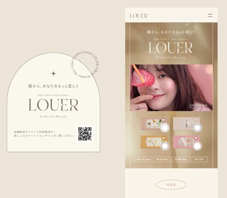
ベージュの背景にアーチ型の固定ビジュアルと細い商品紹介カラムを配置。繊細なロゴ、くすみカラー、人物写真が特徴のカラコン公式サイト。現行ページにはブランド終了のお知らせを掲載。
LOUER — Style Reference
A warm ivory beauty catalog, framed by an arched brand plaque and carried by intimate portrait photography.
Website / original URL: www.louer.jp Final URL: https://www.louer.jp/ Theme: light, with warm neutral surfaces and muted product-color sections. Inspected: October 2, 2026, 04:53 JST; supplied retrieval timestamp: October 1, 2026, 19:53:41.916 UTC. Viewports: 1440 × 1000 desktop and 390 × 844 mobile, in CSS pixels. Scope: the current homepage, including its opening composition, closure notice, outbound shopping links, concept section, four product chapters, product information, producer profile, legal disclosures, and footer. Visual captures cover the opening, a desktop product comparison, and the lower page. Rendered DOM measurements cover additional sections. Linked pages and external shops were not inspected.
LOUER is a brand and product-information website with links to external retailers. Its defining desktop composition places a persistent arched identity plaque on the left and a narrow, vertically scrolling website column on the right. On a phone, that column becomes the entire page. The desktop view preserves the scale and sequence of a mobile presentation instead of expanding products into a broad catalog grid.
Warm beige surrounds pale ivory surfaces. Fine taupe lines, delicate high-contrast serif lettering, four-point stars, translucent lens images, floral packaging, and close portraits create a restrained beauty aesthetic. Muted camel and pink backgrounds distinguish product chapters. Utility text uses sans-serif families, while the branded lettering often appears to be graphic artwork rather than ordinary live text.
The current page announces that the brand is closing and that products will finish selling as stock runs out. This notice appears immediately below the hero and is also visible inside the desktop plaque. The complete product presentation remains accessible. Preserve this current content hierarchy when referencing the page; the presence of shopping links does not verify stock availability.
閉じる
LOUER — Style Reference
A warm ivory beauty catalog, framed by an arched brand plaque and carried by intimate portrait photography.
Website / original URL: www.louer.jp Final URL: https://www.louer.jp/ Theme: light, with warm neutral surfaces and muted product-color sections. Inspected: October 2, 2026, 04:53 JST; supplied retrieval timestamp: October 1, 2026, 19:53:41.916 UTC. Viewports: 1440 × 1000 desktop and 390 × 844 mobile, in CSS pixels. Scope: the current homepage, including its opening composition, closure notice, outbound shopping links, concept section, four product chapters, product information, producer profile, legal disclosures, and footer. Visual captures cover the opening, a desktop product comparison, and the lower page. Rendered DOM measurements cover additional sections. Linked pages and external shops were not inspected.
LOUER is a brand and product-information website with links to external retailers. Its defining desktop composition places a persistent arched identity plaque on the left and a narrow, vertically scrolling website column on the right. On a phone, that column becomes the entire page. The desktop view preserves the scale and sequence of a mobile presentation instead of expanding products into a broad catalog grid.
Warm beige surrounds pale ivory surfaces. Fine taupe lines, delicate high-contrast serif lettering, four-point stars, translucent lens images, floral packaging, and close portraits create a restrained beauty aesthetic. Muted camel and pink backgrounds distinguish product chapters. Utility text uses sans-serif families, while the branded lettering often appears to be graphic artwork rather than ordinary live text.
The current page announces that the brand is closing and that products will finish selling as stock runs out. This notice appears immediately below the hero and is also visible inside the desktop plaque. The complete product presentation remains accessible. Preserve this current content hierarchy when referencing the page; the presence of shopping links does not verify stock availability.
How to Read This Reference
- Measured means a value comes from the supplied rendered DOM or computed styles. Decimal measurements are rounded where appropriate.
- Visual estimate means a dimension, color, or treatment is inferred from the supplied current-page screenshots. It is not a sampled CSS declaration.
- Calculated means a ratio or relationship is derived from measured values. It does not identify the original CSS formula.
- Recommended means guidance for a new implementation, including the Quick Start code. Recommended breakpoints, semantic elements, accessibility behavior, and asset handling are not claims about the original implementation.
- Font-family values identify declared stacks. Downloaded font files and the actual selected face were not independently verified.
- Many branded elements have small or zero computed text sizes despite large visible lettering. Their element bounds are useful measurements; their wrapper font sizes are not reliable visual typography tokens.
- No additional browsing, command execution, or resource inspection was performed for this reference.
Tokens — Colors
Default Palette
The token names are descriptive implementation aliases, not recovered source variables.
| Name | Value | Suggested token | Evidence and role |
|---|---|---|---|
| Warm Canvas | #EBE4D7 |
--color-canvas |
Measured body background, rgb(235, 228, 215); broad desktop surroundings |
| Ivory Paper | #FAF5EA |
--color-paper |
Measured footer background and reversed text color; visually consistent with the main pale surfaces |
| Taupe Ink | #71675B |
--color-ink |
Measured notice, biography, specification, and navigation text |
| Muted Clay | #C77765 |
--color-clay |
Measured filled shop links and COMPANY / PRIVACY POLICY labels |
Supporting Fields
| Name | Approximate value | Evidence and use |
|---|---|---|
| Plaque Ivory | approximately #FAF7F0 |
Visual estimate for the slightly pale desktop plaque interior |
| Camel | approximately #CFA160 |
Visual estimate from the visible third product chapter |
| Dusty Pink | approximately #D9A19D |
Visual estimate from the beginning of the fourth product chapter |
| Golden Light | No single solid token | The hero uses a photographic field with beige, gold, cream, and brown variation |
Exact background colors for the first two product chapters were not established by the supplied computed-style records. Do not invent a complete four-color section palette from product names alone.
The page exposes --swiper-theme-color: #007aff and --swiper-navigation-size: 44px. These are library-related values, not evidence that blue is part of the visible brand palette or that every visible arrow measures 44px. The screenshots show restrained light arrows inside the product presentation.
Several graphic wrappers compute to black text. That does not make black the dominant visible heading color: the screenshot lettering is often taupe or ivory, and the wrapper may not paint the visible glyphs.
Tokens — Typography
Japanese Editorial Text
- Declared family:
'Noto Serif JP', serif. - Measured use: the closure notice and inherited page typography.
- Notice size:
11px, weight400, line height22px, at both inspected widths. - Character: quiet, formal, and spaced generously enough to make the small text feel like a printed announcement.
The document root is 10px at both viewports. It is not a globally shrinking mobile root. Explicit component styles and graphic scaling produce the responsive differences.
Japanese Information Text
- Declared stack: begins with
'Hiragino Sans'and includes Japanese Gothic/Yu Gothic fallbacks, ending insans-serif. - Measured use: product descriptions, Japanese shade names, specifications, usage notes, and the producer biography.
- Weights: generally
400; specification labels use500, specification values300, and the usage-note heading700. - Character: practical and readable, with a clear separation from the decorative brand graphics.
English Utility Text
- Declared family:
'Work Sans'for product numbers and footer/legal labels. - Navigation stack:
'Work Sans', Outfit, sans-serif. - Measured weight:
300for the off-canvas navigation links;400for the footer and legal labels. - Tracking: sampled elements report normal letter spacing. Do not add exaggerated uppercase tracking throughout the interface.
Graphic Lettering
The LOUER wordmark, hero identity lockup, section labels, and large product names have a delicate, high-contrast serif appearance. The evidence does not identify the face used to create that lettering.
The hero heading computes to font-size: 0px while occupying a 250 × 150px desktop box. Other headings inherit 10px type but occupy much larger graphic-shaped boxes. Treat these as graphic lettering for implementation planning. The supplied evidence does not establish whether each is an image, SVG, or another replacement technique.
Use authorized brand artwork where available. A generic serif is a fallback for an adaptation, not an exact identification of the source lettering.
Type Scale
| Role | Desktop | Mobile | Status |
|---|---|---|---|
| Closure notice | 11px / 22px, 400 |
Same | Measured live text |
| Producer biography | 14px / 26.04px, 400 |
Same | Measured live text |
| Wear-image heading | 14px / 14px, 400 |
Same | Measured live text |
| Japanese shade name | 16px / 16px, 400 |
13.494px / 13.494px |
Measured live text |
| Product description | 18px / 28.8px, 400 |
15.6px / 24.96px |
Measured live text |
| Product index | 16px / 16px, 400 |
16.614px / 16.614px |
Measured live text; mobile is slightly larger |
| Specification label/value | 18px / 25.2px |
15.6px / 21.84px |
Measured; weights 500 / 300 |
| Usage-note body | 15px / 21px, 400 |
Same | Measured live text |
| Usage-note heading | 18px / 18px, 700 |
Same | Measured live text |
| Footer and legal labels | 16px / 18.4px, 400 |
Same | Measured live text |
| Header wordmark | 89 × 22px |
Same | Measured element bounds, not font size |
| Hero identity lockup | 250 × 150px |
About 202.8 × 121.7px |
Measured graphic bounds |
| Section-label artwork | 158 × 51px |
About 128.7 × 41.6px |
Measured graphic bounds |
| First product title | 277 × 109px |
About 225 × 88.5px |
Measured graphic bounds |
| Copyright | About 10px visually |
About 10px visually |
Visual estimate |
The display scale comes primarily from artwork, while functional typography remains modest. Avoid converting every section into a large live-text headline.
Tokens — Spacing & Shapes
Layout basis: a 480px desktop content column, a full-width 390px mobile column, and approximately 5% side insets for ordinary content.
Density: large photographs and generous vertical sequencing, with small utility controls and narrow text measures. This is not a card grid.
Spacing Scale
| Use | Desktop | Mobile | Evidence |
|---|---|---|---|
| Outer top clearance | 40px |
0px |
Measured main position |
| Common side inset | 24px |
19.5px |
Measured; both equal 5% of column width |
| Common section top padding | 60px |
49.92px |
Measured in shop, concept, points, and specification sections |
| Concept bottom padding | 110px |
89.7px |
Measured |
| Shop-link vertical gap | 20px |
About 16.77px |
Calculated from adjacent bounds |
| Concept copy-block gap | 48px |
About 39px |
Calculated from adjacent bounds |
| Shop-link padding | 22px 30px |
17.94px 24.57px |
Measured |
| Product-link padding | 22px 0 |
20.67px 0 |
Measured |
| Legal-row vertical padding | 14px |
About 25.97px |
Measured; larger on mobile |
Border Radius
| Element | Treatment | Evidence |
|---|---|---|
| Desktop plaque | Arched upper edge with straight lower sides and a square bottom | Visible in desktop captures; horizontal arch radius approximately 242px |
| Shop links | Pill-like ends | Measured radius 30px desktop and 35.1px mobile |
| Product links | Full outline pill | Measured radius 50px desktop and 117px mobile; rendered ends are constrained by button height |
| Technical badges | Small rounded corners | Visual estimate, approximately 3–4px |
| Photos and media | Square corners | Visible in supplied captures |
| Product lenses | Circular cutouts | Asset geometry, not rounded rectangular cards |
Layout Measurements
| Element | Desktop at 1440 × 1000 | Mobile at 390 × 844 |
|---|---|---|
| Main column origin | x: 780px; y: 40px |
x: 0; y: 0 |
| Main column width | 480px |
390px |
| Header height | 78px |
78px |
| Header logo bounds | 89 × 22px |
89 × 22px |
| Menu-button bounds | 76 × 71px |
63 × 71px |
| Hero bounds | 480 × 757.3px |
390 × 624.4px |
| Common inner content width | 432px |
351px |
| Shop-link bounds | 384 × 62px |
312 × 53.9px |
| Product-link bounds | 376 × 61px |
About 304.2 × 58.3px |
| Footer height | About 196.4px |
About 169.7px |
| Total document height | About 13,935px |
About 11,743px |
The desktop plaque is approximately 484 × 518px, beginning near x: 166px; y: 258px in the screenshots. These are visual estimates; its computed positioning rule was not supplied.
Components
Desktop Identity Plaque
Role: persistent brand identity beside the scrolling product presentation.
A large ivory plaque sits on the left against the beige canvas. A thin taupe contour forms the arch and continues into vertical sides and a flat bottom. The interior contains a four-point star, the Japanese slogan, a small English category line, the large LOUER wordmark, and the producer line.
The lower portion pairs a compact closure announcement with an approximately 84 × 84px QR image. A circular English text ornament overlaps the upper-right contour. The ornament is separate from the central, vertically stacked brand lockup.
The plaque remains at the same apparent viewport position in the opening, middle, and bottom desktop captures. This supports a persistent presentation, although the exact position declaration is unavailable. It disappears entirely from the supplied mobile view.
The rendered text extraction for the plaque still contains an older sales-oriented sentence, while the current screenshot visibly contains the closure announcement. For the visible design, follow the screenshot. Do not repeat the stale extracted sentence as the current displayed message.
Column Header and Navigation
Role: compact identity and access to the site’s principal destinations.
An ivory strip, 78px high, sits at the top of the content column. The wordmark is aligned left and remains 89 × 22px at both widths. A two-line menu icon sits at the right, with strokes approximately 24px wide. Its button is substantially larger than the visible icon: 76 × 71px on desktop and 63 × 71px on mobile.
The DOM includes a second logo and links for LINE UP, SHOP, and Instagram, positioned beyond the content column in the closed capture. This is consistent with an off-canvas navigation panel. No opened state was supplied, so its final panel geometry, focus behavior, backdrop, and closing interaction remain unverified.
The header is absent from the supplied lower-page captures; do not assume that it remains fixed throughout scrolling.
Hero Composition
Role: establish the brand, show its visual world, and introduce the four products.
The hero uses a softly blurred golden photographic background. Thin ivory vertical rules sit approximately 5% inward from each side. Inside that frame, the order is:
- A centered ivory identity lockup containing the slogan, category, wordmark, and producer line.
- A wide photographic or moving-media window.
- Four floral product packages arranged in two columns and two rows, with circular lens images overlapping them.
- A horizontal row of four outlined technical badges.
The desktop lockup begins about 41px below the hero top and measures 250 × 150px. Its mobile counterpart begins about 33.4px below the hero top and measures approximately 202.8 × 121.7px.
The media window is about 432 × 243px on desktop and 351 × 197px on mobile, estimated from the captures. This is consistent with a 16:9 field occupying 90% of the column width. It shows a portrait in one capture and a blurred flower in another. The exact media technology and playback behavior are not established.
The badge labels are DIA 14.2mm, BC 8.7mm, 含水率 38%, and UV CUT. They use fine light outlines and restrained lettering. On the mobile capture, the DIA label wraps onto two lines while the row remains four items wide.
Closure Notice and Shop Links
Role: communicate the current brand status before presenting retailer destinations.
The hero gives way to an ivory section containing a centered seven-line announcement. It is measured at 11px / 22px, with a 154px text-block height at both viewports. The available width changes from 432px to 351px without changing that measured type size.
A graphic shop heading follows. Five filled clay pills link to the official retailer, Rakuten, Amazon, Qoo10, and Yahoo. Each contains a purchase label and a right-pointing arrow. All five have equal visual status; there is no inspected checkout interface on this page.
Links measure 80% of the whole content-column width: 384px on desktop and 312px on mobile. Desktop rows are 62px high with 20px gaps; mobile rows are approximately 53.9px high with 16.8px gaps. Keep the stack simple and evenly spaced.
Concept Section
Role: create a slower editorial passage between shopping information and the product lineup.
The DOM confirms a centered concept graphic, the heading Love Your Better, the Japanese slogan, a star reference, and several separate concept statements. The copy blocks measure 354px wide on desktop and approximately 287.8px on mobile, narrower than the usual content inset.
Successive copy blocks are separated by approximately 48px on desktop and 39px on mobile. The complete section measures about 1756px and 1429px high respectively, indicating an extended editorial sequence rather than a compact introductory paragraph.
No direct screenshot of this complete section was supplied. Its exact image crops, decorative layering, and full visual sequence should not be reconstructed from text extraction alone.
Product Chapter
Role: present each lens as a distinct visual and styling choice.
The page contains four sequential chapters. Their anatomy is consistent:
- A small two-digit index.
- A large English product-name graphic, generally wrapping across two lines.
- A circular lens cutout, visible beside the fourth chapter heading in the supplied capture.
- A Japanese shade name and a two-line description.
- A large portrait with a narrow side area for the vertically presented DIA label.
- A wear-image comparison.
- An outlined link labeled
このレンズに合うコーデを見る.
The visible third chapter uses a muted camel field and a portrait coordinated with warm yellow clothing. The following chapter begins with a dusty pink field. Color fills run across the complete 480px column; these are continuous sections, not isolated cards.
The vertical DIA-label coordinates alternate between the left and right sides across chapters. Preserve that alternating side treatment when implementing the complete sequence, while checking the actual portrait assets before determining crops.
The first title’s graphic box is 277 × 109px on desktop and about 225 × 88.5px on mobile. Other product names have different widths. Do not stretch every title into an identical rectangle.
The fourth title visibly reads CHERISH PINK, while the extracted heading text contains CHELISH PINK. Preserve the visible artwork’s wording and review text alternatives separately.
Wear-Image Comparison
Role: show the appearance of the lens against a clear-lens reference.
The centered heading 装用イメージ uses measured 14px Japanese sans-serif text. Beneath it, the desktop capture shows two eye photographs side by side, each approximately 172 × 102px, separated by about 12px. Labels beneath them include クリアレンズ and 黒目装用時.
Simple light arrows flank the images. They sit on the chapter background without circular containers or shadows. The visual treatment suggests a comparison carousel, but arrow activation, swipe support, wrapping, and slide counts were not tested.
Below the comparison is an outlined pill link, 376 × 61px on desktop and approximately 304.2 × 58.3px on mobile. It navigates to a product-specific anchor on /lineup.html; it is not evidence of an inline modal.
Points and Feature Sections
Role: explain the lens design before the technical specifications.
The points section contains three numbered explanations. Their measured text-block positions alternate right, left, and right. Desktop blocks are 188px wide; mobile blocks are approximately 152.9px wide. This supports an alternating editorial composition rather than three uniformly stacked full-width text cards.
The feature section follows and occupies approximately 1151.6px on desktop and 891px on mobile. Its heading is present in the evidence, but its internal visual assets are not individually described by the supplied records. Do not invent an icon grid, diagrams, or specific feature illustrations to fill this gap.
Lens Specifications and Usage Notes
Role: provide factual product information in a readable two-column arrangement.
The specification area has nine label/value entries, including the brand, pack quantity, BC, water content, approval number, power range, replacement schedule, DIA, and sales name. At desktop width, the label and value columns measure 162px and 270px. On mobile, they measure approximately 130.6px and 220.4px.
That is roughly a 37% / 63% split. Labels use weight 500 and values weight 300. The regular row-start spacing is approximately 84.2px on desktop and 69.6px on mobile; the multiline power range occupies more height.
Usage notes follow in a narrower measure: 384px desktop and 312px mobile. Their heading is 18px, weight 700; body text is 15px / 21px at both widths. Preserve the readable live-text treatment and accommodate wrapping rather than shrinking the entire section as a single image.
The supplied screenshots do not show this complete section, so table rules and other decorative details are not asserted here.
Producer Profile and Media
Role: connect the products to their named producer and visual personality.
The page explicitly identifies Momochi, ももち (牛江 桃子), as the product producer. This is a product attribution, not evidence of a website-design role.
A graphic Producer heading and MOMOCHI name introduce the section. The name graphic measures 175 × 36px on desktop and approximately 142 × 29.6px on mobile.
The biography uses 14px / 26.04px sans-serif text. It spans 432px on desktop and 351px on mobile, growing from about ten lines to fourteen lines without reducing the font size.
Below it is a landscape media panel, approximately 432 × 243px desktop and 351 × 197px mobile. It shows the producer in a pale interior with subtitles and a muted pink frame. Different captured frames are visible, but the media provider, autoplay policy, sound state, and controls were not inspected.
Company, Privacy, and Footer
Role: finish the editorial sequence with quiet utility navigation.
Two disclosure-like rows, COMPANY and PRIVACY POLICY, sit between thin taupe horizontal rules. Labels and plus signs use the clay accent. There are no separate rounded cards or shadows.
Desktop label rows measure about 46.4px high; mobile rows measure about 70.3px. This is a useful responsive detail: disclosure targets become taller on mobile even though much of the artwork becomes smaller.
The supplied company-section DOM names PIA株式会社. The disclosure was not opened in the supplied captures, and no corporate website URL was established from the original page evidence.
The footer places LINE UP, SHOP, and Instagram in one evenly spaced row, followed by small centered copyright text. It uses the same ivory surface as the lower page. The visible ©2022 LOUER is footer copy, not evidence of the inspection date or current content freshness.
Tokens — Motion & Interaction
| Treatment | Evidence | What can be concluded |
|---|---|---|
| Menu-button transition | Computed 0.6s cubic-bezier(0.19, 1, 0.22, 1) at both widths |
A transition is defined on the button; the opened menu and animated properties were not verified |
| Editorial opacity transitions | Mobile computed styles include opacity 1.4s cubic-bezier(0.5, 0, 0, 1) |
Opacity transitions are defined on several concept elements and the producer name; trigger and repeat behavior are unknown |
| Circular plaque lettering | Orientation differs across desktop captures | Consistent with rotation; duration, direction, and scroll linkage are unverified |
| Hero media | Different portrait/flower imagery appears in captures | Media variation is visible; autoplay, loop timing, and transition method are unverified |
| Producer media | Different frames appear in desktop/mobile captures | The panel contains video-like content; playback controls and sound behavior are unknown |
| Wear comparison arrows | Visible arrow affordances and Swiper-related variables | Interactive comparison is suggested, but click and swipe outcomes were not tested |
| Legal disclosures | Plus signs and hidden company content in DOM | Expandable behavior is suggested; expanded layout and keyboard behavior were not tested |
The sampled elements mostly report animation: none. That does not prove the entire page is static: descendants, pseudo-elements, scripts, and media are not fully represented by those samples.
Likewise, a computed transition value of all without a duration is not evidence of a visible animation. Avoid assigning invented timings to every component.
For a new implementation, use gentle opacity changes and restrained control feedback. Keep essential content visible by default and provide reduced-motion behavior. Do not introduce scroll hijacking or make the circular ornament’s movement essential to navigation.
Surfaces
| Layer | Appearance | Purpose |
|---|---|---|
| Desktop canvas | Solid warm beige | Creates the broad space around the plaque and content column |
| Identity plaque | Pale ivory with a fine taupe contour | Persistent brand signature |
| Header and information sections | Flat ivory | Calm reading and utility areas |
| Hero | Golden photographic texture with fine light rules | Establishes the beauty imagery and packaging presentation |
| Product chapters | Muted solid color fields with light lettering | Separates lens personalities without introducing card containers |
| Purchase links | Solid clay pills with ivory content | Identifies outbound shopping destinations |
| Product links | Transparent pills with light outlines | Secondary navigation within a color chapter |
| Legal and footer region | Ivory, thin rules, sparse accent text | Provides a quiet end to the long page |
No general shadow-elevation system is visible. Separation comes from background changes, thin rules, photography, and spacing. Natural shading within photographs and lens artwork should not be copied into a generic UI box-shadow system.
Imagery
Photography is intimate and polished: close faces, clearly visible eyes, soft clothing, warm light, and restrained backgrounds. The camel chapter coordinates its portrait with yellow clothing; the opening media includes portraits and a flower close-up. Preserve eyes and facial expression when choosing crops.
The packaging uses floral artwork, muted color blocks, fine lettering, and small decorative marks. Circular lens cutouts overlap package edges and reveal their fine dot patterns. These details carry product identity; generic cosmetic bottles or abstract circles would not serve the same purpose.
Decorative geometry stays sparse: the arch, circular text, four-point star, delicate borders, and capsule links are enough. Avoid adding unrelated organic blobs or a large icon library.
Observed Asset References
No original asset paths or media URLs were supplied. The following references describe visible roles and measured or estimated display bounds, not filenames.
| Asset role | Observed presentation | Implementation guidance |
|---|---|---|
| Header wordmark | 89 × 22px at both widths |
Preserve its aspect ratio and fine strokes |
| Hero identity lockup | 250 × 150px desktop; about 202.8 × 121.7px mobile |
Use verified artwork rather than guessing a font |
| Plaque identity composition | Large taupe lettering inside an arch | Keep separate from mobile page content |
| QR graphic | Approximately 84 × 84px in desktop capture |
Use a real verified destination; do not invent or redraw its data pattern |
| Hero media | Approximately 16:9, at 90% column width | Supply an intentional poster and suitable crops |
| Product packages and lenses | Two-by-two arrangement, lens circles overlapping packages | Preserve transparent edges and original packaging proportions |
| Product portraits | Large images with adjacent vertical DIA detail | Check each crop individually |
| Wear comparison images | Two approximately 172 × 102px images on desktop |
Keep consistent eye scale and clear labels |
| Producer media panel | Approximately 16:9 with a muted pink edge | Retain readable subtitles and square corners |
Use original assets only when available and authorized. The Quick Start recreates layout relationships; it does not supply the logo, photographs, packaging, QR data, or media.
Layout & Responsive Behavior
At 1440px width, the content column begins at x = 780px and ends at x = 1260px, leaving 180px to the right. The persistent plaque occupies the left region. This deliberately asymmetric composition should remain recognizable on large screens.
At 390px width, the plaque and outer desktop margins disappear. The content column fills the viewport, while ordinary inner content retains 5% side insets. The header remains 78px high and the logo remains 89px wide. This is selective scaling, not a screenshot uniformly reduced to fit.
| Behavior | Observed relationship |
|---|---|
| Content column | 480px desktop; 390px mobile |
| Common content width | 90% of column: 432px / 351px |
| Shop-link width | 80% of column: 384px / 312px |
| Product-link width | Approximately 78% of column |
| Hero lockup | Roughly proportional to column width |
| Notice and biography type | Same measured size at both viewports |
| Product descriptions and specification type | Smaller on mobile |
| Product sequence | Remains a single vertical series |
| Hero package layout | Remains two columns |
| Footer links | Remain one horizontal row |
| Legal disclosure targets | Taller on mobile |
The column-width ratio is 390 / 480 = 0.8125. Several graphic dimensions are close to this ratio, but text and control dimensions do not all follow it. For example, the notice stays at 11px, the biography stays at 14px, and the product index is slightly larger on mobile.
The exact breakpoint and intermediate tablet behavior were not supplied. A desktop breakpoint of 1200px is recommended in the Quick Start because it provides room for both major columns; it is not a recovered source value.
Use normal document scrolling for the long page. Do not turn the right column into an independently scrolling, fixed-height phone mockup. The inspected evidence describes a long document, while only the left identity composition appears persistent.
Do’s and Don’ts
Do
- Preserve the left plaque and narrow right column on sufficiently wide screens.
- Keep the mobile presentation full-width, with approximately 5% content insets.
- Use the measured beige, ivory, taupe, and clay colors as the neutral foundation.
- Preserve the current closure announcement ahead of the shopping destinations.
- Treat the wordmark and major graphic lettering as artwork until their actual font or asset source is verified.
- Keep product chapters continuous and full-column, with large portraits and restrained light details.
- Maintain the two-by-two packaging arrangement and side-by-side eye comparison.
- Use fine outlines, square photographs, and capsule links without general card shadows.
- Separate live information typography from decorative brand lettering.
- Preserve readable text sizes where the source keeps them constant across widths.
Don’t
- Don’t expand the desktop page into a broad four-product grid.
- Don’t place the left plaque above the mobile hero as duplicate content.
- Don’t claim that inherited 10px wrapper styles describe the visible display lettering.
- Don’t use the exposed Swiper blue as a brand accent.
- Don’t replace the golden photographic hero with a flat yellow rectangle and call it an exact match.
- Don’t add thick borders, heavy shadows, glass effects, or uniformly rounded image cards.
- Don’t treat the product producer as a verified website designer.
- Don’t invent carousel timings, menu states, media autoplay, or disclosure behavior.
- Don’t turn the closure notice into a generic sales message.
- Don’t fabricate image paths, exact chapter colors, or missing feature illustrations.
Recommended Implementation Additions
These are recommendations for a new implementation, not verified features of the original page:
- Give the menu control an accessible name,
aria-expanded, and a controlled navigation region. Handle focus and Escape when implementing an overlay or drawer. - Use real buttons for comparison controls and descriptive alternatives for clear-lens and worn-lens images. Expose the selected comparison state when slides change.
- Use native disclosure elements or correctly implemented disclosure buttons for company and privacy content.
- Keep essential announcements as live text. Consider increasing the observed 11px notice size for readability, allowing its height to grow.
- Retain text equivalents for graphic product names and section headings without exposing duplicate announcements to assistive technology.
- Check contrast for ivory lettering on clay and light chapter colors before reusing those combinations for small text.
- Provide static media posters and a reduced-motion mode. Do not make audio playback automatic without an appropriate user action.
- Reserve image dimensions to prevent the long document from shifting as photography loads.
- Ensure a closed off-canvas menu neither creates horizontal overflow nor remains keyboard-focusable.
- Keep important product information readable if decorative assets fail to load.
Agent Prompt Guide
Quick Color Reference
- Desktop canvas:
#EBE4D7. - Main pale surface:
#FAF5EA. - Text and fine rules:
#71675B. - Filled shopping links and legal accents:
#C77765. - Visible camel chapter: approximately
#CFA160. - Visible pink chapter: approximately
#D9A19D. - Hero: warm photographic gold and beige, not a single flat-color token.
Overall Prompt
“Create a Japanese beauty brand and product-information website inspired by the current LOUER composition. On a wide desktop, place a persistent ivory arched brand plaque on the left and a 480px vertical content column on the right, surrounded by warm beige #EBE4D7. On mobile, remove the plaque and let the column fill the viewport. Use ivory #FAF5EA, taupe #71675B, clay #C77765, delicate verified logo artwork, small Work Sans utility labels, Japanese serif announcement text, and Japanese sans-serif information text. Build a golden photographic hero with fine vertical rules, a centered identity lockup, wide media, four floral packages in a two-by-two arrangement, and small outlined specification badges. Follow it with the current closure notice, five clay purchase links, an editorial concept sequence, four color-field product chapters, technical information, a producer profile, and a quiet ruled footer. Preserve large portraits, circular lens cutouts, eye comparisons, and thin outline pills. Do not invent unavailable asset details or unverified interactions.”
Example Component Prompts
- Desktop plaque: “Create a pale ivory panel approximately 484px wide and 518px tall with an arched top, thin taupe outline, square lower corners, a four-point star, delicate centered brand artwork, a compact announcement, and a verified QR image at lower right. Place a circular text ornament across the upper-right contour. Hide this component on mobile.”
- Hero: “Within a narrow mobile-oriented column, use a softly lit gold photographic background and two fine ivory vertical rules inset 5%. Stack an ivory identity graphic, a 16:9 media window, four floral packages in two columns, and four small outlined technical badges. Keep the media and packaging square-edged.”
- Product chapter: “Create a muted camel full-column section with a small 03 index, a large delicate product-name graphic, a circular lens cutout, concise Japanese product information, and a large warm portrait. Below it, show two eye images with labels and simple side arrows, followed by a light outline pill linking to coordinated styling.”
- Footer: “Create an ivory lower section with thin taupe rules around two clay-colored disclosure rows labeled COMPANY and PRIVACY POLICY. Use plus signs aligned right, generous mobile row heights, a single row of LINE UP, SHOP, and Instagram links, and small centered copyright text. No cards or shadows.”
Quick Start
CSS Custom Properties
This is an implementation adaptation, not extracted source CSS. It uses a conventional root font size, explicit component typography, and container-relative units so that the narrow desktop column and phone layout share proportions. The 1200px desktop breakpoint is recommended. The two chapter-color values and plaque color are visual approximations.
Apply .site-column to a wrapper containing the header, main content, and footer. Place .brand-plaque beside it. Supply verified assets for the image classes. The optional --hero-image custom property accepts an authorized CSS image value; no source path is assumed. Font declarations alone do not load font files.
:root {
  /* Measured core colors */
  --color-canvas: #ebe4d7;
  --color-paper: #faf5ea;
  --color-ink: #71675b;
  --color-clay: #c77765;

  /* Visual approximations */
  --color-plaque: #faf7f0;
  --color-camel: #cfa160;
  --color-pink: #d9a19d;

  /* Declared source families, with practical fallbacks */
  --font-editorial: 'Noto Serif JP', serif;
  --font-body: 'Hiragino Sans', 'Yu Gothic', YuGothic, sans-serif;
  --font-utility: 'Work Sans', Outfit, sans-serif;

  --column-width: 480px;
  --header-height: 78px;
  --rule-width: 1px;
  --radius-pill: 999px;
  --radius-badge: 4px;

  /* Timings observed on sampled elements */
  --motion-menu: 600ms cubic-bezier(0.19, 1, 0.22, 1);
  --motion-reveal: 1400ms cubic-bezier(0.5, 0, 0, 1);
}

* {
  box-sizing: border-box;
}

body {
  margin: 0;
  color: var(--color-ink);
  background: var(--color-canvas);
  font-family: var(--font-body);
}

button,
summary,
a {
  -webkit-tap-highlight-color: transparent;
}

button {
  font: inherit;
}

img,
video {
  display: block;
  max-width: 100%;
}

.site-column {
  width: min(100%, var(--column-width));
  margin-inline: auto;
  background: var(--color-paper);
  container-type: inline-size;
}

.brand-plaque {
  display: none;
}

/* Recommended breakpoint; desktop coordinates match the supplied viewport. */
@media (min-width: 1200px) {
  .site-column {
    margin-block: 40px;
    margin-inline-start: calc(50% + 60px);
    margin-inline-end: 0;
  }

  .brand-plaque {
    display: block;
    position: fixed;
    left: calc(50vw - 554px);
    top: calc(50dvh - 242px);
    width: 484px;
    height: 518px;
    border: var(--rule-width) solid var(--color-ink);
    border-radius: 50% 50% 0 0;
    background: var(--color-plaque);
  }
}

/* Supply a verified composite or independently arranged brand artwork. */
.brand-plaque__lockup {
  width: 260px;
  height: auto;
  margin: 92px auto 0;
}

.brand-plaque__notice {
  position: absolute;
  inset-inline: 36px;
  bottom: 36px;
  display: grid;
  grid-template-columns: minmax(0, 1fr) 84px;
  align-items: end;
  gap: 16px;
  font: 400 11px/1.4 var(--font-editorial);
}

.brand-plaque__qr {
  width: 84px;
  height: 84px;
}

.brand-plaque__ring {
  position: absolute;
  top: -12px;
  right: 8px;
  width: 145px;
  height: 145px;
  /* No invented rotation timing is applied. */
}

.site-header {
  display: flex;
  align-items: center;
  justify-content: space-between;
  height: var(--header-height);
  padding-inline-start: 5%;
  background: var(--color-paper);
}

.site-logo {
  width: 89px;
  height: 22px;
  object-fit: contain;
}

.menu-button {
  display: grid;
  place-content: center;
  gap: 10px;
  width: 63px;
  height: 71px;
  padding: 0;
  border: 0;
  color: var(--color-ink);
  background: transparent;
  cursor: pointer;
}

.menu-button span {
  display: block;
  width: 24px;
  height: 2px;
  background: currentColor;
}

.hero {
  position: relative;
  padding-block: min(8.54cqw, 41px) min(6.67cqw, 32px);
  color: var(--color-paper);
  background-color: #b99b70;
  background-image: var(--hero-image, none);
  background-position: center;
  background-size: cover;
}

.hero::before {
  content: '';
  position: absolute;
  inset: 0 5%;
  border-inline: var(--rule-width) solid var(--color-paper);
  pointer-events: none;
}

.hero > * {
  position: relative;
}

.hero-lockup {
  width: 52%;
  height: auto;
  aspect-ratio: 5 / 3;
  object-fit: contain;
  margin: 0 auto min(5.625cqw, 27px);
}

.hero-media {
  width: 90%;
  aspect-ratio: 16 / 9;
  margin-inline: auto;
  object-fit: cover;
}

.pack-grid {
  display: grid;
  grid-template-columns: repeat(2, minmax(0, 1fr));
  gap: 16px 24px;
  width: 66%;
  margin: min(6.25cqw, 30px) auto min(6.67cqw, 32px);
}

.pack-grid img {
  width: 100%;
  height: auto;
  object-fit: contain;
}

.hero-specs {
  display: grid;
  grid-template-columns: repeat(4, minmax(0, 1fr));
  gap: 6px;
  width: 76%;
  margin-inline: auto;
}

.hero-specs > span {
  display: grid;
  place-items: center;
  min-height: 27px;
  padding: 5px 3px;
  border: var(--rule-width) solid currentColor;
  border-radius: var(--radius-badge);
  text-align: center;
  font: 400 12px/1.15 var(--font-editorial);
}

.section {
  padding: min(12.8cqw, 60px) 5%;
}

.closure-notice {
  margin: 0;
  text-align: center;
  font: 400 11px/22px var(--font-editorial);
}

/* The artwork is inside a section with 5% side padding. */
.section-label {
  width: min(33cqw, 158px);
  height: auto;
  margin-inline: auto;
}

.shop-links {
  display: grid;
  gap: min(4.3cqw, 20px);
  width: 88.8889%;
  margin: min(10.53cqw, 50px) auto 0;
}

.shop-link {
  display: flex;
  align-items: center;
  justify-content: space-between;
  gap: 16px;
  padding: min(4.6cqw, 22px) min(6.3cqw, 30px);
  border-radius: var(--radius-pill);
  color: var(--color-paper);
  background: var(--color-clay);
  text-decoration: none;
  font: 400 14px/18px var(--font-body);
}

.concept-copy {
  width: 82%;
  margin-inline: auto;
  font-family: var(--font-editorial);
}

.concept-copy > * + * {
  margin-block-start: min(10cqw, 48px);
}

.shade {
  color: var(--color-paper);
  background: var(--shade-color, var(--color-camel));
  padding-block-end: min(12.8cqw, 60px);
}

.shade--camel {
  --shade-color: var(--color-camel);
}

.shade--pink {
  --shade-color: var(--color-pink);
}

.shade-intro {
  position: relative;
  padding: 60px 5% 40px;
}

.shade-index {
  margin: 0 0 18px;
  font: 400 16px/1 var(--font-utility);
}

.shade-title-art {
  width: var(--title-width, 57.7cqw);
  max-width: 70%;
  height: auto;
}

.shade-lens {
  position: absolute;
  inset-inline-end: 5%;
  top: 90px;
  width: 26%;
  height: auto;
}

.shade-name {
  font: 400 clamp(13.494px, 3.46cqw, 16px)/1 var(--font-body);
}

.shade-description {
  font: 400 clamp(15.6px, 4cqw, 18px)/1.6 var(--font-body);
}

.shade-portrait {
  width: 90%;
  height: auto;
  margin-inline: auto 0;
}

.shade--reverse .shade-portrait {
  margin-inline: 0 auto;
}

.wear-heading {
  margin: 40px 0 22px;
  text-align: center;
  font: 400 14px/1 var(--font-body);
}

.wear-grid {
  display: grid;
  grid-template-columns: 26px repeat(2, minmax(0, 1fr)) 26px;
  align-items: center;
  gap: 12px;
  padding-inline: 5%;
}

.wear-grid figure {
  min-width: 0;
  margin: 0;
  text-align: center;
}

.wear-grid figure img {
  width: 100%;
  aspect-ratio: 172 / 102;
  object-fit: cover;
}

.wear-grid figcaption {
  margin-block-start: 10px;
  font: 400 14px/1.5 var(--font-body);
}

.wear-arrow {
  width: 26px;
  min-height: 44px;
  padding: 0;
  border: 0;
  color: inherit;
  background: transparent;
  font-size: 26px;
  cursor: pointer;
}

.outline-link {
  display: flex;
  align-items: center;
  justify-content: center;
  gap: 12px;
  width: 78%;
  min-height: 58px;
  margin: 48px auto 0;
  padding: 18px 16px;
  border: var(--rule-width) solid currentColor;
  border-radius: var(--radius-pill);
  color: inherit;
  text-decoration: none;
  text-align: center;
  font: 400 14px/1.5 var(--font-body);
}

/* Recommended semantic structure: a definition list with row wrappers. */
.spec-row {
  display: grid;
  grid-template-columns: 37.5% minmax(0, 1fr);
  padding-block: min(6.125cqw, 29.5px);
  font: 300 clamp(15.6px, 4cqw, 18px)/1.4 var(--font-body);
}

.spec-row dt {
  font-weight: 500;
}

.spec-row dd {
  min-width: 0;
  margin: 0;
  overflow-wrap: anywhere;
}

.usage-notes {
  width: 88.8889%;
  margin-inline: auto;
  font: 400 15px/21px var(--font-body);
}

.producer-bio {
  font: 400 14px/26.04px var(--font-body);
}

.producer-media {
  width: 100%;
  aspect-ratio: 16 / 9;
  object-fit: cover;
}

.legal {
  margin-inline: 5%;
  padding-block: 23.4px;
  border-block: var(--rule-width) solid var(--color-ink);
}

.legal summary {
  display: flex;
  align-items: center;
  justify-content: space-between;
  gap: 16px;
  padding-block: 26px;
  color: var(--color-clay);
  list-style: none;
  cursor: pointer;
  font: 400 16px/18.4px var(--font-utility);
}

.legal summary::-webkit-details-marker {
  display: none;
}

.legal summary::after {
  content: '+';
  font-size: 24px;
}

.legal details[open] summary::after {
  content: '−';
}

.site-footer {
  padding: 0 5% 40px;
  background: var(--color-paper);
}

.footer-links {
  display: flex;
  justify-content: space-around;
  gap: 16px;
  padding-block: 30px;
}

.footer-links a {
  padding-block: 12px;
  color: var(--color-ink);
  text-decoration: none;
  font: 400 16px/18.4px var(--font-utility);
}

.copyright {
  margin: 20px 0 0;
  text-align: center;
  font: 400 10px/1.5 var(--font-utility);
}

@container (min-width: 440px) {
  .menu-button {
    width: 76px;
  }

  .hero-specs {
    width: 79%;
  }

  .outline-link {
    min-height: 61px;
  }

  .legal {
    padding-block: 30px;
  }

  .legal summary {
    padding-block: 14px;
  }
}

/* Recommended accessibility additions */
.site-column :focus-visible,
.brand-plaque :focus-visible {
  outline: 2px solid currentColor;
  outline-offset: 4px;
}

.editorial-reveal {
  /* Content remains visible until a script intentionally manages state. */
  transition: opacity var(--motion-reveal);
}

@media (prefers-reduced-motion: reduce) {
  .site-column *,
  .brand-plaque * {
    animation: none !important;
    transition: none !important;
    scroll-behavior: auto !important;
  }
}
The package grid assumes assets that already contain, or are composed with, their corresponding lens overlays. The plaque lockup and ring require actual artwork. Menu opening, comparison navigation, and media playback need separate behavior; this CSS does not claim to reproduce untested original interactions. Native <details> can supply the recommended legal disclosure behavior.
Tailwind v4 Token Mapping
Optional aliases for a project already using Tailwind v4. This does not imply that the original site uses Tailwind. Define the main custom properties first.
@theme inline {
  --color-canvas: var(--color-canvas);
  --color-paper: var(--color-paper);
  --color-ink: var(--color-ink);
  --color-clay: var(--color-clay);

  --font-editorial: 'Noto Serif JP', serif;
  --font-body: 'Hiragino Sans', 'Yu Gothic', YuGothic, sans-serif;
  --font-utility: 'Work Sans', Outfit, sans-serif;

  --text-notice: 11px;
  --text-body: 14px;
  --text-utility: 16px;
  --text-product: 18px;

  --spacing-site-column: 480px;
  --spacing-site-header: 78px;
  --radius-pill: 999px;
  --radius-badge: 4px;
}
For the color entries, a direct-value mapping is also suitable: canvas #ebe4d7, paper #faf5ea, ink #71675b, and clay #c77765. Use direct values if the build setup does not preserve the previously defined variables.
Sources & Evidence
- Inspected original and final website: https://www.louer.jp/. The supplied browser observation reports HTTP 200 and no URL change.
- Capture time:
2026-10-01T19:53:41.916Z, equivalent to October 2, 2026, 04:53:41.916 JST. - Desktop evidence: 1440 × 1000 viewport, with opening, product-comparison, and lower-page captures. The rendered document height was approximately 13,935px.
- Mobile evidence: 390 × 844 viewport, with opening and lower-page captures. The rendered document height was approximately 11,743px.
- Rendered DOM and computed styles: element bounds, text, destination links, declared font stacks, colors, padding, radii, and selected transition values at both widths.
- Capture coverage: the supplied process waited for document loading, sampled layout/text stability, visible-image decoding, and finite animation readiness within stated time limits. It traversed intermediate scroll positions. These checks do not establish complete delayed-content or interaction coverage.
- Interaction limitations: no opened navigation, activated comparison arrows, expanded legal disclosures, retailer availability checks, or verified media controls were supplied. Exact animation triggers and timings beyond the two recorded transition values remain unknown.
- Asset and stylesheet limitations: no complete asset inventory, font-file verification, media-source list, original responsive breakpoint rules, or complete stylesheet was supplied. Visual estimates and recommended implementation rules are labeled accordingly.
This reference documents the currently served homepage and its visible closure announcement. Linked product pages and retailer destinations are navigation evidence only; their designs and present availability are outside the inspected scope.
# LOUER — Style Reference

> A warm ivory beauty catalog, framed by an arched brand plaque and carried by intimate portrait photography.

**Website / original URL:** [www.louer.jp](https://www.louer.jp/)
**Final URL:** [https://www.louer.jp/](https://www.louer.jp/)
**Theme:** light, with warm neutral surfaces and muted product-color sections.
**Inspected:** October 2, 2026, 04:53 JST; supplied retrieval timestamp: October 1, 2026, 19:53:41.916 UTC.
**Viewports:** 1440 × 1000 desktop and 390 × 844 mobile, in CSS pixels.
**Scope:** the current homepage, including its opening composition, closure notice, outbound shopping links, concept section, four product chapters, product information, producer profile, legal disclosures, and footer. Visual captures cover the opening, a desktop product comparison, and the lower page. Rendered DOM measurements cover additional sections. Linked pages and external shops were not inspected.

LOUER is a brand and product-information website with links to external retailers. Its defining desktop composition places a persistent arched identity plaque on the left and a narrow, vertically scrolling website column on the right. On a phone, that column becomes the entire page. The desktop view preserves the scale and sequence of a mobile presentation instead of expanding products into a broad catalog grid.

Warm beige surrounds pale ivory surfaces. Fine taupe lines, delicate high-contrast serif lettering, four-point stars, translucent lens images, floral packaging, and close portraits create a restrained beauty aesthetic. Muted camel and pink backgrounds distinguish product chapters. Utility text uses sans-serif families, while the branded lettering often appears to be graphic artwork rather than ordinary live text.

The current page announces that the brand is closing and that products will finish selling as stock runs out. This notice appears immediately below the hero and is also visible inside the desktop plaque. The complete product presentation remains accessible. Preserve this current content hierarchy when referencing the page; the presence of shopping links does not verify stock availability.
閉じる
# LOUER — Style Reference

> A warm ivory beauty catalog, framed by an arched brand plaque and carried by intimate portrait photography.

**Website / original URL:** [www.louer.jp](https://www.louer.jp/)
**Final URL:** [https://www.louer.jp/](https://www.louer.jp/)
**Theme:** light, with warm neutral surfaces and muted product-color sections.
**Inspected:** October 2, 2026, 04:53 JST; supplied retrieval timestamp: October 1, 2026, 19:53:41.916 UTC.
**Viewports:** 1440 × 1000 desktop and 390 × 844 mobile, in CSS pixels.
**Scope:** the current homepage, including its opening composition, closure notice, outbound shopping links, concept section, four product chapters, product information, producer profile, legal disclosures, and footer. Visual captures cover the opening, a desktop product comparison, and the lower page. Rendered DOM measurements cover additional sections. Linked pages and external shops were not inspected.

LOUER is a brand and product-information website with links to external retailers. Its defining desktop composition places a persistent arched identity plaque on the left and a narrow, vertically scrolling website column on the right. On a phone, that column becomes the entire page. The desktop view preserves the scale and sequence of a mobile presentation instead of expanding products into a broad catalog grid.

Warm beige surrounds pale ivory surfaces. Fine taupe lines, delicate high-contrast serif lettering, four-point stars, translucent lens images, floral packaging, and close portraits create a restrained beauty aesthetic. Muted camel and pink backgrounds distinguish product chapters. Utility text uses sans-serif families, while the branded lettering often appears to be graphic artwork rather than ordinary live text.

The current page announces that the brand is closing and that products will finish selling as stock runs out. This notice appears immediately below the hero and is also visible inside the desktop plaque. The complete product presentation remains accessible. Preserve this current content hierarchy when referencing the page; the presence of shopping links does not verify stock availability.

## How to Read This Reference

- **Measured** means a value comes from the supplied rendered DOM or computed styles. Decimal measurements are rounded where appropriate.
- **Visual estimate** means a dimension, color, or treatment is inferred from the supplied current-page screenshots. It is not a sampled CSS declaration.
- **Calculated** means a ratio or relationship is derived from measured values. It does not identify the original CSS formula.
- **Recommended** means guidance for a new implementation, including the Quick Start code. Recommended breakpoints, semantic elements, accessibility behavior, and asset handling are not claims about the original implementation.
- Font-family values identify declared stacks. Downloaded font files and the actual selected face were not independently verified.
- Many branded elements have small or zero computed text sizes despite large visible lettering. Their element bounds are useful measurements; their wrapper font sizes are not reliable visual typography tokens.
- No additional browsing, command execution, or resource inspection was performed for this reference.

## Tokens — Colors

### Default Palette

The token names are descriptive implementation aliases, not recovered source variables.

| Name | Value | Suggested token | Evidence and role |
| --- | --- | --- | --- |
| Warm Canvas | `#EBE4D7` | `--color-canvas` | Measured body background, `rgb(235, 228, 215)`; broad desktop surroundings |
| Ivory Paper | `#FAF5EA` | `--color-paper` | Measured footer background and reversed text color; visually consistent with the main pale surfaces |
| Taupe Ink | `#71675B` | `--color-ink` | Measured notice, biography, specification, and navigation text |
| Muted Clay | `#C77765` | `--color-clay` | Measured filled shop links and COMPANY / PRIVACY POLICY labels |

### Supporting Fields

| Name | Approximate value | Evidence and use |
| --- | --- | --- |
| Plaque Ivory | approximately `#FAF7F0` | Visual estimate for the slightly pale desktop plaque interior |
| Camel | approximately `#CFA160` | Visual estimate from the visible third product chapter |
| Dusty Pink | approximately `#D9A19D` | Visual estimate from the beginning of the fourth product chapter |
| Golden Light | No single solid token | The hero uses a photographic field with beige, gold, cream, and brown variation |

Exact background colors for the first two product chapters were not established by the supplied computed-style records. Do not invent a complete four-color section palette from product names alone.

The page exposes `--swiper-theme-color: #007aff` and `--swiper-navigation-size: 44px`. These are library-related values, not evidence that blue is part of the visible brand palette or that every visible arrow measures 44px. The screenshots show restrained light arrows inside the product presentation.

Several graphic wrappers compute to black text. That does not make black the dominant visible heading color: the screenshot lettering is often taupe or ivory, and the wrapper may not paint the visible glyphs.

## Tokens — Typography

### Japanese Editorial Text

- **Declared family:** `'Noto Serif JP', serif`.
- **Measured use:** the closure notice and inherited page typography.
- **Notice size:** `11px`, weight `400`, line height `22px`, at both inspected widths.
- **Character:** quiet, formal, and spaced generously enough to make the small text feel like a printed announcement.

The document root is `10px` at both viewports. It is not a globally shrinking mobile root. Explicit component styles and graphic scaling produce the responsive differences.

### Japanese Information Text

- **Declared stack:** begins with `'Hiragino Sans'` and includes Japanese Gothic/Yu Gothic fallbacks, ending in `sans-serif`.
- **Measured use:** product descriptions, Japanese shade names, specifications, usage notes, and the producer biography.
- **Weights:** generally `400`; specification labels use `500`, specification values `300`, and the usage-note heading `700`.
- **Character:** practical and readable, with a clear separation from the decorative brand graphics.

### English Utility Text

- **Declared family:** `'Work Sans'` for product numbers and footer/legal labels.
- **Navigation stack:** `'Work Sans', Outfit, sans-serif`.
- **Measured weight:** `300` for the off-canvas navigation links; `400` for the footer and legal labels.
- **Tracking:** sampled elements report normal letter spacing. Do not add exaggerated uppercase tracking throughout the interface.

### Graphic Lettering

The LOUER wordmark, hero identity lockup, section labels, and large product names have a delicate, high-contrast serif appearance. The evidence does not identify the face used to create that lettering.

The hero heading computes to `font-size: 0px` while occupying a `250 × 150px` desktop box. Other headings inherit `10px` type but occupy much larger graphic-shaped boxes. Treat these as graphic lettering for implementation planning. The supplied evidence does not establish whether each is an image, SVG, or another replacement technique.

Use authorized brand artwork where available. A generic serif is a fallback for an adaptation, not an exact identification of the source lettering.

### Type Scale

| Role | Desktop | Mobile | Status |
| --- | --- | --- | --- |
| Closure notice | `11px / 22px`, 400 | Same | Measured live text |
| Producer biography | `14px / 26.04px`, 400 | Same | Measured live text |
| Wear-image heading | `14px / 14px`, 400 | Same | Measured live text |
| Japanese shade name | `16px / 16px`, 400 | `13.494px / 13.494px` | Measured live text |
| Product description | `18px / 28.8px`, 400 | `15.6px / 24.96px` | Measured live text |
| Product index | `16px / 16px`, 400 | `16.614px / 16.614px` | Measured live text; mobile is slightly larger |
| Specification label/value | `18px / 25.2px` | `15.6px / 21.84px` | Measured; weights 500 / 300 |
| Usage-note body | `15px / 21px`, 400 | Same | Measured live text |
| Usage-note heading | `18px / 18px`, 700 | Same | Measured live text |
| Footer and legal labels | `16px / 18.4px`, 400 | Same | Measured live text |
| Header wordmark | `89 × 22px` | Same | Measured element bounds, not font size |
| Hero identity lockup | `250 × 150px` | About `202.8 × 121.7px` | Measured graphic bounds |
| Section-label artwork | `158 × 51px` | About `128.7 × 41.6px` | Measured graphic bounds |
| First product title | `277 × 109px` | About `225 × 88.5px` | Measured graphic bounds |
| Copyright | About `10px` visually | About `10px` visually | Visual estimate |

The display scale comes primarily from artwork, while functional typography remains modest. Avoid converting every section into a large live-text headline.

## Tokens — Spacing & Shapes

**Layout basis:** a 480px desktop content column, a full-width 390px mobile column, and approximately 5% side insets for ordinary content.

**Density:** large photographs and generous vertical sequencing, with small utility controls and narrow text measures. This is not a card grid.

### Spacing Scale

| Use | Desktop | Mobile | Evidence |
| --- | --- | --- | --- |
| Outer top clearance | `40px` | `0px` | Measured main position |
| Common side inset | `24px` | `19.5px` | Measured; both equal 5% of column width |
| Common section top padding | `60px` | `49.92px` | Measured in shop, concept, points, and specification sections |
| Concept bottom padding | `110px` | `89.7px` | Measured |
| Shop-link vertical gap | `20px` | About `16.77px` | Calculated from adjacent bounds |
| Concept copy-block gap | `48px` | About `39px` | Calculated from adjacent bounds |
| Shop-link padding | `22px 30px` | `17.94px 24.57px` | Measured |
| Product-link padding | `22px 0` | `20.67px 0` | Measured |
| Legal-row vertical padding | `14px` | About `25.97px` | Measured; larger on mobile |

### Border Radius

| Element | Treatment | Evidence |
| --- | --- | --- |
| Desktop plaque | Arched upper edge with straight lower sides and a square bottom | Visible in desktop captures; horizontal arch radius approximately 242px |
| Shop links | Pill-like ends | Measured radius `30px` desktop and `35.1px` mobile |
| Product links | Full outline pill | Measured radius `50px` desktop and `117px` mobile; rendered ends are constrained by button height |
| Technical badges | Small rounded corners | Visual estimate, approximately 3–4px |
| Photos and media | Square corners | Visible in supplied captures |
| Product lenses | Circular cutouts | Asset geometry, not rounded rectangular cards |

### Layout Measurements

| Element | Desktop at 1440 × 1000 | Mobile at 390 × 844 |
| --- | --- | --- |
| Main column origin | `x: 780px; y: 40px` | `x: 0; y: 0` |
| Main column width | `480px` | `390px` |
| Header height | `78px` | `78px` |
| Header logo bounds | `89 × 22px` | `89 × 22px` |
| Menu-button bounds | `76 × 71px` | `63 × 71px` |
| Hero bounds | `480 × 757.3px` | `390 × 624.4px` |
| Common inner content width | `432px` | `351px` |
| Shop-link bounds | `384 × 62px` | `312 × 53.9px` |
| Product-link bounds | `376 × 61px` | About `304.2 × 58.3px` |
| Footer height | About `196.4px` | About `169.7px` |
| Total document height | About `13,935px` | About `11,743px` |

The desktop plaque is approximately `484 × 518px`, beginning near `x: 166px; y: 258px` in the screenshots. These are visual estimates; its computed positioning rule was not supplied.

## Components

### Desktop Identity Plaque

**Role:** persistent brand identity beside the scrolling product presentation.

A large ivory plaque sits on the left against the beige canvas. A thin taupe contour forms the arch and continues into vertical sides and a flat bottom. The interior contains a four-point star, the Japanese slogan, a small English category line, the large LOUER wordmark, and the producer line.

The lower portion pairs a compact closure announcement with an approximately `84 × 84px` QR image. A circular English text ornament overlaps the upper-right contour. The ornament is separate from the central, vertically stacked brand lockup.

The plaque remains at the same apparent viewport position in the opening, middle, and bottom desktop captures. This supports a persistent presentation, although the exact `position` declaration is unavailable. It disappears entirely from the supplied mobile view.

The rendered text extraction for the plaque still contains an older sales-oriented sentence, while the current screenshot visibly contains the closure announcement. For the visible design, follow the screenshot. Do not repeat the stale extracted sentence as the current displayed message.

### Column Header and Navigation

**Role:** compact identity and access to the site’s principal destinations.

An ivory strip, `78px` high, sits at the top of the content column. The wordmark is aligned left and remains `89 × 22px` at both widths. A two-line menu icon sits at the right, with strokes approximately 24px wide. Its button is substantially larger than the visible icon: `76 × 71px` on desktop and `63 × 71px` on mobile.

The DOM includes a second logo and links for `LINE UP`, `SHOP`, and `Instagram`, positioned beyond the content column in the closed capture. This is consistent with an off-canvas navigation panel. No opened state was supplied, so its final panel geometry, focus behavior, backdrop, and closing interaction remain unverified.

The header is absent from the supplied lower-page captures; do not assume that it remains fixed throughout scrolling.

### Hero Composition

**Role:** establish the brand, show its visual world, and introduce the four products.

The hero uses a softly blurred golden photographic background. Thin ivory vertical rules sit approximately 5% inward from each side. Inside that frame, the order is:

1. A centered ivory identity lockup containing the slogan, category, wordmark, and producer line.
2. A wide photographic or moving-media window.
3. Four floral product packages arranged in two columns and two rows, with circular lens images overlapping them.
4. A horizontal row of four outlined technical badges.

The desktop lockup begins about 41px below the hero top and measures `250 × 150px`. Its mobile counterpart begins about 33.4px below the hero top and measures approximately `202.8 × 121.7px`.

The media window is about `432 × 243px` on desktop and `351 × 197px` on mobile, estimated from the captures. This is consistent with a 16:9 field occupying 90% of the column width. It shows a portrait in one capture and a blurred flower in another. The exact media technology and playback behavior are not established.

The badge labels are `DIA 14.2mm`, `BC 8.7mm`, `含水率 38%`, and `UV CUT`. They use fine light outlines and restrained lettering. On the mobile capture, the DIA label wraps onto two lines while the row remains four items wide.

### Closure Notice and Shop Links

**Role:** communicate the current brand status before presenting retailer destinations.

The hero gives way to an ivory section containing a centered seven-line announcement. It is measured at `11px / 22px`, with a 154px text-block height at both viewports. The available width changes from 432px to 351px without changing that measured type size.

A graphic `shop` heading follows. Five filled clay pills link to the official retailer, Rakuten, Amazon, Qoo10, and Yahoo. Each contains a purchase label and a right-pointing arrow. All five have equal visual status; there is no inspected checkout interface on this page.

Links measure 80% of the whole content-column width: 384px on desktop and 312px on mobile. Desktop rows are 62px high with 20px gaps; mobile rows are approximately 53.9px high with 16.8px gaps. Keep the stack simple and evenly spaced.

### Concept Section

**Role:** create a slower editorial passage between shopping information and the product lineup.

The DOM confirms a centered `concept` graphic, the heading `Love Your Better`, the Japanese slogan, a star reference, and several separate concept statements. The copy blocks measure 354px wide on desktop and approximately 287.8px on mobile, narrower than the usual content inset.

Successive copy blocks are separated by approximately 48px on desktop and 39px on mobile. The complete section measures about 1756px and 1429px high respectively, indicating an extended editorial sequence rather than a compact introductory paragraph.

No direct screenshot of this complete section was supplied. Its exact image crops, decorative layering, and full visual sequence should not be reconstructed from text extraction alone.

### Product Chapter

**Role:** present each lens as a distinct visual and styling choice.

The page contains four sequential chapters. Their anatomy is consistent:

- A small two-digit index.
- A large English product-name graphic, generally wrapping across two lines.
- A circular lens cutout, visible beside the fourth chapter heading in the supplied capture.
- A Japanese shade name and a two-line description.
- A large portrait with a narrow side area for the vertically presented DIA label.
- A wear-image comparison.
- An outlined link labeled `このレンズに合うコーデを見る`.

The visible third chapter uses a muted camel field and a portrait coordinated with warm yellow clothing. The following chapter begins with a dusty pink field. Color fills run across the complete 480px column; these are continuous sections, not isolated cards.

The vertical DIA-label coordinates alternate between the left and right sides across chapters. Preserve that alternating side treatment when implementing the complete sequence, while checking the actual portrait assets before determining crops.

The first title’s graphic box is `277 × 109px` on desktop and about `225 × 88.5px` on mobile. Other product names have different widths. Do not stretch every title into an identical rectangle.

The fourth title visibly reads `CHERISH PINK`, while the extracted heading text contains `CHELISH PINK`. Preserve the visible artwork’s wording and review text alternatives separately.

### Wear-Image Comparison

**Role:** show the appearance of the lens against a clear-lens reference.

The centered heading `装用イメージ` uses measured `14px` Japanese sans-serif text. Beneath it, the desktop capture shows two eye photographs side by side, each approximately `172 × 102px`, separated by about 12px. Labels beneath them include `クリアレンズ` and `黒目装用時`.

Simple light arrows flank the images. They sit on the chapter background without circular containers or shadows. The visual treatment suggests a comparison carousel, but arrow activation, swipe support, wrapping, and slide counts were not tested.

Below the comparison is an outlined pill link, `376 × 61px` on desktop and approximately `304.2 × 58.3px` on mobile. It navigates to a product-specific anchor on `/lineup.html`; it is not evidence of an inline modal.

### Points and Feature Sections

**Role:** explain the lens design before the technical specifications.

The points section contains three numbered explanations. Their measured text-block positions alternate right, left, and right. Desktop blocks are 188px wide; mobile blocks are approximately 152.9px wide. This supports an alternating editorial composition rather than three uniformly stacked full-width text cards.

The feature section follows and occupies approximately 1151.6px on desktop and 891px on mobile. Its heading is present in the evidence, but its internal visual assets are not individually described by the supplied records. Do not invent an icon grid, diagrams, or specific feature illustrations to fill this gap.

### Lens Specifications and Usage Notes

**Role:** provide factual product information in a readable two-column arrangement.

The specification area has nine label/value entries, including the brand, pack quantity, BC, water content, approval number, power range, replacement schedule, DIA, and sales name. At desktop width, the label and value columns measure 162px and 270px. On mobile, they measure approximately 130.6px and 220.4px.

That is roughly a 37% / 63% split. Labels use weight 500 and values weight 300. The regular row-start spacing is approximately 84.2px on desktop and 69.6px on mobile; the multiline power range occupies more height.

Usage notes follow in a narrower measure: 384px desktop and 312px mobile. Their heading is `18px`, weight 700; body text is `15px / 21px` at both widths. Preserve the readable live-text treatment and accommodate wrapping rather than shrinking the entire section as a single image.

The supplied screenshots do not show this complete section, so table rules and other decorative details are not asserted here.

### Producer Profile and Media

**Role:** connect the products to their named producer and visual personality.

The page explicitly identifies Momochi, `ももち (牛江 桃子)`, as the product producer. This is a product attribution, not evidence of a website-design role.

A graphic `Producer` heading and `MOMOCHI` name introduce the section. The name graphic measures `175 × 36px` on desktop and approximately `142 × 29.6px` on mobile.

The biography uses `14px / 26.04px` sans-serif text. It spans 432px on desktop and 351px on mobile, growing from about ten lines to fourteen lines without reducing the font size.

Below it is a landscape media panel, approximately `432 × 243px` desktop and `351 × 197px` mobile. It shows the producer in a pale interior with subtitles and a muted pink frame. Different captured frames are visible, but the media provider, autoplay policy, sound state, and controls were not inspected.

### Company, Privacy, and Footer

**Role:** finish the editorial sequence with quiet utility navigation.

Two disclosure-like rows, `COMPANY` and `PRIVACY POLICY`, sit between thin taupe horizontal rules. Labels and plus signs use the clay accent. There are no separate rounded cards or shadows.

Desktop label rows measure about 46.4px high; mobile rows measure about 70.3px. This is a useful responsive detail: disclosure targets become taller on mobile even though much of the artwork becomes smaller.

The supplied company-section DOM names PIA株式会社. The disclosure was not opened in the supplied captures, and no corporate website URL was established from the original page evidence.

The footer places `LINE UP`, `SHOP`, and `Instagram` in one evenly spaced row, followed by small centered copyright text. It uses the same ivory surface as the lower page. The visible `©2022 LOUER` is footer copy, not evidence of the inspection date or current content freshness.

## Tokens — Motion & Interaction

| Treatment | Evidence | What can be concluded |
| --- | --- | --- |
| Menu-button transition | Computed `0.6s cubic-bezier(0.19, 1, 0.22, 1)` at both widths | A transition is defined on the button; the opened menu and animated properties were not verified |
| Editorial opacity transitions | Mobile computed styles include `opacity 1.4s cubic-bezier(0.5, 0, 0, 1)` | Opacity transitions are defined on several concept elements and the producer name; trigger and repeat behavior are unknown |
| Circular plaque lettering | Orientation differs across desktop captures | Consistent with rotation; duration, direction, and scroll linkage are unverified |
| Hero media | Different portrait/flower imagery appears in captures | Media variation is visible; autoplay, loop timing, and transition method are unverified |
| Producer media | Different frames appear in desktop/mobile captures | The panel contains video-like content; playback controls and sound behavior are unknown |
| Wear comparison arrows | Visible arrow affordances and Swiper-related variables | Interactive comparison is suggested, but click and swipe outcomes were not tested |
| Legal disclosures | Plus signs and hidden company content in DOM | Expandable behavior is suggested; expanded layout and keyboard behavior were not tested |

The sampled elements mostly report `animation: none`. That does not prove the entire page is static: descendants, pseudo-elements, scripts, and media are not fully represented by those samples.

Likewise, a computed transition value of `all` without a duration is not evidence of a visible animation. Avoid assigning invented timings to every component.

For a new implementation, use gentle opacity changes and restrained control feedback. Keep essential content visible by default and provide reduced-motion behavior. Do not introduce scroll hijacking or make the circular ornament’s movement essential to navigation.

## Surfaces

| Layer | Appearance | Purpose |
| --- | --- | --- |
| Desktop canvas | Solid warm beige | Creates the broad space around the plaque and content column |
| Identity plaque | Pale ivory with a fine taupe contour | Persistent brand signature |
| Header and information sections | Flat ivory | Calm reading and utility areas |
| Hero | Golden photographic texture with fine light rules | Establishes the beauty imagery and packaging presentation |
| Product chapters | Muted solid color fields with light lettering | Separates lens personalities without introducing card containers |
| Purchase links | Solid clay pills with ivory content | Identifies outbound shopping destinations |
| Product links | Transparent pills with light outlines | Secondary navigation within a color chapter |
| Legal and footer region | Ivory, thin rules, sparse accent text | Provides a quiet end to the long page |

No general shadow-elevation system is visible. Separation comes from background changes, thin rules, photography, and spacing. Natural shading within photographs and lens artwork should not be copied into a generic UI box-shadow system.

## Imagery

Photography is intimate and polished: close faces, clearly visible eyes, soft clothing, warm light, and restrained backgrounds. The camel chapter coordinates its portrait with yellow clothing; the opening media includes portraits and a flower close-up. Preserve eyes and facial expression when choosing crops.

The packaging uses floral artwork, muted color blocks, fine lettering, and small decorative marks. Circular lens cutouts overlap package edges and reveal their fine dot patterns. These details carry product identity; generic cosmetic bottles or abstract circles would not serve the same purpose.

Decorative geometry stays sparse: the arch, circular text, four-point star, delicate borders, and capsule links are enough. Avoid adding unrelated organic blobs or a large icon library.

### Observed Asset References

No original asset paths or media URLs were supplied. The following references describe visible roles and measured or estimated display bounds, not filenames.

| Asset role | Observed presentation | Implementation guidance |
| --- | --- | --- |
| Header wordmark | `89 × 22px` at both widths | Preserve its aspect ratio and fine strokes |
| Hero identity lockup | `250 × 150px` desktop; about `202.8 × 121.7px` mobile | Use verified artwork rather than guessing a font |
| Plaque identity composition | Large taupe lettering inside an arch | Keep separate from mobile page content |
| QR graphic | Approximately `84 × 84px` in desktop capture | Use a real verified destination; do not invent or redraw its data pattern |
| Hero media | Approximately 16:9, at 90% column width | Supply an intentional poster and suitable crops |
| Product packages and lenses | Two-by-two arrangement, lens circles overlapping packages | Preserve transparent edges and original packaging proportions |
| Product portraits | Large images with adjacent vertical DIA detail | Check each crop individually |
| Wear comparison images | Two approximately `172 × 102px` images on desktop | Keep consistent eye scale and clear labels |
| Producer media panel | Approximately 16:9 with a muted pink edge | Retain readable subtitles and square corners |

Use original assets only when available and authorized. The Quick Start recreates layout relationships; it does not supply the logo, photographs, packaging, QR data, or media.

## Layout & Responsive Behavior

At 1440px width, the content column begins at x = 780px and ends at x = 1260px, leaving 180px to the right. The persistent plaque occupies the left region. This deliberately asymmetric composition should remain recognizable on large screens.

At 390px width, the plaque and outer desktop margins disappear. The content column fills the viewport, while ordinary inner content retains 5% side insets. The header remains 78px high and the logo remains 89px wide. This is selective scaling, not a screenshot uniformly reduced to fit.

| Behavior | Observed relationship |
| --- | --- |
| Content column | 480px desktop; 390px mobile |
| Common content width | 90% of column: 432px / 351px |
| Shop-link width | 80% of column: 384px / 312px |
| Product-link width | Approximately 78% of column |
| Hero lockup | Roughly proportional to column width |
| Notice and biography type | Same measured size at both viewports |
| Product descriptions and specification type | Smaller on mobile |
| Product sequence | Remains a single vertical series |
| Hero package layout | Remains two columns |
| Footer links | Remain one horizontal row |
| Legal disclosure targets | Taller on mobile |

The column-width ratio is `390 / 480 = 0.8125`. Several graphic dimensions are close to this ratio, but text and control dimensions do not all follow it. For example, the notice stays at 11px, the biography stays at 14px, and the product index is slightly larger on mobile.

The exact breakpoint and intermediate tablet behavior were not supplied. A desktop breakpoint of 1200px is recommended in the Quick Start because it provides room for both major columns; it is not a recovered source value.

Use normal document scrolling for the long page. Do not turn the right column into an independently scrolling, fixed-height phone mockup. The inspected evidence describes a long document, while only the left identity composition appears persistent.

## Do’s and Don’ts

### Do

- Preserve the left plaque and narrow right column on sufficiently wide screens.
- Keep the mobile presentation full-width, with approximately 5% content insets.
- Use the measured beige, ivory, taupe, and clay colors as the neutral foundation.
- Preserve the current closure announcement ahead of the shopping destinations.
- Treat the wordmark and major graphic lettering as artwork until their actual font or asset source is verified.
- Keep product chapters continuous and full-column, with large portraits and restrained light details.
- Maintain the two-by-two packaging arrangement and side-by-side eye comparison.
- Use fine outlines, square photographs, and capsule links without general card shadows.
- Separate live information typography from decorative brand lettering.
- Preserve readable text sizes where the source keeps them constant across widths.

### Don’t

- Don’t expand the desktop page into a broad four-product grid.
- Don’t place the left plaque above the mobile hero as duplicate content.
- Don’t claim that inherited 10px wrapper styles describe the visible display lettering.
- Don’t use the exposed Swiper blue as a brand accent.
- Don’t replace the golden photographic hero with a flat yellow rectangle and call it an exact match.
- Don’t add thick borders, heavy shadows, glass effects, or uniformly rounded image cards.
- Don’t treat the product producer as a verified website designer.
- Don’t invent carousel timings, menu states, media autoplay, or disclosure behavior.
- Don’t turn the closure notice into a generic sales message.
- Don’t fabricate image paths, exact chapter colors, or missing feature illustrations.

## Recommended Implementation Additions

These are recommendations for a new implementation, not verified features of the original page:

- Give the menu control an accessible name, `aria-expanded`, and a controlled navigation region. Handle focus and Escape when implementing an overlay or drawer.
- Use real buttons for comparison controls and descriptive alternatives for clear-lens and worn-lens images. Expose the selected comparison state when slides change.
- Use native disclosure elements or correctly implemented disclosure buttons for company and privacy content.
- Keep essential announcements as live text. Consider increasing the observed 11px notice size for readability, allowing its height to grow.
- Retain text equivalents for graphic product names and section headings without exposing duplicate announcements to assistive technology.
- Check contrast for ivory lettering on clay and light chapter colors before reusing those combinations for small text.
- Provide static media posters and a reduced-motion mode. Do not make audio playback automatic without an appropriate user action.
- Reserve image dimensions to prevent the long document from shifting as photography loads.
- Ensure a closed off-canvas menu neither creates horizontal overflow nor remains keyboard-focusable.
- Keep important product information readable if decorative assets fail to load.

## Agent Prompt Guide

### Quick Color Reference

- Desktop canvas: `#EBE4D7`.
- Main pale surface: `#FAF5EA`.
- Text and fine rules: `#71675B`.
- Filled shopping links and legal accents: `#C77765`.
- Visible camel chapter: approximately `#CFA160`.
- Visible pink chapter: approximately `#D9A19D`.
- Hero: warm photographic gold and beige, not a single flat-color token.

### Overall Prompt

“Create a Japanese beauty brand and product-information website inspired by the current LOUER composition. On a wide desktop, place a persistent ivory arched brand plaque on the left and a 480px vertical content column on the right, surrounded by warm beige #EBE4D7. On mobile, remove the plaque and let the column fill the viewport. Use ivory #FAF5EA, taupe #71675B, clay #C77765, delicate verified logo artwork, small Work Sans utility labels, Japanese serif announcement text, and Japanese sans-serif information text. Build a golden photographic hero with fine vertical rules, a centered identity lockup, wide media, four floral packages in a two-by-two arrangement, and small outlined specification badges. Follow it with the current closure notice, five clay purchase links, an editorial concept sequence, four color-field product chapters, technical information, a producer profile, and a quiet ruled footer. Preserve large portraits, circular lens cutouts, eye comparisons, and thin outline pills. Do not invent unavailable asset details or unverified interactions.”

### Example Component Prompts

1. **Desktop plaque:** “Create a pale ivory panel approximately 484px wide and 518px tall with an arched top, thin taupe outline, square lower corners, a four-point star, delicate centered brand artwork, a compact announcement, and a verified QR image at lower right. Place a circular text ornament across the upper-right contour. Hide this component on mobile.”
2. **Hero:** “Within a narrow mobile-oriented column, use a softly lit gold photographic background and two fine ivory vertical rules inset 5%. Stack an ivory identity graphic, a 16:9 media window, four floral packages in two columns, and four small outlined technical badges. Keep the media and packaging square-edged.”
3. **Product chapter:** “Create a muted camel full-column section with a small 03 index, a large delicate product-name graphic, a circular lens cutout, concise Japanese product information, and a large warm portrait. Below it, show two eye images with labels and simple side arrows, followed by a light outline pill linking to coordinated styling.”
4. **Footer:** “Create an ivory lower section with thin taupe rules around two clay-colored disclosure rows labeled COMPANY and PRIVACY POLICY. Use plus signs aligned right, generous mobile row heights, a single row of LINE UP, SHOP, and Instagram links, and small centered copyright text. No cards or shadows.”

## Quick Start

### CSS Custom Properties

This is an implementation adaptation, not extracted source CSS. It uses a conventional root font size, explicit component typography, and container-relative units so that the narrow desktop column and phone layout share proportions. The 1200px desktop breakpoint is recommended. The two chapter-color values and plaque color are visual approximations.

Apply `.site-column` to a wrapper containing the header, main content, and footer. Place `.brand-plaque` beside it. Supply verified assets for the image classes. The optional `--hero-image` custom property accepts an authorized CSS image value; no source path is assumed. Font declarations alone do not load font files.

```css
:root {
  /* Measured core colors */
  --color-canvas: #ebe4d7;
  --color-paper: #faf5ea;
  --color-ink: #71675b;
  --color-clay: #c77765;

  /* Visual approximations */
  --color-plaque: #faf7f0;
  --color-camel: #cfa160;
  --color-pink: #d9a19d;

  /* Declared source families, with practical fallbacks */
  --font-editorial: 'Noto Serif JP', serif;
  --font-body: 'Hiragino Sans', 'Yu Gothic', YuGothic, sans-serif;
  --font-utility: 'Work Sans', Outfit, sans-serif;

  --column-width: 480px;
  --header-height: 78px;
  --rule-width: 1px;
  --radius-pill: 999px;
  --radius-badge: 4px;

  /* Timings observed on sampled elements */
  --motion-menu: 600ms cubic-bezier(0.19, 1, 0.22, 1);
  --motion-reveal: 1400ms cubic-bezier(0.5, 0, 0, 1);
}

* {
  box-sizing: border-box;
}

body {
  margin: 0;
  color: var(--color-ink);
  background: var(--color-canvas);
  font-family: var(--font-body);
}

button,
summary,
a {
  -webkit-tap-highlight-color: transparent;
}

button {
  font: inherit;
}

img,
video {
  display: block;
  max-width: 100%;
}

.site-column {
  width: min(100%, var(--column-width));
  margin-inline: auto;
  background: var(--color-paper);
  container-type: inline-size;
}

.brand-plaque {
  display: none;
}

/* Recommended breakpoint; desktop coordinates match the supplied viewport. */
@media (min-width: 1200px) {
  .site-column {
    margin-block: 40px;
    margin-inline-start: calc(50% + 60px);
    margin-inline-end: 0;
  }

  .brand-plaque {
    display: block;
    position: fixed;
    left: calc(50vw - 554px);
    top: calc(50dvh - 242px);
    width: 484px;
    height: 518px;
    border: var(--rule-width) solid var(--color-ink);
    border-radius: 50% 50% 0 0;
    background: var(--color-plaque);
  }
}

/* Supply a verified composite or independently arranged brand artwork. */
.brand-plaque__lockup {
  width: 260px;
  height: auto;
  margin: 92px auto 0;
}

.brand-plaque__notice {
  position: absolute;
  inset-inline: 36px;
  bottom: 36px;
  display: grid;
  grid-template-columns: minmax(0, 1fr) 84px;
  align-items: end;
  gap: 16px;
  font: 400 11px/1.4 var(--font-editorial);
}

.brand-plaque__qr {
  width: 84px;
  height: 84px;
}

.brand-plaque__ring {
  position: absolute;
  top: -12px;
  right: 8px;
  width: 145px;
  height: 145px;
  /* No invented rotation timing is applied. */
}

.site-header {
  display: flex;
  align-items: center;
  justify-content: space-between;
  height: var(--header-height);
  padding-inline-start: 5%;
  background: var(--color-paper);
}

.site-logo {
  width: 89px;
  height: 22px;
  object-fit: contain;
}

.menu-button {
  display: grid;
  place-content: center;
  gap: 10px;
  width: 63px;
  height: 71px;
  padding: 0;
  border: 0;
  color: var(--color-ink);
  background: transparent;
  cursor: pointer;
}

.menu-button span {
  display: block;
  width: 24px;
  height: 2px;
  background: currentColor;
}

.hero {
  position: relative;
  padding-block: min(8.54cqw, 41px) min(6.67cqw, 32px);
  color: var(--color-paper);
  background-color: #b99b70;
  background-image: var(--hero-image, none);
  background-position: center;
  background-size: cover;
}

.hero::before {
  content: '';
  position: absolute;
  inset: 0 5%;
  border-inline: var(--rule-width) solid var(--color-paper);
  pointer-events: none;
}

.hero > * {
  position: relative;
}

.hero-lockup {
  width: 52%;
  height: auto;
  aspect-ratio: 5 / 3;
  object-fit: contain;
  margin: 0 auto min(5.625cqw, 27px);
}

.hero-media {
  width: 90%;
  aspect-ratio: 16 / 9;
  margin-inline: auto;
  object-fit: cover;
}

.pack-grid {
  display: grid;
  grid-template-columns: repeat(2, minmax(0, 1fr));
  gap: 16px 24px;
  width: 66%;
  margin: min(6.25cqw, 30px) auto min(6.67cqw, 32px);
}

.pack-grid img {
  width: 100%;
  height: auto;
  object-fit: contain;
}

.hero-specs {
  display: grid;
  grid-template-columns: repeat(4, minmax(0, 1fr));
  gap: 6px;
  width: 76%;
  margin-inline: auto;
}

.hero-specs > span {
  display: grid;
  place-items: center;
  min-height: 27px;
  padding: 5px 3px;
  border: var(--rule-width) solid currentColor;
  border-radius: var(--radius-badge);
  text-align: center;
  font: 400 12px/1.15 var(--font-editorial);
}

.section {
  padding: min(12.8cqw, 60px) 5%;
}

.closure-notice {
  margin: 0;
  text-align: center;
  font: 400 11px/22px var(--font-editorial);
}

/* The artwork is inside a section with 5% side padding. */
.section-label {
  width: min(33cqw, 158px);
  height: auto;
  margin-inline: auto;
}

.shop-links {
  display: grid;
  gap: min(4.3cqw, 20px);
  width: 88.8889%;
  margin: min(10.53cqw, 50px) auto 0;
}

.shop-link {
  display: flex;
  align-items: center;
  justify-content: space-between;
  gap: 16px;
  padding: min(4.6cqw, 22px) min(6.3cqw, 30px);
  border-radius: var(--radius-pill);
  color: var(--color-paper);
  background: var(--color-clay);
  text-decoration: none;
  font: 400 14px/18px var(--font-body);
}

.concept-copy {
  width: 82%;
  margin-inline: auto;
  font-family: var(--font-editorial);
}

.concept-copy > * + * {
  margin-block-start: min(10cqw, 48px);
}

.shade {
  color: var(--color-paper);
  background: var(--shade-color, var(--color-camel));
  padding-block-end: min(12.8cqw, 60px);
}

.shade--camel {
  --shade-color: var(--color-camel);
}

.shade--pink {
  --shade-color: var(--color-pink);
}

.shade-intro {
  position: relative;
  padding: 60px 5% 40px;
}

.shade-index {
  margin: 0 0 18px;
  font: 400 16px/1 var(--font-utility);
}

.shade-title-art {
  width: var(--title-width, 57.7cqw);
  max-width: 70%;
  height: auto;
}

.shade-lens {
  position: absolute;
  inset-inline-end: 5%;
  top: 90px;
  width: 26%;
  height: auto;
}

.shade-name {
  font: 400 clamp(13.494px, 3.46cqw, 16px)/1 var(--font-body);
}

.shade-description {
  font: 400 clamp(15.6px, 4cqw, 18px)/1.6 var(--font-body);
}

.shade-portrait {
  width: 90%;
  height: auto;
  margin-inline: auto 0;
}

.shade--reverse .shade-portrait {
  margin-inline: 0 auto;
}

.wear-heading {
  margin: 40px 0 22px;
  text-align: center;
  font: 400 14px/1 var(--font-body);
}

.wear-grid {
  display: grid;
  grid-template-columns: 26px repeat(2, minmax(0, 1fr)) 26px;
  align-items: center;
  gap: 12px;
  padding-inline: 5%;
}

.wear-grid figure {
  min-width: 0;
  margin: 0;
  text-align: center;
}

.wear-grid figure img {
  width: 100%;
  aspect-ratio: 172 / 102;
  object-fit: cover;
}

.wear-grid figcaption {
  margin-block-start: 10px;
  font: 400 14px/1.5 var(--font-body);
}

.wear-arrow {
  width: 26px;
  min-height: 44px;
  padding: 0;
  border: 0;
  color: inherit;
  background: transparent;
  font-size: 26px;
  cursor: pointer;
}

.outline-link {
  display: flex;
  align-items: center;
  justify-content: center;
  gap: 12px;
  width: 78%;
  min-height: 58px;
  margin: 48px auto 0;
  padding: 18px 16px;
  border: var(--rule-width) solid currentColor;
  border-radius: var(--radius-pill);
  color: inherit;
  text-decoration: none;
  text-align: center;
  font: 400 14px/1.5 var(--font-body);
}

/* Recommended semantic structure: a definition list with row wrappers. */
.spec-row {
  display: grid;
  grid-template-columns: 37.5% minmax(0, 1fr);
  padding-block: min(6.125cqw, 29.5px);
  font: 300 clamp(15.6px, 4cqw, 18px)/1.4 var(--font-body);
}

.spec-row dt {
  font-weight: 500;
}

.spec-row dd {
  min-width: 0;
  margin: 0;
  overflow-wrap: anywhere;
}

.usage-notes {
  width: 88.8889%;
  margin-inline: auto;
  font: 400 15px/21px var(--font-body);
}

.producer-bio {
  font: 400 14px/26.04px var(--font-body);
}

.producer-media {
  width: 100%;
  aspect-ratio: 16 / 9;
  object-fit: cover;
}

.legal {
  margin-inline: 5%;
  padding-block: 23.4px;
  border-block: var(--rule-width) solid var(--color-ink);
}

.legal summary {
  display: flex;
  align-items: center;
  justify-content: space-between;
  gap: 16px;
  padding-block: 26px;
  color: var(--color-clay);
  list-style: none;
  cursor: pointer;
  font: 400 16px/18.4px var(--font-utility);
}

.legal summary::-webkit-details-marker {
  display: none;
}

.legal summary::after {
  content: '+';
  font-size: 24px;
}

.legal details[open] summary::after {
  content: '−';
}

.site-footer {
  padding: 0 5% 40px;
  background: var(--color-paper);
}

.footer-links {
  display: flex;
  justify-content: space-around;
  gap: 16px;
  padding-block: 30px;
}

.footer-links a {
  padding-block: 12px;
  color: var(--color-ink);
  text-decoration: none;
  font: 400 16px/18.4px var(--font-utility);
}

.copyright {
  margin: 20px 0 0;
  text-align: center;
  font: 400 10px/1.5 var(--font-utility);
}

@container (min-width: 440px) {
  .menu-button {
    width: 76px;
  }

  .hero-specs {
    width: 79%;
  }

  .outline-link {
    min-height: 61px;
  }

  .legal {
    padding-block: 30px;
  }

  .legal summary {
    padding-block: 14px;
  }
}

/* Recommended accessibility additions */
.site-column :focus-visible,
.brand-plaque :focus-visible {
  outline: 2px solid currentColor;
  outline-offset: 4px;
}

.editorial-reveal {
  /* Content remains visible until a script intentionally manages state. */
  transition: opacity var(--motion-reveal);
}

@media (prefers-reduced-motion: reduce) {
  .site-column *,
  .brand-plaque * {
    animation: none !important;
    transition: none !important;
    scroll-behavior: auto !important;
  }
}
```

The package grid assumes assets that already contain, or are composed with, their corresponding lens overlays. The plaque lockup and ring require actual artwork. Menu opening, comparison navigation, and media playback need separate behavior; this CSS does not claim to reproduce untested original interactions. Native `<details>` can supply the recommended legal disclosure behavior.

### Tailwind v4 Token Mapping

Optional aliases for a project already using Tailwind v4. This does not imply that the original site uses Tailwind. Define the main custom properties first.

```css
@theme inline {
  --color-canvas: var(--color-canvas);
  --color-paper: var(--color-paper);
  --color-ink: var(--color-ink);
  --color-clay: var(--color-clay);

  --font-editorial: 'Noto Serif JP', serif;
  --font-body: 'Hiragino Sans', 'Yu Gothic', YuGothic, sans-serif;
  --font-utility: 'Work Sans', Outfit, sans-serif;

  --text-notice: 11px;
  --text-body: 14px;
  --text-utility: 16px;
  --text-product: 18px;

  --spacing-site-column: 480px;
  --spacing-site-header: 78px;
  --radius-pill: 999px;
  --radius-badge: 4px;
}
```

For the color entries, a direct-value mapping is also suitable: canvas `#ebe4d7`, paper `#faf5ea`, ink `#71675b`, and clay `#c77765`. Use direct values if the build setup does not preserve the previously defined variables.

## Sources & Evidence

- **Inspected original and final website:** [https://www.louer.jp/](https://www.louer.jp/). The supplied browser observation reports HTTP 200 and no URL change.
- **Capture time:** `2026-10-01T19:53:41.916Z`, equivalent to October 2, 2026, 04:53:41.916 JST.
- **Desktop evidence:** 1440 × 1000 viewport, with opening, product-comparison, and lower-page captures. The rendered document height was approximately 13,935px.
- **Mobile evidence:** 390 × 844 viewport, with opening and lower-page captures. The rendered document height was approximately 11,743px.
- **Rendered DOM and computed styles:** element bounds, text, destination links, declared font stacks, colors, padding, radii, and selected transition values at both widths.
- **Capture coverage:** the supplied process waited for document loading, sampled layout/text stability, visible-image decoding, and finite animation readiness within stated time limits. It traversed intermediate scroll positions. These checks do not establish complete delayed-content or interaction coverage.
- **Interaction limitations:** no opened navigation, activated comparison arrows, expanded legal disclosures, retailer availability checks, or verified media controls were supplied. Exact animation triggers and timings beyond the two recorded transition values remain unknown.
- **Asset and stylesheet limitations:** no complete asset inventory, font-file verification, media-source list, original responsive breakpoint rules, or complete stylesheet was supplied. Visual estimates and recommended implementation rules are labeled accordingly.

This reference documents the currently served homepage and its visible closure announcement. Linked product pages and retailer destinations are navigation evidence only; their designs and present availability are outside the inspected scope.関連するデザイン
スタイルやページの種類、ジャンルが近いデザインを集めました。