プレビュー準備中デザインリファレンスを見る
DESIGN REFERENCE
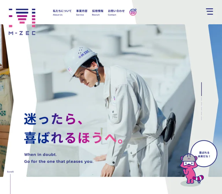
M・ZEC|紺とピンク、斜めの造形で伝える建設会社の企業サイト
現場で働く人の写真、青からピンクへのグラデーション、矢羽根状の写真フレームとマスコットが特徴。スマートフォンでは写真と見出しを分離し、事業説明やフッターの情報順序を再構成しています。
M・ZEC — Style Reference
A construction company presented through people, directional geometry, deep blue ink, and vivid pink accents.
Website: www.m-zec.com Original URL: https://www.m-zec.com/ Final URL: https://www.m-zec.com/ Theme: light surfaces, navy typography, blue-to-pink accents, and natural photography. Inspected: October 2, 2026, at 05:32 JST; the supplied evidence was retrieved on October 1, 2026, at 20:32 UTC. Viewports: 1440 × 1000 desktop and 390 × 844 mobile, in CSS pixels. Scope: the current corporate homepage: header, photographic hero, company philosophy, service links, editorial features, recruitment movie entry, news, contact section, and footer. Linked pages and opened navigation states were not inspected.
M・ZEC combines the confidence of a construction business with the friendliness of a service brand. Employees in pale workwear occupy large photographs; a segmented blue-and-pink logo, helmeted mascot, speech bubbles, and a miniature illustrated town supply a more playful identity. Navy text holds these elements together across white and pale gray-green surfaces.
The most distinctive device is the repeated directional edge. Hero photographs have a concave left edge and a pointed right edge. Oversized background ribbons, feature banners, and footer decorations echo that geometry. The result feels like a continuous branded composition rather than a sequence of identical rectangular cards.
This is a corporate homepage with several purposes: explaining the business, presenting its people, supporting recruitment, publishing updates, and providing contact routes. Its mobile design changes information order and content visibility, rather than simply shrinking the desktop page.
閉じる
M・ZEC — Style Reference
A construction company presented through people, directional geometry, deep blue ink, and vivid pink accents.
Website: www.m-zec.com Original URL: https://www.m-zec.com/ Final URL: https://www.m-zec.com/ Theme: light surfaces, navy typography, blue-to-pink accents, and natural photography. Inspected: October 2, 2026, at 05:32 JST; the supplied evidence was retrieved on October 1, 2026, at 20:32 UTC. Viewports: 1440 × 1000 desktop and 390 × 844 mobile, in CSS pixels. Scope: the current corporate homepage: header, photographic hero, company philosophy, service links, editorial features, recruitment movie entry, news, contact section, and footer. Linked pages and opened navigation states were not inspected.
M・ZEC combines the confidence of a construction business with the friendliness of a service brand. Employees in pale workwear occupy large photographs; a segmented blue-and-pink logo, helmeted mascot, speech bubbles, and a miniature illustrated town supply a more playful identity. Navy text holds these elements together across white and pale gray-green surfaces.
The most distinctive device is the repeated directional edge. Hero photographs have a concave left edge and a pointed right edge. Oversized background ribbons, feature banners, and footer decorations echo that geometry. The result feels like a continuous branded composition rather than a sequence of identical rectangular cards.
This is a corporate homepage with several purposes: explaining the business, presenting its people, supporting recruitment, publishing updates, and providing contact routes. Its mobile design changes information order and content visibility, rather than simply shrinking the desktop page.
How to Read This Reference
- Measured means a value supplied by the rendered DOM or computed-style evidence. Values are rounded in tables where the extra decimal places are not useful.
- Observed means a feature visible in the supplied current-page screenshots. Screenshot-based geometry is marked approximate.
- Estimated colors and dimensions are visual approximations, not sampled pixels or recovered CSS declarations.
- Recommended means guidance for a new implementation. The CSS below is an adaptation, not the original stylesheet.
- All custom-property names in this document are descriptive aliases. The supplied root variables are primarily platform defaults and do not establish a public brand-token system.
- A computed font-family identifies the declared stack; it does not independently prove which font file rendered every character.
- Some DOM entries belong to navigation content that is absent from the closed-menu screenshots. Their presence and nonzero bounds do not prove that the menu was visible.
- The hero headline has an empty text field in the sampled heading element. Its measured box is useful; its inherited
10pxfont size does not describe the visible lettering. The exact image, SVG, background, or other rendering mechanism was not supplied.
Tokens — Colors
Default Palette
| Name | Value | Suggested token | Evidence and role |
|---|---|---|---|
| Brand Navy | #1e257d |
--color-ink |
Measured rgb(30, 37, 125) on navigation, service text on mobile, contact details, footer links, and the back-to-top fill |
| Pale Gray-Green | #e9ebe8 |
--color-canvas |
Measured body and main background; also mobile contact background and news-category fills |
| Secondary Gray-Green | #e8ebe8 |
--color-panel |
Measured news-row background and some navigation-category surfaces |
| White | #ffffff |
--color-white |
Measured footer, news section, and button surfaces; visually dominant across the page |
| Narrative Black | #000000 |
--color-story |
Measured on the philosophy paragraph; also appears as an inherited value on elements whose visible contents have other treatments |
| Gradient Blue | approximately #07358f |
--color-gradient-start |
Estimated left end of the visible headline gradient |
| Gradient Magenta | approximately #ae008d |
--color-gradient-mid |
Estimated central brand accent in the headline and logo |
| Gradient Pink | approximately #ed4a99 |
--color-gradient-end |
Estimated right end of the headline and a useful approximation of the mascot's pink |
| Pale Navy Rule | approximately #d0d3e8 |
--color-rule |
Estimated footer dividers and inactive interface marks |
The measured navy is the reliable anchor. The gradient stops are suitable starting values for a recreation, but their exact positions, interpolation, and original declarations are unknown.
The service photographs carry a strong purple-to-pink wash with white text. This is visually different from the mostly horizontal blue-to-pink lettering treatment. Keep those two roles separate: a text gradient and a photographic overlay should not automatically share one CSS gradient.
Several headings have computed black text while appearing multicolored in the captures. Likewise, the desktop contact section has a white outer background but a large pale interior shape. Describe the visible layers, rather than treating each parent color as the final painted result.
Supporting Content Colors
These values are measured on the mobile captions above the three main editorial features. They distinguish those features without replacing the main navy-and-pink identity.
| Feature | Measured value | Role |
|---|---|---|
| Service philosophy feature | #754a31 |
Brown caption above the first feature |
| Family journal | #c75251 |
Muted red caption above the second feature |
| Young employee documentary | #008663 |
Green caption above the third feature |
No alternate theme or user-selectable color mode was evidenced.
Tokens — Typography
Japanese Text — Noto Sans JP Stack
Measured stack: "Noto Sans JP", "Noto Sans Japanese", "ヒラギノ角ゴ Pro", "Hiragino Kaku Gothic Pro", メイリオ, Meiryo, Osaka, "MS PGothic", sans-serif.
The Japanese interface uses a clear sans-serif voice. Navigation, service labels, news titles, and contact details are predominantly bold. The longer philosophy paragraph uses regular weight and unusually generous line spacing.
The original root is 10px. Do not copy numeric source rem values into a project with a conventional root without conversion. The Quick Start uses explicit pixel values and leaves the root size conventional.
English Section Labels — Kanit
Measured family: Kanit, sans-serif.
Measured weight: 500.
Kanit is used for section labels including Service, Special, News, and Contact, as well as Movie, Tel, Mail, and footer group headings. Its broad forms and moderate tracking create a confident English hierarchy beside the smaller Japanese labels.
Telephone Number — Lexend Tera
Measured family: "Lexend Tera", sans-serif.
Measured weight: 600.
The telephone number has a distinct wide geometric character. Its tracking is tightened to -0.04em: -1.36px at the desktop size and -1.08px on mobile. This is a specific utility treatment, not evidence that the entire site uses Lexend Tera.
Artwork and Promotional Lettering
The segmented logo, hero slogan, circular stamp, and several editorial titles have their own graphic treatment. The small family-journal card visibly uses an editorial serif style, but no font declaration for that lettering was supplied. Do not assign an invented font family to it.
The visible hero slogan is 迷ったら、喜ばれるほうへ。, arranged over two lines. Its English support text reads When in doubt. Go for the one that pleases you. Preserve the relationship between the oversized Japanese statement and its much smaller English translation.
Type Scale
| Role | Desktop | Mobile | Weight / tracking | Evidence |
|---|---|---|---|---|
| Header Japanese navigation | 13px / 13px |
Not visible in the closed header | 700, 0.52px |
Measured |
| Main English section heading | 44px / 44px |
36px / 36px |
500; 2.64px desktop, 1.8px mobile |
Measured |
| Japanese section subtitle | 18px / 18px |
About 14–14.55px |
700, usually 1px |
Measured on News and Contact |
| Philosophy paragraph | 18px / 38px |
14px / 31px |
400, 0.06em |
Measured |
| Philosophy closing statement | 65px / 65px |
35px / 54px |
700, 0.06em |
Measured |
| Service introduction | 16px / 39.49px |
12px / 26px |
700, 0.06em |
Measured |
| Service card title | 24px / 24px |
18.72px / 18.72px |
700, 1px |
Measured |
| Service description | 13px / 30px, collapsed box |
12px / 24px, visible box |
700; mobile tracking 0.24px |
Measured |
| News title | 16px / 24px |
13px / 17.42px |
700, 1px |
Measured |
| Tel / Mail heading | 36px / 36px |
22px / 22px |
Kanit 500, 1px |
Measured |
| Telephone number | 34px / 34px |
27px / 27px |
Lexend Tera 600, -0.04em |
Measured |
| Footer group heading | 14px / 14px |
12px / 12px |
Kanit 500, 0.03em |
Measured |
| Footer navigation | 14px / 14px |
11px / 11px |
700, 1px |
Measured |
| Footer address | 12px / 23px |
10px / 21.6px |
700, 0.04em |
Measured |
| Hero Japanese lettering | Box 482.39 × 151.19px |
Box 239.06 × 74.92px |
Lettering treatment; font size unknown | Measured bounds |
| Hero English support | Approximately 20px |
Approximately 11px |
Bold, visibly tracked | Visual estimate |
The design does not use one universal tracking value. Japanese narrative text, English headings, footer labels, and telephone digits each have their own spacing behavior.
Tokens — Spacing & Shapes
Density: expansive section spacing, compact navigation, and concentrated information inside editorial cards.
Shape language: directional ribbons and chevrons, shallow corner rounding, thin dividers, circular speech bubbles, and small dot markers. There is no evidence of a single modular spacing scale governing every component.
Spacing Measurements
| Use | Desktop | Mobile | Notes |
|---|---|---|---|
| Header logo origin | 90px, 42px |
28.59px, 21px |
Measured x/y |
| Philosophy section top padding | 175px |
99px |
Measured; internal imagery adds further separation on mobile |
| Main Special section padding | 100px top, 110px bottom |
77px top, 60px bottom |
Measured |
| News section padding | 110px top, 160px bottom |
110px top, 125px bottom |
Measured |
| Contact section padding | 130px top, 235px bottom |
117px top, 229px bottom |
Measured; lower space accommodates illustration |
| Footer padding | 160px top, 117px bottom |
107px top, 95px bottom |
Measured |
| Service-column gap | About 3px |
About 45px between cards |
Calculated from measured bounds |
| Footer promotional-card gap | About 13px |
About 6.36px |
Calculated from measured bounds |
| News-row gap | 12px |
10px |
Calculated from measured bounds |
| Footer navigation row interval | 48px |
40px |
Measured from successive link positions |
Border Radius and Linework
| Element | Value | Evidence |
|---|---|---|
| Standard white Read More button | 5px |
Measured |
| Small editorial cards | 5px |
Measured |
| Contact-form button | 3px |
Measured |
| News-category pills | 18px |
Measured; 36px high on desktop, 29px on mobile |
| Desktop service panels | 5px on applicable corners |
Measured; outer page edges remain square |
| Mobile service wrapper | 0 |
Measured |
| Desktop back-to-top control | 5px 0 0 5px |
Measured |
| Mobile back-to-top control | 5px 5px 0 0 |
Measured |
| Speech-bubble outline | Approximately 2–3px |
Visual estimate |
| Dividers and outlined CTA edges | Approximately 1px |
Visual estimate |
The prominent hero silhouette is approximately a six-point polygon: flat top and bottom, a recessed midpoint on the left, and a projecting midpoint on the right. A starting polygon is polygon(0 0, 94% 0, 100% 50%, 94% 100%, 0 100%, 6% 50%). This is a recommendation derived from the appearance, not recovered source geometry.
Layout Measurements
| Element | Desktop at 1440 × 1000 | Mobile at 390 × 844 |
|---|---|---|
| Document height | 7415.70px |
8211.98px |
| Header logo | 128 × 125px |
80 × 78.13px |
| Header feature stamp | 35 × 34px |
35 × 34px |
| Central hero photograph | Approximately 1078 × 730px, starting near 180, 116 |
Approximately 349 × 338px, starting near 21, 140 |
| Hero slogan origin | 154.22, 540px |
26.52, 502.98px |
| Philosophy Read More button | 240 × 60px |
158 × 42px |
| Individual service link | 477.98 × 695px |
390 × 427.91px |
| Service description box | 288px wide, 0px high |
312 × 120px |
| Main first editorial feature | 1243 × 480.42px sampled box |
351 × 266.86px |
| Other main editorial features | 621.5 × 469.09px each |
351 × 266.86px each |
| Recruitment movie entry | 1411.19 × 416.16px |
370.5 × 340px |
| News row | 1160 × 73px |
351 × 95px |
| Contact-form button | 319 × 72px |
296.39 × 60px |
| Footer promotional card | 157.83 × 284px |
110.16 × 195px |
| Footer logo | 122 × 119.14px |
90 × 87.89px |
| Back-to-top control | 46 × 57px |
58 × 32px |
Element bounds describe the sampled state. Some large feature positions differ between the DOM sample and the scrolled screenshots; do not hardcode every recorded document coordinate as a stable layout rule.
Components
Header and Brand Mark
Role: establish identity and provide the primary company routes.
On desktop, the logo sits at the upper left and extends below the horizontal navigation line. The navigation begins around x = 328px, with four bilingual links: 私たちについて, 事業内容, 採用情報, and お問い合わせ. Each has a smaller English label beneath it. The Japanese text is measured at 13px, bold, with 0.04em tracking.
A separate circular 超 stamp links to /super/. At the far right, the menu control uses three navy bars with small angular details. It remains visible at the upper right in the supplied scrolled desktop frames, consistent with persistent positioning; the positioning declaration itself was not supplied.
On mobile, the bilingual navigation disappears from the closed header. The 80px logo sits left; the unchanged 35 × 34px feature stamp and menu icon sit right. This keeps the header recognizable without retaining miniature desktop links.
Additional navigation content exists in the DOM, including main links, news categories, and promotional cards. Its opened appearance, entrance transition, focus behavior, and dismissal controls were not exercised.
Photographic Hero
Role: introduce the company through people and a memorable statement.
The desktop composition has five independent layers:
- White and pale geometric background fields.
- A wide central photograph clipped into a directional ribbon.
- Partial neighboring photographs at the viewport edges.
- The two-line gradient slogan and English support text over the lower-left area.
- A pink helmeted mascot with a circular speech bubble near the lower right.
The main desktop capture shows two employees working among concrete foundations. The mobile capture shows a small team reviewing material at a table. Both emphasize attention, collaboration, and ordinary work rather than abstract corporate architecture.
The title is not constrained to the inner rectangle of the photograph. It crosses the photo's recessed left edge into the surrounding white area. Preserve this overlap on desktop, while keeping text and faces independently positioned.
On mobile, the photograph ends around y = 478px. The slogan begins around y = 503px, below the image, with the English translation beneath it. The mascot sits to the right of the text rather than covering the employees. This separation is one of the most important responsive behaviors.
Hero Position Indicators and Scroll Cue
Role: suggest multiple hero scenes and continuation down the page.
Six slim position marks are visible. On desktop they form a vertical rail near the right of the photograph. The active segment is longer and navy; inactive segments are pale. On mobile the rail becomes horizontal above the photograph, aligned toward the right.
The interface clearly presents a carousel-like sequence, and the two current captures show different scenes. The evidence does not establish automatic playback, slide order, drag support, transition type, or timing.
A small Scroll caption sits over a very thin vertical line below the main composition. It provides directional rhythm rather than a large button. Its activation behavior was not supplied.
Mascot and Speech Bubble
Role: bring warmth to transitions between otherwise formal company sections.
The mascot has a pink body, navy outlines, a light construction helmet, a striped tail, and a small pale oval ground shadow. Its pose changes between the hero and Special-section artwork. The hero bubble contains 喜ばれる未来だな!; another visible bubble accompanies a more active pose near Special.
Keep the character and bubble as a coordinated illustration. Do not replace the character with an unrelated emoji or reconstruct the logo as ordinary text. A hero-sized mascot is approximately 180px wide on desktop and 85px wide on mobile, based on the visible captures; these are estimates rather than measured image dimensions.
Different poses are evidence of multiple illustrations, not proof of character animation.
Company Philosophy
Role: explain the company's service-minded approach before introducing individual services.
The supplied text starts by questioning common assumptions about construction work, then develops a longer statement about care, craft, and customer happiness. The paragraph uses regular Japanese sans-serif text: 18px / 38px on desktop and 14px / 31px on mobile.
The closing statement, 建設業って、超サービス業だ。, rises to 65px bold on desktop. Mobile uses 35px / 54px and an explicit two-line arrangement. A white Read More button links to /super/.
The desktop paragraph's measured box is much wider than a typical reading column. Its deliberate line breaks and surrounding composition matter; do not treat that box width as a recommendation for uninterrupted prose. Mobile uses a measured text width of approximately 285px, with generous side space.
Section Heading
Role: provide a recurring bilingual signpost.
The visible Special heading combines a small navy folded-chevron mark, a large gradient English word, and a smaller bold Japanese subtitle. Contact uses a related mark to the left of its heading. These compact marks echo the page's larger directional geometry.
English headings use Kanit 500 at 44px on desktop and 36px on mobile. News and Contact pair the English title and Japanese subtitle horizontally on desktop, then stack and center them on mobile.
Do not force every desktop section into an identical centered heading. The sampled Service introduction is positioned toward the right, Special is centered, and News and Contact use horizontal title groups.
Service Panels
Role: route visitors to the three core business areas.
The three anchors target /service/#con01, /service/#con02, and /service/#con03. The displayed categories are 住宅建築・リフォーム, 法人新築・リフォーム, and 公共工事.
On desktop, each link is approximately 478px wide and 695px high, with only a 3px gap between panels. The visible panel anatomy is a full-height photograph, a saturated purple/pink wash, a small Service number, a centered white Japanese title, and a thin white outlined Read More treatment with a circular dot. The outlined treatment is approximately 195 × 50px in the screenshot.
The photographs differ by service: a residential interior, hands working with drawings, and a worker using surveying equipment. The overlays unify these subjects into one strong horizontal band.
Desktop descriptions are present in the DOM but have a measured height of zero. Their text and title elements have 0.5s transitions, but no tested hover or reveal sequence was supplied. Do not claim that hovering exposes the description.
On mobile, the services become full-width stacked entries. Titles change to navy, and the descriptions occupy visible 312 × 120px boxes with 12px / 24px text. The mobile design therefore makes the explanatory copy available without relying on a desktop hover state. The precise mobile image treatment was not captured in a supplied middle-page screenshot.
Main Editorial Features
Role: extend the brand through people, company culture, and longer stories.
The Special section contains three destinations: /super/, /journal/, and /life/. The desktop DOM records one broad feature followed by two smaller features side by side. The supplied screenshot shows the top of the first feature: two uniformed employees, a darkened photographic field, large white promotional lettering, and a directional frame.
A soft shadow is visible around this large feature banner. It is a local treatment, not evidence of a site-wide elevated-card system.
On mobile, all three features have the same measured 351 × 266.86px link area, inset 19.5px from the viewport sides. Each receives a separate small caption above it, using the measured brown, muted red, or green supporting color. This is a substantial change from the desktop hierarchy.
Recruitment Movie Entry
Role: direct prospective employees to a company video.
The entry combines RECRUITMENT, Movie, and Read More. Its desktop area is wide and shallow; the mobile area becomes a 370.5 × 340px block. The Movie label uses Kanit at 40px desktop and 33px mobile, in white.
The mobile anchor points directly to /assets/image/recruit_pv.mp4. The desktop sample points to the homepage. This difference may reflect device-specific handling, but no playback interaction was performed. A modal, autoplay, sound behavior, or a particular video player cannot be inferred.
News Categories and Rows
Role: provide recent company updates with category navigation.
The desktop section places the bilingual heading and a row of rounded category links across the upper area. Five category links are present. These are anchors to category archive URLs; they should not be described as verified client-side filters.
Each desktop news row is a pale horizontal band with a date, a bold title, and Read More. The measured rows are 1160 × 73px, with 12px vertical gaps. Their x positions increase by 16px from one row to the next, forming a subtle stepped arrangement.
On mobile, categories wrap into a centered three-plus-two arrangement. The news rows become uniformly aligned 351 × 95px blocks, with dates above or separate from the title region. Titles shrink to 13px / 17.42px. The mobile visible-text extraction omits the repeated Read More labels, while the complete rows remain anchors.
Four entries are recorded, with the latest dated September 1, 2025. This is observed content, not evidence about the site's publishing frequency or operational status.
Contact Panel
Role: offer two direct contact paths at the end of the main content.
The desktop panel places the gradient Contact heading above a horizontal telephone and mail arrangement. Navy vertical rules separate the small Tel and Mail headings from the adjacent number or button. The telephone number is large and visually distinctive; smaller business-hours text sits beneath it.
The form button is a white 319 × 72px rectangle with a small radius, a navy paper-plane outline icon, the actual label お問い合わせフォーム, and a small circular dot. It links to /contact/. The telephone is an actual tel:0979248811 anchor.
A broad pale background shape has a directional right edge. Along its bottom, a town illustration combines buildings, pink hills, clouds, and three people. The illustration links the contact section to the human character established above.
Mobile stacks Tel and Mail in a 296.39px inner column. The number is 27px, and the form button is 60px high. The exact mobile composition is supported by DOM measurements; only the lower town illustration appears at the top of the supplied mobile footer screenshot.
Footer Promotional Cards
Role: keep the three editorial destinations available after the main content.
Each portrait card contains a photographic background, its own title treatment, and a small white Read More label with a white dot near the bottom. The first shows uniformed employees, the second shows a family group, and the third shows a younger person outdoors.
Desktop cards measure approximately 157.83 × 284px, with 13px gaps. Mobile cards remain in one three-column row at approximately 110.16 × 195px, with 6.36px gaps. Their corner radius remains 5px.
These are small editorial covers, not interchangeable feature cards with icons and paragraphs. Retain the different imagery and lettering within the consistent outer format.
Footer Identity and Navigation
Role: close the page with company details and a compact sitemap.
The desktop footer has identity and address at left, Main Contents in the middle, and Special Contents at right. The visible logo is approximately 122px wide. Six main links sit on fine pale dividers, with about 48px between successive link positions.
On mobile, Special Contents moves to the top and spans the width. Below it, the logo/address column sits beside the main-link column. The logo is 90px wide, and the navigation intervals reduce to 40px. The address becomes a narrow, multiline block rather than a full-width paragraph.
A plus appears beside the footer news link. An expansion interaction was not tested; its presence alone does not establish accordion behavior.
Large pale directional shapes continue behind the address area and, on desktop, behind the promotional cards. The footer remains part of the page's graphic composition rather than becoming a generic dark strip.
Back-to-Top Control
Role: return to the homepage's top anchor.
The control links to /#top and uses a navy fill with a small white upward chevron. On desktop it is a 46 × 57px tab against the right edge. On mobile it becomes a centered 58 × 32px tab at the bottom of the document, with rounding only on its upper corners.
The anchor destination is verified. Smooth scrolling and its duration were not established.
Tokens — Motion & Interaction
| Treatment | Supplied evidence | What can be concluded |
|---|---|---|
| General links | 0.4s cubic-bezier(0.25, 0.46, 0.45, 0.94) |
A shared transition timing is declared; exact property changes depend on the component |
| Service title and description | 0.5s cubic-bezier(0.25, 0.46, 0.45, 0.94) |
These elements are prepared for state changes; the trigger and resulting state were not tested |
| Philosophy statement and Service section | 0.6s 0.2s |
A 600ms transition with a 200ms delay is declared; the reveal mechanism is unverified |
| Hero sequence | Six position marks and different current desktop/mobile scenes | A multi-scene presentation is evident; autoplay, duration, direction, and swipe support are unknown |
| Menu | Visible menu control and additional DOM navigation content | Open/close animation and keyboard behavior are unknown |
| Recruitment movie | Mobile MP4 anchor, different desktop href | A video route exists; player behavior is unknown |
| Back to top | /#top anchor |
Destination is known; scrolling animation is unknown |
| Mascot | Different poses in different locations | Multiple artwork variants are present; animation is not established |
Many sampled elements report animation: none. This does not rule out JavaScript motion, transitions, unsampled children, or pseudo-elements. Conversely, a bare transition: all without a meaningful duration is not proof of visible animation.
The capture process waited for load, image decoding, sampled layout stability, and relevant finite animation readiness. Perpetual animations were temporarily paused during checks and then resumed. These checks provide useful settled frames but are not an interaction recording.
Recommended motion approach: retain the measured restrained 400–600ms timing family for local state changes. If building a carousel, provide explicit controls and a reduced-motion mode; choose and document its behavior separately instead of presenting an invented timing as original evidence.
Surfaces
| Layer | Appearance | Purpose |
|---|---|---|
| Main composition | White with oversized pale gray-green ribbons | Establishes the continuous directional identity |
| Hero image | Natural photograph inside a pointed ribbon | Introduces employees and work |
| Brand lettering | Blue-to-magenta-to-pink gradient | Marks the strongest statements and section labels |
| Service band | Purple/pink photographic wash with white labels | Unifies three separate business areas |
| Large editorial feature | Darkened photography, white graphic title, localized soft shadow | Gives long-form brand stories more presence |
| News rows | Flat pale gray-green strips | Keeps publishing information legible and ordered |
| Contact button | White rectangle, navy icon and text | Makes the form route distinct within the pale panel |
| Footer | White with pale geometric decorations | Continues the visual language while organizing utilities |
| Back-to-top tab | Solid navy with a white chevron | Provides a compact, high-contrast utility |
Shadows are not the primary organizing system. Color fields, image crops, overlapping elements, spacing, and directional edges provide most of the hierarchy.
Imagery
Photography should feel specific to the company's people and work. The current hero captures show pale workwear, helmets, concrete foundations, drawing review, daylight, and collaborative gestures. Keep expressions and hand movements readable. The photos are relatively soft and natural in color, which allows the saturated brand accents to stand apart.
Use different photographic treatments for different roles:
- Hero: relatively natural color, large subjects, bright working environments, and a directional crop.
- Service panels: category-specific scenes beneath a strong purple/pink overlay.
- Main editorial feature: darker photography with prominent white lettering.
- Footer covers: portrait crops, separate editorial identities, and small white navigation labels.
Illustration uses clean navy outlines, pink and violet fills, white negative space, and small pale ground shadows. The mascot and town drawing share this palette but perform different roles: the mascot speaks, while the town builds a sense of community around contact information.
The logo is a custom arrangement of horizontal segments with a blue-to-pink color progression and a widely spaced wordmark. Its geometry is part of the identity. A typed replacement will not reproduce it.
Observed Asset References
The supplied evidence includes one explicit media-file path. Other artwork is visible, but its source filenames were not supplied.
| Asset or group | Evidence | Implementation guidance |
|---|---|---|
| Recruitment video | assets/image/recruit_pv.mp4, recorded as the mobile link target | This confirms a destination, not playback behavior or video contents |
| Logo and circular feature stamp | Visible in desktop and mobile headers | Use authorized original artwork where available |
| Hero photographs | Current desktop and mobile captures | Supply separate crop control; do not assume one universal focal point |
| Hero slogan | Visible lettering and measured heading bounds | Preserve its proportions and provide equivalent accessible text |
| Mascot poses and speech bubbles | Hero and Special captures | Keep artwork and bubble spacing coordinated |
| Contact town illustration | Desktop contact and mobile footer boundary | Treat it as a wide illustration rather than a repeated icon pattern |
| Editorial card artwork | Desktop and mobile footer captures | Retain portrait compositions and distinct title treatments |
No image filename, SVG path, or font file should be invented from these visual observations.
Layout & Responsive Behavior
Desktop Composition
The desktop page combines several widths instead of using one container everywhere. The header has a measured 1260px wrapper starting at x = 90px. The hero photograph is narrower and offset, service panels span the entire viewport, news rows are approximately 1160px wide, and the footer uses several deliberately separated columns.
Large vertical gaps allow the photography, text, and mascot to read as individual compositions. Full-width service panels interrupt this slower rhythm with a dense band of color. News and contact return to calmer, more utilitarian arrangements.
The screenshot showing the services includes only their lower portion. Its visible height must not be mistaken for the full 695px panel height recorded in the DOM.
Mobile Recomposition
At 390px, the main changes are:
| Area | Observed responsive change |
|---|---|
| Header | Four bilingual links disappear; logo, feature stamp, and menu remain |
| Hero | Photograph becomes nearly square; slogan moves below it |
| Hero indicators | Vertical rail becomes a horizontal row above the photograph |
| Hero mascot | Becomes a smaller companion beside the copy |
| Philosophy | Text column narrows and the closing statement wraps into two lines |
| Services | Three columns become three stacked entries; descriptions become visible navy text |
| Main Special features | One large plus two smaller features become three equal-size stacked links |
| News categories | One row wraps into a centered three-plus-two arrangement |
| News entries | Stepped wide bands become aligned blocks with more vertical room |
| Contact | Telephone and form areas stack in one inner column |
| Footer | Three editorial cards move above the identity and navigation columns |
| Back to top | Right-edge tab becomes a centered bottom tab |
The mobile footer deliberately retains three promotional columns. It does not stack every card simply because the viewport is narrow. Its lower identity and navigation area likewise remains two columns.
Useful measured width relationships at 390px are 90% for main editorial features and news rows, 88% for the footer promotional group, 80% for service-description text, and approximately 76% for the contact column. These are calculated from supplied bounds, not recovered CSS formulas.
Breakpoint and Inspection Limits
Only 1440px and 390px widths were supplied. The exact media-query breakpoints, intermediate tablet behavior, landscape behavior, and scaling formulas cannot be recovered from two samples. The Quick Start uses a recommended 900px breakpoint for demonstration and should be tested at intermediate widths.
The mobile document is approximately 796px taller than the desktop document, despite its much narrower viewport. This reflects changes in stacking, image proportions, content visibility, and spacing rather than uniform scaling.
Do’s and Don’ts
Do
- Anchor navigation, labels, linework, and contact details in the measured navy
#1e257d. - Preserve the large white areas and pale directional background fields.
- Use the blue-to-pink gradient for brand statements and selected headings.
- Keep actual employees and work situations central to the photography.
- Repeat the concave-left, pointed-right shape at several scales without applying it to every control.
- Move hero text below the image on mobile and reserve room for the mascot beside it.
- Preserve the difference between large main editorial features and small footer covers.
- Keep service explanations visible in the mobile layout.
- Retain the three-card promotional row at the mobile footer size.
- Use Kanit for measured English heading roles and Lexend Tera specifically for the telephone number.
- Keep direct service, category, contact, and telephone routes as meaningful links.
- Distinguish source measurements from approximated gradients, polygons, and breakpoints.
Don’t
- Don’t flatten the homepage into a single-purpose sales layout with repeated conversion blocks.
- Don’t replace the segmented logo, mascot, or editorial lettering with generic substitutes.
- Don’t use magenta as the default body-text or button color.
- Don’t recolor all photography; the hero and service panels have different treatments.
- Don’t turn every section into a rounded card with a large shadow.
- Don’t infer an opened menu layout from hidden or covered DOM content.
- Don’t describe service-description hover reveals, carousel autoplay, or video modals as verified behavior.
- Don’t use an empty heading's inherited
10pxstyle as the hero's visible type size. - Don’t hide essential mobile descriptions behind hover-only interactions.
- Don’t assume that all mobile content collapses to one column.
- Don’t hardcode sampled document positions when content length or viewport width changes.
- Don’t treat platform admin colors as the site's visible design palette.
Recommended Implementation Additions
These are recommendations for a new implementation, not verified features of the original site:
- Give the logo link, feature stamp, menu button, carousel controls, and back-to-top control explicit accessible names. Empty text extraction alone does not establish whether the original assets already have alternatives.
- If the menu opens an overlay, implement keyboard operation, Escape dismissal, focus management, and a clear expanded state.
- If the carousel advances automatically, add pause controls and stop unnecessary motion when reduced motion is requested.
- Keep a readable live heading or equivalent text alternative for the hero slogan. Do not rely exclusively on lettering inside an image.
- Test the estimated gradient colors for contrast. Small utility labels should remain solid navy rather than inheriting the lightest pink.
- Increase compact touch targets to at least
44pxwhere practical. The observed42pxmobile Read More button and32pxback-to-top tab can retain their visual proportions inside larger hit areas. - Make each service panel one meaningful link, with its Read More treatment inside it. Avoid nesting a second interactive link or button inside the panel anchor.
- Allow news rows and contact-hours text to grow for localization and text enlargement. The observed fixed-size rows should not become clipping constraints.
- Use separate focal positions for each photograph and each breakpoint. Keep faces away from clipped edges and overlaid text.
- Reserve image dimensions to avoid layout shifts. Load below-the-fold imagery progressively, while prioritizing the initially visible hero photograph.
Agent Prompt Guide
Quick Color Reference
- Main text and icon ink: measured
#1e257d. - Pale canvas: measured
#e9ebe8. - News and secondary panels: measured
#e8ebe8. - Clear surfaces and reversed text:
#ffffff. - Hero and heading gradient approximation:
#07358f → #ae008d → #ed4a99. - Mobile editorial-caption accents: measured
#754a31,#c75251, and#008663. - Service overlay: purple-to-pink photographic wash; exact source stops unknown.
Overall Prompt
“Create a Japanese construction-company homepage inspired by the current M・ZEC composition. Use white and pale gray-green fields, navy #1e257d typography, blue-to-magenta-to-pink statement lettering, natural photographs of employees, and a coordinated helmeted mascot. Build a wide photographic hero with a recessed left edge and pointed right edge, partial neighboring scenes, and a large two-line Japanese slogan overlapping the lower-left boundary. Follow it with company philosophy, three service routes, editorial features, recruitment video access, news, contact details, and a structured footer. Use Noto Sans JP for Japanese text, Kanit for English section labels, and Lexend Tera for the telephone number. At mobile sizes move the slogan below the hero image, show service descriptions, stack the main editorial features, and move the footer's three portrait cards above the identity and navigation columns. Treat carousel behavior and the exact gradient as implementation choices requiring separate definition.”
Example Component Prompts
- Hero: “A bright employee photograph inside a directional ribbon with a concave left edge and pointed right edge. Place the gradient slogan
迷ったら、喜ばれるほうへ。across the lower left, with small navy English support below it. Add a pink helmeted mascot and circular white speech bubble at the lower right. On a 390px viewport put the slogan below the image and arrange six thin scene markers horizontally above it.” - Service band: “Three almost-touching desktop panels with residential, drawing-review, and surveying photographs. Apply a purple-to-pink wash, then center a small Service number, a bold white Japanese title, and a thin outlined Read More treatment with a circular dot. On mobile use stacked entries with visible navy descriptions at
12px / 24px.” - Contact panel: “A pale directional panel on white, with a gradient Contact title, navy Tel and Mail labels, a wide geometric telephone number, and a white form button containing a paper-plane outline and small dot. Anchor a navy-and-pink town illustration along the bottom. Stack the telephone and form groups on mobile.”
- Footer: “A spacious white corporate footer with a segmented brand mark and compact address at left, navy navigation links over fine pale dividers in the middle, and three narrow photographic editorial covers at right. On mobile move the three covers into the first row, keep identity and navigation side by side below, and center a navy back-to-top tab at the bottom.”
- News: “A white news section with a bilingual Kanit/Japanese heading, five pale category pills, and four flat gray-green rows. Desktop rows step slightly to the right and contain date, title, and Read More. Mobile rows align evenly at 90% viewport width, with the date above the title and enough height for wrapping.”
Quick Start
CSS Custom Properties
This is a reusable visual starting point. Exact colors and typography come from the supplied measurements; gradient stops, polygon geometry, photo heights outside the measured viewports, and the 900px breakpoint are recommendations. The code does not implement a carousel, menu overlay, video player, or scroll-triggered reveals.
Load the declared fonts separately if they are available and appropriate for the project. Supply authorized artwork through image elements; no source image paths are assumed here. For the hero title, .mz-hero__headline can contain either accessible live text or a supplied graphic with an equivalent accessible name.
:root {
  /* Measured colors */
  --color-ink: #1e257d;
  --color-canvas: #e9ebe8;
  --color-panel: #e8ebe8;
  --color-white: #ffffff;
  --color-story: #000000;
  --color-feature-brown: #754a31;
  --color-feature-red: #c75251;
  --color-feature-green: #008663;

  /* Visual approximations */
  --color-gradient-start: #07358f;
  --color-gradient-mid: #ae008d;
  --color-gradient-end: #ed4a99;
  --color-rule: #d0d3e8;
  --brand-gradient: linear-gradient(
    100deg,
    var(--color-gradient-start),
    var(--color-gradient-mid) 58%,
    var(--color-gradient-end)
  );
  --service-wash: linear-gradient(
    180deg,
    rgb(94 29 119 / 86%),
    rgb(225 42 132 / 74%)
  );

  /* Source-declared families; load fonts separately */
  --font-ja: 'Noto Sans JP', 'Noto Sans Japanese',
    'Hiragino Kaku Gothic Pro', Meiryo, Osaka,
    'MS PGothic', sans-serif;
  --font-en: Kanit, sans-serif;
  --font-number: 'Lexend Tera', sans-serif;

  /* Measured role sizes */
  --text-section: 44px;
  --text-service: 24px;
  --text-story: 18px;
  --leading-story: 38px;
  --text-phone: 34px;
  --radius-card: 5px;
  --radius-contact: 3px;

  /* Measured transition timing */
  --ease-link: cubic-bezier(0.25, 0.46, 0.45, 0.94);
  --duration-link: 400ms;

  /* Recommended approximation of the repeated silhouette */
  --ribbon-shape: polygon(
    0 0, 94% 0, 100% 50%, 94% 100%, 0 100%, 6% 50%
  );
}

* { box-sizing: border-box; }
body { margin: 0; }

.mz-page {
  color: var(--color-ink);
  background: var(--color-white);
  font-family: var(--font-ja);
}

.mz-page img {
  display: block;
  max-inline-size: 100%;
}

.mz-page a { color: inherit; }

.mz-page :focus-visible {
  outline: 3px solid var(--color-ink);
  outline-offset: 5px;
}

.mz-gradient-text {
  color: var(--color-ink);
}

@supports (background-clip: text) or (-webkit-background-clip: text) {
  .mz-gradient-text {
    background: var(--brand-gradient);
    background-clip: text;
    -webkit-background-clip: text;
    color: transparent;
  }
}

.mz-section-title {
  margin: 0;
  font: 500 var(--text-section) / 1 var(--font-en);
  letter-spacing: 0.06em;
}

.mz-section-subtitle {
  margin: 16px 0 0;
  font-size: 18px;
  font-weight: 700;
  letter-spacing: 1px;
}

/* Header: approximate positioning between the inspected widths */
.mz-header {
  position: absolute;
  inset: 0 0 auto;
  z-index: 20;
}

.mz-brand {
  position: absolute;
  inset-block-start: 42px;
  inset-inline-start: 6.25%;
  inline-size: 128px;
}

.mz-nav {
  position: absolute;
  inset-block-start: 45px;
  inset-inline-start: 22.78%;
  display: flex;
  align-items: flex-start;
  gap: 33px;
}

.mz-nav a {
  text-decoration: none;
  font-size: 13px;
  font-weight: 700;
  letter-spacing: 0.04em;
}

.mz-nav small {
  display: block;
  margin-block-start: 7px;
  font: 500 10px / 1 var(--font-en);
}

.mz-feature-stamp {
  display: block;
  inline-size: 35px;
  block-size: 34px;
}

/* Use a real button with an accessible name and expanded state. */
.mz-menu-button {
  position: fixed;
  inset-block-start: 32px;
  inset-inline-end: 3.4%;
  display: grid;
  place-content: center;
  gap: 7px;
  inline-size: 44px;
  block-size: 44px;
  padding: 7px;
  border: 0;
  color: var(--color-ink);
  background: transparent;
  cursor: pointer;
}

.mz-menu-button span {
  display: block;
  inline-size: 30px;
  block-size: 3px;
  background: currentColor;
}

/* Hero image and artwork remain independently positioned. */
.mz-hero {
  position: relative;
  isolation: isolate;
  min-block-size: calc(116px + clamp(560px, 50.7vw, 730px));
  overflow: clip;
}

.mz-hero::before {
  content: '';
  position: absolute;
  z-index: -1;
  inset: 0 0 0 auto;
  inline-size: 42%;
  background: var(--color-canvas);
  clip-path: polygon(0 0, 100% 0, 100% 100%, 20% 100%);
}

.mz-hero__media {
  position: absolute;
  inset-block-start: 116px;
  inset-inline-start: 12.5%;
  inline-size: 75%;
  block-size: clamp(560px, 50.7vw, 730px);
  clip-path: var(--ribbon-shape);
}

.mz-hero__media img {
  inline-size: 100%;
  block-size: 100%;
  object-fit: cover;
  object-position: var(--hero-focal-point, 50% 50%);
}

.mz-hero__copy {
  position: relative;
  z-index: 2;
  inline-size: 33.5%;
  max-inline-size: 482.4px;
  margin-inline-start: 10.7%;
  padding-block-start: 540px;
  padding-block-end: 55px;
}

.mz-hero__headline {
  margin: 0;
  font-size: clamp(40px, 4.45vw, 64px);
  font-weight: 700;
  line-height: 1.45;
  letter-spacing: 0.04em;
}

.mz-hero__headline img {
  inline-size: 100%;
  block-size: auto;
}

.mz-hero__english {
  margin: 32px 0 0;
  font-size: 20px;
  font-weight: 700;
  line-height: 1.65;
  letter-spacing: 0.04em;
}

.mz-hero__mascot {
  position: absolute;
  z-index: 3;
  inset-inline-end: 7.7%;
  inset-block-end: 0;
  inline-size: 180px;
}

/* A visual rail only; interactive controls need larger hit areas. */
.mz-hero__rail {
  position: absolute;
  inset-block-start: 393px;
  inset-inline-end: 9.1%;
  display: flex;
  flex-direction: column;
  gap: 5px;
}

.mz-hero__rail > span {
  inline-size: 2px;
  block-size: 18px;
  background: var(--color-rule);
}

.mz-hero__rail > .is-current {
  block-size: 66px;
  background: var(--color-ink);
}

.mz-story {
  color: var(--color-story);
  font-size: var(--text-story);
  line-height: var(--leading-story);
  letter-spacing: 0.06em;
}

.mz-button {
  display: inline-flex;
  align-items: center;
  justify-content: center;
  gap: 14px;
  min-inline-size: 240px;
  min-block-size: 60px;
  padding: 12px 24px;
  border: 1px solid transparent;
  border-radius: var(--radius-card);
  color: var(--color-ink);
  background: var(--color-white);
  font-size: 16px;
  text-decoration: none;
  transition: opacity var(--duration-link) var(--ease-link);
}

.mz-button::after {
  content: '';
  flex: 0 0 9px;
  inline-size: 9px;
  block-size: 9px;
  border-radius: 50%;
  background: currentColor;
}

/* Each service card is one anchor; its CTA is a noninteractive span. */
.mz-services {
  display: grid;
  grid-template-columns: repeat(3, minmax(0, 1fr));
  gap: 3px;
}

.mz-service {
  position: relative;
  isolation: isolate;
  display: grid;
  place-items: center;
  min-block-size: 695px;
  overflow: hidden;
  border-radius: var(--radius-card);
  color: var(--color-white);
  text-decoration: none;
}

.mz-service__image,
.mz-service::before {
  position: absolute;
  z-index: -1;
  inset: 0;
  inline-size: 100%;
  block-size: 100%;
}

.mz-service__image { object-fit: cover; }
.mz-service::before { content: ''; background: var(--service-wash); }

.mz-service__body {
  inline-size: min(320px, 90%);
  text-align: center;
}

.mz-service__number {
  font: 500 15px / 1.2 var(--font-en);
  letter-spacing: 0.05em;
}

.mz-service__title {
  margin: 24px 0 36px;
  font-size: var(--text-service);
  font-weight: 700;
  line-height: 1;
  letter-spacing: 1px;
}

.mz-service__description { display: none; }

.mz-service .mz-button {
  min-inline-size: 195px;
  min-block-size: 50px;
  color: inherit;
  background: transparent;
  border-color: currentColor;
  font-size: 13px;
  font-weight: 700;
}

/* News uses content-safe minimum heights rather than clipping text. */
.mz-news-list {
  inline-size: min(1160px, 84%);
  margin-inline: auto;
  display: grid;
  gap: 12px;
}

.mz-news-row {
  display: grid;
  grid-template-columns: 104px minmax(0, 1fr) auto;
  align-items: center;
  gap: 40px;
  min-block-size: 73px;
  padding: 24px 60px;
  background: var(--color-panel);
  text-decoration: none;
}

.mz-news-row:nth-child(1) { transform: translateX(-16px); }
.mz-news-row:nth-child(3) { transform: translateX(16px); }
.mz-news-row:nth-child(4) { transform: translateX(32px); }

.mz-news-row__title {
  margin: 0;
  font-size: 16px;
  font-weight: 700;
  line-height: 1.5;
  letter-spacing: 1px;
}

.mz-contact {
  padding: 130px 3% 235px;
  background: var(--color-canvas);
}

.mz-contact__grid {
  display: grid;
  grid-template-columns: 1fr 1fr;
  gap: 60px;
  max-inline-size: 946px;
  margin: 56px auto 0;
}

.mz-contact__label {
  font: 500 36px / 1 var(--font-en);
}

.mz-phone {
  font: 600 var(--text-phone) / 1 var(--font-number);
  letter-spacing: -0.04em;
  text-decoration: none;
}

.mz-contact__button {
  inline-size: 319px;
  min-block-size: 72px;
  border-radius: var(--radius-contact);
}

/* Grid areas preserve the observed footer reordering. */
.mz-footer {
  position: relative;
  padding: 160px 0 117px;
  background: var(--color-white);
}

.mz-footer__grid {
  display: grid;
  grid-template-columns: 24.3% 21% 7.4% 43.4%;
  inline-size: 80%;
  margin-inline: auto;
}

.mz-footer__identity { grid-column: 1; }
.mz-footer__nav { grid-column: 2; }
.mz-footer__special { grid-column: 4; }
.mz-footer__logo { inline-size: 122px; }

.mz-footer h3 {
  margin: 0 0 18px;
  font: 500 14px / 1 var(--font-en);
  letter-spacing: 0.03em;
}

.mz-footer__cards {
  display: grid;
  grid-template-columns: repeat(3, minmax(0, 1fr));
  gap: 13px;
}

.mz-promo {
  position: relative;
  min-inline-size: 0;
  block-size: 284px;
  overflow: hidden;
  border-radius: var(--radius-card);
  color: var(--color-white);
}

.mz-promo > img {
  inline-size: 100%;
  block-size: 100%;
  object-fit: cover;
}

.mz-promo__label {
  position: absolute;
  inset: auto 8px 28px;
  text-align: center;
  font: 500 12px / 1.3 var(--font-en);
  letter-spacing: 0.05em;
}

.mz-footer__nav a {
  display: flex;
  align-items: center;
  min-block-size: 48px;
  padding-inline: 5px;
  border-bottom: 1px solid var(--color-rule);
  font-size: 14px;
  font-weight: 700;
  text-decoration: none;
}

.mz-footer__address {
  margin-block-start: 46px;
  font-size: 12px;
  font-weight: 700;
  line-height: 23px;
  letter-spacing: 0.04em;
}

.mz-to-top {
  position: absolute;
  inset-inline-end: 0;
  inset-block-end: 117px;
  display: grid;
  place-items: center;
  inline-size: 46px;
  block-size: 57px;
  border-radius: 5px 0 0 5px;
  color: var(--color-white);
  background: var(--color-ink);
  text-decoration: none;
}

/* Recommended breakpoint; the original breakpoint was not supplied. */
@media (max-width: 900px) {
  :root {
    --text-section: 36px;
    --text-service: 18.72px;
    --text-story: 14px;
    --leading-story: 31px;
    --text-phone: 27px;
  }

  .mz-section-title { letter-spacing: 0.05em; }
  .mz-section-subtitle { font-size: 14px; }
  .mz-nav { display: none; }

  .mz-brand {
    inset-block-start: 21px;
    inset-inline-start: 7.33%;
    inline-size: 80px;
  }

  .mz-header > .mz-feature-stamp {
    position: absolute;
    inset-block-start: 19px;
    inset-inline-end: 69px;
  }

  .mz-menu-button {
    inset-block-start: 16px;
    inset-inline-end: 12px;
  }

  .mz-hero { min-block-size: 676px; }
  .mz-hero::before { inline-size: 60%; }

  .mz-hero__media {
    inset-block-start: 140px;
    inset-inline-start: 5.4%;
    inline-size: 89.5%;
    block-size: auto;
    aspect-ratio: 349 / 338;
  }

  .mz-hero__copy {
    inline-size: 61.3%;
    margin-inline-start: 6.8%;
    padding-block-start: calc(140px + 86.68vw + 25px);
    padding-block-end: 44px;
  }

  .mz-hero__headline {
    font-size: clamp(27px, 7.7vw, 36px);
    line-height: 1.5;
  }

  .mz-hero__english {
    margin-block-start: 18px;
    font-size: 11px;
    line-height: 19px;
  }

  .mz-hero__mascot {
    inset-inline-end: 10px;
    inset-block-end: 0;
    inline-size: 85px;
  }

  .mz-hero__rail {
    inset-block-start: 125px;
    inset-inline-end: 20px;
    flex-direction: row;
    gap: 4px;
  }

  .mz-hero__rail > span { inline-size: 10px; block-size: 2px; }
  .mz-hero__rail > .is-current { inline-size: 38px; block-size: 2px; }

  .mz-button {
    min-inline-size: 158px;
    min-block-size: 44px;
    font-size: 11px;
  }

  .mz-services { grid-template-columns: 1fr; gap: 45px; }

  .mz-service {
    display: block;
    min-block-size: 0;
    border-radius: 0;
    color: var(--color-ink);
  }

  .mz-service::before { display: none; }

  /* Recommended mobile photo crop; its source dimensions are unknown. */
  .mz-service__image {
    position: static;
    block-size: auto;
    aspect-ratio: 2.2;
  }

  .mz-service__body {
    inline-size: 80%;
    margin-inline: auto;
    padding-block-start: 20px;
    text-align: left;
  }

  .mz-service__title { margin: 16px 0 15px; }

  .mz-service__description {
    display: block;
    font-size: 12px;
    font-weight: 700;
    line-height: 24px;
    letter-spacing: 0.02em;
  }

  .mz-news-list { inline-size: 90%; gap: 10px; }

  .mz-news-row,
  .mz-news-row:nth-child(n) {
    grid-template-columns: minmax(0, 1fr);
    gap: 10px;
    min-block-size: 95px;
    padding: 18px 19px;
    transform: none;
  }

  .mz-news-row__title { font-size: 13px; line-height: 1.34; }
  .mz-news-row__more { display: none; }

  .mz-contact { padding: 117px 0 229px; }

  .mz-contact__grid {
    grid-template-columns: 1fr;
    inline-size: 76%;
    gap: 30px;
    margin-block-start: 46px;
  }

  .mz-contact__label { font-size: 22px; }
  .mz-contact__button { inline-size: 100%; min-block-size: 60px; }

  .mz-footer { padding: 107px 0 95px; }

  .mz-footer__grid {
    inline-size: 88%;
    grid-template-columns: 1fr 1fr;
    column-gap: 10%;
    row-gap: 62px;
  }

  .mz-footer__special { grid-column: 1 / -1; grid-row: 1; }
  .mz-footer__identity { grid-column: 1; grid-row: 2; padding-inline-start: 5px; }
  .mz-footer__nav { grid-column: 2; grid-row: 2; }
  .mz-footer__special h3 { text-align: center; }
  .mz-footer h3 { font-size: 12px; }
  .mz-footer__cards { gap: 6.36px; }
  .mz-promo { block-size: 195px; }
  .mz-promo__label { inset-block-end: 14px; font-size: 10px; }
  .mz-footer__logo { inline-size: 90px; }

  .mz-footer__address {
    max-inline-size: 110px;
    margin-block-start: 44px;
    font-size: 10px;
    line-height: 21.6px;
  }

  .mz-footer__nav a { min-block-size: 40px; font-size: 11px; }

  .mz-to-top {
    inset-inline: 50% auto;
    inset-block-end: 0;
    transform: translateX(-50%);
    inline-size: 58px;
    block-size: 44px;
    border-radius: 5px 5px 0 0;
  }
}

/* Recommended fallback for user preferences. */
@media (prefers-reduced-motion: reduce) {
  .mz-page *, .mz-page *::before, .mz-page *::after {
    animation: none !important;
    transition: none !important;
    scroll-behavior: auto !important;
  }
}

@media (forced-colors: active) {
  .mz-gradient-text { background: none; color: CanvasText; }
}
The starter deliberately leaves the mascot's full silhouette inside the hero wrapper to avoid clipping it. The original desktop composition lets it extend below the photo boundary. Reproduce that relationship with a separate overflow-safe illustration layer when integrating the following section.
The code also increases the mobile button and back-to-top hit heights to 44px. These are accessibility recommendations, not copied measurements. Decorative town artwork, neighboring hero slides, and the complete editorial banner composition still require supplied assets and project markup.
Tailwind v4 Token Mapping
Optional aliases for a project already using Tailwind v4. This does not imply that the original site uses Tailwind. Define the custom properties above first.
@theme inline {
  --color-brand-ink: var(--color-ink);
  --color-brand-canvas: var(--color-canvas);
  --color-brand-panel: var(--color-panel);
  --color-brand-pink: var(--color-gradient-end);
  --color-brand-magenta: var(--color-gradient-mid);
  --color-brand-rule: var(--color-rule);

  --font-japanese: var(--font-ja);
  --font-heading: var(--font-en);
  --font-telephone: var(--font-number);

  --text-section: var(--text-section-size, 44px);
  --text-service-title: var(--text-service);
  --radius-editorial: var(--radius-card);
  --radius-contact-button: var(--radius-contact);
  --ease-brand: var(--ease-link);
}
If using the optional mapping, prefer a separate name such as --text-section-size for the responsive source value, and update it to 36px at the chosen mobile breakpoint. Keep the source variable and generated utility token distinct.
Sources & Evidence
- Inspected original and final page: M・ZEC homepage. Both supplied URLs are identical; the recorded response status is HTTP 200.
- Evidence retrieval time:
2026-10-01T20:32:13.803Z, equivalent to October 2, 2026, at 05:32:13.803 JST. Separate timestamps for individual screenshot frames were not supplied. - Desktop evidence: three current-page captures at
1440 × 1000, showing the hero, services/Special boundary, and contact/footer; rendered DOM and computed styles at the same viewport. Recorded document height: approximately7415.70px. - Mobile evidence: two current-page captures at
390 × 844, showing the hero and footer; rendered DOM and computed styles at the same viewport. Recorded document height: approximately8211.98px. - Measured evidence: element rectangles, declared font stacks, font sizes and weights, line heights, tracking, backgrounds, border radii, padding, transitions, and anchor destinations supplied with the page observations.
- Interaction coverage: the supplied collection traversed the page and waited for settled rendering. It did not provide tested menu activation, hover sequences, carousel controls, video playback, category filtering, form submission, or keyboard navigation.
- Limits: no additional browsing, source-file inspection, font-file verification, or independent pixel sampling was performed for this reference. Linked destinations are documented as recorded routes, not as separately inspected pages. SharedWorkers and service workers were disabled during the supplied inspection.
This reference describes the current homepage evidenced by those captures. Exact measurements, visual estimates, and implementation recommendations are identified separately throughout.
# M・ZEC — Style Reference

> A construction company presented through people, directional geometry, deep blue ink, and vivid pink accents.

**Website:** [www.m-zec.com](https://www.m-zec.com/)
**Original URL:** https://www.m-zec.com/
**Final URL:** https://www.m-zec.com/
**Theme:** light surfaces, navy typography, blue-to-pink accents, and natural photography.
**Inspected:** October 2, 2026, at 05:32 JST; the supplied evidence was retrieved on October 1, 2026, at 20:32 UTC.
**Viewports:** 1440 × 1000 desktop and 390 × 844 mobile, in CSS pixels.
**Scope:** the current corporate homepage: header, photographic hero, company philosophy, service links, editorial features, recruitment movie entry, news, contact section, and footer. Linked pages and opened navigation states were not inspected.

M・ZEC combines the confidence of a construction business with the friendliness of a service brand. Employees in pale workwear occupy large photographs; a segmented blue-and-pink logo, helmeted mascot, speech bubbles, and a miniature illustrated town supply a more playful identity. Navy text holds these elements together across white and pale gray-green surfaces.

The most distinctive device is the repeated directional edge. Hero photographs have a concave left edge and a pointed right edge. Oversized background ribbons, feature banners, and footer decorations echo that geometry. The result feels like a continuous branded composition rather than a sequence of identical rectangular cards.

This is a corporate homepage with several purposes: explaining the business, presenting its people, supporting recruitment, publishing updates, and providing contact routes. Its mobile design changes information order and content visibility, rather than simply shrinking the desktop page.
閉じる
# M・ZEC — Style Reference

> A construction company presented through people, directional geometry, deep blue ink, and vivid pink accents.

**Website:** [www.m-zec.com](https://www.m-zec.com/)
**Original URL:** https://www.m-zec.com/
**Final URL:** https://www.m-zec.com/
**Theme:** light surfaces, navy typography, blue-to-pink accents, and natural photography.
**Inspected:** October 2, 2026, at 05:32 JST; the supplied evidence was retrieved on October 1, 2026, at 20:32 UTC.
**Viewports:** 1440 × 1000 desktop and 390 × 844 mobile, in CSS pixels.
**Scope:** the current corporate homepage: header, photographic hero, company philosophy, service links, editorial features, recruitment movie entry, news, contact section, and footer. Linked pages and opened navigation states were not inspected.

M・ZEC combines the confidence of a construction business with the friendliness of a service brand. Employees in pale workwear occupy large photographs; a segmented blue-and-pink logo, helmeted mascot, speech bubbles, and a miniature illustrated town supply a more playful identity. Navy text holds these elements together across white and pale gray-green surfaces.

The most distinctive device is the repeated directional edge. Hero photographs have a concave left edge and a pointed right edge. Oversized background ribbons, feature banners, and footer decorations echo that geometry. The result feels like a continuous branded composition rather than a sequence of identical rectangular cards.

This is a corporate homepage with several purposes: explaining the business, presenting its people, supporting recruitment, publishing updates, and providing contact routes. Its mobile design changes information order and content visibility, rather than simply shrinking the desktop page.

## How to Read This Reference

- **Measured** means a value supplied by the rendered DOM or computed-style evidence. Values are rounded in tables where the extra decimal places are not useful.
- **Observed** means a feature visible in the supplied current-page screenshots. Screenshot-based geometry is marked approximate.
- **Estimated** colors and dimensions are visual approximations, not sampled pixels or recovered CSS declarations.
- **Recommended** means guidance for a new implementation. The CSS below is an adaptation, not the original stylesheet.
- All custom-property names in this document are descriptive aliases. The supplied root variables are primarily platform defaults and do not establish a public brand-token system.
- A computed font-family identifies the declared stack; it does not independently prove which font file rendered every character.
- Some DOM entries belong to navigation content that is absent from the closed-menu screenshots. Their presence and nonzero bounds do not prove that the menu was visible.
- The hero headline has an empty text field in the sampled heading element. Its measured box is useful; its inherited `10px` font size does not describe the visible lettering. The exact image, SVG, background, or other rendering mechanism was not supplied.

## Tokens — Colors

### Default Palette

| Name | Value | Suggested token | Evidence and role |
| --- | --- | --- | --- |
| Brand Navy | `#1e257d` | `--color-ink` | Measured `rgb(30, 37, 125)` on navigation, service text on mobile, contact details, footer links, and the back-to-top fill |
| Pale Gray-Green | `#e9ebe8` | `--color-canvas` | Measured body and main background; also mobile contact background and news-category fills |
| Secondary Gray-Green | `#e8ebe8` | `--color-panel` | Measured news-row background and some navigation-category surfaces |
| White | `#ffffff` | `--color-white` | Measured footer, news section, and button surfaces; visually dominant across the page |
| Narrative Black | `#000000` | `--color-story` | Measured on the philosophy paragraph; also appears as an inherited value on elements whose visible contents have other treatments |
| Gradient Blue | approximately `#07358f` | `--color-gradient-start` | Estimated left end of the visible headline gradient |
| Gradient Magenta | approximately `#ae008d` | `--color-gradient-mid` | Estimated central brand accent in the headline and logo |
| Gradient Pink | approximately `#ed4a99` | `--color-gradient-end` | Estimated right end of the headline and a useful approximation of the mascot's pink |
| Pale Navy Rule | approximately `#d0d3e8` | `--color-rule` | Estimated footer dividers and inactive interface marks |

The measured navy is the reliable anchor. The gradient stops are suitable starting values for a recreation, but their exact positions, interpolation, and original declarations are unknown.

The service photographs carry a strong purple-to-pink wash with white text. This is visually different from the mostly horizontal blue-to-pink lettering treatment. Keep those two roles separate: a text gradient and a photographic overlay should not automatically share one CSS gradient.

Several headings have computed black text while appearing multicolored in the captures. Likewise, the desktop contact section has a white outer background but a large pale interior shape. Describe the visible layers, rather than treating each parent color as the final painted result.

### Supporting Content Colors

These values are measured on the mobile captions above the three main editorial features. They distinguish those features without replacing the main navy-and-pink identity.

| Feature | Measured value | Role |
| --- | --- | --- |
| Service philosophy feature | `#754a31` | Brown caption above the first feature |
| Family journal | `#c75251` | Muted red caption above the second feature |
| Young employee documentary | `#008663` | Green caption above the third feature |

No alternate theme or user-selectable color mode was evidenced.

## Tokens — Typography

### Japanese Text — Noto Sans JP Stack

**Measured stack:** `"Noto Sans JP", "Noto Sans Japanese", "ヒラギノ角ゴ Pro", "Hiragino Kaku Gothic Pro", メイリオ, Meiryo, Osaka, "MS PGothic", sans-serif`.

The Japanese interface uses a clear sans-serif voice. Navigation, service labels, news titles, and contact details are predominantly bold. The longer philosophy paragraph uses regular weight and unusually generous line spacing.

The original root is `10px`. Do not copy numeric source `rem` values into a project with a conventional root without conversion. The Quick Start uses explicit pixel values and leaves the root size conventional.

### English Section Labels — Kanit

**Measured family:** `Kanit, sans-serif`.
**Measured weight:** `500`.

Kanit is used for section labels including `Service`, `Special`, `News`, and `Contact`, as well as `Movie`, `Tel`, `Mail`, and footer group headings. Its broad forms and moderate tracking create a confident English hierarchy beside the smaller Japanese labels.

### Telephone Number — Lexend Tera

**Measured family:** `"Lexend Tera", sans-serif`.
**Measured weight:** `600`.

The telephone number has a distinct wide geometric character. Its tracking is tightened to `-0.04em`: `-1.36px` at the desktop size and `-1.08px` on mobile. This is a specific utility treatment, not evidence that the entire site uses Lexend Tera.

### Artwork and Promotional Lettering

The segmented logo, hero slogan, circular stamp, and several editorial titles have their own graphic treatment. The small family-journal card visibly uses an editorial serif style, but no font declaration for that lettering was supplied. Do not assign an invented font family to it.

The visible hero slogan is `迷ったら、喜ばれるほうへ。`, arranged over two lines. Its English support text reads `When in doubt. Go for the one that pleases you.` Preserve the relationship between the oversized Japanese statement and its much smaller English translation.

### Type Scale

| Role | Desktop | Mobile | Weight / tracking | Evidence |
| --- | --- | --- | --- | --- |
| Header Japanese navigation | `13px / 13px` | Not visible in the closed header | `700`, `0.52px` | Measured |
| Main English section heading | `44px / 44px` | `36px / 36px` | `500`; `2.64px` desktop, `1.8px` mobile | Measured |
| Japanese section subtitle | `18px / 18px` | About `14–14.55px` | `700`, usually `1px` | Measured on News and Contact |
| Philosophy paragraph | `18px / 38px` | `14px / 31px` | `400`, `0.06em` | Measured |
| Philosophy closing statement | `65px / 65px` | `35px / 54px` | `700`, `0.06em` | Measured |
| Service introduction | `16px / 39.49px` | `12px / 26px` | `700`, `0.06em` | Measured |
| Service card title | `24px / 24px` | `18.72px / 18.72px` | `700`, `1px` | Measured |
| Service description | `13px / 30px`, collapsed box | `12px / 24px`, visible box | `700`; mobile tracking `0.24px` | Measured |
| News title | `16px / 24px` | `13px / 17.42px` | `700`, `1px` | Measured |
| Tel / Mail heading | `36px / 36px` | `22px / 22px` | Kanit `500`, `1px` | Measured |
| Telephone number | `34px / 34px` | `27px / 27px` | Lexend Tera `600`, `-0.04em` | Measured |
| Footer group heading | `14px / 14px` | `12px / 12px` | Kanit `500`, `0.03em` | Measured |
| Footer navigation | `14px / 14px` | `11px / 11px` | `700`, `1px` | Measured |
| Footer address | `12px / 23px` | `10px / 21.6px` | `700`, `0.04em` | Measured |
| Hero Japanese lettering | Box `482.39 × 151.19px` | Box `239.06 × 74.92px` | Lettering treatment; font size unknown | Measured bounds |
| Hero English support | Approximately `20px` | Approximately `11px` | Bold, visibly tracked | Visual estimate |

The design does not use one universal tracking value. Japanese narrative text, English headings, footer labels, and telephone digits each have their own spacing behavior.

## Tokens — Spacing & Shapes

**Density:** expansive section spacing, compact navigation, and concentrated information inside editorial cards.

**Shape language:** directional ribbons and chevrons, shallow corner rounding, thin dividers, circular speech bubbles, and small dot markers. There is no evidence of a single modular spacing scale governing every component.

### Spacing Measurements

| Use | Desktop | Mobile | Notes |
| --- | --- | --- | --- |
| Header logo origin | `90px, 42px` | `28.59px, 21px` | Measured x/y |
| Philosophy section top padding | `175px` | `99px` | Measured; internal imagery adds further separation on mobile |
| Main Special section padding | `100px` top, `110px` bottom | `77px` top, `60px` bottom | Measured |
| News section padding | `110px` top, `160px` bottom | `110px` top, `125px` bottom | Measured |
| Contact section padding | `130px` top, `235px` bottom | `117px` top, `229px` bottom | Measured; lower space accommodates illustration |
| Footer padding | `160px` top, `117px` bottom | `107px` top, `95px` bottom | Measured |
| Service-column gap | About `3px` | About `45px` between cards | Calculated from measured bounds |
| Footer promotional-card gap | About `13px` | About `6.36px` | Calculated from measured bounds |
| News-row gap | `12px` | `10px` | Calculated from measured bounds |
| Footer navigation row interval | `48px` | `40px` | Measured from successive link positions |

### Border Radius and Linework

| Element | Value | Evidence |
| --- | --- | --- |
| Standard white Read More button | `5px` | Measured |
| Small editorial cards | `5px` | Measured |
| Contact-form button | `3px` | Measured |
| News-category pills | `18px` | Measured; `36px` high on desktop, `29px` on mobile |
| Desktop service panels | `5px` on applicable corners | Measured; outer page edges remain square |
| Mobile service wrapper | `0` | Measured |
| Desktop back-to-top control | `5px 0 0 5px` | Measured |
| Mobile back-to-top control | `5px 5px 0 0` | Measured |
| Speech-bubble outline | Approximately `2–3px` | Visual estimate |
| Dividers and outlined CTA edges | Approximately `1px` | Visual estimate |

The prominent hero silhouette is approximately a six-point polygon: flat top and bottom, a recessed midpoint on the left, and a projecting midpoint on the right. A starting polygon is `polygon(0 0, 94% 0, 100% 50%, 94% 100%, 0 100%, 6% 50%)`. This is a recommendation derived from the appearance, not recovered source geometry.

### Layout Measurements

| Element | Desktop at 1440 × 1000 | Mobile at 390 × 844 |
| --- | --- | --- |
| Document height | `7415.70px` | `8211.98px` |
| Header logo | `128 × 125px` | `80 × 78.13px` |
| Header feature stamp | `35 × 34px` | `35 × 34px` |
| Central hero photograph | Approximately `1078 × 730px`, starting near `180, 116` | Approximately `349 × 338px`, starting near `21, 140` |
| Hero slogan origin | `154.22, 540px` | `26.52, 502.98px` |
| Philosophy Read More button | `240 × 60px` | `158 × 42px` |
| Individual service link | `477.98 × 695px` | `390 × 427.91px` |
| Service description box | `288px` wide, `0px` high | `312 × 120px` |
| Main first editorial feature | `1243 × 480.42px` sampled box | `351 × 266.86px` |
| Other main editorial features | `621.5 × 469.09px` each | `351 × 266.86px` each |
| Recruitment movie entry | `1411.19 × 416.16px` | `370.5 × 340px` |
| News row | `1160 × 73px` | `351 × 95px` |
| Contact-form button | `319 × 72px` | `296.39 × 60px` |
| Footer promotional card | `157.83 × 284px` | `110.16 × 195px` |
| Footer logo | `122 × 119.14px` | `90 × 87.89px` |
| Back-to-top control | `46 × 57px` | `58 × 32px` |

Element bounds describe the sampled state. Some large feature positions differ between the DOM sample and the scrolled screenshots; do not hardcode every recorded document coordinate as a stable layout rule.

## Components

### Header and Brand Mark

**Role:** establish identity and provide the primary company routes.

On desktop, the logo sits at the upper left and extends below the horizontal navigation line. The navigation begins around `x = 328px`, with four bilingual links: `私たちについて`, `事業内容`, `採用情報`, and `お問い合わせ`. Each has a smaller English label beneath it. The Japanese text is measured at `13px`, bold, with `0.04em` tracking.

A separate circular `超` stamp links to `/super/`. At the far right, the menu control uses three navy bars with small angular details. It remains visible at the upper right in the supplied scrolled desktop frames, consistent with persistent positioning; the positioning declaration itself was not supplied.

On mobile, the bilingual navigation disappears from the closed header. The `80px` logo sits left; the unchanged `35 × 34px` feature stamp and menu icon sit right. This keeps the header recognizable without retaining miniature desktop links.

Additional navigation content exists in the DOM, including main links, news categories, and promotional cards. Its opened appearance, entrance transition, focus behavior, and dismissal controls were not exercised.

### Photographic Hero

**Role:** introduce the company through people and a memorable statement.

The desktop composition has five independent layers:

1. White and pale geometric background fields.
2. A wide central photograph clipped into a directional ribbon.
3. Partial neighboring photographs at the viewport edges.
4. The two-line gradient slogan and English support text over the lower-left area.
5. A pink helmeted mascot with a circular speech bubble near the lower right.

The main desktop capture shows two employees working among concrete foundations. The mobile capture shows a small team reviewing material at a table. Both emphasize attention, collaboration, and ordinary work rather than abstract corporate architecture.

The title is not constrained to the inner rectangle of the photograph. It crosses the photo's recessed left edge into the surrounding white area. Preserve this overlap on desktop, while keeping text and faces independently positioned.

On mobile, the photograph ends around `y = 478px`. The slogan begins around `y = 503px`, below the image, with the English translation beneath it. The mascot sits to the right of the text rather than covering the employees. This separation is one of the most important responsive behaviors.

### Hero Position Indicators and Scroll Cue

**Role:** suggest multiple hero scenes and continuation down the page.

Six slim position marks are visible. On desktop they form a vertical rail near the right of the photograph. The active segment is longer and navy; inactive segments are pale. On mobile the rail becomes horizontal above the photograph, aligned toward the right.

The interface clearly presents a carousel-like sequence, and the two current captures show different scenes. The evidence does not establish automatic playback, slide order, drag support, transition type, or timing.

A small `Scroll` caption sits over a very thin vertical line below the main composition. It provides directional rhythm rather than a large button. Its activation behavior was not supplied.

### Mascot and Speech Bubble

**Role:** bring warmth to transitions between otherwise formal company sections.

The mascot has a pink body, navy outlines, a light construction helmet, a striped tail, and a small pale oval ground shadow. Its pose changes between the hero and Special-section artwork. The hero bubble contains `喜ばれる未来だな!`; another visible bubble accompanies a more active pose near Special.

Keep the character and bubble as a coordinated illustration. Do not replace the character with an unrelated emoji or reconstruct the logo as ordinary text. A hero-sized mascot is approximately `180px` wide on desktop and `85px` wide on mobile, based on the visible captures; these are estimates rather than measured image dimensions.

Different poses are evidence of multiple illustrations, not proof of character animation.

### Company Philosophy

**Role:** explain the company's service-minded approach before introducing individual services.

The supplied text starts by questioning common assumptions about construction work, then develops a longer statement about care, craft, and customer happiness. The paragraph uses regular Japanese sans-serif text: `18px / 38px` on desktop and `14px / 31px` on mobile.

The closing statement, `建設業って、超サービス業だ。`, rises to `65px` bold on desktop. Mobile uses `35px / 54px` and an explicit two-line arrangement. A white Read More button links to `/super/`.

The desktop paragraph's measured box is much wider than a typical reading column. Its deliberate line breaks and surrounding composition matter; do not treat that box width as a recommendation for uninterrupted prose. Mobile uses a measured text width of approximately `285px`, with generous side space.

### Section Heading

**Role:** provide a recurring bilingual signpost.

The visible Special heading combines a small navy folded-chevron mark, a large gradient English word, and a smaller bold Japanese subtitle. Contact uses a related mark to the left of its heading. These compact marks echo the page's larger directional geometry.

English headings use Kanit `500` at `44px` on desktop and `36px` on mobile. News and Contact pair the English title and Japanese subtitle horizontally on desktop, then stack and center them on mobile.

Do not force every desktop section into an identical centered heading. The sampled Service introduction is positioned toward the right, Special is centered, and News and Contact use horizontal title groups.

### Service Panels

**Role:** route visitors to the three core business areas.

The three anchors target `/service/#con01`, `/service/#con02`, and `/service/#con03`. The displayed categories are `住宅建築・リフォーム`, `法人新築・リフォーム`, and `公共工事`.

On desktop, each link is approximately `478px` wide and `695px` high, with only a `3px` gap between panels. The visible panel anatomy is a full-height photograph, a saturated purple/pink wash, a small Service number, a centered white Japanese title, and a thin white outlined Read More treatment with a circular dot. The outlined treatment is approximately `195 × 50px` in the screenshot.

The photographs differ by service: a residential interior, hands working with drawings, and a worker using surveying equipment. The overlays unify these subjects into one strong horizontal band.

Desktop descriptions are present in the DOM but have a measured height of zero. Their text and title elements have `0.5s` transitions, but no tested hover or reveal sequence was supplied. Do not claim that hovering exposes the description.

On mobile, the services become full-width stacked entries. Titles change to navy, and the descriptions occupy visible `312 × 120px` boxes with `12px / 24px` text. The mobile design therefore makes the explanatory copy available without relying on a desktop hover state. The precise mobile image treatment was not captured in a supplied middle-page screenshot.

### Main Editorial Features

**Role:** extend the brand through people, company culture, and longer stories.

The Special section contains three destinations: `/super/`, `/journal/`, and `/life/`. The desktop DOM records one broad feature followed by two smaller features side by side. The supplied screenshot shows the top of the first feature: two uniformed employees, a darkened photographic field, large white promotional lettering, and a directional frame.

A soft shadow is visible around this large feature banner. It is a local treatment, not evidence of a site-wide elevated-card system.

On mobile, all three features have the same measured `351 × 266.86px` link area, inset `19.5px` from the viewport sides. Each receives a separate small caption above it, using the measured brown, muted red, or green supporting color. This is a substantial change from the desktop hierarchy.

### Recruitment Movie Entry

**Role:** direct prospective employees to a company video.

The entry combines `RECRUITMENT`, `Movie`, and Read More. Its desktop area is wide and shallow; the mobile area becomes a `370.5 × 340px` block. The Movie label uses Kanit at `40px` desktop and `33px` mobile, in white.

The mobile anchor points directly to `/assets/image/recruit_pv.mp4`. The desktop sample points to the homepage. This difference may reflect device-specific handling, but no playback interaction was performed. A modal, autoplay, sound behavior, or a particular video player cannot be inferred.

### News Categories and Rows

**Role:** provide recent company updates with category navigation.

The desktop section places the bilingual heading and a row of rounded category links across the upper area. Five category links are present. These are anchors to category archive URLs; they should not be described as verified client-side filters.

Each desktop news row is a pale horizontal band with a date, a bold title, and Read More. The measured rows are `1160 × 73px`, with `12px` vertical gaps. Their x positions increase by `16px` from one row to the next, forming a subtle stepped arrangement.

On mobile, categories wrap into a centered three-plus-two arrangement. The news rows become uniformly aligned `351 × 95px` blocks, with dates above or separate from the title region. Titles shrink to `13px / 17.42px`. The mobile visible-text extraction omits the repeated Read More labels, while the complete rows remain anchors.

Four entries are recorded, with the latest dated September 1, 2025. This is observed content, not evidence about the site's publishing frequency or operational status.

### Contact Panel

**Role:** offer two direct contact paths at the end of the main content.

The desktop panel places the gradient Contact heading above a horizontal telephone and mail arrangement. Navy vertical rules separate the small `Tel` and `Mail` headings from the adjacent number or button. The telephone number is large and visually distinctive; smaller business-hours text sits beneath it.

The form button is a white `319 × 72px` rectangle with a small radius, a navy paper-plane outline icon, the actual label `お問い合わせフォーム`, and a small circular dot. It links to `/contact/`. The telephone is an actual `tel:0979248811` anchor.

A broad pale background shape has a directional right edge. Along its bottom, a town illustration combines buildings, pink hills, clouds, and three people. The illustration links the contact section to the human character established above.

Mobile stacks Tel and Mail in a `296.39px` inner column. The number is `27px`, and the form button is `60px` high. The exact mobile composition is supported by DOM measurements; only the lower town illustration appears at the top of the supplied mobile footer screenshot.

### Footer Promotional Cards

**Role:** keep the three editorial destinations available after the main content.

Each portrait card contains a photographic background, its own title treatment, and a small white Read More label with a white dot near the bottom. The first shows uniformed employees, the second shows a family group, and the third shows a younger person outdoors.

Desktop cards measure approximately `157.83 × 284px`, with `13px` gaps. Mobile cards remain in one three-column row at approximately `110.16 × 195px`, with `6.36px` gaps. Their corner radius remains `5px`.

These are small editorial covers, not interchangeable feature cards with icons and paragraphs. Retain the different imagery and lettering within the consistent outer format.

### Footer Identity and Navigation

**Role:** close the page with company details and a compact sitemap.

The desktop footer has identity and address at left, Main Contents in the middle, and Special Contents at right. The visible logo is approximately `122px` wide. Six main links sit on fine pale dividers, with about `48px` between successive link positions.

On mobile, Special Contents moves to the top and spans the width. Below it, the logo/address column sits beside the main-link column. The logo is `90px` wide, and the navigation intervals reduce to `40px`. The address becomes a narrow, multiline block rather than a full-width paragraph.

A plus appears beside the footer news link. An expansion interaction was not tested; its presence alone does not establish accordion behavior.

Large pale directional shapes continue behind the address area and, on desktop, behind the promotional cards. The footer remains part of the page's graphic composition rather than becoming a generic dark strip.

### Back-to-Top Control

**Role:** return to the homepage's top anchor.

The control links to `/#top` and uses a navy fill with a small white upward chevron. On desktop it is a `46 × 57px` tab against the right edge. On mobile it becomes a centered `58 × 32px` tab at the bottom of the document, with rounding only on its upper corners.

The anchor destination is verified. Smooth scrolling and its duration were not established.

## Tokens — Motion & Interaction

| Treatment | Supplied evidence | What can be concluded |
| --- | --- | --- |
| General links | `0.4s cubic-bezier(0.25, 0.46, 0.45, 0.94)` | A shared transition timing is declared; exact property changes depend on the component |
| Service title and description | `0.5s cubic-bezier(0.25, 0.46, 0.45, 0.94)` | These elements are prepared for state changes; the trigger and resulting state were not tested |
| Philosophy statement and Service section | `0.6s 0.2s` | A `600ms` transition with a `200ms` delay is declared; the reveal mechanism is unverified |
| Hero sequence | Six position marks and different current desktop/mobile scenes | A multi-scene presentation is evident; autoplay, duration, direction, and swipe support are unknown |
| Menu | Visible menu control and additional DOM navigation content | Open/close animation and keyboard behavior are unknown |
| Recruitment movie | Mobile MP4 anchor, different desktop href | A video route exists; player behavior is unknown |
| Back to top | `/#top` anchor | Destination is known; scrolling animation is unknown |
| Mascot | Different poses in different locations | Multiple artwork variants are present; animation is not established |

Many sampled elements report `animation: none`. This does not rule out JavaScript motion, transitions, unsampled children, or pseudo-elements. Conversely, a bare `transition: all` without a meaningful duration is not proof of visible animation.

The capture process waited for load, image decoding, sampled layout stability, and relevant finite animation readiness. Perpetual animations were temporarily paused during checks and then resumed. These checks provide useful settled frames but are not an interaction recording.

**Recommended motion approach:** retain the measured restrained `400–600ms` timing family for local state changes. If building a carousel, provide explicit controls and a reduced-motion mode; choose and document its behavior separately instead of presenting an invented timing as original evidence.

## Surfaces

| Layer | Appearance | Purpose |
| --- | --- | --- |
| Main composition | White with oversized pale gray-green ribbons | Establishes the continuous directional identity |
| Hero image | Natural photograph inside a pointed ribbon | Introduces employees and work |
| Brand lettering | Blue-to-magenta-to-pink gradient | Marks the strongest statements and section labels |
| Service band | Purple/pink photographic wash with white labels | Unifies three separate business areas |
| Large editorial feature | Darkened photography, white graphic title, localized soft shadow | Gives long-form brand stories more presence |
| News rows | Flat pale gray-green strips | Keeps publishing information legible and ordered |
| Contact button | White rectangle, navy icon and text | Makes the form route distinct within the pale panel |
| Footer | White with pale geometric decorations | Continues the visual language while organizing utilities |
| Back-to-top tab | Solid navy with a white chevron | Provides a compact, high-contrast utility |

Shadows are not the primary organizing system. Color fields, image crops, overlapping elements, spacing, and directional edges provide most of the hierarchy.

## Imagery

Photography should feel specific to the company's people and work. The current hero captures show pale workwear, helmets, concrete foundations, drawing review, daylight, and collaborative gestures. Keep expressions and hand movements readable. The photos are relatively soft and natural in color, which allows the saturated brand accents to stand apart.

Use different photographic treatments for different roles:

- **Hero:** relatively natural color, large subjects, bright working environments, and a directional crop.
- **Service panels:** category-specific scenes beneath a strong purple/pink overlay.
- **Main editorial feature:** darker photography with prominent white lettering.
- **Footer covers:** portrait crops, separate editorial identities, and small white navigation labels.

Illustration uses clean navy outlines, pink and violet fills, white negative space, and small pale ground shadows. The mascot and town drawing share this palette but perform different roles: the mascot speaks, while the town builds a sense of community around contact information.

The logo is a custom arrangement of horizontal segments with a blue-to-pink color progression and a widely spaced wordmark. Its geometry is part of the identity. A typed replacement will not reproduce it.

### Observed Asset References

The supplied evidence includes one explicit media-file path. Other artwork is visible, but its source filenames were not supplied.

| Asset or group | Evidence | Implementation guidance |
| --- | --- | --- |
| Recruitment video | [assets/image/recruit_pv.mp4](https://www.m-zec.com/assets/image/recruit_pv.mp4), recorded as the mobile link target | This confirms a destination, not playback behavior or video contents |
| Logo and circular feature stamp | Visible in desktop and mobile headers | Use authorized original artwork where available |
| Hero photographs | Current desktop and mobile captures | Supply separate crop control; do not assume one universal focal point |
| Hero slogan | Visible lettering and measured heading bounds | Preserve its proportions and provide equivalent accessible text |
| Mascot poses and speech bubbles | Hero and Special captures | Keep artwork and bubble spacing coordinated |
| Contact town illustration | Desktop contact and mobile footer boundary | Treat it as a wide illustration rather than a repeated icon pattern |
| Editorial card artwork | Desktop and mobile footer captures | Retain portrait compositions and distinct title treatments |

No image filename, SVG path, or font file should be invented from these visual observations.

## Layout & Responsive Behavior

### Desktop Composition

The desktop page combines several widths instead of using one container everywhere. The header has a measured `1260px` wrapper starting at `x = 90px`. The hero photograph is narrower and offset, service panels span the entire viewport, news rows are approximately `1160px` wide, and the footer uses several deliberately separated columns.

Large vertical gaps allow the photography, text, and mascot to read as individual compositions. Full-width service panels interrupt this slower rhythm with a dense band of color. News and contact return to calmer, more utilitarian arrangements.

The screenshot showing the services includes only their lower portion. Its visible height must not be mistaken for the full `695px` panel height recorded in the DOM.

### Mobile Recomposition

At 390px, the main changes are:

| Area | Observed responsive change |
| --- | --- |
| Header | Four bilingual links disappear; logo, feature stamp, and menu remain |
| Hero | Photograph becomes nearly square; slogan moves below it |
| Hero indicators | Vertical rail becomes a horizontal row above the photograph |
| Hero mascot | Becomes a smaller companion beside the copy |
| Philosophy | Text column narrows and the closing statement wraps into two lines |
| Services | Three columns become three stacked entries; descriptions become visible navy text |
| Main Special features | One large plus two smaller features become three equal-size stacked links |
| News categories | One row wraps into a centered three-plus-two arrangement |
| News entries | Stepped wide bands become aligned blocks with more vertical room |
| Contact | Telephone and form areas stack in one inner column |
| Footer | Three editorial cards move above the identity and navigation columns |
| Back to top | Right-edge tab becomes a centered bottom tab |

The mobile footer deliberately retains three promotional columns. It does not stack every card simply because the viewport is narrow. Its lower identity and navigation area likewise remains two columns.

Useful measured width relationships at 390px are `90%` for main editorial features and news rows, `88%` for the footer promotional group, `80%` for service-description text, and approximately `76%` for the contact column. These are calculated from supplied bounds, not recovered CSS formulas.

### Breakpoint and Inspection Limits

Only 1440px and 390px widths were supplied. The exact media-query breakpoints, intermediate tablet behavior, landscape behavior, and scaling formulas cannot be recovered from two samples. The Quick Start uses a recommended `900px` breakpoint for demonstration and should be tested at intermediate widths.

The mobile document is approximately `796px` taller than the desktop document, despite its much narrower viewport. This reflects changes in stacking, image proportions, content visibility, and spacing rather than uniform scaling.

## Do’s and Don’ts

### Do

- Anchor navigation, labels, linework, and contact details in the measured navy `#1e257d`.
- Preserve the large white areas and pale directional background fields.
- Use the blue-to-pink gradient for brand statements and selected headings.
- Keep actual employees and work situations central to the photography.
- Repeat the concave-left, pointed-right shape at several scales without applying it to every control.
- Move hero text below the image on mobile and reserve room for the mascot beside it.
- Preserve the difference between large main editorial features and small footer covers.
- Keep service explanations visible in the mobile layout.
- Retain the three-card promotional row at the mobile footer size.
- Use Kanit for measured English heading roles and Lexend Tera specifically for the telephone number.
- Keep direct service, category, contact, and telephone routes as meaningful links.
- Distinguish source measurements from approximated gradients, polygons, and breakpoints.

### Don’t

- Don’t flatten the homepage into a single-purpose sales layout with repeated conversion blocks.
- Don’t replace the segmented logo, mascot, or editorial lettering with generic substitutes.
- Don’t use magenta as the default body-text or button color.
- Don’t recolor all photography; the hero and service panels have different treatments.
- Don’t turn every section into a rounded card with a large shadow.
- Don’t infer an opened menu layout from hidden or covered DOM content.
- Don’t describe service-description hover reveals, carousel autoplay, or video modals as verified behavior.
- Don’t use an empty heading's inherited `10px` style as the hero's visible type size.
- Don’t hide essential mobile descriptions behind hover-only interactions.
- Don’t assume that all mobile content collapses to one column.
- Don’t hardcode sampled document positions when content length or viewport width changes.
- Don’t treat platform admin colors as the site's visible design palette.

## Recommended Implementation Additions

These are recommendations for a new implementation, not verified features of the original site:

- Give the logo link, feature stamp, menu button, carousel controls, and back-to-top control explicit accessible names. Empty text extraction alone does not establish whether the original assets already have alternatives.
- If the menu opens an overlay, implement keyboard operation, Escape dismissal, focus management, and a clear expanded state.
- If the carousel advances automatically, add pause controls and stop unnecessary motion when reduced motion is requested.
- Keep a readable live heading or equivalent text alternative for the hero slogan. Do not rely exclusively on lettering inside an image.
- Test the estimated gradient colors for contrast. Small utility labels should remain solid navy rather than inheriting the lightest pink.
- Increase compact touch targets to at least `44px` where practical. The observed `42px` mobile Read More button and `32px` back-to-top tab can retain their visual proportions inside larger hit areas.
- Make each service panel one meaningful link, with its Read More treatment inside it. Avoid nesting a second interactive link or button inside the panel anchor.
- Allow news rows and contact-hours text to grow for localization and text enlargement. The observed fixed-size rows should not become clipping constraints.
- Use separate focal positions for each photograph and each breakpoint. Keep faces away from clipped edges and overlaid text.
- Reserve image dimensions to avoid layout shifts. Load below-the-fold imagery progressively, while prioritizing the initially visible hero photograph.

## Agent Prompt Guide

### Quick Color Reference

- Main text and icon ink: measured `#1e257d`.
- Pale canvas: measured `#e9ebe8`.
- News and secondary panels: measured `#e8ebe8`.
- Clear surfaces and reversed text: `#ffffff`.
- Hero and heading gradient approximation: `#07358f → #ae008d → #ed4a99`.
- Mobile editorial-caption accents: measured `#754a31`, `#c75251`, and `#008663`.
- Service overlay: purple-to-pink photographic wash; exact source stops unknown.

### Overall Prompt

“Create a Japanese construction-company homepage inspired by the current M・ZEC composition. Use white and pale gray-green fields, navy `#1e257d` typography, blue-to-magenta-to-pink statement lettering, natural photographs of employees, and a coordinated helmeted mascot. Build a wide photographic hero with a recessed left edge and pointed right edge, partial neighboring scenes, and a large two-line Japanese slogan overlapping the lower-left boundary. Follow it with company philosophy, three service routes, editorial features, recruitment video access, news, contact details, and a structured footer. Use Noto Sans JP for Japanese text, Kanit for English section labels, and Lexend Tera for the telephone number. At mobile sizes move the slogan below the hero image, show service descriptions, stack the main editorial features, and move the footer's three portrait cards above the identity and navigation columns. Treat carousel behavior and the exact gradient as implementation choices requiring separate definition.”

### Example Component Prompts

1. **Hero:** “A bright employee photograph inside a directional ribbon with a concave left edge and pointed right edge. Place the gradient slogan `迷ったら、喜ばれるほうへ。` across the lower left, with small navy English support below it. Add a pink helmeted mascot and circular white speech bubble at the lower right. On a 390px viewport put the slogan below the image and arrange six thin scene markers horizontally above it.”
2. **Service band:** “Three almost-touching desktop panels with residential, drawing-review, and surveying photographs. Apply a purple-to-pink wash, then center a small Service number, a bold white Japanese title, and a thin outlined Read More treatment with a circular dot. On mobile use stacked entries with visible navy descriptions at `12px / 24px`.”
3. **Contact panel:** “A pale directional panel on white, with a gradient Contact title, navy Tel and Mail labels, a wide geometric telephone number, and a white form button containing a paper-plane outline and small dot. Anchor a navy-and-pink town illustration along the bottom. Stack the telephone and form groups on mobile.”
4. **Footer:** “A spacious white corporate footer with a segmented brand mark and compact address at left, navy navigation links over fine pale dividers in the middle, and three narrow photographic editorial covers at right. On mobile move the three covers into the first row, keep identity and navigation side by side below, and center a navy back-to-top tab at the bottom.”
5. **News:** “A white news section with a bilingual Kanit/Japanese heading, five pale category pills, and four flat gray-green rows. Desktop rows step slightly to the right and contain date, title, and Read More. Mobile rows align evenly at 90% viewport width, with the date above the title and enough height for wrapping.”

## Quick Start

### CSS Custom Properties

This is a reusable visual starting point. Exact colors and typography come from the supplied measurements; gradient stops, polygon geometry, photo heights outside the measured viewports, and the `900px` breakpoint are recommendations. The code does not implement a carousel, menu overlay, video player, or scroll-triggered reveals.

Load the declared fonts separately if they are available and appropriate for the project. Supply authorized artwork through image elements; no source image paths are assumed here. For the hero title, `.mz-hero__headline` can contain either accessible live text or a supplied graphic with an equivalent accessible name.

```css
:root {
  /* Measured colors */
  --color-ink: #1e257d;
  --color-canvas: #e9ebe8;
  --color-panel: #e8ebe8;
  --color-white: #ffffff;
  --color-story: #000000;
  --color-feature-brown: #754a31;
  --color-feature-red: #c75251;
  --color-feature-green: #008663;

  /* Visual approximations */
  --color-gradient-start: #07358f;
  --color-gradient-mid: #ae008d;
  --color-gradient-end: #ed4a99;
  --color-rule: #d0d3e8;
  --brand-gradient: linear-gradient(
    100deg,
    var(--color-gradient-start),
    var(--color-gradient-mid) 58%,
    var(--color-gradient-end)
  );
  --service-wash: linear-gradient(
    180deg,
    rgb(94 29 119 / 86%),
    rgb(225 42 132 / 74%)
  );

  /* Source-declared families; load fonts separately */
  --font-ja: 'Noto Sans JP', 'Noto Sans Japanese',
    'Hiragino Kaku Gothic Pro', Meiryo, Osaka,
    'MS PGothic', sans-serif;
  --font-en: Kanit, sans-serif;
  --font-number: 'Lexend Tera', sans-serif;

  /* Measured role sizes */
  --text-section: 44px;
  --text-service: 24px;
  --text-story: 18px;
  --leading-story: 38px;
  --text-phone: 34px;
  --radius-card: 5px;
  --radius-contact: 3px;

  /* Measured transition timing */
  --ease-link: cubic-bezier(0.25, 0.46, 0.45, 0.94);
  --duration-link: 400ms;

  /* Recommended approximation of the repeated silhouette */
  --ribbon-shape: polygon(
    0 0, 94% 0, 100% 50%, 94% 100%, 0 100%, 6% 50%
  );
}

* { box-sizing: border-box; }
body { margin: 0; }

.mz-page {
  color: var(--color-ink);
  background: var(--color-white);
  font-family: var(--font-ja);
}

.mz-page img {
  display: block;
  max-inline-size: 100%;
}

.mz-page a { color: inherit; }

.mz-page :focus-visible {
  outline: 3px solid var(--color-ink);
  outline-offset: 5px;
}

.mz-gradient-text {
  color: var(--color-ink);
}

@supports (background-clip: text) or (-webkit-background-clip: text) {
  .mz-gradient-text {
    background: var(--brand-gradient);
    background-clip: text;
    -webkit-background-clip: text;
    color: transparent;
  }
}

.mz-section-title {
  margin: 0;
  font: 500 var(--text-section) / 1 var(--font-en);
  letter-spacing: 0.06em;
}

.mz-section-subtitle {
  margin: 16px 0 0;
  font-size: 18px;
  font-weight: 700;
  letter-spacing: 1px;
}

/* Header: approximate positioning between the inspected widths */
.mz-header {
  position: absolute;
  inset: 0 0 auto;
  z-index: 20;
}

.mz-brand {
  position: absolute;
  inset-block-start: 42px;
  inset-inline-start: 6.25%;
  inline-size: 128px;
}

.mz-nav {
  position: absolute;
  inset-block-start: 45px;
  inset-inline-start: 22.78%;
  display: flex;
  align-items: flex-start;
  gap: 33px;
}

.mz-nav a {
  text-decoration: none;
  font-size: 13px;
  font-weight: 700;
  letter-spacing: 0.04em;
}

.mz-nav small {
  display: block;
  margin-block-start: 7px;
  font: 500 10px / 1 var(--font-en);
}

.mz-feature-stamp {
  display: block;
  inline-size: 35px;
  block-size: 34px;
}

/* Use a real button with an accessible name and expanded state. */
.mz-menu-button {
  position: fixed;
  inset-block-start: 32px;
  inset-inline-end: 3.4%;
  display: grid;
  place-content: center;
  gap: 7px;
  inline-size: 44px;
  block-size: 44px;
  padding: 7px;
  border: 0;
  color: var(--color-ink);
  background: transparent;
  cursor: pointer;
}

.mz-menu-button span {
  display: block;
  inline-size: 30px;
  block-size: 3px;
  background: currentColor;
}

/* Hero image and artwork remain independently positioned. */
.mz-hero {
  position: relative;
  isolation: isolate;
  min-block-size: calc(116px + clamp(560px, 50.7vw, 730px));
  overflow: clip;
}

.mz-hero::before {
  content: '';
  position: absolute;
  z-index: -1;
  inset: 0 0 0 auto;
  inline-size: 42%;
  background: var(--color-canvas);
  clip-path: polygon(0 0, 100% 0, 100% 100%, 20% 100%);
}

.mz-hero__media {
  position: absolute;
  inset-block-start: 116px;
  inset-inline-start: 12.5%;
  inline-size: 75%;
  block-size: clamp(560px, 50.7vw, 730px);
  clip-path: var(--ribbon-shape);
}

.mz-hero__media img {
  inline-size: 100%;
  block-size: 100%;
  object-fit: cover;
  object-position: var(--hero-focal-point, 50% 50%);
}

.mz-hero__copy {
  position: relative;
  z-index: 2;
  inline-size: 33.5%;
  max-inline-size: 482.4px;
  margin-inline-start: 10.7%;
  padding-block-start: 540px;
  padding-block-end: 55px;
}

.mz-hero__headline {
  margin: 0;
  font-size: clamp(40px, 4.45vw, 64px);
  font-weight: 700;
  line-height: 1.45;
  letter-spacing: 0.04em;
}

.mz-hero__headline img {
  inline-size: 100%;
  block-size: auto;
}

.mz-hero__english {
  margin: 32px 0 0;
  font-size: 20px;
  font-weight: 700;
  line-height: 1.65;
  letter-spacing: 0.04em;
}

.mz-hero__mascot {
  position: absolute;
  z-index: 3;
  inset-inline-end: 7.7%;
  inset-block-end: 0;
  inline-size: 180px;
}

/* A visual rail only; interactive controls need larger hit areas. */
.mz-hero__rail {
  position: absolute;
  inset-block-start: 393px;
  inset-inline-end: 9.1%;
  display: flex;
  flex-direction: column;
  gap: 5px;
}

.mz-hero__rail > span {
  inline-size: 2px;
  block-size: 18px;
  background: var(--color-rule);
}

.mz-hero__rail > .is-current {
  block-size: 66px;
  background: var(--color-ink);
}

.mz-story {
  color: var(--color-story);
  font-size: var(--text-story);
  line-height: var(--leading-story);
  letter-spacing: 0.06em;
}

.mz-button {
  display: inline-flex;
  align-items: center;
  justify-content: center;
  gap: 14px;
  min-inline-size: 240px;
  min-block-size: 60px;
  padding: 12px 24px;
  border: 1px solid transparent;
  border-radius: var(--radius-card);
  color: var(--color-ink);
  background: var(--color-white);
  font-size: 16px;
  text-decoration: none;
  transition: opacity var(--duration-link) var(--ease-link);
}

.mz-button::after {
  content: '';
  flex: 0 0 9px;
  inline-size: 9px;
  block-size: 9px;
  border-radius: 50%;
  background: currentColor;
}

/* Each service card is one anchor; its CTA is a noninteractive span. */
.mz-services {
  display: grid;
  grid-template-columns: repeat(3, minmax(0, 1fr));
  gap: 3px;
}

.mz-service {
  position: relative;
  isolation: isolate;
  display: grid;
  place-items: center;
  min-block-size: 695px;
  overflow: hidden;
  border-radius: var(--radius-card);
  color: var(--color-white);
  text-decoration: none;
}

.mz-service__image,
.mz-service::before {
  position: absolute;
  z-index: -1;
  inset: 0;
  inline-size: 100%;
  block-size: 100%;
}

.mz-service__image { object-fit: cover; }
.mz-service::before { content: ''; background: var(--service-wash); }

.mz-service__body {
  inline-size: min(320px, 90%);
  text-align: center;
}

.mz-service__number {
  font: 500 15px / 1.2 var(--font-en);
  letter-spacing: 0.05em;
}

.mz-service__title {
  margin: 24px 0 36px;
  font-size: var(--text-service);
  font-weight: 700;
  line-height: 1;
  letter-spacing: 1px;
}

.mz-service__description { display: none; }

.mz-service .mz-button {
  min-inline-size: 195px;
  min-block-size: 50px;
  color: inherit;
  background: transparent;
  border-color: currentColor;
  font-size: 13px;
  font-weight: 700;
}

/* News uses content-safe minimum heights rather than clipping text. */
.mz-news-list {
  inline-size: min(1160px, 84%);
  margin-inline: auto;
  display: grid;
  gap: 12px;
}

.mz-news-row {
  display: grid;
  grid-template-columns: 104px minmax(0, 1fr) auto;
  align-items: center;
  gap: 40px;
  min-block-size: 73px;
  padding: 24px 60px;
  background: var(--color-panel);
  text-decoration: none;
}

.mz-news-row:nth-child(1) { transform: translateX(-16px); }
.mz-news-row:nth-child(3) { transform: translateX(16px); }
.mz-news-row:nth-child(4) { transform: translateX(32px); }

.mz-news-row__title {
  margin: 0;
  font-size: 16px;
  font-weight: 700;
  line-height: 1.5;
  letter-spacing: 1px;
}

.mz-contact {
  padding: 130px 3% 235px;
  background: var(--color-canvas);
}

.mz-contact__grid {
  display: grid;
  grid-template-columns: 1fr 1fr;
  gap: 60px;
  max-inline-size: 946px;
  margin: 56px auto 0;
}

.mz-contact__label {
  font: 500 36px / 1 var(--font-en);
}

.mz-phone {
  font: 600 var(--text-phone) / 1 var(--font-number);
  letter-spacing: -0.04em;
  text-decoration: none;
}

.mz-contact__button {
  inline-size: 319px;
  min-block-size: 72px;
  border-radius: var(--radius-contact);
}

/* Grid areas preserve the observed footer reordering. */
.mz-footer {
  position: relative;
  padding: 160px 0 117px;
  background: var(--color-white);
}

.mz-footer__grid {
  display: grid;
  grid-template-columns: 24.3% 21% 7.4% 43.4%;
  inline-size: 80%;
  margin-inline: auto;
}

.mz-footer__identity { grid-column: 1; }
.mz-footer__nav { grid-column: 2; }
.mz-footer__special { grid-column: 4; }
.mz-footer__logo { inline-size: 122px; }

.mz-footer h3 {
  margin: 0 0 18px;
  font: 500 14px / 1 var(--font-en);
  letter-spacing: 0.03em;
}

.mz-footer__cards {
  display: grid;
  grid-template-columns: repeat(3, minmax(0, 1fr));
  gap: 13px;
}

.mz-promo {
  position: relative;
  min-inline-size: 0;
  block-size: 284px;
  overflow: hidden;
  border-radius: var(--radius-card);
  color: var(--color-white);
}

.mz-promo > img {
  inline-size: 100%;
  block-size: 100%;
  object-fit: cover;
}

.mz-promo__label {
  position: absolute;
  inset: auto 8px 28px;
  text-align: center;
  font: 500 12px / 1.3 var(--font-en);
  letter-spacing: 0.05em;
}

.mz-footer__nav a {
  display: flex;
  align-items: center;
  min-block-size: 48px;
  padding-inline: 5px;
  border-bottom: 1px solid var(--color-rule);
  font-size: 14px;
  font-weight: 700;
  text-decoration: none;
}

.mz-footer__address {
  margin-block-start: 46px;
  font-size: 12px;
  font-weight: 700;
  line-height: 23px;
  letter-spacing: 0.04em;
}

.mz-to-top {
  position: absolute;
  inset-inline-end: 0;
  inset-block-end: 117px;
  display: grid;
  place-items: center;
  inline-size: 46px;
  block-size: 57px;
  border-radius: 5px 0 0 5px;
  color: var(--color-white);
  background: var(--color-ink);
  text-decoration: none;
}

/* Recommended breakpoint; the original breakpoint was not supplied. */
@media (max-width: 900px) {
  :root {
    --text-section: 36px;
    --text-service: 18.72px;
    --text-story: 14px;
    --leading-story: 31px;
    --text-phone: 27px;
  }

  .mz-section-title { letter-spacing: 0.05em; }
  .mz-section-subtitle { font-size: 14px; }
  .mz-nav { display: none; }

  .mz-brand {
    inset-block-start: 21px;
    inset-inline-start: 7.33%;
    inline-size: 80px;
  }

  .mz-header > .mz-feature-stamp {
    position: absolute;
    inset-block-start: 19px;
    inset-inline-end: 69px;
  }

  .mz-menu-button {
    inset-block-start: 16px;
    inset-inline-end: 12px;
  }

  .mz-hero { min-block-size: 676px; }
  .mz-hero::before { inline-size: 60%; }

  .mz-hero__media {
    inset-block-start: 140px;
    inset-inline-start: 5.4%;
    inline-size: 89.5%;
    block-size: auto;
    aspect-ratio: 349 / 338;
  }

  .mz-hero__copy {
    inline-size: 61.3%;
    margin-inline-start: 6.8%;
    padding-block-start: calc(140px + 86.68vw + 25px);
    padding-block-end: 44px;
  }

  .mz-hero__headline {
    font-size: clamp(27px, 7.7vw, 36px);
    line-height: 1.5;
  }

  .mz-hero__english {
    margin-block-start: 18px;
    font-size: 11px;
    line-height: 19px;
  }

  .mz-hero__mascot {
    inset-inline-end: 10px;
    inset-block-end: 0;
    inline-size: 85px;
  }

  .mz-hero__rail {
    inset-block-start: 125px;
    inset-inline-end: 20px;
    flex-direction: row;
    gap: 4px;
  }

  .mz-hero__rail > span { inline-size: 10px; block-size: 2px; }
  .mz-hero__rail > .is-current { inline-size: 38px; block-size: 2px; }

  .mz-button {
    min-inline-size: 158px;
    min-block-size: 44px;
    font-size: 11px;
  }

  .mz-services { grid-template-columns: 1fr; gap: 45px; }

  .mz-service {
    display: block;
    min-block-size: 0;
    border-radius: 0;
    color: var(--color-ink);
  }

  .mz-service::before { display: none; }

  /* Recommended mobile photo crop; its source dimensions are unknown. */
  .mz-service__image {
    position: static;
    block-size: auto;
    aspect-ratio: 2.2;
  }

  .mz-service__body {
    inline-size: 80%;
    margin-inline: auto;
    padding-block-start: 20px;
    text-align: left;
  }

  .mz-service__title { margin: 16px 0 15px; }

  .mz-service__description {
    display: block;
    font-size: 12px;
    font-weight: 700;
    line-height: 24px;
    letter-spacing: 0.02em;
  }

  .mz-news-list { inline-size: 90%; gap: 10px; }

  .mz-news-row,
  .mz-news-row:nth-child(n) {
    grid-template-columns: minmax(0, 1fr);
    gap: 10px;
    min-block-size: 95px;
    padding: 18px 19px;
    transform: none;
  }

  .mz-news-row__title { font-size: 13px; line-height: 1.34; }
  .mz-news-row__more { display: none; }

  .mz-contact { padding: 117px 0 229px; }

  .mz-contact__grid {
    grid-template-columns: 1fr;
    inline-size: 76%;
    gap: 30px;
    margin-block-start: 46px;
  }

  .mz-contact__label { font-size: 22px; }
  .mz-contact__button { inline-size: 100%; min-block-size: 60px; }

  .mz-footer { padding: 107px 0 95px; }

  .mz-footer__grid {
    inline-size: 88%;
    grid-template-columns: 1fr 1fr;
    column-gap: 10%;
    row-gap: 62px;
  }

  .mz-footer__special { grid-column: 1 / -1; grid-row: 1; }
  .mz-footer__identity { grid-column: 1; grid-row: 2; padding-inline-start: 5px; }
  .mz-footer__nav { grid-column: 2; grid-row: 2; }
  .mz-footer__special h3 { text-align: center; }
  .mz-footer h3 { font-size: 12px; }
  .mz-footer__cards { gap: 6.36px; }
  .mz-promo { block-size: 195px; }
  .mz-promo__label { inset-block-end: 14px; font-size: 10px; }
  .mz-footer__logo { inline-size: 90px; }

  .mz-footer__address {
    max-inline-size: 110px;
    margin-block-start: 44px;
    font-size: 10px;
    line-height: 21.6px;
  }

  .mz-footer__nav a { min-block-size: 40px; font-size: 11px; }

  .mz-to-top {
    inset-inline: 50% auto;
    inset-block-end: 0;
    transform: translateX(-50%);
    inline-size: 58px;
    block-size: 44px;
    border-radius: 5px 5px 0 0;
  }
}

/* Recommended fallback for user preferences. */
@media (prefers-reduced-motion: reduce) {
  .mz-page *, .mz-page *::before, .mz-page *::after {
    animation: none !important;
    transition: none !important;
    scroll-behavior: auto !important;
  }
}

@media (forced-colors: active) {
  .mz-gradient-text { background: none; color: CanvasText; }
}
```

The starter deliberately leaves the mascot's full silhouette inside the hero wrapper to avoid clipping it. The original desktop composition lets it extend below the photo boundary. Reproduce that relationship with a separate overflow-safe illustration layer when integrating the following section.

The code also increases the mobile button and back-to-top hit heights to `44px`. These are accessibility recommendations, not copied measurements. Decorative town artwork, neighboring hero slides, and the complete editorial banner composition still require supplied assets and project markup.

### Tailwind v4 Token Mapping

Optional aliases for a project already using Tailwind v4. This does not imply that the original site uses Tailwind. Define the custom properties above first.

```css
@theme inline {
  --color-brand-ink: var(--color-ink);
  --color-brand-canvas: var(--color-canvas);
  --color-brand-panel: var(--color-panel);
  --color-brand-pink: var(--color-gradient-end);
  --color-brand-magenta: var(--color-gradient-mid);
  --color-brand-rule: var(--color-rule);

  --font-japanese: var(--font-ja);
  --font-heading: var(--font-en);
  --font-telephone: var(--font-number);

  --text-section: var(--text-section-size, 44px);
  --text-service-title: var(--text-service);
  --radius-editorial: var(--radius-card);
  --radius-contact-button: var(--radius-contact);
  --ease-brand: var(--ease-link);
}
```

If using the optional mapping, prefer a separate name such as `--text-section-size` for the responsive source value, and update it to `36px` at the chosen mobile breakpoint. Keep the source variable and generated utility token distinct.

## Sources & Evidence

- **Inspected original and final page:** [M・ZEC homepage](https://www.m-zec.com/). Both supplied URLs are identical; the recorded response status is HTTP 200.
- **Evidence retrieval time:** `2026-10-01T20:32:13.803Z`, equivalent to October 2, 2026, at 05:32:13.803 JST. Separate timestamps for individual screenshot frames were not supplied.
- **Desktop evidence:** three current-page captures at `1440 × 1000`, showing the hero, services/Special boundary, and contact/footer; rendered DOM and computed styles at the same viewport. Recorded document height: approximately `7415.70px`.
- **Mobile evidence:** two current-page captures at `390 × 844`, showing the hero and footer; rendered DOM and computed styles at the same viewport. Recorded document height: approximately `8211.98px`.
- **Measured evidence:** element rectangles, declared font stacks, font sizes and weights, line heights, tracking, backgrounds, border radii, padding, transitions, and anchor destinations supplied with the page observations.
- **Interaction coverage:** the supplied collection traversed the page and waited for settled rendering. It did not provide tested menu activation, hover sequences, carousel controls, video playback, category filtering, form submission, or keyboard navigation.
- **Limits:** no additional browsing, source-file inspection, font-file verification, or independent pixel sampling was performed for this reference. Linked destinations are documented as recorded routes, not as separately inspected pages. SharedWorkers and service workers were disabled during the supplied inspection.

This reference describes the current homepage evidenced by those captures. Exact measurements, visual estimates, and implementation recommendations are identified separately throughout.
関連するデザイン
スタイルやページの種類、ジャンルが近いデザインを集めました。