プレビュー準備中デザインリファレンスを見る
日本のWebデザインを、AIの制作リファレンスに。
DESIGN REFERENCE
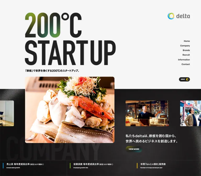
極太の「200°C STARTUP」、料理と接客の写真、鉄板を思わせる黒い質感が特徴。青・緑・黄のブランドカラーで企業紹介と採用情報をつなぐデザイン。
オリジナルサイトを見るOversized industrial lettering, warm hospitality photography, and the dark surface of a hot iron plate.
Website: delta-tokyo.co.jp Original URL: https://delta-tokyo.co.jp/ Final URL: https://delta-tokyo.co.jp/ Theme: a light opening with textured dark company and footer regions, plus a luminous recruitment section; a NIGHT/DAY control is present, but its resulting states were not inspected. Inspected: September 17, 2026, Japan Standard Time. Supplied retrieval timestamp: September 16, 2026, 20:19:55.316 UTC, equivalent to September 17, 05:19:55.316 JST. Viewports: desktop 1440 × 1000 CSS pixels; mobile 390 × 844 CSS pixels. Scope: the current corporate homepage: opening identity, company introduction and metrics, brand preview, recruitment story, information gateway, recruitment/contact links, and footer. Destination pages, open menus, theme changes, and hover states were not independently inspected.
The homepage presents delta as a restaurant business with startup ambition. Its signature is the enormous two-line 200°C STARTUP graphic: narrow, heavy lettering, green-tinted numerals, and very little surrounding decoration. The opening is spacious and pale, while food, restaurant staff, and workplace photographs introduce warmth and human scale. Below, dark material textures suggest an iron cooking surface. Cyan, lime green, and yellow reappear as the logo, intertwined recruitment ribbons, soft background washes, and restrained colored glows.
This is a corporate navigation and storytelling page. Company, Brands, Recruit, Information, and Contact each have a distinct role. The design does not depend on a single conversion funnel: its continuity comes from repeated display graphics, small bilingual labels, rounded photography, compact pill links, and the return of the opening statement in the footer.
Oversized industrial lettering, warm hospitality photography, and the dark surface of a hot iron plate.
Website: delta-tokyo.co.jp Original URL: https://delta-tokyo.co.jp/ Final URL: https://delta-tokyo.co.jp/ Theme: a light opening with textured dark company and footer regions, plus a luminous recruitment section; a NIGHT/DAY control is present, but its resulting states were not inspected. Inspected: September 17, 2026, Japan Standard Time. Supplied retrieval timestamp: September 16, 2026, 20:19:55.316 UTC, equivalent to September 17, 05:19:55.316 JST. Viewports: desktop 1440 × 1000 CSS pixels; mobile 390 × 844 CSS pixels. Scope: the current corporate homepage: opening identity, company introduction and metrics, brand preview, recruitment story, information gateway, recruitment/contact links, and footer. Destination pages, open menus, theme changes, and hover states were not independently inspected.
The homepage presents delta as a restaurant business with startup ambition. Its signature is the enormous two-line 200°C STARTUP graphic: narrow, heavy lettering, green-tinted numerals, and very little surrounding decoration. The opening is spacious and pale, while food, restaurant staff, and workplace photographs introduce warmth and human scale. Below, dark material textures suggest an iron cooking surface. Cyan, lime green, and yellow reappear as the logo, intertwined recruitment ribbons, soft background washes, and restrained colored glows.
This is a corporate navigation and storytelling page. Company, Brands, Recruit, Information, and Contact each have a distinct role. The design does not depend on a single conversion funnel: its continuity comes from repeated display graphics, small bilingual labels, rounded photography, compact pill links, and the return of the opening statement in the footer.
| Name | Value | Observed source token | Role |
|---|---|---|---|
| Pale Canvas | #f5f5f5 |
--color-bg, --color-gray-lighter, --d-bg |
Opening canvas and several underlying section surfaces |
| Primary Ink | #212121 |
--color-base, --d-text, --d-button |
Main text, dark pills, and the footer's computed base background |
| Deep Iron | #171616 |
--color-black |
Available dark palette token; close to the darkest visible material regions |
| White | #ffffff |
--color-white, --d-writing, --d-text-02 |
Reversed lettering, white panels, and bright content surfaces |
| Muted Gray | #777777 |
--color-gray |
Measured recruitment sublinks in the footer; visually similar to the light-surface wordmark |
| Light Gray | #eeeeee |
--color-gray-light |
Supporting neutral token; not a major independent color field in the captures |
| Brand Blue | #00a0e9 |
--color-blue |
Logo and blue recruitment ribbon family |
| Brand Green | #8ec31f |
--color-green |
Logo, ribbon family, and green emphasis within the identity graphics |
| Brand Yellow | #fcc800 |
--color-yellow |
Logo/ribbon accents and the moon-like detail in the NIGHT control |
The three brand accents are exact declared values. Their appearance inside photographs, shaded ribbons, and blended graphics varies. Do not sample one highlight from a shaded ribbon and treat it as another flat interface color.
Layering caveat: some sections compute to a pale or white background even where the screenshot shows a dark texture or colored wash. Child elements, artwork, or other layers supply the visible treatment. The supplied variables include --d-blend: lighten, --d-blend-02: overlay, and --d-filter: brightness(1) invert(0), but the complete compositing sequence was not provided.
Only one rendered theme state is documented. The desktop shows a dark pill labeled NIGHT, and the DOM contains both NIGHT and DAY labels. This supports the presence of a theme-related control, not a verified alternate palette, persistence rule, or transition.
Dark company and footer regions already belong to the captured light-opening composition. Do not interpret them as evidence that the theme control was activated.
Noto Sans JP, sans-serif.500.13px / 20.8px, with 0.65px tracking, equivalent to 0.05em.13.52px / 21.632px, with 0.676px tracking.700, with relaxed line spacing and deliberate short lines.General Sans, serif.600.normal in the measured links and captions.VIEW MORE, and footer headings.The declared fallback is serif. The stylesheet evidence names General Sans for utilities; it does not establish General Sans as the face used for the giant condensed headings.
The visible 200°C STARTUP, RECRUIT, and other large section labels use extremely condensed, heavy uppercase forms. Their height is far more important than a conventional font-size scale. The temperature numerals carry green and dark tonal variation, while the remaining lettering switches between dark ink and white according to the surface.
Preserve authorized artwork where available. If implementing equivalent text with a licensed condensed display face, label it as an adaptation and validate the resulting silhouette. No display-font name can be established from the supplied evidence.
| Role | Desktop measurement | Mobile measurement | Notes |
|---|---|---|---|
| Default body | 13px / 20.8px, 500 |
13.52px / 21.632px, 500 |
Noto Sans JP |
| Opening vertical navigation | 15px / 15px, 600 |
Not visible in the closed mobile header | General Sans |
| Alternate header navigation | 13px / 13px, 600 |
Menu DOM: 16.64px / 16.64px, 600 |
Mobile menu was not opened |
| Brand description | 14px / 22.4px, 500 |
12.48px / 19.968px, 500 |
Tracking approximately 0.13px |
| Recruitment narrative | 15px / 26.25px, 700 |
14.56px / 24.752px, 700 |
Line-height ratios 1.75 and 1.7 |
| English section caption | 10px / 12px, 600 |
10.4px / 12.48px, 600 |
Usually two short lines |
| Metric caption | 10px / 10px, 600 |
8.32px / 8.32px, 600 |
Very small on mobile |
| Main pill label | Commonly 13px / 20.8px, 600 |
10.4px / 16.64px or 13px / 20.8px |
Varies by component |
| Photo-link supporting text | 12px / 19.2px, 700 |
10.4px / 15.6px, 700 |
White over photography |
| Footer primary links | 11px / 11px, 600 |
11.44px / 11.44px, 600 |
Uppercase English |
| Footer recruitment sublinks | 10px / 10px, 500 |
11.44px / 11.44px, 500 |
Muted gray Japanese text |
These are element boxes, not font sizes or necessarily the visible ink bounds.
| Graphic | Desktop | Mobile |
|---|---|---|
| Opening temperature group height | 180px |
93.59px |
| Opening STARTUP container | 696 × 180.72px |
362.44 × 94.11px |
| Opening tagline container | 381 × 20.80px |
326.03 × 21.63px |
| Brands display container | 544 × 160.28px |
226.19 × 71.84px |
| Recruitment display container | 550 × 161.17px |
241.80 × 72.17px |
| Information display container | 544 × 97px |
331.75 × 59.14px |
| Footer temperature group height | 170px |
88.39px |
The sampled opening numeric subgroup is narrower than the complete visible 200°C line. Do not use that subgroup's width as the entire headline width.
The HTML root measures 10px on desktop and 5.2px on mobile. Source variables declare design widths of 1440px and 750px respectively.
At the supplied widths, these values are consistent with a 10-unit design system scaled to each design width. The complete root-size formula, caps, and media queries were not supplied, so this relationship should not be extrapolated as verified behavior at every width.
| Source value | At 1440px desktop | At 390px mobile |
|---|---|---|
Root 1rem |
10px |
5.2px |
--padding |
18rem = 180px |
4.8rem = 24.96px |
--r |
1.5rem = 15px |
2.4rem = 12.48px |
| Base body size | 1.3rem = 13px |
2.6rem = 13.52px |
Mobile doubles or otherwise adjusts many source-rem values. It does not simply shrink the entire desktop page to 52%.
| Use | Desktop evidence | Mobile evidence |
|---|---|---|
| Main content inset | 180px |
About 25px |
| Hero top inset | 90px |
223.08px |
| Gap between temperature and STARTUP boxes | About 16px |
About 9.36px |
| Gap from STARTUP box to tagline | 30px |
About 20.27px |
| Desktop rail link pitch | 33px |
Replaced by closed menu control |
| Brand link inner padding | 20px 20px 20px 40px |
10.4px 10.92px 29.64px |
| Recruitment paragraph separation | 29px |
About 23.4px |
| Footer main grid gap | 95px 62px |
49.92px 41.6px |
| Element | Evidence | Interpretation |
|---|---|---|
| General radius token | 15px desktop; 12.48px mobile |
Declared token; application must be checked per element |
| Pill links and desktop theme control | 1000px |
Fully rounded ends |
| Mobile pill links | 520px |
Fully rounded ends after source scaling |
| Opening photographs | Approximately 12–16px visually |
Soft rectangular masks, not circular imagery |
| White brand panel | Approximately 18–20px visually on desktop |
The sampled anchor itself reports 0px; rounding belongs to another layer |
| Joined footer image links | Rounded outer boundary | Preserve the shared composition rather than adding a large gap |
| Element | Desktop | Mobile |
|---|---|---|
| Document height | 5178.13px |
4914.64px |
| Main content width between standard insets | 1080px |
About 340px |
| Hero section height | 541.52px |
475.03px |
| Company section height | 925px |
904.23px |
| Brand section height | 848.28px |
751.14px |
| Recruitment section height | 1247.42px |
1367.67px |
| Information section height | 681.42px |
692.25px |
| Footer height | 934.48px |
724.31px |
| Brand link | 1080 × 499px |
339.03 × 498.36px |
| Each footer photo link | 540 × 349px |
340.08 × 219.78px |
Section heights describe the inspected content and layout. They are reference measurements, not recommended fixed heights.
Role: brand identity and primary corporate navigation.
The opening screenshot places the logo at the upper right, approximately 159 × 49px, with its left edge at x = 1201px and top at y = 90px. Beneath it, six right-aligned links form a vertical list: Home, Company, Brands, Recruit, Information, and Contact. The first link begins around y = 287px; successive links advance by 33px.
The NIGHT pill sits lower at approximately 1281.64, 553, measuring 78.36 × 30px. Its black fill, tiny white label, and yellow crescent-like symbol keep it secondary to the headline.
The DOM also contains a separate horizontal header: a 119 × 36.75px logo at 60, 50, compact links, recruitment sublinks, and another theme control. It is not the visible header in the opening screenshot. A scroll-dependent or alternate state is plausible, but its trigger and positioning behavior were not verified.
Role: compact identity and access to navigation.
The visible mobile header is a right-positioned group, not a centered logo. The logo measures about 113.25 × 36.09px at 182.66, 26.52; the horizontal-line menu icon begins near 327.63, 40.39 and is about 31.19px wide. Header padding computes to 26.52px 31.2px.
The large blank area below this group is intentional in the captured composition: the temperature graphic does not start until y = 223.08px. Preserve this pause when matching the 390 × 844 view.
Navigation links and a theme control exist in the mobile DOM, but they are not visible in the closed screenshot. Their rectangles and white text do not establish the appearance of an opened menu.
Role: communicate the brand premise before presenting the company.
Stack the temperature line, STARTUP graphic, and Japanese statement: 「鉄板」で世界を熱くする200°Cのスタートアップ。 The lettering is left aligned, vertically compact, and much larger than every utility label. The desktop starts near x = 180px; mobile starts near x = 25px.
The desktop STARTUP box is 696px wide. On mobile its 362.44px box is wider than the approximately 340px content column, while the visible lettering remains inside the screenshot. This distinction suggests internal graphic whitespace or deliberate overhang. Match visible bounds rather than blindly constraining the asset box to the body column.
The statement is repeated in the footer with white lettering and slightly smaller graphic heights. This repetition is structural branding, not a second unrelated hero.
Role: bridge the abstract startup statement and the real restaurant business.
In the desktop capture, a large ingredient photograph begins near 180, 549, with a visible width of roughly 640px. Its bottom extends beyond the supplied opening screenshot. Smaller landscape photographs sit farther right and at the viewport edges; the visible staff image near 900, 719 is approximately 310 × 184px.
The image group crosses the pale-to-dark surface boundary, which appears around y = 637px. That boundary is lower than the hero section's DOM end at 541.52px: the company section begins with 95px of top padding and layered surface treatment.
The mobile capture instead features a staff-and-customer photograph around 25, 475, approximately 340 × 202px, with narrow neighboring image fragments at both edges. The dark field begins around y = 537px. Below the main image, white company copy begins near y = 703px, followed by a small VIEW MORE pill and an oversized, low-contrast COMPANY graphic.
The differing featured photographs and clipped neighbors support a media-track composition. They do not prove automatic rotation, swipe support, or a particular slide sequence.
Role: summarize business scale beneath the introduction.
The DOM supplies three metric categories: Annual sales growth, Employee growth rate, and Number of monja served per year. Desktop caption positions begin at x = 45, 525, and 1005px, establishing three equal-width regions across the page.
On mobile, the same categories stack vertically. Their caption positions differ by 169px, and each region reserves a large number-graphic area beneath its label. Captions compute to white at both sizes.
The supplied text does not expose the actual numeric values. Do not invent percentages, employee counts, serving totals, or count-up behavior. Preserve the three-part hierarchy and supply verified business data separately.
Role: introduce the restaurant brand and link to the brand directory.
The heading combines a small Japanese label, the two-line English caption KOBOREYA and / other Delta brands., a large condensed display graphic, and a separate VIEW MORE pill.
The featured link is 月島もんじゃ こぼれや. On desktop its 1080 × 499px area combines brand artwork, a narrow text column, and a large restaurant photograph. The supplied screenshot shows the lower portion of a white rounded panel, with an entrance photograph on the right and the description on the left. Partially visible neighboring imagery reinforces the wider track composition.
The description measures 270px wide on desktop and 200.75px on mobile. The mobile link remains almost the same overall height while narrowing to 339.03px. Its computed layout changes from flex to grid, with columns of 52px and approximately 215.83px, a 49.4px column gap, and a 14.56px row gap.
The mobile middle section was not supplied as a screenshot. Its grid and text dimensions are measured; the precise photo order and cropping cannot be confirmed visually.
Role: present hospitality work as participation in a shared food culture.
This is the page's most colorful composition. On desktop, the left side features a restaurant worker inside large intertwined blue, green, and yellow ribbons. A pale enlarged portrait sits behind the primary image. White handwritten Start Up! lettering crosses the lower artwork and extends beyond its frame. A grainy blue-to-green-to-yellow wash fills the background.
The right side begins near x = 843–846px. A small recruitment label and English caption sit above a 550 × 161.17px RECRUIT graphic. Below, bold Japanese narrative paragraphs occupy the left of the text region, while the vertically arranged statement ひとつの鉄板を、数え切れない想いが囲んでいる。 occupies the right.
The narrative uses 15px / 26.25px at weight 700 on desktop. Its line breaks keep the text away from the vertical statement even though sampled paragraph boxes span the larger region. A reusable implementation should allocate explicit space for both text treatments rather than relying on accidental overlap.
Mobile DOM geometry places the heading first, followed by the artwork region and then the story. The narrative becomes 14.56px / 24.752px, with shorter lines and more rows. The vertical statement's measured box remains on the right, approximately 75.39px wide. The mobile composition therefore preserves editorial asymmetry instead of turning every element into centered text.
Role: provide access to company updates.
The measured section centers a small label, a large display graphic, the two-line caption Stay up-to-date with / the latest news about Delta., and a small VIEW MORE link. The desktop graphic box is 544 × 97px; mobile is 331.75 × 59.14px.
Two much wider repeated graphic containers also appear in the DOM: approximately 2621px each on desktop and 1362.91px on mobile, extending beyond the viewport. These are consistent with a repeated decorative strip, but its movement and timing were not established.
No article titles, dates, thumbnails, or news rows are established by the supplied evidence. Treat this as the observed gateway composition rather than inventing a populated news feed.
Role: modest, repeated routes into deeper corporate content.
Use short uppercase General Sans labels, weight 600, centered in fully rounded shapes. Most measured links have a dark computed fill and white text. The visible mobile company pill also has a subtle olive-to-teal surface effect. Photo links reverse the treatment to white pills with dark text.
The site uses several sizes rather than a single universal button:
| Context | Desktop | Mobile |
|---|---|---|
| Company | 119.30 × 44px |
104 × 30.16px |
| Brands | 150 × 65px |
93.59 × 41.59px |
| Recruitment story | 150 × 65px |
145.59 × 62.39px |
| Information | 99.72 × 34px |
104 × 30.16px |
Repeated label text appears in the DOM, but only one label is visible in the captured pills. This may support a layered text effect; the actual hover transition was not observed. Do not render duplicate labels visibly or announce them twice to assistive technology.
Role: offer two prominent routes before the footer identity.
Two adjacent desktop panels form a 1080px-wide photographic band. Each panel is 540 × 349px; the group begins 175px above the footer's DOM boundary. Recruitment uses a hospitality scene; Contact uses a meeting scene with a tabletop, papers, and a person holding a pen.
Place a white condensed heading and a short Japanese explanation toward the upper left, with a white VIEW MORE pill near the lower right. The photos do most of the visual work; the component does not need a separate colored header bar or heavy shadow.
On mobile, the panels stack without a large separating gap, each measuring approximately 340.08 × 219.78px. Their aspect ratio remains close to the desktop version. Supporting Contact text wraps to two lines. The stacked group extends about 330.72px above the footer start, and its bottom continues into the dark region.
Role: close the brand narrative and expose the full corporate navigation.
The footer uses a dark, textured surface with broad light falloff and a restrained blue-green glow at the lower right. The repeated 200°C STARTUP composition appears first, with white STARTUP lettering and the Japanese statement beneath it.
Desktop footer padding is 294px 180px 82px. Its measured grid has three columns of 420px, 455px, and approximately 63.63px, with 62px horizontal gaps. The lower identity area includes the logo, the address 東京都中央区月島3-7-12 THE CITY 月島 B1F, primary navigation, recruitment sublinks, privacy policy, and © 2024 delta.
Mobile reorders the information. Three visible navigation groups sit above the logo: main links, recruitment links, and privacy policy. The logo and address follow, with copyright toward the lower right. The footer logo measures about 116.47 × 36.09px, compared with 168 × 52.66px on desktop.
Keep the muted recruitment sublinks visually subordinate, but review their contrast when adapting the textured background.
| Target in supplied evidence | Declaration | What is established |
|---|---|---|
| Temperature graphic group | transform 1s cubic-bezier(0.165, 0.84, 0.44, 1) |
A one-second ease-out transform transition is defined |
| Several section labels and English captions | opacity 0.5s 0.5s |
Half-second opacity transition with a half-second delay |
| Alternate desktop header | opacity 0.2s, visibility 0s 0.2s |
Opacity and delayed visibility handling |
| Mobile recruitment menu sublinks | opacity 0.2s, transform 0s 0.2s |
Defined state-transition properties; opening sequence unverified |
| Footer recruitment sublinks | 0.4s transitions for opacity, color, background, border, fill, and stroke |
General visual feedback transitions |
| Mobile theme-control element | opacity 0.2s |
An opacity transition is defined |
The source exposes numerous easing variables. Their presence does not prove that each easing is used. The most concrete reusable easing is the measured --ease-out-quart: cubic-bezier(0.165, 0.84, 0.44, 1) on the temperature graphic.
transition: all does not establish an animated effect or meaningful duration.animation: none; that does not rule out animation on unsampled descendants or JavaScript-driven motion.Recommended adaptation: retain short utility feedback and a restrained one-second display reveal. Keep all essential content visible without animation, and provide a static reduced-motion state. Introduce a moving image track only when its controls and behavior are intentionally implemented.
| Surface | Visible treatment | Purpose |
|---|---|---|
| Opening canvas | Flat #f5f5f5 |
Makes the massive dark headline and right-side navigation legible |
| Company field | Near-black material texture with low-contrast display lettering | Connects the business story to the iron-plate concept |
| Brand panel | White rounded content panel against surrounding imagery/darker framing | Separates brand explanation from photographic density |
| Recruitment field | Pale multicolor wash, visible grain, oversized portrait, colored ribbons | Human and emotional center of the homepage |
| Information region | White computed base with large graphic containers | A quieter navigation interval before the footer links |
| Photo-link band | Full-bleed photography with white overlaid copy | Direct recruitment and contact entry points |
| Footer | Dark texture, white graphics, localized blue-green light | Restates identity and houses dense navigation |
The page does not use a general elevated-card system. Separation comes from large changes in surface, photographic masks, graphic scale, and overlap. Avoid applying the recruitment gradient to every section or adding shadows beneath every panel.
Photography is specific to the business: abundant seafood and ingredients, staff interacting with customers, restaurant entrances, neighborhood activity, and business conversation. Warm indoor light, human gestures, and close physical detail balance the severe display lettering.
The recruitment artwork transforms the circular brand symbol into a large spatial frame. Its curved colored ribbons have shading and depth; they are not interchangeable with three flat CSS border rings. The white handwritten overlay introduces a second expressive register beside the rigid uppercase headings.
Texture is concentrated in the dark iron-like fields and the recruitment background. Preserve its material scale: broad dark gradients and fine grain should remain subtle enough for small white or black text to read clearly.
Exact image URLs, filenames, formats, and font-file URLs were not supplied. The following are visual asset roles, not downloadable paths.
| Asset role | Evidence | Reuse guidance |
|---|---|---|
| delta logo | Visible on light and dark surfaces | Preserve symbol geometry and the appropriate wordmark color |
| Temperature and STARTUP graphics | Opening and footer screenshots; measured containers | Retain outlined proportions, spacing, and tonal numeral treatment |
| Food and staff montage | Desktop and mobile opening screenshots | Use separate art-directed crops; do not assume the same active frame |
| Restaurant brand artwork and entrance image | Partial desktop brand panel | Keep identity artwork separate from descriptive live text |
| Recruitment portrait/ribbon composition | Desktop recruitment screenshot | Prefer an authorized composite or its original layers |
| Recruitment/contact photographs | Footer screenshots at both widths | Maintain subject visibility behind overlaid labels |
| Dark material texture and colored glow | Company/footer screenshots | Keep texture as a decorative background, not a substitute for content |
Use original assets when authorized and available. A CSS-only shell can reproduce spacing and hierarchy, but the precise graphic identity depends on the actual lettering, photographs, and ribbon artwork.
At 1440px, the regular content inset is 180px, yielding a 1080px central region. The opening rail deliberately sits farther right, with an 80px right clearance. The main headline occupies the left side and leaves substantial unfilled space between the message and navigation.
The company montage breaks out of the central column, while its explanatory copy aligns near x = 900px. Metrics use three page-width regions. Brands returns to a central 1080px panel. Recruitment expands into an asymmetric two-part composition with left artwork and right editorial content. The photo-link pair and footer align again to the main inset.
At 390px, ordinary content insets are approximately 25px. The mobile adaptation changes hierarchy as well as scale:
Only the opening and footer mobile regions have visual screenshots. Middle-section mobile observations are based on rendered text, dimensions, and computed styles.
Declared breakpoint tokens are 320, 768, 1024, 1440, and 1680px, plus a 9999px full-width token. The supplied data does not establish which media query controls every component. The Quick Start therefore uses an explicitly recommended collapse point rather than claiming to reproduce the original breakpoint logic.
Clip decorative image tracks and oversized artwork at their own containers. Do not hide horizontal overflow globally to conceal a broken text layout. Preserve readable copy and usable navigation at intermediate widths, which were not inspected.
13px font size as the size of the graphic headlines.These are recommendations for a new implementation, not verified original features:
#f5f5f5.#212121.#171616 with restrained texture and broad shading.#ffffff.#00a0e9, green #8ec31f, yellow #fcc800.#777777; reassess contrast in an adaptation.“Create a Japanese restaurant-company homepage inspired by delta's 200°C STARTUP composition. Use a spacious pale opening, enormous condensed graphic lettering on the left, and a small logo with a right-aligned vertical navigation rail on desktop. Bridge into a dark iron-textured company section with large food and hospitality photographs that cross the surface boundary. Add three business metrics, a broad white restaurant-brand preview, and a recruitment story with shaded blue, green, and yellow circular ribbons around a staff portrait. Pair compact English captions with Japanese editorial copy. Finish with joined recruitment/contact photo links and a dark footer that repeats the opening graphic. On mobile, use approximately 25px content margins, a compact right-positioned logo/menu group, stacked metrics and photo links, and reorganized footer navigation. Keep unavailable interactions static and accessible.”
This is an implementation scaffold, not the original stylesheet. It keeps a conventional document root and uses a local --u for selected source-derived proportions. The 1024px layout collapse and scaling caps are recommendations. At the two inspected widths, the unit resolves to 10px and 5.2px.
Use authorized graphic assets for .temperature-art, .startup-art, and section display images. The scaffold expects semantic header, section, navigation, and footer markup. Photo-track behavior, theme switching, and menus require separate implementation.
:root {
  /* Exact palette values from supplied custom properties */
  --color-paper: #f5f5f5;
  --color-ink: #212121;
  --color-iron: #171616;
  --color-white: #ffffff;
  --color-muted: #777777;
  --color-blue: #00a0e9;
  --color-green: #8ec31f;
  --color-yellow: #fcc800;

  --font-body: 'Noto Sans JP', sans-serif;
  --font-utility: 'General Sans', serif;
  --weight-body: 500;
  --weight-utility: 600;
  --weight-emphasis: 700;

  /* Recommended scaling outside the two measured viewports */
  --u: clamp(7px, 0.694444vw, 10px);
  --page-gutter: calc(18 * var(--u));
  --radius-media: calc(1.5 * var(--u));
  --radius-pill: 999px;
  --ease-display: cubic-bezier(0.165, 0.84, 0.44, 1);
  --motion-display: 1s var(--ease-display);
  --motion-feedback: 200ms ease;

  /* Optional authorized background image layers */
  --iron-texture: none;
  --recruit-texture: none;
}

* { box-sizing: border-box; }
body {
  margin: 0;
  color: var(--color-ink);
  background: var(--color-paper);
  font-family: var(--font-body);
  font-size: 13px;
  font-weight: var(--weight-body);
  line-height: 1.6;
  letter-spacing: 0.05em;
}
img { display: block; max-width: 100%; }
button, a { -webkit-tap-highlight-color: transparent; }
button { font: inherit; }
a { color: inherit; }
.container { margin-inline: var(--page-gutter); }
.display-art { display: block; height: auto; }
.sr-only {
  position: absolute;
  width: 1px;
  height: 1px;
  padding: 0;
  margin: -1px;
  overflow: hidden;
  clip-path: inset(50%);
  white-space: nowrap;
  border: 0;
}

.hero {
  position: relative;
  padding: calc(9 * var(--u)) var(--page-gutter)
    calc(2.4 * var(--u));
  background: var(--color-paper);
}
.temperature-art {
  width: auto;
  height: calc(18 * var(--u));
  max-width: none;
}
.startup-art {
  width: calc(69.6 * var(--u));
  max-width: none;
  margin-top: calc(1.6 * var(--u));
}
.tagline {
  margin: 30px 0 0;
  font-size: 18px;
  font-weight: 700;
  line-height: 1.2;
  letter-spacing: 0;
}
.hero-rail {
  position: absolute;
  top: 90px;
  right: 80px;
  width: 159px;
  text-align: right;
}
.hero-rail__logo { width: 159px; }
.hero-rail__links {
  display: flex;
  flex-direction: column;
  align-items: flex-end;
  gap: 18px;
  margin-top: 148px;
}
.hero-rail__links a {
  font: 600 15px/1 var(--font-utility);
  letter-spacing: normal;
  text-decoration: none;
}
.theme-control {
  display: inline-flex;
  align-items: center;
  justify-content: space-between;
  gap: 10px;
  min-width: 78px;
  height: 30px;
  margin-top: 85px;
  padding: 0 5px 0 14px;
  border: 0;
  border-radius: var(--radius-pill);
  color: white;
  background: var(--color-ink);
}
.mobile-header { display: none; }

.pill {
  display: inline-flex;
  align-items: center;
  justify-content: center;
  min-width: 119px;
  min-height: 44px;
  padding-inline: 22px;
  border: 0;
  border-radius: var(--radius-pill);
  color: var(--color-white);
  background: var(--color-ink);
  font: 600 13px/1.6 var(--font-utility);
  letter-spacing: normal;
  text-decoration: none;
  transition: opacity var(--motion-feedback);
}
.pill--large { width: 150px; min-height: 65px; }
.pill--small { min-width: 100px; min-height: 34px; font-size: 11px; }
.pill--white { color: var(--color-ink); background: white; }

/* This static layout approximates the observed montage hierarchy. */
.company {
  position: relative;
  color: white;
  background: linear-gradient(
    to bottom, var(--color-paper) 95px, var(--color-iron) 95px
  );
}
.company__stage {
  display: grid;
  grid-template-columns: minmax(0, 640px) minmax(0, 1fr);
  gap: 80px;
  margin-inline: var(--page-gutter);
  padding-top: 8px;
}
.company__feature,
.company__secondary {
  width: 100%;
  border-radius: var(--radius-media);
  object-fit: cover;
}
.company__aside { padding-top: 170px; }
.company__secondary { max-width: 310px; aspect-ratio: 310 / 184; }
.company__copy { margin-top: 54px; font-weight: 700; }
.metrics {
  display: grid;
  grid-template-columns: repeat(3, minmax(0, 1fr));
}
.metric { padding: 30px 45px; }
.metric__caption {
  font: 600 10px/1 var(--font-utility);
  letter-spacing: normal;
}

.section-caption {
  font: 600 10px/1.2 var(--font-utility);
  letter-spacing: normal;
}
.brand-card {
  display: grid;
  grid-template-columns: minmax(0, 1fr) minmax(0, 520px);
  gap: 40px;
  padding: 20px 20px 20px 40px;
  border-radius: 20px;
  color: var(--color-ink);
  background: white;
  text-decoration: none;
}
.brand-card__description {
  max-width: 270px;
  font-size: 14px;
  line-height: 1.6;
  letter-spacing: 0.01em;
}
.brand-card__photo {
  width: 100%;
  height: 100%;
  object-fit: cover;
  border-radius: var(--radius-media);
}

/* Approximate color wash; original ribbon artwork is still required. */
.recruit {
  display: grid;
  grid-template-columns: minmax(0, 1.103fr) minmax(0, 1fr);
  grid-template-areas: 'art heading' 'art body';
  gap: 64px 128px;
  padding: 97px 44px 166px 105px;
  background-image: var(--recruit-texture), linear-gradient(
    100deg, #d6f1fb, #e7efce 58%, #fff2bf
  );
}
.recruit__art { grid-area: art; min-width: 0; }
.recruit__heading { grid-area: heading; min-width: 0; }
.recruit__body {
  grid-area: body;
  display: grid;
  grid-template-columns: minmax(0, 1fr) 144px;
  gap: 32px;
  min-width: 0;
}
.recruit__copy {
  font-size: 15px;
  font-weight: 700;
  line-height: 1.75;
  letter-spacing: normal;
}
.recruit__copy p { margin: 0 0 29px; }
.recruit__vertical {
  justify-self: end;
  writing-mode: vertical-rl;
  text-orientation: upright;
  font-weight: 700;
}
.information {
  padding: 115px var(--page-gutter) 305px;
  text-align: center;
  background: white;
}
.information .display-art { width: 544px; margin-inline: auto; }

.site-footer {
  position: relative;
  padding: 294px var(--page-gutter) 82px;
  color: white;
  background-image: var(--iron-texture), radial-gradient(
    ellipse at 95% 100%, #214b36, transparent 35%
  );
  background-color: var(--color-iron);
}
.pathways {
  position: absolute;
  top: -175px;
  inset-inline: var(--page-gutter);
  display: grid;
  grid-template-columns: repeat(2, minmax(0, 1fr));
  overflow: hidden;
  border-radius: var(--radius-media);
}
.pathway {
  position: relative;
  display: block;
  aspect-ratio: 540 / 349;
  padding: 40px 38px;
  color: white;
  text-decoration: none;
}
.pathway__photo {
  position: absolute;
  inset: 0;
  width: 100%;
  height: 100%;
  object-fit: cover;
}
.pathway__content { position: relative; }
.pathway .pill { position: absolute; right: 38px; bottom: 40px; }
.site-footer .temperature-art { height: calc(17 * var(--u)); }
.site-footer .startup-art { width: calc(65.6 * var(--u)); }
.footer-meta {
  display: grid;
  grid-template-columns: minmax(0, 420px) minmax(0, 1fr) auto;
  gap: 62px;
  align-items: end;
  margin-top: 95px;
}
.footer-nav { display: flex; flex-wrap: wrap; gap: 16px; }
.footer-nav a {
  font: 600 11px/1.4 var(--font-utility);
  letter-spacing: normal;
  text-decoration: none;
}
.footer-nav__secondary a {
  color: var(--color-muted);
  font-family: var(--font-body);
  font-weight: 500;
}

/* Recommended collapse point, not a verified original media query. */
@media (max-width: 1023px) {
  :root {
    --u: clamp(4.27px, 1.333333vw, 6.4px);
    --page-gutter: calc(4.8 * var(--u));
    --radius-media: calc(2.4 * var(--u));
  }
  body { font-size: max(13px, calc(2.6 * var(--u))); }
  .hero { padding-top: 223.08px; padding-bottom: 13px; }
  .hero-rail { display: none; }
  .mobile-header {
    position: absolute;
    top: 26.52px;
    right: 31.2px;
    display: flex;
    align-items: center;
    gap: 26px;
    z-index: 10;
  }
  .mobile-header__logo { width: 113.25px; }
  .menu-button {
    display: grid;
    place-items: center;
    width: 44px;
    height: 44px;
    padding: 0;
    border: 0;
    color: inherit;
    background: transparent;
  }
  .startup-art { width: calc(69.7 * var(--u)); margin-top: 9.36px; }
  .tagline { margin-top: 20.27px; font-size: 15px; }
  .company {
    background: linear-gradient(
      to bottom, var(--color-paper) 62.4px, var(--color-iron) 62.4px
    );
  }
  .company__stage { display: block; padding-top: 0; }
  .company__feature { aspect-ratio: 340 / 202; }
  .company__aside { padding-top: 0; }
  .company__secondary { display: none; }
  .company__copy { margin-top: 25px; }
  .metrics { grid-template-columns: 1fr; }
  .metric { min-height: 169px; padding: 24px 16.5px; }
  .pill--compact { min-width: 104px; min-height: 30.16px; font-size: 10.4px; }
  .brand-card { grid-template-columns: 1fr; gap: 20px; padding: 11px 11px 30px; }
  .brand-card__description { max-width: none; font-size: 13px; }
  .recruit {
    grid-template-columns: minmax(0, 1fr);
    grid-template-areas: 'heading' 'art' 'body';
    gap: 36px;
    padding: 78.52px var(--page-gutter) 46.28px;
  }
  .recruit__heading { max-width: 242px; margin-inline: auto; }
  .recruit__body { grid-template-columns: minmax(0, 1fr) 75px; gap: 18px; }
  .recruit__copy { font-size: 14.56px; line-height: 1.7; }
  .recruit__copy p { margin-bottom: 23.4px; }
  .information { padding: 96.2px var(--page-gutter) 413.4px; }
  .site-footer { padding: 171.6px var(--page-gutter) 23.4px; }
  .pathways { top: -330.72px; grid-template-columns: 1fr; }
  .pathway { padding: 20.8px; }
  .pathway .pill { right: 15.6px; bottom: 15.6px; }
  .footer-meta { grid-template-columns: 1fr auto; gap: 30px; margin-top: 50px; }
  .footer-nav {
    grid-column: 1 / -1;
    grid-row: 1;
    display: grid;
    grid-template-columns: 1fr 1.15fr 1fr;
    gap: 16px;
  }
  .footer-nav a { font-size: 11.44px; }
}

/* Recommended accessibility and feedback additions */
:where(a, button):focus-visible {
  outline: 3px solid var(--color-blue);
  outline-offset: 4px;
}
@media (hover: hover) {
  .pill:hover { opacity: 0.82; }
}
@media (prefers-reduced-motion: reduce) {
  .display-art, .pill, .theme-control {
    animation: none;
    transition: none;
    transform: none;
  }
}
The simplified mobile brand card above intentionally uses a single-column recommendation; the original measured mobile card has a more specialized two-column internal grid. Likewise, the recruitment wash and footer glow are approximations, not recovered artwork. Validate these scaffold choices at intermediate widths and with actual content.
Optional mapping for a project that already uses Tailwind v4. This is not evidence that the original site uses Tailwind. Define the custom properties above first.
@theme inline {
  --color-paper: #f5f5f5;
  --color-ink: #212121;
  --color-iron: #171616;
  --color-brand-blue: #00a0e9;
  --color-brand-green: #8ec31f;
  --color-brand-yellow: #fcc800;
  --color-muted: #777777;

  --font-body: 'Noto Sans JP', sans-serif;
  --font-utility: 'General Sans', serif;

  --spacing-page: var(--page-gutter);
  --spacing-unit: var(--u);
  --radius-media: calc(1.5 * var(--u));
  --radius-pill: 999px;
  --ease-display: cubic-bezier(0.165, 0.84, 0.44, 1);
}
200; original and final URLs are identical. The rendered page title is 株式会社delta.This reference describes the current page represented by those captures. Measurements, visual estimates, and proposed implementation choices are distinguished throughout.
# delta / 200°C STARTUP — Style Reference

> Oversized industrial lettering, warm hospitality photography, and the dark surface of a hot iron plate.

**Website:** [delta-tokyo.co.jp](https://delta-tokyo.co.jp/)
**Original URL:** https://delta-tokyo.co.jp/
**Final URL:** https://delta-tokyo.co.jp/
**Theme:** a light opening with textured dark company and footer regions, plus a luminous recruitment section; a NIGHT/DAY control is present, but its resulting states were not inspected.
**Inspected:** September 17, 2026, Japan Standard Time. Supplied retrieval timestamp: September 16, 2026, 20:19:55.316 UTC, equivalent to September 17, 05:19:55.316 JST.
**Viewports:** desktop 1440 × 1000 CSS pixels; mobile 390 × 844 CSS pixels.
**Scope:** the current corporate homepage: opening identity, company introduction and metrics, brand preview, recruitment story, information gateway, recruitment/contact links, and footer. Destination pages, open menus, theme changes, and hover states were not independently inspected.

The homepage presents delta as a restaurant business with startup ambition. Its signature is the enormous two-line `200°C STARTUP` graphic: narrow, heavy lettering, green-tinted numerals, and very little surrounding decoration. The opening is spacious and pale, while food, restaurant staff, and workplace photographs introduce warmth and human scale. Below, dark material textures suggest an iron cooking surface. Cyan, lime green, and yellow reappear as the logo, intertwined recruitment ribbons, soft background washes, and restrained colored glows.

This is a corporate navigation and storytelling page. Company, Brands, Recruit, Information, and Contact each have a distinct role. The design does not depend on a single conversion funnel: its continuity comes from repeated display graphics, small bilingual labels, rounded photography, compact pill links, and the return of the opening statement in the footer.
# delta / 200°C STARTUP — Style Reference

> Oversized industrial lettering, warm hospitality photography, and the dark surface of a hot iron plate.

**Website:** [delta-tokyo.co.jp](https://delta-tokyo.co.jp/)
**Original URL:** https://delta-tokyo.co.jp/
**Final URL:** https://delta-tokyo.co.jp/
**Theme:** a light opening with textured dark company and footer regions, plus a luminous recruitment section; a NIGHT/DAY control is present, but its resulting states were not inspected.
**Inspected:** September 17, 2026, Japan Standard Time. Supplied retrieval timestamp: September 16, 2026, 20:19:55.316 UTC, equivalent to September 17, 05:19:55.316 JST.
**Viewports:** desktop 1440 × 1000 CSS pixels; mobile 390 × 844 CSS pixels.
**Scope:** the current corporate homepage: opening identity, company introduction and metrics, brand preview, recruitment story, information gateway, recruitment/contact links, and footer. Destination pages, open menus, theme changes, and hover states were not independently inspected.

The homepage presents delta as a restaurant business with startup ambition. Its signature is the enormous two-line `200°C STARTUP` graphic: narrow, heavy lettering, green-tinted numerals, and very little surrounding decoration. The opening is spacious and pale, while food, restaurant staff, and workplace photographs introduce warmth and human scale. Below, dark material textures suggest an iron cooking surface. Cyan, lime green, and yellow reappear as the logo, intertwined recruitment ribbons, soft background washes, and restrained colored glows.

This is a corporate navigation and storytelling page. Company, Brands, Recruit, Information, and Contact each have a distinct role. The design does not depend on a single conversion funnel: its continuity comes from repeated display graphics, small bilingual labels, rounded photography, compact pill links, and the return of the opening statement in the footer.

## How to Read This Reference

- **Measured** values come from the supplied rendered DOM, computed styles, custom properties, and bounding rectangles. Measurements are CSS pixels unless otherwise stated.
- **Visual estimates** describe visible image crops, texture, graphic ink bounds, and corner treatments where the relevant child styles were not supplied.
- **Calculated** values convert the observed source units or compare measured coordinates. They do not establish an unprovided stylesheet formula.
- **Recommendations** describe a reusable implementation. They are not claims about the original site's behavior.
- Several large headings have empty text in their sampled containers while remaining visible in screenshots. Their parent font sizes do not identify the lettering's actual size or typeface. Treat these as graphic headings unless the underlying assets establish otherwise.
- DOM rectangles can exist for hidden menus and alternate headers. A rectangle alone does not prove that an element was visible in the captured state.

## Tokens — Colors

### Default Palette

| Name | Value | Observed source token | Role |
| --- | --- | --- | --- |
| Pale Canvas | `#f5f5f5` | `--color-bg`, `--color-gray-lighter`, `--d-bg` | Opening canvas and several underlying section surfaces |
| Primary Ink | `#212121` | `--color-base`, `--d-text`, `--d-button` | Main text, dark pills, and the footer's computed base background |
| Deep Iron | `#171616` | `--color-black` | Available dark palette token; close to the darkest visible material regions |
| White | `#ffffff` | `--color-white`, `--d-writing`, `--d-text-02` | Reversed lettering, white panels, and bright content surfaces |
| Muted Gray | `#777777` | `--color-gray` | Measured recruitment sublinks in the footer; visually similar to the light-surface wordmark |
| Light Gray | `#eeeeee` | `--color-gray-light` | Supporting neutral token; not a major independent color field in the captures |
| Brand Blue | `#00a0e9` | `--color-blue` | Logo and blue recruitment ribbon family |
| Brand Green | `#8ec31f` | `--color-green` | Logo, ribbon family, and green emphasis within the identity graphics |
| Brand Yellow | `#fcc800` | `--color-yellow` | Logo/ribbon accents and the moon-like detail in the NIGHT control |

The three brand accents are exact declared values. Their appearance inside photographs, shaded ribbons, and blended graphics varies. Do not sample one highlight from a shaded ribbon and treat it as another flat interface color.

**Layering caveat:** some sections compute to a pale or white background even where the screenshot shows a dark texture or colored wash. Child elements, artwork, or other layers supply the visible treatment. The supplied variables include `--d-blend: lighten`, `--d-blend-02: overlay`, and `--d-filter: brightness(1) invert(0)`, but the complete compositing sequence was not provided.

### Theme Presets

Only one rendered theme state is documented. The desktop shows a dark pill labeled `NIGHT`, and the DOM contains both `NIGHT` and `DAY` labels. This supports the presence of a theme-related control, not a verified alternate palette, persistence rule, or transition.

Dark company and footer regions already belong to the captured light-opening composition. Do not interpret them as evidence that the theme control was activated.

## Tokens — Typography

### Japanese Body and Supporting Copy

- **Measured family:** `Noto Sans JP, sans-serif`.
- **Default weight:** `500`.
- **Desktop body:** `13px / 20.8px`, with `0.65px` tracking, equivalent to `0.05em`.
- **Mobile body:** `13.52px / 21.632px`, with `0.676px` tracking.
- **Recruitment narrative:** heavier and larger than the body default: `700`, with relaxed line spacing and deliberate short lines.
- **Brand description:** medium-weight text with nearly neutral tracking, arranged as a compact editorial paragraph.

### English Navigation and Utilities

- **Measured family:** `General Sans, serif`.
- **Common weight:** `600`.
- **Tracking:** usually `normal` in the measured links and captions.
- **Role:** navigation, English section captions, metric captions, `VIEW MORE`, and footer headings.

The declared fallback is serif. The stylesheet evidence names General Sans for utilities; it does not establish General Sans as the face used for the giant condensed headings.

### Display Graphics

The visible `200°C STARTUP`, `RECRUIT`, and other large section labels use extremely condensed, heavy uppercase forms. Their height is far more important than a conventional font-size scale. The temperature numerals carry green and dark tonal variation, while the remaining lettering switches between dark ink and white according to the surface.

Preserve authorized artwork where available. If implementing equivalent text with a licensed condensed display face, label it as an adaptation and validate the resulting silhouette. No display-font name can be established from the supplied evidence.

### Type Scale

| Role | Desktop measurement | Mobile measurement | Notes |
| --- | --- | --- | --- |
| Default body | `13px / 20.8px`, 500 | `13.52px / 21.632px`, 500 | Noto Sans JP |
| Opening vertical navigation | `15px / 15px`, 600 | Not visible in the closed mobile header | General Sans |
| Alternate header navigation | `13px / 13px`, 600 | Menu DOM: `16.64px / 16.64px`, 600 | Mobile menu was not opened |
| Brand description | `14px / 22.4px`, 500 | `12.48px / 19.968px`, 500 | Tracking approximately `0.13px` |
| Recruitment narrative | `15px / 26.25px`, 700 | `14.56px / 24.752px`, 700 | Line-height ratios 1.75 and 1.7 |
| English section caption | `10px / 12px`, 600 | `10.4px / 12.48px`, 600 | Usually two short lines |
| Metric caption | `10px / 10px`, 600 | `8.32px / 8.32px`, 600 | Very small on mobile |
| Main pill label | Commonly `13px / 20.8px`, 600 | `10.4px / 16.64px` or `13px / 20.8px` | Varies by component |
| Photo-link supporting text | `12px / 19.2px`, 700 | `10.4px / 15.6px`, 700 | White over photography |
| Footer primary links | `11px / 11px`, 600 | `11.44px / 11.44px`, 600 | Uppercase English |
| Footer recruitment sublinks | `10px / 10px`, 500 | `11.44px / 11.44px`, 500 | Muted gray Japanese text |

### Graphic Dimensions

These are element boxes, not font sizes or necessarily the visible ink bounds.

| Graphic | Desktop | Mobile |
| --- | --- | --- |
| Opening temperature group height | `180px` | `93.59px` |
| Opening STARTUP container | `696 × 180.72px` | `362.44 × 94.11px` |
| Opening tagline container | `381 × 20.80px` | `326.03 × 21.63px` |
| Brands display container | `544 × 160.28px` | `226.19 × 71.84px` |
| Recruitment display container | `550 × 161.17px` | `241.80 × 72.17px` |
| Information display container | `544 × 97px` | `331.75 × 59.14px` |
| Footer temperature group height | `170px` | `88.39px` |

The sampled opening numeric subgroup is narrower than the complete visible `200°C` line. Do not use that subgroup's width as the entire headline width.

## Tokens — Spacing & Shapes

### Source Unit and Scaling

The HTML root measures **10px on desktop** and **5.2px on mobile**. Source variables declare design widths of `1440px` and `750px` respectively.

At the supplied widths, these values are consistent with a 10-unit design system scaled to each design width. The complete root-size formula, caps, and media queries were not supplied, so this relationship should not be extrapolated as verified behavior at every width.

| Source value | At 1440px desktop | At 390px mobile |
| --- | --- | --- |
| Root `1rem` | `10px` | `5.2px` |
| `--padding` | `18rem` = `180px` | `4.8rem` = `24.96px` |
| `--r` | `1.5rem` = `15px` | `2.4rem` = `12.48px` |
| Base body size | `1.3rem` = `13px` | `2.6rem` = `13.52px` |

Mobile doubles or otherwise adjusts many source-rem values. It does not simply shrink the entire desktop page to 52%.

### Spacing Scale

| Use | Desktop evidence | Mobile evidence |
| --- | --- | --- |
| Main content inset | `180px` | About `25px` |
| Hero top inset | `90px` | `223.08px` |
| Gap between temperature and STARTUP boxes | About `16px` | About `9.36px` |
| Gap from STARTUP box to tagline | `30px` | About `20.27px` |
| Desktop rail link pitch | `33px` | Replaced by closed menu control |
| Brand link inner padding | `20px 20px 20px 40px` | `10.4px 10.92px 29.64px` |
| Recruitment paragraph separation | `29px` | About `23.4px` |
| Footer main grid gap | `95px 62px` | `49.92px 41.6px` |

### Border Radius

| Element | Evidence | Interpretation |
| --- | --- | --- |
| General radius token | `15px` desktop; `12.48px` mobile | Declared token; application must be checked per element |
| Pill links and desktop theme control | `1000px` | Fully rounded ends |
| Mobile pill links | `520px` | Fully rounded ends after source scaling |
| Opening photographs | Approximately `12–16px` visually | Soft rectangular masks, not circular imagery |
| White brand panel | Approximately `18–20px` visually on desktop | The sampled anchor itself reports `0px`; rounding belongs to another layer |
| Joined footer image links | Rounded outer boundary | Preserve the shared composition rather than adding a large gap |

### Layout Measurements

| Element | Desktop | Mobile |
| --- | --- | --- |
| Document height | `5178.13px` | `4914.64px` |
| Main content width between standard insets | `1080px` | About `340px` |
| Hero section height | `541.52px` | `475.03px` |
| Company section height | `925px` | `904.23px` |
| Brand section height | `848.28px` | `751.14px` |
| Recruitment section height | `1247.42px` | `1367.67px` |
| Information section height | `681.42px` | `692.25px` |
| Footer height | `934.48px` | `724.31px` |
| Brand link | `1080 × 499px` | `339.03 × 498.36px` |
| Each footer photo link | `540 × 349px` | `340.08 × 219.78px` |

Section heights describe the inspected content and layout. They are reference measurements, not recommended fixed heights.

## Components

### Desktop Identity Rail and Alternate Header

**Role:** brand identity and primary corporate navigation.

The opening screenshot places the logo at the upper right, approximately `159 × 49px`, with its left edge at `x = 1201px` and top at `y = 90px`. Beneath it, six right-aligned links form a vertical list: `Home`, `Company`, `Brands`, `Recruit`, `Information`, and `Contact`. The first link begins around `y = 287px`; successive links advance by `33px`.

The NIGHT pill sits lower at approximately `1281.64, 553`, measuring `78.36 × 30px`. Its black fill, tiny white label, and yellow crescent-like symbol keep it secondary to the headline.

The DOM also contains a separate horizontal header: a `119 × 36.75px` logo at `60, 50`, compact links, recruitment sublinks, and another theme control. It is not the visible header in the opening screenshot. A scroll-dependent or alternate state is plausible, but its trigger and positioning behavior were not verified.

### Mobile Header

**Role:** compact identity and access to navigation.

The visible mobile header is a right-positioned group, not a centered logo. The logo measures about `113.25 × 36.09px` at `182.66, 26.52`; the horizontal-line menu icon begins near `327.63, 40.39` and is about `31.19px` wide. Header padding computes to `26.52px 31.2px`.

The large blank area below this group is intentional in the captured composition: the temperature graphic does not start until `y = 223.08px`. Preserve this pause when matching the 390 × 844 view.

Navigation links and a theme control exist in the mobile DOM, but they are not visible in the closed screenshot. Their rectangles and white text do not establish the appearance of an opened menu.

### Opening Identity Statement

**Role:** communicate the brand premise before presenting the company.

Stack the temperature line, STARTUP graphic, and Japanese statement: `「鉄板」で世界を熱くする200°Cのスタートアップ。` The lettering is left aligned, vertically compact, and much larger than every utility label. The desktop starts near `x = 180px`; mobile starts near `x = 25px`.

The desktop STARTUP box is `696px` wide. On mobile its `362.44px` box is wider than the approximately `340px` content column, while the visible lettering remains inside the screenshot. This distinction suggests internal graphic whitespace or deliberate overhang. Match visible bounds rather than blindly constraining the asset box to the body column.

The statement is repeated in the footer with white lettering and slightly smaller graphic heights. This repetition is structural branding, not a second unrelated hero.

### Company Photograph Montage

**Role:** bridge the abstract startup statement and the real restaurant business.

In the desktop capture, a large ingredient photograph begins near `180, 549`, with a visible width of roughly `640px`. Its bottom extends beyond the supplied opening screenshot. Smaller landscape photographs sit farther right and at the viewport edges; the visible staff image near `900, 719` is approximately `310 × 184px`.

The image group crosses the pale-to-dark surface boundary, which appears around `y = 637px`. That boundary is lower than the hero section's DOM end at `541.52px`: the company section begins with `95px` of top padding and layered surface treatment.

The mobile capture instead features a staff-and-customer photograph around `25, 475`, approximately `340 × 202px`, with narrow neighboring image fragments at both edges. The dark field begins around `y = 537px`. Below the main image, white company copy begins near `y = 703px`, followed by a small VIEW MORE pill and an oversized, low-contrast COMPANY graphic.

The differing featured photographs and clipped neighbors support a media-track composition. They do not prove automatic rotation, swipe support, or a particular slide sequence.

### Company Metrics

**Role:** summarize business scale beneath the introduction.

The DOM supplies three metric categories: `Annual sales growth`, `Employee growth rate`, and `Number of monja served per year`. Desktop caption positions begin at `x = 45`, `525`, and `1005px`, establishing three equal-width regions across the page.

On mobile, the same categories stack vertically. Their caption positions differ by `169px`, and each region reserves a large number-graphic area beneath its label. Captions compute to white at both sizes.

The supplied text does not expose the actual numeric values. Do not invent percentages, employee counts, serving totals, or count-up behavior. Preserve the three-part hierarchy and supply verified business data separately.

### Brands Heading and Preview Panel

**Role:** introduce the restaurant brand and link to the brand directory.

The heading combines a small Japanese label, the two-line English caption `KOBOREYA and / other Delta brands.`, a large condensed display graphic, and a separate VIEW MORE pill.

The featured link is `月島もんじゃ こぼれや`. On desktop its `1080 × 499px` area combines brand artwork, a narrow text column, and a large restaurant photograph. The supplied screenshot shows the lower portion of a white rounded panel, with an entrance photograph on the right and the description on the left. Partially visible neighboring imagery reinforces the wider track composition.

The description measures `270px` wide on desktop and `200.75px` on mobile. The mobile link remains almost the same overall height while narrowing to `339.03px`. Its computed layout changes from flex to grid, with columns of `52px` and approximately `215.83px`, a `49.4px` column gap, and a `14.56px` row gap.

The mobile middle section was not supplied as a screenshot. Its grid and text dimensions are measured; the precise photo order and cropping cannot be confirmed visually.

### Recruitment Story

**Role:** present hospitality work as participation in a shared food culture.

This is the page's most colorful composition. On desktop, the left side features a restaurant worker inside large intertwined blue, green, and yellow ribbons. A pale enlarged portrait sits behind the primary image. White handwritten `Start Up!` lettering crosses the lower artwork and extends beyond its frame. A grainy blue-to-green-to-yellow wash fills the background.

The right side begins near `x = 843–846px`. A small recruitment label and English caption sit above a `550 × 161.17px` RECRUIT graphic. Below, bold Japanese narrative paragraphs occupy the left of the text region, while the vertically arranged statement `ひとつの鉄板を、数え切れない想いが囲んでいる。` occupies the right.

The narrative uses `15px / 26.25px` at weight 700 on desktop. Its line breaks keep the text away from the vertical statement even though sampled paragraph boxes span the larger region. A reusable implementation should allocate explicit space for both text treatments rather than relying on accidental overlap.

Mobile DOM geometry places the heading first, followed by the artwork region and then the story. The narrative becomes `14.56px / 24.752px`, with shorter lines and more rows. The vertical statement's measured box remains on the right, approximately `75.39px` wide. The mobile composition therefore preserves editorial asymmetry instead of turning every element into centered text.

### Information Gateway

**Role:** provide access to company updates.

The measured section centers a small label, a large display graphic, the two-line caption `Stay up-to-date with / the latest news about Delta.`, and a small VIEW MORE link. The desktop graphic box is `544 × 97px`; mobile is `331.75 × 59.14px`.

Two much wider repeated graphic containers also appear in the DOM: approximately `2621px` each on desktop and `1362.91px` on mobile, extending beyond the viewport. These are consistent with a repeated decorative strip, but its movement and timing were not established.

No article titles, dates, thumbnails, or news rows are established by the supplied evidence. Treat this as the observed gateway composition rather than inventing a populated news feed.

### VIEW MORE Pills

**Role:** modest, repeated routes into deeper corporate content.

Use short uppercase General Sans labels, weight 600, centered in fully rounded shapes. Most measured links have a dark computed fill and white text. The visible mobile company pill also has a subtle olive-to-teal surface effect. Photo links reverse the treatment to white pills with dark text.

The site uses several sizes rather than a single universal button:

| Context | Desktop | Mobile |
| --- | --- | --- |
| Company | `119.30 × 44px` | `104 × 30.16px` |
| Brands | `150 × 65px` | `93.59 × 41.59px` |
| Recruitment story | `150 × 65px` | `145.59 × 62.39px` |
| Information | `99.72 × 34px` | `104 × 30.16px` |

Repeated label text appears in the DOM, but only one label is visible in the captured pills. This may support a layered text effect; the actual hover transition was not observed. Do not render duplicate labels visibly or announce them twice to assistive technology.

### Recruitment and Contact Photo Links

**Role:** offer two prominent routes before the footer identity.

Two adjacent desktop panels form a `1080px`-wide photographic band. Each panel is `540 × 349px`; the group begins `175px` above the footer's DOM boundary. Recruitment uses a hospitality scene; Contact uses a meeting scene with a tabletop, papers, and a person holding a pen.

Place a white condensed heading and a short Japanese explanation toward the upper left, with a white VIEW MORE pill near the lower right. The photos do most of the visual work; the component does not need a separate colored header bar or heavy shadow.

On mobile, the panels stack without a large separating gap, each measuring approximately `340.08 × 219.78px`. Their aspect ratio remains close to the desktop version. Supporting Contact text wraps to two lines. The stacked group extends about `330.72px` above the footer start, and its bottom continues into the dark region.

### Footer

**Role:** close the brand narrative and expose the full corporate navigation.

The footer uses a dark, textured surface with broad light falloff and a restrained blue-green glow at the lower right. The repeated `200°C STARTUP` composition appears first, with white STARTUP lettering and the Japanese statement beneath it.

Desktop footer padding is `294px 180px 82px`. Its measured grid has three columns of `420px`, `455px`, and approximately `63.63px`, with `62px` horizontal gaps. The lower identity area includes the logo, the address `東京都中央区月島3-7-12 THE CITY 月島 B1F`, primary navigation, recruitment sublinks, privacy policy, and `© 2024 delta`.

Mobile reorders the information. Three visible navigation groups sit above the logo: main links, recruitment links, and privacy policy. The logo and address follow, with copyright toward the lower right. The footer logo measures about `116.47 × 36.09px`, compared with `168 × 52.66px` on desktop.

Keep the muted recruitment sublinks visually subordinate, but review their contrast when adapting the textured background.

## Tokens — Motion & Interaction

### Measured Transition Declarations

| Target in supplied evidence | Declaration | What is established |
| --- | --- | --- |
| Temperature graphic group | `transform 1s cubic-bezier(0.165, 0.84, 0.44, 1)` | A one-second ease-out transform transition is defined |
| Several section labels and English captions | `opacity 0.5s 0.5s` | Half-second opacity transition with a half-second delay |
| Alternate desktop header | `opacity 0.2s, visibility 0s 0.2s` | Opacity and delayed visibility handling |
| Mobile recruitment menu sublinks | `opacity 0.2s, transform 0s 0.2s` | Defined state-transition properties; opening sequence unverified |
| Footer recruitment sublinks | `0.4s` transitions for opacity, color, background, border, fill, and stroke | General visual feedback transitions |
| Mobile theme-control element | `opacity 0.2s` | An opacity transition is defined |

The source exposes numerous easing variables. Their presence does not prove that each easing is used. The most concrete reusable easing is the measured `--ease-out-quart: cubic-bezier(0.165, 0.84, 0.44, 1)` on the temperature graphic.

### Evidence Limits

- The supplied captures are settled stills, not recordings of interactions.
- A bare computed `transition: all` does not establish an animated effect or meaningful duration.
- Sampled elements often report `animation: none`; that does not rule out animation on unsampled descendants or JavaScript-driven motion.
- Image rotation, dragging, parallax, metric count-up, marquee speed, hover label rolling, and header stickiness remain unverified.
- Theme switching, menu opening, and destination navigation were not exercised in the supplied evidence.

**Recommended adaptation:** retain short utility feedback and a restrained one-second display reveal. Keep all essential content visible without animation, and provide a static reduced-motion state. Introduce a moving image track only when its controls and behavior are intentionally implemented.

## Surfaces

| Surface | Visible treatment | Purpose |
| --- | --- | --- |
| Opening canvas | Flat `#f5f5f5` | Makes the massive dark headline and right-side navigation legible |
| Company field | Near-black material texture with low-contrast display lettering | Connects the business story to the iron-plate concept |
| Brand panel | White rounded content panel against surrounding imagery/darker framing | Separates brand explanation from photographic density |
| Recruitment field | Pale multicolor wash, visible grain, oversized portrait, colored ribbons | Human and emotional center of the homepage |
| Information region | White computed base with large graphic containers | A quieter navigation interval before the footer links |
| Photo-link band | Full-bleed photography with white overlaid copy | Direct recruitment and contact entry points |
| Footer | Dark texture, white graphics, localized blue-green light | Restates identity and houses dense navigation |

The page does not use a general elevated-card system. Separation comes from large changes in surface, photographic masks, graphic scale, and overlap. Avoid applying the recruitment gradient to every section or adding shadows beneath every panel.

## Imagery

Photography is specific to the business: abundant seafood and ingredients, staff interacting with customers, restaurant entrances, neighborhood activity, and business conversation. Warm indoor light, human gestures, and close physical detail balance the severe display lettering.

The recruitment artwork transforms the circular brand symbol into a large spatial frame. Its curved colored ribbons have shading and depth; they are not interchangeable with three flat CSS border rings. The white handwritten overlay introduces a second expressive register beside the rigid uppercase headings.

Texture is concentrated in the dark iron-like fields and the recruitment background. Preserve its material scale: broad dark gradients and fine grain should remain subtle enough for small white or black text to read clearly.

### Observed Asset References

Exact image URLs, filenames, formats, and font-file URLs were not supplied. The following are visual asset roles, not downloadable paths.

| Asset role | Evidence | Reuse guidance |
| --- | --- | --- |
| delta logo | Visible on light and dark surfaces | Preserve symbol geometry and the appropriate wordmark color |
| Temperature and STARTUP graphics | Opening and footer screenshots; measured containers | Retain outlined proportions, spacing, and tonal numeral treatment |
| Food and staff montage | Desktop and mobile opening screenshots | Use separate art-directed crops; do not assume the same active frame |
| Restaurant brand artwork and entrance image | Partial desktop brand panel | Keep identity artwork separate from descriptive live text |
| Recruitment portrait/ribbon composition | Desktop recruitment screenshot | Prefer an authorized composite or its original layers |
| Recruitment/contact photographs | Footer screenshots at both widths | Maintain subject visibility behind overlaid labels |
| Dark material texture and colored glow | Company/footer screenshots | Keep texture as a decorative background, not a substitute for content |

Use original assets when authorized and available. A CSS-only shell can reproduce spacing and hierarchy, but the precise graphic identity depends on the actual lettering, photographs, and ribbon artwork.

## Layout & Responsive Behavior

### Desktop Composition

At 1440px, the regular content inset is 180px, yielding a 1080px central region. The opening rail deliberately sits farther right, with an 80px right clearance. The main headline occupies the left side and leaves substantial unfilled space between the message and navigation.

The company montage breaks out of the central column, while its explanatory copy aligns near `x = 900px`. Metrics use three page-width regions. Brands returns to a central 1080px panel. Recruitment expands into an asymmetric two-part composition with left artwork and right editorial content. The photo-link pair and footer align again to the main inset.

### Mobile Composition

At 390px, ordinary content insets are approximately 25px. The mobile adaptation changes hierarchy as well as scale:

- The opening navigation rail becomes a compact logo/menu group.
- The headline begins much lower in the viewport, preserving a large pause above it.
- The company photograph becomes an approximately 340px-wide focal image, with copy beneath it.
- Three metrics stack vertically.
- The brand link changes from desktop flex layout to a compact grid.
- Recruitment puts its heading above the artwork and narrative, while retaining a narrow vertical statement beside the body text.
- Recruitment/contact panels stack at nearly the same aspect ratio as desktop.
- Footer navigation moves above the logo and address.

Only the opening and footer mobile regions have visual screenshots. Middle-section mobile observations are based on rendered text, dimensions, and computed styles.

### Breakpoints and Overflow

Declared breakpoint tokens are `320`, `768`, `1024`, `1440`, and `1680px`, plus a `9999px` full-width token. The supplied data does not establish which media query controls every component. The Quick Start therefore uses an explicitly recommended collapse point rather than claiming to reproduce the original breakpoint logic.

Clip decorative image tracks and oversized artwork at their own containers. Do not hide horizontal overflow globally to conceal a broken text layout. Preserve readable copy and usable navigation at intermediate widths, which were not inspected.

## Do’s and Don’ts

### Do

- Make the condensed temperature/STARTUP silhouette the primary identity device.
- Preserve the opening's broad pale space and asymmetric navigation placement.
- Use Noto Sans JP for measured Japanese text roles and General Sans for measured English utility roles.
- Keep display lettering separate from assumptions about those body and utility families.
- Alternate large pale, dark, photographic, and softly colored regions with clear purpose.
- Use real food, staff, customer, restaurant, and workplace imagery.
- Let photographs overlap section boundaries and show cropped neighboring frames where appropriate.
- Preserve the distinct company, brands, recruitment, information, and contact paths.
- Repeat the main identity in the footer with reversed lettering.
- Recompose mobile layouts instead of proportionally shrinking the desktop screen.

### Don’t

- Don’t replace the corporate structure with an unrelated sales funnel.
- Don’t use a generic wide bold font and expect the same display silhouette.
- Don’t treat the parent `13px` font size as the size of the graphic headlines.
- Don’t flatten the dark material fields into a uniform gray card background.
- Don’t distribute blue, green, and yellow equally across every control.
- Don’t turn the brand preview into a collection of small shadowed cards.
- Don’t infer verified carousels, parallax, counters, or theme palettes from still images.
- Don’t render duplicate DOM labels as two visible lines.
- Don’t invent business metrics or news entries missing from the evidence.
- Don’t copy source-rem numbers into a conventional 16px root without conversion.

## Recommended Implementation Additions

These are recommendations for a new implementation, not verified original features:

- Give graphic headings semantic text equivalents. Keep decorative duplicates hidden from assistive technology.
- Use accessible names for the menu and theme controls. Reflect their state with appropriate expanded or pressed semantics.
- Increase hit areas for the approximately 30px-high mobile pills without necessarily enlarging their visible shapes.
- Give repeated VIEW MORE links contextual accessible names, such as company details or recruitment information.
- Implement recruitment and contact panels as single links; style the inner pill as a span rather than nesting interactive elements.
- If image tracks move automatically, provide pause and keyboard controls and retain a useful static composition.
- Check small captions and muted footer links against the final textured surfaces. Consider a 12px minimum for informational labels.
- Preserve the hierarchy of vertical and horizontal Japanese text at narrow widths without overlapping readable content.
- Reserve image dimensions and use responsive sources. Load the opening image promptly and defer lower-page photography.
- Ensure all content remains present with reduced motion, unavailable custom fonts, or failed decorative images.

## Agent Prompt Guide

### Quick Color Reference

- Opening canvas: `#f5f5f5`.
- Main text and dark controls: `#212121`.
- Dark material family: `#171616` with restrained texture and broad shading.
- Reversed text and brand panel: `#ffffff`.
- Brand accents: blue `#00a0e9`, green `#8ec31f`, yellow `#fcc800`.
- Secondary footer text: observed `#777777`; reassess contrast in an adaptation.
- Recruitment background: a pale blended interpretation of the three accents, with subtle grain.

### Overall Prompt

“Create a Japanese restaurant-company homepage inspired by delta's 200°C STARTUP composition. Use a spacious pale opening, enormous condensed graphic lettering on the left, and a small logo with a right-aligned vertical navigation rail on desktop. Bridge into a dark iron-textured company section with large food and hospitality photographs that cross the surface boundary. Add three business metrics, a broad white restaurant-brand preview, and a recruitment story with shaded blue, green, and yellow circular ribbons around a staff portrait. Pair compact English captions with Japanese editorial copy. Finish with joined recruitment/contact photo links and a dark footer that repeats the opening graphic. On mobile, use approximately 25px content margins, a compact right-positioned logo/menu group, stacked metrics and photo links, and reorganized footer navigation. Keep unavailable interactions static and accessible.”

### Example Component Prompts

1. **Opening statement:** “At a 1440px viewport, place the identity approximately 180px from the left and 90px from the top. Stack a 180px-high temperature graphic above an approximately 696 × 181px STARTUP graphic, then a short bold Japanese statement. Keep the right-side navigation small and the pale space expansive.”
2. **Company montage:** “Build a dark restaurant-company introduction with one dominant rounded photograph, smaller neighboring landscape frames, white statement copy, a small VIEW MORE pill, and a low-contrast oversized COMPANY graphic. Let photography cross the pale-to-dark boundary. Do not invent carousel timing.”
3. **Brand preview:** “Create a broad white panel for 月島もんじゃ こぼれや, combining brand artwork, a compact Japanese description, and a warm restaurant entrance photograph. Use soft outer corners and a whole-panel link. Reorganize the composition for a roughly 340px mobile column.”
4. **Recruitment:** “Use a pale grainy blue-green-yellow field with a restaurant worker framed by shaded circular ribbons. Add a large condensed RECRUIT graphic, a tiny English caption, bold Japanese narrative, and a separate vertical Japanese statement. Keep the handwritten white flourish inside the artwork layer.”
5. **Footer pathways:** “Join two photographic links for recruitment and contact. Overlay white display labels and short supporting copy at the upper left, with white pill links at the lower right. Place the pair across the start of a textured dark footer; stack them on mobile.”

## Quick Start

### CSS Custom Properties

This is an implementation scaffold, not the original stylesheet. It keeps a conventional document root and uses a local `--u` for selected source-derived proportions. The 1024px layout collapse and scaling caps are recommendations. At the two inspected widths, the unit resolves to 10px and 5.2px.

Use authorized graphic assets for `.temperature-art`, `.startup-art`, and section display images. The scaffold expects semantic header, section, navigation, and footer markup. Photo-track behavior, theme switching, and menus require separate implementation.

```css
:root {
  /* Exact palette values from supplied custom properties */
  --color-paper: #f5f5f5;
  --color-ink: #212121;
  --color-iron: #171616;
  --color-white: #ffffff;
  --color-muted: #777777;
  --color-blue: #00a0e9;
  --color-green: #8ec31f;
  --color-yellow: #fcc800;

  --font-body: 'Noto Sans JP', sans-serif;
  --font-utility: 'General Sans', serif;
  --weight-body: 500;
  --weight-utility: 600;
  --weight-emphasis: 700;

  /* Recommended scaling outside the two measured viewports */
  --u: clamp(7px, 0.694444vw, 10px);
  --page-gutter: calc(18 * var(--u));
  --radius-media: calc(1.5 * var(--u));
  --radius-pill: 999px;
  --ease-display: cubic-bezier(0.165, 0.84, 0.44, 1);
  --motion-display: 1s var(--ease-display);
  --motion-feedback: 200ms ease;

  /* Optional authorized background image layers */
  --iron-texture: none;
  --recruit-texture: none;
}

* { box-sizing: border-box; }
body {
  margin: 0;
  color: var(--color-ink);
  background: var(--color-paper);
  font-family: var(--font-body);
  font-size: 13px;
  font-weight: var(--weight-body);
  line-height: 1.6;
  letter-spacing: 0.05em;
}
img { display: block; max-width: 100%; }
button, a { -webkit-tap-highlight-color: transparent; }
button { font: inherit; }
a { color: inherit; }
.container { margin-inline: var(--page-gutter); }
.display-art { display: block; height: auto; }
.sr-only {
  position: absolute;
  width: 1px;
  height: 1px;
  padding: 0;
  margin: -1px;
  overflow: hidden;
  clip-path: inset(50%);
  white-space: nowrap;
  border: 0;
}

.hero {
  position: relative;
  padding: calc(9 * var(--u)) var(--page-gutter)
    calc(2.4 * var(--u));
  background: var(--color-paper);
}
.temperature-art {
  width: auto;
  height: calc(18 * var(--u));
  max-width: none;
}
.startup-art {
  width: calc(69.6 * var(--u));
  max-width: none;
  margin-top: calc(1.6 * var(--u));
}
.tagline {
  margin: 30px 0 0;
  font-size: 18px;
  font-weight: 700;
  line-height: 1.2;
  letter-spacing: 0;
}
.hero-rail {
  position: absolute;
  top: 90px;
  right: 80px;
  width: 159px;
  text-align: right;
}
.hero-rail__logo { width: 159px; }
.hero-rail__links {
  display: flex;
  flex-direction: column;
  align-items: flex-end;
  gap: 18px;
  margin-top: 148px;
}
.hero-rail__links a {
  font: 600 15px/1 var(--font-utility);
  letter-spacing: normal;
  text-decoration: none;
}
.theme-control {
  display: inline-flex;
  align-items: center;
  justify-content: space-between;
  gap: 10px;
  min-width: 78px;
  height: 30px;
  margin-top: 85px;
  padding: 0 5px 0 14px;
  border: 0;
  border-radius: var(--radius-pill);
  color: white;
  background: var(--color-ink);
}
.mobile-header { display: none; }

.pill {
  display: inline-flex;
  align-items: center;
  justify-content: center;
  min-width: 119px;
  min-height: 44px;
  padding-inline: 22px;
  border: 0;
  border-radius: var(--radius-pill);
  color: var(--color-white);
  background: var(--color-ink);
  font: 600 13px/1.6 var(--font-utility);
  letter-spacing: normal;
  text-decoration: none;
  transition: opacity var(--motion-feedback);
}
.pill--large { width: 150px; min-height: 65px; }
.pill--small { min-width: 100px; min-height: 34px; font-size: 11px; }
.pill--white { color: var(--color-ink); background: white; }

/* This static layout approximates the observed montage hierarchy. */
.company {
  position: relative;
  color: white;
  background: linear-gradient(
    to bottom, var(--color-paper) 95px, var(--color-iron) 95px
  );
}
.company__stage {
  display: grid;
  grid-template-columns: minmax(0, 640px) minmax(0, 1fr);
  gap: 80px;
  margin-inline: var(--page-gutter);
  padding-top: 8px;
}
.company__feature,
.company__secondary {
  width: 100%;
  border-radius: var(--radius-media);
  object-fit: cover;
}
.company__aside { padding-top: 170px; }
.company__secondary { max-width: 310px; aspect-ratio: 310 / 184; }
.company__copy { margin-top: 54px; font-weight: 700; }
.metrics {
  display: grid;
  grid-template-columns: repeat(3, minmax(0, 1fr));
}
.metric { padding: 30px 45px; }
.metric__caption {
  font: 600 10px/1 var(--font-utility);
  letter-spacing: normal;
}

.section-caption {
  font: 600 10px/1.2 var(--font-utility);
  letter-spacing: normal;
}
.brand-card {
  display: grid;
  grid-template-columns: minmax(0, 1fr) minmax(0, 520px);
  gap: 40px;
  padding: 20px 20px 20px 40px;
  border-radius: 20px;
  color: var(--color-ink);
  background: white;
  text-decoration: none;
}
.brand-card__description {
  max-width: 270px;
  font-size: 14px;
  line-height: 1.6;
  letter-spacing: 0.01em;
}
.brand-card__photo {
  width: 100%;
  height: 100%;
  object-fit: cover;
  border-radius: var(--radius-media);
}

/* Approximate color wash; original ribbon artwork is still required. */
.recruit {
  display: grid;
  grid-template-columns: minmax(0, 1.103fr) minmax(0, 1fr);
  grid-template-areas: 'art heading' 'art body';
  gap: 64px 128px;
  padding: 97px 44px 166px 105px;
  background-image: var(--recruit-texture), linear-gradient(
    100deg, #d6f1fb, #e7efce 58%, #fff2bf
  );
}
.recruit__art { grid-area: art; min-width: 0; }
.recruit__heading { grid-area: heading; min-width: 0; }
.recruit__body {
  grid-area: body;
  display: grid;
  grid-template-columns: minmax(0, 1fr) 144px;
  gap: 32px;
  min-width: 0;
}
.recruit__copy {
  font-size: 15px;
  font-weight: 700;
  line-height: 1.75;
  letter-spacing: normal;
}
.recruit__copy p { margin: 0 0 29px; }
.recruit__vertical {
  justify-self: end;
  writing-mode: vertical-rl;
  text-orientation: upright;
  font-weight: 700;
}
.information {
  padding: 115px var(--page-gutter) 305px;
  text-align: center;
  background: white;
}
.information .display-art { width: 544px; margin-inline: auto; }

.site-footer {
  position: relative;
  padding: 294px var(--page-gutter) 82px;
  color: white;
  background-image: var(--iron-texture), radial-gradient(
    ellipse at 95% 100%, #214b36, transparent 35%
  );
  background-color: var(--color-iron);
}
.pathways {
  position: absolute;
  top: -175px;
  inset-inline: var(--page-gutter);
  display: grid;
  grid-template-columns: repeat(2, minmax(0, 1fr));
  overflow: hidden;
  border-radius: var(--radius-media);
}
.pathway {
  position: relative;
  display: block;
  aspect-ratio: 540 / 349;
  padding: 40px 38px;
  color: white;
  text-decoration: none;
}
.pathway__photo {
  position: absolute;
  inset: 0;
  width: 100%;
  height: 100%;
  object-fit: cover;
}
.pathway__content { position: relative; }
.pathway .pill { position: absolute; right: 38px; bottom: 40px; }
.site-footer .temperature-art { height: calc(17 * var(--u)); }
.site-footer .startup-art { width: calc(65.6 * var(--u)); }
.footer-meta {
  display: grid;
  grid-template-columns: minmax(0, 420px) minmax(0, 1fr) auto;
  gap: 62px;
  align-items: end;
  margin-top: 95px;
}
.footer-nav { display: flex; flex-wrap: wrap; gap: 16px; }
.footer-nav a {
  font: 600 11px/1.4 var(--font-utility);
  letter-spacing: normal;
  text-decoration: none;
}
.footer-nav__secondary a {
  color: var(--color-muted);
  font-family: var(--font-body);
  font-weight: 500;
}

/* Recommended collapse point, not a verified original media query. */
@media (max-width: 1023px) {
  :root {
    --u: clamp(4.27px, 1.333333vw, 6.4px);
    --page-gutter: calc(4.8 * var(--u));
    --radius-media: calc(2.4 * var(--u));
  }
  body { font-size: max(13px, calc(2.6 * var(--u))); }
  .hero { padding-top: 223.08px; padding-bottom: 13px; }
  .hero-rail { display: none; }
  .mobile-header {
    position: absolute;
    top: 26.52px;
    right: 31.2px;
    display: flex;
    align-items: center;
    gap: 26px;
    z-index: 10;
  }
  .mobile-header__logo { width: 113.25px; }
  .menu-button {
    display: grid;
    place-items: center;
    width: 44px;
    height: 44px;
    padding: 0;
    border: 0;
    color: inherit;
    background: transparent;
  }
  .startup-art { width: calc(69.7 * var(--u)); margin-top: 9.36px; }
  .tagline { margin-top: 20.27px; font-size: 15px; }
  .company {
    background: linear-gradient(
      to bottom, var(--color-paper) 62.4px, var(--color-iron) 62.4px
    );
  }
  .company__stage { display: block; padding-top: 0; }
  .company__feature { aspect-ratio: 340 / 202; }
  .company__aside { padding-top: 0; }
  .company__secondary { display: none; }
  .company__copy { margin-top: 25px; }
  .metrics { grid-template-columns: 1fr; }
  .metric { min-height: 169px; padding: 24px 16.5px; }
  .pill--compact { min-width: 104px; min-height: 30.16px; font-size: 10.4px; }
  .brand-card { grid-template-columns: 1fr; gap: 20px; padding: 11px 11px 30px; }
  .brand-card__description { max-width: none; font-size: 13px; }
  .recruit {
    grid-template-columns: minmax(0, 1fr);
    grid-template-areas: 'heading' 'art' 'body';
    gap: 36px;
    padding: 78.52px var(--page-gutter) 46.28px;
  }
  .recruit__heading { max-width: 242px; margin-inline: auto; }
  .recruit__body { grid-template-columns: minmax(0, 1fr) 75px; gap: 18px; }
  .recruit__copy { font-size: 14.56px; line-height: 1.7; }
  .recruit__copy p { margin-bottom: 23.4px; }
  .information { padding: 96.2px var(--page-gutter) 413.4px; }
  .site-footer { padding: 171.6px var(--page-gutter) 23.4px; }
  .pathways { top: -330.72px; grid-template-columns: 1fr; }
  .pathway { padding: 20.8px; }
  .pathway .pill { right: 15.6px; bottom: 15.6px; }
  .footer-meta { grid-template-columns: 1fr auto; gap: 30px; margin-top: 50px; }
  .footer-nav {
    grid-column: 1 / -1;
    grid-row: 1;
    display: grid;
    grid-template-columns: 1fr 1.15fr 1fr;
    gap: 16px;
  }
  .footer-nav a { font-size: 11.44px; }
}

/* Recommended accessibility and feedback additions */
:where(a, button):focus-visible {
  outline: 3px solid var(--color-blue);
  outline-offset: 4px;
}
@media (hover: hover) {
  .pill:hover { opacity: 0.82; }
}
@media (prefers-reduced-motion: reduce) {
  .display-art, .pill, .theme-control {
    animation: none;
    transition: none;
    transform: none;
  }
}
```

The simplified mobile brand card above intentionally uses a single-column recommendation; the original measured mobile card has a more specialized two-column internal grid. Likewise, the recruitment wash and footer glow are approximations, not recovered artwork. Validate these scaffold choices at intermediate widths and with actual content.

### Tailwind v4 Token Mapping

Optional mapping for a project that already uses Tailwind v4. This is not evidence that the original site uses Tailwind. Define the custom properties above first.

```css
@theme inline {
  --color-paper: #f5f5f5;
  --color-ink: #212121;
  --color-iron: #171616;
  --color-brand-blue: #00a0e9;
  --color-brand-green: #8ec31f;
  --color-brand-yellow: #fcc800;
  --color-muted: #777777;

  --font-body: 'Noto Sans JP', sans-serif;
  --font-utility: 'General Sans', serif;

  --spacing-page: var(--page-gutter);
  --spacing-unit: var(--u);
  --radius-media: calc(1.5 * var(--u));
  --radius-pill: 999px;
  --ease-display: cubic-bezier(0.165, 0.84, 0.44, 1);
}
```

## Sources & Evidence

- **Inspected original and final page:** [https://delta-tokyo.co.jp/](https://delta-tokyo.co.jp/). Supplied HTTP status: `200`; original and final URLs are identical. The rendered page title is `株式会社delta`.
- **Capture time:** September 16, 2026, 20:19:55.316 UTC; September 17, 2026, 05:19:55.316 JST.
- **Desktop evidence:** 1440 × 1000 CSS-pixel viewport, opening screenshot, recruitment/brand-boundary screenshot, footer screenshot, full-page text extraction, link destinations, custom properties, and sampled element styles and rectangles. Document height approximately 5178.13px.
- **Mobile evidence:** 390 × 844 CSS-pixel viewport, opening and footer screenshots, full-page text extraction, link destinations, custom properties, and sampled element styles and rectangles. Document height approximately 4914.64px. Middle-section mobile appearance is only partially established through DOM evidence.
- **Capture procedure:** the supplied browser observation waited for document load, image decoding, finite animation readiness, and sampled layout/text stability. Initial observation lasted at least five seconds; scrolling traversed intermediate positions. Perpetual animations were temporarily paused during readiness checks and resumed afterward.
- **Limitations:** no independent browsing or commands were used for this reference. No menu, theme, hover, carousel, or destination-page interaction was independently verified. Exact asset paths, display-font identity, full stylesheet logic, delayed content completeness, and intermediate viewport behavior were not supplied. SharedWorkers and service workers were disabled during the supplied inspection.

This reference describes the current page represented by those captures. Measurements, visual estimates, and proposed implementation choices are distinguished throughout.スタイルやページの種類、ジャンルが近いデザインを集めました。