プレビュー準備中デザインリファレンスを見る
DESIGN REFERENCE
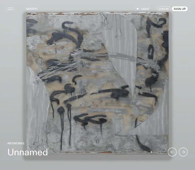
MARPH|作品を主役にしたアート情報プラットフォーム
全画面の作品カルーセル、横スクロールの記事一覧、大小の画像を組み合わせた展覧会一覧が特徴。淡いグレーと白、細い円形コントロール、レギュラーウェイトの文字で作品の多様性を引き立てるデザイン。
MARPH — Style Reference
An immersive artwork wall opening onto a quiet, spacious art index.
Website: marph.com
Original URL: https://marph.com/
Final URL: https://marph.com/
Response: HTTP 200; no redirect recorded.
Theme: light content canvas, with white interface elements over the featured artwork. A desktop control reads LIGHT; alternative theme behavior was not exercised.
Inspected: supplied browser session recorded October 2, 2026, at 04:22 JST; retrieval timestamp 2026-10-01T19:22:37.749Z.
Viewports: desktop 1440 × 1000 and mobile 390 × 844 CSS pixels.
Scope: the current Japanese homepage: featured artworks, category shortcuts, press-release rail, artwork records, exhibition listing, navigation content in the DOM, and footer. Visual coverage consists of three desktop captures and two mobile captures. Detail pages, opened navigation, authentication, and theme changes were not inspected.
MARPH uses a restrained interface to accommodate very different kinds of art. The opening view gives almost the entire screen to a photograph or artwork. A small wordmark, two-line menu icon, compact account pills, and a caption near the lower left provide orientation without competing with the image. Below this opening, a pale gray canvas supports posters, paintings, exhibition dates, and publisher or artist names.
The homepage is a discovery portal. Its hierarchy moves from one immersive featured work to category access, a horizontal news rail, artwork records, and an irregular exhibition composition. Regular-weight sans-serif typography, small English classification labels, Japanese titles, and generous spaces between images give it the character of a contemporary gallery index. The white footer finishes with a large editorial statement and practical navigation.
閉じる
MARPH — Style Reference
An immersive artwork wall opening onto a quiet, spacious art index.
Website: marph.com
Original URL: https://marph.com/
Final URL: https://marph.com/
Response: HTTP 200; no redirect recorded.
Theme: light content canvas, with white interface elements over the featured artwork. A desktop control reads LIGHT; alternative theme behavior was not exercised.
Inspected: supplied browser session recorded October 2, 2026, at 04:22 JST; retrieval timestamp 2026-10-01T19:22:37.749Z.
Viewports: desktop 1440 × 1000 and mobile 390 × 844 CSS pixels.
Scope: the current Japanese homepage: featured artworks, category shortcuts, press-release rail, artwork records, exhibition listing, navigation content in the DOM, and footer. Visual coverage consists of three desktop captures and two mobile captures. Detail pages, opened navigation, authentication, and theme changes were not inspected.
MARPH uses a restrained interface to accommodate very different kinds of art. The opening view gives almost the entire screen to a photograph or artwork. A small wordmark, two-line menu icon, compact account pills, and a caption near the lower left provide orientation without competing with the image. Below this opening, a pale gray canvas supports posters, paintings, exhibition dates, and publisher or artist names.
The homepage is a discovery portal. Its hierarchy moves from one immersive featured work to category access, a horizontal news rail, artwork records, and an irregular exhibition composition. Regular-weight sans-serif typography, small English classification labels, Japanese titles, and generous spaces between images give it the character of a contemporary gallery index. The white footer finishes with a large editorial statement and practical navigation.
How to Read This Reference
- Measured means explicitly supplied in computed styles or element rectangles. These are CSS-pixel measurements at the recorded viewport.
- Source token means a custom property exposed by the original page. A declaration alone does not establish visible use on a particular component.
- Derived means arithmetic from supplied measurements, with the calculation stated.
- Estimated means a visual estimate from an original-page capture. Estimated colors are approximations, not sampled pixel values.
- Recommended means an implementation choice for reuse. The example CSS is an adaptation, not recovered production code.
- A DOM entry can have a rectangle while remaining visually hidden by an ancestor. The navigation entries in the export do not prove that the menu was open.
- Only two viewport sizes were supplied. Exact breakpoints and continuous scaling formulas cannot be recovered from these endpoints.
The snapshot contains eight featured-work links, twenty press-release records, ten artwork records, and twenty exhibition records. These are content counts for this capture, not fixed design requirements.
Tokens — Colors
Default Palette
| Name | Value | Evidence | Role |
|---|---|---|---|
| Gallery Canvas | #f3f3f3 |
Source --color-background; measured body background rgb(243, 243, 243) |
Main content field behind listing images and metadata |
| Primary Ink | #000000 |
Source --color-primary and --color-black; measured body text |
Titles, navigation, dates, outlines, and light-surface controls |
| White | #ffffff |
Source --color-white; measured hero captions and signup fill |
Reversed interface over artwork; visually white footer |
| Utility Accent | #0270e3 |
Source --color-accent |
Available accent token; application to the visible exhibition dots is not established |
| Muted Metadata | Approximately #808080 |
Estimated from classification labels and footer headings | Secondary information without a separate badge surface |
| Exhibition Blue | Approximately #2645ff |
Estimated from visible listing dots | Small marker beside several future-dated exhibitions |
| Exhibition Green | Approximately #00d982 |
Estimated from visible listing dots | Small marker beside currently dated physical and digital exhibitions |
| Danger | #f00000 |
Source --color-danger |
Declared semantic color; no visible use established in these captures |
The interface remains overwhelmingly monochrome. Bright poster lettering, saturated paintings, and photographic tones belong to the content. They should not become global interface colors.
The blue and green dots are distinct from the much larger colors within the artwork. Their distribution suggests a relationship to exhibition timing, but the evidence contains no legend or tested state model. Green appears beside both physical and digital exhibitions, so it should not be interpreted as a digital-only category color.
Observed Color States
| Context | Visible treatment | Confidence |
|---|---|---|
| Desktop hero | White wordmark, menu strokes, utility text, outlined login pill, white signup pill, white caption and arrows | Screenshot and selected computed styles |
| Desktop listing near the footer | Black header elements on a pale background; black signup pill with reversed text | Screenshot observation |
| Mobile hero | White controls over a dark part of the artwork; the theme control shows a dot without the LIGHT label |
Screenshot observation |
| Main listings | Black information on pale gray; muted classifications | Body background measured; metadata tone estimated |
| Footer | White background with black statement and links, gray headings and copyright | Screenshot observation |
The dark opening photograph is not evidence of an activated dark theme. Likewise, the precise mechanism that changes header contrast between page regions is not supplied.
Tokens — Typography
Content Sans Serif
- Measured stack:
'TWK Everett', 'Helvetica Neue', Roboto, Arial, sans-serif. - Source aliases:
--font-sansand--default-font-family. - Measured weight:
400across the sampled hero, press headlines, section labels, and body. - Character: direct, open, and editorial. Hierarchy comes primarily from size, position, and space rather than heavy weights.
- Limitation: a computed family declaration does not identify the font that rendered every glyph. Japanese fallback selection and font-file loading were not separately reported.
Utility Sans Serif
- Measured stack:
'TWK Everett Regular', -apple-system, Roboto, sans-serif. - Observed roles: header controls, menu links, support links, and press-release date text.
- Measured weight:
400. - Tracking: generally normal. The uppercase labels do not use conspicuously wide letterspacing.
The source also declares a monospace stack and weight tokens for 500 and 700. Those declarations do not establish their use in the visible homepage design.
Type Scale
| Role | Desktop | Mobile | Evidence and implementation alias |
|---|---|---|---|
| Base body | 16px / 24px |
16px / 24px |
Measured; --text-body |
| Header account controls | 15px / 15px |
15px / 15px |
Measured; --text-control |
| Main menu entries | 21px / 30px |
21px / 30px |
Measured DOM content; menu visibility unverified |
| Featured-work title | 47px / 55.1028px |
29px / 33.9996px |
Measured; --text-feature |
| Featured-work title tracking | -0.47px |
-0.29px |
Measured; equivalent to -0.01em |
| Featured-work byline | 23px / 30.6659px |
15px / 19.9995px |
Measured; --text-byline |
Hero ARTWORKS label |
Approximately 15px |
Approximately 11–12px |
Estimated; label node not included in the computed sample |
Press section heading and VIEW ALL |
13px / 17.9998px |
11px / 11px |
Measured; --text-section |
| Press-release title | 23px / 29.992px |
21px / 25.998px |
Measured; --text-card |
| Press-release title tracking | Normal | -0.21px |
Measured |
| Press-release date | 13px / 18.005px |
11px / 15.004px |
Measured; --text-date |
| Exhibition title and date | Approximately 23–25px, around 29–30px leading |
Not visually established | Estimated from desktop listing captures |
| Exhibition classification and venue | Approximately 13px |
Not visually established | Estimated |
| Footer wordmark | Approximately 36px |
Approximately 28px |
Estimated visual scale; asset construction unknown |
| Footer statement | Approximately 36px / 36px |
Approximately 28px / 30px |
Estimated |
| Footer links | Approximately 15px / 24px |
Approximately 15px / 24px |
Estimated |
The featured title is substantial but does not dominate the screen. Preserve the large difference between image area and text area. The footer statement can be larger than ordinary content titles because it occupies a dedicated area of white space.
Tokens — Spacing & Shapes
Source spacing unit: --spacing: .25rem, equivalent to 4px at the measured 16px root.
Primary horizontal insets: 40px desktop and 20px mobile.
Visual density: compact controls and metadata within a spacious image composition.
Spacing Scale
| Use | Desktop | Mobile | Evidence |
|---|---|---|---|
| Main content inset | 40px |
20px |
Measured |
| Category shortcut gap | 8px |
8px |
Derived from adjacent rectangles |
| Category shortcut padding | 12px |
12px |
Measured |
| Press card gap | 24px |
12px |
Derived from card positions |
| Press image to metadata | 20px |
16px |
Derived from image bottom and metadata top |
| Press headline to date | About 8px |
About 8px |
Derived from rectangles |
| Section-label bottom to first press image | 90px |
About 54px |
Derived |
| Hero title bottom to byline top | About 34.4px |
21px |
Derived |
| Hero byline bottom clearance | About 73.9px |
37px |
Derived |
| Desktop hero arrow gap | 12px |
Arrows absent in capture | Derived |
| Exhibition horizontal gap | Approximately 24px |
Unverified | Estimated |
| Exhibition vertical separation | Often approximately 80–100px after metadata |
Unverified | Estimated; varies with content |
| Footer top breathing room | Approximately 112–120px |
Approximately 72–80px |
Estimated |
Border Radius
| Element | Value | Evidence |
|---|---|---|
| Login and signup pills | 13px on a 26px high shape |
Measured |
| Category shortcuts | 8px |
Measured |
| Exhibition image corners | Approximately 8px |
Estimated |
| Carousel arrow buttons | Circle, 48 × 48px |
Measured |
| Exhibition plus control | Circle, approximately 24–26px |
Estimated |
| Exhibition status marker | Circle, approximately 10px |
Estimated |
| Pagination dot | Circle, approximately 6px |
Estimated |
| Footer Instagram control | Circle, approximately 36px |
Estimated from the footer capture |
The source radius scale includes 4px, 6px, 8px, 12px, and 16px. Only the component applications supported above should be treated as observed. Extremely large computed radii on circles are implementation artifacts; use 50% for reusable circular shapes.
Layout Measurements
| Element | Desktop 1440 × 1000 |
Mobile 390 × 844 |
|---|---|---|
| Featured section | 1440 × 1000px |
390 × 844px |
| Main content width between insets | 1360px |
350px |
| Wordmark link bounds | 57.6875 × 12px, at x144, y42 |
Same bounds, at x66, y26 |
| Header utility group height | 32px, beginning at y32 |
Group region 64px high, beginning at y0 |
| Login pill | 72.6094 × 26px |
Same dimensions |
| Signup pill | 83.2188 × 26px |
Same dimensions |
| Featured caption text width | 894px |
350px |
| Active featured title top | About y805.98 for the captured one-line title |
About y732.03 for Last Milk |
| Press card width | 408px |
332.5px |
| First press image | About 408 × 577.11px |
About 332.5 × 469.92px |
| Category shortcut width | 448px, three columns |
171px, two columns |
| Recorded document height | About 7966.77px |
About 8023.72px |
Derived press-card proportions: 408 / 1360 = 30% on desktop and 332.5 / 350 = 95% on mobile. These endpoint ratios are useful reconstruction values, not proof of the original breakpoint formula.
A source variable named --max-width-page is 1280px. The observed homepage regions extend to a 1360px inner width, so do not apply that variable as a universal homepage cap.
Components
Overlay Header
Role: identity, menu access, theme control, and account entry.
Arrange a two-stroke menu icon and the small MARPH wordmark toward the left. The right side contains the theme control, outlined LOG IN pill, and filled SIGN UP pill. The account labels remain 15px on both recorded viewports, and the pill silhouettes remain 26px high.
At desktop width, the wordmark begins at x144, leaving considerable space after the menu icon near the 40px page inset. On mobile, the wordmark moves to x66, close to the menu at the 20px inset. The LIGHT text disappears, leaving the small theme dot. Both account controls remain visible.
The header wrapper has zero height in normal flow in the exported DOM, while its children occupy visible positions above the artwork. A header is also visible at the top of the late-page desktop capture. It is absent from the supplied middle desktop image and mobile footer image. These observations support a positioned header with contextual visibility; they do not establish an always-fixed header or an exact hide-on-scroll rule.
Navigation Content
Role: access to the broader art directory and support destinations.
The DOM includes eight English primary entries: Artists, Artworks, Galleries & Museums, Exhibitions & Events, Art Fairs, Art Festivals, Press Releases, and About. Supporting Japanese links, an Instagram link, and language links are also present.
Primary menu text is measured at 21px / 30px. The desktop menu entries begin at x244; mobile entries begin at x66. These measurements describe the exported content, not a visually confirmed open panel. Panel background, opening direction, focus behavior, and transitions remain unverified.
Featured Artwork Slide
Role: a direct visual entry into an individual work.
The active slide fills the viewport and is represented by an artwork link. Its anatomy is a large image field, small ARTWORKS classification, regular-weight title, and artist or presenting-space byline. The lower-left caption uses the same horizontal inset as the content below.
The desktop capture shows 詩の朗読と、身体表現 by 加藤 白: an architectural performance photograph with figures silhouetted against strong light. The mobile capture shows Last Milk by Yudai Nakaya: a dark installation with projected imagery and plinths. These are different active records, so the captures cannot establish how the same image is cropped across breakpoints.
At desktop width, the title is 47px and the byline is 23px. At mobile width, they become 29px and 15px. Longer mobile titles occupy two lines and expand upward while the byline remains aligned near the lower edge. Keep this bottom-anchored relationship when content varies.
Do not add promotional body copy or an oversized conversion button to this component. The work itself is the destination.
Carousel Controls
Role: show the featured sequence and provide desktop navigation affordances.
Eight small dots are visible for the eight featured records. On desktop, they precede two outlined circular arrow buttons near the lower right. The arrows measure 48 × 48px, with a 12px gap. Their lower edge is approximately aligned with the caption byline's lower edge.
On mobile, the dots remain near the lower right, around the byline level, while the arrow buttons are absent. The dots are approximately 6px across and differentiate the active position through brightness.
The evidence establishes the controls' appearance and the existence of horizontally positioned slides. It does not establish dot clickability, swipe support, autoplay interval, looping behavior, or keyboard navigation.
Category Shortcuts
Role: expose the main directory categories immediately after the featured section.
Seven Japanese links appear in a compact grid. Examples include プレスリリース, 展覧会・イベント等, 作品, and ギャラリー・美術館. The first row starts 14px below the featured section in both measured layouts.
Desktop uses three 448px columns with 8px gaps. Mobile uses two 171px columns with 8px gaps. The links have 12px padding and 8px radii. Measured heights are 46px for short entries and up to 66px for wrapped mobile labels. Allow wrapping rather than shrinking all category text to fit one line.
Their sampled backgrounds are transparent. A radius value alone is not evidence of a filled card or a visible border.
Section Heading Row
Role: identify a content collection and link to its complete index.
Place a small uppercase heading at the left and VIEW ALL at the right. The press section measures 13px / 18px on desktop and 11px / 11px on mobile. Titles such as PRESS RELEASES, ARTWORKS, and EXHIBITIONS & EVENTS act as quiet organizational labels.
The first press images start well below this row: 90px after the heading's lower edge on desktop and approximately 54px on mobile. This deliberate space is part of the gallery-like rhythm.
Press-Release Rail
Role: browse recent announcements without adding twenty vertical cards to the page.
The DOM positions cards along one horizontal sequence: desktop starts at x40, x472, x904, and x1336; mobile starts at x20, x364.5, and x709. This establishes a rail rather than a wrapping three-column grid.
Each card contains a linked image, a classification such as General or Exhibition: Solo, a linked headline, and a small date. Image heights vary across the early records, and the metadata follows each image's own bottom edge. The first three desktop image heights are approximately 577px, 505px, and 410px at the same 408px width.
Headlines use 23px / 30px on desktop and 21px / 26px on mobile. Long sampled headlines occupy two line boxes despite much longer DOM text, supporting a two-line presentation. A date follows with approximately 8px separation.
Horizontal placement is measured; drag behavior, arrows, scroll snapping, and boundary handling were not exercised. Some far-offscreen entries have repeated square bounds, which may reflect unloaded or placeholder media. Do not use those bounds to impose a square ratio on all press imagery.
Artwork Records
Role: connect images and titles to their artists or presenting accounts.
The ARTWORKS section is confirmed by the DOM and link inventory. Records include a work title, optional year and medium, and a linked artist or account. For example, 21grams is followed by 2024 / Mixed Media and Yudai Nakaya. Other records contain only a medium or omit the medium line entirely.
Keep these fields separate and optional. A presenting gallery account should not be silently relabeled as the individual artist. The supplied visual crops and computed-element excerpt do not establish the artwork section's complete layout, so its exact grid and mobile treatment should remain unspecified.
Exhibition Card
Role: communicate an exhibition's image, type, title, dates, and venue.
The visible anatomy is:
- An image or poster with subtly rounded corners and a content-dependent aspect ratio.
- A muted classification, such as
Exhibition: Physical, with a small colored dot toward the right. - A prominent title and date range, with a separate outlined plus control aligned along the right edge.
- An optional smaller venue or organizer line.
The card has no visible outer panel or elevation shadow. Metadata sits directly on the gray page. White areas around poster content belong to the media and should not automatically become white card wrappers.
Titles can occupy two lines and truncate. Dates remain visually prominent; long dates and venue names can also truncate in narrow cards. Reserve an action column of approximately 26–32px so the plus control does not collide with text.
The plus symbol's meaning was not tested. Treat it as an unidentified secondary action when documenting the original. A new implementation must define its actual behavior before assigning an accessible label or changing its icon state.
Exhibition Composition
Role: create variation in scale while accommodating portrait posters, landscape paintings, and other image formats.
The desktop captures show narrow media approximately 316px wide and larger media approximately 656px wide, separated by about 24px. Visible horizontal starts include x40, x380, x720, and x1060. The large Breaking News image occupies the left two-track region; a portrait dog illustration and a tall exhibition poster occupy narrower regions to its right.
A useful derived reconstruction model is four 340px track pitches inside the 1360px content region, with 24px reserved at each item's trailing edge. This produces 316px single-track and 656px double-track media. It also explains why the visible rightmost media edge is near x1376, rather than the usual content edge at x1400.
This is a geometric model, not recovered source CSS. The images form staggered vertical stacks, and later content changes which areas are wide. The supplied evidence does not identify whether the original uses a masonry library, measured positioning, nested lanes, or another packing method.
Footer
Role: restate the platform's purpose and provide comprehensive navigation.
The footer switches from the gray listing canvas to white. At desktop width, a large left region carries the MARPH wordmark and this statement:
Common ground for art today.
Expose your latest work.
Follow your next inspiration.
Three navigation groups occupy the right half: MENU, SUPPORT, and ACCOUNT. Their visible starts are approximately x720, x947, and x1173. Small gray uppercase headings sit well above the black links.
On mobile, the wordmark and approximately 28px statement span the available width. The statement wraps to five lines in the supplied capture. MENU and SUPPORT then form two columns beginning around x20 and x195; ACCOUNT follows below on the left. An Instagram circle and language selection share the lower area. JAPANESE has a thin underline indicating the visible language selection.
The final muted line reads Copyright © PR TIMES Corporation. The original-page link inventory independently includes an 運営会社 link to https://prtimes.co.jp/.
Tokens — Motion & Interaction
| Treatment | Supplied evidence | What can be reused confidently |
|---|---|---|
| General utility transition default | Source duration .15s and cubic-bezier(.4,0,.2,1) |
An available default, not the duration of every component |
| Header links and account buttons | Computed transitions include color, background, border, opacity, and transform-related properties at 0.2s cubic-bezier(.4,0,.2,1) |
Use a restrained 200ms state transition; destination styles remain unverified |
| Theme control | opacity 0.2s cubic-bezier(.4,0,.2,1) |
Short opacity response is declared; actual hover or pressed opacity is unknown |
| Carousel arrows | Background color, width, and height transitions at 0.2s with the same easing |
Geometry can transition; no hover enlargement amount was supplied |
| Featured sequence | Adjacent slide rectangles differ by exactly one viewport width | Horizontal track structure is established; transition timing and easing are not |
| Different active slides | Second record on desktop, third record on mobile | Different settled states, without proof of autoplay or its interval |
| Page traversal | Supplied capture process scrolled through intermediate positions | Long-page content was traversed; no parallax or reveal sequence is established |
| Menu, plus action, login, language, and theme switching | Controls or links exist | Their resulting states were not exercised |
Sampled nodes report animation: none. This does not rule out animation on an unsampled ancestor, JavaScript-driven motion, or media content. A computed value of transition: all without a nonzero duration is also insufficient evidence of visible motion.
The inspection process waited for load, layout and text stability, and visible image decoding within finite limits. Perpetual animations were paused during readiness checks and resumed afterward. These checks improve screenshot stability but do not reveal the complete interaction model.
Recommended motion approach: use the measured 200ms easing for small interface state changes. Keep the carousel explicitly controllable. Any chosen slide duration, autoplay policy, or entrance animation must be labeled as an implementation decision rather than an original-site measurement.
Surfaces
| Layer | Appearance | Design purpose |
|---|---|---|
| Featured artwork | Full-viewport image with white interface above it | Establishes the work as the primary visual experience |
| Listing canvas | Solid #f3f3f3 |
Neutral continuity between unrelated artworks |
| Content card | Image plus text on the existing canvas | Groups information without adding a separate panel |
| Header over artwork | Visually transparent, reversed controls | Preserves the image area |
| Header over light content | Pale field with black controls | Keeps utilities legible in the later desktop capture |
| Account action | Thin outlined pill paired with a filled pill | Compact distinction between two account actions |
| Secondary action | Thin outlined circle with a plus or arrow | Small, consistent control vocabulary |
| Footer | White, with broad clear space | Separates directory content from purpose and support navigation |
No general shadow-based elevation system is visible. Depth comes from the artwork itself, while the interface uses position, contrast, and simple outlines.
Imagery
The site accommodates performance photography, installation documentation, paintings, drawings, and typographic exhibition posters. These assets retain their own colors, textures, and lettering. The interface does not impose a unifying duotone treatment or decorative frame.
The featured area presents an immersive crop. The exhibition section uses varied rectangular proportions: the dog illustration is approximately 316 × 443px, the adjacent tall poster approximately 316 × 447px, and the large Breaking News painting approximately 656 × 494px in the desktop capture. These are visual estimates, not native asset dimensions.
Preserve poster lettering as part of the image. Use live text for the title, date, and venue underneath, so readers do not have to extract essential information from artwork. Do not recreate every artwork as a uniform square thumbnail.
Observed Asset References
The supplied DOM does not expose image-file URLs, srcset values, native dimensions, or font-file paths. The following are original-page content links associated with visible works, not direct asset downloads or separately inspected pages.
| Visual reference | Original-page record | Use |
|---|---|---|
| Performance in a concrete interior | 詩の朗読と、身体表現 | Desktop featured slide |
| Dark installation with plinths | Last Milk | Mobile featured slide |
| Portrait dog illustration | ミヤギユカリ「まなざし」展 | Narrow exhibition card |
| Dense crowd painting | Breaking News | Wide exhibition card |
| Tall poster with vivid yellow lettering | テンジシツプロジェクト展 | Narrow exhibition card and press content |
Use authorized artwork assets with sufficient resolution for their display size. Recreating the shell without appropriate art will not reproduce the page's visual character.
Layout & Responsive Behavior
Page Sequence
The DOM establishes this order: featured artwork, category shortcuts, PRESS RELEASES, ARTWORKS, EXHIBITIONS & EVENTS, and footer. Preserve the distinct browsing behavior of each collection rather than applying one card grid to the whole page.
Confirmed Responsive Changes
| Feature | Desktop | Mobile |
|---|---|---|
| Horizontal inset | 40px |
20px |
| Featured height | One recorded viewport | One recorded viewport |
| Featured title | 47px, approximately 55px leading |
29px, approximately 34px leading |
| Featured byline | 23px |
15px |
| Caption lower clearance | Approximately 74px |
37px |
| Header wordmark | Farther from menu | Tightly grouped with menu |
| Theme control | Dot plus LIGHT |
Dot only |
| Account pills | Both visible | Both visible, same measured size |
| Featured arrows | Two 48px circles |
Not visible |
| Category shortcuts | Three columns | Two columns, wrapping permitted |
| Press rail | 408px cards, 24px gaps |
332.5px cards, 12px gaps |
| Footer | Statement at left, three groups at right | Full-width statement, two navigation columns, account below |
The mobile footer is a real visual observation. A mobile exhibition-grid screenshot was not supplied, and the computed-element excerpt ends within the press rail. Consequently, neither a one-column exhibition list nor a two-column mobile masonry grid can be claimed as observed.
The similar total document heights at the two viewport sizes do not reveal the missing grid's implementation. Horizontal collections, different media sizes, and responsive packing can all affect page length.
Recommended breakpoint strategy: begin with a 768px breakpoint for the two demonstrated layout modes, then test intermediate widths. This value is a practical starting point, not a recovered breakpoint. Use stable viewport-height units for the featured area and verify behavior with mobile browser chrome and enlarged text.
Do’s and Don’ts
Do
- Keep the main canvas at the measured
#f3f3f3and let the artwork supply most of the color. - Use regular-weight typography and preserve the measured
47pxto29pxfeatured-title change. - Align hero captions and content to the
40pxdesktop and20pxmobile inset system. - Keep the header wordmark small and the account silhouettes compact.
- Retain a horizontal press rail with variable image heights.
- Preserve the exhibition composition's narrow and wide media, staggered stacks, and quiet metadata.
- Keep exhibition dates prominent and venues secondary.
- Use circles for small actions and modest rounding for media.
- Allow Japanese labels to wrap where the mobile evidence shows wrapping.
- Preserve the generous white footer and its two-column mobile navigation.
Don’t
- Do not turn the homepage into a single conversion funnel or replace artwork captions with marketing slogans.
- Do not use the declared
1280pxvariable to narrow every observed homepage section. - Do not force press cards into a wrapping desktop grid.
- Do not crop every painting, poster, and installation into the same aspect ratio.
- Do not wrap all metadata in raised white cards with shadows.
- Do not promote the blue accent into a large primary CTA system.
- Do not equate green dots with digital exhibitions or invent the plus control's function.
- Do not infer an open menu from text that appears in the DOM export.
- Do not invent a carousel interval, swipe interaction, or alternate theme palette.
- Do not describe different featured artworks as proof of responsive art direction.
Recommended Implementation Additions
These are improvements for a new implementation, not verified features of the original:
- Give menu, theme, arrow, pagination, and plus controls explicit accessible names that describe their implemented actions.
- Preserve the small visible pill and circle shapes while enlarging their effective touch targets to about
44pxwhere possible. - Provide keyboard-operable carousel controls, a clear current-slide state, and a pause mechanism if automatic rotation is introduced.
- Remove inactive slides and a closed menu from keyboard navigation and the accessibility tree as appropriate.
- Add a text equivalent for exhibition status; color alone should not communicate timing or availability.
- Keep full titles, dates, and venues available to assistive technology when visual text is truncated.
- Preserve meaningful reading order when packing mixed-width cards. Avoid a visually dense arrangement that makes keyboard traversal jump unpredictably.
- Check caption contrast for every featured artwork. Apply a restrained image-specific scrim only where necessary; its use was not verified in the original.
- Supply intrinsic image dimensions and responsive sources to reduce layout shifts. Prioritize the current featured image and defer genuinely offscreen media.
- Respect reduced motion, retain visible focus indicators, and test the small mobile utility text at enlarged text sizes.
Agent Prompt Guide
Quick Color Reference
- Content canvas: measured
#f3f3f3. - Primary text and light-surface controls: measured
#000000. - Featured captions and reversed controls: measured
#ffffff. - Footer: visually white.
- Muted metadata: approximately
#808080; validate contrast in the implementation. - Declared utility accent:
#0270e3; do not assume it is the visible exhibition-marker blue. - Exhibition markers: visually bright blue and green; exact values and semantics remain unverified.
Overall Prompt
“Create a contemporary art discovery homepage inspired by MARPH's observed structure. Open with a viewport-height artwork slide, a small upper-left wordmark and two-line menu icon, compact theme and account controls, and a lower-left artwork caption. Use regular-weight TWK Everett where licensed and available, with the supplied sans-serif fallbacks. Set featured titles to 47px on desktop and 29px on mobile, with 40px and 20px page insets. Follow the artwork with category shortcuts, a horizontal press-release rail, artwork records, and an exhibition composition mixing narrow portrait media and larger landscape media. Use a #f3f3f3 canvas, black metadata, small outlined circular actions, and minimal image rounding. Finish with a white footer containing a large three-sentence statement and practical navigation. Keep unverified behavior explicit rather than inventing original-site interactions.”
Example Component Prompts
- Featured artwork: “Build a full-viewport linked artwork image with white UI. Place a small ARTWORKS label, a regular 47px title, and a 23px artist byline at the lower left. Use 40px horizontal insets and approximately 74px lower clearance. On a 390px phone, use 20px insets, a 29px title, a 15px byline, and 37px lower clearance. Show pagination dots at the lower right and desktop-only outlined 48px arrow controls.”
- Press rail: “Create a horizontal announcement rail on pale gray. At a 1360px inner width, use 408px cards separated by 24px. At a 350px inner width, use 332.5px cards separated by 12px. Preserve natural image proportions. Stack classification, a two-line regular-weight headline, and a small date beneath each image.”
- Exhibition card: “Place a rounded artwork image directly on the gray canvas, followed by a small muted exhibition type, a right-aligned colored marker, a prominent title and date range, and an optional venue. Reserve a narrow right-side column for an outlined circular plus action. Define that action before assigning its accessible name.”
- Exhibition composition: “Reproduce the visible desktop rhythm with approximately 316px narrow media and 656px wide media on 340px track pitches. Use independent vertical stacks and 24px trailing gutters. Preserve image aspect ratios and semantic reading order. Treat the packing algorithm and mobile collapse as implementation choices.”
- Footer: “Create a white footer with broad top padding. Put MARPH and a large regular-weight purpose statement in the left half, with MENU, SUPPORT, and ACCOUNT in three columns on the right. On mobile, place the statement above two navigation columns, move ACCOUNT below, and finish with an Instagram circle, language links, and muted copyright.”
Quick Start
CSS Custom Properties
This adaptation uses measured typography, insets, rail proportions, and control silhouettes. Muted colors, image rounding, footer sizes, and the exhibition-lane arrangement include the estimates identified above. The 768px breakpoint is recommended. The mobile exhibition fallback is intentionally a single readable column because its original layout was not captured.
Use .feature__slide for the linked active artwork, with its image and caption inside; place controls as siblings of the link. Press cards belong inside .press-rail. For the demonstrated exhibition arrangement, use three .exhibition-lane containers with the first marked .is-wide. This approximates the visible 2:1:1 composition, not the original page's complete packing algorithm.
:root {
  /* Measured source colors */
  --marph-canvas: #f3f3f3;
  --marph-ink: #000;
  --marph-white: #fff;
  --marph-accent: #0270e3;

  /* Visual approximations; validate before production use */
  --marph-muted: #808080;
  --marker-blue: #2645ff;
  --marker-green: #00d982;

  /* Observed family declarations; font files are not included */
  --font-content: 'TWK Everett', 'Helvetica Neue', Roboto, Arial, sans-serif;
  --font-ui: 'TWK Everett Regular', -apple-system, Roboto, sans-serif;

  --page-inset: 40px;
  --rail-gap: 24px;
  --rail-card-width: 30%;
  --media-info-gap: 20px;
  --section-media-gap: 90px;
  --hero-bottom: 74px;
  --text-feature: 47px;
  --leading-feature: 55.1028px;
  --text-card: 23px;
  --leading-card: 29.992px;
  --text-section: 13px;
  --leading-section: 18px;
  --radius-media: 8px;
  --motion-ui: 200ms;
  --ease-ui: cubic-bezier(.4, 0, .2, 1);
}

* { box-sizing: border-box; }
body {
  margin: 0;
  color: var(--marph-ink);
  background: var(--marph-canvas);
  font: 400 16px/1.5 var(--font-content);
}
a { color: inherit; text-decoration: none; }
button { font: inherit; cursor: pointer; }
img { max-width: 100%; }
.page-inset { padding-inline: var(--page-inset); }

/* Explicit header states; scroll visibility requires application logic. */
.site-header {
  --nav-ink: var(--marph-ink);
  --nav-inverse: var(--marph-white);
  position: absolute;
  inset: 0 0 auto;
  z-index: 10;
  display: flex;
  align-items: center;
  gap: 8px;
  min-height: 96px;
  padding: 26px var(--page-inset);
  color: var(--nav-ink);
  background: var(--marph-canvas);
  font-family: var(--font-ui);
}
.site-header--over-art {
  --nav-ink: var(--marph-white);
  --nav-inverse: var(--marph-ink);
  background: transparent;
}
.header-start {
  display: flex;
  flex: 1;
  align-items: center;
  gap: 60px;
  min-width: 0;
}
.menu-button {
  display: grid;
  place-items: center;
  flex: 0 0 44px;
  width: 44px;
  height: 44px;
  padding: 0;
  border: 0;
  color: inherit;
  background: transparent;
}
.menu-glyph {
  width: 26px;
  height: 12px;
  border-block: 2px solid currentColor;
}
.wordmark { font-size: 15px; line-height: 1; }
.wordmark svg,
.wordmark img { display: block; width: 57.6875px; height: 12px; }
.theme-control {
  display: flex;
  align-items: center;
  gap: 12px;
  min-width: 110px;
  min-height: 44px;
  padding: 8px;
  border: 0;
  color: inherit;
  background: transparent;
  font-size: 15px;
  transition: opacity var(--motion-ui) var(--ease-ui);
}
.theme-dot { width: 10px; height: 10px; border-radius: 50%; background: currentColor; }
.auth-group { display: flex; align-items: center; gap: 8px; }
.auth-action {
  display: inline-flex;
  align-items: center;
  min-height: 44px;
  padding: 0;
  border: 0;
  background: transparent;
}
.auth-shape {
  display: inline-flex;
  align-items: center;
  height: 26px;
  padding-inline: 9px;
  border: 1px solid var(--nav-ink);
  border-radius: 13px;
  color: var(--nav-ink);
  font: 400 15px/15px var(--font-ui);
  white-space: nowrap;
  transition: color var(--motion-ui) var(--ease-ui),
              background-color var(--motion-ui) var(--ease-ui);
}
.auth-action--filled .auth-shape {
  color: var(--nav-inverse);
  background: var(--nav-ink);
}

.feature { position: relative; }
.feature__slide {
  position: relative;
  isolation: isolate;
  display: flex;
  align-items: flex-end;
  min-height: 100vh;
  min-height: 100svh;
  padding: 120px var(--page-inset) var(--hero-bottom);
  color: var(--marph-white);
  background: #111;
}
.feature__image {
  position: absolute;
  inset: 0;
  z-index: -1;
  width: 100%;
  height: 100%;
  object-fit: cover;
  object-position: var(--art-position, center);
}
.feature__caption { width: min(100%, 894px); }
.feature__label { margin: 0 0 8px; font-size: 15px; line-height: 18px; }
.feature__title {
  margin: 0;
  font-size: var(--text-feature);
  font-weight: 400;
  line-height: var(--leading-feature);
  letter-spacing: -.01em;
}
.feature__byline { margin: 34.4px 0 0; font-size: 23px; line-height: 30.6659px; }
.feature__controls {
  position: absolute;
  right: var(--page-inset);
  bottom: var(--hero-bottom);
  display: flex;
  align-items: center;
  gap: 16px;
  color: var(--marph-white);
}
.feature__dots { display: flex; align-items: center; gap: 6px; }
.feature__dot { width: 6px; height: 6px; border-radius: 50%; background: currentColor; opacity: .5; }
.feature__dot.is-current { opacity: 1; }
.feature__arrows { display: flex; gap: 12px; }
.circle-arrow {
  display: grid;
  place-items: center;
  width: 48px;
  height: 48px;
  padding: 0;
  border: 2px solid currentColor;
  border-radius: 50%;
  color: inherit;
  background: transparent;
  transition: background-color var(--motion-ui) var(--ease-ui);
}

.category-shortcuts {
  display: grid;
  grid-template-columns: repeat(3, minmax(0, 1fr));
  gap: 8px;
  padding: 14px var(--page-inset);
}
.category-shortcuts a {
  display: flex;
  align-items: center;
  gap: 8px;
  min-height: 46px;
  padding: 12px;
  border-radius: 8px;
}
.section-heading {
  display: flex;
  align-items: center;
  justify-content: space-between;
  gap: 24px;
  font-size: var(--text-section);
  line-height: var(--leading-section);
}
.section-heading h2 { margin: 0; font: inherit; }

/* Native horizontal scrolling is a recommended rail implementation. */
.press-rail {
  display: grid;
  grid-auto-flow: column;
  grid-auto-columns: var(--rail-card-width);
  align-items: start;
  gap: var(--rail-gap);
  margin-top: var(--section-media-gap);
  overflow-x: auto;
  scroll-snap-type: x proximity;
}
.press-card { min-width: 0; scroll-snap-align: start; }
.card-media { display: block; width: 100%; height: auto; border-radius: var(--radius-media); }
.card-info { margin-top: var(--media-info-gap); }
.card-kind { margin: 0 0 8px; color: var(--marph-muted); font-size: 13px; line-height: 18px; }
.card-title {
  display: -webkit-box;
  overflow: hidden;
  -webkit-box-orient: vertical;
  -webkit-line-clamp: 2;
  margin: 0;
  font-size: var(--text-card);
  font-weight: 400;
  line-height: var(--leading-card);
}
.press-date { margin: 8px 0 0; font: 400 13px/18.005px var(--font-ui); }

/* Lane model for the visible desktop composition, not recovered masonry code. */
.exhibition-board { display: grid; grid-template-columns: repeat(4, minmax(0, 1fr)); }
.exhibition-lane {
  display: flex;
  flex-direction: column;
  gap: 80px;
  min-width: 0;
  padding-right: 24px;
}
.exhibition-lane.is-wide { grid-column: span 2; }
.exhibition-meta {
  display: grid;
  grid-template-columns: minmax(0, 1fr) 26px;
  align-items: start;
  column-gap: 8px;
  row-gap: 8px;
  margin-top: 16px;
}
.exhibition-meta .card-kind { margin: 0; }
.status-dot { justify-self: center; width: 10px; height: 10px; margin-top: 4px; border-radius: 50%; }
.status-dot--blue { background: var(--marker-blue); }
.status-dot--green { background: var(--marker-green); }
.exhibition-date { margin: 0; font-size: 25px; line-height: 29px; }
.exhibition-venue { grid-column: 1; margin: 0; font-size: 13px; line-height: 18px; }
.exhibition-action {
  display: grid;
  place-items: center;
  width: 26px;
  height: 26px;
  padding: 0;
  border: 1px solid currentColor;
  border-radius: 50%;
  color: inherit;
  background: transparent;
}

.site-footer { padding: 120px var(--page-inset) 72px; background: var(--marph-white); }
.footer-main { display: grid; grid-template-columns: minmax(0, 3fr) repeat(3, minmax(0, 1fr)); }
.footer-brand-name { margin: 0; font-size: 36px; font-weight: 400; line-height: 1; }
.footer-statement { margin: 32px 0 0; max-width: 650px; font-size: 36px; line-height: 1; }
.footer-heading { margin: 0 0 68px; color: var(--marph-muted); font-size: 13px; font-weight: 400; line-height: 18px; }
.footer-links { display: flex; flex-direction: column; align-items: flex-start; font-size: 15px; line-height: 24px; }
.footer-bottom { display: flex; align-items: center; flex-wrap: wrap; gap: 20px; margin-top: 40px; }
.footer-language { margin-left: auto; font-size: 13px; }
.footer-language [aria-current] { padding-bottom: 7px; border-bottom: 1px solid currentColor; }
.footer-copyright { flex-basis: 100%; margin: 0; color: var(--marph-muted); font-size: 14px; }

/* Recommended breakpoint; original breakpoint values were not supplied. */
@media (max-width: 767px) {
  :root {
    --page-inset: 20px;
    --rail-gap: 12px;
    --rail-card-width: 95%;
    --media-info-gap: 16px;
    --section-media-gap: 54px;
    --hero-bottom: 37px;
    --text-feature: 29px;
    --leading-feature: 33.9996px;
    --text-card: 21px;
    --leading-card: 25.998px;
    --text-section: 11px;
    --leading-section: 11px;
  }
  .site-header { min-height: 64px; padding-block: 10px; }
  .header-start { gap: 2px; }
  .theme-control { min-width: 26px; width: 26px; }
  .theme-label { display: none; }
  .feature__label { font-size: 11px; line-height: 15px; }
  .feature__byline { margin-top: 21px; padding-right: 110px; font-size: 15px; line-height: 19.9995px; }
  .feature__controls { min-height: 20px; }
  .feature__arrows { display: none; }
  .category-shortcuts { grid-template-columns: repeat(2, minmax(0, 1fr)); }
  .card-title { letter-spacing: -.01em; }
  .press-date { font-size: 11px; line-height: 15.004px; }

  /* Recommended readable fallback; original mobile exhibition grid is unknown. */
  .exhibition-board { grid-template-columns: minmax(0, 1fr); gap: 48px; }
  .exhibition-lane,
  .exhibition-lane.is-wide { grid-column: auto; gap: 48px; padding-right: 0; }

  .site-footer { padding-top: 80px; }
  .footer-main { grid-template-columns: repeat(2, minmax(0, 1fr)); row-gap: 16px; }
  .footer-brand { grid-column: 1 / -1; margin-bottom: 56px; }
  .footer-brand-name { font-size: 28px; line-height: 34px; }
  .footer-statement { margin-top: 28px; font-size: 28px; line-height: 30px; }
  .footer-heading { margin-bottom: 28px; }
  .footer-account { grid-column: 1; }
  .footer-bottom { margin-top: 16px; }
}

/* Recommended accessibility additions. */
:where(a, button):focus-visible { outline: 2px solid currentColor; outline-offset: 4px; }
@media (prefers-reduced-motion: reduce) {
  .site-header *, .circle-arrow { transition: none; }
  .press-rail { scroll-behavior: auto; }
}
The CSS does not implement carousel state, menu disclosure, theme persistence, authentication, or exhibition actions. Supply those behaviors separately. Pagination dots can be decorative indicators; if they become buttons, give them larger targets and accessible labels. The mobile byline padding is a recommended collision safeguard rather than a measured source value.
The lane example also requires care with content order. For a complete mixed-width feed, use a layout strategy that preserves the intended semantic sequence and recomputes placement when media or fonts finish loading.
Tailwind v4 Token Mapping
Optional aliases for a project already using Tailwind v4. This is an adaptation and does not establish the original framework version. Define the custom properties above first.
@theme inline {
  --color-gallery: var(--marph-canvas);
  --color-ink: var(--marph-ink);
  --color-paper: var(--marph-white);
  --color-metadata: var(--marph-muted);
  --font-gallery: var(--font-content);
  --font-utility: var(--font-ui);
  --text-feature: var(--text-feature);
  --text-gallery-card: var(--text-card);
  --spacing-page: var(--page-inset);
  --spacing-rail: var(--rail-gap);
  --radius-artwork: var(--radius-media);
}
For an actual Tailwind configuration, avoid assigning a theme token to itself: rename the plain-CSS --text-feature variable to --marph-text-feature and map --text-feature to that variable, updating its plain-CSS references accordingly.
Sources & Evidence
- Inspected original and final page: MARPH, HTTP 200, unchanged URL. All current-page observations derive from the supplied browser record and original-page captures.
- Recorded session:
2026-10-01T19:22:37.749Z, corresponding to October 2, 2026, 04:22 JST. Individual capture timestamps were not supplied separately. - Desktop:
1440 × 1000CSS pixels; opening featured work, an interior exhibition view, and the exhibition-to-footer transition. Recorded document height approximately7966.77px. - Mobile:
390 × 844CSS pixels; opening featured work and footer. Recorded document height approximately8023.72px. - Computed evidence: root custom properties, body background and typography, header and navigation entries, featured-slide geometry and typography, carousel arrow rectangles, category shortcuts, and press-rail elements. The supplied element excerpt does not provide equivalent computed details for the exhibition grid or footer.
- Link evidence: homepage navigation and record links identify content types and destinations. Linked detail pages were not independently opened for this reference.
- Interaction limits: no supplied click outcomes for menu, theme, account controls, carousel controls, language links, or plus actions. Horizontal slide placement and differing active slides establish structure and states, not a complete motion specification.
- Asset limits: no original image-file inventory, font-file inventory, same-artwork desktop/mobile comparison, or complete stylesheet was supplied. Later media loading, hover states, and exact responsive breakpoints remain unverified.
This reference documents the current homepage represented by the supplied session. Measurements, visual estimates, derived layout models, and recommended additions are distinguished throughout.
# MARPH — Style Reference

> An immersive artwork wall opening onto a quiet, spacious art index.

**Website:** [marph.com](https://marph.com/)
**Original URL:** https://marph.com/
**Final URL:** https://marph.com/
**Response:** HTTP 200; no redirect recorded.
**Theme:** light content canvas, with white interface elements over the featured artwork. A desktop control reads `LIGHT`; alternative theme behavior was not exercised.
**Inspected:** supplied browser session recorded October 2, 2026, at 04:22 JST; retrieval timestamp `2026-10-01T19:22:37.749Z`.
**Viewports:** desktop `1440 × 1000` and mobile `390 × 844` CSS pixels.
**Scope:** the current Japanese homepage: featured artworks, category shortcuts, press-release rail, artwork records, exhibition listing, navigation content in the DOM, and footer. Visual coverage consists of three desktop captures and two mobile captures. Detail pages, opened navigation, authentication, and theme changes were not inspected.

MARPH uses a restrained interface to accommodate very different kinds of art. The opening view gives almost the entire screen to a photograph or artwork. A small wordmark, two-line menu icon, compact account pills, and a caption near the lower left provide orientation without competing with the image. Below this opening, a pale gray canvas supports posters, paintings, exhibition dates, and publisher or artist names.

The homepage is a discovery portal. Its hierarchy moves from one immersive featured work to category access, a horizontal news rail, artwork records, and an irregular exhibition composition. Regular-weight sans-serif typography, small English classification labels, Japanese titles, and generous spaces between images give it the character of a contemporary gallery index. The white footer finishes with a large editorial statement and practical navigation.
閉じる
# MARPH — Style Reference

> An immersive artwork wall opening onto a quiet, spacious art index.

**Website:** [marph.com](https://marph.com/)
**Original URL:** https://marph.com/
**Final URL:** https://marph.com/
**Response:** HTTP 200; no redirect recorded.
**Theme:** light content canvas, with white interface elements over the featured artwork. A desktop control reads `LIGHT`; alternative theme behavior was not exercised.
**Inspected:** supplied browser session recorded October 2, 2026, at 04:22 JST; retrieval timestamp `2026-10-01T19:22:37.749Z`.
**Viewports:** desktop `1440 × 1000` and mobile `390 × 844` CSS pixels.
**Scope:** the current Japanese homepage: featured artworks, category shortcuts, press-release rail, artwork records, exhibition listing, navigation content in the DOM, and footer. Visual coverage consists of three desktop captures and two mobile captures. Detail pages, opened navigation, authentication, and theme changes were not inspected.

MARPH uses a restrained interface to accommodate very different kinds of art. The opening view gives almost the entire screen to a photograph or artwork. A small wordmark, two-line menu icon, compact account pills, and a caption near the lower left provide orientation without competing with the image. Below this opening, a pale gray canvas supports posters, paintings, exhibition dates, and publisher or artist names.

The homepage is a discovery portal. Its hierarchy moves from one immersive featured work to category access, a horizontal news rail, artwork records, and an irregular exhibition composition. Regular-weight sans-serif typography, small English classification labels, Japanese titles, and generous spaces between images give it the character of a contemporary gallery index. The white footer finishes with a large editorial statement and practical navigation.

## How to Read This Reference

- **Measured** means explicitly supplied in computed styles or element rectangles. These are CSS-pixel measurements at the recorded viewport.
- **Source token** means a custom property exposed by the original page. A declaration alone does not establish visible use on a particular component.
- **Derived** means arithmetic from supplied measurements, with the calculation stated.
- **Estimated** means a visual estimate from an original-page capture. Estimated colors are approximations, not sampled pixel values.
- **Recommended** means an implementation choice for reuse. The example CSS is an adaptation, not recovered production code.
- A DOM entry can have a rectangle while remaining visually hidden by an ancestor. The navigation entries in the export do not prove that the menu was open.
- Only two viewport sizes were supplied. Exact breakpoints and continuous scaling formulas cannot be recovered from these endpoints.

The snapshot contains eight featured-work links, twenty press-release records, ten artwork records, and twenty exhibition records. These are content counts for this capture, not fixed design requirements.

## Tokens — Colors

### Default Palette

| Name | Value | Evidence | Role |
| --- | --- | --- | --- |
| Gallery Canvas | `#f3f3f3` | Source `--color-background`; measured body background `rgb(243, 243, 243)` | Main content field behind listing images and metadata |
| Primary Ink | `#000000` | Source `--color-primary` and `--color-black`; measured body text | Titles, navigation, dates, outlines, and light-surface controls |
| White | `#ffffff` | Source `--color-white`; measured hero captions and signup fill | Reversed interface over artwork; visually white footer |
| Utility Accent | `#0270e3` | Source `--color-accent` | Available accent token; application to the visible exhibition dots is not established |
| Muted Metadata | Approximately `#808080` | Estimated from classification labels and footer headings | Secondary information without a separate badge surface |
| Exhibition Blue | Approximately `#2645ff` | Estimated from visible listing dots | Small marker beside several future-dated exhibitions |
| Exhibition Green | Approximately `#00d982` | Estimated from visible listing dots | Small marker beside currently dated physical and digital exhibitions |
| Danger | `#f00000` | Source `--color-danger` | Declared semantic color; no visible use established in these captures |

The interface remains overwhelmingly monochrome. Bright poster lettering, saturated paintings, and photographic tones belong to the content. They should not become global interface colors.

The blue and green dots are distinct from the much larger colors within the artwork. Their distribution suggests a relationship to exhibition timing, but the evidence contains no legend or tested state model. Green appears beside both physical and digital exhibitions, so it should not be interpreted as a digital-only category color.

### Observed Color States

| Context | Visible treatment | Confidence |
| --- | --- | --- |
| Desktop hero | White wordmark, menu strokes, utility text, outlined login pill, white signup pill, white caption and arrows | Screenshot and selected computed styles |
| Desktop listing near the footer | Black header elements on a pale background; black signup pill with reversed text | Screenshot observation |
| Mobile hero | White controls over a dark part of the artwork; the theme control shows a dot without the `LIGHT` label | Screenshot observation |
| Main listings | Black information on pale gray; muted classifications | Body background measured; metadata tone estimated |
| Footer | White background with black statement and links, gray headings and copyright | Screenshot observation |

The dark opening photograph is not evidence of an activated dark theme. Likewise, the precise mechanism that changes header contrast between page regions is not supplied.

## Tokens — Typography

### Content Sans Serif

- **Measured stack:** `'TWK Everett', 'Helvetica Neue', Roboto, Arial, sans-serif`.
- **Source aliases:** `--font-sans` and `--default-font-family`.
- **Measured weight:** `400` across the sampled hero, press headlines, section labels, and body.
- **Character:** direct, open, and editorial. Hierarchy comes primarily from size, position, and space rather than heavy weights.
- **Limitation:** a computed family declaration does not identify the font that rendered every glyph. Japanese fallback selection and font-file loading were not separately reported.

### Utility Sans Serif

- **Measured stack:** `'TWK Everett Regular', -apple-system, Roboto, sans-serif`.
- **Observed roles:** header controls, menu links, support links, and press-release date text.
- **Measured weight:** `400`.
- **Tracking:** generally normal. The uppercase labels do not use conspicuously wide letterspacing.

The source also declares a monospace stack and weight tokens for `500` and `700`. Those declarations do not establish their use in the visible homepage design.

### Type Scale

| Role | Desktop | Mobile | Evidence and implementation alias |
| --- | --- | --- | --- |
| Base body | `16px / 24px` | `16px / 24px` | Measured; `--text-body` |
| Header account controls | `15px / 15px` | `15px / 15px` | Measured; `--text-control` |
| Main menu entries | `21px / 30px` | `21px / 30px` | Measured DOM content; menu visibility unverified |
| Featured-work title | `47px / 55.1028px` | `29px / 33.9996px` | Measured; `--text-feature` |
| Featured-work title tracking | `-0.47px` | `-0.29px` | Measured; equivalent to `-0.01em` |
| Featured-work byline | `23px / 30.6659px` | `15px / 19.9995px` | Measured; `--text-byline` |
| Hero `ARTWORKS` label | Approximately `15px` | Approximately `11–12px` | Estimated; label node not included in the computed sample |
| Press section heading and `VIEW ALL` | `13px / 17.9998px` | `11px / 11px` | Measured; `--text-section` |
| Press-release title | `23px / 29.992px` | `21px / 25.998px` | Measured; `--text-card` |
| Press-release title tracking | Normal | `-0.21px` | Measured |
| Press-release date | `13px / 18.005px` | `11px / 15.004px` | Measured; `--text-date` |
| Exhibition title and date | Approximately `23–25px`, around `29–30px` leading | Not visually established | Estimated from desktop listing captures |
| Exhibition classification and venue | Approximately `13px` | Not visually established | Estimated |
| Footer wordmark | Approximately `36px` | Approximately `28px` | Estimated visual scale; asset construction unknown |
| Footer statement | Approximately `36px / 36px` | Approximately `28px / 30px` | Estimated |
| Footer links | Approximately `15px / 24px` | Approximately `15px / 24px` | Estimated |

The featured title is substantial but does not dominate the screen. Preserve the large difference between image area and text area. The footer statement can be larger than ordinary content titles because it occupies a dedicated area of white space.

## Tokens — Spacing & Shapes

**Source spacing unit:** `--spacing: .25rem`, equivalent to `4px` at the measured `16px` root.
**Primary horizontal insets:** `40px` desktop and `20px` mobile.
**Visual density:** compact controls and metadata within a spacious image composition.

### Spacing Scale

| Use | Desktop | Mobile | Evidence |
| --- | --- | --- | --- |
| Main content inset | `40px` | `20px` | Measured |
| Category shortcut gap | `8px` | `8px` | Derived from adjacent rectangles |
| Category shortcut padding | `12px` | `12px` | Measured |
| Press card gap | `24px` | `12px` | Derived from card positions |
| Press image to metadata | `20px` | `16px` | Derived from image bottom and metadata top |
| Press headline to date | About `8px` | About `8px` | Derived from rectangles |
| Section-label bottom to first press image | `90px` | About `54px` | Derived |
| Hero title bottom to byline top | About `34.4px` | `21px` | Derived |
| Hero byline bottom clearance | About `73.9px` | `37px` | Derived |
| Desktop hero arrow gap | `12px` | Arrows absent in capture | Derived |
| Exhibition horizontal gap | Approximately `24px` | Unverified | Estimated |
| Exhibition vertical separation | Often approximately `80–100px` after metadata | Unverified | Estimated; varies with content |
| Footer top breathing room | Approximately `112–120px` | Approximately `72–80px` | Estimated |

### Border Radius

| Element | Value | Evidence |
| --- | --- | --- |
| Login and signup pills | `13px` on a `26px` high shape | Measured |
| Category shortcuts | `8px` | Measured |
| Exhibition image corners | Approximately `8px` | Estimated |
| Carousel arrow buttons | Circle, `48 × 48px` | Measured |
| Exhibition plus control | Circle, approximately `24–26px` | Estimated |
| Exhibition status marker | Circle, approximately `10px` | Estimated |
| Pagination dot | Circle, approximately `6px` | Estimated |
| Footer Instagram control | Circle, approximately `36px` | Estimated from the footer capture |

The source radius scale includes `4px`, `6px`, `8px`, `12px`, and `16px`. Only the component applications supported above should be treated as observed. Extremely large computed radii on circles are implementation artifacts; use `50%` for reusable circular shapes.

### Layout Measurements

| Element | Desktop `1440 × 1000` | Mobile `390 × 844` |
| --- | --- | --- |
| Featured section | `1440 × 1000px` | `390 × 844px` |
| Main content width between insets | `1360px` | `350px` |
| Wordmark link bounds | `57.6875 × 12px`, at `x144, y42` | Same bounds, at `x66, y26` |
| Header utility group height | `32px`, beginning at `y32` | Group region `64px` high, beginning at `y0` |
| Login pill | `72.6094 × 26px` | Same dimensions |
| Signup pill | `83.2188 × 26px` | Same dimensions |
| Featured caption text width | `894px` | `350px` |
| Active featured title top | About `y805.98` for the captured one-line title | About `y732.03` for `Last Milk` |
| Press card width | `408px` | `332.5px` |
| First press image | About `408 × 577.11px` | About `332.5 × 469.92px` |
| Category shortcut width | `448px`, three columns | `171px`, two columns |
| Recorded document height | About `7966.77px` | About `8023.72px` |

**Derived press-card proportions:** `408 / 1360 = 30%` on desktop and `332.5 / 350 = 95%` on mobile. These endpoint ratios are useful reconstruction values, not proof of the original breakpoint formula.

A source variable named `--max-width-page` is `1280px`. The observed homepage regions extend to a `1360px` inner width, so do not apply that variable as a universal homepage cap.

## Components

### Overlay Header

**Role:** identity, menu access, theme control, and account entry.

Arrange a two-stroke menu icon and the small MARPH wordmark toward the left. The right side contains the theme control, outlined `LOG IN` pill, and filled `SIGN UP` pill. The account labels remain `15px` on both recorded viewports, and the pill silhouettes remain `26px` high.

At desktop width, the wordmark begins at `x144`, leaving considerable space after the menu icon near the `40px` page inset. On mobile, the wordmark moves to `x66`, close to the menu at the `20px` inset. The `LIGHT` text disappears, leaving the small theme dot. Both account controls remain visible.

The header wrapper has zero height in normal flow in the exported DOM, while its children occupy visible positions above the artwork. A header is also visible at the top of the late-page desktop capture. It is absent from the supplied middle desktop image and mobile footer image. These observations support a positioned header with contextual visibility; they do not establish an always-fixed header or an exact hide-on-scroll rule.

### Navigation Content

**Role:** access to the broader art directory and support destinations.

The DOM includes eight English primary entries: `Artists`, `Artworks`, `Galleries & Museums`, `Exhibitions & Events`, `Art Fairs`, `Art Festivals`, `Press Releases`, and `About`. Supporting Japanese links, an Instagram link, and language links are also present.

Primary menu text is measured at `21px / 30px`. The desktop menu entries begin at `x244`; mobile entries begin at `x66`. These measurements describe the exported content, not a visually confirmed open panel. Panel background, opening direction, focus behavior, and transitions remain unverified.

### Featured Artwork Slide

**Role:** a direct visual entry into an individual work.

The active slide fills the viewport and is represented by an artwork link. Its anatomy is a large image field, small `ARTWORKS` classification, regular-weight title, and artist or presenting-space byline. The lower-left caption uses the same horizontal inset as the content below.

The desktop capture shows `詩の朗読と、身体表現` by `加藤 白`: an architectural performance photograph with figures silhouetted against strong light. The mobile capture shows `Last Milk` by Yudai Nakaya: a dark installation with projected imagery and plinths. These are different active records, so the captures cannot establish how the same image is cropped across breakpoints.

At desktop width, the title is `47px` and the byline is `23px`. At mobile width, they become `29px` and `15px`. Longer mobile titles occupy two lines and expand upward while the byline remains aligned near the lower edge. Keep this bottom-anchored relationship when content varies.

Do not add promotional body copy or an oversized conversion button to this component. The work itself is the destination.

### Carousel Controls

**Role:** show the featured sequence and provide desktop navigation affordances.

Eight small dots are visible for the eight featured records. On desktop, they precede two outlined circular arrow buttons near the lower right. The arrows measure `48 × 48px`, with a `12px` gap. Their lower edge is approximately aligned with the caption byline's lower edge.

On mobile, the dots remain near the lower right, around the byline level, while the arrow buttons are absent. The dots are approximately `6px` across and differentiate the active position through brightness.

The evidence establishes the controls' appearance and the existence of horizontally positioned slides. It does not establish dot clickability, swipe support, autoplay interval, looping behavior, or keyboard navigation.

### Category Shortcuts

**Role:** expose the main directory categories immediately after the featured section.

Seven Japanese links appear in a compact grid. Examples include `プレスリリース`, `展覧会・イベント等`, `作品`, and `ギャラリー・美術館`. The first row starts `14px` below the featured section in both measured layouts.

Desktop uses three `448px` columns with `8px` gaps. Mobile uses two `171px` columns with `8px` gaps. The links have `12px` padding and `8px` radii. Measured heights are `46px` for short entries and up to `66px` for wrapped mobile labels. Allow wrapping rather than shrinking all category text to fit one line.

Their sampled backgrounds are transparent. A radius value alone is not evidence of a filled card or a visible border.

### Section Heading Row

**Role:** identify a content collection and link to its complete index.

Place a small uppercase heading at the left and `VIEW ALL` at the right. The press section measures `13px / 18px` on desktop and `11px / 11px` on mobile. Titles such as `PRESS RELEASES`, `ARTWORKS`, and `EXHIBITIONS & EVENTS` act as quiet organizational labels.

The first press images start well below this row: `90px` after the heading's lower edge on desktop and approximately `54px` on mobile. This deliberate space is part of the gallery-like rhythm.

### Press-Release Rail

**Role:** browse recent announcements without adding twenty vertical cards to the page.

The DOM positions cards along one horizontal sequence: desktop starts at `x40`, `x472`, `x904`, and `x1336`; mobile starts at `x20`, `x364.5`, and `x709`. This establishes a rail rather than a wrapping three-column grid.

Each card contains a linked image, a classification such as `General` or `Exhibition: Solo`, a linked headline, and a small date. Image heights vary across the early records, and the metadata follows each image's own bottom edge. The first three desktop image heights are approximately `577px`, `505px`, and `410px` at the same `408px` width.

Headlines use `23px / 30px` on desktop and `21px / 26px` on mobile. Long sampled headlines occupy two line boxes despite much longer DOM text, supporting a two-line presentation. A date follows with approximately `8px` separation.

Horizontal placement is measured; drag behavior, arrows, scroll snapping, and boundary handling were not exercised. Some far-offscreen entries have repeated square bounds, which may reflect unloaded or placeholder media. Do not use those bounds to impose a square ratio on all press imagery.

### Artwork Records

**Role:** connect images and titles to their artists or presenting accounts.

The `ARTWORKS` section is confirmed by the DOM and link inventory. Records include a work title, optional year and medium, and a linked artist or account. For example, `21grams` is followed by `2024 / Mixed Media` and Yudai Nakaya. Other records contain only a medium or omit the medium line entirely.

Keep these fields separate and optional. A presenting gallery account should not be silently relabeled as the individual artist. The supplied visual crops and computed-element excerpt do not establish the artwork section's complete layout, so its exact grid and mobile treatment should remain unspecified.

### Exhibition Card

**Role:** communicate an exhibition's image, type, title, dates, and venue.

The visible anatomy is:

1. An image or poster with subtly rounded corners and a content-dependent aspect ratio.
2. A muted classification, such as `Exhibition: Physical`, with a small colored dot toward the right.
3. A prominent title and date range, with a separate outlined plus control aligned along the right edge.
4. An optional smaller venue or organizer line.

The card has no visible outer panel or elevation shadow. Metadata sits directly on the gray page. White areas around poster content belong to the media and should not automatically become white card wrappers.

Titles can occupy two lines and truncate. Dates remain visually prominent; long dates and venue names can also truncate in narrow cards. Reserve an action column of approximately `26–32px` so the plus control does not collide with text.

The plus symbol's meaning was not tested. Treat it as an unidentified secondary action when documenting the original. A new implementation must define its actual behavior before assigning an accessible label or changing its icon state.

### Exhibition Composition

**Role:** create variation in scale while accommodating portrait posters, landscape paintings, and other image formats.

The desktop captures show narrow media approximately `316px` wide and larger media approximately `656px` wide, separated by about `24px`. Visible horizontal starts include `x40`, `x380`, `x720`, and `x1060`. The large `Breaking News` image occupies the left two-track region; a portrait dog illustration and a tall exhibition poster occupy narrower regions to its right.

A useful **derived reconstruction model** is four `340px` track pitches inside the `1360px` content region, with `24px` reserved at each item's trailing edge. This produces `316px` single-track and `656px` double-track media. It also explains why the visible rightmost media edge is near `x1376`, rather than the usual content edge at `x1400`.

This is a geometric model, not recovered source CSS. The images form staggered vertical stacks, and later content changes which areas are wide. The supplied evidence does not identify whether the original uses a masonry library, measured positioning, nested lanes, or another packing method.

### Footer

**Role:** restate the platform's purpose and provide comprehensive navigation.

The footer switches from the gray listing canvas to white. At desktop width, a large left region carries the MARPH wordmark and this statement:

> Common ground for art today.
> Expose your latest work.
> Follow your next inspiration.

Three navigation groups occupy the right half: `MENU`, `SUPPORT`, and `ACCOUNT`. Their visible starts are approximately `x720`, `x947`, and `x1173`. Small gray uppercase headings sit well above the black links.

On mobile, the wordmark and approximately `28px` statement span the available width. The statement wraps to five lines in the supplied capture. `MENU` and `SUPPORT` then form two columns beginning around `x20` and `x195`; `ACCOUNT` follows below on the left. An Instagram circle and language selection share the lower area. `JAPANESE` has a thin underline indicating the visible language selection.

The final muted line reads `Copyright © PR TIMES Corporation.` The original-page link inventory independently includes an `運営会社` link to `https://prtimes.co.jp/`.

## Tokens — Motion & Interaction

| Treatment | Supplied evidence | What can be reused confidently |
| --- | --- | --- |
| General utility transition default | Source duration `.15s` and `cubic-bezier(.4,0,.2,1)` | An available default, not the duration of every component |
| Header links and account buttons | Computed transitions include color, background, border, opacity, and transform-related properties at `0.2s cubic-bezier(.4,0,.2,1)` | Use a restrained `200ms` state transition; destination styles remain unverified |
| Theme control | `opacity 0.2s cubic-bezier(.4,0,.2,1)` | Short opacity response is declared; actual hover or pressed opacity is unknown |
| Carousel arrows | Background color, width, and height transitions at `0.2s` with the same easing | Geometry can transition; no hover enlargement amount was supplied |
| Featured sequence | Adjacent slide rectangles differ by exactly one viewport width | Horizontal track structure is established; transition timing and easing are not |
| Different active slides | Second record on desktop, third record on mobile | Different settled states, without proof of autoplay or its interval |
| Page traversal | Supplied capture process scrolled through intermediate positions | Long-page content was traversed; no parallax or reveal sequence is established |
| Menu, plus action, login, language, and theme switching | Controls or links exist | Their resulting states were not exercised |

Sampled nodes report `animation: none`. This does not rule out animation on an unsampled ancestor, JavaScript-driven motion, or media content. A computed value of `transition: all` without a nonzero duration is also insufficient evidence of visible motion.

The inspection process waited for load, layout and text stability, and visible image decoding within finite limits. Perpetual animations were paused during readiness checks and resumed afterward. These checks improve screenshot stability but do not reveal the complete interaction model.

**Recommended motion approach:** use the measured `200ms` easing for small interface state changes. Keep the carousel explicitly controllable. Any chosen slide duration, autoplay policy, or entrance animation must be labeled as an implementation decision rather than an original-site measurement.

## Surfaces

| Layer | Appearance | Design purpose |
| --- | --- | --- |
| Featured artwork | Full-viewport image with white interface above it | Establishes the work as the primary visual experience |
| Listing canvas | Solid `#f3f3f3` | Neutral continuity between unrelated artworks |
| Content card | Image plus text on the existing canvas | Groups information without adding a separate panel |
| Header over artwork | Visually transparent, reversed controls | Preserves the image area |
| Header over light content | Pale field with black controls | Keeps utilities legible in the later desktop capture |
| Account action | Thin outlined pill paired with a filled pill | Compact distinction between two account actions |
| Secondary action | Thin outlined circle with a plus or arrow | Small, consistent control vocabulary |
| Footer | White, with broad clear space | Separates directory content from purpose and support navigation |

No general shadow-based elevation system is visible. Depth comes from the artwork itself, while the interface uses position, contrast, and simple outlines.

## Imagery

The site accommodates performance photography, installation documentation, paintings, drawings, and typographic exhibition posters. These assets retain their own colors, textures, and lettering. The interface does not impose a unifying duotone treatment or decorative frame.

The featured area presents an immersive crop. The exhibition section uses varied rectangular proportions: the dog illustration is approximately `316 × 443px`, the adjacent tall poster approximately `316 × 447px`, and the large `Breaking News` painting approximately `656 × 494px` in the desktop capture. These are visual estimates, not native asset dimensions.

Preserve poster lettering as part of the image. Use live text for the title, date, and venue underneath, so readers do not have to extract essential information from artwork. Do not recreate every artwork as a uniform square thumbnail.

### Observed Asset References

The supplied DOM does not expose image-file URLs, `srcset` values, native dimensions, or font-file paths. The following are original-page content links associated with visible works, not direct asset downloads or separately inspected pages.

| Visual reference | Original-page record | Use |
| --- | --- | --- |
| Performance in a concrete interior | [詩の朗読と、身体表現](https://marph.com/artworks/W-3cfca54070da41fcb93e80150bba9e21-65b9b48f5a2e0) | Desktop featured slide |
| Dark installation with plinths | [Last Milk](https://marph.com/artworks/W-f76cbf69-0d32-47db-96c2-e6aad25a2b41-6a8c2073d3afe9.88214838) | Mobile featured slide |
| Portrait dog illustration | [ミヤギユカリ「まなざし」展](https://marph.com/exhibitions/E-27c6f1e7ddb9424889bebd77fa799058-65c86d677ee48) | Narrow exhibition card |
| Dense crowd painting | [Breaking News](https://marph.com/exhibitions/E-b51cee90ed8947a38bfe74a2a452fe8a-65ba756bad1f0) | Wide exhibition card |
| Tall poster with vivid yellow lettering | [テンジシツプロジェクト展](https://marph.com/exhibitions/E-9b9eda52-d5b9-4a68-9f6c-a72f225d333b-6a9524fa5d24c7.32151627) | Narrow exhibition card and press content |

Use authorized artwork assets with sufficient resolution for their display size. Recreating the shell without appropriate art will not reproduce the page's visual character.

## Layout & Responsive Behavior

### Page Sequence

The DOM establishes this order: featured artwork, category shortcuts, `PRESS RELEASES`, `ARTWORKS`, `EXHIBITIONS & EVENTS`, and footer. Preserve the distinct browsing behavior of each collection rather than applying one card grid to the whole page.

### Confirmed Responsive Changes

| Feature | Desktop | Mobile |
| --- | --- | --- |
| Horizontal inset | `40px` | `20px` |
| Featured height | One recorded viewport | One recorded viewport |
| Featured title | `47px`, approximately `55px` leading | `29px`, approximately `34px` leading |
| Featured byline | `23px` | `15px` |
| Caption lower clearance | Approximately `74px` | `37px` |
| Header wordmark | Farther from menu | Tightly grouped with menu |
| Theme control | Dot plus `LIGHT` | Dot only |
| Account pills | Both visible | Both visible, same measured size |
| Featured arrows | Two `48px` circles | Not visible |
| Category shortcuts | Three columns | Two columns, wrapping permitted |
| Press rail | `408px` cards, `24px` gaps | `332.5px` cards, `12px` gaps |
| Footer | Statement at left, three groups at right | Full-width statement, two navigation columns, account below |

The mobile footer is a real visual observation. A mobile exhibition-grid screenshot was not supplied, and the computed-element excerpt ends within the press rail. Consequently, neither a one-column exhibition list nor a two-column mobile masonry grid can be claimed as observed.

The similar total document heights at the two viewport sizes do not reveal the missing grid's implementation. Horizontal collections, different media sizes, and responsive packing can all affect page length.

**Recommended breakpoint strategy:** begin with a `768px` breakpoint for the two demonstrated layout modes, then test intermediate widths. This value is a practical starting point, not a recovered breakpoint. Use stable viewport-height units for the featured area and verify behavior with mobile browser chrome and enlarged text.

## Do’s and Don’ts

### Do

- Keep the main canvas at the measured `#f3f3f3` and let the artwork supply most of the color.
- Use regular-weight typography and preserve the measured `47px` to `29px` featured-title change.
- Align hero captions and content to the `40px` desktop and `20px` mobile inset system.
- Keep the header wordmark small and the account silhouettes compact.
- Retain a horizontal press rail with variable image heights.
- Preserve the exhibition composition's narrow and wide media, staggered stacks, and quiet metadata.
- Keep exhibition dates prominent and venues secondary.
- Use circles for small actions and modest rounding for media.
- Allow Japanese labels to wrap where the mobile evidence shows wrapping.
- Preserve the generous white footer and its two-column mobile navigation.

### Don’t

- Do not turn the homepage into a single conversion funnel or replace artwork captions with marketing slogans.
- Do not use the declared `1280px` variable to narrow every observed homepage section.
- Do not force press cards into a wrapping desktop grid.
- Do not crop every painting, poster, and installation into the same aspect ratio.
- Do not wrap all metadata in raised white cards with shadows.
- Do not promote the blue accent into a large primary CTA system.
- Do not equate green dots with digital exhibitions or invent the plus control's function.
- Do not infer an open menu from text that appears in the DOM export.
- Do not invent a carousel interval, swipe interaction, or alternate theme palette.
- Do not describe different featured artworks as proof of responsive art direction.

## Recommended Implementation Additions

These are improvements for a new implementation, not verified features of the original:

- Give menu, theme, arrow, pagination, and plus controls explicit accessible names that describe their implemented actions.
- Preserve the small visible pill and circle shapes while enlarging their effective touch targets to about `44px` where possible.
- Provide keyboard-operable carousel controls, a clear current-slide state, and a pause mechanism if automatic rotation is introduced.
- Remove inactive slides and a closed menu from keyboard navigation and the accessibility tree as appropriate.
- Add a text equivalent for exhibition status; color alone should not communicate timing or availability.
- Keep full titles, dates, and venues available to assistive technology when visual text is truncated.
- Preserve meaningful reading order when packing mixed-width cards. Avoid a visually dense arrangement that makes keyboard traversal jump unpredictably.
- Check caption contrast for every featured artwork. Apply a restrained image-specific scrim only where necessary; its use was not verified in the original.
- Supply intrinsic image dimensions and responsive sources to reduce layout shifts. Prioritize the current featured image and defer genuinely offscreen media.
- Respect reduced motion, retain visible focus indicators, and test the small mobile utility text at enlarged text sizes.

## Agent Prompt Guide

### Quick Color Reference

- Content canvas: measured `#f3f3f3`.
- Primary text and light-surface controls: measured `#000000`.
- Featured captions and reversed controls: measured `#ffffff`.
- Footer: visually white.
- Muted metadata: approximately `#808080`; validate contrast in the implementation.
- Declared utility accent: `#0270e3`; do not assume it is the visible exhibition-marker blue.
- Exhibition markers: visually bright blue and green; exact values and semantics remain unverified.

### Overall Prompt

“Create a contemporary art discovery homepage inspired by MARPH's observed structure. Open with a viewport-height artwork slide, a small upper-left wordmark and two-line menu icon, compact theme and account controls, and a lower-left artwork caption. Use regular-weight TWK Everett where licensed and available, with the supplied sans-serif fallbacks. Set featured titles to 47px on desktop and 29px on mobile, with 40px and 20px page insets. Follow the artwork with category shortcuts, a horizontal press-release rail, artwork records, and an exhibition composition mixing narrow portrait media and larger landscape media. Use a #f3f3f3 canvas, black metadata, small outlined circular actions, and minimal image rounding. Finish with a white footer containing a large three-sentence statement and practical navigation. Keep unverified behavior explicit rather than inventing original-site interactions.”

### Example Component Prompts

1. **Featured artwork:** “Build a full-viewport linked artwork image with white UI. Place a small ARTWORKS label, a regular 47px title, and a 23px artist byline at the lower left. Use 40px horizontal insets and approximately 74px lower clearance. On a 390px phone, use 20px insets, a 29px title, a 15px byline, and 37px lower clearance. Show pagination dots at the lower right and desktop-only outlined 48px arrow controls.”
2. **Press rail:** “Create a horizontal announcement rail on pale gray. At a 1360px inner width, use 408px cards separated by 24px. At a 350px inner width, use 332.5px cards separated by 12px. Preserve natural image proportions. Stack classification, a two-line regular-weight headline, and a small date beneath each image.”
3. **Exhibition card:** “Place a rounded artwork image directly on the gray canvas, followed by a small muted exhibition type, a right-aligned colored marker, a prominent title and date range, and an optional venue. Reserve a narrow right-side column for an outlined circular plus action. Define that action before assigning its accessible name.”
4. **Exhibition composition:** “Reproduce the visible desktop rhythm with approximately 316px narrow media and 656px wide media on 340px track pitches. Use independent vertical stacks and 24px trailing gutters. Preserve image aspect ratios and semantic reading order. Treat the packing algorithm and mobile collapse as implementation choices.”
5. **Footer:** “Create a white footer with broad top padding. Put MARPH and a large regular-weight purpose statement in the left half, with MENU, SUPPORT, and ACCOUNT in three columns on the right. On mobile, place the statement above two navigation columns, move ACCOUNT below, and finish with an Instagram circle, language links, and muted copyright.”

## Quick Start

### CSS Custom Properties

This adaptation uses measured typography, insets, rail proportions, and control silhouettes. Muted colors, image rounding, footer sizes, and the exhibition-lane arrangement include the estimates identified above. The `768px` breakpoint is recommended. The mobile exhibition fallback is intentionally a single readable column because its original layout was not captured.

Use `.feature__slide` for the linked active artwork, with its image and caption inside; place controls as siblings of the link. Press cards belong inside `.press-rail`. For the demonstrated exhibition arrangement, use three `.exhibition-lane` containers with the first marked `.is-wide`. This approximates the visible 2:1:1 composition, not the original page's complete packing algorithm.

```css
:root {
  /* Measured source colors */
  --marph-canvas: #f3f3f3;
  --marph-ink: #000;
  --marph-white: #fff;
  --marph-accent: #0270e3;

  /* Visual approximations; validate before production use */
  --marph-muted: #808080;
  --marker-blue: #2645ff;
  --marker-green: #00d982;

  /* Observed family declarations; font files are not included */
  --font-content: 'TWK Everett', 'Helvetica Neue', Roboto, Arial, sans-serif;
  --font-ui: 'TWK Everett Regular', -apple-system, Roboto, sans-serif;

  --page-inset: 40px;
  --rail-gap: 24px;
  --rail-card-width: 30%;
  --media-info-gap: 20px;
  --section-media-gap: 90px;
  --hero-bottom: 74px;
  --text-feature: 47px;
  --leading-feature: 55.1028px;
  --text-card: 23px;
  --leading-card: 29.992px;
  --text-section: 13px;
  --leading-section: 18px;
  --radius-media: 8px;
  --motion-ui: 200ms;
  --ease-ui: cubic-bezier(.4, 0, .2, 1);
}

* { box-sizing: border-box; }
body {
  margin: 0;
  color: var(--marph-ink);
  background: var(--marph-canvas);
  font: 400 16px/1.5 var(--font-content);
}
a { color: inherit; text-decoration: none; }
button { font: inherit; cursor: pointer; }
img { max-width: 100%; }
.page-inset { padding-inline: var(--page-inset); }

/* Explicit header states; scroll visibility requires application logic. */
.site-header {
  --nav-ink: var(--marph-ink);
  --nav-inverse: var(--marph-white);
  position: absolute;
  inset: 0 0 auto;
  z-index: 10;
  display: flex;
  align-items: center;
  gap: 8px;
  min-height: 96px;
  padding: 26px var(--page-inset);
  color: var(--nav-ink);
  background: var(--marph-canvas);
  font-family: var(--font-ui);
}
.site-header--over-art {
  --nav-ink: var(--marph-white);
  --nav-inverse: var(--marph-ink);
  background: transparent;
}
.header-start {
  display: flex;
  flex: 1;
  align-items: center;
  gap: 60px;
  min-width: 0;
}
.menu-button {
  display: grid;
  place-items: center;
  flex: 0 0 44px;
  width: 44px;
  height: 44px;
  padding: 0;
  border: 0;
  color: inherit;
  background: transparent;
}
.menu-glyph {
  width: 26px;
  height: 12px;
  border-block: 2px solid currentColor;
}
.wordmark { font-size: 15px; line-height: 1; }
.wordmark svg,
.wordmark img { display: block; width: 57.6875px; height: 12px; }
.theme-control {
  display: flex;
  align-items: center;
  gap: 12px;
  min-width: 110px;
  min-height: 44px;
  padding: 8px;
  border: 0;
  color: inherit;
  background: transparent;
  font-size: 15px;
  transition: opacity var(--motion-ui) var(--ease-ui);
}
.theme-dot { width: 10px; height: 10px; border-radius: 50%; background: currentColor; }
.auth-group { display: flex; align-items: center; gap: 8px; }
.auth-action {
  display: inline-flex;
  align-items: center;
  min-height: 44px;
  padding: 0;
  border: 0;
  background: transparent;
}
.auth-shape {
  display: inline-flex;
  align-items: center;
  height: 26px;
  padding-inline: 9px;
  border: 1px solid var(--nav-ink);
  border-radius: 13px;
  color: var(--nav-ink);
  font: 400 15px/15px var(--font-ui);
  white-space: nowrap;
  transition: color var(--motion-ui) var(--ease-ui),
              background-color var(--motion-ui) var(--ease-ui);
}
.auth-action--filled .auth-shape {
  color: var(--nav-inverse);
  background: var(--nav-ink);
}

.feature { position: relative; }
.feature__slide {
  position: relative;
  isolation: isolate;
  display: flex;
  align-items: flex-end;
  min-height: 100vh;
  min-height: 100svh;
  padding: 120px var(--page-inset) var(--hero-bottom);
  color: var(--marph-white);
  background: #111;
}
.feature__image {
  position: absolute;
  inset: 0;
  z-index: -1;
  width: 100%;
  height: 100%;
  object-fit: cover;
  object-position: var(--art-position, center);
}
.feature__caption { width: min(100%, 894px); }
.feature__label { margin: 0 0 8px; font-size: 15px; line-height: 18px; }
.feature__title {
  margin: 0;
  font-size: var(--text-feature);
  font-weight: 400;
  line-height: var(--leading-feature);
  letter-spacing: -.01em;
}
.feature__byline { margin: 34.4px 0 0; font-size: 23px; line-height: 30.6659px; }
.feature__controls {
  position: absolute;
  right: var(--page-inset);
  bottom: var(--hero-bottom);
  display: flex;
  align-items: center;
  gap: 16px;
  color: var(--marph-white);
}
.feature__dots { display: flex; align-items: center; gap: 6px; }
.feature__dot { width: 6px; height: 6px; border-radius: 50%; background: currentColor; opacity: .5; }
.feature__dot.is-current { opacity: 1; }
.feature__arrows { display: flex; gap: 12px; }
.circle-arrow {
  display: grid;
  place-items: center;
  width: 48px;
  height: 48px;
  padding: 0;
  border: 2px solid currentColor;
  border-radius: 50%;
  color: inherit;
  background: transparent;
  transition: background-color var(--motion-ui) var(--ease-ui);
}

.category-shortcuts {
  display: grid;
  grid-template-columns: repeat(3, minmax(0, 1fr));
  gap: 8px;
  padding: 14px var(--page-inset);
}
.category-shortcuts a {
  display: flex;
  align-items: center;
  gap: 8px;
  min-height: 46px;
  padding: 12px;
  border-radius: 8px;
}
.section-heading {
  display: flex;
  align-items: center;
  justify-content: space-between;
  gap: 24px;
  font-size: var(--text-section);
  line-height: var(--leading-section);
}
.section-heading h2 { margin: 0; font: inherit; }

/* Native horizontal scrolling is a recommended rail implementation. */
.press-rail {
  display: grid;
  grid-auto-flow: column;
  grid-auto-columns: var(--rail-card-width);
  align-items: start;
  gap: var(--rail-gap);
  margin-top: var(--section-media-gap);
  overflow-x: auto;
  scroll-snap-type: x proximity;
}
.press-card { min-width: 0; scroll-snap-align: start; }
.card-media { display: block; width: 100%; height: auto; border-radius: var(--radius-media); }
.card-info { margin-top: var(--media-info-gap); }
.card-kind { margin: 0 0 8px; color: var(--marph-muted); font-size: 13px; line-height: 18px; }
.card-title {
  display: -webkit-box;
  overflow: hidden;
  -webkit-box-orient: vertical;
  -webkit-line-clamp: 2;
  margin: 0;
  font-size: var(--text-card);
  font-weight: 400;
  line-height: var(--leading-card);
}
.press-date { margin: 8px 0 0; font: 400 13px/18.005px var(--font-ui); }

/* Lane model for the visible desktop composition, not recovered masonry code. */
.exhibition-board { display: grid; grid-template-columns: repeat(4, minmax(0, 1fr)); }
.exhibition-lane {
  display: flex;
  flex-direction: column;
  gap: 80px;
  min-width: 0;
  padding-right: 24px;
}
.exhibition-lane.is-wide { grid-column: span 2; }
.exhibition-meta {
  display: grid;
  grid-template-columns: minmax(0, 1fr) 26px;
  align-items: start;
  column-gap: 8px;
  row-gap: 8px;
  margin-top: 16px;
}
.exhibition-meta .card-kind { margin: 0; }
.status-dot { justify-self: center; width: 10px; height: 10px; margin-top: 4px; border-radius: 50%; }
.status-dot--blue { background: var(--marker-blue); }
.status-dot--green { background: var(--marker-green); }
.exhibition-date { margin: 0; font-size: 25px; line-height: 29px; }
.exhibition-venue { grid-column: 1; margin: 0; font-size: 13px; line-height: 18px; }
.exhibition-action {
  display: grid;
  place-items: center;
  width: 26px;
  height: 26px;
  padding: 0;
  border: 1px solid currentColor;
  border-radius: 50%;
  color: inherit;
  background: transparent;
}

.site-footer { padding: 120px var(--page-inset) 72px; background: var(--marph-white); }
.footer-main { display: grid; grid-template-columns: minmax(0, 3fr) repeat(3, minmax(0, 1fr)); }
.footer-brand-name { margin: 0; font-size: 36px; font-weight: 400; line-height: 1; }
.footer-statement { margin: 32px 0 0; max-width: 650px; font-size: 36px; line-height: 1; }
.footer-heading { margin: 0 0 68px; color: var(--marph-muted); font-size: 13px; font-weight: 400; line-height: 18px; }
.footer-links { display: flex; flex-direction: column; align-items: flex-start; font-size: 15px; line-height: 24px; }
.footer-bottom { display: flex; align-items: center; flex-wrap: wrap; gap: 20px; margin-top: 40px; }
.footer-language { margin-left: auto; font-size: 13px; }
.footer-language [aria-current] { padding-bottom: 7px; border-bottom: 1px solid currentColor; }
.footer-copyright { flex-basis: 100%; margin: 0; color: var(--marph-muted); font-size: 14px; }

/* Recommended breakpoint; original breakpoint values were not supplied. */
@media (max-width: 767px) {
  :root {
    --page-inset: 20px;
    --rail-gap: 12px;
    --rail-card-width: 95%;
    --media-info-gap: 16px;
    --section-media-gap: 54px;
    --hero-bottom: 37px;
    --text-feature: 29px;
    --leading-feature: 33.9996px;
    --text-card: 21px;
    --leading-card: 25.998px;
    --text-section: 11px;
    --leading-section: 11px;
  }
  .site-header { min-height: 64px; padding-block: 10px; }
  .header-start { gap: 2px; }
  .theme-control { min-width: 26px; width: 26px; }
  .theme-label { display: none; }
  .feature__label { font-size: 11px; line-height: 15px; }
  .feature__byline { margin-top: 21px; padding-right: 110px; font-size: 15px; line-height: 19.9995px; }
  .feature__controls { min-height: 20px; }
  .feature__arrows { display: none; }
  .category-shortcuts { grid-template-columns: repeat(2, minmax(0, 1fr)); }
  .card-title { letter-spacing: -.01em; }
  .press-date { font-size: 11px; line-height: 15.004px; }

  /* Recommended readable fallback; original mobile exhibition grid is unknown. */
  .exhibition-board { grid-template-columns: minmax(0, 1fr); gap: 48px; }
  .exhibition-lane,
  .exhibition-lane.is-wide { grid-column: auto; gap: 48px; padding-right: 0; }

  .site-footer { padding-top: 80px; }
  .footer-main { grid-template-columns: repeat(2, minmax(0, 1fr)); row-gap: 16px; }
  .footer-brand { grid-column: 1 / -1; margin-bottom: 56px; }
  .footer-brand-name { font-size: 28px; line-height: 34px; }
  .footer-statement { margin-top: 28px; font-size: 28px; line-height: 30px; }
  .footer-heading { margin-bottom: 28px; }
  .footer-account { grid-column: 1; }
  .footer-bottom { margin-top: 16px; }
}

/* Recommended accessibility additions. */
:where(a, button):focus-visible { outline: 2px solid currentColor; outline-offset: 4px; }
@media (prefers-reduced-motion: reduce) {
  .site-header *, .circle-arrow { transition: none; }
  .press-rail { scroll-behavior: auto; }
}
```

The CSS does not implement carousel state, menu disclosure, theme persistence, authentication, or exhibition actions. Supply those behaviors separately. Pagination dots can be decorative indicators; if they become buttons, give them larger targets and accessible labels. The mobile byline padding is a recommended collision safeguard rather than a measured source value.

The lane example also requires care with content order. For a complete mixed-width feed, use a layout strategy that preserves the intended semantic sequence and recomputes placement when media or fonts finish loading.

### Tailwind v4 Token Mapping

Optional aliases for a project already using Tailwind v4. This is an adaptation and does not establish the original framework version. Define the custom properties above first.

```css
@theme inline {
  --color-gallery: var(--marph-canvas);
  --color-ink: var(--marph-ink);
  --color-paper: var(--marph-white);
  --color-metadata: var(--marph-muted);
  --font-gallery: var(--font-content);
  --font-utility: var(--font-ui);
  --text-feature: var(--text-feature);
  --text-gallery-card: var(--text-card);
  --spacing-page: var(--page-inset);
  --spacing-rail: var(--rail-gap);
  --radius-artwork: var(--radius-media);
}
```

For an actual Tailwind configuration, avoid assigning a theme token to itself: rename the plain-CSS `--text-feature` variable to `--marph-text-feature` and map `--text-feature` to that variable, updating its plain-CSS references accordingly.

## Sources & Evidence

- **Inspected original and final page:** [MARPH](https://marph.com/), HTTP 200, unchanged URL. All current-page observations derive from the supplied browser record and original-page captures.
- **Recorded session:** `2026-10-01T19:22:37.749Z`, corresponding to October 2, 2026, 04:22 JST. Individual capture timestamps were not supplied separately.
- **Desktop:** `1440 × 1000` CSS pixels; opening featured work, an interior exhibition view, and the exhibition-to-footer transition. Recorded document height approximately `7966.77px`.
- **Mobile:** `390 × 844` CSS pixels; opening featured work and footer. Recorded document height approximately `8023.72px`.
- **Computed evidence:** root custom properties, body background and typography, header and navigation entries, featured-slide geometry and typography, carousel arrow rectangles, category shortcuts, and press-rail elements. The supplied element excerpt does not provide equivalent computed details for the exhibition grid or footer.
- **Link evidence:** homepage navigation and record links identify content types and destinations. Linked detail pages were not independently opened for this reference.
- **Interaction limits:** no supplied click outcomes for menu, theme, account controls, carousel controls, language links, or plus actions. Horizontal slide placement and differing active slides establish structure and states, not a complete motion specification.
- **Asset limits:** no original image-file inventory, font-file inventory, same-artwork desktop/mobile comparison, or complete stylesheet was supplied. Later media loading, hover states, and exact responsive breakpoints remain unverified.

This reference documents the current homepage represented by the supplied session. Measurements, visual estimates, derived layout models, and recommended additions are distinguished throughout.関連するデザイン
スタイルやページの種類、ジャンルが近いデザインを集めました。