プレビュー準備中デザインリファレンスを見る
DESIGN REFERENCE
緑の森どうぶつ病院|森のイラストと丸ゴシックが包む公式サイト
水彩タッチの動植物、葉のリースで囲む写真、太めの丸ゴシックを組み合わせた動物病院グループの公式サイト。鮮やかな緑のセクションと、診療・予約への導線が特徴。
緑の森どうぶつ病院 — Style Reference
A welcoming woodland picture book surrounding a practical veterinary hospital directory.
Website: midori-no-mori.jp Original URL: https://midori-no-mori.jp/ Final URL: https://midori-no-mori.jp/ Response: HTTP 200; unchanged destination. Theme: a light canvas with vivid green identity surfaces and white reversed text. Inspected: October 2, 2026, 02:06 JST. Supplied retrieval timestamp: October 1, 2026, 17:06:36.413 UTC. Viewports: 1440 × 1000 desktop and 390 × 844 mobile, in CSS pixels. Scope: the current homepage. Screenshots cover the opening composition, desktop feature section, and desktop/mobile footer. Rendered DOM evidence additionally covers the introduction, news, treatment navigation, staff introduction, all six features, LINE contact section, FAQ and clinic directory. Linked pages and activated menus were not inspected.
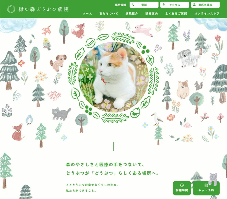
The homepage combines a bright green hospital identity with softly painted trees, flowers, birds and companion animals. A large circular photograph sits inside a loose botanical wreath, surrounded by small illustrations on an almost white background. Bold, rounded Japanese typography continues this approachable character through practical navigation and medical information.
The page is a substantial institutional homepage with several visitor tasks: choosing a clinic, finding treatment information, checking hours, making a reservation, reading news and ordering food. Its rhythm moves from an expansive illustrated opening into asymmetric information sections, a saturated green feature grid, and a detailed service footer. Photography of the grounds, diagnostic equipment and animals provides concrete context within the illustrated world.
閉じる
緑の森どうぶつ病院 — Style Reference
A welcoming woodland picture book surrounding a practical veterinary hospital directory.
Website: midori-no-mori.jp Original URL: https://midori-no-mori.jp/ Final URL: https://midori-no-mori.jp/ Response: HTTP 200; unchanged destination. Theme: a light canvas with vivid green identity surfaces and white reversed text. Inspected: October 2, 2026, 02:06 JST. Supplied retrieval timestamp: October 1, 2026, 17:06:36.413 UTC. Viewports: 1440 × 1000 desktop and 390 × 844 mobile, in CSS pixels. Scope: the current homepage. Screenshots cover the opening composition, desktop feature section, and desktop/mobile footer. Rendered DOM evidence additionally covers the introduction, news, treatment navigation, staff introduction, all six features, LINE contact section, FAQ and clinic directory. Linked pages and activated menus were not inspected.
The homepage combines a bright green hospital identity with softly painted trees, flowers, birds and companion animals. A large circular photograph sits inside a loose botanical wreath, surrounded by small illustrations on an almost white background. Bold, rounded Japanese typography continues this approachable character through practical navigation and medical information.
The page is a substantial institutional homepage with several visitor tasks: choosing a clinic, finding treatment information, checking hours, making a reservation, reading news and ordering food. Its rhythm moves from an expansive illustrated opening into asymmetric information sections, a saturated green feature grid, and a detailed service footer. Photography of the grounds, diagnostic equipment and animals provides concrete context within the illustrated world.
How to Read This Reference
- Measured values come from the supplied rendered element rectangles, computed styles and custom properties. Measurements are CSS pixels unless stated otherwise.
- Estimated values describe visible screenshot geometry where the corresponding element or style was not supplied.
- Calculated values are arithmetic derived from measurements, such as container widths and gaps.
- Recommended values and behaviors belong to the reusable implementation, not necessarily to the original website.
- Token names introduced here are implementation aliases. Only explicitly identified source custom properties were present in the supplied evidence.
- A DOM entry can describe an element inside a closed or concealed panel. Its text and rectangle do not establish that the panel was visibly open.
- The large English section labels contain styling not exposed by the sampled heading wrapper. A wrapper reporting
16pxdoes not mean the visible wordFEATURESis rendered at that size.
Tokens — Colors
Default Palette
| Name | Value | Suggested token | Evidence and role |
|---|---|---|---|
| Forest Green | #3FA037 |
--forest-green |
Measured on feature-section backgrounds, care-action fills, navigation text and introductory copy. Visually also establishes the header and green footer regions. |
| Warm White | #FEFEFB |
--forest-paper |
Measured body background. Its warmth is very subtle; preserve the near-white appearance. |
| Clear White | #FFFFFF |
--forest-white |
Measured utility-button backgrounds and reversed feature text. Also used by white icons and identity artwork. |
| Chat Blue | #1A6585 |
--forest-chat |
Measured chat-launcher fill and source --background-color-chatbot-button. This is a localized service-widget accent. |
| Secondary Green | #3D9738 |
--forest-green-secondary |
Measured on the mobile LINE contact caption. A close contextual variation, not evidence of a second theme. |
| Muted Gray | #828282 |
--forest-muted |
Measured on the mobile LINE-app explanatory note. Suitable as a reference for secondary captions. |
| Widget Pale Gray | #F0F4F8 |
--widget-footer |
Declared widget footer custom property. The supplied screenshots do not show an open chat footer. |
The warm paper and pure-white utility surfaces are intentionally close. Most visual separation comes from large green areas, photography, spacing and illustrations rather than a collection of contrasting neutral cards.
The forest artwork introduces muted sage, dusty pink, soft blue, ochre and brown. These are image colors, not measured interface tokens. Insurance and media logos retain their own colors; their red, lime and black should not become general action colors.
The supplied --swiper-theme-color: #007aff is a library-associated declaration. No visible blue carousel control establishes it as part of the page palette.
Theme Presets
Only one light presentation is evidenced. No selectable theme, dark mode or palette switch was observed.
Calculated accessibility consideration: Forest Green against pure white has approximately 3.3:1 contrast. Preserve its identity role, but evaluate small text separately in a new implementation. A darker green such as #286B25 is a recommended addition for small readable copy or controls that need stronger contrast; it is not an observed site color.
Tokens — Typography
Primary Rounded Gothic
- Measured family:
"Zen Maru Gothic", sans-serif. - Measured weight: predominantly
700, including body copy, navigation, introductory paragraphs and feature headings. - Character: rounded stroke endings, substantial weight and an informal warmth that fits the animal illustrations.
- Role: the main interface and editorial voice across Japanese text and the visible English section labels.
- Suggested alias:
--font-forest: "Zen Maru Gothic", sans-serif.
The body reports 16px / 16px, but content blocks override this with generous line heights. Use the paragraph measurements below rather than applying a one-line-height reset to readable content.
Identity and Artwork Lettering
The header wordmark is carried by a graphic inside an otherwise text-empty heading/link in the extraction. Its thin, spaced lettering is visibly different from the bold interface text. No source font for that wordmark is established.
The food brands, media marks and event banner also contain artwork lettering. Preserve their supplied graphic proportions; do not assign an invented font family to them.
Chat Typography
The widget separately declares "Noto Sans JP", sans-serif and a 14px custom-property size. Its launcher button reports browser-sized 13.3333px text and weight 400, although the visible control is an icon. This widget family should not replace the measured primary site font.
Type Scale
| Role | Desktop measurement | Mobile measurement | Tracking / notes |
|---|---|---|---|
| Main navigation and utility labels | 16px / 16px, 700 |
16px / 16px, 700 |
Normal tracking in sampled controls |
| Recruitment link | 14px / 23.8px, 700 |
Not visible in the captured mobile header | 1.33px |
| Introductory statement | 24px / 48px, 700 |
24.96px / 49.92px, 700 |
0.1em |
| Introductory supporting copy | 16px / 32px, 700 |
16.64px / 33.28px, 700 |
0.1em |
| News title | 16px / 27.2px, 700 |
16.64px / 28.288px, 700 |
0.05em |
| Treatment group label | 20px / 20px, 700 |
20.8px / 20.8px, 700 |
0.1em |
| Staff descriptive copy | 20px / 34px, 700 |
16.64px / 28.288px, 700 |
Approximately 0.095em |
| Feature heading | 32px / 48px, 700 |
29.12px / 43.68px, 700 |
0.05em |
| Feature description | 16px / 27.2px, 700 |
14.56px / 24.752px, 700 |
0.05em |
| FAQ question | Not sampled | 18.72px / 29.952px, 700 |
0.1em |
| Mobile clinic-directory title | Not sampled | 20.8px / 31.2px, 700 |
Normal tracking |
| Mobile shop-promotion caption | Not sampled | 15.6px / 23.4px, 700 |
Approximately 0.095em |
| Hours-panel details | 12px / 20.4px, 700 |
12.48px / 21.216px, 700 |
Panel content exists in the DOM; opening was not tested |
| Mobile LINE explanatory note | Not sampled | 12.48px / 21.216px, 700 |
0.1em |
| Large English feature label | Approximately 80px, screenshot estimate |
Exact child style unavailable | Use a large rounded display treatment |
| Feature numbers | Approximately 80px, screenshot estimate |
Exact child style unavailable | White numerals overlap the upper-left image region |
Keep the hierarchy between broad English section markers, Japanese explanations and practical labels. The introductory statement remains modest compared with the illustration; it begins below the opening artwork.
Tokens — Spacing & Shapes
Density: expansive between major sections, comfortable within editorial copy, compact in navigation and the footer sitemap.
Spacing Scale
| Use | Evidence | Reusable interpretation |
|---|---|---|
| Desktop header horizontal inset | 40px measured at the logo and right utility edge |
Header spacing is wider than mobile spacing |
| Desktop main content boundary | x = 120px through x = 1320px |
Calculated 1200px centered container |
| Mobile main inset | 20.796875px |
Approximately 20.8px at 390px width |
| Mobile header inset | 10.390625px |
Approximately half the main content inset |
| Desktop utility-button gap | 10px |
Tight grouping of related tasks |
| Desktop feature-column gap | 24px, calculated |
Three 384px columns within 1200px |
| Desktop feature inner left offset | 24px, measured padding |
Reserves space for the protruding feature number |
| Desktop feature image-to-heading gap | Approximately 20px, screenshot and geometry |
Image occupies about 280px of the 300px title offset |
| Desktop feature heading-to-copy gap | 20px, calculated |
Heading bottom at 5103px; paragraph begins at 5123px |
| Desktop feature row gap | 92px, calculated |
Clear separation between two rows |
| Mobile feature-item gap | Approximately 72.8px, calculated |
Individual features read as separate chapters |
| Introductory paragraph separation | 24px desktop; approximately 31.2px mobile |
Measured differences between paragraph rectangles |
| Mobile shop-link vertical padding | 31.2px, measured |
A substantial touchable promotional row |
Responsive Unit
Many mobile measurements are consistent with a 390 / 375 = 1.04 scale: 20 becomes 20.8, 24 becomes 24.96, and 14 becomes 14.56. This is a useful reconstruction clue, not a recovered stylesheet formula. Some controls remain exactly 16px, so the page is not uniformly scaled.
The source exposes --vh: 10px on desktop and 8.44px on mobile, matching one percent of the respective viewport heights. The evidence does not establish which components use that variable.
Border Radius
| Element | Value | Status |
|---|---|---|
| Desktop header utility control | 6px |
Measured |
| Mobile header utility control | 6.24px |
Measured |
| Desktop care-action button | 15px |
Measured |
| Mobile care-action button | 12.48px |
Measured |
| Chat launcher | 16px |
Measured |
| Feature photograph | Approximately 20px |
Screenshot estimate |
| Shop promotional photograph | Approximately 10–12px |
Screenshot estimate |
| Hero photograph | Circular crop | Visually observed; CSS mechanism not supplied |
The photograph circle and botanical wreath are separate shapes. A plain circular border cannot reproduce the leaf, seed and branch artwork.
Layout Measurements
| Element | Desktop | Mobile |
|---|---|---|
| Document height | 9562.88px measured |
13147.44px measured |
| Visible opening header | Approximately 100px high |
Approximately 104px high |
| Header brand link | 340 × 45px, at (40, 27.5) |
249.59 × 33.03px, at approximately (10.39, 12.47) |
| Header utility control | 160 × 34px |
116.47 × 33.27px |
| Hero section | 1440 × 950px |
390 × 582.39px |
| Outer hero wreath | Approximately 570–580px wide |
Approximately 310–315px wide |
| Inner hero photograph | Approximately 440px diameter |
Approximately 240px diameter |
| Introduction text column | 528.02px wide |
348.41px wide |
| Feature section | 1723.42px high |
3416.48px high |
| Feature item | 384px overall; 360px content after left inset |
348.41px wide, without desktop left inset |
| Hours action | 100 × 80px |
164.31 × 58.23px |
| Reservation action | 150 × 80px |
164.31 × 58.23px |
| Chat launcher | 56 × 56px |
56 × 56px |
The header wrapper itself reports zero height. That is a wrapper-layout detail, not the height of the visible green header.
Components
Site Header
Role: persistent identity and quick access to operational information.
The desktop header has a large white wordmark at left and two rows of navigation at right. The upper row contains a small recruitment link followed by three white controls: 電話, アクセス and 獣医当番表. Each utility control combines a green icon with a bold green label. The lower row contains the main site categories in white.
The measured desktop logo is 340 × 45px. Utility controls are 160 × 34px with 6px corners. The main navigation uses 16px bold Zen Maru Gothic. The header remains at the top of all three desktop captures, supporting a persistent-header interpretation; its exact positioning rule was not supplied.
On mobile, the logo and a three-line menu icon occupy the first row. The same three utility controls span the second row. The logo becomes approximately 250px wide and the utility buttons become equal-width controls of approximately 116px.
Only the hamburger remains visible in the supplied mobile footer capture. Do not infer that the full mobile header stays fixed throughout scrolling, or invent the threshold at which it changes.
Utility Panels and Clinic Selection
Role: route a visitor to the appropriate clinic or information source.
The DOM contains branch telephone links, address links, hours information and reservation destinations associated with the utility controls. Several parent controls have an empty href, while their child links have concrete tel:, internal-access or reservation URLs. This supports a trigger-and-panel structure, but does not establish whether it opens on hover, click or another event.
The telephone content groups clinic names with phone numbers. The access content groups clinic names with addresses. The reservation content offers individual clinic destinations rather than one universal booking link.
Recommended implementation: use real buttons for panel triggers, meaningful expanded states, keyboard access and explicit dismissal. Preserve clinic selection as part of the task. Do not copy an empty anchor as a functional navigation target.
Illustrated Opening
Role: communicate the hospital's relationship with animals and nature before presenting dense information.
The opening is a layered composition:
- A near-white full-width canvas.
- Scattered painted trees, flowers, animals and pale blue cloud forms, including elements clipped by the viewport edges.
- A large centered circular photograph.
- Botanical details integrated into or over the photographic scene.
- A separate vivid-green wreath of leaves, branches, seeds and berries around the circle.
The desktop capture shows hospital buildings and lawn in the center. The mobile capture shows a cat. These are two observed image states; they do not prove a device-specific image rule or a particular slideshow sequence.
The desktop wreath occupies roughly 40% of the viewport width. On mobile it occupies roughly 80%, while the surrounding woodland is recomposed into a taller, denser field. Keep the animal or building subject recognizable through the crop.
There is no large text block across the photograph. A fine green vertical mark is visible below the desktop illustration, but its animation or interaction role is unverified.
Introductory Statement
Role: connect the illustrated opening to the hospital's philosophy.
A centered desktop column approximately 528px wide contains left-aligned green copy. The lead statement uses 24px type, a 48px line height and 0.1em tracking. Supporting paragraphs use 16px type with 32px line height and the same tracking ratio. A text link to 私たちについて closes the sequence.
On mobile, the column expands to the standard 348.41px content width. The lead becomes four lines at 24.96px / 49.92px, rather than being reduced to tiny text. Its first rectangle begins approximately 112px after the hero section ends. The large line spacing is part of the calm, deliberate pacing.
News List
Role: surface current hospital and community updates.
Measured desktop geometry places the section title on the left and a 760px-wide news list on the right. Each row is a flex link with a date area followed by category and title information. The title begins 100px to the right of the row origin. Two entries are present in the supplied page.
Rows measure approximately 105.2px high with 20px vertical padding. On mobile, the section heading precedes full-width rows; the content starts approximately 81.1px after the left edge. The longer first title wraps, increasing its row to approximately 126.2px, while the second is approximately 98.6px high.
A separate news-index link ends the section. The exact row-rule treatment and date-child typography were not supplied; do not turn an unverified detail into a required token.
Treatment Navigation
Role: let visitors browse by animal, medical service or care need.
The desktop arrangement pairs a large section title at the right with a 640px-wide navigation area at the left. It contains distinct groups headed by どうぶつごとの診療, 診療内容 and ケア.
The measured link-box arrangements are deliberately varied:
- Animal categories: three 160 × 160px links across the desktop group.
- Primary treatment links: another three 160 × 160px links.
- Smaller treatment links: four 130 × 130px links across.
- Care links: three 160 × 160px links with closer spacing than the animal row.
On mobile, the heading moves above the navigation. Large links become approximately 163.27px squares in two columns. Small treatment and care links become 104px squares in three columns, with overflow to a further row where needed.
Several extracted anchors have no text. The evidence does not include their image source paths or accessible-name computation. Preserve the measured hierarchy of large and small link groups, while providing explicit text alternatives in a new implementation.
Staff Introduction
Role: establish the human expertise behind the hospital experience.
The desktop section uses an asymmetric split: the DOCTOR & STAFF heading and staff-index link sit at the left, while a 560px-wide explanatory region sits at the right. Its descriptive paragraph is measured at 20px / 34px. A media region below the copy measures approximately 560 × 358.8px.
The mobile ordering changes to section heading, media region, introductory statement, paragraph and link. The media region becomes approximately 348.41 × 223.22px, preserving its measured aspect ratio. Supporting copy reduces to 16.64px / 28.288px.
The supplied screenshots do not show the media contents for this section. Its dimensions and position are known; the exact photograph, crop and decorative treatment are not.
Feature Section
Role: explain six aspects of the hospital group in a continuous branded environment.
A full-width Forest Green surface reverses headings and copy to white. On desktop, the large FEATURES heading sits toward the upper right, with the Japanese subtitle below it. The content begins as three columns and continues into a second row.
Each feature has:
- A large white two-digit number projecting to the left of the image alignment.
- A photograph with rounded corners.
- A bold Japanese heading.
- A compact descriptive paragraph.
- An optional related-page link.
The first visible row shows hospital grounds, a CT scanner and a dog portrait. Each desktop item is 384px wide with 24px left padding, producing a 360px image and copy width. Photographs are approximately 360 × 280px. Headings are 32px / 48px, and body text is 16px / 27.2px.
The image and text sit directly on green. There is no separate white card body, bounding card border or general card shadow. Some related-page links use a long fine rule and a small botanical ring ornament visible in the desktop feature capture.
On mobile, all six features become a single column. The desktop left inset disappears. Headings become 29.12px / 43.68px and paragraphs 14.56px / 24.752px. The heading for the equipment feature occupies one line on mobile despite occupying two on desktop, demonstrating a content-specific line-break change.
Care Actions
Role: keep 診療時間 and ネット予約 easy to find.
On desktop, the buttons sit near the lower right. The hours button is 100 × 80px; the reservation button is 150 × 80px; the gap is 10px. Both use a green fill, white icon, white label and 15px corners. Icons sit above the labels. A small illustrated gray cat overlaps the upper edge of the reservation control.
The opening mobile capture instead shows two equal 164.31 × 58.23px buttons with approximately 19.8px between them. Their icons and labels are arranged horizontally, and the cat still protrudes above the reservation button.
The desktop pair is visible over both the opening and feature section but absent from the final desktop footer capture. Mobile positioning also differs between the opening and bottom captures. The evidence does not justify an unconditional fixed-bottom rule for every state.
The mobile opening places these controls across the beginning of the introductory text. Record that overlap as current behavior; provide clearer text clearance when adapting the design.
Campaign Banner
Role: promote a current event independently of the main hospital navigation.
A detailed illustrated event banner overlays the lower-left corner in the opening and desktop feature captures. The painted image is approximately 600 × 150px on desktop and 240 × 60px on mobile. Its artwork includes its own serif lettering and a rounded detail label.
The extracted desktop anchor rectangle is 1200 × 170px, and the mobile anchor rectangle is 370 × 80px. Those rectangles are larger than the visibly painted banner. Do not treat the anchor width as the image width.
A stray < character appears below the artwork and in its extracted link text. It is not evidence of a designed carousel arrow or close control. No dismissal behavior was tested. The banner is absent from the footer screenshots, so its full visibility lifecycle remains unknown.
Chat Launcher
Role: provide a separate assistance channel.
The launcher is a 56px square with 16px corners, a Chat Blue fill and a small white outlined speech-bubble icon. It sits 20px from the right and bottom edges in both measured viewports. A soft shadow separates it from the page; this is a localized floating-widget treatment.
The DOM contains a branded assistance greeting and topic choices for inquiries, reservations, medication, food and products. The screenshots show the closed launcher. Open-panel geometry, submission behavior and conversation flow were not exercised.
LINE Contact Section
Role: direct visitors to inquiries, bookings and eligible repeat food orders.
The DOM establishes a promotional statement, explanatory copy, a LINE destination and a device-specific instruction. The desktop text says that clicking displays a QR code. The mobile text says that the LINE app opens. These are instructions presented by the page, not verified interaction results.
The mobile explanatory area uses a narrower approximately 287px text column, with white copy and generous vertical separation from the lower contact area. The visible green contact caption uses the measured Secondary Green. Exact decorative artwork and the complete desktop composition were not shown in the supplied screenshots.
FAQ
Role: answer common concerns about booking, waiting, payment and treatment costs.
Six question prompts are present. On mobile, the question copy begins around x = 89.42px within the standard content region, leaving a prominent left area for the Q marker. Questions use 18.72px / 29.952px type with 0.1em tracking and wrap over two or three lines.
Answer text is present in section-level DOM content while the supplied visible-text extraction lists the questions. This is consistent with a collapsed question-and-answer presentation, but opening behavior and animation were not tested.
Recommended implementation: a native disclosure or a button controlling an answer region is appropriate. Keep answers accessible without assuming that an untested source interaction already meets keyboard requirements.
Clinic Directory
Role: consolidate hours, location, telephone and reservation routes by hospital.
The desktop text exposes six named clinic entries with operational details and separate links for booking and the clinic page. The mobile visible text retains the clinic names while omitting those details. Measured mobile titles are 20.8px / 31.2px, separated by roughly 64.45px between title origins.
This supports a compact or collapsed mobile directory, but its opening interaction is unverified. The homepage also contains a feature headline referring to seven hospitals. Do not invent an additional directory record to reconcile that headline with the six supplied entries.
Shop Promotion Strip
Role: connect the hospital site to its food products and ordering service.
The desktop footer presents two side-by-side promotions on green, separated by a fine white vertical rule. Each combines a photograph at the left with a short white caption and a white product/service mark at the right. The visible desktop photographs are approximately 200 × 120px.
On mobile, the two promotions stack vertically, but each individual promotion retains its image-and-text row. This is an important distinction from a fully stacked card:
- Link width:
348.41px, measured. - Photograph region: approximately
135.19 × 124.78px, measured for the first promotion. - Text/logo region: approximately
193.44pxwide. - Horizontal gap: approximately
19.78px, calculated. - Vertical padding:
31.2px, measured.
A white horizontal rule separates the mobile rows. The first photograph shows food packaging outdoors; the second shows a leafy tree canopy.
Sitemap and Trust Footer
Role: complete navigation and display insurance and publication relationships.
The desktop green sitemap uses four broad columns: general pages, hospital-group locations, hospital information and treatment information. Small white triangular markers precede links. The main column starts align at approximately x = 120, 420, 720 and 1020px.
Below this is a white-looking trust strip. Insurance banners occupy the left group, while four publication logos occupy the right. Green section labels introduce both groups. Copyright appears as small gray text at the lower left.
The mobile output does not show the desktop sitemap. Insurance banners stack in one column, and the publication marks form a two-by-two arrangement. Copyright is centered. Preserve the original proportions and colors of partner marks rather than forcing them into a uniform monochrome icon system.
Tokens — Motion & Interaction
| Element or treatment | Evidence | What remains unverified |
|---|---|---|
| Chat launcher | Computed transition: transform 0.1s |
Trigger, transform distance and active-state shape |
| Hero image changes | Hospital photograph in desktop capture; cat photograph in mobile capture | Autoplay, ordering, interval, crossfade, swipe or device-based selection |
| Desktop header persistence | Header remains at the top across supplied desktop scroll positions | Exact CSS positioning and scroll logic |
| Mobile header change | Full opening header; hamburger visible in footer capture | Threshold, animation and intermediate states |
| Utility panels | Trigger labels and associated links/content in DOM | Hover versus click, opening transition and dismissal |
| FAQ answers | Answer content exists beyond the visible question list | Toggle behavior, duration and expanded appearance |
| LINE entry | Device-specific instructions in visible text | Actual QR display and app-opening result |
| Campaign and care controls | Presence varies among captures | Scroll thresholds, hiding rules and animations |
| General sampled elements | Most report animation: none and transition: all without a duration |
Unsampled descendants, pseudo-elements and script-driven effects |
A bare transition: all is not evidence of a timed transition. The supplied readiness procedure waited for visible images and finite animations and temporarily paused perpetual animations during checks. This helps capture settled layouts but does not document a full motion sequence.
Recommended motion language: brief opacity or small-position changes, approximately 150–250ms, are compatible with the gentle visual character. These timings are design suggestions. Keep the artwork legible, avoid inventing parallax as an observed feature, and provide reduced-motion behavior if animation is added.
Surfaces
| Layer | Appearance | Purpose |
|---|---|---|
| Main canvas | Measured #FEFEFB |
Spacious background for illustration and green editorial text |
| Header | Visually solid Forest Green | Identity and navigation grouping |
| Utility controls | Measured white fill with green content | Compact operational shortcuts |
| Feature field | Measured Forest Green with white copy | Strong visual chapter containing all six features |
| Feature content | Transparent over the green field | Structure through images, numbers and typography |
| Shop and sitemap regions | Visually green with white text and fine white divisions | Extended navigation and service relationships |
| Trust strip | Visually white | Keeps partner marks clear and recognizable |
| Floating care controls | Measured green with white content | Repeat access to hours and reservations |
| Chat launcher | Measured blue with visible soft shadow | Separates the assistance widget from core navigation |
There is no pervasive elevation system. Rounded photography and botanical artwork supply softness; flat color fields and whitespace organize the page.
Imagery
The primary illustration language resembles watercolor and colored-pencil picture-book artwork. Trees have irregular silhouettes and visible pigment variation. Animals are simplified and expressive, with small facial details. Flowers appear as scattered stems or loose clusters. Pale blue cloud forms frame the upper corners.
The green wreath is more graphic than the surrounding painting: crisp, open botanical linework with repeated leaf and berry motifs. It should remain airy, with the white background visible between its parts. The central photograph is a separate full-color layer.
Photography is bright and concrete. Hospital grounds, medical equipment and an animal portrait appear together in the first feature row, connecting place, capability and patient experience. Use rounded crops while retaining enough environmental detail to explain the subject.
Do not apply image-rendering: pixelated; the soft brush texture and ordinary photography require normal image rendering.
Observed Asset References
The supplied evidence does not include original image filenames or asset URLs. These are visual references, not downloadable paths.
| Asset group | Direct evidence | Treatment |
|---|---|---|
| White hospital identity | Desktop and mobile opening captures | Botanical emblem plus spaced wordmark; preserve aspect ratio |
| Woodland background | Desktop and mobile opening captures | Scattered painted trees, flowers and animals; edge cropping |
| Green botanical wreath | Desktop and mobile opening captures | Separate decorative frame around a circular photo |
| Hospital hero scene | Desktop opening capture | Building and lawn within the circular composition |
| Cat hero scene | Mobile opening capture | Cat portrait with botanical details |
| First feature photographs | Desktop feature capture | Grounds, CT equipment and dog; rounded rectangular crops |
| Reservation cat | Opening and desktop feature captures | Small illustration extending above the action button |
| Event artwork | Opening and desktop feature captures | Approximately 4:1 banner with embedded lettering |
| Food and ordering promotions | Desktop and mobile footer captures | Packaging and forest photographs beside white brand marks |
| Insurance and media marks | Desktop and mobile footer captures | Original colors and varied aspect ratios |
CSS can reproduce the page structure, but the woodland identity requires actual illustration assets. Keep decorative art separate from readable interface text and from meaningful medical photographs.
Layout & Responsive Behavior
The desktop homepage repeatedly uses a centered 1200px content area while allowing green fields and illustration backgrounds to span the viewport. Section titles alternate between the left and right sides of split layouts. This produces a more varied reading rhythm than aligning every title above a uniform grid.
| Region | Desktop behavior | Mobile behavior | Evidence level |
|---|---|---|---|
| Header | Logo left; utilities above primary navigation | Logo and hamburger above three utility buttons | Screenshots and measurements |
| Opening | Broad woodland composition; large centered circle | Taller composition relative to width; circle dominates available width | Screenshots and measurements |
| Introduction | Narrow centered text column | Full content width with deliberate line breaks | Measurements and text |
| News | Heading left, list right | Heading above the list | Measured positions |
| Treatment | Category area left, title right | Title above category groups | Measured positions |
| Large treatment links | Three columns | Two columns | Measured rectangles |
| Small treatment links | Four columns | Three columns | Measured rectangles |
| Staff | Left title/link; right copy/media | Title, media, copy, link | Measured vertical order |
| Features | Three columns over two rows | Six sequential items | Measured positions |
| Clinic directory | Operational details exposed in text | Clinic names exposed; details not visible | Text and measured titles |
| Shop strip | Two promotions side by side | Promotions stacked, each retaining two inner columns | Screenshots and measurements |
| Sitemap | Four columns | Not shown in supplied mobile output | Screenshots and text |
| Trust marks | Insurance and media groups side by side | Insurance stacked; media in two columns | Screenshots |
The page height increases from approximately 9563px to 13147px on mobile. The treatment section grows from 995px to approximately 1722px, and the feature section grows from approximately 1723px to 3416px. This is substantial reflow, not a scaled desktop screenshot.
Only two viewport widths were supplied. Exact breakpoints, tablet layouts, landscape behavior, zoom behavior and safe-area rules remain unknown. Breakpoints in the Quick Start are recommended implementation choices.
The mobile opening has several competing layers: care actions around y = 681px, introductory copy beginning around y = 695px, event artwork around y = 768px, and the chat launcher at the same lower-right height. In a new implementation, reserve space or use in-flow placement so these layers do not cover essential text.
Do’s and Don’ts
Do
- Preserve the measured Forest Green
#3FA037, near-white paper and predominantly bold Zen Maru Gothic. - Build the opening from separate woodland, circular-photo and botanical-wreath layers.
- Keep the introduction below the opening artwork with wide line spacing.
- Retain the desktop distinction between broad section markers and narrower explanatory regions.
- Place feature photographs, headings and descriptions directly on the green section.
- Let feature numbers protrude from the photograph alignment.
- Preserve the treatment navigation's different large and small link groups.
- Keep telephone, access, hours and reservations easy to locate.
- Retain image-and-text rows inside the stacked mobile shop promotions.
- Treat partner logos, event artwork and the chat widget as contextual visual systems.
- Mark untested interactions and estimated dimensions explicitly when handing this reference to another agent.
Don’t
- Don't turn the homepage into a single-offer sales page with one generic conversion flow.
- Don't replace the illustrated wreath with a plain circle stroke.
- Don't replace the painted animals and trees with a uniform stock-icon set.
- Don't put white card bodies and shadows behind every feature.
- Don't replace the main rounded font with the chat widget's font.
- Don't shrink all mobile content proportionally; preserve the observed reordering and column changes.
- Don't assume the hero's cat and building states are exclusive to particular devices.
- Don't interpret hidden panel rectangles as screenshots of open menus.
- Don't use the raw
16pxsection-heading wrapper style as the visible English display size. - Don't infer carousel controls, dismissal actions or motion timings from the stray banner character or library variable.
- Don't reproduce overlapping mobile controls without providing space for the underlying content.
Recommended Implementation Additions
These are recommendations for a new implementation, not verified features of the original page:
- Use semantic buttons for menu and utility-panel triggers, with accessible names, expanded states and keyboard dismissal.
- Keep a visible focus indicator on white and green surfaces.
- Check small green-on-white and white-on-green text contrast; introduce a darker contextual green where needed.
- Place mobile care actions in normal document flow or reserve their actual occupied space, including the protruding cat illustration.
- Give the campaign banner an explicit lifecycle and accessible dismissal if it is presented as an overlay.
- Preserve essential clinic information when scripts fail or disclosures cannot open.
- Give treatment links meaningful accessible names; the supplied extraction is insufficient to determine their current names.
- Mark decorative woodland and wreath images as decorative. Provide meaningful alternatives for photographs that communicate facilities or services.
- Set intrinsic image dimensions and reserve aspect ratios to prevent layout shifts. Prioritize the opening imagery and defer lower-page photographs appropriately.
- If a hero sequence is implemented, provide pause/reduced-motion behavior and keep important information independent of any single frame.
- Keep clinic hours, addresses and reservation destinations in structured content rather than embedding them in artwork.
Agent Prompt Guide
Quick Color Reference
- Main canvas:
#FEFEFB. - Brand fields, primary green copy and care actions:
#3FA037. - Reversed text and utility-button surfaces:
#FFFFFF. - Chat launcher only:
#1A6585. - Secondary note:
#828282. - Optional stronger-contrast green:
#286B25, a recommendation rather than a source token. - Illustration colors: soft sage, pink, blue, ochre and brown carried by artwork.
Overall Prompt
“Create a Japanese veterinary hospital-group homepage with the visual character of a woodland picture book. Use near-white #FEFEFB, vivid green #3FA037, and bold Zen Maru Gothic. Build a broad illustrated opening with softly painted trees, flowers, birds and companion animals around a circular photograph framed by a crisp green botanical wreath. Place the introductory statement below the artwork with generous line spacing. Use a 1200px desktop content area, alternating title-and-content sections, grouped treatment links, and a full-width green section containing six numbered photographic features. Provide prominent telephone, access, clinic-hours and reservation routes. On mobile, reflow large treatment links into two columns, smaller links into three, and features into one column. Stack footer shop promotions while retaining their inner image/text rows. Keep artwork, photography and practical navigation equally important.”
Example Component Prompts
- Header: “Design a green hospital header with a white botanical wordmark at left. At desktop, put recruitment and three white utility buttons above a white-text navigation row. At mobile, put a hamburger beside the wordmark and retain three equal utility buttons beneath it. Use 16px bold rounded Japanese labels and small corner radii.”
- Opening illustration: “Compose a near-white woodland scene with loose watercolor trees, flowers and small animals. Center a full-color circular photograph inside an open green wreath made of leaves, branches and berries. Keep the subject visible and place introductory copy beneath the illustrated scene.”
- Feature item: “Create a feature directly on a green field: an oversized white two-digit number overlapping the upper-left edge of a rounded photograph, a bold white Japanese heading, a compact white paragraph and an optional ruled text link with a botanical ornament. Use no separate card panel.”
- Mobile treatment navigation: “Use a 348px content area at a 390px viewport. Arrange primary animal and treatment links as approximately 163px squares in two columns. Arrange smaller service and care links as approximately 104px squares in three columns. Keep group headings visible and give every image-led link an accessible name.”
- Shop strip: “Build two green footer promotions with a photograph on the left and a white caption plus product mark on the right. Display the promotions side by side on desktop and stack them on mobile, retaining the two-column anatomy within each row.”
- Care controls: “Create green hours and reservation controls with white clock/calendar icons and bold labels. Use icon-over-label desktop buttons and two equal horizontal mobile buttons. Let a small gray illustrated cat extend above the reservation control, and reserve enough space to keep nearby text readable.”
Quick Start
CSS Custom Properties
This is an implementation adaptation, not extracted source CSS. Exact colors and several control/type measurements are preserved. Hero sizes and photograph corners use screenshot estimates. The 375px mobile design unit is inferred from repeated measurements and capped here as a recommendation. Breakpoints are chosen for this starter.
Load Zen Maru Gothic through the project's font setup. Supply actual image assets through markup; no original asset URLs were included in the evidence. The CSS covers the header, layered opening, introduction, features, shop promotions and care controls. Mobile care actions intentionally use normal flow to protect readable content.
:root {
  /* Measured palette */
  --forest-green: #3fa037;
  --forest-paper: #fefefb;
  --forest-white: #ffffff;
  --forest-chat: #1a6585;
  --forest-muted: #828282;
  --forest-green-secondary: #3d9738;

  /* Recommended additional text color */
  --forest-readable: #286b25;

  /* Verified primary family; font loading is configured separately */
  --font-forest: 'Zen Maru Gothic', sans-serif;
  --weight-forest: 700;
  --copy-size: 16px;
  --copy-leading: 1.7;
  --copy-tracking: 0.05em;
  --feature-title-size: 32px;
  --feature-title-leading: 1.5;

  /* Measured desktop geometry */
  --content-max: 1200px;
  --content-gutter: 40px;
  --header-height: 100px;
  --header-logo-width: min(23.611vw, 340px);
  --feature-gap: 24px;
  --feature-row-gap: 92px;
  --radius-utility: 6px;
  --radius-care: 15px;
  --radius-chat: 16px;

  /* Screenshot estimates */
  --radius-photo: 20px;
  --hero-wreath-size: 580px;

  /* Recommended bounded mobile unit */
  --m: clamp(1px, calc(100vw / 375), 1.2px);
}

* {
  box-sizing: border-box;
}

body {
  margin: 0;
}

.mori-page {
  color: var(--forest-green);
  background: var(--forest-paper);
  font-family: var(--font-forest);
  font-size: var(--copy-size);
  font-weight: var(--weight-forest);
  line-height: var(--copy-leading);
}

.mori-page img {
  display: block;
  max-width: 100%;
}

.mori-page :where(button, input, select, textarea) {
  font: inherit;
}

.mori-page :where(a, button):focus-visible {
  outline: 3px solid var(--forest-chat);
  outline-offset: 4px;
}

.on-green :where(a, button):focus-visible {
  outline-color: var(--forest-white);
}

.mori-container {
  width: min(
    var(--content-max),
    calc(100% - 2 * var(--content-gutter))
  );
  margin-inline: auto;
}

.site-header {
  position: fixed;
  inset: 0 0 auto;
  z-index: 30;
  display: grid;
  grid-template-columns: var(--header-logo-width) minmax(0, 1fr);
  grid-template-rows: 34px 34px;
  align-items: center;
  row-gap: 14px;
  height: var(--header-height);
  padding: 9px 40px;
  color: var(--forest-white);
  background: var(--forest-green);
}

.site-brand {
  grid-column: 1;
  grid-row: 1 / 3;
  width: var(--header-logo-width);
}

.site-brand img {
  width: 100%;
  height: auto;
}

.header-utilities {
  grid-column: 2;
  grid-row: 1;
  display: flex;
  justify-content: flex-end;
  align-items: center;
  gap: 10px;
}

.utility-button {
  display: inline-flex;
  align-items: center;
  justify-content: center;
  gap: 12px;
  width: 160px;
  height: 34px;
  border: 0;
  border-radius: var(--radius-utility);
  color: var(--forest-green);
  background: var(--forest-white);
  font-size: 16px;
  font-weight: 700;
  line-height: 1;
  text-decoration: none;
}

.recruit-link {
  margin-right: 10px;
  color: inherit;
  font-size: 14px;
  letter-spacing: 0.095em;
  text-decoration: none;
}

.primary-nav {
  grid-column: 2;
  grid-row: 2;
  display: flex;
  justify-content: flex-end;
  align-items: center;
  gap: clamp(20px, 2.778vw, 40px);
}

.primary-nav a {
  color: inherit;
  font-size: 16px;
  line-height: 1;
  white-space: nowrap;
  text-decoration: none;
}

.menu-toggle {
  display: none;
}

.forest-hero {
  position: relative;
  isolation: isolate;
  height: 950px;
  overflow: hidden;
}

.forest-hero__backdrop {
  position: absolute;
  inset: var(--header-height) 0 0;
  width: 100%;
  height: calc(100% - var(--header-height));
  object-fit: cover;
  object-position: center top;
  pointer-events: none;
}

.forest-hero__portrait {
  position: absolute;
  top: 180px;
  left: 50%;
  width: var(--hero-wreath-size);
  aspect-ratio: 1;
  margin: 0;
  transform: translateX(-50%);
}

.forest-hero__photo {
  position: absolute;
  inset: 12%;
  width: 76%;
  height: 76%;
  border-radius: 50%;
  object-fit: cover;
}

.forest-hero__wreath {
  position: absolute;
  inset: 0;
  width: 100%;
  height: 100%;
  object-fit: contain;
  pointer-events: none;
}

.mission {
  width: min(528px, calc(100% - 2 * var(--content-gutter)));
  margin-inline: auto;
  padding-top: 30px;
}

.mission__lead {
  margin: 0 0 24px;
  font-size: 24px;
  line-height: 2;
  letter-spacing: 0.1em;
}

.mission__copy {
  margin: 0 0 24px;
  font-size: 16px;
  line-height: 2;
  letter-spacing: 0.1em;
}

.feature-section {
  padding-block: 114px 126px;
  color: var(--forest-white);
  background: var(--forest-green);
}

.section-heading {
  margin: 0;
}

.feature-section .section-heading {
  width: fit-content;
  margin-left: auto;
  margin-bottom: 72px;
}

.section-heading__en {
  display: block;
  font-size: 80px; /* Screenshot-based desktop estimate */
  line-height: 1.1;
}

.section-heading__ja {
  display: block;
  margin-top: 8px;
  font-size: 20px;
  line-height: 1.5;
  letter-spacing: 0.05em;
}

.feature-grid {
  display: grid;
  grid-template-columns: repeat(3, minmax(0, 1fr));
  gap: var(--feature-row-gap) var(--feature-gap);
}

.feature-item {
  position: relative;
  min-width: 0;
  padding-left: 24px;
}

.feature-item__number {
  position: absolute;
  z-index: 1;
  top: -28px;
  left: 0;
  font-size: 80px; /* Screenshot-based estimate */
  line-height: 1;
}

.feature-item__photo {
  width: 100%;
  aspect-ratio: 9 / 7;
  border-radius: var(--radius-photo);
  object-fit: cover;
}

.feature-item h3 {
  margin: 20px 0;
  font-size: var(--feature-title-size);
  line-height: var(--feature-title-leading);
  letter-spacing: 0.05em;
}

.feature-item p {
  margin: 0;
  font-size: var(--copy-size);
  line-height: 1.7;
  letter-spacing: 0.05em;
}

.botanical-link {
  display: flex;
  align-items: center;
  justify-content: space-between;
  min-height: 47px;
  margin-top: 30px;
  border-bottom: 1px solid currentColor;
  color: inherit;
  text-decoration: none;
}

.botanical-link img {
  width: 47px;
  height: 47px;
  object-fit: contain;
}

.shop-section {
  color: var(--forest-white);
  background: var(--forest-green);
}

.shop-band {
  display: grid;
  grid-template-columns: repeat(2, minmax(0, 1fr));
}

.shop-link {
  display: grid;
  grid-template-columns: 200px minmax(0, 1fr);
  align-items: center;
  gap: 40px;
  padding-block: 40px;
  color: inherit;
  text-decoration: none;
}

.shop-link:first-child {
  padding-right: 40px;
  border-right: 1px solid var(--forest-white);
}

.shop-link:last-child {
  padding-left: 40px;
}

.shop-link__photo {
  width: 100%;
  aspect-ratio: 5 / 3;
  border-radius: 12px;
  object-fit: cover;
}

.shop-link__caption {
  margin: 0 0 16px;
  font-size: 16px;
  line-height: 1.5;
}

.shop-link__mark {
  width: 100%;
  height: auto;
}

.care-actions {
  position: fixed;
  right: 100px;
  bottom: 20px;
  z-index: 20;
  display: flex;
  gap: 10px;
}

.care-action {
  position: relative;
  display: flex;
  flex-direction: column;
  align-items: center;
  justify-content: center;
  gap: 8px;
  width: 100px;
  min-height: 80px;
  border: 0;
  border-radius: var(--radius-care);
  color: var(--forest-white);
  background: var(--forest-green);
  font-size: 16px;
  line-height: 1;
  text-decoration: none;
}

.care-action--reservation {
  width: 150px;
}

.care-action__mascot {
  position: absolute;
  right: 12px;
  bottom: calc(100% - 24px);
  width: 56px;
  pointer-events: none;
}

.chat-launcher {
  position: fixed;
  right: 20px;
  bottom: 20px;
  z-index: 40;
  display: grid;
  place-items: center;
  width: 56px;
  height: 56px;
  border: 0;
  border-radius: var(--radius-chat);
  color: var(--forest-white);
  background: var(--forest-chat);
  box-shadow: 0 2px 9px rgb(0 0 0 / 22%); /* Visual approximation */
  transition: transform 0.1s;
}

/* Use an explicit state controlled by the application's visibility logic. */
.care-actions[hidden] {
  display: none;
}

/* Recommended compact-header breakpoint; the source breakpoint is unknown. */
@media (max-width: 80rem) {
  .site-header {
    grid-template-columns: minmax(0, 1fr) 44px;
    grid-template-rows: auto auto;
    row-gap: 0;
    height: auto;
    min-height: calc(100 * var(--m));
    padding: 0 calc(10 * var(--m)) calc(12 * var(--m));
  }

  .site-brand {
    grid-row: 1;
    width: calc(240 * var(--m));
    max-width: 100%;
    padding-block: calc(12 * var(--m));
  }

  .header-utilities {
    grid-column: 1 / -1;
    grid-row: 2;
    display: grid;
    grid-template-columns: repeat(3, minmax(0, 1fr));
    gap: calc(10 * var(--m));
  }

  .utility-button {
    width: 100%;
    height: calc(32 * var(--m));
    gap: 8px;
    border-radius: calc(6 * var(--m));
  }

  .primary-nav,
  .recruit-link {
    display: none;
  }

  .menu-toggle {
    grid-column: 2;
    grid-row: 1;
    display: grid;
    place-content: center;
    gap: 6px;
    width: 44px;
    height: 44px;
    border: 0;
    color: inherit;
    background: transparent;
  }

  .menu-toggle span {
    width: 32px;
    height: 3px;
    border-radius: 2px;
    background: currentColor;
  }
}

/* Recommended intermediate layout, not an observed tablet state. */
@media (min-width: 48.001rem) and (max-width: 64rem) {
  .feature-grid {
    grid-template-columns: repeat(2, minmax(0, 1fr));
  }

  .shop-band {
    grid-template-columns: 1fr;
  }

  .shop-link:first-child,
  .shop-link:last-child {
    padding-inline: 0;
    border-right: 0;
  }
}

@media (max-width: 48rem) {
  :root {
    --content-gutter: calc(20 * var(--m));
    --header-height: calc(100 * var(--m));
    --hero-wreath-size: calc(300 * var(--m));
    --feature-title-size: calc(28 * var(--m));
    --radius-care: calc(12 * var(--m));
  }

  .forest-hero {
    height: calc(560 * var(--m));
  }

  .forest-hero__portrait {
    top: calc(170 * var(--m));
  }

  .mission {
    width: calc(100% - 2 * var(--content-gutter));
    padding-top: calc(108 * var(--m));
  }

  .mission__lead {
    margin-bottom: calc(30 * var(--m));
    font-size: calc(24 * var(--m));
  }

  .mission__copy {
    margin-bottom: calc(30 * var(--m));
    font-size: calc(16 * var(--m));
  }

  .feature-section {
    padding-block: calc(80 * var(--m));
  }

  .feature-section .section-heading {
    width: 100%;
    margin-bottom: calc(48 * var(--m));
  }

  .section-heading__en {
    font-size: clamp(44px, 13.3vw, 64px); /* Recommended mobile scale */
  }

  .feature-grid {
    grid-template-columns: minmax(0, 1fr);
    gap: calc(70 * var(--m));
  }

  .feature-item {
    padding-left: 0;
  }

  .feature-item__number {
    left: 0;
    font-size: 60px; /* Recommendation; mobile source size unavailable */
  }

  .feature-item__photo {
    aspect-ratio: 16 / 9; /* Recommended crop; source image bounds unavailable */
  }

  .feature-item h3 {
    margin: calc(12 * var(--m)) 0;
  }

  .feature-item p {
    font-size: calc(14 * var(--m));
  }

  .shop-band {
    grid-template-columns: 1fr;
  }

  .shop-link {
    grid-template-columns: calc(130 * var(--m)) minmax(0, 1fr);
    gap: calc(19 * var(--m));
  }

  .shop-link:first-child,
  .shop-link:last-child {
    padding: calc(30 * var(--m)) 0;
    border-right: 0;
  }

  .shop-link:first-child {
    border-bottom: 1px solid var(--forest-white);
  }

  .shop-link__photo {
    aspect-ratio: 13 / 12;
  }

  .shop-link__caption {
    margin-bottom: calc(10 * var(--m));
    font-size: calc(15 * var(--m));
    letter-spacing: 0.095em;
  }

  /* Recommended in-flow placement to avoid covering mobile copy. */
  .care-actions {
    position: static;
    width: calc(100% - 2 * var(--content-gutter));
    margin: 48px auto 24px;
    gap: calc(19 * var(--m));
  }

  .care-action,
  .care-action--reservation {
    flex: 1;
    flex-direction: row;
    width: auto;
    min-height: calc(56 * var(--m));
    gap: 12px;
  }
}

@media (prefers-reduced-motion: reduce) {
  .chat-launcher {
    transition: none;
  }
}
The header menu button needs a separately implemented navigation panel; hiding desktop links alone is not a complete mobile navigation. Utility-panel state, FAQ expansion, campaign visibility, reservation routing and any hero sequencing also require explicit behavior beyond this visual starter.
Tailwind v4 Token Mapping
Optional mapping for a project already using Tailwind v4. This does not imply that the original site uses Tailwind. Define the properties above first.
@theme inline {
  --color-forest: var(--forest-green);
  --color-paper: var(--forest-paper);
  --color-chat: var(--forest-chat);
  --color-muted: var(--forest-muted);
  --color-readable-green: var(--forest-readable);

  --font-forest: 'Zen Maru Gothic', sans-serif;

  --text-copy: 1rem;
  --text-feature: var(--feature-title-size);
  --text-feature--line-height: 1.5;

  --radius-utility: 6px;
  --radius-care: 15px;
  --radius-photo: 20px;
  --radius-chat: 16px;

  --spacing-content-gutter: var(--content-gutter);
  --spacing-feature-gap: 24px;
  --spacing-feature-row: 92px;
}
Sources & Evidence
- Original and final homepage: https://midori-no-mori.jp/. The supplied browser result reports HTTP 200 at the unchanged URL. The title, wordmark and copyright identify the hospital brand.
- Capture time:
2026-10-01T17:06:36.413Z, equivalent to October 2, 2026, 02:06:36.413 JST. - Desktop evidence: 1440 × 1000 CSS pixels; opening, feature-section and footer screenshots; supplied text, links, element rectangles, computed styles and custom properties. Measured document height: approximately 9562.88px.
- Mobile evidence: 390 × 844 CSS pixels; opening and footer screenshots; supplied text, links, element rectangles, computed styles and custom properties. Measured document height: approximately 13147.44px.
- Computed-style authority: primary
Zen Maru Gothictypography, dominant colors, sampled type sizes, control dimensions, radii and the chat launcher's 100ms transform transition are supported by the supplied rendered data. - Visual authority: woodland artwork, central wreath, photographic subjects, feature-image corners, floating mascot, event-banner appearance and footer-logo arrangement are supported by the supplied original-page captures.
- Interaction scope: capture preparation and scrolling were described by the supplied observation process. No additional navigation, menu activation, FAQ expansion, chat use, reservation flow or LINE action was performed for this reference.
- Limitations: original image URLs, full stylesheet rules, child-level display-heading styles and intermediate breakpoints were not supplied. Some extracted content belongs to concealed panels. Static captures do not establish animation timing or every scroll-dependent state. Delayed content and unexercised interactions remain unverified.
This reference describes the homepage captured at the stated time. Estimates and implementation recommendations are explicitly distinguished from measured evidence.
# 緑の森どうぶつ病院 — Style Reference

> A welcoming woodland picture book surrounding a practical veterinary hospital directory.

**Website:** [midori-no-mori.jp](https://midori-no-mori.jp/)
**Original URL:** https://midori-no-mori.jp/
**Final URL:** https://midori-no-mori.jp/
**Response:** HTTP 200; unchanged destination.
**Theme:** a light canvas with vivid green identity surfaces and white reversed text.
**Inspected:** October 2, 2026, 02:06 JST. Supplied retrieval timestamp: October 1, 2026, 17:06:36.413 UTC.
**Viewports:** 1440 × 1000 desktop and 390 × 844 mobile, in CSS pixels.
**Scope:** the current homepage. Screenshots cover the opening composition, desktop feature section, and desktop/mobile footer. Rendered DOM evidence additionally covers the introduction, news, treatment navigation, staff introduction, all six features, LINE contact section, FAQ and clinic directory. Linked pages and activated menus were not inspected.

The homepage combines a bright green hospital identity with softly painted trees, flowers, birds and companion animals. A large circular photograph sits inside a loose botanical wreath, surrounded by small illustrations on an almost white background. Bold, rounded Japanese typography continues this approachable character through practical navigation and medical information.

The page is a substantial institutional homepage with several visitor tasks: choosing a clinic, finding treatment information, checking hours, making a reservation, reading news and ordering food. Its rhythm moves from an expansive illustrated opening into asymmetric information sections, a saturated green feature grid, and a detailed service footer. Photography of the grounds, diagnostic equipment and animals provides concrete context within the illustrated world.
閉じる
# 緑の森どうぶつ病院 — Style Reference

> A welcoming woodland picture book surrounding a practical veterinary hospital directory.

**Website:** [midori-no-mori.jp](https://midori-no-mori.jp/)
**Original URL:** https://midori-no-mori.jp/
**Final URL:** https://midori-no-mori.jp/
**Response:** HTTP 200; unchanged destination.
**Theme:** a light canvas with vivid green identity surfaces and white reversed text.
**Inspected:** October 2, 2026, 02:06 JST. Supplied retrieval timestamp: October 1, 2026, 17:06:36.413 UTC.
**Viewports:** 1440 × 1000 desktop and 390 × 844 mobile, in CSS pixels.
**Scope:** the current homepage. Screenshots cover the opening composition, desktop feature section, and desktop/mobile footer. Rendered DOM evidence additionally covers the introduction, news, treatment navigation, staff introduction, all six features, LINE contact section, FAQ and clinic directory. Linked pages and activated menus were not inspected.

The homepage combines a bright green hospital identity with softly painted trees, flowers, birds and companion animals. A large circular photograph sits inside a loose botanical wreath, surrounded by small illustrations on an almost white background. Bold, rounded Japanese typography continues this approachable character through practical navigation and medical information.

The page is a substantial institutional homepage with several visitor tasks: choosing a clinic, finding treatment information, checking hours, making a reservation, reading news and ordering food. Its rhythm moves from an expansive illustrated opening into asymmetric information sections, a saturated green feature grid, and a detailed service footer. Photography of the grounds, diagnostic equipment and animals provides concrete context within the illustrated world.

## How to Read This Reference

- **Measured** values come from the supplied rendered element rectangles, computed styles and custom properties. Measurements are CSS pixels unless stated otherwise.
- **Estimated** values describe visible screenshot geometry where the corresponding element or style was not supplied.
- **Calculated** values are arithmetic derived from measurements, such as container widths and gaps.
- **Recommended** values and behaviors belong to the reusable implementation, not necessarily to the original website.
- Token names introduced here are implementation aliases. Only explicitly identified source custom properties were present in the supplied evidence.
- A DOM entry can describe an element inside a closed or concealed panel. Its text and rectangle do not establish that the panel was visibly open.
- The large English section labels contain styling not exposed by the sampled heading wrapper. A wrapper reporting `16px` does not mean the visible word `FEATURES` is rendered at that size.

## Tokens — Colors

### Default Palette

| Name | Value | Suggested token | Evidence and role |
| --- | --- | --- | --- |
| Forest Green | `#3FA037` | `--forest-green` | Measured on feature-section backgrounds, care-action fills, navigation text and introductory copy. Visually also establishes the header and green footer regions. |
| Warm White | `#FEFEFB` | `--forest-paper` | Measured body background. Its warmth is very subtle; preserve the near-white appearance. |
| Clear White | `#FFFFFF` | `--forest-white` | Measured utility-button backgrounds and reversed feature text. Also used by white icons and identity artwork. |
| Chat Blue | `#1A6585` | `--forest-chat` | Measured chat-launcher fill and source `--background-color-chatbot-button`. This is a localized service-widget accent. |
| Secondary Green | `#3D9738` | `--forest-green-secondary` | Measured on the mobile LINE contact caption. A close contextual variation, not evidence of a second theme. |
| Muted Gray | `#828282` | `--forest-muted` | Measured on the mobile LINE-app explanatory note. Suitable as a reference for secondary captions. |
| Widget Pale Gray | `#F0F4F8` | `--widget-footer` | Declared widget footer custom property. The supplied screenshots do not show an open chat footer. |

The warm paper and pure-white utility surfaces are intentionally close. Most visual separation comes from large green areas, photography, spacing and illustrations rather than a collection of contrasting neutral cards.

The forest artwork introduces muted sage, dusty pink, soft blue, ochre and brown. These are image colors, not measured interface tokens. Insurance and media logos retain their own colors; their red, lime and black should not become general action colors.

The supplied `--swiper-theme-color: #007aff` is a library-associated declaration. No visible blue carousel control establishes it as part of the page palette.

### Theme Presets

Only one light presentation is evidenced. No selectable theme, dark mode or palette switch was observed.

**Calculated accessibility consideration:** Forest Green against pure white has approximately **3.3:1** contrast. Preserve its identity role, but evaluate small text separately in a new implementation. A darker green such as `#286B25` is a **recommended addition** for small readable copy or controls that need stronger contrast; it is not an observed site color.

## Tokens — Typography

### Primary Rounded Gothic

- **Measured family:** `"Zen Maru Gothic", sans-serif`.
- **Measured weight:** predominantly `700`, including body copy, navigation, introductory paragraphs and feature headings.
- **Character:** rounded stroke endings, substantial weight and an informal warmth that fits the animal illustrations.
- **Role:** the main interface and editorial voice across Japanese text and the visible English section labels.
- **Suggested alias:** `--font-forest: "Zen Maru Gothic", sans-serif`.

The body reports `16px / 16px`, but content blocks override this with generous line heights. Use the paragraph measurements below rather than applying a one-line-height reset to readable content.

### Identity and Artwork Lettering

The header wordmark is carried by a graphic inside an otherwise text-empty heading/link in the extraction. Its thin, spaced lettering is visibly different from the bold interface text. No source font for that wordmark is established.

The food brands, media marks and event banner also contain artwork lettering. Preserve their supplied graphic proportions; do not assign an invented font family to them.

### Chat Typography

The widget separately declares `"Noto Sans JP", sans-serif` and a `14px` custom-property size. Its launcher button reports browser-sized `13.3333px` text and weight `400`, although the visible control is an icon. This widget family should not replace the measured primary site font.

### Type Scale

| Role | Desktop measurement | Mobile measurement | Tracking / notes |
| --- | --- | --- | --- |
| Main navigation and utility labels | `16px / 16px`, 700 | `16px / 16px`, 700 | Normal tracking in sampled controls |
| Recruitment link | `14px / 23.8px`, 700 | Not visible in the captured mobile header | `1.33px` |
| Introductory statement | `24px / 48px`, 700 | `24.96px / 49.92px`, 700 | `0.1em` |
| Introductory supporting copy | `16px / 32px`, 700 | `16.64px / 33.28px`, 700 | `0.1em` |
| News title | `16px / 27.2px`, 700 | `16.64px / 28.288px`, 700 | `0.05em` |
| Treatment group label | `20px / 20px`, 700 | `20.8px / 20.8px`, 700 | `0.1em` |
| Staff descriptive copy | `20px / 34px`, 700 | `16.64px / 28.288px`, 700 | Approximately `0.095em` |
| Feature heading | `32px / 48px`, 700 | `29.12px / 43.68px`, 700 | `0.05em` |
| Feature description | `16px / 27.2px`, 700 | `14.56px / 24.752px`, 700 | `0.05em` |
| FAQ question | Not sampled | `18.72px / 29.952px`, 700 | `0.1em` |
| Mobile clinic-directory title | Not sampled | `20.8px / 31.2px`, 700 | Normal tracking |
| Mobile shop-promotion caption | Not sampled | `15.6px / 23.4px`, 700 | Approximately `0.095em` |
| Hours-panel details | `12px / 20.4px`, 700 | `12.48px / 21.216px`, 700 | Panel content exists in the DOM; opening was not tested |
| Mobile LINE explanatory note | Not sampled | `12.48px / 21.216px`, 700 | `0.1em` |
| Large English feature label | Approximately `80px`, screenshot estimate | Exact child style unavailable | Use a large rounded display treatment |
| Feature numbers | Approximately `80px`, screenshot estimate | Exact child style unavailable | White numerals overlap the upper-left image region |

Keep the hierarchy between broad English section markers, Japanese explanations and practical labels. The introductory statement remains modest compared with the illustration; it begins below the opening artwork.

## Tokens — Spacing & Shapes

**Density:** expansive between major sections, comfortable within editorial copy, compact in navigation and the footer sitemap.

### Spacing Scale

| Use | Evidence | Reusable interpretation |
| --- | --- | --- |
| Desktop header horizontal inset | `40px` measured at the logo and right utility edge | Header spacing is wider than mobile spacing |
| Desktop main content boundary | `x = 120px` through `x = 1320px` | Calculated `1200px` centered container |
| Mobile main inset | `20.796875px` | Approximately `20.8px` at 390px width |
| Mobile header inset | `10.390625px` | Approximately half the main content inset |
| Desktop utility-button gap | `10px` | Tight grouping of related tasks |
| Desktop feature-column gap | `24px`, calculated | Three `384px` columns within `1200px` |
| Desktop feature inner left offset | `24px`, measured padding | Reserves space for the protruding feature number |
| Desktop feature image-to-heading gap | Approximately `20px`, screenshot and geometry | Image occupies about 280px of the 300px title offset |
| Desktop feature heading-to-copy gap | `20px`, calculated | Heading bottom at 5103px; paragraph begins at 5123px |
| Desktop feature row gap | `92px`, calculated | Clear separation between two rows |
| Mobile feature-item gap | Approximately `72.8px`, calculated | Individual features read as separate chapters |
| Introductory paragraph separation | `24px` desktop; approximately `31.2px` mobile | Measured differences between paragraph rectangles |
| Mobile shop-link vertical padding | `31.2px`, measured | A substantial touchable promotional row |

### Responsive Unit

Many mobile measurements are consistent with a **390 / 375 = 1.04** scale: 20 becomes 20.8, 24 becomes 24.96, and 14 becomes 14.56. This is a useful reconstruction clue, not a recovered stylesheet formula. Some controls remain exactly 16px, so the page is not uniformly scaled.

The source exposes `--vh: 10px` on desktop and `8.44px` on mobile, matching one percent of the respective viewport heights. The evidence does not establish which components use that variable.

### Border Radius

| Element | Value | Status |
| --- | --- | --- |
| Desktop header utility control | `6px` | Measured |
| Mobile header utility control | `6.24px` | Measured |
| Desktop care-action button | `15px` | Measured |
| Mobile care-action button | `12.48px` | Measured |
| Chat launcher | `16px` | Measured |
| Feature photograph | Approximately `20px` | Screenshot estimate |
| Shop promotional photograph | Approximately `10–12px` | Screenshot estimate |
| Hero photograph | Circular crop | Visually observed; CSS mechanism not supplied |

The photograph circle and botanical wreath are separate shapes. A plain circular border cannot reproduce the leaf, seed and branch artwork.

### Layout Measurements

| Element | Desktop | Mobile |
| --- | --- | --- |
| Document height | `9562.88px` measured | `13147.44px` measured |
| Visible opening header | Approximately `100px` high | Approximately `104px` high |
| Header brand link | `340 × 45px`, at `(40, 27.5)` | `249.59 × 33.03px`, at approximately `(10.39, 12.47)` |
| Header utility control | `160 × 34px` | `116.47 × 33.27px` |
| Hero section | `1440 × 950px` | `390 × 582.39px` |
| Outer hero wreath | Approximately `570–580px` wide | Approximately `310–315px` wide |
| Inner hero photograph | Approximately `440px` diameter | Approximately `240px` diameter |
| Introduction text column | `528.02px` wide | `348.41px` wide |
| Feature section | `1723.42px` high | `3416.48px` high |
| Feature item | `384px` overall; `360px` content after left inset | `348.41px` wide, without desktop left inset |
| Hours action | `100 × 80px` | `164.31 × 58.23px` |
| Reservation action | `150 × 80px` | `164.31 × 58.23px` |
| Chat launcher | `56 × 56px` | `56 × 56px` |

The header wrapper itself reports zero height. That is a wrapper-layout detail, not the height of the visible green header.

## Components

### Site Header

**Role:** persistent identity and quick access to operational information.

The desktop header has a large white wordmark at left and two rows of navigation at right. The upper row contains a small recruitment link followed by three white controls: `電話`, `アクセス` and `獣医当番表`. Each utility control combines a green icon with a bold green label. The lower row contains the main site categories in white.

The measured desktop logo is 340 × 45px. Utility controls are 160 × 34px with 6px corners. The main navigation uses 16px bold Zen Maru Gothic. The header remains at the top of all three desktop captures, supporting a persistent-header interpretation; its exact positioning rule was not supplied.

On mobile, the logo and a three-line menu icon occupy the first row. The same three utility controls span the second row. The logo becomes approximately 250px wide and the utility buttons become equal-width controls of approximately 116px.

Only the hamburger remains visible in the supplied mobile footer capture. Do not infer that the full mobile header stays fixed throughout scrolling, or invent the threshold at which it changes.

### Utility Panels and Clinic Selection

**Role:** route a visitor to the appropriate clinic or information source.

The DOM contains branch telephone links, address links, hours information and reservation destinations associated with the utility controls. Several parent controls have an empty `href`, while their child links have concrete `tel:`, internal-access or reservation URLs. This supports a trigger-and-panel structure, but does not establish whether it opens on hover, click or another event.

The telephone content groups clinic names with phone numbers. The access content groups clinic names with addresses. The reservation content offers individual clinic destinations rather than one universal booking link.

**Recommended implementation:** use real buttons for panel triggers, meaningful expanded states, keyboard access and explicit dismissal. Preserve clinic selection as part of the task. Do not copy an empty anchor as a functional navigation target.

### Illustrated Opening

**Role:** communicate the hospital's relationship with animals and nature before presenting dense information.

The opening is a layered composition:

1. A near-white full-width canvas.
2. Scattered painted trees, flowers, animals and pale blue cloud forms, including elements clipped by the viewport edges.
3. A large centered circular photograph.
4. Botanical details integrated into or over the photographic scene.
5. A separate vivid-green wreath of leaves, branches, seeds and berries around the circle.

The desktop capture shows hospital buildings and lawn in the center. The mobile capture shows a cat. These are two observed image states; they do not prove a device-specific image rule or a particular slideshow sequence.

The desktop wreath occupies roughly 40% of the viewport width. On mobile it occupies roughly 80%, while the surrounding woodland is recomposed into a taller, denser field. Keep the animal or building subject recognizable through the crop.

There is no large text block across the photograph. A fine green vertical mark is visible below the desktop illustration, but its animation or interaction role is unverified.

### Introductory Statement

**Role:** connect the illustrated opening to the hospital's philosophy.

A centered desktop column approximately 528px wide contains left-aligned green copy. The lead statement uses 24px type, a 48px line height and 0.1em tracking. Supporting paragraphs use 16px type with 32px line height and the same tracking ratio. A text link to `私たちについて` closes the sequence.

On mobile, the column expands to the standard 348.41px content width. The lead becomes four lines at 24.96px / 49.92px, rather than being reduced to tiny text. Its first rectangle begins approximately 112px after the hero section ends. The large line spacing is part of the calm, deliberate pacing.

### News List

**Role:** surface current hospital and community updates.

Measured desktop geometry places the section title on the left and a 760px-wide news list on the right. Each row is a flex link with a date area followed by category and title information. The title begins 100px to the right of the row origin. Two entries are present in the supplied page.

Rows measure approximately 105.2px high with 20px vertical padding. On mobile, the section heading precedes full-width rows; the content starts approximately 81.1px after the left edge. The longer first title wraps, increasing its row to approximately 126.2px, while the second is approximately 98.6px high.

A separate news-index link ends the section. The exact row-rule treatment and date-child typography were not supplied; do not turn an unverified detail into a required token.

### Treatment Navigation

**Role:** let visitors browse by animal, medical service or care need.

The desktop arrangement pairs a large section title at the right with a 640px-wide navigation area at the left. It contains distinct groups headed by `どうぶつごとの診療`, `診療内容` and `ケア`.

The measured link-box arrangements are deliberately varied:

- Animal categories: three 160 × 160px links across the desktop group.
- Primary treatment links: another three 160 × 160px links.
- Smaller treatment links: four 130 × 130px links across.
- Care links: three 160 × 160px links with closer spacing than the animal row.

On mobile, the heading moves above the navigation. Large links become approximately 163.27px squares in two columns. Small treatment and care links become 104px squares in three columns, with overflow to a further row where needed.

Several extracted anchors have no text. The evidence does not include their image source paths or accessible-name computation. Preserve the measured hierarchy of large and small link groups, while providing explicit text alternatives in a new implementation.

### Staff Introduction

**Role:** establish the human expertise behind the hospital experience.

The desktop section uses an asymmetric split: the `DOCTOR & STAFF` heading and staff-index link sit at the left, while a 560px-wide explanatory region sits at the right. Its descriptive paragraph is measured at 20px / 34px. A media region below the copy measures approximately 560 × 358.8px.

The mobile ordering changes to section heading, media region, introductory statement, paragraph and link. The media region becomes approximately 348.41 × 223.22px, preserving its measured aspect ratio. Supporting copy reduces to 16.64px / 28.288px.

The supplied screenshots do not show the media contents for this section. Its dimensions and position are known; the exact photograph, crop and decorative treatment are not.

### Feature Section

**Role:** explain six aspects of the hospital group in a continuous branded environment.

A full-width Forest Green surface reverses headings and copy to white. On desktop, the large `FEATURES` heading sits toward the upper right, with the Japanese subtitle below it. The content begins as three columns and continues into a second row.

Each feature has:

1. A large white two-digit number projecting to the left of the image alignment.
2. A photograph with rounded corners.
3. A bold Japanese heading.
4. A compact descriptive paragraph.
5. An optional related-page link.

The first visible row shows hospital grounds, a CT scanner and a dog portrait. Each desktop item is 384px wide with 24px left padding, producing a 360px image and copy width. Photographs are approximately 360 × 280px. Headings are 32px / 48px, and body text is 16px / 27.2px.

The image and text sit directly on green. There is no separate white card body, bounding card border or general card shadow. Some related-page links use a long fine rule and a small botanical ring ornament visible in the desktop feature capture.

On mobile, all six features become a single column. The desktop left inset disappears. Headings become 29.12px / 43.68px and paragraphs 14.56px / 24.752px. The heading for the equipment feature occupies one line on mobile despite occupying two on desktop, demonstrating a content-specific line-break change.

### Care Actions

**Role:** keep `診療時間` and `ネット予約` easy to find.

On desktop, the buttons sit near the lower right. The hours button is 100 × 80px; the reservation button is 150 × 80px; the gap is 10px. Both use a green fill, white icon, white label and 15px corners. Icons sit above the labels. A small illustrated gray cat overlaps the upper edge of the reservation control.

The opening mobile capture instead shows two equal 164.31 × 58.23px buttons with approximately 19.8px between them. Their icons and labels are arranged horizontally, and the cat still protrudes above the reservation button.

The desktop pair is visible over both the opening and feature section but absent from the final desktop footer capture. Mobile positioning also differs between the opening and bottom captures. The evidence does not justify an unconditional fixed-bottom rule for every state.

The mobile opening places these controls across the beginning of the introductory text. Record that overlap as current behavior; provide clearer text clearance when adapting the design.

### Campaign Banner

**Role:** promote a current event independently of the main hospital navigation.

A detailed illustrated event banner overlays the lower-left corner in the opening and desktop feature captures. The painted image is approximately 600 × 150px on desktop and 240 × 60px on mobile. Its artwork includes its own serif lettering and a rounded detail label.

The extracted desktop anchor rectangle is 1200 × 170px, and the mobile anchor rectangle is 370 × 80px. Those rectangles are larger than the visibly painted banner. Do not treat the anchor width as the image width.

A stray `<` character appears below the artwork and in its extracted link text. It is not evidence of a designed carousel arrow or close control. No dismissal behavior was tested. The banner is absent from the footer screenshots, so its full visibility lifecycle remains unknown.

### Chat Launcher

**Role:** provide a separate assistance channel.

The launcher is a 56px square with 16px corners, a Chat Blue fill and a small white outlined speech-bubble icon. It sits 20px from the right and bottom edges in both measured viewports. A soft shadow separates it from the page; this is a localized floating-widget treatment.

The DOM contains a branded assistance greeting and topic choices for inquiries, reservations, medication, food and products. The screenshots show the closed launcher. Open-panel geometry, submission behavior and conversation flow were not exercised.

### LINE Contact Section

**Role:** direct visitors to inquiries, bookings and eligible repeat food orders.

The DOM establishes a promotional statement, explanatory copy, a LINE destination and a device-specific instruction. The desktop text says that clicking displays a QR code. The mobile text says that the LINE app opens. These are instructions presented by the page, not verified interaction results.

The mobile explanatory area uses a narrower approximately 287px text column, with white copy and generous vertical separation from the lower contact area. The visible green contact caption uses the measured Secondary Green. Exact decorative artwork and the complete desktop composition were not shown in the supplied screenshots.

### FAQ

**Role:** answer common concerns about booking, waiting, payment and treatment costs.

Six question prompts are present. On mobile, the question copy begins around x = 89.42px within the standard content region, leaving a prominent left area for the `Q` marker. Questions use 18.72px / 29.952px type with 0.1em tracking and wrap over two or three lines.

Answer text is present in section-level DOM content while the supplied visible-text extraction lists the questions. This is consistent with a collapsed question-and-answer presentation, but opening behavior and animation were not tested.

**Recommended implementation:** a native disclosure or a button controlling an answer region is appropriate. Keep answers accessible without assuming that an untested source interaction already meets keyboard requirements.

### Clinic Directory

**Role:** consolidate hours, location, telephone and reservation routes by hospital.

The desktop text exposes six named clinic entries with operational details and separate links for booking and the clinic page. The mobile visible text retains the clinic names while omitting those details. Measured mobile titles are 20.8px / 31.2px, separated by roughly 64.45px between title origins.

This supports a compact or collapsed mobile directory, but its opening interaction is unverified. The homepage also contains a feature headline referring to seven hospitals. Do not invent an additional directory record to reconcile that headline with the six supplied entries.

### Shop Promotion Strip

**Role:** connect the hospital site to its food products and ordering service.

The desktop footer presents two side-by-side promotions on green, separated by a fine white vertical rule. Each combines a photograph at the left with a short white caption and a white product/service mark at the right. The visible desktop photographs are approximately 200 × 120px.

On mobile, the two promotions stack vertically, but each individual promotion retains its image-and-text row. This is an important distinction from a fully stacked card:

- Link width: `348.41px`, measured.
- Photograph region: approximately `135.19 × 124.78px`, measured for the first promotion.
- Text/logo region: approximately `193.44px` wide.
- Horizontal gap: approximately `19.78px`, calculated.
- Vertical padding: `31.2px`, measured.

A white horizontal rule separates the mobile rows. The first photograph shows food packaging outdoors; the second shows a leafy tree canopy.

### Sitemap and Trust Footer

**Role:** complete navigation and display insurance and publication relationships.

The desktop green sitemap uses four broad columns: general pages, hospital-group locations, hospital information and treatment information. Small white triangular markers precede links. The main column starts align at approximately x = 120, 420, 720 and 1020px.

Below this is a white-looking trust strip. Insurance banners occupy the left group, while four publication logos occupy the right. Green section labels introduce both groups. Copyright appears as small gray text at the lower left.

The mobile output does not show the desktop sitemap. Insurance banners stack in one column, and the publication marks form a two-by-two arrangement. Copyright is centered. Preserve the original proportions and colors of partner marks rather than forcing them into a uniform monochrome icon system.

## Tokens — Motion & Interaction

| Element or treatment | Evidence | What remains unverified |
| --- | --- | --- |
| Chat launcher | Computed `transition: transform 0.1s` | Trigger, transform distance and active-state shape |
| Hero image changes | Hospital photograph in desktop capture; cat photograph in mobile capture | Autoplay, ordering, interval, crossfade, swipe or device-based selection |
| Desktop header persistence | Header remains at the top across supplied desktop scroll positions | Exact CSS positioning and scroll logic |
| Mobile header change | Full opening header; hamburger visible in footer capture | Threshold, animation and intermediate states |
| Utility panels | Trigger labels and associated links/content in DOM | Hover versus click, opening transition and dismissal |
| FAQ answers | Answer content exists beyond the visible question list | Toggle behavior, duration and expanded appearance |
| LINE entry | Device-specific instructions in visible text | Actual QR display and app-opening result |
| Campaign and care controls | Presence varies among captures | Scroll thresholds, hiding rules and animations |
| General sampled elements | Most report `animation: none` and `transition: all` without a duration | Unsampled descendants, pseudo-elements and script-driven effects |

A bare `transition: all` is not evidence of a timed transition. The supplied readiness procedure waited for visible images and finite animations and temporarily paused perpetual animations during checks. This helps capture settled layouts but does not document a full motion sequence.

**Recommended motion language:** brief opacity or small-position changes, approximately 150–250ms, are compatible with the gentle visual character. These timings are design suggestions. Keep the artwork legible, avoid inventing parallax as an observed feature, and provide reduced-motion behavior if animation is added.

## Surfaces

| Layer | Appearance | Purpose |
| --- | --- | --- |
| Main canvas | Measured `#FEFEFB` | Spacious background for illustration and green editorial text |
| Header | Visually solid Forest Green | Identity and navigation grouping |
| Utility controls | Measured white fill with green content | Compact operational shortcuts |
| Feature field | Measured Forest Green with white copy | Strong visual chapter containing all six features |
| Feature content | Transparent over the green field | Structure through images, numbers and typography |
| Shop and sitemap regions | Visually green with white text and fine white divisions | Extended navigation and service relationships |
| Trust strip | Visually white | Keeps partner marks clear and recognizable |
| Floating care controls | Measured green with white content | Repeat access to hours and reservations |
| Chat launcher | Measured blue with visible soft shadow | Separates the assistance widget from core navigation |

There is no pervasive elevation system. Rounded photography and botanical artwork supply softness; flat color fields and whitespace organize the page.

## Imagery

The primary illustration language resembles watercolor and colored-pencil picture-book artwork. Trees have irregular silhouettes and visible pigment variation. Animals are simplified and expressive, with small facial details. Flowers appear as scattered stems or loose clusters. Pale blue cloud forms frame the upper corners.

The green wreath is more graphic than the surrounding painting: crisp, open botanical linework with repeated leaf and berry motifs. It should remain airy, with the white background visible between its parts. The central photograph is a separate full-color layer.

Photography is bright and concrete. Hospital grounds, medical equipment and an animal portrait appear together in the first feature row, connecting place, capability and patient experience. Use rounded crops while retaining enough environmental detail to explain the subject.

Do not apply `image-rendering: pixelated`; the soft brush texture and ordinary photography require normal image rendering.

### Observed Asset References

The supplied evidence does not include original image filenames or asset URLs. These are visual references, not downloadable paths.

| Asset group | Direct evidence | Treatment |
| --- | --- | --- |
| White hospital identity | Desktop and mobile opening captures | Botanical emblem plus spaced wordmark; preserve aspect ratio |
| Woodland background | Desktop and mobile opening captures | Scattered painted trees, flowers and animals; edge cropping |
| Green botanical wreath | Desktop and mobile opening captures | Separate decorative frame around a circular photo |
| Hospital hero scene | Desktop opening capture | Building and lawn within the circular composition |
| Cat hero scene | Mobile opening capture | Cat portrait with botanical details |
| First feature photographs | Desktop feature capture | Grounds, CT equipment and dog; rounded rectangular crops |
| Reservation cat | Opening and desktop feature captures | Small illustration extending above the action button |
| Event artwork | Opening and desktop feature captures | Approximately 4:1 banner with embedded lettering |
| Food and ordering promotions | Desktop and mobile footer captures | Packaging and forest photographs beside white brand marks |
| Insurance and media marks | Desktop and mobile footer captures | Original colors and varied aspect ratios |

CSS can reproduce the page structure, but the woodland identity requires actual illustration assets. Keep decorative art separate from readable interface text and from meaningful medical photographs.

## Layout & Responsive Behavior

The desktop homepage repeatedly uses a centered 1200px content area while allowing green fields and illustration backgrounds to span the viewport. Section titles alternate between the left and right sides of split layouts. This produces a more varied reading rhythm than aligning every title above a uniform grid.

| Region | Desktop behavior | Mobile behavior | Evidence level |
| --- | --- | --- | --- |
| Header | Logo left; utilities above primary navigation | Logo and hamburger above three utility buttons | Screenshots and measurements |
| Opening | Broad woodland composition; large centered circle | Taller composition relative to width; circle dominates available width | Screenshots and measurements |
| Introduction | Narrow centered text column | Full content width with deliberate line breaks | Measurements and text |
| News | Heading left, list right | Heading above the list | Measured positions |
| Treatment | Category area left, title right | Title above category groups | Measured positions |
| Large treatment links | Three columns | Two columns | Measured rectangles |
| Small treatment links | Four columns | Three columns | Measured rectangles |
| Staff | Left title/link; right copy/media | Title, media, copy, link | Measured vertical order |
| Features | Three columns over two rows | Six sequential items | Measured positions |
| Clinic directory | Operational details exposed in text | Clinic names exposed; details not visible | Text and measured titles |
| Shop strip | Two promotions side by side | Promotions stacked, each retaining two inner columns | Screenshots and measurements |
| Sitemap | Four columns | Not shown in supplied mobile output | Screenshots and text |
| Trust marks | Insurance and media groups side by side | Insurance stacked; media in two columns | Screenshots |

The page height increases from approximately 9563px to 13147px on mobile. The treatment section grows from 995px to approximately 1722px, and the feature section grows from approximately 1723px to 3416px. This is substantial reflow, not a scaled desktop screenshot.

Only two viewport widths were supplied. Exact breakpoints, tablet layouts, landscape behavior, zoom behavior and safe-area rules remain unknown. Breakpoints in the Quick Start are recommended implementation choices.

The mobile opening has several competing layers: care actions around y = 681px, introductory copy beginning around y = 695px, event artwork around y = 768px, and the chat launcher at the same lower-right height. In a new implementation, reserve space or use in-flow placement so these layers do not cover essential text.

## Do’s and Don’ts

### Do

- Preserve the measured Forest Green `#3FA037`, near-white paper and predominantly bold Zen Maru Gothic.
- Build the opening from separate woodland, circular-photo and botanical-wreath layers.
- Keep the introduction below the opening artwork with wide line spacing.
- Retain the desktop distinction between broad section markers and narrower explanatory regions.
- Place feature photographs, headings and descriptions directly on the green section.
- Let feature numbers protrude from the photograph alignment.
- Preserve the treatment navigation's different large and small link groups.
- Keep telephone, access, hours and reservations easy to locate.
- Retain image-and-text rows inside the stacked mobile shop promotions.
- Treat partner logos, event artwork and the chat widget as contextual visual systems.
- Mark untested interactions and estimated dimensions explicitly when handing this reference to another agent.

### Don’t

- Don't turn the homepage into a single-offer sales page with one generic conversion flow.
- Don't replace the illustrated wreath with a plain circle stroke.
- Don't replace the painted animals and trees with a uniform stock-icon set.
- Don't put white card bodies and shadows behind every feature.
- Don't replace the main rounded font with the chat widget's font.
- Don't shrink all mobile content proportionally; preserve the observed reordering and column changes.
- Don't assume the hero's cat and building states are exclusive to particular devices.
- Don't interpret hidden panel rectangles as screenshots of open menus.
- Don't use the raw `16px` section-heading wrapper style as the visible English display size.
- Don't infer carousel controls, dismissal actions or motion timings from the stray banner character or library variable.
- Don't reproduce overlapping mobile controls without providing space for the underlying content.

## Recommended Implementation Additions

These are recommendations for a new implementation, not verified features of the original page:

- Use semantic buttons for menu and utility-panel triggers, with accessible names, expanded states and keyboard dismissal.
- Keep a visible focus indicator on white and green surfaces.
- Check small green-on-white and white-on-green text contrast; introduce a darker contextual green where needed.
- Place mobile care actions in normal document flow or reserve their actual occupied space, including the protruding cat illustration.
- Give the campaign banner an explicit lifecycle and accessible dismissal if it is presented as an overlay.
- Preserve essential clinic information when scripts fail or disclosures cannot open.
- Give treatment links meaningful accessible names; the supplied extraction is insufficient to determine their current names.
- Mark decorative woodland and wreath images as decorative. Provide meaningful alternatives for photographs that communicate facilities or services.
- Set intrinsic image dimensions and reserve aspect ratios to prevent layout shifts. Prioritize the opening imagery and defer lower-page photographs appropriately.
- If a hero sequence is implemented, provide pause/reduced-motion behavior and keep important information independent of any single frame.
- Keep clinic hours, addresses and reservation destinations in structured content rather than embedding them in artwork.

## Agent Prompt Guide

### Quick Color Reference

- Main canvas: `#FEFEFB`.
- Brand fields, primary green copy and care actions: `#3FA037`.
- Reversed text and utility-button surfaces: `#FFFFFF`.
- Chat launcher only: `#1A6585`.
- Secondary note: `#828282`.
- Optional stronger-contrast green: `#286B25`, a recommendation rather than a source token.
- Illustration colors: soft sage, pink, blue, ochre and brown carried by artwork.

### Overall Prompt

“Create a Japanese veterinary hospital-group homepage with the visual character of a woodland picture book. Use near-white `#FEFEFB`, vivid green `#3FA037`, and bold Zen Maru Gothic. Build a broad illustrated opening with softly painted trees, flowers, birds and companion animals around a circular photograph framed by a crisp green botanical wreath. Place the introductory statement below the artwork with generous line spacing. Use a 1200px desktop content area, alternating title-and-content sections, grouped treatment links, and a full-width green section containing six numbered photographic features. Provide prominent telephone, access, clinic-hours and reservation routes. On mobile, reflow large treatment links into two columns, smaller links into three, and features into one column. Stack footer shop promotions while retaining their inner image/text rows. Keep artwork, photography and practical navigation equally important.”

### Example Component Prompts

1. **Header:** “Design a green hospital header with a white botanical wordmark at left. At desktop, put recruitment and three white utility buttons above a white-text navigation row. At mobile, put a hamburger beside the wordmark and retain three equal utility buttons beneath it. Use 16px bold rounded Japanese labels and small corner radii.”
2. **Opening illustration:** “Compose a near-white woodland scene with loose watercolor trees, flowers and small animals. Center a full-color circular photograph inside an open green wreath made of leaves, branches and berries. Keep the subject visible and place introductory copy beneath the illustrated scene.”
3. **Feature item:** “Create a feature directly on a green field: an oversized white two-digit number overlapping the upper-left edge of a rounded photograph, a bold white Japanese heading, a compact white paragraph and an optional ruled text link with a botanical ornament. Use no separate card panel.”
4. **Mobile treatment navigation:** “Use a 348px content area at a 390px viewport. Arrange primary animal and treatment links as approximately 163px squares in two columns. Arrange smaller service and care links as approximately 104px squares in three columns. Keep group headings visible and give every image-led link an accessible name.”
5. **Shop strip:** “Build two green footer promotions with a photograph on the left and a white caption plus product mark on the right. Display the promotions side by side on desktop and stack them on mobile, retaining the two-column anatomy within each row.”
6. **Care controls:** “Create green hours and reservation controls with white clock/calendar icons and bold labels. Use icon-over-label desktop buttons and two equal horizontal mobile buttons. Let a small gray illustrated cat extend above the reservation control, and reserve enough space to keep nearby text readable.”

## Quick Start

### CSS Custom Properties

This is an implementation adaptation, not extracted source CSS. Exact colors and several control/type measurements are preserved. Hero sizes and photograph corners use screenshot estimates. The 375px mobile design unit is inferred from repeated measurements and capped here as a recommendation. Breakpoints are chosen for this starter.

Load Zen Maru Gothic through the project's font setup. Supply actual image assets through markup; no original asset URLs were included in the evidence. The CSS covers the header, layered opening, introduction, features, shop promotions and care controls. Mobile care actions intentionally use normal flow to protect readable content.

```css
:root {
  /* Measured palette */
  --forest-green: #3fa037;
  --forest-paper: #fefefb;
  --forest-white: #ffffff;
  --forest-chat: #1a6585;
  --forest-muted: #828282;
  --forest-green-secondary: #3d9738;

  /* Recommended additional text color */
  --forest-readable: #286b25;

  /* Verified primary family; font loading is configured separately */
  --font-forest: 'Zen Maru Gothic', sans-serif;
  --weight-forest: 700;
  --copy-size: 16px;
  --copy-leading: 1.7;
  --copy-tracking: 0.05em;
  --feature-title-size: 32px;
  --feature-title-leading: 1.5;

  /* Measured desktop geometry */
  --content-max: 1200px;
  --content-gutter: 40px;
  --header-height: 100px;
  --header-logo-width: min(23.611vw, 340px);
  --feature-gap: 24px;
  --feature-row-gap: 92px;
  --radius-utility: 6px;
  --radius-care: 15px;
  --radius-chat: 16px;

  /* Screenshot estimates */
  --radius-photo: 20px;
  --hero-wreath-size: 580px;

  /* Recommended bounded mobile unit */
  --m: clamp(1px, calc(100vw / 375), 1.2px);
}

* {
  box-sizing: border-box;
}

body {
  margin: 0;
}

.mori-page {
  color: var(--forest-green);
  background: var(--forest-paper);
  font-family: var(--font-forest);
  font-size: var(--copy-size);
  font-weight: var(--weight-forest);
  line-height: var(--copy-leading);
}

.mori-page img {
  display: block;
  max-width: 100%;
}

.mori-page :where(button, input, select, textarea) {
  font: inherit;
}

.mori-page :where(a, button):focus-visible {
  outline: 3px solid var(--forest-chat);
  outline-offset: 4px;
}

.on-green :where(a, button):focus-visible {
  outline-color: var(--forest-white);
}

.mori-container {
  width: min(
    var(--content-max),
    calc(100% - 2 * var(--content-gutter))
  );
  margin-inline: auto;
}

.site-header {
  position: fixed;
  inset: 0 0 auto;
  z-index: 30;
  display: grid;
  grid-template-columns: var(--header-logo-width) minmax(0, 1fr);
  grid-template-rows: 34px 34px;
  align-items: center;
  row-gap: 14px;
  height: var(--header-height);
  padding: 9px 40px;
  color: var(--forest-white);
  background: var(--forest-green);
}

.site-brand {
  grid-column: 1;
  grid-row: 1 / 3;
  width: var(--header-logo-width);
}

.site-brand img {
  width: 100%;
  height: auto;
}

.header-utilities {
  grid-column: 2;
  grid-row: 1;
  display: flex;
  justify-content: flex-end;
  align-items: center;
  gap: 10px;
}

.utility-button {
  display: inline-flex;
  align-items: center;
  justify-content: center;
  gap: 12px;
  width: 160px;
  height: 34px;
  border: 0;
  border-radius: var(--radius-utility);
  color: var(--forest-green);
  background: var(--forest-white);
  font-size: 16px;
  font-weight: 700;
  line-height: 1;
  text-decoration: none;
}

.recruit-link {
  margin-right: 10px;
  color: inherit;
  font-size: 14px;
  letter-spacing: 0.095em;
  text-decoration: none;
}

.primary-nav {
  grid-column: 2;
  grid-row: 2;
  display: flex;
  justify-content: flex-end;
  align-items: center;
  gap: clamp(20px, 2.778vw, 40px);
}

.primary-nav a {
  color: inherit;
  font-size: 16px;
  line-height: 1;
  white-space: nowrap;
  text-decoration: none;
}

.menu-toggle {
  display: none;
}

.forest-hero {
  position: relative;
  isolation: isolate;
  height: 950px;
  overflow: hidden;
}

.forest-hero__backdrop {
  position: absolute;
  inset: var(--header-height) 0 0;
  width: 100%;
  height: calc(100% - var(--header-height));
  object-fit: cover;
  object-position: center top;
  pointer-events: none;
}

.forest-hero__portrait {
  position: absolute;
  top: 180px;
  left: 50%;
  width: var(--hero-wreath-size);
  aspect-ratio: 1;
  margin: 0;
  transform: translateX(-50%);
}

.forest-hero__photo {
  position: absolute;
  inset: 12%;
  width: 76%;
  height: 76%;
  border-radius: 50%;
  object-fit: cover;
}

.forest-hero__wreath {
  position: absolute;
  inset: 0;
  width: 100%;
  height: 100%;
  object-fit: contain;
  pointer-events: none;
}

.mission {
  width: min(528px, calc(100% - 2 * var(--content-gutter)));
  margin-inline: auto;
  padding-top: 30px;
}

.mission__lead {
  margin: 0 0 24px;
  font-size: 24px;
  line-height: 2;
  letter-spacing: 0.1em;
}

.mission__copy {
  margin: 0 0 24px;
  font-size: 16px;
  line-height: 2;
  letter-spacing: 0.1em;
}

.feature-section {
  padding-block: 114px 126px;
  color: var(--forest-white);
  background: var(--forest-green);
}

.section-heading {
  margin: 0;
}

.feature-section .section-heading {
  width: fit-content;
  margin-left: auto;
  margin-bottom: 72px;
}

.section-heading__en {
  display: block;
  font-size: 80px; /* Screenshot-based desktop estimate */
  line-height: 1.1;
}

.section-heading__ja {
  display: block;
  margin-top: 8px;
  font-size: 20px;
  line-height: 1.5;
  letter-spacing: 0.05em;
}

.feature-grid {
  display: grid;
  grid-template-columns: repeat(3, minmax(0, 1fr));
  gap: var(--feature-row-gap) var(--feature-gap);
}

.feature-item {
  position: relative;
  min-width: 0;
  padding-left: 24px;
}

.feature-item__number {
  position: absolute;
  z-index: 1;
  top: -28px;
  left: 0;
  font-size: 80px; /* Screenshot-based estimate */
  line-height: 1;
}

.feature-item__photo {
  width: 100%;
  aspect-ratio: 9 / 7;
  border-radius: var(--radius-photo);
  object-fit: cover;
}

.feature-item h3 {
  margin: 20px 0;
  font-size: var(--feature-title-size);
  line-height: var(--feature-title-leading);
  letter-spacing: 0.05em;
}

.feature-item p {
  margin: 0;
  font-size: var(--copy-size);
  line-height: 1.7;
  letter-spacing: 0.05em;
}

.botanical-link {
  display: flex;
  align-items: center;
  justify-content: space-between;
  min-height: 47px;
  margin-top: 30px;
  border-bottom: 1px solid currentColor;
  color: inherit;
  text-decoration: none;
}

.botanical-link img {
  width: 47px;
  height: 47px;
  object-fit: contain;
}

.shop-section {
  color: var(--forest-white);
  background: var(--forest-green);
}

.shop-band {
  display: grid;
  grid-template-columns: repeat(2, minmax(0, 1fr));
}

.shop-link {
  display: grid;
  grid-template-columns: 200px minmax(0, 1fr);
  align-items: center;
  gap: 40px;
  padding-block: 40px;
  color: inherit;
  text-decoration: none;
}

.shop-link:first-child {
  padding-right: 40px;
  border-right: 1px solid var(--forest-white);
}

.shop-link:last-child {
  padding-left: 40px;
}

.shop-link__photo {
  width: 100%;
  aspect-ratio: 5 / 3;
  border-radius: 12px;
  object-fit: cover;
}

.shop-link__caption {
  margin: 0 0 16px;
  font-size: 16px;
  line-height: 1.5;
}

.shop-link__mark {
  width: 100%;
  height: auto;
}

.care-actions {
  position: fixed;
  right: 100px;
  bottom: 20px;
  z-index: 20;
  display: flex;
  gap: 10px;
}

.care-action {
  position: relative;
  display: flex;
  flex-direction: column;
  align-items: center;
  justify-content: center;
  gap: 8px;
  width: 100px;
  min-height: 80px;
  border: 0;
  border-radius: var(--radius-care);
  color: var(--forest-white);
  background: var(--forest-green);
  font-size: 16px;
  line-height: 1;
  text-decoration: none;
}

.care-action--reservation {
  width: 150px;
}

.care-action__mascot {
  position: absolute;
  right: 12px;
  bottom: calc(100% - 24px);
  width: 56px;
  pointer-events: none;
}

.chat-launcher {
  position: fixed;
  right: 20px;
  bottom: 20px;
  z-index: 40;
  display: grid;
  place-items: center;
  width: 56px;
  height: 56px;
  border: 0;
  border-radius: var(--radius-chat);
  color: var(--forest-white);
  background: var(--forest-chat);
  box-shadow: 0 2px 9px rgb(0 0 0 / 22%); /* Visual approximation */
  transition: transform 0.1s;
}

/* Use an explicit state controlled by the application's visibility logic. */
.care-actions[hidden] {
  display: none;
}

/* Recommended compact-header breakpoint; the source breakpoint is unknown. */
@media (max-width: 80rem) {
  .site-header {
    grid-template-columns: minmax(0, 1fr) 44px;
    grid-template-rows: auto auto;
    row-gap: 0;
    height: auto;
    min-height: calc(100 * var(--m));
    padding: 0 calc(10 * var(--m)) calc(12 * var(--m));
  }

  .site-brand {
    grid-row: 1;
    width: calc(240 * var(--m));
    max-width: 100%;
    padding-block: calc(12 * var(--m));
  }

  .header-utilities {
    grid-column: 1 / -1;
    grid-row: 2;
    display: grid;
    grid-template-columns: repeat(3, minmax(0, 1fr));
    gap: calc(10 * var(--m));
  }

  .utility-button {
    width: 100%;
    height: calc(32 * var(--m));
    gap: 8px;
    border-radius: calc(6 * var(--m));
  }

  .primary-nav,
  .recruit-link {
    display: none;
  }

  .menu-toggle {
    grid-column: 2;
    grid-row: 1;
    display: grid;
    place-content: center;
    gap: 6px;
    width: 44px;
    height: 44px;
    border: 0;
    color: inherit;
    background: transparent;
  }

  .menu-toggle span {
    width: 32px;
    height: 3px;
    border-radius: 2px;
    background: currentColor;
  }
}

/* Recommended intermediate layout, not an observed tablet state. */
@media (min-width: 48.001rem) and (max-width: 64rem) {
  .feature-grid {
    grid-template-columns: repeat(2, minmax(0, 1fr));
  }

  .shop-band {
    grid-template-columns: 1fr;
  }

  .shop-link:first-child,
  .shop-link:last-child {
    padding-inline: 0;
    border-right: 0;
  }
}

@media (max-width: 48rem) {
  :root {
    --content-gutter: calc(20 * var(--m));
    --header-height: calc(100 * var(--m));
    --hero-wreath-size: calc(300 * var(--m));
    --feature-title-size: calc(28 * var(--m));
    --radius-care: calc(12 * var(--m));
  }

  .forest-hero {
    height: calc(560 * var(--m));
  }

  .forest-hero__portrait {
    top: calc(170 * var(--m));
  }

  .mission {
    width: calc(100% - 2 * var(--content-gutter));
    padding-top: calc(108 * var(--m));
  }

  .mission__lead {
    margin-bottom: calc(30 * var(--m));
    font-size: calc(24 * var(--m));
  }

  .mission__copy {
    margin-bottom: calc(30 * var(--m));
    font-size: calc(16 * var(--m));
  }

  .feature-section {
    padding-block: calc(80 * var(--m));
  }

  .feature-section .section-heading {
    width: 100%;
    margin-bottom: calc(48 * var(--m));
  }

  .section-heading__en {
    font-size: clamp(44px, 13.3vw, 64px); /* Recommended mobile scale */
  }

  .feature-grid {
    grid-template-columns: minmax(0, 1fr);
    gap: calc(70 * var(--m));
  }

  .feature-item {
    padding-left: 0;
  }

  .feature-item__number {
    left: 0;
    font-size: 60px; /* Recommendation; mobile source size unavailable */
  }

  .feature-item__photo {
    aspect-ratio: 16 / 9; /* Recommended crop; source image bounds unavailable */
  }

  .feature-item h3 {
    margin: calc(12 * var(--m)) 0;
  }

  .feature-item p {
    font-size: calc(14 * var(--m));
  }

  .shop-band {
    grid-template-columns: 1fr;
  }

  .shop-link {
    grid-template-columns: calc(130 * var(--m)) minmax(0, 1fr);
    gap: calc(19 * var(--m));
  }

  .shop-link:first-child,
  .shop-link:last-child {
    padding: calc(30 * var(--m)) 0;
    border-right: 0;
  }

  .shop-link:first-child {
    border-bottom: 1px solid var(--forest-white);
  }

  .shop-link__photo {
    aspect-ratio: 13 / 12;
  }

  .shop-link__caption {
    margin-bottom: calc(10 * var(--m));
    font-size: calc(15 * var(--m));
    letter-spacing: 0.095em;
  }

  /* Recommended in-flow placement to avoid covering mobile copy. */
  .care-actions {
    position: static;
    width: calc(100% - 2 * var(--content-gutter));
    margin: 48px auto 24px;
    gap: calc(19 * var(--m));
  }

  .care-action,
  .care-action--reservation {
    flex: 1;
    flex-direction: row;
    width: auto;
    min-height: calc(56 * var(--m));
    gap: 12px;
  }
}

@media (prefers-reduced-motion: reduce) {
  .chat-launcher {
    transition: none;
  }
}
```

The header menu button needs a separately implemented navigation panel; hiding desktop links alone is not a complete mobile navigation. Utility-panel state, FAQ expansion, campaign visibility, reservation routing and any hero sequencing also require explicit behavior beyond this visual starter.

### Tailwind v4 Token Mapping

Optional mapping for a project already using Tailwind v4. This does not imply that the original site uses Tailwind. Define the properties above first.

```css
@theme inline {
  --color-forest: var(--forest-green);
  --color-paper: var(--forest-paper);
  --color-chat: var(--forest-chat);
  --color-muted: var(--forest-muted);
  --color-readable-green: var(--forest-readable);

  --font-forest: 'Zen Maru Gothic', sans-serif;

  --text-copy: 1rem;
  --text-feature: var(--feature-title-size);
  --text-feature--line-height: 1.5;

  --radius-utility: 6px;
  --radius-care: 15px;
  --radius-photo: 20px;
  --radius-chat: 16px;

  --spacing-content-gutter: var(--content-gutter);
  --spacing-feature-gap: 24px;
  --spacing-feature-row: 92px;
}
```

## Sources & Evidence

- **Original and final homepage:** [https://midori-no-mori.jp/](https://midori-no-mori.jp/). The supplied browser result reports HTTP 200 at the unchanged URL. The title, wordmark and copyright identify the hospital brand.
- **Capture time:** `2026-10-01T17:06:36.413Z`, equivalent to October 2, 2026, 02:06:36.413 JST.
- **Desktop evidence:** 1440 × 1000 CSS pixels; opening, feature-section and footer screenshots; supplied text, links, element rectangles, computed styles and custom properties. Measured document height: approximately 9562.88px.
- **Mobile evidence:** 390 × 844 CSS pixels; opening and footer screenshots; supplied text, links, element rectangles, computed styles and custom properties. Measured document height: approximately 13147.44px.
- **Computed-style authority:** primary `Zen Maru Gothic` typography, dominant colors, sampled type sizes, control dimensions, radii and the chat launcher's 100ms transform transition are supported by the supplied rendered data.
- **Visual authority:** woodland artwork, central wreath, photographic subjects, feature-image corners, floating mascot, event-banner appearance and footer-logo arrangement are supported by the supplied original-page captures.
- **Interaction scope:** capture preparation and scrolling were described by the supplied observation process. No additional navigation, menu activation, FAQ expansion, chat use, reservation flow or LINE action was performed for this reference.
- **Limitations:** original image URLs, full stylesheet rules, child-level display-heading styles and intermediate breakpoints were not supplied. Some extracted content belongs to concealed panels. Static captures do not establish animation timing or every scroll-dependent state. Delayed content and unexercised interactions remain unverified.

This reference describes the homepage captured at the stated time. Estimates and implementation recommendations are explicitly distinguished from measured evidence.関連するデザイン
スタイルやページの種類、ジャンルが近いデザインを集めました。