プレビュー準備中デザインリファレンスを見る
DESIGN REFERENCE
マイフットボールキット|モルテンの社会貢献プログラム
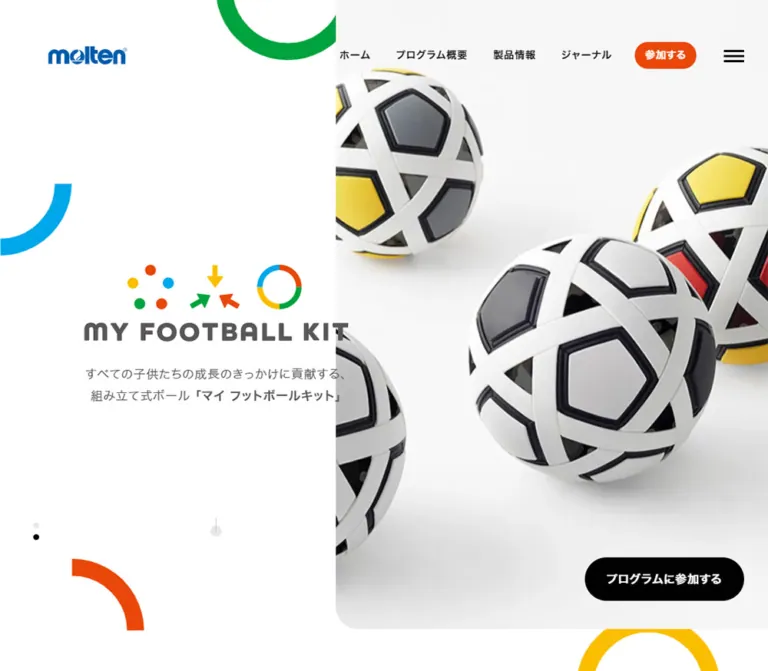
白い余白にカラフルな円弧と大きな製品ビジュアルを組み合わせたプログラムサイト。左右分割のデスクトップ構成を、モバイルでは製品・ロゴ・説明・参加ボタンの順に再配置しています。
MY FOOTBALL KIT — Style Reference
A white product stage framed by playful circles, precise typography, and generous space.
Original URL: https://myfootballkit.jp/ Final URL: https://myfootballkit.jp/ Theme: light; white canvas, pale product backgrounds, dark text, and bright geometric accents. Inspected: October 6, 2026 at 01:19:55 JST; supplied retrieval timestamp: October 5, 2026 at 16:19:55.931 UTC. Viewports: 1440 × 1000 desktop and 390 × 844 mobile, in CSS pixels. Scope: the current Japanese homepage. Visual evidence covers the opening product presentation and the beginning of the mobile About section. Rendered DOM and computed styles additionally cover About, Product, Journal, Join, footer content, and a separate navigation subtree. Destination pages and an opened navigation panel were not inspected.
MY FOOTBALL KIT presents an educational and social contribution program through unusually tangible products: a ball assembled from interlocking parts and a goal assembled from perforated beams, connectors, and netting. The homepage connects that product identity to program information, editorial updates, and participation inquiries. Its structure belongs to a broader program website with multiple destinations.
The defining visual relationship is between a quiet white canvas and a large, nearly monochrome product image. Cyan, green, yellow, and orange appear as cropped rings, quarter circles, and marks within the brand lockup. They provide energy without filling the page with colored panels. Dark gray branding and compact Japanese navigation keep the result controlled.
Desktop uses an asymmetric composition: a pale product stage begins at approximately 43.75% of the viewport width, while the brand lockup and description sit to its left and slightly cross that boundary. Mobile changes the reading order. The product comes first, followed by slide indicators, the lockup, explanatory copy, and a centered participation button.
閉じる
MY FOOTBALL KIT — Style Reference
A white product stage framed by playful circles, precise typography, and generous space.
Original URL: https://myfootballkit.jp/ Final URL: https://myfootballkit.jp/ Theme: light; white canvas, pale product backgrounds, dark text, and bright geometric accents. Inspected: October 6, 2026 at 01:19:55 JST; supplied retrieval timestamp: October 5, 2026 at 16:19:55.931 UTC. Viewports: 1440 × 1000 desktop and 390 × 844 mobile, in CSS pixels. Scope: the current Japanese homepage. Visual evidence covers the opening product presentation and the beginning of the mobile About section. Rendered DOM and computed styles additionally cover About, Product, Journal, Join, footer content, and a separate navigation subtree. Destination pages and an opened navigation panel were not inspected.
MY FOOTBALL KIT presents an educational and social contribution program through unusually tangible products: a ball assembled from interlocking parts and a goal assembled from perforated beams, connectors, and netting. The homepage connects that product identity to program information, editorial updates, and participation inquiries. Its structure belongs to a broader program website with multiple destinations.
The defining visual relationship is between a quiet white canvas and a large, nearly monochrome product image. Cyan, green, yellow, and orange appear as cropped rings, quarter circles, and marks within the brand lockup. They provide energy without filling the page with colored panels. Dark gray branding and compact Japanese navigation keep the result controlled.
Desktop uses an asymmetric composition: a pale product stage begins at approximately 43.75% of the viewport width, while the brand lockup and description sit to its left and slightly cross that boundary. Mobile changes the reading order. The product comes first, followed by slide indicators, the lockup, explanatory copy, and a centered participation button.
How to Read This Reference
- Measured means a value appears in the supplied rendered DOM or computed styles. Element coordinates describe the captured state, not necessarily the original CSS rule.
- Visual estimate means an approximate dimension or color inferred from the current-page screenshots. These values were not extracted with a pixel sampler.
- Calculated means arithmetic based on supplied measurements, such as a container width divided by the viewport width.
- Recommended means an implementation choice for reuse. Breakpoints, accessibility additions, and the Quick Start belong to this category unless explicitly identified otherwise.
- Token names in this document are descriptive aliases. The only supplied source custom property is
--vh. - DOM presence does not prove visibility. The extraction includes navigation elements that are absent from the closed-menu screenshots, and lower sections that are outside the supplied visual captures.
- Repeated captures show a ball state and a goal state. They establish alternate hero states, but do not establish autoplay timing, transition effects, swipe behavior, or a complete slide inventory.
Tokens — Colors
Core Palette
| Name | Value | Suggested token | Evidence and role |
|---|---|---|---|
| White canvas | #ffffff |
--color-paper |
Measured body background; main negative space and reversed button labels |
| Near-black | #010101 |
--color-ink |
Measured primary text and participation-button fill |
| Warm dark gray | #595757 |
--color-muted |
Measured hero copy, About heading, Join copy, and footer links |
| Pale section gray | #f6f6f6 |
--color-surface |
Measured background of the unlabeled section between About and Product |
| Neutral gray | #e7e7e7 |
--color-neutral |
Measured social-icon surfaces and sampled detail-link backgrounds |
| Participation orange | #e94709 |
--color-action |
Measured desktop header button fill |
| Hero background | Approximately #f7f7f7 |
--color-stage |
Visual estimate of the product-image field; the image may contribute this background |
| Cyan | Approximately #00abe3 |
--color-cyan |
Visual estimate of the left quarter circle and brand marks |
| Green | Approximately #00a63c |
--color-green |
Visual estimate of the upper cropped ring and brand marks |
| Yellow | Approximately #ffbf00 |
--color-yellow |
Visual estimate of the lower ring, arrow, and brand marks |
| Motif orange | Approximately #f44300 |
--color-motif-orange |
Visual estimate of the lower-left quarter circle and brand marks |
| Molten blue | Approximately #0063b5 |
--color-brand-blue |
Visual estimate of the molten logo; use the authorized logo asset for fidelity |
The distinction between Participation orange and Motif orange is intentional. The first is a supplied computed CSS value; the second approximates artwork visible in the screenshot. They should not be presented as two verified source brand specifications.
Color Allocation
White and pale gray occupy most of the opening screen. Near-black is concentrated in navigation, the menu glyph, active slide indicators, and the main participation button. Dark gray softens the large brand lockup and explanatory copy. Saturated accents remain compact, although their parent circles are deliberately oversized and cropped.
Use the bright colors for geometry and brand artwork. The current screenshots do not support turning them into a general system of colored cards, category badges, or paragraph text.
Detail-link caution: sampled 詳しく見る links have white text over #e7e7e7. Their final visible appearance is not established by the supplied screenshots, and unmeasured children or pseudo-elements may affect rendering. Record the computed values, but do not infer that these links are disabled. The Quick Start uses a readable dark treatment as a recommended adaptation.
Tokens — Typography
Japanese Interface and Body Copy
The supplied body and Japanese text elements declare this system-oriented stack:
font-family:
  'Hiragino Kaku Gothic Pro',
  'ヒラギノ角ゴ Pro',
  'Yu Gothic Medium',
  '游ゴシック Medium',
  YuGothic,
  '游ゴシック体',
  'メイリオ',
  -apple-system,
  system-ui,
  sans-serif;
Body text is regular weight. Navigation is bold, while participation buttons use weight 800. The repeated 0.8px tracking gives compact interface labels a little separation without making Japanese prose feel widely spaced.
The body itself computes to 16px / 16px, but reading paragraphs override this with much more generous line heights. Do not apply the body's one-to-one line height to long-form content.
English Section Headings and Language Labels
- Declared/computed family:
corsa-grotesk, sans-serif. - Section-heading weight:
800. - Language-label weight:
400. - Heading tracking:
normal. - Heading character: bold, compact, rounded in places, with a very tight line-height relationship.
The family name is directly evidenced. Font files, licensing, and the actual resolved font face were not supplied. A new implementation needs a licensed font delivery setup or an explicitly accepted fallback.
Brand Lockup
The large MY FOOTBALL KIT identity combines three colorful symbol groups above a rounded uppercase wordmark. Its appearance should be treated as supplied brand artwork. The inspected text records do not establish a font that can reproduce this lockup. Do not substitute a regular heading in Corsa Grotesk and describe it as an exact match.
Type Scale
| Role | Desktop | Mobile | Weight | Tracking / evidence |
|---|---|---|---|---|
| Body base | 16px / 16px |
16px / 16px |
400 |
0.8px; measured inheritance baseline |
| Header navigation | 14px / 14px |
Not visible in the closed header | 700 |
0.8px; measured |
| Language links | 13px / 13px |
Present in separate navigation DOM | 400 |
0.8px; measured, not proof of mobile visibility |
| Hero description | 17px / 30.6px |
15px / 27px |
400 |
0.8px; measured |
| About paragraphs | 17px / 34px |
15px / 27px |
400 |
0.8px; measured |
| Product paragraphs | 16px / 32px |
15px / 27px |
400 |
0.8px; measured |
| About heading | Approximately 56px / 56px |
Approximately 32.76px / 32.76px |
800 |
Corsa Grotesk declaration; measured |
| Join heading | Approximately 66px / 66px |
Approximately 34.76px / 34.76px |
800 |
Corsa Grotesk declaration; measured |
| Primary participation label | 16px / 16px |
17px / 17px |
800 |
0.8px; measured |
| Detail-link label | 16px / 16px |
15px / 15px |
800 |
0.8px; measured |
| Main footer links | 16px / 16px |
14px / 14px |
400 |
Measured |
| Secondary footer links | 13px / 13px |
11px / 11px |
400 |
Measured |
| Desktop legal links | 12px / 12px |
Not visible in the main mobile footer text | 400 |
Measured desktop values |
The root element computes to 10px. This is relevant when translating any original rem values, but the supplied evidence does not expose those source declarations. The Quick Start uses explicit pixel values and keeps a conventional application root.
Tokens — Spacing & Shapes
Spacing Relationships
The design combines small navigation intervals with large section spacing. Its rhythm is better understood through measured relationships than through a claimed universal spacing unit.
| Relationship | Desktop | Mobile | Status |
|---|---|---|---|
| Main content inset | 180px |
24.375px |
Measured from section content |
| Main content width | 1080px |
341.25px |
Measured |
| Main content width as viewport share | 75% |
87.5% |
Calculated at the inspected widths |
| Visible molten logo left inset | 90px |
24.375px |
Measured |
| About and Journal section padding | 120px top and bottom |
60px top and bottom |
Measured |
| Product section padding | 140px top, 60px bottom |
60px top, 40px bottom |
Measured |
| Join section padding | 140px top, 0px bottom |
60px top and bottom |
Measured |
| Desktop header link-box gap | Approximately 28px |
Not applicable | Calculated from adjacent rectangles |
| Hero copy to participation button | Separate desktop placement | 40px |
Measured mobile gap |
| Product copy to detail link | 40px |
40px |
Measured |
| About second paragraph to detail link | 30px |
30px |
Measured |
| Journal card horizontal gap | 22.5px |
Cards stack | Calculated from measured card positions |
| Mobile Journal row gap | Not applicable | 30px |
Calculated from measured card bounds |
Shape Vocabulary
| Element | Geometry | Evidence |
|---|---|---|
| Main desktop participation button | 60px high, 30px radius |
Measured |
| Main mobile participation button | 50px high, 25px radius |
Measured |
| Header participation button | Approximately 84.94 × 37.67px, 20px radius |
Measured |
| Detail buttons | 170 × 60px desktop; 150 × 50px mobile |
Measured |
| Social buttons | 35 × 35px, 50% radius |
Measured |
| Hero-stage lower-left corner | Approximately 30px radius |
Visual estimate |
| Language capsule | Approximately 42 × 21px, thin gray outline |
Visual estimate of the complete wrapper |
| Slide indicator | Approximately 8px diameter |
Visual estimate |
| Desktop decorative quarter circle | Approximately 135 × 135px, 32px stroke |
Visual estimate |
| Desktop upper ring | Approximately 270px outer diameter, 32px stroke |
Visual estimate |
| Mobile upper ring | Approximately 146px outer diameter, 17px stroke |
Visual estimate |
The measured JA anchor has a 40 × 19.5px rectangle and 0px border radius. The visible rounded outline belongs to a surrounding treatment, so those two observations should not be conflated.
Opening Layout Measurements
| Element | Desktop at 1440 × 1000 | Mobile at 390 × 844 |
|---|---|---|
| Hero section | 1440 × 1000px, measured |
390 × 713.33px, measured |
| Product stage | Approximately x:630, y:0, 810 × 938px |
Approximately 390 × 320px, at the top |
| Visible molten logo anchor | x:90, y:69.83, 110 × 25px |
x:24.375, y:24, 88 × 22px |
| Main brand lockup | Approximately x:157.5, y:383, 495px wide |
Approximately x:73, y:380, 244px wide |
| Hero paragraph | x:157.5, y:556.84, 495 × 61.19px |
x:0, y:481.33, 390 × 81px |
| Participation button | x:1175.89, y:835.84, 219.11 × 60px |
x:85.72, y:602.33, 218.56 × 50px |
| Slide indicators | Vertical, near x:68, first center near y:768 |
Horizontal, first center near x:32, y:344 |
Stage and brand-artwork bounds above are visual estimates. Logo anchors, paragraph rectangles, section bounds, and participation-button rectangles are measured.
Components
Primary Header
Role: establish molten identity and expose the program's main destinations.
The desktop header is transparent over the opening composition. The blue molten mark sits at the left, followed by a small outlined JA selector. On the right, four text links lead to Home, About, Product, and Journal. An orange 参加する pill follows them, with a three-line menu glyph farther right.
The visible primary navigation uses 14px, weight 700, and 0.8px tracking. The orange pill reverses its label to white. There is no visible header divider, raised container, or opaque navigation bar in the opening captures.
On mobile, the visible header retains the molten mark and menu glyph. The desktop navigation row, language capsule, and orange participation pill are absent from the closed-header screenshot. The mobile logo is 88 × 22px; a separate 70 × 22px logo anchor exists in the navigation subtree and should not be substituted for the visible one.
Sticky behavior was not established. Positioning the header over the first product frame is evidenced; persistence during scrolling is not.
Product Stage
Role: make the kit itself the main visual evidence.
The desktop stage begins at approximately x:630px, leaving a white field to the left. It reaches the right edge and ends near y:938px, with a rounded lower-left corner. The visual is large but carefully contained within this pale field.
Two current states are supplied:
- A nearly monochrome ball with black pentagonal structure, white interwoven bands, and a soft contact shadow.
- A three-quarter view of a beige modular goal, showing perforated beams, dark joints, and a light net.
The goal is kept legible as an assembled object: its top, side depth, net grid, and lower supports remain visible. Preserve that completeness when fitting replacement images. A generic cover crop can remove the very construction details the program is explaining.
Mobile gives the stage the full viewport width and approximately 320px height. The header overlays it, and the colored motifs move into its perimeter. The stage remains a contained opening composition rather than a full-height mobile background.
Brand Lockup and Introductory Copy
Role: connect the product to a named, approachable program.
The lockup has two levels: three colorful symbol groups above, then a dark gray MY FOOTBALL KIT wordmark below. The symbol groups comprise clustered dots, converging arrows, and a segmented ring. Their repeated primary colors connect the logo to the larger perimeter ornaments.
Desktop places this artwork approximately 495px wide, centered around x:405px. Its right edge crosses the product-stage seam by roughly 22.5px. This slight overlap makes the composition feel integrated without turning the copy into a full image overlay.
The description beneath it is centered and restrained. It uses two measured lines at 17px / 30.6px, with the product name emphasized within the sentence.
On mobile, the artwork becomes approximately 244px wide. The description follows below at 15px / 27px and occupies three measured lines. The screenshot shows very little horizontal breathing room around the longest line; this is a useful fidelity observation, but a new implementation should allow a small safe gutter and natural reflow.
Participation Buttons
Role: provide a direct route to the participation inquiry page.
The main label is プログラムに参加する, linked to /join/. Its anatomy is simple: a dark capsule, a centered white label, no visible icon, no border, and no decorative shadow.
Desktop uses a 219.11 × 60px button at the lower-right of the product stage, with 30px horizontal padding and a 30px radius. Mobile moves the action below the description, centers it, reduces the height to 50px, and increases the label size from 16px to 17px.
The Join section repeats the same visual family with the shorter 参加する label. Its measured width is 170px on desktop and 150px on mobile.
The smaller orange header pill is a separate size variant, not a replacement for the dominant black action.
Decorative Rings and Quarter Circles
Role: extend the brand symbols into the page without competing with product detail.
Desktop uses an upper green ring cropped by the top edge and partly concealed by the product stage, a cyan quarter circle cropped at the left edge, an orange quarter circle near the lower-left, and a yellow ring emerging below the stage on the right.
Mobile recomposes these shapes around the image: green at the upper-right, cyan at the upper-left edge, a small orange quarter circle below the product's left side, and yellow at the lower-right. Their sizes and positions change; this is not a uniform scale-down of the desktop canvas.
The visual language uses solid strokes and clean circular geometry. Keep the ornaments noninteractive and outside the accessibility tree. Their overlap and clipping are part of the composition, while their exact original implementation—SVG, image assets, or CSS—is unknown.
Slide Indicators and Scroll Cue
Role: communicate alternate product states and continuation.
Four small indicators are visible. Desktop stacks them vertically near the left edge; mobile places them horizontally below the product image. One dot is near-black and the others are pale gray. The supplied ball state marks the first dot; the goal state marks the second.
The desktop also shows a small pale circular mark with a fine vertical stem near the center of the left content field. It reads visually as a scroll cue, but its action and animation are unverified.
Indicator click behavior, keyboard operation, autoplay, and slide announcements were not exercised. A new carousel needs explicit controls and state semantics rather than relying on the screenshots alone.
About the Program
Role: explain the educational and social contribution purpose.
The title is deliberately broken into About the and Program, with a Japanese subtitle in the page text. It is dark gray, weight 800, and tightly led. Desktop measures 56px per line; mobile measures approximately 32.76px.
The desktop content spans a 1080px region beginning at x:180px. One explanatory paragraph occupies a 450px column at x:810px; another occupies a 450px column at x:180px farther down the section. These positions establish an alternating editorial rhythm. The supplied records do not establish the exact imagery occupying the complementary spaces.
Mobile brings both paragraphs into a 341.25px column with 24.375px side margins. Measured paragraph padding creates 40px separations around intervening content. A 150 × 50px detail link follows the second paragraph.
The section begins immediately after the mobile hero, near y:713.33px. Its heading starts 60px later and is visible at the bottom of the mobile capture.
Unlabeled Interlude
Role: not established by the supplied visual evidence.
A text-empty section separates About and Product. It computes to #f6f6f6, spans the full viewport width, and measures 1000px high on desktop. On mobile it measures 243.75px high with the same amount of top padding.
The mobile proportions calculate to 8:5. This is consistent with a media-shaped region, but the evidence does not identify an image, video, animation, or interaction. Reserve the structural region when reproducing the measured page, but do not invent its content.
Product Stories
Role: introduce BALL KIT and GOAL KIT as distinct product systems.
The section contains a Product heading, Japanese subtitle, numbered entries 01 and 02, product names, descriptive paragraphs, and individual detail links. The observed destinations are /product/ball-kit/ and /product/goal-kit/.
On desktop, the BALL KIT paragraph begins at x:270px; the GOAL KIT paragraph begins at x:720px. Each has a 500px measured box including 45px right padding. Type is 16px / 32px, with a 40px gap before its 170 × 60px detail link.
On mobile, both descriptions use the main 341.25px content width, 15px / 27px type, and 150 × 50px detail links. The section becomes taller despite the narrower screen: approximately 1687.77px versus 1430.5px on desktop.
The product copy names nendo as a collaborator in developing the kits. This is evidence about the products, not a website-production credit. The lower product imagery and complete product-row anatomy are not visible in the supplied screenshots.
Journal Entries
Role: show current reports and announcements associated with the program.
The rendered text contains three entries with dates, long Japanese titles, and category labels such as レポート and お知らせ. The dates use a dotted year-month-day format. Two extracted titles include ellipses; the evidence does not establish whether truncation is editorial or CSS-driven.
Desktop has three linked regions aligned at x:180, 547.5, and 915px. Each is 345px wide, producing 22.5px gaps inside the 1080px content region. Their heights vary with content, approximately 444.58–473.38px.
Mobile stacks the regions at 341.25px wide with 30px gaps. Category-link boxes begin at x:195px and occupy the right half of that width. This supports an internal split in the mobile layout, but does not establish the exact thumbnail bounds or complete row arrangement.
Keep date, title, category, and destination as distinct data fields. Avoid imposing equal text lengths or fixed card heights merely to match the three current entries.
Join Section
Role: invite organizations to inquire about participating.
The English Join heading is larger than the measured About title: approximately 66px desktop and 34.76px mobile, weight 800, in near-black. A Japanese subtitle and a dark gray paragraph explain the participation audience. The paragraph is 450px wide on desktop and 341.25px on mobile.
The black 参加する button follows with a measured 40px gap. Other visual content in this section is not established by the supplied screenshots; its remaining space should not be filled with invented artwork in a source-faithful reference.
Footer
Role: close the program identity and provide secondary navigation.
The measured footer contains a centered brand-link region, a primary navigation row, smaller FAQ/partner/contact links, social links, and ©2026 molten. Desktop additionally exposes a molten corporate link and legal links.
The central brand-link region measures 430 × 98.89px on desktop and 272.5 × 62.67px on mobile. Primary links reduce from 16px to 14px; secondary links reduce from 13px to 11px. The mobile visible-text extraction shortens the About and Product labels to 概要 and 製品.
Social links use 35px circular gray surfaces in both measured viewports. Their internal icon implementation is not supplied.
The original-page footer's copyright and corporate link support molten as the program identity. They do not establish a named website production team.
Separate Navigation Subtree
The DOM includes another navigation structure with paired English/Japanese labels, a close label, language links, social links, and secondary destinations. Sampled primary link containers use approximately 50px type on desktop and 28.72px on mobile.
These rectangles are not a screenshot of an opened menu. Its background, transition, focus handling, scroll behavior, and final visible composition remain unverified. Use its link inventory as evidence, but do not present a reconstructed overlay as an observed component state.
Tokens — Motion & Interaction
| Treatment | Evidence | Reuse guidance |
|---|---|---|
| Hero product changes | Ball and goal states appear in separate supplied captures | Implement state changes if needed; transition type and interval remain unspecified |
| Active slide indicator | First dot corresponds to the supplied ball state; second to the goal state | Keep the visual marker synchronized with the displayed product |
| Footer and selected auxiliary-link color transitions | color 0.25s cubic-bezier(0.39, 0.575, 0.565, 1) in computed styles |
This is the only explicit nonzero transition timing supplied; endpoint colors were not exercised |
| Most sampled elements | transition: all, animation: none |
Do not infer a duration from all, or conclude that descendants and scripts never animate |
| Menu glyph | Visible in both viewport captures | Open/close behavior and animation are unverified |
| Language navigation | JA and EN destinations appear in DOM | The selector's expansion behavior was not exercised |
| Participation and detail links | Destination URLs are supplied | Treat them as navigation links; no form submission was inspected |
| Decorative circles | Static positions visible in captures | Rotation, parallax, and scroll coupling are unverified |
| Scrolling | Tall main content exists in DOM | Scroll engine, snapping, and reveal behavior are not established |
The capture procedure included an initial observation of at least five seconds, waited for selected layout and image readiness conditions, and temporarily paused perpetual animations during readiness checks. It does not provide a continuous motion recording. It also does not prove that every delayed or offscreen state completed.
Recommended motion approach: keep a static product state fully useful. If adding slide transitions, use a restrained fade and document its timing as a new choice. Pause automatic changes when appropriate, honor reduced-motion preferences, and retain manual access to every product. Do not add spinning ornaments simply because the marks are circular.
Surfaces
| Layer | Appearance | Purpose and evidence |
|---|---|---|
| Page canvas | Solid white | Measured base; carries most negative space |
| Hero product field | Near-white or very pale gray | Visually separates the object from the left identity field |
| Unlabeled interlude | #f6f6f6 |
Measured full-width break between About and Product |
| Main action | Near-black capsule, white text | Highest-contrast navigation action |
| Header action | Orange capsule, white text | Compact participation shortcut |
| Secondary neutral surface | #e7e7e7 |
Measured social circles and sampled detail-link background |
| Language wrapper | White/transparent with a fine gray outline | Visual estimate; compact selector treatment |
| Mobile section boundary | Very fine pale horizontal line after the hero | Visible in the mobile capture; exact color not measured |
There are no visibly elevated UI cards in the opening screenshots. The product's soft contact shadow belongs to the imagery and should not become a general CSS shadow system. Separation comes primarily from scale, placement, pale background fields, and open space.
Imagery
The hero uses high-key product visuals with soft illumination and restrained shadows. Whether these are photographs, renders, or a combination cannot be determined from the screenshots. Their important property is material clarity: the white bands remain distinct from the ball's black structure, and the goal's beige beams remain distinct from dark connectors and fine net lines.
Use the object as the focal point. Preserve its silhouette, assembly logic, and dimensional depth. The pale background should blend into the product stage without a conspicuous rectangular image border.
The goal image is especially informative because it shows both the front opening and side depth. Avoid cropping away the connectors or replacing it with an unrelated lifestyle photograph. Likewise, a conventional solid football would lose the assembly concept visible in BALL KIT.
Observed Asset References
No original image URLs or asset filenames were supplied. The entries below identify visible assets without inventing paths.
| Asset | Observed use | Implementation guidance |
|---|---|---|
| Blue molten logo | Upper-left header; corporate identity also appears in footer evidence | Use authorized logo artwork; do not typeset an approximation |
| MY FOOTBALL KIT lockup | Central desktop identity and mobile content block | Preserve the three symbol groups and wordmark as one coordinated asset |
| Monochrome assembled ball | One desktop hero state | Preserve the woven construction and soft contact shadow |
| Modular goal | Desktop and mobile hero states | Keep the full structure visible and preserve the three-quarter viewpoint |
| Colored circles and quarter circles | Opening composition perimeter | SVG or CSS can reproduce the geometry; source implementation is unknown |
| Lower-section imagery | Not visually established | Obtain actual assets before specifying subjects, crops, or treatments |
Use vector artwork for marks and geometric ornaments when authorized assets are available. Use sufficiently detailed raster images for the products. Do not apply pixelated rendering, heavy contrast filters, or added grain: none is supported by the current captures.
Layout & Responsive Behavior
Desktop Composition
At 1440px wide, the pale stage begins at 630px, or a calculated 43.75% of the viewport. The left lockup begins at 157.5px, with its associated paragraph occupying 495px. The main content area below the hero is wider and more conventionally centered: 1080px wide with 180px margins.
This distinction matters. The hero is not simply a two-column instance of the lower-page container. Its branding, stage, header, dots, and button use separate alignments.
The opening section is exactly one inspected desktop viewport high. The product stage ends slightly above its bottom, allowing the yellow decoration to emerge underneath. The black participation button sits inside the stage's lower-right region.
Mobile Composition
At 390px wide, the opening order is:
- A roughly
320px-high product stage with overlaid molten logo and menu glyph. - A horizontal row of four slide indicators.
- A centered brand lockup, approximately
244pxwide. - Three lines of centered Japanese description at
15px / 27px. - A centered
218.56 × 50pxparticipation button. - Approximately
60pxof space before the next section boundary.
The hero ends around 713.33px, leaving part of About visible in the 844px viewport. Do not force the mobile opening to fill 100vh; doing so would change the supplied composition.
Most lower-page content moves to 24.375px side margins, or a calculated 6.25% of the viewport. Section padding generally halves from 120px to 60px. Product stories stack, and Journal changes from three columns to vertically arranged entries.
Measured Page Structure
Coordinates below are element bounds in the supplied snapshots, rounded to two decimals. They are not recommendations to hardcode cumulative section positions.
| Region | Desktop top / height | Mobile top / height |
|---|---|---|
| Hero | 0 / 1000px |
0 / 713.33px |
| About | 1000 / 1592.5px |
713.33 / 880.78px |
| Unlabeled interlude | 2592.5 / 1000px |
1594.11 / 243.75px |
| Product | 3592.5 / 1430.5px |
1837.86 / 1687.77px |
| Journal | 5023 / 863.88px |
3525.63 / 988.02px |
| Join | 5886.88 / 815px |
4513.64 / 765.53px |
| Footer | 6701.88 / 573.39px |
5279.17 / 332.42px |
Viewport and Scrolling Limits
The source custom property --vh is 10px on desktop and 8.44px on mobile, each equal to one percent of the inspected viewport height. The source formula or script that maintains it was not supplied.
The extraction reports document heights equal to the viewport heights, while the main element extends to approximately 7275.27px on desktop and 5611.59px on mobile. This suggests a scrolling arrangement that cannot be understood from document height alone. The exact wrapper, transform, or scrolling mechanism is unverified. Do not infer that the whole page should be fixed or non-scrollable.
Only two widths were inspected. Tablet behavior, intermediate breakpoints, landscape phones, zoom, safe-area handling, and text enlargement remain unverified. The Quick Start uses a recommended 1000px breakpoint; it is not a recovered source breakpoint.
Do’s and Don’ts
Do
- Let the product image carry the visual impact while the interface stays quiet.
- Preserve the asymmetric desktop seam and the separate lower-page content container.
- Keep the complete MY FOOTBALL KIT lockup and its colorful symbols together.
- Use the measured near-black, warm gray, white, and orange values for their evidenced roles.
- Treat the bright ornament colors as approximations until original artwork is available.
- Use bold Corsa Grotesk declarations for English section headings and the supplied Japanese system stack for copy.
- Preserve generous paragraph leading:
1.8on mobile and approximately2for much desktop body copy. - Recompose the hero on mobile, with the product first and the participation button beneath the copy.
- Preserve full product silhouettes and visible assembly details.
- Keep the repeated black pill treatment consistent between hero and Join.
- Distinguish visible states from hidden or offscreen DOM content.
Don't
- Don't turn the program homepage into an unrelated store grid or a generic single-screen conversion template.
- Don't replace the brand artwork with a guessed font.
- Don't distribute bright colors across every heading, card, and paragraph.
- Don't add glossy gradients, glass surfaces, or general card shadows.
- Don't use a cropped football photograph that hides the kit's construction.
- Don't simply shrink the desktop split view onto a phone.
- Don't force the mobile hero to one full viewport height.
- Don't interpret the sampled gray detail links as disabled controls.
- Don't claim autoplay, swipe gestures, sticky navigation, or parallax without interaction evidence.
- Don't treat the separate navigation DOM as a verified opened-menu screenshot.
- Don't infer a production team from a product-development collaborator.
Recommended Implementation Additions
These are recommendations for a new implementation, not verified features of the original page:
- Give the menu button an accessible name and connect it to a keyboard-operable navigation panel with explicit expanded state and focus management.
- Keep participation actions as links when they navigate to another page.
- Give each slide control an accessible name and selected state. Enlarge the tiny visual dots with non-overlapping hit areas; the Quick Start uses
24pxindicator targets and a44pxmenu target. - Keep hero text and controls stable while product imagery changes. Provide manual navigation and respect reduced-motion preferences.
- Add a small mobile text gutter and allow the product name to wrap naturally. Do not reproduce edge crowding at the expense of readable text.
- Use a visible focus outline that does not rely only on the bright orange background.
- Confirm the final visible treatment of detail links before reproducing their sampled light-gray background. Maintain readable text contrast in a new implementation.
- Provide concise product image alternatives and hide decorative geometry from assistive technology.
- Load the actual licensed heading font if fidelity is required; do not assume a computed family name proves that a font file is available.
- Test ordinary scrolling, browser zoom, landscape layout, and text enlargement before adopting any viewport-based positioning.
Agent Prompt Guide
Quick Color Reference
- Main canvas: measured
#ffffff. - Primary text and main action: measured
#010101. - Hero copy and About heading: measured
#595757. - Desktop header participation action: measured
#e94709. - Neutral interlude: measured
#f6f6f6. - Decorative cyan, green, and yellow: approximate
#00abe3,#00a63c, and#ffbf00. - Ornament orange: approximate
#f44300; use the actual artwork when available. - Avoid treating the estimated asset colors as recovered CSS brand tokens.
Overall Prompt
“Create a responsive homepage for an educational football-kit program. Use a white canvas, warm dark gray explanatory text, compact bold Japanese navigation, and large high-key visuals of assembled modular sports products. On desktop, begin a pale product stage around 44% of the viewport width and place the program lockup in a generous white field to its left. Frame the opening with cropped cyan, green, yellow, and orange rings and quarter circles. Use a black capsule participation link at the lower-right of the product stage and a smaller orange participation shortcut in the header. On mobile, place the product image first, then slide indicators, the centered lockup, short Japanese copy, and the black participation link. Continue with spacious About, Product, Journal, and Join sections. Use bold English section headings and readable Japanese body copy. Keep movement restrained and label any invented interaction behavior as a new implementation choice.”
Example Component Prompts
- Product stage: “Build an asymmetric desktop product presentation with a pale image field beginning at 43.75% of the viewport width. Show a complete modular goal in three-quarter view, with soft natural shading and no UI shadow around the image. Round only the visible lower-left stage corner. Keep a black pill link inside the lower-right area.”
- Mobile opening: “At 390px wide, place a roughly 320px product image region first, with a blue manufacturer logo and a three-line menu icon over it. Follow with four small slide markers, a centered program lockup, 15px Japanese copy with 27px leading, and a 50px-high black participation link. Let the About section begin within the first 844px of page height when the supplied content fits.”
- Geometric ornaments: “Use clean, flat ring segments in cyan, green, yellow, and orange. Crop them at the viewport edges and keep the central product legible. Reposition and resize the ornaments for mobile. Do not add rotation or parallax unless explicitly requested.”
- About section: “Use a bold dark gray English heading broken into two compact lines, followed by a smaller Japanese subtitle and generous explanatory copy. At 1440px, use a 1080px content region and 450px text columns. At 390px, use a single 341.25px column and 60px section padding.”
- Journal structure: “Create three desktop editorial entries in a 1080px region, each 345px wide with 22.5px gaps. Keep date, long Japanese title, category, and article destination distinct. Stack entries on mobile with 30px row gaps. Do not invent thumbnail subjects or source image crops.”
- Participation action: “Create a near-black capsule link with a centered white Japanese label, weight 800, and no icon or shadow. Use a 60px height and 30px radius on desktop; 50px height and 25px radius on mobile. Keep a clear keyboard focus indicator.”
Quick Start
CSS Custom Properties
This is a recommended implementation scaffold derived from the two inspected layouts. It is not recovered source code. It preserves the major proportions while using explicit tokens, ordinary document flow below the hero, and a recommended responsive breakpoint.
The ornament colors and hero-stage color remain estimates. The larger slide targets deliberately increase indicator spacing. The mobile copy gutter, dark detail-button treatment, focus indicators, and hover endpoint are recommended additions. Font files, authorized image assets, menu behavior, and slide-state logic must be supplied separately.
:root {
  /* Measured interface colors */
  --color-paper: #ffffff;
  --color-ink: #010101;
  --color-muted: #595757;
  --color-surface: #f6f6f6;
  --color-neutral: #e7e7e7;
  --color-action: #e94709;

  /* Visual estimates for artwork and the hero field */
  --color-stage: #f7f7f7;
  --color-cyan: #00abe3;
  --color-green: #00a63c;
  --color-yellow: #ffbf00;
  --color-motif-orange: #f44300;
  --color-brand-blue: #0063b5;

  /* Computed source font declarations; font files are not bundled */
  --font-jp: 'Hiragino Kaku Gothic Pro', 'ヒラギノ角ゴ Pro',
    'Yu Gothic Medium', '游ゴシック Medium', YuGothic,
    '游ゴシック体', 'メイリオ', -apple-system, system-ui, sans-serif;
  --font-en: corsa-grotesk, sans-serif;
  --tracking-ui: 0.8px;
  --weight-regular: 400;
  --weight-bold: 700;
  --weight-heavy: 800;

  --text-body: 17px;
  --text-product: 16px;
  --text-nav: 14px;
  --text-section: 56px;
  --text-join: 66px;
  --leading-body: 2;

  --space-small: 16px;
  --space-medium: 30px;
  --space-copy-action: 40px;
  --space-section: 120px;
  --content-width: 75%;
  --button-height: 60px;
  --button-radius: 30px;
  --button-inset: 30px;
  --stage-radius: 30px;
  --dot-size: 8px;

  /* Measured link-transition timing */
  --motion-link: 250ms cubic-bezier(0.39, 0.575, 0.565, 1);
}

* { box-sizing: border-box; }

body {
  margin: 0;
  color: var(--color-ink);
  background: var(--color-paper);
  font-family: var(--font-jp);
  font-size: 16px;
  line-height: 1.8;
  letter-spacing: var(--tracking-ui);
}

button, a { -webkit-tap-highlight-color: transparent; }
button { font: inherit; }
img { max-width: 100%; }

.hero {
  position: relative;
  isolation: isolate;
  min-height: 100svh;
  overflow: clip;
}

.site-header {
  position: absolute;
  z-index: 5;
  top: 0;
  left: 6.25%;
  right: 3.125%;
  height: 16.667svh;
  display: flex;
  align-items: center;
}

.site-brand { flex: 0 0 auto; }
.site-brand img { display: block; width: 110px; height: auto; }

.language-link {
  width: 42px;
  margin-left: 116px;
  border: 1px solid #d3d3d3;
  border-radius: 999px;
  color: var(--color-ink);
  font: 400 13px/19.5px var(--font-en);
  text-align: center;
  text-decoration: none;
}

.site-nav {
  display: flex;
  align-items: center;
  gap: 28px;
  margin-left: auto;
}

.site-nav a {
  color: var(--color-ink);
  font-size: var(--text-nav);
  font-weight: var(--weight-bold);
  line-height: 1;
  text-decoration: none;
}

.site-nav .header-join {
  display: inline-flex;
  min-height: 38px;
  align-items: center;
  padding-inline: 14px;
  border-radius: 20px;
  color: var(--color-paper);
  background: var(--color-action);
}

.menu-toggle {
  display: grid;
  flex: 0 0 44px;
  width: 44px;
  height: 44px;
  place-items: center;
  margin-left: 54px;
  margin-right: -8px;
  padding: 8px;
  border: 0;
  color: var(--color-ink);
  background: transparent;
  cursor: pointer;
}

.menu-glyph,
.menu-glyph::before,
.menu-glyph::after {
  display: block;
  width: 28px;
  height: 3px;
  background: currentColor;
}

.menu-glyph { position: relative; }
.menu-glyph::before,
.menu-glyph::after { position: absolute; content: ''; left: 0; }
.menu-glyph::before { top: -7px; }
.menu-glyph::after { top: 7px; }

.hero-stage {
  position: absolute;
  z-index: 1;
  inset: 0 0 6.25svh 43.75%;
  overflow: hidden;
  border-bottom-left-radius: var(--stage-radius);
  background: var(--color-stage);
}

.hero-product {
  display: block;
  width: 100%;
  height: 100%;
  object-fit: contain;
}

.hero-intro {
  position: absolute;
  z-index: 3;
  top: 38.3svh;
  left: 10.9375%;
  width: 34.375%;
  text-align: center;
}

.hero-title { margin: 0; }
.hero-lockup { display: block; width: 100%; height: auto; }

.hero-summary {
  margin: 30px 0 0;
  color: var(--color-muted);
  font-size: 17px;
  font-weight: var(--weight-regular);
  line-height: 1.8;
}

.pill {
  display: inline-flex;
  min-height: var(--button-height);
  align-items: center;
  justify-content: center;
  padding: 12px var(--button-inset);
  border: 0;
  border-radius: var(--button-radius);
  color: var(--color-paper);
  background: var(--color-ink);
  font-size: 16px;
  font-weight: var(--weight-heavy);
  line-height: 1.3;
  text-align: center;
  text-decoration: none;
}

.hero-join {
  position: absolute;
  z-index: 3;
  right: 3.125%;
  bottom: 10.4167svh;
}

.detail-link { min-width: 170px; }

.hero-pagination {
  position: absolute;
  z-index: 3;
  top: 75.6svh;
  left: calc(4.7222% - 12px);
  display: flex;
  flex-direction: column;
}

.slide-dot {
  display: grid;
  width: 24px;
  height: 24px;
  padding: 0;
  place-items: center;
  border: 0;
  background: transparent;
  cursor: pointer;
}

.slide-dot::after {
  content: '';
  width: var(--dot-size);
  height: var(--dot-size);
  border-radius: 50%;
  background: var(--color-neutral);
}

.slide-dot[aria-pressed='true']::after {
  background: var(--color-ink);
}

/* Decorative geometry approximates the supplied screenshots. */
.hero-decorations {
  position: absolute;
  z-index: 0;
  inset: 0;
  overflow: hidden;
  pointer-events: none;
}

.orbit {
  position: absolute;
  width: 270px;
  height: 270px;
  border: 32px solid currentColor;
  border-radius: 50%;
}

.orbit--green {
  top: -125px;
  left: 28.125%;
  color: var(--color-green);
}

.orbit--yellow {
  bottom: -185px;
  left: 75%;
  color: var(--color-yellow);
}

.quarter {
  position: absolute;
  width: 135px;
  height: 135px;
  border: 32px solid currentColor;
}

.quarter--cyan {
  top: 30.2svh;
  left: 0;
  border-top: 0;
  border-left: 0;
  border-bottom-right-radius: 100%;
  color: var(--color-cyan);
}

.quarter--orange {
  bottom: 3.2svh;
  left: 9.375%;
  border-bottom: 0;
  border-left: 0;
  border-top-right-radius: 100%;
  color: var(--color-motif-orange);
}

.content-shell {
  width: var(--content-width);
  margin-inline: auto;
}

.section { padding-block: var(--space-section); }
.section--product { padding-block: 140px 60px; }
.section--join { padding-block: 140px 0; }

.section-title {
  margin: 0;
  color: var(--color-muted);
  font-family: var(--font-en);
  font-size: var(--text-section);
  font-weight: var(--weight-heavy);
  line-height: 1;
  letter-spacing: normal;
}

.section-title--join {
  color: var(--color-ink);
  font-size: var(--text-join);
}

/* Recommended scaffold for the measured alternating text columns. */
.story-row {
  display: grid;
  grid-template-columns: minmax(0, 1fr) minmax(0, 1fr);
  column-gap: 12.5vw;
  align-items: center;
}

.story-copy {
  font-size: var(--text-body);
  line-height: var(--leading-body);
}

.product-copy { font-size: var(--text-product); line-height: 2; }
.story-copy p, .product-copy p { margin: 0; }
.story-copy .pill, .product-copy .pill { margin-top: 40px; }

.journal-list {
  display: grid;
  grid-template-columns: repeat(3, minmax(0, 1fr));
  gap: 22.5px;
}

.text-link {
  color: var(--color-muted);
  transition: color var(--motion-link);
}

@media (hover: hover) {
  /* Recommended endpoint; the source hover color was not exercised. */
  .text-link:hover { color: var(--color-ink); }
}

:where(a, button):focus-visible {
  outline: 3px solid var(--color-brand-blue);
  outline-offset: 4px;
}

/* Recommended breakpoint; only 1440px and 390px were inspected. */
@media (max-width: 1000px) {
  :root {
    --content-width: 87.5%;
    --space-section: 60px;
    --text-body: 15px;
    --text-product: 15px;
    --text-section: 32.76px;
    --text-join: 34.76px;
    --leading-body: 1.8;
    --button-height: 50px;
    --button-radius: 25px;
    --button-inset: 25px;
  }

  .hero {
    display: flex;
    flex-direction: column;
    min-height: 0;
    padding-bottom: 60px;
    border-bottom: 1px solid #efefef;
  }

  .site-header {
    left: 6.25%;
    right: 6.25%;
    height: 70px;
  }

  .site-brand img { width: 88px; }
  .language-link, .site-nav { display: none; }
  .menu-toggle { margin-left: auto; }

  .hero-stage {
    position: relative;
    inset: auto;
    order: 0;
    width: 100%;
    aspect-ratio: 39 / 32;
  }

  .hero-product { position: absolute; inset: 0; }

  .hero-pagination {
    position: static;
    order: 1;
    flex-direction: row;
    align-self: flex-start;
    margin: 12px 0 0 20px;
  }

  .hero-intro {
    position: relative;
    top: auto;
    left: auto;
    order: 2;
    width: 100%;
    margin-top: 24px;
  }

  .hero-lockup { width: 62.5%; margin-inline: auto; }

  .hero-summary {
    padding-inline: 12px;
    font-size: 15px;
    line-height: 1.8;
    overflow-wrap: anywhere;
  }

  .hero-join {
    position: relative;
    right: auto;
    bottom: auto;
    order: 3;
    align-self: center;
    max-width: calc(100% - 32px);
    margin-top: 40px;
    font-size: 17px;
  }

  .detail-link { min-width: 150px; font-size: 15px; }

  .hero-decorations {
    z-index: 2;
    bottom: auto;
    height: 82.0513vw;
  }

  .orbit--green {
    top: -49px;
    left: calc(100% - 97px);
    width: 146px;
    height: 146px;
    border-width: 17px;
  }

  .orbit--yellow {
    top: calc(100% - 73px);
    bottom: auto;
    left: calc(100% - 73px);
    width: 194px;
    height: 194px;
    border-width: 17px;
  }

  .quarter--cyan {
    top: 73px;
    width: 73px;
    height: 73px;
    border-width: 17px;
  }

  .quarter--orange {
    top: 223px;
    bottom: auto;
    left: 24px;
    width: 49px;
    height: 49px;
    border-width: 12px;
  }

  .section--product { padding-block: 60px 40px; }
  .section--join { padding-block: 60px; }
  .story-row { grid-template-columns: 1fr; gap: 40px; }
  .product-copy { line-height: 1.8; }
  .journal-list { grid-template-columns: 1fr; gap: 30px; }
}

@media (prefers-reduced-motion: reduce) {
  .text-link { transition: none; }
  /* Any JavaScript carousel must also honor this preference. */
}
Component Markup
The asset identifiers below are explicit placeholders, not observed website paths. Replace them with authorized images. The example shows the goal state; the four indicators preserve the observed count without inventing the subjects of the remaining slides. Wire the menu and slide controls before using this as an interactive page.
<section class='hero' aria-label='MY FOOTBALL KIT'>
  <header class='site-header'>
    <a class='site-brand' href='/'>
      <img src='YOUR_MOLTEN_LOGO' alt='molten'>
    </a>
    <a class='language-link' href='/' lang='ja'>JA</a>
    <nav class='site-nav' aria-label='Primary navigation'>
      <a href='/'>ホーム</a>
      <a href='/about/'>プログラム概要</a>
      <a href='/product/'>製品情報</a>
      <a href='/journal/'>ジャーナル</a>
      <a class='header-join' href='/join/'>参加する</a>
    </nav>
    <button class='menu-toggle' type='button'
      aria-label='Open navigation' aria-expanded='false'>
      <span class='menu-glyph' aria-hidden='true'></span>
    </button>
  </header>

  <div class='hero-decorations' aria-hidden='true'>
    <span class='orbit orbit--green'></span>
    <span class='orbit orbit--yellow'></span>
    <span class='quarter quarter--cyan'></span>
    <span class='quarter quarter--orange'></span>
  </div>

  <div class='hero-stage'>
    <img class='hero-product' src='YOUR_GOAL_KIT_IMAGE'
      alt='Assembled modular goal with perforated beams and netting'>
  </div>

  <div class='hero-pagination' role='group' aria-label='Product slides'>
    <button class='slide-dot' type='button'
      aria-label='Show slide 1' aria-pressed='false'></button>
    <button class='slide-dot' type='button'
      aria-label='Show slide 2' aria-pressed='true'></button>
    <button class='slide-dot' type='button'
      aria-label='Show slide 3' aria-pressed='false'></button>
    <button class='slide-dot' type='button'
      aria-label='Show slide 4' aria-pressed='false'></button>
  </div>

  <div class='hero-intro'>
    <h1 class='hero-title'>
      <img class='hero-lockup' src='YOUR_PROGRAM_LOCKUP'
        alt='MY FOOTBALL KIT'>
    </h1>
    <p class='hero-summary' lang='ja'>
      すべての子供たちの成長のきっかけに貢献する、<br>
      組み立て式サッカーボールとゴール
      <strong>「マイ フットボールキット」</strong>
    </p>
  </div>

  <a class='pill hero-join' href='/join/' lang='ja'>
    プログラムに参加する
  </a>
</section>
The product image's internal whitespace affects its apparent scale. Adjust the asset export or per-slide image positioning after comparing against the target viewport; do not compensate by stretching the product. The CSS alone does not reproduce hidden sections, menu state, or carousel behavior.
Tailwind v4 Token Mapping
Optional aliases for a project already using Tailwind v4. Define the custom properties above first. This mapping does not imply that the original website uses Tailwind.
@theme inline {
  --color-paper: #ffffff;
  --color-ink: #010101;
  --color-muted: #595757;
  --color-surface: #f6f6f6;
  --color-action: #e94709;
  --color-cyan: #00abe3;
  --color-green: #00a63c;
  --color-yellow: #ffbf00;

  --font-body: var(--font-jp);
  --font-display: var(--font-en);
  --text-section-heading: var(--text-section);
  --text-join-heading: var(--text-join);
  --spacing-section: var(--space-section);
  --spacing-copy-action: 40px;
  --radius-action: var(--button-radius);
  --radius-stage: 30px;
}
Sources & Evidence
- Original and final page: MY FOOTBALL KIT. Both supplied URLs are identical; the recorded HTTP status is
200. - Capture date: supplied retrieval timestamp
2026-10-05T16:19:55.931Z, corresponding to October 6, 2026 at 01:19:55.931 JST. Separate per-image timestamps were not supplied. - Desktop evidence: three current-page captures at
1440 × 1000, showing a ball state and repeated goal states, plus the rendered DOM and computed-style snapshot at that viewport. - Mobile evidence: two current-page captures at
390 × 844, showing the goal, reordered opening content, and the beginning of About, plus the rendered DOM and computed-style snapshot at that viewport. - Measured evidence: element rectangles, paragraph and heading typography, colors, padding, radii, link destinations, the
--vhcustom property, and explicit link-transition timing. - Visual evidence: product appearance, logo and lockup composition, ornament placement, stage shape, visible menu glyph, slide-indicator arrangement, and mobile reading order.
- Interaction limits: no supplied menu-opening, language-selection, dot-click, swipe, hover-state, or form-submission results. Alternate product captures establish states, not their timing or transition mechanism.
- Coverage limits: lower sections are described from DOM evidence unless explicitly identified as visible. Asset URLs, complete stylesheets, resolved font files, and intermediate responsive widths were not supplied. Readiness checks do not establish semantic completeness or every delayed state.
This reference describes the current supplied homepage evidence. Estimated colors and geometry are labeled, and implementation additions are separated from observed behavior.
# MY FOOTBALL KIT — Style Reference

> A white product stage framed by playful circles, precise typography, and generous space.

**Original URL:** [https://myfootballkit.jp/](https://myfootballkit.jp/)
**Final URL:** [https://myfootballkit.jp/](https://myfootballkit.jp/)
**Theme:** light; white canvas, pale product backgrounds, dark text, and bright geometric accents.
**Inspected:** October 6, 2026 at 01:19:55 JST; supplied retrieval timestamp: October 5, 2026 at 16:19:55.931 UTC.
**Viewports:** 1440 × 1000 desktop and 390 × 844 mobile, in CSS pixels.
**Scope:** the current Japanese homepage. Visual evidence covers the opening product presentation and the beginning of the mobile About section. Rendered DOM and computed styles additionally cover About, Product, Journal, Join, footer content, and a separate navigation subtree. Destination pages and an opened navigation panel were not inspected.

MY FOOTBALL KIT presents an educational and social contribution program through unusually tangible products: a ball assembled from interlocking parts and a goal assembled from perforated beams, connectors, and netting. The homepage connects that product identity to program information, editorial updates, and participation inquiries. Its structure belongs to a broader program website with multiple destinations.

The defining visual relationship is between a quiet white canvas and a large, nearly monochrome product image. Cyan, green, yellow, and orange appear as cropped rings, quarter circles, and marks within the brand lockup. They provide energy without filling the page with colored panels. Dark gray branding and compact Japanese navigation keep the result controlled.

Desktop uses an asymmetric composition: a pale product stage begins at approximately 43.75% of the viewport width, while the brand lockup and description sit to its left and slightly cross that boundary. Mobile changes the reading order. The product comes first, followed by slide indicators, the lockup, explanatory copy, and a centered participation button.
閉じる
# MY FOOTBALL KIT — Style Reference

> A white product stage framed by playful circles, precise typography, and generous space.

**Original URL:** [https://myfootballkit.jp/](https://myfootballkit.jp/)
**Final URL:** [https://myfootballkit.jp/](https://myfootballkit.jp/)
**Theme:** light; white canvas, pale product backgrounds, dark text, and bright geometric accents.
**Inspected:** October 6, 2026 at 01:19:55 JST; supplied retrieval timestamp: October 5, 2026 at 16:19:55.931 UTC.
**Viewports:** 1440 × 1000 desktop and 390 × 844 mobile, in CSS pixels.
**Scope:** the current Japanese homepage. Visual evidence covers the opening product presentation and the beginning of the mobile About section. Rendered DOM and computed styles additionally cover About, Product, Journal, Join, footer content, and a separate navigation subtree. Destination pages and an opened navigation panel were not inspected.

MY FOOTBALL KIT presents an educational and social contribution program through unusually tangible products: a ball assembled from interlocking parts and a goal assembled from perforated beams, connectors, and netting. The homepage connects that product identity to program information, editorial updates, and participation inquiries. Its structure belongs to a broader program website with multiple destinations.

The defining visual relationship is between a quiet white canvas and a large, nearly monochrome product image. Cyan, green, yellow, and orange appear as cropped rings, quarter circles, and marks within the brand lockup. They provide energy without filling the page with colored panels. Dark gray branding and compact Japanese navigation keep the result controlled.

Desktop uses an asymmetric composition: a pale product stage begins at approximately 43.75% of the viewport width, while the brand lockup and description sit to its left and slightly cross that boundary. Mobile changes the reading order. The product comes first, followed by slide indicators, the lockup, explanatory copy, and a centered participation button.

## How to Read This Reference

- **Measured** means a value appears in the supplied rendered DOM or computed styles. Element coordinates describe the captured state, not necessarily the original CSS rule.
- **Visual estimate** means an approximate dimension or color inferred from the current-page screenshots. These values were not extracted with a pixel sampler.
- **Calculated** means arithmetic based on supplied measurements, such as a container width divided by the viewport width.
- **Recommended** means an implementation choice for reuse. Breakpoints, accessibility additions, and the Quick Start belong to this category unless explicitly identified otherwise.
- Token names in this document are descriptive aliases. The only supplied source custom property is `--vh`.
- DOM presence does not prove visibility. The extraction includes navigation elements that are absent from the closed-menu screenshots, and lower sections that are outside the supplied visual captures.
- Repeated captures show a ball state and a goal state. They establish alternate hero states, but do not establish autoplay timing, transition effects, swipe behavior, or a complete slide inventory.

## Tokens — Colors

### Core Palette

| Name | Value | Suggested token | Evidence and role |
| --- | --- | --- | --- |
| White canvas | `#ffffff` | `--color-paper` | Measured body background; main negative space and reversed button labels |
| Near-black | `#010101` | `--color-ink` | Measured primary text and participation-button fill |
| Warm dark gray | `#595757` | `--color-muted` | Measured hero copy, About heading, Join copy, and footer links |
| Pale section gray | `#f6f6f6` | `--color-surface` | Measured background of the unlabeled section between About and Product |
| Neutral gray | `#e7e7e7` | `--color-neutral` | Measured social-icon surfaces and sampled detail-link backgrounds |
| Participation orange | `#e94709` | `--color-action` | Measured desktop header button fill |
| Hero background | Approximately `#f7f7f7` | `--color-stage` | Visual estimate of the product-image field; the image may contribute this background |
| Cyan | Approximately `#00abe3` | `--color-cyan` | Visual estimate of the left quarter circle and brand marks |
| Green | Approximately `#00a63c` | `--color-green` | Visual estimate of the upper cropped ring and brand marks |
| Yellow | Approximately `#ffbf00` | `--color-yellow` | Visual estimate of the lower ring, arrow, and brand marks |
| Motif orange | Approximately `#f44300` | `--color-motif-orange` | Visual estimate of the lower-left quarter circle and brand marks |
| Molten blue | Approximately `#0063b5` | `--color-brand-blue` | Visual estimate of the molten logo; use the authorized logo asset for fidelity |

The distinction between **Participation orange** and **Motif orange** is intentional. The first is a supplied computed CSS value; the second approximates artwork visible in the screenshot. They should not be presented as two verified source brand specifications.

### Color Allocation

White and pale gray occupy most of the opening screen. Near-black is concentrated in navigation, the menu glyph, active slide indicators, and the main participation button. Dark gray softens the large brand lockup and explanatory copy. Saturated accents remain compact, although their parent circles are deliberately oversized and cropped.

Use the bright colors for geometry and brand artwork. The current screenshots do not support turning them into a general system of colored cards, category badges, or paragraph text.

**Detail-link caution:** sampled `詳しく見る` links have white text over `#e7e7e7`. Their final visible appearance is not established by the supplied screenshots, and unmeasured children or pseudo-elements may affect rendering. Record the computed values, but do not infer that these links are disabled. The Quick Start uses a readable dark treatment as a recommended adaptation.

## Tokens — Typography

### Japanese Interface and Body Copy

The supplied body and Japanese text elements declare this system-oriented stack:

```css
font-family:
  'Hiragino Kaku Gothic Pro',
  'ヒラギノ角ゴ Pro',
  'Yu Gothic Medium',
  '游ゴシック Medium',
  YuGothic,
  '游ゴシック体',
  'メイリオ',
  -apple-system,
  system-ui,
  sans-serif;
```

Body text is regular weight. Navigation is bold, while participation buttons use weight `800`. The repeated `0.8px` tracking gives compact interface labels a little separation without making Japanese prose feel widely spaced.

The body itself computes to `16px / 16px`, but reading paragraphs override this with much more generous line heights. Do not apply the body's one-to-one line height to long-form content.

### English Section Headings and Language Labels

- **Declared/computed family:** `corsa-grotesk, sans-serif`.
- **Section-heading weight:** `800`.
- **Language-label weight:** `400`.
- **Heading tracking:** `normal`.
- **Heading character:** bold, compact, rounded in places, with a very tight line-height relationship.

The family name is directly evidenced. Font files, licensing, and the actual resolved font face were not supplied. A new implementation needs a licensed font delivery setup or an explicitly accepted fallback.

### Brand Lockup

The large MY FOOTBALL KIT identity combines three colorful symbol groups above a rounded uppercase wordmark. Its appearance should be treated as supplied brand artwork. The inspected text records do not establish a font that can reproduce this lockup. Do not substitute a regular heading in Corsa Grotesk and describe it as an exact match.

### Type Scale

| Role | Desktop | Mobile | Weight | Tracking / evidence |
| --- | --- | --- | --- | --- |
| Body base | `16px / 16px` | `16px / 16px` | `400` | `0.8px`; measured inheritance baseline |
| Header navigation | `14px / 14px` | Not visible in the closed header | `700` | `0.8px`; measured |
| Language links | `13px / 13px` | Present in separate navigation DOM | `400` | `0.8px`; measured, not proof of mobile visibility |
| Hero description | `17px / 30.6px` | `15px / 27px` | `400` | `0.8px`; measured |
| About paragraphs | `17px / 34px` | `15px / 27px` | `400` | `0.8px`; measured |
| Product paragraphs | `16px / 32px` | `15px / 27px` | `400` | `0.8px`; measured |
| About heading | Approximately `56px / 56px` | Approximately `32.76px / 32.76px` | `800` | Corsa Grotesk declaration; measured |
| Join heading | Approximately `66px / 66px` | Approximately `34.76px / 34.76px` | `800` | Corsa Grotesk declaration; measured |
| Primary participation label | `16px / 16px` | `17px / 17px` | `800` | `0.8px`; measured |
| Detail-link label | `16px / 16px` | `15px / 15px` | `800` | `0.8px`; measured |
| Main footer links | `16px / 16px` | `14px / 14px` | `400` | Measured |
| Secondary footer links | `13px / 13px` | `11px / 11px` | `400` | Measured |
| Desktop legal links | `12px / 12px` | Not visible in the main mobile footer text | `400` | Measured desktop values |

The root element computes to `10px`. This is relevant when translating any original `rem` values, but the supplied evidence does not expose those source declarations. The Quick Start uses explicit pixel values and keeps a conventional application root.

## Tokens — Spacing & Shapes

### Spacing Relationships

The design combines small navigation intervals with large section spacing. Its rhythm is better understood through measured relationships than through a claimed universal spacing unit.

| Relationship | Desktop | Mobile | Status |
| --- | --- | --- | --- |
| Main content inset | `180px` | `24.375px` | Measured from section content |
| Main content width | `1080px` | `341.25px` | Measured |
| Main content width as viewport share | `75%` | `87.5%` | Calculated at the inspected widths |
| Visible molten logo left inset | `90px` | `24.375px` | Measured |
| About and Journal section padding | `120px` top and bottom | `60px` top and bottom | Measured |
| Product section padding | `140px` top, `60px` bottom | `60px` top, `40px` bottom | Measured |
| Join section padding | `140px` top, `0px` bottom | `60px` top and bottom | Measured |
| Desktop header link-box gap | Approximately `28px` | Not applicable | Calculated from adjacent rectangles |
| Hero copy to participation button | Separate desktop placement | `40px` | Measured mobile gap |
| Product copy to detail link | `40px` | `40px` | Measured |
| About second paragraph to detail link | `30px` | `30px` | Measured |
| Journal card horizontal gap | `22.5px` | Cards stack | Calculated from measured card positions |
| Mobile Journal row gap | Not applicable | `30px` | Calculated from measured card bounds |

### Shape Vocabulary

| Element | Geometry | Evidence |
| --- | --- | --- |
| Main desktop participation button | `60px` high, `30px` radius | Measured |
| Main mobile participation button | `50px` high, `25px` radius | Measured |
| Header participation button | Approximately `84.94 × 37.67px`, `20px` radius | Measured |
| Detail buttons | `170 × 60px` desktop; `150 × 50px` mobile | Measured |
| Social buttons | `35 × 35px`, `50%` radius | Measured |
| Hero-stage lower-left corner | Approximately `30px` radius | Visual estimate |
| Language capsule | Approximately `42 × 21px`, thin gray outline | Visual estimate of the complete wrapper |
| Slide indicator | Approximately `8px` diameter | Visual estimate |
| Desktop decorative quarter circle | Approximately `135 × 135px`, `32px` stroke | Visual estimate |
| Desktop upper ring | Approximately `270px` outer diameter, `32px` stroke | Visual estimate |
| Mobile upper ring | Approximately `146px` outer diameter, `17px` stroke | Visual estimate |

The measured JA anchor has a `40 × 19.5px` rectangle and `0px` border radius. The visible rounded outline belongs to a surrounding treatment, so those two observations should not be conflated.

### Opening Layout Measurements

| Element | Desktop at 1440 × 1000 | Mobile at 390 × 844 |
| --- | --- | --- |
| Hero section | `1440 × 1000px`, measured | `390 × 713.33px`, measured |
| Product stage | Approximately `x:630`, `y:0`, `810 × 938px` | Approximately `390 × 320px`, at the top |
| Visible molten logo anchor | `x:90`, `y:69.83`, `110 × 25px` | `x:24.375`, `y:24`, `88 × 22px` |
| Main brand lockup | Approximately `x:157.5`, `y:383`, `495px` wide | Approximately `x:73`, `y:380`, `244px` wide |
| Hero paragraph | `x:157.5`, `y:556.84`, `495 × 61.19px` | `x:0`, `y:481.33`, `390 × 81px` |
| Participation button | `x:1175.89`, `y:835.84`, `219.11 × 60px` | `x:85.72`, `y:602.33`, `218.56 × 50px` |
| Slide indicators | Vertical, near `x:68`, first center near `y:768` | Horizontal, first center near `x:32`, `y:344` |

Stage and brand-artwork bounds above are visual estimates. Logo anchors, paragraph rectangles, section bounds, and participation-button rectangles are measured.

## Components

### Primary Header

**Role:** establish molten identity and expose the program's main destinations.

The desktop header is transparent over the opening composition. The blue molten mark sits at the left, followed by a small outlined JA selector. On the right, four text links lead to Home, About, Product, and Journal. An orange `参加する` pill follows them, with a three-line menu glyph farther right.

The visible primary navigation uses `14px`, weight `700`, and `0.8px` tracking. The orange pill reverses its label to white. There is no visible header divider, raised container, or opaque navigation bar in the opening captures.

On mobile, the visible header retains the molten mark and menu glyph. The desktop navigation row, language capsule, and orange participation pill are absent from the closed-header screenshot. The mobile logo is `88 × 22px`; a separate `70 × 22px` logo anchor exists in the navigation subtree and should not be substituted for the visible one.

Sticky behavior was not established. Positioning the header over the first product frame is evidenced; persistence during scrolling is not.

### Product Stage

**Role:** make the kit itself the main visual evidence.

The desktop stage begins at approximately `x:630px`, leaving a white field to the left. It reaches the right edge and ends near `y:938px`, with a rounded lower-left corner. The visual is large but carefully contained within this pale field.

Two current states are supplied:

- A nearly monochrome ball with black pentagonal structure, white interwoven bands, and a soft contact shadow.
- A three-quarter view of a beige modular goal, showing perforated beams, dark joints, and a light net.

The goal is kept legible as an assembled object: its top, side depth, net grid, and lower supports remain visible. Preserve that completeness when fitting replacement images. A generic `cover` crop can remove the very construction details the program is explaining.

Mobile gives the stage the full viewport width and approximately `320px` height. The header overlays it, and the colored motifs move into its perimeter. The stage remains a contained opening composition rather than a full-height mobile background.

### Brand Lockup and Introductory Copy

**Role:** connect the product to a named, approachable program.

The lockup has two levels: three colorful symbol groups above, then a dark gray MY FOOTBALL KIT wordmark below. The symbol groups comprise clustered dots, converging arrows, and a segmented ring. Their repeated primary colors connect the logo to the larger perimeter ornaments.

Desktop places this artwork approximately `495px` wide, centered around `x:405px`. Its right edge crosses the product-stage seam by roughly `22.5px`. This slight overlap makes the composition feel integrated without turning the copy into a full image overlay.

The description beneath it is centered and restrained. It uses two measured lines at `17px / 30.6px`, with the product name emphasized within the sentence.

On mobile, the artwork becomes approximately `244px` wide. The description follows below at `15px / 27px` and occupies three measured lines. The screenshot shows very little horizontal breathing room around the longest line; this is a useful fidelity observation, but a new implementation should allow a small safe gutter and natural reflow.

### Participation Buttons

**Role:** provide a direct route to the participation inquiry page.

The main label is `プログラムに参加する`, linked to `/join/`. Its anatomy is simple: a dark capsule, a centered white label, no visible icon, no border, and no decorative shadow.

Desktop uses a `219.11 × 60px` button at the lower-right of the product stage, with `30px` horizontal padding and a `30px` radius. Mobile moves the action below the description, centers it, reduces the height to `50px`, and increases the label size from `16px` to `17px`.

The Join section repeats the same visual family with the shorter `参加する` label. Its measured width is `170px` on desktop and `150px` on mobile.

The smaller orange header pill is a separate size variant, not a replacement for the dominant black action.

### Decorative Rings and Quarter Circles

**Role:** extend the brand symbols into the page without competing with product detail.

Desktop uses an upper green ring cropped by the top edge and partly concealed by the product stage, a cyan quarter circle cropped at the left edge, an orange quarter circle near the lower-left, and a yellow ring emerging below the stage on the right.

Mobile recomposes these shapes around the image: green at the upper-right, cyan at the upper-left edge, a small orange quarter circle below the product's left side, and yellow at the lower-right. Their sizes and positions change; this is not a uniform scale-down of the desktop canvas.

The visual language uses solid strokes and clean circular geometry. Keep the ornaments noninteractive and outside the accessibility tree. Their overlap and clipping are part of the composition, while their exact original implementation—SVG, image assets, or CSS—is unknown.

### Slide Indicators and Scroll Cue

**Role:** communicate alternate product states and continuation.

Four small indicators are visible. Desktop stacks them vertically near the left edge; mobile places them horizontally below the product image. One dot is near-black and the others are pale gray. The supplied ball state marks the first dot; the goal state marks the second.

The desktop also shows a small pale circular mark with a fine vertical stem near the center of the left content field. It reads visually as a scroll cue, but its action and animation are unverified.

Indicator click behavior, keyboard operation, autoplay, and slide announcements were not exercised. A new carousel needs explicit controls and state semantics rather than relying on the screenshots alone.

### About the Program

**Role:** explain the educational and social contribution purpose.

The title is deliberately broken into `About the` and `Program`, with a Japanese subtitle in the page text. It is dark gray, weight `800`, and tightly led. Desktop measures `56px` per line; mobile measures approximately `32.76px`.

The desktop content spans a `1080px` region beginning at `x:180px`. One explanatory paragraph occupies a `450px` column at `x:810px`; another occupies a `450px` column at `x:180px` farther down the section. These positions establish an alternating editorial rhythm. The supplied records do not establish the exact imagery occupying the complementary spaces.

Mobile brings both paragraphs into a `341.25px` column with `24.375px` side margins. Measured paragraph padding creates `40px` separations around intervening content. A `150 × 50px` detail link follows the second paragraph.

The section begins immediately after the mobile hero, near `y:713.33px`. Its heading starts `60px` later and is visible at the bottom of the mobile capture.

### Unlabeled Interlude

**Role:** not established by the supplied visual evidence.

A text-empty section separates About and Product. It computes to `#f6f6f6`, spans the full viewport width, and measures `1000px` high on desktop. On mobile it measures `243.75px` high with the same amount of top padding.

The mobile proportions calculate to `8:5`. This is consistent with a media-shaped region, but the evidence does not identify an image, video, animation, or interaction. Reserve the structural region when reproducing the measured page, but do not invent its content.

### Product Stories

**Role:** introduce BALL KIT and GOAL KIT as distinct product systems.

The section contains a Product heading, Japanese subtitle, numbered entries `01` and `02`, product names, descriptive paragraphs, and individual detail links. The observed destinations are `/product/ball-kit/` and `/product/goal-kit/`.

On desktop, the BALL KIT paragraph begins at `x:270px`; the GOAL KIT paragraph begins at `x:720px`. Each has a `500px` measured box including `45px` right padding. Type is `16px / 32px`, with a `40px` gap before its `170 × 60px` detail link.

On mobile, both descriptions use the main `341.25px` content width, `15px / 27px` type, and `150 × 50px` detail links. The section becomes taller despite the narrower screen: approximately `1687.77px` versus `1430.5px` on desktop.

The product copy names nendo as a collaborator in developing the kits. This is evidence about the products, not a website-production credit. The lower product imagery and complete product-row anatomy are not visible in the supplied screenshots.

### Journal Entries

**Role:** show current reports and announcements associated with the program.

The rendered text contains three entries with dates, long Japanese titles, and category labels such as `レポート` and `お知らせ`. The dates use a dotted year-month-day format. Two extracted titles include ellipses; the evidence does not establish whether truncation is editorial or CSS-driven.

Desktop has three linked regions aligned at `x:180`, `547.5`, and `915px`. Each is `345px` wide, producing `22.5px` gaps inside the `1080px` content region. Their heights vary with content, approximately `444.58–473.38px`.

Mobile stacks the regions at `341.25px` wide with `30px` gaps. Category-link boxes begin at `x:195px` and occupy the right half of that width. This supports an internal split in the mobile layout, but does not establish the exact thumbnail bounds or complete row arrangement.

Keep date, title, category, and destination as distinct data fields. Avoid imposing equal text lengths or fixed card heights merely to match the three current entries.

### Join Section

**Role:** invite organizations to inquire about participating.

The English Join heading is larger than the measured About title: approximately `66px` desktop and `34.76px` mobile, weight `800`, in near-black. A Japanese subtitle and a dark gray paragraph explain the participation audience. The paragraph is `450px` wide on desktop and `341.25px` on mobile.

The black `参加する` button follows with a measured `40px` gap. Other visual content in this section is not established by the supplied screenshots; its remaining space should not be filled with invented artwork in a source-faithful reference.

### Footer

**Role:** close the program identity and provide secondary navigation.

The measured footer contains a centered brand-link region, a primary navigation row, smaller FAQ/partner/contact links, social links, and `©2026 molten`. Desktop additionally exposes a molten corporate link and legal links.

The central brand-link region measures `430 × 98.89px` on desktop and `272.5 × 62.67px` on mobile. Primary links reduce from `16px` to `14px`; secondary links reduce from `13px` to `11px`. The mobile visible-text extraction shortens the About and Product labels to `概要` and `製品`.

Social links use `35px` circular gray surfaces in both measured viewports. Their internal icon implementation is not supplied.

The original-page footer's copyright and corporate link support molten as the program identity. They do not establish a named website production team.

### Separate Navigation Subtree

The DOM includes another navigation structure with paired English/Japanese labels, a close label, language links, social links, and secondary destinations. Sampled primary link containers use approximately `50px` type on desktop and `28.72px` on mobile.

These rectangles are not a screenshot of an opened menu. Its background, transition, focus handling, scroll behavior, and final visible composition remain unverified. Use its link inventory as evidence, but do not present a reconstructed overlay as an observed component state.

## Tokens — Motion & Interaction

| Treatment | Evidence | Reuse guidance |
| --- | --- | --- |
| Hero product changes | Ball and goal states appear in separate supplied captures | Implement state changes if needed; transition type and interval remain unspecified |
| Active slide indicator | First dot corresponds to the supplied ball state; second to the goal state | Keep the visual marker synchronized with the displayed product |
| Footer and selected auxiliary-link color transitions | `color 0.25s cubic-bezier(0.39, 0.575, 0.565, 1)` in computed styles | This is the only explicit nonzero transition timing supplied; endpoint colors were not exercised |
| Most sampled elements | `transition: all`, `animation: none` | Do not infer a duration from `all`, or conclude that descendants and scripts never animate |
| Menu glyph | Visible in both viewport captures | Open/close behavior and animation are unverified |
| Language navigation | JA and EN destinations appear in DOM | The selector's expansion behavior was not exercised |
| Participation and detail links | Destination URLs are supplied | Treat them as navigation links; no form submission was inspected |
| Decorative circles | Static positions visible in captures | Rotation, parallax, and scroll coupling are unverified |
| Scrolling | Tall main content exists in DOM | Scroll engine, snapping, and reveal behavior are not established |

The capture procedure included an initial observation of at least five seconds, waited for selected layout and image readiness conditions, and temporarily paused perpetual animations during readiness checks. It does not provide a continuous motion recording. It also does not prove that every delayed or offscreen state completed.

**Recommended motion approach:** keep a static product state fully useful. If adding slide transitions, use a restrained fade and document its timing as a new choice. Pause automatic changes when appropriate, honor reduced-motion preferences, and retain manual access to every product. Do not add spinning ornaments simply because the marks are circular.

## Surfaces

| Layer | Appearance | Purpose and evidence |
| --- | --- | --- |
| Page canvas | Solid white | Measured base; carries most negative space |
| Hero product field | Near-white or very pale gray | Visually separates the object from the left identity field |
| Unlabeled interlude | `#f6f6f6` | Measured full-width break between About and Product |
| Main action | Near-black capsule, white text | Highest-contrast navigation action |
| Header action | Orange capsule, white text | Compact participation shortcut |
| Secondary neutral surface | `#e7e7e7` | Measured social circles and sampled detail-link background |
| Language wrapper | White/transparent with a fine gray outline | Visual estimate; compact selector treatment |
| Mobile section boundary | Very fine pale horizontal line after the hero | Visible in the mobile capture; exact color not measured |

There are no visibly elevated UI cards in the opening screenshots. The product's soft contact shadow belongs to the imagery and should not become a general CSS shadow system. Separation comes primarily from scale, placement, pale background fields, and open space.

## Imagery

The hero uses high-key product visuals with soft illumination and restrained shadows. Whether these are photographs, renders, or a combination cannot be determined from the screenshots. Their important property is material clarity: the white bands remain distinct from the ball's black structure, and the goal's beige beams remain distinct from dark connectors and fine net lines.

Use the object as the focal point. Preserve its silhouette, assembly logic, and dimensional depth. The pale background should blend into the product stage without a conspicuous rectangular image border.

The goal image is especially informative because it shows both the front opening and side depth. Avoid cropping away the connectors or replacing it with an unrelated lifestyle photograph. Likewise, a conventional solid football would lose the assembly concept visible in BALL KIT.

### Observed Asset References

No original image URLs or asset filenames were supplied. The entries below identify visible assets without inventing paths.

| Asset | Observed use | Implementation guidance |
| --- | --- | --- |
| Blue molten logo | Upper-left header; corporate identity also appears in footer evidence | Use authorized logo artwork; do not typeset an approximation |
| MY FOOTBALL KIT lockup | Central desktop identity and mobile content block | Preserve the three symbol groups and wordmark as one coordinated asset |
| Monochrome assembled ball | One desktop hero state | Preserve the woven construction and soft contact shadow |
| Modular goal | Desktop and mobile hero states | Keep the full structure visible and preserve the three-quarter viewpoint |
| Colored circles and quarter circles | Opening composition perimeter | SVG or CSS can reproduce the geometry; source implementation is unknown |
| Lower-section imagery | Not visually established | Obtain actual assets before specifying subjects, crops, or treatments |

Use vector artwork for marks and geometric ornaments when authorized assets are available. Use sufficiently detailed raster images for the products. Do not apply pixelated rendering, heavy contrast filters, or added grain: none is supported by the current captures.

## Layout & Responsive Behavior

### Desktop Composition

At 1440px wide, the pale stage begins at `630px`, or a calculated `43.75%` of the viewport. The left lockup begins at `157.5px`, with its associated paragraph occupying `495px`. The main content area below the hero is wider and more conventionally centered: `1080px` wide with `180px` margins.

This distinction matters. The hero is not simply a two-column instance of the lower-page container. Its branding, stage, header, dots, and button use separate alignments.

The opening section is exactly one inspected desktop viewport high. The product stage ends slightly above its bottom, allowing the yellow decoration to emerge underneath. The black participation button sits inside the stage's lower-right region.

### Mobile Composition

At 390px wide, the opening order is:

1. A roughly `320px`-high product stage with overlaid molten logo and menu glyph.
2. A horizontal row of four slide indicators.
3. A centered brand lockup, approximately `244px` wide.
4. Three lines of centered Japanese description at `15px / 27px`.
5. A centered `218.56 × 50px` participation button.
6. Approximately `60px` of space before the next section boundary.

The hero ends around `713.33px`, leaving part of About visible in the `844px` viewport. Do not force the mobile opening to fill `100vh`; doing so would change the supplied composition.

Most lower-page content moves to `24.375px` side margins, or a calculated `6.25%` of the viewport. Section padding generally halves from `120px` to `60px`. Product stories stack, and Journal changes from three columns to vertically arranged entries.

### Measured Page Structure

Coordinates below are element bounds in the supplied snapshots, rounded to two decimals. They are not recommendations to hardcode cumulative section positions.

| Region | Desktop top / height | Mobile top / height |
| --- | --- | --- |
| Hero | `0 / 1000px` | `0 / 713.33px` |
| About | `1000 / 1592.5px` | `713.33 / 880.78px` |
| Unlabeled interlude | `2592.5 / 1000px` | `1594.11 / 243.75px` |
| Product | `3592.5 / 1430.5px` | `1837.86 / 1687.77px` |
| Journal | `5023 / 863.88px` | `3525.63 / 988.02px` |
| Join | `5886.88 / 815px` | `4513.64 / 765.53px` |
| Footer | `6701.88 / 573.39px` | `5279.17 / 332.42px` |

### Viewport and Scrolling Limits

The source custom property `--vh` is `10px` on desktop and `8.44px` on mobile, each equal to one percent of the inspected viewport height. The source formula or script that maintains it was not supplied.

The extraction reports document heights equal to the viewport heights, while the main element extends to approximately `7275.27px` on desktop and `5611.59px` on mobile. This suggests a scrolling arrangement that cannot be understood from document height alone. The exact wrapper, transform, or scrolling mechanism is unverified. Do not infer that the whole page should be fixed or non-scrollable.

Only two widths were inspected. Tablet behavior, intermediate breakpoints, landscape phones, zoom, safe-area handling, and text enlargement remain unverified. The Quick Start uses a recommended `1000px` breakpoint; it is not a recovered source breakpoint.

## Do’s and Don’ts

### Do

- Let the product image carry the visual impact while the interface stays quiet.
- Preserve the asymmetric desktop seam and the separate lower-page content container.
- Keep the complete MY FOOTBALL KIT lockup and its colorful symbols together.
- Use the measured near-black, warm gray, white, and orange values for their evidenced roles.
- Treat the bright ornament colors as approximations until original artwork is available.
- Use bold Corsa Grotesk declarations for English section headings and the supplied Japanese system stack for copy.
- Preserve generous paragraph leading: `1.8` on mobile and approximately `2` for much desktop body copy.
- Recompose the hero on mobile, with the product first and the participation button beneath the copy.
- Preserve full product silhouettes and visible assembly details.
- Keep the repeated black pill treatment consistent between hero and Join.
- Distinguish visible states from hidden or offscreen DOM content.

### Don't

- Don't turn the program homepage into an unrelated store grid or a generic single-screen conversion template.
- Don't replace the brand artwork with a guessed font.
- Don't distribute bright colors across every heading, card, and paragraph.
- Don't add glossy gradients, glass surfaces, or general card shadows.
- Don't use a cropped football photograph that hides the kit's construction.
- Don't simply shrink the desktop split view onto a phone.
- Don't force the mobile hero to one full viewport height.
- Don't interpret the sampled gray detail links as disabled controls.
- Don't claim autoplay, swipe gestures, sticky navigation, or parallax without interaction evidence.
- Don't treat the separate navigation DOM as a verified opened-menu screenshot.
- Don't infer a production team from a product-development collaborator.

## Recommended Implementation Additions

These are recommendations for a new implementation, not verified features of the original page:

- Give the menu button an accessible name and connect it to a keyboard-operable navigation panel with explicit expanded state and focus management.
- Keep participation actions as links when they navigate to another page.
- Give each slide control an accessible name and selected state. Enlarge the tiny visual dots with non-overlapping hit areas; the Quick Start uses `24px` indicator targets and a `44px` menu target.
- Keep hero text and controls stable while product imagery changes. Provide manual navigation and respect reduced-motion preferences.
- Add a small mobile text gutter and allow the product name to wrap naturally. Do not reproduce edge crowding at the expense of readable text.
- Use a visible focus outline that does not rely only on the bright orange background.
- Confirm the final visible treatment of detail links before reproducing their sampled light-gray background. Maintain readable text contrast in a new implementation.
- Provide concise product image alternatives and hide decorative geometry from assistive technology.
- Load the actual licensed heading font if fidelity is required; do not assume a computed family name proves that a font file is available.
- Test ordinary scrolling, browser zoom, landscape layout, and text enlargement before adopting any viewport-based positioning.

## Agent Prompt Guide

### Quick Color Reference

- Main canvas: measured `#ffffff`.
- Primary text and main action: measured `#010101`.
- Hero copy and About heading: measured `#595757`.
- Desktop header participation action: measured `#e94709`.
- Neutral interlude: measured `#f6f6f6`.
- Decorative cyan, green, and yellow: approximate `#00abe3`, `#00a63c`, and `#ffbf00`.
- Ornament orange: approximate `#f44300`; use the actual artwork when available.
- Avoid treating the estimated asset colors as recovered CSS brand tokens.

### Overall Prompt

“Create a responsive homepage for an educational football-kit program. Use a white canvas, warm dark gray explanatory text, compact bold Japanese navigation, and large high-key visuals of assembled modular sports products. On desktop, begin a pale product stage around 44% of the viewport width and place the program lockup in a generous white field to its left. Frame the opening with cropped cyan, green, yellow, and orange rings and quarter circles. Use a black capsule participation link at the lower-right of the product stage and a smaller orange participation shortcut in the header. On mobile, place the product image first, then slide indicators, the centered lockup, short Japanese copy, and the black participation link. Continue with spacious About, Product, Journal, and Join sections. Use bold English section headings and readable Japanese body copy. Keep movement restrained and label any invented interaction behavior as a new implementation choice.”

### Example Component Prompts

1. **Product stage:** “Build an asymmetric desktop product presentation with a pale image field beginning at 43.75% of the viewport width. Show a complete modular goal in three-quarter view, with soft natural shading and no UI shadow around the image. Round only the visible lower-left stage corner. Keep a black pill link inside the lower-right area.”
2. **Mobile opening:** “At 390px wide, place a roughly 320px product image region first, with a blue manufacturer logo and a three-line menu icon over it. Follow with four small slide markers, a centered program lockup, 15px Japanese copy with 27px leading, and a 50px-high black participation link. Let the About section begin within the first 844px of page height when the supplied content fits.”
3. **Geometric ornaments:** “Use clean, flat ring segments in cyan, green, yellow, and orange. Crop them at the viewport edges and keep the central product legible. Reposition and resize the ornaments for mobile. Do not add rotation or parallax unless explicitly requested.”
4. **About section:** “Use a bold dark gray English heading broken into two compact lines, followed by a smaller Japanese subtitle and generous explanatory copy. At 1440px, use a 1080px content region and 450px text columns. At 390px, use a single 341.25px column and 60px section padding.”
5. **Journal structure:** “Create three desktop editorial entries in a 1080px region, each 345px wide with 22.5px gaps. Keep date, long Japanese title, category, and article destination distinct. Stack entries on mobile with 30px row gaps. Do not invent thumbnail subjects or source image crops.”
6. **Participation action:** “Create a near-black capsule link with a centered white Japanese label, weight 800, and no icon or shadow. Use a 60px height and 30px radius on desktop; 50px height and 25px radius on mobile. Keep a clear keyboard focus indicator.”

## Quick Start

### CSS Custom Properties

This is a recommended implementation scaffold derived from the two inspected layouts. It is not recovered source code. It preserves the major proportions while using explicit tokens, ordinary document flow below the hero, and a recommended responsive breakpoint.

The ornament colors and hero-stage color remain estimates. The larger slide targets deliberately increase indicator spacing. The mobile copy gutter, dark detail-button treatment, focus indicators, and hover endpoint are recommended additions. Font files, authorized image assets, menu behavior, and slide-state logic must be supplied separately.

```css
:root {
  /* Measured interface colors */
  --color-paper: #ffffff;
  --color-ink: #010101;
  --color-muted: #595757;
  --color-surface: #f6f6f6;
  --color-neutral: #e7e7e7;
  --color-action: #e94709;

  /* Visual estimates for artwork and the hero field */
  --color-stage: #f7f7f7;
  --color-cyan: #00abe3;
  --color-green: #00a63c;
  --color-yellow: #ffbf00;
  --color-motif-orange: #f44300;
  --color-brand-blue: #0063b5;

  /* Computed source font declarations; font files are not bundled */
  --font-jp: 'Hiragino Kaku Gothic Pro', 'ヒラギノ角ゴ Pro',
    'Yu Gothic Medium', '游ゴシック Medium', YuGothic,
    '游ゴシック体', 'メイリオ', -apple-system, system-ui, sans-serif;
  --font-en: corsa-grotesk, sans-serif;
  --tracking-ui: 0.8px;
  --weight-regular: 400;
  --weight-bold: 700;
  --weight-heavy: 800;

  --text-body: 17px;
  --text-product: 16px;
  --text-nav: 14px;
  --text-section: 56px;
  --text-join: 66px;
  --leading-body: 2;

  --space-small: 16px;
  --space-medium: 30px;
  --space-copy-action: 40px;
  --space-section: 120px;
  --content-width: 75%;
  --button-height: 60px;
  --button-radius: 30px;
  --button-inset: 30px;
  --stage-radius: 30px;
  --dot-size: 8px;

  /* Measured link-transition timing */
  --motion-link: 250ms cubic-bezier(0.39, 0.575, 0.565, 1);
}

* { box-sizing: border-box; }

body {
  margin: 0;
  color: var(--color-ink);
  background: var(--color-paper);
  font-family: var(--font-jp);
  font-size: 16px;
  line-height: 1.8;
  letter-spacing: var(--tracking-ui);
}

button, a { -webkit-tap-highlight-color: transparent; }
button { font: inherit; }
img { max-width: 100%; }

.hero {
  position: relative;
  isolation: isolate;
  min-height: 100svh;
  overflow: clip;
}

.site-header {
  position: absolute;
  z-index: 5;
  top: 0;
  left: 6.25%;
  right: 3.125%;
  height: 16.667svh;
  display: flex;
  align-items: center;
}

.site-brand { flex: 0 0 auto; }
.site-brand img { display: block; width: 110px; height: auto; }

.language-link {
  width: 42px;
  margin-left: 116px;
  border: 1px solid #d3d3d3;
  border-radius: 999px;
  color: var(--color-ink);
  font: 400 13px/19.5px var(--font-en);
  text-align: center;
  text-decoration: none;
}

.site-nav {
  display: flex;
  align-items: center;
  gap: 28px;
  margin-left: auto;
}

.site-nav a {
  color: var(--color-ink);
  font-size: var(--text-nav);
  font-weight: var(--weight-bold);
  line-height: 1;
  text-decoration: none;
}

.site-nav .header-join {
  display: inline-flex;
  min-height: 38px;
  align-items: center;
  padding-inline: 14px;
  border-radius: 20px;
  color: var(--color-paper);
  background: var(--color-action);
}

.menu-toggle {
  display: grid;
  flex: 0 0 44px;
  width: 44px;
  height: 44px;
  place-items: center;
  margin-left: 54px;
  margin-right: -8px;
  padding: 8px;
  border: 0;
  color: var(--color-ink);
  background: transparent;
  cursor: pointer;
}

.menu-glyph,
.menu-glyph::before,
.menu-glyph::after {
  display: block;
  width: 28px;
  height: 3px;
  background: currentColor;
}

.menu-glyph { position: relative; }
.menu-glyph::before,
.menu-glyph::after { position: absolute; content: ''; left: 0; }
.menu-glyph::before { top: -7px; }
.menu-glyph::after { top: 7px; }

.hero-stage {
  position: absolute;
  z-index: 1;
  inset: 0 0 6.25svh 43.75%;
  overflow: hidden;
  border-bottom-left-radius: var(--stage-radius);
  background: var(--color-stage);
}

.hero-product {
  display: block;
  width: 100%;
  height: 100%;
  object-fit: contain;
}

.hero-intro {
  position: absolute;
  z-index: 3;
  top: 38.3svh;
  left: 10.9375%;
  width: 34.375%;
  text-align: center;
}

.hero-title { margin: 0; }
.hero-lockup { display: block; width: 100%; height: auto; }

.hero-summary {
  margin: 30px 0 0;
  color: var(--color-muted);
  font-size: 17px;
  font-weight: var(--weight-regular);
  line-height: 1.8;
}

.pill {
  display: inline-flex;
  min-height: var(--button-height);
  align-items: center;
  justify-content: center;
  padding: 12px var(--button-inset);
  border: 0;
  border-radius: var(--button-radius);
  color: var(--color-paper);
  background: var(--color-ink);
  font-size: 16px;
  font-weight: var(--weight-heavy);
  line-height: 1.3;
  text-align: center;
  text-decoration: none;
}

.hero-join {
  position: absolute;
  z-index: 3;
  right: 3.125%;
  bottom: 10.4167svh;
}

.detail-link { min-width: 170px; }

.hero-pagination {
  position: absolute;
  z-index: 3;
  top: 75.6svh;
  left: calc(4.7222% - 12px);
  display: flex;
  flex-direction: column;
}

.slide-dot {
  display: grid;
  width: 24px;
  height: 24px;
  padding: 0;
  place-items: center;
  border: 0;
  background: transparent;
  cursor: pointer;
}

.slide-dot::after {
  content: '';
  width: var(--dot-size);
  height: var(--dot-size);
  border-radius: 50%;
  background: var(--color-neutral);
}

.slide-dot[aria-pressed='true']::after {
  background: var(--color-ink);
}

/* Decorative geometry approximates the supplied screenshots. */
.hero-decorations {
  position: absolute;
  z-index: 0;
  inset: 0;
  overflow: hidden;
  pointer-events: none;
}

.orbit {
  position: absolute;
  width: 270px;
  height: 270px;
  border: 32px solid currentColor;
  border-radius: 50%;
}

.orbit--green {
  top: -125px;
  left: 28.125%;
  color: var(--color-green);
}

.orbit--yellow {
  bottom: -185px;
  left: 75%;
  color: var(--color-yellow);
}

.quarter {
  position: absolute;
  width: 135px;
  height: 135px;
  border: 32px solid currentColor;
}

.quarter--cyan {
  top: 30.2svh;
  left: 0;
  border-top: 0;
  border-left: 0;
  border-bottom-right-radius: 100%;
  color: var(--color-cyan);
}

.quarter--orange {
  bottom: 3.2svh;
  left: 9.375%;
  border-bottom: 0;
  border-left: 0;
  border-top-right-radius: 100%;
  color: var(--color-motif-orange);
}

.content-shell {
  width: var(--content-width);
  margin-inline: auto;
}

.section { padding-block: var(--space-section); }
.section--product { padding-block: 140px 60px; }
.section--join { padding-block: 140px 0; }

.section-title {
  margin: 0;
  color: var(--color-muted);
  font-family: var(--font-en);
  font-size: var(--text-section);
  font-weight: var(--weight-heavy);
  line-height: 1;
  letter-spacing: normal;
}

.section-title--join {
  color: var(--color-ink);
  font-size: var(--text-join);
}

/* Recommended scaffold for the measured alternating text columns. */
.story-row {
  display: grid;
  grid-template-columns: minmax(0, 1fr) minmax(0, 1fr);
  column-gap: 12.5vw;
  align-items: center;
}

.story-copy {
  font-size: var(--text-body);
  line-height: var(--leading-body);
}

.product-copy { font-size: var(--text-product); line-height: 2; }
.story-copy p, .product-copy p { margin: 0; }
.story-copy .pill, .product-copy .pill { margin-top: 40px; }

.journal-list {
  display: grid;
  grid-template-columns: repeat(3, minmax(0, 1fr));
  gap: 22.5px;
}

.text-link {
  color: var(--color-muted);
  transition: color var(--motion-link);
}

@media (hover: hover) {
  /* Recommended endpoint; the source hover color was not exercised. */
  .text-link:hover { color: var(--color-ink); }
}

:where(a, button):focus-visible {
  outline: 3px solid var(--color-brand-blue);
  outline-offset: 4px;
}

/* Recommended breakpoint; only 1440px and 390px were inspected. */
@media (max-width: 1000px) {
  :root {
    --content-width: 87.5%;
    --space-section: 60px;
    --text-body: 15px;
    --text-product: 15px;
    --text-section: 32.76px;
    --text-join: 34.76px;
    --leading-body: 1.8;
    --button-height: 50px;
    --button-radius: 25px;
    --button-inset: 25px;
  }

  .hero {
    display: flex;
    flex-direction: column;
    min-height: 0;
    padding-bottom: 60px;
    border-bottom: 1px solid #efefef;
  }

  .site-header {
    left: 6.25%;
    right: 6.25%;
    height: 70px;
  }

  .site-brand img { width: 88px; }
  .language-link, .site-nav { display: none; }
  .menu-toggle { margin-left: auto; }

  .hero-stage {
    position: relative;
    inset: auto;
    order: 0;
    width: 100%;
    aspect-ratio: 39 / 32;
  }

  .hero-product { position: absolute; inset: 0; }

  .hero-pagination {
    position: static;
    order: 1;
    flex-direction: row;
    align-self: flex-start;
    margin: 12px 0 0 20px;
  }

  .hero-intro {
    position: relative;
    top: auto;
    left: auto;
    order: 2;
    width: 100%;
    margin-top: 24px;
  }

  .hero-lockup { width: 62.5%; margin-inline: auto; }

  .hero-summary {
    padding-inline: 12px;
    font-size: 15px;
    line-height: 1.8;
    overflow-wrap: anywhere;
  }

  .hero-join {
    position: relative;
    right: auto;
    bottom: auto;
    order: 3;
    align-self: center;
    max-width: calc(100% - 32px);
    margin-top: 40px;
    font-size: 17px;
  }

  .detail-link { min-width: 150px; font-size: 15px; }

  .hero-decorations {
    z-index: 2;
    bottom: auto;
    height: 82.0513vw;
  }

  .orbit--green {
    top: -49px;
    left: calc(100% - 97px);
    width: 146px;
    height: 146px;
    border-width: 17px;
  }

  .orbit--yellow {
    top: calc(100% - 73px);
    bottom: auto;
    left: calc(100% - 73px);
    width: 194px;
    height: 194px;
    border-width: 17px;
  }

  .quarter--cyan {
    top: 73px;
    width: 73px;
    height: 73px;
    border-width: 17px;
  }

  .quarter--orange {
    top: 223px;
    bottom: auto;
    left: 24px;
    width: 49px;
    height: 49px;
    border-width: 12px;
  }

  .section--product { padding-block: 60px 40px; }
  .section--join { padding-block: 60px; }
  .story-row { grid-template-columns: 1fr; gap: 40px; }
  .product-copy { line-height: 1.8; }
  .journal-list { grid-template-columns: 1fr; gap: 30px; }
}

@media (prefers-reduced-motion: reduce) {
  .text-link { transition: none; }
  /* Any JavaScript carousel must also honor this preference. */
}
```

### Component Markup

The asset identifiers below are explicit placeholders, not observed website paths. Replace them with authorized images. The example shows the goal state; the four indicators preserve the observed count without inventing the subjects of the remaining slides. Wire the menu and slide controls before using this as an interactive page.

```html
<section class='hero' aria-label='MY FOOTBALL KIT'>
  <header class='site-header'>
    <a class='site-brand' href='/'>
      <img src='YOUR_MOLTEN_LOGO' alt='molten'>
    </a>
    <a class='language-link' href='/' lang='ja'>JA</a>
    <nav class='site-nav' aria-label='Primary navigation'>
      <a href='/'>ホーム</a>
      <a href='/about/'>プログラム概要</a>
      <a href='/product/'>製品情報</a>
      <a href='/journal/'>ジャーナル</a>
      <a class='header-join' href='/join/'>参加する</a>
    </nav>
    <button class='menu-toggle' type='button'
      aria-label='Open navigation' aria-expanded='false'>
      <span class='menu-glyph' aria-hidden='true'></span>
    </button>
  </header>

  <div class='hero-decorations' aria-hidden='true'>
    <span class='orbit orbit--green'></span>
    <span class='orbit orbit--yellow'></span>
    <span class='quarter quarter--cyan'></span>
    <span class='quarter quarter--orange'></span>
  </div>

  <div class='hero-stage'>
    <img class='hero-product' src='YOUR_GOAL_KIT_IMAGE'
      alt='Assembled modular goal with perforated beams and netting'>
  </div>

  <div class='hero-pagination' role='group' aria-label='Product slides'>
    <button class='slide-dot' type='button'
      aria-label='Show slide 1' aria-pressed='false'></button>
    <button class='slide-dot' type='button'
      aria-label='Show slide 2' aria-pressed='true'></button>
    <button class='slide-dot' type='button'
      aria-label='Show slide 3' aria-pressed='false'></button>
    <button class='slide-dot' type='button'
      aria-label='Show slide 4' aria-pressed='false'></button>
  </div>

  <div class='hero-intro'>
    <h1 class='hero-title'>
      <img class='hero-lockup' src='YOUR_PROGRAM_LOCKUP'
        alt='MY FOOTBALL KIT'>
    </h1>
    <p class='hero-summary' lang='ja'>
      すべての子供たちの成長のきっかけに貢献する、<br>
      組み立て式サッカーボールとゴール
      <strong>「マイ フットボールキット」</strong>
    </p>
  </div>

  <a class='pill hero-join' href='/join/' lang='ja'>
    プログラムに参加する
  </a>
</section>
```

The product image's internal whitespace affects its apparent scale. Adjust the asset export or per-slide image positioning after comparing against the target viewport; do not compensate by stretching the product. The CSS alone does not reproduce hidden sections, menu state, or carousel behavior.

### Tailwind v4 Token Mapping

Optional aliases for a project already using Tailwind v4. Define the custom properties above first. This mapping does not imply that the original website uses Tailwind.

```css
@theme inline {
  --color-paper: #ffffff;
  --color-ink: #010101;
  --color-muted: #595757;
  --color-surface: #f6f6f6;
  --color-action: #e94709;
  --color-cyan: #00abe3;
  --color-green: #00a63c;
  --color-yellow: #ffbf00;

  --font-body: var(--font-jp);
  --font-display: var(--font-en);
  --text-section-heading: var(--text-section);
  --text-join-heading: var(--text-join);
  --spacing-section: var(--space-section);
  --spacing-copy-action: 40px;
  --radius-action: var(--button-radius);
  --radius-stage: 30px;
}
```

## Sources & Evidence

- **Original and final page:** [MY FOOTBALL KIT](https://myfootballkit.jp/). Both supplied URLs are identical; the recorded HTTP status is `200`.
- **Capture date:** supplied retrieval timestamp `2026-10-05T16:19:55.931Z`, corresponding to October 6, 2026 at 01:19:55.931 JST. Separate per-image timestamps were not supplied.
- **Desktop evidence:** three current-page captures at `1440 × 1000`, showing a ball state and repeated goal states, plus the rendered DOM and computed-style snapshot at that viewport.
- **Mobile evidence:** two current-page captures at `390 × 844`, showing the goal, reordered opening content, and the beginning of About, plus the rendered DOM and computed-style snapshot at that viewport.
- **Measured evidence:** element rectangles, paragraph and heading typography, colors, padding, radii, link destinations, the `--vh` custom property, and explicit link-transition timing.
- **Visual evidence:** product appearance, logo and lockup composition, ornament placement, stage shape, visible menu glyph, slide-indicator arrangement, and mobile reading order.
- **Interaction limits:** no supplied menu-opening, language-selection, dot-click, swipe, hover-state, or form-submission results. Alternate product captures establish states, not their timing or transition mechanism.
- **Coverage limits:** lower sections are described from DOM evidence unless explicitly identified as visible. Asset URLs, complete stylesheets, resolved font files, and intermediate responsive widths were not supplied. Readiness checks do not establish semantic completeness or every delayed state.

This reference describes the current supplied homepage evidence. Estimated colors and geometry are labeled, and implementation additions are separated from observed behavior.関連するデザイン
スタイルやページの種類、ジャンルが近いデザインを集めました。