プレビュー準備中デザインリファレンスを見る
DESIGN REFERENCE
側島製罐|工場写真と青緑のグラデーションが印象的な企業サイト
製造現場の写真、大きな英字、青緑から青へのグラデーションで職人の仕事を伝える企業サイト。白地の広い余白、紺色の文字、端に寄せた問い合わせ導線が特徴です。
Sobajima can COMPANY — Style Reference
Industrial craft presented through dark machinery, expansive blue-green fields, and precise navy typography.
Website: sobajima.jp Original URL: https://sobajima.jp/ Final URL: https://sobajima.jp/ — HTTP 200, unchanged destination. Inspected: October 2, 2026, at 05:01:57 JST; supplied browser evidence retrieved October 1, 2026, at 20:01:57.855 UTC. Viewports: 1440 × 1000 desktop and 390 × 844 mobile, in CSS pixels. Theme: white and navy information surfaces, blue-green brand fields, and a dark photographic opening. Scope: the current corporate homepage. Visual captures cover the desktop opening, company section, and footer, plus the mobile opening and lower footer. Rendered DOM measurements cover the longer homepage, including philosophy, products, factory, news, topics, and related links. Linked pages and opened navigation states were not inspected.
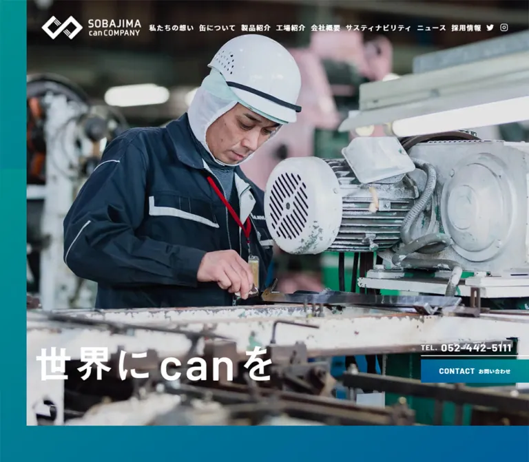
Sobajima presents a can manufacturer through its working environment: presses, cables, metal surfaces, protective clothing, and people operating machinery. A dark opening image gives white branding and the phrase 世界にcanを a strong silhouette. A narrow colored rail runs down the left edge, while telephone and contact links attach to the right edge. The composition is intentionally asymmetric.
Further down, a large worker photograph meets a blue-green company panel containing oversized English lettering and carefully spaced Japanese copy. White sections and a generous footer provide a quieter counterpoint. Barlow supplies the measured English headings and telephone numbers; noto-sans-cjk-jp supplies most measured Japanese text. Rectangular imagery, square buttons, thin rules, and restrained arrows carry the interface without a general shadow or rounded-card system.
This is a substantial corporate homepage with product, company, recruitment, sustainability, and editorial destinations. Preserve that information architecture when adapting its visual language.
閉じる
Sobajima can COMPANY — Style Reference
Industrial craft presented through dark machinery, expansive blue-green fields, and precise navy typography.
Website: sobajima.jp Original URL: https://sobajima.jp/ Final URL: https://sobajima.jp/ — HTTP 200, unchanged destination. Inspected: October 2, 2026, at 05:01:57 JST; supplied browser evidence retrieved October 1, 2026, at 20:01:57.855 UTC. Viewports: 1440 × 1000 desktop and 390 × 844 mobile, in CSS pixels. Theme: white and navy information surfaces, blue-green brand fields, and a dark photographic opening. Scope: the current corporate homepage. Visual captures cover the desktop opening, company section, and footer, plus the mobile opening and lower footer. Rendered DOM measurements cover the longer homepage, including philosophy, products, factory, news, topics, and related links. Linked pages and opened navigation states were not inspected.
Sobajima presents a can manufacturer through its working environment: presses, cables, metal surfaces, protective clothing, and people operating machinery. A dark opening image gives white branding and the phrase 世界にcanを a strong silhouette. A narrow colored rail runs down the left edge, while telephone and contact links attach to the right edge. The composition is intentionally asymmetric.
Further down, a large worker photograph meets a blue-green company panel containing oversized English lettering and carefully spaced Japanese copy. White sections and a generous footer provide a quieter counterpoint. Barlow supplies the measured English headings and telephone numbers; noto-sans-cjk-jp supplies most measured Japanese text. Rectangular imagery, square buttons, thin rules, and restrained arrows carry the interface without a general shadow or rounded-card system.
This is a substantial corporate homepage with product, company, recruitment, sustainability, and editorial destinations. Preserve that information architecture when adapting its visual language.
How to Read This Reference
- Measured means a value is explicitly present in the supplied rendered DOM or computed-style evidence. Element rectangles describe the captured state, including any transforms.
- Visual estimate means a proportion, color, or treatment is inferred from the current-page screenshots. Estimated hexadecimal colors are implementation starting points, not sampled source tokens.
- Calculated means arithmetic applied to measured rectangles, such as a gap between columns.
- Recommended means an implementation choice for a new site. Breakpoints, focus treatments, and the Quick Start belong to this category unless otherwise identified.
- Token names are descriptive aliases. Only the custom properties explicitly identified as source properties were observed on the original page.
- The extracted DOM includes offscreen navigation, duplicate header variants, and repeated link-strip items. Their presence does not establish that they were simultaneously visible.
- Several large titles contain little or no extracted text despite prominent visible lettering. Their parent font sizes do not measure the artwork or styled descendants inside them.
Tokens — Colors
Measured Palette
| Name | Value | Suggested token | Evidence and role |
|---|---|---|---|
| Navy Ink | #0c3860 |
--color-ink |
Computed body color, footer navigation, company details, and telephone links |
| Brand Teal | #00918f |
--color-teal |
Computed color of NEWS and TOPICS headings |
| White | #ffffff |
--color-paper |
Computed philosophy and footer backgrounds; reversed Japanese text and contact labels |
| Editorial Gray | #f7f7f7 |
--color-editorial |
Computed background of the combined news/topics section |
| Environmental Sky | #3cb5de |
--color-sky |
Computed text color of the environmental-message heading on a white strip |
Visually Estimated Accents
| Name | Approximation | Suggested token | Visible use |
|---|---|---|---|
| Action Blue | #00639f |
--color-blue |
Blue end of contact-button gradients and larger brand fields |
| Factory Blue | #155b96 |
--color-factory |
Approximation of the blue factory section visible beneath the company panel |
| Pale Aqua | #79eeee |
--color-aqua |
Oversized lowercase can lettering in the company section |
| Anniversary Gold | #efd052 |
--color-gold |
Campaign artwork with illustrated commemorative cans |
| Hero Near-Black | #090b0d |
--color-dark |
Approximation of the dark machinery image and mobile opening band |
The company field visibly shifts from teal toward blue. Contact buttons run from blue on the left toward teal on the right. The opening rail also changes along its height. Their precise gradient stops and angles were not included in the computed-style extract.
Recommended gradient recipes:
--gradient-contact: linear-gradient(90deg, #00639f, #00918f);
--gradient-company: linear-gradient(135deg, #00918f, #00639f);
--gradient-rail: linear-gradient(180deg, #00918f, #00639f);
These recipes approximate the screenshots. A transparent computed background on an anchor or section does not mean its rendered surface is transparent: background images, pseudo-elements, and ancestor layers were not comprehensively extracted.
There is no evidence of a user-selectable color theme. The dark opening, colored sections, and white footer are parts of one page design.
Tokens — Typography
English Headings and Numerical Information
Measured family: Barlow, sans-serif.
Barlow is explicitly declared for NEWS, TOPICS, LINKS PAGE, telephone numbers, the hero contact link, and copyright. Most measured instances use weight 700. Tracking gives these compact, sturdy letterforms additional presence.
The company’s large can and COMPANY lettering is visible, but its own computed family and font size were not supplied. Barlow is a reasonable adaptation choice for this lettering, not a verified declaration for those particular elements.
Japanese Copy and Navigation
Measured family: noto-sans-cjk-jp, sans-serif.
Use weight 500 for ordinary descriptive paragraphs and article titles, and 700 for section labels, navigation, and company details. Body copy generally has generous line spacing and approximately 0.05em tracking. Footer navigation uses a more pronounced 0.1em.
The declared family name is supported by the evidence; a font-file URL or exact downloaded font binary is not.
Base Fallback Stack
The measured body stack is:
'Helvetica Neue', Arial, 'Hiragino Kaku Gothic ProN',
'Hiragino Sans', Meiryo, sans-serif
The root and body both report 10px in the supplied measurements. Many wrappers inherit that size while their descendants use explicit typography. Do not reproduce visible paragraph text at 10px or treat the root’s Times family as the page’s visual typeface.
Type Scale
All values below are measured unless identified otherwise.
| Role | Desktop | Mobile | Weight and tracking |
|---|---|---|---|
NEWS / TOPICS |
60px / 69px |
44px / 50.6px |
Barlow 700; 0.1em |
LINKS PAGE |
42px / 48.3px |
Same | Barlow 700; 4.2px |
| Company Japanese heading | 28px / 32.2px |
17px / 19.55px |
Japanese family 700; 0.18em |
| Factory Japanese heading | 40px / 46px |
24px / 27.6px |
700; 11.2px desktop, 2.4px mobile |
| Vertical product heading | 40px / 46px |
24px / 27.6px |
700; 10.4px desktop, 3.84px mobile |
| Company/factory body | 16px / 30px |
14px / 28px |
500; approximately 0.05em |
| Philosophy body | 17px / 46px |
16px / 38px |
500; 0.05em |
| Topic titles | 15px / 26px |
14px / 26px |
500; 0.05em |
| Hero telephone | 25px / 27px |
Same | Barlow 700; 1.75px |
| Hero contact link | 18px / 20.7px |
Same | Barlow 700; 1.26px; Japanese child is visibly smaller |
| Compact header inquiry | 13px / 14.95px |
Not visible in mobile header | Japanese family 700; 1.82px |
| Footer company name | 19px / 21.85px |
18px / 20.7px |
700; 0.12em |
| Footer address | 15px / 26px |
14px / 24px |
700; 0.05em |
| Footer telephone/fax | 20px / 27px |
Same | Barlow 700; 1px |
| Footer primary links | 16px / 28px |
15px / 22px |
700; 0.1em |
| Footer product sublinks | 16px / 28px |
13px / 19.5px |
700; 0.1em |
| Copyright | 14px / 16.1px |
13px / 14.95px |
Barlow 700; 0.1em |
Graphic and Oversized Titles
The visible hero phrase occupies a measured heading wrapper of 560 × 82px on desktop and 284 × 41.8px on mobile. Its extracted heading text is empty, so these are bounds, not a font-size measurement.
The philosophy heading also has a small inherited parent font size that does not explain its large content bounds. Treat prominent graphic or nested titles separately from ordinary HTML heading styles. In a new implementation, use authorized artwork with an accessible text equivalent, or deliberately recreate the hierarchy with live text and label that recreation as an adaptation.
Tokens — Spacing & Shapes
Overall rhythm: large section intervals, compact utility controls, and carefully separated navigation links.
There is no demonstrated universal spacing scale. The following useful values are drawn from actual component measurements rather than fitted to an invented eight-point system.
Spacing Inventory
| Use | Desktop | Mobile | Status |
|---|---|---|---|
| Opening left rail | About 72px |
22px |
Desktop visual estimate; mobile section padding measured |
| Editorial outer inset | 147px |
30px |
Measured |
| Editorial content width | 1146px |
330px |
Calculated from outer edges |
| Company copy left edge | 734.55px |
25px for body |
Measured viewport/document x-coordinate |
| Company heading-to-body gap | 60px |
Image-sized interval between heading and body | Desktop calculated; mobile DOM order and positions |
| Company body-to-detail link | 61px |
About 34px |
Calculated from element bounds |
| Factory preview gap | 53px horizontally |
21px vertically |
Calculated |
| Topic column gap | 50px |
About 25.47px |
Calculated |
| Topic row gap | 50px |
35px |
Calculated from anchor rectangles |
| Footer outer inset | About 120px |
30px |
Desktop measured first identity position; mobile padding measured |
| Footer primary-link gap | 30px |
42px |
Calculated between single-line link boxes |
| Footer product indentation | About 30.5px |
18px |
Calculated; includes the visual rule relationship |
| Footer padding | 160px 0 |
80px 30px 30px |
Measured |
Shape Language
- Measured buttons, links, section wrappers, and footer elements report
border-radius: 0. - The contact action is a flat, rectangular gradient slab.
- The telephone sits above a thin horizontal rule.
- Product subnavigation is organized by a vertical navy rule.
- The hamburger uses three horizontal strokes in a measured 34 × 18px button box. A larger invisible hit area is recommended.
- Rounded icon details belong to their particular symbols; they do not establish a rounded container system.
- No general elevation-shadow treatment is apparent in the supplied current-page captures.
Layout Measurements
| Element | Desktop | Mobile |
|---|---|---|
| Document height | About 9731px |
About 9114px |
| Initial logo link box | 297 × 100.4px, x 77px |
210 × 71px, x 20px |
| Compact desktop logo link | 200 × 67.6px |
Separate compact desktop variant not present |
| Hero headline wrapper | 560 × 82px |
284 × 41.8px |
| Hero contact action | 256 × 54.69px |
315 × 54.69px |
| Hero telephone box | 256 × 34px |
227 × 34px |
| Anniversary link box | 259 × 100px |
390 × 94px |
| Company content section | 1258.55 × 847px |
390 × 861.13px |
| Factory preview buttons | Two at 498 × 413.72px |
Two at 336 × 279.13px |
| Topic anchor | 236 × 248.55px |
About 146.27 × 219.52px |
| Company/recruitment gateways | Two at 720 × 430px |
Two at 390 × 236px |
| Footer vertical logo | 164 × 200px |
Same |
| Footer contact action | Not shown in the desktop footer capture | 330 × 65.91px |
The company section’s measured wrapper width does not define the full visible background: the screenshot’s color field reaches the right viewport edge. Preserve the full-bleed field separately from the inner content bounds.
Observed Source Properties
| Property | Desktop | Mobile | Interpretation limit |
|---|---|---|---|
--vw |
14.4 |
3.9 |
Numerically corresponds to one percent of viewport width; consuming formulas were not supplied |
--vh |
10 |
8.44 |
Numerically corresponds to one percent of viewport height |
--base-vw |
13.66 |
3.75 |
Different desktop/mobile reference values; do not invent their formulas |
--header-height |
141px |
71px |
Source variable; not the height of every visible header variant |
--z-base / --z-menu / --z-header |
100 / 101 / 102 |
Same | Observed layer tokens; exact assignment to all components is unknown |
Components
Opening Header and Scrolled Header
Role: retain identity and essential navigation while the visual background changes.
The desktop opening has a large white horizontal logo over dark factory imagery. At the right are the topics symbol, X, Instagram, and the three-line menu button. The measured logo link starts at x 77px; its artwork occupies less than the full link rectangle.
The company and footer screenshots instead show a white header approximately 101px high, with a smaller colored logo, navy telephone number, compact gradient inquiry button, a vertical separator, social/topic icons, and menu control. The DOM includes a compact header variant positioned above the viewport in the initial state. Together these observations support a persistent alternate header associated with scrolling; the exact trigger and positioning implementation are unverified.
On mobile, the visible header contains only the horizontal logo and hamburger. The source height variable is 71px. The opening uses white artwork against a dark band, while the lower-page capture uses colored artwork on white. Do not infer that desktop telephone and social utilities remain in the mobile header.
Industrial Hero
Role: establish manufacturing identity before detailed company information.
A narrow colored left rail frames a large, edge-cropped factory image. The current captures show dark, nearly monochrome machinery, visible cables, and close metal surfaces. White branding, the headline, and contact controls remain legible against it.
At 1440 × 1000, the headline wrapper begins at approximately (99.36, 893) and the contact action ends at y 980. At 390 × 844, the headline begins at approximately (51.44, 366.28). The mobile title therefore moves into the middle portion of the opening instead of merely shrinking in the desktop bottom-left position.
The desktop and mobile captures contain different machinery views. Their medium, playback settings, sequence, and timing are not established by the supplied element extract. Preserve a suitable static image fallback; do not claim verified autoplay or a particular video format.
The measured first section is taller than the opening viewport because it also contains the notice and environmental block: 1812px desktop and about 1459px mobile. Do not make the photographic hero itself that entire height.
Telephone and Contact Pair
Role: offer immediate inquiry without interrupting the photographic composition.
Stack a bold Barlow telephone line above a white rule, followed by a rectangular gradient action. The English CONTACT label is visually dominant, with smaller お問い合わせ beside it. Both lines align toward the right viewport edge.
Desktop anatomy:
- Telephone anchor:
256 × 34px, 25px bold type. - An
8pxgap after that measured box. - Contact anchor:
256 × 54.69px, including17pxvertical padding.
Mobile keeps the same contact height but widens the action to 315px, beginning at x 75px. The narrower phone box starts at x 163px, so the two controls share a right edge but not a left edge.
The links are genuine destinations: tel:052-442-5111 and the site’s contact URL. Their destination pages were not inspected.
Anniversary Campaign Banner
Role: promote the 120th-anniversary destination as a distinct campaign layer.
Gold artwork combines commemorative can illustrations, thin dark rules, and an English anniversary label. The can illustrations visibly protrude to the left of the rectangular banner area.
In the desktop opening, the measured link box is 259 × 100px above the telephone/contact pair. In the company screenshot, a banner appears at the lower-right viewport edge. On mobile, it spans the screen at y 750–844, below the opening contact controls.
The banner is absent from the supplied footer captures. These are observed states, not proof of a particular hide threshold. Implement visibility as explicit state if reproducing it, and verify that it never blocks footer links. Do not make gold the site’s ordinary action color.
Important Notice and Environmental Indicator
Role: insert timely information and a sustainability message after the opening.
The notice combines 重要なお知らせ, a date, and one linked headline. Desktop places the label and article in a horizontal arrangement. On mobile, the label occupies its own row, followed by a date-and-title arrangement; the article headline wraps over three measured lines.
The environmental block uses a white label strip with sky-blue text, white explanatory copy, and a large numeric value with a small t unit. The provided states disagree: desktop extracted 0, while mobile extracted 741.68. This may reflect loading, animation, or another state difference, but the cause was not established. Neither value should be hardcoded as a design token or treated here as a verified emissions result.
Philosophy and Product Introduction
Role: explain the company’s attitude and lead into can-related information.
The philosophy section is a large white interval with navy text. Its paragraph is unusually open: 17px / 46px on desktop and 16px / 38px on mobile. The mobile paragraph occupies a 266px column beginning at x 104px, retaining an asymmetric left margin rather than using the standard 30px inset.
The following product introduction combines ABOUT"CAN", descriptive copy, a vertically arranged Japanese label 缶のこと, and two small arrow links. The narrow title bounds support the vertical composition; the precise writing-mode declaration was not supplied.
Desktop body copy is 16px / 30px; mobile is 14px / 28px. The two destinations remain distinct: product information and an explanation of cans. Keep these as understated text links rather than turning every navigation choice into a filled button.
Company Photograph and Color Panel
Role: connect company values with an actual person at work.
The desktop screenshot places a tall worker photograph at the left, occupying approximately 39% of the viewport width. The adjacent color field contains pale-aqua lowercase can, very large navy COMPANY, a white Japanese heading, a short white paragraph, and an underlined detail link with a right arrow.
Measured copy begins at x 734.55px, about 51% of the viewport width, and has a 524px box. The photograph-to-copy interval is therefore substantial. The panel should not feel like two equal cards with a small gap.
On mobile, the DOM changes to a block layout with 80px 25px 126px section padding. The heading precedes a large interval before the body, consistent with an intervening photograph. No mobile company screenshot was supplied, so its exact crop is unverified. The body is five lines at 14px / 28px; the detail link is aligned toward the right.
Factory Introduction and Preview Controls
Role: invite visitors to explore the manufacturing process.
The desktop factory section begins with a blue field, a large peripheral FACTORY label visible in the company screenshot, and white Japanese copy. The measured layout separates the heading at x 195.5px from explanatory text at x 508.5px.
Two large button wrappers follow: 498 × 413.72px each, separated by 53px. On mobile they stack as 336 × 279.13px controls with 21px between them. Their aspect ratio stays approximately 1.204:1 at both viewports.
The button elements establish interactive affordances, but their contents and activation results were not fully supplied. Do not assume a video modal, lightbox, sound behavior, or player controls. Use descriptive accessible labels when implementing equivalent previews.
News List and Topics Grid
Role: distinguish formal announcements from visual company stories.
Both occupy one light-gray section. Desktop uses adjacent columns: a 533px news column at x 147px and a 522px topics column at x 771px, giving a calculated 91px gap.
The news side contains four dated entries. Each anchor has 50px top and bottom padding; measured heights vary from 130px to 160px with text wrapping. The topics side has four image-oriented anchors in two columns, each 236px wide, with 50px column spacing.
Mobile stacks the news block before topics. News rows switch from flex to block and use 35.5px vertical padding. Topics retain two columns, with anchors about 146.27px wide. Titles wrap naturally at 14px / 26px. Do not collapse this grid automatically to one column at the inspected 390px width.
Both blocks use teal Barlow headings and a small right-aligned detail link. The extract does not establish every divider, thumbnail crop, or date-child style.
Related Links Strip
Role: connect the corporate homepage to campaigns, shop destinations, and related projects.
The LINKS PAGE section has white 42px Barlow lettering and a horizontal run of linked graphic items. Measured item boxes are 282 × 170px on desktop and approximately 245.69 × 142px on mobile. Calculated horizontal intervals are 70px and 15px, respectively.
Repeated destination links and offscreen items suggest a cloned strip or carousel structure. They do not prove autoplay, direction, dragging, or timing. A new implementation can provide a keyboard-accessible horizontal scroller as a safe baseline without inventing original interaction details.
Company and Recruitment Gateways
Role: close the main content with two substantial navigation destinations.
The desktop pair is full bleed and evenly divided: two 720 × 430px anchors. The supplied footer screenshot reveals portions of a company-building photograph and a worker/machinery photograph above the footer.
Mobile stacks them at 390 × 236px each. Preserve their photographic scale and broad click area. Their exact label placement is not visible in the supplied crop.
Corporate Footer
Role: provide a complete, quiet index and company contact information.
The desktop footer is white with navy typography and large empty areas. A vertical 164 × 200px logo sits beside company information. Two navigation columns occupy the right side, with product sublinks grouped beneath a thin vertical rule. The footer independently identifies the operator as 側島製罐株式会社.
Mobile changes the identity region to a vertical arrangement: centered logo, left-aligned company details, and then navigation. Crucially, the navigation remains two columns. At 390px, both are 156px wide with an 18px gap inside 30px side margins.
Primary links use 15px type; product sublinks step down to 13px and wrap over two or three lines. A 330 × 65.91px gradient contact action follows the navigation. Copyright is centered below it with substantial separation; desktop copyright instead sits at the lower-left edge.
Offscreen Navigation Structure
Role: expose the broader site map through the hamburger.
The extracted navigation includes primary destinations, a product sublist, telephone/contact links, graphic links, and a mobile close control. Measured navigation links lie beyond the right viewport edge in the captured state.
Desktop primary menu links declare 17px / 24.99px, weight 700, with 12px vertical padding. Mobile declares 15px / 19.5px with 8px vertical padding; product sublinks reduce to 13px.
This supports an offscreen navigation architecture. It does not establish the opened panel’s exact surface, travel distance, animation duration, focus management, or scroll-lock behavior. The screenshots show the closed state.
Tokens — Motion & Interaction
Measured Transition Declarations
| Target | Supplied declaration | What it establishes |
|---|---|---|
| Main logo heading | transform 0.6s cubic-bezier(0.165, 0.84, 0.44, 1) |
A transform transition exists; exact activation was not recorded |
| Many section headings and paragraphs | opacity 0.3s ease-in-out, transform 0.3s ease-in-out |
Short fade/transform transitions are defined |
| Corresponding mobile reveal elements | Same transitions with 0.2s delay |
A measured mobile delay, not a verified full reveal sequence |
| Desktop navigation/footer links | color 0.3s ease-in-out |
Color feedback is defined; final hover color was not supplied |
| Offscreen menu contact action | background-size 0.6s cubic-bezier(0.39, 0.575, 0.565, 1) |
A background-size transition, not proof of a specific gradient sweep |
| Certain offscreen graphic links | opacity 0.3s cubic-bezier(0.165, 0.84, 0.44, 1) |
Opacity feedback is defined |
| Floating anniversary variant | transform 0.24s ease-out desktop; 0.3s ease-out mobile |
A banner transform transition exists; trigger remains unverified |
The recurring motion vocabulary is short opacity, transform, and color changes with easing. No supplied evidence supports spring physics, elaborate parallax, or a particular hero playback loop.
Observed State Changes and Limits
- The header appears as white artwork over the opening and as colored artwork on white in lower-page captures.
- The anniversary banner occupies different positions in opening and mid-page captures and is absent from footer captures.
- The environmental number differs between desktop and mobile evidence.
- Repeated links and displaced geometry indicate a strip-like module, but no user gesture or timed movement was documented.
- Many extracted elements report
animation: none. This does not rule out animation on children, pseudo-elements, media, or JavaScript-driven transforms. - No menu opening, factory-control activation, hover sequence, or contact submission was recorded.
Recommended adaptation: use the measured 300ms fade/transform rhythm and 600ms logo easing sparingly. Leave content visible when scripting fails. Provide reduced-motion behavior and a static alternative for any moving hero media.
Surfaces
| Surface | Appearance | Structural purpose |
|---|---|---|
| Opening | Dark machinery with white foreground content | Immediate manufacturing identity |
| Left rail | Narrow blue-green gradient | Frames the asymmetric hero |
| Company field | Broad teal-to-blue gradient | Links large display lettering, copy, and worker imagery |
| Factory field | Strong blue visible in the supplied crop | Continues the manufacturing narrative |
| Philosophy/footer | White with navy typography | Gives long copy and navigation breathing room |
| News/topics | Measured #f7f7f7 |
Groups current information without heavy card containers |
| Contact action | Blue-to-teal rectangle with white text | Consistent inquiry affordance |
| Anniversary artwork | Gold campaign strip with can illustrations | Distinct promotional emphasis |
Visual hierarchy comes from image scale, color-field changes, typography, and empty space. A general system of floating panels or soft shadows would change the page’s character.
Imagery
Use documentary factory imagery with believable working detail: worn metal, machine housings, cables, safety equipment, hands near controls, and people concentrating on production. Preserve the sense of an operating workplace rather than substituting abstract technology imagery.
The opening uses a very dark, nearly monochrome treatment. The company photograph is visibly in color, with dark workwear, a white helmet, muted machinery, and natural industrial light. Apply the dark treatment selectively; the entire site is not monochrome.
Photography uses strong crops and flush edges. In the company section, the tall crop makes the operator and machine a continuous visual mass. Gateway photographs work as wide destinations. Topic images belong to editorial entries and should retain their own content identity.
Observed Asset Roles
| Asset role | Appearance and placement | Evidence limitation |
|---|---|---|
| Horizontal logo, white | Linked geometric mark and wordmark over the opening | Source path and format not supplied |
| Horizontal logo, color | Teal/blue mark and navy lettering in the white header | Exact asset variant not supplied |
| Vertical logo | 164 × 200px footer link, with stacked wordmark and small descriptor |
Link bounds measured; image path unavailable |
| Hero lettering | White 世界にcanを |
Heading wrapper measured; internal asset/type construction unverified |
| Factory opening media | Dark machinery close-ups | Video versus still implementation unverified |
| Company photograph | Worker operating equipment | Desktop crop visually confirmed; mobile crop unverified |
| Anniversary artwork | Gold strip and overlapping commemorative cans | Link destination known; artwork source unavailable |
| Gateway imagery | Building and worker/machinery photographs | Only part of their desktop height is visible |
| Topic/related graphics | Image-oriented anchors in grid and strip layouts | Individual image URLs not included |
No image or video source URLs were provided in the rendered extract. Do not invent asset filenames or derive them from linked page URLs. Use authorized assets or clearly identified replacements.
Layout & Responsive Behavior
The design changes composition across viewports rather than scaling every dimension proportionally.
| Pattern | 1440 × 1000 | 390 × 844 |
|---|---|---|
| Header | Large opening logo; compact utility-rich white variant below | Logo and hamburger only in visible header |
| Hero frame | Approximately 72px rail | Measured 22px rail |
| Headline | Near bottom-left | Near middle of the opening |
| Contact pair | 256px action at right edge | 315px action with a narrower right-aligned telephone |
| Anniversary | Small right-side campaign block | Full-width 94px-high opening dock |
| Company | Worker photo beside copy field | Block composition; smaller type and 25px side padding |
| Factory previews | Two across | Two stacked |
| News/topics | Two neighboring sections | News first, topics below |
| Topic cards | Two columns | Still two columns |
| Gateway photographs | Two equal halves | Full-width vertical pair |
| Footer identity | Logo and company details beside navigation | Centered logo, then details and navigation |
| Footer navigation | Two columns on right | Two columns across a 330px region |
Section Rhythm
Measured section heights illustrate the page’s pacing, not fixed values to impose on new content:
| Section | Desktop | Mobile |
|---|---|---|
| Opening, notice, environmental block | 1812px |
About 1459px |
| Philosophy | 1210px |
About 953px |
| Product introduction | About 978px |
571px |
| Company | 847px |
About 861px |
| Factory | About 979px |
About 1084px |
| News/topics | About 1236px |
About 1696px |
| Related links | About 659px |
About 461px |
| Footer | About 740px |
About 1226px |
Some intervals between measured sections are not explained by the selected element extract. Do not insert arbitrary blank spacer blocks simply to reproduce the recorded document height.
Only two widths were inspected. The exact breakpoint, tablet treatment, landscape behavior, and safe-area handling remain unverified. The Quick Start uses a recommended 900px breakpoint and should be checked at intermediate widths.
Do’s and Don’ts
Do
- Keep navy
#0c3860, teal#00918f, white, and the measured editorial gray central to the system. - Use large photographic areas and broad color fields to express manufacturing scale.
- Retain the opening’s left rail and right-edge contact alignment.
- Preserve the visual distinction between the dark hero and natural-color worker photography.
- Use Barlow for the verified English/numerical roles and the declared Japanese family where available.
- Give Japanese paragraphs generous leading and use tracking deliberately.
- Keep actions rectangular, detail links understated, and product navigation grouped by a rule.
- Retain two-column topics and footer navigation at the inspected mobile width.
- Treat the anniversary banner as a separate campaign asset with controlled visibility.
- Distinguish heading artwork bounds from actual font sizes.
- Preserve the corporate site map and editorial destinations.
Don’t
- Don’t turn every section into a centered headline followed by identical rounded cards.
- Don’t replace factory imagery with generic abstract technology graphics.
- Don’t apply the hero’s dark treatment to every photograph.
- Don’t extend gold into the everyday contact or navigation system.
- Don’t use inherited 10px wrapper styles as the visible type scale.
- Don’t keep desktop hero-title positioning unchanged on mobile.
- Don’t let a fixed campaign banner cover footer links or keyboard focus.
- Don’t assume all repeated DOM links are visible duplicates.
- Don’t claim a video player, modal, autoplaying carousel, or menu transition that was not exercised.
- Don’t hardcode the captured environmental number as permanent content.
- Don’t force exact recorded section heights after replacing copy or images.
Recommended Implementation Additions
These are recommendations for a new implementation, not verified original-site features:
- Enlarge the hamburger’s interactive target to at least 44 × 44px while preserving its 34 × 18px strokes.
- Give logo links, campaign artwork, factory controls, and icon-only links meaningful accessible names.
- Provide real heading text or an equivalent accessible name for graphic titles.
- Keep a visible keyboard focus indicator on both white and gradient surfaces.
- If the menu is modal, implement focus containment, Escape dismissal, focus restoration, and an inert background. Confirm the intended behavior before choosing modal semantics.
- Provide a static poster and reduced-motion alternative if using moving factory imagery; do not depend on sound for comprehension.
- Prevent campaign overlays from obscuring content at short heights, with zoom, or near the footer.
- Expose environmental data with a meaningful loading state and avoid announcing every intermediate counter frame.
- Make related links operable without automatic movement and keep cloned decorative items out of the tab order.
- Preserve image space during loading and test Japanese wrapping at 320px, 390px, intermediate tablet widths, and desktop.
- Check the final gradient/text combinations for contrast; the approximated palette has not been audited as a complete implementation.
Agent Prompt Guide
Quick Color Reference
- Main text and rules: measured navy
#0c3860. - English editorial headings: measured teal
#00918f. - Main information surfaces: white; news/topics: measured
#f7f7f7. - Contact action: approximate blue
#00639fto measured teal#00918f. - Company field: approximate teal-to-blue gradient with pale-aqua display lettering.
- Anniversary: gold artwork, separate from normal interface actions.
Overall Prompt
“Create a Japanese manufacturing company homepage inspired by Sobajima’s current composition. Use navy typography, white information surfaces, a pale-gray editorial section, and broad teal-to-blue fields. Open with dark factory imagery framed by a narrow left color rail, a white geometric logo, the phrase 世界にcanを, and a right-aligned telephone/contact pair. Follow with spacious company and product storytelling, a tall worker photograph beside oversized English company lettering, a factory introduction, formal news, visual topics, related destinations, and a generous corporate footer. Use square geometry, Barlow for English headings and numbers, and carefully tracked Japanese sans-serif copy. On mobile, reposition the hero headline, simplify the header, stack major sections, and retain two-column topics and footer navigation.”
Example Component Prompts
- Header: “Create two header treatments: large white branding over a dark industrial opening, and a compact white header with colored branding and navy utilities for lower content. Use a three-line menu icon. On phones retain only logo and menu. Keep the transition trigger configurable.”
- Contact pair: “Place a bold 25px Barlow telephone number above a thin white rule and a square blue-to-teal contact rectangle. Combine dominant
CONTACTwith smallerお問い合わせ. Align both to the right edge; on mobile let the button extend farther left than the telephone.” - Company section: “Use a tall color photograph of a worker and machine on the left and a full-bleed blue-green field on the right. Place large aqua
can, navyCOMPANY, a smaller white Japanese heading, 16px/30px copy, and an underlined arrow link. Preserve substantial space between the photo and copy.” - Editorial section: “Build a pale-gray section with a dated news list beside a two-column topics grid. Use teal Barlow section headings and navy text. On mobile put news above topics while keeping the topics grid two columns wide.”
- Footer: “Create a spacious white corporate footer with a vertical brand mark, address and telephone details, and two navy navigation columns. Group product sublinks with a thin vertical rule. On mobile stack the identity above the two-column navigation, then add a full-width gradient inquiry action and centered copyright.”
Quick Start
CSS Custom Properties
This is an implementation adaptation, not recovered source CSS. It uses a conventional root size, measured component typography, and explicitly approximate gradients. The 900px breakpoint, mobile company image height, and large company display sizes are recommendations.
:root {
  /* Measured colors */
  --color-ink: #0c3860;
  --color-teal: #00918f;
  --color-paper: #ffffff;
  --color-editorial: #f7f7f7;
  --color-sky: #3cb5de;

  /* Visual approximations */
  --color-blue: #00639f;
  --color-factory: #155b96;
  --color-aqua: #79eeee;
  --color-gold: #efd052;
  --color-dark: #090b0d;
  --gradient-contact: linear-gradient(90deg, var(--color-blue), var(--color-teal));
  --gradient-company: linear-gradient(135deg, var(--color-teal), var(--color-blue));
  --gradient-rail: linear-gradient(180deg, var(--color-teal), var(--color-blue));

  --font-system: 'Helvetica Neue', Arial, 'Hiragino Kaku Gothic ProN',
    'Hiragino Sans', Meiryo, sans-serif;
  --font-ja: 'noto-sans-cjk-jp', var(--font-system);
  --font-en: 'Barlow', sans-serif;
  --text-body: 16px;
  --leading-body: 30px;
  --tracking-body: 0.05em;
  --content-width: 1146px;
  --rail-width: 5vw;
  --header-height: 141px;
  --z-base: 100;
  --z-menu: 101;
  --z-header: 102;
  --motion-reveal: 300ms ease-in-out;
  --motion-brand: 600ms cubic-bezier(0.165, 0.84, 0.44, 1);
}

* { box-sizing: border-box; }
body {
  margin: 0;
  color: var(--color-ink);
  background: var(--color-paper);
  font-family: var(--font-ja);
  font-size: var(--text-body);
  line-height: var(--leading-body);
}
img { display: block; max-width: 100%; }
a { color: inherit; }
button { font: inherit; }
[hidden] { display: none !important; }

.site-header {
  position: fixed;
  inset: 0 0 auto;
  z-index: var(--z-header);
  display: flex;
  align-items: center;
  justify-content: space-between;
  height: var(--header-height);
  padding-inline: calc(var(--rail-width) + 5px) 40px;
  color: white;
}
.site-logo { width: 297px; }
.site-logo img { width: 100%; height: auto; }
.site-header__tools { display: flex; align-items: center; gap: 20px; }
.site-header__contact { display: none; }
.site-header.is-scrolled {
  height: 101px;
  padding-inline: 5px 40px;
  color: var(--color-ink);
  background: white;
}
.site-header.is-scrolled .site-logo { width: 200px; }
.site-header.is-scrolled .site-header__contact {
  display: flex;
  align-items: center;
  gap: 16px;
}
.menu-toggle {
  display: grid;
  place-items: center;
  width: 44px;
  height: 44px;
  padding: 5px;
  border: 0;
  color: inherit;
  background: transparent;
  cursor: pointer;
}
.menu-toggle__lines {
  width: 34px;
  height: 18px;
  border-block: 2px solid currentColor;
  background: linear-gradient(currentColor, currentColor) center / 100% 2px no-repeat;
}

/* The notice and environmental block follow this hero in normal flow. */
.hero {
  position: relative;
  isolation: isolate;
  min-height: 100svh;
  margin-left: var(--rail-width);
  color: white;
  background: var(--color-dark);
}
.hero::before {
  content: '';
  position: absolute;
  top: 0;
  bottom: 0;
  left: calc(-1 * var(--rail-width));
  width: var(--rail-width);
  background: var(--gradient-rail);
}
.hero__media {
  position: absolute;
  inset: 0;
  z-index: -2;
  width: 100%;
  height: 100%;
  object-fit: cover;
}
.hero::after {
  content: '';
  position: absolute;
  inset: 0;
  z-index: -1;
  background: rgb(0 0 0 / 28%);
}
.hero__title {
  position: absolute;
  left: 1.9vw;
  bottom: 25px;
  width: min(560px, calc(100% - 60px));
  margin: 0;
}
.hero__title img { width: 100%; height: auto; }
.hero__contact {
  position: absolute;
  right: 0;
  bottom: 20px;
  width: 256px;
}
.telephone {
  display: flex;
  align-items: baseline;
  gap: 7px;
  font: 700 25px/27px var(--font-en);
  letter-spacing: 1.75px;
  text-decoration: none;
}
.telephone small { font-size: 16px; }
.hero__contact .telephone {
  min-height: 34px;
  margin-bottom: 8px;
  padding-bottom: 5px;
  border-bottom: 2px solid currentColor;
}
.contact {
  display: flex;
  align-items: center;
  justify-content: center;
  gap: 8px;
  min-height: 54.69px;
  padding: 17px 12px;
  color: white;
  background: var(--gradient-contact);
  font: 700 18px/20.7px var(--font-en);
  letter-spacing: 0.07em;
  text-decoration: none;
  border-radius: 0;
}
.contact small {
  font: 700 12px/1.4 var(--font-ja);
  letter-spacing: 0.05em;
}
.anniversary {
  position: absolute;
  right: 0;
  bottom: 134px;
  width: 259px;
}
.anniversary img { width: 100%; height: auto; }
.anniversary.is-docked {
  position: fixed;
  bottom: 0;
  z-index: var(--z-base);
}

.company {
  display: grid;
  grid-template-columns: 38.85% minmax(0, 1fr);
  min-height: 847px;
  color: white;
  background: var(--gradient-company);
}
.company__image { width: 100%; height: 100%; object-fit: cover; }
.company__copy {
  align-self: center;
  max-width: 524px;
  margin-left: clamp(40px, 12.15vw, 175px);
  margin-right: 30px;
  padding-block: 80px;
}
.company__display {
  margin: 0;
  color: var(--color-ink);
  font: 700 clamp(64px, 7vw, 104px)/1.05 var(--font-en);
  letter-spacing: 0.08em;
}
.company__display span { display: block; color: var(--color-aqua); }
.company__heading h3 {
  margin: 20px 0 60px;
  font-size: 28px;
  line-height: 1.15;
  letter-spacing: 0.18em;
}
.company__body {
  margin: 0;
  font-weight: 500;
  letter-spacing: var(--tracking-body);
}
.more {
  display: inline-flex;
  align-items: center;
  gap: 10px;
  font-weight: 700;
  letter-spacing: 0.05em;
  text-underline-offset: 6px;
}
.company__more { margin-top: 60px; }

.updates { padding: 200px 30px 181px; background: var(--color-editorial); }
.updates__inner {
  display: grid;
  grid-template-columns: 533fr 522fr;
  gap: 91px;
  max-width: var(--content-width);
  margin-inline: auto;
}
.section-title {
  margin: 0;
  color: var(--color-teal);
  font: 700 60px/1.15 var(--font-en);
  letter-spacing: 0.1em;
}
.news-row {
  display: flex;
  gap: 24px;
  padding-block: 50px;
  text-decoration: none;
}
.topics-grid { display: grid; grid-template-columns: repeat(2, minmax(0, 1fr)); gap: 50px; }
.topic-card { min-width: 0; text-decoration: none; }
.topic-card img { width: 100%; height: auto; }
.topic-card h3 {
  font-size: 15px;
  font-weight: 500;
  line-height: 26px;
  letter-spacing: 0.05em;
}
.gateways { display: grid; grid-template-columns: repeat(2, minmax(0, 1fr)); }
.gateway { min-height: 430px; }

.site-footer { position: relative; padding: 160px 30px; background: white; }
.site-footer__inner {
  display: grid;
  grid-template-columns: 1.2fr 1fr;
  align-items: center;
  gap: 120px;
  max-width: 1200px;
  margin-inline: auto;
}
.footer-identity { display: grid; grid-template-columns: 164px 1fr; align-items: center; gap: 67px; }
.footer-logo { width: 164px; height: 200px; }
.footer-nav { display: grid; grid-template-columns: 1.46fr 1fr; gap: 50px; }
.footer-nav ul { display: grid; gap: 30px; margin: 0; padding: 0; list-style: none; }
.footer-nav a { font-size: 16px; font-weight: 700; line-height: 28px; letter-spacing: 0.1em; text-decoration: none; }
.footer-nav .product-links {
  gap: 15px;
  margin-top: 32px;
  padding-left: 28px;
  border-left: 2px solid currentColor;
}
.footer-contact { display: none; }
.copyright {
  position: absolute;
  left: 30px;
  bottom: 30px;
  margin: 0;
  font: 700 14px/1.15 var(--font-en);
  letter-spacing: 0.1em;
}

/* Recommended focus treatment and an opt-in transition hook. */
a:focus-visible, button:focus-visible { outline: 3px solid currentColor; outline-offset: 5px; }
.reveal { transition: opacity var(--motion-reveal), transform var(--motion-reveal); }

/* Recommended breakpoint; only the two supplied endpoint widths were measured. */
@media (max-width: 900px) {
  :root {
    --text-body: 14px;
    --leading-body: 28px;
    --rail-width: 22px;
    --header-height: 71px;
  }
  .site-header, .site-header.is-scrolled { height: 71px; padding-inline: 20px; }
  .site-logo, .site-header.is-scrolled .site-logo { width: 210px; max-width: 65vw; }
  .site-header__socials, .site-header.is-scrolled .site-header__contact { display: none; }
  .hero__title { top: 43.4svh; bottom: auto; left: 8%; width: min(284px, calc(100% - 56px)); }
  .hero__contact { bottom: 116px; width: min(315px, 100%); }
  .hero__contact .telephone { width: 227px; max-width: 100%; margin-left: auto; }
  .anniversary { left: calc(-1 * var(--rail-width)); bottom: 0; width: calc(100% + var(--rail-width)); }
  .anniversary.is-docked { left: 0; width: 100%; }
  .company {
    grid-template-columns: minmax(0, 1fr);
    grid-template-areas: 'heading' 'photo' 'body' 'more';
    gap: 28px;
    min-height: 0;
    padding: 80px 25px 70px;
  }
  .company__copy { display: contents; }
  .company__heading { grid-area: heading; }
  .company__heading h3 { margin: 16px 0 0; font-size: 17px; }
  .company__display { font-size: clamp(42px, 13vw, 64px); }
  .company__image { grid-area: photo; height: 280px; }
  .company__body { grid-area: body; }
  .company__more { grid-area: more; justify-self: end; margin: 6px 5px 0 0; }
  .updates { padding: 103px 30px 90px; }
  .updates__inner { grid-template-columns: minmax(0, 1fr); gap: 103px; }
  .section-title { font-size: 44px; }
  .news-row { display: block; padding-block: 35.5px; }
  .topics-grid { gap: 35px 25px; margin-inline: 6px; }
  .topic-card h3 { font-size: 14px; }
  .gateways { grid-template-columns: minmax(0, 1fr); }
  .gateway { min-height: 236px; }
  .site-footer { padding: 80px 30px 30px; }
  .site-footer__inner { grid-template-columns: minmax(0, 1fr); gap: 70px; }
  .footer-identity { grid-template-columns: minmax(0, 1fr); gap: 60px; }
  .footer-logo { justify-self: center; }
  .footer-nav { grid-template-columns: repeat(2, minmax(0, 1fr)); gap: 18px; }
  .footer-nav ul { gap: 42px; }
  .footer-nav a { font-size: 15px; line-height: 22px; }
  .footer-nav .product-links { gap: 25px; padding-left: 16px; }
  .product-links a { font-size: 13px; line-height: 19.5px; }
  .footer-contact { display: flex; min-height: 65.91px; margin-top: 29px; padding-block: 21px; }
  .copyright { position: static; margin-top: 80px; text-align: center; font-size: 13px; }
  .reveal { transition-delay: 200ms; }
}

@media (prefers-reduced-motion: reduce) {
  .reveal, .site-logo, .anniversary, .contact { transition: none; }
}
Component Wiring
.hero__titleexpects an authorized heading graphic inside a semantic heading, with the visible phrase supplied as alternative text. A live-text replacement needs its own tuned font size..companyexpects.company__imagebeside.company__copy. The latter contains.company__heading,.company__body, and.company__more. The mobiledisplay: contentsrule allows those groups to surround the photograph in the grid..topics-gridcontains four.topic-cardlinks. Supply real images, dates, and titles; no asset paths are assumed by this CSS.- Each
.gatewayneeds its own photograph and meaningful linked label. The snippet defines only its layout box. - The header’s
.is-scrolled, banner’s.is-docked, logo variants, and menu state require application logic. Exact source triggers are unknown. Usehiddento remove the banner where it would overlap footer content. - Font loading is intentionally omitted because no authorized font URLs were supplied. Load appropriate fonts separately and verify fallback metrics.
- The CSS does not implement hero playback, a menu dialog, a counter, or an automatic link carousel. Their behavior requires separate, explicit decisions.
Tailwind v4 Token Mapping
Optional aliases for an existing Tailwind v4 project. This does not imply that the original website uses Tailwind. Define the custom properties above first.
@theme inline {
  --color-ink: #0c3860;
  --color-teal: #00918f;
  --color-paper: #ffffff;
  --color-editorial: #f7f7f7;
  --color-sky: #3cb5de;
  --color-action-blue: #00639f;
  --font-japanese: var(--font-ja);
  --font-english: var(--font-en);
  --text-copy: var(--text-body);
  --text-copy--line-height: var(--leading-body);
  --spacing-page-inset: 30px;
  --spacing-hero-rail: var(--rail-width);
  --radius-flat: 0px;
}
Sources & Evidence
- Original and final homepage: https://sobajima.jp/. The supplied browser observation reports HTTP 200 with no destination change.
- Capture record: retrieved October 1, 2026, at
20:01:57.855Z, corresponding to October 2 at05:01:57.855JST. Individual screenshot timestamps were not separately supplied. - Desktop evidence: 1440 × 1000 screenshots of the opening, company/factory boundary, and footer; rendered DOM and selected computed styles spanning the homepage.
- Mobile evidence: 390 × 844 screenshots of the opening and lower footer; rendered DOM and selected computed styles spanning the homepage.
- Measurements: element rectangles, font declarations, colors, line heights, tracking, padding, transition declarations, source custom properties, and rendered anchor destinations supplied with the observation.
- Readiness procedure: the capture process included at least five seconds of initial observation, bounded document/layout/image readiness checks, and traversal through intermediate scroll positions. Perpetual animations were paused during readiness checks and resumed afterward. These checks do not establish every delayed or interactive state.
- Inspection limits: no independent browsing was performed for this reference. No source stylesheet files, image/video URLs, font files, opened menu, factory-button result, contact form, keyboard interaction, or intermediate responsive viewport was supplied. SharedWorkers and service workers were disabled during collection.
Measured values describe the supplied current-page states. Approximate colors, inferred structure, and implementation recommendations are identified separately throughout this document.
# Sobajima can COMPANY — Style Reference

> Industrial craft presented through dark machinery, expansive blue-green fields, and precise navy typography.

**Website:** [sobajima.jp](https://sobajima.jp/)
**Original URL:** https://sobajima.jp/
**Final URL:** https://sobajima.jp/ — HTTP 200, unchanged destination.
**Inspected:** October 2, 2026, at 05:01:57 JST; supplied browser evidence retrieved October 1, 2026, at 20:01:57.855 UTC.
**Viewports:** 1440 × 1000 desktop and 390 × 844 mobile, in CSS pixels.
**Theme:** white and navy information surfaces, blue-green brand fields, and a dark photographic opening.
**Scope:** the current corporate homepage. Visual captures cover the desktop opening, company section, and footer, plus the mobile opening and lower footer. Rendered DOM measurements cover the longer homepage, including philosophy, products, factory, news, topics, and related links. Linked pages and opened navigation states were not inspected.

Sobajima presents a can manufacturer through its working environment: presses, cables, metal surfaces, protective clothing, and people operating machinery. A dark opening image gives white branding and the phrase `世界にcanを` a strong silhouette. A narrow colored rail runs down the left edge, while telephone and contact links attach to the right edge. The composition is intentionally asymmetric.

Further down, a large worker photograph meets a blue-green company panel containing oversized English lettering and carefully spaced Japanese copy. White sections and a generous footer provide a quieter counterpoint. Barlow supplies the measured English headings and telephone numbers; `noto-sans-cjk-jp` supplies most measured Japanese text. Rectangular imagery, square buttons, thin rules, and restrained arrows carry the interface without a general shadow or rounded-card system.

This is a substantial corporate homepage with product, company, recruitment, sustainability, and editorial destinations. Preserve that information architecture when adapting its visual language.
閉じる
# Sobajima can COMPANY — Style Reference

> Industrial craft presented through dark machinery, expansive blue-green fields, and precise navy typography.

**Website:** [sobajima.jp](https://sobajima.jp/)
**Original URL:** https://sobajima.jp/
**Final URL:** https://sobajima.jp/ — HTTP 200, unchanged destination.
**Inspected:** October 2, 2026, at 05:01:57 JST; supplied browser evidence retrieved October 1, 2026, at 20:01:57.855 UTC.
**Viewports:** 1440 × 1000 desktop and 390 × 844 mobile, in CSS pixels.
**Theme:** white and navy information surfaces, blue-green brand fields, and a dark photographic opening.
**Scope:** the current corporate homepage. Visual captures cover the desktop opening, company section, and footer, plus the mobile opening and lower footer. Rendered DOM measurements cover the longer homepage, including philosophy, products, factory, news, topics, and related links. Linked pages and opened navigation states were not inspected.

Sobajima presents a can manufacturer through its working environment: presses, cables, metal surfaces, protective clothing, and people operating machinery. A dark opening image gives white branding and the phrase `世界にcanを` a strong silhouette. A narrow colored rail runs down the left edge, while telephone and contact links attach to the right edge. The composition is intentionally asymmetric.

Further down, a large worker photograph meets a blue-green company panel containing oversized English lettering and carefully spaced Japanese copy. White sections and a generous footer provide a quieter counterpoint. Barlow supplies the measured English headings and telephone numbers; `noto-sans-cjk-jp` supplies most measured Japanese text. Rectangular imagery, square buttons, thin rules, and restrained arrows carry the interface without a general shadow or rounded-card system.

This is a substantial corporate homepage with product, company, recruitment, sustainability, and editorial destinations. Preserve that information architecture when adapting its visual language.

## How to Read This Reference

- **Measured** means a value is explicitly present in the supplied rendered DOM or computed-style evidence. Element rectangles describe the captured state, including any transforms.
- **Visual estimate** means a proportion, color, or treatment is inferred from the current-page screenshots. Estimated hexadecimal colors are implementation starting points, not sampled source tokens.
- **Calculated** means arithmetic applied to measured rectangles, such as a gap between columns.
- **Recommended** means an implementation choice for a new site. Breakpoints, focus treatments, and the Quick Start belong to this category unless otherwise identified.
- Token names are descriptive aliases. Only the custom properties explicitly identified as source properties were observed on the original page.
- The extracted DOM includes offscreen navigation, duplicate header variants, and repeated link-strip items. Their presence does not establish that they were simultaneously visible.
- Several large titles contain little or no extracted text despite prominent visible lettering. Their parent font sizes do not measure the artwork or styled descendants inside them.

## Tokens — Colors

### Measured Palette

| Name | Value | Suggested token | Evidence and role |
| --- | --- | --- | --- |
| Navy Ink | `#0c3860` | `--color-ink` | Computed body color, footer navigation, company details, and telephone links |
| Brand Teal | `#00918f` | `--color-teal` | Computed color of `NEWS` and `TOPICS` headings |
| White | `#ffffff` | `--color-paper` | Computed philosophy and footer backgrounds; reversed Japanese text and contact labels |
| Editorial Gray | `#f7f7f7` | `--color-editorial` | Computed background of the combined news/topics section |
| Environmental Sky | `#3cb5de` | `--color-sky` | Computed text color of the environmental-message heading on a white strip |

### Visually Estimated Accents

| Name | Approximation | Suggested token | Visible use |
| --- | --- | --- | --- |
| Action Blue | `#00639f` | `--color-blue` | Blue end of contact-button gradients and larger brand fields |
| Factory Blue | `#155b96` | `--color-factory` | Approximation of the blue factory section visible beneath the company panel |
| Pale Aqua | `#79eeee` | `--color-aqua` | Oversized lowercase `can` lettering in the company section |
| Anniversary Gold | `#efd052` | `--color-gold` | Campaign artwork with illustrated commemorative cans |
| Hero Near-Black | `#090b0d` | `--color-dark` | Approximation of the dark machinery image and mobile opening band |

The company field visibly shifts from teal toward blue. Contact buttons run from blue on the left toward teal on the right. The opening rail also changes along its height. Their precise gradient stops and angles were not included in the computed-style extract.

**Recommended gradient recipes:**

```css
--gradient-contact: linear-gradient(90deg, #00639f, #00918f);
--gradient-company: linear-gradient(135deg, #00918f, #00639f);
--gradient-rail: linear-gradient(180deg, #00918f, #00639f);
```

These recipes approximate the screenshots. A transparent computed background on an anchor or section does not mean its rendered surface is transparent: background images, pseudo-elements, and ancestor layers were not comprehensively extracted.

There is no evidence of a user-selectable color theme. The dark opening, colored sections, and white footer are parts of one page design.

## Tokens — Typography

### English Headings and Numerical Information

**Measured family:** `Barlow, sans-serif`.

Barlow is explicitly declared for `NEWS`, `TOPICS`, `LINKS PAGE`, telephone numbers, the hero contact link, and copyright. Most measured instances use weight `700`. Tracking gives these compact, sturdy letterforms additional presence.

The company’s large `can` and `COMPANY` lettering is visible, but its own computed family and font size were not supplied. Barlow is a reasonable adaptation choice for this lettering, not a verified declaration for those particular elements.

### Japanese Copy and Navigation

**Measured family:** `noto-sans-cjk-jp, sans-serif`.

Use weight `500` for ordinary descriptive paragraphs and article titles, and `700` for section labels, navigation, and company details. Body copy generally has generous line spacing and approximately `0.05em` tracking. Footer navigation uses a more pronounced `0.1em`.

The declared family name is supported by the evidence; a font-file URL or exact downloaded font binary is not.

### Base Fallback Stack

The measured body stack is:

```css
'Helvetica Neue', Arial, 'Hiragino Kaku Gothic ProN',
'Hiragino Sans', Meiryo, sans-serif
```

The root and body both report `10px` in the supplied measurements. Many wrappers inherit that size while their descendants use explicit typography. Do not reproduce visible paragraph text at 10px or treat the root’s `Times` family as the page’s visual typeface.

### Type Scale

All values below are measured unless identified otherwise.

| Role | Desktop | Mobile | Weight and tracking |
| --- | --- | --- | --- |
| `NEWS` / `TOPICS` | `60px / 69px` | `44px / 50.6px` | Barlow 700; `0.1em` |
| `LINKS PAGE` | `42px / 48.3px` | Same | Barlow 700; `4.2px` |
| Company Japanese heading | `28px / 32.2px` | `17px / 19.55px` | Japanese family 700; `0.18em` |
| Factory Japanese heading | `40px / 46px` | `24px / 27.6px` | 700; `11.2px` desktop, `2.4px` mobile |
| Vertical product heading | `40px / 46px` | `24px / 27.6px` | 700; `10.4px` desktop, `3.84px` mobile |
| Company/factory body | `16px / 30px` | `14px / 28px` | 500; approximately `0.05em` |
| Philosophy body | `17px / 46px` | `16px / 38px` | 500; `0.05em` |
| Topic titles | `15px / 26px` | `14px / 26px` | 500; `0.05em` |
| Hero telephone | `25px / 27px` | Same | Barlow 700; `1.75px` |
| Hero contact link | `18px / 20.7px` | Same | Barlow 700; `1.26px`; Japanese child is visibly smaller |
| Compact header inquiry | `13px / 14.95px` | Not visible in mobile header | Japanese family 700; `1.82px` |
| Footer company name | `19px / 21.85px` | `18px / 20.7px` | 700; `0.12em` |
| Footer address | `15px / 26px` | `14px / 24px` | 700; `0.05em` |
| Footer telephone/fax | `20px / 27px` | Same | Barlow 700; `1px` |
| Footer primary links | `16px / 28px` | `15px / 22px` | 700; `0.1em` |
| Footer product sublinks | `16px / 28px` | `13px / 19.5px` | 700; `0.1em` |
| Copyright | `14px / 16.1px` | `13px / 14.95px` | Barlow 700; `0.1em` |

### Graphic and Oversized Titles

The visible hero phrase occupies a measured heading wrapper of **560 × 82px** on desktop and **284 × 41.8px** on mobile. Its extracted heading text is empty, so these are bounds, not a font-size measurement.

The philosophy heading also has a small inherited parent font size that does not explain its large content bounds. Treat prominent graphic or nested titles separately from ordinary HTML heading styles. In a new implementation, use authorized artwork with an accessible text equivalent, or deliberately recreate the hierarchy with live text and label that recreation as an adaptation.

## Tokens — Spacing & Shapes

**Overall rhythm:** large section intervals, compact utility controls, and carefully separated navigation links.

There is no demonstrated universal spacing scale. The following useful values are drawn from actual component measurements rather than fitted to an invented eight-point system.

### Spacing Inventory

| Use | Desktop | Mobile | Status |
| --- | --- | --- | --- |
| Opening left rail | About `72px` | `22px` | Desktop visual estimate; mobile section padding measured |
| Editorial outer inset | `147px` | `30px` | Measured |
| Editorial content width | `1146px` | `330px` | Calculated from outer edges |
| Company copy left edge | `734.55px` | `25px` for body | Measured viewport/document x-coordinate |
| Company heading-to-body gap | `60px` | Image-sized interval between heading and body | Desktop calculated; mobile DOM order and positions |
| Company body-to-detail link | `61px` | About `34px` | Calculated from element bounds |
| Factory preview gap | `53px` horizontally | `21px` vertically | Calculated |
| Topic column gap | `50px` | About `25.47px` | Calculated |
| Topic row gap | `50px` | `35px` | Calculated from anchor rectangles |
| Footer outer inset | About `120px` | `30px` | Desktop measured first identity position; mobile padding measured |
| Footer primary-link gap | `30px` | `42px` | Calculated between single-line link boxes |
| Footer product indentation | About `30.5px` | `18px` | Calculated; includes the visual rule relationship |
| Footer padding | `160px 0` | `80px 30px 30px` | Measured |

### Shape Language

- Measured buttons, links, section wrappers, and footer elements report `border-radius: 0`.
- The contact action is a flat, rectangular gradient slab.
- The telephone sits above a thin horizontal rule.
- Product subnavigation is organized by a vertical navy rule.
- The hamburger uses three horizontal strokes in a measured **34 × 18px** button box. A larger invisible hit area is recommended.
- Rounded icon details belong to their particular symbols; they do not establish a rounded container system.
- No general elevation-shadow treatment is apparent in the supplied current-page captures.

### Layout Measurements

| Element | Desktop | Mobile |
| --- | --- | --- |
| Document height | About `9731px` | About `9114px` |
| Initial logo link box | `297 × 100.4px`, x `77px` | `210 × 71px`, x `20px` |
| Compact desktop logo link | `200 × 67.6px` | Separate compact desktop variant not present |
| Hero headline wrapper | `560 × 82px` | `284 × 41.8px` |
| Hero contact action | `256 × 54.69px` | `315 × 54.69px` |
| Hero telephone box | `256 × 34px` | `227 × 34px` |
| Anniversary link box | `259 × 100px` | `390 × 94px` |
| Company content section | `1258.55 × 847px` | `390 × 861.13px` |
| Factory preview buttons | Two at `498 × 413.72px` | Two at `336 × 279.13px` |
| Topic anchor | `236 × 248.55px` | About `146.27 × 219.52px` |
| Company/recruitment gateways | Two at `720 × 430px` | Two at `390 × 236px` |
| Footer vertical logo | `164 × 200px` | Same |
| Footer contact action | Not shown in the desktop footer capture | `330 × 65.91px` |

The company section’s measured wrapper width does not define the full visible background: the screenshot’s color field reaches the right viewport edge. Preserve the full-bleed field separately from the inner content bounds.

### Observed Source Properties

| Property | Desktop | Mobile | Interpretation limit |
| --- | --- | --- | --- |
| `--vw` | `14.4` | `3.9` | Numerically corresponds to one percent of viewport width; consuming formulas were not supplied |
| `--vh` | `10` | `8.44` | Numerically corresponds to one percent of viewport height |
| `--base-vw` | `13.66` | `3.75` | Different desktop/mobile reference values; do not invent their formulas |
| `--header-height` | `141px` | `71px` | Source variable; not the height of every visible header variant |
| `--z-base` / `--z-menu` / `--z-header` | `100 / 101 / 102` | Same | Observed layer tokens; exact assignment to all components is unknown |

## Components

### Opening Header and Scrolled Header

**Role:** retain identity and essential navigation while the visual background changes.

The desktop opening has a large white horizontal logo over dark factory imagery. At the right are the topics symbol, X, Instagram, and the three-line menu button. The measured logo link starts at x `77px`; its artwork occupies less than the full link rectangle.

The company and footer screenshots instead show a white header approximately **101px high**, with a smaller colored logo, navy telephone number, compact gradient inquiry button, a vertical separator, social/topic icons, and menu control. The DOM includes a compact header variant positioned above the viewport in the initial state. Together these observations support a persistent alternate header associated with scrolling; the exact trigger and positioning implementation are unverified.

On mobile, the visible header contains only the horizontal logo and hamburger. The source height variable is `71px`. The opening uses white artwork against a dark band, while the lower-page capture uses colored artwork on white. Do not infer that desktop telephone and social utilities remain in the mobile header.

### Industrial Hero

**Role:** establish manufacturing identity before detailed company information.

A narrow colored left rail frames a large, edge-cropped factory image. The current captures show dark, nearly monochrome machinery, visible cables, and close metal surfaces. White branding, the headline, and contact controls remain legible against it.

At 1440 × 1000, the headline wrapper begins at approximately `(99.36, 893)` and the contact action ends at y `980`. At 390 × 844, the headline begins at approximately `(51.44, 366.28)`. The mobile title therefore moves into the middle portion of the opening instead of merely shrinking in the desktop bottom-left position.

The desktop and mobile captures contain different machinery views. Their medium, playback settings, sequence, and timing are not established by the supplied element extract. Preserve a suitable static image fallback; do not claim verified autoplay or a particular video format.

The measured first section is taller than the opening viewport because it also contains the notice and environmental block: `1812px` desktop and about `1459px` mobile. Do not make the photographic hero itself that entire height.

### Telephone and Contact Pair

**Role:** offer immediate inquiry without interrupting the photographic composition.

Stack a bold Barlow telephone line above a white rule, followed by a rectangular gradient action. The English `CONTACT` label is visually dominant, with smaller `お問い合わせ` beside it. Both lines align toward the right viewport edge.

Desktop anatomy:

1. Telephone anchor: `256 × 34px`, 25px bold type.
2. An `8px` gap after that measured box.
3. Contact anchor: `256 × 54.69px`, including `17px` vertical padding.

Mobile keeps the same contact height but widens the action to `315px`, beginning at x `75px`. The narrower phone box starts at x `163px`, so the two controls share a right edge but not a left edge.

The links are genuine destinations: `tel:052-442-5111` and the site’s contact URL. Their destination pages were not inspected.

### Anniversary Campaign Banner

**Role:** promote the 120th-anniversary destination as a distinct campaign layer.

Gold artwork combines commemorative can illustrations, thin dark rules, and an English anniversary label. The can illustrations visibly protrude to the left of the rectangular banner area.

In the desktop opening, the measured link box is `259 × 100px` above the telephone/contact pair. In the company screenshot, a banner appears at the lower-right viewport edge. On mobile, it spans the screen at y `750–844`, below the opening contact controls.

The banner is absent from the supplied footer captures. These are observed states, not proof of a particular hide threshold. Implement visibility as explicit state if reproducing it, and verify that it never blocks footer links. Do not make gold the site’s ordinary action color.

### Important Notice and Environmental Indicator

**Role:** insert timely information and a sustainability message after the opening.

The notice combines `重要なお知らせ`, a date, and one linked headline. Desktop places the label and article in a horizontal arrangement. On mobile, the label occupies its own row, followed by a date-and-title arrangement; the article headline wraps over three measured lines.

The environmental block uses a white label strip with sky-blue text, white explanatory copy, and a large numeric value with a small `t` unit. The provided states disagree: desktop extracted `0`, while mobile extracted `741.68`. This may reflect loading, animation, or another state difference, but the cause was not established. Neither value should be hardcoded as a design token or treated here as a verified emissions result.

### Philosophy and Product Introduction

**Role:** explain the company’s attitude and lead into can-related information.

The philosophy section is a large white interval with navy text. Its paragraph is unusually open: `17px / 46px` on desktop and `16px / 38px` on mobile. The mobile paragraph occupies a `266px` column beginning at x `104px`, retaining an asymmetric left margin rather than using the standard 30px inset.

The following product introduction combines `ABOUT"CAN"`, descriptive copy, a vertically arranged Japanese label `缶のこと`, and two small arrow links. The narrow title bounds support the vertical composition; the precise writing-mode declaration was not supplied.

Desktop body copy is `16px / 30px`; mobile is `14px / 28px`. The two destinations remain distinct: product information and an explanation of cans. Keep these as understated text links rather than turning every navigation choice into a filled button.

### Company Photograph and Color Panel

**Role:** connect company values with an actual person at work.

The desktop screenshot places a tall worker photograph at the left, occupying approximately **39% of the viewport width**. The adjacent color field contains pale-aqua lowercase `can`, very large navy `COMPANY`, a white Japanese heading, a short white paragraph, and an underlined detail link with a right arrow.

Measured copy begins at x `734.55px`, about 51% of the viewport width, and has a `524px` box. The photograph-to-copy interval is therefore substantial. The panel should not feel like two equal cards with a small gap.

On mobile, the DOM changes to a block layout with `80px 25px 126px` section padding. The heading precedes a large interval before the body, consistent with an intervening photograph. No mobile company screenshot was supplied, so its exact crop is unverified. The body is five lines at `14px / 28px`; the detail link is aligned toward the right.

### Factory Introduction and Preview Controls

**Role:** invite visitors to explore the manufacturing process.

The desktop factory section begins with a blue field, a large peripheral `FACTORY` label visible in the company screenshot, and white Japanese copy. The measured layout separates the heading at x `195.5px` from explanatory text at x `508.5px`.

Two large button wrappers follow: `498 × 413.72px` each, separated by `53px`. On mobile they stack as `336 × 279.13px` controls with `21px` between them. Their aspect ratio stays approximately `1.204:1` at both viewports.

The button elements establish interactive affordances, but their contents and activation results were not fully supplied. Do not assume a video modal, lightbox, sound behavior, or player controls. Use descriptive accessible labels when implementing equivalent previews.

### News List and Topics Grid

**Role:** distinguish formal announcements from visual company stories.

Both occupy one light-gray section. Desktop uses adjacent columns: a `533px` news column at x `147px` and a `522px` topics column at x `771px`, giving a calculated `91px` gap.

The news side contains four dated entries. Each anchor has `50px` top and bottom padding; measured heights vary from `130px` to `160px` with text wrapping. The topics side has four image-oriented anchors in two columns, each `236px` wide, with `50px` column spacing.

Mobile stacks the news block before topics. News rows switch from flex to block and use `35.5px` vertical padding. Topics retain **two columns**, with anchors about `146.27px` wide. Titles wrap naturally at `14px / 26px`. Do not collapse this grid automatically to one column at the inspected 390px width.

Both blocks use teal Barlow headings and a small right-aligned detail link. The extract does not establish every divider, thumbnail crop, or date-child style.

### Related Links Strip

**Role:** connect the corporate homepage to campaigns, shop destinations, and related projects.

The `LINKS PAGE` section has white 42px Barlow lettering and a horizontal run of linked graphic items. Measured item boxes are `282 × 170px` on desktop and approximately `245.69 × 142px` on mobile. Calculated horizontal intervals are `70px` and `15px`, respectively.

Repeated destination links and offscreen items suggest a cloned strip or carousel structure. They do not prove autoplay, direction, dragging, or timing. A new implementation can provide a keyboard-accessible horizontal scroller as a safe baseline without inventing original interaction details.

### Company and Recruitment Gateways

**Role:** close the main content with two substantial navigation destinations.

The desktop pair is full bleed and evenly divided: two `720 × 430px` anchors. The supplied footer screenshot reveals portions of a company-building photograph and a worker/machinery photograph above the footer.

Mobile stacks them at `390 × 236px` each. Preserve their photographic scale and broad click area. Their exact label placement is not visible in the supplied crop.

### Corporate Footer

**Role:** provide a complete, quiet index and company contact information.

The desktop footer is white with navy typography and large empty areas. A vertical `164 × 200px` logo sits beside company information. Two navigation columns occupy the right side, with product sublinks grouped beneath a thin vertical rule. The footer independently identifies the operator as `側島製罐株式会社`.

Mobile changes the identity region to a vertical arrangement: centered logo, left-aligned company details, and then navigation. Crucially, the navigation **remains two columns**. At 390px, both are `156px` wide with an `18px` gap inside 30px side margins.

Primary links use 15px type; product sublinks step down to 13px and wrap over two or three lines. A `330 × 65.91px` gradient contact action follows the navigation. Copyright is centered below it with substantial separation; desktop copyright instead sits at the lower-left edge.

### Offscreen Navigation Structure

**Role:** expose the broader site map through the hamburger.

The extracted navigation includes primary destinations, a product sublist, telephone/contact links, graphic links, and a mobile close control. Measured navigation links lie beyond the right viewport edge in the captured state.

Desktop primary menu links declare `17px / 24.99px`, weight 700, with `12px` vertical padding. Mobile declares `15px / 19.5px` with `8px` vertical padding; product sublinks reduce to 13px.

This supports an offscreen navigation architecture. It does not establish the opened panel’s exact surface, travel distance, animation duration, focus management, or scroll-lock behavior. The screenshots show the closed state.

## Tokens — Motion & Interaction

### Measured Transition Declarations

| Target | Supplied declaration | What it establishes |
| --- | --- | --- |
| Main logo heading | `transform 0.6s cubic-bezier(0.165, 0.84, 0.44, 1)` | A transform transition exists; exact activation was not recorded |
| Many section headings and paragraphs | `opacity 0.3s ease-in-out, transform 0.3s ease-in-out` | Short fade/transform transitions are defined |
| Corresponding mobile reveal elements | Same transitions with `0.2s` delay | A measured mobile delay, not a verified full reveal sequence |
| Desktop navigation/footer links | `color 0.3s ease-in-out` | Color feedback is defined; final hover color was not supplied |
| Offscreen menu contact action | `background-size 0.6s cubic-bezier(0.39, 0.575, 0.565, 1)` | A background-size transition, not proof of a specific gradient sweep |
| Certain offscreen graphic links | `opacity 0.3s cubic-bezier(0.165, 0.84, 0.44, 1)` | Opacity feedback is defined |
| Floating anniversary variant | `transform 0.24s ease-out` desktop; `0.3s ease-out` mobile | A banner transform transition exists; trigger remains unverified |

The recurring motion vocabulary is short opacity, transform, and color changes with easing. No supplied evidence supports spring physics, elaborate parallax, or a particular hero playback loop.

### Observed State Changes and Limits

- The header appears as white artwork over the opening and as colored artwork on white in lower-page captures.
- The anniversary banner occupies different positions in opening and mid-page captures and is absent from footer captures.
- The environmental number differs between desktop and mobile evidence.
- Repeated links and displaced geometry indicate a strip-like module, but no user gesture or timed movement was documented.
- Many extracted elements report `animation: none`. This does not rule out animation on children, pseudo-elements, media, or JavaScript-driven transforms.
- No menu opening, factory-control activation, hover sequence, or contact submission was recorded.

**Recommended adaptation:** use the measured 300ms fade/transform rhythm and 600ms logo easing sparingly. Leave content visible when scripting fails. Provide reduced-motion behavior and a static alternative for any moving hero media.

## Surfaces

| Surface | Appearance | Structural purpose |
| --- | --- | --- |
| Opening | Dark machinery with white foreground content | Immediate manufacturing identity |
| Left rail | Narrow blue-green gradient | Frames the asymmetric hero |
| Company field | Broad teal-to-blue gradient | Links large display lettering, copy, and worker imagery |
| Factory field | Strong blue visible in the supplied crop | Continues the manufacturing narrative |
| Philosophy/footer | White with navy typography | Gives long copy and navigation breathing room |
| News/topics | Measured `#f7f7f7` | Groups current information without heavy card containers |
| Contact action | Blue-to-teal rectangle with white text | Consistent inquiry affordance |
| Anniversary artwork | Gold campaign strip with can illustrations | Distinct promotional emphasis |

Visual hierarchy comes from image scale, color-field changes, typography, and empty space. A general system of floating panels or soft shadows would change the page’s character.

## Imagery

Use documentary factory imagery with believable working detail: worn metal, machine housings, cables, safety equipment, hands near controls, and people concentrating on production. Preserve the sense of an operating workplace rather than substituting abstract technology imagery.

The opening uses a very dark, nearly monochrome treatment. The company photograph is visibly in color, with dark workwear, a white helmet, muted machinery, and natural industrial light. Apply the dark treatment selectively; the entire site is not monochrome.

Photography uses strong crops and flush edges. In the company section, the tall crop makes the operator and machine a continuous visual mass. Gateway photographs work as wide destinations. Topic images belong to editorial entries and should retain their own content identity.

### Observed Asset Roles

| Asset role | Appearance and placement | Evidence limitation |
| --- | --- | --- |
| Horizontal logo, white | Linked geometric mark and wordmark over the opening | Source path and format not supplied |
| Horizontal logo, color | Teal/blue mark and navy lettering in the white header | Exact asset variant not supplied |
| Vertical logo | `164 × 200px` footer link, with stacked wordmark and small descriptor | Link bounds measured; image path unavailable |
| Hero lettering | White `世界にcanを` | Heading wrapper measured; internal asset/type construction unverified |
| Factory opening media | Dark machinery close-ups | Video versus still implementation unverified |
| Company photograph | Worker operating equipment | Desktop crop visually confirmed; mobile crop unverified |
| Anniversary artwork | Gold strip and overlapping commemorative cans | Link destination known; artwork source unavailable |
| Gateway imagery | Building and worker/machinery photographs | Only part of their desktop height is visible |
| Topic/related graphics | Image-oriented anchors in grid and strip layouts | Individual image URLs not included |

No image or video source URLs were provided in the rendered extract. Do not invent asset filenames or derive them from linked page URLs. Use authorized assets or clearly identified replacements.

## Layout & Responsive Behavior

The design changes composition across viewports rather than scaling every dimension proportionally.

| Pattern | 1440 × 1000 | 390 × 844 |
| --- | --- | --- |
| Header | Large opening logo; compact utility-rich white variant below | Logo and hamburger only in visible header |
| Hero frame | Approximately 72px rail | Measured 22px rail |
| Headline | Near bottom-left | Near middle of the opening |
| Contact pair | 256px action at right edge | 315px action with a narrower right-aligned telephone |
| Anniversary | Small right-side campaign block | Full-width 94px-high opening dock |
| Company | Worker photo beside copy field | Block composition; smaller type and 25px side padding |
| Factory previews | Two across | Two stacked |
| News/topics | Two neighboring sections | News first, topics below |
| Topic cards | Two columns | Still two columns |
| Gateway photographs | Two equal halves | Full-width vertical pair |
| Footer identity | Logo and company details beside navigation | Centered logo, then details and navigation |
| Footer navigation | Two columns on right | Two columns across a 330px region |

### Section Rhythm

Measured section heights illustrate the page’s pacing, not fixed values to impose on new content:

| Section | Desktop | Mobile |
| --- | --- | --- |
| Opening, notice, environmental block | `1812px` | About `1459px` |
| Philosophy | `1210px` | About `953px` |
| Product introduction | About `978px` | `571px` |
| Company | `847px` | About `861px` |
| Factory | About `979px` | About `1084px` |
| News/topics | About `1236px` | About `1696px` |
| Related links | About `659px` | About `461px` |
| Footer | About `740px` | About `1226px` |

Some intervals between measured sections are not explained by the selected element extract. Do not insert arbitrary blank spacer blocks simply to reproduce the recorded document height.

Only two widths were inspected. The exact breakpoint, tablet treatment, landscape behavior, and safe-area handling remain unverified. The Quick Start uses a recommended 900px breakpoint and should be checked at intermediate widths.

## Do’s and Don’ts

### Do

- Keep navy `#0c3860`, teal `#00918f`, white, and the measured editorial gray central to the system.
- Use large photographic areas and broad color fields to express manufacturing scale.
- Retain the opening’s left rail and right-edge contact alignment.
- Preserve the visual distinction between the dark hero and natural-color worker photography.
- Use Barlow for the verified English/numerical roles and the declared Japanese family where available.
- Give Japanese paragraphs generous leading and use tracking deliberately.
- Keep actions rectangular, detail links understated, and product navigation grouped by a rule.
- Retain two-column topics and footer navigation at the inspected mobile width.
- Treat the anniversary banner as a separate campaign asset with controlled visibility.
- Distinguish heading artwork bounds from actual font sizes.
- Preserve the corporate site map and editorial destinations.

### Don’t

- Don’t turn every section into a centered headline followed by identical rounded cards.
- Don’t replace factory imagery with generic abstract technology graphics.
- Don’t apply the hero’s dark treatment to every photograph.
- Don’t extend gold into the everyday contact or navigation system.
- Don’t use inherited 10px wrapper styles as the visible type scale.
- Don’t keep desktop hero-title positioning unchanged on mobile.
- Don’t let a fixed campaign banner cover footer links or keyboard focus.
- Don’t assume all repeated DOM links are visible duplicates.
- Don’t claim a video player, modal, autoplaying carousel, or menu transition that was not exercised.
- Don’t hardcode the captured environmental number as permanent content.
- Don’t force exact recorded section heights after replacing copy or images.

## Recommended Implementation Additions

These are recommendations for a new implementation, not verified original-site features:

- Enlarge the hamburger’s interactive target to at least 44 × 44px while preserving its 34 × 18px strokes.
- Give logo links, campaign artwork, factory controls, and icon-only links meaningful accessible names.
- Provide real heading text or an equivalent accessible name for graphic titles.
- Keep a visible keyboard focus indicator on both white and gradient surfaces.
- If the menu is modal, implement focus containment, Escape dismissal, focus restoration, and an inert background. Confirm the intended behavior before choosing modal semantics.
- Provide a static poster and reduced-motion alternative if using moving factory imagery; do not depend on sound for comprehension.
- Prevent campaign overlays from obscuring content at short heights, with zoom, or near the footer.
- Expose environmental data with a meaningful loading state and avoid announcing every intermediate counter frame.
- Make related links operable without automatic movement and keep cloned decorative items out of the tab order.
- Preserve image space during loading and test Japanese wrapping at 320px, 390px, intermediate tablet widths, and desktop.
- Check the final gradient/text combinations for contrast; the approximated palette has not been audited as a complete implementation.

## Agent Prompt Guide

### Quick Color Reference

- Main text and rules: measured navy `#0c3860`.
- English editorial headings: measured teal `#00918f`.
- Main information surfaces: white; news/topics: measured `#f7f7f7`.
- Contact action: approximate blue `#00639f` to measured teal `#00918f`.
- Company field: approximate teal-to-blue gradient with pale-aqua display lettering.
- Anniversary: gold artwork, separate from normal interface actions.

### Overall Prompt

“Create a Japanese manufacturing company homepage inspired by Sobajima’s current composition. Use navy typography, white information surfaces, a pale-gray editorial section, and broad teal-to-blue fields. Open with dark factory imagery framed by a narrow left color rail, a white geometric logo, the phrase `世界にcanを`, and a right-aligned telephone/contact pair. Follow with spacious company and product storytelling, a tall worker photograph beside oversized English company lettering, a factory introduction, formal news, visual topics, related destinations, and a generous corporate footer. Use square geometry, Barlow for English headings and numbers, and carefully tracked Japanese sans-serif copy. On mobile, reposition the hero headline, simplify the header, stack major sections, and retain two-column topics and footer navigation.”

### Example Component Prompts

1. **Header:** “Create two header treatments: large white branding over a dark industrial opening, and a compact white header with colored branding and navy utilities for lower content. Use a three-line menu icon. On phones retain only logo and menu. Keep the transition trigger configurable.”
2. **Contact pair:** “Place a bold 25px Barlow telephone number above a thin white rule and a square blue-to-teal contact rectangle. Combine dominant `CONTACT` with smaller `お問い合わせ`. Align both to the right edge; on mobile let the button extend farther left than the telephone.”
3. **Company section:** “Use a tall color photograph of a worker and machine on the left and a full-bleed blue-green field on the right. Place large aqua `can`, navy `COMPANY`, a smaller white Japanese heading, 16px/30px copy, and an underlined arrow link. Preserve substantial space between the photo and copy.”
4. **Editorial section:** “Build a pale-gray section with a dated news list beside a two-column topics grid. Use teal Barlow section headings and navy text. On mobile put news above topics while keeping the topics grid two columns wide.”
5. **Footer:** “Create a spacious white corporate footer with a vertical brand mark, address and telephone details, and two navy navigation columns. Group product sublinks with a thin vertical rule. On mobile stack the identity above the two-column navigation, then add a full-width gradient inquiry action and centered copyright.”

## Quick Start

### CSS Custom Properties

This is an implementation adaptation, not recovered source CSS. It uses a conventional root size, measured component typography, and explicitly approximate gradients. The 900px breakpoint, mobile company image height, and large company display sizes are recommendations.

```css
:root {
  /* Measured colors */
  --color-ink: #0c3860;
  --color-teal: #00918f;
  --color-paper: #ffffff;
  --color-editorial: #f7f7f7;
  --color-sky: #3cb5de;

  /* Visual approximations */
  --color-blue: #00639f;
  --color-factory: #155b96;
  --color-aqua: #79eeee;
  --color-gold: #efd052;
  --color-dark: #090b0d;
  --gradient-contact: linear-gradient(90deg, var(--color-blue), var(--color-teal));
  --gradient-company: linear-gradient(135deg, var(--color-teal), var(--color-blue));
  --gradient-rail: linear-gradient(180deg, var(--color-teal), var(--color-blue));

  --font-system: 'Helvetica Neue', Arial, 'Hiragino Kaku Gothic ProN',
    'Hiragino Sans', Meiryo, sans-serif;
  --font-ja: 'noto-sans-cjk-jp', var(--font-system);
  --font-en: 'Barlow', sans-serif;
  --text-body: 16px;
  --leading-body: 30px;
  --tracking-body: 0.05em;
  --content-width: 1146px;
  --rail-width: 5vw;
  --header-height: 141px;
  --z-base: 100;
  --z-menu: 101;
  --z-header: 102;
  --motion-reveal: 300ms ease-in-out;
  --motion-brand: 600ms cubic-bezier(0.165, 0.84, 0.44, 1);
}

* { box-sizing: border-box; }
body {
  margin: 0;
  color: var(--color-ink);
  background: var(--color-paper);
  font-family: var(--font-ja);
  font-size: var(--text-body);
  line-height: var(--leading-body);
}
img { display: block; max-width: 100%; }
a { color: inherit; }
button { font: inherit; }
[hidden] { display: none !important; }

.site-header {
  position: fixed;
  inset: 0 0 auto;
  z-index: var(--z-header);
  display: flex;
  align-items: center;
  justify-content: space-between;
  height: var(--header-height);
  padding-inline: calc(var(--rail-width) + 5px) 40px;
  color: white;
}
.site-logo { width: 297px; }
.site-logo img { width: 100%; height: auto; }
.site-header__tools { display: flex; align-items: center; gap: 20px; }
.site-header__contact { display: none; }
.site-header.is-scrolled {
  height: 101px;
  padding-inline: 5px 40px;
  color: var(--color-ink);
  background: white;
}
.site-header.is-scrolled .site-logo { width: 200px; }
.site-header.is-scrolled .site-header__contact {
  display: flex;
  align-items: center;
  gap: 16px;
}
.menu-toggle {
  display: grid;
  place-items: center;
  width: 44px;
  height: 44px;
  padding: 5px;
  border: 0;
  color: inherit;
  background: transparent;
  cursor: pointer;
}
.menu-toggle__lines {
  width: 34px;
  height: 18px;
  border-block: 2px solid currentColor;
  background: linear-gradient(currentColor, currentColor) center / 100% 2px no-repeat;
}

/* The notice and environmental block follow this hero in normal flow. */
.hero {
  position: relative;
  isolation: isolate;
  min-height: 100svh;
  margin-left: var(--rail-width);
  color: white;
  background: var(--color-dark);
}
.hero::before {
  content: '';
  position: absolute;
  top: 0;
  bottom: 0;
  left: calc(-1 * var(--rail-width));
  width: var(--rail-width);
  background: var(--gradient-rail);
}
.hero__media {
  position: absolute;
  inset: 0;
  z-index: -2;
  width: 100%;
  height: 100%;
  object-fit: cover;
}
.hero::after {
  content: '';
  position: absolute;
  inset: 0;
  z-index: -1;
  background: rgb(0 0 0 / 28%);
}
.hero__title {
  position: absolute;
  left: 1.9vw;
  bottom: 25px;
  width: min(560px, calc(100% - 60px));
  margin: 0;
}
.hero__title img { width: 100%; height: auto; }
.hero__contact {
  position: absolute;
  right: 0;
  bottom: 20px;
  width: 256px;
}
.telephone {
  display: flex;
  align-items: baseline;
  gap: 7px;
  font: 700 25px/27px var(--font-en);
  letter-spacing: 1.75px;
  text-decoration: none;
}
.telephone small { font-size: 16px; }
.hero__contact .telephone {
  min-height: 34px;
  margin-bottom: 8px;
  padding-bottom: 5px;
  border-bottom: 2px solid currentColor;
}
.contact {
  display: flex;
  align-items: center;
  justify-content: center;
  gap: 8px;
  min-height: 54.69px;
  padding: 17px 12px;
  color: white;
  background: var(--gradient-contact);
  font: 700 18px/20.7px var(--font-en);
  letter-spacing: 0.07em;
  text-decoration: none;
  border-radius: 0;
}
.contact small {
  font: 700 12px/1.4 var(--font-ja);
  letter-spacing: 0.05em;
}
.anniversary {
  position: absolute;
  right: 0;
  bottom: 134px;
  width: 259px;
}
.anniversary img { width: 100%; height: auto; }
.anniversary.is-docked {
  position: fixed;
  bottom: 0;
  z-index: var(--z-base);
}

.company {
  display: grid;
  grid-template-columns: 38.85% minmax(0, 1fr);
  min-height: 847px;
  color: white;
  background: var(--gradient-company);
}
.company__image { width: 100%; height: 100%; object-fit: cover; }
.company__copy {
  align-self: center;
  max-width: 524px;
  margin-left: clamp(40px, 12.15vw, 175px);
  margin-right: 30px;
  padding-block: 80px;
}
.company__display {
  margin: 0;
  color: var(--color-ink);
  font: 700 clamp(64px, 7vw, 104px)/1.05 var(--font-en);
  letter-spacing: 0.08em;
}
.company__display span { display: block; color: var(--color-aqua); }
.company__heading h3 {
  margin: 20px 0 60px;
  font-size: 28px;
  line-height: 1.15;
  letter-spacing: 0.18em;
}
.company__body {
  margin: 0;
  font-weight: 500;
  letter-spacing: var(--tracking-body);
}
.more {
  display: inline-flex;
  align-items: center;
  gap: 10px;
  font-weight: 700;
  letter-spacing: 0.05em;
  text-underline-offset: 6px;
}
.company__more { margin-top: 60px; }

.updates { padding: 200px 30px 181px; background: var(--color-editorial); }
.updates__inner {
  display: grid;
  grid-template-columns: 533fr 522fr;
  gap: 91px;
  max-width: var(--content-width);
  margin-inline: auto;
}
.section-title {
  margin: 0;
  color: var(--color-teal);
  font: 700 60px/1.15 var(--font-en);
  letter-spacing: 0.1em;
}
.news-row {
  display: flex;
  gap: 24px;
  padding-block: 50px;
  text-decoration: none;
}
.topics-grid { display: grid; grid-template-columns: repeat(2, minmax(0, 1fr)); gap: 50px; }
.topic-card { min-width: 0; text-decoration: none; }
.topic-card img { width: 100%; height: auto; }
.topic-card h3 {
  font-size: 15px;
  font-weight: 500;
  line-height: 26px;
  letter-spacing: 0.05em;
}
.gateways { display: grid; grid-template-columns: repeat(2, minmax(0, 1fr)); }
.gateway { min-height: 430px; }

.site-footer { position: relative; padding: 160px 30px; background: white; }
.site-footer__inner {
  display: grid;
  grid-template-columns: 1.2fr 1fr;
  align-items: center;
  gap: 120px;
  max-width: 1200px;
  margin-inline: auto;
}
.footer-identity { display: grid; grid-template-columns: 164px 1fr; align-items: center; gap: 67px; }
.footer-logo { width: 164px; height: 200px; }
.footer-nav { display: grid; grid-template-columns: 1.46fr 1fr; gap: 50px; }
.footer-nav ul { display: grid; gap: 30px; margin: 0; padding: 0; list-style: none; }
.footer-nav a { font-size: 16px; font-weight: 700; line-height: 28px; letter-spacing: 0.1em; text-decoration: none; }
.footer-nav .product-links {
  gap: 15px;
  margin-top: 32px;
  padding-left: 28px;
  border-left: 2px solid currentColor;
}
.footer-contact { display: none; }
.copyright {
  position: absolute;
  left: 30px;
  bottom: 30px;
  margin: 0;
  font: 700 14px/1.15 var(--font-en);
  letter-spacing: 0.1em;
}

/* Recommended focus treatment and an opt-in transition hook. */
a:focus-visible, button:focus-visible { outline: 3px solid currentColor; outline-offset: 5px; }
.reveal { transition: opacity var(--motion-reveal), transform var(--motion-reveal); }

/* Recommended breakpoint; only the two supplied endpoint widths were measured. */
@media (max-width: 900px) {
  :root {
    --text-body: 14px;
    --leading-body: 28px;
    --rail-width: 22px;
    --header-height: 71px;
  }
  .site-header, .site-header.is-scrolled { height: 71px; padding-inline: 20px; }
  .site-logo, .site-header.is-scrolled .site-logo { width: 210px; max-width: 65vw; }
  .site-header__socials, .site-header.is-scrolled .site-header__contact { display: none; }
  .hero__title { top: 43.4svh; bottom: auto; left: 8%; width: min(284px, calc(100% - 56px)); }
  .hero__contact { bottom: 116px; width: min(315px, 100%); }
  .hero__contact .telephone { width: 227px; max-width: 100%; margin-left: auto; }
  .anniversary { left: calc(-1 * var(--rail-width)); bottom: 0; width: calc(100% + var(--rail-width)); }
  .anniversary.is-docked { left: 0; width: 100%; }
  .company {
    grid-template-columns: minmax(0, 1fr);
    grid-template-areas: 'heading' 'photo' 'body' 'more';
    gap: 28px;
    min-height: 0;
    padding: 80px 25px 70px;
  }
  .company__copy { display: contents; }
  .company__heading { grid-area: heading; }
  .company__heading h3 { margin: 16px 0 0; font-size: 17px; }
  .company__display { font-size: clamp(42px, 13vw, 64px); }
  .company__image { grid-area: photo; height: 280px; }
  .company__body { grid-area: body; }
  .company__more { grid-area: more; justify-self: end; margin: 6px 5px 0 0; }
  .updates { padding: 103px 30px 90px; }
  .updates__inner { grid-template-columns: minmax(0, 1fr); gap: 103px; }
  .section-title { font-size: 44px; }
  .news-row { display: block; padding-block: 35.5px; }
  .topics-grid { gap: 35px 25px; margin-inline: 6px; }
  .topic-card h3 { font-size: 14px; }
  .gateways { grid-template-columns: minmax(0, 1fr); }
  .gateway { min-height: 236px; }
  .site-footer { padding: 80px 30px 30px; }
  .site-footer__inner { grid-template-columns: minmax(0, 1fr); gap: 70px; }
  .footer-identity { grid-template-columns: minmax(0, 1fr); gap: 60px; }
  .footer-logo { justify-self: center; }
  .footer-nav { grid-template-columns: repeat(2, minmax(0, 1fr)); gap: 18px; }
  .footer-nav ul { gap: 42px; }
  .footer-nav a { font-size: 15px; line-height: 22px; }
  .footer-nav .product-links { gap: 25px; padding-left: 16px; }
  .product-links a { font-size: 13px; line-height: 19.5px; }
  .footer-contact { display: flex; min-height: 65.91px; margin-top: 29px; padding-block: 21px; }
  .copyright { position: static; margin-top: 80px; text-align: center; font-size: 13px; }
  .reveal { transition-delay: 200ms; }
}

@media (prefers-reduced-motion: reduce) {
  .reveal, .site-logo, .anniversary, .contact { transition: none; }
}
```

### Component Wiring

- `.hero__title` expects an authorized heading graphic inside a semantic heading, with the visible phrase supplied as alternative text. A live-text replacement needs its own tuned font size.
- `.company` expects `.company__image` beside `.company__copy`. The latter contains `.company__heading`, `.company__body`, and `.company__more`. The mobile `display: contents` rule allows those groups to surround the photograph in the grid.
- `.topics-grid` contains four `.topic-card` links. Supply real images, dates, and titles; no asset paths are assumed by this CSS.
- Each `.gateway` needs its own photograph and meaningful linked label. The snippet defines only its layout box.
- The header’s `.is-scrolled`, banner’s `.is-docked`, logo variants, and menu state require application logic. Exact source triggers are unknown. Use `hidden` to remove the banner where it would overlap footer content.
- Font loading is intentionally omitted because no authorized font URLs were supplied. Load appropriate fonts separately and verify fallback metrics.
- The CSS does not implement hero playback, a menu dialog, a counter, or an automatic link carousel. Their behavior requires separate, explicit decisions.

### Tailwind v4 Token Mapping

Optional aliases for an existing Tailwind v4 project. This does not imply that the original website uses Tailwind. Define the custom properties above first.

```css
@theme inline {
  --color-ink: #0c3860;
  --color-teal: #00918f;
  --color-paper: #ffffff;
  --color-editorial: #f7f7f7;
  --color-sky: #3cb5de;
  --color-action-blue: #00639f;
  --font-japanese: var(--font-ja);
  --font-english: var(--font-en);
  --text-copy: var(--text-body);
  --text-copy--line-height: var(--leading-body);
  --spacing-page-inset: 30px;
  --spacing-hero-rail: var(--rail-width);
  --radius-flat: 0px;
}
```

## Sources & Evidence

- **Original and final homepage:** [https://sobajima.jp/](https://sobajima.jp/). The supplied browser observation reports HTTP 200 with no destination change.
- **Capture record:** retrieved October 1, 2026, at `20:01:57.855Z`, corresponding to October 2 at `05:01:57.855` JST. Individual screenshot timestamps were not separately supplied.
- **Desktop evidence:** 1440 × 1000 screenshots of the opening, company/factory boundary, and footer; rendered DOM and selected computed styles spanning the homepage.
- **Mobile evidence:** 390 × 844 screenshots of the opening and lower footer; rendered DOM and selected computed styles spanning the homepage.
- **Measurements:** element rectangles, font declarations, colors, line heights, tracking, padding, transition declarations, source custom properties, and rendered anchor destinations supplied with the observation.
- **Readiness procedure:** the capture process included at least five seconds of initial observation, bounded document/layout/image readiness checks, and traversal through intermediate scroll positions. Perpetual animations were paused during readiness checks and resumed afterward. These checks do not establish every delayed or interactive state.
- **Inspection limits:** no independent browsing was performed for this reference. No source stylesheet files, image/video URLs, font files, opened menu, factory-button result, contact form, keyboard interaction, or intermediate responsive viewport was supplied. SharedWorkers and service workers were disabled during collection.

Measured values describe the supplied current-page states. Approximate colors, inferred structure, and implementation recommendations are identified separately throughout this document.関連するデザイン
スタイルやページの種類、ジャンルが近いデザインを集めました。