プレビュー準備中デザインリファレンスを見る
DESIGN REFERENCE
セントパーツ|自動車リサイクルのコーポレートサイト
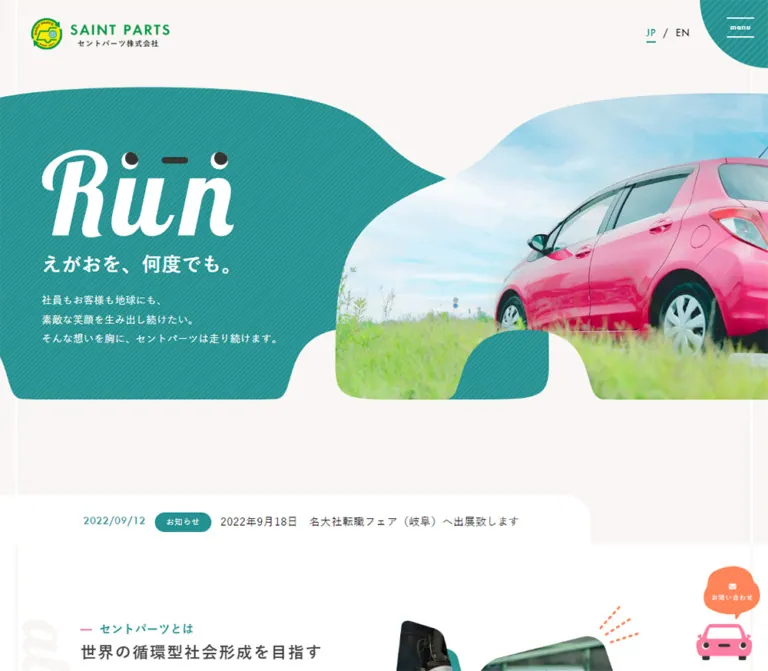
車を思わせる曲線の写真トリミングと、斜線入りの青緑が印象的な企業サイト。親しみのある表情のグラフィックに、オレンジの買取導線とピンクの中古部品バナーを組み合わせています。
SAINT PARTS — Style Reference
Automotive recycling expressed through smiling lettering, striped teal, and photographs shaped like rounded vehicles.
Original URL: https://www.saintparts.co.jp/ Final URL: https://www.saintparts.co.jp/ Theme: light, with white and warm off-white surfaces and large teal regions. Inspected: October 2, 2026, 02:34 JST; supplied retrieval timestamp: October 1, 2026, 17:34:48.381 UTC. Viewports: 1440 × 1000 desktop and 390 × 844 mobile, in CSS pixels. Scope: the current corporate homepage, including its opening composition, service information, purchase cases, parts promotion, company navigation, news, recruitment, contact area, and footer. Visual evidence comprises three desktop captures and two mobile captures; rendered DOM evidence covers the longer page. Menu-open states, linked pages, forms, hover states, and carousel controls were not inspected.
SAINT PARTS presents an industrial business with an unusually friendly visual vocabulary. Teal diagonal stripes connect the hero, navigation corner, photographic framing, and contact section. Smooth roof-like curves and wheel-arch cutouts make the photography feel related to vehicles without turning every component into an illustration. A large white Run graphic includes a simple face made from dark dots and a short horizontal mark.
The homepage serves several audiences: people selling vehicles, buyers seeking recycled parts, readers learning about the company, and potential recruits. Its structure supports these parallel journeys through editorial sections and a detailed footer. A persistent orange purchase action adds commercial emphasis, while a separate pink auction banner receives a more playful promotional treatment.
閉じる
SAINT PARTS — Style Reference
Automotive recycling expressed through smiling lettering, striped teal, and photographs shaped like rounded vehicles.
Original URL: https://www.saintparts.co.jp/ Final URL: https://www.saintparts.co.jp/ Theme: light, with white and warm off-white surfaces and large teal regions. Inspected: October 2, 2026, 02:34 JST; supplied retrieval timestamp: October 1, 2026, 17:34:48.381 UTC. Viewports: 1440 × 1000 desktop and 390 × 844 mobile, in CSS pixels. Scope: the current corporate homepage, including its opening composition, service information, purchase cases, parts promotion, company navigation, news, recruitment, contact area, and footer. Visual evidence comprises three desktop captures and two mobile captures; rendered DOM evidence covers the longer page. Menu-open states, linked pages, forms, hover states, and carousel controls were not inspected.
SAINT PARTS presents an industrial business with an unusually friendly visual vocabulary. Teal diagonal stripes connect the hero, navigation corner, photographic framing, and contact section. Smooth roof-like curves and wheel-arch cutouts make the photography feel related to vehicles without turning every component into an illustration. A large white Run graphic includes a simple face made from dark dots and a short horizontal mark.
The homepage serves several audiences: people selling vehicles, buyers seeking recycled parts, readers learning about the company, and potential recruits. Its structure supports these parallel journeys through editorial sections and a detailed footer. A persistent orange purchase action adds commercial emphasis, while a separate pink auction banner receives a more playful promotional treatment.
How to Read This Reference
- Measured values come from the supplied rendered DOM, computed styles, or reported viewport dimensions. Tables round most measurements to two decimals.
- Estimated values describe visible screenshot geometry or colors without a corresponding computed measurement. They are not pixel samples.
- Recommended values are implementation choices for a reusable adaptation. They do not establish the original stylesheet or behavior.
- Token names introduced here are descriptive aliases. Source custom properties are explicitly identified when discussed.
- Document coordinates describe the recorded DOM state. They should not be treated as absolute-positioning instructions.
- Element rectangles can include invisible space, transforms, or content clipped by an ancestor. An inline anchor's height is not necessarily the height of its image.
- A computed font-family stack establishes declared candidates, not which font file actually rendered every glyph.
- Some supplied screenshots show less content than the corresponding DOM contains. Those gaps are documented as inspection limitations rather than intentional empty sections.
Tokens — Colors
Default Palette
| Name | Value | Suggested token | Evidence and role |
|---|---|---|---|
| Recycling Teal | #249191 |
--color-teal |
Measured on section labels, tag links, footer icons, and the contact background. The hero and corner menu visually use the same family. |
| Warm Paper | #f9f6f4 |
--color-paper |
Measured on the desktop news section and both footers. The pale hero surroundings appear consistent with this color. |
| White | #ffffff |
--color-white |
Measured body background and reversed text. Used visibly for the news teaser and the auction banner's lower strip. |
| Main Ink | #111111 |
--color-ink |
Measured body and ordinary link text. |
| Secondary Ink | #444444 |
--color-muted |
Measured purchase-case tag text. |
| Auction Pink | #ff7da2 |
--color-pink |
Measured background of the linked parts promotion. |
| Action Orange | #ff8053 |
--color-orange |
Measured company-map link color. The purchase artwork and promotional accents appear close to this hue; their image colors were not separately measured. |
| Arrow Lime | approximately #afcd50 |
--color-lime |
Estimated from the circular detail action and LINE control. No computed fill was supplied. |
The logo adds green and yellow through its supplied artwork. Preserve the logo rather than rebuilding it from approximated color tokens.
Diagonal stripes are a recurring surface treatment. Their visible pitch is approximately 6–8px on desktop, with thin lighter strokes over teal or pink. A repeating gradient with a 1px white line at about 10% opacity every 6px is a recommended approximation, not recovered source CSS.
Color roles remain distinct: teal carries the overall identity, lime marks small circular actions, orange emphasizes vehicle purchase, and pink belongs to the parts promotion. Extending pink across ordinary company sections would weaken that hierarchy.
Theme Presets
No theme selector or alternative theme was observed. The white mobile news section is a responsive surface change: its desktop counterpart has a measured warm-paper background. It is not evidence of a selectable color mode.
Tokens — Typography
Japanese Interface and Body Text
The measured body stack is:
font-family:
  'ヒラギノ角ゴ ProN', 'Hiragino Kaku Gothic ProN', 'Hiragino Sans',
  '游ゴシック', YuGothic, '游ゴシック体', 'Noto Sans JP',
  'BIZ UDPGothic', Meiryo, 'Helvetica Neue', Arial, sans-serif;
Body and footer text use weight 400; much of the main content inherits 500; section labels and category links use 700. This gives the Japanese copy a clear, moderately firm appearance without making every paragraph bold.
The body tracking measures approximately 0.04em: 0.6243px on desktop and 0.5215px on mobile. Some descendants inherit that resolved spacing rather than calculating a fresh 0.04em from their own font size.
The root element is measured at 10px. Its reported Times family is not the operative body face. Likewise, generic Helvetica-based source variables do not override the more specific measured Japanese body stack.
Expressive Display Graphics
The large Run mark is slanted, high-contrast white lettering with face-like details above it. Large vertical English section words, including company and contact, share an expressive italic appearance.
Their font family or asset implementation is not established by the supplied evidence. Preserve authorized artwork or obtain the actual display assets. Do not identify them as a particular script font or expect an ordinary italic system font to reproduce their shapes.
The contact number also has a distinctive large slanted treatment. Its exact family was not supplied.
Type Scale
| Role | Desktop | Mobile | Weight / line height | Status |
|---|---|---|---|---|
| Body baseline | 15.6082px | 13.0367px | 400; 28.0947px / 23.4661px |
Measured |
| Main explanatory paragraphs | 15.6082px | 13.0367px | Usually 500; 31.2163px / 22.8142px |
Measured; approximately 2 / 1.75 leading |
| Hero paragraph | 15.3469px | 13.0367px | 500; 28.0947px / 23.4661px |
Measured |
| Teal section label | 16.6082px | 14.0367px | 700; 28.0947px / 23.4661px |
Measured |
| Purchase category links | 14px | 14px | 700; 14px line height |
Measured |
| Case-card tags | 13.7389px | 12.0246px | 500; inherited body leading |
Measured |
| Footer navigation | 13.6082px | 12.0246px | 400; 28.0947px / 23.4661px |
Measured |
| Copyright and privacy | 12px | 12px | 400; inherited body leading |
Measured |
| Opening news link | 15.6082px | 12px | 500; inherited body leading |
Measured on the link wrapper |
| Hero slogan | approximately 32–34px | approximately 15–17px | Visually bold | Estimated |
| Contact number | approximately 54–58px | Not visually established | Slanted display treatment | Estimated desktop only |
The visible Run artwork occupies approximately 318 × 140px on desktop and 175–180 × 80px on mobile. These are graphic bounds, not verified CSS font sizes.
Several h3 wrappers retain body-size computed text while enclosing larger visual treatments. Their wrapper measurements should not be used to infer an unseen heading's final typographic scale.
Tokens — Spacing & Shapes
Overall density: generous section spacing, relatively compact copy, and a few emphatic graphics.
The source contains many fluid spacing custom properties, but the supplied evidence does not connect each variable to every visible component. Use the measured component dimensions below instead of assuming one universal spacing formula.
Spacing Scale
| Use | Desktop | Mobile | Evidence |
|---|---|---|---|
| Main content left alignment | 130.41px | 25.17px | Repeated measured section coordinates |
| Header logo inset | 54.77px left, 30.16px top | 20.48px left, 16.28px top | Measured logo wrapper |
| Header logo-to-purchase gap | approximately 24px | Purchase link absent from header | Calculated from measured boxes |
| Horizontal gap between category links | 10px | 10px | Calculated from adjacent link rectangles |
| Purchase-case rail gap | 70px | 40px | Calculated from repeated card positions |
| News row padding | 19.35px vertical, 62.42px horizontal | 15.06px vertical, 12.71px horizontal | Measured |
| Contact-link vertical padding | 19.35px | 15.06px | Measured |
| Footer padding | 58.04px top, 28.04px bottom | 45.18px top, 15.18px bottom | Measured |
| News section padding | 110.20px top, 91.51px bottom | 45.92px top, 35.80px bottom | Measured |
For a new implementation, a small 4/8/12/16/24/32px utility scale is reasonable, but it is a recommendation. Preserve the much larger editorial intervals independently.
Border Radius and Shape Language
| Element | Treatment | Status |
|---|---|---|
| Auction banner | 20px radius | Measured |
| Detail-action disc | Circular; approximately 66px desktop diameter | Screenshot estimate supported by a 66.08px link-row height |
| News category badge | Fully rounded pill | Observed; exact radius unavailable |
| Opening news panel | Large upper-right curve, approximately 40–45px desktop | Estimated |
| Purchase CTA artwork | Small rounded corners and a narrow dark lower edge | Observed; approximately 5–8px corner radius |
| Corner menu | Teal square corner with a large curved lower-left boundary | Observed |
| Hero photograph | Custom smooth outline with a roof-like upper contour and a lower wheel-arch cutout | Observed; path unavailable |
| Service photograph | Rounded irregular image with an offset striped teal backing | Observed in the desktop middle capture |
The major silhouettes require custom geometry. Ordinary rounded rectangles can approximate secondary frames, but they cannot fully reproduce the hero's changing contour and bottom notch.
Layout Measurements
| Element | Desktop | Mobile |
|---|---|---|
| Document height | 6973.97px | 7206.73px |
| Header measured height | 112.16px | 60.73px |
| Header logo wrapper | 227.19 × 51.84px | 123.47 × 28.17px |
| Header purchase link | 250 × 38.55px | Not in the header |
| Opening news link | 915.44 × 30.42px | 294.88 × 70.41px |
| Detail-link row height | 66.08px | 40.36px |
| Purchase-case item | approximately 327.36 × 491.59px | approximately 318.33 × 425.78px |
| Auction link | 1074.84 × 213.22px | 414.56 × 177.25px; exceeds the viewport |
| Company navigation item | 329.30 × 248px | 390 × 101.22px |
| Contact section height | 542.61px | 625.78px |
| Footer height | 484.97px | 905.19px |
The desktop company row spans approximately 1179.17px between x = 130.41 and x = 1309.58. A source variable declares --_global--container-max-width: 1280px, but that value is not the measured width of this row.
Source CTA variables include --cta-img-width-pc: 290px and --cta-img-width-sp: 350px. The actual desktop header link measures 250px wide. Preserve this distinction between configuration values and rendered dimensions.
Components
Persistent Header
Role: maintain identity and immediate access to vehicle purchase and navigation.
The header overlays the composition without a solid full-width bar in the supplied captures. Its left cluster contains the green-and-yellow logo, the green SAINT PARTS wordmark, and a compact Japanese subtitle. On desktop, an orange purchase action sits about 24px to the right. Its visible label is 中古車買取希望はこちら, followed by a white circular arrow.
A striped teal corner shape anchors the upper right. Two thin horizontal white rules frame the small menu label. The shape is approximately 112px square on desktop and 61px square on mobile, with the curved lower-left edge doing most of the visual work.
The same header elements remain at the top of scrolled screenshots, supporting persistent positioning. The exact CSS positioning rule was not supplied. The menu's expanded appearance and interaction remain unverified.
Hero Composition
Role: establish the company's friendly identity before presenting its services.
On desktop, the hero begins below a broad pale header region. Its principal illustrated band runs approximately from y = 142 to y = 683. A striped teal mass enters from the left; a large photograph enters from the right. Their overlapping curves form a continuous composition rather than a conventional rectangular two-column panel.
The desktop photograph shows a pink hatchback in grass beneath a bright sky. Its lower edge contains a large inset arch. The left copy begins near x = 173, with the Run artwork, the slogan えがおを、何度でも。, and three lines of white supporting text.
On mobile, the photo moves above the copy and sits toward the right, starting near x = 71 and y = 79. The captured photo shows two workers in a workshop. The teal field begins behind the lower part of that image and continues beneath the lettering. The Run graphic and slogan share a horizontal row; the explanatory paragraph follows below.
These are two observed hero states. The evidence does not establish whether the different photographs result from responsive asset selection, timed media, or another state change.
Opening News Teaser
Role: introduce a recent update without competing with the hero.
A white panel with a rounded upper-right corner overlaps the lower pale hero area. Desktop content begins at x = 167 and contains a teal date, a teal pill labeled お知らせ, and one line of dark news text.
The mobile panel occupies roughly four fifths of the viewport. Date and category appear on the first line, with the title wrapping below. Its measured link height increases from 30.42px to 70.41px.
The current item is dated 2026/09/14. Its text and URL are content, not permanent visual tokens. Keep the component flexible enough for a longer title.
Section Labels and About Introduction
Role: combine a small navigational label with a larger editorial message.
The about section has a teal, bold label, a separate prominent Japanese statement, explanatory copy, and a detail link. Large English section lettering acts as background decoration elsewhere on the page.
The desktop about paragraph measures 466.03px wide and uses 31.22px leading. Mobile copy uses shorter editorial line breaks and 22.81px leading. The section becomes taller, from 528.08px to 721.55px, and the mobile screenshot shows photographic content entering before the text block.
Use a readable text column with generous separation from the visual. Decorative lettering should not replace the semantic heading.
Service Feature
Role: explain vehicle purchase and used-parts sales as separate services.
The service modules combine a large photograph, a small teal 事業紹介 label, a service title, a short paragraph, and 詳しく見る.
The desktop middle capture shows dismantled mechanical parts on the left, framed by an offset teal striped shape. The explanation sits to the right over a broad pale curved surface. The paragraph occupies approximately 485–531px, depending on the module.
The mobile DOM places the service information in a vertical sequence, with the photograph region preceding the text. The precise mobile photo contour is not visible in the supplied screenshots.
Circular Detail Link
Role: provide a repeated, recognizable secondary action.
The visible construction is a lime circular disc containing a thin white arrow, followed by a bold dark label. The disc sits before the text; the entire component is a link. The measured desktop link row is 66.08px high, while mobile rows are 40.36px high.
The component is visually open: there is no surrounding pill, rectangular border, or floating card. Preserve the strong circle-to-label relationship and keep arrows consistent across sections.
The original hover transformation was not captured. A small arrow translation is an optional addition, not an observed behavior.
Purchase-Case Rail
Role: demonstrate purchase results and provide category browsing.
Each linked record contains a vehicle name, model information, year, mileage, purchase amount, and tags. The DOM includes six distinct case destinations and repeated instances of some records.
On desktop, category links occupy a narrow area associated with a 245px-wide heading region. Case items measure approximately 327.36px wide with 70px between successive positions. On mobile, tags precede the cases, items are approximately 318.33px wide with 40px gaps, and the index link follows the rail.
Repeated records and offscreen horizontal coordinates are consistent with a looping carousel implementation. Autoplay, dragging, navigation buttons, timing, and direction were not verified. Some recorded desktop item rectangles also cross the category region; ancestor clipping and the exact visible carousel window were not supplied.
The anchor itself computes to a transparent background and zero radius. Child image treatments, price typography, and full card appearance were not visually established and should not be invented from those wrapper values.
Used-Parts Auction Banner
Role: create a clearly differentiated route to the external parts marketplace.
This is the most decorative compact component on the page. A pink striped upper panel contains large yellow-and-white promotional lettering, a small face motif, and floating cutout photographs of signal lamps and metal components. A pale speech bubble protrudes above the right half.
The lower strip is white, outlined by the pink container, and carries dark and orange copy, short lime underline accents, and a small pink circular arrow. The measured desktop banner is 1074.84 × 213.22px with a 20px radius.
The linked destination is a Yahoo! Auctions seller page. The visible banner text includes ヤフオク!中古部品出品中 and お得にほしいパーツを見つけよう!. Keep the external marketplace purpose clear rather than treating this as a generic site-wide CTA.
The measured mobile banner extends beyond the 390px viewport. Its captured geometry is an implementation caveat, not a recommended width.
Company Information and Navigation
Role: connect the business summary to deeper corporate content.
The company section includes the operating name, postal address, contact details, a map link, and a company-detail link. The current original-page text explicitly identifies プレミアオートパーツ株式会社 as the operator of セントパーツ.
Three linked modules lead to 代表メッセージ, スタッフ紹介, and 自動車リサイクルについて. Desktop rectangles are 329.30 × 248px across one row. Mobile rectangles change to 390 × 101.22px and use flex layout, indicating a transition to shorter stacked rows.
The supplied desktop middle screenshot shows substantial white space where company content exists in the DOM. Do not interpret that capture as evidence that the section intentionally contains only a vertical decorative title.
News List
Role: present company updates in an editorial list.
On desktop, a heading and index action occupy the left region; four linked entries occupy an 857.47px-wide right region. Each sampled entry is 98.86px high with generous horizontal padding. The section has a warm-paper background.
On mobile, the heading appears above the entries and the index action appears below them. The background becomes white. Entry heights vary with content: approximately 61.66px, 85.13px, and 108.59px in the supplied data.
Dates, category labels, and titles form a repeatable information hierarchy. Do not impose a fixed mobile row height that clips longer announcements.
Recruitment Feature
Role: introduce the employment journey as a distinct editorial section.
The section contains 採用情報, the statement 挑む人、求む。, supporting copy, and a detail link. Its heading, paragraph, and link are measured as white. Desktop section height is 803.25px; mobile height is 639.75px.
The text begins at x = 175.63 on desktop and x = 81.34 on mobile, preserving a pronounced inset rather than aligning every section to the same mobile left edge. Mobile copy uses additional line breaks.
The complete recruitment background and image treatment were not supplied visually. The white text establishes a reversed treatment, but it does not establish a specific photograph or overlay recipe.
Contact Section
Role: collect the main inquiry routes into a strong final destination.
The section is filled with striped teal and white text. A very large vertical contact word sits along the left edge. Desktop layout places inquiry links on the left and a large phone presentation on the right.
The DOM contains three inquiry routes: general contact, vehicle-purchase contact, and used-parts inquiries through LINE. Desktop link rows measure 496.56px wide and 87.72px high. The visible LINE row has a fine white bottom rule and a lime circular icon at the right.
The telephone number is displayed next to a white circular telephone symbol, with business hours beneath. A telephone link was not established by the supplied link list; a clickable tel: implementation is a recommendation.
Only the LINE row and telephone presentation are visibly present in the supplied bottom desktop capture, although the heading and other inquiry rows remain in the DOM. Their paint state or reveal behavior cannot be resolved from this evidence.
Footer
Role: provide complete business details and a broad navigational index.
The footer returns to warm paper. A larger logo with dark wordmark appears above the address and two separately labeled contact groups. Small teal location, telephone, fax, and external-link symbols provide restrained accents.
Desktop navigation uses three columns to the right of the business details: service/about links, company links, and recruitment links. Copyright sits near the lower center and privacy toward the right.
Mobile navigation becomes one long vertical list beneath the business details. There is no observed accordion. Footer height grows from 484.97px to 905.19px. Its navigation links are approximately 12.02px, with successive rows spaced about 30.5px apart.
The persistent mobile header overlaps the larger footer logo in the supplied bottom capture. This collision should be documented, but a new implementation should prevent it.
Mobile Purchase Dock
Role: keep the vehicle-purchase route available during deeper browsing.
The opening mobile screenshot has no visible bottom dock. The footer screenshot shows a gray-backed strip containing an orange action approximately 350 × 54px, inset 20px from either side.
The initial DOM sample places the purchase link at y = 854, below the 844px viewport. The later screenshot places it against the bottom edge. These observations support state-dependent visibility, but they do not establish the trigger or scroll threshold.
Reserve space for the dock when active so that legal links and navigation remain reachable. Its appearance should not obscure the final footer content as in the supplied capture.
Tokens — Motion & Interaction
| Treatment | Supplied evidence | What is established |
|---|---|---|
| About heading and paragraph | Computed transition 0.5s |
A transition duration is declared; its property, trigger, distance, and easing were not supplied. |
| Contact heading and paragraph | Computed transition 0.8s |
A longer transition duration is declared; the visible reveal sequence remains unverified. |
| Category and footer links | Computed transition 0.4s |
Link transitions exist; the hovered appearance was not inspected. |
| General transition variable | --_global--transition-duration: .2s and delay 0s |
Available source configuration, not proof every component uses it. |
| Persistent header | Same top placement across scrolled screenshots | Persistent appearance is observed; exact positioning implementation is unknown. |
| Purchase-case rail | Repeated records and horizontally displaced bounds | Supports a carousel interpretation; controls and movement are untested. |
| Hero media | Different desktop and mobile photographs | Two states are observed; the cause is unresolved. |
| Mobile purchase action | Absent at opening, visible at footer | Visibility changes between supplied captures; trigger is unknown. |
| Menu | Closed menu control only |
No expanded layout, focus handling, or opening animation was inspected. |
Most sampled elements report animation: none. This does not rule out animation in unreported descendants, images, pseudo-elements, or JavaScript-managed components.
The collection procedure waited for loading and sampled visual stability, with finite time limits. It also temporarily paused any perpetual animations detected during readiness checks. That procedure does not prove that every reveal completed or that a specific component has perpetual motion.
Recommended motion: keep secondary feedback restrained, such as a small arrow movement or opacity change. Use the observed 400–800ms durations as references only where appropriate. Keep essential content visible without requiring a successful animation callback, and disable optional movement for reduced-motion users.
Surfaces
| Surface | Appearance | Purpose |
|---|---|---|
| Main content canvas | White | Gives industrial photographs and decorative shapes room to breathe |
| Hero surroundings and footer | Warm off-white | Adds warmth and separates major page regions |
| Hero and contact field | Teal with fine diagonal stripes | Establishes the strongest recurring identity surface |
| Service backing shape | Offset striped teal behind a photograph | Gives depth through graphic layering |
| News teaser | White with one large curved corner | Bridges hero and editorial content |
| Auction promotion | Pink striped upper region and white lower strip | Marks an external commercial destination |
| Secondary action | Lime circular disc | Repeats a small, friendly directional cue |
| Purchase action | Orange with a narrow darker lower edge | Gives the primary commercial action immediate visibility |
| Mobile purchase dock | Gray-backed bottom strip | Separates the persistent action from underlying footer content |
There is no visible general-purpose shadow system in the supplied screenshots. Most depth comes from overlap, cutouts, offset shapes, and changes in surface color. The purchase action's narrow lower edge is a localized treatment.
Imagery
Photography connects the brand to real vehicles, workers, and dismantled parts. The desktop hero uses bright grass, blue sky, and a saturated pink vehicle; the mobile hero shows workers in contrasting dark teal and pink workwear. The service capture contains closely framed metal components and workshop surfaces.
The photographs remain full color. Their special character comes from the crop and surrounding graphics rather than a duotone filter. Keep faces, recognizable vehicle features, and useful mechanical details inside the retained portion of each mask.
The graphic vocabulary includes paired dots and a short dash that read as a face, small radiating accent strokes, circular arrows, speech bubbles, and oversized italic section words. These details make the page approachable without changing its business purpose.
Observed Asset References
Original image URLs, filenames, and mask paths were not included in the supplied evidence. The following is an inventory of visible asset roles, not a list of downloadable source files.
| Asset role | Observed content | Implementation guidance |
|---|---|---|
| Header logo | Green wordmark, yellow-and-green emblem, Japanese subtitle | Use the authorized logo artwork at its original proportions |
| Footer logo | Dark wordmark with the same emblem | Preserve the observed variant rather than recoloring a screenshot |
| Hero display mark | White Run lettering with dark facial details |
Treat as supplied display artwork until its implementation is known |
| Desktop hero photo | Pink hatchback outdoors | Use a crop that retains the rear side of the vehicle and open sky |
| Mobile hero state | Two workshop staff members | Preserve faces and workwear inside the upper-right crop |
| Service photo | Dismantled mechanical components | Pair with an offset striped teal frame |
| Auction cutouts | Signal lamps and metal parts | Use transparent cutouts with varied scale and placement |
| Section lettering | Large italic English words | Keep decorative and separate from semantic headings |
| Utility symbols | Arrow, location, phone, fax, external link, LINE | Exact icon family is unknown; maintain consistent visual weight |
CSS can approximate the striped surfaces and broad contours. It cannot replace the logo, custom lettering, or the photographic character carried by the original assets.
Layout & Responsive Behavior
Desktop Composition
The desktop page alternates broad illustrated regions with content aligned around a roughly 1180px inner span. The hero intentionally breaks that span: its colored field reaches the left edge and its photograph reaches the right edge. Smaller editorial elements sit further inward.
The page uses different horizontal arrangements for different tasks: paired service content, a horizontal case rail, three company links, a split news section, and a two-part contact area. This variation prevents the long homepage from becoming a repeated stack of identical cards.
Large section intervals are part of the rhythm. However, blank areas in a capture should not automatically become permanent spacing requirements when DOM content occupies that region.
Mobile Changes
| Area | Observed mobile adaptation |
|---|---|
| Header | Smaller logo and corner menu; no purchase button next to the logo |
| Hero | Photograph above copy; Run and slogan share a row |
| Opening news | Date/category above a wrapping title |
| About and service content | Vertical sequencing and shorter copy lines |
| Case browsing | Tags above the rail; approximately one item occupies most of the viewport |
| Company navigation | Three desktop modules become shorter stacked flex rows |
| News | Heading above entries, index action below, white background |
| Contact | Taller section; sampled child positions require further verification |
| Footer | Three navigation columns become a single long list |
| Purchase action | Bottom dock visible in the scrolled footer state |
Only two widths were supplied. The source breakpoint and interpolation formulas cannot be recovered from those two states alone. The Quick Start uses a recommended 768px breakpoint and a fitted body-size interpolation; neither is claimed as original CSS.
Observed Layout Caveats
Several mobile rectangles extend beyond the viewport. A number of text blocks measure 390px wide despite starting at x = 25.17, placing their right edge at approximately 415.17px. The auction banner starts at x = 12.89 and ends at approximately 427.45px. Some contact links extend farther still.
These measurements may involve overflowing layout, transforms, or clipping. The available fields do not establish the exact cause or whether a horizontal scrollbar exists. They should prompt containment checks, not be copied as desirable geometry.
The bottom mobile screenshot also shows both a header/footer logo collision and legal content beneath the purchase dock. A reusable implementation should preserve the visual hierarchy while correcting those collisions.
Do’s and Don’ts
Do
- Use teal
#249191as the dominant identity color and warm paper#f9f6f4for supporting regions. - Repeat fine diagonal stripes across a limited set of large surfaces.
- Preserve the hero's roof-like curves and wheel-arch cutout.
- Keep photographs full color and grounded in vehicles, staff, and mechanical work.
- Treat the
Runlettering and face details as distinctive artwork. - Use small bold Japanese section labels and generously led explanatory copy.
- Keep circular detail links visually separate from the orange purchase action.
- Reserve the pink treatment for the parts marketplace promotion.
- Preserve the homepage's service, company, news, recruitment, and contact journeys.
- Recompose the hero and footer for mobile instead of uniformly scaling desktop geometry.
- Label unverified motion and unseen component details honestly.
Don't
- Don't flatten the hero into a rectangular photo beside a plain text box.
- Don't replace all curved forms with generic rounded cards.
- Don't spread pink, lime, and orange evenly across every section.
- Don't invent a display-font name from the lettering's appearance.
- Don't infer autoplay timing or responsive photo-selection rules from two still images.
- Don't treat repeated carousel records as separate business cases.
- Don't copy mobile widths that place essential text outside the viewport.
- Don't reproduce obscured footer links or colliding logos as intended design features.
- Don't turn the footer into an accordion without recognizing that this would be a new behavior.
- Don't recreate blank reveal states by hiding essential content on initial render.
Recommended Implementation Additions
These are improvements for a new implementation, not verified original-site features:
- Give image-based purchase links accessible names and meaningful logo alternatives. Keep essential CTA text available as real text where practical.
- Implement the menu as a named button with expanded state, keyboard operation, and deliberate focus management.
- Use at least a 44px interaction target for mobile controls, even where the observed visible detail disc is smaller.
- Check contrast for small text on orange, lime, and striped surfaces. Introduce darker accessible variants where needed while retaining the documented visual tokens.
- Make phone numbers actionable with
tel:links and preserve the separate purposes of the parts and vehicle-purchase numbers. - Keep all mobile content inside a bounded container; investigate transforms separately rather than globally hiding horizontal overflow.
- Reserve bottom space and device safe-area clearance whenever the purchase dock is active.
- Keep decorative masks and lettering outside the accessibility tree when they repeat adjacent content.
- If rebuilding the case rail, provide keyboard access and avoid exposing duplicate loop slides as repeated focus stops. Add a pause control if autoplay is introduced.
- Ensure content remains available when animation or scripting fails, and provide reduced-motion behavior.
Agent Prompt Guide
Quick Color Reference
- Identity field and labels:
#249191. - Warm supporting surface:
#f9f6f4. - Main canvas and reversed copy:
#ffffff. - Main text:
#111111; secondary tags:#444444. - Parts promotion:
#ff7da2. - Purchase accent: approximately
#ff8053for artwork matching. - Small action discs: approximately
#afcd50. - Stripe recipe: thin low-opacity white diagonal lines; exact source pitch unavailable.
Overall Prompt
“Create a Japanese automotive recycling corporate homepage inspired by the supplied SAINT PARTS reference. Use white and warm off-white space, dominant teal #249191, fine diagonal stripes, and full-color photography of vehicles, workshop staff, and mechanical parts. Build a wide hero from overlapping smooth vehicle-like silhouettes, including a bottom wheel-arch cutout. Place supplied expressive white lettering and a small face motif on the teal field. Keep the green-and-yellow brand logo distinct from the main teal palette. Use an orange vehicle-purchase action, lime circular detail arrows, and one prominent pink parts-marketplace banner. Preserve separate about, service, purchase-case, company, news, recruitment, contact, and footer journeys. On mobile, move the hero photograph above the copy and stack footer links. Keep content within the viewport and clear of persistent controls. Do not invent source fonts, carousel timing, or menu-open visuals.”
Example Component Prompts
- Hero: “Compose a bright automotive hero with a striped teal field at left and an outdoor vehicle photograph at right. Give the photo a smooth rising roof contour and one large lower arch. Use the supplied white Run artwork and Japanese slogan. On mobile, place the photograph above the lettering and retain the overlapping teal background.”
- Header and purchase action: “Use a transparent persistent header with a compact logo at left, a small orange purchase action beside it on desktop, and a striped teal curved corner menu at upper right. On mobile, use the smaller logo and a separately controlled bottom purchase dock with safe-area clearance.”
- Service feature: “Pair a close workshop-parts photograph with a slightly offset teal striped backing shape. Place a small bold teal section label, Japanese service title, loosely led paragraph, and lime circular-arrow link beside it. Stack the visual before the text on narrow screens.”
- Auction banner: “Create a wide pink striped promotion with rounded corners, yellow-and-white display artwork, a small face motif, floating transparent part cutouts, and an overlapping pale speech bubble. Finish with a white lower strip containing emphasized copy and a pink circular arrow. Keep all content inside the mobile viewport.”
- Case browsing: “Create a horizontal rail of linked vehicle-purchase records with model, year, mileage, amount, and tags. Use approximately 327px desktop items with 70px gaps and approximately 318px mobile items with 40px gaps. Place mobile category links above the rail. Treat movement and controls as implementation decisions requiring verification.”
- Contact and footer: “End the page with a full-width striped teal contact area, oversized vertical decorative lettering, white ruled inquiry links, a lime LINE control, and a prominent telephone presentation. Follow with a warm-paper footer containing business details and three desktop navigation columns that become one mobile list.”
Quick Start
CSS Custom Properties
This is a reusable approximation, not extracted source CSS. It preserves a conventional root font size, fits body text to the two measured viewport values, and uses bounded mobile containers to avoid the observed overflow. The lime color, stripe recipe, breakpoint, hover effect, and silhouette paths are recommendations. Original artwork and state-management code must be supplied separately.
:root {
  --color-teal: #249191;
  --color-paper: #f9f6f4;
  --color-white: #fff;
  --color-ink: #111;
  --color-muted: #444;
  --color-pink: #ff7da2;
  --color-orange: #ff8053;
  --color-lime: #afcd50; /* Estimated from the visible action discs. */

  --font-body: 'Hiragino Kaku Gothic ProN', 'Hiragino Sans',
    YuGothic, 'Noto Sans JP', 'BIZ UDPGothic', Meiryo,
    'Helvetica Neue', Arial, sans-serif;

  /* Fitted to the two observed sizes; not the source formula. */
  --text-body: clamp(13.037px, calc(12.082px + 0.2449vw), 15.608px);
  --text-label: calc(var(--text-body) + 1px);
  --text-small: clamp(12px, 0.945vw, 13.608px);
  --leading-body: 1.8;
  --leading-copy: 2;
  --tracking-body: 0.04em;

  --page-gutter: clamp(25px, calc(10vw - 14px), 130.4px);
  --content-width: 1180px;
  --radius-banner: 20px;
  --detail-size: 66px;
  --case-width: 327.36px;
  --case-gap: 70px;
  --menu-size: 112px;
  --safe-bottom: env(safe-area-inset-bottom, 0px);
  --motion-link: 400ms ease;
  --stripe-pattern: repeating-linear-gradient(
    135deg,
    rgb(255 255 255 / 10%) 0 1px,
    transparent 1px 6px
  );
}

*, *::before, *::after { box-sizing: border-box; }

.saint-page {
  margin: 0;
  color: var(--color-ink);
  background: var(--color-white);
  font-family: var(--font-body);
  font-size: var(--text-body);
  line-height: var(--leading-body);
  letter-spacing: var(--tracking-body);
}

.saint-page img { display: block; max-width: 100%; }
.saint-page button { font: inherit; }
.saint-page a { color: inherit; }
.saint-page :focus-visible {
  outline: 3px solid currentColor;
  outline-offset: 5px;
}

.content {
  width: min(var(--content-width), calc(100% - 2 * var(--page-gutter)));
  margin-inline: auto;
}

.striped { background-image: var(--stripe-pattern); }

.site-header {
  position: fixed;
  inset: 0 0 auto;
  z-index: 50;
  display: flex;
  align-items: center;
  gap: 24px;
  min-height: 112px;
  padding: 30px 54.8px;
  pointer-events: none;
}
.site-header > * { pointer-events: auto; }
.site-logo { width: 227.2px; }

/* Optional application state to prevent collisions over later content. */
.site-header.is-scrolled { background: rgb(249 246 244 / 96%); }

.purchase-cta {
  display: inline-flex;
  align-items: center;
  justify-content: center;
  gap: 8px;
  width: 250px;
  min-height: 44px;
  padding: 8px 16px;
  border-radius: 6px;
  color: var(--color-white) !important;
  background: var(--color-orange);
  box-shadow: 0 2px 0 rgb(85 42 23 / 55%);
  font-size: 14px;
  font-weight: 700;
  line-height: 1.3;
  text-decoration: none;
}

.menu-toggle {
  position: absolute;
  inset: 0 0 auto auto;
  width: var(--menu-size);
  height: var(--menu-size);
  padding: 16px 16px 48px 44px;
  border: 0;
  border-bottom-left-radius: 100%;
  color: var(--color-white);
  background-color: var(--color-teal);
  background-image: var(--stripe-pattern);
  font-size: 11px !important;
  font-weight: 700 !important;
  cursor: pointer;
}
.menu-toggle::before,
.menu-toggle::after {
  content: '';
  display: block;
  width: 44px;
  max-width: 100%;
  height: 1px;
  margin: 7px auto;
  background: currentColor;
}

.hero {
  position: relative;
  padding-top: 142px;
  padding-bottom: 171px;
  background: var(--color-paper);
}
.hero-stage { position: relative; min-height: 542px; isolation: isolate; }
.hero-field {
  position: absolute;
  inset: 0 auto 0 0;
  width: 64%;
  background-color: var(--color-teal);
  background-image: var(--stripe-pattern);
  clip-path: url(#saint-field-clip);
}
.hero-photo {
  position: absolute;
  inset: 0 0 auto auto;
  z-index: 1;
  width: 59%;
  height: 542px;
  object-fit: cover;
  object-position: center;
  clip-path: url(#saint-photo-clip);
}
.hero-copy {
  position: relative;
  z-index: 2;
  width: 450px;
  margin-left: 12%;
  padding-top: 126px;
  color: var(--color-white);
}
.hero-wordmark { width: 318px; height: auto; }
.hero-slogan {
  margin: 18px 0 24px;
  font-size: 32px;
  font-weight: 700;
  line-height: 1.4;
}
.hero-copy p { margin: 0; }

.news-teaser {
  position: relative;
  z-index: 3;
  width: min(75.2vw, 1082px);
  margin-top: -77px;
  padding: 28px 24px 19px max(25px, 11.6vw);
  border-top-right-radius: 44px;
  background: var(--color-white);
}
.news-teaser > a {
  display: flex;
  align-items: center;
  gap: 18px;
  text-decoration: none;
}
.news-date { color: var(--color-teal); font-weight: 700; white-space: nowrap; }
.news-badge {
  flex: none;
  padding: 7px 18px;
  border-radius: 999px;
  color: var(--color-white);
  background: var(--color-teal);
  font-size: 12px;
  line-height: 1.3;
}
.news-title { min-width: 0; }

.editorial-section { padding-block: clamp(60px, 7.5vw, 110px); }
.section-label {
  margin: 0 0 20px;
  color: var(--color-teal);
  font-size: var(--text-label);
  font-weight: 700;
}
.section-copy { line-height: var(--leading-copy); font-weight: 500; }
.service-split {
  display: grid;
  grid-template-columns: minmax(0, 1.15fr) minmax(0, 1fr);
  align-items: center;
  gap: clamp(32px, 5.5vw, 80px);
}
.service-split > * { min-width: 0; }

.detail-link {
  display: inline-flex;
  align-items: center;
  gap: 14px;
  min-height: 44px;
  font-weight: 700;
  text-decoration: none;
}
.round-arrow {
  display: grid;
  flex: none;
  place-items: center;
  width: var(--detail-size);
  height: var(--detail-size);
  border-radius: 50%;
  color: var(--color-white);
  background: var(--color-lime);
}
.round-arrow > span { transition: transform var(--motion-link); }
@media (hover: hover) {
  .detail-link:hover .round-arrow > span { transform: translateX(3px); }
}

.case-tags { display: flex; flex-wrap: wrap; gap: 10px; }
.case-tags a { color: var(--color-teal); font-size: 14px; font-weight: 700; }

/* Accessible native scrolling is an adaptation, not a source claim. */
.case-rail {
  display: grid;
  grid-auto-flow: column;
  grid-auto-columns: var(--case-width);
  gap: var(--case-gap);
  overflow-x: auto;
  overscroll-behavior-inline: contain;
  scroll-snap-type: x proximity;
  padding-block: 8px 20px;
}
.case-card { min-width: 0; scroll-snap-align: start; text-decoration: none; }

.auction-banner {
  display: block;
  overflow: hidden;
  border: 2px solid var(--color-pink);
  border-radius: var(--radius-banner);
  background: var(--color-pink);
  text-decoration: none;
}
.auction-banner__main {
  position: relative;
  min-height: 156px;
  padding: 32px 24px;
  background-image: var(--stripe-pattern);
}
.auction-banner__caption {
  padding: 12px 20px;
  background: var(--color-white);
  text-align: center;
  font-weight: 700;
}
/* Put any protruding speech bubble in an unclipped outer wrapper. */

.company-links {
  display: grid;
  grid-template-columns: repeat(3, minmax(0, 1fr));
  gap: clamp(32px, 6.64vw, 96px);
}
.company-link { min-height: 248px; }

.contact {
  padding-block: 115px 102px;
  color: var(--color-white);
  background-color: var(--color-teal);
  background-image: var(--stripe-pattern);
}
.contact-grid {
  display: grid;
  grid-template-columns: minmax(0, 1fr) minmax(0, 1.17fr);
  align-items: center;
  gap: 100px;
}
.contact-links a {
  display: flex;
  align-items: center;
  justify-content: space-between;
  gap: 16px;
  min-height: 88px;
  padding-block: 19px;
  border-bottom: 1px solid rgb(255 255 255 / 75%);
  text-decoration: none;
}
/* Keep the inherited family until the real display artwork is available. */
.phone-display { font-size: clamp(26px, 4vw, 58px); font-weight: 700; }

.site-footer { padding-block: 58px 28px; background: var(--color-paper); }
.footer-grid {
  display: grid;
  grid-template-columns: minmax(0, .93fr) minmax(0, 1.05fr);
  gap: 80px;
}
.footer-logo { width: 250px; }
.footer-nav {
  display: grid;
  grid-template-columns: 1fr 1.35fr 1.45fr;
  gap: 32px;
  font-size: var(--text-small);
}
.footer-nav a { display: block; line-height: 2.06; text-decoration: none; }
.footer-legal { display: flex; flex-wrap: wrap; gap: 16px 32px; margin-top: 48px; font-size: 12px; }
.purchase-dock { display: none; }

/* Recommended breakpoint; the original breakpoint was not supplied. */
@media (max-width: 768px) {
  :root {
    --leading-copy: 1.75;
    --menu-size: 61px;
    --detail-size: 40px;
    --case-width: min(318.33px, calc(100vw - 50px));
    --case-gap: 40px;
  }
  .site-header { min-height: 61px; padding: 16px 20.5px; }
  .site-logo { width: 123.5px; }
  .site-header .purchase-cta { display: none; }
  .menu-toggle { padding: 5px 6px 23px 23px; font-size: 9px !important; }
  .menu-toggle::before, .menu-toggle::after { margin-block: 4px; }

  .hero { padding-top: 79px; padding-bottom: 98px; }
  .hero-stage { min-height: 474px; }
  .hero-field {
    inset: 163px 0 0;
    width: 100%;
    clip-path: none;
    border-bottom-right-radius: 25% 10%;
  }
  .hero-photo { position: relative; width: 81.8%; height: 200px; margin-left: auto; }
  .hero-copy { width: 100%; margin: 0; padding: 56px 25px 54px; }
  .hero-brand-row { display: flex; align-items: flex-end; gap: 10px; }
  .hero-wordmark { width: 51%; max-width: 174px; }
  .hero-slogan { margin: 0 0 7px; font-size: clamp(13px, 3.85vw, 16px); }
  .hero-copy p { margin-top: 20px; }

  .news-teaser { width: 80%; margin-top: -98px; padding: 16px; border-top-right-radius: 26px; }
  .news-teaser > a { display: grid; grid-template-columns: max-content max-content; gap: 3px 12px; font-size: 12px; }
  .news-badge { padding: 4px 12px; font-size: 10px; }
  .news-title { grid-column: 1 / -1; }

  .service-split, .company-links, .contact-grid, .footer-grid, .footer-nav {
    grid-template-columns: minmax(0, 1fr);
  }
  .service-split { gap: 28px; }
  .company-links { gap: 25px; }
  .company-link { min-height: 101px; }
  .auction-banner__main { min-height: 125px; padding-inline: 16px; }
  .contact { padding-block: 80px 46px; }
  .contact-grid { gap: 36px; }
  .contact-links a { min-height: 66px; padding-block: 15px; }
  .site-footer { padding-block: 45px 20px; }
  .footer-grid { gap: 40px; }
  .footer-nav { gap: 0; }
  .footer-nav a { line-height: 2.53; }

  /* Activate this class only when the application enables the dock. */
  .saint-page.has-purchase-dock { padding-bottom: calc(74px + var(--safe-bottom)); }
  .has-purchase-dock .purchase-dock {
    position: fixed;
    inset: auto 0 0;
    z-index: 60;
    display: block;
    padding: 10px 20px calc(10px + var(--safe-bottom));
    background: rgb(0 0 0 / 36%);
  }
  .purchase-dock .purchase-cta { display: flex; width: min(350px, 100%); min-height: 54px; margin-inline: auto; }
}

@media (prefers-reduced-motion: reduce) {
  .saint-page *, .saint-page *::before, .saint-page *::after {
    animation: none !important;
    transition: none !important;
    scroll-behavior: auto !important;
  }
}
The following normalized SVG paths make the CSS clipping references usable. They are newly authored approximations of the visible shape language, not recovered original paths. Place the definitions once in the document, and replace them with authorized source geometry when available.
<svg width='0' height='0' aria-hidden='true'
     style='position:absolute;pointer-events:none'>
  <defs>
    <clipPath id='saint-photo-clip' clipPathUnits='objectBoundingBox'>
      <path d='M0,.9 C0,.53 .05,.37 .24,.27
        C.37,.21 .33,0 .78,0 L1,.01 L1,1 H.57
        C.52,1 .55,.78 .44,.78 C.32,.78 .34,1 .27,1
        H.06 Q0,1 0,.9 Z'/>
    </clipPath>
    <clipPath id='saint-field-clip' clipPathUnits='objectBoundingBox'>
      <path d='M0,.09 C.1,0 .39,-.02 .63,.02
        C.8,.04 .82,.21 1,.28 L1,1 H.15
        C.11,1 .14,.78 0,.78 Z'/>
    </clipPath>
  </defs>
</svg>
Suggested hero anatomy is .hero > .hero-stage, containing a decorative .hero-field, an image .hero-photo, and .hero-copy. Within the copy, .hero-brand-row groups the .hero-wordmark image and .hero-slogan; the supporting paragraph follows. The .news-teaser comes immediately after the hero.
Use actual links for navigation and real buttons for menu control. Add the application states for the menu, header surface, and purchase dock deliberately; the supplied evidence does not establish their original thresholds. The CSS intentionally leaves ordinary content visible and does not implement automatic carousel movement.
Tailwind v4 Token Mapping
Optional aliases for a project already using Tailwind v4. This is not evidence that the original website uses Tailwind. Define the properties above first.
@theme inline {
  --color-recycling-teal: var(--color-teal);
  --color-warm-paper: var(--color-paper);
  --color-main-ink: var(--color-ink);
  --color-auction-pink: var(--color-pink);
  --color-purchase-orange: var(--color-orange);
  --color-arrow-lime: var(--color-lime);

  --font-japanese: var(--font-body);
  --text-site-body: var(--text-body);
  --text-section-label: var(--text-label);
  --text-site-small: var(--text-small);

  --spacing-page-gutter: var(--page-gutter);
  --spacing-detail-disc: var(--detail-size);
  --spacing-case-item: var(--case-width);
  --spacing-case-interval: var(--case-gap);
  --radius-parts-banner: var(--radius-banner);
}
Sources & Evidence
- Inspected original and final website: https://www.saintparts.co.jp/. The supplied browser observation reports HTTP 200 and no URL change.
- Capture time:
2026-10-01T17:34:48.381Z, corresponding to October 2, 2026, 02:34:48.381 JST. - Desktop evidence: 1440 × 1000 CSS-pixel viewport; opening hero, middle service/promotion area, and contact/footer screenshots; rendered document height approximately 6973.97px.
- Mobile evidence: 390 × 844 CSS-pixel viewport; opening hero and footer screenshots; rendered document height approximately 7206.73px.
- Rendered DOM and computed styles: supplied text, link destinations, element rectangles, typography, colors, spacing, transitions, and custom properties. These support measured values and content relationships throughout this document.
- Observed interactions: the collection scrolled through the page. No menu activation, link navigation, form submission, hover comparison, telephone activation, or carousel-control test was supplied.
- Inspection limits: original asset URLs, SVG mask paths, full stylesheet rules, display-font identification, and motion timelines were unavailable. Some DOM content is not visibly painted in the attached captures, and some mobile bounds exceed the viewport. Readiness checks do not resolve every delayed or unexercised state.
This reference describes the current homepage evidenced by those captures and rendered observations. Visual estimates and the reusable CSS are explicitly distinguished from measured source values.
# SAINT PARTS — Style Reference

> Automotive recycling expressed through smiling lettering, striped teal, and photographs shaped like rounded vehicles.

**Original URL:** [https://www.saintparts.co.jp/](https://www.saintparts.co.jp/)
**Final URL:** [https://www.saintparts.co.jp/](https://www.saintparts.co.jp/)
**Theme:** light, with white and warm off-white surfaces and large teal regions.
**Inspected:** October 2, 2026, 02:34 JST; supplied retrieval timestamp: October 1, 2026, 17:34:48.381 UTC.
**Viewports:** 1440 × 1000 desktop and 390 × 844 mobile, in CSS pixels.
**Scope:** the current corporate homepage, including its opening composition, service information, purchase cases, parts promotion, company navigation, news, recruitment, contact area, and footer. Visual evidence comprises three desktop captures and two mobile captures; rendered DOM evidence covers the longer page. Menu-open states, linked pages, forms, hover states, and carousel controls were not inspected.

SAINT PARTS presents an industrial business with an unusually friendly visual vocabulary. Teal diagonal stripes connect the hero, navigation corner, photographic framing, and contact section. Smooth roof-like curves and wheel-arch cutouts make the photography feel related to vehicles without turning every component into an illustration. A large white `Run` graphic includes a simple face made from dark dots and a short horizontal mark.

The homepage serves several audiences: people selling vehicles, buyers seeking recycled parts, readers learning about the company, and potential recruits. Its structure supports these parallel journeys through editorial sections and a detailed footer. A persistent orange purchase action adds commercial emphasis, while a separate pink auction banner receives a more playful promotional treatment.
閉じる
# SAINT PARTS — Style Reference

> Automotive recycling expressed through smiling lettering, striped teal, and photographs shaped like rounded vehicles.

**Original URL:** [https://www.saintparts.co.jp/](https://www.saintparts.co.jp/)
**Final URL:** [https://www.saintparts.co.jp/](https://www.saintparts.co.jp/)
**Theme:** light, with white and warm off-white surfaces and large teal regions.
**Inspected:** October 2, 2026, 02:34 JST; supplied retrieval timestamp: October 1, 2026, 17:34:48.381 UTC.
**Viewports:** 1440 × 1000 desktop and 390 × 844 mobile, in CSS pixels.
**Scope:** the current corporate homepage, including its opening composition, service information, purchase cases, parts promotion, company navigation, news, recruitment, contact area, and footer. Visual evidence comprises three desktop captures and two mobile captures; rendered DOM evidence covers the longer page. Menu-open states, linked pages, forms, hover states, and carousel controls were not inspected.

SAINT PARTS presents an industrial business with an unusually friendly visual vocabulary. Teal diagonal stripes connect the hero, navigation corner, photographic framing, and contact section. Smooth roof-like curves and wheel-arch cutouts make the photography feel related to vehicles without turning every component into an illustration. A large white `Run` graphic includes a simple face made from dark dots and a short horizontal mark.

The homepage serves several audiences: people selling vehicles, buyers seeking recycled parts, readers learning about the company, and potential recruits. Its structure supports these parallel journeys through editorial sections and a detailed footer. A persistent orange purchase action adds commercial emphasis, while a separate pink auction banner receives a more playful promotional treatment.

## How to Read This Reference

- **Measured** values come from the supplied rendered DOM, computed styles, or reported viewport dimensions. Tables round most measurements to two decimals.
- **Estimated** values describe visible screenshot geometry or colors without a corresponding computed measurement. They are not pixel samples.
- **Recommended** values are implementation choices for a reusable adaptation. They do not establish the original stylesheet or behavior.
- Token names introduced here are descriptive aliases. Source custom properties are explicitly identified when discussed.
- Document coordinates describe the recorded DOM state. They should not be treated as absolute-positioning instructions.
- Element rectangles can include invisible space, transforms, or content clipped by an ancestor. An inline anchor's height is not necessarily the height of its image.
- A computed font-family stack establishes declared candidates, not which font file actually rendered every glyph.
- Some supplied screenshots show less content than the corresponding DOM contains. Those gaps are documented as inspection limitations rather than intentional empty sections.

## Tokens — Colors

### Default Palette

| Name | Value | Suggested token | Evidence and role |
| --- | --- | --- | --- |
| Recycling Teal | `#249191` | `--color-teal` | Measured on section labels, tag links, footer icons, and the contact background. The hero and corner menu visually use the same family. |
| Warm Paper | `#f9f6f4` | `--color-paper` | Measured on the desktop news section and both footers. The pale hero surroundings appear consistent with this color. |
| White | `#ffffff` | `--color-white` | Measured body background and reversed text. Used visibly for the news teaser and the auction banner's lower strip. |
| Main Ink | `#111111` | `--color-ink` | Measured body and ordinary link text. |
| Secondary Ink | `#444444` | `--color-muted` | Measured purchase-case tag text. |
| Auction Pink | `#ff7da2` | `--color-pink` | Measured background of the linked parts promotion. |
| Action Orange | `#ff8053` | `--color-orange` | Measured company-map link color. The purchase artwork and promotional accents appear close to this hue; their image colors were not separately measured. |
| Arrow Lime | approximately `#afcd50` | `--color-lime` | Estimated from the circular detail action and LINE control. No computed fill was supplied. |

The logo adds green and yellow through its supplied artwork. Preserve the logo rather than rebuilding it from approximated color tokens.

Diagonal stripes are a recurring surface treatment. Their visible pitch is approximately 6–8px on desktop, with thin lighter strokes over teal or pink. A repeating gradient with a 1px white line at about 10% opacity every 6px is a **recommended approximation**, not recovered source CSS.

Color roles remain distinct: teal carries the overall identity, lime marks small circular actions, orange emphasizes vehicle purchase, and pink belongs to the parts promotion. Extending pink across ordinary company sections would weaken that hierarchy.

### Theme Presets

No theme selector or alternative theme was observed. The white mobile news section is a responsive surface change: its desktop counterpart has a measured warm-paper background. It is not evidence of a selectable color mode.

## Tokens — Typography

### Japanese Interface and Body Text

The measured body stack is:

```css
font-family:
  'ヒラギノ角ゴ ProN', 'Hiragino Kaku Gothic ProN', 'Hiragino Sans',
  '游ゴシック', YuGothic, '游ゴシック体', 'Noto Sans JP',
  'BIZ UDPGothic', Meiryo, 'Helvetica Neue', Arial, sans-serif;
```

Body and footer text use weight `400`; much of the main content inherits `500`; section labels and category links use `700`. This gives the Japanese copy a clear, moderately firm appearance without making every paragraph bold.

The body tracking measures approximately `0.04em`: 0.6243px on desktop and 0.5215px on mobile. Some descendants inherit that resolved spacing rather than calculating a fresh `0.04em` from their own font size.

The root element is measured at `10px`. Its reported Times family is not the operative body face. Likewise, generic Helvetica-based source variables do not override the more specific measured Japanese body stack.

### Expressive Display Graphics

The large `Run` mark is slanted, high-contrast white lettering with face-like details above it. Large vertical English section words, including `company` and `contact`, share an expressive italic appearance.

Their font family or asset implementation is not established by the supplied evidence. Preserve authorized artwork or obtain the actual display assets. Do not identify them as a particular script font or expect an ordinary italic system font to reproduce their shapes.

The contact number also has a distinctive large slanted treatment. Its exact family was not supplied.

### Type Scale

| Role | Desktop | Mobile | Weight / line height | Status |
| --- | --- | --- | --- | --- |
| Body baseline | 15.6082px | 13.0367px | `400`; 28.0947px / 23.4661px | Measured |
| Main explanatory paragraphs | 15.6082px | 13.0367px | Usually `500`; 31.2163px / 22.8142px | Measured; approximately `2` / `1.75` leading |
| Hero paragraph | 15.3469px | 13.0367px | `500`; 28.0947px / 23.4661px | Measured |
| Teal section label | 16.6082px | 14.0367px | `700`; 28.0947px / 23.4661px | Measured |
| Purchase category links | 14px | 14px | `700`; 14px line height | Measured |
| Case-card tags | 13.7389px | 12.0246px | `500`; inherited body leading | Measured |
| Footer navigation | 13.6082px | 12.0246px | `400`; 28.0947px / 23.4661px | Measured |
| Copyright and privacy | 12px | 12px | `400`; inherited body leading | Measured |
| Opening news link | 15.6082px | 12px | `500`; inherited body leading | Measured on the link wrapper |
| Hero slogan | approximately 32–34px | approximately 15–17px | Visually bold | Estimated |
| Contact number | approximately 54–58px | Not visually established | Slanted display treatment | Estimated desktop only |

The visible `Run` artwork occupies approximately 318 × 140px on desktop and 175–180 × 80px on mobile. These are graphic bounds, not verified CSS font sizes.

Several `h3` wrappers retain body-size computed text while enclosing larger visual treatments. Their wrapper measurements should not be used to infer an unseen heading's final typographic scale.

## Tokens — Spacing & Shapes

**Overall density:** generous section spacing, relatively compact copy, and a few emphatic graphics.

The source contains many fluid spacing custom properties, but the supplied evidence does not connect each variable to every visible component. Use the measured component dimensions below instead of assuming one universal spacing formula.

### Spacing Scale

| Use | Desktop | Mobile | Evidence |
| --- | --- | --- | --- |
| Main content left alignment | 130.41px | 25.17px | Repeated measured section coordinates |
| Header logo inset | 54.77px left, 30.16px top | 20.48px left, 16.28px top | Measured logo wrapper |
| Header logo-to-purchase gap | approximately 24px | Purchase link absent from header | Calculated from measured boxes |
| Horizontal gap between category links | 10px | 10px | Calculated from adjacent link rectangles |
| Purchase-case rail gap | 70px | 40px | Calculated from repeated card positions |
| News row padding | 19.35px vertical, 62.42px horizontal | 15.06px vertical, 12.71px horizontal | Measured |
| Contact-link vertical padding | 19.35px | 15.06px | Measured |
| Footer padding | 58.04px top, 28.04px bottom | 45.18px top, 15.18px bottom | Measured |
| News section padding | 110.20px top, 91.51px bottom | 45.92px top, 35.80px bottom | Measured |

For a new implementation, a small 4/8/12/16/24/32px utility scale is reasonable, but it is a recommendation. Preserve the much larger editorial intervals independently.

### Border Radius and Shape Language

| Element | Treatment | Status |
| --- | --- | --- |
| Auction banner | 20px radius | Measured |
| Detail-action disc | Circular; approximately 66px desktop diameter | Screenshot estimate supported by a 66.08px link-row height |
| News category badge | Fully rounded pill | Observed; exact radius unavailable |
| Opening news panel | Large upper-right curve, approximately 40–45px desktop | Estimated |
| Purchase CTA artwork | Small rounded corners and a narrow dark lower edge | Observed; approximately 5–8px corner radius |
| Corner menu | Teal square corner with a large curved lower-left boundary | Observed |
| Hero photograph | Custom smooth outline with a roof-like upper contour and a lower wheel-arch cutout | Observed; path unavailable |
| Service photograph | Rounded irregular image with an offset striped teal backing | Observed in the desktop middle capture |

The major silhouettes require custom geometry. Ordinary rounded rectangles can approximate secondary frames, but they cannot fully reproduce the hero's changing contour and bottom notch.

### Layout Measurements

| Element | Desktop | Mobile |
| --- | --- | --- |
| Document height | 6973.97px | 7206.73px |
| Header measured height | 112.16px | 60.73px |
| Header logo wrapper | 227.19 × 51.84px | 123.47 × 28.17px |
| Header purchase link | 250 × 38.55px | Not in the header |
| Opening news link | 915.44 × 30.42px | 294.88 × 70.41px |
| Detail-link row height | 66.08px | 40.36px |
| Purchase-case item | approximately 327.36 × 491.59px | approximately 318.33 × 425.78px |
| Auction link | 1074.84 × 213.22px | 414.56 × 177.25px; exceeds the viewport |
| Company navigation item | 329.30 × 248px | 390 × 101.22px |
| Contact section height | 542.61px | 625.78px |
| Footer height | 484.97px | 905.19px |

The desktop company row spans approximately 1179.17px between x = 130.41 and x = 1309.58. A source variable declares `--_global--container-max-width: 1280px`, but that value is not the measured width of this row.

Source CTA variables include `--cta-img-width-pc: 290px` and `--cta-img-width-sp: 350px`. The actual desktop header link measures 250px wide. Preserve this distinction between configuration values and rendered dimensions.

## Components

### Persistent Header

**Role:** maintain identity and immediate access to vehicle purchase and navigation.

The header overlays the composition without a solid full-width bar in the supplied captures. Its left cluster contains the green-and-yellow logo, the green `SAINT PARTS` wordmark, and a compact Japanese subtitle. On desktop, an orange purchase action sits about 24px to the right. Its visible label is `中古車買取希望はこちら`, followed by a white circular arrow.

A striped teal corner shape anchors the upper right. Two thin horizontal white rules frame the small `menu` label. The shape is approximately 112px square on desktop and 61px square on mobile, with the curved lower-left edge doing most of the visual work.

The same header elements remain at the top of scrolled screenshots, supporting persistent positioning. The exact CSS positioning rule was not supplied. The menu's expanded appearance and interaction remain unverified.

### Hero Composition

**Role:** establish the company's friendly identity before presenting its services.

On desktop, the hero begins below a broad pale header region. Its principal illustrated band runs approximately from y = 142 to y = 683. A striped teal mass enters from the left; a large photograph enters from the right. Their overlapping curves form a continuous composition rather than a conventional rectangular two-column panel.

The desktop photograph shows a pink hatchback in grass beneath a bright sky. Its lower edge contains a large inset arch. The left copy begins near x = 173, with the `Run` artwork, the slogan `えがおを、何度でも。`, and three lines of white supporting text.

On mobile, the photo moves above the copy and sits toward the right, starting near x = 71 and y = 79. The captured photo shows two workers in a workshop. The teal field begins behind the lower part of that image and continues beneath the lettering. The `Run` graphic and slogan share a horizontal row; the explanatory paragraph follows below.

These are two observed hero states. The evidence does not establish whether the different photographs result from responsive asset selection, timed media, or another state change.

### Opening News Teaser

**Role:** introduce a recent update without competing with the hero.

A white panel with a rounded upper-right corner overlaps the lower pale hero area. Desktop content begins at x = 167 and contains a teal date, a teal pill labeled `お知らせ`, and one line of dark news text.

The mobile panel occupies roughly four fifths of the viewport. Date and category appear on the first line, with the title wrapping below. Its measured link height increases from 30.42px to 70.41px.

The current item is dated `2026/09/14`. Its text and URL are content, not permanent visual tokens. Keep the component flexible enough for a longer title.

### Section Labels and About Introduction

**Role:** combine a small navigational label with a larger editorial message.

The about section has a teal, bold label, a separate prominent Japanese statement, explanatory copy, and a detail link. Large English section lettering acts as background decoration elsewhere on the page.

The desktop about paragraph measures 466.03px wide and uses 31.22px leading. Mobile copy uses shorter editorial line breaks and 22.81px leading. The section becomes taller, from 528.08px to 721.55px, and the mobile screenshot shows photographic content entering before the text block.

Use a readable text column with generous separation from the visual. Decorative lettering should not replace the semantic heading.

### Service Feature

**Role:** explain vehicle purchase and used-parts sales as separate services.

The service modules combine a large photograph, a small teal `事業紹介` label, a service title, a short paragraph, and `詳しく見る`.

The desktop middle capture shows dismantled mechanical parts on the left, framed by an offset teal striped shape. The explanation sits to the right over a broad pale curved surface. The paragraph occupies approximately 485–531px, depending on the module.

The mobile DOM places the service information in a vertical sequence, with the photograph region preceding the text. The precise mobile photo contour is not visible in the supplied screenshots.

### Circular Detail Link

**Role:** provide a repeated, recognizable secondary action.

The visible construction is a lime circular disc containing a thin white arrow, followed by a bold dark label. The disc sits before the text; the entire component is a link. The measured desktop link row is 66.08px high, while mobile rows are 40.36px high.

The component is visually open: there is no surrounding pill, rectangular border, or floating card. Preserve the strong circle-to-label relationship and keep arrows consistent across sections.

The original hover transformation was not captured. A small arrow translation is an optional addition, not an observed behavior.

### Purchase-Case Rail

**Role:** demonstrate purchase results and provide category browsing.

Each linked record contains a vehicle name, model information, year, mileage, purchase amount, and tags. The DOM includes six distinct case destinations and repeated instances of some records.

On desktop, category links occupy a narrow area associated with a 245px-wide heading region. Case items measure approximately 327.36px wide with 70px between successive positions. On mobile, tags precede the cases, items are approximately 318.33px wide with 40px gaps, and the index link follows the rail.

Repeated records and offscreen horizontal coordinates are consistent with a looping carousel implementation. Autoplay, dragging, navigation buttons, timing, and direction were not verified. Some recorded desktop item rectangles also cross the category region; ancestor clipping and the exact visible carousel window were not supplied.

The anchor itself computes to a transparent background and zero radius. Child image treatments, price typography, and full card appearance were not visually established and should not be invented from those wrapper values.

### Used-Parts Auction Banner

**Role:** create a clearly differentiated route to the external parts marketplace.

This is the most decorative compact component on the page. A pink striped upper panel contains large yellow-and-white promotional lettering, a small face motif, and floating cutout photographs of signal lamps and metal components. A pale speech bubble protrudes above the right half.

The lower strip is white, outlined by the pink container, and carries dark and orange copy, short lime underline accents, and a small pink circular arrow. The measured desktop banner is 1074.84 × 213.22px with a 20px radius.

The linked destination is a Yahoo! Auctions seller page. The visible banner text includes `ヤフオク!中古部品出品中` and `お得にほしいパーツを見つけよう!`. Keep the external marketplace purpose clear rather than treating this as a generic site-wide CTA.

The measured mobile banner extends beyond the 390px viewport. Its captured geometry is an implementation caveat, not a recommended width.

### Company Information and Navigation

**Role:** connect the business summary to deeper corporate content.

The company section includes the operating name, postal address, contact details, a map link, and a company-detail link. The current original-page text explicitly identifies `プレミアオートパーツ株式会社` as the operator of `セントパーツ`.

Three linked modules lead to `代表メッセージ`, `スタッフ紹介`, and `自動車リサイクルについて`. Desktop rectangles are 329.30 × 248px across one row. Mobile rectangles change to 390 × 101.22px and use flex layout, indicating a transition to shorter stacked rows.

The supplied desktop middle screenshot shows substantial white space where company content exists in the DOM. Do not interpret that capture as evidence that the section intentionally contains only a vertical decorative title.

### News List

**Role:** present company updates in an editorial list.

On desktop, a heading and index action occupy the left region; four linked entries occupy an 857.47px-wide right region. Each sampled entry is 98.86px high with generous horizontal padding. The section has a warm-paper background.

On mobile, the heading appears above the entries and the index action appears below them. The background becomes white. Entry heights vary with content: approximately 61.66px, 85.13px, and 108.59px in the supplied data.

Dates, category labels, and titles form a repeatable information hierarchy. Do not impose a fixed mobile row height that clips longer announcements.

### Recruitment Feature

**Role:** introduce the employment journey as a distinct editorial section.

The section contains `採用情報`, the statement `挑む人、求む。`, supporting copy, and a detail link. Its heading, paragraph, and link are measured as white. Desktop section height is 803.25px; mobile height is 639.75px.

The text begins at x = 175.63 on desktop and x = 81.34 on mobile, preserving a pronounced inset rather than aligning every section to the same mobile left edge. Mobile copy uses additional line breaks.

The complete recruitment background and image treatment were not supplied visually. The white text establishes a reversed treatment, but it does not establish a specific photograph or overlay recipe.

### Contact Section

**Role:** collect the main inquiry routes into a strong final destination.

The section is filled with striped teal and white text. A very large vertical `contact` word sits along the left edge. Desktop layout places inquiry links on the left and a large phone presentation on the right.

The DOM contains three inquiry routes: general contact, vehicle-purchase contact, and used-parts inquiries through LINE. Desktop link rows measure 496.56px wide and 87.72px high. The visible LINE row has a fine white bottom rule and a lime circular icon at the right.

The telephone number is displayed next to a white circular telephone symbol, with business hours beneath. A telephone link was not established by the supplied link list; a clickable `tel:` implementation is a recommendation.

Only the LINE row and telephone presentation are visibly present in the supplied bottom desktop capture, although the heading and other inquiry rows remain in the DOM. Their paint state or reveal behavior cannot be resolved from this evidence.

### Footer

**Role:** provide complete business details and a broad navigational index.

The footer returns to warm paper. A larger logo with dark wordmark appears above the address and two separately labeled contact groups. Small teal location, telephone, fax, and external-link symbols provide restrained accents.

Desktop navigation uses three columns to the right of the business details: service/about links, company links, and recruitment links. Copyright sits near the lower center and privacy toward the right.

Mobile navigation becomes one long vertical list beneath the business details. There is no observed accordion. Footer height grows from 484.97px to 905.19px. Its navigation links are approximately 12.02px, with successive rows spaced about 30.5px apart.

The persistent mobile header overlaps the larger footer logo in the supplied bottom capture. This collision should be documented, but a new implementation should prevent it.

### Mobile Purchase Dock

**Role:** keep the vehicle-purchase route available during deeper browsing.

The opening mobile screenshot has no visible bottom dock. The footer screenshot shows a gray-backed strip containing an orange action approximately 350 × 54px, inset 20px from either side.

The initial DOM sample places the purchase link at y = 854, below the 844px viewport. The later screenshot places it against the bottom edge. These observations support state-dependent visibility, but they do not establish the trigger or scroll threshold.

Reserve space for the dock when active so that legal links and navigation remain reachable. Its appearance should not obscure the final footer content as in the supplied capture.

## Tokens — Motion & Interaction

| Treatment | Supplied evidence | What is established |
| --- | --- | --- |
| About heading and paragraph | Computed transition `0.5s` | A transition duration is declared; its property, trigger, distance, and easing were not supplied. |
| Contact heading and paragraph | Computed transition `0.8s` | A longer transition duration is declared; the visible reveal sequence remains unverified. |
| Category and footer links | Computed transition `0.4s` | Link transitions exist; the hovered appearance was not inspected. |
| General transition variable | `--_global--transition-duration: .2s` and delay `0s` | Available source configuration, not proof every component uses it. |
| Persistent header | Same top placement across scrolled screenshots | Persistent appearance is observed; exact positioning implementation is unknown. |
| Purchase-case rail | Repeated records and horizontally displaced bounds | Supports a carousel interpretation; controls and movement are untested. |
| Hero media | Different desktop and mobile photographs | Two states are observed; the cause is unresolved. |
| Mobile purchase action | Absent at opening, visible at footer | Visibility changes between supplied captures; trigger is unknown. |
| Menu | Closed `menu` control only | No expanded layout, focus handling, or opening animation was inspected. |

Most sampled elements report `animation: none`. This does not rule out animation in unreported descendants, images, pseudo-elements, or JavaScript-managed components.

The collection procedure waited for loading and sampled visual stability, with finite time limits. It also temporarily paused any perpetual animations detected during readiness checks. That procedure does not prove that every reveal completed or that a specific component has perpetual motion.

**Recommended motion:** keep secondary feedback restrained, such as a small arrow movement or opacity change. Use the observed 400–800ms durations as references only where appropriate. Keep essential content visible without requiring a successful animation callback, and disable optional movement for reduced-motion users.

## Surfaces

| Surface | Appearance | Purpose |
| --- | --- | --- |
| Main content canvas | White | Gives industrial photographs and decorative shapes room to breathe |
| Hero surroundings and footer | Warm off-white | Adds warmth and separates major page regions |
| Hero and contact field | Teal with fine diagonal stripes | Establishes the strongest recurring identity surface |
| Service backing shape | Offset striped teal behind a photograph | Gives depth through graphic layering |
| News teaser | White with one large curved corner | Bridges hero and editorial content |
| Auction promotion | Pink striped upper region and white lower strip | Marks an external commercial destination |
| Secondary action | Lime circular disc | Repeats a small, friendly directional cue |
| Purchase action | Orange with a narrow darker lower edge | Gives the primary commercial action immediate visibility |
| Mobile purchase dock | Gray-backed bottom strip | Separates the persistent action from underlying footer content |

There is no visible general-purpose shadow system in the supplied screenshots. Most depth comes from overlap, cutouts, offset shapes, and changes in surface color. The purchase action's narrow lower edge is a localized treatment.

## Imagery

Photography connects the brand to real vehicles, workers, and dismantled parts. The desktop hero uses bright grass, blue sky, and a saturated pink vehicle; the mobile hero shows workers in contrasting dark teal and pink workwear. The service capture contains closely framed metal components and workshop surfaces.

The photographs remain full color. Their special character comes from the crop and surrounding graphics rather than a duotone filter. Keep faces, recognizable vehicle features, and useful mechanical details inside the retained portion of each mask.

The graphic vocabulary includes paired dots and a short dash that read as a face, small radiating accent strokes, circular arrows, speech bubbles, and oversized italic section words. These details make the page approachable without changing its business purpose.

### Observed Asset References

Original image URLs, filenames, and mask paths were not included in the supplied evidence. The following is an inventory of visible asset roles, not a list of downloadable source files.

| Asset role | Observed content | Implementation guidance |
| --- | --- | --- |
| Header logo | Green wordmark, yellow-and-green emblem, Japanese subtitle | Use the authorized logo artwork at its original proportions |
| Footer logo | Dark wordmark with the same emblem | Preserve the observed variant rather than recoloring a screenshot |
| Hero display mark | White `Run` lettering with dark facial details | Treat as supplied display artwork until its implementation is known |
| Desktop hero photo | Pink hatchback outdoors | Use a crop that retains the rear side of the vehicle and open sky |
| Mobile hero state | Two workshop staff members | Preserve faces and workwear inside the upper-right crop |
| Service photo | Dismantled mechanical components | Pair with an offset striped teal frame |
| Auction cutouts | Signal lamps and metal parts | Use transparent cutouts with varied scale and placement |
| Section lettering | Large italic English words | Keep decorative and separate from semantic headings |
| Utility symbols | Arrow, location, phone, fax, external link, LINE | Exact icon family is unknown; maintain consistent visual weight |

CSS can approximate the striped surfaces and broad contours. It cannot replace the logo, custom lettering, or the photographic character carried by the original assets.

## Layout & Responsive Behavior

### Desktop Composition

The desktop page alternates broad illustrated regions with content aligned around a roughly 1180px inner span. The hero intentionally breaks that span: its colored field reaches the left edge and its photograph reaches the right edge. Smaller editorial elements sit further inward.

The page uses different horizontal arrangements for different tasks: paired service content, a horizontal case rail, three company links, a split news section, and a two-part contact area. This variation prevents the long homepage from becoming a repeated stack of identical cards.

Large section intervals are part of the rhythm. However, blank areas in a capture should not automatically become permanent spacing requirements when DOM content occupies that region.

### Mobile Changes

| Area | Observed mobile adaptation |
| --- | --- |
| Header | Smaller logo and corner menu; no purchase button next to the logo |
| Hero | Photograph above copy; `Run` and slogan share a row |
| Opening news | Date/category above a wrapping title |
| About and service content | Vertical sequencing and shorter copy lines |
| Case browsing | Tags above the rail; approximately one item occupies most of the viewport |
| Company navigation | Three desktop modules become shorter stacked flex rows |
| News | Heading above entries, index action below, white background |
| Contact | Taller section; sampled child positions require further verification |
| Footer | Three navigation columns become a single long list |
| Purchase action | Bottom dock visible in the scrolled footer state |

Only two widths were supplied. The source breakpoint and interpolation formulas cannot be recovered from those two states alone. The Quick Start uses a recommended 768px breakpoint and a fitted body-size interpolation; neither is claimed as original CSS.

### Observed Layout Caveats

Several mobile rectangles extend beyond the viewport. A number of text blocks measure 390px wide despite starting at x = 25.17, placing their right edge at approximately 415.17px. The auction banner starts at x = 12.89 and ends at approximately 427.45px. Some contact links extend farther still.

These measurements may involve overflowing layout, transforms, or clipping. The available fields do not establish the exact cause or whether a horizontal scrollbar exists. They should prompt containment checks, not be copied as desirable geometry.

The bottom mobile screenshot also shows both a header/footer logo collision and legal content beneath the purchase dock. A reusable implementation should preserve the visual hierarchy while correcting those collisions.

## Do’s and Don’ts

### Do

- Use teal `#249191` as the dominant identity color and warm paper `#f9f6f4` for supporting regions.
- Repeat fine diagonal stripes across a limited set of large surfaces.
- Preserve the hero's roof-like curves and wheel-arch cutout.
- Keep photographs full color and grounded in vehicles, staff, and mechanical work.
- Treat the `Run` lettering and face details as distinctive artwork.
- Use small bold Japanese section labels and generously led explanatory copy.
- Keep circular detail links visually separate from the orange purchase action.
- Reserve the pink treatment for the parts marketplace promotion.
- Preserve the homepage's service, company, news, recruitment, and contact journeys.
- Recompose the hero and footer for mobile instead of uniformly scaling desktop geometry.
- Label unverified motion and unseen component details honestly.

### Don't

- Don't flatten the hero into a rectangular photo beside a plain text box.
- Don't replace all curved forms with generic rounded cards.
- Don't spread pink, lime, and orange evenly across every section.
- Don't invent a display-font name from the lettering's appearance.
- Don't infer autoplay timing or responsive photo-selection rules from two still images.
- Don't treat repeated carousel records as separate business cases.
- Don't copy mobile widths that place essential text outside the viewport.
- Don't reproduce obscured footer links or colliding logos as intended design features.
- Don't turn the footer into an accordion without recognizing that this would be a new behavior.
- Don't recreate blank reveal states by hiding essential content on initial render.

## Recommended Implementation Additions

These are improvements for a new implementation, not verified original-site features:

- Give image-based purchase links accessible names and meaningful logo alternatives. Keep essential CTA text available as real text where practical.
- Implement the menu as a named button with expanded state, keyboard operation, and deliberate focus management.
- Use at least a 44px interaction target for mobile controls, even where the observed visible detail disc is smaller.
- Check contrast for small text on orange, lime, and striped surfaces. Introduce darker accessible variants where needed while retaining the documented visual tokens.
- Make phone numbers actionable with `tel:` links and preserve the separate purposes of the parts and vehicle-purchase numbers.
- Keep all mobile content inside a bounded container; investigate transforms separately rather than globally hiding horizontal overflow.
- Reserve bottom space and device safe-area clearance whenever the purchase dock is active.
- Keep decorative masks and lettering outside the accessibility tree when they repeat adjacent content.
- If rebuilding the case rail, provide keyboard access and avoid exposing duplicate loop slides as repeated focus stops. Add a pause control if autoplay is introduced.
- Ensure content remains available when animation or scripting fails, and provide reduced-motion behavior.

## Agent Prompt Guide

### Quick Color Reference

- Identity field and labels: `#249191`.
- Warm supporting surface: `#f9f6f4`.
- Main canvas and reversed copy: `#ffffff`.
- Main text: `#111111`; secondary tags: `#444444`.
- Parts promotion: `#ff7da2`.
- Purchase accent: approximately `#ff8053` for artwork matching.
- Small action discs: approximately `#afcd50`.
- Stripe recipe: thin low-opacity white diagonal lines; exact source pitch unavailable.

### Overall Prompt

“Create a Japanese automotive recycling corporate homepage inspired by the supplied SAINT PARTS reference. Use white and warm off-white space, dominant teal `#249191`, fine diagonal stripes, and full-color photography of vehicles, workshop staff, and mechanical parts. Build a wide hero from overlapping smooth vehicle-like silhouettes, including a bottom wheel-arch cutout. Place supplied expressive white lettering and a small face motif on the teal field. Keep the green-and-yellow brand logo distinct from the main teal palette. Use an orange vehicle-purchase action, lime circular detail arrows, and one prominent pink parts-marketplace banner. Preserve separate about, service, purchase-case, company, news, recruitment, contact, and footer journeys. On mobile, move the hero photograph above the copy and stack footer links. Keep content within the viewport and clear of persistent controls. Do not invent source fonts, carousel timing, or menu-open visuals.”

### Example Component Prompts

1. **Hero:** “Compose a bright automotive hero with a striped teal field at left and an outdoor vehicle photograph at right. Give the photo a smooth rising roof contour and one large lower arch. Use the supplied white Run artwork and Japanese slogan. On mobile, place the photograph above the lettering and retain the overlapping teal background.”
2. **Header and purchase action:** “Use a transparent persistent header with a compact logo at left, a small orange purchase action beside it on desktop, and a striped teal curved corner menu at upper right. On mobile, use the smaller logo and a separately controlled bottom purchase dock with safe-area clearance.”
3. **Service feature:** “Pair a close workshop-parts photograph with a slightly offset teal striped backing shape. Place a small bold teal section label, Japanese service title, loosely led paragraph, and lime circular-arrow link beside it. Stack the visual before the text on narrow screens.”
4. **Auction banner:** “Create a wide pink striped promotion with rounded corners, yellow-and-white display artwork, a small face motif, floating transparent part cutouts, and an overlapping pale speech bubble. Finish with a white lower strip containing emphasized copy and a pink circular arrow. Keep all content inside the mobile viewport.”
5. **Case browsing:** “Create a horizontal rail of linked vehicle-purchase records with model, year, mileage, amount, and tags. Use approximately 327px desktop items with 70px gaps and approximately 318px mobile items with 40px gaps. Place mobile category links above the rail. Treat movement and controls as implementation decisions requiring verification.”
6. **Contact and footer:** “End the page with a full-width striped teal contact area, oversized vertical decorative lettering, white ruled inquiry links, a lime LINE control, and a prominent telephone presentation. Follow with a warm-paper footer containing business details and three desktop navigation columns that become one mobile list.”

## Quick Start

### CSS Custom Properties

This is a reusable approximation, not extracted source CSS. It preserves a conventional root font size, fits body text to the two measured viewport values, and uses bounded mobile containers to avoid the observed overflow. The lime color, stripe recipe, breakpoint, hover effect, and silhouette paths are recommendations. Original artwork and state-management code must be supplied separately.

```css
:root {
  --color-teal: #249191;
  --color-paper: #f9f6f4;
  --color-white: #fff;
  --color-ink: #111;
  --color-muted: #444;
  --color-pink: #ff7da2;
  --color-orange: #ff8053;
  --color-lime: #afcd50; /* Estimated from the visible action discs. */

  --font-body: 'Hiragino Kaku Gothic ProN', 'Hiragino Sans',
    YuGothic, 'Noto Sans JP', 'BIZ UDPGothic', Meiryo,
    'Helvetica Neue', Arial, sans-serif;

  /* Fitted to the two observed sizes; not the source formula. */
  --text-body: clamp(13.037px, calc(12.082px + 0.2449vw), 15.608px);
  --text-label: calc(var(--text-body) + 1px);
  --text-small: clamp(12px, 0.945vw, 13.608px);
  --leading-body: 1.8;
  --leading-copy: 2;
  --tracking-body: 0.04em;

  --page-gutter: clamp(25px, calc(10vw - 14px), 130.4px);
  --content-width: 1180px;
  --radius-banner: 20px;
  --detail-size: 66px;
  --case-width: 327.36px;
  --case-gap: 70px;
  --menu-size: 112px;
  --safe-bottom: env(safe-area-inset-bottom, 0px);
  --motion-link: 400ms ease;
  --stripe-pattern: repeating-linear-gradient(
    135deg,
    rgb(255 255 255 / 10%) 0 1px,
    transparent 1px 6px
  );
}

*, *::before, *::after { box-sizing: border-box; }

.saint-page {
  margin: 0;
  color: var(--color-ink);
  background: var(--color-white);
  font-family: var(--font-body);
  font-size: var(--text-body);
  line-height: var(--leading-body);
  letter-spacing: var(--tracking-body);
}

.saint-page img { display: block; max-width: 100%; }
.saint-page button { font: inherit; }
.saint-page a { color: inherit; }
.saint-page :focus-visible {
  outline: 3px solid currentColor;
  outline-offset: 5px;
}

.content {
  width: min(var(--content-width), calc(100% - 2 * var(--page-gutter)));
  margin-inline: auto;
}

.striped { background-image: var(--stripe-pattern); }

.site-header {
  position: fixed;
  inset: 0 0 auto;
  z-index: 50;
  display: flex;
  align-items: center;
  gap: 24px;
  min-height: 112px;
  padding: 30px 54.8px;
  pointer-events: none;
}
.site-header > * { pointer-events: auto; }
.site-logo { width: 227.2px; }

/* Optional application state to prevent collisions over later content. */
.site-header.is-scrolled { background: rgb(249 246 244 / 96%); }

.purchase-cta {
  display: inline-flex;
  align-items: center;
  justify-content: center;
  gap: 8px;
  width: 250px;
  min-height: 44px;
  padding: 8px 16px;
  border-radius: 6px;
  color: var(--color-white) !important;
  background: var(--color-orange);
  box-shadow: 0 2px 0 rgb(85 42 23 / 55%);
  font-size: 14px;
  font-weight: 700;
  line-height: 1.3;
  text-decoration: none;
}

.menu-toggle {
  position: absolute;
  inset: 0 0 auto auto;
  width: var(--menu-size);
  height: var(--menu-size);
  padding: 16px 16px 48px 44px;
  border: 0;
  border-bottom-left-radius: 100%;
  color: var(--color-white);
  background-color: var(--color-teal);
  background-image: var(--stripe-pattern);
  font-size: 11px !important;
  font-weight: 700 !important;
  cursor: pointer;
}
.menu-toggle::before,
.menu-toggle::after {
  content: '';
  display: block;
  width: 44px;
  max-width: 100%;
  height: 1px;
  margin: 7px auto;
  background: currentColor;
}

.hero {
  position: relative;
  padding-top: 142px;
  padding-bottom: 171px;
  background: var(--color-paper);
}
.hero-stage { position: relative; min-height: 542px; isolation: isolate; }
.hero-field {
  position: absolute;
  inset: 0 auto 0 0;
  width: 64%;
  background-color: var(--color-teal);
  background-image: var(--stripe-pattern);
  clip-path: url(#saint-field-clip);
}
.hero-photo {
  position: absolute;
  inset: 0 0 auto auto;
  z-index: 1;
  width: 59%;
  height: 542px;
  object-fit: cover;
  object-position: center;
  clip-path: url(#saint-photo-clip);
}
.hero-copy {
  position: relative;
  z-index: 2;
  width: 450px;
  margin-left: 12%;
  padding-top: 126px;
  color: var(--color-white);
}
.hero-wordmark { width: 318px; height: auto; }
.hero-slogan {
  margin: 18px 0 24px;
  font-size: 32px;
  font-weight: 700;
  line-height: 1.4;
}
.hero-copy p { margin: 0; }

.news-teaser {
  position: relative;
  z-index: 3;
  width: min(75.2vw, 1082px);
  margin-top: -77px;
  padding: 28px 24px 19px max(25px, 11.6vw);
  border-top-right-radius: 44px;
  background: var(--color-white);
}
.news-teaser > a {
  display: flex;
  align-items: center;
  gap: 18px;
  text-decoration: none;
}
.news-date { color: var(--color-teal); font-weight: 700; white-space: nowrap; }
.news-badge {
  flex: none;
  padding: 7px 18px;
  border-radius: 999px;
  color: var(--color-white);
  background: var(--color-teal);
  font-size: 12px;
  line-height: 1.3;
}
.news-title { min-width: 0; }

.editorial-section { padding-block: clamp(60px, 7.5vw, 110px); }
.section-label {
  margin: 0 0 20px;
  color: var(--color-teal);
  font-size: var(--text-label);
  font-weight: 700;
}
.section-copy { line-height: var(--leading-copy); font-weight: 500; }
.service-split {
  display: grid;
  grid-template-columns: minmax(0, 1.15fr) minmax(0, 1fr);
  align-items: center;
  gap: clamp(32px, 5.5vw, 80px);
}
.service-split > * { min-width: 0; }

.detail-link {
  display: inline-flex;
  align-items: center;
  gap: 14px;
  min-height: 44px;
  font-weight: 700;
  text-decoration: none;
}
.round-arrow {
  display: grid;
  flex: none;
  place-items: center;
  width: var(--detail-size);
  height: var(--detail-size);
  border-radius: 50%;
  color: var(--color-white);
  background: var(--color-lime);
}
.round-arrow > span { transition: transform var(--motion-link); }
@media (hover: hover) {
  .detail-link:hover .round-arrow > span { transform: translateX(3px); }
}

.case-tags { display: flex; flex-wrap: wrap; gap: 10px; }
.case-tags a { color: var(--color-teal); font-size: 14px; font-weight: 700; }

/* Accessible native scrolling is an adaptation, not a source claim. */
.case-rail {
  display: grid;
  grid-auto-flow: column;
  grid-auto-columns: var(--case-width);
  gap: var(--case-gap);
  overflow-x: auto;
  overscroll-behavior-inline: contain;
  scroll-snap-type: x proximity;
  padding-block: 8px 20px;
}
.case-card { min-width: 0; scroll-snap-align: start; text-decoration: none; }

.auction-banner {
  display: block;
  overflow: hidden;
  border: 2px solid var(--color-pink);
  border-radius: var(--radius-banner);
  background: var(--color-pink);
  text-decoration: none;
}
.auction-banner__main {
  position: relative;
  min-height: 156px;
  padding: 32px 24px;
  background-image: var(--stripe-pattern);
}
.auction-banner__caption {
  padding: 12px 20px;
  background: var(--color-white);
  text-align: center;
  font-weight: 700;
}
/* Put any protruding speech bubble in an unclipped outer wrapper. */

.company-links {
  display: grid;
  grid-template-columns: repeat(3, minmax(0, 1fr));
  gap: clamp(32px, 6.64vw, 96px);
}
.company-link { min-height: 248px; }

.contact {
  padding-block: 115px 102px;
  color: var(--color-white);
  background-color: var(--color-teal);
  background-image: var(--stripe-pattern);
}
.contact-grid {
  display: grid;
  grid-template-columns: minmax(0, 1fr) minmax(0, 1.17fr);
  align-items: center;
  gap: 100px;
}
.contact-links a {
  display: flex;
  align-items: center;
  justify-content: space-between;
  gap: 16px;
  min-height: 88px;
  padding-block: 19px;
  border-bottom: 1px solid rgb(255 255 255 / 75%);
  text-decoration: none;
}
/* Keep the inherited family until the real display artwork is available. */
.phone-display { font-size: clamp(26px, 4vw, 58px); font-weight: 700; }

.site-footer { padding-block: 58px 28px; background: var(--color-paper); }
.footer-grid {
  display: grid;
  grid-template-columns: minmax(0, .93fr) minmax(0, 1.05fr);
  gap: 80px;
}
.footer-logo { width: 250px; }
.footer-nav {
  display: grid;
  grid-template-columns: 1fr 1.35fr 1.45fr;
  gap: 32px;
  font-size: var(--text-small);
}
.footer-nav a { display: block; line-height: 2.06; text-decoration: none; }
.footer-legal { display: flex; flex-wrap: wrap; gap: 16px 32px; margin-top: 48px; font-size: 12px; }
.purchase-dock { display: none; }

/* Recommended breakpoint; the original breakpoint was not supplied. */
@media (max-width: 768px) {
  :root {
    --leading-copy: 1.75;
    --menu-size: 61px;
    --detail-size: 40px;
    --case-width: min(318.33px, calc(100vw - 50px));
    --case-gap: 40px;
  }
  .site-header { min-height: 61px; padding: 16px 20.5px; }
  .site-logo { width: 123.5px; }
  .site-header .purchase-cta { display: none; }
  .menu-toggle { padding: 5px 6px 23px 23px; font-size: 9px !important; }
  .menu-toggle::before, .menu-toggle::after { margin-block: 4px; }

  .hero { padding-top: 79px; padding-bottom: 98px; }
  .hero-stage { min-height: 474px; }
  .hero-field {
    inset: 163px 0 0;
    width: 100%;
    clip-path: none;
    border-bottom-right-radius: 25% 10%;
  }
  .hero-photo { position: relative; width: 81.8%; height: 200px; margin-left: auto; }
  .hero-copy { width: 100%; margin: 0; padding: 56px 25px 54px; }
  .hero-brand-row { display: flex; align-items: flex-end; gap: 10px; }
  .hero-wordmark { width: 51%; max-width: 174px; }
  .hero-slogan { margin: 0 0 7px; font-size: clamp(13px, 3.85vw, 16px); }
  .hero-copy p { margin-top: 20px; }

  .news-teaser { width: 80%; margin-top: -98px; padding: 16px; border-top-right-radius: 26px; }
  .news-teaser > a { display: grid; grid-template-columns: max-content max-content; gap: 3px 12px; font-size: 12px; }
  .news-badge { padding: 4px 12px; font-size: 10px; }
  .news-title { grid-column: 1 / -1; }

  .service-split, .company-links, .contact-grid, .footer-grid, .footer-nav {
    grid-template-columns: minmax(0, 1fr);
  }
  .service-split { gap: 28px; }
  .company-links { gap: 25px; }
  .company-link { min-height: 101px; }
  .auction-banner__main { min-height: 125px; padding-inline: 16px; }
  .contact { padding-block: 80px 46px; }
  .contact-grid { gap: 36px; }
  .contact-links a { min-height: 66px; padding-block: 15px; }
  .site-footer { padding-block: 45px 20px; }
  .footer-grid { gap: 40px; }
  .footer-nav { gap: 0; }
  .footer-nav a { line-height: 2.53; }

  /* Activate this class only when the application enables the dock. */
  .saint-page.has-purchase-dock { padding-bottom: calc(74px + var(--safe-bottom)); }
  .has-purchase-dock .purchase-dock {
    position: fixed;
    inset: auto 0 0;
    z-index: 60;
    display: block;
    padding: 10px 20px calc(10px + var(--safe-bottom));
    background: rgb(0 0 0 / 36%);
  }
  .purchase-dock .purchase-cta { display: flex; width: min(350px, 100%); min-height: 54px; margin-inline: auto; }
}

@media (prefers-reduced-motion: reduce) {
  .saint-page *, .saint-page *::before, .saint-page *::after {
    animation: none !important;
    transition: none !important;
    scroll-behavior: auto !important;
  }
}
```

The following normalized SVG paths make the CSS clipping references usable. They are newly authored approximations of the visible shape language, not recovered original paths. Place the definitions once in the document, and replace them with authorized source geometry when available.

```html
<svg width='0' height='0' aria-hidden='true'
     style='position:absolute;pointer-events:none'>
  <defs>
    <clipPath id='saint-photo-clip' clipPathUnits='objectBoundingBox'>
      <path d='M0,.9 C0,.53 .05,.37 .24,.27
        C.37,.21 .33,0 .78,0 L1,.01 L1,1 H.57
        C.52,1 .55,.78 .44,.78 C.32,.78 .34,1 .27,1
        H.06 Q0,1 0,.9 Z'/>
    </clipPath>
    <clipPath id='saint-field-clip' clipPathUnits='objectBoundingBox'>
      <path d='M0,.09 C.1,0 .39,-.02 .63,.02
        C.8,.04 .82,.21 1,.28 L1,1 H.15
        C.11,1 .14,.78 0,.78 Z'/>
    </clipPath>
  </defs>
</svg>
```

Suggested hero anatomy is `.hero > .hero-stage`, containing a decorative `.hero-field`, an image `.hero-photo`, and `.hero-copy`. Within the copy, `.hero-brand-row` groups the `.hero-wordmark` image and `.hero-slogan`; the supporting paragraph follows. The `.news-teaser` comes immediately after the hero.

Use actual links for navigation and real buttons for menu control. Add the application states for the menu, header surface, and purchase dock deliberately; the supplied evidence does not establish their original thresholds. The CSS intentionally leaves ordinary content visible and does not implement automatic carousel movement.

### Tailwind v4 Token Mapping

Optional aliases for a project already using Tailwind v4. This is not evidence that the original website uses Tailwind. Define the properties above first.

```css
@theme inline {
  --color-recycling-teal: var(--color-teal);
  --color-warm-paper: var(--color-paper);
  --color-main-ink: var(--color-ink);
  --color-auction-pink: var(--color-pink);
  --color-purchase-orange: var(--color-orange);
  --color-arrow-lime: var(--color-lime);

  --font-japanese: var(--font-body);
  --text-site-body: var(--text-body);
  --text-section-label: var(--text-label);
  --text-site-small: var(--text-small);

  --spacing-page-gutter: var(--page-gutter);
  --spacing-detail-disc: var(--detail-size);
  --spacing-case-item: var(--case-width);
  --spacing-case-interval: var(--case-gap);
  --radius-parts-banner: var(--radius-banner);
}
```

## Sources & Evidence

- **Inspected original and final website:** [https://www.saintparts.co.jp/](https://www.saintparts.co.jp/). The supplied browser observation reports HTTP 200 and no URL change.
- **Capture time:** `2026-10-01T17:34:48.381Z`, corresponding to October 2, 2026, 02:34:48.381 JST.
- **Desktop evidence:** 1440 × 1000 CSS-pixel viewport; opening hero, middle service/promotion area, and contact/footer screenshots; rendered document height approximately 6973.97px.
- **Mobile evidence:** 390 × 844 CSS-pixel viewport; opening hero and footer screenshots; rendered document height approximately 7206.73px.
- **Rendered DOM and computed styles:** supplied text, link destinations, element rectangles, typography, colors, spacing, transitions, and custom properties. These support measured values and content relationships throughout this document.
- **Observed interactions:** the collection scrolled through the page. No menu activation, link navigation, form submission, hover comparison, telephone activation, or carousel-control test was supplied.
- **Inspection limits:** original asset URLs, SVG mask paths, full stylesheet rules, display-font identification, and motion timelines were unavailable. Some DOM content is not visibly painted in the attached captures, and some mobile bounds exceed the viewport. Readiness checks do not resolve every delayed or unexercised state.

This reference describes the current homepage evidenced by those captures and rendered observations. Visual estimates and the reusable CSS are explicitly distinguished from measured source values.関連するデザイン
スタイルやページの種類、ジャンルが近いデザインを集めました。