プレビュー準備中デザインリファレンスを見る
日本のWebデザインを、AIの制作リファレンスに。
DESIGN REFERENCE
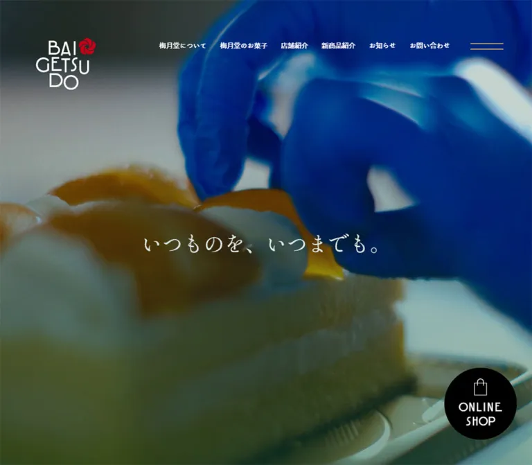
菓子づくりの写真を大きく配し、白い明朝体と独自の欧文書体で物語を伝える梅月堂の公式サイト。深緑のお知らせ欄、黒いフッター、控えめな金色のボタン、常設のオンラインショップ導線が特徴。
オリジナルサイトを見るEveryday confectionery, presented through expansive workshop imagery and quiet white typography.
Website: baigetsudo.com Original URL: https://baigetsudo.com/ Final URL: https://baigetsudo.com/ Theme: dark photographic presentation, white typography, muted gold actions, deep green news, and a black footer. Inspected: September 17, 2026, Japan Standard Time; supplied retrieval timestamp September 16, 2026, at 19:17:48.936 UTC. Viewports: 1440 × 1000 desktop and 390 × 844 mobile, in CSS pixels. Scope: the current homepage, including its opening composition, introductory narrative, About and Sweets sections, customer-story link, news index, persistent shop access, and footer. Visual captures show desktop opening, sweets-story, and footer states, plus mobile opening and footer states. Other homepage sections are documented from rendered DOM measurements. Linked pages and the open navigation panel were not inspected.
BAIGETSUDO presents its confectionery through the people and processes behind it. Large photographic scenes show white workwear, blue gloves, cream, glossy fruit, and pale pastry. White Japanese headlines float over these images with very little surrounding interface. The red brand emblem supplies a small, concentrated identity mark; muted gold is reserved for restrained navigation strokes and rounded discovery links.
This is a long brand homepage connecting company history, sweets, stores, news, and a separate online shop. Its structure gives storytelling substantial space while keeping shopping continuously available at the lower right. The typography is deliberately divided between Japanese Mincho storytelling, distinctive Latin display lettering, Japanese navigation, and practical sans-serif body copy. Preserve those different voices and the unusually generous scene lengths when adapting the design.
Everyday confectionery, presented through expansive workshop imagery and quiet white typography.
Website: baigetsudo.com Original URL: https://baigetsudo.com/ Final URL: https://baigetsudo.com/ Theme: dark photographic presentation, white typography, muted gold actions, deep green news, and a black footer. Inspected: September 17, 2026, Japan Standard Time; supplied retrieval timestamp September 16, 2026, at 19:17:48.936 UTC. Viewports: 1440 × 1000 desktop and 390 × 844 mobile, in CSS pixels. Scope: the current homepage, including its opening composition, introductory narrative, About and Sweets sections, customer-story link, news index, persistent shop access, and footer. Visual captures show desktop opening, sweets-story, and footer states, plus mobile opening and footer states. Other homepage sections are documented from rendered DOM measurements. Linked pages and the open navigation panel were not inspected.
BAIGETSUDO presents its confectionery through the people and processes behind it. Large photographic scenes show white workwear, blue gloves, cream, glossy fruit, and pale pastry. White Japanese headlines float over these images with very little surrounding interface. The red brand emblem supplies a small, concentrated identity mark; muted gold is reserved for restrained navigation strokes and rounded discovery links.
This is a long brand homepage connecting company history, sweets, stores, news, and a separate online shop. Its structure gives storytelling substantial space while keeping shopping continuously available at the lower right. The typography is deliberately divided between Japanese Mincho storytelling, distinctive Latin display lettering, Japanese navigation, and practical sans-serif body copy. Preserve those different voices and the unusually generous scene lengths when adapting the design.
| Name | Value | Suggested token | Evidence and role |
|---|---|---|---|
| Black | #000000 |
--color-black |
Measured footer background and floating shop-link fill |
| White | #FFFFFF |
--color-white |
Measured navigation, headings, body copy, and action labels; also declared as source --color_white and --color_txt_white |
| Muted Gold | #C1B98A |
--color-gold |
Measured VIEW MORE background, computed as rgb(193, 185, 138) |
| Deep Green | #005438 |
--color-green |
Measured news-section background, computed as rgb(0, 84, 56) |
| Emblem Red | Approximately #D6002A |
--color-brand-red-estimate |
Visual estimate from the red emblem; use the actual logo artwork for accurate color |
The two-line menu symbol looks close to the muted gold action color. Its stroke color was not separately included in the computed-style evidence, so assigning the exact button gold to it is an implementation approximation.
The opening is visually dominated by dark green-black shadows, cool workwear, and saturated blue gloves. The sweets-story scene shifts toward pastry beige and warm fruit colors. These are image colors, not additional interface tokens.
The screenshots show darkened backgrounds with readable white copy, but the evidence does not isolate an overlay color, opacity, blend mode, or baked-in image grading. A black overlay around 30–40% is a reasonable starting recommendation; tune it against the actual media rather than treating that range as a measurement.
The supplied custom-property collection contains many bright generic colors, including orange, purple, pink, and lime. Their declaration does not establish use on this homepage. In particular, the declared bright green #16B900 is not the measured news background #005438.
shippori-mincho-b1shippori-mincho-b1, sans-serif.400 for the opening and feature headings, 500 for the introductory prose, and 700 for news titles.baigetsudo-mbaigetsudo-m, sans-serif.--font-family_baigetsudo-m.VIEW MORE, news dates, and telephone numbers.400 in the measured elements.A baigetsudo-b family is also declared in the custom properties, but its use is not established in the sampled visible text. Do not substitute it indiscriminately or assume the medium face can be recreated by selecting an unrelated geometric sans-serif.
iroha-26tubaki-stdniroha-26tubaki-stdn, sans-serif.--font-family_iroha.400.Measured stack: 'Yu Gothic', YuGothic, 'Hiragino Kaku Gothic ProN', 'Hiragino Sans', Meiryo, 'MS PGothic', sans-serif.
Feature paragraphs, news excerpts, and contact captions use this stack at weight 500. Generous leading is essential: desktop feature copy uses 16px type on a 42px line, making the text feel unhurried despite ordinary character sizes.
The root and many structural wrappers report Times at 10px on desktop. Those inherited wrapper values do not describe the visible branded headings or logo artwork. Likewise, the declared Kozuka family is not demonstrated as a principal face in the sampled visible components.
| Role | Desktop size / line height | Mobile size / line height | Weight and tracking |
|---|---|---|---|
| Opening slogan | 46 / 46px |
25.35 / 25.35px |
400; normal tracking |
| Introductory narrative | 16 / 37px |
12.675 / 33.15px |
500; normal tracking |
| Japanese section label | 24 / 24px |
17.55 / 17.55px |
400 |
| English section label | 58 / 69.6px |
40.95 / 49.14px |
400; normal desktop tracking, 2.0475px mobile tracking |
| Feature headline | 40 / 84px |
25.35 / 40.56px |
400; 2px desktop tracking, normal mobile tracking |
| Feature paragraph | 16 / 42px |
12.675 / 27.3px |
500 |
VIEW MORE |
24 / 24px |
15.6 / 15.6px |
400 |
| Header navigation | 16 / 16px |
Hidden in opening capture | 400 |
| Footer navigation | 18 / 18px |
13.65 / 13.65px |
400 |
| News date | 20 / 20px |
12.675 / 12.675px |
400 |
| News title | 20 / 20px |
12.675 / 12.675px |
700 |
| News excerpt | 14 / 24px |
11.7 / 18.525px |
500 |
| Contact caption | 14 / 14px |
11.7 / 11.7px |
500; some caption words appear emphasized |
| Telephone number | 39 / 39px |
31.2 / 31.2px |
400 |
The mobile English section-label tracking is exactly 0.05em at the sampled size. The desktop feature-headline tracking is also 0.05em, but the mobile feature headline returns to normal tracking.
The logo is visible artwork in stacked and horizontal arrangements. Reuse authorized artwork rather than attempting to reproduce its layout by typing the brand name in one of the measured text families.
| Property | Desktop | Mobile |
|---|---|---|
| Root font size | 10px |
9.75px |
--base-w |
1500 |
400 |
--vw |
14.4px |
3.9px |
--vh |
10px |
8.44px |
--wh |
100vh |
100vh |
Mobile measurements are consistent with a 400-unit design scaled to 390px: 390 / 400 = 0.975. For example, 26 design units become 25.35px. This relationship does not establish the complete stylesheet formula or its breakpoints. The desktop root is 10px, so simply applying the same proportional formula to the desktop --base-w would be inaccurate.
| Element | Desktop at 1440 × 1000 | Mobile at 390 × 844 |
|---|---|---|
| Stacked header logo | 143 × 124px, at approximately (80, 84) |
74.09 × 64.23px, at approximately (18.52, 21.44) |
| Menu-button rectangle | 73 × 15px, at (1304, 95) |
33.14 × 10.72px, at approximately (338.34, 37.05) |
| Section-heading inset | 96px |
19.5px |
| Section-heading width | 1248px |
351px |
| Main mobile feature-copy width | Varies by composition | 312px, with 39px side insets |
| Standard discovery link | 197.05 × 60px |
135.91 × 39.03px |
| News-card width | 382.80px |
165.75px |
| News horizontal gap | 60px, calculated |
19.5px, calculated |
| News row gap | Approximately 58px, calculated |
Approximately 27.3px, calculated |
| Floating shop link | 160 × 160px |
78 × 78px |
| Shop-link edge clearance | 34px right, 56px bottom |
Flush right and bottom |
| Horizontal footer logo | 275 × 42px |
234 × 35.73px |
| Footer contact pill | 308 × 94px |
Approximately 313.97 × 74.14px |
| Footer social icon | 30 × 30px |
Approximately 31.19 × 31.19px |
| Footer height | 529px |
Approximately 590.56px |
The main section-heading width is about 86.67% of the desktop viewport and 90% of the mobile viewport. Mobile feature copy uses a narrower 80% width. Keeping these two mobile insets distinct helps preserve the original hierarchy.
These are component-specific relationships, not evidence of a universal eight-point spacing system.
| Element | Observed treatment |
|---|---|
| Discovery link | Measured 100px radius desktop and 97.5px mobile; visually a capsule |
| Telephone link | Measured 1000px radius desktop and 975px mobile; visually a capsule with a fine white outline |
| Desktop shop link | Measured 50% radius; a circle |
| Mobile shop link | Measured top-left radius 33.15px; the other corners are square |
| Sweets-story inset photograph | Approximately 16px radius, visually estimated |
| Main scenes and footer | Full-width, square outer boundaries |
There is no visible general-purpose shadow or elevated-card system. Separation comes from image contrast, section color, spacing, and a few rounded action shapes.
Role: brand identity and access to the principal site sections.
The desktop header overlays the opening image without a solid bar. The stacked white BAIGETSUDO wordmark and red emblem sit at the upper left. Six white Japanese links form a single row across the right half: About, Sweets, Stores, New Products, News, and Contact. A separate two-line menu symbol occupies the far right.
The logo starts at x=80px and y=84px. Navigation begins at x=480px and y=95px, using 16px type. The small difference in vertical origins is intentional in the observed composition: align the links near the top of the taller logo rather than vertically centering them beside it.
On mobile, the text navigation disappears. The logo becomes approximately 74px wide, with an 18.5px left inset. The menu remains at the upper right. The mobile footer capture still shows this stacked logo and menu over the image above the footer; the desktop footer capture retains the menu but not the large opening wordmark.
Recommended: reproduce the small visible menu glyph inside a larger transparent touch target. Its measured mobile rectangle is substantially smaller than a comfortable tap area.
Role: introduce the brand through the act of making confectionery.
The visible first screen is entirely photographic. A worker, cake, tools, workwear, and blue gloves establish the subject. The photograph extends under the logo, navigation, slogan, and shopping control. There is no bounded hero card or colored text panel.
The slogan is the actual source copy, “いつものを、いつまでも。”. Its desktop rectangle is 552 × 46px, centered horizontally at x=444px, with its center approximately 529px down the 1000px viewport. On mobile, it is approximately 304.31 × 25.34px, centered around y=413px in an 844px viewport.
The mobile crop keeps the working hands and cake prominent while allowing the worker's body to extend beyond the right edge. Preserve a purposeful portrait crop; fitting the entire wide scene inside a phone would weaken the composition.
The supplied evidence does not establish the precise media implementation. Treat the opening as an edge-to-edge production scene whose moving-media behavior requires separate verification.
Role: expand the opening phrase into a brand statement before introducing conventional section links.
Three measured prose blocks occupy a long interval below the first screen. Desktop positions alternate right, left, and right, with approximately 500–570px between their starting y positions. The first is about 222px wide, the second 259px, and the third 185px. This makes the text feel placed within a larger scene rather than confined to a single central article column.
Those desktop dimensions are consistent with vertical Japanese composition, but writing mode was not included in the evidence and these passages are not visible in the supplied screenshots. Verify writing direction before implementing vertical-rl.
On mobile, the measured prose boxes share an approximately 37–39px left inset and a width near 332px. Their heights correspond to multiple horizontal lines at 33.15px leading. Preserve the explicit phrase breaks and the generous separation between passages.
Role: label major chapters without interrupting the photographic atmosphere.
Stack a modest Japanese label above a much larger English label. Examples include “梅月堂について” above ABOUT BAIGETSUDO, and “梅月堂のお菓子” above BAIGETSUDO SWEETS.
The Japanese label uses the navigation family; the English label uses the custom brand face. Both are white. Desktop English labels occupy one line. Mobile splits the longer labels into ABOUT / BAIGETSUDO and BAIGETSUDO / SWEETS, each on two lines. This is a useful editorial line break, not a reason to shrink the English text until it fits on one line.
The News heading is represented as lowercase news in the sampled element text and uppercase NEWS in the rendered text extraction. Preserve the visible brand treatment rather than inferring a universal capitalization rule from either representation alone.
Role: connect a confectionery image to the story behind the products.
The desktop screenshot shows a full-bleed background of pale folded pastry with a darker treatment. A brighter inset photograph of cakes sits at the left, approximately x=96px, y=164px, and 461 × 499px in the supplied viewport capture. Its corners are gently rounded. These image measurements are visual estimates.
The right-hand copy starts near x=749px. Its anatomy is a Mincho headline, a short three-line paragraph, and a gold discovery capsule separated by substantial vertical space. The actual headline is “いつもの、ものがたり”. The measured headline uses 40px type, an 84px line box, and 2px tracking.
The background and inset image serve different purposes: the background establishes the workshop environment; the inset gives a more legible view of finished sweets. Preserve this difference in brightness and scale.
Mobile DOM measurements place the headline, paragraph, and action in a shared 312px column at x=39px. The mobile photograph arrangement was not supplied visually, so a stacked image-and-copy adaptation is a recommendation rather than a verified image layout.
Role: vary the narrative composition while retaining consistent typography and actions.
The About feature uses “梅月堂の、いつもの” with history-oriented text and a link to /about/. Its desktop copy occupies an approximately 664px-wide region offset toward the left. The customer-story feature uses “わたしの、いつもの” in a centered 612px-wide desktop region, followed by explanatory copy and a centered link to /sweets/#sweets-voice.
On mobile, both use the same 312px copy width as the sweets-story feature. About and sweets-story actions align left, while the customer-story action remains centered. Keep these alignment differences; making every section an identical centered block would flatten the page's pacing.
Role: a repeated secondary action for deeper reading.
The visible label is VIEW MORE, in white baigetsudo-m lettering on measured muted gold #C1B98A. The desktop rectangle is approximately 197 × 60px. Computed padding is 17px vertically and 35px horizontally. On mobile, the rectangle is approximately 136 × 39px, with 10.725px vertical and 26.325px horizontal padding.
Observed destinations are /about/, /sweets/, /sweets/#sweets-voice, and /news/. These are links, not form buttons. The source declares a 600ms background-color and text-color transition, but the destination hover colors are not established.
Role: provide practical updates after the extended brand narrative.
This section changes to a solid deep green field, measured as #005438. White text and gold discovery links continue the existing palette.
Desktop geometry places a heading and discovery-link rail at the left, followed by a two-column, two-row article grid. The title rail is approximately 290px wide. Each article link is approximately 382.80 × 469.09px, with a 60px horizontal gap. The four sampled entries are dates, Japanese titles, and excerpts linking to individual news pages.
Each card's text hierarchy is:
The date begins approximately 334px below the desktop card top and 159px below the mobile card top. This leaves a substantial upper content region, but the evidence does not provide image-node dimensions or a news screenshot. Thumbnail subjects, exact aspect ratios, and corner treatments remain unverified.
On mobile, the grid remains two columns, each 165.75px wide, with a 19.5px gap. It does not become a one-column feed at the inspected width. The section heading moves above the grid, and VIEW MORE appears below all four entries.
Measured title boxes are one line high even for long titles; the supplied evidence does not establish the exact clipping or ellipsis mechanism. A new implementation should keep the complete article title accessible even when the visual treatment is shortened.
Role: keep commerce reachable throughout the homepage without turning every section into a purchase pitch.
On desktop, a black 160px circle sits 34px from the right and 56px from the bottom. A thin white shopping-bag symbol sits above the two-line ONLINE / SHOP label. The link appears at the same viewport location in the opening, sweets-story, and footer captures.
On mobile, it becomes a 78px square attached to the bottom-right corner, with only the top-left corner rounded to 33.15px. The bag and label become much smaller. This geometry is a meaningful responsive change; a proportionally shrunken floating circle would not match the supplied phone capture.
The actual destination is https://baigetsudo.shop-pro.jp/. The target site's content and whether the link opens a new browsing context were not tested. Its black fill merges into the footer, leaving the white icon and lettering visible.
Role: provide separate, highly visible contact routes for product enquiries and general brand enquiries.
Each link has a transparent interior, a fine white outline, a small centered Japanese caption, and a much larger brand-font telephone number. The DOM contains actual tel: destinations:
tel:0957-49-2911.tel:0957-43-5061.Desktop pills measure 308 × 94px. Their caption is 14px and number 39px. Mobile footer pills expand to approximately 314px wide while becoming 74px tall, with 11.7px captions and 31.2px numbers. Avoid reducing the phone numbers to ordinary body text; their scale is a defining footer feature.
Role: close the narrative with identity, site navigation, social access, and direct contact.
The desktop footer is a 529px-high black field. A horizontal logo sits at the upper left and six navigation links run across the upper right. Social icons and copyright occupy the lower left; the two contact pills sit side by side across the lower middle. The persistent shop circle remains at the lower right.
The mobile footer is approximately 591px high. Its visual order changes to a centered horizontal logo, two stacked contact pills, a two-column navigation group with a vertical social-icon column at the right, and centered copyright near the bottom. This is a substantial reorder, not simply a wrapped desktop row.
The footer replaces the header's Contact link with the business-product destination /products/. Instagram and X symbols are visible; their supplied links point to the brand's Instagram account and its twitter.com account URL.
The copyright is extremely small in the mobile capture; its measured wrapper is only about 7.8px high. A new implementation can increase this text while preserving its quiet visual role.
A second group of navigation links appears in the rendered DOM with English and Japanese labels, the two contact links, an anniversary-page link, and social links. It includes About, Sweets, Stores, New Products, News, Contact, and business products.
This content is consistent with an expanded navigation system, but no opened-menu screenshot or toggle interaction was supplied. Do not claim an observed overlay color, opening direction, animation, focus behavior, or scroll lock. The closed two-line trigger is the visually established component.
| Element or behavior | Supplied evidence | Interpretation and limit |
|---|---|---|
| Header and footer text links | opacity 0.6s cubic-bezier(0.25, 0.46, 0.45, 0.94) |
A measured fade transition; the target opacity was not captured |
| Logo and social links | opacity 0.6s cubic-bezier(0.215, 0.61, 0.355, 1) |
Slightly different easing for image-based links |
| Discovery capsule | Background and color transitions, each 0.6s cubic-bezier(0.215, 0.61, 0.355, 1) |
Color-change capability is established; hover colors are not |
| Shop link | Background-color transition with the same 600ms cubic easing | No verified hover fill |
| Mobile News action wrapper | Opacity and transform transitions of 1.4s cubic-bezier(0.25, 0.46, 0.45, 0.94) |
Supports a slow reveal treatment; displacement, trigger, and replay behavior are unknown |
| Desktop News action wrapper | Zero-duration opacity/transform transitions with a 0.6s delay in the sampled state |
A state-specific declaration, not a complete animation sequence |
| Persistent controls | Shop and menu remain at consistent viewport corners across supplied views | Fixed positioning is a suitable implementation; precise original positioning rules were not supplied |
| Photographic scenes | Different production images or frames appear across current captures | Does not independently establish video, slideshow, loop timing, autoplay, or scroll-controlled playback |
| Menu | Button and secondary navigation content exist | Opening and closing were not exercised |
Many sampled text nodes report animation: none. This does not rule out media playback, ancestor transforms, pseudo-element animation, or script-driven changes.
The collection process waited for initial loading and sampled stability, traversed intermediate scroll positions, and handled ongoing animation during capture preparation. These checks do not establish the entire interaction model. There is no evidence here for a specific parallax factor, scroll-scrubbed timeline, snap behavior, or menu choreography.
Recommended motion direction: use restrained opacity and short-distance translation, retain the measured 600ms link-transition character, and keep text immediately available when motion is reduced. If moving footage is used, provide a still fallback and an explicit pause mechanism where appropriate.
| Surface | Appearance | Function |
|---|---|---|
| Opening and narrative scenes | Full-width production imagery with dark visual treatment | Establish craft, atmosphere, and continuity |
| Inset sweets photograph | Brighter food image with modestly rounded corners | Give a clear, focused product view within the broader scene |
| News | Solid #005438 |
Separate practical updates from the photographic narrative |
| Footer | Solid #000000 |
Ground the page and support white contact information |
| Discovery action | Muted gold capsule | Repeated invitation to explore |
| Contact action | Transparent pill with a fine white edge | Direct contact without introducing another fill color |
| Shop control | Black circle or corner tile | Persistent commerce access |
The supplied captures do not show glass effects, gradients used as decorative UI fills, or layered card shadows. Let the photographs provide visual complexity while the interface stays flat and legible.
Use close, specific observations of confectionery production: hands shaping pastry, a worker smoothing cream, cakes on metal trays, tools in use, and repeated rows of sweets. White workwear and vivid blue gloves are prominent in the current captures. Food color comes from cream, pale dough, and glossy orange fruit.
The visual treatment feels documentary rather than like an isolated product catalog. Subjects extend beyond the frame, workshop backgrounds remain softly visible, and actions are photographed closely enough to show texture. The inset cake photograph is brighter and more appetizing than the subdued scene behind it.
For a new implementation, commission or select images with a usable central and portrait crop. Keep important hands, tools, and food visible when the width narrows. Use responsive crops or art direction where one object-position cannot serve both viewports.
The supplied evidence does not include media file URLs. The following are observed asset roles, not invented source paths.
| Asset role | Observed appearance | Availability limit |
|---|---|---|
| Header identity | Stacked white lettering with a red emblem | Original file format and URL not supplied |
| Footer identity | Horizontal white wordmark with a red emblem | Original file format and URL not supplied |
| Opening scene | Worker preparing a cream-covered cake | Media type and source URL not established |
| Sweets-story background | Rows of pale folded pastry | Source URL not supplied |
| Sweets-story inset | Cakes with piped cream and glossy orange fruit | Source URL not supplied |
| Image above desktop footer | Blue-gloved hands working with pastry | Separate asset versus shared background media is unknown |
| Shop symbol | Thin white shopping-bag outline | Original icon source not supplied |
| Social symbols | White Instagram and X treatments | Original icon sources not supplied |
Use original artwork and fonts only when available and authorized. CSS can reproduce the composition and control shapes, but it cannot replace the brand identity or the production photography.
The measured document height is approximately 11,485px on desktop and 8,619px on mobile. This is a long narrative homepage with substantial space between content groups.
| Section | Desktop start / height | Mobile start / height |
|---|---|---|
| About | 2802.98 / 2010.17px |
2389.05 / 1491.59px |
| Sweets | 4813.16 / 3398.17px |
3880.64 / 2294.81px |
| News | 8691.33 / 1584.19px |
6516.70 / 1024.06px |
| Footer | 10955.52 / 529px |
8028.27 / 590.56px |
These are sampled document coordinates, not recommended absolute positioning. They establish the scale and sequence of the experience. Build flow-based sections that can grow with content rather than fixing every heading to these y values.
The measured interval between the end of main and the start of the footer is 680px on desktop and 487.5px on mobile. The bottom captures show production imagery above the footer, but the media element itself was not measured separately.
| Feature | Desktop | Mobile |
|---|---|---|
| Header | Large stacked logo, six text links, menu | Smaller stacked logo and menu |
| Opening image | Wide workshop composition | Strong portrait crop |
| Opening slogan | 46px, just below viewport center | 25.35px, slightly above viewport center |
| Section labels | English label generally on one line | Long English labels split into two lines |
| Feature copy | Alternating and centered desktop placements | Shared 312px content width |
| News | Left heading rail and two-column grid | Heading above the same two-column structure |
| News discovery link | In the left rail | Below the grid |
| Shop link | Floating circle with edge clearance | Corner-attached tile with one rounded corner |
| Contact links | Two horizontal pills | Two stacked pills |
| Footer social links | Horizontal at lower left | Vertical to the right of navigation |
Only the two stated viewport sizes were inspected. Tablet behavior, exact breakpoint values, landscape-phone composition, and safe-area rules are not established. Breakpoints in the Quick Start are recommendations chosen for workable layouts.
These are recommendations for a new implementation, not verified original-site features:
aria-controls and aria-expanded.#000000.#FFFFFF.#C1B98A.#005438.“Create a long confectionery brand homepage inspired by the observed BAIGETSUDO composition. Use full-width workshop and sweets photography, delicate white Japanese Mincho headlines, distinctive Latin display lettering, and generous narrative intervals. Start with an edge-to-edge production scene, a stacked logo at upper left, restrained desktop navigation, a two-line menu symbol, and a centered Japanese slogan. Alternate editorial text placements and pair a bright rounded food photograph with quieter background imagery. Use muted gold #C1B98A discovery capsules, a deep green #005438 news section, and a black contact footer. Keep the online-shop link visible at the lower right: a 160px floating circle on desktop and a 78px corner tile with one rounded corner on mobile. Preserve the two-column mobile news grid and stack the footer telephone links. Treat media playback and menu-open behavior as separate implementation decisions.”
This is a practical adaptation of the measured components, not recovered source CSS. It keeps a conventional root font size and uses explicit component tokens. The desktop and 390px endpoint sizes come from the supplied evidence; breakpoints, layout interpolation, focus styling, a 35% media overlay, and the example news-image ratio are recommendations.
Provide actual logo, icon, photograph, and font assets separately. Apply .scene__media to an image or video element with a real source. The code styles the closed menu trigger; its navigation panel requires a separate accessible implementation. Section heights remain content-driven rather than reproducing the sampled document coordinates.
:root {
  /* Measured interface colors */
  --color-black: #000000;
  --color-white: #ffffff;
  --color-gold: #c1b98a;
  --color-green: #005438;

  /* Named source families; serif fallback is an adaptation */
  --font-story: 'shippori-mincho-b1', serif;
  --font-brand: 'baigetsudo-m', sans-serif;
  --font-nav: 'iroha-26tubaki-stdn', sans-serif;
  --font-body: 'Yu Gothic', YuGothic,
    'Hiragino Kaku Gothic ProN', 'Hiragino Sans',
    Meiryo, 'MS PGothic', sans-serif;

  --text-hero: 46px;
  --text-section-jp: 24px;
  --text-section-en: 58px;
  --text-feature: 40px;
  --text-body: 16px;
  --text-action: 24px;
  --text-phone: 39px;
  --feature-leading: 42px;
  --page-inset: 6.666667vw;
  --shop-size: 160px;

  --radius-pill: 1000px;
  --radius-photo: 16px; /* Visual estimate */
  --ease-link: cubic-bezier(0.25, 0.46, 0.45, 0.94);
  --ease-image: cubic-bezier(0.215, 0.61, 0.355, 1);
  --duration-link: 600ms;
  --scene-shade: rgb(0 0 0 / 35%); /* Recommended starting point */
}

* { box-sizing: border-box; }

body {
  margin: 0;
  color: var(--color-white);
  background: var(--color-black);
  font: 500 var(--text-body) / 1.75 var(--font-body);
}

img, video { display: block; max-width: 100%; }
a { color: inherit; }
button { font: inherit; }

.container {
  width: min(calc(100% - 2 * var(--page-inset)), 1248px);
  margin-inline: auto;
}

.site-header {
  position: absolute;
  z-index: 20;
  top: 84px;
  inset-inline: 80px 182px;
  display: flex;
  align-items: flex-start;
  gap: 40px;
}

.site-header__logo {
  display: block;
  flex: 0 0 143px;
  width: 143px;
}

.site-header__logo img { width: 100%; height: auto; }

.site-nav {
  display: flex;
  gap: 50px;
  margin: 11px 0 0 auto;
  white-space: nowrap;
  font: 400 16px / 1 var(--font-nav);
}

.site-nav a,
.footer-links a {
  text-decoration: none;
  transition: opacity var(--duration-link) var(--ease-link);
}

.menu-toggle {
  /* Expanded hit area; the visible lines remain compact */
  position: fixed;
  z-index: 40;
  top: 80px;
  right: 63px;
  width: 73px;
  height: 44px;
  display: flex;
  flex-direction: column;
  justify-content: center;
  gap: 12px;
  padding: 0;
  border: 0;
  background: transparent;
  color: var(--color-gold);
  cursor: pointer;
}

.menu-toggle::before,
.menu-toggle::after {
  content: '';
  width: 100%;
  height: 1px;
  background: currentColor;
}

.scene {
  position: relative;
  isolation: isolate;
  overflow: hidden;
  background: var(--color-black);
}

.scene__media {
  position: absolute;
  z-index: -2;
  inset: 0;
  width: 100%;
  height: 100%;
  object-fit: cover;
  object-position: var(--scene-position, center);
}

.scene::after {
  content: '';
  position: absolute;
  z-index: -1;
  inset: 0;
  background: var(--scene-shade);
  pointer-events: none;
}

.hero {
  min-height: 100vh;
  min-height: 100svh;
  display: grid;
  place-items: center;
}

.hero__slogan {
  margin: 0;
  font: 400 var(--text-hero) / 1 var(--font-story);
  white-space: nowrap;
  transform: translateY(2.9vh);
}

.chapter { padding-top: 232px; }
.chapter--about { padding-top: 310px; }

.section-label__jp {
  margin: 0 0 14px;
  font: 400 var(--text-section-jp) / 1 var(--font-nav);
}

.section-label__en {
  margin: 0;
  font: 400 var(--text-section-en) / 1.2 var(--font-brand);
}

.mobile-break { display: none; }

.feature {
  display: grid;
  grid-template-columns: 37% minmax(0, 1fr);
  column-gap: 15.3%;
  align-items: start;
  padding-block: 160px 320px; /* Adaptation for narrative pacing */
}

.feature__image {
  width: 100%;
  aspect-ratio: 461 / 499; /* Estimated from desktop capture */
  object-fit: cover;
  border-radius: var(--radius-photo);
}

.feature__copy { padding-top: 50px; }

.feature__title {
  margin: 0 0 38px;
  font: 400 var(--text-feature) / 2.1 var(--font-story);
  letter-spacing: 0.05em;
}

.feature__body {
  margin: 0;
  font-size: var(--text-body);
  line-height: var(--feature-leading);
}

.more-link {
  display: inline-flex;
  align-items: center;
  justify-content: center;
  min-width: 197px;
  min-height: 60px;
  padding-inline: 35px;
  border-radius: var(--radius-pill);
  color: var(--color-white);
  background: var(--color-gold);
  text-decoration: none;
  font: 400 var(--text-action) / 1 var(--font-brand);
  transition:
    background-color var(--duration-link) var(--ease-image),
    color var(--duration-link) var(--ease-image);
}

.feature__copy .more-link { margin-top: 92px; }

.news {
  padding-block: 314px 274px;
  background: var(--color-green);
}

.news__layout {
  display: grid;
  grid-template-columns: 290px minmax(0, 826px);
  grid-template-areas: 'heading cards' 'more cards';
  align-items: start;
  align-content: start;
  row-gap: 66px;
}

.news__heading { grid-area: heading; }
.news__more { grid-area: more; justify-self: start; }

.news__grid {
  grid-area: cards;
  display: grid;
  grid-template-columns: repeat(2, minmax(0, 1fr));
  gap: 58px 60px;
}

.news-card { min-width: 0; text-decoration: none; }

.news-card__image {
  width: 100%;
  aspect-ratio: 4 / 3; /* Recommended; original ratio unverified */
  object-fit: cover;
  margin-bottom: 32px;
}

.news-card__date {
  display: block;
  font: 400 20px / 1 var(--font-brand);
}

.news-card__title {
  margin: 15px 0 32px;
  overflow: hidden;
  white-space: nowrap;
  text-overflow: ellipsis; /* Recommended clipping implementation */
  font: 700 20px / 1 var(--font-story);
}

.news-card__excerpt {
  display: -webkit-box;
  -webkit-box-orient: vertical;
  -webkit-line-clamp: 2;
  overflow: hidden;
  margin: 0;
  font-size: 14px;
  line-height: 24px;
}

.shop-link {
  position: fixed;
  z-index: 30;
  right: 34px;
  bottom: 56px;
  width: var(--shop-size);
  height: var(--shop-size);
  display: flex;
  flex-direction: column;
  align-items: center;
  justify-content: center;
  gap: 10px;
  border-radius: 50%;
  background: var(--color-black);
  color: var(--color-white);
  text-decoration: none;
  text-align: center;
  transition: background-color var(--duration-link) var(--ease-image);
}

.shop-link__icon { width: 30px; height: 40px; }
.shop-link__label { font: 400 28px / 1.1 var(--font-brand); }

.site-footer {
  padding-block: 147px 106px;
  background: var(--color-black);
}

.footer-layout {
  display: grid;
  grid-template-columns: minmax(275px, 1fr) auto;
  grid-template-areas:
    'brand links'
    'social contacts'
    'copyright contacts';
  column-gap: 40px;
  row-gap: 32px;
}

.footer-brand { grid-area: brand; width: 275px; }
.footer-links {
  grid-area: links;
  display: flex;
  align-items: center;
  gap: 35px;
  font: 400 18px / 1 var(--font-nav);
}

.footer-social {
  grid-area: social;
  display: flex;
  align-self: end;
  gap: 13px;
  margin-top: 130px;
}

.footer-social a { display: block; width: 30px; height: 30px; }

.footer-contacts {
  grid-area: contacts;
  display: flex;
  align-items: end;
  gap: 22px;
}

.contact-pill {
  display: flex;
  flex-direction: column;
  justify-content: center;
  align-items: center;
  gap: 7px;
  width: 308px;
  min-height: 94px;
  border: 1px solid currentColor;
  border-radius: var(--radius-pill);
  text-decoration: none;
  text-align: center;
}

.contact-pill__caption { font-size: 14px; line-height: 1; }
.contact-pill__number { font: 400 var(--text-phone) / 1 var(--font-brand); }

.footer-copyright {
  grid-area: copyright;
  margin: 0;
  font: 400 14px / 1.2 var(--font-brand);
}

/* Recommended breakpoint; the original breakpoint was not supplied */
@media (max-width: 75rem) {
  .site-nav { display: none; }
  .footer-layout {
    grid-template-columns: 1fr;
    grid-template-areas: 'brand' 'links' 'contacts' 'social' 'copyright';
  }
  .footer-links { flex-wrap: wrap; }
  .footer-social { margin-top: 0; }
}

@media (max-width: 48rem) {
  :root {
    --page-inset: 5vw;
    --text-hero: clamp(20px, 6.5vw, 25.35px);
    --text-section-jp: 17.55px;
    --text-section-en: 40.95px;
    --text-feature: 25.35px;
    --text-body: 12.675px;
    --text-action: 15.6px;
    --text-phone: 31.2px;
    --feature-leading: 27.3px;
    --shop-size: 78px;
  }

  .site-header {
    position: fixed;
    top: 21.44px;
    inset-inline: 18.52px auto;
  }
  .site-header__logo { flex-basis: 74.09px; width: 74.09px; }
  .menu-toggle {
    top: 21px;
    right: 13px;
    width: 44px;
    padding-inline: 5.43px;
    gap: 9px;
  }
  .hero__slogan { transform: translateY(-1vh); }
  .chapter { padding-top: 126.75px; }
  .chapter--about { padding-top: 0; }
  .section-label__jp { margin-bottom: 14.63px; }
  .section-label__en { letter-spacing: 0.05em; }
  .mobile-break { display: block; }

  .feature {
    width: 80%;
    grid-template-columns: minmax(0, 1fr);
    gap: 48px;
    padding-block: 120px 180px;
  }
  .feature__copy { padding-top: 0; }
  .feature__title {
    margin-bottom: 22px;
    line-height: 1.6;
    letter-spacing: normal;
  }
  .feature__copy .more-link { margin-top: 31.2px; }
  .more-link {
    min-width: 135.91px;
    min-height: 39.03px;
    padding-inline: 26.325px;
  }

  .news { padding-block: 117px 187.2px; }
  .news__layout {
    grid-template-columns: minmax(0, 1fr);
    grid-template-areas: 'heading' 'cards' 'more';
    row-gap: 25.35px;
  }
  .news__grid { gap: 27.3px 19.5px; }
  .news__more { margin-top: 36px; }
  .news-card__date,
  .news-card__title { font-size: 12.675px; }
  .news-card__title { margin-block: 12.675px 9px; }
  .news-card__excerpt { font-size: 11.7px; line-height: 18.525px; }

  .shop-link {
    right: 0;
    bottom: 0;
    border-radius: 33.15px 0 0 0;
    gap: 6px;
    padding-bottom: env(safe-area-inset-bottom, 0px);
    height: calc(var(--shop-size) + env(safe-area-inset-bottom, 0px));
  }
  .shop-link__icon { width: 16px; height: 22px; }
  .shop-link__label { font-size: 10px; }

  .site-footer { padding-block: 61.43px 40px; }
  .footer-layout {
    width: 80.5%;
    grid-template-columns: minmax(0, 1fr) 31.2px;
    grid-template-areas:
      'brand brand'
      'contacts contacts'
      'links social'
      'copyright copyright';
    gap: 48px 0;
  }
  .footer-brand { width: 234px; justify-self: center; max-width: 100%; }
  .footer-contacts { display: grid; gap: 19.5px; }
  .contact-pill { width: 100%; min-height: 74.14px; gap: 3.9px; }
  .contact-pill__caption { font-size: 11.7px; }
  .footer-links {
    display: grid;
    grid-template-columns: repeat(2, minmax(0, 1fr));
    gap: 27.3px 0;
    align-content: start;
    font-size: 13.65px;
  }
  .footer-social { flex-direction: column; gap: 16.56px; align-self: start; }
  .footer-social a { width: 31.2px; height: 31.2px; }
  .footer-copyright {
    margin-top: 24px;
    text-align: center;
    font-size: 10px; /* Recommended increase over the tiny original */
  }
}

/* Recommended feedback; original hover endpoints were not supplied */
@media (hover: hover) {
  .site-nav a:hover,
  .footer-links a:hover { opacity: 0.7; }
  .more-link:hover { color: var(--color-black); }
}

:where(a, button):focus-visible {
  outline: 2px solid var(--color-white);
  outline-offset: 5px;
}

@media (pointer: coarse) {
  .more-link { min-height: 44px; }
}

@media (prefers-reduced-motion: reduce) {
  .site-nav a,
  .footer-links a,
  .more-link,
  .shop-link { transition: none; }
  /* Manage any video playback separately in application logic. */
}
The example deliberately leaves photography and font loading external. Adjust scene darkening if an asset is already graded. The shop icon and label sizes in this adaptation are visual approximations because their child-element typography was not included in the supplied measurements.
Optional mapping for a project already using Tailwind v4. These aliases do not imply that the original website uses Tailwind. Define the properties above first.
@theme inline {
  --color-baigetsudo-black: var(--color-black);
  --color-baigetsudo-white: var(--color-white);
  --color-baigetsudo-gold: var(--color-gold);
  --color-baigetsudo-green: var(--color-green);

  --font-editorial: var(--font-story);
  --font-display: var(--font-brand);
  --font-navigation: var(--font-nav);
  --font-copy: var(--font-body);

  --text-opening: var(--text-hero);
  --text-chapter: var(--text-section-en);
  --text-feature-heading: var(--text-feature);
  --text-feature-copy: var(--text-body);
  --text-discovery: var(--text-action);
  --text-contact-number: var(--text-phone);

  --spacing-page-inset: var(--page-inset);
  --spacing-shop-control: var(--shop-size);
  --radius-discovery: var(--radius-pill);
  --radius-editorial-photo: var(--radius-photo);
}
2026-09-16T19:17:48.936Z, equivalent to September 17, 2026, at 04:17:48.936 JST.This reference describes the current homepage represented by those captures. Tables distinguish measured geometry from visual estimates; the prompts and CSS provide an explicitly labeled implementation adaptation.
# BAIGETSUDO / 梅月堂 — Style Reference

> Everyday confectionery, presented through expansive workshop imagery and quiet white typography.

**Website:** [baigetsudo.com](https://baigetsudo.com/)
**Original URL:** https://baigetsudo.com/
**Final URL:** https://baigetsudo.com/
**Theme:** dark photographic presentation, white typography, muted gold actions, deep green news, and a black footer.
**Inspected:** September 17, 2026, Japan Standard Time; supplied retrieval timestamp September 16, 2026, at 19:17:48.936 UTC.
**Viewports:** 1440 × 1000 desktop and 390 × 844 mobile, in CSS pixels.
**Scope:** the current homepage, including its opening composition, introductory narrative, About and Sweets sections, customer-story link, news index, persistent shop access, and footer. Visual captures show desktop opening, sweets-story, and footer states, plus mobile opening and footer states. Other homepage sections are documented from rendered DOM measurements. Linked pages and the open navigation panel were not inspected.

BAIGETSUDO presents its confectionery through the people and processes behind it. Large photographic scenes show white workwear, blue gloves, cream, glossy fruit, and pale pastry. White Japanese headlines float over these images with very little surrounding interface. The red brand emblem supplies a small, concentrated identity mark; muted gold is reserved for restrained navigation strokes and rounded discovery links.

This is a long brand homepage connecting company history, sweets, stores, news, and a separate online shop. Its structure gives storytelling substantial space while keeping shopping continuously available at the lower right. The typography is deliberately divided between Japanese Mincho storytelling, distinctive Latin display lettering, Japanese navigation, and practical sans-serif body copy. Preserve those different voices and the unusually generous scene lengths when adapting the design.
# BAIGETSUDO / 梅月堂 — Style Reference

> Everyday confectionery, presented through expansive workshop imagery and quiet white typography.

**Website:** [baigetsudo.com](https://baigetsudo.com/)
**Original URL:** https://baigetsudo.com/
**Final URL:** https://baigetsudo.com/
**Theme:** dark photographic presentation, white typography, muted gold actions, deep green news, and a black footer.
**Inspected:** September 17, 2026, Japan Standard Time; supplied retrieval timestamp September 16, 2026, at 19:17:48.936 UTC.
**Viewports:** 1440 × 1000 desktop and 390 × 844 mobile, in CSS pixels.
**Scope:** the current homepage, including its opening composition, introductory narrative, About and Sweets sections, customer-story link, news index, persistent shop access, and footer. Visual captures show desktop opening, sweets-story, and footer states, plus mobile opening and footer states. Other homepage sections are documented from rendered DOM measurements. Linked pages and the open navigation panel were not inspected.

BAIGETSUDO presents its confectionery through the people and processes behind it. Large photographic scenes show white workwear, blue gloves, cream, glossy fruit, and pale pastry. White Japanese headlines float over these images with very little surrounding interface. The red brand emblem supplies a small, concentrated identity mark; muted gold is reserved for restrained navigation strokes and rounded discovery links.

This is a long brand homepage connecting company history, sweets, stores, news, and a separate online shop. Its structure gives storytelling substantial space while keeping shopping continuously available at the lower right. The typography is deliberately divided between Japanese Mincho storytelling, distinctive Latin display lettering, Japanese navigation, and practical sans-serif body copy. Preserve those different voices and the unusually generous scene lengths when adapting the design.

## How to Read This Reference

- **Measured** means supplied computed styles, element rectangles, or document dimensions. Values are CSS pixels unless stated otherwise.
- **Visual estimate** means an approximation from the original-page screenshots. Estimated colors and image geometry are identified explicitly.
- **Calculated** means arithmetic derived from supplied measurements, such as a gap between two rectangles.
- **Recommended** means guidance for a new implementation, including the CSS adaptation below. It does not establish an original-site feature.
- Token names introduced here are implementation aliases unless an original custom-property name is explicitly given.
- Some DOM entries belong to a second navigation group that is absent from the visible closed-menu captures. Their presence does not prove how an opened menu looks or behaves.
- DOM sampling and screenshots represent separate observations. Some feature-copy wrappers have a measured 20px horizontal offset that is less apparent in the settled screenshot. Do not treat every sampled offset as permanent composition.
- Computed font-family declarations establish the requested families, not independent verification of font-file loading or the exact glyph fallback used for every character.

## Tokens — Colors

### Core Palette

| Name | Value | Suggested token | Evidence and role |
| --- | --- | --- | --- |
| Black | `#000000` | `--color-black` | Measured footer background and floating shop-link fill |
| White | `#FFFFFF` | `--color-white` | Measured navigation, headings, body copy, and action labels; also declared as source `--color_white` and `--color_txt_white` |
| Muted Gold | `#C1B98A` | `--color-gold` | Measured `VIEW MORE` background, computed as `rgb(193, 185, 138)` |
| Deep Green | `#005438` | `--color-green` | Measured news-section background, computed as `rgb(0, 84, 56)` |
| Emblem Red | Approximately `#D6002A` | `--color-brand-red-estimate` | Visual estimate from the red emblem; use the actual logo artwork for accurate color |

The two-line menu symbol looks close to the muted gold action color. Its stroke color was not separately included in the computed-style evidence, so assigning the exact button gold to it is an implementation approximation.

### Photographic Color and Contrast

The opening is visually dominated by dark green-black shadows, cool workwear, and saturated blue gloves. The sweets-story scene shifts toward pastry beige and warm fruit colors. These are image colors, not additional interface tokens.

The screenshots show darkened backgrounds with readable white copy, but the evidence does not isolate an overlay color, opacity, blend mode, or baked-in image grading. A black overlay around 30–40% is a reasonable starting recommendation; tune it against the actual media rather than treating that range as a measurement.

The supplied custom-property collection contains many bright generic colors, including orange, purple, pink, and lime. Their declaration does not establish use on this homepage. In particular, the declared bright green `#16B900` is not the measured news background `#005438`.

## Tokens — Typography

### Japanese Storytelling — `shippori-mincho-b1`

- **Measured family:** `shippori-mincho-b1, sans-serif`.
- **Roles:** opening slogan, introductory narrative, feature headlines, and news titles.
- **Weights:** `400` for the opening and feature headings, `500` for the introductory prose, and `700` for news titles.
- **Character:** delicate Mincho forms with a literary, measured rhythm. Large line boxes and restrained tracking create space without heavy display weight.
- **Implementation note:** the original declaration uses a sans-serif fallback. The Quick Start recommends a serif fallback to retain the visual category when the named font is unavailable; that is an intentional adaptation.

### Latin Display and Numerals — `baigetsudo-m`

- **Measured family:** `baigetsudo-m, sans-serif`.
- **Source variable:** `--font-family_baigetsudo-m`.
- **Roles:** large English section labels, `VIEW MORE`, news dates, and telephone numbers.
- **Weight:** `400` in the measured elements.
- **Character:** distinctive, lightly irregular Latin lettering. The large telephone numerals belong to the brand's visual language rather than a neutral utility font.

A `baigetsudo-b` family is also declared in the custom properties, but its use is not established in the sampled visible text. Do not substitute it indiscriminately or assume the medium face can be recreated by selecting an unrelated geometric sans-serif.

### Japanese Navigation — `iroha-26tubaki-stdn`

- **Measured family:** `iroha-26tubaki-stdn, sans-serif`.
- **Source variable:** `--font-family_iroha`.
- **Roles:** desktop header links, Japanese section labels, and footer navigation.
- **Weight:** `400`.

### Practical Body Copy

**Measured stack:** `'Yu Gothic', YuGothic, 'Hiragino Kaku Gothic ProN', 'Hiragino Sans', Meiryo, 'MS PGothic', sans-serif`.

Feature paragraphs, news excerpts, and contact captions use this stack at weight `500`. Generous leading is essential: desktop feature copy uses 16px type on a 42px line, making the text feel unhurried despite ordinary character sizes.

The root and many structural wrappers report Times at 10px on desktop. Those inherited wrapper values do not describe the visible branded headings or logo artwork. Likewise, the declared Kozuka family is not demonstrated as a principal face in the sampled visible components.

### Measured Type Scale

| Role | Desktop size / line height | Mobile size / line height | Weight and tracking |
| --- | --- | --- | --- |
| Opening slogan | `46 / 46px` | `25.35 / 25.35px` | 400; normal tracking |
| Introductory narrative | `16 / 37px` | `12.675 / 33.15px` | 500; normal tracking |
| Japanese section label | `24 / 24px` | `17.55 / 17.55px` | 400 |
| English section label | `58 / 69.6px` | `40.95 / 49.14px` | 400; normal desktop tracking, `2.0475px` mobile tracking |
| Feature headline | `40 / 84px` | `25.35 / 40.56px` | 400; `2px` desktop tracking, normal mobile tracking |
| Feature paragraph | `16 / 42px` | `12.675 / 27.3px` | 500 |
| `VIEW MORE` | `24 / 24px` | `15.6 / 15.6px` | 400 |
| Header navigation | `16 / 16px` | Hidden in opening capture | 400 |
| Footer navigation | `18 / 18px` | `13.65 / 13.65px` | 400 |
| News date | `20 / 20px` | `12.675 / 12.675px` | 400 |
| News title | `20 / 20px` | `12.675 / 12.675px` | 700 |
| News excerpt | `14 / 24px` | `11.7 / 18.525px` | 500 |
| Contact caption | `14 / 14px` | `11.7 / 11.7px` | 500; some caption words appear emphasized |
| Telephone number | `39 / 39px` | `31.2 / 31.2px` | 400 |

The mobile English section-label tracking is exactly `0.05em` at the sampled size. The desktop feature-headline tracking is also `0.05em`, but the mobile feature headline returns to normal tracking.

The logo is visible artwork in stacked and horizontal arrangements. Reuse authorized artwork rather than attempting to reproduce its layout by typing the brand name in one of the measured text families.

## Tokens — Spacing & Shapes

### Source Scaling

| Property | Desktop | Mobile |
| --- | --- | --- |
| Root font size | `10px` | `9.75px` |
| `--base-w` | `1500` | `400` |
| `--vw` | `14.4px` | `3.9px` |
| `--vh` | `10px` | `8.44px` |
| `--wh` | `100vh` | `100vh` |

Mobile measurements are consistent with a 400-unit design scaled to 390px: `390 / 400 = 0.975`. For example, 26 design units become 25.35px. This relationship does not establish the complete stylesheet formula or its breakpoints. The desktop root is 10px, so simply applying the same proportional formula to the desktop `--base-w` would be inaccurate.

### Layout Measurements

| Element | Desktop at 1440 × 1000 | Mobile at 390 × 844 |
| --- | --- | --- |
| Stacked header logo | `143 × 124px`, at approximately `(80, 84)` | `74.09 × 64.23px`, at approximately `(18.52, 21.44)` |
| Menu-button rectangle | `73 × 15px`, at `(1304, 95)` | `33.14 × 10.72px`, at approximately `(338.34, 37.05)` |
| Section-heading inset | `96px` | `19.5px` |
| Section-heading width | `1248px` | `351px` |
| Main mobile feature-copy width | Varies by composition | `312px`, with `39px` side insets |
| Standard discovery link | `197.05 × 60px` | `135.91 × 39.03px` |
| News-card width | `382.80px` | `165.75px` |
| News horizontal gap | `60px`, calculated | `19.5px`, calculated |
| News row gap | Approximately `58px`, calculated | Approximately `27.3px`, calculated |
| Floating shop link | `160 × 160px` | `78 × 78px` |
| Shop-link edge clearance | `34px` right, `56px` bottom | Flush right and bottom |
| Horizontal footer logo | `275 × 42px` | `234 × 35.73px` |
| Footer contact pill | `308 × 94px` | Approximately `313.97 × 74.14px` |
| Footer social icon | `30 × 30px` | Approximately `31.19 × 31.19px` |
| Footer height | `529px` | Approximately `590.56px` |

The main section-heading width is about 86.67% of the desktop viewport and 90% of the mobile viewport. Mobile feature copy uses a narrower 80% width. Keeping these two mobile insets distinct helps preserve the original hierarchy.

### Spacing Relationships

- Desktop header links have a calculated 50px gap. Footer links use a calculated 35px gap.
- English section labels begin 14px below the Japanese label on desktop and approximately 14.63px below it on mobile.
- Feature headings and paragraphs are separated by approximately 33–38px on desktop and 22–25px on mobile, depending on the section.
- Desktop feature paragraphs sit approximately 65–92px above their discovery links. The sampled mobile gaps are approximately 31–42px.
- Footer phone links sit side by side with a calculated 22px gap on desktop. On mobile, they stack with a calculated 19.5px gap.

These are component-specific relationships, not evidence of a universal eight-point spacing system.

### Shapes

| Element | Observed treatment |
| --- | --- |
| Discovery link | Measured `100px` radius desktop and `97.5px` mobile; visually a capsule |
| Telephone link | Measured `1000px` radius desktop and `975px` mobile; visually a capsule with a fine white outline |
| Desktop shop link | Measured `50%` radius; a circle |
| Mobile shop link | Measured top-left radius `33.15px`; the other corners are square |
| Sweets-story inset photograph | Approximately `16px` radius, visually estimated |
| Main scenes and footer | Full-width, square outer boundaries |

There is no visible general-purpose shadow or elevated-card system. Separation comes from image contrast, section color, spacing, and a few rounded action shapes.

## Components

### Opening Header

**Role:** brand identity and access to the principal site sections.

The desktop header overlays the opening image without a solid bar. The stacked white BAIGETSUDO wordmark and red emblem sit at the upper left. Six white Japanese links form a single row across the right half: About, Sweets, Stores, New Products, News, and Contact. A separate two-line menu symbol occupies the far right.

The logo starts at x=80px and y=84px. Navigation begins at x=480px and y=95px, using 16px type. The small difference in vertical origins is intentional in the observed composition: align the links near the top of the taller logo rather than vertically centering them beside it.

On mobile, the text navigation disappears. The logo becomes approximately 74px wide, with an 18.5px left inset. The menu remains at the upper right. The mobile footer capture still shows this stacked logo and menu over the image above the footer; the desktop footer capture retains the menu but not the large opening wordmark.

**Recommended:** reproduce the small visible menu glyph inside a larger transparent touch target. Its measured mobile rectangle is substantially smaller than a comfortable tap area.

### Full-Screen Opening Scene

**Role:** introduce the brand through the act of making confectionery.

The visible first screen is entirely photographic. A worker, cake, tools, workwear, and blue gloves establish the subject. The photograph extends under the logo, navigation, slogan, and shopping control. There is no bounded hero card or colored text panel.

The slogan is the actual source copy, “いつものを、いつまでも。”. Its desktop rectangle is 552 × 46px, centered horizontally at x=444px, with its center approximately 529px down the 1000px viewport. On mobile, it is approximately 304.31 × 25.34px, centered around y=413px in an 844px viewport.

The mobile crop keeps the working hands and cake prominent while allowing the worker's body to extend beyond the right edge. Preserve a purposeful portrait crop; fitting the entire wide scene inside a phone would weaken the composition.

The supplied evidence does not establish the precise media implementation. Treat the opening as an edge-to-edge production scene whose moving-media behavior requires separate verification.

### Introductory Narrative

**Role:** expand the opening phrase into a brand statement before introducing conventional section links.

Three measured prose blocks occupy a long interval below the first screen. Desktop positions alternate right, left, and right, with approximately 500–570px between their starting y positions. The first is about 222px wide, the second 259px, and the third 185px. This makes the text feel placed within a larger scene rather than confined to a single central article column.

Those desktop dimensions are consistent with vertical Japanese composition, but writing mode was not included in the evidence and these passages are not visible in the supplied screenshots. Verify writing direction before implementing `vertical-rl`.

On mobile, the measured prose boxes share an approximately 37–39px left inset and a width near 332px. Their heights correspond to multiple horizontal lines at 33.15px leading. Preserve the explicit phrase breaks and the generous separation between passages.

### Bilingual Section Heading

**Role:** label major chapters without interrupting the photographic atmosphere.

Stack a modest Japanese label above a much larger English label. Examples include “梅月堂について” above `ABOUT BAIGETSUDO`, and “梅月堂のお菓子” above `BAIGETSUDO SWEETS`.

The Japanese label uses the navigation family; the English label uses the custom brand face. Both are white. Desktop English labels occupy one line. Mobile splits the longer labels into `ABOUT / BAIGETSUDO` and `BAIGETSUDO / SWEETS`, each on two lines. This is a useful editorial line break, not a reason to shrink the English text until it fits on one line.

The News heading is represented as lowercase `news` in the sampled element text and uppercase `NEWS` in the rendered text extraction. Preserve the visible brand treatment rather than inferring a universal capitalization rule from either representation alone.

### Editorial Feature — Sweets Story

**Role:** connect a confectionery image to the story behind the products.

The desktop screenshot shows a full-bleed background of pale folded pastry with a darker treatment. A brighter inset photograph of cakes sits at the left, approximately x=96px, y=164px, and 461 × 499px in the supplied viewport capture. Its corners are gently rounded. These image measurements are visual estimates.

The right-hand copy starts near x=749px. Its anatomy is a Mincho headline, a short three-line paragraph, and a gold discovery capsule separated by substantial vertical space. The actual headline is “いつもの、ものがたり”. The measured headline uses 40px type, an 84px line box, and 2px tracking.

The background and inset image serve different purposes: the background establishes the workshop environment; the inset gives a more legible view of finished sweets. Preserve this difference in brightness and scale.

Mobile DOM measurements place the headline, paragraph, and action in a shared 312px column at x=39px. The mobile photograph arrangement was not supplied visually, so a stacked image-and-copy adaptation is a recommendation rather than a verified image layout.

### Other Editorial Features

**Role:** vary the narrative composition while retaining consistent typography and actions.

The About feature uses “梅月堂の、いつもの” with history-oriented text and a link to `/about/`. Its desktop copy occupies an approximately 664px-wide region offset toward the left. The customer-story feature uses “わたしの、いつもの” in a centered 612px-wide desktop region, followed by explanatory copy and a centered link to `/sweets/#sweets-voice`.

On mobile, both use the same 312px copy width as the sweets-story feature. About and sweets-story actions align left, while the customer-story action remains centered. Keep these alignment differences; making every section an identical centered block would flatten the page's pacing.

### Discovery Capsule

**Role:** a repeated secondary action for deeper reading.

The visible label is `VIEW MORE`, in white `baigetsudo-m` lettering on measured muted gold `#C1B98A`. The desktop rectangle is approximately 197 × 60px. Computed padding is 17px vertically and 35px horizontally. On mobile, the rectangle is approximately 136 × 39px, with 10.725px vertical and 26.325px horizontal padding.

Observed destinations are `/about/`, `/sweets/`, `/sweets/#sweets-voice`, and `/news/`. These are links, not form buttons. The source declares a 600ms background-color and text-color transition, but the destination hover colors are not established.

### News Section

**Role:** provide practical updates after the extended brand narrative.

This section changes to a solid deep green field, measured as `#005438`. White text and gold discovery links continue the existing palette.

Desktop geometry places a heading and discovery-link rail at the left, followed by a two-column, two-row article grid. The title rail is approximately 290px wide. Each article link is approximately 382.80 × 469.09px, with a 60px horizontal gap. The four sampled entries are dates, Japanese titles, and excerpts linking to individual news pages.

Each card's text hierarchy is:

1. A date in the Latin brand face.
2. A bold Mincho title.
3. A smaller sans-serif excerpt occupying a two-line-high box.

The date begins approximately 334px below the desktop card top and 159px below the mobile card top. This leaves a substantial upper content region, but the evidence does not provide image-node dimensions or a news screenshot. Thumbnail subjects, exact aspect ratios, and corner treatments remain unverified.

On mobile, the grid remains **two columns**, each 165.75px wide, with a 19.5px gap. It does not become a one-column feed at the inspected width. The section heading moves above the grid, and `VIEW MORE` appears below all four entries.

Measured title boxes are one line high even for long titles; the supplied evidence does not establish the exact clipping or ellipsis mechanism. A new implementation should keep the complete article title accessible even when the visual treatment is shortened.

### Persistent Online-Shop Link

**Role:** keep commerce reachable throughout the homepage without turning every section into a purchase pitch.

On desktop, a black 160px circle sits 34px from the right and 56px from the bottom. A thin white shopping-bag symbol sits above the two-line `ONLINE / SHOP` label. The link appears at the same viewport location in the opening, sweets-story, and footer captures.

On mobile, it becomes a 78px square attached to the bottom-right corner, with only the top-left corner rounded to 33.15px. The bag and label become much smaller. This geometry is a meaningful responsive change; a proportionally shrunken floating circle would not match the supplied phone capture.

The actual destination is `https://baigetsudo.shop-pro.jp/`. The target site's content and whether the link opens a new browsing context were not tested. Its black fill merges into the footer, leaving the white icon and lettering visible.

### Telephone Contact Pill

**Role:** provide separate, highly visible contact routes for product enquiries and general brand enquiries.

Each link has a transparent interior, a fine white outline, a small centered Japanese caption, and a much larger brand-font telephone number. The DOM contains actual `tel:` destinations:

- Product enquiries: `tel:0957-49-2911`.
- Brand enquiries: `tel:0957-43-5061`.

Desktop pills measure 308 × 94px. Their caption is 14px and number 39px. Mobile footer pills expand to approximately 314px wide while becoming 74px tall, with 11.7px captions and 31.2px numbers. Avoid reducing the phone numbers to ordinary body text; their scale is a defining footer feature.

### Footer

**Role:** close the narrative with identity, site navigation, social access, and direct contact.

The desktop footer is a 529px-high black field. A horizontal logo sits at the upper left and six navigation links run across the upper right. Social icons and copyright occupy the lower left; the two contact pills sit side by side across the lower middle. The persistent shop circle remains at the lower right.

The mobile footer is approximately 591px high. Its visual order changes to a centered horizontal logo, two stacked contact pills, a two-column navigation group with a vertical social-icon column at the right, and centered copyright near the bottom. This is a substantial reorder, not simply a wrapped desktop row.

The footer replaces the header's Contact link with the business-product destination `/products/`. Instagram and X symbols are visible; their supplied links point to the brand's Instagram account and its `twitter.com` account URL.

The copyright is extremely small in the mobile capture; its measured wrapper is only about 7.8px high. A new implementation can increase this text while preserving its quiet visual role.

### Secondary Navigation Group — DOM Evidence Only

A second group of navigation links appears in the rendered DOM with English and Japanese labels, the two contact links, an anniversary-page link, and social links. It includes About, Sweets, Stores, New Products, News, Contact, and business products.

This content is consistent with an expanded navigation system, but no opened-menu screenshot or toggle interaction was supplied. Do not claim an observed overlay color, opening direction, animation, focus behavior, or scroll lock. The closed two-line trigger is the visually established component.

## Tokens — Motion & Interaction

| Element or behavior | Supplied evidence | Interpretation and limit |
| --- | --- | --- |
| Header and footer text links | `opacity 0.6s cubic-bezier(0.25, 0.46, 0.45, 0.94)` | A measured fade transition; the target opacity was not captured |
| Logo and social links | `opacity 0.6s cubic-bezier(0.215, 0.61, 0.355, 1)` | Slightly different easing for image-based links |
| Discovery capsule | Background and color transitions, each `0.6s cubic-bezier(0.215, 0.61, 0.355, 1)` | Color-change capability is established; hover colors are not |
| Shop link | Background-color transition with the same 600ms cubic easing | No verified hover fill |
| Mobile News action wrapper | Opacity and transform transitions of `1.4s cubic-bezier(0.25, 0.46, 0.45, 0.94)` | Supports a slow reveal treatment; displacement, trigger, and replay behavior are unknown |
| Desktop News action wrapper | Zero-duration opacity/transform transitions with a `0.6s` delay in the sampled state | A state-specific declaration, not a complete animation sequence |
| Persistent controls | Shop and menu remain at consistent viewport corners across supplied views | Fixed positioning is a suitable implementation; precise original positioning rules were not supplied |
| Photographic scenes | Different production images or frames appear across current captures | Does not independently establish video, slideshow, loop timing, autoplay, or scroll-controlled playback |
| Menu | Button and secondary navigation content exist | Opening and closing were not exercised |

Many sampled text nodes report `animation: none`. This does not rule out media playback, ancestor transforms, pseudo-element animation, or script-driven changes.

The collection process waited for initial loading and sampled stability, traversed intermediate scroll positions, and handled ongoing animation during capture preparation. These checks do not establish the entire interaction model. There is no evidence here for a specific parallax factor, scroll-scrubbed timeline, snap behavior, or menu choreography.

**Recommended motion direction:** use restrained opacity and short-distance translation, retain the measured 600ms link-transition character, and keep text immediately available when motion is reduced. If moving footage is used, provide a still fallback and an explicit pause mechanism where appropriate.

## Surfaces

| Surface | Appearance | Function |
| --- | --- | --- |
| Opening and narrative scenes | Full-width production imagery with dark visual treatment | Establish craft, atmosphere, and continuity |
| Inset sweets photograph | Brighter food image with modestly rounded corners | Give a clear, focused product view within the broader scene |
| News | Solid `#005438` | Separate practical updates from the photographic narrative |
| Footer | Solid `#000000` | Ground the page and support white contact information |
| Discovery action | Muted gold capsule | Repeated invitation to explore |
| Contact action | Transparent pill with a fine white edge | Direct contact without introducing another fill color |
| Shop control | Black circle or corner tile | Persistent commerce access |

The supplied captures do not show glass effects, gradients used as decorative UI fills, or layered card shadows. Let the photographs provide visual complexity while the interface stays flat and legible.

## Imagery

Use close, specific observations of confectionery production: hands shaping pastry, a worker smoothing cream, cakes on metal trays, tools in use, and repeated rows of sweets. White workwear and vivid blue gloves are prominent in the current captures. Food color comes from cream, pale dough, and glossy orange fruit.

The visual treatment feels documentary rather than like an isolated product catalog. Subjects extend beyond the frame, workshop backgrounds remain softly visible, and actions are photographed closely enough to show texture. The inset cake photograph is brighter and more appetizing than the subdued scene behind it.

For a new implementation, commission or select images with a usable central and portrait crop. Keep important hands, tools, and food visible when the width narrows. Use responsive crops or art direction where one `object-position` cannot serve both viewports.

### Observed Asset References

The supplied evidence does not include media file URLs. The following are observed asset roles, not invented source paths.

| Asset role | Observed appearance | Availability limit |
| --- | --- | --- |
| Header identity | Stacked white lettering with a red emblem | Original file format and URL not supplied |
| Footer identity | Horizontal white wordmark with a red emblem | Original file format and URL not supplied |
| Opening scene | Worker preparing a cream-covered cake | Media type and source URL not established |
| Sweets-story background | Rows of pale folded pastry | Source URL not supplied |
| Sweets-story inset | Cakes with piped cream and glossy orange fruit | Source URL not supplied |
| Image above desktop footer | Blue-gloved hands working with pastry | Separate asset versus shared background media is unknown |
| Shop symbol | Thin white shopping-bag outline | Original icon source not supplied |
| Social symbols | White Instagram and X treatments | Original icon sources not supplied |

Use original artwork and fonts only when available and authorized. CSS can reproduce the composition and control shapes, but it cannot replace the brand identity or the production photography.

## Layout & Responsive Behavior

### Page Length and Pacing

The measured document height is approximately 11,485px on desktop and 8,619px on mobile. This is a long narrative homepage with substantial space between content groups.

| Section | Desktop start / height | Mobile start / height |
| --- | --- | --- |
| About | `2802.98 / 2010.17px` | `2389.05 / 1491.59px` |
| Sweets | `4813.16 / 3398.17px` | `3880.64 / 2294.81px` |
| News | `8691.33 / 1584.19px` | `6516.70 / 1024.06px` |
| Footer | `10955.52 / 529px` | `8028.27 / 590.56px` |

These are sampled document coordinates, not recommended absolute positioning. They establish the scale and sequence of the experience. Build flow-based sections that can grow with content rather than fixing every heading to these y values.

The measured interval between the end of `main` and the start of the footer is 680px on desktop and 487.5px on mobile. The bottom captures show production imagery above the footer, but the media element itself was not measured separately.

### Responsive Changes

| Feature | Desktop | Mobile |
| --- | --- | --- |
| Header | Large stacked logo, six text links, menu | Smaller stacked logo and menu |
| Opening image | Wide workshop composition | Strong portrait crop |
| Opening slogan | 46px, just below viewport center | 25.35px, slightly above viewport center |
| Section labels | English label generally on one line | Long English labels split into two lines |
| Feature copy | Alternating and centered desktop placements | Shared 312px content width |
| News | Left heading rail and two-column grid | Heading above the same two-column structure |
| News discovery link | In the left rail | Below the grid |
| Shop link | Floating circle with edge clearance | Corner-attached tile with one rounded corner |
| Contact links | Two horizontal pills | Two stacked pills |
| Footer social links | Horizontal at lower left | Vertical to the right of navigation |

Only the two stated viewport sizes were inspected. Tablet behavior, exact breakpoint values, landscape-phone composition, and safe-area rules are not established. Breakpoints in the Quick Start are recommendations chosen for workable layouts.

## Do’s and Don’ts

### Do

- Lead with real confectionery production imagery and preserve useful portrait crops.
- Keep the exact measured white, black, muted gold, and deep green interface colors.
- Use Mincho for storytelling, the brand face for Latin display and numbers, and the measured Japanese navigation family where available.
- Preserve the difference between 5% mobile section-heading insets and 10% feature-copy insets.
- Allow long English section labels to break into two lines on mobile.
- Retain the two-column mobile news grid at the inspected width.
- Keep the shopping route continuously available and change its geometry at mobile sizes.
- Reorder the mobile footer around its logo and large telephone links.
- Use large photographic intervals and varied text placement to maintain narrative pacing.
- Label inferred motion, image dimensions, and implementation choices as such.

### Don’t

- Don’t turn the homepage into a dense product grid or a succession of identical promotional cards.
- Don’t use the glove blue as a general button or navigation color.
- Don’t treat unused generic stylesheet variables as the visible brand palette.
- Don’t replace all typography with one modern sans-serif family.
- Don’t recreate the logo as ordinary text when authorized artwork is available.
- Don’t compress every section into a short, uniform content band.
- Don’t keep the desktop shop circle unchanged on mobile.
- Don’t infer a specific video loop, parallax mechanism, or menu animation from still captures.
- Don’t assume that every nonzero DOM rectangle represents content visible in the closed-page state.
- Don’t reproduce tiny tap targets or very small mobile copy without assessing usability.

## Recommended Implementation Additions

These are recommendations for a new implementation, not verified original-site features:

- Give the menu, shop, and social links explicit accessible names. Connect the menu trigger to its actual panel with `aria-controls` and `aria-expanded`.
- Keep the menu's visible two-line symbol small while expanding its interactive area to at least 44 × 44px.
- Consider increasing mobile body copy from the measured 12.675px to at least 14px, and increase small copyright text independently.
- Preserve complete news titles in accessible link text. If visual truncation is required, ensure readers can reach the full title without depending on hover.
- Test white text against every background frame and crop. A single contrast check on one still is insufficient for changing media.
- Respect reduced motion, provide useful poster images, and avoid hiding content until a reveal animation completes.
- If background video is introduced, manage pause behavior and playback explicitly. CSS reduced-motion rules alone cannot stop a video element.
- Add safe-area handling to the corner shop link and reserve enough footer space so it does not cover important content.
- Load appropriately sized photographic assets and preserve their intended crop during loading.
- Keep the contact links as telephone links and the discovery actions as navigation links.

## Agent Prompt Guide

### Quick Color Reference

- Footer and shop control: `#000000`.
- Text and line icons: `#FFFFFF`.
- Discovery capsules: `#C1B98A`.
- News section: `#005438`.
- Brand emblem: use the authorized red logo artwork; approximate red is not a substitute for the asset.
- Photographic blue, cream, and fruit colors stay within imagery.
- Background darkening must be tuned to the actual asset; no exact overlay opacity was established.

### Overall Prompt

“Create a long confectionery brand homepage inspired by the observed BAIGETSUDO composition. Use full-width workshop and sweets photography, delicate white Japanese Mincho headlines, distinctive Latin display lettering, and generous narrative intervals. Start with an edge-to-edge production scene, a stacked logo at upper left, restrained desktop navigation, a two-line menu symbol, and a centered Japanese slogan. Alternate editorial text placements and pair a bright rounded food photograph with quieter background imagery. Use muted gold #C1B98A discovery capsules, a deep green #005438 news section, and a black contact footer. Keep the online-shop link visible at the lower right: a 160px floating circle on desktop and a 78px corner tile with one rounded corner on mobile. Preserve the two-column mobile news grid and stack the footer telephone links. Treat media playback and menu-open behavior as separate implementation decisions.”

### Example Component Prompts

1. **Opening scene:** “Fill the first viewport with a closely cropped confectionery-production photograph. Place a stacked white logo with a small red emblem at upper left, white navigation along the desktop top edge, and a muted gold two-line menu at upper right. Center the source slogan ‘いつものを、いつまでも。’ in light Mincho typography. Keep the image visible behind all interface elements.”
2. **Sweets story:** “Create a desktop editorial pair over darkened pastry imagery. Place a brighter approximately 461 × 499px cake photograph at left with subtly rounded corners. At right, use a 40px Mincho heading, 16px body copy with 42px leading, and a gold capsule labeled VIEW MORE. Preserve the large gap between the photograph and copy.”
3. **News:** “Use a solid #005438 background with white typography. On desktop, place a bilingual heading rail beside a two-by-two article grid. On a 390px phone, retain two 165.75px columns with a 19.5px gap, move the heading above the grid, and place the discovery link below. Use brand-style dates, bold Mincho titles, and compact sans-serif excerpts. Select any thumbnail treatment as a new design decision.”
4. **Shop control:** “Build a black desktop circle, 160px across, containing a thin white bag symbol above ONLINE / SHOP. At mobile width, convert it into a 78px tile attached to the bottom-right corner, with only its top-left corner rounded. Keep a clear accessible link name.”
5. **Footer:** “Create a black footer with a horizontal white wordmark and red emblem. Make two white-outline telephone capsules visually prominent, with small centered captions and large distinctive numerals. On mobile, center the logo, stack the capsules, then arrange site links in two columns with social icons in a vertical column to the right.”

## Quick Start

### CSS Custom Properties

This is a practical adaptation of the measured components, not recovered source CSS. It keeps a conventional root font size and uses explicit component tokens. The desktop and 390px endpoint sizes come from the supplied evidence; breakpoints, layout interpolation, focus styling, a 35% media overlay, and the example news-image ratio are recommendations.

Provide actual logo, icon, photograph, and font assets separately. Apply `.scene__media` to an image or video element with a real source. The code styles the closed menu trigger; its navigation panel requires a separate accessible implementation. Section heights remain content-driven rather than reproducing the sampled document coordinates.

```css
:root {
  /* Measured interface colors */
  --color-black: #000000;
  --color-white: #ffffff;
  --color-gold: #c1b98a;
  --color-green: #005438;

  /* Named source families; serif fallback is an adaptation */
  --font-story: 'shippori-mincho-b1', serif;
  --font-brand: 'baigetsudo-m', sans-serif;
  --font-nav: 'iroha-26tubaki-stdn', sans-serif;
  --font-body: 'Yu Gothic', YuGothic,
    'Hiragino Kaku Gothic ProN', 'Hiragino Sans',
    Meiryo, 'MS PGothic', sans-serif;

  --text-hero: 46px;
  --text-section-jp: 24px;
  --text-section-en: 58px;
  --text-feature: 40px;
  --text-body: 16px;
  --text-action: 24px;
  --text-phone: 39px;
  --feature-leading: 42px;
  --page-inset: 6.666667vw;
  --shop-size: 160px;

  --radius-pill: 1000px;
  --radius-photo: 16px; /* Visual estimate */
  --ease-link: cubic-bezier(0.25, 0.46, 0.45, 0.94);
  --ease-image: cubic-bezier(0.215, 0.61, 0.355, 1);
  --duration-link: 600ms;
  --scene-shade: rgb(0 0 0 / 35%); /* Recommended starting point */
}

* { box-sizing: border-box; }

body {
  margin: 0;
  color: var(--color-white);
  background: var(--color-black);
  font: 500 var(--text-body) / 1.75 var(--font-body);
}

img, video { display: block; max-width: 100%; }
a { color: inherit; }
button { font: inherit; }

.container {
  width: min(calc(100% - 2 * var(--page-inset)), 1248px);
  margin-inline: auto;
}

.site-header {
  position: absolute;
  z-index: 20;
  top: 84px;
  inset-inline: 80px 182px;
  display: flex;
  align-items: flex-start;
  gap: 40px;
}

.site-header__logo {
  display: block;
  flex: 0 0 143px;
  width: 143px;
}

.site-header__logo img { width: 100%; height: auto; }

.site-nav {
  display: flex;
  gap: 50px;
  margin: 11px 0 0 auto;
  white-space: nowrap;
  font: 400 16px / 1 var(--font-nav);
}

.site-nav a,
.footer-links a {
  text-decoration: none;
  transition: opacity var(--duration-link) var(--ease-link);
}

.menu-toggle {
  /* Expanded hit area; the visible lines remain compact */
  position: fixed;
  z-index: 40;
  top: 80px;
  right: 63px;
  width: 73px;
  height: 44px;
  display: flex;
  flex-direction: column;
  justify-content: center;
  gap: 12px;
  padding: 0;
  border: 0;
  background: transparent;
  color: var(--color-gold);
  cursor: pointer;
}

.menu-toggle::before,
.menu-toggle::after {
  content: '';
  width: 100%;
  height: 1px;
  background: currentColor;
}

.scene {
  position: relative;
  isolation: isolate;
  overflow: hidden;
  background: var(--color-black);
}

.scene__media {
  position: absolute;
  z-index: -2;
  inset: 0;
  width: 100%;
  height: 100%;
  object-fit: cover;
  object-position: var(--scene-position, center);
}

.scene::after {
  content: '';
  position: absolute;
  z-index: -1;
  inset: 0;
  background: var(--scene-shade);
  pointer-events: none;
}

.hero {
  min-height: 100vh;
  min-height: 100svh;
  display: grid;
  place-items: center;
}

.hero__slogan {
  margin: 0;
  font: 400 var(--text-hero) / 1 var(--font-story);
  white-space: nowrap;
  transform: translateY(2.9vh);
}

.chapter { padding-top: 232px; }
.chapter--about { padding-top: 310px; }

.section-label__jp {
  margin: 0 0 14px;
  font: 400 var(--text-section-jp) / 1 var(--font-nav);
}

.section-label__en {
  margin: 0;
  font: 400 var(--text-section-en) / 1.2 var(--font-brand);
}

.mobile-break { display: none; }

.feature {
  display: grid;
  grid-template-columns: 37% minmax(0, 1fr);
  column-gap: 15.3%;
  align-items: start;
  padding-block: 160px 320px; /* Adaptation for narrative pacing */
}

.feature__image {
  width: 100%;
  aspect-ratio: 461 / 499; /* Estimated from desktop capture */
  object-fit: cover;
  border-radius: var(--radius-photo);
}

.feature__copy { padding-top: 50px; }

.feature__title {
  margin: 0 0 38px;
  font: 400 var(--text-feature) / 2.1 var(--font-story);
  letter-spacing: 0.05em;
}

.feature__body {
  margin: 0;
  font-size: var(--text-body);
  line-height: var(--feature-leading);
}

.more-link {
  display: inline-flex;
  align-items: center;
  justify-content: center;
  min-width: 197px;
  min-height: 60px;
  padding-inline: 35px;
  border-radius: var(--radius-pill);
  color: var(--color-white);
  background: var(--color-gold);
  text-decoration: none;
  font: 400 var(--text-action) / 1 var(--font-brand);
  transition:
    background-color var(--duration-link) var(--ease-image),
    color var(--duration-link) var(--ease-image);
}

.feature__copy .more-link { margin-top: 92px; }

.news {
  padding-block: 314px 274px;
  background: var(--color-green);
}

.news__layout {
  display: grid;
  grid-template-columns: 290px minmax(0, 826px);
  grid-template-areas: 'heading cards' 'more cards';
  align-items: start;
  align-content: start;
  row-gap: 66px;
}

.news__heading { grid-area: heading; }
.news__more { grid-area: more; justify-self: start; }

.news__grid {
  grid-area: cards;
  display: grid;
  grid-template-columns: repeat(2, minmax(0, 1fr));
  gap: 58px 60px;
}

.news-card { min-width: 0; text-decoration: none; }

.news-card__image {
  width: 100%;
  aspect-ratio: 4 / 3; /* Recommended; original ratio unverified */
  object-fit: cover;
  margin-bottom: 32px;
}

.news-card__date {
  display: block;
  font: 400 20px / 1 var(--font-brand);
}

.news-card__title {
  margin: 15px 0 32px;
  overflow: hidden;
  white-space: nowrap;
  text-overflow: ellipsis; /* Recommended clipping implementation */
  font: 700 20px / 1 var(--font-story);
}

.news-card__excerpt {
  display: -webkit-box;
  -webkit-box-orient: vertical;
  -webkit-line-clamp: 2;
  overflow: hidden;
  margin: 0;
  font-size: 14px;
  line-height: 24px;
}

.shop-link {
  position: fixed;
  z-index: 30;
  right: 34px;
  bottom: 56px;
  width: var(--shop-size);
  height: var(--shop-size);
  display: flex;
  flex-direction: column;
  align-items: center;
  justify-content: center;
  gap: 10px;
  border-radius: 50%;
  background: var(--color-black);
  color: var(--color-white);
  text-decoration: none;
  text-align: center;
  transition: background-color var(--duration-link) var(--ease-image);
}

.shop-link__icon { width: 30px; height: 40px; }
.shop-link__label { font: 400 28px / 1.1 var(--font-brand); }

.site-footer {
  padding-block: 147px 106px;
  background: var(--color-black);
}

.footer-layout {
  display: grid;
  grid-template-columns: minmax(275px, 1fr) auto;
  grid-template-areas:
    'brand links'
    'social contacts'
    'copyright contacts';
  column-gap: 40px;
  row-gap: 32px;
}

.footer-brand { grid-area: brand; width: 275px; }
.footer-links {
  grid-area: links;
  display: flex;
  align-items: center;
  gap: 35px;
  font: 400 18px / 1 var(--font-nav);
}

.footer-social {
  grid-area: social;
  display: flex;
  align-self: end;
  gap: 13px;
  margin-top: 130px;
}

.footer-social a { display: block; width: 30px; height: 30px; }

.footer-contacts {
  grid-area: contacts;
  display: flex;
  align-items: end;
  gap: 22px;
}

.contact-pill {
  display: flex;
  flex-direction: column;
  justify-content: center;
  align-items: center;
  gap: 7px;
  width: 308px;
  min-height: 94px;
  border: 1px solid currentColor;
  border-radius: var(--radius-pill);
  text-decoration: none;
  text-align: center;
}

.contact-pill__caption { font-size: 14px; line-height: 1; }
.contact-pill__number { font: 400 var(--text-phone) / 1 var(--font-brand); }

.footer-copyright {
  grid-area: copyright;
  margin: 0;
  font: 400 14px / 1.2 var(--font-brand);
}

/* Recommended breakpoint; the original breakpoint was not supplied */
@media (max-width: 75rem) {
  .site-nav { display: none; }
  .footer-layout {
    grid-template-columns: 1fr;
    grid-template-areas: 'brand' 'links' 'contacts' 'social' 'copyright';
  }
  .footer-links { flex-wrap: wrap; }
  .footer-social { margin-top: 0; }
}

@media (max-width: 48rem) {
  :root {
    --page-inset: 5vw;
    --text-hero: clamp(20px, 6.5vw, 25.35px);
    --text-section-jp: 17.55px;
    --text-section-en: 40.95px;
    --text-feature: 25.35px;
    --text-body: 12.675px;
    --text-action: 15.6px;
    --text-phone: 31.2px;
    --feature-leading: 27.3px;
    --shop-size: 78px;
  }

  .site-header {
    position: fixed;
    top: 21.44px;
    inset-inline: 18.52px auto;
  }
  .site-header__logo { flex-basis: 74.09px; width: 74.09px; }
  .menu-toggle {
    top: 21px;
    right: 13px;
    width: 44px;
    padding-inline: 5.43px;
    gap: 9px;
  }
  .hero__slogan { transform: translateY(-1vh); }
  .chapter { padding-top: 126.75px; }
  .chapter--about { padding-top: 0; }
  .section-label__jp { margin-bottom: 14.63px; }
  .section-label__en { letter-spacing: 0.05em; }
  .mobile-break { display: block; }

  .feature {
    width: 80%;
    grid-template-columns: minmax(0, 1fr);
    gap: 48px;
    padding-block: 120px 180px;
  }
  .feature__copy { padding-top: 0; }
  .feature__title {
    margin-bottom: 22px;
    line-height: 1.6;
    letter-spacing: normal;
  }
  .feature__copy .more-link { margin-top: 31.2px; }
  .more-link {
    min-width: 135.91px;
    min-height: 39.03px;
    padding-inline: 26.325px;
  }

  .news { padding-block: 117px 187.2px; }
  .news__layout {
    grid-template-columns: minmax(0, 1fr);
    grid-template-areas: 'heading' 'cards' 'more';
    row-gap: 25.35px;
  }
  .news__grid { gap: 27.3px 19.5px; }
  .news__more { margin-top: 36px; }
  .news-card__date,
  .news-card__title { font-size: 12.675px; }
  .news-card__title { margin-block: 12.675px 9px; }
  .news-card__excerpt { font-size: 11.7px; line-height: 18.525px; }

  .shop-link {
    right: 0;
    bottom: 0;
    border-radius: 33.15px 0 0 0;
    gap: 6px;
    padding-bottom: env(safe-area-inset-bottom, 0px);
    height: calc(var(--shop-size) + env(safe-area-inset-bottom, 0px));
  }
  .shop-link__icon { width: 16px; height: 22px; }
  .shop-link__label { font-size: 10px; }

  .site-footer { padding-block: 61.43px 40px; }
  .footer-layout {
    width: 80.5%;
    grid-template-columns: minmax(0, 1fr) 31.2px;
    grid-template-areas:
      'brand brand'
      'contacts contacts'
      'links social'
      'copyright copyright';
    gap: 48px 0;
  }
  .footer-brand { width: 234px; justify-self: center; max-width: 100%; }
  .footer-contacts { display: grid; gap: 19.5px; }
  .contact-pill { width: 100%; min-height: 74.14px; gap: 3.9px; }
  .contact-pill__caption { font-size: 11.7px; }
  .footer-links {
    display: grid;
    grid-template-columns: repeat(2, minmax(0, 1fr));
    gap: 27.3px 0;
    align-content: start;
    font-size: 13.65px;
  }
  .footer-social { flex-direction: column; gap: 16.56px; align-self: start; }
  .footer-social a { width: 31.2px; height: 31.2px; }
  .footer-copyright {
    margin-top: 24px;
    text-align: center;
    font-size: 10px; /* Recommended increase over the tiny original */
  }
}

/* Recommended feedback; original hover endpoints were not supplied */
@media (hover: hover) {
  .site-nav a:hover,
  .footer-links a:hover { opacity: 0.7; }
  .more-link:hover { color: var(--color-black); }
}

:where(a, button):focus-visible {
  outline: 2px solid var(--color-white);
  outline-offset: 5px;
}

@media (pointer: coarse) {
  .more-link { min-height: 44px; }
}

@media (prefers-reduced-motion: reduce) {
  .site-nav a,
  .footer-links a,
  .more-link,
  .shop-link { transition: none; }
  /* Manage any video playback separately in application logic. */
}
```

The example deliberately leaves photography and font loading external. Adjust scene darkening if an asset is already graded. The shop icon and label sizes in this adaptation are visual approximations because their child-element typography was not included in the supplied measurements.

### Tailwind v4 Token Mapping

Optional mapping for a project already using Tailwind v4. These aliases do not imply that the original website uses Tailwind. Define the properties above first.

```css
@theme inline {
  --color-baigetsudo-black: var(--color-black);
  --color-baigetsudo-white: var(--color-white);
  --color-baigetsudo-gold: var(--color-gold);
  --color-baigetsudo-green: var(--color-green);

  --font-editorial: var(--font-story);
  --font-display: var(--font-brand);
  --font-navigation: var(--font-nav);
  --font-copy: var(--font-body);

  --text-opening: var(--text-hero);
  --text-chapter: var(--text-section-en);
  --text-feature-heading: var(--text-feature);
  --text-feature-copy: var(--text-body);
  --text-discovery: var(--text-action);
  --text-contact-number: var(--text-phone);

  --spacing-page-inset: var(--page-inset);
  --spacing-shop-control: var(--shop-size);
  --radius-discovery: var(--radius-pill);
  --radius-editorial-photo: var(--radius-photo);
}
```

## Sources & Evidence

- [BAIGETSUDO homepage](https://baigetsudo.com/): both the original and final inspected URL; supplied HTTP status 200. Current page title: “梅月堂 - 長崎の老舗和洋菓子店”.
- **Capture time:** supplied retrieval timestamp `2026-09-16T19:17:48.936Z`, equivalent to September 17, 2026, at 04:17:48.936 JST.
- **Desktop evidence:** 1440 × 1000 CSS-pixel viewport; approximately 11,485px document height; opening, sweets-story, and footer screenshots; rendered text, links, custom properties, and computed element measurements.
- **Mobile evidence:** 390 × 844 CSS-pixel viewport; approximately 8,619px document height; opening and footer screenshots; corresponding rendered DOM and computed-style measurements.
- **Observed navigation destinations:** the supplied homepage DOM establishes internal section links, article links, telephone links, social destinations, and the separate online-shop URL. Their destination-page designs were not inspected.
- **Inspection limits:** analysis uses the supplied observations only. No additional browsing, command execution, or file access was performed. Open-menu behavior, hover endpoints, keyboard behavior, media sources, playback timing, exact breakpoints, and intermediate responsive layouts remain unverified. SharedWorkers and service workers were disabled during the supplied collection.

This reference describes the current homepage represented by those captures. Tables distinguish measured geometry from visual estimates; the prompts and CSS provide an explicitly labeled implementation adaptation.スタイルやページの種類、ジャンルが近いデザインを集めました。