プレビュー準備中デザインリファレンスを見る
DESIGN REFERENCE
岡山芸術交流2022
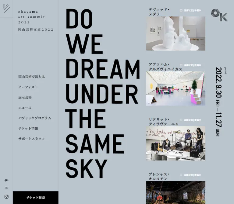
青みのあるグレーに、7段の巨大な英字グラフィックと明朝体を組み合わせた現代美術展の公式サイト。固定サイドナビ、作品写真、横並びのアーティスト一覧、ニュース、パブリックプログラムで構成されています。
Okayama Art Summit 2022 — Style Reference
A monumental exhibition poster beside an open archive of artworks, set on cool blue-gray paper.
Website: Okayama Art Summit 2022 Original URL: https://www.okayamaartsummit.jp/2022/ Final URL: https://www.okayamaartsummit.jp/2022/ Theme: a light blue-gray canvas, black typography, and a dark gray footer; no theme selector was observed. Inspected: October 2, 2026 at 03:48 JST / October 1, 2026 at 18:48 UTC, according to the supplied browser capture timestamp. Viewports: 1440 × 1000 desktop and 390 × 844 mobile, in CSS pixels. Scope: the currently served Japanese 2022-edition homepage: closed navigation, opening theme graphic, seven featured artworks, artist strip, news, public programs, and footer. Additional navigation-layer elements are present in the DOM, but their open state was not demonstrated.
The page combines the force of an exhibition poster with the reading rhythm of a cultural publication. Seven enormous uppercase words—“DO / WE / DREAM / UNDER / THE / SAME / SKY”—establish the opening composition. Japanese serif captions, small status labels, and unframed installation photographs sit alongside them. A restrained interface lets the artwork supply almost all chromatic variation.
Desktop navigation occupies a persistent two-part left column. The remaining page is deliberately asymmetric: the headline fills one side of the opening, artworks form a long column on the other, and a narrow right margin carries the event mark and vertically oriented dates. Later sections become an editorial sequence of horizontal artwork previews, unequal news columns, public-program entries, and generous empty space.
This is a functioning exhibition archive homepage. The visible artwork status is “終了しました,” and the displayed period is September 30–November 27, 2022. Those historical event dates do not indicate that the website is discontinued. The current page still exposes artist records, news, program archives, language navigation, and a ticket-sales link.
閉じる
Okayama Art Summit 2022 — Style Reference
A monumental exhibition poster beside an open archive of artworks, set on cool blue-gray paper.
Website: Okayama Art Summit 2022 Original URL: https://www.okayamaartsummit.jp/2022/ Final URL: https://www.okayamaartsummit.jp/2022/ Theme: a light blue-gray canvas, black typography, and a dark gray footer; no theme selector was observed. Inspected: October 2, 2026 at 03:48 JST / October 1, 2026 at 18:48 UTC, according to the supplied browser capture timestamp. Viewports: 1440 × 1000 desktop and 390 × 844 mobile, in CSS pixels. Scope: the currently served Japanese 2022-edition homepage: closed navigation, opening theme graphic, seven featured artworks, artist strip, news, public programs, and footer. Additional navigation-layer elements are present in the DOM, but their open state was not demonstrated.
The page combines the force of an exhibition poster with the reading rhythm of a cultural publication. Seven enormous uppercase words—“DO / WE / DREAM / UNDER / THE / SAME / SKY”—establish the opening composition. Japanese serif captions, small status labels, and unframed installation photographs sit alongside them. A restrained interface lets the artwork supply almost all chromatic variation.
Desktop navigation occupies a persistent two-part left column. The remaining page is deliberately asymmetric: the headline fills one side of the opening, artworks form a long column on the other, and a narrow right margin carries the event mark and vertically oriented dates. Later sections become an editorial sequence of horizontal artwork previews, unequal news columns, public-program entries, and generous empty space.
This is a functioning exhibition archive homepage. The visible artwork status is “終了しました,” and the displayed period is September 30–November 27, 2022. Those historical event dates do not indicate that the website is discontinued. The current page still exposes artist records, news, program archives, language navigation, and a ticket-sales link.
How to Read This Reference
- Measured values come from the supplied computed styles and element rectangles. They describe the two inspected viewports, not a recovered responsive stylesheet.
- Derived values are arithmetic based on those measurements, such as inter-item gaps and image proportions.
- Estimated values describe screenshot appearance where the corresponding computed style was not supplied. Footer colors and several lower-page text sizes fall into this category.
- Recommended values and behaviors belong to the reusable implementation, including its breakpoint, focus treatment, and native horizontal overflow.
- Custom-property names in this document are implementation aliases. The supplied custom-property export was empty; these names are not claimed to exist in the original source.
- Nonzero DOM rectangles do not establish visibility. The extracted navigation directory overlaps the opening composition in the element data but is absent from the closed-menu screenshots. Its measurements are kept separate from the visible page.
Tokens — Colors
Default Palette
| Name | Value | Suggested token | Evidence and role |
|---|---|---|---|
| Blue-Gray Canvas | #b9c4cd |
--oas-canvas |
Measured body background: rgb(185, 196, 205) at both viewports. Used throughout the main page and desktop navigation. |
| Black Ink | #000000 |
--oas-ink |
Measured text color. Also visible in the large theme graphic, event mark, dates, and ticket strip. |
| Reversed White | #ffffff |
--oas-reversed |
Measured status and desktop ticket-link text; visually used for footer graphics and links. |
| Footer Gray | Approximately #5c5c5c |
--oas-footer |
Screenshot estimate, not a supplied computed value. A broad, flat terminal surface. |
| Secondary Gray | Approximately #686c6f |
--oas-muted |
Screenshot estimate for dates, category labels, and thin directional graphics. |
| Quiet Divider | Recommended rgba(0, 0, 0, 0.08) |
--oas-rule |
Approximation of the faint desktop rail boundaries. Exact border color was not exported. |
| Status Ring | Approximately #737779 |
--oas-status-ring |
Screenshot estimate for the small outlined circle before the ended label. |
The blue-gray is the defining interface color. Do not replace it with neutral white or treat it as a temporary overlay. It remains consistent from the opening through the news and public-program sections.
The desktop ticket area is visibly black, although the anchor itself reports a transparent background. The fill therefore belongs to another rendering layer or ancestor; the screenshot establishes the final appearance, not which node paints it.
There is no observed multicolor badge system or separate promotional accent color. Blue skies, green lawns, red lips, metallic sculpture, and printed posters obtain their colors from the content images.
Contrast Considerations
White on the measured canvas has a calculated contrast ratio of approximately 1.8:1. The original status labels are therefore visually faint, especially at their 10–11px size. For an accessible adaptation, retain the small ring-and-label anatomy but use dark text, or place reversed text on a sufficiently dark backing. This is a recommended improvement, not an observed original feature.
Tokens — Typography
Editorial Text
Measured computed stack:
font-family: YakuHanJP, "EB Garamond", "Noto Serif JP", sans-serif;
The body uses 15px, 500 weight, and 30px line height at both inspected widths. The combination gives Japanese content a literary, exhibition-catalog character, while Latin labels and dates remain delicate.
This is the reported font-family declaration. It does not independently prove which font file rendered every glyph. Preserve the declared stack when the corresponding assets are available; do not substitute an unrelated interface sans-serif across the entire page.
Theme Graphic
The opening words look like extremely large, heavy, condensed sans-serif lettering. Their paragraph wrappers nevertheless report the body’s 15px / 30px typography. Those inherited values do not describe the visible letters.
The evidence establishes the graphic’s appearance and layout boxes, but does not identify its typeface or asset format. Treat each word as a supplied graphic with a consistent canvas, or use a clearly labeled approximation during development. Do not claim a specific display font based on appearance alone.
The words occupy seven separate lines. Short words retain their natural shorter ink widths within the same layout width; they are not stretched to make every line equally wide.
Identity, Dates, and Small Graphics
The identity appears as a widely spaced lowercase English wordmark with a Japanese line beneath it. Its desktop sidebar version is tall and stacked; the phone header uses a compact horizontal version. Their visual lettering should not be inferred from the inherited font on their empty links.
The event dates use a contrasting bold sans-serif appearance and rotate the reading direction down the right side. The exact date typeface was not established.
Type Scale
| Role | Desktop | Mobile | Evidence |
|---|---|---|---|
| Body default | 15px / 30px, weight 500 |
Same | Measured |
| Persistent sidebar links | 15px / 15px, weight 500 |
Sidebar absent in closed state | Measured; anchors add 10px bottom padding |
| Language links | 12px / 12px, weight 600 |
Same in DOM navigation layer | Measured; 7px vertical padding |
| Desktop ticket label | 14px / 28px |
DOM navigation ticket: 13px / 26px |
Measured; phone ticket is not visible in the closed capture |
| Featured artist name | 22px / 22px |
25px / 25px |
Measured; mobile tracking is -0.75px, equivalent to -0.03em |
| Featured name line spacing | 26px between line starts | 33px between line starts | Derived from separate paragraph positions |
| Artwork status wrapper | 11px / 11px |
10px / 10px |
Measured; screenshot supplies the visible label |
| Artist section heading | 34px / 34px |
22px / 22px |
Measured |
| Artist-strip caption | 17px / 25.5px |
13px / 19.5px |
Measured |
| Expanded-navigation primary links | 24px / 24px |
20px / 20px |
DOM-only measurement; open state unverified |
| Expanded-navigation item counts | 10px / 10px |
Same | DOM-only measurement |
| News feature headline | Approximately 22–24px | Not established | Desktop screenshot estimate |
| Secondary news headline | Approximately 18px with generous leading | Not established | Desktop screenshot estimate |
| Footer links | Approximately 12px | Approximately 11px | Screenshot estimate |
The phone version does not simply reduce all typography. Featured artist names become larger, while section headings and strip captions become smaller. Preserve this distinction when adapting the hierarchy.
Tokens — Spacing & Shapes
Overall density: small navigation and metadata around very large graphics, wide images, and substantial section gaps.
Shape language: square image edges, rectangular regions, fine rules, and a small number of circles used as status symbols. No rounded-card or shadow-based elevation system is visible.
Spacing Scale
| Use | Desktop | Mobile | Evidence |
|---|---|---|---|
| Utility rail width | 58px | Not present as a rail | Measured |
| Navigation panel width | 207px | Not present in closed state | Measured |
| Total desktop navigation reservation | 265px | 0px | Measured / derived |
| Sidebar panel inset | 25px horizontally; 44px at top | — | Measured |
| Standard lower-section inset | 55px from main-area edges | 25px from viewport edges | Measured from artist-section positions |
| Opening word left inset | 30px from main-area edge | 25px from viewport edge | Measured / derived |
| Gap between word boxes | 22px | 13px | Derived |
| Featured-image-to-next-name gap | 55px | 40px | Derived |
| Featured name left inset from image | 10px | 15px | Derived |
| Gap before artist section | 155px after opening composition | 100px | Derived |
| Artist-strip horizontal gap | 55px | 28px | Derived |
| Gap after mobile theme graphic | — | 80px before first featured name | Derived |
| Footer side inset | Approximately 55px | Approximately 35–40px | Screenshot estimate |
Border Radius
| Element | Treatment |
|---|---|
| Artwork photographs | Square corners |
| News and program thumbnails | Square corners |
| Sidebar ticket strip | Rectangular, flush with navigation edges |
| Footer | Full rectangular field |
| Status symbol | Small circular outline |
| Links and category labels | Unboxed text; occasional fine underline |
Sampled element styles consistently report a 0px border radius. The status circle is a separate visual motif, not evidence of a general rounded-component system.
Layout Measurements
| Element | Desktop: 1440 × 1000 | Mobile: 390 × 844 |
|---|---|---|
| Document height | 6793.56px; rounded export 6794px | 6539.44px; rounded export 6539px |
| Header region | 265 × 1000px at (0, 0) |
390 × 65px at (0, 0) |
| Primary identity link | 157 × 97.08px at (83, 44) |
206 × 31px at (25, 17) |
| Menu graphic wrapper | 30 × 39px at (15.5, 17.5) |
39 × 30px at (331, 16) |
| Opening main region | 1175px wide, starting at x = 265px | 390px wide, starting at y = 65px |
| Each theme-word box | 527.5 × 142.78px | 260 × 70.375px |
| First theme-word position | (295, 40) |
(25, 90) |
| Complete seven-word stack | Approximately 1131.47px tall | 570.625px tall |
| Featured-art column | 457.5px wide, x = 852.5px | 340px wide, x = 25px |
| First featured image | 457.5 × 265.56px at y = 84px | 340 × 197.36px at y = 796.625px |
| Artist-section heading | (320, 2715.94) |
(25, 2854.14) |
| Artist-strip item width | 432px | 202px |
| Footer visible height in bottom capture | Approximately 490px | Approximately 483px |
Featured-image rectangles have a derived width-to-height ratio of approximately 1.723:1, or a height around 58.05% of width, at both sizes. This is more faithful than automatically assigning every image a 16:9 ratio.
The opening and lower sections deliberately use different alignments. Desktop words begin 30px inside the main area, while the artist section begins 55px inside it. Do not force every component onto one universal left edge.
Components
Desktop Navigation Frame
Role: persistent identity, site navigation, language access, and ticket entry.
The left frame consists of a 58px utility rail and a 207px navigation panel, separated by faint vertical rules. Their positions remain consistent across the supplied top, middle, and bottom desktop captures, supporting a persistent desktop treatment.
The utility rail places a diagonal-line menu graphic at the top and JP, EN, and Instagram controls near the bottom. The main panel places the stacked wordmark at (83, 44), a vertical list of seven primary destinations through the middle, and a black ticket strip at the bottom.
Primary links begin 47px apart: each measured link box is 25px high, including its 10px bottom padding, leaving a derived 22px interval. The ticket area is 207 × 58px, aligned to the panel rather than the full 265px frame.
The “チケット販売” link points to https://www.e-tix.jp/okayamaartsummit/. Its presence is verified; the external ticket destination and purchase flow were not inspected.
Mobile Header and Menu Trigger
Role: retain identity while releasing the page width for the exhibition graphic.
At 390px, the desktop frame becomes a 65px-high horizontal header. The identity link is 206 × 31px at a 25px left inset. The diagonal menu graphic sits at the upper right and changes orientation/proportions relative to its desktop presentation.
The menu trigger remains visible in the supplied lower mobile capture, while the initial wordmark is no longer visible. This supports a persistent trigger, but does not establish that the entire identity header remains fixed.
Use the diagonal line motif as part of the identity. A generic three-horizontal-bar icon would alter the visual character. Its observed graphic is small; a recommended implementation can provide a larger invisible hit area without enlarging the strokes.
Seven-Line Theme Graphic
Role: the page’s dominant visual statement.
Preserve this explicit sequence:
DO
WE
DREAM
UNDER
THE
SAME
SKY
On desktop, the graphic occupies a left-hand column beside the featured artworks. Each word has the same 527.5px-wide layout canvas and an approximately 142.78px-high box, with 22px between boxes. The entire phrase extends beyond the first 1000px viewport.
On mobile, the boxes become 260 × 70.375px with 13px gaps. The complete phrase fits between approximately y = 90px and y = 661px. The artist sequence follows after an 80px pause.
Avoid fitting the entire desktop statement into the first screen by reducing its scale. Its partial first-screen visibility is part of the measured composition. Likewise, do not reflow it into an ordinary two- or three-line headline on phones.
OK Mark and Vertical Event Period
Role: reinforce event identity in the otherwise open right margin.
The black OK mark combines a radial striped O with a diagonal striped K. It sits near the upper right of the opening on both viewports. A larger white version returns at the center of the footer.
The date graphic runs down the right side and displays “2022.9.30 (FRI) — 11.27 (SUN)” with a small “period” label. On mobile, this date remains beside the word stack instead of moving into a horizontal metadata row.
The exact asset URLs and font were not supplied. Use authorized identity artwork when available, preserving stripe density, orientation, and clear space. The captures do not establish whether the opening mark or dates are sticky during intermediate scrolling.
Featured Artwork Entry
Role: pair an artist with an immediate view of their work.
Each entry has a compact caption area above a wide, square-cornered photograph. The artist name is deliberately split across two lines. A small gray outlined circle and white “終了しました” label sit toward the right of the caption area.
Desktop anatomy:
- Image width: 457.5px; image height: 265.56px.
- Name inset: 10px from the image’s left edge.
- Name typography: 22px, with 26px between line starts.
- First caption begins at y = 36px; image begins at y = 84px.
- Next caption starts 55px after the previous image ends.
Mobile anatomy:
- Image width: 340px; image height: 197.36px.
- Name inset: 15px.
- Name typography: 25px, tracking
-0.03em, with 33px between line starts. - Images sit closely beneath the names; measured line boxes nearly meet the image edge.
- The interval before the next artist is 40px.
Seven entries are present in the supplied opening sequence. The first visible works are labeled “梁慧圭,” “島袋 / 道浩,” and “リジア・ / クラーク.” The photographs link to artist-specific query URLs.
The extracted section text also contains opening-hour strings. These do not override the visibly rendered ended status or establish current opening hours. Implement status from explicit event data rather than interpreting any time range as an open state.
Artist Strip
Role: browse the broader artist roster after the featured sequence.
A serif “アーティスト” heading introduces an unboxed horizontal row of artwork previews. The evidence contains 23 distinct artist destinations; duplicate links also occur in the navigation layer and should not be counted as additional artists.
Desktop items are 432px wide, with starts at x = 320, 807, and 1294px. The third item is partially visible at the viewport edge, making continuation apparent. Captions sit below the images, with the status aligned toward the right.
Mobile items are 202px wide with 28px gaps. Caption type drops to 13px, and the status occupies a subsequent row instead of sharing the desktop caption line.
The geometry proves that the row extends horizontally. It does not prove autoplay, dragging, snapping, or a particular carousel library. A native, keyboard-accessible horizontal scroller is a recommended implementation choice.
News Editorial Layout
Role: surface institutional updates without abandoning the exhibition’s visual language.
The supplied desktop middle capture shows a large “ニュース” heading followed by two unequal columns. The left feature is approximately 533px wide; the right column approximately 472px, separated by about 60px. These are screenshot estimates rather than exported grid values.
The feature article presents a large image, then a category/date line, then a larger headline. The right column contains compact text entries with dates, underlined categories, and optional small thumbnails aligned to the right. Entries remain open on the canvas; there are no enclosing white cards or decorative shadows.
The featured image is a screenshot of another edition’s website within a news article. It is article media, not evidence that this inspected URL redirected or adopted that embedded page’s design.
Some news entries have no thumbnail. Preserve that variation rather than inserting identical placeholder image boxes into every row.
Public Program Layout
Role: connect exhibition activity to community participation and archived projects.
The DOM provides an introductory description and entries for community gatherings, a student journalism project, open-call projects, a closing event, school videos, and a participant call.
The lower desktop capture shows a large photographic feature on the right and smaller editorial entries on the left. One compact entry pairs a headline and underlined “参加者募集” category with a small portrait flyer. The larger entry uses a substantial photograph, a larger serif title, and an underlined “ARCHIVE” label.
The mobile bottom capture shows a compact text-and-flyer row within the 25px content inset, followed by a right-aligned view-all treatment and a generous gap before the footer. The complete mobile program ordering was not visually documented.
View-All Link
Role: provide a quiet transition from a preview section to its full index.
“VIEW ALL” is plain serif text paired with a long, thin arrow. There is no pill, filled button, or enclosing card. In the desktop captures, the text begins at the section’s left edge while the arrow sits well to its right. In the mobile bottom capture, the combined control is aligned toward the right side.
A useful adaptation is a flex row with a restrained label and a 140–165px arrow. Those arrow lengths are screenshot estimates. Keep a generous interaction area while retaining the thin visible geometry.
Footer
Role: provide a decisive visual endpoint and secondary navigation.
The footer changes the main content area to dark gray and reverses its details to white. On desktop it begins at x = 265px, leaving the persistent navigation visible. On mobile it spans the full viewport width.
Its anatomy is consistent across the supplied captures:
- A small, widely spaced identity at the upper left.
- An upward arrow at the upper right.
- A large centered striped OK mark.
- Support, press, collaboration, access, and contact links near the bottom.
- A small copyright line.
The central mark appears approximately 140 × 105px at both sizes. Keeping it similar in absolute size gives it much greater relative prominence on a phone.
Desktop secondary links sit along the lower left while copyright sits at the lower right. Mobile links are centered above the copyright. The arrow visually suggests a return-to-top action, but activation and scrolling behavior were not tested.
Unopened Navigation Layer
Role suggested by the DOM: an expanded site directory associated with the menu control.
The supplied element export includes both “menu” and “close,” a second set of larger navigation links, item counts, and an artist directory. Its primary links report white text at 24px desktop and 20px mobile. Artist previews are arranged in three columns in the desktop element geometry and two columns on mobile.
These nodes are not visible in the supplied closed-menu screenshots. Their backdrop, entry direction, focus behavior, scroll locking, and actual open-state appearance remain unverified. Do not use their white text or overlapping rectangles to reinterpret the visible homepage as an open overlay.
Tokens — Motion & Interaction
| Treatment | Supplied evidence | What can be concluded |
|---|---|---|
| Theme-word wrappers | 1.5s cubic-bezier(1, 0, 0, 1) transition |
A long transition is declared. Animated property, trigger, displacement, and staggering were not established. |
| Navigation and identity links | 0.4s cubic-bezier(0.075, 0.82, 0.165, 1) transition |
A shorter easing is declared. Hover or active-state endpoints were not demonstrated. |
| Sampled keyframe animations | animation: none on exported elements |
No active keyframe animation is reported for those sampled nodes. This does not rule out scripts, descendants, or other states. |
| Artist strip | Successive items extend beyond the viewport | Horizontal continuation is established; autoplay, drag, snap, and arrow behavior are unverified. |
| Desktop navigation | Same frame visible across scroll captures | Persistent desktop navigation is supported by screenshots. |
| Mobile menu trigger | Visible at the top and near the document end | Persistent trigger is supported; open/close interaction is untested. |
| Footer upward arrow | Visible directional control | Intended direction is apparent; activated behavior is unverified. |
| Artist, index, and category links | Explicit hrefs in rendered DOM | Destinations are known. Their resulting page states were not inspected. |
Do not convert these observations into invented parallax, automatic image cycling, or scroll-scrubbed typography. The settled captures establish composition, while the computed transitions establish only timing declarations.
For a new implementation, use the measured easing values only where a purposeful state change exists. Keep the default visible content usable without animation, and disable nonessential motion for reduced-motion preferences.
Surfaces
| Layer | Appearance | Structural role |
|---|---|---|
| Main canvas | Solid #b9c4cd |
Unifies the opening, artist previews, news, and programs |
| Desktop navigation | Same canvas with faint rules | Separates persistent controls without introducing another large color field |
| Artwork and editorial media | Natural-color rectangular images | Supplies visual variety and subject matter |
| Metadata | Small gray or white text, occasional underline | Adds categories, dates, and event state with little visual weight |
| Ticket strip | Black rectangle with white label | Concentrates the strongest filled action treatment in the sidebar |
| Footer | Estimated dark gray with white graphics | Terminates the page and houses secondary links |
Hierarchy comes from size, position, image edges, and open space. A conventional card surface system would weaken the relationship between the page and an exhibition poster.
Imagery
Artwork documentation is central. The first desktop capture includes an installation in a concrete interior, a small craft on open water beneath a broad sky, and a sharply folded metallic sculpture. The middle capture adds a staged band scene and a close-up face with a strong red-lip accent. Public-program imagery includes aerial views of a lawn and information-dense printed flyers.
Keep these distinctions intact:
- Installation photography should retain architectural context and spatial depth.
- Seascapes need room for the horizon and sky.
- Sculpture images should preserve material highlights and angular silhouettes.
- Flyers and posters should remain legible as documents, preferably without aggressive cropping.
- Website screenshots used in news should remain recognizable as screenshots.
There is no observed global duotone, tint overlay, film-grain treatment, or rounded image mask. Use full-color media against the restrained interface palette.
Observed Asset References
The supplied evidence contains link destinations, not image src values or an asset manifest. The URLs below identify the original-page contexts associated with visible media; they are not image-file URLs and were not separately visited.
| Visible media or graphic | Context in the original page | File-path evidence |
|---|---|---|
| Interior installation under “梁慧圭” | Artist 23 | Image path not supplied |
| Sea-and-sky work under “島袋道浩” | Artist 20 | Image path not supplied |
| Metallic sculpture under “リジア・クラーク” | Artist 6 | Image path not supplied |
| Band scene in artist strip | Artist 1 | Image path not supplied |
| Website screenshot in lead news | News 860 | Image path not supplied |
| Lawn gathering feature | Public program 717 | Image path not supplied |
| Participant-call flyer | Public program 636 | Image path not supplied |
| Seven theme words, identity, OK marks, and period graphic | Opening and footer of the homepage | Format and paths not supplied |
Use authorized original artwork where available. CSS can recreate the layout and surfaces, but generic stock imagery cannot reproduce the exhibition’s content identity.
Layout & Responsive Behavior
Desktop Composition
The 265px navigation reservation leaves 1175px for the opening. The featured-art column begins halfway across that remaining width, at x = 852.5px. A 130px right reservation leaves the artwork column 457.5px wide and provides space for the event graphics.
The word graphic begins at x = 295px, 30px inside the main area. Its 527.5px canvas corresponds to half the main-area width minus 60px. This relationship explains the balanced but asymmetric opening without assuming a generic centered maximum-width container.
The seven featured artworks make the opening region approximately 2561px tall. The artist section follows 155px later. Lower sections use 55px side insets, producing a 1065px content region at this viewport.
Mobile Composition
At 390px, the navigation reservation disappears and the header occupies 65px above the content. The opening uses 25px side padding. The 260px-wide statement leaves an 80px band inside the content width for the identity/date composition.
The featured artworks follow the complete theme graphic rather than remaining beside it. Their images use the full 340px content width. Featured names become larger, while the artist section heading shrinks from 34px to 22px.
The artist strip remains horizontal: a complete 202px item and part of the next item fit within the viewport. It does not become a fully visible two-column homepage grid. The separate two-column directory in the DOM belongs to the unverified navigation layer.
The footer spans the viewport, centers its large emblem, and moves copyright beneath the secondary links. The observed phone content still has substantial pauses; spacing is reduced selectively, not compressed everywhere.
Responsive Limits
Only two viewport widths were supplied. The exact breakpoint, tablet composition, landscape behavior, and fluid interpolation cannot be recovered from them. The mobile news interior and complete public-program ordering were not captured visually.
The Quick Start uses 1024px as a recommended breakpoint, not a source value. It proposes a single-column editorial layout below that width and native horizontal overflow for the artist strip. Validate those choices against real content at intermediate widths.
Do’s and Don’ts
Do
- Use the measured
#b9c4cdcanvas across navigation and content. - Preserve all seven explicit word breaks in the exhibition theme.
- Keep the large display graphic distinct from the editorial font stack.
- Reserve 265px for the desktop navigation, split into 58px and 207px parts.
- Preserve different desktop alignments for the opening words and lower editorial sections.
- Place artist names close to the top of their photographs.
- Retain the approximately 1.723:1 featured-image proportion.
- Make featured names larger on mobile while reducing section headings and strip captions.
- Let the artist row visibly continue beyond the viewport.
- Use natural-color art documentation and square image corners.
- Pair quiet “VIEW ALL” text with a long, fine arrow.
- Preserve the broad dark footer and its centered striped emblem.
- Reflect the current ended state in archive content.
Don’t
- Don’t infer a display-font name from the graphic’s appearance or its inherited 15px wrapper style.
- Don’t shrink the desktop statement solely to fit it into the first viewport.
- Don’t replace the long exhibition homepage with a short sales funnel.
- Don’t introduce rounded cards, ornamental gradients, or a general shadow system.
- Don’t turn every photograph, flyer, and news screenshot into the same crop.
- Don’t mistake hidden navigation-directory geometry for visible homepage content.
- Don’t claim autoplay, dragging, parallax, or a menu transition that was not exercised.
- Don’t interpret a retained ticket link or DOM opening-hour string as proof that the exhibition is currently open.
- Don’t use tiny white-on-blue-gray status text unchanged when accessibility is a requirement.
- Don’t assume the embedded news screenshot describes the surrounding site’s current design.
Recommended Implementation Additions
These are improvements for a new implementation, not verified original features:
- Provide one meaningful textual heading for the complete exhibition theme. If decorative word graphics duplicate it, hide those duplicate graphics from assistive technology.
- Give the menu, Instagram icon, and upward arrow accessible names and at least approximately 44px interaction areas.
- Ensure closed navigation content is hidden from keyboard focus and assistive technology. If a modal menu is implemented, manage focus, Escape, and focus restoration explicitly.
- Associate every artwork link with its artist name. Empty link text in this export does not establish whether the original has an accessible name.
- Increase status contrast and consider a 12px minimum for essential metadata.
- Make the artist strip usable through keyboard navigation and touch without requiring a drag gesture.
- Preserve image aspect ratios before loading to reduce layout shifts. Use responsive image sources and appropriate alternative text.
- Use a real anchor for return-to-top behavior and retain functionality without animated scrolling.
- Keep historical status and dates explicit, and maintain ticket availability separately from the visual template.
- Test Japanese name wrapping, long news headlines, and footer links at widths between the two supplied captures.
Agent Prompt Guide
Quick Color Reference
- Main canvas and navigation:
#b9c4cd, measured. - Main typography and event graphics:
#000000, measured. - Reversed labels:
#ffffff, measured. - Footer: approximately
#5c5c5c, estimated. - Secondary text and arrows: approximately
#686c6f, estimated. - Image color: natural, unrestricted artwork photography.
- Filled action: a black rectangular ticket strip with white text.
Overall Prompt
“Create an exhibition archive homepage inspired by Okayama Art Summit 2022. Use a continuous blue-gray canvas #b9c4cd, black graphic lettering, Japanese editorial serif text, square photographs, and generous open space. On desktop, reserve a persistent 265px left navigation frame with a 58px utility rail and a 207px identity/navigation panel. Build the opening around seven separate graphic words—DO, WE, DREAM, UNDER, THE, SAME, SKY—beside a vertical sequence of captioned artworks. Place a striped event emblem and vertical period graphic in the right margin. Follow with a horizontally extending artist strip, unequal editorial news columns, public-program entries, and a dark gray footer with a centered white emblem. On a 390px phone, use a 65px header, 25px page insets, the complete seven-line statement before the artwork sequence, 340px-wide featured images, and larger 25px artist names. Use supplied identity artwork; do not invent its font or unverified motion.”
Example Component Prompts
- Desktop navigation: “Create a persistent blue-gray left frame split into a 58px utility rail and a 207px navigation panel. Place a delicate diagonal menu symbol above bottom-aligned language/social links. Use a stacked tracked wordmark, seven 15px serif navigation links, faint vertical rules, and a flush 58px-high black ticket strip.”
- Featured artwork: “Place a two-line Japanese serif artist name immediately above a wide, square-cornered photograph. Use a small outlined-circle status at the upper right. At desktop size, use a 457.5 × 265.56px image and 22px names; at 390px, use a 340 × 197.36px image and 25px names. Keep the surface unboxed.”
- Artist strip: “Build an open horizontal sequence of natural-color artworks, with serif names below and compact event statuses. Use 432px items with 55px gaps on desktop and 202px items with 28px gaps on mobile. Show a partial next item. Implement accessible native scrolling without assuming autoplay.”
- News section: “Create an editorial news section on blue-gray, with a large feature image and headline on the left and a narrower list of dated entries on the right. Underline category labels, allow optional right-side thumbnails, and avoid enclosing cards. Use a single-column phone adaptation as an implementation choice.”
- Footer: “Use a flat dark gray footer with small tracked white identity text at the upper left, a fine upward arrow at the upper right, and an approximately 140px-wide striped white emblem in the center. Place five secondary links and small copyright text near the bottom; center and stack the lower content on phones.”
Quick Start
CSS Custom Properties
This is a recommended adaptation of the measured layout, not recovered source CSS. It reproduces the two main compositions using ordinary CSS pixels and a conventional root size. Approximate colors and the proposed breakpoint are labeled below.
Suggested structure: .oas-sidebar and .oas-mobile-header sit beside .oas-page; the page contains .oas-opening, .oas-section blocks, and .oas-footer. The opening contains .oas-slogan, .oas-featured, and the two event graphics. Each slogan line expects an authorized word graphic with a consistent canvas. Font files, image URLs, menu logic, and identity assets are not bundled with this reference.
:root {
  /* Measured colors */
  --oas-canvas: #b9c4cd;
  --oas-ink: #000000;
  --oas-reversed: #ffffff;

  /* Estimated colors and a recommended divider approximation */
  --oas-footer: #5c5c5c;
  --oas-muted: #686c6f;
  --oas-status-ring: #737779;
  --oas-rule: rgb(0 0 0 / 8%);

  /* Measured editorial declaration; load fonts separately */
  --oas-editorial: YakuHanJP, "EB Garamond", "Noto Serif JP", sans-serif;
  --oas-body: 15px;
  --oas-heading: 34px;
  --oas-feature-name: 22px;
  --oas-caption: 17px;

  /* Desktop geometry */
  --oas-rail: 58px;
  --oas-panel: 207px;
  --oas-sidebar: 265px;
  --oas-section-inset: 55px;
  --oas-section-gap: 155px;
  --oas-art-width: 432px;
  --oas-art-gap: 55px;
  --oas-image-ratio: 457.5 / 265.5625;
  --oas-word-ratio: 527.5 / 142.78125;

  /* Observed timing declarations; triggers remain unspecified */
  --oas-link-motion: 400ms cubic-bezier(0.075, 0.82, 0.165, 1);
  --oas-word-motion: 1500ms cubic-bezier(1, 0, 0, 1);
}

* { box-sizing: border-box; }

body {
  margin: 0;
  color: var(--oas-ink);
  background: var(--oas-canvas);
  font-family: var(--oas-editorial);
  font-size: var(--oas-body);
  font-weight: 500;
  line-height: 2;
}

a { color: inherit; }
button { font: inherit; }
img { display: block; max-width: 100%; }

.oas-sidebar {
  position: fixed;
  inset: 0 auto 0 0;
  z-index: 20;
  display: grid;
  grid-template-columns: var(--oas-rail) var(--oas-panel);
  width: var(--oas-sidebar);
  height: 100dvh;
  background: var(--oas-canvas);
  border-right: 1px solid var(--oas-rule);
}

.oas-utility {
  display: flex;
  flex-direction: column;
  justify-content: space-between;
  align-items: center;
  padding-bottom: 15px;
  border-right: 1px solid var(--oas-rule);
}

.oas-side-panel {
  display: grid;
  grid-template-rows: auto 1fr 58px;
  min-height: 0;
}

.oas-side-brand {
  display: block;
  width: 157px;
  margin: 44px 25px 0;
}

.oas-nav {
  align-self: center;
  display: grid;
  gap: 22px;
  padding-inline: 25px;
}

.oas-nav a {
  padding-bottom: 10px;
  font-size: 15px;
  line-height: 1;
  text-decoration: none;
}

.oas-ticket {
  display: grid;
  place-items: center;
  min-height: 58px;
  color: var(--oas-reversed);
  background: var(--oas-ink);
  font-size: 14px;
  text-decoration: none;
}

.oas-mobile-header { display: none; }
.oas-page { margin-left: var(--oas-sidebar); }

.oas-opening {
  position: relative;
  display: grid;
  grid-template-columns: repeat(2, minmax(0, 1fr));
  align-items: start;
}

.oas-slogan {
  display: grid;
  gap: 22px;
  margin: 40px 30px 0;
}

.oas-slogan-line {
  display: block;
  aspect-ratio: var(--oas-word-ratio);
}

.oas-slogan-line :is(img, svg) {
  display: block;
  width: 100%;
  height: 100%;
  object-fit: contain;
  object-position: left center;
}

.oas-featured { padding: 36px 130px 0 0; }
.oas-feature + .oas-feature { margin-top: 55px; }

.oas-feature-head {
  display: grid;
  grid-template-columns: minmax(0, 1fr) auto;
  gap: 16px;
  min-height: 48px;
  padding-inline: 10px 20px;
}

.oas-feature-name {
  margin: 0;
  font-size: var(--oas-feature-name);
  font-weight: 500;
  line-height: 1;
}

.oas-feature-name span { display: block; }
.oas-feature-name span + span { margin-top: 4px; }

.oas-status {
  display: inline-flex;
  align-items: center;
  gap: 7px;
  color: var(--oas-reversed);
  font-size: 11px;
  line-height: 1;
  white-space: nowrap;
}

.oas-feature-head .oas-status {
  align-self: start;
  margin-top: 14px;
}

.oas-status::before {
  content: "";
  flex: 0 0 11px;
  width: 11px;
  height: 11px;
  border: 3px solid var(--oas-status-ring);
  border-radius: 50%;
}

/* Recommended contrast improvement for essential status text */
.oas-status.is-readable { color: var(--oas-ink); }

.oas-feature-image {
  display: block;
  aspect-ratio: var(--oas-image-ratio);
}

.oas-feature-image img {
  width: 100%;
  height: 100%;
  object-fit: cover;
}

/* These selectors expect supplied identity/date graphics. */
.oas-emblem {
  position: absolute;
  top: 40px;
  right: 28px;
  width: 76px;
}

.oas-period {
  position: absolute;
  top: 342px;
  right: 28px;
  width: 48px;
  height: 320px;
  object-fit: contain;
}

.oas-section {
  margin: var(--oas-section-gap) var(--oas-section-inset) 0;
}

.oas-section-title {
  margin: 0 0 40px;
  font-size: var(--oas-heading);
  font-weight: 500;
  line-height: 1;
}

/* Native scrolling is a recommended implementation choice. */
.oas-artist-track {
  display: flex;
  gap: var(--oas-art-gap);
  overflow-x: auto;
  padding-bottom: 12px;
}

.oas-artist-card {
  flex: 0 0 var(--oas-art-width);
  min-width: 0;
  text-decoration: none;
}

.oas-artist-card > img {
  width: 100%;
  aspect-ratio: var(--oas-image-ratio);
  object-fit: cover;
}

.oas-artist-caption {
  display: flex;
  justify-content: space-between;
  align-items: start;
  gap: 20px;
  margin-top: 12px;
  font-size: var(--oas-caption);
  line-height: 1.5;
}

/* Estimated desktop editorial proportions */
.oas-editorial-grid {
  display: grid;
  grid-template-columns: minmax(0, 1.13fr) minmax(0, 1fr);
  gap: 60px;
}

.oas-news-row {
  display: grid;
  grid-template-columns: minmax(0, 1fr) 140px;
  gap: 20px;
  margin-bottom: 44px;
}

.oas-news-row.is-text-only { grid-template-columns: 1fr; }
.oas-news-row img { width: 100%; height: auto; }

.oas-meta {
  display: flex;
  justify-content: space-between;
  gap: 16px;
  color: var(--oas-muted);
  font-size: 14px;
}

.oas-category { text-underline-offset: 6px; }
.oas-article-title { margin: 16px 0 0; font-size: 22px; line-height: 1.7; }
.oas-news-row .oas-article-title { font-size: 18px; }

.oas-view-all {
  display: flex;
  align-items: center;
  justify-content: space-between;
  width: min(362px, 100%);
  min-height: 44px;
  margin-top: 40px;
  font-size: 15px;
  text-decoration: none;
}

.oas-view-all-arrow {
  position: relative;
  width: 164px;
  height: 1px;
  background: var(--oas-muted);
}

.oas-view-all-arrow::after {
  content: "";
  position: absolute;
  top: -3px;
  right: 0;
  width: 6px;
  height: 6px;
  border-top: 1px solid var(--oas-muted);
  border-right: 1px solid var(--oas-muted);
  transform: rotate(45deg);
}

.oas-footer {
  display: grid;
  grid-template-rows: auto 1fr auto;
  gap: 24px;
  min-height: 490px;
  margin-top: 190px;
  padding: 80px 55px 45px;
  color: var(--oas-reversed);
  background: var(--oas-footer);
}

.oas-footer-top,
.oas-footer-bottom {
  display: flex;
  justify-content: space-between;
  align-items: center;
  gap: 24px;
}

.oas-footer-mark { width: 140px; place-self: center; }
.oas-footer-links { display: flex; flex-wrap: wrap; gap: 28px; font-size: 12px; }
.oas-footer a { text-decoration: none; }
.oas-copyright { margin: 0; font-size: 10px; }

:where(.oas-page, .oas-sidebar, .oas-mobile-header) :focus-visible {
  outline: 2px solid currentColor;
  outline-offset: 4px;
}

/* Recommended breakpoint; the original threshold is unknown. */
@media (max-width: 1024px) {
  :root {
    --oas-heading: 22px;
    --oas-feature-name: 25px;
    --oas-caption: 13px;
    --oas-section-inset: 25px;
    --oas-section-gap: 100px;
    --oas-art-width: 202px;
    --oas-art-gap: 28px;
  }

  .oas-sidebar { display: none; }
  .oas-page { margin-left: 0; }

  .oas-mobile-header {
    position: relative;
    display: block;
    height: 65px;
  }

  .oas-mobile-brand {
    position: absolute;
    top: 17px;
    left: 25px;
    width: 206px;
  }

  .oas-mobile-menu {
    position: fixed;
    top: 10px;
    right: 15px;
    z-index: 30;
    width: 44px;
    height: 44px;
    padding: 0;
    border: 0;
    color: inherit;
    background: transparent;
  }

  .oas-opening { display: block; padding: 25px 25px 0; }
  .oas-slogan { width: calc(100% - 80px); margin: 0; gap: 13px; }
  .oas-featured { padding: 80px 0 0; }
  .oas-feature + .oas-feature { margin-top: 40px; }

  /* A safe 58px caption height avoids overlapping line boxes. */
  .oas-feature-head { min-height: 58px; padding-left: 15px; }
  .oas-feature-name { letter-spacing: -0.03em; }
  .oas-feature-name span + span { margin-top: 8px; }
  .oas-feature-head .oas-status { margin-top: 25px; }
  .oas-status { font-size: 10px; }

  .oas-emblem { top: 23px; right: 15px; width: 70px; }
  .oas-period { top: 300px; right: 25px; width: 40px; height: 245px; }
  .oas-section-title { margin-bottom: 20px; }
  .oas-artist-caption { display: grid; gap: 10px; }

  /* Proposed stacking; the complete phone news layout was not captured. */
  .oas-editorial-grid { grid-template-columns: 1fr; gap: 40px; }
  .oas-news-row { grid-template-columns: minmax(0, 1fr) 90px; gap: 20px; }
  .oas-article-title { font-size: 20px; }
  .oas-news-row .oas-article-title { font-size: 15px; }
  .oas-view-all { width: 225px; margin-left: auto; }
  .oas-view-all-arrow { width: 140px; }

  .oas-footer { min-height: 483px; margin-top: 100px; padding: 40px 35px; }
  .oas-footer-bottom { flex-direction: column; gap: 20px; }
  .oas-footer-links { justify-content: center; gap: 12px; font-size: 11px; }
}

@media (prefers-reduced-motion: reduce) {
  :where(.oas-page, .oas-sidebar, .oas-mobile-header) * {
    animation: none !important;
    transition: none !important;
    scroll-behavior: auto !important;
  }
}
The starter retains the original low-contrast status as a reference and supplies .is-readable as an explicit improvement. Its footer copyright is set to 10px for practical readability rather than attempting to reproduce the smaller screenshot estimate.
Tailwind v4 Token Mapping
Optional aliases for an existing Tailwind v4 project. This does not imply that the original website uses Tailwind. Define the custom properties above first.
@theme inline {
  --color-canvas: var(--oas-canvas);
  --color-ink: var(--oas-ink);
  --color-reversed: var(--oas-reversed);
  --color-footer: var(--oas-footer);
  --color-muted: var(--oas-muted);

  --font-editorial: var(--oas-editorial);
  --text-section: var(--oas-heading);
  --text-feature-name: var(--oas-feature-name);
  --text-artist-caption: var(--oas-caption);

  --spacing-rail: var(--oas-rail);
  --spacing-sidebar: var(--oas-sidebar);
  --spacing-section-inset: var(--oas-section-inset);
  --spacing-artist-gap: var(--oas-art-gap);
}
Sources & Evidence
- Inspected original and final page: https://www.okayamaartsummit.jp/2022/. The supplied observation reports HTTP 200 with no URL change and the title “岡山芸術交流 OKAYAMA ART SUMMIT 2022.”
- Capture timestamp:
2026-10-01T18:48:21.914Z, equivalent to October 2, 2026 at 03:48:21.914 JST. - Visual evidence: three supplied original-page desktop captures at 1440 × 1000 and two mobile captures at 390 × 844, covering the opening, a desktop middle section, and the lower page/footer.
- DOM and computed-style evidence: supplied text, link hrefs, element rectangles, colors, font-family declarations, sizes, weights, line heights, padding, transitions, and animation summaries for both viewports. These support measured tokens; they are not a complete stylesheet or asset manifest.
- Capture procedure: the supplied notes report an initial observation of at least five seconds, readiness checks for load, finite motion, layout/text stability, and visible image decoding, with bounded waiting. Perpetual animations were paused during readiness checks and resumed afterward. SharedWorkers and service workers were disabled.
- Interaction limits: scrolling is represented by the supplied captures. No demonstrated menu opening, link activation, hover endpoint, carousel manipulation, ticket flow, or return-to-top activation was supplied. Delayed content and unexercised motion remain unverified.
- Asset and responsive limits: exact graphic files, headline/date fonts, footer computed styles, source breakpoints, tablet behavior, and the complete mobile news/program layout were not supplied. Estimates and implementation choices are labeled throughout.
This reference describes the current page served at the 2022-edition URL using the supplied evidence. No additional navigation, commands, or file inspection were performed.
# Okayama Art Summit 2022 — Style Reference

> A monumental exhibition poster beside an open archive of artworks, set on cool blue-gray paper.

**Website:** [Okayama Art Summit 2022](https://www.okayamaartsummit.jp/2022/)
**Original URL:** https://www.okayamaartsummit.jp/2022/
**Final URL:** https://www.okayamaartsummit.jp/2022/
**Theme:** a light blue-gray canvas, black typography, and a dark gray footer; no theme selector was observed.
**Inspected:** October 2, 2026 at 03:48 JST / October 1, 2026 at 18:48 UTC, according to the supplied browser capture timestamp.
**Viewports:** 1440 × 1000 desktop and 390 × 844 mobile, in CSS pixels.
**Scope:** the currently served Japanese 2022-edition homepage: closed navigation, opening theme graphic, seven featured artworks, artist strip, news, public programs, and footer. Additional navigation-layer elements are present in the DOM, but their open state was not demonstrated.

The page combines the force of an exhibition poster with the reading rhythm of a cultural publication. Seven enormous uppercase words—“DO / WE / DREAM / UNDER / THE / SAME / SKY”—establish the opening composition. Japanese serif captions, small status labels, and unframed installation photographs sit alongside them. A restrained interface lets the artwork supply almost all chromatic variation.

Desktop navigation occupies a persistent two-part left column. The remaining page is deliberately asymmetric: the headline fills one side of the opening, artworks form a long column on the other, and a narrow right margin carries the event mark and vertically oriented dates. Later sections become an editorial sequence of horizontal artwork previews, unequal news columns, public-program entries, and generous empty space.

This is a functioning exhibition archive homepage. The visible artwork status is “終了しました,” and the displayed period is September 30–November 27, 2022. Those historical event dates do not indicate that the website is discontinued. The current page still exposes artist records, news, program archives, language navigation, and a ticket-sales link.
閉じる
# Okayama Art Summit 2022 — Style Reference

> A monumental exhibition poster beside an open archive of artworks, set on cool blue-gray paper.

**Website:** [Okayama Art Summit 2022](https://www.okayamaartsummit.jp/2022/)
**Original URL:** https://www.okayamaartsummit.jp/2022/
**Final URL:** https://www.okayamaartsummit.jp/2022/
**Theme:** a light blue-gray canvas, black typography, and a dark gray footer; no theme selector was observed.
**Inspected:** October 2, 2026 at 03:48 JST / October 1, 2026 at 18:48 UTC, according to the supplied browser capture timestamp.
**Viewports:** 1440 × 1000 desktop and 390 × 844 mobile, in CSS pixels.
**Scope:** the currently served Japanese 2022-edition homepage: closed navigation, opening theme graphic, seven featured artworks, artist strip, news, public programs, and footer. Additional navigation-layer elements are present in the DOM, but their open state was not demonstrated.

The page combines the force of an exhibition poster with the reading rhythm of a cultural publication. Seven enormous uppercase words—“DO / WE / DREAM / UNDER / THE / SAME / SKY”—establish the opening composition. Japanese serif captions, small status labels, and unframed installation photographs sit alongside them. A restrained interface lets the artwork supply almost all chromatic variation.

Desktop navigation occupies a persistent two-part left column. The remaining page is deliberately asymmetric: the headline fills one side of the opening, artworks form a long column on the other, and a narrow right margin carries the event mark and vertically oriented dates. Later sections become an editorial sequence of horizontal artwork previews, unequal news columns, public-program entries, and generous empty space.

This is a functioning exhibition archive homepage. The visible artwork status is “終了しました,” and the displayed period is September 30–November 27, 2022. Those historical event dates do not indicate that the website is discontinued. The current page still exposes artist records, news, program archives, language navigation, and a ticket-sales link.

## How to Read This Reference

- **Measured** values come from the supplied computed styles and element rectangles. They describe the two inspected viewports, not a recovered responsive stylesheet.
- **Derived** values are arithmetic based on those measurements, such as inter-item gaps and image proportions.
- **Estimated** values describe screenshot appearance where the corresponding computed style was not supplied. Footer colors and several lower-page text sizes fall into this category.
- **Recommended** values and behaviors belong to the reusable implementation, including its breakpoint, focus treatment, and native horizontal overflow.
- Custom-property names in this document are implementation aliases. The supplied custom-property export was empty; these names are not claimed to exist in the original source.
- Nonzero DOM rectangles do not establish visibility. The extracted navigation directory overlaps the opening composition in the element data but is absent from the closed-menu screenshots. Its measurements are kept separate from the visible page.

## Tokens — Colors

### Default Palette

| Name | Value | Suggested token | Evidence and role |
| --- | --- | --- | --- |
| Blue-Gray Canvas | `#b9c4cd` | `--oas-canvas` | Measured body background: `rgb(185, 196, 205)` at both viewports. Used throughout the main page and desktop navigation. |
| Black Ink | `#000000` | `--oas-ink` | Measured text color. Also visible in the large theme graphic, event mark, dates, and ticket strip. |
| Reversed White | `#ffffff` | `--oas-reversed` | Measured status and desktop ticket-link text; visually used for footer graphics and links. |
| Footer Gray | Approximately `#5c5c5c` | `--oas-footer` | Screenshot estimate, not a supplied computed value. A broad, flat terminal surface. |
| Secondary Gray | Approximately `#686c6f` | `--oas-muted` | Screenshot estimate for dates, category labels, and thin directional graphics. |
| Quiet Divider | Recommended `rgba(0, 0, 0, 0.08)` | `--oas-rule` | Approximation of the faint desktop rail boundaries. Exact border color was not exported. |
| Status Ring | Approximately `#737779` | `--oas-status-ring` | Screenshot estimate for the small outlined circle before the ended label. |

The blue-gray is the defining interface color. Do not replace it with neutral white or treat it as a temporary overlay. It remains consistent from the opening through the news and public-program sections.

The desktop ticket area is visibly black, although the anchor itself reports a transparent background. The fill therefore belongs to another rendering layer or ancestor; the screenshot establishes the final appearance, not which node paints it.

There is no observed multicolor badge system or separate promotional accent color. Blue skies, green lawns, red lips, metallic sculpture, and printed posters obtain their colors from the content images.

### Contrast Considerations

White on the measured canvas has a calculated contrast ratio of approximately **1.8:1**. The original status labels are therefore visually faint, especially at their 10–11px size. For an accessible adaptation, retain the small ring-and-label anatomy but use dark text, or place reversed text on a sufficiently dark backing. This is a recommended improvement, not an observed original feature.

## Tokens — Typography

### Editorial Text

**Measured computed stack:**

```css
font-family: YakuHanJP, "EB Garamond", "Noto Serif JP", sans-serif;
```

The body uses **15px**, **500 weight**, and **30px line height** at both inspected widths. The combination gives Japanese content a literary, exhibition-catalog character, while Latin labels and dates remain delicate.

This is the reported font-family declaration. It does not independently prove which font file rendered every glyph. Preserve the declared stack when the corresponding assets are available; do not substitute an unrelated interface sans-serif across the entire page.

### Theme Graphic

The opening words look like extremely large, heavy, condensed sans-serif lettering. Their paragraph wrappers nevertheless report the body’s `15px / 30px` typography. Those inherited values do **not** describe the visible letters.

The evidence establishes the graphic’s appearance and layout boxes, but does not identify its typeface or asset format. Treat each word as a supplied graphic with a consistent canvas, or use a clearly labeled approximation during development. Do not claim a specific display font based on appearance alone.

The words occupy seven separate lines. Short words retain their natural shorter ink widths within the same layout width; they are not stretched to make every line equally wide.

### Identity, Dates, and Small Graphics

The identity appears as a widely spaced lowercase English wordmark with a Japanese line beneath it. Its desktop sidebar version is tall and stacked; the phone header uses a compact horizontal version. Their visual lettering should not be inferred from the inherited font on their empty links.

The event dates use a contrasting bold sans-serif appearance and rotate the reading direction down the right side. The exact date typeface was not established.

### Type Scale

| Role | Desktop | Mobile | Evidence |
| --- | --- | --- | --- |
| Body default | `15px / 30px`, weight `500` | Same | Measured |
| Persistent sidebar links | `15px / 15px`, weight `500` | Sidebar absent in closed state | Measured; anchors add 10px bottom padding |
| Language links | `12px / 12px`, weight `600` | Same in DOM navigation layer | Measured; 7px vertical padding |
| Desktop ticket label | `14px / 28px` | DOM navigation ticket: `13px / 26px` | Measured; phone ticket is not visible in the closed capture |
| Featured artist name | `22px / 22px` | `25px / 25px` | Measured; mobile tracking is `-0.75px`, equivalent to `-0.03em` |
| Featured name line spacing | 26px between line starts | 33px between line starts | Derived from separate paragraph positions |
| Artwork status wrapper | `11px / 11px` | `10px / 10px` | Measured; screenshot supplies the visible label |
| Artist section heading | `34px / 34px` | `22px / 22px` | Measured |
| Artist-strip caption | `17px / 25.5px` | `13px / 19.5px` | Measured |
| Expanded-navigation primary links | `24px / 24px` | `20px / 20px` | DOM-only measurement; open state unverified |
| Expanded-navigation item counts | `10px / 10px` | Same | DOM-only measurement |
| News feature headline | Approximately 22–24px | Not established | Desktop screenshot estimate |
| Secondary news headline | Approximately 18px with generous leading | Not established | Desktop screenshot estimate |
| Footer links | Approximately 12px | Approximately 11px | Screenshot estimate |

The phone version does not simply reduce all typography. Featured artist names become **larger**, while section headings and strip captions become smaller. Preserve this distinction when adapting the hierarchy.

## Tokens — Spacing & Shapes

**Overall density:** small navigation and metadata around very large graphics, wide images, and substantial section gaps.

**Shape language:** square image edges, rectangular regions, fine rules, and a small number of circles used as status symbols. No rounded-card or shadow-based elevation system is visible.

### Spacing Scale

| Use | Desktop | Mobile | Evidence |
| --- | --- | --- | --- |
| Utility rail width | 58px | Not present as a rail | Measured |
| Navigation panel width | 207px | Not present in closed state | Measured |
| Total desktop navigation reservation | 265px | 0px | Measured / derived |
| Sidebar panel inset | 25px horizontally; 44px at top | — | Measured |
| Standard lower-section inset | 55px from main-area edges | 25px from viewport edges | Measured from artist-section positions |
| Opening word left inset | 30px from main-area edge | 25px from viewport edge | Measured / derived |
| Gap between word boxes | 22px | 13px | Derived |
| Featured-image-to-next-name gap | 55px | 40px | Derived |
| Featured name left inset from image | 10px | 15px | Derived |
| Gap before artist section | 155px after opening composition | 100px | Derived |
| Artist-strip horizontal gap | 55px | 28px | Derived |
| Gap after mobile theme graphic | — | 80px before first featured name | Derived |
| Footer side inset | Approximately 55px | Approximately 35–40px | Screenshot estimate |

### Border Radius

| Element | Treatment |
| --- | --- |
| Artwork photographs | Square corners |
| News and program thumbnails | Square corners |
| Sidebar ticket strip | Rectangular, flush with navigation edges |
| Footer | Full rectangular field |
| Status symbol | Small circular outline |
| Links and category labels | Unboxed text; occasional fine underline |

Sampled element styles consistently report a `0px` border radius. The status circle is a separate visual motif, not evidence of a general rounded-component system.

### Layout Measurements

| Element | Desktop: 1440 × 1000 | Mobile: 390 × 844 |
| --- | --- | --- |
| Document height | 6793.56px; rounded export 6794px | 6539.44px; rounded export 6539px |
| Header region | 265 × 1000px at `(0, 0)` | 390 × 65px at `(0, 0)` |
| Primary identity link | 157 × 97.08px at `(83, 44)` | 206 × 31px at `(25, 17)` |
| Menu graphic wrapper | 30 × 39px at `(15.5, 17.5)` | 39 × 30px at `(331, 16)` |
| Opening main region | 1175px wide, starting at x = 265px | 390px wide, starting at y = 65px |
| Each theme-word box | 527.5 × 142.78px | 260 × 70.375px |
| First theme-word position | `(295, 40)` | `(25, 90)` |
| Complete seven-word stack | Approximately 1131.47px tall | 570.625px tall |
| Featured-art column | 457.5px wide, x = 852.5px | 340px wide, x = 25px |
| First featured image | 457.5 × 265.56px at y = 84px | 340 × 197.36px at y = 796.625px |
| Artist-section heading | `(320, 2715.94)` | `(25, 2854.14)` |
| Artist-strip item width | 432px | 202px |
| Footer visible height in bottom capture | Approximately 490px | Approximately 483px |

Featured-image rectangles have a derived width-to-height ratio of approximately **1.723:1**, or a height around **58.05% of width**, at both sizes. This is more faithful than automatically assigning every image a 16:9 ratio.

The opening and lower sections deliberately use different alignments. Desktop words begin 30px inside the main area, while the artist section begins 55px inside it. Do not force every component onto one universal left edge.

## Components

### Desktop Navigation Frame

**Role:** persistent identity, site navigation, language access, and ticket entry.

The left frame consists of a **58px utility rail** and a **207px navigation panel**, separated by faint vertical rules. Their positions remain consistent across the supplied top, middle, and bottom desktop captures, supporting a persistent desktop treatment.

The utility rail places a diagonal-line menu graphic at the top and JP, EN, and Instagram controls near the bottom. The main panel places the stacked wordmark at `(83, 44)`, a vertical list of seven primary destinations through the middle, and a black ticket strip at the bottom.

Primary links begin 47px apart: each measured link box is 25px high, including its 10px bottom padding, leaving a derived 22px interval. The ticket area is **207 × 58px**, aligned to the panel rather than the full 265px frame.

The “チケット販売” link points to `https://www.e-tix.jp/okayamaartsummit/`. Its presence is verified; the external ticket destination and purchase flow were not inspected.

### Mobile Header and Menu Trigger

**Role:** retain identity while releasing the page width for the exhibition graphic.

At 390px, the desktop frame becomes a **65px-high horizontal header**. The identity link is 206 × 31px at a 25px left inset. The diagonal menu graphic sits at the upper right and changes orientation/proportions relative to its desktop presentation.

The menu trigger remains visible in the supplied lower mobile capture, while the initial wordmark is no longer visible. This supports a persistent trigger, but does not establish that the entire identity header remains fixed.

Use the diagonal line motif as part of the identity. A generic three-horizontal-bar icon would alter the visual character. Its observed graphic is small; a recommended implementation can provide a larger invisible hit area without enlarging the strokes.

### Seven-Line Theme Graphic

**Role:** the page’s dominant visual statement.

Preserve this explicit sequence:

```text
DO
WE
DREAM
UNDER
THE
SAME
SKY
```

On desktop, the graphic occupies a left-hand column beside the featured artworks. Each word has the same 527.5px-wide layout canvas and an approximately 142.78px-high box, with 22px between boxes. The entire phrase extends beyond the first 1000px viewport.

On mobile, the boxes become 260 × 70.375px with 13px gaps. The complete phrase fits between approximately y = 90px and y = 661px. The artist sequence follows after an 80px pause.

Avoid fitting the entire desktop statement into the first screen by reducing its scale. Its partial first-screen visibility is part of the measured composition. Likewise, do not reflow it into an ordinary two- or three-line headline on phones.

### OK Mark and Vertical Event Period

**Role:** reinforce event identity in the otherwise open right margin.

The black OK mark combines a radial striped O with a diagonal striped K. It sits near the upper right of the opening on both viewports. A larger white version returns at the center of the footer.

The date graphic runs down the right side and displays “2022.9.30 (FRI) — 11.27 (SUN)” with a small “period” label. On mobile, this date remains beside the word stack instead of moving into a horizontal metadata row.

The exact asset URLs and font were not supplied. Use authorized identity artwork when available, preserving stripe density, orientation, and clear space. The captures do not establish whether the opening mark or dates are sticky during intermediate scrolling.

### Featured Artwork Entry

**Role:** pair an artist with an immediate view of their work.

Each entry has a compact caption area above a wide, square-cornered photograph. The artist name is deliberately split across two lines. A small gray outlined circle and white “終了しました” label sit toward the right of the caption area.

Desktop anatomy:

- Image width: 457.5px; image height: 265.56px.
- Name inset: 10px from the image’s left edge.
- Name typography: 22px, with 26px between line starts.
- First caption begins at y = 36px; image begins at y = 84px.
- Next caption starts 55px after the previous image ends.

Mobile anatomy:

- Image width: 340px; image height: 197.36px.
- Name inset: 15px.
- Name typography: 25px, tracking `-0.03em`, with 33px between line starts.
- Images sit closely beneath the names; measured line boxes nearly meet the image edge.
- The interval before the next artist is 40px.

Seven entries are present in the supplied opening sequence. The first visible works are labeled “梁慧圭,” “島袋 / 道浩,” and “リジア・ / クラーク.” The photographs link to artist-specific query URLs.

The extracted section text also contains opening-hour strings. These do not override the visibly rendered ended status or establish current opening hours. Implement status from explicit event data rather than interpreting any time range as an open state.

### Artist Strip

**Role:** browse the broader artist roster after the featured sequence.

A serif “アーティスト” heading introduces an unboxed horizontal row of artwork previews. The evidence contains **23 distinct artist destinations**; duplicate links also occur in the navigation layer and should not be counted as additional artists.

Desktop items are 432px wide, with starts at x = 320, 807, and 1294px. The third item is partially visible at the viewport edge, making continuation apparent. Captions sit below the images, with the status aligned toward the right.

Mobile items are 202px wide with 28px gaps. Caption type drops to 13px, and the status occupies a subsequent row instead of sharing the desktop caption line.

The geometry proves that the row extends horizontally. It does not prove autoplay, dragging, snapping, or a particular carousel library. A native, keyboard-accessible horizontal scroller is a recommended implementation choice.

### News Editorial Layout

**Role:** surface institutional updates without abandoning the exhibition’s visual language.

The supplied desktop middle capture shows a large “ニュース” heading followed by two unequal columns. The left feature is approximately 533px wide; the right column approximately 472px, separated by about 60px. These are screenshot estimates rather than exported grid values.

The feature article presents a large image, then a category/date line, then a larger headline. The right column contains compact text entries with dates, underlined categories, and optional small thumbnails aligned to the right. Entries remain open on the canvas; there are no enclosing white cards or decorative shadows.

The featured image is a screenshot of another edition’s website within a news article. It is article media, not evidence that this inspected URL redirected or adopted that embedded page’s design.

Some news entries have no thumbnail. Preserve that variation rather than inserting identical placeholder image boxes into every row.

### Public Program Layout

**Role:** connect exhibition activity to community participation and archived projects.

The DOM provides an introductory description and entries for community gatherings, a student journalism project, open-call projects, a closing event, school videos, and a participant call.

The lower desktop capture shows a large photographic feature on the right and smaller editorial entries on the left. One compact entry pairs a headline and underlined “参加者募集” category with a small portrait flyer. The larger entry uses a substantial photograph, a larger serif title, and an underlined “ARCHIVE” label.

The mobile bottom capture shows a compact text-and-flyer row within the 25px content inset, followed by a right-aligned view-all treatment and a generous gap before the footer. The complete mobile program ordering was not visually documented.

### View-All Link

**Role:** provide a quiet transition from a preview section to its full index.

“VIEW ALL” is plain serif text paired with a long, thin arrow. There is no pill, filled button, or enclosing card. In the desktop captures, the text begins at the section’s left edge while the arrow sits well to its right. In the mobile bottom capture, the combined control is aligned toward the right side.

A useful adaptation is a flex row with a restrained label and a 140–165px arrow. Those arrow lengths are screenshot estimates. Keep a generous interaction area while retaining the thin visible geometry.

### Footer

**Role:** provide a decisive visual endpoint and secondary navigation.

The footer changes the main content area to dark gray and reverses its details to white. On desktop it begins at x = 265px, leaving the persistent navigation visible. On mobile it spans the full viewport width.

Its anatomy is consistent across the supplied captures:

1. A small, widely spaced identity at the upper left.
2. An upward arrow at the upper right.
3. A large centered striped OK mark.
4. Support, press, collaboration, access, and contact links near the bottom.
5. A small copyright line.

The central mark appears approximately **140 × 105px** at both sizes. Keeping it similar in absolute size gives it much greater relative prominence on a phone.

Desktop secondary links sit along the lower left while copyright sits at the lower right. Mobile links are centered above the copyright. The arrow visually suggests a return-to-top action, but activation and scrolling behavior were not tested.

### Unopened Navigation Layer

**Role suggested by the DOM:** an expanded site directory associated with the menu control.

The supplied element export includes both “menu” and “close,” a second set of larger navigation links, item counts, and an artist directory. Its primary links report white text at 24px desktop and 20px mobile. Artist previews are arranged in three columns in the desktop element geometry and two columns on mobile.

These nodes are not visible in the supplied closed-menu screenshots. Their backdrop, entry direction, focus behavior, scroll locking, and actual open-state appearance remain unverified. Do not use their white text or overlapping rectangles to reinterpret the visible homepage as an open overlay.

## Tokens — Motion & Interaction

| Treatment | Supplied evidence | What can be concluded |
| --- | --- | --- |
| Theme-word wrappers | `1.5s cubic-bezier(1, 0, 0, 1)` transition | A long transition is declared. Animated property, trigger, displacement, and staggering were not established. |
| Navigation and identity links | `0.4s cubic-bezier(0.075, 0.82, 0.165, 1)` transition | A shorter easing is declared. Hover or active-state endpoints were not demonstrated. |
| Sampled keyframe animations | `animation: none` on exported elements | No active keyframe animation is reported for those sampled nodes. This does not rule out scripts, descendants, or other states. |
| Artist strip | Successive items extend beyond the viewport | Horizontal continuation is established; autoplay, drag, snap, and arrow behavior are unverified. |
| Desktop navigation | Same frame visible across scroll captures | Persistent desktop navigation is supported by screenshots. |
| Mobile menu trigger | Visible at the top and near the document end | Persistent trigger is supported; open/close interaction is untested. |
| Footer upward arrow | Visible directional control | Intended direction is apparent; activated behavior is unverified. |
| Artist, index, and category links | Explicit hrefs in rendered DOM | Destinations are known. Their resulting page states were not inspected. |

Do not convert these observations into invented parallax, automatic image cycling, or scroll-scrubbed typography. The settled captures establish composition, while the computed transitions establish only timing declarations.

For a new implementation, use the measured easing values only where a purposeful state change exists. Keep the default visible content usable without animation, and disable nonessential motion for reduced-motion preferences.

## Surfaces

| Layer | Appearance | Structural role |
| --- | --- | --- |
| Main canvas | Solid `#b9c4cd` | Unifies the opening, artist previews, news, and programs |
| Desktop navigation | Same canvas with faint rules | Separates persistent controls without introducing another large color field |
| Artwork and editorial media | Natural-color rectangular images | Supplies visual variety and subject matter |
| Metadata | Small gray or white text, occasional underline | Adds categories, dates, and event state with little visual weight |
| Ticket strip | Black rectangle with white label | Concentrates the strongest filled action treatment in the sidebar |
| Footer | Estimated dark gray with white graphics | Terminates the page and houses secondary links |

Hierarchy comes from size, position, image edges, and open space. A conventional card surface system would weaken the relationship between the page and an exhibition poster.

## Imagery

Artwork documentation is central. The first desktop capture includes an installation in a concrete interior, a small craft on open water beneath a broad sky, and a sharply folded metallic sculpture. The middle capture adds a staged band scene and a close-up face with a strong red-lip accent. Public-program imagery includes aerial views of a lawn and information-dense printed flyers.

Keep these distinctions intact:

- Installation photography should retain architectural context and spatial depth.
- Seascapes need room for the horizon and sky.
- Sculpture images should preserve material highlights and angular silhouettes.
- Flyers and posters should remain legible as documents, preferably without aggressive cropping.
- Website screenshots used in news should remain recognizable as screenshots.

There is no observed global duotone, tint overlay, film-grain treatment, or rounded image mask. Use full-color media against the restrained interface palette.

### Observed Asset References

The supplied evidence contains link destinations, not image `src` values or an asset manifest. The URLs below identify the original-page contexts associated with visible media; they are **not image-file URLs** and were not separately visited.

| Visible media or graphic | Context in the original page | File-path evidence |
| --- | --- | --- |
| Interior installation under “梁慧圭” | [Artist 23](https://www.okayamaartsummit.jp/2022/artist/?artist=23) | Image path not supplied |
| Sea-and-sky work under “島袋道浩” | [Artist 20](https://www.okayamaartsummit.jp/2022/artist/?artist=20) | Image path not supplied |
| Metallic sculpture under “リジア・クラーク” | [Artist 6](https://www.okayamaartsummit.jp/2022/artist/?artist=6) | Image path not supplied |
| Band scene in artist strip | [Artist 1](https://www.okayamaartsummit.jp/2022/artist/?artist=1) | Image path not supplied |
| Website screenshot in lead news | [News 860](https://www.okayamaartsummit.jp/2022/news/860/) | Image path not supplied |
| Lawn gathering feature | [Public program 717](https://www.okayamaartsummit.jp/2022/public-program/717/) | Image path not supplied |
| Participant-call flyer | [Public program 636](https://www.okayamaartsummit.jp/2022/public-program/636/) | Image path not supplied |
| Seven theme words, identity, OK marks, and period graphic | Opening and footer of the [homepage](https://www.okayamaartsummit.jp/2022/) | Format and paths not supplied |

Use authorized original artwork where available. CSS can recreate the layout and surfaces, but generic stock imagery cannot reproduce the exhibition’s content identity.

## Layout & Responsive Behavior

### Desktop Composition

The 265px navigation reservation leaves **1175px** for the opening. The featured-art column begins halfway across that remaining width, at x = 852.5px. A 130px right reservation leaves the artwork column 457.5px wide and provides space for the event graphics.

The word graphic begins at x = 295px, 30px inside the main area. Its 527.5px canvas corresponds to half the main-area width minus 60px. This relationship explains the balanced but asymmetric opening without assuming a generic centered maximum-width container.

The seven featured artworks make the opening region approximately 2561px tall. The artist section follows 155px later. Lower sections use 55px side insets, producing a 1065px content region at this viewport.

### Mobile Composition

At 390px, the navigation reservation disappears and the header occupies 65px above the content. The opening uses 25px side padding. The 260px-wide statement leaves an 80px band inside the content width for the identity/date composition.

The featured artworks follow the complete theme graphic rather than remaining beside it. Their images use the full **340px** content width. Featured names become larger, while the artist section heading shrinks from 34px to 22px.

The artist strip remains horizontal: a complete 202px item and part of the next item fit within the viewport. It does not become a fully visible two-column homepage grid. The separate two-column directory in the DOM belongs to the unverified navigation layer.

The footer spans the viewport, centers its large emblem, and moves copyright beneath the secondary links. The observed phone content still has substantial pauses; spacing is reduced selectively, not compressed everywhere.

### Responsive Limits

Only two viewport widths were supplied. The exact breakpoint, tablet composition, landscape behavior, and fluid interpolation cannot be recovered from them. The mobile news interior and complete public-program ordering were not captured visually.

The Quick Start uses **1024px as a recommended breakpoint**, not a source value. It proposes a single-column editorial layout below that width and native horizontal overflow for the artist strip. Validate those choices against real content at intermediate widths.

## Do’s and Don’ts

### Do

- Use the measured `#b9c4cd` canvas across navigation and content.
- Preserve all seven explicit word breaks in the exhibition theme.
- Keep the large display graphic distinct from the editorial font stack.
- Reserve 265px for the desktop navigation, split into 58px and 207px parts.
- Preserve different desktop alignments for the opening words and lower editorial sections.
- Place artist names close to the top of their photographs.
- Retain the approximately 1.723:1 featured-image proportion.
- Make featured names larger on mobile while reducing section headings and strip captions.
- Let the artist row visibly continue beyond the viewport.
- Use natural-color art documentation and square image corners.
- Pair quiet “VIEW ALL” text with a long, fine arrow.
- Preserve the broad dark footer and its centered striped emblem.
- Reflect the current ended state in archive content.

### Don’t

- Don’t infer a display-font name from the graphic’s appearance or its inherited 15px wrapper style.
- Don’t shrink the desktop statement solely to fit it into the first viewport.
- Don’t replace the long exhibition homepage with a short sales funnel.
- Don’t introduce rounded cards, ornamental gradients, or a general shadow system.
- Don’t turn every photograph, flyer, and news screenshot into the same crop.
- Don’t mistake hidden navigation-directory geometry for visible homepage content.
- Don’t claim autoplay, dragging, parallax, or a menu transition that was not exercised.
- Don’t interpret a retained ticket link or DOM opening-hour string as proof that the exhibition is currently open.
- Don’t use tiny white-on-blue-gray status text unchanged when accessibility is a requirement.
- Don’t assume the embedded news screenshot describes the surrounding site’s current design.

## Recommended Implementation Additions

These are improvements for a new implementation, not verified original features:

- Provide one meaningful textual heading for the complete exhibition theme. If decorative word graphics duplicate it, hide those duplicate graphics from assistive technology.
- Give the menu, Instagram icon, and upward arrow accessible names and at least approximately 44px interaction areas.
- Ensure closed navigation content is hidden from keyboard focus and assistive technology. If a modal menu is implemented, manage focus, Escape, and focus restoration explicitly.
- Associate every artwork link with its artist name. Empty link text in this export does not establish whether the original has an accessible name.
- Increase status contrast and consider a 12px minimum for essential metadata.
- Make the artist strip usable through keyboard navigation and touch without requiring a drag gesture.
- Preserve image aspect ratios before loading to reduce layout shifts. Use responsive image sources and appropriate alternative text.
- Use a real anchor for return-to-top behavior and retain functionality without animated scrolling.
- Keep historical status and dates explicit, and maintain ticket availability separately from the visual template.
- Test Japanese name wrapping, long news headlines, and footer links at widths between the two supplied captures.

## Agent Prompt Guide

### Quick Color Reference

- Main canvas and navigation: **`#b9c4cd`**, measured.
- Main typography and event graphics: **`#000000`**, measured.
- Reversed labels: **`#ffffff`**, measured.
- Footer: **approximately `#5c5c5c`**, estimated.
- Secondary text and arrows: **approximately `#686c6f`**, estimated.
- Image color: natural, unrestricted artwork photography.
- Filled action: a black rectangular ticket strip with white text.

### Overall Prompt

“Create an exhibition archive homepage inspired by Okayama Art Summit 2022. Use a continuous blue-gray canvas `#b9c4cd`, black graphic lettering, Japanese editorial serif text, square photographs, and generous open space. On desktop, reserve a persistent 265px left navigation frame with a 58px utility rail and a 207px identity/navigation panel. Build the opening around seven separate graphic words—DO, WE, DREAM, UNDER, THE, SAME, SKY—beside a vertical sequence of captioned artworks. Place a striped event emblem and vertical period graphic in the right margin. Follow with a horizontally extending artist strip, unequal editorial news columns, public-program entries, and a dark gray footer with a centered white emblem. On a 390px phone, use a 65px header, 25px page insets, the complete seven-line statement before the artwork sequence, 340px-wide featured images, and larger 25px artist names. Use supplied identity artwork; do not invent its font or unverified motion.”

### Example Component Prompts

1. **Desktop navigation:** “Create a persistent blue-gray left frame split into a 58px utility rail and a 207px navigation panel. Place a delicate diagonal menu symbol above bottom-aligned language/social links. Use a stacked tracked wordmark, seven 15px serif navigation links, faint vertical rules, and a flush 58px-high black ticket strip.”
2. **Featured artwork:** “Place a two-line Japanese serif artist name immediately above a wide, square-cornered photograph. Use a small outlined-circle status at the upper right. At desktop size, use a 457.5 × 265.56px image and 22px names; at 390px, use a 340 × 197.36px image and 25px names. Keep the surface unboxed.”
3. **Artist strip:** “Build an open horizontal sequence of natural-color artworks, with serif names below and compact event statuses. Use 432px items with 55px gaps on desktop and 202px items with 28px gaps on mobile. Show a partial next item. Implement accessible native scrolling without assuming autoplay.”
4. **News section:** “Create an editorial news section on blue-gray, with a large feature image and headline on the left and a narrower list of dated entries on the right. Underline category labels, allow optional right-side thumbnails, and avoid enclosing cards. Use a single-column phone adaptation as an implementation choice.”
5. **Footer:** “Use a flat dark gray footer with small tracked white identity text at the upper left, a fine upward arrow at the upper right, and an approximately 140px-wide striped white emblem in the center. Place five secondary links and small copyright text near the bottom; center and stack the lower content on phones.”

## Quick Start

### CSS Custom Properties

This is a recommended adaptation of the measured layout, not recovered source CSS. It reproduces the two main compositions using ordinary CSS pixels and a conventional root size. Approximate colors and the proposed breakpoint are labeled below.

Suggested structure: `.oas-sidebar` and `.oas-mobile-header` sit beside `.oas-page`; the page contains `.oas-opening`, `.oas-section` blocks, and `.oas-footer`. The opening contains `.oas-slogan`, `.oas-featured`, and the two event graphics. Each slogan line expects an authorized word graphic with a consistent canvas. Font files, image URLs, menu logic, and identity assets are not bundled with this reference.

```css
:root {
  /* Measured colors */
  --oas-canvas: #b9c4cd;
  --oas-ink: #000000;
  --oas-reversed: #ffffff;

  /* Estimated colors and a recommended divider approximation */
  --oas-footer: #5c5c5c;
  --oas-muted: #686c6f;
  --oas-status-ring: #737779;
  --oas-rule: rgb(0 0 0 / 8%);

  /* Measured editorial declaration; load fonts separately */
  --oas-editorial: YakuHanJP, "EB Garamond", "Noto Serif JP", sans-serif;
  --oas-body: 15px;
  --oas-heading: 34px;
  --oas-feature-name: 22px;
  --oas-caption: 17px;

  /* Desktop geometry */
  --oas-rail: 58px;
  --oas-panel: 207px;
  --oas-sidebar: 265px;
  --oas-section-inset: 55px;
  --oas-section-gap: 155px;
  --oas-art-width: 432px;
  --oas-art-gap: 55px;
  --oas-image-ratio: 457.5 / 265.5625;
  --oas-word-ratio: 527.5 / 142.78125;

  /* Observed timing declarations; triggers remain unspecified */
  --oas-link-motion: 400ms cubic-bezier(0.075, 0.82, 0.165, 1);
  --oas-word-motion: 1500ms cubic-bezier(1, 0, 0, 1);
}

* { box-sizing: border-box; }

body {
  margin: 0;
  color: var(--oas-ink);
  background: var(--oas-canvas);
  font-family: var(--oas-editorial);
  font-size: var(--oas-body);
  font-weight: 500;
  line-height: 2;
}

a { color: inherit; }
button { font: inherit; }
img { display: block; max-width: 100%; }

.oas-sidebar {
  position: fixed;
  inset: 0 auto 0 0;
  z-index: 20;
  display: grid;
  grid-template-columns: var(--oas-rail) var(--oas-panel);
  width: var(--oas-sidebar);
  height: 100dvh;
  background: var(--oas-canvas);
  border-right: 1px solid var(--oas-rule);
}

.oas-utility {
  display: flex;
  flex-direction: column;
  justify-content: space-between;
  align-items: center;
  padding-bottom: 15px;
  border-right: 1px solid var(--oas-rule);
}

.oas-side-panel {
  display: grid;
  grid-template-rows: auto 1fr 58px;
  min-height: 0;
}

.oas-side-brand {
  display: block;
  width: 157px;
  margin: 44px 25px 0;
}

.oas-nav {
  align-self: center;
  display: grid;
  gap: 22px;
  padding-inline: 25px;
}

.oas-nav a {
  padding-bottom: 10px;
  font-size: 15px;
  line-height: 1;
  text-decoration: none;
}

.oas-ticket {
  display: grid;
  place-items: center;
  min-height: 58px;
  color: var(--oas-reversed);
  background: var(--oas-ink);
  font-size: 14px;
  text-decoration: none;
}

.oas-mobile-header { display: none; }
.oas-page { margin-left: var(--oas-sidebar); }

.oas-opening {
  position: relative;
  display: grid;
  grid-template-columns: repeat(2, minmax(0, 1fr));
  align-items: start;
}

.oas-slogan {
  display: grid;
  gap: 22px;
  margin: 40px 30px 0;
}

.oas-slogan-line {
  display: block;
  aspect-ratio: var(--oas-word-ratio);
}

.oas-slogan-line :is(img, svg) {
  display: block;
  width: 100%;
  height: 100%;
  object-fit: contain;
  object-position: left center;
}

.oas-featured { padding: 36px 130px 0 0; }
.oas-feature + .oas-feature { margin-top: 55px; }

.oas-feature-head {
  display: grid;
  grid-template-columns: minmax(0, 1fr) auto;
  gap: 16px;
  min-height: 48px;
  padding-inline: 10px 20px;
}

.oas-feature-name {
  margin: 0;
  font-size: var(--oas-feature-name);
  font-weight: 500;
  line-height: 1;
}

.oas-feature-name span { display: block; }
.oas-feature-name span + span { margin-top: 4px; }

.oas-status {
  display: inline-flex;
  align-items: center;
  gap: 7px;
  color: var(--oas-reversed);
  font-size: 11px;
  line-height: 1;
  white-space: nowrap;
}

.oas-feature-head .oas-status {
  align-self: start;
  margin-top: 14px;
}

.oas-status::before {
  content: "";
  flex: 0 0 11px;
  width: 11px;
  height: 11px;
  border: 3px solid var(--oas-status-ring);
  border-radius: 50%;
}

/* Recommended contrast improvement for essential status text */
.oas-status.is-readable { color: var(--oas-ink); }

.oas-feature-image {
  display: block;
  aspect-ratio: var(--oas-image-ratio);
}

.oas-feature-image img {
  width: 100%;
  height: 100%;
  object-fit: cover;
}

/* These selectors expect supplied identity/date graphics. */
.oas-emblem {
  position: absolute;
  top: 40px;
  right: 28px;
  width: 76px;
}

.oas-period {
  position: absolute;
  top: 342px;
  right: 28px;
  width: 48px;
  height: 320px;
  object-fit: contain;
}

.oas-section {
  margin: var(--oas-section-gap) var(--oas-section-inset) 0;
}

.oas-section-title {
  margin: 0 0 40px;
  font-size: var(--oas-heading);
  font-weight: 500;
  line-height: 1;
}

/* Native scrolling is a recommended implementation choice. */
.oas-artist-track {
  display: flex;
  gap: var(--oas-art-gap);
  overflow-x: auto;
  padding-bottom: 12px;
}

.oas-artist-card {
  flex: 0 0 var(--oas-art-width);
  min-width: 0;
  text-decoration: none;
}

.oas-artist-card > img {
  width: 100%;
  aspect-ratio: var(--oas-image-ratio);
  object-fit: cover;
}

.oas-artist-caption {
  display: flex;
  justify-content: space-between;
  align-items: start;
  gap: 20px;
  margin-top: 12px;
  font-size: var(--oas-caption);
  line-height: 1.5;
}

/* Estimated desktop editorial proportions */
.oas-editorial-grid {
  display: grid;
  grid-template-columns: minmax(0, 1.13fr) minmax(0, 1fr);
  gap: 60px;
}

.oas-news-row {
  display: grid;
  grid-template-columns: minmax(0, 1fr) 140px;
  gap: 20px;
  margin-bottom: 44px;
}

.oas-news-row.is-text-only { grid-template-columns: 1fr; }
.oas-news-row img { width: 100%; height: auto; }

.oas-meta {
  display: flex;
  justify-content: space-between;
  gap: 16px;
  color: var(--oas-muted);
  font-size: 14px;
}

.oas-category { text-underline-offset: 6px; }
.oas-article-title { margin: 16px 0 0; font-size: 22px; line-height: 1.7; }
.oas-news-row .oas-article-title { font-size: 18px; }

.oas-view-all {
  display: flex;
  align-items: center;
  justify-content: space-between;
  width: min(362px, 100%);
  min-height: 44px;
  margin-top: 40px;
  font-size: 15px;
  text-decoration: none;
}

.oas-view-all-arrow {
  position: relative;
  width: 164px;
  height: 1px;
  background: var(--oas-muted);
}

.oas-view-all-arrow::after {
  content: "";
  position: absolute;
  top: -3px;
  right: 0;
  width: 6px;
  height: 6px;
  border-top: 1px solid var(--oas-muted);
  border-right: 1px solid var(--oas-muted);
  transform: rotate(45deg);
}

.oas-footer {
  display: grid;
  grid-template-rows: auto 1fr auto;
  gap: 24px;
  min-height: 490px;
  margin-top: 190px;
  padding: 80px 55px 45px;
  color: var(--oas-reversed);
  background: var(--oas-footer);
}

.oas-footer-top,
.oas-footer-bottom {
  display: flex;
  justify-content: space-between;
  align-items: center;
  gap: 24px;
}

.oas-footer-mark { width: 140px; place-self: center; }
.oas-footer-links { display: flex; flex-wrap: wrap; gap: 28px; font-size: 12px; }
.oas-footer a { text-decoration: none; }
.oas-copyright { margin: 0; font-size: 10px; }

:where(.oas-page, .oas-sidebar, .oas-mobile-header) :focus-visible {
  outline: 2px solid currentColor;
  outline-offset: 4px;
}

/* Recommended breakpoint; the original threshold is unknown. */
@media (max-width: 1024px) {
  :root {
    --oas-heading: 22px;
    --oas-feature-name: 25px;
    --oas-caption: 13px;
    --oas-section-inset: 25px;
    --oas-section-gap: 100px;
    --oas-art-width: 202px;
    --oas-art-gap: 28px;
  }

  .oas-sidebar { display: none; }
  .oas-page { margin-left: 0; }

  .oas-mobile-header {
    position: relative;
    display: block;
    height: 65px;
  }

  .oas-mobile-brand {
    position: absolute;
    top: 17px;
    left: 25px;
    width: 206px;
  }

  .oas-mobile-menu {
    position: fixed;
    top: 10px;
    right: 15px;
    z-index: 30;
    width: 44px;
    height: 44px;
    padding: 0;
    border: 0;
    color: inherit;
    background: transparent;
  }

  .oas-opening { display: block; padding: 25px 25px 0; }
  .oas-slogan { width: calc(100% - 80px); margin: 0; gap: 13px; }
  .oas-featured { padding: 80px 0 0; }
  .oas-feature + .oas-feature { margin-top: 40px; }

  /* A safe 58px caption height avoids overlapping line boxes. */
  .oas-feature-head { min-height: 58px; padding-left: 15px; }
  .oas-feature-name { letter-spacing: -0.03em; }
  .oas-feature-name span + span { margin-top: 8px; }
  .oas-feature-head .oas-status { margin-top: 25px; }
  .oas-status { font-size: 10px; }

  .oas-emblem { top: 23px; right: 15px; width: 70px; }
  .oas-period { top: 300px; right: 25px; width: 40px; height: 245px; }
  .oas-section-title { margin-bottom: 20px; }
  .oas-artist-caption { display: grid; gap: 10px; }

  /* Proposed stacking; the complete phone news layout was not captured. */
  .oas-editorial-grid { grid-template-columns: 1fr; gap: 40px; }
  .oas-news-row { grid-template-columns: minmax(0, 1fr) 90px; gap: 20px; }
  .oas-article-title { font-size: 20px; }
  .oas-news-row .oas-article-title { font-size: 15px; }
  .oas-view-all { width: 225px; margin-left: auto; }
  .oas-view-all-arrow { width: 140px; }

  .oas-footer { min-height: 483px; margin-top: 100px; padding: 40px 35px; }
  .oas-footer-bottom { flex-direction: column; gap: 20px; }
  .oas-footer-links { justify-content: center; gap: 12px; font-size: 11px; }
}

@media (prefers-reduced-motion: reduce) {
  :where(.oas-page, .oas-sidebar, .oas-mobile-header) * {
    animation: none !important;
    transition: none !important;
    scroll-behavior: auto !important;
  }
}
```

The starter retains the original low-contrast status as a reference and supplies `.is-readable` as an explicit improvement. Its footer copyright is set to 10px for practical readability rather than attempting to reproduce the smaller screenshot estimate.

### Tailwind v4 Token Mapping

Optional aliases for an existing Tailwind v4 project. This does not imply that the original website uses Tailwind. Define the custom properties above first.

```css
@theme inline {
  --color-canvas: var(--oas-canvas);
  --color-ink: var(--oas-ink);
  --color-reversed: var(--oas-reversed);
  --color-footer: var(--oas-footer);
  --color-muted: var(--oas-muted);

  --font-editorial: var(--oas-editorial);
  --text-section: var(--oas-heading);
  --text-feature-name: var(--oas-feature-name);
  --text-artist-caption: var(--oas-caption);

  --spacing-rail: var(--oas-rail);
  --spacing-sidebar: var(--oas-sidebar);
  --spacing-section-inset: var(--oas-section-inset);
  --spacing-artist-gap: var(--oas-art-gap);
}
```

## Sources & Evidence

- **Inspected original and final page:** [https://www.okayamaartsummit.jp/2022/](https://www.okayamaartsummit.jp/2022/). The supplied observation reports HTTP 200 with no URL change and the title “岡山芸術交流 OKAYAMA ART SUMMIT 2022.”
- **Capture timestamp:** `2026-10-01T18:48:21.914Z`, equivalent to October 2, 2026 at 03:48:21.914 JST.
- **Visual evidence:** three supplied original-page desktop captures at 1440 × 1000 and two mobile captures at 390 × 844, covering the opening, a desktop middle section, and the lower page/footer.
- **DOM and computed-style evidence:** supplied text, link hrefs, element rectangles, colors, font-family declarations, sizes, weights, line heights, padding, transitions, and animation summaries for both viewports. These support measured tokens; they are not a complete stylesheet or asset manifest.
- **Capture procedure:** the supplied notes report an initial observation of at least five seconds, readiness checks for load, finite motion, layout/text stability, and visible image decoding, with bounded waiting. Perpetual animations were paused during readiness checks and resumed afterward. SharedWorkers and service workers were disabled.
- **Interaction limits:** scrolling is represented by the supplied captures. No demonstrated menu opening, link activation, hover endpoint, carousel manipulation, ticket flow, or return-to-top activation was supplied. Delayed content and unexercised motion remain unverified.
- **Asset and responsive limits:** exact graphic files, headline/date fonts, footer computed styles, source breakpoints, tablet behavior, and the complete mobile news/program layout were not supplied. Estimates and implementation choices are labeled throughout.

This reference describes the current page served at the 2022-edition URL using the supplied evidence. No additional navigation, commands, or file inspection were performed.関連するデザイン
スタイルやページの種類、ジャンルが近いデザインを集めました。