プレビュー準備中デザインリファレンスを見る
QINO — Style Reference
A forest atmosphere framed by precise grids, quiet typography, and pale sage surfaces.
Original URL: https://qino.jp/ Final URL: https://qino.jp/ Page title: “QINO(キノ)公式サイト” Theme: dark photographic introduction followed by a light sage content canvas; no selectable theme was demonstrated. Inspected: September 29, 2026, at 12:32:30 UTC / 21:32:30 JST. Viewports: 1440 × 1000 desktop and 390 × 844 mobile, in CSS pixels. Scope: the current homepage, using supplied desktop opening, project-section, and footer captures; mobile opening and footer captures; and rendered DOM/computed-style evidence covering the wider page. Menu opening, carousel operation, media playback, and linked pages were not exercised in the supplied evidence.
QINO presents a project concerned with forests, water, and new uses for wood. Its homepage connects an atmospheric introduction to four projects, current news, contact routes, and an external shop. The design supports both brand storytelling and practical navigation.
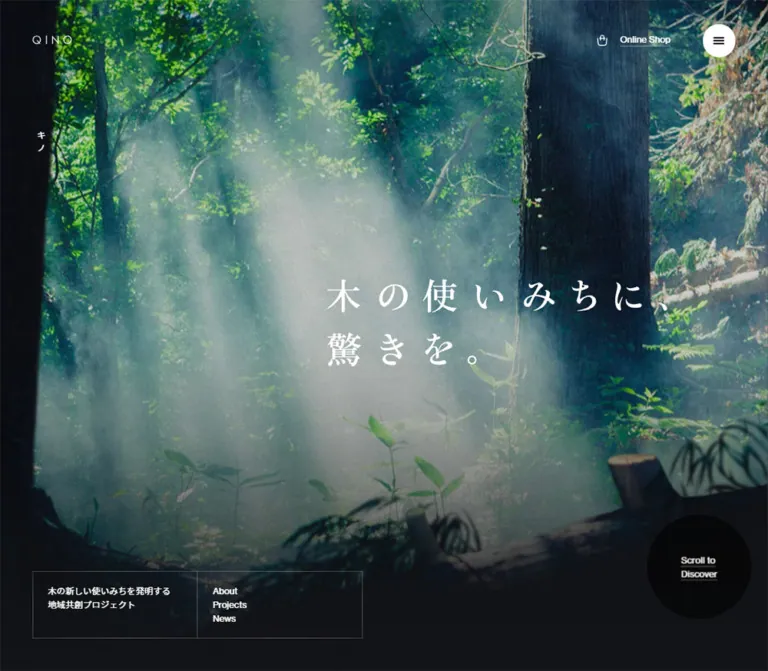
The strongest contrast is between immersive natural imagery and an unusually disciplined interface. A forest fills the desktop opening, with luminous mist behind widely spaced Japanese lettering. Small navigation, thin rules, a circular scroll link, and a geometric wordmark frame the scene without competing with it. Subsequent content sits on pale sage, using a numbered portrait-image rail and generous empty space. The footer turns this restraint into scale: small directory links occupy ruled columns above an enormous cropped wordmark.
閉じる
QINO — Style Reference
A forest atmosphere framed by precise grids, quiet typography, and pale sage surfaces.
Original URL: https://qino.jp/ Final URL: https://qino.jp/ Page title: “QINO(キノ)公式サイト” Theme: dark photographic introduction followed by a light sage content canvas; no selectable theme was demonstrated. Inspected: September 29, 2026, at 12:32:30 UTC / 21:32:30 JST. Viewports: 1440 × 1000 desktop and 390 × 844 mobile, in CSS pixels. Scope: the current homepage, using supplied desktop opening, project-section, and footer captures; mobile opening and footer captures; and rendered DOM/computed-style evidence covering the wider page. Menu opening, carousel operation, media playback, and linked pages were not exercised in the supplied evidence.
QINO presents a project concerned with forests, water, and new uses for wood. Its homepage connects an atmospheric introduction to four projects, current news, contact routes, and an external shop. The design supports both brand storytelling and practical navigation.
The strongest contrast is between immersive natural imagery and an unusually disciplined interface. A forest fills the desktop opening, with luminous mist behind widely spaced Japanese lettering. Small navigation, thin rules, a circular scroll link, and a geometric wordmark frame the scene without competing with it. Subsequent content sits on pale sage, using a numbered portrait-image rail and generous empty space. The footer turns this restraint into scale: small directory links occupy ruled columns above an enormous cropped wordmark.
How to Read This Reference
- Measured means a value appears in the supplied computed styles or element rectangles. Unless stated otherwise, coordinates refer to the document, not the scrolled screenshot.
- Visually observed means a feature is visible in the supplied original-page captures. Screenshot-based dimensions are labeled approximate.
- Calculated means a relationship is derived from measured values, such as the number of grid units occupied by a card.
- Recommended means an implementation choice for a new site, including the CSS adaptation below. It is not a claim about the original source.
- Source variables retain their original names. Other token names and all Quick Start component classes are descriptive aliases.
- Computed styles on a heading wrapper do not necessarily describe its visible lettering. This distinction is particularly important for the hero headline and logo.
- The supplied DOM includes navigation content and repeated project items that are not all visible simultaneously. Their presence does not establish an opened menu or a particular carousel behavior.
Tokens — Colors
Default Palette
| Name | Value | Source token | Role and evidence |
|---|---|---|---|
| Pale Sage | #e3eae0 |
--col-bg |
Measured root background; visible across projects and the footer |
| Moss | #23352b |
--col-moss |
Declared source color matching the dark green section marker, project index, and filled menu treatment |
| Night | #131417 |
--col-bg-dark |
Measured background of the opening and About sections; supports the dark lower edge of the hero |
| Black | #000000 |
--col-black |
Measured default text; visible wordmarks and utility text on sage |
| White | #ffffff |
--col-white |
Measured hero and About text; visible reversed desktop header details |
| Matte Sage | #dbe2d7 |
--col-mat |
Declared secondary color; sampled on the desktop news-media link, but its wider visual role is not established |
| Forest Green | #296a46 |
--col-green |
Declared source color; no distinct large component using it is confirmed by the supplied captures |
| Grey | #898d87 |
--col-grey |
Declared source color; exact component assignment is unverified |
| Dark Rule | rgba(0, 0, 0, 0.2) |
--col-line |
Low-contrast divider token consistent with the project controls and footer grid |
| Light Rule | hsla(0, 0%, 100%, 0.4) |
--col-line-light |
Reversed rule token available for the dark introduction |
The main interface palette is sage, black, moss, and white. Brighter greens, blue-green shadows, and warm highlights belong primarily to the photography. Avoid converting every color found in the forest into a separate interface accent.
Color Behavior
The desktop opening shows a white logo and shop link with a white menu circle containing a dark icon. The footer shows dark identity and utility text with a moss menu circle and white icon. The mobile opening already shows dark header text and a moss menu circle over its diffuse background.
These are observed color states. A logo filter 0.4s transition and shop-link color 0.4s transition are measured, but the code that chooses the state is not supplied. Do not assume a particular intersection threshold or blend-mode implementation.
The background is flat sage in the content areas. Atmospheric gradients belong to the photographic composition and its dark fade, not to a general gradient-card system.
Tokens — Typography
Main Interface and Body Copy
Measured family: YakuHanJPs, Inter, "Noto Sans JP", sans-serif.
The body uses weight 400, restrained tracking, and generous paragraph leading. At desktop, the measured size is 13.68px, line height 24.624px, and letter spacing 0.1368px. At mobile, these become 12.5px, 22.5px, and 0.125px.
The computed family records the declared stack, not proof that every family supplies visible glyphs on every device. Preserve a clear Latin/Japanese sans-serif pairing and check actual font loading before matching line breaks.
Editorial Japanese Heading
Measured About-heading family: YakuHanMPs, Inter, 游明朝体, "Yu Mincho", YuMincho, serif.
The About heading is regular weight, with 1.6 line height and 0.03em tracking. It measures 36px on desktop and 23px on mobile. This is direct evidence for a Japanese serif voice within the page.
Hero Lettering and Brand Marks
The visible hero copy, “木の使いみちに、驚きを。”, has a prominent Japanese serif appearance with wide spacing. Its H2 wrapper, however, reports the main sans-serif stack at only 20.52px desktop and 18.75px mobile. Those values do not explain the large visible glyphs.
The headline rectangle is measured at 660 × 199.41px desktop and approximately 325.03 × 90.22px mobile. Visible character height suggests an approximate 60–64px desktop display size and 30–32px mobile display size. These are visual estimates, not recovered font declarations. Descendant styling, artwork, and transforms were not supplied.
Treat QINO's wordmark as artwork. Its wide spacing and geometric letterforms are visible, but its font or asset format is not established. The header link's artwork-sized rectangle is 72 × 18px on desktop and approximately 56.86 × 12.34px on mobile; the wrapper's larger font size should not be used to reconstruct the logo.
Type Scale
| Role | Desktop | Mobile | Status |
|---|---|---|---|
| Body and introductory paragraphs | 13.68 / 24.624px, weight 400 |
12.5 / 22.5px, weight 400 |
Measured |
| About serif heading | 36 / 57.6px, tracking 1.08px |
23 / 36.8px, tracking 0.69px |
Measured |
| Hero visible lettering | Approximately 60–64px |
Approximately 30–32px |
Visual estimate; actual descendant font unknown |
| Hero H2 wrapper | 20.52 / 32.832px |
18.75 / 30px |
Measured wrapper only |
| Section-title wrapper | 16.0056 / 19.2067px |
14.625 / 17.55px |
Measured; visible child lettering may differ |
| Project description | 13.68 / 19.152px |
12.5 / 17.5px |
Measured |
| Project image-link wrapper | 12 / 21.6px |
12 / 21.6px |
Measured |
Small View link |
12 / 19.2px |
12 / 19.2px |
Measured |
| Scroll-link caption | 12 / 16.8px |
12 / 16.8px |
Measured |
| News-row link | 12 / 21.6px |
12 / 21.6px |
Measured |
| Footer directory link | 12 / 19.2px |
11 / 17.6px |
Measured |
| Main menu entries | 50 / 65px, weight 500 |
32 / 41.6px, weight 500 |
DOM evidence; opened menu not pictured |
| Menu project entries | 20 / 30px, weight 500 |
17 / 27.2px, weight 500 |
DOM evidence; opened menu not pictured |
| Active project number | Approximately 120px |
Not visually established | Desktop visual estimate |
Hierarchy comes from scale contrast and placement rather than widespread bold weight. Small English labels identify sections; Japanese copy supplies the editorial voice; the index and wordmark create the largest graphic gestures.
Tokens — Spacing & Shapes
Responsive Unit
The source exposes a viewport-derived grid variable:
/* Measured values at the two inspected viewports */
/* Desktop: 1440px wide */
--gw: 4.16667vw; /* Approximately 60px */
--vh: 10px;

/* Mobile: 390px wide */
--gw: 8.33333vw; /* Approximately 32.5px */
--vh: 8.44px;
For this reference, g means the measured --gw unit. The desktop value divides the width into approximately 24 units; the mobile value divides it into approximately 12. This describes the observed alignment system, not a claim that the original uses CSS Grid.
The breakpoint between these modes was not supplied. The Quick Start uses 767px as a recommended implementation boundary.
Spacing Scale
| Relationship | Desktop | Mobile | Evidence |
|---|---|---|---|
| One grid unit | 60px |
32.5px |
Source variable, calculated |
| Header logo left edge | 60px |
32.48px |
Measured |
| Main mobile reading inset | Not a single global value | Approximately 65px = 2g |
About, project metadata, news, and footer link positions |
| About copy width | 540px = 9g |
Approximately 260px = 8g |
Measured |
| Hero headline width | 660px = 11g |
Approximately 325px = 10g |
Measured |
| Project image width | 360px = 6g |
260px = 8g |
Measured |
| Project image height | 450px = 7.5g |
Approximately 325px = 10g |
Measured |
| Project image gap | 60px = 1g |
Approximately 32.48px = 1g |
Calculated from adjacent item positions |
| Desktop news-row vertical padding | 24px top and bottom |
12px top, 0px bottom |
Measured link padding |
| Footer bottom padding | 0px in the sampled footer style |
130px = 4g |
Measured |
Avoid applying the outer gutter uniformly to all content. The desktop hero and About text start at 10g, the project rail starts at 8g, and the mobile reading column starts at 2g. These staggered alignments create the composition.
Border Radius
| Element | Geometry | Evidence |
|---|---|---|
| Project photography | Square corners | Visible |
| Hero orientation panel | Square, thin outline | Visible |
| Carousel arrow pair | Two adjoining square cells | Visible |
| Footer directory | Rectangular ruled cells | Visible |
| Menu control | Circle | Visible; approximately 48px desktop and 44px mobile |
| Scroll link | Circle | Visible; measured link box is 180px desktop and approximately 97.48px mobile |
| Section marker | Solid circle | Approximately 40px diameter in the desktop project capture |
There is no visible rounded-card or shadow-based elevation system.
Layout Measurements
| Element | Desktop measurement | Mobile measurement |
|---|---|---|
| Document height | 6825.25px |
5387.09px |
| Opening section | 1440 × 1000px |
390 × 844px |
| Hero headline origin | x 600, y 385.30px |
x 32.48, y 368.77px |
| Scroll-link box | x 1200, y 730, 180 × 180px |
x 268.12, y 565.29, 97.48 × 97.48px |
| About section | y 1000, height 1000px |
y 844, height 844px |
| Projects section | y 3000, height 859.25px |
y 2142.98, height 867.09px |
| First visible QINO SODA image | x 480, width 360px |
x 64.98, width 260px |
| News section | y 3859.25, height 720px |
y 3010.08, height 644.34px |
| News-row link width | 780px |
Approximately 260px |
| Contact display section | height 1000px |
Approximately 454.98px |
| Footer | height 1000px |
Approximately 899.45px |
These are snapshot measurements. They should guide proportions, not become rigid document-height targets for different content or font metrics.
Components
Persistent Header
Role: identity, shop access, and primary navigation entry.
The header remains visible in the opening, project, and footer captures. It is visually persistent; its exact positioning declaration was not included in the computed-style excerpt.
Place the small QINO mark at the left, then use substantial open space before the shop utility and circular menu at the right. The shop link combines a thin bag outline with the underlined label Online Shop. The menu is a compact three-line icon inside a filled circle, not a pill-shaped text button.
On desktop, the logo link begins at x 60, y 66px, while the shop link measures approximately 108.67 × 24.61px. On mobile, the logo begins at x 32.48, y 30.36px, and the shop link measures approximately 95.89 × 22.5px.
Use header colors appropriate to the underlying scene. The supplied footer captures show header elements overlapping footer identity and utility content. Record that as an observed collision, not a recommended layout feature.
Opening Hero
Role: communicate the project's natural setting before presenting detailed information.
The desktop hero fills one viewport. Large dark trunks frame a forest scene, with mist and sunlight opening a luminous region behind the central-right headline. Green foliage remains detailed; the lower portion becomes nearly black.
The composition is asymmetric. The main headline begins at x 600px, while a small vertical “キノ” label sits near the left edge. The headline is arranged as two lines with generous character spacing. Avoid centering every hero element into a conventional single-column stack.
The bottom-left contains an outlined orientation panel. The bottom-right contains the large circular Scroll to / Discover link. The empty space between them is intentional.
The mobile opening preserves the two-line white headline and circular scroll link. Its background appears as a diffuse teal-grey field rather than a resolved forest image. The supplied evidence does not establish whether this is intentional treatment, a media state, or a capture limitation. Do not treat heavy CSS blur as a verified brand requirement.
Hero Orientation Panel
Role: explain the project briefly and offer direct section routes.
The desktop capture shows an approximately 456 × 94px outlined rectangle at x 60, y 846px. A vertical rule divides it into two near-equal cells.
The left cell contains two lines of Japanese project description: “木の使い道を創造する / 地域共創プロジェクト”. The right cell stacks About, Projects, and News in 12px type with 19.2px leading. Both cells have roughly 20px internal horizontal padding.
This panel is not visible in the supplied mobile opening. Its descriptive text remains in the DOM evidence, so absence from the capture should not be interpreted as removal from the document.
Circular Scroll Link
Role: direct the visitor into the About section.
A dark circular field contains a small, two-line underlined caption. Its measured link box is 180 × 180px desktop and approximately 97.48 × 97.48px mobile. In both cases, that diameter is approximately 3g.
The destination is explicitly https://qino.jp/#about. The href verifies the intended target; smooth scrolling, magnetic movement, hover scaling, and the actual click result were not demonstrated.
The circle remains offset toward the right. On mobile it sits substantially above the bottom of the hero, preserving a long dark area beneath it.
About Story Section
Role: connect the atmospheric opening to the project's purpose.
The DOM identifies a second viewport-height dark section with white text. On desktop, its copy begins at x 600px and occupies 540px; on mobile, it begins near x 65px and occupies 260px.
The hierarchy is a regular Japanese serif heading, two sans-serif paragraphs, and an About Us link. The source heading reads “木を使い、森を育て、水を守る。”. Paragraphs explain the relationship between forest stewardship, local collaboration, products, and experiences.
The desktop About Us link has a measured 113.58 × 36px box aligned toward the copy column's right edge. The mobile equivalent expands to approximately 260 × 69.55px. This is a meaningful responsive change: a compact desktop action becomes a full reading-column target.
The complete background imagery of this section is not shown in the supplied captures. Preserve the measured dark surface and typography without inventing a specific video or illustration.
Section Identifier
Role: label major editorial sections without using large conventional headings.
The desktop project section uses a solid moss circle followed by the two-line label OUR / PROJECTS. The circle is approximately 40px; the text begins roughly 24px after it. This small identifier sits far to the left of the explanatory paragraph.
The measured heading wrapper occupies 600 × 160px, including 60px 120px 60px 60px padding. On mobile, the wrapper spans the page and uses 32.5px padding. The news section has a corresponding LATEST / NEWS heading wrapper.
Use the circle as a structural marker. It should not become a colorful category badge or a numbered step indicator.
Project Index and Portrait Rail
Role: introduce four projects while giving each a strong photographic identity.
The desktop project section has three coordinated areas:
- A small section identifier at the upper left and introductory Japanese copy beginning at
x 600px. - An active-project information area at the left, with a large moss index, project name, short description, and underlined
Viewlink. - A horizontal portrait-image rail beginning at
x 480pxand extending beyond the right edge.
The visible active project is 01 / QINO SODA. Its image measures 360 × 450px, a 4:5 ratio. The next image starts at x 900px, followed by a partial third image at x 1320px. Maintain the 60px spaces between images and the intentional partial item at the edge.
The visible first photograph shows a bottle and glass on a mossy stump. The second shows dining and service in the forest. A cropped third image shows a gloved hand holding a piece of wood. These are contextual photographs, not isolated product packshots on colored cards.
Each project image is a link and carries a small index/name label near its upper-left corner. The source destinations identify QINO SODA, QINO Restaurant, QINO School, and “森の庭”.
Two adjoining arrow cells sit below the active-project information. Their desktop interiors measure approximately 89 × 88px; the visible outer pair is about 180 × 90px. Mobile interiors are much smaller, approximately 31.48 × 30.48px. The supplied elements have empty hrefs and no text; their interaction and accessible names were not verified.
On mobile, DOM geometry places the main image at x 64.98px, with a 260 × 324.98px box. The next begins at x 357.47px, leaving a visible edge within the viewport. Metadata follows below the image, with View near the reading column's right edge. This reflow is supported by DOM geometry, but a mobile project screenshot was not supplied.
The DOM contains twelve project-image links on desktop and twenty on mobile, representing repeated sets of the same four projects. This is compatible with a looping rail implementation, but it does not establish autoplay, drag support, timing, or a particular carousel library.
Latest News
Role: provide a practical, current information layer beneath the project presentation.
The DOM contains three dated news links and a View All News action. Desktop rows are 780px wide and approximately 69.59px tall, with 24px vertical padding. A separate 300 × 300px linked media area sits to the right at x 1020px.
On mobile, the rows become approximately 260px wide and 94.23px tall, reflecting wrapped text. View All News moves after the rows and expands to approximately 260 × 69.55px.
Use compact editorial text and clearly associated dates. The supplied captures do not show the news artwork or the exact title/date arrangement within each row. A ruled list is a suitable implementation continuation of the page's visual language, but specific news-row borders are not verified here.
Contact Display and Contact Link
Role: provide an expressive closing invitation and a conventional contact target.
The DOM identifies a large contact section containing four repeated GET / IN / TOUCH text groups within a link to the external contact page. It measures one desktop viewport high and approximately 454.98px on mobile. The link wrapper is about 164.05px high on desktop and 47.08px on mobile.
The repeated text suggests a decorative display treatment, but a marquee, rotation, or automatic movement cannot be confirmed from the provided evidence. The section's complete imagery is also not pictured.
A following section contains the separate link “お問合せはこちら”. Its target is https://shop.qino.jp/pages/contact. Desktop uses a compact 157.11 × 36px link toward the right; mobile uses the familiar 260 × 69.55px reading-column action.
Footer Directory and Oversized Wordmark
Role: provide comprehensive navigation and finish with a large identity gesture.
The desktop footer's upper band is approximately 300px high. Thin vertical rules divide it into four columns whose visible widths are approximately 480 / 300 / 300 / 360px, equivalent to 8g / 5g / 5g / 6g.
The first column contains copyright information and a smaller slogan/wordmark composition. The second contains About, Projects, News, Contact, and a separated shop link. The third contains Instagram and Twitter. The fourth groups support, retail, business, legal, and company links.
The smaller footer identity link measures 240 × 90px on desktop and approximately 260 × 89.36px on mobile. Below the directory, a very large black QINO wordmark extends beyond the viewport edges and is cropped by the visible frame. Preserve the letterforms as artwork; the exact oversized asset dimensions are unavailable.
Mobile stacks the directory into full-width horizontal bands separated by thin rules. Link content remains inset approximately 65px from the left. Generous space around each group replaces the desktop vertical dividers. The large cropped wordmark still appears at the bottom.
The mobile footer capture begins partway through a footer taller than the viewport. Its upper crop and persistent header overlap should not be mistaken for the complete first footer band.
Navigation Content — DOM Evidence Only
The supplied DOM includes a separate navigation hierarchy: large HOME, ABOUT, and PROJECTS links; indented project links; smaller news, contact, shop, and social links; and a legal/support group.
Main entries measure 50px desktop and 32px mobile at weight 500. Project entries measure 20px desktop and 17px mobile. This establishes a useful information hierarchy, but no opened-menu screenshot or click sequence was provided. Background, entrance motion, close behavior, focus handling, and scroll locking remain unverified.
Tokens — Motion & Interaction
| Treatment | Supplied evidence | Practical interpretation |
|---|---|---|
| Header logo state | filter 0.4s |
A filter transition is declared; the triggering state and filter values are unknown |
| Header shop-link state | color 0.4s |
A color transition is declared; desktop and mobile captures show different color states |
| Scroll link | Transition reported as 0.2s |
Duration is present; animated property and interaction result are not established |
| Hero H2 wrapper | transition: none, animation: none |
Applies to this wrapper only; does not rule out descendant or media animation |
| Project rail | Repeated items and offscreen item positions | Supports a rail structure; no verified autoplay, dragging, or timing |
| Contact display | Four repeated text groups | Repetition is established; movement is not |
| Persistent header | Same controls visible at multiple scroll positions | Persistent visual behavior is supported; precise positioning implementation is not supplied |
| Background media | Still captures with different levels of image detail | No confirmed playback mode, audio, video source, or frame cadence |
Most sampled elements report animation: none. Many report transition: all without a useful duration in the excerpt. Neither fact supports a complete motion specification.
The inspection process waited for document readiness, sampled layout/text stability, image decoding, and finite animation completion within bounded limits. Perpetual animations were paused during readiness checks and resumed. This improves capture reliability but does not demonstrate every delayed or interactive state.
Recommended adaptation: keep utility color changes around 200–400ms, avoid adding spring motion to every control, and ensure the page works with static imagery and reduced motion. Add moving media or an animated rail only when there is an explicit implementation requirement and usable controls.
Surfaces
| Layer | Appearance | Purpose |
|---|---|---|
| Opening | Full-width forest imagery over #131417 |
Establishes atmosphere and place |
| About | Measured dark background with white copy | Maintains continuity with the introduction |
| Main content canvas | Flat #e3eae0 |
Gives photography and small text room to breathe |
| Project images | Unframed, square-cornered portrait photographs | Carry project identity |
| Utility controls | Small circles or thin outlined rectangles | Provide navigation without a heavy button system |
| Footer directory | Same sage canvas with subtle rules | Organizes dense navigation |
| Footer identity field | Sage with oversized black artwork | Creates the final visual statement |
| Contact display | White text measured; complete backdrop not shown | Expressive contact invitation, with visual treatment only partially established |
Surface changes come from imagery, color fields, and dividers. Avoid adding shadows, translucent floating cards, or layered rounded panels to achieve hierarchy.
Imagery
The desktop opening depends on the particular relationship between dark foreground trunks, green foliage, mist, and light. Choose imagery with a readable luminous area for the headline and darker regions for small navigation. A uniformly bright landscape would require a different text treatment.
Project photography connects objects to their environment. The soda bottle and glass remain within the forest; dining is shown among trees; wood is shown in a person's hand. Preserve this connection between material, product, and experience.
Use natural color and photographic texture. The captures do not show a duotone filter, illustrated leaf pattern, artificial grain layer, or pixelated image treatment.
Observed Asset References
No original image filenames, media URLs, logo paths, or font-file URLs were included in the supplied evidence. The following identifies visible subjects rather than inventing asset paths.
| Visual | Evidence | Intended use |
|---|---|---|
| Forest with mist and sunbeams | Desktop opening capture | Full-viewport introduction |
| Rushing water over dark rocks | Narrow strip above the project section in the desktop capture | Natural-image transition; full section treatment not established |
| Soda bottle and clear glass on a mossy stump | First visible project card | QINO SODA project link |
| Outdoor dining and service among trees | Second visible project card | QINO Restaurant project link |
| Gloved hand holding wood | Partial third project card | QINO School project link |
| Small and oversized QINO marks | Header and footer captures | Persistent and expressive identity |
| Bag, menu, and directional icons | Header and project controls | Small utility navigation |
Use authorized brand artwork and suitable licensed photographs. CSS can recreate the grid and surfaces, but it cannot recreate the forest composition or the exact QINO letterforms.
Layout & Responsive Behavior
The desktop page alternates immersive full-width sections with precise editorial columns. Its right-shifted hero and About copy align at x 600px, while project imagery begins earlier at x 480px. The news list returns toward the left, and the footer distributes small content across the full width.
Mobile does not simply reduce the desktop canvas. It changes from a 24-part to a 12-part grid, centers major reading columns within 65px margins, retains horizontal project overflow, and stacks footer groups.
| Area | Desktop observation | Mobile observation |
|---|---|---|
| Header | White over the photographed opening; small logo at 60px left inset | Dark text and moss circle in supplied opening; logo at approximately 32.5px inset |
| Hero | Detailed forest, right-shifted headline, visible bottom-left panel | Diffuse background, headline across most of the width, no visible orientation panel |
| Scroll control | 180px diameter, near lower-right corner | Approximately 97.5px diameter, raised well above the bottom |
| About | 540px copy column starting at x 600px | 260px copy column starting near x 65px |
| Projects | Active metadata beside a multi-image rail | DOM positions indicate image rail above metadata, with one main card and an edge of the next |
| News | 780px rows plus separate right-side media link | 260px rows; full-width action below them |
| Footer | Four ruled columns and a large lower identity field | Stacked ruled bands with 65px content insets and cropped identity artwork |
The About section ends at document y 2000px on desktop, while projects begin at y 3000px. On mobile, the corresponding interval is approximately 455px. A water image is partially visible above the project capture, but the supplied DOM excerpt does not fully describe this intervening media area. Do not invent a precise section implementation for that gap.
The exact responsive breakpoint, intermediate tablet layout, landscape behavior, and safe-area handling are not supplied. The source --vh values equal one percent of each inspected viewport height; the update mechanism is unknown.
Do’s and Don’ts
Do
- Preserve the exact sage canvas
#e3eae0and dark base#131417. - Use
#23352bfor restrained moss-colored structural accents. - Build around the measured grid relationships: 60px desktop units and 32.5px mobile units at the inspected widths.
- Keep the desktop headline and About copy offset toward the right.
- Pair small, regular sans-serif utilities with an editorial Japanese serif voice.
- Preserve large empty areas around compact interface details.
- Use square
4:5project images with generous gaps and a partially visible next item. - Keep project metadata distinct from the photographic card surface.
- Use thin rules and small underlined links for navigation hierarchy.
- Retain the footer's change from ruled columns to stacked mobile bands.
- Use the actual wordmark artwork when it is available and authorized.
- Separate verified measurements from recommended interaction behavior.
Don’t
- Don't replace the sage background with neutral white throughout.
- Don't turn the project rail into a collection of rounded cards with shadows and colored badges.
- Don't center every section into the same narrow desktop column.
- Don't interpret the hero H2 wrapper's 20.52px font size as the visible display size.
- Don't claim the logo or hero lettering uses a specific font that was not established.
- Don't reproduce the mobile background blur as a mandatory effect.
- Don't infer video playback, parallax, carousel autoplay, or a marquee from still images and repeated DOM content.
- Don't expose repeated carousel clones as separate projects in an accessible navigation structure.
- Don't duplicate the captured header/footer collisions in a new implementation.
- Don't use stock leaf icons or environmental badges as substitutes for the site's photographic identity.
Recommended Implementation Additions
These are improvements for a new implementation, not verified features of the original:
- Use a real button for the menu, with an accessible name,
aria-expanded, and a relationship to the navigation region. - Give project arrow buttons meaningful labels and at least 44px touch targets. This intentionally exceeds the approximately 32px mobile control interiors in the evidence.
- Make the horizontal rail usable by touch, keyboard, and conventional project links. Keep repeated visual clones out of the accessibility tree and tab order.
- Maintain readable text over every media state, including a static fallback image. Test header contrast independently from headline contrast.
- Preserve content visibility if optional animation or media initialization fails.
- Ensure the persistent header does not obscure anchor targets, footer links, or branding. Add appropriate scroll margins and section-aware spacing.
- If a navigation overlay is implemented, provide focus management, Escape dismissal, and a reliable way to return to the trigger.
- Respect reduced-motion preferences and provide pause controls for any continuous motion introduced by the implementation.
- Review the small source text sizes with real Japanese content and browser zoom. Larger accessible body text is a reasonable adaptation when exact capture matching is not required.
- Use descriptive image alternatives for meaningful project photography and empty alternatives for purely atmospheric images.
Agent Prompt Guide
Quick Color Reference
- Main canvas:
#e3eae0. - Default text and wordmark:
#000000. - Moss markers, index, and dark menu circle:
#23352b. - Dark introduction base:
#131417. - Reversed type:
#ffffff. - Dividers:
rgba(0, 0, 0, 0.2)on sage. - Photographic color: natural forest greens, mist, and blue-green shade; keep these within imagery rather than inventing more interface accents.
Overall Prompt
“Create a homepage for a forest-and-water project inspired by QINO's visual structure. Use a full-viewport forest photograph with dark framing trunks, mist, and a luminous area behind a two-line Japanese serif headline. Offset the headline toward the right on desktop. Keep a small geometric wordmark at the upper left, a bag-icon shop link and circular menu at the upper right, a thin outlined information panel at the lower left, and a dark circular scroll link at the lower right. Continue onto pale sage #e3eae0 with small English section labels, moss #23352b markers, a large project index, and square-cornered 4:5 photographs in a horizontal rail. Use restrained sans-serif body text, thin rules, generous negative space, and a ruled footer ending in an oversized cropped wordmark. Reflow reading content and footer groups on mobile. Treat motion as an optional, accessible implementation choice.”
Example Component Prompts
- Hero: “Build a 1440 × 1000 reference composition with a forest image covering the viewport. Position a roughly 660px-wide two-line Japanese serif headline near x 600px and the vertical center. Use small white utilities, a 180px circular scroll link at the lower right, and a two-cell outlined information panel at the lower left. Preserve dark foreground framing and clear text contrast.”
- Project rail: “Use a pale sage section with a small moss dot and OUR PROJECTS label. Put an oversized moss 01 and compact project metadata at the left. Begin a horizontal rail around one third of the desktop width, with 360 × 450px photographs and 60px gaps. Show the next image partially at the right edge. Use underlined text links and adjoining square arrow controls.”
- Mobile project section: “At 390px wide, use 32.5px grid units. Place the main 260 × 325px photograph at a 65px left inset with a 32.5px gap before the next item. Put project metadata below the photograph and keep the action reachable. Use accessible 44px controls even though the reference's measured mobile controls are smaller.”
- Footer: “Create a pale sage footer with four desktop columns in approximately 8:5:5:6 proportions. Separate columns with subtle one-pixel rules. Use small black navigation links, generous internal spacing, and a compact brand lockup. Place an oversized black wordmark below, cropped at the outer edges. On mobile, stack the groups into ruled horizontal bands with 65px text insets.”
- About section: “Use a dark viewport-height section with a 540px white copy column offset to the right on desktop. Pair a 36px regular Japanese serif heading with small sans-serif paragraphs and a quiet About Us link. At 390px, use a 260px centered reading column, a 23px heading, and a larger full-column action area.”
Quick Start
CSS Custom Properties
This is a recommended implementation scaffold, not recovered source code. It keeps a conventional root font size while using the measured grid relationships. The 767px breakpoint, fluid body-size cap, hero lettering approximation, media gradient, and interaction states are adaptation choices.
Supply authorized imagery and logo artwork separately. No asset paths were available in the inspected evidence. The hero title assumes two block-level spans. Project cards are links containing an image and a small label. Carousel arrows need application logic if used; the rail itself supports native horizontal scrolling.
:root {
  /* Exact supplied source colors */
  --col-bg: #e3eae0;
  --col-bg-dark: #131417;
  --col-moss: #23352b;
  --col-mat: #dbe2d7;
  --col-black: #000;
  --col-white: #fff;
  --col-grey: #898d87;
  --col-green: #296a46;
  --col-line: rgb(0 0 0 / 20%);
  --col-line-light: rgb(255 255 255 / 40%);

  /* Measured source grid; adaptation alias */
  --gw: 4.16667vw;
  --g: var(--gw);

  /* Measured family stacks; font files are not bundled */
  --qino-sans: YakuHanJPs, Inter, "Noto Sans JP", sans-serif;
  --qino-serif: YakuHanMPs, Inter, "Yu Mincho", YuMincho, serif;

  /* Recommended fluid interpolation, matching the inspected desktop */
  --body-size: clamp(12.5px, 0.95vw, 16px);
  --caption-size: 12px;
  --rule: 1px;
  --utility-duration: 200ms;
  --header-duration: 400ms;
}

* { box-sizing: border-box; }

body {
  margin: 0;
  color: var(--col-black);
  background: var(--col-bg);
  font-family: var(--qino-sans);
  font-size: var(--body-size);
  font-weight: 400;
  line-height: 1.8;
  letter-spacing: 0.01em;
}

img, svg { display: block; }
a { color: inherit; }
button { font: inherit; }

.text-link {
  font-size: var(--caption-size);
  line-height: 1.6;
  text-decoration-thickness: 1px;
  text-underline-offset: 4px;
}

/* Set the surface attribute through application state. */
.site-header {
  --header-ink: var(--col-black);
  --menu-fill: var(--col-moss);
  --menu-ink: var(--col-white);
  position: fixed;
  z-index: 20;
  inset-block-start: calc(var(--g) - 9px);
  inset-inline: var(--g);
  display: flex;
  align-items: center;
  gap: calc(1.2 * var(--g));
  min-block-size: 48px;
  color: var(--header-ink);
}

.site-header[data-surface='dark'] {
  --header-ink: var(--col-white);
  --menu-fill: var(--col-white);
  --menu-ink: var(--col-black);
}

.brand-mark {
  inline-size: 72px;
  block-size: 18px;
  object-fit: contain;
}

.shop-link {
  display: inline-flex;
  align-items: center;
  gap: 16px;
  margin-inline-start: auto;
  white-space: nowrap;
  text-underline-offset: 4px;
  transition: color var(--header-duration);
}

.menu-toggle {
  display: grid;
  place-items: center;
  flex: 0 0 48px;
  inline-size: 48px;
  block-size: 48px;
  padding: 0;
  border: 0;
  border-radius: 50%;
  color: var(--menu-ink);
  background: var(--menu-fill);
  cursor: pointer;
}

.hero {
  position: relative;
  isolation: isolate;
  min-block-size: 100vh;
  min-block-size: 100svh;
  overflow: hidden;
  color: var(--col-white);
  background: var(--col-bg-dark);
}

.hero-media {
  position: absolute;
  z-index: -2;
  inset: 0;
  inline-size: 100%;
  block-size: 100%;
  object-fit: cover;
}

/* Recommended fade; original gradient stops were not supplied. */
.hero::after {
  content: '';
  position: absolute;
  z-index: -1;
  inset: 0;
  pointer-events: none;
  background: linear-gradient(
    to bottom,
    transparent 48%,
    rgb(19 20 23 / 24%) 70%,
    var(--col-bg-dark) 100%
  );
}

.hero-kana {
  position: absolute;
  inset-block-start: 24%;
  inset-inline-start: calc(var(--g) + 6px);
  writing-mode: vertical-rl;
  font-size: 12px;
  letter-spacing: 0.2em;
}

/* Serif approximation; the original hero font is unverified. */
.hero-title {
  position: absolute;
  inset-block-start: 48.5%;
  inset-inline-start: calc(10 * var(--g));
  inline-size: calc(11 * var(--g));
  margin: 0;
  transform: translateY(-50%);
  font-family: var(--qino-serif);
  font-size: clamp(32px, 4.444vw, 64px);
  font-weight: 400;
  line-height: 1.55;
  letter-spacing: 0.28em;
}

.hero-title > span { display: block; }

.hero-orientation {
  position: absolute;
  inset-inline-start: var(--g);
  inset-block-end: var(--g);
  display: grid;
  grid-template-columns: 1fr 1fr;
  inline-size: 456px;
  border: var(--rule) solid var(--col-line-light);
  font-size: 12px;
  line-height: 1.6;
}

.hero-orientation > * { padding: 18px 20px; }
.hero-orientation > * + * {
  border-inline-start: var(--rule) solid var(--col-line-light);
}
.hero-orientation a { display: block; }

.scroll-disc {
  position: absolute;
  inset-inline-end: var(--g);
  inset-block-end: calc(1.5 * var(--g));
  display: grid;
  place-items: center;
  inline-size: calc(3 * var(--g));
  aspect-ratio: 1;
  border-radius: 50%;
  color: var(--col-white);
  background: rgb(0 0 0 / 85%);
  font-size: 12px;
  line-height: 1.4;
  text-underline-offset: 4px;
}

.about {
  display: grid;
  grid-template-columns: calc(10 * var(--g)) calc(9 * var(--g)) 1fr;
  align-items: center;
  min-block-size: 100vh;
  min-block-size: 100svh;
  padding-block: calc(2 * var(--g));
  color: var(--col-white);
  background: var(--col-bg-dark);
  scroll-margin-block-start: 100px;
}

.about-copy { grid-column: 2; }
.about-title {
  margin: 0 0 30px;
  font-family: var(--qino-serif);
  font-size: 36px;
  font-weight: 400;
  line-height: 1.6;
  letter-spacing: 0.03em;
}

.section-intro {
  display: grid;
  grid-template-columns: calc(10 * var(--g)) 1fr;
  align-items: start;
  padding-block: calc(2 * var(--g));
}

.section-label {
  display: flex;
  align-items: center;
  gap: 24px;
  margin: 0;
  padding-inline: var(--g);
  font-size: 12px;
  font-weight: 400;
  line-height: 1.2;
  letter-spacing: 0.03em;
}

.section-label::before {
  content: '';
  flex: 0 0 40px;
  inline-size: 40px;
  block-size: 40px;
  border-radius: 50%;
  background: var(--col-moss);
}

.section-intro > p {
  max-inline-size: calc(9 * var(--g));
  margin: 0;
}

.project-layout {
  display: grid;
  grid-template-columns: calc(8 * var(--g)) minmax(0, 1fr);
  padding-block-end: calc(2 * var(--g));
}

.project-meta { padding-inline: var(--g); }
.project-number {
  margin: 0 0 var(--g);
  color: var(--col-moss);
  font-size: clamp(80px, 8.333vw, 120px);
  line-height: 1;
}

.project-name { margin: 0 0 10px; font: inherit; }
.project-description { margin: 0 0 10px; line-height: 1.4; }

/* Native-scroll adaptation; no source carousel library is assumed. */
.project-rail {
  display: flex;
  align-items: flex-start;
  gap: var(--g);
  min-inline-size: 0;
  overflow-x: auto;
  overscroll-behavior-inline: contain;
  scroll-snap-type: x proximity;
}

.project-card {
  position: relative;
  flex: 0 0 calc(6 * var(--g));
  aspect-ratio: 4 / 5;
  overflow: hidden;
  border-radius: 0;
  scroll-snap-align: start;
}

.project-card img {
  inline-size: 100%;
  block-size: 100%;
  object-fit: cover;
}

.project-card-label {
  position: absolute;
  inset-block-start: 30px;
  inset-inline-start: 30px;
  color: var(--col-white);
  font-size: 12px;
  line-height: 1.8;
}

.project-controls {
  display: inline-flex;
  margin-block-start: calc(1.8 * var(--g));
  border: var(--rule) solid var(--col-line);
}

.project-controls button {
  display: grid;
  place-items: center;
  inline-size: 90px;
  block-size: 90px;
  padding: 0;
  border: 0;
  color: inherit;
  background: transparent;
  cursor: pointer;
}

.project-controls button + button {
  border-inline-start: var(--rule) solid var(--col-line);
}

/* Row dividers are a recommended continuation of the rule system. */
.news-list { margin-inline: var(--g); max-inline-size: calc(13 * var(--g)); }
.news-row {
  display: flex;
  justify-content: space-between;
  gap: 24px;
  padding-block: 24px;
  border-block-end: var(--rule) solid var(--col-line);
  font-size: 12px;
  line-height: 1.8;
  text-decoration: none;
}
.news-row time { flex-shrink: 0; }

.site-footer { border-block-start: var(--rule) solid var(--col-line); }
.footer-grid {
  display: grid;
  grid-template-columns: 8fr 5fr 5fr 6fr;
  min-block-size: calc(5 * var(--g));
  border-block-end: var(--rule) solid var(--col-line);
}

.footer-cell { min-inline-size: 0; padding: var(--g); }
.footer-cell + .footer-cell {
  border-inline-start: var(--rule) solid var(--col-line);
}

.footer-brand {
  display: flex;
  flex-direction: column;
  justify-content: space-between;
}
.footer-brand-art { inline-size: 240px; max-inline-size: 100%; }
.footer-links { display: grid; gap: 3.4px; }
.footer-links a { font-size: 12px; line-height: 1.6; text-decoration: none; }
.footer-shop { margin-block-start: var(--g); }

/* Use actual wordmark artwork; these crop dimensions are approximate. */
.footer-display {
  display: flex;
  align-items: flex-end;
  block-size: calc(100svh - 5 * var(--g));
  overflow: hidden;
}
.footer-display > :is(img, svg) {
  flex: none;
  inline-size: 128vw;
  max-inline-size: none;
  block-size: auto;
  transform: translate(-14vw, 18%);
}

:where(a, button):focus-visible {
  outline: 2px solid currentColor;
  outline-offset: 5px;
}

@media (hover: hover) {
  .text-link:hover { text-decoration-thickness: 2px; }
  .project-controls button:hover { background: var(--col-mat); }
}

/* Recommended breakpoint; the original breakpoint was not supplied. */
@media (max-width: 767px) {
  :root { --gw: 8.33333vw; --body-size: 12.5px; }

  .site-header {
    inset-block-start: calc(0.75 * var(--g) - 9px);
    inset-inline-end: calc(0.75 * var(--g));
    gap: calc(1.15 * var(--g));
    min-block-size: 44px;
  }
  .brand-mark { inline-size: 56.86px; block-size: 12.34px; }
  .shop-link { gap: 10px; }
  .menu-toggle { flex-basis: 44px; inline-size: 44px; block-size: 44px; }

  .hero-kana { inset-block-start: 15.5%; }
  .hero-title {
    inset-inline-start: var(--g);
    inset-block-start: 49%;
    inline-size: calc(10 * var(--g));
    font-size: 32px;
    line-height: 1.4;
    letter-spacing: 0.25em;
  }
  .hero-orientation { display: none; }
  .scroll-disc {
    inset-inline-end: calc(0.75 * var(--g));
    inset-block-end: 21.47%;
  }

  .about { display: flex; padding-inline: calc(2 * var(--g)); }
  .about-copy { inline-size: 100%; }
  .about-title { margin-block-end: 16px; font-size: 23px; }

  .section-intro { grid-template-columns: 1fr; gap: var(--g); }
  .section-label { gap: 20px; }
  .section-label::before { flex-basis: 32px; inline-size: 32px; block-size: 32px; }
  .section-intro > p { max-inline-size: none; margin-inline: calc(2 * var(--g)); }

  .project-layout { grid-template-columns: minmax(0, 1fr); }
  .project-rail {
    grid-row: 1;
    padding-inline: calc(2 * var(--g));
    scroll-padding-inline-start: calc(2 * var(--g));
  }
  .project-card { flex-basis: calc(8 * var(--g)); }
  .project-card-label { inset-block-start: 20px; inset-inline-start: 20px; }
  .project-meta { grid-row: 2; padding: var(--g) calc(2 * var(--g)) 0; }
  .project-number { margin-block-end: 20px; font-size: 48px; }
  .project-controls { margin-block-start: var(--g); }
  .project-controls button { inline-size: 44px; block-size: 44px; }

  .news-list { max-inline-size: none; margin-inline: calc(2 * var(--g)); }
  .news-row { flex-direction: column; gap: 8px; padding-block: 12px; }

  .footer-grid { grid-template-columns: 1fr; }
  .footer-cell { padding: var(--g) calc(2 * var(--g)); }
  .footer-cell + .footer-cell {
    border-inline-start: 0;
    border-block-start: var(--rule) solid var(--col-line);
  }
  .footer-brand { min-block-size: calc(6.3 * var(--g)); }
  .footer-brand-art { inline-size: 260px; }
  .footer-links { gap: 5.5px; }
  .footer-links a { font-size: 11px; }
  .footer-display { block-size: calc(4 * var(--g)); }
}

@media (prefers-reduced-motion: reduce) {
  .site-header, .shop-link, .scroll-disc { transition: none; }
  .project-rail { scroll-behavior: auto; }
}
The scaffold deliberately leaves the unsupplied intermediate media section, contact artwork, opened navigation, and exact brand assets to the implementation. It does not reproduce an unknown animation system. At narrow widths, validate the approximate live-text hero against actual font metrics; use authorized lettering artwork when exact fidelity is required.
Tailwind v4 Token Mapping
Optional mapping for a project already using Tailwind v4. Define the properties above first. This does not imply that the original website uses Tailwind.
@theme inline {
  --color-canvas: var(--col-bg);
  --color-night: var(--col-bg-dark);
  --color-moss: var(--col-moss);
  --color-matte: var(--col-mat);
  --color-ink: var(--col-black);
  --color-rule: var(--col-line);

  --font-sans: var(--qino-sans);
  --font-editorial: var(--qino-serif);

  --text-body: var(--body-size);
  --text-caption: 12px;

  --spacing-grid: var(--g);
  --spacing-reading-inset: calc(2 * var(--g));
  --radius-control: 9999px;
}
Sources & Evidence
- Inspected original and final website: QINO, both
https://qino.jp/; reported HTTP status200. - Capture timestamp: September 29, 2026,
12:32:30.241Z, equivalent to21:32:30.241 JST. - Desktop evidence: 1440 × 1000 viewport; supplied opening, project-section, and footer images; document height approximately
6825.25px. - Mobile evidence: 390 × 844 viewport; supplied opening and footer images; document height approximately
5387.09px. - Rendered evidence: element text, link destinations, bounding rectangles, source custom properties, font stacks, type metrics, padding, and selected transition/animation values from both viewports.
- Observed navigation structure: the homepage exposes routes for About, projects, news, an external shop, contact, social accounts, support, and legal information. Destinations were recorded, not independently inspected.
- Inspection limits: no menu-opening sequence, carousel operation, hover test, keyboard test, media playback verification, network asset inventory, or source stylesheet rule set was supplied. The mobile project/news arrangement is supported by DOM measurements rather than section screenshots.
- Readiness limits: the supplied inspector waited for load, finite animation settlement, layout/text stability, and visible image decoding within bounded time limits. SharedWorkers and service workers were disabled. These checks do not establish semantic completeness or explain the diffuse mobile hero image.
This reference describes the current homepage represented by the supplied inspection. Measurements, visual estimates, calculations, and implementation recommendations are identified separately throughout.
# QINO — Style Reference

> A forest atmosphere framed by precise grids, quiet typography, and pale sage surfaces.

**Original URL:** [https://qino.jp/](https://qino.jp/)
**Final URL:** [https://qino.jp/](https://qino.jp/)
**Page title:** “QINO(キノ)公式サイト”
**Theme:** dark photographic introduction followed by a light sage content canvas; no selectable theme was demonstrated.
**Inspected:** September 29, 2026, at 12:32:30 UTC / 21:32:30 JST.
**Viewports:** 1440 × 1000 desktop and 390 × 844 mobile, in CSS pixels.
**Scope:** the current homepage, using supplied desktop opening, project-section, and footer captures; mobile opening and footer captures; and rendered DOM/computed-style evidence covering the wider page. Menu opening, carousel operation, media playback, and linked pages were not exercised in the supplied evidence.

QINO presents a project concerned with forests, water, and new uses for wood. Its homepage connects an atmospheric introduction to four projects, current news, contact routes, and an external shop. The design supports both brand storytelling and practical navigation.

The strongest contrast is between immersive natural imagery and an unusually disciplined interface. A forest fills the desktop opening, with luminous mist behind widely spaced Japanese lettering. Small navigation, thin rules, a circular scroll link, and a geometric wordmark frame the scene without competing with it. Subsequent content sits on pale sage, using a numbered portrait-image rail and generous empty space. The footer turns this restraint into scale: small directory links occupy ruled columns above an enormous cropped wordmark.
閉じる
# QINO — Style Reference

> A forest atmosphere framed by precise grids, quiet typography, and pale sage surfaces.

**Original URL:** [https://qino.jp/](https://qino.jp/)
**Final URL:** [https://qino.jp/](https://qino.jp/)
**Page title:** “QINO(キノ)公式サイト”
**Theme:** dark photographic introduction followed by a light sage content canvas; no selectable theme was demonstrated.
**Inspected:** September 29, 2026, at 12:32:30 UTC / 21:32:30 JST.
**Viewports:** 1440 × 1000 desktop and 390 × 844 mobile, in CSS pixels.
**Scope:** the current homepage, using supplied desktop opening, project-section, and footer captures; mobile opening and footer captures; and rendered DOM/computed-style evidence covering the wider page. Menu opening, carousel operation, media playback, and linked pages were not exercised in the supplied evidence.

QINO presents a project concerned with forests, water, and new uses for wood. Its homepage connects an atmospheric introduction to four projects, current news, contact routes, and an external shop. The design supports both brand storytelling and practical navigation.

The strongest contrast is between immersive natural imagery and an unusually disciplined interface. A forest fills the desktop opening, with luminous mist behind widely spaced Japanese lettering. Small navigation, thin rules, a circular scroll link, and a geometric wordmark frame the scene without competing with it. Subsequent content sits on pale sage, using a numbered portrait-image rail and generous empty space. The footer turns this restraint into scale: small directory links occupy ruled columns above an enormous cropped wordmark.

## How to Read This Reference

- **Measured** means a value appears in the supplied computed styles or element rectangles. Unless stated otherwise, coordinates refer to the document, not the scrolled screenshot.
- **Visually observed** means a feature is visible in the supplied original-page captures. Screenshot-based dimensions are labeled approximate.
- **Calculated** means a relationship is derived from measured values, such as the number of grid units occupied by a card.
- **Recommended** means an implementation choice for a new site, including the CSS adaptation below. It is not a claim about the original source.
- Source variables retain their original names. Other token names and all Quick Start component classes are descriptive aliases.
- Computed styles on a heading wrapper do not necessarily describe its visible lettering. This distinction is particularly important for the hero headline and logo.
- The supplied DOM includes navigation content and repeated project items that are not all visible simultaneously. Their presence does not establish an opened menu or a particular carousel behavior.

## Tokens — Colors

### Default Palette

| Name | Value | Source token | Role and evidence |
| --- | --- | --- | --- |
| Pale Sage | `#e3eae0` | `--col-bg` | Measured root background; visible across projects and the footer |
| Moss | `#23352b` | `--col-moss` | Declared source color matching the dark green section marker, project index, and filled menu treatment |
| Night | `#131417` | `--col-bg-dark` | Measured background of the opening and About sections; supports the dark lower edge of the hero |
| Black | `#000000` | `--col-black` | Measured default text; visible wordmarks and utility text on sage |
| White | `#ffffff` | `--col-white` | Measured hero and About text; visible reversed desktop header details |
| Matte Sage | `#dbe2d7` | `--col-mat` | Declared secondary color; sampled on the desktop news-media link, but its wider visual role is not established |
| Forest Green | `#296a46` | `--col-green` | Declared source color; no distinct large component using it is confirmed by the supplied captures |
| Grey | `#898d87` | `--col-grey` | Declared source color; exact component assignment is unverified |
| Dark Rule | `rgba(0, 0, 0, 0.2)` | `--col-line` | Low-contrast divider token consistent with the project controls and footer grid |
| Light Rule | `hsla(0, 0%, 100%, 0.4)` | `--col-line-light` | Reversed rule token available for the dark introduction |

The main interface palette is sage, black, moss, and white. Brighter greens, blue-green shadows, and warm highlights belong primarily to the photography. Avoid converting every color found in the forest into a separate interface accent.

### Color Behavior

The desktop opening shows a white logo and shop link with a white menu circle containing a dark icon. The footer shows dark identity and utility text with a moss menu circle and white icon. The mobile opening already shows dark header text and a moss menu circle over its diffuse background.

These are observed color states. A logo `filter 0.4s` transition and shop-link `color 0.4s` transition are measured, but the code that chooses the state is not supplied. Do not assume a particular intersection threshold or blend-mode implementation.

The background is flat sage in the content areas. Atmospheric gradients belong to the photographic composition and its dark fade, not to a general gradient-card system.

## Tokens — Typography

### Main Interface and Body Copy

**Measured family:** `YakuHanJPs, Inter, "Noto Sans JP", sans-serif`.

The body uses weight `400`, restrained tracking, and generous paragraph leading. At desktop, the measured size is `13.68px`, line height `24.624px`, and letter spacing `0.1368px`. At mobile, these become `12.5px`, `22.5px`, and `0.125px`.

The computed family records the declared stack, not proof that every family supplies visible glyphs on every device. Preserve a clear Latin/Japanese sans-serif pairing and check actual font loading before matching line breaks.

### Editorial Japanese Heading

**Measured About-heading family:** `YakuHanMPs, Inter, 游明朝体, "Yu Mincho", YuMincho, serif`.

The About heading is regular weight, with `1.6` line height and `0.03em` tracking. It measures `36px` on desktop and `23px` on mobile. This is direct evidence for a Japanese serif voice within the page.

### Hero Lettering and Brand Marks

The visible hero copy, “木の使いみちに、驚きを。”, has a prominent Japanese serif appearance with wide spacing. Its H2 wrapper, however, reports the main sans-serif stack at only `20.52px` desktop and `18.75px` mobile. Those values do not explain the large visible glyphs.

The headline rectangle is measured at `660 × 199.41px` desktop and approximately `325.03 × 90.22px` mobile. Visible character height suggests an approximate `60–64px` desktop display size and `30–32px` mobile display size. These are visual estimates, not recovered font declarations. Descendant styling, artwork, and transforms were not supplied.

Treat QINO's wordmark as artwork. Its wide spacing and geometric letterforms are visible, but its font or asset format is not established. The header link's artwork-sized rectangle is `72 × 18px` on desktop and approximately `56.86 × 12.34px` on mobile; the wrapper's larger font size should not be used to reconstruct the logo.

### Type Scale

| Role | Desktop | Mobile | Status |
| --- | --- | --- | --- |
| Body and introductory paragraphs | `13.68 / 24.624px`, weight 400 | `12.5 / 22.5px`, weight 400 | Measured |
| About serif heading | `36 / 57.6px`, tracking `1.08px` | `23 / 36.8px`, tracking `0.69px` | Measured |
| Hero visible lettering | Approximately `60–64px` | Approximately `30–32px` | Visual estimate; actual descendant font unknown |
| Hero H2 wrapper | `20.52 / 32.832px` | `18.75 / 30px` | Measured wrapper only |
| Section-title wrapper | `16.0056 / 19.2067px` | `14.625 / 17.55px` | Measured; visible child lettering may differ |
| Project description | `13.68 / 19.152px` | `12.5 / 17.5px` | Measured |
| Project image-link wrapper | `12 / 21.6px` | `12 / 21.6px` | Measured |
| Small `View` link | `12 / 19.2px` | `12 / 19.2px` | Measured |
| Scroll-link caption | `12 / 16.8px` | `12 / 16.8px` | Measured |
| News-row link | `12 / 21.6px` | `12 / 21.6px` | Measured |
| Footer directory link | `12 / 19.2px` | `11 / 17.6px` | Measured |
| Main menu entries | `50 / 65px`, weight 500 | `32 / 41.6px`, weight 500 | DOM evidence; opened menu not pictured |
| Menu project entries | `20 / 30px`, weight 500 | `17 / 27.2px`, weight 500 | DOM evidence; opened menu not pictured |
| Active project number | Approximately `120px` | Not visually established | Desktop visual estimate |

Hierarchy comes from scale contrast and placement rather than widespread bold weight. Small English labels identify sections; Japanese copy supplies the editorial voice; the index and wordmark create the largest graphic gestures.

## Tokens — Spacing & Shapes

### Responsive Unit

The source exposes a viewport-derived grid variable:

```css
/* Measured values at the two inspected viewports */
/* Desktop: 1440px wide */
--gw: 4.16667vw; /* Approximately 60px */
--vh: 10px;

/* Mobile: 390px wide */
--gw: 8.33333vw; /* Approximately 32.5px */
--vh: 8.44px;
```

For this reference, **g** means the measured `--gw` unit. The desktop value divides the width into approximately 24 units; the mobile value divides it into approximately 12. This describes the observed alignment system, not a claim that the original uses CSS Grid.

The breakpoint between these modes was not supplied. The Quick Start uses `767px` as a recommended implementation boundary.

### Spacing Scale

| Relationship | Desktop | Mobile | Evidence |
| --- | --- | --- | --- |
| One grid unit | `60px` | `32.5px` | Source variable, calculated |
| Header logo left edge | `60px` | `32.48px` | Measured |
| Main mobile reading inset | Not a single global value | Approximately `65px = 2g` | About, project metadata, news, and footer link positions |
| About copy width | `540px = 9g` | Approximately `260px = 8g` | Measured |
| Hero headline width | `660px = 11g` | Approximately `325px = 10g` | Measured |
| Project image width | `360px = 6g` | `260px = 8g` | Measured |
| Project image height | `450px = 7.5g` | Approximately `325px = 10g` | Measured |
| Project image gap | `60px = 1g` | Approximately `32.48px = 1g` | Calculated from adjacent item positions |
| Desktop news-row vertical padding | `24px` top and bottom | `12px` top, `0px` bottom | Measured link padding |
| Footer bottom padding | `0px` in the sampled footer style | `130px = 4g` | Measured |

Avoid applying the outer gutter uniformly to all content. The desktop hero and About text start at `10g`, the project rail starts at `8g`, and the mobile reading column starts at `2g`. These staggered alignments create the composition.

### Border Radius

| Element | Geometry | Evidence |
| --- | --- | --- |
| Project photography | Square corners | Visible |
| Hero orientation panel | Square, thin outline | Visible |
| Carousel arrow pair | Two adjoining square cells | Visible |
| Footer directory | Rectangular ruled cells | Visible |
| Menu control | Circle | Visible; approximately 48px desktop and 44px mobile |
| Scroll link | Circle | Visible; measured link box is 180px desktop and approximately 97.48px mobile |
| Section marker | Solid circle | Approximately 40px diameter in the desktop project capture |

There is no visible rounded-card or shadow-based elevation system.

### Layout Measurements

| Element | Desktop measurement | Mobile measurement |
| --- | --- | --- |
| Document height | `6825.25px` | `5387.09px` |
| Opening section | `1440 × 1000px` | `390 × 844px` |
| Hero headline origin | `x 600, y 385.30px` | `x 32.48, y 368.77px` |
| Scroll-link box | `x 1200, y 730, 180 × 180px` | `x 268.12, y 565.29, 97.48 × 97.48px` |
| About section | `y 1000, height 1000px` | `y 844, height 844px` |
| Projects section | `y 3000, height 859.25px` | `y 2142.98, height 867.09px` |
| First visible QINO SODA image | `x 480, width 360px` | `x 64.98, width 260px` |
| News section | `y 3859.25, height 720px` | `y 3010.08, height 644.34px` |
| News-row link width | `780px` | Approximately `260px` |
| Contact display section | `height 1000px` | Approximately `454.98px` |
| Footer | `height 1000px` | Approximately `899.45px` |

These are snapshot measurements. They should guide proportions, not become rigid document-height targets for different content or font metrics.

## Components

### Persistent Header

**Role:** identity, shop access, and primary navigation entry.

The header remains visible in the opening, project, and footer captures. It is visually persistent; its exact positioning declaration was not included in the computed-style excerpt.

Place the small QINO mark at the left, then use substantial open space before the shop utility and circular menu at the right. The shop link combines a thin bag outline with the underlined label `Online Shop`. The menu is a compact three-line icon inside a filled circle, not a pill-shaped text button.

On desktop, the logo link begins at `x 60, y 66px`, while the shop link measures approximately `108.67 × 24.61px`. On mobile, the logo begins at `x 32.48, y 30.36px`, and the shop link measures approximately `95.89 × 22.5px`.

Use header colors appropriate to the underlying scene. The supplied footer captures show header elements overlapping footer identity and utility content. Record that as an observed collision, not a recommended layout feature.

### Opening Hero

**Role:** communicate the project's natural setting before presenting detailed information.

The desktop hero fills one viewport. Large dark trunks frame a forest scene, with mist and sunlight opening a luminous region behind the central-right headline. Green foliage remains detailed; the lower portion becomes nearly black.

The composition is asymmetric. The main headline begins at `x 600px`, while a small vertical “キノ” label sits near the left edge. The headline is arranged as two lines with generous character spacing. Avoid centering every hero element into a conventional single-column stack.

The bottom-left contains an outlined orientation panel. The bottom-right contains the large circular `Scroll to / Discover` link. The empty space between them is intentional.

The mobile opening preserves the two-line white headline and circular scroll link. Its background appears as a diffuse teal-grey field rather than a resolved forest image. The supplied evidence does not establish whether this is intentional treatment, a media state, or a capture limitation. Do not treat heavy CSS blur as a verified brand requirement.

### Hero Orientation Panel

**Role:** explain the project briefly and offer direct section routes.

The desktop capture shows an approximately `456 × 94px` outlined rectangle at `x 60, y 846px`. A vertical rule divides it into two near-equal cells.

The left cell contains two lines of Japanese project description: “木の使い道を創造する / 地域共創プロジェクト”. The right cell stacks `About`, `Projects`, and `News` in `12px` type with `19.2px` leading. Both cells have roughly `20px` internal horizontal padding.

This panel is not visible in the supplied mobile opening. Its descriptive text remains in the DOM evidence, so absence from the capture should not be interpreted as removal from the document.

### Circular Scroll Link

**Role:** direct the visitor into the About section.

A dark circular field contains a small, two-line underlined caption. Its measured link box is `180 × 180px` desktop and approximately `97.48 × 97.48px` mobile. In both cases, that diameter is approximately `3g`.

The destination is explicitly `https://qino.jp/#about`. The href verifies the intended target; smooth scrolling, magnetic movement, hover scaling, and the actual click result were not demonstrated.

The circle remains offset toward the right. On mobile it sits substantially above the bottom of the hero, preserving a long dark area beneath it.

### About Story Section

**Role:** connect the atmospheric opening to the project's purpose.

The DOM identifies a second viewport-height dark section with white text. On desktop, its copy begins at `x 600px` and occupies `540px`; on mobile, it begins near `x 65px` and occupies `260px`.

The hierarchy is a regular Japanese serif heading, two sans-serif paragraphs, and an `About Us` link. The source heading reads “木を使い、森を育て、水を守る。”. Paragraphs explain the relationship between forest stewardship, local collaboration, products, and experiences.

The desktop `About Us` link has a measured `113.58 × 36px` box aligned toward the copy column's right edge. The mobile equivalent expands to approximately `260 × 69.55px`. This is a meaningful responsive change: a compact desktop action becomes a full reading-column target.

The complete background imagery of this section is not shown in the supplied captures. Preserve the measured dark surface and typography without inventing a specific video or illustration.

### Section Identifier

**Role:** label major editorial sections without using large conventional headings.

The desktop project section uses a solid moss circle followed by the two-line label `OUR / PROJECTS`. The circle is approximately `40px`; the text begins roughly `24px` after it. This small identifier sits far to the left of the explanatory paragraph.

The measured heading wrapper occupies `600 × 160px`, including `60px 120px 60px 60px` padding. On mobile, the wrapper spans the page and uses `32.5px` padding. The news section has a corresponding `LATEST / NEWS` heading wrapper.

Use the circle as a structural marker. It should not become a colorful category badge or a numbered step indicator.

### Project Index and Portrait Rail

**Role:** introduce four projects while giving each a strong photographic identity.

The desktop project section has three coordinated areas:

1. A small section identifier at the upper left and introductory Japanese copy beginning at `x 600px`.
2. An active-project information area at the left, with a large moss index, project name, short description, and underlined `View` link.
3. A horizontal portrait-image rail beginning at `x 480px` and extending beyond the right edge.

The visible active project is `01 / QINO SODA`. Its image measures `360 × 450px`, a `4:5` ratio. The next image starts at `x 900px`, followed by a partial third image at `x 1320px`. Maintain the `60px` spaces between images and the intentional partial item at the edge.

The visible first photograph shows a bottle and glass on a mossy stump. The second shows dining and service in the forest. A cropped third image shows a gloved hand holding a piece of wood. These are contextual photographs, not isolated product packshots on colored cards.

Each project image is a link and carries a small index/name label near its upper-left corner. The source destinations identify `QINO SODA`, `QINO Restaurant`, `QINO School`, and “森の庭”.

Two adjoining arrow cells sit below the active-project information. Their desktop interiors measure approximately `89 × 88px`; the visible outer pair is about `180 × 90px`. Mobile interiors are much smaller, approximately `31.48 × 30.48px`. The supplied elements have empty hrefs and no text; their interaction and accessible names were not verified.

On mobile, DOM geometry places the main image at `x 64.98px`, with a `260 × 324.98px` box. The next begins at `x 357.47px`, leaving a visible edge within the viewport. Metadata follows below the image, with `View` near the reading column's right edge. This reflow is supported by DOM geometry, but a mobile project screenshot was not supplied.

The DOM contains twelve project-image links on desktop and twenty on mobile, representing repeated sets of the same four projects. This is compatible with a looping rail implementation, but it does not establish autoplay, drag support, timing, or a particular carousel library.

### Latest News

**Role:** provide a practical, current information layer beneath the project presentation.

The DOM contains three dated news links and a `View All News` action. Desktop rows are `780px` wide and approximately `69.59px` tall, with `24px` vertical padding. A separate `300 × 300px` linked media area sits to the right at `x 1020px`.

On mobile, the rows become approximately `260px` wide and `94.23px` tall, reflecting wrapped text. `View All News` moves after the rows and expands to approximately `260 × 69.55px`.

Use compact editorial text and clearly associated dates. The supplied captures do not show the news artwork or the exact title/date arrangement within each row. A ruled list is a suitable implementation continuation of the page's visual language, but specific news-row borders are not verified here.

### Contact Display and Contact Link

**Role:** provide an expressive closing invitation and a conventional contact target.

The DOM identifies a large contact section containing four repeated `GET / IN / TOUCH` text groups within a link to the external contact page. It measures one desktop viewport high and approximately `454.98px` on mobile. The link wrapper is about `164.05px` high on desktop and `47.08px` on mobile.

The repeated text suggests a decorative display treatment, but a marquee, rotation, or automatic movement cannot be confirmed from the provided evidence. The section's complete imagery is also not pictured.

A following section contains the separate link “お問合せはこちら”. Its target is `https://shop.qino.jp/pages/contact`. Desktop uses a compact `157.11 × 36px` link toward the right; mobile uses the familiar `260 × 69.55px` reading-column action.

### Footer Directory and Oversized Wordmark

**Role:** provide comprehensive navigation and finish with a large identity gesture.

The desktop footer's upper band is approximately `300px` high. Thin vertical rules divide it into four columns whose visible widths are approximately `480 / 300 / 300 / 360px`, equivalent to `8g / 5g / 5g / 6g`.

The first column contains copyright information and a smaller slogan/wordmark composition. The second contains `About`, `Projects`, `News`, `Contact`, and a separated shop link. The third contains `Instagram` and `Twitter`. The fourth groups support, retail, business, legal, and company links.

The smaller footer identity link measures `240 × 90px` on desktop and approximately `260 × 89.36px` on mobile. Below the directory, a very large black QINO wordmark extends beyond the viewport edges and is cropped by the visible frame. Preserve the letterforms as artwork; the exact oversized asset dimensions are unavailable.

Mobile stacks the directory into full-width horizontal bands separated by thin rules. Link content remains inset approximately `65px` from the left. Generous space around each group replaces the desktop vertical dividers. The large cropped wordmark still appears at the bottom.

The mobile footer capture begins partway through a footer taller than the viewport. Its upper crop and persistent header overlap should not be mistaken for the complete first footer band.

### Navigation Content — DOM Evidence Only

The supplied DOM includes a separate navigation hierarchy: large `HOME`, `ABOUT`, and `PROJECTS` links; indented project links; smaller news, contact, shop, and social links; and a legal/support group.

Main entries measure `50px` desktop and `32px` mobile at weight `500`. Project entries measure `20px` desktop and `17px` mobile. This establishes a useful information hierarchy, but no opened-menu screenshot or click sequence was provided. Background, entrance motion, close behavior, focus handling, and scroll locking remain unverified.

## Tokens — Motion & Interaction

| Treatment | Supplied evidence | Practical interpretation |
| --- | --- | --- |
| Header logo state | `filter 0.4s` | A filter transition is declared; the triggering state and filter values are unknown |
| Header shop-link state | `color 0.4s` | A color transition is declared; desktop and mobile captures show different color states |
| Scroll link | Transition reported as `0.2s` | Duration is present; animated property and interaction result are not established |
| Hero H2 wrapper | `transition: none`, `animation: none` | Applies to this wrapper only; does not rule out descendant or media animation |
| Project rail | Repeated items and offscreen item positions | Supports a rail structure; no verified autoplay, dragging, or timing |
| Contact display | Four repeated text groups | Repetition is established; movement is not |
| Persistent header | Same controls visible at multiple scroll positions | Persistent visual behavior is supported; precise positioning implementation is not supplied |
| Background media | Still captures with different levels of image detail | No confirmed playback mode, audio, video source, or frame cadence |

Most sampled elements report `animation: none`. Many report `transition: all` without a useful duration in the excerpt. Neither fact supports a complete motion specification.

The inspection process waited for document readiness, sampled layout/text stability, image decoding, and finite animation completion within bounded limits. Perpetual animations were paused during readiness checks and resumed. This improves capture reliability but does not demonstrate every delayed or interactive state.

**Recommended adaptation:** keep utility color changes around `200–400ms`, avoid adding spring motion to every control, and ensure the page works with static imagery and reduced motion. Add moving media or an animated rail only when there is an explicit implementation requirement and usable controls.

## Surfaces

| Layer | Appearance | Purpose |
| --- | --- | --- |
| Opening | Full-width forest imagery over `#131417` | Establishes atmosphere and place |
| About | Measured dark background with white copy | Maintains continuity with the introduction |
| Main content canvas | Flat `#e3eae0` | Gives photography and small text room to breathe |
| Project images | Unframed, square-cornered portrait photographs | Carry project identity |
| Utility controls | Small circles or thin outlined rectangles | Provide navigation without a heavy button system |
| Footer directory | Same sage canvas with subtle rules | Organizes dense navigation |
| Footer identity field | Sage with oversized black artwork | Creates the final visual statement |
| Contact display | White text measured; complete backdrop not shown | Expressive contact invitation, with visual treatment only partially established |

Surface changes come from imagery, color fields, and dividers. Avoid adding shadows, translucent floating cards, or layered rounded panels to achieve hierarchy.

## Imagery

The desktop opening depends on the particular relationship between dark foreground trunks, green foliage, mist, and light. Choose imagery with a readable luminous area for the headline and darker regions for small navigation. A uniformly bright landscape would require a different text treatment.

Project photography connects objects to their environment. The soda bottle and glass remain within the forest; dining is shown among trees; wood is shown in a person's hand. Preserve this connection between material, product, and experience.

Use natural color and photographic texture. The captures do not show a duotone filter, illustrated leaf pattern, artificial grain layer, or pixelated image treatment.

### Observed Asset References

No original image filenames, media URLs, logo paths, or font-file URLs were included in the supplied evidence. The following identifies visible subjects rather than inventing asset paths.

| Visual | Evidence | Intended use |
| --- | --- | --- |
| Forest with mist and sunbeams | Desktop opening capture | Full-viewport introduction |
| Rushing water over dark rocks | Narrow strip above the project section in the desktop capture | Natural-image transition; full section treatment not established |
| Soda bottle and clear glass on a mossy stump | First visible project card | QINO SODA project link |
| Outdoor dining and service among trees | Second visible project card | QINO Restaurant project link |
| Gloved hand holding wood | Partial third project card | QINO School project link |
| Small and oversized QINO marks | Header and footer captures | Persistent and expressive identity |
| Bag, menu, and directional icons | Header and project controls | Small utility navigation |

Use authorized brand artwork and suitable licensed photographs. CSS can recreate the grid and surfaces, but it cannot recreate the forest composition or the exact QINO letterforms.

## Layout & Responsive Behavior

The desktop page alternates immersive full-width sections with precise editorial columns. Its right-shifted hero and About copy align at `x 600px`, while project imagery begins earlier at `x 480px`. The news list returns toward the left, and the footer distributes small content across the full width.

Mobile does not simply reduce the desktop canvas. It changes from a 24-part to a 12-part grid, centers major reading columns within `65px` margins, retains horizontal project overflow, and stacks footer groups.

| Area | Desktop observation | Mobile observation |
| --- | --- | --- |
| Header | White over the photographed opening; small logo at 60px left inset | Dark text and moss circle in supplied opening; logo at approximately 32.5px inset |
| Hero | Detailed forest, right-shifted headline, visible bottom-left panel | Diffuse background, headline across most of the width, no visible orientation panel |
| Scroll control | 180px diameter, near lower-right corner | Approximately 97.5px diameter, raised well above the bottom |
| About | 540px copy column starting at x 600px | 260px copy column starting near x 65px |
| Projects | Active metadata beside a multi-image rail | DOM positions indicate image rail above metadata, with one main card and an edge of the next |
| News | 780px rows plus separate right-side media link | 260px rows; full-width action below them |
| Footer | Four ruled columns and a large lower identity field | Stacked ruled bands with 65px content insets and cropped identity artwork |

The About section ends at document y `2000px` on desktop, while projects begin at y `3000px`. On mobile, the corresponding interval is approximately `455px`. A water image is partially visible above the project capture, but the supplied DOM excerpt does not fully describe this intervening media area. Do not invent a precise section implementation for that gap.

The exact responsive breakpoint, intermediate tablet layout, landscape behavior, and safe-area handling are not supplied. The source `--vh` values equal one percent of each inspected viewport height; the update mechanism is unknown.

## Do’s and Don’ts

### Do

- Preserve the exact sage canvas `#e3eae0` and dark base `#131417`.
- Use `#23352b` for restrained moss-colored structural accents.
- Build around the measured grid relationships: 60px desktop units and 32.5px mobile units at the inspected widths.
- Keep the desktop headline and About copy offset toward the right.
- Pair small, regular sans-serif utilities with an editorial Japanese serif voice.
- Preserve large empty areas around compact interface details.
- Use square `4:5` project images with generous gaps and a partially visible next item.
- Keep project metadata distinct from the photographic card surface.
- Use thin rules and small underlined links for navigation hierarchy.
- Retain the footer's change from ruled columns to stacked mobile bands.
- Use the actual wordmark artwork when it is available and authorized.
- Separate verified measurements from recommended interaction behavior.

### Don’t

- Don't replace the sage background with neutral white throughout.
- Don't turn the project rail into a collection of rounded cards with shadows and colored badges.
- Don't center every section into the same narrow desktop column.
- Don't interpret the hero H2 wrapper's 20.52px font size as the visible display size.
- Don't claim the logo or hero lettering uses a specific font that was not established.
- Don't reproduce the mobile background blur as a mandatory effect.
- Don't infer video playback, parallax, carousel autoplay, or a marquee from still images and repeated DOM content.
- Don't expose repeated carousel clones as separate projects in an accessible navigation structure.
- Don't duplicate the captured header/footer collisions in a new implementation.
- Don't use stock leaf icons or environmental badges as substitutes for the site's photographic identity.

## Recommended Implementation Additions

These are improvements for a new implementation, not verified features of the original:

- Use a real button for the menu, with an accessible name, `aria-expanded`, and a relationship to the navigation region.
- Give project arrow buttons meaningful labels and at least 44px touch targets. This intentionally exceeds the approximately 32px mobile control interiors in the evidence.
- Make the horizontal rail usable by touch, keyboard, and conventional project links. Keep repeated visual clones out of the accessibility tree and tab order.
- Maintain readable text over every media state, including a static fallback image. Test header contrast independently from headline contrast.
- Preserve content visibility if optional animation or media initialization fails.
- Ensure the persistent header does not obscure anchor targets, footer links, or branding. Add appropriate scroll margins and section-aware spacing.
- If a navigation overlay is implemented, provide focus management, Escape dismissal, and a reliable way to return to the trigger.
- Respect reduced-motion preferences and provide pause controls for any continuous motion introduced by the implementation.
- Review the small source text sizes with real Japanese content and browser zoom. Larger accessible body text is a reasonable adaptation when exact capture matching is not required.
- Use descriptive image alternatives for meaningful project photography and empty alternatives for purely atmospheric images.

## Agent Prompt Guide

### Quick Color Reference

- Main canvas: `#e3eae0`.
- Default text and wordmark: `#000000`.
- Moss markers, index, and dark menu circle: `#23352b`.
- Dark introduction base: `#131417`.
- Reversed type: `#ffffff`.
- Dividers: `rgba(0, 0, 0, 0.2)` on sage.
- Photographic color: natural forest greens, mist, and blue-green shade; keep these within imagery rather than inventing more interface accents.

### Overall Prompt

“Create a homepage for a forest-and-water project inspired by QINO's visual structure. Use a full-viewport forest photograph with dark framing trunks, mist, and a luminous area behind a two-line Japanese serif headline. Offset the headline toward the right on desktop. Keep a small geometric wordmark at the upper left, a bag-icon shop link and circular menu at the upper right, a thin outlined information panel at the lower left, and a dark circular scroll link at the lower right. Continue onto pale sage #e3eae0 with small English section labels, moss #23352b markers, a large project index, and square-cornered 4:5 photographs in a horizontal rail. Use restrained sans-serif body text, thin rules, generous negative space, and a ruled footer ending in an oversized cropped wordmark. Reflow reading content and footer groups on mobile. Treat motion as an optional, accessible implementation choice.”

### Example Component Prompts

1. **Hero:** “Build a 1440 × 1000 reference composition with a forest image covering the viewport. Position a roughly 660px-wide two-line Japanese serif headline near x 600px and the vertical center. Use small white utilities, a 180px circular scroll link at the lower right, and a two-cell outlined information panel at the lower left. Preserve dark foreground framing and clear text contrast.”
2. **Project rail:** “Use a pale sage section with a small moss dot and OUR PROJECTS label. Put an oversized moss 01 and compact project metadata at the left. Begin a horizontal rail around one third of the desktop width, with 360 × 450px photographs and 60px gaps. Show the next image partially at the right edge. Use underlined text links and adjoining square arrow controls.”
3. **Mobile project section:** “At 390px wide, use 32.5px grid units. Place the main 260 × 325px photograph at a 65px left inset with a 32.5px gap before the next item. Put project metadata below the photograph and keep the action reachable. Use accessible 44px controls even though the reference's measured mobile controls are smaller.”
4. **Footer:** “Create a pale sage footer with four desktop columns in approximately 8:5:5:6 proportions. Separate columns with subtle one-pixel rules. Use small black navigation links, generous internal spacing, and a compact brand lockup. Place an oversized black wordmark below, cropped at the outer edges. On mobile, stack the groups into ruled horizontal bands with 65px text insets.”
5. **About section:** “Use a dark viewport-height section with a 540px white copy column offset to the right on desktop. Pair a 36px regular Japanese serif heading with small sans-serif paragraphs and a quiet About Us link. At 390px, use a 260px centered reading column, a 23px heading, and a larger full-column action area.”

## Quick Start

### CSS Custom Properties

This is a recommended implementation scaffold, not recovered source code. It keeps a conventional root font size while using the measured grid relationships. The `767px` breakpoint, fluid body-size cap, hero lettering approximation, media gradient, and interaction states are adaptation choices.

Supply authorized imagery and logo artwork separately. No asset paths were available in the inspected evidence. The hero title assumes two block-level spans. Project cards are links containing an image and a small label. Carousel arrows need application logic if used; the rail itself supports native horizontal scrolling.

```css
:root {
  /* Exact supplied source colors */
  --col-bg: #e3eae0;
  --col-bg-dark: #131417;
  --col-moss: #23352b;
  --col-mat: #dbe2d7;
  --col-black: #000;
  --col-white: #fff;
  --col-grey: #898d87;
  --col-green: #296a46;
  --col-line: rgb(0 0 0 / 20%);
  --col-line-light: rgb(255 255 255 / 40%);

  /* Measured source grid; adaptation alias */
  --gw: 4.16667vw;
  --g: var(--gw);

  /* Measured family stacks; font files are not bundled */
  --qino-sans: YakuHanJPs, Inter, "Noto Sans JP", sans-serif;
  --qino-serif: YakuHanMPs, Inter, "Yu Mincho", YuMincho, serif;

  /* Recommended fluid interpolation, matching the inspected desktop */
  --body-size: clamp(12.5px, 0.95vw, 16px);
  --caption-size: 12px;
  --rule: 1px;
  --utility-duration: 200ms;
  --header-duration: 400ms;
}

* { box-sizing: border-box; }

body {
  margin: 0;
  color: var(--col-black);
  background: var(--col-bg);
  font-family: var(--qino-sans);
  font-size: var(--body-size);
  font-weight: 400;
  line-height: 1.8;
  letter-spacing: 0.01em;
}

img, svg { display: block; }
a { color: inherit; }
button { font: inherit; }

.text-link {
  font-size: var(--caption-size);
  line-height: 1.6;
  text-decoration-thickness: 1px;
  text-underline-offset: 4px;
}

/* Set the surface attribute through application state. */
.site-header {
  --header-ink: var(--col-black);
  --menu-fill: var(--col-moss);
  --menu-ink: var(--col-white);
  position: fixed;
  z-index: 20;
  inset-block-start: calc(var(--g) - 9px);
  inset-inline: var(--g);
  display: flex;
  align-items: center;
  gap: calc(1.2 * var(--g));
  min-block-size: 48px;
  color: var(--header-ink);
}

.site-header[data-surface='dark'] {
  --header-ink: var(--col-white);
  --menu-fill: var(--col-white);
  --menu-ink: var(--col-black);
}

.brand-mark {
  inline-size: 72px;
  block-size: 18px;
  object-fit: contain;
}

.shop-link {
  display: inline-flex;
  align-items: center;
  gap: 16px;
  margin-inline-start: auto;
  white-space: nowrap;
  text-underline-offset: 4px;
  transition: color var(--header-duration);
}

.menu-toggle {
  display: grid;
  place-items: center;
  flex: 0 0 48px;
  inline-size: 48px;
  block-size: 48px;
  padding: 0;
  border: 0;
  border-radius: 50%;
  color: var(--menu-ink);
  background: var(--menu-fill);
  cursor: pointer;
}

.hero {
  position: relative;
  isolation: isolate;
  min-block-size: 100vh;
  min-block-size: 100svh;
  overflow: hidden;
  color: var(--col-white);
  background: var(--col-bg-dark);
}

.hero-media {
  position: absolute;
  z-index: -2;
  inset: 0;
  inline-size: 100%;
  block-size: 100%;
  object-fit: cover;
}

/* Recommended fade; original gradient stops were not supplied. */
.hero::after {
  content: '';
  position: absolute;
  z-index: -1;
  inset: 0;
  pointer-events: none;
  background: linear-gradient(
    to bottom,
    transparent 48%,
    rgb(19 20 23 / 24%) 70%,
    var(--col-bg-dark) 100%
  );
}

.hero-kana {
  position: absolute;
  inset-block-start: 24%;
  inset-inline-start: calc(var(--g) + 6px);
  writing-mode: vertical-rl;
  font-size: 12px;
  letter-spacing: 0.2em;
}

/* Serif approximation; the original hero font is unverified. */
.hero-title {
  position: absolute;
  inset-block-start: 48.5%;
  inset-inline-start: calc(10 * var(--g));
  inline-size: calc(11 * var(--g));
  margin: 0;
  transform: translateY(-50%);
  font-family: var(--qino-serif);
  font-size: clamp(32px, 4.444vw, 64px);
  font-weight: 400;
  line-height: 1.55;
  letter-spacing: 0.28em;
}

.hero-title > span { display: block; }

.hero-orientation {
  position: absolute;
  inset-inline-start: var(--g);
  inset-block-end: var(--g);
  display: grid;
  grid-template-columns: 1fr 1fr;
  inline-size: 456px;
  border: var(--rule) solid var(--col-line-light);
  font-size: 12px;
  line-height: 1.6;
}

.hero-orientation > * { padding: 18px 20px; }
.hero-orientation > * + * {
  border-inline-start: var(--rule) solid var(--col-line-light);
}
.hero-orientation a { display: block; }

.scroll-disc {
  position: absolute;
  inset-inline-end: var(--g);
  inset-block-end: calc(1.5 * var(--g));
  display: grid;
  place-items: center;
  inline-size: calc(3 * var(--g));
  aspect-ratio: 1;
  border-radius: 50%;
  color: var(--col-white);
  background: rgb(0 0 0 / 85%);
  font-size: 12px;
  line-height: 1.4;
  text-underline-offset: 4px;
}

.about {
  display: grid;
  grid-template-columns: calc(10 * var(--g)) calc(9 * var(--g)) 1fr;
  align-items: center;
  min-block-size: 100vh;
  min-block-size: 100svh;
  padding-block: calc(2 * var(--g));
  color: var(--col-white);
  background: var(--col-bg-dark);
  scroll-margin-block-start: 100px;
}

.about-copy { grid-column: 2; }
.about-title {
  margin: 0 0 30px;
  font-family: var(--qino-serif);
  font-size: 36px;
  font-weight: 400;
  line-height: 1.6;
  letter-spacing: 0.03em;
}

.section-intro {
  display: grid;
  grid-template-columns: calc(10 * var(--g)) 1fr;
  align-items: start;
  padding-block: calc(2 * var(--g));
}

.section-label {
  display: flex;
  align-items: center;
  gap: 24px;
  margin: 0;
  padding-inline: var(--g);
  font-size: 12px;
  font-weight: 400;
  line-height: 1.2;
  letter-spacing: 0.03em;
}

.section-label::before {
  content: '';
  flex: 0 0 40px;
  inline-size: 40px;
  block-size: 40px;
  border-radius: 50%;
  background: var(--col-moss);
}

.section-intro > p {
  max-inline-size: calc(9 * var(--g));
  margin: 0;
}

.project-layout {
  display: grid;
  grid-template-columns: calc(8 * var(--g)) minmax(0, 1fr);
  padding-block-end: calc(2 * var(--g));
}

.project-meta { padding-inline: var(--g); }
.project-number {
  margin: 0 0 var(--g);
  color: var(--col-moss);
  font-size: clamp(80px, 8.333vw, 120px);
  line-height: 1;
}

.project-name { margin: 0 0 10px; font: inherit; }
.project-description { margin: 0 0 10px; line-height: 1.4; }

/* Native-scroll adaptation; no source carousel library is assumed. */
.project-rail {
  display: flex;
  align-items: flex-start;
  gap: var(--g);
  min-inline-size: 0;
  overflow-x: auto;
  overscroll-behavior-inline: contain;
  scroll-snap-type: x proximity;
}

.project-card {
  position: relative;
  flex: 0 0 calc(6 * var(--g));
  aspect-ratio: 4 / 5;
  overflow: hidden;
  border-radius: 0;
  scroll-snap-align: start;
}

.project-card img {
  inline-size: 100%;
  block-size: 100%;
  object-fit: cover;
}

.project-card-label {
  position: absolute;
  inset-block-start: 30px;
  inset-inline-start: 30px;
  color: var(--col-white);
  font-size: 12px;
  line-height: 1.8;
}

.project-controls {
  display: inline-flex;
  margin-block-start: calc(1.8 * var(--g));
  border: var(--rule) solid var(--col-line);
}

.project-controls button {
  display: grid;
  place-items: center;
  inline-size: 90px;
  block-size: 90px;
  padding: 0;
  border: 0;
  color: inherit;
  background: transparent;
  cursor: pointer;
}

.project-controls button + button {
  border-inline-start: var(--rule) solid var(--col-line);
}

/* Row dividers are a recommended continuation of the rule system. */
.news-list { margin-inline: var(--g); max-inline-size: calc(13 * var(--g)); }
.news-row {
  display: flex;
  justify-content: space-between;
  gap: 24px;
  padding-block: 24px;
  border-block-end: var(--rule) solid var(--col-line);
  font-size: 12px;
  line-height: 1.8;
  text-decoration: none;
}
.news-row time { flex-shrink: 0; }

.site-footer { border-block-start: var(--rule) solid var(--col-line); }
.footer-grid {
  display: grid;
  grid-template-columns: 8fr 5fr 5fr 6fr;
  min-block-size: calc(5 * var(--g));
  border-block-end: var(--rule) solid var(--col-line);
}

.footer-cell { min-inline-size: 0; padding: var(--g); }
.footer-cell + .footer-cell {
  border-inline-start: var(--rule) solid var(--col-line);
}

.footer-brand {
  display: flex;
  flex-direction: column;
  justify-content: space-between;
}
.footer-brand-art { inline-size: 240px; max-inline-size: 100%; }
.footer-links { display: grid; gap: 3.4px; }
.footer-links a { font-size: 12px; line-height: 1.6; text-decoration: none; }
.footer-shop { margin-block-start: var(--g); }

/* Use actual wordmark artwork; these crop dimensions are approximate. */
.footer-display {
  display: flex;
  align-items: flex-end;
  block-size: calc(100svh - 5 * var(--g));
  overflow: hidden;
}
.footer-display > :is(img, svg) {
  flex: none;
  inline-size: 128vw;
  max-inline-size: none;
  block-size: auto;
  transform: translate(-14vw, 18%);
}

:where(a, button):focus-visible {
  outline: 2px solid currentColor;
  outline-offset: 5px;
}

@media (hover: hover) {
  .text-link:hover { text-decoration-thickness: 2px; }
  .project-controls button:hover { background: var(--col-mat); }
}

/* Recommended breakpoint; the original breakpoint was not supplied. */
@media (max-width: 767px) {
  :root { --gw: 8.33333vw; --body-size: 12.5px; }

  .site-header {
    inset-block-start: calc(0.75 * var(--g) - 9px);
    inset-inline-end: calc(0.75 * var(--g));
    gap: calc(1.15 * var(--g));
    min-block-size: 44px;
  }
  .brand-mark { inline-size: 56.86px; block-size: 12.34px; }
  .shop-link { gap: 10px; }
  .menu-toggle { flex-basis: 44px; inline-size: 44px; block-size: 44px; }

  .hero-kana { inset-block-start: 15.5%; }
  .hero-title {
    inset-inline-start: var(--g);
    inset-block-start: 49%;
    inline-size: calc(10 * var(--g));
    font-size: 32px;
    line-height: 1.4;
    letter-spacing: 0.25em;
  }
  .hero-orientation { display: none; }
  .scroll-disc {
    inset-inline-end: calc(0.75 * var(--g));
    inset-block-end: 21.47%;
  }

  .about { display: flex; padding-inline: calc(2 * var(--g)); }
  .about-copy { inline-size: 100%; }
  .about-title { margin-block-end: 16px; font-size: 23px; }

  .section-intro { grid-template-columns: 1fr; gap: var(--g); }
  .section-label { gap: 20px; }
  .section-label::before { flex-basis: 32px; inline-size: 32px; block-size: 32px; }
  .section-intro > p { max-inline-size: none; margin-inline: calc(2 * var(--g)); }

  .project-layout { grid-template-columns: minmax(0, 1fr); }
  .project-rail {
    grid-row: 1;
    padding-inline: calc(2 * var(--g));
    scroll-padding-inline-start: calc(2 * var(--g));
  }
  .project-card { flex-basis: calc(8 * var(--g)); }
  .project-card-label { inset-block-start: 20px; inset-inline-start: 20px; }
  .project-meta { grid-row: 2; padding: var(--g) calc(2 * var(--g)) 0; }
  .project-number { margin-block-end: 20px; font-size: 48px; }
  .project-controls { margin-block-start: var(--g); }
  .project-controls button { inline-size: 44px; block-size: 44px; }

  .news-list { max-inline-size: none; margin-inline: calc(2 * var(--g)); }
  .news-row { flex-direction: column; gap: 8px; padding-block: 12px; }

  .footer-grid { grid-template-columns: 1fr; }
  .footer-cell { padding: var(--g) calc(2 * var(--g)); }
  .footer-cell + .footer-cell {
    border-inline-start: 0;
    border-block-start: var(--rule) solid var(--col-line);
  }
  .footer-brand { min-block-size: calc(6.3 * var(--g)); }
  .footer-brand-art { inline-size: 260px; }
  .footer-links { gap: 5.5px; }
  .footer-links a { font-size: 11px; }
  .footer-display { block-size: calc(4 * var(--g)); }
}

@media (prefers-reduced-motion: reduce) {
  .site-header, .shop-link, .scroll-disc { transition: none; }
  .project-rail { scroll-behavior: auto; }
}
```

The scaffold deliberately leaves the unsupplied intermediate media section, contact artwork, opened navigation, and exact brand assets to the implementation. It does not reproduce an unknown animation system. At narrow widths, validate the approximate live-text hero against actual font metrics; use authorized lettering artwork when exact fidelity is required.

### Tailwind v4 Token Mapping

Optional mapping for a project already using Tailwind v4. Define the properties above first. This does not imply that the original website uses Tailwind.

```css
@theme inline {
  --color-canvas: var(--col-bg);
  --color-night: var(--col-bg-dark);
  --color-moss: var(--col-moss);
  --color-matte: var(--col-mat);
  --color-ink: var(--col-black);
  --color-rule: var(--col-line);

  --font-sans: var(--qino-sans);
  --font-editorial: var(--qino-serif);

  --text-body: var(--body-size);
  --text-caption: 12px;

  --spacing-grid: var(--g);
  --spacing-reading-inset: calc(2 * var(--g));
  --radius-control: 9999px;
}
```

## Sources & Evidence

- **Inspected original and final website:** [QINO](https://qino.jp/), both `https://qino.jp/`; reported HTTP status `200`.
- **Capture timestamp:** September 29, 2026, `12:32:30.241Z`, equivalent to `21:32:30.241 JST`.
- **Desktop evidence:** 1440 × 1000 viewport; supplied opening, project-section, and footer images; document height approximately `6825.25px`.
- **Mobile evidence:** 390 × 844 viewport; supplied opening and footer images; document height approximately `5387.09px`.
- **Rendered evidence:** element text, link destinations, bounding rectangles, source custom properties, font stacks, type metrics, padding, and selected transition/animation values from both viewports.
- **Observed navigation structure:** the homepage exposes routes for About, projects, news, an external shop, contact, social accounts, support, and legal information. Destinations were recorded, not independently inspected.
- **Inspection limits:** no menu-opening sequence, carousel operation, hover test, keyboard test, media playback verification, network asset inventory, or source stylesheet rule set was supplied. The mobile project/news arrangement is supported by DOM measurements rather than section screenshots.
- **Readiness limits:** the supplied inspector waited for load, finite animation settlement, layout/text stability, and visible image decoding within bounded time limits. SharedWorkers and service workers were disabled. These checks do not establish semantic completeness or explain the diffuse mobile hero image.

This reference describes the current homepage represented by the supplied inspection. Measurements, visual estimates, calculations, and implementation recommendations are identified separately throughout.関連するデザイン
スタイルやページの種類、ジャンルが近いデザインを集めました。