プレビュー準備中デザインリファレンスを見る
DESIGN REFERENCE
Sta.|空間と家庭料理を伝えるレストラン公式サイト
落ち着いた店内写真を全面に配し、グレーの背景と日英の文字組みで構成したレストランサイト。横に続く店舗紹介と画面下部の予約導線が特徴。
Sta. — Style Reference
Quiet restaurant interiors, a cool gray canvas, and carefully spaced bilingual typography.
Original URL: https://online-sta.com/ Final URL: https://online-sta.com/ — HTTP 200; no redirect recorded. Theme: gray content surfaces with black typography; white identity and copy over the opening photograph. Inspected: October 2, 2026, 02:07:57 JST. Supplied retrieval timestamp: October 1, 2026, 17:07:57.386 UTC. Viewports: desktop 1440 × 1000 CSS pixels; mobile 390 × 844 CSS pixels. Scope: the current restaurant brand homepage, including its opening hero, introduction text, Store section, Catering section, footer, and reservation strip. Screenshots show the desktop hero, store rail, lower catering/footer region, mobile hero, and mobile footer. DOM evidence covers additional page content and offscreen controls. Linked pages and open navigation or reservation states were not inspected.
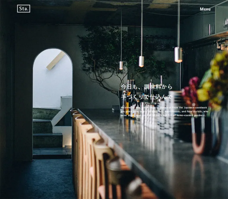
Sta. introduces its food through the spaces where it is served. The first screen is almost entirely a photograph: a long reflective counter, pale timber stools, concrete, a rounded opening, branches, and small pendant lights. A framed wordmark and two-line menu symbol occupy the upper corners. The headline is modest, leaving the room itself to establish the identity.
Below the photograph, the measured background is a cool medium gray, #ADADAF. Black text, thin rules, square photographs, and generous vertical intervals organize the page. Japanese statements carry the main message; much smaller English paragraphs create a second reading rhythm. Store photographs continue horizontally beyond the viewport. The footer expands the navigation into a sparse directory, while a black reservation strip remains visible at the bottom of the supplied scrolled captures.
閉じる
Sta. — Style Reference
Quiet restaurant interiors, a cool gray canvas, and carefully spaced bilingual typography.
Original URL: https://online-sta.com/ Final URL: https://online-sta.com/ — HTTP 200; no redirect recorded. Theme: gray content surfaces with black typography; white identity and copy over the opening photograph. Inspected: October 2, 2026, 02:07:57 JST. Supplied retrieval timestamp: October 1, 2026, 17:07:57.386 UTC. Viewports: desktop 1440 × 1000 CSS pixels; mobile 390 × 844 CSS pixels. Scope: the current restaurant brand homepage, including its opening hero, introduction text, Store section, Catering section, footer, and reservation strip. Screenshots show the desktop hero, store rail, lower catering/footer region, mobile hero, and mobile footer. DOM evidence covers additional page content and offscreen controls. Linked pages and open navigation or reservation states were not inspected.
Sta. introduces its food through the spaces where it is served. The first screen is almost entirely a photograph: a long reflective counter, pale timber stools, concrete, a rounded opening, branches, and small pendant lights. A framed wordmark and two-line menu symbol occupy the upper corners. The headline is modest, leaving the room itself to establish the identity.
Below the photograph, the measured background is a cool medium gray, #ADADAF. Black text, thin rules, square photographs, and generous vertical intervals organize the page. Japanese statements carry the main message; much smaller English paragraphs create a second reading rhythm. Store photographs continue horizontally beyond the viewport. The footer expands the navigation into a sparse directory, while a black reservation strip remains visible at the bottom of the supplied scrolled captures.
How to Read This Reference
- Measured means supplied computed styles, custom-property values, or element rectangles. Measurements are CSS pixels unless stated otherwise.
- Visual estimates describe screenshot geometry that was not separately measured in the DOM, including photo proportions, logo strokes, and the circular New badge.
- Inferred relationships connect measured positions, such as the gap between store cards. They do not establish the original CSS implementation.
- Recommendations and the Quick Start are implementation guidance. Their breakpoints, focus treatment, fallback fonts, and state handling are not verified original behavior.
- The supplied extraction includes content positioned outside the viewport. Its presence confirms content and destinations, but does not show how an opened panel looks or behaves.
- The mobile navigation-like screenshot is the footer. Its items and copyright align with the measured footer positions; it is not evidence of an opened menu.
Tokens — Colors
Core Palette
| Name | Value | Evidence | Role / suggested alias |
|---|---|---|---|
| Cool Gray | #ADADAF / rgb(173, 173, 175) |
Measured body background on both viewports | Main page canvas; --canvas |
| Black | #000000 |
Measured text, reservation-strip background, and desktop rail-control background | Typography, rules, solid controls; --ink |
| White | #FFFFFF |
Measured hero heading and English paragraph | Copy over photography; --reverse |
| Light black tint | rgba(0, 0, 0, .1) |
Source --color-bdr and --color-grey |
Available subtle border/tint value; application to every visible rule is not established |
| Stronger black tint | rgba(0, 0, 0, .2) |
Source --color-grey2 |
Secondary tint available in the stylesheet |
| Solid rule | rgba(0, 0, 0, 1) |
Source --color-bdr-black |
Strong black divider value |
The gray is a measured page color. Do not automatically interpret the lower-page screenshots as a white page covered by a temporary dark veil. The supplied body style independently reports the same gray on desktop and mobile.
The reservation label and New label appear gray against black in the captures. The New text is explicitly measured as rgb(173, 173, 175). The reservation anchor's inherited text color does not identify the rendered label descendant, so its visible label color is a screenshot observation.
Photographic Color
The photography introduces deep green-black shadows, cool concrete, warm wood, small amber lights, and occasional floral color. These are image colors, not additional measured interface tokens. Keep the interface neutral so that the room and food remain the principal sources of color.
An error-red variable exists in the supplied stylesheet properties, but no visible homepage error state was captured. It is not a general accent color for this reference.
Tokens — Typography
Japanese Text
The measured main stack begins with:
'A+EqpB-游ゴシック体 Pr6N D', 游ゴシック, YuGothic,
'Helvetica Neue', 'Segoe UI', 'ヒラギノ角ゴ Pro W3',
'Hiragino Kaku Gothic Pro', 'Hiragino Sans', メイリオ,
Meiryo, 'MS Pゴシック', sans-serif
The hero heading and store descriptions explicitly report the first family. Other Japanese paragraphs report the complete stack. The recorded weight is 400.
Japanese headings remain conversational in scale: 26px on desktop and approximately 20px on mobile. Their generous 1.8 line height gives two-line statements room to breathe without turning them into oversized display typography.
English Headings
- Measured family:
RotisSansSerif-ExtraBold. - Verified roles: Store and Catering section headings; Kanda, Nihonbashi, Azabudai, and Sakae titles.
- Recorded weight:
400. The heavier design is supplied by the named face; do not assume the source declaresfont-weight: 800. - Character: narrow, emphatic letterforms that establish a clear hierarchy without enormous type.
English Supporting Copy
- Measured family:
RotisSansSerif-Bold. - Verified roles: hero translation, introduction translation, section translations, store translations, New label, and copyright.
- Recorded weight:
400. - Typical scale: 12px with an 18px line height.
The English copy is a deliberate secondary layer, not ordinary body copy at the same size as Japanese. Preserve its tighter scale and distinct letterforms.
Navigation Measurement Caveat
The sampled English navigation anchors report the general Japanese/sans-serif stack, even though their visible letterforms are narrow and emphatic. The supplied evidence does not resolve descendant font styling. Rotis is directly verified for section and store headings, but assigning it to all navigation remains an implementation interpretation.
The framed Sta. wordmark should be treated as artwork. Its anchor's inherited font size is not a measurement of the lettering inside the mark.
Type Scale
Values below are measured, except the reservation-label row, which is explicitly a source token.
| Role | Desktop size / line height | Mobile size / line height | Family or evidence |
|---|---|---|---|
| Hero Japanese heading | 26 / 46.8px |
20.007 / 36.013px |
Japanese display face |
| Store and Catering Japanese lead | 26 / 46.8px |
20.007 / 36.013px |
General Japanese stack |
| Section heading | 40 / 40px |
28.002 / 28.002px |
Rotis ExtraBold |
| Store name | 30 / 30px |
24.999 / 24.999px |
Rotis ExtraBold |
| Japanese introduction and store description | 17 / 30.6px |
15.99 / 28.782px |
Japanese stack / display face |
| English supporting paragraph | 12 / 18px |
12.012 / 18.018px |
Rotis Bold |
| Main footer navigation | 30 / 30px |
23.985 / 23.985px |
Sampled anchor stack |
| Recruitment / contact links | 17 / 17px |
15.99 / 15.99px |
General stack |
| Company / policy links | 11 / 11px |
9.984 / 9.984px |
General stack |
| Underlined detail-link anchor | 14 / 14px |
17.063 / 17.063px |
Inherited anchor style; descendants may affect the box |
| Copyright | 12 / 12px |
12.012 / 12.012px |
Rotis Bold |
| New label | 20 / 20px |
15.99 / 15.99px |
Rotis Bold; mobile element is outside the initial rail view |
| Reservation-label token | 1.7rem = 17px |
4.1vw = 15.99px |
Source --font-btn-reserve; rendered label descendant not sampled |
Root Size and Tracking
The measured root is 10px on desktop and 12.1875px on mobile. The body consequently changes from 14px to 17.0625px, while many component sizes switch to viewport units. It would be inaccurate to copy the desktop rem values into a conventional 16px-root project unchanged.
Relevant source values include:
| Source property | Desktop | Mobile |
|---|---|---|
--font-main-h2 |
2.6rem |
5.13vw |
--font-main-en |
1.2rem |
3.08vw |
--font-size-h3 |
4rem |
7.18vw |
--font-ttl-shop |
3rem |
6.41vw |
--font-nav-main |
3rem |
6.15vw |
--font-nav-info |
1.1rem |
2.56vw |
Most sampled content inherits 0.84px tracking on desktop and 1.02375px on mobile. These are inherited lengths, not a fresh 0.06em calculation at each heading size. Main navigation has its own measured tracking of 1.8px and 1.4391px respectively. Copyright uses 0.72px and 0.72072px.
Tokens — Spacing & Shapes
Density: broad architectural spacing around compact text and controls. Geometry: square photographs and controls, thin rules, a framed wordmark, and one circular New marker. Scaling: a mixture of viewport-relative widths and role-specific pixel or viewport-unit spacing. The evidence does not establish a universal spacing grid.
Spacing Scale
| Relationship | Desktop | Mobile | Evidence |
|---|---|---|---|
| Main left inset | 106.70px |
40px |
Measured; source --inner-left is 7.41% / 10.26% |
| Header top | 32px |
20px |
Measured logo and control rectangles |
| Hero headline to English paragraph | 18px |
20px |
Calculated from measured text boxes |
| Store-card horizontal gap | 53.33px |
40px |
Calculated from adjacent card rectangles |
| Store heading to Japanese lead | 104px after heading box |
65px after heading box |
Measured positions |
| Store English lead to rail | 122px |
About 80px |
Measured positions |
| Hero end to introduction section | 240px |
About 160px |
Measured section starts |
| Store / Catering bottom padding | 240px |
160.017px |
Computed section padding |
| Detail-link bottom padding | 20px |
15.015px |
Computed anchor padding |
| Footer top rule to first navigation box | 121px |
41px |
Measured; includes the rule |
| Footer bottom padding | 120px |
120.003px |
Computed footer padding |
Shapes
| Element | Treatment | Evidence level |
|---|---|---|
| Store photographs | Square corners | Visible capture |
| Store links / sampled containers | border-radius: 0 |
Computed styles |
| Detail links | Text with a fine bottom rule | Visible capture and padding measurements |
| Footer dividers | Approximately 1px black rules | Visual estimate |
| Sta. frame | Approximately 2px rectangular outline | Visual estimate; use the approved artwork |
| Desktop rail-next control | Black square, approximately 80 × 80px |
Measured 79.906 × 79.906px |
| New badge | Black circle, approximately 60px diameter on desktop | Visual estimate |
There is no visible general-purpose shadow or rounded-card elevation system.
Layout Measurements
| Element | Desktop 1440 × 1000 | Mobile 390 × 844 |
|---|---|---|
| Hero | 1440 × 1000px |
390 × 844px |
| Logo link | 60 × 36.17px at (106.70, 32) |
51 × 29.98px at (40, 20) |
| Menu-link box | 24 × 36px at (1309.45, 32) |
20 × 29.98px at (330.02, 20) |
| Hero copy width | 373.28px |
310px |
| Hero heading top-left | (960.08, 408.20) |
(40, 454.48) |
| Aligned section text width | 1226.61px |
About 309.97px |
| Store-card width | 373.36px |
254.97px |
| Store photo | Approximately 373 × 498px |
Approximately 255 × 340px, inferred from the same portrait relationship |
| Reservation strip | 67px high |
55.98px high |
| Footer | 543px high |
736.23px high |
| Document height | 5211.77px |
5100.22px |
The source also exposes --inner-width, --block-text-width, and --content-width. These describe different containers. Do not apply one of their percentages indiscriminately to the header, text column, image rail, and footer rules.
Components
Header and Framed Wordmark
Role: a small, persistent identity and navigation entry point.
The header places the Sta. mark at the left content inset and a two-line menu symbol at the matching right inset. There is no visible filled header surface over the opening photograph. Both elements appear white there and black in the supplied gray-content captures where they are visible.
The logo link measures 60 × 36.17px on desktop and 51 × 29.98px on mobile. The menu symbol uses two horizontal strokes, approximately 24px wide on desktop and 20px on mobile. Avoid replacing it with a three-line hamburger or a large labeled button.
The header is visible at the top of the desktop Store capture and mobile footer capture. It is absent from the desktop footer capture, so an always-visible header at every scroll position is not established. Logo and menu elements have a measured 300ms transform transition, but the triggering behavior is unverified.
In the desktop Store capture, the section title reaches the logo's position and visually overlaps it. Treat this as an observed scroll-state collision, not an intentional combined logo/title treatment.
Full-Viewport Photographic Hero
Role: establish the restaurant's atmosphere before presenting destinations.
The hero exactly fills each inspected viewport. Its content consists of the room photograph, the overlaid header, and one bilingual copy group. No opening reservation strip is visible inside either hero capture.
The Japanese heading reads:
今日も、調味料から
手づくりで仕込んで
On desktop, the copy group occupies a 373px column in the right third. Its measured vertical extent is approximately 408–592px, centered around the 500px midpoint. The Japanese heading uses two spacious lines; the English paragraph follows 18px below and occupies four 18px lines.
On mobile, the group moves to the left inset at x = 40px, with a 310px width. The heading starts at y = 454.48px; the English paragraph starts at y = 546.48px and occupies five lines. The copy therefore sits below the screen midpoint rather than remaining vertically centered.
The mobile photograph shows a taller composition with substantial ceiling above the room and the rounded opening toward the left. The image asset and crop rules were not supplied. Use responsive art direction or carefully tuned cropping rather than stretching a desktop screenshot.
Bilingual Copy Group
Role: pair a readable Japanese statement with a smaller English interpretation.
The recurring anatomy is:
- A Japanese heading or paragraph with
1.8line height. - A small separation, typically 10–20px depending on context.
- Rotis Bold English text at approximately
12px / 18px. - An optional detail link separated by substantially more space.
Keep the two languages visually distinct. Do not promote every English paragraph into a second headline. Use real text with independent language markup so wrapping and accessibility remain controllable.
Brand Introduction
Role: explain the food philosophy and lead to About.
The DOM confirms a Japanese paragraph about chefs, nutritionists, food stylists, and preparing seasonings by hand, followed by the English introduction and the link Sta.について.
On desktop, its copy sits at x = 106.70px in a 373.25px column. The Japanese paragraph uses 17px / 30.6px; the English paragraph begins about 10px after it. The About link begins 55px after the English paragraph's box.
On mobile, the copy uses a roughly 310px column at x = 40px, with Japanese text at 15.99px / 28.782px. The link follows the English paragraph by 40px.
This section is measured in the DOM but is not represented by a dedicated supplied screenshot. Its surrounding imagery and exact image arrangement cannot be specified from the evidence.
Store Section Introduction
Role: frame locations as individual spaces with their own history.
A 40px English Store heading precedes the Japanese lead その場所ならではの食卓で。 and a 12px English line. On mobile the heading becomes approximately 28px and the Japanese lead approximately 20px.
The important feature is the vertical pacing: 104px separates the desktop heading box from the Japanese lead, and another 122px separates the English line from the photo rail. Mobile keeps the same sequence but reduces those intervals to 65px and approximately 80px.
Store Rail and Linked Store Card
Role: let visitors compare places visually and enter a location page.
The rail contains Kanda, Nihonbashi, Azabudai, and Sakae in that order. Each location is a linked unit containing:
- A large portrait interior photograph.
- A Rotis ExtraBold location name.
- A Japanese description of the space.
- A smaller English description.
- Service labels such as Restaurant, Cafe, and Bar.
Nihonbashi lists Restaurant and Bar; the other supplied entries also list Cafe. The exact visual treatment of the labels is not visible in the provided rail screenshot, so do not infer pill badges or an icon system.
Desktop cards are 373.36px wide, separated by approximately 53.33px. Three complete photographs fit between the main side alignments; the fourth begins at x = 1386.61px and remains partially visible at the right edge. The photographs appear to use a 3:4 portrait ratio, followed by approximately 30px before the location title.
Mobile retains a horizontal rail. Cards measure 254.97px with 40px gaps. The first begins at x = 40px and the second at x = 334.97px, leaving approximately 55px of the next card visible. The title starts approximately 360px below the card top, consistent with a 340px portrait image and a 20px title gap.
The entire card links to its location page. Keep its photograph and descriptive text together; do not make the title a disconnected navigation element.
Rail-Next Control and New Badge
The desktop rail has a black square control at the viewport's right edge, approximately 80 × 80px, containing a small light chevron. Its measured top is 309px below the rail start. It overlays the rail rather than consuming a full card column.
A black circular New marker overlaps the upper-left area of Sakae's photograph. Its diameter is approximately 60px, and its text is measured at 20px in the canvas gray.
No next-control rectangle is included in the mobile evidence. The cards still extend horizontally, but touch dragging, arrow activation, snapping, and looping were not exercised. A clipped next card is a confirmed affordance; a particular carousel engine is not.
Underlined Detail Link
Role: a quiet secondary action.
Observed labels include Sta.について, すべての店舗を見る, and さらに詳しく. These use plain black text and a short rule sized to the link rather than a full-width button.
Desktop links have a measured 20px bottom padding and approximately 38px total height. Mobile uses about 15px bottom padding and a 33px total height. Their source text sizes do not scale uniformly: the sampled anchor is 14px on desktop and about 17px on mobile.
Preserve the combination of small text, generous space below the label, and a fine rule. Do not substitute a rounded, filled call-to-action button for every secondary link.
Catering Feature
Role: extend the food offering from restaurant visits to bento catering.
The section uses a 40px English heading, a Japanese two-line lead, a small English explanation, and さらに詳しく.
Desktop text occupies the right column at x = 960.06px with a width of 373.25px. The lower-page screenshot shows part of a large bento photograph on the left, approximately 800px wide, against a pale textured surface. The photograph's full height and upper crop are not supplied.
Mobile text moves to x = 40px with a roughly 310px width. Its Japanese lead becomes approximately 20px. The mobile image position and crop are not visible in the supplied screenshots and should remain unspecified.
Reservation Strip
Role: maintain a clear route toward booking after the opening view.
A full-width black strip appears at the bottom of the supplied scrolled captures, with 座席予約 centered inside. It occupies the bottom 67px on desktop and approximately 56px on mobile. It has no rounded corners or separate floating-button enclosure.
In the initial DOM snapshot, its top is exactly at the viewport boundary: y = 1000px or y = 844px. It is not visible over the initial hero screenshots. Later screenshots show it at the viewport bottom. This supports a state-dependent bottom placement, but does not establish the exact reveal threshold or animation.
The strip's anchor uses javascript:void(0);. Separate offscreen content contains location-specific TableCheck links for all four stores. The reservation-selection interaction was not opened, so its appearance and routing sequence remain unverified.
Footer Directory
Role: give the brand a complete, orderly navigation ending.
The footer retains the gray page surface. A fine horizontal rule begins at the main left inset and extends to the right viewport edge.
On desktop, the content is divided into two columns:
- Left: Top, About, Store, Catering, then the copyright line.
- Right: recruitment and contact links, smaller company and policy links, then social icons.
The first column starts at x = 106.70px; the second starts at x = 746.64px. Main navigation is 30px with a 60px vertical start-to-start interval. Secondary links are 17px; legal and company links are 11px. The visible social marks are Instagram, Facebook, and the Twitter bird, corresponding to the supplied destinations.
Mobile converts this into a single vertical directory at x = 40px. Rules separate the main navigation, information links, and social area. Main navigation is approximately 24px with 41px start-to-start spacing. Social marks precede the copyright instead of sharing its desktop row.
The visible copyright is © 2019-2026 Sta Inc.. The bottom reservation strip remains a separate black element.
Offscreen Navigation and Supporting Content
The DOM includes another primary navigation group outside the viewport, location information with detail and booking links, and delivery-fee content with a Close control. For example, mobile navigation anchors begin at x = 430px, outside the 390px screen.
These measurements establish that the content exists; they do not establish the open panel's final position, backdrop, focus behavior, or animation. Do not present the delivery table as an ordinary visible homepage section or invent an opened menu composition from its extracted text.
Tokens — Motion & Interaction
| Target | Recorded value or evidence | What can be concluded |
|---|---|---|
| Body and main | opacity 0.6s |
A 600ms opacity transition is declared; its trigger was not established |
| Hero heading and paragraph | color 0.6s |
A 600ms color transition is declared |
| Logo container | transform 0.3s |
A 300ms transform transition is declared |
| Desktop menu control | transform 0.3s, opacity 0.15s linear |
Transform and opacity transitions are available |
| Desktop navigation, store links, detail links | opacity 0.15s linear |
Brief opacity feedback is defined; the target opacity was not supplied |
| Many mobile links | Serialized as all |
No positive transition duration is established by this value alone |
| Sampled element animations | none |
No active named animation is reported on these sampled elements |
| Store rail | Overflowing cards and desktop next control | Horizontal navigation is suggested; movement and snapping are unverified |
| Reservation strip | Absent from hero, present at bottom of scrolled captures | Visibility or placement changes with page state; exact logic is unverified |
The supplied capture process waited for document loading, image decoding, and sampled layout stability, and traversed intermediate scroll positions. It did not provide a record of clicking the menu, advancing the rail, opening booking content, or testing keyboard navigation.
There is no sufficient evidence here for parallax, autoplay hero slides, background video, spring motion, or a specific panel entrance effect. For an adaptation, short opacity transitions are a compatible choice; additional motion should be labeled as a new design decision.
Surfaces
| Surface | Appearance | Purpose |
|---|---|---|
| Opening hero | Full-viewport interior photograph | Atmosphere and brand introduction |
| Main document | Flat #ADADAF |
Consistent background for copy and images |
| Store card | Photograph and text directly on the page | Location discovery without a separate card surface |
| Detail action | Black text and a fine rule | Low-emphasis navigation |
| Rail control | Solid black square | Strong local navigation affordance |
| New marker | Black circle with gray text | One location-specific announcement |
| Footer | Same gray with black rules | Navigation hierarchy and closure |
| Reservation strip | Full-width black band | Persistent booking entry in scrolled captures |
The visible hierarchy comes from scale, empty space, photographic boundaries, and contrast. Avoid adding a generic system of raised white cards.
Imagery
Photography carries most of the site's personality. The interiors are quiet and materially specific: dark walls, rough concrete, warm timber, metal and glass reflections, architectural openings, plants, and small pools of light. The spaces are shown without visible crowds in the supplied views.
The hero emphasizes depth. The counter and row of stools lead away from the foreground, while the rounded opening and tree provide recognizable anchors. Its restrained exposure supports white text without a visible text panel.
Store photographs are composed as vertical architectural studies. Kanda is framed through a rounded passage; Nihonbashi emphasizes the semi-basement room, tables, and exposed structure; Azabudai shows planting and warm interior surfaces. Only a narrow portion of Sakae's photograph is visible in the desktop rail capture, so a full compositional description would be speculative.
The visible catering image introduces food color and a lighter textured surface. Maintain its editorial still-life character rather than replacing it with a tightly cropped product tile on a pure white background.
Observed Asset References
No original image URLs, font-file URLs, SVG paths, or image intrinsic dimensions were included in the supplied evidence. The table identifies the observed assets without inventing filenames.
| Asset | Evidence | Implementation guidance |
|---|---|---|
| Hero interior photograph | Desktop and mobile opening captures | Obtain the approved original and tune each viewport's framing |
| Kanda portrait | Desktop Store capture | Preserve the arch, depth, and portrait framing |
| Nihonbashi portrait | Desktop Store capture | Retain the room's structural details and subdued light |
| Azabudai portrait | Desktop Store capture | Preserve the planting, timber, and dark background relationship |
| Sakae portrait | Partial desktop rail view | Full image composition unverified |
| Catering photograph | Upper portion of desktop lower-page capture | Large food photograph on a textured neutral surface; full crop unverified |
| Sta. wordmark | Header captures | Use approved artwork rather than approximating its lettering from the anchor font |
| Social marks | Desktop and mobile footer captures | Keep their small monochrome treatment and provide accessible names |
Use sharp, high-quality photography without artificial sharpening, decorative color washes, or unnecessary rounded masks. Exact crop matching requires the source image, not merely the screenshot dimensions.
Layout & Responsive Behavior
Paired Observations
| Relationship | Desktop | Mobile |
|---|---|---|
| Header inset | About 7.41% of viewport width | About 10.26%, measuring 40px |
| Hero copy | Right third, vertically centered as a group | Left aligned, beginning below the screen midpoint |
| Hero Japanese size | 26px | About 20px |
| English supporting size | 12px | Remains about 12px |
| Main copy | Narrow columns within a broad layout | Approximately 310px wide |
| Store rail | Three full portraits and a sliver of the fourth | One full portrait and a sliver of the second |
| Store card width | About 25.93% of viewport | About 65.38% of viewport |
| Footer | Two columns | Stacked groups separated by rules |
| Reservation strip | 67px high | About 56px high |
The store rail does not become a vertical list on mobile. Its measured card widths and offscreen positions preserve horizontal continuation.
The desktop content alignment suggests a useful reusable grid: approximately 106.7px side insets, 53.3px gutters, and three 373.3px columns at 1440px. The hero copy and catering copy align with the third column. The visible catering photograph spans approximately the first two columns and their intervening gap. This is a relationship inferred from measurements, not a recovered source grid declaration.
Measured Document Flow
Coordinates below are document positions from the initial DOM observations, not positions inside the scrolled screenshots.
| Region | Desktop top / height | Mobile top / height |
|---|---|---|
| Hero | 0 / 1000px |
0 / 844px |
| Introduction | 1240 / 719.98px |
1004.02 / 1083.59px |
| Store | 2079.98 / 1531.80px |
2087.61 / 1169.67px |
| Catering | 3611.78 / 1056.98px |
3257.28 / 1106.70px |
| Footer | 4668.77 / 543px |
4363.98 / 736.23px |
These heights describe the captured content and wrapping. They should not become fixed section heights in a new implementation.
The source provides --vh: 10px on desktop and --vh: 8.44px on mobile, matching one percent of each inspected viewport height. A modern viewport-unit implementation is reasonable, but browser-toolbar behavior was not tested.
No exact breakpoint was supplied. The Quick Start uses 48rem as a recommended breakpoint and preserves the two observed endpoint compositions. Intermediate widths, landscape phones, text zoom, and safe-area behavior require separate verification.
Do’s and Don’ts
Do
- Keep the measured gray canvas, black structure, and white hero copy.
- Let the room photograph dominate the opening screen.
- Preserve the small framed wordmark and two-line menu symbol.
- Pair spacious Japanese text with much smaller Rotis English copy.
- Maintain a clear distinction between Rotis Bold and Rotis ExtraBold roles.
- Keep store photographs square-cornered and approximately
3:4. - Preserve horizontal continuation and a visible next-card fragment on mobile.
- Use large vertical intervals to separate editorial subjects.
- Keep detail links understated, with a short bottom rule.
- Stack the footer into clearly separated groups on mobile.
- Reserve the black bottom band for the booking entry.
Don’t
- Don’t replace the measured gray with white or beige by assumption.
- Don’t center the desktop hero headline or enlarge it into a dominant slogan.
- Don’t treat the English paragraphs as equal-sized duplicates of the Japanese.
- Don’t turn the store rail into a conventional rounded-card grid.
- Don’t add colorful category pills without a new, explicit design reason.
- Don’t infer an open menu from the mobile footer screenshot.
- Don’t reproduce the captured logo/title overlap as an intentional lockup.
- Don’t assume autoplay, parallax, carousel looping, or a drawer animation.
- Don’t apply desktop
remvalues under a different root size unchanged. - Don’t claim source asset paths, font delivery details, or production authorship that were not established by the inspected page.
Recommended Implementation Additions
These are recommendations for a new implementation, not verified original features:
- Use buttons for menu and reservation-panel actions instead of
javascript:void(0)anchors. Provide accessible names, state attributes, and keyboard activation. - If navigation opens as a modal panel, implement focus management, Escape dismissal, focus return, and inert background content.
- Give the store rail keyboard-reachable links and usable horizontal navigation. Native overflow with optional scroll snapping is a practical starting point; snapping is not an observed source feature.
- Increase the interactive hit area around the small menu symbol and social marks without enlarging their visible artwork.
- Keep legal links readable under zoom. A 12px minimum is a reasonable adaptation of the approximately 10px mobile original.
- Test white hero copy against each responsive crop. Adjust the crop or add a restrained local contrast treatment only where necessary.
- Reserve enough bottom clearance for the booking strip, including device safe areas, so it does not hide focused links or final content.
- Use section headings and card headings with an appropriate semantic hierarchy. The source samples both section labels and location titles as
h3; visual size can be preserved while improving document structure. - Prevent offscreen panels from remaining in the tab sequence when closed.
- Respect reduced-motion preferences, particularly for any added rail scrolling or panel transitions.
- Add header clearance where needed to prevent the overlap visible in the captured Store state.
Agent Prompt Guide
Quick Color Reference
- Main canvas:
#ADADAF. - Text, rules, icons, and filled controls:
#000000. - Hero text and header artwork over photography:
#FFFFFF. - New badge: black circle with canvas-gray lettering.
- Reservation entry: full-width black bottom strip with a restrained light label.
- Additional color: supplied by photography rather than interface accents.
Overall Prompt
“Create a restaurant brand homepage inspired by Sta.'s current visual system. Begin with a full-viewport, quietly lit restaurant interior photograph, a small framed wordmark at the upper left, and a two-line menu symbol at the upper right. Place modest white Japanese copy and a much smaller English paragraph in the right third on desktop, then move the group to the left below the midpoint on mobile. Use a cool gray #ADADAF document background, black typography, measured Japanese sans-serif text, and narrow Rotis-style English headings. Build a horizontally continuing rail of square-cornered portrait store photographs, sparse underlined detail links, a large catering feature, and a directory footer that stacks on mobile. Show a black reservation band in scrolled states. Preserve generous spacing and photographic depth.”
Example Component Prompts
- Hero: “At 1440 × 1000, fill the opening screen with an interior photograph and place a 373px copy group near x = 960px, centered vertically. Use a 26px Japanese heading at 1.8 line height and 12px English copy at 1.5. At 390 × 844, use a 310px copy width with 40px side insets and start the heading near y = 454px. Tune the image crop independently.”
- Store rail: “Build an overflowing row of approximately 3:4 restaurant portraits on a gray canvas. Desktop cards are about 373px wide with 53px gaps; mobile cards are about 255px wide with 40px gaps. Follow each image with a narrow emphatic location name, Japanese description, smaller English description, and service labels. Keep part of the next card visible.”
- Detail link: “Use a short black Japanese label above a fine black rule, with approximately 20px of breathing room below the text on desktop. Keep the link unfilled and sized to its content.”
- Footer: “Use a gray directory footer with a thin rule extending from the left content inset to the right edge. Arrange large English navigation on the left and smaller Japanese information links on the right. On mobile, stack the groups with horizontal dividers, then social icons and copyright.”
- Reservation band: “Create a flat black strip across the viewport bottom, 67px high on desktop and 56px on mobile, with the centered label
座席予約. Keep the opening photograph unobstructed and let the application determine when the strip becomes visible. Do not invent the booking panel.”
Quick Start
CSS Custom Properties
This is an adaptation of the measured proportions, not recovered source CSS. It keeps a conventional root size and declares observed font-family names without inventing font-file URLs. Supply approved photography, wordmark artwork, and licensed fonts separately. Fallback fonts will change line lengths and visual weight.
Expected component structure:
- A
body.sta-sitecontaining.site-header,.hero, content sections,.site-footer, and.reservation-bar. .herocontains.hero-mediaand.hero-copy; the latter contains.hero-titleand.english-copy..store-railcontains linked.store-cardelements with an image,.store-name, description paragraphs, and optional service text..footer-gridcontains.footer-primary,.footer-utility,.footer-social, and.footer-copy.
The application supplies data-over-photo='true' for header contrast and data-visible='true' for the reservation strip. Their exact source triggers are unknown. The proposed 48rem breakpoint, hover opacity, readable mobile size floors, and accessible hit areas are recommendations.
:root {
  /* Measured core colors */
  --canvas: #adadaf;
  --ink: #000;
  --reverse: #fff;

  /* Observed family names; font files must be supplied separately */
  --font-ja: 'A+EqpB-游ゴシック体 Pr6N D', 'Yu Gothic',
    YuGothic, 'Hiragino Sans', sans-serif;
  --font-en: 'RotisSansSerif-Bold', 'Arial Narrow',
    'Helvetica Neue', sans-serif;
  --font-display: 'RotisSansSerif-ExtraBold', 'Arial Narrow',
    'Helvetica Neue', sans-serif;

  --text-hero: 26px;
  --text-section: 40px;
  --text-store: 30px;
  --text-ja: 17px;
  --text-en: 12px;
  --text-nav: 30px;
  --text-side: 17px;
  --text-legal: 11px;
  --tracking-copy: 0.84px;
  --leading-ja: 1.8;
  --leading-en: 1.5;

  /* Desktop geometry inferred from measured alignments */
  --gutter: 7.41vw;
  --rail-gap: 3.704vw;
  --column: calc(
    (100vw - 2 * var(--gutter) - 2 * var(--rail-gap)) / 3
  );
  --card-width: var(--column);
  --section-space: 240px;
  --hero-copy-gap: 18px;
  --reservation-height: 67px;
  --safe-bottom: env(safe-area-inset-bottom, 0px);
  --rule: 1px;

  /* Neutral starting crop; tune against the approved photograph */
  --hero-focus: 50% 50%;
  --motion-link: 150ms linear;
  --motion-header: 300ms ease;
}

* {
  box-sizing: border-box;
}

body.sta-site {
  margin: 0;
  color: var(--ink);
  background: var(--canvas);
  font-family: var(--font-ja);
  font-size: 14px;
  font-weight: 400;
  line-height: 1.5;
  letter-spacing: var(--tracking-copy);
}

.sta-site a {
  color: inherit;
}

.sta-site button {
  font: inherit;
  letter-spacing: inherit;
}

.content-width {
  margin-inline: var(--gutter);
}

.japanese-copy,
.english-copy {
  margin: 0;
}

.japanese-copy {
  font-size: var(--text-ja);
  line-height: var(--leading-ja);
}

.english-copy {
  font-family: var(--font-en);
  font-size: var(--text-en);
  font-weight: 400;
  line-height: var(--leading-en);
}

.site-header {
  position: fixed;
  z-index: 30;
  inset: 32px var(--gutter) auto;
  height: 36.17px;
  display: flex;
  align-items: center;
  justify-content: space-between;
  color: var(--ink);
  pointer-events: none;
  transition: transform var(--motion-header);
}

.site-header[data-over-photo='true'] {
  color: var(--reverse);
}

.site-header > * {
  pointer-events: auto;
}

.brand {
  display: block;
  width: 60px;
  height: 36.17px;
}

.brand svg,
.brand img {
  display: block;
  width: 100%;
  height: 100%;
}

/* Use approved currentColor artwork or separate contrast variants. */
.menu-toggle {
  display: grid;
  place-content: center end;
  gap: 7px;
  width: 44px;
  height: 44px;
  padding: 0;
  border: 0;
  color: inherit;
  background: transparent;
  cursor: pointer;
}

.menu-toggle span {
  display: block;
  width: 24px;
  height: 2px;
  background: currentColor;
}

.hero {
  position: relative;
  isolation: isolate;
  height: 100vh;
  height: 100svh;
  color: var(--reverse);
  overflow: hidden;
}

.hero-media {
  position: absolute;
  z-index: -1;
  inset: 0;
  display: block;
}

.hero-media img {
  display: block;
  width: 100%;
  height: 100%;
  object-fit: cover;
  object-position: var(--hero-focus);
}

.hero-copy {
  position: absolute;
  top: 50%;
  right: var(--gutter);
  width: var(--column);
  transform: translateY(-50%);
}

.hero-title {
  margin: 0 0 var(--hero-copy-gap);
  font-family: var(--font-ja);
  font-size: var(--text-hero);
  font-weight: 400;
  line-height: var(--leading-ja);
}

.intro {
  margin-top: var(--section-space);
}

.intro-copy {
  width: var(--column);
}

.intro-copy .english-copy {
  margin-top: 10px;
}

.intro-copy .text-link {
  margin-top: 55px;
}

.section-title {
  margin: 0;
  font-family: var(--font-display);
  font-size: var(--text-section);
  font-weight: 400;
  line-height: 1;
}

.store-section,
.catering-section {
  padding-block: 55px var(--section-space);
}

.section-lead {
  margin-top: 104px;
}

.section-lead .japanese-copy {
  font-size: var(--text-hero);
}

.section-lead .english-copy {
  margin-top: 18px;
}

/* Native overflow is an adaptation, not a verified source engine. */
.store-rail {
  display: grid;
  grid-auto-flow: column;
  grid-auto-columns: var(--card-width);
  align-items: start;
  gap: var(--rail-gap);
  margin-top: 122px;
  padding: 20px var(--gutter) 8px;
  overflow-x: auto;
  scroll-padding-inline: var(--gutter);
  overscroll-behavior-inline: contain;
}

.store-card {
  position: relative;
  display: block;
  min-width: 0;
  text-decoration: none;
  transition: opacity var(--motion-link);
}

.store-card > img {
  display: block;
  width: 100%;
  aspect-ratio: 3 / 4;
  object-fit: cover;
  border-radius: 0;
}

.store-name {
  margin: 30px 0 16px;
  font-family: var(--font-display);
  font-size: var(--text-store);
  font-weight: 400;
  line-height: 1;
}

.store-card .english-copy {
  margin-top: 10px;
}

/* Plain service text is a recommendation; source styling is unverified. */
.store-services {
  display: flex;
  flex-wrap: wrap;
  gap: 12px;
  margin-top: 30px;
  font-family: var(--font-en);
  font-size: var(--text-en);
}

.new-badge {
  position: absolute;
  top: -20px;
  left: -20px;
  display: grid;
  place-items: center;
  width: 60px;
  aspect-ratio: 1;
  border-radius: 50%;
  color: var(--canvas);
  background: var(--ink);
  font-family: var(--font-en);
  font-size: 20px;
  line-height: 1;
}

.text-link {
  display: inline-block;
  padding-bottom: 20px;
  border-bottom: var(--rule) solid currentColor;
  font-size: 14px;
  line-height: 17px;
  text-decoration: none;
  transition: opacity var(--motion-link);
}

.store-more {
  margin-top: 122px;
  margin-left: var(--gutter);
}

/* Desktop feature alignment follows the visible catering composition. */
.catering-layout {
  display: grid;
  grid-template-columns: minmax(0, 1fr) var(--column);
  align-items: center;
  gap: var(--rail-gap);
  margin-top: 120px;
}

.catering-image {
  display: block;
  width: 100%;
  height: auto;
}

.catering-copy .japanese-copy {
  font-size: var(--text-hero);
}

.catering-copy .english-copy {
  margin-top: 10px;
}

.catering-copy .text-link {
  margin-top: 55px;
}

.site-footer {
  margin-left: var(--gutter);
  padding: 120px var(--gutter) 120px 0;
  border-top: var(--rule) solid var(--ink);
}

.footer-grid {
  display: grid;
  grid-template-columns: repeat(2, minmax(0, 1fr));
  grid-template-areas:
    'primary utility'
    'copyright social';
  gap: 60px var(--rail-gap);
}

.footer-primary {
  grid-area: primary;
  display: grid;
  justify-items: start;
  align-content: start;
  gap: 30px;
  font-size: var(--text-nav);
  line-height: 1;
  letter-spacing: 0.06em;
}

.footer-primary a,
.footer-utility a {
  text-decoration: none;
}

.footer-utility {
  grid-area: utility;
}

.footer-contact,
.footer-legal {
  display: grid;
  justify-items: start;
}

.footer-contact {
  gap: 20px;
  font-size: var(--text-side);
  line-height: 1;
  letter-spacing: 0.06em;
}

.footer-legal {
  gap: 21px;
  margin-top: 60px;
  font-size: var(--text-legal);
  line-height: 1;
  letter-spacing: 0.06em;
}

.footer-social {
  grid-area: social;
  display: flex;
  align-items: center;
  gap: 30px;
}

.footer-social a {
  position: relative;
  display: block;
  width: 18px;
  height: 19px;
}

/* Enlarge the hit area without enlarging the icon artwork. */
.footer-social a::after {
  content: '';
  position: absolute;
  width: 44px;
  height: 44px;
  left: 50%;
  top: 50%;
  transform: translate(-50%, -50%);
}

.footer-social svg {
  display: block;
  width: 100%;
  height: 100%;
}

.footer-copy {
  grid-area: copyright;
  margin: 0;
  font-family: var(--font-en);
  font-size: 12px;
  line-height: 1;
  letter-spacing: 0.06em;
}

.reservation-bar {
  position: fixed;
  z-index: 40;
  inset: auto 0 0;
  display: none;
  place-items: center;
  width: 100%;
  min-height: calc(var(--reservation-height) + var(--safe-bottom));
  padding: 0 20px var(--safe-bottom);
  border: 0;
  border-radius: 0;
  color: var(--canvas);
  background: var(--ink);
  font-size: 17px;
  text-align: center;
  text-decoration: none;
  cursor: pointer;
}

.reservation-bar[data-visible='true'] {
  display: grid;
}

.sta-site :focus-visible {
  outline: 2px solid currentColor;
  outline-offset: 5px;
}

@media (hover: hover) {
  /* Recommended endpoint; only the source duration was measured. */
  .text-link:hover,
  .store-card:hover,
  .footer-grid a:hover {
    opacity: 0.72;
  }
}

@media (max-width: 48rem) {
  :root {
    --gutter: 10.26vw;
    --rail-gap: 10.26vw;
    --column: calc(100vw - 2 * var(--gutter));
    --card-width: 65.38vw;
    --section-space: 160px;
    --hero-copy-gap: 20px;
    --reservation-height: 56px;
    --tracking-copy: clamp(0.96px, 0.2625vw, 1.08px);

    /* Readability floors are recommended additions. */
    --text-hero: clamp(20px, 5.13vw, 26px);
    --text-section: clamp(28px, 7.18vw, 36px);
    --text-store: clamp(25px, 6.41vw, 30px);
    --text-ja: clamp(16px, 4.1vw, 18px);
    --text-en: clamp(12px, 3.08vw, 14px);
    --text-nav: clamp(24px, 6.15vw, 28px);
    --text-side: 16px;
    --text-legal: 12px;
  }

  body.sta-site {
    font-size: 17px;
  }

  .site-header {
    top: 20px;
    height: 30px;
  }

  .brand {
    width: 51px;
    height: 30px;
  }

  .menu-toggle {
    gap: 6px;
  }

  .menu-toggle span {
    width: 20px;
  }

  .hero-copy {
    top: auto;
    right: var(--gutter);
    bottom: 24.58%;
    left: var(--gutter);
    width: auto;
    transform: none;
  }

  .intro-copy {
    width: 100%;
  }

  .intro-copy .text-link {
    margin-top: 40px;
  }

  .store-section,
  .catering-section {
    padding-top: 41px;
  }

  .section-lead {
    margin-top: 65px;
  }

  .section-lead .english-copy {
    margin-top: 20px;
  }

  .store-rail {
    margin-top: 80px;
  }

  .store-name {
    margin-top: 20px;
    margin-bottom: 15px;
  }

  .store-card .english-copy {
    margin-top: 12px;
  }

  .text-link {
    padding-bottom: 15px;
    font-size: 17px;
    line-height: 17px;
  }

  .store-more {
    margin-top: 90px;
  }

  .catering-layout {
    grid-template-columns: minmax(0, 1fr);
    gap: 60px;
    margin-top: 80px;
  }

  /* Copy-first mobile order is a recommendation, not a captured image order. */
  .catering-copy {
    grid-row: 1;
  }

  .catering-copy .text-link {
    margin-top: 40px;
  }

  .site-footer {
    padding: 0 0 140px;
  }

  .footer-grid {
    grid-template-columns: minmax(0, 1fr);
    grid-template-areas:
      'primary'
      'utility'
      'social'
      'copyright';
    gap: 0;
  }

  .footer-primary {
    gap: 17px;
    padding-block: 40px;
    border-bottom: var(--rule) solid var(--ink);
  }

  .footer-utility {
    padding-block: 40px 48px;
    border-bottom: var(--rule) solid var(--ink);
  }

  .footer-contact {
    gap: 21px;
  }

  .footer-legal {
    gap: 23px;
    margin-top: 41px;
  }

  .footer-social {
    margin-top: 40px;
  }

  .footer-social a {
    width: 14px;
    height: 17px;
  }

  .footer-copy {
    margin-top: 40px;
  }

  .reservation-bar {
    font-size: 16px;
  }
}

@media (prefers-reduced-motion: reduce) {
  .sta-site *,
  .sta-site *::before,
  .sta-site *::after {
    animation: none !important;
    transition: none !important;
    scroll-behavior: auto !important;
  }
}
The CSS intentionally leaves menu opening, reservation selection, and any rail-next button behavior to the application. It also does not manufacture the introduction's uncaptured imagery or force the measured document heights. The extra rail padding protects overlapping badges; adjust section spacing during visual comparison because this is an implementation addition.
Tailwind v4 Token Mapping
Optional aliases for a project already using Tailwind v4. Define the properties above first. This mapping does not imply that the original site uses Tailwind.
@theme inline {
  --color-sta-canvas: var(--canvas);
  --color-sta-ink: var(--ink);
  --color-sta-reverse: var(--reverse);

  --font-sta-ja: var(--font-ja);
  --font-sta-en: var(--font-en);
  --font-sta-display: var(--font-display);

  --text-sta-hero: var(--text-hero);
  --text-sta-section: var(--text-section);
  --text-sta-store: var(--text-store);
  --text-sta-body: var(--text-ja);
  --text-sta-caption: var(--text-en);

  --spacing-sta-gutter: var(--gutter);
  --spacing-sta-rail-gap: var(--rail-gap);
  --spacing-sta-card: var(--card-width);
  --spacing-sta-section: var(--section-space);
  --spacing-sta-reservation: var(--reservation-height);
}
Sources & Evidence
- Sta. homepage: original and final inspected URL, HTTP 200. Supplied current-page screenshots and rendered DOM are the authority for this document.
- Capture timestamp: October 1, 2026, 17:07:57.386 UTC / October 2, 2026, 02:07:57.386 JST.
- Desktop evidence: 1440 × 1000 viewport; opening hero, Store rail, and lower catering/footer captures; measured document height approximately 5211.77px.
- Mobile evidence: 390 × 844 viewport; opening hero and footer captures; measured document height approximately 5100.22px. Additional section geometry comes from the supplied mobile DOM.
- Computed evidence: body color, root and component font sizes, named font families, tracking, line heights, element rectangles, padding, source custom properties, link destinations, and serialized transition values.
- Inspection limitations: no additional browsing was performed for this reference. Original asset URLs and full stylesheets were not supplied. Linked About, Store, Catering, company, legal, social, and booking destinations were not opened. Menu, booking, delivery-fee, carousel, hover, focus, and reduced-motion behavior were not exercised. Intermediate responsive widths and complete image arrangements outside the supplied screenshots remain unverified.
This reference describes the current homepage evidenced by the supplied captures. Measured values, visual estimates, inferred relationships, and implementation recommendations are identified separately throughout.
# Sta. — Style Reference

> Quiet restaurant interiors, a cool gray canvas, and carefully spaced bilingual typography.

**Original URL:** [https://online-sta.com/](https://online-sta.com/)
**Final URL:** [https://online-sta.com/](https://online-sta.com/) — HTTP 200; no redirect recorded.
**Theme:** gray content surfaces with black typography; white identity and copy over the opening photograph.
**Inspected:** October 2, 2026, 02:07:57 JST. Supplied retrieval timestamp: October 1, 2026, 17:07:57.386 UTC.
**Viewports:** desktop 1440 × 1000 CSS pixels; mobile 390 × 844 CSS pixels.
**Scope:** the current restaurant brand homepage, including its opening hero, introduction text, Store section, Catering section, footer, and reservation strip. Screenshots show the desktop hero, store rail, lower catering/footer region, mobile hero, and mobile footer. DOM evidence covers additional page content and offscreen controls. Linked pages and open navigation or reservation states were not inspected.

Sta. introduces its food through the spaces where it is served. The first screen is almost entirely a photograph: a long reflective counter, pale timber stools, concrete, a rounded opening, branches, and small pendant lights. A framed wordmark and two-line menu symbol occupy the upper corners. The headline is modest, leaving the room itself to establish the identity.

Below the photograph, the measured background is a cool medium gray, `#ADADAF`. Black text, thin rules, square photographs, and generous vertical intervals organize the page. Japanese statements carry the main message; much smaller English paragraphs create a second reading rhythm. Store photographs continue horizontally beyond the viewport. The footer expands the navigation into a sparse directory, while a black reservation strip remains visible at the bottom of the supplied scrolled captures.
閉じる
# Sta. — Style Reference

> Quiet restaurant interiors, a cool gray canvas, and carefully spaced bilingual typography.

**Original URL:** [https://online-sta.com/](https://online-sta.com/)
**Final URL:** [https://online-sta.com/](https://online-sta.com/) — HTTP 200; no redirect recorded.
**Theme:** gray content surfaces with black typography; white identity and copy over the opening photograph.
**Inspected:** October 2, 2026, 02:07:57 JST. Supplied retrieval timestamp: October 1, 2026, 17:07:57.386 UTC.
**Viewports:** desktop 1440 × 1000 CSS pixels; mobile 390 × 844 CSS pixels.
**Scope:** the current restaurant brand homepage, including its opening hero, introduction text, Store section, Catering section, footer, and reservation strip. Screenshots show the desktop hero, store rail, lower catering/footer region, mobile hero, and mobile footer. DOM evidence covers additional page content and offscreen controls. Linked pages and open navigation or reservation states were not inspected.

Sta. introduces its food through the spaces where it is served. The first screen is almost entirely a photograph: a long reflective counter, pale timber stools, concrete, a rounded opening, branches, and small pendant lights. A framed wordmark and two-line menu symbol occupy the upper corners. The headline is modest, leaving the room itself to establish the identity.

Below the photograph, the measured background is a cool medium gray, `#ADADAF`. Black text, thin rules, square photographs, and generous vertical intervals organize the page. Japanese statements carry the main message; much smaller English paragraphs create a second reading rhythm. Store photographs continue horizontally beyond the viewport. The footer expands the navigation into a sparse directory, while a black reservation strip remains visible at the bottom of the supplied scrolled captures.

## How to Read This Reference

- **Measured** means supplied computed styles, custom-property values, or element rectangles. Measurements are CSS pixels unless stated otherwise.
- **Visual estimates** describe screenshot geometry that was not separately measured in the DOM, including photo proportions, logo strokes, and the circular New badge.
- **Inferred relationships** connect measured positions, such as the gap between store cards. They do not establish the original CSS implementation.
- **Recommendations** and the Quick Start are implementation guidance. Their breakpoints, focus treatment, fallback fonts, and state handling are not verified original behavior.
- The supplied extraction includes content positioned outside the viewport. Its presence confirms content and destinations, but does not show how an opened panel looks or behaves.
- The mobile navigation-like screenshot is the **footer**. Its items and copyright align with the measured footer positions; it is not evidence of an opened menu.

## Tokens — Colors

### Core Palette

| Name | Value | Evidence | Role / suggested alias |
| --- | --- | --- | --- |
| Cool Gray | `#ADADAF` / `rgb(173, 173, 175)` | Measured body background on both viewports | Main page canvas; `--canvas` |
| Black | `#000000` | Measured text, reservation-strip background, and desktop rail-control background | Typography, rules, solid controls; `--ink` |
| White | `#FFFFFF` | Measured hero heading and English paragraph | Copy over photography; `--reverse` |
| Light black tint | `rgba(0, 0, 0, .1)` | Source `--color-bdr` and `--color-grey` | Available subtle border/tint value; application to every visible rule is not established |
| Stronger black tint | `rgba(0, 0, 0, .2)` | Source `--color-grey2` | Secondary tint available in the stylesheet |
| Solid rule | `rgba(0, 0, 0, 1)` | Source `--color-bdr-black` | Strong black divider value |

**The gray is a measured page color.** Do not automatically interpret the lower-page screenshots as a white page covered by a temporary dark veil. The supplied body style independently reports the same gray on desktop and mobile.

The reservation label and New label appear gray against black in the captures. The New text is explicitly measured as `rgb(173, 173, 175)`. The reservation anchor's inherited text color does not identify the rendered label descendant, so its visible label color is a screenshot observation.

### Photographic Color

The photography introduces deep green-black shadows, cool concrete, warm wood, small amber lights, and occasional floral color. These are image colors, not additional measured interface tokens. Keep the interface neutral so that the room and food remain the principal sources of color.

An error-red variable exists in the supplied stylesheet properties, but no visible homepage error state was captured. It is not a general accent color for this reference.

## Tokens — Typography

### Japanese Text

The measured main stack begins with:

```css
'A+EqpB-游ゴシック体 Pr6N D', 游ゴシック, YuGothic,
'Helvetica Neue', 'Segoe UI', 'ヒラギノ角ゴ Pro W3',
'Hiragino Kaku Gothic Pro', 'Hiragino Sans', メイリオ,
Meiryo, 'MS Pゴシック', sans-serif
```

The hero heading and store descriptions explicitly report the first family. Other Japanese paragraphs report the complete stack. The recorded weight is `400`.

Japanese headings remain conversational in scale: 26px on desktop and approximately 20px on mobile. Their generous `1.8` line height gives two-line statements room to breathe without turning them into oversized display typography.

### English Headings

- **Measured family:** `RotisSansSerif-ExtraBold`.
- **Verified roles:** Store and Catering section headings; Kanda, Nihonbashi, Azabudai, and Sakae titles.
- **Recorded weight:** `400`. The heavier design is supplied by the named face; do not assume the source declares `font-weight: 800`.
- **Character:** narrow, emphatic letterforms that establish a clear hierarchy without enormous type.

### English Supporting Copy

- **Measured family:** `RotisSansSerif-Bold`.
- **Verified roles:** hero translation, introduction translation, section translations, store translations, New label, and copyright.
- **Recorded weight:** `400`.
- **Typical scale:** 12px with an 18px line height.

The English copy is a deliberate secondary layer, not ordinary body copy at the same size as Japanese. Preserve its tighter scale and distinct letterforms.

### Navigation Measurement Caveat

The sampled English navigation anchors report the general Japanese/sans-serif stack, even though their visible letterforms are narrow and emphatic. The supplied evidence does not resolve descendant font styling. Rotis is directly verified for section and store headings, but assigning it to all navigation remains an implementation interpretation.

The framed Sta. wordmark should be treated as artwork. Its anchor's inherited font size is not a measurement of the lettering inside the mark.

### Type Scale

Values below are measured, except the reservation-label row, which is explicitly a source token.

| Role | Desktop size / line height | Mobile size / line height | Family or evidence |
| --- | --- | --- | --- |
| Hero Japanese heading | `26 / 46.8px` | `20.007 / 36.013px` | Japanese display face |
| Store and Catering Japanese lead | `26 / 46.8px` | `20.007 / 36.013px` | General Japanese stack |
| Section heading | `40 / 40px` | `28.002 / 28.002px` | Rotis ExtraBold |
| Store name | `30 / 30px` | `24.999 / 24.999px` | Rotis ExtraBold |
| Japanese introduction and store description | `17 / 30.6px` | `15.99 / 28.782px` | Japanese stack / display face |
| English supporting paragraph | `12 / 18px` | `12.012 / 18.018px` | Rotis Bold |
| Main footer navigation | `30 / 30px` | `23.985 / 23.985px` | Sampled anchor stack |
| Recruitment / contact links | `17 / 17px` | `15.99 / 15.99px` | General stack |
| Company / policy links | `11 / 11px` | `9.984 / 9.984px` | General stack |
| Underlined detail-link anchor | `14 / 14px` | `17.063 / 17.063px` | Inherited anchor style; descendants may affect the box |
| Copyright | `12 / 12px` | `12.012 / 12.012px` | Rotis Bold |
| New label | `20 / 20px` | `15.99 / 15.99px` | Rotis Bold; mobile element is outside the initial rail view |
| Reservation-label token | `1.7rem = 17px` | `4.1vw = 15.99px` | Source `--font-btn-reserve`; rendered label descendant not sampled |

### Root Size and Tracking

The measured root is **10px on desktop** and **12.1875px on mobile**. The body consequently changes from 14px to 17.0625px, while many component sizes switch to viewport units. It would be inaccurate to copy the desktop `rem` values into a conventional 16px-root project unchanged.

Relevant source values include:

| Source property | Desktop | Mobile |
| --- | --- | --- |
| `--font-main-h2` | `2.6rem` | `5.13vw` |
| `--font-main-en` | `1.2rem` | `3.08vw` |
| `--font-size-h3` | `4rem` | `7.18vw` |
| `--font-ttl-shop` | `3rem` | `6.41vw` |
| `--font-nav-main` | `3rem` | `6.15vw` |
| `--font-nav-info` | `1.1rem` | `2.56vw` |

Most sampled content inherits **0.84px tracking on desktop** and **1.02375px on mobile**. These are inherited lengths, not a fresh `0.06em` calculation at each heading size. Main navigation has its own measured tracking of 1.8px and 1.4391px respectively. Copyright uses 0.72px and 0.72072px.

## Tokens — Spacing & Shapes

**Density:** broad architectural spacing around compact text and controls.
**Geometry:** square photographs and controls, thin rules, a framed wordmark, and one circular New marker.
**Scaling:** a mixture of viewport-relative widths and role-specific pixel or viewport-unit spacing. The evidence does not establish a universal spacing grid.

### Spacing Scale

| Relationship | Desktop | Mobile | Evidence |
| --- | --- | --- | --- |
| Main left inset | `106.70px` | `40px` | Measured; source `--inner-left` is `7.41%` / `10.26%` |
| Header top | `32px` | `20px` | Measured logo and control rectangles |
| Hero headline to English paragraph | `18px` | `20px` | Calculated from measured text boxes |
| Store-card horizontal gap | `53.33px` | `40px` | Calculated from adjacent card rectangles |
| Store heading to Japanese lead | `104px` after heading box | `65px` after heading box | Measured positions |
| Store English lead to rail | `122px` | About `80px` | Measured positions |
| Hero end to introduction section | `240px` | About `160px` | Measured section starts |
| Store / Catering bottom padding | `240px` | `160.017px` | Computed section padding |
| Detail-link bottom padding | `20px` | `15.015px` | Computed anchor padding |
| Footer top rule to first navigation box | `121px` | `41px` | Measured; includes the rule |
| Footer bottom padding | `120px` | `120.003px` | Computed footer padding |

### Shapes

| Element | Treatment | Evidence level |
| --- | --- | --- |
| Store photographs | Square corners | Visible capture |
| Store links / sampled containers | `border-radius: 0` | Computed styles |
| Detail links | Text with a fine bottom rule | Visible capture and padding measurements |
| Footer dividers | Approximately 1px black rules | Visual estimate |
| Sta. frame | Approximately 2px rectangular outline | Visual estimate; use the approved artwork |
| Desktop rail-next control | Black square, approximately `80 × 80px` | Measured `79.906 × 79.906px` |
| New badge | Black circle, approximately 60px diameter on desktop | Visual estimate |

There is no visible general-purpose shadow or rounded-card elevation system.

### Layout Measurements

| Element | Desktop 1440 × 1000 | Mobile 390 × 844 |
| --- | --- | --- |
| Hero | `1440 × 1000px` | `390 × 844px` |
| Logo link | `60 × 36.17px` at `(106.70, 32)` | `51 × 29.98px` at `(40, 20)` |
| Menu-link box | `24 × 36px` at `(1309.45, 32)` | `20 × 29.98px` at `(330.02, 20)` |
| Hero copy width | `373.28px` | `310px` |
| Hero heading top-left | `(960.08, 408.20)` | `(40, 454.48)` |
| Aligned section text width | `1226.61px` | About `309.97px` |
| Store-card width | `373.36px` | `254.97px` |
| Store photo | Approximately `373 × 498px` | Approximately `255 × 340px`, inferred from the same portrait relationship |
| Reservation strip | `67px` high | `55.98px` high |
| Footer | `543px` high | `736.23px` high |
| Document height | `5211.77px` | `5100.22px` |

The source also exposes `--inner-width`, `--block-text-width`, and `--content-width`. These describe different containers. Do not apply one of their percentages indiscriminately to the header, text column, image rail, and footer rules.

## Components

### Header and Framed Wordmark

**Role:** a small, persistent identity and navigation entry point.

The header places the Sta. mark at the left content inset and a two-line menu symbol at the matching right inset. There is no visible filled header surface over the opening photograph. Both elements appear white there and black in the supplied gray-content captures where they are visible.

The logo link measures 60 × 36.17px on desktop and 51 × 29.98px on mobile. The menu symbol uses two horizontal strokes, approximately 24px wide on desktop and 20px on mobile. Avoid replacing it with a three-line hamburger or a large labeled button.

The header is visible at the top of the desktop Store capture and mobile footer capture. It is absent from the desktop footer capture, so an always-visible header at every scroll position is not established. Logo and menu elements have a measured 300ms transform transition, but the triggering behavior is unverified.

In the desktop Store capture, the section title reaches the logo's position and visually overlaps it. Treat this as an observed scroll-state collision, not an intentional combined logo/title treatment.

### Full-Viewport Photographic Hero

**Role:** establish the restaurant's atmosphere before presenting destinations.

The hero exactly fills each inspected viewport. Its content consists of the room photograph, the overlaid header, and one bilingual copy group. No opening reservation strip is visible inside either hero capture.

The Japanese heading reads:

> 今日も、調味料から
> 手づくりで仕込んで

On desktop, the copy group occupies a 373px column in the right third. Its measured vertical extent is approximately 408–592px, centered around the 500px midpoint. The Japanese heading uses two spacious lines; the English paragraph follows 18px below and occupies four 18px lines.

On mobile, the group moves to the left inset at x = 40px, with a 310px width. The heading starts at y = 454.48px; the English paragraph starts at y = 546.48px and occupies five lines. The copy therefore sits below the screen midpoint rather than remaining vertically centered.

The mobile photograph shows a taller composition with substantial ceiling above the room and the rounded opening toward the left. The image asset and crop rules were not supplied. Use responsive art direction or carefully tuned cropping rather than stretching a desktop screenshot.

### Bilingual Copy Group

**Role:** pair a readable Japanese statement with a smaller English interpretation.

The recurring anatomy is:

1. A Japanese heading or paragraph with `1.8` line height.
2. A small separation, typically 10–20px depending on context.
3. Rotis Bold English text at approximately `12px / 18px`.
4. An optional detail link separated by substantially more space.

Keep the two languages visually distinct. Do not promote every English paragraph into a second headline. Use real text with independent language markup so wrapping and accessibility remain controllable.

### Brand Introduction

**Role:** explain the food philosophy and lead to About.

The DOM confirms a Japanese paragraph about chefs, nutritionists, food stylists, and preparing seasonings by hand, followed by the English introduction and the link `Sta.について`.

On desktop, its copy sits at x = 106.70px in a 373.25px column. The Japanese paragraph uses `17px / 30.6px`; the English paragraph begins about 10px after it. The About link begins 55px after the English paragraph's box.

On mobile, the copy uses a roughly 310px column at x = 40px, with Japanese text at `15.99px / 28.782px`. The link follows the English paragraph by 40px.

This section is measured in the DOM but is not represented by a dedicated supplied screenshot. Its surrounding imagery and exact image arrangement cannot be specified from the evidence.

### Store Section Introduction

**Role:** frame locations as individual spaces with their own history.

A 40px English Store heading precedes the Japanese lead `その場所ならではの食卓で。` and a 12px English line. On mobile the heading becomes approximately 28px and the Japanese lead approximately 20px.

The important feature is the vertical pacing: 104px separates the desktop heading box from the Japanese lead, and another 122px separates the English line from the photo rail. Mobile keeps the same sequence but reduces those intervals to 65px and approximately 80px.

### Store Rail and Linked Store Card

**Role:** let visitors compare places visually and enter a location page.

The rail contains Kanda, Nihonbashi, Azabudai, and Sakae in that order. Each location is a linked unit containing:

1. A large portrait interior photograph.
2. A Rotis ExtraBold location name.
3. A Japanese description of the space.
4. A smaller English description.
5. Service labels such as Restaurant, Cafe, and Bar.

Nihonbashi lists Restaurant and Bar; the other supplied entries also list Cafe. The exact visual treatment of the labels is not visible in the provided rail screenshot, so do not infer pill badges or an icon system.

Desktop cards are 373.36px wide, separated by approximately 53.33px. Three complete photographs fit between the main side alignments; the fourth begins at x = 1386.61px and remains partially visible at the right edge. The photographs appear to use a `3:4` portrait ratio, followed by approximately 30px before the location title.

Mobile retains a horizontal rail. Cards measure 254.97px with 40px gaps. The first begins at x = 40px and the second at x = 334.97px, leaving approximately 55px of the next card visible. The title starts approximately 360px below the card top, consistent with a 340px portrait image and a 20px title gap.

The entire card links to its location page. Keep its photograph and descriptive text together; do not make the title a disconnected navigation element.

### Rail-Next Control and New Badge

The desktop rail has a black square control at the viewport's right edge, approximately 80 × 80px, containing a small light chevron. Its measured top is 309px below the rail start. It overlays the rail rather than consuming a full card column.

A black circular New marker overlaps the upper-left area of Sakae's photograph. Its diameter is approximately 60px, and its text is measured at 20px in the canvas gray.

No next-control rectangle is included in the mobile evidence. The cards still extend horizontally, but touch dragging, arrow activation, snapping, and looping were not exercised. A clipped next card is a confirmed affordance; a particular carousel engine is not.

### Underlined Detail Link

**Role:** a quiet secondary action.

Observed labels include `Sta.について`, `すべての店舗を見る`, and `さらに詳しく`. These use plain black text and a short rule sized to the link rather than a full-width button.

Desktop links have a measured 20px bottom padding and approximately 38px total height. Mobile uses about 15px bottom padding and a 33px total height. Their source text sizes do not scale uniformly: the sampled anchor is 14px on desktop and about 17px on mobile.

Preserve the combination of small text, generous space below the label, and a fine rule. Do not substitute a rounded, filled call-to-action button for every secondary link.

### Catering Feature

**Role:** extend the food offering from restaurant visits to bento catering.

The section uses a 40px English heading, a Japanese two-line lead, a small English explanation, and `さらに詳しく`.

Desktop text occupies the right column at x = 960.06px with a width of 373.25px. The lower-page screenshot shows part of a large bento photograph on the left, approximately 800px wide, against a pale textured surface. The photograph's full height and upper crop are not supplied.

Mobile text moves to x = 40px with a roughly 310px width. Its Japanese lead becomes approximately 20px. The mobile image position and crop are not visible in the supplied screenshots and should remain unspecified.

### Reservation Strip

**Role:** maintain a clear route toward booking after the opening view.

A full-width black strip appears at the bottom of the supplied scrolled captures, with `座席予約` centered inside. It occupies the bottom 67px on desktop and approximately 56px on mobile. It has no rounded corners or separate floating-button enclosure.

In the initial DOM snapshot, its top is exactly at the viewport boundary: y = 1000px or y = 844px. It is not visible over the initial hero screenshots. Later screenshots show it at the viewport bottom. This supports a state-dependent bottom placement, but does not establish the exact reveal threshold or animation.

The strip's anchor uses `javascript:void(0);`. Separate offscreen content contains location-specific TableCheck links for all four stores. The reservation-selection interaction was not opened, so its appearance and routing sequence remain unverified.

### Footer Directory

**Role:** give the brand a complete, orderly navigation ending.

The footer retains the gray page surface. A fine horizontal rule begins at the main left inset and extends to the right viewport edge.

On desktop, the content is divided into two columns:

- Left: Top, About, Store, Catering, then the copyright line.
- Right: recruitment and contact links, smaller company and policy links, then social icons.

The first column starts at x = 106.70px; the second starts at x = 746.64px. Main navigation is 30px with a 60px vertical start-to-start interval. Secondary links are 17px; legal and company links are 11px. The visible social marks are Instagram, Facebook, and the Twitter bird, corresponding to the supplied destinations.

Mobile converts this into a single vertical directory at x = 40px. Rules separate the main navigation, information links, and social area. Main navigation is approximately 24px with 41px start-to-start spacing. Social marks precede the copyright instead of sharing its desktop row.

The visible copyright is `© 2019-2026 Sta Inc.`. The bottom reservation strip remains a separate black element.

### Offscreen Navigation and Supporting Content

The DOM includes another primary navigation group outside the viewport, location information with detail and booking links, and delivery-fee content with a Close control. For example, mobile navigation anchors begin at x = 430px, outside the 390px screen.

These measurements establish that the content exists; they do not establish the open panel's final position, backdrop, focus behavior, or animation. Do not present the delivery table as an ordinary visible homepage section or invent an opened menu composition from its extracted text.

## Tokens — Motion & Interaction

| Target | Recorded value or evidence | What can be concluded |
| --- | --- | --- |
| Body and main | `opacity 0.6s` | A 600ms opacity transition is declared; its trigger was not established |
| Hero heading and paragraph | `color 0.6s` | A 600ms color transition is declared |
| Logo container | `transform 0.3s` | A 300ms transform transition is declared |
| Desktop menu control | `transform 0.3s, opacity 0.15s linear` | Transform and opacity transitions are available |
| Desktop navigation, store links, detail links | `opacity 0.15s linear` | Brief opacity feedback is defined; the target opacity was not supplied |
| Many mobile links | Serialized as `all` | No positive transition duration is established by this value alone |
| Sampled element animations | `none` | No active named animation is reported on these sampled elements |
| Store rail | Overflowing cards and desktop next control | Horizontal navigation is suggested; movement and snapping are unverified |
| Reservation strip | Absent from hero, present at bottom of scrolled captures | Visibility or placement changes with page state; exact logic is unverified |

The supplied capture process waited for document loading, image decoding, and sampled layout stability, and traversed intermediate scroll positions. It did not provide a record of clicking the menu, advancing the rail, opening booking content, or testing keyboard navigation.

There is no sufficient evidence here for parallax, autoplay hero slides, background video, spring motion, or a specific panel entrance effect. For an adaptation, short opacity transitions are a compatible choice; additional motion should be labeled as a new design decision.

## Surfaces

| Surface | Appearance | Purpose |
| --- | --- | --- |
| Opening hero | Full-viewport interior photograph | Atmosphere and brand introduction |
| Main document | Flat `#ADADAF` | Consistent background for copy and images |
| Store card | Photograph and text directly on the page | Location discovery without a separate card surface |
| Detail action | Black text and a fine rule | Low-emphasis navigation |
| Rail control | Solid black square | Strong local navigation affordance |
| New marker | Black circle with gray text | One location-specific announcement |
| Footer | Same gray with black rules | Navigation hierarchy and closure |
| Reservation strip | Full-width black band | Persistent booking entry in scrolled captures |

The visible hierarchy comes from scale, empty space, photographic boundaries, and contrast. Avoid adding a generic system of raised white cards.

## Imagery

Photography carries most of the site's personality. The interiors are quiet and materially specific: dark walls, rough concrete, warm timber, metal and glass reflections, architectural openings, plants, and small pools of light. The spaces are shown without visible crowds in the supplied views.

The hero emphasizes depth. The counter and row of stools lead away from the foreground, while the rounded opening and tree provide recognizable anchors. Its restrained exposure supports white text without a visible text panel.

Store photographs are composed as vertical architectural studies. Kanda is framed through a rounded passage; Nihonbashi emphasizes the semi-basement room, tables, and exposed structure; Azabudai shows planting and warm interior surfaces. Only a narrow portion of Sakae's photograph is visible in the desktop rail capture, so a full compositional description would be speculative.

The visible catering image introduces food color and a lighter textured surface. Maintain its editorial still-life character rather than replacing it with a tightly cropped product tile on a pure white background.

### Observed Asset References

No original image URLs, font-file URLs, SVG paths, or image intrinsic dimensions were included in the supplied evidence. The table identifies the observed assets without inventing filenames.

| Asset | Evidence | Implementation guidance |
| --- | --- | --- |
| Hero interior photograph | Desktop and mobile opening captures | Obtain the approved original and tune each viewport's framing |
| Kanda portrait | Desktop Store capture | Preserve the arch, depth, and portrait framing |
| Nihonbashi portrait | Desktop Store capture | Retain the room's structural details and subdued light |
| Azabudai portrait | Desktop Store capture | Preserve the planting, timber, and dark background relationship |
| Sakae portrait | Partial desktop rail view | Full image composition unverified |
| Catering photograph | Upper portion of desktop lower-page capture | Large food photograph on a textured neutral surface; full crop unverified |
| Sta. wordmark | Header captures | Use approved artwork rather than approximating its lettering from the anchor font |
| Social marks | Desktop and mobile footer captures | Keep their small monochrome treatment and provide accessible names |

Use sharp, high-quality photography without artificial sharpening, decorative color washes, or unnecessary rounded masks. Exact crop matching requires the source image, not merely the screenshot dimensions.

## Layout & Responsive Behavior

### Paired Observations

| Relationship | Desktop | Mobile |
| --- | --- | --- |
| Header inset | About 7.41% of viewport width | About 10.26%, measuring 40px |
| Hero copy | Right third, vertically centered as a group | Left aligned, beginning below the screen midpoint |
| Hero Japanese size | 26px | About 20px |
| English supporting size | 12px | Remains about 12px |
| Main copy | Narrow columns within a broad layout | Approximately 310px wide |
| Store rail | Three full portraits and a sliver of the fourth | One full portrait and a sliver of the second |
| Store card width | About 25.93% of viewport | About 65.38% of viewport |
| Footer | Two columns | Stacked groups separated by rules |
| Reservation strip | 67px high | About 56px high |

The store rail does **not** become a vertical list on mobile. Its measured card widths and offscreen positions preserve horizontal continuation.

The desktop content alignment suggests a useful reusable grid: approximately 106.7px side insets, 53.3px gutters, and three 373.3px columns at 1440px. The hero copy and catering copy align with the third column. The visible catering photograph spans approximately the first two columns and their intervening gap. This is a relationship inferred from measurements, not a recovered source grid declaration.

### Measured Document Flow

Coordinates below are document positions from the initial DOM observations, not positions inside the scrolled screenshots.

| Region | Desktop top / height | Mobile top / height |
| --- | --- | --- |
| Hero | `0 / 1000px` | `0 / 844px` |
| Introduction | `1240 / 719.98px` | `1004.02 / 1083.59px` |
| Store | `2079.98 / 1531.80px` | `2087.61 / 1169.67px` |
| Catering | `3611.78 / 1056.98px` | `3257.28 / 1106.70px` |
| Footer | `4668.77 / 543px` | `4363.98 / 736.23px` |

These heights describe the captured content and wrapping. They should not become fixed section heights in a new implementation.

The source provides `--vh: 10px` on desktop and `--vh: 8.44px` on mobile, matching one percent of each inspected viewport height. A modern viewport-unit implementation is reasonable, but browser-toolbar behavior was not tested.

No exact breakpoint was supplied. The Quick Start uses 48rem as a **recommended breakpoint** and preserves the two observed endpoint compositions. Intermediate widths, landscape phones, text zoom, and safe-area behavior require separate verification.

## Do’s and Don’ts

### Do

- Keep the measured gray canvas, black structure, and white hero copy.
- Let the room photograph dominate the opening screen.
- Preserve the small framed wordmark and two-line menu symbol.
- Pair spacious Japanese text with much smaller Rotis English copy.
- Maintain a clear distinction between Rotis Bold and Rotis ExtraBold roles.
- Keep store photographs square-cornered and approximately `3:4`.
- Preserve horizontal continuation and a visible next-card fragment on mobile.
- Use large vertical intervals to separate editorial subjects.
- Keep detail links understated, with a short bottom rule.
- Stack the footer into clearly separated groups on mobile.
- Reserve the black bottom band for the booking entry.

### Don’t

- Don’t replace the measured gray with white or beige by assumption.
- Don’t center the desktop hero headline or enlarge it into a dominant slogan.
- Don’t treat the English paragraphs as equal-sized duplicates of the Japanese.
- Don’t turn the store rail into a conventional rounded-card grid.
- Don’t add colorful category pills without a new, explicit design reason.
- Don’t infer an open menu from the mobile footer screenshot.
- Don’t reproduce the captured logo/title overlap as an intentional lockup.
- Don’t assume autoplay, parallax, carousel looping, or a drawer animation.
- Don’t apply desktop `rem` values under a different root size unchanged.
- Don’t claim source asset paths, font delivery details, or production authorship that were not established by the inspected page.

## Recommended Implementation Additions

These are recommendations for a new implementation, not verified original features:

- Use buttons for menu and reservation-panel actions instead of `javascript:void(0)` anchors. Provide accessible names, state attributes, and keyboard activation.
- If navigation opens as a modal panel, implement focus management, Escape dismissal, focus return, and inert background content.
- Give the store rail keyboard-reachable links and usable horizontal navigation. Native overflow with optional scroll snapping is a practical starting point; snapping is not an observed source feature.
- Increase the interactive hit area around the small menu symbol and social marks without enlarging their visible artwork.
- Keep legal links readable under zoom. A 12px minimum is a reasonable adaptation of the approximately 10px mobile original.
- Test white hero copy against each responsive crop. Adjust the crop or add a restrained local contrast treatment only where necessary.
- Reserve enough bottom clearance for the booking strip, including device safe areas, so it does not hide focused links or final content.
- Use section headings and card headings with an appropriate semantic hierarchy. The source samples both section labels and location titles as `h3`; visual size can be preserved while improving document structure.
- Prevent offscreen panels from remaining in the tab sequence when closed.
- Respect reduced-motion preferences, particularly for any added rail scrolling or panel transitions.
- Add header clearance where needed to prevent the overlap visible in the captured Store state.

## Agent Prompt Guide

### Quick Color Reference

- Main canvas: `#ADADAF`.
- Text, rules, icons, and filled controls: `#000000`.
- Hero text and header artwork over photography: `#FFFFFF`.
- New badge: black circle with canvas-gray lettering.
- Reservation entry: full-width black bottom strip with a restrained light label.
- Additional color: supplied by photography rather than interface accents.

### Overall Prompt

“Create a restaurant brand homepage inspired by Sta.'s current visual system. Begin with a full-viewport, quietly lit restaurant interior photograph, a small framed wordmark at the upper left, and a two-line menu symbol at the upper right. Place modest white Japanese copy and a much smaller English paragraph in the right third on desktop, then move the group to the left below the midpoint on mobile. Use a cool gray `#ADADAF` document background, black typography, measured Japanese sans-serif text, and narrow Rotis-style English headings. Build a horizontally continuing rail of square-cornered portrait store photographs, sparse underlined detail links, a large catering feature, and a directory footer that stacks on mobile. Show a black reservation band in scrolled states. Preserve generous spacing and photographic depth.”

### Example Component Prompts

1. **Hero:** “At 1440 × 1000, fill the opening screen with an interior photograph and place a 373px copy group near x = 960px, centered vertically. Use a 26px Japanese heading at 1.8 line height and 12px English copy at 1.5. At 390 × 844, use a 310px copy width with 40px side insets and start the heading near y = 454px. Tune the image crop independently.”
2. **Store rail:** “Build an overflowing row of approximately 3:4 restaurant portraits on a gray canvas. Desktop cards are about 373px wide with 53px gaps; mobile cards are about 255px wide with 40px gaps. Follow each image with a narrow emphatic location name, Japanese description, smaller English description, and service labels. Keep part of the next card visible.”
3. **Detail link:** “Use a short black Japanese label above a fine black rule, with approximately 20px of breathing room below the text on desktop. Keep the link unfilled and sized to its content.”
4. **Footer:** “Use a gray directory footer with a thin rule extending from the left content inset to the right edge. Arrange large English navigation on the left and smaller Japanese information links on the right. On mobile, stack the groups with horizontal dividers, then social icons and copyright.”
5. **Reservation band:** “Create a flat black strip across the viewport bottom, 67px high on desktop and 56px on mobile, with the centered label `座席予約`. Keep the opening photograph unobstructed and let the application determine when the strip becomes visible. Do not invent the booking panel.”

## Quick Start

### CSS Custom Properties

This is an adaptation of the measured proportions, not recovered source CSS. It keeps a conventional root size and declares observed font-family names without inventing font-file URLs. Supply approved photography, wordmark artwork, and licensed fonts separately. Fallback fonts will change line lengths and visual weight.

Expected component structure:

- A `body.sta-site` containing `.site-header`, `.hero`, content sections, `.site-footer`, and `.reservation-bar`.
- `.hero` contains `.hero-media` and `.hero-copy`; the latter contains `.hero-title` and `.english-copy`.
- `.store-rail` contains linked `.store-card` elements with an image, `.store-name`, description paragraphs, and optional service text.
- `.footer-grid` contains `.footer-primary`, `.footer-utility`, `.footer-social`, and `.footer-copy`.

The application supplies `data-over-photo='true'` for header contrast and `data-visible='true'` for the reservation strip. Their exact source triggers are unknown. The proposed 48rem breakpoint, hover opacity, readable mobile size floors, and accessible hit areas are recommendations.

```css
:root {
  /* Measured core colors */
  --canvas: #adadaf;
  --ink: #000;
  --reverse: #fff;

  /* Observed family names; font files must be supplied separately */
  --font-ja: 'A+EqpB-游ゴシック体 Pr6N D', 'Yu Gothic',
    YuGothic, 'Hiragino Sans', sans-serif;
  --font-en: 'RotisSansSerif-Bold', 'Arial Narrow',
    'Helvetica Neue', sans-serif;
  --font-display: 'RotisSansSerif-ExtraBold', 'Arial Narrow',
    'Helvetica Neue', sans-serif;

  --text-hero: 26px;
  --text-section: 40px;
  --text-store: 30px;
  --text-ja: 17px;
  --text-en: 12px;
  --text-nav: 30px;
  --text-side: 17px;
  --text-legal: 11px;
  --tracking-copy: 0.84px;
  --leading-ja: 1.8;
  --leading-en: 1.5;

  /* Desktop geometry inferred from measured alignments */
  --gutter: 7.41vw;
  --rail-gap: 3.704vw;
  --column: calc(
    (100vw - 2 * var(--gutter) - 2 * var(--rail-gap)) / 3
  );
  --card-width: var(--column);
  --section-space: 240px;
  --hero-copy-gap: 18px;
  --reservation-height: 67px;
  --safe-bottom: env(safe-area-inset-bottom, 0px);
  --rule: 1px;

  /* Neutral starting crop; tune against the approved photograph */
  --hero-focus: 50% 50%;
  --motion-link: 150ms linear;
  --motion-header: 300ms ease;
}

* {
  box-sizing: border-box;
}

body.sta-site {
  margin: 0;
  color: var(--ink);
  background: var(--canvas);
  font-family: var(--font-ja);
  font-size: 14px;
  font-weight: 400;
  line-height: 1.5;
  letter-spacing: var(--tracking-copy);
}

.sta-site a {
  color: inherit;
}

.sta-site button {
  font: inherit;
  letter-spacing: inherit;
}

.content-width {
  margin-inline: var(--gutter);
}

.japanese-copy,
.english-copy {
  margin: 0;
}

.japanese-copy {
  font-size: var(--text-ja);
  line-height: var(--leading-ja);
}

.english-copy {
  font-family: var(--font-en);
  font-size: var(--text-en);
  font-weight: 400;
  line-height: var(--leading-en);
}

.site-header {
  position: fixed;
  z-index: 30;
  inset: 32px var(--gutter) auto;
  height: 36.17px;
  display: flex;
  align-items: center;
  justify-content: space-between;
  color: var(--ink);
  pointer-events: none;
  transition: transform var(--motion-header);
}

.site-header[data-over-photo='true'] {
  color: var(--reverse);
}

.site-header > * {
  pointer-events: auto;
}

.brand {
  display: block;
  width: 60px;
  height: 36.17px;
}

.brand svg,
.brand img {
  display: block;
  width: 100%;
  height: 100%;
}

/* Use approved currentColor artwork or separate contrast variants. */
.menu-toggle {
  display: grid;
  place-content: center end;
  gap: 7px;
  width: 44px;
  height: 44px;
  padding: 0;
  border: 0;
  color: inherit;
  background: transparent;
  cursor: pointer;
}

.menu-toggle span {
  display: block;
  width: 24px;
  height: 2px;
  background: currentColor;
}

.hero {
  position: relative;
  isolation: isolate;
  height: 100vh;
  height: 100svh;
  color: var(--reverse);
  overflow: hidden;
}

.hero-media {
  position: absolute;
  z-index: -1;
  inset: 0;
  display: block;
}

.hero-media img {
  display: block;
  width: 100%;
  height: 100%;
  object-fit: cover;
  object-position: var(--hero-focus);
}

.hero-copy {
  position: absolute;
  top: 50%;
  right: var(--gutter);
  width: var(--column);
  transform: translateY(-50%);
}

.hero-title {
  margin: 0 0 var(--hero-copy-gap);
  font-family: var(--font-ja);
  font-size: var(--text-hero);
  font-weight: 400;
  line-height: var(--leading-ja);
}

.intro {
  margin-top: var(--section-space);
}

.intro-copy {
  width: var(--column);
}

.intro-copy .english-copy {
  margin-top: 10px;
}

.intro-copy .text-link {
  margin-top: 55px;
}

.section-title {
  margin: 0;
  font-family: var(--font-display);
  font-size: var(--text-section);
  font-weight: 400;
  line-height: 1;
}

.store-section,
.catering-section {
  padding-block: 55px var(--section-space);
}

.section-lead {
  margin-top: 104px;
}

.section-lead .japanese-copy {
  font-size: var(--text-hero);
}

.section-lead .english-copy {
  margin-top: 18px;
}

/* Native overflow is an adaptation, not a verified source engine. */
.store-rail {
  display: grid;
  grid-auto-flow: column;
  grid-auto-columns: var(--card-width);
  align-items: start;
  gap: var(--rail-gap);
  margin-top: 122px;
  padding: 20px var(--gutter) 8px;
  overflow-x: auto;
  scroll-padding-inline: var(--gutter);
  overscroll-behavior-inline: contain;
}

.store-card {
  position: relative;
  display: block;
  min-width: 0;
  text-decoration: none;
  transition: opacity var(--motion-link);
}

.store-card > img {
  display: block;
  width: 100%;
  aspect-ratio: 3 / 4;
  object-fit: cover;
  border-radius: 0;
}

.store-name {
  margin: 30px 0 16px;
  font-family: var(--font-display);
  font-size: var(--text-store);
  font-weight: 400;
  line-height: 1;
}

.store-card .english-copy {
  margin-top: 10px;
}

/* Plain service text is a recommendation; source styling is unverified. */
.store-services {
  display: flex;
  flex-wrap: wrap;
  gap: 12px;
  margin-top: 30px;
  font-family: var(--font-en);
  font-size: var(--text-en);
}

.new-badge {
  position: absolute;
  top: -20px;
  left: -20px;
  display: grid;
  place-items: center;
  width: 60px;
  aspect-ratio: 1;
  border-radius: 50%;
  color: var(--canvas);
  background: var(--ink);
  font-family: var(--font-en);
  font-size: 20px;
  line-height: 1;
}

.text-link {
  display: inline-block;
  padding-bottom: 20px;
  border-bottom: var(--rule) solid currentColor;
  font-size: 14px;
  line-height: 17px;
  text-decoration: none;
  transition: opacity var(--motion-link);
}

.store-more {
  margin-top: 122px;
  margin-left: var(--gutter);
}

/* Desktop feature alignment follows the visible catering composition. */
.catering-layout {
  display: grid;
  grid-template-columns: minmax(0, 1fr) var(--column);
  align-items: center;
  gap: var(--rail-gap);
  margin-top: 120px;
}

.catering-image {
  display: block;
  width: 100%;
  height: auto;
}

.catering-copy .japanese-copy {
  font-size: var(--text-hero);
}

.catering-copy .english-copy {
  margin-top: 10px;
}

.catering-copy .text-link {
  margin-top: 55px;
}

.site-footer {
  margin-left: var(--gutter);
  padding: 120px var(--gutter) 120px 0;
  border-top: var(--rule) solid var(--ink);
}

.footer-grid {
  display: grid;
  grid-template-columns: repeat(2, minmax(0, 1fr));
  grid-template-areas:
    'primary utility'
    'copyright social';
  gap: 60px var(--rail-gap);
}

.footer-primary {
  grid-area: primary;
  display: grid;
  justify-items: start;
  align-content: start;
  gap: 30px;
  font-size: var(--text-nav);
  line-height: 1;
  letter-spacing: 0.06em;
}

.footer-primary a,
.footer-utility a {
  text-decoration: none;
}

.footer-utility {
  grid-area: utility;
}

.footer-contact,
.footer-legal {
  display: grid;
  justify-items: start;
}

.footer-contact {
  gap: 20px;
  font-size: var(--text-side);
  line-height: 1;
  letter-spacing: 0.06em;
}

.footer-legal {
  gap: 21px;
  margin-top: 60px;
  font-size: var(--text-legal);
  line-height: 1;
  letter-spacing: 0.06em;
}

.footer-social {
  grid-area: social;
  display: flex;
  align-items: center;
  gap: 30px;
}

.footer-social a {
  position: relative;
  display: block;
  width: 18px;
  height: 19px;
}

/* Enlarge the hit area without enlarging the icon artwork. */
.footer-social a::after {
  content: '';
  position: absolute;
  width: 44px;
  height: 44px;
  left: 50%;
  top: 50%;
  transform: translate(-50%, -50%);
}

.footer-social svg {
  display: block;
  width: 100%;
  height: 100%;
}

.footer-copy {
  grid-area: copyright;
  margin: 0;
  font-family: var(--font-en);
  font-size: 12px;
  line-height: 1;
  letter-spacing: 0.06em;
}

.reservation-bar {
  position: fixed;
  z-index: 40;
  inset: auto 0 0;
  display: none;
  place-items: center;
  width: 100%;
  min-height: calc(var(--reservation-height) + var(--safe-bottom));
  padding: 0 20px var(--safe-bottom);
  border: 0;
  border-radius: 0;
  color: var(--canvas);
  background: var(--ink);
  font-size: 17px;
  text-align: center;
  text-decoration: none;
  cursor: pointer;
}

.reservation-bar[data-visible='true'] {
  display: grid;
}

.sta-site :focus-visible {
  outline: 2px solid currentColor;
  outline-offset: 5px;
}

@media (hover: hover) {
  /* Recommended endpoint; only the source duration was measured. */
  .text-link:hover,
  .store-card:hover,
  .footer-grid a:hover {
    opacity: 0.72;
  }
}

@media (max-width: 48rem) {
  :root {
    --gutter: 10.26vw;
    --rail-gap: 10.26vw;
    --column: calc(100vw - 2 * var(--gutter));
    --card-width: 65.38vw;
    --section-space: 160px;
    --hero-copy-gap: 20px;
    --reservation-height: 56px;
    --tracking-copy: clamp(0.96px, 0.2625vw, 1.08px);

    /* Readability floors are recommended additions. */
    --text-hero: clamp(20px, 5.13vw, 26px);
    --text-section: clamp(28px, 7.18vw, 36px);
    --text-store: clamp(25px, 6.41vw, 30px);
    --text-ja: clamp(16px, 4.1vw, 18px);
    --text-en: clamp(12px, 3.08vw, 14px);
    --text-nav: clamp(24px, 6.15vw, 28px);
    --text-side: 16px;
    --text-legal: 12px;
  }

  body.sta-site {
    font-size: 17px;
  }

  .site-header {
    top: 20px;
    height: 30px;
  }

  .brand {
    width: 51px;
    height: 30px;
  }

  .menu-toggle {
    gap: 6px;
  }

  .menu-toggle span {
    width: 20px;
  }

  .hero-copy {
    top: auto;
    right: var(--gutter);
    bottom: 24.58%;
    left: var(--gutter);
    width: auto;
    transform: none;
  }

  .intro-copy {
    width: 100%;
  }

  .intro-copy .text-link {
    margin-top: 40px;
  }

  .store-section,
  .catering-section {
    padding-top: 41px;
  }

  .section-lead {
    margin-top: 65px;
  }

  .section-lead .english-copy {
    margin-top: 20px;
  }

  .store-rail {
    margin-top: 80px;
  }

  .store-name {
    margin-top: 20px;
    margin-bottom: 15px;
  }

  .store-card .english-copy {
    margin-top: 12px;
  }

  .text-link {
    padding-bottom: 15px;
    font-size: 17px;
    line-height: 17px;
  }

  .store-more {
    margin-top: 90px;
  }

  .catering-layout {
    grid-template-columns: minmax(0, 1fr);
    gap: 60px;
    margin-top: 80px;
  }

  /* Copy-first mobile order is a recommendation, not a captured image order. */
  .catering-copy {
    grid-row: 1;
  }

  .catering-copy .text-link {
    margin-top: 40px;
  }

  .site-footer {
    padding: 0 0 140px;
  }

  .footer-grid {
    grid-template-columns: minmax(0, 1fr);
    grid-template-areas:
      'primary'
      'utility'
      'social'
      'copyright';
    gap: 0;
  }

  .footer-primary {
    gap: 17px;
    padding-block: 40px;
    border-bottom: var(--rule) solid var(--ink);
  }

  .footer-utility {
    padding-block: 40px 48px;
    border-bottom: var(--rule) solid var(--ink);
  }

  .footer-contact {
    gap: 21px;
  }

  .footer-legal {
    gap: 23px;
    margin-top: 41px;
  }

  .footer-social {
    margin-top: 40px;
  }

  .footer-social a {
    width: 14px;
    height: 17px;
  }

  .footer-copy {
    margin-top: 40px;
  }

  .reservation-bar {
    font-size: 16px;
  }
}

@media (prefers-reduced-motion: reduce) {
  .sta-site *,
  .sta-site *::before,
  .sta-site *::after {
    animation: none !important;
    transition: none !important;
    scroll-behavior: auto !important;
  }
}
```

The CSS intentionally leaves menu opening, reservation selection, and any rail-next button behavior to the application. It also does not manufacture the introduction's uncaptured imagery or force the measured document heights. The extra rail padding protects overlapping badges; adjust section spacing during visual comparison because this is an implementation addition.

### Tailwind v4 Token Mapping

Optional aliases for a project already using Tailwind v4. Define the properties above first. This mapping does not imply that the original site uses Tailwind.

```css
@theme inline {
  --color-sta-canvas: var(--canvas);
  --color-sta-ink: var(--ink);
  --color-sta-reverse: var(--reverse);

  --font-sta-ja: var(--font-ja);
  --font-sta-en: var(--font-en);
  --font-sta-display: var(--font-display);

  --text-sta-hero: var(--text-hero);
  --text-sta-section: var(--text-section);
  --text-sta-store: var(--text-store);
  --text-sta-body: var(--text-ja);
  --text-sta-caption: var(--text-en);

  --spacing-sta-gutter: var(--gutter);
  --spacing-sta-rail-gap: var(--rail-gap);
  --spacing-sta-card: var(--card-width);
  --spacing-sta-section: var(--section-space);
  --spacing-sta-reservation: var(--reservation-height);
}
```

## Sources & Evidence

- [Sta. homepage](https://online-sta.com/): original and final inspected URL, HTTP 200. Supplied current-page screenshots and rendered DOM are the authority for this document.
- **Capture timestamp:** October 1, 2026, 17:07:57.386 UTC / October 2, 2026, 02:07:57.386 JST.
- **Desktop evidence:** 1440 × 1000 viewport; opening hero, Store rail, and lower catering/footer captures; measured document height approximately 5211.77px.
- **Mobile evidence:** 390 × 844 viewport; opening hero and footer captures; measured document height approximately 5100.22px. Additional section geometry comes from the supplied mobile DOM.
- **Computed evidence:** body color, root and component font sizes, named font families, tracking, line heights, element rectangles, padding, source custom properties, link destinations, and serialized transition values.
- **Inspection limitations:** no additional browsing was performed for this reference. Original asset URLs and full stylesheets were not supplied. Linked About, Store, Catering, company, legal, social, and booking destinations were not opened. Menu, booking, delivery-fee, carousel, hover, focus, and reduced-motion behavior were not exercised. Intermediate responsive widths and complete image arrangements outside the supplied screenshots remain unverified.

This reference describes the current homepage evidenced by the supplied captures. Measured values, visual estimates, inferred relationships, and implementation recommendations are identified separately throughout.関連するデザイン
スタイルやページの種類、ジャンルが近いデザインを集めました。