プレビュー準備中デザインリファレンスを見る
DESIGN REFERENCE
hito/toki|若林佛具製作所 — 香りと祈りの商品紹介
青緑の自然光とお香の写真を全面に配し、大きな余白、細身の見出し、小さな欧文セリフで香りの物語を伝える商品紹介ページ。
hito/toki / Wakabayashi Butsugu Mfg. — Style Reference
Incense, luminous foliage, and spacious typography turn a product page into a quiet reading experience.
Original URL: https://www.wakabayashi.co.jp/project/hitotoki/ Final URL: https://www.wakabayashi.co.jp/project/hitotoki/ Status: HTTP 200; original and final URLs are identical. Theme: white editorial canvas, photographic opening, and dark closing panels. No selectable theme was verified. Inspected: supplied evidence retrieved October 6, 2026 at 01:38:14.627 JST, equivalent to October 5, 2026 at 16:38:14.627 UTC. Individual screenshot timestamps were not supplied. Viewports: 1440 × 1000 desktop and 390 × 844 mobile, in CSS pixels. Scope: current Japanese project/product page within the Wakabayashi corporate website. Visual captures cover the desktop hero, part of YASURAGI, the desktop closing area, and the mobile hero and closing area. Rendered DOM and computed styles additionally document the introduction, concept essays, three fragrances, usage instructions, purchase/resource links, and navigation elements.
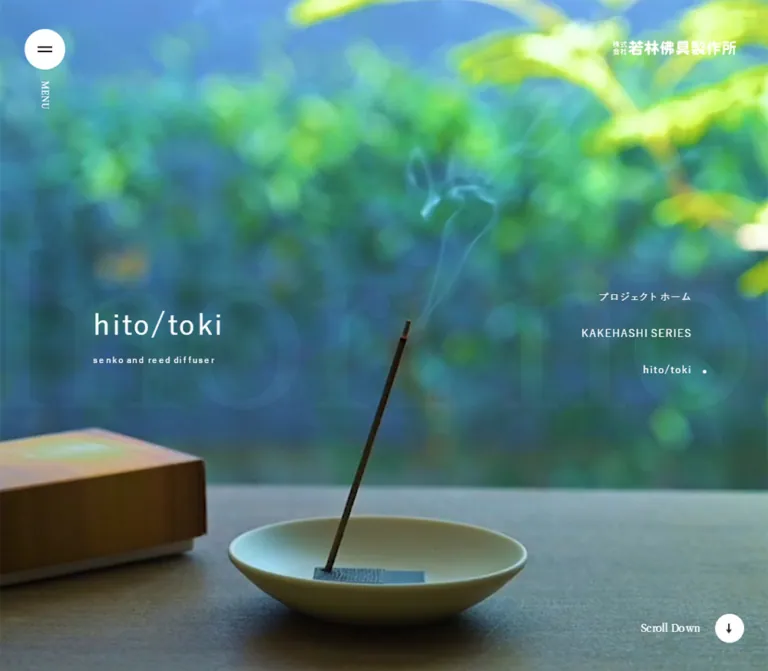
The opening is almost entirely photographic: an incense stick rises diagonally from a shallow ceramic dish, a wooden package enters from the left, and blue-green foliage dissolves into bright, soft focus. The white hito/toki title remains modest against this image. Navigation occupies the edges, while oversized, faint lettering adds a second typographic layer behind the title.
Below the opening, the page becomes a long editorial presentation. Regular-weight Japanese sans-serif headings, generous tracking, small English serif captions, and large vertical intervals establish a slow reading pace. Product information appears as image-and-description rows rather than a dense shopping grid. Purchase, pamphlet, and trade-contact links arrive after the narrative and usage guidance.
The final composition is particularly distinctive: a gray project-return panel and a black contact panel overlap on desktop, then become consecutive full-width blocks on mobile. The corporate header and footer identify Wakabayashi Butsugu Mfg.; the supplied evidence does not identify a website production team.
閉じる
hito/toki / Wakabayashi Butsugu Mfg. — Style Reference
Incense, luminous foliage, and spacious typography turn a product page into a quiet reading experience.
Original URL: https://www.wakabayashi.co.jp/project/hitotoki/ Final URL: https://www.wakabayashi.co.jp/project/hitotoki/ Status: HTTP 200; original and final URLs are identical. Theme: white editorial canvas, photographic opening, and dark closing panels. No selectable theme was verified. Inspected: supplied evidence retrieved October 6, 2026 at 01:38:14.627 JST, equivalent to October 5, 2026 at 16:38:14.627 UTC. Individual screenshot timestamps were not supplied. Viewports: 1440 × 1000 desktop and 390 × 844 mobile, in CSS pixels. Scope: current Japanese project/product page within the Wakabayashi corporate website. Visual captures cover the desktop hero, part of YASURAGI, the desktop closing area, and the mobile hero and closing area. Rendered DOM and computed styles additionally document the introduction, concept essays, three fragrances, usage instructions, purchase/resource links, and navigation elements.
The opening is almost entirely photographic: an incense stick rises diagonally from a shallow ceramic dish, a wooden package enters from the left, and blue-green foliage dissolves into bright, soft focus. The white hito/toki title remains modest against this image. Navigation occupies the edges, while oversized, faint lettering adds a second typographic layer behind the title.
Below the opening, the page becomes a long editorial presentation. Regular-weight Japanese sans-serif headings, generous tracking, small English serif captions, and large vertical intervals establish a slow reading pace. Product information appears as image-and-description rows rather than a dense shopping grid. Purchase, pamphlet, and trade-contact links arrive after the narrative and usage guidance.
The final composition is particularly distinctive: a gray project-return panel and a black contact panel overlap on desktop, then become consecutive full-width blocks on mobile. The corporate header and footer identify Wakabayashi Butsugu Mfg.; the supplied evidence does not identify a website production team.
How to Read This Reference
- Measured means a value is explicitly present in the supplied rendered DOM or computed-style record. Measurements describe these two inspected viewports, not every possible screen size.
- Calculated means a ratio, difference, or unit conversion derived from those measurements. Matching a percentage does not prove that the original stylesheet uses that percentage.
- Estimated means a visual approximation from an original-page screenshot. Estimated colors were not obtained through a pixel-sampling tool.
- Recommended means an implementation choice for reuse. The Quick Start is an adaptation, not recovered source code.
- All custom-property names introduced here are descriptive aliases unless explicitly identified as original properties.
- A computed font-family stack identifies declared candidates, not the exact font file used for every glyph. A parent anchor's computed color also need not describe its nested SVG or text spans.
- Navigation entries can have measured rectangles while their containing layer is visually hidden. The DOM inventory is not proof that every listed element was simultaneously visible.
- No menus, image enlargement controls, cookie actions, purchase flows, or linked documents were opened during this analysis. The supplied capture process traversed the page, but does not establish every interaction or delayed state.
Tokens — Colors
Default Palette
| Name | Value | Suggested token | Evidence and role |
|---|---|---|---|
| Editorial White | #ffffff |
--color-paper |
Measured body background and large action-link backgrounds; also measured hero title and project-link text |
| Soft Black | #111111 |
--color-ink |
Measured body text and underlying hero-section background; the contact panel appears consistent with this color |
| Caption Gray | #999999 |
--color-muted |
Measured fragrance captions, specifications, and secondary English text |
| Closing Gray | Approximately #5c5c5c |
--color-closing |
Estimated visible project-return panel; also a useful approximation for cookie buttons |
| Product Image Ground | Approximately #f7f7f7 |
--color-image-ground |
Estimated background within the visible bottle image; it may be part of the photograph rather than a CSS surface |
| Cookie Veil | Translucent neutral gray | --color-consent-veil |
Visually observed over different backgrounds; exact color, opacity, and blur are not present in the supplied styles |
The interface has no verified bright action color. Color comes mainly from imagery, while navigation, prose, product labels, and actions remain neutral.
The cookie banner looks lighter over white content and darker over the black footer. Do not reproduce both appearances as separate opaque banner colors: the captures support a translucent treatment.
Atmospheric Image Colors
These are estimated reference swatches, not measured CSS colors or exact samples from the media.
| Name | Approximate value | Role |
|---|---|---|
| Blue-Green Shade | #39798a |
Cool, shaded atmosphere in the hero |
| Sunlit Leaf | #a6d84b |
Bright foliage near the upper and right edges |
| Golden Light | #eea300 |
Warm, blurred light in the visible YASURAGI image |
Keep these colors inside photography or related artwork. Turning them into navigation fills, category badges, or competing CTA colors would change the observed hierarchy.
Tokens — Typography
Primary Sans-Serif Stack
The measured body and main heading stack is:
-apple-system, 'system-ui', Roboto, 'Helvetica Neue', HelveticaNeue,
'游ゴシック体', YuGothic, '游ゴシック Medium', 'Yu Gothic Medium',
'Hiragino Sans', 'ヒラギノ角ゴシック', 'Hiragino Kaku Gothic ProN', sans-serif
Main headings and sampled body text use weight 400. Hierarchy comes from size, spacing, tracking, and placement rather than bold weight. The corporate logo is separate artwork; its appearance should not be used to infer a heading font.
The HTML root is measured at 10px. Body text is explicitly 14px, and longer editorial paragraphs are 15px. This is not a fluid miniature-unit system: do not assume all sizes scale proportionally with viewport width.
English Serif Captions
- Declared family:
'Libre Caslon Text', serif. - Measured weight:
400. - Typical fragrance caption:
11px / 17.6px, with-0.176pxtracking, equivalent to-0.016em. - Roles: small repeated fragrance names, the TOKYO KODO caption, usage subtitles, action subtitles, and the project-return translation.
- Limit: the declaration is verified; the supplied evidence does not include font-file URLs or a glyph-level font-resolution report.
This serif is a quiet secondary voice. It does not replace the sans-serif product title or Japanese narrative headings.
Decorative Background Lettering
The hero contains very large, faint lettering reading “Inori no Kaori.” It appears serif-like, extends beyond the visible composition, and occupies multiple lines in the phone capture. Its exact font, size, opacity, and positioning were not exported. Any numerical reconstruction of this layer should be labeled an estimate.
Type Scale
Values below are measured unless a cell explicitly describes a visual estimate. Sizes are font-size / line-height.
| Role | Desktop | Mobile | Tracking |
|---|---|---|---|
| Base interface text | 14px / normal |
Same | 0.336px |
| Hero hito/toki title | 48px / 60px |
28px / 35px |
0.048em |
| Hero subtitle | 12px / 15px |
10px / 12.5px |
0.024em |
| Introduction heading | 48px / 76.8px |
26px / 41.6px |
0.32em |
| Introduction stanzas | 18px / 43.2px |
13px / 31.2px |
0.16em |
| Concept headings | 28px / 44.8px |
22px / 35.2px |
0.096em |
| Editorial paragraphs | 15px / 30px |
Same | 0.024em |
| Fragrance section headings | 30px / 48px |
24px / 38.4px |
0.096em |
| Fragrance statement | 24px / 38.4px |
20px / normal |
0.096em |
| Product-format heading | 18px / 28.8px |
15px / 24px |
0.096em |
| Product specifications | 11px / normal |
Same | 0.336px |
| Fragrance English caption | 11px / 17.6px |
Same | -0.016em |
| Usage English caption | 14px / 22.4px |
12px / 19.2px |
-0.016em |
| Usage instruction text | 15px / 30px |
14px / 28px |
0.024em |
| Large action heading | 28px / 28px |
18px / 18px |
0.064em |
| Large action English caption | 16px / 25.6px |
10px / 16px |
Normal |
| Project-return heading | 36px / normal |
24px / normal |
0.048em |
| Project-return English caption | 12px / normal |
10px / normal |
0.336px |
| Desktop project navigation | 14px / normal |
Not visible as a hero list | 0.896px |
| Mobile contents links | Not the same presentation | 13px / normal |
1.248px |
The mobile fragrance statement has a measured element height of 30px, but its computed line-height is normal. Likewise, action-heading element rectangles are taller than their declared line-heights. Do not substitute rectangle height for the CSS line-height value.
Tokens — Spacing & Shapes
Density: expansive sections with compact labels and controls. Geometry: square content surfaces, circular menu artwork, and a pill-shaped mobile contents control. Layout method: several distinct horizontal alignments, not a single universal centered container.
Spacing Scale
| Relationship | Desktop | Mobile | Evidence |
|---|---|---|---|
| Main title to English subtitle | 8px |
8px |
Calculated from hero rectangles |
| Section heading to small English caption | 4px |
4px |
Calculated from fragrance rectangles |
| Product heading to specifications | 8px |
8px |
Calculated from product rectangles |
| Concept paragraph separation | 20px |
16px |
Calculated from consecutive paragraphs |
| Introduction stanza separation | 30px |
30px |
Calculated from consecutive stanzas |
| Concept heading to first paragraph | 40px |
40px |
Calculated from rectangles |
| Fragrance statement to paragraph | 40px |
30px |
Calculated from rectangles |
| Fragrance caption to statement | 100px |
80px |
Calculated from rectangles |
| Introduction section padding | 200px 0 |
100px 0 80px |
Computed padding |
| Gap between large action links | 40px |
20px |
Calculated from link rectangles |
| Space before closing footer | 200px |
80px |
Calculated from section boundaries |
The introductory heading has additional internal placement on desktop: its top is approximately 286.39px below the introduction section's start, even though the section padding is 200px. Do not treat the padding alone as the complete layout rule.
Border Radius
| Element | Value | Evidence |
|---|---|---|
| Main sections and large action links | 0 |
Measured |
| Mobile contents button | 100px |
Measured; an 88 × 36px pill |
| Hero menu disc | Circle | Screenshot; approximately 56px desktop and 40px mobile |
| Cookie action buttons | Nearly square, approximately 0–2px |
Visual estimate |
| Featured links in the global-navigation DOM | 4px |
Measured, but their open-menu appearance was not captured |
The small radius on navigation-related featured links does not establish a rounded-card system for the product page.
Layout Measurements
| Element | Desktop: 1440 × 1000 | Mobile: 390 × 844 |
|---|---|---|
| Document height | 15125px reported; main approximately 15124.67px |
11055px reported; main approximately 11054.84px |
| Hero section | 1440 × 1000px |
390 × 844px |
| Hero title position | x 129.59, y 457.5 |
x 31.19, y 393.5 |
| Hero title inset as viewport ratio | Approximately 9vw |
Approximately 8vw |
| Header brand link box | 200 × 56px, at 1180, 42 |
44 × 56px, at 338, 12 |
| Introduction text | x 172.80, width 700.81px |
x 31.19, width 327.63px |
| Concept paragraph width | 436.33px |
335.42px |
| Fragrance content frame | x 166.39, width 1107.22px |
x 31.19, width 327.63px |
| Fragrance description width | 830.41px |
327.63px |
| Product text column | x 500.78, width 772.81px |
x 150.78, width 223.61px |
| Usage text column | x 500.78, width 772.81px |
x 180.69, width 193.70px |
| Large action link | 1267.22 × 269.59px, at x 86.39 |
358.81 × 148px, at x 15.59 |
| Closing footer height | Approximately 818.30px |
837px |
| Cookie banner | Approximately 136px high |
Approximately 237px high |
Cookie-banner dimensions are screenshot estimates. The other entries come from DOM rectangles or calculations from them.
Components
Photographic Hero
Role: establish the product's atmosphere before explaining it.
The hero fills one inspected viewport at both sizes. Its anatomy is a full-bleed media layer, extremely faint background lettering, a left-aligned title/subtitle group near the vertical midpoint, edge navigation, and corporate identity in the upper-right corner.
The desktop title group begins at approximately 9vw. Its overall visible DOM group spans roughly 85px, centered around the 500px midpoint. On mobile the group begins at 8vw, spans roughly 57px, and remains centered around the 422px midpoint. The title does not move above the image or become centered horizontally.
The media's exact element type is not included. Describe this as a photographic hero depicting smoke; do not assert that it is a video or an animated background.
Corporate Menu and Brand Mark
Role: connect this project to the larger corporate website.
At the upper left, a white circular disc contains a simple black two-stroke menu symbol. The desktop screenshot adds a small vertical MENU label below it. The phone capture uses the smaller disc without that visible label.
The desktop upper-right identity is a horizontal Japanese wordmark. Mobile shows a compact white illustrated mark inside the measured 44 × 56px home-link area. Preserve this switch in identity artwork instead of shrinking the complete desktop wordmark until it becomes unreadable.
The full global navigation appears in the DOM, including corporate destinations, language links, news, works, and featured links. Its open state, transition sequence, focus handling, and visual layout were not tested.
Desktop Project Navigation
Role: move between projects without leaving the photographic opening.
Nine right-aligned links sit over the image, including project home, Paper Altar, IKOI, COYUI SERIES, hito/toki, raison d'être, two KAKEHASHI entries, and the cooperation page. Each measured link has 15px vertical padding and an approximately 49.31px row height.
The right text edge is approximately 86.39px from the viewport edge. A small white dot marks hito/toki in the screenshot. The list is transparent and unboxed; it is not a separate sidebar surface.
This visible project list is absent from the phone hero. A project-menu button exists in the mobile DOM near the bottom of the hero, but the cookie banner covers that region in the supplied capture.
Introduction and Contents Navigation
Role: transition from an atmospheric opening to the product's emotional premise and section structure.
The introduction begins with the widely tracked heading “香りを灯そう,” followed by short, deliberately broken stanzas. Its 2.4 line-height and 0.16em paragraph tracking create a different rhythm from the later 15px / 30px explanatory prose.
Desktop DOM measurements show seven narrow, tall contents-link boxes grouped on the right. Each is 33.5px wide, including 8px horizontal padding, with heights varying by label length. These dimensions support a vertical label arrangement, although writing-mode and transform values were not supplied.
On mobile, the contents control appears as an 88 × 36px white pill at x 294, y 20 in the closing screenshot. It contains a small list icon and “もくじ.” Its DOM also includes “閉じる,” but no open state was captured. The associated links have horizontal text, 13px type, and 10px vertical padding.
Six links target document fragments: #contents, #concept, #yasuragi, #seseragi, #komorebi, and #howto. BUY NOW leads to an external shop category rather than another page section.
Concept Essays
Role: explain the relationship between prayer, fragrance, familiar gestures, and everyday use.
There are three main explanatory essays followed by a profile headed “東京香堂.” Desktop copy alternates right, left, and right: measured heading origins are approximately x 897.58, x 57.61, and x 897.58. Headings occupy 484.81px, while paragraphs use a narrower 436.33px measure.
On mobile, all three essays use a common left edge near 31.19px; heading and paragraph widths are approximately 335.42px. Paragraphs retain their desktop 15px / 30px setting. The layout changes around the text rather than making all prose smaller.
The accompanying media boxes were not included in the supplied element records or visible detail captures. The text alternation is measured; exact companion-image crops and dimensions remain unverified.
The TOKYO KODO caption has an unusually tall, narrow desktop rectangle, consistent with a vertical presentation. On mobile it becomes an ordinary horizontal caption immediately below its heading. Treat the profile as page content, not as evidence of website authorship.
Fragrance Chapter
Role: give each fragrance a full editorial introduction before showing its product formats.
YASURAGI, SESERAGI, and KOMOREBI use the same measured hierarchy:
- A large opening media region.
- Uppercase fragrance name with a smaller Japanese reading alongside it.
- A small gray serif repetition of the English name.
- A substantial blank interval.
- A Japanese fragrance statement and ingredient/atmosphere paragraph.
- Separate diffuser and incense rows.
The visible YASURAGI image is warm golden light with soft highlights. Its desktop screenshot shows approximately 80px outer side margins. The heading and following copy sit farther inward at x 166.39px.
Each desktop fragrance section measures approximately 1950.38px high; each mobile section measures approximately 1029.42px. These equal heights reflect the supplied content and layout, not a recommendation to hardcode every chapter's height.
The heading begins 933.33px after the desktop section start and 320px after the mobile section start. The media's own rectangle is not exported. A 3:2 media frame with 80px desktop and 60px mobile separation is a plausible implementation that matches these offsets, but remains a reconstruction choice.
Product-Format Row
Role: identify each physical format and its contents.
The visible desktop row pairs an isolated amber bottle image on a very pale ground with a text block to the right. The image appears approximately 277px wide; the text begins at measured x 500.78px. A small pale circular plus symbol appears at the image's upper-right corner.
The text contains a regular-weight Japanese format name, a smaller English term in angle brackets, and a gray specifications line. The diffuser lists 10ml; the incense format lists 30 sticks. These are informational rows, with no visible price, quantity control, or local add-to-cart action in the supplied evidence.
Mobile retains a separate right-hand text column: its measured origin is 150.78px. It does not simply center all row contents in a vertical card. The image bounds on mobile were not supplied, so exact thumbnail width and gap should be treated as implementation estimates.
The plus mark suggests an image-viewing affordance. It does not prove the presence or behavior of a lightbox.
Usage Instructions
Role: explain the diffuser ritual in two steps.
A Japanese heading and small serif “How to use” caption precede instructions for soaking the reed in the bottle and placing it in the supplied holder. A smaller gray note accompanies the first step.
Desktop instruction copy aligns with the product text column at x 500.78px. Mobile instructions begin farther right than product-format text, at x 180.69px, and occupy approximately 193.70px. This is a separate row proportion, not the same mobile grid reused unchanged.
The exported evidence establishes text and its placement. The exact instructional image content was not visible in the supplied captures.
Purchase and Resource Links
Role: provide three substantial next steps after the product explanation.
The page has three large, square-cornered white links: “ご購入はこちら,” “製品パンフレット,” and “お取扱いをご希望の方.” Each combines a Japanese heading with a quieter gray serif English caption.
Measured desktop links are approximately 1267 × 270px, separated by 40px. Mobile links are approximately 359 × 148px, separated by 20px. Their horizontal footprint expands relative to the narrower reading column: 88% of the desktop viewport and 92% of the mobile viewport, calculated from the rectangles.
The destinations are a shop category, a product brochure, and a sales-contact page. Their hrefs are verified; their destination pages and documents were not inspected. Borders and shadows have declared transitions, but resting and hover endpoints are not included in the evidence.
Project Return and Contact Footer
Role: return visitors to the project collection and expose direct contact options.
The desktop screenshot shows a gray panel beginning around 42vw from the left and a black panel covering the left half of the viewport. The black panel starts approximately 120px lower and overlaps the gray panel's left edge. These panel bounds are visual estimates supported by the footer's measured text placement.
The gray panel holds a large white “プロジェクトホーム” heading and a smaller serif “Back to Contents Home.” The black panel contains the compact white brand mark, a phone-contact group, and a form-contact group. Each contact group has a small Japanese label, a larger actionable line, and an understated English caption.
On mobile, the gray project-return region comes first, approximately 258px high, followed by the full-width black contact region. The project-return text uses a 6vw left inset; contact links start at 10vw. The logo moves to the upper-right portion of the black panel.
The phone link is tel:+81120378585; the displayed number is 0120-37-8585. Social links and copyright appear in the DOM, but the persistent cookie layer obscures much of the footer's lower area in the captures.
Cookie Notice
Role: present cookie information and two actions across all captured scroll positions.
The notice is a fixed-looking, full-width bottom layer with white Japanese text, a translucent gray backdrop, and two gray rectangular actions: “同意する” and “詳細はこちら.” The visible background is softened, but the exact backdrop-filter declaration is unavailable.
On desktop, the notice occupies approximately the bottom 136px. Copy begins near x 58px; two approximately 120 × 44px buttons sit to the right with a 10px gap.
On mobile, it occupies approximately 237px, starting near y 607. Copy is above the buttons and wraps over roughly five lines. The two approximately 120px-wide buttons remain side by side, centered with a 10px gap. Their visible height is approximately 41px.
The banner occupies about 28% of the mobile viewport, calculated from the screenshot. It covers lower hero controls and footer content. Its acceptance, preference, and persistence behavior were not exercised.
Tokens — Motion & Interaction
The shared measured easing is cubic-bezier(0.25, 0.46, 0.45, 0.94).
| Element | Declared transition | What the evidence establishes |
|---|---|---|
| Header brand link | opacity 0.24s with the shared easing |
Opacity can transition; hover endpoint was not recorded |
| Desktop project links | 0.6s with the shared easing |
A transition is declared; the changing property is not identified in the export |
| Hero title and subtitle | 0.8s with the shared easing |
A transition is available; initial state, trigger, and displacement are unknown |
| Mobile contents links | opacity 0.24s, delayed 0.24s |
Delayed opacity transition is declared |
| Mobile contents pill | border 0.24s |
Border transition is declared |
| Large action links | border 0.3s, box-shadow 0.3s |
Properties and timing are verified; visual endpoints are not |
| Footer social links | opacity 0.3s |
Opacity transition is declared |
| Featured links in navigation DOM | border-radius 0.48s, box-shadow 0.48s |
Applies to a navigation component whose visible open state was not captured |
Most sampled text elements report animation: none. This does not rule out animation on media, pseudo-elements, ancestors, or through JavaScript. Entries that only report transition: all without a nonzero duration are not useful evidence of visible motion.
Verified affordances: native links with destinations, named scroll/menu buttons, a current-project dot, the mobile contents pill, cookie actions, and a plus symbol over a product image.
Unverified behavior: hero playback or looping, audio, parallax, scroll-linked movement, reveal trajectories, menu opening, image enlargement, anchor-scroll easing, focus management, and cookie persistence. The capture protocol's handling of perpetual animations is not evidence that this specific hero uses one.
For an adaptation, use the measured timing family for restrained opacity and border changes. Keep reveal content visible by default so an absent script cannot hide the page. Any new media movement should have a static or reduced-motion alternative.
Surfaces
| Layer | Appearance | Purpose |
|---|---|---|
| Hero | Full-bleed photographic media over a measured dark base | Establishes atmosphere and product identity |
| Hero navigation | White labels and symbols directly over media | Keeps the photograph dominant |
| Reading canvas | White with soft-black type | Supports the long product narrative |
| Product imagery | Pale neutral image grounds | Separates small objects from surrounding white space |
| Large action links | White, square-cornered, generously padded | Makes destinations substantial without a bright CTA color |
| Project-return panel | Estimated medium gray with white type | Creates the first closing block |
| Contact panel | Near-black with white primary information | Anchors the page with direct contact details |
| Cookie notice | Translucent gray with visible background softening | Persistent information and consent actions |
There is no visible, general-purpose elevation system across the product content. The declared action-link shadow transition is insufficient evidence for assigning shadows to every section.
Imagery
The hero depends on real material and light: ceramic, a slender incense stick, smoke, a wooden box, and heavily defocused foliage. Large cool areas provide calm, while yellow-green highlights make the upper image feel sunlit. The subject is not isolated on a commercial studio background; it belongs to a quiet physical setting.
At desktop width, the dish and wooden package remain visible. The phone crop concentrates on foliage, smoke, and the rising stick, with the dish and package outside the unobscured portion of the screenshot. Preserve the recognizable stick and sufficient dark space for the title when selecting a mobile crop.
The visible YASURAGI chapter contrasts with the cool opening through an amber/golden image and a bottle with a warm label. Product rows use smaller, more descriptive object photography. The other fragrance media were not visually supplied, so their palettes and subjects should not be inferred solely from their names or prose.
The white corporate mark is recognizable illustrated artwork. Do not replace it with an arbitrary icon or attempt to recreate it using a text glyph.
Observed Asset References
The supplied evidence does not expose hero, product-image, or logo file URLs.
| Asset or resource | Evidence | Reuse guidance |
|---|---|---|
| Incense hero media | Desktop and mobile screenshots | Supply authorized media and tune the crop at both viewport shapes |
| Large YASURAGI media | Partial desktop chapter screenshot | Use the actual authorized image when available; the full image bounds were not exported |
| YASURAGI bottle image | Desktop product-row screenshot | Preserve the small object, pale background, and square image boundary |
| Corporate wordmark and compact mark | Hero and footer screenshots | Use the appropriate original artwork for each layout |
| Product brochure | Observed href: /wp/wp-content/themes/wakabayashi/assets/download/hitotoki.pdf |
Link destination only; its contents and design were not inspected |
CSS can reproduce spacing and framing, but cannot replace the photographed materials or brand artwork.
Layout & Responsive Behavior
Page Sequence
The supplied DOM establishes this sequence: full-height hero → poetic introduction → three concept essays → TOKYO KODO profile → YASURAGI → SESERAGI → KOMOREBI → usage instructions → three destination links → project return and contact footer.
This is a project/product detail page within a corporate site, with both project-level and site-level navigation. Its content structure should be preserved when extending it.
Distinct Horizontal Alignments
Desktop uses several deliberate positions: approximately 9vw for the hero title, 12vw for introduction text, 4vw for left-side concept copy, and 6vw for large action links. The fragrance content starts at approximately 166px, farther inward than the wide chapter image.
Mobile simplifies these relationships without making every component identical. Main chapter text uses approximately 8vw side margins. Concept copy has an approximately 8vw left and 6vw right margin. Large actions use 4vw margins; project-return text uses 6vw; contact text starts at 10vw.
Typography Changes Selectively
Hero type shrinks from 48px to 28px, concept headings from 28px to 22px, and fragrance headings from 30px to 24px. Long editorial paragraphs remain 15px / 30px. The introductory poem becomes 13px / 31.2px, retaining its unusually open leading.
Navigation and Footer Recompose
The desktop hero project list disappears from the visible mobile opening. The mobile closing capture exposes the compact contents pill instead. The desktop overlapping footer becomes a simple gray-then-black vertical sequence, while the contact mark moves to the right.
The product and usage text measurements retain side-by-side row relationships on mobile. These rows require their own proportions; a universal stacked-card conversion would lose the measured arrangement.
Viewport and Length Evidence
Original custom properties include --vw and --vh, measured as 1440px and 1000px on desktop, and 390px and 844px on mobile. Additional spelling variants such as --vw-orgin and --vh_orgin are present, but their use is not included in the export.
The mobile document is shorter overall despite narrower text. Major photographic regions, chapter spacing, and large links contract considerably; meanwhile, the combined concept area grows from approximately 3699px to 4120px as prose wraps. Responsive behavior therefore involves component-specific changes, not uniform scaling.
Only these two widths were inspected. Exact media-query thresholds, tablet layouts, orientation changes, and browser-chrome behavior remain unknown. A breakpoint in the Quick Start is explicitly a recommendation.
Do’s and Don’ts
Do
- Let the opening photograph carry most of the visual impact.
- Keep the hito/toki title left aligned and near the vertical midpoint at both viewport sizes.
- Preserve regular-weight headings and the distinct tracking levels for title, poem, and explanatory text.
- Use Libre Caslon Text as the declared secondary caption family, with a serif fallback.
- Keep long explanatory paragraphs at the measured
15px / 30pxon mobile where practical. - Maintain separate image, reading, action, and footer alignments.
- Give each fragrance its own spacious chapter and separate product-format rows.
- Recompose the overlapping closing panels into consecutive mobile blocks.
- Treat the cookie notice as part of the captured composition while accounting for its substantial mobile footprint.
- Keep measured values, visual estimates, and new implementation decisions identifiable.
Don’t
- Do not turn every text group into a rounded, elevated card.
- Do not convert photographic greens and golds into a collection of UI accent colors.
- Do not make every heading bold or replace the small serif captions with a second large display style.
- Do not treat hidden navigation DOM as visible body content.
- Do not claim that smoke proves autoplay video, or that a plus symbol proves a functioning lightbox.
- Do not assume the mobile product rows stack vertically; their text columns remain offset.
- Do not impose the same side gutter on every component.
- Do not hardcode the observed chapter or document heights as content constraints.
- Do not invent asset URLs, font files, hover endpoints, or production credits.
- Do not make a persistent overlay the only way to reach navigation or essential information.
Recommended Implementation Additions
These are recommendations for a new implementation, not verified features of the original:
- Give global-menu, project-menu, contents, and image-viewing controls explicit accessible names and state attributes.
- If a menu opens as a dialog, implement focus entry, Escape dismissal, and focus restoration. Keep ordinary navigation links available without requiring an animation to complete.
- Mark the giant background lettering as decorative to avoid repeating the hero's identity for assistive technology.
- Use descriptive alternatives for informative product images; a decorative atmospheric hero can use an empty alternative when adjacent text supplies its meaning.
- Check white hero text against all intended crops. Add a restrained image-specific scrim only where needed; no exact source scrim was verified.
- Increase contrast for essential small specifications. The measured
#999999is approximately2.85:1against white, below ordinary small-text contrast requirements. - Aim for at least
44pxinteractive targets. The measured contents pill is36pxhigh, and the visible phone cookie buttons are approximately41pxhigh; invisible hit-area expansion can preserve their appearance. - Measure the actual cookie-banner height and reserve enough end-of-page space while it is displayed, so footer controls remain reachable.
- Respect reduced-motion preferences. If animated hero media is introduced, provide a poster and a way to pause sustained movement.
- Load only the required caption font weight, reserve media dimensions, and defer below-the-fold images without delaying the opening image.
Agent Prompt Guide
Quick Color Reference
- Canvas: measured
#ffffff. - Primary text and dark base: measured
#111111. - Secondary captions: measured
#999999; improve contrast where the text is essential. - Closing gray: approximately
#5c5c5c, visually estimated. - Hero atmosphere: cool blue-green shade and luminous yellow-green foliage, supplied through media.
- YASURAGI atmosphere: golden light, supplied through media.
- Cookie layer: translucent neutral gray; exact source opacity and blur are unknown.
Overall Prompt
“Create a Japanese fragrance project page inspired by the current hito/toki presentation. Begin with a full-viewport photographic scene of incense, ceramic, wood, and luminous foliage. Place a modest white regular-weight title at the left near mid-height, with a tiny English subtitle and very faint oversized decorative lettering behind it. Use a white editorial canvas below, widely tracked Japanese headings, generous vertical spacing, and small Libre Caslon Text captions. Structure the page as a poetic introduction, explanatory essays, three spacious fragrance chapters, product-format rows, usage guidance, and three large destination links. Finish with overlapping gray project-return and black contact panels on desktop, stacking them on mobile. Retain component-specific gutters and offset mobile product rows. Treat motion and media playback as separate implementation decisions.”
Example Component Prompts
- Hero: “Build a viewport-height incense photograph with cool foliage and warm material details. Put the title at about 9% from the left on desktop and 8% on mobile. Use 48px desktop and 28px mobile regular sans-serif type, 0.048em tracking, and an 8px gap before the subtitle. Keep the title group vertically centered. Add a circular white menu control and switch from a horizontal corporate wordmark to compact artwork on mobile.”
- Poetic introduction: “Create a white introduction headed ‘香りを灯そう’. Use 48px desktop and 26px mobile regular sans-serif headings with 0.32em tracking. Set short stanzas at 18px/43.2px desktop and 13px/31.2px mobile, with 0.16em tracking and 30px between stanzas. Preserve intentional line breaks and broad surrounding white space.”
- Fragrance chapter: “Place a wide atmospheric image above an inset uppercase fragrance heading, a small Japanese reading, and an 11px gray serif caption. Leave 100px on desktop or 80px on mobile before a separate fragrance statement. Follow with 15px/30px descriptive copy and image-left, text-right product-format rows. Use square image boundaries and no card shadow.”
- Large destination link: “Create a square-cornered white link approximately 270px high on desktop and 148px on mobile. Pair a regular Japanese heading with a smaller gray serif English caption. Use 6% desktop and 4% mobile outer margins. Keep border feedback subtle; the source hover endpoint is unknown.”
- Closing area: “Overlap a black left contact panel with a medium-gray project-return panel extending to the right. Offset the black panel downward by about 120px. Use white primary text, small supporting labels, and restrained serif translations. On mobile, place the gray return block above the black contact block and position the compact brand mark toward the right.”
- Cookie notice: “Create a full-width bottom notice with a translucent neutral-gray background, white Japanese copy, and two nearly square gray buttons. Arrange copy and buttons horizontally on desktop, then stack the copy above a centered two-button row on mobile. Keep actions keyboard accessible and reserve enough scroll clearance for covered footer content.”
Quick Start
CSS Custom Properties
The following is a reusable approximation of the measured hierarchy. It keeps the host page's normal root font size and expresses measured sizes directly in pixels.
The 800px breakpoint, intermediate scaling, media aspect ratios, decorative-lettering treatment, footer panel implementation, cookie opacity/blur, and hover endpoints are recommended or estimated, not recovered source rules. Supply authorized media separately. The declared caption family needs an appropriate font resource to render as Libre Caslon Text.
:root {
  /* Measured neutral colors */
  --color-paper: #fff;
  --color-ink: #111;
  --color-muted: #999;

  /* Screenshot approximations */
  --color-closing: #5c5c5c;
  --color-image-ground: #f7f7f7;
  --color-consent-veil: rgb(153 153 153 / 72%);

  /* Declared source families */
  --font-sans: -apple-system, 'system-ui', Roboto,
    'Helvetica Neue', HelveticaNeue, '游ゴシック体', YuGothic,
    '游ゴシック Medium', 'Yu Gothic Medium', 'Hiragino Sans',
    'ヒラギノ角ゴシック', 'Hiragino Kaku Gothic ProN', sans-serif;
  --font-caption: 'Libre Caslon Text', serif;

  --text-hero: 48px;
  --text-section: 30px;
  --text-concept: 28px;
  --text-statement: 24px;
  --text-product: 18px;
  --text-body: 15px;
  --text-caption: 11px;
  --tracking-body: 0.024em;
  --tracking-title: 0.096em;
  --tracking-hero: 0.048em;
  --tracking-poem: 0.16em;

  --space-caption: 4px;
  --space-label: 8px;
  --space-stanza: 30px;
  --space-heading: 40px;
  --space-chapter-copy: 100px;
  --chapter-inset: calc(80px + 6vw);
  --action-inset: 6vw;

  --ease-quiet: cubic-bezier(0.25, 0.46, 0.45, 0.94);
  --motion-link: 240ms var(--ease-quiet);
  --motion-action: 300ms var(--ease-quiet);
  --motion-title: 800ms var(--ease-quiet);
  --consent-clearance: 136px;
}

* { box-sizing: border-box; }

.hitotoki {
  margin: 0;
  color: var(--color-ink);
  background: var(--color-paper);
  font-family: var(--font-sans);
  font-size: 14px;
  font-weight: 400;
  letter-spacing: var(--tracking-body);
}

.hitotoki img { display: block; max-width: 100%; }
.hitotoki a { color: inherit; }
.hitotoki button { font: inherit; cursor: pointer; }
.hitotoki h1,
.hitotoki h2,
.hitotoki h3 { font-weight: 400; }

.hitotoki [id] { scroll-margin-top: 88px; }

.hitotoki :focus-visible {
  outline: 2px solid currentColor;
  outline-offset: 5px;
}

.hero {
  position: relative;
  min-height: 100vh;
  min-height: 100svh;
  overflow: hidden;
  isolation: isolate;
  color: white;
  background: var(--color-ink);
}

.hero__media {
  position: absolute;
  inset: 0;
  width: 100%;
  height: 100%;
  object-fit: cover;
  object-position: var(--hero-position, 50% 50%);
  z-index: -2;
}

/* Estimated decorative treatment; source values are unavailable. */
.hero__ghost {
  position: absolute;
  top: 33%;
  left: -2%;
  width: 110%;
  margin: 0;
  font: 400 clamp(100px, 18vw, 280px) / 1 serif;
  opacity: 0.035;
  pointer-events: none;
  z-index: -1;
}

.hero__copy {
  position: absolute;
  top: 50%;
  left: 9%;
  transform: translateY(-50%);
}

.hero__title {
  margin: 0;
  font-size: var(--text-hero);
  line-height: 1.25;
  letter-spacing: var(--tracking-hero);
}

.hero__subtitle {
  margin: 8px 0 0;
  font-size: 12px;
  line-height: 1.25;
}

.menu-disc {
  position: absolute;
  top: 40px;
  left: 46px;
  display: grid;
  place-content: center;
  gap: 4px;
  width: 56px;
  height: 56px;
  padding: 0;
  border: 0;
  border-radius: 50%;
  color: #111;
  background: white;
}

.menu-disc::before,
.menu-disc::after {
  content: '';
  width: 20px;
  height: 2px;
  background: currentColor;
}

.hero__brand {
  position: absolute;
  top: 42px;
  right: 60px;
  display: flex;
  align-items: center;
  width: 200px;
  height: 56px;
  transition: opacity var(--motion-link);
}

.hero__brand img { width: 100%; max-height: 100%; object-fit: contain; }
.hero__brand-compact { display: none; }

.project-nav {
  position: absolute;
  top: 50%;
  right: 6%;
  transform: translateY(-50%);
  text-align: right;
}

.project-nav a {
  position: relative;
  display: block;
  padding-block: 15px;
  font-size: 14px;
  letter-spacing: 0.064em;
  text-decoration: none;
}

.project-nav [aria-current='page']::after {
  content: '';
  position: absolute;
  right: -22px;
  top: 50%;
  width: 5px;
  height: 5px;
  border-radius: 50%;
  background: currentColor;
  transform: translateY(-50%);
}

.introduction { padding-block: 200px; }
.introduction__copy { width: 48.667%; margin-left: 12%; }

.introduction h2 {
  margin: 0 0 80px;
  font-size: 48px;
  line-height: 1.6;
  letter-spacing: 0.32em;
}

.introduction p {
  margin: 0 0 var(--space-stanza);
  font-size: 18px;
  line-height: 2.4;
  letter-spacing: var(--tracking-poem);
}

/* Copy placement only; companion-media geometry is not reconstructed. */
.concept-copy { width: 33.667%; margin: 0 4% 100px auto; }
.concept-copy--left { margin-inline: 4% auto; }

.concept-copy h2 {
  margin: 0 0 40px;
  font-size: var(--text-concept);
  line-height: 1.6;
  letter-spacing: var(--tracking-title);
}

.concept-copy p {
  width: 90%;
  margin: 0 0 20px;
  font-size: var(--text-body);
  line-height: 2;
}

.chapter { padding-bottom: 180px; }

/* Recommended ratio, consistent with the recorded heading offsets. */
.chapter__media {
  width: calc(100% - 160px);
  margin-inline: auto;
  aspect-ratio: 3 / 2;
  object-fit: cover;
}

.chapter__inner { margin-inline: var(--chapter-inset); }
.chapter__heading { margin-top: 80px; }

.chapter__heading h2 {
  margin: 0;
  font-size: var(--text-section);
  line-height: 1.6;
  letter-spacing: var(--tracking-title);
}

.chapter__heading h2 small { font-size: 0.43em; }

.english-caption {
  margin: 4px 0 0;
  color: var(--color-muted);
  font-family: var(--font-caption);
  font-size: var(--text-caption);
  line-height: 1.6;
  letter-spacing: -0.016em;
}

.chapter__description {
  width: 75%;
  margin-top: var(--space-chapter-copy);
}

.chapter__description h3 {
  margin: 0 0 40px;
  font-size: var(--text-statement);
  line-height: 1.6;
  letter-spacing: var(--tracking-title);
}

.chapter__description p {
  margin: 0;
  font-size: var(--text-body);
  line-height: 2;
}

.product-list { margin-top: 100px; }

.product-row {
  display: grid;
  grid-template-columns: 25% minmax(0, 1fr);
  align-items: center;
  gap: 4vw;
}

.product-row + .product-row { margin-top: 60px; }

.product-row__image {
  width: 100%;
  aspect-ratio: 3 / 2;
  object-fit: contain;
  background: var(--color-image-ground);
}

.product-row h3 {
  margin: 0;
  font-size: var(--text-product);
  line-height: 1.6;
  letter-spacing: var(--tracking-title);
}

.product-row h3 small { font-size: 0.67em; }

.product-row__spec {
  margin: 8px 0 0;
  color: var(--color-muted);
  font-size: 11px;
  line-height: 1.55;
  letter-spacing: 0.336px;
}

.action-list {
  display: grid;
  gap: 40px;
  margin-inline: var(--action-inset);
}

.action-link {
  display: flex;
  flex-direction: column;
  justify-content: center;
  min-height: 270px;
  padding: 40px 4vw;
  border: 1px solid #e5e5e5;
  border-radius: 0;
  background: white;
  text-decoration: none;
  transition: border-color var(--motion-action);
}

.action-link__title {
  font-size: 28px;
  line-height: 1;
  letter-spacing: 0.064em;
}

.action-link .english-caption {
  margin-top: 12px;
  font-size: 16px;
  letter-spacing: normal;
}

/* Suggested endpoint; the source endpoint was not supplied. */
@media (hover: hover) {
  .action-link:hover { border-color: #777; }
  .hero__brand:hover { opacity: 0.75; }
}

.closing {
  position: relative;
  min-height: 818px;
  margin-top: 200px;
  padding-top: 120px;
}

.project-return {
  position: absolute;
  top: 0;
  right: 0;
  display: flex;
  align-items: center;
  justify-content: flex-end;
  width: 58%;
  min-height: 640px;
  padding: 80px 4vw;
  color: white;
  background: var(--color-closing);
  text-decoration: none;
}

.project-return h2 {
  margin: 0;
  font-size: 36px;
  letter-spacing: 0.048em;
}

.project-return .english-caption {
  margin-top: 10px;
  color: white;
  font-size: 12px;
}

.contact-panel {
  position: relative;
  width: 50%;
  min-height: 698px;
  padding: 115px 10vw 100px;
  color: white;
  background: var(--color-ink);
}

.contact-panel__mark { width: 26px; margin-bottom: 80px; }
.contact-link { display: block; text-decoration: none; }
.contact-link + .contact-link { margin-top: 40px; }
.contact-link small { display: block; font-size: 11px; }
.contact-link strong { display: block; margin-top: 10px; font-size: 24px; font-weight: 400; }
.contact-link .english-caption { font-size: 12px; }

.contents-toggle { display: none; }

.cookie-notice {
  position: fixed;
  inset: auto 0 0;
  z-index: 50;
  display: grid;
  grid-template-columns: minmax(0, 1fr) auto;
  align-items: center;
  gap: 4vw;
  padding: 40px 4vw;
  color: white;
  background: var(--color-consent-veil);
  backdrop-filter: blur(12px);
}

.cookie-notice[hidden] { display: none; }
.cookie-notice p { margin: 0; font-size: 13px; line-height: 28px; }
.cookie-notice__actions { display: flex; gap: 10px; justify-content: center; flex-wrap: wrap; }

.cookie-notice button {
  min-width: 120px;
  min-height: 44px;
  padding: 10px 16px;
  border: 0;
  border-radius: 2px;
  color: white;
  background: var(--color-closing);
  font-size: 13px;
}

/* Update this value from the banner's actual rendered height. */
.hitotoki.is-consent-visible { padding-bottom: var(--consent-clearance); }

@media (max-width: 800px) {
  :root {
    --text-hero: 28px;
    --text-section: 24px;
    --text-concept: 22px;
    --text-statement: 20px;
    --text-product: 15px;
    --space-chapter-copy: 80px;
    --chapter-inset: 8vw;
    --action-inset: 4vw;
    --consent-clearance: 240px;
  }

  .hero__copy { left: 8%; }
  .hero__subtitle { font-size: 10px; }
  .hero__ghost { top: 39%; font-size: 110px; }
  .project-nav { display: none; }
  .menu-disc { top: 20px; left: 16px; width: 40px; height: 40px; }
  .menu-disc::before, .menu-disc::after { width: 12px; height: 1px; }
  .hero__brand { top: 12px; right: 8px; width: 44px; }
  .hero__brand-wide { display: none; }
  .hero__brand-compact { display: block; }

  .introduction { padding-block: 100px 80px; }
  .introduction__copy { width: 84%; margin-inline: 8%; }
  .introduction h2 { margin-bottom: 40px; font-size: 26px; }
  .introduction p { font-size: 13px; }

  .concept-copy, .concept-copy--left { width: 86%; margin: 0 6% 60px 8%; }
  .concept-copy p { width: 100%; margin-bottom: 16px; }

  .chapter { padding-bottom: 100px; }
  .chapter__media { width: 100%; }
  .chapter__heading { margin-top: 60px; }
  .chapter__description { width: 100%; }
  .chapter__description h3 { margin-bottom: 30px; line-height: 1.5; }
  .product-list { margin-top: 60px; margin-right: -4vw; }

  /* Estimated thumbnail width; measured text begins near x=151 at 390px. */
  .product-row {
    grid-template-columns: 26.667vw minmax(0, 1fr);
    align-items: start;
    gap: 4vw;
    min-height: 80px;
  }
  .product-row + .product-row { margin-top: 40px; }

  .action-list { gap: 20px; }
  .action-link { min-height: 148px; padding: 30px 6vw; }
  .action-link__title { font-size: 18px; }
  .action-link .english-caption { font-size: 10px; }

  .closing { min-height: 0; margin-top: 80px; padding-top: 0; }
  .project-return {
    position: static;
    justify-content: flex-start;
    width: 100%;
    min-height: 258px;
    padding: 80px 6vw;
  }
  .project-return h2 { font-size: 24px; }
  .project-return .english-caption { margin-top: 6px; font-size: 10px; }
  .contact-panel { width: 100%; min-height: 579px; padding: 40px 6vw 100px 10vw; }
  .contact-panel__mark { width: 20px; margin-left: auto; margin-bottom: 65px; }

  /* Apply this state after the hero; state management is separate. */
  .hitotoki.is-reading .contents-toggle {
    position: fixed;
    top: 20px;
    right: 8px;
    z-index: 30;
    display: inline-flex;
    align-items: center;
    justify-content: center;
    gap: 8px;
    width: 88px;
    height: 36px;
    padding: 4px;
    border: 1px solid transparent;
    border-radius: 100px;
    color: #111;
    background: white;
  }

  .cookie-notice { grid-template-columns: 1fr; gap: 20px; padding: 16px 6vw 40px; }
  .cookie-notice p { font-size: 12px; line-height: 24px; }
}

@media (prefers-reduced-motion: reduce) {
  .hitotoki *, .hitotoki *::before, .hitotoki *::after {
    animation: none !important;
    transition: none !important;
    scroll-behavior: auto !important;
  }
}
Use .hero__copy to wrap the title and subtitle. Place each chapter's image before .chapter__inner; within that inner frame, use .chapter__heading, .chapter__description, and .product-list. Inside .closing, place .project-return before .contact-panel so the mobile reading order follows the visual order.
The menu disc and contents toggle must be real buttons with accessible names. The decorative hero lettering should have aria-hidden='true'. Use ordinary anchors for destination links. A functional cookie implementation must update the visible banner state and its measured clearance; CSS alone does not implement consent or persistence.
The sample intentionally leaves unseen menu panels and image enlargement behavior unspecified. Its mobile 44px cookie-button height and visible focus outlines are recommended accessibility additions.
Tailwind v4 Token Mapping
Optional aliases for an implementation that already uses Tailwind v4. This does not imply that the original website uses Tailwind. Define the custom properties above first.
@theme inline {
  --color-paper: var(--color-paper);
  --color-ink: var(--color-ink);
  --color-caption: var(--color-muted);
  --color-closing-panel: var(--color-closing);
  --font-editorial: var(--font-sans);
  --font-secondary: var(--font-caption);
  --text-hero: var(--text-hero);
  --text-fragrance: var(--text-section);
  --text-prose: var(--text-body);
  --text-micro: var(--text-caption);
  --spacing-chapter-copy: var(--space-chapter-copy);
  --radius-square: 0px;
  --radius-contents: 100px;
  --ease-quiet: cubic-bezier(0.25, 0.46, 0.45, 0.94);
}
When integrating this mapping, use distinct application token names if your build emits the same custom-property name on both sides of a mapping. For example, rename the source palette tokens to --ht-paper and --ht-ink, then map Tailwind's --color-paper and --color-ink to those names.
Sources & Evidence
- Current Japanese hito/toki page: original and final inspected URL; supplied HTTP status
200, page title, rendered text, hrefs, custom properties, element rectangles, and computed styles. - Evidence retrieval: October 5, 2026,
16:38:14.627 UTC, equivalent to October 6, 2026,01:38:14.627 JST. Per-capture timestamps were not provided. - Desktop evidence:
1440 × 1000; original-page screenshots of the hero, YASURAGI content, and closing footer, plus the corresponding DOM/style inventory. - Mobile evidence:
390 × 844; original-page screenshots of the hero and closing footer, plus the corresponding DOM/style inventory. - Observed state: cookie notice visible in all supplied original-page screenshots; desktop project links visible in the opening; mobile contents pill visible in the closing capture.
- Inspection limits: no fresh browsing or command execution was performed. The supplied capture process waited for initial loading and sampled layout stability, then traversed scroll positions. This does not verify all delayed content, media playback, hover states, open menus, dialogs, keyboard behavior, or cookie actions. Linked destinations were recorded but not visited.
- Asset and style limits: image resource URLs, complete stylesheets, pseudo-element styles, font files, exact breakpoints, and transition endpoints were not supplied. Screenshot colors and inferred component geometry are labeled estimates; reusable CSS choices are labeled recommendations.
This reference describes the currently supplied page evidence. It separates directly measured typography and geometry from visually estimated surfaces and proposed implementation behavior.
# hito/toki / Wakabayashi Butsugu Mfg. — Style Reference

> Incense, luminous foliage, and spacious typography turn a product page into a quiet reading experience.

**Original URL:** [https://www.wakabayashi.co.jp/project/hitotoki/](https://www.wakabayashi.co.jp/project/hitotoki/)
**Final URL:** [https://www.wakabayashi.co.jp/project/hitotoki/](https://www.wakabayashi.co.jp/project/hitotoki/)
**Status:** HTTP 200; original and final URLs are identical.
**Theme:** white editorial canvas, photographic opening, and dark closing panels. No selectable theme was verified.
**Inspected:** supplied evidence retrieved October 6, 2026 at 01:38:14.627 JST, equivalent to October 5, 2026 at 16:38:14.627 UTC. Individual screenshot timestamps were not supplied.
**Viewports:** 1440 × 1000 desktop and 390 × 844 mobile, in CSS pixels.
**Scope:** current Japanese project/product page within the Wakabayashi corporate website. Visual captures cover the desktop hero, part of YASURAGI, the desktop closing area, and the mobile hero and closing area. Rendered DOM and computed styles additionally document the introduction, concept essays, three fragrances, usage instructions, purchase/resource links, and navigation elements.

The opening is almost entirely photographic: an incense stick rises diagonally from a shallow ceramic dish, a wooden package enters from the left, and blue-green foliage dissolves into bright, soft focus. The white hito/toki title remains modest against this image. Navigation occupies the edges, while oversized, faint lettering adds a second typographic layer behind the title.

Below the opening, the page becomes a long editorial presentation. Regular-weight Japanese sans-serif headings, generous tracking, small English serif captions, and large vertical intervals establish a slow reading pace. Product information appears as image-and-description rows rather than a dense shopping grid. Purchase, pamphlet, and trade-contact links arrive after the narrative and usage guidance.

The final composition is particularly distinctive: a gray project-return panel and a black contact panel overlap on desktop, then become consecutive full-width blocks on mobile. The corporate header and footer identify Wakabayashi Butsugu Mfg.; the supplied evidence does not identify a website production team.
閉じる
# hito/toki / Wakabayashi Butsugu Mfg. — Style Reference

> Incense, luminous foliage, and spacious typography turn a product page into a quiet reading experience.

**Original URL:** [https://www.wakabayashi.co.jp/project/hitotoki/](https://www.wakabayashi.co.jp/project/hitotoki/)
**Final URL:** [https://www.wakabayashi.co.jp/project/hitotoki/](https://www.wakabayashi.co.jp/project/hitotoki/)
**Status:** HTTP 200; original and final URLs are identical.
**Theme:** white editorial canvas, photographic opening, and dark closing panels. No selectable theme was verified.
**Inspected:** supplied evidence retrieved October 6, 2026 at 01:38:14.627 JST, equivalent to October 5, 2026 at 16:38:14.627 UTC. Individual screenshot timestamps were not supplied.
**Viewports:** 1440 × 1000 desktop and 390 × 844 mobile, in CSS pixels.
**Scope:** current Japanese project/product page within the Wakabayashi corporate website. Visual captures cover the desktop hero, part of YASURAGI, the desktop closing area, and the mobile hero and closing area. Rendered DOM and computed styles additionally document the introduction, concept essays, three fragrances, usage instructions, purchase/resource links, and navigation elements.

The opening is almost entirely photographic: an incense stick rises diagonally from a shallow ceramic dish, a wooden package enters from the left, and blue-green foliage dissolves into bright, soft focus. The white hito/toki title remains modest against this image. Navigation occupies the edges, while oversized, faint lettering adds a second typographic layer behind the title.

Below the opening, the page becomes a long editorial presentation. Regular-weight Japanese sans-serif headings, generous tracking, small English serif captions, and large vertical intervals establish a slow reading pace. Product information appears as image-and-description rows rather than a dense shopping grid. Purchase, pamphlet, and trade-contact links arrive after the narrative and usage guidance.

The final composition is particularly distinctive: a gray project-return panel and a black contact panel overlap on desktop, then become consecutive full-width blocks on mobile. The corporate header and footer identify Wakabayashi Butsugu Mfg.; the supplied evidence does not identify a website production team.

## How to Read This Reference

- **Measured** means a value is explicitly present in the supplied rendered DOM or computed-style record. Measurements describe these two inspected viewports, not every possible screen size.
- **Calculated** means a ratio, difference, or unit conversion derived from those measurements. Matching a percentage does not prove that the original stylesheet uses that percentage.
- **Estimated** means a visual approximation from an original-page screenshot. Estimated colors were not obtained through a pixel-sampling tool.
- **Recommended** means an implementation choice for reuse. The Quick Start is an adaptation, not recovered source code.
- All custom-property names introduced here are descriptive aliases unless explicitly identified as original properties.
- A computed font-family stack identifies declared candidates, not the exact font file used for every glyph. A parent anchor's computed color also need not describe its nested SVG or text spans.
- Navigation entries can have measured rectangles while their containing layer is visually hidden. The DOM inventory is not proof that every listed element was simultaneously visible.
- No menus, image enlargement controls, cookie actions, purchase flows, or linked documents were opened during this analysis. The supplied capture process traversed the page, but does not establish every interaction or delayed state.

## Tokens — Colors

### Default Palette

| Name | Value | Suggested token | Evidence and role |
| --- | --- | --- | --- |
| Editorial White | `#ffffff` | `--color-paper` | Measured body background and large action-link backgrounds; also measured hero title and project-link text |
| Soft Black | `#111111` | `--color-ink` | Measured body text and underlying hero-section background; the contact panel appears consistent with this color |
| Caption Gray | `#999999` | `--color-muted` | Measured fragrance captions, specifications, and secondary English text |
| Closing Gray | Approximately `#5c5c5c` | `--color-closing` | Estimated visible project-return panel; also a useful approximation for cookie buttons |
| Product Image Ground | Approximately `#f7f7f7` | `--color-image-ground` | Estimated background within the visible bottle image; it may be part of the photograph rather than a CSS surface |
| Cookie Veil | Translucent neutral gray | `--color-consent-veil` | Visually observed over different backgrounds; exact color, opacity, and blur are not present in the supplied styles |

The interface has no verified bright action color. Color comes mainly from imagery, while navigation, prose, product labels, and actions remain neutral.

The cookie banner looks lighter over white content and darker over the black footer. Do not reproduce both appearances as separate opaque banner colors: the captures support a translucent treatment.

### Atmospheric Image Colors

These are **estimated reference swatches**, not measured CSS colors or exact samples from the media.

| Name | Approximate value | Role |
| --- | --- | --- |
| Blue-Green Shade | `#39798a` | Cool, shaded atmosphere in the hero |
| Sunlit Leaf | `#a6d84b` | Bright foliage near the upper and right edges |
| Golden Light | `#eea300` | Warm, blurred light in the visible YASURAGI image |

Keep these colors inside photography or related artwork. Turning them into navigation fills, category badges, or competing CTA colors would change the observed hierarchy.

## Tokens — Typography

### Primary Sans-Serif Stack

The measured body and main heading stack is:

```css
-apple-system, 'system-ui', Roboto, 'Helvetica Neue', HelveticaNeue,
'游ゴシック体', YuGothic, '游ゴシック Medium', 'Yu Gothic Medium',
'Hiragino Sans', 'ヒラギノ角ゴシック', 'Hiragino Kaku Gothic ProN', sans-serif
```

Main headings and sampled body text use **weight 400**. Hierarchy comes from size, spacing, tracking, and placement rather than bold weight. The corporate logo is separate artwork; its appearance should not be used to infer a heading font.

The HTML root is measured at `10px`. Body text is explicitly `14px`, and longer editorial paragraphs are `15px`. This is not a fluid miniature-unit system: do not assume all sizes scale proportionally with viewport width.

### English Serif Captions

- **Declared family:** `'Libre Caslon Text', serif`.
- **Measured weight:** `400`.
- **Typical fragrance caption:** `11px / 17.6px`, with `-0.176px` tracking, equivalent to `-0.016em`.
- **Roles:** small repeated fragrance names, the TOKYO KODO caption, usage subtitles, action subtitles, and the project-return translation.
- **Limit:** the declaration is verified; the supplied evidence does not include font-file URLs or a glyph-level font-resolution report.

This serif is a quiet secondary voice. It does not replace the sans-serif product title or Japanese narrative headings.

### Decorative Background Lettering

The hero contains very large, faint lettering reading “Inori no Kaori.” It appears serif-like, extends beyond the visible composition, and occupies multiple lines in the phone capture. Its exact font, size, opacity, and positioning were not exported. Any numerical reconstruction of this layer should be labeled an estimate.

### Type Scale

Values below are measured unless a cell explicitly describes a visual estimate. Sizes are `font-size / line-height`.

| Role | Desktop | Mobile | Tracking |
| --- | --- | --- | --- |
| Base interface text | `14px / normal` | Same | `0.336px` |
| Hero hito/toki title | `48px / 60px` | `28px / 35px` | `0.048em` |
| Hero subtitle | `12px / 15px` | `10px / 12.5px` | `0.024em` |
| Introduction heading | `48px / 76.8px` | `26px / 41.6px` | `0.32em` |
| Introduction stanzas | `18px / 43.2px` | `13px / 31.2px` | `0.16em` |
| Concept headings | `28px / 44.8px` | `22px / 35.2px` | `0.096em` |
| Editorial paragraphs | `15px / 30px` | Same | `0.024em` |
| Fragrance section headings | `30px / 48px` | `24px / 38.4px` | `0.096em` |
| Fragrance statement | `24px / 38.4px` | `20px / normal` | `0.096em` |
| Product-format heading | `18px / 28.8px` | `15px / 24px` | `0.096em` |
| Product specifications | `11px / normal` | Same | `0.336px` |
| Fragrance English caption | `11px / 17.6px` | Same | `-0.016em` |
| Usage English caption | `14px / 22.4px` | `12px / 19.2px` | `-0.016em` |
| Usage instruction text | `15px / 30px` | `14px / 28px` | `0.024em` |
| Large action heading | `28px / 28px` | `18px / 18px` | `0.064em` |
| Large action English caption | `16px / 25.6px` | `10px / 16px` | Normal |
| Project-return heading | `36px / normal` | `24px / normal` | `0.048em` |
| Project-return English caption | `12px / normal` | `10px / normal` | `0.336px` |
| Desktop project navigation | `14px / normal` | Not visible as a hero list | `0.896px` |
| Mobile contents links | Not the same presentation | `13px / normal` | `1.248px` |

The mobile fragrance statement has a measured element height of `30px`, but its computed line-height is `normal`. Likewise, action-heading element rectangles are taller than their declared line-heights. Do not substitute rectangle height for the CSS line-height value.

## Tokens — Spacing & Shapes

**Density:** expansive sections with compact labels and controls.
**Geometry:** square content surfaces, circular menu artwork, and a pill-shaped mobile contents control.
**Layout method:** several distinct horizontal alignments, not a single universal centered container.

### Spacing Scale

| Relationship | Desktop | Mobile | Evidence |
| --- | --- | --- | --- |
| Main title to English subtitle | `8px` | `8px` | Calculated from hero rectangles |
| Section heading to small English caption | `4px` | `4px` | Calculated from fragrance rectangles |
| Product heading to specifications | `8px` | `8px` | Calculated from product rectangles |
| Concept paragraph separation | `20px` | `16px` | Calculated from consecutive paragraphs |
| Introduction stanza separation | `30px` | `30px` | Calculated from consecutive stanzas |
| Concept heading to first paragraph | `40px` | `40px` | Calculated from rectangles |
| Fragrance statement to paragraph | `40px` | `30px` | Calculated from rectangles |
| Fragrance caption to statement | `100px` | `80px` | Calculated from rectangles |
| Introduction section padding | `200px 0` | `100px 0 80px` | Computed padding |
| Gap between large action links | `40px` | `20px` | Calculated from link rectangles |
| Space before closing footer | `200px` | `80px` | Calculated from section boundaries |

The introductory heading has additional internal placement on desktop: its top is approximately `286.39px` below the introduction section's start, even though the section padding is `200px`. Do not treat the padding alone as the complete layout rule.

### Border Radius

| Element | Value | Evidence |
| --- | --- | --- |
| Main sections and large action links | `0` | Measured |
| Mobile contents button | `100px` | Measured; an `88 × 36px` pill |
| Hero menu disc | Circle | Screenshot; approximately `56px` desktop and `40px` mobile |
| Cookie action buttons | Nearly square, approximately `0–2px` | Visual estimate |
| Featured links in the global-navigation DOM | `4px` | Measured, but their open-menu appearance was not captured |

The small radius on navigation-related featured links does not establish a rounded-card system for the product page.

### Layout Measurements

| Element | Desktop: 1440 × 1000 | Mobile: 390 × 844 |
| --- | --- | --- |
| Document height | `15125px` reported; main approximately `15124.67px` | `11055px` reported; main approximately `11054.84px` |
| Hero section | `1440 × 1000px` | `390 × 844px` |
| Hero title position | `x 129.59`, `y 457.5` | `x 31.19`, `y 393.5` |
| Hero title inset as viewport ratio | Approximately `9vw` | Approximately `8vw` |
| Header brand link box | `200 × 56px`, at `1180, 42` | `44 × 56px`, at `338, 12` |
| Introduction text | `x 172.80`, width `700.81px` | `x 31.19`, width `327.63px` |
| Concept paragraph width | `436.33px` | `335.42px` |
| Fragrance content frame | `x 166.39`, width `1107.22px` | `x 31.19`, width `327.63px` |
| Fragrance description width | `830.41px` | `327.63px` |
| Product text column | `x 500.78`, width `772.81px` | `x 150.78`, width `223.61px` |
| Usage text column | `x 500.78`, width `772.81px` | `x 180.69`, width `193.70px` |
| Large action link | `1267.22 × 269.59px`, at `x 86.39` | `358.81 × 148px`, at `x 15.59` |
| Closing footer height | Approximately `818.30px` | `837px` |
| Cookie banner | Approximately `136px` high | Approximately `237px` high |

Cookie-banner dimensions are screenshot estimates. The other entries come from DOM rectangles or calculations from them.

## Components

### Photographic Hero

**Role:** establish the product's atmosphere before explaining it.

The hero fills one inspected viewport at both sizes. Its anatomy is a full-bleed media layer, extremely faint background lettering, a left-aligned title/subtitle group near the vertical midpoint, edge navigation, and corporate identity in the upper-right corner.

The desktop title group begins at approximately `9vw`. Its overall visible DOM group spans roughly `85px`, centered around the `500px` midpoint. On mobile the group begins at `8vw`, spans roughly `57px`, and remains centered around the `422px` midpoint. The title does not move above the image or become centered horizontally.

The media's exact element type is not included. Describe this as a photographic hero depicting smoke; do not assert that it is a video or an animated background.

### Corporate Menu and Brand Mark

**Role:** connect this project to the larger corporate website.

At the upper left, a white circular disc contains a simple black two-stroke menu symbol. The desktop screenshot adds a small vertical MENU label below it. The phone capture uses the smaller disc without that visible label.

The desktop upper-right identity is a horizontal Japanese wordmark. Mobile shows a compact white illustrated mark inside the measured `44 × 56px` home-link area. Preserve this switch in identity artwork instead of shrinking the complete desktop wordmark until it becomes unreadable.

The full global navigation appears in the DOM, including corporate destinations, language links, news, works, and featured links. Its open state, transition sequence, focus handling, and visual layout were not tested.

### Desktop Project Navigation

**Role:** move between projects without leaving the photographic opening.

Nine right-aligned links sit over the image, including project home, Paper Altar, IKOI, COYUI SERIES, hito/toki, raison d'être, two KAKEHASHI entries, and the cooperation page. Each measured link has `15px` vertical padding and an approximately `49.31px` row height.

The right text edge is approximately `86.39px` from the viewport edge. A small white dot marks hito/toki in the screenshot. The list is transparent and unboxed; it is not a separate sidebar surface.

This visible project list is absent from the phone hero. A project-menu button exists in the mobile DOM near the bottom of the hero, but the cookie banner covers that region in the supplied capture.

### Introduction and Contents Navigation

**Role:** transition from an atmospheric opening to the product's emotional premise and section structure.

The introduction begins with the widely tracked heading “香りを灯そう,” followed by short, deliberately broken stanzas. Its `2.4` line-height and `0.16em` paragraph tracking create a different rhythm from the later `15px / 30px` explanatory prose.

Desktop DOM measurements show seven narrow, tall contents-link boxes grouped on the right. Each is `33.5px` wide, including `8px` horizontal padding, with heights varying by label length. These dimensions support a vertical label arrangement, although writing-mode and transform values were not supplied.

On mobile, the contents control appears as an `88 × 36px` white pill at `x 294`, `y 20` in the closing screenshot. It contains a small list icon and “もくじ.” Its DOM also includes “閉じる,” but no open state was captured. The associated links have horizontal text, `13px` type, and `10px` vertical padding.

Six links target document fragments: `#contents`, `#concept`, `#yasuragi`, `#seseragi`, `#komorebi`, and `#howto`. BUY NOW leads to an external shop category rather than another page section.

### Concept Essays

**Role:** explain the relationship between prayer, fragrance, familiar gestures, and everyday use.

There are three main explanatory essays followed by a profile headed “東京香堂.” Desktop copy alternates right, left, and right: measured heading origins are approximately `x 897.58`, `x 57.61`, and `x 897.58`. Headings occupy `484.81px`, while paragraphs use a narrower `436.33px` measure.

On mobile, all three essays use a common left edge near `31.19px`; heading and paragraph widths are approximately `335.42px`. Paragraphs retain their desktop `15px / 30px` setting. The layout changes around the text rather than making all prose smaller.

The accompanying media boxes were not included in the supplied element records or visible detail captures. The text alternation is measured; exact companion-image crops and dimensions remain unverified.

The TOKYO KODO caption has an unusually tall, narrow desktop rectangle, consistent with a vertical presentation. On mobile it becomes an ordinary horizontal caption immediately below its heading. Treat the profile as page content, not as evidence of website authorship.

### Fragrance Chapter

**Role:** give each fragrance a full editorial introduction before showing its product formats.

YASURAGI, SESERAGI, and KOMOREBI use the same measured hierarchy:

1. A large opening media region.
2. Uppercase fragrance name with a smaller Japanese reading alongside it.
3. A small gray serif repetition of the English name.
4. A substantial blank interval.
5. A Japanese fragrance statement and ingredient/atmosphere paragraph.
6. Separate diffuser and incense rows.

The visible YASURAGI image is warm golden light with soft highlights. Its desktop screenshot shows approximately `80px` outer side margins. The heading and following copy sit farther inward at `x 166.39px`.

Each desktop fragrance section measures approximately `1950.38px` high; each mobile section measures approximately `1029.42px`. These equal heights reflect the supplied content and layout, not a recommendation to hardcode every chapter's height.

The heading begins `933.33px` after the desktop section start and `320px` after the mobile section start. The media's own rectangle is not exported. A `3:2` media frame with `80px` desktop and `60px` mobile separation is a plausible implementation that matches these offsets, but remains a reconstruction choice.

### Product-Format Row

**Role:** identify each physical format and its contents.

The visible desktop row pairs an isolated amber bottle image on a very pale ground with a text block to the right. The image appears approximately `277px` wide; the text begins at measured `x 500.78px`. A small pale circular plus symbol appears at the image's upper-right corner.

The text contains a regular-weight Japanese format name, a smaller English term in angle brackets, and a gray specifications line. The diffuser lists `10ml`; the incense format lists `30` sticks. These are informational rows, with no visible price, quantity control, or local add-to-cart action in the supplied evidence.

Mobile retains a separate right-hand text column: its measured origin is `150.78px`. It does not simply center all row contents in a vertical card. The image bounds on mobile were not supplied, so exact thumbnail width and gap should be treated as implementation estimates.

The plus mark suggests an image-viewing affordance. It does not prove the presence or behavior of a lightbox.

### Usage Instructions

**Role:** explain the diffuser ritual in two steps.

A Japanese heading and small serif “How to use” caption precede instructions for soaking the reed in the bottle and placing it in the supplied holder. A smaller gray note accompanies the first step.

Desktop instruction copy aligns with the product text column at `x 500.78px`. Mobile instructions begin farther right than product-format text, at `x 180.69px`, and occupy approximately `193.70px`. This is a separate row proportion, not the same mobile grid reused unchanged.

The exported evidence establishes text and its placement. The exact instructional image content was not visible in the supplied captures.

### Purchase and Resource Links

**Role:** provide three substantial next steps after the product explanation.

The page has three large, square-cornered white links: “ご購入はこちら,” “製品パンフレット,” and “お取扱いをご希望の方.” Each combines a Japanese heading with a quieter gray serif English caption.

Measured desktop links are approximately `1267 × 270px`, separated by `40px`. Mobile links are approximately `359 × 148px`, separated by `20px`. Their horizontal footprint expands relative to the narrower reading column: `88%` of the desktop viewport and `92%` of the mobile viewport, calculated from the rectangles.

The destinations are a shop category, a product brochure, and a sales-contact page. Their hrefs are verified; their destination pages and documents were not inspected. Borders and shadows have declared transitions, but resting and hover endpoints are not included in the evidence.

### Project Return and Contact Footer

**Role:** return visitors to the project collection and expose direct contact options.

The desktop screenshot shows a gray panel beginning around `42vw` from the left and a black panel covering the left half of the viewport. The black panel starts approximately `120px` lower and overlaps the gray panel's left edge. These panel bounds are visual estimates supported by the footer's measured text placement.

The gray panel holds a large white “プロジェクトホーム” heading and a smaller serif “Back to Contents Home.” The black panel contains the compact white brand mark, a phone-contact group, and a form-contact group. Each contact group has a small Japanese label, a larger actionable line, and an understated English caption.

On mobile, the gray project-return region comes first, approximately `258px` high, followed by the full-width black contact region. The project-return text uses a `6vw` left inset; contact links start at `10vw`. The logo moves to the upper-right portion of the black panel.

The phone link is `tel:+81120378585`; the displayed number is `0120-37-8585`. Social links and copyright appear in the DOM, but the persistent cookie layer obscures much of the footer's lower area in the captures.

### Cookie Notice

**Role:** present cookie information and two actions across all captured scroll positions.

The notice is a fixed-looking, full-width bottom layer with white Japanese text, a translucent gray backdrop, and two gray rectangular actions: “同意する” and “詳細はこちら.” The visible background is softened, but the exact backdrop-filter declaration is unavailable.

On desktop, the notice occupies approximately the bottom `136px`. Copy begins near `x 58px`; two approximately `120 × 44px` buttons sit to the right with a `10px` gap.

On mobile, it occupies approximately `237px`, starting near `y 607`. Copy is above the buttons and wraps over roughly five lines. The two approximately `120px`-wide buttons remain side by side, centered with a `10px` gap. Their visible height is approximately `41px`.

The banner occupies about `28%` of the mobile viewport, calculated from the screenshot. It covers lower hero controls and footer content. Its acceptance, preference, and persistence behavior were not exercised.

## Tokens — Motion & Interaction

The shared measured easing is `cubic-bezier(0.25, 0.46, 0.45, 0.94)`.

| Element | Declared transition | What the evidence establishes |
| --- | --- | --- |
| Header brand link | `opacity 0.24s` with the shared easing | Opacity can transition; hover endpoint was not recorded |
| Desktop project links | `0.6s` with the shared easing | A transition is declared; the changing property is not identified in the export |
| Hero title and subtitle | `0.8s` with the shared easing | A transition is available; initial state, trigger, and displacement are unknown |
| Mobile contents links | `opacity 0.24s`, delayed `0.24s` | Delayed opacity transition is declared |
| Mobile contents pill | `border 0.24s` | Border transition is declared |
| Large action links | `border 0.3s, box-shadow 0.3s` | Properties and timing are verified; visual endpoints are not |
| Footer social links | `opacity 0.3s` | Opacity transition is declared |
| Featured links in navigation DOM | `border-radius 0.48s, box-shadow 0.48s` | Applies to a navigation component whose visible open state was not captured |

Most sampled text elements report `animation: none`. This does not rule out animation on media, pseudo-elements, ancestors, or through JavaScript. Entries that only report `transition: all` without a nonzero duration are not useful evidence of visible motion.

**Verified affordances:** native links with destinations, named scroll/menu buttons, a current-project dot, the mobile contents pill, cookie actions, and a plus symbol over a product image.

**Unverified behavior:** hero playback or looping, audio, parallax, scroll-linked movement, reveal trajectories, menu opening, image enlargement, anchor-scroll easing, focus management, and cookie persistence. The capture protocol's handling of perpetual animations is not evidence that this specific hero uses one.

For an adaptation, use the measured timing family for restrained opacity and border changes. Keep reveal content visible by default so an absent script cannot hide the page. Any new media movement should have a static or reduced-motion alternative.

## Surfaces

| Layer | Appearance | Purpose |
| --- | --- | --- |
| Hero | Full-bleed photographic media over a measured dark base | Establishes atmosphere and product identity |
| Hero navigation | White labels and symbols directly over media | Keeps the photograph dominant |
| Reading canvas | White with soft-black type | Supports the long product narrative |
| Product imagery | Pale neutral image grounds | Separates small objects from surrounding white space |
| Large action links | White, square-cornered, generously padded | Makes destinations substantial without a bright CTA color |
| Project-return panel | Estimated medium gray with white type | Creates the first closing block |
| Contact panel | Near-black with white primary information | Anchors the page with direct contact details |
| Cookie notice | Translucent gray with visible background softening | Persistent information and consent actions |

There is no visible, general-purpose elevation system across the product content. The declared action-link shadow transition is insufficient evidence for assigning shadows to every section.

## Imagery

The hero depends on real material and light: ceramic, a slender incense stick, smoke, a wooden box, and heavily defocused foliage. Large cool areas provide calm, while yellow-green highlights make the upper image feel sunlit. The subject is not isolated on a commercial studio background; it belongs to a quiet physical setting.

At desktop width, the dish and wooden package remain visible. The phone crop concentrates on foliage, smoke, and the rising stick, with the dish and package outside the unobscured portion of the screenshot. Preserve the recognizable stick and sufficient dark space for the title when selecting a mobile crop.

The visible YASURAGI chapter contrasts with the cool opening through an amber/golden image and a bottle with a warm label. Product rows use smaller, more descriptive object photography. The other fragrance media were not visually supplied, so their palettes and subjects should not be inferred solely from their names or prose.

The white corporate mark is recognizable illustrated artwork. Do not replace it with an arbitrary icon or attempt to recreate it using a text glyph.

### Observed Asset References

The supplied evidence does not expose hero, product-image, or logo file URLs.

| Asset or resource | Evidence | Reuse guidance |
| --- | --- | --- |
| Incense hero media | Desktop and mobile screenshots | Supply authorized media and tune the crop at both viewport shapes |
| Large YASURAGI media | Partial desktop chapter screenshot | Use the actual authorized image when available; the full image bounds were not exported |
| YASURAGI bottle image | Desktop product-row screenshot | Preserve the small object, pale background, and square image boundary |
| Corporate wordmark and compact mark | Hero and footer screenshots | Use the appropriate original artwork for each layout |
| Product brochure | Observed href: `/wp/wp-content/themes/wakabayashi/assets/download/hitotoki.pdf` | Link destination only; its contents and design were not inspected |

CSS can reproduce spacing and framing, but cannot replace the photographed materials or brand artwork.

## Layout & Responsive Behavior

### Page Sequence

The supplied DOM establishes this sequence: full-height hero → poetic introduction → three concept essays → TOKYO KODO profile → YASURAGI → SESERAGI → KOMOREBI → usage instructions → three destination links → project return and contact footer.

This is a project/product detail page within a corporate site, with both project-level and site-level navigation. Its content structure should be preserved when extending it.

### Distinct Horizontal Alignments

Desktop uses several deliberate positions: approximately `9vw` for the hero title, `12vw` for introduction text, `4vw` for left-side concept copy, and `6vw` for large action links. The fragrance content starts at approximately `166px`, farther inward than the wide chapter image.

Mobile simplifies these relationships without making every component identical. Main chapter text uses approximately `8vw` side margins. Concept copy has an approximately `8vw` left and `6vw` right margin. Large actions use `4vw` margins; project-return text uses `6vw`; contact text starts at `10vw`.

### Typography Changes Selectively

Hero type shrinks from `48px` to `28px`, concept headings from `28px` to `22px`, and fragrance headings from `30px` to `24px`. Long editorial paragraphs remain `15px / 30px`. The introductory poem becomes `13px / 31.2px`, retaining its unusually open leading.

### Navigation and Footer Recompose

The desktop hero project list disappears from the visible mobile opening. The mobile closing capture exposes the compact contents pill instead. The desktop overlapping footer becomes a simple gray-then-black vertical sequence, while the contact mark moves to the right.

The product and usage text measurements retain side-by-side row relationships on mobile. These rows require their own proportions; a universal stacked-card conversion would lose the measured arrangement.

### Viewport and Length Evidence

Original custom properties include `--vw` and `--vh`, measured as `1440px` and `1000px` on desktop, and `390px` and `844px` on mobile. Additional spelling variants such as `--vw-orgin` and `--vh_orgin` are present, but their use is not included in the export.

The mobile document is shorter overall despite narrower text. Major photographic regions, chapter spacing, and large links contract considerably; meanwhile, the combined concept area grows from approximately `3699px` to `4120px` as prose wraps. Responsive behavior therefore involves component-specific changes, not uniform scaling.

Only these two widths were inspected. Exact media-query thresholds, tablet layouts, orientation changes, and browser-chrome behavior remain unknown. A breakpoint in the Quick Start is explicitly a recommendation.

## Do’s and Don’ts

### Do

- Let the opening photograph carry most of the visual impact.
- Keep the hito/toki title left aligned and near the vertical midpoint at both viewport sizes.
- Preserve regular-weight headings and the distinct tracking levels for title, poem, and explanatory text.
- Use Libre Caslon Text as the declared secondary caption family, with a serif fallback.
- Keep long explanatory paragraphs at the measured `15px / 30px` on mobile where practical.
- Maintain separate image, reading, action, and footer alignments.
- Give each fragrance its own spacious chapter and separate product-format rows.
- Recompose the overlapping closing panels into consecutive mobile blocks.
- Treat the cookie notice as part of the captured composition while accounting for its substantial mobile footprint.
- Keep measured values, visual estimates, and new implementation decisions identifiable.

### Don’t

- Do not turn every text group into a rounded, elevated card.
- Do not convert photographic greens and golds into a collection of UI accent colors.
- Do not make every heading bold or replace the small serif captions with a second large display style.
- Do not treat hidden navigation DOM as visible body content.
- Do not claim that smoke proves autoplay video, or that a plus symbol proves a functioning lightbox.
- Do not assume the mobile product rows stack vertically; their text columns remain offset.
- Do not impose the same side gutter on every component.
- Do not hardcode the observed chapter or document heights as content constraints.
- Do not invent asset URLs, font files, hover endpoints, or production credits.
- Do not make a persistent overlay the only way to reach navigation or essential information.

## Recommended Implementation Additions

These are recommendations for a new implementation, not verified features of the original:

- Give global-menu, project-menu, contents, and image-viewing controls explicit accessible names and state attributes.
- If a menu opens as a dialog, implement focus entry, Escape dismissal, and focus restoration. Keep ordinary navigation links available without requiring an animation to complete.
- Mark the giant background lettering as decorative to avoid repeating the hero's identity for assistive technology.
- Use descriptive alternatives for informative product images; a decorative atmospheric hero can use an empty alternative when adjacent text supplies its meaning.
- Check white hero text against all intended crops. Add a restrained image-specific scrim only where needed; no exact source scrim was verified.
- Increase contrast for essential small specifications. The measured `#999999` is approximately `2.85:1` against white, below ordinary small-text contrast requirements.
- Aim for at least `44px` interactive targets. The measured contents pill is `36px` high, and the visible phone cookie buttons are approximately `41px` high; invisible hit-area expansion can preserve their appearance.
- Measure the actual cookie-banner height and reserve enough end-of-page space while it is displayed, so footer controls remain reachable.
- Respect reduced-motion preferences. If animated hero media is introduced, provide a poster and a way to pause sustained movement.
- Load only the required caption font weight, reserve media dimensions, and defer below-the-fold images without delaying the opening image.

## Agent Prompt Guide

### Quick Color Reference

- Canvas: measured `#ffffff`.
- Primary text and dark base: measured `#111111`.
- Secondary captions: measured `#999999`; improve contrast where the text is essential.
- Closing gray: approximately `#5c5c5c`, visually estimated.
- Hero atmosphere: cool blue-green shade and luminous yellow-green foliage, supplied through media.
- YASURAGI atmosphere: golden light, supplied through media.
- Cookie layer: translucent neutral gray; exact source opacity and blur are unknown.

### Overall Prompt

“Create a Japanese fragrance project page inspired by the current hito/toki presentation. Begin with a full-viewport photographic scene of incense, ceramic, wood, and luminous foliage. Place a modest white regular-weight title at the left near mid-height, with a tiny English subtitle and very faint oversized decorative lettering behind it. Use a white editorial canvas below, widely tracked Japanese headings, generous vertical spacing, and small Libre Caslon Text captions. Structure the page as a poetic introduction, explanatory essays, three spacious fragrance chapters, product-format rows, usage guidance, and three large destination links. Finish with overlapping gray project-return and black contact panels on desktop, stacking them on mobile. Retain component-specific gutters and offset mobile product rows. Treat motion and media playback as separate implementation decisions.”

### Example Component Prompts

1. **Hero:** “Build a viewport-height incense photograph with cool foliage and warm material details. Put the title at about 9% from the left on desktop and 8% on mobile. Use 48px desktop and 28px mobile regular sans-serif type, 0.048em tracking, and an 8px gap before the subtitle. Keep the title group vertically centered. Add a circular white menu control and switch from a horizontal corporate wordmark to compact artwork on mobile.”
2. **Poetic introduction:** “Create a white introduction headed ‘香りを灯そう’. Use 48px desktop and 26px mobile regular sans-serif headings with 0.32em tracking. Set short stanzas at 18px/43.2px desktop and 13px/31.2px mobile, with 0.16em tracking and 30px between stanzas. Preserve intentional line breaks and broad surrounding white space.”
3. **Fragrance chapter:** “Place a wide atmospheric image above an inset uppercase fragrance heading, a small Japanese reading, and an 11px gray serif caption. Leave 100px on desktop or 80px on mobile before a separate fragrance statement. Follow with 15px/30px descriptive copy and image-left, text-right product-format rows. Use square image boundaries and no card shadow.”
4. **Large destination link:** “Create a square-cornered white link approximately 270px high on desktop and 148px on mobile. Pair a regular Japanese heading with a smaller gray serif English caption. Use 6% desktop and 4% mobile outer margins. Keep border feedback subtle; the source hover endpoint is unknown.”
5. **Closing area:** “Overlap a black left contact panel with a medium-gray project-return panel extending to the right. Offset the black panel downward by about 120px. Use white primary text, small supporting labels, and restrained serif translations. On mobile, place the gray return block above the black contact block and position the compact brand mark toward the right.”
6. **Cookie notice:** “Create a full-width bottom notice with a translucent neutral-gray background, white Japanese copy, and two nearly square gray buttons. Arrange copy and buttons horizontally on desktop, then stack the copy above a centered two-button row on mobile. Keep actions keyboard accessible and reserve enough scroll clearance for covered footer content.”

## Quick Start

### CSS Custom Properties

The following is a reusable approximation of the measured hierarchy. It keeps the host page's normal root font size and expresses measured sizes directly in pixels.

The `800px` breakpoint, intermediate scaling, media aspect ratios, decorative-lettering treatment, footer panel implementation, cookie opacity/blur, and hover endpoints are **recommended or estimated**, not recovered source rules. Supply authorized media separately. The declared caption family needs an appropriate font resource to render as Libre Caslon Text.

```css
:root {
  /* Measured neutral colors */
  --color-paper: #fff;
  --color-ink: #111;
  --color-muted: #999;

  /* Screenshot approximations */
  --color-closing: #5c5c5c;
  --color-image-ground: #f7f7f7;
  --color-consent-veil: rgb(153 153 153 / 72%);

  /* Declared source families */
  --font-sans: -apple-system, 'system-ui', Roboto,
    'Helvetica Neue', HelveticaNeue, '游ゴシック体', YuGothic,
    '游ゴシック Medium', 'Yu Gothic Medium', 'Hiragino Sans',
    'ヒラギノ角ゴシック', 'Hiragino Kaku Gothic ProN', sans-serif;
  --font-caption: 'Libre Caslon Text', serif;

  --text-hero: 48px;
  --text-section: 30px;
  --text-concept: 28px;
  --text-statement: 24px;
  --text-product: 18px;
  --text-body: 15px;
  --text-caption: 11px;
  --tracking-body: 0.024em;
  --tracking-title: 0.096em;
  --tracking-hero: 0.048em;
  --tracking-poem: 0.16em;

  --space-caption: 4px;
  --space-label: 8px;
  --space-stanza: 30px;
  --space-heading: 40px;
  --space-chapter-copy: 100px;
  --chapter-inset: calc(80px + 6vw);
  --action-inset: 6vw;

  --ease-quiet: cubic-bezier(0.25, 0.46, 0.45, 0.94);
  --motion-link: 240ms var(--ease-quiet);
  --motion-action: 300ms var(--ease-quiet);
  --motion-title: 800ms var(--ease-quiet);
  --consent-clearance: 136px;
}

* { box-sizing: border-box; }

.hitotoki {
  margin: 0;
  color: var(--color-ink);
  background: var(--color-paper);
  font-family: var(--font-sans);
  font-size: 14px;
  font-weight: 400;
  letter-spacing: var(--tracking-body);
}

.hitotoki img { display: block; max-width: 100%; }
.hitotoki a { color: inherit; }
.hitotoki button { font: inherit; cursor: pointer; }
.hitotoki h1,
.hitotoki h2,
.hitotoki h3 { font-weight: 400; }

.hitotoki [id] { scroll-margin-top: 88px; }

.hitotoki :focus-visible {
  outline: 2px solid currentColor;
  outline-offset: 5px;
}

.hero {
  position: relative;
  min-height: 100vh;
  min-height: 100svh;
  overflow: hidden;
  isolation: isolate;
  color: white;
  background: var(--color-ink);
}

.hero__media {
  position: absolute;
  inset: 0;
  width: 100%;
  height: 100%;
  object-fit: cover;
  object-position: var(--hero-position, 50% 50%);
  z-index: -2;
}

/* Estimated decorative treatment; source values are unavailable. */
.hero__ghost {
  position: absolute;
  top: 33%;
  left: -2%;
  width: 110%;
  margin: 0;
  font: 400 clamp(100px, 18vw, 280px) / 1 serif;
  opacity: 0.035;
  pointer-events: none;
  z-index: -1;
}

.hero__copy {
  position: absolute;
  top: 50%;
  left: 9%;
  transform: translateY(-50%);
}

.hero__title {
  margin: 0;
  font-size: var(--text-hero);
  line-height: 1.25;
  letter-spacing: var(--tracking-hero);
}

.hero__subtitle {
  margin: 8px 0 0;
  font-size: 12px;
  line-height: 1.25;
}

.menu-disc {
  position: absolute;
  top: 40px;
  left: 46px;
  display: grid;
  place-content: center;
  gap: 4px;
  width: 56px;
  height: 56px;
  padding: 0;
  border: 0;
  border-radius: 50%;
  color: #111;
  background: white;
}

.menu-disc::before,
.menu-disc::after {
  content: '';
  width: 20px;
  height: 2px;
  background: currentColor;
}

.hero__brand {
  position: absolute;
  top: 42px;
  right: 60px;
  display: flex;
  align-items: center;
  width: 200px;
  height: 56px;
  transition: opacity var(--motion-link);
}

.hero__brand img { width: 100%; max-height: 100%; object-fit: contain; }
.hero__brand-compact { display: none; }

.project-nav {
  position: absolute;
  top: 50%;
  right: 6%;
  transform: translateY(-50%);
  text-align: right;
}

.project-nav a {
  position: relative;
  display: block;
  padding-block: 15px;
  font-size: 14px;
  letter-spacing: 0.064em;
  text-decoration: none;
}

.project-nav [aria-current='page']::after {
  content: '';
  position: absolute;
  right: -22px;
  top: 50%;
  width: 5px;
  height: 5px;
  border-radius: 50%;
  background: currentColor;
  transform: translateY(-50%);
}

.introduction { padding-block: 200px; }
.introduction__copy { width: 48.667%; margin-left: 12%; }

.introduction h2 {
  margin: 0 0 80px;
  font-size: 48px;
  line-height: 1.6;
  letter-spacing: 0.32em;
}

.introduction p {
  margin: 0 0 var(--space-stanza);
  font-size: 18px;
  line-height: 2.4;
  letter-spacing: var(--tracking-poem);
}

/* Copy placement only; companion-media geometry is not reconstructed. */
.concept-copy { width: 33.667%; margin: 0 4% 100px auto; }
.concept-copy--left { margin-inline: 4% auto; }

.concept-copy h2 {
  margin: 0 0 40px;
  font-size: var(--text-concept);
  line-height: 1.6;
  letter-spacing: var(--tracking-title);
}

.concept-copy p {
  width: 90%;
  margin: 0 0 20px;
  font-size: var(--text-body);
  line-height: 2;
}

.chapter { padding-bottom: 180px; }

/* Recommended ratio, consistent with the recorded heading offsets. */
.chapter__media {
  width: calc(100% - 160px);
  margin-inline: auto;
  aspect-ratio: 3 / 2;
  object-fit: cover;
}

.chapter__inner { margin-inline: var(--chapter-inset); }
.chapter__heading { margin-top: 80px; }

.chapter__heading h2 {
  margin: 0;
  font-size: var(--text-section);
  line-height: 1.6;
  letter-spacing: var(--tracking-title);
}

.chapter__heading h2 small { font-size: 0.43em; }

.english-caption {
  margin: 4px 0 0;
  color: var(--color-muted);
  font-family: var(--font-caption);
  font-size: var(--text-caption);
  line-height: 1.6;
  letter-spacing: -0.016em;
}

.chapter__description {
  width: 75%;
  margin-top: var(--space-chapter-copy);
}

.chapter__description h3 {
  margin: 0 0 40px;
  font-size: var(--text-statement);
  line-height: 1.6;
  letter-spacing: var(--tracking-title);
}

.chapter__description p {
  margin: 0;
  font-size: var(--text-body);
  line-height: 2;
}

.product-list { margin-top: 100px; }

.product-row {
  display: grid;
  grid-template-columns: 25% minmax(0, 1fr);
  align-items: center;
  gap: 4vw;
}

.product-row + .product-row { margin-top: 60px; }

.product-row__image {
  width: 100%;
  aspect-ratio: 3 / 2;
  object-fit: contain;
  background: var(--color-image-ground);
}

.product-row h3 {
  margin: 0;
  font-size: var(--text-product);
  line-height: 1.6;
  letter-spacing: var(--tracking-title);
}

.product-row h3 small { font-size: 0.67em; }

.product-row__spec {
  margin: 8px 0 0;
  color: var(--color-muted);
  font-size: 11px;
  line-height: 1.55;
  letter-spacing: 0.336px;
}

.action-list {
  display: grid;
  gap: 40px;
  margin-inline: var(--action-inset);
}

.action-link {
  display: flex;
  flex-direction: column;
  justify-content: center;
  min-height: 270px;
  padding: 40px 4vw;
  border: 1px solid #e5e5e5;
  border-radius: 0;
  background: white;
  text-decoration: none;
  transition: border-color var(--motion-action);
}

.action-link__title {
  font-size: 28px;
  line-height: 1;
  letter-spacing: 0.064em;
}

.action-link .english-caption {
  margin-top: 12px;
  font-size: 16px;
  letter-spacing: normal;
}

/* Suggested endpoint; the source endpoint was not supplied. */
@media (hover: hover) {
  .action-link:hover { border-color: #777; }
  .hero__brand:hover { opacity: 0.75; }
}

.closing {
  position: relative;
  min-height: 818px;
  margin-top: 200px;
  padding-top: 120px;
}

.project-return {
  position: absolute;
  top: 0;
  right: 0;
  display: flex;
  align-items: center;
  justify-content: flex-end;
  width: 58%;
  min-height: 640px;
  padding: 80px 4vw;
  color: white;
  background: var(--color-closing);
  text-decoration: none;
}

.project-return h2 {
  margin: 0;
  font-size: 36px;
  letter-spacing: 0.048em;
}

.project-return .english-caption {
  margin-top: 10px;
  color: white;
  font-size: 12px;
}

.contact-panel {
  position: relative;
  width: 50%;
  min-height: 698px;
  padding: 115px 10vw 100px;
  color: white;
  background: var(--color-ink);
}

.contact-panel__mark { width: 26px; margin-bottom: 80px; }
.contact-link { display: block; text-decoration: none; }
.contact-link + .contact-link { margin-top: 40px; }
.contact-link small { display: block; font-size: 11px; }
.contact-link strong { display: block; margin-top: 10px; font-size: 24px; font-weight: 400; }
.contact-link .english-caption { font-size: 12px; }

.contents-toggle { display: none; }

.cookie-notice {
  position: fixed;
  inset: auto 0 0;
  z-index: 50;
  display: grid;
  grid-template-columns: minmax(0, 1fr) auto;
  align-items: center;
  gap: 4vw;
  padding: 40px 4vw;
  color: white;
  background: var(--color-consent-veil);
  backdrop-filter: blur(12px);
}

.cookie-notice[hidden] { display: none; }
.cookie-notice p { margin: 0; font-size: 13px; line-height: 28px; }
.cookie-notice__actions { display: flex; gap: 10px; justify-content: center; flex-wrap: wrap; }

.cookie-notice button {
  min-width: 120px;
  min-height: 44px;
  padding: 10px 16px;
  border: 0;
  border-radius: 2px;
  color: white;
  background: var(--color-closing);
  font-size: 13px;
}

/* Update this value from the banner's actual rendered height. */
.hitotoki.is-consent-visible { padding-bottom: var(--consent-clearance); }

@media (max-width: 800px) {
  :root {
    --text-hero: 28px;
    --text-section: 24px;
    --text-concept: 22px;
    --text-statement: 20px;
    --text-product: 15px;
    --space-chapter-copy: 80px;
    --chapter-inset: 8vw;
    --action-inset: 4vw;
    --consent-clearance: 240px;
  }

  .hero__copy { left: 8%; }
  .hero__subtitle { font-size: 10px; }
  .hero__ghost { top: 39%; font-size: 110px; }
  .project-nav { display: none; }
  .menu-disc { top: 20px; left: 16px; width: 40px; height: 40px; }
  .menu-disc::before, .menu-disc::after { width: 12px; height: 1px; }
  .hero__brand { top: 12px; right: 8px; width: 44px; }
  .hero__brand-wide { display: none; }
  .hero__brand-compact { display: block; }

  .introduction { padding-block: 100px 80px; }
  .introduction__copy { width: 84%; margin-inline: 8%; }
  .introduction h2 { margin-bottom: 40px; font-size: 26px; }
  .introduction p { font-size: 13px; }

  .concept-copy, .concept-copy--left { width: 86%; margin: 0 6% 60px 8%; }
  .concept-copy p { width: 100%; margin-bottom: 16px; }

  .chapter { padding-bottom: 100px; }
  .chapter__media { width: 100%; }
  .chapter__heading { margin-top: 60px; }
  .chapter__description { width: 100%; }
  .chapter__description h3 { margin-bottom: 30px; line-height: 1.5; }
  .product-list { margin-top: 60px; margin-right: -4vw; }

  /* Estimated thumbnail width; measured text begins near x=151 at 390px. */
  .product-row {
    grid-template-columns: 26.667vw minmax(0, 1fr);
    align-items: start;
    gap: 4vw;
    min-height: 80px;
  }
  .product-row + .product-row { margin-top: 40px; }

  .action-list { gap: 20px; }
  .action-link { min-height: 148px; padding: 30px 6vw; }
  .action-link__title { font-size: 18px; }
  .action-link .english-caption { font-size: 10px; }

  .closing { min-height: 0; margin-top: 80px; padding-top: 0; }
  .project-return {
    position: static;
    justify-content: flex-start;
    width: 100%;
    min-height: 258px;
    padding: 80px 6vw;
  }
  .project-return h2 { font-size: 24px; }
  .project-return .english-caption { margin-top: 6px; font-size: 10px; }
  .contact-panel { width: 100%; min-height: 579px; padding: 40px 6vw 100px 10vw; }
  .contact-panel__mark { width: 20px; margin-left: auto; margin-bottom: 65px; }

  /* Apply this state after the hero; state management is separate. */
  .hitotoki.is-reading .contents-toggle {
    position: fixed;
    top: 20px;
    right: 8px;
    z-index: 30;
    display: inline-flex;
    align-items: center;
    justify-content: center;
    gap: 8px;
    width: 88px;
    height: 36px;
    padding: 4px;
    border: 1px solid transparent;
    border-radius: 100px;
    color: #111;
    background: white;
  }

  .cookie-notice { grid-template-columns: 1fr; gap: 20px; padding: 16px 6vw 40px; }
  .cookie-notice p { font-size: 12px; line-height: 24px; }
}

@media (prefers-reduced-motion: reduce) {
  .hitotoki *, .hitotoki *::before, .hitotoki *::after {
    animation: none !important;
    transition: none !important;
    scroll-behavior: auto !important;
  }
}
```

Use `.hero__copy` to wrap the title and subtitle. Place each chapter's image before `.chapter__inner`; within that inner frame, use `.chapter__heading`, `.chapter__description`, and `.product-list`. Inside `.closing`, place `.project-return` before `.contact-panel` so the mobile reading order follows the visual order.

The menu disc and contents toggle must be real buttons with accessible names. The decorative hero lettering should have `aria-hidden='true'`. Use ordinary anchors for destination links. A functional cookie implementation must update the visible banner state and its measured clearance; CSS alone does not implement consent or persistence.

The sample intentionally leaves unseen menu panels and image enlargement behavior unspecified. Its mobile `44px` cookie-button height and visible focus outlines are recommended accessibility additions.

### Tailwind v4 Token Mapping

Optional aliases for an implementation that already uses Tailwind v4. This does not imply that the original website uses Tailwind. Define the custom properties above first.

```css
@theme inline {
  --color-paper: var(--color-paper);
  --color-ink: var(--color-ink);
  --color-caption: var(--color-muted);
  --color-closing-panel: var(--color-closing);
  --font-editorial: var(--font-sans);
  --font-secondary: var(--font-caption);
  --text-hero: var(--text-hero);
  --text-fragrance: var(--text-section);
  --text-prose: var(--text-body);
  --text-micro: var(--text-caption);
  --spacing-chapter-copy: var(--space-chapter-copy);
  --radius-square: 0px;
  --radius-contents: 100px;
  --ease-quiet: cubic-bezier(0.25, 0.46, 0.45, 0.94);
}
```

When integrating this mapping, use distinct application token names if your build emits the same custom-property name on both sides of a mapping. For example, rename the source palette tokens to `--ht-paper` and `--ht-ink`, then map Tailwind's `--color-paper` and `--color-ink` to those names.

## Sources & Evidence

- [Current Japanese hito/toki page](https://www.wakabayashi.co.jp/project/hitotoki/): original and final inspected URL; supplied HTTP status `200`, page title, rendered text, hrefs, custom properties, element rectangles, and computed styles.
- **Evidence retrieval:** October 5, 2026, `16:38:14.627 UTC`, equivalent to October 6, 2026, `01:38:14.627 JST`. Per-capture timestamps were not provided.
- **Desktop evidence:** `1440 × 1000`; original-page screenshots of the hero, YASURAGI content, and closing footer, plus the corresponding DOM/style inventory.
- **Mobile evidence:** `390 × 844`; original-page screenshots of the hero and closing footer, plus the corresponding DOM/style inventory.
- **Observed state:** cookie notice visible in all supplied original-page screenshots; desktop project links visible in the opening; mobile contents pill visible in the closing capture.
- **Inspection limits:** no fresh browsing or command execution was performed. The supplied capture process waited for initial loading and sampled layout stability, then traversed scroll positions. This does not verify all delayed content, media playback, hover states, open menus, dialogs, keyboard behavior, or cookie actions. Linked destinations were recorded but not visited.
- **Asset and style limits:** image resource URLs, complete stylesheets, pseudo-element styles, font files, exact breakpoints, and transition endpoints were not supplied. Screenshot colors and inferred component geometry are labeled estimates; reusable CSS choices are labeled recommendations.

This reference describes the currently supplied page evidence. It separates directly measured typography and geometry from visually estimated surfaces and proposed implementation behavior.関連するデザイン
スタイルやページの種類、ジャンルが近いデザインを集めました。