プレビュー準備中デザインリファレンスを見る
DESIGN REFERENCE
『城郭合体オシロボッツ』公式サイト
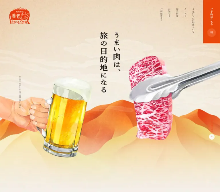
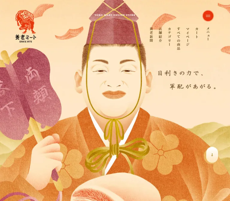
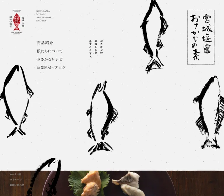
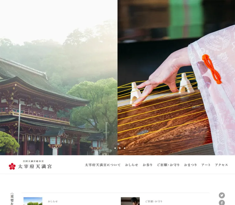
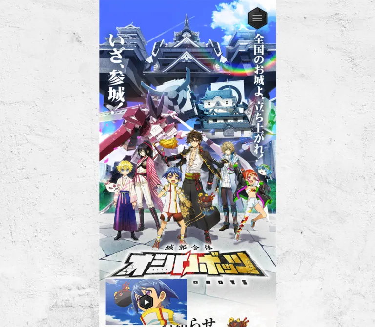
城郭ロボットと人物の大型ビジュアルを固定し、細長い情報欄を並べた公式サイト。和紙・古文書・石垣の質感に、明朝体、金縁のボタン、六角形の装飾を組み合わせています。
城郭合体オシロボッツ — Style Reference
A vivid castle robot poster beside a narrow scroll of paper, parchment, and stone.
Website: oshiro-robots.com Original URL: https://oshiro-robots.com/ Final URL: https://oshiro-robots.com/ Theme: light textured content, saturated illustration, and dark ornamental controls Inspected: October 2, 2026, Japan Standard Time; supplied collection timestamp: October 1, 2026, 15:30:14.210 UTC Viewports: desktop 1440 × 1000 CSS pixels; mobile 390 × 844 CSS pixels Scope: the current Japanese home page, analyzed from three supplied desktop captures, two mobile captures, and rendered DOM/computed-style evidence. Visual coverage includes the opening composition, part of the project introduction, media imagery, social links, and footer. The DOM also describes the castle robot catalog. Destination pages, an opened menu, video playback, and carousel operation were not inspected.
This is an official entertainment franchise website with news, project storytelling, a character and castle catalog, special content, and contact navigation. Its identity comes from combining Japanese castle architecture with colorful anime characters and giant robots. Traditional materials and lettering give that illustrated world a physical setting: white plaster around the desktop composition, pale patterned paper behind information, gridded parchment behind the story, and dark castle masonry beneath the footer.
The defining desktop relationship is a large, persistent illustration area on the left and a 500px information column on the right. At the inspected width, the artwork occupies the remaining 940px. Scrolling changes the right column while the left composition remains in the same screen position. On mobile, a portrait composition leads into the information sections in one vertical sequence. Preserve this change in hierarchy when adapting the design.
閉じる
城郭合体オシロボッツ — Style Reference
A vivid castle robot poster beside a narrow scroll of paper, parchment, and stone.
Website: oshiro-robots.com Original URL: https://oshiro-robots.com/ Final URL: https://oshiro-robots.com/ Theme: light textured content, saturated illustration, and dark ornamental controls Inspected: October 2, 2026, Japan Standard Time; supplied collection timestamp: October 1, 2026, 15:30:14.210 UTC Viewports: desktop 1440 × 1000 CSS pixels; mobile 390 × 844 CSS pixels Scope: the current Japanese home page, analyzed from three supplied desktop captures, two mobile captures, and rendered DOM/computed-style evidence. Visual coverage includes the opening composition, part of the project introduction, media imagery, social links, and footer. The DOM also describes the castle robot catalog. Destination pages, an opened menu, video playback, and carousel operation were not inspected.
This is an official entertainment franchise website with news, project storytelling, a character and castle catalog, special content, and contact navigation. Its identity comes from combining Japanese castle architecture with colorful anime characters and giant robots. Traditional materials and lettering give that illustrated world a physical setting: white plaster around the desktop composition, pale patterned paper behind information, gridded parchment behind the story, and dark castle masonry beneath the footer.
The defining desktop relationship is a large, persistent illustration area on the left and a 500px information column on the right. At the inspected width, the artwork occupies the remaining 940px. Scrolling changes the right column while the left composition remains in the same screen position. On mobile, a portrait composition leads into the information sections in one vertical sequence. Preserve this change in hierarchy when adapting the design.
How to Read This Reference
- Computed means a value is explicitly present in the supplied computed styles.
- Measured geometry means a rendered element rectangle from the supplied DOM evidence. Measurements are rounded for readability.
- Visual estimate means a proportion, color, or size judged from the current-page captures. Estimated hex values are practical approximations, not sampled source colors.
- Calculated means arithmetic based on recorded measurements, such as the mobile-to-desktop column ratio.
- Recommended means an implementation choice for a new build. It does not establish how the original was coded.
- Token names are descriptive aliases created for this reference. The available CMS preset inventory is not treated as the site's active design system.
Several labels are rendered through artwork or descendants whose appearance is not represented by the enclosing element's text styles. A link with computed blue text, a 0px font size, or a 0px radius can visibly contain white lettering and a rounded black plaque. Use the captures to establish appearance and the DOM to establish structure, dimensions, and destinations.
Tokens — Colors
Default Palette
| Name | Value | Evidence | Suggested token | Role |
|---|---|---|---|---|
| Outer Canvas | #f4f3f3 |
Computed body background | --canvas |
Fallback beneath the white plaster texture |
| Primary Ink | #141414 |
Computed body and heading color | --ink |
Text and the general dark interface tone |
| White | #ffffff |
Computed mobile main background and slide text | --paper |
Light content base and reversed lettering |
| Parchment | Approximately #e6dece |
Visual estimate | --parchment |
Warm story panel beneath its grid and weathering |
| Castle Stone | Approximately #252c2a |
Visual estimate | --stone |
Dark footer fallback beneath masonry photography |
| Metallic Gold | Approximately #d6b632 |
Visual estimate | --gold |
Plaque outlines, small diamonds, and desktop menu trim |
| Hero Sky | Approximately #4c6fff |
Visual estimate | --sky |
Large blue field within the illustration |
| Story Red | Approximately #b51e20 |
Visual estimate | --story-red |
Selected words within dramatic story lettering |
| Event Navy | Approximately #263c78 |
Visual estimate | --event |
News ribbon labeled イベント |
| Goods Purple | Approximately #772482 |
Visual estimate | --goods |
News ribbon labeled グッズ |
Color Hierarchy
The interface has a restrained material palette even though the main illustration contains many saturated colors. White and near-black provide the reading structure. Gold belongs primarily to ornamental controls and frames. Red emphasizes story copy. Navy and purple distinguish news categories.
The hero's blue, cyan, pink, green, and yellow belong to its artwork rather than a collection of interchangeable button colors. Keep the social platform graphics in their observed brand treatments: black for X and green for LINE. Their greens vary between the visible sidebar and footer graphics; no exact platform-color declaration was supplied.
The pale content column is not visually equivalent to a flat #ffffff rectangle. Subtle mottling and faint geometric patterns remain visible. Likewise, the footer's dark stone contains substantial tonal variation that a single charcoal swatch cannot reproduce.
No theme switcher or alternate color theme was evidenced.
Tokens — Typography
Noto Serif JP — Section Headings and Catalog Copy
The supplied styles explicitly declare "Noto Serif JP", serif on the major section headings and castle slide descriptions.
- Section headings use weight
700. - Desktop headings compute to
40px, with approximately51.33–52pxline height. - Mobile headings compute to
30px, with approximately38.5–39pxline height. - Castle slide descriptions use
18.6667px / 30.6667pxon desktop and14px / 23pxon mobile, also at weight700. - Letter spacing is recorded as
normalon these elements.
This serif treatment supplies much of the historical and theatrical character of the readable interface. Headings such as お知らせ and SNS are centered above decorative rules.
M PLUS 1p — Declared Base Stack
The body declares:
font-family: "M PLUS 1p", "Hiragino Kaku Gothic ProN",
  "ヒラギノ角ゴ ProN W3", Meiryo, メイリオ, Osaka,
  "MS PGothic", arial, helvetica, sans-serif;
Both inspected viewports report a 10px root font size and a 10px / 10px, weight 400 body declaration. These are source measurements, not a recommendation to render paragraphs at 10px. Many enclosing links and headings inherit this value while displaying much larger graphic lettering.
Computed family declarations identify the requested font stack. The supplied evidence does not separately verify the font file used for every glyph.
Graphic Lettering
The principal logo, vertical slogans, desktop navigation, several calls to action, and emphatic story copy have a strong artwork component. Some desktop navigation anchors explicitly compute to font-size: 0px and line-height: 0px while retaining substantial visible labels.
Do not recreate the angular franchise logo by selecting a vaguely similar display font. Preserve the provided mark as artwork. Treat stylized calligraphy and mechanically shaped lettering separately from ordinary section headings.
Type Scale
| Role | Desktop | Mobile | Evidence and application |
|---|---|---|---|
| Section heading | 40px / 51.33–52px, 700 |
30px / 38.5–39px, 700 |
Computed Noto Serif JP |
| Castle slide description | 18.6667px / 30.6667px, 700 |
14px / 23px, 700 |
Computed Noto Serif JP; white text |
| Body declaration | 10px / 10px, 400 |
10px / 10px, 400 |
Computed inherited base; not the visible size of every label |
| News date | Approximately 20px |
Approximately 15–16px |
Visual estimate; date descendant styles were not supplied |
| News description | Approximately 16–17px |
Approximately 12–13px |
Visual estimate |
| Story paragraph | Approximately 16px, with generous leading |
Not visually sampled in a mobile story capture | Desktop visual estimate; roughly 30–32px between lines |
| Social plaque label | Approximately 18–20px |
Approximately 14–16px |
Visual estimate; enclosing link reports 10px |
| Footer navigation | Approximately 18–20px |
Approximately 14–16px |
Visual estimate; preserve the serif appearance |
| Hero slogans | Large vertical graphic lettering | Rebalanced within portrait artwork | Do not infer a font family or exact font size |
The mobile news heading has a computed 39px line height but a measured 40.56px rectangle. Similar differences appear elsewhere. Keep computed typography distinct from transformed or otherwise scaled geometry; the evidence does not establish the exact scaling mechanism.
Tokens — Spacing & Shapes
Spacing Model
The right column behaves like a compact poster or illustrated booklet. Standard content is inset by approximately 5.333% of the column width, while large social plaques are narrower. These repeated proportional relationships are more useful than imposing a generic spacing system on the page.
| Measurement | Desktop | Mobile | Evidence |
|---|---|---|---|
| Information column | 500px |
390px |
Measured main width |
| Information column left edge | 940px |
0px |
Measured geometry |
| Standard side inset | Approximately 26.67px |
Approximately 20.8px |
Measured news and banner positions |
| Standard inner width | Approximately 446.67px |
Approximately 348.4px |
Measured news and banner width |
| Special banner | 446.66 × 140px |
348.4 × 109.2px |
Measured link rectangle |
| Large plaque link | 417.33 × 80px |
325.52 × 62.4px |
Measured index and social link rectangles |
| First news link height | 60.08px |
46.86px |
Measured rectangle |
| Following news row cadence | Approximately 78.81px |
Approximately 61.49px |
Calculated from consecutive row positions |
| News archive link | 120.66 × 29.33px |
94.12 × 22.88px |
Measured link rectangle |
| Catalog selector arrow | 26 × 29.33px |
20.28 × 22.88px |
Measured button rectangle |
| Footer | 500 × 504px |
390 × 393.12px |
Measured footer rectangle |
| Footer X icon | 50 × 50px |
39 × 39px |
Measured link rectangle |
| Footer logo | 136 × 66.94px |
106.08 × 52.47px |
Measured logo link rectangle |
The mobile column is 390 / 500 = 0.78 times the desktop column width. Banner, plaque, footer, and icon measurements closely follow this ratio. This is a calculated observation, not proof of a specific source CSS formula.
Border Radius and Geometry
| Element | Visible treatment | Status |
|---|---|---|
| Main artwork and special banner | Rectangular composition without generic card rounding | Observed |
| Story panel | Square corners and two inset outline rules | Observed |
| Social and index plaques | Long capsule silhouette with layered black and gold edges | Observed; enclosing anchor radius is 0px |
| News category ribbons | Slanted ends rather than rounded pills | Observed |
| Menu and media arrows | Hexagonal or shield-like dark emblems | Observed |
| Share icons | Circles | Observed |
| Language selector | Small beveled rectangular plate with a dark outline and shadow | Observed |
For a CSS recreation, border-radius: 999px is a reasonable plaque approximation. It is a recommendation, not an extracted source radius. The captured plaque contains an illustrated border and shadow inside a larger rectangular element box.
Desktop Artwork Measurements
The left illustration spans approximately 940 × 772px, from about y=115px to y=887px in the 1000px-high desktop captures. White plaster remains visible above and below it. Its vertical position is unchanged in the supplied opening, story, and footer views.
The desktop share tab is attached to the illustration's lower-left area. Its X and LINE link boxes are approximately 41px square. The small video preview at the lower right is visually about 160 × 90px.
These artwork measurements are visual estimates. The left illustration container's own bounding rectangle was not supplied.
Components
Persistent Desktop Key Visual
Role: maintain the franchise identity while visitors read the information column.
The composition builds depth in several layers: bright blue sky and clouds, castle towers and giant mechanical forms, the foreground character ensemble, small mascot figures, and a large angular logo near the ground. Two vertical white slogans flank the scene. Lens flare, rainbow color, mist, and paving stones are part of the visible composition.
On desktop, this artwork fills the left region horizontally while leaving plaster above and below. The navigation sits across its upper edge. A vertical social tab attaches to the lower-left side, and a video preview occupies the lower-right corner.
On mobile, the artwork becomes a tall opening poster. The characters and logo remain legible within the narrow frame, with the castle robots stacked above them. A single wide image cropped with object-fit: cover would not reliably preserve this arrangement. Use an authorized portrait composition or separately art-directed layers.
Navigation, Language Plate, and Menu Emblem
Role: expose the site's news, story, catalog, special content, and contact routes without adding a conventional header bar.
The desktop navigation is a row of small white labels over the blue sky. Its links include お知らせ, オシロボッツとは, オシロボット紹介, スペシャル, and お問い合わせ. The measured row begins around x=284.56px; the language link occupies a larger box near the right edge of the artwork.
The language plate visually separates JP and EN into two small cells. JP is dark on a light cell; EN is muted on gray. The recorded link target is /en/. The plate's precise switching behavior and the English destination were not exercised.
Mobile omits the horizontal navigation from the visible opening. A language plate and a dark hexagonal menu control appear at the upper right. The visible menu emblem is approximately 44–48px across and remains in the same upper-right area in the mobile footer capture. In the scrolled desktop captures, a larger gold-edged emblem appears near the lower-right corner. It is not visible in the supplied desktop opening capture.
The DOM contains duplicated navigation and logo entries. These do not establish that the menu was open. An opened menu's background, animation, focus behavior, and internal layout remain unverified.
Ornamented Section Heading
Role: make the narrow column read as a sequence of distinct illustrated chapters.
The component consists of a centered bold serif title, a dark decorative underline, and, for some sections, a small mascot near the title's upper-right side. The underline resembles short architectural or roof details flanking a central diamond emblem.
The news heading uses a dark mascot with red and gold details. The SNS heading has a small aquatic mascot in blue and green. The mascot sits beside the title rather than becoming an icon inside a colored heading box.
Use real heading text for the title. Keep the ornament and decorative mascot separate from the accessible name. Longer headings, including 「オシロボッツ」とは?, need a wider underline than the compact SNS heading.
News List and Category Ribbons
Role: provide current franchise updates in a compact editorial format.
Each entry has two levels:
- A date followed by one or more small category ribbons.
- A Japanese article title below, aligned with the date.
The list is left aligned inside the approximately 446.67px desktop inner width. Dates have greater visual weight than the descriptions. Navy and purple ribbon fills carry white lettering, and their ends are slanted. Articles sit directly on pale patterned paper without individual cards or strong separators.
The supplied DOM contains five news entries. The desktop opening visibly shows three complete entries and the fourth entry's date/category row before the visible list ends. A centered さらに見る link with a small dark hexagonal arrow follows. The evidence does not establish whether the clipped list area itself scrolls or how its visibility is controlled.
Do not infer an expandable accordion from the archive link: its recorded destination is /news/.
Special Content Banner
Role: provide an illustrated route into special content between news and the story panel.
A wide, shallow image link follows the news archive link. Its measured aspect ratio is approximately 3.19:1. Gold brush-like lines form the frame, characters occupy the ends, and the franchise mark and bold special-content lettering fill the center.
The entire banner links to /special/. Its enclosing anchor has no extracted text, so an implementation should provide a useful accessible label. Preserve the banner's internal lettering as artwork unless an authorized editable version is available.
Parchment Story Panel
Role: explain the premise and connect the fantasy robots to real castle architecture.
The panel spans the full information column. It has a warm parchment surface, a fine square grid, weathered marks, and two inset dark rectangular rules. The opening stacks a centered section heading, emphatic display copy, and a short red accent within otherwise dark lettering.
Further down, vertical Japanese phrases sit beside castle and anime imagery. One visible scene combines a photographic castle with red-and-black vertical copy on the left. The castle fades into the parchment rather than sitting inside a hard photographic card.
Below the image, several short centered lines explain how castle towers, gates, stone walls, and historical references become robot parts. In the desktop capture, generous line spacing gives the compact column a ceremonial reading rhythm. Use deliberate line grouping for this short narrative content; longer explanatory text in a new implementation should be allowed to wrap naturally.
The measured section is approximately 2718.66px tall on desktop and 2120.56px tall on mobile. Those are captured outcomes, not fixed heights to copy into CSS.
Anime Media Preview and Story Image Slider
Role: introduce animated content and make the story visually concrete.
The desktop key visual includes a small anime still with a dark play emblem. The story capture also shows a much larger landscape anime image, approximately 396 × 224px, with dark hexagonal left and right arrows overlapping its edges.
These are separate visual contexts. Do not conflate the large story arrows with the much smaller catalog selector buttons measured elsewhere in the DOM.
A visible play symbol supports describing a media affordance. It does not establish playback, autoplay, audio behavior, or whether the result opens inline, in a modal, or on another site. Similarly, the paired arrows establish a slider affordance, but slide order, swipe support, and transition behavior were not recorded.
Castle Robot Catalog
Role: lead visitors from the overall franchise into individual castle robot entries.
This component is supported primarily by the rendered DOM; the supplied screenshots do not show its full visual presentation.
The recorded anatomy is:
- A centered
オシロボット紹介section heading. - A castle-name selection strip with Previous and Next buttons.
- A horizontal sequence of slide panels, each as wide as the content column.
- A castle robot name, a two-line descriptive statement, and a
くわしく見るdetail link. - A large
一覧を見るplaque after the featured content.
Slide descriptions are confirmed as bold white Noto Serif JP. The panels' x-coordinates advance in 500px desktop increments and 390px mobile increments. Repeated castle entries occur in the DOM, consistent with duplicated carousel content, but looping and autoplay were not demonstrated.
Do not turn the offscreen sequence into a visible multi-column grid merely because many entries appear in extracted text. Per-castle backgrounds, selection states, and full illustration framing are not established by the supplied visual coverage.
The recorded index link points to /oshiro, while the primary catalog navigation points to /oshiro-robots/. Their destination behavior was not checked.
Black and Gold Plaque Link
Role: provide the most prominent reusable navigation treatment.
A long dark capsule contains centered light serif lettering. Gold outlines sit just inside a dark exterior edge. Small gold diamonds mark the left and right ends. A smoky metal-like texture and a compact shadow make the plaque look like a physical object.
This treatment appears on the catalog index and both SNS links. The measured enclosing link is approximately 417.33 × 80px on desktop and 325.52 × 62.4px on mobile. The visible painted outline is smaller than the full rectangle.
Keep the hierarchy within the component: dark field first, thin gold border second, white label third. Gold is trim, not the main fill. On narrow screens, preserve breathing room around the side diamonds and let unusually long labels wrap rather than collide with them.
SNS Section
Role: connect the franchise site to its external channels.
The centered SNS heading and aquatic mascot sit above two vertically stacked plaque links. The first is labeled オシロボッツ公式Twitterをフォローする; the second is MIXI_ANIME公式YouTube.
The recorded destinations are the franchise's Twitter account and the MIXI_ANIME YouTube channel. Preserve the distinction between these follow/channel links and the separate sharing controls.
The section remains on pale patterned paper and leaves substantial space before the irregular transition into dark stone below.
Share Controls
Role: share the current franchise page through X/Twitter and LINE.
On desktop, two circular marks sit in a narrow white tab at the lower-left edge of the persistent artwork. A second set appears in the footer beside シェアする.
The visible symbol is X, while the extracted link text and intent endpoint still use Twitter terminology. The recorded links are share/intent URLs containing page text and the original page URL. No successful external sharing action was tested.
The mobile opening does not show the desktop side tab. The footer retains the horizontal sharing row.
Castle Stone Footer
Role: close the page with franchise channels, corporate navigation, and ownership branding.
An irregular pale edge leads into a full-width dark masonry background. Large stone blocks and visible joints provide the structure; there are no separate footer cards.
The content is centered and vertically stacked: sharing row, MIXI_ANIME link, company information, privacy policy, contact link, MIXI logo, and copyright. White text contrasts with the dark stone. The logo is large enough to be a clear final visual anchor, with its small magenta and yellow marks retained.
The inspected page visibly includes the MIXI logo and ©MIXI, and its company-information link points to https://mixi.co.jp/. No website production credit is established by the inspected original-page evidence.
Tokens — Motion & Interaction
| Element or treatment | Recorded evidence | What can be concluded |
|---|---|---|
| Navigation, news, banner, and social links | transition: opacity 0.3s |
An opacity transition is defined; trigger and target opacity are not supplied |
| News and SNS sections | 1s cubic-bezier(0.71, 0.42, 0.06, 0.88) |
A one-second transition is declared; its start/end geometry is unverified |
| Story and catalog headings | Same one-second curve | Shared transition timing is evidenced |
| One vertical story heading | Same curve with 0.2s delay |
A delayed transition declaration is evidenced |
| Another vertical story heading | Same curve with 0.1s delay |
A second stagger interval is evidenced |
| Mobile opening H1 | Same one-second curve | The hero container has a transition declaration |
| Catalog Previous/Next buttons | opacity 0.3s |
Button opacity timing is defined; slide timing is not established |
| Desktop left artwork | Same screen position in three scroll captures | Visually persistent during the supplied scroll sequence; fixed versus sticky source positioning is not supplied |
| Mobile menu emblem | Same upper-right area in opening and footer captures | Persistent control placement is visually supported |
| Sampled element animations | animation: none |
No keyframe animation on those sampled elements; this does not rule out scripts, descendants, or animated assets |
The capture process waited for image decoding and finite layout motion, with bounded readiness checks. Perpetual animations were paused during those checks and resumed afterward. This procedure improves screenshot stability but does not reveal every animation or interaction.
Do not infer animated lens flare, character movement, parallax, or ambient sound from the artwork. The supplied stills do not demonstrate those effects. Menu opening, video playback, hover endpoints, carousel dragging, keyboard behavior, and reduced-motion support remain unverified.
For a new implementation, a 300ms opacity response and the recorded one-second easing curve are reasonable starting points. Any chosen translation distance, hover opacity, or reveal trigger must be labeled as an implementation recommendation.
Surfaces
| Layer | Appearance | Purpose |
|---|---|---|
| Desktop outer canvas | White plaster with fine gray irregularities | Frames the large illustration without adding visual competition |
| Information paper | Near-white mottling with faint patterns | Supports compact news and social content |
| Story parchment | Warm paper, fine grid, weathering, and double outline | Gives the premise a historical-document setting |
| Illustrated scene | Saturated sky, castle forms, characters, and light effects | Supplies the main visual impact |
| Control plaque | Dark textured capsule with gold edges | Signals prominent navigation |
| Footer | Dark photographic castle masonry | Provides a strong final material change |
Depth is concentrated in the artwork and illustrated controls. There is no broad system of floating white cards. Keep shadows local to plates, emblems, and other objects that visibly use them.
Imagery
The imagery combines anime character design, detailed mechanical castle forms, historical architecture, and physical Japanese materials. The castle elements remain recognizable: tiled roofs, towers, walls, gates, and stone foundations are not reduced to generic robot armor.
The main ensemble is dense but organized. The tallest castle and robot forms rise behind the people; characters remain clearly separated by costume color; the angular logo anchors the lower foreground. Bright sky and mist separate silhouettes from the architecture.
Use normal high-quality image rendering. These illustrations are not pixel art, and image-rendering: pixelated would damage their linework.
Observed Asset Roles
Actual image URLs, background URLs, natural dimensions, and file formats were not included in the evidence. The following table identifies required visual roles without inventing filenames.
| Asset role | Visible use | Adaptation guidance |
|---|---|---|
| Wide ensemble composition | Persistent desktop artwork | Preserve the complete cast, logo, and side slogans |
| Portrait ensemble composition | Mobile opening | Use deliberate art direction rather than an arbitrary center crop |
| Franchise logo | Lower part of the main composition | Retain its angular outline, red center accent, and gold treatment |
| Vertical slogan lettering | Both sides of the main visual | Preserve as artwork or use an authorized editable source |
| News and SNS mascots | Beside section headings | Keep their small scale and irregular silhouette |
| Special banner | Between news and story | Preserve its approximately 3.19:1 composition |
| Castle photograph | Story explanation | Retain its soft transition into parchment |
| Anime stills | Video preview and story media | Reserve landscape image proportions |
| Plaster, paper, parchment, and stone textures | Major surfaces | Match scale and contrast separately for each material |
| Plaque, arrow, menu, and language graphics | Controls | Retain their material edges and distinctive silhouettes |
| Social and corporate marks | Sharing and footer | Use supplied brand assets rather than improvised text logos |
The visible left hero slogan reads いざ、参城!, while the supplied DOM text includes いざ、参戦!. This discrepancy should be reviewed when preparing text alternatives. Do not silently assume the artwork and extracted text are identical.
Layout & Responsive Behavior
Desktop: Persistent Artwork and a Reading Column
At 1440px wide, the main information column begins at x=940 and measures 500px. The composition can therefore be described as a flexible left stage plus a narrow right column at the inspected size.
The news section starts at the top of the right column while the artwork is vertically centered on the left. The page does not begin with a full-width hero above all content. The right column continues through the story, castle robot catalog, SNS links, and footer.
The desktop document height is reported as approximately 5402px. This does not imply that the artwork itself is 5402px tall; it remains in place while the information changes.
Mobile: Portrait Opening and Sequential Content
At 390 × 844, the artwork occupies the full available width. The visible horizontal desktop navigation is replaced by the menu emblem and language plate. The logo appears near the lower part of the portrait scene, and the news heading begins around y=693px.
The measured mobile H1 rectangle is about 831px tall, even though news begins around y=692px. The source contains overlapping or transformed geometry, so the H1 rectangle should not be treated as the visible image's simple flow height. The screenshot is the authority for the composition's apparent end.
The information sections remain a single column. The mobile document height is reported as approximately 4888px. The measured body rectangle is slightly shorter than that reported document extent; do not force all recorded bounds into an exact sum.
Recorded Section Positions
These values are useful for understanding the page sequence, not for absolute-positioning a recreation.
| Region | Desktop y-coordinate | Mobile y-coordinate |
|---|---|---|
| News section | 0px |
Approximately 692.14px |
| Special banner | Approximately 492.64px |
Approximately 1046.24px |
| Story panel | Approximately 673.97px |
Approximately 1187.68px |
| Castle robot section | Approximately 3392.63px |
Approximately 3308.24px |
| SNS section | Approximately 4552.97px |
Approximately 4145.18px |
| Footer | Approximately 4897.88px |
Approximately 4494.53px |
Some child rectangles extend outside their section rectangles, and the computed evidence is not a complete layout stylesheet. Build a semantic document flow, then reproduce confirmed overlays and positioning deliberately.
Recommended Responsive Strategy
- Use a 500px right column and a flexible artwork region at sufficiently wide desktop sizes.
- Use a portrait opening followed by normal document flow on phones.
- Express standard inner spacing as approximately
5.333%of the content column. - Size banners and decorative controls relative to the column, while maintaining readable text and usable hit areas.
- Keep one featured catalog slide per column width.
- Choose and test an intermediate breakpoint explicitly. The source breakpoint cannot be recovered from two viewport samples.
- Prefer document scrolling for the reading content unless a separate scroll container is intentionally required. The evidence does not establish an independently scrolling right pane.
The Quick Start uses 1100px as a recommended desktop breakpoint. It is not a measured source value.
Do’s and Don’ts
Do
- Preserve the desktop relationship between a large persistent illustration and a narrow information column.
- Use a portrait composition on mobile that keeps the people, castle robots, and logo legible.
- Retain the distinct plaster, pale paper, parchment, and masonry surfaces.
- Use bold Noto Serif JP for headings where the evidence confirms it.
- Keep news entries compact, left aligned, and directly on the paper surface.
- Use small slanted category ribbons with white lettering.
- Preserve the black-and-gold capsule controls and their small diamond accents.
- Keep story red selective and gold concentrated around ornamental elements.
- Maintain the centered story rhythm and the mixture of vertical lettering and architectural imagery.
- Treat decorative lettering and logo artwork as separate assets from ordinary readable text.
- Give image links and icon controls usable accessible names.
Don’t
- Don’t replace the desktop split with a conventional full-width marketing hero.
- Don’t turn the information column into a grid of rounded cards.
- Don’t apply the inherited 10px body declaration to all visible copy.
- Don’t mistake computed blue anchor text or 0px border radii for the final graphic appearance.
- Don’t promote unused CMS color and font presets into the active palette.
- Don’t stretch the portrait artwork across desktop or blindly crop the wide composition for phones.
- Don’t flatten the parchment and stone into interchangeable beige and gray blocks.
- Don’t spread gold fills or vivid anime colors across every interface control.
- Don’t claim autoplay, parallax, video playback, or menu animation from still captures.
- Don’t display duplicated offscreen carousel entries as separate content cards.
- Don’t invent production credits, asset paths, or an active campaign modal from extracted text alone.
Recommended Implementation Additions
These are recommendations for a new implementation, not verified features of the original:
- Keep news, headings, link labels, and narrative text as accessible HTML wherever practical. Use images for lettering only where its artwork is essential.
- Increase small arrow and sharing targets to at least 44 × 44px without necessarily enlarging their visible graphics. The measured mobile catalog arrows are substantially smaller.
- Implement the menu control with an accessible name,
aria-expanded, and a defined relationship to its navigation. If it opens a modal surface, manage focus and support Escape. - Keep keyboard focus visible against paper, dark plaques, illustration, and stone.
- Ensure clipped news entries are still reachable through an explicit, keyboard-operable route. Avoid placing focusable links invisibly beneath a mask.
- Remove hidden carousel clones from the keyboard sequence and accessibility tree as appropriate. Announce the active slide without continuously interrupting reading.
- Start audible video only after a user action, provide playback controls, and avoid moving focus unexpectedly.
- Honor reduced-motion preferences and keep essential content visible if reveal scripts fail.
- Set explicit image dimensions or aspect ratios to limit layout shifts. Prioritize the opening artwork and defer below-fold media where appropriate.
- Review the hero slogan's artwork/DOM wording discrepancy when authoring alternative text.
Agent Prompt Guide
Quick Color Reference
- Computed outer canvas:
#f4f3f3. - Computed main ink:
#141414. - Computed white surface/reversed text:
#ffffff. - Estimated parchment:
#e6dece. - Estimated dark stone:
#252c2a. - Estimated metallic gold:
#d6b632. - Estimated story red:
#b51e20. - Estimated event and goods ribbons:
#263c78and#772482. - Hero blue is carried by the artwork;
#4c6fffis only a visual approximation.
Overall Prompt
“Create an official Japanese entertainment franchise home page inspired by the supplied 城郭合体オシロボッツ captures. On wide desktop, place a persistent anime castle robot ensemble in the flexible left region and a 500px reading column at the right. Frame the artwork with white plaster. Build the reading column from pale patterned paper, compact dated news with slanted category ribbons, a gold-framed illustrated special banner, a long gridded parchment story panel, a single-slide castle robot catalog, black-and-gold social plaques, and a dark masonry footer. Use bold Noto Serif JP section headings with architectural underline ornaments and small mascot illustrations. On mobile, lead with a deliberately composed portrait visual and continue through one vertical content column. Use supplied artwork, preserve readable HTML text, and treat unverified motion and menu behavior as implementation decisions.”
Example Component Prompts
- Desktop composition: “At a 1440 × 1000 reference viewport, allocate 940px to a persistent illustration stage and 500px to the information column. Center an approximately 940 × 772px wide composition vertically against white plaster. Keep navigation over the sky and the reading column independently positioned at the page's right edge.”
- News section: “Create a pale textured news panel with a centered bold serif heading, roof-like underline ornament, and a small mascot. Use left-aligned dates, navy and purple slanted category ribbons, and compact article titles. Give the section approximately 5.333% horizontal inset and finish with a small archive link and hexagonal arrow.”
- Story panel: “Build a full-column parchment section with subtle square grid lines and two inset dark border rules. Combine centered Japanese introductory copy, selective red emphasis, vertical story lettering, a softly faded castle photograph, and short centered paragraphs. Keep the surface square and materially textured.”
- Plaque link: “Design a long dark capsule with a restrained smoky texture, layered black and gold outlines, a compact downward shadow, centered white serif lettering, and a small gold diamond at each end. Use approximately 83.5% of the content-column width.”
- Mobile opening: “Use a portrait version of the supplied castle robot ensemble at 390px wide. Keep the giant castle forms above the characters and the franchise logo near the lower foreground. Place the language plate and dark hexagonal menu control at the upper right. Let the news heading enter near the bottom of the first 844px viewport.”
- Footer: “Transition from pale paper into dark castle masonry with an irregular upper edge. Center a sharing row, four vertically spaced navigation links, a large supplied MIXI mark, and a small copyright line. Retain white serif lettering and the original social icon colors.”
Quick Start
CSS Custom Properties
This is a practical adaptation, not extracted source CSS. It uses a conventional readable root size, proportional content widths, and CSS approximations for ornamental controls. The 1100px breakpoint, hover endpoint, minimum target sizes, and portrait frame ratio are recommendations.
Provide a .site-shell containing .keyvisual and .content-rail. Place the wide/portrait picture inside .keyvisual-frame, then put the news, story, catalog, SNS, and footer sections inside the content rail. Use a real <picture> with authorized desktop and mobile sources. The menu is a real button with a child .menu-lines span; its opening behavior requires separate implementation.
Texture custom properties default to none. Connect them to supplied image assets when available. The CSS remains usable without them, but flat fallback colors do not reproduce the original material detail. Declaring a font family does not load that font.
:root {
  /* Computed colors */
  --canvas: #f4f3f3;
  --paper: #ffffff;
  --ink: #141414;

  /* Visual approximations */
  --parchment: #e6dece;
  --stone: #252c2a;
  --gold: #d6b632;
  --story-red: #b51e20;
  --event: #263c78;
  --goods: #772482;

  /* Observed families; font loading is separate */
  --font-editorial: 'Noto Serif JP', serif;
  --font-base: 'M PLUS 1p', 'Hiragino Kaku Gothic ProN',
    Meiryo, sans-serif;

  /* Measured proportions, adapted for normal document flow */
  --rail-width: min(100vw, 500px);
  --inner-width: 89.333%;
  --plaque-width: 83.466%;
  --heading-size: clamp(30px, 7.692vw, 40px);
  --plaque-height: clamp(62.4px, 16vw, 80px);

  /* Assign authorized texture images in the consuming project */
  --texture-plaster: none;
  --texture-paper: none;
  --texture-parchment: none;
  --texture-stone: none;
  --texture-metal: none;

  /* Recorded timings; motion endpoints remain recommendations */
  --motion-link: 300ms;
  --motion-reveal: 1000ms;
  --ease-reveal: cubic-bezier(0.71, 0.42, 0.06, 0.88);
}

* {
  box-sizing: border-box;
}

html {
  font-size: 100%;
}

body {
  margin: 0;
  color: var(--ink);
  background-color: var(--canvas);
  background-image: var(--texture-plaster);
  font-family: var(--font-base);
  font-size: 16px;
  line-height: 1.7;
}

img {
  display: block;
  max-inline-size: 100%;
}

button,
a {
  -webkit-tap-highlight-color: transparent;
}

.keyvisual,
.content-rail {
  inline-size: var(--rail-width);
  margin-inline: auto;
}

.keyvisual-frame {
  position: relative;
  inline-size: 100%;
  aspect-ratio: 390 / 660;
}

.hero-picture,
.hero-picture img {
  display: block;
  inline-size: 100%;
  block-size: 100%;
}

.hero-picture img {
  /* Supply art with the intended portrait composition. */
  object-fit: contain;
}

.hero-nav,
.hero-share,
.hero-video {
  display: none;
}

.content-rail {
  position: relative;
  background-color: var(--paper);
  background-image: var(--texture-paper);
}

.section-inner {
  inline-size: var(--inner-width);
  margin-inline: auto;
}

.news-section {
  padding-block: 32px;
}

.section-title {
  position: relative;
  margin: 0;
  text-align: center;
  font-family: var(--font-editorial);
  font-size: var(--heading-size);
  font-weight: 700;
  line-height: 1.3;
}

.section-title > span {
  position: relative;
  display: inline-block;
  padding-block-end: 16px;
}

.section-title > span::before {
  content: '';
  position: absolute;
  inset: auto 0 0;
  block-size: 8px;
  background:
    linear-gradient(currentColor, currentColor)
      left center / 42% 3px no-repeat,
    linear-gradient(currentColor, currentColor)
      right center / 42% 3px no-repeat;
}

.section-title > span::after {
  content: '';
  position: absolute;
  inset-inline-start: 50%;
  inset-block-end: 0;
  inline-size: 8px;
  block-size: 8px;
  border: 2px solid currentColor;
  transform: translateX(-50%) rotate(45deg);
}

.heading-mascot {
  position: absolute;
  inset-inline-end: 12%;
  inset-block-start: -12px;
  inline-size: clamp(50px, 13vw, 68px);
  pointer-events: none;
}

.news-list {
  display: grid;
  gap: 20px;
  margin: 30px 0 0;
  padding: 0;
  list-style: none;
}

.news-row {
  display: block;
  color: inherit;
  text-decoration: none;
  font-family: var(--font-editorial);
}

.news-meta {
  display: flex;
  flex-wrap: wrap;
  align-items: center;
  gap: 6px;
}

.news-date {
  margin-inline-end: 5px;
  font-size: clamp(15px, 4vw, 20px);
  font-weight: 700;
  line-height: 1.3;
}

.news-tag {
  padding: 1px 15px;
  color: var(--paper);
  background: var(--goods);
  clip-path: polygon(0 0, 90% 0, 100% 100%, 10% 100%);
  font-size: clamp(11px, 2.8vw, 14px);
  font-weight: 700;
  line-height: 1.35;
}

.news-tag[data-category='event'] {
  background: var(--event);
}

.news-copy {
  margin: 6px 0 0;
  font-size: clamp(13px, 3.33vw, 16.67px);
  line-height: 1.6;
}

.archive-link {
  display: flex;
  align-items: center;
  justify-content: center;
  gap: 8px;
  min-block-size: 44px;
  margin-block-start: 20px;
  color: inherit;
  font-family: var(--font-editorial);
  text-decoration: none;
}

.special-banner {
  display: block;
  inline-size: var(--inner-width);
  margin: 24px auto 32px;
}

.special-banner img {
  inline-size: 100%;
  block-size: auto;
}

.story-panel {
  position: relative;
  padding: 42px 5.333% 48px;
  background-color: var(--parchment);
  background-image:
    var(--texture-parchment),
    linear-gradient(#1414140c 1px, transparent 1px),
    linear-gradient(90deg, #1414140c 1px, transparent 1px);
  background-size: auto, 26px 26px, 26px 26px;
}

.story-panel::before {
  content: '';
  position: absolute;
  inset: 10px;
  border: 2px solid #141414b3;
  outline: 1px solid #14141499;
  outline-offset: -8px;
  pointer-events: none;
}

.story-copy {
  position: relative;
  margin-block: 28px;
  text-align: center;
  font-family: var(--font-editorial);
  font-size: clamp(14px, 3.2vw, 16px);
  line-height: 2;
}

.story-emphasis {
  color: var(--story-red);
  font-weight: 700;
}

.story-media {
  position: relative;
  margin-block-start: 24px;
}

.story-media img {
  inline-size: 100%;
  aspect-ratio: 16 / 9;
  object-fit: contain;
}

.catalog-viewport {
  overflow: hidden;
}

.catalog-track {
  display: flex;
}

.catalog-slide {
  flex: 0 0 100%;
  min-inline-size: 0;
}

.catalog-caption {
  color: var(--paper);
  font-family: var(--font-editorial);
  font-size: clamp(14px, 3.733vw, 18.667px);
  font-weight: 700;
  line-height: 1.643;
  text-align: center;
}

.plaque-link {
  position: relative;
  display: flex;
  align-items: center;
  justify-content: center;
  inline-size: var(--plaque-width);
  min-block-size: var(--plaque-height);
  margin-inline: auto;
  padding: 12px 30px;
  border: 2px solid var(--ink);
  border-radius: 999px;
  color: var(--paper);
  background-color: var(--ink);
  background-image:
    var(--texture-metal),
    linear-gradient(#151515, #343434 48%, #090909);
  box-shadow:
    inset 0 0 0 2px var(--gold),
    2px 4px 3px #00000045;
  font-family: var(--font-editorial);
  font-size: clamp(14px, 4vw, 20px);
  line-height: 1.4;
  text-align: center;
  text-decoration: none;
}

.plaque-link::before,
.plaque-link::after {
  content: '';
  position: absolute;
  inset-block-start: calc(50% - 3px);
  inline-size: 6px;
  block-size: 6px;
  background: var(--gold);
  transform: rotate(45deg);
}

.plaque-link::before {
  inset-inline-start: 17px;
}

.plaque-link::after {
  inset-inline-end: 17px;
}

.sns-section {
  padding-block: 56px 72px;
}

.sns-links {
  display: grid;
  gap: clamp(16px, 4.2vw, 21px);
  margin-block-start: 32px;
}

.castle-footer {
  padding: 40px 5.333% 20px;
  color: var(--paper);
  background-color: var(--stone);
  background-image: var(--texture-stone);
  background-size: cover;
  font-family: var(--font-editorial);
  text-align: center;
}

.share-row {
  display: flex;
  align-items: center;
  justify-content: center;
  gap: 22px;
}

.share-link {
  display: grid;
  place-items: center;
  min-inline-size: 44px;
  min-block-size: 44px;
}

.footer-links {
  display: grid;
  gap: 6px;
  margin-block: 24px;
}

.footer-links a {
  display: grid;
  place-items: center;
  min-block-size: 44px;
  color: inherit;
  text-decoration: none;
}

.footer-logo {
  inline-size: clamp(106px, 27.2vw, 136px);
  margin: 28px auto 20px;
}

.menu-toggle {
  position: fixed;
  z-index: 30;
  inset-block-start: max(16px, env(safe-area-inset-top));
  inset-inline-end: max(18px, env(safe-area-inset-right));
  display: grid;
  place-items: center;
  inline-size: 46px;
  block-size: 50px;
  padding: 0;
  border: 0;
  isolation: isolate;
  color: var(--paper);
  background: transparent;
  cursor: pointer;
}

.menu-toggle::before,
.menu-toggle::after {
  content: '';
  position: absolute;
  clip-path: polygon(50% 0, 100% 25%, 100% 75%,
    50% 100%, 0 75%, 0 25%);
}

.menu-toggle::before {
  z-index: -2;
  inset: 0;
  background: var(--ink);
}

.menu-toggle::after {
  z-index: -1;
  inset: 3px;
  background: linear-gradient(#343a38, #131715);
}

.menu-lines {
  inline-size: 22px;
  block-size: 1px;
  background: currentColor;
  box-shadow: 0 -6px currentColor, 0 6px currentColor;
}

.news-row,
.plaque-link,
.special-banner,
.hero-nav a {
  transition: opacity var(--motion-link);
}

@media (hover: hover) {
  /* Recommended endpoint; only the duration is source-evidenced. */
  .news-row:hover,
  .plaque-link:hover,
  .special-banner:hover,
  .hero-nav a:hover {
    opacity: 0.82;
  }
}

@media (min-width: 1100px) {
  /* Recommended breakpoint; the source breakpoint is unknown. */
  .keyvisual {
    position: fixed;
    inset: 0 auto 0 0;
    display: grid;
    place-items: center;
    inline-size: calc(100% - 500px);
    margin: 0;
  }

  .keyvisual-frame {
    inline-size: min(100%, calc(100svh * 940 / 772));
    aspect-ratio: 940 / 772;
  }

  .content-rail {
    inline-size: 500px;
    margin-inline: auto 0;
  }

  .hero-nav {
    position: absolute;
    inset-block-start: 12px;
    inset-inline-end: 3%;
    display: flex;
    align-items: center;
    gap: 20px;
  }

  .hero-nav a {
    color: var(--paper);
    font-family: var(--font-editorial);
    font-size: 13px;
    font-weight: 700;
    text-decoration: none;
  }

  .hero-share {
    position: absolute;
    inset-inline-start: 0;
    inset-block-end: 16px;
    display: grid;
    gap: 14px;
    padding: 14px 8px;
    border-radius: 0 12px 12px 0;
    background: var(--paper);
  }

  .hero-video {
    position: absolute;
    inset-inline-end: 8px;
    inset-block-end: 10px;
    display: block;
    inline-size: 17%;
    aspect-ratio: 16 / 9;
  }

  .news-section {
    padding-block-start: 40px;
  }

  .menu-toggle {
    inset-block-start: auto;
    inset-block-end: 20px;
    inset-inline-end: 24px;
    inline-size: 80px;
    block-size: 90px;
    display: none;
  }

  /* Application logic supplies the observed scrolled placement state. */
  .site-shell.is-scrolled .menu-toggle {
    display: grid;
  }

  .menu-toggle::before {
    background: var(--gold);
  }
}

.site-shell :is(a, button):focus-visible {
  outline: 3px solid currentColor;
  outline-offset: 4px;
}

@media (prefers-reduced-motion: reduce) {
  .site-shell *,
  .site-shell *::before,
  .site-shell *::after {
    animation: none !important;
    transition: none !important;
    scroll-behavior: auto !important;
  }
}
The news list above is intentionally left in accessible normal flow. Matching the original clipped presentation requires an explicit visibility model and a reachable archive route. The catalog CSS establishes slide geometry only; navigation, active state, and clone handling require application logic. The original irregular footer edge and detailed control artwork require image assets or separately authored decorative shapes.
Tailwind v4 Token Mapping
Optional aliases for an existing Tailwind v4 project. These do not indicate that the original site uses Tailwind. Define the properties above first.
@theme inline {
  --color-canvas: var(--canvas);
  --color-paper: var(--paper);
  --color-ink: var(--ink);
  --color-parchment: var(--parchment);
  --color-stone: var(--stone);
  --color-gold: var(--gold);
  --color-story-red: var(--story-red);
  --color-event: var(--event);
  --color-goods: var(--goods);

  --font-display: var(--font-editorial);
  --font-interface: var(--font-base);

  --text-section: var(--heading-size);
  --spacing-content-rail: 500px;
  --spacing-touch-target: 44px;
  --radius-plaque: 999px;
  --ease-story: var(--ease-reveal);
}
Sources & Evidence
- Current Japanese home page: the original and final URL are identical, with a supplied HTTP status of 200. No destination pages were independently inspected for this reference.
- Collection timestamp:
2026-10-01T15:30:14.210Z, equivalent to October 2, 2026, 00:30:14.210 JST. - Desktop evidence: 1440 × 1000 CSS-pixel viewport; reported document height approximately 5402px. Three supplied captures show the opening, a story/media position, and the SNS/footer region.
- Mobile evidence: 390 × 844 CSS-pixel viewport; reported document height approximately 4888px. Two supplied captures show the portrait opening and the SNS/footer region.
- Rendered evidence: page title, text, link destinations, element rectangles, computed colors, font stacks, typography, transitions, and CSS custom-property inventory. This is the authority for values labeled computed or measured.
- Visual evidence: current-page captures establish illustration composition, surface textures, ornament, visible clipping, control appearance, and persistent placement across scroll positions. Color approximations and unsampled visual dimensions are labeled estimates.
- Inspection limits: no original image asset URLs, complete stylesheets, open-menu state, video playback, tested hover endpoint, carousel operation, intermediate breakpoint capture, or accessibility interaction log was supplied. Duplicate navigation, campaign terms, and offscreen slide text do not prove those surfaces were visibly active.
This reference describes the current supplied page evidence. Its reusable CSS, responsive breakpoint, accessibility additions, and interaction endpoints are recommendations rather than claims about the original implementation.
# 城郭合体オシロボッツ — Style Reference

> A vivid castle robot poster beside a narrow scroll of paper, parchment, and stone.

**Website:** [oshiro-robots.com](https://oshiro-robots.com/)
**Original URL:** https://oshiro-robots.com/
**Final URL:** https://oshiro-robots.com/
**Theme:** light textured content, saturated illustration, and dark ornamental controls
**Inspected:** October 2, 2026, Japan Standard Time; supplied collection timestamp: October 1, 2026, 15:30:14.210 UTC
**Viewports:** desktop 1440 × 1000 CSS pixels; mobile 390 × 844 CSS pixels
**Scope:** the current Japanese home page, analyzed from three supplied desktop captures, two mobile captures, and rendered DOM/computed-style evidence. Visual coverage includes the opening composition, part of the project introduction, media imagery, social links, and footer. The DOM also describes the castle robot catalog. Destination pages, an opened menu, video playback, and carousel operation were not inspected.

This is an official entertainment franchise website with news, project storytelling, a character and castle catalog, special content, and contact navigation. Its identity comes from combining Japanese castle architecture with colorful anime characters and giant robots. Traditional materials and lettering give that illustrated world a physical setting: white plaster around the desktop composition, pale patterned paper behind information, gridded parchment behind the story, and dark castle masonry beneath the footer.

The defining desktop relationship is a large, persistent illustration area on the left and a 500px information column on the right. At the inspected width, the artwork occupies the remaining 940px. Scrolling changes the right column while the left composition remains in the same screen position. On mobile, a portrait composition leads into the information sections in one vertical sequence. Preserve this change in hierarchy when adapting the design.
閉じる
# 城郭合体オシロボッツ — Style Reference

> A vivid castle robot poster beside a narrow scroll of paper, parchment, and stone.

**Website:** [oshiro-robots.com](https://oshiro-robots.com/)
**Original URL:** https://oshiro-robots.com/
**Final URL:** https://oshiro-robots.com/
**Theme:** light textured content, saturated illustration, and dark ornamental controls
**Inspected:** October 2, 2026, Japan Standard Time; supplied collection timestamp: October 1, 2026, 15:30:14.210 UTC
**Viewports:** desktop 1440 × 1000 CSS pixels; mobile 390 × 844 CSS pixels
**Scope:** the current Japanese home page, analyzed from three supplied desktop captures, two mobile captures, and rendered DOM/computed-style evidence. Visual coverage includes the opening composition, part of the project introduction, media imagery, social links, and footer. The DOM also describes the castle robot catalog. Destination pages, an opened menu, video playback, and carousel operation were not inspected.

This is an official entertainment franchise website with news, project storytelling, a character and castle catalog, special content, and contact navigation. Its identity comes from combining Japanese castle architecture with colorful anime characters and giant robots. Traditional materials and lettering give that illustrated world a physical setting: white plaster around the desktop composition, pale patterned paper behind information, gridded parchment behind the story, and dark castle masonry beneath the footer.

The defining desktop relationship is a large, persistent illustration area on the left and a 500px information column on the right. At the inspected width, the artwork occupies the remaining 940px. Scrolling changes the right column while the left composition remains in the same screen position. On mobile, a portrait composition leads into the information sections in one vertical sequence. Preserve this change in hierarchy when adapting the design.

## How to Read This Reference

- **Computed** means a value is explicitly present in the supplied computed styles.
- **Measured geometry** means a rendered element rectangle from the supplied DOM evidence. Measurements are rounded for readability.
- **Visual estimate** means a proportion, color, or size judged from the current-page captures. Estimated hex values are practical approximations, not sampled source colors.
- **Calculated** means arithmetic based on recorded measurements, such as the mobile-to-desktop column ratio.
- **Recommended** means an implementation choice for a new build. It does not establish how the original was coded.
- Token names are descriptive aliases created for this reference. The available CMS preset inventory is not treated as the site's active design system.

Several labels are rendered through artwork or descendants whose appearance is not represented by the enclosing element's text styles. A link with computed blue text, a 0px font size, or a 0px radius can visibly contain white lettering and a rounded black plaque. Use the captures to establish appearance and the DOM to establish structure, dimensions, and destinations.

## Tokens — Colors

### Default Palette

| Name | Value | Evidence | Suggested token | Role |
| --- | --- | --- | --- | --- |
| Outer Canvas | `#f4f3f3` | Computed body background | `--canvas` | Fallback beneath the white plaster texture |
| Primary Ink | `#141414` | Computed body and heading color | `--ink` | Text and the general dark interface tone |
| White | `#ffffff` | Computed mobile main background and slide text | `--paper` | Light content base and reversed lettering |
| Parchment | Approximately `#e6dece` | Visual estimate | `--parchment` | Warm story panel beneath its grid and weathering |
| Castle Stone | Approximately `#252c2a` | Visual estimate | `--stone` | Dark footer fallback beneath masonry photography |
| Metallic Gold | Approximately `#d6b632` | Visual estimate | `--gold` | Plaque outlines, small diamonds, and desktop menu trim |
| Hero Sky | Approximately `#4c6fff` | Visual estimate | `--sky` | Large blue field within the illustration |
| Story Red | Approximately `#b51e20` | Visual estimate | `--story-red` | Selected words within dramatic story lettering |
| Event Navy | Approximately `#263c78` | Visual estimate | `--event` | News ribbon labeled `イベント` |
| Goods Purple | Approximately `#772482` | Visual estimate | `--goods` | News ribbon labeled `グッズ` |

### Color Hierarchy

The interface has a restrained material palette even though the main illustration contains many saturated colors. White and near-black provide the reading structure. Gold belongs primarily to ornamental controls and frames. Red emphasizes story copy. Navy and purple distinguish news categories.

The hero's blue, cyan, pink, green, and yellow belong to its artwork rather than a collection of interchangeable button colors. Keep the social platform graphics in their observed brand treatments: black for X and green for LINE. Their greens vary between the visible sidebar and footer graphics; no exact platform-color declaration was supplied.

The pale content column is not visually equivalent to a flat `#ffffff` rectangle. Subtle mottling and faint geometric patterns remain visible. Likewise, the footer's dark stone contains substantial tonal variation that a single charcoal swatch cannot reproduce.

No theme switcher or alternate color theme was evidenced.

## Tokens — Typography

### Noto Serif JP — Section Headings and Catalog Copy

The supplied styles explicitly declare `"Noto Serif JP", serif` on the major section headings and castle slide descriptions.

- Section headings use weight `700`.
- Desktop headings compute to `40px`, with approximately `51.33–52px` line height.
- Mobile headings compute to `30px`, with approximately `38.5–39px` line height.
- Castle slide descriptions use `18.6667px / 30.6667px` on desktop and `14px / 23px` on mobile, also at weight `700`.
- Letter spacing is recorded as `normal` on these elements.

This serif treatment supplies much of the historical and theatrical character of the readable interface. Headings such as `お知らせ` and `SNS` are centered above decorative rules.

### M PLUS 1p — Declared Base Stack

The body declares:

```css
font-family: "M PLUS 1p", "Hiragino Kaku Gothic ProN",
  "ヒラギノ角ゴ ProN W3", Meiryo, メイリオ, Osaka,
  "MS PGothic", arial, helvetica, sans-serif;
```

Both inspected viewports report a `10px` root font size and a `10px / 10px`, weight `400` body declaration. These are source measurements, not a recommendation to render paragraphs at 10px. Many enclosing links and headings inherit this value while displaying much larger graphic lettering.

Computed family declarations identify the requested font stack. The supplied evidence does not separately verify the font file used for every glyph.

### Graphic Lettering

The principal logo, vertical slogans, desktop navigation, several calls to action, and emphatic story copy have a strong artwork component. Some desktop navigation anchors explicitly compute to `font-size: 0px` and `line-height: 0px` while retaining substantial visible labels.

Do not recreate the angular franchise logo by selecting a vaguely similar display font. Preserve the provided mark as artwork. Treat stylized calligraphy and mechanically shaped lettering separately from ordinary section headings.

### Type Scale

| Role | Desktop | Mobile | Evidence and application |
| --- | --- | --- | --- |
| Section heading | `40px / 51.33–52px`, 700 | `30px / 38.5–39px`, 700 | Computed Noto Serif JP |
| Castle slide description | `18.6667px / 30.6667px`, 700 | `14px / 23px`, 700 | Computed Noto Serif JP; white text |
| Body declaration | `10px / 10px`, 400 | `10px / 10px`, 400 | Computed inherited base; not the visible size of every label |
| News date | Approximately `20px` | Approximately `15–16px` | Visual estimate; date descendant styles were not supplied |
| News description | Approximately `16–17px` | Approximately `12–13px` | Visual estimate |
| Story paragraph | Approximately `16px`, with generous leading | Not visually sampled in a mobile story capture | Desktop visual estimate; roughly 30–32px between lines |
| Social plaque label | Approximately `18–20px` | Approximately `14–16px` | Visual estimate; enclosing link reports 10px |
| Footer navigation | Approximately `18–20px` | Approximately `14–16px` | Visual estimate; preserve the serif appearance |
| Hero slogans | Large vertical graphic lettering | Rebalanced within portrait artwork | Do not infer a font family or exact font size |

The mobile news heading has a computed 39px line height but a measured 40.56px rectangle. Similar differences appear elsewhere. Keep computed typography distinct from transformed or otherwise scaled geometry; the evidence does not establish the exact scaling mechanism.

## Tokens — Spacing & Shapes

### Spacing Model

The right column behaves like a compact poster or illustrated booklet. Standard content is inset by approximately `5.333%` of the column width, while large social plaques are narrower. These repeated proportional relationships are more useful than imposing a generic spacing system on the page.

| Measurement | Desktop | Mobile | Evidence |
| --- | --- | --- | --- |
| Information column | `500px` | `390px` | Measured main width |
| Information column left edge | `940px` | `0px` | Measured geometry |
| Standard side inset | Approximately `26.67px` | Approximately `20.8px` | Measured news and banner positions |
| Standard inner width | Approximately `446.67px` | Approximately `348.4px` | Measured news and banner width |
| Special banner | `446.66 × 140px` | `348.4 × 109.2px` | Measured link rectangle |
| Large plaque link | `417.33 × 80px` | `325.52 × 62.4px` | Measured index and social link rectangles |
| First news link height | `60.08px` | `46.86px` | Measured rectangle |
| Following news row cadence | Approximately `78.81px` | Approximately `61.49px` | Calculated from consecutive row positions |
| News archive link | `120.66 × 29.33px` | `94.12 × 22.88px` | Measured link rectangle |
| Catalog selector arrow | `26 × 29.33px` | `20.28 × 22.88px` | Measured button rectangle |
| Footer | `500 × 504px` | `390 × 393.12px` | Measured footer rectangle |
| Footer X icon | `50 × 50px` | `39 × 39px` | Measured link rectangle |
| Footer logo | `136 × 66.94px` | `106.08 × 52.47px` | Measured logo link rectangle |

The mobile column is `390 / 500 = 0.78` times the desktop column width. Banner, plaque, footer, and icon measurements closely follow this ratio. This is a calculated observation, not proof of a specific source CSS formula.

### Border Radius and Geometry

| Element | Visible treatment | Status |
| --- | --- | --- |
| Main artwork and special banner | Rectangular composition without generic card rounding | Observed |
| Story panel | Square corners and two inset outline rules | Observed |
| Social and index plaques | Long capsule silhouette with layered black and gold edges | Observed; enclosing anchor radius is 0px |
| News category ribbons | Slanted ends rather than rounded pills | Observed |
| Menu and media arrows | Hexagonal or shield-like dark emblems | Observed |
| Share icons | Circles | Observed |
| Language selector | Small beveled rectangular plate with a dark outline and shadow | Observed |

For a CSS recreation, `border-radius: 999px` is a reasonable plaque approximation. It is a recommendation, not an extracted source radius. The captured plaque contains an illustrated border and shadow inside a larger rectangular element box.

### Desktop Artwork Measurements

The left illustration spans approximately `940 × 772px`, from about `y=115px` to `y=887px` in the 1000px-high desktop captures. White plaster remains visible above and below it. Its vertical position is unchanged in the supplied opening, story, and footer views.

The desktop share tab is attached to the illustration's lower-left area. Its X and LINE link boxes are approximately 41px square. The small video preview at the lower right is visually about `160 × 90px`.

These artwork measurements are visual estimates. The left illustration container's own bounding rectangle was not supplied.

## Components

### Persistent Desktop Key Visual

**Role:** maintain the franchise identity while visitors read the information column.

The composition builds depth in several layers: bright blue sky and clouds, castle towers and giant mechanical forms, the foreground character ensemble, small mascot figures, and a large angular logo near the ground. Two vertical white slogans flank the scene. Lens flare, rainbow color, mist, and paving stones are part of the visible composition.

On desktop, this artwork fills the left region horizontally while leaving plaster above and below. The navigation sits across its upper edge. A vertical social tab attaches to the lower-left side, and a video preview occupies the lower-right corner.

On mobile, the artwork becomes a tall opening poster. The characters and logo remain legible within the narrow frame, with the castle robots stacked above them. A single wide image cropped with `object-fit: cover` would not reliably preserve this arrangement. Use an authorized portrait composition or separately art-directed layers.

### Navigation, Language Plate, and Menu Emblem

**Role:** expose the site's news, story, catalog, special content, and contact routes without adding a conventional header bar.

The desktop navigation is a row of small white labels over the blue sky. Its links include `お知らせ`, `オシロボッツとは`, `オシロボット紹介`, `スペシャル`, and `お問い合わせ`. The measured row begins around `x=284.56px`; the language link occupies a larger box near the right edge of the artwork.

The language plate visually separates JP and EN into two small cells. JP is dark on a light cell; EN is muted on gray. The recorded link target is `/en/`. The plate's precise switching behavior and the English destination were not exercised.

Mobile omits the horizontal navigation from the visible opening. A language plate and a dark hexagonal menu control appear at the upper right. The visible menu emblem is approximately 44–48px across and remains in the same upper-right area in the mobile footer capture. In the scrolled desktop captures, a larger gold-edged emblem appears near the lower-right corner. It is not visible in the supplied desktop opening capture.

The DOM contains duplicated navigation and logo entries. These do not establish that the menu was open. An opened menu's background, animation, focus behavior, and internal layout remain unverified.

### Ornamented Section Heading

**Role:** make the narrow column read as a sequence of distinct illustrated chapters.

The component consists of a centered bold serif title, a dark decorative underline, and, for some sections, a small mascot near the title's upper-right side. The underline resembles short architectural or roof details flanking a central diamond emblem.

The news heading uses a dark mascot with red and gold details. The SNS heading has a small aquatic mascot in blue and green. The mascot sits beside the title rather than becoming an icon inside a colored heading box.

Use real heading text for the title. Keep the ornament and decorative mascot separate from the accessible name. Longer headings, including `「オシロボッツ」とは?`, need a wider underline than the compact `SNS` heading.

### News List and Category Ribbons

**Role:** provide current franchise updates in a compact editorial format.

Each entry has two levels:

1. A date followed by one or more small category ribbons.
2. A Japanese article title below, aligned with the date.

The list is left aligned inside the approximately 446.67px desktop inner width. Dates have greater visual weight than the descriptions. Navy and purple ribbon fills carry white lettering, and their ends are slanted. Articles sit directly on pale patterned paper without individual cards or strong separators.

The supplied DOM contains five news entries. The desktop opening visibly shows three complete entries and the fourth entry's date/category row before the visible list ends. A centered `さらに見る` link with a small dark hexagonal arrow follows. The evidence does not establish whether the clipped list area itself scrolls or how its visibility is controlled.

Do not infer an expandable accordion from the archive link: its recorded destination is `/news/`.

### Special Content Banner

**Role:** provide an illustrated route into special content between news and the story panel.

A wide, shallow image link follows the news archive link. Its measured aspect ratio is approximately `3.19:1`. Gold brush-like lines form the frame, characters occupy the ends, and the franchise mark and bold special-content lettering fill the center.

The entire banner links to `/special/`. Its enclosing anchor has no extracted text, so an implementation should provide a useful accessible label. Preserve the banner's internal lettering as artwork unless an authorized editable version is available.

### Parchment Story Panel

**Role:** explain the premise and connect the fantasy robots to real castle architecture.

The panel spans the full information column. It has a warm parchment surface, a fine square grid, weathered marks, and two inset dark rectangular rules. The opening stacks a centered section heading, emphatic display copy, and a short red accent within otherwise dark lettering.

Further down, vertical Japanese phrases sit beside castle and anime imagery. One visible scene combines a photographic castle with red-and-black vertical copy on the left. The castle fades into the parchment rather than sitting inside a hard photographic card.

Below the image, several short centered lines explain how castle towers, gates, stone walls, and historical references become robot parts. In the desktop capture, generous line spacing gives the compact column a ceremonial reading rhythm. Use deliberate line grouping for this short narrative content; longer explanatory text in a new implementation should be allowed to wrap naturally.

The measured section is approximately 2718.66px tall on desktop and 2120.56px tall on mobile. Those are captured outcomes, not fixed heights to copy into CSS.

### Anime Media Preview and Story Image Slider

**Role:** introduce animated content and make the story visually concrete.

The desktop key visual includes a small anime still with a dark play emblem. The story capture also shows a much larger landscape anime image, approximately `396 × 224px`, with dark hexagonal left and right arrows overlapping its edges.

These are separate visual contexts. Do not conflate the large story arrows with the much smaller catalog selector buttons measured elsewhere in the DOM.

A visible play symbol supports describing a media affordance. It does not establish playback, autoplay, audio behavior, or whether the result opens inline, in a modal, or on another site. Similarly, the paired arrows establish a slider affordance, but slide order, swipe support, and transition behavior were not recorded.

### Castle Robot Catalog

**Role:** lead visitors from the overall franchise into individual castle robot entries.

This component is supported primarily by the rendered DOM; the supplied screenshots do not show its full visual presentation.

The recorded anatomy is:

- A centered `オシロボット紹介` section heading.
- A castle-name selection strip with Previous and Next buttons.
- A horizontal sequence of slide panels, each as wide as the content column.
- A castle robot name, a two-line descriptive statement, and a `くわしく見る` detail link.
- A large `一覧を見る` plaque after the featured content.

Slide descriptions are confirmed as bold white Noto Serif JP. The panels' x-coordinates advance in 500px desktop increments and 390px mobile increments. Repeated castle entries occur in the DOM, consistent with duplicated carousel content, but looping and autoplay were not demonstrated.

Do not turn the offscreen sequence into a visible multi-column grid merely because many entries appear in extracted text. Per-castle backgrounds, selection states, and full illustration framing are not established by the supplied visual coverage.

The recorded index link points to `/oshiro`, while the primary catalog navigation points to `/oshiro-robots/`. Their destination behavior was not checked.

### Black and Gold Plaque Link

**Role:** provide the most prominent reusable navigation treatment.

A long dark capsule contains centered light serif lettering. Gold outlines sit just inside a dark exterior edge. Small gold diamonds mark the left and right ends. A smoky metal-like texture and a compact shadow make the plaque look like a physical object.

This treatment appears on the catalog index and both SNS links. The measured enclosing link is approximately `417.33 × 80px` on desktop and `325.52 × 62.4px` on mobile. The visible painted outline is smaller than the full rectangle.

Keep the hierarchy within the component: dark field first, thin gold border second, white label third. Gold is trim, not the main fill. On narrow screens, preserve breathing room around the side diamonds and let unusually long labels wrap rather than collide with them.

### SNS Section

**Role:** connect the franchise site to its external channels.

The centered SNS heading and aquatic mascot sit above two vertically stacked plaque links. The first is labeled `オシロボッツ公式Twitterをフォローする`; the second is `MIXI_ANIME公式YouTube`.

The recorded destinations are the franchise's Twitter account and the MIXI_ANIME YouTube channel. Preserve the distinction between these follow/channel links and the separate sharing controls.

The section remains on pale patterned paper and leaves substantial space before the irregular transition into dark stone below.

### Share Controls

**Role:** share the current franchise page through X/Twitter and LINE.

On desktop, two circular marks sit in a narrow white tab at the lower-left edge of the persistent artwork. A second set appears in the footer beside `シェアする`.

The visible symbol is X, while the extracted link text and intent endpoint still use Twitter terminology. The recorded links are share/intent URLs containing page text and the original page URL. No successful external sharing action was tested.

The mobile opening does not show the desktop side tab. The footer retains the horizontal sharing row.

### Castle Stone Footer

**Role:** close the page with franchise channels, corporate navigation, and ownership branding.

An irregular pale edge leads into a full-width dark masonry background. Large stone blocks and visible joints provide the structure; there are no separate footer cards.

The content is centered and vertically stacked: sharing row, MIXI_ANIME link, company information, privacy policy, contact link, MIXI logo, and copyright. White text contrasts with the dark stone. The logo is large enough to be a clear final visual anchor, with its small magenta and yellow marks retained.

The inspected page visibly includes the MIXI logo and `©MIXI`, and its company-information link points to `https://mixi.co.jp/`. No website production credit is established by the inspected original-page evidence.

## Tokens — Motion & Interaction

| Element or treatment | Recorded evidence | What can be concluded |
| --- | --- | --- |
| Navigation, news, banner, and social links | `transition: opacity 0.3s` | An opacity transition is defined; trigger and target opacity are not supplied |
| News and SNS sections | `1s cubic-bezier(0.71, 0.42, 0.06, 0.88)` | A one-second transition is declared; its start/end geometry is unverified |
| Story and catalog headings | Same one-second curve | Shared transition timing is evidenced |
| One vertical story heading | Same curve with `0.2s` delay | A delayed transition declaration is evidenced |
| Another vertical story heading | Same curve with `0.1s` delay | A second stagger interval is evidenced |
| Mobile opening H1 | Same one-second curve | The hero container has a transition declaration |
| Catalog Previous/Next buttons | `opacity 0.3s` | Button opacity timing is defined; slide timing is not established |
| Desktop left artwork | Same screen position in three scroll captures | Visually persistent during the supplied scroll sequence; fixed versus sticky source positioning is not supplied |
| Mobile menu emblem | Same upper-right area in opening and footer captures | Persistent control placement is visually supported |
| Sampled element animations | `animation: none` | No keyframe animation on those sampled elements; this does not rule out scripts, descendants, or animated assets |

The capture process waited for image decoding and finite layout motion, with bounded readiness checks. Perpetual animations were paused during those checks and resumed afterward. This procedure improves screenshot stability but does not reveal every animation or interaction.

Do not infer animated lens flare, character movement, parallax, or ambient sound from the artwork. The supplied stills do not demonstrate those effects. Menu opening, video playback, hover endpoints, carousel dragging, keyboard behavior, and reduced-motion support remain unverified.

For a new implementation, a 300ms opacity response and the recorded one-second easing curve are reasonable starting points. Any chosen translation distance, hover opacity, or reveal trigger must be labeled as an implementation recommendation.

## Surfaces

| Layer | Appearance | Purpose |
| --- | --- | --- |
| Desktop outer canvas | White plaster with fine gray irregularities | Frames the large illustration without adding visual competition |
| Information paper | Near-white mottling with faint patterns | Supports compact news and social content |
| Story parchment | Warm paper, fine grid, weathering, and double outline | Gives the premise a historical-document setting |
| Illustrated scene | Saturated sky, castle forms, characters, and light effects | Supplies the main visual impact |
| Control plaque | Dark textured capsule with gold edges | Signals prominent navigation |
| Footer | Dark photographic castle masonry | Provides a strong final material change |

Depth is concentrated in the artwork and illustrated controls. There is no broad system of floating white cards. Keep shadows local to plates, emblems, and other objects that visibly use them.

## Imagery

The imagery combines anime character design, detailed mechanical castle forms, historical architecture, and physical Japanese materials. The castle elements remain recognizable: tiled roofs, towers, walls, gates, and stone foundations are not reduced to generic robot armor.

The main ensemble is dense but organized. The tallest castle and robot forms rise behind the people; characters remain clearly separated by costume color; the angular logo anchors the lower foreground. Bright sky and mist separate silhouettes from the architecture.

Use normal high-quality image rendering. These illustrations are not pixel art, and `image-rendering: pixelated` would damage their linework.

### Observed Asset Roles

Actual image URLs, background URLs, natural dimensions, and file formats were not included in the evidence. The following table identifies required visual roles without inventing filenames.

| Asset role | Visible use | Adaptation guidance |
| --- | --- | --- |
| Wide ensemble composition | Persistent desktop artwork | Preserve the complete cast, logo, and side slogans |
| Portrait ensemble composition | Mobile opening | Use deliberate art direction rather than an arbitrary center crop |
| Franchise logo | Lower part of the main composition | Retain its angular outline, red center accent, and gold treatment |
| Vertical slogan lettering | Both sides of the main visual | Preserve as artwork or use an authorized editable source |
| News and SNS mascots | Beside section headings | Keep their small scale and irregular silhouette |
| Special banner | Between news and story | Preserve its approximately 3.19:1 composition |
| Castle photograph | Story explanation | Retain its soft transition into parchment |
| Anime stills | Video preview and story media | Reserve landscape image proportions |
| Plaster, paper, parchment, and stone textures | Major surfaces | Match scale and contrast separately for each material |
| Plaque, arrow, menu, and language graphics | Controls | Retain their material edges and distinctive silhouettes |
| Social and corporate marks | Sharing and footer | Use supplied brand assets rather than improvised text logos |

The visible left hero slogan reads `いざ、参城!`, while the supplied DOM text includes `いざ、参戦!`. This discrepancy should be reviewed when preparing text alternatives. Do not silently assume the artwork and extracted text are identical.

## Layout & Responsive Behavior

### Desktop: Persistent Artwork and a Reading Column

At 1440px wide, the main information column begins at x=940 and measures 500px. The composition can therefore be described as a flexible left stage plus a narrow right column at the inspected size.

The news section starts at the top of the right column while the artwork is vertically centered on the left. The page does not begin with a full-width hero above all content. The right column continues through the story, castle robot catalog, SNS links, and footer.

The desktop document height is reported as approximately 5402px. This does not imply that the artwork itself is 5402px tall; it remains in place while the information changes.

### Mobile: Portrait Opening and Sequential Content

At 390 × 844, the artwork occupies the full available width. The visible horizontal desktop navigation is replaced by the menu emblem and language plate. The logo appears near the lower part of the portrait scene, and the news heading begins around y=693px.

The measured mobile H1 rectangle is about 831px tall, even though news begins around y=692px. The source contains overlapping or transformed geometry, so the H1 rectangle should not be treated as the visible image's simple flow height. The screenshot is the authority for the composition's apparent end.

The information sections remain a single column. The mobile document height is reported as approximately 4888px. The measured body rectangle is slightly shorter than that reported document extent; do not force all recorded bounds into an exact sum.

### Recorded Section Positions

These values are useful for understanding the page sequence, not for absolute-positioning a recreation.

| Region | Desktop y-coordinate | Mobile y-coordinate |
| --- | --- | --- |
| News section | `0px` | Approximately `692.14px` |
| Special banner | Approximately `492.64px` | Approximately `1046.24px` |
| Story panel | Approximately `673.97px` | Approximately `1187.68px` |
| Castle robot section | Approximately `3392.63px` | Approximately `3308.24px` |
| SNS section | Approximately `4552.97px` | Approximately `4145.18px` |
| Footer | Approximately `4897.88px` | Approximately `4494.53px` |

Some child rectangles extend outside their section rectangles, and the computed evidence is not a complete layout stylesheet. Build a semantic document flow, then reproduce confirmed overlays and positioning deliberately.

### Recommended Responsive Strategy

- Use a 500px right column and a flexible artwork region at sufficiently wide desktop sizes.
- Use a portrait opening followed by normal document flow on phones.
- Express standard inner spacing as approximately `5.333%` of the content column.
- Size banners and decorative controls relative to the column, while maintaining readable text and usable hit areas.
- Keep one featured catalog slide per column width.
- Choose and test an intermediate breakpoint explicitly. The source breakpoint cannot be recovered from two viewport samples.
- Prefer document scrolling for the reading content unless a separate scroll container is intentionally required. The evidence does not establish an independently scrolling right pane.

The Quick Start uses 1100px as a recommended desktop breakpoint. It is not a measured source value.

## Do’s and Don’ts

### Do

- Preserve the desktop relationship between a large persistent illustration and a narrow information column.
- Use a portrait composition on mobile that keeps the people, castle robots, and logo legible.
- Retain the distinct plaster, pale paper, parchment, and masonry surfaces.
- Use bold Noto Serif JP for headings where the evidence confirms it.
- Keep news entries compact, left aligned, and directly on the paper surface.
- Use small slanted category ribbons with white lettering.
- Preserve the black-and-gold capsule controls and their small diamond accents.
- Keep story red selective and gold concentrated around ornamental elements.
- Maintain the centered story rhythm and the mixture of vertical lettering and architectural imagery.
- Treat decorative lettering and logo artwork as separate assets from ordinary readable text.
- Give image links and icon controls usable accessible names.

### Don’t

- Don’t replace the desktop split with a conventional full-width marketing hero.
- Don’t turn the information column into a grid of rounded cards.
- Don’t apply the inherited 10px body declaration to all visible copy.
- Don’t mistake computed blue anchor text or 0px border radii for the final graphic appearance.
- Don’t promote unused CMS color and font presets into the active palette.
- Don’t stretch the portrait artwork across desktop or blindly crop the wide composition for phones.
- Don’t flatten the parchment and stone into interchangeable beige and gray blocks.
- Don’t spread gold fills or vivid anime colors across every interface control.
- Don’t claim autoplay, parallax, video playback, or menu animation from still captures.
- Don’t display duplicated offscreen carousel entries as separate content cards.
- Don’t invent production credits, asset paths, or an active campaign modal from extracted text alone.

## Recommended Implementation Additions

These are recommendations for a new implementation, not verified features of the original:

- Keep news, headings, link labels, and narrative text as accessible HTML wherever practical. Use images for lettering only where its artwork is essential.
- Increase small arrow and sharing targets to at least 44 × 44px without necessarily enlarging their visible graphics. The measured mobile catalog arrows are substantially smaller.
- Implement the menu control with an accessible name, `aria-expanded`, and a defined relationship to its navigation. If it opens a modal surface, manage focus and support Escape.
- Keep keyboard focus visible against paper, dark plaques, illustration, and stone.
- Ensure clipped news entries are still reachable through an explicit, keyboard-operable route. Avoid placing focusable links invisibly beneath a mask.
- Remove hidden carousel clones from the keyboard sequence and accessibility tree as appropriate. Announce the active slide without continuously interrupting reading.
- Start audible video only after a user action, provide playback controls, and avoid moving focus unexpectedly.
- Honor reduced-motion preferences and keep essential content visible if reveal scripts fail.
- Set explicit image dimensions or aspect ratios to limit layout shifts. Prioritize the opening artwork and defer below-fold media where appropriate.
- Review the hero slogan's artwork/DOM wording discrepancy when authoring alternative text.

## Agent Prompt Guide

### Quick Color Reference

- Computed outer canvas: `#f4f3f3`.
- Computed main ink: `#141414`.
- Computed white surface/reversed text: `#ffffff`.
- Estimated parchment: `#e6dece`.
- Estimated dark stone: `#252c2a`.
- Estimated metallic gold: `#d6b632`.
- Estimated story red: `#b51e20`.
- Estimated event and goods ribbons: `#263c78` and `#772482`.
- Hero blue is carried by the artwork; `#4c6fff` is only a visual approximation.

### Overall Prompt

“Create an official Japanese entertainment franchise home page inspired by the supplied 城郭合体オシロボッツ captures. On wide desktop, place a persistent anime castle robot ensemble in the flexible left region and a 500px reading column at the right. Frame the artwork with white plaster. Build the reading column from pale patterned paper, compact dated news with slanted category ribbons, a gold-framed illustrated special banner, a long gridded parchment story panel, a single-slide castle robot catalog, black-and-gold social plaques, and a dark masonry footer. Use bold Noto Serif JP section headings with architectural underline ornaments and small mascot illustrations. On mobile, lead with a deliberately composed portrait visual and continue through one vertical content column. Use supplied artwork, preserve readable HTML text, and treat unverified motion and menu behavior as implementation decisions.”

### Example Component Prompts

1. **Desktop composition:** “At a 1440 × 1000 reference viewport, allocate 940px to a persistent illustration stage and 500px to the information column. Center an approximately 940 × 772px wide composition vertically against white plaster. Keep navigation over the sky and the reading column independently positioned at the page's right edge.”
2. **News section:** “Create a pale textured news panel with a centered bold serif heading, roof-like underline ornament, and a small mascot. Use left-aligned dates, navy and purple slanted category ribbons, and compact article titles. Give the section approximately 5.333% horizontal inset and finish with a small archive link and hexagonal arrow.”
3. **Story panel:** “Build a full-column parchment section with subtle square grid lines and two inset dark border rules. Combine centered Japanese introductory copy, selective red emphasis, vertical story lettering, a softly faded castle photograph, and short centered paragraphs. Keep the surface square and materially textured.”
4. **Plaque link:** “Design a long dark capsule with a restrained smoky texture, layered black and gold outlines, a compact downward shadow, centered white serif lettering, and a small gold diamond at each end. Use approximately 83.5% of the content-column width.”
5. **Mobile opening:** “Use a portrait version of the supplied castle robot ensemble at 390px wide. Keep the giant castle forms above the characters and the franchise logo near the lower foreground. Place the language plate and dark hexagonal menu control at the upper right. Let the news heading enter near the bottom of the first 844px viewport.”
6. **Footer:** “Transition from pale paper into dark castle masonry with an irregular upper edge. Center a sharing row, four vertically spaced navigation links, a large supplied MIXI mark, and a small copyright line. Retain white serif lettering and the original social icon colors.”

## Quick Start

### CSS Custom Properties

This is a practical adaptation, not extracted source CSS. It uses a conventional readable root size, proportional content widths, and CSS approximations for ornamental controls. The 1100px breakpoint, hover endpoint, minimum target sizes, and portrait frame ratio are recommendations.

Provide a `.site-shell` containing `.keyvisual` and `.content-rail`. Place the wide/portrait picture inside `.keyvisual-frame`, then put the news, story, catalog, SNS, and footer sections inside the content rail. Use a real `<picture>` with authorized desktop and mobile sources. The menu is a real button with a child `.menu-lines` span; its opening behavior requires separate implementation.

Texture custom properties default to `none`. Connect them to supplied image assets when available. The CSS remains usable without them, but flat fallback colors do not reproduce the original material detail. Declaring a font family does not load that font.

```css
:root {
  /* Computed colors */
  --canvas: #f4f3f3;
  --paper: #ffffff;
  --ink: #141414;

  /* Visual approximations */
  --parchment: #e6dece;
  --stone: #252c2a;
  --gold: #d6b632;
  --story-red: #b51e20;
  --event: #263c78;
  --goods: #772482;

  /* Observed families; font loading is separate */
  --font-editorial: 'Noto Serif JP', serif;
  --font-base: 'M PLUS 1p', 'Hiragino Kaku Gothic ProN',
    Meiryo, sans-serif;

  /* Measured proportions, adapted for normal document flow */
  --rail-width: min(100vw, 500px);
  --inner-width: 89.333%;
  --plaque-width: 83.466%;
  --heading-size: clamp(30px, 7.692vw, 40px);
  --plaque-height: clamp(62.4px, 16vw, 80px);

  /* Assign authorized texture images in the consuming project */
  --texture-plaster: none;
  --texture-paper: none;
  --texture-parchment: none;
  --texture-stone: none;
  --texture-metal: none;

  /* Recorded timings; motion endpoints remain recommendations */
  --motion-link: 300ms;
  --motion-reveal: 1000ms;
  --ease-reveal: cubic-bezier(0.71, 0.42, 0.06, 0.88);
}

* {
  box-sizing: border-box;
}

html {
  font-size: 100%;
}

body {
  margin: 0;
  color: var(--ink);
  background-color: var(--canvas);
  background-image: var(--texture-plaster);
  font-family: var(--font-base);
  font-size: 16px;
  line-height: 1.7;
}

img {
  display: block;
  max-inline-size: 100%;
}

button,
a {
  -webkit-tap-highlight-color: transparent;
}

.keyvisual,
.content-rail {
  inline-size: var(--rail-width);
  margin-inline: auto;
}

.keyvisual-frame {
  position: relative;
  inline-size: 100%;
  aspect-ratio: 390 / 660;
}

.hero-picture,
.hero-picture img {
  display: block;
  inline-size: 100%;
  block-size: 100%;
}

.hero-picture img {
  /* Supply art with the intended portrait composition. */
  object-fit: contain;
}

.hero-nav,
.hero-share,
.hero-video {
  display: none;
}

.content-rail {
  position: relative;
  background-color: var(--paper);
  background-image: var(--texture-paper);
}

.section-inner {
  inline-size: var(--inner-width);
  margin-inline: auto;
}

.news-section {
  padding-block: 32px;
}

.section-title {
  position: relative;
  margin: 0;
  text-align: center;
  font-family: var(--font-editorial);
  font-size: var(--heading-size);
  font-weight: 700;
  line-height: 1.3;
}

.section-title > span {
  position: relative;
  display: inline-block;
  padding-block-end: 16px;
}

.section-title > span::before {
  content: '';
  position: absolute;
  inset: auto 0 0;
  block-size: 8px;
  background:
    linear-gradient(currentColor, currentColor)
      left center / 42% 3px no-repeat,
    linear-gradient(currentColor, currentColor)
      right center / 42% 3px no-repeat;
}

.section-title > span::after {
  content: '';
  position: absolute;
  inset-inline-start: 50%;
  inset-block-end: 0;
  inline-size: 8px;
  block-size: 8px;
  border: 2px solid currentColor;
  transform: translateX(-50%) rotate(45deg);
}

.heading-mascot {
  position: absolute;
  inset-inline-end: 12%;
  inset-block-start: -12px;
  inline-size: clamp(50px, 13vw, 68px);
  pointer-events: none;
}

.news-list {
  display: grid;
  gap: 20px;
  margin: 30px 0 0;
  padding: 0;
  list-style: none;
}

.news-row {
  display: block;
  color: inherit;
  text-decoration: none;
  font-family: var(--font-editorial);
}

.news-meta {
  display: flex;
  flex-wrap: wrap;
  align-items: center;
  gap: 6px;
}

.news-date {
  margin-inline-end: 5px;
  font-size: clamp(15px, 4vw, 20px);
  font-weight: 700;
  line-height: 1.3;
}

.news-tag {
  padding: 1px 15px;
  color: var(--paper);
  background: var(--goods);
  clip-path: polygon(0 0, 90% 0, 100% 100%, 10% 100%);
  font-size: clamp(11px, 2.8vw, 14px);
  font-weight: 700;
  line-height: 1.35;
}

.news-tag[data-category='event'] {
  background: var(--event);
}

.news-copy {
  margin: 6px 0 0;
  font-size: clamp(13px, 3.33vw, 16.67px);
  line-height: 1.6;
}

.archive-link {
  display: flex;
  align-items: center;
  justify-content: center;
  gap: 8px;
  min-block-size: 44px;
  margin-block-start: 20px;
  color: inherit;
  font-family: var(--font-editorial);
  text-decoration: none;
}

.special-banner {
  display: block;
  inline-size: var(--inner-width);
  margin: 24px auto 32px;
}

.special-banner img {
  inline-size: 100%;
  block-size: auto;
}

.story-panel {
  position: relative;
  padding: 42px 5.333% 48px;
  background-color: var(--parchment);
  background-image:
    var(--texture-parchment),
    linear-gradient(#1414140c 1px, transparent 1px),
    linear-gradient(90deg, #1414140c 1px, transparent 1px);
  background-size: auto, 26px 26px, 26px 26px;
}

.story-panel::before {
  content: '';
  position: absolute;
  inset: 10px;
  border: 2px solid #141414b3;
  outline: 1px solid #14141499;
  outline-offset: -8px;
  pointer-events: none;
}

.story-copy {
  position: relative;
  margin-block: 28px;
  text-align: center;
  font-family: var(--font-editorial);
  font-size: clamp(14px, 3.2vw, 16px);
  line-height: 2;
}

.story-emphasis {
  color: var(--story-red);
  font-weight: 700;
}

.story-media {
  position: relative;
  margin-block-start: 24px;
}

.story-media img {
  inline-size: 100%;
  aspect-ratio: 16 / 9;
  object-fit: contain;
}

.catalog-viewport {
  overflow: hidden;
}

.catalog-track {
  display: flex;
}

.catalog-slide {
  flex: 0 0 100%;
  min-inline-size: 0;
}

.catalog-caption {
  color: var(--paper);
  font-family: var(--font-editorial);
  font-size: clamp(14px, 3.733vw, 18.667px);
  font-weight: 700;
  line-height: 1.643;
  text-align: center;
}

.plaque-link {
  position: relative;
  display: flex;
  align-items: center;
  justify-content: center;
  inline-size: var(--plaque-width);
  min-block-size: var(--plaque-height);
  margin-inline: auto;
  padding: 12px 30px;
  border: 2px solid var(--ink);
  border-radius: 999px;
  color: var(--paper);
  background-color: var(--ink);
  background-image:
    var(--texture-metal),
    linear-gradient(#151515, #343434 48%, #090909);
  box-shadow:
    inset 0 0 0 2px var(--gold),
    2px 4px 3px #00000045;
  font-family: var(--font-editorial);
  font-size: clamp(14px, 4vw, 20px);
  line-height: 1.4;
  text-align: center;
  text-decoration: none;
}

.plaque-link::before,
.plaque-link::after {
  content: '';
  position: absolute;
  inset-block-start: calc(50% - 3px);
  inline-size: 6px;
  block-size: 6px;
  background: var(--gold);
  transform: rotate(45deg);
}

.plaque-link::before {
  inset-inline-start: 17px;
}

.plaque-link::after {
  inset-inline-end: 17px;
}

.sns-section {
  padding-block: 56px 72px;
}

.sns-links {
  display: grid;
  gap: clamp(16px, 4.2vw, 21px);
  margin-block-start: 32px;
}

.castle-footer {
  padding: 40px 5.333% 20px;
  color: var(--paper);
  background-color: var(--stone);
  background-image: var(--texture-stone);
  background-size: cover;
  font-family: var(--font-editorial);
  text-align: center;
}

.share-row {
  display: flex;
  align-items: center;
  justify-content: center;
  gap: 22px;
}

.share-link {
  display: grid;
  place-items: center;
  min-inline-size: 44px;
  min-block-size: 44px;
}

.footer-links {
  display: grid;
  gap: 6px;
  margin-block: 24px;
}

.footer-links a {
  display: grid;
  place-items: center;
  min-block-size: 44px;
  color: inherit;
  text-decoration: none;
}

.footer-logo {
  inline-size: clamp(106px, 27.2vw, 136px);
  margin: 28px auto 20px;
}

.menu-toggle {
  position: fixed;
  z-index: 30;
  inset-block-start: max(16px, env(safe-area-inset-top));
  inset-inline-end: max(18px, env(safe-area-inset-right));
  display: grid;
  place-items: center;
  inline-size: 46px;
  block-size: 50px;
  padding: 0;
  border: 0;
  isolation: isolate;
  color: var(--paper);
  background: transparent;
  cursor: pointer;
}

.menu-toggle::before,
.menu-toggle::after {
  content: '';
  position: absolute;
  clip-path: polygon(50% 0, 100% 25%, 100% 75%,
    50% 100%, 0 75%, 0 25%);
}

.menu-toggle::before {
  z-index: -2;
  inset: 0;
  background: var(--ink);
}

.menu-toggle::after {
  z-index: -1;
  inset: 3px;
  background: linear-gradient(#343a38, #131715);
}

.menu-lines {
  inline-size: 22px;
  block-size: 1px;
  background: currentColor;
  box-shadow: 0 -6px currentColor, 0 6px currentColor;
}

.news-row,
.plaque-link,
.special-banner,
.hero-nav a {
  transition: opacity var(--motion-link);
}

@media (hover: hover) {
  /* Recommended endpoint; only the duration is source-evidenced. */
  .news-row:hover,
  .plaque-link:hover,
  .special-banner:hover,
  .hero-nav a:hover {
    opacity: 0.82;
  }
}

@media (min-width: 1100px) {
  /* Recommended breakpoint; the source breakpoint is unknown. */
  .keyvisual {
    position: fixed;
    inset: 0 auto 0 0;
    display: grid;
    place-items: center;
    inline-size: calc(100% - 500px);
    margin: 0;
  }

  .keyvisual-frame {
    inline-size: min(100%, calc(100svh * 940 / 772));
    aspect-ratio: 940 / 772;
  }

  .content-rail {
    inline-size: 500px;
    margin-inline: auto 0;
  }

  .hero-nav {
    position: absolute;
    inset-block-start: 12px;
    inset-inline-end: 3%;
    display: flex;
    align-items: center;
    gap: 20px;
  }

  .hero-nav a {
    color: var(--paper);
    font-family: var(--font-editorial);
    font-size: 13px;
    font-weight: 700;
    text-decoration: none;
  }

  .hero-share {
    position: absolute;
    inset-inline-start: 0;
    inset-block-end: 16px;
    display: grid;
    gap: 14px;
    padding: 14px 8px;
    border-radius: 0 12px 12px 0;
    background: var(--paper);
  }

  .hero-video {
    position: absolute;
    inset-inline-end: 8px;
    inset-block-end: 10px;
    display: block;
    inline-size: 17%;
    aspect-ratio: 16 / 9;
  }

  .news-section {
    padding-block-start: 40px;
  }

  .menu-toggle {
    inset-block-start: auto;
    inset-block-end: 20px;
    inset-inline-end: 24px;
    inline-size: 80px;
    block-size: 90px;
    display: none;
  }

  /* Application logic supplies the observed scrolled placement state. */
  .site-shell.is-scrolled .menu-toggle {
    display: grid;
  }

  .menu-toggle::before {
    background: var(--gold);
  }
}

.site-shell :is(a, button):focus-visible {
  outline: 3px solid currentColor;
  outline-offset: 4px;
}

@media (prefers-reduced-motion: reduce) {
  .site-shell *,
  .site-shell *::before,
  .site-shell *::after {
    animation: none !important;
    transition: none !important;
    scroll-behavior: auto !important;
  }
}
```

The news list above is intentionally left in accessible normal flow. Matching the original clipped presentation requires an explicit visibility model and a reachable archive route. The catalog CSS establishes slide geometry only; navigation, active state, and clone handling require application logic. The original irregular footer edge and detailed control artwork require image assets or separately authored decorative shapes.

### Tailwind v4 Token Mapping

Optional aliases for an existing Tailwind v4 project. These do not indicate that the original site uses Tailwind. Define the properties above first.

```css
@theme inline {
  --color-canvas: var(--canvas);
  --color-paper: var(--paper);
  --color-ink: var(--ink);
  --color-parchment: var(--parchment);
  --color-stone: var(--stone);
  --color-gold: var(--gold);
  --color-story-red: var(--story-red);
  --color-event: var(--event);
  --color-goods: var(--goods);

  --font-display: var(--font-editorial);
  --font-interface: var(--font-base);

  --text-section: var(--heading-size);
  --spacing-content-rail: 500px;
  --spacing-touch-target: 44px;
  --radius-plaque: 999px;
  --ease-story: var(--ease-reveal);
}
```

## Sources & Evidence

- [Current Japanese home page](https://oshiro-robots.com/): the original and final URL are identical, with a supplied HTTP status of 200. No destination pages were independently inspected for this reference.
- **Collection timestamp:** `2026-10-01T15:30:14.210Z`, equivalent to October 2, 2026, 00:30:14.210 JST.
- **Desktop evidence:** 1440 × 1000 CSS-pixel viewport; reported document height approximately 5402px. Three supplied captures show the opening, a story/media position, and the SNS/footer region.
- **Mobile evidence:** 390 × 844 CSS-pixel viewport; reported document height approximately 4888px. Two supplied captures show the portrait opening and the SNS/footer region.
- **Rendered evidence:** page title, text, link destinations, element rectangles, computed colors, font stacks, typography, transitions, and CSS custom-property inventory. This is the authority for values labeled computed or measured.
- **Visual evidence:** current-page captures establish illustration composition, surface textures, ornament, visible clipping, control appearance, and persistent placement across scroll positions. Color approximations and unsampled visual dimensions are labeled estimates.
- **Inspection limits:** no original image asset URLs, complete stylesheets, open-menu state, video playback, tested hover endpoint, carousel operation, intermediate breakpoint capture, or accessibility interaction log was supplied. Duplicate navigation, campaign terms, and offscreen slide text do not prove those surfaces were visibly active.

This reference describes the current supplied page evidence. Its reusable CSS, responsive breakpoint, accessibility additions, and interaction endpoints are recommendations rather than claims about the original implementation.関連するデザイン
スタイルやページの種類、ジャンルが近いデザインを集めました。