プレビュー準備中デザインリファレンスを見る
DESIGN REFERENCE
狂ATE the FUTURE|東京大学工学部の研究者動画メディア
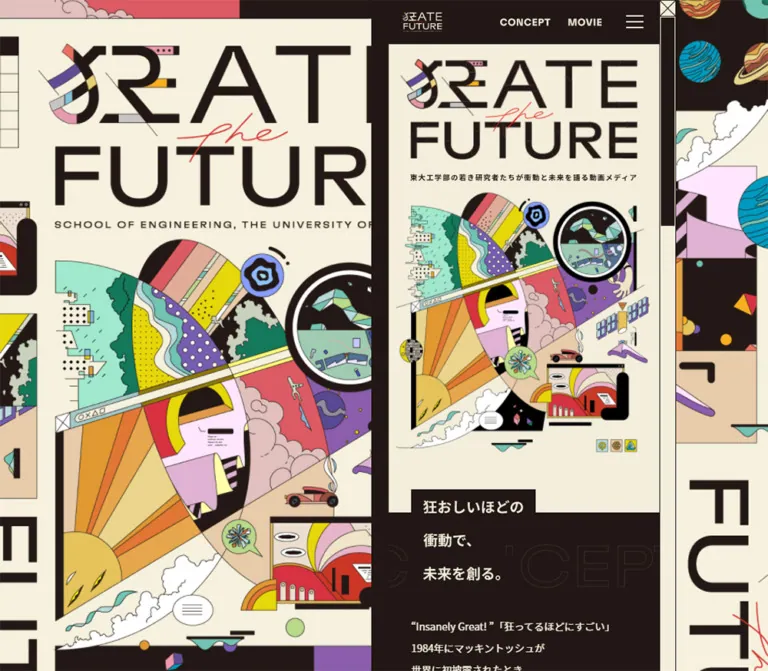
クリーム色と深い茶黒を基調に、巨大なロゴと多彩な科学モチーフのイラストを組み合わせた動画メディア。デスクトップでは装飾背景の右側に細い本文カラムを配置し、モバイルでは画面幅いっぱいに展開する。
狂ATE the FUTURE — Style Reference
An exuberant science poster surrounding a pocket-sized editorial channel.
Website: 狂ATE the FUTURE Original URL: https://park.itc.u-tokyo.ac.jp/createthefuture/ Final URL: https://park.itc.u-tokyo.ac.jp/createthefuture/ Theme: warm cream with espresso-colored sections and multicolored illustration; no theme selector verified. Inspected: supplied browser capture dated October 5, 2026, 06:55:22 JST / October 4, 2026, 21:55:22 UTC. Viewports: 1440 × 1000 desktop and 390 × 844 mobile, in CSS pixels. Scope: the current homepage: illustrated opening, navigation, beginning of the concept section, and rendered DOM measurements for the remaining concept copy, researcher feature rail, archive link, and footer. The supplied screenshots show the opening viewport. Researcher detail pages, the archive destination, an opened menu, and video playback were not inspected.
The page presents engineering research through an unusually expressive visual identity. A cream canvas carries enormous dark lettering, a thin red handwritten “the,” and a dense composition of patterned shapes, scientific suggestions, clouds, a small car, and architectural fragments. The artwork combines flat color with fine dark outlines. Its energy comes from intersecting diagonals, oversized circular forms, and abruptly cropped panels.
On desktop, this visual world appears at two scales: a huge cropped environmental poster fills the background, while a narrow reading column sits toward the right. The same column becomes the full mobile page. Compact navigation and carefully spaced Japanese copy keep the interface orderly inside the illustration. The homepage leads into researcher stories and a video archive; its structure is an editorial media entrance with a strong project introduction.
閉じる
狂ATE the FUTURE — Style Reference
An exuberant science poster surrounding a pocket-sized editorial channel.
Website: 狂ATE the FUTURE Original URL: https://park.itc.u-tokyo.ac.jp/createthefuture/ Final URL: https://park.itc.u-tokyo.ac.jp/createthefuture/ Theme: warm cream with espresso-colored sections and multicolored illustration; no theme selector verified. Inspected: supplied browser capture dated October 5, 2026, 06:55:22 JST / October 4, 2026, 21:55:22 UTC. Viewports: 1440 × 1000 desktop and 390 × 844 mobile, in CSS pixels. Scope: the current homepage: illustrated opening, navigation, beginning of the concept section, and rendered DOM measurements for the remaining concept copy, researcher feature rail, archive link, and footer. The supplied screenshots show the opening viewport. Researcher detail pages, the archive destination, an opened menu, and video playback were not inspected.
The page presents engineering research through an unusually expressive visual identity. A cream canvas carries enormous dark lettering, a thin red handwritten “the,” and a dense composition of patterned shapes, scientific suggestions, clouds, a small car, and architectural fragments. The artwork combines flat color with fine dark outlines. Its energy comes from intersecting diagonals, oversized circular forms, and abruptly cropped panels.
On desktop, this visual world appears at two scales: a huge cropped environmental poster fills the background, while a narrow reading column sits toward the right. The same column becomes the full mobile page. Compact navigation and carefully spaced Japanese copy keep the interface orderly inside the illustration. The homepage leads into researcher stories and a video archive; its structure is an editorial media entrance with a strong project introduction.
How to Read This Reference
- Measured means a value reported in the supplied rendered DOM or computed styles. These measurements include elements below the captured viewport.
- Visual estimate means a proportion or color judged from the supplied original-page screenshots. Estimated colors are practical approximations, not sampled source values.
- Calculated means arithmetic derived from measured bounds, such as the 48px separation between adjacent 290px researcher tiles.
- Recommended means a proposed implementation choice. Breakpoints, accessibility improvements, and unspecified interaction behavior belong to this category.
- Named tokens are implementation aliases created for this reference. The evidence does not provide a semantic source token system.
- Empty extracted anchor text does not establish that a control lacks an accessible name. Likewise, offscreen DOM bounds do not establish that an element was visible in the captured state.
The evidence includes a 100px header element but a visibly dark navigation strip approximately 61px high. It also includes a concept heading whose parent computes to 14px regular while its visible lettering appears larger and heavier. These differences are retained below rather than flattened into misleading exact values.
Tokens — Colors
Measured Interface Palette
| Name | Value | Suggested token | Evidence and role |
|---|---|---|---|
| Warm Paper | #f3eedb |
--paper |
Computed body background; researcher metadata surfaces; reversed text on dark sections |
| Espresso | #221714 |
--ink |
Computed footer background; visually consistent with the header and concept field |
| Text Black | #000000 |
--copy |
Computed text color for research headings, tile text, and institutional links |
| File Purple | #a655a4 |
--file-purple |
File-number label backgrounds for entries No.19 and No.14 |
| File Blue | #5593a6 |
--file-blue |
File-number label backgrounds for entries No.18, No.13, and No.12 |
| File Red | #a65555 |
--file-red |
File-number label backgrounds for entries No.17, No.15, and No.11 |
| File Olive | #8ca6555 corrected to #8ca655 |
--file-olive |
Computed rgb(140, 166, 85) on entries No.16 and No.10 |
The label colors distinguish individual entries. No category meaning or interactive selection state was established for these colors. Preserve them as content accents unless a separate content model defines their meaning.
Espresso and pure black have different measured roles. Use the brown-black for large dark fields; retain black where the source computes black text. The exact dark color inside the illustration was not independently measured.
Illustration Palette — Visual Estimates
| Name | Approximate value | Visual role |
|---|---|---|
| Acid Yellow | #e5df00 |
Dotted fields, bands, and bright geometric fragments |
| Pale Mint | #a0dfcb |
Broad irregular shapes and portions of the scientific collage |
| Sea Green | #64bba9 |
Wave forms, small planetary details, and diagram fragments |
| Violet | #8a5faf |
Polka-dot panels and curved illustrated objects |
| Coral | #d85763 |
Large color bands and warm collage sections |
| Blush | #e0c0bb |
Cloud-like shapes and softer colored planes |
| Handwritten Red | #ef3434 |
The thin script word “the” across the main wordmark |
These accents primarily belong inside the artwork. The navigation and reading surfaces remain disciplined cream-and-espresso compositions. Avoid distributing the full illustration palette across unrelated interface buttons.
The supplied --swiper-theme-color: #007aff and blue ring utility properties are not evidence of a visible blue brand system. They should not override the colors measured on actual components.
Tokens — Typography
Japanese Interface and Editorial Copy
Computed family: "Noto Sans JP", "Hiragino Sans", Meiryo, sans-serif.
This stack appears on the body and the sampled content elements at both viewport sizes. It is evidence of the declared family stack, not proof of which installed or downloaded font rendered every glyph.
The base body computes to 16px / 24px, weight 400, with 0.3px tracking. Most individual content roles override this. Concept paragraphs use a notably open 14px / 30.8px, giving short Japanese lines an almost spoken rhythm. The researcher introduction is denser at 13px / 23.4px.
Graphic Identity
The large “狂ATE the FUTURE” wordmark is custom graphic lettering. Its leading character combines dark strokes with colored fragments; “FUTURE” uses extremely large geometric forms; “the” crosses the composition in thin red script.
Do not select a commercial display font and present it as the source font. Neither the wordmark's font construction nor its asset format was supplied. The small header wordmark and the visible CONCEPT and MOVIE labels also use graphic content or other non-extracted descendants: their sampled anchors contain no extracted text.
Type Scale
| Role | Measured size / line height | Weight | Tracking | Qualification |
|---|---|---|---|---|
| Body default | 16px / 24px |
400 |
0.3px |
Inherited starting point |
| Concept paragraph | 14px / 30.8px |
400 |
Normal | Same on desktop and mobile |
| Concept heading parent | 14px / 30.8px |
400 |
Normal | Parent measurement; not a complete description of visible heading lettering |
| Visible concept headline | Approximately 20px, roughly 46px line steps |
Visually bold | Not measured | Screenshot estimate for the three-line ribbon treatment |
| Research section heading | 20px / 30px |
500 |
0.3px |
Heading text 狂ATORS |
| Research introduction | 13px / 23.4px |
400 |
Normal | Includes 10px right padding |
| File-number label | 12px / 26px |
500 |
Normal | 28px measured outer height |
| Department label | 10px / 23px |
500 |
Normal | 25px measured outer height |
| Researcher name | 13px / 31px |
500 |
Normal | 34px measured outer height |
| Research tile H3 parent | 16px / 24px |
400 |
Normal | Child line styling not included; measured title groups are 36px or 72px tall |
| Archive-link caption | 12px / 18px |
500 |
0.3px |
Visible copy 一覧へ |
| Institutional footer link | 14px / 22.4px |
500 |
0.3px |
Allows a two-line institutional name |
| Footer utility link | 10px / 15px |
500 |
0.3px |
TOP, archive, and policy links |
| Additional menu link | 16px / 24px |
500 |
0.3px |
Present in DOM; expanded-menu appearance unverified |
Keep ordinary content modest in scale. The oversized typography belongs to the illustrated identity, while the live interface relies on small labels and narrow reading measures.
Tokens — Spacing & Shapes
Spacing Scale
The source does not expose a spacing scale. The following values recur or can be calculated from the supplied geometry.
| Use | Value | Status |
|---|---|---|
| File and department label horizontal inset | 8px |
Measured |
| Researcher name inset | 8px left, 10px right |
Measured |
| Research-introduction right padding | 10px |
Measured |
| Archive-link padding | 9px 11px 11px |
Measured |
| Institutional-link padding | 17px |
Measured |
| Header wordmark left inset | 18px |
Measured relative to main |
| Main top padding | 22px |
Measured; not interchangeable with visible header height |
| Concept paragraph separation | 24px |
Calculated between paragraph bounds |
| Research heading to introduction | 27px |
Calculated |
| Research introduction to tile row | 30px |
Calculated |
| Main content side inset | Approximately 8.25% |
Calculated fit at both viewports |
| Gap between researcher tiles | 48px |
Calculated from a 338px origin interval and 290px tile width |
| Institutional-link vertical gap | 24px |
Calculated from 64px links placed every 88px |
| Tile bottom to archive-link top | 65px |
Calculated |
| Archive-link bottom to footer top | 55px |
Calculated |
| Footer padding | 48px 0 34px |
Measured |
Shapes and Edges
| Element | Treatment | Evidence |
|---|---|---|
| Main reading surfaces | Rectangular, flush color fields | Screenshot and sampled zero radii |
| Researcher metadata labels | Square rectangles with content-dependent widths | Measured border-radius: 0 |
| Institutional links | Wide square-cornered paper blocks | Measured background and zero radius |
| Concept heading | Dark rectangular strips stepping into the cream field | Screenshot |
| Desktop pane boundary | Fine straight edge with a broad dark strip at its left | Screenshot estimate |
| Hamburger | Three thin horizontal strokes | Screenshot |
| Circles and curved forms | Concentrated within the illustration | Screenshot; not evidence of circular UI controls |
There is no visible soft-shadow elevation system in the opening. Fine artwork outlines, large color inversions, and rectangular boundaries establish depth and separation.
Layout Measurements
| Element | Desktop: 1440 × 1000 | Mobile: 390 × 844 |
|---|---|---|
| Main rectangle | x: 870.19px, width 397px, height 1000px |
x: 0, width 390px, height 844px |
| Main right clearance | 172.81px |
0px |
| Main content width | 331.48px |
325.64px |
| Main content left inset | 32.75px |
32.17px |
| Header element | 397 × 100px, 22px right padding |
390 × 100px, no padding |
| Visible dark navigation strip | Approximately 61px high |
Approximately 61px high |
| Header wordmark | 58 × 26.73px, top 17px |
Same size and top position |
| Researcher tile | 290 × 220.84px |
Same |
| Archive link | 123 × 38px |
Same |
| Institutional link | 312.25 × 64px |
306.75 × 64px |
| Footer | 397 × 819.70px |
390 × 818.08px |
The measured main width includes more than the visibly dark header strip on desktop. The desktop header's 22px right padding and the narrow right-side paper region should not be interpreted as a wider navigation bar in the screenshot.
Components
Desktop Illustration Field
Role: creates an immersive graphic setting around the reading column.
The desktop screenshot is filled by a collage extending beyond every viewport edge. A huge cream poster occupies much of the left side, with the title above an enlarged version of the hero illustration. Additional panels continue across the top, right, and bottom. Some lettering and motifs are intentionally cut off by the viewport.
The foreground reading pane begins around 60.4% of the viewport width. A dark strip approximately 24px wide sits immediately to its left. The surrounding artwork is a separate visual layer from the content inside the pane; the repeated title appears at a dramatically larger scale in this environment.
Implementation guidance: make environmental artwork decorative and keep it out of the accessibility reading order. Cropping is appropriate for this background layer. Its source positioning rules, fixed behavior, and any animated movement were not supplied.
Compact Header
Role: identity and access to the main content areas.
The visible header places a small reversed wordmark at the left, CONCEPT and MOVIE toward the right, and a three-line menu symbol at the far right. All sit on an espresso field approximately 61px high.
The home-linked logo measures 58 × 26.73px, positioned 18px from the main's left edge and 17px from the top. On mobile, the sampled navigation anchor boxes begin at x: 168px and x: 263px, with widths of 95px and 47px respectively. Their reported 11px heights describe graphic-content boxes, not a verified full pointer-target size.
The MOVIE anchor points to /createthefuture/movie/. The extracted CONCEPT anchor has an empty href, so its precise scroll or script behavior cannot be established from the link table. The menu's opening and closing behavior was not exercised.
Illustrated Opening
Role: introduce the project through artwork before editorial explanation.
The mobile composition follows this sequence:
- A large two-line custom wordmark below the header.
- A narrow Japanese subtitle identifying the researcher video medium.
- A tall, dense illustration with diagonal bands and a large circular scientific motif.
- Three small square pictograms near the lower right of the composition.
- A cream breathing space before the concept section.
In the mobile screenshot, the large wordmark occupies roughly y: 83–228px; the subtitle sits near y: 250px; the principal collage extends approximately from y: 278px to 650px. These are visual estimates, not DOM image bounds.
The illustration includes a bright sunburst, irregular mint and green forms, violet polka dots, pale cloud shapes, a diagonal pencil-like beam, a small car, and a framed multicolored inset near the bottom. The large circular form uses a thick dark perimeter with cream and mint details. Tiny geometric pieces continue outside the major forms.
The pictograms belong to the artwork unless interaction evidence establishes otherwise. Their appearance alone does not justify adding clickable controls.
Concept Section and Stepped Headline
Role: transition from visual spectacle into the project's editorial premise.
A dark field replaces the cream page. Its headline appears as three bold cream lines on dark strips:
狂おしいほどの衝動で、未来を創る。
The first strip protrudes approximately 32px above the main dark field. The visible lettering begins about 17px inside the strip. Very large, faint outline lettering reading CONCEPT crosses the dark background and is clipped by the narrow column.
The measured H2 occupies a 138px-high parent box. On mobile its parent starts at y: 733.70px, although the first visible strip begins around y: 702px. This shows that child styling or positioning affects the visible composition; the parent rectangle alone does not describe the top edge.
Body copy uses cream text at 14px / 30.8px with no added letter spacing. Paragraph groups have 24px separation. The narrow measure and deliberate line breaks create a measured reading rhythm. The closing line is 狂え。そして未来を創れ。
Research Section Introduction
Role: connect the project's premise to individual researchers.
The DOM contains the heading 狂ATORS at 20px / 30px, weight 500, followed by a three-line introduction at 13px / 23.4px. The heading and paragraph share the main content inset of approximately 8.25%.
There is a 27px gap after the heading's measured bottom and a 30px gap after the paragraph before the feature row. This is a compact editorial introduction, with the title and copy leading directly into content.
This section falls below the supplied screenshots. Its typography and geometry are measured; additional decorative backgrounds and image treatments are not visually verified.
Horizontal Researcher Rail
Role: present the current selection of researcher stories.
Ten linked entries, file No.19 through No.10, appear in the rendered DOM. Their widths are 290px at both inspected viewport sizes. Adjacent origins are 338px apart, yielding a calculated 48px gap.
All entries share the same vertical origin while their horizontal coordinates continue beyond the viewport. This supports a horizontal rail structure rather than a wrapped desktop grid. The source also exposes Swiper-related custom properties, but those properties do not establish autoplay, looping, dragging, pagination, or arrow behavior.
On mobile, the second tile starts at x: 370.17px. If clipping occurs at the viewport edge, this could expose a small next-item preview; the actual rail clipping boundary was not included in the evidence.
Researcher Feature Tile
Role: provide a linked identity-and-topic summary for a researcher feature.
Each measured anchor is 290 × 220.84px and contains:
- A colored file-number strip, such as
狂ATORS file No.19. - A paper-colored department or laboratory label.
- A separate paper-colored researcher-name label.
- A topic heading lower in the tile.
The first label measures approximately 124.16 × 28px, with 8px horizontal padding. The department label uses 10px type and a 25px outer height. Its width follows the text: the first two entries measure approximately 212.52px and 200.27px. The name strip uses 13px type, a 34px outer height, and content-dependent width.
Successive metadata strips overlap their measured vertical bounds by about 1px. Preserve their tight stacking instead of spacing them like independent badges.
The topic H3 starts lower in the anchor and measures either 36px or 72px high in the supplied entries. The parent computes to 16px / 24px; child-level styling needed to explain the complete line treatment was not included.
No tile-image URL, poster bounds, or visible lower-page screenshot was supplied. A portrait crop, play triangle, image filter, or photograph treatment must not be asserted as an observed feature.
Archive Link
Role: move from the featured selection to the full movie archive.
The link labeled 一覧へ points to /createthefuture/movie/. It measures 123 × 38px and aligns near the right edge of the content measure. Its caption uses 12px / 18px, weight 500, with 0.3px tracking.
The anchor is a flex container with 9px 11px 11px padding. Its background is transparent and its radius is zero in the supplied styles. Any border, arrow artwork, or hover endpoint would require additional evidence.
Institutional Footer
Role: reconnect the expressive project identity to its university context and related channels.
The footer is espresso, with paper-colored social and utility links. It contains YouTube, Twitter, and Facebook destinations; three institutional links; home and archive navigation; a policy link; and a School of Engineering, The University of Tokyo copyright statement.
The institutional links are paper-colored rectangular blocks, 64px high, with 17px padding and 24px vertical gaps. Their widths are approximately 78.65% of the main width. Text uses 14px / 22.4px, weight 500.
The lower utility links use 10px / 15px, weight 500, and a 37px vertical origin interval, giving 22px between line boxes. The sampled social anchors have approximately 48–49 × 68px bounds. Their precise icon artwork was not visible in the supplied opening captures.
Additional Menu Content
Role: secondary navigation, as indicated by rendered DOM content.
The header subtree contains a 狂ATORS link and social links in addition to the visible graphic navigation. Their DOM rectangles do not establish the appearance of an opened menu. Do not infer a modal, full-screen overlay, drawer direction, backdrop, or animation from these entries alone.
Tokens — Motion & Interaction
| Element or behavior | Evidence | What can be reused |
|---|---|---|
| Text navigation and footer utility links | opacity 0.2s cubic-bezier(0.4, 0, 0.2, 1) |
A measured 200ms opacity-transition declaration; endpoint opacity was not supplied |
| Institutional footer links | Computed transition reported as 0.2s |
Duration only; changing properties and endpoint styles are unknown |
| Sampled body, headings, and researcher labels | animation: none |
No CSS animation on those sampled elements in that state |
Other sampled elements with transition all |
No nonzero duration reported | Insufficient evidence for a visible transition |
| Opening illustration | Repeated still captures show the same supplied composition | No verified animation sequence, loop, or timing |
| Hamburger | Visible closed-state symbol | Open state and keyboard behavior unverified |
| Researcher rail | Horizontal geometry and Swiper custom properties | Rail layout supported; gesture, autoplay, and control behavior unverified |
| Movie links | Resolved archive and detail destinations | Navigation destinations supported; playback behavior unverified |
| Vertical reading | Viewport-sized main with descendants extending below it | Internal scrolling is plausible; exact overflow rules and fixed/sticky behavior were not supplied |
The capture procedure waited for load, visible image decoding, and sampled layout stability. It temporarily paused perpetual animations during readiness checks and resumed them afterward. These checks do not establish that the page is motionless, that all delayed content appeared, or that an interaction was tested.
Recommended motion approach: preserve the measured 200ms opacity vocabulary for simple links. Keep any newly introduced menu motion restrained and optional. Do not invent animated planets, spinning scientific motifs, parallax, automatic carousel movement, or video autoplay as source behavior.
Surfaces
| Layer | Appearance | Function |
|---|---|---|
| Desktop environment | Dense, edge-cropped illustration with cream, dark, and colored panels | Surrounds the narrow editorial experience |
| Opening canvas | Flat warm paper | Gives the detailed artwork visual breathing room |
| Header | Espresso strip with cream identity and navigation | Compact visual anchor |
| Concept section | Espresso field with cream copy and faint outline lettering | Strong tonal change for long-form explanation |
| Research metadata | Paper strips and muted colored file labels | Organizes identity in small stacked units |
| Footer | Espresso with paper institutional blocks | Establishes a clear closing section |
The contrast between paper and dark sections supplies the hierarchy. Rounded cards, frosted overlays, gradients, and soft elevation are not needed to reproduce the observed opening.
Imagery
The illustration mixes scientific curiosity with graphic experimentation. It uses precise thin outlines around deliberately playful forms: circles resembling lenses or diagrams, bent tubes, little geometric fragments, waves, a tiny vehicle, cloud clusters, and intersecting strips. Dots, grids, and alternating color bands provide texture without photographic realism.
Scale is a major design tool. The environmental artwork is much larger than the reading pane, while the foreground artwork fits into a phone-width composition. Preserve that two-scale relationship on desktop. Within the foreground, keep the complete composition legible rather than cropping it into a generic wide banner.
The large wordmark is part of the imagery. Its black geometric strokes, multicolored leading character, and red handwritten interruption should retain their relative positions. The hero's visual identity cannot be reproduced by typography tokens alone.
Observed Asset References
No image manifest or original artwork filenames were included in the evidence. The following are asset roles, not invented downloadable paths.
| Asset role | Observed appearance | Availability limitation |
|---|---|---|
| Header wordmark | Small reversed two-line project mark | Home-anchor bounds supplied; asset URL and format unknown |
| Main wordmark | Oversized dark lettering with red script and colored fragments | Clearly visible; source file and font construction unknown |
| Foreground science collage | Tall multicolored line illustration | Clearly visible; whether assembled from layers is unknown |
| Desktop environmental composition | Enlarged and cropped poster fragments around the pane | Clearly visible; source positioning and asset segmentation unknown |
| Concept outline lettering | Oversized low-contrast CONCEPT behind the headline |
Visible in the opening; text-versus-image implementation unknown |
| Researcher media | Not visible in supplied opening captures | Do not infer image subjects, crops, or filters |
Use authorized original artwork when available. For replacement artwork, preserve the composition principles rather than copying only individual decorative objects. Keep smooth, crisp linework; pixelated image rendering is not supported by the observed aesthetic.
Layout & Responsive Behavior
The key responsive change is the relationship between the content pane and its surroundings. Desktop uses an offset narrow pane inside a full-screen illustrated environment. Mobile removes that surrounding composition from view and gives the page the complete 390px viewport width.
Content typography does not enlarge substantially on desktop. The measured concept copy, research introduction, labels, and 290px researcher tiles retain their mobile-scale dimensions. Desktop width is used for environmental imagery rather than a wider reading measure.
Measured Responsive Relationships
| Relationship | Evidence | Interpretation |
|---|---|---|
| Reading pane | 397px desktop, 390px mobile | Nearly the same editorial scale at both widths |
| Side inset | 32.75px of 397px; 32.17px of 390px | Both fit approximately 8.25% per side |
| Inner content | 331.48px desktop, 325.64px mobile | Approximately 83.5% of main width |
| Desktop right space | 172.81px of 1440px | Approximately 12% at this one measured desktop width |
| Researcher tiles | 290px wide at both viewports | Horizontal content stays compact |
| Institutional links | 312.25px and 306.75px | Approximately 78.65% of main width |
| Concept H2 parent top | 745.06px desktop, 733.70px mobile | Only about 11.36px difference |
| Research heading top | 1558.42px desktop, 1547.06px mobile | Retains the same approximately 11.36px offset |
| Footer top | 2094.48px desktop, 2083.13px mobile | Content below the opening remains similarly proportioned |
The main and root document heights equal the viewport heights in the supplied measurements, but footer descendants extend to approximately 2914px on desktop and 2901px on mobile. Do not mistake the reported document height for the total content length. The geometry is consistent with a contained scrolling region; actual scrolling mechanics were not demonstrated in the supplied screenshots.
No tablet viewport, landscape phone, intermediate breakpoint, source media query, or safe-area rule was supplied. The Quick Start uses a recommended 1024px desktop threshold and a 12vw right offset to approximate the measured desktop arrangement. These are adaptation choices, not recovered source formulas.
Do’s and Don’ts
Do
- Preserve the warm paper
#f3eedband espresso#221714relationship. - Keep the editorial pane narrow on desktop and let the surrounding artwork occupy the extra width.
- Use the hero illustration at two distinct scales in the desktop composition.
- Treat the wordmark as custom artwork with its red handwritten interruption.
- Keep the foreground hero composition substantially intact on mobile.
- Use dense, flat illustration with fine outlines, patterns, and strong diagonals.
- Preserve the abrupt cream-to-dark concept transition and protruding headline strip.
- Use the measured open leading for concept copy and compact typography for metadata.
- Retain square label shapes, content-dependent label widths, and the horizontal researcher arrangement.
- Distinguish verified link destinations from untested interaction behavior.
Don’t
- Don't expand the desktop reading content into a conventional full-width marketing grid.
- Don't replace the illustration with a stock laboratory photograph and expect the same identity.
- Don't approximate the custom wordmark with an arbitrary geometric font and label it source-accurate.
- Don't treat every bright artwork color as a new interface action color.
- Don't convert the metadata strips into rounded pills or elevated cards.
- Don't infer visible research photography, play controls, or thumbnail filters from text-only DOM evidence.
- Don't equate the 100px header element with the 61px visible navigation strip.
- Don't use parent heading styles as a complete measurement of graphic or child-level lettering.
- Don't infer carousel autoplay, menu animation, or a fixed background from still screenshots.
- Don't hide unreachable overflow simply to imitate the viewport-sized document measurement.
Recommended Implementation Additions
These are recommendations for a new implementation, not verified original features:
- Give the menu a real button, an accessible name, and an accurate
aria-expandedstate. Return focus to it after closing the menu. - Provide an accessible text equivalent for the graphic identity and subtitle. Mark duplicated desktop artwork as decorative to avoid repeated announcements.
- Increase invisible pointer targets around small header graphics without enlarging the visible marks. Aim for approximately 44px touch targets.
- Preserve the narrow visual composition while allowing text enlargement and longer researcher names without clipping.
- Audit contrast for each colored file label. The recorded colors should not be assumed to meet small-text contrast requirements.
- Make a horizontal researcher rail usable by keyboard and touch. Offer a direct archive link regardless of carousel enhancements.
- If a contained scroll pane is used, make it focusable, label it, support anchor navigation, and verify that the footer remains reachable.
- Provide visible focus indicators on both cream and dark surfaces. Respect reduced-motion preferences for any new transitions.
- Reserve image space using actual asset dimensions once available. Load the primary hero promptly and defer offscreen media appropriately.
- Verify header positioning, menu states, and rail clipping against an interactive original-page inspection before claiming behavioral fidelity.
Agent Prompt Guide
Quick Color Reference
- Main paper and reversed text:
#f3eedb, measured. - Large dark sections:
#221714, measured on the footer and visually consistent elsewhere. - Ordinary dark text:
#000000, measured. - File-label accents:
#a655a4,#5593a6,#a65555,#8ca655, measured. - Illustration accents: acid yellow, mint, violet, coral, blush, and a thin red handwritten mark; approximate colors are listed above.
- Separation: straight edges, flat fills, fine linework, and large inversions of paper and ink.
Overall Prompt
“Create a Japanese university research media homepage with a narrow editorial pane and a highly expressive illustrated identity. Use warm paper #f3eedb, espresso #221714, and the declared Noto Sans JP / Hiragino Sans / Meiryo stack for live content. At a 1440px desktop viewport, place an approximately 397px-wide reading pane toward the right, over an oversized edge-cropped illustrated environment. On a 390px phone, let the pane fill the screen. Build a compact dark header with a small graphic wordmark, CONCEPT and MOVIE links, and a three-line menu button. Lead with authorized custom title artwork and a tall science-inspired collage using flat color, fine dark outlines, dots, grids, circular diagrams, and diagonals. Follow with a dark concept section and stepped cream headline, then a horizontal researcher rail using 290px tiles, stacked square metadata labels, and muted file-number colors. Keep unknown interactions explicitly separate from visual reconstruction.”
Example Component Prompts
- Desktop composition: “Arrange a 397px editorial pane with approximately 12vw clearance on the right at 1440px. Surround it with much larger cropped illustration panels and a broad dark strip along its left edge. Preserve the reading pane's mobile-like text scale.”
- Header: “Build a roughly 61px dark navigation strip with a 58px-wide reversed logo, compact CONCEPT and MOVIE graphic labels, and three thin cream menu strokes. Keep generous invisible touch targets. Do not invent an opened-menu design from the closed-state reference.”
- Hero artwork: “Prepare a tall composition with an enormous two-line custom title, a thin red script interruption, a small Japanese subtitle, and a dense science collage. Use mint, acid yellow, violet, coral, fine dark outlines, a large circular diagram, and strong diagonal bands. Keep the foreground composition uncropped.”
- Concept section: “Create a paper-to-espresso transition with the first dark headline strip extending about 32px above the section. Set the three-line example copy ‘狂おしいほどの / 衝動で、 / 未来を創る。’ in bold cream lettering, with oversized faint outline CONCEPT lettering behind it. Set body copy at 14px with 30.8px line height.”
- Researcher tile: “Create a square-cornered 290px-wide linked feature tile. Stack a muted colored file-number strip, a paper department strip, and a separate paper researcher-name strip at its upper left. Keep the topic title lower in the tile. Use measured 12px, 10px, and 13px metadata sizes, and leave any media treatment unspecified until assets are available.”
- Footer: “Use an espresso footer with compact paper social links, three 64px-high paper institutional blocks separated by 24px, and small utility navigation below. Keep the institutional text at 14px with 22.4px leading and square corners.”
Quick Start
CSS Custom Properties
This is a usable structural adaptation, not recovered source CSS. It combines measured colors, typography, tile widths, and gaps with explicitly recommended layout behavior. The sticky header, 1024px breakpoint, scroll snapping, hover endpoint, and section padding are recommendations.
Expected structure: a decorative .future-mural, a .future-frame containing .future-shell, then header, hero, concept, research, and footer sections. Place research headings inside .content-inner, the .episode-rail directly inside the research section, and the archive link inside another .content-inner.
The .hero__plate rule supports a prepared proportional artwork plate containing the title, subtitle, collage, and small pictograms. Preparing one plate is a recommendation for this static starter, not evidence that the original uses one image file. Supply authorized artwork separately; no asset paths are fabricated here.
:root {
  /* Measured interface colors */
  --paper: #f3eedb;
  --ink: #221714;
  --copy: #000000;
  --file-purple: #a655a4;
  --file-blue: #5593a6;
  --file-red: #a65555;
  --file-olive: #8ca655;

  /* Approximate illustration colors */
  --art-yellow: #e5df00;
  --art-mint: #a0dfcb;
  --art-violet: #8a5faf;
  --art-coral: #d85763;

  /* Measured typography and geometry */
  --font-site: 'Noto Sans JP', 'Hiragino Sans', Meiryo, sans-serif;
  --pane-width: 397px;
  --content-width: 83.5%;
  --content-inset: 8.25%;
  --tile-width: 290px;
  --tile-gap: 48px;
  --partner-width: 78.65%;
  --link-motion: 200ms cubic-bezier(0.4, 0, 0.2, 1);

  /* Visual estimates and recommended adaptation settings */
  --header-visible: 61px;
  --header-rail: 0px;
  --section-space: 112px;
  --mural-image: none;
}

* { box-sizing: border-box; }

body {
  margin: 0;
  color: var(--copy);
  background: var(--paper);
  font-family: var(--font-site);
  font-size: 16px;
  line-height: 1.5;
  letter-spacing: 0.3px;
}

.future-mural {
  display: none;
  position: fixed;
  inset: 0;
  pointer-events: none;
  background-color: var(--paper);
  background-image: var(--mural-image);
  background-position: center;
  background-size: cover;
}

.future-frame {
  position: relative;
  width: min(100%, var(--pane-width));
  height: 100vh;
  height: 100dvh;
  margin-inline: auto;
}

/* Recommended contained reading region; label it in HTML. */
.future-shell {
  position: relative;
  height: 100%;
  overflow-y: auto;
  overflow-x: hidden;
  background: var(--paper);
  scroll-padding-top: calc(var(--header-visible) + 16px);
}

.content-inner {
  width: var(--content-width);
  margin-inline: auto;
}

/* Sticky positioning is an adaptation, not verified source behavior. */
.future-header {
  position: sticky;
  top: 0;
  z-index: 10;
  display: flex;
  align-items: center;
  width: calc(100% - var(--header-rail));
  height: var(--header-visible);
  padding-inline: 18px 13px;
  color: var(--paper);
  background: var(--ink);
}

.future-logo {
  display: block;
  flex: 0 0 58px;
  width: 58px;
}

.future-logo img {
  display: block;
  width: 100%;
  height: auto;
}

/* Text fallback for graphic navigation labels. */
.primary-nav {
  display: flex;
  align-items: center;
  gap: 24px;
  margin-left: auto;
  font-size: 14px;
  font-weight: 700;
  line-height: 1;
}

.primary-nav a,
.footer-nav a {
  color: inherit;
  text-decoration: none;
  transition: opacity var(--link-motion);
}

.menu-button {
  display: grid;
  align-content: center;
  justify-items: center;
  gap: 6px;
  flex: 0 0 44px;
  width: 44px;
  height: 44px;
  margin-left: 22px;
  padding: 0;
  border: 0;
  color: inherit;
  background: transparent;
  cursor: pointer;
}

.menu-button span {
  display: block;
  width: 24px;
  height: 2px;
  background: currentColor;
}

/* Insets approximate the supplied mobile opening. */
.hero {
  padding: 22px 12px 84px;
  background: var(--paper);
}

.hero__plate {
  display: block;
  width: 100%;
  height: auto;
}

.concept {
  color: var(--paper);
  background: var(--ink);
  padding-bottom: var(--section-space);
}

/* Reconstructs the visible ribbon, not the measured parent font. */
.concept-title {
  position: relative;
  top: -32px;
  margin: 0 0 4px;
  font-size: 20px;
  font-weight: 700;
  line-height: 46px;
  letter-spacing: normal;
}

.concept-title span {
  display: table;
  padding-inline: 17px;
  background: var(--ink);
}

.concept-copy {
  font-size: 14px;
  font-weight: 400;
  line-height: 2.2;
  letter-spacing: normal;
}

.concept-copy p { margin: 0; }
.concept-copy p + p { margin-top: 24px; }

.research {
  padding-block: var(--section-space) 55px;
  background: var(--paper);
}

.research-heading {
  margin: 0 0 27px;
  font-size: 20px;
  font-weight: 500;
  line-height: 30px;
}

.research-intro {
  margin: 0 0 30px;
  padding-right: 10px;
  font-size: 13px;
  line-height: 1.8;
  letter-spacing: normal;
}

/* Native scrolling and snapping are recommended replacements. */
.episode-rail {
  display: flex;
  gap: var(--tile-gap);
  overflow-x: auto;
  margin: 0;
  padding: 0 var(--content-inset) 8px;
  scroll-padding-inline: var(--content-inset);
  scroll-snap-type: x proximity;
}

.episode-card {
  display: flex;
  flex: 0 0 var(--tile-width);
  flex-direction: column;
  min-width: 0;
  min-height: 220.84px;
  color: var(--copy);
  text-decoration: none;
  letter-spacing: normal;
  scroll-snap-align: start;
}

.episode-meta {
  display: flex;
  flex-direction: column;
  align-items: flex-start;
}

.episode-meta p { margin: 0; }
.episode-meta p + p { margin-top: -1px; }

.episode-file {
  min-height: 28px;
  padding-inline: 8px;
  color: var(--paper);
  background: var(--file-color, var(--file-purple));
  font-size: 12px;
  font-weight: 500;
  line-height: 26px;
}

.episode-department {
  min-height: 25px;
  padding-inline: 8px;
  background: var(--paper);
  font-size: 10px;
  font-weight: 500;
  line-height: 23px;
}

.episode-name {
  min-height: 34px;
  padding-inline: 8px 10px;
  background: var(--paper);
  font-size: 13px;
  font-weight: 500;
  line-height: 31px;
}

/* Child-level title styling is a simplified adaptation. */
.episode-title {
  display: flex;
  flex-direction: column;
  align-items: flex-start;
  margin: auto 0 0;
  padding-top: 12px;
  font-size: 16px;
  font-weight: 400;
  line-height: 24px;
}

.episode-title span { min-height: 36px; }

.archive-link {
  display: flex;
  align-items: center;
  width: 123px;
  min-height: 38px;
  margin: 65px 0 0 auto;
  padding: 9px 11px 11px;
  color: var(--copy);
  font-size: 12px;
  font-weight: 500;
  line-height: 18px;
  text-decoration: none;
}

.future-footer {
  padding: 48px 0 34px;
  color: var(--paper);
  background: var(--ink);
  font-weight: 500;
}

.footer-social {
  display: flex;
  justify-content: space-evenly;
  width: var(--content-width);
  margin: 44px auto 32px;
}

.footer-social a {
  display: grid;
  place-items: center;
  min-width: 48px;
  min-height: 68px;
  color: inherit;
}

.partner-links {
  display: grid;
  gap: 24px;
  width: var(--partner-width);
  margin-inline: auto;
}

.partner-link {
  display: flex;
  align-items: center;
  min-height: 64px;
  padding: 17px;
  color: var(--copy);
  background: var(--paper);
  font-size: 14px;
  line-height: 1.6;
  text-decoration: none;
  transition: opacity var(--link-motion);
}

.footer-nav {
  display: grid;
  gap: 22px;
  margin-top: 180px;
  font-size: 10px;
  line-height: 15px;
}

.footer-copyright {
  margin-top: 24px;
  font-size: 10px;
  line-height: 1.5;
}

/* Recommended breakpoint; right offset fits the 1440px capture. */
@media (min-width: 1024px) {
  .future-mural { display: block; }
  .future-frame {
    --header-rail: 22px;
    margin-inline: auto 12vw;
  }
  .future-frame::before {
    content: '';
    position: absolute;
    inset-block: 0;
    right: 100%;
    width: 24px;
    background: var(--ink);
  }
}

/* Recommended endpoint; the source supplies timing only. */
@media (hover: hover) {
  .primary-nav a:hover,
  .footer-nav a:hover,
  .partner-link:hover { opacity: 0.75; }
}

.future-shell :focus-visible {
  outline: 2px solid currentColor;
  outline-offset: 4px;
}

@media (prefers-reduced-motion: reduce) {
  .future-shell *,
  .future-shell *::before,
  .future-shell *::after {
    transition: none !important;
    animation: none !important;
    scroll-behavior: auto !important;
  }
}
Set each tile's --file-color from its content record. Do not automatically cycle colors if the original content mapping is available. The starter intentionally leaves the original illustration files, concept outline artwork, menu state machine, media assets, and playback behavior to separate implementation.
Tailwind v4 Token Mapping
Optional aliases for a project already using Tailwind v4. This does not identify the original framework version. Define the custom properties above first.
@theme inline {
  --color-paper: var(--paper);
  --color-espresso: var(--ink);
  --color-copy: var(--copy);
  --color-file-purple: var(--file-purple);
  --color-file-blue: var(--file-blue);
  --color-file-red: var(--file-red);
  --color-file-olive: var(--file-olive);

  --font-sans: var(--font-site);

  --text-concept: 14px;
  --text-concept--line-height: 2.2;
  --text-intro: 13px;
  --text-intro--line-height: 1.8;
  --text-section: 20px;
  --text-section--line-height: 1.5;
  --text-file: 12px;
  --text-department: 10px;

  --spacing-pane: 397px;
  --spacing-tile: 290px;
  --spacing-rail-gap: 48px;
  --spacing-paragraph-gap: 24px;
  --radius-tile: 0px;
}
Sources & Evidence
- Inspected original and final page: https://park.itc.u-tokyo.ac.jp/createthefuture/. Both supplied URLs are identical; the supplied response status is HTTP 200.
- Capture timestamp: October 4, 2026,
21:55:22.233Z, equivalent to October 5, 2026,06:55:22.233 JST. - Desktop evidence: supplied 1440 × 1000 original-page captures and matching rendered DOM/computed-style snapshot.
- Mobile evidence: supplied 390 × 844 original-page captures and matching rendered DOM/computed-style snapshot.
- Direct visual scope: desktop environmental illustration, foreground header and hero, and the beginning of the concept section. Repeated captures do not establish a motion sequence.
- DOM-supported scope: concept paragraphs, ten researcher-feature anchors, archive navigation, social links, institutional links, footer geometry, declared font stacks, computed colors, and reported transitions.
- Observed destinations, not separately inspected: the movie archive at the supplied archive URL and researcher detail links beneath it. Their destination content and playback interfaces are outside this reference.
- Institutional identity: the original-page footer includes School of Engineering, The University of Tokyo copyright text and institutional destinations. No production team is identified in the supplied original-page evidence.
No additional browsing, commands, asset retrieval, or filesystem inspection was performed for this reference. Lower-page imagery, interaction endpoints, source breakpoints, menu states, animation assets, scroll mechanics, and font-file loading remain unverified. All visual estimates and implementation recommendations are separated from measured evidence above.
# 狂ATE the FUTURE — Style Reference

> An exuberant science poster surrounding a pocket-sized editorial channel.

**Website:** [狂ATE the FUTURE](https://park.itc.u-tokyo.ac.jp/createthefuture/)
**Original URL:** https://park.itc.u-tokyo.ac.jp/createthefuture/
**Final URL:** https://park.itc.u-tokyo.ac.jp/createthefuture/
**Theme:** warm cream with espresso-colored sections and multicolored illustration; no theme selector verified.
**Inspected:** supplied browser capture dated October 5, 2026, 06:55:22 JST / October 4, 2026, 21:55:22 UTC.
**Viewports:** 1440 × 1000 desktop and 390 × 844 mobile, in CSS pixels.
**Scope:** the current homepage: illustrated opening, navigation, beginning of the concept section, and rendered DOM measurements for the remaining concept copy, researcher feature rail, archive link, and footer. The supplied screenshots show the opening viewport. Researcher detail pages, the archive destination, an opened menu, and video playback were not inspected.

The page presents engineering research through an unusually expressive visual identity. A cream canvas carries enormous dark lettering, a thin red handwritten “the,” and a dense composition of patterned shapes, scientific suggestions, clouds, a small car, and architectural fragments. The artwork combines flat color with fine dark outlines. Its energy comes from intersecting diagonals, oversized circular forms, and abruptly cropped panels.

On desktop, this visual world appears at two scales: a huge cropped environmental poster fills the background, while a narrow reading column sits toward the right. The same column becomes the full mobile page. Compact navigation and carefully spaced Japanese copy keep the interface orderly inside the illustration. The homepage leads into researcher stories and a video archive; its structure is an editorial media entrance with a strong project introduction.
閉じる
# 狂ATE the FUTURE — Style Reference

> An exuberant science poster surrounding a pocket-sized editorial channel.

**Website:** [狂ATE the FUTURE](https://park.itc.u-tokyo.ac.jp/createthefuture/)
**Original URL:** https://park.itc.u-tokyo.ac.jp/createthefuture/
**Final URL:** https://park.itc.u-tokyo.ac.jp/createthefuture/
**Theme:** warm cream with espresso-colored sections and multicolored illustration; no theme selector verified.
**Inspected:** supplied browser capture dated October 5, 2026, 06:55:22 JST / October 4, 2026, 21:55:22 UTC.
**Viewports:** 1440 × 1000 desktop and 390 × 844 mobile, in CSS pixels.
**Scope:** the current homepage: illustrated opening, navigation, beginning of the concept section, and rendered DOM measurements for the remaining concept copy, researcher feature rail, archive link, and footer. The supplied screenshots show the opening viewport. Researcher detail pages, the archive destination, an opened menu, and video playback were not inspected.

The page presents engineering research through an unusually expressive visual identity. A cream canvas carries enormous dark lettering, a thin red handwritten “the,” and a dense composition of patterned shapes, scientific suggestions, clouds, a small car, and architectural fragments. The artwork combines flat color with fine dark outlines. Its energy comes from intersecting diagonals, oversized circular forms, and abruptly cropped panels.

On desktop, this visual world appears at two scales: a huge cropped environmental poster fills the background, while a narrow reading column sits toward the right. The same column becomes the full mobile page. Compact navigation and carefully spaced Japanese copy keep the interface orderly inside the illustration. The homepage leads into researcher stories and a video archive; its structure is an editorial media entrance with a strong project introduction.

## How to Read This Reference

- **Measured** means a value reported in the supplied rendered DOM or computed styles. These measurements include elements below the captured viewport.
- **Visual estimate** means a proportion or color judged from the supplied original-page screenshots. Estimated colors are practical approximations, not sampled source values.
- **Calculated** means arithmetic derived from measured bounds, such as the 48px separation between adjacent 290px researcher tiles.
- **Recommended** means a proposed implementation choice. Breakpoints, accessibility improvements, and unspecified interaction behavior belong to this category.
- **Named tokens** are implementation aliases created for this reference. The evidence does not provide a semantic source token system.
- Empty extracted anchor text does not establish that a control lacks an accessible name. Likewise, offscreen DOM bounds do not establish that an element was visible in the captured state.

The evidence includes a 100px header element but a visibly dark navigation strip approximately 61px high. It also includes a concept heading whose parent computes to 14px regular while its visible lettering appears larger and heavier. These differences are retained below rather than flattened into misleading exact values.

## Tokens — Colors

### Measured Interface Palette

| Name | Value | Suggested token | Evidence and role |
| --- | --- | --- | --- |
| Warm Paper | `#f3eedb` | `--paper` | Computed body background; researcher metadata surfaces; reversed text on dark sections |
| Espresso | `#221714` | `--ink` | Computed footer background; visually consistent with the header and concept field |
| Text Black | `#000000` | `--copy` | Computed text color for research headings, tile text, and institutional links |
| File Purple | `#a655a4` | `--file-purple` | File-number label backgrounds for entries No.19 and No.14 |
| File Blue | `#5593a6` | `--file-blue` | File-number label backgrounds for entries No.18, No.13, and No.12 |
| File Red | `#a65555` | `--file-red` | File-number label backgrounds for entries No.17, No.15, and No.11 |
| File Olive | `#8ca6555` corrected to `#8ca655` | `--file-olive` | Computed `rgb(140, 166, 85)` on entries No.16 and No.10 |

The label colors distinguish individual entries. No category meaning or interactive selection state was established for these colors. Preserve them as content accents unless a separate content model defines their meaning.

Espresso and pure black have different measured roles. Use the brown-black for large dark fields; retain black where the source computes black text. The exact dark color inside the illustration was not independently measured.

### Illustration Palette — Visual Estimates

| Name | Approximate value | Visual role |
| --- | --- | --- |
| Acid Yellow | `#e5df00` | Dotted fields, bands, and bright geometric fragments |
| Pale Mint | `#a0dfcb` | Broad irregular shapes and portions of the scientific collage |
| Sea Green | `#64bba9` | Wave forms, small planetary details, and diagram fragments |
| Violet | `#8a5faf` | Polka-dot panels and curved illustrated objects |
| Coral | `#d85763` | Large color bands and warm collage sections |
| Blush | `#e0c0bb` | Cloud-like shapes and softer colored planes |
| Handwritten Red | `#ef3434` | The thin script word “the” across the main wordmark |

These accents primarily belong inside the artwork. The navigation and reading surfaces remain disciplined cream-and-espresso compositions. Avoid distributing the full illustration palette across unrelated interface buttons.

The supplied `--swiper-theme-color: #007aff` and blue ring utility properties are not evidence of a visible blue brand system. They should not override the colors measured on actual components.

## Tokens — Typography

### Japanese Interface and Editorial Copy

**Computed family:** `"Noto Sans JP", "Hiragino Sans", Meiryo, sans-serif`.

This stack appears on the body and the sampled content elements at both viewport sizes. It is evidence of the declared family stack, not proof of which installed or downloaded font rendered every glyph.

The base body computes to `16px / 24px`, weight `400`, with `0.3px` tracking. Most individual content roles override this. Concept paragraphs use a notably open `14px / 30.8px`, giving short Japanese lines an almost spoken rhythm. The researcher introduction is denser at `13px / 23.4px`.

### Graphic Identity

The large “狂ATE the FUTURE” wordmark is custom graphic lettering. Its leading character combines dark strokes with colored fragments; “FUTURE” uses extremely large geometric forms; “the” crosses the composition in thin red script.

Do not select a commercial display font and present it as the source font. Neither the wordmark's font construction nor its asset format was supplied. The small header wordmark and the visible `CONCEPT` and `MOVIE` labels also use graphic content or other non-extracted descendants: their sampled anchors contain no extracted text.

### Type Scale

| Role | Measured size / line height | Weight | Tracking | Qualification |
| --- | --- | --- | --- | --- |
| Body default | `16px / 24px` | `400` | `0.3px` | Inherited starting point |
| Concept paragraph | `14px / 30.8px` | `400` | Normal | Same on desktop and mobile |
| Concept heading parent | `14px / 30.8px` | `400` | Normal | Parent measurement; not a complete description of visible heading lettering |
| Visible concept headline | Approximately `20px`, roughly `46px` line steps | Visually bold | Not measured | Screenshot estimate for the three-line ribbon treatment |
| Research section heading | `20px / 30px` | `500` | `0.3px` | Heading text `狂ATORS` |
| Research introduction | `13px / 23.4px` | `400` | Normal | Includes 10px right padding |
| File-number label | `12px / 26px` | `500` | Normal | 28px measured outer height |
| Department label | `10px / 23px` | `500` | Normal | 25px measured outer height |
| Researcher name | `13px / 31px` | `500` | Normal | 34px measured outer height |
| Research tile H3 parent | `16px / 24px` | `400` | Normal | Child line styling not included; measured title groups are 36px or 72px tall |
| Archive-link caption | `12px / 18px` | `500` | `0.3px` | Visible copy `一覧へ` |
| Institutional footer link | `14px / 22.4px` | `500` | `0.3px` | Allows a two-line institutional name |
| Footer utility link | `10px / 15px` | `500` | `0.3px` | `TOP`, archive, and policy links |
| Additional menu link | `16px / 24px` | `500` | `0.3px` | Present in DOM; expanded-menu appearance unverified |

Keep ordinary content modest in scale. The oversized typography belongs to the illustrated identity, while the live interface relies on small labels and narrow reading measures.

## Tokens — Spacing & Shapes

### Spacing Scale

The source does not expose a spacing scale. The following values recur or can be calculated from the supplied geometry.

| Use | Value | Status |
| --- | --- | --- |
| File and department label horizontal inset | `8px` | Measured |
| Researcher name inset | `8px` left, `10px` right | Measured |
| Research-introduction right padding | `10px` | Measured |
| Archive-link padding | `9px 11px 11px` | Measured |
| Institutional-link padding | `17px` | Measured |
| Header wordmark left inset | `18px` | Measured relative to main |
| Main top padding | `22px` | Measured; not interchangeable with visible header height |
| Concept paragraph separation | `24px` | Calculated between paragraph bounds |
| Research heading to introduction | `27px` | Calculated |
| Research introduction to tile row | `30px` | Calculated |
| Main content side inset | Approximately `8.25%` | Calculated fit at both viewports |
| Gap between researcher tiles | `48px` | Calculated from a 338px origin interval and 290px tile width |
| Institutional-link vertical gap | `24px` | Calculated from 64px links placed every 88px |
| Tile bottom to archive-link top | `65px` | Calculated |
| Archive-link bottom to footer top | `55px` | Calculated |
| Footer padding | `48px 0 34px` | Measured |

### Shapes and Edges

| Element | Treatment | Evidence |
| --- | --- | --- |
| Main reading surfaces | Rectangular, flush color fields | Screenshot and sampled zero radii |
| Researcher metadata labels | Square rectangles with content-dependent widths | Measured `border-radius: 0` |
| Institutional links | Wide square-cornered paper blocks | Measured background and zero radius |
| Concept heading | Dark rectangular strips stepping into the cream field | Screenshot |
| Desktop pane boundary | Fine straight edge with a broad dark strip at its left | Screenshot estimate |
| Hamburger | Three thin horizontal strokes | Screenshot |
| Circles and curved forms | Concentrated within the illustration | Screenshot; not evidence of circular UI controls |

There is no visible soft-shadow elevation system in the opening. Fine artwork outlines, large color inversions, and rectangular boundaries establish depth and separation.

### Layout Measurements

| Element | Desktop: 1440 × 1000 | Mobile: 390 × 844 |
| --- | --- | --- |
| Main rectangle | `x: 870.19px`, width `397px`, height `1000px` | `x: 0`, width `390px`, height `844px` |
| Main right clearance | `172.81px` | `0px` |
| Main content width | `331.48px` | `325.64px` |
| Main content left inset | `32.75px` | `32.17px` |
| Header element | `397 × 100px`, 22px right padding | `390 × 100px`, no padding |
| Visible dark navigation strip | Approximately `61px` high | Approximately `61px` high |
| Header wordmark | `58 × 26.73px`, top `17px` | Same size and top position |
| Researcher tile | `290 × 220.84px` | Same |
| Archive link | `123 × 38px` | Same |
| Institutional link | `312.25 × 64px` | `306.75 × 64px` |
| Footer | `397 × 819.70px` | `390 × 818.08px` |

The measured main width includes more than the visibly dark header strip on desktop. The desktop header's 22px right padding and the narrow right-side paper region should not be interpreted as a wider navigation bar in the screenshot.

## Components

### Desktop Illustration Field

**Role:** creates an immersive graphic setting around the reading column.

The desktop screenshot is filled by a collage extending beyond every viewport edge. A huge cream poster occupies much of the left side, with the title above an enlarged version of the hero illustration. Additional panels continue across the top, right, and bottom. Some lettering and motifs are intentionally cut off by the viewport.

The foreground reading pane begins around 60.4% of the viewport width. A dark strip approximately 24px wide sits immediately to its left. The surrounding artwork is a separate visual layer from the content inside the pane; the repeated title appears at a dramatically larger scale in this environment.

**Implementation guidance:** make environmental artwork decorative and keep it out of the accessibility reading order. Cropping is appropriate for this background layer. Its source positioning rules, fixed behavior, and any animated movement were not supplied.

### Compact Header

**Role:** identity and access to the main content areas.

The visible header places a small reversed wordmark at the left, `CONCEPT` and `MOVIE` toward the right, and a three-line menu symbol at the far right. All sit on an espresso field approximately 61px high.

The home-linked logo measures `58 × 26.73px`, positioned 18px from the main's left edge and 17px from the top. On mobile, the sampled navigation anchor boxes begin at `x: 168px` and `x: 263px`, with widths of 95px and 47px respectively. Their reported 11px heights describe graphic-content boxes, not a verified full pointer-target size.

The `MOVIE` anchor points to `/createthefuture/movie/`. The extracted `CONCEPT` anchor has an empty href, so its precise scroll or script behavior cannot be established from the link table. The menu's opening and closing behavior was not exercised.

### Illustrated Opening

**Role:** introduce the project through artwork before editorial explanation.

The mobile composition follows this sequence:

1. A large two-line custom wordmark below the header.
2. A narrow Japanese subtitle identifying the researcher video medium.
3. A tall, dense illustration with diagonal bands and a large circular scientific motif.
4. Three small square pictograms near the lower right of the composition.
5. A cream breathing space before the concept section.

In the mobile screenshot, the large wordmark occupies roughly `y: 83–228px`; the subtitle sits near `y: 250px`; the principal collage extends approximately from `y: 278px` to `650px`. These are visual estimates, not DOM image bounds.

The illustration includes a bright sunburst, irregular mint and green forms, violet polka dots, pale cloud shapes, a diagonal pencil-like beam, a small car, and a framed multicolored inset near the bottom. The large circular form uses a thick dark perimeter with cream and mint details. Tiny geometric pieces continue outside the major forms.

The pictograms belong to the artwork unless interaction evidence establishes otherwise. Their appearance alone does not justify adding clickable controls.

### Concept Section and Stepped Headline

**Role:** transition from visual spectacle into the project's editorial premise.

A dark field replaces the cream page. Its headline appears as three bold cream lines on dark strips:

- `狂おしいほどの`
- `衝動で、`
- `未来を創る。`

The first strip protrudes approximately 32px above the main dark field. The visible lettering begins about 17px inside the strip. Very large, faint outline lettering reading `CONCEPT` crosses the dark background and is clipped by the narrow column.

The measured H2 occupies a 138px-high parent box. On mobile its parent starts at `y: 733.70px`, although the first visible strip begins around `y: 702px`. This shows that child styling or positioning affects the visible composition; the parent rectangle alone does not describe the top edge.

Body copy uses cream text at `14px / 30.8px` with no added letter spacing. Paragraph groups have 24px separation. The narrow measure and deliberate line breaks create a measured reading rhythm. The closing line is `狂え。そして未来を創れ。`

### Research Section Introduction

**Role:** connect the project's premise to individual researchers.

The DOM contains the heading `狂ATORS` at `20px / 30px`, weight `500`, followed by a three-line introduction at `13px / 23.4px`. The heading and paragraph share the main content inset of approximately 8.25%.

There is a 27px gap after the heading's measured bottom and a 30px gap after the paragraph before the feature row. This is a compact editorial introduction, with the title and copy leading directly into content.

This section falls below the supplied screenshots. Its typography and geometry are measured; additional decorative backgrounds and image treatments are not visually verified.

### Horizontal Researcher Rail

**Role:** present the current selection of researcher stories.

Ten linked entries, file No.19 through No.10, appear in the rendered DOM. Their widths are 290px at both inspected viewport sizes. Adjacent origins are 338px apart, yielding a calculated 48px gap.

All entries share the same vertical origin while their horizontal coordinates continue beyond the viewport. This supports a horizontal rail structure rather than a wrapped desktop grid. The source also exposes Swiper-related custom properties, but those properties do not establish autoplay, looping, dragging, pagination, or arrow behavior.

On mobile, the second tile starts at `x: 370.17px`. If clipping occurs at the viewport edge, this could expose a small next-item preview; the actual rail clipping boundary was not included in the evidence.

### Researcher Feature Tile

**Role:** provide a linked identity-and-topic summary for a researcher feature.

Each measured anchor is `290 × 220.84px` and contains:

1. A colored file-number strip, such as `狂ATORS file No.19`.
2. A paper-colored department or laboratory label.
3. A separate paper-colored researcher-name label.
4. A topic heading lower in the tile.

The first label measures approximately `124.16 × 28px`, with 8px horizontal padding. The department label uses 10px type and a 25px outer height. Its width follows the text: the first two entries measure approximately 212.52px and 200.27px. The name strip uses 13px type, a 34px outer height, and content-dependent width.

Successive metadata strips overlap their measured vertical bounds by about 1px. Preserve their tight stacking instead of spacing them like independent badges.

The topic H3 starts lower in the anchor and measures either 36px or 72px high in the supplied entries. The parent computes to `16px / 24px`; child-level styling needed to explain the complete line treatment was not included.

No tile-image URL, poster bounds, or visible lower-page screenshot was supplied. A portrait crop, play triangle, image filter, or photograph treatment must not be asserted as an observed feature.

### Archive Link

**Role:** move from the featured selection to the full movie archive.

The link labeled `一覧へ` points to `/createthefuture/movie/`. It measures `123 × 38px` and aligns near the right edge of the content measure. Its caption uses `12px / 18px`, weight `500`, with `0.3px` tracking.

The anchor is a flex container with `9px 11px 11px` padding. Its background is transparent and its radius is zero in the supplied styles. Any border, arrow artwork, or hover endpoint would require additional evidence.

### Institutional Footer

**Role:** reconnect the expressive project identity to its university context and related channels.

The footer is espresso, with paper-colored social and utility links. It contains YouTube, Twitter, and Facebook destinations; three institutional links; home and archive navigation; a policy link; and a School of Engineering, The University of Tokyo copyright statement.

The institutional links are paper-colored rectangular blocks, 64px high, with 17px padding and 24px vertical gaps. Their widths are approximately 78.65% of the main width. Text uses `14px / 22.4px`, weight `500`.

The lower utility links use `10px / 15px`, weight `500`, and a 37px vertical origin interval, giving 22px between line boxes. The sampled social anchors have approximately `48–49 × 68px` bounds. Their precise icon artwork was not visible in the supplied opening captures.

### Additional Menu Content

**Role:** secondary navigation, as indicated by rendered DOM content.

The header subtree contains a `狂ATORS` link and social links in addition to the visible graphic navigation. Their DOM rectangles do not establish the appearance of an opened menu. Do not infer a modal, full-screen overlay, drawer direction, backdrop, or animation from these entries alone.

## Tokens — Motion & Interaction

| Element or behavior | Evidence | What can be reused |
| --- | --- | --- |
| Text navigation and footer utility links | `opacity 0.2s cubic-bezier(0.4, 0, 0.2, 1)` | A measured 200ms opacity-transition declaration; endpoint opacity was not supplied |
| Institutional footer links | Computed transition reported as `0.2s` | Duration only; changing properties and endpoint styles are unknown |
| Sampled body, headings, and researcher labels | `animation: none` | No CSS animation on those sampled elements in that state |
| Other sampled elements with transition `all` | No nonzero duration reported | Insufficient evidence for a visible transition |
| Opening illustration | Repeated still captures show the same supplied composition | No verified animation sequence, loop, or timing |
| Hamburger | Visible closed-state symbol | Open state and keyboard behavior unverified |
| Researcher rail | Horizontal geometry and Swiper custom properties | Rail layout supported; gesture, autoplay, and control behavior unverified |
| Movie links | Resolved archive and detail destinations | Navigation destinations supported; playback behavior unverified |
| Vertical reading | Viewport-sized main with descendants extending below it | Internal scrolling is plausible; exact overflow rules and fixed/sticky behavior were not supplied |

The capture procedure waited for load, visible image decoding, and sampled layout stability. It temporarily paused perpetual animations during readiness checks and resumed them afterward. These checks do not establish that the page is motionless, that all delayed content appeared, or that an interaction was tested.

**Recommended motion approach:** preserve the measured 200ms opacity vocabulary for simple links. Keep any newly introduced menu motion restrained and optional. Do not invent animated planets, spinning scientific motifs, parallax, automatic carousel movement, or video autoplay as source behavior.

## Surfaces

| Layer | Appearance | Function |
| --- | --- | --- |
| Desktop environment | Dense, edge-cropped illustration with cream, dark, and colored panels | Surrounds the narrow editorial experience |
| Opening canvas | Flat warm paper | Gives the detailed artwork visual breathing room |
| Header | Espresso strip with cream identity and navigation | Compact visual anchor |
| Concept section | Espresso field with cream copy and faint outline lettering | Strong tonal change for long-form explanation |
| Research metadata | Paper strips and muted colored file labels | Organizes identity in small stacked units |
| Footer | Espresso with paper institutional blocks | Establishes a clear closing section |

The contrast between paper and dark sections supplies the hierarchy. Rounded cards, frosted overlays, gradients, and soft elevation are not needed to reproduce the observed opening.

## Imagery

The illustration mixes scientific curiosity with graphic experimentation. It uses precise thin outlines around deliberately playful forms: circles resembling lenses or diagrams, bent tubes, little geometric fragments, waves, a tiny vehicle, cloud clusters, and intersecting strips. Dots, grids, and alternating color bands provide texture without photographic realism.

Scale is a major design tool. The environmental artwork is much larger than the reading pane, while the foreground artwork fits into a phone-width composition. Preserve that two-scale relationship on desktop. Within the foreground, keep the complete composition legible rather than cropping it into a generic wide banner.

The large wordmark is part of the imagery. Its black geometric strokes, multicolored leading character, and red handwritten interruption should retain their relative positions. The hero's visual identity cannot be reproduced by typography tokens alone.

### Observed Asset References

No image manifest or original artwork filenames were included in the evidence. The following are asset roles, not invented downloadable paths.

| Asset role | Observed appearance | Availability limitation |
| --- | --- | --- |
| Header wordmark | Small reversed two-line project mark | Home-anchor bounds supplied; asset URL and format unknown |
| Main wordmark | Oversized dark lettering with red script and colored fragments | Clearly visible; source file and font construction unknown |
| Foreground science collage | Tall multicolored line illustration | Clearly visible; whether assembled from layers is unknown |
| Desktop environmental composition | Enlarged and cropped poster fragments around the pane | Clearly visible; source positioning and asset segmentation unknown |
| Concept outline lettering | Oversized low-contrast `CONCEPT` behind the headline | Visible in the opening; text-versus-image implementation unknown |
| Researcher media | Not visible in supplied opening captures | Do not infer image subjects, crops, or filters |

Use authorized original artwork when available. For replacement artwork, preserve the composition principles rather than copying only individual decorative objects. Keep smooth, crisp linework; pixelated image rendering is not supported by the observed aesthetic.

## Layout & Responsive Behavior

The key responsive change is the relationship between the content pane and its surroundings. Desktop uses an offset narrow pane inside a full-screen illustrated environment. Mobile removes that surrounding composition from view and gives the page the complete 390px viewport width.

Content typography does not enlarge substantially on desktop. The measured concept copy, research introduction, labels, and 290px researcher tiles retain their mobile-scale dimensions. Desktop width is used for environmental imagery rather than a wider reading measure.

### Measured Responsive Relationships

| Relationship | Evidence | Interpretation |
| --- | --- | --- |
| Reading pane | 397px desktop, 390px mobile | Nearly the same editorial scale at both widths |
| Side inset | 32.75px of 397px; 32.17px of 390px | Both fit approximately 8.25% per side |
| Inner content | 331.48px desktop, 325.64px mobile | Approximately 83.5% of main width |
| Desktop right space | 172.81px of 1440px | Approximately 12% at this one measured desktop width |
| Researcher tiles | 290px wide at both viewports | Horizontal content stays compact |
| Institutional links | 312.25px and 306.75px | Approximately 78.65% of main width |
| Concept H2 parent top | 745.06px desktop, 733.70px mobile | Only about 11.36px difference |
| Research heading top | 1558.42px desktop, 1547.06px mobile | Retains the same approximately 11.36px offset |
| Footer top | 2094.48px desktop, 2083.13px mobile | Content below the opening remains similarly proportioned |

The main and root document heights equal the viewport heights in the supplied measurements, but footer descendants extend to approximately 2914px on desktop and 2901px on mobile. Do not mistake the reported document height for the total content length. The geometry is consistent with a contained scrolling region; actual scrolling mechanics were not demonstrated in the supplied screenshots.

No tablet viewport, landscape phone, intermediate breakpoint, source media query, or safe-area rule was supplied. The Quick Start uses a recommended 1024px desktop threshold and a 12vw right offset to approximate the measured desktop arrangement. These are adaptation choices, not recovered source formulas.

## Do’s and Don’ts

### Do

- Preserve the warm paper `#f3eedb` and espresso `#221714` relationship.
- Keep the editorial pane narrow on desktop and let the surrounding artwork occupy the extra width.
- Use the hero illustration at two distinct scales in the desktop composition.
- Treat the wordmark as custom artwork with its red handwritten interruption.
- Keep the foreground hero composition substantially intact on mobile.
- Use dense, flat illustration with fine outlines, patterns, and strong diagonals.
- Preserve the abrupt cream-to-dark concept transition and protruding headline strip.
- Use the measured open leading for concept copy and compact typography for metadata.
- Retain square label shapes, content-dependent label widths, and the horizontal researcher arrangement.
- Distinguish verified link destinations from untested interaction behavior.

### Don’t

- Don't expand the desktop reading content into a conventional full-width marketing grid.
- Don't replace the illustration with a stock laboratory photograph and expect the same identity.
- Don't approximate the custom wordmark with an arbitrary geometric font and label it source-accurate.
- Don't treat every bright artwork color as a new interface action color.
- Don't convert the metadata strips into rounded pills or elevated cards.
- Don't infer visible research photography, play controls, or thumbnail filters from text-only DOM evidence.
- Don't equate the 100px header element with the 61px visible navigation strip.
- Don't use parent heading styles as a complete measurement of graphic or child-level lettering.
- Don't infer carousel autoplay, menu animation, or a fixed background from still screenshots.
- Don't hide unreachable overflow simply to imitate the viewport-sized document measurement.

## Recommended Implementation Additions

These are recommendations for a new implementation, not verified original features:

- Give the menu a real button, an accessible name, and an accurate `aria-expanded` state. Return focus to it after closing the menu.
- Provide an accessible text equivalent for the graphic identity and subtitle. Mark duplicated desktop artwork as decorative to avoid repeated announcements.
- Increase invisible pointer targets around small header graphics without enlarging the visible marks. Aim for approximately 44px touch targets.
- Preserve the narrow visual composition while allowing text enlargement and longer researcher names without clipping.
- Audit contrast for each colored file label. The recorded colors should not be assumed to meet small-text contrast requirements.
- Make a horizontal researcher rail usable by keyboard and touch. Offer a direct archive link regardless of carousel enhancements.
- If a contained scroll pane is used, make it focusable, label it, support anchor navigation, and verify that the footer remains reachable.
- Provide visible focus indicators on both cream and dark surfaces. Respect reduced-motion preferences for any new transitions.
- Reserve image space using actual asset dimensions once available. Load the primary hero promptly and defer offscreen media appropriately.
- Verify header positioning, menu states, and rail clipping against an interactive original-page inspection before claiming behavioral fidelity.

## Agent Prompt Guide

### Quick Color Reference

- Main paper and reversed text: `#f3eedb`, measured.
- Large dark sections: `#221714`, measured on the footer and visually consistent elsewhere.
- Ordinary dark text: `#000000`, measured.
- File-label accents: `#a655a4`, `#5593a6`, `#a65555`, `#8ca655`, measured.
- Illustration accents: acid yellow, mint, violet, coral, blush, and a thin red handwritten mark; approximate colors are listed above.
- Separation: straight edges, flat fills, fine linework, and large inversions of paper and ink.

### Overall Prompt

“Create a Japanese university research media homepage with a narrow editorial pane and a highly expressive illustrated identity. Use warm paper `#f3eedb`, espresso `#221714`, and the declared Noto Sans JP / Hiragino Sans / Meiryo stack for live content. At a 1440px desktop viewport, place an approximately 397px-wide reading pane toward the right, over an oversized edge-cropped illustrated environment. On a 390px phone, let the pane fill the screen. Build a compact dark header with a small graphic wordmark, CONCEPT and MOVIE links, and a three-line menu button. Lead with authorized custom title artwork and a tall science-inspired collage using flat color, fine dark outlines, dots, grids, circular diagrams, and diagonals. Follow with a dark concept section and stepped cream headline, then a horizontal researcher rail using 290px tiles, stacked square metadata labels, and muted file-number colors. Keep unknown interactions explicitly separate from visual reconstruction.”

### Example Component Prompts

1. **Desktop composition:** “Arrange a 397px editorial pane with approximately 12vw clearance on the right at 1440px. Surround it with much larger cropped illustration panels and a broad dark strip along its left edge. Preserve the reading pane's mobile-like text scale.”
2. **Header:** “Build a roughly 61px dark navigation strip with a 58px-wide reversed logo, compact CONCEPT and MOVIE graphic labels, and three thin cream menu strokes. Keep generous invisible touch targets. Do not invent an opened-menu design from the closed-state reference.”
3. **Hero artwork:** “Prepare a tall composition with an enormous two-line custom title, a thin red script interruption, a small Japanese subtitle, and a dense science collage. Use mint, acid yellow, violet, coral, fine dark outlines, a large circular diagram, and strong diagonal bands. Keep the foreground composition uncropped.”
4. **Concept section:** “Create a paper-to-espresso transition with the first dark headline strip extending about 32px above the section. Set the three-line example copy ‘狂おしいほどの / 衝動で、 / 未来を創る。’ in bold cream lettering, with oversized faint outline CONCEPT lettering behind it. Set body copy at 14px with 30.8px line height.”
5. **Researcher tile:** “Create a square-cornered 290px-wide linked feature tile. Stack a muted colored file-number strip, a paper department strip, and a separate paper researcher-name strip at its upper left. Keep the topic title lower in the tile. Use measured 12px, 10px, and 13px metadata sizes, and leave any media treatment unspecified until assets are available.”
6. **Footer:** “Use an espresso footer with compact paper social links, three 64px-high paper institutional blocks separated by 24px, and small utility navigation below. Keep the institutional text at 14px with 22.4px leading and square corners.”

## Quick Start

### CSS Custom Properties

This is a usable structural adaptation, not recovered source CSS. It combines measured colors, typography, tile widths, and gaps with explicitly recommended layout behavior. The sticky header, 1024px breakpoint, scroll snapping, hover endpoint, and section padding are recommendations.

Expected structure: a decorative `.future-mural`, a `.future-frame` containing `.future-shell`, then header, hero, concept, research, and footer sections. Place research headings inside `.content-inner`, the `.episode-rail` directly inside the research section, and the archive link inside another `.content-inner`.

The `.hero__plate` rule supports a prepared proportional artwork plate containing the title, subtitle, collage, and small pictograms. Preparing one plate is a recommendation for this static starter, not evidence that the original uses one image file. Supply authorized artwork separately; no asset paths are fabricated here.

```css
:root {
  /* Measured interface colors */
  --paper: #f3eedb;
  --ink: #221714;
  --copy: #000000;
  --file-purple: #a655a4;
  --file-blue: #5593a6;
  --file-red: #a65555;
  --file-olive: #8ca655;

  /* Approximate illustration colors */
  --art-yellow: #e5df00;
  --art-mint: #a0dfcb;
  --art-violet: #8a5faf;
  --art-coral: #d85763;

  /* Measured typography and geometry */
  --font-site: 'Noto Sans JP', 'Hiragino Sans', Meiryo, sans-serif;
  --pane-width: 397px;
  --content-width: 83.5%;
  --content-inset: 8.25%;
  --tile-width: 290px;
  --tile-gap: 48px;
  --partner-width: 78.65%;
  --link-motion: 200ms cubic-bezier(0.4, 0, 0.2, 1);

  /* Visual estimates and recommended adaptation settings */
  --header-visible: 61px;
  --header-rail: 0px;
  --section-space: 112px;
  --mural-image: none;
}

* { box-sizing: border-box; }

body {
  margin: 0;
  color: var(--copy);
  background: var(--paper);
  font-family: var(--font-site);
  font-size: 16px;
  line-height: 1.5;
  letter-spacing: 0.3px;
}

.future-mural {
  display: none;
  position: fixed;
  inset: 0;
  pointer-events: none;
  background-color: var(--paper);
  background-image: var(--mural-image);
  background-position: center;
  background-size: cover;
}

.future-frame {
  position: relative;
  width: min(100%, var(--pane-width));
  height: 100vh;
  height: 100dvh;
  margin-inline: auto;
}

/* Recommended contained reading region; label it in HTML. */
.future-shell {
  position: relative;
  height: 100%;
  overflow-y: auto;
  overflow-x: hidden;
  background: var(--paper);
  scroll-padding-top: calc(var(--header-visible) + 16px);
}

.content-inner {
  width: var(--content-width);
  margin-inline: auto;
}

/* Sticky positioning is an adaptation, not verified source behavior. */
.future-header {
  position: sticky;
  top: 0;
  z-index: 10;
  display: flex;
  align-items: center;
  width: calc(100% - var(--header-rail));
  height: var(--header-visible);
  padding-inline: 18px 13px;
  color: var(--paper);
  background: var(--ink);
}

.future-logo {
  display: block;
  flex: 0 0 58px;
  width: 58px;
}

.future-logo img {
  display: block;
  width: 100%;
  height: auto;
}

/* Text fallback for graphic navigation labels. */
.primary-nav {
  display: flex;
  align-items: center;
  gap: 24px;
  margin-left: auto;
  font-size: 14px;
  font-weight: 700;
  line-height: 1;
}

.primary-nav a,
.footer-nav a {
  color: inherit;
  text-decoration: none;
  transition: opacity var(--link-motion);
}

.menu-button {
  display: grid;
  align-content: center;
  justify-items: center;
  gap: 6px;
  flex: 0 0 44px;
  width: 44px;
  height: 44px;
  margin-left: 22px;
  padding: 0;
  border: 0;
  color: inherit;
  background: transparent;
  cursor: pointer;
}

.menu-button span {
  display: block;
  width: 24px;
  height: 2px;
  background: currentColor;
}

/* Insets approximate the supplied mobile opening. */
.hero {
  padding: 22px 12px 84px;
  background: var(--paper);
}

.hero__plate {
  display: block;
  width: 100%;
  height: auto;
}

.concept {
  color: var(--paper);
  background: var(--ink);
  padding-bottom: var(--section-space);
}

/* Reconstructs the visible ribbon, not the measured parent font. */
.concept-title {
  position: relative;
  top: -32px;
  margin: 0 0 4px;
  font-size: 20px;
  font-weight: 700;
  line-height: 46px;
  letter-spacing: normal;
}

.concept-title span {
  display: table;
  padding-inline: 17px;
  background: var(--ink);
}

.concept-copy {
  font-size: 14px;
  font-weight: 400;
  line-height: 2.2;
  letter-spacing: normal;
}

.concept-copy p { margin: 0; }
.concept-copy p + p { margin-top: 24px; }

.research {
  padding-block: var(--section-space) 55px;
  background: var(--paper);
}

.research-heading {
  margin: 0 0 27px;
  font-size: 20px;
  font-weight: 500;
  line-height: 30px;
}

.research-intro {
  margin: 0 0 30px;
  padding-right: 10px;
  font-size: 13px;
  line-height: 1.8;
  letter-spacing: normal;
}

/* Native scrolling and snapping are recommended replacements. */
.episode-rail {
  display: flex;
  gap: var(--tile-gap);
  overflow-x: auto;
  margin: 0;
  padding: 0 var(--content-inset) 8px;
  scroll-padding-inline: var(--content-inset);
  scroll-snap-type: x proximity;
}

.episode-card {
  display: flex;
  flex: 0 0 var(--tile-width);
  flex-direction: column;
  min-width: 0;
  min-height: 220.84px;
  color: var(--copy);
  text-decoration: none;
  letter-spacing: normal;
  scroll-snap-align: start;
}

.episode-meta {
  display: flex;
  flex-direction: column;
  align-items: flex-start;
}

.episode-meta p { margin: 0; }
.episode-meta p + p { margin-top: -1px; }

.episode-file {
  min-height: 28px;
  padding-inline: 8px;
  color: var(--paper);
  background: var(--file-color, var(--file-purple));
  font-size: 12px;
  font-weight: 500;
  line-height: 26px;
}

.episode-department {
  min-height: 25px;
  padding-inline: 8px;
  background: var(--paper);
  font-size: 10px;
  font-weight: 500;
  line-height: 23px;
}

.episode-name {
  min-height: 34px;
  padding-inline: 8px 10px;
  background: var(--paper);
  font-size: 13px;
  font-weight: 500;
  line-height: 31px;
}

/* Child-level title styling is a simplified adaptation. */
.episode-title {
  display: flex;
  flex-direction: column;
  align-items: flex-start;
  margin: auto 0 0;
  padding-top: 12px;
  font-size: 16px;
  font-weight: 400;
  line-height: 24px;
}

.episode-title span { min-height: 36px; }

.archive-link {
  display: flex;
  align-items: center;
  width: 123px;
  min-height: 38px;
  margin: 65px 0 0 auto;
  padding: 9px 11px 11px;
  color: var(--copy);
  font-size: 12px;
  font-weight: 500;
  line-height: 18px;
  text-decoration: none;
}

.future-footer {
  padding: 48px 0 34px;
  color: var(--paper);
  background: var(--ink);
  font-weight: 500;
}

.footer-social {
  display: flex;
  justify-content: space-evenly;
  width: var(--content-width);
  margin: 44px auto 32px;
}

.footer-social a {
  display: grid;
  place-items: center;
  min-width: 48px;
  min-height: 68px;
  color: inherit;
}

.partner-links {
  display: grid;
  gap: 24px;
  width: var(--partner-width);
  margin-inline: auto;
}

.partner-link {
  display: flex;
  align-items: center;
  min-height: 64px;
  padding: 17px;
  color: var(--copy);
  background: var(--paper);
  font-size: 14px;
  line-height: 1.6;
  text-decoration: none;
  transition: opacity var(--link-motion);
}

.footer-nav {
  display: grid;
  gap: 22px;
  margin-top: 180px;
  font-size: 10px;
  line-height: 15px;
}

.footer-copyright {
  margin-top: 24px;
  font-size: 10px;
  line-height: 1.5;
}

/* Recommended breakpoint; right offset fits the 1440px capture. */
@media (min-width: 1024px) {
  .future-mural { display: block; }
  .future-frame {
    --header-rail: 22px;
    margin-inline: auto 12vw;
  }
  .future-frame::before {
    content: '';
    position: absolute;
    inset-block: 0;
    right: 100%;
    width: 24px;
    background: var(--ink);
  }
}

/* Recommended endpoint; the source supplies timing only. */
@media (hover: hover) {
  .primary-nav a:hover,
  .footer-nav a:hover,
  .partner-link:hover { opacity: 0.75; }
}

.future-shell :focus-visible {
  outline: 2px solid currentColor;
  outline-offset: 4px;
}

@media (prefers-reduced-motion: reduce) {
  .future-shell *,
  .future-shell *::before,
  .future-shell *::after {
    transition: none !important;
    animation: none !important;
    scroll-behavior: auto !important;
  }
}
```

Set each tile's `--file-color` from its content record. Do not automatically cycle colors if the original content mapping is available. The starter intentionally leaves the original illustration files, concept outline artwork, menu state machine, media assets, and playback behavior to separate implementation.

### Tailwind v4 Token Mapping

Optional aliases for a project already using Tailwind v4. This does not identify the original framework version. Define the custom properties above first.

```css
@theme inline {
  --color-paper: var(--paper);
  --color-espresso: var(--ink);
  --color-copy: var(--copy);
  --color-file-purple: var(--file-purple);
  --color-file-blue: var(--file-blue);
  --color-file-red: var(--file-red);
  --color-file-olive: var(--file-olive);

  --font-sans: var(--font-site);

  --text-concept: 14px;
  --text-concept--line-height: 2.2;
  --text-intro: 13px;
  --text-intro--line-height: 1.8;
  --text-section: 20px;
  --text-section--line-height: 1.5;
  --text-file: 12px;
  --text-department: 10px;

  --spacing-pane: 397px;
  --spacing-tile: 290px;
  --spacing-rail-gap: 48px;
  --spacing-paragraph-gap: 24px;
  --radius-tile: 0px;
}
```

## Sources & Evidence

- **Inspected original and final page:** [https://park.itc.u-tokyo.ac.jp/createthefuture/](https://park.itc.u-tokyo.ac.jp/createthefuture/). Both supplied URLs are identical; the supplied response status is HTTP 200.
- **Capture timestamp:** October 4, 2026, `21:55:22.233Z`, equivalent to October 5, 2026, `06:55:22.233 JST`.
- **Desktop evidence:** supplied 1440 × 1000 original-page captures and matching rendered DOM/computed-style snapshot.
- **Mobile evidence:** supplied 390 × 844 original-page captures and matching rendered DOM/computed-style snapshot.
- **Direct visual scope:** desktop environmental illustration, foreground header and hero, and the beginning of the concept section. Repeated captures do not establish a motion sequence.
- **DOM-supported scope:** concept paragraphs, ten researcher-feature anchors, archive navigation, social links, institutional links, footer geometry, declared font stacks, computed colors, and reported transitions.
- **Observed destinations, not separately inspected:** the movie archive at [the supplied archive URL](https://park.itc.u-tokyo.ac.jp/createthefuture/movie/) and researcher detail links beneath it. Their destination content and playback interfaces are outside this reference.
- **Institutional identity:** the original-page footer includes School of Engineering, The University of Tokyo copyright text and institutional destinations. No production team is identified in the supplied original-page evidence.

No additional browsing, commands, asset retrieval, or filesystem inspection was performed for this reference. Lower-page imagery, interaction endpoints, source breakpoints, menu states, animation assets, scroll mechanics, and font-file loading remain unverified. All visual estimates and implementation recommendations are separated from measured evidence above.関連するデザイン
スタイルやページの種類、ジャンルが近いデザインを集めました。