プレビュー準備中デザインリファレンスを見る
日本のWebデザインを、AIの制作リファレンスに。
DESIGN REFERENCE
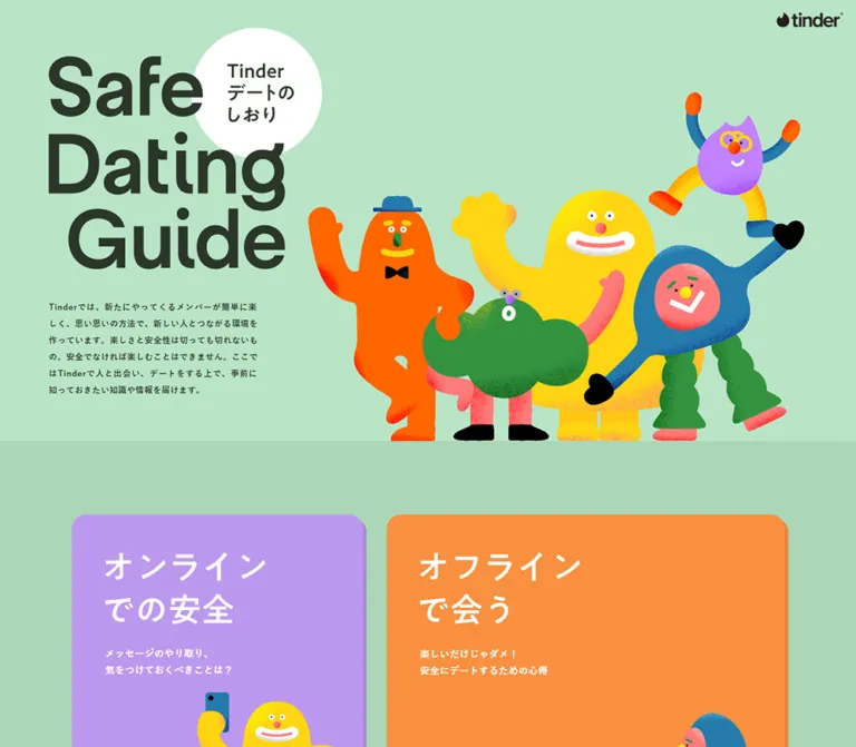
ミントグリーンの背景に大きな欧文タイトルと鮮やかなキャラクターを配置した、安全な出会いを学ぶ情報サイト。色分けされたトピック、相談先カード、関連コンテンツを整理し、モバイルでは縦一列へ展開しています。
オリジナルサイトを見るA mint-green safety handbook made approachable through oversized lettering, colorful characters, and generous reading space.
Original URL: safedatingguide.jp Final URL: safedatingguide.jp Theme: light, with mint backgrounds, dark green text, and colorful topic surfaces Inspected: September 22, 2026, at 14:02:01 UTC / 23:02:01 JST, using the supplied browser inspection Viewports: desktop 1440 × 1000; mobile 390 × 844 CSS pixels Scope: the current homepage: introductory composition, seven chapter links, community guidance, team information, seven support resources, two related educational sites, and footer. Chapter pages and external destinations were not inspected.
Safe Dating Guide is an educational content hub for safer dating. Its visual identity combines a quiet mint canvas with large dark lettering and exuberant, grain-textured characters. Rounded white cards create calm spaces for practical information; seven different background colors distinguish the main learning topics. The tone is friendly without making every section equally playful: the policy list uses compact rules and prohibition marks, while support resources emphasize readable explanations and clear outbound links.
The desktop composition alternates between broad illustrative space and a roughly 1200px content area. The opening title occupies the left side, with a large character ensemble extending across the right. Lower sections introduce oversized English labels alongside smaller Japanese explanations. Mobile changes the reading order: title, characters, introductory paragraph, then stacked content. Several long-form text styles become larger on mobile rather than shrinking with the layout.
A mint-green safety handbook made approachable through oversized lettering, colorful characters, and generous reading space.
Original URL: safedatingguide.jp Final URL: safedatingguide.jp Theme: light, with mint backgrounds, dark green text, and colorful topic surfaces Inspected: September 22, 2026, at 14:02:01 UTC / 23:02:01 JST, using the supplied browser inspection Viewports: desktop 1440 × 1000; mobile 390 × 844 CSS pixels Scope: the current homepage: introductory composition, seven chapter links, community guidance, team information, seven support resources, two related educational sites, and footer. Chapter pages and external destinations were not inspected.
Safe Dating Guide is an educational content hub for safer dating. Its visual identity combines a quiet mint canvas with large dark lettering and exuberant, grain-textured characters. Rounded white cards create calm spaces for practical information; seven different background colors distinguish the main learning topics. The tone is friendly without making every section equally playful: the policy list uses compact rules and prohibition marks, while support resources emphasize readable explanations and clear outbound links.
The desktop composition alternates between broad illustrative space and a roughly 1200px content area. The opening title occupies the left side, with a large character ensemble extending across the right. Lower sections introduce oversized English labels alongside smaller Japanese explanations. Mobile changes the reading order: title, characters, introductory paragraph, then stacked content. Several long-form text styles become larger on mobile rather than shrinking with the layout.
| Name | Value | Suggested token | Role and evidence |
|---|---|---|---|
| Dark Green Ink | #2b362a |
--color-ink |
Measured text color across the page; visually also defines the large title and simple controls |
| Lower Mint | #abd6b7 |
--color-mint |
Measured footer background; the Team and Contents screenshots show a visually matching field |
| Light Mint | approximately #bbe4c8 |
--color-mint-light |
Visual estimate for the opening composition and community-guidance background; exact section CSS was not supplied |
| White | #ffffff |
--color-surface |
Measured resource cards, related-content cards, role pills, and topic captions; also visible in the circular title badge |
| Support Green | #608b6d |
--color-support |
Measured color of the situation labels above support cards |
| Card Backing | approximately #eeeeee |
--color-card-backing |
Visual estimate for the solid offset layer beneath related-content cards |
| Fine Rule | ink at approximately 20% opacity | --color-rule |
Recommended approximation of the subdued section and row separators; source border color was not provided |
The HTML element has a measured white background, but most of the visible page is covered by colored sections. Do not use the root background as evidence that the design is predominantly white.
These are measured anchor backgrounds. Topic descriptions below summarize the supplied link copy; they do not reconstruct unmeasured graphic headings.
| Topic | Background | Suggested token | Destination |
|---|---|---|---|
| Messaging precautions | #bd98ef |
--topic-purple |
/page01/index.html |
| Safer in-person dating | #f99040 |
--topic-orange |
/page02/index.html |
| Available Tinder support features | #f38a86 |
--topic-coral |
/page03/index.html |
| Responding to uncomfortable experiences | #70b469 |
--topic-green |
/page04/index.html |
| Checking whether someone is trustworthy | #80b5e0 |
--topic-blue |
/page05/index.html |
| Communication for developing relationships | #edd725 |
--topic-yellow |
/page06/index.html |
| Preventing dangerous situations | #fba476 |
--topic-peach |
/page07/index.html |
These colors organize content rather than represent selectable themes. No theme switcher or alternate color mode was evidenced. The measured explanatory captions are white on all seven topic backgrounds; evaluate contrast when adapting this treatment to new copy and sizes.
The measured stack is:
font-family:
  'ヒラギノ角ゴ ProN W3',
  'Hiragino Kaku Gothic ProN',
  '游ゴシック',
  YuGothic,
  'メイリオ',
  Meiryo,
  sans-serif;
This is a system-oriented Japanese sans-serif stack. The evidence establishes the declared stack, not which installed font rendered each glyph. No named custom display font can be established from the supplied evidence.
The root font size is 10px, with measured root weight 500 and tracking 0.6px. Individual content styles override the very small root line height. A reusable implementation can keep a conventional root size and specify component sizes explicitly.
The opening title reads “Safe / Dating / Guide” in three tightly arranged lines. The last line is indented. Its scale, dark color, and compact spacing make it an illustration-like anchor rather than an ordinary paragraph heading.
The visible desktop lettering suggests roughly a 130–140px display scale; mobile suggests roughly 96–104px. These are visual estimates, not measured font sizes. The English section labels “Team” and “Contents” appear around a 100px desktop display scale. Their exact font, weight, and implementation as text or artwork were not supplied.
The circular title badge contains the source label “Tinder デートのしおり”. Tinder and PILCON wordmarks are branded artwork. Do not substitute a guessed font for either logo.
Values below are measured unless explicitly labeled as estimates.
| Role | Desktop size / line height | Mobile size / line height | Weight | Tracking |
|---|---|---|---|---|
| Introductory paragraph | 14px / 28px |
14px / 28px |
600 |
0.6px |
| Topic explanatory caption | 16px / 28px |
16px / 28px |
600 |
0.6px |
| Japanese section subtitle | 20px / 20px |
14px / 14px |
700 |
0.6px |
| Community explanation | 14px / 26px |
16px / 32px |
500 desktop; 400 mobile |
0.6px |
| Community warning | 14px / 24px |
14px / 24px |
600 |
0.6px |
| Prohibited-topic row | 14px / 40px |
14px / 40px |
600 |
0.6px |
| Team description | 14px / 26px |
16px / 32px |
500 desktop; 400 mobile |
0.6px |
| Team role pill | 20px / 20px |
12px / 12px |
600 |
0.6px |
| Support situation label | 20px / 20px |
18px / 18px |
600 |
0.6px |
| Support title paragraph | 14px / 22px |
16px / 24px |
600 |
0.6px |
| Support description | 12px / 24px |
14px / 28px |
400 |
0.12px / 0.14px |
| Outbound label “外部サイトへ” | 16px / 16px |
16px / 16px |
600 |
0.6px |
| Related-content title | 32px / 32px |
24px / 24px |
600 |
0.6px |
| Related-content description | 12px / 24px |
12px / 24px |
400 |
0.24px |
| Footer utility links | 12px / 12px |
12px / 12px |
600 |
0.72px |
Support titles can contain multiple typographic levels. The table reports the sampled paragraph styles, not every possible nested span.
The long-form reading rhythm is unusually open: line heights range from about 1.86 to 2. Preserve this breathing room, particularly for Japanese explanations. The related-content descriptions remain small on mobile in the original; increasing them is an accessibility recommendation, not an observed behavior.
The page repeats 24, 28, 32, 36, 40, 48, 56, and 64px values. These repetitions do not establish a single universal spacing grid: measured 25px mobile margins and 33px resource-card insets are also important.
| Use | Desktop | Mobile | Evidence |
|---|---|---|---|
| Standard content width | 1200px |
340px for guidance and related content |
Measured dimensions; mobile side margins are 25px |
| Topic-card gap | 40px |
32px |
Calculated from measured rectangles |
| Related-card gap | 32px horizontally |
32px vertically |
Calculated from measured rectangles |
| Related-card padding | 48px |
28px |
Computed styles |
| Second related-card bottom padding | 72px |
28px |
Computed styles; balances shorter desktop copy |
| Topic caption left inset | 56px, or 48px in the three-card row |
36px |
Computed styles |
| Topic caption top padding | approximately 36px |
20px |
Computed styles |
| Intro paragraph top / bottom padding | 45px / 72px |
20px / 60px |
Computed styles |
| Resource description side inset | 33px |
29.5px |
Calculated from measured parent and child rectangles |
| Resource-card bottom padding | 40px |
40px |
Computed styles |
| Team-description bottom padding | 64px |
40px |
Computed styles; visibility of expanded text was not tested |
| Element | Value | Status |
|---|---|---|
| Topic cards | 24px |
Measured |
| Support cards | 24px |
Measured |
| Related-content cards | 24px |
Measured |
| Team role pills | 16px |
Measured |
| Hero badge | Circle | Visually observed |
| Related-content image corners | Square | Visually observed |
| Policy panel corners | Rounded, approximately 20–24px |
Visual estimate from the visible lower corners |
The related-content cards have a pale, hard offset backing approximately 6px down and right. It reads as a second sheet, with little or no visible blur. This is a visual estimate; no box-shadow value was supplied.
| Element | Desktop 1440 × 1000 | Mobile 390 × 844 |
|---|---|---|
| Document height | 7512.73px |
12615.89px |
| Opening mint section | Ends near y = 744px |
Ends near y = 813px |
| Header logo link | 116 × 30.03px, at 1306, 17 |
73 × 18.91px, at 11, 13 |
| Intro paragraph box | 352px wide, at 82, 459 |
316px wide, at 37, 537 |
| Topic-card height | Approximately 572px |
440px |
| First topic-card rectangle | 490px wide, document y ≈ 885.16px |
357px wide, document y = 1293px |
| Related-content card width | 584px |
340px |
| Related-content text/media width | 488px |
284px |
| Related-card heights | Approximately 638px each |
Approximately 468px and 444px |
| Footer height | 130.55px |
199.08px |
| Footer logo link | 145 × 37.55px |
120 × 31.08px |
| Page Top link | 111 × 20px |
111 × 20px |
Opening-section boundaries are screenshot observations; paragraph, anchor, and footer dimensions are DOM measurements. Paragraph boxes include padding and should not be mistaken for the visible glyph bounds.
Role: establish the Tinder identity and provide a home link.
The desktop logo sits alone in the upper-right corner, about 18px from the right edge and 17px from the top. Mobile relocates it to the upper-left corner with an 11px left inset and a 13px top inset. Its width reduces from 116px to 73px.
There is no visible navigation bar accompanying this mark in the opening captures. The evidence does not establish sticky or fixed behavior. The header logo links to the guide homepage; the footer logo links to the main Tinder site.
Role: introduce the guide with warmth and a strong visual identity.
The desktop composition has four distinct parts:
x = 76px.The main figures rest on the section boundary. Their silhouettes overlap, while their saturated orange, yellow, green, blue, and pink details remain distinct against the light mint background. The isolated purple character occupies the upper-right open space without competing with the small logo.
Mobile keeps the title very large. The badge is approximately 160px in diameter and overlaps the upper-right of the title composition. The visible order becomes title, character group, paragraph. The four-character group spans roughly 320px and sits around y = 378–537px. Only those four figures are visible in the supplied mobile opening; the source rule controlling the separate purple figure is unknown.
The introduction has no visible primary conversion button. Its task is to orient the reader before the chapter navigation.
Role: route readers to seven different learning chapters.
Each topic is a large block-level anchor with a distinctive background, a 24px radius, and a white explanatory caption. The desktop arrangement is deliberately uneven rather than a uniform grid.
| Row | Card widths at 1440px | Gap | Height |
|---|---|---|---|
| First | 490px + 670px |
40px |
Approximately 572px |
| Second | 632px + 528px |
40px |
Approximately 572px |
| Third | 337px + 423px + 360px |
40px between cards |
Approximately 572px |
These rows each total 1200px. Mobile converts all seven cards into a single sequence of 357 × 440px anchors, with 32px between them and approximately 16.5px side margins.
The measured implementation reserves card height with substantial bottom padding. A new implementation can use min-height and explicit content layers instead; that is a recommended adaptation that makes text growth easier to handle.
The supplied original-page screenshots do not show complete topic-card interiors. Their backgrounds, dimensions, destinations, and caption styles are well supported by the DOM, but exact headline artwork, internal illustration placement, and hover appearance are not. Preserve the navigation structure without inventing unsupported details.
Role: create memorable landmarks in a long page.
The desktop Team and Contents sections pair a very large English word with a much smaller Japanese explanation. Their visible composition uses a broad baseline relationship and roughly 40px of separation between the two parts.
Examples of actual subtitles are “Safe Dating Guide制作チーム” and “Tinderと学ぼう”. Measured desktop subtitles are 20px, weight 700; mobile subtitles are 14px and occupy a full 340px-wide block.
The mobile English display headings are not visible in the supplied crops. Their exact size and spacing should not be reconstructed from the desktop screenshots alone.
Role: explain community expectations and list prohibited conduct.
On desktop, the explanatory text occupies a 416px-wide column beginning at x = 120px. The policy list sits in a separate white panel on the right, visually about 600px wide. A smaller purple character overlaps the panel's lower-left area in the supplied screenshot.
The list contains fifteen items arranged as eight rows in the left column and seven in the right. Each line uses dark 14px semibold text with a 40px line height, a small red outlined prohibition mark, and a fine horizontal divider. A fine vertical rule separates the columns.
The compact warning beneath the explanation is 14px / 24px, weight 600. Below the panel, the source link ends with the underlined label “こちら”.
On mobile, the explanation becomes 16px / 32px and spans 340px. All fifteen list entries follow one another in a single column. Their 40px line height remains unchanged, with measured row positions advancing by approximately 41px including separation.
Role: introduce the guide's development and supervision participants.
The desktop screenshot shows two broad rows separated by fine rules. Each row contains a small white role pill, a prominent organization logo, and a large thin plus sign aligned at the right edge. The plus is visually about 64px square. The original page identifies Tinder under “開発” and NPO法人ピルコン under “監修”. These are the page's stated roles; they do not establish an additional design-agency credit.
The role pills measure 73.2 × 34px on desktop, with 7px 16px padding. Mobile pills measure 55.2 × 26px, with 7px 15px padding. The radius stays at 16px.
The supplied DOM includes descriptive paragraphs inside the team links, but their rectangles overlap subsequent content and the screenshot shows closed rows. DOM presence does not establish visible expansion. Both triggers have href = #; no activation trace was supplied. Expansion, collapse, icon changes, and keyboard behavior remain unverified.
Recommended implementation: use native disclosure elements or buttons with explicit expanded state. Keep the role, logo, and plus visible when collapsed, and reveal the explanation in document flow.
Role: help readers identify an appropriate external resource by situation.
Each entry begins with a green situation label outside a white rounded card. Inside the card are a service name, explanatory copy, and a centered outbound label, “外部サイトへ”. The whole card is a link.
There are seven resources. The first desktop row has three 376px-wide cards with 36px gaps. The remaining four entries form two rows of 582px-wide cards, also separated by 36px. The first three cards have substantial space before their title paragraphs, while the later entries begin with text padding around 50–57px. Their exact upper media content is not shown in the supplied screenshots.
Desktop descriptions are 12px / 24px within 310px-wide columns in the smaller cards and approximately 516px-wide columns in the larger cards. Mobile cards measure 336px wide, with 277px-wide description columns at 14px / 28px. Height follows content, ranging from about 380px to 638px in the mobile samples.
The current page lists services concerning contraception, infection testing, sexual-health education, sexual-violence support, police consultation, and romance-fraud concerns. Their availability and external content were not inspected. This reference documents the presentation and link structure.
Role: continue learning through two adjacent projects.
The Contents section contains two large white cards linking to “Let’s Talk Consent” and “Let’s Talk Gender”. Each card consists of:
Desktop cards are 584px wide with 48px padding. Their inner images and text measure 488px wide. A substantial interval separates the image from the title; the geometry is consistent with roughly 48px. Titles are 32px / 32px, with 24px between the title line box and description.
The Consent card uses 48px bottom padding. The shorter Gender description has 72px bottom padding, producing nearly equal overall desktop heights around 638px.
Mobile stacks the cards with a 32px gap. Padding becomes 28px, images are about 284 × 213px, and titles become 24px / 24px. The title-to-description gap becomes 20px. Descriptions remain 12px / 24px. The cards are naturally unequal in height on mobile, approximately 468px and 444px.
Role: provide organizational links and a return-to-top affordance.
A fine horizontal rule separates the footer from related content. Desktop places the Tinder logo at the left, then “Company” and “Privacy Policy”, with “Page Top” at the far right. The top control combines a simple upward chevron with its label.
Mobile reorganizes this into two levels: the two utility links stack at the upper left, followed by a lower row containing the logo and Page Top control. Both mobile and desktop retain the lower mint background.
The Page Top anchor points to #. Its visible purpose is clear, but smooth scrolling, focus movement, and activation behavior were not tested. Keep it in normal footer flow unless a separate requirement calls for persistent navigation.
| Element or behavior | Supplied evidence | What can be concluded |
|---|---|---|
| Intro paragraph | transition: opacity 0.48s 1.26s at both viewports |
A 480ms opacity transition with a 1260ms delay is declared; trigger and opacity endpoints were not captured |
| Mobile Japanese section subtitles | transition: opacity 0.48s 0.38s |
A 480ms opacity transition with a 380ms delay is declared |
| Desktop team, policy, and utility links | transition: opacity 0.24s |
Short opacity feedback is declared; the target opacity and triggering state are unknown |
| Corresponding mobile links | transition: none |
These sampled mobile links omit that transition |
| Many sampled elements | transition: all, with no nonzero duration reported |
This does not establish an animation duration or visible effect |
| Sampled text and anchor nodes | animation: none |
No keyframe animation was reported on these nodes; illustration descendants and other elements may differ |
| Team plus controls | Closed visual state and # anchors |
Disclosure intent is visible; expanded behavior is unverified |
| Topic and resource cards | Concrete anchor destinations | Navigation targets are known; navigation was not exercised |
| Page Top | Chevron, label, and # destination |
Return-to-top intent is visible; scrolling details are unverified |
The captures provide static illustration frames, not enough evidence to specify character animation loops, parallax, hover choreography, or scroll-driven transforms. Do not invent timing curves for those effects.
The inspection waited for finite motion and layout stability and temporarily paused perpetual animations during readiness checks. These precautions improve capture consistency but do not prove that every reveal or delayed element was observed.
Recommended motion approach: keep content visible by default, add modest opacity feedback only where useful, and respect reduced-motion preferences. Do not make access to the guide depend on an introductory animation completing.
| Layer | Appearance | Purpose |
|---|---|---|
| Opening canvas | Light mint, no visible texture | Gives saturated character artwork a quiet background |
| Lower content canvas | Slightly darker mint | Connects team information, resources, related projects, and footer |
| Topic navigation | Seven different solid colors with 24px corners | Distinguishes learning categories |
| Reading/resource surface | White with dark green text | Improves separation and reading clarity |
| Related-content backing | Pale hard offset layer | Adds a small amount of playful depth |
| Team role pill | White, rounded, compact | Separates organizational role from logo artwork |
| Dividers | Fine muted green-gray rules | Organizes lists and broad rows without heavy borders |
| Policy prohibition mark | Small red outline circle and cross | Gives the policy list an immediately recognizable cue |
There is no evidence of a global glass, gradient, or soft-elevation system. Texture belongs primarily to the character artwork, while interface surfaces remain flat.
The hero uses irregular, friendly creatures with simple faces, oversized limbs, and bright color blocking. Fine sprayed grain and stippled shadows soften their shapes. A yellow figure provides the largest warm mass, while an orange figure, a green rounded figure, and a blue figure with a pink face create an overlapping ensemble. A purple character appears separately in the desktop opening and beside the community panel.
Keep the texture inside the illustrations. Applying noise across the whole page would change the calm background and reduce text clarity. Preserve smooth artwork scaling; the supplied images do not support a pixelated rendering treatment.
The two related-content images introduce different visual languages without changing the card shell. Consent uses a pale pink illustrated scene with fine dark outlines and graphic lettering. Gender uses vivid pink, purple, yellow, coral, and blue figures with large white lettering. Their typography is embedded in the visible artwork and should remain part of that artwork when authorized assets are available.
No asset URLs, native dimensions, or image-format declarations were supplied. The table identifies visual assets without inventing file paths.
| Asset | Evidence | Implementation guidance |
|---|---|---|
| Tinder wordmark | Header and footer screenshots; branded team row | Use an authorized logo asset; preserve its native proportions |
| Guide title and circular badge | Desktop and mobile opening screenshots | Preserve the three-line arrangement and overlap; exact font or asset implementation is unknown |
| Main character ensemble | Desktop and mobile opening screenshots | Keep figures grouped and uncropped at the section baseline |
| Purple character | Desktop opening and policy/team screenshot | Treat as a separate decorative accent where the layout permits |
| PILCON logo | Desktop team screenshot | Use the complete mark rather than recreating it with ordinary text |
| Consent promotional image | Desktop related-content screenshot | Preserve the full approximately 4:3 composition |
| Gender promotional image | Desktop and mobile related-content screenshots | Preserve the full approximately 4:3 composition |
CSS can reproduce the layout, surfaces, spacing, and simple controls. It cannot reproduce the character identity or branded artwork by itself.
The homepage follows a long document flow. Its measured height grows from about 7513px on desktop to about 12616px on mobile as topic navigation and resource grids become vertical lists.
| Region | Desktop observation | Mobile observation |
|---|---|---|
| Header mark | Upper right | Upper left and smaller |
| Opening | Title/copy left, characters right | Title, characters, then copy |
| Topic navigation | Unequal two-, two-, and three-card rows | Seven equal-width cards in one column |
| Community explanation | Narrow left column beside policy panel | Full-width explanation above a single-column list |
| Team role pills | 20px text | 12px text |
| Long explanatory text | 14px with 26px leading | 16px with 32px leading |
| Support cards | Three columns, followed by two-column rows | One column with larger body text |
| Related content | Two equal-width cards | Stacked cards with natural heights |
| Footer | Logo, links, and top control in one broad row | Stacked links above logo/top row |
Widths are intentionally not identical across every mobile section: topic anchors are 357px wide, support anchors 336px, ordinary content and related cards 340px, and the hero paragraph 316px. Retaining these differences preserves the original balance between expansive navigation and contained reading.
The exact media-query breakpoint is unknown. The Quick Start uses 900px as a recommended implementation threshold; it is not a recovered source value. Test intermediate widths, longer Japanese titles, text zoom, and expanded team content independently.
The opening desktop screenshot shows an empty mint region beneath the hero even though the DOM reports topic-card bounds within that viewport. Some team/resource DOM positions also differ from the later visible screenshot alignment. These discrepancies do not establish intentional blank sections or a permanent horizontal offset. Use the dimensions as evidence, but do not reproduce unexplained capture-state gaps as structural spacers.
These are recommendations for a new implementation, not verified features of the original:
aria-expanded for team rows. Keep expanded copy in normal flow and avoid nested interactive elements.#2b362a.#abd6b7.#bbe4c8.#ffffff.#608b6d.#bd98ef, #f99040, #f38a86, #70b469, #80b5e0, #edd725, #fba476.#eeeeee, with a small hard offset.“Create a Japanese educational guide homepage inspired by Safe Dating Guide. Use a light mint opening, a slightly darker mint lower canvas, dark green text, and expressive grain-textured character illustrations. Arrange a huge three-line English title at the left of the desktop opening, overlapping a white circular Japanese title badge, with a narrow introduction below and a character ensemble grounded on the section edge. Follow with seven large color-coded chapter links in unequal two-, two-, and three-card desktop rows. Add community guidance, broad team disclosure rows, a practical support directory, and two white related-content cards. Use 24px card corners, generous Japanese line height, and fine muted rules. At mobile widths, stack the title, characters, and introduction; collapse content grids into lists and increase long-form text sizes. Treat exact display fonts and unobserved motion as unspecified.”
This is a recommended implementation scaffold, not recovered source CSS. It uses measured component sizes where available, visually estimated mint and backing colors, and a recommended 900px breakpoint. The original artwork must be supplied separately. The opening title selector expects an authorized title composition or an equivalent semantic treatment; its proportions will need adjustment to the actual asset.
Use a .guide-wrap for ordinary sections. Place topic cards inside three .topic-row wrappers. A .support-grid contains seven .support-item elements, each with a situation label followed by its card. Team rows can use native details and summary. Related cards contain an image, heading, and paragraph in that order.
:root {
  /* Measured colors, except the two visual approximations noted below. */
  --color-ink: #2b362a;
  --color-mint: #abd6b7;
  --color-mint-light: #bbe4c8; /* Visual approximation. */
  --color-surface: #ffffff;
  --color-support: #608b6d;
  --color-card-backing: #eeeeee; /* Visual approximation. */
  --color-rule: rgb(43 54 42 / 20%); /* Recommended approximation. */
  --topic-purple: #bd98ef;
  --topic-orange: #f99040;
  --topic-coral: #f38a86;
  --topic-green: #70b469;
  --topic-blue: #80b5e0;
  --topic-yellow: #edd725;
  --topic-peach: #fba476;

  --font-body: 'Hiragino Kaku Gothic ProN', YuGothic, Meiryo, sans-serif;
  --content-width: 1200px;
  --radius-card: 24px;
  --radius-pill: 16px;
  --gap-topic: 40px;
  --gap-related: 32px;
  --gap-support: 36px;
  --card-padding: 48px;
  --text-body: 14px;
  --leading-body: 26px;
  --text-small: 12px;
  --leading-small: 24px;
  --tracking-body: 0.6px;
  --motion-feedback: 240ms;
}

* { box-sizing: border-box; }
body {
  margin: 0;
  color: var(--color-ink);
  background: var(--color-mint);
  font-family: var(--font-body);
  font-size: var(--text-body);
  line-height: var(--leading-body);
  letter-spacing: var(--tracking-body);
}
img { display: block; max-width: 100%; height: auto; }
a { color: inherit; }
button, summary { font: inherit; }
.guide-wrap {
  width: min(var(--content-width), calc(100% - 50px));
  margin-inline: auto;
}

/* Recommended hero positioning based on the two supplied viewports. */
.guide-hero { position: relative; background: var(--color-mint-light); }
.hero-mark { position: absolute; z-index: 2; top: 17px; right: 18px; width: 116px; }
.hero-inner {
  position: relative;
  display: grid;
  grid-template-columns: 352px minmax(0, 1fr);
  grid-template-rows: 459px auto;
  width: min(1276px, calc(100% - 80px));
  min-height: 744px;
  margin-inline: auto;
}
.hero-title-art { position: absolute; top: 47px; left: -6px; width: 466px; }
.hero-ensemble { position: absolute; right: 2%; bottom: 0; width: 65%; }
.hero-floater { position: absolute; top: 114px; right: 0; width: 234px; }
.hero-copy {
  grid-column: 1;
  grid-row: 2;
  margin: 0;
  padding: 45px 0 72px;
  font-size: 14px;
  font-weight: 600;
  line-height: 28px;
}

/* Section display typography is an approximation, not an identified font. */
.guide-section { padding-block: 120px; }
.section-heading { display: flex; align-items: baseline; gap: 40px; margin-bottom: 64px; }
.section-heading__display {
  margin: 0;
  font-family: sans-serif;
  font-size: clamp(64px, 7vw, 100px);
  font-weight: 500;
  line-height: 1;
  letter-spacing: -0.04em;
}
.section-heading__caption { margin: 0; font-size: 20px; font-weight: 700; line-height: 1.3; }

.topic-grid { display: grid; gap: var(--gap-topic); }
.topic-row { display: grid; gap: var(--gap-topic); }
.topic-row--one { grid-template-columns: 490fr 670fr; }
.topic-row--two { grid-template-columns: 632fr 528fr; }
.topic-row--three { grid-template-columns: 337fr 423fr 360fr; }
.topic-card {
  position: relative;
  display: block;
  min-width: 0;
  min-height: 572px;
  padding: 56px;
  border-radius: var(--radius-card);
  background: var(--topic-color);
  color: var(--color-surface);
  text-decoration: none;
}
.topic-row--three .topic-card { padding-inline: 48px; }
.topic-card--1 { --topic-color: var(--topic-purple); }
.topic-card--2 { --topic-color: var(--topic-orange); }
.topic-card--3 { --topic-color: var(--topic-coral); }
.topic-card--4 { --topic-color: var(--topic-green); }
.topic-card--5 { --topic-color: var(--topic-blue); }
.topic-card--6 { --topic-color: var(--topic-yellow); }
.topic-card--7 { --topic-color: var(--topic-peach); }
.topic-caption { margin: 36px 0 0; font-size: 16px; font-weight: 600; line-height: 28px; }

.guidance-layout { display: grid; grid-template-columns: 416fr 600fr; gap: 15.333%; }
.guidance-copy { margin: 0; font-size: 14px; line-height: 26px; }
.policy-panel { padding: 48px; background: white; border-radius: var(--radius-card); }
.policy-list { columns: 2; column-gap: 40px; margin: 0; padding: 0; list-style: none; }
.policy-list li { break-inside: avoid; min-height: 41px; border-bottom: 1px solid var(--color-rule); }
.policy-list li { font-size: 14px; font-weight: 600; line-height: 40px; }

/* Native disclosure behavior is a recommended addition. */
.team-row { border-bottom: 1px solid var(--color-rule); }
.team-row summary {
  display: grid;
  grid-template-columns: auto minmax(0, 1fr) 64px;
  align-items: center;
  gap: 44px;
  min-height: 162px;
  padding-block: 32px;
  cursor: pointer;
  list-style: none;
}
.team-row summary::-webkit-details-marker { display: none; }
.role-pill {
  width: max-content;
  padding: 7px 16px;
  border-radius: var(--radius-pill);
  background: white;
  font-size: 20px;
  font-weight: 600;
  line-height: 20px;
}
.team-logo { width: min(100%, 330px); }
.team-plus { position: relative; width: 64px; height: 64px; }
.team-plus::before, .team-plus::after {
  content: '';
  position: absolute;
  inset: 31px 0 auto;
  height: 2px;
  background: currentColor;
}
.team-plus::after { transform: rotate(90deg); }
.team-row[open] .team-plus::after { display: none; }
.team-copy { max-width: 780px; margin: 0; padding-bottom: 64px; font-size: 14px; line-height: 26px; }

.support-grid { display: grid; grid-template-columns: repeat(6, minmax(0, 1fr)); gap: 70px var(--gap-support); }
.support-item { grid-column: span 3; min-width: 0; }
.support-item:nth-child(-n + 3) { grid-column: span 2; }
.support-context { margin: 0 0 25px; color: var(--color-support); font-size: 20px; font-weight: 600; line-height: 1.4; }
.support-card { display: block; padding: 40px 33px; border-radius: var(--radius-card); background: white; text-decoration: none; }
.support-title { margin: 0 0 28px; text-align: center; font-size: 14px; font-weight: 600; line-height: 22px; }
.support-copy { margin: 0; font-size: 12px; line-height: 24px; letter-spacing: 0.01em; }
.support-outbound { display: block; margin-top: 25px; text-align: center; font-size: 16px; font-weight: 600; line-height: 1.4; }

.related-grid { display: grid; grid-template-columns: repeat(2, minmax(0, 1fr)); gap: var(--gap-related); }
.related-card {
  display: block;
  min-width: 0;
  padding: var(--card-padding);
  border-radius: var(--radius-card);
  background: var(--color-surface);
  box-shadow: 6px 6px 0 var(--color-card-backing);
  text-decoration: none;
}
.related-card:nth-child(2) { padding-bottom: 72px; }
.related-card img { width: 100%; aspect-ratio: 4 / 3; object-fit: contain; }
.related-title { margin: 48px 0 24px; text-align: center; font-size: 32px; font-weight: 600; line-height: 1; }
.related-copy { margin: 0; font-size: 12px; line-height: 24px; letter-spacing: 0.02em; }

.guide-footer__inner {
  display: grid;
  grid-template-columns: auto 1fr auto;
  align-items: end;
  gap: 24px;
  padding: 36px 0 57px;
  border-top: 1px solid var(--color-rule);
}
.footer-logo { width: 145px; }
.footer-links { display: flex; gap: 24px; }
.footer-links a { font-size: 12px; font-weight: 600; line-height: 1; letter-spacing: 0.06em; text-decoration: none; }
.back-to-top { display: inline-flex; align-items: center; gap: 14px; text-decoration: none; }
.back-to-top::before { content: ''; width: 18px; height: 18px; border-top: 2px solid; border-left: 2px solid; transform: translateY(5px) rotate(45deg); }

/* Recommended interaction feedback; the source endpoint was not captured. */
.feedback-link { transition: opacity var(--motion-feedback); }
@media (hover: hover) {
  .feedback-link:hover { opacity: 0.75; }
}
a:focus-visible, summary:focus-visible, button:focus-visible {
  outline: 3px solid var(--color-ink);
  outline-offset: 5px;
}

@media (max-width: 900px) {
  .hero-mark { top: 13px; right: auto; left: 11px; width: 73px; }
  .hero-inner { display: flex; flex-direction: column; width: 100%; min-height: 0; }
  .hero-title-art { position: static; width: calc(100% - 50px); margin: 27px auto 0; }
  .hero-ensemble { position: static; width: calc(100% - 72px); margin: 50px auto 0; }
  .hero-floater { display: none; }
  .hero-copy { width: calc(100% - 74px); margin-inline: auto; padding: 20px 0 60px; }
  .guide-section { padding-block: 72px; }
  .section-heading { display: block; margin-bottom: 36px; }
  .section-heading__display { font-size: 60px; }
  .section-heading__caption { margin-top: 20px; font-size: 14px; }
  .topic-grid { width: calc(100% - 33px); gap: 32px; }
  .topic-row { grid-template-columns: 1fr; gap: 32px; }
  .topic-card, .topic-row--three .topic-card { min-height: 440px; padding: 36px; }
  .topic-caption { margin-top: 20px; }
  .guidance-layout { grid-template-columns: 1fr; gap: 48px; }
  .guidance-copy, .team-copy { font-size: 16px; line-height: 32px; }
  .policy-panel { padding: 36px 28px; }
  .policy-list { columns: 1; }
  .team-row summary { grid-template-columns: auto minmax(0, 1fr) 32px; gap: 20px; min-height: 102px; }
  .role-pill { padding: 7px 15px; font-size: 12px; line-height: 12px; }
  .team-plus { width: 32px; height: 32px; }
  .team-plus::before, .team-plus::after { top: 15px; }
  .team-copy { padding-bottom: 40px; }
  .support-grid { grid-template-columns: 1fr; width: calc(100% - 4px); row-gap: 50px; }
  .support-item, .support-item:nth-child(-n + 3) { grid-column: auto; }
  .support-context { margin-bottom: 20px; font-size: 18px; }
  .support-card { padding: 40px 29.5px; }
  .support-title { font-size: 16px; line-height: 24px; }
  .support-copy { font-size: 14px; line-height: 28px; }
  .related-grid { grid-template-columns: 1fr; }
  .related-card, .related-card:nth-child(2) { padding: 28px; }
  .related-title { margin: 36px 0 20px; font-size: 24px; }
  .guide-footer__inner { grid-template-columns: 1fr auto; gap: 36px 20px; padding-top: 39px; }
  .footer-links { grid-column: 1 / -1; grid-row: 1; flex-direction: column; align-items: start; gap: 12px; }
  .footer-logo { width: 120px; }
  .feedback-link { transition: none; }
}

@media (prefers-reduced-motion: reduce) {
  .feedback-link { transition: none; }
}
The scaffold deliberately leaves topic artwork placement, support-card media, and character animation to separately supplied assets and requirements. It uses content-friendly minimum heights rather than copying the source's padding-based topic-card construction. Mobile display-heading sizes and disclosure-icon sizes in this adaptation are recommendations because those details were not visually captured.
Optional mapping for a project already using Tailwind v4. Define the custom properties above first. This does not imply that the original site uses Tailwind.
@theme inline {
  --color-guide-ink: var(--color-ink);
  --color-guide-mint: var(--color-mint);
  --color-guide-mint-light: var(--color-mint-light);
  --color-guide-surface: var(--color-surface);
  --color-guide-support: var(--color-support);
  --color-guide-purple: var(--topic-purple);
  --color-guide-orange: var(--topic-orange);
  --color-guide-coral: var(--topic-coral);
  --color-guide-green: var(--topic-green);
  --color-guide-blue: var(--topic-blue);
  --color-guide-yellow: var(--topic-yellow);
  --color-guide-peach: var(--topic-peach);
  --font-guide: var(--font-body);
  --radius-guide-card: var(--radius-card);
  --radius-guide-pill: var(--radius-pill);
  --spacing-guide-card: var(--card-padding);
  --spacing-guide-topic-gap: var(--gap-topic);
  --spacing-guide-related-gap: var(--gap-related);
  --text-guide-body: 14px;
  --text-guide-body--line-height: 26px;
  --text-guide-caption: 12px;
  --text-guide-caption--line-height: 24px;
}
2026-09-22T14:02:01.453Z, equivalent to 23:02:01 JST.This reference describes the currently supplied homepage evidence. It does not extend visual or behavioral claims to the seven chapter pages or external resources.
# Safe Dating Guide — Style Reference

> A mint-green safety handbook made approachable through oversized lettering, colorful characters, and generous reading space.

**Original URL:** [safedatingguide.jp](https://safedatingguide.jp/)
**Final URL:** [safedatingguide.jp](https://safedatingguide.jp/)
**Theme:** light, with mint backgrounds, dark green text, and colorful topic surfaces
**Inspected:** September 22, 2026, at 14:02:01 UTC / 23:02:01 JST, using the supplied browser inspection
**Viewports:** desktop 1440 × 1000; mobile 390 × 844 CSS pixels
**Scope:** the current homepage: introductory composition, seven chapter links, community guidance, team information, seven support resources, two related educational sites, and footer. Chapter pages and external destinations were not inspected.

Safe Dating Guide is an educational content hub for safer dating. Its visual identity combines a quiet mint canvas with large dark lettering and exuberant, grain-textured characters. Rounded white cards create calm spaces for practical information; seven different background colors distinguish the main learning topics. The tone is friendly without making every section equally playful: the policy list uses compact rules and prohibition marks, while support resources emphasize readable explanations and clear outbound links.

The desktop composition alternates between broad illustrative space and a roughly 1200px content area. The opening title occupies the left side, with a large character ensemble extending across the right. Lower sections introduce oversized English labels alongside smaller Japanese explanations. Mobile changes the reading order: title, characters, introductory paragraph, then stacked content. Several long-form text styles become larger on mobile rather than shrinking with the layout.
# Safe Dating Guide — Style Reference

> A mint-green safety handbook made approachable through oversized lettering, colorful characters, and generous reading space.

**Original URL:** [safedatingguide.jp](https://safedatingguide.jp/)
**Final URL:** [safedatingguide.jp](https://safedatingguide.jp/)
**Theme:** light, with mint backgrounds, dark green text, and colorful topic surfaces
**Inspected:** September 22, 2026, at 14:02:01 UTC / 23:02:01 JST, using the supplied browser inspection
**Viewports:** desktop 1440 × 1000; mobile 390 × 844 CSS pixels
**Scope:** the current homepage: introductory composition, seven chapter links, community guidance, team information, seven support resources, two related educational sites, and footer. Chapter pages and external destinations were not inspected.

Safe Dating Guide is an educational content hub for safer dating. Its visual identity combines a quiet mint canvas with large dark lettering and exuberant, grain-textured characters. Rounded white cards create calm spaces for practical information; seven different background colors distinguish the main learning topics. The tone is friendly without making every section equally playful: the policy list uses compact rules and prohibition marks, while support resources emphasize readable explanations and clear outbound links.

The desktop composition alternates between broad illustrative space and a roughly 1200px content area. The opening title occupies the left side, with a large character ensemble extending across the right. Lower sections introduce oversized English labels alongside smaller Japanese explanations. Mobile changes the reading order: title, characters, introductory paragraph, then stacked content. Several long-form text styles become larger on mobile rather than shrinking with the layout.

## How to Read This Reference

- **Measured** means a value appears in the supplied rendered DOM or computed-style evidence. Measurements are CSS pixels unless stated otherwise.
- **Visual estimate** means a dimension, color, or treatment was estimated from the original-page screenshots. It is not an extracted CSS declaration.
- **Recommended** means implementation guidance for a new build. Recommended CSS, accessibility behavior, and breakpoints are not claims about the original implementation.
- All custom-property names in this document are descriptive aliases. The supplied custom-property report was empty.
- The screenshots and element measurements are separate observations, not a synchronized frame-by-frame trace. Some element positions differ between them.
- Large display lettering, illustrations, and several logos have no supplied font or image-element measurements. Their exact fonts, asset formats, and native dimensions remain unknown.

## Tokens — Colors

### Default Palette

| Name | Value | Suggested token | Role and evidence |
| --- | --- | --- | --- |
| Dark Green Ink | `#2b362a` | `--color-ink` | Measured text color across the page; visually also defines the large title and simple controls |
| Lower Mint | `#abd6b7` | `--color-mint` | Measured footer background; the Team and Contents screenshots show a visually matching field |
| Light Mint | approximately `#bbe4c8` | `--color-mint-light` | Visual estimate for the opening composition and community-guidance background; exact section CSS was not supplied |
| White | `#ffffff` | `--color-surface` | Measured resource cards, related-content cards, role pills, and topic captions; also visible in the circular title badge |
| Support Green | `#608b6d` | `--color-support` | Measured color of the situation labels above support cards |
| Card Backing | approximately `#eeeeee` | `--color-card-backing` | Visual estimate for the solid offset layer beneath related-content cards |
| Fine Rule | ink at approximately 20% opacity | `--color-rule` | Recommended approximation of the subdued section and row separators; source border color was not provided |

The HTML element has a measured white background, but most of the visible page is covered by colored sections. Do not use the root background as evidence that the design is predominantly white.

### Topic Palette

These are measured anchor backgrounds. Topic descriptions below summarize the supplied link copy; they do not reconstruct unmeasured graphic headings.

| Topic | Background | Suggested token | Destination |
| --- | --- | --- | --- |
| Messaging precautions | `#bd98ef` | `--topic-purple` | `/page01/index.html` |
| Safer in-person dating | `#f99040` | `--topic-orange` | `/page02/index.html` |
| Available Tinder support features | `#f38a86` | `--topic-coral` | `/page03/index.html` |
| Responding to uncomfortable experiences | `#70b469` | `--topic-green` | `/page04/index.html` |
| Checking whether someone is trustworthy | `#80b5e0` | `--topic-blue` | `/page05/index.html` |
| Communication for developing relationships | `#edd725` | `--topic-yellow` | `/page06/index.html` |
| Preventing dangerous situations | `#fba476` | `--topic-peach` | `/page07/index.html` |

These colors organize content rather than represent selectable themes. No theme switcher or alternate color mode was evidenced. The measured explanatory captions are white on all seven topic backgrounds; evaluate contrast when adapting this treatment to new copy and sizes.

## Tokens — Typography

### Source Text Stack

The measured stack is:

```css
font-family:
  'ヒラギノ角ゴ ProN W3',
  'Hiragino Kaku Gothic ProN',
  '游ゴシック',
  YuGothic,
  'メイリオ',
  Meiryo,
  sans-serif;
```

This is a system-oriented Japanese sans-serif stack. The evidence establishes the declared stack, not which installed font rendered each glyph. No named custom display font can be established from the supplied evidence.

The root font size is `10px`, with measured root weight `500` and tracking `0.6px`. Individual content styles override the very small root line height. A reusable implementation can keep a conventional root size and specify component sizes explicitly.

### Display Lettering and Logos

The opening title reads “Safe / Dating / Guide” in three tightly arranged lines. The last line is indented. Its scale, dark color, and compact spacing make it an illustration-like anchor rather than an ordinary paragraph heading.

The visible desktop lettering suggests roughly a 130–140px display scale; mobile suggests roughly 96–104px. These are visual estimates, not measured font sizes. The English section labels “Team” and “Contents” appear around a 100px desktop display scale. Their exact font, weight, and implementation as text or artwork were not supplied.

The circular title badge contains the source label “Tinder デートのしおり”. Tinder and PILCON wordmarks are branded artwork. Do not substitute a guessed font for either logo.

### Type Scale

Values below are measured unless explicitly labeled as estimates.

| Role | Desktop size / line height | Mobile size / line height | Weight | Tracking |
| --- | --- | --- | --- | --- |
| Introductory paragraph | `14px / 28px` | `14px / 28px` | `600` | `0.6px` |
| Topic explanatory caption | `16px / 28px` | `16px / 28px` | `600` | `0.6px` |
| Japanese section subtitle | `20px / 20px` | `14px / 14px` | `700` | `0.6px` |
| Community explanation | `14px / 26px` | `16px / 32px` | `500` desktop; `400` mobile | `0.6px` |
| Community warning | `14px / 24px` | `14px / 24px` | `600` | `0.6px` |
| Prohibited-topic row | `14px / 40px` | `14px / 40px` | `600` | `0.6px` |
| Team description | `14px / 26px` | `16px / 32px` | `500` desktop; `400` mobile | `0.6px` |
| Team role pill | `20px / 20px` | `12px / 12px` | `600` | `0.6px` |
| Support situation label | `20px / 20px` | `18px / 18px` | `600` | `0.6px` |
| Support title paragraph | `14px / 22px` | `16px / 24px` | `600` | `0.6px` |
| Support description | `12px / 24px` | `14px / 28px` | `400` | `0.12px` / `0.14px` |
| Outbound label “外部サイトへ” | `16px / 16px` | `16px / 16px` | `600` | `0.6px` |
| Related-content title | `32px / 32px` | `24px / 24px` | `600` | `0.6px` |
| Related-content description | `12px / 24px` | `12px / 24px` | `400` | `0.24px` |
| Footer utility links | `12px / 12px` | `12px / 12px` | `600` | `0.72px` |

Support titles can contain multiple typographic levels. The table reports the sampled paragraph styles, not every possible nested span.

The long-form reading rhythm is unusually open: line heights range from about `1.86` to `2`. Preserve this breathing room, particularly for Japanese explanations. The related-content descriptions remain small on mobile in the original; increasing them is an accessibility recommendation, not an observed behavior.

## Tokens — Spacing & Shapes

### Spacing Scale

The page repeats 24, 28, 32, 36, 40, 48, 56, and 64px values. These repetitions do not establish a single universal spacing grid: measured 25px mobile margins and 33px resource-card insets are also important.

| Use | Desktop | Mobile | Evidence |
| --- | --- | --- | --- |
| Standard content width | `1200px` | `340px` for guidance and related content | Measured dimensions; mobile side margins are `25px` |
| Topic-card gap | `40px` | `32px` | Calculated from measured rectangles |
| Related-card gap | `32px` horizontally | `32px` vertically | Calculated from measured rectangles |
| Related-card padding | `48px` | `28px` | Computed styles |
| Second related-card bottom padding | `72px` | `28px` | Computed styles; balances shorter desktop copy |
| Topic caption left inset | `56px`, or `48px` in the three-card row | `36px` | Computed styles |
| Topic caption top padding | approximately `36px` | `20px` | Computed styles |
| Intro paragraph top / bottom padding | `45px / 72px` | `20px / 60px` | Computed styles |
| Resource description side inset | `33px` | `29.5px` | Calculated from measured parent and child rectangles |
| Resource-card bottom padding | `40px` | `40px` | Computed styles |
| Team-description bottom padding | `64px` | `40px` | Computed styles; visibility of expanded text was not tested |

### Border Radius

| Element | Value | Status |
| --- | --- | --- |
| Topic cards | `24px` | Measured |
| Support cards | `24px` | Measured |
| Related-content cards | `24px` | Measured |
| Team role pills | `16px` | Measured |
| Hero badge | Circle | Visually observed |
| Related-content image corners | Square | Visually observed |
| Policy panel corners | Rounded, approximately `20–24px` | Visual estimate from the visible lower corners |

The related-content cards have a pale, hard offset backing approximately 6px down and right. It reads as a second sheet, with little or no visible blur. This is a visual estimate; no box-shadow value was supplied.

### Layout Measurements

| Element | Desktop 1440 × 1000 | Mobile 390 × 844 |
| --- | --- | --- |
| Document height | `7512.73px` | `12615.89px` |
| Opening mint section | Ends near `y = 744px` | Ends near `y = 813px` |
| Header logo link | `116 × 30.03px`, at `1306, 17` | `73 × 18.91px`, at `11, 13` |
| Intro paragraph box | `352px` wide, at `82, 459` | `316px` wide, at `37, 537` |
| Topic-card height | Approximately `572px` | `440px` |
| First topic-card rectangle | `490px` wide, document `y ≈ 885.16px` | `357px` wide, document `y = 1293px` |
| Related-content card width | `584px` | `340px` |
| Related-content text/media width | `488px` | `284px` |
| Related-card heights | Approximately `638px` each | Approximately `468px` and `444px` |
| Footer height | `130.55px` | `199.08px` |
| Footer logo link | `145 × 37.55px` | `120 × 31.08px` |
| Page Top link | `111 × 20px` | `111 × 20px` |

Opening-section boundaries are screenshot observations; paragraph, anchor, and footer dimensions are DOM measurements. Paragraph boxes include padding and should not be mistaken for the visible glyph bounds.

## Components

### Header Identity

**Role:** establish the Tinder identity and provide a home link.

The desktop logo sits alone in the upper-right corner, about 18px from the right edge and 17px from the top. Mobile relocates it to the upper-left corner with an 11px left inset and a 13px top inset. Its width reduces from 116px to 73px.

There is no visible navigation bar accompanying this mark in the opening captures. The evidence does not establish sticky or fixed behavior. The header logo links to the guide homepage; the footer logo links to the main Tinder site.

### Opening Composition

**Role:** introduce the guide with warmth and a strong visual identity.

The desktop composition has four distinct parts:

1. A large three-line dark title at the left, beginning around `x = 76px`.
2. A white circular badge, approximately 220px in diameter, overlapping the upper title area.
3. A narrow introductory paragraph below the title.
4. A character ensemble across the right, with a separate purple figure above it.

The main figures rest on the section boundary. Their silhouettes overlap, while their saturated orange, yellow, green, blue, and pink details remain distinct against the light mint background. The isolated purple character occupies the upper-right open space without competing with the small logo.

Mobile keeps the title very large. The badge is approximately 160px in diameter and overlaps the upper-right of the title composition. The visible order becomes title, character group, paragraph. The four-character group spans roughly 320px and sits around `y = 378–537px`. Only those four figures are visible in the supplied mobile opening; the source rule controlling the separate purple figure is unknown.

The introduction has no visible primary conversion button. Its task is to orient the reader before the chapter navigation.

### Topic Navigation Cards

**Role:** route readers to seven different learning chapters.

Each topic is a large block-level anchor with a distinctive background, a 24px radius, and a white explanatory caption. The desktop arrangement is deliberately uneven rather than a uniform grid.

| Row | Card widths at 1440px | Gap | Height |
| --- | --- | --- | --- |
| First | `490px + 670px` | `40px` | Approximately `572px` |
| Second | `632px + 528px` | `40px` | Approximately `572px` |
| Third | `337px + 423px + 360px` | `40px` between cards | Approximately `572px` |

These rows each total 1200px. Mobile converts all seven cards into a single sequence of `357 × 440px` anchors, with 32px between them and approximately 16.5px side margins.

The measured implementation reserves card height with substantial bottom padding. A new implementation can use `min-height` and explicit content layers instead; that is a recommended adaptation that makes text growth easier to handle.

The supplied original-page screenshots do not show complete topic-card interiors. Their backgrounds, dimensions, destinations, and caption styles are well supported by the DOM, but exact headline artwork, internal illustration placement, and hover appearance are not. Preserve the navigation structure without inventing unsupported details.

### Section Heading Pair

**Role:** create memorable landmarks in a long page.

The desktop Team and Contents sections pair a very large English word with a much smaller Japanese explanation. Their visible composition uses a broad baseline relationship and roughly 40px of separation between the two parts.

Examples of actual subtitles are “Safe Dating Guide制作チーム” and “Tinderと学ぼう”. Measured desktop subtitles are `20px`, weight `700`; mobile subtitles are `14px` and occupy a full 340px-wide block.

The mobile English display headings are not visible in the supplied crops. Their exact size and spacing should not be reconstructed from the desktop screenshots alone.

### Community Guidance Panel

**Role:** explain community expectations and list prohibited conduct.

On desktop, the explanatory text occupies a 416px-wide column beginning at `x = 120px`. The policy list sits in a separate white panel on the right, visually about 600px wide. A smaller purple character overlaps the panel's lower-left area in the supplied screenshot.

The list contains fifteen items arranged as eight rows in the left column and seven in the right. Each line uses dark `14px` semibold text with a 40px line height, a small red outlined prohibition mark, and a fine horizontal divider. A fine vertical rule separates the columns.

The compact warning beneath the explanation is `14px / 24px`, weight `600`. Below the panel, the source link ends with the underlined label “こちら”.

On mobile, the explanation becomes `16px / 32px` and spans 340px. All fifteen list entries follow one another in a single column. Their 40px line height remains unchanged, with measured row positions advancing by approximately 41px including separation.

### Team Disclosure Rows

**Role:** introduce the guide's development and supervision participants.

The desktop screenshot shows two broad rows separated by fine rules. Each row contains a small white role pill, a prominent organization logo, and a large thin plus sign aligned at the right edge. The plus is visually about 64px square. The original page identifies Tinder under “開発” and NPO法人ピルコン under “監修”. These are the page's stated roles; they do not establish an additional design-agency credit.

The role pills measure `73.2 × 34px` on desktop, with `7px 16px` padding. Mobile pills measure `55.2 × 26px`, with `7px 15px` padding. The radius stays at 16px.

The supplied DOM includes descriptive paragraphs inside the team links, but their rectangles overlap subsequent content and the screenshot shows closed rows. DOM presence does not establish visible expansion. Both triggers have `href = #`; no activation trace was supplied. Expansion, collapse, icon changes, and keyboard behavior remain unverified.

**Recommended implementation:** use native disclosure elements or buttons with explicit expanded state. Keep the role, logo, and plus visible when collapsed, and reveal the explanation in document flow.

### Support Resource Cards

**Role:** help readers identify an appropriate external resource by situation.

Each entry begins with a green situation label outside a white rounded card. Inside the card are a service name, explanatory copy, and a centered outbound label, “外部サイトへ”. The whole card is a link.

There are seven resources. The first desktop row has three 376px-wide cards with 36px gaps. The remaining four entries form two rows of 582px-wide cards, also separated by 36px. The first three cards have substantial space before their title paragraphs, while the later entries begin with text padding around 50–57px. Their exact upper media content is not shown in the supplied screenshots.

Desktop descriptions are `12px / 24px` within 310px-wide columns in the smaller cards and approximately 516px-wide columns in the larger cards. Mobile cards measure 336px wide, with 277px-wide description columns at `14px / 28px`. Height follows content, ranging from about 380px to 638px in the mobile samples.

The current page lists services concerning contraception, infection testing, sexual-health education, sexual-violence support, police consultation, and romance-fraud concerns. Their availability and external content were not inspected. This reference documents the presentation and link structure.

### Related Educational Content

**Role:** continue learning through two adjacent projects.

The Contents section contains two large white cards linking to “Let’s Talk Consent” and “Let’s Talk Gender”. Each card consists of:

- An approximately 4:3 rectangular image, with square corners.
- A centered English title.
- A left-aligned Japanese description.
- A pale solid backing offset down and right.

Desktop cards are 584px wide with 48px padding. Their inner images and text measure 488px wide. A substantial interval separates the image from the title; the geometry is consistent with roughly 48px. Titles are `32px / 32px`, with 24px between the title line box and description.

The Consent card uses 48px bottom padding. The shorter Gender description has 72px bottom padding, producing nearly equal overall desktop heights around 638px.

Mobile stacks the cards with a 32px gap. Padding becomes 28px, images are about `284 × 213px`, and titles become `24px / 24px`. The title-to-description gap becomes 20px. Descriptions remain `12px / 24px`. The cards are naturally unequal in height on mobile, approximately 468px and 444px.

### Footer

**Role:** provide organizational links and a return-to-top affordance.

A fine horizontal rule separates the footer from related content. Desktop places the Tinder logo at the left, then “Company” and “Privacy Policy”, with “Page Top” at the far right. The top control combines a simple upward chevron with its label.

Mobile reorganizes this into two levels: the two utility links stack at the upper left, followed by a lower row containing the logo and Page Top control. Both mobile and desktop retain the lower mint background.

The Page Top anchor points to `#`. Its visible purpose is clear, but smooth scrolling, focus movement, and activation behavior were not tested. Keep it in normal footer flow unless a separate requirement calls for persistent navigation.

## Tokens — Motion & Interaction

| Element or behavior | Supplied evidence | What can be concluded |
| --- | --- | --- |
| Intro paragraph | `transition: opacity 0.48s 1.26s` at both viewports | A 480ms opacity transition with a 1260ms delay is declared; trigger and opacity endpoints were not captured |
| Mobile Japanese section subtitles | `transition: opacity 0.48s 0.38s` | A 480ms opacity transition with a 380ms delay is declared |
| Desktop team, policy, and utility links | `transition: opacity 0.24s` | Short opacity feedback is declared; the target opacity and triggering state are unknown |
| Corresponding mobile links | `transition: none` | These sampled mobile links omit that transition |
| Many sampled elements | `transition: all`, with no nonzero duration reported | This does not establish an animation duration or visible effect |
| Sampled text and anchor nodes | `animation: none` | No keyframe animation was reported on these nodes; illustration descendants and other elements may differ |
| Team plus controls | Closed visual state and `#` anchors | Disclosure intent is visible; expanded behavior is unverified |
| Topic and resource cards | Concrete anchor destinations | Navigation targets are known; navigation was not exercised |
| Page Top | Chevron, label, and `#` destination | Return-to-top intent is visible; scrolling details are unverified |

The captures provide static illustration frames, not enough evidence to specify character animation loops, parallax, hover choreography, or scroll-driven transforms. Do not invent timing curves for those effects.

The inspection waited for finite motion and layout stability and temporarily paused perpetual animations during readiness checks. These precautions improve capture consistency but do not prove that every reveal or delayed element was observed.

**Recommended motion approach:** keep content visible by default, add modest opacity feedback only where useful, and respect reduced-motion preferences. Do not make access to the guide depend on an introductory animation completing.

## Surfaces

| Layer | Appearance | Purpose |
| --- | --- | --- |
| Opening canvas | Light mint, no visible texture | Gives saturated character artwork a quiet background |
| Lower content canvas | Slightly darker mint | Connects team information, resources, related projects, and footer |
| Topic navigation | Seven different solid colors with 24px corners | Distinguishes learning categories |
| Reading/resource surface | White with dark green text | Improves separation and reading clarity |
| Related-content backing | Pale hard offset layer | Adds a small amount of playful depth |
| Team role pill | White, rounded, compact | Separates organizational role from logo artwork |
| Dividers | Fine muted green-gray rules | Organizes lists and broad rows without heavy borders |
| Policy prohibition mark | Small red outline circle and cross | Gives the policy list an immediately recognizable cue |

There is no evidence of a global glass, gradient, or soft-elevation system. Texture belongs primarily to the character artwork, while interface surfaces remain flat.

## Imagery

The hero uses irregular, friendly creatures with simple faces, oversized limbs, and bright color blocking. Fine sprayed grain and stippled shadows soften their shapes. A yellow figure provides the largest warm mass, while an orange figure, a green rounded figure, and a blue figure with a pink face create an overlapping ensemble. A purple character appears separately in the desktop opening and beside the community panel.

Keep the texture inside the illustrations. Applying noise across the whole page would change the calm background and reduce text clarity. Preserve smooth artwork scaling; the supplied images do not support a pixelated rendering treatment.

The two related-content images introduce different visual languages without changing the card shell. Consent uses a pale pink illustrated scene with fine dark outlines and graphic lettering. Gender uses vivid pink, purple, yellow, coral, and blue figures with large white lettering. Their typography is embedded in the visible artwork and should remain part of that artwork when authorized assets are available.

### Observed Asset References

No asset URLs, native dimensions, or image-format declarations were supplied. The table identifies visual assets without inventing file paths.

| Asset | Evidence | Implementation guidance |
| --- | --- | --- |
| Tinder wordmark | Header and footer screenshots; branded team row | Use an authorized logo asset; preserve its native proportions |
| Guide title and circular badge | Desktop and mobile opening screenshots | Preserve the three-line arrangement and overlap; exact font or asset implementation is unknown |
| Main character ensemble | Desktop and mobile opening screenshots | Keep figures grouped and uncropped at the section baseline |
| Purple character | Desktop opening and policy/team screenshot | Treat as a separate decorative accent where the layout permits |
| PILCON logo | Desktop team screenshot | Use the complete mark rather than recreating it with ordinary text |
| Consent promotional image | Desktop related-content screenshot | Preserve the full approximately 4:3 composition |
| Gender promotional image | Desktop and mobile related-content screenshots | Preserve the full approximately 4:3 composition |

CSS can reproduce the layout, surfaces, spacing, and simple controls. It cannot reproduce the character identity or branded artwork by itself.

## Layout & Responsive Behavior

The homepage follows a long document flow. Its measured height grows from about 7513px on desktop to about 12616px on mobile as topic navigation and resource grids become vertical lists.

| Region | Desktop observation | Mobile observation |
| --- | --- | --- |
| Header mark | Upper right | Upper left and smaller |
| Opening | Title/copy left, characters right | Title, characters, then copy |
| Topic navigation | Unequal two-, two-, and three-card rows | Seven equal-width cards in one column |
| Community explanation | Narrow left column beside policy panel | Full-width explanation above a single-column list |
| Team role pills | 20px text | 12px text |
| Long explanatory text | 14px with 26px leading | 16px with 32px leading |
| Support cards | Three columns, followed by two-column rows | One column with larger body text |
| Related content | Two equal-width cards | Stacked cards with natural heights |
| Footer | Logo, links, and top control in one broad row | Stacked links above logo/top row |

Widths are intentionally not identical across every mobile section: topic anchors are 357px wide, support anchors 336px, ordinary content and related cards 340px, and the hero paragraph 316px. Retaining these differences preserves the original balance between expansive navigation and contained reading.

The exact media-query breakpoint is unknown. The Quick Start uses 900px as a recommended implementation threshold; it is not a recovered source value. Test intermediate widths, longer Japanese titles, text zoom, and expanded team content independently.

The opening desktop screenshot shows an empty mint region beneath the hero even though the DOM reports topic-card bounds within that viewport. Some team/resource DOM positions also differ from the later visible screenshot alignment. These discrepancies do not establish intentional blank sections or a permanent horizontal offset. Use the dimensions as evidence, but do not reproduce unexplained capture-state gaps as structural spacers.

## Do’s and Don’ts

### Do

- Preserve the relationship between mint backgrounds, dark green typography, and saturated character artwork.
- Keep the opening title large and arranged in three lines, with a white circular badge overlapping it.
- Anchor the main figures to the lower edge of the opening composition.
- Preserve the asymmetric desktop topic rows and their single-column mobile order.
- Use the measured 24px card radius consistently across topic, resource, and related-content cards.
- Give Japanese explanations generous line height and sufficient text width.
- Increase long-form and support-description type on mobile, as the source does.
- Keep support situation labels outside their white cards.
- Distinguish the related cards' hard offset backing from a blurred shadow.
- Use recognizable semantic links and disclosure controls in a new implementation.

### Don’t

- Don’t reduce the homepage to a single conversion pitch; it organizes a substantial educational guide and resource directory.
- Don’t replace the character ensemble with unrelated stock photography or generic icons.
- Don’t force every desktop card into an equal-width grid.
- Don’t make every mobile text style smaller than its desktop counterpart.
- Don’t claim the display lettering uses a particular custom font without asset or stylesheet evidence.
- Don’t infer expanded team states from text appearing in the DOM.
- Don’t invent character motion, card hover transforms, or smooth-scroll behavior.
- Don’t apply noise to reading surfaces or use pixelated scaling for the illustrations.
- Don’t copy unexplained capture-state whitespace into a permanent layout spacer.
- Don’t assign artwork filenames, production credits, or external-service capabilities that were not established by the supplied evidence.

## Recommended Implementation Additions

These are recommendations for a new implementation, not verified features of the original:

- Provide one semantic page heading and logical section headings, even when the visible lettering is an image.
- Give the home logo and Page Top link accessible names; empty extracted link text alone does not establish whether the source already supplies them.
- Use native disclosures or buttons with `aria-expanded` for team rows. Keep expanded copy in normal flow and avoid nested interactive elements.
- Make visible keyboard focus work on large cards, utility links, and disclosure controls.
- Enlarge the effective target area of the compact footer controls without changing their visible artwork size.
- Check white topic captions against all seven backgrounds. Use a darker text treatment or a dedicated text area where necessary.
- Consider raising mobile related-content descriptions from the observed 12px to at least 14px if reading comfort takes priority over exact visual matching.
- Reserve intrinsic space for illustrations and logos to avoid layout shifts, and keep nonessential imagery from blocking access to content.
- Ensure any optional reveal animation leaves content visible when scripts fail or reduced motion is requested.
- Use accurate text alternatives for meaningful linked images and empty alternatives for purely decorative characters.

## Agent Prompt Guide

### Quick Color Reference

- Main ink: measured `#2b362a`.
- Lower canvas: measured footer `#abd6b7`.
- Opening canvas: visually estimated `#bbe4c8`.
- Reading cards and title badge: `#ffffff`.
- Support situation labels: measured `#608b6d`.
- Topic backgrounds: `#bd98ef`, `#f99040`, `#f38a86`, `#70b469`, `#80b5e0`, `#edd725`, `#fba476`.
- Related-card backing: approximately `#eeeeee`, with a small hard offset.

### Overall Prompt

“Create a Japanese educational guide homepage inspired by Safe Dating Guide. Use a light mint opening, a slightly darker mint lower canvas, dark green text, and expressive grain-textured character illustrations. Arrange a huge three-line English title at the left of the desktop opening, overlapping a white circular Japanese title badge, with a narrow introduction below and a character ensemble grounded on the section edge. Follow with seven large color-coded chapter links in unequal two-, two-, and three-card desktop rows. Add community guidance, broad team disclosure rows, a practical support directory, and two white related-content cards. Use 24px card corners, generous Japanese line height, and fine muted rules. At mobile widths, stack the title, characters, and introduction; collapse content grids into lists and increase long-form text sizes. Treat exact display fonts and unobserved motion as unspecified.”

### Example Component Prompts

1. **Opening composition:** “Build a mint hero with the English title split across three lines, an overlapping circular white badge, a small corner brand mark, and colorful grain-textured figures. On desktop place the explanatory copy below the title and figures to the right; on mobile place the figures between title and copy. Use supplied authorized artwork.”
2. **Topic navigation:** “Create seven large rounded chapter links. At a 1200px desktop content width use rows of 490/670px, 632/528px, and 337/423/360px, separated by 40px. Give each topic its measured solid color. At 390px viewport width use 357px-wide cards with 32px gaps. Do not invent unavailable heading artwork.”
3. **Team row:** “Create a broad mint disclosure row with a compact white role pill, organization logo, thin divider, and a large plus aligned right. Use a semantic disclosure control and readable expanded copy. The accessible behavior is a recommended implementation, not a verified source interaction.”
4. **Support directory:** “Place a green situation label above each white rounded resource card. Inside, center the service title, keep explanatory Japanese copy left aligned with generous leading, and finish with a clear outbound label. Use three columns for the first three desktop resources and two columns for the next four; stack all cards on phones.”
5. **Related content:** “Create a white card with 24px corners and a small pale hard-offset backing. Place an uncropped approximately 4:3 promotional image above a centered 32px title and 12px/24px description. Use 48px desktop padding; on mobile use 28px padding and a 24px title.”

## Quick Start

### CSS Custom Properties

This is a recommended implementation scaffold, not recovered source CSS. It uses measured component sizes where available, visually estimated mint and backing colors, and a recommended 900px breakpoint. The original artwork must be supplied separately. The opening title selector expects an authorized title composition or an equivalent semantic treatment; its proportions will need adjustment to the actual asset.

Use a `.guide-wrap` for ordinary sections. Place topic cards inside three `.topic-row` wrappers. A `.support-grid` contains seven `.support-item` elements, each with a situation label followed by its card. Team rows can use native `details` and `summary`. Related cards contain an image, heading, and paragraph in that order.

```css
:root {
  /* Measured colors, except the two visual approximations noted below. */
  --color-ink: #2b362a;
  --color-mint: #abd6b7;
  --color-mint-light: #bbe4c8; /* Visual approximation. */
  --color-surface: #ffffff;
  --color-support: #608b6d;
  --color-card-backing: #eeeeee; /* Visual approximation. */
  --color-rule: rgb(43 54 42 / 20%); /* Recommended approximation. */
  --topic-purple: #bd98ef;
  --topic-orange: #f99040;
  --topic-coral: #f38a86;
  --topic-green: #70b469;
  --topic-blue: #80b5e0;
  --topic-yellow: #edd725;
  --topic-peach: #fba476;

  --font-body: 'Hiragino Kaku Gothic ProN', YuGothic, Meiryo, sans-serif;
  --content-width: 1200px;
  --radius-card: 24px;
  --radius-pill: 16px;
  --gap-topic: 40px;
  --gap-related: 32px;
  --gap-support: 36px;
  --card-padding: 48px;
  --text-body: 14px;
  --leading-body: 26px;
  --text-small: 12px;
  --leading-small: 24px;
  --tracking-body: 0.6px;
  --motion-feedback: 240ms;
}

* { box-sizing: border-box; }
body {
  margin: 0;
  color: var(--color-ink);
  background: var(--color-mint);
  font-family: var(--font-body);
  font-size: var(--text-body);
  line-height: var(--leading-body);
  letter-spacing: var(--tracking-body);
}
img { display: block; max-width: 100%; height: auto; }
a { color: inherit; }
button, summary { font: inherit; }
.guide-wrap {
  width: min(var(--content-width), calc(100% - 50px));
  margin-inline: auto;
}

/* Recommended hero positioning based on the two supplied viewports. */
.guide-hero { position: relative; background: var(--color-mint-light); }
.hero-mark { position: absolute; z-index: 2; top: 17px; right: 18px; width: 116px; }
.hero-inner {
  position: relative;
  display: grid;
  grid-template-columns: 352px minmax(0, 1fr);
  grid-template-rows: 459px auto;
  width: min(1276px, calc(100% - 80px));
  min-height: 744px;
  margin-inline: auto;
}
.hero-title-art { position: absolute; top: 47px; left: -6px; width: 466px; }
.hero-ensemble { position: absolute; right: 2%; bottom: 0; width: 65%; }
.hero-floater { position: absolute; top: 114px; right: 0; width: 234px; }
.hero-copy {
  grid-column: 1;
  grid-row: 2;
  margin: 0;
  padding: 45px 0 72px;
  font-size: 14px;
  font-weight: 600;
  line-height: 28px;
}

/* Section display typography is an approximation, not an identified font. */
.guide-section { padding-block: 120px; }
.section-heading { display: flex; align-items: baseline; gap: 40px; margin-bottom: 64px; }
.section-heading__display {
  margin: 0;
  font-family: sans-serif;
  font-size: clamp(64px, 7vw, 100px);
  font-weight: 500;
  line-height: 1;
  letter-spacing: -0.04em;
}
.section-heading__caption { margin: 0; font-size: 20px; font-weight: 700; line-height: 1.3; }

.topic-grid { display: grid; gap: var(--gap-topic); }
.topic-row { display: grid; gap: var(--gap-topic); }
.topic-row--one { grid-template-columns: 490fr 670fr; }
.topic-row--two { grid-template-columns: 632fr 528fr; }
.topic-row--three { grid-template-columns: 337fr 423fr 360fr; }
.topic-card {
  position: relative;
  display: block;
  min-width: 0;
  min-height: 572px;
  padding: 56px;
  border-radius: var(--radius-card);
  background: var(--topic-color);
  color: var(--color-surface);
  text-decoration: none;
}
.topic-row--three .topic-card { padding-inline: 48px; }
.topic-card--1 { --topic-color: var(--topic-purple); }
.topic-card--2 { --topic-color: var(--topic-orange); }
.topic-card--3 { --topic-color: var(--topic-coral); }
.topic-card--4 { --topic-color: var(--topic-green); }
.topic-card--5 { --topic-color: var(--topic-blue); }
.topic-card--6 { --topic-color: var(--topic-yellow); }
.topic-card--7 { --topic-color: var(--topic-peach); }
.topic-caption { margin: 36px 0 0; font-size: 16px; font-weight: 600; line-height: 28px; }

.guidance-layout { display: grid; grid-template-columns: 416fr 600fr; gap: 15.333%; }
.guidance-copy { margin: 0; font-size: 14px; line-height: 26px; }
.policy-panel { padding: 48px; background: white; border-radius: var(--radius-card); }
.policy-list { columns: 2; column-gap: 40px; margin: 0; padding: 0; list-style: none; }
.policy-list li { break-inside: avoid; min-height: 41px; border-bottom: 1px solid var(--color-rule); }
.policy-list li { font-size: 14px; font-weight: 600; line-height: 40px; }

/* Native disclosure behavior is a recommended addition. */
.team-row { border-bottom: 1px solid var(--color-rule); }
.team-row summary {
  display: grid;
  grid-template-columns: auto minmax(0, 1fr) 64px;
  align-items: center;
  gap: 44px;
  min-height: 162px;
  padding-block: 32px;
  cursor: pointer;
  list-style: none;
}
.team-row summary::-webkit-details-marker { display: none; }
.role-pill {
  width: max-content;
  padding: 7px 16px;
  border-radius: var(--radius-pill);
  background: white;
  font-size: 20px;
  font-weight: 600;
  line-height: 20px;
}
.team-logo { width: min(100%, 330px); }
.team-plus { position: relative; width: 64px; height: 64px; }
.team-plus::before, .team-plus::after {
  content: '';
  position: absolute;
  inset: 31px 0 auto;
  height: 2px;
  background: currentColor;
}
.team-plus::after { transform: rotate(90deg); }
.team-row[open] .team-plus::after { display: none; }
.team-copy { max-width: 780px; margin: 0; padding-bottom: 64px; font-size: 14px; line-height: 26px; }

.support-grid { display: grid; grid-template-columns: repeat(6, minmax(0, 1fr)); gap: 70px var(--gap-support); }
.support-item { grid-column: span 3; min-width: 0; }
.support-item:nth-child(-n + 3) { grid-column: span 2; }
.support-context { margin: 0 0 25px; color: var(--color-support); font-size: 20px; font-weight: 600; line-height: 1.4; }
.support-card { display: block; padding: 40px 33px; border-radius: var(--radius-card); background: white; text-decoration: none; }
.support-title { margin: 0 0 28px; text-align: center; font-size: 14px; font-weight: 600; line-height: 22px; }
.support-copy { margin: 0; font-size: 12px; line-height: 24px; letter-spacing: 0.01em; }
.support-outbound { display: block; margin-top: 25px; text-align: center; font-size: 16px; font-weight: 600; line-height: 1.4; }

.related-grid { display: grid; grid-template-columns: repeat(2, minmax(0, 1fr)); gap: var(--gap-related); }
.related-card {
  display: block;
  min-width: 0;
  padding: var(--card-padding);
  border-radius: var(--radius-card);
  background: var(--color-surface);
  box-shadow: 6px 6px 0 var(--color-card-backing);
  text-decoration: none;
}
.related-card:nth-child(2) { padding-bottom: 72px; }
.related-card img { width: 100%; aspect-ratio: 4 / 3; object-fit: contain; }
.related-title { margin: 48px 0 24px; text-align: center; font-size: 32px; font-weight: 600; line-height: 1; }
.related-copy { margin: 0; font-size: 12px; line-height: 24px; letter-spacing: 0.02em; }

.guide-footer__inner {
  display: grid;
  grid-template-columns: auto 1fr auto;
  align-items: end;
  gap: 24px;
  padding: 36px 0 57px;
  border-top: 1px solid var(--color-rule);
}
.footer-logo { width: 145px; }
.footer-links { display: flex; gap: 24px; }
.footer-links a { font-size: 12px; font-weight: 600; line-height: 1; letter-spacing: 0.06em; text-decoration: none; }
.back-to-top { display: inline-flex; align-items: center; gap: 14px; text-decoration: none; }
.back-to-top::before { content: ''; width: 18px; height: 18px; border-top: 2px solid; border-left: 2px solid; transform: translateY(5px) rotate(45deg); }

/* Recommended interaction feedback; the source endpoint was not captured. */
.feedback-link { transition: opacity var(--motion-feedback); }
@media (hover: hover) {
  .feedback-link:hover { opacity: 0.75; }
}
a:focus-visible, summary:focus-visible, button:focus-visible {
  outline: 3px solid var(--color-ink);
  outline-offset: 5px;
}

@media (max-width: 900px) {
  .hero-mark { top: 13px; right: auto; left: 11px; width: 73px; }
  .hero-inner { display: flex; flex-direction: column; width: 100%; min-height: 0; }
  .hero-title-art { position: static; width: calc(100% - 50px); margin: 27px auto 0; }
  .hero-ensemble { position: static; width: calc(100% - 72px); margin: 50px auto 0; }
  .hero-floater { display: none; }
  .hero-copy { width: calc(100% - 74px); margin-inline: auto; padding: 20px 0 60px; }
  .guide-section { padding-block: 72px; }
  .section-heading { display: block; margin-bottom: 36px; }
  .section-heading__display { font-size: 60px; }
  .section-heading__caption { margin-top: 20px; font-size: 14px; }
  .topic-grid { width: calc(100% - 33px); gap: 32px; }
  .topic-row { grid-template-columns: 1fr; gap: 32px; }
  .topic-card, .topic-row--three .topic-card { min-height: 440px; padding: 36px; }
  .topic-caption { margin-top: 20px; }
  .guidance-layout { grid-template-columns: 1fr; gap: 48px; }
  .guidance-copy, .team-copy { font-size: 16px; line-height: 32px; }
  .policy-panel { padding: 36px 28px; }
  .policy-list { columns: 1; }
  .team-row summary { grid-template-columns: auto minmax(0, 1fr) 32px; gap: 20px; min-height: 102px; }
  .role-pill { padding: 7px 15px; font-size: 12px; line-height: 12px; }
  .team-plus { width: 32px; height: 32px; }
  .team-plus::before, .team-plus::after { top: 15px; }
  .team-copy { padding-bottom: 40px; }
  .support-grid { grid-template-columns: 1fr; width: calc(100% - 4px); row-gap: 50px; }
  .support-item, .support-item:nth-child(-n + 3) { grid-column: auto; }
  .support-context { margin-bottom: 20px; font-size: 18px; }
  .support-card { padding: 40px 29.5px; }
  .support-title { font-size: 16px; line-height: 24px; }
  .support-copy { font-size: 14px; line-height: 28px; }
  .related-grid { grid-template-columns: 1fr; }
  .related-card, .related-card:nth-child(2) { padding: 28px; }
  .related-title { margin: 36px 0 20px; font-size: 24px; }
  .guide-footer__inner { grid-template-columns: 1fr auto; gap: 36px 20px; padding-top: 39px; }
  .footer-links { grid-column: 1 / -1; grid-row: 1; flex-direction: column; align-items: start; gap: 12px; }
  .footer-logo { width: 120px; }
  .feedback-link { transition: none; }
}

@media (prefers-reduced-motion: reduce) {
  .feedback-link { transition: none; }
}
```

The scaffold deliberately leaves topic artwork placement, support-card media, and character animation to separately supplied assets and requirements. It uses content-friendly minimum heights rather than copying the source's padding-based topic-card construction. Mobile display-heading sizes and disclosure-icon sizes in this adaptation are recommendations because those details were not visually captured.

### Tailwind v4 Token Mapping

Optional mapping for a project already using Tailwind v4. Define the custom properties above first. This does not imply that the original site uses Tailwind.

```css
@theme inline {
  --color-guide-ink: var(--color-ink);
  --color-guide-mint: var(--color-mint);
  --color-guide-mint-light: var(--color-mint-light);
  --color-guide-surface: var(--color-surface);
  --color-guide-support: var(--color-support);
  --color-guide-purple: var(--topic-purple);
  --color-guide-orange: var(--topic-orange);
  --color-guide-coral: var(--topic-coral);
  --color-guide-green: var(--topic-green);
  --color-guide-blue: var(--topic-blue);
  --color-guide-yellow: var(--topic-yellow);
  --color-guide-peach: var(--topic-peach);
  --font-guide: var(--font-body);
  --radius-guide-card: var(--radius-card);
  --radius-guide-pill: var(--radius-pill);
  --spacing-guide-card: var(--card-padding);
  --spacing-guide-topic-gap: var(--gap-topic);
  --spacing-guide-related-gap: var(--gap-related);
  --text-guide-body: 14px;
  --text-guide-body--line-height: 26px;
  --text-guide-caption: 12px;
  --text-guide-caption--line-height: 24px;
}
```

## Sources & Evidence

- **Original and final website:** [https://safedatingguide.jp/](https://safedatingguide.jp/). The supplied browser observation reports HTTP 200 and an unchanged final URL.
- **Capture time:** September 22, 2026, `2026-09-22T14:02:01.453Z`, equivalent to 23:02:01 JST.
- **Desktop evidence:** 1440 × 1000 viewport; opening screenshot, community/team screenshot, related-content/footer screenshot, rendered text, link destinations, element rectangles, and computed styles. Reported document height: approximately 7513px.
- **Mobile evidence:** 390 × 844 viewport; opening screenshot, related-content/footer screenshot, rendered text, link destinations, element rectangles, and computed styles. Reported document height: approximately 12616px.
- **Interaction evidence:** declared opacity transitions, anchor destinations, closed team affordances, and the visible Page Top control. No click, hover, keyboard, disclosure-opening, or destination-navigation result was supplied.
- **Capture limitations:** readiness checks waited for document loading, image decoding, finite animation completion, and sampled stability within bounded time limits. Perpetual animations were paused during checks and resumed afterward. SharedWorkers and service workers were disabled. These conditions do not establish complete observation of delayed content or every interaction state.
- **Measurement limitations:** the supplied element list omits image URLs, native asset dimensions, display-lettering font declarations, and many container styles. Some DOM positions do not correspond exactly to the screenshot state. Color estimates, display-scale estimates, and implementation recommendations are labeled accordingly.

This reference describes the currently supplied homepage evidence. It does not extend visual or behavioral claims to the seven chapter pages or external resources.スタイルやページの種類、ジャンルが近いデザインを集めました。