プレビュー準備中デザインリファレンスを見る
DESIGN REFERENCE
QUANT(クアント)|鮮やかな紫とイラストで伝えるクリエイター支援サイト
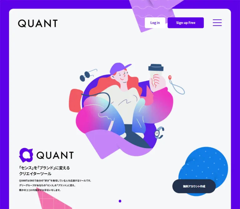
紫のフレームと淡いグレーの背景に、大きな人物イラストを配置。広い余白、英日併記の見出し、濃紺の登録ボタンが特徴のクリエイター向けサービスサイト。
QUANT — Style Reference
A spacious creator-service website framed in electric purple, with expressive illustrated characters floating across a cool, pale canvas.
Website: pf.quant.page Original URL: https://pf.quant.page/ Final URL: https://pf.quant.page/ Theme: light content surface with a saturated purple outer frame. Inspected: October 2, 2026, 05:38 JST; supplied retrieval timestamp: October 1, 2026, 20:38:22.504 UTC. Viewports: 1440 × 1000 desktop and 390 × 844 mobile, in CSS pixels. Scope: the current public service presentation, including its hero, introductory sections, service descriptions, creator testimonials, FAQ, business/contact information, closing message, and footer. Direct visual evidence covers three desktop positions and two mobile positions. Other sections are supported by rendered text and element measurements rather than complete visual captures.
QUANT presents influencer job management and creator branding through a friendly, illustration-led visual identity. The strongest contrast is between a vivid purple perimeter and an almost-white interior. Black Japanese copy supplies clarity, purple headings organize the story, and dark navy registration buttons provide a separate action color.
The composition relies on generous empty space. Large characters and abstract patterned shapes occupy broad areas without being boxed into cards. On desktop, the hero places a substantial illustration near the center, a compact brand-and-copy block at the lower left, and a registration pill at the lower right. Mobile reorganizes these elements vertically while retaining both account links and the hamburger control in the header.
The inspected page is a long service website with editorial messaging, product explanations, testimonials, and practical support information. Its character comes from the relationship between the persistent frame, restrained interface controls, expressive artwork, and unusually spacious section pacing.
閉じる
QUANT — Style Reference
A spacious creator-service website framed in electric purple, with expressive illustrated characters floating across a cool, pale canvas.
Website: pf.quant.page Original URL: https://pf.quant.page/ Final URL: https://pf.quant.page/ Theme: light content surface with a saturated purple outer frame. Inspected: October 2, 2026, 05:38 JST; supplied retrieval timestamp: October 1, 2026, 20:38:22.504 UTC. Viewports: 1440 × 1000 desktop and 390 × 844 mobile, in CSS pixels. Scope: the current public service presentation, including its hero, introductory sections, service descriptions, creator testimonials, FAQ, business/contact information, closing message, and footer. Direct visual evidence covers three desktop positions and two mobile positions. Other sections are supported by rendered text and element measurements rather than complete visual captures.
QUANT presents influencer job management and creator branding through a friendly, illustration-led visual identity. The strongest contrast is between a vivid purple perimeter and an almost-white interior. Black Japanese copy supplies clarity, purple headings organize the story, and dark navy registration buttons provide a separate action color.
The composition relies on generous empty space. Large characters and abstract patterned shapes occupy broad areas without being boxed into cards. On desktop, the hero places a substantial illustration near the center, a compact brand-and-copy block at the lower left, and a registration pill at the lower right. Mobile reorganizes these elements vertically while retaining both account links and the hamburger control in the header.
The inspected page is a long service website with editorial messaging, product explanations, testimonials, and practical support information. Its character comes from the relationship between the persistent frame, restrained interface controls, expressive artwork, and unusually spacious section pacing.
How to Read This Reference
- Measured means directly reported by the supplied rendered DOM or computed styles. Unless stated otherwise, paired values refer to desktop first and mobile second.
- Visual estimate means inferred from the original-page screenshots. Illustration bounds, frame corner radii, and decorative colors have this status unless a corresponding DOM value is available.
- Calculated means arithmetic derived from reported measurements, such as the gap between two controls.
- Recommended means an implementation choice for a new site. The CSS breakpoint, accessible states, and some intermediate-width behavior are recommendations.
- Named tokens are implementation aliases created for this reference, not recovered source variable names.
- Measurements belong to the sampled states. Offscreen coordinates, transformations, and later scroll captures need not align exactly with a single static document model.
- A computed style on a wrapper does not necessarily describe the visible text inside it. This matters particularly for bilingual headings, logo containers, and registration-button labels.
Tokens — Colors
Default Palette
| Name | Value | Suggested token | Evidence and role |
|---|---|---|---|
| Brand Purple | #5e00e7 |
--q-purple |
Measured on signup/contact button fills, login text, and the active testimonial dot. The outer frame is visually consistent with this family, but its own computed color was not supplied. |
| Heading Violet | #6329e7 |
--q-highlight |
Measured on About-section benefit headings. Slightly lighter and less saturated than the main action purple. |
| Cool Paper | #f6f7f9 |
--q-paper |
Measured root background and the dominant visible content surface. |
| Registration Navy | #24314b |
--q-navy |
Measured fill of the large registration pills. |
| Text Black | #000000 |
--q-ink |
Measured primary copy and heading color; also visually used by the wordmark. |
| Control White | #ffffff |
--q-white |
Measured login-button fill and reversed button text. Also measured on JOIN US text. |
| Pale Rule | Approximately #e7e9ee |
--q-rule |
Visual estimate for the subtle footer dividers. Exact border color was not included in the evidence. |
The artwork introduces additional lavender, pink, blue, mint, coral, and green. These belong primarily to illustration assets. Do not assign each illustrated color a competing interface function.
| Illustration accent | Approximate reference | Typical placement |
|---|---|---|
| Lavender | #c58af2 |
Folded ribbons, decorative shapes, and clothing |
| Bright Pink | #eb5ac3 |
Jackets, fabric, and geometric accents |
| Clear Blue | #1483e4 |
Speckled right-edge decoration and illustrated clothing |
| Pale Mint | #c6e7e2 |
Soft highlights within clothing gradients |
These four hex values are visual approximations, not pixel samples or recovered gradient stops. Preserve authorized artwork when available instead of recoloring it to these approximations.
Theme Presets
Only the light presentation is evidenced. No theme selector or alternate palette was supplied. The many exported WordPress preset colors, gradients, shadows, and fonts are not evidence that those presets appear in the interface.
Tokens — Typography
Japanese Text and Interface Controls
The measured font stack begins with Noto Sans JP, followed by Hiragino Kaku Gothic ProN, Hiragino Sans, several Japanese system Gothic families, and Western sans-serif fallbacks.
An abbreviated implementation stack is:
font-family: 'Noto Sans JP', 'Hiragino Kaku Gothic ProN',
  'Hiragino Sans', 'Yu Gothic', Meiryo, Arial, sans-serif;
This identifies the reported CSS family preference. It does not independently establish which font file supplied every rendered glyph.
The text hierarchy uses weight deliberately. Hero copy, brand messaging, and About paragraphs are bold. Detailed service descriptions and testimonials are lighter: desktop samples use 400, while comparable mobile samples use 500. Preserve that distinction instead of making every paragraph bold.
English Display Text
JOIN US explicitly reports Mont-SemiBold, sans-serif, with computed weight 700. Preserve the exact family identifier if the licensed font is supplied. Do not reinterpret it as Montserrat.
The visible SERVICES heading has a similarly geometric sans-serif character, but its child-level computed font was not included. Applying Mont-SemiBold to other English section labels is a reasonable adaptation, not a separately verified source declaration.
Wordmark
The QUANT wordmark is graphic artwork. Its broad spacing and distinctive letterforms should be preserved as a logo asset. The font properties of its enclosing paragraph or heading do not identify the logo's typeface.
Type Scale
All sizes below are measured unless explicitly marked as estimates. Values are font-size / line-height in CSS pixels.
| Role | Desktop | Mobile | Weight and tracking |
|---|---|---|---|
| Header account labels | 14 / 32 |
10 / 10 |
700; mobile tracking -0.15px |
| Hero Japanese heading | 24 / 36 |
15.6 / 19.76 |
700; tracking -0.72px / -0.234px |
| Hero explanatory copy | 14 / 28 |
10.4 / 15.6 |
700; normal tracking |
| JOIN US display | 48 / 48 |
24.96 / 24.96 |
Mont-SemiBold, 700; tracking -1.44px / -0.3744px |
| JOIN US supporting copy | 20 / 32 |
12.48 / 18.72 |
700 |
| Message headline | 38 / 54 |
24.96 / 37.44 |
700; tracking -1.14px / -0.3744px |
| Message paragraphs | 18 / 32 |
14.56 / 29.12 |
700; mobile tracking -0.728px |
| About benefit heading | 32 / 44 |
22.88 / 34.32 |
700; Heading Violet |
| About explanatory copy | 18 / 32 |
14.56 / 29.12 |
700 |
| Service title | 32 / 32 |
21.84 / 21.84 |
700; tracking -0.96px / -0.3276px |
| Service lead | 20 / 30 |
14.56 / 21.84 |
700 |
| Service detail | 18 / 32 |
12.48 / 24.96 |
400 / 500 |
| Development-screen note | 14 / 32 |
10.4 / 24.96 |
400 / 500 |
| Testimonial headline | 32 / 44 |
18.72 / 32.76 |
700 |
| Testimonial body | 16 / 32 |
12.48 / 24.96 |
400 / 500 |
| Business/contact body | 16 / 32 |
12.48 / 24.96 |
400 / 500 |
| Contact-button label | 14 / 14 |
10.4 / 10.4 |
700 |
| Closing headline | 44 / 44 |
28.08 / 28.08 |
700; tracking -1.32px / -0.4212px |
| Closing supporting copy | 18 / 18 |
11.44 / 17.16 |
700 |
| Footer links | 12 / 12 |
10.4 / 10.4 |
400 / 500 |
Bilingual heading limitation: section-heading wrappers measure 84px high on desktop and approximately 54.08px on mobile. The visible desktop SERVICES display is approximately 48px, with an approximately 18px Japanese caption. Those child sizes are visual estimates. The wrapper's reported 32px desktop font size is not a reliable substitute for either child.
Registration-label limitation: the desktop registration anchor reports 32px, but its visible label appears approximately 16px. A nested text element may override the inherited size. Use the visible scale as an estimate; do not describe the visible label as a confirmed 32px heading.
Root Size and Scaling
The root reports 32px on desktop and 12.1875px on mobile. These are implementation-specific root sizes, not universal body-copy sizes.
Many mobile measurements are consistent with a 375px design scaled by 390 / 375 = 1.04: for example, 14 × 1.04 = 14.56px. This is a numerical pattern, not proof of the original CSS formula. The source breakpoint and full scaling rules were not supplied.
The Quick Start keeps a conventional root and defines component dimensions explicitly.
Tokens — Spacing & Shapes
Density: sparse overall, with compact header utilities and relatively narrow text columns.
Geometry: a rounded outer content aperture, small-radius account buttons, fully rounded registration pills, and unboxed editorial content.
Spacing Scale
| Relationship | Desktop | Mobile | Status |
|---|---|---|---|
| Main horizontal outer inset | 40px |
12.5px |
Measured main padding |
| Login-to-signup gap | 10px |
5px |
Calculated from measured rectangles |
| Signup-to-menu gap | 40px |
14px |
Calculated |
| Hero logo to Japanese heading | 12px |
About 5.19px |
Calculated |
| Hero heading to body | 12px |
About 10.39px |
Calculated |
| About heading to body | 35px |
About 18.19px |
Calculated |
| Service lead to detail | 20px |
About 10.39px |
Calculated |
| Repeated major-section gap | 210px |
78px |
Measured between About/Services, Services/Voice, and Voice/FAQ section boxes |
| Testimonial dot pitch | 24px |
About 18.17px |
Calculated center-to-center spacing |
| Footer mobile link pitch | — | About 31.2px |
Calculated top-to-top spacing |
The repeated section gap is not a universal vertical rhythm. The opening and JOIN US areas use much taller staging, and the closing section has its own generous clearances.
Border Radius
| Element | Desktop | Mobile | Evidence |
|---|---|---|---|
| Main frame corners | Approximately 20px |
Approximately 10px |
Visual estimate |
| Header account buttons | 6px |
3px |
Measured |
| Registration pill | 42px |
26px |
Measured; half the button height |
| Contact button | 6px |
3.12px |
Measured |
| Testimonial dots | 50% |
50% |
Measured |
Layout Measurements
| Element | Desktop | Mobile |
|---|---|---|
| Full document height | Approximately 11084.48px |
Approximately 9495.47px |
| Main surface width | 1360px |
365px |
| Standard content column | 1040px, starting at x = 200px |
Approximately 291.19px, starting at x = 49.41px |
| Wide footer content | Approximately 1240px, starting at x = 100px |
Approximately 291.19px |
| Header wordmark | 174 × 37.42px |
93 × 20px |
| Hero logo lockup | 326.5 × 88.08px |
Approximately 179.91 × 48.52px |
| Hero copy width | Approximately 432.11px |
365px wrapper with centered text |
| About text column | 480px |
Approximately 291.19px |
| Service text column | 440px |
Approximately 291.19px |
| FAQ question row | 880 × 122px |
Approximately 291.19 × 105.97px |
| Closing logo lockup | 237 × 63.92px |
Approximately 123.23 × 33.23px |
| Footer wordmark | 146 × 32px |
Approximately 106.08 × 23.25px |
Components
Viewport Frame
Role: creates a recognizable purple perimeter around the long page.
The desktop captures show an approximately 40px top and side frame with rounded inner top corners. Mobile reduces the side inset to 12.5px. The pale surface continues vertically through the page. Rounded bottom corners and a purple bottom margin become visible at the document end.
The top edge and header remain in consistent viewport positions across the supplied scrolled captures. A plain document wrapper with rounded corners would not fully reproduce that persistent top treatment. A fixed top mask is a suitable implementation approach, but the original masking mechanism was not exposed.
Decorative artwork sometimes crosses the inner surface boundary, especially on mobile. Clip horizontal overflow at the viewport while allowing selected ornaments to overlap the inner frame.
Persistent Header
Role: keeps identity and account access available while the page scrolls.
The header contains a black wordmark at left and three controls at right: Log in, Sign up Free, and a purple three-line menu symbol. There is no visible desktop navigation-link row between them.
| Part | Desktop | Mobile |
|---|---|---|
| Wordmark position | x = 80px, y = 85px |
x = 27px, y = 44px |
| Login | 91 × 48px, white fill |
54.5 × 38px, white fill |
| Signup | 160 × 48px, purple fill |
100 × 38px, purple fill |
| Menu rectangle | 39 × 29px |
25 × 16px |
| Account-control top | 77px |
35px |
Both account actions survive on mobile. Preserve this compact grouping rather than moving them into an unverified menu state.
The observed destinations are https://pf.quant.jp/login and https://pf.quant.jp/signup. The menu element resolves to the page URL in the extracted link data; its actual open state and JavaScript behavior were not exercised.
Hero Composition
Role: introduces the creator-focused identity before explaining product details.
The desktop character illustration occupies approximately x = 425–1100 and y = 250–815 in the opening capture. Its silhouette is irregular, with accessories and folded shapes extending beyond the main figure. These are visual bounds, not an image-element rectangle.
The lower-left text stack contains:
- The purple symbol and black QUANT wordmark as a single visual lockup.
- The bold two-line heading
「センス」を「ブランド」に変える / クリエイターツール. - Three lines of smaller, bold supporting copy.
The lockup begins at approximately y = 632px on desktop. On mobile it begins at approximately y = 636px, despite the much narrower screen. This demonstrates a substantial compositional change: the illustration occupies the upper-middle area, and the brand message remains low in the opening viewport.
The mobile capture shows a different character scene: a seated creator with a mug, phone, lamp, clock, and plant. The desktop capture shows a cap-wearing figure holding a takeaway cup. The supplied evidence does not establish whether this difference is caused by responsive asset selection, animation timing, or a rotating visual sequence.
A small purple dot appears near the lower center of each opening screenshot. Its purpose was not established. Do not assign carousel or scroll-control semantics solely from its appearance.
Registration Buttons
Role: offers free account creation at several points in the page.
The label is 無料アカウント作成, set in white on a solid navy pill. The shape is flat, with no visible shadow or arrow in the supplied hero capture.
| Placement | Desktop | Mobile |
|---|---|---|
| Hero | 260 × 84px |
Approximately 291.19 × 52px |
| After Services | 300 × 84px |
208 × 52px |
| After Creator Voice | 300 × 84px |
208 × 52px |
The desktop hero button sits at x = 1049px, y = 821px, in front of the blue decorative form. The mobile hero button begins at document y = 844px, exactly beyond the supplied 844px-tall opening viewport. Its absence from that screenshot does not mean the action was removed.
These pills have a different visual role from the purple rectangular header and contact buttons. Preserve both families.
Bilingual Section Heading
Role: provides a repeated chapter marker throughout the long page.
The visible Services heading uses a centered uppercase English display in purple, followed by a smaller bold Japanese caption in black. The pair sits in a large open area rather than inside a badge or card.
The DOM confirms corresponding pairs for MESSAGE, ABOUT, SERVICES, CREATORS VOICE, FAQ, and CONTACT. The text and wrapper geometry are verified; the individual child styles are not available for every pair.
Keep the English and Japanese lines as separately styled elements. A single inherited heading size will not reproduce their hierarchy.
JOIN US Stage
Role: introduces the promise of turning familiar social media activity into a branding tool.
This is an unusually tall section: its measured box is 1360 × 1501px on desktop and 365 × 1267px on mobile. Its heading and supporting text are white. The desktop text wrapper is 800px wide; mobile uses 312px.
The heading sits deep inside the section rather than immediately after its top boundary. This supports a staged visual composition, but neither the background imagery nor any pinned or scroll-driven behavior is shown directly in the supplied screenshots. Treat those aspects as unverified.
Message Section
Role: explains the emotional proposition before listing capabilities.
The section combines a bilingual title, the bold headline あなたの「好き」は、誰かを幸せにする。, and a sequence of short, deliberately separated paragraphs.
Desktop paragraph blocks use 18px bold text with a 32px line height. Mobile uses 14.56px text with a 29.12px line height. The mobile layout includes a substantial interval between the headline and the first paragraph. The intervening visual content is not included in the supplied captures, so that interval should not automatically become an empty spacer in a reconstruction.
About Benefit Rows
Role: connects the illustrated lifestyle to concrete service benefits.
The desktop text measurements indicate alternating alignment. The first benefit uses a left text column at approximately x = 203px. The second uses a right text column at x = 760px. Both columns are 480px wide.
The visible second row pairs a large illustration on the left with a purple two-line heading and four lines of black bold copy on the right. Pale sweeping lines connect the background without enclosing either column.
The text anatomy is consistent:
- A purple benefit heading at
32 / 44px. - A 35px heading-to-paragraph gap.
- Bold body text at
18 / 32px. - No visible card fill, border, or shadow around the copy.
On mobile, both text groups use the same approximately 291px-wide column at x = 49.41px. The exact illustration order and crop for these middle sections were not directly captured.
Service Explanation Blocks
Role: presents job progress management and revenue management.
The DOM identifies two explanations, each with an English kicker, Japanese service title, bold lead, and lighter detail paragraph. Both English kickers read Job Management in the current extracted content.
Desktop text columns are 440px wide. Japanese titles use 32px bold text, leads use 20 / 30px, and descriptions use 18 / 32px at weight 400. Mobile reduces the hierarchy to 21.84px titles, 14.56px leads, and 12.48px descriptions.
A small note reads ※画面は開発中のものです. This establishes the presence of a development-screen disclaimer, but the supplied screenshots do not reveal the product-screen artwork itself. Device frames, screen colors, and image cropping cannot be specified from the current evidence.
A centered navy registration pill follows the service explanations.
Creator Voice Carousel Structure
Role: presents five distinct creator testimonials.
The DOM contains five unique testimonial texts repeated across horizontally displaced positions, five pagination links, and two larger navigation controls. This strongly supports a carousel structure. The repeated entries should be understood as structural duplicates, not fifteen different testimonials.
Measured anatomy includes:
- Desktop headline width:
560px; body width:440px. - Mobile headline width: approximately
328.61px; body width: approximately292.22px. - Horizontal pitch between matching testimonial positions:
1200pxdesktop and365pxmobile. - Pagination dots:
10pxdesktop and approximately7.8pxmobile. - Active dot: Brand Purple; inactive dot backgrounds: transparent in the sampled styles.
- Navigation-control boxes:
79 × 79pxdesktop and approximately41.08 × 41.08pxmobile.
The mobile navigation controls occur above the text group, while desktop controls align around the middle of the testimonial area. Artwork, portraits, exact arrow graphics, and inactive-dot borders are not visible in the supplied captures.
Autoplay, swipe support, looping behavior, transition duration, and arrow responses were not tested. For a new implementation, use five semantic items and keep any cloned slides out of the accessibility tree.
FAQ Rows
Role: answers two practical payment-related questions.
The two observed questions are 成果報酬型案件とはなんですか? and 報酬の振り込みはいつですか?. Answer text exists in the rendered text evidence, but no open/closed interaction was captured.
Desktop question-link boxes are 880px wide and 122px high, with 20px 0 padding. Mobile boxes are approximately 291.19px wide and 105.97px high, with 31.2px 0 padding. Their reported transition targets border color.
The questions resolve to the current page URL in the extracted link list. That does not prove ordinary navigation or establish an accordion implementation. Use accessible disclosure semantics if expandable answers are added to a new implementation.
Business and Contact Information
Role: serves production-company representatives and creators seeking help.
Desktop uses two unequal columns within the 1040px content area: a 600px business-information section and a 320px contact section, separated by a calculated 120px gap. Mobile stacks both in the same approximately 291px column.
The contact action reads インフルエンサー向けお問い合わせ. It is a purple rectangle with a small radius, measuring 253 × 44px on desktop and approximately 187.19 × 39.52px on mobile. Unlike the registration pills, it uses the bright brand fill.
The link target alone does not identify the contact workflow; no form or modal state was supplied.
Closing Message
Role: ends the narrative with a short invitation and repeated brand identity.
A large group illustration leads into a centered QUANT lockup, the heading さっそく始めましょう!, and one sentence of bold supporting copy. Both closing captures show the artwork cropped at the top of the viewport because the page has been scrolled into this region.
The heading is 44 / 44px on desktop and 28.08 / 28.08px on mobile. The supporting sentence remains one line on desktop and wraps to two lines on mobile.
The visible closing block contains the logo, headline, and sentence. No additional local registration button appears in either supplied closing capture. The header signup action remains visible above.
Footer
Role: provides company and policy navigation while finishing the rounded page surface.
Desktop uses a wide, fine top rule. Four small links run horizontally at the lower left, separated by faint vertical dividers. The black wordmark and copyright occupy the right side.
Mobile transforms this into three stages: a top rule, a vertically stacked link list, and a lower brand row separated by another pale rule. Copyright sits at the lower left and the wordmark at the lower right.
The visible labels are お問い合わせ, 会社概要, プライバシーポリシー, and 利用規約. The company link points to https://gree-x.com/, and the footer reads © GREE X, Inc.. These are directly supported by the current page.
Tokens — Motion & Interaction
Measured Transition Declarations
| Element | Reported transition | What is established |
|---|---|---|
| Login, signup, menu, contact button | opacity 0.3s cubic-bezier(0.215, 0.61, 0.355, 1) |
A 300ms opacity transition is declared; the triggering state and target opacity were not captured. |
| Testimonial pagination | background-color 0.3s cubic-bezier(0.215, 0.61, 0.355, 1) |
Dot background changes use the same easing. |
| FAQ question links | border-color 0.3s cubic-bezier(0.215, 0.61, 0.355, 1) |
Border-color feedback is declared. |
| Footer links | color 0.3s cubic-bezier(0.215, 0.61, 0.355, 1) |
Text-color feedback is declared. |
The shared easing can be represented as:
--q-motion-ui: 300ms cubic-bezier(0.215, 0.61, 0.355, 1);
Evidence and Limitations
The supplied captures show consistent header placement during scrolling. They also show different hero scenes across desktop and mobile. Neither fact establishes an animation timeline.
Sampled elements report animation: none, but this does not rule out animation on unsampled descendants, pseudo-elements, image assets, or JavaScript-controlled transforms. Bare transition: all entries do not establish a nonzero motion duration.
The inspection waited for finite visible motion and sampled layout stability, while temporarily pausing perpetual animations during readiness checks. It did not record a complete motion sequence. Do not invent illustration-loop duration, scroll parallax strength, reveal delays, carousel speed, or menu transitions.
For an adaptation, use the measured 300ms easing for modest control feedback. Any added entrance motion or autoplay should be identified as new behavior and support reduced motion.
Surfaces
| Layer | Appearance | Purpose |
|---|---|---|
| Outer frame | Saturated purple, persistent at the sides and top | Strong brand boundary |
| Main content | Flat Cool Paper | Gives colorful illustrations room and keeps text legible |
| Editorial sections | Primarily unboxed content | Maintains a continuous narrative |
| Login control | White fill, purple label | Secondary account action |
| Signup/contact controls | Purple fill, white label | Compact account and support actions |
| Registration pills | Navy fill, white label | Prominent repeated signup action |
| Footer separators | Very pale, thin rules | Quiet organization at the page end |
| Illustrated regions | Multicolor silhouettes and gradients | Supplies most visual complexity |
The shown interface does not rely on a general shadow-elevation system. The gradients belong mainly to the artwork. The mobile closing capture has a pale wash behind the header over the illustration, but its exact compositing method is not supplied; do not infer a glass-blur system.
Imagery
The artwork is smooth and vector-like, with exaggerated sleeves, simplified faces, curved limbs, and bold silhouettes. Clothing mixes pink, violet, blue, and mint through soft gradients. Small objects float around the figures to suggest everyday creator activity.
The desktop hero includes a cap, takeaway cup, eyewear, earphones, and a watch. The mobile scene includes a seated figure, mug, phone, lamp, clock, and plant. The visible About scene combines a broad-brimmed hat, smartphone, child, and circular product vignettes containing cosmetics, baby-related items, and clothing.
Abstract decorations extend the illustration language into the page boundary:
- A lavender folded shape with repeated wavy lines enters from the top.
- A pink angular ribbon with a thin grid enters from the lower left.
- A blue lobed shape with lighter speckles enters from the right.
- Very pale sweeping lines travel behind the About composition.
These shapes are not content cards. They can overlap the frame and be intentionally cropped without clipping meaningful text or controls.
Observed Asset References
No original image URLs, filenames, SVG markup, or font-file URLs were included in the supplied evidence. The following are descriptive handles only.
| Descriptive handle | Evidence | Use |
|---|---|---|
| QUANT wordmark | Header and footer captures | Plain black brand identity |
| QUANT symbol-and-wordmark lockup | Hero and closing captures | Larger identity statement |
| Coffee-holding creator | Desktop opening capture | Main hero scene |
| Seated creator | Mobile opening capture | Alternate observed hero scene |
| Creator with product vignettes | Desktop About capture | Benefit illustration |
| Group creator scene | Desktop/mobile closing captures | Closing illustration |
| Wave, grid, and speckled ornaments | Opening captures | Edge decoration |
Use authorized original assets where available. For newly commissioned illustrations, preserve the silhouette scale, restrained facial detail, gradient clothing, floating accessories, and relationship to empty space. Maintain smooth image rendering; raster compression is not an intended visual texture.
Layout & Responsive Behavior
Desktop
The page has three nested widths: a 1360px framed surface, an approximately 1240px wide hero/footer alignment, and a 1040px standard content column. Text columns inside the standard container generally measure 440–480px.
The opening screen is intentionally asymmetric. The main illustration carries the center, the brand message anchors the lower left, and the navy registration pill anchors the lower right. Large gaps then separate the major editorial chapters.
The screenshot transitioning from About to Services is particularly instructive: the benefit row occupies the upper portion, while the next centered heading appears much farther down. Preserve this breathing room instead of filling it with incidental UI.
Mobile
The purple perimeter narrows to 12.5px, leaving a 365px surface. Most lower-page text uses an approximately 291px centered column, while the hero copy wrapper spans the full pale surface.
The header stays on one line with the wordmark, login, signup, and menu. The hero becomes vertically staged, with a large upper illustration and a centered lower brand block. The hero registration button sits below the initial viewport.
The business and contact sections stack. Footer links become vertical, and the brand/copyright arrangement becomes a separate bottom row. The testimonial region uses the wider 365px surface for its slide pitch while keeping body text narrower.
Responsive Evidence Boundaries
| Behavior | Evidence status |
|---|---|
| Header controls retained on mobile | Directly visible and measured |
| Hero copy changes from left aligned to centered | Directly visible |
| Hero illustration differs between captures | Directly visible; cause unknown |
| Standard text columns narrow on mobile | Measured throughout the DOM |
| Business/contact columns stack | Measured positions |
| Footer links stack | Directly visible and measured |
| Actual CSS breakpoint | Not supplied |
| Tablet and landscape layouts | Not inspected |
| Exact mobile scaling formula | Not supplied |
| Sticky/pinned section implementation | Not established |
The source exposes --vh: 10px on desktop and --vh: 8.44px on mobile, matching one percent of the sampled viewport height. This suggests a viewport-height helper is available, but does not establish which components use it.
Do’s and Don’ts
Do
- Preserve the purple perimeter and the cool, nearly white interior as the dominant color relationship.
- Let large character silhouettes carry the visual impact.
- Keep the distinction between bright purple account controls and navy registration pills.
- Use graphic assets for the wordmark and symbol lockup.
- Preserve bold Japanese messaging alongside lighter service-detail paragraphs.
- Treat English section labels and Japanese captions as separate typographic layers.
- Retain substantial open space between illustrated sections.
- Keep both account actions visible in the evidenced mobile header pattern.
- Allow decorative shapes to cross the inner frame while protecting content and controls.
- Distinguish five unique testimonials from repeated carousel DOM entries.
Don’t
- Don’t replace the continuous pale canvas with a grid of elevated cards.
- Don’t apply illustration gradients to every button, heading, or surface.
- Don’t use unused exported font or color presets as design evidence.
- Don’t interpret wrapper font sizes as verified logo or nested-label sizes.
- Don’t describe the alternate hero scenes as a confirmed autoplay sequence.
- Don’t claim menu, FAQ, contact, or carousel behavior that was not exercised.
- Don’t remove the mobile hero signup action because it falls below the opening screenshot.
- Don’t invent product-screen artwork or creator portraits for uncaptured sections.
- Don’t compress every section into a conventional, tightly spaced feature layout.
- Don’t reproduce unusually small mobile text without evaluating readability for the new content.
Recommended Implementation Additions
These are recommendations for a new implementation, not verified features of the original page:
- Give the menu an explicit accessible name, expanded state, and controlled-panel relationship.
- Keep the visual menu glyph compact while providing a touch target of at least 44 × 44px. Apply the same principle to carousel dots and arrows.
- Provide a meaningful accessible name for the logo-based main heading. The supplied text extraction does not establish the original image alternatives.
- Consider 14–16px minimum sizes for essential mobile explanatory text. Several measured source labels and paragraphs are smaller.
- Use visible keyboard focus on both purple and navy controls.
- Implement FAQ disclosures with buttons or native disclosure elements if answers expand in place.
- Provide carousel navigation without requiring dragging; make the selected slide clear and hide structural duplicates from assistive technology.
- Keep decorative illustrations out of the accessibility tree, while describing illustrations that communicate information not present in the copy.
- Respect reduced-motion preferences and provide a pause control if perpetual movement is introduced.
- Verify the persistent header and frame at increased text size and short viewport heights so that content remains reachable.
Agent Prompt Guide
Quick Color Reference
- Main surface: measured
#f6f7f9. - Primary purple controls and active indicators: measured
#5e00e7. - About benefit headings: measured
#6329e7. - Large registration pills: measured
#24314bwith white text. - Main copy and wordmark: black.
- Decorative lavender, pink, blue, and mint: asset colors; approximate swatches only.
- Dividers: very pale gray; no general shadow system in the shown sections.
Overall Prompt
“Create a spacious public service website for creators, inspired by QUANT's observed visual system. Frame a cool off-white #f6f7f9 canvas with vivid purple, using approximately 40px outer insets on a large desktop and 12.5px on a 390px mobile viewport. Keep a persistent black wordmark at left and compact login, purple signup, and three-line menu controls at right. Build the desktop hero around a large expressive character illustration, a lower-left brand-and-copy stack, and a lower-right navy registration pill. On mobile, place the illustration above a centered brand message and keep the registration pill in normal reach below it. Use bold Japanese Gothic text, geometric English chapter labels, broad vertical spacing, and smooth pink-violet-blue gradients inside the illustrations. Use unboxed benefit rows, restrained rules, and a quiet responsive footer. Supply artwork separately and implement only explicitly specified interactions.”
Example Component Prompts
- Header: “Create a compact persistent header with a graphic black wordmark, white login button, purple signup button, and three purple menu lines. At 1440px, use 48px-high account controls with 6px corners; at 390px, retain both controls at 38px high with 3px corners. Provide accessible hit areas without enlarging the visible menu glyph.”
- Hero: “Compose a large illustrated creator on a pale canvas with floating everyday accessories and cropped patterned decorations. Keep the desktop brand lockup and two-line Japanese heading low on the left. Recompose the phone layout vertically with a centered lower text stack. Treat scene selection as supplied content, not assumed carousel behavior.”
- Benefit row: “Pair a large creator illustration with an unboxed 480px text column. Use a
#6329e7heading at 32px with 44px line height, followed by bold black 18px text with 32px line height. Leave a 35px gap and broad surrounding whitespace.” - Section heading: “Center a geometric purple English section label over a smaller bold black Japanese caption. For a desktop Services marker, approximate 48px English text and 18px Japanese text. Keep the pair visually isolated with generous space above and below.”
- Registration action: “Create a flat navy
#24314bsignup pill with white bold text reading無料アカウント作成. Use 300 × 84px for a desktop section action and 208 × 52px for mobile, with a radius equal to half the height.” - Footer: “Finish the pale page with a fine gray rule. On desktop, place four small links with subtle separators on the left and the wordmark/copyright on the right. On mobile, stack the links and add a separate bottom row with copyright left and wordmark right. Preserve the purple margin and rounded lower page corners.”
Quick Start
CSS Custom Properties
This is an implementation adaptation, not recovered source CSS. It reproduces the main measured colors, control dimensions, text relationships, and opening composition at the supplied viewport sizes. The 1023px collapse breakpoint, fixed top-cap technique, hover opacity, intermediate-width behavior, and estimated rule/frame values are recommendations.
Use .quant-page for the pale surface; .quant-cap for its persistent top treatment; .quant-header for the utility header; and .quant-core or .quant-wide for content alignment. The hero expects separate artwork, logo, heading, body, action, and dot elements. Load authorized logo and illustration assets separately; no original asset paths were provided.
:root {
  /* Measured interface colors */
  --q-purple: #5e00e7;
  --q-highlight: #6329e7;
  --q-paper: #f6f7f9;
  --q-navy: #24314b;
  --q-ink: #000;
  --q-white: #fff;

  /* Visual estimates */
  --q-rule: #e7e9ee;
  --q-panel-radius: 20px;

  /* Abbreviated observed family stack */
  --q-font-body: 'Noto Sans JP', 'Hiragino Kaku Gothic ProN',
    'Hiragino Sans', 'Yu Gothic', Meiryo, Arial, sans-serif;
  --q-font-display: Mont-SemiBold, sans-serif;

  /* Source measurements at the desktop capture */
  --q-frame: 40px;
  --q-core: 1040px;
  --q-section-gap: 210px;
  --q-benefit-size: 32px;
  --q-benefit-leading: 44px;
  --q-body-size: 18px;
  --q-body-leading: 32px;
  --q-button-radius: 6px;
  --q-motion-ui: 300ms cubic-bezier(0.215, 0.61, 0.355, 1);
}

* { box-sizing: border-box; }

html {
  font-size: 16px;
  scroll-padding-top: 150px;
}

body {
  margin: 0;
  padding: var(--q-frame);
  overflow-x: clip;
  color: var(--q-ink);
  background: var(--q-purple);
  font-family: var(--q-font-body);
}

img { display: block; max-width: 100%; }
button, a { -webkit-tap-highlight-color: transparent; }
button { font: inherit; }

.quant-page {
  position: relative;
  isolation: isolate;
  min-height: calc(100svh - 2 * var(--q-frame));
  border-radius: var(--q-panel-radius);
  background: var(--q-paper);
}

/* Recommended approximation of the persistent top frame */
.quant-cap {
  position: fixed;
  z-index: 30;
  inset: 0 0 auto;
  height: calc(var(--q-frame) + var(--q-panel-radius));
  pointer-events: none;
  background: var(--q-purple);
}

.quant-cap::after {
  content: '';
  position: absolute;
  inset: var(--q-frame) var(--q-frame) 0;
  border-radius: var(--q-panel-radius) var(--q-panel-radius) 0 0;
  background: var(--q-paper);
}

.quant-core {
  width: min(var(--q-core), calc(100% - 120px));
  margin-inline: auto;
}

.quant-wide {
  width: calc(100% - 120px);
  margin-inline: auto;
}

.quant-section { margin-block-start: var(--q-section-gap); }

.quant-header {
  position: fixed;
  z-index: 40;
  top: 77px;
  right: 81px;
  left: 80px;
  display: flex;
  align-items: center;
}

.quant-header__logo { width: 174px; height: auto; }

.quant-header__actions {
  display: flex;
  align-items: center;
  gap: 10px;
  margin-left: auto;
}

.quant-account {
  display: inline-flex;
  align-items: center;
  justify-content: center;
  height: 48px;
  border-radius: var(--q-button-radius);
  font-size: 14px;
  font-weight: 700;
  line-height: 32px;
  text-decoration: none;
  transition: opacity var(--q-motion-ui);
}

.quant-account--login {
  width: 91px;
  color: var(--q-purple);
  background: var(--q-white);
}

.quant-account--signup {
  width: 160px;
  color: var(--q-white);
  background: var(--q-purple);
}

.quant-menu {
  position: relative;
  display: flex;
  flex-direction: column;
  justify-content: space-between;
  width: 39px;
  height: 29px;
  margin-left: 30px;
  padding: 0;
  border: 0;
  color: var(--q-purple);
  background: transparent;
  cursor: pointer;
}

.quant-menu span {
  display: block;
  width: 100%;
  height: 3px;
  background: currentColor;
}

/* Recommended expanded hit area */
.quant-menu::after {
  content: '';
  position: absolute;
  inset: -10px;
}

.quant-hero {
  position: relative;
  min-height: calc(100svh - var(--q-frame));
}

/* Illustration placement is estimated from visible artwork bounds. */
.quant-hero__art {
  position: absolute;
  z-index: 1;
  top: 212px;
  left: calc(50% - 295px);
  width: 675px;
  height: auto;
  object-fit: contain;
}

.quant-hero__copy {
  position: absolute;
  z-index: 2;
  bottom: 100px;
  left: 60px;
  width: 432.11px;
}

.quant-hero__brand {
  width: 326.5px;
  height: auto;
  margin: 0 0 12px;
}

.quant-hero__heading {
  margin: 0 0 12px;
  font-size: 24px;
  font-weight: 700;
  line-height: 36px;
  letter-spacing: -0.03em;
}

.quant-hero__body {
  margin: 0;
  font-size: 14px;
  font-weight: 700;
  line-height: 28px;
}

.quant-register {
  display: inline-flex;
  align-items: center;
  justify-content: center;
  width: 300px;
  max-width: 100%;
  height: 84px;
  border-radius: 42px;
  color: var(--q-white);
  background: var(--q-navy);
  font-size: 16px; /* Estimated visible label size */
  font-weight: 700;
  text-align: center;
  text-decoration: none;
}

.quant-hero__register {
  position: absolute;
  z-index: 3;
  right: 91px;
  bottom: 95px;
  width: 260px;
}

.quant-hero__dot {
  position: absolute;
  bottom: 48px;
  left: 50%;
  width: 16px;
  height: 16px;
  border-radius: 50%;
  background: var(--q-purple);
  transform: translateX(-50%);
}

/* Section-label child sizes are adaptations of the visible hierarchy. */
.quant-section-title { margin: 0; text-align: center; }

.quant-section-title__en {
  display: block;
  color: var(--q-purple);
  font-family: var(--q-font-display);
  font-size: 48px;
  font-weight: 700;
  line-height: 1;
  letter-spacing: -0.03em;
}

.quant-section-title__jp {
  display: block;
  margin-top: 18px;
  font-size: 18px;
  font-weight: 700;
  line-height: 1;
}

.quant-benefit {
  display: grid;
  grid-template-columns: minmax(0, 1fr) minmax(0, 1fr);
  align-items: center;
  gap: 80px;
}

.quant-benefit__heading {
  margin: 0 0 35px;
  color: var(--q-highlight);
  font-size: var(--q-benefit-size);
  font-weight: 700;
  line-height: var(--q-benefit-leading);
  letter-spacing: -0.03em;
}

.quant-benefit__body {
  margin: 0;
  font-size: var(--q-body-size);
  font-weight: 700;
  line-height: var(--q-body-leading);
}

.quant-service__detail {
  max-width: 440px;
  font-size: 18px;
  font-weight: 400;
  line-height: 32px;
  letter-spacing: -0.01em;
}

.quant-close { text-align: center; }
.quant-close__brand { width: 237px; margin-inline: auto; }

.quant-close__heading {
  margin: 14px 0 30px;
  font-size: 44px;
  font-weight: 700;
  line-height: 44px;
  letter-spacing: -0.03em;
}

.quant-close__body {
  margin: 0;
  font-size: 18px;
  font-weight: 700;
  line-height: 1.5; /* Recommended breathing room for changed copy */
}

.quant-footer {
  display: grid;
  grid-template-columns: 1fr auto;
  align-items: end;
  margin-top: 182px;
  padding: 80px 0;
  border-top: 1px solid var(--q-rule);
}

.quant-footer__links { display: flex; align-items: center; }

.quant-footer__links a {
  color: var(--q-ink);
  font-size: 12px;
  line-height: 1;
  letter-spacing: -0.03em;
  text-decoration: none;
  transition: color var(--q-motion-ui);
}

.quant-footer__links a + a {
  margin-left: 20px;
  padding-left: 20px;
  border-left: 1px solid var(--q-rule);
}

.quant-footer__brand {
  display: flex;
  flex-direction: column;
  align-items: flex-end;
  gap: 20px;
}

.quant-footer__logo { width: 146px; }
.quant-footer__copyright { font-size: 12px; }

/* Hover endpoints and focus treatment are recommended additions. */
@media (hover: hover) {
  .quant-account:hover { opacity: 0.8; }
  .quant-footer__links a:hover { color: var(--q-purple); }
}

.quant-page :focus-visible {
  outline: 3px solid var(--q-purple);
  outline-offset: 4px;
}

/* Recommended breakpoint; the original breakpoint was not supplied. */
@media (max-width: 1023px) {
  :root {
    --q-frame: 12.5px;
    --q-panel-radius: 10px;
    --q-section-gap: 78px;
    --q-benefit-size: 22.88px;
    --q-benefit-leading: 34.32px;
    --q-body-size: 14.56px;
    --q-body-leading: 29.12px;
    --q-button-radius: 3px;
  }

  html { scroll-padding-top: 100px; }
  body { font-weight: 500; }

  .quant-core,
  .quant-wide {
    width: min(74.666667vw, 640px);
    max-width: calc(100% - 24px);
  }

  .quant-header { top: 35px; right: 29.5px; left: 27px; }
  .quant-header__logo { width: 93px; }
  .quant-header__actions { gap: 5px; }

  .quant-account {
    height: 38px;
    font-size: 10px;
    line-height: 10px;
    letter-spacing: -0.015em;
  }

  .quant-account--login { width: 54.5px; }
  .quant-account--signup { width: 100px; }
  .quant-menu { width: 25px; height: 16px; margin-left: 9px; }
  .quant-menu span { height: 2px; }
  .quant-menu::after { inset: -14px -10px; }

  .quant-hero {
    min-height: max(831.5px, calc(100svh + 52px - var(--q-frame)));
  }

  .quant-hero__art {
    top: 222px;
    left: calc(-1 * var(--q-frame));
    width: min(86vw, 420px);
  }

  .quant-hero__copy {
    right: 0;
    bottom: 94px;
    left: 0;
    width: 100%;
    text-align: center;
  }

  .quant-hero__brand { width: 179.91px; margin: 0 auto 5.2px; }

  .quant-hero__heading {
    margin-bottom: 10.4px;
    font-size: 15.6px;
    line-height: 19.76px;
    letter-spacing: -0.015em;
  }

  .quant-hero__body {
    max-width: 365px;
    margin-inline: auto;
    font-size: 10.4px;
    line-height: 15.6px;
  }

  .quant-register {
    width: 208px;
    height: 52px;
    border-radius: 26px;
    font-size: 12px; /* Adapted visible label size */
  }

  .quant-hero__register {
    right: auto;
    bottom: 0;
    left: 50%;
    width: min(74.666667vw, 360px);
    transform: translateX(-50%);
  }

  .quant-hero__dot { bottom: 65px; width: 8px; height: 8px; }

  .quant-section-title__en { font-size: 31.2px; }
  .quant-section-title__jp { margin-top: 10.4px; font-size: 12.48px; }

  .quant-benefit { grid-template-columns: 1fr; gap: 32px; }
  .quant-benefit__heading { margin-bottom: 18.2px; letter-spacing: -0.015em; }

  .quant-service__detail {
    max-width: none;
    font-size: 12.48px;
    font-weight: 500;
    line-height: 24.96px;
    letter-spacing: normal;
  }

  .quant-close__brand { width: 123.23px; }

  .quant-close__heading {
    margin: 6.24px 0 15.6px;
    font-size: 28.08px;
    line-height: 28.08px;
    letter-spacing: -0.015em;
  }

  .quant-close__body { font-size: 11.44px; line-height: 17.16px; }

  .quant-footer {
    grid-template-columns: 1fr;
    margin-top: 104px;
    padding: 60px 0 40px;
  }

  .quant-footer__links {
    display: flex;
    flex-direction: column;
    align-items: flex-start;
    gap: 20.8px;
  }

  .quant-footer__links a { font-size: 10.4px; letter-spacing: -0.015em; }
  .quant-footer__links a + a { margin: 0; padding: 0; border: 0; }

  .quant-footer__brand {
    flex-direction: row-reverse;
    justify-content: space-between;
    align-items: center;
    margin-top: 60px;
    padding-top: 36px;
    border-top: 1px solid var(--q-rule);
  }

  .quant-footer__logo { width: 106.08px; }
  .quant-footer__copyright { font-size: 9px; }
}

/* Recommended accommodation for narrower, uninspected phones. */
@media (max-width: 360px) {
  .quant-header { left: 22.5px; right: 22.5px; }
  .quant-header__logo { width: 78px; }
  .quant-account--login { width: 46px; }
  .quant-account--signup { width: 88px; }
  .quant-header__actions { gap: 4px; }
  .quant-menu { margin-left: 4px; }
}

@media (prefers-reduced-motion: reduce) {
  .quant-account,
  .quant-footer__links a { transition: none; }
}
The compact mobile text sizes above retain the measured reference. Increase them for a readability-focused adaptation and reflow the hero in normal document flow if larger text no longer fits its staged composition. Artwork-specific transparent padding can also change the apparent image position; adjust against the intended asset rather than compensating with arbitrary crop rules.
Tailwind v4 Token Mapping
Optional mapping for a project already using Tailwind v4. This does not identify the original site's framework. Define the custom properties above first.
@theme inline {
  --color-brand: var(--q-purple);
  --color-highlight: var(--q-highlight);
  --color-paper: var(--q-paper);
  --color-registration: var(--q-navy);
  --color-ink: var(--q-ink);
  --color-rule: var(--q-rule);

  --font-sans: var(--q-font-body);
  --font-display: var(--q-font-display);

  --spacing-frame: var(--q-frame);
  --spacing-section: var(--q-section-gap);
  --container-content: var(--q-core);

  --radius-panel: var(--q-panel-radius);
  --radius-control: var(--q-button-radius);
  --radius-registration: 999px;

  --text-benefit: var(--q-benefit-size);
  --text-benefit--line-height: var(--q-benefit-leading);
  --text-body: var(--q-body-size);
  --text-body--line-height: var(--q-body-leading);
}
Sources & Evidence
- Original and final website: https://pf.quant.page/. The supplied inspection reports HTTP 200 with no URL change.
- Capture timestamp: October 1, 2026, 20:38:22.504 UTC; October 2, 2026, 05:38:22.504 JST.
- Desktop evidence: 1440 × 1000 viewport; opening hero, About-to-Services transition, and closing/footer captures, plus rendered text and sampled element styles throughout the document.
- Mobile evidence: 390 × 844 viewport; opening hero and closing/footer captures, plus rendered text and sampled element styles throughout the document.
- Measured evidence: element rectangles, typography, foreground/background colors, padding, radii, transitions, link destinations, document dimensions, and exported custom properties.
- Observed state coverage: loaded page and supplied scroll positions. No interaction trace establishes menu opening, FAQ expansion, contact forms, carousel navigation, hover endpoints, or completed account flows.
- Capture limitations: the supplied process awaited document load, visible-image decoding, finite motion, and sampled stability within bounded waits. Perpetual animations were temporarily paused for readiness checks and then resumed. Delayed content, unsampled descendants, and unexercised interactions remain unverified.
- Asset limitations: original artwork URLs, font-file URLs, and full source stylesheets were not supplied. Illustration colors and bounds are estimates where identified. No additional browsing or file inspection was used to extend the evidence.
This reference describes the current supplied page states. Measurements, visual estimates, and implementation recommendations are identified separately throughout.
# QUANT — Style Reference

> A spacious creator-service website framed in electric purple, with expressive illustrated characters floating across a cool, pale canvas.

**Website:** [pf.quant.page](https://pf.quant.page/)
**Original URL:** https://pf.quant.page/
**Final URL:** https://pf.quant.page/
**Theme:** light content surface with a saturated purple outer frame.
**Inspected:** October 2, 2026, 05:38 JST; supplied retrieval timestamp: October 1, 2026, 20:38:22.504 UTC.
**Viewports:** 1440 × 1000 desktop and 390 × 844 mobile, in CSS pixels.
**Scope:** the current public service presentation, including its hero, introductory sections, service descriptions, creator testimonials, FAQ, business/contact information, closing message, and footer. Direct visual evidence covers three desktop positions and two mobile positions. Other sections are supported by rendered text and element measurements rather than complete visual captures.

QUANT presents influencer job management and creator branding through a friendly, illustration-led visual identity. The strongest contrast is between a vivid purple perimeter and an almost-white interior. Black Japanese copy supplies clarity, purple headings organize the story, and dark navy registration buttons provide a separate action color.

The composition relies on generous empty space. Large characters and abstract patterned shapes occupy broad areas without being boxed into cards. On desktop, the hero places a substantial illustration near the center, a compact brand-and-copy block at the lower left, and a registration pill at the lower right. Mobile reorganizes these elements vertically while retaining both account links and the hamburger control in the header.

The inspected page is a long service website with editorial messaging, product explanations, testimonials, and practical support information. Its character comes from the relationship between the persistent frame, restrained interface controls, expressive artwork, and unusually spacious section pacing.
閉じる
# QUANT — Style Reference

> A spacious creator-service website framed in electric purple, with expressive illustrated characters floating across a cool, pale canvas.

**Website:** [pf.quant.page](https://pf.quant.page/)
**Original URL:** https://pf.quant.page/
**Final URL:** https://pf.quant.page/
**Theme:** light content surface with a saturated purple outer frame.
**Inspected:** October 2, 2026, 05:38 JST; supplied retrieval timestamp: October 1, 2026, 20:38:22.504 UTC.
**Viewports:** 1440 × 1000 desktop and 390 × 844 mobile, in CSS pixels.
**Scope:** the current public service presentation, including its hero, introductory sections, service descriptions, creator testimonials, FAQ, business/contact information, closing message, and footer. Direct visual evidence covers three desktop positions and two mobile positions. Other sections are supported by rendered text and element measurements rather than complete visual captures.

QUANT presents influencer job management and creator branding through a friendly, illustration-led visual identity. The strongest contrast is between a vivid purple perimeter and an almost-white interior. Black Japanese copy supplies clarity, purple headings organize the story, and dark navy registration buttons provide a separate action color.

The composition relies on generous empty space. Large characters and abstract patterned shapes occupy broad areas without being boxed into cards. On desktop, the hero places a substantial illustration near the center, a compact brand-and-copy block at the lower left, and a registration pill at the lower right. Mobile reorganizes these elements vertically while retaining both account links and the hamburger control in the header.

The inspected page is a long service website with editorial messaging, product explanations, testimonials, and practical support information. Its character comes from the relationship between the persistent frame, restrained interface controls, expressive artwork, and unusually spacious section pacing.

## How to Read This Reference

- **Measured** means directly reported by the supplied rendered DOM or computed styles. Unless stated otherwise, paired values refer to desktop first and mobile second.
- **Visual estimate** means inferred from the original-page screenshots. Illustration bounds, frame corner radii, and decorative colors have this status unless a corresponding DOM value is available.
- **Calculated** means arithmetic derived from reported measurements, such as the gap between two controls.
- **Recommended** means an implementation choice for a new site. The CSS breakpoint, accessible states, and some intermediate-width behavior are recommendations.
- **Named tokens** are implementation aliases created for this reference, not recovered source variable names.
- Measurements belong to the sampled states. Offscreen coordinates, transformations, and later scroll captures need not align exactly with a single static document model.
- A computed style on a wrapper does not necessarily describe the visible text inside it. This matters particularly for bilingual headings, logo containers, and registration-button labels.

## Tokens — Colors

### Default Palette

| Name | Value | Suggested token | Evidence and role |
| --- | --- | --- | --- |
| Brand Purple | `#5e00e7` | `--q-purple` | Measured on signup/contact button fills, login text, and the active testimonial dot. The outer frame is visually consistent with this family, but its own computed color was not supplied. |
| Heading Violet | `#6329e7` | `--q-highlight` | Measured on About-section benefit headings. Slightly lighter and less saturated than the main action purple. |
| Cool Paper | `#f6f7f9` | `--q-paper` | Measured root background and the dominant visible content surface. |
| Registration Navy | `#24314b` | `--q-navy` | Measured fill of the large registration pills. |
| Text Black | `#000000` | `--q-ink` | Measured primary copy and heading color; also visually used by the wordmark. |
| Control White | `#ffffff` | `--q-white` | Measured login-button fill and reversed button text. Also measured on JOIN US text. |
| Pale Rule | Approximately `#e7e9ee` | `--q-rule` | Visual estimate for the subtle footer dividers. Exact border color was not included in the evidence. |

The artwork introduces additional lavender, pink, blue, mint, coral, and green. These belong primarily to illustration assets. Do not assign each illustrated color a competing interface function.

| Illustration accent | Approximate reference | Typical placement |
| --- | --- | --- |
| Lavender | `#c58af2` | Folded ribbons, decorative shapes, and clothing |
| Bright Pink | `#eb5ac3` | Jackets, fabric, and geometric accents |
| Clear Blue | `#1483e4` | Speckled right-edge decoration and illustrated clothing |
| Pale Mint | `#c6e7e2` | Soft highlights within clothing gradients |

These four hex values are visual approximations, not pixel samples or recovered gradient stops. Preserve authorized artwork when available instead of recoloring it to these approximations.

### Theme Presets

Only the light presentation is evidenced. No theme selector or alternate palette was supplied. The many exported WordPress preset colors, gradients, shadows, and fonts are not evidence that those presets appear in the interface.

## Tokens — Typography

### Japanese Text and Interface Controls

The measured font stack begins with `Noto Sans JP`, followed by `Hiragino Kaku Gothic ProN`, `Hiragino Sans`, several Japanese system Gothic families, and Western sans-serif fallbacks.

An abbreviated implementation stack is:

```css
font-family: 'Noto Sans JP', 'Hiragino Kaku Gothic ProN',
  'Hiragino Sans', 'Yu Gothic', Meiryo, Arial, sans-serif;
```

This identifies the reported CSS family preference. It does not independently establish which font file supplied every rendered glyph.

The text hierarchy uses weight deliberately. Hero copy, brand messaging, and About paragraphs are bold. Detailed service descriptions and testimonials are lighter: desktop samples use `400`, while comparable mobile samples use `500`. Preserve that distinction instead of making every paragraph bold.

### English Display Text

`JOIN US` explicitly reports `Mont-SemiBold, sans-serif`, with computed weight `700`. Preserve the exact family identifier if the licensed font is supplied. Do not reinterpret it as Montserrat.

The visible `SERVICES` heading has a similarly geometric sans-serif character, but its child-level computed font was not included. Applying Mont-SemiBold to other English section labels is a reasonable adaptation, not a separately verified source declaration.

### Wordmark

The QUANT wordmark is graphic artwork. Its broad spacing and distinctive letterforms should be preserved as a logo asset. The font properties of its enclosing paragraph or heading do not identify the logo's typeface.

### Type Scale

All sizes below are measured unless explicitly marked as estimates. Values are `font-size / line-height` in CSS pixels.

| Role | Desktop | Mobile | Weight and tracking |
| --- | --- | --- | --- |
| Header account labels | `14 / 32` | `10 / 10` | `700`; mobile tracking `-0.15px` |
| Hero Japanese heading | `24 / 36` | `15.6 / 19.76` | `700`; tracking `-0.72px` / `-0.234px` |
| Hero explanatory copy | `14 / 28` | `10.4 / 15.6` | `700`; normal tracking |
| JOIN US display | `48 / 48` | `24.96 / 24.96` | Mont-SemiBold, `700`; tracking `-1.44px` / `-0.3744px` |
| JOIN US supporting copy | `20 / 32` | `12.48 / 18.72` | `700` |
| Message headline | `38 / 54` | `24.96 / 37.44` | `700`; tracking `-1.14px` / `-0.3744px` |
| Message paragraphs | `18 / 32` | `14.56 / 29.12` | `700`; mobile tracking `-0.728px` |
| About benefit heading | `32 / 44` | `22.88 / 34.32` | `700`; Heading Violet |
| About explanatory copy | `18 / 32` | `14.56 / 29.12` | `700` |
| Service title | `32 / 32` | `21.84 / 21.84` | `700`; tracking `-0.96px` / `-0.3276px` |
| Service lead | `20 / 30` | `14.56 / 21.84` | `700` |
| Service detail | `18 / 32` | `12.48 / 24.96` | `400` / `500` |
| Development-screen note | `14 / 32` | `10.4 / 24.96` | `400` / `500` |
| Testimonial headline | `32 / 44` | `18.72 / 32.76` | `700` |
| Testimonial body | `16 / 32` | `12.48 / 24.96` | `400` / `500` |
| Business/contact body | `16 / 32` | `12.48 / 24.96` | `400` / `500` |
| Contact-button label | `14 / 14` | `10.4 / 10.4` | `700` |
| Closing headline | `44 / 44` | `28.08 / 28.08` | `700`; tracking `-1.32px` / `-0.4212px` |
| Closing supporting copy | `18 / 18` | `11.44 / 17.16` | `700` |
| Footer links | `12 / 12` | `10.4 / 10.4` | `400` / `500` |

**Bilingual heading limitation:** section-heading wrappers measure 84px high on desktop and approximately 54.08px on mobile. The visible desktop `SERVICES` display is approximately 48px, with an approximately 18px Japanese caption. Those child sizes are visual estimates. The wrapper's reported `32px` desktop font size is not a reliable substitute for either child.

**Registration-label limitation:** the desktop registration anchor reports `32px`, but its visible label appears approximately 16px. A nested text element may override the inherited size. Use the visible scale as an estimate; do not describe the visible label as a confirmed 32px heading.

### Root Size and Scaling

The root reports `32px` on desktop and `12.1875px` on mobile. These are implementation-specific root sizes, not universal body-copy sizes.

Many mobile measurements are consistent with a 375px design scaled by `390 / 375 = 1.04`: for example, `14 × 1.04 = 14.56px`. This is a numerical pattern, not proof of the original CSS formula. The source breakpoint and full scaling rules were not supplied.

The Quick Start keeps a conventional root and defines component dimensions explicitly.

## Tokens — Spacing & Shapes

**Density:** sparse overall, with compact header utilities and relatively narrow text columns.

**Geometry:** a rounded outer content aperture, small-radius account buttons, fully rounded registration pills, and unboxed editorial content.

### Spacing Scale

| Relationship | Desktop | Mobile | Status |
| --- | --- | --- | --- |
| Main horizontal outer inset | `40px` | `12.5px` | Measured main padding |
| Login-to-signup gap | `10px` | `5px` | Calculated from measured rectangles |
| Signup-to-menu gap | `40px` | `14px` | Calculated |
| Hero logo to Japanese heading | `12px` | About `5.19px` | Calculated |
| Hero heading to body | `12px` | About `10.39px` | Calculated |
| About heading to body | `35px` | About `18.19px` | Calculated |
| Service lead to detail | `20px` | About `10.39px` | Calculated |
| Repeated major-section gap | `210px` | `78px` | Measured between About/Services, Services/Voice, and Voice/FAQ section boxes |
| Testimonial dot pitch | `24px` | About `18.17px` | Calculated center-to-center spacing |
| Footer mobile link pitch | — | About `31.2px` | Calculated top-to-top spacing |

The repeated section gap is not a universal vertical rhythm. The opening and JOIN US areas use much taller staging, and the closing section has its own generous clearances.

### Border Radius

| Element | Desktop | Mobile | Evidence |
| --- | --- | --- | --- |
| Main frame corners | Approximately `20px` | Approximately `10px` | Visual estimate |
| Header account buttons | `6px` | `3px` | Measured |
| Registration pill | `42px` | `26px` | Measured; half the button height |
| Contact button | `6px` | `3.12px` | Measured |
| Testimonial dots | `50%` | `50%` | Measured |

### Layout Measurements

| Element | Desktop | Mobile |
| --- | --- | --- |
| Full document height | Approximately `11084.48px` | Approximately `9495.47px` |
| Main surface width | `1360px` | `365px` |
| Standard content column | `1040px`, starting at x = `200px` | Approximately `291.19px`, starting at x = `49.41px` |
| Wide footer content | Approximately `1240px`, starting at x = `100px` | Approximately `291.19px` |
| Header wordmark | `174 × 37.42px` | `93 × 20px` |
| Hero logo lockup | `326.5 × 88.08px` | Approximately `179.91 × 48.52px` |
| Hero copy width | Approximately `432.11px` | `365px` wrapper with centered text |
| About text column | `480px` | Approximately `291.19px` |
| Service text column | `440px` | Approximately `291.19px` |
| FAQ question row | `880 × 122px` | Approximately `291.19 × 105.97px` |
| Closing logo lockup | `237 × 63.92px` | Approximately `123.23 × 33.23px` |
| Footer wordmark | `146 × 32px` | Approximately `106.08 × 23.25px` |

## Components

### Viewport Frame

**Role:** creates a recognizable purple perimeter around the long page.

The desktop captures show an approximately 40px top and side frame with rounded inner top corners. Mobile reduces the side inset to 12.5px. The pale surface continues vertically through the page. Rounded bottom corners and a purple bottom margin become visible at the document end.

The top edge and header remain in consistent viewport positions across the supplied scrolled captures. A plain document wrapper with rounded corners would not fully reproduce that persistent top treatment. A fixed top mask is a suitable implementation approach, but the original masking mechanism was not exposed.

Decorative artwork sometimes crosses the inner surface boundary, especially on mobile. Clip horizontal overflow at the viewport while allowing selected ornaments to overlap the inner frame.

### Persistent Header

**Role:** keeps identity and account access available while the page scrolls.

The header contains a black wordmark at left and three controls at right: `Log in`, `Sign up Free`, and a purple three-line menu symbol. There is no visible desktop navigation-link row between them.

| Part | Desktop | Mobile |
| --- | --- | --- |
| Wordmark position | x = `80px`, y = `85px` | x = `27px`, y = `44px` |
| Login | `91 × 48px`, white fill | `54.5 × 38px`, white fill |
| Signup | `160 × 48px`, purple fill | `100 × 38px`, purple fill |
| Menu rectangle | `39 × 29px` | `25 × 16px` |
| Account-control top | `77px` | `35px` |

Both account actions survive on mobile. Preserve this compact grouping rather than moving them into an unverified menu state.

The observed destinations are `https://pf.quant.jp/login` and `https://pf.quant.jp/signup`. The menu element resolves to the page URL in the extracted link data; its actual open state and JavaScript behavior were not exercised.

### Hero Composition

**Role:** introduces the creator-focused identity before explaining product details.

The desktop character illustration occupies approximately x = 425–1100 and y = 250–815 in the opening capture. Its silhouette is irregular, with accessories and folded shapes extending beyond the main figure. These are visual bounds, not an image-element rectangle.

The lower-left text stack contains:

1. The purple symbol and black QUANT wordmark as a single visual lockup.
2. The bold two-line heading `「センス」を「ブランド」に変える / クリエイターツール`.
3. Three lines of smaller, bold supporting copy.

The lockup begins at approximately y = 632px on desktop. On mobile it begins at approximately y = 636px, despite the much narrower screen. This demonstrates a substantial compositional change: the illustration occupies the upper-middle area, and the brand message remains low in the opening viewport.

The mobile capture shows a different character scene: a seated creator with a mug, phone, lamp, clock, and plant. The desktop capture shows a cap-wearing figure holding a takeaway cup. The supplied evidence does not establish whether this difference is caused by responsive asset selection, animation timing, or a rotating visual sequence.

A small purple dot appears near the lower center of each opening screenshot. Its purpose was not established. Do not assign carousel or scroll-control semantics solely from its appearance.

### Registration Buttons

**Role:** offers free account creation at several points in the page.

The label is `無料アカウント作成`, set in white on a solid navy pill. The shape is flat, with no visible shadow or arrow in the supplied hero capture.

| Placement | Desktop | Mobile |
| --- | --- | --- |
| Hero | `260 × 84px` | Approximately `291.19 × 52px` |
| After Services | `300 × 84px` | `208 × 52px` |
| After Creator Voice | `300 × 84px` | `208 × 52px` |

The desktop hero button sits at x = 1049px, y = 821px, in front of the blue decorative form. The mobile hero button begins at document y = 844px, exactly beyond the supplied 844px-tall opening viewport. Its absence from that screenshot does not mean the action was removed.

These pills have a different visual role from the purple rectangular header and contact buttons. Preserve both families.

### Bilingual Section Heading

**Role:** provides a repeated chapter marker throughout the long page.

The visible Services heading uses a centered uppercase English display in purple, followed by a smaller bold Japanese caption in black. The pair sits in a large open area rather than inside a badge or card.

The DOM confirms corresponding pairs for `MESSAGE`, `ABOUT`, `SERVICES`, `CREATORS VOICE`, `FAQ`, and `CONTACT`. The text and wrapper geometry are verified; the individual child styles are not available for every pair.

Keep the English and Japanese lines as separately styled elements. A single inherited heading size will not reproduce their hierarchy.

### JOIN US Stage

**Role:** introduces the promise of turning familiar social media activity into a branding tool.

This is an unusually tall section: its measured box is `1360 × 1501px` on desktop and `365 × 1267px` on mobile. Its heading and supporting text are white. The desktop text wrapper is 800px wide; mobile uses 312px.

The heading sits deep inside the section rather than immediately after its top boundary. This supports a staged visual composition, but neither the background imagery nor any pinned or scroll-driven behavior is shown directly in the supplied screenshots. Treat those aspects as unverified.

### Message Section

**Role:** explains the emotional proposition before listing capabilities.

The section combines a bilingual title, the bold headline `あなたの「好き」は、誰かを幸せにする。`, and a sequence of short, deliberately separated paragraphs.

Desktop paragraph blocks use 18px bold text with a 32px line height. Mobile uses 14.56px text with a 29.12px line height. The mobile layout includes a substantial interval between the headline and the first paragraph. The intervening visual content is not included in the supplied captures, so that interval should not automatically become an empty spacer in a reconstruction.

### About Benefit Rows

**Role:** connects the illustrated lifestyle to concrete service benefits.

The desktop text measurements indicate alternating alignment. The first benefit uses a left text column at approximately x = 203px. The second uses a right text column at x = 760px. Both columns are 480px wide.

The visible second row pairs a large illustration on the left with a purple two-line heading and four lines of black bold copy on the right. Pale sweeping lines connect the background without enclosing either column.

The text anatomy is consistent:

- A purple benefit heading at `32 / 44px`.
- A 35px heading-to-paragraph gap.
- Bold body text at `18 / 32px`.
- No visible card fill, border, or shadow around the copy.

On mobile, both text groups use the same approximately 291px-wide column at x = 49.41px. The exact illustration order and crop for these middle sections were not directly captured.

### Service Explanation Blocks

**Role:** presents job progress management and revenue management.

The DOM identifies two explanations, each with an English kicker, Japanese service title, bold lead, and lighter detail paragraph. Both English kickers read `Job Management` in the current extracted content.

Desktop text columns are 440px wide. Japanese titles use 32px bold text, leads use `20 / 30px`, and descriptions use `18 / 32px` at weight 400. Mobile reduces the hierarchy to 21.84px titles, 14.56px leads, and 12.48px descriptions.

A small note reads `※画面は開発中のものです`. This establishes the presence of a development-screen disclaimer, but the supplied screenshots do not reveal the product-screen artwork itself. Device frames, screen colors, and image cropping cannot be specified from the current evidence.

A centered navy registration pill follows the service explanations.

### Creator Voice Carousel Structure

**Role:** presents five distinct creator testimonials.

The DOM contains five unique testimonial texts repeated across horizontally displaced positions, five pagination links, and two larger navigation controls. This strongly supports a carousel structure. The repeated entries should be understood as structural duplicates, not fifteen different testimonials.

Measured anatomy includes:

- Desktop headline width: `560px`; body width: `440px`.
- Mobile headline width: approximately `328.61px`; body width: approximately `292.22px`.
- Horizontal pitch between matching testimonial positions: `1200px` desktop and `365px` mobile.
- Pagination dots: `10px` desktop and approximately `7.8px` mobile.
- Active dot: Brand Purple; inactive dot backgrounds: transparent in the sampled styles.
- Navigation-control boxes: `79 × 79px` desktop and approximately `41.08 × 41.08px` mobile.

The mobile navigation controls occur above the text group, while desktop controls align around the middle of the testimonial area. Artwork, portraits, exact arrow graphics, and inactive-dot borders are not visible in the supplied captures.

Autoplay, swipe support, looping behavior, transition duration, and arrow responses were not tested. For a new implementation, use five semantic items and keep any cloned slides out of the accessibility tree.

### FAQ Rows

**Role:** answers two practical payment-related questions.

The two observed questions are `成果報酬型案件とはなんですか?` and `報酬の振り込みはいつですか?`. Answer text exists in the rendered text evidence, but no open/closed interaction was captured.

Desktop question-link boxes are 880px wide and 122px high, with `20px 0` padding. Mobile boxes are approximately 291.19px wide and 105.97px high, with `31.2px 0` padding. Their reported transition targets border color.

The questions resolve to the current page URL in the extracted link list. That does not prove ordinary navigation or establish an accordion implementation. Use accessible disclosure semantics if expandable answers are added to a new implementation.

### Business and Contact Information

**Role:** serves production-company representatives and creators seeking help.

Desktop uses two unequal columns within the 1040px content area: a 600px business-information section and a 320px contact section, separated by a calculated 120px gap. Mobile stacks both in the same approximately 291px column.

The contact action reads `インフルエンサー向けお問い合わせ`. It is a purple rectangle with a small radius, measuring `253 × 44px` on desktop and approximately `187.19 × 39.52px` on mobile. Unlike the registration pills, it uses the bright brand fill.

The link target alone does not identify the contact workflow; no form or modal state was supplied.

### Closing Message

**Role:** ends the narrative with a short invitation and repeated brand identity.

A large group illustration leads into a centered QUANT lockup, the heading `さっそく始めましょう!`, and one sentence of bold supporting copy. Both closing captures show the artwork cropped at the top of the viewport because the page has been scrolled into this region.

The heading is `44 / 44px` on desktop and `28.08 / 28.08px` on mobile. The supporting sentence remains one line on desktop and wraps to two lines on mobile.

The visible closing block contains the logo, headline, and sentence. No additional local registration button appears in either supplied closing capture. The header signup action remains visible above.

### Footer

**Role:** provides company and policy navigation while finishing the rounded page surface.

Desktop uses a wide, fine top rule. Four small links run horizontally at the lower left, separated by faint vertical dividers. The black wordmark and copyright occupy the right side.

Mobile transforms this into three stages: a top rule, a vertically stacked link list, and a lower brand row separated by another pale rule. Copyright sits at the lower left and the wordmark at the lower right.

The visible labels are `お問い合わせ`, `会社概要`, `プライバシーポリシー`, and `利用規約`. The company link points to `https://gree-x.com/`, and the footer reads `© GREE X, Inc.`. These are directly supported by the current page.

## Tokens — Motion & Interaction

### Measured Transition Declarations

| Element | Reported transition | What is established |
| --- | --- | --- |
| Login, signup, menu, contact button | `opacity 0.3s cubic-bezier(0.215, 0.61, 0.355, 1)` | A 300ms opacity transition is declared; the triggering state and target opacity were not captured. |
| Testimonial pagination | `background-color 0.3s cubic-bezier(0.215, 0.61, 0.355, 1)` | Dot background changes use the same easing. |
| FAQ question links | `border-color 0.3s cubic-bezier(0.215, 0.61, 0.355, 1)` | Border-color feedback is declared. |
| Footer links | `color 0.3s cubic-bezier(0.215, 0.61, 0.355, 1)` | Text-color feedback is declared. |

The shared easing can be represented as:

```css
--q-motion-ui: 300ms cubic-bezier(0.215, 0.61, 0.355, 1);
```

### Evidence and Limitations

The supplied captures show consistent header placement during scrolling. They also show different hero scenes across desktop and mobile. Neither fact establishes an animation timeline.

Sampled elements report `animation: none`, but this does not rule out animation on unsampled descendants, pseudo-elements, image assets, or JavaScript-controlled transforms. Bare `transition: all` entries do not establish a nonzero motion duration.

The inspection waited for finite visible motion and sampled layout stability, while temporarily pausing perpetual animations during readiness checks. It did not record a complete motion sequence. Do not invent illustration-loop duration, scroll parallax strength, reveal delays, carousel speed, or menu transitions.

For an adaptation, use the measured 300ms easing for modest control feedback. Any added entrance motion or autoplay should be identified as new behavior and support reduced motion.

## Surfaces

| Layer | Appearance | Purpose |
| --- | --- | --- |
| Outer frame | Saturated purple, persistent at the sides and top | Strong brand boundary |
| Main content | Flat Cool Paper | Gives colorful illustrations room and keeps text legible |
| Editorial sections | Primarily unboxed content | Maintains a continuous narrative |
| Login control | White fill, purple label | Secondary account action |
| Signup/contact controls | Purple fill, white label | Compact account and support actions |
| Registration pills | Navy fill, white label | Prominent repeated signup action |
| Footer separators | Very pale, thin rules | Quiet organization at the page end |
| Illustrated regions | Multicolor silhouettes and gradients | Supplies most visual complexity |

The shown interface does not rely on a general shadow-elevation system. The gradients belong mainly to the artwork. The mobile closing capture has a pale wash behind the header over the illustration, but its exact compositing method is not supplied; do not infer a glass-blur system.

## Imagery

The artwork is smooth and vector-like, with exaggerated sleeves, simplified faces, curved limbs, and bold silhouettes. Clothing mixes pink, violet, blue, and mint through soft gradients. Small objects float around the figures to suggest everyday creator activity.

The desktop hero includes a cap, takeaway cup, eyewear, earphones, and a watch. The mobile scene includes a seated figure, mug, phone, lamp, clock, and plant. The visible About scene combines a broad-brimmed hat, smartphone, child, and circular product vignettes containing cosmetics, baby-related items, and clothing.

Abstract decorations extend the illustration language into the page boundary:

- A lavender folded shape with repeated wavy lines enters from the top.
- A pink angular ribbon with a thin grid enters from the lower left.
- A blue lobed shape with lighter speckles enters from the right.
- Very pale sweeping lines travel behind the About composition.

These shapes are not content cards. They can overlap the frame and be intentionally cropped without clipping meaningful text or controls.

### Observed Asset References

No original image URLs, filenames, SVG markup, or font-file URLs were included in the supplied evidence. The following are descriptive handles only.

| Descriptive handle | Evidence | Use |
| --- | --- | --- |
| QUANT wordmark | Header and footer captures | Plain black brand identity |
| QUANT symbol-and-wordmark lockup | Hero and closing captures | Larger identity statement |
| Coffee-holding creator | Desktop opening capture | Main hero scene |
| Seated creator | Mobile opening capture | Alternate observed hero scene |
| Creator with product vignettes | Desktop About capture | Benefit illustration |
| Group creator scene | Desktop/mobile closing captures | Closing illustration |
| Wave, grid, and speckled ornaments | Opening captures | Edge decoration |

Use authorized original assets where available. For newly commissioned illustrations, preserve the silhouette scale, restrained facial detail, gradient clothing, floating accessories, and relationship to empty space. Maintain smooth image rendering; raster compression is not an intended visual texture.

## Layout & Responsive Behavior

### Desktop

The page has three nested widths: a 1360px framed surface, an approximately 1240px wide hero/footer alignment, and a 1040px standard content column. Text columns inside the standard container generally measure 440–480px.

The opening screen is intentionally asymmetric. The main illustration carries the center, the brand message anchors the lower left, and the navy registration pill anchors the lower right. Large gaps then separate the major editorial chapters.

The screenshot transitioning from About to Services is particularly instructive: the benefit row occupies the upper portion, while the next centered heading appears much farther down. Preserve this breathing room instead of filling it with incidental UI.

### Mobile

The purple perimeter narrows to 12.5px, leaving a 365px surface. Most lower-page text uses an approximately 291px centered column, while the hero copy wrapper spans the full pale surface.

The header stays on one line with the wordmark, login, signup, and menu. The hero becomes vertically staged, with a large upper illustration and a centered lower brand block. The hero registration button sits below the initial viewport.

The business and contact sections stack. Footer links become vertical, and the brand/copyright arrangement becomes a separate bottom row. The testimonial region uses the wider 365px surface for its slide pitch while keeping body text narrower.

### Responsive Evidence Boundaries

| Behavior | Evidence status |
| --- | --- |
| Header controls retained on mobile | Directly visible and measured |
| Hero copy changes from left aligned to centered | Directly visible |
| Hero illustration differs between captures | Directly visible; cause unknown |
| Standard text columns narrow on mobile | Measured throughout the DOM |
| Business/contact columns stack | Measured positions |
| Footer links stack | Directly visible and measured |
| Actual CSS breakpoint | Not supplied |
| Tablet and landscape layouts | Not inspected |
| Exact mobile scaling formula | Not supplied |
| Sticky/pinned section implementation | Not established |

The source exposes `--vh: 10px` on desktop and `--vh: 8.44px` on mobile, matching one percent of the sampled viewport height. This suggests a viewport-height helper is available, but does not establish which components use it.

## Do’s and Don’ts

### Do

- Preserve the purple perimeter and the cool, nearly white interior as the dominant color relationship.
- Let large character silhouettes carry the visual impact.
- Keep the distinction between bright purple account controls and navy registration pills.
- Use graphic assets for the wordmark and symbol lockup.
- Preserve bold Japanese messaging alongside lighter service-detail paragraphs.
- Treat English section labels and Japanese captions as separate typographic layers.
- Retain substantial open space between illustrated sections.
- Keep both account actions visible in the evidenced mobile header pattern.
- Allow decorative shapes to cross the inner frame while protecting content and controls.
- Distinguish five unique testimonials from repeated carousel DOM entries.

### Don’t

- Don’t replace the continuous pale canvas with a grid of elevated cards.
- Don’t apply illustration gradients to every button, heading, or surface.
- Don’t use unused exported font or color presets as design evidence.
- Don’t interpret wrapper font sizes as verified logo or nested-label sizes.
- Don’t describe the alternate hero scenes as a confirmed autoplay sequence.
- Don’t claim menu, FAQ, contact, or carousel behavior that was not exercised.
- Don’t remove the mobile hero signup action because it falls below the opening screenshot.
- Don’t invent product-screen artwork or creator portraits for uncaptured sections.
- Don’t compress every section into a conventional, tightly spaced feature layout.
- Don’t reproduce unusually small mobile text without evaluating readability for the new content.

## Recommended Implementation Additions

These are recommendations for a new implementation, not verified features of the original page:

- Give the menu an explicit accessible name, expanded state, and controlled-panel relationship.
- Keep the visual menu glyph compact while providing a touch target of at least 44 × 44px. Apply the same principle to carousel dots and arrows.
- Provide a meaningful accessible name for the logo-based main heading. The supplied text extraction does not establish the original image alternatives.
- Consider 14–16px minimum sizes for essential mobile explanatory text. Several measured source labels and paragraphs are smaller.
- Use visible keyboard focus on both purple and navy controls.
- Implement FAQ disclosures with buttons or native disclosure elements if answers expand in place.
- Provide carousel navigation without requiring dragging; make the selected slide clear and hide structural duplicates from assistive technology.
- Keep decorative illustrations out of the accessibility tree, while describing illustrations that communicate information not present in the copy.
- Respect reduced-motion preferences and provide a pause control if perpetual movement is introduced.
- Verify the persistent header and frame at increased text size and short viewport heights so that content remains reachable.

## Agent Prompt Guide

### Quick Color Reference

- Main surface: measured `#f6f7f9`.
- Primary purple controls and active indicators: measured `#5e00e7`.
- About benefit headings: measured `#6329e7`.
- Large registration pills: measured `#24314b` with white text.
- Main copy and wordmark: black.
- Decorative lavender, pink, blue, and mint: asset colors; approximate swatches only.
- Dividers: very pale gray; no general shadow system in the shown sections.

### Overall Prompt

“Create a spacious public service website for creators, inspired by QUANT's observed visual system. Frame a cool off-white `#f6f7f9` canvas with vivid purple, using approximately 40px outer insets on a large desktop and 12.5px on a 390px mobile viewport. Keep a persistent black wordmark at left and compact login, purple signup, and three-line menu controls at right. Build the desktop hero around a large expressive character illustration, a lower-left brand-and-copy stack, and a lower-right navy registration pill. On mobile, place the illustration above a centered brand message and keep the registration pill in normal reach below it. Use bold Japanese Gothic text, geometric English chapter labels, broad vertical spacing, and smooth pink-violet-blue gradients inside the illustrations. Use unboxed benefit rows, restrained rules, and a quiet responsive footer. Supply artwork separately and implement only explicitly specified interactions.”

### Example Component Prompts

1. **Header:** “Create a compact persistent header with a graphic black wordmark, white login button, purple signup button, and three purple menu lines. At 1440px, use 48px-high account controls with 6px corners; at 390px, retain both controls at 38px high with 3px corners. Provide accessible hit areas without enlarging the visible menu glyph.”
2. **Hero:** “Compose a large illustrated creator on a pale canvas with floating everyday accessories and cropped patterned decorations. Keep the desktop brand lockup and two-line Japanese heading low on the left. Recompose the phone layout vertically with a centered lower text stack. Treat scene selection as supplied content, not assumed carousel behavior.”
3. **Benefit row:** “Pair a large creator illustration with an unboxed 480px text column. Use a `#6329e7` heading at 32px with 44px line height, followed by bold black 18px text with 32px line height. Leave a 35px gap and broad surrounding whitespace.”
4. **Section heading:** “Center a geometric purple English section label over a smaller bold black Japanese caption. For a desktop Services marker, approximate 48px English text and 18px Japanese text. Keep the pair visually isolated with generous space above and below.”
5. **Registration action:** “Create a flat navy `#24314b` signup pill with white bold text reading `無料アカウント作成`. Use 300 × 84px for a desktop section action and 208 × 52px for mobile, with a radius equal to half the height.”
6. **Footer:** “Finish the pale page with a fine gray rule. On desktop, place four small links with subtle separators on the left and the wordmark/copyright on the right. On mobile, stack the links and add a separate bottom row with copyright left and wordmark right. Preserve the purple margin and rounded lower page corners.”

## Quick Start

### CSS Custom Properties

This is an implementation adaptation, not recovered source CSS. It reproduces the main measured colors, control dimensions, text relationships, and opening composition at the supplied viewport sizes. The 1023px collapse breakpoint, fixed top-cap technique, hover opacity, intermediate-width behavior, and estimated rule/frame values are recommendations.

Use `.quant-page` for the pale surface; `.quant-cap` for its persistent top treatment; `.quant-header` for the utility header; and `.quant-core` or `.quant-wide` for content alignment. The hero expects separate artwork, logo, heading, body, action, and dot elements. Load authorized logo and illustration assets separately; no original asset paths were provided.

```css
:root {
  /* Measured interface colors */
  --q-purple: #5e00e7;
  --q-highlight: #6329e7;
  --q-paper: #f6f7f9;
  --q-navy: #24314b;
  --q-ink: #000;
  --q-white: #fff;

  /* Visual estimates */
  --q-rule: #e7e9ee;
  --q-panel-radius: 20px;

  /* Abbreviated observed family stack */
  --q-font-body: 'Noto Sans JP', 'Hiragino Kaku Gothic ProN',
    'Hiragino Sans', 'Yu Gothic', Meiryo, Arial, sans-serif;
  --q-font-display: Mont-SemiBold, sans-serif;

  /* Source measurements at the desktop capture */
  --q-frame: 40px;
  --q-core: 1040px;
  --q-section-gap: 210px;
  --q-benefit-size: 32px;
  --q-benefit-leading: 44px;
  --q-body-size: 18px;
  --q-body-leading: 32px;
  --q-button-radius: 6px;
  --q-motion-ui: 300ms cubic-bezier(0.215, 0.61, 0.355, 1);
}

* { box-sizing: border-box; }

html {
  font-size: 16px;
  scroll-padding-top: 150px;
}

body {
  margin: 0;
  padding: var(--q-frame);
  overflow-x: clip;
  color: var(--q-ink);
  background: var(--q-purple);
  font-family: var(--q-font-body);
}

img { display: block; max-width: 100%; }
button, a { -webkit-tap-highlight-color: transparent; }
button { font: inherit; }

.quant-page {
  position: relative;
  isolation: isolate;
  min-height: calc(100svh - 2 * var(--q-frame));
  border-radius: var(--q-panel-radius);
  background: var(--q-paper);
}

/* Recommended approximation of the persistent top frame */
.quant-cap {
  position: fixed;
  z-index: 30;
  inset: 0 0 auto;
  height: calc(var(--q-frame) + var(--q-panel-radius));
  pointer-events: none;
  background: var(--q-purple);
}

.quant-cap::after {
  content: '';
  position: absolute;
  inset: var(--q-frame) var(--q-frame) 0;
  border-radius: var(--q-panel-radius) var(--q-panel-radius) 0 0;
  background: var(--q-paper);
}

.quant-core {
  width: min(var(--q-core), calc(100% - 120px));
  margin-inline: auto;
}

.quant-wide {
  width: calc(100% - 120px);
  margin-inline: auto;
}

.quant-section { margin-block-start: var(--q-section-gap); }

.quant-header {
  position: fixed;
  z-index: 40;
  top: 77px;
  right: 81px;
  left: 80px;
  display: flex;
  align-items: center;
}

.quant-header__logo { width: 174px; height: auto; }

.quant-header__actions {
  display: flex;
  align-items: center;
  gap: 10px;
  margin-left: auto;
}

.quant-account {
  display: inline-flex;
  align-items: center;
  justify-content: center;
  height: 48px;
  border-radius: var(--q-button-radius);
  font-size: 14px;
  font-weight: 700;
  line-height: 32px;
  text-decoration: none;
  transition: opacity var(--q-motion-ui);
}

.quant-account--login {
  width: 91px;
  color: var(--q-purple);
  background: var(--q-white);
}

.quant-account--signup {
  width: 160px;
  color: var(--q-white);
  background: var(--q-purple);
}

.quant-menu {
  position: relative;
  display: flex;
  flex-direction: column;
  justify-content: space-between;
  width: 39px;
  height: 29px;
  margin-left: 30px;
  padding: 0;
  border: 0;
  color: var(--q-purple);
  background: transparent;
  cursor: pointer;
}

.quant-menu span {
  display: block;
  width: 100%;
  height: 3px;
  background: currentColor;
}

/* Recommended expanded hit area */
.quant-menu::after {
  content: '';
  position: absolute;
  inset: -10px;
}

.quant-hero {
  position: relative;
  min-height: calc(100svh - var(--q-frame));
}

/* Illustration placement is estimated from visible artwork bounds. */
.quant-hero__art {
  position: absolute;
  z-index: 1;
  top: 212px;
  left: calc(50% - 295px);
  width: 675px;
  height: auto;
  object-fit: contain;
}

.quant-hero__copy {
  position: absolute;
  z-index: 2;
  bottom: 100px;
  left: 60px;
  width: 432.11px;
}

.quant-hero__brand {
  width: 326.5px;
  height: auto;
  margin: 0 0 12px;
}

.quant-hero__heading {
  margin: 0 0 12px;
  font-size: 24px;
  font-weight: 700;
  line-height: 36px;
  letter-spacing: -0.03em;
}

.quant-hero__body {
  margin: 0;
  font-size: 14px;
  font-weight: 700;
  line-height: 28px;
}

.quant-register {
  display: inline-flex;
  align-items: center;
  justify-content: center;
  width: 300px;
  max-width: 100%;
  height: 84px;
  border-radius: 42px;
  color: var(--q-white);
  background: var(--q-navy);
  font-size: 16px; /* Estimated visible label size */
  font-weight: 700;
  text-align: center;
  text-decoration: none;
}

.quant-hero__register {
  position: absolute;
  z-index: 3;
  right: 91px;
  bottom: 95px;
  width: 260px;
}

.quant-hero__dot {
  position: absolute;
  bottom: 48px;
  left: 50%;
  width: 16px;
  height: 16px;
  border-radius: 50%;
  background: var(--q-purple);
  transform: translateX(-50%);
}

/* Section-label child sizes are adaptations of the visible hierarchy. */
.quant-section-title { margin: 0; text-align: center; }

.quant-section-title__en {
  display: block;
  color: var(--q-purple);
  font-family: var(--q-font-display);
  font-size: 48px;
  font-weight: 700;
  line-height: 1;
  letter-spacing: -0.03em;
}

.quant-section-title__jp {
  display: block;
  margin-top: 18px;
  font-size: 18px;
  font-weight: 700;
  line-height: 1;
}

.quant-benefit {
  display: grid;
  grid-template-columns: minmax(0, 1fr) minmax(0, 1fr);
  align-items: center;
  gap: 80px;
}

.quant-benefit__heading {
  margin: 0 0 35px;
  color: var(--q-highlight);
  font-size: var(--q-benefit-size);
  font-weight: 700;
  line-height: var(--q-benefit-leading);
  letter-spacing: -0.03em;
}

.quant-benefit__body {
  margin: 0;
  font-size: var(--q-body-size);
  font-weight: 700;
  line-height: var(--q-body-leading);
}

.quant-service__detail {
  max-width: 440px;
  font-size: 18px;
  font-weight: 400;
  line-height: 32px;
  letter-spacing: -0.01em;
}

.quant-close { text-align: center; }
.quant-close__brand { width: 237px; margin-inline: auto; }

.quant-close__heading {
  margin: 14px 0 30px;
  font-size: 44px;
  font-weight: 700;
  line-height: 44px;
  letter-spacing: -0.03em;
}

.quant-close__body {
  margin: 0;
  font-size: 18px;
  font-weight: 700;
  line-height: 1.5; /* Recommended breathing room for changed copy */
}

.quant-footer {
  display: grid;
  grid-template-columns: 1fr auto;
  align-items: end;
  margin-top: 182px;
  padding: 80px 0;
  border-top: 1px solid var(--q-rule);
}

.quant-footer__links { display: flex; align-items: center; }

.quant-footer__links a {
  color: var(--q-ink);
  font-size: 12px;
  line-height: 1;
  letter-spacing: -0.03em;
  text-decoration: none;
  transition: color var(--q-motion-ui);
}

.quant-footer__links a + a {
  margin-left: 20px;
  padding-left: 20px;
  border-left: 1px solid var(--q-rule);
}

.quant-footer__brand {
  display: flex;
  flex-direction: column;
  align-items: flex-end;
  gap: 20px;
}

.quant-footer__logo { width: 146px; }
.quant-footer__copyright { font-size: 12px; }

/* Hover endpoints and focus treatment are recommended additions. */
@media (hover: hover) {
  .quant-account:hover { opacity: 0.8; }
  .quant-footer__links a:hover { color: var(--q-purple); }
}

.quant-page :focus-visible {
  outline: 3px solid var(--q-purple);
  outline-offset: 4px;
}

/* Recommended breakpoint; the original breakpoint was not supplied. */
@media (max-width: 1023px) {
  :root {
    --q-frame: 12.5px;
    --q-panel-radius: 10px;
    --q-section-gap: 78px;
    --q-benefit-size: 22.88px;
    --q-benefit-leading: 34.32px;
    --q-body-size: 14.56px;
    --q-body-leading: 29.12px;
    --q-button-radius: 3px;
  }

  html { scroll-padding-top: 100px; }
  body { font-weight: 500; }

  .quant-core,
  .quant-wide {
    width: min(74.666667vw, 640px);
    max-width: calc(100% - 24px);
  }

  .quant-header { top: 35px; right: 29.5px; left: 27px; }
  .quant-header__logo { width: 93px; }
  .quant-header__actions { gap: 5px; }

  .quant-account {
    height: 38px;
    font-size: 10px;
    line-height: 10px;
    letter-spacing: -0.015em;
  }

  .quant-account--login { width: 54.5px; }
  .quant-account--signup { width: 100px; }
  .quant-menu { width: 25px; height: 16px; margin-left: 9px; }
  .quant-menu span { height: 2px; }
  .quant-menu::after { inset: -14px -10px; }

  .quant-hero {
    min-height: max(831.5px, calc(100svh + 52px - var(--q-frame)));
  }

  .quant-hero__art {
    top: 222px;
    left: calc(-1 * var(--q-frame));
    width: min(86vw, 420px);
  }

  .quant-hero__copy {
    right: 0;
    bottom: 94px;
    left: 0;
    width: 100%;
    text-align: center;
  }

  .quant-hero__brand { width: 179.91px; margin: 0 auto 5.2px; }

  .quant-hero__heading {
    margin-bottom: 10.4px;
    font-size: 15.6px;
    line-height: 19.76px;
    letter-spacing: -0.015em;
  }

  .quant-hero__body {
    max-width: 365px;
    margin-inline: auto;
    font-size: 10.4px;
    line-height: 15.6px;
  }

  .quant-register {
    width: 208px;
    height: 52px;
    border-radius: 26px;
    font-size: 12px; /* Adapted visible label size */
  }

  .quant-hero__register {
    right: auto;
    bottom: 0;
    left: 50%;
    width: min(74.666667vw, 360px);
    transform: translateX(-50%);
  }

  .quant-hero__dot { bottom: 65px; width: 8px; height: 8px; }

  .quant-section-title__en { font-size: 31.2px; }
  .quant-section-title__jp { margin-top: 10.4px; font-size: 12.48px; }

  .quant-benefit { grid-template-columns: 1fr; gap: 32px; }
  .quant-benefit__heading { margin-bottom: 18.2px; letter-spacing: -0.015em; }

  .quant-service__detail {
    max-width: none;
    font-size: 12.48px;
    font-weight: 500;
    line-height: 24.96px;
    letter-spacing: normal;
  }

  .quant-close__brand { width: 123.23px; }

  .quant-close__heading {
    margin: 6.24px 0 15.6px;
    font-size: 28.08px;
    line-height: 28.08px;
    letter-spacing: -0.015em;
  }

  .quant-close__body { font-size: 11.44px; line-height: 17.16px; }

  .quant-footer {
    grid-template-columns: 1fr;
    margin-top: 104px;
    padding: 60px 0 40px;
  }

  .quant-footer__links {
    display: flex;
    flex-direction: column;
    align-items: flex-start;
    gap: 20.8px;
  }

  .quant-footer__links a { font-size: 10.4px; letter-spacing: -0.015em; }
  .quant-footer__links a + a { margin: 0; padding: 0; border: 0; }

  .quant-footer__brand {
    flex-direction: row-reverse;
    justify-content: space-between;
    align-items: center;
    margin-top: 60px;
    padding-top: 36px;
    border-top: 1px solid var(--q-rule);
  }

  .quant-footer__logo { width: 106.08px; }
  .quant-footer__copyright { font-size: 9px; }
}

/* Recommended accommodation for narrower, uninspected phones. */
@media (max-width: 360px) {
  .quant-header { left: 22.5px; right: 22.5px; }
  .quant-header__logo { width: 78px; }
  .quant-account--login { width: 46px; }
  .quant-account--signup { width: 88px; }
  .quant-header__actions { gap: 4px; }
  .quant-menu { margin-left: 4px; }
}

@media (prefers-reduced-motion: reduce) {
  .quant-account,
  .quant-footer__links a { transition: none; }
}
```

The compact mobile text sizes above retain the measured reference. Increase them for a readability-focused adaptation and reflow the hero in normal document flow if larger text no longer fits its staged composition. Artwork-specific transparent padding can also change the apparent image position; adjust against the intended asset rather than compensating with arbitrary crop rules.

### Tailwind v4 Token Mapping

Optional mapping for a project already using Tailwind v4. This does not identify the original site's framework. Define the custom properties above first.

```css
@theme inline {
  --color-brand: var(--q-purple);
  --color-highlight: var(--q-highlight);
  --color-paper: var(--q-paper);
  --color-registration: var(--q-navy);
  --color-ink: var(--q-ink);
  --color-rule: var(--q-rule);

  --font-sans: var(--q-font-body);
  --font-display: var(--q-font-display);

  --spacing-frame: var(--q-frame);
  --spacing-section: var(--q-section-gap);
  --container-content: var(--q-core);

  --radius-panel: var(--q-panel-radius);
  --radius-control: var(--q-button-radius);
  --radius-registration: 999px;

  --text-benefit: var(--q-benefit-size);
  --text-benefit--line-height: var(--q-benefit-leading);
  --text-body: var(--q-body-size);
  --text-body--line-height: var(--q-body-leading);
}
```

## Sources & Evidence

- **Original and final website:** [https://pf.quant.page/](https://pf.quant.page/). The supplied inspection reports HTTP 200 with no URL change.
- **Capture timestamp:** October 1, 2026, 20:38:22.504 UTC; October 2, 2026, 05:38:22.504 JST.
- **Desktop evidence:** 1440 × 1000 viewport; opening hero, About-to-Services transition, and closing/footer captures, plus rendered text and sampled element styles throughout the document.
- **Mobile evidence:** 390 × 844 viewport; opening hero and closing/footer captures, plus rendered text and sampled element styles throughout the document.
- **Measured evidence:** element rectangles, typography, foreground/background colors, padding, radii, transitions, link destinations, document dimensions, and exported custom properties.
- **Observed state coverage:** loaded page and supplied scroll positions. No interaction trace establishes menu opening, FAQ expansion, contact forms, carousel navigation, hover endpoints, or completed account flows.
- **Capture limitations:** the supplied process awaited document load, visible-image decoding, finite motion, and sampled stability within bounded waits. Perpetual animations were temporarily paused for readiness checks and then resumed. Delayed content, unsampled descendants, and unexercised interactions remain unverified.
- **Asset limitations:** original artwork URLs, font-file URLs, and full source stylesheets were not supplied. Illustration colors and bounds are estimates where identified. No additional browsing or file inspection was used to extend the evidence.

This reference describes the current supplied page states. Measurements, visual estimates, and implementation recommendations are identified separately throughout.関連するデザイン
スタイルやページの種類、ジャンルが近いデザインを集めました。