プレビュー準備中デザインリファレンスを見る
DESIGN REFERENCE
エネカリ|暮らしの写真と青緑のグラデーションで伝える省エネ設備サービス
暮らしと太陽光発電の写真コラージュを中心に、白い角丸パネル、紺色の文字、青緑のグラデーションで安心感を表現したサービスサイト。スマートフォンでは写真配置とフッター構成を大きく組み替えています。
エネカリ — Style Reference
Everyday home life arranged around solar energy, with calm navy typography and aqua-to-blue actions.
Original URL: https://www.tepco-ht.co.jp/enekari/ Final URL: https://www.tepco-ht.co.jp/enekari/ Theme: light content surfaces, a dark navy footer, and blue-green accents. Inspected: October 2, 2026. Supplied browser evidence was retrieved at 10:11:55.710 UTC / 19:11:55.710 JST. Viewports: 1440 × 1000 desktop and 390 × 844 mobile, in CSS pixels. Scope: the current service homepage: corporate and service navigation, photographic hero, recommended content, news, service explanation, plan selection, equipment lineup, support, contact options, and footer. Linked detail pages and contact forms were not inspected.
This is a service homepage within a larger website. It supports browsing, learning, comparing equipment and plans, reading announcements, and making an inquiry. Its structure should retain those distinct functions.
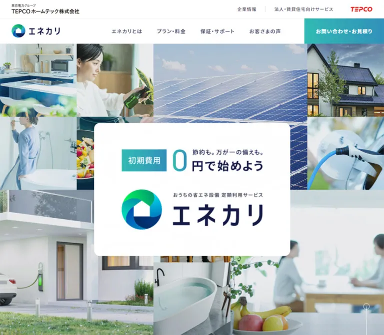
The strongest visual relationship is between a dense photographic opening and a spacious explanatory body. The hero places a white offer-and-brand panel over a mosaic of solar panels, homes, cooking, bathing, and electric mobility. Below it, pale backgrounds, broad white panels, blue illustrations, and generous vertical spacing make technical services approachable. Rounded gradient links repeat the same action language, while navy text and corporate identification provide continuity.
The mobile design is deliberately recomposed. The hero uses a different arrangement of photos, the initial navigation becomes a small white menu glyph over the image, horizontal card tracks retain partial next items, and the footer separates service branding from corporate information.
閉じる
エネカリ — Style Reference
Everyday home life arranged around solar energy, with calm navy typography and aqua-to-blue actions.
Original URL: https://www.tepco-ht.co.jp/enekari/ Final URL: https://www.tepco-ht.co.jp/enekari/ Theme: light content surfaces, a dark navy footer, and blue-green accents. Inspected: October 2, 2026. Supplied browser evidence was retrieved at 10:11:55.710 UTC / 19:11:55.710 JST. Viewports: 1440 × 1000 desktop and 390 × 844 mobile, in CSS pixels. Scope: the current service homepage: corporate and service navigation, photographic hero, recommended content, news, service explanation, plan selection, equipment lineup, support, contact options, and footer. Linked detail pages and contact forms were not inspected.
This is a service homepage within a larger website. It supports browsing, learning, comparing equipment and plans, reading announcements, and making an inquiry. Its structure should retain those distinct functions.
The strongest visual relationship is between a dense photographic opening and a spacious explanatory body. The hero places a white offer-and-brand panel over a mosaic of solar panels, homes, cooking, bathing, and electric mobility. Below it, pale backgrounds, broad white panels, blue illustrations, and generous vertical spacing make technical services approachable. Rounded gradient links repeat the same action language, while navy text and corporate identification provide continuity.
The mobile design is deliberately recomposed. The hero uses a different arrangement of photos, the initial navigation becomes a small white menu glyph over the image, horizontal card tracks retain partial next items, and the footer separates service branding from corporate information.
How to Read This Reference
- Measured means a value explicitly present in the supplied rendered DOM, computed-style record, or element rectangle. Coordinates are document coordinates unless stated otherwise.
- Visual estimate means a proportion, color, or treatment judged from the supplied original-page captures. These values are approximate and were not extracted with a pixel sampler.
- Recommended means an implementation choice for a new build. It is not evidence of the original source code.
- All custom-property names introduced below are implementation aliases. The only supplied source custom properties were Swiper-related configuration values.
- The three desktop captures show the opening, the service-to-merit boundary, and the bottom of the page. The two mobile captures show the opening and footer. Other sections have DOM measurements but less direct visual coverage.
- Some sampled parent nodes report
16pxtype and16pxline height even where the visible text or rectangle suggests different descendant treatment. Preserve that distinction; do not interpret every sampled parent value as the final glyph size.
Tokens — Colors
Default Palette
| Name | Value | Suggested token | Evidence and role |
|---|---|---|---|
| Navy ink | #3d4060 |
--color-ink |
Measured body text color and dark footer background |
| White | #ffffff |
--color-white |
Measured recommended-content card background and reversed link text; visually used for major panels |
| Body base | #eaecf0 |
--color-body-base |
Measured body background; not necessarily the visible surface of every section |
| Pale content wash | Approximately #f4f8f7 |
--color-canvas |
Visual estimate of the light surface around service, merit, and support |
| Aqua | Approximately #2db8b5 |
--color-aqua |
Visual estimate of the left side of gradient actions and the web-contact panel |
| Service blue | Approximately #3294b8 |
--color-blue |
Visual estimate of gradient endpoints and the telephone-contact panel |
| Diagram blue | Approximately #479fc6 |
--color-diagram |
Visual estimate of circular service benefits and section accents |
| Footer muted text | #a8aabe |
--color-footer-muted |
Measured desktop legal links and footer breadcrumb |
| Mobile legal text | #7b7c8d |
--color-legal |
Measured legal-link color on the light mobile footer |
| Mobile corporate links | #4e5062 |
--color-corporate |
Measured corporate utility-link color |
| Carousel control gray | #dfe5e8 |
--color-control-muted |
Measured background of one desktop carousel control; disabled semantics were not established |
| Carousel control pale | #f5f5f8 |
--color-control |
Measured background of the opposite desktop carousel control |
The green, cyan, and deep blue segments of the brand symbol belong to the artwork. They are not evidence of additional general-purpose UI colors. The small red corporate mark similarly remains localized to corporate identification.
Color Application
Use navy for most readable content, white for major content containers, and aqua-to-blue gradients for important navigation. A practical approximation is linear-gradient(90deg, #2db8b5, #3294b8); the original gradient stops and angle were not supplied.
Several gradient links have a transparent computed background on the sampled anchor. The screenshots nevertheless show filled gradients. The visible treatment may be supplied elsewhere in the component; its exact CSS layering is unverified.
Keep the source body base separate from the visible content wash. Applying #eaecf0 indiscriminately to every section would make the captured body appear heavier and grayer.
Tokens — Typography
Noto Sans JP — Japanese Interface and Content
Measured family: "Noto Sans JP", sans-serif.
This stack appears on body content, navigation, service headings, equipment headings, and footer links. Regular text uses weight 400; desktop service navigation uses 500; major headings and important links use 700.
The sampled body tracking is 1.28px, equivalent to 0.08em at a 16px font size. Major headings retain the same measured pixel tracking, rather than necessarily inheriting a proportional 0.08em value.
Poppins — Confirmed English Utility Label
Measured family: Poppins, sans-serif on VIEW ALL, with weight 600, size 16px, and tracking 0.64px.
The uppercase section labels visually complement this geometric English typography, but their individual computed font families were not included. Using Poppins for those labels is a reasonable adaptation, not a verified source-wide rule.
Barlow Condensed — Telephone Number
Measured family: "Barlow Condensed", sans-serif on the telephone link, with tracking 4.8px.
The number appears tall and narrow. Its link rectangle is 40px high on desktop and 36px high on mobile, while the sampled parent font size remains 16px. Treat approximately 40px and 36px as visual implementation targets, not directly measured font-size declarations.
Brand and Hero Lettering
The brand mark, wordmark, and central offer composition have artwork-like proportions. Their typography is not resolved by the supplied text-node measurements. Use authorized brand artwork or explicitly designed replacement lettering; do not assign an invented font to the logo or oversized zero.
Type Scale
| Role | Measured source-node values | Visual or implementation interpretation |
|---|---|---|
| Body parent | 16px, weight 400, line height 16px, tracking 1.28px |
Parent values do not explain all rendered paragraph leading |
| Desktop service navigation | 16px, weight 500, tracking 1.28px |
Visible labels appear approximately 14px; descendant sizing was not exposed |
| Main section heading, desktop | 32px, weight 700, line height 64px |
Strong but restrained Japanese heading scale |
| Main section heading, mobile | 24px, weight 700, line height 48px |
Same hierarchy with more deliberate wrapping |
| Equipment heading, desktop | 28px, weight 500, line height 56px |
Slightly lighter than major section headings |
| Equipment heading, mobile | 20px, weight 500, line height 40px |
Compact centered subsection heading |
| Standard pill label | 16px, weight 700, tracking 1.28px |
White label centered vertically in a 64px control |
VIEW ALL |
16px, weight 600, line height 16px, tracking 0.64px |
Small English utility action |
| Main paragraph appearance | Parent sampled at 16px / 16px |
Approximately 14px glyphs with roughly 32px line steps in the desktop service capture; estimate |
| Uppercase section eyebrow | Individual style not supplied | Approximately 24px on desktop; visual estimate |
| Header tagline and footer legal text | Parent often sampled at 16px |
Approximately 11–12px visible text; visual estimate |
| Contact number | Barlow Condensed; 4.8px tracking |
Approximately 40px desktop and 36px mobile; estimated font sizes |
Recommended reading treatment: use 16px body text with a line height near 2 when building accessible new content. This preserves the spacious rhythm without copying the sampled parent’s misleadingly tight line height. Expect different wrapping from the original’s unresolved descendant styling.
Tokens — Spacing & Shapes
Density: compact navigation, generous explanatory panels, and tightly joined horizontal card tracks.
There is no evidence of a single source spacing variable. The recurring dimensions support a practical scale of 16, 24, 32, 40, 48, 64, 80, 96, and 120px, with some component-specific exceptions.
Spacing Scale
| Use | Desktop | Mobile | Evidence |
|---|---|---|---|
| Main content width | 1040px |
342px |
Measured heading and content rectangles |
| Main side margin | 200px at 1440px |
24px at 390px |
Measured |
| Inner service/support text inset | 48px from panel edge |
32px from panel edge |
Derived from content and text coordinates |
| Recommended-content card padding | 32px |
30px 32px 44px |
Measured |
| Plan card padding | 50px 30px |
30px 15px 40px |
Measured |
| Service paragraph block gap | 34px |
34px |
Calculated from consecutive paragraph rectangles |
| Standard pill insets | Left 32px, right 20px |
Same | Measured |
| Service panel space after pill | 80px |
80px |
Calculated from pill bottom and section bottom |
| Major section separation | 120px |
120px |
Measured between news/service, service/merit, and merit/support section bounds |
| Equipment card horizontal gap | 32px |
38px |
Calculated from item rectangles |
| Equipment row gap | One row | 40px |
Calculated from mobile item rectangles |
The retained 120px section intervals on mobile are a notable part of the pacing. This is not a uniformly compressed phone layout.
Border Radius
| Element | Radius | Status |
|---|---|---|
| Standard action pill | 32px |
Measured |
| Contact form action | 36px |
Measured on a 74px-high control |
| Mobile menu contact action | 36px |
Measured on a 72px-high link in the DOM; open menu not visually tested |
| Recommended-content track ends | 16px outer corners |
Measured on the relevant links |
| Desktop white explanatory panels | Approximately 16px |
Visual estimate |
| Hero offer panel | Approximately 16px desktop, 8–10px mobile |
Visual estimate |
| Carousel arrow controls | 50% |
Measured, 48 × 48px |
| Arrow disc inside pills | Circular, approximately 32px | Visual estimate |
Round the outer container and the pill controls. Internal card divisions remain straight and orderly.
Layout Measurements
| Element | Desktop at 1440 × 1000 | Mobile at 390 × 844 |
|---|---|---|
| Document height | Approximately 5223px |
Approximately 7100px |
| Corporate utility header | 50px high |
Header rectangle has zero height |
| Main content start | y=121px |
y=0px |
| Desktop service navigation links | 70px high, beginning at y=51px |
Replaced visually by menu control |
| Initial menu glyph | Not used | 20 × 24px at x=346, y=20 |
| Hero offer panel | Approximately 542 × 368px, centered |
Approximately 310 × 212px, centered |
| Recommended-content card | 346.66 × 308.36px |
264 × 295.77px |
| Plan card | 260 × 398.33px |
230 × 332.33px |
| Service text column | 472px wide |
278px wide |
| Equipment item | 208px wide |
152px wide |
| Standard pill | 260 × 64px |
260 × 64px |
| Contact form action | 336 × 74px |
311 × 74px |
| Contact band | 344px high, two columns |
570px total, stacked |
| Dark brand-footer section | 212px high |
393px high |
Components
Corporate Utility Header
Role: identify the operator and provide access to corporate information.
A narrow white strip places the corporate identity at the left, corporate and business-service links toward the right, and a red corporate mark at the far right. Its measured height is 50px. A fine horizontal separation distinguishes it from the service navigation below.
The original-page corporate link explicitly names TEPCOホームテック株式会社 and points to the corporate homepage. The footer also carries © TEPCO HomeTech, Inc..
On mobile, this top utility strip no longer occupies document space. Corporate identity and utility links reappear in a dedicated light footer area.
Service Navigation
Role: persistent access to the service’s main destinations.
On desktop, arrange the colored symbol and wordmark at the left, a small tagline beside them, five service links across the right, and a rectangular gradient contact action flush to the right edge. The contact action is approximately 220.25 × 70px with square corners.
The service links are エネカリとは, プラン・料金, 保証・サポート, お客さまの声, and FAQ. The prominent action is お問い合わせ・お見積り.
In scrolled desktop captures, the white service navigation remains at the viewport top while the corporate utility strip is out of view. The exact sticky/fixed implementation is not supplied.
The initial mobile capture shows only a white menu glyph over the hero. In the mobile footer capture, a roughly 64px white bar contains the colored logo at the left and an aqua menu glyph at the right. This establishes two visual states, but not the exact scroll threshold or transition mechanism.
Mobile Menu Structure
Role: consolidate service and corporate navigation on a narrow screen.
The DOM contains service links arranged at two horizontal positions, followed by a 326 × 72px pill-shaped inquiry link. It also contains corporate information. These measurements indicate menu content, but the menu was not opened in the supplied captures.
Do not treat the DOM’s link rectangles as proof that the menu was visibly open. Its backdrop, entry direction, focus behavior, close state, and scroll locking remain unverified.
Photographic Hero
Role: connect energy equipment with ordinary, comfortable domestic life.
The desktop hero begins immediately below the two-tier header and fills approximately the remainder of the opening viewport. Its mosaic has an estimated five-column, four-row rhythm, with several images spanning multiple cells. Large solar-panel imagery occupies the upper middle; a modern home dominates the lower left; smaller domestic and equipment scenes fill the surrounding spaces.
Place a large white rounded panel in the middle of this visual field. The panel contains two clear horizontal groups:
- The initial-cost offer: a colored
初期費用badge, a large zero, and short Japanese offer copy. - The service descriptor and the colored symbol with the large
エネカリwordmark.
The panel is the visual anchor, not a conventional headline placed above an image. Its generous internal white space protects the brand from the collage’s density.
On mobile, use a different composition: solar panels occupy the upper-left two thirds, cooking and bathroom scenes form a narrow right column, a large house image occupies the lower-right area, and smaller domestic images remain at the lower left. The white offer panel stays centered across the image seams.
Hero Scroll Cue
Role: suggest continuation below the opening image.
A fine white vertical line and outlined circle sit near the lower-right edge. The supplied anchor points to #p-service-top__body__id and measures 17 × 89px in both viewports.
The cue’s navigation target is evidenced. Animated movement and smooth scrolling were not demonstrated.
Recommended-Content Carousel
Role: promote timely campaigns and useful related content.
The section begins with PICKUP and a Japanese subtitle. Desktop measurements show three equal visible slots within the 1040px content width, with additional items positioned beyond the visible area. Each card is about 346.66px wide, has a white background and 32px padding, and contributes to a joined horizontal surface with rounded outer ends.
Two 48px circular controls overlap the desktop track’s left and right edges. Their centers align approximately with the track’s vertical center.
On mobile, each card remains 264px wide and starts at the 24px content margin. The next card begins at x=288, creating a partial-next-item composition. The track does not become a conventional stacked card list.
Campaign text and destinations are available in the DOM. The exact card artwork and lower-level text styling are not fully visible in the attached captures, so they should not be reconstructed from assumptions.
News List
Role: provide current service and corporate announcements without competing with the hero.
Desktop uses a compact left heading area and a larger right list. The heading region is 126px wide; the list begins at x=374 and spans 866px. Three linked entries combine a date, category, and announcement title. Their measured top positions are 53px apart.
On mobile, the heading and VIEW ALL share the upper area, while the entries occupy the full 342px content width below. Each sampled entry is 86px high, with 40px between entries.
Preserve dates and categories as supporting information. The evidence does not establish every truncation or wrapping rule within the rows.
Service Explanation Panel
Role: explain the monthly equipment-use model and its benefits.
Use a broad white panel with rounded corners and a subtle diffuse shadow. On desktop, a blue domestic-energy illustration and benefit diagram occupy the left side; the right side contains the SERVICE eyebrow, a bold Japanese heading, four paragraphs, and an エネカリとは pill.
The copy column is 472px wide. The visible diagram uses three blue circles connected by a fine circular outline. The labels are 初期費用 0円, 毎月 定額払い, and 自然災害 補償. A larger illustration is partially visible above this diagram.
The surrounding pale background includes oversized, translucent organic shapes. These are supporting decoration rather than additional content cards.
Mobile text is inset to a 278px column. The final sampled paragraph ends near y=2846, while the CTA begins near y=3421. That approximately 574px interval includes unsampled content and spacing; it must not be collapsed into an ordinary paragraph gap. A stacked copy-and-illustration composition is the appropriate implementation direction, but exact illustration bounds were not supplied.
Standard Gradient Pill
Role: navigate from an overview to a relevant detail page.
The standard link is 260 × 64px with a 32px radius. Its anatomy is consistent:
- Horizontal aqua-to-blue fill.
- Bold white Japanese label, inset 32px from the left.
- Small white circular disc at the right, containing an aqua arrow.
- Right inset of 20px.
This treatment appears on service, plan, and support links. It remains 260px wide at the inspected mobile viewport rather than expanding to the entire screen.
Merit and Plan Track
Role: connect household goals with equipment plans.
A centered blue MERIT eyebrow sits above a bold navy Japanese heading. Below it is a joined white card track, with fine vertical divisions and colorful illustrations near the top of each card.
Desktop shows four 260px plan slots within the 1040px content width; a fifth plan is positioned beyond the right edge. Each linked card is approximately 398px high with 50px vertical and 30px horizontal padding.
Cards combine an illustration, a small PLAN label, and a short Japanese plan title. The visible illustration tops use blue houses, solar panels, yellow suns, people, and weather-related motifs.
Mobile cards become 230px wide with 30px top, 15px horizontal, and 40px bottom padding. The second begins at x=254, preserving a visible continuation cue. Do not force all five plans into small equal-width phone columns.
Equipment Lineup
Role: offer a direct equipment-based route alongside the goal-based plans.
The lineup has a centered heading and four linked categories: solar power, storage batteries, all-electric equipment, and V2H. Each combines an equipment identity with a short benefit statement.
Desktop uses four 208px-wide items with 32px gaps, inset 56px within the main content width. Mobile uses two columns of 152px with a 38px horizontal gap and a 40px row gap.
The grouping and dimensions are measured. Individual equipment-image files and their exact crops were not supplied.
Support Panel
Role: reassure visitors about repairs, disaster coverage, and service availability.
A wide white rounded panel contains the SUPPORT eyebrow, a bold heading, explanatory copy, and a 保証・サポート gradient pill. Desktop places the action to the right of the lower copy area; mobile stacks the content.
The mobile heading and paragraph use the same 278px inner width as the service panel. The observed mobile support action is left-aligned with that inner column at x=56, rather than centered across the overall 342px panel.
Keep two distinct source messages separate: the support copy describes 24-hour, 365-day support, while the final inquiry telephone block displays reception hours of 9:00 -18:00, excluding the year-end/New Year period.
Split Contact Band
Role: present web and telephone inquiry routes with equal prominence.
The desktop band spans the entire viewport in two equal columns. A cityscape photograph sits behind strongly tinted surfaces: aqua on the left and blue on the right. Each half uses centered white content.
The web half contains a bold heading and a large transparent, white-outlined pill with the familiar white arrow disc. The telephone half contains a bold heading, telephone icon, condensed number, and a smaller reception-hours line.
The desktop band is 344px high. On mobile it becomes a stacked 570px section; the form action measures 311 × 74px. The visible bottom of the mobile phone panel retains the cityscape texture.
The inquiry form is a link to a separate contact URL. The number is a real tel: link. Neither destination was activated during the supplied inspection.
Service and Corporate Footer
Role: close the page with brand continuity, social links, and corporate/legal information.
Desktop keeps the footer largely navy. A small service-home link sits above the white brand lockup. Instagram, X, and YouTube symbols align toward the right. Legal links and copyright occupy a lower row, using muted text.
A thin vertical line and rotated PAGE TOP label sit near the far-right edge. Its activation behavior was not tested.
Mobile separates the footer into clearly different zones:
- A navy service-home breadcrumb row.
- A large navy brand area with centered white identity, tagline, and social icons.
- A light corporate-information block with company identification and utility links.
- Legal links and a small white copyright strip.
The dark brand section is 393px high on mobile, compared with 212px on desktop. This is a structural reflow, not simply a smaller version of the desktop footer.
Tokens — Motion & Interaction
| Treatment | Supplied evidence | What can be concluded |
|---|---|---|
| Major section transitions | transform 0.5s ease-in 0.2s, opacity 0.5s ease-in 0.2s |
Transform and opacity transitions are defined; trigger, displacement, and initial state are unverified |
| Desktop corporate utility links | color 0.3s |
A color transition is defined; destination color was not supplied |
| Service navigation links | 0.3s transition |
Timing is known; detailed state changes were not exercised |
| Recommended-content links and desktop carousel controls | 0.3s transition |
Short feedback timing is defined |
| Standard gradient pills | 0.5s ease-in-out |
Slower action-state timing is defined; exact animated properties are unverified |
| Contact form pill | 0.5s ease-in-out |
Same timing family as internal detail links |
| One mobile menu-button instance | opacity 0.2s 0.2s |
Delayed opacity transition is defined; full menu choreography is unknown |
| Header while scrolling | Different top and lower-page captures | Persistent service navigation and a changed mobile header appearance are visible |
| Card tracks | Multiple offscreen item rectangles, desktop arrow buttons | Carousel structure is supported; dragging, looping, autoplay, and button results are unverified |
| Hero cue | Anchor target in DOM | A below-hero navigation target exists; smooth-scroll timing is unknown |
The supplied capture process waited for layout stability and finite motion. Perpetual animations were temporarily paused during readiness checks and then resumed. This process does not prove that the hero is animated, that carousels autoplay, or that every delayed effect was captured.
Do not turn the generic computed value transition: all into evidence of a visible animation. The supplied record does not provide a meaningful duration for those entries.
Recommended adaptation: retain quiet opacity and transform feedback, keep reveal distances modest, and ensure content remains visible without JavaScript. Provide reduced-motion behavior. The quick-start CSS uses observed durations but does not invent an automatic reveal sequence.
Surfaces
| Layer | Appearance | Use |
|---|---|---|
| Hero imagery | Edge-to-edge photographic mosaic | Establish household context and energy equipment |
| Hero offer | Opaque white rounded panel | Protect price and brand readability |
| Main canvas | Very pale cool wash with occasional organic decoration | Separate content panels without strong borders |
| Explanatory panels | White, broad corners, faint diffuse shadow | Service and support explanations |
| Horizontal card tracks | Joined white surface with straight internal divisions | Recommended content and plan selection |
| Primary actions | Aqua-to-blue gradient with white label and arrow disc | Detail navigation and inquiry |
| Contact band | Cityscape with saturated aqua/blue tint | Full-width closing inquiry routes |
| Brand footer | Solid #3d4060, white identity, muted links |
Service identity and social destinations |
| Mobile corporate footer | Pale neutral surface with darker utility text | Corporate identification and legal links |
The panel shadows are visible but their CSS values were not supplied. A low-opacity shadow such as 0 16px 48px rgb(61 64 96 / 5%) is a recommended approximation.
Imagery
Photography is bright, clean, and domestic. It combines large energy infrastructure details with small everyday actions: cooking, tending a plant, using a bathroom, spending time at home, and charging a vehicle. Modern white architecture and blue solar panels connect these scenes visually.
The collage uses hard image seams rather than floating photo cards. Larger images establish the main subject areas; smaller images provide domestic context. The central white panel crosses several seams and visually stabilizes the composition.
Photography has a cool, softened appearance. Any tint or exposure matching used in a rebuild should be subtle enough to preserve the distinction between panels, people, homes, and interiors. The exact original overlay or image-processing method is unknown.
Illustrations serve a different function: they simplify service benefits and plan choices. The visible graphics use friendly houses, solar roofs, people, yellow sunlight, and blue/green equipment forms. Keep these explanatory illustrations distinct from the photographic hero.
Observed Asset References
No original image or SVG file paths were included in the evidence. The following are visual references, not downloadable asset specifications.
| Asset group | Original-page evidence | Reuse guidance |
|---|---|---|
| Colored service identity | Header and central hero panel | Use authorized symbol and wordmark artwork |
| White service identity | Desktop and mobile footer | Preserve the reversed treatment and clear space |
| Desktop hero mosaic | Opening desktop capture | Maintain large solar and home regions with smaller domestic scenes |
| Mobile hero mosaic | Opening mobile capture | Art-direct separately; do not rely on a center crop of the desktop composition |
| Service illustration and benefit circles | Desktop service capture | Use coherent blue diagram artwork with readable labels |
| Plan illustrations | Upper portion of merit cards | Keep a consistent illustration family and scale |
| Contact cityscape | Desktop contact band and mobile phone-panel tail | Apply contrasting aqua/blue treatments while retaining a faint skyline |
| Social and navigation symbols | Footer, pills, hero cue, menu control | Preserve simple, consistent silhouettes; exact asset implementation is unknown |
Layout & Responsive Behavior
| System | Desktop observation | Mobile observation |
|---|---|---|
| Header | Corporate strip above service navigation | Initial image-overlay menu; white logo/menu bar visible after scrolling |
| Hero | Approximately five-column mosaic with wide central solar region | Approximately three-column mosaic with solar upper left and house lower right |
| Central hero panel | Large white panel, approximately 542px wide | Approximately 310px wide, preserving internal composition |
| Main content | Centered 1040px width | 342px width with 24px side margins |
| Recommended content | Three visible 346.66px slots | 264px cards with next-card visibility |
| News | Heading left, compact list right | Heading area above full-width entries |
| Service | Illustration left and 472px copy column right | Narrower copy and vertically expanded content |
| Plan selection | Four visible 260px slots | 230px cards continuing horizontally |
| Equipment | Four columns | Two columns |
| Support | Copy and right-side action | Stacked text and action |
| Contact | Equal side-by-side panels | Stacked panels |
| Footer | Horizontal brand/social arrangement and dark legal area | Centered brand/social area, separate light corporate/legal block |
The exact media-query breakpoint was not supplied. A breakpoint near 64rem is a recommended starting point, not a source value. Intermediate widths require testing because the desktop navigation contains many labels and a wide contact action.
The CSS below uses modern viewport units to approximate the opening composition. The original viewport-height formula is unknown. Preserve the observed result: the desktop hero begins below the 121px header stack, while the initial mobile hero begins at the top of the viewport.
Do not infer horizontal page overflow from offscreen carousel rectangles. Those measurements establish track content positions, not the clipping or overflow behavior of the overall document.
Do’s and Don’ts
Do
- Preserve the relationship between busy domestic photography and quiet white explanatory panels.
- Give solar panels and the modern home substantial space in the hero mosaic.
- Recompose the photo arrangement for mobile.
- Use
#3d4060consistently for primary content text and the brand footer. - Repeat the gradient pill with its white arrow disc across detail-navigation links.
- Keep recommended content, news, plan browsing, equipment browsing, and support as distinct sections.
- Retain partially visible next cards on narrow screens.
- Preserve the four-to-two-column equipment reflow.
- Keep corporate identity available when the top utility strip disappears on mobile.
- Distinguish support availability from inquiry-line reception hours.
- Keep broad section spacing, including the measured 120px major intervals.
Don’t
- Do not replace the mosaic with one generic solar-panel photograph.
- Do not crop the desktop hero indiscriminately to make the mobile version.
- Do not give every card a detached shadow and a large gap; the observed tracks read as joined surfaces.
- Do not flatten all colors into blue or introduce unrelated bright action colors.
- Do not treat transparent sampled anchor backgrounds as proof that gradient fills are absent.
- Do not assign the logo a guessed font family.
- Do not reduce mobile equipment labels or plan cards until every item fits in one row.
- Do not assume autoplay, swipe behavior, menu choreography, or smooth scrolling from static evidence.
- Do not remove corporate and legal content when simplifying the mobile footer.
- Do not copy
16px / 16pxparent typography into long-form reading text without checking the rendered result.
Recommended Implementation Additions
These are improvements for a new implementation, not verified features of the original:
- Give menu, carousel, social, and scroll-cue controls explicit accessible names.
- Enlarge the menu’s interactive area to at least 44 × 44px while retaining its approximately 20 × 24px visible glyph.
- Use
aria-expandedandaria-controlsfor the menu and implement keyboard focus management when an overlay is open. - Provide carousel navigation that works with keyboard input and without dragging. Keep important items reachable without autoplay.
- Test white text against every point of a gradient. Adjust the fill or text treatment where contrast is insufficient.
- Preserve offer information as accessible text even if the hero lockup is supplied as artwork.
- Use empty alternative text for decorative collage photos when equivalent meaning is already communicated nearby; provide meaningful alternatives for informative diagrams.
- Reserve image dimensions and use responsive image sources, especially for the large hero.
- Honor reduced motion and avoid hiding content permanently when a reveal script fails.
- Use visible focus indicators and account for the persistent header when navigating to section anchors.
Agent Prompt Guide
Quick Color Reference
- Primary text and dark footer: measured
#3d4060. - White cards and reversed text: measured
#ffffff. - Body base: measured
#eaecf0; the visible main wash is lighter. - Main wash approximation:
#f4f8f7. - Action-gradient approximation:
#2db8b5to#3294b8. - Footer muted text: measured
#a8aabe. - Card separation: fine pale rules and very soft shadows.
- Brand symbol colors: preserve the supplied artwork rather than substituting general UI swatches.
Overall Prompt
“Create a Japanese home-energy service homepage inspired by the current エネカリ page. Use a full-width mosaic of solar panels, modern homes, cooking, bathing, and electric mobility, with a centered white rounded panel holding an initial-cost offer and service identity. Below it, use a 1040px centered content width, a very pale cool canvas, navy #3d4060 Japanese typography, broad white explanation panels, blue household illustrations, and aqua-to-blue action pills with white circular arrow discs. Include recommended-content and plan tracks, a compact news section, a four-item equipment lineup, a support panel, a split web/telephone contact band, and a dark brand footer. At 390px, recompose the mosaic, use 24px content margins, retain partial next cards, change equipment to two columns, stack contact panels, and move corporate information into a separate light footer block. Treat unknown menu and carousel behavior as implementation decisions.”
Example Component Prompts
- Hero: “Build an edge-to-edge photographic mosaic with large solar and modern-home regions and smaller domestic scenes. Center an opaque white rounded offer panel over several image seams. Create a separate three-column mobile composition; keep the central panel about 310px wide at a 390px viewport.”
- Service panel: “Create a 1040px white rounded explanation panel with a blue home-energy illustration and three connected benefit circles on the left, and navy Japanese heading, spacious paragraphs, and a 260 × 64px gradient pill on the right. On mobile, retain 32px inner padding inside a 342px panel and stack the content.”
- Plan track: “Create a joined white horizontal track with four visible 260px plan cards on desktop. Each card has a friendly blue house illustration, a small PLAN label, a short Japanese title, and a fine vertical divider. Use 230px cards on mobile so part of the next item remains visible.”
- Contact band: “Create a full-width two-column contact area with a faint cityscape background, aqua tint on the web side, blue tint on the telephone side, centered white headings, a white-outlined form pill, and a tall condensed telephone number. Stack the panels on mobile.”
- Mobile footer: “Use a navy service breadcrumb and a generous centered white brand area with three social icons. Follow with a pale corporate-information block, separated legal links, and a narrow white copyright strip. Keep a fine vertical PAGE TOP control near the right edge.”
Quick Start
CSS Custom Properties
This is a recommended implementation scaffold, not recovered source CSS. It preserves measured content widths, card sizes, pill geometry, equipment gaps, and major spacing. Gradient colors, shadow, mosaic grid, breakpoint, and some reading typography are approximations.
The mosaic expects named image cells such as .tile--solar and .tile--home. Supply authorized images and a brand lockup; no original asset filenames were exposed. The mobile .is-at-hero state requires your own scroll-state logic. Native horizontal scrolling is used as a progressive enhancement, without assuming the original carousel behavior.
:root {
  /* Measured colors */
  --color-ink: #3d4060;
  --color-white: #fff;
  --color-body-base: #eaecf0;
  --color-footer-muted: #a8aabe;
  --color-legal: #7b7c8d;
  --color-control: #f5f5f8;

  /* Visual approximations */
  --color-canvas: #f4f8f7;
  --color-aqua: #2db8b5;
  --color-blue: #3294b8;
  --color-diagram: #479fc6;
  --action-fill: linear-gradient(90deg, var(--color-aqua), var(--color-blue));
  --panel-shadow: 0 16px 48px rgb(61 64 96 / 5%);

  /* Families evidenced on specific source elements */
  --font-body: 'Noto Sans JP', sans-serif;
  --font-utility: 'Poppins', sans-serif;
  --font-number: 'Barlow Condensed', sans-serif;

  --content-width: 1040px;
  --page-gutter: 24px;
  --section-space: 120px;
  --radius-panel: 16px;
  --radius-pill: 32px;
  --text-heading: 32px;
  --text-equipment-heading: 28px;
  --header-height: 121px;
  --motion-fast: 300ms;
  --motion-action: 500ms ease-in-out;
}

* { box-sizing: border-box; }
html { scroll-padding-top: 88px; }
body {
  margin: 0;
  color: var(--color-ink);
  background: var(--color-body-base);
  font-family: var(--font-body);
  font-size: 16px;
  line-height: 2;
  letter-spacing: 1.28px;
}
img { display: block; max-width: 100%; }
a { color: inherit; }
button { font: inherit; }
.page-body { background: var(--color-canvas); }
.container {
  width: min(var(--content-width), calc(100% - 2 * var(--page-gutter)));
  margin-inline: auto;
}
.section + .section { margin-top: var(--section-space); }
.section-title {
  margin: 0;
  font-size: var(--text-heading);
  font-weight: 700;
  line-height: 2;
}
.section-kicker {
  margin: 0 0 32px;
  color: var(--color-diagram);
  font-family: var(--font-utility);
  font-size: 24px;
  font-weight: 700;
  line-height: 1;
}
.prose p { margin: 0; }
.prose p + p { margin-top: 34px; }

/* Recommended sticky implementation for the observed desktop states */
.header-shell {
  position: sticky;
  top: -50px;
  z-index: 20;
  background: var(--color-white);
}
.corporate-strip {
  height: 50px;
  padding-inline: 32px;
  display: flex;
  align-items: center;
  justify-content: space-between;
}
.service-nav {
  min-height: 71px;
  padding-left: 32px;
  display: flex;
  align-items: center;
  border-top: 1px solid #eee;
}
.service-brand { flex: 0 0 auto; }
.nav-links {
  display: flex;
  align-items: center;
  gap: 40px;
  margin-left: auto;
}
.nav-links a {
  display: flex;
  align-items: center;
  min-height: 70px;
  font-weight: 500;
  text-decoration: none;
}
.header-contact {
  align-self: stretch;
  min-width: 220px;
  margin-left: 64px;
  padding-inline: 32px;
  display: grid;
  place-items: center;
  color: white;
  background: var(--action-fill);
  font-weight: 700;
  text-decoration: none;
}
.menu-toggle { display: none; }

/* Art-directed approximation of the captured image arrangement */
.hero {
  position: relative;
  isolation: isolate;
  display: grid;
  place-items: center;
  min-height: calc(100svh - var(--header-height));
}
.hero-mosaic {
  position: absolute;
  inset: 0;
  z-index: -1;
  display: grid;
  grid-template-columns: repeat(5, minmax(0, 1fr));
  grid-template-rows: repeat(4, minmax(0, 1fr));
  grid-template-areas:
    'kitchen plant solar solar roof'
    'bathroom cooking solar solar charger'
    'home home daily family family'
    'home home tub family family';
}
.hero-tile { min-width: 0; min-height: 0; overflow: hidden; }
.hero-tile img { width: 100%; height: 100%; object-fit: cover; }
.tile--kitchen { grid-area: kitchen; }
.tile--plant { grid-area: plant; }
.tile--solar { grid-area: solar; }
.tile--roof { grid-area: roof; }
.tile--bathroom { grid-area: bathroom; }
.tile--cooking { grid-area: cooking; }
.tile--charger { grid-area: charger; }
.tile--home { grid-area: home; }
.tile--daily { grid-area: daily; }
.tile--tub { grid-area: tub; }
.tile--family { grid-area: family; }
.hero-lockup {
  width: min(542px, calc(100% - 80px));
  aspect-ratio: 542 / 368;
  display: grid;
  place-items: center;
  padding: 13.8%;
  padding: min(5.3vw, 76px);
  border-radius: 16px;
  background: white;
}
.hero-lockup img { width: 100%; }
.hero-scroll {
  position: absolute;
  right: 40px;
  bottom: 0;
  width: 17px;
  height: 89px;
  color: white;
}

.panel {
  background: white;
  border-radius: var(--radius-panel);
  box-shadow: var(--panel-shadow);
}
.service-panel {
  display: grid;
  grid-template-columns: repeat(2, minmax(0, 1fr));
  grid-template-areas: 'visual copy' 'visual action';
  row-gap: 64px;
  padding: 80px 48px;
}
.service-visual { grid-area: visual; align-self: center; padding-right: 32px; }
.service-copy { grid-area: copy; min-width: 0; }
.service-action { grid-area: action; justify-self: start; }

.cta {
  display: inline-flex;
  align-items: center;
  justify-content: space-between;
  gap: 16px;
  width: 260px;
  max-width: 100%;
  min-height: 64px;
  padding: 12px 20px 12px 32px;
  border: 0;
  border-radius: var(--radius-pill);
  color: white;
  background: var(--action-fill);
  font-weight: 700;
  line-height: 1.5;
  text-decoration: none;
  transition: filter var(--motion-action);
}
.cta__icon {
  flex: 0 0 32px;
  width: 32px;
  height: 32px;
  display: grid;
  place-items: center;
  border-radius: 50%;
  color: var(--color-aqua);
  background: white;
  line-height: 1;
}

/* Native scrolling is a recommended fallback, not a source claim */
.pickup-track,
.plan-track {
  display: grid;
  grid-auto-flow: column;
  overflow-x: auto;
  scroll-snap-type: x mandatory;
  border-radius: 16px;
  background: white;
}
.pickup-track { grid-auto-columns: calc(100% / 3); }
.plan-track { grid-auto-columns: 25%; }
.pickup-card,
.plan-card {
  min-width: 0;
  color: var(--color-ink);
  border-right: 1px solid #eee;
  scroll-snap-align: start;
  text-decoration: none;
}
.pickup-card { padding: 32px; }
.plan-card { padding: 50px 30px; }
.rail-arrow {
  width: 48px;
  height: 48px;
  border: 0;
  border-radius: 50%;
  color: var(--color-ink);
  background: var(--color-control);
}
.equipment-heading {
  font-size: var(--text-equipment-heading);
  font-weight: 500;
  line-height: 2;
  text-align: center;
}
.equipment-grid {
  display: grid;
  grid-template-columns: repeat(4, minmax(0, 1fr));
  gap: 32px;
  padding-inline: 56px;
}
.support-panel {
  display: grid;
  grid-template-columns: minmax(0, 1fr) 260px;
  align-items: end;
  gap: 106px;
  padding: 80px 48px;
}

.contact-band { display: grid; grid-template-columns: 1fr 1fr; }
.contact-pane {
  min-height: 344px;
  display: grid;
  align-content: center;
  justify-items: center;
  gap: 40px;
  padding: 48px 24px;
  color: white;
  text-align: center;
  background-size: cover;
  background-position: center;
}
.contact-pane--web {
  background-color: var(--color-aqua);
  background-image:
    linear-gradient(rgb(45 184 181 / 90%), rgb(45 184 181 / 90%)),
    var(--contact-image, none);
}
.contact-pane--phone {
  background-color: var(--color-blue);
  background-image:
    linear-gradient(rgb(50 148 184 / 90%), rgb(50 148 184 / 90%)),
    var(--contact-image, none);
}
.cta--outline {
  width: min(336px, 100%);
  min-height: 74px;
  border: 1px solid white;
  border-radius: 36px;
  background: transparent;
}
.contact-number {
  font-family: var(--font-number);
  font-size: 40px;
  line-height: 1;
  letter-spacing: 4.8px;
  text-decoration: none;
}
.brand-footer {
  padding: 70px 0 60px;
  color: white;
  background: var(--color-ink);
}
.footer-brand-row {
  display: flex;
  align-items: center;
  justify-content: space-between;
  gap: 32px;
}
.social-links { display: flex; align-items: center; gap: 32px; }
.footer-legal {
  color: var(--color-footer-muted);
  background: var(--color-ink);
}
.mobile-corporate { display: none; }

/* Recommended feedback and keyboard treatment */
a:focus-visible,
button:focus-visible {
  outline: 3px solid currentColor;
  outline-offset: 5px;
}
@media (hover: hover) {
  .cta:hover { filter: brightness(.94); }
}

/* Recommended breakpoint; the original breakpoint was not supplied */
@media (max-width: 64rem) {
  :root {
    --text-heading: 24px;
    --text-equipment-heading: 20px;
    --header-height: 0px;
  }
  .header-shell { position: fixed; inset: 0 0 auto; }
  .corporate-strip,
  .nav-links,
  .header-contact { display: none; }
  .service-nav {
    min-height: 64px;
    padding-inline: 16px 12px;
    justify-content: space-between;
    border: 0;
    background: white;
  }
  .menu-toggle {
    display: grid;
    place-items: center;
    width: 44px;
    height: 44px;
    padding: 0;
    border: 0;
    color: var(--color-blue);
    background: transparent;
  }
  .header-shell.is-at-hero { background: transparent; }
  .is-at-hero .service-nav { background: transparent; }
  .is-at-hero .service-brand { visibility: hidden; }
  .is-at-hero .menu-toggle { color: white; }
  .hero { min-height: 100svh; }
  .hero-mosaic {
    grid-template-columns: repeat(3, minmax(0, 1fr));
    grid-template-areas:
      'solar solar cooking'
      'solar solar bathroom'
      'daily home home'
      'tub home home';
  }
  .tile--kitchen,
  .tile--plant,
  .tile--roof,
  .tile--charger,
  .tile--family { display: none; }
  .hero-lockup { padding: 11vw; border-radius: 9px; }
  .hero-scroll { right: 24px; }
  .section-kicker { font-size: 20px; margin-bottom: 28px; }
  .service-panel {
    grid-template-columns: minmax(0, 1fr);
    grid-template-areas: 'copy' 'visual' 'action';
    gap: 48px;
    padding: 48px 32px 80px;
  }
  .service-visual { padding: 0; }
  .service-action { justify-self: center; }
  .pickup-track { grid-auto-columns: min(264px, 100%); }
  .plan-track { grid-auto-columns: min(230px, 100%); }
  .pickup-card { padding: 30px 32px 44px; }
  .plan-card { padding: 30px 15px 40px; }
  .equipment-grid {
    grid-template-columns: repeat(2, minmax(0, 1fr));
    gap: 40px 38px;
    padding: 0;
  }
  .support-panel {
    grid-template-columns: minmax(0, 1fr);
    gap: 64px;
    padding: 48px 32px 80px;
  }
  .contact-band { grid-template-columns: minmax(0, 1fr); }
  .contact-pane { min-height: 285px; }
  .contact-number { font-size: 36px; }
  .brand-footer { min-height: 393px; padding: 24px 0 30px; }
  .footer-brand-row { flex-direction: column; text-align: center; }
  .mobile-corporate {
    display: block;
    padding: 48px 32px 24px;
    color: var(--color-ink);
    background: #f5f5f8;
  }
  .footer-legal {
    padding: 0 32px 40px;
    color: var(--color-legal);
    background: #f5f5f8;
  }
}

@media (prefers-reduced-motion: reduce) {
  .cta,
  .nav-links a,
  .rail-arrow { transition: none; }
  .pickup-track,
  .plan-track { scroll-behavior: auto; }
}
Use real anchors for navigation. A standard action can be authored as:
<a class="cta" href="/enekari/about/">
  <span>エネカリとは</span>
  <span class="cta__icon" aria-hidden="true">→</span>
</a>
This scaffold does not include menu JavaScript, carousel-button logic, original illustration assets, or source-exact section heights. Load the evidenced fonts separately if they are available to the implementation; the CSS retains sans-serif fallbacks.
Tailwind v4 Token Mapping
Optional aliases for a project already using Tailwind v4. This does not imply that the original website uses Tailwind. Define the custom properties above first.
@theme inline {
  --color-ink: #3d4060;
  --color-canvas: #f4f8f7;
  --color-aqua: #2db8b5;
  --color-service-blue: #3294b8;
  --color-footer-muted: #a8aabe;

  --font-japanese: 'Noto Sans JP', sans-serif;
  --font-utility: 'Poppins', sans-serif;
  --font-number: 'Barlow Condensed', sans-serif;

  --text-section: var(--text-heading);
  --text-equipment: var(--text-equipment-heading);
  --spacing-page-gutter: 24px;
  --spacing-section: 120px;
  --spacing-cta-width: 260px;
  --spacing-cta-height: 64px;
  --radius-panel: 16px;
  --radius-action: 32px;
}
Sources & Evidence
- Inspected original and final page: エネカリ. The supplied browser record reports HTTP 200 and no URL change.
- Capture record: October 2, 2026, retrieved at
2026-10-02T10:11:55.710Z; desktop viewport 1440 × 1000 and mobile viewport 390 × 844. Reported document heights are approximately 5223px and 7100px respectively. - Visual evidence: three desktop original-page captures and two mobile original-page captures. They support the hero composition, visible header states, service/merit boundary, contact band, and footer treatments.
- Rendered evidence: supplied page text, link destinations, computed typography and colors, element rectangles, padding, border radii, transitions, and two Swiper-related custom properties. These support the measured values in this reference.
- Operator evidence: the inspected page’s corporate identity link names
TEPCOホームテック株式会社and points to the corporate homepage; the footer includes© TEPCO HomeTech, Inc.. No production-credit claim is made. - Interaction scope: the supplied browser process traversed scroll positions and waited for layout and image stability. No menu-open, carousel-button, drag, hover, form-submission, telephone, or page-top activation result was supplied.
- Limitations: original asset URLs, full stylesheet rules, intermediate breakpoints, exact gradient stops, shadow values, and some descendant typography are unavailable. Linked pages were not inspected. Visual estimates and implementation recommendations are explicitly separated from measurements.
This reference describes the current page evidenced by the supplied captures and DOM record. It does not reconstruct an earlier version or treat untested behavior as verified.
# エネカリ — Style Reference

> Everyday home life arranged around solar energy, with calm navy typography and aqua-to-blue actions.

**Original URL:** [https://www.tepco-ht.co.jp/enekari/](https://www.tepco-ht.co.jp/enekari/)
**Final URL:** [https://www.tepco-ht.co.jp/enekari/](https://www.tepco-ht.co.jp/enekari/)
**Theme:** light content surfaces, a dark navy footer, and blue-green accents.
**Inspected:** October 2, 2026. Supplied browser evidence was retrieved at 10:11:55.710 UTC / 19:11:55.710 JST.
**Viewports:** 1440 × 1000 desktop and 390 × 844 mobile, in CSS pixels.
**Scope:** the current service homepage: corporate and service navigation, photographic hero, recommended content, news, service explanation, plan selection, equipment lineup, support, contact options, and footer. Linked detail pages and contact forms were not inspected.

This is a service homepage within a larger website. It supports browsing, learning, comparing equipment and plans, reading announcements, and making an inquiry. Its structure should retain those distinct functions.

The strongest visual relationship is between a dense photographic opening and a spacious explanatory body. The hero places a white offer-and-brand panel over a mosaic of solar panels, homes, cooking, bathing, and electric mobility. Below it, pale backgrounds, broad white panels, blue illustrations, and generous vertical spacing make technical services approachable. Rounded gradient links repeat the same action language, while navy text and corporate identification provide continuity.

The mobile design is deliberately recomposed. The hero uses a different arrangement of photos, the initial navigation becomes a small white menu glyph over the image, horizontal card tracks retain partial next items, and the footer separates service branding from corporate information.
閉じる
# エネカリ — Style Reference

> Everyday home life arranged around solar energy, with calm navy typography and aqua-to-blue actions.

**Original URL:** [https://www.tepco-ht.co.jp/enekari/](https://www.tepco-ht.co.jp/enekari/)
**Final URL:** [https://www.tepco-ht.co.jp/enekari/](https://www.tepco-ht.co.jp/enekari/)
**Theme:** light content surfaces, a dark navy footer, and blue-green accents.
**Inspected:** October 2, 2026. Supplied browser evidence was retrieved at 10:11:55.710 UTC / 19:11:55.710 JST.
**Viewports:** 1440 × 1000 desktop and 390 × 844 mobile, in CSS pixels.
**Scope:** the current service homepage: corporate and service navigation, photographic hero, recommended content, news, service explanation, plan selection, equipment lineup, support, contact options, and footer. Linked detail pages and contact forms were not inspected.

This is a service homepage within a larger website. It supports browsing, learning, comparing equipment and plans, reading announcements, and making an inquiry. Its structure should retain those distinct functions.

The strongest visual relationship is between a dense photographic opening and a spacious explanatory body. The hero places a white offer-and-brand panel over a mosaic of solar panels, homes, cooking, bathing, and electric mobility. Below it, pale backgrounds, broad white panels, blue illustrations, and generous vertical spacing make technical services approachable. Rounded gradient links repeat the same action language, while navy text and corporate identification provide continuity.

The mobile design is deliberately recomposed. The hero uses a different arrangement of photos, the initial navigation becomes a small white menu glyph over the image, horizontal card tracks retain partial next items, and the footer separates service branding from corporate information.

## How to Read This Reference

- **Measured** means a value explicitly present in the supplied rendered DOM, computed-style record, or element rectangle. Coordinates are document coordinates unless stated otherwise.
- **Visual estimate** means a proportion, color, or treatment judged from the supplied original-page captures. These values are approximate and were not extracted with a pixel sampler.
- **Recommended** means an implementation choice for a new build. It is not evidence of the original source code.
- All custom-property names introduced below are implementation aliases. The only supplied source custom properties were Swiper-related configuration values.
- The three desktop captures show the opening, the service-to-merit boundary, and the bottom of the page. The two mobile captures show the opening and footer. Other sections have DOM measurements but less direct visual coverage.
- Some sampled parent nodes report `16px` type and `16px` line height even where the visible text or rectangle suggests different descendant treatment. Preserve that distinction; do not interpret every sampled parent value as the final glyph size.

## Tokens — Colors

### Default Palette

| Name | Value | Suggested token | Evidence and role |
| --- | --- | --- | --- |
| Navy ink | `#3d4060` | `--color-ink` | Measured body text color and dark footer background |
| White | `#ffffff` | `--color-white` | Measured recommended-content card background and reversed link text; visually used for major panels |
| Body base | `#eaecf0` | `--color-body-base` | Measured body background; not necessarily the visible surface of every section |
| Pale content wash | Approximately `#f4f8f7` | `--color-canvas` | Visual estimate of the light surface around service, merit, and support |
| Aqua | Approximately `#2db8b5` | `--color-aqua` | Visual estimate of the left side of gradient actions and the web-contact panel |
| Service blue | Approximately `#3294b8` | `--color-blue` | Visual estimate of gradient endpoints and the telephone-contact panel |
| Diagram blue | Approximately `#479fc6` | `--color-diagram` | Visual estimate of circular service benefits and section accents |
| Footer muted text | `#a8aabe` | `--color-footer-muted` | Measured desktop legal links and footer breadcrumb |
| Mobile legal text | `#7b7c8d` | `--color-legal` | Measured legal-link color on the light mobile footer |
| Mobile corporate links | `#4e5062` | `--color-corporate` | Measured corporate utility-link color |
| Carousel control gray | `#dfe5e8` | `--color-control-muted` | Measured background of one desktop carousel control; disabled semantics were not established |
| Carousel control pale | `#f5f5f8` | `--color-control` | Measured background of the opposite desktop carousel control |

The green, cyan, and deep blue segments of the brand symbol belong to the artwork. They are not evidence of additional general-purpose UI colors. The small red corporate mark similarly remains localized to corporate identification.

### Color Application

Use navy for most readable content, white for major content containers, and aqua-to-blue gradients for important navigation. A practical approximation is `linear-gradient(90deg, #2db8b5, #3294b8)`; the original gradient stops and angle were not supplied.

Several gradient links have a transparent computed background on the sampled anchor. The screenshots nevertheless show filled gradients. The visible treatment may be supplied elsewhere in the component; its exact CSS layering is unverified.

Keep the source body base separate from the visible content wash. Applying `#eaecf0` indiscriminately to every section would make the captured body appear heavier and grayer.

## Tokens — Typography

### Noto Sans JP — Japanese Interface and Content

**Measured family:** `"Noto Sans JP", sans-serif`.

This stack appears on body content, navigation, service headings, equipment headings, and footer links. Regular text uses weight `400`; desktop service navigation uses `500`; major headings and important links use `700`.

The sampled body tracking is `1.28px`, equivalent to `0.08em` at a 16px font size. Major headings retain the same measured pixel tracking, rather than necessarily inheriting a proportional `0.08em` value.

### Poppins — Confirmed English Utility Label

**Measured family:** `Poppins, sans-serif` on `VIEW ALL`, with weight `600`, size `16px`, and tracking `0.64px`.

The uppercase section labels visually complement this geometric English typography, but their individual computed font families were not included. Using Poppins for those labels is a reasonable adaptation, not a verified source-wide rule.

### Barlow Condensed — Telephone Number

**Measured family:** `"Barlow Condensed", sans-serif` on the telephone link, with tracking `4.8px`.

The number appears tall and narrow. Its link rectangle is 40px high on desktop and 36px high on mobile, while the sampled parent font size remains 16px. Treat approximately 40px and 36px as visual implementation targets, not directly measured font-size declarations.

### Brand and Hero Lettering

The brand mark, wordmark, and central offer composition have artwork-like proportions. Their typography is not resolved by the supplied text-node measurements. Use authorized brand artwork or explicitly designed replacement lettering; do not assign an invented font to the logo or oversized zero.

### Type Scale

| Role | Measured source-node values | Visual or implementation interpretation |
| --- | --- | --- |
| Body parent | `16px`, weight `400`, line height `16px`, tracking `1.28px` | Parent values do not explain all rendered paragraph leading |
| Desktop service navigation | `16px`, weight `500`, tracking `1.28px` | Visible labels appear approximately 14px; descendant sizing was not exposed |
| Main section heading, desktop | `32px`, weight `700`, line height `64px` | Strong but restrained Japanese heading scale |
| Main section heading, mobile | `24px`, weight `700`, line height `48px` | Same hierarchy with more deliberate wrapping |
| Equipment heading, desktop | `28px`, weight `500`, line height `56px` | Slightly lighter than major section headings |
| Equipment heading, mobile | `20px`, weight `500`, line height `40px` | Compact centered subsection heading |
| Standard pill label | `16px`, weight `700`, tracking `1.28px` | White label centered vertically in a 64px control |
| `VIEW ALL` | `16px`, weight `600`, line height `16px`, tracking `0.64px` | Small English utility action |
| Main paragraph appearance | Parent sampled at `16px / 16px` | Approximately 14px glyphs with roughly 32px line steps in the desktop service capture; estimate |
| Uppercase section eyebrow | Individual style not supplied | Approximately 24px on desktop; visual estimate |
| Header tagline and footer legal text | Parent often sampled at `16px` | Approximately 11–12px visible text; visual estimate |
| Contact number | Barlow Condensed; `4.8px` tracking | Approximately 40px desktop and 36px mobile; estimated font sizes |

**Recommended reading treatment:** use 16px body text with a line height near `2` when building accessible new content. This preserves the spacious rhythm without copying the sampled parent’s misleadingly tight line height. Expect different wrapping from the original’s unresolved descendant styling.

## Tokens — Spacing & Shapes

**Density:** compact navigation, generous explanatory panels, and tightly joined horizontal card tracks.

There is no evidence of a single source spacing variable. The recurring dimensions support a practical scale of 16, 24, 32, 40, 48, 64, 80, 96, and 120px, with some component-specific exceptions.

### Spacing Scale

| Use | Desktop | Mobile | Evidence |
| --- | --- | --- | --- |
| Main content width | `1040px` | `342px` | Measured heading and content rectangles |
| Main side margin | `200px` at 1440px | `24px` at 390px | Measured |
| Inner service/support text inset | `48px` from panel edge | `32px` from panel edge | Derived from content and text coordinates |
| Recommended-content card padding | `32px` | `30px 32px 44px` | Measured |
| Plan card padding | `50px 30px` | `30px 15px 40px` | Measured |
| Service paragraph block gap | `34px` | `34px` | Calculated from consecutive paragraph rectangles |
| Standard pill insets | Left `32px`, right `20px` | Same | Measured |
| Service panel space after pill | `80px` | `80px` | Calculated from pill bottom and section bottom |
| Major section separation | `120px` | `120px` | Measured between news/service, service/merit, and merit/support section bounds |
| Equipment card horizontal gap | `32px` | `38px` | Calculated from item rectangles |
| Equipment row gap | One row | `40px` | Calculated from mobile item rectangles |

The retained 120px section intervals on mobile are a notable part of the pacing. This is not a uniformly compressed phone layout.

### Border Radius

| Element | Radius | Status |
| --- | --- | --- |
| Standard action pill | `32px` | Measured |
| Contact form action | `36px` | Measured on a 74px-high control |
| Mobile menu contact action | `36px` | Measured on a 72px-high link in the DOM; open menu not visually tested |
| Recommended-content track ends | `16px` outer corners | Measured on the relevant links |
| Desktop white explanatory panels | Approximately `16px` | Visual estimate |
| Hero offer panel | Approximately `16px` desktop, `8–10px` mobile | Visual estimate |
| Carousel arrow controls | `50%` | Measured, 48 × 48px |
| Arrow disc inside pills | Circular, approximately 32px | Visual estimate |

Round the outer container and the pill controls. Internal card divisions remain straight and orderly.

### Layout Measurements

| Element | Desktop at 1440 × 1000 | Mobile at 390 × 844 |
| --- | --- | --- |
| Document height | Approximately `5223px` | Approximately `7100px` |
| Corporate utility header | `50px` high | Header rectangle has zero height |
| Main content start | `y=121px` | `y=0px` |
| Desktop service navigation links | `70px` high, beginning at `y=51px` | Replaced visually by menu control |
| Initial menu glyph | Not used | `20 × 24px` at `x=346`, `y=20` |
| Hero offer panel | Approximately `542 × 368px`, centered | Approximately `310 × 212px`, centered |
| Recommended-content card | `346.66 × 308.36px` | `264 × 295.77px` |
| Plan card | `260 × 398.33px` | `230 × 332.33px` |
| Service text column | `472px` wide | `278px` wide |
| Equipment item | `208px` wide | `152px` wide |
| Standard pill | `260 × 64px` | `260 × 64px` |
| Contact form action | `336 × 74px` | `311 × 74px` |
| Contact band | `344px` high, two columns | `570px` total, stacked |
| Dark brand-footer section | `212px` high | `393px` high |

## Components

### Corporate Utility Header

**Role:** identify the operator and provide access to corporate information.

A narrow white strip places the corporate identity at the left, corporate and business-service links toward the right, and a red corporate mark at the far right. Its measured height is 50px. A fine horizontal separation distinguishes it from the service navigation below.

The original-page corporate link explicitly names `TEPCOホームテック株式会社` and points to the corporate homepage. The footer also carries `© TEPCO HomeTech, Inc.`.

On mobile, this top utility strip no longer occupies document space. Corporate identity and utility links reappear in a dedicated light footer area.

### Service Navigation

**Role:** persistent access to the service’s main destinations.

On desktop, arrange the colored symbol and wordmark at the left, a small tagline beside them, five service links across the right, and a rectangular gradient contact action flush to the right edge. The contact action is approximately 220.25 × 70px with square corners.

The service links are `エネカリとは`, `プラン・料金`, `保証・サポート`, `お客さまの声`, and `FAQ`. The prominent action is `お問い合わせ・お見積り`.

In scrolled desktop captures, the white service navigation remains at the viewport top while the corporate utility strip is out of view. The exact sticky/fixed implementation is not supplied.

The initial mobile capture shows only a white menu glyph over the hero. In the mobile footer capture, a roughly 64px white bar contains the colored logo at the left and an aqua menu glyph at the right. This establishes two visual states, but not the exact scroll threshold or transition mechanism.

### Mobile Menu Structure

**Role:** consolidate service and corporate navigation on a narrow screen.

The DOM contains service links arranged at two horizontal positions, followed by a 326 × 72px pill-shaped inquiry link. It also contains corporate information. These measurements indicate menu content, but the menu was not opened in the supplied captures.

Do not treat the DOM’s link rectangles as proof that the menu was visibly open. Its backdrop, entry direction, focus behavior, close state, and scroll locking remain unverified.

### Photographic Hero

**Role:** connect energy equipment with ordinary, comfortable domestic life.

The desktop hero begins immediately below the two-tier header and fills approximately the remainder of the opening viewport. Its mosaic has an estimated five-column, four-row rhythm, with several images spanning multiple cells. Large solar-panel imagery occupies the upper middle; a modern home dominates the lower left; smaller domestic and equipment scenes fill the surrounding spaces.

Place a large white rounded panel in the middle of this visual field. The panel contains two clear horizontal groups:

1. The initial-cost offer: a colored `初期費用` badge, a large zero, and short Japanese offer copy.
2. The service descriptor and the colored symbol with the large `エネカリ` wordmark.

The panel is the visual anchor, not a conventional headline placed above an image. Its generous internal white space protects the brand from the collage’s density.

On mobile, use a different composition: solar panels occupy the upper-left two thirds, cooking and bathroom scenes form a narrow right column, a large house image occupies the lower-right area, and smaller domestic images remain at the lower left. The white offer panel stays centered across the image seams.

### Hero Scroll Cue

**Role:** suggest continuation below the opening image.

A fine white vertical line and outlined circle sit near the lower-right edge. The supplied anchor points to `#p-service-top__body__id` and measures 17 × 89px in both viewports.

The cue’s navigation target is evidenced. Animated movement and smooth scrolling were not demonstrated.

### Recommended-Content Carousel

**Role:** promote timely campaigns and useful related content.

The section begins with `PICKUP` and a Japanese subtitle. Desktop measurements show three equal visible slots within the 1040px content width, with additional items positioned beyond the visible area. Each card is about 346.66px wide, has a white background and 32px padding, and contributes to a joined horizontal surface with rounded outer ends.

Two 48px circular controls overlap the desktop track’s left and right edges. Their centers align approximately with the track’s vertical center.

On mobile, each card remains 264px wide and starts at the 24px content margin. The next card begins at x=288, creating a partial-next-item composition. The track does not become a conventional stacked card list.

Campaign text and destinations are available in the DOM. The exact card artwork and lower-level text styling are not fully visible in the attached captures, so they should not be reconstructed from assumptions.

### News List

**Role:** provide current service and corporate announcements without competing with the hero.

Desktop uses a compact left heading area and a larger right list. The heading region is 126px wide; the list begins at x=374 and spans 866px. Three linked entries combine a date, category, and announcement title. Their measured top positions are 53px apart.

On mobile, the heading and `VIEW ALL` share the upper area, while the entries occupy the full 342px content width below. Each sampled entry is 86px high, with 40px between entries.

Preserve dates and categories as supporting information. The evidence does not establish every truncation or wrapping rule within the rows.

### Service Explanation Panel

**Role:** explain the monthly equipment-use model and its benefits.

Use a broad white panel with rounded corners and a subtle diffuse shadow. On desktop, a blue domestic-energy illustration and benefit diagram occupy the left side; the right side contains the `SERVICE` eyebrow, a bold Japanese heading, four paragraphs, and an `エネカリとは` pill.

The copy column is 472px wide. The visible diagram uses three blue circles connected by a fine circular outline. The labels are `初期費用 0円`, `毎月 定額払い`, and `自然災害 補償`. A larger illustration is partially visible above this diagram.

The surrounding pale background includes oversized, translucent organic shapes. These are supporting decoration rather than additional content cards.

Mobile text is inset to a 278px column. The final sampled paragraph ends near y=2846, while the CTA begins near y=3421. That approximately 574px interval includes unsampled content and spacing; it must not be collapsed into an ordinary paragraph gap. A stacked copy-and-illustration composition is the appropriate implementation direction, but exact illustration bounds were not supplied.

### Standard Gradient Pill

**Role:** navigate from an overview to a relevant detail page.

The standard link is 260 × 64px with a 32px radius. Its anatomy is consistent:

- Horizontal aqua-to-blue fill.
- Bold white Japanese label, inset 32px from the left.
- Small white circular disc at the right, containing an aqua arrow.
- Right inset of 20px.

This treatment appears on service, plan, and support links. It remains 260px wide at the inspected mobile viewport rather than expanding to the entire screen.

### Merit and Plan Track

**Role:** connect household goals with equipment plans.

A centered blue `MERIT` eyebrow sits above a bold navy Japanese heading. Below it is a joined white card track, with fine vertical divisions and colorful illustrations near the top of each card.

Desktop shows four 260px plan slots within the 1040px content width; a fifth plan is positioned beyond the right edge. Each linked card is approximately 398px high with 50px vertical and 30px horizontal padding.

Cards combine an illustration, a small `PLAN` label, and a short Japanese plan title. The visible illustration tops use blue houses, solar panels, yellow suns, people, and weather-related motifs.

Mobile cards become 230px wide with 30px top, 15px horizontal, and 40px bottom padding. The second begins at x=254, preserving a visible continuation cue. Do not force all five plans into small equal-width phone columns.

### Equipment Lineup

**Role:** offer a direct equipment-based route alongside the goal-based plans.

The lineup has a centered heading and four linked categories: solar power, storage batteries, all-electric equipment, and V2H. Each combines an equipment identity with a short benefit statement.

Desktop uses four 208px-wide items with 32px gaps, inset 56px within the main content width. Mobile uses two columns of 152px with a 38px horizontal gap and a 40px row gap.

The grouping and dimensions are measured. Individual equipment-image files and their exact crops were not supplied.

### Support Panel

**Role:** reassure visitors about repairs, disaster coverage, and service availability.

A wide white rounded panel contains the `SUPPORT` eyebrow, a bold heading, explanatory copy, and a `保証・サポート` gradient pill. Desktop places the action to the right of the lower copy area; mobile stacks the content.

The mobile heading and paragraph use the same 278px inner width as the service panel. The observed mobile support action is left-aligned with that inner column at x=56, rather than centered across the overall 342px panel.

Keep two distinct source messages separate: the support copy describes 24-hour, 365-day support, while the final inquiry telephone block displays reception hours of `9:00 -18:00`, excluding the year-end/New Year period.

### Split Contact Band

**Role:** present web and telephone inquiry routes with equal prominence.

The desktop band spans the entire viewport in two equal columns. A cityscape photograph sits behind strongly tinted surfaces: aqua on the left and blue on the right. Each half uses centered white content.

The web half contains a bold heading and a large transparent, white-outlined pill with the familiar white arrow disc. The telephone half contains a bold heading, telephone icon, condensed number, and a smaller reception-hours line.

The desktop band is 344px high. On mobile it becomes a stacked 570px section; the form action measures 311 × 74px. The visible bottom of the mobile phone panel retains the cityscape texture.

The inquiry form is a link to a separate contact URL. The number is a real `tel:` link. Neither destination was activated during the supplied inspection.

### Service and Corporate Footer

**Role:** close the page with brand continuity, social links, and corporate/legal information.

Desktop keeps the footer largely navy. A small service-home link sits above the white brand lockup. Instagram, X, and YouTube symbols align toward the right. Legal links and copyright occupy a lower row, using muted text.

A thin vertical line and rotated `PAGE TOP` label sit near the far-right edge. Its activation behavior was not tested.

Mobile separates the footer into clearly different zones:

1. A navy service-home breadcrumb row.
2. A large navy brand area with centered white identity, tagline, and social icons.
3. A light corporate-information block with company identification and utility links.
4. Legal links and a small white copyright strip.

The dark brand section is 393px high on mobile, compared with 212px on desktop. This is a structural reflow, not simply a smaller version of the desktop footer.

## Tokens — Motion & Interaction

| Treatment | Supplied evidence | What can be concluded |
| --- | --- | --- |
| Major section transitions | `transform 0.5s ease-in 0.2s, opacity 0.5s ease-in 0.2s` | Transform and opacity transitions are defined; trigger, displacement, and initial state are unverified |
| Desktop corporate utility links | `color 0.3s` | A color transition is defined; destination color was not supplied |
| Service navigation links | `0.3s` transition | Timing is known; detailed state changes were not exercised |
| Recommended-content links and desktop carousel controls | `0.3s` transition | Short feedback timing is defined |
| Standard gradient pills | `0.5s ease-in-out` | Slower action-state timing is defined; exact animated properties are unverified |
| Contact form pill | `0.5s ease-in-out` | Same timing family as internal detail links |
| One mobile menu-button instance | `opacity 0.2s 0.2s` | Delayed opacity transition is defined; full menu choreography is unknown |
| Header while scrolling | Different top and lower-page captures | Persistent service navigation and a changed mobile header appearance are visible |
| Card tracks | Multiple offscreen item rectangles, desktop arrow buttons | Carousel structure is supported; dragging, looping, autoplay, and button results are unverified |
| Hero cue | Anchor target in DOM | A below-hero navigation target exists; smooth-scroll timing is unknown |

The supplied capture process waited for layout stability and finite motion. Perpetual animations were temporarily paused during readiness checks and then resumed. This process does not prove that the hero is animated, that carousels autoplay, or that every delayed effect was captured.

Do not turn the generic computed value `transition: all` into evidence of a visible animation. The supplied record does not provide a meaningful duration for those entries.

**Recommended adaptation:** retain quiet opacity and transform feedback, keep reveal distances modest, and ensure content remains visible without JavaScript. Provide reduced-motion behavior. The quick-start CSS uses observed durations but does not invent an automatic reveal sequence.

## Surfaces

| Layer | Appearance | Use |
| --- | --- | --- |
| Hero imagery | Edge-to-edge photographic mosaic | Establish household context and energy equipment |
| Hero offer | Opaque white rounded panel | Protect price and brand readability |
| Main canvas | Very pale cool wash with occasional organic decoration | Separate content panels without strong borders |
| Explanatory panels | White, broad corners, faint diffuse shadow | Service and support explanations |
| Horizontal card tracks | Joined white surface with straight internal divisions | Recommended content and plan selection |
| Primary actions | Aqua-to-blue gradient with white label and arrow disc | Detail navigation and inquiry |
| Contact band | Cityscape with saturated aqua/blue tint | Full-width closing inquiry routes |
| Brand footer | Solid `#3d4060`, white identity, muted links | Service identity and social destinations |
| Mobile corporate footer | Pale neutral surface with darker utility text | Corporate identification and legal links |

The panel shadows are visible but their CSS values were not supplied. A low-opacity shadow such as `0 16px 48px rgb(61 64 96 / 5%)` is a recommended approximation.

## Imagery

Photography is bright, clean, and domestic. It combines large energy infrastructure details with small everyday actions: cooking, tending a plant, using a bathroom, spending time at home, and charging a vehicle. Modern white architecture and blue solar panels connect these scenes visually.

The collage uses hard image seams rather than floating photo cards. Larger images establish the main subject areas; smaller images provide domestic context. The central white panel crosses several seams and visually stabilizes the composition.

Photography has a cool, softened appearance. Any tint or exposure matching used in a rebuild should be subtle enough to preserve the distinction between panels, people, homes, and interiors. The exact original overlay or image-processing method is unknown.

Illustrations serve a different function: they simplify service benefits and plan choices. The visible graphics use friendly houses, solar roofs, people, yellow sunlight, and blue/green equipment forms. Keep these explanatory illustrations distinct from the photographic hero.

### Observed Asset References

No original image or SVG file paths were included in the evidence. The following are visual references, not downloadable asset specifications.

| Asset group | Original-page evidence | Reuse guidance |
| --- | --- | --- |
| Colored service identity | Header and central hero panel | Use authorized symbol and wordmark artwork |
| White service identity | Desktop and mobile footer | Preserve the reversed treatment and clear space |
| Desktop hero mosaic | Opening desktop capture | Maintain large solar and home regions with smaller domestic scenes |
| Mobile hero mosaic | Opening mobile capture | Art-direct separately; do not rely on a center crop of the desktop composition |
| Service illustration and benefit circles | Desktop service capture | Use coherent blue diagram artwork with readable labels |
| Plan illustrations | Upper portion of merit cards | Keep a consistent illustration family and scale |
| Contact cityscape | Desktop contact band and mobile phone-panel tail | Apply contrasting aqua/blue treatments while retaining a faint skyline |
| Social and navigation symbols | Footer, pills, hero cue, menu control | Preserve simple, consistent silhouettes; exact asset implementation is unknown |

## Layout & Responsive Behavior

| System | Desktop observation | Mobile observation |
| --- | --- | --- |
| Header | Corporate strip above service navigation | Initial image-overlay menu; white logo/menu bar visible after scrolling |
| Hero | Approximately five-column mosaic with wide central solar region | Approximately three-column mosaic with solar upper left and house lower right |
| Central hero panel | Large white panel, approximately 542px wide | Approximately 310px wide, preserving internal composition |
| Main content | Centered 1040px width | 342px width with 24px side margins |
| Recommended content | Three visible 346.66px slots | 264px cards with next-card visibility |
| News | Heading left, compact list right | Heading area above full-width entries |
| Service | Illustration left and 472px copy column right | Narrower copy and vertically expanded content |
| Plan selection | Four visible 260px slots | 230px cards continuing horizontally |
| Equipment | Four columns | Two columns |
| Support | Copy and right-side action | Stacked text and action |
| Contact | Equal side-by-side panels | Stacked panels |
| Footer | Horizontal brand/social arrangement and dark legal area | Centered brand/social area, separate light corporate/legal block |

The exact media-query breakpoint was not supplied. A breakpoint near `64rem` is a recommended starting point, not a source value. Intermediate widths require testing because the desktop navigation contains many labels and a wide contact action.

The CSS below uses modern viewport units to approximate the opening composition. The original viewport-height formula is unknown. Preserve the observed result: the desktop hero begins below the 121px header stack, while the initial mobile hero begins at the top of the viewport.

Do not infer horizontal page overflow from offscreen carousel rectangles. Those measurements establish track content positions, not the clipping or overflow behavior of the overall document.

## Do’s and Don’ts

### Do

- Preserve the relationship between busy domestic photography and quiet white explanatory panels.
- Give solar panels and the modern home substantial space in the hero mosaic.
- Recompose the photo arrangement for mobile.
- Use `#3d4060` consistently for primary content text and the brand footer.
- Repeat the gradient pill with its white arrow disc across detail-navigation links.
- Keep recommended content, news, plan browsing, equipment browsing, and support as distinct sections.
- Retain partially visible next cards on narrow screens.
- Preserve the four-to-two-column equipment reflow.
- Keep corporate identity available when the top utility strip disappears on mobile.
- Distinguish support availability from inquiry-line reception hours.
- Keep broad section spacing, including the measured 120px major intervals.

### Don’t

- Do not replace the mosaic with one generic solar-panel photograph.
- Do not crop the desktop hero indiscriminately to make the mobile version.
- Do not give every card a detached shadow and a large gap; the observed tracks read as joined surfaces.
- Do not flatten all colors into blue or introduce unrelated bright action colors.
- Do not treat transparent sampled anchor backgrounds as proof that gradient fills are absent.
- Do not assign the logo a guessed font family.
- Do not reduce mobile equipment labels or plan cards until every item fits in one row.
- Do not assume autoplay, swipe behavior, menu choreography, or smooth scrolling from static evidence.
- Do not remove corporate and legal content when simplifying the mobile footer.
- Do not copy `16px / 16px` parent typography into long-form reading text without checking the rendered result.

## Recommended Implementation Additions

These are improvements for a new implementation, not verified features of the original:

- Give menu, carousel, social, and scroll-cue controls explicit accessible names.
- Enlarge the menu’s interactive area to at least 44 × 44px while retaining its approximately 20 × 24px visible glyph.
- Use `aria-expanded` and `aria-controls` for the menu and implement keyboard focus management when an overlay is open.
- Provide carousel navigation that works with keyboard input and without dragging. Keep important items reachable without autoplay.
- Test white text against every point of a gradient. Adjust the fill or text treatment where contrast is insufficient.
- Preserve offer information as accessible text even if the hero lockup is supplied as artwork.
- Use empty alternative text for decorative collage photos when equivalent meaning is already communicated nearby; provide meaningful alternatives for informative diagrams.
- Reserve image dimensions and use responsive image sources, especially for the large hero.
- Honor reduced motion and avoid hiding content permanently when a reveal script fails.
- Use visible focus indicators and account for the persistent header when navigating to section anchors.

## Agent Prompt Guide

### Quick Color Reference

- Primary text and dark footer: measured `#3d4060`.
- White cards and reversed text: measured `#ffffff`.
- Body base: measured `#eaecf0`; the visible main wash is lighter.
- Main wash approximation: `#f4f8f7`.
- Action-gradient approximation: `#2db8b5` to `#3294b8`.
- Footer muted text: measured `#a8aabe`.
- Card separation: fine pale rules and very soft shadows.
- Brand symbol colors: preserve the supplied artwork rather than substituting general UI swatches.

### Overall Prompt

“Create a Japanese home-energy service homepage inspired by the current エネカリ page. Use a full-width mosaic of solar panels, modern homes, cooking, bathing, and electric mobility, with a centered white rounded panel holding an initial-cost offer and service identity. Below it, use a 1040px centered content width, a very pale cool canvas, navy `#3d4060` Japanese typography, broad white explanation panels, blue household illustrations, and aqua-to-blue action pills with white circular arrow discs. Include recommended-content and plan tracks, a compact news section, a four-item equipment lineup, a support panel, a split web/telephone contact band, and a dark brand footer. At 390px, recompose the mosaic, use 24px content margins, retain partial next cards, change equipment to two columns, stack contact panels, and move corporate information into a separate light footer block. Treat unknown menu and carousel behavior as implementation decisions.”

### Example Component Prompts

1. **Hero:** “Build an edge-to-edge photographic mosaic with large solar and modern-home regions and smaller domestic scenes. Center an opaque white rounded offer panel over several image seams. Create a separate three-column mobile composition; keep the central panel about 310px wide at a 390px viewport.”
2. **Service panel:** “Create a 1040px white rounded explanation panel with a blue home-energy illustration and three connected benefit circles on the left, and navy Japanese heading, spacious paragraphs, and a 260 × 64px gradient pill on the right. On mobile, retain 32px inner padding inside a 342px panel and stack the content.”
3. **Plan track:** “Create a joined white horizontal track with four visible 260px plan cards on desktop. Each card has a friendly blue house illustration, a small PLAN label, a short Japanese title, and a fine vertical divider. Use 230px cards on mobile so part of the next item remains visible.”
4. **Contact band:** “Create a full-width two-column contact area with a faint cityscape background, aqua tint on the web side, blue tint on the telephone side, centered white headings, a white-outlined form pill, and a tall condensed telephone number. Stack the panels on mobile.”
5. **Mobile footer:** “Use a navy service breadcrumb and a generous centered white brand area with three social icons. Follow with a pale corporate-information block, separated legal links, and a narrow white copyright strip. Keep a fine vertical PAGE TOP control near the right edge.”

## Quick Start

### CSS Custom Properties

This is a recommended implementation scaffold, not recovered source CSS. It preserves measured content widths, card sizes, pill geometry, equipment gaps, and major spacing. Gradient colors, shadow, mosaic grid, breakpoint, and some reading typography are approximations.

The mosaic expects named image cells such as `.tile--solar` and `.tile--home`. Supply authorized images and a brand lockup; no original asset filenames were exposed. The mobile `.is-at-hero` state requires your own scroll-state logic. Native horizontal scrolling is used as a progressive enhancement, without assuming the original carousel behavior.

```css
:root {
  /* Measured colors */
  --color-ink: #3d4060;
  --color-white: #fff;
  --color-body-base: #eaecf0;
  --color-footer-muted: #a8aabe;
  --color-legal: #7b7c8d;
  --color-control: #f5f5f8;

  /* Visual approximations */
  --color-canvas: #f4f8f7;
  --color-aqua: #2db8b5;
  --color-blue: #3294b8;
  --color-diagram: #479fc6;
  --action-fill: linear-gradient(90deg, var(--color-aqua), var(--color-blue));
  --panel-shadow: 0 16px 48px rgb(61 64 96 / 5%);

  /* Families evidenced on specific source elements */
  --font-body: 'Noto Sans JP', sans-serif;
  --font-utility: 'Poppins', sans-serif;
  --font-number: 'Barlow Condensed', sans-serif;

  --content-width: 1040px;
  --page-gutter: 24px;
  --section-space: 120px;
  --radius-panel: 16px;
  --radius-pill: 32px;
  --text-heading: 32px;
  --text-equipment-heading: 28px;
  --header-height: 121px;
  --motion-fast: 300ms;
  --motion-action: 500ms ease-in-out;
}

* { box-sizing: border-box; }
html { scroll-padding-top: 88px; }
body {
  margin: 0;
  color: var(--color-ink);
  background: var(--color-body-base);
  font-family: var(--font-body);
  font-size: 16px;
  line-height: 2;
  letter-spacing: 1.28px;
}
img { display: block; max-width: 100%; }
a { color: inherit; }
button { font: inherit; }
.page-body { background: var(--color-canvas); }
.container {
  width: min(var(--content-width), calc(100% - 2 * var(--page-gutter)));
  margin-inline: auto;
}
.section + .section { margin-top: var(--section-space); }
.section-title {
  margin: 0;
  font-size: var(--text-heading);
  font-weight: 700;
  line-height: 2;
}
.section-kicker {
  margin: 0 0 32px;
  color: var(--color-diagram);
  font-family: var(--font-utility);
  font-size: 24px;
  font-weight: 700;
  line-height: 1;
}
.prose p { margin: 0; }
.prose p + p { margin-top: 34px; }

/* Recommended sticky implementation for the observed desktop states */
.header-shell {
  position: sticky;
  top: -50px;
  z-index: 20;
  background: var(--color-white);
}
.corporate-strip {
  height: 50px;
  padding-inline: 32px;
  display: flex;
  align-items: center;
  justify-content: space-between;
}
.service-nav {
  min-height: 71px;
  padding-left: 32px;
  display: flex;
  align-items: center;
  border-top: 1px solid #eee;
}
.service-brand { flex: 0 0 auto; }
.nav-links {
  display: flex;
  align-items: center;
  gap: 40px;
  margin-left: auto;
}
.nav-links a {
  display: flex;
  align-items: center;
  min-height: 70px;
  font-weight: 500;
  text-decoration: none;
}
.header-contact {
  align-self: stretch;
  min-width: 220px;
  margin-left: 64px;
  padding-inline: 32px;
  display: grid;
  place-items: center;
  color: white;
  background: var(--action-fill);
  font-weight: 700;
  text-decoration: none;
}
.menu-toggle { display: none; }

/* Art-directed approximation of the captured image arrangement */
.hero {
  position: relative;
  isolation: isolate;
  display: grid;
  place-items: center;
  min-height: calc(100svh - var(--header-height));
}
.hero-mosaic {
  position: absolute;
  inset: 0;
  z-index: -1;
  display: grid;
  grid-template-columns: repeat(5, minmax(0, 1fr));
  grid-template-rows: repeat(4, minmax(0, 1fr));
  grid-template-areas:
    'kitchen plant solar solar roof'
    'bathroom cooking solar solar charger'
    'home home daily family family'
    'home home tub family family';
}
.hero-tile { min-width: 0; min-height: 0; overflow: hidden; }
.hero-tile img { width: 100%; height: 100%; object-fit: cover; }
.tile--kitchen { grid-area: kitchen; }
.tile--plant { grid-area: plant; }
.tile--solar { grid-area: solar; }
.tile--roof { grid-area: roof; }
.tile--bathroom { grid-area: bathroom; }
.tile--cooking { grid-area: cooking; }
.tile--charger { grid-area: charger; }
.tile--home { grid-area: home; }
.tile--daily { grid-area: daily; }
.tile--tub { grid-area: tub; }
.tile--family { grid-area: family; }
.hero-lockup {
  width: min(542px, calc(100% - 80px));
  aspect-ratio: 542 / 368;
  display: grid;
  place-items: center;
  padding: 13.8%;
  padding: min(5.3vw, 76px);
  border-radius: 16px;
  background: white;
}
.hero-lockup img { width: 100%; }
.hero-scroll {
  position: absolute;
  right: 40px;
  bottom: 0;
  width: 17px;
  height: 89px;
  color: white;
}

.panel {
  background: white;
  border-radius: var(--radius-panel);
  box-shadow: var(--panel-shadow);
}
.service-panel {
  display: grid;
  grid-template-columns: repeat(2, minmax(0, 1fr));
  grid-template-areas: 'visual copy' 'visual action';
  row-gap: 64px;
  padding: 80px 48px;
}
.service-visual { grid-area: visual; align-self: center; padding-right: 32px; }
.service-copy { grid-area: copy; min-width: 0; }
.service-action { grid-area: action; justify-self: start; }

.cta {
  display: inline-flex;
  align-items: center;
  justify-content: space-between;
  gap: 16px;
  width: 260px;
  max-width: 100%;
  min-height: 64px;
  padding: 12px 20px 12px 32px;
  border: 0;
  border-radius: var(--radius-pill);
  color: white;
  background: var(--action-fill);
  font-weight: 700;
  line-height: 1.5;
  text-decoration: none;
  transition: filter var(--motion-action);
}
.cta__icon {
  flex: 0 0 32px;
  width: 32px;
  height: 32px;
  display: grid;
  place-items: center;
  border-radius: 50%;
  color: var(--color-aqua);
  background: white;
  line-height: 1;
}

/* Native scrolling is a recommended fallback, not a source claim */
.pickup-track,
.plan-track {
  display: grid;
  grid-auto-flow: column;
  overflow-x: auto;
  scroll-snap-type: x mandatory;
  border-radius: 16px;
  background: white;
}
.pickup-track { grid-auto-columns: calc(100% / 3); }
.plan-track { grid-auto-columns: 25%; }
.pickup-card,
.plan-card {
  min-width: 0;
  color: var(--color-ink);
  border-right: 1px solid #eee;
  scroll-snap-align: start;
  text-decoration: none;
}
.pickup-card { padding: 32px; }
.plan-card { padding: 50px 30px; }
.rail-arrow {
  width: 48px;
  height: 48px;
  border: 0;
  border-radius: 50%;
  color: var(--color-ink);
  background: var(--color-control);
}
.equipment-heading {
  font-size: var(--text-equipment-heading);
  font-weight: 500;
  line-height: 2;
  text-align: center;
}
.equipment-grid {
  display: grid;
  grid-template-columns: repeat(4, minmax(0, 1fr));
  gap: 32px;
  padding-inline: 56px;
}
.support-panel {
  display: grid;
  grid-template-columns: minmax(0, 1fr) 260px;
  align-items: end;
  gap: 106px;
  padding: 80px 48px;
}

.contact-band { display: grid; grid-template-columns: 1fr 1fr; }
.contact-pane {
  min-height: 344px;
  display: grid;
  align-content: center;
  justify-items: center;
  gap: 40px;
  padding: 48px 24px;
  color: white;
  text-align: center;
  background-size: cover;
  background-position: center;
}
.contact-pane--web {
  background-color: var(--color-aqua);
  background-image:
    linear-gradient(rgb(45 184 181 / 90%), rgb(45 184 181 / 90%)),
    var(--contact-image, none);
}
.contact-pane--phone {
  background-color: var(--color-blue);
  background-image:
    linear-gradient(rgb(50 148 184 / 90%), rgb(50 148 184 / 90%)),
    var(--contact-image, none);
}
.cta--outline {
  width: min(336px, 100%);
  min-height: 74px;
  border: 1px solid white;
  border-radius: 36px;
  background: transparent;
}
.contact-number {
  font-family: var(--font-number);
  font-size: 40px;
  line-height: 1;
  letter-spacing: 4.8px;
  text-decoration: none;
}
.brand-footer {
  padding: 70px 0 60px;
  color: white;
  background: var(--color-ink);
}
.footer-brand-row {
  display: flex;
  align-items: center;
  justify-content: space-between;
  gap: 32px;
}
.social-links { display: flex; align-items: center; gap: 32px; }
.footer-legal {
  color: var(--color-footer-muted);
  background: var(--color-ink);
}
.mobile-corporate { display: none; }

/* Recommended feedback and keyboard treatment */
a:focus-visible,
button:focus-visible {
  outline: 3px solid currentColor;
  outline-offset: 5px;
}
@media (hover: hover) {
  .cta:hover { filter: brightness(.94); }
}

/* Recommended breakpoint; the original breakpoint was not supplied */
@media (max-width: 64rem) {
  :root {
    --text-heading: 24px;
    --text-equipment-heading: 20px;
    --header-height: 0px;
  }
  .header-shell { position: fixed; inset: 0 0 auto; }
  .corporate-strip,
  .nav-links,
  .header-contact { display: none; }
  .service-nav {
    min-height: 64px;
    padding-inline: 16px 12px;
    justify-content: space-between;
    border: 0;
    background: white;
  }
  .menu-toggle {
    display: grid;
    place-items: center;
    width: 44px;
    height: 44px;
    padding: 0;
    border: 0;
    color: var(--color-blue);
    background: transparent;
  }
  .header-shell.is-at-hero { background: transparent; }
  .is-at-hero .service-nav { background: transparent; }
  .is-at-hero .service-brand { visibility: hidden; }
  .is-at-hero .menu-toggle { color: white; }
  .hero { min-height: 100svh; }
  .hero-mosaic {
    grid-template-columns: repeat(3, minmax(0, 1fr));
    grid-template-areas:
      'solar solar cooking'
      'solar solar bathroom'
      'daily home home'
      'tub home home';
  }
  .tile--kitchen,
  .tile--plant,
  .tile--roof,
  .tile--charger,
  .tile--family { display: none; }
  .hero-lockup { padding: 11vw; border-radius: 9px; }
  .hero-scroll { right: 24px; }
  .section-kicker { font-size: 20px; margin-bottom: 28px; }
  .service-panel {
    grid-template-columns: minmax(0, 1fr);
    grid-template-areas: 'copy' 'visual' 'action';
    gap: 48px;
    padding: 48px 32px 80px;
  }
  .service-visual { padding: 0; }
  .service-action { justify-self: center; }
  .pickup-track { grid-auto-columns: min(264px, 100%); }
  .plan-track { grid-auto-columns: min(230px, 100%); }
  .pickup-card { padding: 30px 32px 44px; }
  .plan-card { padding: 30px 15px 40px; }
  .equipment-grid {
    grid-template-columns: repeat(2, minmax(0, 1fr));
    gap: 40px 38px;
    padding: 0;
  }
  .support-panel {
    grid-template-columns: minmax(0, 1fr);
    gap: 64px;
    padding: 48px 32px 80px;
  }
  .contact-band { grid-template-columns: minmax(0, 1fr); }
  .contact-pane { min-height: 285px; }
  .contact-number { font-size: 36px; }
  .brand-footer { min-height: 393px; padding: 24px 0 30px; }
  .footer-brand-row { flex-direction: column; text-align: center; }
  .mobile-corporate {
    display: block;
    padding: 48px 32px 24px;
    color: var(--color-ink);
    background: #f5f5f8;
  }
  .footer-legal {
    padding: 0 32px 40px;
    color: var(--color-legal);
    background: #f5f5f8;
  }
}

@media (prefers-reduced-motion: reduce) {
  .cta,
  .nav-links a,
  .rail-arrow { transition: none; }
  .pickup-track,
  .plan-track { scroll-behavior: auto; }
}
```

Use real anchors for navigation. A standard action can be authored as:

```html
<a class="cta" href="/enekari/about/">
  <span>エネカリとは</span>
  <span class="cta__icon" aria-hidden="true">→</span>
</a>
```

This scaffold does not include menu JavaScript, carousel-button logic, original illustration assets, or source-exact section heights. Load the evidenced fonts separately if they are available to the implementation; the CSS retains sans-serif fallbacks.

### Tailwind v4 Token Mapping

Optional aliases for a project already using Tailwind v4. This does not imply that the original website uses Tailwind. Define the custom properties above first.

```css
@theme inline {
  --color-ink: #3d4060;
  --color-canvas: #f4f8f7;
  --color-aqua: #2db8b5;
  --color-service-blue: #3294b8;
  --color-footer-muted: #a8aabe;

  --font-japanese: 'Noto Sans JP', sans-serif;
  --font-utility: 'Poppins', sans-serif;
  --font-number: 'Barlow Condensed', sans-serif;

  --text-section: var(--text-heading);
  --text-equipment: var(--text-equipment-heading);
  --spacing-page-gutter: 24px;
  --spacing-section: 120px;
  --spacing-cta-width: 260px;
  --spacing-cta-height: 64px;
  --radius-panel: 16px;
  --radius-action: 32px;
}
```

## Sources & Evidence

- **Inspected original and final page:** [エネカリ](https://www.tepco-ht.co.jp/enekari/). The supplied browser record reports HTTP 200 and no URL change.
- **Capture record:** October 2, 2026, retrieved at `2026-10-02T10:11:55.710Z`; desktop viewport 1440 × 1000 and mobile viewport 390 × 844. Reported document heights are approximately 5223px and 7100px respectively.
- **Visual evidence:** three desktop original-page captures and two mobile original-page captures. They support the hero composition, visible header states, service/merit boundary, contact band, and footer treatments.
- **Rendered evidence:** supplied page text, link destinations, computed typography and colors, element rectangles, padding, border radii, transitions, and two Swiper-related custom properties. These support the measured values in this reference.
- **Operator evidence:** the inspected page’s corporate identity link names `TEPCOホームテック株式会社` and points to [the corporate homepage](https://www.tepco-ht.co.jp/index.html); the footer includes `© TEPCO HomeTech, Inc.`. No production-credit claim is made.
- **Interaction scope:** the supplied browser process traversed scroll positions and waited for layout and image stability. No menu-open, carousel-button, drag, hover, form-submission, telephone, or page-top activation result was supplied.
- **Limitations:** original asset URLs, full stylesheet rules, intermediate breakpoints, exact gradient stops, shadow values, and some descendant typography are unavailable. Linked pages were not inspected. Visual estimates and implementation recommendations are explicitly separated from measurements.

This reference describes the current page evidenced by the supplied captures and DOM record. It does not reconstruct an earlier version or treat untested behavior as verified.
関連するデザイン
スタイルやページの種類、ジャンルが近いデザインを集めました。