プレビュー準備中デザインリファレンスを見る
日本のWebデザインを、AIの制作リファレンスに。
DESIGN REFERENCE
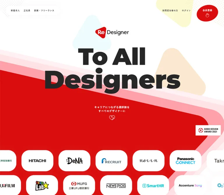
大胆な黒いタイポグラフィと赤い斜線状の背景が印象的なキャリアサービスサイト。淡い幾何学模様、丸みのあるカード、人物紹介を組み合わせ、モバイルでは縦方向の構成に展開しています。
オリジナルサイトを見るMonumental black lettering, a sweeping red ribbon, and approachable human detail for a designer career platform.
Website: redesigner.jp Original URL: https://redesigner.jp/ Final URL: https://redesigner.jp/ Theme: a white canvas with charcoal typography, large red graphic fields, and pastel accents. Inspected: September 23, 2026, at 02:32 JST; supplied retrieval timestamp September 22, 2026, at 17:32:46.197 UTC. Viewports: 1440 × 1000 desktop and 390 × 844 mobile, in CSS pixels. Scope: the current public homepage. Visual evidence includes the opening composition, a desktop feature/support transition, and desktop/mobile footer states. Rendered text and sampled computed styles additionally cover the service introduction, career concerns, adviser profiles, testimonials, usage steps, and FAQ. Destination pages and expanded interaction states were not inspected.
ReDesigner presents a career service with the confidence of a design brand. The opening uses two enormous lines of black English lettering over a white field crossed by red and pink diagonal graphics. Rounded triangular marks, pale dotted textures, and generous empty space soften the scale. Japanese copy stays compact and readable beneath the much louder display typography.
The page continues as a long service homepage with staggered proof cards, adviser profiles, customer stories, registration steps, and questions. Its visual rhythm alternates broad graphic gestures with small, precise information groups. Black registration capsules provide a consistent action treatment, while red carries the brand environment and the visible consent action. The footer repeats the opening diagonal, turning the page into one continuous composition.
Monumental black lettering, a sweeping red ribbon, and approachable human detail for a designer career platform.
Website: redesigner.jp Original URL: https://redesigner.jp/ Final URL: https://redesigner.jp/ Theme: a white canvas with charcoal typography, large red graphic fields, and pastel accents. Inspected: September 23, 2026, at 02:32 JST; supplied retrieval timestamp September 22, 2026, at 17:32:46.197 UTC. Viewports: 1440 × 1000 desktop and 390 × 844 mobile, in CSS pixels. Scope: the current public homepage. Visual evidence includes the opening composition, a desktop feature/support transition, and desktop/mobile footer states. Rendered text and sampled computed styles additionally cover the service introduction, career concerns, adviser profiles, testimonials, usage steps, and FAQ. Destination pages and expanded interaction states were not inspected.
ReDesigner presents a career service with the confidence of a design brand. The opening uses two enormous lines of black English lettering over a white field crossed by red and pink diagonal graphics. Rounded triangular marks, pale dotted textures, and generous empty space soften the scale. Japanese copy stays compact and readable beneath the much louder display typography.
The page continues as a long service homepage with staggered proof cards, adviser profiles, customer stories, registration steps, and questions. Its visual rhythm alternates broad graphic gestures with small, precise information groups. Black registration capsules provide a consistent action treatment, while red carries the brand environment and the visible consent action. The footer repeats the opening diagonal, turning the page into one continuous composition.
| Name | Value | Evidence | Suggested token | Role |
|---|---|---|---|---|
| Canvas White | #FFFFFF |
Measured on body and several surfaces | --rd-paper |
Page, feature surfaces, profile name strips, testimonial cards, consent panel |
| Charcoal | #262626 |
Measured | --rd-ink |
Main text and black registration capsules |
| Action Red | #D90D0D |
Measured on consent button and privacy link | --rd-action |
Explicit red controls and inline emphasis |
| Graphic Red | Approximately #E60000 |
Screenshot estimate | --rd-graphic-red |
Large hero and footer graphic fields |
| Ribbon Pink | Approximately #FFA1AB |
Screenshot estimate | --rd-ribbon-pink |
Strongest offset layer above the red ribbon |
| Pale Pink | Approximately #FFE2E6 |
Screenshot estimate | --rd-ribbon-light |
Middle ribbon layer |
| Blush White | Approximately #FFF0F3 |
Screenshot estimate | --rd-ribbon-pale |
Outermost ribbon layer against white |
| Mint | Approximately #DFF7EF |
Screenshot estimate | --rd-mint |
Small rounded triangular decoration in the desktop opening |
| Peach | Approximately #FBE8D1 |
Screenshot estimate | --rd-peach |
Cropped decorative shape near the desktop upper-left corner |
| Ice Blue | Approximately #EDFAFE |
Screenshot estimate | --rd-ice |
Large pale shape behind the mobile hero |
| Arrow Gray | Approximately #DCDEE0 |
Screenshot estimate | --rd-line-soft |
Hand-drawn directional arrows near the final registration action |
| Career Highlight | #FBFAD1 |
Measured | --rd-highlight |
Small employer-transition labels within testimonial cards |
| Heart Coral | Approximately #FF6861 |
Screenshot estimate | --rd-coral |
Small heart beside the closing statement |
The distinction between Action Red and Graphic Red is an evidence distinction, not proof that the site intentionally defines two brand reds. The button color is known from computed CSS; the large graphic fills were not sampled. Use an authorized original asset or verify its fill before treating the visual estimate as an exact production value.
White and charcoal establish the interface. Red occupies entire compositions rather than appearing only on buttons. Pink provides a stepped boundary between white and red; it is not a general card background. Pastels remain subordinate, appearing in isolated shapes and small information highlights.
Registration buttons in the current captures are charcoal with visibly white labels. Some sampled anchor containers report charcoal text as well as a charcoal background; those parent values do not describe the final label rendering. Preserve the visible white label rather than copying an incomplete parent style.
Only the default appearance was supplied. There is no evidence here of a user-selectable theme.
Observed stack: "Hiragino Kaku Gothic Pro", "ヒラギノ角ゴ Pro W3", "Hiragino Sans", 游ゴシック, "Yu Gothic", メイリオ, Meiryo, sans-serif.
The root is 16px / 24px; the body is 14px / 22.4px, weight 400. Larger Japanese statements use weight 700, deliberate line breaks, and additional tracking. Feature descriptions retain a comfortable 16px / 25.6px on both inspected widths.
The hierarchy is selective rather than uniformly scaled down. Introductory prose becomes smaller on mobile, while feature headings and feature-body text keep their desktop sizes.
Observed stack on sampled English elements: "Avenir Next", Montserrat, Verdana.
The decorative About title, adviser names, and footer group headings use weight 900. Adviser role labels use weight 500, while the copyright line uses weight 400.
The hero has very heavy geometric lettering, but its actual letter-bearing elements were not included in the computed-style sample. Its family and exact font size are therefore unverified. The observed English stack is a practical starting point for an adaptation, not a verified identification of the hero face.
The main H1 has no extracted text and corresponds visually to the ReDesigner wordmark. Its measured rectangle is 210 × 72.09px on desktop and 150 × 51.5px on mobile. Treat this as brand artwork rather than rebuilding the logo by typing the product name in a substitute font.
A Material Symbols Outlined font declaration is present in the rendered evidence. That establishes an available icon resource, but does not establish that every visible lock, hand, social icon, or hamburger uses that font.
Sizes below are measured unless explicitly marked as estimates. Entries describe the text-bearing element where that element was sampled.
| Role | Desktop | Mobile | Weight / tracking | Notes |
|---|---|---|---|---|
| Base body | 14px / 22.4px |
Same | 400, normal |
General inherited text |
| Header navigation link | 13px / 20.8px |
Login: 11px / 18.15px |
700, 1px |
Desktop jobs, employer, and login links |
| Hero English lettering | Approximately 150–160px |
Approximately 60–64px |
Visually very heavy | Screenshot estimate; actual child styles unavailable |
| Hero Japanese caption | 16px / 24px |
15px / 24px |
700, 1px |
Two centered lines |
| Large service statement | 40px / 60px |
22px / 33px |
700, 2px |
Applies to sampled mission/About statements |
| Mission supporting text | 20px / 37px |
14px / 26.6px |
700, 1px |
White text in the service introduction |
| About introduction | 20px / 32px |
14px / 22.4px |
400, 1px |
Introductory paragraph above feature cards |
| Feature heading | 20px / 32px |
Same | 700, normal |
Both feature descriptions |
| Feature body | 16px / 25.6px |
Same | 400, normal |
Strong mobile reading size |
| Outlined jobs action | 20px / 32px |
Same | 700, 1px |
すべての求人 |
| Support subheading | 18px / 28.8px |
16px / 25.6px |
700 |
Adviser-service explanation |
| Support paragraph | 16px / 25.6px |
13px / 20.8px |
400 |
Compact mobile service detail |
| Adviser name | 18px / 27px |
Same | English stack, 900 |
White strip with 2px padding |
| Adviser role | 12px / 19px |
Same | English stack, 500 |
Separate white strip |
| Testimonial occupation | 13px / 21px |
Same | 500, 1px |
Above the customer name |
| Testimonial name | 18px / 24px |
Same | 700, 1px |
Centered within the card |
| Employer transition label | 11px / 21px |
Same | 500, 1px |
Pale-yellow background |
| Decorative About title | 130px / 208px |
Same | English stack, 900 |
Computed color is transparent; final decorative treatment is not fully specified |
| Footer group title | 18px / 25px |
Same | English stack, 900, 0.5px |
About, Product, SNS |
| Footer links | 12px / 19.8px |
Same | 500, 1px |
Compact vertical navigation |
| Operator detail | 11px / 16.5px |
Same | 500, 1px |
Small footer information |
| Consent heading | 18px / 27px |
16px / 27px |
700 |
Privacy heading with red lock |
| Consent paragraph | 16px / 24px |
14px / 24px |
400 |
One line desktop, four lines mobile in the supplied state |
| Consent action | 14px / 22.4px |
Same | 700 |
White text on red |
Do not use the sampled 14px inherited H2 value as the visible size of every English section heading. Several headings contain separate visual children that were not individually sampled.
Layout character: expansive scenes, compact utility controls, large rounded content forms, and intentional horizontal offsets.
The evidence does not expose one universal spacing scale. A practical adaptation can use 8, 16, 20, 24, 32, 40, 60, 80px as recurring working values, while retaining measured component dimensions where appropriate.
| Element | Desktop | Mobile | Evidence |
|---|---|---|---|
| Header | 132px high; 36px horizontal padding |
70px high; padding 12px 16px 0 10px |
Measured |
| Main wordmark | 210 × 72.09px, top about 191.55px |
150 × 51.5px, top about 188.05px |
Measured |
| Header registration capsule | 144 × 48px |
103 × 40px |
Measured |
| Large registration / jobs action | 268 × 72px |
268 × 72px |
Measured on stable examples |
| Feature text width | 468px |
310px |
Measured |
| About introductory text | 836px wide |
350px wide |
Measured |
| Testimonial card | 360 × 640px |
350 × 656.77px |
Measured |
| Testimonial separation | 24px horizontally |
24px vertically |
Calculated from measured rectangles |
| Footer padding | 288px 0 140px |
78px 40px 80px |
Measured |
| Consent panel outer box | Approximately 1312 × 119px; 64px side clearance |
Approximately 342 × 252px; 24px side clearance |
Screenshot estimate |
| Consent panel bottom clearance | Approximately 30px |
Approximately 30px |
Screenshot estimate |
| Consent action | 180 × 52.39px |
294 × 52.39px |
Measured |
The first large registration link has slightly smaller rendered desktop bounds than its 268px grid track. This is a reminder that transformed rectangles should not automatically become layout tokens. The stable closing action provides the clearer 268 × 72px reference.
| Element | Value | Evidence |
|---|---|---|
| Registration and outlined jobs actions | 40px |
Measured |
| Consent action | 45px |
Measured |
| Testimonial cards | 160px |
Measured |
| Adviser portrait buttons | 50% |
Measured; rendered bounds are not square |
| Consent panel | Approximately 8px |
Screenshot estimate |
| Feature surface | Approximately 48px |
Screenshot estimate |
| Product screenshot frame | Approximately 24–30px |
Screenshot estimate |
| Large background shapes | Broad, custom rounded corners | Visual observation; exact path unavailable |
The major boundaries descend toward the right at approximately 13°. This estimate comes from roughly 330px of vertical change across a 1440px desktop frame and roughly 90px across a 390px mobile frame.
The opening uses multiple parallel layers above a large red field. Near the left edge, the visible layer depths are approximately 30px, 42px, and 56px. They remain substantial on mobile instead of shrinking in proportion to the viewport. The desktop red form also has a broad rounded turn toward the right; a plain rectangular skew reproduces only part of that silhouette.
Repeat the direction and layering at scene transitions. Keep text level while the surrounding graphic moves diagonally.
Role: access to jobs, content, employer information, login, and registration.
On desktop, a white capsule at the upper left contains the 求人 link and the コンテンツ button. Its visual size is approximately 186 × 62px, with generous internal padding and an extremely soft shadow. At the right, the employer and login links lead into a charcoal registration capsule.
The full header is transparent in the sampled styles. Its placement lets the white page and decorative shapes remain visible around the controls. In scrolled desktop captures, a smaller ReDesigner wordmark appears at the center while the left and right controls remain near their original positions.
On mobile, the left capsule becomes an icon-only menu button with a measured 63 × 52px rectangle. The initial state shows login and a 103 × 40px registration capsule at the right. In the supplied footer state, a small wordmark occupies the center and the login label is no longer visible. The exact scroll threshold and transition logic are unverified.
The content control is a button, not a supplied destination link. Its menu contents and open-state appearance were not captured.
Role: establish identity and the service promise before detailed information.
The opening has four principal layers:
To All and Designers.The wordmark remains close to y = 190px at both inspected viewports. The headline contracts dramatically on mobile while preserving the same two-line composition. The mobile caption starts around y = 550px, compared with y = 730px on desktop.
The hand-shaped control has a measured 36 × 30px button rectangle and sits 14px below the caption. Its purpose cannot be established from its empty extracted text alone; no click result was supplied.
The header registration action remains available above the composition. Avoid adding an unrelated central button that changes the opening hierarchy.
Role: explain the service and connect it to recognizable career questions.
The rendered text includes a repeated service promise, a statement that ReDesigner began as a Goodpatch service, and ten career concerns. These range from understanding employers and receiving informed career advice to clarifying strengths, market value, portfolio creation, and designer type.
The mission statement is measured at 40px / 60px on desktop and 22px / 33px on mobile. Supporting text is bold, white, and generously led. On mobile, both occupy a 350px column with 20px side margins.
The concerns section ends with a solution statement and a registration action. Its full decorative arrangement is not visible in the supplied screenshots. The content sequence is established; the precise arrangement of concern items is not. For a new implementation, preserve the progression from concerns to reassurance without inventing an unverified carousel or interactive assessment.
Role: demonstrate what is distinctive about the jobs and scouting experience.
A large Japanese statement introduces the section, followed by an explanatory paragraph. Two feature blocks describe designer-specific job information and personalized scouting.
The visible desktop scouting card is a broad white surface, approximately 870px wide and 300px tall, with large rounded corners and a very faint shadow. Text occupies the left portion; a compact product-interface screenshot sits at the right. The sampled text width is 468px, and the screenshot is visually about 304 × 216px.
The cards are staggered horizontally. The first text block begins at x = 206px; the second begins at x = 439px, a 233px shift. This offset is part of the composition, not a conventional equal-column card grid.
Each text group uses a 20px / 32px bold heading, an 8px gap, and 16px / 25.6px body copy. On mobile, the two text groups align at x = 40px with 310px widths. Their exact image placement is not visible in the supplied mobile frames; stacking the screenshot beneath the copy is a recommended adaptation, not a confirmed source rule.
A centered outlined すべての求人 link follows the cards. It measures 268 × 72px, with 16px padding, 40px radius, and a visually fine charcoal border. Its observed destination is /jobs.
Role: make the service feel personal and explain the support available.
On desktop, the large English Support heading sits to the left of a Japanese explanation. The explanatory column begins around x = 564px and is approximately 686px wide. Mobile places the heading above the explanation; the latter uses a 360px column with 15px side clearance.
Four adviser profiles are present: Misaki Miyamoto, Mao Misaka, Fumihisa Iwase, and Takayuki Morikawa. Each has a rounded button region and two white text strips: a heavy English name and a smaller Career Designer label.
The desktop button bounds are approximately 260.3 × 214.1px, placed at roughly 270px horizontal intervals. These are rendered bounds, not proof of the original image dimensions. The supplied screenshot shows only a small portion of the portrait row, so exact image crops remain unverified.
Mobile re-composes the profiles into an alternating sequence. Their left positions alternate between approximately 10px and 120px, while their top positions advance by approximately 207px. Name strips alternate to the opposite side, creating an overlapping, editorial rhythm. Preserve this relationship rather than reducing the section to four identical centered blocks.
Profile activation behavior was not supplied.
Role: connect the service to specific career outcomes and editorial stories.
The DOM establishes two large white capsule-shaped links. On desktop, they are 360 × 640px, separated by 24px; the section introduction sits to their left. On mobile, the introduction moves above two stacked 350px cards, each approximately 657px tall, again separated by 24px.
The 160px corner radius is unusually large and important to the component identity. Metadata is centered and layered by importance: employment type, occupation, customer name, then a pale-yellow employer-transition label. That small highlight uses 1px 10px padding and square corners.
The links point to two ReDesigner Magazine career interviews. The supplied evidence establishes card dimensions, text styling, and destinations, but does not fully show their imagery. Do not infer a carousel, video, or hover reveal from the card shape.
Role: explain the process and resolve common questions before registration.
The rendered sequence contains four usage steps: free registration, profile completion, scouting or employer introductions, and meetings or interviews. A following FAQ contains six questions about cost, differentiation, readiness to change jobs, other uses, regional jobs, and student eligibility.
The supplied element samples do not include the detailed step-item layout or question-row controls. Their exact iconography, borders, spacing, and answer states are therefore unverified. Treat these sections as content requirements, not as evidence for a particular accordion implementation.
For a new build, an ordered list for the four steps and accessible disclosure controls for the FAQ are reasonable recommendations.
Role: provide a clear final action after the service explanation.
The desktop closing statement reads Design to empower, in heavy charcoal type with a small coral heart. Its visual scale is approximately 60px; the text-bearing computed style was not supplied.
A centered charcoal 268 × 72px registration capsule sits below. Loose gray arrows point toward it from several directions. These marks look hand drawn, with rounded ends and imperfect geometry, adding warmth to an otherwise precise layout.
The red diagonal footer crosses the lower part of this composition. At the bottom mobile capture, most of the closing action has already scrolled above the frame; the visible fragment should not be interpreted as its full mobile layout.
Role: secondary navigation, related products, social access, and operator identification.
The footer places white content on a large red diagonal field. Its element background is sampled as transparent, so the red appearance belongs to another visual layer rather than a simple measured footer background declaration.
Desktop content is organized into three groups, with left edges near 359px, 548px, and 837px. About and Product contain compact vertical link lists. SNS includes two 20 × 20px social links, followed by the reversed wordmark and operator information. The navigation group spans roughly 721px overall.
On mobile, these groups stack within 40px horizontal padding. The link typography stays at 12px / 19.8px, rather than scaling down further. The About-to-Product heading separation is approximately 242px, reflecting the length of the first list and the following group gap.
The current page identifies the operator as Goodpatch Inc., displays its Japanese legal name, and links 運営会社 to https://goodpatch.com/jp. This establishes operation of the service; it does not identify the designer or developer of the current website.
Role: explain cookie use and provide the visible consent action.
This panel is a major part of the supplied first-visit appearance. It remains near the viewport bottom in opening, middle, and footer captures. The rest of the page is not visibly dimmed.
Desktop anatomy:
1312 × 119px, with 64px side margins and 30px bottom clearance.x = 89px, implying about 25px horizontal inset.18px / 27px heading with a small red lock, followed by an 8px gap and a 16px / 24px paragraph.180 × 52.39px red button at the right, with 45px radius and a small shadow.Mobile anatomy:
342 × 252px, inset 24px from each side and about 30px from the bottom.294px inner width.16px; body reduces to 14px while retaining 24px line height.The panel occupies approximately 12% of the desktop viewport height and 30% of the mobile viewport height. It visibly covers part of the opening caption on mobile and substantial footer content. Account for that obstruction when reviewing composition. Dismissal, persistence, and subsequent consent states were not tested.
The supplied styles expose several timings, but the screenshots show settled states. A declared transition is not proof of its trigger, start value, or final transform.
| Element | Supplied declaration | What is established |
|---|---|---|
| Desktop navigation links | 0.2s ease-out |
Short transition; affected property not specified in the supplied shorthand |
| Registration capsules | transform 0.3s |
Transform feedback is declared; scale or translation amount is unknown |
| Outlined jobs action | background-color 0.3s |
Background-color transition is declared |
| Hero caption and hand button | opacity 1s cubic-bezier(0.46, 0.4, 0.07, 1) 0.8s |
Delayed opacity transition |
| Mission statement | 0.5s cubic-bezier(0.46, 0.4, 0.07, 1) |
Half-second transition |
| Mission supporting copy | Same, with 0.3s delay |
Staggered timing relative to the statement |
| About introduction | 0.6s cubic-bezier(0.46, 0.4, 0.07, 1) |
Paragraph has an additional 0.1s delay |
| First testimonial link | 0.4s cubic-bezier(0.46, 0.4, 0.07, 1) 0.55s |
Delayed transition |
| Second testimonial link | Same, with 0.65s delay |
A further 0.1s stagger |
| Decorative About title on mobile | 1.2s cubic-bezier(0.46, 0.4, 0.07, 1) both |
Named animation present; keyframe geometry unavailable |
| Consent action | 0.2s ease-out |
Short transition; final feedback appearance unverified |
Most sampled elements report animation: none. Repeated generic transition: all entries without a supplied nonzero duration should not be treated as meaningful motion evidence.
For an adaptation, reuse the observed easing curve and restrained stagger where helpful. Keep content visible if reveal scripting is unavailable. Do not add parallax, continuous floating, or spring effects and describe them as source behavior.
| Layer | Appearance | Evidence and purpose |
|---|---|---|
| Page canvas | White, uninterrupted | Measured body background; preserves space around large graphics |
| Brand scene | Red with parallel pink layers | Visually established; large structural gesture |
| Decorative accents | Pale rounded forms and corner dots | Visual observation; low-contrast support for the brand scene |
| Navigation island | White capsule with very soft shadow | Screenshot observation; separates compact controls from the page |
| Feature surface | White on white, large radius, faint shadow | Screenshot observation; groups proof without creating a dense dashboard |
| Profile labels | Small white rectangular strips | Measured background and padding; readable over portrait regions |
| Testimonial surface | White, 160px radius |
Measured; distinctive tall capsule geometry |
| Career outcome label | Flat pale yellow, square corners | Measured; small informational emphasis |
| Consent panel | White, modest radius, broad shadow | Visually persistent foreground layer |
| Footer | White details over a red diagonal graphic | Screenshot observation; closes the visual loop |
Shadows are present but selective. They separate white surfaces and elevate the consent panel; they are not the main source of hierarchy. The supplied styles do not provide exact shadow recipes, so the Quick Start uses recommended approximations.
The brand language combines vector-like geometry with concrete service proof. Large red and pastel shapes supply identity; small interface screenshots explain the product; adviser imagery and customer stories supply human context.
The opening does not depend on a large stock photograph. Its impact comes from type, the logo, layered diagonal geometry, and scale. Preserve the relationship between those elements before adding more imagery.
Product screenshots should remain legible enough to communicate that they show real job and scouting interfaces. Preserve their aspect ratios and avoid replacing them with decorative browser mockups that were not observed. At the inspected desktop size, they function as compact proof images beside substantial explanatory copy.
Gray arrows and the small hand motif bring a more informal drawing style into the system. They should remain secondary to the typography and action labels.
| Asset category | Evidence | Availability |
|---|---|---|
| ReDesigner wordmark | Large opening version, smaller scrolled-header version, reversed footer version | Visible; asset URLs were not supplied |
| Hero/footer geometry | Red field, pink offset layers, rounded turns | Visible; exact SVG paths or image files were not supplied |
| Pastel shapes and dot textures | Desktop and mobile opening captures | Visible; source implementation unknown |
| Job/scouting interface images | Desktop feature-card capture | Visible; image URLs were not supplied |
| Adviser imagery | Partial screenshot coverage plus profile-button structure | Exact crops and source files unverified |
| Testimonial imagery | Story-card content and geometry in DOM evidence | Full visual treatment not shown in the supplied frames |
| Closing arrows and heart | Desktop footer-transition capture | Visible; original asset paths unknown |
| Material Symbols Outlined | Font declaration in rendered evidence | Observed resource: https://content.redesigner.jp/site-static/red-career-front/fonts/material-symbols-outlined.11f30d4a58823c8a.woff2 |
Use authorized original brand assets when available. The absence of asset URLs in the supplied evidence is not a reason to invent filenames or claim a particular illustration-production method.
The page is a long scrolling homepage: approximately 8669px tall at 1440px wide and 10506px tall at 390px wide in the supplied state. These are capture results, not fixed heights to encode in CSS.
| Relationship | Desktop observation | Mobile observation |
|---|---|---|
| Header | Left navigation capsule, right utility links and registration | Menu button, compact utility controls; centered wordmark visible in scrolled state |
| Main logo | 210px wide, near 192px from top |
150px wide, near 188px from top |
| Hero lettering | Monumental two-line composition | Same two lines, much smaller lettering |
| Ribbon | Broad diagonal with visible rounded turn | Same downward-right direction; large band thickness retained |
| Main statements | 40px type |
22px type with additional wrapping |
| Feature text | 468px columns with horizontal staggering |
310px columns sharing a 40px left inset |
| Support introduction | Heading and explanation beside each other | Heading above explanation |
| Adviser profiles | Four across | Alternating left/right vertical sequence |
| Testimonials | Two cards beside the section introduction | Introduction above two stacked cards |
| Footer | Three content groups across | Groups stacked within 40px side padding |
| Consent panel | Copy and action in one row | Copy above full-width action |
The mobile design preserves several large component dimensions. Main actions remain 268 × 72px; adviser button bounds remain approximately the same size; testimonial widths change only from 360px to 350px. Responsive behavior therefore depends heavily on re-composition rather than uniform scaling.
No source breakpoint was supplied. The 48rem breakpoint in the Quick Start is a recommendation for the demonstrated layout changes. Intermediate widths, landscape phones, safe-area behavior, and browser zoom were not captured.
16px / 25.6px on mobile.160px-radius testimonial cards and small square outcome labels.These are recommendations for a new implementation, not verified features of the original:
details elements and clear expanded states.#FFFFFF.#262626.#D90D0D.#E60000; verify against its asset.#FFA1AB, #FFE2E6, and #FFF0F3.#FBFAD1.“Create a responsive designer career-platform homepage inspired by the current ReDesigner composition. Use a white canvas, charcoal text, very heavy two-line English hero lettering, and a centered brand asset. Sweep a large red form diagonally downward to the right behind the headline, with three substantial pale-pink offset layers. Keep Japanese explanatory copy compact and readable. Use transparent persistent navigation with a small white navigation capsule and black rounded registration actions. Continue into horizontally staggered white proof cards, adviser profiles, tall capsule-shaped customer stories, usage steps, questions, and a red diagonal footer. On mobile, retain large action sizes, stack the story cards, and alternate adviser profiles left and right. Treat decorative colors and hero font metrics as estimates until original assets are available.”
This is a recommended implementation scaffold, not recovered source CSS. It combines measured interface values with clearly approximate decoration. The hero letterforms, rounded ribbon path, logo, dots, arrows, and imagery require appropriate assets for close visual correspondence. The skewed background below approximates the diagonal relationship rather than the full original silhouette.
:root {
  /* Measured interface colors */
  --rd-paper: #ffffff;
  --rd-ink: #262626;
  --rd-action: #d90d0d;
  --rd-highlight: #fbfad1;

  /* Visual estimates: verify against original artwork */
  --rd-graphic-red: #e60000;
  --rd-ribbon-pink: #ffa1ab;
  --rd-ribbon-light: #ffe2e6;
  --rd-ribbon-pale: #fff0f3;
  --rd-mint: #dff7ef;
  --rd-peach: #fbe8d1;
  --rd-ice: #edfafe;
  --rd-line-soft: #dcdee0;

  /* Observed font stacks; hero face remains unverified */
  --rd-font-body: 'Hiragino Kaku Gothic Pro',
    'ヒラギノ角ゴ Pro W3', 'Hiragino Sans', '游ゴシック',
    'Yu Gothic', 'メイリオ', Meiryo, sans-serif;
  --rd-font-display: 'Avenir Next', Montserrat, Verdana, sans-serif;

  --rd-radius-action: 40px;
  --rd-radius-story: 160px;
  --rd-radius-panel: 8px;
  --rd-radius-feature: 48px;
  --rd-action-width: 268px;
  --rd-action-height: 72px;
  --rd-ease: cubic-bezier(0.46, 0.4, 0.07, 1);

  /* Recommended shadow approximations */
  --rd-shadow-feature: 0 10px 40px rgb(0 0 0 / 0.035);
  --rd-shadow-panel: 0 16px 64px rgb(0 0 0 / 0.16);
  --rd-shadow-button: 0 2px 6px rgb(0 0 0 / 0.2);
}

* { box-sizing: border-box; }
html { font-size: 16px; }
body { margin: 0; }
button, input { font: inherit; }

.rd-page {
  overflow-x: clip;
  color: var(--rd-ink);
  background: var(--rd-paper);
  font: 400 14px / 1.6 var(--rd-font-body);
}

.rd-header {
  position: fixed;
  z-index: 30;
  inset: 0 0 auto;
  display: flex;
  align-items: center;
  justify-content: space-between;
  height: 132px;
  padding-inline: 36px;
}

.rd-header__nav {
  display: flex;
  align-items: center;
  gap: 24px;
  padding: 20px 32px;
  border-radius: 999px;
  background: var(--rd-paper);
  box-shadow: 0 4px 32px rgb(0 0 0 / 0.025);
}

.rd-header__actions {
  display: flex;
  align-items: center;
  gap: 24px;
  margin-left: auto;
}

.rd-header a,
.rd-header__content {
  color: var(--rd-ink);
  text-decoration: none;
  font-size: 13px;
  font-weight: 700;
  letter-spacing: 1px;
}

.rd-header__content {
  border: 0;
  padding: 0;
  background: transparent;
  cursor: pointer;
}

.rd-header__brand {
  position: absolute;
  left: 50%;
  width: 140px;
  transform: translateX(-50%);
  visibility: hidden;
}

/* State hook for an implementation-defined scroll threshold */
.rd-header[data-scrolled='true'] .rd-header__brand {
  visibility: visible;
}

.rd-header__menu { display: none; }

.rd-pill {
  display: inline-grid;
  place-items: center;
  width: min(var(--rd-action-width), 100%);
  min-height: var(--rd-action-height);
  padding: 16px;
  border: 0;
  border-radius: var(--rd-radius-action);
  color: var(--rd-paper);
  background: var(--rd-ink);
  font: 700 20px / 32px var(--rd-font-body);
  letter-spacing: 1px;
  text-decoration: none;
  cursor: pointer;
  transition: transform 0.3s;
}

.rd-header .rd-pill {
  width: 144px;
  min-height: 48px;
  padding: 0;
  margin-left: 12px;
  color: var(--rd-paper);
  font-size: 13px;
}

.rd-pill--outline {
  border: 1px solid var(--rd-ink);
  color: var(--rd-ink);
  background: transparent;
  transition: background-color 0.3s;
}

.rd-hero {
  position: relative;
  isolation: isolate;
  overflow: hidden;
  min-height: 1000px;
  padding: 192px 20px 176px;
  text-align: center;
}

/* Approximate graphic only; use an authored path for fidelity */
.rd-hero::before {
  content: '';
  position: absolute;
  z-index: -1;
  top: 435px;
  left: 0;
  width: 100%;
  height: 1100px;
  border-radius: 0 120px 160px 0;
  background: var(--rd-graphic-red);
  box-shadow:
    0 -56px 0 var(--rd-ribbon-pink),
    0 -98px 0 var(--rd-ribbon-light),
    0 -128px 0 var(--rd-ribbon-pale);
  transform: skewY(13deg);
  transform-origin: left top;
  pointer-events: none;
}

.rd-hero__brand {
  display: block;
  width: 210px;
  height: auto;
  margin-inline: auto;
}

.rd-hero__title {
  margin: 56px 0 0;
  font-family: var(--rd-font-display);
  font-size: clamp(64px, 11.1vw, 160px);
  font-weight: 900;
  line-height: 1;
  letter-spacing: -0.04em;
}

.rd-hero__title span { display: block; }

.rd-hero__tagline {
  margin: 90px auto 0;
  color: var(--rd-paper);
  font-size: 16px;
  font-weight: 700;
  line-height: 24px;
  letter-spacing: 1px;
}

.rd-hero__cue {
  display: block;
  width: 36px;
  height: 30px;
  margin: 14px auto 0;
  padding: 0;
  border: 0;
  color: var(--rd-paper);
  background: transparent;
}

.rd-features {
  width: min(1108px, calc(100% - 40px));
  margin-inline: auto;
}

.rd-feature {
  display: grid;
  grid-template-columns: minmax(0, 468px) minmax(0, 1fr);
  align-items: center;
  gap: 24px;
  width: min(872px, 100%);
  padding: 40px;
  border-radius: var(--rd-radius-feature);
  background: var(--rd-paper);
  box-shadow: var(--rd-shadow-feature);
}

.rd-feature + .rd-feature {
  margin-top: 32px;
  margin-left: auto;
}

.rd-feature h3 {
  margin: 0 0 8px;
  font-size: 20px;
  font-weight: 700;
  line-height: 32px;
}

.rd-feature p {
  margin: 0;
  font-size: 16px;
  line-height: 25.6px;
}

.rd-feature img {
  display: block;
  width: 100%;
  height: auto;
  border-radius: 28px;
}

.rd-stories {
  display: flex;
  justify-content: center;
  gap: 24px;
}

.rd-story {
  display: block;
  width: 360px;
  min-height: 640px;
  overflow: hidden;
  border-radius: var(--rd-radius-story);
  color: var(--rd-ink);
  background: var(--rd-paper);
  text-align: center;
  text-decoration: none;
}

.rd-story__outcome {
  display: inline-block;
  padding: 1px 10px;
  background: var(--rd-highlight);
  font-size: 11px;
  font-weight: 500;
  line-height: 21px;
  letter-spacing: 1px;
}

.rd-footer {
  position: relative;
  isolation: isolate;
  overflow: hidden;
  padding: 288px 0 140px;
  color: var(--rd-paper);
}

.rd-footer::before {
  content: '';
  position: absolute;
  z-index: -1;
  inset: 0;
  background: var(--rd-graphic-red);
  transform: skewY(13deg);
  transform-origin: left top;
  pointer-events: none;
}

.rd-footer__inner {
  display: grid;
  grid-template-columns: 129px 228px minmax(0, 1fr);
  gap: 60px;
  width: min(721px, calc(100% - 80px));
  margin-inline: auto;
}

.rd-footer h3 {
  margin: 0 0 14px;
  font: 900 18px / 25px var(--rd-font-display);
  letter-spacing: 0.5px;
}

.rd-footer ul {
  display: grid;
  gap: 6.6px;
  margin: 0;
  padding: 0;
  list-style: none;
}

.rd-footer a {
  color: inherit;
  font-size: 12px;
  font-weight: 500;
  line-height: 19.8px;
  letter-spacing: 1px;
  text-decoration: none;
}

.rd-consent {
  position: fixed;
  z-index: 100;
  right: 64px;
  bottom: max(30px, env(safe-area-inset-bottom, 0px));
  left: 64px;
  display: grid;
  grid-template-columns: minmax(0, 1fr) 180px;
  align-items: center;
  gap: 20px;
  max-height: calc(100dvh - 60px);
  overflow-y: auto;
  padding: 30px 25px;
  border-radius: var(--rd-radius-panel);
  color: var(--rd-ink);
  background: var(--rd-paper);
  box-shadow: var(--rd-shadow-panel);
}

.rd-consent h2 {
  margin: 0 0 8px;
  font-size: 18px;
  font-weight: 700;
  line-height: 27px;
}

.rd-consent p {
  margin: 0;
  font-size: 16px;
  line-height: 24px;
}

.rd-consent a { color: var(--rd-action); }

.rd-consent__accept {
  width: 100%;
  padding: 15px 0;
  border: 0;
  border-radius: 45px;
  color: var(--rd-paper);
  background: var(--rd-action);
  box-shadow: var(--rd-shadow-button);
  font: 700 14px / 22.4px var(--rd-font-body);
  cursor: pointer;
  transition: 0.2s ease-out;
}

/* Recommended breakpoint; the source breakpoint is unknown */
@media (max-width: 48rem) {
  .rd-header {
    height: 70px;
    padding: 12px 16px 0 10px;
  }
  .rd-header__nav,
  .rd-header__employer { display: none; }
  .rd-header__menu {
    display: grid;
    place-items: center;
    width: 63px;
    height: 52px;
    padding: 0;
    border: 0;
    border-radius: 50%;
    background: var(--rd-paper);
  }
  .rd-header__actions { gap: 16px; }
  .rd-header__login { font-size: 11px !important; }
  .rd-header .rd-pill {
    width: 103px;
    min-height: 40px;
    margin-left: 0;
    font-size: 11px;
  }
  .rd-header__brand { width: 104px; }
  .rd-header[data-scrolled='true'] .rd-header__login {
    display: none;
  }
  .rd-hero {
    min-height: 844px;
    padding: 188px 20px 120px;
  }
  .rd-hero::before {
    top: 491px;
    border-radius: 0;
  }
  .rd-hero__brand { width: 150px; }
  .rd-hero__title {
    margin-top: 18px;
    font-size: clamp(48px, 16.41vw, 64px);
  }
  .rd-hero__tagline {
    margin-top: 164px;
    font-size: 15px;
  }
  .rd-feature {
    grid-template-columns: minmax(0, 1fr);
    padding: 24px 20px;
    border-radius: 32px;
  }
  .rd-stories {
    flex-direction: column;
    align-items: center;
  }
  .rd-story {
    width: min(350px, calc(100vw - 40px));
    min-height: 657px;
  }
  .rd-footer { padding: 78px 40px 80px; }
  .rd-footer__inner {
    grid-template-columns: minmax(0, 1fr);
    gap: 30px;
    width: 100%;
  }
  .rd-consent {
    right: 24px;
    left: 24px;
    grid-template-columns: minmax(0, 1fr);
    gap: 23px;
    padding: 18px 24px 28px;
  }
  .rd-consent h2 { font-size: 16px; }
  .rd-consent p { font-size: 14px; }
}

/* Recommended accessibility additions */
.rd-page :focus-visible {
  outline: 3px solid var(--rd-ink);
  outline-offset: 4px;
}
.rd-footer :focus-visible { outline-color: var(--rd-paper); }

@media (prefers-reduced-motion: reduce) {
  .rd-page *,
  .rd-page *::before,
  .rd-page *::after {
    animation: none !important;
    transition: none !important;
  }
}
Use two block spans inside .rd-hero__title to retain the intended line break. Supply the real wordmark in .rd-hero__brand. Each .rd-feature expects a copy group followed by an image; the mobile image stacking in this scaffold is a recommendation. Do not use the example hero minimum heights as evidence for the original section boundaries.
The consent panel expects a copy group and a sibling button. For example:
<aside class='rd-consent' aria-labelledby='privacy-title'>
  <div>
    <h2 id='privacy-title'>プライバシー</h2>
    <p>
      こんにちは!私たちがより良い情報を提供できるように、
      <a href='https://redesigner.jp/privacy/'>プライバシーポリシー</a>
      に基づいたCookieの取得と利用に同意をお願い致します。
    </p>
  </div>
  <button class='rd-consent__accept' type='button'>同意する</button>
</aside>
Connect the button to the new implementation's consent state. The example does not implement storage, dismissal, or any unobserved source behavior. Add an appropriate decorative lock asset if reproducing the supplied panel.
Optional mapping for a project already using Tailwind v4. This is an adaptation and does not establish the original site's framework version. Define the custom properties above first.
@theme inline {
  --color-paper: var(--rd-paper);
  --color-ink: var(--rd-ink);
  --color-action: var(--rd-action);
  --color-graphic-red: var(--rd-graphic-red);
  --color-ribbon-pink: var(--rd-ribbon-pink);
  --color-ribbon-light: var(--rd-ribbon-light);
  --color-career-highlight: var(--rd-highlight);

  --font-body: var(--rd-font-body);
  --font-display: var(--rd-font-display);

  --radius-action: var(--rd-radius-action);
  --radius-story: var(--rd-radius-story);
  --radius-feature: var(--rd-radius-feature);
  --radius-panel: var(--rd-radius-panel);

  --spacing-action-width: var(--rd-action-width);
  --spacing-action-height: var(--rd-action-height);
  --ease-brand: var(--rd-ease);
}
2026-09-22T17:32:46.197Z, equivalent to September 23, 2026, 02:32:46.197 JST.https://goodpatch.com/jp. No current production credits are established by the inspected page evidence.This reference describes the current homepage represented by the supplied captures and rendered evidence. It does not claim inspection of destination pages or reconstruction of an earlier version.
# ReDesigner — Style Reference

> Monumental black lettering, a sweeping red ribbon, and approachable human detail for a designer career platform.

**Website:** [redesigner.jp](https://redesigner.jp/)
**Original URL:** https://redesigner.jp/
**Final URL:** https://redesigner.jp/
**Theme:** a white canvas with charcoal typography, large red graphic fields, and pastel accents.
**Inspected:** September 23, 2026, at 02:32 JST; supplied retrieval timestamp September 22, 2026, at 17:32:46.197 UTC.
**Viewports:** 1440 × 1000 desktop and 390 × 844 mobile, in CSS pixels.
**Scope:** the current public homepage. Visual evidence includes the opening composition, a desktop feature/support transition, and desktop/mobile footer states. Rendered text and sampled computed styles additionally cover the service introduction, career concerns, adviser profiles, testimonials, usage steps, and FAQ. Destination pages and expanded interaction states were not inspected.

ReDesigner presents a career service with the confidence of a design brand. The opening uses two enormous lines of black English lettering over a white field crossed by red and pink diagonal graphics. Rounded triangular marks, pale dotted textures, and generous empty space soften the scale. Japanese copy stays compact and readable beneath the much louder display typography.

The page continues as a long service homepage with staggered proof cards, adviser profiles, customer stories, registration steps, and questions. Its visual rhythm alternates broad graphic gestures with small, precise information groups. Black registration capsules provide a consistent action treatment, while red carries the brand environment and the visible consent action. The footer repeats the opening diagonal, turning the page into one continuous composition.
# ReDesigner — Style Reference

> Monumental black lettering, a sweeping red ribbon, and approachable human detail for a designer career platform.

**Website:** [redesigner.jp](https://redesigner.jp/)
**Original URL:** https://redesigner.jp/
**Final URL:** https://redesigner.jp/
**Theme:** a white canvas with charcoal typography, large red graphic fields, and pastel accents.
**Inspected:** September 23, 2026, at 02:32 JST; supplied retrieval timestamp September 22, 2026, at 17:32:46.197 UTC.
**Viewports:** 1440 × 1000 desktop and 390 × 844 mobile, in CSS pixels.
**Scope:** the current public homepage. Visual evidence includes the opening composition, a desktop feature/support transition, and desktop/mobile footer states. Rendered text and sampled computed styles additionally cover the service introduction, career concerns, adviser profiles, testimonials, usage steps, and FAQ. Destination pages and expanded interaction states were not inspected.

ReDesigner presents a career service with the confidence of a design brand. The opening uses two enormous lines of black English lettering over a white field crossed by red and pink diagonal graphics. Rounded triangular marks, pale dotted textures, and generous empty space soften the scale. Japanese copy stays compact and readable beneath the much louder display typography.

The page continues as a long service homepage with staggered proof cards, adviser profiles, customer stories, registration steps, and questions. Its visual rhythm alternates broad graphic gestures with small, precise information groups. Black registration capsules provide a consistent action treatment, while red carries the brand environment and the visible consent action. The footer repeats the opening diagonal, turning the page into one continuous composition.

## How to Read This Reference

- **Measured** means a value was present in the supplied rendered DOM or computed-style samples. Rectangle dimensions are rendered bounds and may include transforms.
- **Estimated** means a value was judged from the supplied current-page screenshots. Estimated colors were not obtained through pixel sampling.
- **Recommended** means a proposed implementation choice, including the CSS adaptation, breakpoint, focus styles, and reduced-motion behavior.
- **Named tokens** are descriptive aliases created for this reference. The sampled root properties expose utility variables rather than a semantic brand-token system.
- **Font stacks** are observed declarations. They do not prove which installed font face rendered every glyph.
- **Coverage varies by component.** The opening, persistent navigation, consent panel, visible feature card, and footer have direct screenshot evidence. Several intervening sections have stronger DOM evidence than visual coverage.
- **Interaction limits:** scrolling states were captured, but no menu opening, FAQ expansion, adviser-button activation, consent dismissal, or registration flow was supplied.

## Tokens — Colors

### Default Palette

| Name | Value | Evidence | Suggested token | Role |
| --- | --- | --- | --- | --- |
| Canvas White | `#FFFFFF` | Measured on body and several surfaces | `--rd-paper` | Page, feature surfaces, profile name strips, testimonial cards, consent panel |
| Charcoal | `#262626` | Measured | `--rd-ink` | Main text and black registration capsules |
| Action Red | `#D90D0D` | Measured on consent button and privacy link | `--rd-action` | Explicit red controls and inline emphasis |
| Graphic Red | Approximately `#E60000` | Screenshot estimate | `--rd-graphic-red` | Large hero and footer graphic fields |
| Ribbon Pink | Approximately `#FFA1AB` | Screenshot estimate | `--rd-ribbon-pink` | Strongest offset layer above the red ribbon |
| Pale Pink | Approximately `#FFE2E6` | Screenshot estimate | `--rd-ribbon-light` | Middle ribbon layer |
| Blush White | Approximately `#FFF0F3` | Screenshot estimate | `--rd-ribbon-pale` | Outermost ribbon layer against white |
| Mint | Approximately `#DFF7EF` | Screenshot estimate | `--rd-mint` | Small rounded triangular decoration in the desktop opening |
| Peach | Approximately `#FBE8D1` | Screenshot estimate | `--rd-peach` | Cropped decorative shape near the desktop upper-left corner |
| Ice Blue | Approximately `#EDFAFE` | Screenshot estimate | `--rd-ice` | Large pale shape behind the mobile hero |
| Arrow Gray | Approximately `#DCDEE0` | Screenshot estimate | `--rd-line-soft` | Hand-drawn directional arrows near the final registration action |
| Career Highlight | `#FBFAD1` | Measured | `--rd-highlight` | Small employer-transition labels within testimonial cards |
| Heart Coral | Approximately `#FF6861` | Screenshot estimate | `--rd-coral` | Small heart beside the closing statement |

The distinction between Action Red and Graphic Red is an evidence distinction, not proof that the site intentionally defines two brand reds. The button color is known from computed CSS; the large graphic fills were not sampled. Use an authorized original asset or verify its fill before treating the visual estimate as an exact production value.

### Color Distribution

White and charcoal establish the interface. Red occupies entire compositions rather than appearing only on buttons. Pink provides a stepped boundary between white and red; it is not a general card background. Pastels remain subordinate, appearing in isolated shapes and small information highlights.

Registration buttons in the current captures are charcoal with visibly white labels. Some sampled anchor containers report charcoal text as well as a charcoal background; those parent values do not describe the final label rendering. Preserve the visible white label rather than copying an incomplete parent style.

Only the default appearance was supplied. There is no evidence here of a user-selectable theme.

## Tokens — Typography

### Japanese Interface and Body Copy

**Observed stack:** `"Hiragino Kaku Gothic Pro", "ヒラギノ角ゴ Pro W3", "Hiragino Sans", 游ゴシック, "Yu Gothic", メイリオ, Meiryo, sans-serif`.

The root is `16px / 24px`; the body is `14px / 22.4px`, weight `400`. Larger Japanese statements use weight `700`, deliberate line breaks, and additional tracking. Feature descriptions retain a comfortable `16px / 25.6px` on both inspected widths.

The hierarchy is selective rather than uniformly scaled down. Introductory prose becomes smaller on mobile, while feature headings and feature-body text keep their desktop sizes.

### English Display and Profile Labels

**Observed stack on sampled English elements:** `"Avenir Next", Montserrat, Verdana`.

The decorative About title, adviser names, and footer group headings use weight `900`. Adviser role labels use weight `500`, while the copyright line uses weight `400`.

The hero has very heavy geometric lettering, but its actual letter-bearing elements were not included in the computed-style sample. Its family and exact font size are therefore unverified. The observed English stack is a practical starting point for an adaptation, not a verified identification of the hero face.

### Wordmark and Icons

The main H1 has no extracted text and corresponds visually to the ReDesigner wordmark. Its measured rectangle is `210 × 72.09px` on desktop and `150 × 51.5px` on mobile. Treat this as brand artwork rather than rebuilding the logo by typing the product name in a substitute font.

A Material Symbols Outlined font declaration is present in the rendered evidence. That establishes an available icon resource, but does not establish that every visible lock, hand, social icon, or hamburger uses that font.

### Type Scale

Sizes below are measured unless explicitly marked as estimates. Entries describe the text-bearing element where that element was sampled.

| Role | Desktop | Mobile | Weight / tracking | Notes |
| --- | --- | --- | --- | --- |
| Base body | `14px / 22.4px` | Same | `400`, normal | General inherited text |
| Header navigation link | `13px / 20.8px` | Login: `11px / 18.15px` | `700`, `1px` | Desktop jobs, employer, and login links |
| Hero English lettering | Approximately `150–160px` | Approximately `60–64px` | Visually very heavy | Screenshot estimate; actual child styles unavailable |
| Hero Japanese caption | `16px / 24px` | `15px / 24px` | `700`, `1px` | Two centered lines |
| Large service statement | `40px / 60px` | `22px / 33px` | `700`, `2px` | Applies to sampled mission/About statements |
| Mission supporting text | `20px / 37px` | `14px / 26.6px` | `700`, `1px` | White text in the service introduction |
| About introduction | `20px / 32px` | `14px / 22.4px` | `400`, `1px` | Introductory paragraph above feature cards |
| Feature heading | `20px / 32px` | Same | `700`, normal | Both feature descriptions |
| Feature body | `16px / 25.6px` | Same | `400`, normal | Strong mobile reading size |
| Outlined jobs action | `20px / 32px` | Same | `700`, `1px` | `すべての求人` |
| Support subheading | `18px / 28.8px` | `16px / 25.6px` | `700` | Adviser-service explanation |
| Support paragraph | `16px / 25.6px` | `13px / 20.8px` | `400` | Compact mobile service detail |
| Adviser name | `18px / 27px` | Same | English stack, `900` | White strip with `2px` padding |
| Adviser role | `12px / 19px` | Same | English stack, `500` | Separate white strip |
| Testimonial occupation | `13px / 21px` | Same | `500`, `1px` | Above the customer name |
| Testimonial name | `18px / 24px` | Same | `700`, `1px` | Centered within the card |
| Employer transition label | `11px / 21px` | Same | `500`, `1px` | Pale-yellow background |
| Decorative About title | `130px / 208px` | Same | English stack, `900` | Computed color is transparent; final decorative treatment is not fully specified |
| Footer group title | `18px / 25px` | Same | English stack, `900`, `0.5px` | About, Product, SNS |
| Footer links | `12px / 19.8px` | Same | `500`, `1px` | Compact vertical navigation |
| Operator detail | `11px / 16.5px` | Same | `500`, `1px` | Small footer information |
| Consent heading | `18px / 27px` | `16px / 27px` | `700` | Privacy heading with red lock |
| Consent paragraph | `16px / 24px` | `14px / 24px` | `400` | One line desktop, four lines mobile in the supplied state |
| Consent action | `14px / 22.4px` | Same | `700` | White text on red |

Do not use the sampled `14px` inherited H2 value as the visible size of every English section heading. Several headings contain separate visual children that were not individually sampled.

## Tokens — Spacing & Shapes

**Layout character:** expansive scenes, compact utility controls, large rounded content forms, and intentional horizontal offsets.

The evidence does not expose one universal spacing scale. A practical adaptation can use `8, 16, 20, 24, 32, 40, 60, 80px` as recurring working values, while retaining measured component dimensions where appropriate.

### Spacing and Geometry

| Element | Desktop | Mobile | Evidence |
| --- | --- | --- | --- |
| Header | `132px` high; `36px` horizontal padding | `70px` high; padding `12px 16px 0 10px` | Measured |
| Main wordmark | `210 × 72.09px`, top about `191.55px` | `150 × 51.5px`, top about `188.05px` | Measured |
| Header registration capsule | `144 × 48px` | `103 × 40px` | Measured |
| Large registration / jobs action | `268 × 72px` | `268 × 72px` | Measured on stable examples |
| Feature text width | `468px` | `310px` | Measured |
| About introductory text | `836px` wide | `350px` wide | Measured |
| Testimonial card | `360 × 640px` | `350 × 656.77px` | Measured |
| Testimonial separation | `24px` horizontally | `24px` vertically | Calculated from measured rectangles |
| Footer padding | `288px 0 140px` | `78px 40px 80px` | Measured |
| Consent panel outer box | Approximately `1312 × 119px`; `64px` side clearance | Approximately `342 × 252px`; `24px` side clearance | Screenshot estimate |
| Consent panel bottom clearance | Approximately `30px` | Approximately `30px` | Screenshot estimate |
| Consent action | `180 × 52.39px` | `294 × 52.39px` | Measured |

The first large registration link has slightly smaller rendered desktop bounds than its `268px` grid track. This is a reminder that transformed rectangles should not automatically become layout tokens. The stable closing action provides the clearer `268 × 72px` reference.

### Border Radius

| Element | Value | Evidence |
| --- | --- | --- |
| Registration and outlined jobs actions | `40px` | Measured |
| Consent action | `45px` | Measured |
| Testimonial cards | `160px` | Measured |
| Adviser portrait buttons | `50%` | Measured; rendered bounds are not square |
| Consent panel | Approximately `8px` | Screenshot estimate |
| Feature surface | Approximately `48px` | Screenshot estimate |
| Product screenshot frame | Approximately `24–30px` | Screenshot estimate |
| Large background shapes | Broad, custom rounded corners | Visual observation; exact path unavailable |

### The Diagonal Motif

The major boundaries descend toward the right at approximately `13°`. This estimate comes from roughly `330px` of vertical change across a `1440px` desktop frame and roughly `90px` across a `390px` mobile frame.

The opening uses multiple parallel layers above a large red field. Near the left edge, the visible layer depths are approximately `30px`, `42px`, and `56px`. They remain substantial on mobile instead of shrinking in proportion to the viewport. The desktop red form also has a broad rounded turn toward the right; a plain rectangular skew reproduces only part of that silhouette.

Repeat the direction and layering at scene transitions. Keep text level while the surrounding graphic moves diagonally.

## Components

### Persistent Navigation

**Role:** access to jobs, content, employer information, login, and registration.

On desktop, a white capsule at the upper left contains the `求人` link and the `コンテンツ` button. Its visual size is approximately `186 × 62px`, with generous internal padding and an extremely soft shadow. At the right, the employer and login links lead into a charcoal registration capsule.

The full header is transparent in the sampled styles. Its placement lets the white page and decorative shapes remain visible around the controls. In scrolled desktop captures, a smaller ReDesigner wordmark appears at the center while the left and right controls remain near their original positions.

On mobile, the left capsule becomes an icon-only menu button with a measured `63 × 52px` rectangle. The initial state shows login and a `103 × 40px` registration capsule at the right. In the supplied footer state, a small wordmark occupies the center and the login label is no longer visible. The exact scroll threshold and transition logic are unverified.

The content control is a button, not a supplied destination link. Its menu contents and open-state appearance were not captured.

### Opening Brand Composition

**Role:** establish identity and the service promise before detailed information.

The opening has four principal layers:

1. Sparse corner dot patterns and pale rounded shapes.
2. A centered ReDesigner wordmark.
3. Two oversized charcoal lines: `To All` and `Designers`.
4. A sweeping red background with three pink offset layers, followed by a small white Japanese caption and a hand-shaped control.

The wordmark remains close to `y = 190px` at both inspected viewports. The headline contracts dramatically on mobile while preserving the same two-line composition. The mobile caption starts around `y = 550px`, compared with `y = 730px` on desktop.

The hand-shaped control has a measured `36 × 30px` button rectangle and sits `14px` below the caption. Its purpose cannot be established from its empty extracted text alone; no click result was supplied.

The header registration action remains available above the composition. Avoid adding an unrelated central button that changes the opening hierarchy.

### Service Introduction and Career Concerns

**Role:** explain the service and connect it to recognizable career questions.

The rendered text includes a repeated service promise, a statement that ReDesigner began as a Goodpatch service, and ten career concerns. These range from understanding employers and receiving informed career advice to clarifying strengths, market value, portfolio creation, and designer type.

The mission statement is measured at `40px / 60px` on desktop and `22px / 33px` on mobile. Supporting text is bold, white, and generously led. On mobile, both occupy a `350px` column with `20px` side margins.

The concerns section ends with a solution statement and a registration action. Its full decorative arrangement is not visible in the supplied screenshots. The content sequence is established; the precise arrangement of concern items is not. For a new implementation, preserve the progression from concerns to reassurance without inventing an unverified carousel or interactive assessment.

### About and Feature Proof Cards

**Role:** demonstrate what is distinctive about the jobs and scouting experience.

A large Japanese statement introduces the section, followed by an explanatory paragraph. Two feature blocks describe designer-specific job information and personalized scouting.

The visible desktop scouting card is a broad white surface, approximately `870px` wide and `300px` tall, with large rounded corners and a very faint shadow. Text occupies the left portion; a compact product-interface screenshot sits at the right. The sampled text width is `468px`, and the screenshot is visually about `304 × 216px`.

The cards are staggered horizontally. The first text block begins at `x = 206px`; the second begins at `x = 439px`, a `233px` shift. This offset is part of the composition, not a conventional equal-column card grid.

Each text group uses a `20px / 32px` bold heading, an `8px` gap, and `16px / 25.6px` body copy. On mobile, the two text groups align at `x = 40px` with `310px` widths. Their exact image placement is not visible in the supplied mobile frames; stacking the screenshot beneath the copy is a recommended adaptation, not a confirmed source rule.

A centered outlined `すべての求人` link follows the cards. It measures `268 × 72px`, with `16px` padding, `40px` radius, and a visually fine charcoal border. Its observed destination is `/jobs`.

### Adviser Support Section

**Role:** make the service feel personal and explain the support available.

On desktop, the large English Support heading sits to the left of a Japanese explanation. The explanatory column begins around `x = 564px` and is approximately `686px` wide. Mobile places the heading above the explanation; the latter uses a `360px` column with `15px` side clearance.

Four adviser profiles are present: Misaki Miyamoto, Mao Misaka, Fumihisa Iwase, and Takayuki Morikawa. Each has a rounded button region and two white text strips: a heavy English name and a smaller Career Designer label.

The desktop button bounds are approximately `260.3 × 214.1px`, placed at roughly `270px` horizontal intervals. These are rendered bounds, not proof of the original image dimensions. The supplied screenshot shows only a small portion of the portrait row, so exact image crops remain unverified.

Mobile re-composes the profiles into an alternating sequence. Their left positions alternate between approximately `10px` and `120px`, while their top positions advance by approximately `207px`. Name strips alternate to the opposite side, creating an overlapping, editorial rhythm. Preserve this relationship rather than reducing the section to four identical centered blocks.

Profile activation behavior was not supplied.

### Testimonial Cards

**Role:** connect the service to specific career outcomes and editorial stories.

The DOM establishes two large white capsule-shaped links. On desktop, they are `360 × 640px`, separated by `24px`; the section introduction sits to their left. On mobile, the introduction moves above two stacked `350px` cards, each approximately `657px` tall, again separated by `24px`.

The `160px` corner radius is unusually large and important to the component identity. Metadata is centered and layered by importance: employment type, occupation, customer name, then a pale-yellow employer-transition label. That small highlight uses `1px 10px` padding and square corners.

The links point to two ReDesigner Magazine career interviews. The supplied evidence establishes card dimensions, text styling, and destinations, but does not fully show their imagery. Do not infer a carousel, video, or hover reveal from the card shape.

### Usage Steps and FAQ

**Role:** explain the process and resolve common questions before registration.

The rendered sequence contains four usage steps: free registration, profile completion, scouting or employer introductions, and meetings or interviews. A following FAQ contains six questions about cost, differentiation, readiness to change jobs, other uses, regional jobs, and student eligibility.

The supplied element samples do not include the detailed step-item layout or question-row controls. Their exact iconography, borders, spacing, and answer states are therefore unverified. Treat these sections as content requirements, not as evidence for a particular accordion implementation.

For a new build, an ordered list for the four steps and accessible disclosure controls for the FAQ are reasonable recommendations.

### Closing Registration Composition

**Role:** provide a clear final action after the service explanation.

The desktop closing statement reads `Design to empower`, in heavy charcoal type with a small coral heart. Its visual scale is approximately `60px`; the text-bearing computed style was not supplied.

A centered charcoal `268 × 72px` registration capsule sits below. Loose gray arrows point toward it from several directions. These marks look hand drawn, with rounded ends and imperfect geometry, adding warmth to an otherwise precise layout.

The red diagonal footer crosses the lower part of this composition. At the bottom mobile capture, most of the closing action has already scrolled above the frame; the visible fragment should not be interpreted as its full mobile layout.

### Footer

**Role:** secondary navigation, related products, social access, and operator identification.

The footer places white content on a large red diagonal field. Its element background is sampled as transparent, so the red appearance belongs to another visual layer rather than a simple measured footer background declaration.

Desktop content is organized into three groups, with left edges near `359px`, `548px`, and `837px`. About and Product contain compact vertical link lists. SNS includes two `20 × 20px` social links, followed by the reversed wordmark and operator information. The navigation group spans roughly `721px` overall.

On mobile, these groups stack within `40px` horizontal padding. The link typography stays at `12px / 19.8px`, rather than scaling down further. The About-to-Product heading separation is approximately `242px`, reflecting the length of the first list and the following group gap.

The current page identifies the operator as Goodpatch Inc., displays its Japanese legal name, and links `運営会社` to `https://goodpatch.com/jp`. This establishes operation of the service; it does not identify the designer or developer of the current website.

### Persistent Consent Panel

**Role:** explain cookie use and provide the visible consent action.

This panel is a major part of the supplied first-visit appearance. It remains near the viewport bottom in opening, middle, and footer captures. The rest of the page is not visibly dimmed.

Desktop anatomy:

- White rounded panel, approximately `1312 × 119px`, with `64px` side margins and `30px` bottom clearance.
- Copy starts at `x = 89px`, implying about `25px` horizontal inset.
- An `18px / 27px` heading with a small red lock, followed by an `8px` gap and a `16px / 24px` paragraph.
- A red privacy-policy link embedded in the paragraph.
- A `180 × 52.39px` red button at the right, with `45px` radius and a small shadow.

Mobile anatomy:

- Approximately `342 × 252px`, inset `24px` from each side and about `30px` from the bottom.
- Copy and action share a `294px` inner width.
- Heading reduces to `16px`; body reduces to `14px` while retaining `24px` line height.
- Copy wraps to four lines; the button becomes full width beneath it.

The panel occupies approximately 12% of the desktop viewport height and 30% of the mobile viewport height. It visibly covers part of the opening caption on mobile and substantial footer content. Account for that obstruction when reviewing composition. Dismissal, persistence, and subsequent consent states were not tested.

## Tokens — Motion & Interaction

The supplied styles expose several timings, but the screenshots show settled states. A declared transition is not proof of its trigger, start value, or final transform.

| Element | Supplied declaration | What is established |
| --- | --- | --- |
| Desktop navigation links | `0.2s ease-out` | Short transition; affected property not specified in the supplied shorthand |
| Registration capsules | `transform 0.3s` | Transform feedback is declared; scale or translation amount is unknown |
| Outlined jobs action | `background-color 0.3s` | Background-color transition is declared |
| Hero caption and hand button | `opacity 1s cubic-bezier(0.46, 0.4, 0.07, 1) 0.8s` | Delayed opacity transition |
| Mission statement | `0.5s cubic-bezier(0.46, 0.4, 0.07, 1)` | Half-second transition |
| Mission supporting copy | Same, with `0.3s` delay | Staggered timing relative to the statement |
| About introduction | `0.6s cubic-bezier(0.46, 0.4, 0.07, 1)` | Paragraph has an additional `0.1s` delay |
| First testimonial link | `0.4s cubic-bezier(0.46, 0.4, 0.07, 1) 0.55s` | Delayed transition |
| Second testimonial link | Same, with `0.65s` delay | A further `0.1s` stagger |
| Decorative About title on mobile | `1.2s cubic-bezier(0.46, 0.4, 0.07, 1) both` | Named animation present; keyframe geometry unavailable |
| Consent action | `0.2s ease-out` | Short transition; final feedback appearance unverified |

Most sampled elements report `animation: none`. Repeated generic `transition: all` entries without a supplied nonzero duration should not be treated as meaningful motion evidence.

### Observed State Changes and Limits

- Navigation remains visible in the supplied scrolled frames; a smaller centered wordmark appears in those states.
- The consent panel remains at the same viewport location while page content changes behind it.
- Job, login, employer, registration, article, and footer destinations are present as links.
- No supplied interaction demonstrates FAQ expansion, menu contents, profile overlays, consent persistence, or the hand control's behavior.
- The capture procedure waited for finite motion and layout stability, and temporarily paused perpetual animations during readiness checks. This does not establish that the page contains a perpetual animation.

For an adaptation, reuse the observed easing curve and restrained stagger where helpful. Keep content visible if reveal scripting is unavailable. Do not add parallax, continuous floating, or spring effects and describe them as source behavior.

## Surfaces

| Layer | Appearance | Evidence and purpose |
| --- | --- | --- |
| Page canvas | White, uninterrupted | Measured body background; preserves space around large graphics |
| Brand scene | Red with parallel pink layers | Visually established; large structural gesture |
| Decorative accents | Pale rounded forms and corner dots | Visual observation; low-contrast support for the brand scene |
| Navigation island | White capsule with very soft shadow | Screenshot observation; separates compact controls from the page |
| Feature surface | White on white, large radius, faint shadow | Screenshot observation; groups proof without creating a dense dashboard |
| Profile labels | Small white rectangular strips | Measured background and padding; readable over portrait regions |
| Testimonial surface | White, `160px` radius | Measured; distinctive tall capsule geometry |
| Career outcome label | Flat pale yellow, square corners | Measured; small informational emphasis |
| Consent panel | White, modest radius, broad shadow | Visually persistent foreground layer |
| Footer | White details over a red diagonal graphic | Screenshot observation; closes the visual loop |

Shadows are present but selective. They separate white surfaces and elevate the consent panel; they are not the main source of hierarchy. The supplied styles do not provide exact shadow recipes, so the Quick Start uses recommended approximations.

## Imagery

The brand language combines vector-like geometry with concrete service proof. Large red and pastel shapes supply identity; small interface screenshots explain the product; adviser imagery and customer stories supply human context.

The opening does not depend on a large stock photograph. Its impact comes from type, the logo, layered diagonal geometry, and scale. Preserve the relationship between those elements before adding more imagery.

Product screenshots should remain legible enough to communicate that they show real job and scouting interfaces. Preserve their aspect ratios and avoid replacing them with decorative browser mockups that were not observed. At the inspected desktop size, they function as compact proof images beside substantial explanatory copy.

Gray arrows and the small hand motif bring a more informal drawing style into the system. They should remain secondary to the typography and action labels.

### Observed Asset References

| Asset category | Evidence | Availability |
| --- | --- | --- |
| ReDesigner wordmark | Large opening version, smaller scrolled-header version, reversed footer version | Visible; asset URLs were not supplied |
| Hero/footer geometry | Red field, pink offset layers, rounded turns | Visible; exact SVG paths or image files were not supplied |
| Pastel shapes and dot textures | Desktop and mobile opening captures | Visible; source implementation unknown |
| Job/scouting interface images | Desktop feature-card capture | Visible; image URLs were not supplied |
| Adviser imagery | Partial screenshot coverage plus profile-button structure | Exact crops and source files unverified |
| Testimonial imagery | Story-card content and geometry in DOM evidence | Full visual treatment not shown in the supplied frames |
| Closing arrows and heart | Desktop footer-transition capture | Visible; original asset paths unknown |
| Material Symbols Outlined | Font declaration in rendered evidence | Observed resource: `https://content.redesigner.jp/site-static/red-career-front/fonts/material-symbols-outlined.11f30d4a58823c8a.woff2` |

Use authorized original brand assets when available. The absence of asset URLs in the supplied evidence is not a reason to invent filenames or claim a particular illustration-production method.

## Layout & Responsive Behavior

The page is a long scrolling homepage: approximately `8669px` tall at 1440px wide and `10506px` tall at 390px wide in the supplied state. These are capture results, not fixed heights to encode in CSS.

| Relationship | Desktop observation | Mobile observation |
| --- | --- | --- |
| Header | Left navigation capsule, right utility links and registration | Menu button, compact utility controls; centered wordmark visible in scrolled state |
| Main logo | `210px` wide, near `192px` from top | `150px` wide, near `188px` from top |
| Hero lettering | Monumental two-line composition | Same two lines, much smaller lettering |
| Ribbon | Broad diagonal with visible rounded turn | Same downward-right direction; large band thickness retained |
| Main statements | `40px` type | `22px` type with additional wrapping |
| Feature text | `468px` columns with horizontal staggering | `310px` columns sharing a `40px` left inset |
| Support introduction | Heading and explanation beside each other | Heading above explanation |
| Adviser profiles | Four across | Alternating left/right vertical sequence |
| Testimonials | Two cards beside the section introduction | Introduction above two stacked cards |
| Footer | Three content groups across | Groups stacked within `40px` side padding |
| Consent panel | Copy and action in one row | Copy above full-width action |

The mobile design preserves several large component dimensions. Main actions remain `268 × 72px`; adviser button bounds remain approximately the same size; testimonial widths change only from `360px` to `350px`. Responsive behavior therefore depends heavily on re-composition rather than uniform scaling.

No source breakpoint was supplied. The `48rem` breakpoint in the Quick Start is a recommendation for the demonstrated layout changes. Intermediate widths, landscape phones, safe-area behavior, and browser zoom were not captured.

## Do’s and Don’ts

### Do

- Build the opening around the two-line English statement, centered brand asset, and diagonal red field.
- Keep registration actions charcoal with clearly white labels in the current visual system.
- Preserve the pink layers between the white canvas and red graphic.
- Repeat the downward-right diagonal in the footer.
- Use pale rounded shapes and dotted corner textures sparingly.
- Retain generous empty space around relatively compact navigation and Japanese copy.
- Stagger desktop feature cards instead of aligning everything to one rigid grid.
- Keep feature-body text at the observed `16px / 25.6px` on mobile.
- Preserve the tall `160px`-radius testimonial cards and small square outcome labels.
- Re-compose adviser profiles into an alternating mobile sequence.
- Treat the consent panel as a significant first-visit layout state.
- Separate measured typography and geometry from estimates for decorative assets.

### Don’t

- Don’t replace the current black registration capsules with a different primary-action shape.
- Don’t make every surface red or every card pink; the white canvas is essential.
- Don’t replace the brand wordmark with ordinary text in a guessed font.
- Don’t identify the hero font solely from the font stack of another English element.
- Don’t shrink every mobile component proportionally to desktop width.
- Don’t turn the adviser sequence into an unrelated carousel without a product reason.
- Don’t flatten the diagonal artwork into a generic horizontal color band.
- Don’t treat transparent parent backgrounds or inherited font sizes as the complete rendered appearance.
- Don’t invent FAQ answers, profile dialogs, menu layouts, or button outcomes from static screenshots.
- Don’t reproduce the capture's total document height with fixed-height sections.
- Don’t let new decorative artwork block links or create horizontal document scrolling.

## Recommended Implementation Additions

These are recommendations for a new implementation, not verified features of the original:

- Give the menu, social links, adviser buttons, and hand control explicit accessible names. The supplied text extraction does not establish their accessible names.
- Preserve a meaningful text heading for the page even when the logo or hero lettering uses image or SVG artwork.
- Provide visible keyboard focus on both white and red backgrounds. Use white focus outlines for footer links if a charcoal outline would disappear into the scene.
- Keep decorative shapes and arrows out of the accessibility tree and disable their pointer events.
- Implement FAQ disclosures with native buttons or `details` elements and clear expanded states.
- Make mobile navigation keyboard operable and restore focus to its trigger when it closes.
- Respect reduced-motion preferences and avoid hiding essential copy behind an animation prerequisite.
- Let the consent panel scroll internally on short screens, while keeping its action reachable. Ensure keyboard-focused content is not concealed behind it.
- Preserve the visible compact button shapes while expanding touch hit areas where needed.
- Reserve image dimensions to prevent layout shifts; load below-the-fold proof and portrait imagery appropriately.
- Validate the estimated decorative colors and hero letterforms against authorized source assets before a fidelity-sensitive implementation.

## Agent Prompt Guide

### Quick Color Reference

- Main canvas and card surfaces: measured `#FFFFFF`.
- Main text and registration capsules: measured `#262626`.
- Consent action and privacy link: measured `#D90D0D`.
- Large red graphic field: approximately `#E60000`; verify against its asset.
- Ribbon layers: approximately `#FFA1AB`, `#FFE2E6`, and `#FFF0F3`.
- Small outcome highlight: measured `#FBFAD1`.
- Secondary decoration: pale mint, peach, ice blue, and light gray.

### Overall Prompt

“Create a responsive designer career-platform homepage inspired by the current ReDesigner composition. Use a white canvas, charcoal text, very heavy two-line English hero lettering, and a centered brand asset. Sweep a large red form diagonally downward to the right behind the headline, with three substantial pale-pink offset layers. Keep Japanese explanatory copy compact and readable. Use transparent persistent navigation with a small white navigation capsule and black rounded registration actions. Continue into horizontally staggered white proof cards, adviser profiles, tall capsule-shaped customer stories, usage steps, questions, and a red diagonal footer. On mobile, retain large action sizes, stack the story cards, and alternate adviser profiles left and right. Treat decorative colors and hero font metrics as estimates until original assets are available.”

### Example Component Prompts

1. **Opening scene:** “Place a 210px-wide brand asset near 192px from the top of a 1440px desktop view. Center a monumental two-line headline beneath it. Use a downward-right red ribbon with pink layers and a small white two-line caption. At 390px width, use a 150px logo, approximately 64px display lettering, and the same diagonal direction. Keep decorative shapes behind the text.”
2. **Feature card:** “Build a broad white feature surface with roughly 48px corners and a faint shadow. Put a 468px copy column beside a compact interface screenshot. Use a 20px/32px bold heading, an 8px gap, and 16px/25.6px body text. Stagger successive desktop cards horizontally; use a 310px copy column on a 390px phone.”
3. **Adviser sequence:** “Show four rounded adviser portraits across desktop, each with overlapping white name and role strips. Names use heavy 18px English type and roles use 12px type. On mobile, retain substantial portrait size and alternate left/right placement with labels counterbalancing the image.”
4. **Testimonial link:** “Create a white 360px by 640px story link with a 160px radius. Center the occupation, customer name, and a small pale-yellow employer-transition label near the lower portion. Stack two approximately 350px-wide cards with a 24px gap on mobile.”
5. **Consent panel:** “Create a persistent white panel 30px above the viewport bottom. On desktop, use 64px side insets, copy at left, and a 180px red consent button at right. On mobile, use 24px side insets, 24px inner horizontal padding, 14px/24px copy, and a full-width 52px-tall action. Give the panel a modest radius and soft shadow without dimming the page.”
6. **Footer transition:** “Place a heavy closing statement above a centered 268px by 72px charcoal registration capsule, with loose light-gray arrows pointing toward it. Let a red field cut diagonally across the lower composition. Arrange white About, Product, and SNS groups in three desktop columns and one mobile column.”

## Quick Start

### CSS Custom Properties

This is a recommended implementation scaffold, not recovered source CSS. It combines measured interface values with clearly approximate decoration. The hero letterforms, rounded ribbon path, logo, dots, arrows, and imagery require appropriate assets for close visual correspondence. The skewed background below approximates the diagonal relationship rather than the full original silhouette.

```css
:root {
  /* Measured interface colors */
  --rd-paper: #ffffff;
  --rd-ink: #262626;
  --rd-action: #d90d0d;
  --rd-highlight: #fbfad1;

  /* Visual estimates: verify against original artwork */
  --rd-graphic-red: #e60000;
  --rd-ribbon-pink: #ffa1ab;
  --rd-ribbon-light: #ffe2e6;
  --rd-ribbon-pale: #fff0f3;
  --rd-mint: #dff7ef;
  --rd-peach: #fbe8d1;
  --rd-ice: #edfafe;
  --rd-line-soft: #dcdee0;

  /* Observed font stacks; hero face remains unverified */
  --rd-font-body: 'Hiragino Kaku Gothic Pro',
    'ヒラギノ角ゴ Pro W3', 'Hiragino Sans', '游ゴシック',
    'Yu Gothic', 'メイリオ', Meiryo, sans-serif;
  --rd-font-display: 'Avenir Next', Montserrat, Verdana, sans-serif;

  --rd-radius-action: 40px;
  --rd-radius-story: 160px;
  --rd-radius-panel: 8px;
  --rd-radius-feature: 48px;
  --rd-action-width: 268px;
  --rd-action-height: 72px;
  --rd-ease: cubic-bezier(0.46, 0.4, 0.07, 1);

  /* Recommended shadow approximations */
  --rd-shadow-feature: 0 10px 40px rgb(0 0 0 / 0.035);
  --rd-shadow-panel: 0 16px 64px rgb(0 0 0 / 0.16);
  --rd-shadow-button: 0 2px 6px rgb(0 0 0 / 0.2);
}

* { box-sizing: border-box; }
html { font-size: 16px; }
body { margin: 0; }
button, input { font: inherit; }

.rd-page {
  overflow-x: clip;
  color: var(--rd-ink);
  background: var(--rd-paper);
  font: 400 14px / 1.6 var(--rd-font-body);
}

.rd-header {
  position: fixed;
  z-index: 30;
  inset: 0 0 auto;
  display: flex;
  align-items: center;
  justify-content: space-between;
  height: 132px;
  padding-inline: 36px;
}

.rd-header__nav {
  display: flex;
  align-items: center;
  gap: 24px;
  padding: 20px 32px;
  border-radius: 999px;
  background: var(--rd-paper);
  box-shadow: 0 4px 32px rgb(0 0 0 / 0.025);
}

.rd-header__actions {
  display: flex;
  align-items: center;
  gap: 24px;
  margin-left: auto;
}

.rd-header a,
.rd-header__content {
  color: var(--rd-ink);
  text-decoration: none;
  font-size: 13px;
  font-weight: 700;
  letter-spacing: 1px;
}

.rd-header__content {
  border: 0;
  padding: 0;
  background: transparent;
  cursor: pointer;
}

.rd-header__brand {
  position: absolute;
  left: 50%;
  width: 140px;
  transform: translateX(-50%);
  visibility: hidden;
}

/* State hook for an implementation-defined scroll threshold */
.rd-header[data-scrolled='true'] .rd-header__brand {
  visibility: visible;
}

.rd-header__menu { display: none; }

.rd-pill {
  display: inline-grid;
  place-items: center;
  width: min(var(--rd-action-width), 100%);
  min-height: var(--rd-action-height);
  padding: 16px;
  border: 0;
  border-radius: var(--rd-radius-action);
  color: var(--rd-paper);
  background: var(--rd-ink);
  font: 700 20px / 32px var(--rd-font-body);
  letter-spacing: 1px;
  text-decoration: none;
  cursor: pointer;
  transition: transform 0.3s;
}

.rd-header .rd-pill {
  width: 144px;
  min-height: 48px;
  padding: 0;
  margin-left: 12px;
  color: var(--rd-paper);
  font-size: 13px;
}

.rd-pill--outline {
  border: 1px solid var(--rd-ink);
  color: var(--rd-ink);
  background: transparent;
  transition: background-color 0.3s;
}

.rd-hero {
  position: relative;
  isolation: isolate;
  overflow: hidden;
  min-height: 1000px;
  padding: 192px 20px 176px;
  text-align: center;
}

/* Approximate graphic only; use an authored path for fidelity */
.rd-hero::before {
  content: '';
  position: absolute;
  z-index: -1;
  top: 435px;
  left: 0;
  width: 100%;
  height: 1100px;
  border-radius: 0 120px 160px 0;
  background: var(--rd-graphic-red);
  box-shadow:
    0 -56px 0 var(--rd-ribbon-pink),
    0 -98px 0 var(--rd-ribbon-light),
    0 -128px 0 var(--rd-ribbon-pale);
  transform: skewY(13deg);
  transform-origin: left top;
  pointer-events: none;
}

.rd-hero__brand {
  display: block;
  width: 210px;
  height: auto;
  margin-inline: auto;
}

.rd-hero__title {
  margin: 56px 0 0;
  font-family: var(--rd-font-display);
  font-size: clamp(64px, 11.1vw, 160px);
  font-weight: 900;
  line-height: 1;
  letter-spacing: -0.04em;
}

.rd-hero__title span { display: block; }

.rd-hero__tagline {
  margin: 90px auto 0;
  color: var(--rd-paper);
  font-size: 16px;
  font-weight: 700;
  line-height: 24px;
  letter-spacing: 1px;
}

.rd-hero__cue {
  display: block;
  width: 36px;
  height: 30px;
  margin: 14px auto 0;
  padding: 0;
  border: 0;
  color: var(--rd-paper);
  background: transparent;
}

.rd-features {
  width: min(1108px, calc(100% - 40px));
  margin-inline: auto;
}

.rd-feature {
  display: grid;
  grid-template-columns: minmax(0, 468px) minmax(0, 1fr);
  align-items: center;
  gap: 24px;
  width: min(872px, 100%);
  padding: 40px;
  border-radius: var(--rd-radius-feature);
  background: var(--rd-paper);
  box-shadow: var(--rd-shadow-feature);
}

.rd-feature + .rd-feature {
  margin-top: 32px;
  margin-left: auto;
}

.rd-feature h3 {
  margin: 0 0 8px;
  font-size: 20px;
  font-weight: 700;
  line-height: 32px;
}

.rd-feature p {
  margin: 0;
  font-size: 16px;
  line-height: 25.6px;
}

.rd-feature img {
  display: block;
  width: 100%;
  height: auto;
  border-radius: 28px;
}

.rd-stories {
  display: flex;
  justify-content: center;
  gap: 24px;
}

.rd-story {
  display: block;
  width: 360px;
  min-height: 640px;
  overflow: hidden;
  border-radius: var(--rd-radius-story);
  color: var(--rd-ink);
  background: var(--rd-paper);
  text-align: center;
  text-decoration: none;
}

.rd-story__outcome {
  display: inline-block;
  padding: 1px 10px;
  background: var(--rd-highlight);
  font-size: 11px;
  font-weight: 500;
  line-height: 21px;
  letter-spacing: 1px;
}

.rd-footer {
  position: relative;
  isolation: isolate;
  overflow: hidden;
  padding: 288px 0 140px;
  color: var(--rd-paper);
}

.rd-footer::before {
  content: '';
  position: absolute;
  z-index: -1;
  inset: 0;
  background: var(--rd-graphic-red);
  transform: skewY(13deg);
  transform-origin: left top;
  pointer-events: none;
}

.rd-footer__inner {
  display: grid;
  grid-template-columns: 129px 228px minmax(0, 1fr);
  gap: 60px;
  width: min(721px, calc(100% - 80px));
  margin-inline: auto;
}

.rd-footer h3 {
  margin: 0 0 14px;
  font: 900 18px / 25px var(--rd-font-display);
  letter-spacing: 0.5px;
}

.rd-footer ul {
  display: grid;
  gap: 6.6px;
  margin: 0;
  padding: 0;
  list-style: none;
}

.rd-footer a {
  color: inherit;
  font-size: 12px;
  font-weight: 500;
  line-height: 19.8px;
  letter-spacing: 1px;
  text-decoration: none;
}

.rd-consent {
  position: fixed;
  z-index: 100;
  right: 64px;
  bottom: max(30px, env(safe-area-inset-bottom, 0px));
  left: 64px;
  display: grid;
  grid-template-columns: minmax(0, 1fr) 180px;
  align-items: center;
  gap: 20px;
  max-height: calc(100dvh - 60px);
  overflow-y: auto;
  padding: 30px 25px;
  border-radius: var(--rd-radius-panel);
  color: var(--rd-ink);
  background: var(--rd-paper);
  box-shadow: var(--rd-shadow-panel);
}

.rd-consent h2 {
  margin: 0 0 8px;
  font-size: 18px;
  font-weight: 700;
  line-height: 27px;
}

.rd-consent p {
  margin: 0;
  font-size: 16px;
  line-height: 24px;
}

.rd-consent a { color: var(--rd-action); }

.rd-consent__accept {
  width: 100%;
  padding: 15px 0;
  border: 0;
  border-radius: 45px;
  color: var(--rd-paper);
  background: var(--rd-action);
  box-shadow: var(--rd-shadow-button);
  font: 700 14px / 22.4px var(--rd-font-body);
  cursor: pointer;
  transition: 0.2s ease-out;
}

/* Recommended breakpoint; the source breakpoint is unknown */
@media (max-width: 48rem) {
  .rd-header {
    height: 70px;
    padding: 12px 16px 0 10px;
  }
  .rd-header__nav,
  .rd-header__employer { display: none; }
  .rd-header__menu {
    display: grid;
    place-items: center;
    width: 63px;
    height: 52px;
    padding: 0;
    border: 0;
    border-radius: 50%;
    background: var(--rd-paper);
  }
  .rd-header__actions { gap: 16px; }
  .rd-header__login { font-size: 11px !important; }
  .rd-header .rd-pill {
    width: 103px;
    min-height: 40px;
    margin-left: 0;
    font-size: 11px;
  }
  .rd-header__brand { width: 104px; }
  .rd-header[data-scrolled='true'] .rd-header__login {
    display: none;
  }
  .rd-hero {
    min-height: 844px;
    padding: 188px 20px 120px;
  }
  .rd-hero::before {
    top: 491px;
    border-radius: 0;
  }
  .rd-hero__brand { width: 150px; }
  .rd-hero__title {
    margin-top: 18px;
    font-size: clamp(48px, 16.41vw, 64px);
  }
  .rd-hero__tagline {
    margin-top: 164px;
    font-size: 15px;
  }
  .rd-feature {
    grid-template-columns: minmax(0, 1fr);
    padding: 24px 20px;
    border-radius: 32px;
  }
  .rd-stories {
    flex-direction: column;
    align-items: center;
  }
  .rd-story {
    width: min(350px, calc(100vw - 40px));
    min-height: 657px;
  }
  .rd-footer { padding: 78px 40px 80px; }
  .rd-footer__inner {
    grid-template-columns: minmax(0, 1fr);
    gap: 30px;
    width: 100%;
  }
  .rd-consent {
    right: 24px;
    left: 24px;
    grid-template-columns: minmax(0, 1fr);
    gap: 23px;
    padding: 18px 24px 28px;
  }
  .rd-consent h2 { font-size: 16px; }
  .rd-consent p { font-size: 14px; }
}

/* Recommended accessibility additions */
.rd-page :focus-visible {
  outline: 3px solid var(--rd-ink);
  outline-offset: 4px;
}
.rd-footer :focus-visible { outline-color: var(--rd-paper); }

@media (prefers-reduced-motion: reduce) {
  .rd-page *,
  .rd-page *::before,
  .rd-page *::after {
    animation: none !important;
    transition: none !important;
  }
}
```

Use two block spans inside `.rd-hero__title` to retain the intended line break. Supply the real wordmark in `.rd-hero__brand`. Each `.rd-feature` expects a copy group followed by an image; the mobile image stacking in this scaffold is a recommendation. Do not use the example hero minimum heights as evidence for the original section boundaries.

The consent panel expects a copy group and a sibling button. For example:

```html
<aside class='rd-consent' aria-labelledby='privacy-title'>
  <div>
    <h2 id='privacy-title'>プライバシー</h2>
    <p>
      こんにちは!私たちがより良い情報を提供できるように、
      <a href='https://redesigner.jp/privacy/'>プライバシーポリシー</a>
      に基づいたCookieの取得と利用に同意をお願い致します。
    </p>
  </div>
  <button class='rd-consent__accept' type='button'>同意する</button>
</aside>
```

Connect the button to the new implementation's consent state. The example does not implement storage, dismissal, or any unobserved source behavior. Add an appropriate decorative lock asset if reproducing the supplied panel.

### Tailwind v4 Token Mapping

Optional mapping for a project already using Tailwind v4. This is an adaptation and does not establish the original site's framework version. Define the custom properties above first.

```css
@theme inline {
  --color-paper: var(--rd-paper);
  --color-ink: var(--rd-ink);
  --color-action: var(--rd-action);
  --color-graphic-red: var(--rd-graphic-red);
  --color-ribbon-pink: var(--rd-ribbon-pink);
  --color-ribbon-light: var(--rd-ribbon-light);
  --color-career-highlight: var(--rd-highlight);

  --font-body: var(--rd-font-body);
  --font-display: var(--rd-font-display);

  --radius-action: var(--rd-radius-action);
  --radius-story: var(--rd-radius-story);
  --radius-feature: var(--rd-radius-feature);
  --radius-panel: var(--rd-radius-panel);

  --spacing-action-width: var(--rd-action-width);
  --spacing-action-height: var(--rd-action-height);
  --ease-brand: var(--rd-ease);
}
```

## Sources & Evidence

- **Inspected original and final page:** [https://redesigner.jp/](https://redesigner.jp/). Both URLs are identical; the supplied response status is HTTP 200.
- **Capture time:** `2026-09-22T17:32:46.197Z`, equivalent to September 23, 2026, 02:32:46.197 JST.
- **Desktop evidence:** 1440 × 1000 viewport; approximately 8669.44px document height; opening, feature/support transition, and footer captures; rendered page text, link destinations, element rectangles, and computed-style samples.
- **Mobile evidence:** 390 × 844 viewport; approximately 10506.11px document height; opening and footer captures; corresponding rendered text, destinations, rectangles, and style samples.
- **Preparation described by the supplied browser record:** document-load and image-decoding checks, at least five seconds of initial observation, finite-motion and layout-stability checks, and scrolling through intermediate positions. SharedWorkers and service workers were disabled.
- **Observed state coverage:** settled initial and scrolled page states. No supplied click tests establish menu, FAQ, adviser-button, consent, or account-flow behavior.
- **Asset and styling limitations:** no complete stylesheet, decorative path data, image inventory, hero-letter computed styles, source breakpoints, or exact shadow declarations were provided. Values derived visually are labeled estimates; implementation choices are labeled recommendations.
- **Attribution supported by the current page:** the footer names Goodpatch Inc. and links its operator entry to `https://goodpatch.com/jp`. No current production credits are established by the inspected page evidence.

This reference describes the current homepage represented by the supplied captures and rendered evidence. It does not claim inspection of destination pages or reconstruction of an earlier version.スタイルやページの種類、ジャンルが近いデザインを集めました。