プレビュー準備中デザインリファレンスを見る
日本のWebデザインを、AIの制作リファレンスに。
DESIGN REFERENCE
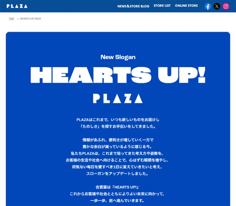
鮮やかなブルーと白、大きな英字見出し、商品写真を組み合わせたブランド特設ページ。ピンクのギフト紹介パネルをアクセントに、スローガンやショッピングバッグ、サービスを縦長に紹介します。
オリジナルサイトを見るA vivid blue brand manifesto punctuated by oversized English headings, colorful product cutouts, and a pink gift-wrapping showcase.
Website / Original URL: PLAZA — HEARTS UP! 2024 Final URL: https://www.plazastyle.com/contents/heartsup2024/ Response: HTTP 200; original and final URLs are identical. Theme: white canvas, saturated blue brand fields, and a pink gift section; no theme selector was observed. Inspected: September 23, 2026, 00:29 JST / September 22, 2026, 15:29 UTC, according to the supplied capture record. Viewports: desktop 1440 × 1000 and mobile 390 × 844 CSS pixels. Scope: supplied desktop captures of the opening, Gift section, and page ending; mobile captures of the opening and ending; rendered text, links, element bounds, and computed-style samples covering the full page at both widths. Menu opening, media playback, and carousel interaction were not exercised in the supplied evidence.
This is a long-form brand and service feature within the PLAZA website. Its sequence moves from a new slogan to brand meaning, shopping bags, gift wrapping, an in-store campaign, a movie, and a large branded ending. The visual hierarchy comes from broad color fields and typography, with product imagery providing the detail. The inspected content is not organized around a product grid or a single purchase action.
On desktop, white space separates large rounded panels. Blue carries identity, headings, and reversed text; pink distinguishes the gift-wrapping service. The geometric PLAZA wordmark is treated as artwork. Japanese paragraphs remain relatively restrained beneath much larger English display type.
A material limitation of the current render: the mobile viewport is 390px wide, but the header and main sections measure 1264px wide. Centered content therefore falls outside the visible crop. The nearly empty blue mobile opening is consistent with this geometry. This reference records that defect; the Quick Start proposes a viewport-fitting adaptation rather than presenting the captured mobile layout as successful.
A vivid blue brand manifesto punctuated by oversized English headings, colorful product cutouts, and a pink gift-wrapping showcase.
Website / Original URL: PLAZA — HEARTS UP! 2024 Final URL: https://www.plazastyle.com/contents/heartsup2024/ Response: HTTP 200; original and final URLs are identical. Theme: white canvas, saturated blue brand fields, and a pink gift section; no theme selector was observed. Inspected: September 23, 2026, 00:29 JST / September 22, 2026, 15:29 UTC, according to the supplied capture record. Viewports: desktop 1440 × 1000 and mobile 390 × 844 CSS pixels. Scope: supplied desktop captures of the opening, Gift section, and page ending; mobile captures of the opening and ending; rendered text, links, element bounds, and computed-style samples covering the full page at both widths. Menu opening, media playback, and carousel interaction were not exercised in the supplied evidence.
This is a long-form brand and service feature within the PLAZA website. Its sequence moves from a new slogan to brand meaning, shopping bags, gift wrapping, an in-store campaign, a movie, and a large branded ending. The visual hierarchy comes from broad color fields and typography, with product imagery providing the detail. The inspected content is not organized around a product grid or a single purchase action.
On desktop, white space separates large rounded panels. Blue carries identity, headings, and reversed text; pink distinguishes the gift-wrapping service. The geometric PLAZA wordmark is treated as artwork. Japanese paragraphs remain relatively restrained beneath much larger English display type.
A material limitation of the current render: the mobile viewport is 390px wide, but the header and main sections measure 1264px wide. Centered content therefore falls outside the visible crop. The nearly empty blue mobile opening is consistent with this geometry. This reference records that defect; the Quick Start proposes a viewport-fitting adaptation rather than presenting the captured mobile layout as successful.
| Name | Value | Suggested token | Evidence and role |
|---|---|---|---|
| PLAZA Blue | #0047BA |
--color-brand / source --plaza-blue |
Exact exposed source variable; also measured on headings and the closing blue surfaces. Main identity color. |
| White | #FFFFFF |
--color-paper |
Measured document canvas and navigation-link fill; reversed lettering in blue regions. |
| Gift Pink | approximately #FFB2D3 |
--color-gift |
Visual estimate from the Gift capture. Broad panel background, not a measured CSS declaration. |
| Utility Ink | #15181C |
--color-text |
Measured body color, rgb(21, 24, 28). Used by the small host-page title. |
| Floating Control Shade | rgb(0 0 0 / 50%) |
--color-floating |
Exact measured background of the circular return control. |
| Fine Rule | approximately #DCE0E2 |
--color-rule |
Visual estimate of the thin host-header and lower-page separators. |
The blue and white pair supplies most of the interface. Pink occupies a substantial service-specific field. Hot pink, turquoise, yellow, and metallic gold appear within gift-ribbon imagery; they should not automatically become additional interface action colors.
The return control uses one translucent black fill. It looks gray over white and dark navy over blue. Do not encode those appearances as separate control themes.
The supplied custom properties also include --swiper-theme-color: #007aff. Its presence does not establish a visible accent in the captures. Keep it separate from the confirmed brand blue.
No selectable palette or dark-mode state was established. White, blue, and pink are section treatments within one page, not observed user-selectable themes.
roc-grotesk-wide, sans-serif.900 for the opening slogan; 800 for section headings, navigation labels, and step numbers.normal on sampled elements.The family name is directly supported by computed styles. Font files and resolved font faces were not included, so a successful custom-font load cannot be assumed. Verify the current captured proportions when choosing or loading the display face.
Internal labels such as New Slogan, New Symbol, New Statement, and New Symbol Grid use the computed stack roc-grotesk, sans-serif, usually at weight 600 and line height 1.5.
The opening New Slogan eyebrow appears approximately 38–40px on desktop. Its own computed text element was not supplied; do not substitute the internal-label measurement as an exact measurement of this eyebrow.
The measured body stack is:
"IBM Plex Sans JP", メイリオ, Meiryo,
"ヒラギノ角ゴ Pro W6", "Hiragino Kaku Gothic Pro",
Osaka, "MS Pゴシック", "MS PGothic", sans-serif
Regular copy uses weight 400. Selected introductory statements use 700. Most paragraphs have line height 1.7; the opening statement uses 1.8, while the longer brand statement uses 1.6.
The opening and gift paragraphs are centered in the desktop captures. Explicit line breaks organize the copy into short statements and separated thought groups. The mobile text extraction contains additional breaks, although the resulting text remains centered within an oversized content area.
Values below are computed measurements, rounded for readability. Mobile values describe the captured oversized layout, not a recommended phone scale.
| Role | Desktop size / line height | Mobile size / line height | Weight |
|---|---|---|---|
| Host body defaults | 14 / 21px |
14 / 21px |
400 |
Opening HEARTS UP! |
144 / 144px |
58.5 / 58.5px |
900 |
| Main section H2 | 81.6 / 81.6px |
41.018 / 41.018px |
800 |
| Navigation label | 27.2 / 29.92px |
18.230 / 20.053px |
800 |
| Internal slogan / symbol label | 32.64 / 48.96px |
18.230 / 27.346px |
600 |
| Statement / symbol-grid label | 32.64 / 48.96px |
21.876 / 32.815px |
600 |
| Opening Japanese copy | 20.4 / 36.72px |
13.673 / 24.611px |
400 |
| Gift copy | 20.4 / 34.68px |
13.673 / 23.244px |
400 |
| Standard explanatory copy | 19.04 / 32.368px |
12.761 / 21.694px |
400 |
| Long brand statement | 19.04 / 30.464px |
12.761 / 20.418px |
400 |
| Campaign lead | 25.84 / 43.928px |
17.319 / 29.442px |
700 |
| Campaign-ended notice | 23.12 / 39.304px |
16.407 / 27.893px |
400 |
| Step number | 34 / 34px |
27.346 / 27.346px |
800 |
| Step description | 24.48 / 41.616px |
18.230 / 30.992px |
400 |
| Bag-history year | 14.96 / 25.432px |
10.027 / 17.045px |
400 |
| Small artwork-rights caption | 13.6 / 23.12px |
9.115 / 15.496px |
400 |
The root font size measures 13.6px on desktop and approximately 9.11519px on mobile, while the body explicitly remains 14px. The supplied evidence does not reveal the formula or breakpoint responsible for the root scale. Do not copy numerical rem values into a conventional 16px-root implementation without conversion.
The HTML element reports Times, but the body and campaign text override it. Serif typography is not part of the visible campaign design.
The composition uses large panels, generous internal padding, and comparatively small gaps between complete chapters. No universal spacing formula was supplied.
| Use | Desktop | Mobile | Evidence |
|---|---|---|---|
| Header height | 91px |
91px |
Measured |
| Header bottom to opening section | 119px |
104px |
Derived from section start and header height |
| Opening panel outside inset | approximately 36px |
approximately 31.6px within a 1264px section |
Screenshot edge supported by related content geometry |
| Opening panel inside text inset | approximately 75px |
approximately 30px |
Derived from panel edge and text bounds |
| Gap after opening section | 35px |
35px |
Derived from adjacent section bounds |
| Typical subsequent chapter gap | 30px |
25px |
Derived from several adjacent sections |
| Navigation-item gap | 15px |
10px |
Derived from item positions and heights |
| Closing artwork top padding | 150px |
100px |
Measured |
| Return-control right / bottom clearance | 15px / 15px |
15px / 15px |
Derived from measured control bounds |
| Element | Value | Status |
|---|---|---|
| Main blue and pink panels | approximately 16–20px |
Visual estimate |
| Navigation links | 10px |
Measured |
| White menu-control backing | approximately 10–12px |
Visual estimate |
| Return control | 50% |
Measured |
| Free-wrapping badge | Many-point starburst | Visible artwork; no CSS construction supplied |
There is no observed general shadow system. Rounded color fields provide separation; photographic highlights belong to the products and ribbons.
| Element | Desktop | Mobile |
|---|---|---|
| Viewport | 1440 × 1000px |
390 × 844px |
| Header / main-section width | 1440px |
1264px |
| Opening section start | y = 210px |
y = 195px |
| Opening heading box | x = 111px, width 1218px |
x = 61.594px, width 1140.797px |
| Gift paragraph box | x = 36px, width 1368px |
x = 31.594px, width 1200.797px |
| Closed-state navigation-link box | 360 × 75px |
approximately 315.891 × 60px |
| Footer logo link width | 450px |
450px |
| Return control | 50 × 50px |
50 × 50px |
| Total document height | approximately 17049.58px |
approximately 18858.86px |
The broad panel geometry is consistent with a width of 95% of its containing section: 1440 × 0.95 = 1368, and 1264 × 0.95 = 1200.8. This is a derived relationship, not a retrieved stylesheet rule. On mobile, it operates against the oversized section rather than the 390px viewport.
Role: frames the campaign inside the larger website.
The opening capture begins with a mostly empty white header, a fine horizontal separator at about 90px, and a small page label underneath. The label reads HEARTS UP 2024 | PLAZA | プラザ and begins around x = 120px on desktop and x = 32px on mobile.
The campaign panel begins farther down, at y = 210px on desktop and 195px on mobile. Preserve this separation between host-page identification and the campaign's own large typographic opening.
Role: provides access to the page's six chapter anchors.
The visible control consists of two blue horizontal bars. Over the blue ending it has a white rounded backing; against the white page the backing blends into the canvas. The same upper-right placement appears across the supplied scrolled captures.
Visual estimates:
60 × 60px, at x = 1330px, y = 43px.35px wide and 5px thick.48 × 48px, at x = 326px, y = 18px.30px wide and 4px thick.The DOM contains six white rounded link boxes with blue, centered labels: TOP, What's “HEARTS UP!”, Shopping Bag, Gift, Campaign, and Movie.
In the captured closed state, their left edges are outside the viewport: 1535px on desktop and approximately 606.55px on mobile. This supports an offscreen navigation arrangement. The opening trajectory, backdrop, close icon, focus behavior, and expanded layout remain unverified.
Role: announces the brand's new organizing idea.
The desktop anatomy is a centered vertical sequence:
New Slogan eyebrow.HEARTS UP! heading, measured at 144px with a 144px line box.225px wide in the capture.The heading box begins at y = 381px; the opening paragraph box starts around y = 653.70px. Although the paragraph box spans 1218px, its centered, explicitly broken lines occupy a much narrower visual measure.
The full opening section is approximately 1059.98px tall. It continues below the first desktop viewport; it is not a viewport-height splash.
The source heading is an H3. A new implementation should preserve the appearance while assigning a logical page-heading hierarchy.
Role: announces each major chapter before its artwork or panel.
Large blue English titles sit on white. In the Gift capture, a smaller HEARTS UP! line sits above the much larger word Gift. The section H2's measured base size is 81.6px, with a two-line bounding height of approximately 163.19px.
The smaller prefix's separate computed style was not supplied. Its visible desktop size is approximately 48–50px. Preserve the hierarchy between the repeated brand phrase and the chapter name rather than making both lines equally prominent.
Role: explains the slogan, statement, and symbol.
The DOM establishes distinct New Slogan, New Symbol, New Statement, and New Symbol Grid modules. On desktop, the first two labels sit in a left-hand area at x = 111px, while the statement begins at x = 808.67px in a 520.31px-wide column.
In the mobile-mode DOM, slogan and symbol labels share a row at approximately x = 51.59px and 676px. The statement moves below them and spans about 1160.80px. Responsive rearrangement therefore exists, but it still takes place inside the oversized canvas.
The page explains that the symbol is based on PLAZA's P, using a heart rotated by 135 degrees and an upward-left directional meaning. That is source content, not a geometric reconstruction verified from an asset file.
White labels and blue statement text are measured. No middle-section screenshot was supplied to verify every module background, illustration, or grid detail.
Role: introduces the redesigned bag and its material context.
The chapter contains a New Shopping Bag announcement, a short bold Japanese introduction, sustainability copy, and a history sequence. The desktop introductory copy uses 24.48px, weight 700, and 41.616px line height. Supporting sustainability text uses 19.04px / 32.368px in blue.
The text specifically describes FSC-certified paper and ink and participation in a forest-related fund. These are editorial statements on the inspected page; they do not imply additional interface controls or badges.
The artwork itself was not included in the visible middle-page captures, so image arrangement and bag asset dimensions remain unverified.
Role: presents a chronological collection of packaging designs.
The extracted sequence contains eleven year labels, from 2024 - back to 1966 -, followed by the same sequence again. Label positions extend horizontally well beyond the viewport.
Measured label-box widths are 340px on desktop and 160px in mobile mode. Successive label positions advance approximately 275px and 125px, respectively. These are text-box measurements, not verified image or slide dimensions.
The duplicated sequence and horizontal geometry are consistent with a repeating history track. Autoplay, dragging, speed, direction, and navigation controls were not demonstrated. Do not treat duplicated labels as twenty-two unique designs.
Role: makes the free-wrapping service visually immediate.
This is the clearest secondary composition in the supplied captures. A large pink rounded panel contains four visual groups:
Pink label above.Blue label.All Gift Wrapping and ¥0 lettering.The gold ribbon reflections and irregular curls add tactile detail to the otherwise flat composition. The badge is slightly rotated, while its price remains the strongest information inside the panel.
In the 1440px capture, the pink panel starts approximately 36px from each side. The gift bag occupies roughly the left third; the ribbon samples occupy the middle; the starburst is approximately 370px across. These are screenshot estimates.
The extracted text does not establish whether the sample labels and badge lettering are independent DOM elements or part of supplied artwork. Preserve their visual relationship without assuming an original implementation technique.
Blue Japanese copy follows below the artwork. Its measured desktop size is 20.4px / 34.68px, with a five-line box approximately 173.44px high. The service message says the wrapping is always free. The starburst is an informational price badge; click behavior was not evidenced.
Role: explains the in-store gift-box shopping activity and records its status.
The chapter contains a lead statement, explanatory copy, an ended-campaign notice, an external event-report link, a HOW TO SHOP guide, and a 60 Stickers subsection.
The three step labels are STEP 1, STEP 2, and STEP 3, paired with ボックスを選ぶ, ステッカーを選ぶ, and ショッピングを楽しむ. On desktop, their boxes share a horizontal row with centers around 316.81px, 720px, and 1123.19px.
In mobile mode, they become a vertical sequence, but each label box is still approximately 758.39px wide and centered at x = 632px. The vertical step spacing is about 1166.47px, contributing to a much longer campaign section.
The notice explicitly says the campaign has ended at the listed stores. It is set larger than standard supporting copy. Preserve this status in any faithful content reproduction. It does not mean the page itself has been discontinued.
The event-report link has the visible label こちら and targets a PLAZA post on X. Its destination was recorded but not opened.
Role: links the brand narrative to a video.
The page contains a Movie chapter and a YouTube destination with video ID a0zp_e18oZI. Playback-related text appears in the recorded URL, but this does not prove autoplay, successful playback, an embedded player, or modal behavior.
The supplied inline anchor reports a 14px line-box height. That is not a measurement of the video preview's height. Poster imagery, play-button styling, and media aspect ratio cannot be established from that anchor alone.
Role: closes the narrative with merchandise and identity.
The ending capture shows a blue field with partially cropped, rotated product cutouts entering from above. A large white PLAZA wordmark anchors the composition below them. Its visible desktop width is approximately 450px, matching the footer link's measured width.
The footer text reads Copyright © SLH/PLAZASTYLE COMPANY. It is small, white, and centered beneath the logo. This is an observed footer statement, not a production-credit identification.
A second host-footer region follows after a measured 50px gap. In both ending captures, it includes extensive white space, an approximately 80px blue horizontal band, and more white space below. The outer host-footer box measures 520px high. Record this as part of the current render; the evidence does not establish an intentional campaign module within the empty areas.
Role: offers a return-to-top affordance throughout the page.
A 50 × 50px circle stays 15px from the right and bottom viewport edges in both sizes. It contains a thin white upward chevron and uses a measured half-transparent black background.
Its recorded destination ends in #Top, whereas the menu's top link ends in #TOP. The target IDs and any JavaScript handlers were not supplied. Successful scrolling and easing are unverified; a new implementation should use one consistently cased target.
| Feature | Evidence | What remains unverified |
|---|---|---|
| Menu access | Two-bar control and six offscreen anchor boxes | Open/close animation, expanded appearance, focus handling, backdrop |
| Section navigation | Links to #TOP, #HeartsUp, #ShoppingBag, #Gift, #Campaign, and #Movie |
Click results, scroll easing, active-section tracking |
| Return control | Matching viewport-relative placement in desktop and mobile captures | Actual scroll result and duration |
| History sequence | Repeated years and a long horizontal arrangement | Autoplay, drag support, speed, pause behavior |
| Product composition | Rotated and partially cropped product images in a static capture | Falling, floating, parallax, or other motion |
| Movie entry | Recorded YouTube link | Playback, audio, modal presentation, autoplay |
| Sampled CSS animation | Sampled elements report animation: none |
Descendant, pseudo-element, media, or script-driven motion |
| Sampled CSS transition | Records show transition: all without timing detail |
Any nonzero duration or actual transition |
No defensible animation-duration tokens can be extracted from these records. The word all alone does not establish an animated transition.
The capture process waited for finite motion and image readiness within time limits and temporarily paused perpetual animations during readiness checks. This improves capture stability but does not prove that the entire page is static or semantically complete.
Recommended adaptation: keep basic anchor navigation usable without animation. If adding continuous history movement, provide a pause control and a reduced-motion alternative. Treat subtle hover feedback or menu transitions as new implementation choices, not observed timings.
| Surface | Appearance | Function |
|---|---|---|
| Host canvas | White with occasional fine gray rules | Frames the campaign and its utility label |
| Opening panel | Saturated blue, rounded corners, white content | Establishes slogan and brand identity |
| Chapter-title region | White with large blue typography | Separates long sections without ornamental dividers |
| Gift panel | Pink with blue text and multicolor photographic details | Distinguishes the wrapping service |
| Navigation items | White, 10px radius, blue labels | Large section-link targets in the offscreen menu structure |
| Closing brand field | Full-width blue with cutout products and white logo | Visual conclusion |
| Return control | Translucent black circle and white chevron | Persistent utility above different backgrounds |
The visible design relies on flat fields rather than gradients, glass effects, or raised cards. The starburst and ribbon photography provide localized visual complexity.
Use clean product cutouts with intact silhouettes and photographic material detail. The gift bag has translucent folds and a gathered top; the ribbons have tightly curled ends, metallic reflections, and saturated color. Their irregular shapes contrast with the simple panel geometry.
The large blue starburst introduces a retail-promotion shape. White lettering remains readable despite its rotation. Keep enough separation between the badge and the ribbon samples to preserve the three-part service story: bag, wrapping choices, and free price.
The geometric PLAZA wordmark is essential artwork. Do not approximate it by typing the brand name in the body font. The opening HEARTS UP! headline, by contrast, is a measured HTML heading.
The footer uses rotated merchandise cutouts with intentional clipping at the edge of the captured region. Rotation is a compositional observation, not evidence of animated falling products.
Asset source URLs and native file dimensions were not included. The following inventory identifies visual roles without inventing filenames.
| Asset role | Evidence | Implementation guidance |
|---|---|---|
| White PLAZA wordmark | Visible in opening and footer captures | Use an approved logo asset; preserve its proportions |
| Gift bag photograph | Visible in Gift capture | Retain translucent material detail and the complete silhouette |
| Pink and blue ribbon samples | Visible in Gift capture | Preserve saturated strands, gold curls, and label placement |
| Free-wrapping starburst | Visible in Gift capture | Keep blue fill, white information, jagged perimeter, and slight rotation |
| Closing product cutouts | Partially visible in footer capture | Use transparent-background assets; preserve natural product proportions |
| Brand-symbol studies | Established by rendered text and module positions | Exact artwork and construction grid were not visually supplied |
| Shopping-bag history images | History structure established by DOM | Image files, native ratios, and detailed designs remain unverified |
| Campaign, sticker, and movie artwork | Chapters established by DOM | Do not invent visual details from their text labels |
Use normal high-quality image rendering for photography. Pixelated scaling is not part of the observed aesthetic.
At 1440px, the main sections span the viewport, while prominent panels sit approximately 36px inside each side. The opening panel's inner text box begins another 75px inward. Large blue headings bridge the white gaps between chapters.
The page is exceptionally long: approximately 17050px at the supplied desktop viewport. Its rhythm alternates oversized type, explanatory paragraphs, large artwork, and chapter transitions. It should remain a continuous editorial sequence when adapted.
Positions are document-relative DOM values, not the scroll offsets of the supplied screenshots.
| Section | Desktop start / height | Mobile-mode start / height |
|---|---|---|
| Opening slogan | 210 / 1059.98px |
195 / 845.63px |
| Brand explanation | 1304.98 / 3562.16px |
1075.63 / 2816.86px |
| Shopping Bag | 4897.14 / 3099.92px |
3917.48 / 3100.03px |
| Gift | 8027.06 / 1209.67px |
7042.52 / 978.91px |
| Campaign | 9266.73 / 4186.20px |
8046.42 / 6535.56px |
| Movie | 13482.94 / 824.61px |
14606.98 / 793.30px |
These heights document the inspected render; they are not recommended fixed heights. Artwork sizing and content flow should determine section height in a new implementation.
The root and body boxes measure 390px wide, but the header and campaign sections measure 1264px. Their horizontal center is therefore 632px, which is beyond the right edge of the viewport.
The opening heading is centered in a box from approximately x = 61.59px to 1202.39px. Its smaller mobile font does not solve the offscreen placement. Similarly, the footer logo link begins at x = 407px with a width of 450px, placing it entirely beyond the captured 390px width.
This explains why the mobile screenshots retain the blue backgrounds and viewport-positioned controls while losing the central content. The panel's left edge appears near 32px, but its right edge is far outside the crop.
There are nevertheless real responsive changes: smaller typography, additional Japanese line breaks, rearranged brand modules, and vertically stacked campaign steps. Those adaptations coexist with the oversized host layout. The cause of the 1264px width cannot be identified from the supplied style subset.
48rem breakpoint below as a recommendation. No original breakpoint was supplied.#0047BA for the main identity field and blue typography.Times value as the campaign font.#007aff default as the brand color.These are recommendations for a new implementation, not verified features of the original page:
#0047BA, measured.#FFFFFF, measured.#FFB2D3, visually estimated.#15181C, measured.“Create a long-form Japanese retail-brand feature inspired by the inspected PLAZA HEARTS UP! page. Use saturated blue #0047BA, white, and a broad pink gift-wrapping section. Build a large rounded opening panel with a smaller New Slogan eyebrow, an oversized bold English headline, approved white logo artwork, and centered Japanese paragraphs. Separate chapters with stacked blue English headings on white. Use clean product cutouts, translucent gift packaging, curled colorful ribbons, and a slightly rotated blue starburst announcing free wrapping. Keep utility controls minimal: a two-bar upper-right menu and a translucent circular return control. Preserve the editorial chapter sequence and make the content fit the phone viewport. Do not reproduce the captured mobile overflow.”
This is a recommended adaptation using a conventional root size. Exact measured colors and selected desktop proportions are retained. Pink, panel radii, the open navigation surface, fluid formulas, and the mobile breakpoint are implementation choices. The code intentionally avoids the captured 1264px mobile content width.
Load suitable font files separately if available; the stacks below do not fetch them. Photography, logo artwork, and any interactive history behavior also require their own assets or implementation.
:root {
  /* Measured colors */
  --plaza-blue: #0047ba;
  --plaza-white: #ffffff;
  --plaza-ink: #15181c;
  --plaza-floating: rgb(0 0 0 / 50%);

  /* Visual approximations */
  --plaza-gift-pink: #ffb2d3;
  --plaza-rule: #dce0e2;
  --plaza-panel-radius: 20px;

  /* Observed family preferences; font files are not included */
  --plaza-display: roc-grotesk-wide, sans-serif;
  --plaza-label: roc-grotesk, sans-serif;
  --plaza-body: "IBM Plex Sans JP", Meiryo,
    "Hiragino Kaku Gothic Pro", Osaka, "MS PGothic", sans-serif;

  /* Recommended scaling with measured desktop endpoints */
  --plaza-slogan-size: clamp(2.5rem, 10vw, 9rem);
  --plaza-heading-size: clamp(2.25rem, 5.667vw, 5.1rem);
  --plaza-copy-size: clamp(1rem, 1.4167vw, 1.275rem);
  --plaza-body-size: clamp(1rem, 1.3223vw, 1.19rem);
  --plaza-gutter: clamp(1rem, 2.5vw, 2.25rem);
  --plaza-panel-inset: clamp(1.25rem, 5.2083vw, 4.6875rem);
  --plaza-panel-block: clamp(3rem, 6.9444vw, 6.25rem);
}

*,
*::before,
*::after {
  box-sizing: border-box;
}

body {
  margin: 0;
}

.brand-page {
  inline-size: 100%;
  min-inline-size: 0;
  color: var(--plaza-ink);
  background: var(--plaza-white);
  font-family: var(--plaza-body);
  font-size: 1rem;
  line-height: 1.7;
}

.brand-page :where(main, section, header, footer) {
  min-inline-size: 0;
}

.brand-page img {
  display: block;
  max-inline-size: 100%;
  block-size: auto;
}

.site-shell-header {
  block-size: 91px;
  border-block-end: 1px solid var(--plaza-rule);
}

.page-label {
  inline-size: min(1200px, calc(100% - 64px));
  margin: 16px auto 82px;
  font-size: 14px;
  line-height: 21px;
}

.feature-panel {
  inline-size: calc(100% - var(--plaza-gutter) - var(--plaza-gutter));
  margin-inline: auto;
  border-radius: var(--plaza-panel-radius);
}

.hero-panel {
  padding: var(--plaza-panel-block) var(--plaza-panel-inset);
  color: var(--plaza-white);
  background: var(--plaza-blue);
  text-align: center;
}

.hero-kicker {
  margin: 0;
  font-family: var(--plaza-label);
  font-size: clamp(1.375rem, 2.778vw, 2.5rem);
  font-weight: 600;
  line-height: 1.2;
}

.hero-title {
  margin: 22px 0 0;
  font-family: var(--plaza-display);
  font-size: var(--plaza-slogan-size);
  font-weight: 900;
  line-height: 1;
  overflow-wrap: anywhere;
  text-wrap: balance;
}

.brand-mark {
  inline-size: min(225px, 45vw);
  margin: 20px auto 0;
}

.hero-copy {
  max-inline-size: 42rem;
  margin: 64px auto 0;
  font-size: var(--plaza-copy-size);
  line-height: 1.8;
}

.hero-copy p {
  margin: 0;
}

.hero-copy p + p {
  margin-block-start: 1.5em;
}

.feature-section {
  margin-block-start: 30px;
  scroll-margin-block-start: 24px;
}

.section-heading {
  margin: 0 16px 40px;
  color: var(--plaza-blue);
  font-family: var(--plaza-display);
  font-size: var(--plaza-heading-size);
  font-weight: 800;
  line-height: 1;
  text-align: center;
  overflow-wrap: anywhere;
}

.section-heading > span {
  display: block;
  font-size: 0.6em;
  line-height: 1.667;
}

.gift-panel {
  padding: var(--plaza-panel-block) var(--plaza-panel-inset) 80px;
  color: var(--plaza-blue);
  background: var(--plaza-gift-pink);
}

.gift-artwork {
  margin: 0;
}

.gift-artwork img {
  inline-size: 100%;
  object-fit: contain;
}

.body-copy {
  font-size: var(--plaza-body-size);
  line-height: 1.7;
}

.gift-panel .body-copy {
  max-inline-size: 60rem;
  margin: 64px auto 0;
  font-size: var(--plaza-copy-size);
  text-align: center;
}

.statement-layout,
.steps {
  display: grid;
  gap: clamp(24px, 5vw, 72px);
}

.statement-layout {
  grid-template-columns: repeat(2, minmax(0, 1fr));
}

.steps {
  grid-template-columns: repeat(3, minmax(0, 1fr));
  padding: 0;
  list-style: none;
}

.step-number {
  font: 800 34px / 1 var(--plaza-display);
}

/* Recommended manual history strip, not a source autoplay claim */
.history-track {
  display: flex;
  gap: 24px;
  padding: 0 0 16px;
  overflow-x: auto;
  scroll-snap-type: x proximity;
  list-style: none;
}

.history-track > * {
  flex: 0 0 clamp(160px, 23.61vw, 340px);
  scroll-snap-align: start;
}

.footer-brand {
  padding: 80px 24px 16px;
  color: var(--plaza-white);
  background: var(--plaza-blue);
  text-align: center;
}

.footer-brand .brand-mark {
  inline-size: min(450px, 70vw);
  margin: 0 auto 64px;
}

/* Native disclosure is an adaptation; original open state is unverified */
.section-menu {
  position: fixed;
  z-index: 50;
  inset-block-start: 43px;
  inset-inline-end: 50px;
}

.section-menu > summary {
  display: grid;
  place-items: center;
  inline-size: 60px;
  block-size: 60px;
  margin-inline-start: auto;
  border-radius: 12px;
  background: var(--plaza-white);
  color: var(--plaza-blue);
  list-style: none;
  cursor: pointer;
}

.section-menu > summary::-webkit-details-marker {
  display: none;
}

.menu-glyph {
  display: grid;
  gap: 13px;
  inline-size: 35px;
}

.menu-glyph::before,
.menu-glyph::after {
  content: "";
  display: block;
  block-size: 5px;
  border-radius: 5px;
  background: currentColor;
}

.section-menu nav {
  display: grid;
  gap: 15px;
  inline-size: min(360px, calc(100vw - 32px));
  max-block-size: calc(100dvh - 130px);
  margin-block-start: 16px;
  padding: 12px;
  overflow-y: auto;
  border-radius: 12px;
  background: var(--plaza-blue);
}

.section-menu nav a {
  display: grid;
  place-items: center;
  min-block-size: 75px;
  padding: 8px;
  border-radius: 10px;
  color: var(--plaza-blue);
  background: var(--plaza-white);
  font: 800 27.2px / 1.1 var(--plaza-display);
  text-align: center;
  text-decoration: none;
}

.back-to-top {
  position: fixed;
  z-index: 40;
  inset-inline-end: 15px;
  inset-block-end: 15px;
  display: grid;
  place-items: center;
  inline-size: 50px;
  block-size: 50px;
  border-radius: 50%;
  color: var(--plaza-white);
  background: var(--plaza-floating);
}

.back-to-top::before {
  content: "";
  inline-size: 11px;
  block-size: 11px;
  border-block-start: 2px solid currentColor;
  border-inline-start: 2px solid currentColor;
  transform: translateY(3px) rotate(45deg);
}

.brand-page :focus-visible {
  outline: 3px solid currentColor;
  outline-offset: 4px;
}

.sr-only {
  position: absolute;
  inline-size: 1px;
  block-size: 1px;
  padding: 0;
  overflow: hidden;
  clip-path: inset(50%);
  white-space: nowrap;
}

@media (max-width: 48rem) {
  .page-label {
    margin-block-end: 67px;
  }

  .statement-layout,
  .steps {
    grid-template-columns: minmax(0, 1fr);
  }

  .section-menu {
    inset-block-start: 18px;
    inset-inline-end: 16px;
  }

  .section-menu > summary {
    inline-size: 48px;
    block-size: 48px;
  }

  .menu-glyph {
    inline-size: 30px;
    gap: 12px;
  }

  .menu-glyph::before,
  .menu-glyph::after {
    block-size: 4px;
  }

  .section-menu nav {
    gap: 10px;
    max-block-size: calc(100dvh - 100px);
  }

  .section-menu nav a {
    min-block-size: 60px;
    font-size: 18px;
  }

  .gift-panel {
    padding-block-end: 48px;
  }
}

@media (prefers-reduced-motion: reduce) {
  /* Animated media needs a separate pause or static alternative. */
  .brand-page *,
  .brand-page *::before,
  .brand-page *::after {
    animation: none !important;
    transition: none !important;
  }
}
This two-section example demonstrates the opening and Gift panels. Replace uppercase asset placeholders with approved files and add their real intrinsic dimensions. The placeholders are not observed source paths. A complete page should add the other documented chapters and their navigation links.
<div class="brand-page" id="top">
  <header class="site-shell-header"></header>

  <details class="section-menu">
    <summary>
      <span class="menu-glyph" aria-hidden="true"></span>
      <span class="sr-only">Section navigation</span>
    </summary>
    <nav aria-label="Page sections">
      <a href="#top">TOP</a>
      <a href="#Gift">Gift</a>
    </nav>
  </details>

  <p class="page-label">HEARTS UP 2024 | PLAZA | プラザ</p>

  <main>
    <section class="feature-panel hero-panel" aria-labelledby="slogan-title">
      <p class="hero-kicker">New Slogan</p>
      <h1 class="hero-title" id="slogan-title">HEARTS UP!</h1>
      <img class="brand-mark" src="APPROVED_WHITE_LOGO_URL" alt="PLAZA">
      <div class="hero-copy" lang="ja">
        <p>PLAZAはこれまで、いつも新しいものをお届けし「たのしさ」を探すお手伝いをしてきました。</p>
      </div>
    </section>

    <section class="feature-section" id="Gift" aria-labelledby="gift-title">
      <h2 class="section-heading" id="gift-title">
        <span>HEARTS UP!</span>Gift
      </h2>
      <div class="feature-panel gift-panel">
        <figure class="gift-artwork">
          <img src="APPROVED_GIFT_COMPOSITE_URL"
            alt="A white gift bag, pink and blue curled ribbons, and a free-wrapping badge.">
        </figure>
        <p class="body-copy" lang="ja">PLAZAのギフトラッピングはいつも無料です。</p>
      </div>
    </section>
  </main>

  <a class="back-to-top" href="#top" aria-label="Back to top"></a>
</div>
Optional aliases for a project already using Tailwind v4. This does not imply that the inspected website uses Tailwind. Define the custom properties above first.
@theme inline {
  --color-plaza: var(--plaza-blue);
  --color-paper: var(--plaza-white);
  --color-gift: var(--plaza-gift-pink);
  --color-utility: var(--plaza-ink);

  --font-display: var(--plaza-display);
  --font-label: var(--plaza-label);
  --font-body: var(--plaza-body);

  --text-slogan: var(--plaza-slogan-size);
  --text-chapter: var(--plaza-heading-size);
  --text-feature-copy: var(--plaza-copy-size);

  --spacing-page-gutter: var(--plaza-gutter);
  --spacing-panel-inset: var(--plaza-panel-inset);
  --radius-feature: var(--plaza-panel-radius);
  --radius-navigation: 10px;
}
2026-09-22T15:29:51.158Z, corresponding to September 23, 2026, 00:29:51.158 JST.This reference uses the supplied current-page evidence only. No additional browsing, file inspection, font-loading audit, or interaction testing was performed. Estimated visual values and recommended implementation behavior are identified separately from measured observations.
# PLAZA / HEARTS UP! 2024 — Style Reference

> A vivid blue brand manifesto punctuated by oversized English headings, colorful product cutouts, and a pink gift-wrapping showcase.

**Website / Original URL:** [PLAZA — HEARTS UP! 2024](https://www.plazastyle.com/contents/heartsup2024/)
**Final URL:** [https://www.plazastyle.com/contents/heartsup2024/](https://www.plazastyle.com/contents/heartsup2024/)
**Response:** HTTP 200; original and final URLs are identical.
**Theme:** white canvas, saturated blue brand fields, and a pink gift section; no theme selector was observed.
**Inspected:** September 23, 2026, 00:29 JST / September 22, 2026, 15:29 UTC, according to the supplied capture record.
**Viewports:** desktop 1440 × 1000 and mobile 390 × 844 CSS pixels.
**Scope:** supplied desktop captures of the opening, Gift section, and page ending; mobile captures of the opening and ending; rendered text, links, element bounds, and computed-style samples covering the full page at both widths. Menu opening, media playback, and carousel interaction were not exercised in the supplied evidence.

This is a long-form brand and service feature within the PLAZA website. Its sequence moves from a new slogan to brand meaning, shopping bags, gift wrapping, an in-store campaign, a movie, and a large branded ending. The visual hierarchy comes from broad color fields and typography, with product imagery providing the detail. The inspected content is not organized around a product grid or a single purchase action.

On desktop, white space separates large rounded panels. Blue carries identity, headings, and reversed text; pink distinguishes the gift-wrapping service. The geometric PLAZA wordmark is treated as artwork. Japanese paragraphs remain relatively restrained beneath much larger English display type.

**A material limitation of the current render:** the mobile viewport is 390px wide, but the header and main sections measure 1264px wide. Centered content therefore falls outside the visible crop. The nearly empty blue mobile opening is consistent with this geometry. This reference records that defect; the Quick Start proposes a viewport-fitting adaptation rather than presenting the captured mobile layout as successful.
# PLAZA / HEARTS UP! 2024 — Style Reference

> A vivid blue brand manifesto punctuated by oversized English headings, colorful product cutouts, and a pink gift-wrapping showcase.

**Website / Original URL:** [PLAZA — HEARTS UP! 2024](https://www.plazastyle.com/contents/heartsup2024/)
**Final URL:** [https://www.plazastyle.com/contents/heartsup2024/](https://www.plazastyle.com/contents/heartsup2024/)
**Response:** HTTP 200; original and final URLs are identical.
**Theme:** white canvas, saturated blue brand fields, and a pink gift section; no theme selector was observed.
**Inspected:** September 23, 2026, 00:29 JST / September 22, 2026, 15:29 UTC, according to the supplied capture record.
**Viewports:** desktop 1440 × 1000 and mobile 390 × 844 CSS pixels.
**Scope:** supplied desktop captures of the opening, Gift section, and page ending; mobile captures of the opening and ending; rendered text, links, element bounds, and computed-style samples covering the full page at both widths. Menu opening, media playback, and carousel interaction were not exercised in the supplied evidence.

This is a long-form brand and service feature within the PLAZA website. Its sequence moves from a new slogan to brand meaning, shopping bags, gift wrapping, an in-store campaign, a movie, and a large branded ending. The visual hierarchy comes from broad color fields and typography, with product imagery providing the detail. The inspected content is not organized around a product grid or a single purchase action.

On desktop, white space separates large rounded panels. Blue carries identity, headings, and reversed text; pink distinguishes the gift-wrapping service. The geometric PLAZA wordmark is treated as artwork. Japanese paragraphs remain relatively restrained beneath much larger English display type.

**A material limitation of the current render:** the mobile viewport is 390px wide, but the header and main sections measure 1264px wide. Centered content therefore falls outside the visible crop. The nearly empty blue mobile opening is consistent with this geometry. This reference records that defect; the Quick Start proposes a viewport-fitting adaptation rather than presenting the captured mobile layout as successful.

## How to Read This Reference

- **Measured** means supplied DOM bounds, computed styles, or exposed custom properties. Values are CSS pixels unless stated otherwise.
- **Visual estimate** means an approximation from the supplied original-page captures. Pink, panel radii, and menu-button dimensions fall into this category.
- **Derived** means arithmetic based on measured geometry. A matching ratio does not establish the original CSS declaration.
- **Recommended** means guidance for a new implementation, including the responsive corrections and all Quick Start code.
- Token names are descriptive aliases unless explicitly identified as source variables.
- Computed font-family lists establish the requested families, not which font files successfully rendered every glyph.
- Extracted text can exist outside the viewport. Its presence is not proof that a mobile visitor can see it.

## Tokens — Colors

### Default Palette

| Name | Value | Suggested token | Evidence and role |
| --- | --- | --- | --- |
| PLAZA Blue | `#0047BA` | `--color-brand` / source `--plaza-blue` | Exact exposed source variable; also measured on headings and the closing blue surfaces. Main identity color. |
| White | `#FFFFFF` | `--color-paper` | Measured document canvas and navigation-link fill; reversed lettering in blue regions. |
| Gift Pink | approximately `#FFB2D3` | `--color-gift` | Visual estimate from the Gift capture. Broad panel background, not a measured CSS declaration. |
| Utility Ink | `#15181C` | `--color-text` | Measured body color, `rgb(21, 24, 28)`. Used by the small host-page title. |
| Floating Control Shade | `rgb(0 0 0 / 50%)` | `--color-floating` | Exact measured background of the circular return control. |
| Fine Rule | approximately `#DCE0E2` | `--color-rule` | Visual estimate of the thin host-header and lower-page separators. |

The blue and white pair supplies most of the interface. Pink occupies a substantial service-specific field. Hot pink, turquoise, yellow, and metallic gold appear within gift-ribbon imagery; they should not automatically become additional interface action colors.

The return control uses one translucent black fill. It looks gray over white and dark navy over blue. Do not encode those appearances as separate control themes.

The supplied custom properties also include `--swiper-theme-color: #007aff`. Its presence does not establish a visible accent in the captures. Keep it separate from the confirmed brand blue.

### Theme Presets

No selectable palette or dark-mode state was established. White, blue, and pink are section treatments within one page, not observed user-selectable themes.

## Tokens — Typography

### English Display Type

- **Computed family:** `roc-grotesk-wide, sans-serif`.
- **Weights:** `900` for the opening slogan; `800` for section headings, navigation labels, and step numbers.
- **Character in the captures:** large, bold sans-serif lettering with short, tightly stacked lines.
- **Tracking:** `normal` on sampled elements.
- **Role:** gives each chapter the impact of a retail poster.

The family name is directly supported by computed styles. Font files and resolved font faces were not included, so a successful custom-font load cannot be assumed. Verify the current captured proportions when choosing or loading the display face.

### Supporting English Labels

Internal labels such as `New Slogan`, `New Symbol`, `New Statement`, and `New Symbol Grid` use the computed stack `roc-grotesk, sans-serif`, usually at weight `600` and line height `1.5`.

The opening `New Slogan` eyebrow appears approximately 38–40px on desktop. Its own computed text element was not supplied; do not substitute the internal-label measurement as an exact measurement of this eyebrow.

### Japanese Body Copy

The measured body stack is:

```css
"IBM Plex Sans JP", メイリオ, Meiryo,
"ヒラギノ角ゴ Pro W6", "Hiragino Kaku Gothic Pro",
Osaka, "MS Pゴシック", "MS PGothic", sans-serif
```

Regular copy uses weight `400`. Selected introductory statements use `700`. Most paragraphs have line height `1.7`; the opening statement uses `1.8`, while the longer brand statement uses `1.6`.

The opening and gift paragraphs are centered in the desktop captures. Explicit line breaks organize the copy into short statements and separated thought groups. The mobile text extraction contains additional breaks, although the resulting text remains centered within an oversized content area.

### Type Scale

Values below are computed measurements, rounded for readability. Mobile values describe the captured oversized layout, not a recommended phone scale.

| Role | Desktop size / line height | Mobile size / line height | Weight |
| --- | --- | --- | --- |
| Host body defaults | `14 / 21px` | `14 / 21px` | 400 |
| Opening `HEARTS UP!` | `144 / 144px` | `58.5 / 58.5px` | 900 |
| Main section H2 | `81.6 / 81.6px` | `41.018 / 41.018px` | 800 |
| Navigation label | `27.2 / 29.92px` | `18.230 / 20.053px` | 800 |
| Internal slogan / symbol label | `32.64 / 48.96px` | `18.230 / 27.346px` | 600 |
| Statement / symbol-grid label | `32.64 / 48.96px` | `21.876 / 32.815px` | 600 |
| Opening Japanese copy | `20.4 / 36.72px` | `13.673 / 24.611px` | 400 |
| Gift copy | `20.4 / 34.68px` | `13.673 / 23.244px` | 400 |
| Standard explanatory copy | `19.04 / 32.368px` | `12.761 / 21.694px` | 400 |
| Long brand statement | `19.04 / 30.464px` | `12.761 / 20.418px` | 400 |
| Campaign lead | `25.84 / 43.928px` | `17.319 / 29.442px` | 700 |
| Campaign-ended notice | `23.12 / 39.304px` | `16.407 / 27.893px` | 400 |
| Step number | `34 / 34px` | `27.346 / 27.346px` | 800 |
| Step description | `24.48 / 41.616px` | `18.230 / 30.992px` | 400 |
| Bag-history year | `14.96 / 25.432px` | `10.027 / 17.045px` | 400 |
| Small artwork-rights caption | `13.6 / 23.12px` | `9.115 / 15.496px` | 400 |

The root font size measures `13.6px` on desktop and approximately `9.11519px` on mobile, while the body explicitly remains `14px`. The supplied evidence does not reveal the formula or breakpoint responsible for the root scale. Do not copy numerical rem values into a conventional 16px-root implementation without conversion.

The HTML element reports `Times`, but the body and campaign text override it. Serif typography is not part of the visible campaign design.

## Tokens — Spacing & Shapes

The composition uses large panels, generous internal padding, and comparatively small gaps between complete chapters. No universal spacing formula was supplied.

### Spacing Scale

| Use | Desktop | Mobile | Evidence |
| --- | --- | --- | --- |
| Header height | `91px` | `91px` | Measured |
| Header bottom to opening section | `119px` | `104px` | Derived from section start and header height |
| Opening panel outside inset | approximately `36px` | approximately `31.6px` within a 1264px section | Screenshot edge supported by related content geometry |
| Opening panel inside text inset | approximately `75px` | approximately `30px` | Derived from panel edge and text bounds |
| Gap after opening section | `35px` | `35px` | Derived from adjacent section bounds |
| Typical subsequent chapter gap | `30px` | `25px` | Derived from several adjacent sections |
| Navigation-item gap | `15px` | `10px` | Derived from item positions and heights |
| Closing artwork top padding | `150px` | `100px` | Measured |
| Return-control right / bottom clearance | `15px / 15px` | `15px / 15px` | Derived from measured control bounds |

### Border Radius

| Element | Value | Status |
| --- | --- | --- |
| Main blue and pink panels | approximately `16–20px` | Visual estimate |
| Navigation links | `10px` | Measured |
| White menu-control backing | approximately `10–12px` | Visual estimate |
| Return control | `50%` | Measured |
| Free-wrapping badge | Many-point starburst | Visible artwork; no CSS construction supplied |

There is no observed general shadow system. Rounded color fields provide separation; photographic highlights belong to the products and ribbons.

### Layout Measurements

| Element | Desktop | Mobile |
| --- | --- | --- |
| Viewport | `1440 × 1000px` | `390 × 844px` |
| Header / main-section width | `1440px` | `1264px` |
| Opening section start | `y = 210px` | `y = 195px` |
| Opening heading box | `x = 111px`, width `1218px` | `x = 61.594px`, width `1140.797px` |
| Gift paragraph box | `x = 36px`, width `1368px` | `x = 31.594px`, width `1200.797px` |
| Closed-state navigation-link box | `360 × 75px` | approximately `315.891 × 60px` |
| Footer logo link width | `450px` | `450px` |
| Return control | `50 × 50px` | `50 × 50px` |
| Total document height | approximately `17049.58px` | approximately `18858.86px` |

The broad panel geometry is consistent with a width of 95% of its containing section: `1440 × 0.95 = 1368`, and `1264 × 0.95 = 1200.8`. This is a derived relationship, not a retrieved stylesheet rule. On mobile, it operates against the oversized section rather than the 390px viewport.

## Components

### Host Header and Page Label

**Role:** frames the campaign inside the larger website.

The opening capture begins with a mostly empty white header, a fine horizontal separator at about 90px, and a small page label underneath. The label reads `HEARTS UP 2024 | PLAZA | プラザ` and begins around `x = 120px` on desktop and `x = 32px` on mobile.

The campaign panel begins farther down, at `y = 210px` on desktop and `195px` on mobile. Preserve this separation between host-page identification and the campaign's own large typographic opening.

### Persistent Menu Control

**Role:** provides access to the page's six chapter anchors.

The visible control consists of two blue horizontal bars. Over the blue ending it has a white rounded backing; against the white page the backing blends into the canvas. The same upper-right placement appears across the supplied scrolled captures.

Visual estimates:

- Desktop backing: approximately `60 × 60px`, at `x = 1330px`, `y = 43px`.
- Desktop bars: approximately `35px` wide and `5px` thick.
- Mobile backing: approximately `48 × 48px`, at `x = 326px`, `y = 18px`.
- Mobile bars: approximately `30px` wide and `4px` thick.

The DOM contains six white rounded link boxes with blue, centered labels: `TOP`, `What's “HEARTS UP!”`, `Shopping Bag`, `Gift`, `Campaign`, and `Movie`.

In the captured closed state, their left edges are outside the viewport: `1535px` on desktop and approximately `606.55px` on mobile. This supports an offscreen navigation arrangement. The opening trajectory, backdrop, close icon, focus behavior, and expanded layout remain unverified.

### Opening Slogan Panel

**Role:** announces the brand's new organizing idea.

The desktop anatomy is a centered vertical sequence:

1. A blue panel with broad white outer margins and rounded upper corners.
2. A smaller white `New Slogan` eyebrow.
3. The very large `HEARTS UP!` heading, measured at `144px` with a `144px` line box.
4. The white geometric PLAZA wordmark, approximately `225px` wide in the capture.
5. Centered Japanese copy divided into short lines and separated thought groups.

The heading box begins at `y = 381px`; the opening paragraph box starts around `y = 653.70px`. Although the paragraph box spans `1218px`, its centered, explicitly broken lines occupy a much narrower visual measure.

The full opening section is approximately `1059.98px` tall. It continues below the first desktop viewport; it is not a viewport-height splash.

The source heading is an H3. A new implementation should preserve the appearance while assigning a logical page-heading hierarchy.

### Section Title Lockup

**Role:** announces each major chapter before its artwork or panel.

Large blue English titles sit on white. In the Gift capture, a smaller `HEARTS UP!` line sits above the much larger word `Gift`. The section H2's measured base size is `81.6px`, with a two-line bounding height of approximately `163.19px`.

The smaller prefix's separate computed style was not supplied. Its visible desktop size is approximately 48–50px. Preserve the hierarchy between the repeated brand phrase and the chapter name rather than making both lines equally prominent.

### Brand Explanation and Symbol Study

**Role:** explains the slogan, statement, and symbol.

The DOM establishes distinct `New Slogan`, `New Symbol`, `New Statement`, and `New Symbol Grid` modules. On desktop, the first two labels sit in a left-hand area at `x = 111px`, while the statement begins at `x = 808.67px` in a `520.31px`-wide column.

In the mobile-mode DOM, slogan and symbol labels share a row at approximately `x = 51.59px` and `676px`. The statement moves below them and spans about `1160.80px`. Responsive rearrangement therefore exists, but it still takes place inside the oversized canvas.

The page explains that the symbol is based on PLAZA's `P`, using a heart rotated by 135 degrees and an upward-left directional meaning. That is source content, not a geometric reconstruction verified from an asset file.

White labels and blue statement text are measured. No middle-section screenshot was supplied to verify every module background, illustration, or grid detail.

### Shopping Bag Introduction and Sustainability Copy

**Role:** introduces the redesigned bag and its material context.

The chapter contains a `New Shopping Bag` announcement, a short bold Japanese introduction, sustainability copy, and a history sequence. The desktop introductory copy uses `24.48px`, weight `700`, and `41.616px` line height. Supporting sustainability text uses `19.04px / 32.368px` in blue.

The text specifically describes FSC-certified paper and ink and participation in a forest-related fund. These are editorial statements on the inspected page; they do not imply additional interface controls or badges.

The artwork itself was not included in the visible middle-page captures, so image arrangement and bag asset dimensions remain unverified.

### Shopping Bag History Strip

**Role:** presents a chronological collection of packaging designs.

The extracted sequence contains eleven year labels, from `2024 -` back to `1966 -`, followed by the same sequence again. Label positions extend horizontally well beyond the viewport.

Measured label-box widths are `340px` on desktop and `160px` in mobile mode. Successive label positions advance approximately `275px` and `125px`, respectively. These are text-box measurements, not verified image or slide dimensions.

The duplicated sequence and horizontal geometry are consistent with a repeating history track. Autoplay, dragging, speed, direction, and navigation controls were not demonstrated. Do not treat duplicated labels as twenty-two unique designs.

### Gift-Wrapping Showcase

**Role:** makes the free-wrapping service visually immediate.

This is the clearest secondary composition in the supplied captures. A large pink rounded panel contains four visual groups:

- A tall translucent white gift bag at the left, tied with curled ribbons.
- A pink ribbon arrangement near the center, with a bold `Pink` label above.
- A turquoise-blue ribbon arrangement beside it, with a `Blue` label.
- A large blue starburst at the right carrying white `All Gift Wrapping` and `¥0` lettering.

The gold ribbon reflections and irregular curls add tactile detail to the otherwise flat composition. The badge is slightly rotated, while its price remains the strongest information inside the panel.

In the 1440px capture, the pink panel starts approximately `36px` from each side. The gift bag occupies roughly the left third; the ribbon samples occupy the middle; the starburst is approximately `370px` across. These are screenshot estimates.

The extracted text does not establish whether the sample labels and badge lettering are independent DOM elements or part of supplied artwork. Preserve their visual relationship without assuming an original implementation technique.

Blue Japanese copy follows below the artwork. Its measured desktop size is `20.4px / 34.68px`, with a five-line box approximately `173.44px` high. The service message says the wrapping is always free. The starburst is an informational price badge; click behavior was not evidenced.

### Campaign Archive and Three-Step Guide

**Role:** explains the in-store gift-box shopping activity and records its status.

The chapter contains a lead statement, explanatory copy, an ended-campaign notice, an external event-report link, a `HOW TO SHOP` guide, and a `60 Stickers` subsection.

The three step labels are `STEP 1`, `STEP 2`, and `STEP 3`, paired with `ボックスを選ぶ`, `ステッカーを選ぶ`, and `ショッピングを楽しむ`. On desktop, their boxes share a horizontal row with centers around `316.81px`, `720px`, and `1123.19px`.

In mobile mode, they become a vertical sequence, but each label box is still approximately `758.39px` wide and centered at `x = 632px`. The vertical step spacing is about `1166.47px`, contributing to a much longer campaign section.

The notice explicitly says the campaign has ended at the listed stores. It is set larger than standard supporting copy. Preserve this status in any faithful content reproduction. It does not mean the page itself has been discontinued.

The event-report link has the visible label `こちら` and targets a PLAZA post on X. Its destination was recorded but not opened.

### Movie Entry

**Role:** links the brand narrative to a video.

The page contains a Movie chapter and a YouTube destination with video ID `a0zp_e18oZI`. Playback-related text appears in the recorded URL, but this does not prove autoplay, successful playback, an embedded player, or modal behavior.

The supplied inline anchor reports a `14px` line-box height. That is not a measurement of the video preview's height. Poster imagery, play-button styling, and media aspect ratio cannot be established from that anchor alone.

### Product-Cutout Ending and Brand Footer

**Role:** closes the narrative with merchandise and identity.

The ending capture shows a blue field with partially cropped, rotated product cutouts entering from above. A large white PLAZA wordmark anchors the composition below them. Its visible desktop width is approximately `450px`, matching the footer link's measured width.

The footer text reads `Copyright © SLH/PLAZASTYLE COMPANY`. It is small, white, and centered beneath the logo. This is an observed footer statement, not a production-credit identification.

A second host-footer region follows after a measured `50px` gap. In both ending captures, it includes extensive white space, an approximately `80px` blue horizontal band, and more white space below. The outer host-footer box measures `520px` high. Record this as part of the current render; the evidence does not establish an intentional campaign module within the empty areas.

### Circular Return Control

**Role:** offers a return-to-top affordance throughout the page.

A `50 × 50px` circle stays `15px` from the right and bottom viewport edges in both sizes. It contains a thin white upward chevron and uses a measured half-transparent black background.

Its recorded destination ends in `#Top`, whereas the menu's top link ends in `#TOP`. The target IDs and any JavaScript handlers were not supplied. Successful scrolling and easing are unverified; a new implementation should use one consistently cased target.

## Tokens — Motion & Interaction

| Feature | Evidence | What remains unverified |
| --- | --- | --- |
| Menu access | Two-bar control and six offscreen anchor boxes | Open/close animation, expanded appearance, focus handling, backdrop |
| Section navigation | Links to `#TOP`, `#HeartsUp`, `#ShoppingBag`, `#Gift`, `#Campaign`, and `#Movie` | Click results, scroll easing, active-section tracking |
| Return control | Matching viewport-relative placement in desktop and mobile captures | Actual scroll result and duration |
| History sequence | Repeated years and a long horizontal arrangement | Autoplay, drag support, speed, pause behavior |
| Product composition | Rotated and partially cropped product images in a static capture | Falling, floating, parallax, or other motion |
| Movie entry | Recorded YouTube link | Playback, audio, modal presentation, autoplay |
| Sampled CSS animation | Sampled elements report `animation: none` | Descendant, pseudo-element, media, or script-driven motion |
| Sampled CSS transition | Records show `transition: all` without timing detail | Any nonzero duration or actual transition |

No defensible animation-duration tokens can be extracted from these records. The word `all` alone does not establish an animated transition.

The capture process waited for finite motion and image readiness within time limits and temporarily paused perpetual animations during readiness checks. This improves capture stability but does not prove that the entire page is static or semantically complete.

**Recommended adaptation:** keep basic anchor navigation usable without animation. If adding continuous history movement, provide a pause control and a reduced-motion alternative. Treat subtle hover feedback or menu transitions as new implementation choices, not observed timings.

## Surfaces

| Surface | Appearance | Function |
| --- | --- | --- |
| Host canvas | White with occasional fine gray rules | Frames the campaign and its utility label |
| Opening panel | Saturated blue, rounded corners, white content | Establishes slogan and brand identity |
| Chapter-title region | White with large blue typography | Separates long sections without ornamental dividers |
| Gift panel | Pink with blue text and multicolor photographic details | Distinguishes the wrapping service |
| Navigation items | White, 10px radius, blue labels | Large section-link targets in the offscreen menu structure |
| Closing brand field | Full-width blue with cutout products and white logo | Visual conclusion |
| Return control | Translucent black circle and white chevron | Persistent utility above different backgrounds |

The visible design relies on flat fields rather than gradients, glass effects, or raised cards. The starburst and ribbon photography provide localized visual complexity.

## Imagery

Use clean product cutouts with intact silhouettes and photographic material detail. The gift bag has translucent folds and a gathered top; the ribbons have tightly curled ends, metallic reflections, and saturated color. Their irregular shapes contrast with the simple panel geometry.

The large blue starburst introduces a retail-promotion shape. White lettering remains readable despite its rotation. Keep enough separation between the badge and the ribbon samples to preserve the three-part service story: bag, wrapping choices, and free price.

The geometric PLAZA wordmark is essential artwork. Do not approximate it by typing the brand name in the body font. The opening `HEARTS UP!` headline, by contrast, is a measured HTML heading.

The footer uses rotated merchandise cutouts with intentional clipping at the edge of the captured region. Rotation is a compositional observation, not evidence of animated falling products.

### Observed Asset References

Asset source URLs and native file dimensions were not included. The following inventory identifies visual roles without inventing filenames.

| Asset role | Evidence | Implementation guidance |
| --- | --- | --- |
| White PLAZA wordmark | Visible in opening and footer captures | Use an approved logo asset; preserve its proportions |
| Gift bag photograph | Visible in Gift capture | Retain translucent material detail and the complete silhouette |
| Pink and blue ribbon samples | Visible in Gift capture | Preserve saturated strands, gold curls, and label placement |
| Free-wrapping starburst | Visible in Gift capture | Keep blue fill, white information, jagged perimeter, and slight rotation |
| Closing product cutouts | Partially visible in footer capture | Use transparent-background assets; preserve natural product proportions |
| Brand-symbol studies | Established by rendered text and module positions | Exact artwork and construction grid were not visually supplied |
| Shopping-bag history images | History structure established by DOM | Image files, native ratios, and detailed designs remain unverified |
| Campaign, sticker, and movie artwork | Chapters established by DOM | Do not invent visual details from their text labels |

Use normal high-quality image rendering for photography. Pixelated scaling is not part of the observed aesthetic.

## Layout & Responsive Behavior

### Desktop Composition

At 1440px, the main sections span the viewport, while prominent panels sit approximately 36px inside each side. The opening panel's inner text box begins another 75px inward. Large blue headings bridge the white gaps between chapters.

The page is exceptionally long: approximately 17050px at the supplied desktop viewport. Its rhythm alternates oversized type, explanatory paragraphs, large artwork, and chapter transitions. It should remain a continuous editorial sequence when adapted.

### Measured Section Geometry

Positions are document-relative DOM values, not the scroll offsets of the supplied screenshots.

| Section | Desktop start / height | Mobile-mode start / height |
| --- | --- | --- |
| Opening slogan | `210 / 1059.98px` | `195 / 845.63px` |
| Brand explanation | `1304.98 / 3562.16px` | `1075.63 / 2816.86px` |
| Shopping Bag | `4897.14 / 3099.92px` | `3917.48 / 3100.03px` |
| Gift | `8027.06 / 1209.67px` | `7042.52 / 978.91px` |
| Campaign | `9266.73 / 4186.20px` | `8046.42 / 6535.56px` |
| Movie | `13482.94 / 824.61px` | `14606.98 / 793.30px` |

These heights document the inspected render; they are not recommended fixed heights. Artwork sizing and content flow should determine section height in a new implementation.

### Mobile Behavior Actually Observed

The root and body boxes measure 390px wide, but the header and campaign sections measure 1264px. Their horizontal center is therefore `632px`, which is beyond the right edge of the viewport.

The opening heading is centered in a box from approximately `x = 61.59px` to `1202.39px`. Its smaller mobile font does not solve the offscreen placement. Similarly, the footer logo link begins at `x = 407px` with a width of `450px`, placing it entirely beyond the captured 390px width.

This explains why the mobile screenshots retain the blue backgrounds and viewport-positioned controls while losing the central content. The panel's left edge appears near 32px, but its right edge is far outside the crop.

There are nevertheless real responsive changes: smaller typography, additional Japanese line breaks, rearranged brand modules, and vertically stacked campaign steps. Those adaptations coexist with the oversized host layout. The cause of the 1264px width cannot be identified from the supplied style subset.

### Recommended Responsive Adaptation

- Make the campaign shell and its containing host layout fit the viewport; inspect inherited minimum widths instead of merely hiding horizontal overflow.
- Use approximately 16–20px panel gutters on phones and retain the measured 36px desktop gutters.
- Let section heights grow naturally. Do not preserve the captured 1264px mobile canvas or its tall step-image spacing.
- Keep primary Japanese copy at least 16px in the adaptation; the source's approximately 12.76–13.67px mobile copy is documented above.
- Stack the gift bag, ribbon choices, and badge in a deliberate reading order if a full-width composite becomes too small.
- Keep the menu and return control attached to the viewport, with content clear of their touch targets.
- Treat the example `48rem` breakpoint below as a recommendation. No original breakpoint was supplied.

## Do’s and Don’ts

### Do

- Use exact PLAZA Blue `#0047BA` for the main identity field and blue typography.
- Give the pink gift panel substantial area rather than reducing pink to a small accent.
- Keep English headings dramatically larger than Japanese explanatory copy.
- Preserve the white geometric logo as artwork.
- Use centered, thoughtfully broken copy in the opening and gift chapters.
- Build broad rounded panels with generous internal space.
- Retain photographic folds, transparency, and metallic ribbon highlights.
- Keep the starburst's free-wrapping message visually prominent.
- Preserve the ended-campaign notice when reproducing the archived activity.
- Distinguish observed mobile overflow from recommended responsive behavior.

### Don’t

- Do not turn every chapter into a repeated small-card grid.
- Do not add purchase buttons or conversion controls that the evidence does not contain.
- Do not use the HTML element's `Times` value as the campaign font.
- Do not assume a named custom font necessarily loaded successfully.
- Do not treat the library's `#007aff` default as the brand color.
- Do not redraw the PLAZA logo with ordinary text.
- Do not add shadows, gradients, or translucent glass surfaces to the main panels.
- Do not interpret rotated product cutouts as proof of parallax or falling animation.
- Do not describe duplicate history labels as additional unique content.
- Do not conceal a 1264px layout with clipping and call it a mobile solution.

## Recommended Implementation Additions

These are recommendations for a new implementation, not verified features of the original page:

- Use one page H1 and a logical H2/H3 hierarchy while retaining the display scale.
- Give the menu and return control accessible names and visible keyboard focus.
- Implement the menu as a keyboard-operable disclosure or another explicitly designed navigation pattern. Manage expanded state and focus according to that chosen pattern.
- Use consistent fragment-ID casing for top navigation and the return control.
- Keep essential service information as selectable text even if its visual badge is included in an image.
- Provide useful alternatives for product images; avoid repeating promotional lettering unnecessarily when equivalent nearby text already conveys it.
- Reserve real image dimensions to reduce layout shifts, and verify all central content remains visible at 390px.
- Provide a static or user-controlled alternative if continuous history movement is introduced.
- Preserve campaign status and use a clear, user-initiated movie action.

## Agent Prompt Guide

### Quick Color Reference

- Main brand field and headings: `#0047BA`, measured.
- Page and reversed text: `#FFFFFF`, measured.
- Gift field: approximately `#FFB2D3`, visually estimated.
- Host utility text: `#15181C`, measured.
- Return control: black at 50% opacity, measured.
- Ribbon colors belong primarily to photographic artwork.

### Overall Prompt

“Create a long-form Japanese retail-brand feature inspired by the inspected PLAZA HEARTS UP! page. Use saturated blue #0047BA, white, and a broad pink gift-wrapping section. Build a large rounded opening panel with a smaller New Slogan eyebrow, an oversized bold English headline, approved white logo artwork, and centered Japanese paragraphs. Separate chapters with stacked blue English headings on white. Use clean product cutouts, translucent gift packaging, curled colorful ribbons, and a slightly rotated blue starburst announcing free wrapping. Keep utility controls minimal: a two-bar upper-right menu and a translucent circular return control. Preserve the editorial chapter sequence and make the content fit the phone viewport. Do not reproduce the captured mobile overflow.”

### Example Component Prompts

1. **Opening panel:** “Create a 95%-width blue panel for a 1440px desktop composition, with approximately 20px corners and 75px horizontal inner padding. Center a small white New Slogan label above a 144px, weight-900 HEARTS UP! heading, followed by approved white brand artwork and Japanese copy at about 20px with 1.8 line height. Scale and wrap the text for a real phone-width container.”
2. **Gift showcase:** “Create a broad pink panel with a translucent white gift bag at left, pink and turquoise ribbon samples in the middle, and a large blue many-point starburst at right. Use reflective gold curls within the photographs. Put white All Gift Wrapping and ¥0 lettering inside the badge and centered blue service copy below.”
3. **Chapter title:** “Create a centered blue section title on white. Put a smaller HEARTS UP! line above a much larger chapter name, using a heavy sans-serif display treatment and compact line spacing. Leave a clear white gap before the next color panel.”
4. **Utility controls:** “Create a white rounded menu button with two blue horizontal bars and a 50px translucent-black return circle with a thin white upward chevron. Keep the return circle 15px from the viewport's right and bottom edges. Include accessible names and keyboard focus.”
5. **Responsive correction:** “Adapt the poster-like desktop composition to a 390px viewport. Remove inherited wide minimum widths, maintain 16px or larger body copy, stack complex imagery when needed, and keep centered content inside the visible viewport. Verify the logo, slogan, and step descriptions remain reachable.”

## Quick Start

### CSS Custom Properties

This is a recommended adaptation using a conventional root size. Exact measured colors and selected desktop proportions are retained. Pink, panel radii, the open navigation surface, fluid formulas, and the mobile breakpoint are implementation choices. The code intentionally avoids the captured 1264px mobile content width.

Load suitable font files separately if available; the stacks below do not fetch them. Photography, logo artwork, and any interactive history behavior also require their own assets or implementation.

```css
:root {
  /* Measured colors */
  --plaza-blue: #0047ba;
  --plaza-white: #ffffff;
  --plaza-ink: #15181c;
  --plaza-floating: rgb(0 0 0 / 50%);

  /* Visual approximations */
  --plaza-gift-pink: #ffb2d3;
  --plaza-rule: #dce0e2;
  --plaza-panel-radius: 20px;

  /* Observed family preferences; font files are not included */
  --plaza-display: roc-grotesk-wide, sans-serif;
  --plaza-label: roc-grotesk, sans-serif;
  --plaza-body: "IBM Plex Sans JP", Meiryo,
    "Hiragino Kaku Gothic Pro", Osaka, "MS PGothic", sans-serif;

  /* Recommended scaling with measured desktop endpoints */
  --plaza-slogan-size: clamp(2.5rem, 10vw, 9rem);
  --plaza-heading-size: clamp(2.25rem, 5.667vw, 5.1rem);
  --plaza-copy-size: clamp(1rem, 1.4167vw, 1.275rem);
  --plaza-body-size: clamp(1rem, 1.3223vw, 1.19rem);
  --plaza-gutter: clamp(1rem, 2.5vw, 2.25rem);
  --plaza-panel-inset: clamp(1.25rem, 5.2083vw, 4.6875rem);
  --plaza-panel-block: clamp(3rem, 6.9444vw, 6.25rem);
}

*,
*::before,
*::after {
  box-sizing: border-box;
}

body {
  margin: 0;
}

.brand-page {
  inline-size: 100%;
  min-inline-size: 0;
  color: var(--plaza-ink);
  background: var(--plaza-white);
  font-family: var(--plaza-body);
  font-size: 1rem;
  line-height: 1.7;
}

.brand-page :where(main, section, header, footer) {
  min-inline-size: 0;
}

.brand-page img {
  display: block;
  max-inline-size: 100%;
  block-size: auto;
}

.site-shell-header {
  block-size: 91px;
  border-block-end: 1px solid var(--plaza-rule);
}

.page-label {
  inline-size: min(1200px, calc(100% - 64px));
  margin: 16px auto 82px;
  font-size: 14px;
  line-height: 21px;
}

.feature-panel {
  inline-size: calc(100% - var(--plaza-gutter) - var(--plaza-gutter));
  margin-inline: auto;
  border-radius: var(--plaza-panel-radius);
}

.hero-panel {
  padding: var(--plaza-panel-block) var(--plaza-panel-inset);
  color: var(--plaza-white);
  background: var(--plaza-blue);
  text-align: center;
}

.hero-kicker {
  margin: 0;
  font-family: var(--plaza-label);
  font-size: clamp(1.375rem, 2.778vw, 2.5rem);
  font-weight: 600;
  line-height: 1.2;
}

.hero-title {
  margin: 22px 0 0;
  font-family: var(--plaza-display);
  font-size: var(--plaza-slogan-size);
  font-weight: 900;
  line-height: 1;
  overflow-wrap: anywhere;
  text-wrap: balance;
}

.brand-mark {
  inline-size: min(225px, 45vw);
  margin: 20px auto 0;
}

.hero-copy {
  max-inline-size: 42rem;
  margin: 64px auto 0;
  font-size: var(--plaza-copy-size);
  line-height: 1.8;
}

.hero-copy p {
  margin: 0;
}

.hero-copy p + p {
  margin-block-start: 1.5em;
}

.feature-section {
  margin-block-start: 30px;
  scroll-margin-block-start: 24px;
}

.section-heading {
  margin: 0 16px 40px;
  color: var(--plaza-blue);
  font-family: var(--plaza-display);
  font-size: var(--plaza-heading-size);
  font-weight: 800;
  line-height: 1;
  text-align: center;
  overflow-wrap: anywhere;
}

.section-heading > span {
  display: block;
  font-size: 0.6em;
  line-height: 1.667;
}

.gift-panel {
  padding: var(--plaza-panel-block) var(--plaza-panel-inset) 80px;
  color: var(--plaza-blue);
  background: var(--plaza-gift-pink);
}

.gift-artwork {
  margin: 0;
}

.gift-artwork img {
  inline-size: 100%;
  object-fit: contain;
}

.body-copy {
  font-size: var(--plaza-body-size);
  line-height: 1.7;
}

.gift-panel .body-copy {
  max-inline-size: 60rem;
  margin: 64px auto 0;
  font-size: var(--plaza-copy-size);
  text-align: center;
}

.statement-layout,
.steps {
  display: grid;
  gap: clamp(24px, 5vw, 72px);
}

.statement-layout {
  grid-template-columns: repeat(2, minmax(0, 1fr));
}

.steps {
  grid-template-columns: repeat(3, minmax(0, 1fr));
  padding: 0;
  list-style: none;
}

.step-number {
  font: 800 34px / 1 var(--plaza-display);
}

/* Recommended manual history strip, not a source autoplay claim */
.history-track {
  display: flex;
  gap: 24px;
  padding: 0 0 16px;
  overflow-x: auto;
  scroll-snap-type: x proximity;
  list-style: none;
}

.history-track > * {
  flex: 0 0 clamp(160px, 23.61vw, 340px);
  scroll-snap-align: start;
}

.footer-brand {
  padding: 80px 24px 16px;
  color: var(--plaza-white);
  background: var(--plaza-blue);
  text-align: center;
}

.footer-brand .brand-mark {
  inline-size: min(450px, 70vw);
  margin: 0 auto 64px;
}

/* Native disclosure is an adaptation; original open state is unverified */
.section-menu {
  position: fixed;
  z-index: 50;
  inset-block-start: 43px;
  inset-inline-end: 50px;
}

.section-menu > summary {
  display: grid;
  place-items: center;
  inline-size: 60px;
  block-size: 60px;
  margin-inline-start: auto;
  border-radius: 12px;
  background: var(--plaza-white);
  color: var(--plaza-blue);
  list-style: none;
  cursor: pointer;
}

.section-menu > summary::-webkit-details-marker {
  display: none;
}

.menu-glyph {
  display: grid;
  gap: 13px;
  inline-size: 35px;
}

.menu-glyph::before,
.menu-glyph::after {
  content: "";
  display: block;
  block-size: 5px;
  border-radius: 5px;
  background: currentColor;
}

.section-menu nav {
  display: grid;
  gap: 15px;
  inline-size: min(360px, calc(100vw - 32px));
  max-block-size: calc(100dvh - 130px);
  margin-block-start: 16px;
  padding: 12px;
  overflow-y: auto;
  border-radius: 12px;
  background: var(--plaza-blue);
}

.section-menu nav a {
  display: grid;
  place-items: center;
  min-block-size: 75px;
  padding: 8px;
  border-radius: 10px;
  color: var(--plaza-blue);
  background: var(--plaza-white);
  font: 800 27.2px / 1.1 var(--plaza-display);
  text-align: center;
  text-decoration: none;
}

.back-to-top {
  position: fixed;
  z-index: 40;
  inset-inline-end: 15px;
  inset-block-end: 15px;
  display: grid;
  place-items: center;
  inline-size: 50px;
  block-size: 50px;
  border-radius: 50%;
  color: var(--plaza-white);
  background: var(--plaza-floating);
}

.back-to-top::before {
  content: "";
  inline-size: 11px;
  block-size: 11px;
  border-block-start: 2px solid currentColor;
  border-inline-start: 2px solid currentColor;
  transform: translateY(3px) rotate(45deg);
}

.brand-page :focus-visible {
  outline: 3px solid currentColor;
  outline-offset: 4px;
}

.sr-only {
  position: absolute;
  inline-size: 1px;
  block-size: 1px;
  padding: 0;
  overflow: hidden;
  clip-path: inset(50%);
  white-space: nowrap;
}

@media (max-width: 48rem) {
  .page-label {
    margin-block-end: 67px;
  }

  .statement-layout,
  .steps {
    grid-template-columns: minmax(0, 1fr);
  }

  .section-menu {
    inset-block-start: 18px;
    inset-inline-end: 16px;
  }

  .section-menu > summary {
    inline-size: 48px;
    block-size: 48px;
  }

  .menu-glyph {
    inline-size: 30px;
    gap: 12px;
  }

  .menu-glyph::before,
  .menu-glyph::after {
    block-size: 4px;
  }

  .section-menu nav {
    gap: 10px;
    max-block-size: calc(100dvh - 100px);
  }

  .section-menu nav a {
    min-block-size: 60px;
    font-size: 18px;
  }

  .gift-panel {
    padding-block-end: 48px;
  }
}

@media (prefers-reduced-motion: reduce) {
  /* Animated media needs a separate pause or static alternative. */
  .brand-page *,
  .brand-page *::before,
  .brand-page *::after {
    animation: none !important;
    transition: none !important;
  }
}
```

### Minimal Component Markup

This two-section example demonstrates the opening and Gift panels. Replace uppercase asset placeholders with approved files and add their real intrinsic dimensions. The placeholders are not observed source paths. A complete page should add the other documented chapters and their navigation links.

```html
<div class="brand-page" id="top">
  <header class="site-shell-header"></header>

  <details class="section-menu">
    <summary>
      <span class="menu-glyph" aria-hidden="true"></span>
      <span class="sr-only">Section navigation</span>
    </summary>
    <nav aria-label="Page sections">
      <a href="#top">TOP</a>
      <a href="#Gift">Gift</a>
    </nav>
  </details>

  <p class="page-label">HEARTS UP 2024 | PLAZA | プラザ</p>

  <main>
    <section class="feature-panel hero-panel" aria-labelledby="slogan-title">
      <p class="hero-kicker">New Slogan</p>
      <h1 class="hero-title" id="slogan-title">HEARTS UP!</h1>
      <img class="brand-mark" src="APPROVED_WHITE_LOGO_URL" alt="PLAZA">
      <div class="hero-copy" lang="ja">
        <p>PLAZAはこれまで、いつも新しいものをお届けし「たのしさ」を探すお手伝いをしてきました。</p>
      </div>
    </section>

    <section class="feature-section" id="Gift" aria-labelledby="gift-title">
      <h2 class="section-heading" id="gift-title">
        <span>HEARTS UP!</span>Gift
      </h2>
      <div class="feature-panel gift-panel">
        <figure class="gift-artwork">
          <img src="APPROVED_GIFT_COMPOSITE_URL"
            alt="A white gift bag, pink and blue curled ribbons, and a free-wrapping badge.">
        </figure>
        <p class="body-copy" lang="ja">PLAZAのギフトラッピングはいつも無料です。</p>
      </div>
    </section>
  </main>

  <a class="back-to-top" href="#top" aria-label="Back to top"></a>
</div>
```

### Tailwind v4 Token Mapping

Optional aliases for a project already using Tailwind v4. This does not imply that the inspected website uses Tailwind. Define the custom properties above first.

```css
@theme inline {
  --color-plaza: var(--plaza-blue);
  --color-paper: var(--plaza-white);
  --color-gift: var(--plaza-gift-pink);
  --color-utility: var(--plaza-ink);

  --font-display: var(--plaza-display);
  --font-label: var(--plaza-label);
  --font-body: var(--plaza-body);

  --text-slogan: var(--plaza-slogan-size);
  --text-chapter: var(--plaza-heading-size);
  --text-feature-copy: var(--plaza-copy-size);

  --spacing-page-gutter: var(--plaza-gutter);
  --spacing-panel-inset: var(--plaza-panel-inset);
  --radius-feature: var(--plaza-panel-radius);
  --radius-navigation: 10px;
}
```

## Sources & Evidence

- **Inspected original page:** [PLAZA — HEARTS UP! 2024](https://www.plazastyle.com/contents/heartsup2024/). The recorded final URL is identical, with HTTP status 200.
- **Capture timestamp:** `2026-09-22T15:29:51.158Z`, corresponding to September 23, 2026, 00:29:51.158 JST.
- **Desktop evidence:** 1440 × 1000 viewport; three supplied original-page captures covering the opening, Gift panel, and page ending; full-page rendered text and sampled DOM bounds/styles.
- **Mobile evidence:** 390 × 844 viewport; two supplied original-page captures covering the opening and page ending; full-page rendered text and sampled DOM bounds/styles. Multiple main elements measured 1264px wide.
- **Measured styling evidence:** exposed custom properties, computed font stacks, sizes, weights, line heights, colors, selected radii, padding, and element rectangles. A complete stylesheet and asset-source inventory were not supplied.
- **Interaction evidence:** recorded anchor destinations and captures obtained through scrolling. No menu-opening result, link-click result, carousel manipulation, or movie playback was supplied.
- **Capture limitations:** readiness checks included document loading, finite motion, layout/text stability, and image decoding within bounded waits. Perpetual animations were temporarily paused during readiness checks and resumed afterward. SharedWorkers and service workers were disabled. Delayed content and unexercised states remain unverified.

This reference uses the supplied current-page evidence only. No additional browsing, file inspection, font-loading audit, or interaction testing was performed. Estimated visual values and recommended implementation behavior are identified separately from measured observations.スタイルやページの種類、ジャンルが近いデザインを集めました。