プレビュー準備中デザインリファレンスを見る
DESIGN REFERENCE
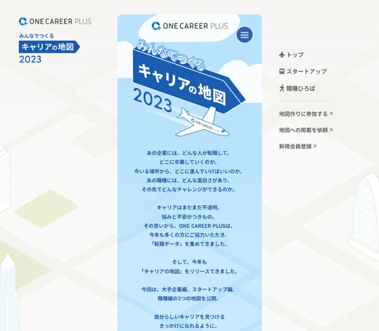
みんなでつくる、キャリアの地図2022年
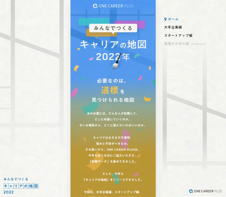
幅400pxの縦長カラムに、青から黄土色へのグラデーション、紙吹雪、街と人物のイラストを組み合わせた転職データの特設サイト。地図柄の余白と固定ナビゲーションが、3つのキャリアマップへ案内する。
Career Map 2022 / ONE CAREER PLUS — Style Reference
A narrow illustrated journey through career choices, surrounded by the quiet texture of a paper map.
Website: Career Map 2022 Original URL: https://plus-oc.onecareer.jp/careermap/2022 Final URL: https://plus-oc.onecareer.jp/careermap/2022 Theme: light paper surroundings, a colorful illustrated story, and a blue footer; no theme switch was evidenced. Inspected: supplied browser evidence retrieved October 2, 2026, at 00:44:13.900 JST / October 1, 2026, at 15:44:13.900 UTC. Viewports: desktop 1440 × 1000 CSS pixels; mobile 390 × 844 CSS pixels. Scope: the currently served 2022 home page, including the opening composition, introductory narrative, illustrated category entrances, sharing area, service explanation, company-listing request, footer, and persistent peripheral elements. Category destination pages and external services were not inspected.
Career Map 2022 presents a content hub for exploring career-transition information. Three category routes organize the experience: large companies, startups, and questions about job types. An illustrated town makes these routes feel like places to explore. Sharing, service discovery, and company participation follow the main narrative.
The defining layout is a 400px central strip on desktop. Pale street-map lines and paper grain fill the broad surrounding space, while campaign branding rests at the lower left and a small navigation list remains at the upper right. Inside the strip, blue becomes muted green and then ochre beneath centered white copy. Speech bubbles, a paintbrush, confetti, buildings, people, mountains, and cloud-like shapes connect the sections. On the inspected phone, the strip fills the viewport while most typography and key artwork dimensions remain unchanged.
閉じる
Career Map 2022 / ONE CAREER PLUS — Style Reference
A narrow illustrated journey through career choices, surrounded by the quiet texture of a paper map.
Website: Career Map 2022 Original URL: https://plus-oc.onecareer.jp/careermap/2022 Final URL: https://plus-oc.onecareer.jp/careermap/2022 Theme: light paper surroundings, a colorful illustrated story, and a blue footer; no theme switch was evidenced. Inspected: supplied browser evidence retrieved October 2, 2026, at 00:44:13.900 JST / October 1, 2026, at 15:44:13.900 UTC. Viewports: desktop 1440 × 1000 CSS pixels; mobile 390 × 844 CSS pixels. Scope: the currently served 2022 home page, including the opening composition, introductory narrative, illustrated category entrances, sharing area, service explanation, company-listing request, footer, and persistent peripheral elements. Category destination pages and external services were not inspected.
Career Map 2022 presents a content hub for exploring career-transition information. Three category routes organize the experience: large companies, startups, and questions about job types. An illustrated town makes these routes feel like places to explore. Sharing, service discovery, and company participation follow the main narrative.
The defining layout is a 400px central strip on desktop. Pale street-map lines and paper grain fill the broad surrounding space, while campaign branding rests at the lower left and a small navigation list remains at the upper right. Inside the strip, blue becomes muted green and then ochre beneath centered white copy. Speech bubbles, a paintbrush, confetti, buildings, people, mountains, and cloud-like shapes connect the sections. On the inspected phone, the strip fills the viewport while most typography and key artwork dimensions remain unchanged.
How to Read This Reference
- Measured means a value appears in the supplied rendered DOM or computed-style evidence. Measurements are CSS pixels unless stated otherwise.
- Derived means arithmetic based on measured rectangles, such as a 16px gap between navigation rows.
- Estimated means a visual approximation from the original-page screenshots. Estimated artwork colors were not sampled programmatically.
- Recommended means an implementation choice for a new build. It is not a claim about the original site's code or behavior.
- Token names beginning with
--cm-are descriptive implementation aliases. The original exported custom-property names are identified separately when relevant. - Initial DOM rectangles and later scrolled screenshots can represent different reveal states. Transformed, initially offscreen artwork bounds should not be treated as final authoring coordinates.
- The five original-page screenshots supply visual evidence. The mobile middle section is documented by DOM evidence rather than a supplied middle-position mobile screenshot.
Tokens — Colors
Measured Interface Palette
| Name | Value | Suggested token | Verified role |
|---|---|---|---|
| Navigation Blue | #0071bc |
--cm-blue |
Active desktop navigation text, participation heading, request-button fill, and footer background |
| Signpost Yellow | #ffcc47 |
--cm-yellow |
The enlarged word 道標 in the opening statement |
| Warm Gray | #ddd9d7 |
--cm-warm-gray |
Sharing, service explanation, and participation section background |
| White | #ffffff |
--cm-white |
Opening copy, request-button label, and footer text |
| Black | #000000 |
--cm-black |
Inactive desktop category labels |
| Sharing Ink | #4f4f4f |
--cm-sharing-ink |
Sharing invitation text |
| Explanation Ink | #5b5b5b |
--cm-body-ink |
Service explanation paragraphs |
| Copyright Gray | #cccccc |
--cm-copyright |
Copyright line on the blue footer |
The body itself computes to white, but that is not a complete description of the visible canvas. Artwork and other surfaces supply the paper texture, pale roads, opening gradient, and illustrations.
Estimated Artwork Palette
These values are practical starting points for recreating the visual relationships. They are not recovered source colors.
| Name | Approximate value | Role |
|---|---|---|
| Paper | #f5f5f1 |
Broad desktop margins with fine grain |
| Pale Roads | #dcded9 |
Large orthogonal and diagonal map lines, with varying apparent opacity |
| Opening Blue | #1d79ef |
Saturated opening field; visibly brighter than the measured footer blue |
| Muted Green | #859f94 |
Intermediate area of the blue-to-ochre transition |
| Ochre | #bc9937 |
Lower introductory background |
| Confetti Teal | #43b9ae |
Curved paper fragments and illustration accents |
| Confetti Pink | #d879c7 |
Paper fragments and speech-bubble accents |
| Promotional Orange | #eb620a |
Persistent circular document-promotion artwork |
| Banner Green | #405f55 |
Dark vertical category banner visible in the illustrated town |
Preserve the two blues: the opening is luminous and atmospheric; #0071bc is the more controlled navigation and footer color. Using one blue for both loses depth.
The custom-property inventory includes other colors, including --s-color-6cb31af5: #0085ceff. Their presence alone does not establish their use in the inspected components. Likewise, the exported transparent gradient variables do not reveal the visible opening artwork's exact gradient stops.
Tokens — Typography
Main Japanese Interface Face
Measured computed family: "A1ゴシック M JIS2004".
This family is declared on the navigation labels, introductory statement, body copy, sharing invitation, participation heading, request label, footer labels, and copyright. It gives the interface a friendly, substantial Japanese Gothic texture without requiring every text element to use bold CSS weight.
Most introductory and navigation text computes to font-weight: 400. The service explanation uses 500; the sharing invitation and participation heading use 700. Preserve this distinction instead of assigning 700 throughout because the screenshots look weighty.
The family appears under several exported aliases, including --s-font-ee88e536 and --s-font-0e83f509. These aliases name the same family rather than proving multiple visual font systems. Font files and actual glyph fallback were not independently inspected.
Recommended fallback stack: 'A1ゴシック M JIS2004', 'Hiragino Kaku Gothic ProN', 'Yu Gothic', sans-serif. The fallback portion is implementation guidance, not a recovered source stack.
Artwork Lettering and Brand Marks
The title artwork reads キャリアの地図 2022年, with みんなでつくる in a speech bubble above it. The supplied H1 has an empty extracted text value and a measured box of 310 × 97.83px. Its computed 32px sans-serif font is a container style; it does not identify the font used to draw the visible title.
Treat the campaign title, logo marks, vertical category lettering, and promotional badge as designed artwork unless original editable assets establish otherwise. The evidence does not identify their production fonts.
The root's computed Times family and the generic sans-serif declarations on link wrappers do not describe the visible Japanese text inside those wrappers. Use the text-bearing elements as the typographic authority.
Type Scale
| Role | Desktop size / line height | Mobile size / line height | Weight | Tracking |
|---|---|---|---|---|
| Desktop navigation | 16px / 22.4px |
Not visible in the inspected phone layout | 400 |
0.8px, or 0.05em |
| Opening statement | 24px / 33.6px |
Same | 400 |
1.2px, or 0.05em |
Highlighted 道標 |
40px / 56px |
Same | 400 |
2px, or 0.05em |
| Introductory paragraphs | 14px / 28px |
Same | 400 |
0.42px, or 0.03em |
| Sharing invitation | 14px / 19.6px |
16px / 22.4px |
700 |
0.03em |
| Service explanation | 14px / 28px |
Same | 500 |
0.7px, or 0.05em |
| Participation heading | 16px / 22.4px |
Same | 700 |
0.96px, or 0.06em |
| Request-button label | 14px / 14px |
Same | 400 |
2.1px, or 0.15em |
| Footer group headings | 16px / 22.4px |
14px / 19.6px |
400 |
0.1em |
| Footer links | 14–15px / 19.6–21px |
14px / 19.6px |
400 |
0.05em |
| Copyright | 12px / 16.8px |
11px / 15.4px |
400 |
0.05em |
The desktop footer's home, enterprise, and job-category links use 15px; several other links use 14px. This is an observed local variation, not a reason to invent a larger global type scale.
The introductory body uses a generous 2 line-height ratio. Its rhythm depends on short, deliberately broken lines and centered paragraph groups, rather than large paragraph text.
Tokens — Spacing & Shapes
The interface uses conventional pixel dimensions around a narrow composition. No viewport-derived root scaling formula was supplied.
Spacing Scale
| Value | Evidence and use | Status |
|---|---|---|
4px |
Horizontal gap between the enlarged keyword and the following を |
Derived |
10px |
Sharing invitation bottom to social-button row top | Derived |
12px |
Opening logo top offset | Measured |
14px |
Participation heading bottom to request-button top | Derived |
16px |
Desktop navigation gaps, social-button gaps, and explanation side insets | Derived |
24px |
Footer side insets; explanation-to-service-logo gap | Derived |
30px |
Separation between introductory paragraph blocks | Derived |
32px |
Opening statement bottom to first introductory paragraph | Derived |
40px |
Desktop left branding inset and central-strip-to-navigation clearance | Measured / derived |
48px |
Request-button height and clearance below that button before the footer | Measured / derived |
56px |
Desktop share-button diameter; footer group separation and copyright separation | Measured / derived |
58px |
Warm-gray section start to sharing invitation top | Derived |
64px |
Footer top to first group heading | Derived |
68px |
Social-button row bottom to service explanation top | Derived |
100px |
Service-logo box bottom to participation heading top | Derived |
The original intro contains empty paragraph elements between content blocks. A new implementation can reproduce the measured 30px separation with margins rather than empty text nodes.
Border Radius and Edges
| Element | Treatment | Evidence quality |
|---|---|---|
| Central strip and major sections | Straight edges; no card frame | Screenshots and computed section radius 0px |
| Request button | Square corners; white outline | Radius 0px measured; outline approximately 2px visually |
| Social controls | Circular white surfaces | 50% radius measured; white appearance visible |
| Speech bubbles | Small rounded corners and triangular tails | Artwork appearance; exact radius unknown |
| Category entrances | Irregular illustrated scrolls and banners | Artwork appearance, not standard rectangular cards |
| Mobile lower-left control | White circle | Approximately 48px across visually; function unverified |
Key Dimensions
| Element | Desktop | Mobile | Status |
|---|---|---|---|
| Main strip | 400px, from x=520 to x=920 |
390px, full viewport |
Measured |
| Opening logo link | 200 × 31.22px, y=12 |
Same, y=12 | Measured |
| Title container | 310 × 97.83px, x=565 |
Same, x=40 | Measured |
| Introductory paragraph box | 400px wide |
390px wide |
Measured |
| Explanation text box | 368px wide |
358px wide |
Measured |
| Lower service-logo link | 219 × 43.44px |
219 × 43.42px |
Measured |
| Request button | 260 × 48px |
Same | Measured |
| Social circles | 56 × 56px |
50 × 50px |
Measured |
| Footer inner width | 352px |
342px |
Derived from 24px side insets |
| Promotional link box | 220 × 211.02px |
170 × 170px |
Measured; visible art has internal transparency |
Components
Central Story Strip
Role: holds the complete narrative and route-selection sequence.
Center a single narrow column in the document. At 1440px, the 400px strip occupies only about 27.8% of the viewport width; the large side areas are intentional. The footer and support section stay inside the same strip rather than expanding to the full desktop width.
The page scrolls vertically as a document. There is no evidence of an application-style internal scrolling panel. Content order is opening artwork, introduction, illustrated map entrances, sharing, service explanation, participation request, and footer.
Maintain continuous edges between sections. Color changes and illustrated scenery supply the transitions; repeated bordered cards do not organize the main page.
Desktop Background and Persistent Furniture
Role: keeps campaign identity and navigation available around the scrolling strip.
The surrounding canvas resembles lightly textured paper with broad pale streets. Lines vary in width and apparent opacity, crossing at right angles and diagonally. The map treatment remains low contrast so the colorful central strip dominates.
A campaign artwork link sits at x=40, y≈809.38, measuring 220 × 110.63px in the 1000px-high viewport. A separate 200 × 29.08px service-logo link sits below it at y≈942.92, ending 28px above the viewport bottom. Their position is visually stable across the desktop scroll captures.
The right navigation begins at x=960, y=80: 40px to the right of the strip. Four rows use 16px text and approximately 38.4px top-to-top spacing. The current ホーム item is blue with a small location-pin symbol; the three category labels are black. This is a compact unboxed list, not a full-width header.
Opening Artwork
Role: establishes the edition, voice, and map-making metaphor.
Place the white ONE CAREER PLUS mark near the top center. Below it, layer cyan, purple, and ochre speech-bubble forms behind an off-white bubble reading みんなでつくる. The white campaign title and year form a separate visual block below the bubbles. A small angled brush sits near the year and lower opening area.
The title container begins at y≈186.66 and retains its 310px width on both inspected screens. The speech-bubble artwork is visually around 314px wide, but its exact asset dimensions are not supplied.
Use saturated blue behind the composition, with darker street-like geometry and a lighter wash near the top. Confetti includes curved strips, angular cutouts, and irregular paper shapes in yellow, teal, and pink. Their arrangement is part of the art direction; an evenly repeated confetti pattern would feel different.
The brush is approximately 29px lower in the mobile composition visually, consistent with the lower statement position. The stills do not establish a brush animation.
Opening Statement and Narrative
Role: explains why career information needs a map.
Build the opening statement as three centered lines: 必要なのは、, a larger yellow 道標 followed by a smaller white を, and 見つけられる地図. The combined measured height is approximately 123.2px. The keyword line supplies the strongest typographic emphasis outside the title artwork.
Start the body 32px below the statement. Use 14px white text with 28px line height and short authored line breaks. The content moves from uncertainty about career choices to the collection of transition data and the availability of three maps.
Keep the gradient broad: blue around the statement, muted green through the first body block, and ochre lower down. The exact gradient implementation is unknown; it may involve artwork or layered surfaces.
Illustrated Category Entrances
Role: offers three routes through a town-like illustration.
The desktop middle capture shows clustered small buildings with colorful roofs, a river, tall angled banners, people near signposts, and layered mountains toward the bottom. The startup and job-category entrances are visible as vertical lettering on illustrated banner or scroll shapes. The enterprise route is confirmed by its link and navigation label; its full scene is not shown in the supplied middle capture.
| Visible UI label | Observed destination |
|---|---|
大手企業編 |
/careermap/2022/enterprise |
スタートアップ編 |
/careermap/2022/startup |
職種のお悩み編 |
/careermap/2022/job |
The entrances alternate around the central axis rather than forming a regular card grid. Mobile DOM rectangles for the three image links measure approximately 92.14 × 308.27px, 119.60 × 315.31px, and 125.15 × 329.93px. Desktop sampled rectangles are wider and reflect transformed bounds; one initially offscreen rectangle extends outside the strip's left edge. These measurements are evidence of the captured state, not reliable intrinsic image sizes or final placement coordinates.
For implementation, keep the town scenery and each linked banner as coordinated assets with meaningful link names. Position targets against the artwork's own coordinate system, and verify their final bounds after any entrance effects.
Sharing Area
Role: invites readers to distribute the map.
The illustration settles into a warm-gray section through mountains and white cloud-like bands. A centered invitation sits 58px below the section's measured start, followed by three social circles after a 10px gap.
The desktop row contains Twitter's bird, Facebook, and LINE marks on white circles. Each link is 56px across with 16px gaps, giving the row a total width of 200px. Soft shadows visually lift the circles from the gray surface; shadow parameters were not captured.
Mobile circles shrink to 50px, making the row 182px wide, while the invitation grows from 14px to 16px. Keep this specific adjustment rather than uniformly scaling every element down.
The DOM exposes share URLs for the three services. No share window, completed share, or popup behavior was exercised.
Service Explanation
Role: connects the campaign to the broader career service.
The explanation begins 68px below the sharing circles. Its text box uses 16px side insets, 14px type, 28px line height, 500 weight, and #5b5b5b text on warm gray. The measured text block is 392px high in both viewports.
The copy discusses support beyond the first career choice and includes the service name ワンキャリア転職. A centered linked service logo follows 24px after the paragraph box. The current page visibly contains this Japanese service identity alongside ONE CAREER PLUS campaign and footer branding. Preserve the observed coexistence when documenting this page.
The paragraph's content and dimensions are DOM-supported; the supplied screenshots do not expose its complete visual layout at a dedicated scroll position.
Company-Listing Request
Role: allows companies to request inclusion in the map.
A faint building illustration sits behind a centered two-line blue heading. The heading reads キャリアの地図に 掲載したい企業を募集中! and uses 16px bold text with 22.4px line height.
Place a 260 × 48px rectangular button 14px below the heading. Its blue fill, approximately 2px white outline, square corners, subtle shadow, and lighter diagonal wedge at the left create a small printed-sign effect. The white label 地図の掲載依頼をする uses unusually open 0.15em tracking.
The link points to https://forms.gle/VFA5jsC3EicwmBas5. This is an outbound form entry, not an observed inline form or modal. Leave 48px beneath the button before the blue footer begins.
Footer Navigation
Role: supplies a complete secondary directory and service links.
The footer uses measured #0071bc, white labels, 24px side insets, and 64px top clearance. Two stacked groups are headed by キャリアの地図 and ONE CAREER PLUS. Each heading has a fine white horizontal rule extending across the inner width.
The first group contains home, three category routes, a company-listing request, and the 2021 edition. The second contains the service home, registration, and three related editorial features. Small northeast-pointing arrows appear beside several outbound or related destinations. The extracted arrow_forward text should be understood as an icon-related DOM value, not literal visible copy to reproduce.
Links are plain text rows with 16px vertical gaps. The second group starts 56px after the final row of the first group. Copyright follows the last service link after another 56px and sits 24px above the document end.
A grain texture is visible over the blue surface in the mobile capture. Its asset or compositing method is not included in the style evidence.
Persistent Document Promotion
Role: directs visitors to a separate startup-related document offer.
A vivid orange circular graphic stays at the lower right in both layouts. Black, white, and yellow lettering forms a compact promotional composition, including スタートアップのお金事情 and a free-materials message. The observed destination is https://plus.onecareer.jp/exclusive_career_documents.
The desktop link box extends 33px beyond the right edge and 67px below the viewport. Mobile uses a 170px square link box extending 22px right and 54px below. Transparent space within the graphic means the orange silhouette is smaller than these link bounds.
On mobile, the graphic overlaps introductory copy and the lower footer in the supplied captures. This is an observed layout limitation. A new implementation should retain the visual identity while ensuring important text and focused controls can be read without obstruction.
Unverified Mobile Circular Control
A small white circle with a thin black cross- or needle-like mark appears at the lower left in both mobile screenshots. It is approximately 48px across and approximately 16px from the left and bottom edges.
The supplied element records do not identify its semantic role or resulting state. Do not label it as a menu, scroll-to-top button, or accessibility control without further evidence. Recreating its appearance does not establish what action it should perform.
Tokens — Motion & Interaction
Recorded Transition Declarations
| Element or treatment | Supplied computed declaration | What the evidence establishes |
|---|---|---|
| Body background | 0.5s cubic-bezier(0.4, 0.4, 0, 1) |
A background transition is declared; no background-change trigger was exercised |
| Most text, links, sections, and footer elements | 0.3s cubic-bezier(0.4, 0.4, 0, 1) |
Common transition timing, including exported gradient-property transitions |
| Title container | 0.6s cubic-bezier(0.4, 0.4, 0, 1) 0.8s |
A 600ms transition with an 800ms delay is declared |
| Desktop enterprise and job entrances | 0.6s cubic-bezier(0.57, -0.02, 0.41, 1.59) 0.6s |
Overshooting timing curve with a 600ms delay |
| Desktop startup entrance | Same 600ms overshooting curve, 0.8s delay |
A different stagger delay is declared |
| Mobile category entrances | 0.3s cubic-bezier(0.4, 0.4, 0, 1) |
The supplied mobile declarations differ from the desktop entrance timings |
The sampled elements report animation: none. This does not prove that the page is motionless: transitions, image animation, pseudo-elements, and script-driven changes are separate mechanisms.
The category timing curve can produce an overshooting entrance when applied to geometry. The evidence does not establish the precise starting transform, reveal trigger, travel distance, or whether the effect repeats. Do not describe a specific bounce, brush stroke, falling-confetti loop, or parallax system as verified behavior.
Interaction Evidence and Limits
- Vertical scrolling exposed the town, sharing area, and footer. Desktop branding, navigation, and the promotional graphic remain visually anchored across the supplied scroll captures.
- The three categories are links to distinct routes, not evidenced in-page filter tabs.
- The company request, service links, registration, and promotion have identifiable destinations. Their destination pages were not opened as part of this analysis.
- Hover states, keyboard focus appearance, mobile-control activation, and click-driven transitions were not supplied.
- The capture process waited for load, finite motion, layout stability, text stability, and image decoding within stated time limits. That process does not prove that every delayed or interaction-dependent state was captured.
Recommended motion vocabulary: short transitions, restrained opacity changes, and optional brief entrance motion for the illustrated banners. Preserve a fully readable static state and respect reduced-motion preferences. Treat these as new implementation choices until the original triggers are verified.
Surfaces
| Layer | Appearance | Purpose |
|---|---|---|
| Desktop surroundings | Off-white grain and pale oversized road lines | Gives the narrow story geographic context and breathing room |
| Opening | Luminous blue with darker geometry and scattered paper shapes | Establishes campaign energy and identity |
| Introduction | Broad blue-to-green-to-ochre color transition | Carries centered narrative copy through the vertical composition |
| Illustrated town | Light grounds, colored roofs, dark banners, loosely drawn figures | Turns category navigation into an exploratory scene |
| Support section | Measured warm gray, #ddd9d7 |
Quieter space for sharing, explanation, and company participation |
| Social buttons | White circles with soft shadows | Small raised interaction targets |
| Request button | Blue rectangle, white outline, diagonal highlight | Distinct participation action |
| Footer | Measured blue with white rules and text | Strong, orderly ending to the story |
| Promotion | Orange circular artwork with dense lettering | Independent attention point outside the main narrative |
There is no general elevated-card system. Shadows are local to small controls and artwork accents; section hierarchy comes mainly from color, illustration, and spacing.
Imagery
The visual language combines a paper map, friendly editorial drawing, and celebratory cut paper. Buildings are simplified but have uneven window and roof details. Figures use fine gray outlines, restrained facial detail, and generous colored clothing shapes. The town's perspective is illustrative rather than a rigid isometric grid.
Banners resemble rolled sheets or hanging signs, with vertical white lettering and irregular ends. Wooden signposts reinforce the idea of choosing a direction. Mountains and horizontal cloud forms soften the change from the town into the support section.
Preserve the difference between decorative surroundings and actionable artwork. Background roads should stay faint. Category banners need clear silhouettes and readable labels. Confetti should frame copy without making the reading area uniformly busy.
Observed Asset References
The supplied evidence does not include image src values, original filenames, dimensions of source files, or asset URLs. The inventory below identifies observed visual assets without inventing paths.
| Asset | Observed use | Implementation guidance |
|---|---|---|
| Paper-map background | Desktop surroundings | Use a dedicated texture and street illustration; generic repeating grids are only a rough placeholder |
| Campaign lockup | Desktop lower-left identity | Preserve its speech-bubble label, title, and year as a coordinated graphic |
| Opening wordmark and title | Top of the central strip | Keep separate from ordinary paragraph typography |
| Brush and confetti | Opening and introductory story | Use transparent artwork; mark purely decorative images accordingly |
| Town, banners, people, signposts | Category-selection scene | Coordinate scene dimensions and linked banner placements |
| Mountains and clouds | Transition into sharing | Preserve their full-width relationship to the strip |
| Social marks | Three sharing circles | Preserve the currently shown marks when documenting this page |
| Japanese service logo | Below the explanation | Retain the observed variant and its aspect ratio |
| Faint building | Participation invitation | Keep it low contrast behind the heading |
| Orange document offer | Persistent corner promotion | Preserve graphic proportions; evaluate overlap on narrow screens |
No photographic content appears in the supplied original-page captures. The illustrations are not pixel art; do not apply image-rendering: pixelated.
Layout & Responsive Behavior
Measured Comparison
| Characteristic | Desktop 1440 × 1000 | Mobile 390 × 844 |
|---|---|---|
| Document height | 3780.11px |
3969.02px |
| Central strip | 400px, centered |
390px, edge to edge |
| Title top | 186.66px |
186.66px |
| Opening statement top | 366.08px |
395.08px |
| First intro paragraph top | 521.27px |
550.27px |
| Warm-gray support section top | 2178.97px |
2382.31px |
| Warm-gray section height | 925.81px |
922.59px |
| Footer top | 3104.78px |
3304.91px |
| Footer height | 675.33px |
664.11px |
| Desktop side furniture | Visible | Not visible |
| Corner promotion | Larger, outside the reading strip | Smaller, overlapping the reading strip |
The mobile layout is not a uniformly scaled desktop canvas. The title remains 310px wide, the logo remains 200px wide, the lead remains 24px, and the highlighted word remains 40px. The opening statement and body shift down by 29px while the title's vertical position stays the same.
The support section starts approximately 203.34px later on mobile. The full mobile document is approximately 188.91px taller, while its footer is slightly shorter. This indicates meaningful changes in the upper illustration and section composition, not merely a change in paragraph width.
The footer stays a single vertical directory. It does not become a multi-column desktop footer. At both sizes, its content begins 24px inside the strip.
The supplied DOM text contains a max-width: 1120px rule for conditional line breaks. That fragment does not establish the breakpoint used to hide desktop navigation or change illustration positions. Only the two supplied viewport outcomes are verified. Tablet, landscape, very narrow phones, zoomed text, and other intermediate widths remain untested.
Recommended shell rule: width: min(100%, 400px); margin-inline: auto. A desktop-furniture breakpoint around 1024px is a practical starting point, not a recovered source value. Test it against navigation clearance and the left branding footprint.
Do’s and Don’ts
Do
- Keep the desktop narrative around 400px wide and allow the surroundings to remain spacious.
- Preserve the pale street-map background and fine paper texture.
- Use measured
#0071bcfor navigation, the request action, and footer. - Keep the opening blue visually distinct from the footer blue.
- Use the yellow
道標as a focused typographic accent. - Retain short centered introductory lines with 28px leading.
- Build category entrances into a continuous illustrated scene.
- Keep the title artwork, speech bubbles, brush, and confetti composition coordinated.
- Preserve the warm-gray pause between the illustrated journey and blue footer.
- Use square corners for the request button and circles for sharing controls.
- Carry category navigation into the footer as ordinary text links.
- Treat mobile layout changes individually: text sizes, circle diameters, vertical offsets, and peripheral visibility do not all scale together.
Don’t
- Don't stretch the story into a conventional wide desktop content grid.
- Don't replace the town's category entrances with interchangeable rounded cards.
- Don't infer the title's artwork font from the empty
H1container's computed font. - Don't adopt every exported font or color variable as a visible design token.
- Don't make every Japanese text element bold when the measured weight is
400. - Don't flatten all backgrounds into one corporate blue.
- Don't turn faint background streets into a high-contrast technical diagram.
- Don't add photographic office imagery to the observed illustration system.
- Don't assume that confetti, the brush, or the background continuously animate.
- Don't copy initial transformed link rectangles as final scene coordinates.
- Don't assign a made-up function to the unexplained mobile circular control.
- Don't allow a persistent promotion to make essential copy or keyboard focus unreachable in a new implementation.
Recommended Implementation Additions
These are recommendations for a new implementation, not verified features of the inspected page.
- Provide an accessible campaign heading even when the visible title is an image. Empty extracted
H1text is not sufficient to determine whether the original already has an accessible alternative. - Give every image-based category link a clear accessible name matching its destination. Keep decorative town elements out of the accessibility tree.
- Add explicit names to social links and distinguish the two home links in the footer by their navigation-group context.
- Keep visible keyboard focus on white, blue, gray, and illustrated surfaces. A two-color outline is useful where the underlying artwork varies.
- Enlarge effective footer and side-navigation hit areas without changing the visual text rhythm. Several measured link boxes are only about 20–22px high.
- Review contrast across the entire opening gradient. White text over ochre and muted green needs checking at the actual rendered colors; those background colors are only visually estimated here.
- Reposition, collapse, or make the promotional graphic flow with the content on small screens. Preserve its destination while removing persistent overlap with narrative text.
- Respect safe-area insets for any fixed phone controls. Verify focus visibility, orientation changes, and text zoom.
- Use semantic spacing rather than empty paragraphs and keep authored Japanese line breaks adaptable at narrower widths.
- Supply image dimensions and responsive sources to preserve scene geometry while assets load. Keep essential text and navigation available if artwork fails.
- If entrance motion is implemented, make content visible by default and add motion only as progressive enhancement. Reduced-motion users should receive the complete final composition immediately.
Agent Prompt Guide
Quick Color Reference
- Navigation, footer, and main request action: measured
#0071bc. - Keyword emphasis: measured
#ffcc47. - Support section: measured
#ddd9d7. - Introductory and footer text: measured
#ffffff. - Explanation copy: measured
#5b5b5b. - Opening artwork approximation: blue
#1d79efthrough muted green#859f94into ochre#bc9937. - Desktop paper approximation:
#f5f5f1, with very pale broad roads. - Orange belongs to the separate document promotion, not the main category-navigation system.
Overall Prompt
“Create an illustrated Japanese career-information hub with a 400px central story strip on desktop and a full-width strip on a 390px phone. Surround the desktop strip with softly textured off-white paper and pale oversized street-map lines. Place a compact campaign lockup at the lower left and an unboxed category navigation list to the right of the strip. Begin with a small white service mark, overlapping speech bubbles, a designed title and year, an angled paintbrush, and sparse colorful paper fragments. Transition a luminous blue background through muted green into ochre beneath centered white Japanese copy. Emphasize one key word in yellow at 40px. Lead into a continuous illustrated town with vertical banner links, then a warm-gray sharing and explanation section, a square blue participation button, and a narrow blue footer with white rules. Use the measured body rhythm of 14px text with 28px leading. Treat all artwork colors beyond the measured UI palette as approximations.”
Example Component Prompts
- Desktop shell: “Center a 400px story strip in a 1440px viewport. Keep pale paper-map artwork in both side areas. Position navigation 40px to the right of the strip and 80px from the top. Use 16px Japanese Gothic labels with 16px row gaps; show the active home route in blue with a small pin.”
- Opening statement: “Set three centered lines of Japanese copy in a substantial Gothic face. Use 24px white text with 33.6px leading and 0.05em tracking. On the middle line, enlarge
道標to 40px and color it#ffcc47, followed by a smaller whiteを. Start 14px body copy 32px below the statement.” - Category scene: “Illustrate a small town with hand-drawn buildings, colored roofs, a river, people, wooden signposts, and tall rolled banners. Arrange three accessible category links alternately along the vertical scene. Use the banners as the navigation objects and preserve their irregular illustrated silhouettes.”
- Sharing area: “On
#ddd9d7, center a compact invitation above three white circular social links with soft shadows. Use 56px circles and 16px gaps on desktop; use 50px circles and a 16px invitation on the phone. Add low-contrast mountain and cloud artwork above.” - Participation action: “Place a faint building behind a two-line blue heading. Below it, create a 260 × 48px square-cornered blue link with a white outline and a small diagonal lighter-blue wedge at the left. Use the label
地図の掲載依頼をするat 14px with 0.15em tracking.” - Footer: “Keep the footer inside the story strip. Use
#0071bc, 24px side insets, 64px top spacing, white Japanese labels, and a thin rule below each of two navigation headings. Stack the groups vertically with 56px separation and retain compact outbound arrows.” - Motion: “Use 300ms transitions for modest interface feedback. An optional illustrated entrance can use a 600ms overshooting curve, but do not invent continuous confetti or parallax motion. Keep content visible without animation and provide a reduced-motion final state.”
Quick Start
CSS Custom Properties
This CSS is a reusable adaptation, not extracted source code. It preserves measured strip widths, typography, social sizing, request-button geometry, and footer rhythm. Estimated colors, the 1024px breakpoint, shadows, focus styling, and hover feedback are explicitly implementation choices.
Apply .cm-page to the page wrapper or body, place the main content inside .cm-strip, and keep .cm-desktop-brand, .cm-side-nav, and .cm-promo outside that strip. Use .cm-hero-header, .cm-lead, and .cm-story for the opening sequence. The footer expects heading-plus-navigation groups. Optional image properties default to none; bind them to authorized assets when available. No asset URLs are inferred here.
:root {
  /* Measured interface colors */
  --cm-blue: #0071bc;
  --cm-yellow: #ffcc47;
  --cm-warm-gray: #ddd9d7;
  --cm-white: #fff;
  --cm-black: #000;
  --cm-sharing-ink: #4f4f4f;
  --cm-body-ink: #5b5b5b;
  --cm-copyright: #ccc;

  /* Visual estimates for artwork fallbacks */
  --cm-paper: #f5f5f1;
  --cm-opening-blue: #1d79ef;
  --cm-muted-green: #859f94;
  --cm-ochre: #bc9937;

  /* Observed family followed by recommended fallbacks */
  --cm-font: 'A1ゴシック M JIS2004',
    'Hiragino Kaku Gothic ProN', 'Yu Gothic', sans-serif;
  --cm-body-size: 14px;
  --cm-body-leading: 28px;
  --cm-lead-size: 24px;
  --cm-keyword-size: 40px;

  /* Measured dimensions and derived spacing */
  --cm-strip-max: 400px;
  --cm-inset: 24px;
  --cm-gap: 16px;
  --cm-paragraph-gap: 30px;
  --cm-section-gap: 56px;
  --cm-share-size: 50px;
  --cm-share-caption: 16px;
  --cm-footer-heading: 14px;
  --cm-footer-primary: 14px;
  --cm-copyright-size: 11px;
  --cm-hero-head-height: 395.078px;

  /* Recorded timing; application to hover is recommended */
  --cm-ease: cubic-bezier(0.4, 0.4, 0, 1);
  --cm-ease-overshoot: cubic-bezier(0.57, -0.02, 0.41, 1.59);
  --cm-feedback-time: 300ms;

  /* Recommended shadow, not a recovered source value */
  --cm-control-shadow: 0 8px 18px rgb(0 0 0 / 12%);

  /* Optional authorized artwork; no assumed file paths */
  --cm-map-art: none;
  --cm-paper-art: none;
  --cm-hero-art: none;
  --cm-footer-art: none;
}

* { box-sizing: border-box; }

body { margin: 0; }

.cm-page {
  color: var(--cm-body-ink);
  background: var(--cm-paper);
  font-family: var(--cm-font);
  font-weight: 400;
}

.cm-page img {
  display: block;
  max-inline-size: 100%;
}

.cm-backdrop {
  display: none;
  position: fixed;
  inset: 0;
  pointer-events: none;
  background-color: var(--cm-paper);
  background-image: var(--cm-map-art), var(--cm-paper-art);
  background-position: center;
  background-size: cover;
}

.cm-strip {
  position: relative;
  inline-size: min(100%, var(--cm-strip-max));
  margin-inline: auto;
  overflow-x: clip;
}

.cm-desktop-brand,
.cm-side-nav { display: none; }

.cm-hero {
  position: relative;
  color: var(--cm-white);
  text-align: center;
  /* Approximate gradient; replace with verified artwork if available. */
  background-image: var(--cm-hero-art), linear-gradient(
    180deg,
    var(--cm-opening-blue) 0,
    var(--cm-opening-blue) 360px,
    var(--cm-muted-green) 530px,
    var(--cm-ochre) 720px
  );
  background-size: 100% auto;
  background-repeat: no-repeat;
}

.cm-hero-header {
  position: relative;
  block-size: var(--cm-hero-head-height);
}

.cm-opening-logo {
  position: absolute;
  inset-block-start: 12px;
  inset-inline-start: 50%;
  inline-size: 200px;
  transform: translateX(-50%);
}

.cm-opening-logo img { inline-size: 100%; }

.cm-title {
  position: absolute;
  inset-block-start: 186.656px;
  inset-inline-start: 50%;
  inline-size: min(310px, calc(100% - 48px));
  margin: 0;
  transform: translateX(-50%);
}

.cm-title img {
  inline-size: 100%;
  block-size: auto;
}

.cm-hero-decoration { pointer-events: none; }

.cm-lead {
  font-size: var(--cm-lead-size);
  line-height: 1.4;
  letter-spacing: 0.05em;
}

.cm-lead p { margin: 0; }

.cm-keyword-row {
  display: flex;
  align-items: baseline;
  justify-content: center;
  gap: 4px;
}

.cm-keyword {
  color: var(--cm-yellow);
  font-size: var(--cm-keyword-size);
  font-weight: 400;
  line-height: 1.4;
}

.cm-story {
  margin-block-start: 32px;
  /* Small-screen protection; original paragraph boxes have no padding. */
  padding-inline: 16px;
  font-size: var(--cm-body-size);
  line-height: var(--cm-body-leading);
  letter-spacing: 0.03em;
}

.cm-story p { margin: 0; }
.cm-story p + p { margin-block-start: var(--cm-paragraph-gap); }

.cm-map-scene { position: relative; }
.cm-map-scene > img { inline-size: 100%; block-size: auto; }

/* Set these percentages against the supplied scene artwork. */
.cm-map-link {
  position: absolute;
  inset-inline-start: var(--scene-x, 0%);
  inset-block-start: var(--scene-y, 0%);
  inline-size: var(--scene-width, 25%);
}

.cm-map-link img { inline-size: 100%; block-size: auto; }

.cm-support {
  background: var(--cm-warm-gray);
  text-align: center;
}

.cm-share { padding-block-start: 58px; }

.cm-share-caption {
  margin: 0 12px 10px;
  color: var(--cm-sharing-ink);
  font-size: var(--cm-share-caption);
  font-weight: 700;
  line-height: 1.4;
  letter-spacing: 0.03em;
}

.cm-share-links {
  display: flex;
  justify-content: center;
  gap: var(--cm-gap);
}

.cm-share-link {
  display: grid;
  place-items: center;
  inline-size: var(--cm-share-size);
  block-size: var(--cm-share-size);
  border-radius: 50%;
  background: var(--cm-white);
  box-shadow: var(--cm-control-shadow);
}

.cm-about {
  margin-block-start: 68px;
  padding-inline: 16px;
  color: var(--cm-body-ink);
  font-size: 14px;
  font-weight: 500;
  line-height: 28px;
  letter-spacing: 0.05em;
}

.cm-about p { margin: 0; }

.cm-service-logo {
  display: block;
  inline-size: 219px;
  margin: 24px auto 0;
}

.cm-service-logo img { inline-size: 100%; block-size: auto; }

.cm-request {
  position: relative;
  margin-block-start: 100px;
  padding: 0 16px 48px;
}

.cm-request h2 {
  margin: 0;
  color: var(--cm-blue);
  font-size: 16px;
  font-weight: 700;
  line-height: 22.4px;
  letter-spacing: 0.06em;
}

.cm-request-link {
  position: relative;
  isolation: isolate;
  display: flex;
  align-items: center;
  justify-content: center;
  inline-size: min(260px, 100%);
  min-block-size: 48px;
  margin: 14px auto 0;
  padding: 8px 12px;
  overflow: hidden;
  border: 2px solid var(--cm-white);
  border-radius: 0;
  color: var(--cm-white);
  background: var(--cm-blue);
  box-shadow: var(--cm-control-shadow);
  font-size: 14px;
  line-height: 1;
  letter-spacing: 0.15em;
  text-decoration: none;
}

.cm-request-link::before {
  content: '';
  position: absolute;
  z-index: -1;
  inset: 0 auto 0 0;
  inline-size: 48px;
  background: rgb(255 255 255 / 10%);
  clip-path: polygon(0 0, 100% 0, 0 100%);
}

.cm-footer {
  padding: 64px var(--cm-inset) 24px;
  color: var(--cm-white);
  background-color: var(--cm-blue);
  background-image: var(--cm-footer-art);
}

.cm-footer-group + .cm-footer-group {
  margin-block-start: var(--cm-section-gap);
}

.cm-footer h2 {
  margin: 0 0 16px;
  padding-block-end: 8px;
  border-block-end: 1px solid rgb(255 255 255 / 70%);
  font-size: var(--cm-footer-heading);
  font-weight: 400;
  line-height: 1.4;
  letter-spacing: 0.1em;
}

.cm-footer nav {
  display: flex;
  flex-direction: column;
  align-items: flex-start;
  gap: 16px;
}

.cm-footer a {
  max-inline-size: 100%;
  color: inherit;
  font-size: 14px;
  line-height: 1.4;
  letter-spacing: 0.05em;
  text-decoration: none;
}

.cm-footer a.cm-footer-primary {
  font-size: var(--cm-footer-primary);
}

.cm-copyright {
  margin: 56px 0 0;
  color: var(--cm-copyright);
  font-size: var(--cm-copyright-size);
  line-height: 1.4;
  letter-spacing: 0.05em;
  text-align: center;
}

/* Matches observed clipping; reconsider overlap for production use. */
.cm-promo {
  position: fixed;
  z-index: 5;
  right: -22px;
  bottom: -54px;
  inline-size: 170px;
  block-size: 170px;
}

.cm-promo img {
  inline-size: 100%;
  block-size: 100%;
  object-fit: contain;
}

/* Recommended breakpoint, not a recovered source media query. */
@media (min-width: 1024px) {
  :root {
    --cm-share-size: 56px;
    --cm-share-caption: 14px;
    --cm-footer-heading: 16px;
    --cm-footer-primary: 15px;
    --cm-copyright-size: 12px;
    --cm-hero-head-height: 366.078px;
  }

  .cm-backdrop { display: block; }

  .cm-desktop-brand {
    display: block;
    position: fixed;
    z-index: 2;
    left: 40px;
    bottom: 28px;
    inline-size: 220px;
  }

  .cm-desktop-brand .cm-campaign-mark { inline-size: 220px; }
  .cm-desktop-brand .cm-brand-service {
    inline-size: 200px;
    margin-block-start: 22.92px;
  }

  .cm-side-nav {
    display: flex;
    flex-direction: column;
    align-items: flex-start;
    gap: 16px;
    position: fixed;
    z-index: 2;
    top: 80px;
    left: calc(50% + 240px);
  }

  .cm-side-nav a {
    display: flex;
    align-items: center;
    gap: 8px;
    color: var(--cm-black);
    font-size: 16px;
    line-height: 22.4px;
    letter-spacing: 0.05em;
    text-decoration: none;
  }

  .cm-side-nav a[aria-current='page'] { color: var(--cm-blue); }

  .cm-promo {
    right: -33px;
    bottom: -67px;
    inline-size: 220px;
    block-size: 211.016px;
  }
}

/* Recommended interaction and accessibility additions. */
.cm-page a {
  transition: opacity var(--cm-feedback-time) var(--cm-ease);
}

@media (hover: hover) {
  .cm-page a:hover { opacity: 0.82; }
}

.cm-page :focus-visible {
  outline: 3px solid #fff;
  outline-offset: 3px;
  box-shadow: 0 0 0 6px #173b52;
}

.cm-sr-only {
  position: absolute;
  inline-size: 1px;
  block-size: 1px;
  padding: 0;
  margin: -1px;
  overflow: hidden;
  clip-path: inset(50%);
  white-space: nowrap;
  border: 0;
}

@media (prefers-reduced-motion: reduce) {
  .cm-page *,
  .cm-page *::before,
  .cm-page *::after {
    animation: none !important;
    transition: none !important;
    scroll-behavior: auto !important;
  }
}
The shell and text styling are usable without a framework. The map scene, title lettering, brush, speech bubbles, background roads, and promotion still require actual assets. Their identity cannot be reproduced by the CSS tokens alone. The CSS deliberately does not assign behavior to the unverified mobile circular control or invent a reveal trigger.
Tailwind v4 Token Mapping
Optional aliases for a project that already uses Tailwind v4. This does not imply that the original page uses Tailwind. Define the custom properties above first.
@theme inline {
  --color-map-blue: var(--cm-blue);
  --color-map-yellow: var(--cm-yellow);
  --color-map-paper: var(--cm-paper);
  --color-map-warm-gray: var(--cm-warm-gray);
  --color-map-ink: var(--cm-body-ink);

  --font-map: var(--cm-font);

  --text-map-body: 14px;
  --text-map-body--line-height: 28px;
  --text-map-lead: 24px;
  --text-map-lead--line-height: 33.6px;
  --text-map-keyword: 40px;
  --text-map-keyword--line-height: 56px;

  --spacing-map-strip: 400px;
  --spacing-map-inset: 24px;
  --spacing-map-gap: 16px;
  --spacing-map-section: 56px;
  --spacing-map-action: 260px;
  --spacing-map-action-height: 48px;
  --spacing-map-share: var(--cm-share-size);
}
Sources & Evidence
- Original and final website: Career Map 2022. The supplied browser record reports HTTP 200 and no URL change.
- Capture record: retrieved
2026-10-01T15:44:13.900Z, equivalent to October 2, 2026, 00:44:13.900 JST. The year in the campaign title identifies its edition; this reference describes the page served at the recorded inspection time. - Desktop evidence: 1440 × 1000 CSS-pixel viewport; opening, middle, and lower-page screenshots; rendered text, destinations, computed styles, and element rectangles. Recorded document height is approximately 3780.11px.
- Mobile evidence: 390 × 844 CSS-pixel viewport; opening and lower-page screenshots; rendered text, destinations, computed styles, and element rectangles. Recorded document height is approximately 3969.02px.
- Current original-page branding: the opening and footer show ONE CAREER PLUS, while the explanation and lower service mark show
ワンキャリア転職. The footer visibly includesCopyright © ONE CAREER INC. All rights reserved. - Inspection conditions: the supplied capture process observed the initial page for at least five seconds and checked load, finite animation readiness, layout and text stability, and image decoding within bounded waits. Perpetual animations were paused during readiness checks and resumed afterward. SharedWorkers and service workers were disabled during inspection.
- Interaction scope: scrolling and resulting page positions are evidenced. Link destinations and transition declarations are supplied. Click outcomes, hover states, focus states, mobile-control behavior, precise animation triggers, and destination-page designs remain unverified.
- Asset and responsive limits: original image URLs, complete stylesheets, font files, and additional viewport captures were not supplied. Exact artwork colors, gradient stops, texture composition, source breakpoints, and final offscreen reveal geometry are therefore not established. No additional browsing, commands, or file access were used for this reference.
Measured interface values, visual estimates, and implementation recommendations are separated throughout so the reference can guide a new build without presenting approximations as recovered source code.
# Career Map 2022 / ONE CAREER PLUS — Style Reference

> A narrow illustrated journey through career choices, surrounded by the quiet texture of a paper map.

**Website:** [Career Map 2022](https://plus-oc.onecareer.jp/careermap/2022)
**Original URL:** https://plus-oc.onecareer.jp/careermap/2022
**Final URL:** https://plus-oc.onecareer.jp/careermap/2022
**Theme:** light paper surroundings, a colorful illustrated story, and a blue footer; no theme switch was evidenced.
**Inspected:** supplied browser evidence retrieved October 2, 2026, at 00:44:13.900 JST / October 1, 2026, at 15:44:13.900 UTC.
**Viewports:** desktop 1440 × 1000 CSS pixels; mobile 390 × 844 CSS pixels.
**Scope:** the currently served 2022 home page, including the opening composition, introductory narrative, illustrated category entrances, sharing area, service explanation, company-listing request, footer, and persistent peripheral elements. Category destination pages and external services were not inspected.

Career Map 2022 presents a content hub for exploring career-transition information. Three category routes organize the experience: large companies, startups, and questions about job types. An illustrated town makes these routes feel like places to explore. Sharing, service discovery, and company participation follow the main narrative.

The defining layout is a 400px central strip on desktop. Pale street-map lines and paper grain fill the broad surrounding space, while campaign branding rests at the lower left and a small navigation list remains at the upper right. Inside the strip, blue becomes muted green and then ochre beneath centered white copy. Speech bubbles, a paintbrush, confetti, buildings, people, mountains, and cloud-like shapes connect the sections. On the inspected phone, the strip fills the viewport while most typography and key artwork dimensions remain unchanged.
閉じる
# Career Map 2022 / ONE CAREER PLUS — Style Reference

> A narrow illustrated journey through career choices, surrounded by the quiet texture of a paper map.

**Website:** [Career Map 2022](https://plus-oc.onecareer.jp/careermap/2022)
**Original URL:** https://plus-oc.onecareer.jp/careermap/2022
**Final URL:** https://plus-oc.onecareer.jp/careermap/2022
**Theme:** light paper surroundings, a colorful illustrated story, and a blue footer; no theme switch was evidenced.
**Inspected:** supplied browser evidence retrieved October 2, 2026, at 00:44:13.900 JST / October 1, 2026, at 15:44:13.900 UTC.
**Viewports:** desktop 1440 × 1000 CSS pixels; mobile 390 × 844 CSS pixels.
**Scope:** the currently served 2022 home page, including the opening composition, introductory narrative, illustrated category entrances, sharing area, service explanation, company-listing request, footer, and persistent peripheral elements. Category destination pages and external services were not inspected.

Career Map 2022 presents a content hub for exploring career-transition information. Three category routes organize the experience: large companies, startups, and questions about job types. An illustrated town makes these routes feel like places to explore. Sharing, service discovery, and company participation follow the main narrative.

The defining layout is a 400px central strip on desktop. Pale street-map lines and paper grain fill the broad surrounding space, while campaign branding rests at the lower left and a small navigation list remains at the upper right. Inside the strip, blue becomes muted green and then ochre beneath centered white copy. Speech bubbles, a paintbrush, confetti, buildings, people, mountains, and cloud-like shapes connect the sections. On the inspected phone, the strip fills the viewport while most typography and key artwork dimensions remain unchanged.

## How to Read This Reference

- **Measured** means a value appears in the supplied rendered DOM or computed-style evidence. Measurements are CSS pixels unless stated otherwise.
- **Derived** means arithmetic based on measured rectangles, such as a 16px gap between navigation rows.
- **Estimated** means a visual approximation from the original-page screenshots. Estimated artwork colors were not sampled programmatically.
- **Recommended** means an implementation choice for a new build. It is not a claim about the original site's code or behavior.
- Token names beginning with `--cm-` are descriptive implementation aliases. The original exported custom-property names are identified separately when relevant.
- Initial DOM rectangles and later scrolled screenshots can represent different reveal states. Transformed, initially offscreen artwork bounds should not be treated as final authoring coordinates.
- The five original-page screenshots supply visual evidence. The mobile middle section is documented by DOM evidence rather than a supplied middle-position mobile screenshot.

## Tokens — Colors

### Measured Interface Palette

| Name | Value | Suggested token | Verified role |
| --- | --- | --- | --- |
| Navigation Blue | `#0071bc` | `--cm-blue` | Active desktop navigation text, participation heading, request-button fill, and footer background |
| Signpost Yellow | `#ffcc47` | `--cm-yellow` | The enlarged word `道標` in the opening statement |
| Warm Gray | `#ddd9d7` | `--cm-warm-gray` | Sharing, service explanation, and participation section background |
| White | `#ffffff` | `--cm-white` | Opening copy, request-button label, and footer text |
| Black | `#000000` | `--cm-black` | Inactive desktop category labels |
| Sharing Ink | `#4f4f4f` | `--cm-sharing-ink` | Sharing invitation text |
| Explanation Ink | `#5b5b5b` | `--cm-body-ink` | Service explanation paragraphs |
| Copyright Gray | `#cccccc` | `--cm-copyright` | Copyright line on the blue footer |

The body itself computes to white, but that is not a complete description of the visible canvas. Artwork and other surfaces supply the paper texture, pale roads, opening gradient, and illustrations.

### Estimated Artwork Palette

These values are practical starting points for recreating the visual relationships. They are not recovered source colors.

| Name | Approximate value | Role |
| --- | --- | --- |
| Paper | `#f5f5f1` | Broad desktop margins with fine grain |
| Pale Roads | `#dcded9` | Large orthogonal and diagonal map lines, with varying apparent opacity |
| Opening Blue | `#1d79ef` | Saturated opening field; visibly brighter than the measured footer blue |
| Muted Green | `#859f94` | Intermediate area of the blue-to-ochre transition |
| Ochre | `#bc9937` | Lower introductory background |
| Confetti Teal | `#43b9ae` | Curved paper fragments and illustration accents |
| Confetti Pink | `#d879c7` | Paper fragments and speech-bubble accents |
| Promotional Orange | `#eb620a` | Persistent circular document-promotion artwork |
| Banner Green | `#405f55` | Dark vertical category banner visible in the illustrated town |

**Preserve the two blues:** the opening is luminous and atmospheric; `#0071bc` is the more controlled navigation and footer color. Using one blue for both loses depth.

The custom-property inventory includes other colors, including `--s-color-6cb31af5: #0085ceff`. Their presence alone does not establish their use in the inspected components. Likewise, the exported transparent gradient variables do not reveal the visible opening artwork's exact gradient stops.

## Tokens — Typography

### Main Japanese Interface Face

**Measured computed family:** `"A1ゴシック M JIS2004"`.

This family is declared on the navigation labels, introductory statement, body copy, sharing invitation, participation heading, request label, footer labels, and copyright. It gives the interface a friendly, substantial Japanese Gothic texture without requiring every text element to use bold CSS weight.

Most introductory and navigation text computes to `font-weight: 400`. The service explanation uses `500`; the sharing invitation and participation heading use `700`. Preserve this distinction instead of assigning `700` throughout because the screenshots look weighty.

The family appears under several exported aliases, including `--s-font-ee88e536` and `--s-font-0e83f509`. These aliases name the same family rather than proving multiple visual font systems. Font files and actual glyph fallback were not independently inspected.

**Recommended fallback stack:** `'A1ゴシック M JIS2004', 'Hiragino Kaku Gothic ProN', 'Yu Gothic', sans-serif`. The fallback portion is implementation guidance, not a recovered source stack.

### Artwork Lettering and Brand Marks

The title artwork reads `キャリアの地図 2022年`, with `みんなでつくる` in a speech bubble above it. The supplied `H1` has an empty extracted text value and a measured box of 310 × 97.83px. Its computed `32px` sans-serif font is a container style; it does not identify the font used to draw the visible title.

Treat the campaign title, logo marks, vertical category lettering, and promotional badge as designed artwork unless original editable assets establish otherwise. The evidence does not identify their production fonts.

The root's computed `Times` family and the generic sans-serif declarations on link wrappers do not describe the visible Japanese text inside those wrappers. Use the text-bearing elements as the typographic authority.

### Type Scale

| Role | Desktop size / line height | Mobile size / line height | Weight | Tracking |
| --- | --- | --- | --- | --- |
| Desktop navigation | `16px / 22.4px` | Not visible in the inspected phone layout | `400` | `0.8px`, or `0.05em` |
| Opening statement | `24px / 33.6px` | Same | `400` | `1.2px`, or `0.05em` |
| Highlighted `道標` | `40px / 56px` | Same | `400` | `2px`, or `0.05em` |
| Introductory paragraphs | `14px / 28px` | Same | `400` | `0.42px`, or `0.03em` |
| Sharing invitation | `14px / 19.6px` | `16px / 22.4px` | `700` | `0.03em` |
| Service explanation | `14px / 28px` | Same | `500` | `0.7px`, or `0.05em` |
| Participation heading | `16px / 22.4px` | Same | `700` | `0.96px`, or `0.06em` |
| Request-button label | `14px / 14px` | Same | `400` | `2.1px`, or `0.15em` |
| Footer group headings | `16px / 22.4px` | `14px / 19.6px` | `400` | `0.1em` |
| Footer links | `14–15px / 19.6–21px` | `14px / 19.6px` | `400` | `0.05em` |
| Copyright | `12px / 16.8px` | `11px / 15.4px` | `400` | `0.05em` |

The desktop footer's home, enterprise, and job-category links use 15px; several other links use 14px. This is an observed local variation, not a reason to invent a larger global type scale.

The introductory body uses a generous `2` line-height ratio. Its rhythm depends on short, deliberately broken lines and centered paragraph groups, rather than large paragraph text.

## Tokens — Spacing & Shapes

The interface uses conventional pixel dimensions around a narrow composition. No viewport-derived root scaling formula was supplied.

### Spacing Scale

| Value | Evidence and use | Status |
| --- | --- | --- |
| `4px` | Horizontal gap between the enlarged keyword and the following `を` | Derived |
| `10px` | Sharing invitation bottom to social-button row top | Derived |
| `12px` | Opening logo top offset | Measured |
| `14px` | Participation heading bottom to request-button top | Derived |
| `16px` | Desktop navigation gaps, social-button gaps, and explanation side insets | Derived |
| `24px` | Footer side insets; explanation-to-service-logo gap | Derived |
| `30px` | Separation between introductory paragraph blocks | Derived |
| `32px` | Opening statement bottom to first introductory paragraph | Derived |
| `40px` | Desktop left branding inset and central-strip-to-navigation clearance | Measured / derived |
| `48px` | Request-button height and clearance below that button before the footer | Measured / derived |
| `56px` | Desktop share-button diameter; footer group separation and copyright separation | Measured / derived |
| `58px` | Warm-gray section start to sharing invitation top | Derived |
| `64px` | Footer top to first group heading | Derived |
| `68px` | Social-button row bottom to service explanation top | Derived |
| `100px` | Service-logo box bottom to participation heading top | Derived |

The original intro contains empty paragraph elements between content blocks. A new implementation can reproduce the measured 30px separation with margins rather than empty text nodes.

### Border Radius and Edges

| Element | Treatment | Evidence quality |
| --- | --- | --- |
| Central strip and major sections | Straight edges; no card frame | Screenshots and computed section radius `0px` |
| Request button | Square corners; white outline | Radius `0px` measured; outline approximately 2px visually |
| Social controls | Circular white surfaces | `50%` radius measured; white appearance visible |
| Speech bubbles | Small rounded corners and triangular tails | Artwork appearance; exact radius unknown |
| Category entrances | Irregular illustrated scrolls and banners | Artwork appearance, not standard rectangular cards |
| Mobile lower-left control | White circle | Approximately 48px across visually; function unverified |

### Key Dimensions

| Element | Desktop | Mobile | Status |
| --- | --- | --- | --- |
| Main strip | `400px`, from x=520 to x=920 | `390px`, full viewport | Measured |
| Opening logo link | `200 × 31.22px`, y=12 | Same, y=12 | Measured |
| Title container | `310 × 97.83px`, x=565 | Same, x=40 | Measured |
| Introductory paragraph box | `400px` wide | `390px` wide | Measured |
| Explanation text box | `368px` wide | `358px` wide | Measured |
| Lower service-logo link | `219 × 43.44px` | `219 × 43.42px` | Measured |
| Request button | `260 × 48px` | Same | Measured |
| Social circles | `56 × 56px` | `50 × 50px` | Measured |
| Footer inner width | `352px` | `342px` | Derived from 24px side insets |
| Promotional link box | `220 × 211.02px` | `170 × 170px` | Measured; visible art has internal transparency |

## Components

### Central Story Strip

**Role:** holds the complete narrative and route-selection sequence.

Center a single narrow column in the document. At 1440px, the 400px strip occupies only about 27.8% of the viewport width; the large side areas are intentional. The footer and support section stay inside the same strip rather than expanding to the full desktop width.

The page scrolls vertically as a document. There is no evidence of an application-style internal scrolling panel. Content order is opening artwork, introduction, illustrated map entrances, sharing, service explanation, participation request, and footer.

Maintain continuous edges between sections. Color changes and illustrated scenery supply the transitions; repeated bordered cards do not organize the main page.

### Desktop Background and Persistent Furniture

**Role:** keeps campaign identity and navigation available around the scrolling strip.

The surrounding canvas resembles lightly textured paper with broad pale streets. Lines vary in width and apparent opacity, crossing at right angles and diagonally. The map treatment remains low contrast so the colorful central strip dominates.

A campaign artwork link sits at x=40, y≈809.38, measuring 220 × 110.63px in the 1000px-high viewport. A separate 200 × 29.08px service-logo link sits below it at y≈942.92, ending 28px above the viewport bottom. Their position is visually stable across the desktop scroll captures.

The right navigation begins at x=960, y=80: 40px to the right of the strip. Four rows use 16px text and approximately 38.4px top-to-top spacing. The current `ホーム` item is blue with a small location-pin symbol; the three category labels are black. This is a compact unboxed list, not a full-width header.

### Opening Artwork

**Role:** establishes the edition, voice, and map-making metaphor.

Place the white ONE CAREER PLUS mark near the top center. Below it, layer cyan, purple, and ochre speech-bubble forms behind an off-white bubble reading `みんなでつくる`. The white campaign title and year form a separate visual block below the bubbles. A small angled brush sits near the year and lower opening area.

The title container begins at y≈186.66 and retains its 310px width on both inspected screens. The speech-bubble artwork is visually around 314px wide, but its exact asset dimensions are not supplied.

Use saturated blue behind the composition, with darker street-like geometry and a lighter wash near the top. Confetti includes curved strips, angular cutouts, and irregular paper shapes in yellow, teal, and pink. Their arrangement is part of the art direction; an evenly repeated confetti pattern would feel different.

The brush is approximately 29px lower in the mobile composition visually, consistent with the lower statement position. The stills do not establish a brush animation.

### Opening Statement and Narrative

**Role:** explains why career information needs a map.

Build the opening statement as three centered lines: `必要なのは、`, a larger yellow `道標` followed by a smaller white `を`, and `見つけられる地図`. The combined measured height is approximately 123.2px. The keyword line supplies the strongest typographic emphasis outside the title artwork.

Start the body 32px below the statement. Use 14px white text with 28px line height and short authored line breaks. The content moves from uncertainty about career choices to the collection of transition data and the availability of three maps.

Keep the gradient broad: blue around the statement, muted green through the first body block, and ochre lower down. The exact gradient implementation is unknown; it may involve artwork or layered surfaces.

### Illustrated Category Entrances

**Role:** offers three routes through a town-like illustration.

The desktop middle capture shows clustered small buildings with colorful roofs, a river, tall angled banners, people near signposts, and layered mountains toward the bottom. The startup and job-category entrances are visible as vertical lettering on illustrated banner or scroll shapes. The enterprise route is confirmed by its link and navigation label; its full scene is not shown in the supplied middle capture.

| Visible UI label | Observed destination |
| --- | --- |
| `大手企業編` | `/careermap/2022/enterprise` |
| `スタートアップ編` | `/careermap/2022/startup` |
| `職種のお悩み編` | `/careermap/2022/job` |

The entrances alternate around the central axis rather than forming a regular card grid. Mobile DOM rectangles for the three image links measure approximately 92.14 × 308.27px, 119.60 × 315.31px, and 125.15 × 329.93px. Desktop sampled rectangles are wider and reflect transformed bounds; one initially offscreen rectangle extends outside the strip's left edge. These measurements are evidence of the captured state, not reliable intrinsic image sizes or final placement coordinates.

For implementation, keep the town scenery and each linked banner as coordinated assets with meaningful link names. Position targets against the artwork's own coordinate system, and verify their final bounds after any entrance effects.

### Sharing Area

**Role:** invites readers to distribute the map.

The illustration settles into a warm-gray section through mountains and white cloud-like bands. A centered invitation sits 58px below the section's measured start, followed by three social circles after a 10px gap.

The desktop row contains Twitter's bird, Facebook, and LINE marks on white circles. Each link is 56px across with 16px gaps, giving the row a total width of 200px. Soft shadows visually lift the circles from the gray surface; shadow parameters were not captured.

Mobile circles shrink to 50px, making the row 182px wide, while the invitation grows from 14px to 16px. Keep this specific adjustment rather than uniformly scaling every element down.

The DOM exposes share URLs for the three services. No share window, completed share, or popup behavior was exercised.

### Service Explanation

**Role:** connects the campaign to the broader career service.

The explanation begins 68px below the sharing circles. Its text box uses 16px side insets, 14px type, 28px line height, `500` weight, and `#5b5b5b` text on warm gray. The measured text block is 392px high in both viewports.

The copy discusses support beyond the first career choice and includes the service name `ワンキャリア転職`. A centered linked service logo follows 24px after the paragraph box. The current page visibly contains this Japanese service identity alongside ONE CAREER PLUS campaign and footer branding. Preserve the observed coexistence when documenting this page.

The paragraph's content and dimensions are DOM-supported; the supplied screenshots do not expose its complete visual layout at a dedicated scroll position.

### Company-Listing Request

**Role:** allows companies to request inclusion in the map.

A faint building illustration sits behind a centered two-line blue heading. The heading reads `キャリアの地図に 掲載したい企業を募集中!` and uses 16px bold text with 22.4px line height.

Place a 260 × 48px rectangular button 14px below the heading. Its blue fill, approximately 2px white outline, square corners, subtle shadow, and lighter diagonal wedge at the left create a small printed-sign effect. The white label `地図の掲載依頼をする` uses unusually open `0.15em` tracking.

The link points to `https://forms.gle/VFA5jsC3EicwmBas5`. This is an outbound form entry, not an observed inline form or modal. Leave 48px beneath the button before the blue footer begins.

### Footer Navigation

**Role:** supplies a complete secondary directory and service links.

The footer uses measured `#0071bc`, white labels, 24px side insets, and 64px top clearance. Two stacked groups are headed by `キャリアの地図` and ONE CAREER PLUS. Each heading has a fine white horizontal rule extending across the inner width.

The first group contains home, three category routes, a company-listing request, and the 2021 edition. The second contains the service home, registration, and three related editorial features. Small northeast-pointing arrows appear beside several outbound or related destinations. The extracted `arrow_forward` text should be understood as an icon-related DOM value, not literal visible copy to reproduce.

Links are plain text rows with 16px vertical gaps. The second group starts 56px after the final row of the first group. Copyright follows the last service link after another 56px and sits 24px above the document end.

A grain texture is visible over the blue surface in the mobile capture. Its asset or compositing method is not included in the style evidence.

### Persistent Document Promotion

**Role:** directs visitors to a separate startup-related document offer.

A vivid orange circular graphic stays at the lower right in both layouts. Black, white, and yellow lettering forms a compact promotional composition, including `スタートアップのお金事情` and a free-materials message. The observed destination is `https://plus.onecareer.jp/exclusive_career_documents`.

The desktop link box extends 33px beyond the right edge and 67px below the viewport. Mobile uses a 170px square link box extending 22px right and 54px below. Transparent space within the graphic means the orange silhouette is smaller than these link bounds.

On mobile, the graphic overlaps introductory copy and the lower footer in the supplied captures. This is an observed layout limitation. A new implementation should retain the visual identity while ensuring important text and focused controls can be read without obstruction.

### Unverified Mobile Circular Control

A small white circle with a thin black cross- or needle-like mark appears at the lower left in both mobile screenshots. It is approximately 48px across and approximately 16px from the left and bottom edges.

The supplied element records do not identify its semantic role or resulting state. Do not label it as a menu, scroll-to-top button, or accessibility control without further evidence. Recreating its appearance does not establish what action it should perform.

## Tokens — Motion & Interaction

### Recorded Transition Declarations

| Element or treatment | Supplied computed declaration | What the evidence establishes |
| --- | --- | --- |
| Body background | `0.5s cubic-bezier(0.4, 0.4, 0, 1)` | A background transition is declared; no background-change trigger was exercised |
| Most text, links, sections, and footer elements | `0.3s cubic-bezier(0.4, 0.4, 0, 1)` | Common transition timing, including exported gradient-property transitions |
| Title container | `0.6s cubic-bezier(0.4, 0.4, 0, 1) 0.8s` | A 600ms transition with an 800ms delay is declared |
| Desktop enterprise and job entrances | `0.6s cubic-bezier(0.57, -0.02, 0.41, 1.59) 0.6s` | Overshooting timing curve with a 600ms delay |
| Desktop startup entrance | Same 600ms overshooting curve, `0.8s` delay | A different stagger delay is declared |
| Mobile category entrances | `0.3s cubic-bezier(0.4, 0.4, 0, 1)` | The supplied mobile declarations differ from the desktop entrance timings |

The sampled elements report `animation: none`. This does not prove that the page is motionless: transitions, image animation, pseudo-elements, and script-driven changes are separate mechanisms.

The category timing curve can produce an overshooting entrance when applied to geometry. The evidence does not establish the precise starting transform, reveal trigger, travel distance, or whether the effect repeats. Do not describe a specific bounce, brush stroke, falling-confetti loop, or parallax system as verified behavior.

### Interaction Evidence and Limits

- Vertical scrolling exposed the town, sharing area, and footer. Desktop branding, navigation, and the promotional graphic remain visually anchored across the supplied scroll captures.
- The three categories are links to distinct routes, not evidenced in-page filter tabs.
- The company request, service links, registration, and promotion have identifiable destinations. Their destination pages were not opened as part of this analysis.
- Hover states, keyboard focus appearance, mobile-control activation, and click-driven transitions were not supplied.
- The capture process waited for load, finite motion, layout stability, text stability, and image decoding within stated time limits. That process does not prove that every delayed or interaction-dependent state was captured.

**Recommended motion vocabulary:** short transitions, restrained opacity changes, and optional brief entrance motion for the illustrated banners. Preserve a fully readable static state and respect reduced-motion preferences. Treat these as new implementation choices until the original triggers are verified.

## Surfaces

| Layer | Appearance | Purpose |
| --- | --- | --- |
| Desktop surroundings | Off-white grain and pale oversized road lines | Gives the narrow story geographic context and breathing room |
| Opening | Luminous blue with darker geometry and scattered paper shapes | Establishes campaign energy and identity |
| Introduction | Broad blue-to-green-to-ochre color transition | Carries centered narrative copy through the vertical composition |
| Illustrated town | Light grounds, colored roofs, dark banners, loosely drawn figures | Turns category navigation into an exploratory scene |
| Support section | Measured warm gray, `#ddd9d7` | Quieter space for sharing, explanation, and company participation |
| Social buttons | White circles with soft shadows | Small raised interaction targets |
| Request button | Blue rectangle, white outline, diagonal highlight | Distinct participation action |
| Footer | Measured blue with white rules and text | Strong, orderly ending to the story |
| Promotion | Orange circular artwork with dense lettering | Independent attention point outside the main narrative |

There is no general elevated-card system. Shadows are local to small controls and artwork accents; section hierarchy comes mainly from color, illustration, and spacing.

## Imagery

The visual language combines a paper map, friendly editorial drawing, and celebratory cut paper. Buildings are simplified but have uneven window and roof details. Figures use fine gray outlines, restrained facial detail, and generous colored clothing shapes. The town's perspective is illustrative rather than a rigid isometric grid.

Banners resemble rolled sheets or hanging signs, with vertical white lettering and irregular ends. Wooden signposts reinforce the idea of choosing a direction. Mountains and horizontal cloud forms soften the change from the town into the support section.

Preserve the difference between decorative surroundings and actionable artwork. Background roads should stay faint. Category banners need clear silhouettes and readable labels. Confetti should frame copy without making the reading area uniformly busy.

### Observed Asset References

The supplied evidence does not include image `src` values, original filenames, dimensions of source files, or asset URLs. The inventory below identifies observed visual assets without inventing paths.

| Asset | Observed use | Implementation guidance |
| --- | --- | --- |
| Paper-map background | Desktop surroundings | Use a dedicated texture and street illustration; generic repeating grids are only a rough placeholder |
| Campaign lockup | Desktop lower-left identity | Preserve its speech-bubble label, title, and year as a coordinated graphic |
| Opening wordmark and title | Top of the central strip | Keep separate from ordinary paragraph typography |
| Brush and confetti | Opening and introductory story | Use transparent artwork; mark purely decorative images accordingly |
| Town, banners, people, signposts | Category-selection scene | Coordinate scene dimensions and linked banner placements |
| Mountains and clouds | Transition into sharing | Preserve their full-width relationship to the strip |
| Social marks | Three sharing circles | Preserve the currently shown marks when documenting this page |
| Japanese service logo | Below the explanation | Retain the observed variant and its aspect ratio |
| Faint building | Participation invitation | Keep it low contrast behind the heading |
| Orange document offer | Persistent corner promotion | Preserve graphic proportions; evaluate overlap on narrow screens |

No photographic content appears in the supplied original-page captures. The illustrations are not pixel art; do not apply `image-rendering: pixelated`.

## Layout & Responsive Behavior

### Measured Comparison

| Characteristic | Desktop 1440 × 1000 | Mobile 390 × 844 |
| --- | --- | --- |
| Document height | `3780.11px` | `3969.02px` |
| Central strip | `400px`, centered | `390px`, edge to edge |
| Title top | `186.66px` | `186.66px` |
| Opening statement top | `366.08px` | `395.08px` |
| First intro paragraph top | `521.27px` | `550.27px` |
| Warm-gray support section top | `2178.97px` | `2382.31px` |
| Warm-gray section height | `925.81px` | `922.59px` |
| Footer top | `3104.78px` | `3304.91px` |
| Footer height | `675.33px` | `664.11px` |
| Desktop side furniture | Visible | Not visible |
| Corner promotion | Larger, outside the reading strip | Smaller, overlapping the reading strip |

The mobile layout is not a uniformly scaled desktop canvas. The title remains 310px wide, the logo remains 200px wide, the lead remains 24px, and the highlighted word remains 40px. The opening statement and body shift down by 29px while the title's vertical position stays the same.

The support section starts approximately 203.34px later on mobile. The full mobile document is approximately 188.91px taller, while its footer is slightly shorter. This indicates meaningful changes in the upper illustration and section composition, not merely a change in paragraph width.

The footer stays a single vertical directory. It does not become a multi-column desktop footer. At both sizes, its content begins 24px inside the strip.

The supplied DOM text contains a `max-width: 1120px` rule for conditional line breaks. That fragment does not establish the breakpoint used to hide desktop navigation or change illustration positions. Only the two supplied viewport outcomes are verified. Tablet, landscape, very narrow phones, zoomed text, and other intermediate widths remain untested.

**Recommended shell rule:** `width: min(100%, 400px); margin-inline: auto`. A desktop-furniture breakpoint around 1024px is a practical starting point, not a recovered source value. Test it against navigation clearance and the left branding footprint.

## Do’s and Don’ts

### Do

- Keep the desktop narrative around 400px wide and allow the surroundings to remain spacious.
- Preserve the pale street-map background and fine paper texture.
- Use measured `#0071bc` for navigation, the request action, and footer.
- Keep the opening blue visually distinct from the footer blue.
- Use the yellow `道標` as a focused typographic accent.
- Retain short centered introductory lines with 28px leading.
- Build category entrances into a continuous illustrated scene.
- Keep the title artwork, speech bubbles, brush, and confetti composition coordinated.
- Preserve the warm-gray pause between the illustrated journey and blue footer.
- Use square corners for the request button and circles for sharing controls.
- Carry category navigation into the footer as ordinary text links.
- Treat mobile layout changes individually: text sizes, circle diameters, vertical offsets, and peripheral visibility do not all scale together.

### Don’t

- Don't stretch the story into a conventional wide desktop content grid.
- Don't replace the town's category entrances with interchangeable rounded cards.
- Don't infer the title's artwork font from the empty `H1` container's computed font.
- Don't adopt every exported font or color variable as a visible design token.
- Don't make every Japanese text element bold when the measured weight is `400`.
- Don't flatten all backgrounds into one corporate blue.
- Don't turn faint background streets into a high-contrast technical diagram.
- Don't add photographic office imagery to the observed illustration system.
- Don't assume that confetti, the brush, or the background continuously animate.
- Don't copy initial transformed link rectangles as final scene coordinates.
- Don't assign a made-up function to the unexplained mobile circular control.
- Don't allow a persistent promotion to make essential copy or keyboard focus unreachable in a new implementation.

## Recommended Implementation Additions

These are recommendations for a new implementation, not verified features of the inspected page.

- Provide an accessible campaign heading even when the visible title is an image. Empty extracted `H1` text is not sufficient to determine whether the original already has an accessible alternative.
- Give every image-based category link a clear accessible name matching its destination. Keep decorative town elements out of the accessibility tree.
- Add explicit names to social links and distinguish the two home links in the footer by their navigation-group context.
- Keep visible keyboard focus on white, blue, gray, and illustrated surfaces. A two-color outline is useful where the underlying artwork varies.
- Enlarge effective footer and side-navigation hit areas without changing the visual text rhythm. Several measured link boxes are only about 20–22px high.
- Review contrast across the entire opening gradient. White text over ochre and muted green needs checking at the actual rendered colors; those background colors are only visually estimated here.
- Reposition, collapse, or make the promotional graphic flow with the content on small screens. Preserve its destination while removing persistent overlap with narrative text.
- Respect safe-area insets for any fixed phone controls. Verify focus visibility, orientation changes, and text zoom.
- Use semantic spacing rather than empty paragraphs and keep authored Japanese line breaks adaptable at narrower widths.
- Supply image dimensions and responsive sources to preserve scene geometry while assets load. Keep essential text and navigation available if artwork fails.
- If entrance motion is implemented, make content visible by default and add motion only as progressive enhancement. Reduced-motion users should receive the complete final composition immediately.

## Agent Prompt Guide

### Quick Color Reference

- Navigation, footer, and main request action: measured `#0071bc`.
- Keyword emphasis: measured `#ffcc47`.
- Support section: measured `#ddd9d7`.
- Introductory and footer text: measured `#ffffff`.
- Explanation copy: measured `#5b5b5b`.
- Opening artwork approximation: blue `#1d79ef` through muted green `#859f94` into ochre `#bc9937`.
- Desktop paper approximation: `#f5f5f1`, with very pale broad roads.
- Orange belongs to the separate document promotion, not the main category-navigation system.

### Overall Prompt

“Create an illustrated Japanese career-information hub with a 400px central story strip on desktop and a full-width strip on a 390px phone. Surround the desktop strip with softly textured off-white paper and pale oversized street-map lines. Place a compact campaign lockup at the lower left and an unboxed category navigation list to the right of the strip. Begin with a small white service mark, overlapping speech bubbles, a designed title and year, an angled paintbrush, and sparse colorful paper fragments. Transition a luminous blue background through muted green into ochre beneath centered white Japanese copy. Emphasize one key word in yellow at 40px. Lead into a continuous illustrated town with vertical banner links, then a warm-gray sharing and explanation section, a square blue participation button, and a narrow blue footer with white rules. Use the measured body rhythm of 14px text with 28px leading. Treat all artwork colors beyond the measured UI palette as approximations.”

### Example Component Prompts

1. **Desktop shell:** “Center a 400px story strip in a 1440px viewport. Keep pale paper-map artwork in both side areas. Position navigation 40px to the right of the strip and 80px from the top. Use 16px Japanese Gothic labels with 16px row gaps; show the active home route in blue with a small pin.”
2. **Opening statement:** “Set three centered lines of Japanese copy in a substantial Gothic face. Use 24px white text with 33.6px leading and 0.05em tracking. On the middle line, enlarge `道標` to 40px and color it `#ffcc47`, followed by a smaller white `を`. Start 14px body copy 32px below the statement.”
3. **Category scene:** “Illustrate a small town with hand-drawn buildings, colored roofs, a river, people, wooden signposts, and tall rolled banners. Arrange three accessible category links alternately along the vertical scene. Use the banners as the navigation objects and preserve their irregular illustrated silhouettes.”
4. **Sharing area:** “On `#ddd9d7`, center a compact invitation above three white circular social links with soft shadows. Use 56px circles and 16px gaps on desktop; use 50px circles and a 16px invitation on the phone. Add low-contrast mountain and cloud artwork above.”
5. **Participation action:** “Place a faint building behind a two-line blue heading. Below it, create a 260 × 48px square-cornered blue link with a white outline and a small diagonal lighter-blue wedge at the left. Use the label `地図の掲載依頼をする` at 14px with 0.15em tracking.”
6. **Footer:** “Keep the footer inside the story strip. Use `#0071bc`, 24px side insets, 64px top spacing, white Japanese labels, and a thin rule below each of two navigation headings. Stack the groups vertically with 56px separation and retain compact outbound arrows.”
7. **Motion:** “Use 300ms transitions for modest interface feedback. An optional illustrated entrance can use a 600ms overshooting curve, but do not invent continuous confetti or parallax motion. Keep content visible without animation and provide a reduced-motion final state.”

## Quick Start

### CSS Custom Properties

This CSS is a reusable adaptation, not extracted source code. It preserves measured strip widths, typography, social sizing, request-button geometry, and footer rhythm. Estimated colors, the 1024px breakpoint, shadows, focus styling, and hover feedback are explicitly implementation choices.

Apply `.cm-page` to the page wrapper or body, place the main content inside `.cm-strip`, and keep `.cm-desktop-brand`, `.cm-side-nav`, and `.cm-promo` outside that strip. Use `.cm-hero-header`, `.cm-lead`, and `.cm-story` for the opening sequence. The footer expects heading-plus-navigation groups. Optional image properties default to `none`; bind them to authorized assets when available. No asset URLs are inferred here.

```css
:root {
  /* Measured interface colors */
  --cm-blue: #0071bc;
  --cm-yellow: #ffcc47;
  --cm-warm-gray: #ddd9d7;
  --cm-white: #fff;
  --cm-black: #000;
  --cm-sharing-ink: #4f4f4f;
  --cm-body-ink: #5b5b5b;
  --cm-copyright: #ccc;

  /* Visual estimates for artwork fallbacks */
  --cm-paper: #f5f5f1;
  --cm-opening-blue: #1d79ef;
  --cm-muted-green: #859f94;
  --cm-ochre: #bc9937;

  /* Observed family followed by recommended fallbacks */
  --cm-font: 'A1ゴシック M JIS2004',
    'Hiragino Kaku Gothic ProN', 'Yu Gothic', sans-serif;
  --cm-body-size: 14px;
  --cm-body-leading: 28px;
  --cm-lead-size: 24px;
  --cm-keyword-size: 40px;

  /* Measured dimensions and derived spacing */
  --cm-strip-max: 400px;
  --cm-inset: 24px;
  --cm-gap: 16px;
  --cm-paragraph-gap: 30px;
  --cm-section-gap: 56px;
  --cm-share-size: 50px;
  --cm-share-caption: 16px;
  --cm-footer-heading: 14px;
  --cm-footer-primary: 14px;
  --cm-copyright-size: 11px;
  --cm-hero-head-height: 395.078px;

  /* Recorded timing; application to hover is recommended */
  --cm-ease: cubic-bezier(0.4, 0.4, 0, 1);
  --cm-ease-overshoot: cubic-bezier(0.57, -0.02, 0.41, 1.59);
  --cm-feedback-time: 300ms;

  /* Recommended shadow, not a recovered source value */
  --cm-control-shadow: 0 8px 18px rgb(0 0 0 / 12%);

  /* Optional authorized artwork; no assumed file paths */
  --cm-map-art: none;
  --cm-paper-art: none;
  --cm-hero-art: none;
  --cm-footer-art: none;
}

* { box-sizing: border-box; }

body { margin: 0; }

.cm-page {
  color: var(--cm-body-ink);
  background: var(--cm-paper);
  font-family: var(--cm-font);
  font-weight: 400;
}

.cm-page img {
  display: block;
  max-inline-size: 100%;
}

.cm-backdrop {
  display: none;
  position: fixed;
  inset: 0;
  pointer-events: none;
  background-color: var(--cm-paper);
  background-image: var(--cm-map-art), var(--cm-paper-art);
  background-position: center;
  background-size: cover;
}

.cm-strip {
  position: relative;
  inline-size: min(100%, var(--cm-strip-max));
  margin-inline: auto;
  overflow-x: clip;
}

.cm-desktop-brand,
.cm-side-nav { display: none; }

.cm-hero {
  position: relative;
  color: var(--cm-white);
  text-align: center;
  /* Approximate gradient; replace with verified artwork if available. */
  background-image: var(--cm-hero-art), linear-gradient(
    180deg,
    var(--cm-opening-blue) 0,
    var(--cm-opening-blue) 360px,
    var(--cm-muted-green) 530px,
    var(--cm-ochre) 720px
  );
  background-size: 100% auto;
  background-repeat: no-repeat;
}

.cm-hero-header {
  position: relative;
  block-size: var(--cm-hero-head-height);
}

.cm-opening-logo {
  position: absolute;
  inset-block-start: 12px;
  inset-inline-start: 50%;
  inline-size: 200px;
  transform: translateX(-50%);
}

.cm-opening-logo img { inline-size: 100%; }

.cm-title {
  position: absolute;
  inset-block-start: 186.656px;
  inset-inline-start: 50%;
  inline-size: min(310px, calc(100% - 48px));
  margin: 0;
  transform: translateX(-50%);
}

.cm-title img {
  inline-size: 100%;
  block-size: auto;
}

.cm-hero-decoration { pointer-events: none; }

.cm-lead {
  font-size: var(--cm-lead-size);
  line-height: 1.4;
  letter-spacing: 0.05em;
}

.cm-lead p { margin: 0; }

.cm-keyword-row {
  display: flex;
  align-items: baseline;
  justify-content: center;
  gap: 4px;
}

.cm-keyword {
  color: var(--cm-yellow);
  font-size: var(--cm-keyword-size);
  font-weight: 400;
  line-height: 1.4;
}

.cm-story {
  margin-block-start: 32px;
  /* Small-screen protection; original paragraph boxes have no padding. */
  padding-inline: 16px;
  font-size: var(--cm-body-size);
  line-height: var(--cm-body-leading);
  letter-spacing: 0.03em;
}

.cm-story p { margin: 0; }
.cm-story p + p { margin-block-start: var(--cm-paragraph-gap); }

.cm-map-scene { position: relative; }
.cm-map-scene > img { inline-size: 100%; block-size: auto; }

/* Set these percentages against the supplied scene artwork. */
.cm-map-link {
  position: absolute;
  inset-inline-start: var(--scene-x, 0%);
  inset-block-start: var(--scene-y, 0%);
  inline-size: var(--scene-width, 25%);
}

.cm-map-link img { inline-size: 100%; block-size: auto; }

.cm-support {
  background: var(--cm-warm-gray);
  text-align: center;
}

.cm-share { padding-block-start: 58px; }

.cm-share-caption {
  margin: 0 12px 10px;
  color: var(--cm-sharing-ink);
  font-size: var(--cm-share-caption);
  font-weight: 700;
  line-height: 1.4;
  letter-spacing: 0.03em;
}

.cm-share-links {
  display: flex;
  justify-content: center;
  gap: var(--cm-gap);
}

.cm-share-link {
  display: grid;
  place-items: center;
  inline-size: var(--cm-share-size);
  block-size: var(--cm-share-size);
  border-radius: 50%;
  background: var(--cm-white);
  box-shadow: var(--cm-control-shadow);
}

.cm-about {
  margin-block-start: 68px;
  padding-inline: 16px;
  color: var(--cm-body-ink);
  font-size: 14px;
  font-weight: 500;
  line-height: 28px;
  letter-spacing: 0.05em;
}

.cm-about p { margin: 0; }

.cm-service-logo {
  display: block;
  inline-size: 219px;
  margin: 24px auto 0;
}

.cm-service-logo img { inline-size: 100%; block-size: auto; }

.cm-request {
  position: relative;
  margin-block-start: 100px;
  padding: 0 16px 48px;
}

.cm-request h2 {
  margin: 0;
  color: var(--cm-blue);
  font-size: 16px;
  font-weight: 700;
  line-height: 22.4px;
  letter-spacing: 0.06em;
}

.cm-request-link {
  position: relative;
  isolation: isolate;
  display: flex;
  align-items: center;
  justify-content: center;
  inline-size: min(260px, 100%);
  min-block-size: 48px;
  margin: 14px auto 0;
  padding: 8px 12px;
  overflow: hidden;
  border: 2px solid var(--cm-white);
  border-radius: 0;
  color: var(--cm-white);
  background: var(--cm-blue);
  box-shadow: var(--cm-control-shadow);
  font-size: 14px;
  line-height: 1;
  letter-spacing: 0.15em;
  text-decoration: none;
}

.cm-request-link::before {
  content: '';
  position: absolute;
  z-index: -1;
  inset: 0 auto 0 0;
  inline-size: 48px;
  background: rgb(255 255 255 / 10%);
  clip-path: polygon(0 0, 100% 0, 0 100%);
}

.cm-footer {
  padding: 64px var(--cm-inset) 24px;
  color: var(--cm-white);
  background-color: var(--cm-blue);
  background-image: var(--cm-footer-art);
}

.cm-footer-group + .cm-footer-group {
  margin-block-start: var(--cm-section-gap);
}

.cm-footer h2 {
  margin: 0 0 16px;
  padding-block-end: 8px;
  border-block-end: 1px solid rgb(255 255 255 / 70%);
  font-size: var(--cm-footer-heading);
  font-weight: 400;
  line-height: 1.4;
  letter-spacing: 0.1em;
}

.cm-footer nav {
  display: flex;
  flex-direction: column;
  align-items: flex-start;
  gap: 16px;
}

.cm-footer a {
  max-inline-size: 100%;
  color: inherit;
  font-size: 14px;
  line-height: 1.4;
  letter-spacing: 0.05em;
  text-decoration: none;
}

.cm-footer a.cm-footer-primary {
  font-size: var(--cm-footer-primary);
}

.cm-copyright {
  margin: 56px 0 0;
  color: var(--cm-copyright);
  font-size: var(--cm-copyright-size);
  line-height: 1.4;
  letter-spacing: 0.05em;
  text-align: center;
}

/* Matches observed clipping; reconsider overlap for production use. */
.cm-promo {
  position: fixed;
  z-index: 5;
  right: -22px;
  bottom: -54px;
  inline-size: 170px;
  block-size: 170px;
}

.cm-promo img {
  inline-size: 100%;
  block-size: 100%;
  object-fit: contain;
}

/* Recommended breakpoint, not a recovered source media query. */
@media (min-width: 1024px) {
  :root {
    --cm-share-size: 56px;
    --cm-share-caption: 14px;
    --cm-footer-heading: 16px;
    --cm-footer-primary: 15px;
    --cm-copyright-size: 12px;
    --cm-hero-head-height: 366.078px;
  }

  .cm-backdrop { display: block; }

  .cm-desktop-brand {
    display: block;
    position: fixed;
    z-index: 2;
    left: 40px;
    bottom: 28px;
    inline-size: 220px;
  }

  .cm-desktop-brand .cm-campaign-mark { inline-size: 220px; }
  .cm-desktop-brand .cm-brand-service {
    inline-size: 200px;
    margin-block-start: 22.92px;
  }

  .cm-side-nav {
    display: flex;
    flex-direction: column;
    align-items: flex-start;
    gap: 16px;
    position: fixed;
    z-index: 2;
    top: 80px;
    left: calc(50% + 240px);
  }

  .cm-side-nav a {
    display: flex;
    align-items: center;
    gap: 8px;
    color: var(--cm-black);
    font-size: 16px;
    line-height: 22.4px;
    letter-spacing: 0.05em;
    text-decoration: none;
  }

  .cm-side-nav a[aria-current='page'] { color: var(--cm-blue); }

  .cm-promo {
    right: -33px;
    bottom: -67px;
    inline-size: 220px;
    block-size: 211.016px;
  }
}

/* Recommended interaction and accessibility additions. */
.cm-page a {
  transition: opacity var(--cm-feedback-time) var(--cm-ease);
}

@media (hover: hover) {
  .cm-page a:hover { opacity: 0.82; }
}

.cm-page :focus-visible {
  outline: 3px solid #fff;
  outline-offset: 3px;
  box-shadow: 0 0 0 6px #173b52;
}

.cm-sr-only {
  position: absolute;
  inline-size: 1px;
  block-size: 1px;
  padding: 0;
  margin: -1px;
  overflow: hidden;
  clip-path: inset(50%);
  white-space: nowrap;
  border: 0;
}

@media (prefers-reduced-motion: reduce) {
  .cm-page *,
  .cm-page *::before,
  .cm-page *::after {
    animation: none !important;
    transition: none !important;
    scroll-behavior: auto !important;
  }
}
```

The shell and text styling are usable without a framework. The map scene, title lettering, brush, speech bubbles, background roads, and promotion still require actual assets. Their identity cannot be reproduced by the CSS tokens alone. The CSS deliberately does not assign behavior to the unverified mobile circular control or invent a reveal trigger.

### Tailwind v4 Token Mapping

Optional aliases for a project that already uses Tailwind v4. This does not imply that the original page uses Tailwind. Define the custom properties above first.

```css
@theme inline {
  --color-map-blue: var(--cm-blue);
  --color-map-yellow: var(--cm-yellow);
  --color-map-paper: var(--cm-paper);
  --color-map-warm-gray: var(--cm-warm-gray);
  --color-map-ink: var(--cm-body-ink);

  --font-map: var(--cm-font);

  --text-map-body: 14px;
  --text-map-body--line-height: 28px;
  --text-map-lead: 24px;
  --text-map-lead--line-height: 33.6px;
  --text-map-keyword: 40px;
  --text-map-keyword--line-height: 56px;

  --spacing-map-strip: 400px;
  --spacing-map-inset: 24px;
  --spacing-map-gap: 16px;
  --spacing-map-section: 56px;
  --spacing-map-action: 260px;
  --spacing-map-action-height: 48px;
  --spacing-map-share: var(--cm-share-size);
}
```

## Sources & Evidence

- **Original and final website:** [Career Map 2022](https://plus-oc.onecareer.jp/careermap/2022). The supplied browser record reports HTTP 200 and no URL change.
- **Capture record:** retrieved `2026-10-01T15:44:13.900Z`, equivalent to October 2, 2026, 00:44:13.900 JST. The year in the campaign title identifies its edition; this reference describes the page served at the recorded inspection time.
- **Desktop evidence:** 1440 × 1000 CSS-pixel viewport; opening, middle, and lower-page screenshots; rendered text, destinations, computed styles, and element rectangles. Recorded document height is approximately 3780.11px.
- **Mobile evidence:** 390 × 844 CSS-pixel viewport; opening and lower-page screenshots; rendered text, destinations, computed styles, and element rectangles. Recorded document height is approximately 3969.02px.
- **Current original-page branding:** the opening and footer show ONE CAREER PLUS, while the explanation and lower service mark show `ワンキャリア転職`. The footer visibly includes `Copyright © ONE CAREER INC. All rights reserved.`
- **Inspection conditions:** the supplied capture process observed the initial page for at least five seconds and checked load, finite animation readiness, layout and text stability, and image decoding within bounded waits. Perpetual animations were paused during readiness checks and resumed afterward. SharedWorkers and service workers were disabled during inspection.
- **Interaction scope:** scrolling and resulting page positions are evidenced. Link destinations and transition declarations are supplied. Click outcomes, hover states, focus states, mobile-control behavior, precise animation triggers, and destination-page designs remain unverified.
- **Asset and responsive limits:** original image URLs, complete stylesheets, font files, and additional viewport captures were not supplied. Exact artwork colors, gradient stops, texture composition, source breakpoints, and final offscreen reveal geometry are therefore not established. No additional browsing, commands, or file access were used for this reference.

Measured interface values, visual estimates, and implementation recommendations are separated throughout so the reference can guide a new build without presenting approximations as recovered source code.関連するデザイン
スタイルやページの種類、ジャンルが近いデザインを集めました。