プレビュー準備中デザインリファレンスを見る
日本のWebデザインを、AIの制作リファレンスに。
DESIGN REFERENCE
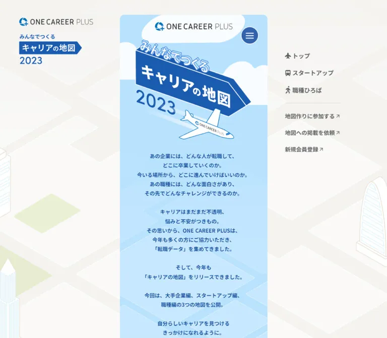
企業や職種を建物・屋台として描く、縦長のキャリア情報コンテンツ。水色と青を基調に、PCの固定ロゴ・右側ナビゲーションと、スマートフォンの全面表示を組み合わせています。
オリジナルサイトを見るA career city drawn on a narrow blue scroll.
Original URL: plus-oc.onecareer.jp/careermap/2023
Final URL: plus-oc.onecareer.jp/careermap/2023 — unchanged; supplied HTTP status: 200.
Theme: light, with a pale city surround, sky-blue introduction, illustrated districts, and a blue footer.
Inspected from supplied browser evidence: September 23, 2026, at 02:46:15.204 JST / September 22, 2026, at 17:46:15.204 UTC.
Viewports: desktop 1440 × 1000 CSS pixels; mobile 390 × 844 CSS pixels.
Scope: the current index page at the 2023 URL. Visual evidence covers the introduction, one startup district segment, and the footer on desktop, plus the introduction and footer on mobile. Rendered DOM evidence extends through company links, occupation links, and availability labels. Open menus, linked detail pages, forms, and hover states were not inspected.
Career Map turns a directory of companies and occupations into an illustrated city. The introduction establishes a travel metaphor through clouds, a dimensional direction sign, the year 2023, and a small airplane. Below it, company names become signs on buildings, market stalls, and vans. The central activity is exploration through these illustrated destinations, supported by links to participation, listing requests, and account registration.
The defining composition is unusually narrow: a 400px content strip remains centered on a 1440px desktop. Almost three quarters of the viewport width belongs to the surrounding city illustration and persistent identity/navigation. On mobile, the outer frame disappears, while the illustrated sections retain their 400px width inside a 390px shell. Preserve this relationship between a quiet surround and a detailed central journey.
The current visible service identity is “ワンキャリア転職.” The browser title still includes “ONE CAREER PLUS,” and the airplane also carries that lettering. These are observations of the current page; the year in the URL is an edition label, not the inspection date.
A career city drawn on a narrow blue scroll.
Original URL: plus-oc.onecareer.jp/careermap/2023
Final URL: plus-oc.onecareer.jp/careermap/2023 — unchanged; supplied HTTP status: 200.
Theme: light, with a pale city surround, sky-blue introduction, illustrated districts, and a blue footer.
Inspected from supplied browser evidence: September 23, 2026, at 02:46:15.204 JST / September 22, 2026, at 17:46:15.204 UTC.
Viewports: desktop 1440 × 1000 CSS pixels; mobile 390 × 844 CSS pixels.
Scope: the current index page at the 2023 URL. Visual evidence covers the introduction, one startup district segment, and the footer on desktop, plus the introduction and footer on mobile. Rendered DOM evidence extends through company links, occupation links, and availability labels. Open menus, linked detail pages, forms, and hover states were not inspected.
Career Map turns a directory of companies and occupations into an illustrated city. The introduction establishes a travel metaphor through clouds, a dimensional direction sign, the year 2023, and a small airplane. Below it, company names become signs on buildings, market stalls, and vans. The central activity is exploration through these illustrated destinations, supported by links to participation, listing requests, and account registration.
The defining composition is unusually narrow: a 400px content strip remains centered on a 1440px desktop. Almost three quarters of the viewport width belongs to the surrounding city illustration and persistent identity/navigation. On mobile, the outer frame disappears, while the illustrated sections retain their 400px width inside a 390px shell. Preserve this relationship between a quiet surround and a detailed central journey.
The current visible service identity is “ワンキャリア転職.” The browser title still includes “ONE CAREER PLUS,” and the airplane also carries that lettering. These are observations of the current page; the year in the URL is an edition label, not the inspection date.
--cm- are descriptive aliases. The original page uses generated custom-property names.| Name | Value | Suggested token | Evidence and role |
|---|---|---|---|
| Warm city canvas | #f4f3f0 |
--cm-canvas |
Measured BODY background; also the desktop brand-link background |
| Introduction sky | #b9e2ff |
--cm-sky |
Measured introduction SECTION background on both viewports |
| Narrative blue | #0b4794 |
--cm-ink |
Measured introduction paragraph color |
| Navigation gray | #606060 |
--cm-nav |
Measured visible desktop navigation text |
| Cloud white | #f8fcff |
--cm-cloud |
Measured background of the brand link inside the introduction |
| Shell white | #ffffff |
--cm-white |
Measured MAIN background; also measured availability-label text |
| Map underlay | #ededed |
--cm-road |
Measured long map SECTION background; artwork supplies many visible surfaces above it |
| Availability veil | rgba(117,117,117,.5) |
--cm-unavailable |
Measured background of the DOM “coming soon...” pills |
The BODY color does not describe every visible desktop pixel. The surrounding illustration adds near-white roads, pale building faces, blue window lines, and green plots. Likewise, the map section's gray background does not mean every district is gray: the supplied startup segment has a prominent pale green ground.
These values are visual estimates for an adaptation.
| Name | Approximation | Suggested token | Role |
|---|---|---|---|
| Footer blue | #23599f |
--cm-footer |
Large closing surface with white navigation and branding |
| Direction-sign blue | #1f5cb2 |
--cm-sign |
Main dimensional title sign and smaller edition badge |
| Menu blue | #3262ad |
--cm-menu |
Circular hamburger control |
| Park green | #eaf0d1 |
--cm-grass |
Startup market ground and outer city plots |
| Building cream | #eee7d8 |
--cm-building |
Roofs, canopies, vehicle bodies, and building planes |
| Drawing outline | #827c78 |
--cm-outline |
Thin architectural and vehicle contours |
Individual company signs introduce teal, yellow, coral, orange, and blue. Their colors identify destinations within the illustration; they do not establish a separate global button palette.
The supplied custom-property inventory includes --s-color-6cb31af5: #0085ceff and --s-color-968dd6d5: #80c1eeff. These are consistent with the visible cyan branding and pale blue details, but their assignment to particular artwork pixels was not established. Do not substitute them for the independently measured narrative blue or sky background.
Other declared colors include magenta, yellow, and a vivid gradient. Their presence in a shared variable inventory does not establish their use in this page's visible interface. No theme selector or alternate color mode was supplied.
The introduction and desktop navigation explicitly compute to "Noto Sans JP". The narrative uses weight 700, a modest 14px size, and generous 25.2px leading. This combination makes the centered Japanese copy feel confident without competing with the illustrated title.
Primary desktop navigation uses 16px bold text. Secondary participation and registration links step down to 15px while retaining the same weight. Normal tracking is measured in both groups.
Use "Noto Sans JP", sans-serif as an implementation stack. The generic fallback is a recommendation; font loading files and delivery settings were not included in the evidence.
The dimensional “キャリアの地図” sign, outlined “みんなでつくる,” year, and company signboards belong to the illustrated composition. Their exact font families were not established. Preserve their geometry as artwork when suitable assets are available.
The title sign is not a conventional horizontal H1 treatment. Its face slopes across the page, its right edge forms an arrow, and its depth is drawn with blue planes and white outlines. The year follows the same overall diagonal composition.
Footer text appears to be a Japanese sans serif, with stronger group headings and lighter link text. Its computed typography is absent from the supplied element excerpt, so the values below are estimates. The copyright is smaller, lighter, and visibly tracked.
The HTML/BODY default of Times is not the visible narrative font. Similarly, declarations for Poppins, Inter, Lato, and other families do not prove their use in this page's text.
| Role | Size / line height | Weight | Tracking | Status |
|---|---|---|---|---|
| Introduction copy | 14px / 25.2px |
700 |
Normal | Measured on desktop and mobile |
| Primary desktop navigation | 16px / 22.4px |
700 |
Normal | Measured |
| Secondary desktop navigation | 15px / 21px |
700 |
Normal | Measured |
| DOM availability pill | 14px / 14px |
900 |
Normal | Measured; text breaks across two lines |
| Footer group heading | About 14–16px / 1.4 |
Bold | About 0.08–0.1em |
Estimated; desktop appears slightly larger |
| Footer link | About 14px / 20px |
Regular to medium | Slightly open | Estimated |
| Copyright | About 11–12px / 1.6 |
Regular | About 0.08em |
Estimated |
| Main sign lettering | Roughly 36–44px visual character height |
Heavy | Artwork-specific | Visual estimate only; not a CSS font-size measurement |
The introduction has five text groups, with visible line counts of five, five, two, two, and two. Blank-line separation adds breathing room between these groups. The total measured text block is approximately 503.75px tall at both viewports.
Density: spacious narrative above a dense illustrated directory.
Geometry: narrow rectangular canvas, circular menu, thin rules, dimensional signs, and a small number of rounded containers.
| Use | Value | Status |
|---|---|---|
| Primary navigation icon-to-label gap | 4px |
Measured |
| Desktop outer logo-link padding | 8px 12px |
Measured |
| Introduction logo-link padding | 6px 8px |
Measured |
| Gap between primary navigation rows | 24px |
Derived from row positions and heights |
| Gap between secondary navigation rows | 24px |
Derived |
| Menu clearance from shell right edge | 24px |
Derived at both viewports |
| Desktop shell top and bottom margin | 40px |
Derived from MAIN and document bounds |
| Desktop column-to-navigation gap | 48px |
Derived: navigation starts at x = 968, column ends at x = 920 |
| Narrative group separation | About 25.2px |
Consistent with one blank text line; recommended paragraph spacing |
| Footer horizontal inset | About 24px desktop; 19px mobile |
Screenshot estimate |
| Footer top inset | About 64px |
Screenshot estimate |
| Footer link-row pitch | About 36px |
Screenshot estimate |
| Footer group separation | About 40px |
Screenshot estimate |
There is no evidence for a single global spacing unit. The interface uses compact utility gaps, while the illustration follows its own coordinate system.
| Element | Value | Status |
|---|---|---|
| Desktop MAIN | 12px |
Measured; visible at the top and footer corners |
| Mobile MAIN | 0 |
Measured |
| Brand-link wrappers | 4px |
Measured; do not confuse these with the much larger cloud silhouette |
| Availability pills | 48px |
Measured |
| Menu appearance | Circle | Visually observed |
| Menu BUTTON wrapper | 0 |
Measured; the visible circular treatment belongs to its contents or another layer |
| Ordinary map-link wrappers | 0 |
Measured in the sampled elements |
| Element | Desktop 1440 × 1000 | Mobile 390 × 844 | Interpretation |
|---|---|---|---|
| MAIN | x 520, y 40, width 400, height 15183.875px |
x 0, y 0, width 390, height 15163.531px |
One long document, not a viewport-height application |
| Document height | 15263.875px |
15163.531px |
Rounded summaries report 15264 and 15164 |
| Introduction SECTION | 400 × 1293.609px |
400 × 1284.484px, x -5 |
Inner canvas stays wider than the phone shell |
| Narrative block | x 566.688, y 429.859, width 306.609px |
x 41.688, y 380.734, width 306.609px |
Same text width and typography |
| Introduction logo link | 226 × 53.641px |
180 × 44.516px |
A genuine responsive size change |
| Menu button | x 848, y 72, 48 × 48px |
x 318, y 16, 48 × 48px |
Constant target dimensions |
| Illustrated selector SECTION | y 943.609, 400 × 495.313px |
y 894.484, 400 × 495.313px |
Same geometry, shifted upward with the shorter mobile introduction |
| Long map SECTION | y 1438.922, 400 × 13152.75px |
y 1389.797, 400 × 13152.75px |
Identical measured width and height |
| Closing region after map | About 632.203px |
About 620.984px |
Derived residual to MAIN end; agrees with the footer screenshots |
The introduction and selector bounds overlap by exactly 390px in both snapshots. Do not add their heights as though they were independent stacked sections. A new implementation can reproduce the relationship with reserved illustration space and a negative margin, but the original positioning mechanism was not supplied.
Role: persistent service identity and edition context outside the scrolling content.
At the upper left, a service-logo link occupies a measured 224 × 55.656px wrapper at x = 40, y = 40. Its background matches the warm page canvas, and its padding is 8px vertically and 12px horizontally.
Below it, a separate edition link begins at x = 52, y = 107.656 and measures 170 × 95.031px. The artwork combines a small introductory line, a blue arrow-shaped title badge, and “2023.” The smaller edition mark echoes the large central sign without reproducing its entire scene.
The block remains in the same visible position in the desktop top, middle, and bottom captures. This supports persistent positioning, although a computed position value was not provided. It is absent from the mobile captures and visible-link inventory.
Role: quick access to major parts of a very long page and to supporting actions.
The rail begins at x = 968, y = 140. Its first group contains three compact icon-and-label links:
#startup.#job.Each primary row pairs an approximately 16px icon with a measured 4px gap and 16px bold gray text. The row starts are approximately 46.4px apart: a 22.4px line box plus 24px of separation.
A thin gray rule separates this group from “地図作りに参加する,” “地図への掲載を依頼,” and “新規会員登録.” These use 15px bold gray text and small diagonal arrows. The extracted arrow_forward string is an icon token, not visible prose to reproduce literally.
The rail remains visually stationary across the desktop captures. There is no enclosing card, shadow, or large filled registration button.
Role: compact navigation access within the central experience.
A blue circle with a fine white perimeter contains three horizontal white strokes. The measured BUTTON target is 48 × 48px. It sits 24px inside the shell's right edge, at y = 72 on desktop and y = 16 on mobile.
The control remains visible over the introduction, market district, and footer. Place its persistent layer independently from scrolling scene artwork. Its opened state, contents, dismissal behavior, and animation are unverified. The empty extracted button text is not sufficient to determine its accessible name.
Role: introduces the service inside the narrow canvas, including when the desktop identity block is absent.
The current service logo sits on a broad, irregular white cloud near the top. The link itself has a small 4px radius, but the visible cloud extends well beyond it and has an asymmetric curved silhouette. Preserve these as separate shapes.
The desktop logo-link wrapper is 226px wide; the mobile wrapper is 180px. Both start 14px below their introduction section's top. The cloud is visually about 280px wide. This smaller mobile logo shortens the content above the narrative by approximately 9.125px.
Role: supplies the page's main visual identity and travel metaphor.
The title composition contains four distinct parts:
Clouds enter from the sides behind the sign. The composition occupies roughly 315px of the 400px illustration width. Its visible upper edge is around y = 127 on desktop and y = 78 on mobile; these are screenshot estimates.
Use supplied artwork or a carefully authored vector composition. A flat blue rectangle with a large text heading will miss the slanted perspective, depth, and overlapping airplane that define this opening.
Role: explains why the map exists before the user enters the directory.
The narrative is live text, not part of the title artwork. It uses measured Noto Sans JP, 14px, weight 700, 25.2px line height, and #0b4794.
Its 306.609px block is centered within the illustrated canvas, with approximately 46.7px of space on each side of the 400px section. The mobile screenshot shows approximately 41.7px of visible clearance because the section is cropped by 5px at each edge.
The five groups move from questions about career transitions to the data collection effort, the release announcement, three map editions, and a closing invitation to find a suitable career. Maintain the intentional short lines and blank-line rhythm for this Japanese copy. For translated or longer copy, allow reflow rather than forcing the same number of lines into fixed heights.
Faint isometric street lines continue behind the text. Keep this pattern light enough that it reads as atmosphere rather than an information grid.
Role: connects the introduction to the long map and exposes major destinations within the visual world.
The rendered DOM reports a 400 × 495.313px section containing image-led links to #startup and #job, plus a button. It overlaps the lower introduction bounds by 390px. Its top begins only 10px below the narrative block's bottom.
A mobile startup-link rectangle measures 182 × 82px, and the occupation-link rectangle measures 182 × 169px. A second startup link covers a larger 327.594 × 161.25px region. These establish multiple illustrated targets rather than a standard row of text tabs.
Only a small part of this section is visible in the supplied opening screenshots. Its complete appearance and button behavior should remain unspecified until separately inspected.
Role: opens a company's career-map detail page.
In the supplied startup segment, company identity is attached to physical objects: a shop sign for “クロスマート,” a teal van sign for “セーフィー,” a dark sign above the High Link van, and striped stalls for “モノグサ,” SHE, and “プログリット.”
The recurring anatomy is a pale structure or vehicle, a striped canopy where appropriate, a high-contrast company sign, and a nearby path or open ground. Signs vary in shape: rounded capsules, rectangular boards, and dimensional panels. Their orientation follows the isometric scene.
The DOM confirms distinct links for these destinations, including /xmart, /safie, /high-link, /monoxer, /she, and /progrit. Common mobile sign-link rectangles are 103px wide and approximately 84–106px tall, while taller building targets can be only 36–40px wide. These are link rectangles, not measurements of the entire illustrated building or stall.
Desktop offscreen rectangles are frequently wider and slightly taller than mobile equivalents. Without transform values or before/after interaction captures, do not interpret those differences as a verified hover enlargement.
Role: groups company destinations into a continuous, explorable place.
The middle desktop capture shows a pale green market with diagonal white paths, cream stalls, small vans, people, balloons, and benches. Several structures are deliberately cut by the strip's edges, making the city feel larger than the viewport.
Company accent colors stay localized to signs and awnings. Thin gray-brown contours unify the scene. Large white and cream planes prevent the dense arrangement from becoming visually heavy.
Keep objects staggered along the diagonal paths. A regular card grid would remove the spatial relationships that make the directory feel like a town.
Role: exposes an additional destination beside a company entry.
The High Link area includes a white outlined speech bubble with “応募できる” and a person symbol. The DOM independently includes /high-link#recruit. CADDi has separate #recruit and #podcast links.
Several mobile callout wrappers measure 80 × 80px. Corresponding desktop wrappers in the initial offscreen sample measure only 10 × 10px and carry delayed transitions. Treat these as state-sensitive measurements; they do not prove that the final desktop controls are tiny.
Use separate sibling links for company information and related actions. Avoid nesting interactive targets inside another link when adapting the composition.
Role: communicates destinations that are not yet available.
Two treatments are evidenced:
rgba(117,117,117,.5).The DOM pills have a measured 48px radius, 42px box height, variable widths of 110–165px, and padding of 5px 8px 7px. Do not confuse the pill component with the dimensional ground lettering. The pills' exact compositing over their underlying illustrations is not shown in the supplied screenshots.
Role: extends exploration from companies to job functions.
The navigation and DOM establish an occupation area with links to /job/hr and /job/insidesales. Their mobile rectangles measure 92 × 167px and 156 × 155px respectively. The supplied screenshots do not show the complete occupation scene, so its artwork should not be invented from the startup market.
Role: ends the illustrated journey with conventional navigation and service identity.
Immediately above the footer, a small coral car travels visually along a diagonal road between large pale buildings. Blue window lines and thin neutral outlines carry the city language into the final section. Movement of the car itself is not verified.
The footer is a solid medium-dark blue field spanning the central strip. It has approximately 24px side insets on desktop and 19px on mobile, leaving a visually consistent content width near 352px.
The first group, “キャリアの地図,” has a white divider beneath its heading and rows for home, podcast, participation, listing requests, and the 2021/2022 editions. “ポッドキャスト” is visible text, but its destination is not present in the supplied link list; do not invent one.
The second group, “ワンキャリア転職,” repeats the heading-and-rule treatment with home and registration links. A reversed white service logo sits below, followed by a small centered copyright line. The copyright explicitly names ONE CAREER Inc.
The footer remains a single column on desktop. Its lower corners inherit the shell's 12px rounding; the mobile footer reaches the viewport edges with square corners.
The supplied styles establish transition timing, but the screenshots show settled states. A transition declaration alone does not establish its trigger, changed property, direction, or replay behavior.
| Element or treatment | Reported value | Evidence boundary |
|---|---|---|
| BODY background | 0.5s cubic-bezier(0.4, 0.4, 0, 1) |
Measured declaration; no background-change trigger exercised |
| Common links, menu wrapper, and containers | 0.3s cubic-bezier(0.4, 0.4, 0, 1) |
Measured widely; hover appearance unknown |
| Selector button | 0.4s cubic-bezier(0.4, 0.4, 0, 1) |
Measured; behavior unknown |
| Larger startup selector link | 0.6s cubic-bezier(0.4, 0.4, 0, 1) |
Measured on both viewports |
| Many desktop company links | 0.8s cubic-bezier(0.4, 0.69, 0.54, 1.7) |
Delays commonly 0.6–0.9s; curve permits overshoot |
| Large desktop illustrated button | 0.8s cubic-bezier(0.48, 0.28, 0, 2.15) 0.6s |
Strong overshoot curve; actual displacement unknown |
| Desktop occupation links | 0.8s cubic-bezier(0.4, 0.4, 0.21, 1.69) 0.4s |
Measured; trigger unverified |
| Desktop recruitment/podcast callouts | 0.6s cubic-bezier(0.4, 0.4, 0, 1) |
Sample delays 1.2–1.3s |
| Some mobile recruitment callouts | Same 0.6s curve, with 1.5s delay |
Mobile retains some delayed transitions |
| Many mobile company links and availability pills | Common 0.3s curve |
Different from the longer desktop declarations |
The desktop timing pattern is consistent with staggered reveals and a playful settling motion, but that interpretation is not a directly observed animation sequence. Preserve the timing evidence without inventing a flight path, bouncing vehicle, parallax layer, or scroll-scrubbing system.
All sampled elements report animation: none. This does not exclude transitions, scripts, pseudo-element motion, or animated image assets.
| Control | Established destination or behavior | Unverified detail |
|---|---|---|
| Startup and occupation navigation | Same-page fragment URLs | Smooth-scroll timing, focus movement, and active state |
| Company signs | Distinct company detail URLs | Destination-page layout and transition |
| Recruitment/podcast callouts | Company URLs with fragments | Resulting section behavior |
| Participation | /lp/5 |
Form or subsequent flow |
| Listing request | External form URL present | Submission flow |
| Registration | https://id.onecareer.jp/users/sign_up |
Account flow |
| Menu button | Persistent button visible | Opened panel and dismissal behavior |
Scrolling is evidenced by the supplied top, middle, and bottom captures. The persistent desktop surround and menu maintain their visible positions while the central document advances. No drag, zoom, or map-panning interaction is established.
| Layer | Appearance | Purpose |
|---|---|---|
| Desktop surround | Warm off-white city with very pale roads and buildings | Creates breadth without competing with the central strip |
| Main strip | White underlying shell, 400px on desktop | Contains the complete journey |
| Introduction | Sky blue with clouds and faint street lines | Establishes the travel metaphor and supports blue text |
| Startup district | Pale green ground, cream structures, localized sign colors | Makes destination links feel like places |
| Company sign | White or colored face with a thin outline and drawn depth | Carries company identity and navigation affordance |
| Availability pill | Translucent gray with white text | Distinguishes unavailable content |
| Menu | Blue circle with white strokes | Remains recognizable across changing backgrounds |
| Footer | Solid blue with white rules, links, and branding | Gives the long illustrated page a clear ending |
There is no general UI elevation system in the supplied captures. Depth is drawn into signs, roofs, vehicles, and buildings. Keep ordinary navigation flat rather than adding card shadows to every destination.
The page uses clean isometric illustration with delicate outlines and flat pastel planes. Architecture, street grids, signs, stalls, vehicles, and people share the same viewpoint. The outer city is deliberately much quieter than the central district.
The supplied startup scene includes striped awnings, a food-truck-like van, balloons, a bench, and small people. These details humanize a topic that could otherwise become a dense corporate directory. Company names and colored sign faces remain the main points of contrast.
The outer city uses near-white building faces, pale beige edges, and light blue window outlines. Large green plots interrupt the road geometry. Preserve the sparse distribution and low contrast; filling all desktop whitespace with additional buildings would weaken the central focus.
The illustration looks crisp and smoothly rendered. No evidence supports pixelated image rendering, grain, photographic texture, glossy 3D materials, or a photographic hero.
| Visual asset | Evidence | Implementation note |
|---|---|---|
| Current service logo | Visible in the desktop identity, introduction, and footer | Use the appropriate color or reversed version |
| Small edition badge | Desktop identity capture and its separate home link | Preserve its arrow silhouette and year |
| Large title composition | Desktop and mobile opening captures | Keep outlined lettering, sign depth, and airplane overlap |
| Desktop city background | Same arrangement across all desktop captures | Keep independent from the scrolling content |
| Startup district artwork | Supplied middle desktop capture | Preserve diagonal paths, object placement, and edge crops |
| Company signs | Visual company labels plus matching original-page links | Maintain meaningful link names independently of artwork |
| Recruitment bubble | High Link bubble in the middle capture and matching fragment link | Separate from the main company destination |
| Closing buildings and car | Desktop and mobile footer captures | Join directly to the blue footer |
The DOM includes generated pseudo-element background-image references hosted on Google Cloud Storage. The supplied references are truncated, and a complete asset manifest is unavailable. Exact asset URLs, formats, native dimensions, and layer boundaries should not be fabricated.
At 1440px, the 400px strip is exactly centered: (1440 - 400) / 2 = 520px. Its width is approximately 27.8% of the viewport. The remaining width forms two broad margins, although the identity block and navigation occupy different positions within them.
The service identity is anchored near the upper-left viewport corner. The navigation begins 48px beyond the strip's right edge. These are not three equally sized content columns.
The MAIN starts 40px below the viewport top and finishes 40px before the document end. Its rounded corners make the entire long experience resemble one continuous sheet. Scrolling moves that sheet through the viewport; the surrounding identity, navigation, and city remain visually stable.
At 390px, MAIN fills the viewport and loses its corner rounding and outer margins. The desktop identity and navigation rail are absent. The menu remains at 48 × 48px, with 16px top and 24px right clearance.
The inner illustrated sections remain 400px wide at x = -5px. This is a centered crop of 5px on each side, not a uniform 97.5% scale-down. The long map's height remains exactly 13152.75px in both DOM snapshots.
The narrative remains 14px/25.2px and 306.609px wide. The introduction logo shrinks from 226px to 180px at the wrapper level. Combined with removal of the desktop's 40px outer margin, this places the mobile narrative 49.125px higher in viewport coordinates.
The footer adapts to the 390px shell, with about 19px side clearance. It is not necessary to crop its text with the illustrated sections.
A max-width: 1120px rule is visible in the supplied line-break CSS, but that excerpt does not establish the breakpoint used to hide the desktop rails or remove MAIN margins. Only 1440px and 390px layouts are directly evidenced.
The Quick Start uses 1120px as a recommended working breakpoint, not a recovered shell rule. Validate intermediate widths, landscape phones, browser zoom, and widths below 390px separately.
For smaller screens, preserve access to destinations near the artwork edges. A text directory or an alternative scene layout is preferable to silently cropping essential links further. This is an implementation recommendation, not a verified original feature.
#b9e2ff and narrative blue #0b4794 for the introduction.These recommendations are not verified original-page features:
aria-expanded, and aria-controls. Add appropriate focus handling once its actual panel behavior is defined.#f4f3f0.#b9e2ff.#0b4794.#606060.#f8fcff.#23599f.#3262ad.#eaf0d1.“Create an illustrated career directory inspired by Career Map 2023. Center a 400px vertical content strip on a warm off-white desktop city background. Put persistent service identity at the upper left and a compact gray navigation rail 48px to the right of the strip. Open with a sky-blue field, white clouds, a dimensional blue direction sign carrying Japanese title artwork, a large year, and a small outlined airplane. Set the introduction in centered Noto Sans JP, 14px, weight 700, with 25.2px leading. Continue into an isometric town where company signs on buildings, striped market stalls, and vans act as links. End with a solid blue footer containing two groups of white links and thin rules. On mobile, remove the outer rails and margins, keep a 48px circular menu, and preserve a centered 400px illustration canvas inside the viewport. Keep live text accessible and mark any newly designed interactions as additions.”
#b9e2ff, an irregular white cloud behind the current service logo, a blue dimensional arrow sign, outlined Japanese introductory lettering, ‘2023,’ and a white airplane with blue linework. Center a roughly 307px live-text block beneath it in #0b4794, 14px/25.2px, weight 700.”cubic-bezier(0.4,0.69,0.54,1.7). Keep content visible by default and disable the reveal treatment under reduced motion. The reveal trigger and displacement are new design decisions.”This CSS reproduces the shell relationships, narrative typography, navigation rhythm, menu geometry, scene positioning pattern, and footer treatment. It requires licensed or newly authored logo and illustration assets. It does not recreate the city from CSS primitives or implement the uninspected menu.
Structure: use .cm-city-backdrop, .cm-desktop-brand, .cm-desktop-nav, and .cm-menu as siblings of .cm-page. Inside .cm-page, place .cm-scene.cm-hero, the overlapping .cm-scene.cm-selector, scene sections for the map, and .cm-footer. Each map scene contains an intrinsic-height .cm-scene-art and sibling .cm-hotspot links.
For hotspots, set --x, --y, --w, and --h as percentages of the containing scene. Those coordinates must come from the supplied artwork. Define --cm-city-art as an image value only after an appropriate asset is available.
:root {
  /* Measured colors */
  --cm-canvas: #f4f3f0;
  --cm-sky: #b9e2ff;
  --cm-ink: #0b4794;
  --cm-nav: #606060;
  --cm-cloud: #f8fcff;
  --cm-white: #ffffff;
  --cm-road: #ededed;
  --cm-unavailable: rgba(117, 117, 117, 0.5);

  /* Visual approximations */
  --cm-footer: #23599f;
  --cm-sign: #1f5cb2;
  --cm-menu: #3262ad;
  --cm-grass: #eaf0d1;
  --cm-outline: #827c78;

  /* Measured geometry and typography */
  --cm-scene-width: 400px;
  --cm-copy-width: 306.609px;
  --cm-menu-size: 48px;
  --cm-menu-inset: 24px;
  --cm-shell-radius: 12px;
  --cm-font: 'Noto Sans JP', sans-serif;
  --cm-copy-size: 14px;
  --cm-copy-leading: 1.8;
  --cm-primary-size: 16px;
  --cm-secondary-size: 15px;

  /* Measured timing; application to new states is an adaptation */
  --cm-ease: cubic-bezier(0.4, 0.4, 0, 1);
  --cm-ease-object: cubic-bezier(0.4, 0.69, 0.54, 1.7);
  --cm-motion-ui: 300ms;
  --cm-motion-object: 800ms;

  /* Supply an authorized illustration asset */
  --cm-city-art: none;
}

* {
  box-sizing: border-box;
}

body {
  margin: 0;
  background: var(--cm-canvas);
  color: var(--cm-ink);
  font-family: var(--cm-font);
}

.cm-city-backdrop,
.cm-desktop-brand,
.cm-desktop-nav {
  display: none;
}

.cm-page {
  position: relative;
  z-index: 1;
  display: flex;
  flex-direction: column;
  align-items: center;
  width: min(100%, var(--cm-scene-width));
  margin-inline: auto;
  overflow: clip;
  background: var(--cm-white);
}

.cm-scene {
  position: relative;
  flex: none;
  width: var(--cm-scene-width);
}

.cm-scene-art {
  display: block;
  width: 100%;
  height: auto;
}

.cm-hero {
  background: var(--cm-sky);
  /* Derived overlap strategy, not recovered source CSS */
  padding-bottom: 400px;
}

.cm-hero-brand {
  position: relative;
  z-index: 1;
  display: block;
  width: 180px;
  margin: 14px auto 20px;
  padding: 6px 8px;
  border-radius: 4px;
  background: var(--cm-cloud);
}

.cm-hero-brand img,
.cm-brand-link img,
.cm-edition-link img,
.cm-footer-logo img {
  display: block;
  width: 100%;
  height: auto;
}

.cm-title-art {
  display: block;
  width: 316px;
  height: auto;
  margin-inline: auto;
}

.cm-hero-copy {
  width: var(--cm-copy-width);
  margin: 32px auto 0;
  color: var(--cm-ink);
  font-size: var(--cm-copy-size);
  font-weight: 700;
  line-height: var(--cm-copy-leading);
  text-align: center;
}

.cm-hero-copy p {
  margin: 0;
}

.cm-hero-copy p + p {
  margin-top: 1.8em;
}

.cm-selector {
  z-index: 2;
  height: 495.313px;
  margin-top: -390px;
}

.cm-map-scene {
  background: var(--cm-road);
}

.cm-map-scene--market {
  background: var(--cm-grass);
}

.cm-hotspot {
  position: absolute;
  z-index: 2;
  left: var(--x);
  top: var(--y);
  width: var(--w);
  height: var(--h);
  display: block;
  color: inherit;
  text-decoration: none;
}

.cm-hotspot > img {
  display: block;
  width: 100%;
  height: 100%;
  object-fit: contain;
}

.cm-unavailable {
  display: flex;
  align-items: center;
  justify-content: center;
  min-height: 42px;
  padding: 5px 8px 7px;
  border-radius: 48px;
  background: var(--cm-unavailable);
  color: var(--cm-white);
  font-size: 14px;
  font-weight: 900;
  line-height: 14px;
  text-align: center;
}

.cm-menu {
  position: fixed;
  z-index: 20;
  top: max(16px, env(safe-area-inset-top, 0px));
  right: calc(
    (100% - min(100%, var(--cm-scene-width))) / 2
    + var(--cm-menu-inset)
  );
  display: grid;
  place-content: center;
  gap: 5px;
  width: var(--cm-menu-size);
  height: var(--cm-menu-size);
  padding: 0;
  border: 1px solid var(--cm-white);
  border-radius: 50%;
  background: var(--cm-menu);
  color: var(--cm-white);
  cursor: pointer;
}

/* Use three decorative spans inside a named button */
.cm-menu > span {
  display: block;
  width: 22px;
  height: 2px;
  border-radius: 1px;
  background: currentColor;
}

.cm-footer {
  width: 100%;
  padding: 64px 19px 40px;
  background: var(--cm-footer);
  color: var(--cm-white);
}

.cm-footer-group + .cm-footer-group {
  margin-top: 40px;
}

.cm-footer-heading {
  margin: 0 0 16px;
  padding-bottom: 8px;
  border-bottom: 1px solid rgba(255, 255, 255, 0.8);
  font-size: 14px;
  font-weight: 700;
  line-height: 1.4;
  letter-spacing: 0.1em;
}

.cm-footer-links {
  display: grid;
  gap: 16px;
}

.cm-footer-links a {
  color: inherit;
  font-size: 14px;
  line-height: 20px;
  text-decoration: none;
}

.cm-footer-logo {
  display: block;
  width: 200px;
  max-width: 100%;
  margin-top: 40px;
}

.cm-copyright {
  margin: 44px 0 0;
  font-size: 11px;
  font-weight: 400;
  line-height: 1.6;
  letter-spacing: 0.08em;
  text-align: center;
}

/* Recommended focus styling */
:where(.cm-page, .cm-desktop-brand, .cm-desktop-nav)
  :focus-visible,
.cm-menu:focus-visible {
  outline: 3px solid currentColor;
  outline-offset: 4px;
}

.cm-hotspot:focus-visible {
  outline-color: var(--cm-ink);
  outline-offset: -3px;
  background: rgba(255, 255, 255, 0.25);
}

.cm-sr-only {
  position: absolute;
  width: 1px;
  height: 1px;
  margin: -1px;
  padding: 0;
  overflow: hidden;
  clip-path: inset(50%);
  white-space: nowrap;
  border: 0;
}

/* Recommended working breakpoint; shell threshold is unverified */
@media (min-width: 1121px) {
  .cm-city-backdrop {
    position: fixed;
    z-index: 0;
    inset: 0;
    display: block;
    pointer-events: none;
    background-image: var(--cm-city-art);
    background-position: center;
    background-size: cover;
  }

  .cm-page {
    margin-block: 40px;
    border-radius: var(--cm-shell-radius);
  }

  .cm-desktop-brand {
    position: fixed;
    z-index: 5;
    top: 40px;
    left: 40px;
    display: block;
    width: 224px;
  }

  .cm-brand-link {
    display: block;
    padding: 8px 12px;
    border-radius: 4px;
    background: var(--cm-canvas);
  }

  .cm-edition-link {
    display: block;
    width: 170px;
    margin: 12px 0 0 12px;
  }

  .cm-desktop-nav {
    position: fixed;
    z-index: 5;
    top: 140px;
    left: calc(50% + 248px);
    display: block;
    width: 151px;
    color: var(--cm-nav);
    font-weight: 700;
  }

  .cm-nav-group {
    display: grid;
    justify-items: start;
    gap: 24px;
  }

  .cm-nav-group a {
    display: flex;
    align-items: center;
    gap: 4px;
    color: inherit;
    font-size: var(--cm-primary-size);
    line-height: 1.4;
    text-decoration: none;
  }

  .cm-nav-icon {
    flex: none;
    width: 16px;
    height: 16px;
  }

  .cm-nav-group--secondary {
    margin-top: 24px;
    padding-top: 24px;
    border-top: 1px solid #d7d7d7;
  }

  .cm-nav-group--secondary a {
    gap: 0;
    font-size: var(--cm-secondary-size);
  }

  .cm-menu {
    top: 72px;
  }

  .cm-hero-brand {
    width: 226px;
  }

  .cm-footer {
    padding-inline: 24px;
  }

  .cm-footer-heading {
    font-size: 16px;
  }
}

/* Optional new reveal state; keep content visible by default */
@media (prefers-reduced-motion: no-preference) {
  .cm-hotspot[data-reveal-ready] {
    transition:
      transform var(--cm-motion-object) var(--cm-ease-object),
      opacity var(--cm-motion-object) var(--cm-ease);
  }

  .cm-hotspot[data-reveal-ready][data-pending] {
    opacity: 0;
    transform: translateY(8px);
  }
}

@media (prefers-reduced-motion: reduce) {
  .cm-hotspot,
  .cm-menu {
    transition: none;
  }

  .cm-hotspot[data-pending] {
    opacity: 1;
    transform: none;
  }
}
The 316px title width, 32px narrative gap, footer type settings, and background sizing are approximation choices. Asset whitespace and intrinsic proportions determine the final alignment. The 400px scene width and 390px overlap reproduce measured relationships, but essential content still requires validation at smaller widths and increased text sizes.
For optional reveals, add data-reveal-ready only after the enhancement script is working, then remove data-pending when the destination is revealed. The 8px displacement and trigger mechanism are recommendations; they were not recovered from the original page.
Optional aliases for an implementation that already uses Tailwind v4. This is not evidence that the original page uses Tailwind. Define the custom properties above first.
@theme inline {
  --color-career-canvas: var(--cm-canvas);
  --color-career-sky: var(--cm-sky);
  --color-career-ink: var(--cm-ink);
  --color-career-nav: var(--cm-nav);
  --color-career-cloud: var(--cm-cloud);
  --color-career-footer: var(--cm-footer);
  --color-career-grass: var(--cm-grass);

  --font-career: var(--cm-font);
  --text-career-copy: 14px;
  --text-career-copy--line-height: 1.8;
  --text-career-primary: 16px;
  --text-career-primary--line-height: 1.4;
  --text-career-secondary: 15px;
  --text-career-secondary--line-height: 1.4;

  --spacing-career-scene: 400px;
  --spacing-career-copy: 306.609px;
  --spacing-career-control: 48px;
  --spacing-career-inset: 24px;
  --radius-career-shell: 12px;
}
2026-09-22T17:46:15.204Z.This reference describes the page currently served at the inspected URL. Unmeasured colors and geometry are labeled as estimates; accessibility additions, responsive thresholds, and reusable CSS are implementation recommendations.
# Career Map 2023 / ワンキャリア転職 — Style Reference

> A career city drawn on a narrow blue scroll.

**Original URL:** [plus-oc.onecareer.jp/careermap/2023](https://plus-oc.onecareer.jp/careermap/2023)
**Final URL:** [plus-oc.onecareer.jp/careermap/2023](https://plus-oc.onecareer.jp/careermap/2023) — unchanged; supplied HTTP status: 200.
**Theme:** light, with a pale city surround, sky-blue introduction, illustrated districts, and a blue footer.
**Inspected from supplied browser evidence:** September 23, 2026, at 02:46:15.204 JST / September 22, 2026, at 17:46:15.204 UTC.
**Viewports:** desktop 1440 × 1000 CSS pixels; mobile 390 × 844 CSS pixels.
**Scope:** the current index page at the 2023 URL. Visual evidence covers the introduction, one startup district segment, and the footer on desktop, plus the introduction and footer on mobile. Rendered DOM evidence extends through company links, occupation links, and availability labels. Open menus, linked detail pages, forms, and hover states were not inspected.

Career Map turns a directory of companies and occupations into an illustrated city. The introduction establishes a travel metaphor through clouds, a dimensional direction sign, the year 2023, and a small airplane. Below it, company names become signs on buildings, market stalls, and vans. The central activity is exploration through these illustrated destinations, supported by links to participation, listing requests, and account registration.

The defining composition is unusually narrow: a 400px content strip remains centered on a 1440px desktop. Almost three quarters of the viewport width belongs to the surrounding city illustration and persistent identity/navigation. On mobile, the outer frame disappears, while the illustrated sections retain their 400px width inside a 390px shell. Preserve this relationship between a quiet surround and a detailed central journey.

The current visible service identity is “ワンキャリア転職.” The browser title still includes “ONE CAREER PLUS,” and the airplane also carries that lettering. These are observations of the current page; the year in the URL is an edition label, not the inspection date.
# Career Map 2023 / ワンキャリア転職 — Style Reference

> A career city drawn on a narrow blue scroll.

**Original URL:** [plus-oc.onecareer.jp/careermap/2023](https://plus-oc.onecareer.jp/careermap/2023)
**Final URL:** [plus-oc.onecareer.jp/careermap/2023](https://plus-oc.onecareer.jp/careermap/2023) — unchanged; supplied HTTP status: 200.
**Theme:** light, with a pale city surround, sky-blue introduction, illustrated districts, and a blue footer.
**Inspected from supplied browser evidence:** September 23, 2026, at 02:46:15.204 JST / September 22, 2026, at 17:46:15.204 UTC.
**Viewports:** desktop 1440 × 1000 CSS pixels; mobile 390 × 844 CSS pixels.
**Scope:** the current index page at the 2023 URL. Visual evidence covers the introduction, one startup district segment, and the footer on desktop, plus the introduction and footer on mobile. Rendered DOM evidence extends through company links, occupation links, and availability labels. Open menus, linked detail pages, forms, and hover states were not inspected.

Career Map turns a directory of companies and occupations into an illustrated city. The introduction establishes a travel metaphor through clouds, a dimensional direction sign, the year 2023, and a small airplane. Below it, company names become signs on buildings, market stalls, and vans. The central activity is exploration through these illustrated destinations, supported by links to participation, listing requests, and account registration.

The defining composition is unusually narrow: a 400px content strip remains centered on a 1440px desktop. Almost three quarters of the viewport width belongs to the surrounding city illustration and persistent identity/navigation. On mobile, the outer frame disappears, while the illustrated sections retain their 400px width inside a 390px shell. Preserve this relationship between a quiet surround and a detailed central journey.

The current visible service identity is “ワンキャリア転職.” The browser title still includes “ONE CAREER PLUS,” and the airplane also carries that lettering. These are observations of the current page; the year in the URL is an edition label, not the inspection date.

## How to Read This Reference

- **Measured** means directly reported in the supplied rendered DOM or computed styles. Coordinates refer to the supplied initial viewport unless otherwise stated.
- **Derived** means calculated from those measurements, such as the 5px mobile crop or the 48px gap beside the desktop column.
- **Estimated** means visually judged from the five original-page screenshots. Estimated colors are implementation approximations, not sampled pixels or recovered source declarations.
- **Recommended** means guidance for a new implementation. The CSS below is an adaptation, not a recovered stylesheet.
- Token names beginning with `--cm-` are descriptive aliases. The original page uses generated custom-property names.
- Offscreen element rectangles can reflect transforms or unrevealed states. They are not automatically final hit-area dimensions.

## Tokens — Colors

### Default Palette

| Name | Value | Suggested token | Evidence and role |
| --- | --- | --- | --- |
| Warm city canvas | `#f4f3f0` | `--cm-canvas` | Measured BODY background; also the desktop brand-link background |
| Introduction sky | `#b9e2ff` | `--cm-sky` | Measured introduction SECTION background on both viewports |
| Narrative blue | `#0b4794` | `--cm-ink` | Measured introduction paragraph color |
| Navigation gray | `#606060` | `--cm-nav` | Measured visible desktop navigation text |
| Cloud white | `#f8fcff` | `--cm-cloud` | Measured background of the brand link inside the introduction |
| Shell white | `#ffffff` | `--cm-white` | Measured MAIN background; also measured availability-label text |
| Map underlay | `#ededed` | `--cm-road` | Measured long map SECTION background; artwork supplies many visible surfaces above it |
| Availability veil | `rgba(117,117,117,.5)` | `--cm-unavailable` | Measured background of the DOM “coming soon...” pills |

The BODY color does not describe every visible desktop pixel. The surrounding illustration adds near-white roads, pale building faces, blue window lines, and green plots. Likewise, the map section's gray background does not mean every district is gray: the supplied startup segment has a prominent pale green ground.

### Supporting Illustration Colors

These values are **visual estimates** for an adaptation.

| Name | Approximation | Suggested token | Role |
| --- | --- | --- | --- |
| Footer blue | `#23599f` | `--cm-footer` | Large closing surface with white navigation and branding |
| Direction-sign blue | `#1f5cb2` | `--cm-sign` | Main dimensional title sign and smaller edition badge |
| Menu blue | `#3262ad` | `--cm-menu` | Circular hamburger control |
| Park green | `#eaf0d1` | `--cm-grass` | Startup market ground and outer city plots |
| Building cream | `#eee7d8` | `--cm-building` | Roofs, canopies, vehicle bodies, and building planes |
| Drawing outline | `#827c78` | `--cm-outline` | Thin architectural and vehicle contours |

Individual company signs introduce teal, yellow, coral, orange, and blue. Their colors identify destinations within the illustration; they do not establish a separate global button palette.

### Declared Source Variables

The supplied custom-property inventory includes `--s-color-6cb31af5: #0085ceff` and `--s-color-968dd6d5: #80c1eeff`. These are consistent with the visible cyan branding and pale blue details, but their assignment to particular artwork pixels was not established. Do not substitute them for the independently measured narrative blue or sky background.

Other declared colors include magenta, yellow, and a vivid gradient. Their presence in a shared variable inventory does not establish their use in this page's visible interface. No theme selector or alternate color mode was supplied.

## Tokens — Typography

### Noto Sans JP — Narrative and Navigation

The introduction and desktop navigation explicitly compute to `"Noto Sans JP"`. The narrative uses weight `700`, a modest 14px size, and generous 25.2px leading. This combination makes the centered Japanese copy feel confident without competing with the illustrated title.

Primary desktop navigation uses 16px bold text. Secondary participation and registration links step down to 15px while retaining the same weight. Normal tracking is measured in both groups.

Use `"Noto Sans JP", sans-serif` as an implementation stack. The generic fallback is a recommendation; font loading files and delivery settings were not included in the evidence.

### Artwork Lettering

The dimensional “キャリアの地図” sign, outlined “みんなでつくる,” year, and company signboards belong to the illustrated composition. Their exact font families were not established. Preserve their geometry as artwork when suitable assets are available.

The title sign is not a conventional horizontal H1 treatment. Its face slopes across the page, its right edge forms an arrow, and its depth is drawn with blue planes and white outlines. The year follows the same overall diagonal composition.

### Utility and Footer Text

Footer text appears to be a Japanese sans serif, with stronger group headings and lighter link text. Its computed typography is absent from the supplied element excerpt, so the values below are estimates. The copyright is smaller, lighter, and visibly tracked.

The HTML/BODY default of `Times` is not the visible narrative font. Similarly, declarations for Poppins, Inter, Lato, and other families do not prove their use in this page's text.

### Type Scale

| Role | Size / line height | Weight | Tracking | Status |
| --- | --- | --- | --- | --- |
| Introduction copy | `14px / 25.2px` | `700` | Normal | Measured on desktop and mobile |
| Primary desktop navigation | `16px / 22.4px` | `700` | Normal | Measured |
| Secondary desktop navigation | `15px / 21px` | `700` | Normal | Measured |
| DOM availability pill | `14px / 14px` | `900` | Normal | Measured; text breaks across two lines |
| Footer group heading | About `14–16px / 1.4` | Bold | About `0.08–0.1em` | Estimated; desktop appears slightly larger |
| Footer link | About `14px / 20px` | Regular to medium | Slightly open | Estimated |
| Copyright | About `11–12px / 1.6` | Regular | About `0.08em` | Estimated |
| Main sign lettering | Roughly `36–44px` visual character height | Heavy | Artwork-specific | Visual estimate only; not a CSS font-size measurement |

The introduction has five text groups, with visible line counts of five, five, two, two, and two. Blank-line separation adds breathing room between these groups. The total measured text block is approximately 503.75px tall at both viewports.

## Tokens — Spacing & Shapes

**Density:** spacious narrative above a dense illustrated directory.
**Geometry:** narrow rectangular canvas, circular menu, thin rules, dimensional signs, and a small number of rounded containers.

### Spacing Scale

| Use | Value | Status |
| --- | --- | --- |
| Primary navigation icon-to-label gap | `4px` | Measured |
| Desktop outer logo-link padding | `8px 12px` | Measured |
| Introduction logo-link padding | `6px 8px` | Measured |
| Gap between primary navigation rows | `24px` | Derived from row positions and heights |
| Gap between secondary navigation rows | `24px` | Derived |
| Menu clearance from shell right edge | `24px` | Derived at both viewports |
| Desktop shell top and bottom margin | `40px` | Derived from MAIN and document bounds |
| Desktop column-to-navigation gap | `48px` | Derived: navigation starts at x = 968, column ends at x = 920 |
| Narrative group separation | About `25.2px` | Consistent with one blank text line; recommended paragraph spacing |
| Footer horizontal inset | About `24px` desktop; `19px` mobile | Screenshot estimate |
| Footer top inset | About `64px` | Screenshot estimate |
| Footer link-row pitch | About `36px` | Screenshot estimate |
| Footer group separation | About `40px` | Screenshot estimate |

There is no evidence for a single global spacing unit. The interface uses compact utility gaps, while the illustration follows its own coordinate system.

### Border Radius

| Element | Value | Status |
| --- | --- | --- |
| Desktop MAIN | `12px` | Measured; visible at the top and footer corners |
| Mobile MAIN | `0` | Measured |
| Brand-link wrappers | `4px` | Measured; do not confuse these with the much larger cloud silhouette |
| Availability pills | `48px` | Measured |
| Menu appearance | Circle | Visually observed |
| Menu BUTTON wrapper | `0` | Measured; the visible circular treatment belongs to its contents or another layer |
| Ordinary map-link wrappers | `0` | Measured in the sampled elements |

### Layout Measurements

| Element | Desktop 1440 × 1000 | Mobile 390 × 844 | Interpretation |
| --- | --- | --- | --- |
| MAIN | x `520`, y `40`, width `400`, height `15183.875px` | x `0`, y `0`, width `390`, height `15163.531px` | One long document, not a viewport-height application |
| Document height | `15263.875px` | `15163.531px` | Rounded summaries report 15264 and 15164 |
| Introduction SECTION | `400 × 1293.609px` | `400 × 1284.484px`, x `-5` | Inner canvas stays wider than the phone shell |
| Narrative block | x `566.688`, y `429.859`, width `306.609px` | x `41.688`, y `380.734`, width `306.609px` | Same text width and typography |
| Introduction logo link | `226 × 53.641px` | `180 × 44.516px` | A genuine responsive size change |
| Menu button | x `848`, y `72`, `48 × 48px` | x `318`, y `16`, `48 × 48px` | Constant target dimensions |
| Illustrated selector SECTION | y `943.609`, `400 × 495.313px` | y `894.484`, `400 × 495.313px` | Same geometry, shifted upward with the shorter mobile introduction |
| Long map SECTION | y `1438.922`, `400 × 13152.75px` | y `1389.797`, `400 × 13152.75px` | Identical measured width and height |
| Closing region after map | About `632.203px` | About `620.984px` | Derived residual to MAIN end; agrees with the footer screenshots |

The introduction and selector bounds overlap by exactly **390px** in both snapshots. Do not add their heights as though they were independent stacked sections. A new implementation can reproduce the relationship with reserved illustration space and a negative margin, but the original positioning mechanism was not supplied.

## Components

### Desktop Identity Block

**Role:** persistent service identity and edition context outside the scrolling content.

At the upper left, a service-logo link occupies a measured 224 × 55.656px wrapper at x = 40, y = 40. Its background matches the warm page canvas, and its padding is 8px vertically and 12px horizontally.

Below it, a separate edition link begins at x = 52, y = 107.656 and measures 170 × 95.031px. The artwork combines a small introductory line, a blue arrow-shaped title badge, and “2023.” The smaller edition mark echoes the large central sign without reproducing its entire scene.

The block remains in the same visible position in the desktop top, middle, and bottom captures. This supports persistent positioning, although a computed `position` value was not provided. It is absent from the mobile captures and visible-link inventory.

### Desktop Navigation Rail

**Role:** quick access to major parts of a very long page and to supporting actions.

The rail begins at x = 968, y = 140. Its first group contains three compact icon-and-label links:

- “トップ,” with an airplane silhouette, links to the index URL.
- “スタートアップ,” with a train silhouette, links to `#startup`.
- “職種ひろば,” with a walking-person silhouette, links to `#job`.

Each primary row pairs an approximately 16px icon with a measured 4px gap and 16px bold gray text. The row starts are approximately 46.4px apart: a 22.4px line box plus 24px of separation.

A thin gray rule separates this group from “地図作りに参加する,” “地図への掲載を依頼,” and “新規会員登録.” These use 15px bold gray text and small diagonal arrows. The extracted `arrow_forward` string is an icon token, not visible prose to reproduce literally.

The rail remains visually stationary across the desktop captures. There is no enclosing card, shadow, or large filled registration button.

### Persistent Menu Button

**Role:** compact navigation access within the central experience.

A blue circle with a fine white perimeter contains three horizontal white strokes. The measured BUTTON target is 48 × 48px. It sits 24px inside the shell's right edge, at y = 72 on desktop and y = 16 on mobile.

The control remains visible over the introduction, market district, and footer. Place its persistent layer independently from scrolling scene artwork. Its opened state, contents, dismissal behavior, and animation are unverified. The empty extracted button text is not sufficient to determine its accessible name.

### Introduction Masthead

**Role:** introduces the service inside the narrow canvas, including when the desktop identity block is absent.

The current service logo sits on a broad, irregular white cloud near the top. The link itself has a small 4px radius, but the visible cloud extends well beyond it and has an asymmetric curved silhouette. Preserve these as separate shapes.

The desktop logo-link wrapper is 226px wide; the mobile wrapper is 180px. Both start 14px below their introduction section's top. The cloud is visually about 280px wide. This smaller mobile logo shortens the content above the narrative by approximately 9.125px.

### Dimensional Title and Airplane

**Role:** supplies the page's main visual identity and travel metaphor.

The title composition contains four distinct parts:

1. An outlined “みんなでつくる” line following the diagonal direction of the sign.
2. A large blue arrow sign with white Japanese lettering, a thin white outline, and a visible blue side plane.
3. A large blue “2023” positioned below the sign's left side.
4. A white airplane with blue linework crossing below the sign toward the right, accompanied by a pale diagonal trail.

Clouds enter from the sides behind the sign. The composition occupies roughly 315px of the 400px illustration width. Its visible upper edge is around y = 127 on desktop and y = 78 on mobile; these are screenshot estimates.

Use supplied artwork or a carefully authored vector composition. A flat blue rectangle with a large text heading will miss the slanted perspective, depth, and overlapping airplane that define this opening.

### Centered Narrative

**Role:** explains why the map exists before the user enters the directory.

The narrative is live text, not part of the title artwork. It uses measured Noto Sans JP, 14px, weight 700, 25.2px line height, and `#0b4794`.

Its 306.609px block is centered within the illustrated canvas, with approximately 46.7px of space on each side of the 400px section. The mobile screenshot shows approximately 41.7px of visible clearance because the section is cropped by 5px at each edge.

The five groups move from questions about career transitions to the data collection effort, the release announcement, three map editions, and a closing invitation to find a suitable career. Maintain the intentional short lines and blank-line rhythm for this Japanese copy. For translated or longer copy, allow reflow rather than forcing the same number of lines into fixed heights.

Faint isometric street lines continue behind the text. Keep this pattern light enough that it reads as atmosphere rather than an information grid.

### Illustrated Section Selector

**Role:** connects the introduction to the long map and exposes major destinations within the visual world.

The rendered DOM reports a 400 × 495.313px section containing image-led links to `#startup` and `#job`, plus a button. It overlaps the lower introduction bounds by 390px. Its top begins only 10px below the narrative block's bottom.

A mobile startup-link rectangle measures 182 × 82px, and the occupation-link rectangle measures 182 × 169px. A second startup link covers a larger 327.594 × 161.25px region. These establish multiple illustrated targets rather than a standard row of text tabs.

Only a small part of this section is visible in the supplied opening screenshots. Its complete appearance and button behavior should remain unspecified until separately inspected.

### Company Destination Sign

**Role:** opens a company's career-map detail page.

In the supplied startup segment, company identity is attached to physical objects: a shop sign for “クロスマート,” a teal van sign for “セーフィー,” a dark sign above the High Link van, and striped stalls for “モノグサ,” SHE, and “プログリット.”

The recurring anatomy is a pale structure or vehicle, a striped canopy where appropriate, a high-contrast company sign, and a nearby path or open ground. Signs vary in shape: rounded capsules, rectangular boards, and dimensional panels. Their orientation follows the isometric scene.

The DOM confirms distinct links for these destinations, including `/xmart`, `/safie`, `/high-link`, `/monoxer`, `/she`, and `/progrit`. Common mobile sign-link rectangles are 103px wide and approximately 84–106px tall, while taller building targets can be only 36–40px wide. These are link rectangles, not measurements of the entire illustrated building or stall.

Desktop offscreen rectangles are frequently wider and slightly taller than mobile equivalents. Without transform values or before/after interaction captures, do not interpret those differences as a verified hover enlargement.

### Startup Market District

**Role:** groups company destinations into a continuous, explorable place.

The middle desktop capture shows a pale green market with diagonal white paths, cream stalls, small vans, people, balloons, and benches. Several structures are deliberately cut by the strip's edges, making the city feel larger than the viewport.

Company accent colors stay localized to signs and awnings. Thin gray-brown contours unify the scene. Large white and cream planes prevent the dense arrangement from becoming visually heavy.

Keep objects staggered along the diagonal paths. A regular card grid would remove the spatial relationships that make the directory feel like a town.

### Recruitment and Podcast Callouts

**Role:** exposes an additional destination beside a company entry.

The High Link area includes a white outlined speech bubble with “応募できる” and a person symbol. The DOM independently includes `/high-link#recruit`. CADDi has separate `#recruit` and `#podcast` links.

Several mobile callout wrappers measure 80 × 80px. Corresponding desktop wrappers in the initial offscreen sample measure only 10 × 10px and carry delayed transitions. Treat these as state-sensitive measurements; they do not prove that the final desktop controls are tiny.

Use separate sibling links for company information and related actions. Avoid nesting interactive targets inside another link when adapting the composition.

### Availability Labels

**Role:** communicates destinations that are not yet available.

Two treatments are evidenced:

- The market screenshot contains dimensional “coming soon...” lettering placed directly on the ground.
- The DOM reports seven two-line “coming soon...” text pills in the occupation region, with white 14px/14px text at weight 900 over `rgba(117,117,117,.5)`.

The DOM pills have a measured 48px radius, 42px box height, variable widths of 110–165px, and padding of 5px 8px 7px. Do not confuse the pill component with the dimensional ground lettering. The pills' exact compositing over their underlying illustrations is not shown in the supplied screenshots.

### Occupation Destinations

**Role:** extends exploration from companies to job functions.

The navigation and DOM establish an occupation area with links to `/job/hr` and `/job/insidesales`. Their mobile rectangles measure 92 × 167px and 156 × 155px respectively. The supplied screenshots do not show the complete occupation scene, so its artwork should not be invented from the startup market.

### Closing City Scene and Footer

**Role:** ends the illustrated journey with conventional navigation and service identity.

Immediately above the footer, a small coral car travels visually along a diagonal road between large pale buildings. Blue window lines and thin neutral outlines carry the city language into the final section. Movement of the car itself is not verified.

The footer is a solid medium-dark blue field spanning the central strip. It has approximately 24px side insets on desktop and 19px on mobile, leaving a visually consistent content width near 352px.

The first group, “キャリアの地図,” has a white divider beneath its heading and rows for home, podcast, participation, listing requests, and the 2021/2022 editions. “ポッドキャスト” is visible text, but its destination is not present in the supplied link list; do not invent one.

The second group, “ワンキャリア転職,” repeats the heading-and-rule treatment with home and registration links. A reversed white service logo sits below, followed by a small centered copyright line. The copyright explicitly names ONE CAREER Inc.

The footer remains a single column on desktop. Its lower corners inherit the shell's 12px rounding; the mobile footer reaches the viewport edges with square corners.

## Tokens — Motion & Interaction

The supplied styles establish transition timing, but the screenshots show settled states. A transition declaration alone does not establish its trigger, changed property, direction, or replay behavior.

| Element or treatment | Reported value | Evidence boundary |
| --- | --- | --- |
| BODY background | `0.5s cubic-bezier(0.4, 0.4, 0, 1)` | Measured declaration; no background-change trigger exercised |
| Common links, menu wrapper, and containers | `0.3s cubic-bezier(0.4, 0.4, 0, 1)` | Measured widely; hover appearance unknown |
| Selector button | `0.4s cubic-bezier(0.4, 0.4, 0, 1)` | Measured; behavior unknown |
| Larger startup selector link | `0.6s cubic-bezier(0.4, 0.4, 0, 1)` | Measured on both viewports |
| Many desktop company links | `0.8s cubic-bezier(0.4, 0.69, 0.54, 1.7)` | Delays commonly `0.6–0.9s`; curve permits overshoot |
| Large desktop illustrated button | `0.8s cubic-bezier(0.48, 0.28, 0, 2.15) 0.6s` | Strong overshoot curve; actual displacement unknown |
| Desktop occupation links | `0.8s cubic-bezier(0.4, 0.4, 0.21, 1.69) 0.4s` | Measured; trigger unverified |
| Desktop recruitment/podcast callouts | `0.6s cubic-bezier(0.4, 0.4, 0, 1)` | Sample delays `1.2–1.3s` |
| Some mobile recruitment callouts | Same `0.6s` curve, with `1.5s` delay | Mobile retains some delayed transitions |
| Many mobile company links and availability pills | Common `0.3s` curve | Different from the longer desktop declarations |

The desktop timing pattern is consistent with staggered reveals and a playful settling motion, but that interpretation is not a directly observed animation sequence. Preserve the timing evidence without inventing a flight path, bouncing vehicle, parallax layer, or scroll-scrubbing system.

All sampled elements report `animation: none`. This does not exclude transitions, scripts, pseudo-element motion, or animated image assets.

### Navigation Evidence

| Control | Established destination or behavior | Unverified detail |
| --- | --- | --- |
| Startup and occupation navigation | Same-page fragment URLs | Smooth-scroll timing, focus movement, and active state |
| Company signs | Distinct company detail URLs | Destination-page layout and transition |
| Recruitment/podcast callouts | Company URLs with fragments | Resulting section behavior |
| Participation | `/lp/5` | Form or subsequent flow |
| Listing request | External form URL present | Submission flow |
| Registration | `https://id.onecareer.jp/users/sign_up` | Account flow |
| Menu button | Persistent button visible | Opened panel and dismissal behavior |

Scrolling is evidenced by the supplied top, middle, and bottom captures. The persistent desktop surround and menu maintain their visible positions while the central document advances. No drag, zoom, or map-panning interaction is established.

## Surfaces

| Layer | Appearance | Purpose |
| --- | --- | --- |
| Desktop surround | Warm off-white city with very pale roads and buildings | Creates breadth without competing with the central strip |
| Main strip | White underlying shell, 400px on desktop | Contains the complete journey |
| Introduction | Sky blue with clouds and faint street lines | Establishes the travel metaphor and supports blue text |
| Startup district | Pale green ground, cream structures, localized sign colors | Makes destination links feel like places |
| Company sign | White or colored face with a thin outline and drawn depth | Carries company identity and navigation affordance |
| Availability pill | Translucent gray with white text | Distinguishes unavailable content |
| Menu | Blue circle with white strokes | Remains recognizable across changing backgrounds |
| Footer | Solid blue with white rules, links, and branding | Gives the long illustrated page a clear ending |

There is no general UI elevation system in the supplied captures. Depth is drawn into signs, roofs, vehicles, and buildings. Keep ordinary navigation flat rather than adding card shadows to every destination.

## Imagery

The page uses clean isometric illustration with delicate outlines and flat pastel planes. Architecture, street grids, signs, stalls, vehicles, and people share the same viewpoint. The outer city is deliberately much quieter than the central district.

The supplied startup scene includes striped awnings, a food-truck-like van, balloons, a bench, and small people. These details humanize a topic that could otherwise become a dense corporate directory. Company names and colored sign faces remain the main points of contrast.

The outer city uses near-white building faces, pale beige edges, and light blue window outlines. Large green plots interrupt the road geometry. Preserve the sparse distribution and low contrast; filling all desktop whitespace with additional buildings would weaken the central focus.

The illustration looks crisp and smoothly rendered. No evidence supports pixelated image rendering, grain, photographic texture, glossy 3D materials, or a photographic hero.

### Observed Asset References

| Visual asset | Evidence | Implementation note |
| --- | --- | --- |
| Current service logo | Visible in the desktop identity, introduction, and footer | Use the appropriate color or reversed version |
| Small edition badge | Desktop identity capture and its separate home link | Preserve its arrow silhouette and year |
| Large title composition | Desktop and mobile opening captures | Keep outlined lettering, sign depth, and airplane overlap |
| Desktop city background | Same arrangement across all desktop captures | Keep independent from the scrolling content |
| Startup district artwork | Supplied middle desktop capture | Preserve diagonal paths, object placement, and edge crops |
| Company signs | Visual company labels plus matching original-page links | Maintain meaningful link names independently of artwork |
| Recruitment bubble | High Link bubble in the middle capture and matching fragment link | Separate from the main company destination |
| Closing buildings and car | Desktop and mobile footer captures | Join directly to the blue footer |

The DOM includes generated pseudo-element background-image references hosted on Google Cloud Storage. The supplied references are truncated, and a complete asset manifest is unavailable. Exact asset URLs, formats, native dimensions, and layer boundaries should not be fabricated.

## Layout & Responsive Behavior

### Desktop Composition

At 1440px, the 400px strip is exactly centered: `(1440 - 400) / 2 = 520px`. Its width is approximately 27.8% of the viewport. The remaining width forms two broad margins, although the identity block and navigation occupy different positions within them.

The service identity is anchored near the upper-left viewport corner. The navigation begins 48px beyond the strip's right edge. These are not three equally sized content columns.

The MAIN starts 40px below the viewport top and finishes 40px before the document end. Its rounded corners make the entire long experience resemble one continuous sheet. Scrolling moves that sheet through the viewport; the surrounding identity, navigation, and city remain visually stable.

### Mobile Composition

At 390px, MAIN fills the viewport and loses its corner rounding and outer margins. The desktop identity and navigation rail are absent. The menu remains at 48 × 48px, with 16px top and 24px right clearance.

The inner illustrated sections remain **400px wide at x = -5px**. This is a centered crop of 5px on each side, not a uniform 97.5% scale-down. The long map's height remains exactly 13152.75px in both DOM snapshots.

The narrative remains 14px/25.2px and 306.609px wide. The introduction logo shrinks from 226px to 180px at the wrapper level. Combined with removal of the desktop's 40px outer margin, this places the mobile narrative 49.125px higher in viewport coordinates.

The footer adapts to the 390px shell, with about 19px side clearance. It is not necessary to crop its text with the illustrated sections.

### Breakpoints and Untested Sizes

A `max-width: 1120px` rule is visible in the supplied line-break CSS, but that excerpt does not establish the breakpoint used to hide the desktop rails or remove MAIN margins. Only 1440px and 390px layouts are directly evidenced.

The Quick Start uses 1120px as a **recommended working breakpoint**, not a recovered shell rule. Validate intermediate widths, landscape phones, browser zoom, and widths below 390px separately.

For smaller screens, preserve access to destinations near the artwork edges. A text directory or an alternative scene layout is preferable to silently cropping essential links further. This is an implementation recommendation, not a verified original feature.

## Do’s and Don’ts

### Do

- Keep a centered 400px desktop strip with broad, quiet illustrated margins.
- Use the measured sky `#b9e2ff` and narrative blue `#0b4794` for the introduction.
- Retain Noto Sans JP at 14px, weight 700, and 1.8 leading for the observed narrative treatment.
- Preserve the dimensional title sign, airplane, clouds, and diagonal composition.
- Make destination signs part of a continuous city scene.
- Keep company colors localized to signs, awnings, and related details.
- Maintain the menu's clear circular silhouette and 48px target.
- Separate decorative scene coordinates from live text and footer layout.
- Keep footer navigation in one column with thin white heading rules.
- Distinguish declared motion timing from verified interaction behavior.

### Don't

- Don't stretch the illustrated map to fill a desktop content grid.
- Don't replace the town with uniform rounded company cards.
- Don't scale all mobile text and artwork together; the measured page uses different rules.
- Don't use the body's default Times declaration as the narrative font.
- Don't assume all globally declared fonts and colors are used on this page.
- Don't apply glossy shadows or heavy 3D rendering to the restrained line illustration.
- Don't present “coming soon...” as a working destination without availability data.
- Don't reproduce tiny offscreen desktop callout bounds as final touch targets.
- Don't invent an opened-menu layout, hover animation, or moving airplane from static captures.
- Don't let clipped artwork make essential links unreachable.

## Recommended Implementation Additions

These recommendations are not verified original-page features:

- Give the menu button an accessible name, `aria-expanded`, and `aria-controls`. Add appropriate focus handling once its actual panel behavior is defined.
- Give every company sign a meaningful accessible name. Empty extracted text does not prove a missing accessible name, but an adaptation should make the naming explicit.
- Provide a readable company and occupation directory alongside the visual map, especially for keyboard users and narrow screens.
- Keep decorative roads, buildings, and people out of the accessibility tree. Preserve the title and destination names through semantic headings and links.
- Use visible focus outlines that remain legible over sky, grass, and footer blue. Keep outlines inside cropped scene targets when necessary.
- Expand narrow building targets without overlapping neighboring destinations, or provide equivalent links in the directory.
- Respect reduced-motion preferences and keep content visible if reveal scripts fail. Avoid long delays on direct user feedback.
- Divide the long map into manageable scene assets, reserve their dimensions, and load lower scenes progressively without shifting hotspot coordinates.
- Allow narrative and footer text to reflow under text zoom. Do not lock essential text inside illustration-height calculations.
- Verify translucent availability labels against the actual artwork behind them; their final contrast depends on that background.

## Agent Prompt Guide

### Quick Color Reference

- Desktop canvas: measured `#f4f3f0`.
- Introduction: measured `#b9e2ff`.
- Narrative: measured `#0b4794`.
- Desktop navigation: measured `#606060`.
- Cloud logo surface: measured `#f8fcff`.
- Footer approximation: `#23599f`.
- Menu approximation: `#3262ad`.
- Market-ground approximation: `#eaf0d1`.
- Depth: drawn planes and fine outlines, with no general card-shadow system.

### Overall Prompt

“Create an illustrated career directory inspired by Career Map 2023. Center a 400px vertical content strip on a warm off-white desktop city background. Put persistent service identity at the upper left and a compact gray navigation rail 48px to the right of the strip. Open with a sky-blue field, white clouds, a dimensional blue direction sign carrying Japanese title artwork, a large year, and a small outlined airplane. Set the introduction in centered Noto Sans JP, 14px, weight 700, with 25.2px leading. Continue into an isometric town where company signs on buildings, striped market stalls, and vans act as links. End with a solid blue footer containing two groups of white links and thin rules. On mobile, remove the outer rails and margins, keep a 48px circular menu, and preserve a centered 400px illustration canvas inside the viewport. Keep live text accessible and mark any newly designed interactions as additions.”

### Example Component Prompts

1. **Desktop frame:** “At 1440px, place a 400px strip at x = 520 with a 40px top margin and 12px outer corners. Add a quiet isometric city surround, identity near x = 40/y = 40, and navigation at x = 968/y = 140. Keep the surround stationary while the document scrolls.”
2. **Introduction:** “Use sky `#b9e2ff`, an irregular white cloud behind the current service logo, a blue dimensional arrow sign, outlined Japanese introductory lettering, ‘2023,’ and a white airplane with blue linework. Center a roughly 307px live-text block beneath it in `#0b4794`, 14px/25.2px, weight 700.”
3. **Company destination:** “Create a cream isometric market stall with a striped canopy, fine warm-gray outlines, and a company sign mounted above it. Place it beside a diagonal white path on pale green ground. Make the sign a named link and keep recruitment callouts as separate sibling targets.”
4. **Menu:** “Create a persistent 48px circular blue control with a fine white border and three white horizontal lines. Position it 24px from the content shell's right edge. Supply accessible state attributes; do not assume a particular opened-panel design.”
5. **Footer:** “Create a narrow solid-blue footer with about 64px top padding and a 352px text region. Use two white section headings, thin white rules, single-column links at roughly 36px row intervals, a reversed service logo, and small tracked copyright text. Use square outer corners on mobile.”
6. **Motion adaptation:** “Use the measured 300ms utility easing for simple feedback. If adding district reveals, use an optional 800ms overshoot transition inspired by `cubic-bezier(0.4,0.69,0.54,1.7)`. Keep content visible by default and disable the reveal treatment under reduced motion. The reveal trigger and displacement are new design decisions.”

## Quick Start

### CSS Custom Properties

This CSS reproduces the shell relationships, narrative typography, navigation rhythm, menu geometry, scene positioning pattern, and footer treatment. It requires licensed or newly authored logo and illustration assets. It does not recreate the city from CSS primitives or implement the uninspected menu.

**Structure:** use `.cm-city-backdrop`, `.cm-desktop-brand`, `.cm-desktop-nav`, and `.cm-menu` as siblings of `.cm-page`. Inside `.cm-page`, place `.cm-scene.cm-hero`, the overlapping `.cm-scene.cm-selector`, scene sections for the map, and `.cm-footer`. Each map scene contains an intrinsic-height `.cm-scene-art` and sibling `.cm-hotspot` links.

For hotspots, set `--x`, `--y`, `--w`, and `--h` as percentages of the containing scene. Those coordinates must come from the supplied artwork. Define `--cm-city-art` as an image value only after an appropriate asset is available.

```css
:root {
  /* Measured colors */
  --cm-canvas: #f4f3f0;
  --cm-sky: #b9e2ff;
  --cm-ink: #0b4794;
  --cm-nav: #606060;
  --cm-cloud: #f8fcff;
  --cm-white: #ffffff;
  --cm-road: #ededed;
  --cm-unavailable: rgba(117, 117, 117, 0.5);

  /* Visual approximations */
  --cm-footer: #23599f;
  --cm-sign: #1f5cb2;
  --cm-menu: #3262ad;
  --cm-grass: #eaf0d1;
  --cm-outline: #827c78;

  /* Measured geometry and typography */
  --cm-scene-width: 400px;
  --cm-copy-width: 306.609px;
  --cm-menu-size: 48px;
  --cm-menu-inset: 24px;
  --cm-shell-radius: 12px;
  --cm-font: 'Noto Sans JP', sans-serif;
  --cm-copy-size: 14px;
  --cm-copy-leading: 1.8;
  --cm-primary-size: 16px;
  --cm-secondary-size: 15px;

  /* Measured timing; application to new states is an adaptation */
  --cm-ease: cubic-bezier(0.4, 0.4, 0, 1);
  --cm-ease-object: cubic-bezier(0.4, 0.69, 0.54, 1.7);
  --cm-motion-ui: 300ms;
  --cm-motion-object: 800ms;

  /* Supply an authorized illustration asset */
  --cm-city-art: none;
}

* {
  box-sizing: border-box;
}

body {
  margin: 0;
  background: var(--cm-canvas);
  color: var(--cm-ink);
  font-family: var(--cm-font);
}

.cm-city-backdrop,
.cm-desktop-brand,
.cm-desktop-nav {
  display: none;
}

.cm-page {
  position: relative;
  z-index: 1;
  display: flex;
  flex-direction: column;
  align-items: center;
  width: min(100%, var(--cm-scene-width));
  margin-inline: auto;
  overflow: clip;
  background: var(--cm-white);
}

.cm-scene {
  position: relative;
  flex: none;
  width: var(--cm-scene-width);
}

.cm-scene-art {
  display: block;
  width: 100%;
  height: auto;
}

.cm-hero {
  background: var(--cm-sky);
  /* Derived overlap strategy, not recovered source CSS */
  padding-bottom: 400px;
}

.cm-hero-brand {
  position: relative;
  z-index: 1;
  display: block;
  width: 180px;
  margin: 14px auto 20px;
  padding: 6px 8px;
  border-radius: 4px;
  background: var(--cm-cloud);
}

.cm-hero-brand img,
.cm-brand-link img,
.cm-edition-link img,
.cm-footer-logo img {
  display: block;
  width: 100%;
  height: auto;
}

.cm-title-art {
  display: block;
  width: 316px;
  height: auto;
  margin-inline: auto;
}

.cm-hero-copy {
  width: var(--cm-copy-width);
  margin: 32px auto 0;
  color: var(--cm-ink);
  font-size: var(--cm-copy-size);
  font-weight: 700;
  line-height: var(--cm-copy-leading);
  text-align: center;
}

.cm-hero-copy p {
  margin: 0;
}

.cm-hero-copy p + p {
  margin-top: 1.8em;
}

.cm-selector {
  z-index: 2;
  height: 495.313px;
  margin-top: -390px;
}

.cm-map-scene {
  background: var(--cm-road);
}

.cm-map-scene--market {
  background: var(--cm-grass);
}

.cm-hotspot {
  position: absolute;
  z-index: 2;
  left: var(--x);
  top: var(--y);
  width: var(--w);
  height: var(--h);
  display: block;
  color: inherit;
  text-decoration: none;
}

.cm-hotspot > img {
  display: block;
  width: 100%;
  height: 100%;
  object-fit: contain;
}

.cm-unavailable {
  display: flex;
  align-items: center;
  justify-content: center;
  min-height: 42px;
  padding: 5px 8px 7px;
  border-radius: 48px;
  background: var(--cm-unavailable);
  color: var(--cm-white);
  font-size: 14px;
  font-weight: 900;
  line-height: 14px;
  text-align: center;
}

.cm-menu {
  position: fixed;
  z-index: 20;
  top: max(16px, env(safe-area-inset-top, 0px));
  right: calc(
    (100% - min(100%, var(--cm-scene-width))) / 2
    + var(--cm-menu-inset)
  );
  display: grid;
  place-content: center;
  gap: 5px;
  width: var(--cm-menu-size);
  height: var(--cm-menu-size);
  padding: 0;
  border: 1px solid var(--cm-white);
  border-radius: 50%;
  background: var(--cm-menu);
  color: var(--cm-white);
  cursor: pointer;
}

/* Use three decorative spans inside a named button */
.cm-menu > span {
  display: block;
  width: 22px;
  height: 2px;
  border-radius: 1px;
  background: currentColor;
}

.cm-footer {
  width: 100%;
  padding: 64px 19px 40px;
  background: var(--cm-footer);
  color: var(--cm-white);
}

.cm-footer-group + .cm-footer-group {
  margin-top: 40px;
}

.cm-footer-heading {
  margin: 0 0 16px;
  padding-bottom: 8px;
  border-bottom: 1px solid rgba(255, 255, 255, 0.8);
  font-size: 14px;
  font-weight: 700;
  line-height: 1.4;
  letter-spacing: 0.1em;
}

.cm-footer-links {
  display: grid;
  gap: 16px;
}

.cm-footer-links a {
  color: inherit;
  font-size: 14px;
  line-height: 20px;
  text-decoration: none;
}

.cm-footer-logo {
  display: block;
  width: 200px;
  max-width: 100%;
  margin-top: 40px;
}

.cm-copyright {
  margin: 44px 0 0;
  font-size: 11px;
  font-weight: 400;
  line-height: 1.6;
  letter-spacing: 0.08em;
  text-align: center;
}

/* Recommended focus styling */
:where(.cm-page, .cm-desktop-brand, .cm-desktop-nav)
  :focus-visible,
.cm-menu:focus-visible {
  outline: 3px solid currentColor;
  outline-offset: 4px;
}

.cm-hotspot:focus-visible {
  outline-color: var(--cm-ink);
  outline-offset: -3px;
  background: rgba(255, 255, 255, 0.25);
}

.cm-sr-only {
  position: absolute;
  width: 1px;
  height: 1px;
  margin: -1px;
  padding: 0;
  overflow: hidden;
  clip-path: inset(50%);
  white-space: nowrap;
  border: 0;
}

/* Recommended working breakpoint; shell threshold is unverified */
@media (min-width: 1121px) {
  .cm-city-backdrop {
    position: fixed;
    z-index: 0;
    inset: 0;
    display: block;
    pointer-events: none;
    background-image: var(--cm-city-art);
    background-position: center;
    background-size: cover;
  }

  .cm-page {
    margin-block: 40px;
    border-radius: var(--cm-shell-radius);
  }

  .cm-desktop-brand {
    position: fixed;
    z-index: 5;
    top: 40px;
    left: 40px;
    display: block;
    width: 224px;
  }

  .cm-brand-link {
    display: block;
    padding: 8px 12px;
    border-radius: 4px;
    background: var(--cm-canvas);
  }

  .cm-edition-link {
    display: block;
    width: 170px;
    margin: 12px 0 0 12px;
  }

  .cm-desktop-nav {
    position: fixed;
    z-index: 5;
    top: 140px;
    left: calc(50% + 248px);
    display: block;
    width: 151px;
    color: var(--cm-nav);
    font-weight: 700;
  }

  .cm-nav-group {
    display: grid;
    justify-items: start;
    gap: 24px;
  }

  .cm-nav-group a {
    display: flex;
    align-items: center;
    gap: 4px;
    color: inherit;
    font-size: var(--cm-primary-size);
    line-height: 1.4;
    text-decoration: none;
  }

  .cm-nav-icon {
    flex: none;
    width: 16px;
    height: 16px;
  }

  .cm-nav-group--secondary {
    margin-top: 24px;
    padding-top: 24px;
    border-top: 1px solid #d7d7d7;
  }

  .cm-nav-group--secondary a {
    gap: 0;
    font-size: var(--cm-secondary-size);
  }

  .cm-menu {
    top: 72px;
  }

  .cm-hero-brand {
    width: 226px;
  }

  .cm-footer {
    padding-inline: 24px;
  }

  .cm-footer-heading {
    font-size: 16px;
  }
}

/* Optional new reveal state; keep content visible by default */
@media (prefers-reduced-motion: no-preference) {
  .cm-hotspot[data-reveal-ready] {
    transition:
      transform var(--cm-motion-object) var(--cm-ease-object),
      opacity var(--cm-motion-object) var(--cm-ease);
  }

  .cm-hotspot[data-reveal-ready][data-pending] {
    opacity: 0;
    transform: translateY(8px);
  }
}

@media (prefers-reduced-motion: reduce) {
  .cm-hotspot,
  .cm-menu {
    transition: none;
  }

  .cm-hotspot[data-pending] {
    opacity: 1;
    transform: none;
  }
}
```

The 316px title width, 32px narrative gap, footer type settings, and background sizing are approximation choices. Asset whitespace and intrinsic proportions determine the final alignment. The 400px scene width and 390px overlap reproduce measured relationships, but essential content still requires validation at smaller widths and increased text sizes.

For optional reveals, add `data-reveal-ready` only after the enhancement script is working, then remove `data-pending` when the destination is revealed. The 8px displacement and trigger mechanism are recommendations; they were not recovered from the original page.

### Tailwind v4 Token Mapping

Optional aliases for an implementation that already uses Tailwind v4. This is not evidence that the original page uses Tailwind. Define the custom properties above first.

```css
@theme inline {
  --color-career-canvas: var(--cm-canvas);
  --color-career-sky: var(--cm-sky);
  --color-career-ink: var(--cm-ink);
  --color-career-nav: var(--cm-nav);
  --color-career-cloud: var(--cm-cloud);
  --color-career-footer: var(--cm-footer);
  --color-career-grass: var(--cm-grass);

  --font-career: var(--cm-font);
  --text-career-copy: 14px;
  --text-career-copy--line-height: 1.8;
  --text-career-primary: 16px;
  --text-career-primary--line-height: 1.4;
  --text-career-secondary: 15px;
  --text-career-secondary--line-height: 1.4;

  --spacing-career-scene: 400px;
  --spacing-career-copy: 306.609px;
  --spacing-career-control: 48px;
  --spacing-career-inset: 24px;
  --radius-career-shell: 12px;
}
```

## Sources & Evidence

- [Current Career Map 2023 index](https://plus-oc.onecareer.jp/careermap/2023): original and final URL supplied by the browser inspection, with HTTP 200 and retrieval timestamp `2026-09-22T17:46:15.204Z`.
- **Desktop evidence:** three original-page screenshots at 1440 × 1000, showing the opening, a startup district segment, and the footer. The supplied DOM reports document height 15263.875px and MAIN width 400px.
- **Mobile evidence:** two original-page screenshots at 390 × 844, showing the opening and footer. The supplied DOM reports document height 15163.531px, MAIN width 390px, and illustrated-section width 400px at x = -5px.
- **Rendered DOM and computed styles:** authority for the named text font, exact narrative/navigation colors and sizes, measured rectangles, radii, link destinations, and reported transition declarations. The element excerpts are partial and do not include complete footer styles, all descendants, accessibility properties, or full asset URLs.
- **Capture procedure:** the supplied inspection observed the initial page for at least five seconds and waited for loading, finite motion, layout/text stability, and image decoding within bounded time limits. Perpetual animations were temporarily paused during readiness checks and resumed. Intermediate scroll positions were traversed before the supplied settled captures.
- **Limitations:** no independent browsing or command execution was performed for this reference. No opened-menu, hover, keyboard, form, or destination-page interaction record was supplied. Capture readiness does not prove semantic completeness, reveal triggers, or the absence of delayed content. SharedWorkers and service workers were disabled during the supplied inspection.

This reference describes the page currently served at the inspected URL. Unmeasured colors and geometry are labeled as estimates; accessibility additions, responsive thresholds, and reusable CSS are implementation recommendations.スタイルやページの種類、ジャンルが近いデザインを集めました。